TYPOGRAPHIC ART DIRECTION
ALBUM: FEELINGS, CHANDLER MOORE
PROCESS DOCUMENT
Snapshot of my iterative process [3–4]
Part 1 [5–25]
Part 2 [26–57]
TYPOGRAPHIC ART DIRECTION
ALBUM: FEELINGS, CHANDLER MOORE
Snapshot of my iterative process [3–4]
Part 1 [5–25]
Part 2 [26–57]


This project was divided into two parts, from January 8th, 2024, to February 16th, 2024.
The first part of the project consisted of designing a new version of an existing album cover, using a grid, and practicing using a grid to design multiple album cover concepts. The aim was to push our ability to be creative within an underlying structure.
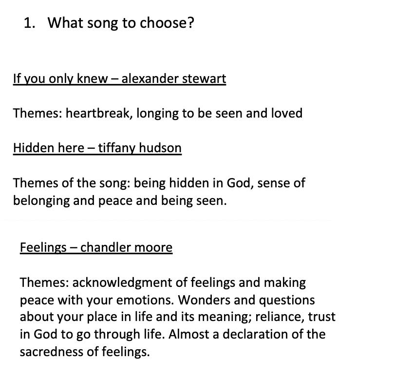
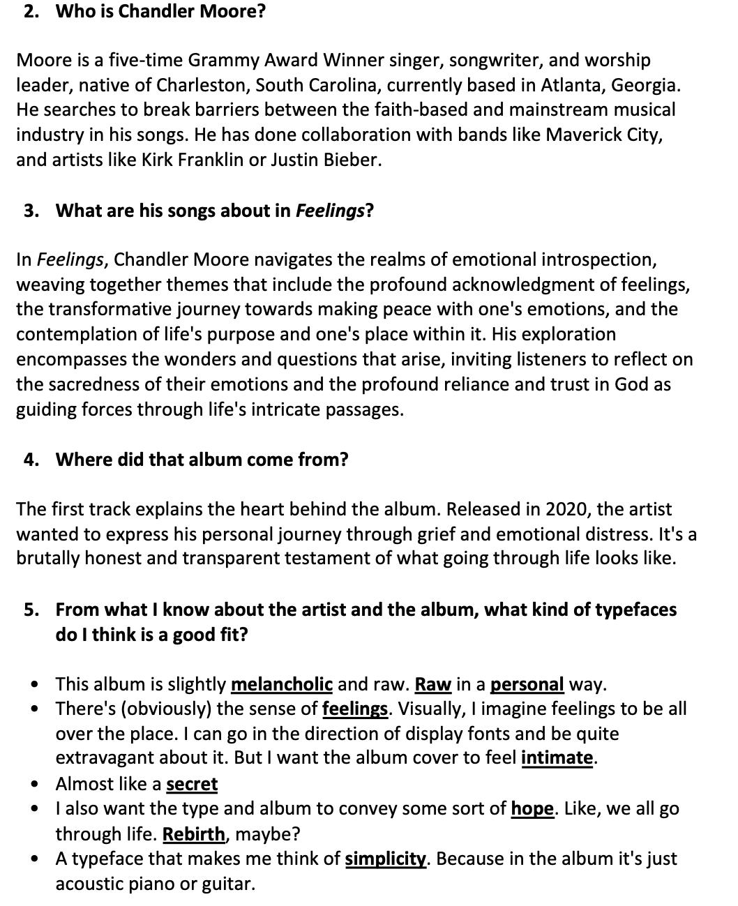
I started my process by selecting a song that I thought would challenge and inspire me to create an album cover. I considered choosing one I’d be willing to listen to repeatedly for this project. The screenshots provided are reflections on how to choose the artist and the themes their albums encompass.
Once I did that, I began researching, as shown in the screenshots, who the artist was and started gathering information to inform my art direction. Once I grasped the essence of the song – which didn’t take too long since I was familiar with the album – I initiated a process of visual research (summarized by the mood board on page 6).
When working on my mood board, I explored various handwritten typefaces because I felt they corresponded with my understanding of the album’s themes, as outlined in my process on page 5. My keywords at this stage were: “melancholic, raw, personal, feelings, secret, intimate, rebirth, hope, and simplicity.”
One strong reference in the mood board is the type I found from the Terry Fox campaign. When I saw it in the streets months prior, it stuck with me. At the time of working on this project, I researched it further and discovered it was a custom handwritten and scanned font. I explored more typography – some serifs that felt elegant but had a tenderness to them. I annotated each visual reference and attached a link to where I could license them. Most typefaces I liked for this exhibited interesting shapes, including the subtle irregularities in the sans-serif “retina.”
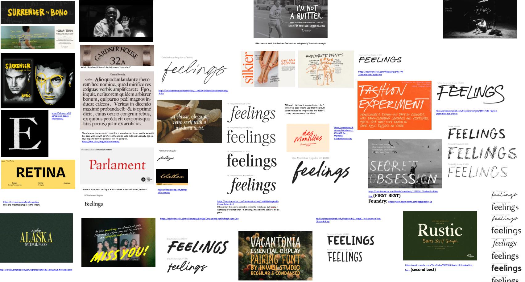
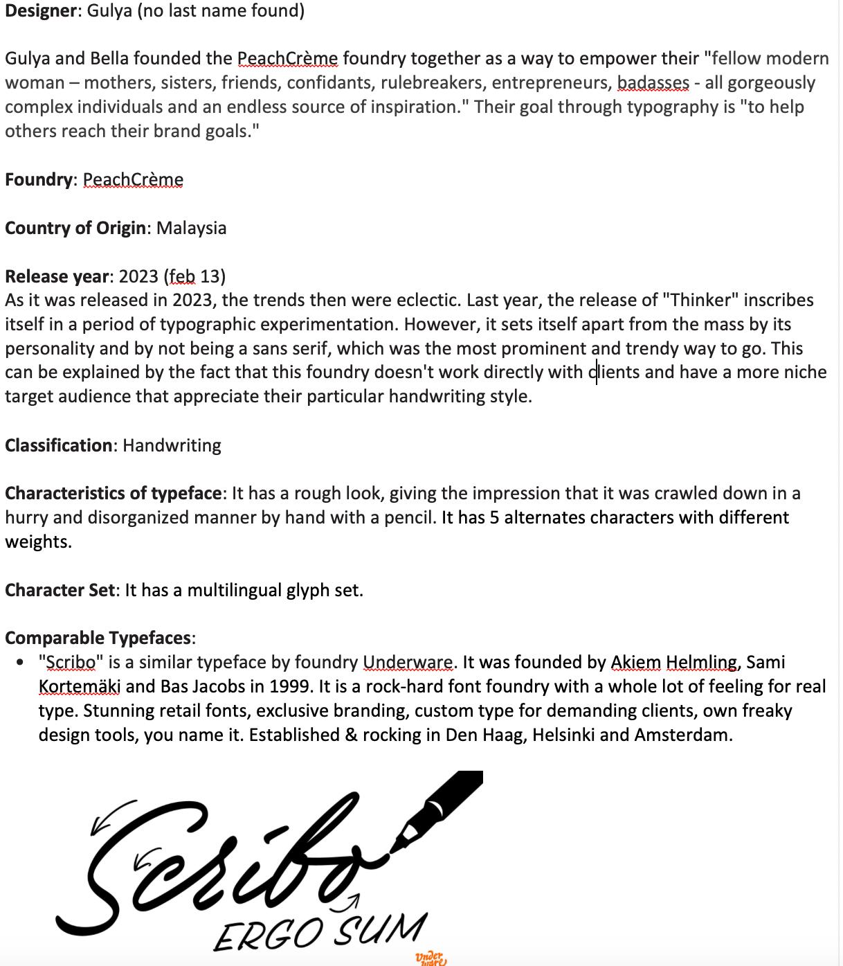
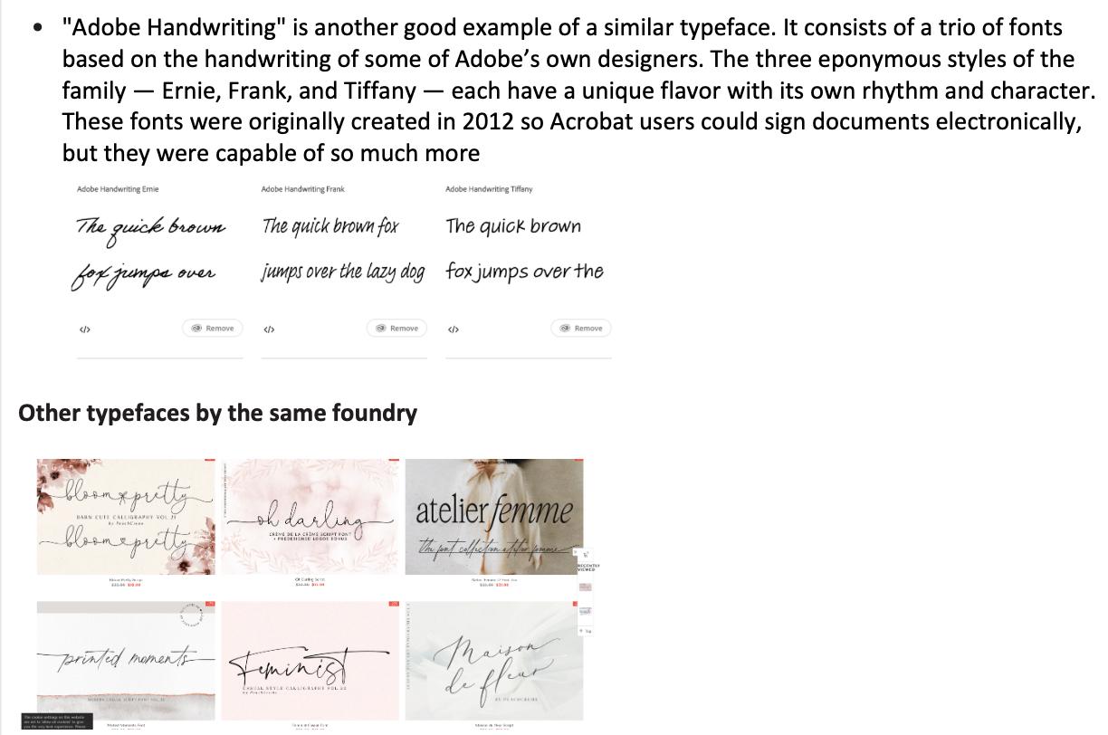

Since this project required us to use an existing typeface, I found the best alternative to real handwriting – a scribbly font. One difficulty I encountered was that Adobe Fonts is not, in my opinion, a great place to source handwriting fonts. Therefore, I had to look for affordable options that fell under the look and feel I wanted – one that could convey rawness and intimacy, one that pairs simplicity with rich visuals. I ended up licensing “Thinker” by PeachCreme.
On this page is my research for the typeface. It somehow informed my design process, confirming that its origins match my use of the typeface.
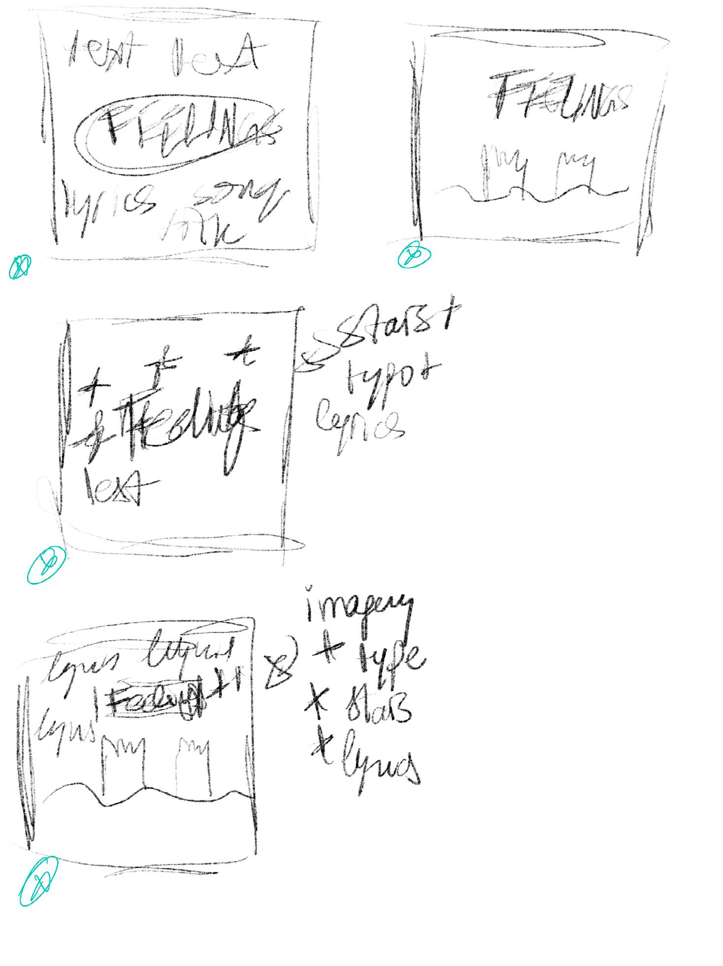
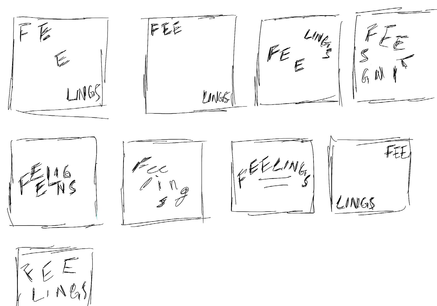
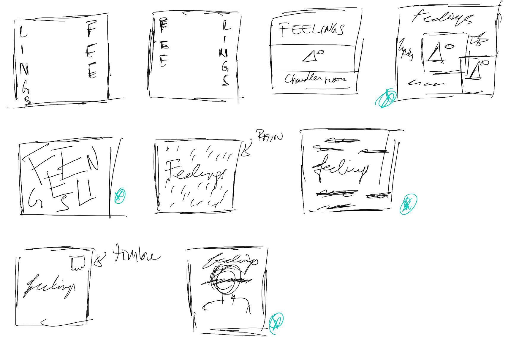
Pages 8 to 9 showcase my first iterative sketches for the album cover. I explored minimalist compositions that evoke emptiness, hope, and chaos simultaneously. I found it challenging since I would normally have approached something like this through photography and not typography.

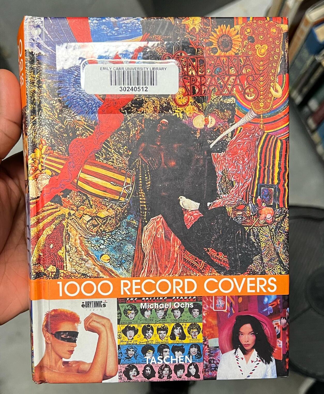
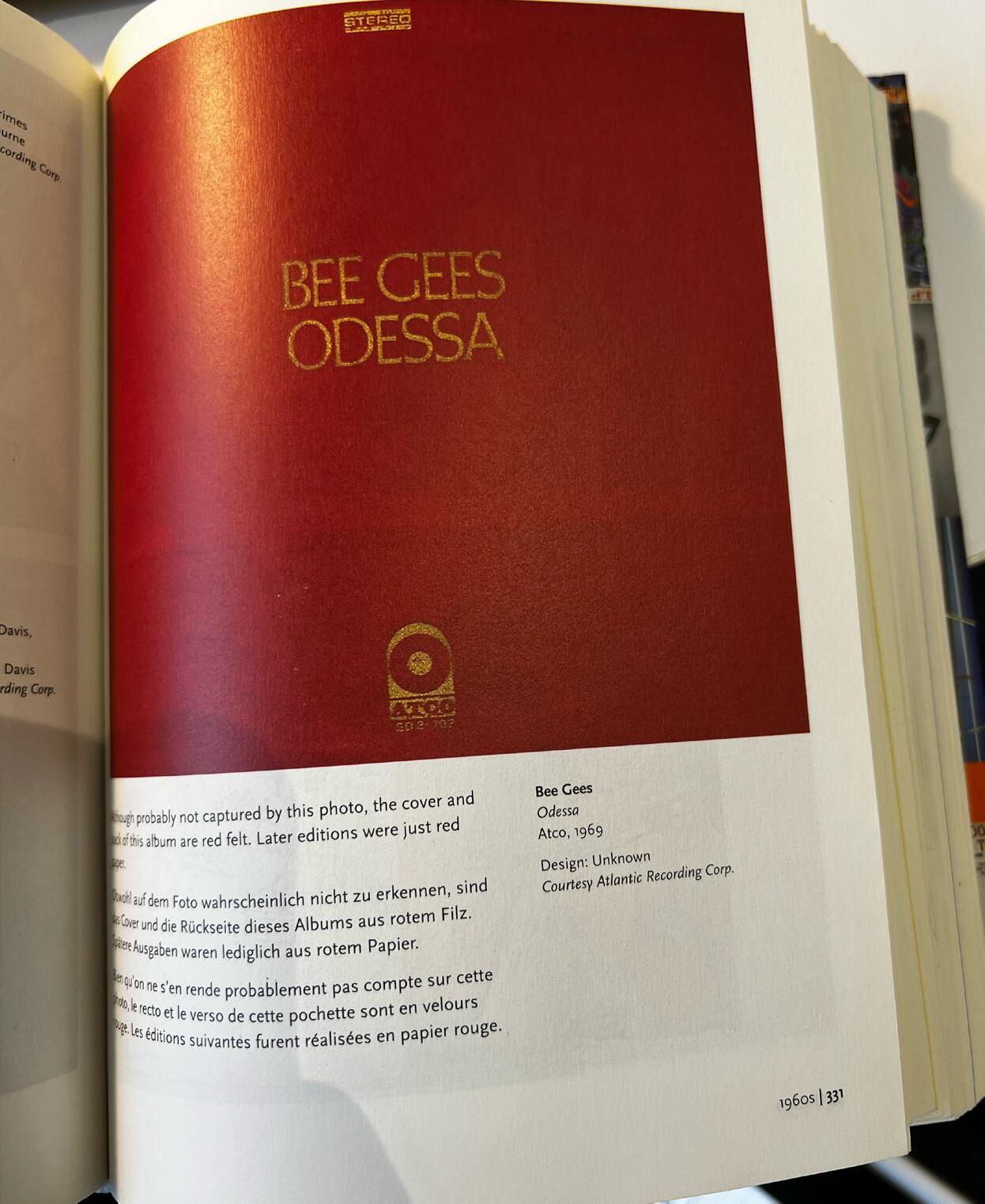
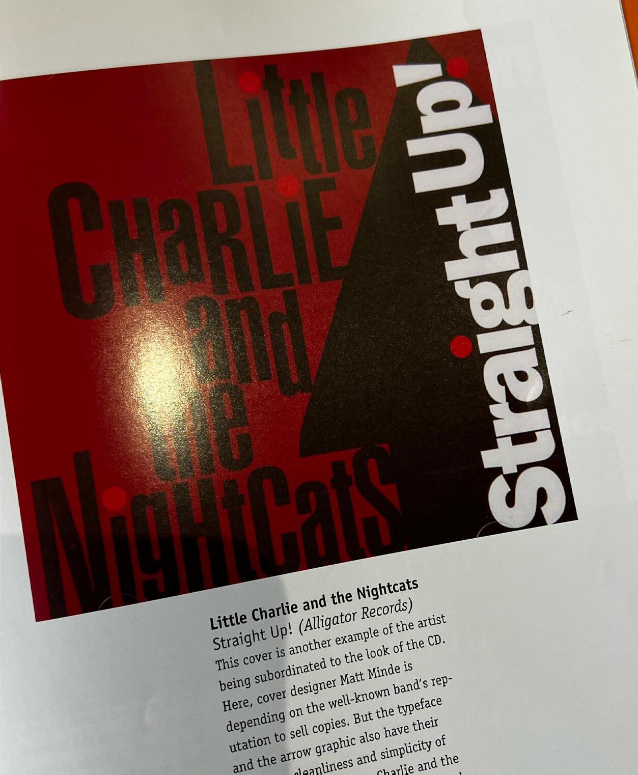
Besides my general mood board for the visual feeling of the album cover, I needed more inspiration from previous work in album cover designs. I flipped through a couple of books in the library; one of them was 1000 Record Covers, published by Taschen It showcased covers spanning different centuries. I isolated a couple of them that I enjoyed, either for their simplicity or their graphics and/or composition.
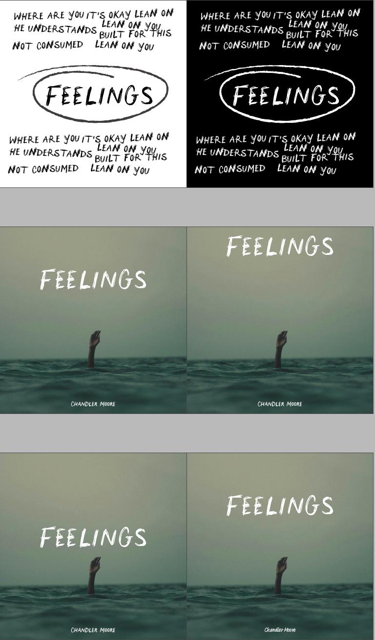
Once I felt that sketches were no longer helpful, I decided to turn my ideations into low-fidelity compositions in InDesign. I tried to explore a handwriting look with a chalk-like visual to reiterate the rawness and personal character of the album. But I also wanted to convey the overwhelm associated with the themes of the album. So, I tried to fill the composition with words (they are tracks from the album – I didn’t want random words). Another reason I went that way was to follow the typography brief. Creating typography-heavy artwork was challenging. Considering my minimalist aesthetic, I researched a few photographs that related to the keywords aforementioned. I wanted the image to convey despair but also emptiness. This is why I chose this one because of the negative space. I thought it would give me space to play with typography in this space. Again, although this was a type project, and the emphasis was on type, I felt pairing good photography with type was critical. The following are iterations of slightly different concepts, playing with photography, type, and compositions.
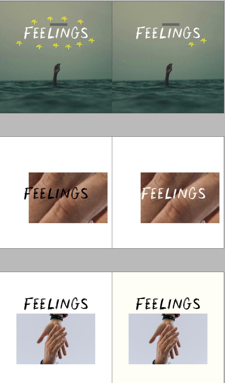
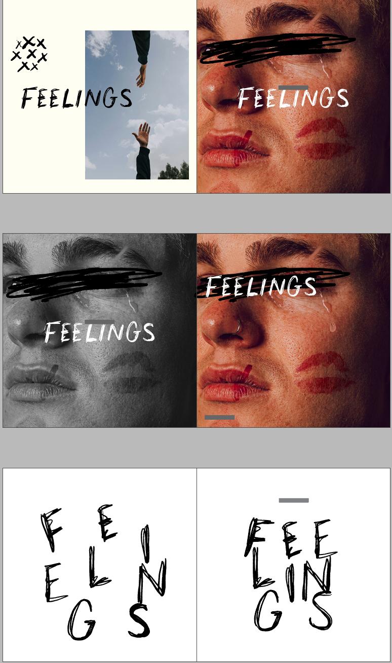
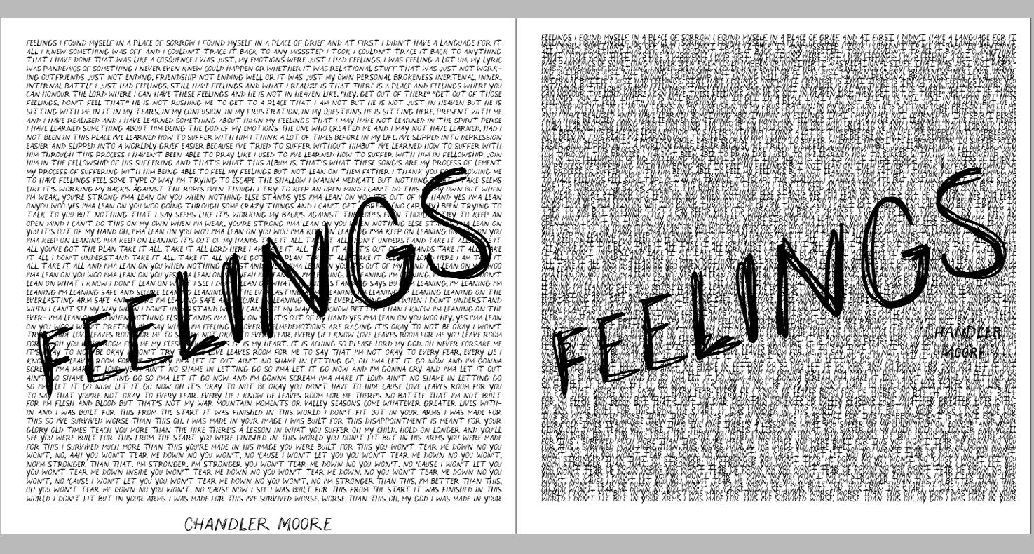
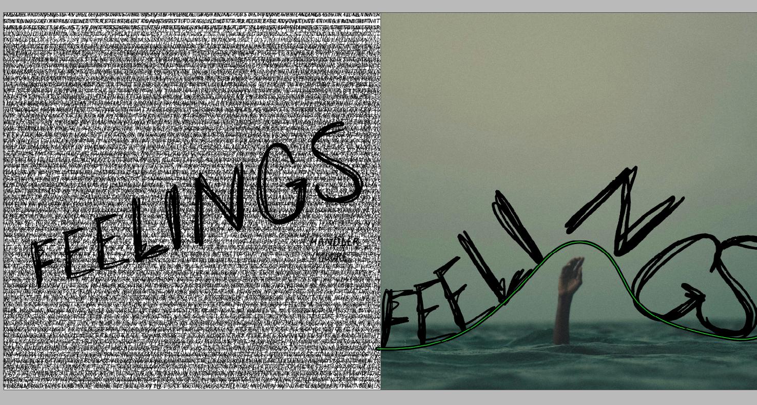
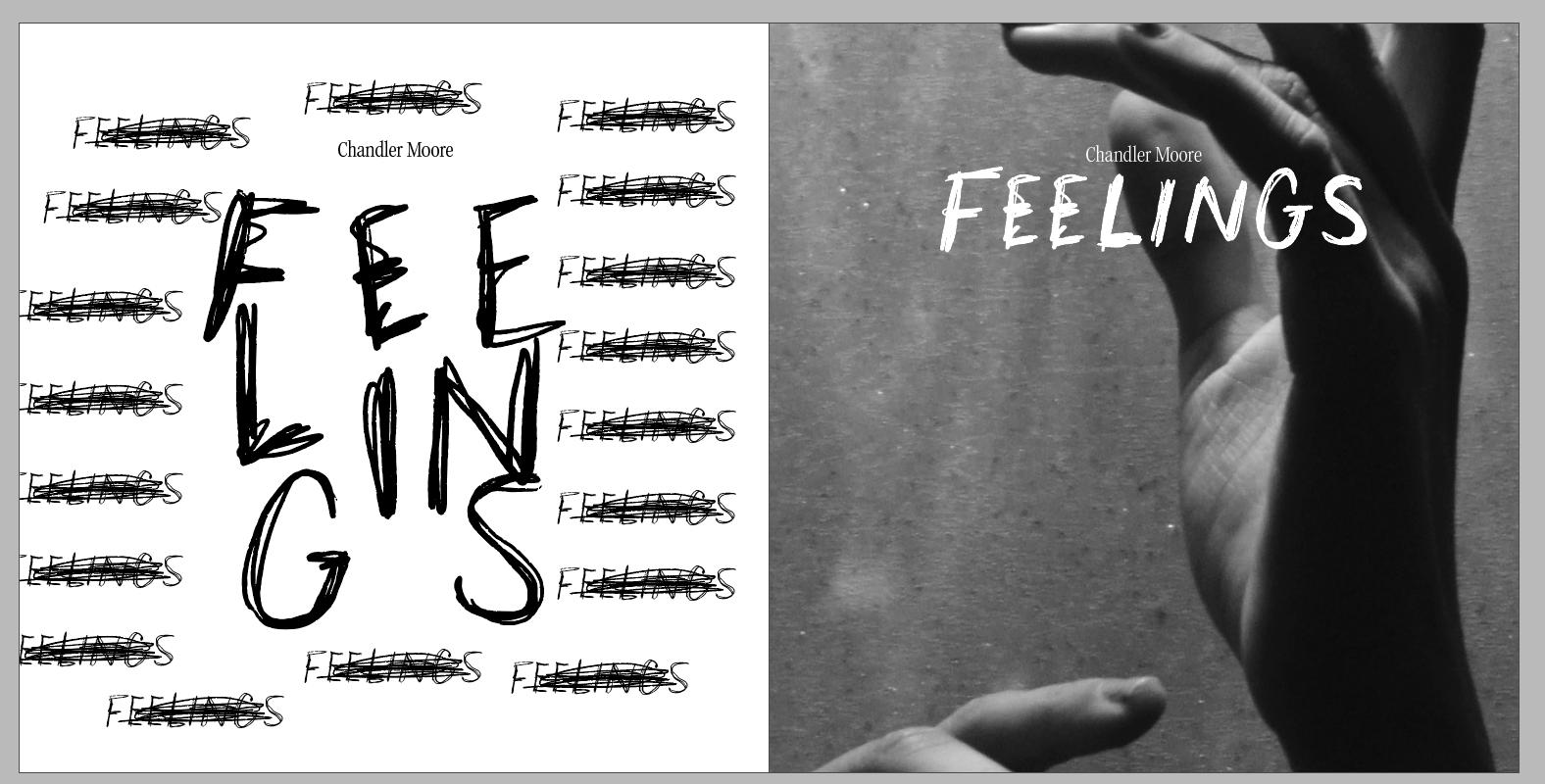
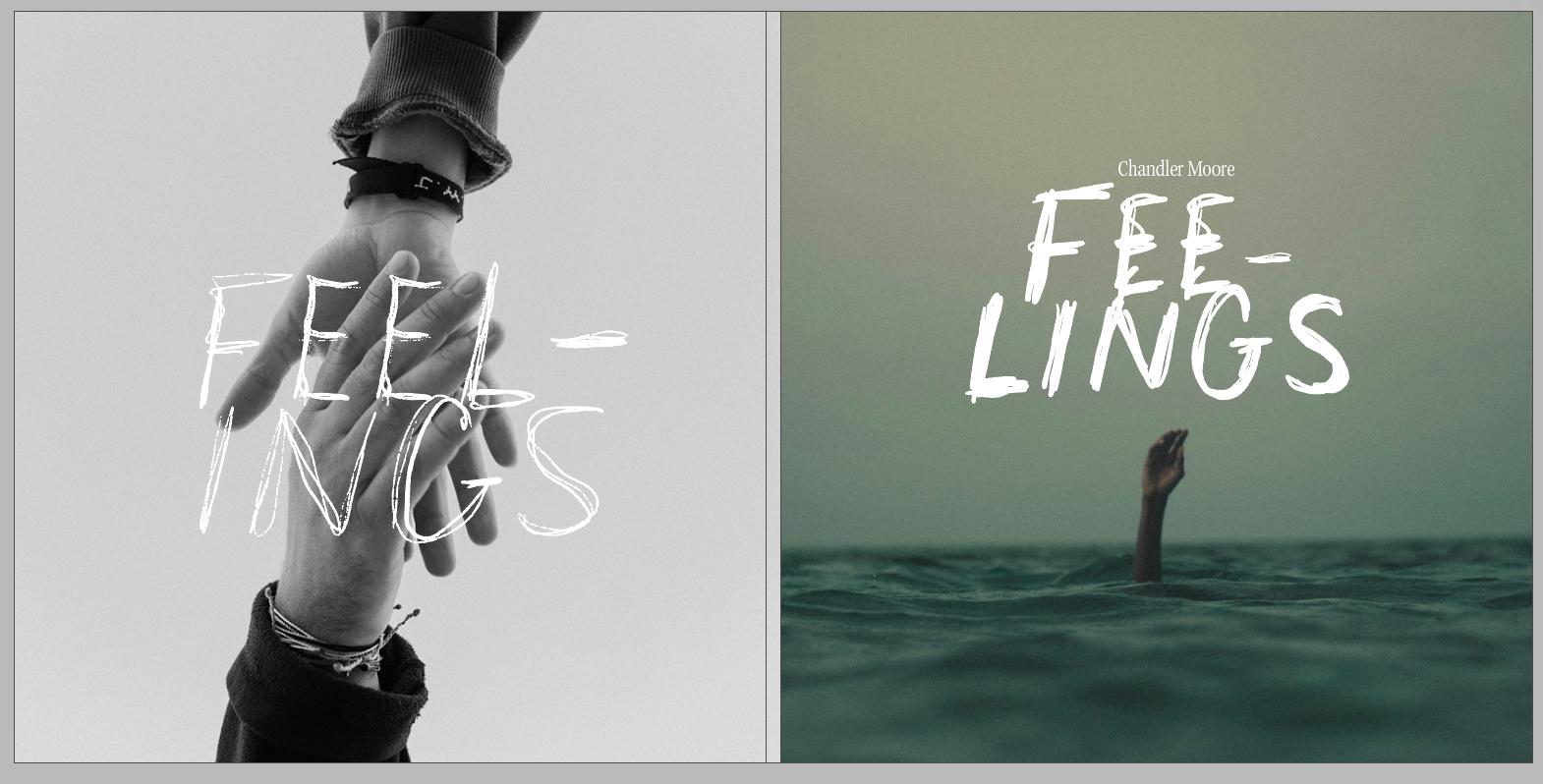
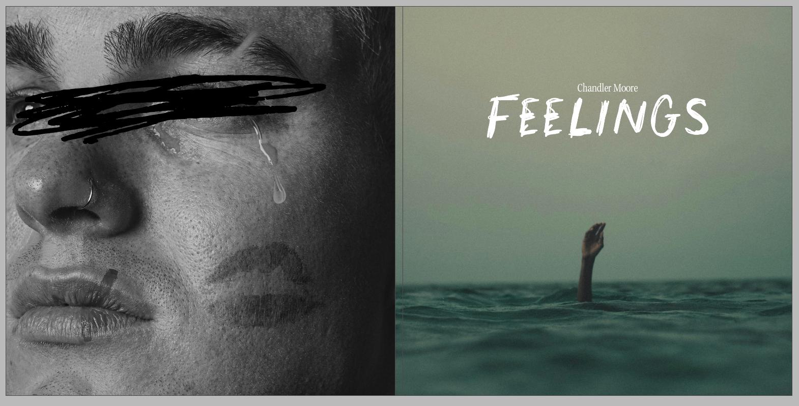
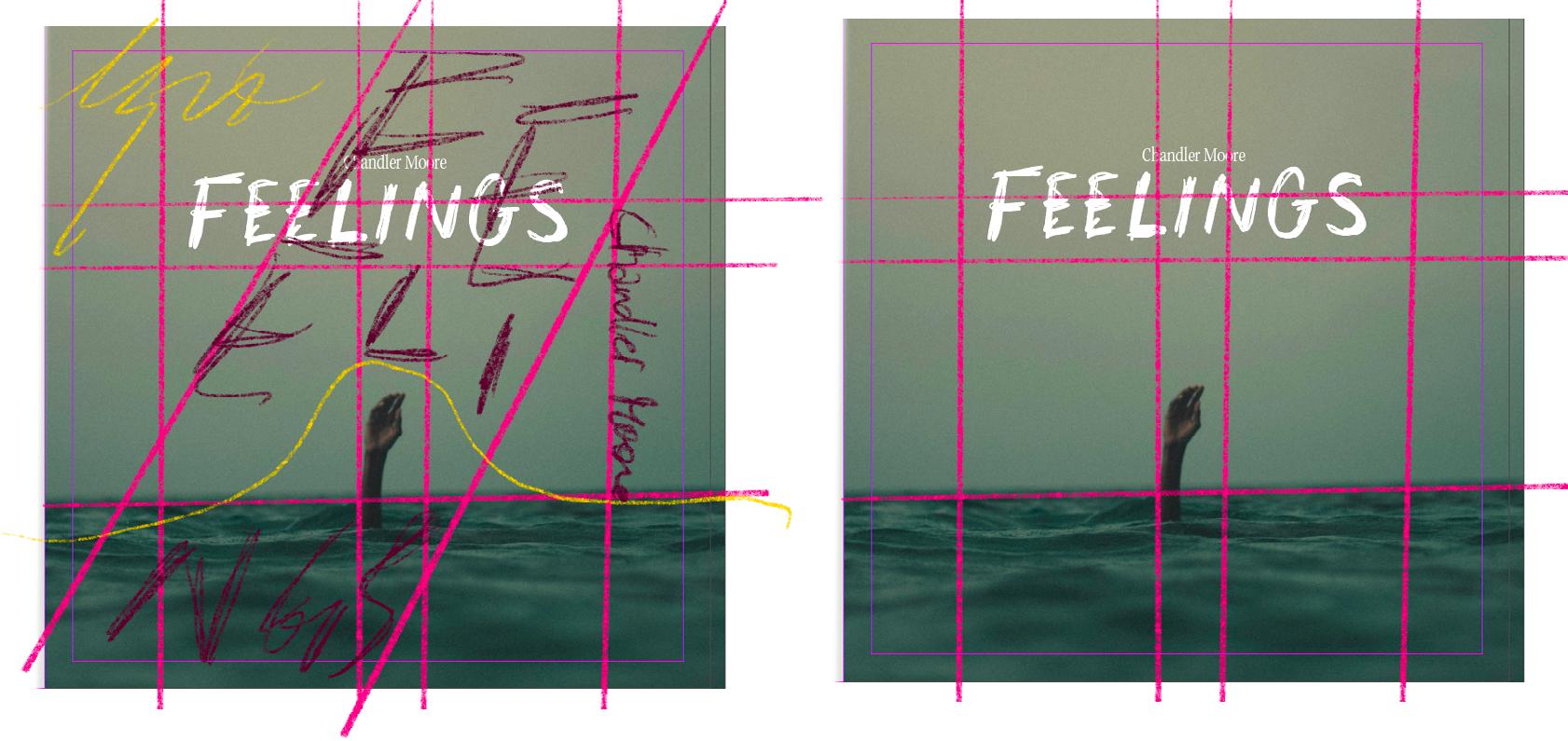
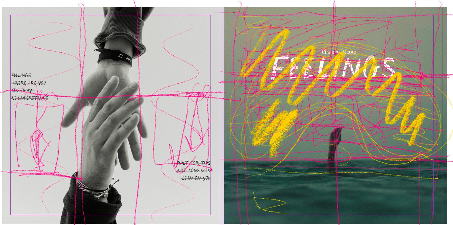
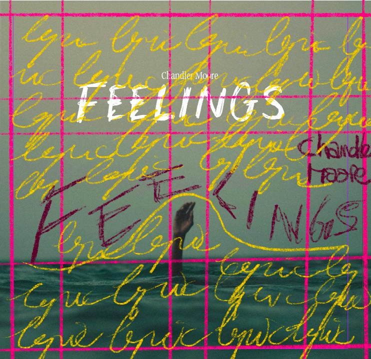
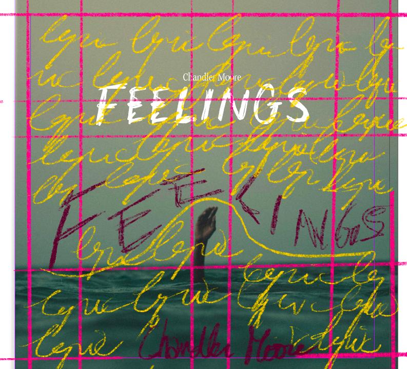
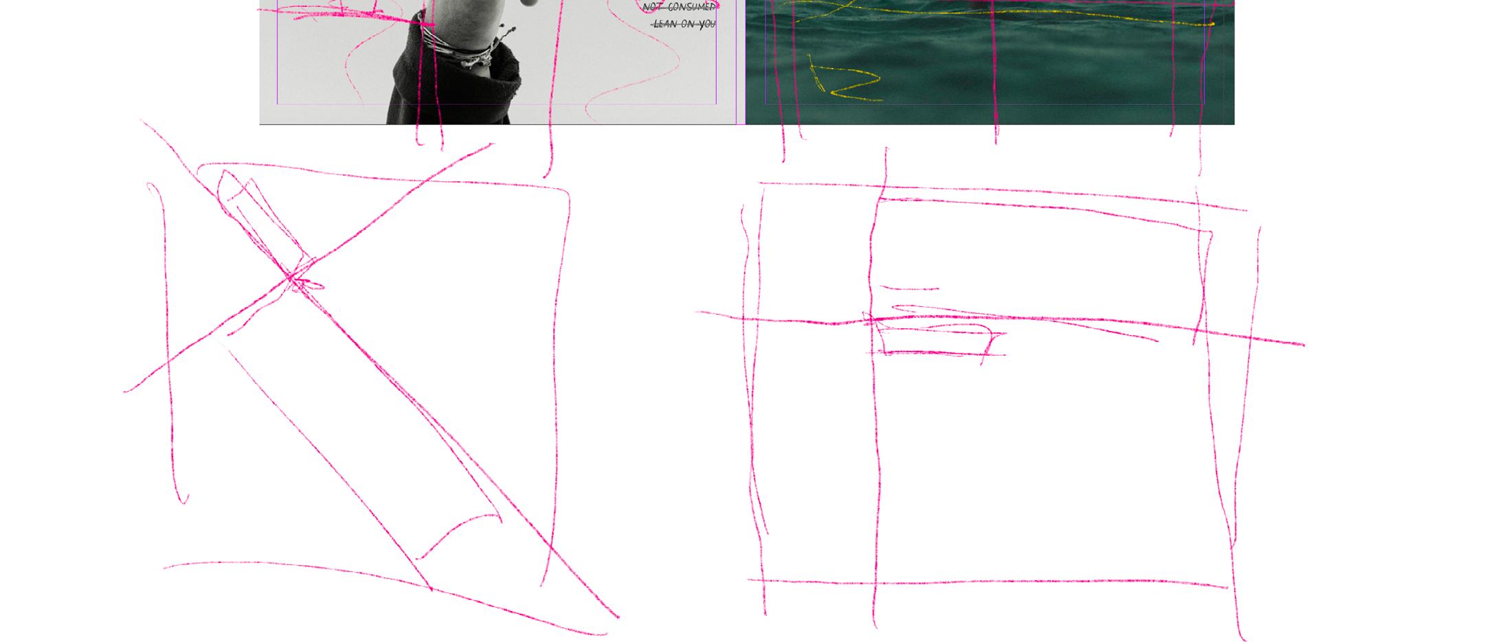
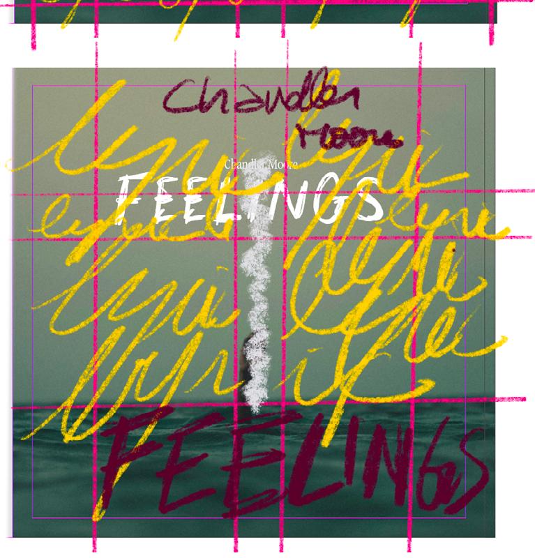
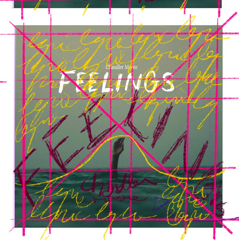
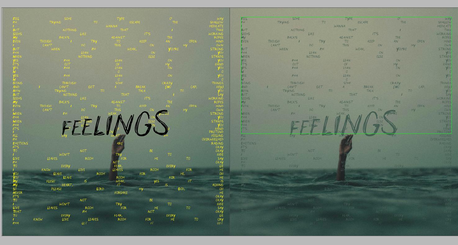
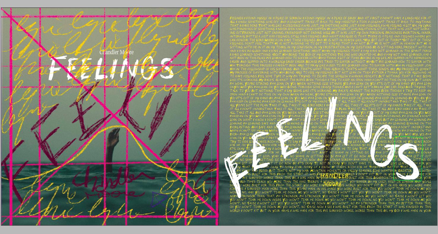
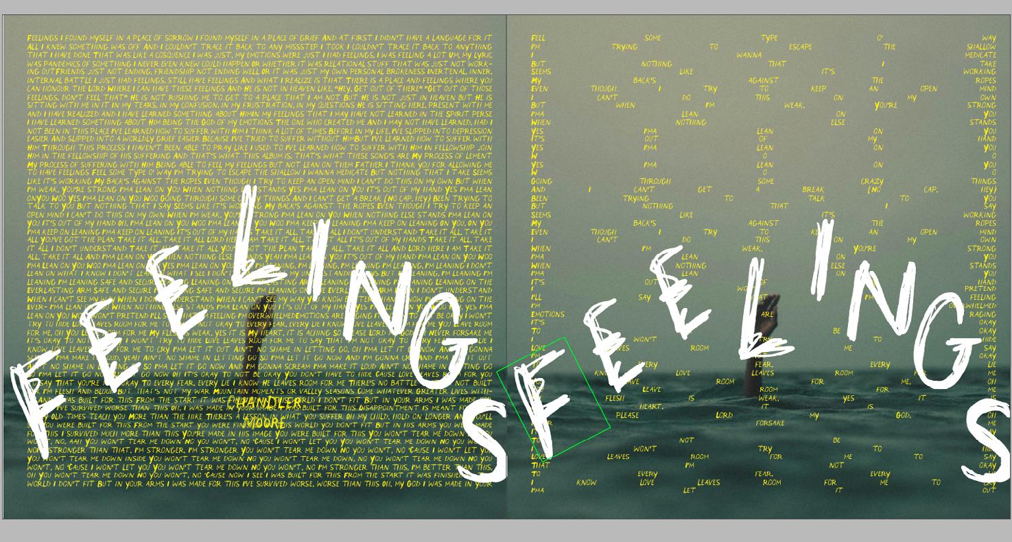
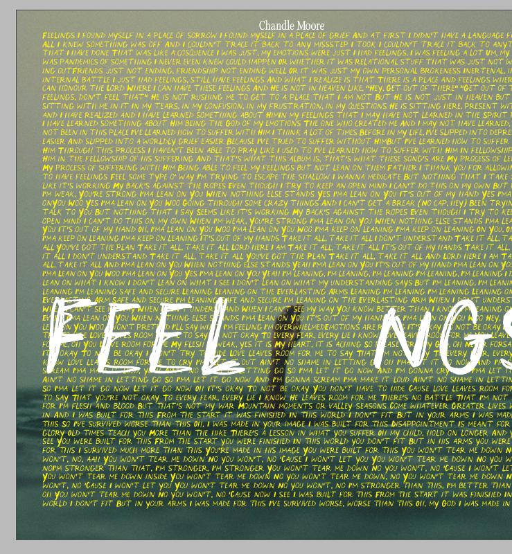
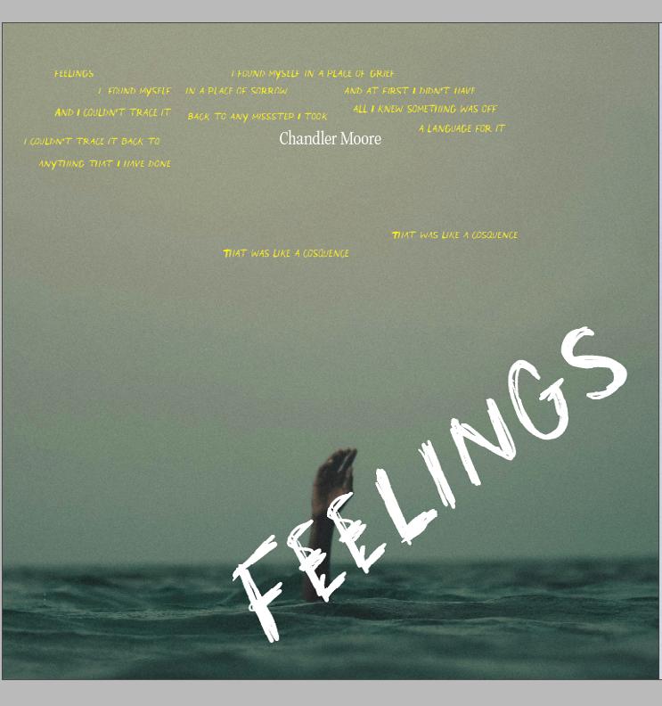
After iterating, I was semi-satisfied with the image on the top left of page 14. I thought it encompassed the album simply but beautifully. After a feedback session and peer review, this sentiment wasn’t shared unanimously. So, after being encouraged to explore more in terms of my use of space and to construct a grid, I started playing with space and composition, making sure I was using the space efficiently and intentionally.
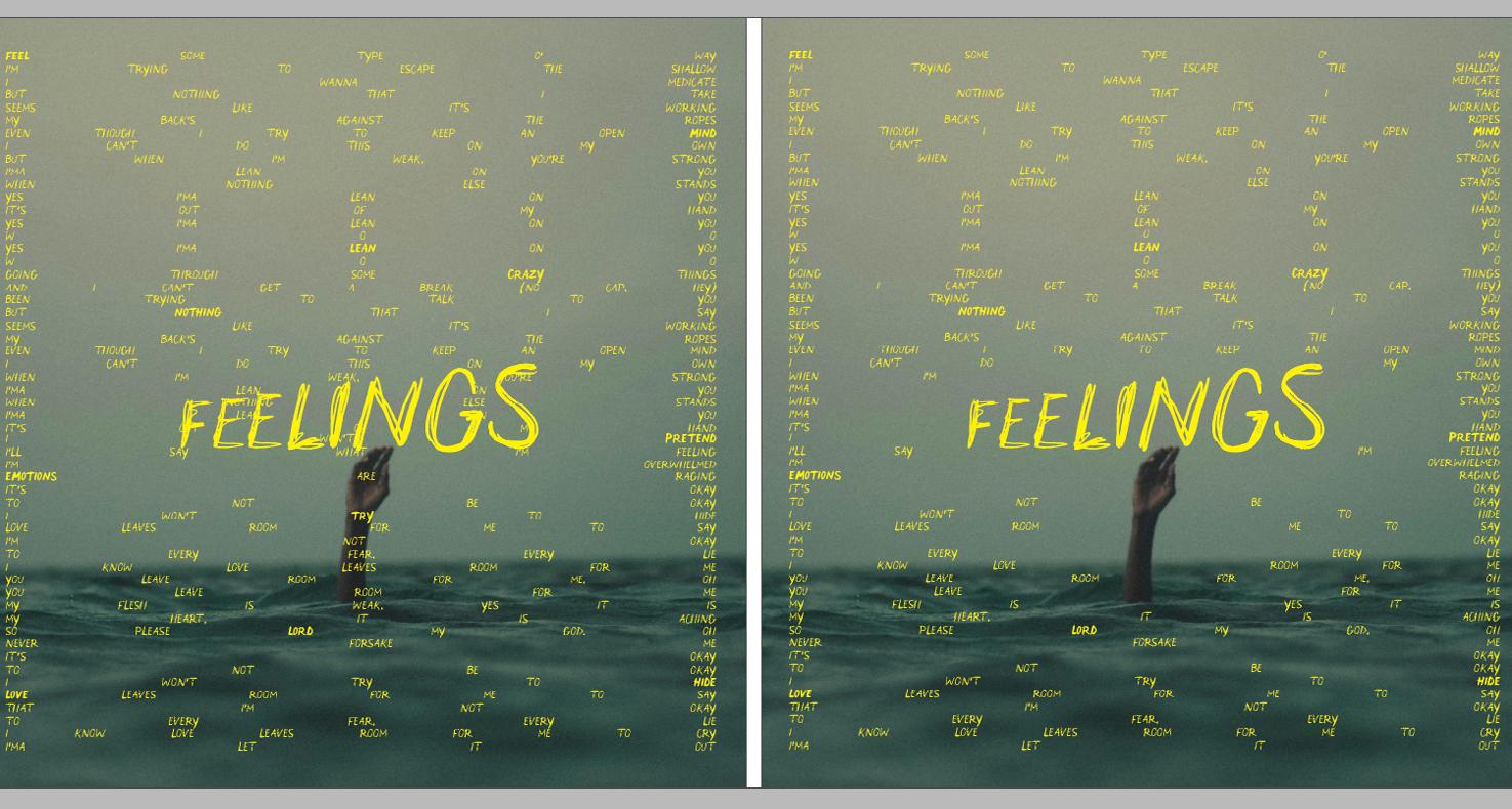
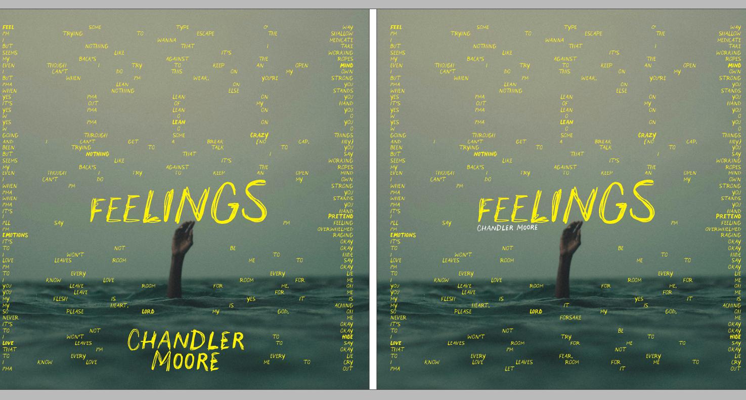
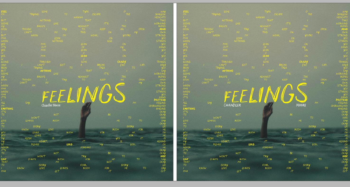
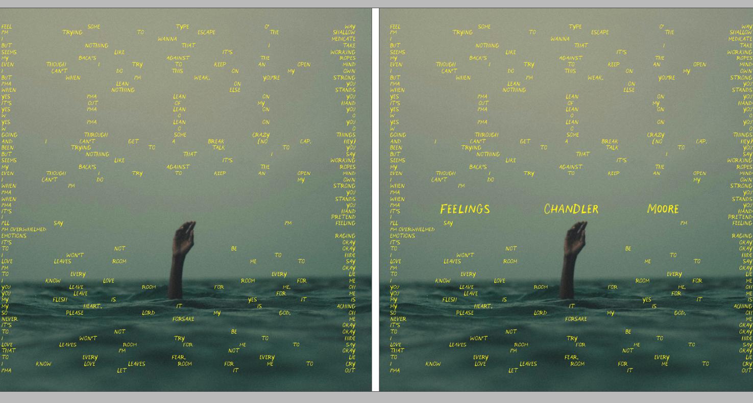
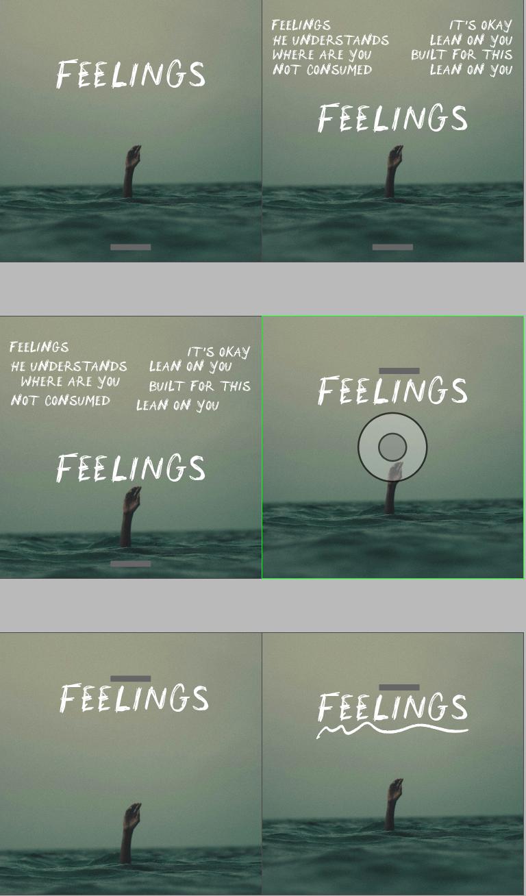
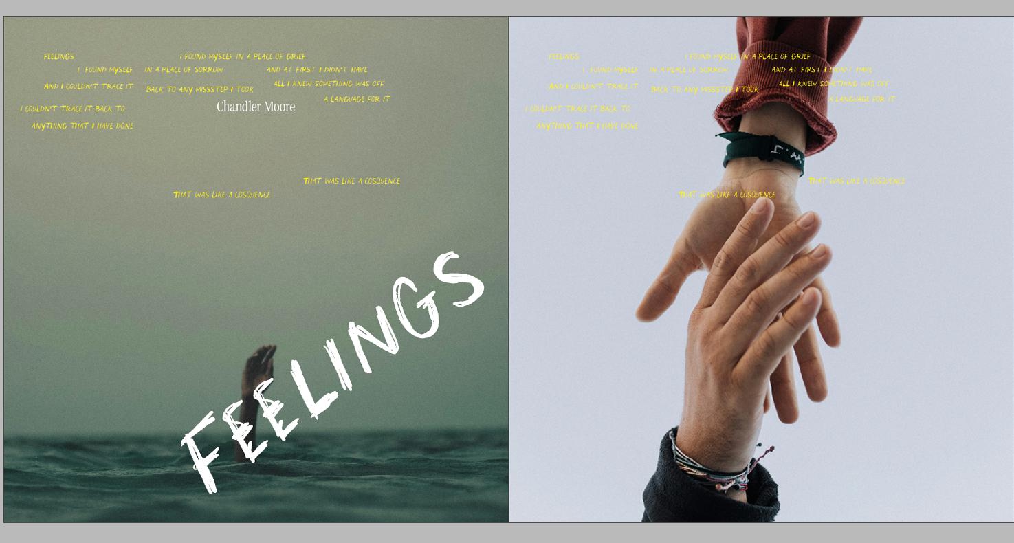
I came up with a concept of using different words, as in one of my first iterations, but this time, having different words spread out throughout the page using a grid to ensure I was using the space efficiently. Then I centered the composition around the hand, drowning, to emphasize the sense of overwhelm and despair. The bright yellow was my color choice because of its contrast, and I thought, although there is a lot of despair in the album, there is also a lot of hope. I saw the yellow as representing hope. I explored making the type flow like a wave around the hand. I also tried making the type bigger, as in the scream. Then I experimented with making the text go around the hand, leaving the composition empty around the hand and drawing attention to it. But I wondered if I could omit the name of the album on the cover. Although that was my initial choice, I received feedback prompting me to include the title of the album on the cover, but to integrate it into the image. Instead of having it as a scream, I chose to place the name of the album as a whisper. All the texts around are words from the lyrics of the songs on the album.
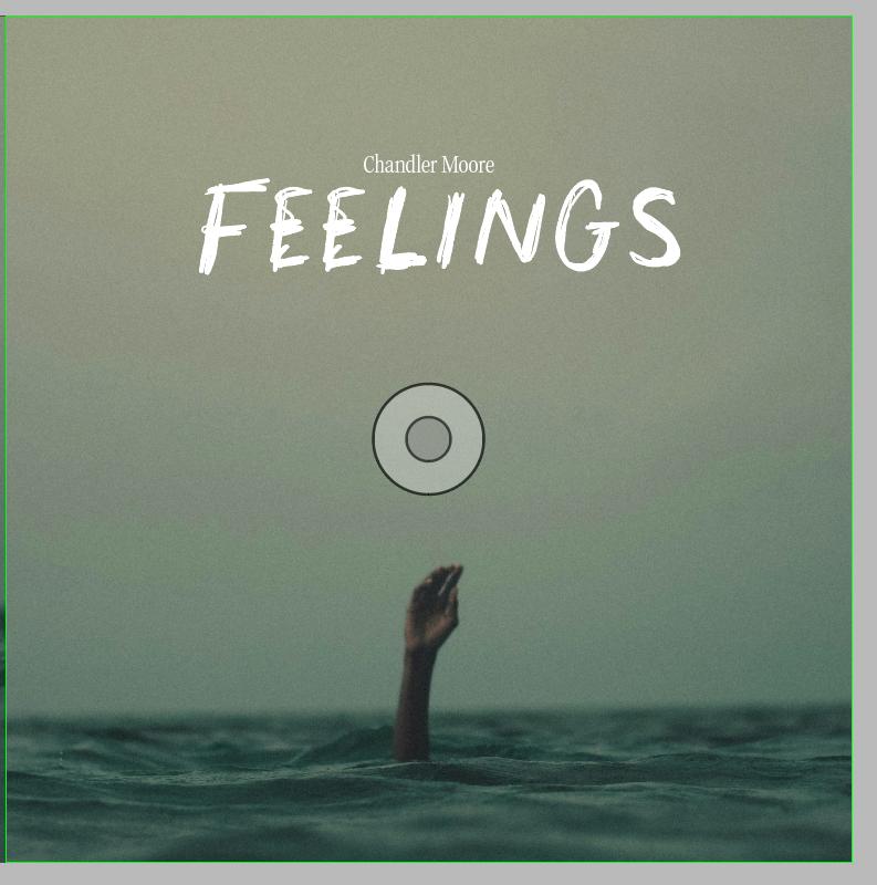
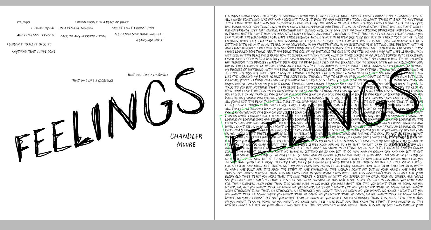
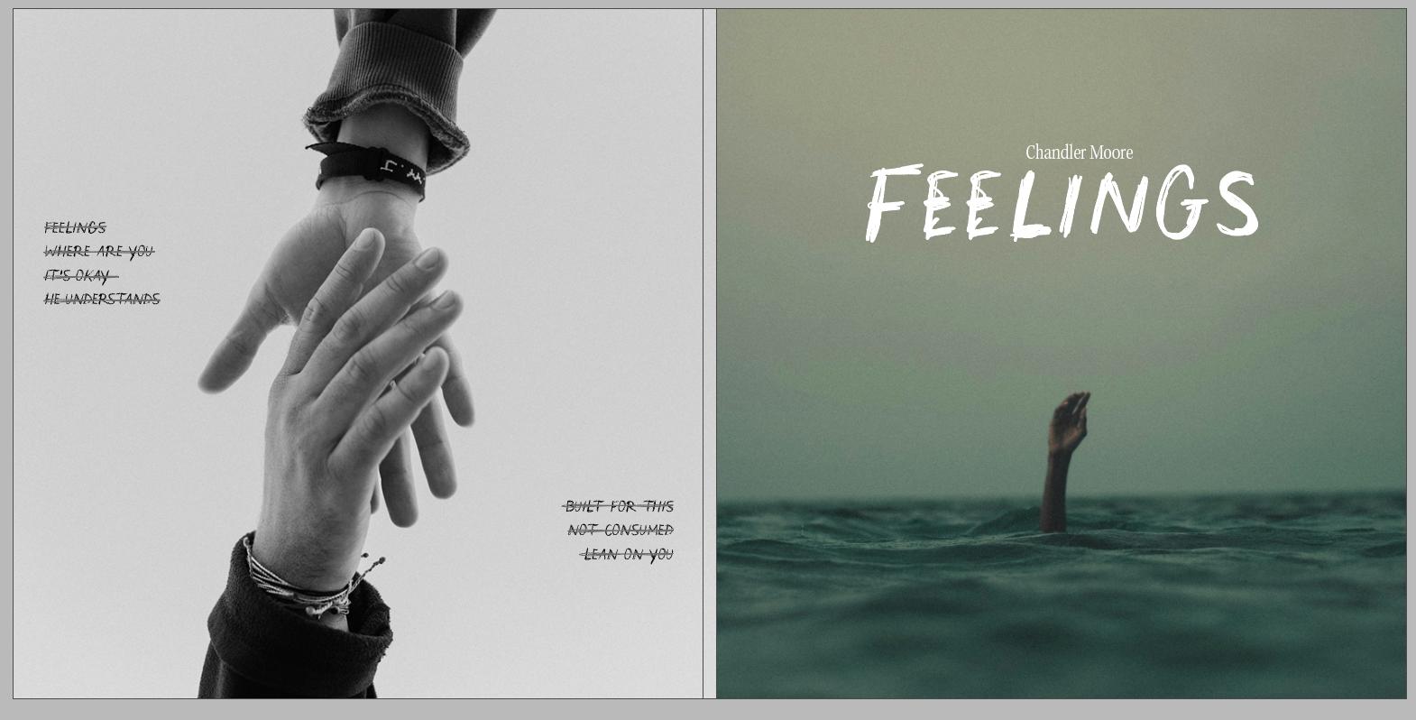
Then I had to start thinking about the back cover because, in the beginning of my process, I designed the front cover as it is the most visually appealing thing on a cover. Then, obviously, I thought about the spine. The back cover went through different iterations, from having minimal design to mimicking the style of the front cover, keeping it empty. Or at least, creating the feeling of emptiness. A small difficulty with the back cover arose due to creating a balanced composition because the tracklist has seven songs, an odd number. But I found a solution.
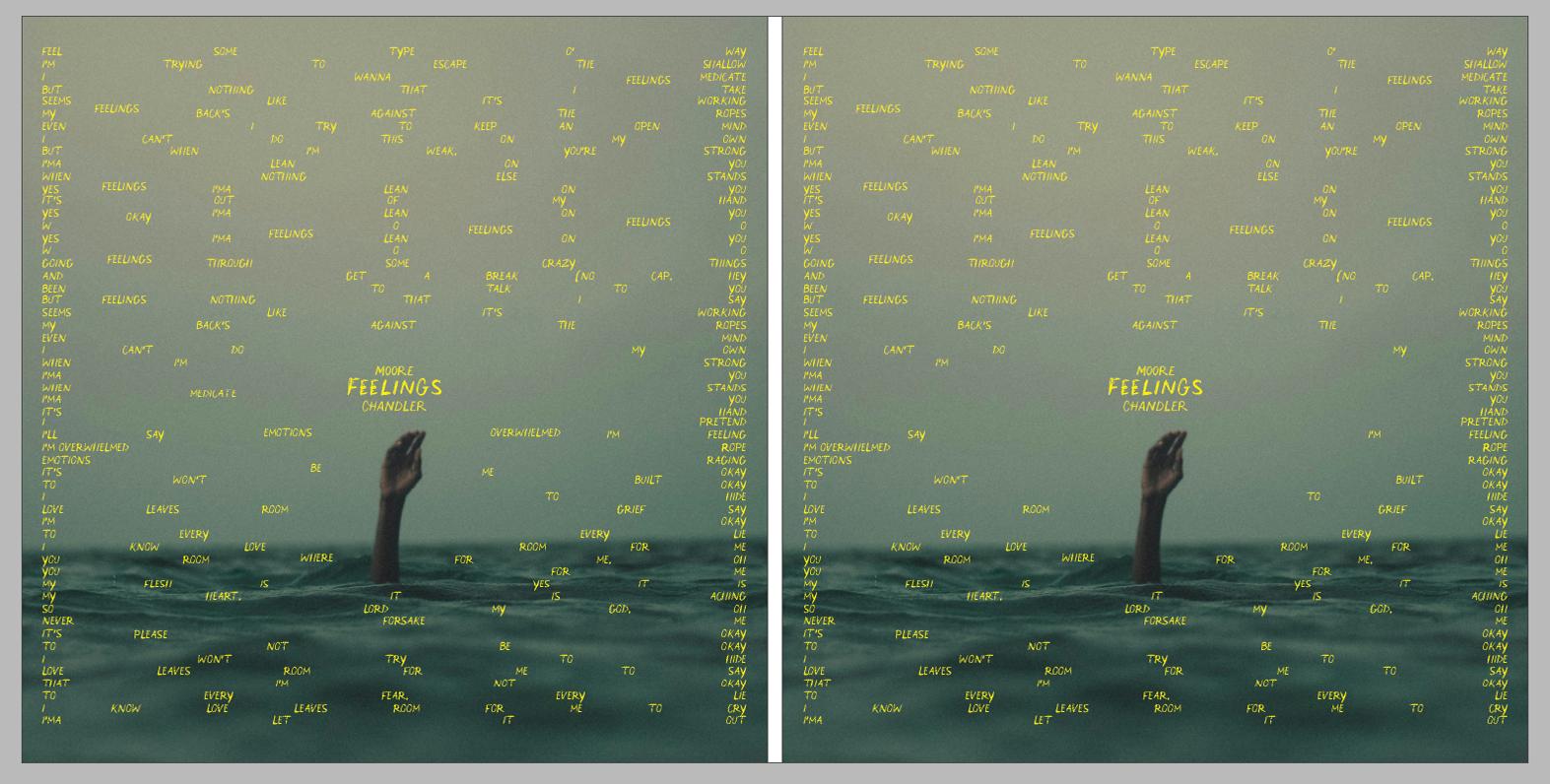
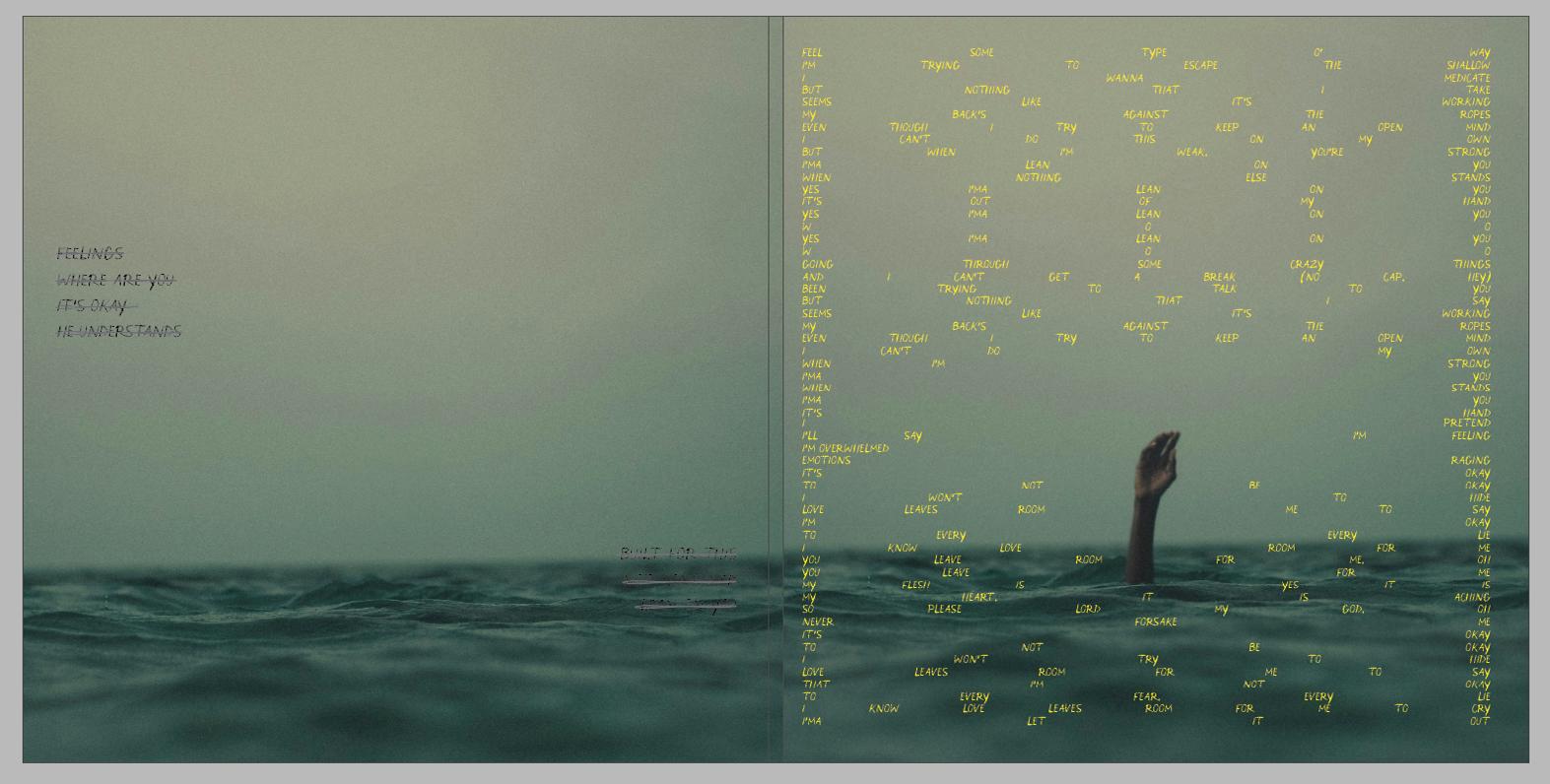
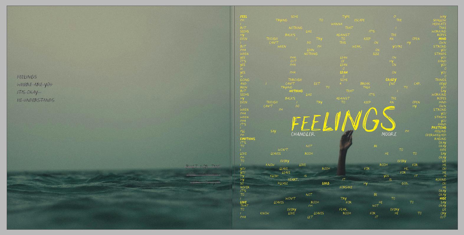
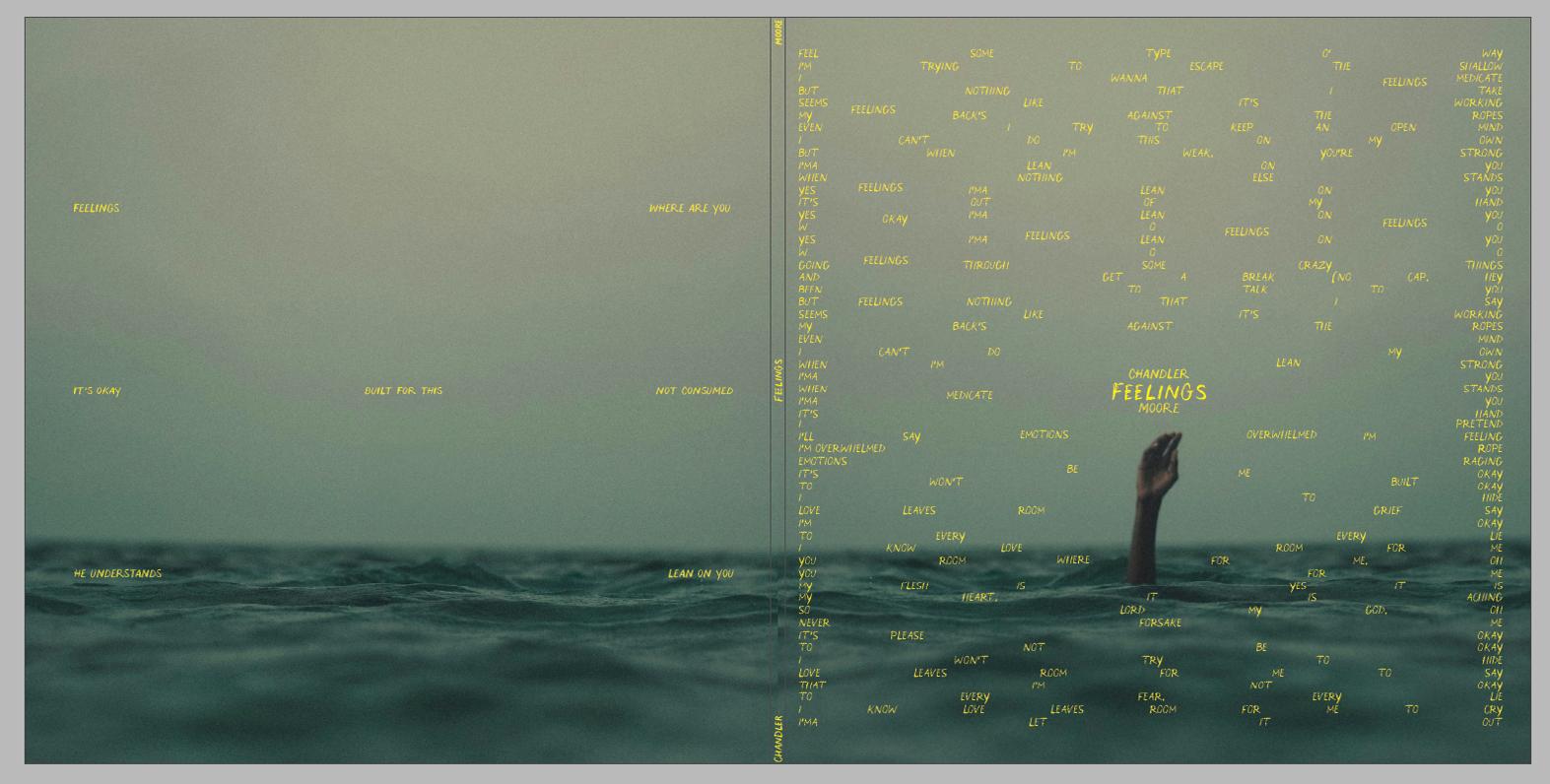
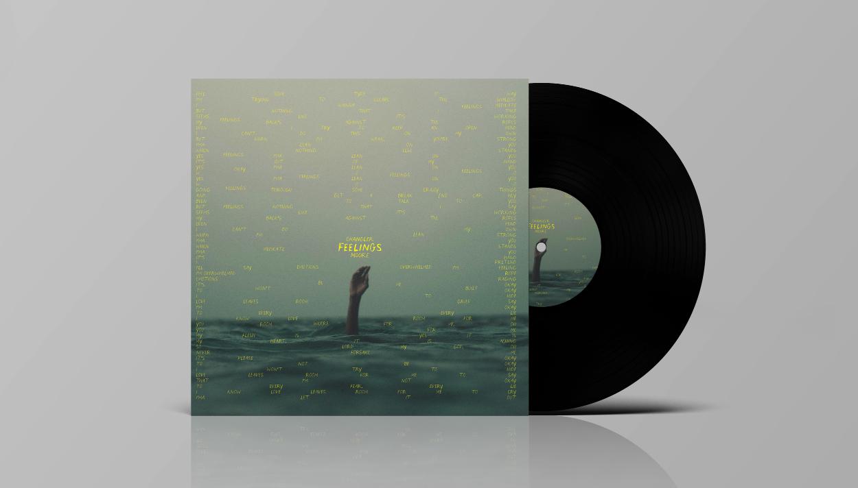
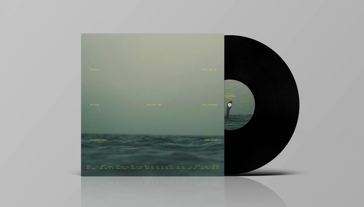
Here is the final album cover. In the end, I am satisfied with how the album cover looks. I believe this part of the project was definitely challenging because I had to rely on typography to convey emotion, but I think the result is good.
In this part of the project, we had to design a print vinyl album lyric booklet that utilizes a baseline modular grid; then translate the design to a digital book made for an iPad Pro (10.5in).
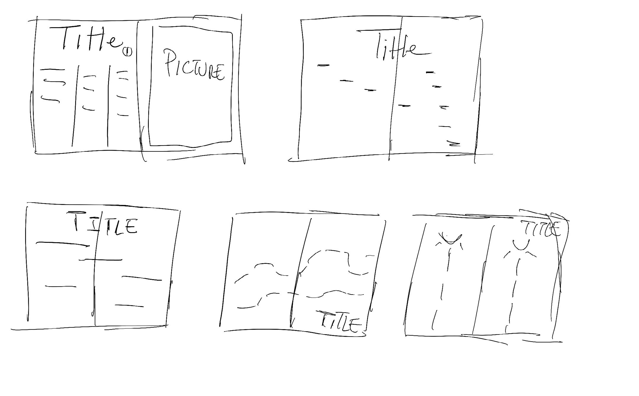
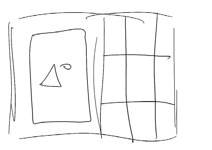
I started sketching some ideas for the layout of my lyric book. Because we had to do it for at least six songs of the album, and considering the small amount of time remaining for the project, I thought it wouldn’t be helpful for me to go ahead and do something conceptual or metaphorical and create individual designs for each song. So, I decided to go with a simpler approach by creating a detailed grid and a modular grid with a baseline. Sketching wasn’t all that helpful, so I quickly switched to trying some things directly with the software.
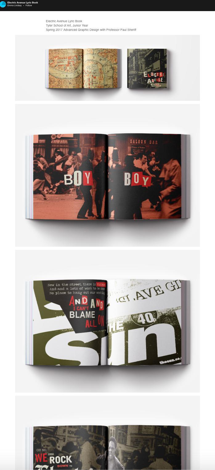
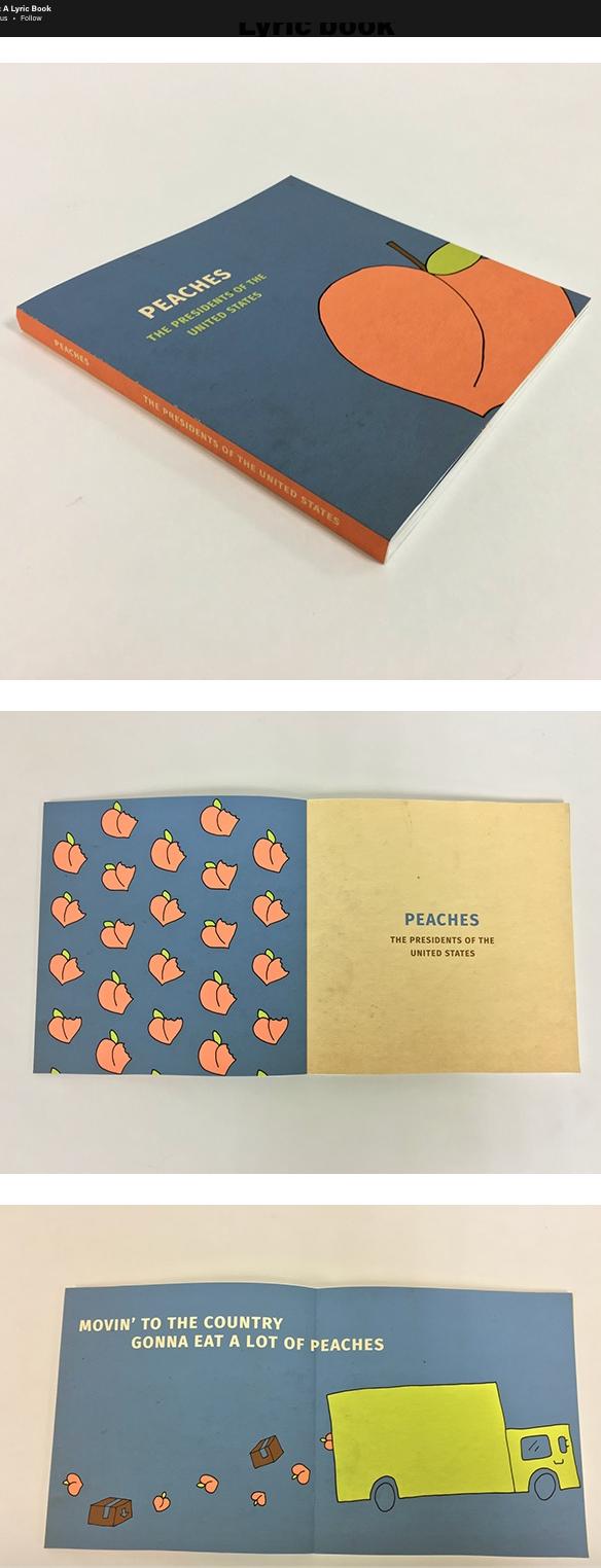
But because I wasn’t familiar with what the lyric book was and what its purpose was, I did visual research into existing lyric books and the vernacular I was going to have to step into and perhaps break or bend. The following are some examples of the visual research I conducted before starting to work with software.
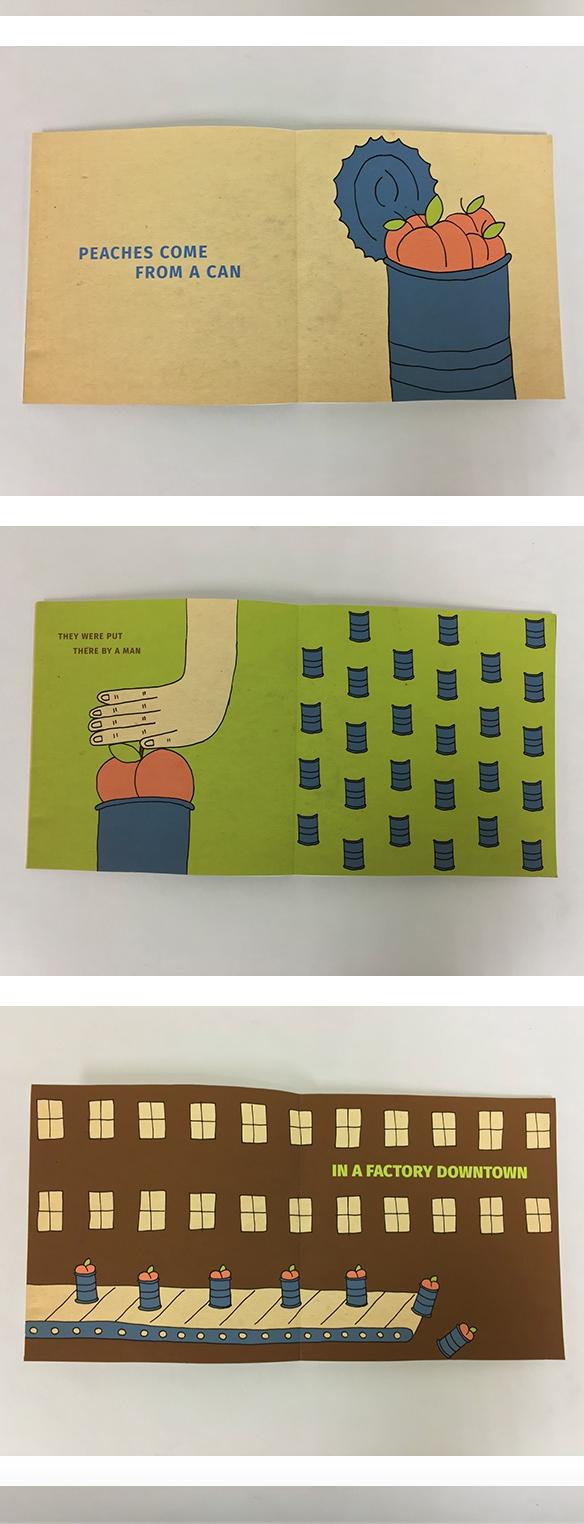
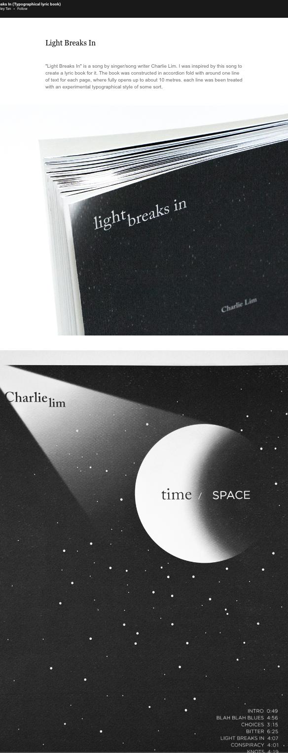
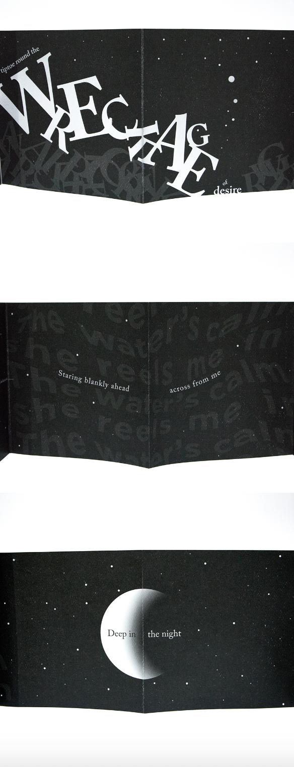
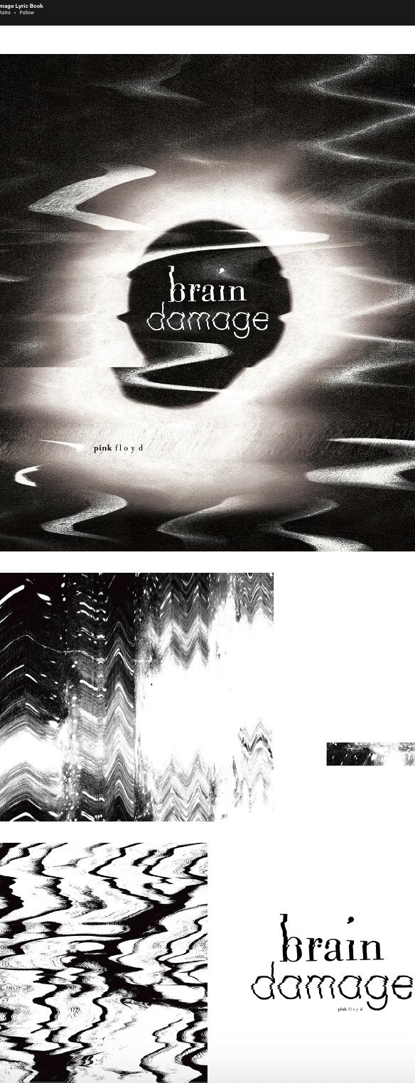
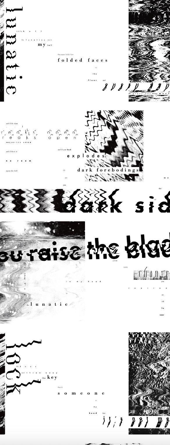
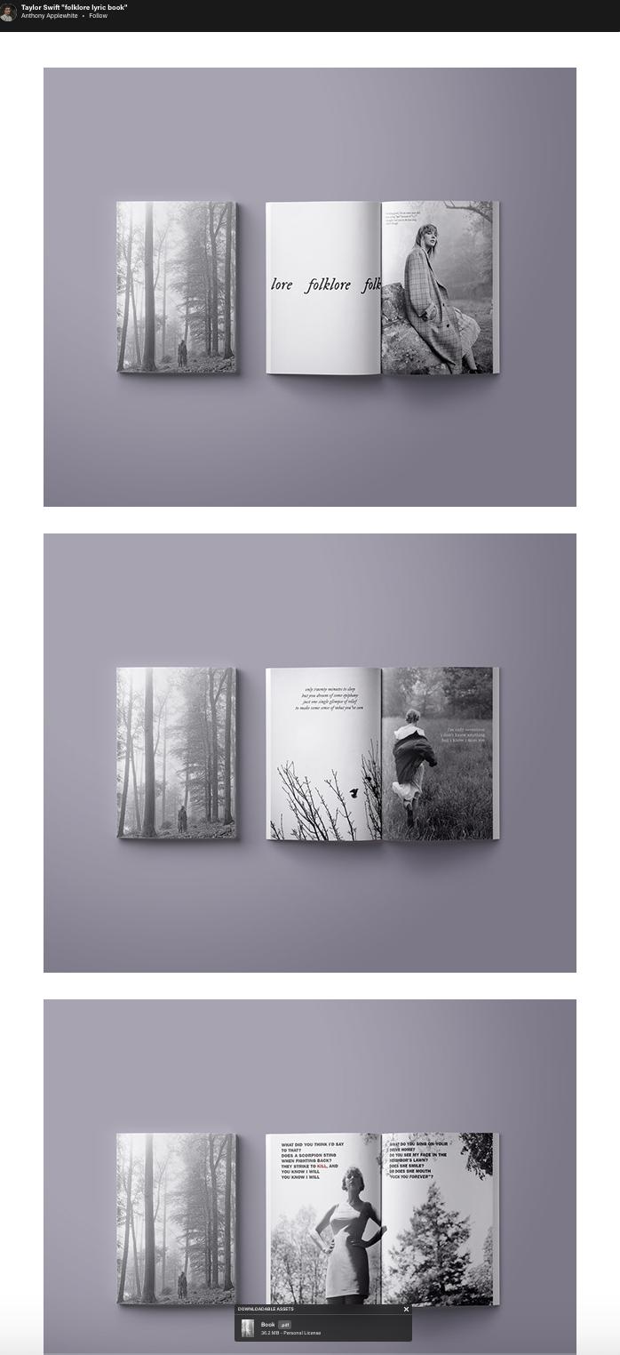
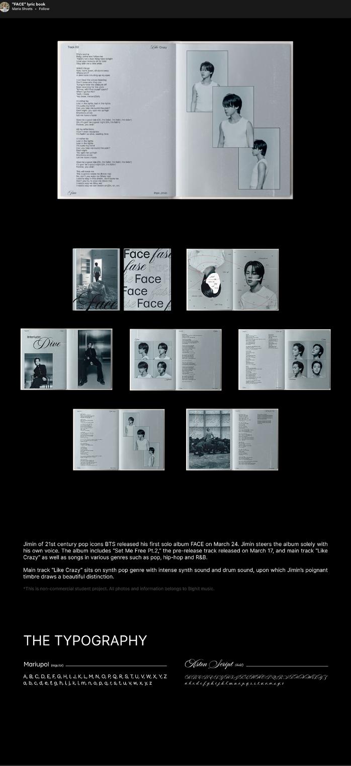
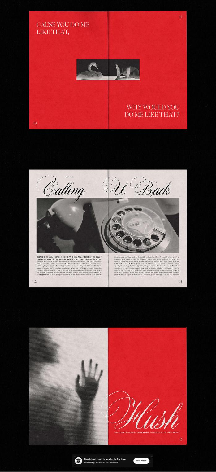
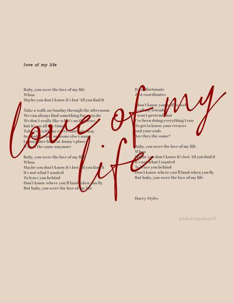
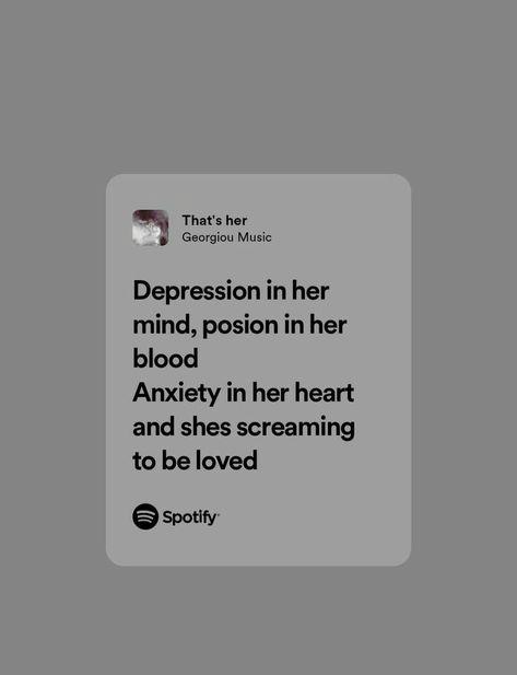
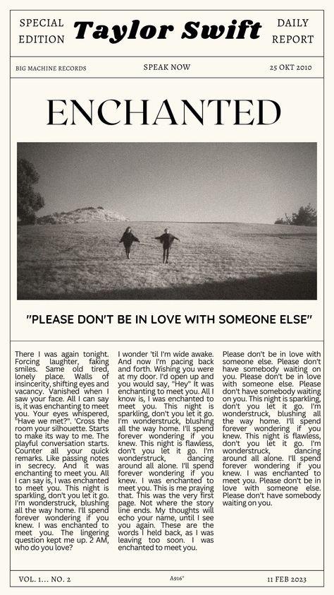
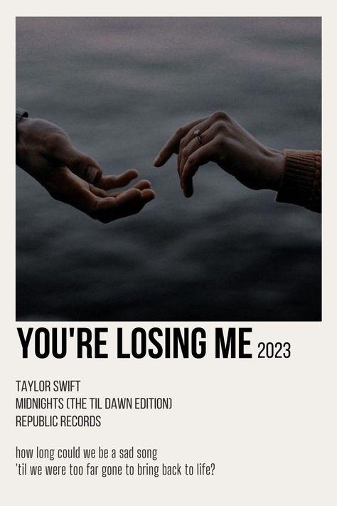
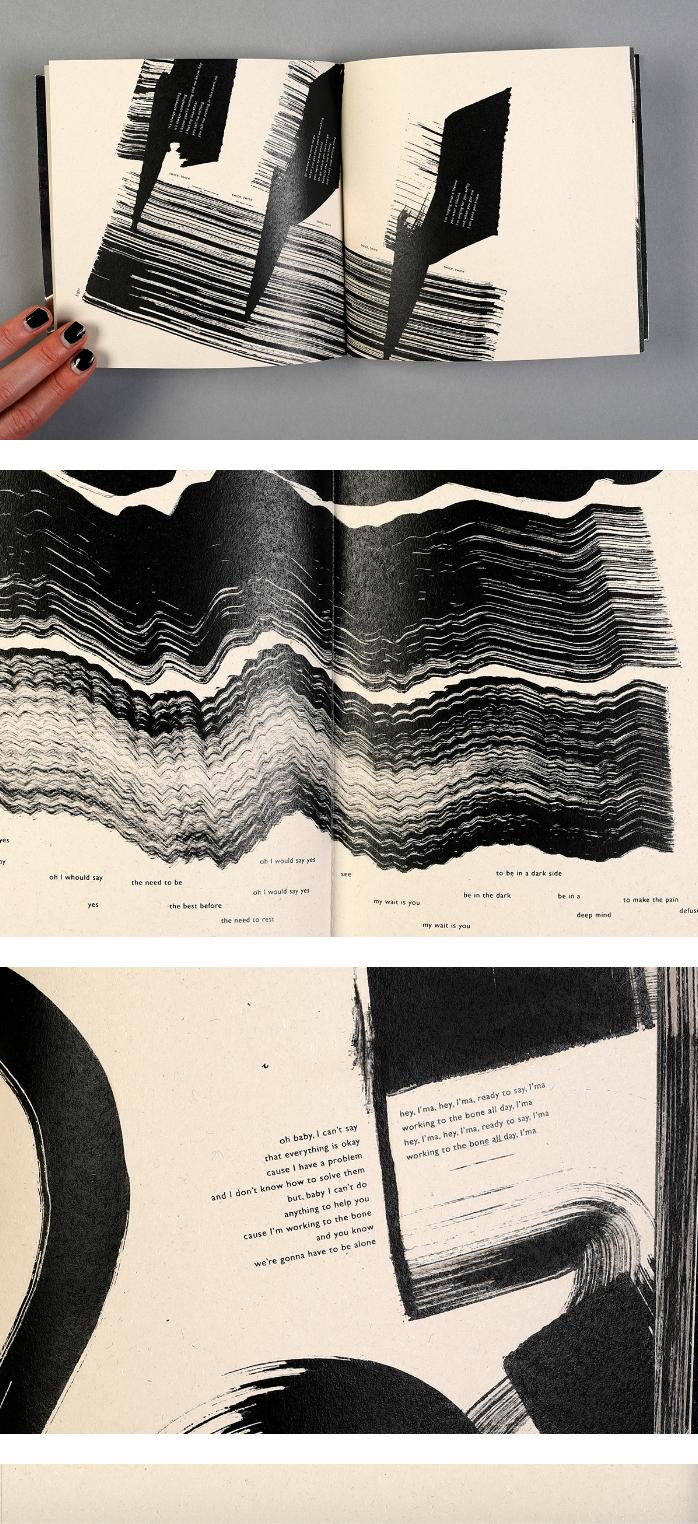
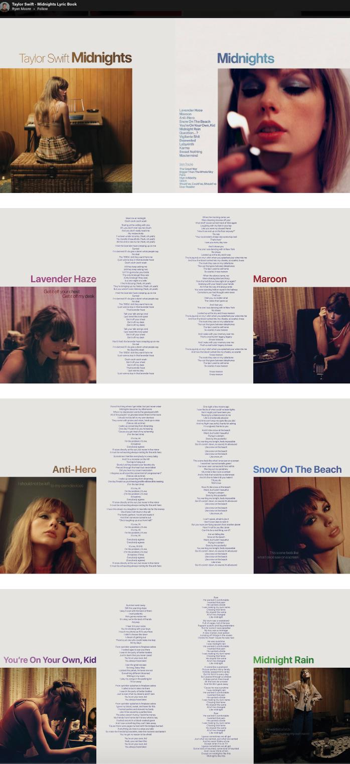
I probably took the most inspiration from this lyric book. I love the simplicity and the alternation between photographs and typography. I thought I could make it work for my concept.
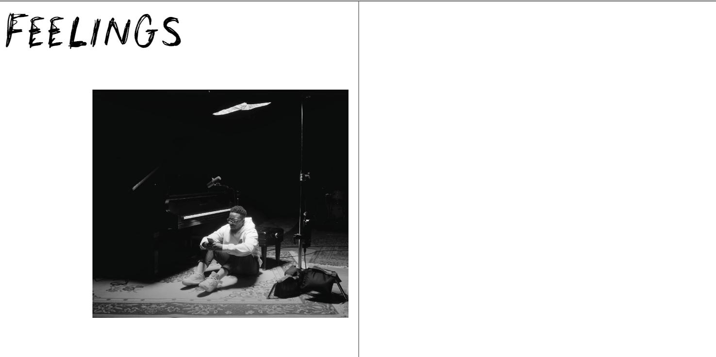
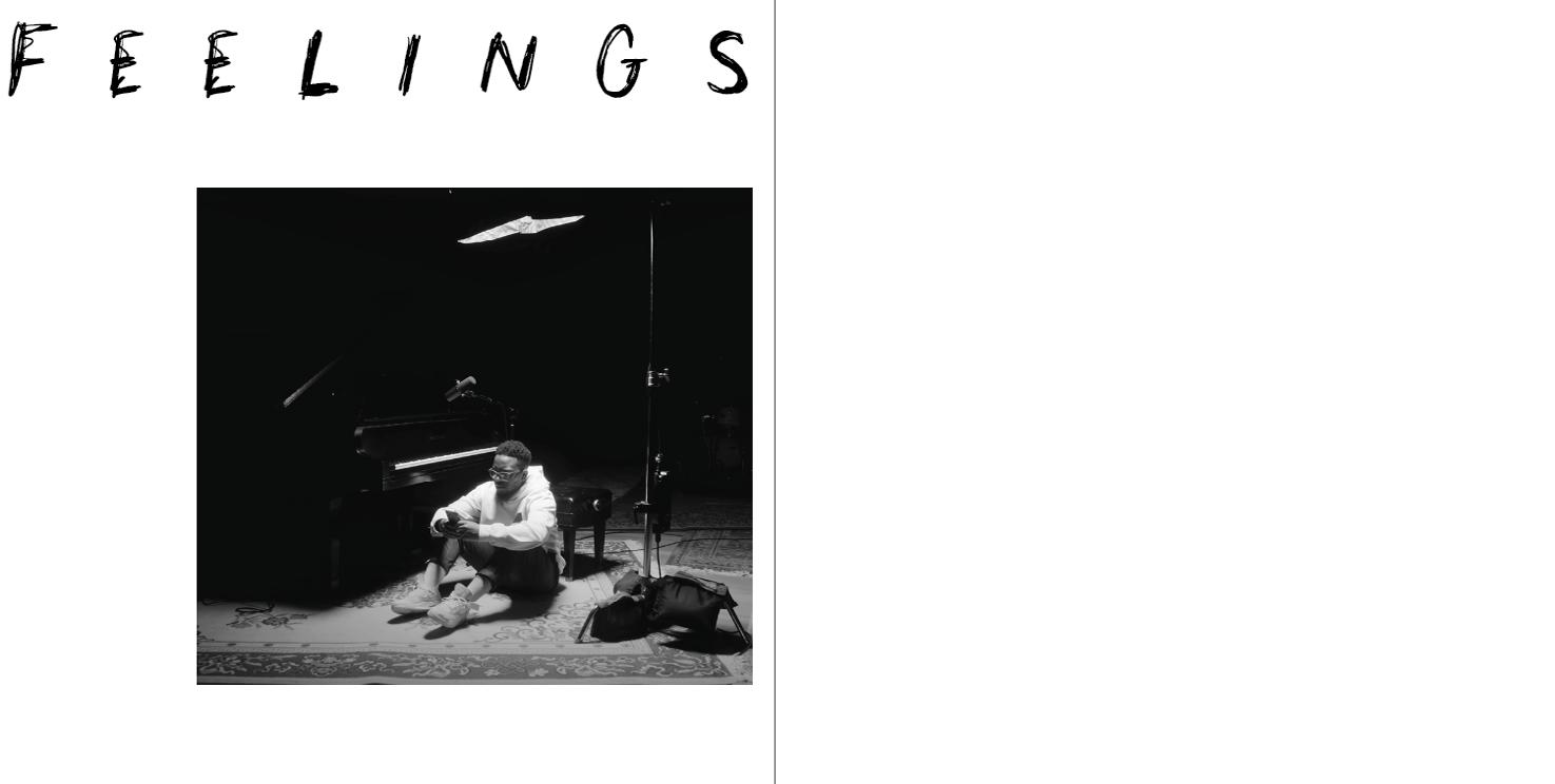
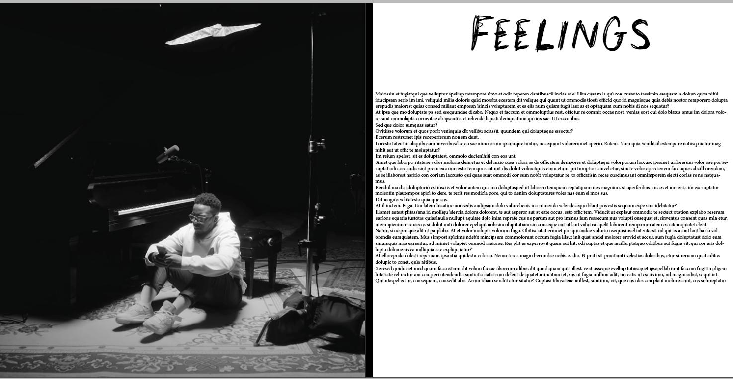
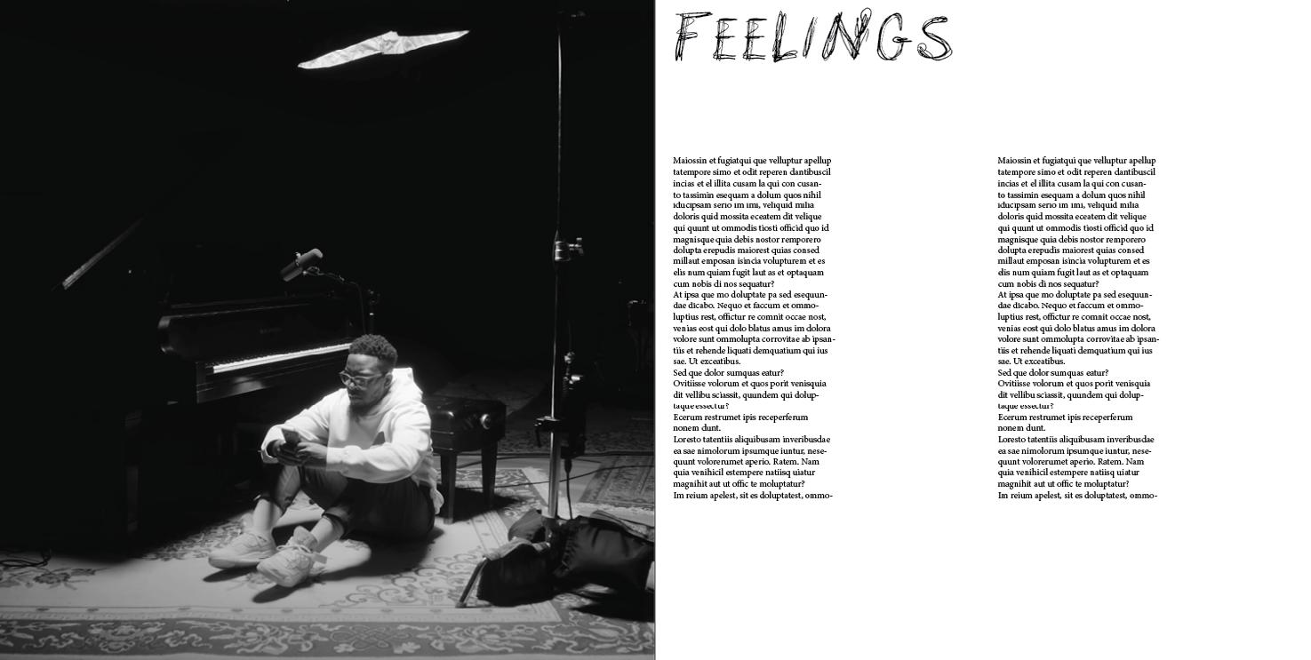
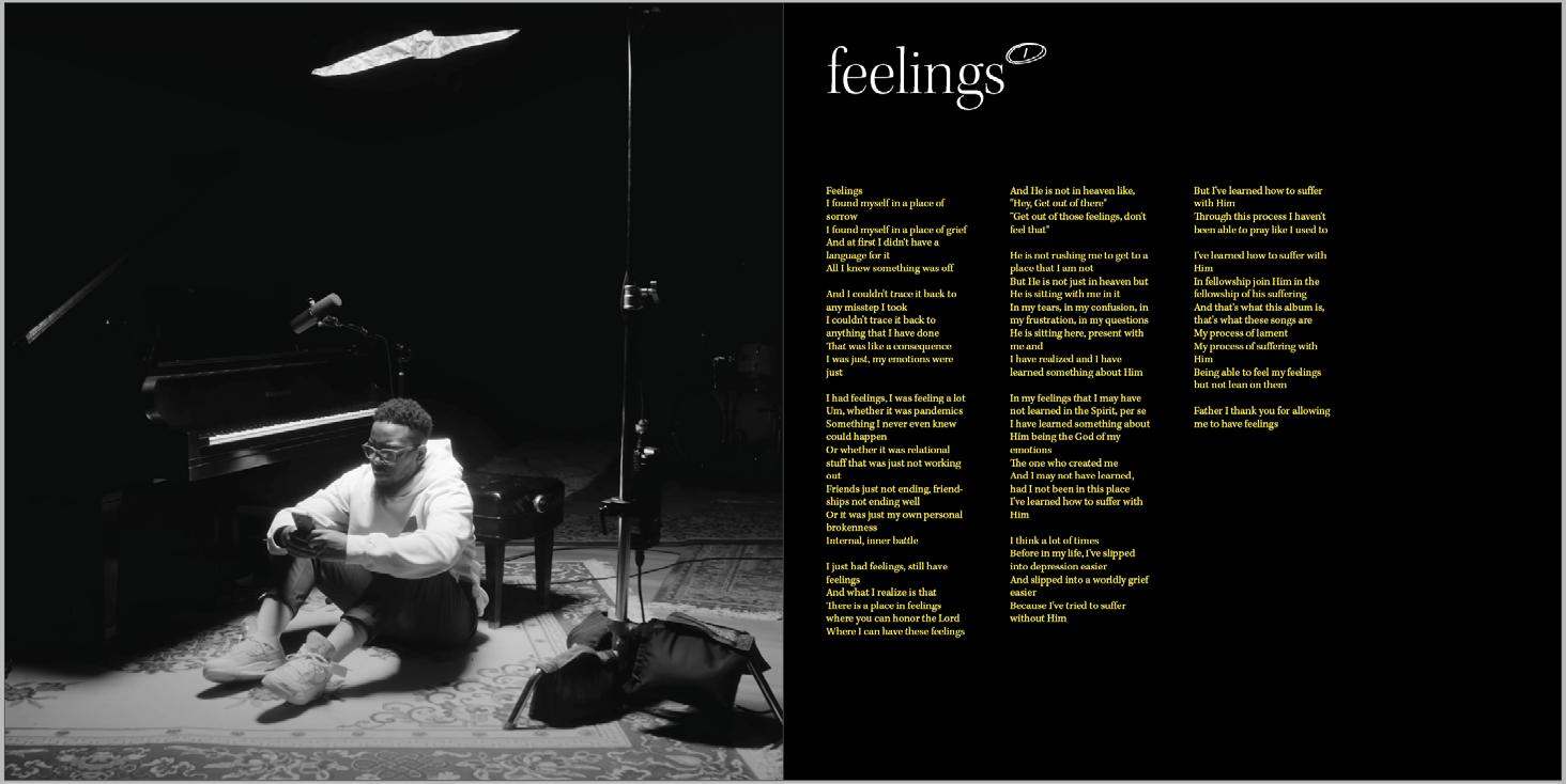
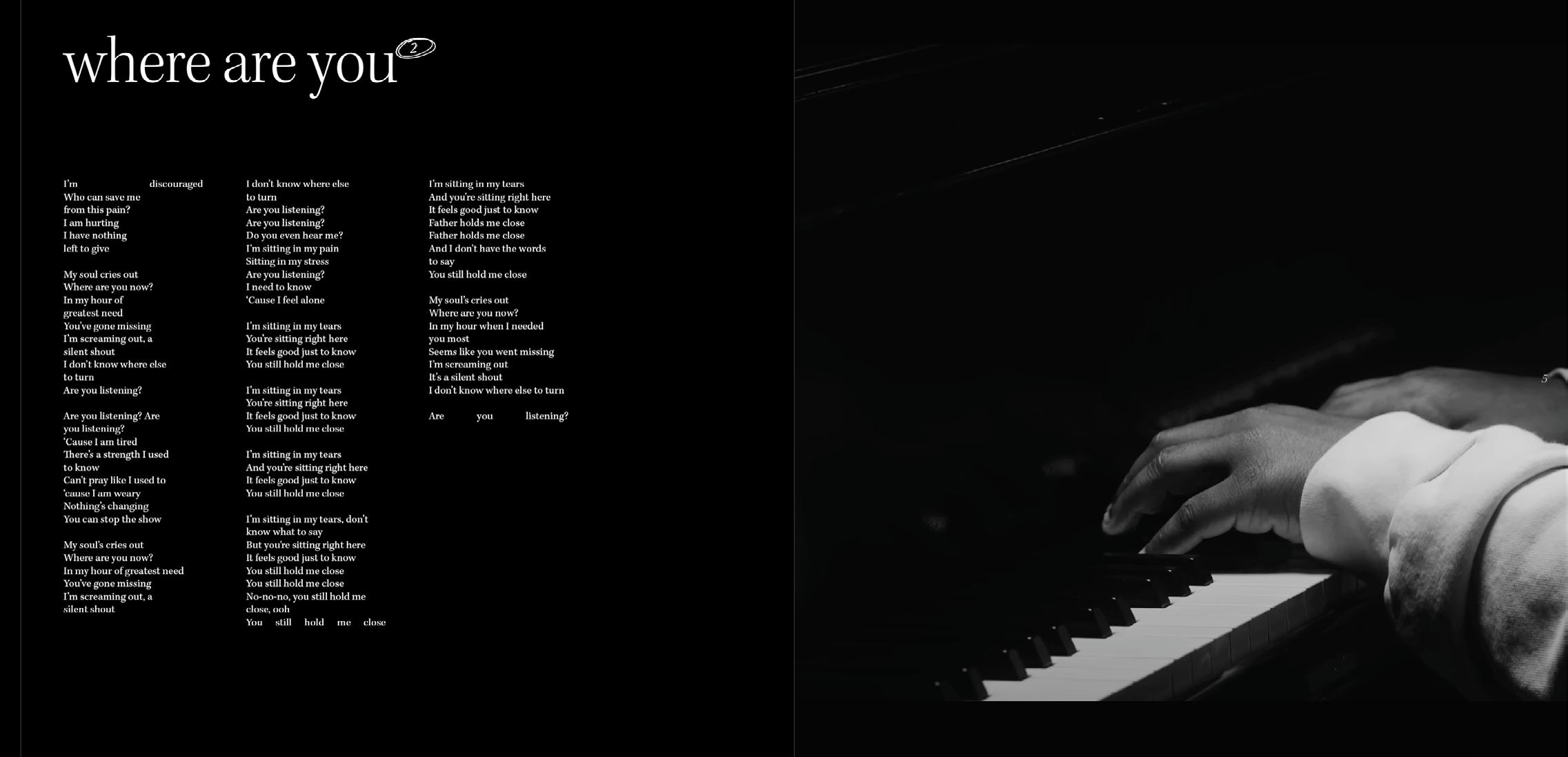
When I first started exploring some layouts in InDesign, I played with typography and tried to evoke the emotion of the album while keeping it simple. I tested different font pairings. Besides having to find a pair that works well, I struggled with the fact that the typography was a slight departure from the album cover. I wasn’t sure if it was going to work or if it was going to evoke the same feeling. So, I made sure to incorporate photography as mentioned before. Once I found the balance between the photography, the layout, and the negative space, I thought that, although the lyric book was slightly different visually, it still felt like it belonged to the album’s visual and artistic direction.
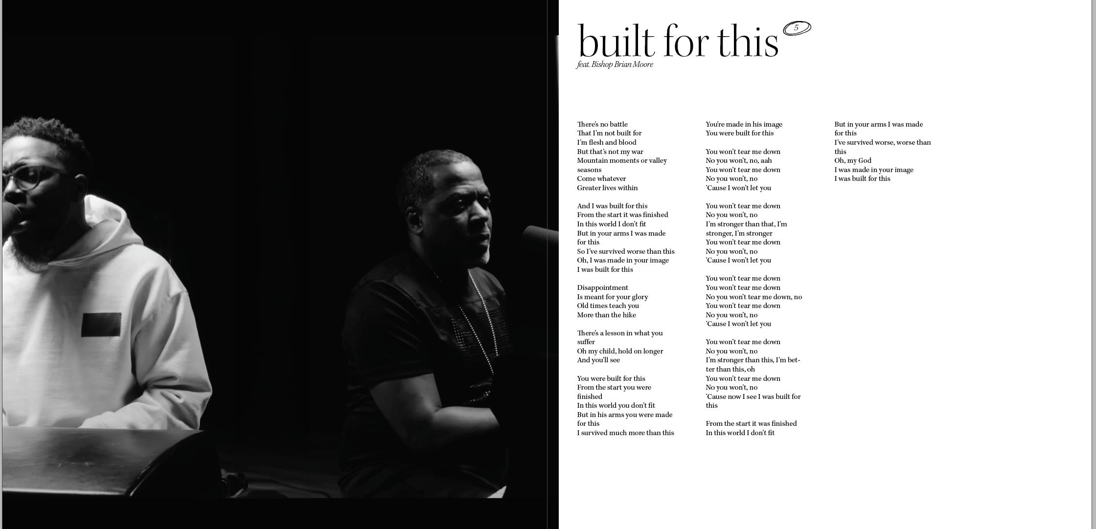
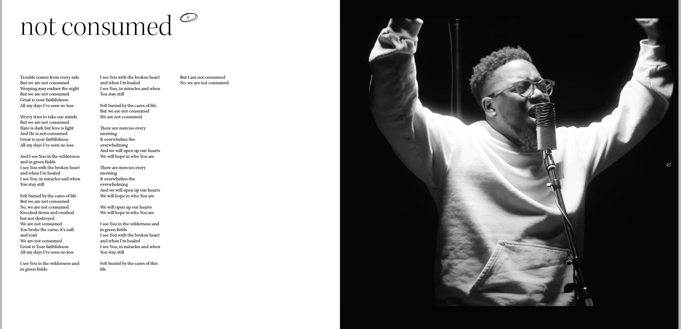
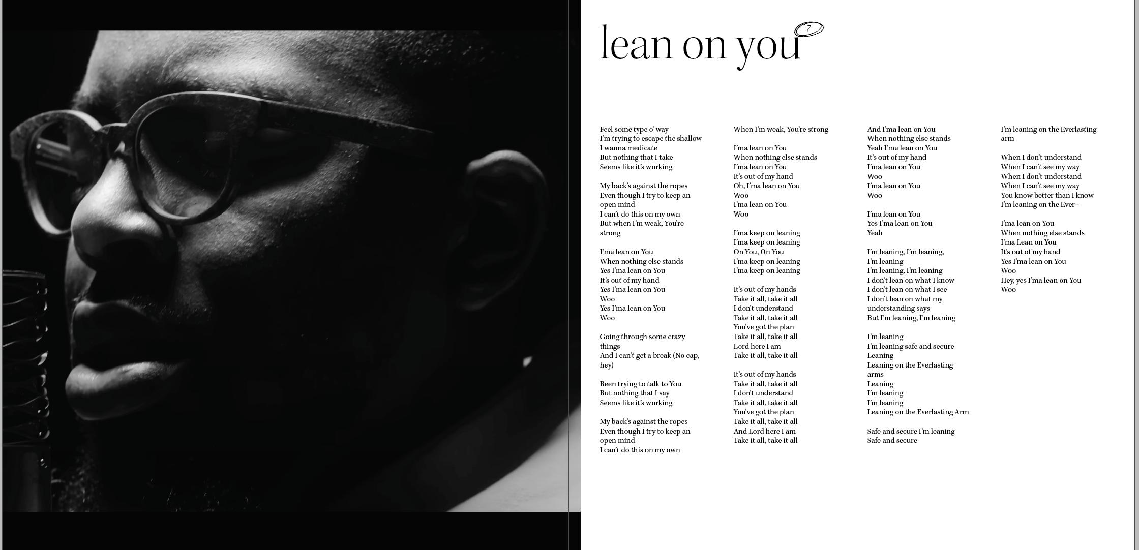
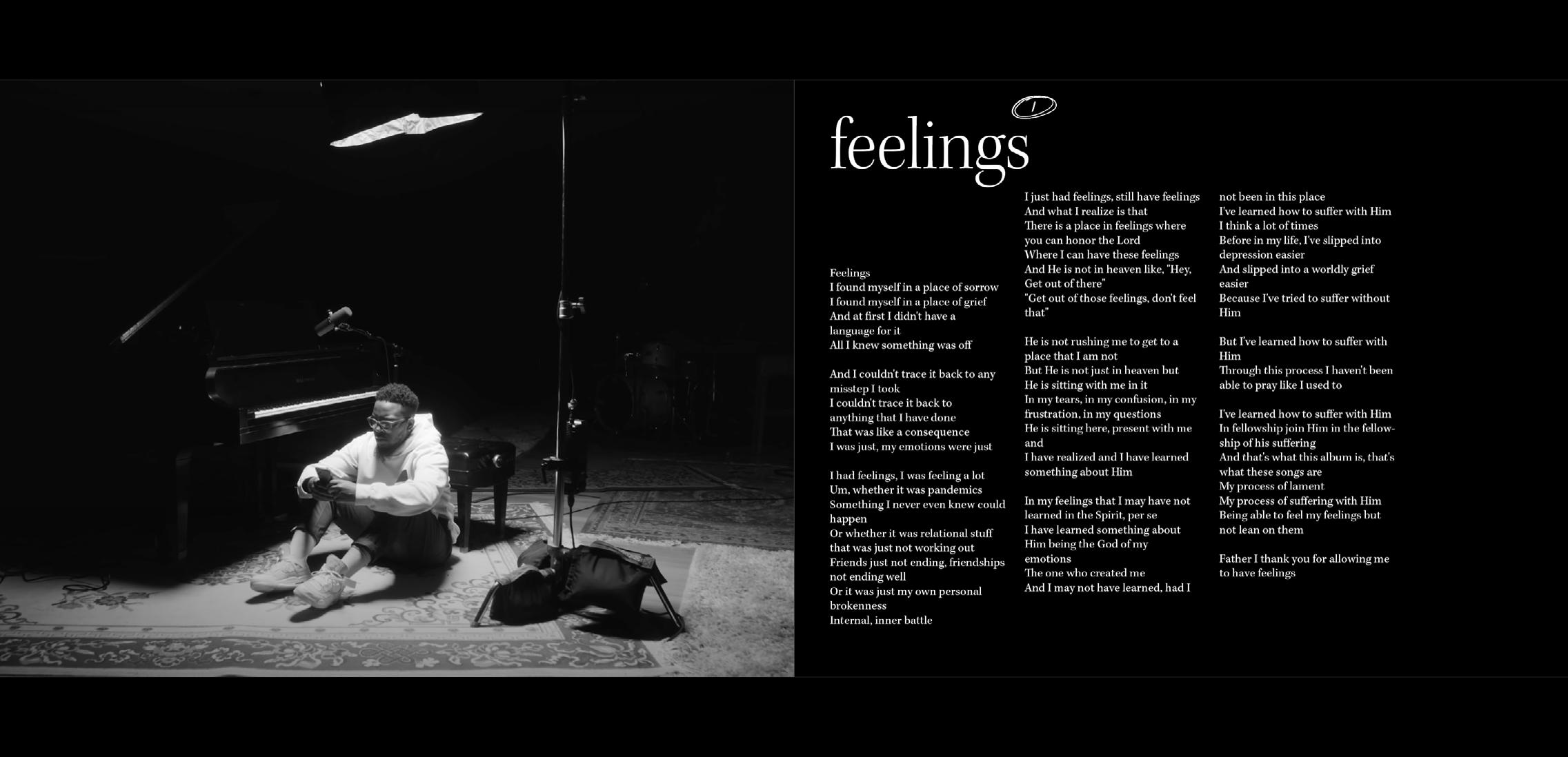
The following are my iterations for spreads of the print version of the lyric book. Many of them have the same imagery because I was focused on the layout, the type, and started changing the photography later on.
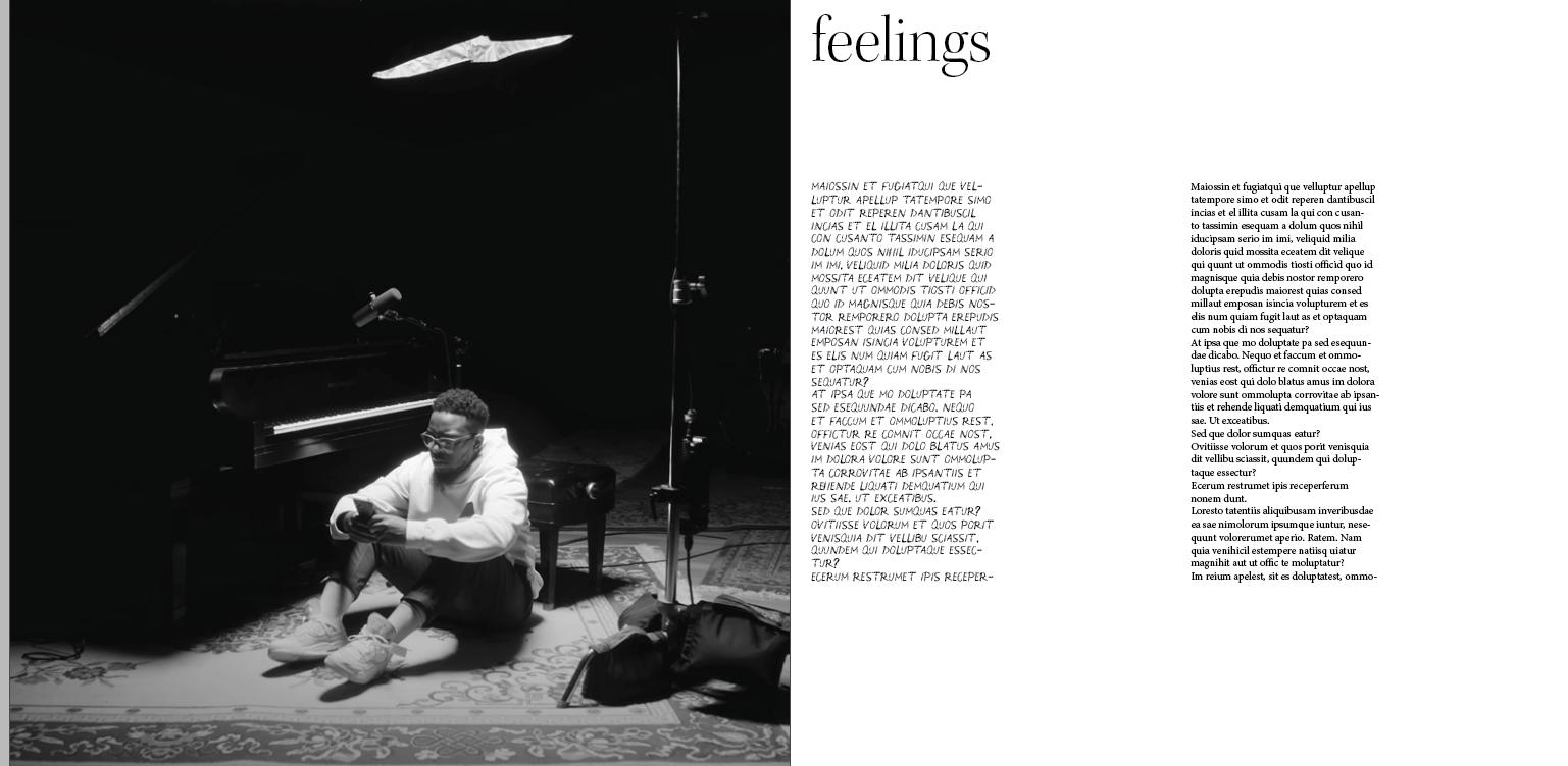
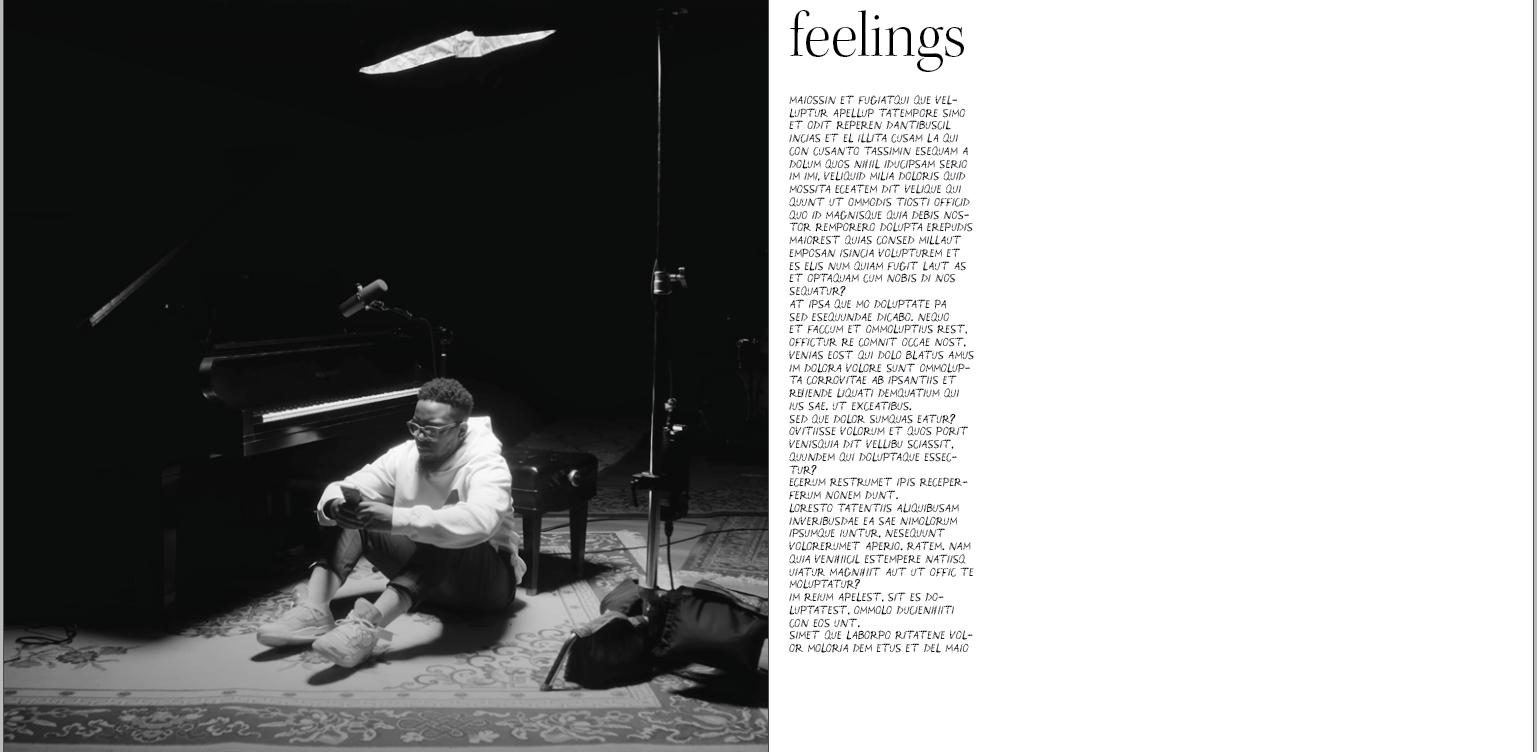
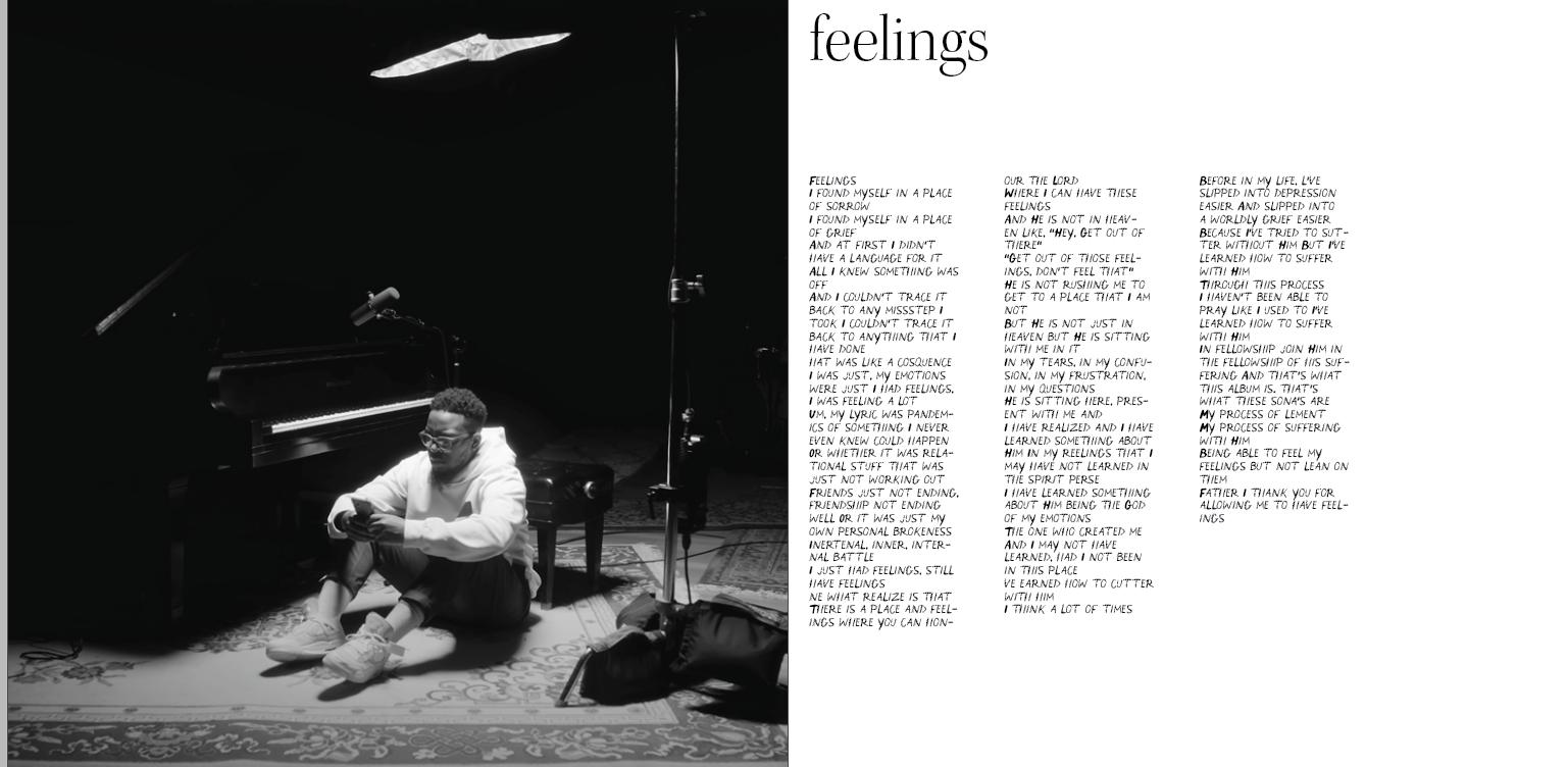
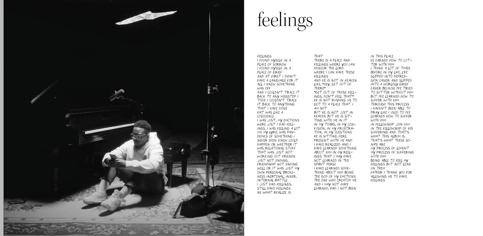

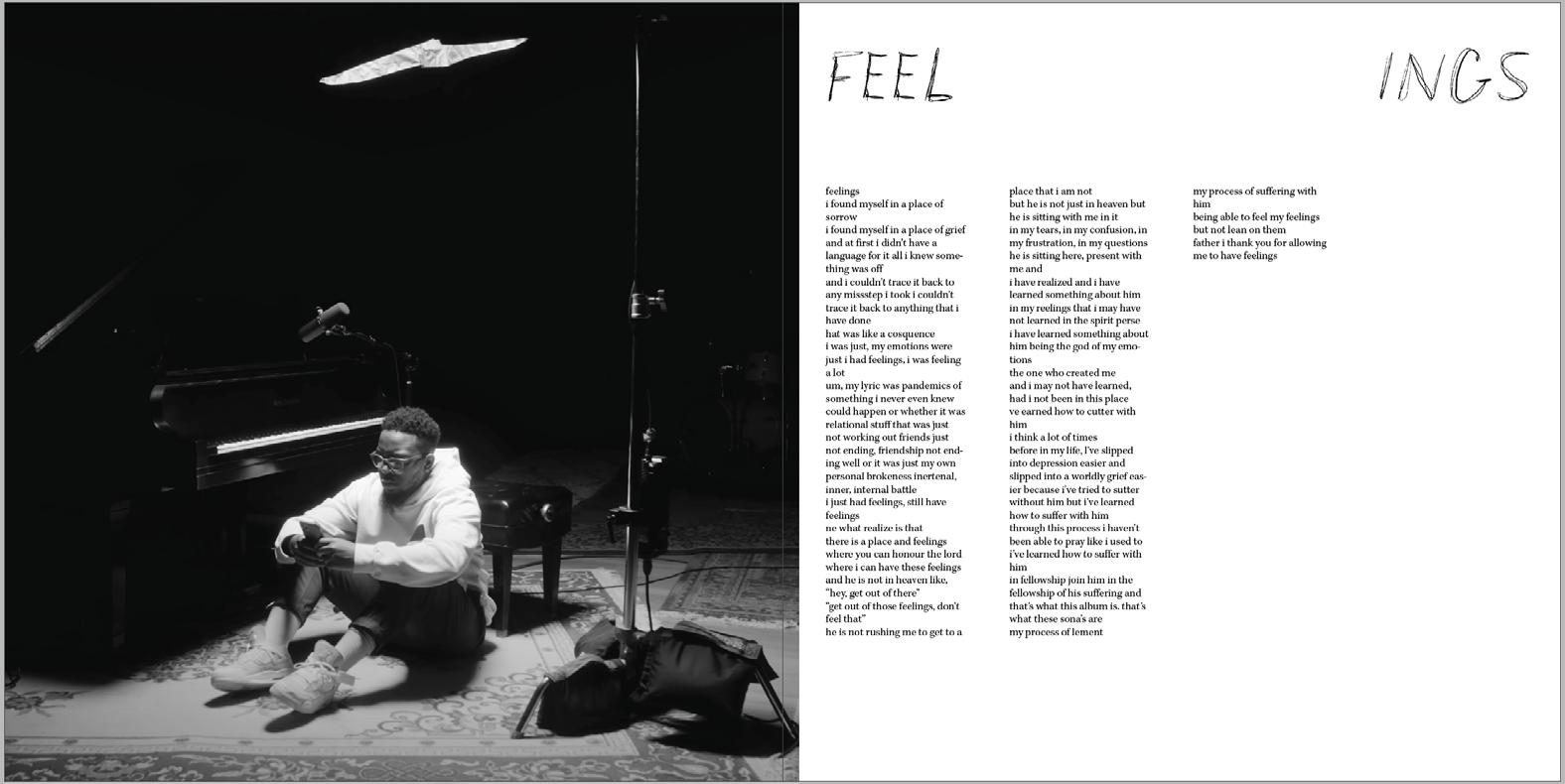
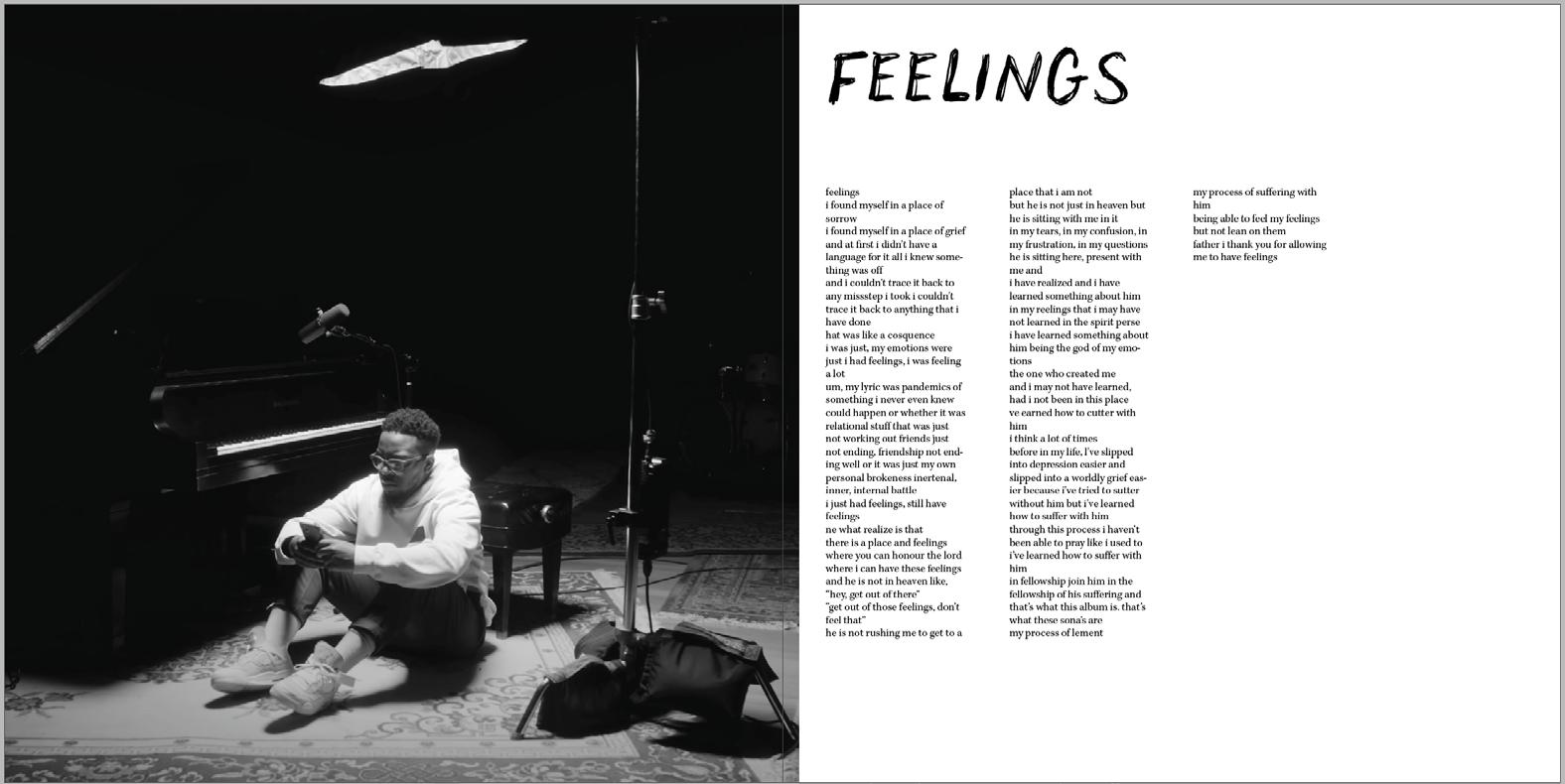
At this point, I started having a strong idea of where I was going with the layout, so I tested it with different lyrics and songs, and I thought it worked pretty well. After feedback and peer review, I decided to change some details that you will see on the following pages.
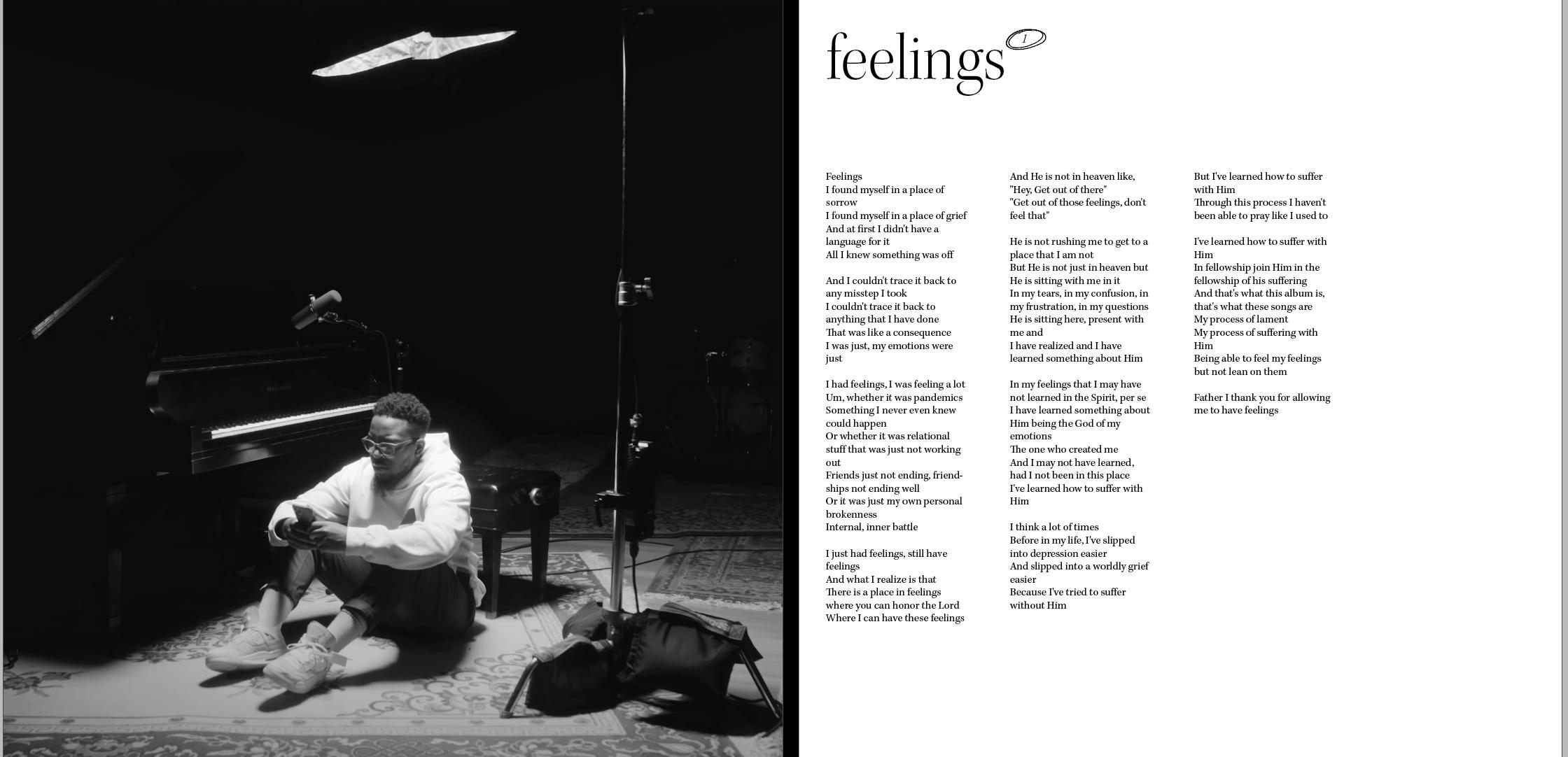
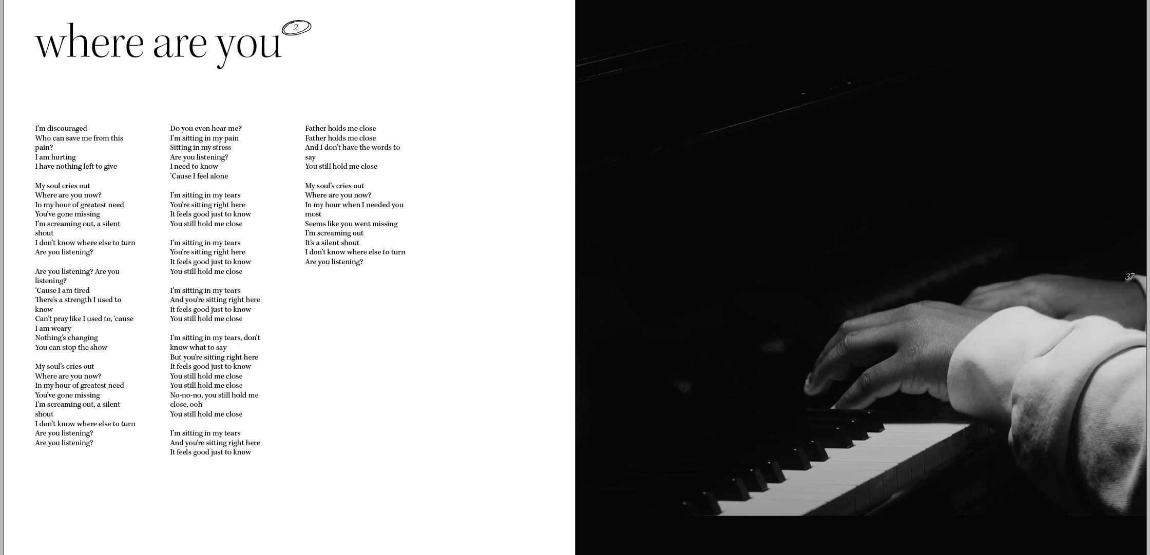
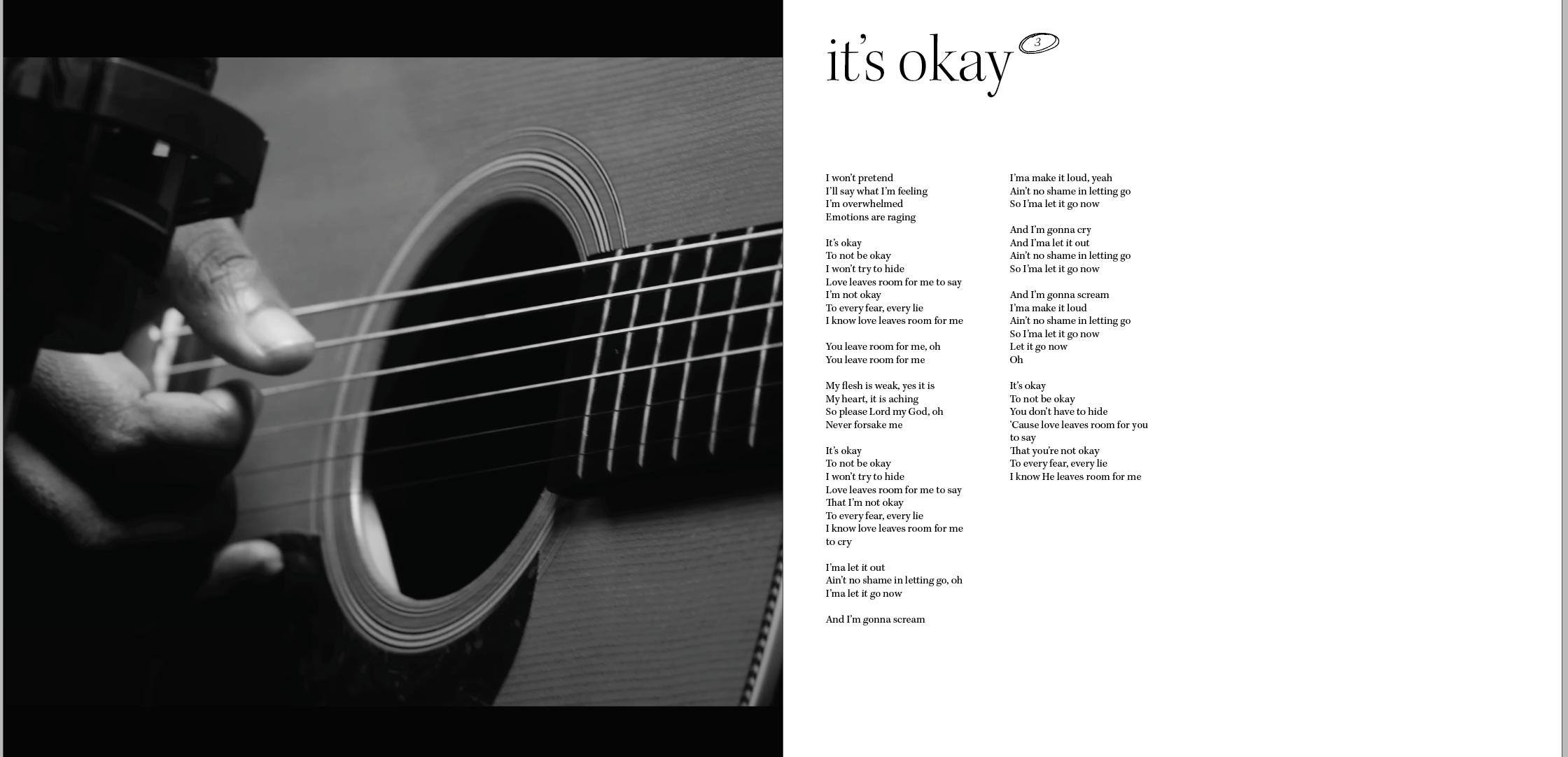
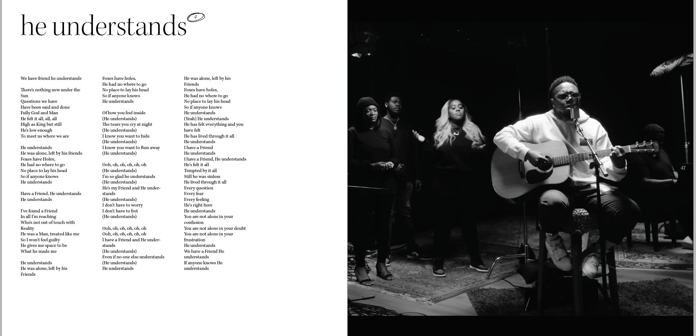
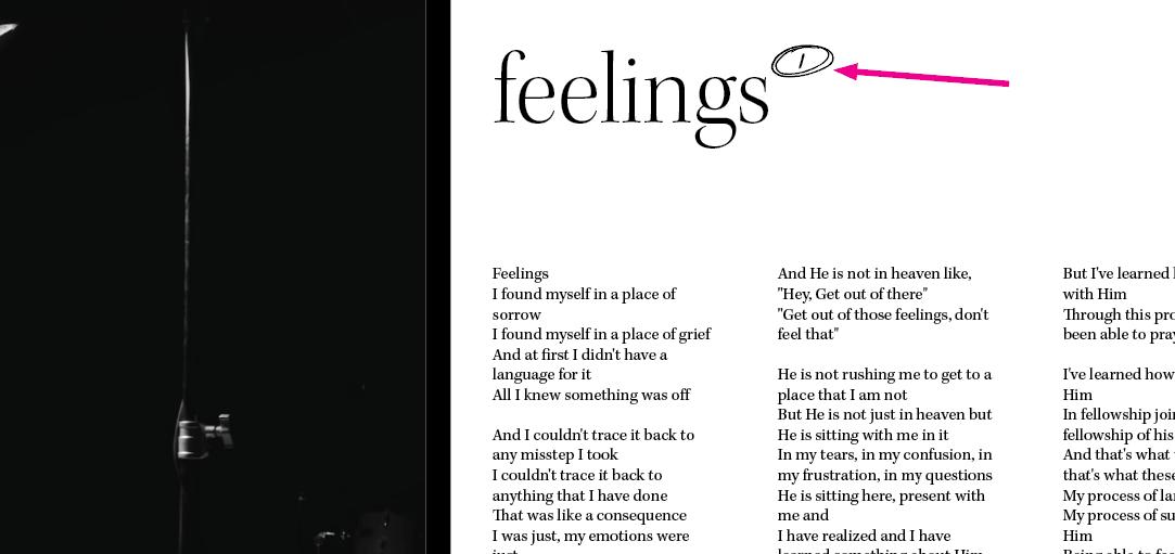
I thought adding this little scribble would help unify this lyric book with the rawness and scratchiness of the album cover. I think it did (see where pink arrow points). Then I worked with details. For instance, the font I used for the number after the songs – the ones in the scribbles. All of them used the same typeface as the one for the title of the track. However, a peer review prompted me to change it to make it look even more raw. So I did!
Then I wanted to try to unify even more with the album cover by using the same color, yellow. But I didn’t think it would work as well, so I stopped. I wanted to explore more options, but I didn’t have more time. However, I felt something was satisfying with the current layout. So I decided to change it from black on white to white text on a black background. It felt more connected. You will be able to see it on page 44.
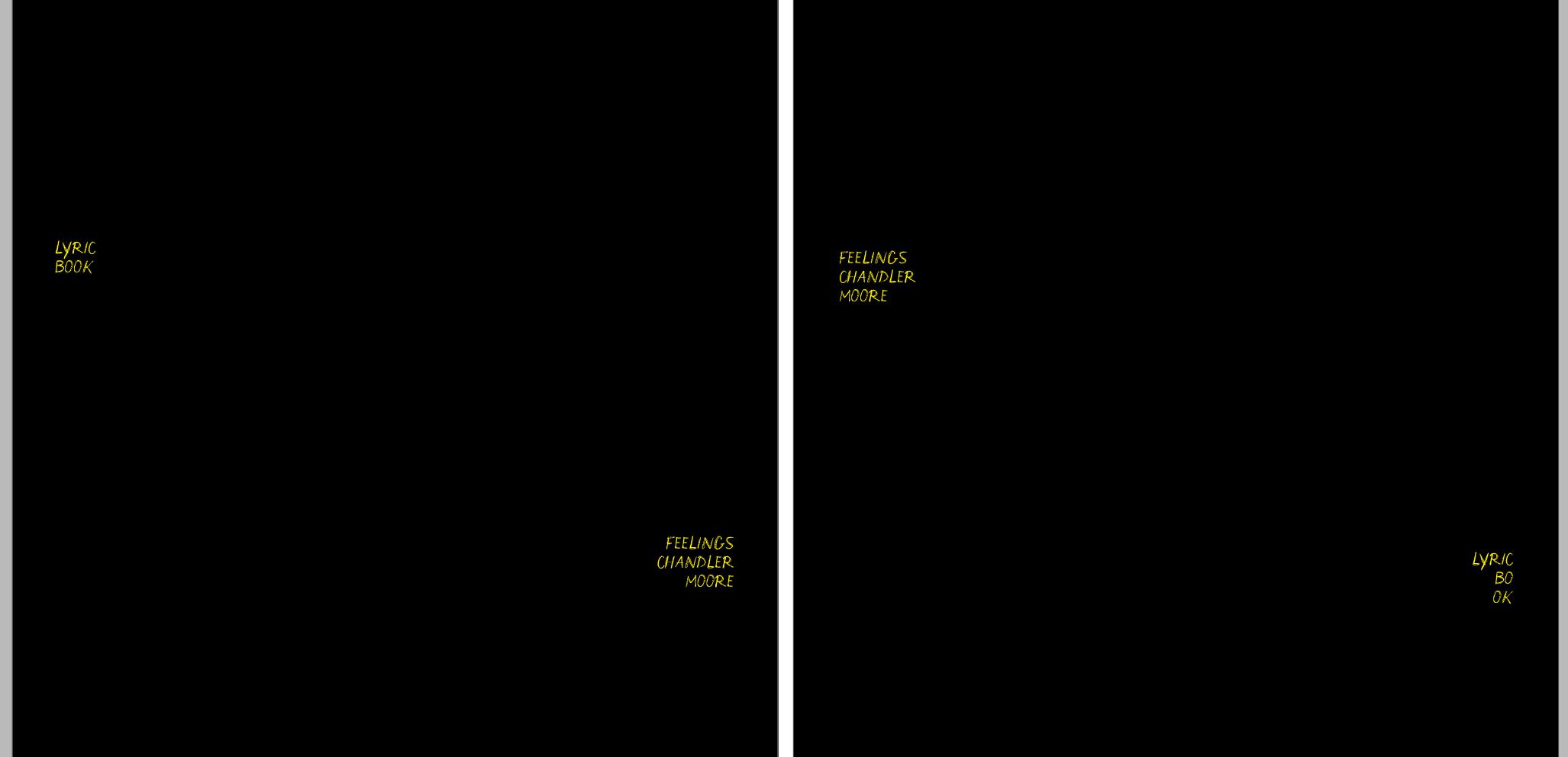
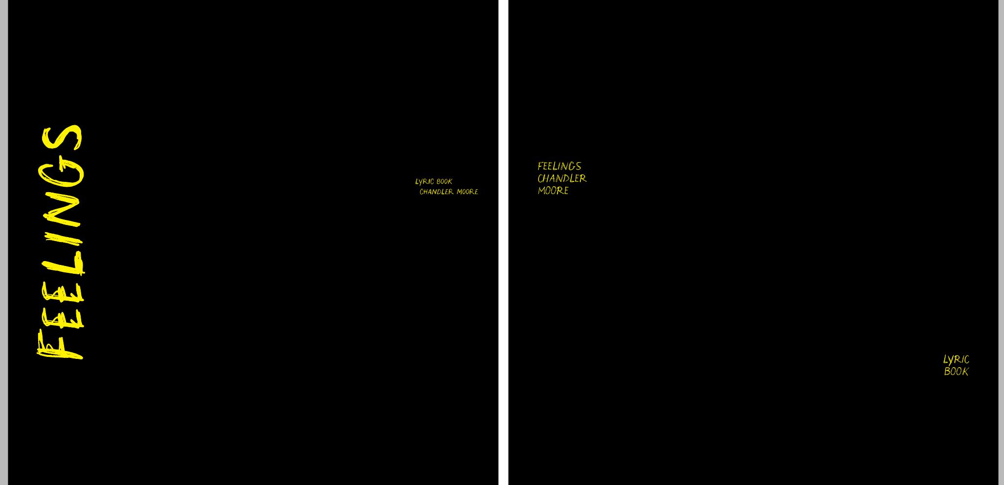
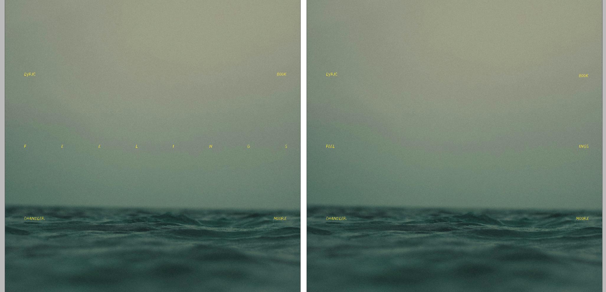
In the meantime, I started working on the lyric book cover. I deemed it important to keep it simple because the lyric book is supposed to be inside the vinyl cover (that is already heavily designed). So, I decided to keep the background neutral (black) and tried to use the same language with a lot of text around the main title, but I thought it was too distracting and complex for the purpose of the book. So, I decided to play around with my grid system but ended up choosing the very same typography as in the album cover, but in a much more simple way, as you will be able to see on page 44

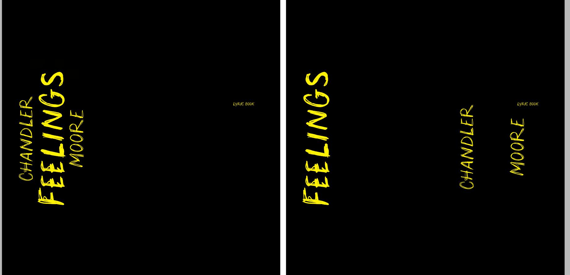
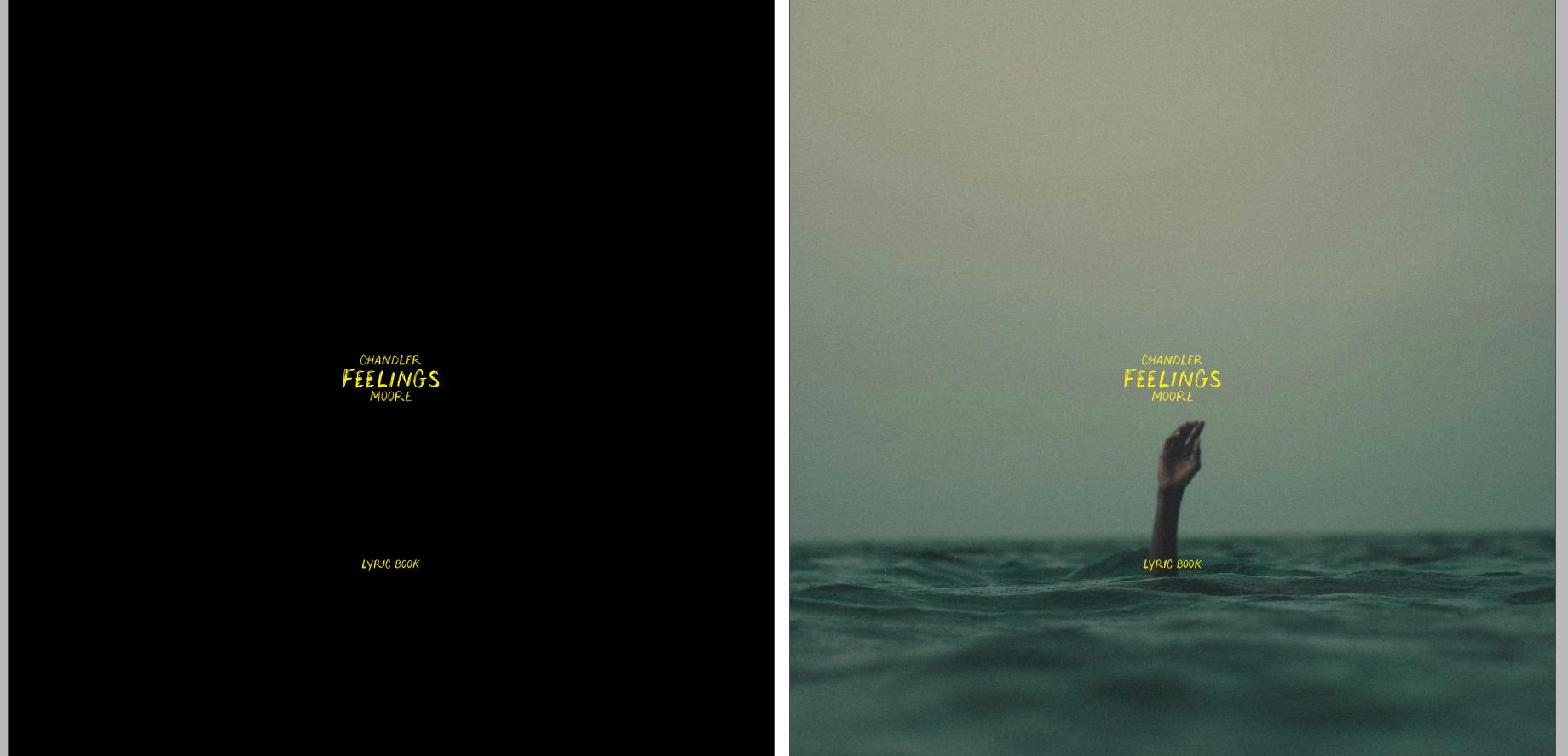
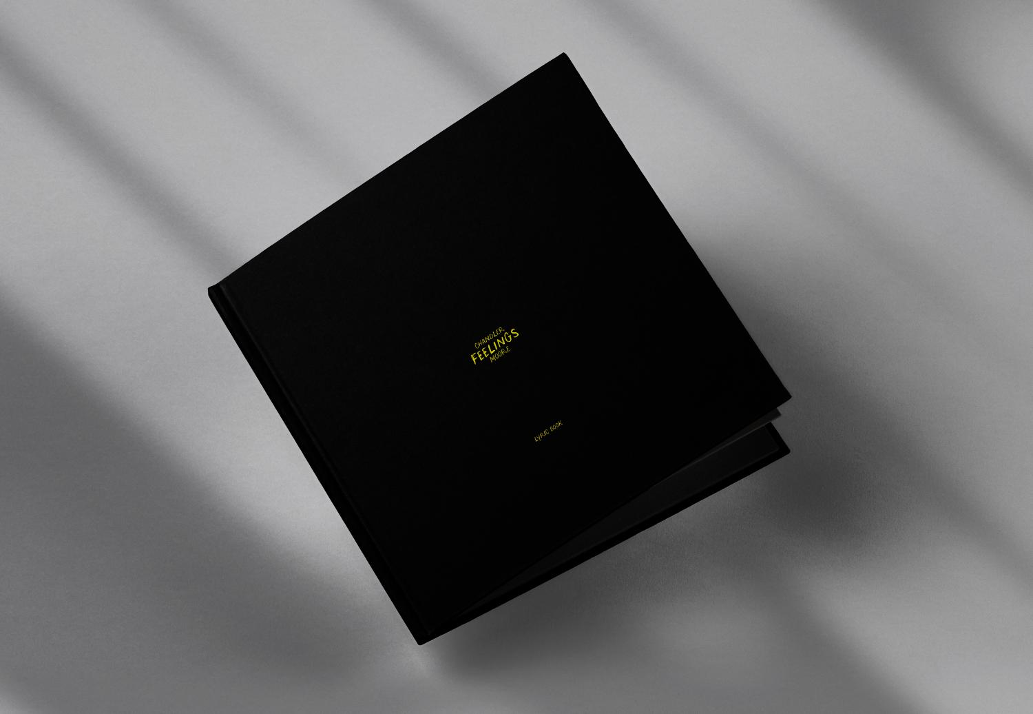
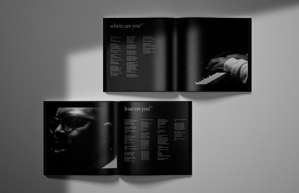
Working with a modular grid and a baseline was something I had to learn, and it was satisfying to create a solid layout, weaving simplicity with efficiency. Because I thought the experience of the lyric book would be better on its own, rather than within the process document, I invite you to click here or on the button to access the lyric book and flip through it.
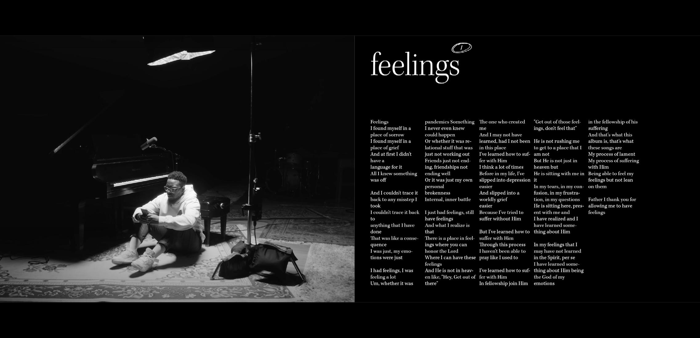
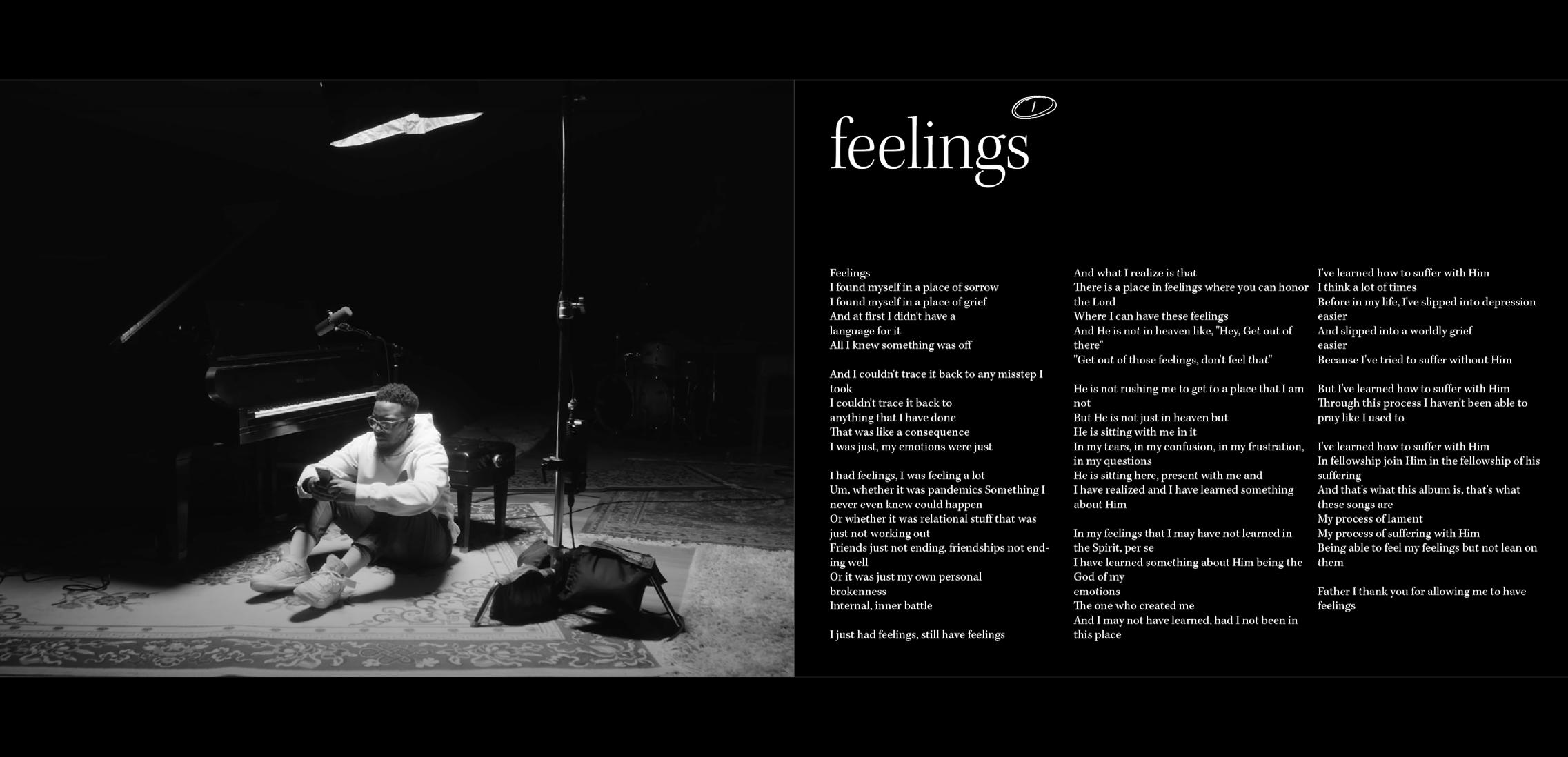
After completing the print version of the lyric book, I had to work on converting the grid to work on a mobile display, such as an iPad Pro of 10.5 inches. Apart from the difficulty I experienced in converting the layout from the printed version to the digital one, I faced the challenge of making sure that the digital version remained faithful to the printed one. I explored different layouts to enhance the digital experience while keeping it within the established art direction. This is what these spreads are about.

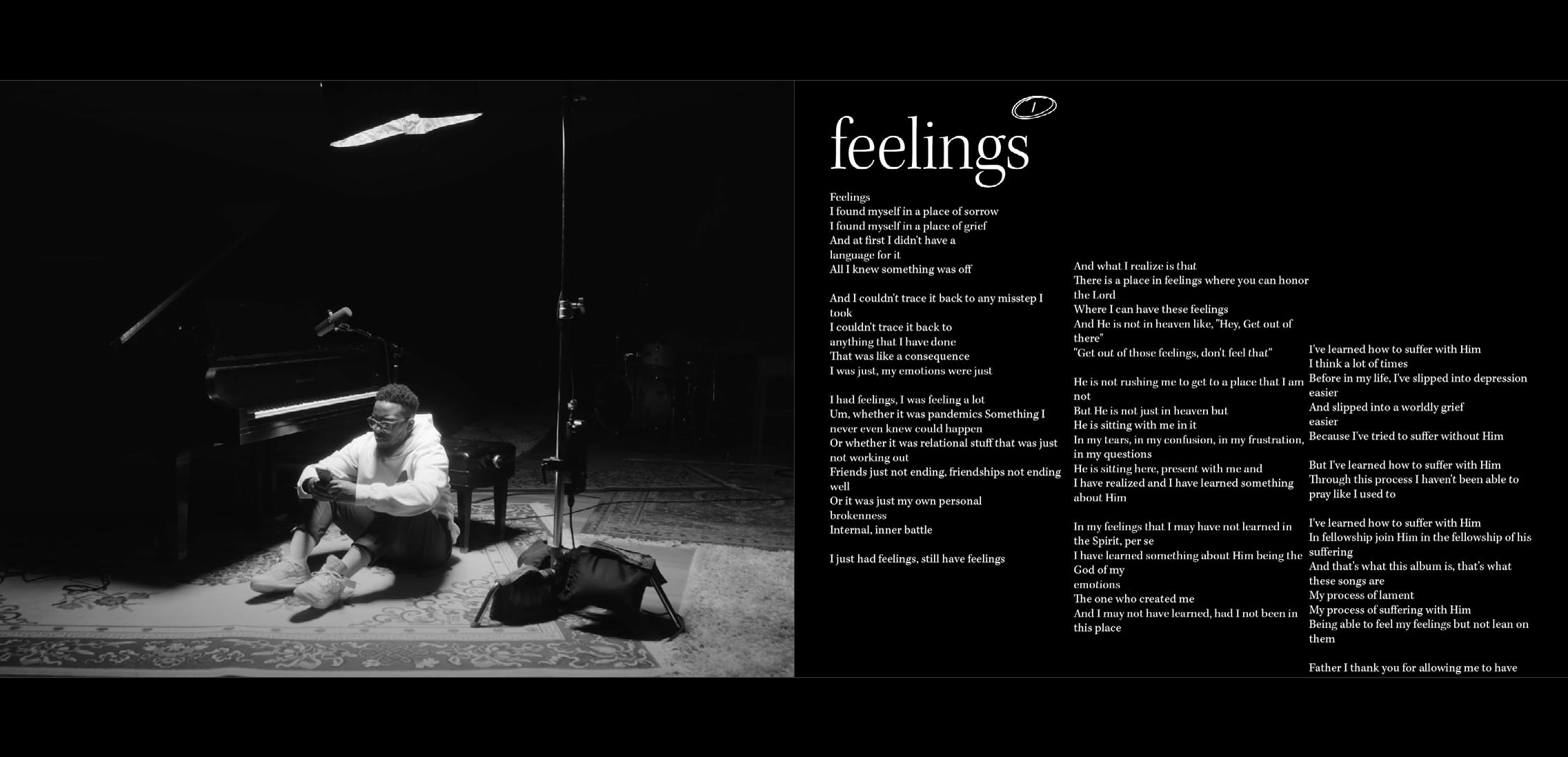
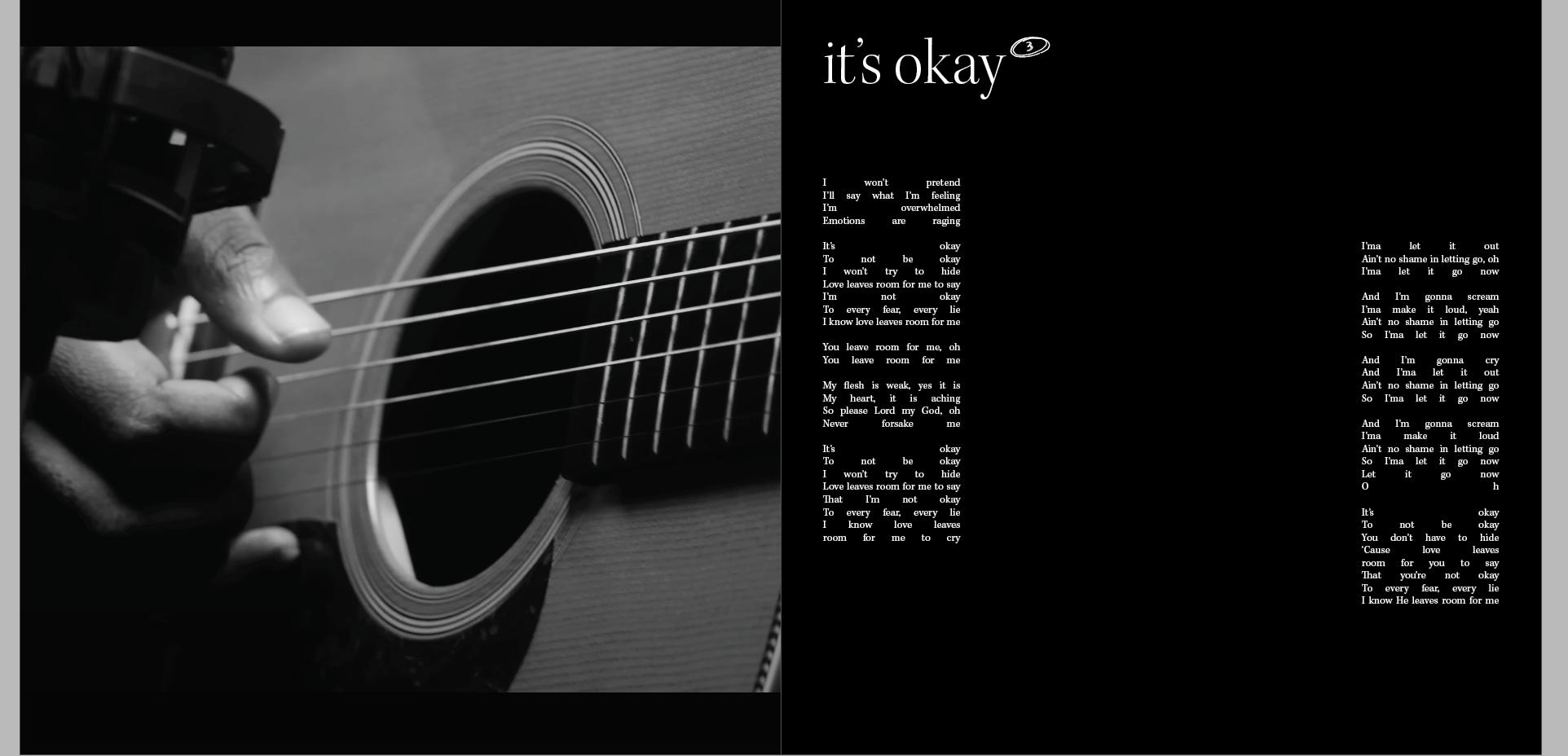

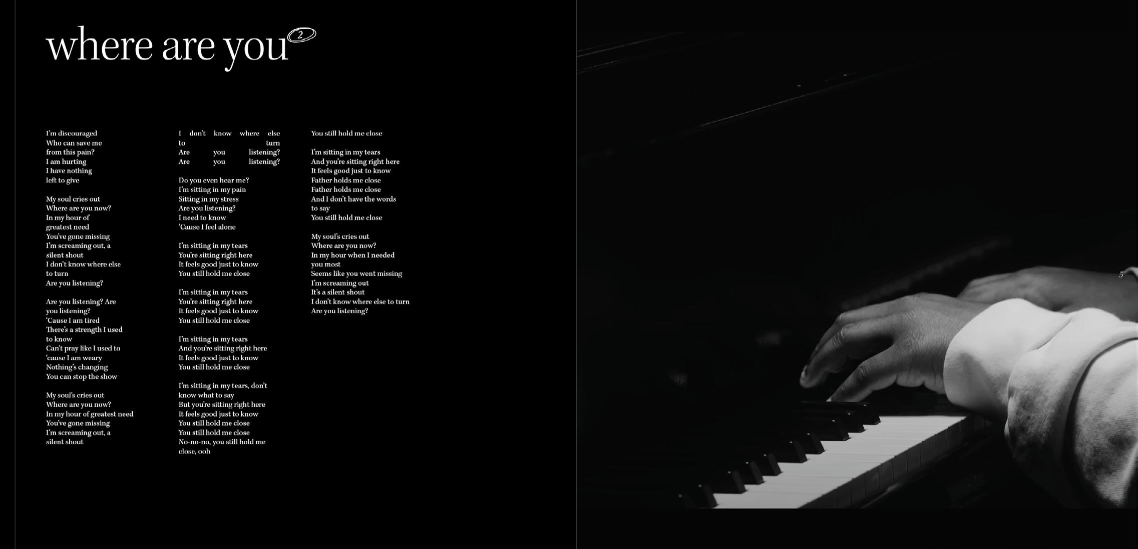
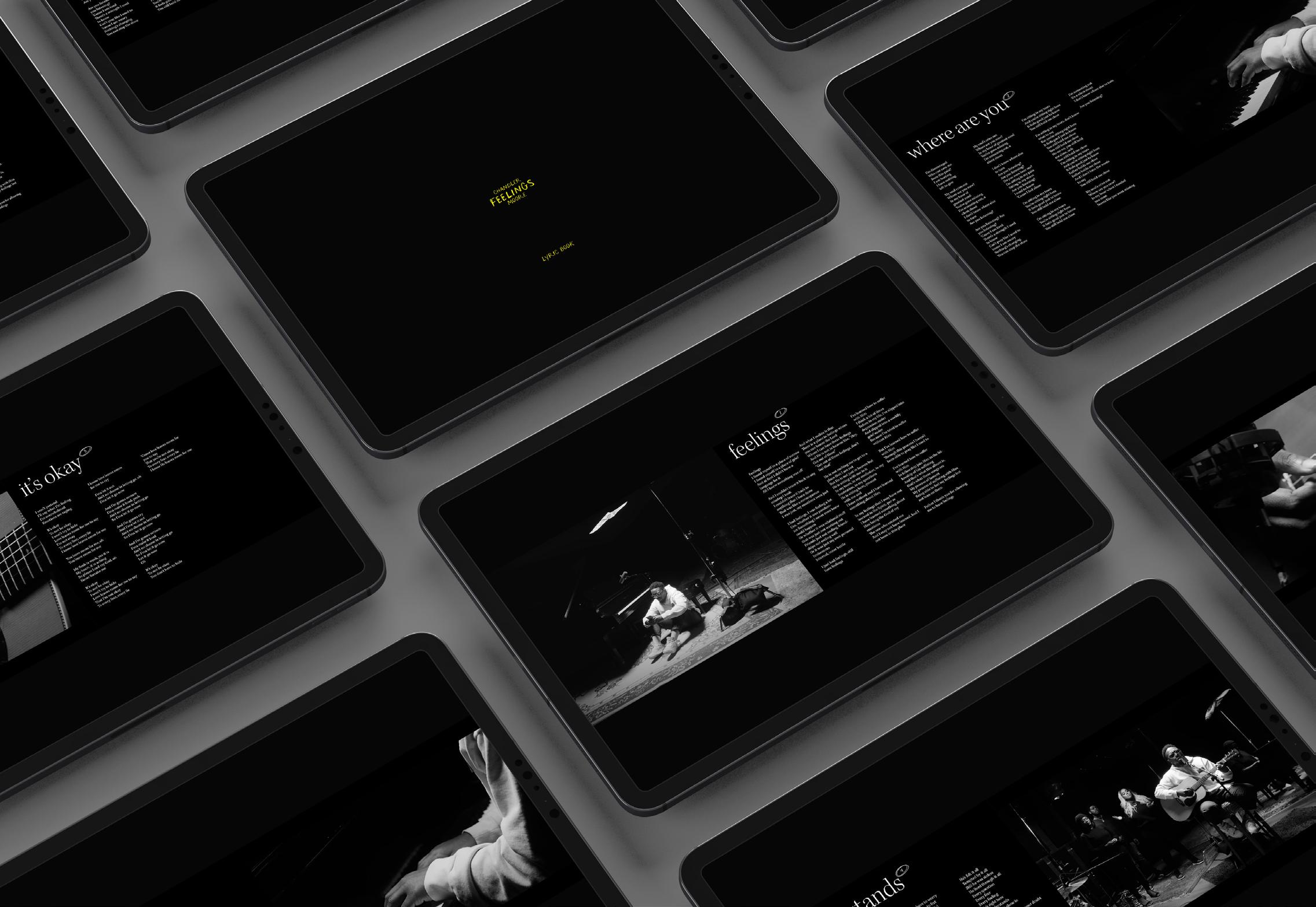
I completed both the digital and the printed version of the lyric book, and I am satisfied with it. I would have liked to have a bit more time to adjust even more details. But one thing that I am learning is to be able to make design decisions in an appropriate amount of time and not over-think things, as suggested by Joe Ling, Creative Director at Koto Studio in the Brand New Podcast I was listening to.