Project Movie Poster
For this project, I had to watch a movie and design a film poster that visually communicates an essential aspect of the film’s narrative in a manner that surprises, delights and engages the viewer; challenges the conventions of the movie poster genre while avoid clichés imagery and representations; and creatively and skilfully addresses formal qualities such as composition, typography, imagery, and materiality.
I had three options for the film: Women talking, Everything Everywhere All At Once, and Blood Quantum. I chose the first one.
At this stage, I was gathering information about the two movies I favored (EEAAO and Women Talking), with the intent of identifying interesting patterns that I could use to brainstorm ideas for creating movie posters.
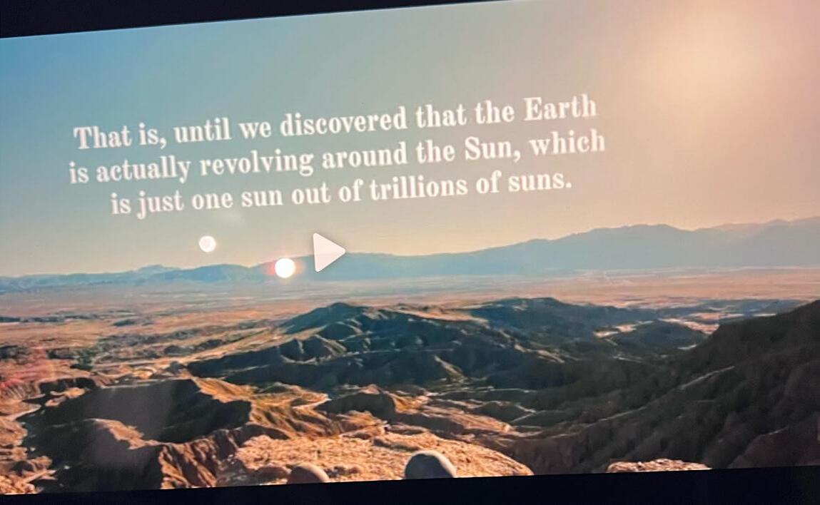
These are several screenshots I captured from the movie “Everything Everywhere All At Once” while I was in the process of deciding which movie I would create a poster for. I selected stills that encapsulated the essence of the movie or contained visually inspiring elements, intending to use them as references in my design work.
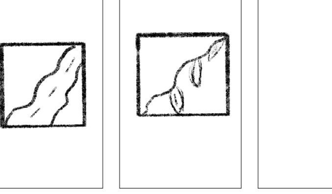
I then started sketching things I felt could encapsulate themes of the movie well.
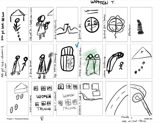
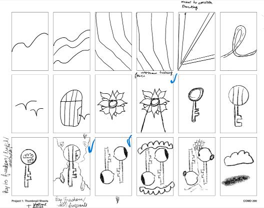
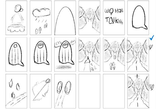
I eventually made the choice to further develop and refine a selected few of these thumbnails (those marked with blue checks) for the project.
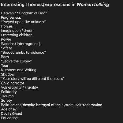
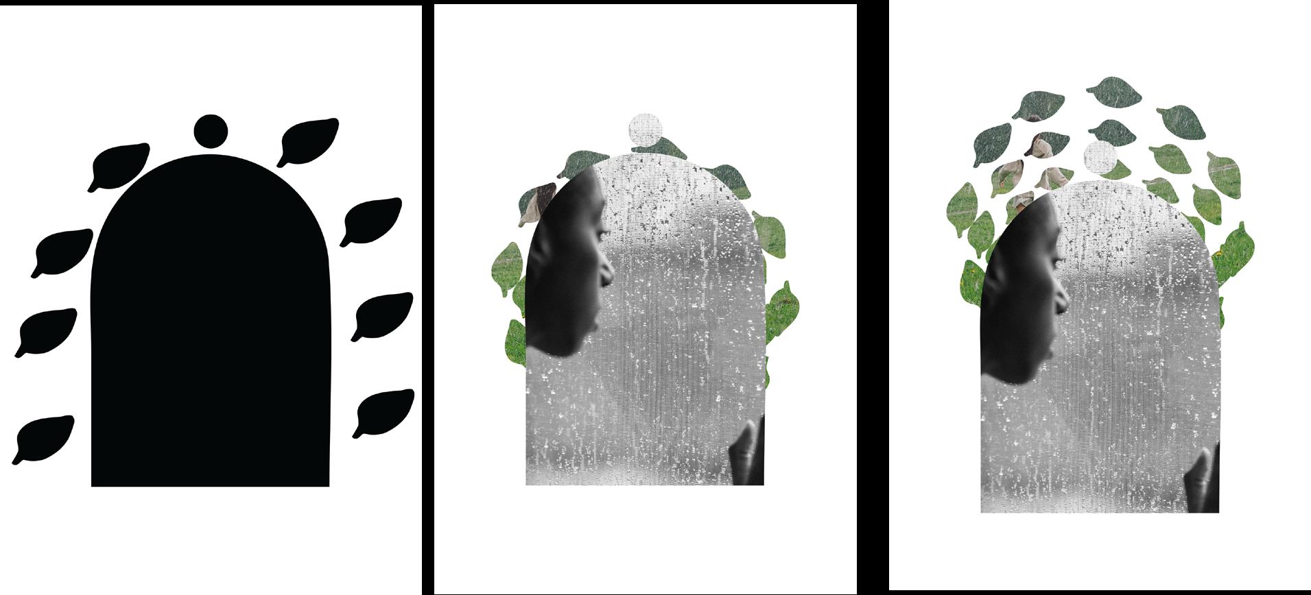
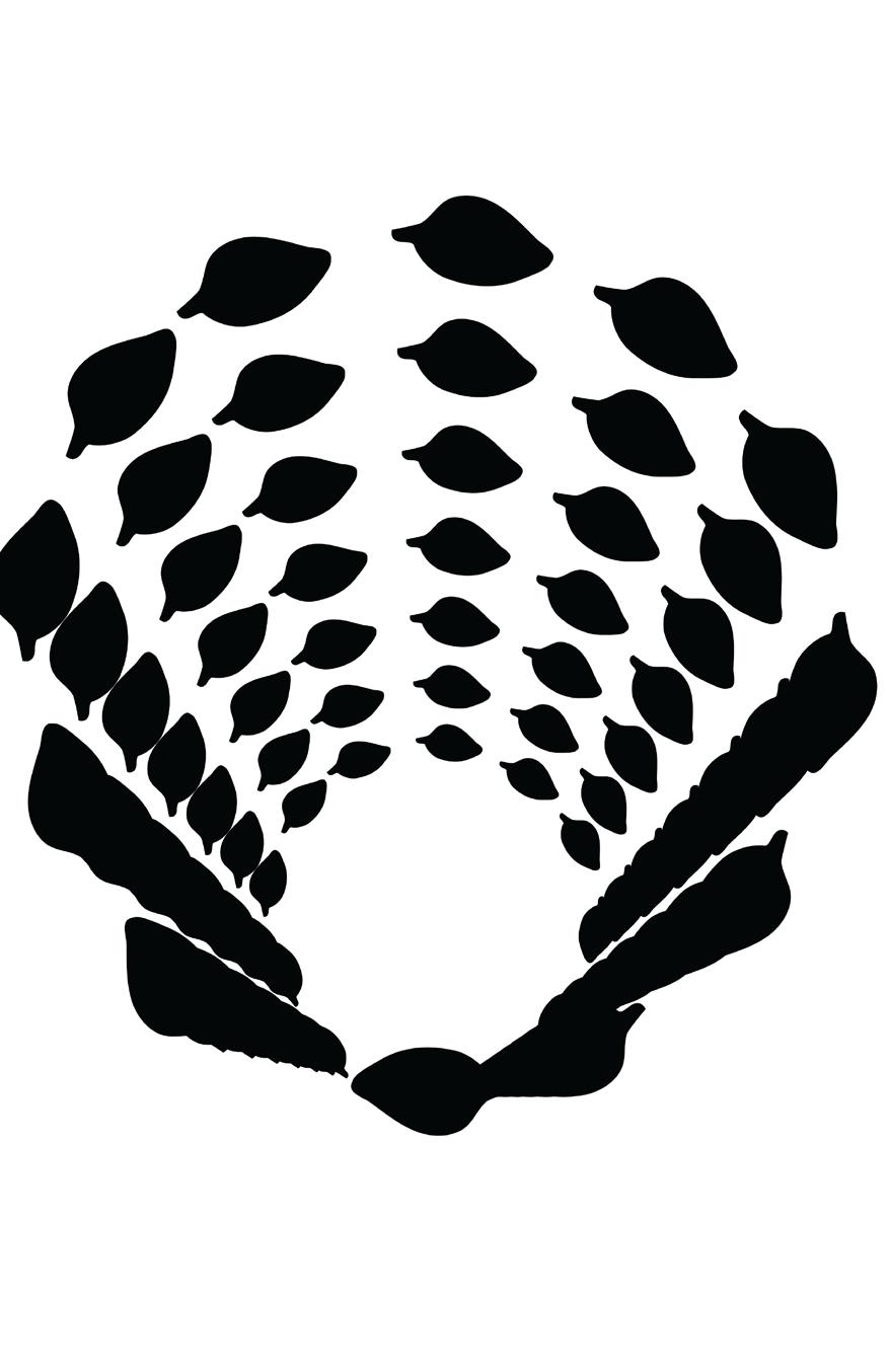
After researching dozens of books in the library and scanning hundreds of pages, I developed three moodboards for my three primary concepts. For this initial concept, the moodboard delved into considerations of color schemes, textures, and compositions. I encountered challenges while working on this concept, as I initially struggled to find ideas for it. However, the intention was to convey a sense of imprisonment, and I wanted to incorporate elements like leaves, symbolizing growth and healing, akin to a crown.
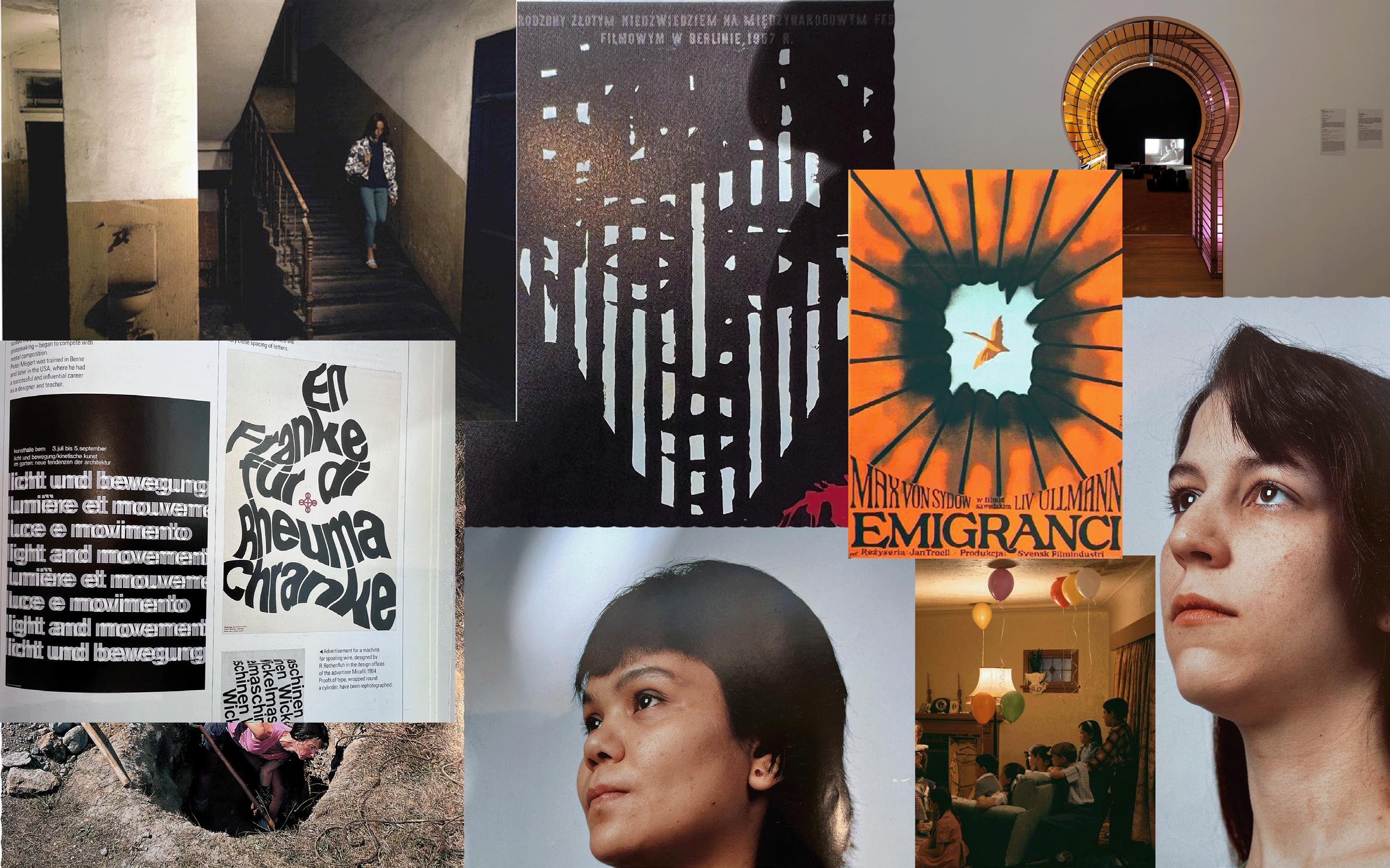
Here’s my moodboard for the second concept. It’s worth noting that my three moodboards share some similarities. In this particular moodboard, my focus was on exploring shapes, facial expressions, overall feel, typography, visual effects, and the effective use of negative space.
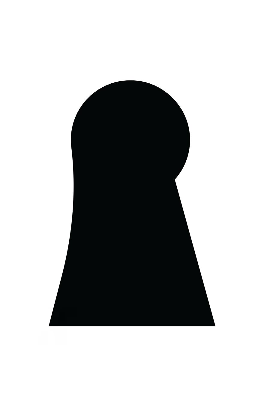
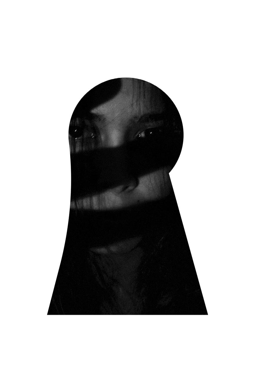
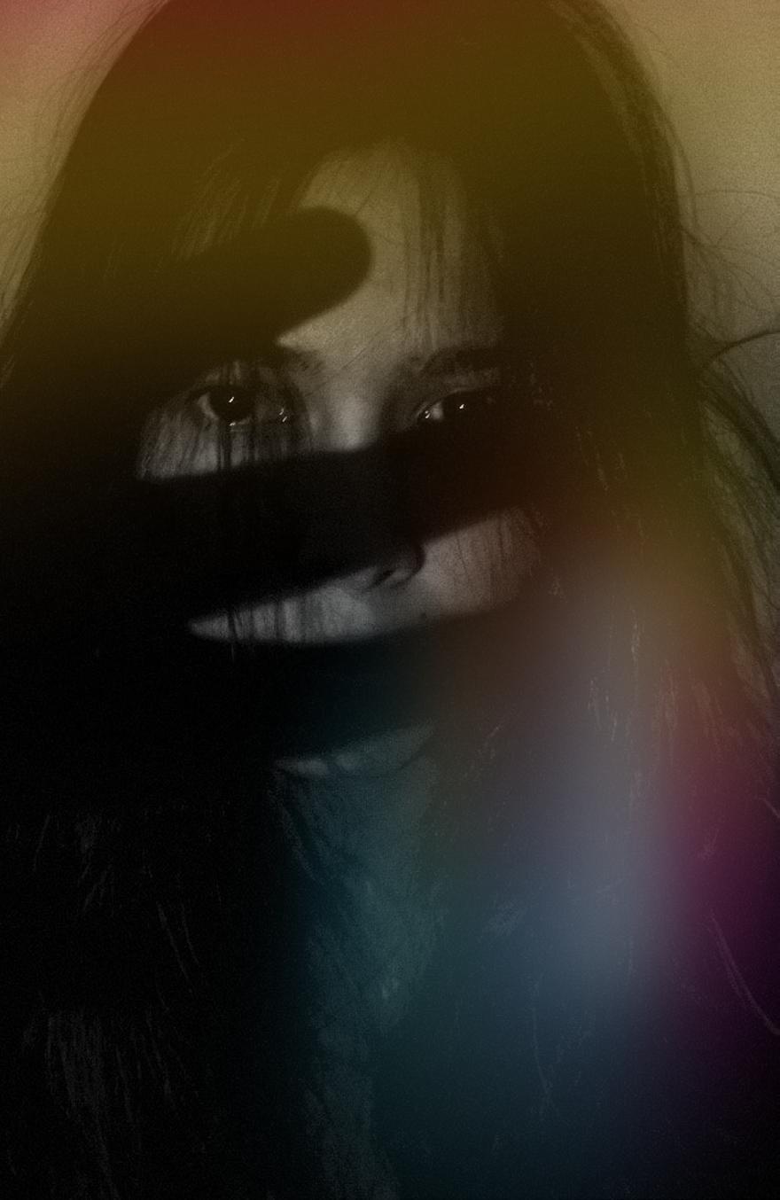
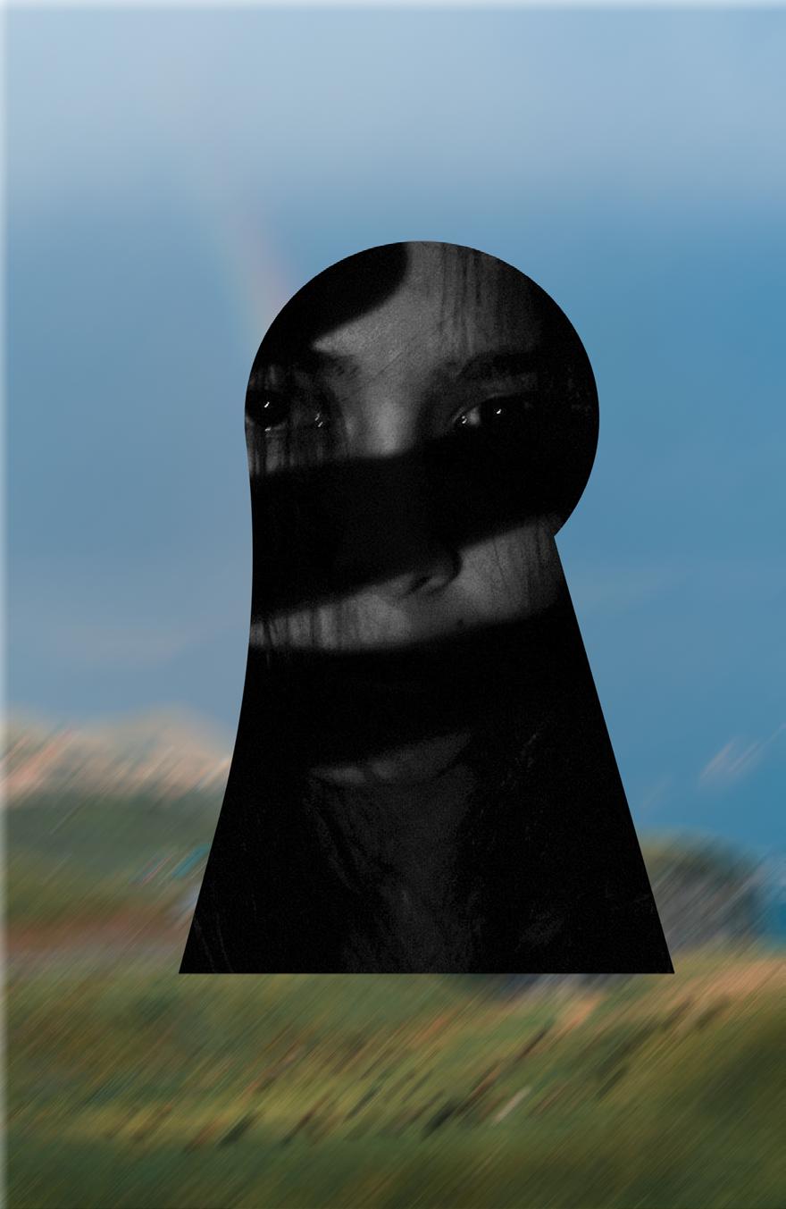
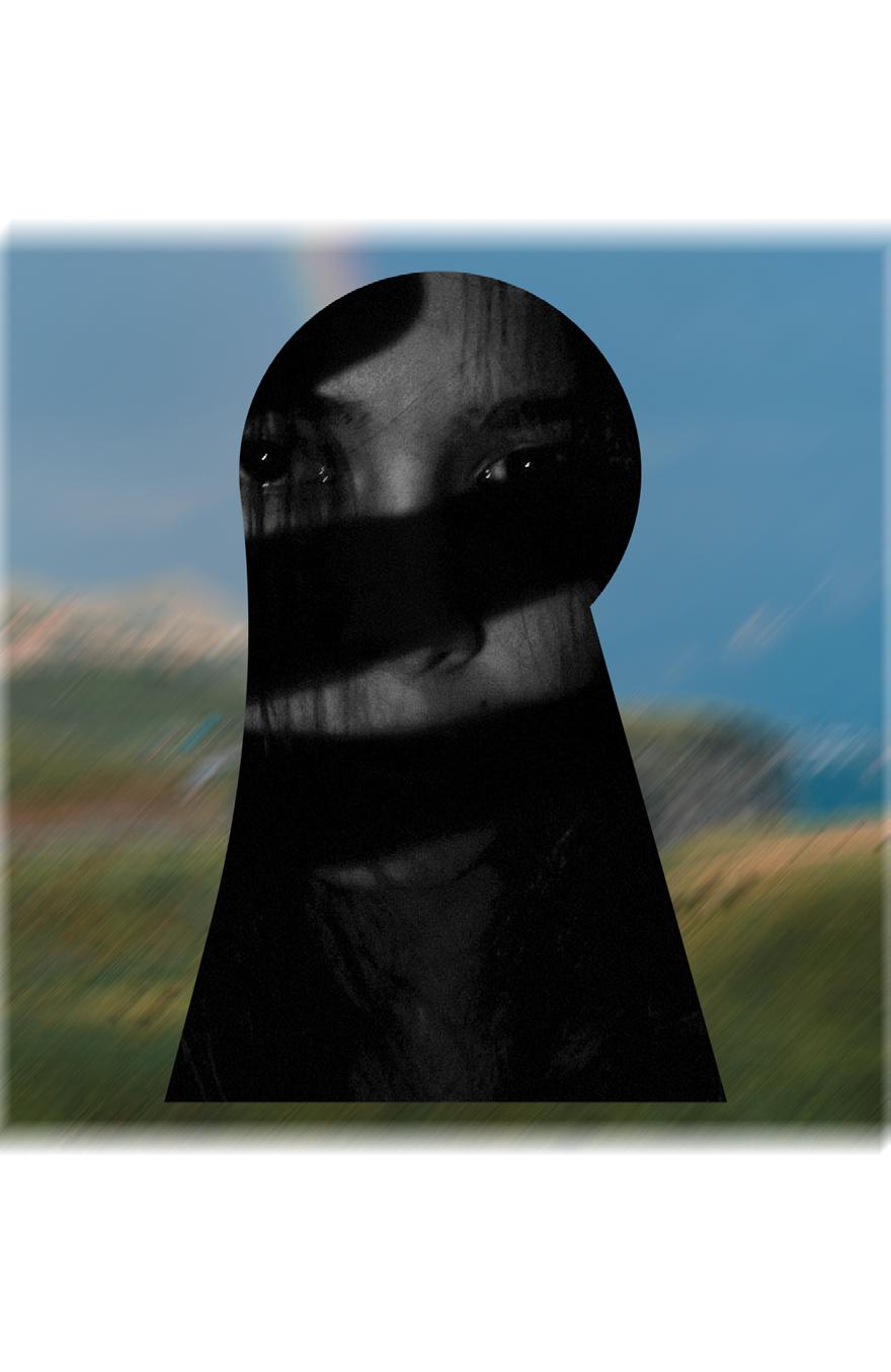
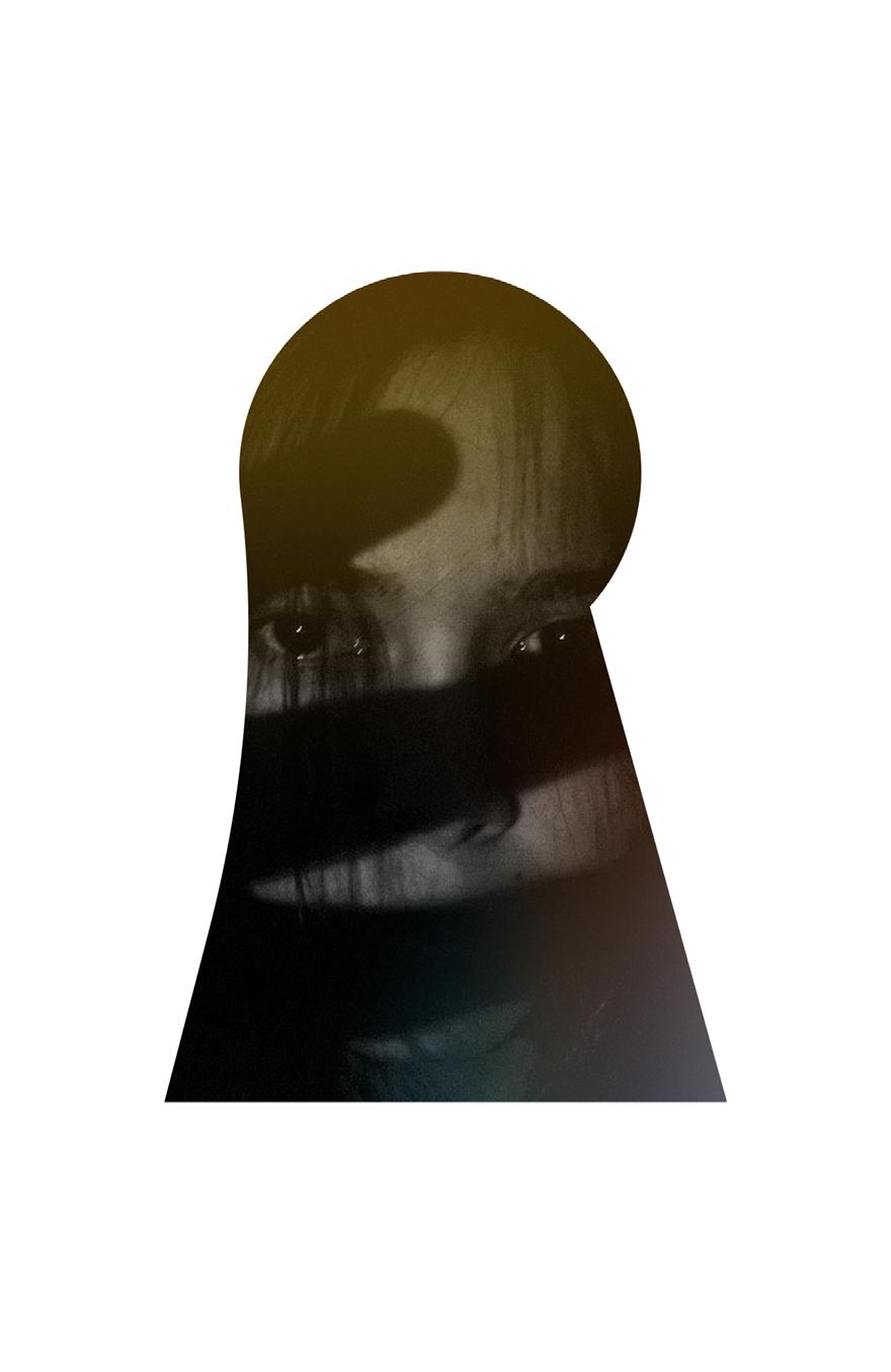
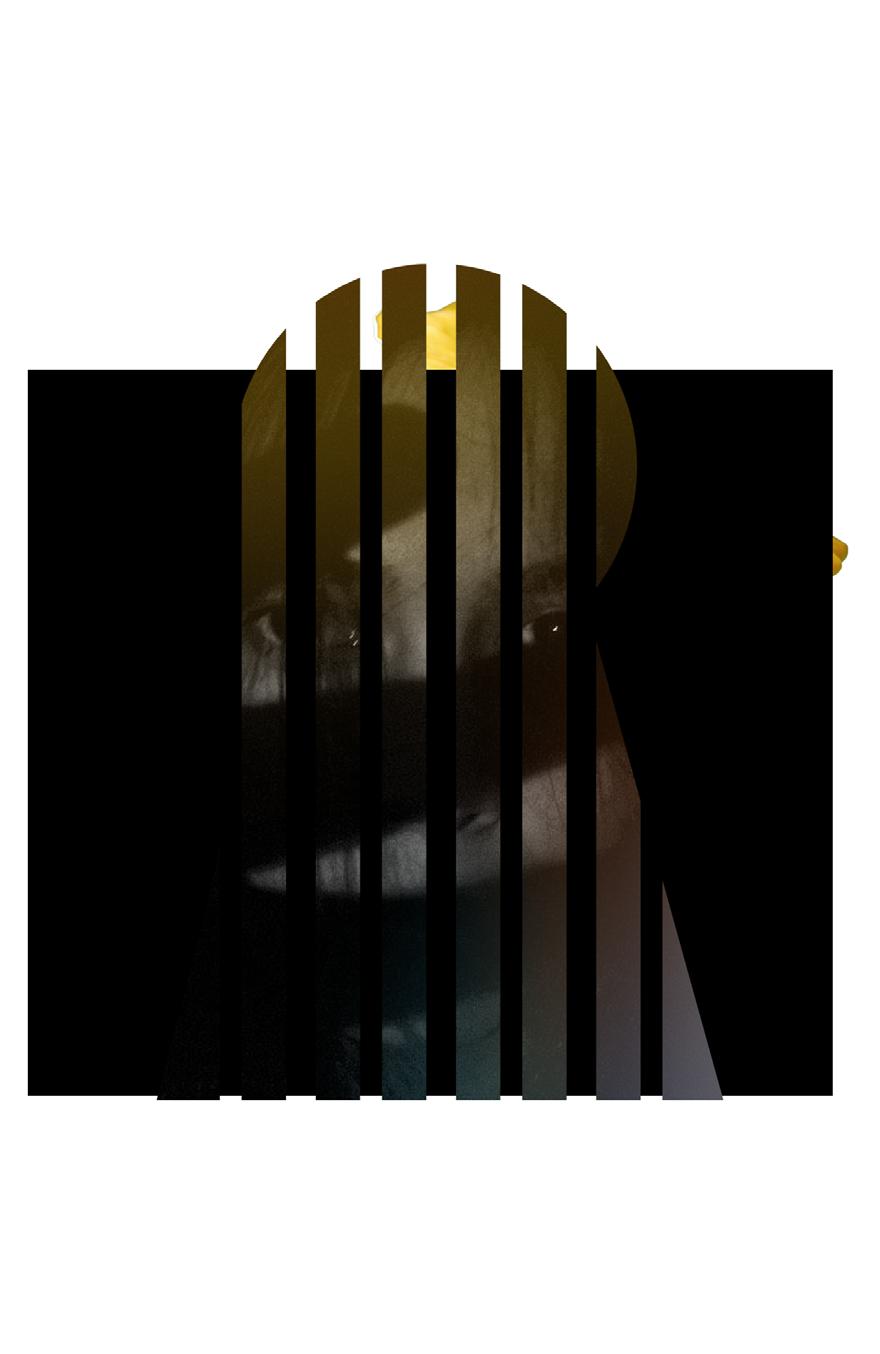
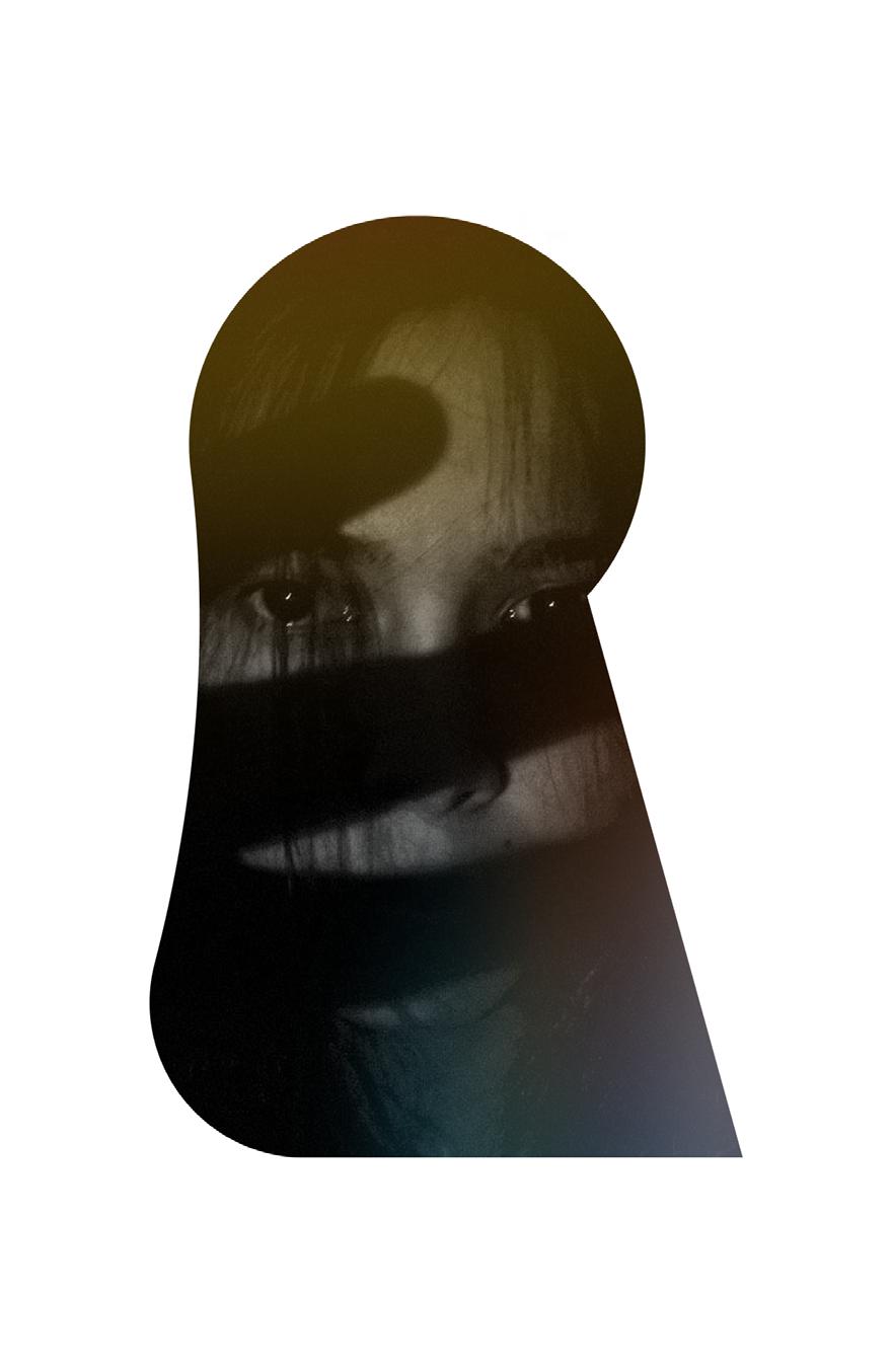
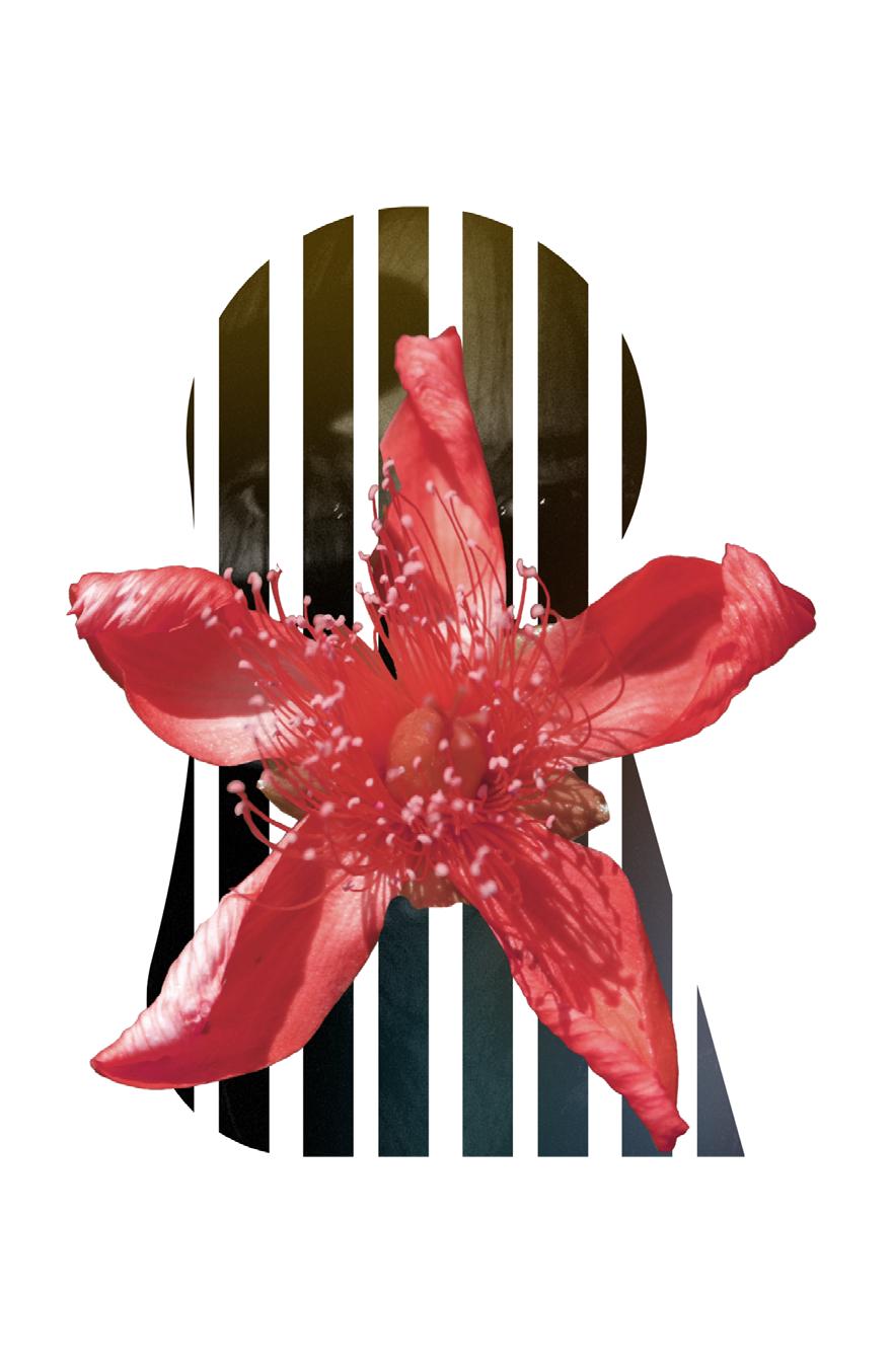
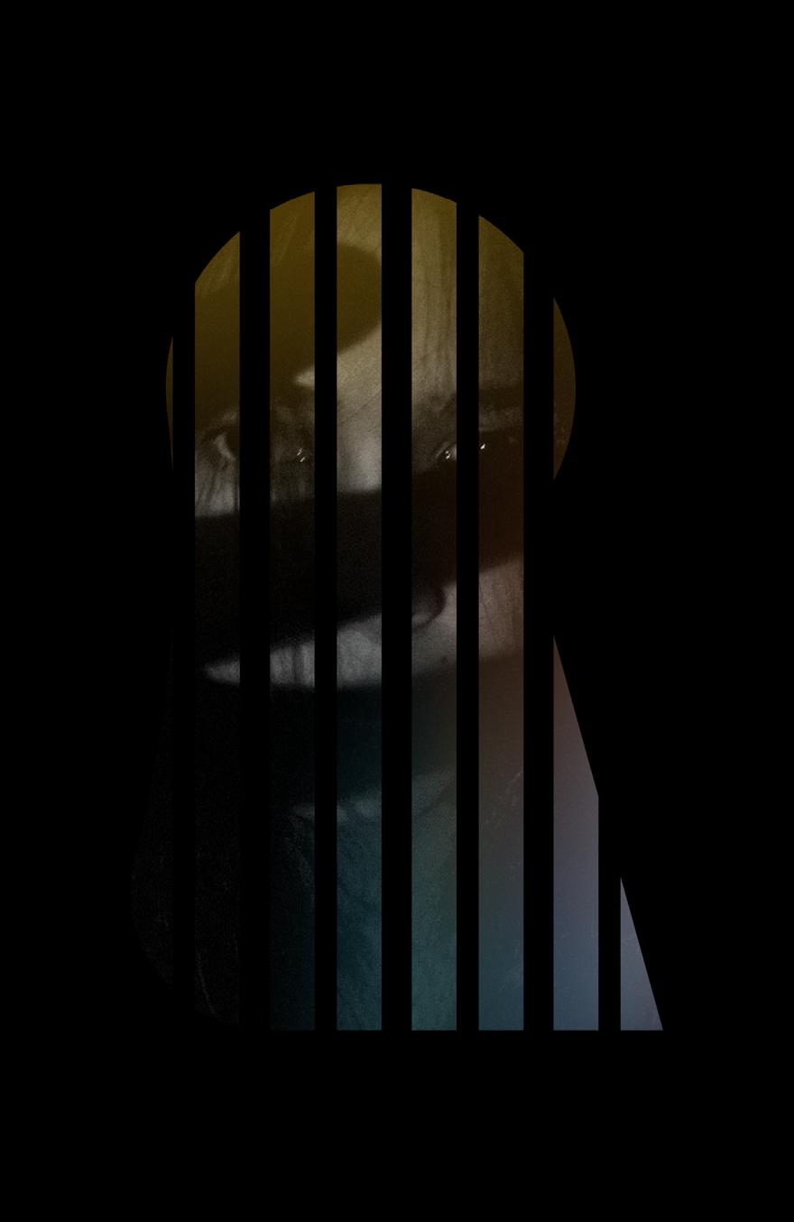
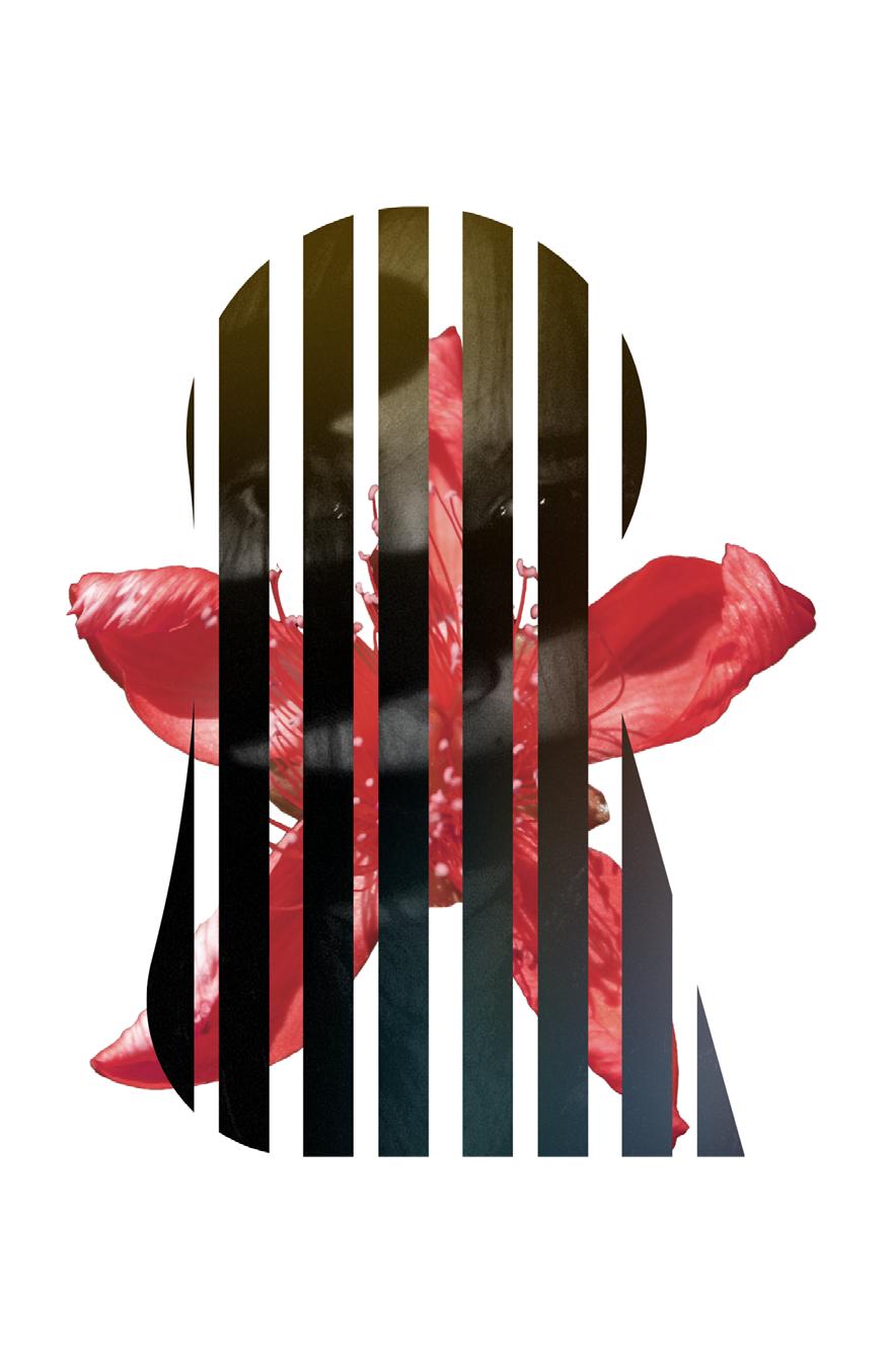
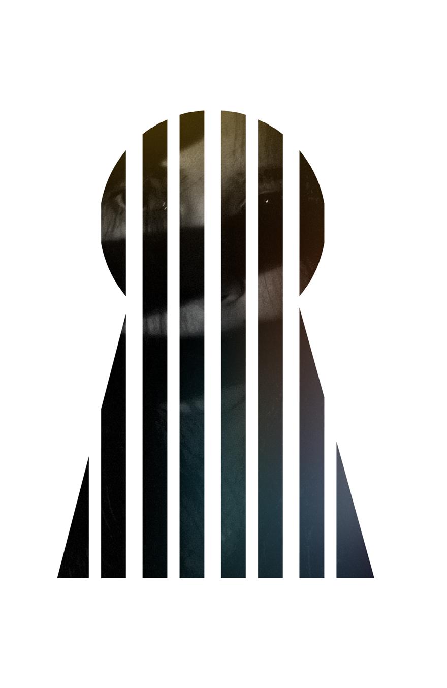
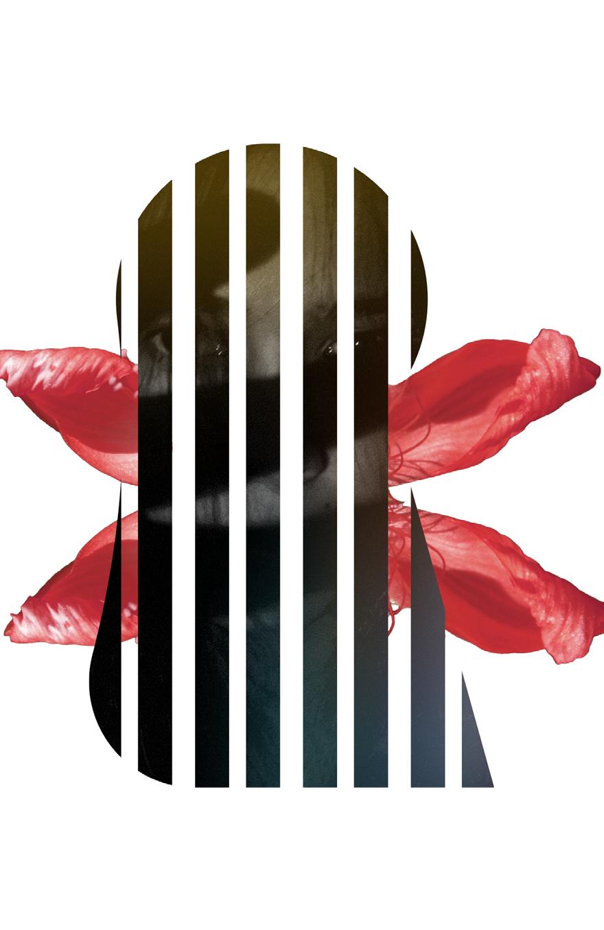
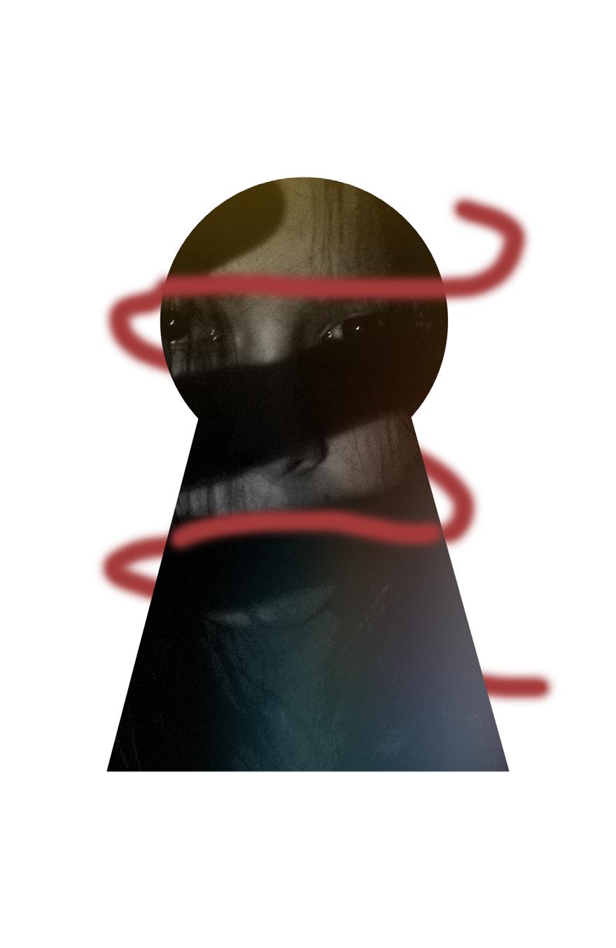
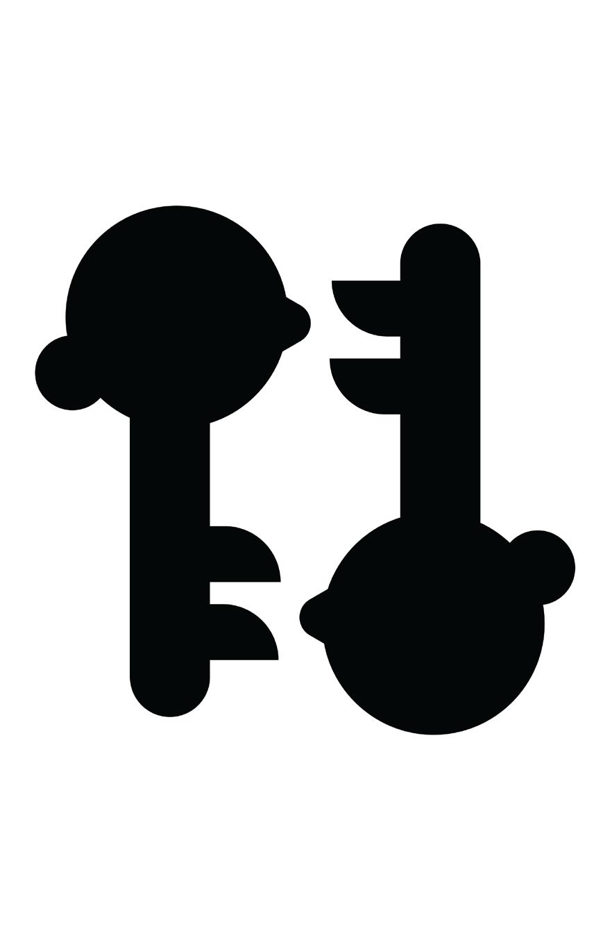
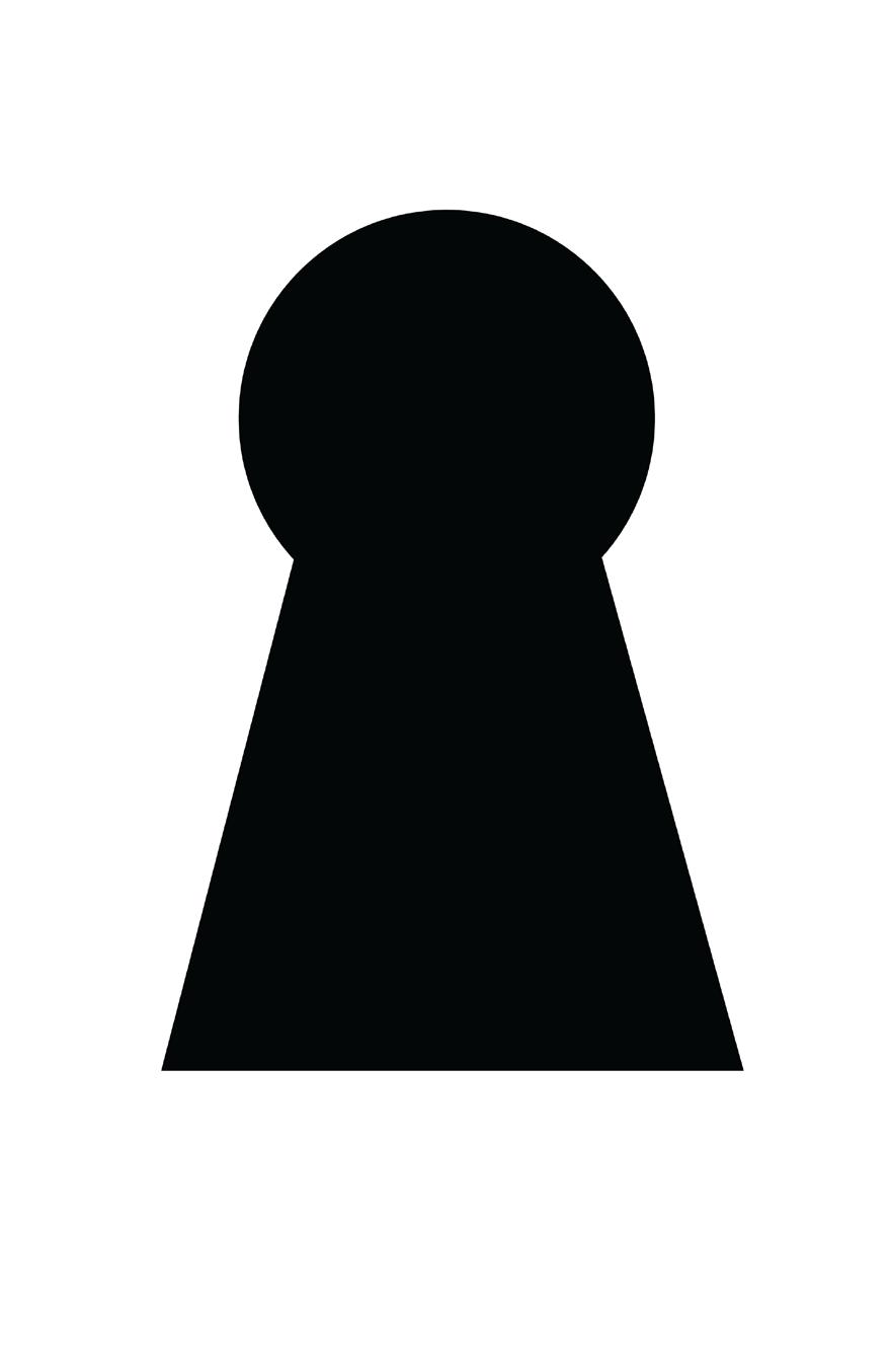
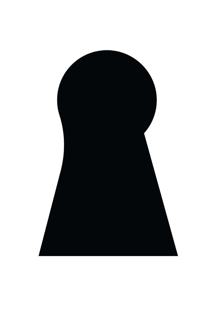
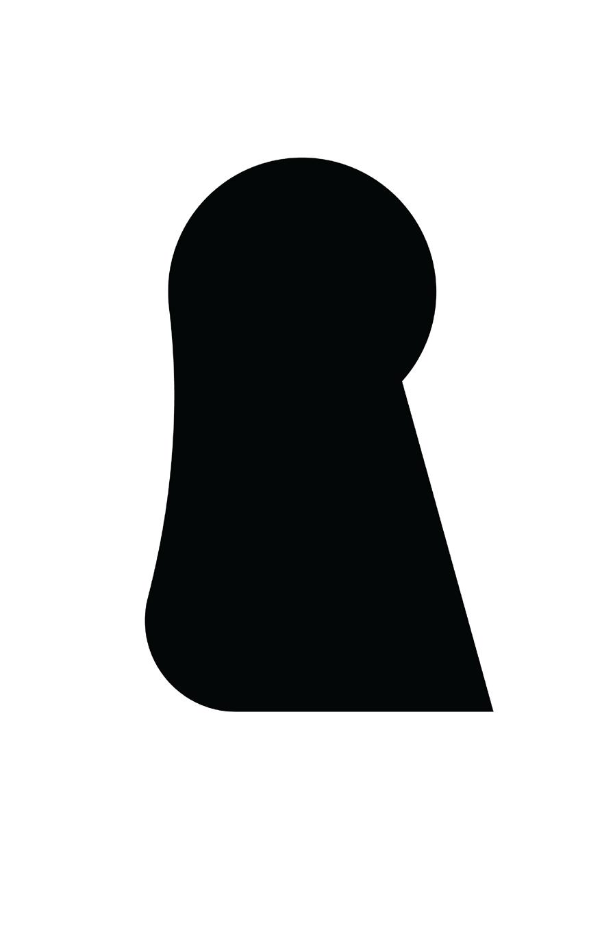
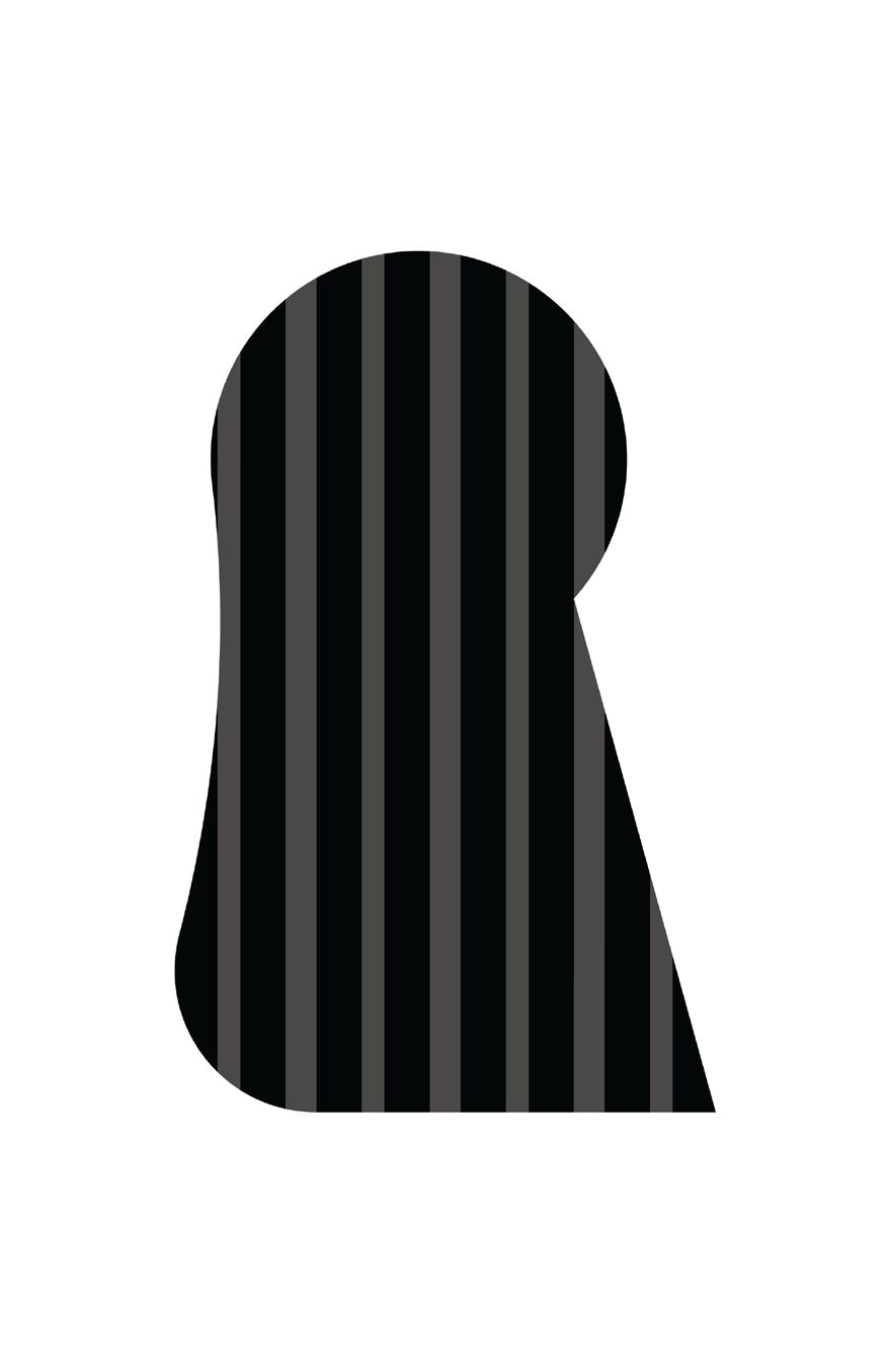
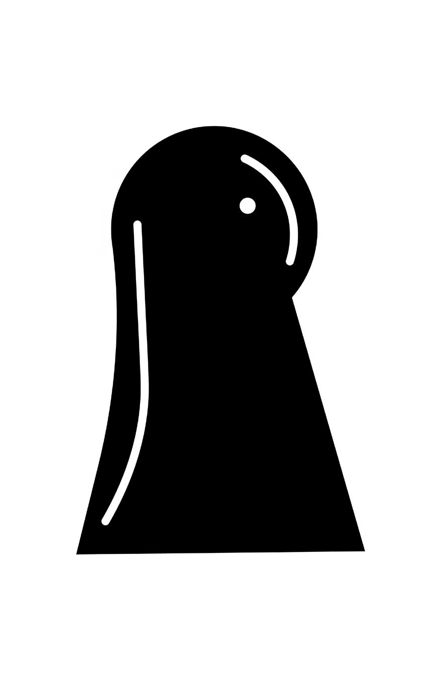
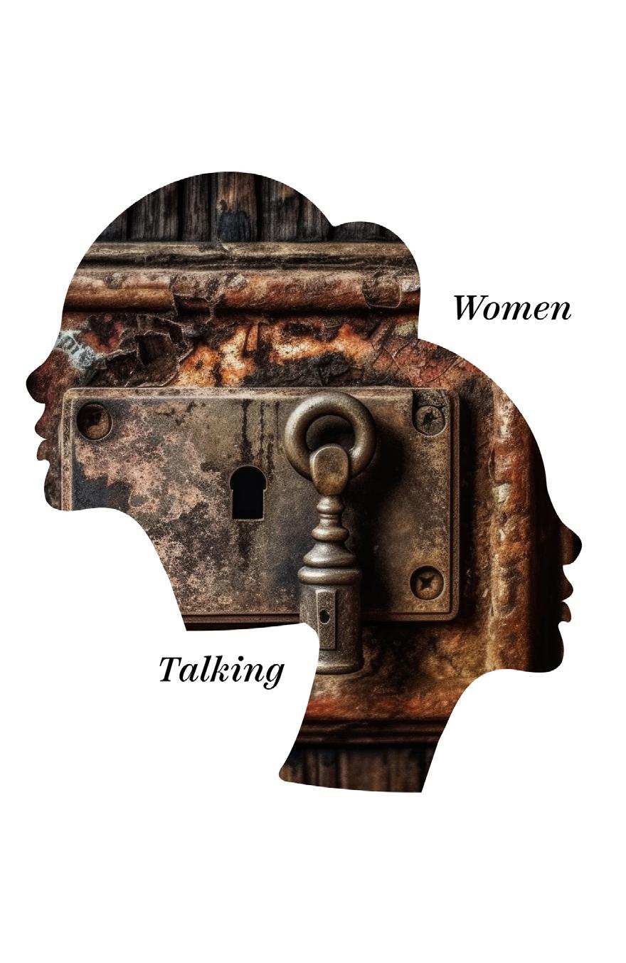
In this concept, my aim was to delve into the theme of confinement, stemming from a patriarchal society, as well as the idea of suppression. Simultaneously, I wanted to convey elements of hope and healing. This is why I centered my work around the symbolism of a keyhole, manipulating its shape to resemble a headscarf. I edited the photograph, transitioning it from stark black to include a subtle gradient, introducing the element of hope into the image.
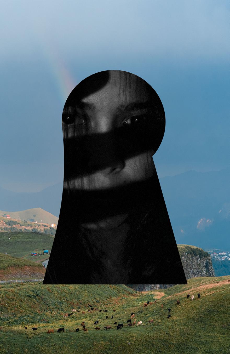
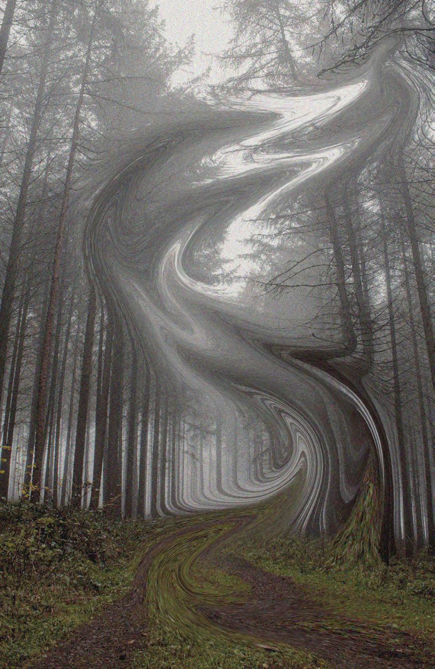
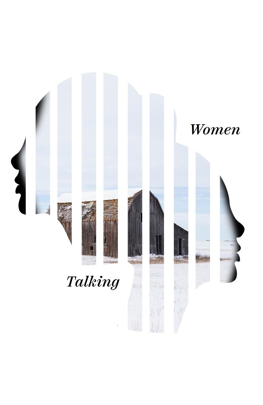
I experimented with various iterations using a farm background, ranging from a plain, clear setting to a highly motion-blurred one. The goal was to convey both the urgency of the challenges faced by the women in that colony and to allude to their experiences of being gaslighted and drugged before enduring abuse. The choice of background and the degree of blur were part of the visual storytelling aimed at capturing the complex and distressing nature of their circumstances.

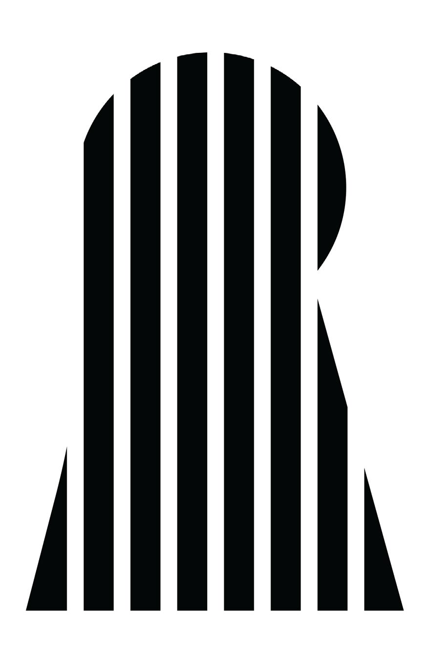
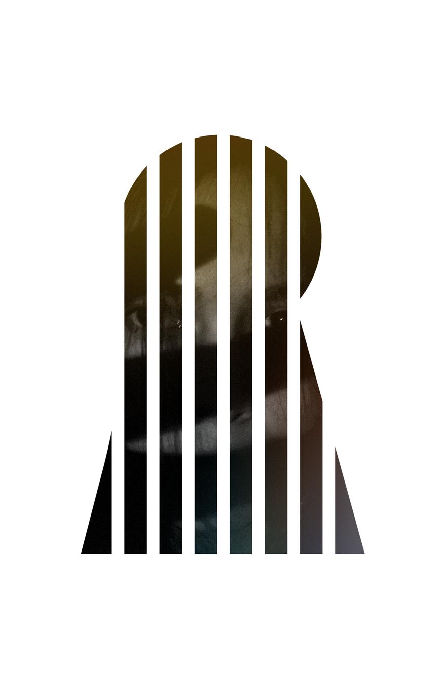
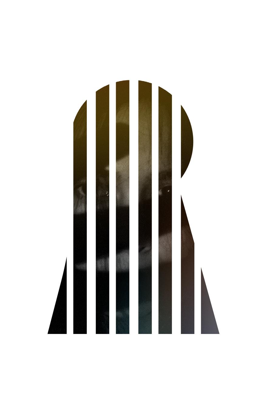
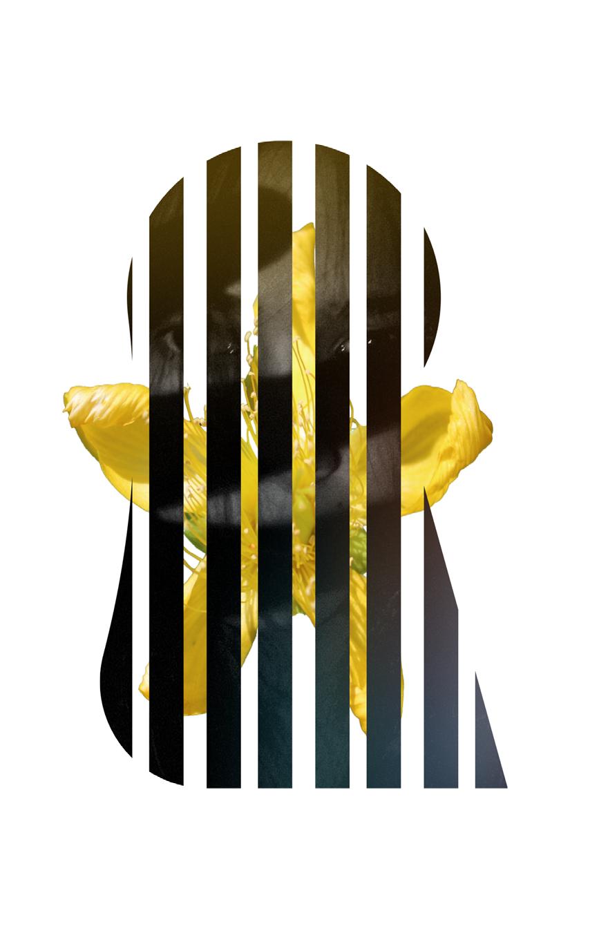
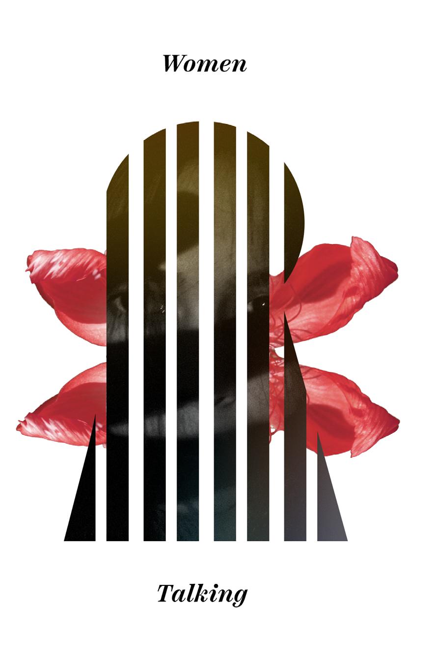
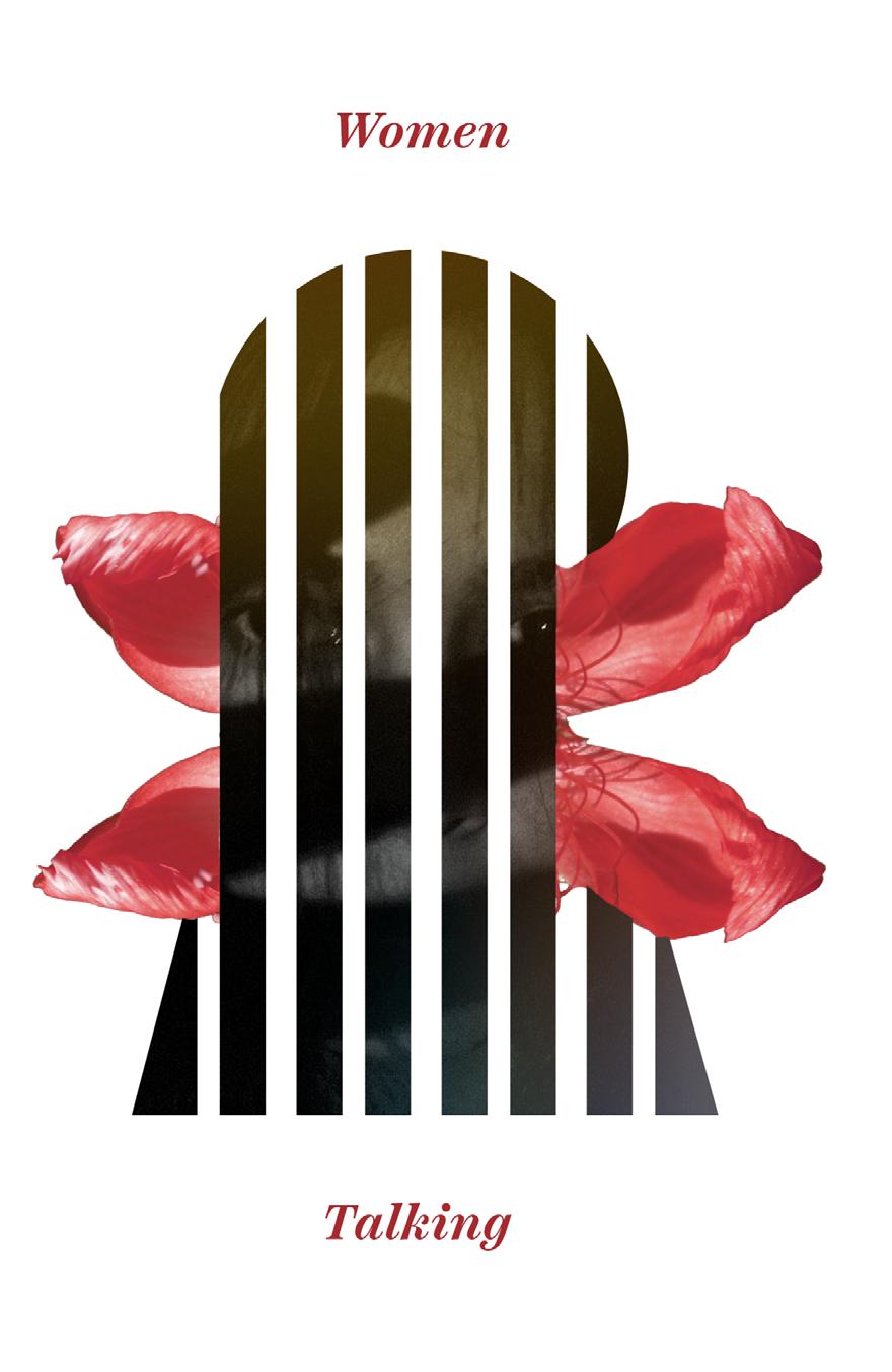
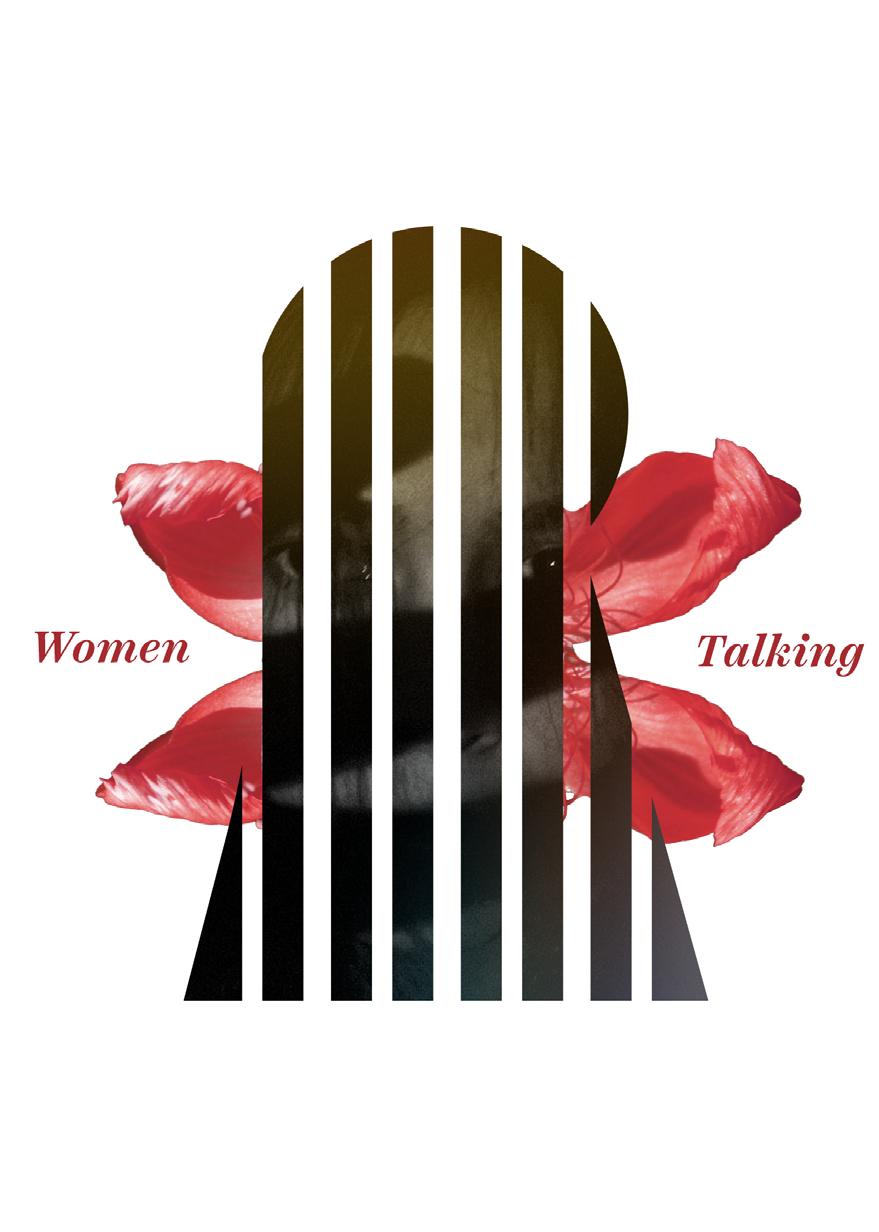
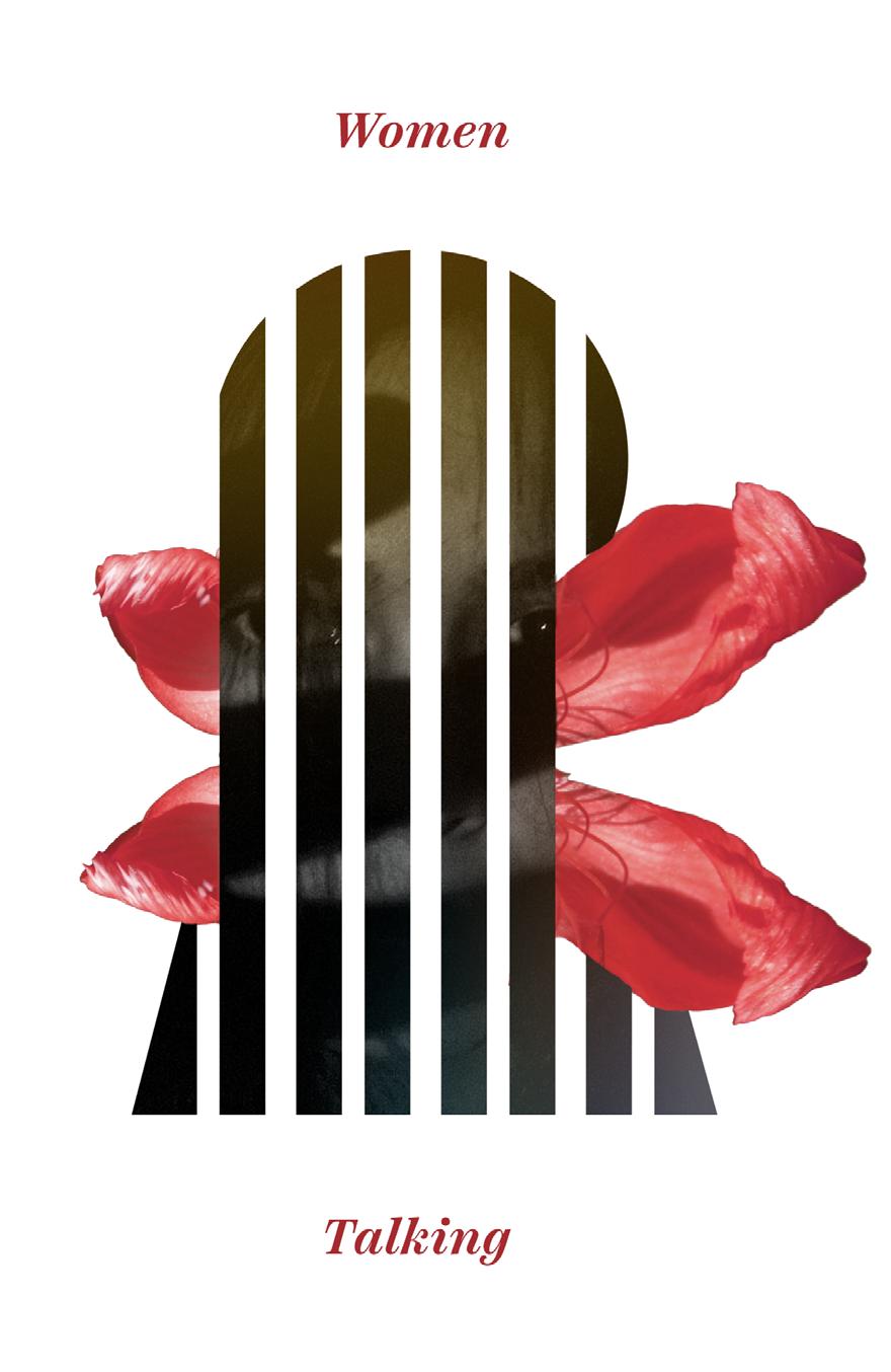
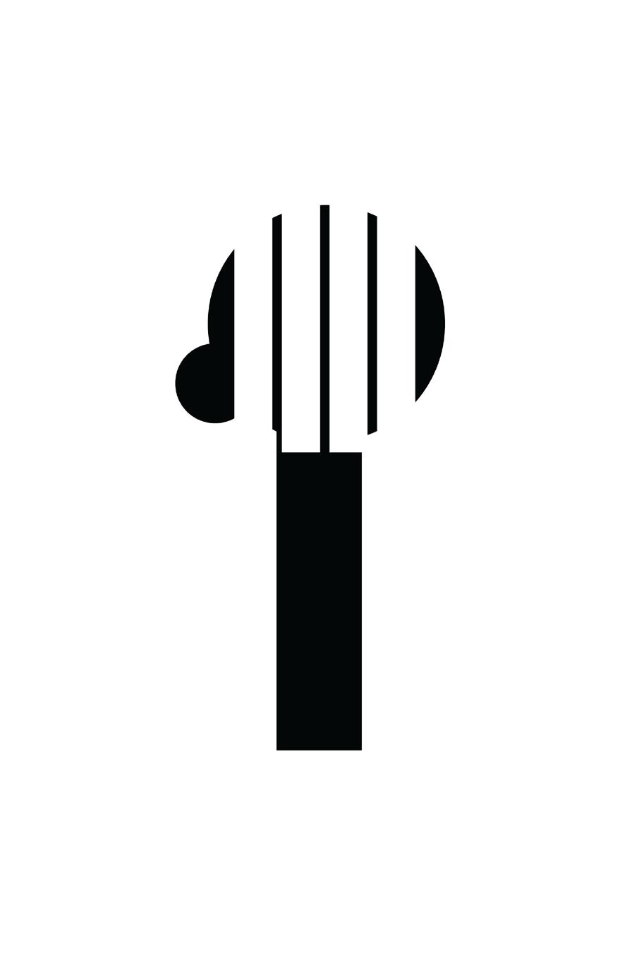
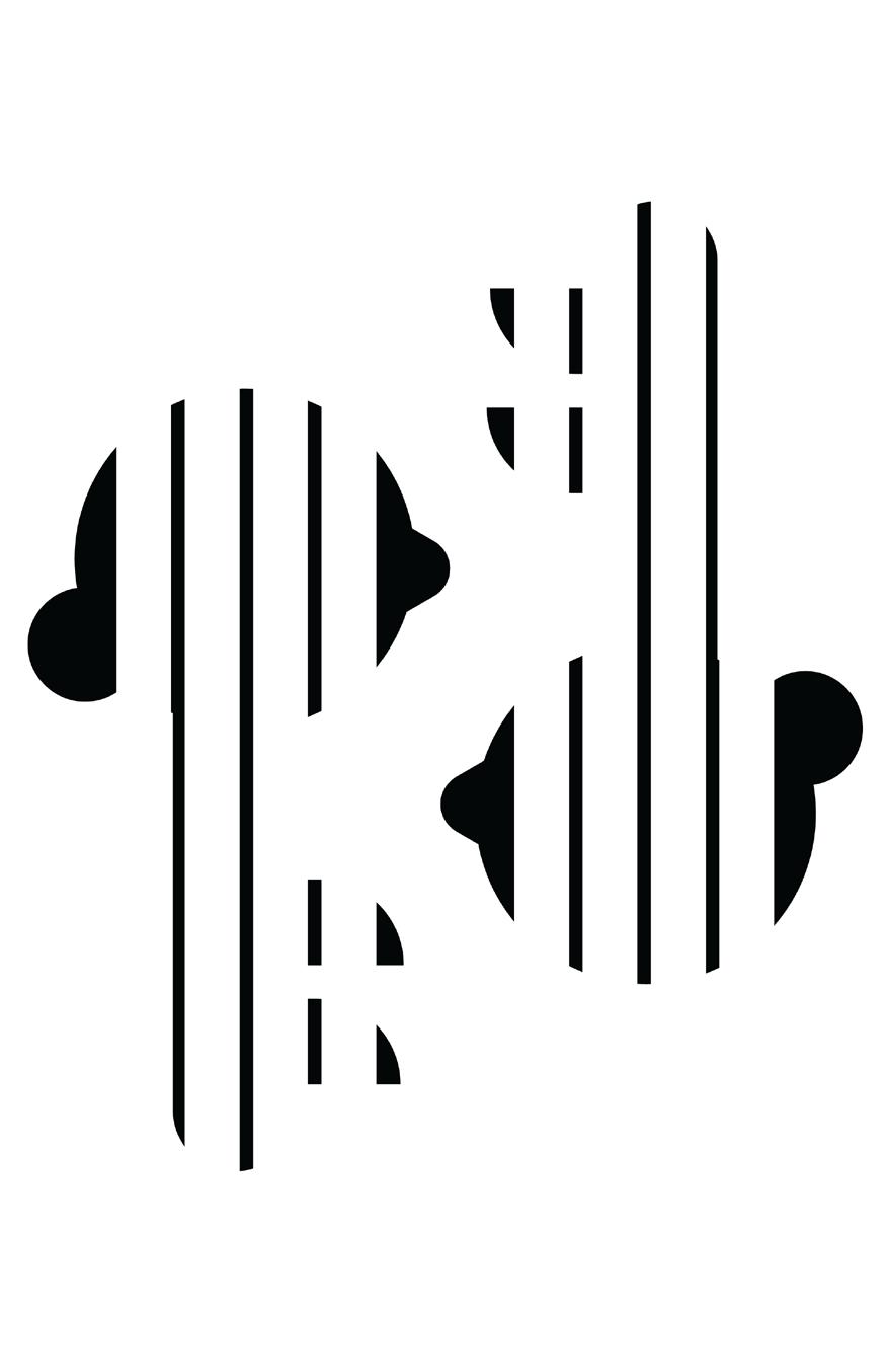
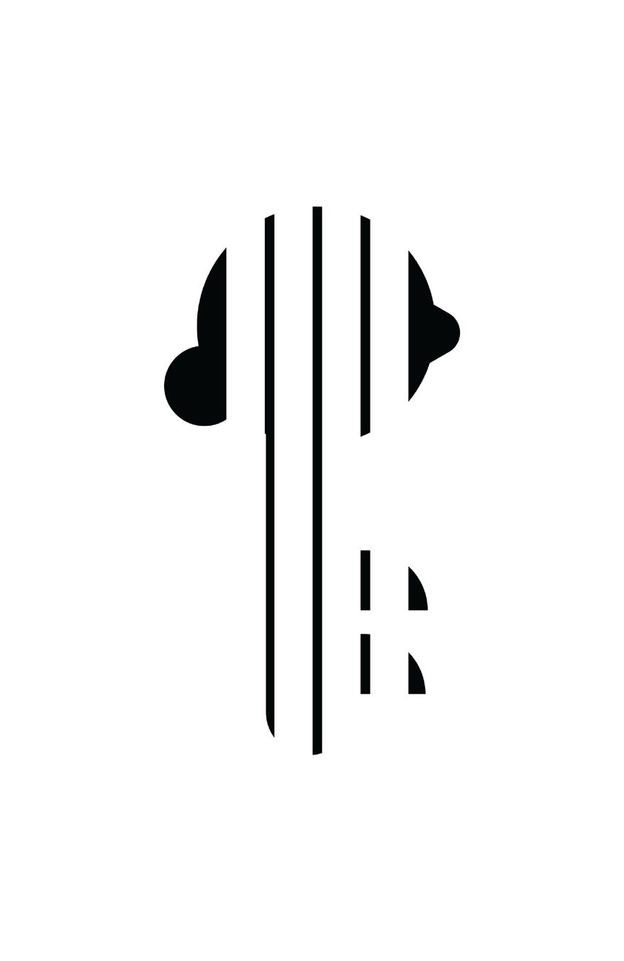
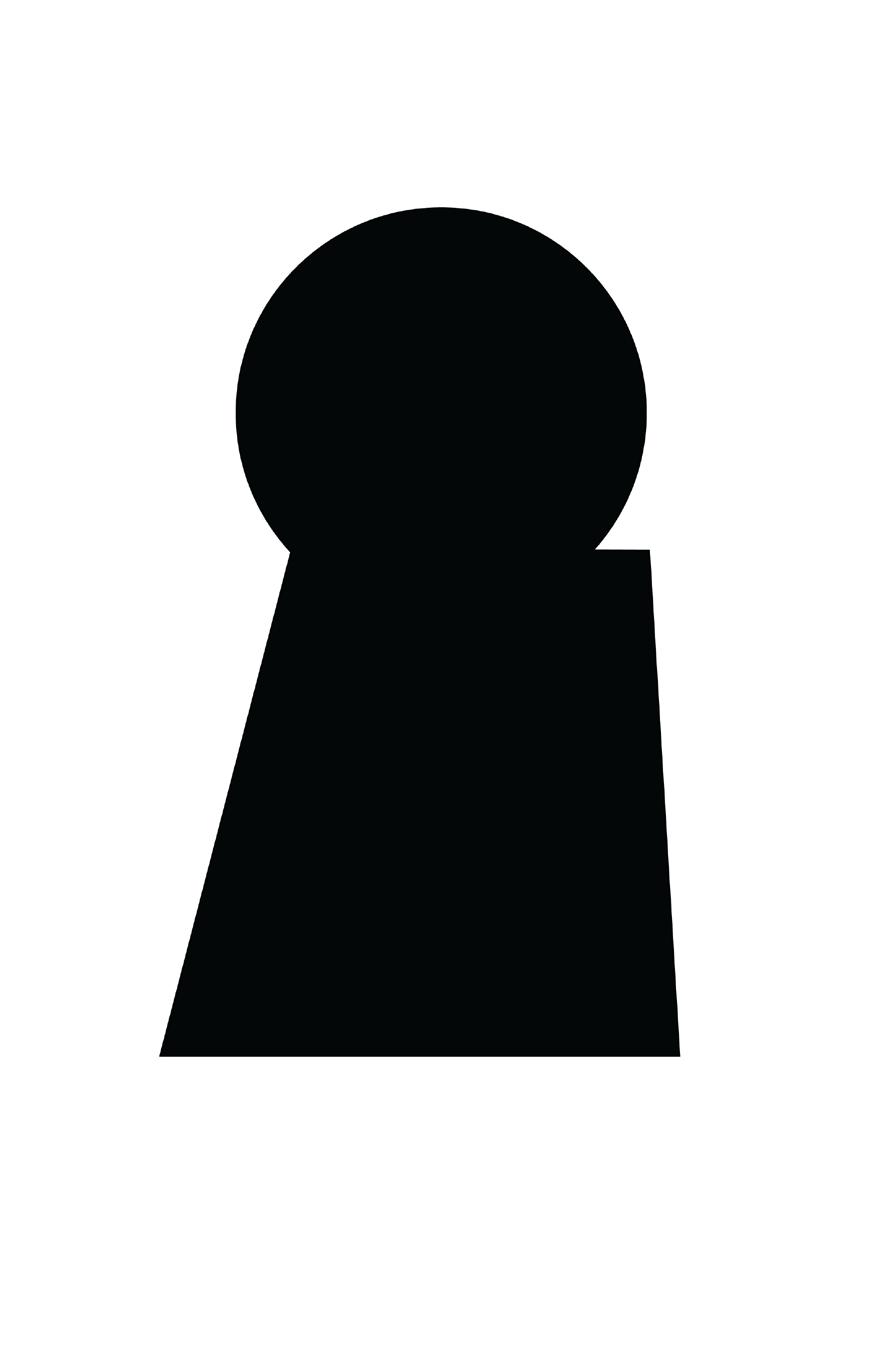
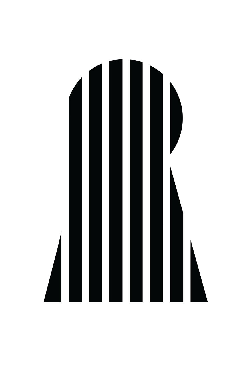
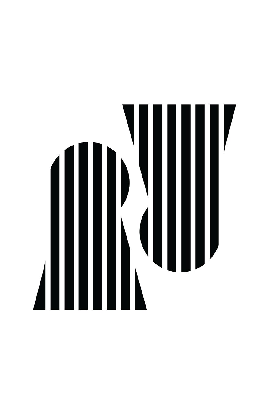
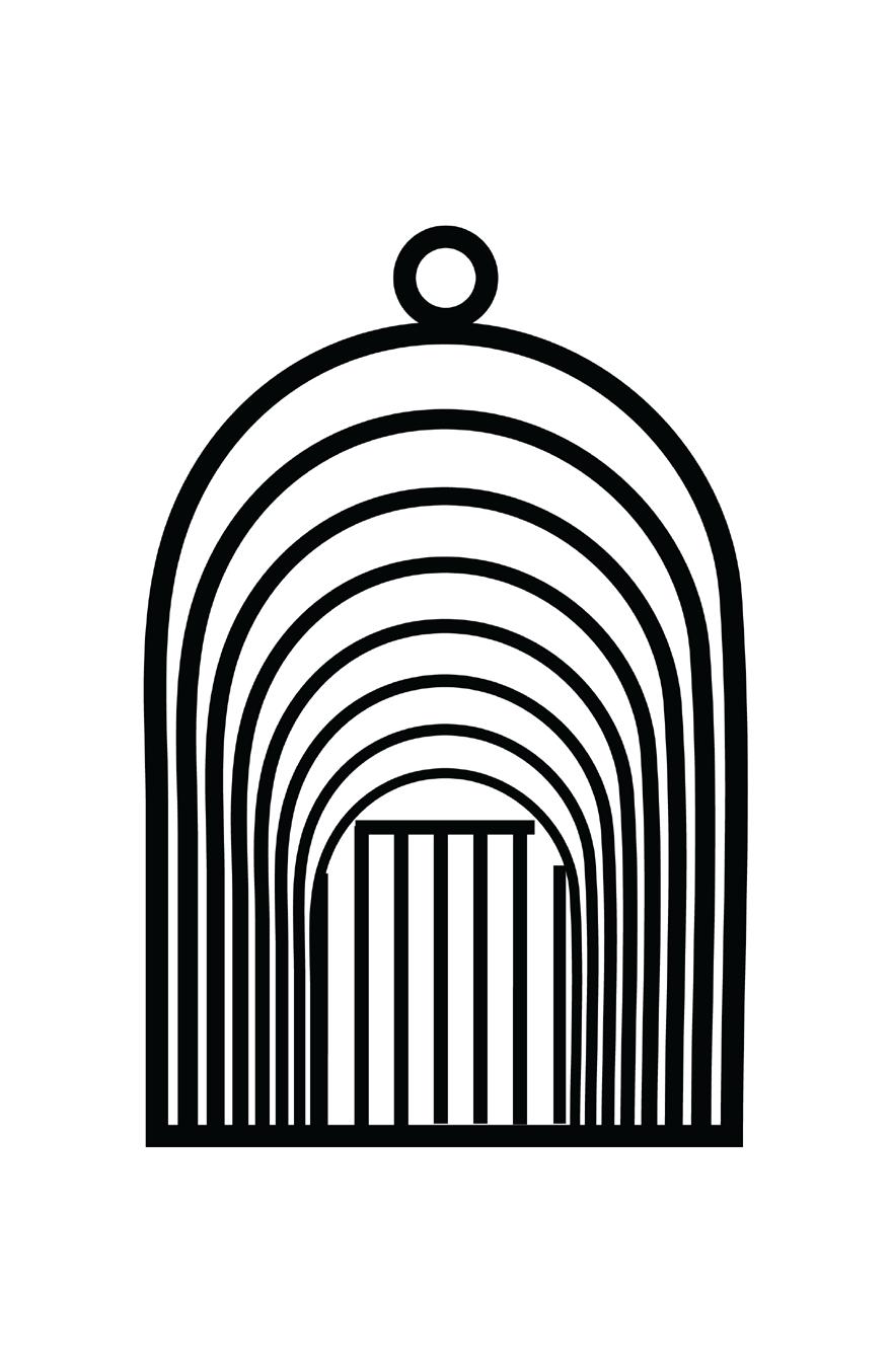
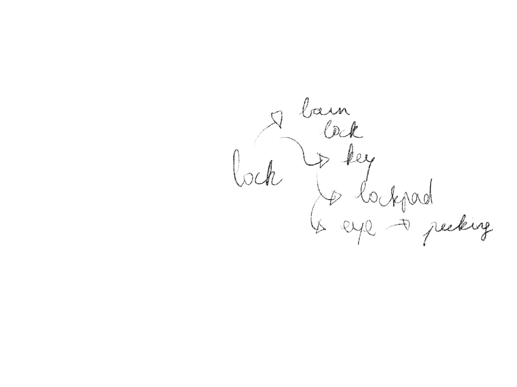
I began considering the integration of several ideas from my thumbnails. In this phase, I aimed to incorporate prison bars to strengthen the metaphor I was developing with the headscarf-wearing women. The addition of the prison bars served to reinforce various aspects, including the notions of penetration, external observation, security, and insecurity. These elements also contributed to the depiction of severance and pain, alluding to the sense of being trapped.
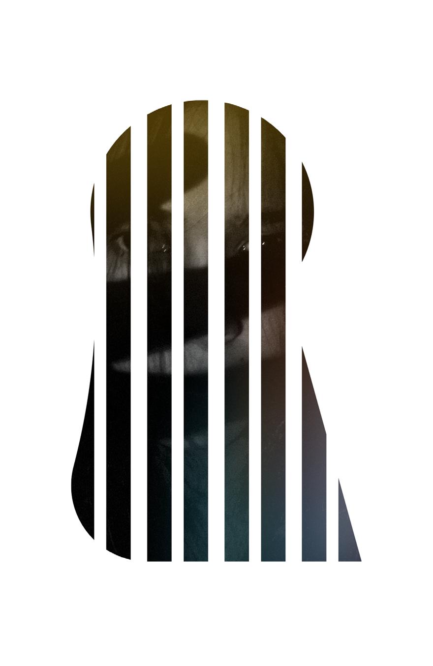
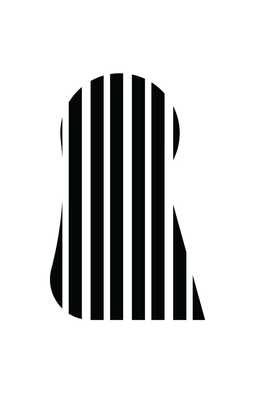
During this process, I created multiple iterations, some with evenly spaced bars and others with irregular spacing. I found that the even spacing appeared somewhat lacking in personality and felt too bold, prompting me to focus on adjusting the spacing and refining the stroke of the lines for a more nuanced effect.
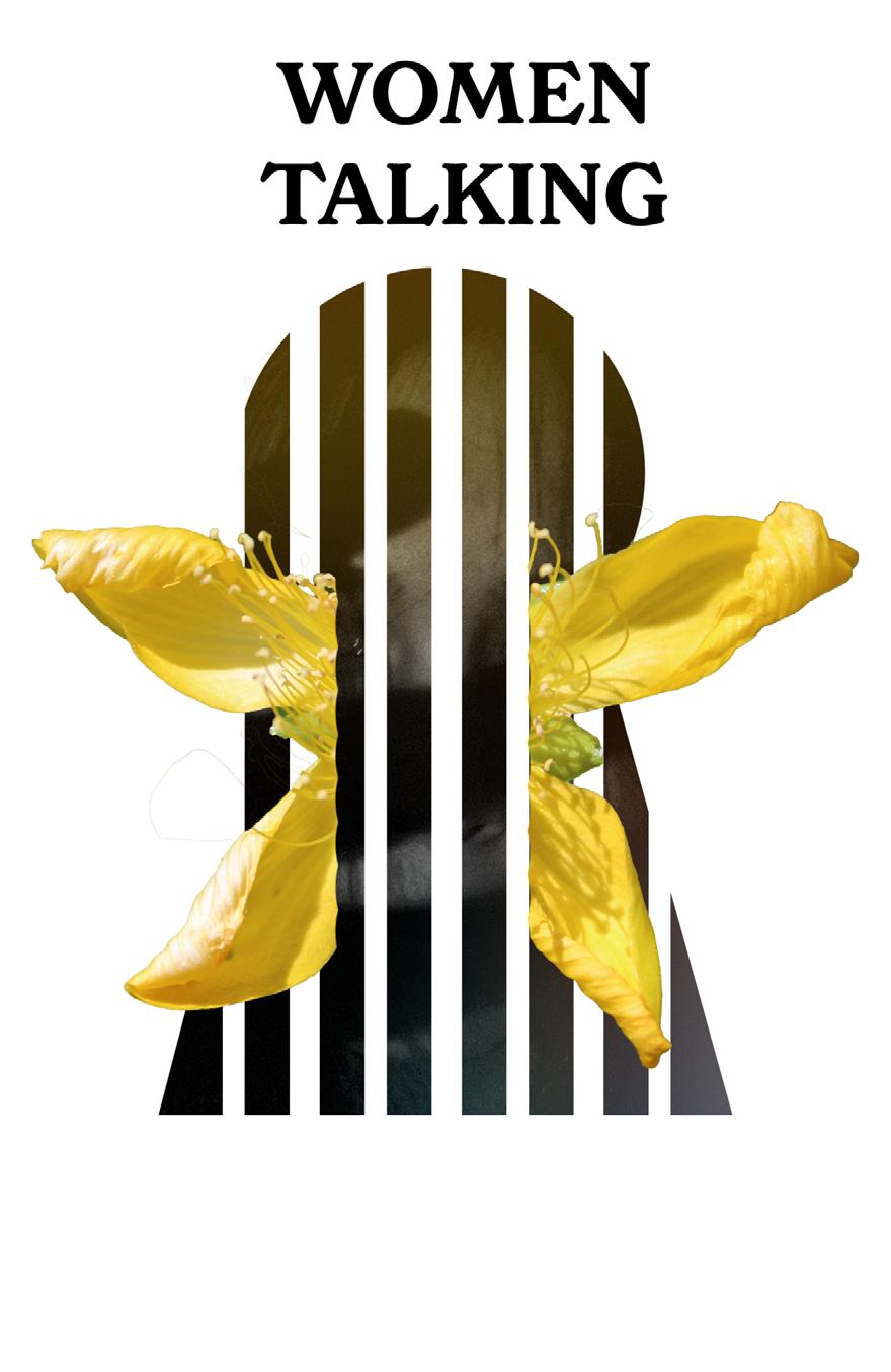
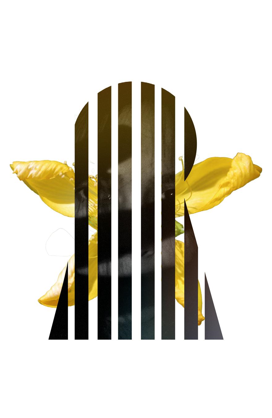
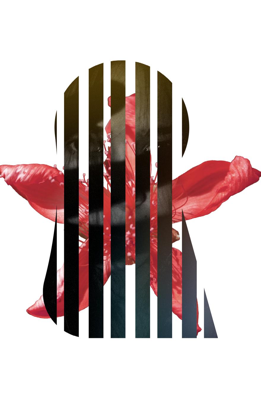
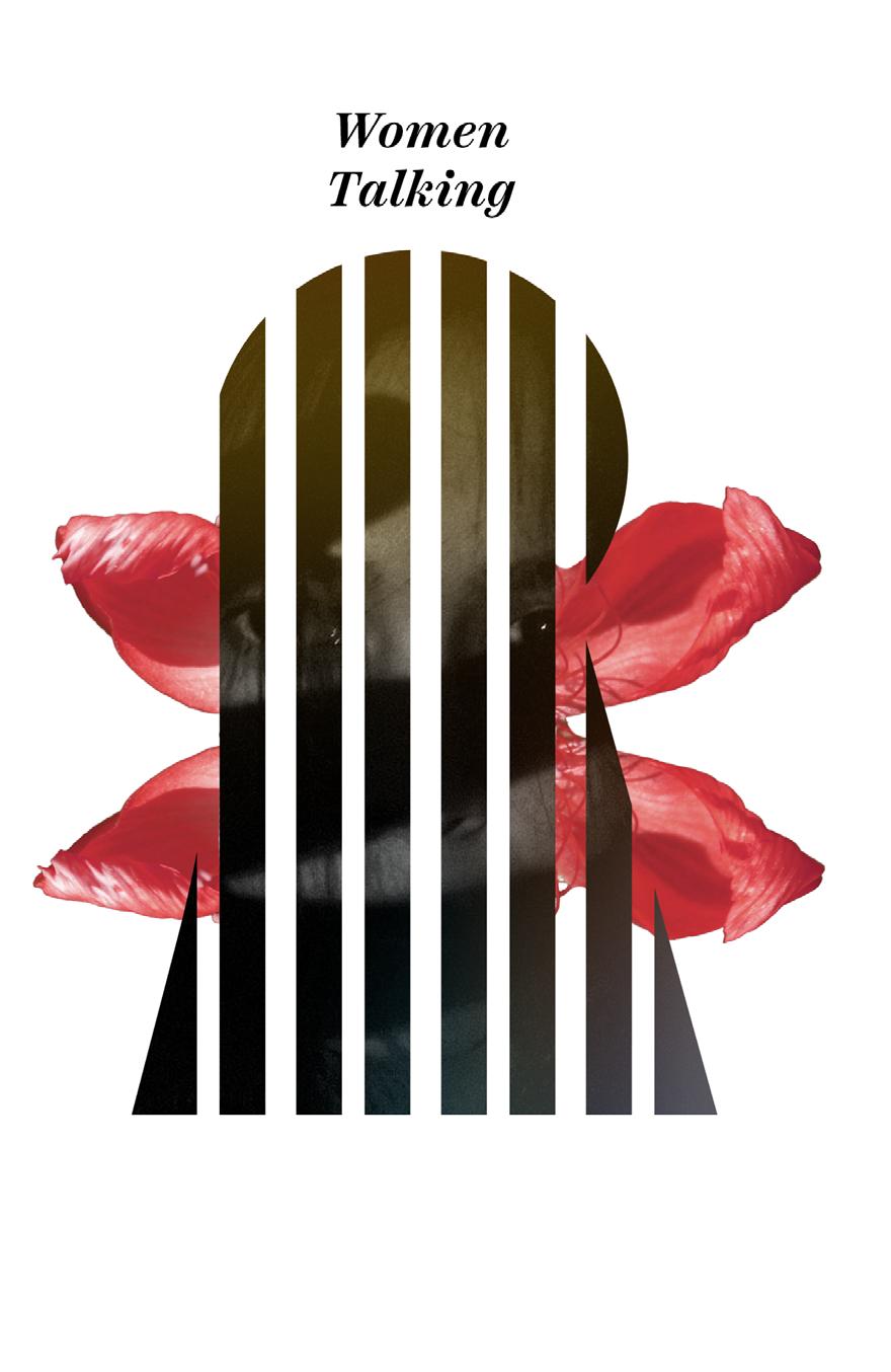
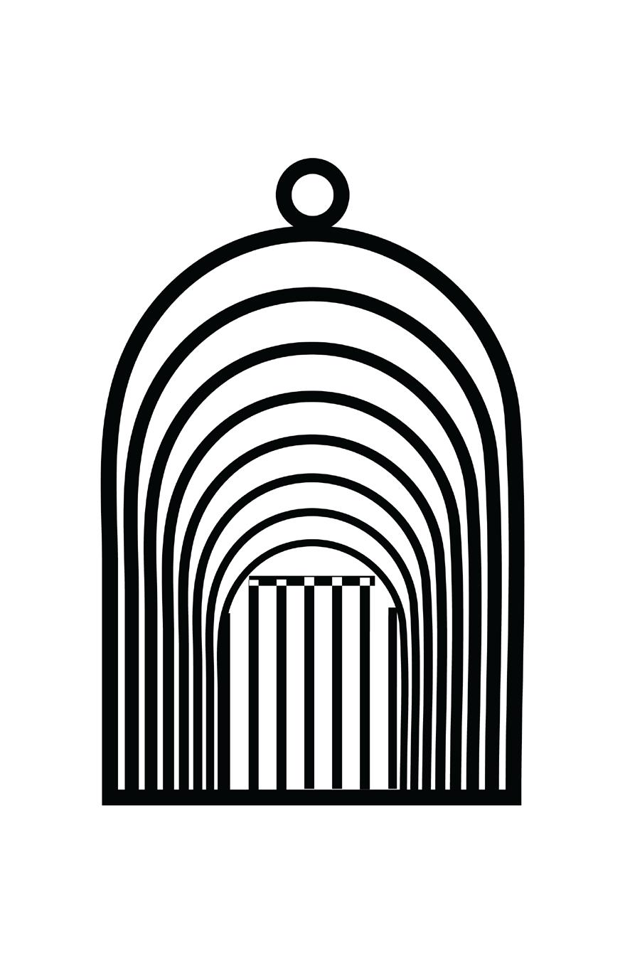
I introduced a tutsan flower in the background, seemingly emerging from the prison keyhole. Tutsan flowers are renowned for their healing properties, and this imagery was intended to symbolize the positive outcomes that could result from the women’s decision-making process. In this phase, I also engaged in progressive experiments with typography to see how it would interact with the overall design and convey the intended message.
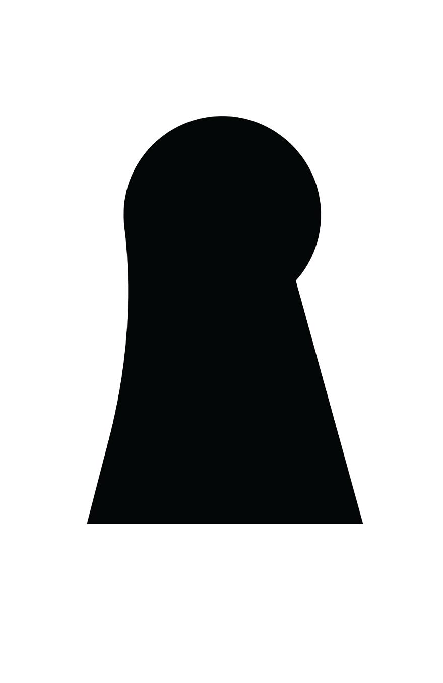
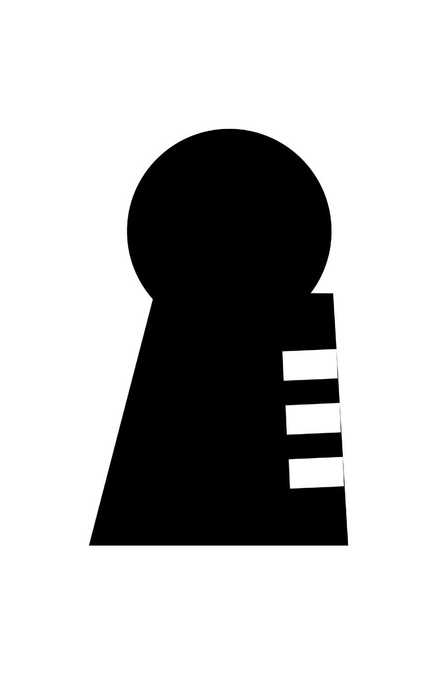
I altered the shape of the prison keyhole to make the resemblance to a headscarf more apparent. However, feedback I received suggested that this adjustment made the design more confusing rather than intriguing.
I engaged in further exploration regarding the placement, composition, and the relationship between the foreground and background elements. While I initially considered a black background to be more suitable for addressing the theme, I found that it had the unintended effect of overshadowing my design. Consequently, I decided to leave it as it was.
In this phase, I made efforts to create a three-dimensional appearance for the flower. However, the flower’s shape posed challenges, and I didn’t feel that these attempts were particularly successful or visually prominent.
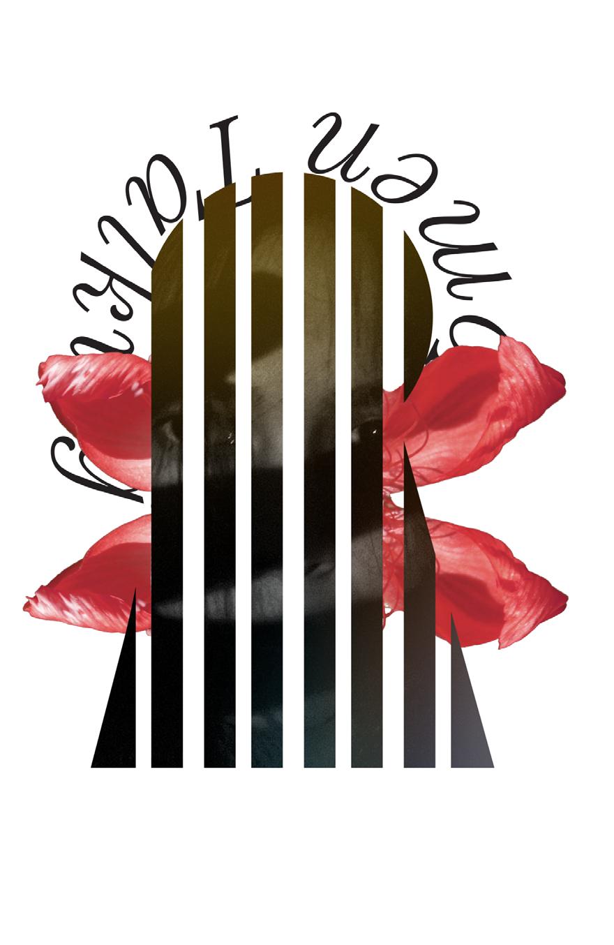

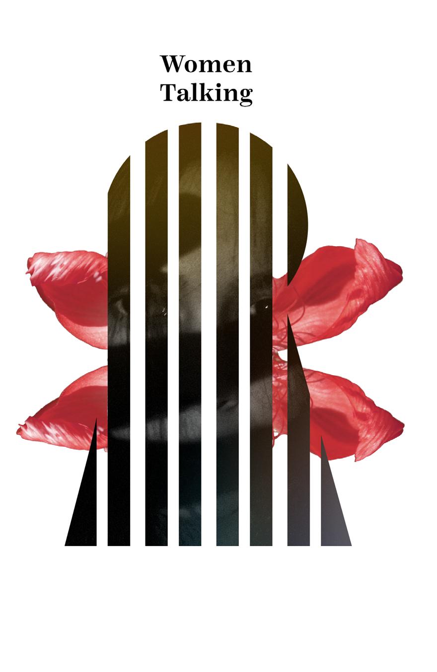
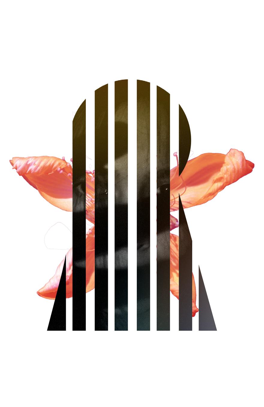
I continued to refine the typography and its integration into the design. In some iterations, I introduced red elements to hint at blood and match the color of the flower, which also alludes to blood. This use of red can indeed evoke multiple connotations, from violence and bleeding to passion and the determination to fight. It adds a complex layer of meaning to the overall composition.


Following a considerable amount of feedback and critiques, I attempted to render the shapes more threedimensional. However, I also explored new ideas, which didn’t yield the desired results. This phase marked a point of reflection for me as I had been immersed in this project for a while. I was grappling with the disappointment that the concept seemed to involve “too many metaphors.”
It was a turning point because I’ve always appreciated layers of meaning in design, but I came to understand that while nuance and ambiguity have their place, poster design requires a certain level of efficiency. Posters are designed to convey their message quickly and effectively, without demanding in-depth analysis from viewers.
This realization was further influenced by a quote from the Netflix documentary “Abstract,” where former Nike designer Tinker Hatfield delineated the difference beteen art and design, emphasizing that design should communicate with others rather than solely serve as self-expression. In light of these considerations, I began to transition away from overly layered messaging, embracing abstraction and efficiency in my design approach.

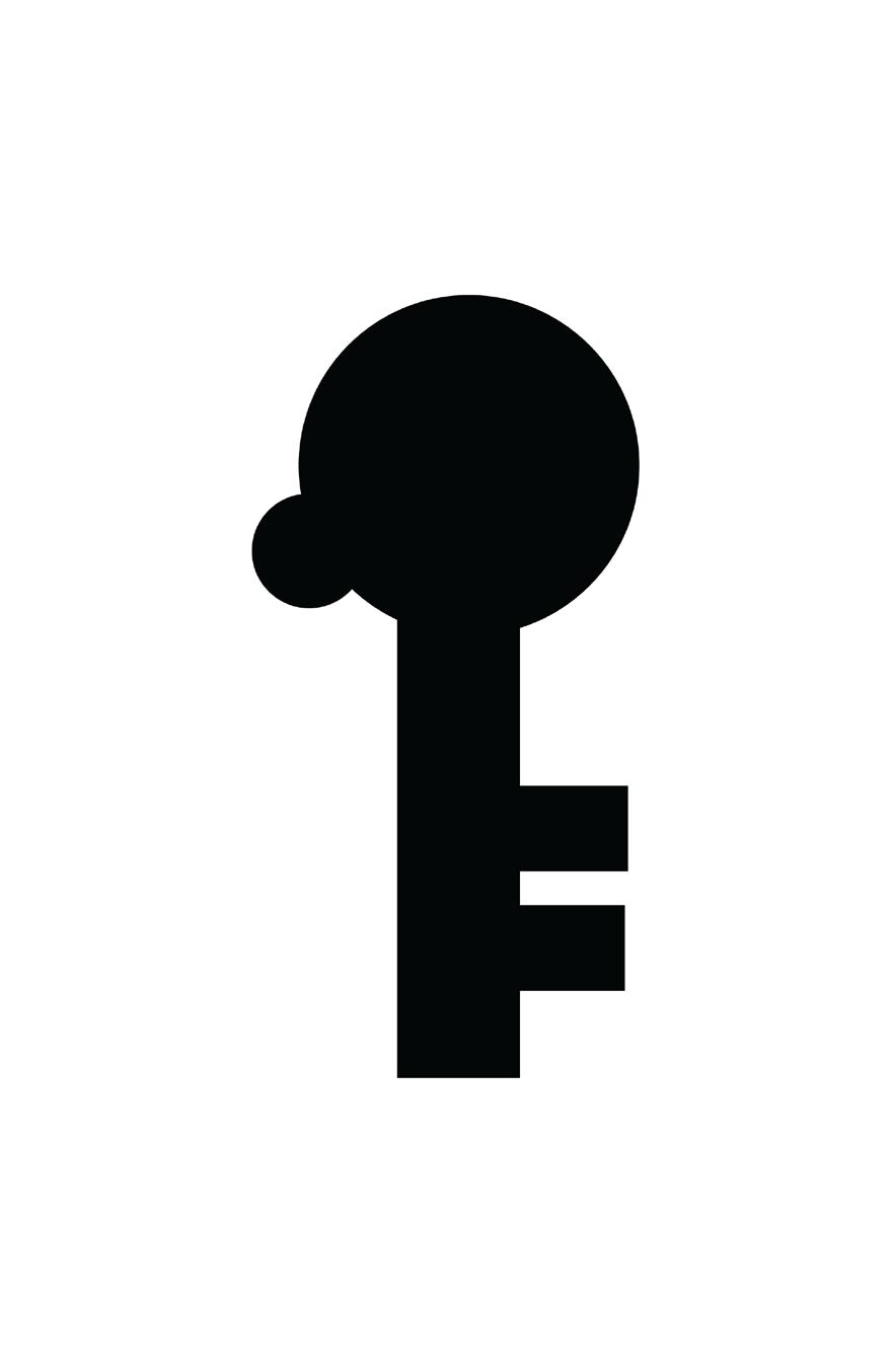
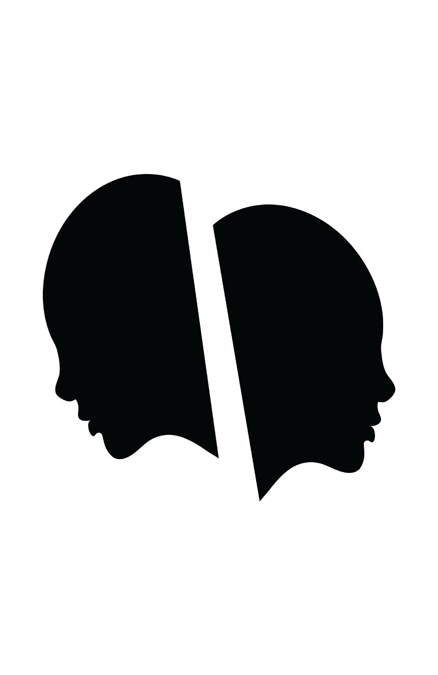
I continued my creative journey by attempting to merge concepts and generate iterations that featured a key shaped with a woman’s face. This represented another phase of exploration and experimentation in my design process.


Subsequently, I revisited the idea of cage designs, drawing inspiration from the first concept.

I continued to experiment with opacity, and then I engaged in brainstorming to explore subtler alternatives for expressing my keyhole metaphor, as I had envisioned.
None of these approaches appeared to be effective. Consequently, I returned to sketching once more, this time focusing on new ideas transitioning into the context of concept 3.
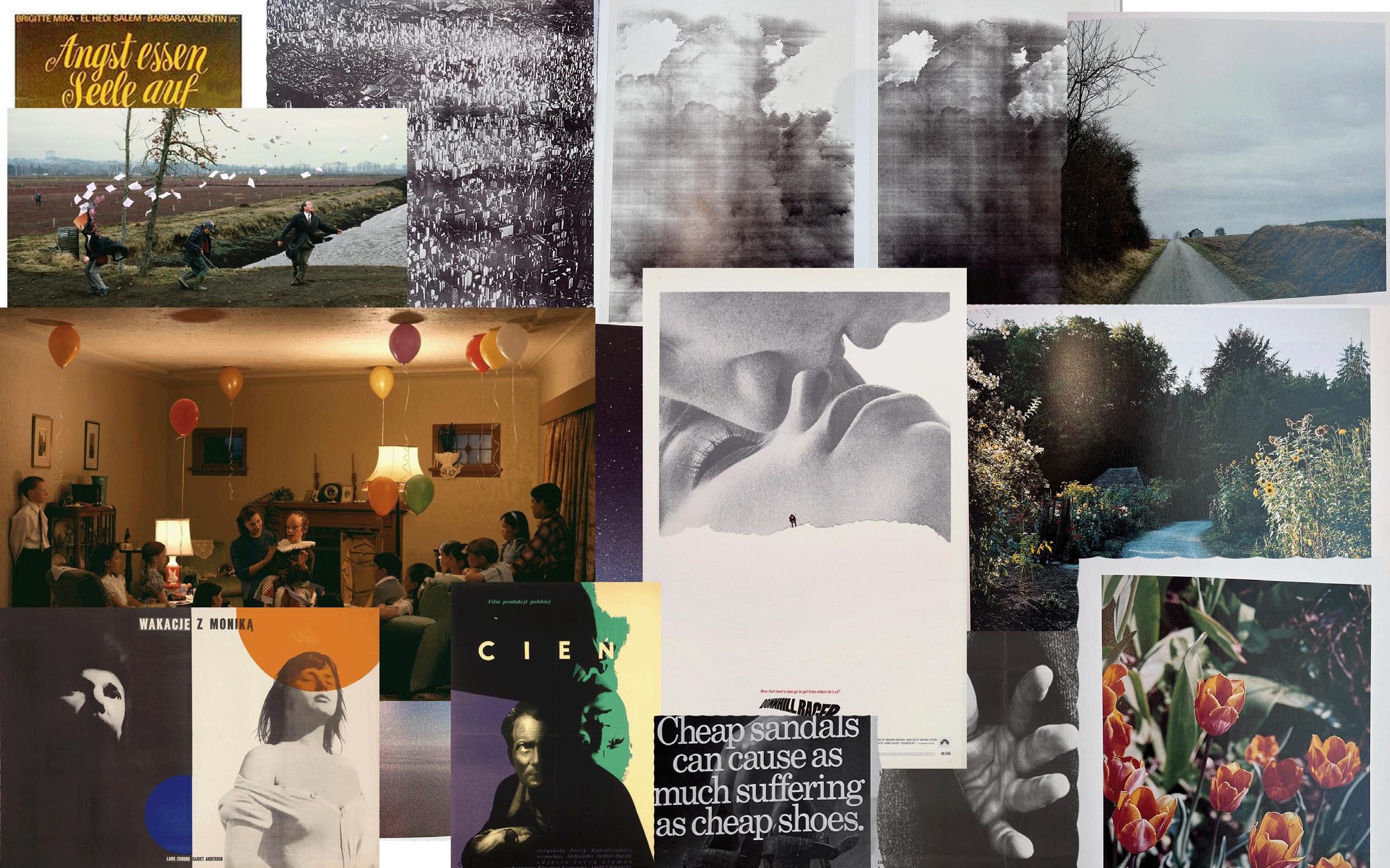
This is my moodboard for concept 3, which bears a strong resemblance to the one in concept 2, but with a lighter visual tone.
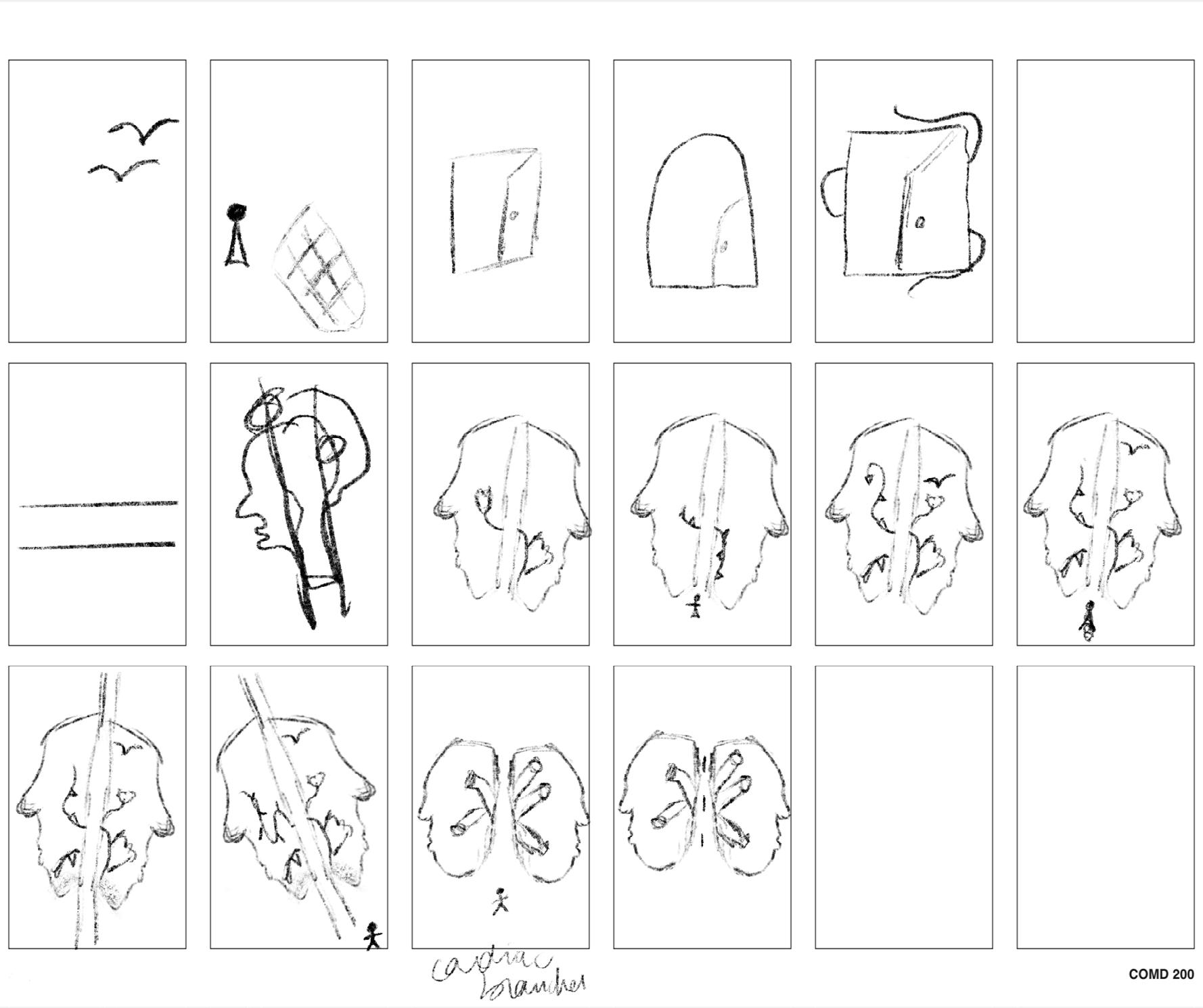
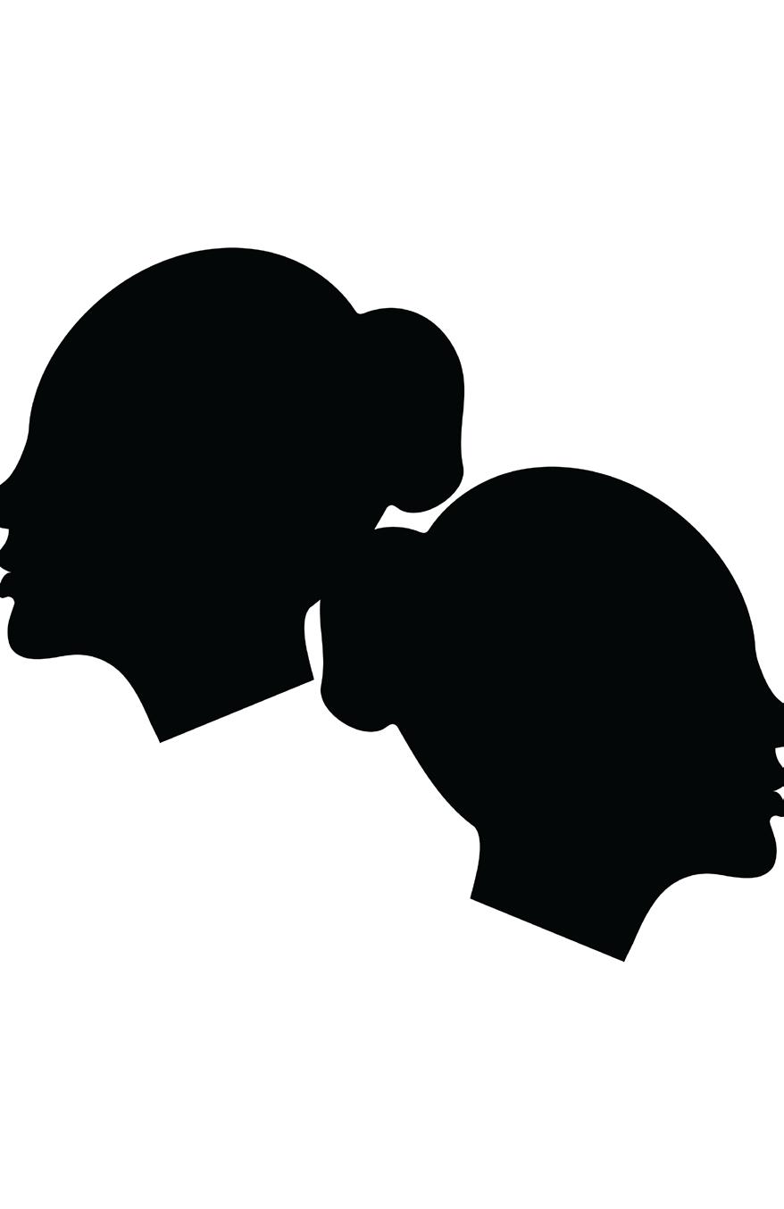
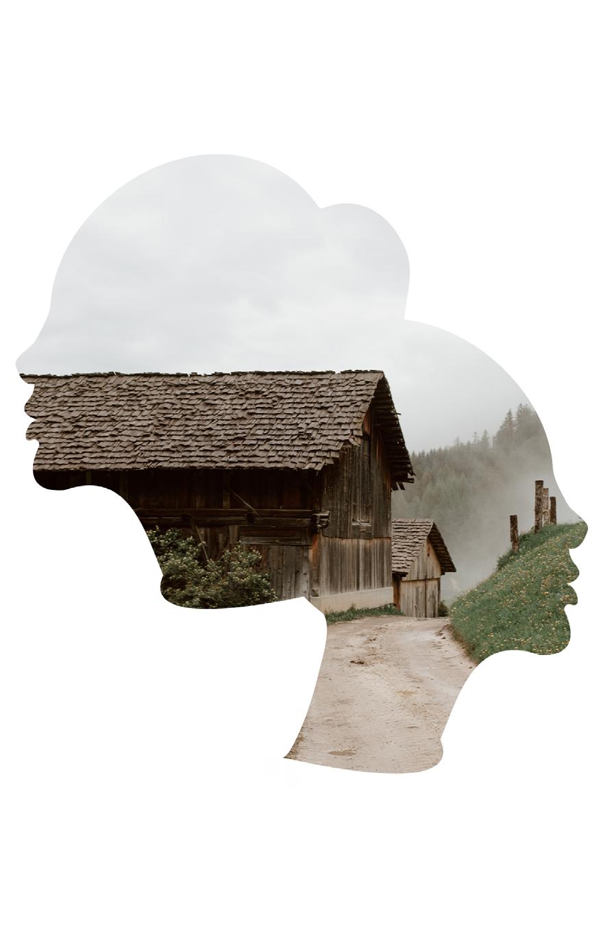
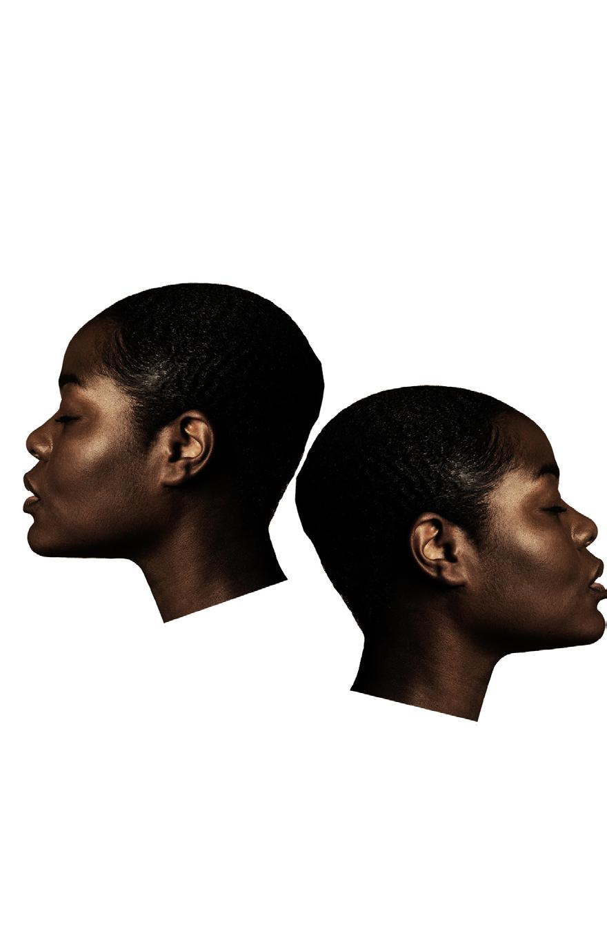
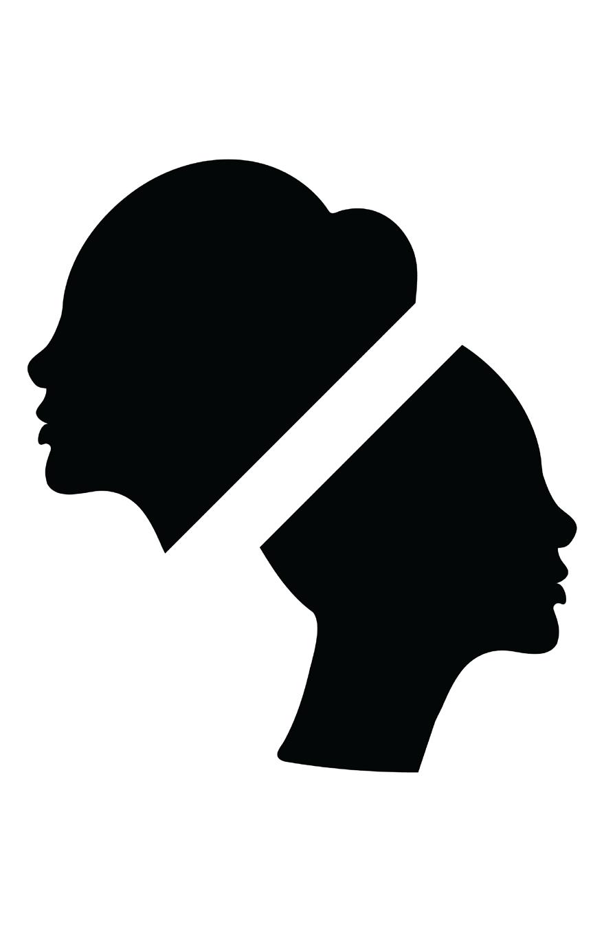
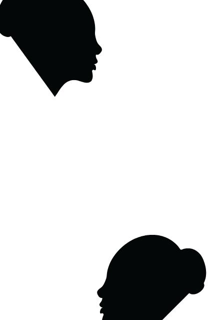
I initiated concept 3 by working with raster images in an attempt to evoke the themes of the movie. However, this approach didn’t yield the desired visual results. Consequently, I returned to my initial ideas of incorporating multiple women, in this case, two women interacting with one another as they progress on their path to freedom.


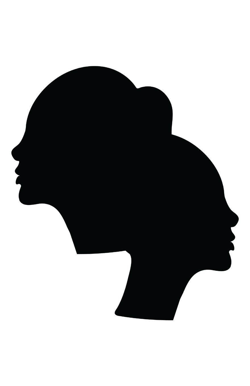
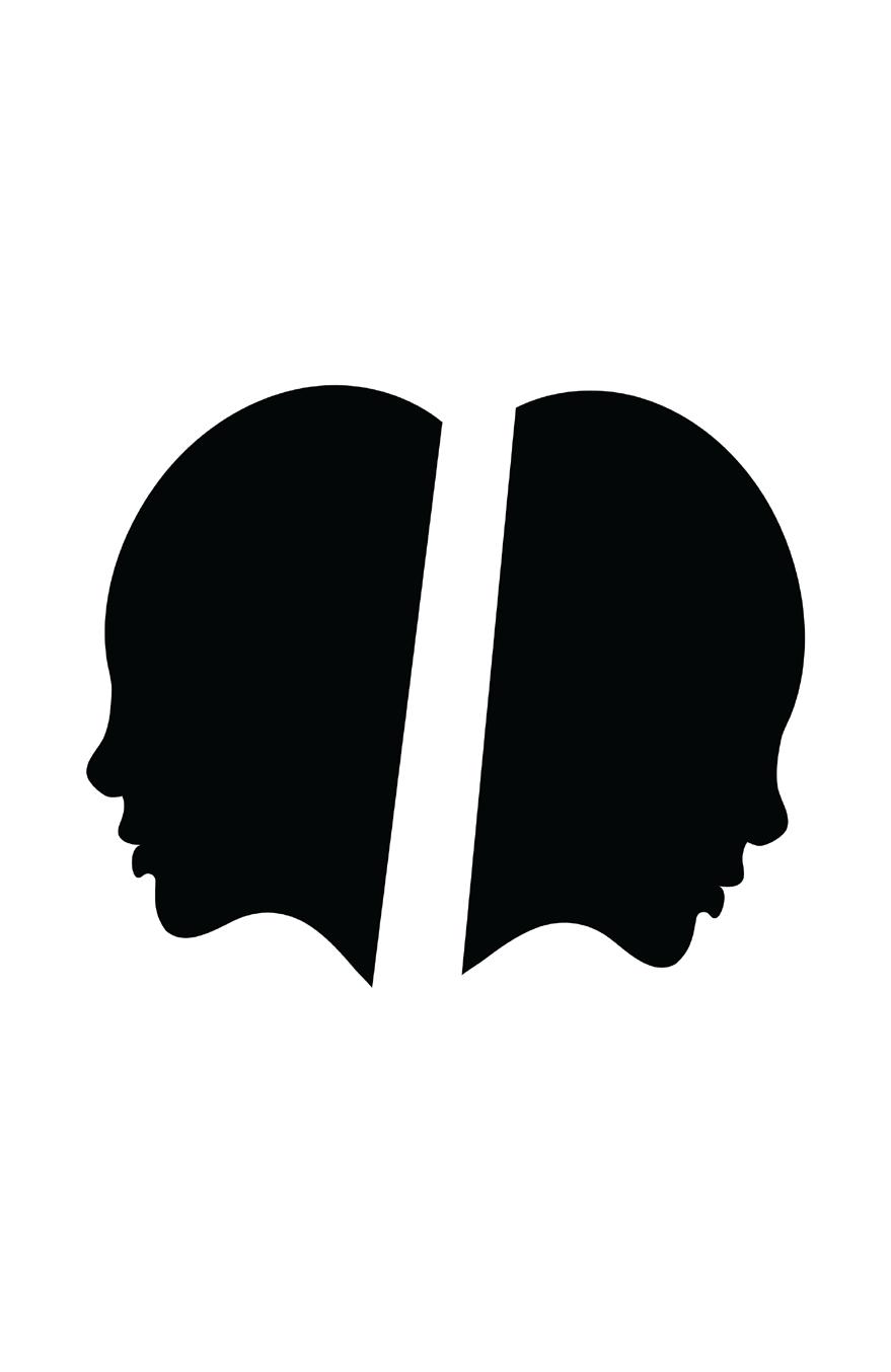
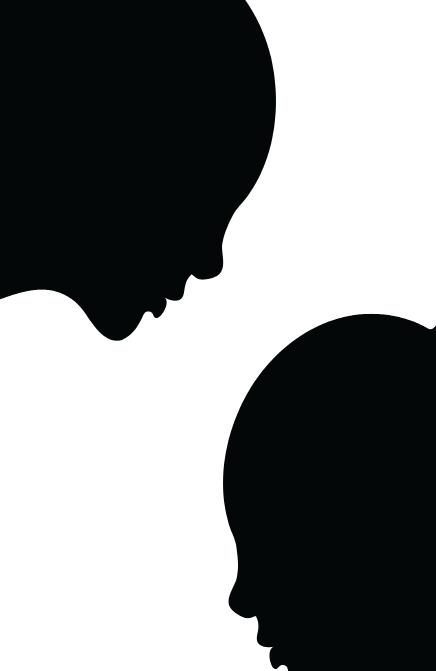
I delved into the manipulation of negative space and explored how the figures interacted with each other in the composition.
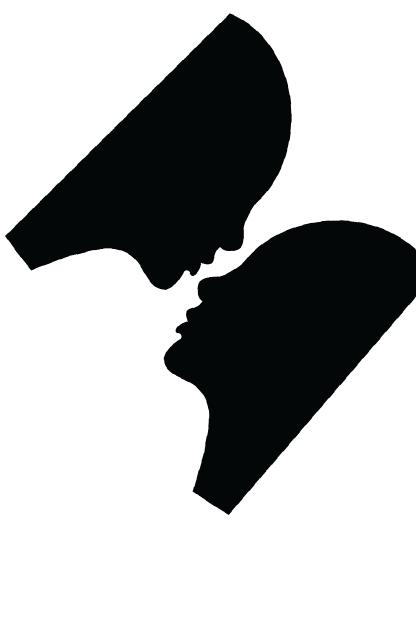
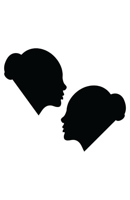
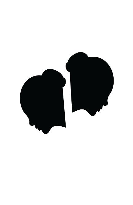
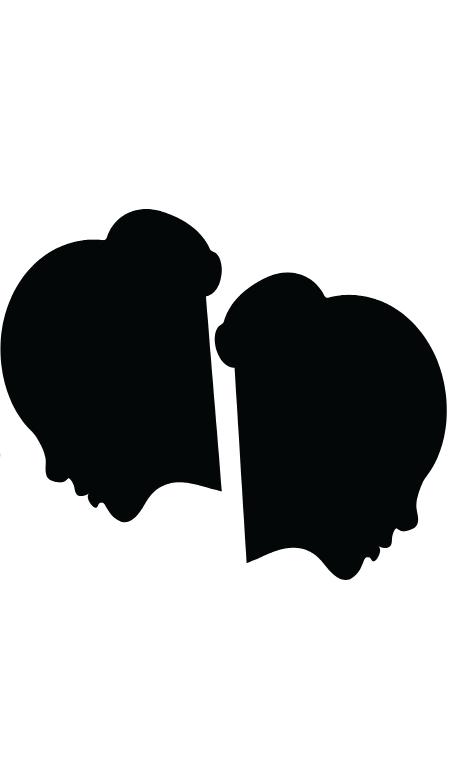
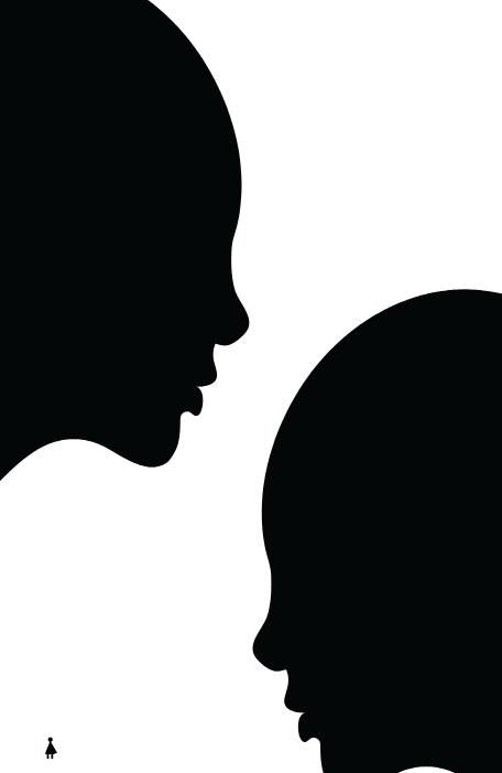
I began to consider the composition and how I could create a visual dialogue or conversation between the figures within the design.
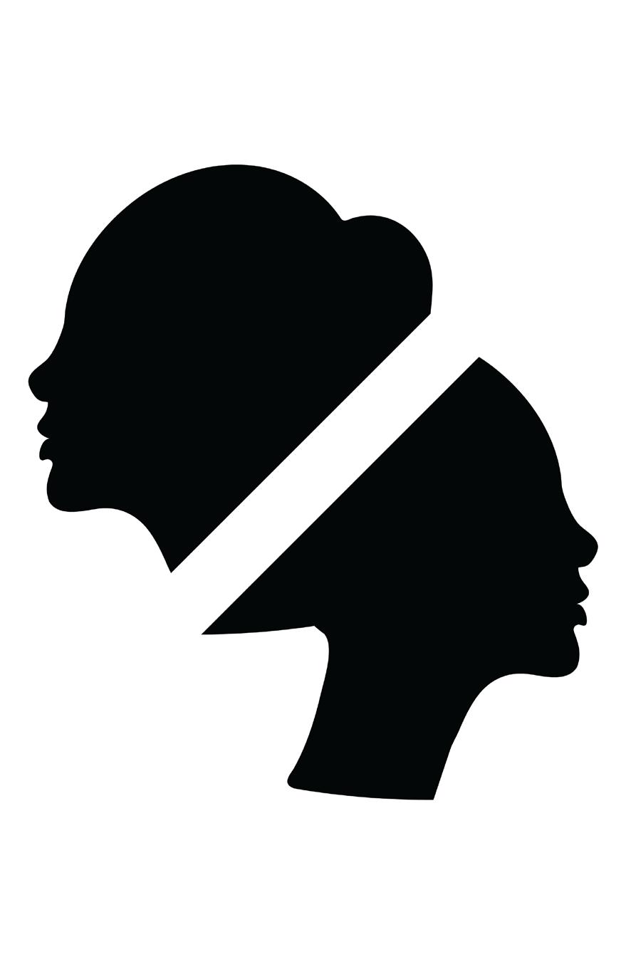
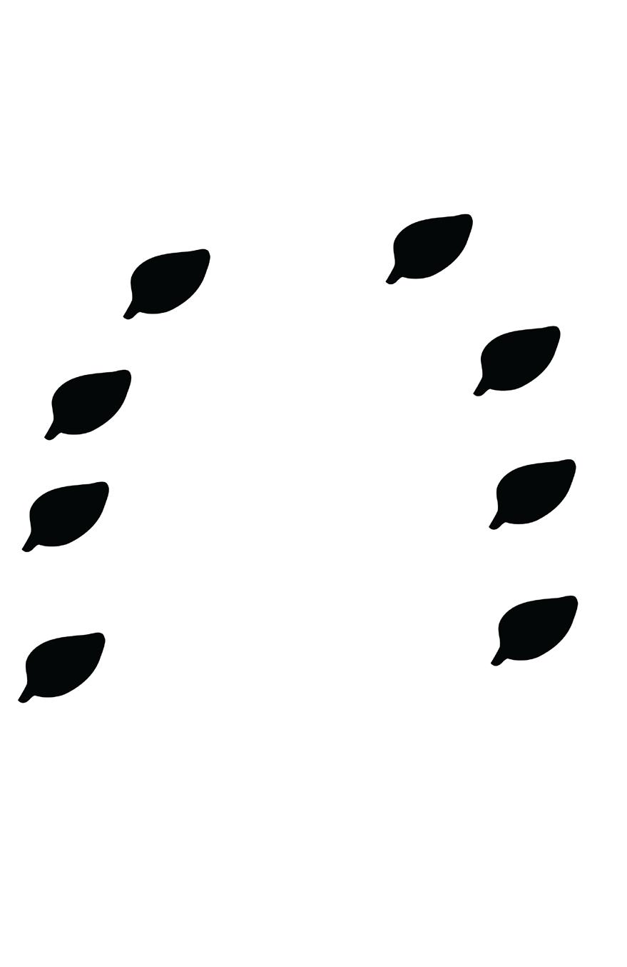
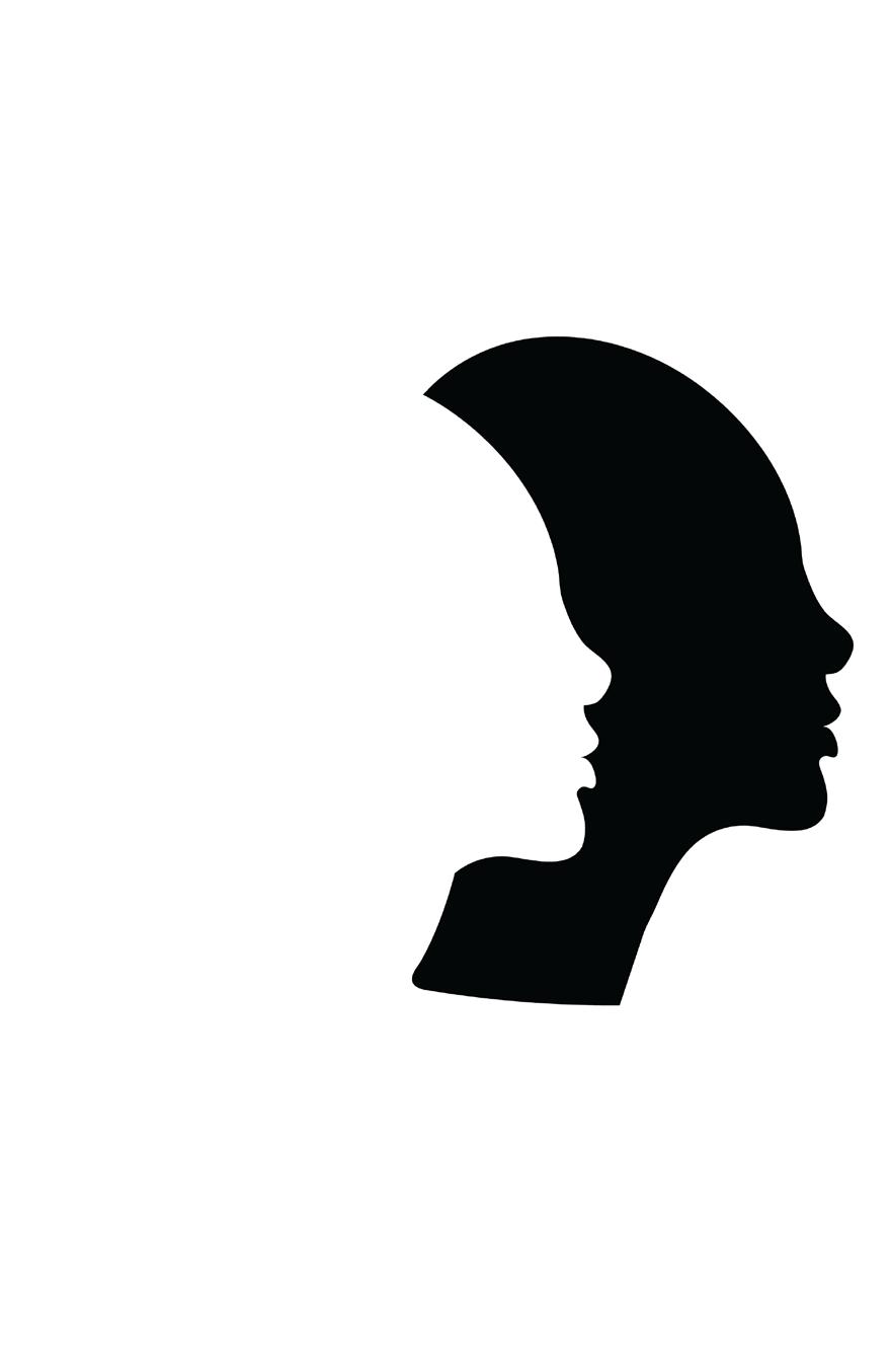
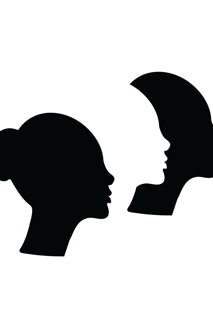
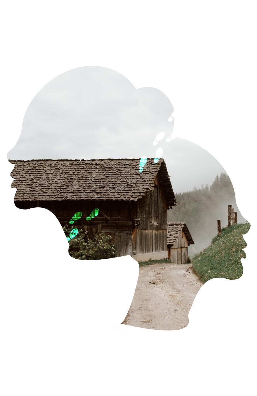
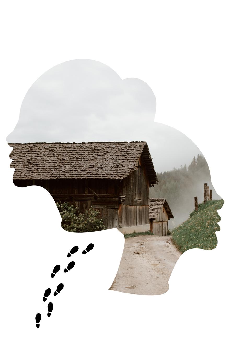
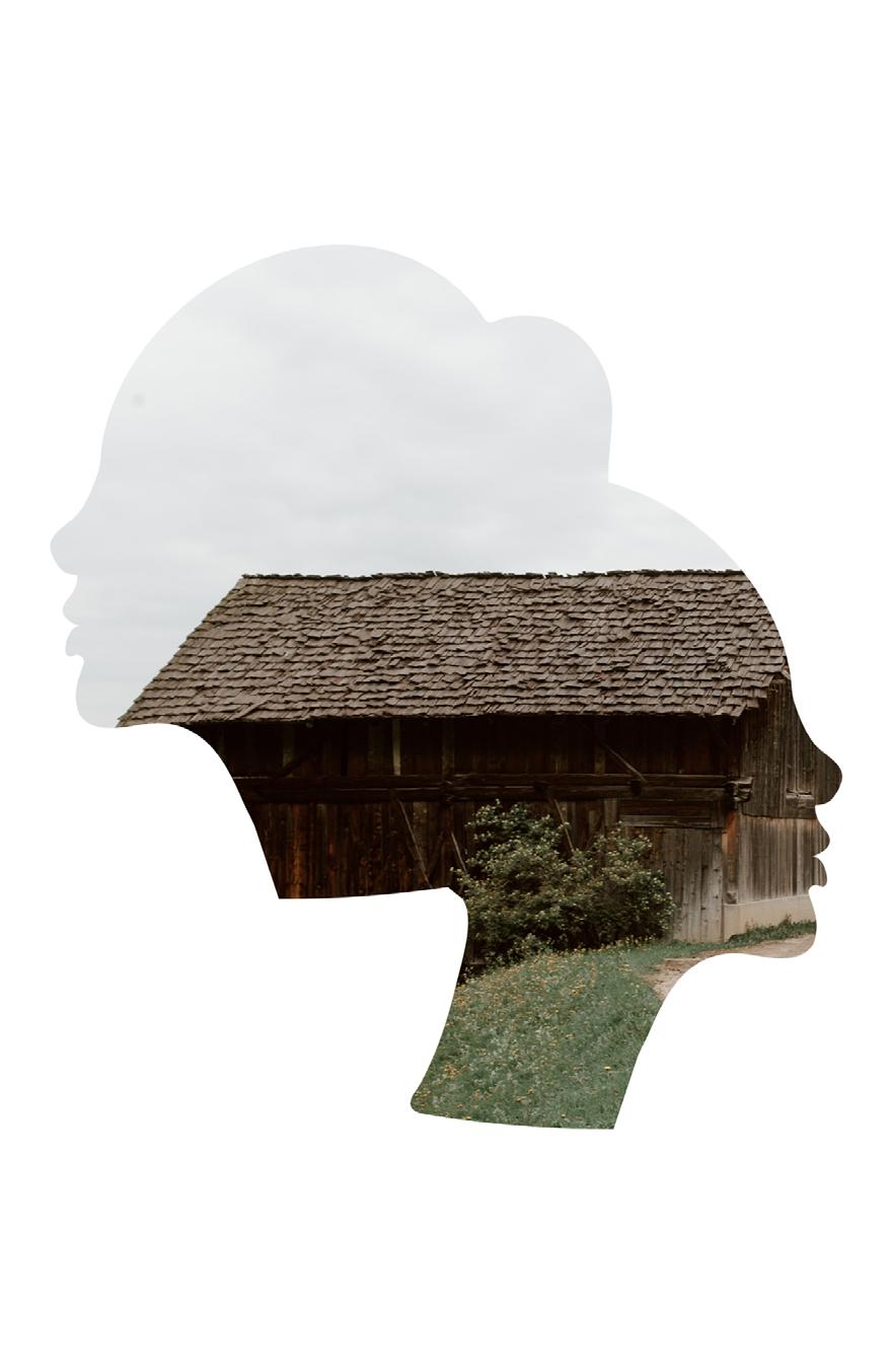
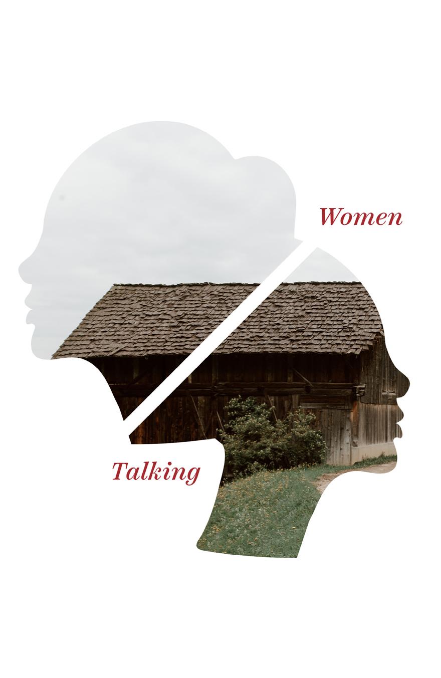
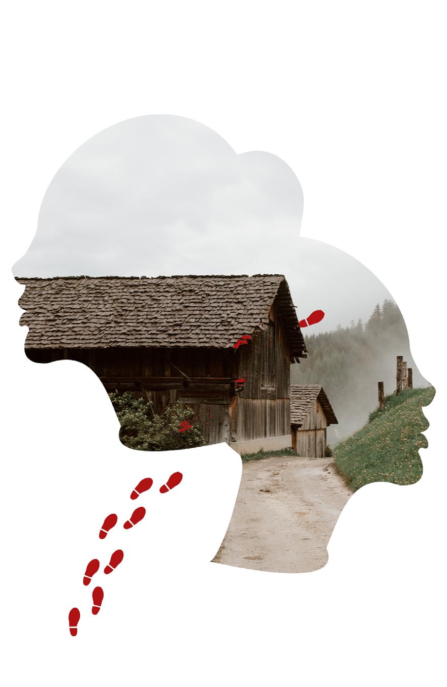
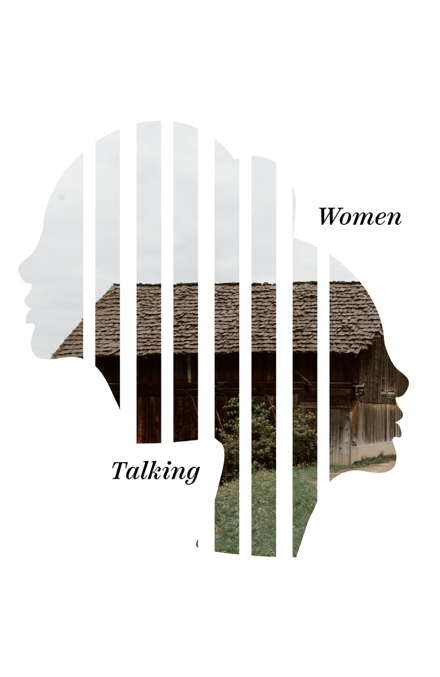
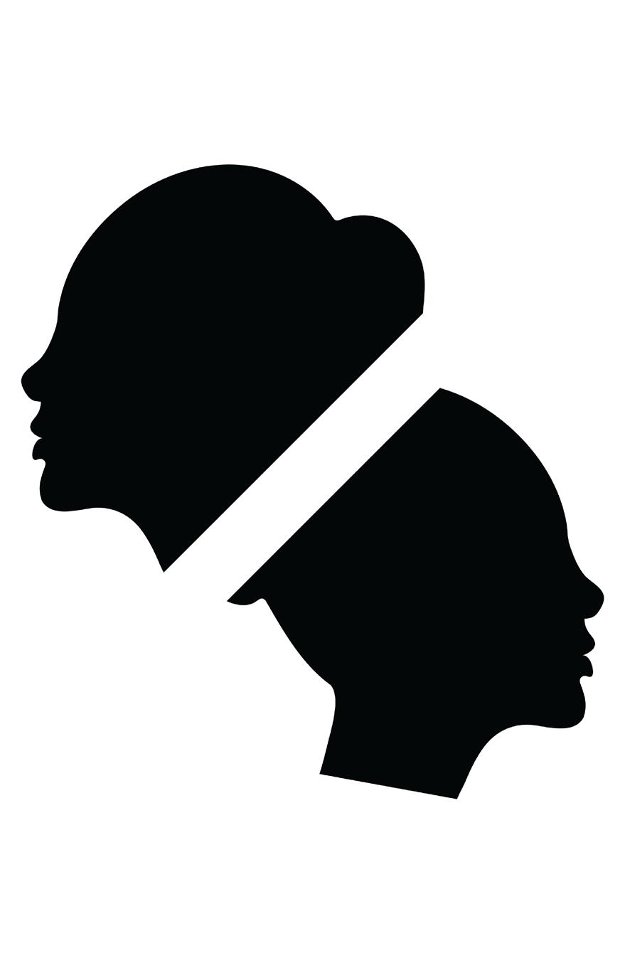
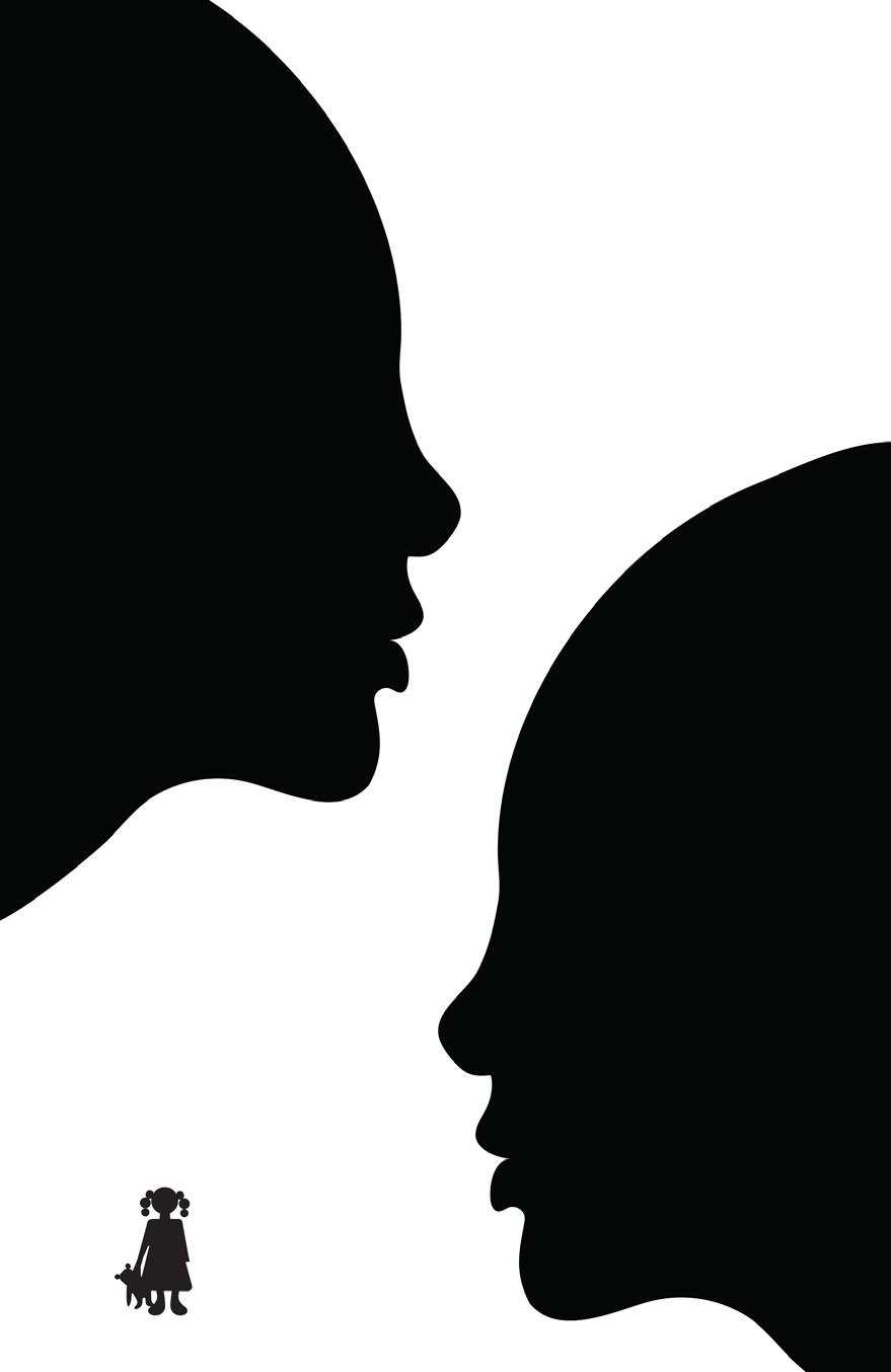
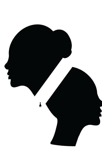
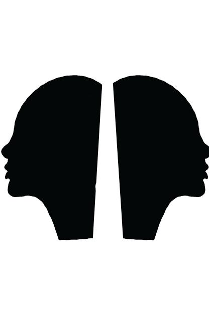
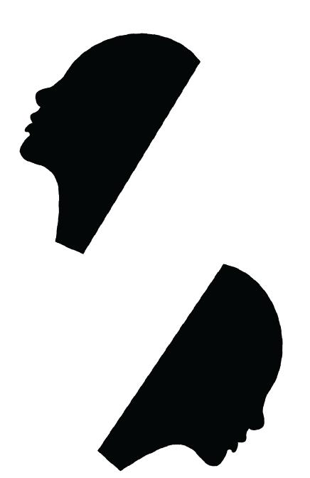
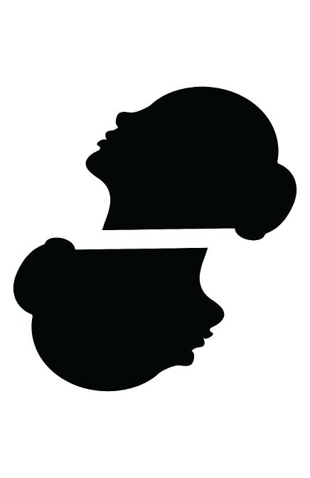
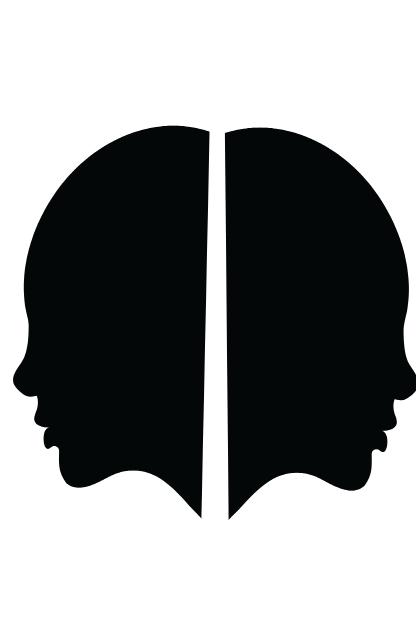
In these artboards, I experimented with the idea of depicting two women facing opposite directions, symbolizing the choices they have in the film: to stay or to leave. I added footsteps to suggest the path taken, and incorporated an image of a barn to reference the movie’s location, emphasizing its secluded and stifling atmosphere.
I also made efforts to finetune the representation of the footsteps to make them more evocative. Among these attempts, one that caught my attention was the red footsteps, which alluded to themes of blood, violence, and fear.
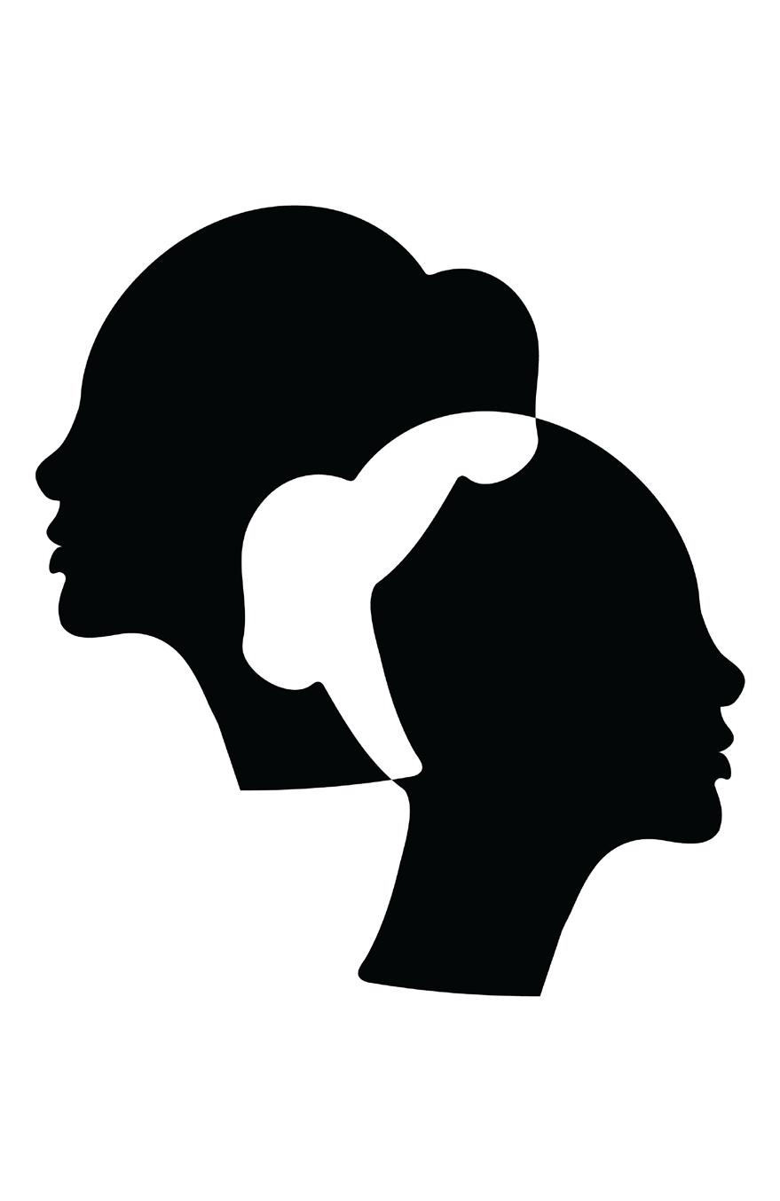
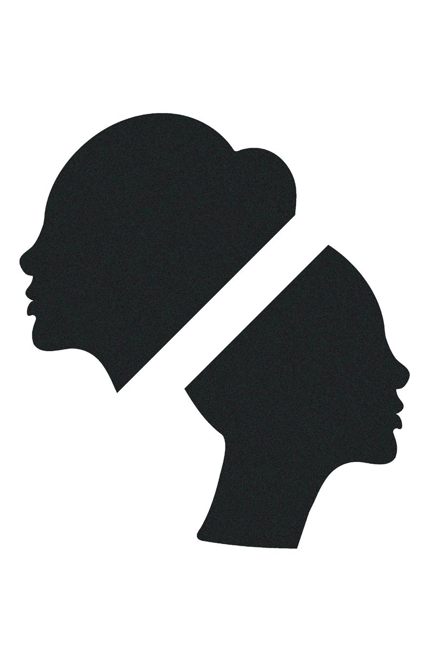
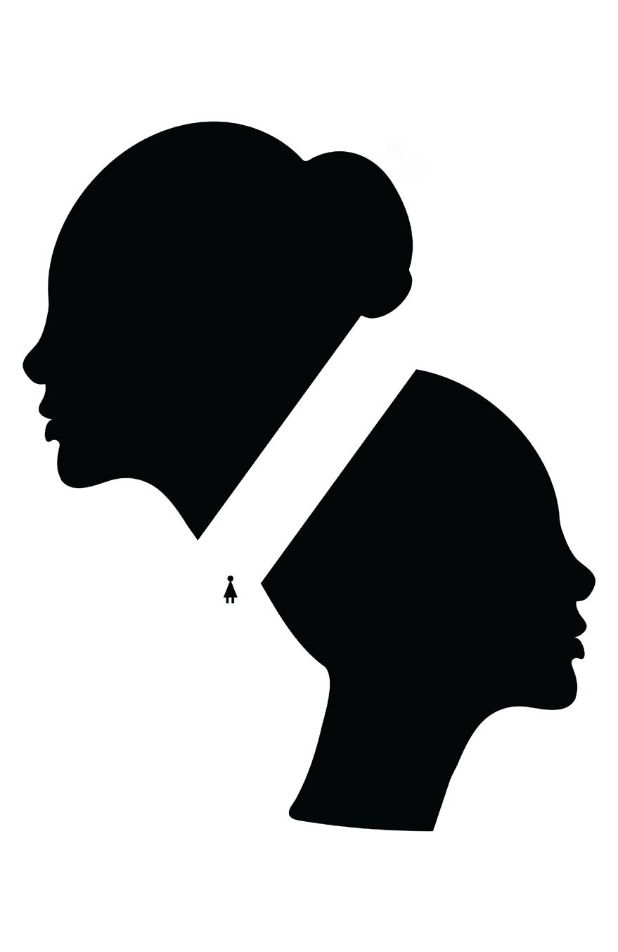
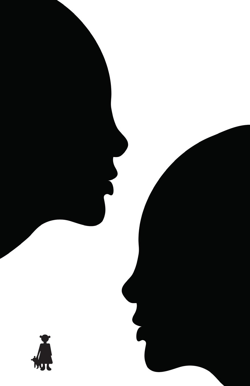
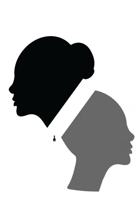
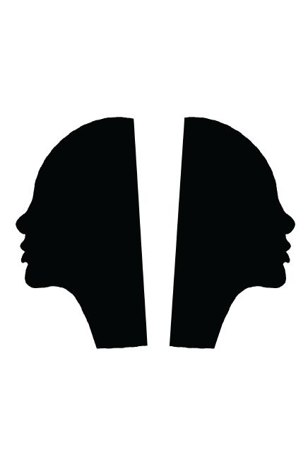
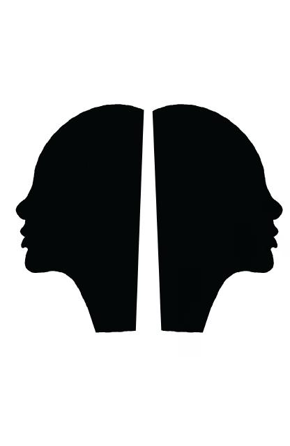
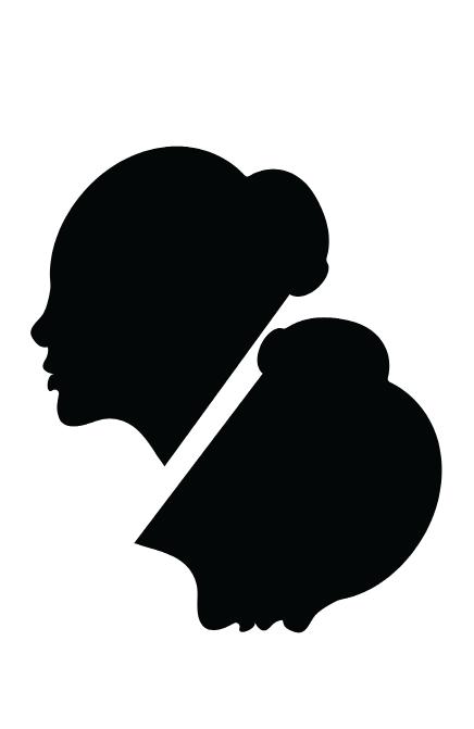
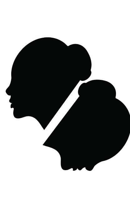
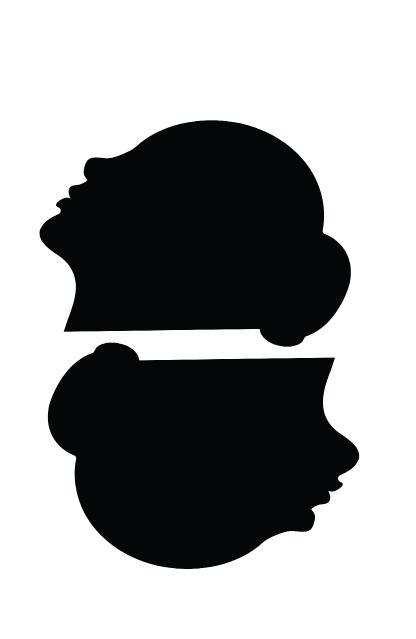
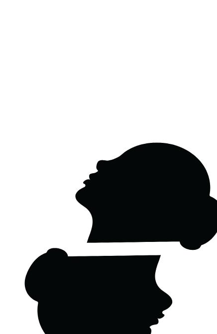
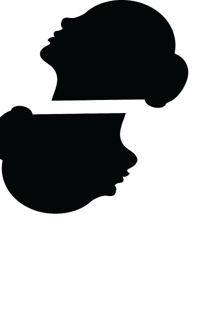
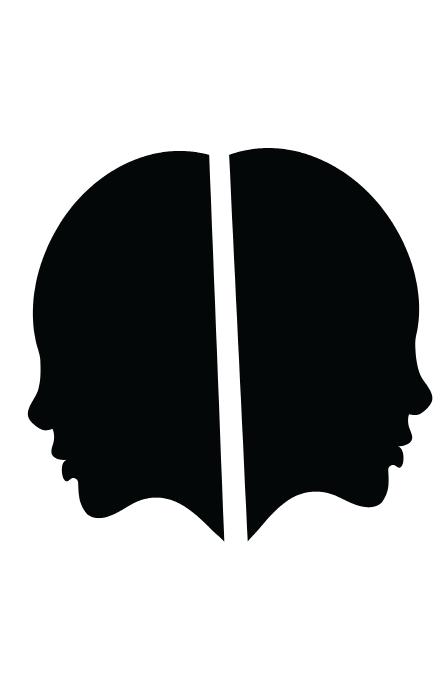
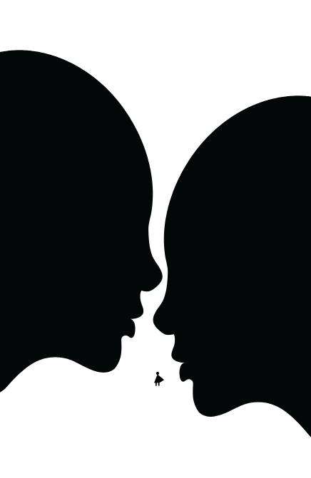
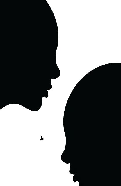
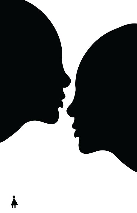
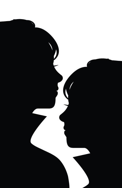
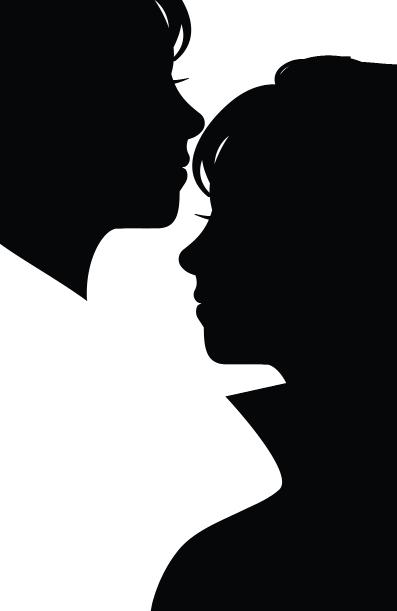
Instead of using footsteps, I was encouraged to divide the space between the heads, intending to convey a sense of direction and emphasize the narrow path they are on. This change in approach was a creative adjustment to enhance the visual storytelling of the design.

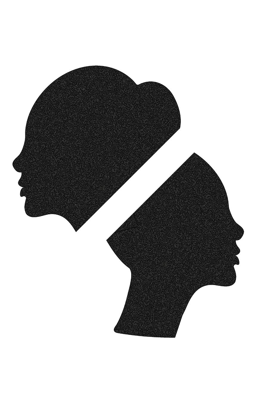
I intended to incorporate prison bars onto the faces as an additional layer symbolizing a form of imprisonment. However, this concept did not resonate well with my instructor, prompting me to further iterate and refine the design.
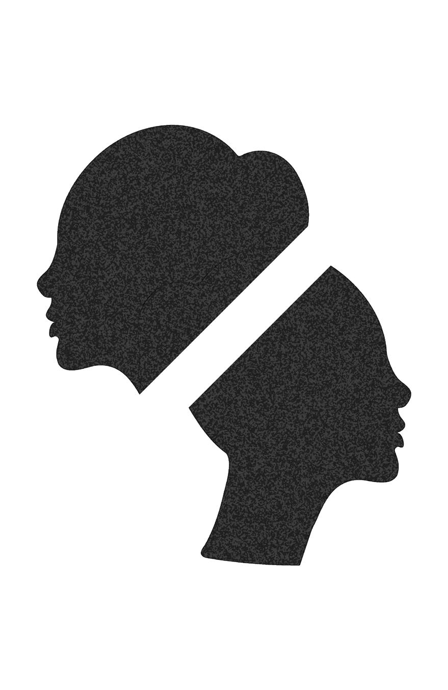
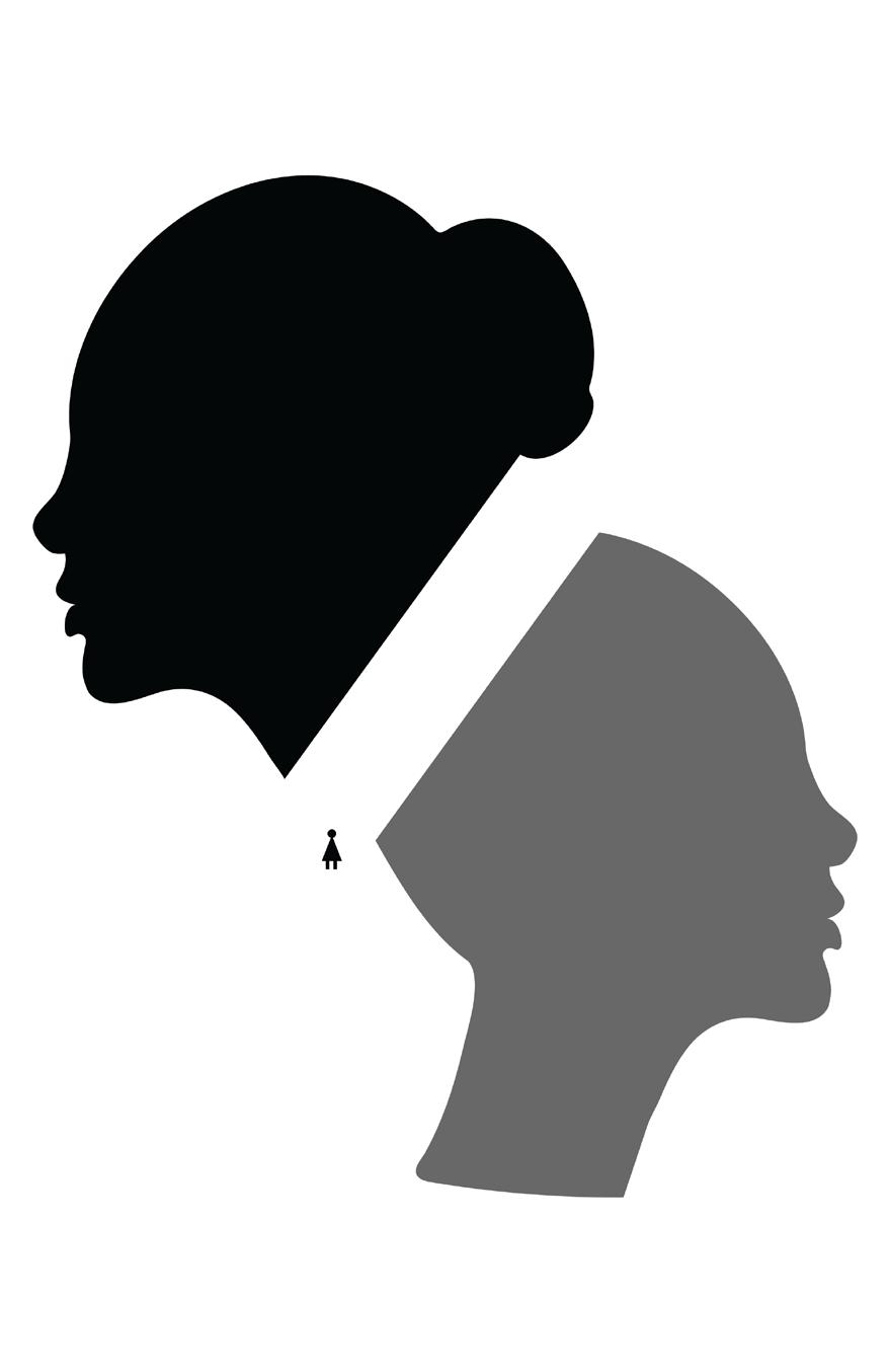
After receiving everyone’s feedback, one particularly notable piece of advice was to be more mindful and deliberate in how I utilized space within the composition and in how I created a dialogue between the faces in the design.
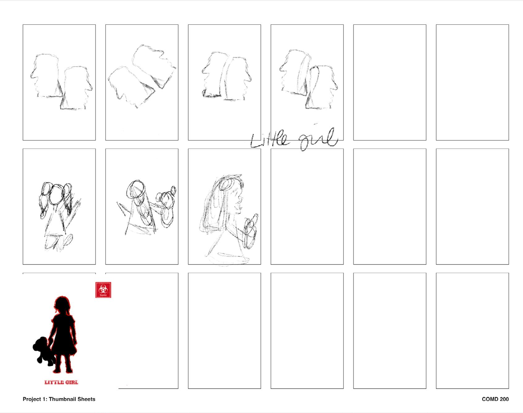
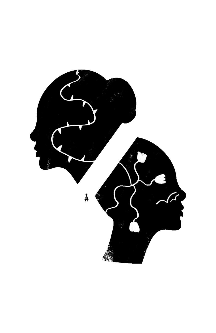
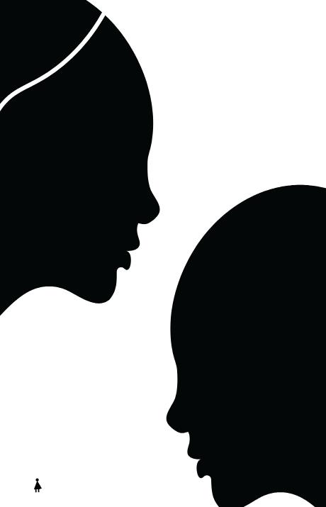
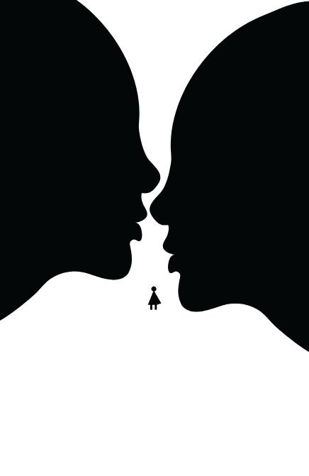
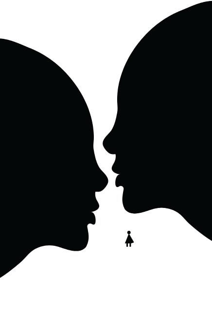
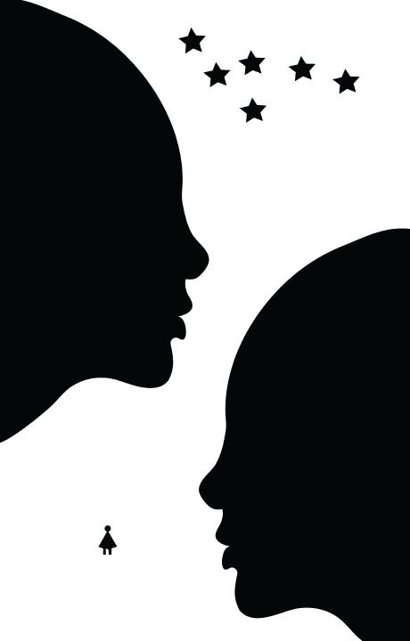
I began experimenting with texture to enhance the visual appeal of the design, and I also introduced the image of a little girl in the middle of the negative space. This addition aimed to make the concept of the road more explicit within the composition
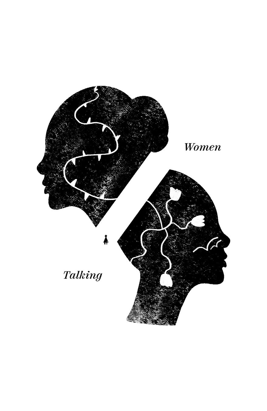
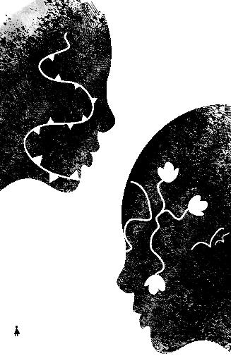
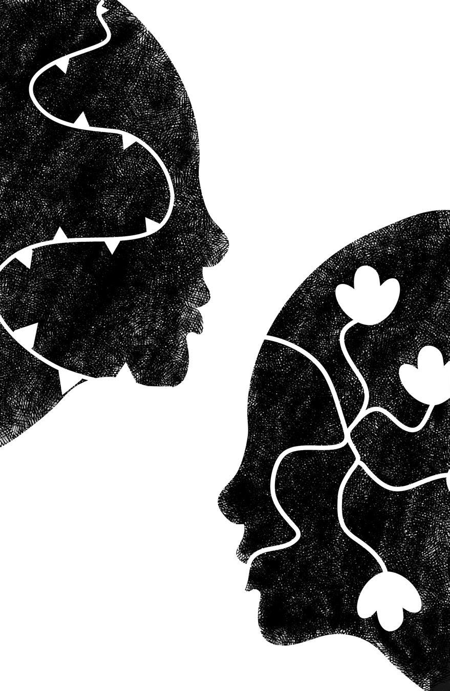
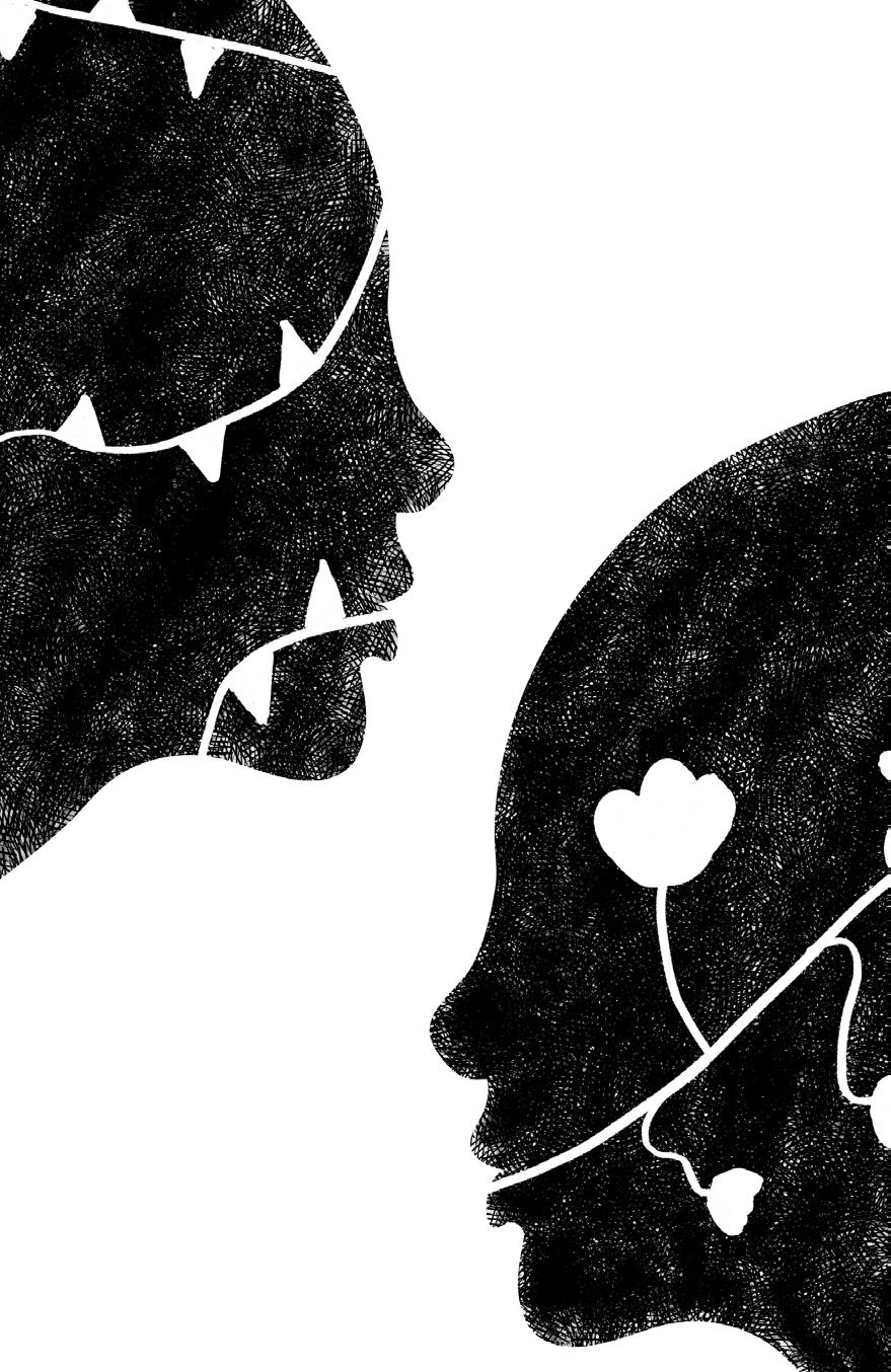
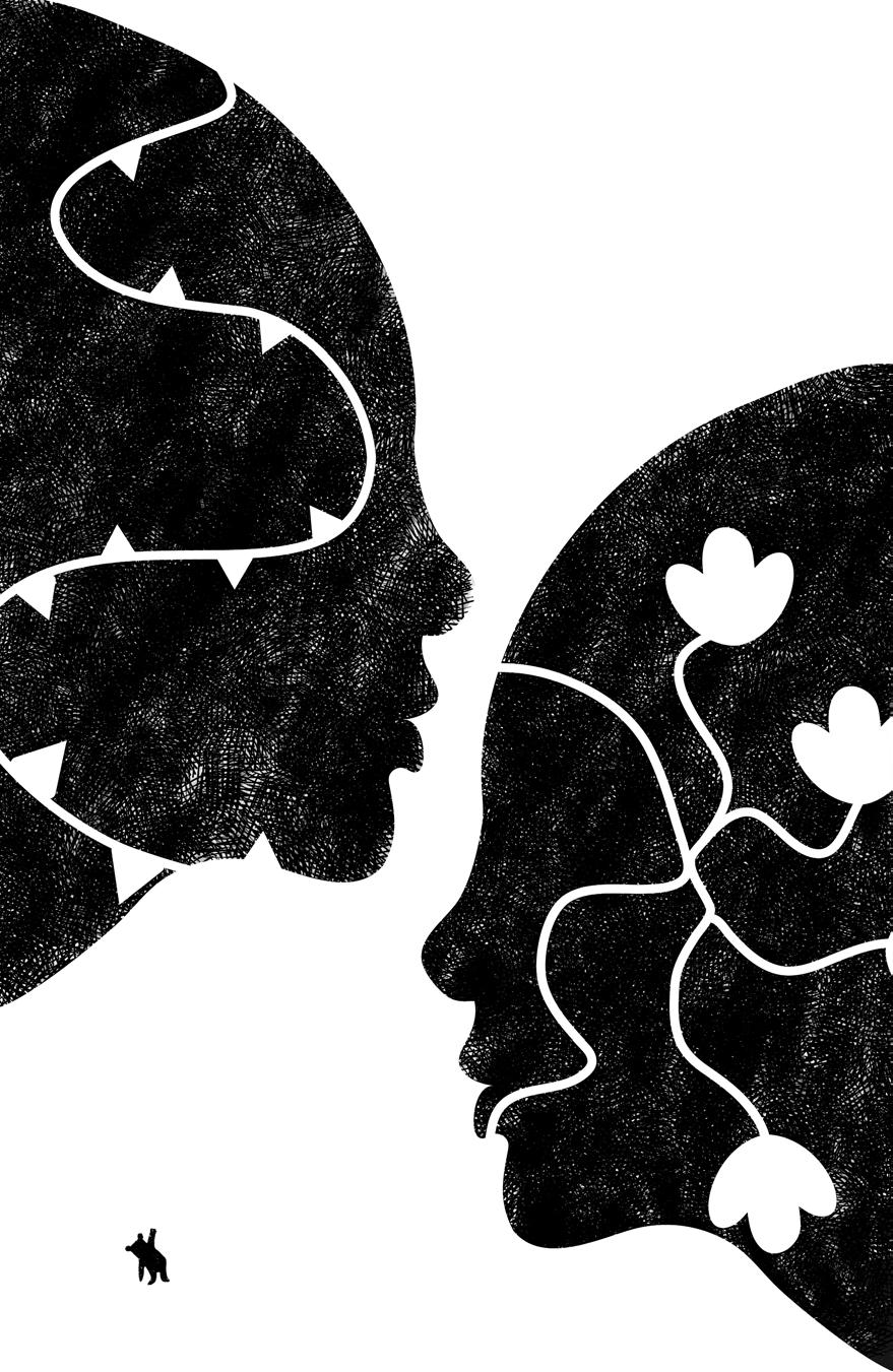
I subsequently began drawing thorns and flowers on opposite sides of the composition. This was a reflection of the potential outcomes of the decision the women make, symbolizing both adversity and the possibility of growth and resilience.
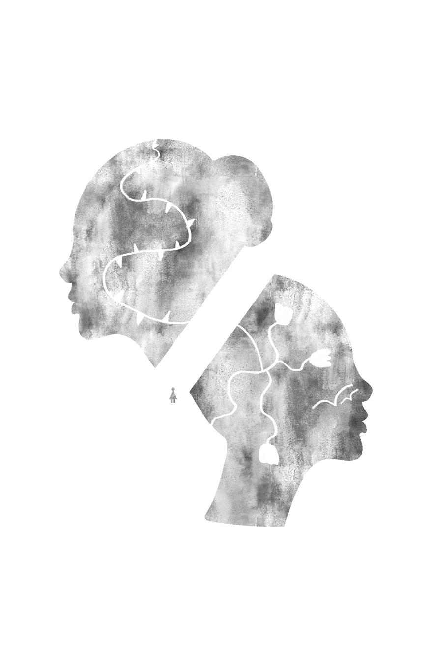

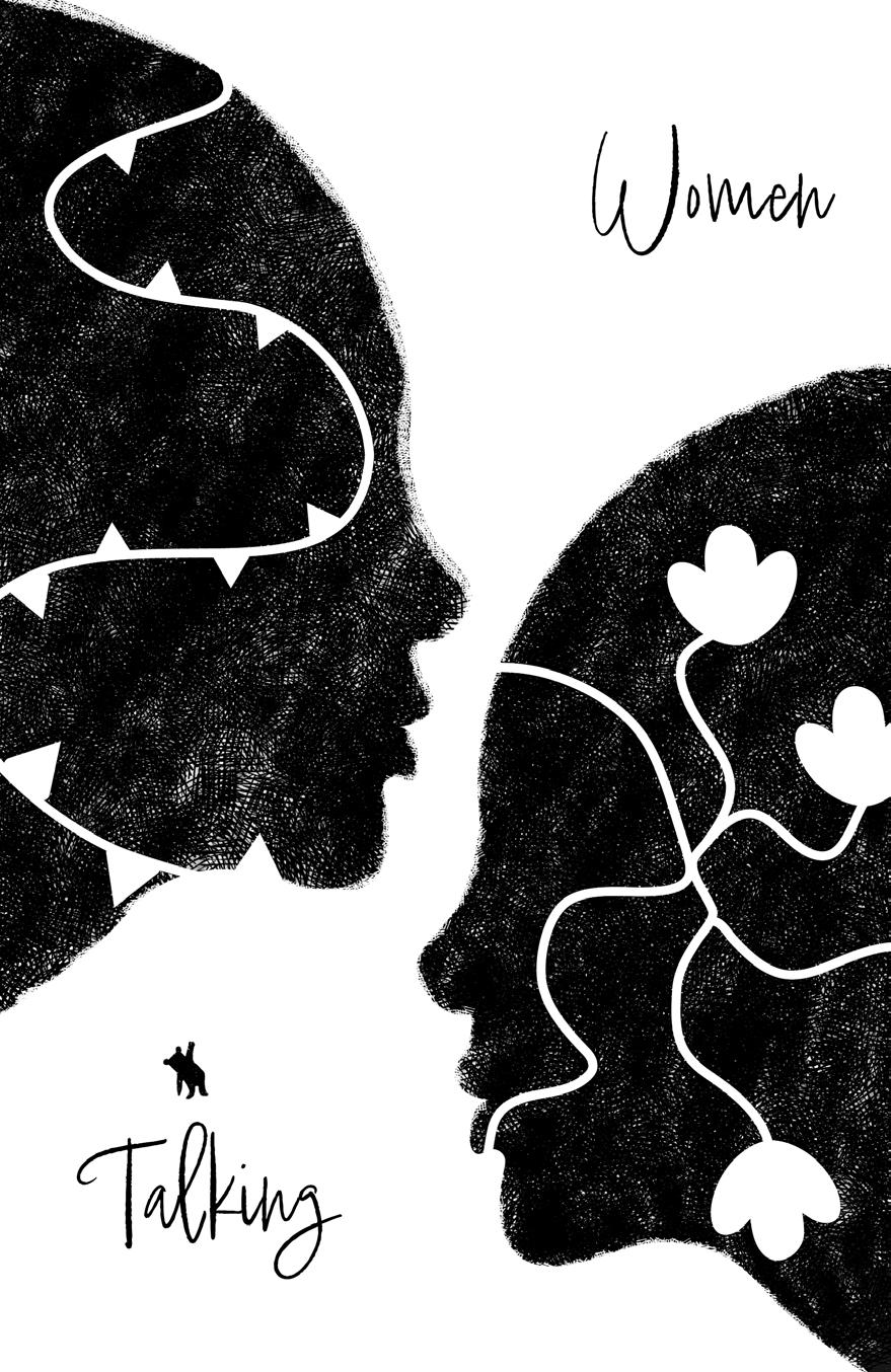
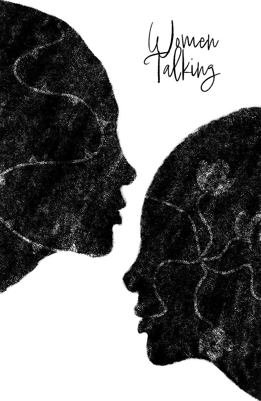
At this stage, I introduced text to explore which arrangement would fit the design better. I maintained a consistent indentation to create an effect reminiscent of the flow of wind


This is my annotated moodboard after revisions.
Considering the expansive canvas of the large poster format, and taking my instructor’s suggestion into account, I expanded the use of space within the design.
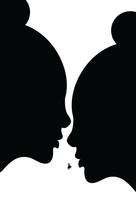
I also made several adjustments, including the repositioning of the little girl. I found that her placement could be potentially confusing for the audience, so I opted to make it more evident that she was indeed a little girl. This choice was informed by my desire to reference innocence and allude to the film’s narrator, as well as to create a visual conversation between the little girl and the woman yet to come. This aspect of the design aimed to convey the impact of their decisions and engage the viewer in a thoughtful reflection on the future of those women.
The presence of the little girl appeared somewhat out of place in my artwork. Therefore, I considered having the teddy bear she was holding to be independent, signifying that someone was holding it. I believed this would clearly indicate to the audience that there was a figure present.
However, my instructor and some of my peers strongly disapproved of this decision, justifying their disapproval by stating that it felt out of sync with the overall aesthetic of the poster. Consequently, I chose to remove it. This experience highlighted the value of receiving critiques, as they provide an outsider’s perspective on the work. When you’ve spent a substantial amount of time on something, it might make perfect sense to you, but not to others. As per my earlier point, in line with Tinker Hatfield’s perspective, design should communicate not just with the designer but also with those who view it. So, in the end, dear Teddy Bear was removed from the design.
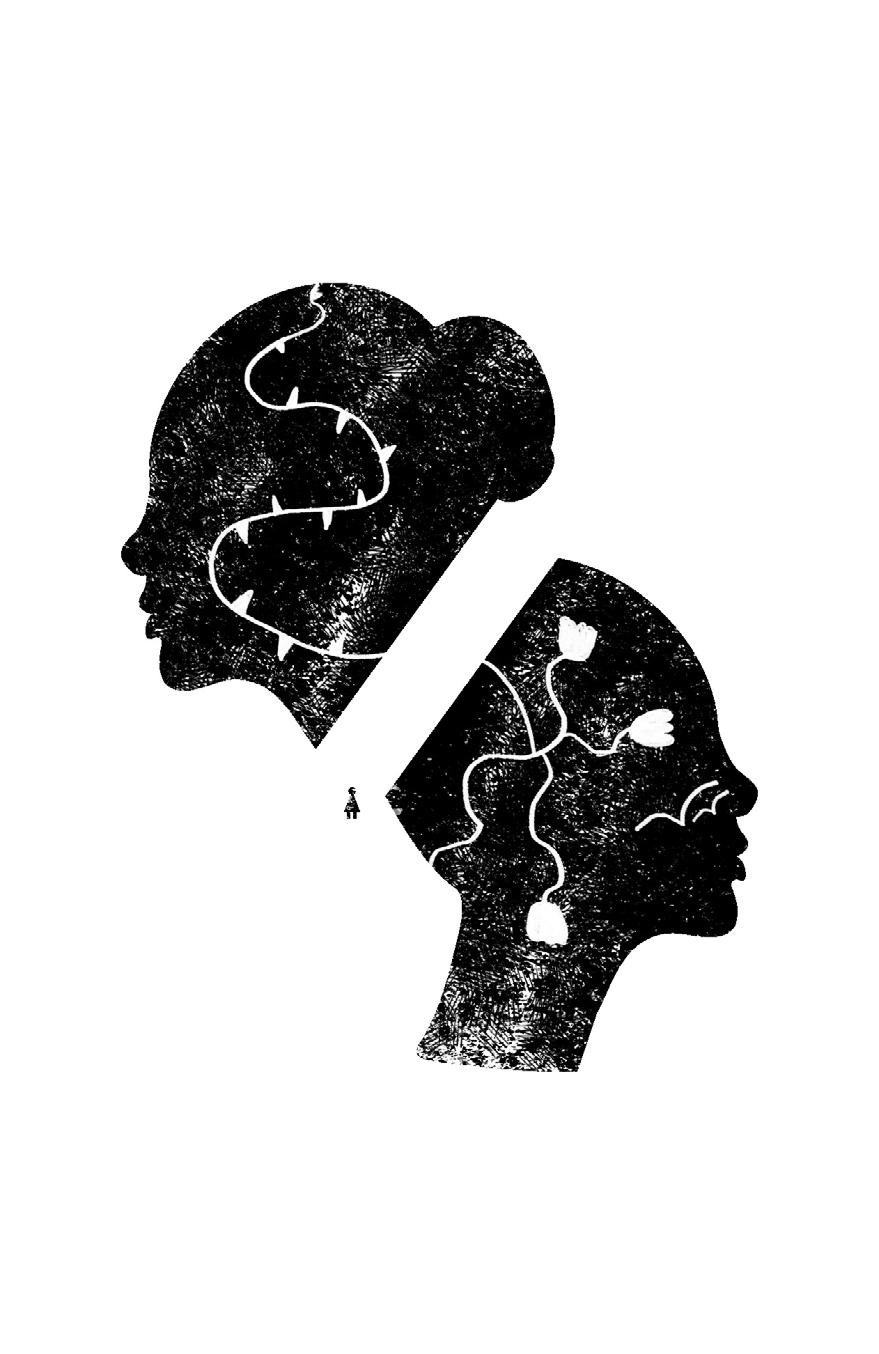
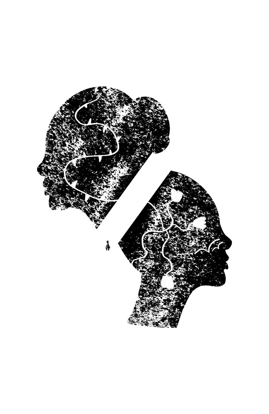
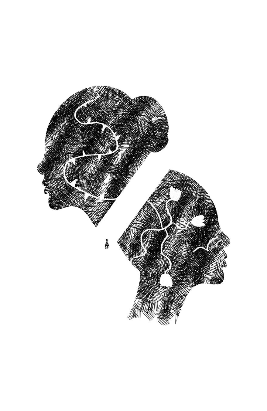
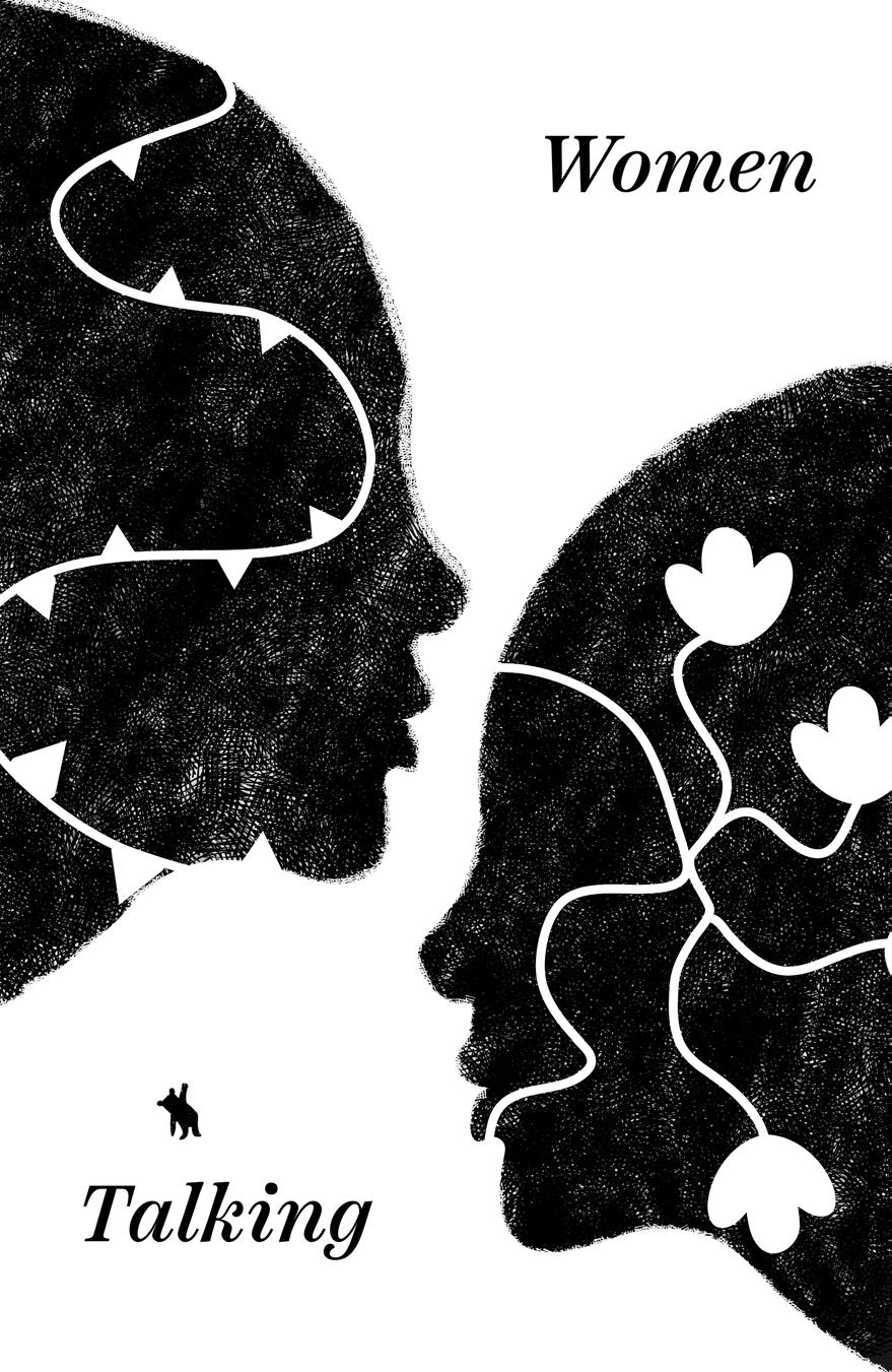
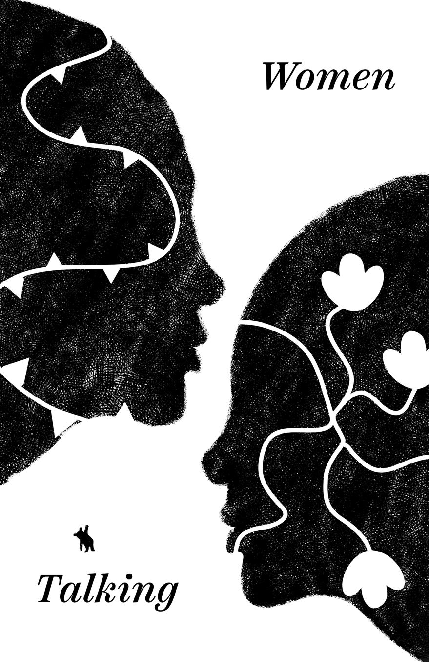
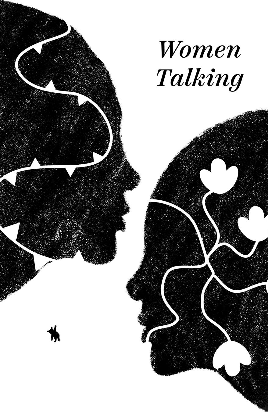
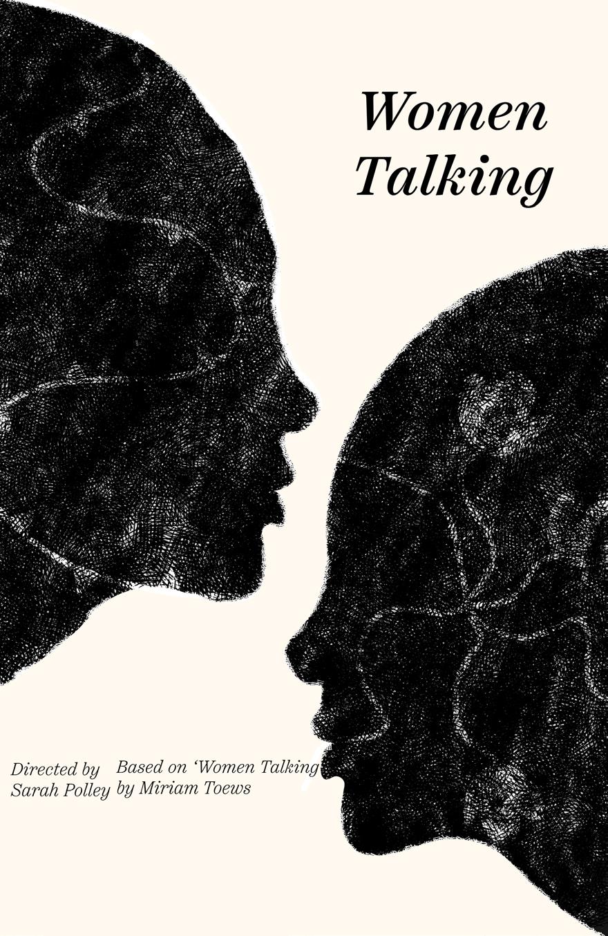
The following iterations encompass explorations of composition, typography, and texture within the design.
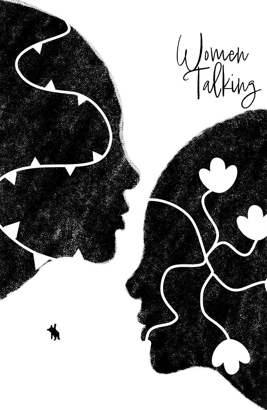
I favored this handwritten typeface, as it seemed to capture the delicacy of the themes. However, it didn’t appear strong enough for the message I wanted to convey. It came across as more romantic in style, which wasn’t aligned with the intended tone.
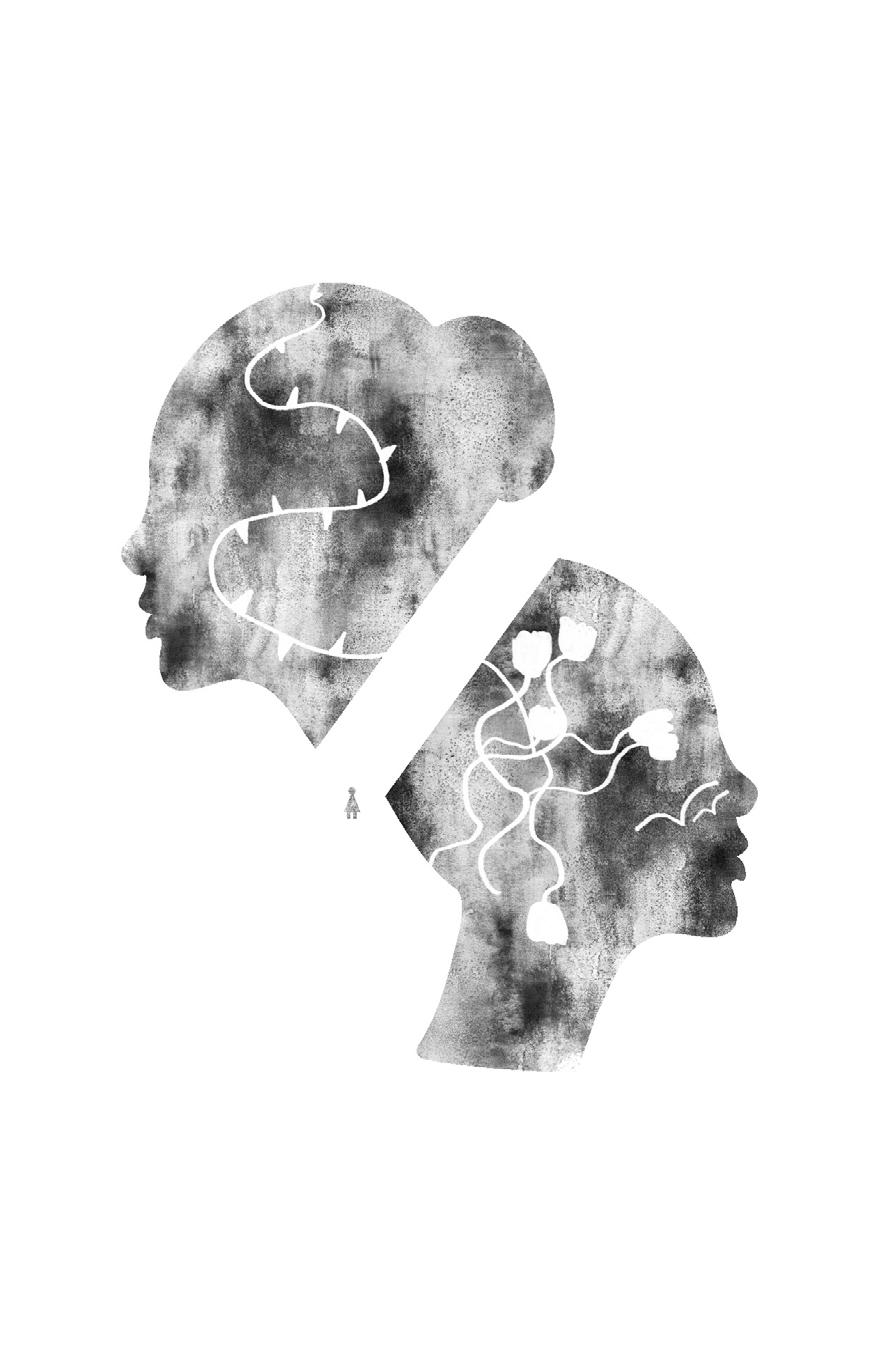
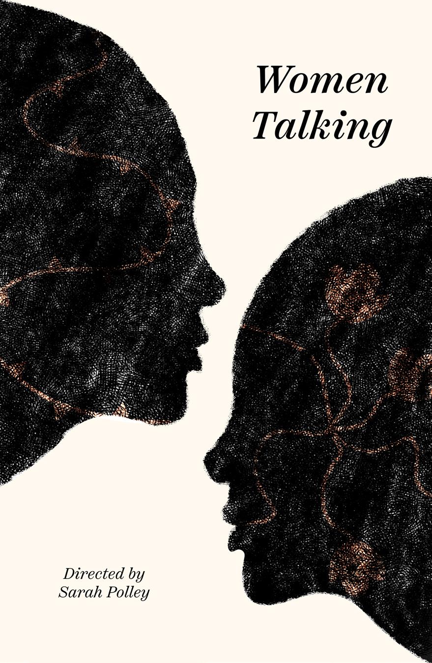
I softened the edges and integrated the flowers and thorns more seamlessly into the design. This adjustment aimed to create a smoother and more harmonious visual composition.


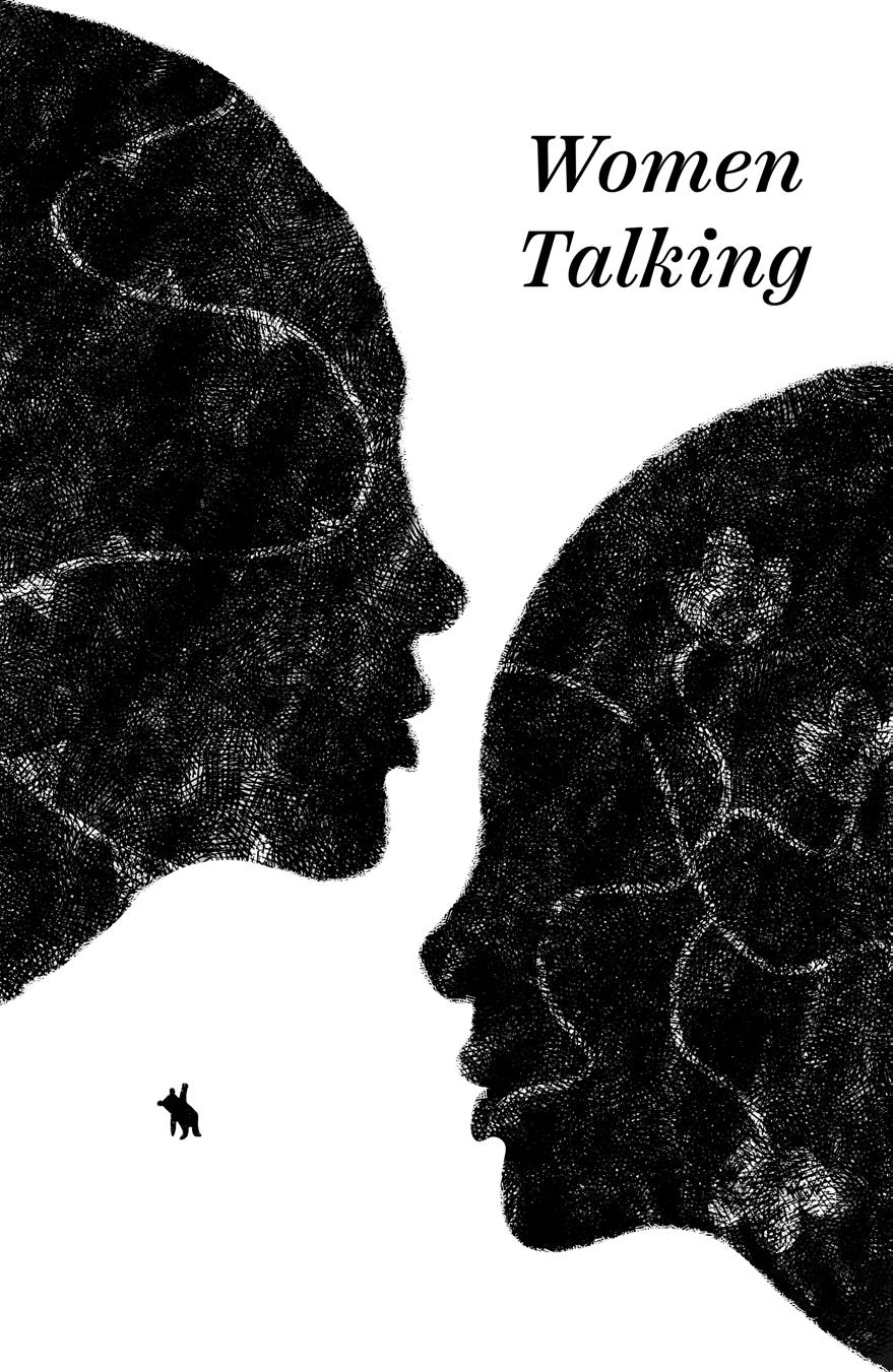
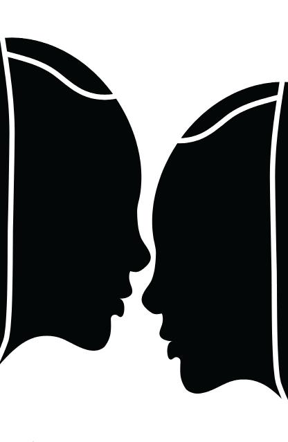
I received feedback regarding the proportions of the face, as it appeared to be somewhat disproportionate, with the forefront looking too large. To address this, I returned to Illustrator and attempted to rectify the proportions. The challenge stemmed from the fact that I had distorted the face to fit it into the poster, making it difficult to maintain the same dimensions while also achieving proportional balance. This was a complex task, to the point where I had to reconsider the placement of the faces within the composition.
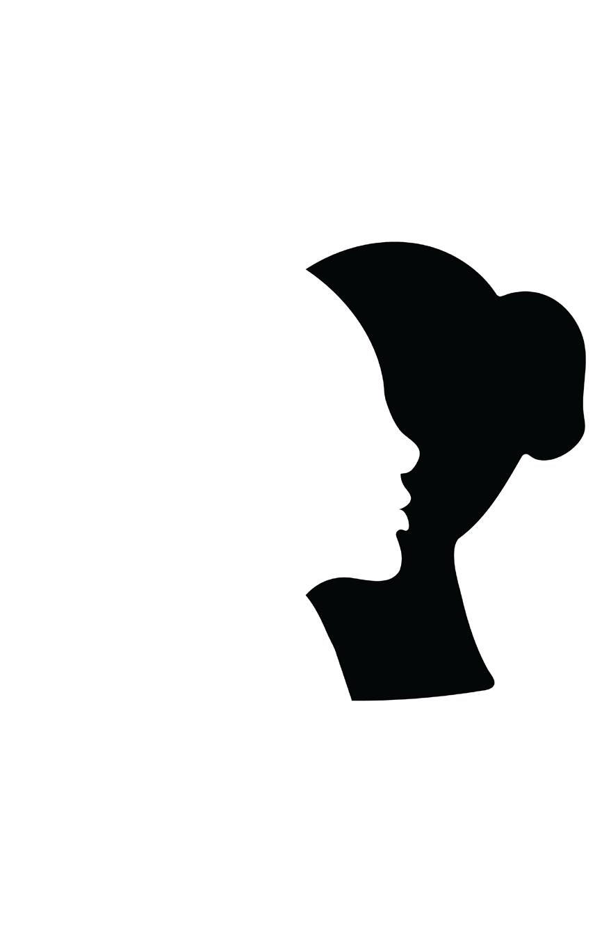
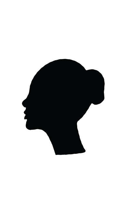
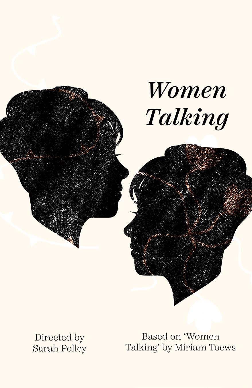
I began the process of “feminizing” the portrait, as I became concerned that it might not read as a woman but merely as a generic figure. The concept of “woman” has evolved to become increasingly complex and layered. However, I considered that elements like hair and a headscarf are still strongly associated with femininity, so I experimented with these features, although with initial difficulties.

I ventured into a less conventional representation of women’s hair. Traditionally, it’s often portrayed as long and flowing, but I wanted to introduce a subtler shift in this concept, while still retaining an eyelash to maintain clarity.
As I drew the faces with hair, I noticed that they seemed somewhat empty, which led me to the decision to create the rest of the body to fill the void I was previously attempting to address with the presence of the little girl or the teddy bear. However, I encountered challenges when attempting to draw the body.


I delved into a more thorough examination of the costume design within the movie. While the characters in the film wear simpler clothing reminiscent of maid outfits, I drew inspiration from European fashion history to create a contrast. I opted to give the women on the poster a more regal and powerful appearance, reflecting their reclamation of power from their abusers in the film.
Historically, royal outfits often featured prominent and impressive collars. With this in mind, I experimented with incorporating collars that had large, imposing peaks into the design. These elements aimed to convey the strength and assertiveness of the women portrayed in the poster.


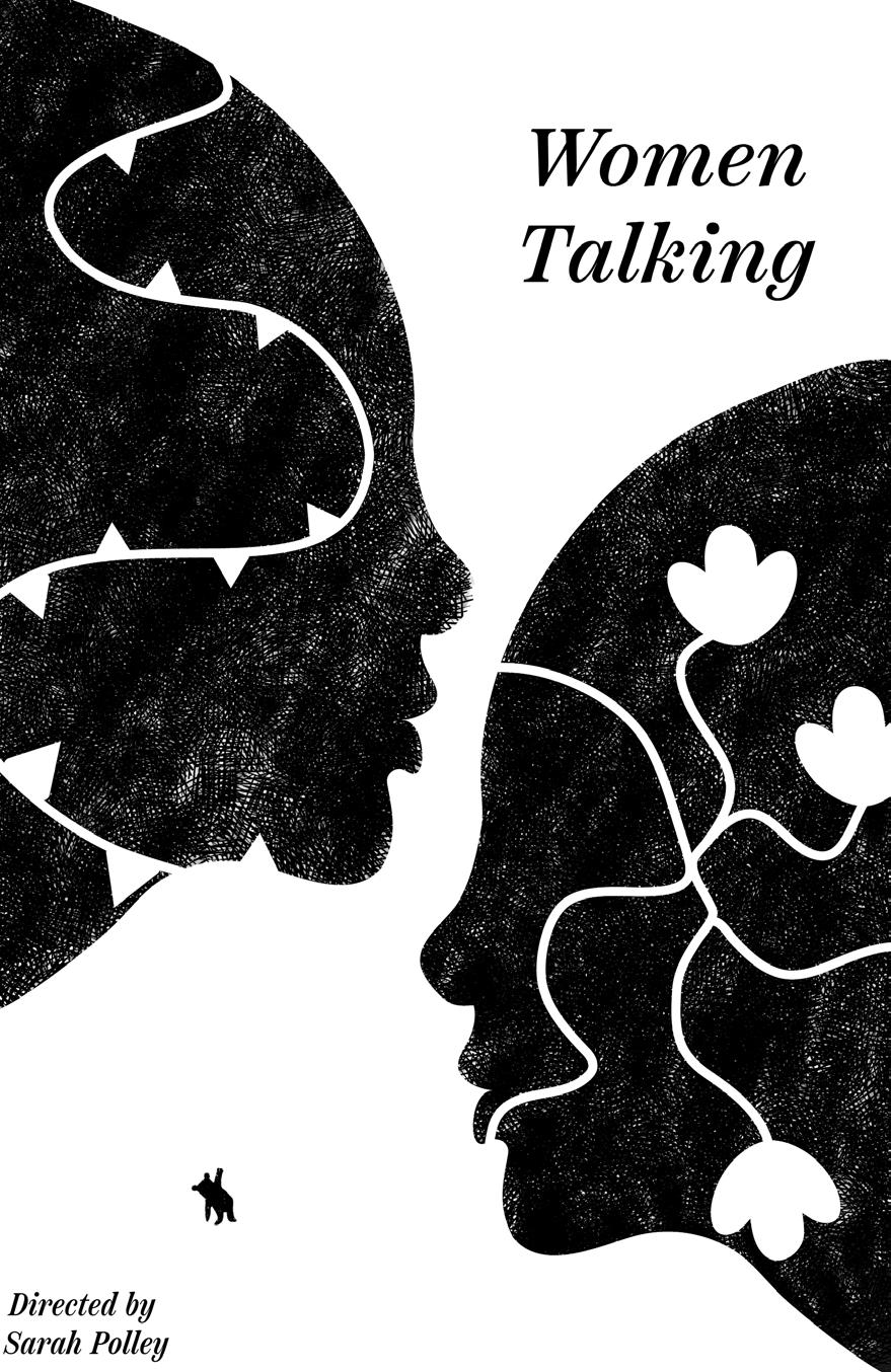
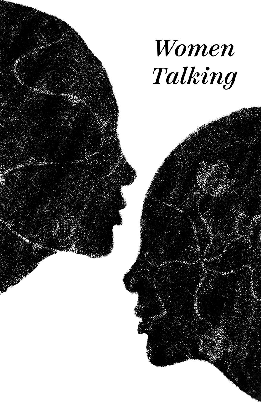
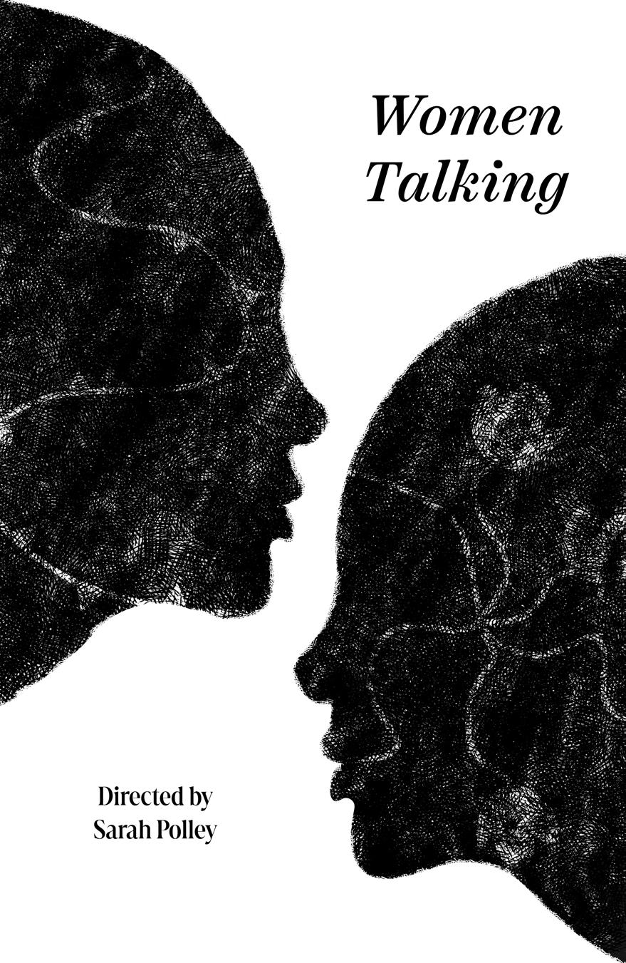
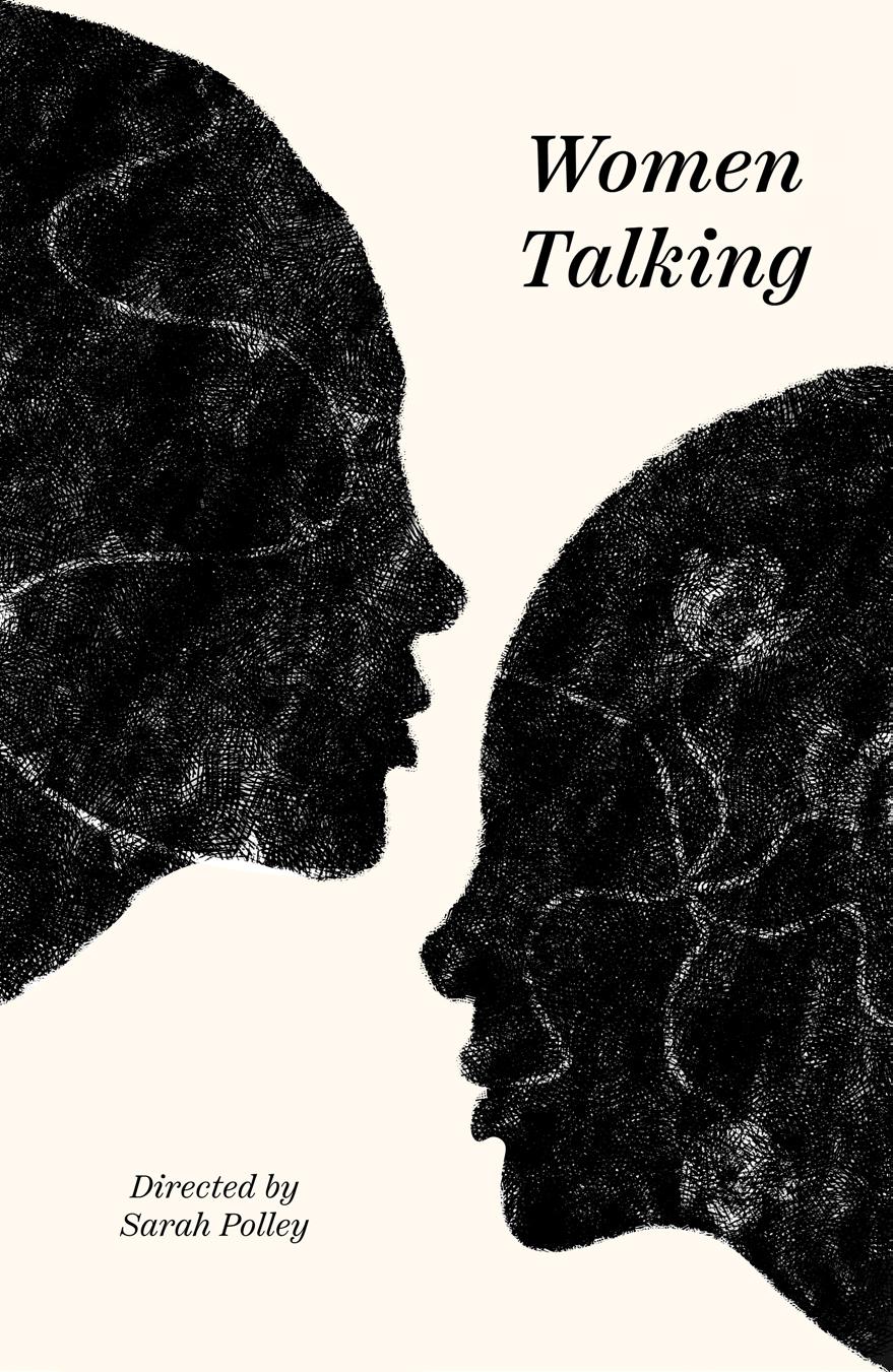
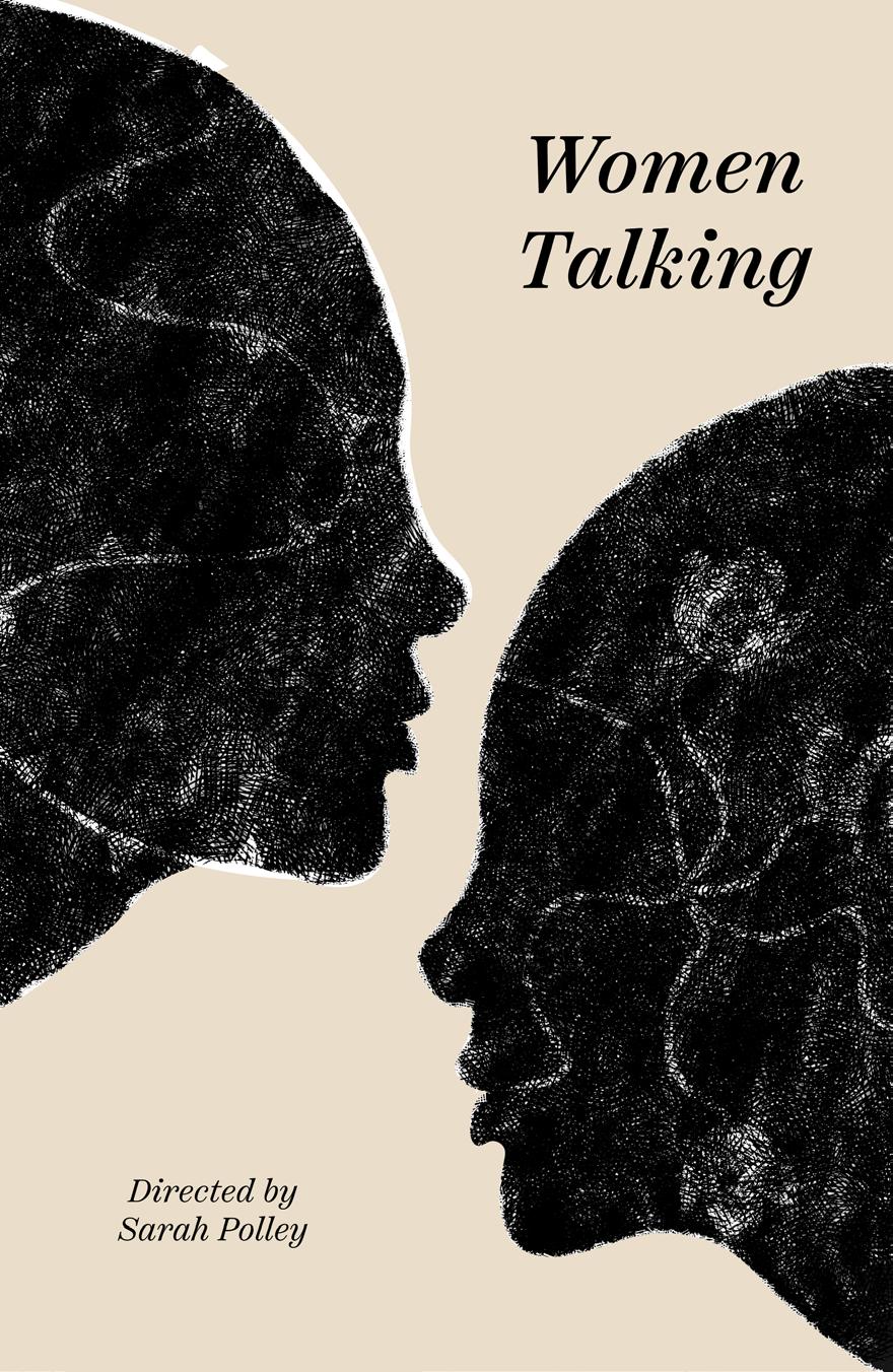
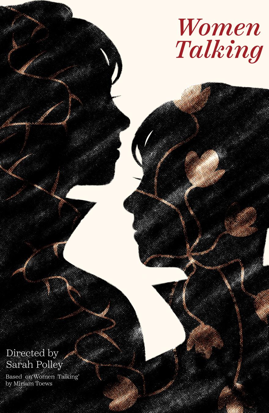
I proceeded to apply these changes to the design, incorporating the regal attire and the imposing collars. Additionally, I modified the white background, transitioning it to an off-white shade with a slight blue tone, which would appear progressively in the artboards. I also opted for a red or dark blue title to reference the classic literature book cover aesthetic, adding depth and a sense of classic sophistication to the poster.


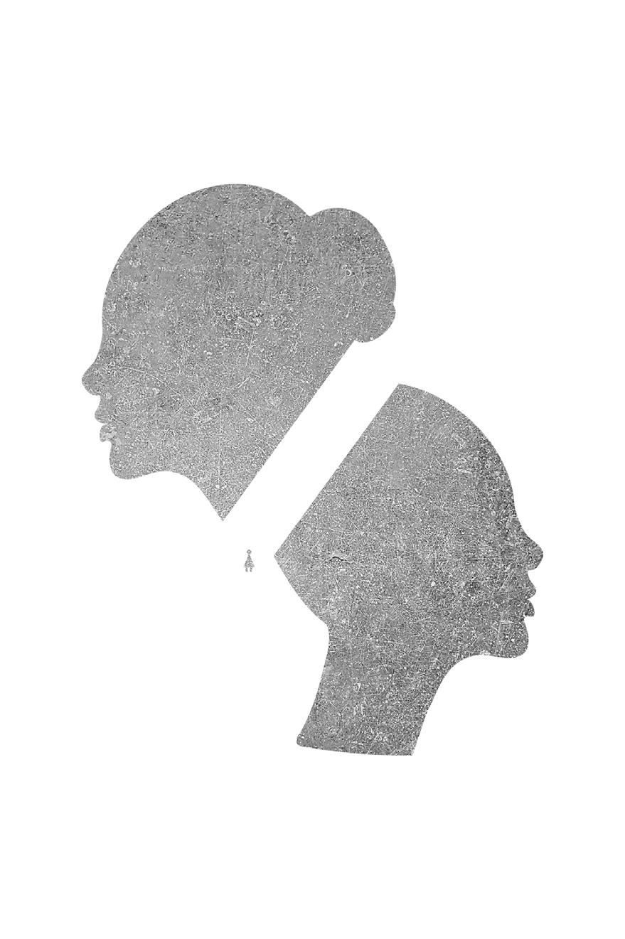
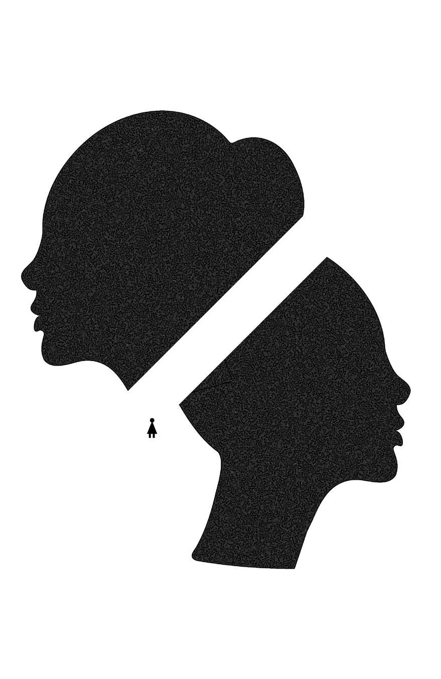
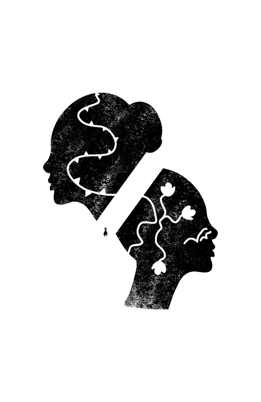
I continued to refine the texture within the design. Initially, the use of texture was made as an aesthetic choice, but as I further developed it, I realized it could effectively contribute to conveying the sense of blurriness that surrounds the characters’ situation.
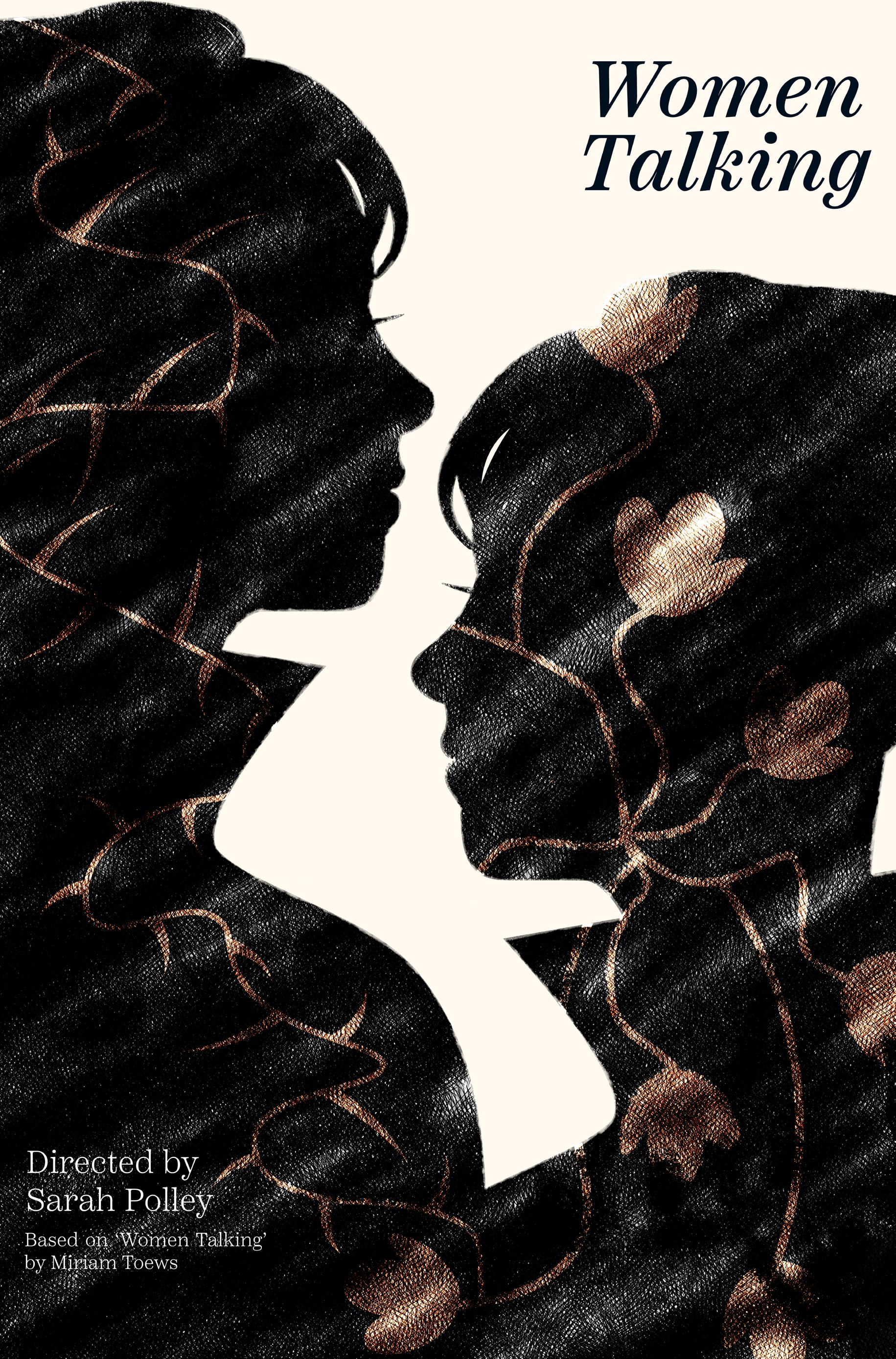
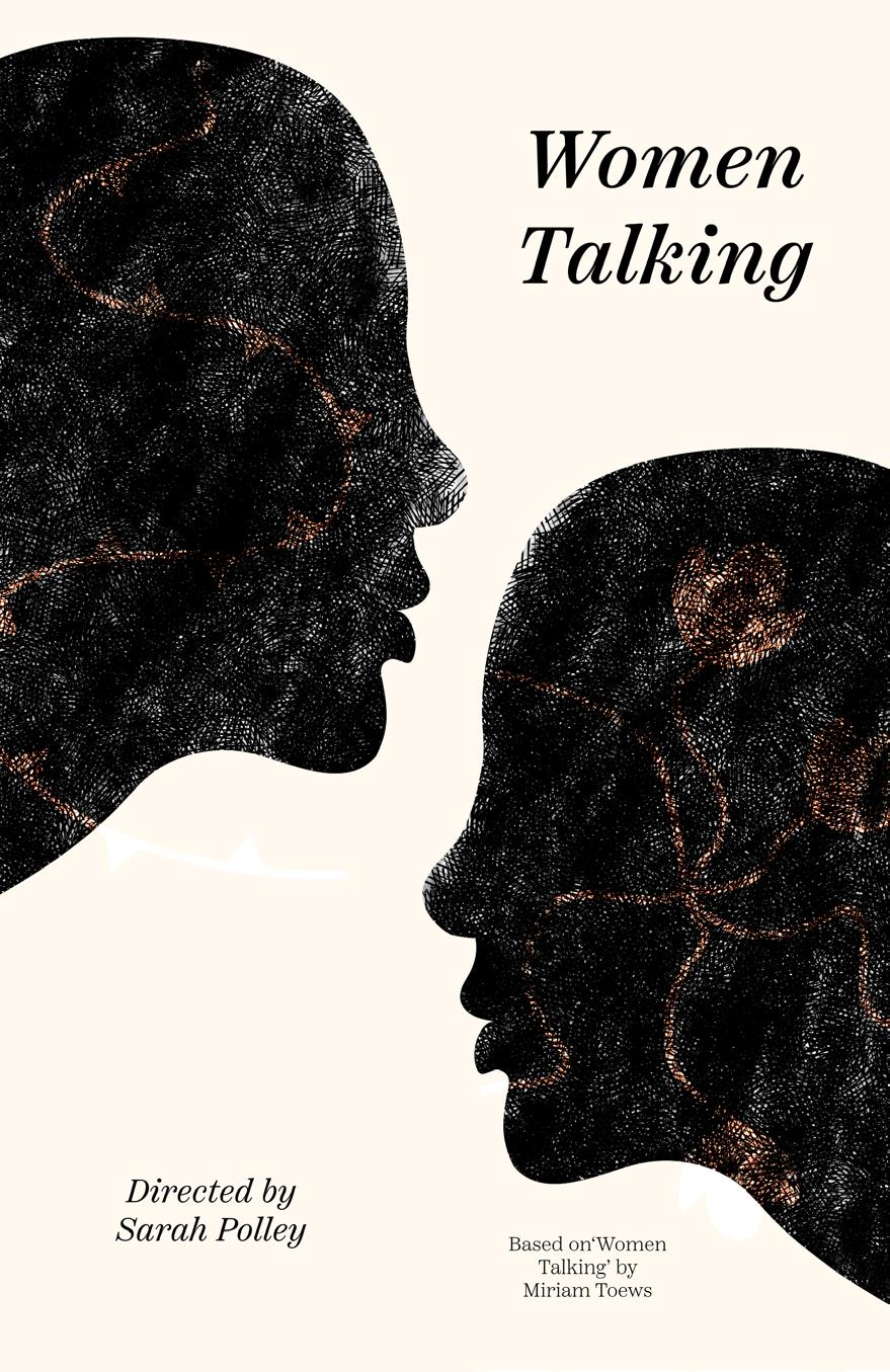
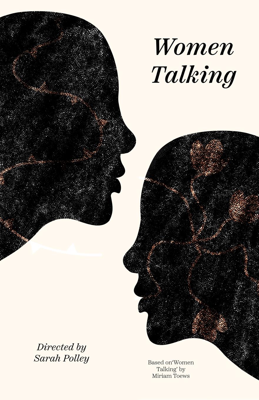
In alignment with the royal theme, I added a touch of gold to the flowers and thorns, harmonizing with the regal motif while infusing a premium aesthetic into the poster.
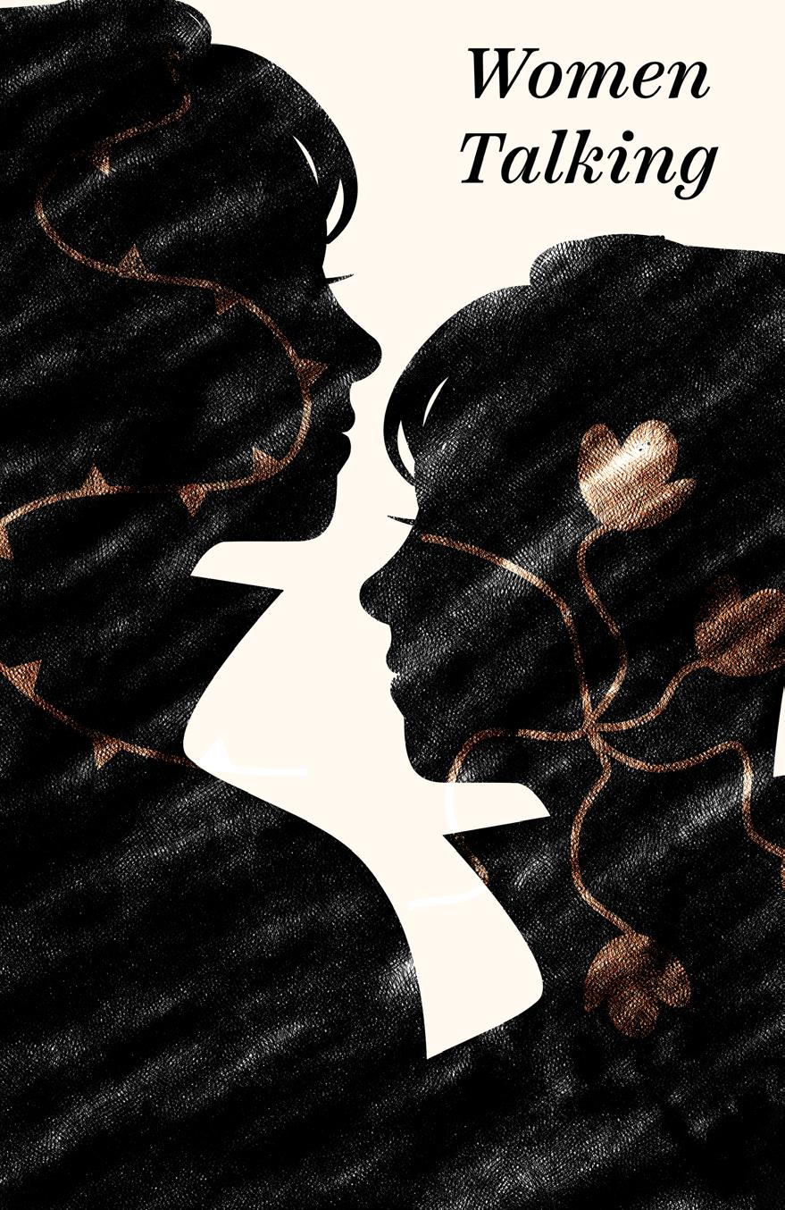

I implemented changes to the thorns and flowers to make them occupy more space within the composition. I also adjusted the thorns to have a sharper and more aggressive appearance, enhancing the visual impact and symbolism of these elements.
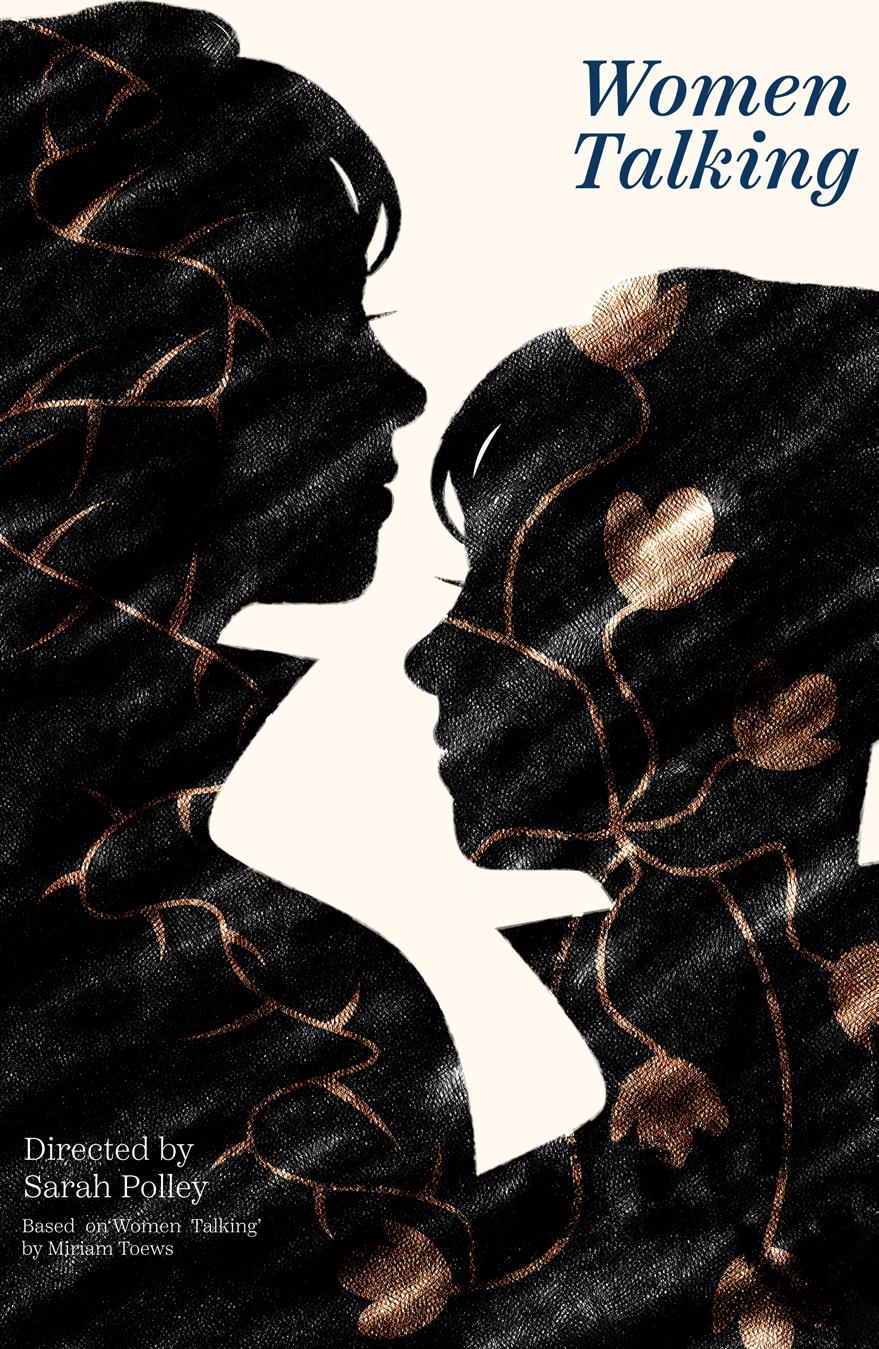
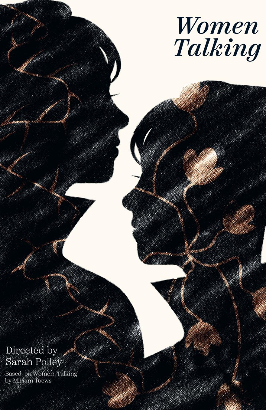
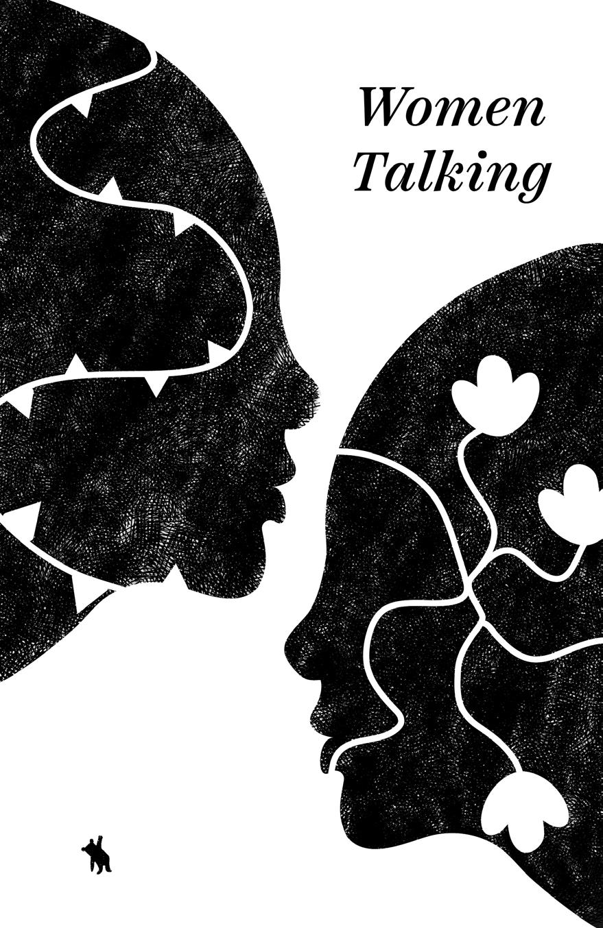
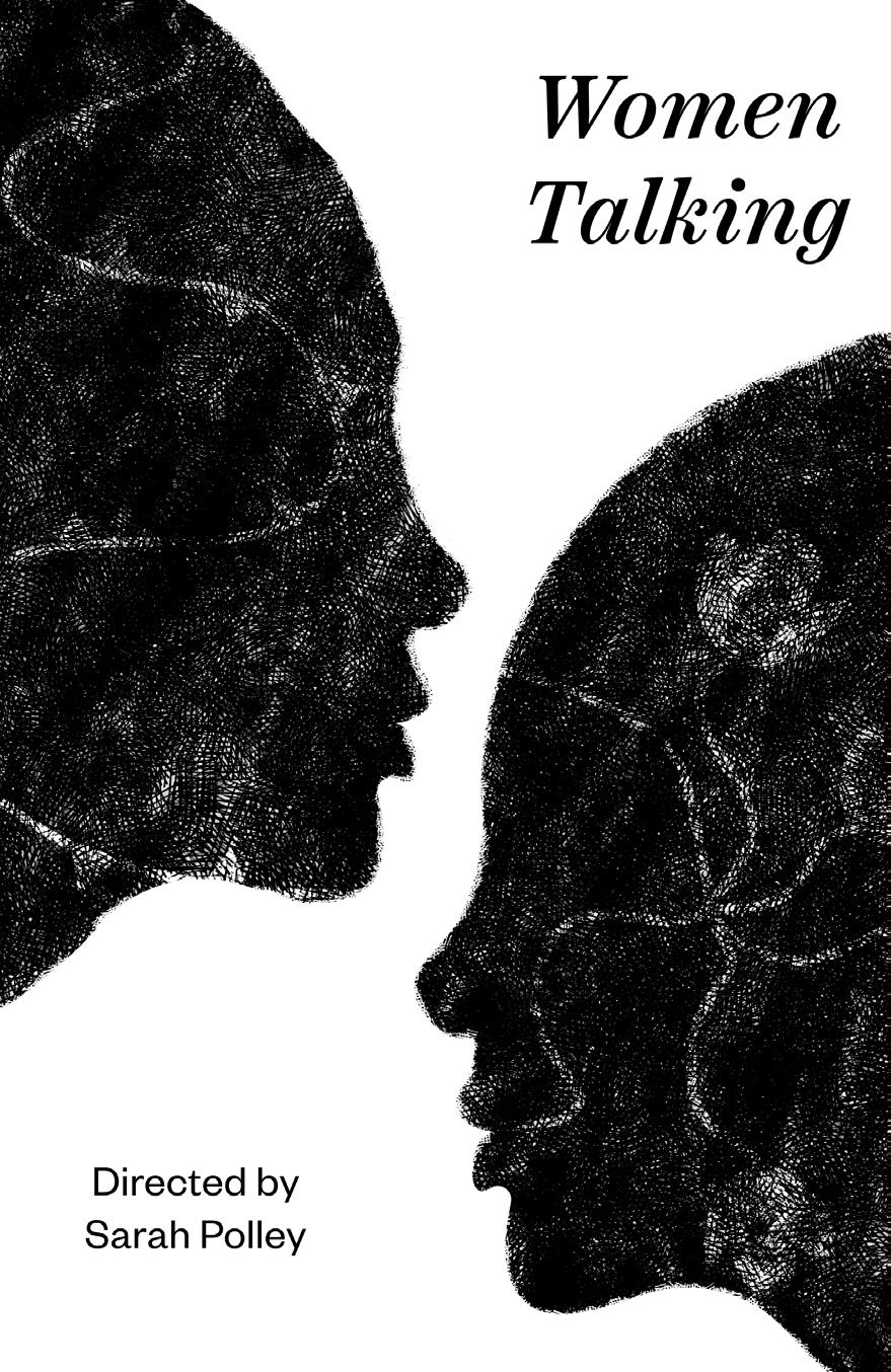
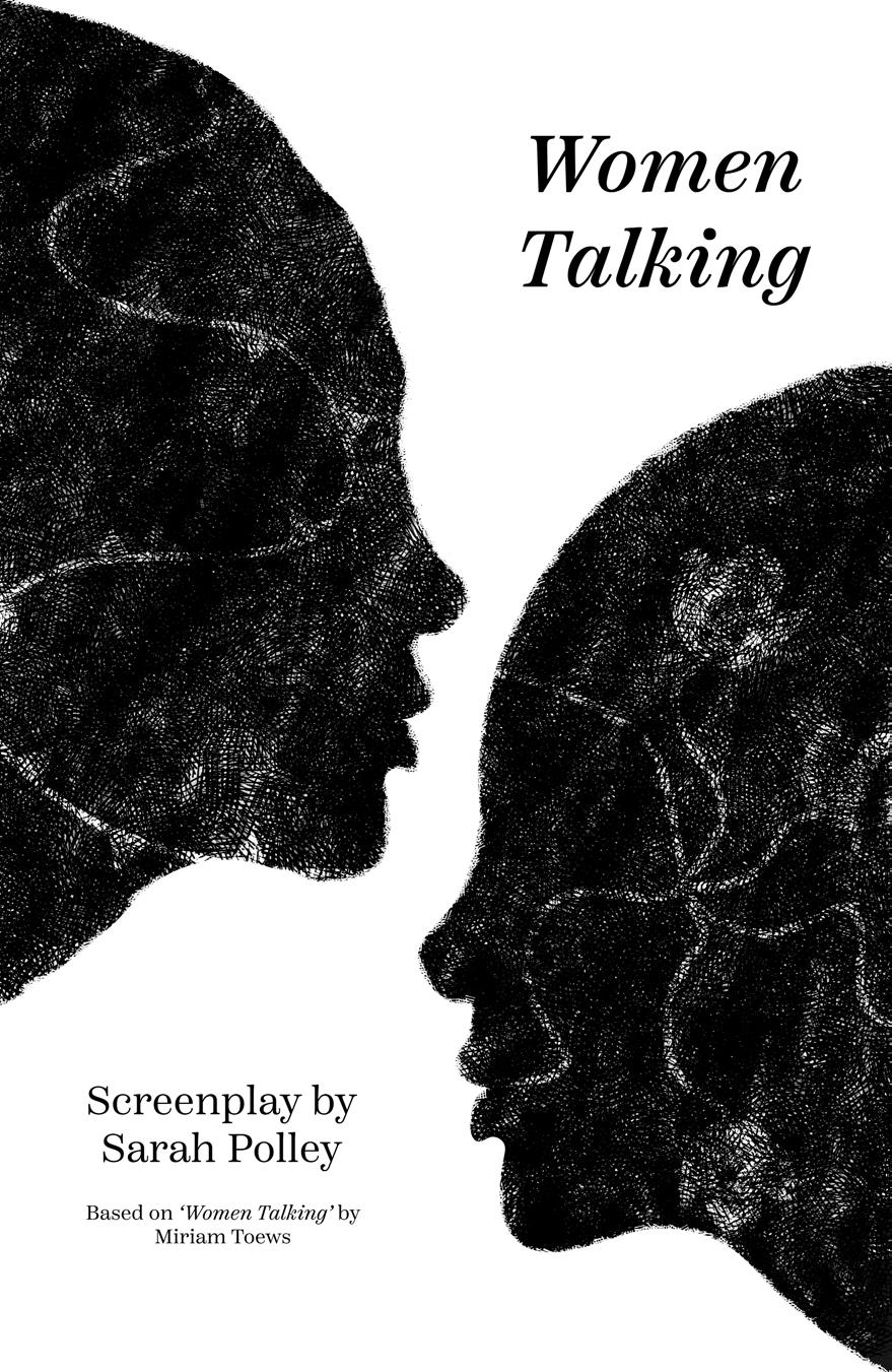
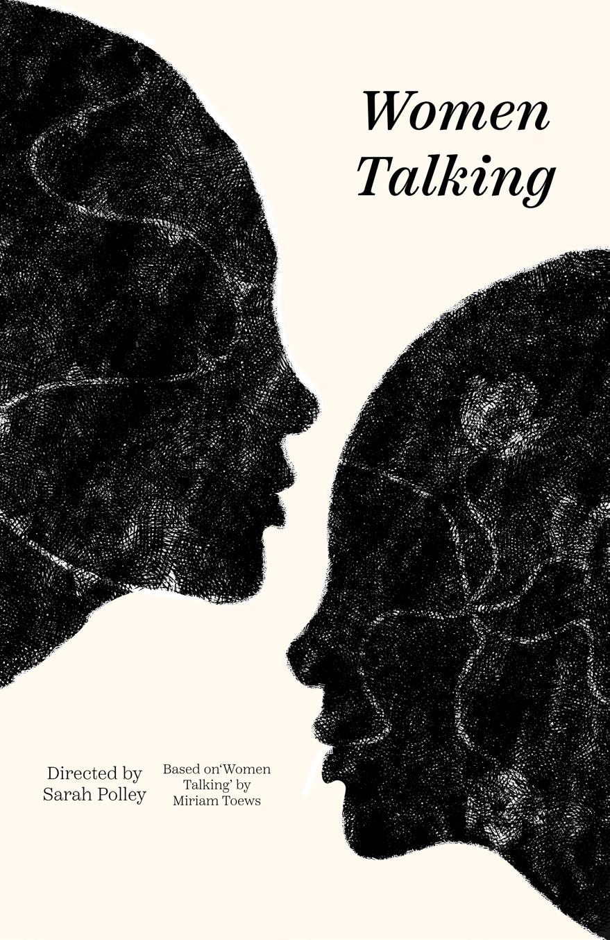
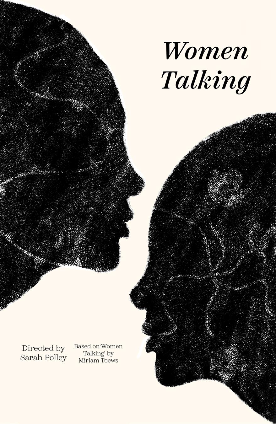
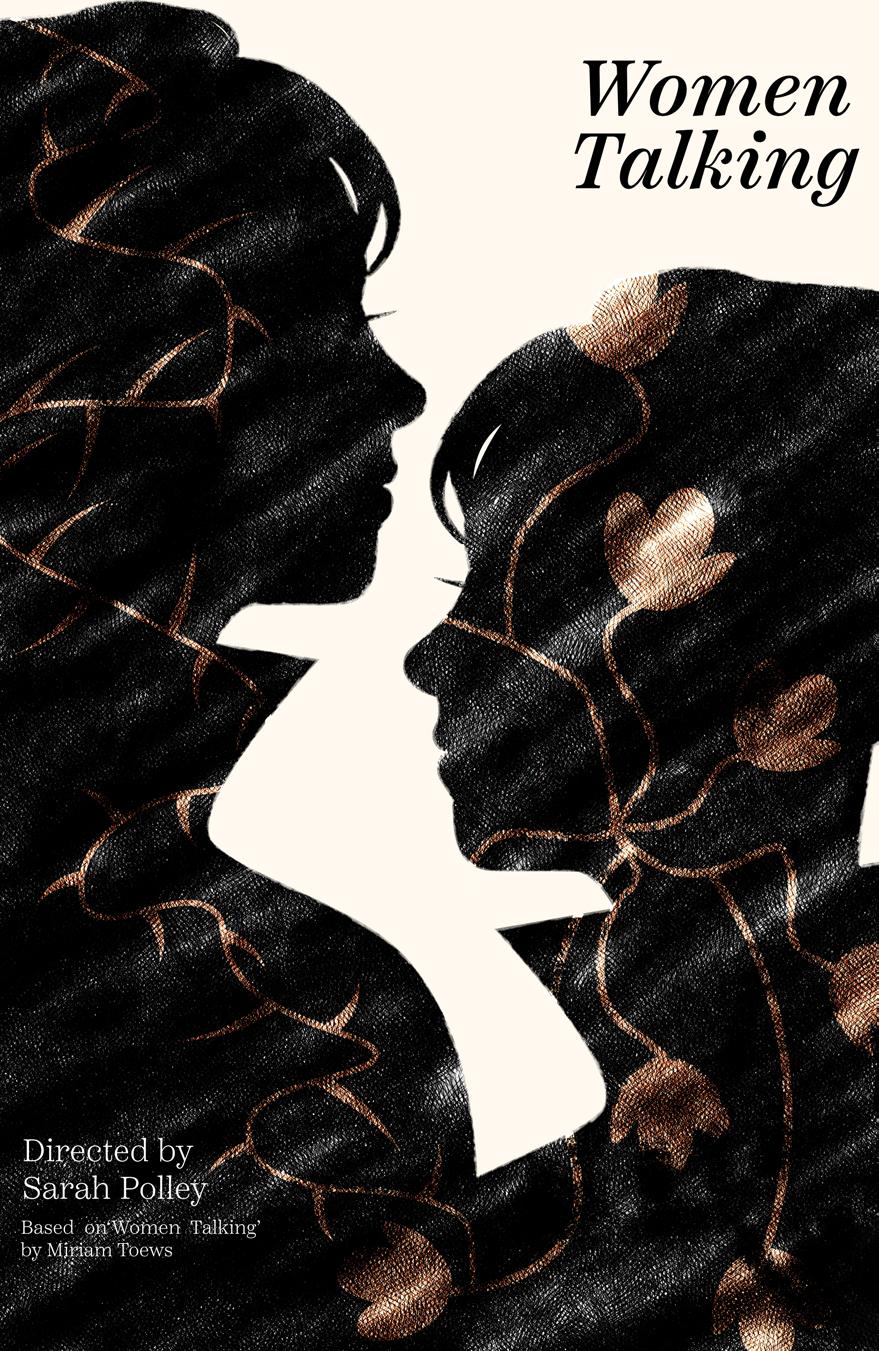
At this stage, the final result emerged. The print version may have appeared slightly subdued in comparison to the digital version. It’s important to note that the film title is rendered in a very dark blue, as the lighter blue often used in classic literature design didn’t align with the aesthetic of this poster. Additionally, there’s a subtle blue tint applied over the poster, contributing to the overall visual effect and atmosphere.
All things considered, this project was fulfilling and greatly challenged my sense of creativity. I felt greatly challenged, but also encouraged.