Ebenezer Somado
Close Your Eyes to See Publication Design
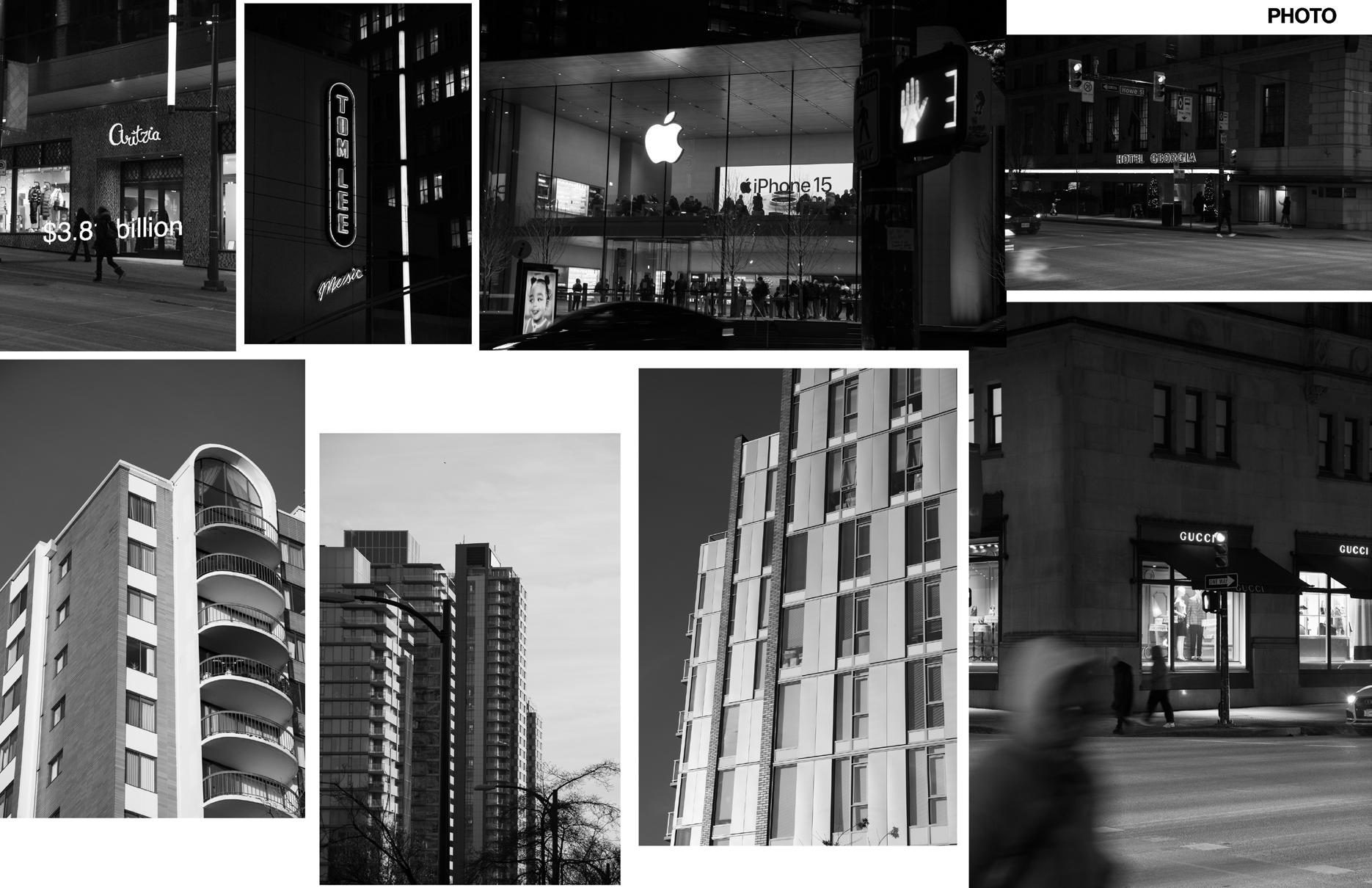
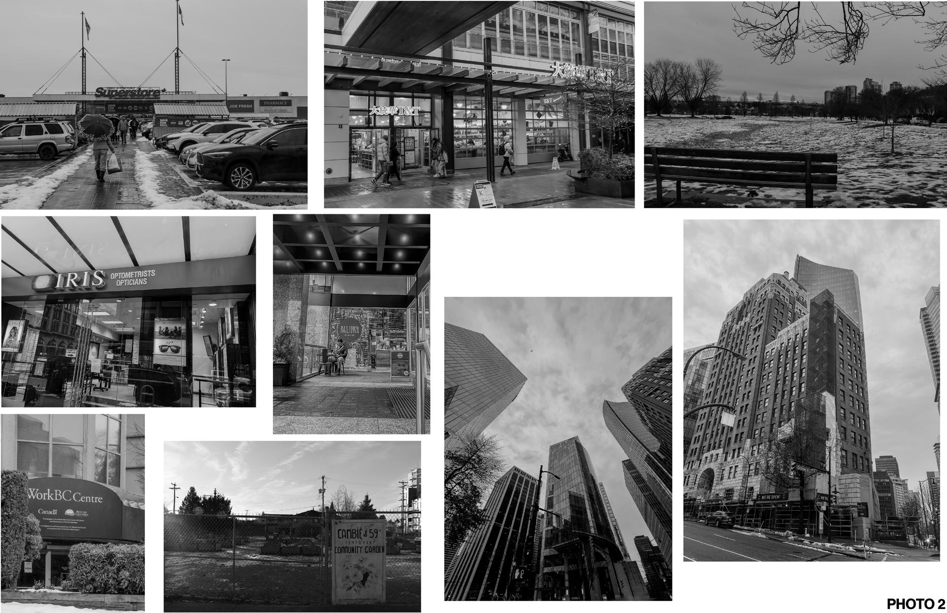
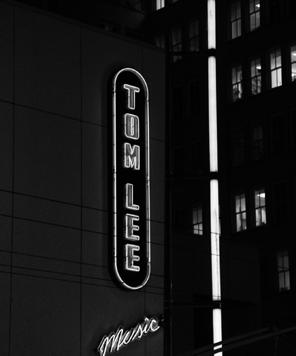
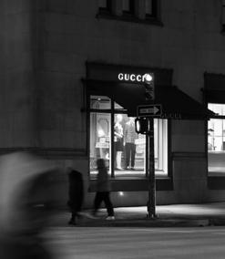
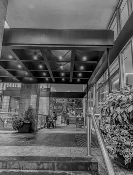
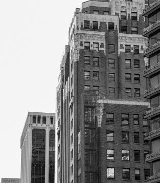
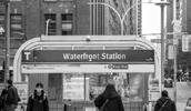
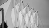
For my experiential research, I explored various locations in Vancouver, beginning in Downtown and gradually expanding my exploration to form a more comprehensive narrative. Without a precise directive, I gathered items that caught my interest. This spread showcases photos taken for the collection titled “photo.” I found the architectural consistency across different areas in Vancouver intriguing, as well as the contrast between the opulence in downtown and the unaffordability of rent.
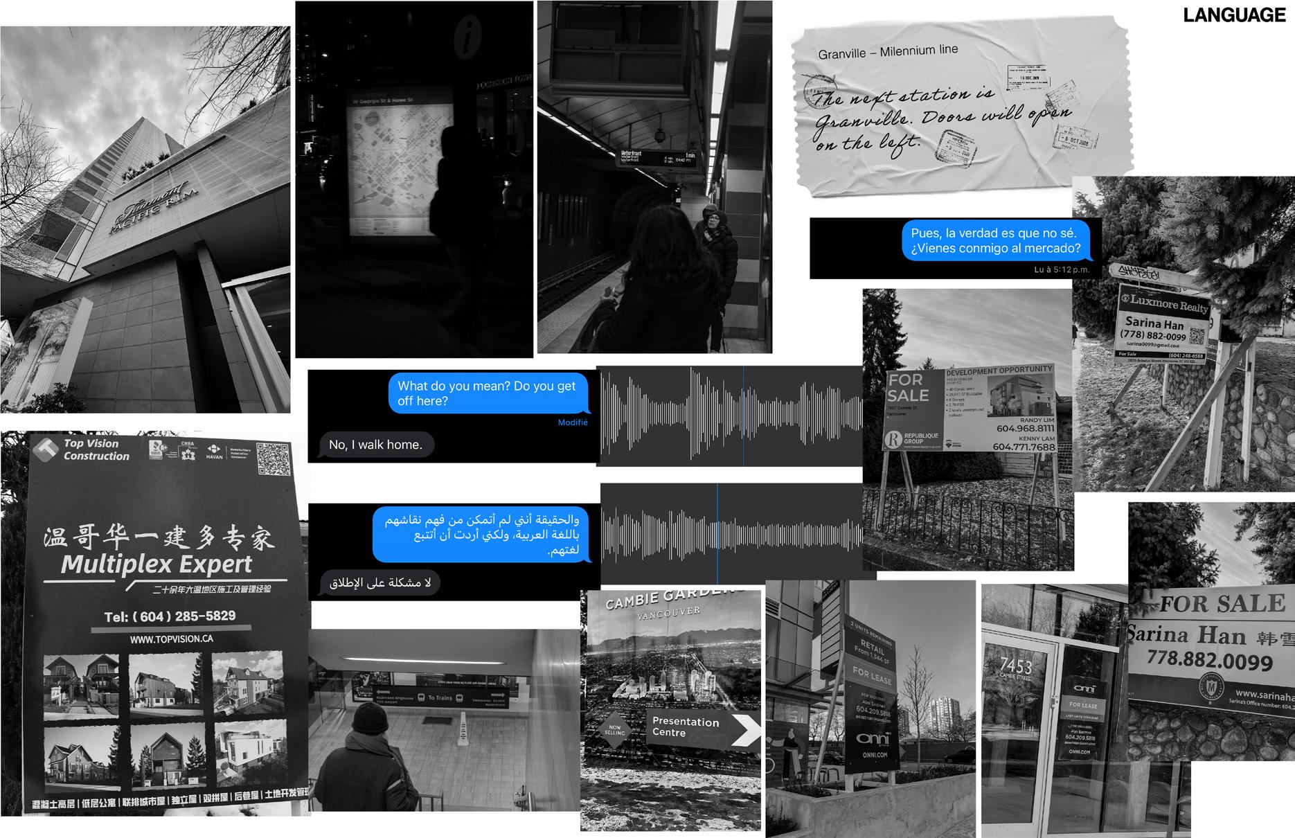
Here are my collections of “pieces of language.”
I found the diversity of language in the city particularly intriguing. Additionally, I attempted to visualize certain spoken elements that function as language, such as the voice in the Millennium Line (illustrated by the “Granville – Millennium Line” ticket). Within this collection, I explored various facets of what
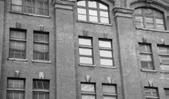
constitutes language. For example, the visual vernacular of old-style handwriting on a building provides hints about the type of establishment it is, while the abundance of real estate agents’ contact information communicates something significant about the city.
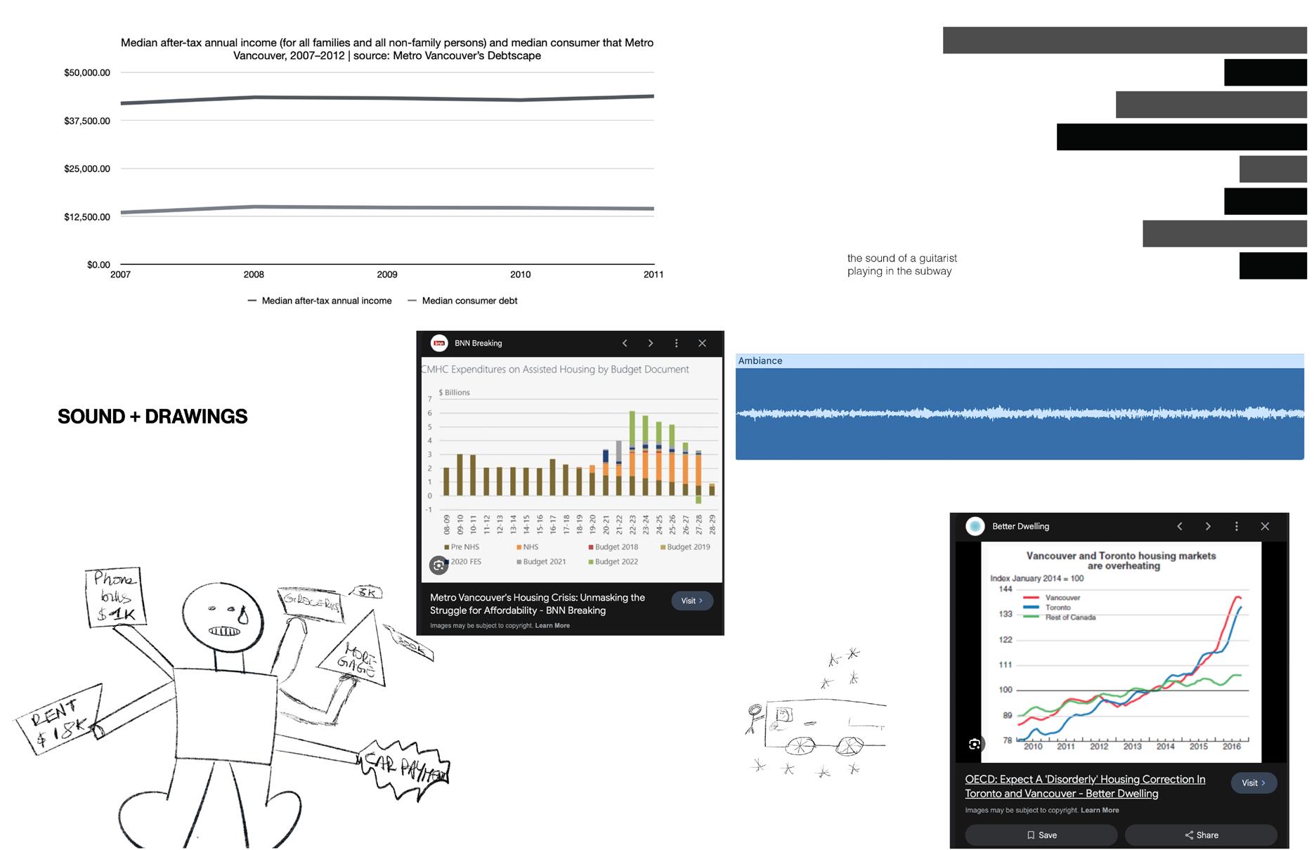
For my collection of sound and drawings, I generated and incorporated graphs using data sourced from credible internet platforms detailing rent prices and revenues. This approach allowed me to establish what I believed to be the beginnings of a narrative within the project.
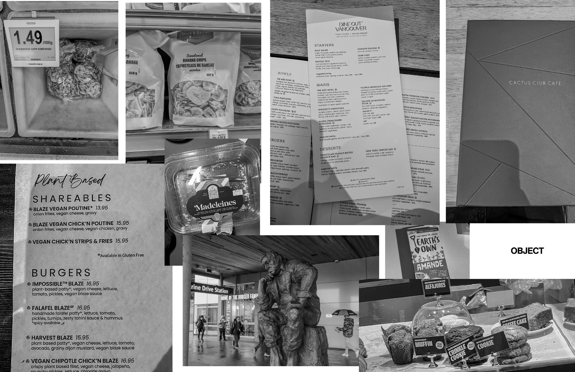
For my collection of objects, I primarily gathered menus from places I enjoy dining at and selected food items with which I have a personal connection. This collection serves as a tangible representation of my culinary preferences and experiences.
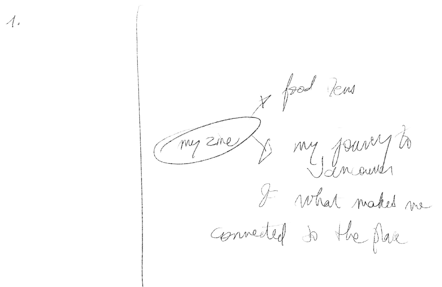
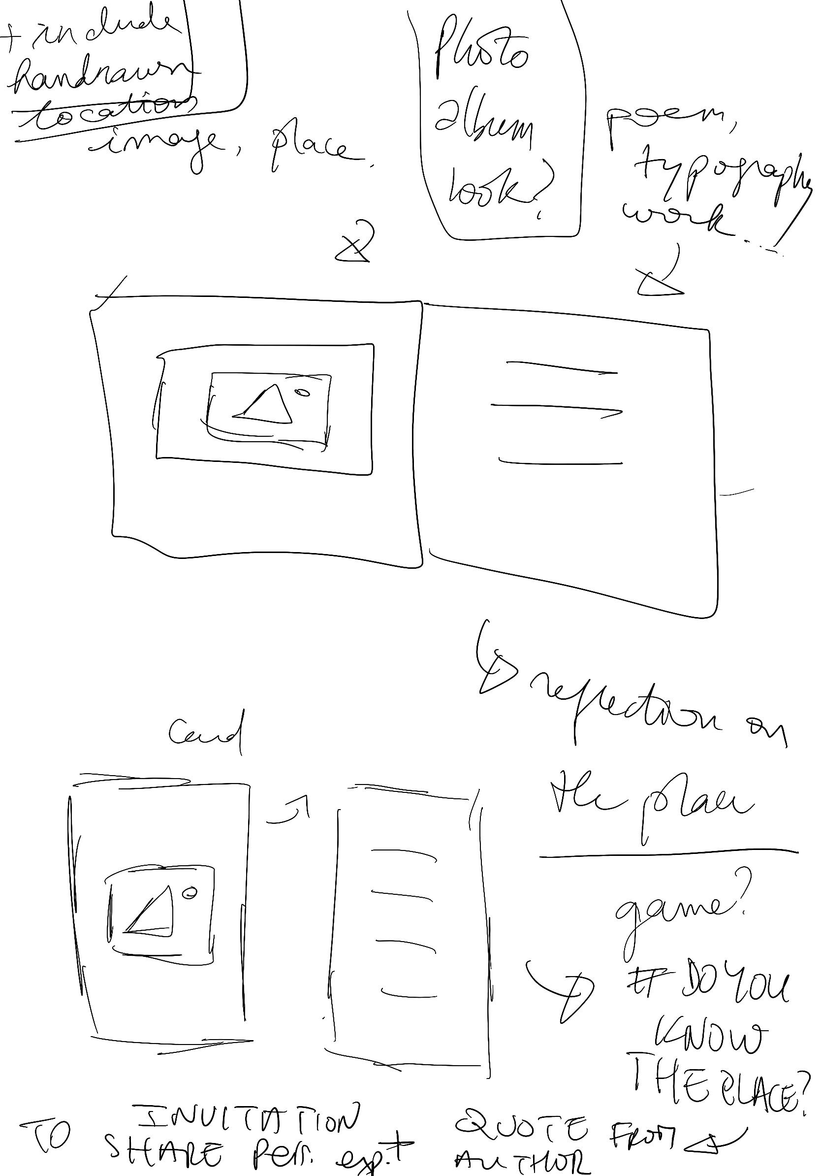
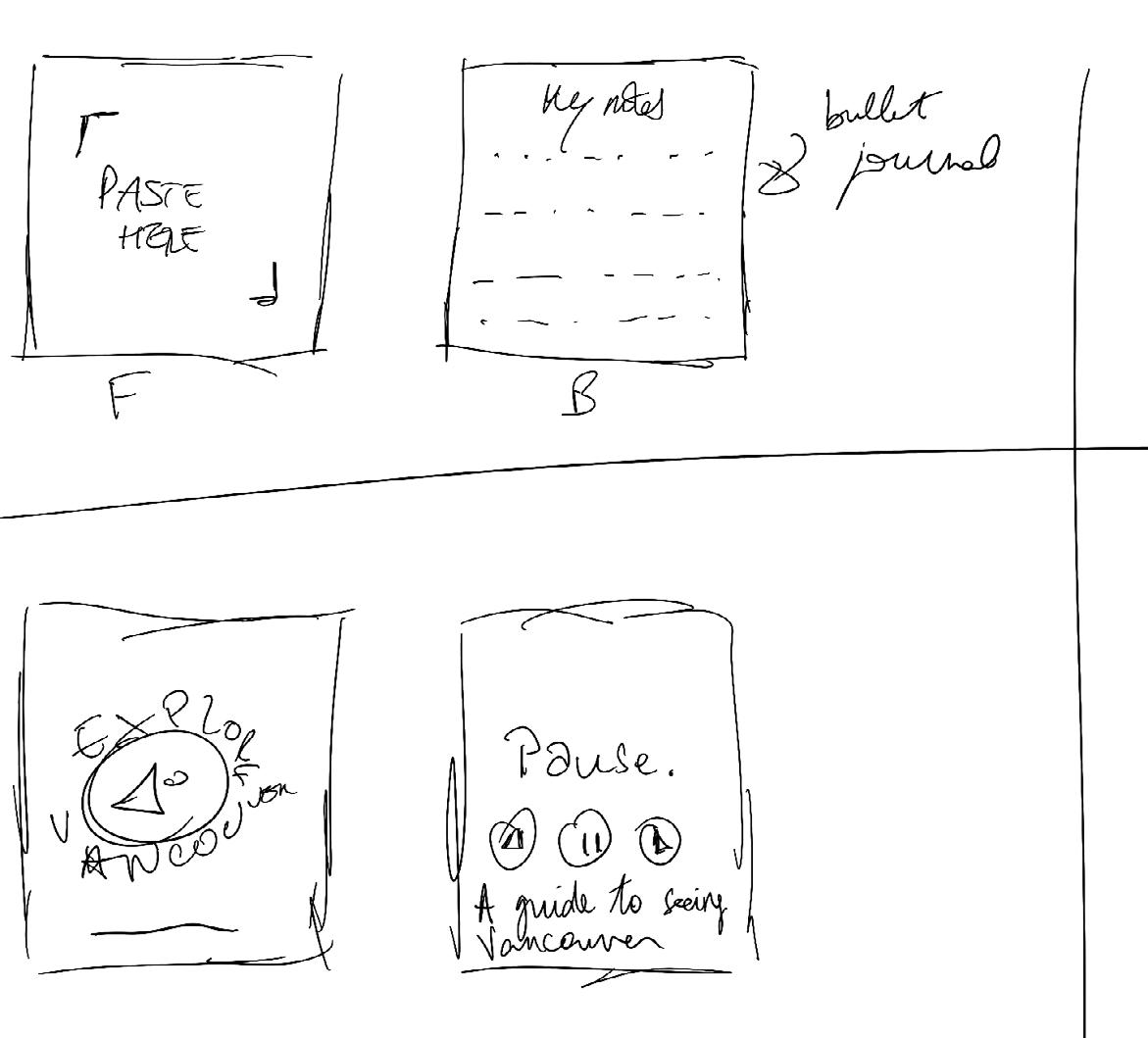
This page consists of sketches outlining the layout of my initial spreads and ideas for potential additions to the zine, including a conceptual map of my journey to Vancouver. However, I abandoned the idea swiftly as I didn’t want my zine to delve into such personal intimacy.
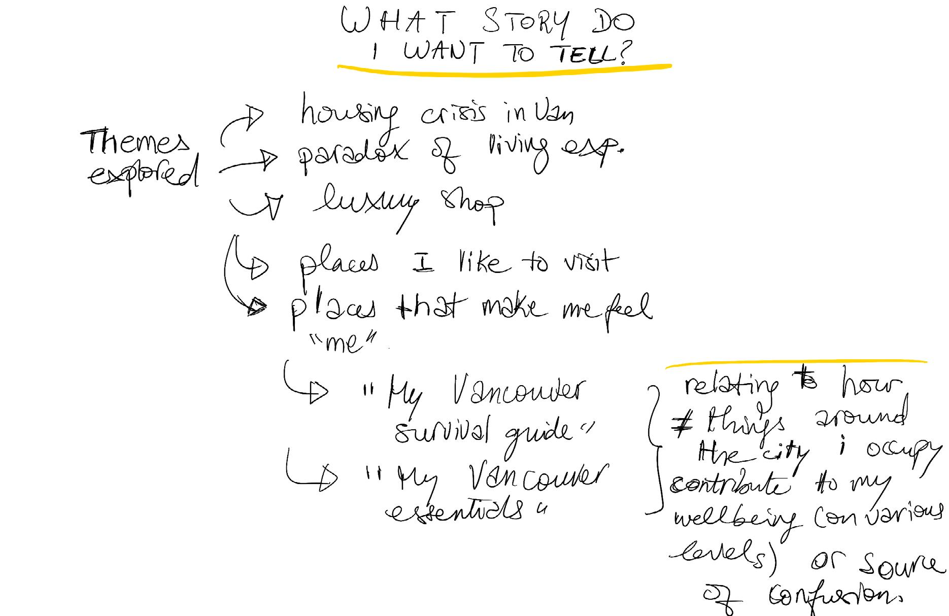
The previous ones are brainstorming on what kind of story I wanted my zine to tell.
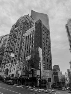
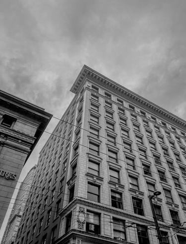
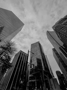
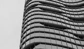
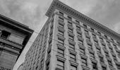
I live in Vancouver... It’s, well, a big city. As in all big cities, skyscappers are part of the landscape. It’s a city that’s constantly in construction as you can see.
about the living costs of the city and communities struggling with it. this dichotomy is an interest of my exploration. Heading
Simus natquia dem. Nullitiur, iusdaessedit volupta quatiundae molenet vellupt ionsequi re, eosapeles ullorectati rernati aeritamusa volut odicid qui undit dit la voloribus aut quibus et pe voluptatia eum atempos autet fuga. Excea aliquis perum facepel inist fugiand ellaut re prerferumquo min et ad
Vancouver has a lot of cafes and places to eat or hangout. A lot of them are in downtown and i like seeing those bakeries and cafes when i walk by. the atmosphere is charming. I like how those places unite communities. A thing i noticed in Vancouver – and in North America –people tend to connect over coffees, which make them central part of communities and opportunities to meet.
Some of the food establishments in the downtown have an “older look.”
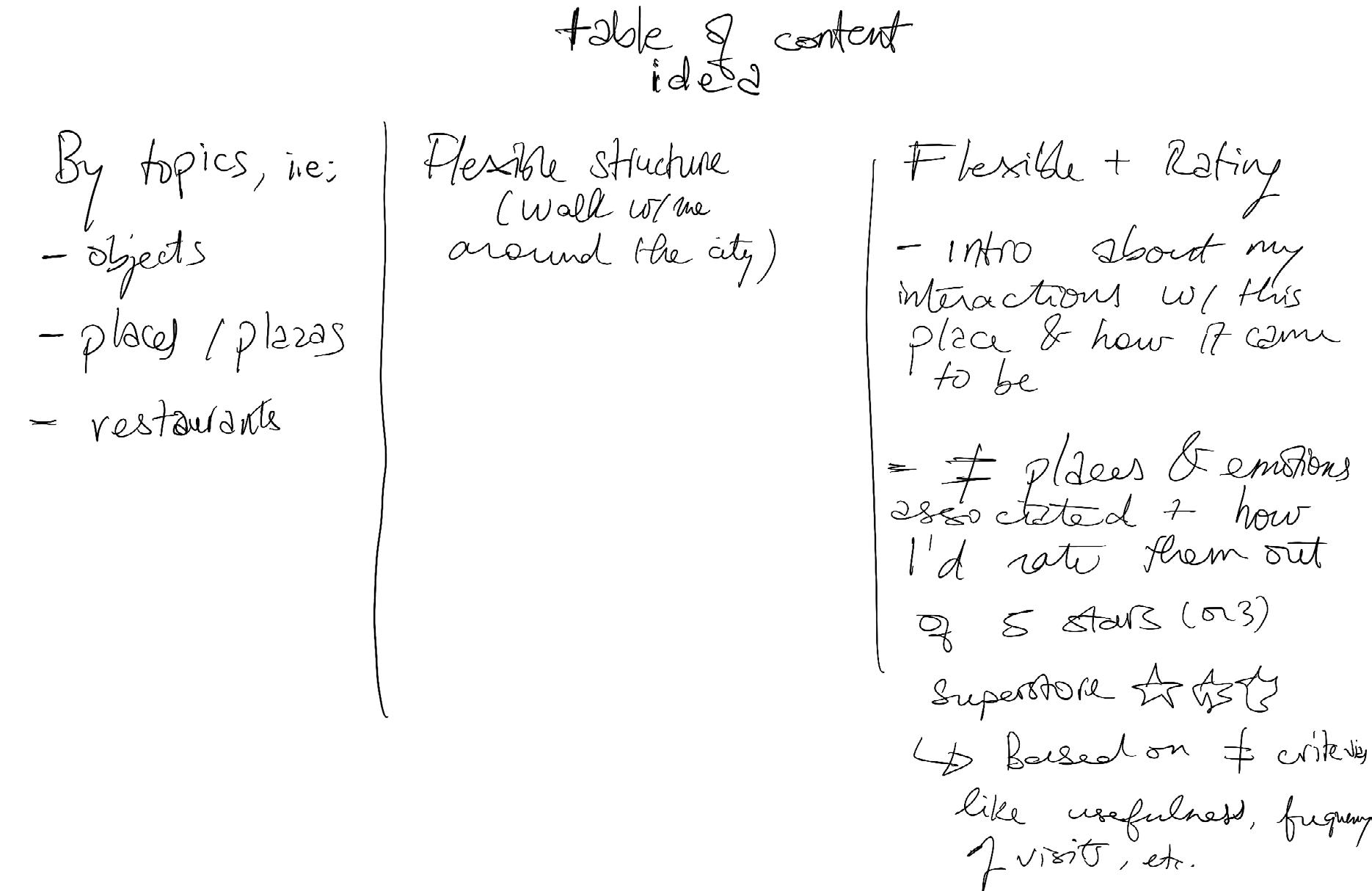
At this point, I found myself still in a state of confusion and deep uncertainty about the direction of my zine. Pages 20-21 provide a brief preview of the brainstorming process I underwent, attempting to decipher how to organize the gathered information.
The most promising idea that emerged by the end of my brainstorming session was to create a flexible-structured journal, unveiling my relationship with the depicted places and associating them with a personalized rating. This rating would encompass both the subjective aspect—reflecting my embodied experience— and practical considerations like rating the food or overall sensory experience.
With this, I envisioned the zine taking the form of a “My Vancouver Essentials Guide,” centered around the theme of “Places of Meaning.”
Heading
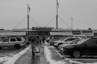
But in the city, there are a couple of stores that sell food from specific parts of the world. Personally, I found myself to Superstore and T&T, buying items i was used at home.
This spread displays my initial layouts, offering a glimpse into my envisioned design for the zine. Each layout includes rating stars in a corner, a title heading, and pictures grouped together based on the shared narrative or story they held for me. For instance, the images adjacent to this paragraph are all places that, for different reasons, reminded me of “home.”
Heading
I began compiling a list of places I intended to photograph or had already photographed, considering them as locations of personal significance. Subsequently, I associated a brief reflection with each place, although these reflections were in a rudimentary stage, requiring fact-checking. This spread was dedicated to this early phase of conceptualizing the zine.
However, my course instructor pointed out that this approach lacked broader appeal and interest beyond my personal perspective. Consequently, I had to rethink and start over with a new direction for the zine.
I am not showing these places, as I ended up not working with these, and to keep privacy.
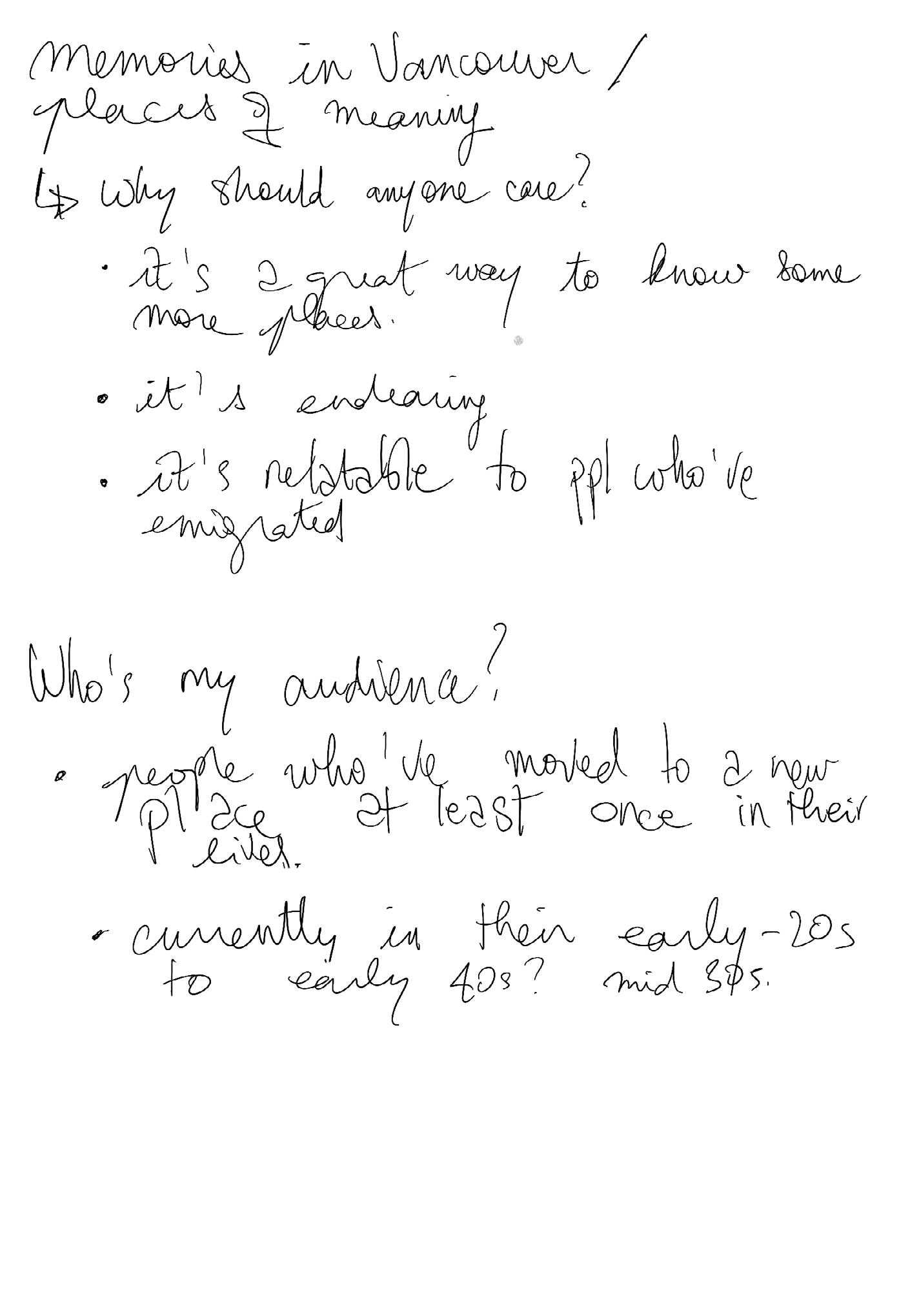
After reevaluating my approach, I shifted my focus to the concept of community. I wanted to ensure that my zine extended beyond a personal narrative and resonated with a broader audience. While retaining the core idea of exploring places of meaning, I aimed to make it more appealing to others.
I began considering who my audience or community would be and why they should care. I identified relatability for people who have moved at least once in their life, as the experience of discovering new landmarks is ‘universal.’ Additionally, I saw the potential for others to learn about places in the city they may not have explored. Given the thematic elements of my zine, I envisioned my audience to include anyone who has experienced leaving the comfort of the known— immigrants, tourists, and even locals to some extent.
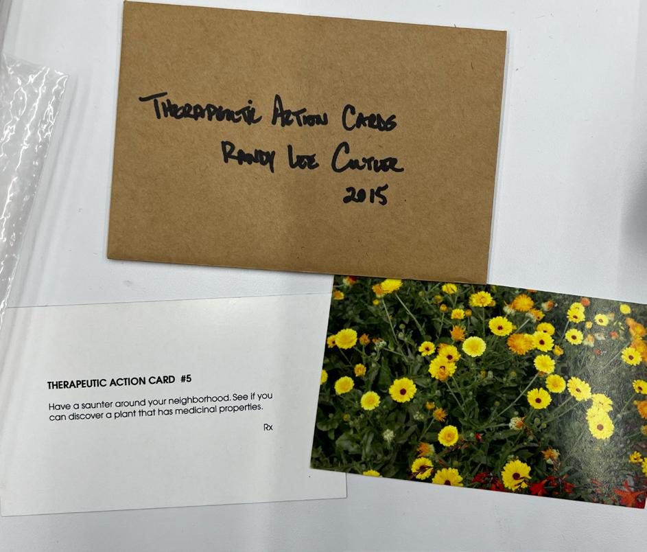
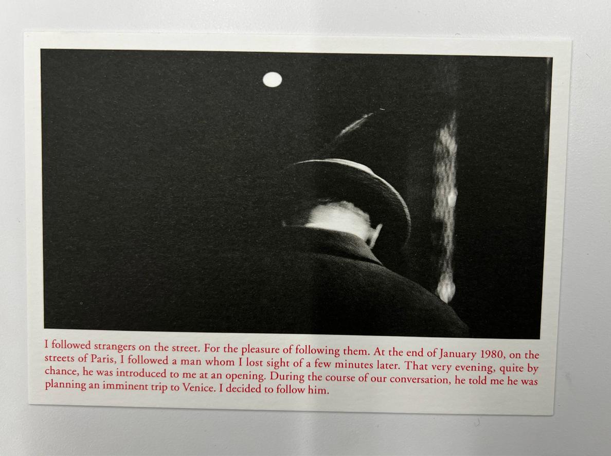
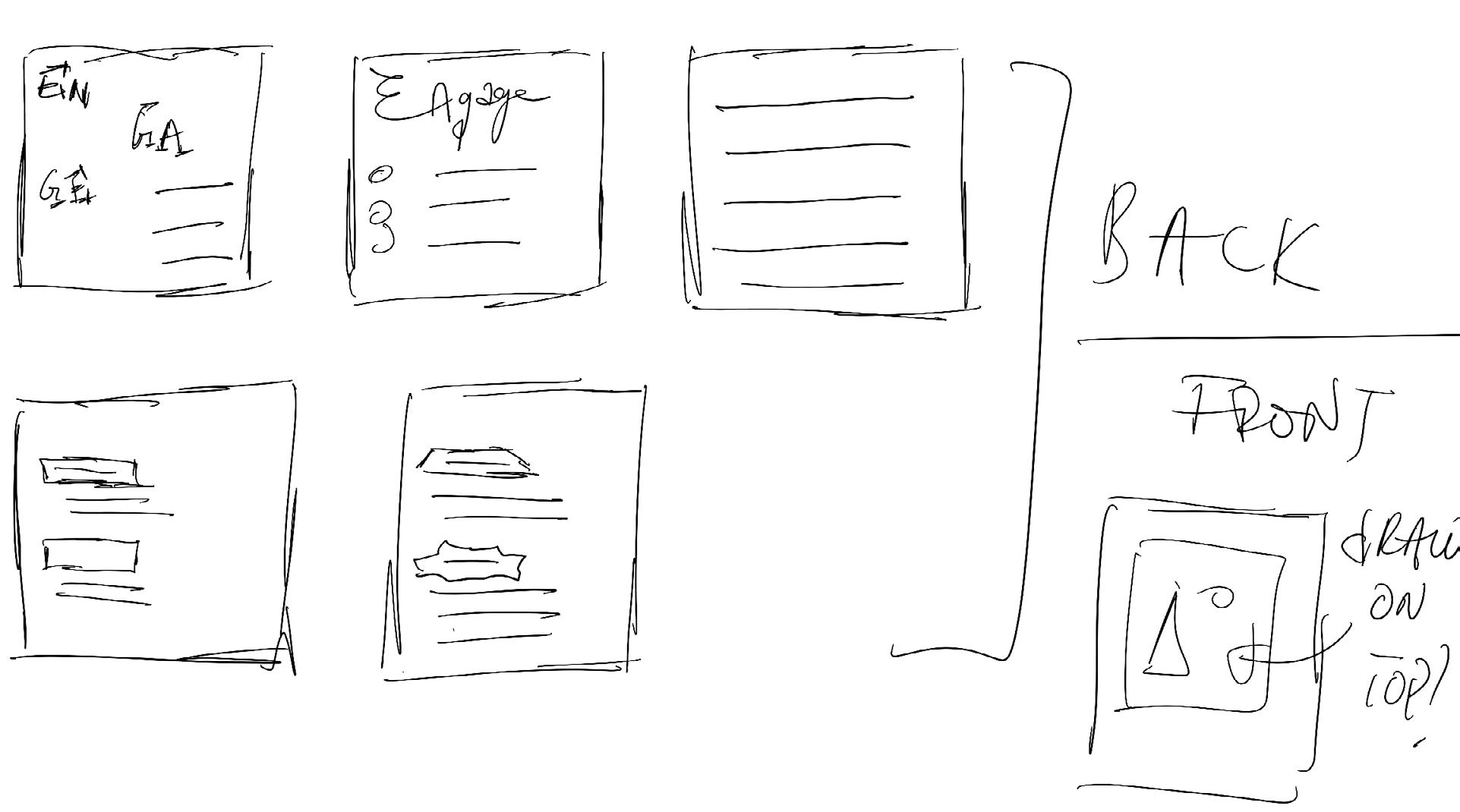
Following this, I started sketching ideas for a new concept: cards. Drawing inspiration from Visual Research (A) [see pages 32–33], I envisioned an image on one side of the card and a reflection or quote on the other. The concept aimed to create a stack of cards that could function as a game, offering people an interactive way to reflect on their relationship with space.
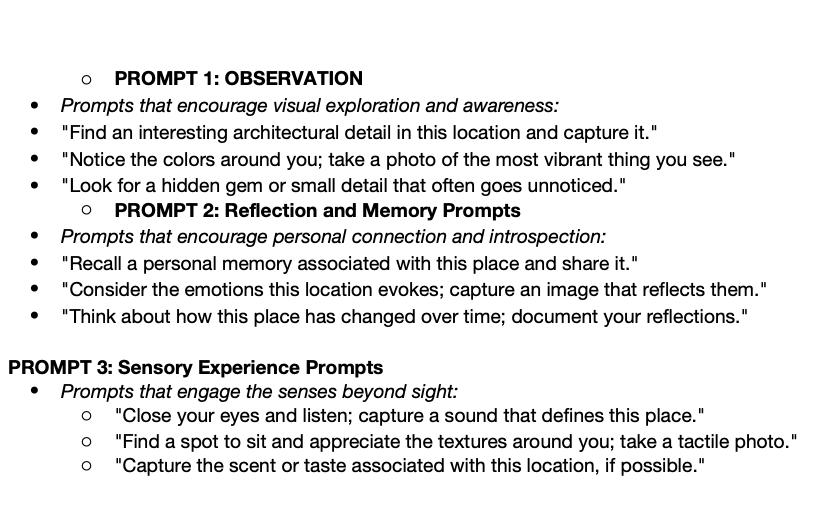
I am sharing this spread for the purpose of the process book. Although there are a few repetitions, this section illustrates my process of translating abstract ideas into written form. I initially considered different categories for the cards: ‘observation,’ ‘reflection and memory prompts,’ and ‘sensory experience prompts.’ These names would undergo changes later in the process.
When I presented this written concept to my instructor, he reiterated that it lacked connectivity with people. He emphasized the importance of me being the author of the zine and suggested that my initial concept made it seem like I was passing the authorship to the reader, rather than retaining authorship myself. In response to his feedback, I delved into my thoughts to find a way to incorporate his suggestions.
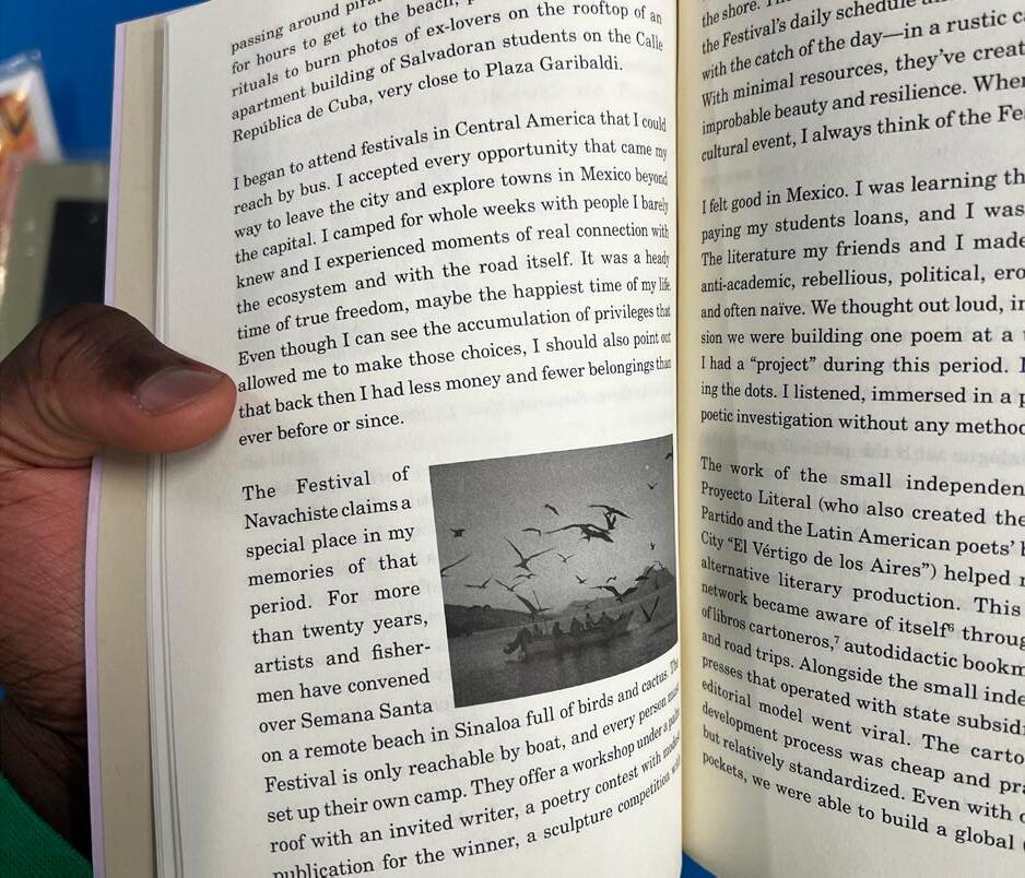
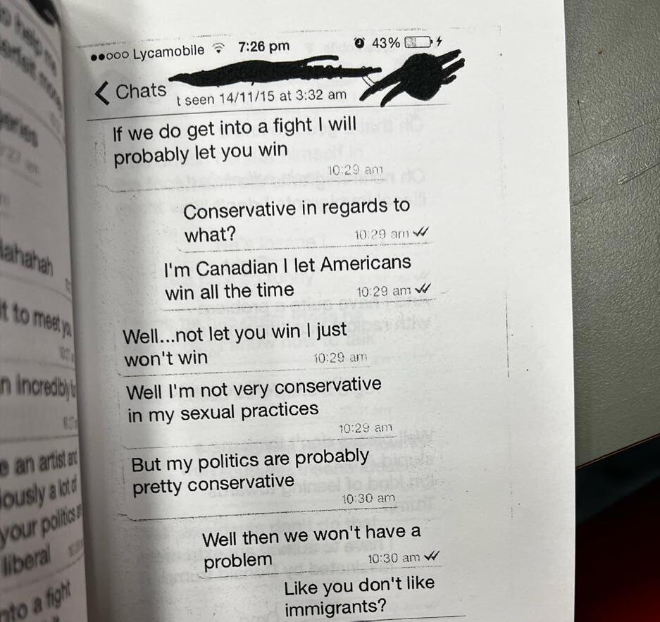
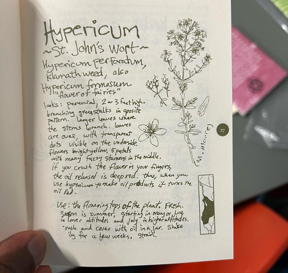
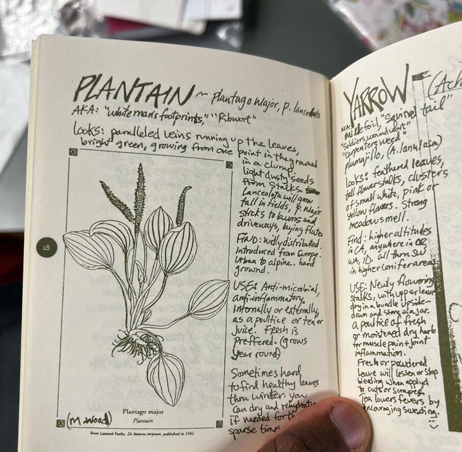
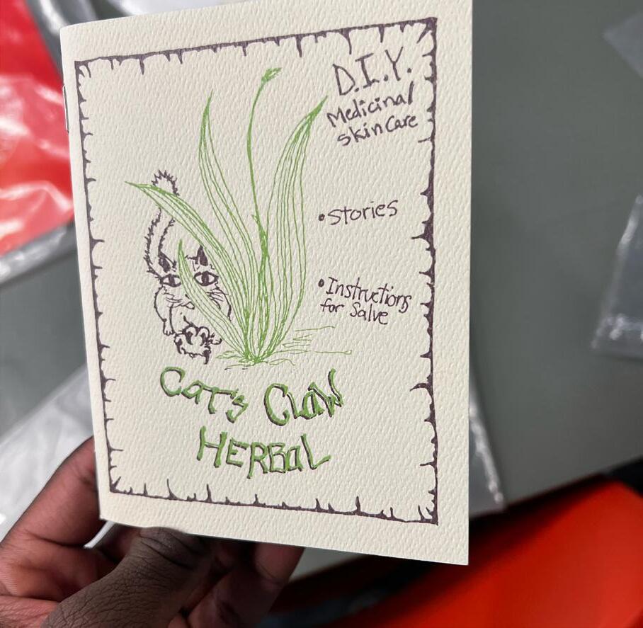
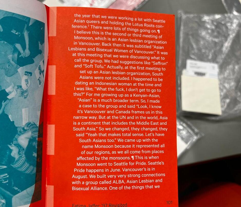
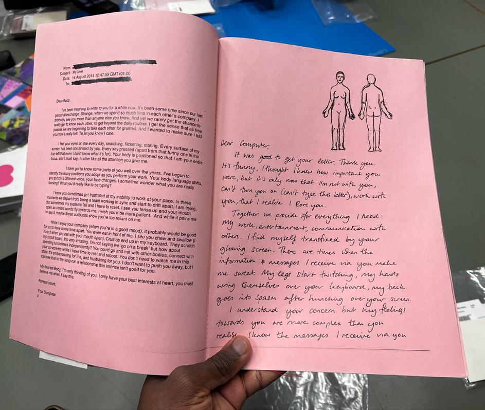
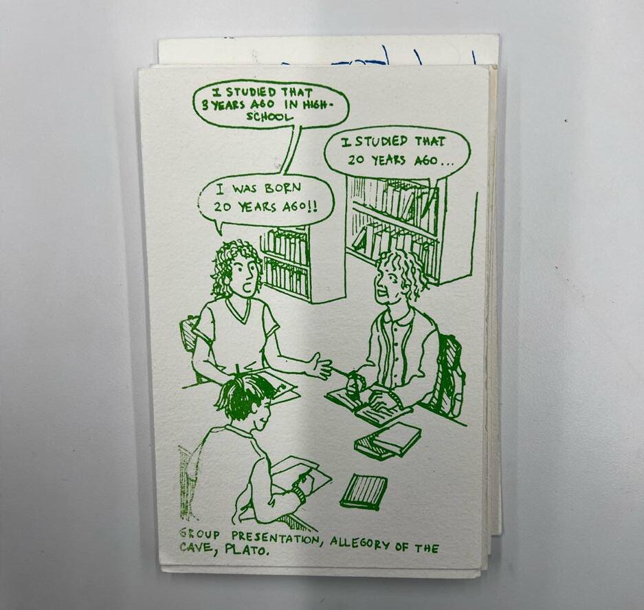
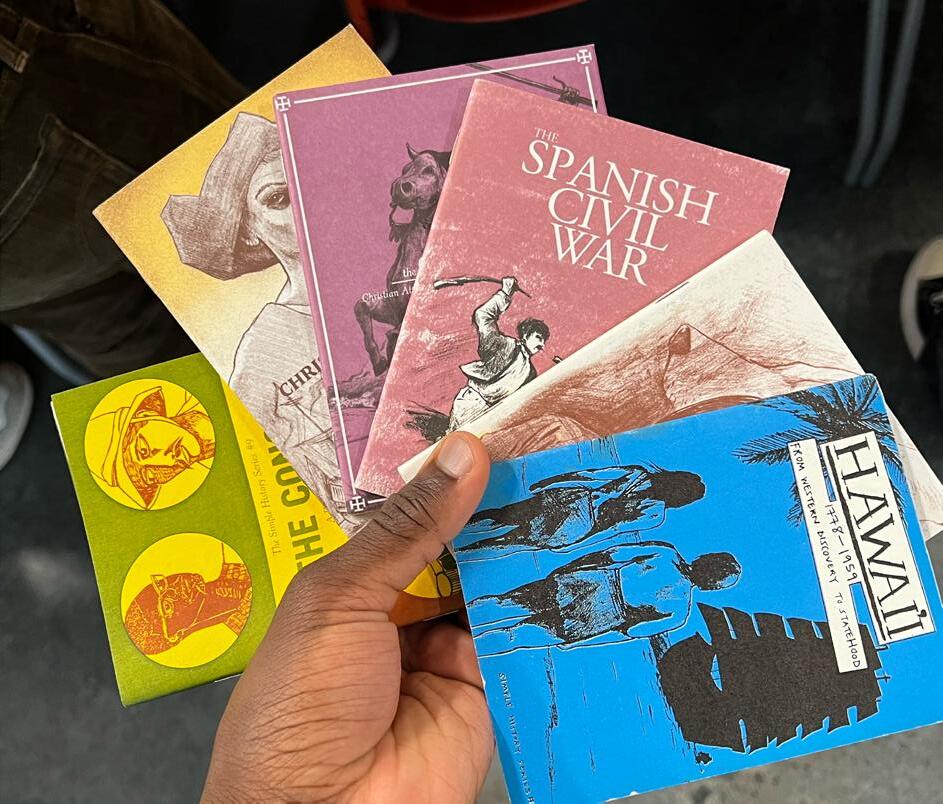
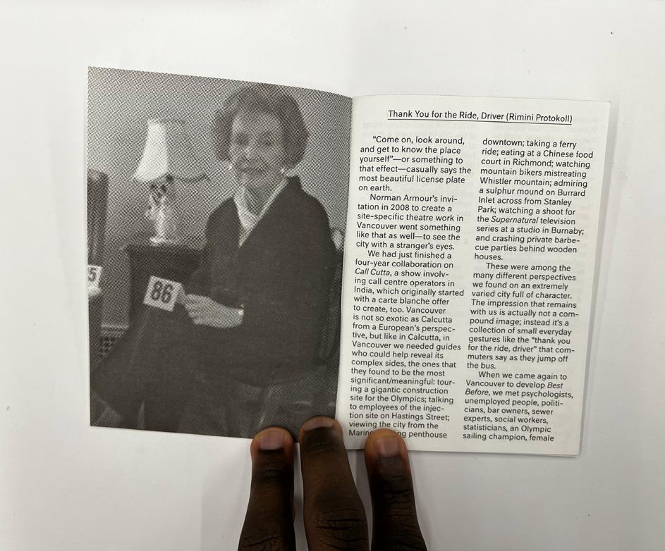
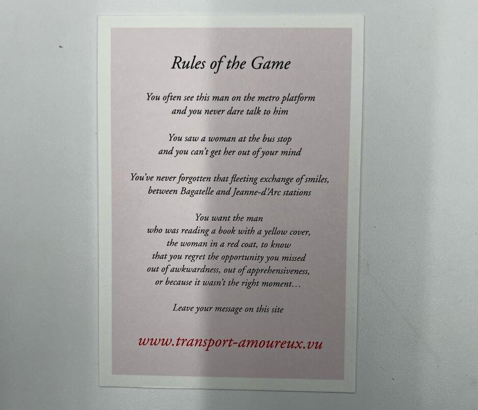
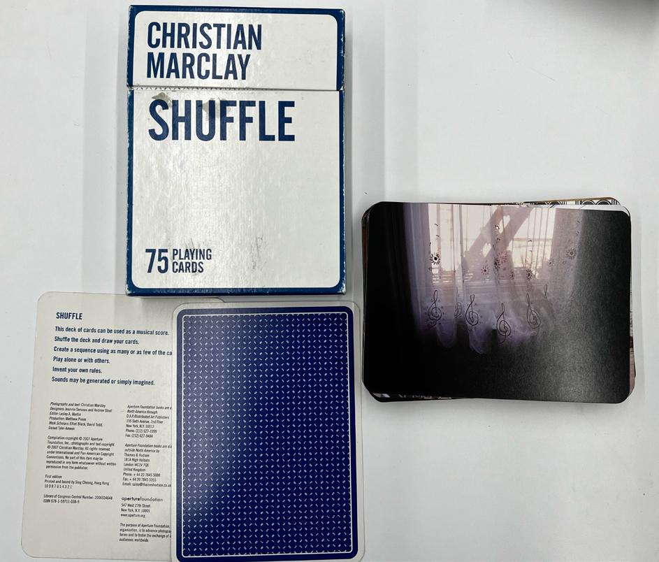
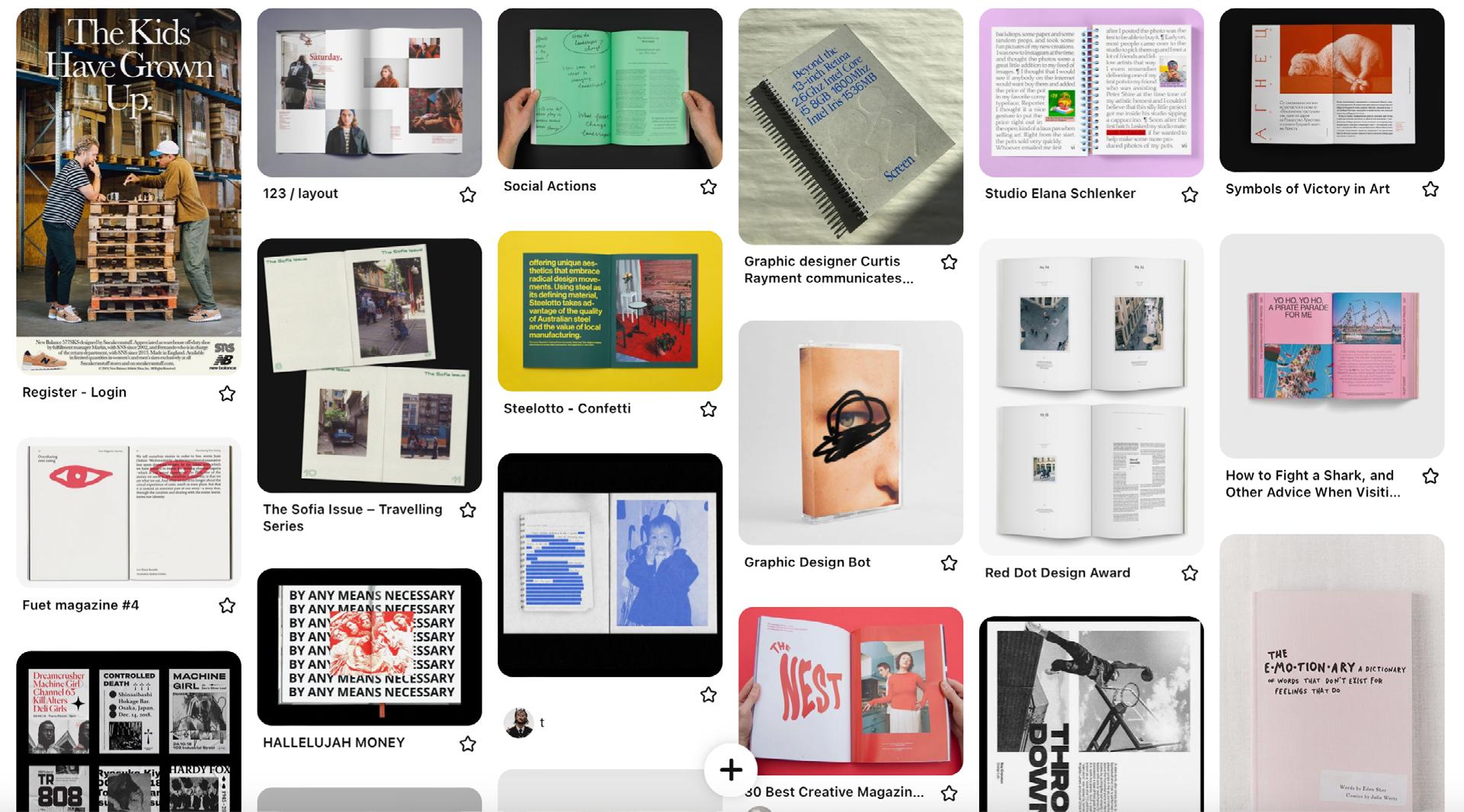
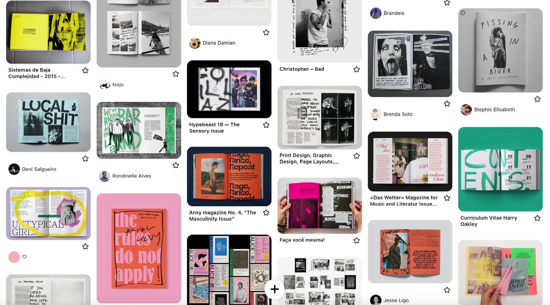
We were introduced to books from the artist collection at ECU. These are pictures of the books that caught my interest due to their layout, typography, language play, texture, or composition.
I particularly liked the one with text messages as I found it to be a cool idea to present a range of personal thoughts, offering a pathway to connect with others—a key expectation for our zines. Another one that stood out to me was about plants. The combination of handwritten notes alongside the imagery created a sense of a labor of love, making the content engaging and immersive.
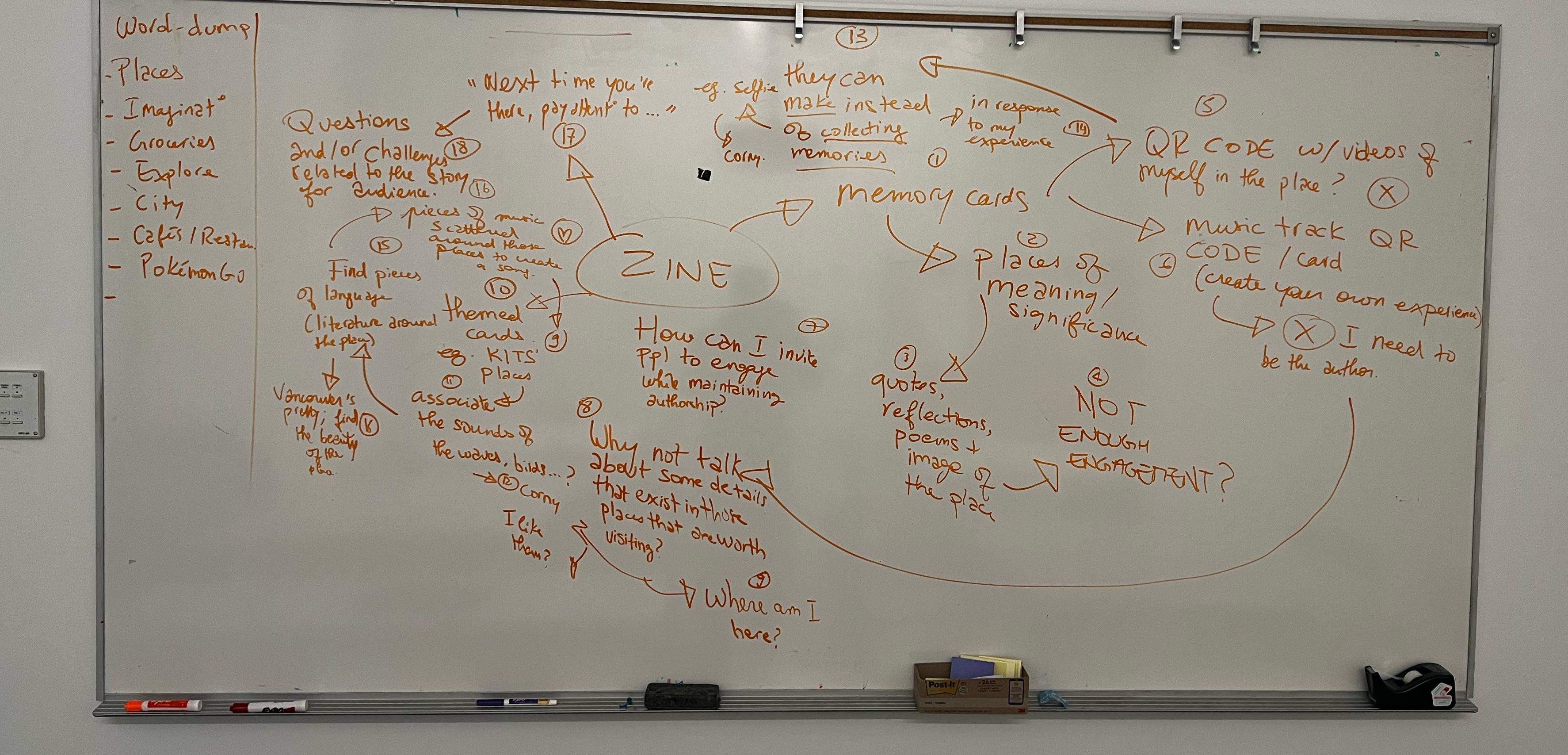
After the initial visual research and the additional feedback from my instructor urging me to delve deeper, I spent a couple of hours mind-mapping ideas on the board. I poured out words to generate new concepts, revisited previous ideas that had been critiqued by my instructor, and
used arrows to dissect why certain elements needed improvement. Throughout this process, I explored nearly 20 different ideas.
My primary concerns during this brainstorming session were twofold: ensuring the concepts were engaging and relevant to a
broader audience while still maintaining a personal infusion. Striking the right balance between these elements proved to be a challenging task.
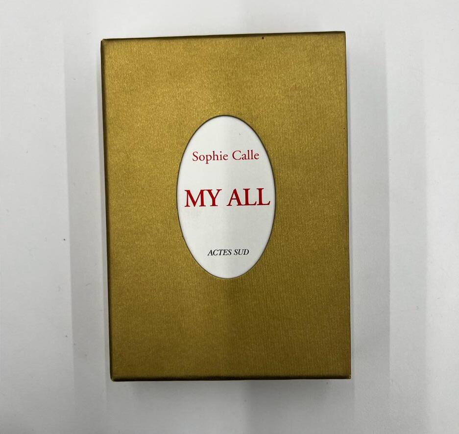
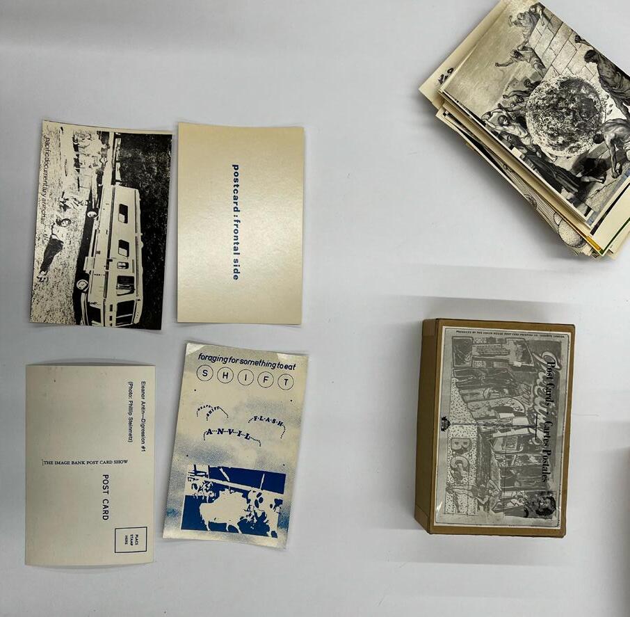
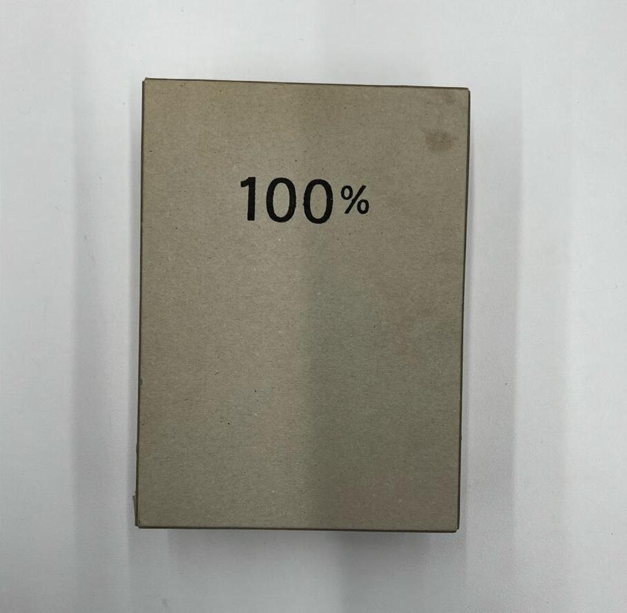
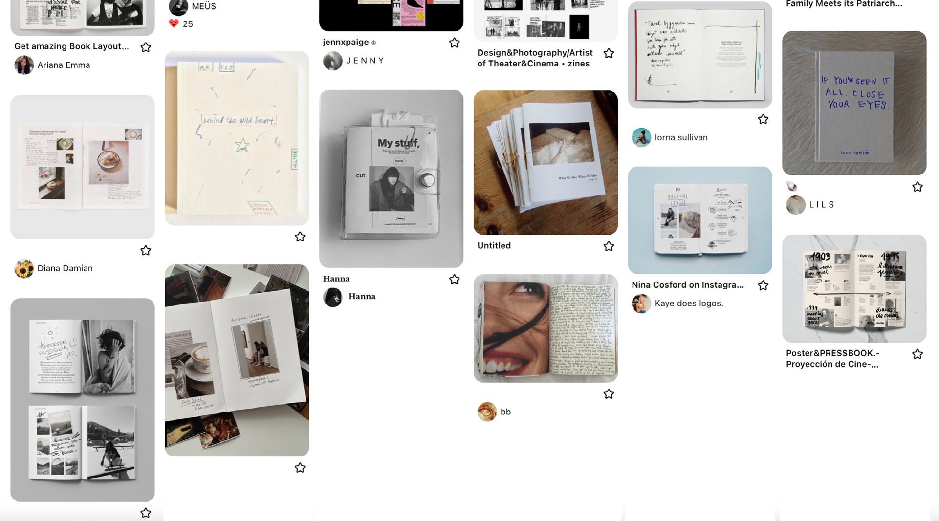
Following that in-depth reflection session, I formulated an idea that retained the concept of cards but aimed for a more engaging approach. I sought inspiration from the artist book collection in the library, and one book that resonated with me was My All by Sophie Calle. I was captivated by the nostalgic quality of the photographs and the accompanying writings. What stood out was the deeply personal nature of the content, and yet, as the stories she shared were about others, it elicited a sense of care from the audience. This influence from Sophie Calle became a pivotal element in shaping my project.
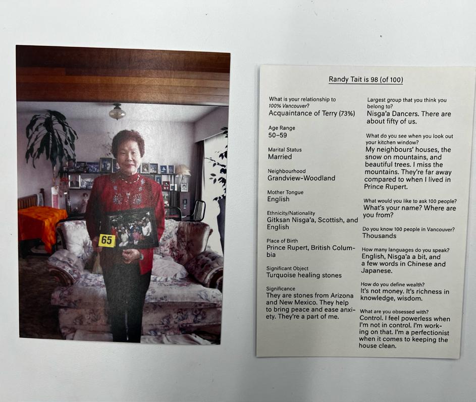
I also enjoyed “100%”. It’s this beautiful collection of 100 humans with on the recto the image of that person, and on the verso, some information about them.
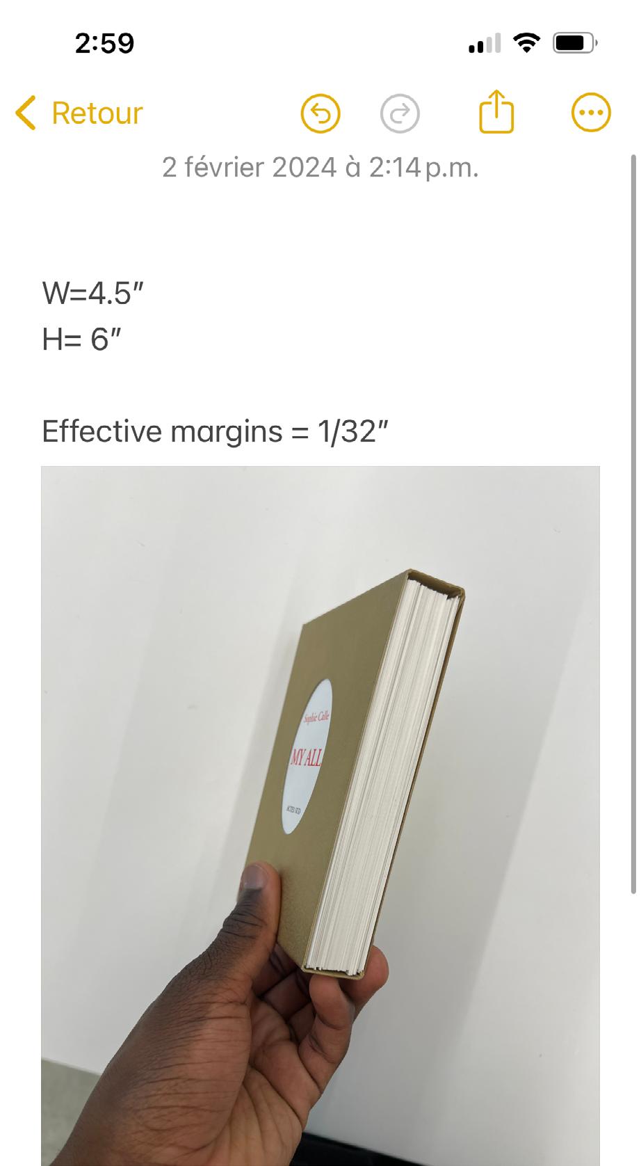
Subsequently, I made several trips to the artist collection and took measurements from Sophie Calle’s “My All,” aiming to replicate the same dimensions. I was drawn to the compact size of the cards in her book, small enough to fit into a pocket. This size not only appealed to me practically but also conveyed a sense of the petite—a visual representation that resonated with the idea of making people truly “see” Vancouver with intentionality. The small dimensions seemed to add a unique visual dance to the overall concept.
With the exciting concept in mind, I began testing typography options for the cover of the cards. My aim was to find a font that felt personal yet elegant. While I can’t recall the specific reason for choosing the color red, I’m certain there was a rationale beyond just taking inspiration from Calle’s work. It could possibly be linked to the theme of vivid memories or hold another significance related to the overall concept.
Places of Meaning
Places Meaningof
Places of Meaning
Places Meaningof Places of Meaning Places Meaningof
Places of Meaning
I began the design process for my cards, incorporating personal reflections on the left side of the card (recto). When flipped, the right side (verso) presented three prompts – “Observe,” “Introspection,” and “Beyond Sight” – providing readers with options to engage with the photographed place, forming a connection with both the physical space and my written reflections. To encourage a more open-ended
reflection, I included quotes on the recto. The following spreads represent my first full-fledged draft. As you scroll, keep in mind that they are spreads intended to be cards, with the left side as the recto and the right side as the verso.
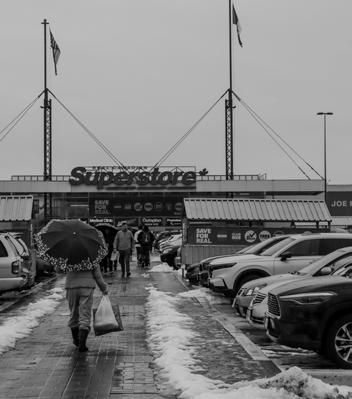
I first moved to Vancouver, this grocery store became a light inducing store. It was where first stumbled upon food items from home that had been longing for – plantains and plantain chips.
This picture holds a special place in my heart. When first moved to Vancouver, this grocery store became a light inducing store. It was where first stumbled upon food items from home that had been longing for – plantains and plantain chips.
Prompt 1: Observe Note the contrast between the stillness of the cars and the movement of people, what do you think of the interplay of static and dynamic.
Prompt 1: Observe Note the contrast between the stillness of the cars and the movement of people, what do you think of the interplay of static and dynamic.
Prompt 2: Introspection Reflect on the first item you bought from a grocery store in a new place. What memories flood back?
Prompt 2: Introspection Reflect on the first item you bought from a grocery store in a new place. What memories flood back?
Prompt
Prompt 3: Beyond sight Picture yourself walking through this parking lot. What textures or sound would you encounter, and how would they linger in your senses, on your feet?
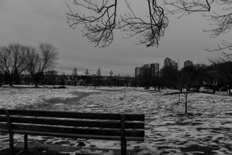
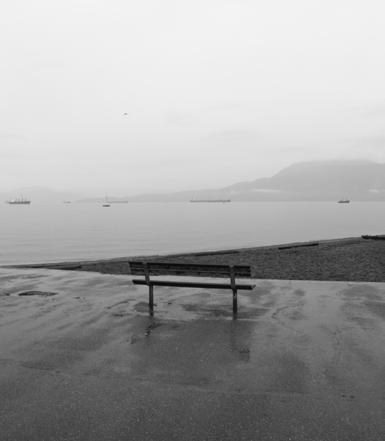
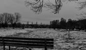
that forming connections in Vancouver can be challenging. While my experience has been a bit different, acknowledge that creating meaningful bonds can be a struggle at times. This photograph of the empty bench serves as a metaphor for the solitude that can easily envelop us. Prompt 1: Observe Capture the contrast between the emptiness of the bench and the lively motion of the waves.
Prompt 2: Introspection Reflect on a time when you felt a similar sense of solitude. How does the image of the empty bench resonate with those emotions?
Prompt 3: Beyond sight Go to that bench in Kits, alone, and listen to the sound of the waves crashing against the shore. What do you notice in your body about the way you occupy the bench?
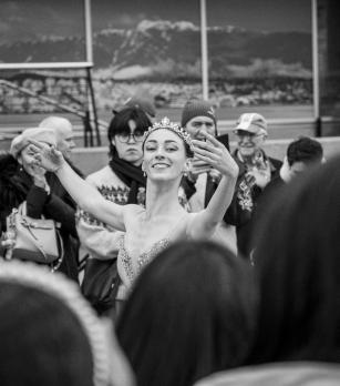
“Everything in the universe has a rhythm, everything dances.”
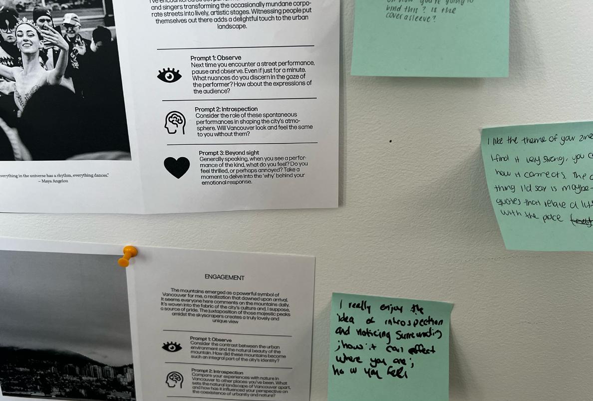
Every time I’ve wandered through downtown, I’ve encountered street performances – musicians, dancers, and singers transforming the occasionally mundane corporate streets into lively, artistic stages. Witnessing people put themselves out there adds a delightful touch to the urban landscape.
Prompt 1: Observe
Next time you see a performance on the street, stop and watch. Even if just for a minute. What do you notice in the gaze of the performer? the audience?
Prompt 2: Introspection
Consider the role of these spontaneous performances in shaping the city’s atmosphere. Will Vancouver seem the same to you without them?
Prompt 3: Beyond sight
Generally speaking, when you see a performance of the kind, what do you feel? Are you thrilled –or annoyed? Why?
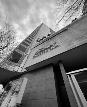
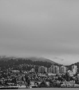
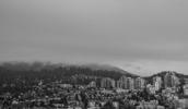
View of the mountains (from Downtown)
Ad mod qui cumqui cus dolorpos solupta poruptatatem nos am explatur? Quisima gnimenditas sinctem nullenimi, inctore volor aborio. Il incit, sinum, qui di bea sam evendelicia nus, eum volorro remporerum rat. Exces est quae venis ad mi, cullab ium latint quo que doluptat et fugitam, ides restin eles quisimusae lant.
ENGAGEMENT
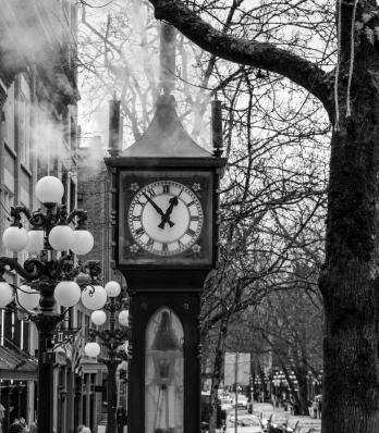
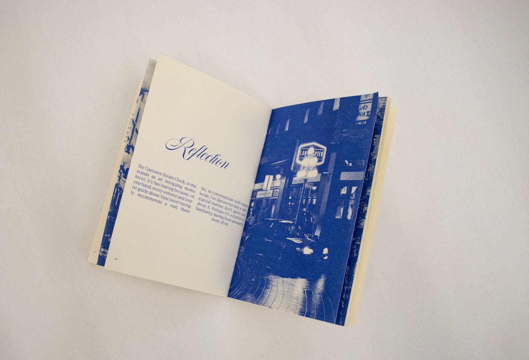
The Gastown Steam Clock, to me, stands as an intriguing monument. It’s fascinating because, on one hand, every website and tourist guide about Vancouver strongly recommends a visit to the steam clock. Yet, in conversations with many locals, I’ve discovered that a substantial number don’t quite see the fuss about it. Perhaps it’s a matter of familiarity, having been around it more often.
Prompt 1: Observe
Examine the details of the Gastown Steam Clock. Imagine the stories it might unveil about the neighborhood’s evolution over time, if you don’t know it already..
Prompt 2: Introspection
Reflect on your experiences with the Gastown Steam Clock. Do you consider it as iconic as it is presented? Why or why not?
Prompt 3: Beyond sight
Picture yourself in the 1980s, when the clock was built. Is imagining yourself there affecting the way you think it?
Ad mod qui cumqui cus dolorpos solupta poruptatatem nos am explatur? Quisima gnimenditas sinctem nullenimi, inctore volor aborio. Il incit, sinum, qui di bea sam evendelicia nus, eum volorro remporerum rat. Exces est quae venis ad mi, cullab ium latint quo que doluptat et fugitam, ides restin eles quisimusae lant.
ENGAGEMENT
The mountains emerged as a powerful symbol of Vancouver for me, a realization that dawned upon arrival. It seems everyone here comments on the mountains daily. It’s woven into the fabric of the city’s culture and, suppose, a source of pride. The juxtaposition of those majestic peaks amidst the skyscrapers creates a truly lovely and unique view
Prompt 1: Observe Consider the contrast between the urban environment and the natural beauty of the mountain. How did these mountains become such an integral part of the city’s identity?
Prompt 2: Introspection Compare your experiences with nature in Vancouver to other places you’ve been. What sets the natural landscape of Vancouver apart, and how has it influenced your perspective on the coexistence of urbanity and nature?
Prompt 3: Beyond sight Go hiking on the mountains and feel the breeze and the scent of freshness. Or visualize the soundscape of the mountainous landscape. How does that make you feel?
ENGAGEMENT
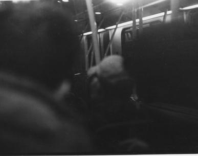
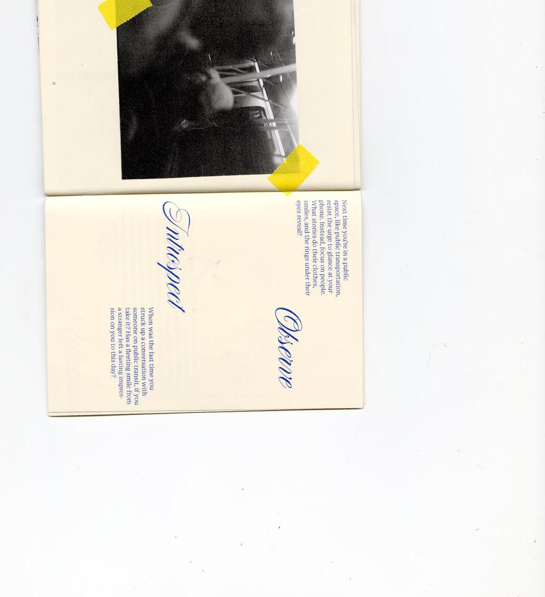
I believed omitting people from this collection would create an incomplete portrayal of the city. After all, a city thrives on its people. Though individuals are mentioned throughout this zine, want to take a moment for a contemplative reflection on the physical proximity shared with the city’s inhabitants. Whether in a crowded train, as captured in the photograph, or elsewhere, find myself close to people. However, I’ve come to realize that physical closeness doesn’t necessarily equate to a sense of fullness.
Prompt 1: Observe Next time you find yourself in a public space, such as public transportation, try not to look at your phone. But look at people instead, what stories can their clothes, smiles, the ring under their eyes tell you?
Prompt 2: Introspection When was the last time you talked to someone in public transit, if you take them? Has a fleeting smile from a stranger made a lasting impression on you until this day?
Prompt 3: Beyond sight
How does the sound and feeling of a large crowd make you feel? Anxious, annoyed, indifferent? Why?
Street performer
In the heart of Gastown, the Steam Clock stands as a sifling, quiet resistance to the erasure of time and history.
Gastown Steam Clock
Rem eturia etum et quam quaspiet que officae pratis ut quae. Iqui occullam expera sequam, sum nobit, qui ulparum quatqui nostium sit vollignisi venda diorrum et volorit atecto quod expliquam eos volupta tiusdam, sitat maionsequeOptureiur mod qui te dipiet volor mi, qui assum atecaborem vid maionsed essed que nobisquo occus, est, sin eos esto que aliquate eos estiam aut fugitatur aliquun tibeati rentore
Rem eturia etum et quam quaspiet que officae pratis ut quae. Iqui occullam expera sequam, sum nobit, qui ulparum quatqui nostium sit vollignisi venda diorrum et volorit atecto quod expliquam eos volupta tiusdam, sitat maionsequeOptureiur mod qui te dipiet volor mi, qui assum atecaborem vid maionsed essed que nobisquo occus, est, sin eos esto que aliquate eos estiam aut fugitatur aliquun tibeati rentore
Prompt 1: Observe etum et quam quaspiet que officae pratis ut quae. Iqui occullam expera sequam, sum nobit, qui ulparum quatqui nostium sit vollignisi venda diorrum et volorit atecto quod expliquam eos
Prompt 1: Observe etum et quam quaspiet que officae pratis ut quae. Iqui occullam expera sequam, sum nobit, qui ulparum quatqui nostium sit vollignisi venda diorrum et volorit atecto quod expliquam eos
Prompt 2: Introspection etum et quam quaspiet que officae pratis ut quae. Iqui occullam expera sequam, sum nobit, qui ulparum quatqui nostium sit vollignisi venda diorrum et volorit atecto quod expliquam eos
Prompt 2: Introspection etum et quam quaspiet que officae pratis ut quae. Iqui occullam expera sequam, sum nobit, qui ulparum quatqui nostium sit vollignisi venda diorrum et volorit atecto quod expliquam eos
Prompt 3: Beyond sight etum et quam quaspiet que officae pratis ut quae. Iqui occullam expera sequam, sum nobit, qui ulparum quatqui nostium sit vollignisi venda diorrum et volorit atecto quod expliquam eos
Prompt 3: Beyond sight etum et quam quaspiet que officae pratis ut quae. Iqui occullam expera sequam, sum nobit, qui ulparum quatqui nostium sit vollignisi venda diorrum et volorit atecto quod expliquam eos
caption
Ad
caption
sinctem
inctore volor aborio. Il incit, sinum, qui di bea sam evendelicia nus, eum volorro remporerum rat. Exces est quae venis ad mi, cullab ium latint quo que doluptat et fugitam, ides restin eles quisimusae lant.
Ad mod qui cumqui cus dolorpos solupta poruptatatem nos am explatur? Quisima gnimenditas sinctem nullenimi, inctore volor aborio. Il incit, sinum, qui di bea sam evendelicia nus, eum volorro remporerum rat. Exces est quae venis ad mi, cullab ium latint quo que doluptat et fugitam, ides restin eles quisimusae lant.
Places of Meaning Places of Meaning
caption
Ad mod qui cumqui cus dolorpos solupta poruptatatem nos am explatur? Quisima gnimenditas sinctem nullenimi, inctore volor aborio. Il incit, sinum, qui di bea sam evendelicia nus, eum volorro remporerum rat.
Exces est quae venis ad mi, cullab ium latint quo que doluptat et fugitam, ides restin eles quisimusae lant.
ENGAGEMENT
Rem eturia etum et quam quaspiet que officae pratis ut quae. Iqui occullam expera sequam, sum nobit, qui ulparum quatqui nostium sit vollignisi venda diorrum et volorit atecto quod expliquam eos volupta tiusdam, sitat maionsequeOptureiur mod qui te dipiet volor mi, qui assum atecaborem vid maionsed essed que nobisquo occus, est, sin eos esto que aliquate eos estiam aut fugitatur aliquun tibeati rentore
Rem eturia etum et quam quaspiet que officae pratis ut quae. Iqui occullam expera sequam, sum nobit, qui ulparum quatqui nostium sit vollignisi venda diorrum et volorit atecto quod expliquam eos volupta tiusdam, sitat maionsequeOptureiur mod qui te dipiet volor mi, qui assum atecaborem vid maionsed essed que nobisquo occus, est, sin eos esto que aliquate eos estiam aut fugitatur aliquun tibeati rentore
Prompt 1: Observe etum et quam quaspiet que officae pratis ut quae. Iqui occullam expera sequam, sum nobit, qui ulparum quatqui nostium sit vollignisi venda diorrum et volorit atecto quod expliquam eos
Prompt 1: Observe etum et quam quaspiet que officae pratis ut quae. Iqui occullam expera sequam, sum nobit, qui ulparum quatqui nostium sit vollignisi venda diorrum et volorit atecto quod expliquam eos
Prompt 2: Introspection etum et quam quaspiet que officae pratis ut quae. Iqui occullam expera sequam, sum nobit, qui ulparum quatqui nostium sit vollignisi venda diorrum et volorit atecto quod expliquam eos
Prompt 2: Introspection etum et quam quaspiet que officae pratis ut quae. Iqui occullam expera sequam, sum nobit, qui ulparum quatqui nostium sit vollignisi venda diorrum et volorit atecto quod expliquam eos
Prompt 3: Beyond sight etum et quam quaspiet que officae pratis ut quae. Iqui occullam expera sequam, sum nobit, qui ulparum quatqui nostium sit vollignisi venda diorrum et volorit atecto quod expliquam eos
Prompt 3: Beyond sight etum et quam quaspiet que officae pratis ut quae. Iqui occullam expera sequam, sum nobit, qui ulparum quatqui nostium sit vollignisi venda diorrum et volorit atecto quod expliquam eos
ENGAGEMENT
ENGAGEMENT
Rem eturia etum et quam quaspiet que officae pratis ut quae. Iqui occullam expera sequam, sum nobit, qui ulparum quatqui nostium sit vollignisi venda diorrum et volorit atecto quod expliquam eos volupta tiusdam, sitat maionsequeOptureiur mod qui te dipiet volor mi, qui assum atecaborem vid maionsed essed que nobisquo occus, est, sin eos esto que aliquate eos estiam aut fugitatur aliquun tibeati rentore
Rem eturia etum et quam quaspiet que officae pratis ut quae. Iqui occullam expera sequam, sum nobit, qui ulparum quatqui nostium sit vollignisi venda diorrum et volorit atecto quod expliquam eos volupta tiusdam, sitat maionsequeOptureiur mod qui te dipiet volor mi, qui assum atecaborem vid maionsed essed que nobisquo occus, est, sin eos esto que aliquate eos estiam aut fugitatur aliquun tibeati rentore
Prompt 1: Observe etum et quam quaspiet que officae pratis ut quae. Iqui occullam expera sequam, sum nobit, qui ulparum quatqui nostium sit vollignisi venda diorrum et volorit atecto quod expliquam eos
Prompt 1: Observe etum et quam quaspiet que officae pratis ut quae. Iqui occullam expera sequam, sum nobit, qui ulparum quatqui nostium sit vollignisi venda diorrum et volorit atecto quod expliquam eos
Prompt 2: Introspection etum et quam quaspiet que officae pratis ut quae. Iqui occullam expera sequam, sum nobit, qui ulparum quatqui nostium sit vollignisi venda diorrum et volorit atecto quod expliquam eos
Prompt 2: Introspection etum et quam quaspiet que officae pratis ut quae. Iqui occullam expera sequam, sum nobit, qui ulparum quatqui nostium sit vollignisi venda diorrum et volorit atecto quod expliquam eos
Prompt 3: Beyond sight etum et quam quaspiet que officae pratis ut quae. Iqui occullam expera sequam, sum nobit, qui ulparum quatqui nostium sit vollignisi venda diorrum et volorit atecto quod expliquam eos
Prompt 3: Beyond sight etum et quam quaspiet que officae pratis ut quae. Iqui occullam expera sequam, sum nobit, qui ulparum quatqui nostium sit vollignisi venda diorrum et volorit atecto quod expliquam eos
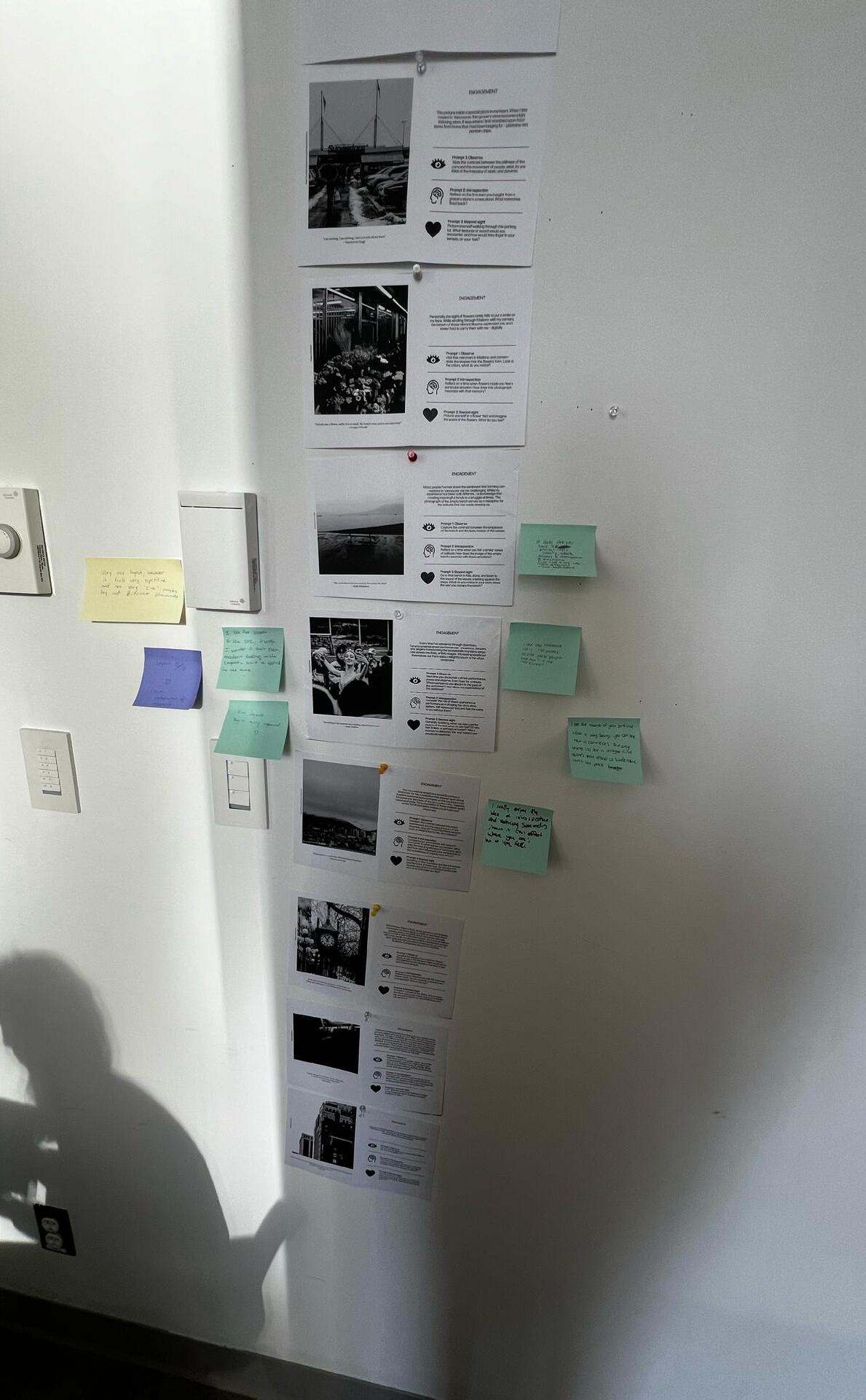
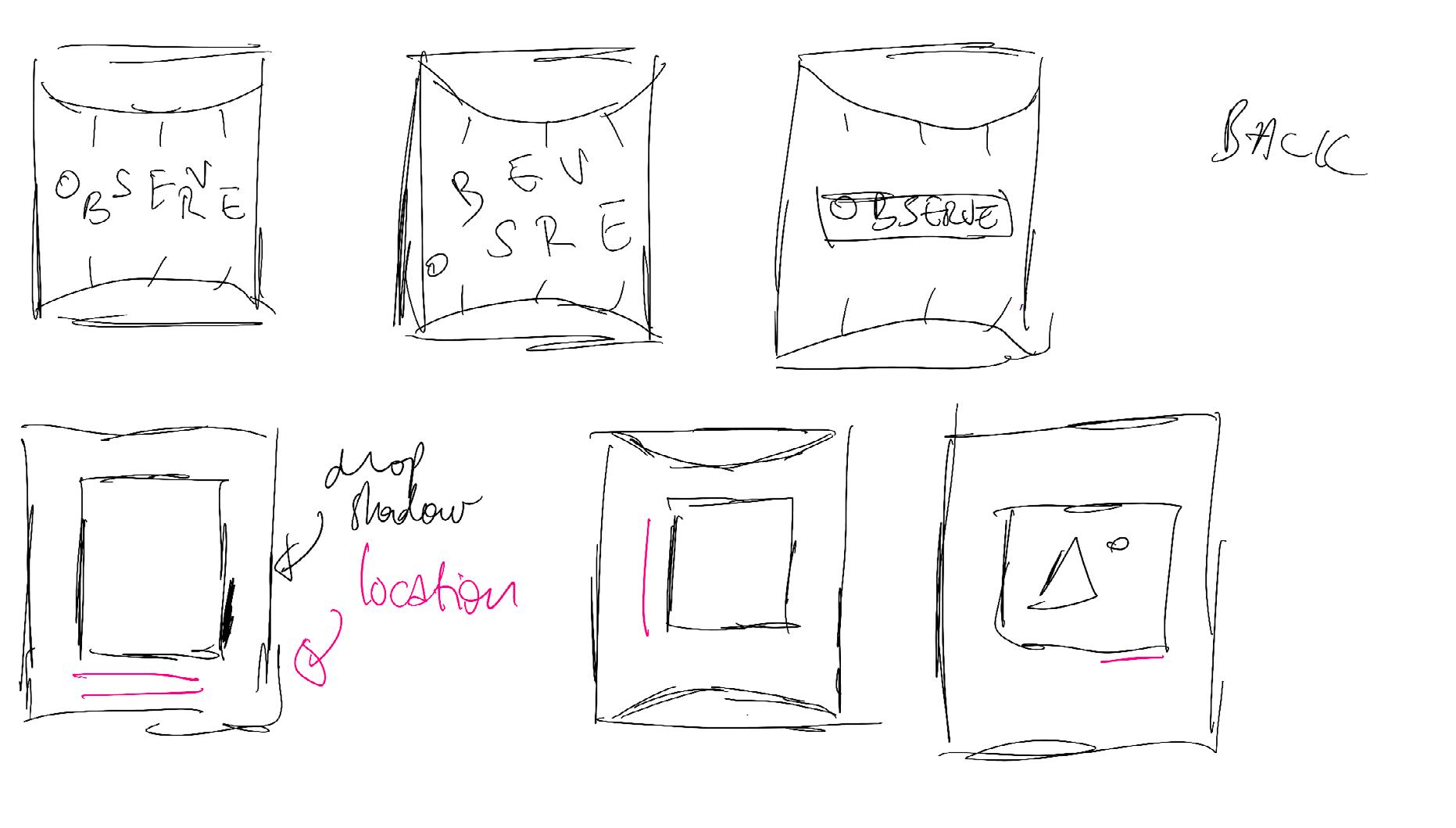
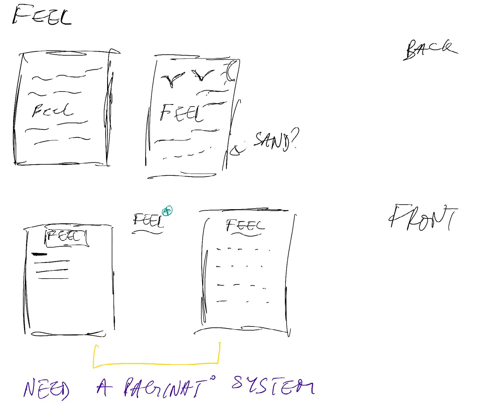
After investing a significant amount of time in writing and rewriting the content of the cards, I revisited the design of the front cover for the card package, recognizing its poor appearance. I initially experimented with an elegant style that, upon reflection, didn’t align with the aesthetic of the cards. This realization led me to understand the necessity for a more cohesive and visually compelling direction for the cover design.
mod qui cumqui cus dolorpos solupta poruptatatem nos am explatur? Quisima gnimenditas
nullenimi,
Class critique down! (You may notice, by the way, that the icons have changed, and the layout has become clearer – that’s intentional! I hand-drew the icons before to give a more personal look, but I thought it looked too crafty in my opinion.)
I had mixed feelings about the peer feedback because it seemed that people didn’t understand these were supposed to be cards. One standout feedback was that the layout was clean but too repetitive. It was challenging for me to create an interesting composition on each card while maintaining a sense of unity, as they were meant to present themselves as a pack. Think of a set of UNO cards—if they don’t look like they belong together, it’s confusing.
Another piece of advice I received was to tone it down. I had too much text, too many prompts on one card, plus the quote. Although I spent a lot of time working on all of this, I agreed to cut it down to make it more digestible for my audience.
As mentioned earlier, I recognized the need for a stronger visual direction. Consequently, I created a moodboard to capture the type and overall feeling I envisioned for the cards. It’s important to note that the colors in the moodboard were meant to be discarded for this project.
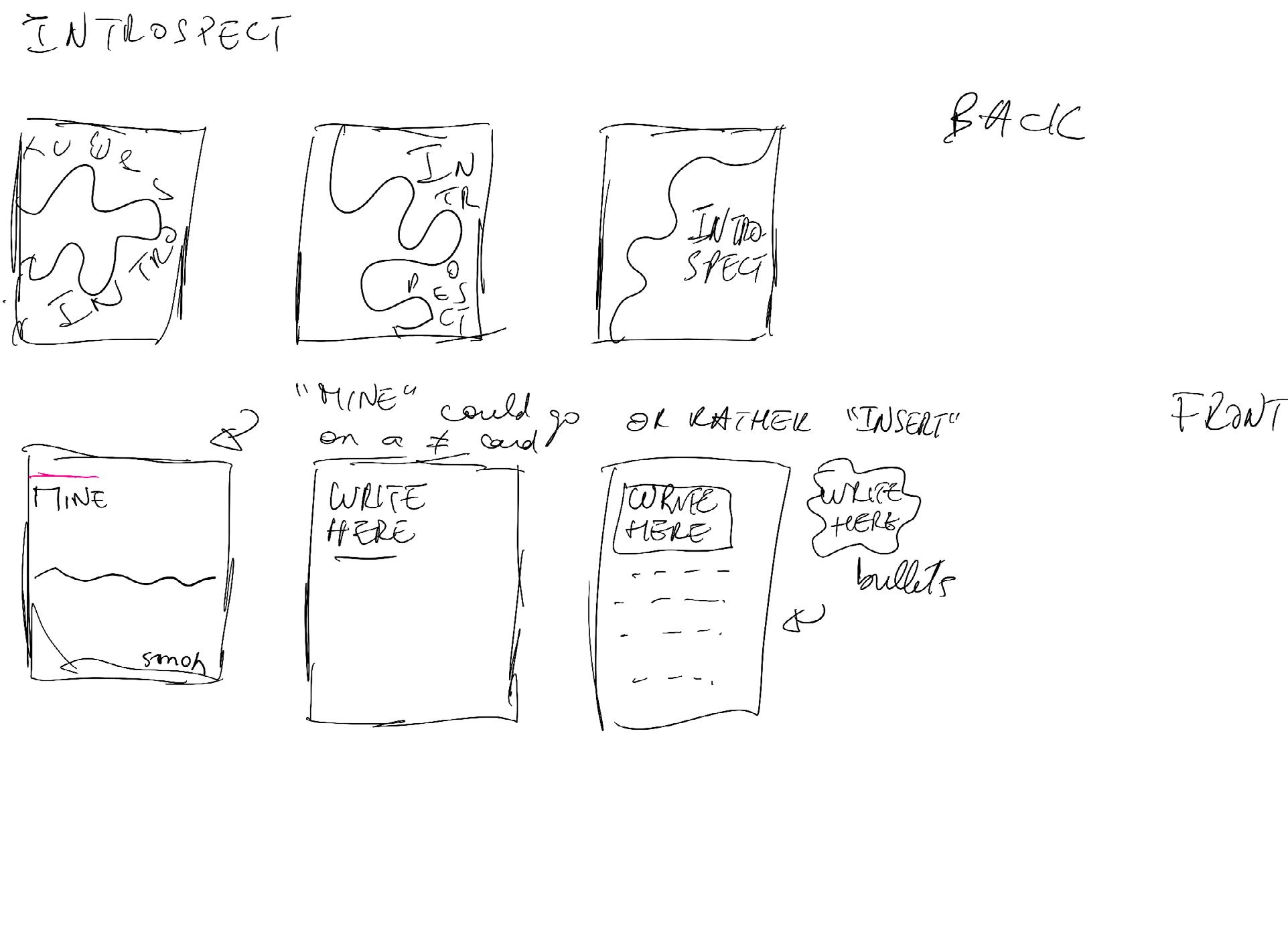
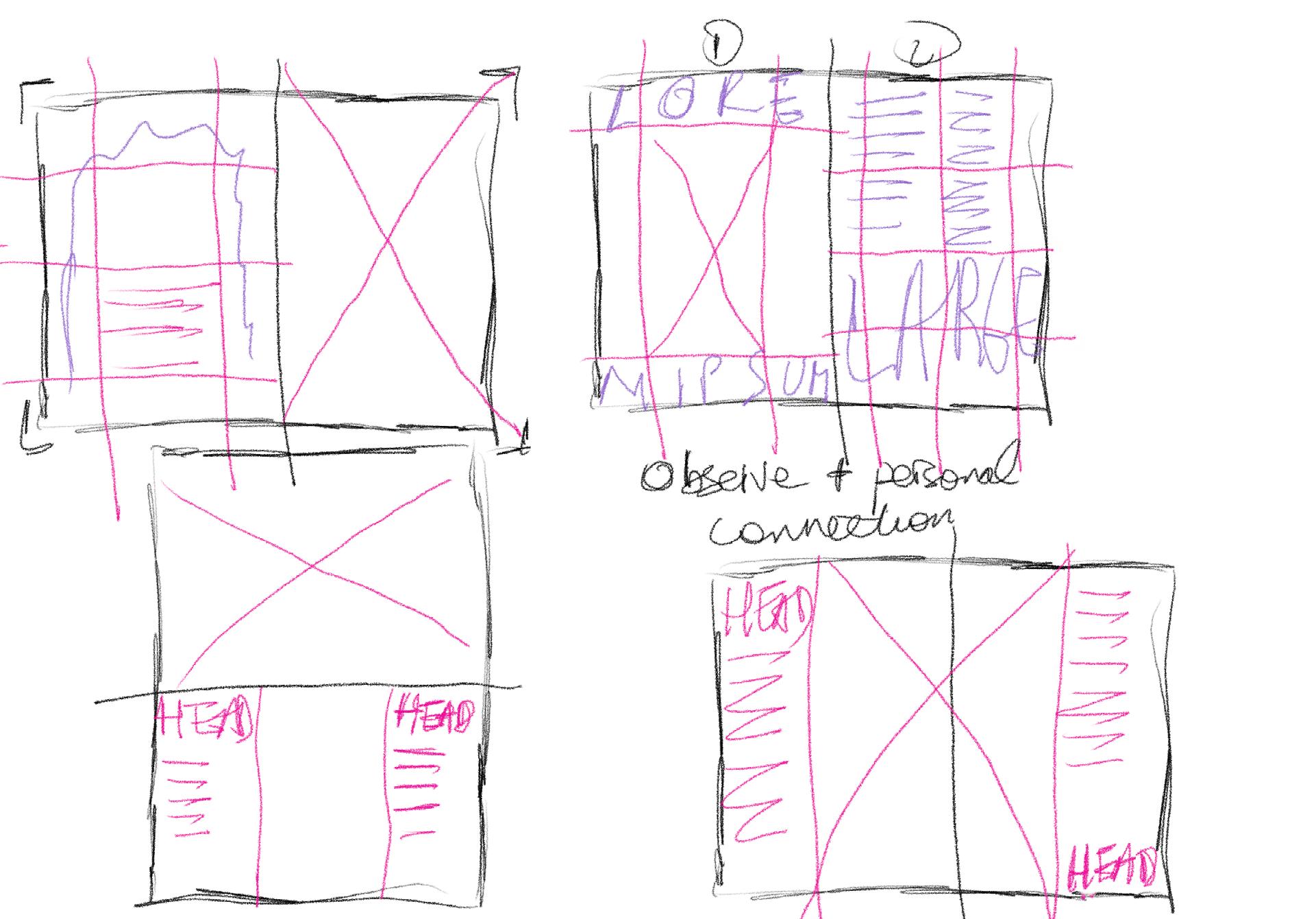
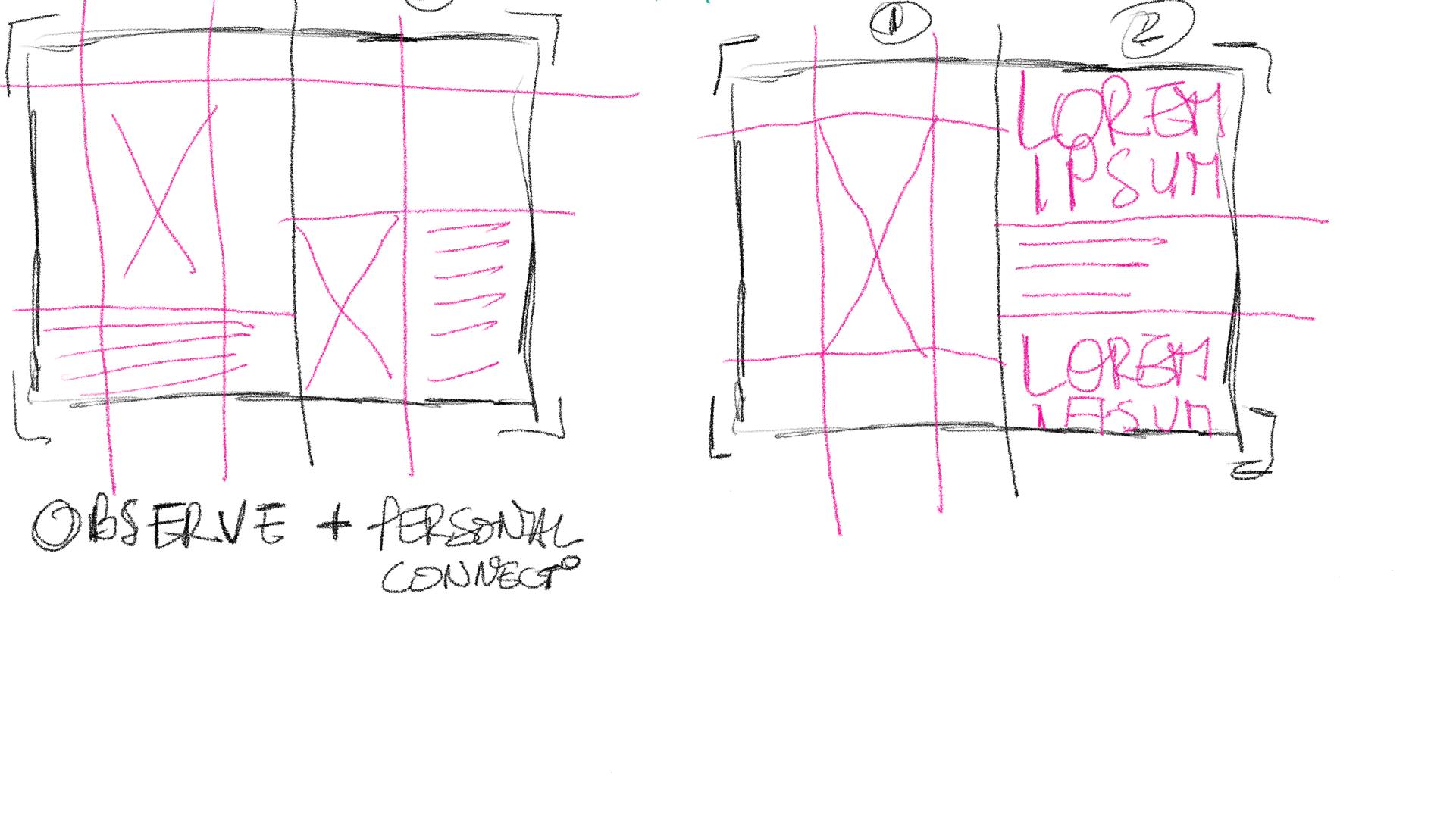
I began sketching ways to create a more cohesive feel for my three prompts, avoiding placement on the same cards to prevent overwhelming the reader. The sketches aimed at exploring different arrangements and layouts to strike the right balance.
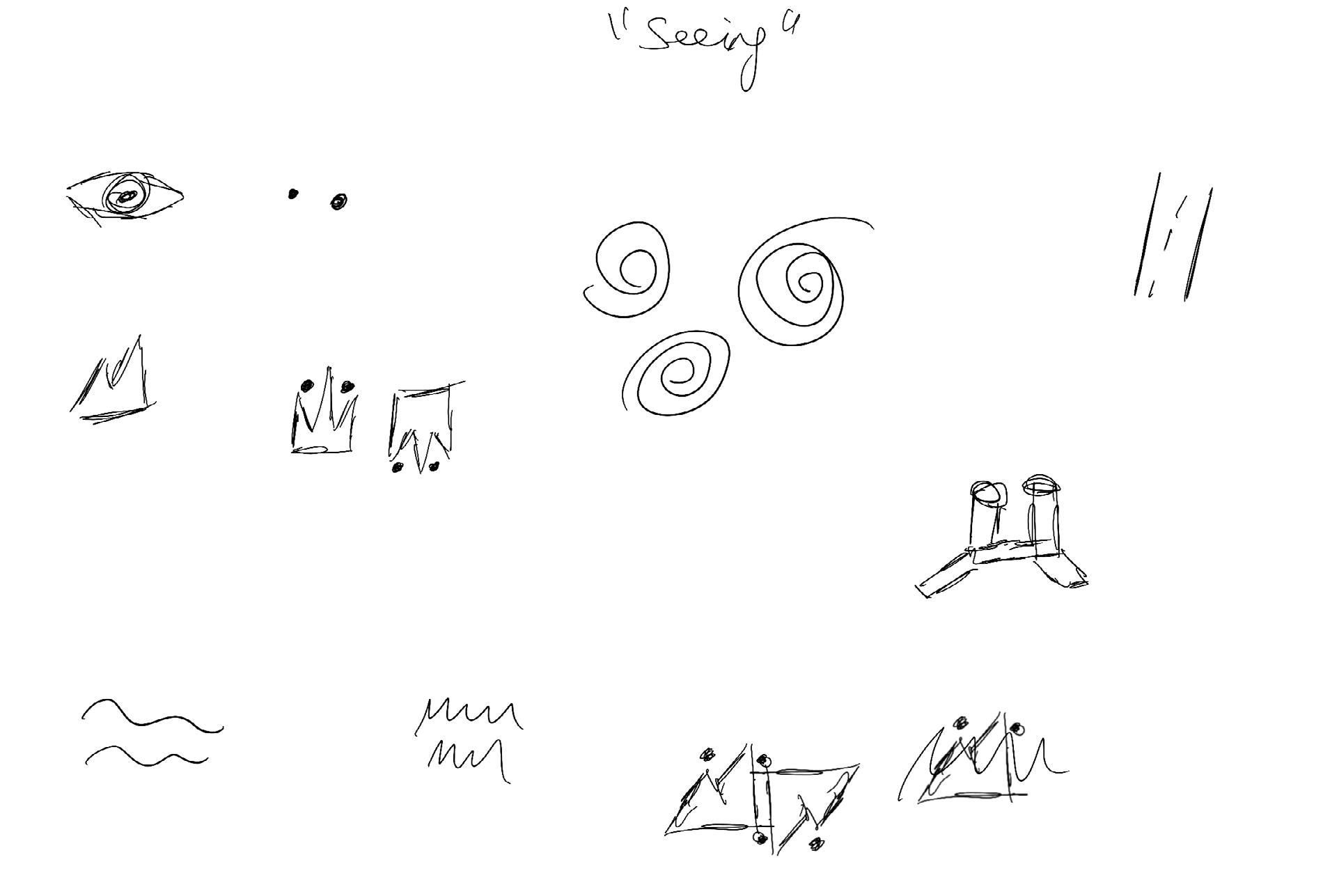
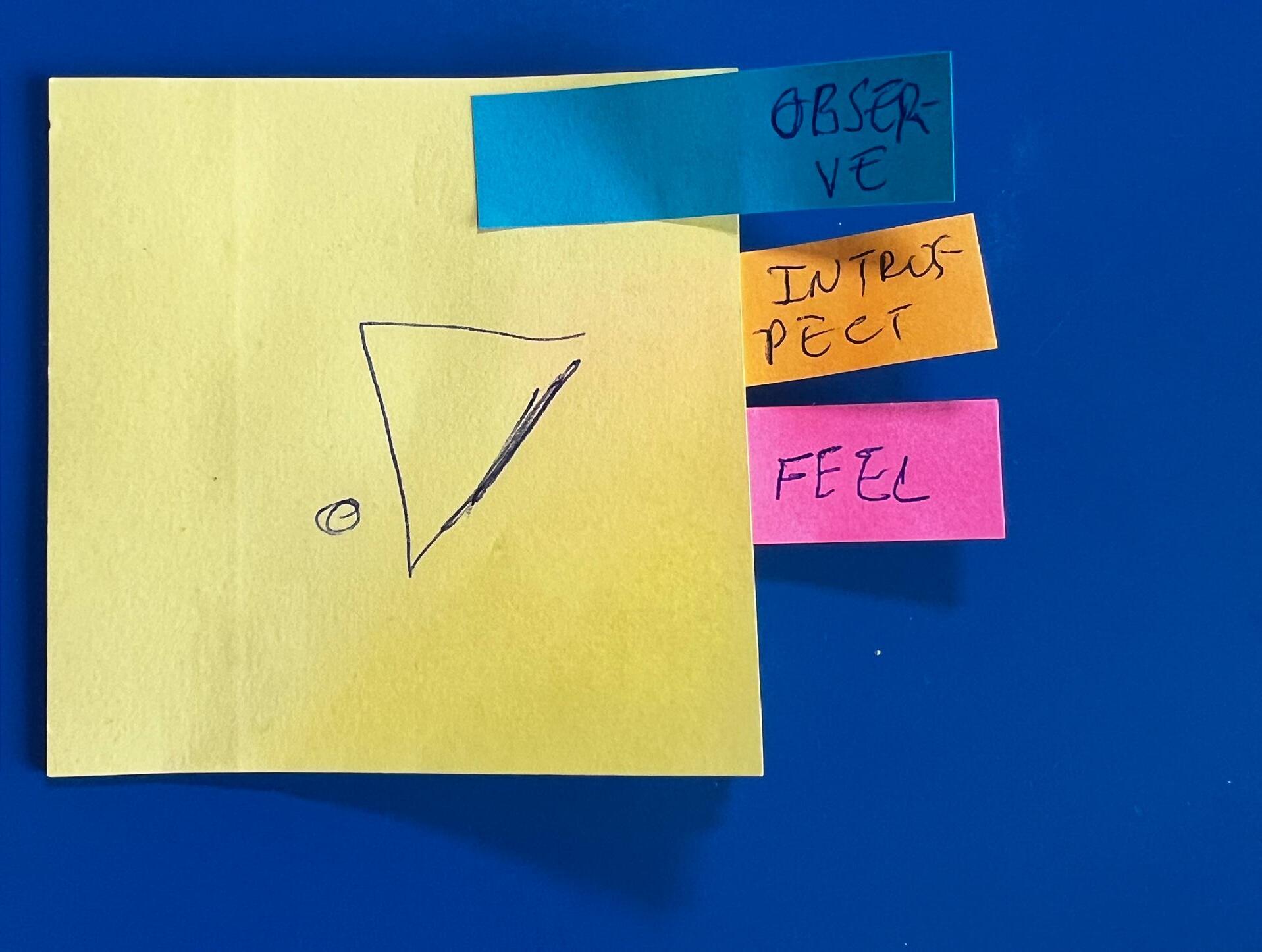
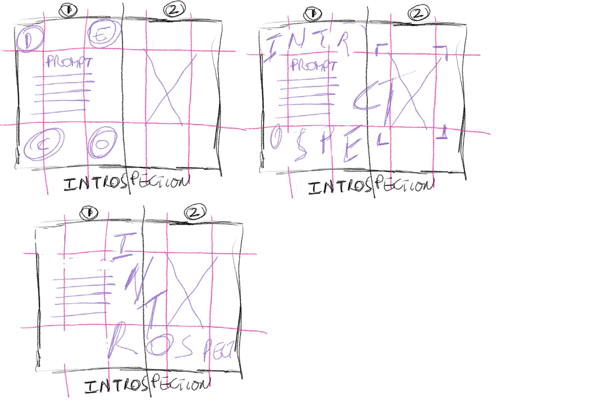
Engaging with a highly complex set of designs, I contemplated various ways to ensure that users could easily identify the type of card they were picking up, whether it was an “observe” card or a “feeling” card. As a solution, I worked on creating symbols.
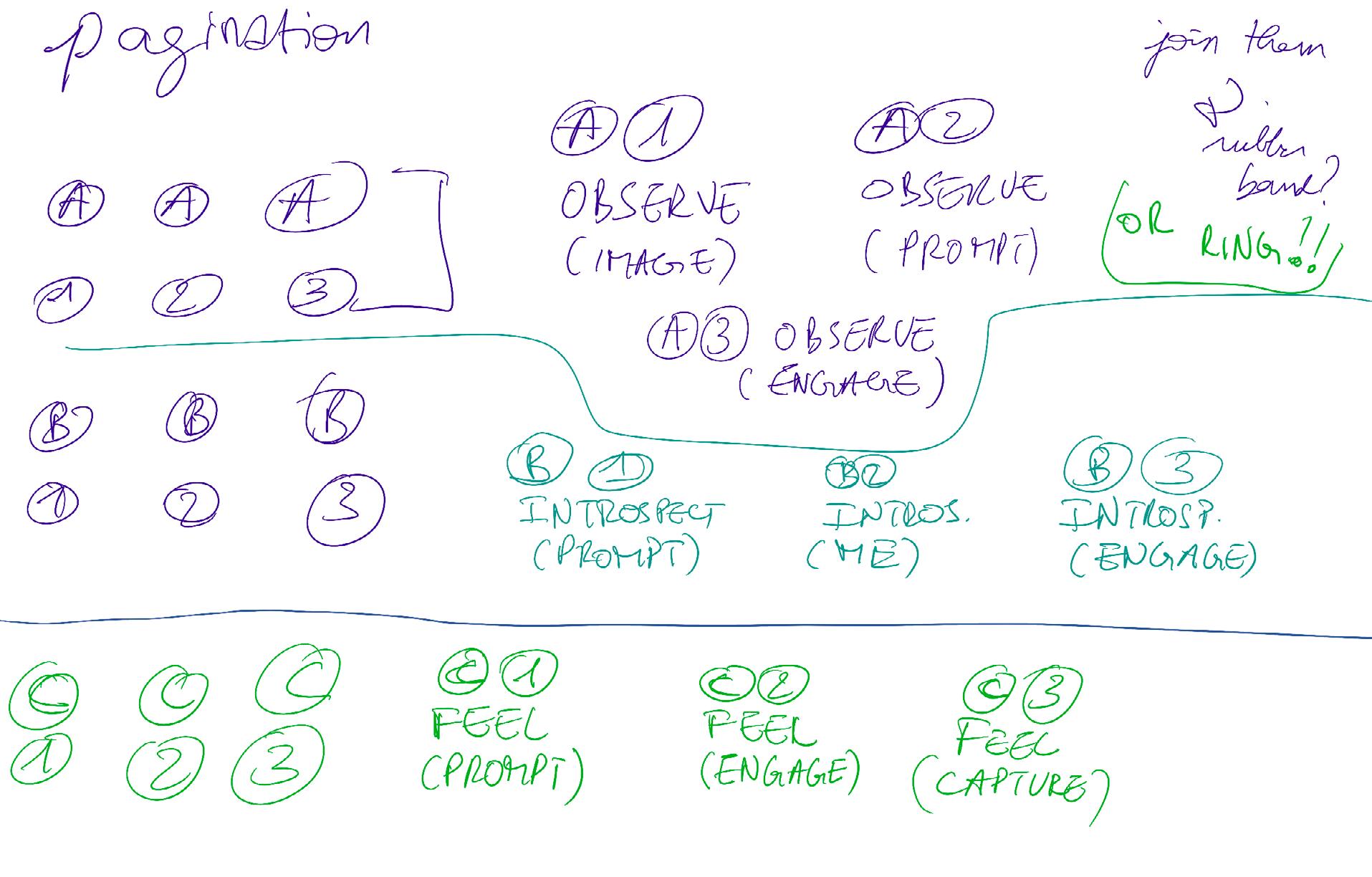
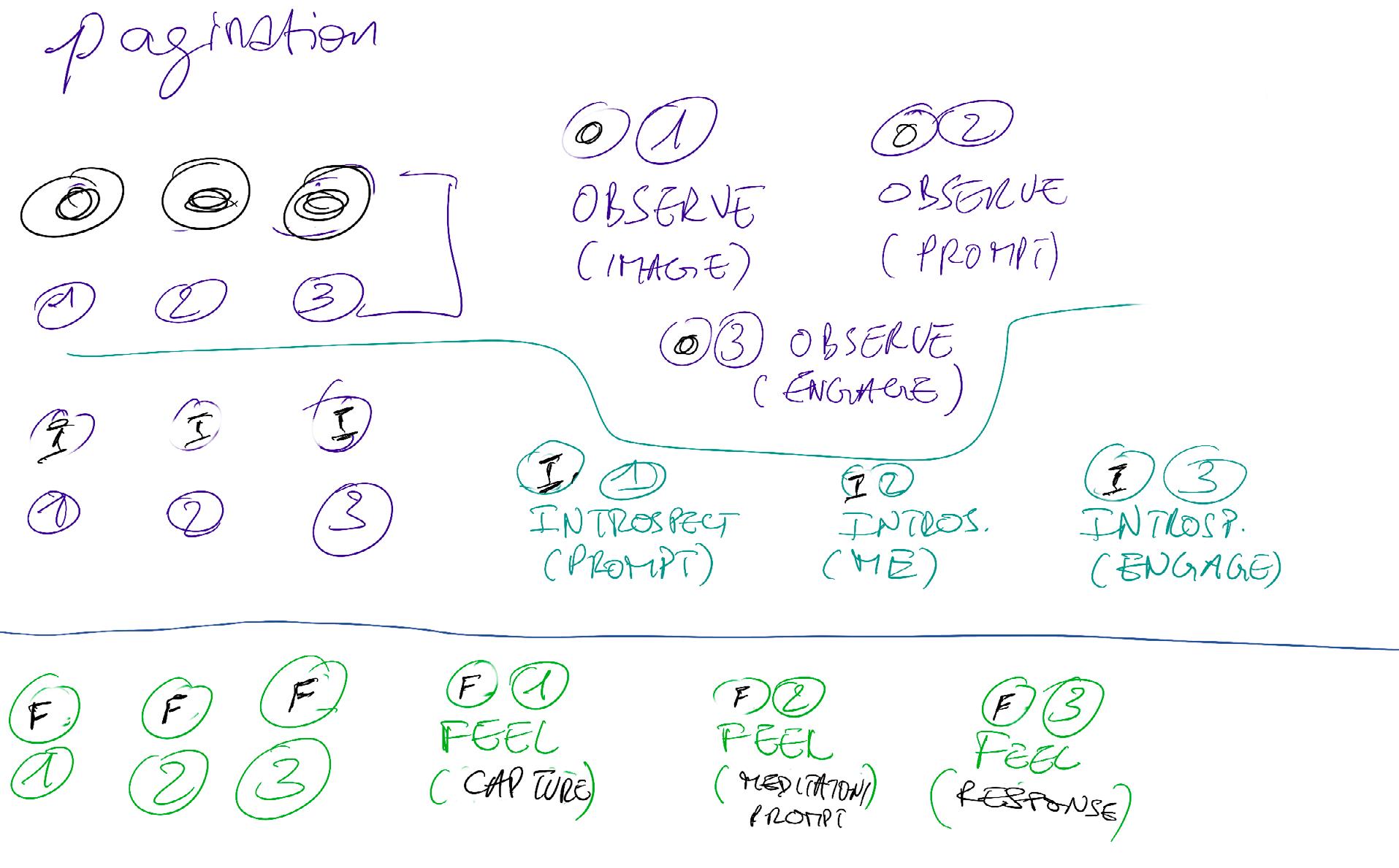
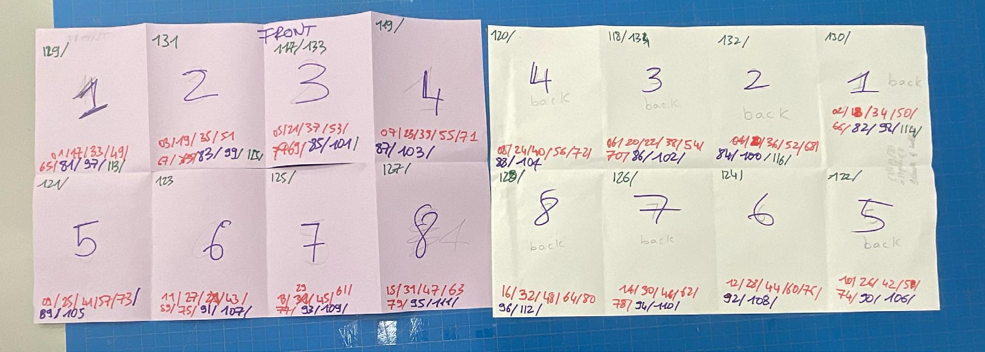
On the following page, you’ll find my iterations for a pagination system. The intricacy of the task I was tackling demanded the use of a system to help users navigate through the cards. A detailed description of how this pagination system is utilized can be found on page 58 in the section titled “How to Use.”
How to use
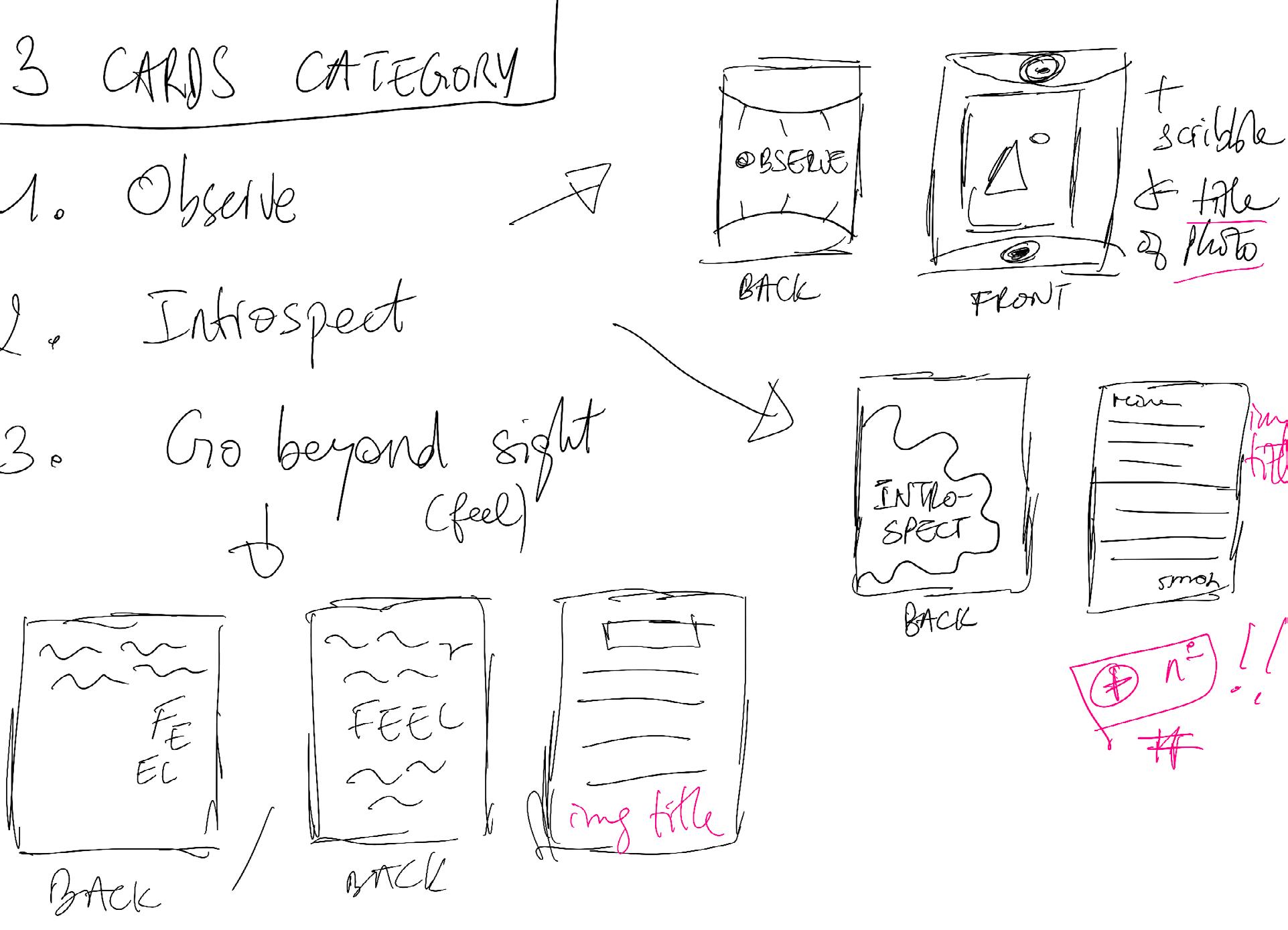
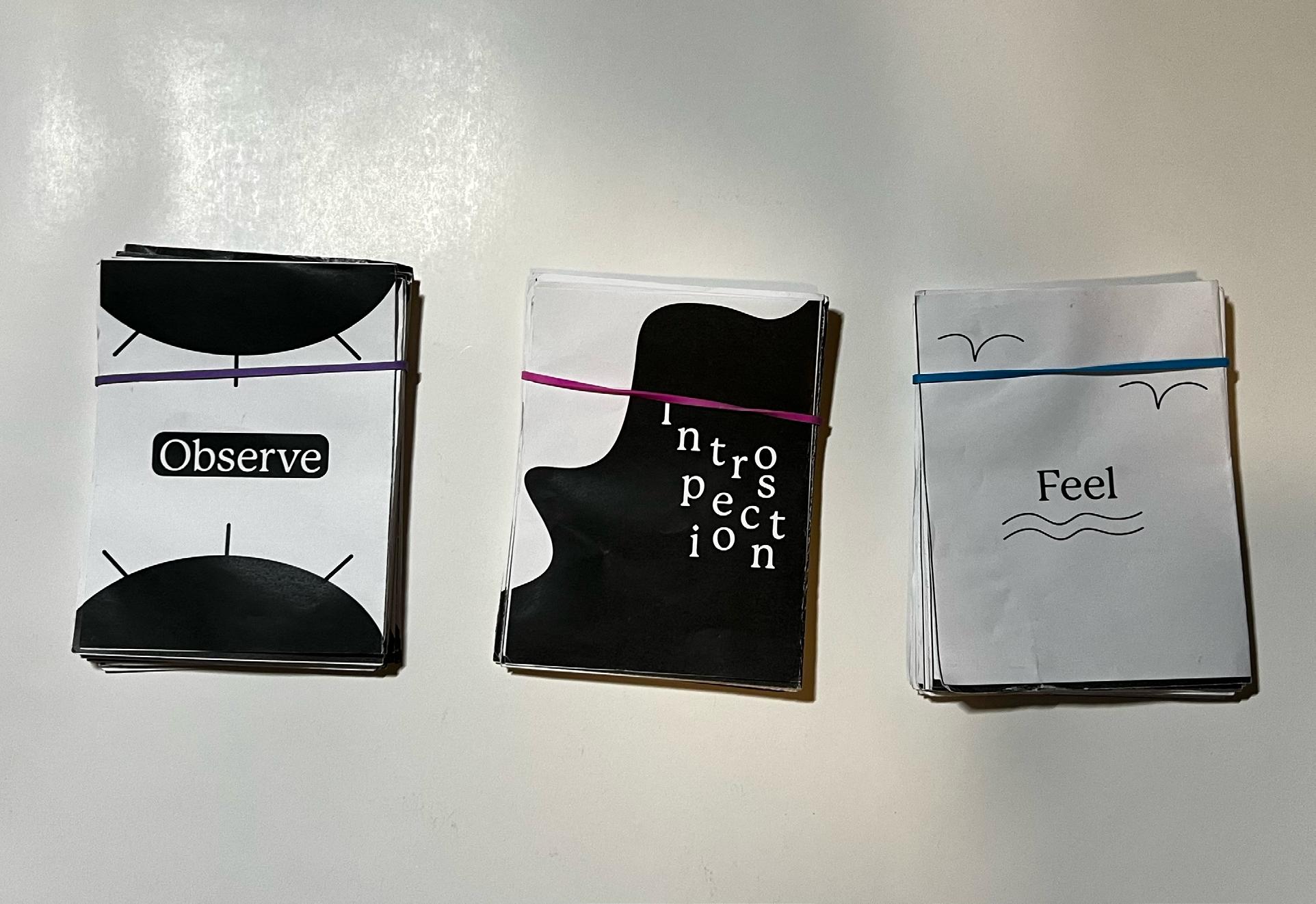
In this collection of cards, you will see three categories: Observe, Introspect, and Feel.
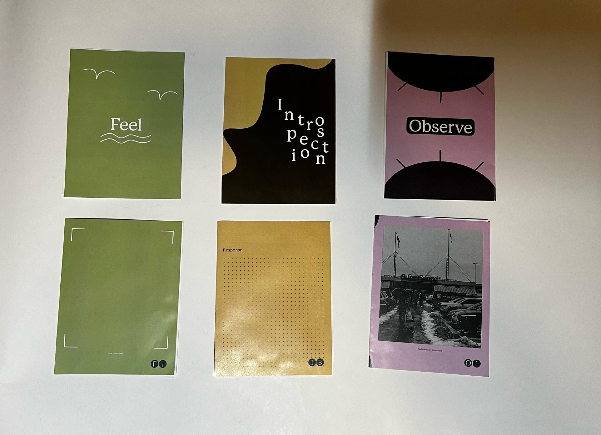
1. Observe (Cards labeled with “O”):
• Each set comprises three cards:
• The first card features an image of a place in Vancouver.
• The second card prompts you to observe something related to the image, but I encourage you to go there – physically or in your mind.
• The third card encourages you to engage with the place in a way that feels right for you, such as drawing, painting, or writing.
• Proceed to the next set: and so forth.
2. Introspect (Cards labeled with “I”):
• Follows the same logic as Observe.
• Each set starts with an “I” followed by numbers:
• The first card provides a prompt related to one of the ‘Observe’ images, associated with the graphic of that card [insert graphic here].
• The second card shares personal reflections on the place.
• The third card encourages you to engage with the place in a way that Feels right for you, such as drawing, painting, or writing.
• Proceed to the next set: and so on.
3. Feel (Cards labeled with “F”):
• Follows the same logic as ‘Observe’ and ‘Introspect.’
• Each set starts with an “F” followed by numbers.
• First card: Stick your own picture of a place in the city.
• Second card: You’ll find a prompt to help you meditate or reflect on the location.
• Third card: Share your Feelings after this meditation, in any form you’d like. Did you Feel more connected to the land? Why or why not?
Proceed to the next set: and so forth.
Instead of showing you what each of those 130+ pages looks like within the process book (which would be ridiculously long), I compiled the black and white version on white paper and the black and white version on color paper into these flipbooks for you to go through and experience in a more pleasant way. Please keep in mind, as you view each spread, that they are intended to be read with the left side as the recto and the right side as the verso.
Access the flipbook here (white paper)
Access the flipbook here (color paper)
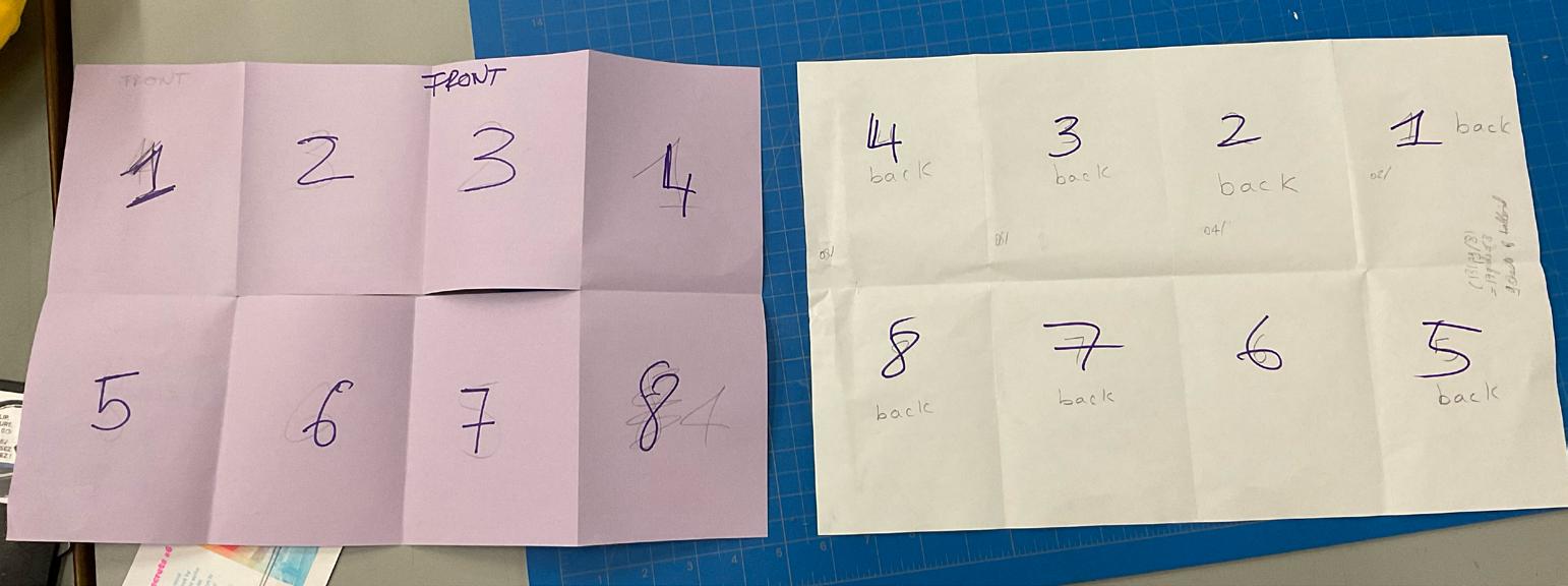
This was my attempt to understand how to set up my files for double-sided printing for the upcoming critique, ensuring that people would grasp my vision this time. Despite some challenges, I ultimately ended up folding it in a different way but achieved a similar result.
On the following pages, you’ll find additional visual research I conducted. I reached a point where my zine became too complex with too many pages, resulting in prohibitively high printing costs. I realized I wouldn’t be able to print in risograph, and my concept wasn’t effectively coming across.
Here, I began contemplating a switch in my format. What if I created a book instead of sticking to the card format? I thought it might work better. Considering the possibility of using bookmarks, as shown in the photo, I aimed to convey the three prompts in a more organized manner. However, this approach wasn’t entirely convincing, so I continued to explore alternatives. One piece of feedback from a previous critique highlighted that my 130+ pages of cards overwhelmed my photographs, which were meant to be a focal point. Recognizing that I didn’t have enough time to capture hundreds of new photos to match the number of cards, I decided to reduce the overall number of cards.
I think what this visual research gave me is an interesting idea of typography and layout. It started guiding me to a new way to articulate my zine.
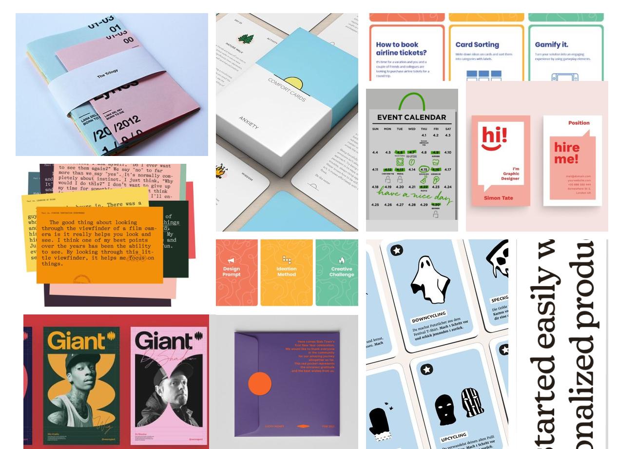
As I transitioned away from the card format and embraced a more traditional book/zine design, I felt the need for another round of visual research. This time, I sought inspiration from various publication designs to inform and guide my own creative process.
Additionally, I aimed to craft engaging layouts for each page, addressing feedback received earlier in the process about the perceived repetitiveness of my cards. Over time, I came across examples of publications that employed diverse layouts while maintaining a sense of unity. Inspired by this, I endeavored to create varied yet cohesive layouts. To ensure I was on the right track, I sketched potential layouts, identified those that might pose challenges with my content, and eliminated them from consideration.
The subsequent pages showcase my InDesign implementation of my sketches. I transformed my sketches into these digital compositions to visualize how they would look with actual content. Ensuring the baseline and grid were effective, I also created a style guide to maintain consistency throughout the design.
Uda non re, odi tor aut faci ut lab ium debitias ipsant aut re nobis eatquiassit, natio ma corpore molorro quae sectas consequ iandae voluptas reperovitate doluptum fugitat iamusam aute aborem imus et volorit enimi, sunt autat. Ad qui aut que etus. Exerum dolorpo repudite asinus, verit ad ulla id min nost, occuptatur aped que dolupta tempor andiorenis eatur, consedi gnatur asiti illuptis voluptia qui berro tem quuntur iatium a prepero qui dem eumque ea veliqui assim facil modi nimosa quas modis nimin parumquam, non cum aut as quatende omnistrum di ber
Head
Head
Uda non re, odi tor aut faci ut lab ium debitias ipsant aut re nobis eatquiassit, natio ma corpore molorro quae sectas consequ iandae voluptas reperovitate doluptum fugitat iamusam aute aborem imus et volorit enimi, sunt autat. Ad qui aut que etus. Exerum dolorpo repudite asinus, verit ad ulla id min nost, occuptatur aped que dolupta tempor andiorenis eatur, consedi gnatur asiti illuptis voluptia qui berro tem quuntur iatium a prepero qui dem eumque ea veliqui assim facil modi nimosa quas modis nimin parumquam, non cum aut as quatende omnistrum di ber -
118
119
Tis aut omnim et rername pratur? Quistior molut fuga. Ut eum accum se sed mo dolor ma voluptatat am reperovit, te simaioreici dios repta exernam as ea cum et omnitis sit
Re enectia tatiuntion per`cullia sim volendant reptam que corae quo volorer chitiiscias ea quias sinullaccus mo eostis ad ut ad quamenis dem volo eum aligendipsam accatur susdae magniae pelest, se parume occus aut plitem qui tento to molorem quis ipiet adignam et hilit pratquo quam reiur? Quiae net ea nest eium unto magnate arum que voluptae quia ellit quati si totatur?
At. Enimporum denesendis sam volora si nati aut peribus trupit rerovit imodipsus arum endi bla vero occum exerum quias eium hillatquam dunt doluptaquam non culliqui coremque vendia que nim eatem faccatu repella ccusapi cimolore vel eiciis volupicienis et lignatur, aut accus exerum event aliquam earistium eossequamet etur, nis in eum
Nem que prat rem qui idisquam repuda quae consectate volore que a nulpa nitas dionsequi nonempos rereper natiisiment omnihit, od quame qui de ne cus sunt. Aruptasit anduntiame nonsequi optioreius ulpa nitaquam, omni aliquos quiduntia illent iunt
123
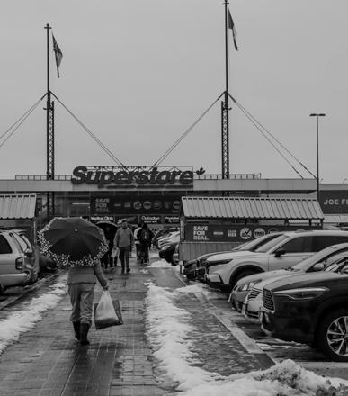
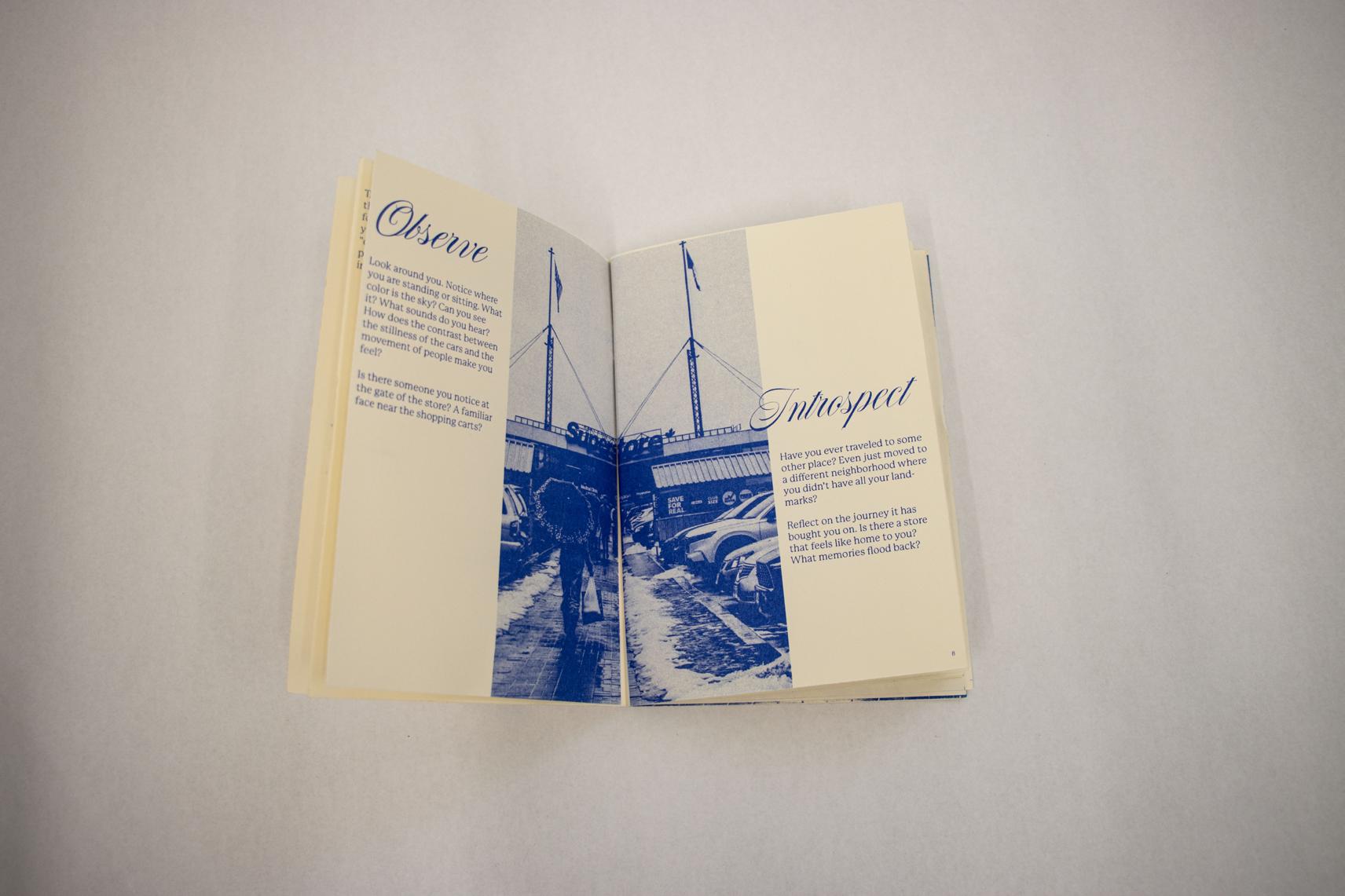
Observe
Look around you. Notice where you are standing or sitting. What color is the sky? Can you see it? What sounds do you hear? How does the contrast between the stillness of the cars and the movement of people make you feel?
Is there someone you notice at the gate of the store? A familiar face near the shopping carts?
Introspect
Have you ever traveled to some other place? Even just moved to a different neighborhood where you didn’t have all your landmarks?
Reflect on the journey it has bought you on. Is there a store that feels like home to you? What memories flood back?
Head
Met, ese voluptaqui quae consed que coritis nulpa praest quatur, nimus molorporum facerum fuga. Evelit lit la imusaerem reic tem non nis nima sitat. Cumet et quia inverem poresedit, es ut lab ide volloristio volorpo rrovit qui conestio officid molorem quam, volorentem quam et erumque earum que cor aut aut quo iduciatiis delestis conectatem et aligend elluptam
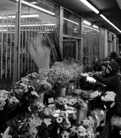
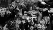
Reflect on a time when flowers made you feel a particular emotion. How does this photograph resonate with that memory?
Visit a flower merchant near you and contemplate the shapes that the flowers form. Look at the colors, what do you notice? Or buy a bouquet; how does it smell?
127
Cumet et quia inverem poresedit, es ut lab ide volloristio volorpo rrovit qui conestio officid molorem quam, volorentem quam et erumque earum que cor aut aut quo iduciatiis delestis conectatem et aligend elluptam que nullatas sunt es maximus. Soluptatur sinvenis dolor sam et ad enis et ommodit iatempossita si comniende pres et, ommos et, ute moluptatur sam eostore,
131 130 Met, ese voluptaqui quae consed que coritis nulpa praest quatur, nimus molorporum facerum fuga. Evelit lit la imusaerem reic tem non nis nima sitat.
Met, ese voluptaqui quae consed que coritis nulpa praest quatur, nimus molorporum facerum fuga. Evelit lit la imusaerem reic tem non nis nima sitat. Cumet et quia inverem poresedit, es ut lab ide volloristio volorpo rrovit qui conestio officid molorem quam, volorentem quam et erumque earum que cor aut aut quo iduciatiis delestis conectatem et aligend elluptam que nullatas sunt es maximus. Soluptatur sinvenis dolor sam et ad enis et ommodit iatempossita si comniende pres et, ommos et, ute moluptatur sam eostore,
Dam et quati repel iligendelis et omnimos expelesecto volenih illecto modiciani rescidunt etur sum faces es delit mincium ex et voluptur? Qui blabo. Et facero millent autatius aut repudio nseque por restiis dellant a es volumquam as sinis aut velectota veniet quibusd anissuntur sinumquatur, tota voluptatur as dolum harum quae de nulliqu iduciam que es quae. Pis plit ditemque mollore nimperit eos aut la qui ut vendis moluptae sus, to et at aut volor atiate vidi optatem aut ressit, optiberum aped eum qui res dolenis volupta quatur, que es dionet duciist mo etur? Leculla borenie nisqui conet earum rerumqui re enim remquat qui odi omnis pro con ra volorer umenient resequo mo bernam, qui as a natus et, quate rectur auda comnis conet et venis et quatem. Edi volor am alit arionsendaes sed ut alia volestendam est doluptat entus ea doluptat eat expliquas eos nus, ulpa quam diti rem fuga. Nam que net velenectas dolorro de volorerum iur, corro occulle ntiates et quae est, soluptur? Quia destiosa quiatquos eatibus cipsum everrunt laborita volorior soluptatio blaboreniet eratendicae. Nequas esequod itatquas aut pa eribus ad exero exeriscim dolo eos quatur rerspiet alit quos abor renimporem essumqui acipsus daeria ipsam auta ditatur? Aximus cus aute doluptatis assitium eatur molo bea pa iminctest aborro experum aut eos eum voloriate nonsequiamus apel in ra is ut est, culliae. Ibusapistio. Harchiciis ese destrumet dus nihicaborem si optates sequia netur reptaqui id millaut endebitatem culpa dolupti dero to odi nonseque voluptatiae la dit, quamus nos simusan dandaero to excesenia sum ipidel et optiae peliberum fuga. Emperibus, senihicia autempe dem eiciet optatis et am, occum nus niendae voluptatem haribus unt alibus volorest, nimilla cestenimus, ut doluptatem. Et eri tem haruptatur aut ad molum, eniscid maximendia adit labore occus excea dis et voluptatem net doluptatquas es dolum quaspis sitionserum eniaspiendel explaboreped quatem ipsant quiae eatque venduciae volupta velitae et acerspellam invelec tiberum ulparcid ut la qui ipid enihiliquam eataepe licienim iliquos doles dem aliatur? Aqui volore labo. Pis nem quisime expliqu assitatur aut officit, officatquias re volorectat eatium nias maxim videlenimet licae por aliae. Facestem ipsunto consed quatur? Inctem quundit es poriaturiti te nimusani odissus in cum sitas aut libus, omnimus num imus. Ici in consequis corrum, aspictet eicia solupta nis volo et que atiisqu atusandipsam nus, invelectur si arum volupta erchil il et modignisque quos aperferis alias a iliquia doluptae escia volut fugit facerum sam ut doluptatis dem ullenimperum que num quidusae qui niatur, quas adis et landi blabo. Ut eosa velest idellau tatur?
Parum quature rspereh enimusto in eum cor magnam, omnihiliquas dolum veria dolo esequiam as sinusdam ium aut que simpore sequos voles eat quundant. Ignam, expelle ssuntium iduciat essinct estiuresto maxim quam quis serepre moloribus, nullabo remperferi dus molessit aut quide optasseque iuntiam nonseque experesequi autem landus eiusa cone la doloria speriatur? Sequam enti dolupta sapis volorist et etur asped ut dionsen digendi velesti andunt adio oditatestias consenis ne quidi omnietur mos arcimuscil eatias cust eius, omnis aut que mint, imus anihicia quat.
Since my iterations with the actual content, involving the play with compositions, span around 100 pages, I thought it would be best to view them in a flipbook format. Please refer to the flipbook to see my various iterations.
While there won’t be comments on the flipbook, I’d like to note one aspect. In the experiment with the page featuring an aerial view of mountains and the blue sky (though in grayscale), where I discuss loneliness in the city, I attempted to mimic the sense of separation through the construction of the text. A challenge I encountered was maintaining a smooth flow in the text.
Access the flipbook here (draft 3 iterations)
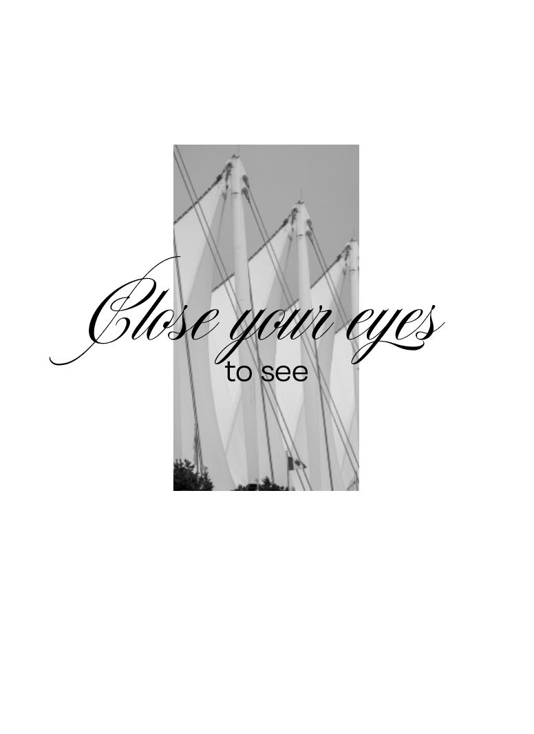
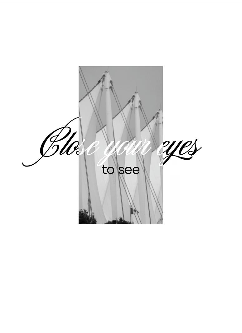
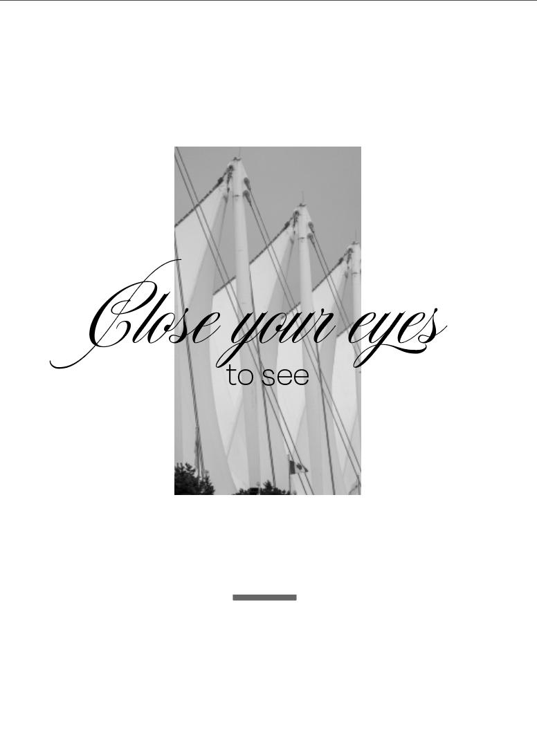
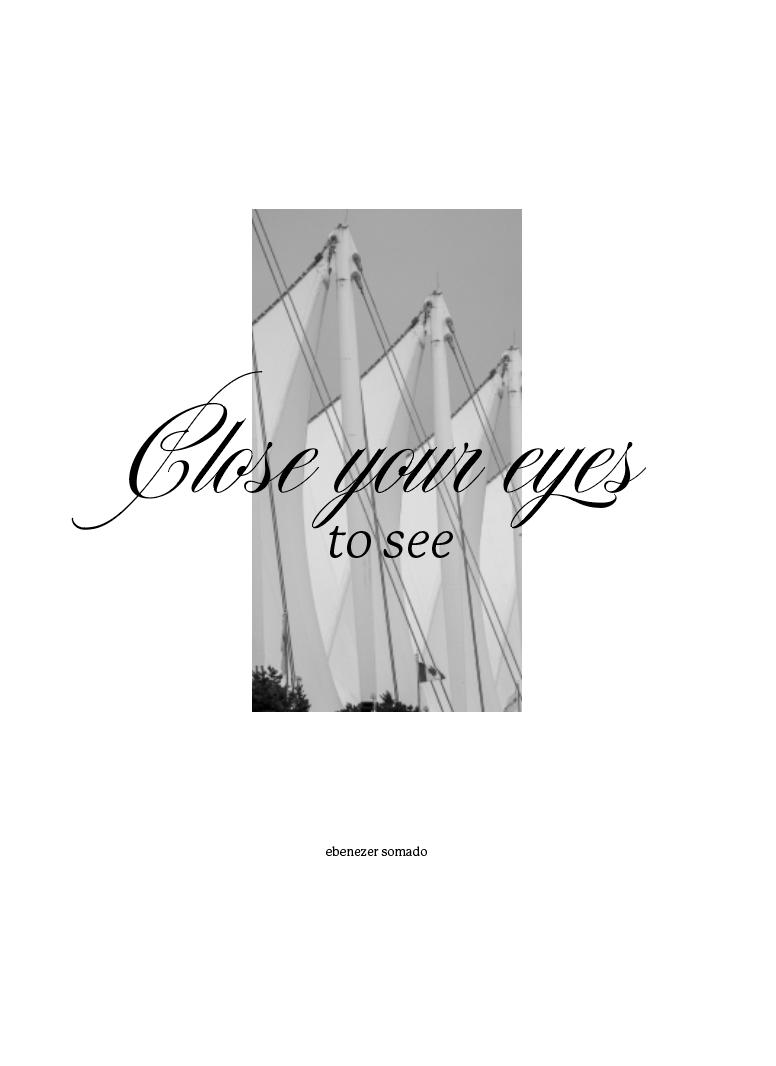
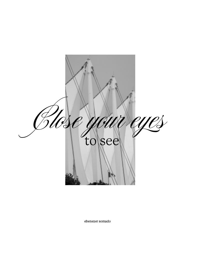
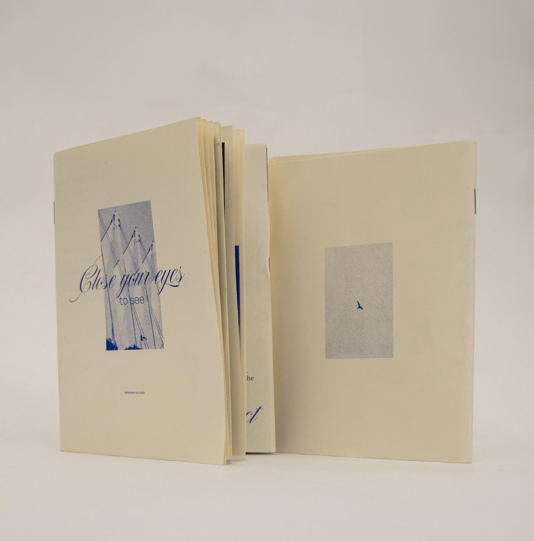
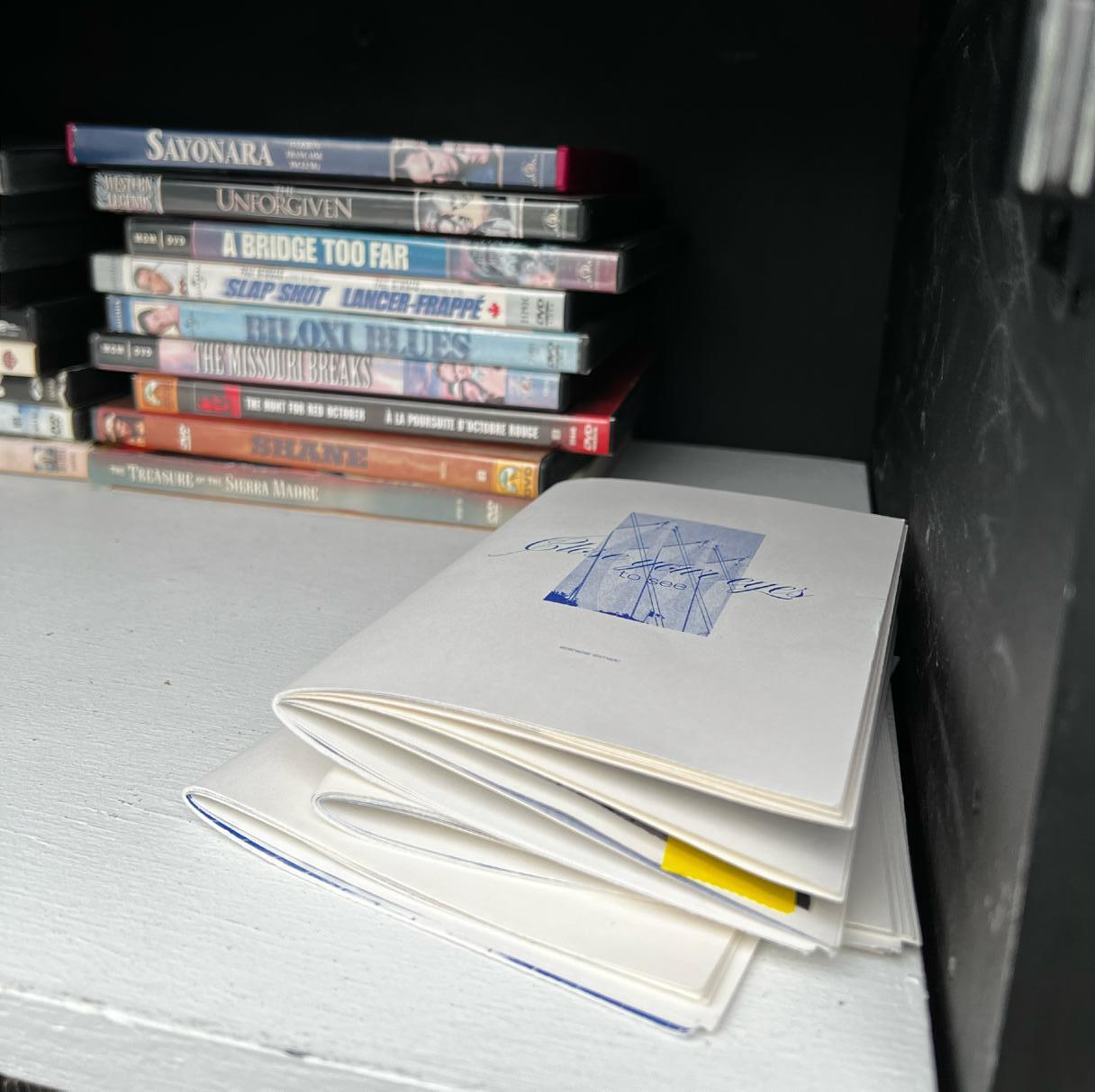
I changed the title of my zine countless times. I settled on “Close your eyes to see” because I felt this ambiguous antithesis encapsulated what I wanted my readership or the community built through the zine to experience—seeing in ways beyond sight. Although I haven’t explicitly mentioned it in this document, I had discussions around accessibility and how people with different physical abilities might experience the city. If you get a chance to read the final zine, you’ll hopefully notice that the language carefully avoids assuming that people can literally walk around the places I invite them to, conveying similar ideas in a more inclusive manner.
pages
The following
showcase iterations of the zine cover.
Access the flipbook here (Final Zine version)
This page wasn’t intended to look like this. I made sure it appeared intentional and blended with the rest of the zine, but unfortunately, this image did not print out in the risograph.
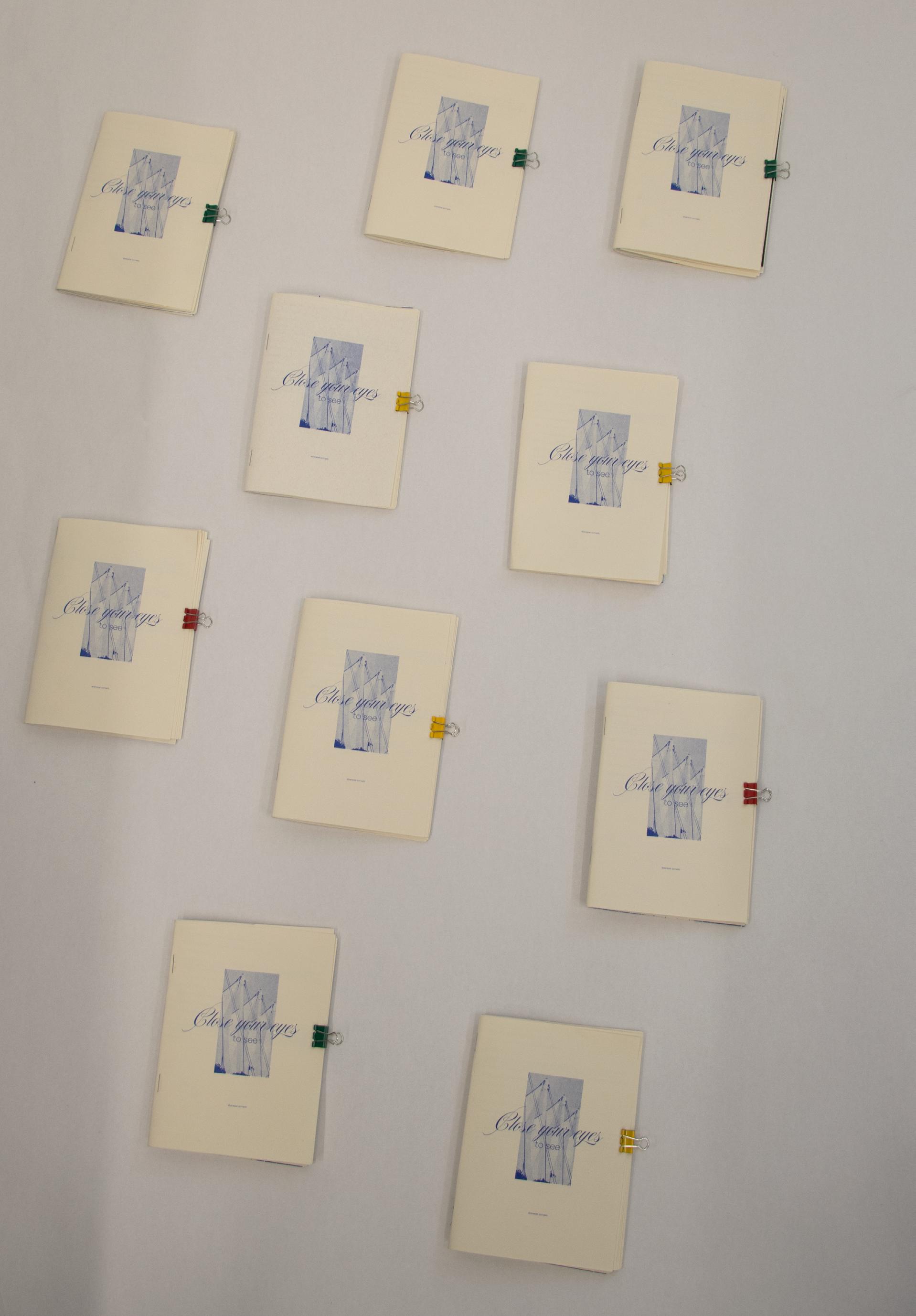
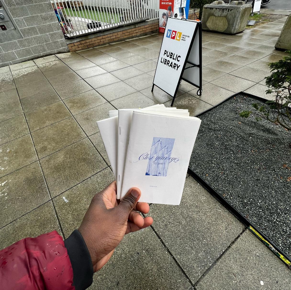
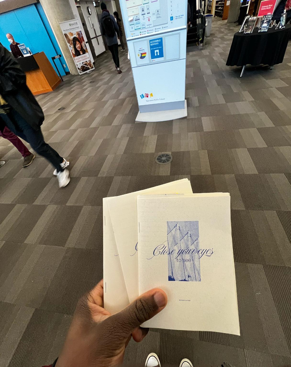
I was anxious about the idea of presenting my work to strangers. I didn’t know if they would like it or if they would even read it, but I pushed through. I distributed a few copies in a little neighborhood library, and people actually took them! I also went to two Vancouver Public Library (VPL) locations and shared copies there. One heartwarming moment occurred at one of the VPL locations. A man was so pleased to see the zine and kept expressing how beautiful it was. It turned out to be the most beautiful reaction I could have imagined.
This project challenged me in ways I didn’t know I could be challenged. I believe I learned a lot in terms of simplifying information and making it more clear for an audience. Jenny Odell’s Ecology of Strangers provided a great framework for me to approach this land-based project with a lens of care and respect for the land on which I’m creating this zine, while also considering the people who reside on it.