Project BBKF
Ebenezer Somado
In this project, we had to develop a design system for a music or cultural festival.
After searching for different festivals I could potentially attend, I chose the Brooklyn Book Festival (BKBF) for several reasons. Here are a few: when I was looking at festivals, many of them already had well-designed platforms, and I didn’t see the relevance I could
bring. Others were overly complicated and required extensive rebranding to align with the actual content of their pages. Due to the time span of this project, I opted for BKBF because of its potential and the foundation in content it would provide me.
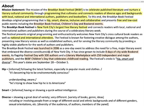
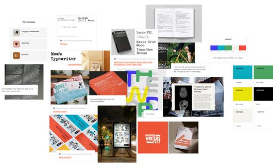
After deciding to redesign the BKBF, I conducted research on the festival itself to understand its core characteristics. I compiled this research into the document above, which outlines the festival’s main features and the keywords that informed my direction: hip, smart, and diverse.
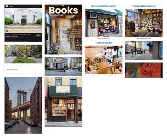
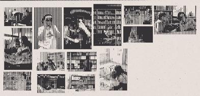
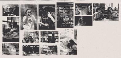
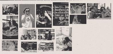
I started searching for visuals of popular and iconic bookshops in Brooklyn, NY, as well as locations in NYC in general. Additionally, I watched a couple of videos of people walking through Brooklyn, specifically around the areas where the festival takes place. This
gave me insights into the spirit that Brooklyn embodies.
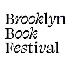
The first direction I chose blends modernity with traditionality. This moodboard conveys a modernized old-style. The idea is to bring New York to life and blend it with modernity and traditionality. I believe this mix would work nicely for the festival, as it hints at
the foundational style of books - with blackletter fonts and cream paper, while incorporating some throwback elements of photography (bitmap and duotone). I particularly reflected on typography and how to achieve an ancient look without being overly
traditional. The work of The New York Times has been inspiring in this process.
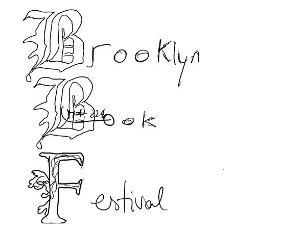
I began sketching black letters and pairing them with my handwriting to see if it would work. Drawing blackletter was definitely challenging. Additionally, this concept seemed quite robust, and I assumed the execution would be smoother digitally.
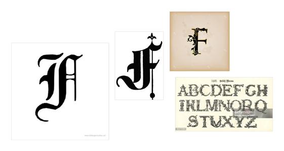
I also looked for blackletter inspiration.
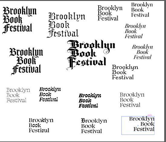
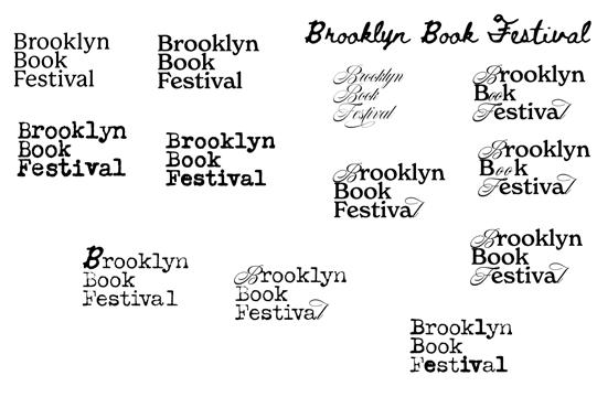
I went on Illustrator and started experimenting with mixing different typefaces to create the classic-modern look I envisioned. I also began considering how they could integrate into a more global identity system. I even thought about the possibility of animating it.
I ended up choosing this one because it matched my direction.
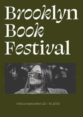
To see how the identity would play out in an actual context, I designed two posters with careful attention to typography and photography to convey the concept of modernism and traditionality, while keeping in mind the keywords
working, I decided to explore a second direction. The color palette is inspired by pictures of Brooklyn I found online.
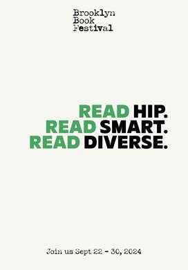
from the beginning: smart, hip, diverse. I aimed to slightly target a younger audience and to break the stereotype of literature as something old or boring. My intention was to make the design ‘hip’. However, while I thought it was
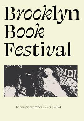
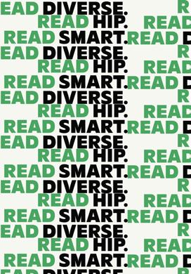
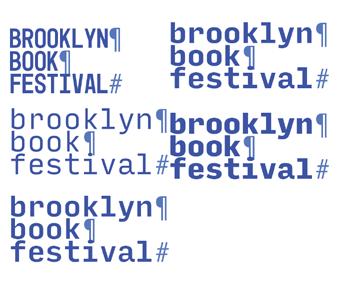
My second concept retained the essence of making literature fun and accessible while drawing inspiration from its roots. Unlike the first concept, which embraced a 16th-century aesthetic, I opted for a more contemporary approach. I relied on monospaced,
typewriter-like typefaces and earthtone colors, or colors inspired by nature – such as blue for the sky, yellow for the sun, and green. Black and white served as neutrals. Cream was also incorporated, nodding to the classic vernacular of literature.
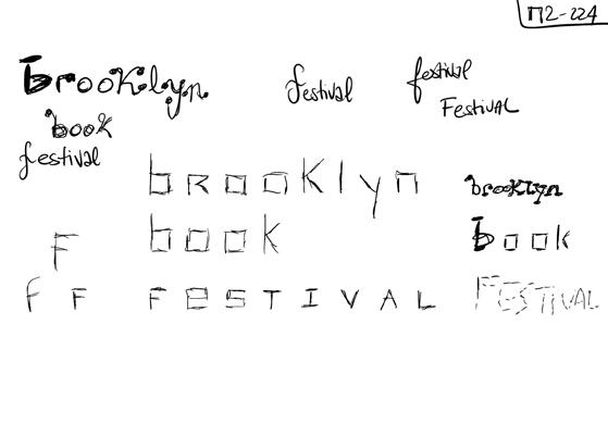
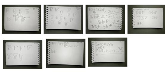
I started sketching some logotype ideas.
I explored different combinations of swashes and typewriter typefaces to emulate the traditional and elegant look.
I ended up being more convinced by this logo
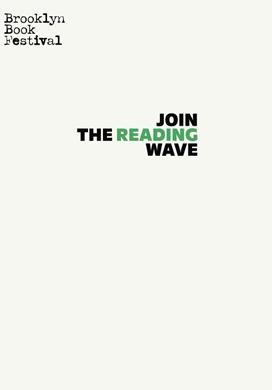
I then applied my color scheme and the idea of making reading fresh to posters to see how it would pan out. I felt it was working okay. Subsequently, I decided to try a third direction.

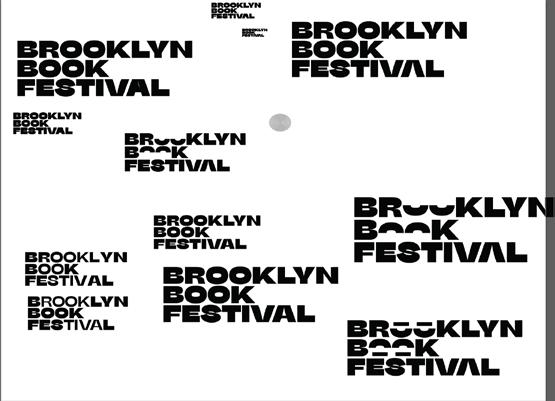
This moodboard aims for a futuristic, modern, edgy, and hip design. In this direction, I leaned more towards contemporary styles than in any of the previous directions. I discarded literal references to the past and focused on creating a design system that would
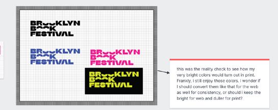
appear modern and surprising, appealing to an audience that might be less inclined to attend a book festival. Once more, I sought to embody BKBF’s key values: hip, smart, diverse. The color palette currently on screen has been adjusted from a bright RGB palette to suit printing needs.
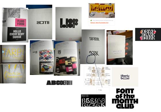
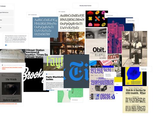
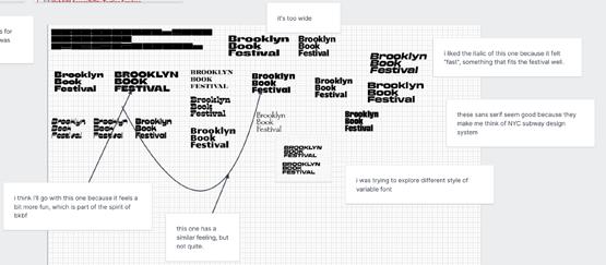
These inspirations are drawn from various design books, visual research walks, and other sources. I also drew inspiration from the human skeleton in terms of interesting and intriguing shapes
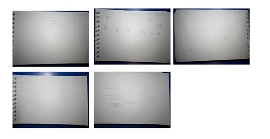
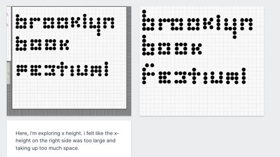
I began sketching possible logomarks formed by circles. I focused on legibility, contrast, and type anatomy to ensure readability and legibility. However, it was not working as intended.
I transitioned into Illustrator to try out my concept.
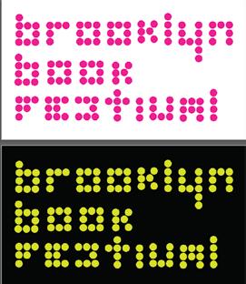
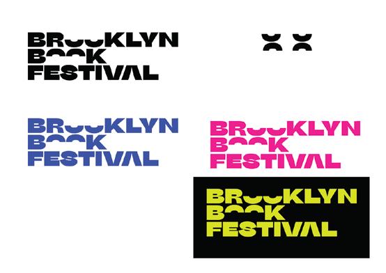
I experimented with colors to see if it improved the design. However, I learned that a logo should work well in grayscale. Otherwise, its strength is compromised.
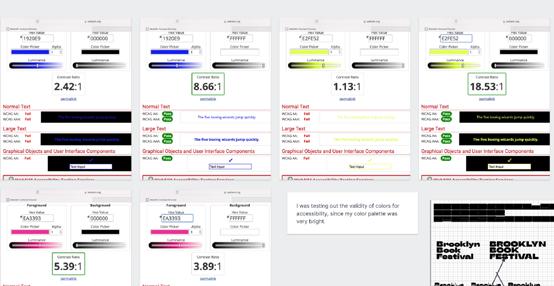
Given my bright color palette and the keyword ‘diverse,’ I aimed to ensure accessibility in terms of color contrast. I utilized tools to determine the required level of contrast for various visual impairments. While most of them
passed the test, I made some adjustments where necessary.
I felt like my futuristic approach wasn’t working for the festival because it seemed to be too big of a departure from the world of literature. So, I toned it down a little. Here are some further explorations I made for the logo mark.
I transitioned into Illustrator to try out my concept.
Since I wanted to push this direction forward, I continued iterating on the logomark, considering how it could operate in a system. So, I played with the weight of the “o”s and more, until choosing to cut them in half to maintain
an “edgy” look, while giving me space to play with them in motion and more.
I started getting closer to something that embodied the spirit of the festival, so I continued in that direction. I developed a logomark that I envisioned animating.
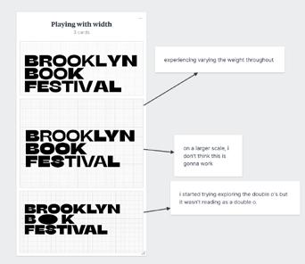

I began to approach something that truly captured the essence of the festival, so I persisted in that direction. I developed a logomark that I envisioned animating.
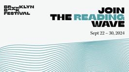
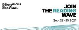
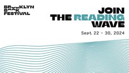
When I first worked on the poster on the left, using the original color scheme, I experimented with a wave-like pattern. My goal was to incorporate an element of the identity that could convey the dynamism of the brand. It required several tweaks before I achieved the desired flow I was aiming for.
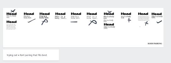
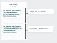
Here I was experimenting different font pairing for the heading and the body text in context of a poster.
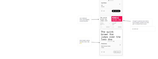
Here, I was researching various monospaced typefaces and figuring out what was working and what was not. Here are some thoughts that were running through my head: I thought it could be cool to have a monospaced headline instead of the sans serif, but I’m afraid it might be too much. A very traditional monospaced typeface
offers good legibility for both screen and print. A sans serif could work nicely for titles paired with a monospaced or slab serif. I think that a serif typography could be suitable, as it hints at traditional publications, but a sans serif would work better for the hip, disruptive side of the festival.
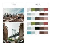
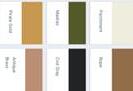
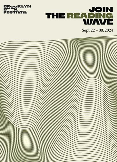
I reconsidered the RGB color palette I had chosen for accessibility and practicality purposes, especially since BKBF would require numerous printed assets, potentially increasing costs unnecessarily. Additionally, I aimed for a color scheme that made sense and was grounded in Brooklyn’s visual landscape. One problem with the previous palette was that it lacked this connection. Therefore, I created a new palette by extracting colors from quintessential images of New York locations.
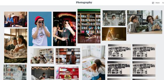
As part of creating a system, I brainstormed the use of patterns and photography that showcase a diverse range of people, aligning with the festival’s core values.
Exploring what I called “throwback photography.”
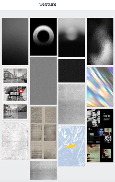
Then, I explored textures. However, I ultimately decided not to use any of them.
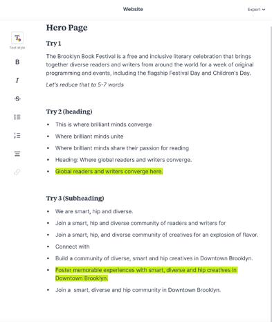
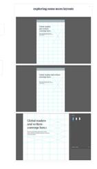
I worked on the copy of the landing page to ensure the tone aligned with the core values and design keywords I had chosen.

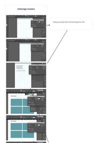
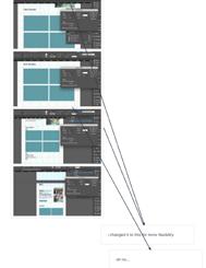
Adjusting grids and layouts in InDesign.
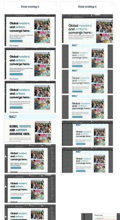
Pairing different fonts and weights within the same type families to determine the most effective combination.
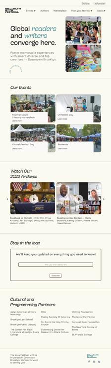
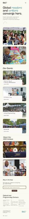
On the left is the desktop version of the landing page, designed with the goal of showcasing the events and programming while infusing it with BKBF’s ethos. On the right is the mobile version.
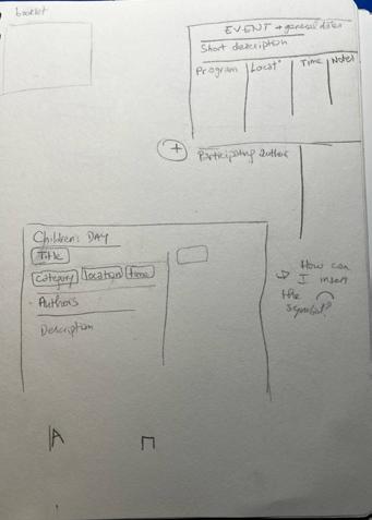
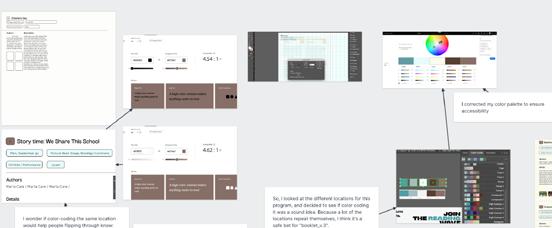
Sketches of tables to show the schedule.
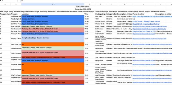
Children’s Day
September 30th, 2024
With a Picture Book Stage, Young Reader’s Stage, Performance Stage, Workshop Room and a dedicated Makers & Creators corner, families enjoy a full day of readings, workshops, performances, book signings, and art projects with favorite authors and illustrators.
Nº Program Location Time Participating Authors Notes
Food, Community, and California
"PEN Presents: Free the Books
"Oh, the Horror "
Center Stage (Columbus Park) 10:00
Main Stage on Borough Hall Plaza 10:00
" Main Stage on Borough Hall Plaza, Columbus Park Brooklyn NY 11201 11:00
Rahanna Bisseret Martinez;Tanya Holland; Natasha Pickowicz; Osayi Endolyn "Food / Non-Fiction
Casey McQuiston; Jonathan Friedman Fiction / Non-Fiction
Allegra Hyde; Gabino Iglesias; Victor LaValle; Lincoln Michel Fiction / Non-Fiction
Children’s Day
September 30th, 2024
With a Picture Book Stage, Young Reader’s Stage, Performance Stage, Workshop Room and a dedicated Makers & Creators corner, families enjoy a full day of readings, workshops, performances, book signings, and art projects with favorite authors and illustrators.
Nº Program Location Time Participating Author Notes
1
Because we used the word ‘table,’ I initially took a literal approach and created a table in Google Sheets, then styled it in InDesign. Apart from its unappealing appearance, it was not as efficient as it could be in delivering
information to an audience. So, I had to reconsider what information I wanted to include and how to present it.
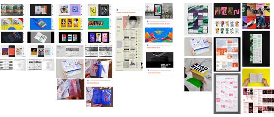
I conducted visual research to aid in creating a cohesive look for the schedule of events, as I was not making progress with my drawings.