Branding Guidelines

Foreword
These branding guidelines outline how to use the PM² visual identify with confidence and clarity. The guidelines have been designed to ensure consistency within the PM² brand, helping to create strong, recognizable, and innovative communications.
For questions, please contact:
Graphic Design Branch: kaitlin.tichansky@dot.ca.gov
Communications Office: brandon.shoemaker@dot.ca.gov
PM² Branding Guidelines
2
3 PM² Branding Guidelines Table of Contents Overview & Vision Graphic Design Logo Color Palette Typography Shapes & Patterns Photography Iconography Branded Assets Communications Voice Tone 05 08 14 20 25 36 29 32 09 17 23 33
Overview & Vision 04
PM² Branding Guidelines
Overview
The California Department of Transportation’s (Caltrans’) mission is to provide a safe and reliable transportation network that serves all people and respects the environment. Caltrans carries out its mission through its programs. Planning & Modal Program Management (PM²) is overseen by Planning & Modal Programs (PMP).
The following divisions are currently part of PMP:
• Planning & Modal Program Management (PM²)
• Data and Digital Services (DDS)
• Local Assistance (DLA)
• Transportation Planning (DOTP)
• Research, Innovation and System Information (DRISI)
PM² Branding Guidelines
5
Overview cont.
PM² was launched in 2023 to streamline administrative functions across PMP.
PM² provides PMP support with the following administrative functions: Human Resources, Resource Management, Business Management, Contract Management, Communications, Project Management, Workforce Development and Training, Facilities and Capacity Management, and SPR federal funding coordination. The SB1 Program Portfolio and Rebuilding California Programs are also managed under PM².
The PM² Communications Office supports graphic & branding needs, communication needs, web management, and ADA compliance throughout PMP. To work with the PM² Communications Office, please submit a request through the PM² Communications Office Service Request Form. The request will be assigned to a team member who will get in contact within 24 hours.
PM² Branding Guidelines
6
Vision
By March 1, 2024, PMP will have a systematic approach to increase the visibility of products and services through improving customer engagement, elevating the design of core assets, and streamlining streamlining online publishing and multimedia content. The PM² Communications Office will support PMP achieve this through communication services and three primary guidance documents: PM² Communications Plan, Branding Guidelines, and Website Conformity Standards.
PM² Branding Guidelines 7
Graphic Design
PM² Branding Guidelines
08
PM² Branding Guidelines
09
Logo
Logo
There are four versions of the PM² logo. Two for use on a white or light-colored background and two for use on a black or dark-colored background.
The PM² signature has three components:
(1) The primary name (also referred to as a logotype or wordmark); (2) the emblem (also referred to as a logomark); and
(3) the full division name along the bottom.
These components have been carefully drawn and proportioned and should never be redrawn, altered, or distorted.
Full Color (light background)
Full Color (dark background)
Black Version
White Version
10 PM² Branding Guidelines
Acceptable & Unacceptable Logo Usage
Do not rearrange the logo elements
Do not rearrange or rotate the logo elements

Do not change logo proportions
Do not change the logo colors
11 PM² Branding Guidelines
Safe Zone & Size
Clear space creates breathing room for the logo. It prevents the logo from becoming crowded by images, text, or other graphics that can lessen its impact and visibility.
The clear space is derived from x, which is measured by the cap height of the number two in the logo.
Clear space should always be at least 1x on all sides of the logo. This amount of space should be increased whenever possible.
Clear-space requirements are the same for all versions and configurations of the logo.
The minimum size of the full-color logo is measured by the horizontal width, which should not be reduced smaller than 1.25 inches wide (90 px for digital).
12 PM² Branding Guidelines
Logo Usage: Co-Branding
In all external communications, the PM² logo must appear with the Caltrans logo. In most internal communications, the PM² logo should appear with the Caltrans logo. Logo arrangement should consider the relative size, spacing, and alignment of the two logos.
In a vertical arrangement, the horizontal Caltrans logo should be used. The Caltrans logo must be spaced 1.5x the height of the “2” and be placed above the PM² logo. The logos should both be left-aligned.
In a horizontal arrangement, the vertical Caltrans logo should be used. It must be spaced 2x the height of the “2” and be placed to the left of the PM² logo. The PM² logo must be centered vertically relative to the Caltrans logo.
Vertical Alignment
Horizontal Alignment
13 PM² Branding Guidelines
X
2 X 1.5
Color Palette 14
PM² Branding Guidelines
Primary Color Palette
The primary color palette is composed of nine colors that can be applied to all materials, including core branded assets (e.g. PM² PowerPoint Template, PM² Stationary, etc). Always ensure the selected color supports the content and maintains both readability and legibility.
Text and imperative (non-decorative) graphics must pass minimum color contrast threshold (WCAG 2.1, Level AA) for ADA accessibility.
15 PM² Branding Guidelines
PMS 299 85, 19, 0, 0 0, 163, 224 #00a3e0 Pantone CMYK RGB Hex Pantone CMYK RGB Hex Pantone CMYK RGB Hex PMS 7468 100, 10, 0, 28 0, 115, 152 #007398 PMS 433 33, 3, 0, 95 22, 41, 51 #162933 PMS 3105 43, 0, 12, 0 103, 210, 223 #67d2df PMS 631 67, 0, 12, 2 62, 177, 200 #3eb1c8 PMS 7540 0, 0, 0, 72 75, 79, 84 #4b4f54 PMS 317 18, 0, 8, 0 177, 228, 227 #b1e4e3 PMS 563 52, 0, 32, 1 107, 187, 174 #6bbbae PMS Cool Gray 1 0, 0, 0, 6 217, 217, 214 #d9d9d6
Expanded Color Palette
The expanded color palette includes the primary color palette colors, but allows for more flexibility with the addition of lighter tints, darker shades, and complementary colors. It’s important to note that the colors in this expanded palette should be used as accents or contrast to the primary colors and should not dominate a design. The expanded color palette may be used on custom reports, plans, or templates, but should not be used on core branded assets.
16 PM² Branding Guidelines
PMS 326 87, 0, 38, 0 0, 178, 169 #00b2a9 PMS 327 100, 0, 44, 17 0, 134, 117 #008675 PMS 342 100, 0, 71, 43 0, 103, 71 #006747 PMS 299 85, 19, 0, 0 0, 163, 224 #00a3e0 PMS 7468 100, 10, 0, 28 0, 115, 152 #007398 PMS 433 33, 3, 0, 95 22, 41, 51 #162933 PMS 7540 0, 0, 0, 72 75, 79, 84 #4b4f54 PMS Cool Gray 1 0, 0, 0, 6 217, 217, 214 #d9d9d6 PMS 1595 0, 59, 100, 0 216, 96, 24 #d86018 PMS 3105 43, 0, 12, 0 103, 210, 223 #67d2df PMS 317 18, 0, 8, 0 177, 228, 227 #b1e4e3 PMS 1235 0, 0, 0, 0 255, 184, 28 #ffb81c PMS 631 67, 0, 12, 2 62, 177, 200 #3eb1c8 PMS 563 52, 0, 32, 1 107, 187, 174 #6bbbae PMS 151 0, 48, 95, 0 255, 130, 0 #ff8200 Pantone CMYK RGB Hex Pantone CMYK RGB Hex Pantone CMYK RGB Hex
Typography
PM² Branding Guidelines
17
Typography
Century Gothic is the official typeface for PM². For usage in a headline or subhead, use Bold. For usage in body copy, use Regular.
Century Gothic can be used in sentence case, lower-case, and all caps. Headlines primarily use sentence case and lowercase. This typeface works well with long sentences.
Headlines and subheads look best tracked out at 25-50 pts
18 PM² Branding Guidelines
Primary Aa Aa Century Gothic Bold AaBbCcDdEeFfGgHhIiJjKkLlMmNn OoPpQRrSsTtUuVvWwXxYyZz 1234567890 !¡”#%&’()*+÷-±,./|\:;<=>¿?@ “‘~`-[\]^_{|}€§°•≤≥¯Æ’”±—‚·°‡flfi›‹€ Century Gothic Regular AaBbCcDdEeFfGgHhIiJjKkLlMmNn OoPpQRrSsTtUuVvWwXxYyZz 1234567890 !¡”#%&’()*+÷-±,./|\:;<=>¿?@ “‘~`-[\]^_{|}€§°•≤≥¯Æ’”±—‚·°‡flfi›‹€
Typography
In the event that Century Gothic is unavailable on a web-based application, an alternative web-safe font may be used. This font should only be used if Century Gothic is unavailable. The approved web-safe font is Arial.
1234567890 !¡”#%&’()*+÷-±,./|\:;<=>¿?@
AaBbCcDdEeFfGgHhIiJjKkLlMmNn
OoPpQRrSsTtUuVvWwXxYyZz
1234567890 !¡”#%&’()*+÷-±,./|\:;<=>¿?@
19 PM² Branding Guidelines
Web Safe Font Aa Aa Aa Arial Black AaBbCcDdEeFfGgHhIiJjKkLlMmNn OoPpQRrSsTtUuVvWwXxYyZz 1234567890 !¡”#%&’()*+÷-±,./|\:;<=>¿?@ “‘~`-[\]^_{|}€§°•≤≥¯Æ’”±—‚·°‡flfi›‹€ Arial Bold
AaBbCcDdEeFfGgHhIiJjKkLlMmNn OoPpQRrSsTtUuVvWwXxYyZz
“‘~`-[\]^_{|}€§°•≤≥¯Æ’”±—‚·°‡flfi›‹€ Arial Regular
“‘~`-[\]^_{|}€§°•≤≥¯Æ’”±—‚·°‡flfi›‹€
Shapes & Patterns 20
PM² Branding Guidelines
Shapes


Hexagons are the primary shape in the PM² brand and may be used to add visual interest to a layout. Because these shapes work in tandem with photography, it helps to figure out which mask arrangement works best within the layout and to select photography that fits best within the shape.


21 PM² Branding Guidelines
Patterns
The hexagonal pattern can be used in varying arrangements throughout PM² branding to add visual interest to a layout.
22 PM² Branding Guidelines
Photography
PM² Branding Guidelines
23
Photography
The imagery used by PM² branding should depict California-based transportation and locations. Photos should be professionally shot and of the highest quality/resolution (no less than 150 dpi and up to 300 dpi). When possible, choose images with a warmer tone.


24 PM² Branding Guidelines
Iconography 25
PM² Branding Guidelines
Iconography
PM² utilizes a simplistic, single-color, lined icon style. The icons must meet the following parameters:
• Single-color (white or black)
• Lined style
• Simplistic
• 0.5 x 0.5 inches actual size
*Acronyms may be used for custom department/program sub-branding icons, but may not be used for the standard icons.
Ideally, icons should fill the entire 0.5 x 0.5 inches active area; however, that may not always be possible. At minimum, the icon must fill either 0.5 inches height or 0.5 inches width. Icons should maintain a clear space equal to 1/4 the height or width (whichever is greater).
For more information about designing PM² icons, please refer to the Icon Design style guide
.5 inches
26 PM² Branding Guidelines
height
Icon Examples
Additional icons are available on the PM² website and are available in both white and black colors.
27 PM² Branding Guidelines
Program / Department Icons
Program and department icons provide offices the ability to implement subbranding on materials. These icons follow the same style as standard PM² icons, but must (1) be used in conjunction with division or Caltrans branding and (2) take a secondary and less prominent position as Caltrans/division branding on assets. These icons must meet all icon parameters outlined on page 26, but may include an acronym.
Examples
Califor nia Freight Advisory Committee
Reconnecting Communities: Highways to Boulevards
28 PM² Branding Guidelines
Branded Assets
PM² Branding Guidelines
29
Business Documents


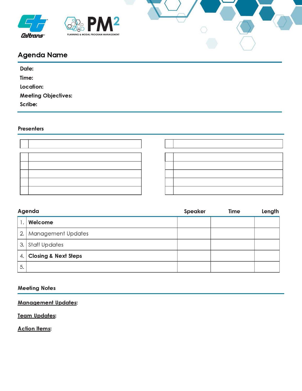
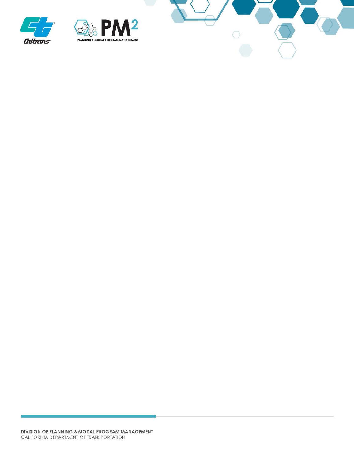
PM² business documents found on the PM² website include key deliverables, such as the division’s stationary and agenda/ minutes documents.
Stationary:
8.5 x 11.5 inches
Agenda/Minutes:
8.5 x 11.5 inches
Stationary Agenda/Minutes
30 PM² Branding Guidelines
Presentation Deck


The slides of the presentation deck follow the overall theme represented in the PM² brand. The slides should always use Century Gothic typeface and the point size of the font should not be changed. If content does not fit on one slide, an additional slide should be added to continue the flow of text.


31 PM² Branding Guidelines
Communications
PM² Branding Guidelines
32
PM² Branding Guidelines
33
Voice
Voice
“Voice” is an organization’s unique personality or brand identity. It is the tone, style, and messaging an organization uses to communicate with both stakeholders and employees. Planning & Modal Program’s voice reflects Caltrans mission, vision, values, goals, and culture. Planning & Modal Program’s voice strives to be consistent across all communication channels, from outreach materials to stakeholder interactions.
Three keys to a strong and consistent voice:
Create a memorable brand identity that stakeholders easily recognize and relate to.
Build trust and loyalty with stakeholders to create a sense of reliability and dependability.
Improve communication and collaboration within Planning & Modal Programs to have a clear understanding of how to represent products and services with stakeholders.
34 PM² Branding Guidelines
Voice cont.
To develop Planning & Modal Programs’ voice, employees must:
• Clarify how the communication effort ties into Caltrans’ mission, vision, values, and goals
• Identify the target audience, and
• Determine the appropriate tone and style of communication.
Each step should involve input from stakeholders, including employees, management, and partners so the voice is authentic and resonates with the intended audience. By developing a clear and consistent voice, Planning & Modal Programs can build trust and improve communication and collaboration within Caltrans and our external partners.
35 PM² Branding Guidelines
Tone
PM² Branding Guidelines
36
Tone
“Tone” is the expressive quality of communication and language. It is the way Planning & Modal Programs conveys its message and interacts with its audience. Tone can range from formal and professional to casual and conversational, depending on the situation and audience.
It is important for Planning & Modal Programs to establish clear guidelines and training for employees on the appropriate tone to use in different situations. Planning & Modal Program’s tone should align with Caltrans’ mission, vision, values and goals. Per GOV 6219 , Planning & Modal Program documents should be written in “plain, straightforward language and avoid technical terms as much as possible.” Inconsistencies in tone can lead to confusion or mistrust among stakeholders and can damage Planning & Modal Programs’ and Caltrans’ reputations.
37 PM² Branding Guidelines
Tone cont. There are four different types of tone that Planning & Modal Programs’ employees may use in a business setting:
Formal and Professional: Used in more formal settings such as contract negotiations, official communications, or legal documents. This type of tone is serious, respectful, and authoritative. Formal language and proper grammaris required. The goal is to convey professionalism, competence, and reliability.
Conversational and Friendly: Used to create a relaxed and friendly atmosphere, such as in customer service or social situations. This type of tone is casual, empathetic, and informal. The goal is to create a sense of approachability, understanding, and relatability.
Authoritative and Instructional: Used to provide clear and concise instructions or guidance in a business setting, such as training manuals, policy writing, or other types of technical instruction. This type of tone is authoritative, instructional and uses clear and direct language. The goal is to convey a sense of expertise, confidence, and clarity.
4
Inspirational and Motivational: Used to inspire and motivate employees or customers, such as in staff meetings, presentations or speeches, or in outreach. This type of tone is positive, uplifting, and encouraging. The goal is to create a sense of excitement, inspiration, and motivation.
38 PM² Branding Guidelines
