MASTERPIECES
FROM THE S.I. NEWHOUSE COLLECTION


5


AUCTION
May 2023
Christie’s Rockefeller Plaza 20 Rockefeller Plaza NewYork, NY 10020
VIEWING
Opening 29 April 2023
AUCTION CODE AND NUMBER
In sending absentee bids or making enquiries, this sale should be referred to as ADVANCE-22522
ABSENTEE ANDTELEPHONE BIDS
Tel: +1 212 636 2437
Christie’s has a direct financial interest in each lot of property listed in this catalogue. For certain lots, Christie’s has funded all or part of our interest with third party guarantors.These lots will be noted with symbols on the sale landing page on christies.com.The sale for each lot is subject to the Conditions of Sale, Important Notices and Explanation of Cataloguing Practice which are set out online, with other important sale information at christies.com.

Lee Bontecou, Untitled, 1959-1960 22
George Condo, Portrait Composition in Blue and Grey, 2012 36
Marilyn McCully on Pablo Picasso’s L’Arlésienne (Lee Miller) 46
Pablo Picasso, L’Arlésienne (Lee Miller), 1937
Arshile Gorky, Untitled (The Horns of the Landscape), 1944 74
Mark Stevens on Francis Bacon’s Self-Portrait
Francis Bacon, Self-Portrait, 1969
Lucian Freud, After Chardin (Large), 1999
Andy Warhol, Martinson Coffee, 1962
Paul Hayes Tucker on Roy Lichtenstein’s Rouen Cathedral, Set IV
Roy Lichtenstein, Rouen Cathedral, Set IV, 1969 132
Brice Marden, Number 1, 1962 148
Pablo Picasso, Cafetière, tasse et pipe, 1911 156
Benjamin Moser on Jasper Johns’s Decoy
Jasper Johns, Decoy, 1971
Jasper Johns, Cicada, 1979
Jasper Johns, Momoyama, 2005
Cy Twombly, Untitled [Bolsena], 1969
Brice Marden, Small Point, 1969
Mark Stevens on Willem de Kooning’s Orestes
Willem de Kooning, Orestes, 1947

MAX CARTER:
When and how did you meet Si Newhouse?
TOBIAS MEYER:
I had heard about him. I heard about his mysterious collection, and I was told that it was hard to meet him. In 1998, I got for sale Warhol’s Orange Marilyn. Before announcing it publicly, I sent out an orange invitation for dinner, which said only “Guess who’s coming for dinner?” And I sent one to Si. One day before the dinner, his assistant, Anne, called and connected me with Mr. Newhouse. He said, “I hear you have a forty inch Marilyn for sale.” I said, yes. “What color is it?” I said, I can’t tell you that, but if you come for dinner tonight, you will see her. And he said, “Oh no, I don’t go to dinners like that.” He never came to the dinner, but he saw the painting the next day and bought it for four times the estimate.
MAX:
The great House and Garden profile featuring his townhouse in 1970 shows already an extraordinary, self-contained collection of masterpieces by Rothko, Pollock, Newman, Louis, Noland, Smith. 30 years later, he came to the moderns, Cezanne and, above all, Picasso. How did he make his way back to them?
TOBIAS:
By the time I met him, he had sold important paintings by Johns, important paintings by de Kooning. He bought Orestes because he had sold his black-and-white de Kooning to David Geffen. There were certain circles that he made, certain things that he did not want to let go, and certain things he came back to. And if you love art and you love anything of the 20th century, you have to go to Picasso, to Cezanne. I’m sure his knowledge of how Johns looked at Picasso and Cezanne also informed his thinking. Si was continuously looking and moving. But not moving restlessly, rather moving in an intellectual, curious way. If you look at what he bought throughout his career, it is intellectually stimulating as much as it is visually compelling and of the highest quality. It is there for the mind and for the eye at the same level.
MAX:
Roger Thérond, who bought photographs, once said collecting happened in three stages: play, hunt and serenity. Did Si hunt?
TOBIAS:
According to his wife Victoria, who of course knew him best, he liked the hunt. But then he never appeared agitated when he looked at art. He became quiet and he would look at the object and he would make up his mind incredibly quickly whether he wanted something or not. But he was not, as some are, tortured by it. If he made the decision to buy something, nobody outbid him. That was it. He bought an important Pollock from me, which at the time was very, very expensive, triple the world record price. I took the photograph of it to Si. He looked at it and sighed. And sighed once more. And then he said, “I’ll take it.” And I said, you haven’t seen it yet. He said, “No, that’s not true. I saw it when it was hanging in Herbert Matter’s kitchen in the 1950s, and I didn’t buy it. I saw it when it was hanging in London in the 1980s, and I didn’t buy it. And now I’m buying it.” He was brilliant, he had memory, curiosity and persistence.
MAX:
Intellectual curiosity and persistence tend to flag over the years. It is sometimes said, too, that it’s hard to reconcile the prices of one’s youth with the prices of maturity. How did Si remain so committed?
TOBIAS:
I think it’s the same thing he used for his business. When you are publishing, you can’t look back. You have to stay current. And so the biggest joy he had was to stay current in his intellectual capacity as the publisher of the magazines he published, the editors that he employed. It was all about staying alert and staying awake. And that informed his collecting. And that’s why he never had the issue of being trapped in the past. I never heard him say, “Oh, I should have” or “I could have”. The past was the past. Once at an exhibition for Rauschenberg, we stood in front of something he used to own, and I said, “Si you use to own this.” He said, “I did?” Because it wasn’t the present. It was the past. And he lived in the present.


MAX:
His collection is vast, whereas the selection is very tailored. What do these 16 works tell us about him?
TOBIAS:
Among other things, this selection shows how broad his interests are. It ranges from an artist like Jasper Johns, who was so important to him early on in his collecting, to Abstract Expressionism. Si had an exploratory mind that led to new areas of collecting and on interesting journeys. When Bill Acquavella began to represent Lucian Freud, Freud became an international artist. Si bought Freud’s naked self-portrait, standing in his boots, arguably one of the finest self-portraits of the 20th century. It would take many years for others to see in it what Si had and to recognize it as one of Freud’s most important paintings. And he went to visit Freud in London. Si saw that Freud had the greatest eye and exquisite taste and how he installed works of art, without any superfluous décor. There were beautiful things, nice Georgian furniture, but the art was everything. And Si saw that. It was from this visit that he became interested in Kossoff, interested in Degas. And it was in his studio that Si saw the incredible Bacon of two men wrestling in the grass that hung above Freud’s bed, and became interested in his work. And from there, he bought Bacon’s portrait of Henrietta Moraes, the triptych of Freud and of course, in time, this 1969 self-portrait.
The self-portrait sits in its own radiance and beauty. I had gone to see it for Si at Christie’s in London. Which was not easy because I was deeply jealous and would have loved to have sold it myself but it wasn’t to be. My honest opinion was that it was exquisite and that he should buy it, because there is something essential about it, both in its subject matter and its execution. In 1969, Bacon is in complete control of his technique, at the peak of his skill. And the criticism sometimes levied at him was that his paintings were focused around the face, and the rest of the composition was just an exercise in how to fill the canvas with some sort of structure. If you think about Bacon in that context, this is the essential painting because it is small, because it is strictly the head, which is ultimately where his focus and attention are. And because it is so personal. Bacon gave it to his assistant, his “wife” almost, Valerie Beston, who looked after him and literally kept him alive. Which you can only do if you love somebody.
MAX:
Where the self-portrait sits in its radiant beauty, Decoy draws you in and requires something of you.
TOBIAS:
I think Decoy is where Johns and Si’s minds met, in the consciousness of the self. Because in 1971 Johns is deeply aware of who he is, in what he is doing. The early paintings, the Targets, are paintings about the subconscious. Decoy is not youthful compulsion, it’s the achievement of an artist who is mature and analyzing his own work—and painting about it. To somebody who published The New Yorker this was probably very interesting, painting about consciousness. It hung in his bedroom, very simply. I once interviewed Jasper about Si after he died. He liked the way Si hung art without fanfare. No spotlight, no “let me impress my neighbors.” It was casual and Jasper said he liked the casualness of his approach.
Si hung the Twombly, which was one of his favorite paintings, opposite the de Kooning for the longest time. He loved the lyrical nature of the Twombly, and would comment on how simply beautiful it was. It is the sort of painting where you have to stand still.
MAX:
In the selection, many works are from the late 1960s or early 1970s. Johns, Twombly, Lichtenstein. Si was serious about art by this point, but decades later he returned and bought works from this moment. Is there any significance to that period of time for him?
TOBIAS:
There was something remarkably cyclical about Si going back to things he saw and remembered, and wanting to pursue them again. I don’t know if you ever went to the old used book shop on Bank Street in the village? It was terribly untidy, with this grouchy man in the corner, and I would always go there.
MAX: Charmingly grouchy.
TOBIAS:
Yes. But grouchy. And I would always go there to buy art books. And I once found the catalogue of the exhibition that Henry Geldzahler did at the Met in 1970, called New York Painting. And I opened the catalogue up, and it’s dedicated to Si from Henry Geldzahler. It’s priced at $1, and I buy it for $1 and soon after I give it back to Si. I thought he would laugh and be happy about it, and he says, “Well, there’s a story about a man that tries to give a suit away, and it comes back to him.” And I said, well, do you want me to take it from you? “Oh, no, now I’m keeping it!” So there are these things, paintings and objects, not haunting him, but sticking to his mind. And when the moment comes, he pursues them.
His love affair with Pop, for instance, lasted for many years. He owned the orange Marilyn, the turquoise Marilyn, Dick Tracy, the Martinson Coffee. And that’s why you see Lichtenstein here, whom he loved. Si was interested in his approach and application of paint.
MAX:
This selection runs from 1911 and the dawn of cubism, and arguably of modern art in the 20th century, through to Condo in 2012. Did Si have any limits?
TOBIAS:
The one thing that I never managed to get him to buy was Gerhard Richter. I thought that with his interest in film and with his interest in paint, he would respond to Richter, and he didn’t. And there was no way, it just was always no. So there were limits, and these were very personal, and sometimes they only made sense to him. But that was the beauty of his collecting. You need to remember that Si was not interested in status. He had no status anxiety. The biggest driver in American collecting is status anxiety. You need to have what other people have, you need to compete with other collectors. You need to have the better this or the better that. None of that interested him. What interested him was the art, and he had no fear of being compared to anybody. And he was incomparable in that way.
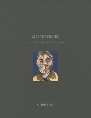
Untitled welded steel, canvas, fabric, velvet and wire 38Ω x 30¬ x 10¬ in. (97.8 x 77.8 x 27 cm.)
Executed in 1959-1960
$3,000,000-5,000,000
PROVENANCE:
Leo Castelli Gallery, New York. Vera G. List, Greenwich (1960); Sotheby's, New York, 12 November 2003, lot 1. Gagosian Gallery, New York.
Acquired from the above by the late owner, 2003.
EXHIBITED:
New York, Leo Castelli Gallery, Lee Bontecou, November-December 1960. New York, The Museum of Modern Art, Americans 1963, May-August 1963, p. 15 (illustrated).
New York, New School Art Center, Sculpture from the Albert A. List Family Collection, OctoberNovember 1965, no. 13.
New York, The Museum of Modern Art, Seven Decades, 1895-1965: Crosscurrents in American Art, AprilMay 1966, p. 177, no. 344 (illustrated).
Leverkusen, Stadtisches Museum Schloss Morsbroich and Berlin, Kunstverein Haus am Waldsee, Lee Bontecou, March-July 1968, no. 4 (illustrated).
Providence, Rhode Island School of Design Museum of Art, Governor's Arts Awards, June-July 1970, no. 1 (illustrated).
Ridgefield, Aldrich Museum of Contemporary Art, Fall 1977: Contemporary Collectors, SeptemberDecember 1977, n.p. (illustrated).
New York, Leo Castelli Gallery, Lee Bontecou, October-November 1999.
Utterly enticing, yet elegant in its inaccessibility, Lee Bontecou’s Untitled (1959-1960) treads the fragile line between painting and sculpture, human and machine, fine art and craft, knowing and oblivion. Surrounded by the artist’s signature metal frame, delicate canvas fragments stretch over an unseen wire armature, which the artist carefully sutured into place. Three voids open onto velvety darkness, while yawning linear gulfs punctuate the remaining flatness, blurring the distinction between two-dimensional picture and multi-dimensional object. Clustered spyholes invite looking, their intrigue heightened by Bontecou’s rare use of regal crimson and glinting white as background, yet, as with all the other orifices, summarily deny sight of anything behind the structure itself. For upon approaching the daunting, enchanted apparition, any aspiration to deduce the beyond so heavily implied by its convexity quickly evaporates, met instead with all-encompassing, ever-impenetrable blackness. But, once in front of it, so too dissipates the desire to understand, and one finds oneself content to simply surrender to the pseudo-object’s sublime power. Simultaneously pushing and pulling across the scarred surface, towards the wall and then into the spectator’s space, Untitled humbly invades its environment, giving and taking in equal measure.
From the early years of the artist’s now-iconic series of wall relief sculptures, on which she worked from 1959 through 1967, Untitled represents a pivotal moment for Bontecou’s manifestation of lifelong ideas. “Since my early years, the natural world and its visual
wonders and horrors—man-made devices with their mind-boggling engineering feats and destructive abominations, elusive human nature and its multiple ramifications from the sublime to unbelievable abhorrences—to me are all one” (“Artist’s Statement,” in E. Smith, ed., Lee Bontecou: A Retrospective, Chicago, 2003, p. 12). Maturing during the optimistic Space Age and its darker Cold War counterpart, Bontecou (1931-2022) recognized and responded to the frightening tensions spawned by a rapidly industrialized and monetized post-war America. While streamlining work, rendering all sorts of products possible and available, and discovering new galaxies, the machine was also threatening the world order with its overwhelming capability to destroy what it explored. Artists around the world, like Robert Rauschenberg in the United States and Lucio Fontana in Europe, wrestled with these dichotomies—Rauschenberg in his chaos of images and Fontana in his spiritual, visceral punctures. The daughter of an inventor and a factory laborer, Bontecou was no stranger to the trappings of industrial production, yet she sought to engage with her materials on a more personal level akin to Fontana. By formalizing, compartmentalizing, juxtaposing, and arranging, Bontecou exercised control over her deliberate compositions in a way that bespoke both her awe at the heights humans could reach and her anxiety over the depths to which they might stoop.
Thus blending the mechanic and the organic, Bontecou constructed her own visual language amidst the cacophonous art world of mid-twentieth-century New York. In fact, Untitled has lived most of its life in the city where it was made, acquired from Leo Castelli Gallery by visionary philanthropist and New Museum of Contemporary Art co-founder Vera G. List before entering the private collection from which it is now being offered. While other artists in the late 1950s and early 1960s worked ferociously against the seemingly immutable legacy of the Abstract Expressionists, Bontecou praised the latter’s lively, relentless pursuit of creative liberation and their “dual use of paint itself as both subject and object” (quoted in E.
 Present lot illustrated (detail).
© Lee Bontecou 2023, All Rights Reserved.
Present lot illustrated (detail).
© Lee Bontecou 2023, All Rights Reserved.

Smith, “All Freedom in Every Sense,” in E. Smith, ed., Lee Bontecou: A Retrospective, Chicago, 2003, p. 172). Indeed, her free-hand wire structures, like the one that supports the present lot, invoke the gestural abandon of the first-generation New York School painters, as do her confounded boundaries between picture and support. These instincts served Bontecou well, especially in an art world dominated by male energy, as she mounted her first one-woman show at Leo Castelli Gallery in New York in 1960, the same year as the present lot. From her studio on Avenue C in Manhattan’s Lower East Side, however, Bontecou’s vantage point was more akin to that of the magpie-proto-Pop artists, like Rauschenberg and Claes Oldenburg, who salvaged scrap materials to use in their work for reasons of both realism and thrift. The collected detritus determined the gritty palette of Bontecou’s wall reliefs, uniting greasy laundry sacks, army surplus supplies, metal fasteners, and the like in what curator Elizabeth Smith deems “rough poetry” (E. Smith, op. cit., p. 173).
Smith is justified in calling works like Untitled poetic, for Bontecou undertook the act of merging her disparate elements with a care and vision belied by their apparent roughness. Artists like Eva Hesse, Louise Bourgeois, and Yayoi Kusama would soon carry Bontecou’s investigations to their own unique conclusions by introducing traditional handicraft media and techniques into the realm of fine art. Hesse’s net bag creation, Untitled or Not Yet (1966), similarly challenges the painting/sculpture dichotomy by hanging from the wall, weighted down by hunks of lead, while also utilizing unconventional and often feminized materials. An important precedent for this wanton expansion of what constitutes ‘art’, amongst others, were the Cubists – that earlier avant-garde circle who made pictures out of anything they could get their hands on, reveling in the patchwork aesthetic of collage. Pablo Picasso’s Guitar (1912) not only elevates base instruments like paper, string, and wire, but also centers on the deep void that simultaneously rejects and engulfs. The maker of music, sucking in sound, just as Untitled, the protruding lens, feeds on light.
 Present lot illustrated (detail).
© Lee Bontecou 2023, All Rights Reserved.
Present lot illustrated (detail).
© Lee Bontecou 2023, All Rights Reserved.

“At one time I had a joy and excitement about outer space – nothing was known about the black holes – just huge, intangible, dangerous entities, and I felt great excitement when little Sputnik flew.”
— LEE BONTECOU, IN A LETTER TO JO APPLIN, 2002

As one of the first and most eloquent champions of Bontecou’s revolutionary, categorydefying work, Donald Judd took great pleasure in her accomplished unity of elements, emphasizing how the sum of a Bontecou is worth far more than its parts. “The black hole does not allude to a black hole; it is one. The image does not suggest other things, but by analogy; the image is one thing among similar things” (“Lee Bontecou,” Arts Magazine 39, no. 7, April 1965, p. 20). The image is Judd’s reference to the overall gut punch a work like Untitled delivers on first glance—it is the comprehensive, coherent vision of spaces and shadows, lines and curves, soft fabric and steely wire contained within the metal border that enacts its devious seduction. Once in its orbit, subject to its influence, it is the component parts that trouble and stun as precisely what they profess to be—rends and voids, openings and closures. But what is one to do when faced with such a gaping abyss? Fontana asks a similar question in his career-defining La Fine di Dio series, which presents constellations of buchi as otherworldly signs. Yet, Bontecou softens and facilitates the confrontation she sets up between the seer and the seen through the work’s intimate scale and gentle details, for she knows the fear that accompanies the ethereal void. For facing it means facing oneself—inasmuch one desperately attempts to look through Untitled as a window, one can only reflect on Untitled as a mirror. The artist frustrates the desire to know the great beyond with the need to know oneself. In her own mysterious, enigmatic way, Bontecou thus suggests that perhaps it is us who carry the cosmos, and that it has been all along.


Portrait Composition in Blue and Grey incised with the artist's signature and date 'Condo 2012' (upper left) oil on canvas
66 x 58¿ in. (167.6 x 147.6 cm.) Painted in 2012
$1,000,000-1,500,000
PROVENANCE:
Skarstedt Gallery, New York. Acquired from the above by the late owner, 2012.
LITERATURE:
S. Baker, George Condo: Painting Reconfigured, New York, 2015, p. 107 (illustrated in color).

At once becoming and dissolving, building and demolishing, materializing and evaporating, George Condo’s Portrait Composition in Blue and Grey both engages an age-old tradition of portraiture and paints a novel path forward in abstract figuration. Blocks of weighty color cram and abut within the contour of a traditional bust against an evanescent background that passes from light blue to grey and back again. Arranged geometrically, these lush passages mimic three-dimensionality—prisms and spheres caught in a moment of expansion—yet a realization of the perspectival impossibilities halts the deception in its tracks. Bricks of white and pastel hues imitate the cool light that would presumably fall on the bridge of the sitter’s nose, the tops of the ears, the proper right clavicle, but their clearly defined edges again belie any sense of illusionism. Similarly, what first appear as shadows quickly dissolve into varying shades of the same palette, citing the Impressionist realization that darkness does not require blackness. The formless, ethereal space enshrouding the figure borrows from the early seventeenth century, when portrait subjects abandoned their luxurious environments for the barren canvas. Thus, Condo obeys the portrait recipe in name alone, following the art historical rules for the express purpose of breaking them.
Hailed for his abiding knowledge of the Western European canon tempered by an ongoing dialogue with his contemporaries, Condo has long sought precedent beyond his immediate landscape. A brief stint in Cologne in 1983 and a near-decade in Paris contributed to the visual morass amounting in the mind of the artist, then contextualized through

 Present lot illustrated (detail).

contact with the post-modernist, conceptual leanings of late-twentieth-century New York. Unbound by standard chronological classifications, Condo continually synthesizes disparate styles and embedded motifs in an atemporal menagerie of Piero, Picasso, and Pop: “As far as I’m concerned the Renaissance was yesterday and Cubism was a hundred years before it” (S. Baker, George Condo: Painting Reconfigured, New York, 2015, p. 104). His characteristic conflations manifest in iconic dreamscapes peopled by the regal, the comical, the fractured, and the ubiquitous, as exemplified in the present portrait.
Condo’s unique brand of “artificial realism” simultaneously obscures typical portrait features and excavates an inescapable psychological dimension that perhaps elucidates more of his subject than sharp cheekbones and coiffed hair ever could. Rather than drawing from life or painting from a live model, Condo constructed the present work, along with others in the 2012 Toy Heads series, out of imaginative fragments; free from the restrictions of real light and space, the internal color relationships are pure fictions of the artist’s creation. In this way, Condo attains the pictorial liberation of which influential curator Henry Geldzahler wrote several years earlier: “It is a freedom that Condo is seeking, the freedom to be burdened by the freight of history, or the freedom to walk away” (“On George Condo,” in George Condo: Paintings and Drawings, exh. cat., The Pace Gallery, New York, 1988, n.p.). In choosing both precedent and progress, Condo travels beyond the formulaic discipline of portrait painting, of capturing likeness, to, as the present work’s title confirms, solely compose in color. Released from strict representation of an individual subject’s physicality, Condo’s invented mental persona bears literal facets that bespeak the disparate multiplicities of which any given human being is created.
No art historical moment approached the depiction of multiplicities more closely than the early twentieth century Cubists, namely George Braque and Pablo Picasso. In his Portrait
of Fernande Olivier (1909), Picasso pictures his first muse, the French artist and model, from a variety of angles before an anonymous, sculptural landscape, and eschews proper perspective to coax the utmost complexity out of a two-dimensional canvas. Condo unabashedly borrows from such an influential project on a regular basis, yet Portrait Composition stands out for its commitment to showing “all sides of the same head in different ways at the same time” (The artist quoted in W. Dickhoff, “In Ictu Oculi: The Post-Nondeconstructive Paintings of George Condo,” George Condo: Recent Paintings, exh. cat., The Pace Gallery, New York, 1991, n.p.). Not only is a plethora of personalities on display here, but also a medley of moments—the head turns this way and that, ever clicking in and out of view. Movement inheres in each separate chunk of color, such that the unity of the portrait is tentative at best, ever threatening to decompose. Yet according to the Cubist impulse, the most accurate image of life is the one that accounts for all of life’s dynamism—living, breathing humans are not static, immobile busts, nor is the arbitrary notion of time always linear. Out of this twisted logic of reality Condo’s ersatz entity emerges as the truest representation of the archetypal portrait subject, even as it remains devoid of attributes grounded in reality.
Condo’s investigation, then, is not confined to the gallery wall, but instead contains an undeniable universality, as the present work comes to reflect any viewer at any time, rather than a single historical personage. “As an artist, you have to be grateful that you are able to transmit some kind of a life force through your work, and that life force is for all the people out there who question their existence and say who am I, where do I come from, what do I do? They realize that they’re alive because they are looking at it” (The artist quoted in “Conversation: George Condo and Bernard Ruiz-Picasso,” Life is Worth Living, exh. cat., Almine Rech, Paris, 2017, p. 1). Across the ocean, across the centuries, Portrait Composition in Blue and Grey thus stares back at its ancestors who bestow upon it that endless life force, and gazes ahead toward a future that celebrates every facet of diverse humanity.


The inspiration for Picasso’s boldly colored painting known as L’Arlésienne was the celebrated beauty Lee Miller, and the canvas is one of a series of portraits of her and other close friends that the artist carried out in late summer 1937 at the Hôtel Vaste Horizon in Mougins. Picasso kept this painting in his own collection throughout his life, and it served as a reminder both of his attachment to the Côte d’Azur and to his enduring friendship with Miller.
Picasso had left Paris with the photographer Dora Maar soon after the opening of the Spanish Republican pavilion on 12 July 1937, where his celebrated mural Guernica had been featured. An opportunity to get away from press attention and to distract the artist from his preoccupation with the ongoing Spanish Civil War was especially welcome. Moreover, Picasso’s habit of vacationing in the south of France in the summer had always allowed him to step back from his work in Paris and come up with new ideas and directions in his art. The substantial number of paintings that he carried out in Mougins that summer would reflect not only a different pace of life, with subjects drawn from the place itself and the company of his friends, but also the sunshine and warmth of his Mediterranean surroundings.
When the couple arrived in mid-July, they found the poet Paul Éluard and his wife Nusch already installed in the hotel. More friends arrived in August, including the English painter and future Picasso biographer Roland Penrose and his new companion, the photographer and fashion model Lee Miller (they would marry ten years later). Others who joined the group were the American artist and photographer Man Ray and his girlfriend and sometimes model, Ady Fidelin, a dancer originally from Guadeloupe, as well as the English surrealist Eileen Agar and her husband, the Hungarian writer Joseph Bard. Miller, Man Ray, Agar and Penrose would all record their stay together in various photographs, some of them taken at the hotel and others at the beach.
When Picasso set to work in Mougins, he used his hotel room as his studio, and within weeks he produced over twenty relatively large paintings on canvas. Whether or not he had packed paints and canvases with him in his car is not known, but he could acquire whatever additional materials (including, possibly, Ripolin house paint) that he needed from a paint merchant in Nice. As well as a few paintings and drawings of Dora Maar and Nusch Éluard, he focused in his oil paintings on views of the town, and these are usually set against yellow or green skies, with the buildings, trees and plants rendered in pinks, blues, reds and yellows. The reduction of the houses and other landscape features to bold strokes of paint and flat planes of strident colors, sometimes outlined with black, represents a strong response to his new surroundings. This same palette and approach would be taken up for his series of Arlésiennes
The idea to paint Picasso’s friends in traditional costume was undoubtedly prompted by the festivals that were taking place in and around Nice and Arles to celebrate the birth on 8 September of Fédéric Mistral, one of the founders of the Provençal Félibrige organization, which promoted local culture and language. Many women could be seen on the streets attired as Arlésiennes in their characteristic little ribboned hats, lace shawls and patterned dresses. The costume was also familiar to Picasso from the work of Van Gogh; for reference while he was painting, he could use the postcard he possessed (now in the Musée Picasso Archives) of Van Gogh’s Madame Ginoux as an Arlésienne
Penrose reports that Picasso did not work from the model, but that the series of portraits of Lee Miller were, in spite of painterly distortions, what he called “astonishing likenesses”. Although not all of the Arlésiennes are dated, the series seems to have been begun around the first of September. Given the way Picasso liked to work in series – that is, moving quite rapidly from one composition to the next (sometimes producing more than one in a day), elaborating or changing features as he worked – the Arlésienne portraits of Miller, of which there are seven, are quite remarkable.
Penrose recalled the day that he first saw Portrait of Lee Miller in Arlésienne costume, a work that he would buy for Miller. He recounts that the artist came out of his hotel room studio and announced that he had just made a portrait of her. “On a bright pink background Lee appeared in profile, her face a brilliant yellow like the sun with no modelling. Two smiling eyes and a green mouth were placed on the same side of the face and her breasts seemed like the sails of ships filled with a joyous breeze” (R. Penrose, Scrap Book 1900-1981, London, 1981, p. 109).
A comparison of this painting with the present Arlésienne, done on 11 September, demonstrates how quickly Picasso had advanced in the series with his manipulation of the figure and the space around her. One of the features of the earlier portraits is the green color used for her hair; in the present composition, two tones of green, one of them quite dark, are mixed and highlighted with whites. The technique of striation that he employed adds an element of texture that is echoed in other areas throughout the whole composition. Miller’s breasts become repeated spirals that echo the striations of the wicker chair back and the edge of her black shawl just above her red skirt. In this work, although she faces in the opposite direction, she is also shown in profile with her eyes in a similar position to the earlier version: one vertical and one seen in profile. Here her open mouth does not reveal her teeth, but a blue curvilinear brushstroke animates her smile.
The choice of strident colors – pinks next to oranges and blues – recalls not only the Mougins landscapes done a month earlier but also, in certain respects, the palette employed by Van Gogh in his Arlésienne. In the Dutch painter’s composition, he set the seated figure against a flat yellow background, which strongly contrasts the black of her hair and her dress. The white lace at the neck of her dress allows us to focus on her face. In Picasso’s painting of Miller, white appears simply as an outline behind the seated figure, echoing the curved back of her chair, but the flat background here, in smoothly painted yellows and black, calls to mind the juxtaposition of the flat areas of yellow and black in the Van Gogh composition.
In addition to the Miller portraits, Picasso also painted Ady Fidelin and even Paul Éluard as Arlésiennes. In the poet’s case, the portrait startled the group of friends because Picasso painted Éluard as a woman, shown not only wearing the traditional Arlésienne costume but suckling a kitten on his lap! Roland Penrose later mentioned in a letter to Lee Miller that Picasso had also painted his portrait, but there is no firm evidence to identify it with another of the Arlésiennes (although Anthony Penrose, the son of Roland and Lee, believes that it could be the present composition). In any event, it should be noted that when Picasso developed an idea over a series, he often made significant changes and incorporated elements from different sources. It could well be that he also had Roland in the back of his mind as he painted this great portrait of Lee, where the Mediterranean sunshine seems to suffuse all the brilliant colors.
Picasso, Penrose and Miller remained friends over the years, and the artist welcomed their visits to his studio. She often photographed him and his works in progress, and Penrose assisted with loan requests from the artist for exhibitions in London. In 1965 he was instrumental in the Tate’s acquisition of Picasso’s Three Dancers (1925) and in organizing Picasso’s Picassos, the exhibition there in 1981 of works from the artist’s own collection, celebrating the centenary of his birth.
L'Arlésienne (Lee Miller)
dated and numbered '11 Septembre 37 (I)' (on the stretcher) oil and Ripolin on canvas
28√ x 23Ω in. (72.7 x 59.8 cm.)
Painted in Mougins on 11 September 1937
$20,000,000-30,000,000
PROVENANCE:
Estate of the artist (until at least the early 1990s). Private collection (by descent from the above).
PaceWildenstein, New York (acquired from the above, 15 September 1998).
Acquired from the above by the late owner, 14 January 1999.
LITERATURE:
D.D. Duncan, Picasso's Picassos: The Treasures of La Californie, London, 1961, pp. 131 and 225 (illustrated in color, p. 131; illustrated again, p. 225).
Y. Clergue, Pablo Picasso: Portraits d'Arlésiennes, 1912-1958, exh. cat., The van Gogh Foundation, Arles, 2005, pp. 74 and 165 (illustrated in color, p. 75; detail illustrated in color, p. 42; titled Sans titre).
J. Palau i Fabre, Picasso: from the Minotaur to Guernica, 1927-1939, Barcelona, 2011, pp. 340 and 446, no. 1045 (illustrated in color, p. 340; titled Portrait of Lee Miller in Arlésienne Costume I).
Claude Picasso has confirmed the authenticity of this work.

The product of a heady summer spent in the south of France with a group of Surrealists, Pablo Picasso’s L'Arlésienne (Lee Miller) depicts the famed American photographer, Lee Miller. One of seven portraits that Picasso painted of Miller in the guise of an Arlésienne over the course of this 1937 trip, the dazzling painting emerged during one of the most important years of Picasso’s life. Situated after an intensive period of artistic creation during which he produced Guernica, and before the autumn in which he focused on the haunting motif of the Weeping Woman, this portrait dates from a point of escapism and important creative exchange for Picasso.
Two weeks after he presented the finished Guernica to the Spanish Republican pavilion in Paris’s Exposition Universelle, Picasso traveled south to the small hilltop village of Mougins with his then-lover, Dora Maar. Staying in the Hôtel Vaste Horizon, they joined a number of Surrealist artists and poets—Paul Eluard and his wife, Nusch, as well as Man Ray and his girlfriend, Ady Fidelin, British Surrealist Eileen Agar and her husband Joseph Bard, and Roland Penrose and his new lover, Miller.
Far removed from the ever worsening political situation in Europe, this group spent a carefree, creatively fertile and liberating summer together. They swapped names—“Pablo Picasso became Don José,” Agar explained, “Joseph became Pablo Bard, I became Dora Agar, Man Ray became Roland Ray and so on” (A Look at my Life, London, 1988, p. 139)—as well as lovers, blissfully immersed in a hedonistic Surrealist idyll. Evocative photographs taken
L’Arlésienne (Lee Miller) PABLO PICASSO


by Miller, Maar and Agar immortalize this summer sojourn—languorous lunches, days spent on the beach, Picasso posing in the striped shadows cast by the cane trellis of the hotel terrace, or pictured, in one case, holding an ox skull up to his head, as if transformed into a monstrous, minotaur-like figure.
It was, perhaps unsurprisingly, Picasso who held sway over this coterie of Surrealists—as Agar later described, it was “le Peintre Soleil himself, Picasso the Master, who was indubitably the boss of the roost, his thoughts and moods somehow setting the ruling temperature” (quoted in J. Richardson, A Life of Picasso, The Minotaur Years, 1933-1943, London, 2022, vol. 4, p. 155). Over the course of the summer, he painted a number of portraits, primarily of the group of friends that surrounded him, that were far removed from those that he had been working on prior to this vacation, in particular the intense and deeply moving Weeping Women series. “Picasso’s energy, in no way sapped by the ordeal of Guernica, expressed itself not only in his physical enjoyment of the unfailing sunshine but also in the constant invention of his mind,” Roland Penrose later wrote. “As a reaction to his recent preoccupation with tragedy, he was seized with a diabolical playfulness. The ‘portraits’ were most frequently of Dora Maar, but at other times his model was Eluard or Nusch or Lee Miller. The paintings were strangely like their models but distorted and disguised by surprising inventions” (Picasso: His Life and Work, London, 1958, p. 279).
Indeed, the artist appears to have relished the very act of painting during this summer sojourn, boldly exploring and playing with the materiality of his paint in canvases such as L'Arlésienne (Lee Miller). With a vibrant, fantastical palette, and bold application of paint, Picasso transformed his companions into playful, light hearted caricatured characters, introducing intriguing textures and finishes to his compositions in the process. For example, the chair in which Miller sits in the present portrait is rendered in bold curving lines that frame her form,


“Picasso’s energy, in no way sapped by the ordeal of Guernica, expressed itself not only in his physical enjoyment of the unfailing sunshine but also in the constant invention of his mind.”
— ROLAND PENROSE Present lot illustrated (detail).
and features horizontal bands of pigment that seem to feather and bleed in different sections. In other areas, thick strokes of paint have been deliberately allowed to drip freely, imbuing the composition with a sense of spontaneity, while also recording an impression of the speed and energy with which Picasso attacked the canvas.
For the bright yellow background, Picasso appears to have used whatever materials he could get his hands on, adding Ripolin paint to the composition. A readily available commercial paint, Ripolin was marketed to the general public as a do-it-yourself material and had been formulated to allow for easy application, usually to interior walls, doors or radiators. This iconic French brand quickly became synonymous with a new modernity during the early twentieth century, becoming so ubiquitous in society that the verb “to ripolin” was coined. Aware of its provocative potential in a fine art context, Picasso had begun to use Ripolin in 1912, leading Georges Braque to proclaim that “the weapons have been changed” (quoted in E. Cowling, Picasso: Style and Meaning, London, 2002, p. 231).
Produced in a variety of richly vibrant shades and designed to provide an even, opaque coverage, Ripolin was fast drying and resulted in a smooth, glossy, enamel finish. However, when applied in thicker layers the paint had a tendency to shift during the drying process, often resulting in wrinkling effects that lent the finished compositions a richly textured surface. Such rippling and creasing can be seen in certain passages of L'Arlésienne (Lee Miller), the vibrant yellow pigment subtly crinkling in unexpected ways that interrupt the smooth finish of the semi-gloss material. At one point, the Ripolin layer peels away dramatically, perhaps the result of an errant air bubble, revealing layers of matte paint below, that transition from delicately variegated pink to soft blue hues. Relishing the chance effects that arose from playing with such materials and the presence of his artistic comrades, Picasso’s imagination was stimulated, resulting in an outpouring of richly worked, vibrant portraits.
Miller had become Picasso’s primary focus towards the end of the summer; the artist was said to be captivated by the American, both by her famed classical beauty and her intellect. Beginning in early September, he commenced this group of seated portraits each of which show Miller in the quintessential Arlésienne costume, featuring most prominently the ribbon-trimmed headdress. As well as the liberated palette, what is most notable about these works is the striated technique that Picasso employed to convey Miller’s form, her shoulders and bust depicted with repeated lines or stripes and spirals. This motif would appear with ever-greater frequency in Picasso’s portraiture over the following years.
While abstracted, Picasso’s portraits of Miller retain the essence of the sitter at their center. Penrose, who would later become Miller’s husband, described, “The profile of Lee Miller seemed all the more recognizable when combined with large liquid eyes that had been allowed to run with wet paint and an enormous smile from a pair of bright green lips. It was by a combination of characteristics set out in hieroglyphic shorthand that the person in question became ludicrously recognizable” (op. cit., 1959, p. 279).
The present portrait is the most elaborately constructed portrait of the Miller series. With her face distorted so as to show both profile and frontal angles simultaneously—one of the artist’s most famous portraiture devices—Miller’s visage is painted with a collagelike construction of color. Describing another portrait of Miller from this series, Penrose remarked: “It was an astonishing likeness. An agglomeration of Lee’s qualities of exuberant vitality and vivid beauty put together in such a way that it was undoubtedly her but with none of the conventional attributions of a portrait” (Scrap Book 1900-1981, London, 1981, p. 109).
In many ways, these portraits prefigured the great wartime portraits of Dora Maar, in which Picasso continued to employ both a dazzling palette and an elaborate fusion of lines, strokes, and striations to portray his wartime muse.


Miller had only met Penrose a few months before the Mougins trip, not long after she had returned to Paris, a city that she had adored for many years prior. She had first visited the French capital in 1925, aged 18, and was immediately intoxicated by the world of art and bohemianism that she found there. Returning to New York, she was discovered by the publishing magnate, Condé Nast, who launched her successful modeling career when she appeared on the cover of Vogue for the first time in March 1927.
With her own ambitions to become a photographer, Miller left for the French capital again in 1929, armed with an introduction to Man Ray from Edward Steichen, for whom she had frequently sat. She met the American Surrealist photographer by chance in a café. “I told him boldly that I was his new student,” she later recalled. “He said he didn’t take students, and anyway he was leaving Paris for his holiday. I said, I know, I’m going with you—and I did. We lived together for three years. I was known as Madame Man Ray, because that’s how they do things in France” (quoted in A. Penrose, The Lives of Lee Miller, London, 1999, p. 25). Though he was at the time living with Kiki de Montparnasse, Man Ray took Miller on as a student. They soon became lovers. While she posed for him, they also collaborated—most famously developing the solarization technique together. After almost a year working in his studio, she began to take on her own projects.
In 1932, she left Man Ray and returned home to New York, where she set up her own photography studio. The lure of Paris did not wane however, and finally in 1937 she arrived once more in the city, and was immediately re-immersed in the Surrealist world she had once inhabited. Attending a fancy-dress ball alongside the likes of Max Ernst, Georges Bataille, and gallerist, Julien Levy, she was introduced to Penrose, who had come, together with Ernst, dressed as a beggar. “Blond, blue-eyed and responsive she seemed to enjoy the abysmal contrast between her elegance and my own slumlike horror,” Penrose described. “And so it was for the second time that the coup de foudre struck” (quoted in ibid., p. 74).
Two weeks later, Penrose took Miller back to his native England. Together the pair traveled with Man Ray and Ady Fidelin to Truro, in Cornwall. Paul and Nusch Eluard were already there, together with Ernst and Leonora Carrington. Herbert Read, E.L.T Mesens, and Eileen Agar later joined, completing this group of avant-garde artists, writers and poets. A month later, many of this group regathered, this time in Mougins, where they were joined by Picasso and Dora Maar.
That Picasso chose to pose Miller in the costume of an Arlésienne is a reflection of his lifelong admiration for Vincent van Gogh. The artist had featured in a major exhibition in the Palais de Tokyo at the Exposition Universelle, which Picasso would likely have visited—indeed this show had drawn far more visitors and press coverage than Picasso’s own Guernica. Inspired by Van Gogh’s portraits of Madame Ginoux, the café owner from Arles, Picasso’s depictions of Miller show that the Dutch artist was still very much on his mind that summer. Borrowing the same costume as well as the high-keyed palette of his great hero, he transformed his friend into a dazzling amalgam of identities.
It was also at this time that Picasso learned that he, like Van Gogh, had been branded a “degenerate artist,” by the Nazi regime and that the authorities had begun to confiscate works, including his own, from German museums and collections. By appropriating the work of Van Gogh, Picasso was not only paying homage to the artist, but also demonstrating, in the face of derision, their shared status as defiant trailblazers of avant-garde art.
Regarded in this way, the series of Miller portraits stands not only as exuberant, escapist depictions of Picasso’s new friend, but an artistic symbol of defiance in the face of the increasing oppression of the fascist regime. “It becomes clear,” Anne Baldessari has written, “that the virulent theme of the ‘Arlésiennes’ of the summer of 1937 was as much a


complex homage to Van Gogh, condemned to Nazi heresy by the Nazis’ ‘new order,’ as an act of ‘diabolical gaiety’… This is an encoded game, the shared language of a group of friends unconsciously struck by the imminence of catastrophe” (Picasso: Life with Dora Maar, Love and War 1935-1945, Paris, 2006, p. 205).
While Picasso and Miller remained close following this hedonistic summer of 1937, the group could not escape the impending realities of war for much longer. When the conflict broke out, Picasso holed up in his Left Bank studio, throwing himself into his painting. Miller and Penrose, meanwhile, were living together in London. Ignoring her family’s pleas for her to return to the US, Miller chose to remain in Europe and later became a war correspondent and photographer for Condé Nast. Over the course of the conflict, she captured London ravaged by the Blitz, the field hospitals in northern France, and later, Hitler’s apartment in Munich as well as the death camps of Dachau and Buchenwald.
It was amid the chaos that followed the Liberation of Paris that she made her way to Picasso’s studio, and, as her son, Antony Penrose has described, she “hammered on the door. [Picasso] opened it and nearly fell over backwards. And he hugged her and he kissed her and he hugged her, and then finally, when he stood back, he looked at her and he said, ‘It’s incredible. The first allied soldier I should see is a woman. She is you’” (quoted in R.L. Cosslett, “’Picasso nearly fell over backwards when he saw her’—Lee Miller’s son on their intense relationship,” in The Guardian, London, 5 September 2022).
Untitled (The Horns of the Landscape)
graphite and wax crayon on paper laid down on canvas 19 x 24 in. (48.3 x 61 cm.)
Executed in 1944
$500,000-700,000
PROVENANCE:
Estate of the artist.
Galleria dell'Obelisco, Rome.
World House Galleries, New York.
Marilyn and Bernard Brodsky, New York (1958).
Stephen Mazoh & Co., New York.
Mitchell-Innes & Nash, New York.
Acquired from the above by the late owner, 2002.
EXHIBITED:
Rome, Galleria dell'Obelisco, Arshile Gorky, February 1957.
Cambridge, Hayden Gallery, Massachusetts Institute of Technology, Drawings by Five Abstract
Expressionist Painters: Arshile Gorky, Willem de Kooning, Jackson Pollock, Franz Kline, Philip Guston, February–March 1975, no. 15.
New York, Solomon R. Guggenheim Museum, Arshile Gorky 1904–1948: A Retrospective, April-July 1981, p. 165, no. 132 (illustrated).
New York, Whitney Museum of American Art, Arshile Gorky: A Retrospective of Drawings, November 2003-February 2004, pp. 62 and 242 (illustrated in color, pl. 24).
LITERATURE:
P. Johnson, "Exhibit Reveals Gorky's Genius: Menil Collection Shows 140 of Artist's Works," Houston Chronicle, 6 March 2004, p. 10D.
E. Costello, ed., Arshile Gorky Catalogue Raisonné, New York, 2022-ongoing, no. D1139 (illustrated in color).

Untitled (The Horns of the Landscape) is exemplary of Arshile Gorky’s mature draftsmanship and his remarkable ability to create a vibrant cosmos of textures and forms with the use of just one, elemental medium. His vivid concatenation of bold graphite pencil, compassed by passages of erasure, filament-like extensions of line, dispersed smudges, and ghostly suggestions, score an ever-shifting portmanteau of natural and mechanical forms. Electrically divergent concentrations of graphite tease one across the drawn surface, keeping time with a symphony of shapes and technical tempos—variously sinuous, sharp, gentle, meandering, smooth, allusive, decisive, and repetitious.
The present work is the only known work on paper that is directly related to Gorky’s seminal 1944 painting, The Horns of the Landscape, an iconic masterwork in the collection of the Frances Lehman Loeb Art Center at Vassar College. The drawn composition’s intricate linework and touches of color; its carefully rendered, yet seemingly spontaneous, organization; and enrapturing visual kineticism are closely referenced in the painting. The relationship between the two works beautifully testifies to Gorky’s process of transposition— across media and scale—that was integral to his practice, and which was creatively renewed in the mid-1940s during his several extended visits to Lincoln, Virginia. Liberated from the
Untitled (The Horns of the Landscape) ARSHILE GORKY

confines of his urban studio off Union Square, Gorky feverishly worked in, with, and among the land, daily “perched on his stool out on the side of the hill, sitting for hours without seeming to move, rooted, his drawing board held by one arm in front of him” (A. Magruder, letter to J. Reynal, Arshile Gorky: The Plow and the Song: A Life in Letters and Documents, Zurich, 2018, p. 317). The primary setting for Gorky’s plein air drawings in Virginia—such as would provide the genesis for this drawing—was Crooked Run Farm, a sprawling country property owned by his wife’s parents which doubled as a working farm. As observed by Janie C. Lee, curator of Arshile Gorky: A Retrospective of Drawings, in which this work on paper was exhibited, Gorky often returned home with the drawings he made, creating “repetitions of them, [and] exploring multiple variations of each image. . . . to absorb the new ideas gained outdoors until they became an integral part of his formal vocabulary” (“The Power of Drawing,” Arshile Gorky: A Retrospective of Drawings, exh. cat., Whitney Museum of American Art, New York, 2003, p. 63). The punctuations of color and their rooting in the “glorious red and gold world” of Shenandoah carry over into the painting’s lambent hues—mixing drippy washes of gold, auburn, and brown, enlivened with accents of yellow, purple, red, green and blue—each an echo of Gorky’s first witnessing of changing seasons in the American countryside (A. Magruder, letter to J. Reynal, ibid., p. 317).
Gorky’s sojourns to Crooked Run were his only prolonged chapters outside of the high-voltage density of New York since having first moved there in 1924, four years after his perilous flight from the Armenian genocide led him to Ellis Island. Although Gorky rarely, if ever, openly discussed his experiences of growing up in the Ottoman Empire on the shores of Lake Van and his witnessing of the relentless Ottoman-Turkish persecution of his Armenian community, the histories remained central to his perspective. In 1945, shortly after the creation of the present work, Gorky responded to a question posed to him by curators at The Museum of Modern Art, New York: “I was taken away from my little village when I was

five years old yet all my vital memories are of these first years. These were the days when I smelled the bread, I saw my first red poppy, the moon, the innocent seeing. Since then these memories have become iconography, the shapes even the colors: millstone, red earth, yellow wheatfield, apricots, etc” (quoted in Arshile Gorky: Replies to a Museum of Modern Art Questionnaire, New York, 1945, p. 355). As an adult in the late 1920s and 30s, in the heady cultural atmosphere of Manhattan, Gorky undertook the assiduous self-directed study of old and modern masters that underscores the well-known phases of his early work. His prodigious frequenting of museum galleries and insatiable devouring of monographs and current periodicals—to keep apprised of aesthetic developments across the Atlantic—was to become legendary.
While the technical skill and compositional force of Untitled (The Horns of the Landscape) are informed by his long apprenticeship to fellow artists and their traditions, its biomorphic vocabularies and abiding gestural looseness speak to the creative liberation that was explosively propelled by Gorky’s triggering return to nature, to the earth, and to its synesthetic polyphonies. The composition’s unique world of shapes, at once suggestive of organic, living, and mechanical forms, capture the essence of Gorky’s magpie curiosity and childlike wonderment in his new surroundings—ranging from his careful gathering of chosen found objects and farm equipment for his studio, which itself occupied a converted barn; to the continuous hours he spent working outside; and his close observation of the native flora, fauna, and insect life—most fondly, of milkweed, purple thistles, ragweed, cockscomb, towering field grasses, and fireflies. Gorky’s intense absorptions of place, so beautifully rendered in this composition, reflect the surrealist habitat that he created for himself in his makeshift studio, in which he placed horse bones, “old rusty farm implements,” “bits of machinery,” and “hay ricks” (A. Magruder, letter to J. Reynal, ibid., p. 320).

Struck by the seismic shift in his work, Agnes Gorky’s letters from 1943 and ’44, the year this work on paper was executed and when Gorky first met Surrealist poet André Breton, further underscore how the 110-acre farm and its enveloping landscape were immediately revelatory for Gorky and his creative sensibilities: "His vision was clear and untrammeled by habit. He made only drawings. . . . A drawing is more direct and automatic, or should be, to have the lyrical freshness that a drawing should have, like a poem. . . . [Gorky] was able to discover himself and what he has done is to create a world of his own but a world equal to nature with the infinite complexities of nature and yet sweet, secretive and playful as nature is” (ibid., p. 290). Years later in 1957, Agnes selected Untitled (The Horns of the Landscape) for inclusion in the first solo presentation of her late husband’s work outside of the United States, at Rome’s Galleria dell’Obelisco.
In the last interview he gave, Gorky himself reflected his wife’s earlier sentiments: “You don't recognize [beauty] when you are looking for it, and you won't find it by looking in a magazine. It's right here in [nature, in] the moon, the stars, the horizon, the snow formations, the first patch of brown earth under the poplar” (T. Clapp, “A Painter in a Glass House,” Sunday Republican Magazine, 29 February 1948, p. 3). We may consider Untitled (The Horns of the Landscape) a direct emanation of the beauty—and the magnitude of creative release—that so transfixed Gorky’s sensibilities during the last (and first) years of his life.

In the 1960s, Francis Bacon—on the way to his haunts in Soho—regularly strolled through the Piccadilly tube station. It was a congenial environment for the storied artist and flâneur. He could observe the wide array of London fauna, which included businessmen with rolled umbrellas but also prostitutes, tourists, pickpockets, addicts, and brightly-colored young things from Carnaby Street. And men on the hunt, including homosexuals hoping to catch an eye. In the end, of course, a flâneur—reflecting on his reflections—mostly observes himself. Sometimes, Bacon stepped from the crowd into a Piccadilly station photo booth, closed the curtain behind him, and stared into a large blank rectangle. Soon the flashing machine spit out a strip of four connected photos of his face, still damp to the touch and smelling of chemicals. A moment subdivided. A moment multiplied. And small enough to drop into his pocket.
The photo booths of that period, an inspiration behind Bacon’s self-portraits, were an emblem of the modern world. They embodied the phantom, elusive, and solipsistic sense of self characteristic of 20th century society. They were public and private, personal and mechanical; they offered the lonely crowd a cheap sideshow in which, concealed behind a flimsy curtain, one could perform oneself in front of oneself. I myself etcetera. Bacon began painting portraits and a few self-portraits of varying sizes during the 1950s, but he addressed the genre in a more sustained way the following decade, when he often depicted his friends. In 1969, the year he painted Self-Portrait, he was turning sixty—a gateway for an artist obsessed with death. One of the first of forty 14” x 12” self-portraits that he made in the last three decades—including three diptychs and eleven triptychs—Self-Portrait (1969) marks that important gateway.
Rembrandt, of course, provided the essential model. Not only did the Dutch master examine himself unsparingly: he also captured the visceral sensation of aging flesh, a quality important to Bacon. Rembrandt’s late self-portraits were also peculiarly modern, especially those in which he appeared to dress up. Then he resembled a performer whose slipping mask reveals the truth of the flesh; the mask, finally, will be what remains. The great peekaboo questions—of existential identity, authenticity, and appearance—mattered to Bacon, a homosexual who learned early that to survive he must perform, no less than Rembrandt.
In Self-Portrait, Bacon appears dressed up, still handsome and, at the age of sixty, very wellcombed. The painting is steeped in elegant curves (he has carefully composed a curl of hair on his forehead, something he liked to do when he went out) and his fine jacket looks casually right, its color and wavy lines complementing his hair. He may have powdered his face.
But the modern world’s phone booth has still exposed the artist. Separated from the crowd, concealed offstage behind the curtain of appearances, he appears caught out—the melancholy flâneur who knows finery is just another fraudulent performance. Some formal characteristics of phone booth pictures helped Bacon give his self-portraits their sharp modern edge. The photos are almost mug shots, typically stark, frank, and full face, and the positioning of the head and body in the rectangle is rarely elegant, in contrast to the fine three-quarter view found in many great old master portraits. The posers in the photo booth may be poseurs, in short, but they are also amateurs. The modern world no longer holds together the way the old one did. In Self-Portrait, Bacon, rather than settle his head inside the composition, leaves some patchy raw canvas above the hair. And his elegant jacket is also, on second look, just raw canvas. His head and shoulders are floating in a space raw and blue.
In the modern booth, Bacon’s face comes undone, though not in this instance with a Rembrandt-like corruption of the flesh. Bacon’s characteristic “mark” was a kind of coil-andtwist. In Self-Portrait, he has visually twisted his face into two parts that do not fit together seamlessly. The right side of his face, as we look at him, is the more clearly delineated. It is the “face” better suited to the outside world, with a declarative eye and sensual lips. The other side of the face cannot hold up. The eye is fainter and inward-looking, the cheek sunken rather than (as on the other side) protruding boldly. Around the lips where the two sides meet there is a churning, a beautiful jumble, painted in an altogether clear way. There can be no doubt that inside and outside can never smoothly conjoin. Where the fissure actually opens, on Bacon’s chin, he has painted two small circles. We may dream of snapping together our parts.
Bacon was a painter of range and subtlety, something often overlooked. He brought many different moods to his self-portraits. He remained on the blue side of the emotional scale, of course, but moved across a wide spectrum, from the softest melancholy to the harshest pain. (After the death of his lover George Dyer in 1971, the fissures in his face enlarged.) And he could take such pleasure—which he conveyed—in the act of painting. He was an artist with an exacting eye, never a paint-and-splatter man; he weighed his effects, including those found by chance. Every dot and edge of Self-Portrait—such as the delicate tracing of violet just beyond one cheek—was rendered with needlepoint care. Bacon gave this portrait to Valerie Beston, his friend at the Marlborough Gallery who looked after his affairs, and she kept it until the end of her life. Valerie Beston and Bacon were a special sort of couple. They often went to the movies on Sundays when Bacon was alone. They were comfortable enough together that talking did not seem necessary, especially about important things. Bacon’s gift of Self-Portrait said all that mattered. His “Who am I” begged the question, “Who are you?”
signed, dedicated, titled and dated 'Self-Portrait 1969 Francis Bacon to V with all very best wishes Francis' (on the reverse)
oil on canvas
14 x 12 in. (35.6 x 30.5 cm.)
Painted in 1969
$22,000,000-28,000,000
PROVENANCE:
Valerie Beston, London (gift from the artist, circa 1969); Christie's, London, 8 February 2006, lot 5. Acquired at the above sale by the late owner.
EXHIBITED:
Paris, Galeries nationales du Grand Palais and Kunsthalle
Düsseldorf, Francis Bacon, October 1971-May 1972, pp. 53 and 131, no. 90 (illustrated).
New York, The Metropolitan Museum of Art, Francis Bacon: Recent Paintings 1968-1974, March-June 1975, no. 4 (illustrated in color).
London, Arts Council of Great Britain, The Human Clay: An Exhibition Selected by R.B. Kitaj, August 1976, no. 9 (illustrated).
Madrid, Fundación Juan March and Barcelona, Fundaciò Joan Miro, Francis Bacon, April-July 1978, no. 1 (illustrated in color).
Tokyo, National Museum of Modern Art; Kyoto, The National Museum of Modern Art and Aichi Prefectural Art Gallery, Francis Bacon: Paintings 1945-1982, June-November 1983, pp. 52 and 85, no. 24 (illustrated in color).
Paris, Galerie Maeght Lelong, Francis Bacon. Peintures récentes, January-February 1984, p. 33, no. 2 (illustrated in color).
London, Tate Gallery; Stuttgart, Staatsgalerie and Berlin, Nationalgalerie, Francis Bacon, May 1985-March 1986, no. 66 (illustrated in color).
London, Marlborough Fine Art Ltd., Francis Bacon: Loan Exhibition in Celebration of His 80th Birthday, October-November 1989, p. 23, no. 8 (illustrated in color).
Manchester Art Gallery; London, Barbican Art Gallery and Glasgow, City Art Gallery, The Pursuit of the Real: British Figurative Painting, from Sickert to Bacon, May-September 1990, p. 90, no. 46 (illustrated in color).
London, Marlborough Fine Art Ltd., Francis Bacon 1909-1992: Small Portrait Studies, October-December 1993, no. 19 (illustrated in color).
Saint-Paul-de-Vence, Foundation Maeght, Bacon-Freud Expressions, July-October 1995, p. 71, no. 18 (illustrated in color and illustrated on the front cover).
LITERATURE:
J. Russell, Francis Bacon, London, 1971, p. 182, no. 89 (illustrated).
L. Trucchi, Francis Bacon, Milan, 1975, (illustrated in color, pl. 136).
M. Leiris, Francis Bacon, Full Face and in Profile, London, 1983, no. 68 (illustrated in color).
Willem de Kooning: Drawings, Paintings, Sculpture, exh. cat., New York, Whitney Museum of American Art, 1983, p. 242 (illustrated, pl. 1).
J. Burr, "Round the Galleries: Crisis Under the Skin," Apollo, June 1985, vol. CXXI, p. 431, no. 1 (illustrated).
M. Vaizey, "Bacon: Genius Who Walks Alone," The Sunday Times, 26 May 1985, p. 43 (illustrated).
H. Davies and S. Yard, Francis Bacon, New York, 1986, p. 6, no. 1 (illustrated in color and illustrated on the front cover).
D. Kuspit, "Hysterical Painting," Artforum, vol. 24, no. 5, January 1986, p. 55 (illustrated in color).
J. Burr, "Too Much Reality?," Apollo, vol. CXXXI, no. 335, January 1990, p. 59, no. 1 (illustrated).
P. Ackroyd, "Pictures from an Irish Exhibitionist," The Times, 2 September 1993, p. 39 (illustrated).
A. Riding, "The School of London, Mordantly Messy as Ever," The New York Times, 25 September 1995, p. C11 (illustrated).
W. Schmied, Francis Bacon Commitment and Conflict, Munich and New York, 1996, p. 100, no. 31 (illustrated in color).
F. Bores and M. Kundera, Francis Bacon: Portraits and Self-Portraits, London, 1996, p. 106 (illustrated in color).
Francis Bacon, exh. cat., Paris, Centre national d'art et de culture Georges Pompidou, 1996 (illustrated, pl. 70).
C. Darwent, "Valerie Forever," The Independent, 29 January 2006, p. 5 (illustrated).
H. Lane, "Valerie at the Gallery," Observer Magazine, 29 January 2006, p. 32 (illustrated).
J. Colapinto, "The Alchemist," The New Yorker, 20 March 2006, p. 96 and 100.
M. Peppiatt, Francis Bacon: Studies for a Portrait: Essays and Interviews, New Haven and London, 2008, pp. 216-217 (illustrated in color).
R. Cork, "Bacon and Edge," The Sunday Times Magazine, 7 September 2008, p. 1 (illustrated).
A. Wieland, Francis Bacon, New York, 2009, pp. 15 and 53 (illustrated in color).
J. Littell, Triptych: Three Studies after Francis Bacon, London, 2013, pp. 190-191 (illustrated in color).
M. Harrison and R. Daniels, eds., Francis Bacon: Catalogue Raisonné: Volume III 1958-71, London, 2016, pp. 22, 920-921 and 1000, no. 69-13 (illustrated in color).
M. Harrison, ed., Bacon and the Mind: Art, Neuroscience and Psychology, London, 2019, p. 120, no. 82 (illustrated in color).

Painted in 1969, the present work is a masterful and poignant self-portrait from a pivotal moment in Francis Bacon’s career. The artist’s unmistakable countenance emerges in swirling, evanescent strokes of lilac, teal, bone-white and vermillion set against a rich blue backdrop. Flashes of turquoise, orange and magenta halo his silhouette. Bacon has bruised and blushed his features, using a corduroy rag to print delicate, striated impressions across his mouth, nose and shadowed eye sockets. Impastoed sweeps of white convey the sheen of skin under bright electric light. Zones of raw canvas shape his beige trenchcoat and shine through his deftly brushed hair, with the distinctive forelock that Michel Leiris called “a reckless comma staunchly inscribed across his brow” (M. Leiris, Francis Bacon: Full Face and in Profile, Oxford, 1983, p. 12). The artist’s large, hooded eyes gaze out with a subtle glitter. A far cry from some of the more violent distortions of Bacon’s portraiture, it is a remarkably tender self-image. Its warmth may reflect his feelings towards its intended recipient: Bacon presented the work as a gift to Valerie Beston, who had overseen his affairs at London’s Marlborough Gallery since 1958, playing an important role in his personal and professional lives. The 1960s had been a decade of huge success for Bacon, witnessing a flowering of ambition and drama in his painting as he embraced new colors, techniques and subjects. Here, months before his sixtieth birthday, he emerges as a poised and contemplative figure brimming with creative life. Two years later, the work was included in his career-defining retrospective at the Grand Palais, Paris; it has been shown in a number of major international exhibitions across the decades since.
 Present lot illustrated (detail).


An intimate arena charged with spectacular power, the fourteen-by-twelve-inch portrait is perhaps the most iconic format in Bacon’s oeuvre. “Just as a gunshot sometimes leaves an after-echo or parallel report,” wrote John Russell, “so these small concentrated heads carry their ghosts within them” (J. Russell, Francis Bacon, ed., London, 1979, p. 99). Having experimented with painting heads on this scale in 1961, Bacon first fully realized the format in 1962 with the triptych Study for Three Heads (The Museum of Modern Art, New York). Flanked by two portraits of his former partner Peter Lacy, its central panel is a forlorn selfimage emerging from a pitch-black void. Lacy’s death had coincided with the opening of Bacon’s first museum retrospective at the Tate, London, in May 1962. As Bacon overcame his sadness, however, the following years would see the small canvases play host to a vivid, colorful cast of characters. Buoyed by critical success and amid the unfolding dynamism of Swinging London, he abandoned the dark, existentialist visions that had defined his work of the 1950s. His charismatic circle of friends—including Lucian Freud, Isabel Rawsthorne, Henrietta Moraes and, following their meeting in autumn 1963, his lover George Dyer— gave rise to a rich, variegated and deeply personal body of portraits. While Bacon sometimes blurred his sitters’ likenesses with his own, he painted himself only rarely during these outward-looking years. Alongside a closely-related example dedicated to his cousin Diana Watson, the present work is one of two single-panel self-portraits made at the climax of the 1960s. As Bacon turns the brush upon himself, he showcases the triumphant new heights of painterly eloquence to which he has risen, and seems to picture himself taking stock at a moment of great personal contentment.
Bacon worked almost exclusively from photographs when depicting his friends. “I think it’s the slight remove from fact, which returns me onto the fact more violently”, he explained.
“Through the photographic image I find myself beginning to wander into the image and unlock what I think of as its reality more than I can by looking at it” (quoted in D. Sylvester,
The Brutality of Fact: Interviews with Francis Bacon, ed., London, 2016, p. 37). In this sense, his self-portraits stand apart: in order to paint them, Bacon would study his own face in the mirror, intimately engaged with its physical presence. John Richardson recounted a visit to the artist’s studio where “Ensconced in front of a mirror, he rehearsed on his own face the brushstrokes that he envisaged making on canvas. With a flourish of his wrist, he would apply great swoops of Max Factor ‘pancake’ makeup in a gamut of flesh colors to the stubble on his chin” (J. Richardson, “Bacon Agonistes,” The New York Review of Books, vol. 56, no. 20, 17 December 2009).
This arresting image suggests not only Bacon’s haptic familiarity with the contours of his own face—so distinct from the photographic remove at which he preferred to study other people—but also the consonance between self-portraiture and the daily acts of masking that we all engage in as we present ourselves to the world: in the words of T.S. Eliot’s J. Alfred Prufrock, “To prepare a face to meet the faces that you meet.” Like Eliot, whose writing he greatly admired, Bacon understood the modern experience of selfhood as one of instability and uncertainty. It is this sense of flux—of a raw, mutable reality contained beneath the often cultivated composure of appearance—that defines Bacon’s unique visual language. Rather than violence, his formal distortions are acts of investigation, of reaching towards the essence of a person. The present painting’s vorticial sweeps of pigment twist and disintegrate aspects of the artist’s physical form, but—like Pablo Picasso’s stylized faces—they also reveal something indissolubly human.
Self-portraiture played a central role in Picasso’s work and that of Bacon’s other artistic hero Vincent van Gogh, charting the evolution of their respective styles, their changing outlooks on the world and the ups and downs of circumstance. His friend and contemporary Lucian Freud—the subject of some of Bacon’s own most celebrated paintings—also painted a
remarkable body of self-portraits, turning an unsparing eye on his ageing face and body. Bacon reserved his greatest admiration, however, for the self-portraits of Rembrandt. He saw these paintings’ remarkably free brushwork—the contours of the artist’s face changing between pictures, often almost lost in dramas of shadow and light—as a profound fusion of the artist’s self with his medium. “[If] you think of the great Rembrandt self-portrait in Aix-en-Provence, for instance, and if you analyze it, you will see that there are hardly any sockets to the eyes, that it is almost completely anti-illustrational”, he told David Sylvester. “… there is a coagulation of non-representational marks which have led to making up this very great image” (quoted in D. Sylvester, ibid., p. 67). These daring “non-representational marks”, for Bacon, were more powerful than anything achieved in the years of Abstract Expressionism because they were allied with the recording of what he called “fact”: with the conveying of an image. Never settling for illustrative ease, the tension created by combining representation with the “risk” of visceral, impulsive mark-making drove all of Bacon’s own work.
Bacon would turn further inward over the following decade, painting almost thirty haunting, mournful self-portraits during the 1970s. Many of these were made alongside the tragic “black triptychs” he painted to memorialize George Dyer, who—in a grim echo of Lacy’s death on the eve of his Tate retrospective—died while he and Bacon were in Paris for the opening of the Grand Palais exhibition in 1971. “I loathe my own face, but go on painting it only because I haven’t got any other people to do”, Bacon said of this period. "One of the nicest things that Cocteau ever said was: ‘Each day in the mirror I watch death at work.’ This is what one does oneself” (quoted in D. Sylvester, ibid., p. 152). In the present painting, however, Bacon seems free of such morbidity, instead exhibiting a proud sense of life. He rouges his cheeks, and caresses his eyes, mouth and hair with his brush with palpable care. If some parts of the surface bear the visceral color of vein or bruise, others are touched with the softness of a lipsticked kiss. Appearing youthful, even raffish for a man about to enter his sixties, Bacon emerges as a spirited
and mercurial figure. While indebted to the figural language of Picasso, his countenance has none of the mask-like fixity of the Spanish master’s Demoiselles or weeping women, but instead seems—paradoxically—caught in the act of refusing to be pinned down.
“At moments he was one of the most feminine of men,” David Sylvester said of Bacon; “at others one of the most masculine. He would switch between these roles as suddenly and as unpredictably as the switching of a light. That duality did more than anything perhaps to make his presence so famously seductive and compelling and to make him so peculiarly wise and realistic in his observation of life” (Francis Bacon: The Human Body, exh. cat., Hayward Gallery, London, 1998, p. 21). Here, Bacon presents himself not as an idée fixe, but a dynamic presence in a constant state of becoming. His face’s prismatic, diaphanous contortions are not the result of a cubist exploration of form from different angles, but rather a penetrating mode of superimposition and restatement. The painting reveals an intense, emphatic insight not only into the artist’s appearance but also his being, seized in what Bacon called its “most elemental state.”
“The longer you work,” Bacon said of painting, “the more the mystery deepens of what appearance is, or how can what is called appearance be made in another medium. And it needs a sort of moment of magic to coagulate color and form so that it gets the equivalent of appearance, the appearance that you see at any moment, because so-called appearance is only riveted for one moment as that appearance. In a second you may blink your eyes or turn your head slightly, and you look again and the appearance has changed. I mean, appearance is like a continuously floating thing” (quoted in D. Sylvester, ibid., p. 136). This “moment of magic”, so thrilling in its contingency, brings the present work to extraordinary life. Caught on the precipice between appearance and disappearance, Bacon’s Self-Portrait records not just his likeness but also the process of its own facture: the artist channels the impulses of his nervous system through the face he knows best of all, fusing medium and message at the moment when paint becomes flesh.


After Chardin (Large)
oil on canvas with attached wooden panels 20¬ x 24¿ in. (52.4 x 61.3 cm.)
Painted in 1999
$1,000,000-1,500,000
PROVENANCE:
Acquavella Contemporary Art, Inc., New York. Acquired from the above by the late owner, 2000.
EXHIBITED:
New York, Acquavella Contemporary Art, Inc., Lucian Freud Recent Work, April-May 2000, no. 34 (illustrated in color).
London, The National Gallery, Encounters: New Art from Old, June-September 2000, pp. 129-133 (illustrated in color).
Ipswich Borough Council, Traveling Companions, January 2001-March 2002.
New York, The Museum of Modern Art, Lucian Freud: The Painter's Etchings, December 2007-March 2008, pp. 32-33 and 130, no. 100 (illustrated in color).
Dublin, Irish Museum of Modern Art; Denmark, Louisiana Museum of Modern Art and The Hague, Gemeente Museum Den Haag, Lucian Freud, June 2007-June 2008, p. 25 (illustrated in color).
Paris, Centre Georges Pompidou, Lucian Freud L'atelier, March-July 2010, pp. 123 and 172-173 (illustrated in color).
Vienna, Kunsthistorisches Museum, Lucian Freud, October 2013-January 2014, pp. 220-221 (illustrated in color).
LITERATURE:
M. Gayford, "A Physical Truth," Modern Painters, London, Summer 2000, pp. 74-77 (illustrated in color).
S. Smee, Lucian Freud 1996-2005, New York, 2005, no. 35 (illustrated in color).
W. Feaver, Freud, New York, 2011, no. 309 (illustrated in color).
H. Von, Lucian Freud, Munich, 2013, p. 52, no. 3 (illustrated in color).
V. Button, Lucian Freud, London, 2015, pp. 71 and 73, fig. 47 (illustrated in color).
M. Gayford, Lucian Freud, New York, 2018, pp. 13 and 290 (illustrated in color).

Painted in 1999, Lucian Freud’s After Chardin (Large) is an impressive display of technical bravura, and an act of deference to art history. Rendered with the raw, unrelenting precision that characterizes his wider oeuvre, it is a direct portrait of Jean-Siméon Chardin’s The Young Schoolmistress (circa 1737), held in the National Gallery, London. The painting forms part of a rare but vital cluster of works – including the masterpiece Large Interior, W11 (after Watteau) (1981-1983) – in which Freud engages directly with the art of the past. Here, he reimagines Chardin’s composition in his own painterly language, studying its contours with the same exacting scrutiny he applied to human flesh. In contrast to Chardin’s smoothed brushwork, which almost conceals any trace of human intervention, Freud’s subjects are tactile and animated, their connection brought to life by intricate, near-sculptural impasto. Painted as he took his place on the global stage towards the turn of the millennium, the work represents an intimate homage to both the artist and the institution that had inspired him throughout his career. Following Freud’s acclaimed centenary retrospective in 2022 – hosted, fittingly, by the National Gallery – it stands as an extraordinary record of the act of looking at art.
After Chardin (Large)
LUCIAN FREUD


“I like the idea of making it as good as the original, the idea of getting near, the idea that things may be superseded”
—LUCIAN FREUD

The origins of the present work may be traced back to the 1980s. During this period the National Gallery devised a series of shows entitled The Artist’s Eye, in which Britain’s famed artists – including Auerbach, Hockney and Freud himself – were invited to curate a selection of works from its esteemed collection. For his exhibition, Freud chose Chardin’s The Young Schoolmistress. Curating a show of this nature was an easy task for an artist like Freud, who spent countless hours in the company of the National Gallery’s prized masterpieces. The works of Rembrandt, Constable, Degas, Ingres and, prominently, Chardin certainly offered Freud a great deal of inspiration. In fact, Freud reflected on his time at the National Gallery as a form of medicine in its own right, explaining that “I use the gallery as if it were a doctor. I come for ideas and help – to look at situations within paintings, rather than whole paintings. Often these situations have to do with arms and legs, so the medical analogy is actually right” (M. Kimmelman, Portraits: Talking with Artists at the Met, the Modern, the Louvre and Elsewhere, London, 1998). Following the success of Freud’s Artist’s Eye exhibition, the National Gallery returned to the artist in the 1990s, just as he was skyrocketing onto the international stage, with the request for him to paint a work for their forthcoming millennium exhibition. In response, Freud completed two meticulously executed canvases after Chardin, the present getting near, the idea that things may be superseded” (L. Freud quoted in W. Feaver, The Lives of Lucian Freud: Fame 1968-2011, New York, 2020, p. 368).
Freud admired The Young Schoolmistress for its keen attention to the intricacies of the human form. In the picture, two sitters are engaged in a lesson. The younger androgynous figure to the left sits precociously, prepared to absorb the knowledge offered by their close elder to the right. The young student’s face is captured in a slight blur, as if to suggest that their visage, like their mind, is still wholly impressionable. The young schoolmistress,

however – both in part because of her closer proximity to the viewer and also due to her elevated education – is painted in great detail. When asked about Chardin, Freud heralded the artist’s literalism and candor, explaining that “I think a great portrait has to do with the way it is approached. If you look at Chardin’s animals, they’re absolute portraits. It’s to do with the feeling of individuality and the intensity of the regard and the focus on the specific” (S. Smee, “Reading faces,” Prospect Magazine, London, 20 May 2004). On the topic of The Young Schoolmistress, Freud lauded the artist’s precise figuration, deeming his execution of the young girl’s ear as the most beautifully painted ear in the history of art.
Freud’s renewed fascination with Chardin’s painting – a work capturing two young figures in a domestic setting – is perhaps no coincidence. During this period the artist was spending more time with his extended family and offspring, many of whom had come to define his art over the previous few decades. Just as painting his own family was a biographical act for Freud, so too were the rare occasions in which he took art history as his subject. In Large Interior, W11 (After Watteau), Freud had combined the two strands, inviting disparate family members to assume the poses of the subjects in Jean-Antoine Watteau’s Pierrot Content (circa 1712). Other examples of art-historical restaging punctuate Freud’s oeuvre: The Egyptian Book (1994), where he muses from two unearthed busts of the pharaoh Akhenaten (1353–1336 BC) in an attempt to reorient his work toward naturalism; After Cezanne (1999-2000), a work now held in the National Gallery of Australia inspired by Cézanne’s L'Après-midi à Naples (1873-1875); and a series of etchings After Constable’s Elm (2003), a work that Freud had unsuccessfully attempted to execute as a student due to its complexity but later perfected in examples that now belong to the permanent collections of the Victoria and Albert Museum and the Irish Museum of Modern Art. On another occasion, he and Leigh Bowery posed for a
 Present lot illustrated (detail).

photograph in imitation of Gustave Courbet’s The Painter’s Studio (1855). The rarity with which Freud engaged in these explicit acts of homage indicates the importance of Chardin’s The Young Schoolmistress to the artist; his translation of the painting quivers with both technical and personal intimacy.
In so much as the present work is a portrait of a painting, it may also be considered a study of the practice of viewing. During a period that saw Freud’s portraiture reach new heights – with figures such as Leigh Bowery and the ‘benefits supervisor’ Sue Tilley sprawling across vast canvases – Chardin’s The Young Schoolmistress is treated with the same visceral intensity as his grandest subjects. Freud approaches Chardin’s meticulous tenderness with humanity, perfectly capturing the contours of each sitter’s face, the curvatures of their cheeks and the bridges of their noses. In technique alone, its execution is masterful. At the same time, however, it is a work of searing personal honesty, Freud’s adoration for this painting manifesting itself in his lush, expressive brushwork. Paint and artist come together in perfect symbiosis, coalescing in a canvas that illuminates the uncanny eye with which Freud captured the origins of his heart.
Martinson Coffee
signed and dated 'Andy Warhol 1962' (lower turning edge); signed again and dated again 'Andy Warhol 1962' (on the reverse)
silkscreen ink and graphite on canvas
20¿ x 16¿ in. (51.1 x 41 cm.)
Executed in 1962
$1,500,000-2,500,000
PROVENANCE:
Todd Brassner, New York.
Irving Weissman, Munich.
Leo Castelli Gallery, New York.
Gagosian Gallery, New York.
Acquired from the above by the late owner, 1989.
LITERATURE:
G. Frei and N. Printz, eds., The Andy Warhol Catalogue Raisonné of Paintings and Sculptures, 1961-1963, vol. 1, New York, 2002, pp. 191 and 193, no. 213 (illustrated in color). Phaidon Press Ltd., ed., Andy Warhol "Giant" Size, New York and London, 2006, p. 137 (illustrated in color).

An early example of the artist’s signature silkscreen technique, Andy Warhol’s Martinson Coffee (1962) stands out from his plentiful paintings of Coca-Cola bottles and Campbell’s Soup cans as being one of only four fully realized depictions of its subject matter. Stacking fifteen tins of Martinson grounds (“regular or drip”) at nearly life-scale, the present work presents a supermarket shelf of sorts, featuring that other American staple, coffee.
Striking vermilion labels stand out against a pale canvas ground, overlaid with velvety black contours of the tins’ silhouette. Warhol used only two silkscreens—one for the red labels, and the other for the dark contours on top—and restrained the series to four fully executed examples, with two smaller versions depicting only the scarlet underlayer in duet. Elevated from an everyday beverage, Martinson cans bear a faux-royal insignia that simultaneously honors the company’s founder, Joe Martinson, and bestows upon the contents an overwrought social significance. In typical complex fashion, however, Warhol’s screening process begins to dissect his motif, running roughshod over his initial graphite grid and slipping out of serial alignment. By doing so, Warhol reminds that we are not, in fact, witnessing an overflowing rack of available products, but rather a two-dimensional representation of recognizable, if anachronistic, shapes and images. Each element floats above the one below, hovering in undefined, magical space, in what would be a striking feat for

fifteen individual one-pound tins! Rather than defining its heft by physical measure, Martinson Coffee assumes its gravity in repetition—the canvas weighted down by the inescapable multiplication of morning brew. Tellingly, Warhol’s experiments in seriality reached an apex in the year of the present work, when he also created the monumental 100 Cans, 200 One Dollar Bills, and 210 Coca Cola Bottles.
Similarly laden with serial materials, Jasper Johns’s Painted Bronze (1960) captures the painter’s tools in the eponymous metal, rendering immoveable the three-dimensional trappings of the trade. A reaction to the lyrical abstraction of the preceding decades from artists like Pollock, de Kooning, and Kline, Johns’s frozen homage to his daily instruments counters the gestural freedom enabled by a loose brush. At the same time as he physically restricts artistic progress, Johns uplifts the humble act of painting by employing a storied material with respected connotations – equestrian statues, funereal monuments, and royal adornments have all, at one point or another, been forged in bronze. Warhol contains his "tool" too, not only within his penciled lines, but within separate tin cans. Insofar as coffee is a version of the artist’s fuel, so too is tin a bastardized metal when compared with pure bronze. Thus, in a classic Warholian turn, Johns’s grand statement receives the Factory treatment in both seriality and de-reification. Rendering such a turn ever more poignant is the fact that Johns’s brush handles poke up out of a coffee can—Savarin not Martinson— in a semantic nod to the good-natured clash between the old guard and the new. Perhaps in deference to Warhol’s genius, Johns reproduced the Savarin-as-brush-holder image in a series of monotypes over a decade later, underscoring the conceptual difference between a representation of a thing and the thing itself.

Warhol himself investigated such a dichotomy in three dimensions with the famed Brillo Box (Soap Pads) series of 1964, two years after the creation of the present work. Recasting the label of a popular product onto machine-made wooden boxes, Warhol confused the distinction between an actual carton of Brillo soap pads and his serially produced, visually similar art object. Severing the connection between the function of an object and its expected appearance, Warhol expanded on the questions his iconic series of Campbell’s Soup Cans (1962) raised, and engaged with the decades-old Magritte-ism: “Ceci n’est pas une pipe” (The Treachery of Images, 1929). Is it possible to smoke a painting of a pipe-shaped form? Is it possible to fill a solid wooden cube with Brillo pads? Is it possible to open a silkscreened Martinson label and smell the virgin grounds? The answer to all of these, of course, is no, yet without these visual heuristics, we are in danger of collapsing into untenable territory. The point thus made, we now ask—why a pipe / a Brillo box / a Martinson label in particular? What can we take away from the representation at least, if we cannot indulge in its function?
Though Joe Martinson’s first coffee sales originated from behind a pushcart on the Lower East Side of New York City, the company quickly grew to supply up-scale hotels and restaurants thanks to its irresistible aroma and inventive blends. As legend has it, Martinson door-to-door deliveries grew in grandeur such that, by the 1930s, carriers were receiving their weekly orders from a Rolls Royce chauffeur, spawning the phrase “a cup of Joe.” Clever marketing proved essential in the competitive landscape, since the rival Savarin brand had secured a deal with the Waldorf-Astoria hotel and, apparently, a spot in Jasper Johns’s pantry. Martinson’s move into grocery stores necessitated a strategy that accounted for the broader audience, yielding a campaign that proclaimed, “Now everybody can afford the finest coffee ever poured” (Daily News, New York, 17 March 1960, p. 482). Tracing the Martinson trajectory from Manhattan commuters to luxurious guests to ‘50s housewives encapsulates Warhol’s own insight to Pop culture in his time: “What’s great about this country is that

America started the tradition where the richest consumers buy essentially the same things as the poorest. You can be watching TV and see Coca-Cola, and you can know that the President drinks Coke, Liz Taylor drinks Coke, and just think, you can drink Coke, too” (The Philosophy of Andy Warhol (From A to B and Back Again), Orlando, 1975, p. 100). Replace with Coke with ‘coffee’ and there you have it—Warhol implements the base household object both as a unifying device and as a spotlight on a general spirit of conformity, belying originality with the ceaseless reminder of a product in which most everyone partakes.
Importantly, Warhol does not stop at seriality; indeed, he prevents the gathered labels from morphing into one homogenous whole. In the aforementioned aberrances and screen slippages, Warhol imbues each instance of the image with its own unique characteristics. Art historian Robert Slifkin likens Warhol’s serial objects as “surrogate portraits,” suggesting that while there is sameness in difference, there can also be difference in sameness. As portrait subjects, then, each pictured element in the present lot encases a self—a whole identity bound up in a paper label emblazoned with somebody else’s name, struggling to break free. And as artist’s fuel, Warhol wields the Martinson label as an archaeologist might—to excavate from the supermarket shelf any pretense to sameness, for the purpose of celebrating those rare yet beautiful differences.


In 1968, with the pluck he had developed during the decade for appropriating comic book imagery and commercial advertisements, the Pop artist, Roy Lichtenstein, then forty-four years old, trained his practiced eye on Claude Monet’s famous series paintings of Rouen Cathedral which the arch-Impressionist had completed between 1892 and 1895. The result was five triptychs, including the present set, one of which he expanded to five canvases now at The Broad in Los Angeles. (Other sets are in the San Francisco Museum of Modern Art and the Museum Ludwig in Cologne).
It was not the first time Lichtenstein had turned to works by modern masters. He had recently recast paintings by Paul Cezanne, Piet Mondrian, and Pablo Picasso, but those were relatively simple in color, facture, and composition, especially in comparison to Monet’s series. Not surprisingly therefore, when he exhibited the present canvases at a major retrospective at the Guggenheim Museum in New York in 1969, they were quickly recognized as the most technically complex he had ever attempted. He must have felt rewarded as they had absorbed him for more than a year leading him to assert with typically dry humor, “it probably takes me ten times as long to do one . . . as it took Monet to do his.”
The elder artist began his campaign in early February 1892 when he left his family in Giverny and boarded a train in nearby Vernon burdened with crates of canvases and boxes of painting supplies. Monet knew Rouen well. His brother lived there and he had visited him often. He had even painted more than a dozen views of its stretch of the Seine and belching factories in the 1870s. But this time, he appears to have had a different motif in mind—the gothic Cathedral of Notre Dame that stood in the heart of the Norman capital.
When he arrived, he checked into the Hotel d’Angleterre, one of Rouen’s finest. He then prowled the city for a week, occupying himself with sketches of various sites until he secured an apartment across from the church where he started the first of what eventually became thirty paintings of its majestic façade and monumental towers. From the outset, Monet knew his task was going to be arduous although he never could have envisioned it would take more than three years to complete, considerably longer than Lichtenstein. It even prompted nightmares. “I dreamed the cathedral was falling on me,” he confided to his soon-to-be wife, Alice Hoschedé in April 1892, admitting it confusingly appeared “either pink or blue, or yellow.”
His problems were exacerbated by logistics. He had to change studios several times, once to the second-floor of a women’s dress shop where he worked behind a folding screen that discretely separated him from the changing rooms. Erratic weather plagued him as well. But the biggest problem was the complexity of capturing the rich and varied effects he desired in order to create paintings that would be entirely different from the series of Stacks and Poplars he had recently exhibited to great critical acclaim at the Durand-Ruel Gallery in Paris. Little wonder that the surfaces of these Cathedrals are so encrusted, the brushwork so multifaceted, the palette so subtle and expressive. No surprise as well that he worked on the group as much
in Giverny as he did in Rouen, using photographs of the building as his guide. He even took a painting with him when he visited his stepson, Jacques Hoschedé, in Oslo in early 1895. He exhibited twenty of the thirty in May of that year again at Durand-Ruel’s, prompting both incredulity and unfettered praise. Georges Clemenceau famously insisted in a front page article in his newspaper La Justice that the President of France buy them all to preserve Monet’s novel accomplishment.
Clemenceau’s call went unheeded and, like Monet’s other series paintings of the 1890s, the Cathedrals were scattered across the globe. Americans who had been some of the artist’s most enthusiastic patrons bought many of them. (Nine are in collections in the United States, more than anywhere else.)
Lichtenstein could have seen one of the most ravishing examples at the Metropolitan Museum in New York where it had hung since 1930, unlined and unvarnished. But it seems he did not encounter any of them—at least not seriously—until the summer of 1968 when his friend John Coplans, the British artist, critic, curator, and museum director, was finalizing a groundbreaking exhibition on series imagery at the Pasadena Art Museum that began with a Monet Stack and a Cathedral and ended with contemporary works by Frank Stella and Andy Warhol. Coplans showed Lichtenstein photographs of the Monets he had gathered for the catalogue which Coplans recalled “aroused [his] interest” and led him to create several “serial sets of paintings based upon Monet’s images.” So keen was Lichtenstein’s engagement with Monet that upon completing his Cathedral triptychs, he turned to Gemini Graphics to help him produce a series of prints of Stacks as well as Cathedrals, exhibiting them in a solo show at the University of California, Irvine in 1970, also curated by Coplans.
By then, Lichtenstein was an international figure who had represented the United States at the Venice Biennale in 1966 and had had one-person exhibitions at major museums in Amsterdam, London, Bern, and Hanover, culminating in the retrospective at the Guggenheim just blocks from the Leo Castelli Gallery where he had had his first solo show only seven years earlier. It was a meteoric rise, one that undoubtedly gave him the confidence to do battle with Monet’s densely layered canvases.
Their manufacture still perplexes viewers. From a distance, the cathedral is recognizable, but, up close, it disappears as if a prop in a magic trick. The same is true in Monet’s paintings. Both are the result of masterful sleights of hand—Monet’s manipulation of the brush, Lichtenstein’s keen understanding of the mechanics of reproduction. Monet’s may seem more intuitive and spontaneous versus Lichtenstein’s cool, machine-like neutrality, but Monet’s were the product of many conscious decisions just as Lichtenstein’s arose from traditional drawings and much emotional expenditure. The two artists also experimented as they proceeded, Monet with how to crop and orient the cathedral, Lichtenstein with the size of his Ben Day dots and the specific pictures to form his triptychs. (None of the sets are exactly alike.) Both used standard, commercially-primed canvases although Lichtenstein’s are almost twice the size of Monet’s. His are also all the same dimension in contrast to Monet’s diverse formats. Both artists worked sequentially. Monet moved from one canvas to the next when the light or weather changed, at least when he began. Lichtenstein did the same, but he was motivated by his media’s drying time not the vicissitudes of nature.
The passage of time is apparent in both artists’ works, although Monet undercut that concern by hanging his canvases non-sequentially and selling them individually. Lichtenstein wanted his to remain as sets with each displayed in diurnal order, even numbering them on the back.
Most importantly, perhaps, both artists assert their roles as innovators engaged with essential truths. Both instill attendant wonder, for example, just as they revel in contradictions. Monet was a lapsed Catholic after all, Lichtenstein a Jew, yet both paint a sacred structure that appears as profane as it does mysterious. They therefore both insist on privileging painting as a practice. Lichtenstein told Coplans his Cathedrals were paintings about painting. When Monet was accused of painting his series from photographs, he told his dealer “It doesn’t matter how a picture is painted. It’s the end result that counts.” Lichtenstein could not have agreed more.
Rouen Cathedral, Set IV signed and dated 'rf Lichtenstein '69' (on the reverse of each canvas) triptych—oil and Magna on canvas each: 63 x 42 in. (160 x 106.7 cm.)
Painted in 1969
$18,000,000-25,000,000
PROVENANCE:
Leo Castelli Gallery, New York. Holly and Horace H. Solomon, New York (1969). The Mayor Gallery, London and Anders Malmberg, Malmö (circa 1985). Douglas S. Cramer, Los Angeles. Gagosian Gallery, New York (2000).
Acquired from the above by the late owner, 2000.
EXHIBITED:
New York, Solomon R. Guggenheim Museum, Roy Lichtenstein, September-November 1969, pp. 7071, no. 58 (illustrated in color).
New York, Whitney Museum of American Art, Art About Art, July-September 1978, pp. 92-93 (illustrated).
Houston, Contemporary Arts Museum, In Our Time: Houston's Contemporary Arts Museum 1948-1982, October 1982-January 1983, p. 74.
Venice Biennale, 41st International Art Exhibition, Art in the Mirror/Art and the Arts/History and the Present in La Biennale di Venezia, June–September 1984, p. 57, no. 1-3.
Sydney, Art Gallery of New South Wales; Brisbane, Queensland Art Gallery and Melbourne, National Gallery of Victoria, Pop Art: 1955-1970, February-August 1985, pp. 162-163 (illustrated in color).
This work will be included in the forthcoming catalogue raisonné being prepared by the Roy Lichtenstein Foundation.

Rouen Cathedral, Set IV, Roy Lichtenstein’s epic interrogation of art history through the lens of contemporary art, is one of the most perceptive paintings of his career. Fresh from the success of his groundbreaking paintings inspired by comic books, in 1969 the artist turned his attention to the celebrated paintings of Claude Monet, one of the most visionary artists of the late nineteenth and early twentieth centuries. Captivated by the French artist’s investigations into painting light, Lichtenstein took as his inspiration Monet’s famous painting Rouen Cathedral, Façade (1894; Museum of Fine Art Boston). He had seen the painting in a monograph about the artist and began transforming Monet’s ethereal brushstrokes into his signature Ben-Day dots. The result was a group of about half a dozen triptychs (two of which are now in major international museum collections) that demonstrates Lichtenstein’s uniquely academic approach to Pop Art. As Diane Waldman writes in the catalogue to the artist’s 1969 Guggenheim retrospective (his first museum exhibition, and one which included the present work), ”Lichtenstein rewards us with a highly complex visual and intellectual statement…
[he] is able to present us with a new vision, not one based on the comic strip but more probably based on his understanding of modern art” (Roy Lichtenstein, exh. cat., Solomon R.
Guggenheim Museum, New York, 1969, p. 20).
Across these three conjoined canvases, Lichtenstein produces a simulacrum of Monet’s famous depiction of the west front of Rouen Cathedral. The French master’s version was a triumphal essay on the Impressionists’ treatment of light, as—over approximately thirty canvases—he painted the same building at different times of day and at different times of the year, replicating the deep shadows cast by the building’s Gothic façade as it changed in the different light conditions. In Rouen Cathedral, Set IV, Lichtenstein swaps Monet’s loaded brushstrokes for the utilitarian nature of his Ben-Day dots, imitating the printing process that has reproduced Monet’s original painting countless times. The result is a Pop painting that dissolves into abstraction before our very eyes. This builds on one of the qualities of Monet’s original, as Lichtenstein himself pointed out in an interview with John Coplans, “I follow Monet’s general idea in a much more mechanical way. Of course, they are different from Monet, but they do deal with the Impressionist cliché of not being able to read the image close up—it becomes clearer as you move away” (quoted in J. Coplans, "Interview: Roy Lichtenstein," in G. Bader, ed., October Files: Roy Lichtenstein, Cambridge, 2009, p. 43).
Rather than applying color in a field of luscious brushstrokes as the Impressionists did, Lichtenstein’s canvases were painted using a metal stencil, producing the hard-edged optical dots of color. Although mimicking the mechanical process of industrial CMYK printing, Lichtenstein’s process is much more laborious and complex than rapid printing: “It’s an industrialized way of Impressionism, by a machine-like technique,” the artist once quipped, “but it probably takes me ten times as long to do one of the Cathedrals or Haystacks as it took Monet to do his” (ibid.). Each of the works in the series is painted individually using the same labor-intensive process of applying the dots by hand, yet each of the sets is unique: slightly different images and changing color combinations insuring that no aspect of the composition is repeated.


The use of repeating images also plays into the idea of seriality, something which interested both Monet and Pop artists such as Lichtenstein and his contemporary, Andy Warhol. Lichtenstein reminds us that Monet painted in series—a very modern idea at the time—by painting essentially the same view of Rouen Cathedral at different times of day, and at different times of the year. Lichtenstein replicated this idea but with a slight, yet significant, difference. “I thought using three slightly different images in three different colors as a play on different times of day would be more interesting” he said (ibid.).
Lichtenstein’s sophisticated understanding of color is another factor that is paramount to the success of his Cathedral paintings. In Rouen Cathedral, Set IV, the artist situates his canvases at the red light end of the spectrum: the first canvas in the sequence combines a lighter orange ground with a deep red primary image, the second canvas is comprised of a cooler ground counteracted by the same red hue as the first canvas, and the final canvas in the triptych combines two tones of deep red. “I think changing the color to represent different times of the day is a mass-production way of using the printing process” Lichtenstein has admitted. In this matter, he was continuing an interest in color theory and the science of optics that had enthused Monet and his contemporaries. In paintings such as Circus Sideshow (1887-1988; The Metropolitan Museum of Art, New York), Georges Seurat employs his pointillist technique to play with the idea of light and shadow, fracturing it into dots of pure color. Rather than mixing together colors on a palette or directly on the surface of the canvas, Seurat was placing dabs of contrasting colors side by side and letting the eye do the mixing. In the present work, Lichtenstein advances the same line of enquiry, but with an industrial technique, thus reversing the traditional high art-to-low art trajectory of the time.


It was this interest in light and shadow falling across the façade of Rouen Cathedral that attracted Monet to this particular subject matter in the first place. In February 1892 he was in the French city to meet his older brother Léon. While he was there, Monet searched the city for a subject to paint and eventually fell upon the façade of the city’s gothic cathedral. As Joachim Pissarro has noted: “At first glance, the series of Cathedrals is based on a two-fold paradox. Each of the thirty views of the cathedral, while striving to render pictorial account of the artist’s fleeting, momentary, sensation of the cathedral under some ephemeral light effect, was the result of months and months of work. Further, although each different view of the cathedral represents a separate moment, an individual and a separate slice of time and light as perceived by the artist in front of the cathedral, everything in Monet’s working process and in his letters indicates that the paintings were conceived, thought out together…” (quoted in C. Lloyd, Pissarro, Geneva, 1981, p. 6). The result transformed the nature of our understanding of perception, and today these paintings are considered to be the climax of Impressionism.
These paintings also mirrored Lichtenstein’s unique way of conveying seemingly simple pieces information, the result of his perceptive and systematic understanding of how visual communication developed in the age of mass communication. He began to form these ideas under the tutelage of Hoyt L. Sherman, his professor at Ohio State University in the 1940s. In his influential book Drawing by Seeing, Sherman advocated a new approach to conveying narrative, “Students must develop an ability to see familiar objects in terms of visual qualities,” he wrote, “and they must develop this ability to the degree that old associations with such objects will have only a secondary or a submerged role during the seeing-anddrawing act” (quoted in B. Rose, The Drawings of Roy Lichtenstein, exh. cat., The Museum
of Modern Art, New York, 1987, p. 29). This theory was reinforced by Sherman’s use of what he called his "flash room"—a darkened room where images of objects were briefly flashed onto a screen for the students to copy. Teaching drawing in this manner proved to be extremely influential for on Lichtenstein as it forced him to focus his attention on the most important visual aspects of the objects structure, and not to become distracted by extraneous matters such as unnecessary decoration.
Lichtenstein’s Pop breakthrough came in 1961 when he adopted the flat graphic style of commercial printing. After many years working with unsuccessfully in the Abstract Expressionist mode of painting, he suddenly found himself propelled onto the international art scene with his bright, bold, optimistic imagery. In 1962 the legendary Ferus Gallery’s first director, Walter Hopps, curated the group exhibition New Painting of Common Objects at the Pasadena Art Museum, in which Lichtenstein’s early comic strip and consumer goods paintings were shown on the West Coast for the first time. The Ferus Gallery would then host important solo shows for the artist in 1963 and 1965, as well as featuring his work in the 1964 exhibit A View of New York Painting, including Major Works by Jasper Johns, Robert Rauschenberg, Andy Warhol, Ellsworth Kelly, Frank Stella, Roy Lichtenstein and Larry Poons. Each show helped to enhance Lichtenstein’s standing, and collectors were soon eager to acquire the comic-inspired paintings that shocked so many viewers with their confrontational banality.
Rouen Cathedral, Set IV was included in Lichtenstein’s first ever museum retrospective, organized by the Solomon R. Guggenheim Museum, New York in 1969. In his review of the exhibition, Max Kozloff of Artforum recognized Lichtenstein’s progressive approach, even among the Pop artists. He wrote “Lichtenstein has always been a revisionist. It means nothing


and everything to say that he feeds off the given accoutrements of culture, high and low, old and new. Even when he invents a composition, he is not free from borrowing its style, and even when he is at his most derivative in style, he can be most authentic in thought. He gives as much as he gets, feeding back into the cultural mainstream, not so much comments or précis or afterthoughts on his sources, but witty alternatives of looking ‘through’ them—and by extension, at ourselves” ("Lichtenstein at the Guggenheim," in G. Bader, op. cit., pp. 11-13).
Rightly regarded as one of the founders of the Pop Art movement, Lichtenstein was also in many ways a conceptual painter. As can be seen with the Brushstroke paintings that preceded his Cathedral canvases, the artist was fascinated by the physical act of painting as much as he was by the visual language used to convey different ideas. He was also a consummate student of art history and joined the canon with his insightful interpretation of the artistic process. The curators of his last major retrospective, organized by the Art Institute of Chicago in 20122013, knowingly surmised his unique contribution: “He was the first artist to systematically dismantle—through appropriation, repetition, stylization, and parody—the history of modern art, and he himself is now an inviolable fixture in that very canon. By rendering reproductions of paintings plucked from a familiar litany of Modernist art history, Lichtenstein conflated disparate genre subjects and styles, though not without deference and respect” (J. Rondeau and S. Wagstaff, Roy Lichtenstein: A Retrospective, exh. cat., The Art Institute of Chicago, May-September 2012, p. 20). In Rouen Cathedral, Set IV, Lichtenstein knowingly engaged in a century long conversation with one of his artistic heroes to create a fundamentally new style that allowed him the capacity to innovate while pursuing the same artistic conventions that had dominated the previous two decades.
“Lichtenstein rewards us with a highly complex visual and intellectual statement… [one] based on his understanding of modern art”
—DIANE WALDMAN
Number 1
signed 'MARDEN' (lower right); signed again, titled and dated 'Number 1 B. Marden 1962' (on a card affixed to the reverse) oil and beeswax on paper mounted on canvas 18 x 22Ω in. (45.7 x 57.2 cm.)
Executed in 1962
$400,000-600,000
PROVENANCE: The artist.
Matthew Marks Gallery (by 2010). Private collection, New York.
Craig F. Starr Gallery, New York. Acquired from the above by the late owner, 2012.
EXHIBITED:
Swarthmore, Wilcox Gallery, Swarthmore College, Brice Marden, December 1963-January 1964. New York, Richard L. Feigen & Co., Sublime Convergence: Gothic to the Abstract, April-June 2007, no. 14 (illustrated in color).
New York, Matthew Marks Gallery, Brice Marden Paintings 1961-1964, October 2010-January 2011.
LITERATURE:
Plane Image: A Brice Marden Retrospective, exh. cat., New York, The Museum of Modern Art, 2007, p. 48, fig. 15 (illustrated in color).
This work will be included the artist’s forthcoming catalogue raisonné

A pivotal figure who has grappled with the boundary between emotion and conceptual rigor throughout his career, Brice Marden’s expansive oeuvre has inspired generations of artists since he began in the 1960s. An extraordinary work by the then-nascent artist, Number 1 sets the stage for decades of painterly investigation. Interested in the expression of time and process as well as a break from the machismo of Abstract Expressionism, Marden pushed for a deeper exploration of how seemingly simple fields of color or gestural marks can convey a greater human experience. Marden has noted, “In my case, and Rothko’s, with the scratches and scrapes and the colors coming through from below, it might look like a monochromatic surface, but it really never is. There are real evidences of drawing. I remember being very conscious of how you spread the paint on the surface of a canvas, of how it got to the edge and how it went around the corners. How do you draw your way vertically and horizontally around a corner? The issue of how you broach the outer edge of the painting was a big one for Rothko too” (quoted in S. Grant, “Landscapes of the Mind," Tate Etc., Issue 14, Autumn 2008). The very intricacies of creating a painting and how that relates to the human experience of art became central to Marden’s practice as he worked throughout the twentieth century and now into the twenty-first. Infusing each canvas with a depth of meaning and visible strata that are indicative of his careful process, the painter asks for quiet contemplation rather than a brash, explosive spectacle.

Executed in 1962, while Marden was still a graduate student, Number 1 precedes the artist’s move to New York by one year, but serves as a harbinger of the carefully considered style that would come to define his groundbreaking career. Divided into a grid of four rectangular areas, the work is painted with beeswax and oil on panel. Encaustic, the ancient method of suspending pigment in wax, evolved into Marden’s signature medium as the years progressed, so this early confluence of two media hints at a young artist’s experimentation with traditional modes. The upper right and lower left sections are painted a darker gray while the upper left is rendered in a light slate. The remaining area is more mottled, its surface glowing a pale blue reminiscent of moonlight trickling through a dusty window. Within each of the more solid sections, various lines and brushstrokes in myriad colors are visible. Drips of pewter on the brown-black contrast with dark vertical scratches and wispy areas that float over the surface. A discrete line divides the upper sections in half, its sharp edges serving as a foil to the swirl of mark-making on either side. Notably, Marden has remarked that "the rectangle, the plane, the structure, the picture are but sounding boards for a spirit" (quoted in D. Anfam, "Brice Marden," Artforum, January 2007, pp. 242-243). This way of thinking diverges from the more procedural efforts of Minimalists like Donald Judd and instead finds kinship in the deep reverie of Mark Rothko and other abstractionists interested in the capture of emotion in the painted surfaces. In Number 1, Marden’s grid serves as a lattice upon which the artist is able to explore, investigate, and lay bare the human introspection inherent to the act of painting.
After studying at Boston University’s School of Fine and Applied Arts from 1958-1961, Marden began graduate work at Yale University. It was there that he started to coalesce his interest in art historical modes with minimal abstractions in various forms. Rather than focus on a cold, analytical mode like some of the Minimalists working at the same time, Marden

used parameters to support an exploration of emotive painting. As he wrote in his Master’s thesis in 1963, “the paintings are made in a highly subjective state within Spartan limitations. Within these strict confines, confines which I have painted myself into and intend to explore with no regrets, I try to give the viewer something to which he will react subjectively. I believe these are highly emotional paintings not to be admired for any technical or intellectual reason but to be felt” (Unpublished Master of Fine Arts Thesis, Yale University, School of Art and Architecture, New Haven, 1963, 3-4, cited in L. A. Svendsen, Brice Marden, exh. cat., Solomon R. Guggenheim Foundation, New York, 1975, p. 10). Seizing upon the idea of preconceived structures but using them as a catalyst for painterly exuberance instead of a treatise on figure-ground relationships, Marden created a personal amalgam that tied the prevailing artistic discourses together while not settling neatly in either one. In doing so, works like Number 1 become pivotal in the conversation surrounding mid-century Modernism and the interstitial space between Abstract Expressionism and Minimalism.
Cafetière, tasse et pipe signed 'Picasso' (on the reverse) oil on canvas
18 1/8 x 10 5/8 in. (46 x 27 cm.)
Painted in Paris in winter 1911
$8,000,000-12,000,000
PROVENANCE:
Galerie Kahnweiler, Paris (acquired from the artist).
Alphonse Kann, Saint-Germain-en-Laye (acquired from the above, 1912).
Confiscated from the above by the Einsatzstab Reichsleiter Rosenberg (ERR no. UNB 328, October 1940);
Transferred to the German Embassy, Paris, and then to the Jeu de Paume, Paris. One of seven artworks included in Exchange #3 between the Einstatzstab Reichsleiter Rosenberg and Gustav Rochlitz, Paris, for paintings by Raffaellino del Garbo and Frans Wouters (17 March 1941).
Sold by Gustav Rochlitz to Isidor (Ignacy) Rosner, Paris. (probably) Pablo Picasso, Paris.
Dora Maar, Paris (probably gift from the above, by circa 1945); withdrawn from her Estate sale, Piasa, Paris, 7 December 1998.
Settlement reached between the Estate of Dora Maar and the heirs of Alphonse Kann (1999). Acquired from the above by the late owner, 15 March 2000.
LITERATURE:
C. Zervos, Pablo Picasso, Paris, 1942, vol. 2*, no. 283 (illustrated, pl. 138).
F. Russoli, L'opera completa di Picasso, cubista, Milan, 1972, p. 108, no. 433 (illustrated, p. 109; dated fall 1911).
P. Daix and J. Rosselet, Picasso: The Cubist Years, 1907-1916, London, 1979, p. 273, no. 436 (illustrated; titled Wineglass, Coffee-pot, Cup and Pipe and dated fall 1911).
J. Palau i Fabre, Picasso Cubism: 1907-1917, Barcelona, 1990, pp. 231 and 506, no. 634 (illustrated, p. 230; titled Glass, Coffee-pot, Cup and Pipe and dated January-March 1912).
E. de Roux, "Du collectionneur Alphonse Kann à Dora Maar, le parcours mouvementé d'un Picasso" in Le Monde, 30 October 1998.
N.H. Yeide, Beyond the Dreams of Avarice: The Hermann Goering Collection, Dallas, 2009, p. 465, no. D92 (titled Composition).
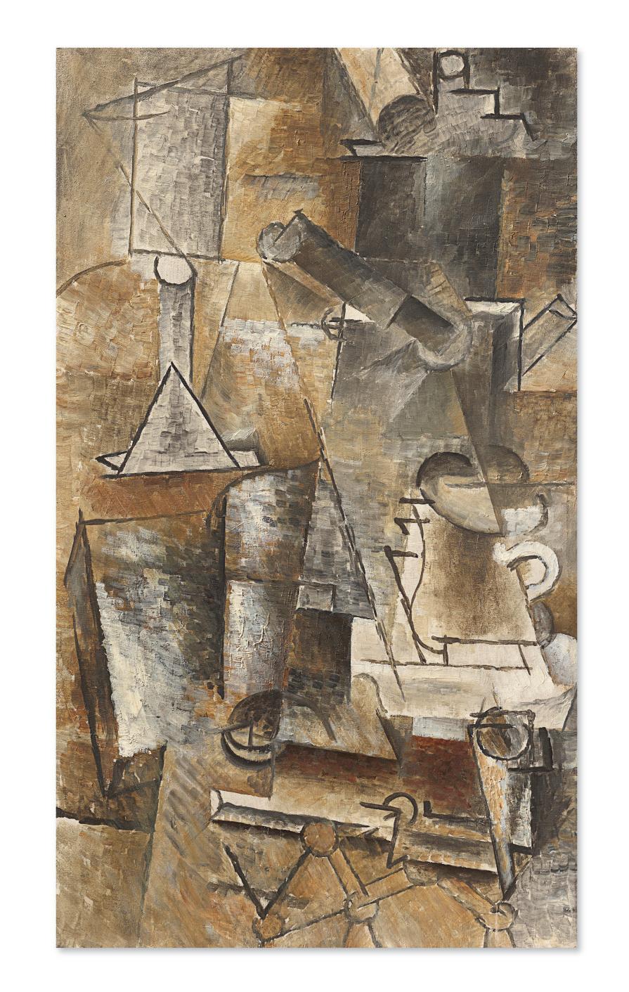
It was predominantly with the still life that Pablo Picasso deconstructed the centurieslong tools of artistic representation in his epoch-defining movement, Cubism. In his desire to unpack and reconfigure the processes of representation, Picasso adopted this genre—one that is based more upon the immutable reality of the everyday world than any other—discovering that it offered him the greatest opportunity for his iconoclastic re-writing of convention. Volumetric vessels were split and rendered as floating compilations of lines, presented from multiple viewpoints at once; flat tabletops were upturned, distorting classical notions of pictorial space; pieces of fruit, so often the motifs with which an artist displayed their verisimitudinal virtuosity became nothing more than playful signs and shapes that alluded to rather than faithfully rendered real life. All of these objects became the protagonists in the new painterly world Picasso created in his cubist compositions.
Cafetière, tasse et pipe was painted in 1911, the highpoint of the artist’s Analytical Cubism phase, and captures to great effect the startling pictorial disruptions that Picasso so diligently crafted. Here, the just visible objects of an everyday still-life emerge from a monochrome mist of pigment. As the title denotes, a cafetière, cup and pipe, together with the prominent form of a wineglass, are the protagonists of the scene. Untethered from the tabletop on which they would usually stand, they float apparition-like amid various accumulations of shadows and gleams of light.
Cafetière, tasse et pipe
PABLO PICASSO
Writing about works such as Cafetière, tasse et pipe, Elizabeth Cowling has described, “In detecting and itemizing the scattered realistic details one risks reducing the paintings of 19101911 to diverting brain-teasers. In fact they remain mysterious and elusive, fascinating and intriguing, for no sooner has one small fragment emerged from the shadowy, shimmering, mazy whole to assume a momentary, almost tangible, reality than it becomes absorbed back into the abstract structure. This coming in and out of focus lends the objects in the paintings a hallucinatory, mirage-like quality, leading one to question one’s momentary impressions, to think of alternative interpretations, to wonder whether spectators will see what one believes has been seen” (Picasso: Style and Meaning, London, 2002, p. 225).
At this time, Picasso’s cubist compositions had reached their most austere and hermetic point. Together with his friend and fellow cubist pioneer, Georges Braque, the artists had succeeded in painting a form of reality without resorting to any of the illusionistic tropes or visual tricks that had defined Western painting since the Renaissance. In the summer of 1910, Picasso had verged on creating canvases of total abstraction. Insistent that his art be based in the real world, he diverged from this path and began to reintroduce recognizable objects or “attributes” into his complex configurations of line and form.
The following summer, Picasso traveled to Céret, a small town in the French Pyrenees, where he was soon joined by Braque. There the pair, so close at this time that Braque later described them as mountain climbers tied together on their artistic adventure, worked intensively in what has been described as a highpoint of both artists’ creative powers. Their work became so closely aligned that it was often hard to tell their canvases apart. It was also in Céret that Braque made a momentous breakthrough—adding stenciled letters onto the canvas, a motif that became essential to Cubism from this point onwards. “Although they were together for no more than three weeks,” John Richardson has written, “the two


artists challenged each other to such good effect that—to revert to Braque’s mountaineering image—they finally made it to the summit. Over the next three years Picasso and Braque, sometimes singly, sometimes together, would conquer other peaks, but nothing would excel the feat they brought off at Céret, when the two of them pooled their prodigious resources— their very different skills and powers of invention and imagination, not to speak of Spanish duende and French poésie—to achieve parity. As Golding says, it was ‘a moment of poise and equilibrium’” (quoted in J. Richardson, A Life of Picasso, 1907 1917: The Painter of Modern Life, London, 2009, vol. II, p. 193).
Returning to Paris, Picasso, who turned thirty that October, continued on this path of intense creativity. As with the Céret paintings, including L’Accordéoniste (Zervos, vol. 2a, no. 277; Solomon R. Guggenheim Museum, New York), Le Poète (Zervos, vol. 2a, no. 285; Peggy Guggenheim Collection, Venice) and La bouteille de rhum (Zervos, vol. 2a, no. 267; The Metropolitan Museum of Art, New York), it was the increasingly cogent structural armature of Picasso and Braque’s compositions that characterize their work of 1911. It was at this time—in the winter of 1911 as Zervos states, or the autumn according to Pierre Daix and Joan Rosselet—that Picasso painted the present work. Here, the outlines and forms that trace the recognizable objects stand in perfect equilibrium with the rest of the composition, their forms echoing and reinforcing the geometric planes and lines that constitute the setting.
“In still lifes representing bar-tables covered with heterogeneous objects,” Pierre Daix has written of the 1911 works, “Picasso perfected the grid of slanting and vertical lines, then the pyramidal rhythm which gave the heroic period of Cubism its strength and lofty severity. The concrete elements are there merely to help the structural armature: the bottle for elevation, the glass for its curves… the structural rhythms emerged only slowly, through complex dynamics which linked the abstract forms to the concrete clues. In fact these
 Present lot illustrated (detail).


rhythms acquired their structural value, became an armature, only in so far as they formed a system of concrete signs” (Picasso: The Cubist Years, 1907-1916, A Catalogue Raisonné of the Paintings and Related Works, London, 1979, p. 84). This idea of conveying the “concrete signs” of an object would carry through to the new year. Indeed, this preoccupation manifested itself in the first cubist collage that Picasso created in early 1912—a bold leap forward that altered both the path of Cubism and modern art as a whole.
In the background of this moment of artistic invention, Picasso became embroiled in a now infamous controversy. On 23 August it was announced that Leonardo da Vinci’s Mona Lisa had been stolen from the Louvre. When an anonymous article was published in which the author claimed that theft from the museum was not difficult and that he himself had stolen some early Iberian figures from the museum, Picasso made a hasty return to Paris. He immediately realized the writer was Géry Pieret, an acquaintance of Guillaume Apollinaire’s—from whom Picasso had earlier purchased two Iberian statuettes. With no other leads, police investigated this angle intensively. Despite the anonymous return of the Iberian artefacts, Apollinaire found himself arrested for some days and Picasso was forced to testify in court. Despite this unfolding scandal, Picasso worked intensively throughout the autumn, creating works such as Cafetière, tasse et pipe, which constantly pushed forwards the artist’s cubist mission.
Shortly after it was completed, Cafetière, tasse et pipe was purchased by the renowned art collector Alphonse Kann. Born in Vienna in March, 1870, Kann earned a reputation as an elegant connoisseur of classical sculpture and Renaissance painting in Paris during the opening decades of the twentieth century. A close friend of Marcel Proust, he was believed to have been one of the principal models for the character Charles Swann in the author’s 1908 novel À la recherche du temps perdu. Revered for his keen eye and extraordinary taste, he shocked the

art world in 1927 by auctioning off the majority of his Old Master and antiquities collections in order to concentrate on the acquisition of 19th-century and modern art, which he pursued enthusiastically. By the late 1930s, Kann’s collection included at least thirty-five paintings by Picasso, in addition to numerous works by Georges Braque, Paul Klee, Henri Matisse, Edouard Manet, Gustave Courbet, Pierre-Auguste Renoir and others.
As the threat of war loomed on the horizon, Kann fled Paris for England in 1938, leaving the majority of his art collection at his home in Saint-Germain-en-Laye in the Western suburbs of the city. During the Occupation of Paris in 1940, the Kann mansion was pillaged by the German Army, as part of a series of systematic raids on the homes and businesses of French Jewish collectors. Hundreds of artworks were looted from his vast collection, while others were ‘Aryanized’ and sold at auction. Following the Allied victory in 1945, Kann attempted to recover the stolen artworks, but the destruction of his records meant that he had to draw up an inventory from memory alone. At the time of his death only about half of the artworks which were stolen from the house in Saint-Germain-en-Laye had been returned.
After its confiscation by the infamous Einsatzstab Reichsleiter Rosenberg, Cafetière, tasse et pipe came into the possession of the art-dealer Gustav Rochlitz, who in turn sold the work to Isidor Rosner. Shortly thereafter the painting probably made its way back to Picasso, before entering the personal collection of Dora Maar, who received a number of works as gifts from the artist over the course of their relationship. It remained in her personal collection until her death. Extensive research by Alphonse Kann’s heirs during the late 1990s and early 2000s led to the successful restitution of several artworks which had formerly graced his collection, including Fernand Léger’s Smoke Over Rooftops, from the Minneapolis Museum of Arts, and Albert Gleizes’s Le Chemin (Meudon) from the Centre Georges Pompidou in Paris. Cafetière, tasse et pipe was restituted to the Kann heirs in 1999, and was purchased shortly thereafter by Si Newhouse.

I once got an email from Jasper Johns. He had read my biography of Susan Sontag, and questioned a story someone had told me. Sontag and Johns had known each other in the 1960s, and when Johns moved out of his penthouse, at 340 Riverside Drive, Sontag moved in. There was one drawback. The walls were covered with his drawings. Sontag, not knowing what to do with this graffiti, chose the simplest option, which was to have it painted over. Bullshit, Johns wrote: “I want to assure you that I have never drawn on any walls of any place where I have lived.”
I was relieved, for Johns’s sake—what a massacre!—and for Sontag’s: it would have been a shocking act of vandalism from one of the most sophisticated writers of her time. But it was the existence of the email itself that fascinated me most. I felt as if I had received an email from John F. Kennedy, say, or Marilyn Monroe: from some great but irretrievably distant personification of postwar American culture—from that moment when, with Europe in ruins, New York had taken over from Paris and London and become the capital of the world. Johns’s American flag had become a symbol, however layered and ironic, of that moment: a symbol of a symbol, it rose above its creator in order to became an emblem of a generation, a nation. I felt as if I had just received an email from the very flag itself.
The fascination of writing and reading artistic or intellectual biographies is in seeing the operations of two kinds of time. The first is internal time, the time that exists in the artist’s own evolution, as he moves from one thought, one work, to the next; as he pursues one interest, pulls one thread, and drops another; as he moves from success to failure to—if he’s lucky—another success. As the grande ligne in a musical composition connects one note, one work, to the next, this movement is not always easy to define—not easy, in isolation, to perceive. For painters, this is the movement, the line, that we get to glimpse in big career retrospectives like those that were recently held for Johns at the Whitney and in Philadelphia.
Still, even in the most carefully representative retrospective, it is rare to be able to point to a single work that sums up where the artist has been, and shows where he is going to go. Decoy is such a work in Johns’s œuvre. A new kind of meaning is creeping back into it, the way the colors are—haltingly, partially—crawling back onto the words that describe them. The word “green” is still mostly gray, and so are the o and the w in “yellow”; but the steely refusal to reveal meanings that marked his earlier work, including Flag, seems to be starting to recede. Is this why the work is called Decoy? Johns would always remain subtle and elegant. But maybe, here, he is starting to become a bit less rigidly hieratic—a bit less coy.
Or maybe not. At the age of ninety-two, Johns and his work are now passing into a second kind of time, which might be called external time, the time that no longer depends on the artist himself. This is the time that adds meanings to old works, and strips others. Some works are enhanced by new layers of interpretation; some, reduced. What meaning will an image of a beer can have in an age when the definition of art has expanded to encompass
anything the artist says it is? How will Johns’s refusal of opinion be understood at a time when opinion is so universal, and so cheap? How will we look at Decoy’s reproduction of reproductions in an age when so much experience has been placed at a digital remove? How, in an age when culture is increasingly subsumed into the entertainment industries, will we regard the rigor, the austerity, of a painting by Jasper Johns?
We don’t know. But if we know anything about Jasper Johns, it’s that he—that emblem of postwar American culture—is also one of his culture’s most persuasive opponents. Elias Canetti said that the great modern writer “is original; he sums up his age; he opposes his age.” And this—summing up and opposing his age—is what Johns does more than any other American artist. Where America is obvious, he is subtle; where it shouts, he whispers; where it is slick, he is retiring and rough. But America, like Johns, is protean, restless, heroic; America, like Johns, resists easy intimacy. Rooted in that nation and that generation, Decoy invites and repels interpretation. It is a work that sums up its age, and eloquently opposes it.
Decoy is only fifty-two years old. Fifty-two is middle-aged for a human. But it’s young for a great work of art. And as this painting prepares to enter only the third collection in its career, it is just beginning. What new meanings will attach themselves to it, and what old meanings will be lost? It’s waiting for new generations to understand it and misunderstand it, embrace it and reject it, be inspired by it and defy it. We don’t know what form the painting’s future life will take. What we do know is that, like Jasper Johns himself, it will never be ignored: something that, unlike those mythical drawings on the penthouse wall, can never be painted over.
Decoy
oil and brass grommet on canvas
72 x 49√ in. (182.9 x 126.7 cm.)
Executed in 1971
$12,000,000-18,000,000
PROVENANCE:
Leo Castelli Gallery, New York. Victor and Sally Ganz, New York (1972); Estate sale; Christie's, New York, 10 November 1997, lot 31.
Acquired at the above sale by the late owner.
EXHIBITED:
New York, Whitney Museum of American Art, 1972 Annual Exhibition: Contemporary American Painting, January-March 1972, p. 9, no. 57.
Hempstead, Emily Lowe Gallery at Hofstra University, Jasper Johns Decoy: The Print and the Painting, September-October 1972, n.p. (illustrated).
New York, Whitney Museum of American Art; Cologne, Museum Ludwig in der Kunsthalle Koln; Paris, Musée National d'Art Moderne; Tokyo, Seibu Museum of Art and San Francisco Museum of Modern Art, Jasper Johns, October 1977-December 1978, no. 146 (illustrated in color, New York), no. 112 (Cologne), no. 134 (London), no. 146 (Tokyo), no. 113 (San Francisco).
New York, The Museum of Modern Art, Jasper Johns: A Print Retrospective, May-August 1986, p. 75 (illustrated in color).
New York, The Museum of Modern Art, Jasper Johns: A Retrospective, October 1996-January 1997, p. 263, no. 144 (illustrated in color).
London, Royal Academy of Arts and Los Angeles, The Broad, Jasper Johns, September 2017-May 2018, pp. 8, 17 and 193 (illustrated in color, pl. 108).
New York, Whitney Museum of American Art, Jasper Johns: Mind/ Mirror, September 2021-February 2022, pp. 171 and 191, no. 13 (illustrated in color).
LITERATURE:
R.D. Herrmann, "Johns the Pessimist," Artforum 16, no. 2, October 1977, pp. 26-33 (illustrated in color).
T. Hess, "Jasper Johns, Tell a Vision," New York Magazine, November 1977, pp. 109-111.
Jasper Johns: Working Proofs, exh. cat., London, Tate Gallery, 1980, pp. 40-41 (illustrated).
R. Francis, Jasper Johns, New York, 1984, pp. 68 and 74-76, fig. 76 (illustrated in color).
R. Bernstein, Jasper Johns' Paintings and Sculptures, 1954-1974: "The Changing Focus of the Eye," Ann Arbor, 1985, pp. 125-128 (illustrated, pl. 53).
Jasper Johns: The Seasons, exh. cat., New York, Leo Castelli Gallery, 1987.
Dancers on a Plane: Cage, Cunningham, Johns, exh. cat., London, Anthony d'Offay Gallery, 1989, p. 122, fig. 5 (illustrated).
G. Boudaille, Jasper Johns, New York, 1989, p. 20 (illustrated in color, pl. 67).
J. Elderfield, ed., American Art of the 1960s, New York, 1991, pp. 38-62, fig. 17 (illustrated in color).
R. Bernstein, Jasper Johns, New York, 1992.
Jasper Johns: Writings, Sketchbook Notes, Interviews, exh. cat., New York, The Museum of Modern Art, 1996, pp. 188, 191, 193, 200, 204, 211, 213 and 317.
M. FitzGerald, ed., A Life of Collecting: Victor and Sally Ganz, New York, 1997, pp. 22 and 88-111 (illustrated in color and installation view illustrated).
Jasper Johns: Regrets, exh. cat., New York, The Museum of Modern Art, 2014, p. 25, fig. 16 (illustrated in color).
R. Bernstein, Jasper Johns: Catalogue Raisonné of Painting and Sculpture, Volume 3, Painting, 1971-2014, New Haven and London, 2016, pp. 8-9, no. P180 (illustrated in color).

A seminal painting from 1971, Jasper Johns’s Decoy acts as a mini retrospective of the artist’s prodigious career up to this point, and a recapitulation of his ideas about representation and reproduction. It presents themes and motifs which have been the subject of artist’s gaze for nearly two decades and subjects them to a fresh interrogation. Thus, reproductions of Johns’s bronze sculptures from 1960 are layered together with the gestural brushwork of his Maps (1960 onwards), and combined with his technical interest in image and imitation, the result is a work that speaks to many of the artists concerns. The present work is the largest of two paintings that are a continuation of the artist’s celebrated Decoy prints, widely regarded as among the visually rich and complex of his editioned works. Exhibited in major retrospectives of the artist’s work and cited in much of the literature, Decoy comes with exceptional provenance, having been acquired by unrivalled collectors, Victor and Sally Ganz in 1972. They held it in their collection for twenty-five years, from where it was acquired by the present owner over two decades ago, remaining in his collection ever since.
Measuring six feet in height, the surface of this large-scale canvas is consists of a multilayered composition bringing together painterly gestures and printed images together with conceptual representations of forms and color. Surrounded by a field of bold black brushwork,


Johns situates one of his most familiar motifs in the center of the composition: an image of the famous Ballantine beer cans featured in Painted Bronze (1960; Whitney Museum of American Art, New York). Yet, closer consideration reveals that this is in fact a reproduction of a printed image of the can, as evidenced by the remnants of ghostly Ben-Day dots and the edit notes to an unseen assistant requesting a crop to the image and a reduction in its size. Surrounding the central beer can are other printed images, their fixed images counterbalanced by gestural brushwork that envelops the surface, in the process disrupting the perceived integrity of the photographic image. Traversing its way across the surface is a trail of colorful words, spelling out "red," "orange," "yellow," "green," "blue," and "violet." Johns first used the combination of words and colors in False Start in 1959, when he produced a dramatic canvas in which he broke the representative ties between the words and colors (i.e. "yellow" was executed in blue paint, and "white" was painted in red etc.). However, in Decoy the colors and their representation are reunited once more, with each word being painted in the correct shade of pigment. Interestingly, these motifs also add depth and structure to the surface of the work as they traverse down the picture plane, before "folding back" on themselves and appearing as a reverse impression of themselves, another nod to Johns’s new found interest in printmaking. This interplay between representation and reality continues in the lower section with reproductions of Johns’s iconic sculptural forms. The are taken from the cancelled plates of some of his first etchings, visibly scored with the "cancelation" line that runs through them, ensuring (in theory) that no more versions can be made. Finally, a brass grommet situated along the lower edge of this progression pierces the sanctity of the canvas’s surface, allowing us, as the viewer, to peer through the canvas into another dimension.
Thus, Decoy becomes the synthesis of the ideas and issues that Johns had been grappling with throughout his career. From the beginning, he has produced paintings that would fundamentally change the history of American postwar art. Abandoning the longstanding

 Present lot illustrated (detail).
ABOVE: Installation view, Jasper Johns: A Print Retrospective, May 19–August 19, 1986, Museum of Modern Art, New York (present lot illustrated).


Photo: © The Museum of Modern Art/Licensed by SCALA / Art Resource, NY.
Artwork:© 2023 Jasper Johns / Licensed by VAGA at Artists Rights Society (ARS), NY.
BELOW: Installation view, Jasper Johns: A Retrospective, October 15, 1996 - January 21, 1997, Museum of Modern Art, New York (present lot illustrated).
Photo: © The Museum of Modern Art/Licensed by SCALA / Art Resource, NY.
Artwork: © 2023 Jasper Johns / Licensed by VAGA at Artists Rights Society (ARS), NY.
tradition of narrative painting, and the emotionally imbued Abstract Expressionism, Johns instead adopted a more formalist approach, garnering interest from everyday objects, and investigating the possibility of line and shape. “I’m interested in things which suggest the world rather than suggest the personality,” he once stated. “I’m interested in things which are rather than in judgments. The most conventional things, the most ordinary things—it seems to me that those things can be dealt with without having to judge them; they seem to me to exist as clear facts not involving aesthetic hierarchy” (quoted in R. Francis, Modern Master: Jasper Johns, New York, London and Paris, 1991, p. 21). In Decoy, these concerns come together in one painting.
The present work relates to a series of prints that Johns produced during the summer of 1971, and which are now regarded to be among the most lauded series of prints he ever executed, examples of which are housed in major international institutional collections including: Tate Gallery, London; The Metropolitan Museum of Art, New York; The National Gallery of Art, Washington, D.C.; The Broad, Los Angeles; and Art Institute of Chicago. Unusually for the artist, Johns painted the canvas as the culmination of the series, rather than the other way around. The prints were produced from a single lithographic stone, which he reworked many times, along with eighteen aluminum plates. The constant reworking and making additions and changes speak to the work being a recapitulation of his ideas about reproduction and representation. The artist has also spoken of how Decoy is about memory and transformation, as each time a motif is used and re-used it accrues new memories and meaning, and the object gets to develop its own history.
One indication of the importance of Decoy is that it was once in the collection of Victor and Sally Ganz, the pre-eminent collectors of twentieth-century art. Johns was one of the Ganz’s favorite artists and during their lifetimes they amassed what is widely regarded to
be the most complete collection of the artist’s work ever assembled. Over the years, Victor Ganz and Johns developed an extraordinary rapport. Ganz savored the artist’s complex, multilayered meanings, and appreciated the craft and invention of Johns’s explorations of different artistic media and his consistently evolving technique. Decoy is a work that combines this cerebral complexity and emotional intensity, writes Roberta Bernstein—widely regarded as the foremost scholar of the artist’s work—in respect of the present work, “This major work summarizes the themes of disorientation, disintegration, discontinuity, and fragmentation that had dominated Johns’s work for the past decade… Decoy is intellectually rich and sensuously alive… yet weighted with a dark pessimism evoked by the area of black that surrounds and threatens to obliterate” (“Jasper Johns,” in M. Fitzgerald, A Life in Collecting: Victor and Sally Ganz, New York, 1997, p. 107).
One of most of the most intricate paintings of Johns’s long career, Decoy represents the artist’s multifaceted approach to art. Unrivalled within the artistic canon of the postwar period, he has done more than any other artist to interrogate the creativity of the artistic process, resulting in a body of work that is as vital and invigorating as it is broad. From paintings, to prints, to sculpture, Johns is the master of his chosen medium, excited by their formal properties and investigating and manipulating them to push at the boundaries of art. Here, in Decoy, the artist represents all three mediums; “Johns’s art is a constant reminder that the truth is not a given,” concludes Bernstein, “but rather is revealed through the layered and shifting meanings uncovered through the process of perception. Fixed habits of seeing, feeling, and thinking render the truth invisible. A flicker of grace occurs when the senses are awakened and new ways of experiencing the world, even ordinary objects in the world, provide a glimpse of that truth” (R. Bernstein and E. Devaney, "Something Resembling Truth," in R. Bernstein, ed., Jasper Johns, exh. cat., Royal Academy of Arts, London, 2018, p. 12).

Cicada
stenciled with the artist's name, title and date 'OHNS 1979 CICADA JASPER JO' (lower edge) oil on canvas
30 x 22Ω in. (76.2 x 57.2 cm.)
Painted in 1979
$7,000,000-10,000,000
PROVENANCE:
Mark Lancaster, New York (acquired from the artist, 1979). PaceWildenstein, New York.
Acquired from the above by the late owner, 1999.
EXHIBITED:
New York, Grace Borgenicht Gallery, Twenty Galleries, Twenty Years, January-February 1982, p. 23 (illustrated).
New York, Harm Bouckaert Gallery, Recent Aspects of Allover, September-October 1982.
London, Anthony d'Offay Gallery and Liverpool, Tate Gallery, Dancers on a Plane: Cage, Cunningham, Johns, October 1989-March 1990, pp. 124 and 140, no. 2 (illustrated in color).
Glasgow, Kelvingrove Art Gallery and Museum, Jasper Johns: From a Private Collection, 1961-1983, June-July 1990.
Miami, Center for the Fine Arts, Abstraction: A Tradition of Collecting in Miami, November 1994-January 1995, p. 42, no. 35 (illustrated in color).
Miami Art Museum, Dream Collection: Gifts and Just a Few Hidden Desires...Part Two, September 1997-April 1998.
LITERATURE:
R. Francis, "Disclosures," Art in America, vol. 72, no. 8, September 1984, p. 198.
R. Mariner, "Jasper Johns," Art Monthly, no. 132, London, December 1989-January 1990, pp. 20-21.
G. Boudaille, Jasper Johns, New York, 1989, p. 22.
Jasper Johns: Printed Symbols, exh. cat., Minneapolis, Walker Art Center, 1990-1991, pp. 51-61.
R. Bernstein, Jasper Johns, New York, 1992 (illustrated, pl. 4).
B. Rouge, "Splitting Cicadas, ou le repli des masques: Jasper Johns et la serie", Suites et series: actes du troisieme Colloque du Cicada, 3, 4, 5 decembre 1992, Paris, 1994, pp. 155-171.
F. Orton, Figuring Jasper Johns, London, 1994, pp. 164-169, 172 and 182.
J. Yau, The United States of Jasper Johns, New York, 1996, pp. 69-70.
R. Bernstein, Jasper Johns: Catalogue Raisonné of Painting and Sculpture, Volume 3, Painting, 1971-2014, New Haven and London, 2016, pp. 56-57, no. P204 (illustrated in color).

One of three Cicada canvases which the artist painted in 1979 (another example is in the collection of the Museum of Fine Arts, Houston), Jasper Johns’s iconic crosshatched motif acts as a pertinent reminder that—despite revolutionizing the art world with his Flags, Maps, and Targets—the artist was still capable of sending seismic shocks through the contemporary art world. Two decades later, Johns embarked on this series of abstract paintings featuring dramatic crosshatchings, dynamic streaks of vibrant color that are woven together across the surface of the canvas. This new motif would form the basis of some of the artist’s most celebrated mid-career paintings including Dancers on a Plane (1980; Tate Gallery, London), Between the Clock and he Bed (1981; The Museum of Modern Art, New York), and Perilous Nights (1982; The National Gallery of Art, Washington, D.C.). First owned by Johns’s assistant, the British artist Mark Lancaster, the present work has been in the present collection for nearly twenty-five years.
Cicada is comprised of a dazzling patchwork of hatched marks that covers the surface of the canvas. Short, deliberate brushstrokes of red, blue, green, orange, magenta, and white pigment are laid down in studied fashion. These colored brushstrokes are separated by white counterparts, which in turn are painted over earlier colored marks. They are then grouped together in "bundles" of five or six; varying in length, they produce irregular fields

 Present lot illustrated (detail).
of alternating colored and white gestures which take on different dimensions; the result is a complex kaleidoscope of colored marks. This bewildering effect continues along the lower edge where Johns stencils his name, along with the title and date of the painting, but being Johns, not in a straightforward way, instead breaking it up the words so they read: “OHNS 1979 CICADA JASPER JO.”
What, at first glance, might seem to be an arbitrary arrangement of colored marks is in fact carefully thought out and pre-determined. Beginning in the center with a series of marks in the primary colors, by the time they progress out towards the edge of the canvas they have become secondary colors of green, orange, and magenta. A remarkable drawing from 1978 (The Broad, Los Angeles) explains Johns’s thinking as he writes in the margin of this preparatory work such notes as “Central Vertical of Primaries Reversing to Secondaries” and “Left and Right Edges Occupy the Same Line in Formation.” He also notes potential titles including "Cicada," "Locust," and "Husk." As noted in the artist’s catalogue raisonné of drawings, the words "Cicada" and "Locust" refer to the insect known for its loud buzzing call, while "Husk" alludes to the exoskeleton that splits open as the insect emerges from its prolonged period spent developing underground. The cross hatching then represents the insects form, and if joined (either physically or conceptually) the clusters of parallel lines meet their corresponding color, unifying the design across a continuous surface.
These enigmatic markings first appeared in Johns’s work in the early 1970s, in a painting called Scent (1973; Ludwig Forum für Internationale Kunst, Aachen). The artist himself has spoken extensively on his inspiration for this new motif, attributing it to a chance sighting of a car in motion on the highway. “I only saw it for a second, but I knew immediately that I was going to use it. It had all the qualities that interest me—literalness, repetitiveness, an


obsessive quality, order with dumbness, and the possibility of a complete lack of meaning with the possibilities of gesture and the nuances that characterize the material—color, thickness, thinning—a range of shadings that become emotionally interesting” (quoted in S. Kent, "Jasper Johns: Strokes of Genius," in K. Varnedoe, ed., Jasper Johns: Writings, Sketchbook Notes, Interviews, New York, 1996, pp. 258-259). From these innocuous beginnings Johns developed a highly versatile language that could be inserted into almost any painting as it was versatile enough to be adapted to convey a multitude of meanings. It evoked the frenzied choreography of Johns’s friend, Merce Cunningham, in Dancers on a Plane, at the same time as paying homage to Edvard Munch’s Self-Portrait Between the Clock and the Bed, which, too, features a thinly laid bedspread patterned in similar fashion to Johns’s signature crosshatching trademark.
At the end of the 1970s, the turn of the decade marked a clear shift in Johns’s output as he began to trade the familiarity of his Maps, Flags, and Targets for a more unfamiliar painterly language, one defined by repetition, a lack of obvious context, and unusual visual depth. Johns would repeat this pattern of hatching in various different media over the course of the next critical decade, asserting both the artist’s technical prowess and the importance of this visual iconography. This is a composition that displays great versatility, potential and universality, one that agreed perfectly with the artist’s working methods. During the time of the present example’s conception, Johns was confidentially executing this pattern in both prints and traditional paintings, both mediums musing off of one another. Indeed, the Cicada crosshatchings would come to be one of the artist’s most enduring motifs.
Throughout his career, Johns was fundamentally interested in issues of representation. Bridging the gap between abstraction and Pop, Johns sought inspiration in the forms and images that he saw around him. Yet he differed from other artists of his generation in that his interest in the iconography of his chosen subject matter is based on their formal associations and how that changes (or not) in the context of their use in art. Of Johns’s work, the Johns scholar Roberta Bernstein noted “Their subjects were not drawn from the topical mass media but were intrinsic to culture and deeply ingrained in human consciousness. Their uncertain status, hovering between art work and the thing itself, focused attention on the process of perception, how reality is represented through visual signs, and how the viewer interprets those signs. In this, they did not so much reject abstraction and subjectivity as forge a new way to integrate abstraction with representation and make more apparent the viewer’s role in investing the art work with meaning” (“Jasper Johns’s Numbers: Uncertain Signs,” in R. Bernstein and C. E. Foster, eds., Jasper Johns: Numbers, exh. cat., Cleveland Museum of Art, 2003, p. 12). The crosshatching exemplified by Cicada peers into underlying structure of the very world that supported his practice. With works such as this, Johns gives rise to new inquiries into the nature of art, and—in the process—produced some of the most celebrated works of our time.
Momoyama signed, stenciled with the title and dated 'MOMOYAMA J. Johns 2005' (on the reverse of the inner right slat); signed again, stenciled with the title again and dated again 'MOMOYAMA J. Johns '05' (on the reverse) oil, encaustic and string on two attached canvases with wooden slats
60¿ x 50¡ x 4¡ in. (152.7 x 128 x 11.1 cm.)
Executed in 2005
$4,000,000-6,000,000
PROVENANCE:
Acquired from the artist by the late owner, 2007.
LITERATURE:
R. Bernstein, Jasper Johns: Catalogue Raisonné of Painting and Sculpture, Volume 3, Painting, 1971-2014, New Haven and London, 2016, pp. 316-317, no. P334 (illustrated in color).

In part a painting, yet also in part a sculpture, Jasper Johns’s Momoyama is one of the artist’s most engaging later works. Executed in 2005, the multi-paneled wooden structure speaks to Johns’s multi-faceted approach to art, reveling in the bravado and inventiveness that enabled him to investigate all aspects of the creative process. Inspired by the pattern of the flagstones on a New York sidewalk, Momoyama explores the interplay of color, form, and material in three dimensions. Returning to a motif which the artist first used in his 1967 painting Harlem Light, and used on a number of occasions throughout his long career including his monumental Untitled (1972; Museum Ludwig, Cologne), the present work is one of only three works of this type that he executed in 2005 (the other two examples are in, or promised to, major institutional collections). Incorporating elements of oil painting, encaustic, wooden construction, and found materials (in this particular case, string), Momoyama provides ample evidence of the peripatetic nature the artist’s mind as he probes the nature of representation and reproduction.
Across two conjoined canvas, Johns lays out a field of multicolored corpuscular forms. Painted in the secondary colors of orange, green, and magenta, their irregular forms seem to pulsate when set against the pale ground: graphite marks and active drips of white paint add

to the active surface. The left canvas is rendered in encaustic, while the right canvas is painted in oil, this combination offering up subtle variations in the richness of the painted surface. On the left, the multicolored forms traverse over the edge of the canvas, and onto a narrow wooden slat which can turn inwards, much like a hinged panel on a Renaissance altarpiece. Conversely, on the right hand side, the colored forms stop short of the turning edge, leaving the two wooden slats painted white, the outermost one bearing a free-hanging piece of string suspended from a screw eye.
Throughout his career, Johns produced a series of paintings that would fundamentally change the history of American painting. Abandoning the longstanding tradition of narrative painting, and the emotionally imbued Abstract Expressionism, Johns instead adopted a more formalist approach, garnering interest from seemingly ordinary objects and motifs, and the possibility of line and shape. Building on his works that incorporated maps, numbers, targets, and coffee and beer cans, as his career developed, so did the sophistication of his motifs.
The title Momoyama refers to a period in Japanese history dating from the latter half of the sixteenth century. Although not a work directly about Japan, the title does speak to the artist’s long history with the country. He was stationed north of Tokyo in 1952-1953, and returned to the country in 1964, by which time he was an influential figure in the Japanese art world. His time in Tokyo was highly influential to his subsequent career, as it was here that he began to refine his ideas about “seeing” and “looking” and the relationship between spectator and critic. Johns now began to use “objects and traces of action in order to diversify the ways of seeing things… and [and] to confuse the meaning of the act of looking” (The artist quoted in H. Ikegami, “Looking Deeper: Johns Johns in an International Context of the 1960s” in R. Bernstein, ed., Jasper Johns, exh. cat. Royal Academy of Arts, London, 2017, p. 54).


The present work is just one of three canvases of this type that the artist completed in 2005. Beckett (named after the Irish author Samuel Beckett) is rendered in the artist’s signature gray and is a promised gift to The Museum of Modern Art, New York, and Within—another gray version with underlying colored crosshatching—is in the Glenstone collection in Potomac, Maryland. Nines, a later version in primary colors from 2006, is a promised gift of the Philadelphia Museum of Art. Following these examples, the artist evolved the composition slightly, reducing the number of slates on the side, and moving the string element to the center of the work.
Executed in 2005, Momoyama provides ample evidence of the engaging and provocative nature of Jasper Johns practice. Half a century after the seismic shift that was caused by his groundbreaking Flag (1954-1955; The Museum of Modern Art, New York), the artist was still producing works that exhort the viewer to stop seeing and start looking. With its striking motif, and unique construction, the present work forces us to do just that—question. “Johns’s art is a constant reminder that the truth is not a given,” concludes curators Roberta Bernstein and Edith Devaney, “but rather is revealed through the layered and shifting meanings uncovered through the process of perception. Fixed habits of seeing, feeling, and thinking render the truth invisible. A flicker of grace occurs when the senses are awakened and new ways of experiencing the world, even ordinary objects in the world, provide a glimpse of that truth” ("Something Resembling Truth," in R. Bernstein, op. cit., p. 12).
Untitled [Bolsena]
signed, inscribed and dated 'BOLSENA Twombly 69' (lower right) graphite, wax crayon and oil-based house paint on canvas
78æ x 93¡ in. (200 x 237.2 cm.)
Executed in 1969
$18,000,000-25,000,000
PROVENANCE:
Private collection.
Plinio de Martiis, Rome.
Gagosian Gallery, New York.
Acquired from above by the late owner, 1999.
LITERATURE:
H. Bastian, ed., Cy Twombly: Catalogue Raisonné of the Paintings, Volume VII Addendum, Berlin and Munich, 2018, p. 56, no. 36 (illustrated in color).

Painted in Italy during the summer of 1969, Cy Twombly’s Bolsena paintings are regarded by many scholars as the summation of the artist’s exploration into the free-flowing nature of the line. The supple, twisting and unbridled marks that navigate their way across the surface of this elegant canvas are the natural extension of the mark making that had established Twombly as one of the most inquisitive and innovative artists of his generation. Occupying a place between representation and symbolism, Untitled [Bolsena] is one of just fourteen paintings the artist painted during a stay on the shores of Lake Bolsena (other examples are in the collections of The National Gallery of Art, Washington, D.C., the Philadelphia Museum of Art, the Art Institute of Chicago, The Broad, and Bayerische Staatsgemäldessammlungen— Sammlung Moderne Kunst in der Pinakothek der Modern München), the present work expresses Twombly’s interest in the expansive nature of history, yet also speaks to the contemporary. One of the most evocative and lyrical works in the series, this is a triumphal example of the artist’s exacting contribution to the twentieth-century canon.
Twombly’s mastery of his line can be seen in the elegant amalgamation of the lithe traces and symbolic gestures that play out across the surface of this expansive canvas. From freeflowing lines to more torrid loops and swirls, the full repertoire of the artist’s gestures is on display. This multifaceted composition is the result of Twombly’s free-flowing hand tracing out anonymous forms, but it is also populated by signs and symbols infused with meaning. The lines are symbolic of the purity and timelessness of the artist’s mark making, while the scattering of dates, numbers, names, and even the artist’s expansive signature, anchor the


work very much in the present. “Twombly had an incontestable mastery over line,” Heiner Bastion—the author of the artist’s catalogue raisonné—once wrote, “it [has the] capacity to generate new form and to stimulate fresh potency” (Cy Twombly Catalogue Raisonné of the Paintings Volume II 1961-65, Munich, 1993, p. 21).
Untitled [Bolsena] was painted during Twombly’s stay at Palazzo del Drago, the soaring Renaissance palace on the shores of Lago di Bolsena in Italy. The artist had settled in the picturesque Tuscan hills after a two-year period of peripatetic activity traveling between Italy, New York, Florida and the Caribbean. He would stay in the town in a state of comparative solitude for almost six months, and this newfound sense of stability seemed to have unleashed within Twombly a new sense of innovation and painterly adventure. Bolsena provided Twombly with a sense of certainty and longevity, which had so often sparked his artistic abilities in the past. Surrounded by the history of Italy and absorbed in the historic events of July 1969, Twombly reacts to history in the making.
In July 1969, the American spaceflight Apollo 11 became the first mission to land men on the surface of the moon. As he worked on his new suite of paintings, Twombly listened to the excited coverage of this momentous occasion on the radio, enthralled by the historymaking events that were taking place thousands of miles away in space. The constant stream of scientific data, together with talk of vectors, orbits, and trajectories, filtered into his imagination and manifested themselves onto the surface of his canvases in the disparate loops, swirls, numbers and cryptic cyphers that populate Untitled [Bolsena]. “In these paintings reside real as well as imagined confrontations,” notes Bastian, “lit by the reflection of actual things as if by a radiance cast by marvelous happenstance; and all with freely changes temper as it navigates pathways warped by a reeling, gravimatic tow” (ibid, p. 32).
“Twombly had an incontestable mastery over line, its capacity to generate new form and to stimulate fresh potency”
—HEINER BASTIAN
Yet, as with much of Twombly’s work, this painting also has its origins in the past. When the artist moved from the United States to Italy in the 1950s, he became fascinated by the Roman graffiti that he observed around him on a daily basis. He was captivated by the idea of the “living history” of the city, and the fact that Romans had been living this same history for millennia. Twombly also spent many hours absorbing the artistic legacy of the city, seeing in person many of the Renaissance and Baroque masterpieces that he had previously only experienced from images reproduced in books. He would have been acutely aware of Raphael’s masterpiece The Mass of Bolsena (1512-1514; Apostolic Palace, Vatican City) for example, and his fascination with the artist had already spurned him to make two of his own interpretations of the masters paintings, namely The School of Athens (1509-1511; Apostolic Palace, Vatican City) and Triumph of Galatea (ca. 1512; Villa Farnesina, Rome). While the present work does not reproduce the same narrative imagery as Raphael’s frescos, it does share the horizontality of the narrative progression of his Renaissance counterpart’s work.
The Bolsena paintings are located at an important juncture in the artist’s career, coming after his triumphal Blackboard paintings begun the year prior, and just before his poetic Nini’s Paintings and Orion canvases from the early 1970s. The majestic loops and swirls of his Blackboards were perhaps the purest example of his much quoted adage: “Each line now is the actual experience with its own innate history. It does not illustrate—it is the sensation of its own realization. The imagery is one of the private or separate indulgencies rather than an abstract totality of visual perception” (quoted in K. Varnadoe, "Inscriptions in Arcadia," in N. del Roscio, ed., The Essential Cy Twombly, 2014, p. 67). Their rhythmic, roiling forms were the artist’s attempts to attain true artistic freedom. Twombly taught himself to “de-skill” the gesture, in effect to eradicate the habits of artists throughout history, to disconnect his hand from his eye. This was his sly wink at de Kooning and Rothko’s sanctification of the emotive power of the painterly gesture. Instead, Twombly sought in his own “gesture” to remove


himself psychologically and manually from his forebears. In the process, he also sought to position himself not only outside that earlier stylistic arena, but to create a more intensely personal relationship with his own production.
As Varnedoe has stated of these paintings, “These are ‘signature’ images in several senses—because they ostensibly present an abstracted, wordless essence of handwriting… and because they vividly embody, again and in renewed form, the artist’s willingness to take on the most unpromising premises as the basis of his art” (ibid., p. 74). Twombly’s “auto” or “proto-calligraphy” markings fall “rhythmically” over the surface, as Roland Barthes writes (Cy Twombly: Fifty Years of Works on Paper, New York, 2005, p. 19). In the present work, we can see Twombly’s aesthetic radicality—“[a] personal art… out of means which appear so studiously, so implacably artless” (ibid., p. 74)—an uncanny familiarity where the artist’s “auto-calligraphic” stream of markings trace a personal and poignant autographic statement that could well be our own.
Traces of the majestic loops that comprised the Blackboard paintings can be found in upper register of Untitled [Bolsena], which are in turn contrasted by the horizontal lines that populate the lower portion of the canvas. In these new paintings, Twombly also reverts back to using primarily “white” canvases, after a period working almost exclusively with a grey ground. This adoption of what has often mistakenly referred to as “empty space” was a central feature of Twombly’s oeuvre. He readily admitted that he felt more affinity with the surface of the work than the marks he often placed upon it and, as the critic Gillo Dorfles has noted, they are central to the artist aesthetic: “Vast white spaces… are the void’s which for Twombly have the power of color and matter and are, actually, the ‘fullest’ part of the picture” (G. Dorfles quoted in R. Pincus-Witten, "Cy Twombly," in Artforum, April 1974, via https:// www.artforum.com/print/197404/cy-twombly-36116).

This unique use of space also recalls the origins of Twombly’s Italian works. Together with the rich variety of his gestural marks, it evokes memories of the walls onto which the Roman graffiti that artist saw around him on a daily basis had been scrawled. Even as a child growing up in Lexington, Virginia, Twombly was beguiled by the city. Nicola Del Roscio, the artist's lifelong assistant and friend, has recalled Twombly’s mother telling a story about how as a young boy, Twombly would often repeat: “When I grow up I’ll go to Rome!” His first visit to Rome came many years later during a trip to Europe with Robert Rauschenberg, who he had met at art school in New York. Travelling on a grant, the new friends left America in 1952 to explore Europe and North Africa for the first time. They arrived in Rome, and from there went on to Florence, Siena, Assisi and Venice, before journeying to France, Spain and Morocco. This love affair with Italy would last for the rest of the artist’s life and result in the some of the most celebrated paintings of the postwar period.
Twombly’s ability to blend ancient and modern, the classical and the contemporary, is unique in the twentieth-century canon. His celebration of the simplicity of the mark rejected the self-imposed heroic grandeur of Abstract Expressionism, and added humanity to the austerity of what would become Minimalism. This mysterious cerebral state, described as “just below the deliberate mind,” undoubtedly emanates from a place where the mind of the artist unwinds and allows the hand to do its work. It comes close to what has been described as “flow state” by athletes, artists and musicians who surrender their mind and body to a kind of zen-like focus and concentration, losing all track of time and even numbed to the sensory experiences of the body. Twombly’s paintings are the lingering relics of this state, as they abandon the safety of known language and recognizable symbols and instead revert to a kind of primal urge. In Untitled [Bolsena], Twombly’s lines speak to this inscrutable yet powerful artistic impulse; they travel across both time and space—emanating a kind of beautiful, poetic, rhythmic force.
Small Point signed, titled and dated 'SMALL POINT 1969 B. Marden' (on the reverse) oil and beeswax on canvas, in three parts
overall: 47æ x 48º in. (121.3 x 122.6 cm.)
Executed in 1969
$1,200,000-1,800,000
PROVENANCE:
Galerie Yvon Lambert, Paris.
Gisèle and Marcel Boulois, Paris (circa 1975).
Gérard Boulois (by descent from the above).
Gagosian Gallery, New York (1996).
Private collection, Australia (1997).
Private Collection, Mexico (by 2005).
Gagosian Gallery, New York (2005).
Acquired from the above by the late owner, 2005.
EXHIBITED:
Paris, Yvon Lambert, Brice Marden, October 1969.
New York, Solomon R. Guggenheim Museum, Brice Marden, 1975, pp. 18 and 38, no. 10 (illustrated and installation view illustrated).
New York, C & M Arts, Brice Marden: Classic Paintings, March-May 1999, no. 2 (illustrated in color).
This work will be included the artist’s forthcoming catalogue raisonné

Beginning his career during a time of artistic upheaval, Brice Marden established himself early on as an innovative force in American painting. Drawing upon the emotional urgency of Abstract Expressionism while embracing the forthright structures of the nascent Minimalism, his work in the 1960s set the stage not only for his own illustrious oeuvre but irrevocably changed the face of twentieth-century art. Small Point is a decisive example of Marden’s ability to employ the most simple forms and colors to create evocative works of art. Related to his later Elements series, the present works omits those pieces’ adjoining lintel on top and embraces a more delicate and subdued palette. The light earthen tones are reminiscent of clay, concrete, and plaster, perhaps alluding to the artist’s interest in drawing from his surroundings. In the spring and summer of 1964, he spent time in Paris where he was privy to the urban renewal prompted by André Malraux, the French Minister for Culture at that time. He later reminisced, "They were re-plastering or stuccoing a lot of the walls. And then when I got back to New York—there were paintings that I had started at Yale, and then I just sort of reworked them, and they became more field-like" (quoted in G. Garrels, ed., Plane Image: A Brice Marden Retrospective, New York, 2006, p. 15). Constantly evolving as new ideas about surface and color entered his purview, Marden’s oeuvre grew steadily in response to his daily experiences. Distilling these observations into formal compositions, the walls of Manhattan, the skies of Greece, and the Parisian boulevards all coalesced into pure color and surface.

Completed in 1969, Small Point is a large square composition made up of three vertical canvases set flush in a row. Using his signature materials of oil and wax, Marden reinvigorates the traditional methods of encaustic painters to serve his experimental needs. At first glance, the entire work is rendered in a flat, even coat. However, upon further observation, differences in color and surface begin to emerge. Across this subtle spectrum, Marden’s hand is only slightly visible where some minute markings or underpainting becomes apparent through a shift in light. Indeed, the ability of the wax in his paintings to capture and disperse light evenly gives works like Small Point an internal glow. Light and its changing effects in various locales would become pivotal throughout his career as he absorbed his surrounding and channeled them into his work. "You're really influenced by where you're painting," he has noted. "One of the biggest things is the light." (quoted in T. Loos, "A Subtle Sense of Place," The New York Times, 29 October 2006). After moving to New York City after graduate school, Marden was influenced by the concrete and brick around his first apartment downtown. One can imagine the different shades a seemingly boring wall could change as the seasons changed in a city so full of light and shadow.
An early example of his breakthrough monochromatic wax panels, the power of Small Point hinges upon the capture of light within each canvas individually and their combination as a trio. Not as interested in sculptural qualities as some of his contemporaries, Marden made sure to focus on the direct representation of hues and tones. “By limiting each color he employed to one canvas, Marden sought to avoid the overlaps of figure-ground relationship that might compromise the identity and space of that particular color,” explained curator Klaus Kertess, an early proponent of the artist’s career. “The color becomes totally identified with the plane of its individual support and the physicality of its paintedness. The color of each plane makes its own light and space, at once independent of and dependent upon its
other planar partners. The painting is resolved and dissolved in the dynamics of a shifting symbiosis of planar identities” (Brice Marden: Paintings and Drawings, New York, 1992, p. 23). In the 1960s, Marden was fully invested in relaying the inherent materiality in his work to the viewer. Interested in ideas of physicality and working toward a more pure mode of abstraction, he nonetheless sidestepped the analytical mode of Minimalism in favor of expressive depth. The use of wax in his surfaces created a richness that softened the line between where the painting ended and the atmosphere began.
After his graduate work at Yale, where he studied in close proximity to artists like Robert Mangold and Chuck Close, Marden moved to New York City in 1963 and started a job as a guard at the Jewish Museum. Like many young artists during that time, he was working under the shadow of the prevailing Abstract Expressionist tendencies that still had a hold on the critics and art-going public. However, Marden was more struck by the compositions of Jasper Johns, whose oeuvre he came to know intimately as he worked the retrospective. It was because of Johns that he became fully enamored with encaustic, the medium which made up so many of his predecessor’s flag and number paintings and which helped the young painter to formulate ideas about the intersection of emotional depth and formal structure. Creating his own specialized mixture of encaustic and oil, Marden focused on the best way to create a fully immersive experience of color. The painter has noted that he would begin a painting by "work[ing] with some vague color idea; a memory of a space, a color presence, a color I think I have seen" (quotes in C. Andre, ed., "New in New York: Line work," Arts Magazine, vol. 41, no. 7, May 1967, p. 50). This link between half-remembered colors and creating optical experiences is especially key to a true understanding of Marden’s oeuvre as he traversed the painterly spectrum. Infusing each panel with a presence of place through color alone works like Small Point prove Marden’s lasting effect on American painting.

In the Greek myth, Orestes avenges his father—by killing his mother. Was he an avenging hero or a matricidal monster? He was both, a tragic figure haunted by impossible questions and contrary truths. Although de Kooning was not illustrating a Greek myth in this painting (others suggested the name Orestes) the title represents his allegiance to a certain kind of art, one that was highly dramatic and churning with import; and yet allusive, impure, brooding, and ambiguous—and, no less important, open to suggestion. In the celebrated series of black and white paintings that de Kooning completed in the aftermath of World War II, he developed a fierce but nuanced flicker, as if light and dark, raw and refined, named and unnamed, could not finally be separated. “Art,” he confessed, “never seems to make me peaceful or pure.”
The neither “peaceful” nor “pure” begins, in Orestes, with the actual paint. Writers have often described de Kooning and Franz Kline, too poor to purchase fine art paints, instead buying cheap cans of commercial enamel. The story illustrates the poverty of the New York painters downtown and conveys the workingman’s spirit that later characterized the Cedar Tavern. But the cheap Ripolin had other implications. Amid the ashes of World War II, “fine” was arguably not the best way to make a picture; an unsoiled purity could represent a retreat into an effete ivory tower. Born into a gritty working-class Rotterdam family, de Kooning was trained
in both the academic tradition of classical drawing and the guild traditions of European craftsmanship, and his life as a young man was suffused with an impure blend of “high and low,” “craft and art.” He respected housepainters. It came naturally to him to mix paint, ideas, and classes. Later, when asked how he was, he’d joke, “Still working for the same firm.”
The neither “peaceful” nor “pure” continued with his refusal, in the black and white paintings, to replace the human figure with a purely abstract art. De Kooning would have agreed that, in 1947, it was impossible to paint “the figure” in a way that met the esthetic, moral, and philosophical challenges of that moment. But that did not mean he must become an abstract painter. De Kooning was not either-or: he was either-and. And so, he painted the impossibility, become the “slipping glimpser” who created forms that, as in Orestes, hint at the contours of the body but do not pretend or presume to complete a human figure. De Kooning admired the free-flowing rhythm of Jackson Pollock’s “drip” or “poured” paintings—he, too, sought a dancing visual rhythm—but his way of moving differed from Pollock’s. De Kooning required resistance: stops-and-starts, varied spaces, knots, complications.
It is easy today to admire figural glimpses in Orestes, more difficult to appreciate the wilder intimations of the painting. Like the ancient tragedians—who captured moments when rational behavior collapses and the boundaries of taste cannot hold—de Kooning was looking beyond the pale in Orestes, opening a Pandora’s box of crazy. (No apologies are necessary, beyond the pale, for the mixing of Greek metaphors.) The normal world has been reduced to small bits of color—a corner of fleshy pink, a small plot of raw sienna—which heightens the larger hallucinatory scale of the ballooning black-and-white shapes. In this churning phantasm, no literal references to World War II exist, just as there are no literal references to myth. But
an underworld has flashed into view, one that can easily encompass revenge, war, violence and despair. And more. De Kooning, like many modernist writers and artists, collapsed the space between ancient myth and contemporary life. To one person Orestes may suggest a Greek myth, to another modern billboards and traditional European sign painting. A viewer may find an “O,” an “R”, a “T,” and an “E” and suppose the crime to be solved: “OREsTes!” But why then is there no “S”—but an “A” and a “P”? The artist eludes your meaning.
The most disconcerting aspect of Orestes, to the museum-mind, is its strange hint of humor and goof. If tragedies culminate when words are lost to cries, jokes leave us wordless at the punchline. We can just laugh. Dark humor was part of the existentialist tool-box, a laugh-andcry response to a world gone mad, and de Kooning relished cartoons and the funny papers. Is that a bat-like creature claiming center stage in Orestes? Or is it a black-caped figure (one may discern a tiny head) arousing the Furies with outflung arms? Could that possibly be an oldstyle telephone receiver forming the letter “E”? Who, then, is calling? Did de Kooning chance a smile when he heard the title “Orestes,” given his own problems—famously mythic—with his mother in Holland? What of that circles-within-circles form in the upper corner? Such visual punch…But it also calls to mind Weegee’s revelatory flash; or the frightened cartoon character whose eyes jump out on their stalks; or the girl in film noir who suddenly sits up in bed, eyes wide, as she realizes the extent of the evil around her. De Kooning enjoyed film noir—then reaching its heyday in the late forties—and he was a fan of detective novels and tough-guy American slang. Sam Spade, meet Mr. Orestes.
Is supposition of this kind absurd—a projection by someone who should know better than to paraphrase a great painter? Did de Kooning intend a bat-like shape? Did World War II actually
enter his mind as he painted? No literal intention should be ascribed to de Kooning unless he stated the intention himself. But that does not mean the viewer, facing Orestes, should close that box of Pandora’s. De Kooning himself did not object to the title Orestes, accepting another person’s “glimpse” even as he did not fully reveal his own. His intention, then, was also an invitation—to look, imagine, find. Instead of focusing upon any particular glimpse, de Kooning’s eye never seems to linger for long, suggesting in Orestes the way a haunted imagination flickers and casts about.
We can easily move, in the blink of an eye, from raw to refined perceptions. De Kooning’s flat, declarative Ripolin yields to passages of exquisite depth and subtlety. Our thoughts overlap like monkeys jumping about in a cage; de Kooning’s forms leap forward, but we know (from the way of his brush) that they can also fall back. Our minds, composed of light and shadow, find a reflection in de Kooning’s mastery of figure-ground relationships. He lets the darks predominate in this painting, but they remain inseparable from the lights. (In Orestes, nothing is just black and white.) We improvise; we are tragic; we are funny. “Miles Davis bends the notes,” de Kooning once said. “He doesn’t play them, he bends them. I bend the paint.”
Orestes
signed 'de Kooning' (lower right); signed again 'de Kooning' (on the reverse) oil, enamel and paper collage on paper mounted on board 24¿ x 36¿ in. (61.3 x 91.8 cm.)
Executed in 1947
Estimate on Request
PROVENANCE:
Egan Gallery, New York.
Mr. and Mrs. John Stephan, New York, 1949.
Ruth Stephan Franklin, New York (by descent from the above).
Andrew Crispo Gallery, Inc., New York.
Private collection, Europe.
Washburn Gallery, New York.
Allan Stone Gallery, New York.
Thomas W. Wiesel, San Francisco.
Anon. sale; Sotheby's, New York, 12 November 2002, lot 11. Acquired at the above sale by the late owner.
EXHIBITED:
New York, Egan Gallery, de Kooning, April-May 1948 (illustrated on the exhibition announcement).
New York, The Museum of Modern Art; Saratoga Springs, Skidmore College; New Britain, Art Museum of New Britain; Fargo, North Dakota Agricultural College; Jacksonville, MacMurray College for Women; Carbondale, Southern Illinois University; Winnipeg, University of Manitoba; East Lansing, Michigan State College; Poughkeepsie, Vassar College; Chapel Hill, University of North Carolina; Atlanta, Georgia Institute of Technology; Fort Worth, Texas Christian University; Northampton, Smith College Museum of Art; New York, Binghamton Museum of Fine Arts; Northfield, Carleton College; Bowling Green State University; Ann Arbor, University of Michigan; Norman, University of Oklahoma; Nashville, The Parthenon; Chattanooga, Chattanooga Art Association, Hunter Gallery of Art; Evanston, Northwestern Illinois; Williamsburg; College of William and Mary; Ithaca, Willard Straight Hall at Cornell University; Oswego, State University of New York, Teachers College; Manchester, Currier Gallery of Art and South Hadley, Mount Holyoke College, Calligraphic and Geometric: Two Recent Linear Tendencies in American Painting, October 1950-May 1954, no. 5.
Museu de Arte Moderna de São Paulo, 2nd Biennale of the Museum of Modern Art of São Paulo, December 1953-February 1954, no. 13.
New York, Allan Stone Gallery, de Kooning Newman, OctoberNovember 1962.
New York, The Jewish Museum, Black and White, December 1963-February 1964.
Cambridge, Fogg Art Museum, Harvard University, Within the Easel Convention: Sources of Abstract Expressionism, May-June 1964, p. 17, no. 3.
New York, Solomon R. Guggenheim Museum, Word and Image, December 1965-January 1966, no. 18.
Amsterdam, Stedelijk Museum; London, Tate Gallery; New York, The Museum of Modern Art; Art Institute of Chicago and Los Angeles County Museum of Art, Willem de Kooning, September 1968-September 1969, no. 22 (Amsterdam: illustrated), no. 25 (London and New York: p. 56, illustrated).
New York, Andrew Crispo Gallery, Four Abstract Expressionist Painters: de Kooning, Kline, Pollock, and Pousette-Dart: A Selection of Paintings and Drawings, September-October 1975.
New York, Andrew Crispo Gallery, A Bicenntennial Exhibition: Two Hundred Years of American Painting 1776 to 1976, May-August 1976.
New York, Andrew Crispo Gallery, Twentieth Century American Masters, May-June 1977.
New York, Allan Stone Gallery, Liquefying Cubism, October 1994-January 1995, p. vii (illustrated in color, pl. 22, installation view illustrated).
New York, Gagosian Gallery, Willem de Kooning: A Centennial Exhibition, April-June 2004, pp. 28-29 (illustrated in color).
New York, Gagosian Gallery, Willem de Kooning: The Last Beginning, September-October 2007, n.p. (illustrated in color).
New York, The Museum of Modern Art, Willem de Kooning: A Retrospective, September 2011-January 2012, p. 163, 167-169, 171 and 173, no. 53 (illustrated in color).

R. Goldwater, ed., "William DeKooning [sic]," Magazine of Art, February 1948, p. 54 (illustrated).
R. Stephan, ed., "William deKooning [sic]," The Tiger's Eye, vol. 7, no. 3, 15 March 1948, p. 101 (illustrated).
T. Hess, Willem de Kooning, New York, 1959 (illustrated, pl. 76).
M. Gill and D. Sylvester, Ten Modern Artists, Programme 10, London, BBC 1964 (video).
G. Drudi, Willem de Kooning, Milan, 1972, p. 31 (illustrated).
H. Rosenberg, Willem de Kooning, New York, 1973 (illustrated, pl. 50).
H. Gaugh, Willem de Kooning, New York, 1983, p. 27, fig. 19 (illustrated).
W. Seitz, Abstract Expressionist Painting in America, Cambridge and London, 1983 (illustrated, pl. 19).
S. Yard, Willem de Kooning: The First Twenty-Six Years in New York, 1927-1952, New York and London, 1986, pp. 161-162, no. 181 (illustrated).
D. Waldman, Willem de Kooning, New York, 1988, p. 59 (illustrated, pl. 41).
J. Elderfield, Frankenthaler, New York, 1989, p. 38 (illustrated).
S. Yard, "The Angel and the Demoiselle: Willem de Kooning's Black Friday," Record of the Art Museum, Princeton University, vol. 50, no. 2, 1991, p. 6, fig. 5 (illustrated in color).
P. Brach, "De Kooning's Changes of Climate: A Personal Meditation on the Artist's Career," Art in America, vol. 83, January 1995, p. 74 (illustrated in color).
Willem de Kooning: the Late Paintings, the 1980s, exh. cat., San Francisco Museum of Modern Art, 1995, p. 10, fig. 1 (illustrated). Continuing Education Bulletin, University of New Hampshire at Durham, vol. 2, no. 4, September 1995 (illustrated on the front cover).
S. Yard, Willem de Kooning, New York, 1997, p. 40, pl. 29 (illustrated in color).
D. Belgrad, The Culture of Spontaneity: Improvisation and the Arts in Post War America, Chicago and London, 1998, p. 97, fig. 3.7 (illustrated).
The Tiger's Eye: The Art of a Magazine, exh. cat., New Haven, Yale University Art Gallery, 2002, p. 42 (illustrated).
D. Anfam, "New Haven: Tiger's Eye," Burlington Magazine, vol. CXLIV, no. 1190, May 2002, p. 321 (illustrated).
M. Stevens and A. Swan, De Kooning: An American Master, New York, 2004, pp. 251-252.
B. Hess, Willem de Kooning, 1904-1997: Content as a Glimpse, Cologne, 2004, p. 25.
S. Yard, Willem de Kooning: Works, Writings, Interviews, Barcelona, 2007, pp. 36 and 44 (illustrated in color).
R. Shiff, Between Sense and de Kooning, London, 2011, p. 19, fig. 2 (illustrated in color).
Sammlung Hubert Looser, exh. cat., Vienna, Bank Austria Kunstforum, April-July 2012, pp. 210-213, no. 4 (illustrated in color).
Willem de Kooning: Ten Paintings, 1983-1985, exh. cat., New York, Gagosian Gallery, 2013, p. 62, fig. 23 (illustrated in color).
C. Waid, The Signifying Eye: Seeing Faulkner's Art, Athens, Georgia, 2013, p. 360.
J. Zilczer, A Way of Living: The Art of Willem de Kooning, London, 2014, pp. 84 and 88 (illustrated in color).
F. Steininger, et al., Restless Gestures: Collection Hubert Looser, Oslo, 2017, p. 69, fig. 4 (illustrated in color).
M. Gabriel, Ninth Street Women: Lee Krasner, Elaine de Kooning, Grace Hartigan, Joan Mitchell, and Helen Frankenthaler: Five Painters and the Movement That Changed Modern Art, New York, 2018, p. 212.

One of the most important early paintings by Willem de Kooning to remain in private hands, Orestes was painted during a period which marked the dawn of the artist as an abstract painter. Widely cited in the literature, and exhibited in de Kooning’s first solo exhibition, it was with this 1947 painting that the artist abandoned the vestiges of figuration in his work and finally succumbed to abstraction. The predominant black and white palette, the evocative rounded forms, and the painterly surface all mark out this particular work as an example from a pivotal moment in the artist’s career when he was pushing at the accepted boundaries of painting and exploring the full potential of his vital new mode of painting. Transgressing hundreds of years of art history, de Kooning abandons traditional notions of shading, volume and modeling of space, leading curator John Elderfield, curator of the artist’s seminal 2011 retrospective at The Museum of Modern Art, to identity Orestes as unique in the artist’s body of work in affording a primary function to the wide, flat forms that would come to dominate his compositions from this period.
Populated by a series of familiar, yet inscrutable, forms set against a pale ground, Orestes belongs to a group of paintings that the artist embarked on in 1947. With their rounded shapes and distinct silhouettes, they resemble letters of the alphabet suspended within the body of the composition; yet their forms are amorphous enough as to eschew definitive comprehension. These cryptic ciphers are separated by brushy passages of black and white pigment laid down one on top of another resulting in a highly active painterly surface. In his appraisal of this painting, Elderfield notes that de Kooning appears reticent about using too many shapes that resemble recognizable objects and “is content to compose a painting almost
entirely with shapes that resemble letters, providing that the letters to not compose words that refer to objects, and actually that are difficult to read as words at all” ("De Kooning’s First Solo Exhibition," in J. Elderfield, ed., de Kooning: a Retrospective, exh. cat., The Museum of Modern Art, New York, 2011, p. 169).
The result, Elderfield continues, is a still-life quality that the critic attributes, in part, to the influence of analytical cubism, something which de Kooning himself has acknowledged. The puffed-up shapes sooner or later do become recognizable as letters that seem to spell out an O, an R, an A, a P and a T, with also the hint of an E and an O. They do equate to a flat painted sign—the artist had studied lettering at the academy in his native Rotterdam, and had worked as a sign painter—something which Elderfield identifies helps to make the painterliness of this particular work all the more conspicuous.
These ‘black and white’ paintings mark a pivotal moment in the artist’s career, as he began an intense period of innovation and experimentation. Of primary interest during this period was his examination of the relationship between surface and depth. Relating back to his interest in cubism, and their fracturing of the planar image to represent three-dimensional objects in a two-dimensional space, the monochromatic palette allowed de Kooning to investigate these dynamics to their greatest potential. It also allowed for maximum instability, while at the same time offering more control in the figure-ground relationship, unaffected as it was by the influence of receding, warm and cool colors. In Orestes, traces of those warm colors can be seen in the lower left quadrant and central portion as passages of soft pinks and warm ochers emerge through fissures in the black and white organic forms. As Thomas Hess points out, de Kooning favored this restrictive palette as it enabled him “to achieve a higher degree of ambiguity—of forms dissolving into their opposites—than ever before” (quoted in H. Gaugh, Willem de Kooning, New York, 1983, p. 27).
 Present lot illustrated (detail).


Another important factor in the development of these forms was de Kooning’s adoption of commercial enamel (sometimes mixed with artists’ oil paints) as his preferred medium. It has been claimed that this was due to economic need, in that, due to the copious amounts of paint need to produce these new canvases, de Kooning needed to find a cheaper alternative to traditional artists’ oils. Yet others have argued that the quick drying enamels allowed the artist to successfully develop his ‘erasure’ technique by which he would lay down, and then subsequently partially remove, layers of pigment to produce his desired effects: it is no coincidence that the ultimate manifestation of this process is a painting titled Excavation (1950; Art Institute of Chicago).
A mysterious composition filled with unsettling pictorial ambiguity, Orestes, along with other works from this period, also recalls the artist’s notion of the "no-environment," a term which de Kooning used to denote a sense of place within his paintings that was simultaneously void of any concrete details regarding the particular setting. Painted while the artist was still living in New York City, de Kooning’s “no-environments” were meant to convey the same sense of alienation and anonymity that the large, bustling, modern city, with its emphasis on the mass collective, often fostered. “No-environment—the metaphysical and social alienation of man from society and the nightmares of urbanization—have been a preoccupation of modern writers from Marx and Dostoyevsky to Heidegger and Celine,” Hess described. “For de Kooning, however, 'no-environment' is a metaphysical concept with physical materiality— with flesh and cement" (Willem de Kooning, New York, 1959, p. 18).
In order to attain this new, pure and open-ended approach to painting, de Kooning had adopted a novel semi-automatic approach to the way in which he constructed his paintings. It had essentially been the Surrealists' introduction of automatism and chance in their work that had inspired many artists of the New York School to elevate the process of painting


to the level of its subject matter, content or style in the first place. In particular Miró's transformation of the objects of life into ambiguous and evocative signs had played a major role in the development of both de Kooning as well as his close friend and mentor, Arshile Gorky's, distorting of forms. Now, refuting the use of abstraction towards the essentially mystical end of transcendence, de Kooning drew on the spontaneity of automatism and on chance configurations as a way of generating paintings that conveyed, through the viscosity of their own medium, the vitality and immediacy of tangible corporeal life. De Kooning achieved this remarkable feat primarily through a conscious and premeditated disruption of his own lyrical and masterly ability with line.
De Kooning’s paintings from this period come with arresting titles, many of which have sparked vigorous debate amongst scholars. In the case of the present work, Oresetes, the origins of this particular title has been much discussed. In Greek mythology, Orestes was the son of Agamemnon and Clytemnestra, who murdered his mother in revenge for her murder of his father. Some scholars have argued that this reflected de Kooning’s own difficult relationship with his mother, but other have rejected this biographical theory. In interviews, Elaine de Kooning recalled that many the of titles for the paintings were only arrived at the time of their 1948 exhibition at the Charles Egan Gallery in New York, when she, de Kooning and Egan came up with them in the hours before the exhibition opened. Elderfield further elucidates that in the exhibition, Orestes was originally listed as merely Painting, indicating that perhaps it was only given its current title by its first owners, John and Ruth Stephan who subsequently acquired it.
The Charles Egan Gallery show was de Kooning’s first solo exhibition. Although also still painting figuratively at this time, the artist chose to focus his exhibition on his new black-and-white abstract paintings. In his review, Clement Greenberg honed in on the noble
 Present lot illustrated (detail).
lineage of these new works: “De Kooning, along with Gorky, Gottlieb, Pollock [Pollock was executing his first ‘drip’ paintings around this period], and several other contemporaries, has refined himself down to black in an effort to change the composition and design of postcubist painting and introduce more open forms… [Black] and white seem to answer a more advanced phase of sensibility at the moment” (quoted in J. Zilczar, A Way of Living: The Art of Willem de Kooning, 2014, New York, p. 84). While Greenberg placed these new works firmly in the canon of twentieth-century art, another reviewer, Renée Arb, focused on their sheer vitality: “His abstractions with their free energy are the results of months of sketching and alteration, and they reveal the new, self-contained personality. For here, virtuosity is disguised as voluptuousness—the process of painting becomes the end… In the compositions there is a constant tension as space envelopes and then releases these ambiguous forms. Indeed, his subject seems to be that crucial intensity of the creative process itself, which de Kooning has translated into a new and purely pictorial idiom” (quoted in J. Zilcar, op. cit., p.84).
In his review of the Egan show, Greenberg hailed de Kooning as being at the dawn of his career as an abstract painter. The paintings that came out of this crucial period serve as the definitive fulcrum that would launch the rest of his eminent production. For, as the critic Tom Hess recounted, Barnett Newman had once stated of de Kooning’s black-and-white paintings, “When an artist wants to change, when he wants to invent, he goes to black; it is a way of clearing the table—of getting to new ideas” (Willem de Kooning, New York, 1968, p. 50). Indeed, the significance of these paintings and their humble beginnings was not lost on the artist, as de Kooning would keep the two original cans of enamel for the rest of his life— resolving not to lose them as he changed studios. And while he would never return to the predominantly black and white compositional format as his paintings evolved, the ever-present reminder of the paint cans would serve as a symbol for the artist’s own dark genesis.


These Conditions of Sale and the Important Notices and Explanation of Cataloguing Practice set out the terms on which we offer the lots listed in this catalogue for sale. By registering to bid and/or by bidding at auction you agree to these terms, so you should read them carefully before doing so. You will find a glossary at the end explaining the meaning of the words and expressions coloured in bold.
As well as these Conditions of Sale, lots in which we offer Non-Fungible Tokens are governed by the Additional Conditions of Sale – Non-Fungible Tokens which are available in Appendix A herein. For the sale of NonFungible Tokens, to the extent there is a conflict between the “New York Conditions of Sale Buying at Christie’s” and “Additional Conditions of Sale – Non-Fungible Tokens”, the latter controls.
Unless we own a lot in authen or in part (Δ symbol), Christie’s acts as agent for the seller.
A BEFORE THE SALE
1 DESCRIPTION OF LOTS
(a)Certain words used in the catalogue description have special meanings. You can find details of these on the page headed “Important Notices and Explanation of Cataloguing Practice” which forms part of these terms. You can find a key to the Symbols found next to certain catalogue entries under the section of the catalogue called “Symbols Used in this Catalogue”.
(b) Our description of any lot in the catalogue, any condition report and any other statement made by us (whether orally or in writing) about any lot, including about its nature or condition, artist, period, materials, approximate dimensions, or provenance are our opinion and not to be relied upon as a statement of fact. We do not carry out in-depth research of the sort carried out by professional historians and scholars. All dimensions and weights are approximate only.
2 OUR RESPONSIBILITY FOR OUR DESCRIPTION OF LOTS
We do not provide any guarantee in relation to the nature of a lot apart from our authenticity warranty contained in paragraph E2 and to the extent provided in paragraph I below.
3 CONDITION
(a)The condition of lots sold in our auctions can vary widely due to factors such as age, previous damage, restoration, repair and wear and tear. Their nature means that they will rarely be in perfect condition Lots are sold “as is,” in the condition they are in at the time of the sale, without any representation or warranty or assumption of liability of any kind as to condition by Christie’s or by the seller.
(b)Any reference to condition in a catalogue entry or in a condition report will not amount to a full description of condition, and images may not show a lot clearly. Colours and shades may look different in print or on screen to how they look on physical inspection. Condition reports may be available to help you evaluate the condition of a lot Condition reports are provided free of charge as a convenience to our buyers and are for guidance only. They offer our opinion but they may not refer to all faults, inherent defects, restoration, alteration or adaptation because our staff are not professional restorers or conservators. For that reason condition reports are not an alternative to examining a lot in person or seeking your own professional advice. It is your responsibility to ensure that you have requested, received and considered any condition report.
4 VIEWING LOTS
(a)If you are planning to bid on a lot you should inspect it personally or through a knowledgeable representative before you make a bid to make sure that you accept the description and its condition. We recommend you get your own advice from a restorer or other professional adviser.
(b)Pre-auction viewings are open to the public free of charge. Our specialists may be available to answer questions at pre-auction viewings or by appointment.
5 ESTIMATES
Estimates are based on the condition, rarity, quality and provenance of the lots and on prices recently paid at auction for similar property. Estimates can change. Neither you, nor anyone else, may rely on any estimates as a prediction or guarantee of the actual selling price of a lot or its value for any other purpose. Estimates do not include the buyer’s premium or any applicable taxes.
6 WITHDRAWAL
Christie’s may, at its option, withdraw any lot from auction at any time prior to or during the sale of the lot. Christie’s has no liability to you for any decision to withdraw.
7 JEWELLERY
(a)Coloured gemstones (such as rubies, sapphires and emeralds) may have been treated to improve their look, through methods such as heating and oiling. These methods are accepted by the international jewellery trade but may make the gemstone less strong and/or require special care over time.
(b)All types of gemstones may have been improved by some method. You may request a gemmological report for any item which does not have a report if the request is made to us at least three weeks before the date of the auction and you pay the fee for the report.
(c)We do not obtain a gemmological report for every gemstone sold in our auctions. Where we do get gemmological reports from internationally accepted gemmological laboratories, such reports will be described in the catalogue. Reports from American gemmological laboratories will describe any improvement or treatment to the gemstone. Reports from European gemmological laboratories will describe any improvement or treatment only if we request that they do so, but will confirm when no improvement or treatment has been made. Because of differences in approach and technology, laboratories may not agree whether a particular gemstone has been treated, the amount of treatment, or whether treatment is permanent. The gemmological laboratories will only report on the improvements or treatments known to the laboratories at the date of the report.
(d)For jewellery sales, estimates are based on the information in any gemmological report. If no report is available, assume that the gemstones may have been treated or enhanced.
8 WATCHES & CLOCKS
(a)Almost all clocks and watches are repaired in their lifetime and may include parts which are not original. We do not give a warranty that any individual component part of any watch is authentic Watchbands described as “associated” are not part of the original watch and may not be authentic. Clocks may be sold without pendulums, weights or keys.
(b)As collectors’ watches often have very fine and complex mechanisms, you are responsible for any general service, change of battery, or further repair work that may be necessary. We do not give a warranty that any watch is in good working order. Certificates are not available unless described in the catalogue.
(c)Most wristwatches have been opened to find out the type and quality of movement. For that reason, wristwatches with water resistant cases may not be waterproof and we recommend you have them checked by a competent watchmaker before use. Important information about the sale, transport and shipping of watches and watchbands can be found in paragraph H2(f).
B REGISTERING TO BID
1 NEW BIDDERS
(a)If this is your first time bidding at Christie’s or you are a returning bidder who has not bought anything from any of our salerooms within the last two years you must register at least 48 hours before an auction begins to give us enough time to process and approve your registration. We may, at our option, decline to permit you to register as a bidder. You will be asked for the following:
(i)for individuals: Photo identification (driver’s licence, national identity card, or passport) and, if not shown on the ID document, proof of your current address (for example, a current utility bill or bank statement);
(ii)for corporate clients: Your Certificate of Incorporation or equivalent document(s) showing your name and registered address together with documentary proof of directors and beneficial owners; and
(iii)for trusts, partnerships, offshore companies and other business structures, please contact us in advance to discuss our requirements.
(b)We may also ask you to give us a financial reference and/or a deposit as a condition of allowing you to bid. For help, please contact our Client Services Department at +1 212-636-2000.
2
As described in paragraph B(1) above, we may at our option ask you for current identification, a financial reference, or a deposit as a condition of allowing you to bid. If you have not bought anything from any of our salerooms within the last two years or if you want to spend more than on previous occasions, please contact our Client Services Department at +1 212-636-2000.
3
it has been agreed in writing with Christie’s, before commencement of the auction, that the bidder is acting as an agent on behalf of a named third party acceptable to Christie’s and that Christie’s will only seek payment from the named third party.
5 BIDDING IN PERSON
If you wish to bid in the saleroom you must register for a numbered bidding paddle at least 30 minutes before the auction. You may register online at www.christies.com or in person. For help, please contact the Client Service Department on +1 212-636-2000.
6 BIDDING SERVICES
The bidding services described below are a free service offered as a convenience to our clients and Christie’s is not responsible for any error (human or otherwise), omission, or breakdown in providing these services.
(a)Phone Bids
Your request for this service must be made no later than 24 hours prior to the auction. We will accept bids by telephone for lots only if our staff are available to take the bids. If you need to bid in a language other than in English, you must arrange this well before the auction. We may record telephone bids. By bidding on the telephone, you are agreeing to us recording your conversations. You also agree that your telephone bids are governed by these Conditions of Sale.
(b)Internet Bids on Christie’s LIVE™
For certain auctions we will accept bids over the Internet. For more information, please visit https://www.christies.com/buying-services/ buying-guide/register-and-bid/. As well as these Conditions of Sale, internet bids are governed by the Christie’s LIVE™ Terms of Use which are available at https://www.christies.com/LiveBidding/ OnlineTermsOfUse.aspx
(c)Written Bids
You can find a Written Bid Form at any Christie’s office, or by choosing the sale and viewing the lots online at www.christies.com. We must receive your completed Written Bid at least 24 hours before the auction. Bids must be placed in the currency of the saleroom. The auctioneer will take reasonable steps to carry out written bids at the lowest possible price, taking into account the reserve. If you make a written bid on a lot which does not have a reserve and there is no higher bid than yours, we will bid on your behalf at around 50% of the low estimate or, if lower, the amount of your bid. If we receive written bids on a lot for identical amounts, and at the auction these are the highest bids on the lot, we will sell the lot to the bidder whose written bid we received first.
We may, at our option, refuse admission to our premises or decline to permit participation in any auction or to reject any bid.
2 RESERVES
Unless otherwise indicated, all lots are subject to a reserve. We identify lots that are offered without a reserve with the symbol • next to the lot number. The reserve cannot be more than the lot’s low estimate unless the lot is subject to a third party guarantee and the irrevocable bid exceeds the printed low estimate
In that case, the reserve will be set at the amount of the irrevocable bid. Lots which are subject to a third party guarantee arrangement are identified in the catalogue with the symbol °◆
The auctioneer can at his or her sole option:
(a)refuse any bid;
(b)move the bidding backwards or forwards in any way he or she may decide, or change the order of the lots;
(c)withdraw any lot;
(d)divide any lot or combine any two or more lots;
(e)reopen or continue the bidding even after the hammer has fallen; and
The auctioneer accepts bids from:
(a)bidders in the saleroom;
(b)telephone bidders;
(c)internet bidders through Christie’s LIVE™ (as shown above in paragraph B6); and
(d)written bids (also known as absentee bids or commission bids) left with us by a bidder before the auction.
5 BIDDING ON BEHALF OF THE SELLER
The auctioneer may, at his or her sole option, bid on behalf of the seller up to but not including the amount of the reserve either by making consecutive bids or by making bids in response to other bidders. The auctioneer will not identify these as bids made on behalf of the seller and will not make any bid on behalf of the seller at or above the reserve If lots are offered without reserve the auctioneer will generally decide to open the bidding at 50% of the low estimate for the lot If no bid is made at that level, the auctioneer may decide to go backwards at his or her sole option until a bid is made, and then continue up from that amount. In the event that there are no bids on a lot, the auctioneer may deem such lot unsold.
6 BID INCREMENTS
Bidding generally starts below the low estimate and increases in steps (bid increments). The auctioneer will decide at his or her sole option where the bidding should start and the bid increments.
7 CURRENCY CONVERTER
The saleroom video screens (and Christies LIVE™) may show bids in some other major currencies as well as US dollars. Any conversion is for guidance only and we cannot be bound by any rate of exchange used. Christie’s is not responsible for any error (human or otherwise), omission or breakdown in providing these services.
8 SUCCESSFUL BIDS
Unless the auctioneer decides to use his or her discretion as set out in paragraph C3 above, when the auctioneer’s hammer strikes, we have accepted the last bid. This means a contract for sale has been formed between the seller and the successful bidder. We will issue an invoice only to the registered bidder who made the successful bid. While we send out invoices by mail and/or email after the auction, we do not accept responsibility for telling you whether or not your bid was successful. If you have bid by written bid, you should contact us by telephone or in person as soon as possible after the auction to get details of the outcome of your bid to avoid having to pay unnecessary storage charges.
9 LOCAL BIDDING LAWS
You agree that when bidding in any of our sales that you will strictly comply with all local laws and regulations in force at the time of the sale for the relevant sale site.
D THE BUYER’S PREMIUM AND TAXES
1 THE BUYER’S PREMIUM
In addition to the hammer price the successful bidder agrees to pay us a buyer’s premium on the hammer price of each lot sold. On all lots we charge 26% of the hammer price up to and including US$1,000,000, 21% on that part of the hammer price over US$1,000,000 and up to and including US$6,000,000, and 15% of that part of the hammer price above US$6,000,000.
2 TAXES
The successful bidder is responsible for any applicable taxes including any sales or use tax or equivalent tax wherever such taxes may arise on the hammer price the buyer’s premium, and/or any other charges related to the lot
If in our opinion you do not satisfy our bidder identification and registration procedures including, but not limited to completing any anti-money laundering and/or anti-terrorism financing checks we may require to our satisfaction, we may refuse to register you to bid, and if you make a successful bid, we may cancel the contract for sale between you and the seller.
4 BIDDING ON BEHALF OF ANOTHER PERSON
If you are bidding on behalf of another person, that person will need to complete the registration requirements above before you can bid, and supply a signed letter authorising you to bid for him/her. A bidder accepts personal liability to pay the purchase price and all other sums due unless
(f)in the case of error or dispute related to bidding and whether during or after the auction, continue the bidding, determine the successful bidder, cancel the sale of the lot, or reoffer and resell any lot. If you believe that the auctioneer has accepted the successful bid in error, you must provide a written notice detailing your claim within 3 business days of the date of the auction. The auctioneer will consider such claim in good faith. If the auctioneer, in the exercise of his or her discretion under this paragraph, decides after the auction is complete, to cancel the sale of a lot, or reoffer and resell a lot, he or she will notify the successful bidder no later than by the end of the 7th calendar day following the date of the auction. The auctioneer’s decision in exercise of this discretion is final. This paragraph does not in any way prejudice Christie’s ability to cancel the sale of a lot under any other applicable provision of these Conditions of Sale, including the rights of cancellation set forth in sections B(3), E(2)(i), F(4), and J(1).
For lots Christie’s ships to or within the United States, a sales or use tax may be due on the hammer price buyer’s premium, and/or any other charges related to the lot, regardless of the nationality or citizenship of the successful bidder. Christie’s will collect sales tax where legally required. The applicable sales tax rate will be determined based upon the state, county, or locale to which the lot will be shipped. Christie’s shall collect New York sales tax at a rate of 8.875% for any lot collected from Christie’s in New York.
In accordance with New York law, if Christie’s arranges the shipment of a lot out of New York State, New York sales tax does not apply, although sales tax or other applicable taxes for other states may apply. If you hire a shipper (other than a common carrier authorized by Christie’s), to collect the lot from a Christie’s New York location, Christie’s must collect New York sales tax on the lot at a rate of 8.875% regardless of the ultimate destination of the lot
If Christie’s delivers the lot to, or the lot is collected by, any framer, restorer or other similar service provider in New York that you have hired, New York law considers the lot delivered to the successful bidder in New York and New York sales tax must be imposed regardless of the ultimate destination of the lot. In this circumstance, New York sales tax will apply to the lot even if Christie’s or a common carrier (authorized by Christie’s that you hire) subsequently delivers the lot outside New York.
Successful bidders claiming an exemption from sales tax must provide appropriate documentation to Christie’s prior to the release of the lot or within 90 days after the sale, whichever is earlier. For shipments to those states for which Christie’s is not required to collect sales tax, a successful bidder may have a use or similar tax obligation. It is the successful bidder’s responsibility to pay all taxes due. Christie’s recommends you consult your own independent tax advisor with any questions.
E WARRANTIES
1 SELLER’S WARRANTIES
For each lot, the seller gives a warranty that the seller:
(a)is the owner of the lot or a joint owner of the lot acting with the permission of the other co-owners or, if the seller is not the owner or a joint owner of the lot has the permission of the owner to sell the lot or the right to do so in law; and
(b)has the right to transfer ownership of the lot to the buyer without any restrictions or claims by anyone else.
(c)If either of the above warranties are incorrect, the seller shall not have to pay more than the purchase price (as defined in paragraph F1(a) below) paid by you to us. The seller will not be responsible to you for any reason for loss of profits or business, expected savings, loss of opportunity or interest, costs, damages, other damages or expenses. The seller gives no warranty in relation to any lot other than as set out above and, as far as the seller is allowed by law, all warranties from the seller to you, and all other obligations upon the seller which may be added to this agreement by law, are excluded.
2 OUR AUTHENTICITY WARRANTY
We warrant, subject to the terms below, that the lots in our sales are authentic (our “authenticity warranty”). If, within 5 years of the date of the auction, you give notice to us that your lot is not authentic subject to the terms below, we will refund the purchase price paid by you. The meaning of authentic can be found in the glossary at the end of these Conditions of Sale. The terms of the authenticity warranty are as follows:
(a)It will be honored for claims notified within a period of 5 years from the date of the auction. After such time, we will not be obligated to honor the authenticity warranty
(b)It is given only for information shown in UPPERCASE type in the first line of the catalogue description (the Heading”). It does not apply to any information other than in the Heading even if shown in UPPERCASE type
(c)The authenticity warranty does not apply to any Heading or part of a Heading which is qualified Qualified means limited by a clarification in a lot’s catalogue description or by the use in a Heading of one of the terms listed in the section titled Qualified Headings on the page of the catalogue headed “Important Notices and Explanation of Cataloguing Practice”. For example, use of the term “ATTRIBUTED TO…” in a Heading means that the lot is in Christie’s opinion probably a work by the named artist but no warranty is provided that the lot is the work of the named artist. Please read the full list of Qualified Headings and a lot’s full catalogue description before bidding.
(d)The authenticity warranty applies to the Heading as amended by any Saleroom notice.
(e)The authenticity warranty does not apply where scholarship has developed since the auction leading to a change in generally accepted opinion. Further, it does not apply if the Heading either matched the generally accepted opinion of experts at the date of the auction or drew attention to any conflict of opinion.
(f)The authenticity warranty does not apply if the lot can only be shown not to be authentic by a scientific process which, on the date we published the catalogue, was not available or generally accepted for use, or which was unreasonably expensive or impractical, or which was likely to have damaged the lot
(g)The benefit of the authenticity warranty is only available to the original buyer shown on the invoice for the lot issued at the time of the sale and only if on the date of the notice of claim, the original buyer is the full owner of the lot and the lot is free from any claim, interest or restriction by anyone else. The benefit of this authenticity warranty may not be transferred to anyone else.
(h)In order to claim under the authenticity warranty you must:
(i)give us written notice of your claim within 5 years of the date of the auction. We may require full details and supporting evidence of any such claim;
(ii)at Christie’s option, we may require you to provide the written opinions of two recognised experts in the field of the lot mutually agreed by you and us in advance confirming that the lot is not authentic If we have any doubts, we reserve the right to obtain additional opinions at our expense; and
(iii)return the lot at your expense to the saleroom from which you bought it in the condition it was in at the time of sale.
(i)Your only right under this authenticity warranty is to cancel the sale and receive a refund of the purchase price paid by you to us. We will not, under any circumstances, be required to pay you more than the purchase price nor will we be liable for any loss of profits or business, loss of opportunity or value, expected savings or interest, costs, damages, other damages or expenses.
(j) Books. Where the lot is a book, we give an additional warranty for 21 days from the date of the auction that if any lot is defective in text or illustration, we will refund your purchase price subject to the following terms:
(a)This additional warranty does not apply to:
(i)the absence of blanks, half titles, tissue guards or advertisements, damage in respect of bindings, stains, spotting, marginal tears or other defects not affecting completeness of the text or illustration;
(ii)drawings, autographs, letters or manuscripts, signed photographs, music, atlases, maps or periodicals;
(iii)books not identified by title;
(iv) lots sold without a printed estimate;
(v)books which are described in the catalogue as sold not subject to return; or
(vi)defects stated in any condition report or announced at the time of sale.
(b)To make a claim under this paragraph you must give written details of the defect and return the lot to the sale room at which you bought it in the same condition as at the time of sale, within 21 days of the date of the sale.
(k) South East Asian Modern and Contemporary Art and Chinese Calligraphy and Painting.
In these categories, the authenticity warranty does not apply because current scholarship does not permit the making of definitive statements. Christie’s does, however, agree to cancel a sale in either of these two categories of art where it has been proven the lot is a forgery. Christie’s will refund to the original buyer the purchase price in accordance with the terms of Christie’s Authenticity warranty provided that the original buyer notifies us with full supporting evidence documenting the forgery claim within twelve (12) months of the date of the auction. Such evidence must be satisfactory to us that the property is a forgery in accordance with paragraph E2(h)(ii) above and the property must be returned to us in accordance with E2h(iii) above. Paragraphs E2(b), (c), (d), (e), (f) and (g) and (i) also apply to a claim under these categories.
(l) Chinese, Japanese and Korean artefacts (excluding Chinese, Japanese and Korean calligraphy, paintings, prints, drawings and jewellery).
In these categories, paragraph E2 (b) – (e) above shall be amended so that where no maker or artist is identified, the authenticity warranty is given not only for the Heading but also for information regarding date or period shown in UPPERCASE type in the second line of the catalogue description (the “Subheading”). Accordingly, all references to the Heading in paragraph E2 (b) – (e) above shall be read as references to both the Heading and the Subheading.
3 NO IMPLIED WARRANTIES EXCEPT AS SET FORTH IN PARAGRAPHS E1 AND E2 ABOVE, NEITHER THE SELLER NOR THE CHRISTIE’S GROUP MAKE ANY OTHER WARRANTY, EXPRESS OR IMPLIED, ORAL OR WRITTEN, WITH RESPECT TO THE LOT, INCLUDING THE IMPLIED WARRANTIES OF MERCHANTABILITY OR FITNESS FOR A PARTICULAR PURPOSE, EACH OF WHICH IS SPECIFICALLY DISCLAIMED.
4 YOUR WARRANTIES
(a)You warrant that the funds used for settlement are not connected with any criminal activity, including tax evasion, and you are neither under investigation, nor have you been charged with or convicted of money laundering, terrorist activities or other crimes.
(b)Where you are bidding on behalf of another person, you warrant that:
(i)you have conducted appropriate customer due diligence on the ultimate buyer(s) of the lot(s) in accordance with all applicable anti-money laundering and sanctions laws, consent to us relying on this due diligence, and you will retain for a period of not less than 5 years the documentation evidencing the due diligence. You will make such documentation promptly available for immediate inspection by an independent thirdparty auditor upon our written request to do so;
(ii)the arrangements between you and the ultimate buyer(s) in relation to the lot or otherwise do not, in whole or in part, facilitate tax crimes;
(iii)you do not know, and have no reason to suspect, that the funds used for settlement are connected with, the proceeds of any criminal activity, including tax evasion, or that the ultimate buyer(s) are under investigation, or have been charged with or convicted of money laundering, terrorist activities or other crimes.
(a)Immediately following the auction, you must pay the purchase price being:
(i)the hammer price; and
(ii)the buyer’s premium; and
(iii)any applicable duties, goods, sales, use, compensating or service tax, or VAT.
Payment is due no later than by the end of the 7th calendar day following the date of the auction (the “due date”).
(b)We will only accept payment from the registered bidder. Once issued, we cannot change the buyer’s name on an invoice or re-issue the invoice in a different
name. You must pay immediately even if you want to export the lot and you need an export licence.
(c)You must pay for lots bought at Christie’s in the United States in the currency stated on the invoice in one of the following ways:
(i) Wire transfer JP Morgan Chase Bank, N.A., 270 Park Avenue, New York, NY 10017; ABA# 021000021; FBO: Christie’s Inc.; Account # 957-107978, for international transfers, SWIFT: CHASUS33.
(ii) Credit Card
We accept Visa, MasterCard, American Express and China Union Pay. Credit card payments at the New York premises will only be accepted for New York sales. Christie’s will not accept credit card payments for purchases in any other sale site.
(iii) Cash
We accept cash payments (including money orders and traveller’s checks) subject to a maximum global aggregate of US$7,500 per buyer.
(iv) Bank Checks
You must make these payable to Christie’s Inc. and there may be conditions. Once we have deposited your check, property cannot be released until five business days have passed.
(v) Checks
You must make checks payable to Christie’s Inc. and they must be drawn from US dollar accounts from a US bank.
(d)You must quote the sale number, your invoice number and client number when making a payment. All payments sent by post must be sent to: Christie’s Inc. Post-Sale Services, 20 Rockefeller Center, New York, NY 10020.
(e)For more information please contact our Post-Sale Services by phone at +1 212 636 2650 or fax at +1 212 636 4939 or email PostSaleUS@christies.com.
(f)Cryptocurrency (if applicable): You may either pay for a lot in the currency of the sale or by a cryptocurrency permitted by us. The invoice will set forth the purchase price in the currency of the sale and where permitted by us, a specified cryptocurrency. Partial payment in cryptocurrency is not permitted. Where the purchase price is payable in a specified cryptocurrency, the invoice will include both the amount due in the currency of the sale as well as a cryptocurrency amount. The cryptocurrency amount will be calculated by us based on the most recent published CME CF Ether-Dollar Reference Rate (BRR and ETHUSD_RR) index rate as determined by us, and will be disclosed in the invoice. The amount of cryptocurrency specified in the invoice is the amount of cryptocurrency that must be paid to us if that is the payment option you select regardless of whether the conversion rate at the time of auction or when you pay the invoice or at any other time is different. In the event that we are required to return any amounts to you hereunder, you agree to receive such amounts in the fiat amount of the saleroom
2 TRANSFERRING OWNERSHIP TO YOU
You will not own the lot and ownership of the lot will not pass to you until we have received full and clear payment of the purchase price, even in circumstances where we have released the lot to you.
3
The risk in and responsibility for the lot will transfer to you from whichever is the earlier of the following:
(a)When you collect the lot; or
(b)At the end of the 30th day following the date of the auction or, if earlier, the date the lot is taken into care by a third party warehouse as set out on the page headed ‘Storage and Collection’, unless we have agreed otherwise with you.
(a)If you fail to pay us the purchase price in full by the due date, we will be entitled to do one or more of the following (as well as enforce our rights under paragraph F5 and any other rights or remedies we have by law):
(i)we can charge interest from the due date at a rate of up to 1.34% per month on the unpaid amount due;
(ii)we can cancel the sale of the lot. If we do this, we may sell the lot again, publically or privately on such terms we shall think necessary or appropriate, in which case you must pay us any shortfall between the purchase price and the proceeds from the resale. You must also pay all costs, expenses, losses, damages and legal fees we have to pay or may suffer and any shortfall in the seller’s commission on the resale;
(iii)we can pay the seller an amount up to the net proceeds payable in respect of the amount bid by your default in which case you acknowledge and understand that Christie’s will have all of the rights of the seller to pursue you for such amounts;
(iv)we can hold you legally responsible for the purchase price and may begin legal proceedings to recover it together with other losses, interest, legal fees and costs as far as we are allowed by law;
(v)we can take what you owe us from any amounts which we or any company in the Christie’s Group
may owe you (including any deposit or other partpayment which you have paid to us);
(vi)we can, at our option, reveal your identity and contact details to the seller;
(vii)we can reject at any future auction any bids made by or on behalf of the buyer or to obtain a deposit from the buyer before accepting any bids;
(viii)we can exercise all the rights and remedies of a person holding security over any property in our possession owned by you, whether by way of pledge, security interest or in any other way as permitted by the law of the place where such property is located. You will be deemed to have granted such security to us and we may retain such property as collateral security for your obligations to us; and
(ix)we can take any other action we see necessary or appropriate.
(b)If you owe money to us or to another Christie’s Group company, we can use any amount you do pay, including any deposit or other part-payment you have made to us, or which we owe you, to pay off any amount you owe to us or another Christie’s Group company for any transaction.
5 KEEPING YOUR PROPERTY
If you owe money to us or to another Christie’s Group company, as well as the rights set out in F4 above, we can use or deal with any of your property we hold or which is held by another Christie’s Group company in any way we are allowed to by law. We will only release your property to you after you pay us or the relevant Christie’s Group company in full for what you owe. However, if we choose, we can also sell your property in any way we think appropriate. We will use the proceeds of the sale against any amounts you owe us and we will pay any amount left from that sale to you. If there is a shortfall, you must pay us any difference between the amount we have received from the sale and the amount you owe us.
(a)You must collect purchased lots within seven days from the auction (but note that lots will not be released to you until you have made full and clear payment of all amounts due to us).
(b)Information on collecting lots is set out on the storage and collection page and on an information sheet which you can get from the bidder registration staff or Christie’s Post-Sale Services Department on +1 212 636 2650.
(c)If you do not collect any lot within thirty days following the auction we may, at our option
(i)charge you storage costs at the rates set out at www.christies.com/storage
(ii)move the lot to another Christie’s location or an affiliate or third party warehouse and charge you transport costs and administration fees for doing so and you will be subject to the third party storage warehouse’s standard terms and to pay for their standard fees and costs.
(iii)sell the lot in any commercially reasonable way we think appropriate.
(d)The Storage conditions which can be found at www. christies.com/storage will apply.
(e)In accordance with New York law, if you have paid for the lot in full but you do not collect the lot within 180 calendar days of payment, we may charge you New York sales tax for the lot
(f)Nothing in this paragraph is intended to limit our rights under paragraph F4.
H TRANSPORT AND SHIPPING
1 SHIPPING
We would be happy to assist in making shipping arrangements on request. You must make all transport and shipping arrangements. However, we can arrange to pack, transport, and ship your property if you ask us to and pay the costs of doing so. We recommend that you ask us for an estimate, especially for any large items or items of high value that need professional packing. We may also suggest other handlers, packers, transporters, or experts if you ask us to do so. For more information, please contact Christie’s Post-Sale Services at +1 212 636 2650. See the information set out at https://www.christies. com/buying-services/buying-guide/ship/ or contact us at PostSaleUS@christies.com. We will take reasonable care when we are handling, packing, transporting, and shipping. However, if we recommend another company for any of these purposes, we are not responsible for their acts, failure to act, or neglect.
Any lot sold at auction may be affected by laws on exports from the country in which it is sold and the import restrictions of other countries. Many countries require a declaration of export for property leaving the country and/or an import declaration on entry of property into the country. Local laws may prevent you from importing a lot or may prevent you selling a lot in the country you import it into.
(a)You alone are responsible for getting advice about and meeting the requirements of any laws or regulations which apply to exporting or importing any lot prior to bidding. If you are refused a licence or there is a delay in getting one, you must still pay us in full for the lot We may be able to help you apply for the appropriate licences if you ask us to and pay our fee for doing so. However, we cannot guarantee that you will get one. For more information, please contact Christie’s PostSale Services Department at +1 212 636 2650 and
PostSaleUS@christies.com.
See the information set out at https://www. christies.com/buying-services/buying-guide/ ship/ or contact us at PostSaleUS@christies.com.
(b)You alone are responsible for any applicable taxes, tariffs or other government-imposed charges relating to the export or import of the lot. If Christie’s exports or imports the lot on your behalf, and if Christie’s pays these applicable taxes, tariffs or other governmentimposed charges, you agree to refund that amount to Christie’s.
(c) Endangered and protected species
Lots made of or including (regardless of the percentage) endangered and other protected species of wildlife are marked with the symbol ~ in the catalogue. This material includes, among other things, ivory, tortoiseshell, crocodile skin, rhinoceros horn, whalebone certain species of coral, and Brazilian rosewood. You should check the relevant customs laws and regulations before bidding on any lot containing wildlife material if you plan to import the lot into another country. Several countries refuse to allow you to import property containing these materials, and some other countries require a licence from the relevant regulatory agencies in the countries of exportation as well as importation. In some cases, the lot can only be shipped with an independent scientific confirmation of species and/or age, and you will need to obtain these at your own cost.
(d) Lots containing Ivory or materials resembling ivory
If a lot contains elephant ivory, or any other wildlife material that could be confused with elephant ivory (for example, mammoth ivory, walrus ivory, helmeted hornbill ivory) you may be prevented from exporting the lot from the US or shipping it between US States without first confirming its species by way of a rigorous scientific test acceptable to the applicable Fish and Wildlife authorities. You will buy that lot at your own risk and be responsible for any scientific test or other reports required for export from the USA or between US States at your own cost. We will not be obliged to cancel your purchase and refund the purchase price if your lot may not be exported, imported or shipped between US States, or it is seized for any reason by a government authority. It is your responsibility to determine and satisfy the requirements of any applicable laws or regulations relating to interstate shipping, export or import of property containing such protected or regulated material.
(e) Lots of Iranian origin
Some countries prohibit or restrict the purchase, export and/or import of Iranian-origin “works of conventional craftsmanship” (works that are not by a recognized artist and/or that have a function, (for example: carpets, bowls, ewers, tiles, ornamental boxes). For example, the USA prohibits the import and export of this type of property without a license issued by the US Department of the Treasury, Office of Foreign Assets Control. Other countries, such as Canada, only permit the import of this property in certain circumstances. As a convenience to buyers, Christie’s indicates under the title of a lot if the lot originates from Iran (Persia). It is your responsibility to ensure you do not bid on or import a lot in contravention of the sanctions or trade embargoes that apply to you.
(f) Gold
Gold of less than 18ct does not qualify in all countries as ‘gold’ and may be refused import into those countries as ‘gold’.
(g) Watches
Many of the watches offered for sale in this catalogue are pictured with straps made of endangered or protected animal materials such as alligator or crocodile. These lots are marked with the symbol Ψ in the catalogue. These endangered species straps are shown for display purposes only and are not for sale. Christie’s will remove and retain the strap prior to shipment from the sale site. At some sale sites, Christie’s may, at its discretion, make the displayed endangered species strap available to the buyer of the lot free of charge if collected in person from the sale site within 1 year of the date of the auction. Please check with the department for details on a particular lot
For all symbols and other markings referred to in paragraph H2, please note that lots are marked as a convenience to you, but we do not accept liability for errors or for failing to mark lots
(a)We give no warranty in relation to any statement made, or information given, by us or our representatives or employees, about any lot other than as set out in the authenticity warranty and, as far as we are allowed by law, all warranties and other terms which may be added to this agreement by law are excluded. The seller’s warranties contained in paragraph E1 are their own and we do not have any liability to you in relation to those warranties.
(b)(i) We are not responsible to you for any reason (whether for breaking this agreement or any other matter relating to your purchase of, or bid for, any lot) other than in the event of fraud or fraudulent misrepresentation by us or other than as expressly set out in these conditions of sale; and (ii) we do not give any representation, warranty or guarantee or
assume any liability of any kind in respect of any lot with regard to merchantability, fitness for a particular purpose, description, size, quality, condition, attribution, authenticity, rarity, importance, medium, provenance, exhibition history, literature, or historical relevance. Except as required by local law, any warranty of any kind is excluded by this paragraph.
(c)In particular, please be aware that our written and telephone bidding services, Christie’s LIVE™, condition reports, currency converter and saleroom video screens are free services and we are not responsible to you for any error (human or otherwise), omission or breakdown in these services.
(d)We have no responsibility to any person other than a buyer in connection with the purchase of any lot
(e)If, in spite of the terms in paragraphs I(a) to (d) or E2(i) above, we are found to be liable to you for any reason, we shall not have to pay more than the purchase price paid by you to us. We will not be responsible to you for any reason for loss of profits or business, loss of opportunity or value, expected savings or interest, costs, other damages or expenses.
J OTHER TERMS
1 OUR ABILITY TO CANCEL
In addition to the other rights of cancellation contained in this agreement, we can cancel a sale of a lot if : (i) any of your warranties in paragraph E4 are not correct; (ii) we reasonably believe that completing the transaction is, or may be, unlawful; or (iii) we reasonably believe that the sale places us or the seller under any liability to anyone else or may damage our reputation.
2 RECORDINGS
We may videotape and record proceedings at any auction. We will keep any personal information confidential, except to the extent disclosure is required by law. However, we may, through this process, use or share these recordings with another Christie’s Group company and marketing partners to analyse our customers and to help us to tailor our services for buyers. If you do not want to be videotaped, you may make arrangements to make a telephone or written bid or bid on Christie’s LIVE™ instead. Unless we agree otherwise in writing, you may not videotape or record proceedings at any auction.
3 COPYRIGHT
We own the copyright in all images, illustrations and written material produced by or for us relating to a lot (including the contents of our catalogues unless otherwise noted in the catalogue). You cannot use them without our prior written permission. We do not offer any guarantee that you will gain any copyright or other reproduction rights to the lot
4 ENFORCING THIS AGREEMENT
If a court finds that any part of this agreement is not valid or is illegal or impossible to enforce, that part of the agreement will be treated as being deleted and the rest of this agreement will not be affected.
5 TRANSFERRING YOUR RIGHTS AND RESPONSIBILITIES
You may not grant a security over or transfer your rights or responsibilities under these terms on the contract of sale with the buyer unless we have given our written permission. This agreement will be binding on your successors or estate and anyone who takes over your rights and responsibilities.
6 TRANSLATIONS
If we have provided a translation of this agreement, we will use this original version in deciding any issues or disputes which arise under this agreement.
7 PERSONAL INFORMATION
We will hold and process your personal information and may pass it to another Christie’s Group company for use as described in, and in line with, our privacy notice at www.christies.com/about-us/contact/privacy and if you are a resident of California you can see a copy of our California Consumer Privacy Act statement at https:// www.christies.com/about-us/contact/ccpa
8 WAIVER No failure or delay to exercise any right or remedy provided under these Conditions of Sale shall constitute a waiver of that or any other right or remedy, nor shall it prevent or restrict the further exercise of that or any other right or remedy. No single or partial exercise of such right or remedy shall prevent or restrict the further exercise of that or any other right or remedy.
9 LAW AND DISPUTES
This agreement, and any non-contractual obligations arising out of or in connection with this agreement, or any other rights you may have relating to the purchase of a lot (the “Dispute”) will be governed by the laws of New York. Before we or you start any court proceedings (except in the limited circumstances where the dispute, controversy or claim is related to proceedings brought by someone else and this dispute could be joined to those proceedings), we agree we will each try to settle the Dispute by mediation submitted to JAMS, or its successor, for mediation in New York. If the Dispute is not settled by mediation within 60 days from the date when mediation is initiated, then the Dispute shall be submitted to JAMS, or its successor, for final and binding arbitration in accordance with its Comprehensive Arbitration Rules
and Procedures or, if the Dispute involves a non-U.S. party, the JAMS International Arbitration Rules. The seat of the arbitration shall be New York and the arbitration shall be conducted by one arbitrator, who shall be appointed within 30 days after the initiation of the arbitration. The language used in the arbitral proceedings shall be English. The arbitrator shall order the production of documents only upon a showing that such documents are relevant and material to the outcome of the Dispute. The arbitration shall be confidential, except to the extent necessary to enforce a judgment or where disclosure is required by law. The arbitration award shall be final and binding on all parties involved. Judgment upon the award may be entered by any court having jurisdiction thereof or having jurisdiction over the relevant party or its assets. This arbitration and any proceedings conducted hereunder shall be governed by Title 9 (Arbitration) of the United States Code and by the United Nations Convention on the Recognition and Enforcement of Foreign Arbitral Awards of June 10, 1958.
10 REPORTING ON WWW.CHRISTIES.COM
Details of all lots sold by us, including catalogue descriptions and prices, may be reported on www. christies.com. Sales totals are hammer price plus buyer’s premium and do not reflect costs, financing fees, or application of buyer’s or seller’s credits. We regret that we cannot agree to requests to remove these details from www.christies.com
K GLOSSARY auctioneer: the individual auctioneer and/or Christie’s. authentic: a genuine example, rather than a copy or forgery of:
(i) the work of a particular artist, author or manufacturer, if the lot is described in the Heading as the work of that artist, author or manufacturer;
(ii) a work created within a particular period or culture, if the lot is described in the Heading as a work created during that period or culture;
(iii) a work for a particular origin source if the lot is described in the Heading as being of that origin or source; or
(iv) in the case of gems, a work which is made of a particular material, if the lot is described in the Heading as being made of that material. authenticity warranty: the guarantee we give in this agreement that a lot is authentic as set out in paragraph E2 of this agreement.
buyer’s premium: the charge the buyer pays us along with the hammer price catalogue description: the description of a lot in the catalogue for the auction, as amended by any saleroom notice
Christie’s Group: Christie’s International Plc, its subsidiaries and other companies within its corporate group.
condition: the physical condition of a lot
due date: has the meaning given to it paragraph F1(a).
estimate: the price range included in the catalogue or any saleroom notice within which we believe a lot may sell.
Low estimate means the lower figure in the range and high estimate means the higher figure. The mid estimate is the midpoint between the two.
hammer price: the amount of the highest bid the auctioneer accepts for the sale of a lot
Heading: has the meaning given to it in paragraph E2. lot: an item to be offered at auction (or two or more items to be offered at auction as a group). other damages: any special, consequential, incidental or indirect damages of any kind or any damages which fall within the meaning of ‘special’, ‘incidental’ or ‘consequential’ under local law.
purchase price: has the meaning given to it in paragraph F1(a).
provenance: the ownership history of a lot qualified: has the meaning given to it in paragraph E2 and Qualified Headings means the paragraph headed Qualified Headings on the page of the catalogue headed ‘Important Notices and Explanation of Cataloguing Practice’.
reserve: the confidential amount below which we will not sell a lot saleroom notice: a written notice posted next to the lot in the saleroom and on www.christies.com which is also read to prospective telephone bidders and notified to clients who have left commission bids, or an announcement made by the auctioneer either at the beginning of the sale, or before a particular lot is auctioned.
subheading: has the meaning given to it in paragraph E2. UPPER CASE type: means having all capital letters. warranty: a statement or representation in which the person making it guarantees that the facts set out in it are correct.
10/08/2022
∆ Property in which Christie’s has an ownership or financial interest
From time to time, Christie’s may offer a lot in which Christie’s has an ownership interest or a financial interest. Such property is identified in the catalogue with the symbol ∆ next to its lot number. Where Christie’s has an ownership or financial interest in every lot in the catalogue, Christie’s will not designate each lot with a symbol, but will state its interest in the front of the catalogue.
º Minimum Price Guarantees
On occasion, Christie’s has a direct financial interest in the outcome of the sale of certain lots consigned for sale. This will usually be where it has guaranteed to the Seller that whatever the outcome of the auction, the Seller will receive a minimum sale price for the work. This is known as a minimum price guarantee. Where Christie’s holds such financial interest we identify such lots with the symbol º next to the lot number.
º
♦ Third Party Guarantees/Irrevocable bids
Where Christie’s has provided a Minimum Price Guarantee, it is at risk of making a loss which can be significant if the lot fails to sell. Christie’s sometimes chooses to share that risk with a third party who agrees prior to the auction to place an irrevocable written bid on the lot. If there are no other higher bids, the third party commits to buy the lot at the level of their irrevocable written bid. In doing so, the third party takes on all or part of the risk of the lot not being sold. Lots which are subject to a third party guarantee arrangement are identified in the catalogue with the symbol º ♦
In most cases, Christie’s compensates the third party in exchange for accepting this risk. Where the third party is the successful bidder, the third party’s remuneration is based on a fixed financing fee. If the third party is not the successful bidder, the remuneration may either be based on a fixed fee or an amount calculated against the final hammer price The third party may continue to bid for the lot above the irrevocable written bid.
Third party guarantors are required by us to disclose to anyone they are advising their financial interest in any lots they are guaranteeing. However, for the avoidance of any doubt, if you are advised by or bidding through an agent on a lot identified as being subject to a third party guarantee you should always ask your agent to confirm whether or not he or she has a financial interest in relation to the lot
¤ Bidding by interested parties
When a party with a direct or indirect interest in the lot who may have knowledge of the lot’s reserve or other material information may be bidding on the lot, we will mark the lot with this symbol ¤. This interest can include beneficiaries of an estate that consigned the lot or a joint owner of a lot Any interested party that successfully bids on a lot must comply with Christie’s Conditions of Sale, including paying the lot’s full buyer’s premium plus applicable taxes.
Post-catalogue notifications
In certain instances, after the catalogue has been published, Christie’s may enter into an arrangement or become aware of bidding that would have required a catalogue symbol. In those instances, a pre-sale or pre-lot announcement will be made
Other Arrangements
Christie’s may enter into other arrangements not involving bids. These include arrangements where Christie’s has advanced money to consignors or prospective purchasers or where Christie’s has shared the risk of a guarantee with a partner without the partner being required to place an irrevocable written bid or otherwise participating in the bidding on the lot. Because such arrangements are unrelated to the bidding process they are not marked with a symbol in the catalogue.
Terms used in a catalogue or lot description have the meanings ascribed to them below. Please note that all statements in a catalogue or lot description as to authorship are made subject to the provisions of the Conditions of Sale, including the authenticity warranty. Our use of these expressions does not take account of the condition of the lot or of the extent of any restoration. Written condition reports are usually available on request.
A term and its definition listed under ‘Qualified Headings’ is a qualified statement as to authorship. While the use of this term is based upon careful study and represents the opinion of specialists, Christie’s and the consignor assume no risk, liability and responsibility for the authenticity of authorship of any lot in this catalogue described by this term, and the authenticity warranty shall not be available with respect to lots described using this term.
Name(s) or Recognised Designation of an artist without any qualification: in Christie’s opinion a work by the artist.
QUALIFIED HEADINGS
“Attributed to …”: in Christie’s qualified opinion probably a work by the artist in whole or in part.
“Studio of …”/“Workshop of …”: in Christie’s qualified opinion a work executed in the studio or workshop of the artist, possibly under his supervision.
“Circle of …”: in Christie’s qualified opinion a work of the period of the artist and showing his influence.
“Follower of… ”: in Christie’s qualified opinion a work executed in the artist’s style but not necessarily by a pupil.
“Manner of… ”: in Christie’s qualified opinion a work executed in the artist’s style but of a later date.
“After …”: in Christie’s qualified opinion a copy (of any date) of a work of the artist.
“Signed …”/“Dated …”/ “Inscribed …”: in Christie’s qualified opinion the work has been signed/dated/inscribed by the artist.
“With signature …”/“With date …”/ “With inscription …”: in Christie’s qualified opinion the signature/ date/inscription appears to be by a hand other than that of the artist.
The date given for Old Master, Modern and Contemporary Prints is the date (or approximate date when prefixed with ‘circa’) on which the matrix was worked and not necessarily the date when the impression was printed or published.
CHINESE CERAMICS AND WORKS OF ART
When a piece is, in Christie’s opinion, of a certain period, reign or dynasty, its attribution appears in uppercase letters directly below the Heading of the description of the lot
e.g. A BLUE AND WHITE BOWL 18TH CENTURY
If the date, period or reign mark mentioned in uppercase letters after the bold type first line states that the mark is of the period, then in Christie’s opinion, the piece is of the date, period or reign of the mark.
e.g. A BLUE AND WHITE BOWL KANGXI SIX-CHARACTER MARK IN UNDERGLAZE BLUE AND OF THE PERIOD (1662-1722)
If no date, period or reign mark is mentioned in uppercase letters after the bold description, in Christie’s opinion it is of uncertain date or late manufacture.
e.g. A BLUE AND WHITE BOWL QUALIFIED HEADINGS
When a piece is, in Christie’s opinion, not of the period to which it would normally be attributed on stylistic grounds, this will be incorporated into the first line or the body of the text of the description.
e.g. A BLUE AND WHITE MING-STYLE BOWL; or The Ming-style bowl is decorated with lotus scrolls…
In Christie’s qualified opinion this object most probably dates from Kangxi period but there remains the possibility that it may be dated differently.
e.g. KANGXI SIX-CHARACTER MARK IN UNDERGLAZE BLUE AND PROBABLY OF THE PERIOD
In Christie’s qualified opinion, this object could be dated to the Kangxi period but there is a strong element of doubt.
e.g. KANGXI SIX-CHARACTER MARK IN UNDERGLAZE BLUE AND POSSIBLY OF THE PERIOD
FABERGÉ
QUALIFIED HEADINGS
“Marked Fabergé, Workmaster …”: in Christie’s qualified opinion a work of the master’s workshop inscribed with his name or initials and his workmaster’s initials.
“By Fabergé …”: in Christie’s qualified opinion, a work of the master’s workshop, but without his mark.
“In the style of …”: in Christie’s qualified opinion a work of the period of the master and closely related to his style.
“Bearing marks …”: in Christie’s qualified opinion not a work of the master’s workshop and bearing later marks.
JEWELLERY
“Boucheron”: when maker’s name appears in the title, in Christie’s opinion it is by that maker.
“Mount by Boucheron”: in Christie’s opinion the setting has been created by the jeweller using stones originally supplied by the jeweller’s client.
QUALIFIED HEADINGS
“Signed Boucheron / Signature Boucheron”: in Christie’s qualified opinion has a signature by the jeweller.
“With maker’s mark for Boucheron”: in Christie’s qualified opinion has a mark denoting the maker.
Periods
Art Nouveau 1895-1910
Belle Epoque 1895-1914
Art Deco 1915-1935
Retro 1940s
HANDBAGS Condition Reports
The condition of lots sold in our auctions can vary widely due to factors such as age, previous damage, restoration, repair and wear and tear. Condition reports and grades are provided free of charge as a courtesy and convenience to our buyers and are for guidance only. They offer our honest opinion but they may not refer to all faults, restoration, alteration or adaptation. They are not an alternative to examining a lot in person or taking your own professional advice.
Lots are sold “as is,” in the condition they are in at the time of the sale, without any representation or warranty as to condition by Christie’s or by the seller.
Grades in Condition Reports
We provide a general, numeric condition grade to help with overall condition guidance. Please review the specific condition report and extra images for each lot before bidding.
Grade 1: this item exhibits no signs of use or wear and could be considered as new. There are no flaws. Original packaging and protective plastic are likely intact as noted in the lot description.
Grade 2: this item exhibits minor flaws and could be considered nearly brand new. It may never have been used, or may have been used a few times. There are only minor condition notes, which can be found in the specific condition report.
Grade 3: this item exhibits visible signs of use. Any signs of use or wear are minor. This item is in good condition.
Grade 4: this item exhibits wear from frequent use. This item either has light overall wear or small areas of heavy wear. The item is considered to be in fair condition.
Grade 5: this item exhibits normal wear and tear from regular or heavy use. The item is in good, usable condition but it does have condition notes.
Grade 6: this item is damaged and requires repair. It is considered in fair condition
Any reference to condition in a catalogue entry will not amount to a full description of condition, and images may not show the condition of a lot clearly. Colours and shades may look different in print or on screen to how they look in real life. It is your responsibility to ensure that you have received and considered any condition report and grading.
Where used in this catalogue the term “hardware” refers to the metallic parts of the bag, such as the buckle hardware, base studs, lock and keys and /or strap, which are plated with a coloured finish (e.g. gold, silver, palladium). The terms “Gold Hardware”, “Silver Hardware”, “Palladium Hardware” etc. refer to the tone or colour of the hardware and not the actual material used. If the bag incorporates solid metal hardware this will be referenced in the lot description.
All items of post-1950 furniture included in this sale are items either not originally supplied for use in a private home or sold as collector’s items. These items may not comply with the provisions of the Furniture and Furnishings (Fire) (Safety) Regulations 1988 (as amended in 1989, 1993 and 2010, the “Regulations”). Accordingly, these items should not be used as furniture in your home in their current condition. If you do intend to use such items for this purpose, you must first ensure that they are reupholstered, restuffed and/or recovered (as appropriate) in order that they comply with the provisions of the Regulations.
From January 2020, new anti-money laundering regulations require Christie’s and other art businesses to verify the identity of all clients. To register as a new client, you will need to provide the following documents, or if you are an existing client, you will be prompted to provide any outstanding documents the next time you transact.
Private individuals:
• A copy of your passport or other government-issued photo ID
• Proof of your residential address (such as a bank statement or utility bill) dated within the last three months
Please upload your documents through your christies.com account: click ‘My Account’ followed by ‘Complete Profle’. You can also email your documents to info@christies.com or provide them in person.
Organisations:
• Formal documents showing the company’s incorporation, its registered ofice and business address, and its oficers, members and ultimate benefcial owners
• A passport or other government-issued photo ID for each authorised user
Please email your documents to info@christies.com or provide them in person.
The meaning of words coloured in bold in this section can be found at the end of the section of the catalogue headed ‘Conditions of Sale’
º
Christie’s has a direct financial interest in the lot
See Important Notices and Explanation of Cataloguing Practice.
∆ Properties in which Christie’s or another Christie’s Group companyhas an ownership or financial interest. See Important Notices and Explanation of Cataloguing Practice.
♦ Christie’s has a direct financial interest in the lot and has funded all or part of our interest with the help of someone else. See Important Notices and Explanation of Cataloguing Practice.
¤
A party with a direct or indirect interest in the lot who may have knowledge of the lot’s reserve or other material information may be bidding on the lot
• Lot offered without reserve which will be sold to the highest bidder regardless of the pre-sale estimate in the catalogue.
Lot incorporates material from endangered species which could result in export restrictions. See Paragraph H2(b) of the Conditions of Sale.
■
See Storage and Collection pages in the catalogue.
Ψ
Lot incorporates material from endangered species that is not for sale and shown for display purposes only. See Paragraph H2(g) of the Conditions of Sale.
φ
Please note that this lot is subject to an import tariff. The amount of the import tariff due is a percentage of the final hammer price plus buyer’s premium. The buyer should contact Post Sale Services prior to the sale to determine the estimated amount of the import tariff. If the buyer instructs Christie’s to arrange shipping of the lot to a foreign address the buyer will not be required to pay the import tariff, but the shipment may be delayed while awaiting approval to export from the local government. If the buyer instructs Christie’s to arrange shipping of the lot to a domestic address, if the buyer collects the property in person, or if the buyer arranges their own shipping (whether domestically or internationally), the buyer will be required to pay the import tariff. For the purpose of calculating sales tax, if applicable, the import tariff will be added to the final hammer price plus buyer’s premium and sales tax will be collected as per The Buyer’s Premium and Taxes section of the Conditions of Sale.
Please note that lots are marked as a convenience to you and we shall not be liable for any errors in, or failure to, mark a lot.
PAYMENT OF ANY CHARGES DUE
Specified lots (sold and unsold) marked with a filled square (■) not collected from Christie’s by 5.00pm on the day of the sale will, at our option, be removed to Christie’s Fine Art Storage Services (CFASS in Red Hook, Brooklyn). Christie’s will inform you if the lot has been sent offsite. If the lot is transferred to Christie’s Fine Art Storage Services, it will be available for collection after the third business day following the sale.
Please contact Christie’s Post-Sale Service 24 hours in advance to book a collection time at Christie’s Fine Art Services. All collections from Christie’s Fine Art Services will be by pre-booked appointment only.
Please be advised that after 50 days from the auction date property may be moved at Christie’s discretion. Please contact Post-Sale Services to confirm the location of your property prior to collection.
Tel: +1 212 636 2650
Email: PostSaleUS@christies.com
Operation hours for both Christie’s Rockefeller and Christie’s Fine Art Storage are from 9:30 am to 5:00 pm, Monday – Friday.
COLLECTION AND CONTACT DETAILS
Lots will only be released on payment of all charges due and on production of a Collection Form from Christie’s. Charges may be paid in advance or at the time of collection. We may charge fees for storage if your lot is not collected within thirty days from the sale. Please see paragraph G of the Conditions of Sale for further detail.
Tel: +1 212 636 2650
Email: PostSaleUS@christies.com
SHIPPING AND DELIVERY
Christie’s Post-Sale Service can organize domestic deliveries or international freight. Please contact them on +1 212 636 2650 or PostSaleUS@christies.com.
Long-term storage solutions are also available per client request. CFASS is a separate subsidiary of Christie’s and clients enjoy complete confidentiality. Please contact CFASS New York for details and rates: +1 212 636 2070 or storage@cfass.com
STREET MAP OF CHRISTIE’S NEW YORK LOCATIONS
Christie’s Rockefeller Center
20 Rockefeller Plaza, New York 10020
Tel: +1 212 636 2000
PostSaleUS@christies.com
Main Entrance on 49th Street
Receiving/Shipping Entrance on 48th Street
Hours: 9.30 AM - 5.00 PM
Monday-Friday except Public Holidays
Christie’s Fine Art Storage Services (CFASS)
62-100 Imlay Street, Brooklyn, NY 11231
Tel: +1 212 974 4500
PostSaleUS@christies.com
Main Entrance on Corner of Imlay and Bowne St.
Hours: 9.30 AM - 5.00 PM
Monday-Friday except Public Holidays
HEAD OF SALE
Max Carter
+1 212 636 2091 mcarter@christies.com
SPECIALIST
Allison Immergut
+ 1 212 636 2106 aimmergut@christies.com
JUNIOR SPECIALIST
Emma Boyd
+1 212 636 2063 eboyd@christies.com
SENIOR SALE COORDINATOR
Emily Clifford
+1 212 636 2067 eclifford@christies.com
GRADUATETRAINEE
Jack Nelson
+1 646 673 5758 jacknelson@christies.com
WRITERS
Graham Bell
Anna Campbell
Meghan Doyle
Jennifer Duignam
Stephen Jones
Grace Linden
Annabel Matterson
Jack Nelson
William J. Simmons
DESIGNER
Kent Albin
COPYRIGHT CO-ORDINATION
Sophia Baggett
Kelsey Dickinson
Anne Homans
SPECIALTHANKS
Eleazer Cohen
Elena Ferrara
Ava Galeva
Vlad Golanov
Matthew Masin
Shannon O’Deens
Rusty Riker
Stacey Sayer
Werner Sencion
Samantha Smith
EricaThorpe
ShannonWeiss
Cover Lot 5, Francis Bacon, Self-Portrait, 1969. ©The Estate of Francis Bacon.All rights reserved / DACS, London / ARS, NewYork 2023.
p. 2 Lot 11, Jasper Johns, Decoy, 1971. © 2023 Jasper Johns / Licensed byVAGA at Artists Rights Society (ARS), NY.
p. 3 Detail of Lot 10, Pablo Picasso, Cafetière, tasse et pipe, 1911. © 2023 Estate of Pablo Picasso / Artists Rights Society (ARS), NewYork.
p. 4 Lot 3, Pablo Picasso, L’Arlésienne (Lee Miller), 1937. © 2023 Estate of Pablo Picasso / Artists Rights Society (ARS), NewYork.
p. 5 Detail of Lot 8, Roy Lichtenstein, Rouen Cathedral, Set IV, 1969. © Estate of Roy Lichtenstein.
p. 6 Lot 16,Willem de Kooning, Orestes, 1947. © 2023TheWillem de Kooning Foundation / Artists Rights Society (ARS), NewYork.
p. 8 Lot 1, Lee Bontecou, Untitled, 1959-1960. © Lee Bontecou 2023,All Rights Reserved.
p. 10 Lot 14, CyTwombly, Untitled [Bolsena], 1969. © CyTwombly Foundation