

SOPHIE DONALD
Domesticity: Perspectives on Home – Past, Present and Hardships
May 2025
Fine Art BA Hons Dissertation
DOI 10.20933/100001379

Except where other wise noted, the text in this disser tation is licensed under the Creative Commons Attribution-Non Commercial-No Derivatives 4 0 International (CC BY-NC-ND 4.0) license.
All images, figures, and other third-par ty materials included in this disser tation are the copyright of their respective rights holders, unless other wise stated. Reuse of these materials may require separate permission
Domesticity: Perspectives on Home - Past, Present and Hardships
A dissertation submitted in partial fulfilment of the requirements of a Bachelor of Arts (Hons) degree in Fine Art.
Duncan of Jordanstone College of Art and Design University of Dundee 2025 Word count: 7161
Abstract
This dissertation presents the concept of the imagined exhibition “Domesticity: Perspectives on home - Past, Present and hardships” in which the domestic scene will be explored through the perspectives of 18 artists. The paintings come from an array of artists, renowned and emerging who explore this domestic space in their work. These works are a depiction of the domestic through contemporary and traditional lenses or that of which reflects hardships. The selection process of this exhibition concentrated on the creation of a balanced and diverse range of views and visual narratives. Curational choices have been drawn from knowledge gained through research of successful and unsuccessful past exhibitions along with further research. This collection aims to create an interesting and nuanced look at the domestic within art and the making of a more accessible and inviting art world for those who may not have felt included.
List of Illustrations
Chapter 2
Figure 1 Hernández, A. (2016) Las Tres Gracias [oil on canvas]. Available at: https://www.gallerialaveronica.it/artworks/alejandra-hernandez-038-las-tresgracias/#&gid=1&pid=1
Figure 2 Casteel, J.(2019) Kimmah [Oil on canvas]. Available at: https://www.jordancasteel.com/2020-2019
Figure 3 Hockney, D. (1970-1) Mr and Mrs Clark and Percy [Acrylic on canvas].
Available at: https://david-hockney.org/collection/mr-and-mrs-clark-and-percy/
Figure 4 Madsen, M. (2022) Average [Acrylic on linen]. Available at: https://www.maudmadsen.com
Figure 5 Green, M. M. (2022) Primetime [Oil on canvas]. Available at: http://www.madelynngreen.com/work/#itemId=5a038b10e4966b0527d632ce
Figure 6 Fatur, J. (1985-87) Obitelj u Jakovlju [Oil on canvas] Available at: https://www.gloria.hr/gl/kultura/vodici/vidljive-u-msu-zagreb-se-otvaraizlozba-108-umjetnica-15335987
Figure 7 Lavery, J. (1884) Sewing in the Shade [Oil on canvas]. Royal Scottish Academy, Edinburgh (Viewed: 02/10/24)
Figure 8 Donald, S. (2024) Grandad [Acrylic on canvas].
Figure 9 Bonnard, P. (1925) The Dining Room [Oil on canvas]. Available at: https://commons.wikimedia.org/wiki/File:The_Dining_Room,_Vernon_by_Pier re_Bonnard,_c._1925.jpg
Figure 10 Induno, G. (1860) La partenza del garibaldino [Oil on canvas]. Available at: https://gallerieditalia.com/it/musei-online/opere/la_partenza_del_garibaldino18912/
Figure 11 Raber-Urgessa, N. (2022) Terepeza [Oil on canvas]. Available at: https://www.artsy.net/artist/nina-raber-urgessa
Figure 12 Mora, G. (2022) Study of a room [Oil on Perspex]. Available at: https://www.artsy.net/artwork/gori-mora-tudy-of-a-room
Figure 13 Rockwell, N. (1943) Freedom from Want [Oil on canvas]. Available at: https://www.mfah.org/blogs/inside-mfah/norman-rockwells-four-freedoms
Figure 14 Pedersen, V. (1888) Solskin i dagligstuen. Kunstnerens hustru og barn [Oil on canvas]. Available at:
https://en.m.wikipedia.org/wiki/File:Viggo_Pedersen,_Solskin_i_dagligstuen._ Kunstnerens_hustru_og_barn,_1888,_KMS1363,_Statens_Museum_for_Kunst.j pg
Figure 15 Cassatt, M. (1908) Young Mother and Two Children [Oil on canvas]. Available at: https://www.artsy.net/artwork/mary-cassatt-young-mother-and-two-children
Figure 16 Wimpenny, G. H. (1921) Chetham’s Kitchen [Oil on canvas] Available at: https://artuk.org/discover/artworks/chethams-kitchen-203774
Figure 17 Van Gogh, V. (1885) The Potato Eaters [Oil on canvas]. Available at: https://www.vangoghmuseum.nl/en/collection/s0005v1962
Figure 18 Munch, E. (1885-1886) The Sick Child [Oil on canvas]. Available at: https://www.tate.org.uk/art/artworks/munch-the-sick-child-n05035
Chapter 4
Figure 19 Exhibition Floorplan, Floorplan courtesy of National Galleries Scotland. Availabe at: https://www.nationalgalleries.org/visit/scottish-national-gallerymodern-art
Figure 20
Figure 21
Figure 22
Figure 23
Figure 24
Figure 25
Figure 26
Exhibition Model I [Digital render]
Exhibition Model 2 [Digital render]
Exhibition Model 3 [Digital render]
Exhibition Model 4 [Digital render]
Exhibition Model 5 [Digital render]
Exhibition Model 6 [Digital render]
Exhibition Model 7 [Digital render]
Introduction
This exhibition dissertation proposes an exhibition based around the domestic scene. This collection of paintings has been selected to represent the diverse interpretations of the domestic spanning over a century. These works aim to bring new perspectives of the domestic to the viewers as well as create an environment in which people feel welcomed into the artworld. Within the art world there can occasionally be a nature of gatekeeping in which the art world could become cut off to newcomers. I want to curate an exhibition of which all are welcomed into the art world by both making the artworks accessible and by including emerging artists who may find it hard to break into the art world. I have chosen to explore this within my dissertation as I believe the art world should be an open and welcoming place for both artist and viewer
This exhibition will aim to explore the representation of the domestic through the lens of painting and the way this has changed throughout the years as it has been shaped by gender norms and societal pressures of the time. This exhibition will be displayed in three sections: the first group will focus on contemporary representations, the second traditional depictions and the last, the loss of this space or depictions in which this is not the idealised place that most imagine.
Throughout history of art, depictions of the domestic have been ever changing. Over time paintings have shifted from a female-centred idealised portrayal of the domestic to the contemporary works which depict the complexities and variations in home life. Through this exhibition this shift can be seen.
Chapter One- Curatorial Thesis
My interest in the domestic space is rooted in my studio practice, where I look to my family’s photographic archive for inspiration for my artworks. With the loss of family members, I found deep comfort in giving new life to these photographs and submerging myself into a scene which felt intimate and comforting to me. Ultimately, this intimacy helps me feel connected to my practice. For me, the image of the domestic scene is not always positive. However, I think there is a safety that most people find in it. Throughout my time at The University of Dundee, I have taken an interest in many subjects for my painting but have always returned to the idea of home and family. This began with focusing on the exterior of my grandparents’ houses and has progressed to the snapshots of family life, which I paint today. This focus within my work has led me to appreciate the subtleties of other artworks with similar subject matter, whether painted in the 21st century or any other. Domestic scenes have been illustrated in paintings for centuries and have reflected the world at their respective times. Something I find beautiful about this is that, as a collective, they tell a story and transport us in time. I wanted to curate the exhibition with a collection of artworks that explore the themes of domesticity and can provide certain feelings of warmth and familiarity or even explore the emotions of the loss of this space. I also feel that the domestic is a subject matter that, in one way or another, almost everyone can relate to in some capacity.
I would be unable to curate this exhibition without mentioning genre painting1. Genre painting was first popularised in 17th century Holland, where scenes of peasant life were painted. Genre painting continued to be popular throughout the Victorian era and the 19th century with different focuses from the everyday life around them. This art category has developed throughout the years in terms of subject matter changing to reflect the times and through style. Thus, a small connection runs through these artworks, linking all the paintings and various individuals to the work. There is simple beauty in capturing the essence of everyday life that can be seen in genre painting and the paintings I have chosen to include in this exhibition. Despite genre painting spanning different locations to capture everyday life, I
1 Genre painting is a form of art which depicts elements of the everyday life of ordinary people engaged in common activities.
would like to focus on the domestic specifically as it has its essence. Capturing the domestic scene captures a specific vulnerability as you see people in their personal space.
I want this exhibition to be an expression of a range of voices as this not only allows for people to feel represented and to resonate more with the artworks but also creates some potential contrast, making the works more interesting. This expands the artworks out of the confinement of what they already are and places them into a new context. Within this range of voices, you will see that the artworks are from men and women of different ages, periods, and ethnicities. Each of these people provides a unique and valuable perspective. These unique perspectives bring something fundamental to the art world. With this same goal, I need to include emerging artists as well as already appreciated artists. This is very important as the voices of new artists are important to the art world’s future as they bring new perspectives and scope that bring vitality and views which can fundamentally change how we view art. Creating opportunities for these new artists to enter the industry is also a crucial cog in the turning of the art world.
I want the target audience for this exhibition to be broad, as I believe art should be accessible. However, with this said, I aim this exhibition at those who are perhaps new to the art world or simply less experienced. With this in mind, I would like this exhibition to work towards making art accessible to the average person who may feel left out of the art world as they perhaps do not understand modern abstract art or simply do not see themselves represented. I decided to choose the subject of the domestic scene as this is something that the wider population can relate to. I would also like to represent different views on the domestic scene which again allows a broader scope of people to be able to relate. It is important to make everyone feel welcome in the art world, and it should not only be available to those who are more well-off. In saying this, I realise it is not always possible to make something wholly accessible and that not everyone will connect with the works in this exhibition. However, I feel the works in this exhibition, whether the viewer connects to the subject matter or not, are visually captivating to carry the exhibition alone. I would like to focus this exhibition on the domestic through paintings. There is a rich and fascinating history of the domestic scene in the art world that dates back centuries and even millennia. Painting is deeply intertwined with the representation of the domestic in art, and this is a good place to focus the attention of this show. Another reason for my focus on paintings is that with my goal of inclusion in this exhibition, paintings can be a more understandable introduction to the art world. Although
some of the paintings in this collection are on the abstract side, they are potentially still more understandable than sculptures of performative art. I also feel that the more limited number of works within this collection is better for those who are perhaps newer to the art world.
As the exhibition is focused on the domestic, I thought it would be suited to be exhibited in a domestic place such as a stately home. The issue I found with this is that these estates tend to be more remote and are less accessible to the masses, which works against my aim to make the art world more accessible. For this reason, the National Galleries of Scotland modern one would be an appropriate venue for this exhibition as it holds the same characteristics as a stately home but is much more connected. This building has a neoclassical2 architecture designed by William Burn in the 1800s (Scottish National Gallery of Modern Art | National Galleries of Scotland, 2019). This location has the image of a stately home, which I believe works well with the artworks, but it is also located in the city of Edinburgh and so is accessible to a wider range of people due to bus links. This building is also accessible as it has step-free and wheelchair access, free entry and audio announcements. This building has plenty of gallery space and would allow for each painting to have space surrounding it, allowing viewers to be able to pay attention to each painting.
This difference in time period makes a huge difference in perspective, as well as the domestic scene has meant different things to people over different periods. What once was a confinement for women is now a safe place. As art reflects the times, I feel there is an important element to consider strongly with this exhibition. There were many artworks which I had considered for this exhibition but had decided against because the inclusion of these works would have taken space away from people who may otherwise not have had a place for their voices to be heard. I think this is an important element in the individual exhibition and the progression of art. I think leaving space for diversity is very important as it allows the viewers a broader insight into the artistic views.
2 Neoclassical refers to the revival of the classical style in art, literature and architecture ect.
Chapter 2- Curatorial Choices

Oil on canvas, 200 × 140 cm
This painting is perfect for this exhibition as not only is it visually compelling but expresses the domestic as a safe place, these women relaxed and free to express themselves within this space. These subjects are surrounded by objects personal to them to create an ambient sense of their personalities which further emphasises this as their safe space. Another element which makes this painting fitting for the audience is that Hernández said when she spoke about this work to Artsy, that she wanted the observers of her art to give the artwork their own meanings (Lesser, 2016) which makes this painting perfect for those new to the arts
Hernández is a Colombian-born artist living in Belgium. Her studies in both Colombia and Belgium give her a unique knowledge based on her learning from both countries which can be brought to this exhibition.
Figure 1 - Alejandra Hernández, Las Tres Gracias, 2016

2 - Jordan Casteel, Kimmah, 2019
Oil on canvas, 228.6 x 198.12 cm
“Kimmah” (2019) by Jordan Casteel shows a woman in a chair facing the viewer surrounded by her personal effects. Surrounded by references to Ghanaian culture this painting presents a strong sense of identity for this woman, furthered by the title of the painting being her first name. This work represents a more modern-day voice and shows the importance of personal identity in the current day and that the home is a safe place of expression. This painting works perfectly in this exhibition as in an interview with SFMOMA, Casteel stated that the key reason that her works are the size they are is that they demand space, and people would have to make space for these black bodies to hang the paintings and for them to unapologetically demand attention (San Francisco Museum of Modern Art, 2021). I think this brings a important diversity of perspective to this exhibition.
Jordan Casteel is a New York-based artist who mainly focuses on portraits of non-Caucasian individuals living in New York. Casteel’s practice starts with photographing her subjects, often family, friends or the strangers she meets. These portraits take place within the subject’s usual environment such as their home or the streets of their community and are surrounded with their items as Casteel finds interest in these places that define our individuality.
Figure

Acrylic on canvas, 213.4 x 304.8 cm
“Mr and Mrs Clark and Percy” is a painting depicting a married couple and their cat in their home. They are in a large room with expensive clothes giving the impression of wealth. The distance between the subjects creates a more interesting visual and creates an impression of an emotional distance between them despite the painting being completed shortly after their wedding (Tate, 2020). This painting provides the exhibition with a more traditional idea of domesticity and invites the viewer into their relationship. The minimalistic style of this paining creates a strong focus on the subjects, portraying the importance of the human element of the domestic scene. Within the context of this exhibition, I feel that the minimalistic style and more muted tones help this painting compliment some of the other works.
Figure 3 - David Hockney, Mr and Mrs Clark and Percy, 1970-1

on linen, 60.9 x 50.8 cm
This painting shows a girl having her height measured against a door frame. The intense and vibrant colours of this painting create an intense visual impact despite the simplistic subject matter. The minimal subject matter still manages to provide context which leads the viewer to believe this to be in a home. The warm tones of this painting portray a comforting sense of homeliness and nostalgia. Maud Madsen is also a relatively new artist graduating with her MFA in 2020 despite her active career since she is still a relatively new voice which I would like to include. Her work contains themes of the female form along with autobiographical elements linking to her childhood (Gemima, 2023).
Figure 4 - Maud Madsen, Average, 2022
Acrylic

Oil on canvas, 61 x 91cm
“Primetime” shows two young girls sitting on a bed watching TV. This painting has a very calm atmosphere which matches well with the other paintings selected for this exhibition. It also captures a key element of the modern domestic scene, the television. This is a scene a lot of viewers would be able to relate to. The slightly graphic style of this painting makes it visually captivating along with the strong lines creating a beautiful focal point out of the girls. Madelynn Mae Green is another emerging artist whose work spans painting, sculpture and drawing and has in the past focused on themes of family dynamics. Her exploration of this theme caught my interest for this exhibition. Other paintings of hers which I considered were Biking, 2018, The Kitchen, 2018 and Summer '97, 2018. Ultimately, I decided against these paintings as I felt that “Primetime” was more fitting for this exhibition.
Figure 5 - Madelynn Mae Green, Primetime , 2022
Oil on canvas, 180x 140cm
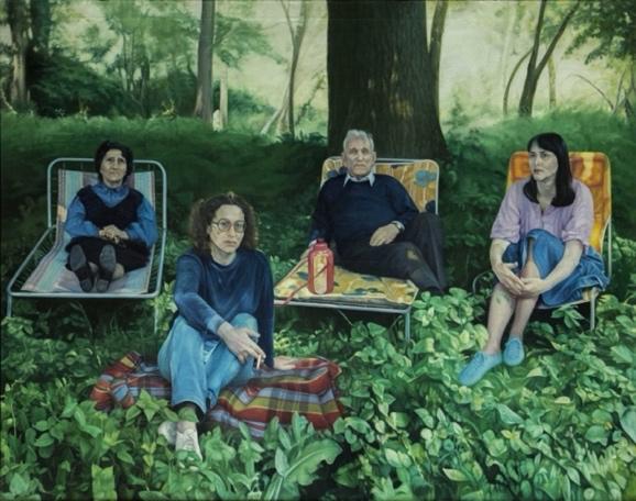
“Obitelj u Jakovlju” by the Croatian artist Jadranka Fatur, is an oil painting which contains four people sitting in the forest on deckchairs all looking towards the viewer. The direct eye contact between the subject and the viewer creates a sense of intimacy and invites the viewer in. Despite being located within the woods there is still a strong sense of homeliness and connection between the subjects of the painting. I think that visually this painting is very captivating, and that the viewer feels a part of the family. This captures a very different side to the theme of domesticity as it shows the human side of this theme. Looking at the theme of domesticity based on connection rather than the simple location. The inclusion of voices from around the world makes the exhibition more interesting as it allows for more experiences and perspectives to be shown. There is also beauty to the realism of this painting and the depth of the connection this creates.
Figure 6 - Fatur, Obitelj u Jakovlju, 1985 - 1987

This painting depicts two women sitting sewing in the shade underneath a tree in dappled sunlight The strong silhouette and dark outline of the tree helps to frame the women withing the painting and makes them the clear focal point. This painting contrasts with the other works slightly due to its more muted colours, but I don’t think this works against the painting but works to add another layer of depth to it. The muted tones of this painting give a softness to the women. There is a warmth of friendship as the women sit together and sew. This captures the essence of the time from the style of painting to the clothing and actions they are taking. Providing a perspective of the domestic life from the 17th century.
Figure 7 - John Lavery, Sewing in the Shade, 1884
Oil on canvas, 91.4 x 71.1 cm

Acrylic on canvas,
This is one of my paintings which I think would work well complementing the other paintings in this exhibition. The painting shows an elderly man (my grandad) sitting on a sofa stooped over. The bright red top leads the viewer’s eye to the subject and contrasts with the white lilies sitting on the table. A pen and iPad can also be seen in his hands, giving context of time for this painting and giving a glimpse into the future. For me, this represents the feeling of watching the people you love grow old, stooping and losing parts of who they once were. To the viewer, they may only see the old man in this domestic setting and feel the serenity of the scene. I welcome the viewer to interpret the work for themselves and create their own attachments to it. I also thought fit to include myself as a young and inexperienced artist. I think there is a critical importance of allowing new voices into the art world and creating space for new perspectives. This painting links very strongly with the theme and has a complimentary look to the other artwork so I believe it is curatorially a good choice.
Figure 8 - Sophie Donald, Grandad, 2024

Oil on canvas, 128.3 x 187.9 cm
“The Dining Room” is a vibrant and soft image depicting two women at a table. In front of them is a door leading to a vivid garden. Fruit and various other items across the table make the room feel lived in as if the viewer is peaking into these people’s daily lives. These bright colours combined with the more traditional depiction of the domestic create a nice transition between the older paintings in this exhibition and the newer paintings. This painting follows on from a previous painting of Bonnard’s painted years before which was set in the same room. The paintings together create the image of life flying by (Bonnard and André Fermigier, 1969). Despite my fondness of these two paintings linking with each other and creating a larger narrative, I think this painting works beautifully on its own. In this context, I believe “Dining Room in the Country” would not add enough to this painting to justify having it in place of one of the other artworks which I have selected.
Figure 9 - Pierre Bonnard, The Dining Room, 1925

10 - Gerolamo Induno, La partenza del garibaldino, 1860
Oil on canvas, 59.8 x 45.3 cm
This painting shows a woman saying goodbye to her son who is leaving for the Garibaldi expedition. This painting shows a heartfelt moment of a man leaving the domestic life he has known goodbye. The brightness of this painting gives warmth to the scene and conveys the comfort of this space. The look of sadness on the boy’s face adds a heartbreaking element and makes the painting emotive. I think this painting works well with the other paintings in this exhibition as the brightness of this work is more harmonic with the vibrancy of the more modern works. This painting also looks at the domestic scene from a new angle, the loss of this comfort. This is a work I saw in Gallerie d'Italia of Piazza Scala, Milan and was drawn to the intensity of the moment. Even with its smaller size, this painting has a significant impact against the larger works in the same room.
Figure

Oil on canvas, 150x 170cm
This artwork by Nina Raber-Urgessa works beautifully within this collection of paintings as it provides a unique representation of domesticity. The dramatic pose of the woman in this painting serves to represent the way in which woman must contort themselves to fit the box of domesticity that the world expects them to fit inside. This painting is also visually very different to the others in this collection, something which I think makes this image even more impactful within this collection. A modern and intriguing take on domesticity. Although this painting depicts the hardships of being a modern woman, this painting will be grouped with the contemporary works. It will be grouped with these as on the surface it does not look gloomy as the others do and the female expression of hardships within this environment is a contemporary view on this space.
Figure 11 Nina Raber Urgessa, Terepeza, 2022

‘Study of a room’ is comforting work which presents a soft simple presentation of the domestic space. The hidden faces of the figures within this painting provides them with privacy and represents the sanctity of the home environment and shows the domestic as a non-gendered space that belongs to us all (Rose Pickering, 2023). I think this representation is a simple but impactful in its imagery and allows us to see ourselves withing the space.
Figure 12 - Gori Mora, Study of a room, 2021
Oil on Perspex, 120 x 110 cm

Oil on canvas, 116.2 cm × 90 cm
This painting gives the viewer a glimpse into an idealised family lifestyle where the people at the table although presented with an extensive feast, look joyfully at one another instead. This painting adds a certain warmth to some of the older paintings in this collection and creates a segway between the more sterile classical depictions of the domestic and some of the more intimate depictions in modern works. This painting conveys the sense that the people are the important element of the domestic scene and possesses a warmth shown by this family’s affection for each other. This painting also depicts a very traditional domestic scene in which the woman cooks, and the man sits head of the table.
Figure 13 - Norman Rockwell, Freedom from Want, 1943

Oil on canvas, 35.5 x 45.5cm
This painting shows a tenderness and presents this mother and child through the gaze of a husband and father. In this painting there is emotion in the tenderness that the artist feels when he looks at his family. The light flowing in from the window highlights the subjects and creates a glow against the background drawing attention to the subjects and highlighting them as the key element in this domestic scene. This painting works well within this collection as it carries this softness and homely feel that some of the other paintings within this collection have. This warmth also contrasts with some of the more negative representations of the domestic space.
Figure 14 - Viggo Pedersen, Sunshine in the Living Room. The Artist’s Wife and Child, 1888

Oil on canvas, 92.4 × 73.7 cm
This painting presents us with a very traditional representation of the domestic, with the woman being the key adult in child rearing There is an intimacy in this painting which makes the viewer feel connected to this scene. There is a tender connection between the mother and the children in this painting which expresses the maternal love and the emotional bond between the subjects. This representation of women as caregivers was progressive as the art scene of this time was largely male dominated and so Cassatt’s paintings were not only a departure from the norms in the artworld at the time but also a fresh representation of women I art. The style of this painting has a very soft appearance and has the same delicate nature as some of the older works in this collection which I think makes it fit nicely with the collection.
Figure 15 - Mary Cassatt, Young Mother and Two Children, 1908

Oil on canvas, 35.5x 61cm
This painting shows a few maids in the kitchen undertaking domestic duties. This painting provides this exhibition with the perspective of the non-idealised domestic life, one of which these women do not find the same comfort. Including a work in this collection which isn’t distinctly positive or negative adds an interesting element in which the viewer is given the opportunity to decide for themselves. I think amongst this collection this painting carries a more saddened feeling as you see an image of the ones who keep the idealised life running for the more fortunate.
Figure 16 - George Henry Wimpenny, Chatham’s Kitchen, 1921

Oil on canvas, 82 x 114cm
This painting adds to this collection a glimpse into the domestic of those living in poverty and contrasts with those typically depicted in paintings. In this painting Van Gogh chose to paint this complex composition to prove himself as a figure painter (Van Gogh Museum, 2019). Although some of the proportions in this painting are off the message being this painting and the subject matter is the more important element. The dim lighting of this painting pairs with the subject matter to create a melancholic mood. Van Gogh has used earthy tones within this work to create a tension and to reflect the labour the individuals partake in to survive. The single light source within the room creates an intense lighting and harsh shadows on the subjects’ faces, intensifying the overall mood of the painting.
Figure 17 - Vincent van Gogh, The Potato Eaters, 1885

Oil on canvas, 60 x 88.5cm
This painting brings a more sombre perspective to the exhibition as it explores the pains that can occur within the domestic scene. These darker subjects within some of the domestic paintings are imperative as they bring an interesting change of emotion. There is beauty in this painting coming from something negative as it emphasises the point that there cannot be beauty without pain. This painting was created around the time Munch transitioned from his impressionist work to a more personal style, exploring his own experience and sorrows (Edvard Munch, no date). This painting depicts his older sister who died at the age of 15 from tuberculosis (The Sick Child (Munch), 2020). The composition of this painting and the pose of the women portray a deep sense of grief.
Figure 18 - Edvard Munch, The Sick Child, 1885-1886
Chapter 3
An exhibition that I admired was an exhibition of John Lavery’s work which was held at the Royal Scottish Academy (2024). This exhibition displayed works created by Lavery throughout his life, from works from his travels to society paintings. Professor Kenneth McConkey curated this solo exhibition, which shows a wide array of paintings from throughout Lavery’s life. I wanted to talk about this exhibition because, for many reasons, I feel this was a very successful exhibition, and I feel some elements can be taken from it. One element of this exhibition which I admired for these works was the colouring of the walls. The bright colours of the walls helped the muted paintings to stand out, especially with the golden frames. This really highlighted each of the works and created some cohesion in each room. The different colours in each room also served to highlight each different grouping of paintings. Although the subject matter was already different, I think this worked to break up the exhibition and set the tone for each room. Overall, I think this made the exhibition more engaging, and I admired this element.
The next element of this exhibition I noted my liking for, although not able to be applied to my exhibition, is that the paintings shared a style of frame, creating unity throughout the entire exhibition. This would not have the same effect if I were to use this within my own exhibition as the works are not only from very different times but also not by the same artist as in this exhibition, which would mean that the same frame for all paintings would not suit all the paintings. This exhibition also presented Lavery’s development as an artist through the years and introduced the viewers to the places in which he found inspiration. In this sense, the show had a strong narrative and was very successful. I really appreciated the thought put into the context of the work and artist when choosing a location. I think the location of this exhibition was fitting for his work as Lavery often painted high society, so his works and their subject matter feel very at home in this space. This exhibition being held in Scotland was fitting as although an Irish man himself, he is occasionally referred to as the ‘Belfastborn Glasgow Boy’3 (Mitchelson, 2012) and studied in Glasgow, with a significant amount of his time spent there between 1885 and 1896. As a viewer myself, I found this exhibition very
3 The Glasgow Boys were a group of artists in the late 19th century that represented the beginnings of modernism in Scottish painting
successful in its engagement and flow. It gave the viewers a beautiful display of the work and life and, most importantly, a glimpse into John Lavery’s view of the world.
Another exhibition I thought to be very successful was National Treasures: Artemisia in Birmingham: Jesse Jones: Mirror Martyr Mirror Moon (2024). This exhibition holds the painting Self Portrait as Saint Catherine of Alexandria (Gentileschi, 1615), which is surrounded by a solo exhibition in response to this painting created by Jesse Jones. This exhibition is displayed in a dark room with spotlighting shining on the artworks. The extreme lighting works extremely well to remove all external factors and concentrate the viewers' focus upon the artworks. Despite the successful nature of this exhibition, what I gained from looking into this exhibition was what wouldn’t work for my own due to the darkness of the room, all detail apart from the artworks lit by the spotlights was erased.
An exhibition which I felt to be less successful would be a show in which my own work was displayed. Although I enjoyed the collection of works that had been gathered, I felt a distinct lack of thought was put into how the works were displayed, particularly in the display of my own work, which happened to be a smaller work. This work was hung very high, with the top of the painting at the same height as the larger works, which made it harder to view. This also resulted in the painting looking slightly out of place and took away from the painting overall. Taking from this, I considered the display of the paintings in this exhibition in the context of each other and the space they were in. This exhibition was small and not funded, so it cannot be too heavily criticised for this, but another element which could have been improved was the lighting. This made me more confident of my choice to use the spotlights on the paintings as this meant that each work would have adequate lighting and help the focus be held on each painting.
Upon reading Exhibition Design by David Dernie, one of the elements that struck me was the discussion of narrative within an exhibition. In this text, Dernie states that a poorly ordered exhibition can reduce its effectiveness and clarity (Dernie, 2007). At first, I was unsure whether my exhibition held a narrative and whether this would be able to be applied to it. However, I saw that grouping the works somewhat thematically in my own exhibition rather than focusing on a chronological arrangement possessed the same ideology. This helped me to analyse the order in which the paintings would be shown and consider the way in which
this could improve the viewing experience of my viewers and make this exhibition more appealing to my target audience.
Along with this exhibition, I would like to run a series of events; this would not only boost coverage but also make it more accessible to those who are usually less able to experience the art world. A part of this would be inviting and supplying transport for students from schools in more disadvantaged areas to the exhibition. For this element of the exhibition, I would reach out to outreach programs targeted explicitly towards introducing less advantaged individuals to the arts for funding. In the same vein, this is why it is crucial that this exhibition is free entry as this would allow cheap outings for other schools or institutions this program may not have reached. It is imperative to introduce the younger generations to the art world, and I would like this exhibition to be one that makes all feel welcome. This exhibition would also work well as a travelling exhibition which visited locations accessible to more rural communities.
For the display of this exhibition, I thought it important for the paintings to not be crowded and for them to have their own space. This is a crucial element as this allows the viewers to give their attention to each painting and not be distracted or overwhelmed. The distance between the artworks and the density sets the pace of the exhibition. As my target audience for this exhibition is those perhaps less experienced in the art world, I would like for the pace of this exhibition to be relatively slow to give opportunity for each work to be lingered on and appreciated. The spotlight lighting within the modern one also helps towards this, giving individual attention to each work and providing each with adequate light for viewing4. I do not want to change this lighting for the exhibition as I feel the current lighting works perfectly for this collection. Intense lighting, such as in Jesse Jones exhibition (National Treasures: Artemisia in Birmingham: Jesse Jones: Mirror Martyr Mirror Moon - Exhibition, 2024) would not work for this exhibition as it poses the risk of not only taking away from the paintings but also sterilising the rooms and taking the house like elements away from the rooms
Due to the accessible nature of this exhibition all labels will be hung at an accessible height so they can be easily read by all. I also want for plain language and easy read versions of all print to be provided to make the written element of this exhibition more suitable. This will also be paired with QR codes around the exhibition which will provide an audio guide for
4 Lighting features mentioned here can be seen in Figure 20
visitors. With this exhibition being small, it will be kept on one level of the gallery which also aids the goal of accessibility.
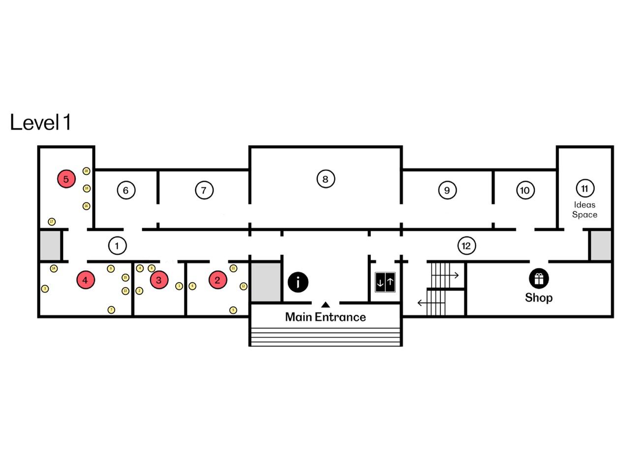
For their display the paintings will be separated into a few groups, contemporary, traditional and those of negative depictions. I have chosen for the contemporary artworks to be displayed together as I feel they harmonise well due to their more modern style of painting. which will allow the rooms in this exhibition to hold contrast. I have also chosen to group the paintings with more traditional representations of domesticity as I feel they link with each other and feel fitting in the same room. The more negative images related to the domestic exploring the pain that can be had here, and the loss that occurs in the domestic space will be the final grouping. I wanted this in a separate grouping to create a full room contrast from the last. I felt that separating the works this way could result in the individual rooms of this exhibition to feel more unified. The individual unity of each room also serves to make each room hold its own feel and interest and creates contrast with the other rooms, making each feel more unique and interesting for the viewers. The contemporary works have been separated into two rooms in order to give each painting space. I want this exhibition to begin in room 2 and 3 (Figure 19) with the contemporary works as they have the potential to connect most with the viewers as they can relate to the elements more relevant to themselves. I would then like for the show to move onto the traditional depictions in room 4 (Figure 19) and then finish with the works that have a negative interpretation of the theme held in room 5. I would like for these painting to be last as I feel their contrast from all the images already seen in the exhibition will emphasise their impact.


Figure 20
Figure 21
Figures 20 and 21 show the first room of the exhibition5 . Each painting has been given adequate room to prevent the room from feeling to crowded. This selection works well together due to their style, and they work to captivate the viewers and begin this exhibition. I have chosen to colour the walls of each room with a colour which compliments the paintings and the emotion of the room. Along with the tones and colourings of each painting I have also considered what each colour will evoke. This works to separate each room from one another and helps to set the tone of the room. I have also chosen the colours of the different rooms so that they connect with one another to link and unify the exhibition. For this first room I chose a light orange colour, this works not only to add warmth to the room and make it less sterile but is also a joyful colour (Faber Birren, 1978, pp. 121). The colour works to make the paintings more prominent within the room as the orange contrasts with the purple and blues in the paintings.


The next room within the exhibition, labelled as room 3 (Figure 19), the walls will be painted with a light blue colour and this room will hold the remainder of the contemporary paintings. This room has grouped the paintings shown (Figure 22 and 23) as they are very complimentary with one another, in contrast to the other contemporary works, these images display the comforts and safety we find in our homes. The inclusion of the smaller paintings in the centre of the room helps to lead the viewer around the room. The room is painted in a shade of blue as there is a softness to this shade which I think differentiates it from the colour
5 Shown as Room 2 in Figure 19 of the floorplan
Figure 22
Figure 23
found in room 4 (Figure 24). The blue colour of the walls creates a calm energy within this room. This room naturally progresses from the first room as the paintings depict a more literal take on the theme of the domestic and offers a transition between the contemporary works and the works which capture traditional views on the domestic.

24

The thir room of this exhibtiion will be filled with the paintings which I felt portrayed a more traditional representation of the domestic. The blue colour convays a sense of serenity and this deeper tone corresponds with a more regal and classical aura. Along with the frames of these works, the colour of the walls help to excentuate the paintings and make them more visually impactful. The decision was made to place painting 3 (Figure 3) in this room as dispite it being a painting some would consider to be within the contemporary art movement, it links with the traditioal views depicted within this room.

Figure
Figure 25
Figure 26
In the final room I have placed the more negative images relating to the domestic. To match the more solum feelings of the paintings in this room I have chosen a brown/grey colour as this muted tone sets the mood of this room. Brown is also thought to be a colour representing security (Faber Birren, 1978, pp. 116) which despite the more saddened tone of these paintings, the domestic is still a place in which these people are finding solace. Another reason I chose this colour is due to its yellow undertones which links this room to the first in the exhibition and helps for the exhibition to be more unified.
Conclusion
In this dissertation I have proposed the exhibition “Domesticity: Perspectives on Home- Past, Present and Hardships” which will explore an array of perceptions of the domestic scene through the lenses of these artists. The collection of art works from different periods create a dialogue between the past and present. These artworks present the domestic within its many forms and display the way in which our views on this space and how we chose to represent it, have evolved over time. Through this selection of 18 paintings the viewer is invited to engage with this layered presentation of views and experiences and reflect upon their own. This exhibition centres its goals around accessibility and inclusion thus creating an inviting space in which all are welcome. The use of colour within the exhibition space has also been discussed as a curational choice which contributes strongly to the effectiveness of the exhibition.
While this exhibition focused solely on a limited collection of works, this exhibition is something that can be explored very deeply thematically. This can be explored in future exhibitions through a larger selection of works which would provide an expanded view on diverse views from around the world and throughout time.
Reference list
Bonnard, P. (1925) The Dining Room [Oil on canvas].
Bonnard, P. and André Fermigier (1969) Pierre Bonnard. Harry N Abrams Incorporated.
Casteel, J. (2014) Jordan Casteel, Jordan Casteel. Available at: http://www.jordancasteel.com/publication (Accessed: 8 November 2024).
Casteel, J. (2019) Kimmah [Oil on canvas].
Cutler-Bittner, J.B. (2020) Portraitist in the Moment, Fine Art Globe. Available at: https://fineartglobe.com/artists/portraitist -in-the-moment/.
Dernie, D. (2007) Exhibition Design. London: Laurence King Publishing.
Donald, S. (2024) Grandad [Acrylic on canvas ].
Edvard Munch (no date) www.nationalgalleries.org. Available at: https://www.nationalgalleries.org/art-and-artists/artists/edvard-munch.
Faber Birren (1978) Color & Human Response. John Wiley & Sons, pp. 116, 121.
Fatur, J. (1987) Obitelj u Jakovlju [Oil on canvas].
Gabisonia, N. (no date) Alejandra Hernández | English, Metal Magazine. Available at: https://metalmagazine.eu/en/post/alejandra -hernandez-with-lovefrom-colombia.
Gemima, C. (2023) Dog Days: an interview with painter Maud Madsen, Whitehot Magazine of Contemporary Art. Available at: https://whitehotmagazine.com/articles/interview -with-painter-maudmadsen/6111 (Accessed: 7 November 2024).
Gentileschi, A. (1615) Self Portrait as Saint Catherine of Alexandria [Oil on Canvas].
Green, M. (2022) Madelynn Green, Madelynn Green. Available at: http://www.madelynngreen.com (Accessed: 8 November 2024).
Green, M.M. (2022) Primetime.
Hernández, A. (2016) Las Tres Gracias [Oil on canvas].
Hockney, D. (1971) Mr and Mrs Clark and Percy [Acrylic on canvas].
La partenza del garibaldino di Gerolamo Induno - Finestre sull’Arte, podcast di storia dell’arte(2017) Finestresullarte.info. Available at: https://www.finestresullarte.info/operadelgiorno/2017/613 -gerolamo-induno-lapartenza-del-garibaldino.php (Accessed: 6 November 2024).
Lavery, J. (1884) Sewing in the shade [Oil on canvas].
Lavery, J. (2024) An Irish Impressionist | Lavery on Location [Exhibition]. Royal Scottish Academy, Edinburgh, Scotland. July 29 2024 – October 27, 2024.
Lesser, C. (2016) These 20 Female Artists Are Pushing Figurative Painting Forward, Artsy. Available at: https://www.artsy.net/article/artsy -editorial-these20-female-artists-are-pushing-figurative-painting-forward.
Lloyd, J. (2018) Virginia Woolf: An Exhibition Inspired By Her Writings, Studiointernational.com . Available at: https://www.studiointernational.com/virginia -woolf-an-exhibition-inspired-byher-writings-review-tate-st-ives (Accessed: 17 October 2024).
Madsen, M. (2022) Average [Acrylic on linen].
Martin Castillejos, A.M., Sofia Melero Tur and Isabel Morales Jareño (2024) ‘Challenging Domesticity:Disruptive Representations of Domesticity in Women’s Art, Literature and the Architecture during the 20th and 21st Century’, International Journal of English Studies, 24(1), pp. 153–170. Available at: https://doi.org/10.6018/ijes.532881.
MCA - Exhibitions | Museum of Contemporary Art Chicago (2020) Mcachicago.org. Available at: https://mcachicago.org/exhibitions/archive/2000 (Accessed: 16 October 2024).
Mitchelson, A. (2012) BBC - Your Paintings Blog: The Glasgow Boy from Belfast: Sir John Lavery (20 March 1856 - 10 January 1941), Bbc.co.uk. Available at: https://www.bbc.co.uk/blogs/yourpaintings/2012/08/the -glasgowboy-from-belfast-s.shtml (Accessed: 7 December 2024).
Muzej Suvremene Umjetnosti, Zagreb (2018) Potraga za stvarnošću –Jadranka Fatur i hiperrealno, Www.msu.hr. Available at: http://www.msu.hr/dogadanja/potraga-za-stvarnou jadranka-fatur-ihiperrealno/16/hr.html (Accessed: 8 November 2024).
National Treasures: Artemisia in Birmingham: Jesse Jones: Mirror Martyr Mirror Moon - Exhibition (2024) Ikon. Available at: https://www.ikongallery.org/exhibition/artemisia-in-birmingham
Rose Pickering (2023) Édouard Vuillard and the Context of Representing Domesticity, Unit London. Available at: https://unitlondon.com/2023-0502/edouard-vuillard-and-the-context-of-representing-domesticity/
San Francisco Museum of Modern Art (2021) Artist Talk: Jordan Casteel on Portraits, Process, and Social Landscapes, YouTube. Available at: https://www.youtube.com/watch?v=rPHw9T0fza8 (Accessed: 5 November 2024).
Scottish National Gallery of Modern Art | National Galleries of Scotland (2019) Nationalgalleries.org. Available at: https://www.nationalgalleries.org/visit/scottish -national-gallery-modern-art
Tate (2020) ‘Mr and Mrs Clark and Percy’, David Hockney, 1970-1 | Tate, Tate. Available at: https://www.tate.org.uk/art/artworks/hockney -mr-andmrs-clark-and-percy-t01269.
Tate (no date a) A Room of One’s Own – Display at Tate Britain, Tate. Available at: https://www.tate.org.uk/visit/tate -britain/display/historic-earlymodern-british-art/18911914 (Accessed: 30 October 2023).
Tate (no date b) Genre painting – Art Term, Tate. Available at: https://www.tate.org.uk/art/art-terms/g/genre-painting.
The Sick Child (Munch) (2020) Wikipedia. Available at: https://en.wikipedia.org/wiki/The_Sick_Child_(Munch) .
Van Gogh Museum (2019) The Potato Eaters, Vangoghmuseum.nl. Available at: https://www.vangoghmuseum.nl/en/collection/s0005V1962 .
ZEVITAS, S. (2022) STEVEN ZEVITAS GALLERY, STEVEN ZEVITAS GALLERY. Available at: https://www.stevenzevitasgallery.com/exhibitionsmain/youhadmeathello (Accessed: 8 November 2024)
Appendices - Exhibition model


