
Auction | Sydney | 7 May 2025


Auction | Sydney | 7 May 2025
Lots 1 – 76

Lots 1 – 76
Wednesday 7 May 7:00 pm
36 Gosbell Street Paddington, NSW telephone: 02 9287 0600
Tuesday 22 – Sunday 27 April 11:00 am – 6:00 pm Friday 25 April ANZAC Day 1:00 pm – 6:00 pm
105 Commercial Road South Yarra, VIC telephone: 03 9865 6333
Thursday 1 – Tuesday 6 May 11:00 am – 6:00 pm
36 Gosbell Street Paddington, NSW telephone: 02 9287 0600
email bids to: info@deutscherandhackett.com telephone: 02 9287 0600 fax: 02 9287 0600 telephone bid form – p. 196 absentee bid form – p. 197
www.deutscherandhackett.com/watch-live-auction
www.deutscherandhackett.com | info@deutscherandhackett.com


Chris Deutscher
Executive Director — Melbourne
Chris is a graduate of Melbourne University and has over 40 years art dealing, auction and valuation experience as Director of Deutscher Fine Art and subsequently as co-founder and Executive Director of Deutscher~Menzies. He has extensively advised private, corporate and museum art collections and been responsible for numerous Australian art publications and landmark exhibitions. He is also an approved valuer under the Cultural Gifts Program.
Fiona Hayward
Senior Art Specialist
After completing a Bachelor of Arts at Monash University, Fiona worked at Niagara Galleries in Melbourne, leaving to join the newly established Melbourne auction rooms of Christie’s in 1990, rising to become an Associate Director. In 2006, Fiona joined Sotheby’s International as a Senior Paintings Specialist and later Deputy Director. In 2009, Sotheby’s International left the Australian auction market and established a franchise agreement with Sotheby’s Australia, where Fiona remained until the end of 2019 as a Senior Specialist in Australian Art. At the end of the franchise agreement with Sotheby’s Australia, Smith & Singer was established where Fiona worked until the end of 2020.
Crispin Gutteridge
Head of Indigenous Art and Senior Art Specialist
Crispin holds a Bachelor of Arts (Visual Arts and History) from Monash University. In 1995, he began working for Sotheby’s Australia, where he became the representative for Aboriginal art in Melbourne. In 2006 Crispin joined Joel Fine Art as head of Aboriginal and Contemporary Art and later was appointed head of the Sydney office. He possesses extensive knowledge of Aboriginal art and has over 30 years’ experience in the Australian fine art auction market.
Alex Creswick
Managing Director / Head of Finance
With a Bachelor of Business Accounting at RMIT, Alex has almost 30 years’ experience within financial management roles. He has spent much of his early years within the corporate sector with companies such as IBM, Macquarie Bank and ANZ. With a strong passion for the arts Alex became the Financial Controller for Ross Mollison Group, a leading provider of marketing services to the performing arts, before joining D+H in 2011.
Annabel Lees
Front of House Manager – Melbourne
Annabel holds a Bachelor of Arts with a major in Art History from the University of Melbourne as well as years of professional experience in art sales and gallery administration. Prior to this role Annabel worked at artnet in London, focusing on client engagement and strategic partnerships.
Danny Kneebone
Design and Photography Manager
With over 25 years in the art auction industry as both photographer and designer. Danny was Art Director at Christie’s from 2000–2007, Bonham’s and Sotheby’s 2007–2009 and then Sotheby’s Australia from 2009–2020. Specialist in design, photography, colour management and print production from fine art to fine jewellery. Danny has won over 50 national and international awards for his photography work.


Damian Hackett
Executive Director — Sydney
Damian has over 30 years’ experience in public and commercial galleries and the fine art auction market. After completing a BA (Visual Arts) at the University of New England, he was Assistant Director of the Gold Coast City Art Gallery and in 1993 joined Rex Irwin Art Dealer, a leading commercial gallery in Sydney. In 2001, Damian moved into the fine art auction market as Head of Australian and International art for Phillips de Pury and Luxembourg, and from 2002 – 2006 was National Director of Deutscher~Menzies.
Henry Mulholland
Senior Art Specialist
Henry Mulholland is a graduate of the National Art School in Sydney, and has had a successful career as an exhibiting artist. Since 2000, Henry has also been a regular art critic on ABC Radio 702. He was artistic advisor to the Sydney Cricket Ground Trust Basil Sellers Sculpture Project, and since 2007 a regular feature of Sculpture by the Sea, leading tours for corporate stakeholders and conducting artist talks in Sydney, Tasmania and New Zealand. Prior to joining Deutscher and Hackett in 2013, Henry’s fine art consultancy provided a range of services, with a particular focus on collection management and acquiring artworks for clients on the secondary market.
Veronica Angelatos
Art Specialist and Senior Researcher
Veronica has a Master of Arts (Art Curatorship and Museum Management), together with a Bachelor of Arts/Law (Honours) and Diploma of Modern Languages from the University of Melbourne. She has strong curatorial and research expertise, having worked at various art museums including the Peggy Guggenheim Collection, Venice and National Gallery of Victoria, and more recently, in the commercial sphere as Senior Art Specialist at Deutscher~Menzies. She is also the author of numerous articles and publications on Australian and International Art.
Ella Perrottet
Senior Registrar
Ella has a Masters of Arts and Cultural Management (Collections and Curatorship) from Deakin University together with a Bachelor of Fine Art (Visual Art) from Monash University, and studied in both Melbourne and Italy. From 2014, Ella worked at Leonard Joel, Melbourne as an Art Assistant, researcher, writer and auctioneer, where she developed a particular interest in Australian women artists.
Eliza Burton
Registrar
Eliza has a Bachelor of Arts (English and Cultural Studies and History of Art) from the University of Western Australia and a Master of Art Curatorship from the University of Melbourne. She has experience in exhibition management, commercial sales, and arts writing through her work for Sculpture by the Sea and The Sheila Foundation.
Poppy Thomson Gallery Manager, Sydney
Poppy holds a Bachelor of Art History and Curatorship (Honours) from the Australian National University and has professional experience as a curator and research assistant. Prior to this role, she spent time in Paris after winning the 2023 Eloquence Art Prize, and now sits on the board of Culture Plus.

Chris Deutscher
Damian Hackett 0411 350 150 0422 811 034
Henry Mulholland Fiona Hayward 0424 487 738 0417 957 590
Crispin Gutteridge Veronica Angelatos 0411 883 052 0409 963 094
Administration and Accounts
Megan Mac Sweeney Poppy Thomson (Melbourne) (Sydney)
03 9865 6333 02 9287 0600
Absentee and Telephone Bids
Annabel Lees
03 9865 6333
Shipping
Ella Perrottet 03 9865 6333


Lot 21
Arthur Boyd
Sleeping bridegroom with red bouquet, 1961 – 62 (detail)
Roger McIlroy Head Auctioneer
Roger was the Chairman, Managing Director and auctioneer for Christie’s Australia and Asia from 1989 to 2006, having joined the firm in London in 1977. He presided over many significant auctions, including Alan Bond’s Dallhold Collection (1992) and The Harold E. Mertz Collection of Australian Art (2000). Since 2006, Roger has built a highly distinguished art consultancy in Australian and International works of art. Roger will continue to independently operate his privately-owned art dealing and consultancy business alongside his role at Deutscher and Hackett.
Scott Livesey Auctioneer
Scott Livesey began his career in fine art with Leonard Joel Auctions from 1988 to 1994 before moving to Sotheby’s Australia in 1994, as auctioneer and specialist in Australian Art. Scott founded his eponymous gallery in 2000, which represents both emerging and established contemporary Australian artists, and includes a regular exhibition program of indigenous Art. Along with running his contemporary art gallery, Scott has been an auctioneer for Deutscher and Hackett since 2010.


Lots 1 – 76 page 12
Prospective buyers and sellers guide page 192
Conditions of auction and sale page 194
Telephone bid form page 196
Absentee bid form page 197
Attendee pre-registration form page 198
Index page 210
alsoknownasTheshallows oiloncanvasonboard
38.0x49.5cm
signedlowerleft:C.Beckett
Estimate:$80,000–100,000
Provenance
Rosalind Humphries Galleries, Melbourne (label attached verso) Privatecollection, Melbourne Leonard Joel, Melbourne, 22 July 1987, lot 80 (as ‘The Shallows’) Privatecollection, Melbourne
Exhibited
Homage to Clarice Beckett (1887-1935): Idylls of Melbourne and Beaumaris, Rosalind Humphries Galleries, Melbourne, 12 November - 1 December 1972, cat. 61 (as ‘The shallows’)
Relatedworks
Bathingboxes,c.1932,oiloncanvasoncompositionboard, 51.2x59.2cm,inthecollectionoftheQueenslandArtGallery|Gallery ofModernArt,Brisbane Bathingboxes,c.1932,oiloncanvasonboard,45.0x55.0cm,private collection,illus.inHollinrake,R.,ClariceBeckett:PoliticallyIncorrect, TheIanPotterMuseum,UniversityofMelbourne,1999,p.69
WearegratefultoRosalindHollinrakeforherassistancewiththis catalogueentry.
This idyllic painting depicts a quiet corner of Beaumaris on Port Phillip Bay, a coastal suburb to the south of the city of Melbourne.
From the earliest days of colony, this bayside locale attracted pleasure seekers with the first public swimming baths dating from the 1840s. By the turn of the century, clusters of bathing boxes were built within the ti-tree scrub by private individuals, or to service the patrons of nearby guesthouses. In Bathing boxes, Beaumaris, c.1932, Clarice Beckett turns her gaze to one such group, most likely located in the cove of Watkins Bay, near where the artist lived. Beckett’s distinctive style is immediately recognisable and, when seen collectively, her paintings provide an unsurpassed record of the changing landscape of the region.
The artist was raised in Casterton in regional Victoria but the family often holidayed at Beaumaris. Her mother Kate ‘had taken sketching and painting classes and counted among her friends Walter Withers and Ola Cohn.’1 On their advice, she enrolled Clarice (and her sister Hilda) in the National Gallery School in 1914, studying under Frederick McCubbin. Inspired later by a lecture by the artist-theorist Max Meldrum, she joined his school for a year. Meldrum taught his own theory
of ‘optical science’ aka Tonalism, which, as its name implies, revolved around building an image based on tonal values alone. Although she remained within the Meldrumite orbit throughout her subsequent career, Beckett’s paintings were truly a combination of the Gallery School’s academic teaching, Tonalism – and herself. As her colleague Elizabeth Colquhoun noted, Beckett’s paintings were more ‘fragile’ than Mel drum’s. ‘It was a different kind of thing, but it was very truthful.’ 2
By the early 1930s, bathing huts could be found on all beaches in the area, sometimes two or three deep. With her handmade painting trolley in tow, Beckett would wander these areas repetitively, always approaching a scene with a different ambition as to the mood she wished to capture. Indeed, when asked why she never felt the desire to travel more widely, she responded ‘I have only just got the hang of painting Beaumaris after all these years, why should I go somewhere else strange to paint?’ 3 Significantly, Rosalind Hollinrake, the historian who ‘re-discovered’ Beckett, included a near identical painting in her landmark exhibition Clarice Beckett: politically incorrect in 1999, although the variant on offer departs from that composition in its inclusion of beachgoers wading in the shallows and empty fishing boats floating not far from shore. Present in both nevertheless is Beckett’s technique of putting ‘a bit of the colour of the object... into its shadow’, thus giving the whole ‘a greater luminosity.’4
Ultimately, this idyllic scene no longer remains. A huge storm in 1934 (also captured by Beckett in a memorable sequence of paintings) destroyed bathing boxes up and down the coast, most of which were not replaced. Bathing boxes, Beaumaris, therefore, remains as a significant memorial to the location, and to the artist herself.
1. Hollinrake, R., ‘Painting against the tide’, The Age, Melbourne, 3 April 1985, p. 16
2. Elizabeth Colquhoun, cited in Peers, J., More than just gumtrees: a personal, social and artistic history of the Melbourne Society of Women Painters and Sculptors, Dawn Revival Press, Melbourne, 1993, p. 197
3. Clarice Beckett, cited in Hollinrake, R., Clarice Beckett: the artist and her circle, Macmillan, Melbourne, 1979, p. 21
4. Clarice Beckett, cited in Hollinrake, ibid., p. 26 Andrew Gaynor

also known as Ricketts Point oil on canvas on board
37.0 x 45.0 cm
inscribed verso by Max Meldrum: B
Estimate: $60,000 – 80,000
Provenance
Probably: Rosalind Humphries Galleries, Melbourne
Private collection, Melbourne
Leonard Joel, Melbourne, 12 April 1989, lot 189 (as ‘Ricketts Point’)
Private collection, Melbourne
We are grateful to Rosalind Hollinrake for her assistance with this catalogue entry.
Clarice Beckett is one of Australia’s most revered early modernists. After decades of neglect, her posthumous reputation has increased exponentially following a series of important retrospectives organised by Rosalind Hollinrake during the early 1970s, and despite no purchases of her paintings by any state gallery during Beckett’s short life, there is none that does not now proudly own examples of her work. Beckett’s images are immediately recognisable and are distinguished by the familiarity of the locations depicted – be it the city of Melbourne, the beach at Anglesea, the sun-drenched plains of the Western Districts, or, in the case of Foreshore and figures, the shoreline of Port Phillip Bay near the artist’s home in Dalgetty Street, Beaumaris. The freshness of Foreshore and figures is implicitly tied to its plein air execution, but the strength of its compositional design, colour and tonal accuracy is underpinned by Beckett’s continuous scrutiny of her neighbourhood.
Beckett’s skills as an artist were evident from an early age, however due to the intransigence of her domineering father, she was unable to commence any formal studies until she was twentyseven. Starting at the National Gallery School in Melbourne, she subsequently undertook nine months of study in 1917 with the tonalist Max Meldrum, who taught his own theory known as the ‘Science of Appearances.’ Beckett’s colleague Colin Colahan edited a book on Meldrum’s lectures in 1919 with a key statement being that ‘tone and proportion gives us what is generally called ‘a perfect work of art’, without any relation to the actual amount of time which the Artist has bestowed upon his picture. Colour is the third and least important factor in depictive art.’ 1
Meldrum stressed the importance of close observation but also celebrated individual interpretation based on his teaching, and Beckett soon became one of his star pupils with Meldrum publicly noting that she was (almost) as good as him. This was faint praise as her combined talents also reveal a deep sense of poetry and Theosophical thought leading to her work that arguably surpasses that of her teacher. Beckett’s paintings sparkle with light and colour, and in 1930, she noted that ‘you always put a bit of the colour of the object you’re painting into its shadow, as it gives a greater luminosity’ 2, a technique clearly seen in Foreshore and figures, where the shadows of the titrees and shrubs contain tones of blue and apricot. There is an emphatic directness to the scene and crucially, the addition of the single patch of red for the woman’s dress provides a weighted visual counterpoint to the rest of the composition –indeed, it is as if the whole scene revolves around this one colour, a strategy that would have infuriated Meldrum. Defiantly her own artist, similar tactics may be observed in other key works by Beckett such as The red bus (private collection) and Walking home, c.1931 (Art Gallery of South Australia).
1. Meldrum, M.,
2.
Andrew Gaynor
of

colour linocut on paper
21.0 x 29.0 cm (image)
24.0 x 33.0 cm (sheet)
edition: 2/50
inscribed with title and numbered lower left: Tug of War 2/50 signed and dated lower right: E. L. Spowers 1933
Estimate: $30,000 – 40,000
Private collection
Deutscher Fine Art, Melbourne
Private collection, Melbourne
Exhibited
Colour Prints and Contemporary Oils, Redfern Gallery, London, 1 June – 29 July 1933, cat. 34 (another example)
Contemporary Group Exhibition, Farmer’s Blaxland Galleries, Sydney, 24 October – 4 November 1933, cat. 84 (another example)
Exhibition of Pictures by Ethel Spowers, Everyman’s Library, Melbourne, 28 November – 9 December 1933, cat. 20 (another example)
Lino–Cuts 1936, Ward Gallery, London, 10 June – 8 July 1936, cat. 48 (another example)
Exhibition of Colour Prints and Water Colours by Ethel Spowers, Grosvenor Galleries, Sydney, 10 – 25 July 1936, cat. 11 (another example)
Exhibition of Modern Lino–Cuts, City of Birmingham Museum and Art Gallery, Birmingham, 30 March – 19 April 1939, cat. 127 (another example)
French and English Colour Prints, Redfern Gallery, London, 29 November – 30 December 1939, cat. 141 (another example)
A Survey of Australian Relief Prints 1900/1950, Deutscher Galleries, Melbourne, 13 April – 5 May 1978, cat. 167 (illus. in exhibition catalogue, p. 86)
Melbourne Woodcuts and Linocuts of the 1920’s and 1930’s, Ballarat Fine Art Gallery, Victoria, then touring to: University Art Museum, Queensland; Newcastle Regional Gallery, New South Wales; McClelland Gallery, Victoria; and Victorian College of the Arts, Melbourne, 1981 (illus. in exhibition catalogue, n.p., another example)
Claude Flight and his Followers: The Colour Linocut Movement between the Wars, Australian National Gallery, Canberra, 18 April – 12 July 1992; Art Gallery of New South Wales, Sydney, 14 October – 29 November 1992; National Gallery of Victoria, Melbourne, 16 December 1992 – 1 March 1993; National Art Gallery, Wellington, 19 March – 16 May 1993 and Auckland City Art Gallery,
Auckland, 3 June – 18 July 1993, cat. 86 (another example)
Spowers & Syme, Canberra Museum and Art Gallery in association with the National Gallery of Australia, Canberra, 13 August 2021 – 12 February 2022, then touring to: Western Plains Cultural Centre, New South Wales, 26 February – 29 May 2022; Geelong Gallery, Victoria, 16 July – 16 October 2022; S.H. Ervin Gallery, Sydney, 3 December 2022 – 12 February 2023; and QUT Art Museum, Brisbane, 11 March – 4 June 2023 (another example)
Literature
‘Colour Prints and Paintings. Measure of a Medium’, The Morning Post, London, 3 June 1933, p. 6 (another example)
Streeton, A., ‘Prints and Paintings. Three New Shows. Miss Spowers’s Art’, The Argus, Melbourne, 28 November 1933, p. 9 (another example)
Coppel, S., Claude Flight and His Followers: The Colour Linocut Movement between the Wars, Australian National Gallery, Canberra, 1992, p. 21 (another example)
Coppel, S., Lino Cuts of the Machine Age: Claude Flight and the Grosvenor School, Scholar Press, Leicester, United Kingdom, in association with National Gallery of Australia, Canberra, 1995, cat. ES25, pp. 174, 175 (illus., another example)
Noordhuis–Fairfax, S. (ed.), Spowers & Syme, National Gallery of Australia, Canberra, 2021, pp. 81, 92 (another example)
Related work
Another example of this print is held in the collection of the National Gallery of Australia, Canberra

colour linocut on paper
19.5 x 13.0 cm (image)
25.0 x 16.0 cm (sheet)
edition: 1/50
signed, numbered and inscribed with title below image: The Lawn Mower 1/50 Dorrit Black.
Estimate: $30,000 – 40,000
Private collection
Deutscher Fine Art, Melbourne
Private collection, Melbourne, acquired from the above in April 1986
Exhibited
Exhibition of Linocuts, Everyman’s Lending Library, Melbourne, 5 – 16 April 1932, cat. 2 (another example)
Fourth Exhibition of British Lino–cuts, Ward Gallery, London, 17 May – 10 June 1933, cat. 44 (another example)
British Lino–cuts (Mostly in Colour), Hastings Public Museum and Art Gallery, Sussex, 9 May – 9 June 1936, cat. 54 (another example)
The Drawing, Print and Watercolour Exhibition, Contemporary Art Society of South Australia, Adelaide, opened 2 December 1952, cat. 2 (another example)
Dorrit Black 1891 – 1951, Art Gallery of South Australia, Adelaide, then touring to: Art Gallery of New South Wales, Sydney; Newcastle Region Art Gallery, New South Wales; The Ewing and George Paton Galleries, University of Melbourne, Melbourne, 1975 – 76, cat. 56 (another example)
Colour Linocuts from the Grosvenor School, The Ward Gallery, Sydney, 26 March – 19 April 1980, cat. 42 (another example)
Australian Art, Colonial to Modern, Deutscher Fine Art, Melbourne, 9 – 25 April 1986, cat. 85 (illus. in exhibition catalogue)
Claude Flight and his Followers: The Colour Linocut Movement between the Wars, Australian National Gallery, Canberra, 18 April – 12 July 1992, then touring to: Art Gallery of New South Wales, Sydney, 14 October – 29 November 1992; National Gallery of Victoria, Melbourne, 16 December 1992 – 1 March 1993; National Art Gallery, Wellington, 19 March – 16 May 1993; and Auckland City Art Gallery, New Zealand, 3 June – 18 July 1993, cat. 22 (another example)
The Dorrit Black Collection, Josef Lebovic Gallery, Sydney, 17 April – 29 May 1999, cat. 10A
Dorrit Black: Unseen Forces, Art Gallery of South Australia, Adelaide, 14 June – 7 September 2014 (another example)
Cutting Edge: Modernist British Printmaking, Dulwich Picture Gallery, London, 19 June – 8 September 2019 (another example)
Literature
Young, E., ‘Contemporary Art Society Exhibition’, The Advertiser, Adelaide, 2 December 1952, p. 9
North, I., The Art of Dorrit Black, MacMillan and Art Gallery of South Australia, Adelaide, 1979, cat. L17, pl. 23, pp. 59, 60 (illus., another example), 131
Coppel, S., Lino Cuts of the Machine Age: Claude Flight and the Grosvenor School, Scholar Press, Leicester, United Kingdom, in association with National Gallery of Australia, Canberra, 1995, cat. DB18, pp. 156, 157 (illus., another example)
Lock–Weir, T., Dorrit Black. Unseen Forces, Art Gallery of South Australia, Adelaide, 2014, pp. 156, 157 (illus., another example), 202 (illus., another example)
Samuel, G., et al., Cutting Edge: Modernist British Printmaking, Dulwich Picture Gallery, London, 2019, pp. 73, 74 (illus., another example)
Related works
Other examples of this print are held in the collections of the National Gallery of Australia, Canberra, and the Art Gallery of South Australia, Adelaide
The Lawn Mower, c.1932, printed in black, 6.9 x 10.0 cm, in the collection of the National Gallery of Australia, Canberra Study for linocut ‘The lawn mower’, 1931 – 32, gouache, pencil, linocut on paper, 19.7 x 13.0 cm, in the collection of the Art Gallery of South Australia, Adelaide

Dutch houses, c.1929
colour linocut on paper
27.5 x 20.5 cm (image)
29.0 x 25.0 cm (sheet)
proof aside from the edition of 50 bears inscription in margin: DUTCH HOUSES L10
Estimate: $15,000 – 20,000
Provenance
Private collection, Adelaide Josef Lebovic Gallery, Sydney
The Estate of James O. Fairfax AC, New South Wales, acquired from the above in 1999
Deutscher and Hackett, Sydney, 30 August 2017, lot 37
Private collection, Melbourne
Exhibited
British Lino–cuts, Redfern Gallery, London, 23 July – 23 August 1930, cat. 78 (another example)
Paintings by Dorrit Black, Macquarie Galleries, Sydney, 10 – 20 September 1930, cat. 30 (another example)
British Lino–cuts, Shanghai Art Club, Shanghai, 2 – 4 May 1931, cat. 60 (another example)
Dorrit Black, Royal South Australian Society of Arts, Adelaide, 25 October – 3 November 1945, cat. 60 (another example)
25th Anniversary Exhibition, Hahndorf Academy Gallery, Adelaide, 1981, cat. 17 (another example)
Claude Flight and his Followers: The Colour Linocut Movement between the Wars, Australian National Gallery, Canberra, 18 April –12 July 1992, then touring to: Art Gallery of New South Wales, Sydney, 14 October – 29 November 1992; National Gallery of Victoria, Melbourne, 16 December 1992 – 1 March 1993; National Art Gallery, Wellington, 19 March – 16 May 1993; and Auckland City Art Gallery, New Zealand, 3 June – 18 July 1993, cat. 20 (another example)
The Dorrit Black Collection, Josef Lebovic Gallery, Sydney, 17 April – 29 May 1999, cat. 7
Graphica Britannica, Christchurch Art Gallery Te Puna o Waiwhetū, New Zealand, 13 May 2005 – 8 October 2006 (another example)
Dorrit Black: Unseen Forces, Art Gallery of South Australia, Adelaide, 14 June – 7 September 2014 (another example)
In Modern Times, Christchurch Art Gallery Te Puna o Waiwhetū, New Zealand, 18 December 2015 – 11 September 2016 (another example)
One O’Clock Jump: British Linocuts from the Jazz Age, Christchurch Art Gallery Te Puna o Waiwhetū, New Zealand, 7 December 2024 – 11 May 2025 (another example)
Literature
‘Art & linoleum cut out pictures with umbrella ribs’, Sun, Sydney, 16 March 1930, p. 8 (illus., another example, incorrectly titled)
Flight, C., The Art and Craft of Lino Cutting and Printing, B. T. Batsford Ltd, London, 1934, pl. XII, no. 10, p. 61 (illus.)
North, I., The Art of Dorrit Black, MacMillan and Art Gallery of South Australia, 1979, cat. L10, pl. 9, pp. 39 (illus., another example) 41, 131
Coppel, S., Lino Cuts of the Machine Age: Claude Flight and the Grosvenor School, Scholar Press, Leicester, United Kingdom, in association with National Gallery of Australia, Canberra, 1995, cat. DB8, p. 154 (illus., another example)
Lock–Weir, T., Dorrit Black. Unseen Forces, Art Gallery of South Australia, Adelaide, 2014, pp. 52, 55 (illus., another example), 200 (illus., another example)
Related works
Other examples of this print are held in the collections of the Christchurch Art Gallery Te Puna o Waiwhetū, New Zealand, and Auckland Art Gallery Toi o Tāmaki, New Zealand

The rain cloud, 1931
colour linocut on paper
20.5 x 26.5 cm (image)
23.0 x 30.0 cm (sheet)
edition: 5/30
signed, dated, inscribed with title and numbered below image: The Rain Cloud 5/30 E. L. Spowers – 1931
Estimate: $25,000 – 35,000
Provenance
Private collection
Deutscher Fine Art, Melbourne
Private collection, Melbourne, acquired from the above in November 1984
Exhibited
Exhibition of ... Progressive Art, Modern Art Centre, Sydney, 1 March – 1 April 1932, cat. 40 (another example)
Exhibition of Linocuts, Everyman’s Lending Library, Melbourne, 5 – 16 April 1932, cat. 18 (another example)
Gladys Owen and Ethel Spowers, Grosvenor Galleries, Sydney, 6 – 31 December 1932, cat. 9 (another example)
Exhibition of Colour Prints and Water Colours by Ethel Spowers, Grosvenor Galleries, Sydney, 10 – 25 July 1936, cat. 4 (another example)
Australian Paintings, Colonial/Impressions/Early Modern, Deutscher Fine Art, Melbourne, 30 October – 16 November 1984, cat. 75 (illus. in exhibition catalogue)
Literature
‘Gladys Owen and Ethel Spowers. Lino–cuts, Wood–cuts, and Water Colours’, Sydney Morning Herald, Sydney, 6 December 1932, p. 4 (another example) Coppel, S., Lino Cuts of the Machine Age: Claude Flight and the Grosvenor School, Scholar Press, Leicester, United Kingdom, in association with National Gallery of Australia, Canberra, 1995, cat. ES16, p. 171 (illus., another example) Noordhuis–Fairfax, S. (ed.), Spowers & Syme, National Gallery of Australia, Canberra, 2021, p. 78 (another example)
Related work
Another example of this print is held in the collection of the National Gallery of Australia, Canberra

The Yarra at Warrandyte, 1931
colour linocut on paper
21.5 x 15.0 cm (image)
29.0 x 22.5 cm (sheet)
edition: 9/25
signed, dated, inscribed with title and numbered below image: The Yarra at Warrandyte 9/25 E W Syme 1931
Estimate: $6,000 – 9,000
Provenance
Private collection
Joseph Lebovic Gallery, Sydney
Private collection, Melbourne, acquired from the above in March 1988
Exhibited
Water Colours and Lino–Cuts by E. W. Syme, Everyman’s Lending Library, Melbourne, 18 August – 1 September 1931, cat. 28 (another example)
Exhibition of Linocuts, Everyman’s Lending Library, Melbourne, 5 – 16 April 1932, cat. 22 (another example) Linocuts and Wood Engravings by E. W. Syme, Arts and Crafts Society’s Gallery, Melbourne, 5 – 16 May 1936, cat. 12 (another example)
Spowers & Syme, Canberra Museum and Art Gallery in association with the National Gallery of Australia, Canberra, 13 August 2021 – 12 February 2022, then touring to: Western Plains Cultural Centre, Dubbo, 26 February – 29 May 2022; Geelong Gallery, Victoria, 16 July – 16 October 2022; S.H. Ervin Gallery, Sydney, 3 December 2022 – 12 February 2023; and QUT Art Museum, Brisbane, 11 March – 4 June 2023 (another example)
Literature
Streeton, A., ‘Miss Syme’s Exhibition’, The Argus, Melbourne, 18 August 1931, p. 8
Streeton, A., ‘Display of Lino Cuts’, The Argus, Melbourne, 5 April 1932, p. 9
Bell, G., ‘20 Prints by Miss Syme’, The Sun–News Pictorial, Melbourne, 5 May 1936, p. 15
Coppel, S., Lino Cuts of the Machine Age: Claude Flight and the Grosvenor School, Scholar Press, Leicester, United Kingdom, in association with National Gallery of Australia, Canberra, 1995, cat. ESy11, pl. 42, pp. 47 (illus.,
another example), 182 (illus., another example)
Noordhuis–Fairfax, S. (ed.), Spowers & Syme, National Gallery of Australia, Canberra, 2021, pp. 77, 93
Miekus, T., ‘New exhibition puts spotlight on the two women who changed our art scene’, Sydney Morning Herald, Sydney, 14 July 2022 (illus., another example)
McDonald, J., ‘Catch this trailblazing art show while you still can’, Sydney Morning Herald, Sydney, 19 January 2023 (illus., another example)
Related work
Other examples of this print are held in the collections of the National Gallery of Australia, Canberra, and the Art Gallery of New South Wales, Sydney

oil on canvas
97.0 x 66.5 cm
signed lower right: A M E Bale
Estimate: $30,000 – 40,000
Provenance
The Estate of A.M.E. Bale, Melbourne Leonard Joel, Melbourne, 5 November 1981, lot 957 (as ‘In the Doorway’) Edward and John Barkes, Sydney and London Hordern House Rare Books, Sydney Private collection, Sydney Bonhams & Goodman, Melbourne, 23 April 2008, lot 18 Private collection, Melbourne
Exhibited
Oil Paintings by Miss Jo Sweatman and Miss A.M.E Bale, Athenaeum Hall, Melbourne, 24 May – 3 June 1922 (as ‘Leisure’)
A.M.E Bale, Rose A. Walker, Athenaeum Gallery, Melbourne, 19 – 30 November 1935, cat. 4
Australian Women Artists, Bridget McDonnell Gallery, Melbourne, 19 September – 8 October 1986
Completing the Picture: Women Artists and the Heidelberg Era, Heide Park and Art Gallery, Melbourne, 3 March – 26 April 1992, cat. 10
Literature
Hammond, V., and Peers, J., Completing the Picture: Women Artists and the Heidelberg Era, Artmoves, Melbourne, 1992, pp. 35 (illus.), 36, 80 (as ‘Interior (Morning Papers)’)
National Australia Bank, Domestic Life in Australia 1840 – 1920, calendar, 1994 (illus. front cover, as ‘Interior (Morning papers)’) Perry, P., A.M.E. Bale: Her Art and Life, Castlemaine Art Gallery and Historical Museum, Victoria, 2011, pp. 56, 57 (illus., as ‘The Doorway (Morning Papers)’)
Related works
Leisure moments, 1902, oil on canvas, 148.3 x 118.2 cm, in the collection of the Queensland Art Gallery | Gallery of Modern Art, Brisbane Suburban Peace, c.1904, oil on canvas on board, 26.5 x 19.5 cm, in the collection of the Castlemaine Art Museum, Victoria Interior, 1915, oil on canvas, 76.5 x 61.0 cm, private collection
Alice M arian Ellen Bale was born at Richmond, Victoria on 11th November 1875, the only child of William Mountier Bale, Chief Inspector of Customs, and his wife Marian (née Adams). She attended Methodist Ladies College from 1885 to 1892 where she became interested in the arts and, having decided to become a painter, took private lessons from May Vale and Hugh Ramsay. In 1894, she was elected a member of the Victorian Artists’ Society, before enrolling at the National Gallery Art School in 1895 where she won nine major prizes during the course of her studies. During the stormy years of Max Meldrum’s Presidency of the Victorian
Artists’ Society (1916 – 17), a group of his supporters formed the Twenty Melbourne Painters Society. Bale was their first secretary and under her leadership the Society flourished for 36 years.
Landscapes, interiors, portraits and still life were Bale’s main interests, and she became particularly renowned for her flower studies. Writing in the catalogue of the 6th Annual Exhibition of the Twenty Melbourne Painters in May 1924, she outlined her objectives in art thus: ‘Truth of tone, of proportion, of colour – that is the aim once the subject is chosen. And in the choosing of the subject such as arrangement of mass and line as shall delight the eye – for pleasure is the essence of Art. The principle of choice, of selection, is inherent in humanity, in the artist above all. It can never be alienated, though it may be unrecognised by its very possessors, and may act so unconsciously as not to feel like another is to be indifferent to all.’ 1
Illustrated on the cover of the 1994 National Australia Bank calendar entitled Domestic Life in Australia 1840 – 1920, the present scene features a couple engrossed in their newspapers, highlighting the importance of newsprint in the leisure moments of Melburnians’ domestic lives at the time. Notably, the male depicted is Bale’s father who, as a marine biologist and world authority on hydroids, bequeathed many of his specimens and reference books to the National Museum and National Herbarium, Melbourne. Most likely painted in her studio in Kew, The doorway was also included in an early exhibition of paintings by Miss Jo Sweatman and Miss A.M.E Bale held at the Upper Athenaeum Hall, Melbourne from May to June 1922 (under the title ‘ Leisure ’). And from the same exhibition the National Gallery of Victoria, upon the recommendation of the then-director L. Bernard Hall who held her art in high esteem, notably acquired her Scabiosa, c.1922 – the first work by Bale to enter the collection.
Throughout her life, Bale was staunch in her beliefs and penned numerous letters to newspapers on subjects such as acquisitions for the National Gallery of Victoria; a letter of protest to the Governor General concerning the formation of the Australian Academy of Art; and another to The Argus in 1937 arguing ‘… that there is no gender in art, only good and bad artists.’ 2
Upon her death on 14 February 1955, Bale’s will directed her trustees to establish an art scholarship bearing her name to encourage painting in representational or traditional art. The scholarship, first awarded in 1969, allowed the holder to live in the estate’s property, the Bale family home in Walpole Street, Kew. In 1981 the trust changed the terms of the scholarship, making it primarily a travelling one to enable Australian painting students to study the works of the old masters abroad
1 A .M.E. Bale, ‘My Objective in Art’ in 20 Melbourne Painters: 6th Annual Exhibition, Athenaeum Hall, Melbourne, 1924
2. Bale, A.M.E., ‘No Sex in Art’, The Argus, 20 December 1937, p. 10 Peter Perry

Brander’s Ferry, 1889
oil on cardboard
21.5 x 15.0 cm
signed lower left: A STREETON dated lower right: 1884 [sic]
Estimate: $500,000 – 700,000
Provenance
Madame Pfund, Melbourne, acquired from The 9 by 5 Impressionism
Exhibition, by 17 August 1889
Thence by descent
Werner de Steiger, Melbourne, by 1924 (grandnephew of the above)
George Page-Cooper, Melbourne
The Historical George Page-Cooper Collection, Leonard Joel, Melbourne, 21 November 1967, lot 42 (as ‘Branders Ferry on the Yarra’, 1884)
Julian Sterling, Southern Cross Galleries, Melbourne
Private collection, Melbourne, acquired from the above in 1968
Thence by descent
Private collection, Melbourne
Exhibited
The 9 by 5 Impressionism Exhibition, Buxton’s Rooms, Melbourne, 17 August 1889, cat. 26
Arthur Streeton Memorial Exhibition, National Gallery of Victoria, Melbourne, 5 September – 7 October 1944, cat. 24
Australian Impressionism, The Ian Potter Centre: NGV Australia at Federation Square, Melbourne, 31 March – 8 July 2008, cat. 9.38
Masterpieces of Australian Impressionism, Bonhams & Goodman, Melbourne, 24 – 26 July 2009, cat. 17

Literature
Evening Standard, Melbourne, 17 August 1889, p. 1
‘Art and Artists’, Table Talk, Melbourne, 23 August 1889, p. 4
Streeton, A., The Arthur Streeton Catalogue, Melbourne, 1935, cat. 63
Arthur Streeton letter to Tom Roberts, 15 April 1924, in Galbally, A. & Gray, A., (eds), Letters from Smike: the letters of Arthur Streeton 1890 – 1943, Oxford University Press, Melbourne, 1989, p. 179
Art and Australia, vol. 5, no. 4, 1968, p. 577
Lane, T., Australian Impressionism, National Gallery of Victoria, Melbourne, 2007, cat. 9.38, pp. 174 (illus.), 332


‘An effect is only momentary: so an impressionist tries to find his place. Two half-hours are never alike, and he who tries to paint the sunset on two successive evenings, must be more or less painting from memory. So, in these works, it has been the object of the artists to render faithfully, and thus obtain first records of effects widely differing, and often of very fleeting character.’ 1
This is how the paintings exhibited in the now famous 9 by 5 Impression Exhibition were described in the accompanying catalogue. The catalogue’s decorative cover designed by Charles Conder emphasised the deliberately provocative raison d’être of the exhibition, featuring the female personification of Art bound by the loosening ties of Convention. A landmark event in Australia’s art history, the 1889 exhibition was organised by Charles Conder, Tom Roberts and Arthur Streeton, all now major names but at the time, relatively young artists who were eager to make their mark. Conder, Roberts and Streeton were the primary exhibitors, showing 46, 62 and 41 works respectively, and were joined in the exhibition by Frederick McCubbin, C. Douglas Richardson and art students, R. E. Falls and Fred Daly, each of whom showed a smaller number of paintings.
The exhibition opened in mid-August and ran for three weeks at Buxton’s Rooms in Swanston Street, opposite the Melbourne Town Hall. The gallery was ‘beautifully decorated… Drapings of soft liberty silk of many delicate colours, were drawn, knotted and looped among the sketches, while Japanese umbrellas, screens and handsome Bretby jardinieres completed a most harmonious arrangement of colour.’ 2 It was by all accounts quite an event: ‘great blue and green vases… were filled with japonica and roses, violets and jonquils, and the air was sweet with the perfume of daphne’ 3, afternoon tea was served each day and on Wednesdays, visitors to the exhibition also enjoyed musical performances.4
It was reported that ‘the general opinion was favourable… [and] in a few hours [of opening], over £50 worth of impressions was sold’ 5, but the exhibition also had its detractors. The now legendary response of James Smith, art critic for the Argus, was especially strong:
‘The modern impressionist asks you to see pictures in splashes of colour, in slap-dash brushwork, and in sleight-of-hand methods of execution… Of the 180 exhibits catalogued… something like

four-fifths are a pain to the eye. Some of them look like faded pictures seen through several mediums of thick gauze; others suggest that a paint-pot has been accidentally upset over a panel nine by five inches; others resemble the first efforts of a small boy, who has just been apprenticed to a house-painter; whilst not a few are distressing as the incoherent images which float through the mind of a dyspeptic dreamer.’ 6
Committed to their cause, the artists displayed Smith’s review at the entrance to the gallery and argued the case in response, stating that ‘any effect of nature which moves us strongly by its beauty, whether strong or vague in its drawing, defined or indefinite in its light, rare or ordinary in colour, is worthy of our best efforts… we will do our best to put only the truth down, and only as much as we feel sure of seeing.’ 7 Impressionism in late nineteenth century Australia emerged in part out of the practice of painting en plein air and a rejection of academic tradition in favour of a more immediate and naturalistic approach. Small works shown in the 9 by 5 exhibition such as Streeton’s Hoddle St, 10 p.m., 1889 and Roberts’ Going home, c.1889 (both National Gallery of Australia) were quick tonal sketches that sought to capture an impression of the subject – often describing the colour and light of a particular time of day – and in this way, had more in common with the oil sketches of the American, James Abbott McNeill Whistler than Monet and the French impressionists.
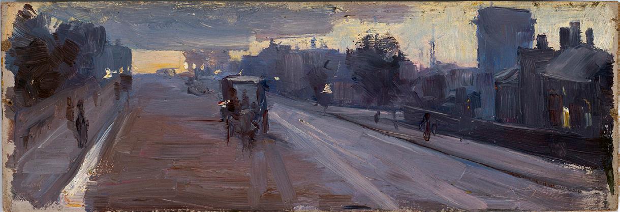
Streeton was the youngest of the organising artists, only twentytwo years of age, and many of his 9 x 5s depict Melbourne scenes, subject matter that was familiar and easily accessible: Charles Summers’ statue of Burke and Wills in Spring Street, opposite the Princess Theatre, steam ships at Sandridge (now Port Melbourne), and early evening football games, for example. Brander’s Ferry, 1889 continues this focus on the local, depicting one of the many nineteenth-century Yarra River crossing points. Developed by Michael Brander in the mid-1850s, the ferry was at the current location of the Swan Street Bridge and operated until just before the First World War. Activities at the site grew over time to include a popular tea-room and after 1876, a miniature zoo and aviary. 8 As the Australasian Sketcher described it: ‘On Sundays, when the little tables… are crowded with visitors… the scene is a very pretty one. The brilliant colours of the ladies’ costumes; the quiet hum of voices; the reflections in the river which are only broken when some boating party passes; then there is the beautiful sky and the fragrant air.’ 9
In this 9 x 5 Streeton adopts a view across the Yarra from the south – water in the foreground leads up to a grassy bank and a path running parallel to the river, through to a band of trees in the distance. The pale sky is richly textured with visible square-edged brushstrokes and reflected in the still water below. Two figures, one in eye-catching red, stand on a raised
National


Installation view of the 9 by 5’s presentation in She-Oak and Sunlight, NGV Australia
Photo courtesy of ArtsHub
platform to the right of the image and below them, we see a woman in a white dress taking the hand of her companion as she steps from a platform on the riverside into a rowboat. Streeton depicted Brander’s Ferry on at least one other occasion –its low timber deck was the subject of an 1885 watercolour –and, as a well-known and popular Melbourne site, it also featured in artworks by Louis Buvelot and John Mather.10
B rander’s Ferry has a distinguished provenance, having been purchased from the 9 by 5 exhibition by Madame Pfund, a respected member of late nineteenth-century Melbourne society who ran Oberwyl, an exclusive school for girls in St Kilda. The subject of a major portrait by Tom Roberts now in the collection of the National Gallery of Victoria, she was a friend and patron of many artists and along with this work by Streeton, bought paintings by both Roberts and Conder from the exhibition.11 Her nephew, Werner de Stieger, inherited the painting and we know from correspondence from Streeton to his fellow artist friend Tom Roberts that in 1924 de Stieger asked Streeton to sign it.12 That it was inscribed more than thirty years later accounts for Streeton incorrectly recalling the date which he gives as 1884 instead of 1889.
1. S tatement from the catalogue of the 9 by 5 Impression Exhibition, Melbourne, 1889, title page
2. Table Talk, 23 August 1889, cited in Lane, T., ‘The 9 by 5 Impression Exhibition – The Challenge of the Sketch’ in Lane, T., Australian Impressionism, National Gallery of Victoria, Melbourne, 2007, p. 162
3. Daily Telegraph, Melbourne, 24 August 1889, p. 10
4. Lane, op. cit.
5. Evening Standard, 17 August 1889, p. 1
6. The Argus, Melbourne, 17 August 1889, p. 10
7. The Argus, Melbourne, 3 September 1889, p. 7
8. See Jones, C., Ferries on the Yarra, Greenhouse, Collingwood, 1981, p. 15 and https:// www.rowinghistory-aus.info/club-histories/mercantile/01-3#gsc.tab=0 (accessed 31 March 2025)
9. Australasian Sketcher, 17 January 1883, cited in Jones, ibid., p. 16
10. Louis Buvelot, Ferry on the Yarra (Brander’s Ferry), undated, oil on board, 20 x 30.5 cm, sold Sotheby’s, Melbourne, 26 November 2002, lot 96; John Mather, Brander’s Ferry 1894, etching, 13.2 x 9.6 cm, National Gallery of Australia; and Arthur Streeton, Branders Ferry, Morning Yarra, 1885, watercolour, 23.5 x 19 cm, sold Shapiro Auctioneers, Sydney, 22 November 2017, lot 100
11. See Lane, T., Nineteenth-Century Australian Art in the National Gallery of Victoria, National Gallery of Victoria, Melbourne, 2003, p. 91
12. S treeton to Tom Roberts, 15 April 1924, in Galbally, A. and Gray, A. (eds.), Letters from Smike: The Letters of Arthur Streeton 1890 – 1943, Oxford University Press, Melbourne, 1989, p. 179
Kirsty Grant
Streeton (1867 – 1943)
La Salute, 1908
oil on canvas
53.5 x 84.5 cm
signed lower left: A STREETON
signed and inscribed with artist’s address on stretcher bar:
Arthur Streeton/10 Hill Rd/Abbey Road London NW inscribed with title on stretcher bar verso: (La Salute) 80 Guineas
original Chapman Brothers frame, London
Estimate: $450,000 – 650,000
Provenance
Arthur Baillieu, Melbourne
Amy Shackell (née Baillieu), Melbourne (Arthur Baillieu’s sister)
Sandra Clarke (née Shackell), Devon Park, western Victoria from December 1957
Thence by descent
Private collection, Sydney
Exhibited
Probably: Mr Streeton’s Pictures, Victorian Artists’ Society Gallery, Melbourne, opened 5 June 1914, cat. 42 (as ‘Santa Maria della Salute’, 33”x 21”, £52)
Sir Arthur Streeton Exhibition, Adelaide Festival of Arts, John Martin & Co., Adelaide, 6 – 23 March 1968 cat. 29 (label attached verso, as ‘Grand Canal’)
Related works
Santa Maria della Salute (grey), 1908, oil on canvas, 51.0 x 76.5cm, in the collection of Geelong Gallery, Victoria
Santa Maria della Salute (sunny), 1908, oil on canvas, 49.5 x 75.2 cm, private collection
We are grateful to Peter Perry, former Director of the Castlemaine Art Gallery and Historical Museum, for his assistance with this catalogue entry.


‘…Mr Streeton has caught the opalescence and glitter of the Venetian canals and marble palaces in moments of bright sunshine as few artists have done before him… he succeeds with delighting the eye and filling the heart with pleasure…’ 1
With their sumptuous colour, sparkling light and dramatic theatrical presence, Arthur Streeton’s paintings of ‘La Serenissima’ remain without doubt among the most highly admired and beautiful of his entire oeuvre. Although not the first Antipodean artist to be captivated by the unique light and romanticism of this fairytale city – Hans Haysen had visited in 1902, inspired by the work of the Venetian old masters which he had previously seen in Paris, and in the spring of 1907, Emanuel Phillips Fox and his artist wife Ethel Carrick had honeymooned in Venice, painting en plein air small ‘travelling’ impressions of the city – Streeton was arguably the most successful. Created during the happiest of circumstances – his honeymoon to Venice in the spring of 1908 – indeed, such works exude a joyfulness, atmospheric truth and mastery of colour and touch evoking the bravura style of his eminent American contemporary, John Singer Sargent, who was also working in Venice around the turn of the century. As Louis McCubbin later reflected in the catalogue accompanying the major Streeton Memorial Exhibition
in 1944: ‘…the fading glories of the City of the Adriatic were never more exquisitely rendered. He [Streeton] painted, as if by magic, St Mark’s, the Doge’s Palace, the canals and gondolas, all bathed in the soft golden sunlight of Northern Italy.’ 2
Streeton first met Esther Leonora (Nora) Clench, a Canadian violinist, in London in May 1899 at a soirée hosted by the Goetzes at their home, Grove House, Regents Park. Although immediately taken by her, the two did not begin courting until several years later, eventually marrying on 11 January 1908 and travelling to Venice from April to May of that year for their honeymoon. Working outdoors, often surrounded by crowds of inquisitive onlookers, Streeton painted in oil and watercolour, as well as making a series of sketches in pencil and wash which provided reference for works that he developed later in the studio. Paintings produced during and following this visit – and during a return trip that the couple made later the same year during the poetic months of autumn – depict Piazza San Marco, the Rialto Bridge and numerous other picturesque views featuring the canals and striking architecture of the city. Rich in inspiration, Venetian subjects notably featured in 79 of the 85 paintings he recorded for 1908 3; as Streeton wrote to a friend at the time, ‘…I worked hard and did some good pieces… What a wonderful place it is.’4


When Streeton subsequently exhibited a selection of his Venetian vedute at the Alpine Club, London in March 1909, they received considerable positive attention in the press.
Describing Streeton’s brushwork as ‘swift’ and ‘able’, critics admired the luminosity of his depictions, one writing that ‘they seem… to radiate the light and colour which fills them’ 5, while the reviewer for The Observer extolled the way in which ‘… the Australian painter has not confined himself to a mere architectural record, but makes us feel that Venice has retained in our days a certain something of the spirit which in the eighteenth century made it the pleasure ground of Europe...’ 6
Upon the unveiling of Streeton’s Venetian paintings in Australia –in the immensely successful exhibitions held at Guild Hall, Melbourne in July 1909 and later, at the Victorian Artists’ Society in June 1914 (which most likely included the present work)– the praise from local audiences was equally effusive. As the critic from The Bulletin noted, ‘Streeton has practically painted everything worth mentioning in the sloppy capital of the Adriatic… he has gathered his information at all hours of the day, even catching the dawn on La Salute and watching the last gondola going to roost. The result is an imposing record of an architecture and atmospheric effects, of quaint bridges and quiet waterways, all demonstrating a magical craftsmanship and a gorgeous sense of colour values.’ 7 That Streeton’s Venetian paintings were widely acclaimed among his best
achievements at the time is attested by the prestigious private and public collections they subsequently entered, from those of Sir Baldwin Spencer; Howard Hinton; Dr D.R. Scheumack; and Sir Edward Hayward of Adelaide’s Carrick Hill, to the National Gallery of Victoria; National Gallery of Australia; Art Gallery of New South Wales; and the University of Melbourne.
A stunning example of Streeton’s talent for capturing the shimmering light and ethereal beauty of this most romantic of Italian cities, La Salute, 1908 bears an equally impeccable, unbroken chain of provenance – originally acquired by Arthur Sydney Bailleu and remaining in different branches of the family over the century since. A keen patron of Streeton, having commissioned several works from the artist 8 and owned at least one other of his Venetian paintings – namely, the magnificent The Grand Canal, 1908, sold by Deutscher and Hackett in April 2021 for $3,068,182 (currently the highest price achieved at auction for the artist) – Baillieu was an influential figure who, as the father of the major Australian art patron Sunday Reed, also laid the foundations for the Heide Museum of Modern Art.
Featuring one of Venice’s most iconic ecclesiastical monuments, the magnificent Basilica di Santa Maria della Salute – built in 1682 as a Senatorial vow to the Madonna following the 1630 plague in which a third of Venetian citizens died – the present view was most likely painted by Streeton from diagonally across

Arthur Streeton
Santa Maria della Salute (Sunny), 1908 oil on canvas
49.5 x 75.2 cm
Private collection
the Grand Canal, next to the Chiesa di Santa Maria del Giglio. As suggested by Roger Benjamin, the building where Streeton was situated must have been the Venetian Gothic mansion built in the fifteenth century and once the home of Doge Andrea Gritti. 9 Upgraded in 1895 as the Grand Hotel (and later in the mid-twentieth century as the majestic Gritti Palace Hotel), the terrace of the hotel in 1908 – as today – opened onto the Campo Santa Maria Zobenigo which had a landing point for the ubiquitous traghetti and gondolas pictured in Streeton’s view here. Streeton often returned to his most loved or successful compositions and thus, unsurprisingly, he produced two other very closely related versions of this view – namely, the almostidentical Santa Maria Della Salute (Grey), 1908 housed in the Geelong Art Gallery and the sun-bathed Santa Maria della Salute (Sunny), 1908 (private collection). Yet, as a contemporary reviewer noted at the time, ‘when he [Streeton]… gives varieties of the same scene, he has some technical effort or charming colour mystery to reveal’ 10; accordingly, the greater architectural detail and tighter brushwork of the present composition would suggest its execution prior to the other two more highly impressionistic interpretations which, as intimated by their titles, seem to have been intended primarily to depict the edifice at two quite different times (of day and conditions of weather).
Quite assuredly among Streeton’s finest Venetian works, indeed La Salute encapsulates superbly both the artist’s technical skill
and sheer delight in rendering the aqueous beauty and opulent splendour of La Serenissima. As the New York art critic, Irwin MacDonald, enthused of Streeton’s Venetian achievements at the time, ‘…he swiftly transferred to canvas what he saw, undisturbed by the golden visions of Turner, and subtle harmonies of Whistler as he was by the merciless architectural details of Canaletto… dashing in his colours with big free brushstrokes, he caught the very spirit of Venice as she is today –with all her opulence of colour, her vividness and gaiety.’ 11
1. Observer, London, 4 April 1909, cited in Galbally, A., Arthur Streeton, Lansdowne Press, Melbourne, 1979, p. 71
2. McCubbin, L., ‘An Appreciation’, Arthur Streeton Memorial Exhibition, National Gallery of South Australia, Adelaide, 1944, n.p.
3. See Streeton, A., The Arthur Streeton Catalogue, published by Arthur Streeton, Melbourne, 1935, unpaginated
4. Arthur Streeton to Frederick Delmer, 1 July 1908, cited in Galbally, A. and Gray, A. (eds.), Letters from Smike: The Letters of Arthur Streeton 1890 – 1943, Oxford University Press, Melbourne, 1989, p. 113
5. Irwin MacDonald, M., ‘Arthur Streeton: an Australian painter who has solved the problems of art in his own way’, The Craftsman, vol. XVII, no.2, New York, November 1909, p. 163
6. Observer, op. cit.
7. The Bulletin, Sydney, vol. 35, no. 1792, 18 June 1914, pp. 8 – 9
8. See Croll, R.H., Smike to Bulldog: Letters from Arthur Streeton to Tom Roberts, Ure Smith, Sydney, 1946, pp. 90 – 91
9. Benjamin, R., ‘Arthur Streeton’s Venice’, in Tunnicliffe, W. (ed.), Streeton, Art Gallery of New South Wales, 2020, p. 222
10. ‘ Mr Streeton’s Pictures’, Punch, Thursday 24 December 1914, p. 35
11. Irwin MacDonald, op. cit.
oil on canvas on plywood
59.5 x 48.0 cm
Estimate: $400,000 – $600,000
Provenance
Estate of the artist
Thence by descent
Caroline Russell (née de Witt Merrill), the artist’s widow Mrs John W. Kessler, Illinois, USA, the artist’s niece, a gift from the above
Thence by descent
Ken Kessler, USA, the artist’s great-nephew Christie’s, London, 19 March 2020, lot 4
Private collection, Sydney, acquired from the above
Literature
Galbally, A., The Art of John Peter Russell, Melbourne, 1977, cat. 260, p. 112 (as ‘Untitled (View of Portofino)’)
Coslovich, G., ‘Amid shutdowns, Christie’s offers Australian art rarities’, Australian Financial Review, 18 March 2020 (illus.)
Related works
Portofino, 1920, oil on canvas on board, 50.0 x 58.0 cm, private collection
Portofino, 1911, watercolour and pencil, 27.0 x 37.2 cm, in the collection of the National Gallery of Victoria, Melbourne
Portofino, 1920, watercolour and gouache, 26.8 x 37.9 cm, in the collection of the National Gallery of Australia, Canberra
Portofino Harbour, 1920, watercolour and charcoal, 28.3 x 38.4 cm, in the collection of the Queensland Art Gallery | Gallery of Modern Art, Brisbane


Private collection
John Russell’s inherited wealth afforded many freedoms, setting him on a unique path unlike that of any other Australian artist of the time and bringing him into direct contact with some of the masters of European Impressionism and Post-Impressionism. No longer expected to join the family business following the death of his father, he sailed to England in 1880, enrolling at London’s Slade School the following year. Continuing his studies at Fernand Cormon’s atelier in Paris in the mid-1880s, he worked alongside Émile Bernard, Henri de Toulouse-Lautrec and later, Vincent van Gogh, with whom he established an enduring friendship.1
His first experience of Belle-Île, one of a group of islands off the coast of Brittany, in the summer of 1886, represented both a professional and personal breakthrough. During an extended stay on the island, Russell met and befriended Claude Monet who he saw working en plein air and, recognising his painting style, famously introduced himself by asking if was indeed ‘the Prince of the Impressionists’. Surely flattered, Monet, who
was eighteen years Russell’s senior, took a liking to the young Australian and uncharacteristically allowed him to watch him work and on occasion, to paint alongside him. This experience provided Russell with an extraordinary insight into the techniques and working method of one of the founders of the Impressionist movement and its influence was both significant and immediate.
The paintings Russell later made in Italy and Sicily show him working in a new style, using a high-keyed palette that omitted black entirely, and his compositions made up of strokes of pure colour. 2 In addition to showing him how to use colour as a means of expressing a personal response to the subject, Monet’s example also highlighted for Russell the importance of working directly from nature. 3
Russell responded to the wild, isolated beauty of Belle-Île and in 1887 bought land overlooking the inlet of Goulphar, writing to his friend, Tom Roberts, ‘I am about to build a house in France.

John Peter Russell
, 1911
over pencil
27.6 x 37.2 cm National Gallery of Victoria, Melbourne
Settle down for some five years. Get some work done. It will be in some out of the way corner as much a desert as possible.’4 Known as Château de l’Anglais (or Château de Goulphar), the house was well-appointed with a large studio, workshop and expansive garden. Russell and his Italian-born wife, Marianna, lived there for many years, raising a large family, the island and surrounding ocean providing a constant source of inspiration for his art. ‘The colours completely bowl me over. On some days here it’s ravishing but impossible for my poor palette.’ 5
It was Marianna’s premature death in 1908 that prompted Russell to leave Belle-Île and for the next two years he travelled in Europe, marrying Caroline de Witt Merrill, an American-born singer known as ‘Felize’ (and a friend of his daughter Jeanne’s) in 1912. Russell had visited Portofino on the Ligurian coast in late 1908, returning with his new wife in 1914 and again, after the war, in 1920. The beauty of the town, with its sixteenth-century fortress perched high on the hilltop and distinctive pastel-
coloured houses bathed in bright Mediterranean light, obviously appealed to the colourist in Russell, who painted various views in oil and watercolour. Monet had visited the region in the 1880s, staying in the nearby coastal town of Bordighera and further inland at Dolceacqua, and as works such as Strada Romana at Bordighera, 1884 (Museum Barberini, Potsdam) demonstrate, he too was dazzled by the beauty and glorious colours of the area.
Russell worked in oil only occasionally after 1908, his preference increasingly being for the immediacy of watercolour which enabled him ‘to capture and hold the intensity of the colours of nature’.6 His deft handling of the medium is clear in Portofino, 1911 (National Gallery of Victoria) which depicts the piazza in front of Portofino Bay – showing the Church of St Giorgio with its distinctive tower in the background and the multi-storey buildings stepping up the hillside on the right – in delicately luminous tones. It was evidently a view that captivated Russell who repeated it in at least two paintings, continuing a practice

that was familiar to his work – and indeed, to that of Monet –of revisiting the same subject at different times (of the day, season, year) and recording chromatic and atmospheric variations. With ‘the true impressionism in the tradition of Monet, [he] caught and held the fleeting moment of sunshine and shadow and pinned it down, light as a butterfly, for all time.’ 7
While one of these Portofino oils adopts a more distant viewpoint, featuring a large area of the bay in the foreground, the current painting from circa 1914 zooms in and hovers over the water, dividing the scene into a series of horizontal bands. The church and adjacent buildings make up the central band and while tones of pink and orange prevail, it appears as if Russell has brought the entirety of his palette to bear with a rainbow of coloured brushstrokes used to define the details of the architecture. In turn, this colour is reflected in the bay which is described in lively squiggles of paint that are built up
in individual brushstrokes to suggest the rhythmic movement of the water. Russell varies the application of paint in his pictures according to the subject and the top band of the painting is the simplest, using less prominent brushstrokes and a more limited colour palette of greens and blues with occasional highlights to describe the hillside beyond the piazza and a glimpse of sky above. Russell’s brilliance as a colourist is on full display in this painting, as is his ability to communicate as much about being in a particular place as its physical and geographical features.
Correspondence documents the provenance of this painting which, upon Russell’s death in 1930 was inherited by his wife, passing by descent to her sister Florence and then to her son, Ken Kessler. This and other works held by the family were rarely, if at all exhibited, and it has only been in more recent years that they have been more widely seen, adding immeasurably to our understanding of Russell’s remarkable oeuvre.

Claude Monet
Strada Romana at Bordighera, 1884 oil on canvas
66.0 x 81.5 cm
Museum Barberini, Potsdam, Germany
1. Although Russell did not see van Gogh again after he departed for Arles in the south of Frances in early 1888, their friendship continued via correspondence: see Galbally, A., A remarkable Friendship: Vincent van Gogh and John Peter Russell, The Miegunyah Press, Carlton, 2008
2. Taylor, E., ‘John Russell and friends: Roberts, Monet, van Gogh, Matisse, Rodin’, Australian Impressionists in France, National Gallery of Victoria, Melbourne, 2013, p. 60
3. ibid.
4. Letter from John Peter Russell to Tom Roberts, 5 October 1887, cited in Tunnicliffe, W., (ed.), John Russell: Australia’s French Impressionist, Art Gallery of New South Wales, Sydney, 2018, p. 193
5. Russell to Auguste Rodin, April – May 1890, cited in Prunster, U., ‘Painting Belle-Île’, Prunster, U. et al., Belle-Île: Monet, Russell and Matisse, Art Gallery of New South Wales, Sydney, 2001, p. 46
6. Galbally, A., The Art of John Peter Russell, Sun Books, Melbourne, 1977, p. 77
7. Ursula Hoff, cited in Salter, E., The Lost Impressionist: A biography of John Peter Russell, Angus and Robertson, London, 1976, p. 179
Kirsty Grant
oil on pulpboard
61.0 x 51.0 cm
signed and dated lower left: G. Cossington Smith, 35 signed and inscribed verso: Winter tree/ G. Cossington Smith inscribed with artist’s name on old label attached verso
Estimate: $250,000 – 300,000
Provenance
Toorak Gallery, Melbourne, 1969
Private collection, Melbourne, from December 1969
Deutscher~Menzies, Melbourne, 26 November 2003, lot 16
Private collection, Melbourne
Exhibited
Society of Artists Annual Exhibition 1935, Education Department Gallery, Sydney, 6 September – 4 October 1935, cat. 160 (as ‘The Winter Tree’)
Grace Cossington Smith, Art Gallery of New South Wales, Sydney, 15 June – 15 July 1973, cat. 40, and touring to: Queensland Art Gallery, Brisbane, 6 September – 4 October 1973; Western Australian Art Gallery, Perth, 6 December 1973 – 2 January 1974; Art Gallery of South Australia, Adelaide, 11 January – 10 February 1974; and National Gallery of Victoria, Melbourne, 26 March – 28 April 1974 (label attached verso, as ‘The winter tree’)
Grace Cossington Smith: A Retrospective Exhibition, National Gallery of Australia, Canberra, 4 March – 13 June 2005, then touring to: Art Gallery of South Australia, Adelaide, 29 July – 9 October 2005; Art Gallery of New South Wales, Sydney, 29 October 2005 – 15 January 2006; and Queensland Art Gallery, Brisbane, 11 February –30 April 2006 (label attached verso, as ‘The winter tree’)
Literature
Thomas, D., Grace Cossington Smith, Art Gallery of New South Wales, Sydney, 1973, cat. 40, pp. 8, 37 (illus.), 65 (as ‘The winter tree’) James, B., Grace Cossington Smith, Craftsman House, Sydney, 1990, p. 102
Hart, D., Grace Cossington Smith, National Gallery of Australia, Canberra, 2005, pp. 52, 53 (illus.), 178 (as ‘The winter tree’)
Related works
Sketch for ‘The winter tree’, c.1935, pencil on paper, 35.6 x 25.4 cm, leaf 18 recto, from the ‘Sketchbook of people, scenes, groups and draft advertisements’, in the collection of the National Gallery of Australia, Canberra Presbyterian Church, Turramurra, watercolour, exhibited in Grace Cossington Smith, Grosvenor Galleries, Sydney, 23 July – 4 August 1928, cat. 40


In the mid-1930s, the leading modernist artists in Australia were women: Clarice Beckett in Melbourne, with Margaret Preston, Grace Crowley and Grace Cossington Smith in Sydney. Whilst Preston may have been the most visible due to her lectures, essays and selfpublicity, Cossington Smith was even more retiring than Beckett –although, as leading curator Deborah Edwards observed, Smith was ‘the most profoundly inventive landscapist of all Australian moderns until Nolan.’ 1 Like Beckett with her home suburb of Beaumaris, Smith found a huge range of possibilities for her subjects in the streets surrounding her house in Kuringai Chase Avenue, Turramurra, such as Eastern Road, Turramurra, c.1926 (National Gallery of Australia); Wonga Wonga Street, Turramurra, c.1930 (Art Gallery of New South Wales); Landscape at Pentecost, 1929 (Art Gallery of South Australia); and House with trees, c.1935 (private collection) which features the mansion at 5 Boomerang Road. Similarly, The winter tree, Turramurra, 1935 depicts the view from Gilroy Road looking onto the rear of St Margaret’s Presbyterian Church.
By 1935 Smith was well established as an artist of note, having mounted major solo exhibitions in Sydney and London. Originally studying alongside Roy de Maistre, Roland Wakelin and Constance Tempe Manning at Anthony Dattilo-Rubbo’s atelier in Sydney, she is recognised for having painted Australia’s first modernist painting, The
National Gallery of Australia, Canberra
Sock knitter, 1915 (Art Gallery of New South Wales). On leaving art school, she painted in isolation at the family home, although in 1926 Ethel Anderson, whose husband was Secretary to the Governor of New South Wales, moved in around the corner. Upon visiting Smith’s backyard studio with her daughter, Anderson, already an enthusiast of modern art, was both stunned and delighted: ‘My mother’s eyes were sparkling with excitement… [saying to Smith] ‘With your unique brushstroke, with your grasp of colour, you may be about to give an expression to a quality in life, more moving than beauty alone, more intimate than infinity. You may find a fourth-dimensional emotion, as yet unfound, un-named.” 2 Smith was likewise stunned, and overjoyed that for once her work was taken seriously, and between 1927 and 1930, she went on to produce her now-iconic images of the Sydney Harbour Bridge under construction. Following the death of her mother in 1930, Smith’s work became notably more introspective, although this period nevertheless also witnessed the creation of one of this country’s undisputed landscape masterpieces, namely Sea wave, 1931 (National Gallery of Australia), and the dramatic Black mountain, 1931 (private collection).
Smith’s work was an amalgam of Cézanne in analysis and Van Gogh in liberation of colour, but another key influence was Beatrice Irwin’s book New science of colour (1915) which Smith laboriously

transcribed by hand to truly gain the essence of her theories. Creating her own colour chart based on Irwin’s system where ‘there were three natural divisions – physical, mental and spiritual – each with subdivisions of sedative, recuperative and stimulative colour… for Cossington Smith, among the most important aspects of Irwin’s writing was the need to go beyond optical vision and to consider the effect that colour has on us.’3 An examination of Smith’s studies of trees over time reveals the veracity of this statement. For example, Trees, c.1927 (Newcastle Region Art Gallery) which features the tangled bush beyond the family’s tennis court, is demarcated into agitated zones of greens, lavender and blue capturing the light spilling through the canopy in a multitude of small brushstrokes applied in ‘firm, separate notes of clear, unworried colour.’4
The winter tree, Turramurra, 1935 takes a similar approach with the tree centring the composition, its organic bend contrasting with the meticulous architectonic lines of St Margaret’s church, dedicated in 1927.5 Apart from Smith’s distinctive brushwork and use of colour, it stands true to Smith’s statement that ‘I always painted what was around me, what was there… I didn’t like to make things up.’6 Being winter, the deciduous tree’s branches are bare, but the chill evident in the ice blue of the sky is somewhat tempered by the warm pink used for the church buildings. The surface is matt
91.5 x 74.3 cm
Newcastle Region Art Gallery, New South Wales
which identifies it as being alla prima – ‘paint which is applied once and not touched again.’ 7 Indeed, Smith was renowned for never revising her brushstrokes and The winter tree, Turramurra thus appears as fresh today as when first painted ninety years ago.
1. Edwards, D., ‘Landscapes of modernity 1920s-40s’ in Sydney moderns: art for a new world, Art Gallery of New South Wales, Sydney, 2013, p. 221
2. Foott, B., Ethel and the governor’s general, Rainforest Publishing, Paddington, NSW, 1992, p. 128 – 30
3. Hart, D. (ed.), Grace Cossington Smith, National Gallery of Australia, Canberra, 2005, p. 28
4. Grace Cossington Smith, cited in Thomas, D. R., Grace Cossington Smith, Art Gallery of New South Wales, Sydney, 1973, p. 6
5. S t Margaret’s is now Sungrak Baptist Church
6. Grace Cossington Smith, cited in Duigan, V., ‘A portrait of the artist at 90’, The National Times, Canberra, 7 – 13 March 1982
7. Proctor, T., ‘Modern art in Sydney’, Art in Australia, 15 November 1938, 3rd series, no. 73, p. 28
Andrew Gaynor
gouache and pencil on paper
38.0 x 39.5 cm (image)
48.0 x 50.0 cm (sheet)
signed lower right: I. Fairweather
Estimate: $90,000 – 120,000
Provenance
Isabella Griffiths, London
Thence by descent
Private collection
Christie’s, Melbourne, 3 May 2004, lot 85 Private collection, Melbourne
Exhibited
Probably: Paintings by Ian Fairweather, The Redfern Gallery, London, 28 October – 20 November 1948, cat. 23 (as ‘Market Foochow’)
Literature
Bail, M., Ian Fairweather, Bay Books, Sydney, 1981, cat. 63, fig. 29, pp. 75, 76, (illus.), 235 – 236; revised edition, Murdoch Books, Sydney, 2009, cat. 57, pl. 44, pp. 70, 71 (illus.), 249 (as ‘(Market Scene, China)’)
Smith, R., ‘Ian Fairweather: artist of cosmological figuration’, Art and Australia, Sydney, vol. 21, no. 3, Autumn 1984, pp. 337 (illus.), 341

In October 1947 Fairweather sent 130 gouaches to the Redfern Gallery in London, the second such consignment.1 They were painted while he was living at Lina Bryans’ house in Darebin which was a stable and productive time for the artist. The works were ‘ghosts’, Fairweather wrote to Jim Ede in the December, painted ‘in ten different ways’; he knew he could not move on with other subjects until they were put to rest. They were memories of the past, and Chinese market and street scenes of differing sizes – some according to Bail, ‘mixed with clag [and] very thickly painted.’ 2
Market Scene, Peking, 1945 – 47 depicts a crowded jumble of terracotta pots and bowls in stark browns and blacks over a background of creamy whites and greys. It hums with the chatter of stall holders and street sellers and is a work of such vividness and immediacy that it is hard to believe it was painted from memory.
The gouaches, which were packed by Fairweather, subsequently arrived at the Redfern Gallery ‘in one solid congealed mass’, not one being able to be saved, according to Redfern director, Rex Nan Kivell. 3 They were bundled up and sent to Isabella Griffiths, Fairweather’s cousin whom he called Ella. She had married the distinguished gynaecologist and musician Walter Spencer Anderson (1854 – 1946) as his second wife, was close to Fairweather’s sister Ethel and lived at 19 Cheyne Walk, Chelsea. It was here that Fairweather stayed after being shipped back to London by the British Government following his disastrous raft voyage to Timor in 1952.
He was destitute and accused Ella of storing the paintings so inadequately that they were riddled with mould and eaten by silverfish. In spite of this, Fairweather had little hesitation in accepting Ella’s hospitality. Nor did it stop him from criticising her food and lifestyle, or dropping cigarettes and mud throughout the house.4 They argued furiously, Fairweather burning all the gouaches kept at Cheyne Walk save for this painting which
escaped the same fate, it has been suggested, after slipping down the back of the incinerator. 5 More credibly, Ella probably salvaged the work when the bundle arrived from the Redfern Gallery as it shows no sign of significant damage. It could be one of the two works mentioned by Fairweather in a letter to his niece Pippa.6
Writing to Pippa in 1953, he said that ‘there were just two that for sentimental reasons I couldn’t bring myself to destroy’. He begged her to rescue them from Ella – and specifically, work that was ‘5ft by 3 ft’ on thick cardboard (clearly not the present Market Scene, Peking). The second painting is not detailed by Fairweather, but we know from the provenance that this work was owned by Isabella around this date.7
Ella accused Fairweather of being a ‘sponger…a hanger-on…a ne’er-do-well’. 8 He was outraged. She was, he wrote, ‘a very [nasty] and poisonous old woman’ who had ‘forced him’ to burn the paintings as a way of humiliating him. 9 Their relationship never recovered. Fairweather fled Cheyne Walk on 22 June 1953. He spent the day in the British Museum sitting in front of the Elgin marbles, writing plaintively to Pippa and waiting for the midnight train to Liverpool and the ship back to Australia.10
1. The first shipment of gouaches was sent in June 1946 and packed with the help of Lina Bryans; they were all stamped with an Australian customs stamp.
2. Bail, M., Ian Fairweather, Bay Books, Sydney, 1981, p. 75
3. Letter from Nan Kivell to Murray Bail, 22 July 1976. See Bail, ibid., p. 225, chapter 7, endnote 14. An earlier bundle sent in June 1946 were stamped by Australian customs to allow re-entry into Australia, see Bail, ibid., p. 74
4. Abbott-Smith, N., Ian Fairweather: A Profile of an Artist, University of Queensland Press, Brisbane, 1978, pp. 123 – 4
5. Bail, op. cit., p. 75
6. Letter 77, Ian Fairweather to Helga Macnamara (Pippa), 22 June 1953, cited in Roberts C., & Thompson, J., Ian Fairweather: A Life in Letters, Text Publishing, Melbourne, 2019, p. 139. As other letters by the artist show, he was quite paranoid at this time.
7. Letter 77, cited ibid.
8. Abbott-Smith, op. cit., p. 124
9. His complaints about Ella reveal that at the age of 66, she was newly widowed (Walter died in 1946) and she was dealing with a very large house without the help of any servants. In February 1974, she was stabbed to death by an intruder.
10. His passage was paid by his siblings after Fairweather ‘passed the hat around’, see Abbott-Smith, op. cit., p. 125
Dr Candice Bruce


Ian Fairweather (Horse-fair, Peking), 1941
gouache on paper
37.2 x 35.9 cm
Private collection
Ian Fairweather Cornsifting, Soochow, 1945 – 47
gouache and pencil on paper
36.0 x 31.0 cm
Private collection, Queensland
Tombs in Peking, 1936
oil on thick paper on compressed card
51.0 x 54.0 cm
Estimate: $400,000 – 500,000
Provenance
Redfern Gallery, London
Lady Strathcona, London, acquired from the above 1936
Thence by descent
Private collection, Sydney
Deutscher and Hackett, Melbourne, 17 November 2010, lot 8
Private collection, Melbourne
Exhibited
Recent Paintings by Ian Fairweather, Redfern Gallery, London, 7 – 30 January 1937, cat. 15 (label attached verso)


We are grateful to Brenda Martin Thomas, wife of the late David Thomas AM, for kindly allowing us to reproduce David’s writing in this catalogue entry
Ian Fairweather has long been admired for the fusion he achieved between Chinese and Western ideas and techniques, with his early Chinese works being rightly regarded as among the great achievements in Australian art. This is seen as much in the philosophical and universal within his art, as in his brilliant use of line drawn on the delicacy and power of Chinese calligraphy. Artist and critic James Gleeson once described his paintings as being ‘infused with the living spirit of Chinese art.’ 1 Fairweather himself remarked, ‘I took on, unconsciously I believe, many Chinese attitudes...’ 2 It was also commented on when this painting was shown in Fairweather’s exhibition of Chinese paintings at the Redfern Gallery, London in January 1937. It was his second exhibition at this prestigious gallery, following on from that, also held in January, of 1936. The critic for The Times wrote with warmth and admiration:
‘There seems to be more than a chance connection between the subject matter and the general effect of the paintings because, though he is completely Western and, in the broader sense, Impressionistic, in his methods it is evident that he has temperamental affinities with Eastern artists. His colour schemes remind one of Chinese frescoes, in which every tint is subdued and away from its name. With this taste in colour he combines a free style of drawing, avoiding sharp definition, and inclining to the calligraphic in character...’ 3
Fairweather made two visits to China, the first from 1929 to 1933, when he studied Mandarin and travelled widely. After spending some time in Bali, Australia and the Philippines, he returned early in 1935, staying until April of the following year. Painting fulltime, he lived in Peking (modern day Beijing) away from European people and influences. Here he made a special study of the work of the master calligraphers, their presence being as much felt in Tombs in Peking, 1936 as in such accompanying works as Temple Yard, Peking, 1936 and


Tethered Horses Outside Gate, Peking, 1936 – both painted the same year. Fairweather followed the Chinese masters who, ‘with a few strokes of the brush, dramatic, delicate’ were able to achieve ‘tremendous power of suggestion and imagination.’4 The ancient city of Peking surrounded by its great walls provided Fairweather with endless opportunities to capture the exotic passing scene in its various moods and moments. Back in his studio, he translated about twelve into paintings, the remaining sketches being used over the years for Chinese subjects painted while in the Philippines, India and Australia.
Tombs in Peking is one of the precious few painted in China, seen in the freshness of the imagery and the immediacy of its realisation. The shallow depth of field adds to the tapestry-like effect of the painting. He was also inclined to reduce some of his paintings, as in Temple Yard, Peking, almost to pure colour, full of lively movement and visual engagement. The most striking features of Tombs in Peking are certainly colour and harmony. Applied with swift touches of the brush, colours dance across
the picture plane, definition sometimes aided by the line drawn in the pigment with the other end of the brush. Overall, the images are effectively generalised as form echoes form distinguished by colour. Unity of technique is similarly achieved in figuration, with humans, animals, trees and temples all as one. In this masterpiece of felt observation, the past is in living harmony with the present, both in its subject and in Fairweather’s realisation of it.
1. Gleeson, J., ‘Fusing art forms’, Sun-Herald, Sydney, 16 May 1965, p. 82
2. Ian Fairweather, cited in Bail, M., Ian Fairweather, Murdoch Books, Sydney, 2009, p. 19
3. ‘Paintings Of China: Exhibition in London’, The Times, 22 January 1937, p. 17
4. Ian Fairweather, cited in Bail, op. cit., p. 46
David Thomas
oil on canvas
40.5 x 56.0 cm
signed and dated lower right: Russell Drysdale 49
Estimate: $300,000 – 400,000
Provenance
Macquarie Galleries, Sydney (label attached verso)
Mrs Ivan Lewis, New South Wales, acquired from the above in 1949
Macquarie Galleries, Sydney
Dr D. R. Sheumack, Sydney, acquired from the above in 1964
Thence by descent
Private collection, Melbourne
Deutscher~Menzies, Melbourne, 22 November 1998, lot 282 (as ‘The Fossickers’)
The Cbus Collection of Australian Art, Melbourne
Deutscher and Hackett, Melbourne, 27 July 2022, lot 28 Private collection, Hong Kong
Exhibited
Russell Drysdale, 1948 /1949, Macquarie Galleries, Sydney, 23 March – 4 April 1949, cat. 8
The D. R. Sheumack Collection of Australian Paintings, S. H. Ervin Museum and Art Gallery, Sydney, 17 May – 12 June 1983, cat. 27
Russell Drysdale Paintings 1940 – 1972, S. H. Ervin Museum and Art Gallery, Sydney, 14 June – 21 July 1985, cat. 26
The Artists of Hill End, Art Gallery of New South Wales, Sydney, 29 July – 17 September 1995, and touring, cat. 23 (label attached verso)
The Modern Landscape 1940 – 1965, Heide Museum of Modern Art, Melbourne, 10 March – 3 May 1998
Russell Drysdale: Defining the Modern Landscape, TarraWarra Museum of Art, Victoria, 9 October 2013 – 9 February 2014 on long term loan to Bendigo Art Gallery, Victoria
Literature
‘Big Crowd at Drysdale Exhibition’, The Sydney Morning Herald, Sydney, 24 March 1949, p. 9 Klepac, L., The Life and Work of Russell Drysdale, Bay Books, Sydney, 1983, pl. 96, pp. 280 (illus.), 367 Christie, R., and Miller, J., (eds.), The D. R. Sheumack Collection. Eighty Years of Australian Painting, Sotheby’s Australia, Sydney, 1988, cat. 102, n.p. (illus.)
Wilson, G., The Artists of Hill End, The Beagle Press and Art Gallery of New South Wales, Sydney, 1995, pl. 23, pp. 45, 50 (illus.), 118 Fox, P., The Modern Landscape 1940 – 1965, Museum of Modern Art at Heide, Victoria, 1998, pp. 6 (illus.), 8 Nainby, B., Stanhope, Z., and Furlonger, K., The Cbus Collection of Australian Art, in association with Latrobe Regional Gallery, Melbourne, 2009, pp. 15, 17, 77 (illus.), 218 Heathcote, C., Russell Drysdale: Defining the Modern Landscape, TarraWarra Museum of Art, Victoria, 2013, pp. 22 (illus.), 23, 85


Russell Drysdale Road with rocks, 1949 oil on canvas
66.6 x 102.0 cm
Art Gallery of New South Wales, Sydney
‘When a vision becomes as widespread throughout society as Drysdale’s has in contemporary Australia, it is hard to believe that it has not always been there. It is now difficult to view Australian landscape without an echo of Drysdale’s images. His vision has become an integral part of the world in which we live.’ 1
Alongside renowned painters including Arthur Streeton and Fred Williams, Russell Drysdale is an artist whose imagery has become synonymous with Australia, instantly recognisable and powerfully evocative. Drysdale might easily have followed in his father’s footsteps however, and established a career working on the land, had it not been for eye surgery in 1932 and a fortuitous meeting with Julian Smith – ‘that strange and brilliant mixture of surgeon, artist and photographer.’ 2 Smith was impressed by drawings Drysdale made while recuperating and showed them to Daryl Lindsay – artist and later, Director of the National Gallery of Victoria – who recalled that they ‘showed a curious sensitivity and a sharp observation.’ 3 The young Drysdale ‘liked Lindsay because he had had the same sort of life that I had led… He had been a jackeroo [sic] and a station manager and we could talk about horses and sheep.’4 A subsequent introduction to George Bell, the influential modernist artist and respected teacher, sealed Drysdale’s fate, and in 1935 he enrolled in formal art studies at the Bell-Shore School in Melbourne.
Drysdale’s first solo exhibition at Melbourne’s Riddell Galleries in 1938 was well received, the Herald critic observing that he was a ‘natural painter savouring to the full the exciting discovery of paint.’ 5 His artistic trajectory continued to rise and in 1941, in addition to being represented in an exhibition of Australian art which toured America and Canada, Monday morning, 1938 was acquired by the Metropolitan Museum of Art in New York. In 1942, both the National Gallery of Victoria and the Art Gallery of New South Wales purchased paintings for their permanent collections, and the Art Gallery of South Australia followed suit the next year.
Early paintings such as Man feeding his dogs, 1941 (Queensland Art Gallery ǀ Gallery of Modern Art) clearly show the feeling and familiarity that Drysdale had for rural subjects, as well as his ability to express this in paint. A commission in 1944 to accompany writer Keith Newman through western New South Wales and record the devastating effects of the drought for the Sydney Morning Herald, added another dimension. This experience expanded Drysdale’s visual repertoire with images and motifs which depicted the country in such an extreme state that it appeared surreal and otherworldly. In subsequent paintings, a palette of rich ochres and black echo the parched landscape, while the dead trees, animal carcasses and remnants of human habitation provide graphic reminders of its harshness.

Russell Drysdale
The Rabbiters, 1947 oil on canvas
77.0 x 102.5 cm
National Gallery of Victoria, Melbourne
As Newman wrote, ‘The dust-laden air plays eerie tricks with light. The sky appears leaden… crossed by great bands of black, red and grey… The sun is entirely obscured or shows like a wan full moon. Dead trees… loom through the hot murk in a variety of fantastic shapes as though they died in agony beneath the axe or tortured by thirst as the wind below the soil from their roots… Worse than the skeletons of animals are the skeletons of homes.’ 6
The impact of this drought-stricken landscape was profound and continued to influence Drysdale’s imagery for years to come. Similarly influential was Hill End, a once prosperous gold mining town north-west of Bathurst, which he first visited with fellow artist, Donald Friend, in 1947. As Friend recorded in his diary, the town was ‘an old, ruined village living on the memory of its former fifty thousand inhabitants and fabulous tales of gold strikes. Now there are only a handful of rather sordid, jovial mad peasants who live by fossicking and rabbiting.’ 7 Working from sketches and the many photographs he took, Drysdale found imagery and atmosphere in Hill End. The latter in particular feeds into the quiet emptiness that characterises many of his paintings – think for example of the now iconic 1947 work, The rabbiters (National Gallery of Victoria). The fossicker, 1949 exemplifies this feeling, the monumentality of the ancient rocky forms towering over a lone figure, signaling
nature’s grandeur and strength. Drysdale’s technique of building up the painting with various layers of scumbling and glazing creates a rich patina, adding to the visual drama of the scene which contrasts bright sunlight with areas of deep shadow.
The fossicker was first shown in Drysdale’s 1949 solo exhibition at Macquarie Galleries, Sydney, alongside eleven other paintings including portraits of friends and fellow artists, Margaret Olley and Donald Friend. According to the Sydney Morning Herald, the opening was a lively affair, ‘crowded out… by artists and others… [and] celebrated with a sherry party at noon.’ 8 It was also an immediate success and ‘Before one o’clock a red seal was on every picture available for sale.’ 9
1. Klepac, L., Russell Drysdale, Bay Books, Sydney, 1983, p. 105
2. Joseph Burke, cited in Klepac, ibid., p. 15
3. ibid.
4. Drysdale interviewed by Geoffrey Dutton, cited in Eagle, M. and Minchin, J., The George Bell School: Students, Friends, Influences, Deutscher Art Publications, Melbourne and Resolution Press, Sydney, 1981, p. 91
5. Burdett, B., Herald, Melbourne, 27 April 1938, cited in Klepac, Russell Drysdale, Murdoch Books, Millers Point, 2009, p. 54
6. Newman, K., ‘An artist’s journey into Australia’s “lost world”’, Sydney Morning Herald, 16 December 1944, p. 5 cited in Smith, G., Russell Drysdale 1912 – 81, National Gallery of Victoria, Melbourne, 1997, p. 84
7. Friend, D., diary entry, 22 August 1947, cited in Klepac, op. cit., p. 89
8. ‘Big Crowd at Drysdale Exhibition’, Sydney Morning Herald, Sydney, 24 March 1949, p. 9
9. ibid.
Kirsty Grant
oil on canvas
81.5 x 48.5 cm
signed and dated lower right: John Brack 54 bears inscription on gallery label verso: POPPIES / JOHN BRACK
Estimate: $400,000 – 600,000
Provenance
Australian Galleries, Melbourne (label attached verso)
Private collection, Melbourne, acquired from the above in September 1956
Exhibited
John Brack, Peter Bray Gallery, Melbourne, 8 – 17 March 1955, cat. 12
Literature
Grishin, S., The Art of John Brack, Oxford University Press, Melbourne, 1990, cat. o39, vol. 1, p. 47, vol. 2, p. 6


Iceland poppies, 1954 is the first of a small group of still life paintings that John Brack made during the 1950s. With the exception of three paintings of flowering gums, Brack depicted familiar, domestic cut flowers – carnations, gerberas, chrysanthemums, daisies and so on – which had long been favoured by studio artists as subject matter that is easilyaccessible and infinitely varied. Described with the directness and graphic clarity that characterised Brack’s art at mid-century, these floral specimens express distinctive and sometimes anthropomorphic personalities. The stark angularity of Solandra, 1955 (National Gallery of Victoria), for example, echoes the hard-jawed women who feature in early 1950s paintings like The veil, 1952 (private collection), while his Christmas lilies, with their spidery tendrils recalling an underwater predator, appeared to a contemporary critic as having an ‘air of quiet peril.’ 1 By contrast, the Iceland poppies depicted here are delicate and graceful, their long fine stems bending gently under the weight of the flowers. Brack has studied the poppies closely, carefully describing the fine hairs that line the stems, as well as the subtle tonal variations between the colour of the petals and the stamen. Like a botanical artist who documents the various stages of a plant’s growth, Brack shows us fully enclosed poppy heads and another which is just beginning to open among this joyous bunch of golden-hued flowers.
While Brack once said that he found the process of painting flower pieces a good way to relax, the still life aligned with other subjects in his art at the time, including portraiture and the nude, which acknowledged traditional genres of Western art. 2 In part, this reflected Brack’s knowledge of art history – an essential touchstone and important source of inspiration throughout his career – but importantly, such subject matter also presented him with the opportunity to consider images from the past in the context of the life of the present. As an artist who was fascinated by human nature and behaviour, this was a theme which held great appeal.
The bar, 1954 (National Gallery of Victoria) is one of the most important paintings within Brack’s oeuvre and it exemplifies his practice of utilising art historical references as a means of analysing and commenting upon aspects of contemporary life. The contrast between this depiction of the six o’clock swill in a dour 1950s Melbourne pub and Édouard Manet’s A bar at the Folies-Bergère, 1882 – a painting which Brack regarded as one of the great nineteenth-century works of art – needs little explanation. When The bar was first shown in Brack’s solo exhibition at the Peter Bray Gallery, Melbourne

John Brack
The bar, 1954 oil on canvas
97.0 x 130.3 cm (irregular)
National Gallery of Victoria, Melbourne © Helen Brack
in March 1955, Alan McCulloch wrote in the Herald that it had ‘stylistic strength and arresting qualities of perception and characterization.’ 3 Continuing, he declared that ‘rarely indeed is it possible to view a local one-man exhibition with unreserved enthusiasm. [This] exhibition… is an exception. Here is an approach to painting which is stylistically “pure” and an approach to “subject” which is exceptionally intelligent.’4
The major work in the exhibition, The bar was displayed alongside a number of studies and related works. As Brack scholar, Sasha Grishin, has explained, this was a practice that the artist introduced at the time ‘as a means through which the viewer might gain access to the complexity of the major paintings.’ 5 Alongside two preparatory drawings for this painting Brack also showed two oils, Men in the bar and Iceland poppies. His depiction of the poppies changed considerably between the present work and their representation in The bar : where relatively naturalistic imagery based on careful observation was his initial approach, the poppies behind the bar have been simplified and stylised in line with the rigidity of their surroundings. They are distinguished from the austere interior however by their bright colours (yellow and white) – a reminder, perhaps, of
the beauty of the natural world within an otherwise artificial environment. Although at first glance, Brack’s still life paintings might appear as nothing more than depictions of familiar blooms, as his wife, the artist Helen Maudsley, has explained, he was very aware ‘that visual analogy is part of the language of art’ and consequently, there is often another layer of meaning to be found.6 Speaking about The bar and the poppies, Brack explained, ‘The bar is not a particular one, but a synthesis of several. Once the general atmosphere was established in my mind, details had to be assembled from here and there. Iceland poppies for instance were indicated, the blooms which symbolise suburbia. Their colour too and fragility tended to reinforce the idea by contrast. Actually most bars have no flowers at all.’ 7
1. Millar, R., John Brack, Lansdowne Press, Melbourne, 1971, p. 22
2. Brack, J., ‘Brack on Brack’, Council of Adult Education, Discussion Group Art Notes, Melbourne, ref. no. A401, 1957, p. 1
3. McCulloch, A., ‘Style and Subject’, Herald, Melbourne, 9 March 1955, p. 22
4. ibid.
5. Grishin, S., The Art of John Brack, Oxford University Press, Melbourne, 1990, p. 47
6. Brack, H., ‘This Oeuvre – The Work Itself’ in Grant, K., John Brack, National Gallery of Victoria, Melbourne, 2009, p. 12
7. John Brack, op. cit., p. 4
Kirsty Grant
oil on canvas
65.5 x 46.0 cm
signed and dated lower left: John / Brack 58 bears inscription verso: Leaves & Flowers
Estimate: $250,000 – 350,000
Provenance
Australian Galleries, Melbourne Private collection, Melbourne
Exhibited
Australian Galleries Second Anniversary Exhibition, Australian Galleries, Melbourne, 3 – 12 June 1958, cat. 4
Literature
Grishin, S., The Art of John Brack, Oxford University Press, Melbourne, 1990, cat. o82, vol. 2, p. 12


John Brack
Solandra, 1955 oil on composition board
45.7 x 40.5 cm
National Gallery of Victoria, Melbourne
© Helen Brack
Being interviewed by Robert Hughes in 1959, John Brack declared, ‘National style is a thing of the past… I couldn’t care less about Australian Myths and Legends. I suppose bushrangers are very beautiful, but they bore me.’ 1 Emphasising his perspective on the type of subject matter that was relevant to a local, contemporary audience, Brack continued, ‘there’s only one true sort of Australian painting… and it consists of truthfully reflecting the life we see about us.’ 2
As a painter of modern life, Brack found the subjects of his art in his immediate surroundings, the suburbs and the city of Melbourne. His best-known paintings of 1950s Australia, such as The new house, 1953 (Art Gallery of New South Wales) and the iconic Collins St, 5p.m., 1955 (National Gallery of Victoria), are full of acute observations of contemporary living, seemingly humorous and ironic – and from an early twentyfirst century perspective, certainly also nostalgic. Such images were primarily motivated however, by Brack’s intense interest in people and the human condition. His early resolution to produce an essentially humanist art that engaged directly with the present was supported by his reading of authors including Rainer Maria Rilke, who advised to ‘seek those [themes] which
your own everyday life offers you’ and Henry James, who found inspiration for his stories in random events and snippets of overheard conversations. 3 As Brack explained, ‘I believed… that you had to decide whether you were going to… take no notice of events or whether you were going to be engaged. Temperamentally, it was obvious I had to be the latter.’4
Brack’s practice of identifying subject matter that was close at hand inevitably resulted in images with a distinctly local flavour – recognisable to anyone who grew up in midtwentieth century Australia, and especially in Melbourne. Elements of autobiography appear throughout his oeuvre, as do works which continue traditional categories of Western art including portraiture, the nude and still-life. During the 1950s, he addressed the theme of the still-life, focussing on everyday domestic items which were isolated and described in his characteristically cool and analytical style – think, for example, of The hairbrush, 1955 (private collection), or The breakfast table, 1958 (Art Gallery of New South Wales).
He also painted simple cut flowers just as you might find them arranged in a vase in a mid-century suburban home. Between

John Brack
Flowers (Shasta daisies), 1959
oil on composition board
88.9 x 56.1 cm
National Gallery of Victoria, Melbourne
© Helen Brack
1955 and 1959 Brack produced fourteen floral still life paintings, among others, depicting carnations, chrysanthemums and gerberas, along with Pot plant, 1957 and in 1958, turning his attention to flowering gums in a trio of related paintings. Brack once said that he found the process of painting flowers relaxing and these works, typically small in scale, speak to the simple enjoyment of setting up an arrangement in the studio, observing its overall shape as well as individual details, and describing the scene in paint. Nevertheless, in each painting Brack’s approach appears to respond to the characteristics of the specimen he is depicting; crisp hard-edges and a minimal background for Solandra, 1955 (National Gallery of Victoria) for example, in contrast to a more painterly style for Flowers (Shasta daisies), 1959 (National Gallery of Victoria) which are shown against a loose, textured background that echoes the free-form quality of the blooms and their long, leafy stems.
In Flowers and leaves, 1958 there is a strong focus on form and colour. While the composition is balanced, with the glass vase centrally placed on a small circular table, there is a dynamic visual interplay between the irregular angularity of the branches, with their striking burgundy seed pods, and the organic curves of the
lilies. The outlining of objects in black (or very dark) paint which was a hallmark of Brack’s painting during these years, defines the plant forms against a pale background which highlights the vibrant greens, dark burgundy and brown of the plants.
By 1958, Brack had joined the stable of Australian Galleries, one of the few commercial galleries in Melbourne, which had been established two years earlier by Tam and Anne Purves. Flowers and leaves was shown in the Second Anniversary Exhibition alongside several other paintings by Brack, as well as works by other artists including Charles Blackman, Arthur Boyd, Mary Macqueen and Fred Williams. Purchased from that exhibition, it has remained in the hands of the same family ever since.
1. John Brack, cited in Hughes, R., ‘Brack: Anti-Romantic Gad-Fly’ in The Observer, 21 March 1959, p. 182
2. ibid.
3. See Grant, K., ‘Human Nature: The Art of John Brack’ in Grant, K., John Brack, National Gallery of Victoria, Melbourne, 2009, p. 92
4. Brack, J., ‘Brack on Brack’, Council of Adult Education, Discussion Group Art Notes, Melbourne, ref. no. A401, 1957, p. 1
Kirsty Grant
oil on plywood
59.0 x 76.0 cm
signed lower left: JEFFREY SMART
signed and inscribed verso: MC.CAUGHEY PRIZE / “PARK” 75gns / Jeffrey Smart
Estimate: $350,000 – 450,000
A.G.B. Burney, London, acquired in February 1960 Private collection, Melbourne
Sotheby’s, Melbourne, 27 August 2007, lot 10 Private collection, Sydney, acquired from the above Deutscher and Hackett, Melbourne, 4 May 2016, lot 37 Private collection, Melbourne, acquired from the above
Exhibited
Jeffrey Smart, Macquarie Galleries, Sydney, 15 – 23 September 1959, cat. 4 (as ‘Park at Kensington’) possibly John McCaughey Memorial Prize, National Gallery of Victoria, Melbourne, November 1959
Recent Australian Painting, Whitechapel Gallery, London, 2 June –23 July 1961, cat. 100 (label attached verso, dated 1960) Destination Sydney: re-imagined, S.H. Ervin Gallery, Sydney, 7 December 2018 – 17 March 2019 (illus. in exhibition catalogue, p. 110)
Literature
Robertson, B., (ed.), Recent Australian Painting, The Arts Council of Great Britain, London, 1961, cat. 100, p. 28 (dated 1960) “Collection: A.G.B. Burney, Esq., London” Quartermaine, P., Jeffrey Smart, Gryphon Books, Melbourne, 1983, cat. 348, p. 106 (as oil on canvas) Allen, C., Jeffrey Smart, Unpublished Paintings, Australian Galleries, Melbourne, 2008, p. 95 (illus., dated 1961) Pearce, B., Master of Stillness: Jeffrey Smart, Wakefield Press, Adelaide, 2015, revised edition, p. 57 (illus.) Rolón, C., Common Practice Basketball and Contemporary Art, Skira Italy, 2020, p. 35 (illus.)
We are grateful to Stephen Rogers, Archivist for the Estate of Jeffrey Smart, for his assistance with this catalogue entry.


Jeffrey Smart Cooper Park I, 1962 oil on composition board
87.5 x 114.3 cm
Private collection
In 1960, at a particularly fertile point in his burgeoning career as an artist and popular children’s broadcaster Phidias from The Argonauts Club, Jeffrey Smart was invited to participate in Bryan Robertson’s exhibition Recent Australian Painting, to be held at the Whitechapel Gallery in London in June and July 1961. This landmark exhibition aimed to broadly champion the works of young Australian artists in London (one-fifth of whom had already begun living there) and to dispel preconceived notions of antipodean art as formulaically figurative and landscape-based. The painting Smart brought to the designated collection point, different to the one originally chosen by Robertson, was the curiously absurd The stilt race, 1960.1 Smart explained in a subsequent letter to Ann Forsdyke, Robertson’s assistant director, that a second work, esteemed to be amongst his best to date, would also be loaned from a private collection in London to provide a more complete demonstration of his individual ‘style’: The park, 1959. 2
Although it was presented somewhat nondescriptly at Whitechapel Gallery in 1961 as ‘The Park, 1960’, new archival research has identified this important work as Park at Kensington, 1959, originally exhibited in the artist’s solo exhibition in September of 1959 at Sydney’s Macquarie Galleries. Painted in Sydney a few years before the artist permanently relocated to Europe in 1963, The park was one of the largest paintings in the exhibition which, like Smart’s previous solo shows at Macquarie, was dominated by small formats. 3 Although the
painting was purchased from this exhibition by Mr Burney of London, it appears that the artist nevertheless in November 1959 submitted the painting to the lucrative John McCaughey Memorial Prize at the National Gallery of Victoria, championing paintings of ‘an Australian landscape of a realistic nature’ or ‘some aspect of the Australian scene or way of life.’4
Indeed depicting an Australian landscape, if only in name, The park belongs to a key group of enigmatic paintings of Sydney parklands, including Centennial Park, 1959 and Park at Paddington, 1959 of the same year, then Beare Park, 1961; Newtown Oval, 1961; Trumper Park, 1961; Cooper Park I, 1961, and Cooper Park II, 1962. With a cinematic tenor central to Smart’s style, the surging bright green hill of The park is crowned by an array of exposed street furniture, including a slightly skewed rubbish bin, a drinking fountain and forlorn basketball hoops painted in pale tones that almost glow under Smart’s floodlight effect. A discarded newspaper is placed in the foreground beside a vacant, candy-striped park bench, suggestive of a dead-letter drop. An anonymous woman in a dappled coat is glimpsed walking off-stage, her identity further concealed by an umbrella. The motif of a multicoloured bench was repeated within the smaller Park at Paddington, also shown in the Macquarie exhibition, this time occupied by a seated man who reads the newspaper. In this larger composition, the deserted, disquieting stillness, foreboding inky black sky and shuttered presence of the building all serve to create a heightened tension, perhaps

implying an atmosphere of surveillance familiar from news and popular culture in these years of escalating Cold War crises.
While The stilt race was animated by a cacophony of optical instructions provided by competing road markings and signs, The park presents a purified distillation of Smart’s formal concerns of the interplay of light, colour and form. The incongruous surrealism and magical realist qualities inherent in Smart’s early paintings are here only hinted at, hidden within unremarkable urban architecture and the barest of anodyne motifs. 5 The careful placement of these objects throughout the picture plane corrals the eye in a circular path towards the lone figure, compositionally following the geometry of the golden mean. This underlying geometric principle was imparted by leading South Australian modernist, Dorrit Black, who gave Smart and Jacqueline Hick informal art lessons in Adelaide in the 1930s and 1940s. In particular, Smart adopted from Black the pursuit of consummate composition: ‘Dorrit taught us above all to make pictures, to examine the bare bones of composition. The design, the composition, was all-important. The word that impressed was “when you make a picture”.’ 6
The park is a quintessential example of Smart’s orchestration of space and perspective into a striking design. The flat, green vibrancy of the hill, abutting against a thunderous sky creates a false horizon, preventing us from seeing the basketball court implied by the presence of the pair of hoops and the city below. The smooth application of colour and erasure of superfluous
details furthers the theatrical impression, presenting the hill as a planar stage set. The same structural device, reminiscent of American painter Andrew Wyeth’s 1948 masterpiece, Christina’s World, can be found throughout Smart’s oeuvre, from a rocky mound in the otherworldly scene of The [nun’s] picnic, 1957 to the bristling grassy hillside of Cooper Park I, 1962 and The listeners, 1965. Many of these works also feature a lone building placed on the horizon, their brick and painted Victorian architecture reminiscent of the works of Edward Hopper. Here, it is a monolithic brick warehouse existing entirely in the shadows. While the irregular patterns of its open and closed shutters suggest human occupancy, now they are still, revealing nothing but darkness.
1. The stilt race, 1960 was purchased shortly after the Whitechapel exhibition by the Art Gallery of New South Wales, joining two earlier works from 1946 and 1954
2. Letter dated 16 May 1961, cited in Pierce, S., Australian Art and Artists in London, 1950 – 1965. An Antipodean Summer, Ashgate, London, 2012, pp. 109, 135
3. Pearce, B., Jeffrey Smart, Beagle Press, Sydney, 2005, p. 122
4. Kane, B., The John McCaughey Memorial Prize. 50 Years, National Gallery of Victoria, Melbourne, 2008, np.
5. ‘ Exhibition of Paintings by Jeffrey Smart’, Sydney Morning Herald, 15 September 1959, p. 2 and Lynn, E., ‘Smart Surrealist’, Vogue Australia, March 1967, p. 106
6. Smart, J., Not Quite Straight. A Memoir, William Heinemann Australia, Melbourne, 1996, p. 57
Lucie Reeves-Smith
oil on composition board
57.0 x 72.5 cm
signed lower right: Nolan bears inscription on gallery label verso: KELLY + FLOATING
Estimate: $200,000 – 300,000
Provenance
Australian Galleries, Melbourne (label attached verso) Private collection, Melbourne, acquired from the above
Related works
Policeman floating in the river, 1964, oil on hardboard, 152.4 x 122.9 cm, in the collection of the Art Gallery of New South Wales, Sydney Kelly and policeman, 1964, oil on hardboard, 152.4 x 121.9 cm, in the collection of the Art Gallery of New South Wales, Sydney


Sidney Nolan
Policeman floating in the river, 1964 oil on hardboard
152.4 x 122.9 cm
Art Gallery of New South Wales, Sydney © The Sidney Nolan Trust.
All rights reserved, DACS / Copyright Agency 2025
Sidney Nolan is arguably the most significant Australian artist of the twentieth century. From his earliest works of the 1930s through to major canvases executed in the late 1980s, Nolan’s inventiveness and prodigious output across art, theatre, dance and film made him a renowned figure on the world stage. He was also an inveterate traveller, visiting six continents whilst still retaining his deep connection to his homeland, its history and its legends. Of these, the doomed explorers Burke and Wills, the shipwrecked Eliza Fraser and the Antarctic explorer Douglas Mawson loom large, but it was the iconic bushranger Edward ‘Ned’ Kelly whose story dominated Nolan’s imagination to the extent that he saw him as an alter-ego, such that his colleague Albert Tucker always started letters to Nolan with the words ‘Dear Ned’. Kelly’s story still causes consternation in many quarters but in this infamous figure, the artist recognised a similar defiance and independence – one which animated Nolan’s evolving ruminations on the outlaw. Kelly and floating policeman, c.1964, is an evocative example from the third series, now recognised as the artist’s most personal sequence.
Ned Kelly was born of proud Irish heritage in the small town of Beveridge, north of Melbourne, subsequently moving with his
family to Greta, east of Benalla. Following an incident when the drunk Constable Fitzpatrick attempted to seduce his fourteenyear-old sister Kate, Kelly was forced into hiding and his mother Ellen was taken into custody, then jailed as a deliberate incentive to draw her son out. Outraged by this blatantly unjust provocation, Kelly and his three companions (Joe Byrne, Steve Hart and Ned’s younger brother Dan) absconded to the bush; when police attempted to capture them, three officers were left dead. Now declared outlaws, the Kelly Gang committed several flamboyant bank robberies and became legends amongst the Irish-born communities in the area. After evading police for some eighteen months, the Gang were finally cornered at Glenrowan. Wearing their now-famous armour, Ned’s three companions were killed whilst he, grievously wounded, was taken back to Melbourne for trial. On 11 November 1880, aged twenty-five, Ned Kelly was hanged, and his legend has increased ever since.
Told that his grandfather had participated in the pursuit of the Gang, Nolan often visited Kelly’s armour as a child when it was displayed at the old aquarium attached to the Royal Exhibition Building.1 Following a hapless journey to ‘Kelly country’ in 1946 in the company of his Angry Penguins colleague, Max Harris,

Sidney Nolan
Kelly and policeman, 1964 oil on hardboard
152.4 x 121.9 cm
Art Gallery of New South Wales, Sydney © The Sidney Nolan Trust. All rights reserved, DACS / Copyright Agency 2025
Nolan began his first series on the outlaw at Heide, with his patron Sunday Reed assisting on some of the panels. Set as an episodic odyssey, these paintings from 1946 – 47 were chronological, painted in jaunty, high-key colours utilising a faux-naïve style described famously as being comprised of ‘Rousseau and sunlight.’ 2 By the time of the second series dated 1955 – 56, Nolan was living in London but had also travelled extensively through central Australia, experiencing harsh landscapes, drought and herds of dead cattle. Reflecting this, the second sequence is thus paler in palette, the atmosphere parched, and Kelly struggles through saltpans on a cadaverous horse, bearing wounds from his travails. In 1964, John and Sunday Reed organised a European tour of the original paintings from 1946 – 47 (of which they retained possession), giving Nolan his first opportunity to see them again since his abrupt departure from Heide. Their impact on his psyche was profound, as it was on British audiences with the Daily Mail describing them as ‘25 paintings that seize you by the throat.’ 3 Nolan now decided to create a new sequence set amidst the forests and muddy banks of the Goulburn River at Shepparton, ‘where I spent my boyhood holidays... It is very much my father’s country.’4 The series begins with a preliminary painting in August 1964, subsequently followed by several images
of Antarctica, and Burke and Wills. Kelly reappears in late October and from then on, a number of compelling works appear, including Kelly and floating policeman, c.1964, plausibly painted before December, after which Nolan’s palette changed markedly.
Nolan’s close friend Elwyn Lynn described the Kelly of 1964 as ‘a much-diminished, frail dryad of the woods, more human and less a generalised symbol’ 5; and the outlaw’s vulnerable nakedness in Kelly and floating policeman is demonstrative of this. The dead trooper (whose two stripes indicate a Senior Constable) references the deadly ambush at Stringybark Creek, the pivotal moment when Kelly’s destiny was sealed. This symbolism was also key for Nolan and he painted two larger versions of this psychologically-charged scene: Policeman floating in the river, 1964, and Kelly and policeman, 1964 (both Art Gallery of New South Wales). Such a motif would also later reappear in the second panel of the monumental Riverbend, 1964 – 65 (Australian National University).
1. The Aquarium was in the northeast wing of the Royal Exhibition Building from 1930 until 1953, when it was destroyed by a fire.
2. Sidney Nolan, cited in Clark, K. et al., Sidney Nolan, Thames and Hudson, London, 1961, p. 30
3. Walter, R., ‘25 paintings that seize you by the throat’, Daily Mail, London, 1 July 1964
4. Sidney Nolan, cited in The Listener, London, 13 November 1969
5. Lynn, E., Sidney Nolan: myth and imagery, Macmillan, London/Melbourne, 1967, p. 31
Andrew Gaynor
tempera and oil on composition board
75.5 x 62.5 cm
signed lower right: CHARLES / BLACKMAN bears inscription on frame verso: 6 Blackman
Estimate: $250,000 – 350,000
Provenance
Joseph Brown Gallery, Melbourne Private collection, Melbourne, acquired from the above in October 1978
Exhibited
Spring Exhibition 1978, Joseph Brown Gallery, Melbourne, 25 September – 9 October 1978, cat. 145 (illus. in exhibition catalogue, dated as c.1950)
Charles Blackman: Alice in Wonderland, National Gallery of Victoria, Melbourne, 11 August – 15 October 2006
Literature
Moore, F. St. J., and Smith, G., Charles Blackman: Alice in Wonderland, National Gallery of Victoria, Melbourne, 2006, cat. 38, pp. 114, 115 (illus.), 140


Charles Blackman
Alice, 1956 tempera and oil on composition board
133.0 x 90.0 cm
Heide Museum of Modern Art, Melbourne
© Charles Blackman/Copyright Agency, 2025
Charles Blackman first encountered Lewis Carroll’s beloved children’s book, Alice’s Adventures in Wonderland in 1956. His introduction to the absurdist tale of fantasy and adventure was through a talking book which his wife, Barbara, who was legally blind, had borrowed from the library. While Blackman had heard of the famous story, he had never read it, and he later recalled:
‘I was absolutely thrilled to bits with it… and it seemed to sum up for me at that particular moment my feelings towards surrealism, and that anything could happen. The cup could lift off the table by itself, the teapot would… pour its own tea… The world is a magical and very possible place for all one’s dreams and feelings. One is completely outside of reality… This was sparked completely off by Barbara’s influence on my life.’ 1
While Carroll’s story was the initial impetus for Blackman’s Alice series, there were various other influences which fed into the evolution of its imagery. Working as a cook at the Eastbourne Café (better known in its later incarnation as Balzac restaurant) in East Melbourne, which was run by his friend, Georges Mora, Blackman drew the chairs, tables, teapots and crockery that became key motifs in the paintings. ‘I went to work… at 5pm… and… finished at 12 and then came home and my head was full of spinning plates and teacups and Barbara would say I brought the rabbit into the restaurant at night and… The restaurant came into the paintings.’ 2

Blackman
Goodbye Feet, 1956 tempera and oil on composition board
116.0 x 122.0 cm
National Gallery of Victoria, Melbourne
© Charles Blackman/Copyright Agency, 2025
Blackman credited the vibrant colour of the paintings to the experience of painting outdoors with his friend, the artist John Perceval. Working in tempera and oil paint, he also acknowledged the influence of Perceval in his approach to making these works, describing them as ‘probably the freest pictures that I’ve painted… I’m not talking about the images, I’m talking about the actual way of painting. He was a wonderfully ecstatic painter… Perceval, very free and very beautiful.’ 3 Sidney Nolan and his now iconic series of paintings about the infamous bushranger, Ned Kelly, also played a part. Blackman had been impressed by Nolan’s art and his ability to ‘[trap] inner feeling in the paint’ and after attending the launch of the Kelly series in mid-1956, he was inspired to develop the Alice paintings into an extended series. Nolan also incorporated references to his own life into the Kelly paintings and this, in particular, struck a chord with Blackman who connected the miraculous transformation of Barbara (who was pregnant with their first child at the time) to Alice’s fantastic experiences, as well as Barbara’s increasing blindness and the spatial disorientation this caused.
In Head of Alice with cup and saucer, 1956, Alice’s head is separated from her body and appears to float in a strange and undefined space. Her face is framed by golden hair and her eyes, piercing and alert, look warily into the darkness. To her right a glorious bouquet of tiny flowers painted in lively

Installation view of the Charles Blackman exhibition Alice in Wonderland, Johnstone Gallery, Brisbane, 4 – 21 September 1966 photographer: Arthur Davenport courtesy of James Hardie Library of Australian Fine Arts, State Library of Queensland, Brisbane
daubs of red, yellow, blue and white paint, is topped with two larger but delicate blooms in mauve and pink. A small blue flower has dropped from the bouquet and is isolated between the pepper shaker and cup and saucer below – familiar accoutrements borrowed from the Mad Hatter’s tea party and Blackman’s place of work. Blackman scholar, Felicity St John Moore, describes the flower as ‘a breath of blue’ and identifies it as a reference to the artist’s soon to be born son.4
Blackman continued painting Alice pictures into early 1957 and they were launched at his exhibition, Paintings from Alice in Wonderland, which opened at the Gallery of Contemporary Art in Melbourne in mid-February that year. At the end of the brief ten-day viewing, five paintings had been sold and while the exhibition was far from a commercial success, it did attract considerable comment in the newspapers. Arnold Shore was the most enthusiastic, writing that ‘Salient incidents… are freely interpreted and the artist’s purpose is to suggest the magical topsy-turvy world which the heroine met in her journey through wonderland.’ 5 Shown again in the late 1960s, by which time Blackman had established a significant reputation in London and at home, the response was unreservedly positive. Writing in the
Brisbane Courier-Mail, Gertrude Langer declared, ‘I feel certain these paintings will live when much that is now fashionable is forgotten. The impression this exhibition as a whole makes is overwhelming… Everything looks spontaneous and just born of inspiration, yet analysis reveals a fine wisdom of picture-making.’ 6
With examples now represented in major private and public collections across the country, the Alice in Wonderland series represented a significant turning point in Blackman’s career. Alice was a subject that, in his words, ‘allowed me to paint in a totally different style. [To believe] that anything is allowable.’ 7
1. Charles Blackman in ‘Interview with Robert Peach’, Sunday Night Radio Two, ABC Radio, 9 September 1973, cited in St John Moore, F., ‘Conception to Birth: The Alice in Wonderland Series’ in St John Moore, F. & Smith, G., Charles Blackman: Alice in Wonderland, National Gallery of Victoria, Melbourne, 2006, p. 10
2. Charles Blackman, cited in Shapcott, T., The Art of Charles Blackman, Andre Deutsch, London, 1989, p. 23
3. Charles Blackman, cited in Shapcott, ibid., pp. 23 – 24
4. S t John Moore, op. cit., p. 114
5. Shore, A., ‘Painter in Alice’s Wonderland’, Age, Melbourne, 12 February 1957, p. 2
6. Langer, G., ‘Blackman’s Genius in his “Alice” Series’, Courier-Mail, Brisbane, 7 September 1966, p. 2, cited in Smith, G., ‘Which Way, Which Way? The Production and Reception of Alice in Wonderland ’, St John Moore, 2006, op. cit., pp. 29 – 30
7. Amadio, N., Charles Blackman: The Lost Domains, A. H. & A. W. Reed, Sydney, 1980, p. 25
Kirsty Grant
oil and tempera on composition board
111.0 x 118.5 cm
signed lower left: Arthur Boyd
Estimate: $350,000 – 450,000
Provenance
The Zwemmer Gallery, London (label attached verso, as ‘Bridegroom with a Bouquet’)
Mr and Mrs John Altmann, Melbourne by 1967
Thence by descent
Private collection, Victoria
Exhibited
Arthur Boyd’s Australia, National Gallery of Victoria, Melbourne, 2 April – 4 May 1970, cat. 58 (labels attached verso)
Literature
Philipp, F., Arthur Boyd, Thames & Hudson, London, 1967, cat. 10.17, pl. 96 (illus.), pp. 130, 146

The son and grandson of artists, Arthur Boyd grew up surrounded by art. The family home in Murrumbeena on the eastern outskirts of Melbourne provided an encouraging environment which, as his brother, David, recalled, was fuelled by their mother’s belief that ‘the creative effort or idea was the most important thing of all… that it was related to life, it was life.’ 1 The recipient of several awards for art at school, Boyd was recognised for his talent from his earliest years and his passion and commitment to the creative life, from the age of about fourteen, saw him ‘go off into the landscape painting on his own… he built himself a little cart which he hitched to a pushbike, and he used to pedal around the countryside.’ 2
The portraits and landscapes of the 1930s – depicting people and places that Boyd knew well – were superseded in the 1940s by images that responded to the experience and atmosphere of war in a very personal way. As Robert Hughes explained, ‘the war convulsed Boyd’s arcadian plein-airism into the violent expressionistic images… To be yanked from the womb into a wartime society, with its hysterias and naked passions, shattered Boyd’s dreams of innocence.’ 3 Another important influence on the development of Boyd’s work during these years was Yosl Bergner, a Polish refugee who had arrived in Melbourne in 1937. With firsthand knowledge of European modernism, Bergner introduced Boyd to the work of the German Expressionists and other international artists, but the most important aspect of his influence was as an artist whose work conveyed a strong social conscience and sense of personal morality.
Boyd had hoped that a solo exhibition in 1953 would generate enough sales to fund his travel to Europe. This did not eventuate however and instead, he went to Central Australia, travelling on
Arthur Boyd
Drowned Bridegroom, 1959
oil and tempera on composition board
122.0 x 182.8 cm
Private collection
© Arthur Boyd/Copyright Agency 2025
The Ghan to Alice Springs and then driving enormous distances to Arltunga and across the Simpson Desert.4 ‘You got a sense of it being extremely vast and much more extraordinary than I’d ever believed… You could go on thousands of miles, on and on forever.’ 5 It was not the landscape that affected Boyd most profoundly on this trip, but his observations of the Aboriginal population whose treatment by white Australians he found deeply distressing. The groundbreaking series of paintings, Love, Marriage and Death of a Half-Caste (also known as the Brides) grew out of this experience and although we now recognise the problematic nature of the subject-matter and Boyd’s limited understanding of the issues, it stands as a powerful testament to the empathetic humanism that underpinned his art.6
The first exhibition of the Brides paintings took place at Australian Galleries, Melbourne in 1958 and the following year, with guaranteed financial support (a monthly stipend from Australian Galleries exchanged for pictures), Boyd and his family sailed for England. What was initially envisaged as a stay of several months turned into years as Boyd’s international reputation and success grew. A solo exhibition at London’s Zwemmer Gallery in 1960 was followed by a major retrospective at the Whitechapel Gallery in 1962 where, of the 175 works included in the show, 70 of the largest had been made since the artist’s arrival in London just a few years earlier. Inspired by his surroundings and buoyed by the interest in his art, Boyd was energised and producing some of the boldest and most confident painting of his career. Critics responded enthusiastically to the Antipodean flavour of his imagery but also recognised its allegiance to the traditions of European art. Indeed, it was Boyd’s access to the work of the masters that he had previously only known through reproduction (Titian, Tintoretto, Goya and

Rembrandt among many others) that helped fuel this period of intense creativity. In addition to Boyd’s habit of borrowing elements from Old Master paintings he saw, Ursula Hoff identified the increased eclecticism of his approach during these years as well as a more sophisticated handling of paint.7
We see this in Sleeping bridegroom with red bouquet, 1961 –62 where the brushstrokes, deft and assured, also reveal a distinct lightness of touch. The translucency of tempera (traditionally made by combining pigment with egg yolk and here, used in combination with oil paint) allows us to see the way colour is progressively built up to define form and construct the landscape. Lying in a shallow gully surrounded by dense vegetation, the figure is dreaming and still while all around him is movement, as trees and grasses sway and swirl in the wind and birds swoop through the air. His red jacket with its gleaming gold buttons distinguishes the bridegroom from the natural surroundings, but half submerged in a dark pond, he is depicted ‘sinking back into the cycle of nature.’ 8 Boyd’s signature iconography is here, from the red-eyed ramox, a personal symbol of lust, fear and guilt, to the ‘dream-posy’ which sprouts joyously, if rather incongruously, from the bridegroom’s ear. 9
T he 1960s was Boyd’s ‘decade of triumph’, the period in which he established a reputation – both internationally and in his country of birth – as an artist whose skill and creative drive matched the brilliance and originality of his imagination. Sleeping bridegroom with red bouquet reflects the dynamism of this moment, looking back to one of the landmark series of Boyd’s oeuvre and signalling the brilliant and singular career that was to come.
1. David Boyd cited in Pearce, B., Arthur Boyd Retrospective, Art Gallery of New South Wales, Sydney, 1993, p. 11
2. ibid.
3. Hughes, R., ‘Nolan and Boyd’, Nation, 4 April 1964, cited in Pearce, op. cit., p. 14
4. See Morgan, K., Arthur Boyd Brides, Heide Museum of Modern Art, Melbourne, 2014, p. 11 and Pearce, ibid., p. 20
5. Boyd cited in Pearce, ibid., p. 20
6. For a discussion of the Brides series from a twenty-first century perspective, see essays by Kendrah Morgan and Marcia Langton in Morgan, K., Arthur Boyd Brides, Heide Museum of Modern Art, Melbourne, 2014
7. Hoff, U., The Art of Arthur Boyd, Andre Deutsch, London, 1986, pp. 22 – 23
8. Philipp, F., Arthur Boyd, Thames and Hudson, London, 1967, p. 261, cat. 10.17
9. See Morgan, op. cit., p. 16 and Philipp, ibid.
Kirsty Grant
oil on canvas
126.5 x 114.5 cm
signed and dated upper left: EDWIN TANNER 54.6
Estimate: $60,000 – 90,000
Provenance
Mr and Mrs A. Herpe, Melbourne Christie’s, Melbourne, 24 November 1999, lot 40
Private collection, Victoria Deutscher and Hackett, Melbourne, 20 April 2011, lot 2
Private collection, Melbourne
Exhibited
Australian Galleries, Melbourne, cat. 11 (label attached verso)
Sir John Sulman Prize, Art Gallery of New South Wales, Sydney, January – February 1956
Art et Travail, The ILO Art and Labor Exhibition, Musée d’Art et d’Histoire, Geneva, Switzerland, 15 June –22 September 1957 (label attached verso)
Edwin Tanner Retrospective 1976, Age Gallery, Melbourne, 19 – 29 October 1976, cat. 78
Edwin Tanner: Mathematical Expressionist, TarraWarra Museum of Art, Victoria, 12 May – 15 July 2018
Literature
Tanner, E., ‘Professional Engineers’, The Professional Engineer, vol. II, no. 6 and 7, June – July 1957, pp. 6, 7 (illus.), 8
Das Werk: Architektur und Kunst/ L’oeuvre: architecture et art, Zurich, no. 44, issue 8, 1957, p. 2 (illus.)
Art et Travail, exhibition catalogue, Geneva, 1957
Reid, B., ‘Maker and Signmaker – some aspects of the art of Edwin Tanner’, Art and Australia, Sydney, vol. 9, no. 3, December 1971, p. 212 (illus.)
Fitzpatrick, A., Edwin Tanner: Mathematical Expressionist, TarraWarra Museum of Art, Victoria, 2018, cover (illus.), pp. 9, 11, 37 (illus.), 126, 132 Fitzpatrick, A., ‘The subtle satire of engineer turned artist Edwin Tanner’, Australian Financial Review, 27 April 2018 (illus.), https://www.afr.com/life–and–luxury/arts–and–culture/ the–subtle–satire–of–engineer–turned–artist–edwin–tanner–20180407–h0yguc (accessed January 2025)
Edgar, R., ‘’Visionary’ artist who enraged public servants celebrated at Tarrawarra’, Sydney Morning Herald, Sydney, 4 May 2018 (illus.), https://www.smh.com.au/entertainment/art–and–design/ visionary–artist–who–enraged–public–servants–celebrated–at–tarrawarra–20180430–h0zfw3.html (accessed January 2025)

Professional engineers, 1954, is one of Edwin Tanner’s most impactful paintings of satirical and autobiographical social realism. It canonised his early format of filiform figures operating in blank offices leached of life and colour. It was extensively exhibited, with the resulting critical commentary spurring the artist to publish a response defending his work to his engineering peers—providing rare insight into his early artistic motivations.
Edwin Tanner remains one of Australia’s most idiosyncratic artists. Self-taught in art, Tanner was a polymath whose unusual and diverse career progression and broad range of intellectual pursuits informed his paintings. The resultant works, although inflected with modernist techniques, stood well apart from the regional expressionism practised around the country during the second half of the twentieth century. Having emigrated from Wales in the early 1920s, the Tanner family worked as miners around Newcastle, while young Edwin showed early aptitude for mathematics and mechanical engineering. From 1935, Tanner steadily and tirelessly accumulated apprenticeships and degrees by correspondence in engineering, civil design, physics, logic, mathematics and philosophy. By 1954 he was living and working in Hobart, employed as Engineer-in-Charge at the Structural Design Department of the Hydro-Electric Commission of Tasmania. As such, he was a card-carrying member of the Association of Professional Engineers, whose vocation he felt qualified to lampoon in this early painting.
In September of 1953, while studying evening classes of Fine Art at Hobart Technical College, Tanner saw the influential exhibition French Painting Today, as it toured regional capitals to Hobart. Similarly to John Brack in Melbourne, the germ of Tanner’s ‘sparse, elongated style’ 1 can be traced back to a self-portrait Le peintre, 1949, by French enfant terrible Bernard Buffet. 2 Like Buffet, Tanner decided to flatly paint the realities of his own profession in Professional engineers (indeed, it was later, somewhat ironically, exhibited in an international exhibition extolling the virtues of manual labour). The large painting depicts two engineers hunched over a draughtsman’s table, marooned in a windowless, spartan room. Although there are flashes of colour in their clothes, their sharply delineated
forms fuse with the geometric furniture of their laboratory, prefiguring the anonymous symbols of circuity the figures would become in Tanner’s later works. With a poetic sensibility for negative space and colour, Tanner’s work here is subtle and quietly humorous. The humour was lost on his fellow engineers. Similar to the media furore that had erupted over his painting of The public servant, exhibited at Victoria’s Contemporary Art Society in May 1954, the display of Professional engineers as a finalist in the Sir John Sulman Prize at the Art Gallery of New South Wales brought it to the attention of his scientific peers. To defend himself, Tanner penned the following:
‘It is the atmosphere of the painting I find stifling, the characters seem etiolated and enveloped in a large vacant space with only the minimum of nourishment… these engineers seem to me good, honest souls, rather unimaginative, but faithfully pursuing their daily task [...] I felt it inappropriate that a painting of Professional Engineers should be dramatic; any drama in an engineering office is conducted on a subtle scale [...] The work is a unified thesis. Every stroke or item is a function of all the others…’ 3
For all of Tanner’s eccentricities, he produced an astounding body of work. Although during his lifetime he largely remained neglected by the press and the art establishment, his works were prized among artists and a small group of connoisseurs appreciative of the inventiveness of his unique artistic vision. Today Tanner’s place has been rightfully re-established and solidified through further acquisitions by the National Gallery of Victoria, the Queensland Gallery of Modern Art, the Art Gallery of New South Wales, and most recently, a major retrospective exhibition held at TarraWarra Museum of Art, where Professional engineers was featured on the cover of their published catalogue.
1. ‘ Even before I saw a Brack painting we were influenced by the brilliant young Victor [sic.] Buffet of Paris… Buffet had a marvellous painting in the large French exhibition’, Edwin Tanner, letter to Gwen Harwood, 11 December 1979, Gwen Harwood papers, UQFL45, Box 25, Folder 11, Fryer Library, University of Queensland, Brisbane
2. Gleeson, J., ‘Pictures fall below standard’, Sun, Sydney, 30 October 1953, p. 19
3. ‘Artist’s statement’ in The Professional Engineer, vol. II, nos. 6 and 7, June – July 1957, pp. 6 - 8
Lucie Reeves-Smith

Edwin Tanner
The public servant, 1953 oil on canvas
64.5 x 100.7 cm
National Gallery of Victoria, Melbourne

Edwin Tanner
The engineers, 1954 oil on linen
79.0 x 98.5 cm
Art Gallery of New South Wales, Sydney
oil on canvas
106.5 x 137.0 cm
signed and dated lower right: John Brack 1990 inscribed with title and date on artist’s label verso: SEVEN ON THE TABLE / 1990 bears inscription on frame verso: SEVEN ON THE TABLE
Estimate: $400,000 – 600,000
Provenance
Private collection, Melbourne, acquired directly from the artist in February 1998
Exhibited
John Brack, Tolarno Galleries, Melbourne, 7 September 1991, cat. 6
John Brack: selected paintings 1950s to 1990s, Geelong Art Gallery, Victoria, 15 June – 14 July 1996
A Question of Balance, John Brack 1974 – 1994, Heide Museum of Modern Art, Melbourne, 1 April – 28 May 2000
Literature
Gott, T., A Question of Balance, John Brack 1974 – 1994, Heide Museum of Modern Art, Melbourne, 2000, pp. 36 (illus.), 37, 47


John Brack Finale, 1992 oil on canvas
109.3 x 136.0 cm
Queensland Art Gallery | Gallery of Modern Art, Brisbane © Helen Brack
John Brack is renowned as the artist who most succinctly captured the character of twentieth century Australian life. His iconic paintings including The bar, 1954 and Collins St, 5p.m., 1955 (both National Gallery of Victoria), together with the ballroom dancing series of the late 1960s, are eternally popular with successive generations of viewers and now, more than fifty years on, also tinged with nostalgia for our recent past.
While Brack’s imagery was often interpreted as satirical social commentary, his primary motivation was quite different. As he explained, ‘What I paint most is what interests me most, that is, people; the Human Condition… A large part of the motive… is the desire to understand, and if possible, to illuminate… My material is what lies nearest to hand, the people and the things I know best.’ 1 Throughout a career that spanned more than five decades Brack’s work evolved both stylistically and technically, as well as witnessing distinct changes of subject matter, however this focus on the human condition remained a consistent theme.
Ironically, in the mid-1970s the human figure disappeared almost entirely from Brack’s imagery, replaced in ensuing series by various inanimate objects, from museum postcards, umbrellas,
pens, pencils and playing cards, to wooden artists’ manikins and Pinocchio dolls. Using these everyday props to construct subtle visual metaphors, Brack’s new approach ‘[permitted] him to express the whole complexity of social interconnections’ 2 and his perspective on the perennial forces of human nature was transformed from the local to a broader universal view.
Brack turned seventy in 1990 and many of the works made around this time show the artist reflecting on his own experience of life as well as looking forward. As Helen Brack recalled, ‘John was getting older, and so he was starting to think of the future – not his future but the future… (He realised) that it was the same again – we’d very much seen this, been there. That was the beginning of his making an image for perpetuation… There is an optimism at the end of John’s life that wasn’t there earlier.’ 3 In this context, the acrobatic manikins and wooden Pinocchio dolls that tumble, leap and wrestle across Seven on the table, 1990 reflect the carefree confidence, energy and freedom of youth. This was the first occasion that Brack included the figure of Pinocchio in his painting, inspired by a conversation with his grandson about a children’s film that was followed by coincidental sightings of these painted wooden dolls in shop windows. As Ted Gott has

explained, ‘the linking of the imagery as a motif for boyhood was natural and fluid. Seven on the table shows us little boys playing, tumbling and ‘roughing it up’. It celebrates Brack’s relationship with the first boy in his family, after a lifetime spent surrounded by the female element (a wife, four daughters, and granddaughters). The Pinocchio motif stands for the male force in life, for the unstoppable nature of all small boys’ playing and fighting.’4
The field occupied by the playing figures is a circular marble table depicted in a sparse interior of timber floorboards and a bare wall behind. While the focus is on the manikins and Pinocchio dolls, every detail of the painting reflects the meticulous finish that characterised Brack’s work from this time. Produced in his studio, the late paintings were the result of intense preparation and technique. Setting up elaborate tableaux using fishing line and tape to suspend props when necessary, he would create a model from which a detailed preparatory drawing was made. He also used fine brushes and glazes to minimise the appearance of brushstrokes and heighten the sense of pictorial realism in these works, aiming to engage viewers so that they could focus on the meaning of the imagery rather than being distracted by expressive painterly bravura. 5
John Brack
On Stage, 1991 oil on canvas
137.0 x 122.0 cm
Private collection, Melbourne
© Helen Brack
John Brack has long been recognised as a towering figure within twentieth century Australian art, one of the few artists of his generation who addressed the reality of life as it was lived in the cities and the suburbs. As Patrick McCaughey observed however, ‘even if he may look direct, accessible and easy to read… the imagery retains an ambiguous and enigmatic quality. Paintings infer hidden meanings; references just beyond the grasp or consciousness of the viewer.’ 6
1. John Brack, cited in Reed, J., New Painting 1952-62, Longman, Melbourne, 1963, p. 19
2. Grishin, S., The Art of John Brack, Oxford University Press, Melbourne, 1990, p. 140
3. Helen Brack, cited in Gott, T., A Question of Balance: John Brack 1974 – 1994, Heide Museum of Modern Art, Bulleen, 2000, p. 34
4. ibid, p. 37
5. Grishin, op. cit., p. 132
6. McCaughey, P., ‘The Complexity of John Brack’ in Lindsay, R., John Brack, National Gallery of Victoria, Melbourne, 1987, p. 7
Kirsty Grant
Arkley (1951 – 1999)
Neapolitan delight, 1993
synthetic polymer paint on canvas
172.5 x 254.0 cm
signed and dated verso: Howard Arkley 93 signed, dated and inscribed with title verso: Howard Arkley / Neapolitan Delight / 1993
Estimate: $1,000,000 – 1,500,000
Provenance
Tolarno Galleries, Melbourne
The Sigg Collection, Switzerland, acquired from the above in April 1994
Literature
Arkley, H., and Humphries, B., Imaginary Australia, Arkitekturtidsskrift B, Denmark, no. 52+53, 1995, pp. 95 – 99 (illus.)
Howard Arkley Online Catalogue Raisonné: [https://www.arkleyworks.com/ blog/2009/12/08/neapolitan–delight–1993–lounge–room/] (accessed March 2025)


Lounge Room #2
The Instant Decorator, 1976, by Frances Joslin Gold (New York: Clarkson N. Potter)
Howard Arkley first exhibited a painting of the exterior of a suburban house in 1983 1, but this celebrated aspect of his oeuvre did not build momentum until the mid-1980s, culminating in the artist’s highly successful representation of Australia at the Venice Biennale in 1999 with his exhibition The Home Show. However, even at this nascent stage of his exploration of the subject matter that was to preoccupy him well into the next decade, the work arrived confident and fully formed; a riotous combination of the artist’s characteristic thick black linework, bold colour and all-over patterning. Tellingly, this exterior was exhibited alongside two works that dared to venture beyond the front gate, exploring the interiors of Arkley’s ‘suburban dreaming’ 2 with their cramped spaces, competing decoration and patterning, and unsettling, slightly wonky perspectives. 3 From the outset, Arkley’s imagination was sparked not only by the instantly recognisable facades of the houses that line our suburban streets, but also, by what goes on within them. Yet rather than look at interpersonal dynamics and familial relationships, the artist explores the ‘private self’ through the way in which we choose to decorate our homes. For Arkley, these familiar interiors become investigative sites that
enable him to playfully explore notions of aspiration and taste, together with the push-pull allure of suburban domesticity.
Arkley’s love of decoration and patterning was deeply connected to Australian suburbia, beginning as far back as 1978 with his photographic documentation of Australian flywire screen doors. Arkley and his first wife, artist Elizabeth Gower, had recently returned from travel in Europe and New York, where they had enthusiastically analysed and sketched the patterns they had encountered ‘in everything from the Paris railway station and linoleum, to Japanese prints and the paintings of Alfred Jensen and Henri Matisse.’4 However, for Arkley, it was these homegrown versions of Paris’ Art Deco and Art Nouveau grilles, gates and doorways that were to have the most influence, making their way at the time into his elegant black and white abstract paintings as decorative flourishes and repeated forms. As the artist explained:
‘…on return [from overseas] the provincial Australian wrought iron fly-wire security door dominated my attention. I used the door format to arrive at my canvas proportion using what turned out to


be unlimited variations of pattern and shapes… subject allowed me to produce non-figurative images of a nature that not many viewers would relate to; a common, shared, visual source.’ 5
As the extensive holdings of the State Library of Victoria’s substantial Howard Arkley Archive demonstrate, Arkley was a prodigious collector of references and material scavenged from both high- and low-brow sources. Images from real estate advertising and interior decoration magazines were a vital wellspring for the artist’s suburban imagery, just as the artist’s own photographs, collages, doodles and notes served as the creative fuel for the asynchronous juxtaposition of his works’ richly patterned surfaces. Arkley’s suburban exteriors can in many instances be directly correlated to the real estate advertising and schematic images of houses that filled his visual diaries (enriched by his own forays into the suburbs to take photographs). By contrast, the early interiors were often the outcome of the artist’s creative imagination; amalgamations of different materials, surfaces and products selected from magazines and advertising as if purchased as individual items from a catalogue and carefully brought together to create the ‘perfect’ home. As Arkley has said of the creation of one such work:
‘The images in the painting came from a Myer direct mail catalogue, which I collaged together selecting all the elements that I really liked, those items which I thought were the best: the best carpet, the best light, the best chair plus a domestic pet…’ 6
However, like many of the interiors from 1992 onwards, the composition of Neapolitan delight, 1993 is closely based on an identifiable source: the 1976 US publication The Instant Decorator by Frances Joslin Gold, which was given to Arkley by fellow artist (and occasional collaborator) John Nixon, who had found it in an op shop.7 In an echoing of Arkley’s own techniques in terms of pattern and decoration, the book featured transparent sheets over each outlined interior so that the homemaker could place fabric swatches and colour samples underneath to test their effect. From this time, Arkley’s interiors were not based on local sources at all, but instead derived from international architecture and design publications, such as the Italian magazine Domus, and his own extensive library, which included books ‘on Russian Constructivist design, the de Stijl movement, the Bauhaus, Marcel Breuer’s furniture, and contemporary Italian design.’ 8 The use of the Gold source, and the ability it provided (by simply turning the page) to effectively glide from one room to the next, is replicated

in the both the visual and physical experience of Arkley’s ambitious environment Fabricated Rooms, 1997 – 99 – a work that effectively collages Gold’s elegant but vacuous templates into a show home full of awkward juxtapositions and strange, unsettling angles. First exhibited at the Art Gallery of New South Wales in late 1997, and then at Benalla Regional Art Gallery in April 1998, the installation’s original thirteen panels were later expanded to seventeen so that the work could assume the role of centrepiece in Arkley’s solo exhibition in Venice. 9 Arkley’s work has always drawn comparison to American and British Pop artists Roy Lichtenstein (1923 – 1997) and Patrick Caulfield (1936 – 2005), to name but a few, but both the ambition and sheer expanse of Fabricated Rooms has its closest international parallel in James Rosenquist’s masterwork F-111, 1964 – 65 which Arkley saw for the first time in the exhibition High and Low: Modern Art and Popular Culture at the Museum of Modern Art, New York in 1991.10
Arkley’s ability to manipulate his everyday source material is clearly demonstrated by the way in which he dramatically crops the ‘original’ image for Neapolitan delight, slicing the couch and the painting above it in half while zooming in to focus his composition on the fire burning within the hearth. The kookaburra
painting on the wall may place the interior with the realm of Australian suburbia, but the stuffy furniture design and its kitschy decoration speaks, as the work’s title suggests, of a kind of translation of continental ‘good’ taste that could be witnessed for decades in the houses of European immigrants of the 1950s and 60s (exemplified by the excessive, neo-Baroque furniture of Melbourne’s iconic Franco Cozzo). One can also assume that Arkley would have relished the double entendre of the painting’s title and its reference to Neapolitan ice cream, with its stripes of pink (strawberry), white (vanilla) and brown (chocolate). Arkley’s lounge room is the ‘best room’ – kept for company, and rarely in use, but his knowing juxtaposition of discordant colour and pattern are more Pop psychedelia than ‘good’ taste, creating an all-consuming environment that would prompt any suburban housewife to have ‘a cup of tea, a Bex and a good lie down.’ 11
By the early 1990s, Arkley was at the height of his powers, particularly when it came to his skill with the airbrush – his tool of choice. The artist’s signature black lines have disappeared in Neapolitan delight, replaced by a complex scheme of coloured outlines that both contrast and clash with the jostling array of colours and patterns that are barely contained within them.

However, Arkley’s creation of a joyous kitsch wonderland –with its competing dots, moiré flourishes and plaid – is more indifferent than critical, and it remains difficult, within this work and others, to ascertain his attitude to the suburbs:
‘I don’t know… it’s a kind of love-hate thing. I love it [i.e. this type of suburban interior], but I wouldn’t want to live in it… You see photographs of rooms and you think, ‘My God, how do they live in that?’’ 12
Arkley recognised that life in the suburbs was the reality of most Australians, and he knew them from firsthand experience, having grown up in the eastern Melbourne suburb of Surrey Hills (which was also the home of artist John Brack, another Australian artist preoccupied by the suburbs). He was to make a return in 1991, moving to the outer Melbourne suburb of Caulfield with his partner Alison Burton. This ‘new’ environment also coincided with an increasing focus, between 1992 and 1994, on lavish suburban interiors like Neapolitan delight
The international reach of Arkley’s art is evidenced by this work’s acquisition in 1994 for the Sigg Collection, Switzerland, well before the artist’s representation in Venice further catapulted his art world success. At the time of the work’s purchase, businessman and diplomat Uli Sigg had amassed one of the world’s largest collections of contemporary Chinese art. After its donation in 2012, the Sigg Collection formed the basis of the burgeoning collection of Hong Kong’s M+ prior to the museum’s long-awaited opening in 2021.
Howard Arkley Riteroom, 1998
synthetic polymer paint on canvas
203.0 x 200.0 cm
Art Gallery of South Australia, Adelaide
© The Estate of Howard Arkley. Licensed by Kalli Rolfe Contemporary Art
1. Howard Arkley, Suburban exterior, 1983. This painting was first exhibited in the exhibition Howard Arkley: Urban Paintings at Tolarno Galleries, South Yarra, 22 October – 13 November 1983, see Gregory, J., ‘Suburban exterior (1983)’, Arkley Works, at: https:// www.arkleyworks.com/blog/2009/11/16/suburban-exterior-1983/ (accessed 20 March 2025)
2. Gregory, J., Carnival in Suburbia: The Art of Howard Arkley, Cambridge University Press, New York, 2006, p. 1
3. The interiors were Suburban and Suburban interior, both painted in 1983, see Gregory, J., ‘1983’, Arkley Works, at: https://www.arkleyworks.com/blog/2009/11/16/1983/ (accessed 20 March 2025)
4. Brown, R., ‘Art in the Urban Environment’ in Casual Works: Working Drawings, Source Material, Doodles 1974 – 1987, 200 Gertrude Street, Melbourne, 1988, unpaginated, cited in Fitzpatrick, A., ‘Sampling: The Art of Howard Arkley’, Howard Arkley and Friends TarraWarra Museum of Art, Healesville, 2015, p. 12
5. Fitzpatrick, ibid.
6. Howard Arkley cited in Lindsay, R., ‘Working Through the Decade: The Artists and Their Works’, The Baillieu Myer Collection of the 80s, Museum of Modern Art at Heide, Bulleen, 1994, p. 32. The work the artist is referring to is Suburban Interior, 1983 (Heide Museum of Modern Art)
7. Gregory, 2006, op. cit., p. 32
8. ibid., p. 28
9. Gregory, J., ‘Fabricated Rooms (1997 – 99)’, Arkley Works, at: https://www.arkleyworks. com/blog/2009/11/24/fabricated-rooms-1997-99/ (accessed 21 March 2025)
10. ibid.
11. Originally produced in South Australia during the 1920s, Bex Powders were a compound analgesic comprised of aspirin, phenacetin and caffeine, and were marketed specifically to women with the advertising slogan ‘Stressful day? What you need is a cup of tea, a Bex and a good lie down.’ Now part of Australian vernacular, the phrase was further cemented in the popular consciousness by the 1965 satirical review, A Cup of Tea, a Bex and a Good Lie Down, written by John McKellar and starring Reg Livermore and Ruth Cracknell. See: Hanna, K., ‘Bex Powders’, The Dictionary of Sydney, State Library of New South Wales, 2016 [archived 2021], at: https://dictionaryofsydney.org/entry/bex_powders (accessed 20 March 2025)
12. Howard Arkley cited in Gregory, J., Howard Arkley: Mix ‘n Match, A Series of Suburban Interiors, Tolarno Galleries, South Yarra, 1992, n. p.
Kelly Gellatly

Floral Interior, 1996
synthetic polymer paint on paper
156.0 x 120.5 cm
Estimate: $100,000 – 150,000
Provenance
Tolarno Galleries, Melbourne
The Sigg Collection, Switzerland, acquired from the above in May 1996
Literature
Howard Arkley Online Catalogue Raisonné: [https://www.arkleyworks.com/blog/2009/11/26/ floral-interior-1996-wp/] (accessed April 2025)
In 1994 Howard Arkley was on top of his game, confidently expanding his rich exploration of the suburbs through his iconic paintings of house facades and increasingly, their interiors –providing an imaginary and voyeuristic insight into the furnishing and decoration of the ‘typical’ Australian home.1 In that year, Arkley held an important exhibition of monochromatic works at Bellas Gallery in Brisbane, and this creative framework was to continue to absorb him, appearing across an expansive body of work made between 1994 and 1995, during a time in which the artist was increasingly renowned for his exuberant, highly colourful images of suburbia, and for his new explorations of the freeway. However, the discipline involved in this restriction of his palette was not new for Arkley and instead enabled a circling back to the early abstractions that had launched his career. Created between 1974 and 1977, Arkley’s ‘White Paintings’ drew on a vast array of sources, ranging from modernist art theory, philosophy and science and eastern spiritualism to the influence of a variety of artists, including Malevich, Robert Morris, and the artist’s Australian contemporary, Robert Hunter.
An exercise in masterful restraint for an artist increasingly celebrated for his freewheeling use of colour, Floral interior, 1996 draws immediate attention to Arkley’s consummate skill with the airbrush and the finesse of his application of stencilled pattern. As Arkley fully appreciated, the airbrush leaves nowhere to hide – its application must be confident and decisive, and the artist fully exploits his mastery in this piece by creating bold sweeping linework that sits in stark contrast to the delicate stencilled motifs that add both texture and depth to the room’s armchair, curtains and floor. The airbrush allowed Arkley to fulfil his desire to make paintings that looked like art reproductions rather than actual paintings – ‘nice and flat and shiny’ – and to work in a way that suited him:
‘I first saw an airbrush in 1969, the first year I was at art school, and I thought it was a pretty interesting kind of medium – that you could make marks without actually touching the canvas. And, I must say, right from the beginning, I was never very much of a physical painter. I was never ever going to be a de Kooning or a John Olsen. I was never going to love paint and wallow around in it. I always had the idea that I wanted to make the image without actually having to get my hands dirty.’ 2
While the observational quality and ‘remove’ of Floral interior make it difficult to categorise the work as either celebration or critique of the suburbs and the hopes, dreams and aspirations that they hold within them, Arkley nevertheless saw his work in this realm as a legitimate, real and relatable expression of contemporary Australian life. As he reflected:
‘Australian art has been dominated by the rural landscape, and I think there is something false and overrated – it’s romanticised or, at the very least, lopsided. Most of the population live in an urban environment. This environment affects us – the kinds of people that Australians are, and the way we behave. It affects our formative years, so it is a very important element.’ 3
1. Many of Arkley’s works from this period were based upon international design and architecture sources, particularly Frances Joslin Gold’s 1976 US publication The Instant Decorator. Gregory, J., ‘Gold’s Instant Decorator ’, Arkley Works, see: https://www. arkleyworks.com/blog/2009/12/21/golds-instant-decorator/ (accessed 22 March 2025)
2. Wyzenbeek, T., Howard’s Way, 1999, ABC-TV Arts, 24 mins
3. Arkley, H. unpublished interview with the authors, cited in Crawford, A. & Edgar, R., Spray: The Work of Howard Arkley, Craftsman House, Sydney, 1997, p. 88
Kelly Gellatly

synthetic polymer paint, gouache, watercolour and ink on canvas 220.0 x 180.0 cm
signed, dated and inscribed with title lower left: or make myself a space to inhabit del kathryn barton 07 inscribed with title lower right: or / make / myself / a / space / to / inhabit signed, dated and inscribed with title on stretcher bar verso: or make myself a space to inhabit del kathryn barton 2007
Estimate: $280,000 – 350,000
Provenance
Karen Woodbury Gallery, Melbourne (label attached verso)
Private collection, Sydney, acquired from the above in 2007
Exhibited
Del Kathryn Barton, the whole of everything, Karen Woodbury Gallery, Melbourne, 5 March – 5 April 2008
Literature
Woodbury, K., (ed.) & Colless, E., Del Kathryn Barton, the whole of everything, Karen Woodbury Gallery, Melbourne, 2008, pp. 6 – 7 (illus.)
Gardner, A., ‘Del Kathryn Barton: A paradox of ecstasies’, Art and Australia, Sydney, vol. 45, no. 3, 2008, cover (illus. detail), pp. 323, 428, 433


The sirens of Del Kathryn Barton’s sumptuous mystical world are caught mid-metamorphosis, radiating energy from their pale skin into a dark and starry void. With the shallow pictorial perspective of a Byzantine icon or a medieval tapestry, the rabbit-eared goddess of Or make myself a space to inhabit, 2007 is depicted in a striking pose, profusely adorned and richly embellished with decorative details. Gathering simian infants to her breast and with technicolour birds and a pair of ladybugs perched on her arm, she is a protectress, a fierce icon of enchanted motherhood.
Del Kathryn Barton
you are what is most beautiful about me, a self-portrait with Kell and Arella, 2008 synthetic polymer paint, watercolour, gouache and pen on polyester canvas
280.0 x 180.0 cm
Private collection
Winner of the Archibald Prize for Portraiture, Art Gallery of New South Wales, 2008
In March 2008, Barton’s hyper-decorative homage to the allencompassing love of motherhood You are what is most beautiful about me, a self-portrait with Kell and Arella, 2008 won the most coveted of all Australian art prizes, the Archibald Prize for Portraiture. Writing in her artist’s statement, Barton explained: ‘The intensity of this emotion is not something that I could have prepared myself for. The alchemy of life offered forth from my inhabitable woman’s body is perhaps the greatest gift of my life.’ 1 Painted at this pivotal point in Del Kathryn Barton’s career, with her star in ascendence, Or make myself a space to inhabit similarly addresses the theme of maternal protection and nourishment. A key work in her solo exhibition Del Kathryn Barton, the whole of everything, at Melbourne’s Karen Woodbury Gallery, this painting was reproduced on a large banner in Melbourne’s central business
district. Also featuring on the cover of Art and Australia ’s Autumn 2008 issue, this painting enjoyed unrivalled public exposure.
A mature work by an artist reaching the height of her powers, Or make myself a space to inhabit confidently and unapologetically displays a beguiling profusion of details, a dense cornucopia of real and imagined elements enticing the viewer into the artist’s Romantic and Symbolist realm, tumbling like Alice into a disorienting dreamscape. Barton’s horror vacui – the creative urge to cover the entire surface of her paintings with pulsating and scintillating patterns and small decorative motifs – is often said to be inspired by the works of Viennese Secession artist, Gustav Klimt, whose symbolist paintings also combined daring psycho-sexual subject matter with patterned backgrounds. For Barton, the thousands of meticulous dots and snaking inky lines of ribbons and filaments animate the surface and ‘attempt to impart a quality of energy.’ 2 The obsessively radiating waves throughout the background of this painting evoke the shimmering monochrome paintings of Lily Kelly Napangardi’s Tali desert sandhills, shifting in the wind.
Addressing the inherent tension in Barton’s artworks, between painstaking detail and an intuitively spontaneous creative process, Anthony Gardener writes: ‘What matters most for Barton is what

Del Kathryn Barton the whole of everything, 2007 – 08 synthetic polymer paint, gouache, watercolour and pen on polyester canvas 253.0 x 183.0 cm Museum of Old and New Art, Tasmania
goes on beneath the surface of her figures and their worlds. What concerns her are the forces propelling the creation of those worlds – forces of chance and intuition, exhaustion and drive – of how, in Barton’s own words, ‘the resulting narratives are so much about the quality of the process of their making.’ 3
Blurring the lines between figure and ground, the tremulous tension of Barton’s cosmic field is echoed in the quivering alertness of her figures and their animal familiars. For the artist, the watchful goddesses and creatures of her world have not escaped the competing emotional burdens we face on Earth. The dark pools of eyes watch from anxious animal faces, while the hirsute goddess stares defiantly with oddly coloured milky eyes. Amongst this optical assault, our eyes are drawn to the porcelain purity of her raw skin, the lilac and rose washes staining her cheeks and breasts, and her pouting cherry-red lips. The spindly angularity of her cheek, sharply bent elbows framing her face and flanked by bony hands seem directly inherited from Egon Schiele. Their fey gestures infer a sacred atmosphere. Consumed by fecund nature, the goddess is entangled, every inch of the canvas is trembling with life force.
Del Kathryn Barton’s work has long addressed complicated and conflicting ideas about motherhood and savage female
power through a wide range of media, from the innocent and cutesy girls of her earliest series of painted portraits to the aggressive spider-mother in her short film of 2017, Red. Her depictions of womanhood balance overt eroticism and twee decoration with an inner, darker world of the subconscious. Her figures echo the fantastical femmes fatales of the Symbolist painters, whose subjective expression of universal desires and real anxieties of modern existence deliberately eluded a clear and finite interpretation. As Pip Wallis noted in the catalogue for Barton’s retrospective exhibition at the National Gallery of Victoria, ‘Her works direct us away from our refined, controlled and categorised society towards a mysteriously interconnected world where spirit, psyche, natural cycles and the body are interconnected in intimate, unknowable relationships.’4
1. Del Kathryn Barton, 2008, Art Gallery of New South Wales at: https://www.artgallery. nsw.gov.au/prizes/archibald/2008/28606/ (accessed 26 March 2025)
2. Conversation with artist, cited in Gardner, A., ‘Del Kathryn Barton: A paradox of ecstasies’, Art and Australia, Sydney, vol. 45, no. 3, 2008, p. 428
3. ibid.
4. Wallis, P., ‘Matrix Of Desire’, Del Kathryn Barton: Highway is a Disco, National Gallery of Victoria, Melbourne, 2017, p. 6
Lucie Reeves-Smith
Hank, 2004
oil on canvas
130.0 x 120.0 cm
signed, dated and inscribed with title verso: ‘Hank’ / Ben Quilty / 2004
Estimate: $80,000 – 120,000
Provenance
Jan Murphy Gallery, Brisbane Private collection, Melbourne, acquired from the above in 2004
Exhibited
Young and Free?, Jan Murphy Gallery, Brisbane, 4 – 19 June 2004 (illus. in exhibition catalogue)
Ben Quilty is undeniably one of Australia’s most well-known conte mporary artists, his face frequently gracing our television screens in the guise of spokesperson-painter and cultural commentator. Part of the appeal of the artist’s work, and of Quilty himself, is accessibility – the immediacy of the way in which both art and artist communicate. The outer-suburban environment in which Quilty grew up, and the rites of passage of young men in this milieu – drinking, fast cars, larrikinism, and risk taking – fuel his early work, and we can relate to his lusciously painted canvases as easily as we can sing the lyrics of Cold Chisel’s ‘Khe Sanh’. Yet from the outset, Quilty’s work has unflinchingly explored masculine aggression, and the way in which Australian males work to define themselves as ‘Australian’ 1 , along with mortality, and the stains of our colonial legacy. As Nick Mitzevitch has noted, the means of communication may be deceptively straightforward, but the message is not:
‘We rarely encounter an artist whose work combines such broad appeal and such a startling, singular vision. Quilty’s paintings possess an extraordinary presence: he achieves such delicious, inviting and seductive experiences in paint that the paint surface appears as if ‘live’. But, if we step back from the tour de force of the paint surface, if we marshal the image into focus, we see that Quilty also unflinchingly investigates our culture and history.’ 2
Quilty first exhibited his budgerigar images in 2004 in his solo exhibition Young and Free?3, using the phrase from Australia’s national anthem (which was officially changed to ‘one and free’ on 1 January 2021) to point to the complex bundle of issues surrounding nati onalism and identity that
this jaunty native bird encapsulated in his paintings. As he has observed, domestic budgies are ‘far from their native form – both geographically and physically’ and are ‘a fitting representation of the way white Australian society has claimed its own identity.’4 The budgerigar’s ability to mimic human speech also highlights the role of adaptation and change in the conscious construction of any ‘new’ persona.
Fittingly, Quilty’s budgies were conceived as portraits of real-life human subjects, captured in ‘mug-shot style’. 5 In Hank, 2004 the blocky form is built up of slabs of green and gold paint, trowelled onto the surface of the canvas in sweeping, confident arcs. Although at rest and clearly clinging to his perch, the possibility of flight (and escape?) is captured in the zig zag-like marks on the bird’s wing, creating an uneasy tension between repose and animation. The painting exudes a love of the medium of paint and the act of painting, best summed up by the artist himself: ‘For me the most exciting thing is that incredible energy that comes about when you start to try and find something new. And painting, the whole act of it – putting one tiny, tiny, tiny bit of colour into this huge, big expansive mass of thick paint can be an incredible feeling and can leave me for a week on a high.’ 6
1. ‘Ben Quilty in Conversation with Lisa Slade’, UQ Art Museum, Brisbane, 2009, at: https:// www.janmurphygallery.com.au/artist/ben-quilty/videos/ (accessed 13 July 2022)
2. Mitzevitch, N., ‘Foreword’, Ben Quilty, The University of Queensland Art Museum, Brisbane, 2009, p. 11
3. Ben Quilty: Young and Free?, Jan Murphy Gallery, Brisbane, 2004
4. Quilty, cited in Slade, L., ‘Ben Quilty: We Are History’, Ben Quilty, 2009, p. 24
5. ibid.
6. ‘Ben Quilty and the Maggots’, Artscape, ABC Arts, 2011, at: https://www.janmurphygallery. com.au/artist/ben-quilty/videos/ (accessed 13 July 2022)
Kelly Gellatly

bronze
57.0 x 97.0 x 46.0 cm
edition: 1/6
signed, dated and numbered at base: Meadmore 1987 1/6 stamped with Tallix foundry mark at base
Estimate: $120,000 – 180,000
Provenance
Judith Meadmore, the artist’s wife, USA Doyle, New York, 1 November 2016, lot 177 Private collection, Sydney Deutscher and Hackett, Sydney, 10 May 2017, lot 60 Private collection, Sydney, acquired from the above
Literature
Gibson, E., The Sculpture of Clement Meadmore, Hudson Hills Press, New York, 1994, pp. 124 (illus.), 125
There is always a hidden power in Clement Meadmore’s sculptures.
An explanation is in order: if one drops a length of rope on the ground it always looks elegant – it’s in its nature that its curves are smooth and its lines supple. It is only when the human hand intervenes with knots, ties and stretching that internal complexity and underlying tension become involved – this the core of its power. A rope becomes more interesting when its nature is inverted – its natural pliancy is turned into a type of resistance.
The converse applies with steel when its inherent rigidity is made to bend. Clement Meadmore always knew this. He utilised the pointed significance of this odd analogy. In other words, in Meadmore’s sculptures the natural rigidity of steel is overturned to add internal complexity and underlying tension to an otherwise inert material – this is the core of its hidden power. Steel becomes more interesting when its nature is inverted – in Meadmore’s hands steel’s natural rigidity is turned into a type of pliancy.
Meadmore’s Wallflower, 1987 is a fine example of these highly individualistic hallmark attributes. The sculpture is the first of an edition of six and was originally in the collection of his former wife Judith Meadmore. Significantly, during the late 1980s, Meadmore created a small group of works in which ‘the wall’ was a common theme: Jericho, 1986; Wall for Bojangles, 1987; Wall king, 1988, and the present work on offer. Each appears to have begun with a solid rectangular form, the artist then proceeding to divide and shape portions of the block in his characteristic manner, slicing
and shaping in a series of short gestures. Accordingly, such sculptures wrestle gently with gravity as the weight of the mass is contrasted against the lightness evoked by the curves. The titles specifically selected by Meadmore thus offer a direct insight into the artist’s thinking and the challenges he set himself with this group as he investigates how a delicate action, such as a curve or a cut, can alter the weight and feel of a larger, dominant form.
Notably, Meadmore’s Wallflower also bears that typical sense of arrested ‘movement’ that may be discerned in the best of the artist’s achievements. They always carry visual hints of animation as though steel – that most inert of materials – is somehow made to seem to curl, wiggle, flow and knot like wood shavings fallen from an imagined hand plane. Of course, the present work is not steel, but its bronze forms have a direct link to the monumental weathered Corten steel sculptures that made Meadmore internationally famous. It was a fame that was set on its path by the flowing elegance of his Awakening, 1968 in Melbourne’s Collins Street for the Australian Mutual Provident Society and is typified by his large majestically sited Virginia, 1970 (dedicated to the Australian artist Virginia Cuppaidge and situated in the Sculpture Garden of National Gallery of Australia), together with Curl, 1968 (Columbia University, New York). These large sculptures all sit happily in their spaces with a type of arms-folded insistence – not only that, they also seem to ‘make’ the space, like a good brooch ‘makes’ an outfit. Meadmore’s Wallflower possesses the same type of spatial poise.
Ken Wach

welded and painted steel
198.0 x 48.0 x 45.5 cm
Estimate: $60,000 – 80,000
Provenance
Estate of Audrey Deckoff, New York, USA
Private collection, USA
Skinner, Boston, 23 September 2016, lot 452
Company collection, Sydney
Deutscher and Hackett, Sydney, 30 November 2016, lot 46
Private collection, Sydney, acquired from the above
Related work
Criss Cross, 1965, (a series of five steel sculptures of which Through Way is one).
The series was later separated into two groups: one group of three sculptures (Criss Cross I, II, & III) and one group of two. The latter group was then divided and each work sold separately, Through Way being one of those works.
A large-scale steel edifice jutting up towards the heavens, Through Way, 1965 is a key example of Clement Meadmore’s early outdoor sculpture, created soon after his migration to New York in 1963. This work was produced during critical crossroads in the artist’s career, a short-lived span of three years during which he devoted himself exclusively to rectilinear compositions. The artworks from this period were removed from Meadmore’s textured slab-plane constructions of the 1950s and still far from the curves that would come to represent his sculptural practice from 1966 onwards. Belonging to a series of five steel sculptures collectively titled Criss Cross, 1965 – comprising of Criss Cross, Overpass, Thick and Thin (sold as a group of three works), Through Way and another single sculpture, title unknown – Through Way is a unique and pure sculpture that perfectly embodies the stylistic and theoretical evolution of Meadmore’s oeuvre within the Modern art movements of the mid-twentieth century.
In Melbourne in the late 1950s, Meadmore founded the designbased Gallery A with Max Hutchinson as an interdisciplinary exhibition space modelled on the Weimar Bauhaus.1 The geometric rigour associated with Bauhaus seeped Meadmore’s sculptural works by the time he arrived in New York. Contrary to what one might imagine, Meadmore was not clearly influenced by Minimalist sculpture being practiced in New York at the time, he was instead inspired by the geometric lines of the early modern painter Piet Mondrian and the modernist impetus to push forms of art to their physical limits, as dictated by Clement Greenberg’s theory of Abstract Expressionist painting.
Meadmore’s practice during these years underwent a process of purification. The resulting effortless physical grace belied his true labour-intensive process of conception and creation.
With simplified forms and a restricted formal vocabulary varied only through slight adjustments in size and placement, Meadmore’s series of sculptures from 1965 have a commanding presence. Like various practitioners of Minimalist sculpture, Meadmore was particularly dedicated to the idea that his sculptures should be able to be viewed entirely and instantaneously from any single viewpoint. Eric Gibson writes of the inherent space-altering quality of these works from 1965, how they dominate the environment: ‘instead its relationship to space is more forceful and direct than any of his works heretofore. it occupies space rather than interacts with it.’ 2
For all its formal simplicity, the subtle differences in proportion and permutations of intersections between separate block-forms render these sculptures particularly thought-provoking. Through Way features two large rectangular prisms, the heights of which are perfectly divided in a ratio of 1 to 3. In between these two blocks is slotted a thin rectangular block – the physical equivalent of a pause, a breath, a musical rest.
1. McNamara, A. and Stephen, A., ‘The Story of the Sixties… A Pile-Up on the Freeway of Advanced Art’ in Anderson, J. (ed.), The Cambridge Companion to Australian Art, University of Melbourne, Melbourne, 2011, p. 177
2. Gibson, E., The Sculpture of Clement Meadmore, Hudson Hills Press, New York City, 1994, p. 24
Lucie Reeves-Smith

Flight of a magpie II, 1995
oil and synthetic polymer paint on marine plywood
61.0 x 122.0 cm
signed and dated lower right: H TAYLOR ‘95
signed, dated and inscribed with title verso: FLIGHT of a MAGPIE II / H TAYLOR 1995
Estimate: $60,000 – 90,000
Provenance
Taylor Family, Western Australia, a gift from the artist
Literature
Dufour, G., Howard Taylor: A Painter’s Journal, Art Gallery of Western Australia, Perth, 2025, p. 10 (illus.)
Related works
Flight of a magpie, 1956, egg tempera on composition board, 61.2 x 122.0 cm, illus. in Dufour G., Howard Taylor Phenomena, Art Gallery of Western Australia, Perth, 2003, p. 43 (work destroyed by the artist) Study for ‘Flight of a magpie’, 1956, pencil on paper, 28.0 x 38.4 cm, Art Gallery of Western Australia, Perth
One of Australia’s most admired contemporary artists, Howard Taylor’s interests in flight were first revealed as an avid modelmaker while attending Perth Modern School in 1936. A pilot in WWII with both the RAF and RAAF, the experience of flight informed his art which was simultaneously rigorous, ingenious and underscored by a mastery of materials. The recipient of the inaugural Australia Council Emeritus Award, two Honorary Doctorates and recognised in Western Australia as a State Cultural Treasure and Citizen of the Year, Taylor’s art is in the collections of the National Gallery of Australia and all the state Galleries.
Taylor wrote to me often, and about flight twice, first in 1985 and again in 1998. He was keen to outline the chronology of his 1956 Flight series and how it coincided with ‘three dimensional interests occurring about the same time and an involvement with actual structures and sculptures… I painted Flight of the magpie with the figure / ground movement supported by the internal action of movement and space… interested in, fore and aft movement, aircraft structure and behaviour in the sky… Flight of the magpie precedes all the other jobs.’ Notes on this subject span years, and the artist’s journal served as a personal resource to support a master of painterly technique, something which sustained an ambition to know reality and transform visual discoveries into art.
Taylor constantly refined his interest in flight as a subject while seeking to understand through painting how the interaction of support, colour, texture and technique could serve artistic vision. Flight of a magpie II, 1995 is unique in many regards – a composition conceived in 1956, painted first in egg tempera, exhibited in 1957 and 1985, and gifted to his daughter. In 1995, the artist destroyed the first version and replaced it with this
sec ond version in oil and acrylic. He reused the original artist’s frame which, in depth and treatment, clearly indicates that Flight of a magpie was conceived to be an object on the wall – the earliest occurrence of this hallmark in the artist’s oeuvre. Taylor set himself the complex problem of bringing viewers beyond what he described as simply recognition. He was familiar with a technique known as grisaille from his study of Flemish painters as a student. His notes for this painting, like so many, are extensive and reveal the challenges of painting in shades of grey. Notations indicate the use of cool and warm whites and blacks in varying mixtures – opaque, translucent and pearlescent. And the greys are colourful, combinations enhanced with yellow ochre and red. Any modelling, a typical feature of grisaille, was subordinated so contour action could dominate, something highlighted in his notes.
Flight of a magpie II is situated at the very crux of a lifelong exploration of imagined and actual three-dimensional forms; something that was very much front of mind for the artist in 1995. Taylor was again building maquettes to use as subjects for paintings (such as Colonnade study, 1995) and producing monochromatic white wall reliefs. The title of one, No horizon, 1994 (National Gallery of Australia), is a reference to the spatial disorientation experienced by pilots – an example of the artist’s continuing interest in this optical phenomenon.
Taylor often revisited subjects and motifs so when the opportunity arose to create Flight of a magpie II, he had forty years of experience upon which to draw, an artist at the pinnacle of his powers. What makes this painting utterly unique as the aesthetic summation of the Flight series is a composition from early in his career rethought and rendered with hands, heart, and mind steeped in a lifetime of artistic excellence.
Taylor endeavoured to create analogies for what exists, what can be seen and what can be understood, and he never hesitated in reengaging with ideas first entertained decades earlier. Flight of a magpie II is a testament to the artist’s belief that the more one looks the more enlightening and replenishing visual experience in the Australian bush becomes. It also reminds me of his inimitable dry wit; as he reflected around this time, ‘What does it take to be a good artist? Two ideas and a lot of hard work. And why most artists fail is because they spend their time looking for a third idea and do not put in the arduous work required to fully realise the first two.’
Gary Dufour


gouache on paper
51.0 x 51.0 cm
signed lower right: Fred Williams
Estimate: $40,000 – 60,000
Provenance
Estate of the artist (GW 612)
Niagara Galleries, Melbourne (label attached verso)
Private collection, Melbourne, acquired from the above in 2012
Exhibited
Fred Williams and John Brack, Art Gallery of South Australia, Adelaide, 21 April – 31 August 1998 Blue Chip XIV: The Collectors’ Exhibition, Niagara Galleries, Melbourne, 6 March – 28 April 2012, cat. 7 (illus. in exhibition catalogue, p. 13)
We are grateful to Lyn Williams for her assistance in cataloguing this work.
‘It is perfectly true, it is monotonous... There is no focal point , and obviously it was too good a thing for me to pass up... the fact [that] if there’s going to be no focal point in a landscape [then] it had to [be built ] into the paint... I’m basically an artist who see things in terms of paint.’ 1
With their distinctive granite peaks rising above the Werribee plain south-west of Melbourne, the You Yangs – derived from the Aboriginal ‘Wurdi Youang’, meaning big mountain in the middle of a plain – fascinated Fred Williams not only for their sheer scale, but perhaps more significantly, for the ostensibly monotonous nature of the landscape surrounding the monoliths. Seizing the challenge to thus ‘find form in a seemingly featureless landscape… to transform the more familiar landscape motifs into a new pictorial experience’ 2, Williams proceeded to create some of the most elegant and groundbreaking compositions of his career to date. As Patrick McCaughey observed, the You Yangs series signalled a decisive turning point: ‘They opened up his art, breaking down the monumental image and effect of the Forest paintings and working towards a new fluidity. Where the Forest paintings had been dense – the motif seen in close-up – the You Yangs paintings were broad and extensive, not immediately grand and imposing, but moving towards a more impersonal and abstract order.’ 3 Accordingly, Williams’ first You Yangs iterations celebrated the flatness of the volcanic plains, viewed from above in fields of minimalist splendour with an absence of sky and horizon line –witness for example, You Yangs II, 1963 (National Gallery of Australia); You Yangs Pond, 1963 ( Art Gallery of South Australia), You Yangs landscape, 1965 (National Gallery of Victoria); or K noll in the You Yangs I, 1964 (National Gallery of Australia).
Significantly, Williams worked in various media throughout his c areer – the technical possibilities and creative innovations of one influencing his work in another – and thus, the You Yangs feature in numerous drawings, etchings, gouaches, as well as oil paintings. A quick-drying medium composed of watercolour mixed with white pigment, gouache was his preferred medium for painting outdoors during the mid to late 1960s. In addition to its convenience and ease of use, in Williams’ hands, gouache also offered something of the richness of oil paint in terms of the pictorial possibilities and textural manipulation it allowed. Here the familiar format of the early You Yangs landscapes is combined with a luscious wintry palette – the scrubby but empty countryside created by a few impasto strokes of the brush across a smooth field of velvety grey. Such expressionist textures also contrast against the balance achieved through the accent on verticals and horizontals, and the classical association they give to the composition. A masterpiece of minimalism, the absence of a horizon line achieves greater harmony – earth and sky are one, supported by the multiviewpoint and its combination of motifs seen from above and in profile. A superb example of the ‘remote intimacy’4 which Elwyn Lynn identified as a defining characteristic of Williams’ art during this decade, indeed the composition encapsulates well the casual informality of these lyrical landscapes which are ‘…almost Chinese in [the] mixture of immediate gesture, of spontaneous notation, with contemplation and serenity.’ 5
1. Fred Williams, cited in Mollison, J., A Singular Vision: The Art of Fred Williams Australian National Gallery, Canberra, 1989, p. 35
2. McCaughey, P., Fred Williams, Bay Books, Sydney, 1980, p. 154
3. ibid., p. 153
4. Lynn, E., ’Poetic Bushland’, The Bulletin, Sydney, vol. 88, no. 4520, 22 October 1966, p. 54
5. ibid.
Veronica Angelatos

oil on canvas
121.5 x 91.0 cm
signed lower right: Arthur Boyd
Estimate: $120,000 – 160,000
Provenance
Andrew Ivanyi Galleries, Melbourne (as ‘Shoalhaven Riverbank with Black Swan’)
Private collection
Sotheby’s, Sydney, 16 August 1999, lot 22 (as ‘Shoalhaven’)
Private collection, Melbourne
Literature
Art and Australia, Autumn 1992, vol. 29, no. 3, p. 277 (illus.)
‘The natural beauty of the Shoalhaven area caused Boyd to marvel constantly. His paintings are a celebration of grandeur and wonder of Nature. It is to Boyd’s credit that a single landscape can inspire such diversity of work. He gives us the impression that there are infinite possibilities, as long as we train ourselves to see.’ 1
Eager to rediscover his roots, his ‘Australianism’, after more than a decade abroad, in 1971 Arthur Boyd returned to the country of his birth to take up a Creative Arts Fellowship at the Australian National University in Canberra. Over the blazing summer of 1971 – 72, Boyd and his wife Yvonne were invited by the Sydney art dealer Frank McDonald to visit Bundanon for the weekend, staying at a home he shared on the south coast of New South Wales with art historian Sandra McGrath and her husband Tony. Here the artist’s joyful rediscovery of the Australian bush with its stark contrasts and clarity of light was nothing short of an epiphany, and thus in 1974, Boyd purchased the nearby property Riversdale on the banks of the Shoalhaven River. Once again, the magic of the dour, untamed Australian landscape became the impetus for his art, and over the subsequent twenty-five years until his death in 1999, Boyd would dedicate himself almost exclusively to capturing the myriad moods of the Shoalhaven in images that are today imprinted upon the national psyche as some of our most beloved and iconic.
Soul-piercing in its beauty, the Shoalhaven region offered both refreshing solace for the artist’s world-weary eyes, and endless potential as a subject – ‘the variation in the area with its great deep tones and high keys’ bearing strong affinities with music. As Boyd elaborated, ‘in the desert there is only one note, just one low
singing note. In this landscape the tonal range – not tonal in the obvious sense of colour, but the actual fact of the horizon which can vary from very high to low, to infinite, depending on your line of vision – makes it a greater challenge. It has a knife-edged clarity. Impressionism could never have been born here, but Wagner could easily have composed here.’ 2 Wild and primordial, the region differed completely from the ordered English countryside to which he had grown accustomed and thus, a new vision was required to unlock its tangled mysteries. If previously Breughel and Rembrandt had offered inspiration, now Von Guérard, Piguenit and Buvelot became Boyd’s spiritual mentors.
With its shimmering light, golden palette and signature format of the landscape divided into three horizontal bands of air, earth and water, Shoalhaven River Landscape offers a superb example of the early, ‘pure’ Shoalhaven landscapes which – devoid of the mythological creatures and symbolic narrative punctuating later versions – simply pay homage to the sheer beauty, grandeur and wonder of Nature. Capturing the beauty of the Shoalhaven in the blistering heat of the midday sun, indeed the work is a poignant reminder of how Boyd, comfortable once more with the eternal diversity of the Australian landscape, ultimately did tame his wilderness: ‘...what was unfamiliar became familiar, what was menacing became friendly, what was awesome became intimate.’ 3
1. McKenzie, J., Arthur Boyd at Bundanon, Academy Editions, London, 1994, p. 42
2. Arthur Boyd, cited in Pearce, B., Arthur Boyd Retrospective, Art Gallery of New South Wales, Sydney, 1993, pp. 26 – 27
3. McGrath, S., The Artist and the Shoalhaven, Bay Books, Sydney, 1982, p. 79
Veronica Angelatos

Sturt on the riverbank, 1948
Ripolin enamel on composition board
90.0 x 60.5 cm
signed with initial and dated lower right: N 15–4–48
Estimate: $250,000 – 350,000
Provenance
Lauraine Diggins Fine Art, Melbourne Lord Alistair McAlpine of West Green, United Kingdom, November 1986 Art Gallery of New South Wales, Sydney, a gift from the above in 1995 (label attached verso) Sotheby’s, Sydney, 26 November 2007, lot 28 Private collection, Western Australia
Exhibited
Michael Reid Galleries at Sydney Contemporary 2024, Carriageworks, Sydney, 5 – 8 September 2024
Literature
Morse, J., ‘The Short–Sighted Explorer’, Link, April 1999, pp. 16 – 17 ‘Nolan works fetch more than $700k’, ABC News, 26 November 2007, https://www.abc.net.au/news/2007–11–26/nolan–works–fetch–more–than–700k/969332?utm_campaign=abc_news_ web&utm_content=link&utm_medium=content_shared&utm_ source=abc_news_web (accessed March 2025)


Sidney Nolan On the Murray, 1948 Ripolin enamel on hardboard
91.4 x 121.5 cm
The University of Western Australia Art Collection, Perth
Sturt on the riverbank, 1948, was painted shortly after a turbulent year for Sidney Nolan during which he completed his famed ‘Ned Kelly’ series before escaping the hothouse intrigues of Heide and marrying Cynthia Reed. As ‘survivors’ of Heide, Nolan and Reed ‘knew each other’s baggage. Cynthia gave Nolan an intelligent companion, an agile front-row forward for his career… He also achieved a settled home life (whilst) Cynthia gained a partner and a cause. Above all, they considered each other intellectual equals, respecting and supporting their separate work habits.’ 1 The couple were married on 25 March 1948, and Sturt on the riverbank was painted three weeks later.
Nolan famously claimed that the original Kelly series was ‘secretly about myself… From 1945 to 1947 there were emotional and complicated events in my own life. It’s an inner history of my own emotions’ 2; and he is also recorded as saying that Sturt on the riverbank was another psychic self-portrait. Nolan’s great hero was an additional dreamer, the French poet and explorer Arthur Rimbaud who similarly furthered this poised identity as an outsider. Nolan’s choice of comparable individuals as subjects for his paintings furthered this image. These included the shipwrecked Eliza Fraser, a saga of survival, betrayal and hopeless
dreams; the bleakly doomed Burke and Wills; and Captain Charles Sturt who fervently believed that Australia possessed an inland sea. These names, like Kelly, now have a mythic quality in this country’s colonial history, particularly the British-born explorers who pitted themselves against the hostile interior, a ’testing ground for men and the repository of stern virtues.’ 3 Sturt was so obsessed by his idea that he undertook three separate expeditions, the first of which identified the junction of the Murray and Darling rivers whilst encountering numerous stable villages and many hundreds of indigenous Yorta-Yorta (hardly terra nullius). The third expedition almost killed him as they crossed the Stony Desert before being halted by the endless sand expanses of the Simpson Desert. Nearly blind, Sturt finally accepted that an inland sea was folly and returned a broken man.
This culture clash of hapless Europeans in Australia informs Nolan’s depictions of his characters. In the Kelly series, for example, Nolan is hardly flattering to the dignity of the hapless, English troopers bashing around the bush as they track the elusive outlaws whilst Kelly, equally comical, is depicted as ‘the invincible and immortal hero of the puppet show; Australia’s Petruska.’4 Likewise, the explorer’s eyes in Burke, 1950 (private

Sidney Nolan Agricultural hotel, 1948
Ripolin enamel on hardboard
90.2 x 120.5 cm
The University of Western Australia Art Collection, Perth
collection) burn with a fanaticism bordering on insanity, before he and Wills fuse in later paintings into spectral figures atop their camels. In Sturt on the riverbank, the explorer poses awkwardly having turned his back on the small homestead in the far distance and crossed his river of no return. Sturt is bearded, barefoot despite his suit, and wears a skew-whiff hat that seems to be too small for his head. Noting Nolan’s comment that the Kellys were painted with ‘Rousseau and sunlight’ 5, the poet Robert Melville wrote that like other European naïve painters, Nolan’s figures are ‘stiff, solemn, incorrect versions of the human figure oddly and intensely imbued with human presence. Their heads are slightly too large for their bodies, and the narrow part of their bodies tends to dwindle… Their faces are expressionless. Their movements stiff and doll-like.’ 6 This looming frontal engagement with the figure is one Nolan had employed to great effect earlier in Footballer, 1946 (National Gallery of Victoria); and Marriage of Aaron Sherritt, 1947 (National Gallery of Australia).
Painted in Nolan’s favoured medium of Ripolin enamel, Sturt’s piercing blue eyes reflect a sunset-streaked sky which echoes that seen in The encounter, 1946 (National Gallery of Australia). The homestead is uncannily similar to Nolan’s depiction of
the Heide cottage seen behind the figure of Sunday Reed in Rosa mutabilis, 1945 (Heide Museum of Modern Art) and these elements allude to the possibility of the self-portrait, with the river being the Rubicon that Nolan has now also crossed. Notwithstanding, there is no known evidence that the painting had an alternate name when owned by Nolan’s friend and patron Lord Alistair McAlpine; and it was titled Sturt on the riverbank for the twelve years that it was owned by the Art Gallery of New South Wales. Supporting this appellation, moreover, is the companion painting On the Murray, 1948 (University of Western Australia) which depicts a similarly attired Sturt squatting by a riverboat.
1. Underhill, N, Sidney Nolan: a life, Newsouth, Sydney, 2015, pp. 198 – 199
2. Sidney Nolan, cited in Underhill, N. (ed.), Nolan on Nolan: Sidney Nolan in his own words, Viking, Victoria, 2007, p. 268
3. Lynn, E., Sidney Nolan: myth and imagery, Macmillan, Melbourne, 1967, p. 20
4. Melville, R., Ned Kelly, Thames and Hudson, London, 1964, p. 1
5. Clark, K. et al, Sidney Nolan, Thames and Hudson, London, 1961, p. 30
6. Melville, op. cit., p. 3
Andrew Gaynor
oil on canvas on composition board
126.5 x 120.0 cm
signed and dated upper left: BLACKMAN 1961
Estimate: $120,000 – 180,000
Provenance
MEPC Australia Ltd collection, Sydney Savill Galleries, Sydney (label attached verso) Company collection, Sydney Deutscher~Menzies, Melbourne, 20 August 2001, lot 39 Company collection, Melbourne Deutscher~Menzies, Sydney, 15 June 2005, lot 35 Private collection, Melbourne
Exhibited
probably Paintings and Drawings by Charles Blackman, The Matthiesen Gallery, London, 3 – 25 November 1961
A Salute to Charles Blackman, Savill Galleries, Sydney, 12 August –5 September 1998, cat. 7 (illus. in exhibition catalogue)
‘…Part of their essential character springs from the interpretation, marvellously developed and sustained, between the tenderness and grace of the personages contained in the paintings and the fiercely implacably controlled means taken to give these personages life and eloquence within the terms of painting itself…’ 1
At the time of unveiling his seminal solo show at Mathiesen Gallery in London in November 1961 (in which Double image, 1961 was most likely included), Charles Blackman’s star was in the ascendent. In 1958, one of his Alice paintings had been acquired by the Musée d’Art Moderne in Paris (a remarkable feat for any Australian artist), and in June 1960, his solo exhibition at the Johnstone Gallery had completely sold out, realising approximately 4,500 pounds and enabling the Blackmans to buy a house in St Lucia, Queensland. Two months later he was awarded the prestigious Helena Rubinstein Travelling Art Scholarship for his celebrated Suites I – IV (now housed in the collections of the state galleries of New South Wales, Queensland and Western Australia), and by the following February, he and his family had relocated to London where they would remain for the next five years. In June 1961, three of his paintings were featured in the groundbreaking Recent Australian Painting exhibition at the Whitechapel Art Gallery in London, alongside major works by Boyd, Nolan, Tucker and Whiteley, and later that year, he was selected, together with Whiteley and Lawrence Daws, to represent Australia at the progressive Biennale des Jeunes organised by the Musée d’Art Moderne, Paris.
An impressive achievement both in scale and conceptual breadth, Double image comprises one of a select few works created during this pivotal period in Blackman’s oeuvre when,
stimulated by the dynamic European art scene, he was at the height of his artistic powers and critical success. As one London newspaper critic observed of his representation at the Whitechapel show, ‘The most moving – and the discovery of the exhibition – are the three remarkable paintings by Charles Blackman… It is fanciful to see in this painting not only a new and original talent but a sign that Australian painting is at last moving away from its obsession with the outback?’ 2 Meanwhile, English art critic Bryan Robertson, an early champion of the young Antipodean’s work, was so impressed that he offered to arrange the subsequent solo exhibition for Blackman at the Mathiesen Gallery, writing in the Preface to that catalogue: ‘These are some of the strongest, most urgent and forceful paintings by a young artist that I have seen in the past ten years.’ 3
As Robertson continued: ‘…We are given a curious impression, often of a double image, positive and negative, as well as of the space between people… The formal roots of Blackman’s paintings extend beyond the Renaissance to Byzantium. He has made icons from the commonplace material of domestic life. The fragile gestures and spontaneous movements among people in the streets around us are caught and made eloquent...’4 Se parated into three voyeuristic vignettes akin to a split-screen ‘suite’, the present composition is populated entirely by female forms in various poses and guises – one silhouetted in bright light with hand cupped to her ear to aid her hearing, a second with back turned and the tender nape of her neck exposed, and the third lying prostate, face obscured, across the lower half of the canvas. Tough yet tender, firm of outline but fragile of psyche, it is difficult to know whether the work represents separate figures, or one and her shadows (psychological or emotional, rather than physical) –with each of the three gestures plausibly alluding to his wife Barbara and her encroaching blindness. Imbued with an aching sense of loneliness and curious, almost existential quality, indeed the work thus typifies brilliantly the formal, iconographic and emotional ambiguity of these early London pictures which brought Blackman such acclaim – his enigmatic dreamworld offering a rich matrix for the viewer’s imagination, for what Ray Mathew called ‘introspection distanced… by identification with others.’ 5
1. Robertson, B., ‘Preface’, Charles Blackman: Paintings and Drawings, The Mathiesen Gallery, London, 1961, n. p.
2. Pringle, J.D., ‘The Australian Painters’ in Observer, London, 4 June 1961, n. p.
3. Robertson, op. cit.
4. ibid.
5. Mathew, R., ‘London’s Blackman’, Art and Australia, Sydney, vol. 3, no. 4, March 1966, p. 283
Veronica Angelatos
synthetic polymer paint on composition board
91.0 x 122.0 cm
signed and dated lower left: Tucker / 66 inscribed with title verso: HORNED FIGURE bears inscription on gallery label verso: HORNED FIGURE / ALBERT TUCKER
Estimate: $180,000 – 240,000
Provenance
Australian Galleries, Melbourne (label attached verso) Private collection, Melbourne
Exhibited
Albert Tucker, Australian Galleries, Melbourne, 26 April – 13 May 1966, cat. 15


The intruder, 1964 oil and plaster on board
101.3 x 75.8 cm
Albert Tucker decided to explore distinctly Australian themes in his work while living in Italy (he had left Australia in 1947 and was to not return until 1960), where distance allowed a different perspective on the creative possibilities contained within inherited myths and traditions. Sharing a fascination with the story of Ned Kelly alongside his close friend Sidney Nolan, who had painted his first Kelly series in 1946 – 47, Tucker began his investigations of Australian iconography in the same place, creating versions of the Kelly story that pictured the bushranger as a dark, mysterious and isolated figure quite unlike the jaunty iron-clad hero of Nolan’s brightly coloured Ripolin paintings. As Tucker later recalled in an interview with Janet Hawley, he had once said to Nolan that ‘I was painting hell, and he was painting paradise… and I saw a very satisfied grin spread across Nolan’s face.’ 1
The subject of Kelly was a starting point for Tucker, resulting in a broader exploration of the hardship of life in the Australian bush and the relationship between man and the land. The craggy and scarified forms of Tucker’s images from this time – thick with paint and encrusted surfaces – were no doubt inspired in part by Nolan’s photographs of the 1962 Queensland drought, which he shared with Tucker when the pair reconnected in Rome where Tucker was based. 2 However, the artist’s discovery in Paris of the work of Jean Dubuffet, and his meeting with Italian artist
Alberto Burri while living in Rome, also played a considerable role in this important transition in his practice. Tucker soon adopted Burri’s use of polyvinyl acetate (which enabled Burri to build up the surfaces of his works), using its ‘flexible and leathery toughness’ 3 to great effect in his subsequent Antipodean Heads, and, as these works coalesced into bushrangers, explorers and other creatures, for the remainer of his career.
As he recalled: ‘I’d been away long enough to be suffering acute bouts of nostalgia and I was getting all these memory images of Australia – and oddly enough not so much specific imagery, but in images of texture and colour and light and all that kind of thing that’s very Australian, very rough textures.’4
Following the influence of artists such as Picasso, Tucker had a lifelong interest in non-Western art and he began collecting sculptures and masks in Melbourne in the 1940s, later travelling to New Guinea to experience the Sepik River region firsthand and further expand his collection. Like the early French modernists, ‘primitive’ art served as a liberating force in Tucker’s practice, helping to free him from the inherited constraints of the Western tradition and open his practice to the power and possibilities of myth. The potent combination of Surrealism, the poetry of T.S. Eliot and contemporary discussion of Jung’s archetypes, served as a platform for discovery and experimentation in his

Albert Tucker
Faun attacked by parrot 3, 1968 synthetic polymer paint, sand and wood on hardboard
137.0 x 106.5 cm
© The Albert & Barbara Tucker Foundation. Courtesy of Smith & Singer Fine Art
work from as early as the 1940s and the creation of his now iconic series Images of Modern Evil, 1943 – 48. From the grinning faces of the women in a painting such as Victory girls, 1943 (National Gallery of Australia) and the triangular gaping mouth of the figure in Memory of Leonski, 1943 (National Gallery of Victoria), the mouth motif thus transformed into the shape of a crescent, serving as a kind of visual shorthand for the artist:
‘In a way, that crescent thing became a kind of key; it was a hieroglyphic thing. I reached the point in around 1943 that, if I painted and I did not have that crescent, then I could not work. I would have to tear it down, throw it away, nothing would happen. But the moment I got that crescent image in, the thing would fill itself in. It was like automatic writing. Once I had that key form, the rest of the thing would fill itself in rapidly and immediately with whatever data was in my head at the time from wandering around Melbourne.’ 5
While maintaining an echo of Tucker’s crescent form, Horned figure, 1966 seemingly takes its cue from the mythological horned figures that populate ancient sculpture and the memory of a double-headed axe that the artist had seen in the Etruscan Museum in Rome.6 With its feathery visage and cleaved mouth, statuesque body and claw-like torso, the creature of Horned figure
is a menacing and primordial amalgam of recognisable parts. And, like its creator’s contested relationship to his homeland, it appears at once part of the landscape it finds itself in, and strangely isolated from it. As Tucker reflected in later life:
‘…But I do feel that whatever the struggles and conflicts and difficulties of my own life and I did work out the resolution of a lot of them through images and painting and I’d hope this [his paintings] plots a sort of an autobiographical diagram almost, a diagrammatical account of my life because I think it can be traced through all that now. And so... I feel that I have left a few footprints shall I say…’ 7
1. Hawley, J., ‘Making Pictorial Sense of Modern Evil’, Good Weekend, 18 February 1995, p. 40, cited in Burke, J., Australian Gothic: A Life of Albert Tucker, Random House Australia, Sydney, 2002, p. 163
2. Albert Tucker’, Art Gallery of New South Wales at: https://www.artgallery.nsw.gov.au/ collection/artists/tucker-albert/ (accessed 23 March 2025)
3. ibid.
4. Harding, L., Hinterlands: Albert Tucker’s Landscapes 1960 – 75, Heide Museum of Modern Art, Bulleen, 2008, p. 31
5. ‘James Gleeson Interviews: Albert Tucker’ (transcript), 2 May 1979, National Gallery of Australia, at: https://nga.gov.au/media/dd/documents/tucker.pdf (accessed 23 May 2025)
6. Albert Tucker, The Intruder, 1964’, Art Gallery of New South Wales, at: https://www. artgallery.nsw.gov.au/collection/works/429.2016/#about (accessed 23 May 2025)
7. Heimans, F., Australian Biography: Albert Tucker, (video excerpt and transcript), 26 mins, 1993, National Film and Sound Archive, at: https://www.nfsa.gov.au/collection/curated/ asset/99512-australian-biography-albert-tucker?utm_source=pocket_saves (accessed 23 May 2025)
Kelly Gellatly
Ripolin enamel on composition board
89.0 x 121.0 cm
signed and dated lower right: 4-11-48/ Nolan signed lower right: Nolan
Estimate: $45,000 – 65,000
Provenance
Estate of the artist, United Kingdom
Important Early Works from the Estate of Sir Sidney Nolan, Bonhams, Melbourne, 20 August 2013, lot 42
Private collection, Sydney, acquired from the above
Exhibited
Sidney Nolan – 102 works from the first fifteen years (1939 – 53), Joseph Brown Gallery, Melbourne, 25 July – 7 August 1979, cat. 36 (illus. in exhibition catalogue)
A Collection of work 1940 – 1970, Australian Galleries, Melbourne, 27 April – 16 May 1992, and touring to Australian Galleries, Sydney, 9 June – 4 July 1992, cat. 11 (label attached verso, as ‘Emu with rocks’, stock no. 8967)
Important Impressionist, Traditional, Modern and Contemporary Art, 69 John Street, Sydney, 1 – 31 August 2014
Related work
Swagman, c.1948, enamel on composition board, 122.0 x 91.5 cm, private collection
With poised solemnity and other-worldly whimsy, Nolan’s chimerical Bird, 1948 stands alone in a desolate and vast desert landscape, a topsy-turvy land that has existed since the dawn of time. The exotic strangeness of the Australian landscape to European settler eyes, the myth of its dead desert centre, and the trope of the ill-fated explorer all fed into Sidney Nolan’s paintings in the immediate aftermath of World War Two. These rich themes inspired radical paintings, surreal in character, that provided ‘the sensation of seeing and knowing our own country, both its landscape and its legend for the first time’ – and launched the artist’s international reputation.1
By 1947, Nolan needed to distance himself from the oppressive atmosphere of life with his patrons, the Reeds in Melbourne, and encouraged by his new friend, the young poet Barrie Reid, travelled to Fraser Island in Queensland. This first experience of air travel proved to be transformative for the artist, sparking an enduring fascination for outback Australia and providing a new and unusual aerial perspective for his paintings. Inland Australia and its ethnography was a popular subject at the time, fostered by publications such as Walkabout magazine and Axel Poignant’s aerial photographs, and desert paintings by Hans Heysen, Albert Namatjira and Russell Drysdale.
In 1948, shortly after marrying Cynthia Hansen (née Reed) and settling in Sydney, Nolan set off again with his new family on a remarkable journey to some of the most remote parts of the continent, following Eddie Connellan’s mail-service route through Alice Springs. Cynthia Nolan wrote in her travel notebook that Nolan ‘was both tremendously excited and repelled by the wind, desolation and phenomenal light… Enlivened by his own vision, painting executed with fiery speed, savage scrubbing, tender delicacy and penetrating wit.’ 2 Here, the sunbaked earth of central Australia, its cracked tessellations overlaying the entire image, surprisingly supports flourishing flora and fauna. The unexpected patterning fracturing this scene shares the ink and enamel transparency of Nolan’s contemporaneous paintings on glass, as well as the austere gridded abstractions of his earliest artworks in 1939. Painted beneath in glossy Ripolin, the continent’s interior of purple cratered peaks, scrubby bush, and a hypnotic spiral sun hanging in a blue sky, is presented as a shimmering primordial landscape.
The spectacular paintings from Nolan’s outback odyssey were exhibited to much acclaim and public enthusiasm at David Jones Gallery in March 1949, introduced by Maie Casey as ‘an Australian myth - the poetic image transmuted from facts into essence.’ 3 Although Bird was painted in Sydney immediately upon the artist’s return, it was not included in this exhibition and remained in the artist’s collection in Australia from 1950 until after his death. It is intimately linked to this series of paintings of abandoned colonial buildings, swagmen and escaped convicts, native grass trees and paintings of ‘a bird, a weird and wonderful and beautifully comic creature, leaping right across the picture.’4 While some paintings from this time such as Desert bird, 1948 (private collection), Bird, 1948 (private collection), and Pretty Polly Mine, 1948 (Art Gallery of New South Wales), featured birds strangely suspended in the sky, here the large eponymous creature is at one with the landscape, its webbed feet solidly planted in the ground and its curved beak joining the black lines that cover the painting’s surface. It stands stiffly in profile, echoing the heraldic form of the emu and the colonial specimens of John Gould’s Birds of Australia (1848).
1. Tatlock Miller, H., ‘Amazing impact by Australian artist’, Sun, Sydney, 8 March 1949, p. 8
2. Nolan, C., Outback, Methuen & Co Ltd, London 1962, p. 57
3. Maie Casey, cited in Underhill, N., Sidney Nolan. A Life, Newsouth, Sydney, 2015, p. 206
4. ‘Assorted Painters’, The Bulletin, Sydney, vol. 69, no. 3951, 8 December 1948, p. 24
Lucie Reeves-Smith

oil on canvas
109.0 x 114.0 cm
signed lower right: Arthur Boyd
Estimate: $60,000 – 80,000
Provenance
The Johnstone Gallery, Brisbane Sir Asher and Lady Joel, Sydney
Thence by descent Private collection, Sydney
Exhibited
Arthur Boyd, The Johnstone Gallery, Brisbane, 25 July – 9 August 1967, cat. 50
As a cautionary tale of extravagance, destitution, reconciliation and final redemption, the parable of the Prodigal Son clearly held great appeal for Arthur Boyd who revisited the theme at multiple points throughout his vast and varied oeuvre. Embedded in his imagination from an early age through the ritual reading of biblical stories to him by his grandmother, Emma Minnie Boyd (1858 – 1963)1, significantly such preoccupation was augmented during the mid to late forties by the artist’s study of Old Master reproductions, and in particular, the extensive Rembrandt print collection housed in the National Gallery of Victoria. 2 Culminating most famously in his seminal mural cycle at the Harkaway family property, The Grange, commissioned in 1948 by his uncle Martin Boyd (who himself had returned to the family fold after an absence of 27 years), indeed these early iterations of the theme eloquently attest to the fusion of the sacred with the deeply personal in Boyd’s art, with such ancient biblical stories invariably transformed into ciphers of modern life.
Recounted in the Gospel of Luke, the parable of the Prodigal Son narrates the tale of a son who beseeched his father to bequeath him his share of the family estate early so he could travel and make his fortune. Seduced by worldly vices in foreign lands, thus he subsequently squandered his wealth on wild living, falling into poverty and forced to become a swineherd. Starving and repentant, the son eventually returns to his father seeking forgiveness, which is readily granted by the magnanimous patriarch. Featuring this joyful reunion of father and son, the present painting nevertheless encapsulates
a marked departure from Boyd’s earlier, Old Master-inspired treatment of the episode – both in its iconography and stylistic approach. Offering a highly expressive, gestural interpretation that employs several signature motifs all fused within a rolling bush landscape, the composition here would seem, rather, more reminiscent of the artist’s iconic Nebuchadnezzar series which he commenced in 1966 and exhibited in Australia and the United Kingdom in 1968 and 1969 respectively (see lot 42).
Of particular relevance are Boyd’s depictions of Nebuchadnezzar vividly evoking the King of Babylon’s descent into madness, many of which bear affinities with the present work in the overall abstract fusion of figurative elements with natural shrubland surrounds and inclusion of signature motifs such as the waterfall and ominous blackbirds. Moreover, as in the Nebuchadnezzar series, here the Australian bush similarly becomes a site of intense psychological anxiety, a space of moral degeneration and fall from grace. With its litany of personal symbols, interconnection of elements and energetic handling, thus The Prodigal Son and a waterfall, 1967 exemplifies superbly Boyd’s singular talent for capturing man, beast and nature caught up in the same expressive maelstrom of strange and malevolent energies. Like the most successful of his biblical narratives, the composition abandons logic to invoke a mythic, spiritual dimension and enigmatic resonance that far transcends pure representation.
1. Hoff, U., The Art of Arthur Boyd, Andre Deutsch, London, 1986, p. 83
2. Philipp, F., Arthur Boyd, Thames and Hudson, London, 1967, pp. 47 – 48
Veronica Angelatos

Interior with bottlebrush, 1991
oil on composition board
76.5 x 76.5 cm
signed lower left: Olley bears inscription verso: 22
Estimate: $60,000 – 90,000
Provenance
Australian Galleries, Melbourne (label attached verso)
Private collection
Sotheby’s, Melbourne, 30 April 2002, lot 2 (as ‘Interior with Bottle Brush’)
Private collection, Melbourne
Exhibited
Recent Paintings by Margaret Olley, Australian Galleries, Sydney, 14 October – 2 November 1991, cat. 22
Literature
The Olley Project https://ehive.com/collections/5439/ objects/466087/interior-with-bottlebrush-i (accessed March 2025)
‘…I can think of no other painter of the present time who orchestrates his or her themes with such richness as Margaret Olley. She is a symphonist among flower painters; a painter who calls upon the full resources of the modern palette to express her joy in the beauty of things.’ 1
A much-loved, vibrant personality of the Australian art world for over 60 years, Margaret Olley exerted an enduring influence not only as a remarkably talented artist, but as a nurturing mentor, inspirational muse and generous philanthropist. Awarded an Order of Australia in 1991 and a Companion of the Order of Australia in 2006, Olley featured as the subject of two Archibald Prize winning portraits (the first by William Dobell in 1948, and the second by contemporary artist Ben Quilty in 2011, just prior to her death) and was honoured with over 90 solo exhibitions during her lifetime, including a major retrospective at the Art Gallery of New South Wales in 1997. Today her work is held in all major state and regional galleries in Australia, and the myriad contents of her Paddington studio have been immortalised in a permanent installation at the Tweed Regional Gallery in northern New South Wales, not far from where Olley was born. Bequeathing a legacy as bountiful as the subject matter of her paintings, indeed her achievements are difficult to overstate – and reach far beyond the irrepressible sense of joy her art still brings.
A striking example of the still-life and interior scenes for which Olley remains widely celebrated, Interior with bottlebrush wonderfully encapsulates the way in which the artist repeatedly turned to the quotidian for inspiration, excavating her domestic setting to uncover the beauty inherent in everyday life. Deliberately positioning the natural border of the window
frame just slightly off-centre to engender a sense of sincerity and unaffectedness, Olley further emphasises this impression of familiarity in the seemingly nonchalant arrangement of unpretentious still life items – loosely scattered apples (unmistakably redolent of Cézanne), a bowl of mandarins (and one stray) placed on a dining chair, native bottlebrush divided between two ceramic vessels on the sideboard and glass jar in the foreground – all juxtaposed against a colourful Persian rug and vibrantly patterned drapes that evoke the exotic, textured interiors of Matisse. Notwithstanding the apparent randomness of her arrangement however, fundamental to such compositions was inevitably the artist’s careful ‘orchestration’ to create a harmonious image – a practice inspired directly by her experience of the theatre in 1948 when she assisted with painting the sets for Sam Hughes’ productions of Shakespeare’s Pericles and Cocteau’s Orphée (designed by Jean Bellette and Sidney Nolan respectively). As Olley fondly recalled, ‘space is the secret of life… it is everything’ 2, and over the ensuing decades, she consequently came to arrange the objects in her art as characters on a stage – objects both commonplace and beautiful, shuffled this way and that, plunged into deep shadow or transformed by lighting.
In Interior with bottlebrush, thus the various elements are artfully arranged by Olley to lead the viewer’s eye and mind through an intimate, deeply personal drama to a tantalising glimpse of the world beyond. Paying direct homage to the great European masters of her métier such as Vermeer, Bonnard, Matisse and Cézanne, as well as her domestic surroundings which continue to provide inspiration, indeed the work reveals the very essence of the artist’s identity; as Barry Pearce aptly notes, ‘…to live with a Margaret Olley painting is to experience the transfiguration of a passionate, highly focused personality into art. In her paintings, the space surrounding each bowl of fruit, each vase of flowers, and through which the eye traverses a cacophony of surfaces such as patterned carpets, modulated walls, and cluttered tabletops, resounds with her presence. These are reflections of the things she loves, and which embellished the centre of how she prefers her existence to be.’ 3
1. Gleeson, J., ‘Introduction’, Margaret Olley, The Johnstone Gallery, Brisbane, 1964, n.p.
2. Margaret Olley, cited in Pearce, B., Margaret Olley, The Art Gallery of New South Wales, Sydney, 1996, p. 14
3. Pearce, B., ‘Margaret Olley Retrospective’, State of the Arts, Sydney, August – November 1996, p. 5
Veronica Angelatos

(1939
suiteoftenetchingsplustitlepageandcollagedflag etching and collage on paper
20.0 x 18.0 cm (image, each)
24.0 x 22.0 cm (sheet, each)
104.5 x 123.5 cm (framed overall)
edition: 18/30
each signed and numbered below image
Estimate: $45,000 – 65,000 (12)
Provenance
Private collection, Sydney Richard Martin Art, Sydney Private collection, Sydney
Literature
Mandy, R., Brett Whiteley: Graphics 1961 – 1982, Art Gallery of Western Australia, Perth, 1983, cat. 83 – 93, pp. 66 – 68 (illus., another example)
Brett Whiteley: The Graphics 1961 – 1992, Deutscher Fine Art, Melbourne, 1992, cats. 76 – 86, pp. 79 – 83 (illus., another example), 114 Sutherland, K., Brett Whiteley: Catalogue Raisonné, Schwartz Publishing, Melbourne, 2020, cats. 132P – 142P, vol. 5, pp. 160 – 161; 163; 165 – 169; 171 – 175 (illus., another example), vol. 7, pp. 836 – 837
Sydney’s iconic sandy playground, Bondi Beach, was a recurrent motif in Brett Whiteley’s work – the perfect outdoor backdrop for his buxom and supple figures, caught in intimate moments of relaxation and performative athletic activity. A day at Bondi, 1984 is a suite of ten black and white etchings, arranged in a storyboard sequence of a summer’s day well spent by the sea, accompanied by a title page adorned with a squabble of seagulls, and a unique collaged flag. For Whiteley, printmaking was a natural extension of his painting and drawing practice, expanding on the same motifs and often including original and unique additions (such as the collaged flag in this sequence). Several large paintings later derived from the same scenes depicted in A day at Bondi, including the lifesaver in The Lebanese grin –Bondi, 1986 and Diving in, Bondi, 1988. ‘I am not interested in the Marxist side of printmaking… cheaper originals. A good print should have the same feeling of “rightness” that a oneoff drawing should have’, Whiteley explained in a handwritten text A few words about printmaking in December of 1982.1
Reproducing the immediacy of in-situ sketches within Whiteley’s notebooks, the prints of A day at Bondi express recognisable actions in just a few assured lines. With only minimal visual references to the landscape, Whiteley’s etchings of A day at Bondi are dominated by two archetypal avatars of the beach: a female topless sunbather, her lassitude counterbalanced by a strutting, athletic surf lifesaver. These figures encapsulate the zeitgeist
of 1980s hedonism – the age of topless bathing and portable cassette players. Each displays in various vignettes the joie de vivre of a day at the beach: licking a dripping ice cream cone, diving cleanly underneath a dumping wave, reading a burninghot paperback held up against the sun, or balancing carefully on a swaying surfboard. While printed in simple black and white, we implicitly understand the vibrancy of the colours perceived by the artist – the iconic red-and-yellow swimming cap, bronzed bodies and ultramarine water. All drawn with the simple gestural elegance of Whiteley’s acclaimed draughtsmanship, these etchings are spare and almost caricatural. They emphasise the sensuous arabesques of relaxed and reclining bodies, rippling muscles, and awkward contortions of crouched forms. In the bleaching, blinding sun of a Sydney summer, these figures are flooded with light, their forms almost entirely devoid of modelling and shadow.
Painting and drawing Australia’s glittering, busy shore with the ceaseless wonderment of a returned expatriate, Whiteley’s works exhibit an almost childlike excitement and whimsy, emphasised by the handwritten title. Bondi beach, although explicitly referenced in the title of this work, is only obliquely referenced in certain plates – a long wave bisecting the image with five minimal lines, a radiant sun minimally drawn with a simple circle in an otherwise featureless landscape.
1. ‘Introductory note’, Brett Whiteley: The Complete Graphics, Art Gallery of Western Australia, Perth, 1983
Lucie Reeves-Smith

conté on paper
66.0 x 45.5 cm
signed and dated lower right: John Brack 1973
Estimate: $30,000 – 40,000
Provenance
Joseph Brown Gallery, Melbourne Private collection, Victoria, acquired from the above in 1975 Private collection, Adelaide
Exhibited
John Brack: Paintings and Drawings, Rudy Komon Art Gallery, Sydney, 10 – 28 November 1973, cat. 16
John Brack Drawings/George Baldessin Etchings, Desborough Galleries, Perth, 27 January – 9 February 1974, cat. 14
John Brack: Recent Paintings, Joseph Brown Gallery, Melbourne, 24 February – 11 March 1975, cat. 18
Literature
Grishin, S., The Art of John Brack, Oxford University Press, Melbourne, 1990, cat. p182, vol. 2, pp. 62, 221 (illus.)
The following excerpts are from Grishin, S., The Art of John Brack, Oxford University Press, Melbourne, 1990, vol. I, pp. 121 – 22:
‘…The series of gymnasts of 1971 and 1972 consists of ten oil paintings and eight conté drawings. Thematically, it presents a logical progression from the ballroom dancing series – the concern with senseless ritual as recreational activities is converted into difficult and testing labour. In its formal language, however, there are signs of a fundamental change. A constant preoccupation in Brack’s art is identity. This can be traced back to a youthful interest in books on physiognomy as well as a later study of Nigel Dennis’ Cards of identity with its questions of ‘re-identification’ and ‘personal distinctiveness’... Up to this point, Brack’s images of still-life objects – scissors, knives and forks – were kept separate from figure compositions, although he did imbue these still life objects with a symbolic existence. In the gymnast series, the stick-like figures start to lose a little of their human identity and increasingly become formal elements that symbolically convey humanity as observed from a distance. The whole setting is reduced to a minimum – the featureless floors and walls of the gymnasium, with a few lines on the bare floorboards marking off the extent of the playing arena. They are very sparse compositions where the figures remain the dominant elements but no longer occupy most of the picture space.
The origins of the gymnast motif probably can be traced back to Brack’s observation of his own children when they were young, although when he commenced the series his youngest daughter was almost twenty and all the gymnasts in the first series are boys. Implied in this association is the artist’s concern that angst is being pushed down onto our children: ‘... a series of pictures dealing with children doing gymnastic exercises, the idea here is related to balancing and falling, but not absolutely collapsing – you know, the world is going on in a series of stumbling lurches, but not absolutely collapsing... it is not the abyss, it is stumbling, but it is not the abyss.’ 1
The first series of gymnasts is largely preoccupied with exploring a number of premeditated ambiguities intended as a visual metaphor commenting on the complexity of life... there is a statement about balance and imbalance, movement and stability, unity and discord, implying in the antinomical sense that at the moment of greatest balance there exists the greatest potential for imbalance, that ascent implies descent, and so forth. These slight, almost sexless figures cast against the naked floorboards are involved in part of a ritual as complex as life itself. Having attained, for a brief moment, a state of triumph, they hover as if frozen on the pinnacle of their success, precariously balancing, tottering on the brink of collapse without actually collapsing…’
1. John Brack on John Brack, Lecture, Australian National University, Canberra, 1977, p. 7

oil on cardboard
63.0 x 76.0 cm
signed and dated upper right: BLACKMAN 53
Estimate: $40,000 – 60,000
Provenance
Private collection
Christie’s, Melbourne, 24 November 1992, lot 239
Private collection, Melbourne
Private collection, Melbourne, acquired from the above
Exhibited
Heads & Bodies, Charles Nodrum Gallery, Melbourne, 1 – 17 March 2018
Related work
Schoolgirls in passage, 1952, charcoal on paper, 61.0 x 76.0 cm, in the collection of the National Gallery of Australia, Canberra
Imbuing the playful innocence of childhood with an underlying menace informed by contemporary events, Charles Blackman’s Schoolgirls represented the first truly unique visions to emerge within his painting and as such, were pivotal in establishing his reputation as an artist of great individuality. Indeed, from their inaugural unveiling at Peter Bray Gallery, Melbourne in 1953 – a classic succès de scandale – his surrealist-inflected depictions such as Schoolgirl’s hat, 1953 have become legendary in the public imagination; as art critic for The Herald, Alan McCulloch, effused at the time: ‘...the artist has projected his personality, with all its hopes and frustrations, into the extremely difficult subject of the schoolgirls… [the paintings] speak aggressively, perhaps, but with undeniable power and artistry… In the hands of merely the competent painter such a subject would be ludicrous. In Blackman’s hands, John Shaw Neilson’s schoolgirl becomes a creature of endless aesthetic possibilities… at once exciting and extremely stimulating.’ 1
C ommenced in 1952 following Blackman’s move to Melbourne the previous year, the Schoolgirl series was inspired initially by the reality of the artist’s new environment – the neighbourhood of Hawthorn where, travelling to and from his coach-stable studio, uniformed schoolchildren were a daily sight. More profoundly however, the series also resonated with his underlying fear of isolation, a fear that was poignantly reawakened by the recent murder of Betty Shanks, a university friend of Barbara’s, in Brisbane in 1952, as well as the notorious murder of a schoolgirl near Melbourne’s Eastern markets some thirty years earlier –‘the jagged, savage image that childhood is alone’ 2 having a p rofound and anguished effect on him. With their tenderness and lyricism, such images also reveal Blackman’s insight into the female psyche – a legacy of vivid childhood memories of his mother and sisters that was revived by his reading of the
literature of childhood fantasy, particularly French novels of adolescent eroticism such as the Claudine schoolgirl series by Colette. Interestingly, it was not until well after Blackman had embarked upon the theme that he encountered the John Shaw Neilson schoolgirl poetry to which his work is often compared. Admiring especially the semi-blind poet’s emotional use of colour, Blackman found the mystical verse ‘very akin to what I felt myself in some sort of way... the frailty of their image, as such, and their being a kind of receptacle... of very delicate emotional auras.’ 3
Occupying a realm between dream and reality, Blackman’s Schoolgirls present a myriad of emotional states and entities –from vulnerable and self-absorbed to dangerously clumsy, haunting and even predatory. In the present work, the pervading mood is one of uneasy disquiet or foreboding, heightened not only by the scale discrepancy between the oversized school hat and its surrounds, but by the enigmatic silhouettes of the two lone schoolgirls who, walking side-by-side holding hands, flee down the dark alleyway towards some safe destination – or their impending doom. Alone and defenceless in an environment that threatens in its obscurity – empty of protection, and full of the unknown – thus the figures encapsulate the artist’s own inner emotions of vulnerability that had inspired his identification with the Schoolgirl theme in the first instance: ‘…The Schoolgirl pictures had a lot to do with fear, I think. A lot to do with my isolation as a person and my quite paranoid fears of loneliness and stuff like that; indeed, you could almost say that’s why I painted them.’4
1. McCulloch, A., ‘Quantity and Quality’, The Herald, Melbourne, 12 May 1953
2. Charles Blackman, cited in Amadio, N., Charles Blackman: The Lost Domains, A.H. & A.W. Reed Publishing, Sydney, 1980, p. 14
3. Charles Blackman in an interview with Thomas Shapcott, 6 September 1966, cited in St John Moore, F., Charles Blackman: Schoolgirls and Angels, National Gallery of Victoria, Melbourne, 1993, p. 6
4. Charles Blackman, cited in Shapcott, T., The Art of Charles Blackman, Andre Deutsch, London, 1989, p. 11
Veronica Angelatos

Nebuchadnezzar being struck by lightning in a rocky landscape with black ram, c.1968 – 71
oil on canvas on composition board
108.0 x 112.5 cm
signed lower right: Arthur Boyd
Estimate: $30,000 – 40,000
Provenance
Australian Galleries, Melbourne Private collection, Melbourne
Literature
Boase, T.S.R., Nebuchadnezzar, Thames and Hudson, London, 1972, pl. 24 (illus.)
Related work
Nebuchadnezzar being struck by lightning, 1969, oil on canvas, 174.3 x 183.2 cm, in the collection of the National Gallery of Australia, Canberra
‘I’d like to feel that through my work there is a possibility of making a contribution to a social progression or enlightenment. It would be nice if the creative effort or impulse was connected with a conscious contribution to society, a sort of duty of service.’ 1
According to the Old Testament, Nebuchadnezzar, king of ancient Babylon (602 – 562 BCE), was a successful ruler who fell from grace for placing his own self-aggrandisement before God. As punishment for his pride and arrogance, he thus lost his sanity and was banished into the wilderness for seven years where he underwent various trials and tribulations: ‘...his heart was made like the beasts, and his dwelling was with the wild asses: they fed him with grass like oxen, and his body was wet with the dew of heaven; til he knew that the most high God ruled in the kingdom of men, and that he appointeth over it whomsoever he will.’ 2 Although the Book of Daniel had provided inspiration to the visual arts for centuries prior from the medieval façade reliefs of Notre Dame La Grande, Poitiers to the Romantic prints of visionary William Blake, no painter arguably ever devoted him or herself more fully to imagining the degenerative experiences of Nebuchadnezzar in the wilderness than Australian modernist, Arthur Boyd.
Imbuing his king with Lear-like characteristics, Boyd embarked upon this impressive Nebuchadnezzar series in 1966 to illustrate a text on the theme by the scholar Thomas S.R. Boase (who subsequently published thirty-four of the works in his dedicated tome in 1974). 3 Characterised by its frenzied energy, vivid colour and profound symbolic permutations, the series still remains one of the artist’s most sustained, encompassing more than a hundred works and featuring some of the most sumptuously
executed paintings of his career. Elaborating upon the appeal of the theme for the artist, Boase suggests: ‘Here is a subject that leads immediately into Boyd’s preoccupation in many other works with the fusion between man and natural forces, the involvement of man and beast... Other echoes link with Boyd’s own symbolism, the sinister dark birds, the gentle mourning dog. Behind the figures there are traces of the Australian landscape of his early inspiration. But if these works are enriched with such references, the myth is newly and freshly created, a second Daniel come to judge our own contemporary obscure and secret impulses.’4
Given the artist’s renowned social conscience, indeed it is perhaps not coincidental that his Nebuchadnezzar series was produced at the height of the Vietnam War when audiences internationally were assailed with images in the mass media of cruel dictatorial regimes: villages incinerated, men and women tortured, children screaming from the pain of napalm. As one author notes, ‘self-immolations in protest actually took place on Hampstead Heath near Boyd’s house... and once more, a biblical subject by him was seen to be an allegory of the descent of humanity in a conflicted world.’ 5 Here accompanied by the signature Boydian motif of the black ram, in Nebuchadnezzar being struck by lightning in a rocky landscape with black ram, c.1968 – 71, the king, ablaze in golden flames, is depicted as a pathetic figure – on his knees, half-human, half-animal, crawling pitifully within an acid-green field. As with the finest of Boyd’s Nebuchadnezzar images, the work offers an empathetic and emotive response to a harsh tale of moral instruction, giving compelling form to ‘…good and evil; things elemental and mysterious, things intensely human and vulnerable.’ 6
1. Arthur Boyd, cited at https://www.bundanon.com.au/collection/exhibitions-page/ active-witness/
2. Boase, T. S., Nebuchadnezzar, Thames and Hudson, London, 1972, p. 20
3. Pearce, B., Arthur Boyd Retrospective, Art Gallery of New South Wales, Sydney, 1993, p. 26
4. Boase, op. cit., p. 42
5. Pearce, op. cit.
6. Oliver, C., ‘A Welcome to Arthur Boyd’ in Retrospective Exhibition of Paintings, Drawings and Other Works by Arthur Boyd, Richard Demarco Gallery, Edinburgh, Scotland, 1969, n. p.
Veronica Angelatos

oil on composition board
59.0 x 74.0 cm
signed lower right: Olley
Estimate: $40,000 - 60,000
Provenance
Estate of Harold Mitchell, Melbourne
Thence by descent
Private collection, Melbourne
Exhibited
Margaret Olley: recent paintings, Nevill Keating Pictures, London in association with Philip Bacon Galleries, Brisbane, 10 – 25 June 1999, cat. 15
Literature
The Olley Project https://ehive.com/ collections/5439/objects/466342/backgammonand-bottlebrush (accessed March 2025)
Painted with rich and warm hues describing a myriad of textures, Olley’s still-life paintings celebrate the abundance of worldly pleasures. Unswayed by fluctuating fashions, her art has remained steadfastly intimate and personal, romantic in feeling and humanist in subject matter. Mirroring the directness of her personality, her works portray humble and prosaic scenes, executed with an untiring vitality. Olley’s sprawling Paddington house and studio provided an immediate and never-ending source of inspiration, crowded with countless ceramic vessels, and exotic objets d’art collected from distant lands, bouquets of fresh cut flowers and piles of glistening fruits, a place her friend Jeffrey Smart described as ‘that beautiful magic cave of beguiling chaos which is her home.’ 1 A luminous medley of red and green, the casually arranged Backgammon and bottlebrush presents a new permutation of well-loved motifs and visually stimulating objects that have graced previous canvases over many decades of dedicated painting as a daily ritual.
A classical still life combining inanimate decorative objects, fresh flowers and fruit, Backgammon and bottlebrush suspends a moment in time, the possibility of an afternoon spent indulging in pleasant pastimes. Centred around a striking arrangement of crimson bottle-brush blossoms in a modest glass jar, Olley has carefully orchestrated a chromatic dialogue between her objects. This visual conceit links the bottlebrush’s distinctive spiky combs and pale green leaves with the pointed designs of the open backgammon games board in the foreground; a jug with a lustrous red enamel coating completes the loop. Counterbalancing the radiant warmth
of these objects, Olley has painted surprising highlights of green on the cedar table-top and has used an array of blue pigments to depict a white pedestal bowl containing apples.
Placed slightly off-kilter and angled invitingly toward the viewer, Olley’s backgammon board can be found in several more strictly thematic still-life compositions from the 1970s, including Games table, 1977 (private collection). Open, in an unplayed state, this backgammon board is far removed from those within rowdy tavern scenes of Dutch 17th-century genre paintings which Olley may have seen on her frequent visits to European museums. An exceptionally popular game at the time, backgammon boards were a common motif in gambling scenes, becoming a symbol of wasted time and moral laxness. By contrast, the objects within Olley’s paintings impart no special meaning beyond the creative possibilities they afforded in shape, colour and lighting.
First travelling to Europe in the late 1940s, Olley’s later life was increasingly punctuated by habitual trips to European capitals to visit major retrospective exhibitions of masters of still life painting such as Pierre Chardin, Pierre Bonnard and Paul Cézanne. In 1995, Olley travelled to Paris with the antique dealer, Brian Moore, to see a large retrospective exhibition of Cézanne’s work – the first of its kind since the 1930s. With a direct artistic inheritance from this father of modern art, who claimed to be able to shock Paris with a single apple, Olley has included in this still life an arrangement of these fruits, painted as his had been, with bold and unmodulated brushwork. Similarly dispensing with the strict rational perspective of a single viewpoint, Olley’s Backgammon and bottlebrush dynamically directs the viewer around this small corner of the artist’s magically transformed domestic sphere.
1.

Pavement II, 1997
sawn, painted and stencilled wood from cable reels on plywood
66.0 x 50.5 cm
signed, dated and inscribed with title verso: Rosalie Gascoigne / 1997 / PAVEMENT II
Estimate: $35,000 – 45,000
Provenance
Greenaway Art Gallery, Adelaide Private collection, Sydney
Gould Galleries, Melbourne Private collection, Adelaide
Exhibited
Rosalie Gascoigne, Greenaway Art Gallery, Adelaide, 19 August – 13
September 1998, cat. 13 (illus. in exhibition catalogue)
Gouldmodern, Gould Galleries, Melbourne, 8 February – 10 March 2002, cat. 30 (illus. in exhibition catalogue)
Literature
Gascoigne, M., Rosalie Gascoigne: A Catalogue
Raisonné, Australian National University Press, Canberra, 2019, cat. 617, pp. 297 (illus.), 416
Related work
Pavement I, 1997, sawn, painted and stencilled wood from cable reels on composition board, 66.0 x 51.0 cm, private collection
‘Gascoigne’s use of modernist strategies, her simple but complex means of construction – those of fragmentation, re-assemblage, repetition, tessellation and compression –effect an ordering and accentuation which is also poetic in its workings. In all this, Gascoigne’s processes of handcrafting are foregrounded, and communicated through an exceptional economy of means. She experiences, selects and creates, using a relatively narrow range of materials in order to present the work to us resonating with a virtually endless allusive power. Her results are spectacular, exquisite distillations and extractions, grounded in her personalised experience of the land.’ 1
With her training in the formal discipline of Ikebana complementing her intuitive understanding of the nature of materials, her deep attachment to her environment and later interest in modern art, Rosalie Gascoigne is regarded as one of Australia’s most revered assemblage artists.
Juxtaposing triangles sawn from wooden industrial cable spools, Pavement II, 1997 is an impressive example of the artist’s signature black-on-gold assemblages which first brought Gascoigne widespread acclaim almost a decade earlier with works such as the monumental Monaro, 1989 (Art Gallery of Western Australia). Occupying that space between ‘the world,
and the world of art’ 2, these compositions are artful and refined, yet always bear strong affinities with her immediate surroundings, powerfully evoking remembered feelings or memories in relationship to the landscape – ‘...they are instances of emotion recollected in tranquility’ to quote a phrase of Wordsworth’s which was so dear to her. In the same vein as the Romantic poets which she so admired, Gascoigne thus aspired to an art that was both illusive and allusive. Here the geometric arrangement with its emphatic frontality, repetition and interest in the formal qualities of colour, texture and movement is unmistakably aligned with high Modernist practice; simultaneously however, the abstraction eloquently echoes tessellated floors familiar to us all (and perhaps originally inspired by the artist’s own experience of the celebrated marble pavements of Piazza San Marco, Venice which she had no doubt visited while representing Australia at the Venice Biennale in 1982).
With their rhythmic pattern composed of letters, such compositions have not surprisingly been described as ‘concrete stammering poems’ 3 – a perceptive analogy, especially given the artist’s predilection for poetry from Shakespeare to Plath. Notwithstanding, Gascoigne stresses that the flickering word fragments, though carefully arranged, are not intended to be read literally: ‘Placement of letters is important, but it’s not a matter of reading the text – it’s a matter of getting a visually pleasing result.’4 Similarly, her titles are not literal but rather, ‘leave room for the viewer’, imbued with multiple levels of meaning to be deciphered. Indeed, as Gascoigne reiterates, ultimately her work is about ‘the pleasures of the eye’ 5, with her formal manipulations of natural and semi-industrial debris to be appreciated simply as objects of aesthetic delight. Like the materials themselves, beauty is a quality that is easily and thoughtlessly discarded; as John McDonald muses, ‘When we value things for their perceived usefulness, we overlook a more fundamental necessity. Life is impoverished by the inability to recognise beauty in even the most humble guise.’ 6
1. Edwards, D., Rosalie Gascoigne: Materials as Landscape, Trustees of the Art Gallery of New South Wales, Sydney, 1998, p. 11
2 ibid., p. 15
3. MacDonald, V., Rosalie Gascoigne, Regaro, Sydney, 1998, p. 34
4. Rosalie Gascoigne, cited ibid., p. 35
5 ibid.
6. McDonald, J., ‘Introduction’, in MacDonald, ibid., p. 7
Veronica Angelatos

hand woven wool and cotton tapestry
157.0 x 118.0 cm
signed with initials and dated by weaver Sue Batten within woven image verso: SB 2012 signed, dated and numbered on Australian Tapestry Workshop label verso signed with initials within woven image verso: BH workshop monogram lower left
Estimate: $20,000 – 30,000
Provenance
Australian Tapestry Workshop, Melbourne
Private collection, Melbourne, acquired from the above in July 2015
Exhibited
Australian Tapestry Workshop, 2012 Melbourne Art Fair, Royal Exhibition Building, Melbourne, 1 – 5 August 2012
Current Exchanges: Dovecot and the Australian Tapestry Workshop, Dovecot, Edinburgh, 5 July – 27 September 2014
Literature
‘Brent Harris at National Gallery of Victoria’, Architecture, AU, 1 June 2012 (illus.) https://architectureau.com/articles/brent–harris–at–the–national–gallery–of–victoria/ (accessed January 2025)
Related work
No. 22 (the reassembled self), 2011, charcoal and gouache on board, 42.0 x 32.0 cm, private collection, Sydney
Leading Melbourne-based contemporary painter and printmaker Brent Harris has demonstrated his capacity for artistic and personal transformation over thirty years of continuous practice, nimbly harnessing the new formal possibilities of each adaptation of his distinct graphic vocabulary. This sumptuous wool tapestry, Rome, created in 2012 in close collaboration with the Australian Tapestry Workshop in Melbourne, is a quintessential example of the artist’s bold artistic experimentation and illustrates the philosophical theories of regeneration that underpin his latest series of paintings.
Far from the flat geometric abstraction and pale zoomorphic shapes that brought him early acclaim in the mid-1990s, Harris’ series ‘The Reassembled Self’ which began in 2009, signalled an unprecedented aesthetic shift towards nebulous painterliness and rich, saturated colour. Although its reference artwork, a painting on board from 2011, bore the title No. 22 (The reassembled self), the title of this tapestry, Rome, refers to the location of Harris’ artistic epiphany which brought forth this new series: a three-month sojourn as artist-in-residence at the Australia Council studio at the British School at Rome. Painting with unusual spontaneity, Harris responded immediately to the rich art history of his local environment, particularly the Renaissance and Baroque altarpieces. His radical paintings on
board featured swirling and dramatic organic forms sketched in charcoal and overlaid with a rich palette of gouache paint, in deep orange, royal blue, red and pink. The spatial ambiguity of this primordial maelstrom of colour, with shadowy forms surging forth between the foreground and confetti background, illustrates the psychological potential of reinvention. In addition to the phrase ‘the reassembled self’, other phrases associated with this radical group of small paintings include ‘surrender and catch’ and ‘the ecstatic moment’, derived from a text from 1976 by American sociologist Kurt Wolff, and psychoanalyst Heinz Kohut’s The restoration of the selfs. These texts describe a theory of knowledge which is an active and never-ending process of self-discovery that resonated with Harris’ creative practice. Harris described the paintings of this series, which were created by an almost surrealist creative abandon, as ‘a gathering of possibilities.’ 1
Conferring monumentality and a certain medieval resplendence, the translation of a small painting into a tapestry is an ambitious creative endeavour, perfectly executed by the highly skilled artisan weavers at the Australian Tapestry Workshop. Having produced over five hundred contemporary hand-woven tapestries with Australian artists using prized local wool dyed with a palette


of over 370 colours, the workshop is a leading producer of public art and a success story for the Victorian government initiative that revived and imported this tradition in the 1970s. Attracted by its texture and warmth, John Olsen and John Coburn were the first contemporary Australian painters to investigate the medium in the 1960s, at the time only offered in historic workshops, Aubusson in France and Portalegre in Portugal. The flourishing local production of tapestries, particularly popular as a haptic adornment to cold urban architecture, has enabled successive
generations of contemporary artists to also approach the medium. With Rome, the workshop’s mastery of the warp and weft of the wool has amazingly emulated the semi-translucent layers of Harris’ gouache paint mixed directly on the board, magnifying the subtlety of his colour shifts and softness of the charcoal.
1. Brent Harris, ‘Artist Statement: the Reassembled Self’ at https://brentharris.com.au/e/ the-reassembled-self (accessed 12 February 2025)
Lucie Reeves-Smith

Frank Auerbach (British, 1931 – 2024)
Nude Seated on a Folding Chair, 1954
from Six Drypoints of the Nude, 1954
drypoint
15.0 x 14.5 cm
signed and dated in plate lower left: 1954 / AUERBACH
Estimate: $10,000 – 15,000
Collection of the artist, London
Estella “Stella” Olive West (E.O.W.), London, a gift from the artist
Thence by descent
Private collection, Sydney
Exhibited
Young Contemporaries 1955, RBA Galleries, London, 18 January –5 February 1955 (as ‘Drypoint Nude 4’, another example)
– 2024)
Jake, 1990
from Seven Portraits, 1989 – 90 etching on Somerset wove paper
17.5 x 14.5 cm
edition: AP 8/10 aside from an edition of 50 signed, dated, editioned, inscribed with title and dedicated below image
Estimate: $5,000 – 8,000
Provenance
Published by Marlborough Graphics Ltd., London
Collection of the artist, London
Private collection, Sydney, a gift from the artist
Exhibited
Frank Auerbach – The Complete Etchings 1954 – 1990 and recent studies for paintings, Marlborough Graphics, London, 21 September –20 October 1990 (illus. on catalogue cover, another example)
Literature
Auerbach, F. & Podro, M., Frank Auerbach: the complete etchings, 1954 – 1990, Marlborough Graphics, London, 1990, cat. 15 – 21
Related work
Other examples of this print are held in numerous major public collections including Tate, London
Julia, 1989
from Seven Portraits, 1989 – 90 etching on Somerset wove paper
17.5 x 14.5 cm
edition: AP aside from an edition of 50 signed, dated, editioned, inscribed with title and dedicated below image
Estimate: $3,000 – 5,000
Provenance
Published by Marlborough Graphics Ltd., London
Collection of the artist, London
Private collection, Sydney, a gift from the artist
Exhibited
Frank Auerbach – The Complete Etchings 1954–1990 and recent studies for paintings, Marlborough Graphics, London, 21 September – 20 October 1990 (another example)
Literature
Auerbach, F. & Podro, M., Frank Auerbach: the complete etchings, 1954 – 1990, Marlborough Graphics, London, 1990, cat. 15 – 21
Related work
Other examples of this print are held in numerous major public collections including Tate, London


bronze figure on bronze base
14.5 x 13.0 x 11.0 cm
edition: 3/9
dated, numbered and inscribed at base: C28S 1985 3/9
Estimate: $20,000 – 30,000
Provenance
Dennis Hotz Gallery, Johannesburg, South Africa
Private collection, Sydney, acquired from the above
Thence by descent
Private collection, Sydney
Private collection, Melbourne
Exhibited
Lynn Chadwick, Osborne Samuel Gallery, London, 4 – 27 November 2004 (another example)
Literature
Farr, D., and Chadwick, E., Lynn Chadwick, Sculptor: With a Complete Illustrated Catalogue 1947 - 2005, Lund Humphries, United Kingdom, 2000, cat. C28S, p. 354 (illus., C28, another example)
‘Art must be the manifestation of some vital force coming from the dark, caught by the imagination and translated by the artist’s ability and skill… Whatever the final shape, the force behind is… indivisible. When we philosophise upon this force, we lose sight of it. The intellect alone is too clumsy to grasp it.’ 1
Like his much-admired predecessors and contemporaries such as Henry Moore, Alexander Calder, Alberto Giacometti and Barbara Hepworth, Lynn Chadwick is widely regarded as one of the twentieth century’s greatest sculptors. Fusing extraordinary imagination with immense technical ability, his art is revered for its remarkable ability to both respond to, and transcend, its time; as Terence Mullaly reflected in his obituary of the artist, ‘…he produced objects eloquent of both the grandeur and the dilemma of man. They are highly idiosyncratic, yet their message is universal.’ 2 Born in London in 1914, Chadwick studied architectural drafting and design after his World War II service as a pilot, before emerging during the fifties as a sculptor with a singularly distinctive and dramatic style. Following two solo exhibitions at Gimpel Fils, London, he was propelled to fame in 1952 as one of seven young British sculptors invited to exhibit at the British Pavilion of the Venice Biennale in 1952, and in 1956, was awarded the Biennale’s highest honour – the prestigious International Prize for Sculpture. Over the subsequent decades, Chadwick has exhibited to widespread success in Paris, London, New York and Tokyo, and today is represented with works in most
major international collections, including the Museum of Modern Art, New York; the Tate Gallery, London; the Musée National d’Art Moderne, Paris; and the Art Gallery of New South Wales, Australia.
Although Chadwick’s first creations were – quite appropriately, given his flying experience – abstract mobiles and elegant suspended constructions of metal and glass, it is his timeless architectonic forms combining elements of the human and mechanical such as Sitting woman, 1985, for which he remains most highly acclaimed. Evolving from the brooding standing figures of the sixties, and the voluminous, striding figures of the seventies onwards, the present bronze is an impressive example of the artist’s seated figure motif which, though punctuating his entire oeuvre to a certain degree, culminates during this decade – most famously in his monumental Back to Venice, 1988, commissioned by the British Council for the XLIII Venice Biennale in memory of the artist’s extraordinary achievement thirty-two years earlier.
Capturing the rarefied essence of something human, universal, contemplative and at times, elegiac, Sitting woman invariably beguiles and attracts, drawing in the viewer yet at the same time, revealing little. Like the best of Chadwick’s mysterious works, the sculpture remains powerfully elusive in its anonymous strength and silent presence – and perhaps that is the point. As the artist himself – notoriously reluctant to assign specific meaning to his work – elaborates, ‘...The important thing in my figures is always the attitude – what the figures are expressing through their actual stance. They talk, as it were, and this is something a lot of people don’t understand...’ 3
1. Chadwick, L., The Listener, London, 21 October 1954
2. Mulally, T., ‘Lynn Chadwick’, The Guardian, London, 28 April 2003, p. 5
3. Chadwick cited at http://www.gallerycenter.org/elaine_baker_chadwick.shtml Veronica Angelatos

New Zealand, born 1968
Driving Mr Albert, 2006
taxidermied rabbit, polyurethane and two-pot paint
163.0 x 25.0 x 25.0 cm
Estimate: $15,000 – 20,000
Provenance
Michael Lett Gallery, Auckland Private collection, Adelaide, acquired from the above in 2006
Exhibited
Michael Parekōwhai: Driving Mr Albert, Michael Lett Gallery, Auckland, 27 July – 20 August 2005

Ron Mueck born 1958
Janus, 1995
resin
49.0 x 26.0 x 22.0 cm
Estimate: $12,000 – 18,000
Provenance
Private collection, London, commissioned in July 1995 Ewbank’s, Surrey, United Kingdom, 25 July 2024, lot 2127 (as ‘Roman bust ‘Janus’’) Private collection, Adelaide

Kuno Gonschior (German, 1933 – 2010)
Gelb, 1995 – 96
oil and tempera on linen
100.5 x 85.5 cm
signed and dated verso: Kuno Gonschior ‘95/96
signed, dated and inscribed with title on stretcher verso: KUNO GONSCHIOR GELB 1995/6
Estimate: $16,000 – 24,000
Conny Dietzschold Gallery, Sydney (label attached verso) Private collection, Melbourne, acquired from the above


Three landscape studies, 1993 – 95
formboard and painted wood
23.0 x 70.0 cm, 16.0 x 61.0 cm, 18.5 x 61.0 cm
three panels
top panel inscribed verso: Studio 53(a) / Certificate that this / work is by / Rosalie Gascoigne / Martin Gascoigne / 19 April 2004
centre panel inscribed verso: Studio 53(b)
bottom panel inscribed verso: Studio 53(c)
Estimate: $25,000 – 35,000 (3)
Provenance
Collection of the artist, Canberra
Thence by descent
Private collection, Canberra
Exhibited
Rosalie Gascoigne, Roslyn Oxley9 Gallery, Sydney, 22 April –22 May 2004, cat. 16 (as ‘Untitled (three landscapes)’)
Literature
Gascoigne, M., Rosalie Gascoigne: A Catalogue Raisonné, ANU Press, Canberra, 2019, cat. 601, pp. 293 (illus.), 352
Jude Rae Australia/New Zealand, born 1956
SL 312, 2013
oil on linen
86.5 x 96.5 cm
signed, dated and inscribed with title verso: J M Rae 2013 / SL 312
Estimate: $25,000 – 35,000
Provenance
Fox Jensen Gallery, Sydney (label attached verso)
Private collection, Sydney
Estate of the above
In the year 2000, the late and great art critic John Berger wrote that a still life, as a contrived arrangement of selected objects, was intimately linked with the domestic art of keeping house, and thus, ‘Every still life is about safety, just as every landscape is about risk and adventure.’ 1 Contravening this assertion, Jude Rae’s still life SL312, 2013 bristles with underlying menace, the threat of explosive combustion poised in a delicate equilibrium.
A deceptively simple presentation of three items: an open cylindrical jar made of glass, half-filled with a clear liquid, a small hand-held fire extinguisher and a bulbous gas bottle, Rae’s painting strips away the warm and nostalgic notions of still life to instead interrogate the very act of perception and representation. With characteristic introspection, she writes: ‘Traditionally loaded up with allegory and religious symbolism, the trappings of status or domesticity, I prefer its [still life’s] other inclinations: to detail, to the overlooked, even the abject. Unlike other genres which lend themselves to expression and narrative, still life is a strange and largely mute mixture of the analytical and the sensual.’ 2
Distilled to their most essential expression, Rae’s still lives evoke the airy sensuality of Chardin and the lyrical subtlety of Morandi. Like these masters of the genre, Rae’s direct presentation of her chosen items imbues them with an abstract monumentality, an effect of the sustained attention she had lavished on such everyday items. This is a painting of the spatial and tonal relationships between these objects, of the subtle reflections and refractions of the light around their contours. Although outwardly appearing static and solid, Rae’s objects are unbounded, their vibrating edges tend to disintegrate into the atmosphere before our eyes. Smooth and hard surfaces become velvety with her precise, chalky brushstrokes. Built up in accretions, Rae’s colour
values are carefully orchestrated, conjuring a pearlescent sheen on the gas bottle’s shoulder and collar, and a yellowed griminess around the rim of the glass cylinder. The water-refracted red stripes of the fire extinguisher in the fluted surface of the glass imply an exact viewpoint held by the artist, the slightest deviation from which would ruin the present optical effects.
Grounded in extensive theoretical knowledge and savoir-faire, Jude Rae speaks of her studio as a laboratory and numbers her still-life paintings in a continuous sequence beginning with the initials SL. Within the confines of this formal rigour, Rae’s still lifes have evolved from academic depictions of swathes of drapery in the 1990s, to arrangements of vintage crockery, to a suite of still lives featuring gas bottles, coinciding with the artist’s relocation to Canberra in 2002. While her early fabric paintings overtly depicted the act of concealment, the later table-top arrangements play with the same concerns through combinations of open and closed vessels, transparent surfaces and hermetically sealed containers.
SL312 is painted at eye-height, dead straight, and with minimal shadows. With nowhere to hide, the silhouetted cluster of objects is slightly off-kilter. The gas bottle, seductively ballooned, stands apart. Its weighty material presence and pressurised interior overpower the two narrower objects, the fire extinguisher even seeming to cower behind the jar. The taut balance of the entire painting is held within the vertical sliver of air between these objects, a weighted pause in the centre of the image.
1. Berger, J., ‘The Infinity of Desire’, The Guardian, London, 13 July 2000
2. Rae, J., ‘In Plain Sight’, in Jude Rae: a space of measured light, Drill Hall Gallery, Canberra, 2018, p. 7
Lucie Reeves-Smith

Interior with curtains, 1959
oil on canvas on board
45.0 x 26.0 cm
signed and dated lower right: G. Cossington Smith 59
signed and inscribed with title on artist’s handwritten label verso:
Interior with Curtains / Grace Cossington Smith
Estimate: $35,000 – 45,000
Estate of the artist
Thence by descent
Private collection, New South Wales
Deutscher~Menzies, Melbourne, 21 September 2005, lot 78
Private collection, Melbourne
Radiant with prismatic colour, Grace Cossington Smith’s intimate Interior with curtains, 1959 provides a glimpse of the artist’s immediate domestic sphere, which, although modest, hums with metaphysical and optical luxury. Withdrawing into ‘Cossington’, her family home in Turramurra in the 1950s to care for her ailing sister, Diddy, Cossington Smith’s pictorial world was quickly condensed into the interior views offered by the various rooms in her home. Animated by interesting pictorial devices such as pictures-within-pictures, views through windows and reflected through mirrors, Cossington Smith’s private interiors of the 1950s and 1960s would become her most mature and resolved paintings, confidently applying her iconic post-impressionist technique of form-in-colour.
Awash with the artist’s hallmark transcendent yellow light, Interior with curtains warmly depicts the corner of a bedroom. This small jewel of a painting follows a suite of window studies in pencil created in 1949 during Cossington Smith’s trip to Devonshire, the empty chairs facing a garden view silently becoming a portrait-in-absence of the cousin Frances Cranshaw she had been visiting.1 Closely related to a larger painting, Chair in the Room, 1960 (private collection), Interior with curtains presents a simple composition dominated by a sculptural wooden chair, the harsh vertical surfaces softened by heavy dark green curtains. While the wooded view through the window is partially obscured by this drapery, the trees are further fractured by Cossington’s mosaic of square-tipped brushstrokes.
Deep in the house, the sunlit and airy view that Cossington Smith has presented here is tightly cropped. In contrast to larger compositions, there is no clever trickery of perspective involving oblique views through door frames and mirrors. Nevertheless, despite the simplicity of this composition, the artist still plays with the idea of concealment and containment, the vibrating surface of her painting creating a sensation of restlessness noted by the critic Paul Haefliger. 2 Although the light within the house was quite subdued, the violent luminosity and touches of pure high-key colour of Cossington Smith’s interiors describe an artist at the height of her powers, boldly experimenting with subject matter so familiar to her.
Grace Cossington Smith’s interiors continued throughout the 1960s, shining brighter as the artist aged. In 1969, her fame was crystallising, with her work included in Mervyn Horton’s Present Day Art in Australia. In this publication, the artist restated her beliefs, giving the interpretative keys to her read her paintings: ‘All form – landscape, interiors, still life, flowers, animals, people – has an inarticulate grace and beauty; painting to me is expressing this form in colour — colour vibrant with light — but containing this other, silent quality which is unconscious, and belongs to all things created.’ 3
1. South Lodge, Rochester, 1949, pencil on paper, National Gallery of Australia, see: Thomas, D., Grace Cossington Smith: A Life, from the drawings in the collection of the National Gallery of Australia, National Gallery of Australia, Canberra, 1993, p. 53
2. See Hart, D., Grace Cossington Smith, National Gallery of Australia, Canberra, 2005, p. 79
3. Horton, M. (ed.), Present Day Art in Australia, Ure Smith, Sydney, 1969, p. 203
Lucie Reeves-Smith


watercolour on paper
30.0 x 55.0 cm (irregular)
signed lower left: THEA PROCTOR
Estimate: $10,000 – 15,000
Provenance
Private collection, Sydney
Private collection, Sydney, acquired from the above in 1982
Exhibited
Thea Proctor’s Exhibition of Fan Designs, Paintings on Silk, Watercolours, Drawings and Woodcuts, Argonaut Galleries, Adelaide, 3 – 18 October 1929, cat. 19
Literature
“WOMAN ARTIST WITH VIGOR AND LINE Thea Proctor’s Show At The Argonaut”, The Register News–Pictorial, Adelaide, 3 October 1929, p. 5
Art in Australia, 3rd series, no. 43, 15 April 1932, p. 49 (illus.)
Related work
The Encampment, watercolour on silk, illus. in Art in Australia, third series, no. 43, 15 April 1932, pl. 16

Adrian Feint (1894 – 1971)
Still life and harbour, 1949
oil on composition board
45.0 x 40.0 cm
signed and dated lower left: Adrian Feint / 1949. bears inscription verso: A 1222
Estimate: $18,000 – 24,000
Private collection, New South Wales
Thence by descent
Private collection, New South Wales
Related work
Study, Still Life and Harbour, oil on board, 16.0 x 14.0 cm, formerly from the collection of Lesley Godden, Sydney
oil on canvas
71.5 x 56.5 cm
signed lower left: W Dobell
inscribed verso: Dobell / The boy George
Estimate: $70,000 – 90,000
Provenance
Private collection
The Estate of Pro Hart, Broken Hill, New South Wales
Deutscher and Hackett, Melbourne, 16 April 2008, lot 30
Private collection, Western Australia
We are grateful to Brenda Thomas, wife of the late David Thomas AM, for kindly allowing us to reproduce David’s writing in this catalogue entry.
Among Australia’s great portrait painters, William Dobell is undoubtedly one of the finest. He produced some of the best portraits in our history of art; those of Dame Mary Gilmore, 1957 and Margaret Olley, 1948 (both Art Gallery of New South Wales) are particularly unforgettable. Others, such as Billy boy, 1943 (Australian War Memorial), although inspired by people he met, are superb character types – and not only confined to Australians, witness his acerbic Mrs South Kensington, 1937 (Art Gallery of New South Wales). Dobell was an artist of remarkable virtuosity using his considerable talents to produce portraits in which the character and occupation of the sitter are reinforced through the application of the medium and the brushwork. In Portrait of a strapper, 1941 (Newcastle Art Gallery) for example, the paint is as caringly worked as would the strapper groom the horses in his charge. In Anthony Quayle as Falstaff, 1951 (private collection) by contrast, the fullness of the personality flows through the rotund figure and generous strokes of the colour-laden brush. Many of the portraits reveal telling psychological insights into the sitter, as in his portrait of
Joshua Smith, controversial winner of the 1943 Archibald Prize titled Portrait of an artist, 1943 (Art Gallery of New South Wales).
The boy George, c.1928 is an early portrait offering a rare insight into the beginnings – and development – of Dobell’s gifts as a portrait painter. Its striking realism comes from the skill with which he creates the illusion of three-dimensional features on the flat canvas. Painted in the late 1920s while Dobell was attending Julian Ashton’s classes in the Sydney Art School, his training was essentially academic. The hero of the day was George Lambert from whom Dobell learnt the importance of underlying structure as distinct from the surfaces that beguile the eye. Working by day as a draughtsman at Wunderlich Ltd. in Redfern, the model for The boy George was most likely from his everyday working world. The direct gaze of the model is met by the equally inquiring eye of the artist, and the painting reveals his mastery of draughtsmanship and the wonderful tactile quality of his paint, notable throughout his painting life. These talents were soon to be recognised in the award of the 1929 Society of Artists’ Travelling Scholarship, and in London in 1930, a first prize for figure painting with Slade Nude (gifted in 1961 by the artist to his hometown Newcastle Region Art Gallery). Early paintings by Dobell are rare, with most held in public collections.
David Thomas


Arthur Streeton (1867 – 1943)
Still life with green vase and violets, 1905
oil on canvas
36.0 x 46.0 cm
signed, dated and inscribed lower left: a Streeton / … 1905
Estimate: $20,000 – 30,000
Thence by descent
Private collection, Melbourne

Max Meldrum (1875 – 1955)
Interior with cello player (Graeme Inson), 1949
oil on composition board
61.0 x 76.0 cm
signed and dated lower left: Meldrum 1949
Estimate: $15,000 – 20,000
Provenance
Estate of Max Meldrum, Melbourne
Thence by descent
Private collection, Melbourne

Alison Rehfisch (1900 – 1975)
oil on plywood
61.0 x 53.0 cm
signed lower right: Rehfisch
bears inscription verso: WINDOW PIECE / ALISON REHFISCH / 24
Estimate: $8,000 – 12,000
Provenance
Macquarie Galleries, Sydney
Private collection
Leonard Joel, Melbourne, 7 November 1979, lot 188
Private collection
Deutscher~Menzies, Sydney, 10 March 2004, lot 323
Private collection, Sydney
Deutscher and Hackett, Sydney, 2 May 2012, lot 63
Private collection, Melbourne
Exhibited
Alison Rehfisch, Macquarie Galleries, Sydney, 30 April – 12 May 1958, cat. 24

Flowers in a green jug
oil on canvas
61.0 x 46.0 cm
signed lower left: CARRICK FOX
Estimate: $20,000 – 30,000
Provenance
Private collection, Melbourne, since c.1965
Thence by descent
Private collection, Melbourne
Private collection, Melbourne, since 2005

In the train, 1953
Also known as: ‘Two sleeping figures’ oil on canvas
38.0 x 48.5 cm
signed and dated lower right: S Herman 53
Estimate: $15,000 – 20,000
Provenance
Sir Ross Grey-Smith and Lady Smith, Melbourne, by 1962
Pro Hart, Broken Hill, New South Wales
Deutscher~Menzies, Sydney, 15 March 2006, lot 12A
Reg Grundy AC OBE and Joy Chambers-Grundy, Australia and Bermuda, acquired in 2006
The Grundy Collection, Bonhams, Sydney, 26 June 2013, lot 50
Private collection, New South Wales, acquired from the above
Exhibited
Sali Herman, Macquarie Galleries, Sydney, 11 – 23 August 1954, cat. 11
Sali Herman, Argus Gallery, Melbourne, 19 September –6 October 1961 (as ‘Sleeping Soldiers’)
Literature
Cook, J., ‘Solidity, within 2 shows’, Daily Telegraph, Sydney, 11 August 1954, p. 15
Thomas, D., Sali Herman, Australian Art Monographs, Georgian House, Melbourne, 1962, pl. 30 (illus.), p. 16
Hetherington, J., Australian painters: forty profiles, F.W. Cheshire, Melbourne, 1963, p. 74 (illus.)
oil on plywood
50.0 x 39.5 cm

signed lower right: Vassilieff
Estimate: $20,000 – 30,000
Provenance
Joseph Brown Gallery, Melbourne
Private collection, Melbourne, acquired from the above in December 1976
Literature
St John Moore, F., Vassilieff and His Art, Macmillan, Melbourne, 2012, cat. 232, p. 204 (as ‘Portrait of Cleo and Tony Scott’)

John Perceval (1923 – 2000)
Reclining angel, c.1957
bronze
15.0 x 24.5 x 26.0 cm
edition: 6/6
signed and editioned on base: John Perceval 6/6
Estimate: $12,000 – 18,000
Private collection
Sotheby’s, Melbourne, 26 July 1987, lot 408
Private collection
Sotheby’s, Melbourne, 18 November 1996, lot 121
Private collection, Melbourne
Another edition of this work is held in the collection of the Australian War Memorial, Canberra

glazed earthenware
19.5 x 21.0 x 21.0 cm
signed and dated on base: John Perceval 61
Estimate: $35,000 – 45,000
Provenance
Private collection
Deutscher~Menzies, Melbourne, 4 June 2003, lot 37
Private collection, Melbourne
His only sculptural ceramic works, the Angels are not only amongst Perceval’s best-known creations but now widely considered to be among the most important series within Australian modernism, alongside Sidney Nolan’s ‘Kelly’ paintings, Arthur Boyd’s ‘Love, Marriage and Death of a Half-Caste Bride’ and Albert Tucker’s ‘Images of Modern Evil’. Consequently, the cherubic and mischievous figures are rare to appear on the market, with many examples held in state and national collections across Australia.
Wide-eyed and disarmingly innocent, Head of an angel, 1961 is a superb example of the later Angels which were more lavishly detailed than their predecessors, their profane actions increasingly sculpted rather than wheel-thrown. Bringing chubby hands up to its toothless mouth in a distinctly infantile gesture, this baby angel’s head is smoothly fashioned and uniformly coated with a mottled and iridescent burgundy-and-turquoise glaze. As noted in a review within the Bulletin, underpinning the exuberance, thoughtfulness and tenderness of these works was Perceval’s ‘astonishing craftsmanship.’ 1 The genesis of these angels can be found in the rough urchins of Perceval’s semi-autobiographical child-in-the-street paintings of the 1940s – although here their marked delicateness expresses instead a hopeful, terrestrial, joie de vivre. While the upturned, trusting face of this angel was anchored in the artist’s immediate experience of raising four children, the broader context of the threat of nuclear warfare also informed the Angels of the early 1960s. Perceval commented that they were ‘more or less… symbols of the world’s survival… war babies, the precious creatures we run the risk of losing.’ 2
1. ‘ Sundry Shows, Fallen Angels’, The Bulletin, Sydney, vol. 80, no. 4137, 27 May 1959, p. 23
2. Hetherington, J., ‘John Perceval. His angels affirm his faith in man’, The Age, Melbourne, 24 March 1962, p. 18
Lucie Reeves-Smith

Arthur Boyd (1920 – 1999)
Berwick landscape with farmer and creek, c.1944 – 48
oil on canvas
51.0 x 61.0 cm
signed and dated lower centre: 19... Arthur Boyd
Estimate: $25,000 – 35,000
Private collection, Melbourne
Private collection, Melbourne, acquired from the above
Literature
Probably: Philipp, F., Arthur Boyd, Thames and Hudson, London, 1967, cat. 5.2, p. 245 (as ‘Landscape with man and cow’, formerly in the collection of Mr and Mrs P. Ryan, Melbourne)

Guy Grey–Smith (1916 – 1981)
Grass trees, Darlington, 1967
oil and beeswax on composition board
62.0 x 51.5 cm
signed and dated lower right: 67’ G. Grey Smith
inscribed verso: no 57 / Grass Trees
Estimate: $16,000 – 20,000
Provenance
Goddard de Fiddes Gallery, Perth (label attached verso)
Private collection, Perth
GFL Fine Art, Perth, 14 October 1996, lot 12
Private collection, Perth
Exhibited
Guy Grey Smith: selected paintings 1945 – 1979, Goddard de Fiddes Gallery, Perth, 24 June – 22 July 2006, cat. 5
oil on canvas on plywood
25.0 x 35.5 cm
signed lower right: F McCubbin
Estimate: $30,000 – 40,000
Provenance
Private collection, Melbourne
In September 1901, Frederick McCubbin and his wife Annie purchased Fontainebleau, a two-storey gabled cottage in Glover Road on the slopes of Mount Macedon. The family maintained a residence in the city but spent a large part of their time at this country retreat located on the traditional lands of the Dja Dja Wurrung, Taungurung and Wurundjeri Woi Wurrung peoples. According to McCubbin’s daughter Kathleen, her father’s ‘greatest love was the bushland at Mt Macedon. The mystique of the Australian bushland intrigued him: the sunlight glinting through the tall timbers, the secret colours in the abundant undergrowth, the call of the birds, and the whispering breeze… He loved them all.’ 1 Landscape (Mount Macedon) was painted on the hill behind Fontainebleau and shows the rise of the former volcano Hanging Rock (Ngannelong) to the right, a view similar to that seen from the top-floor bedrooms of the cottage. To the left is a glimpse of one of Fontainebleau’s two chimneys and in between are the plains dotted with dead trees, likely strip bark as the land was being cleared for sheep and cattle.
From the late 1880s, McCubbin and his colleagues Arthur Streeton and Tom Roberts were acclaimed for their new interpretation of the Australian bush, with McCubbin specialising in large narrative paintings depicting colonial settlers, such as The bush burial, 1890 (Geelong Art Gallery) and the iconic Down on his luck, 1889 (Art Gallery of Western Australia). At Mount Macedon, he completed the final – and largest – of these, the monumental triptych The pioneer, 1904 (National Gallery of Victoria), the second panel of which shows a small cottage located on William McGregor’s property behind Fontainebleau called ‘Ard choile’
meaning ‘height of the woods’. Given the raised aspect, it is plausible that Landscape (Mount Macedon) was painted near this cottage, although this particular view is no longer attainable due to tree growth. Following The pioneer, McCubbin wrote to Streeton that ‘I am afraid I must paint smaller pictures for the future (on little stretchers eight by ten, I laid him and his brethren)’ 2, and in a letter to Tom Roberts the following year, he further notes that he has again returned from ‘the Mount’ with a series of small studies. 3
In May 1907, McCubbin travelled to Europe for three months and spent much of his time there studying the work of significant painters including J.M.W. Turner and Claude Monet, whose techniques he then sought to absorb into his own work. Although undated, it is possible that Landscape (Mount Macedon) was painted shortly after his return, with the distinctive flickering edging of the trees echoing that seen in other contemporaneous works such as Winter sunlight, 1908 (Art Gallery of South Australia). Regardless of date, this is a charming and serene view of a landscape undergoing pastoral change, rich with ‘the soft tender violet gold grey of the gums’4 that McCubbin loved so well.
1. Mangan, K., Daisy chains, war, the jazz, Hutchison, Melbourne, 1984, p. 70
2. Frederick McCubbin, letter to Arthur Streeton, 4 September 1904, cited in McKenzie, A., Frederick McCubbin 1855 – 1917: ‘The Proff’ and his art, Mannagum Press, Melbourne, 1990, p. 236. McCubbin repeated the line ‘on little stretchers eight by ten, I laid him and his brethren’ in a letter to Tom Roberts 7 November 1904 (see p. 237) but the source of this quote is unknown.
3. Frederick McCubbin, letter to Tom Roberts, 25 August 1905, cited in McKenzie, ibid., p. 240
4. Frederick McCubbin, letter to Tom Roberts, November 1903, cited in Whitelaw, B., The art of Frederick McCubbin, National Gallery of Victoria, Melbourne, 1991, p. 6
Andrew Gaynor
pencil and watercolour wash on paper
45.5 x 35.5 cm
Estimate: $60,000 – 80,000
Provenance
Crosby family, Tasmania
Thence by descent
Kathleen Dodgson, née Crosby, Tasmania
Thence by descent
Richard Dodgson, Tasmania
Thence by descent
Private collection, Tasmania, daughter of the above
Literature
Crossland, R., Wainewright in Tasmania, Oxford University Press, Melbourne, 1954, pl. 3 (illus.), n.p.
Related work
E.Lord Esq. R M, 1846, pencil and watercolour on paper, 48.5 x 38.0 cm, in the collection of Allport Library and Museum of Fine Arts, State Library of Tasmania, Hobart
Thomas Griffiths Wainewright is without doubt one of the finest portraitists to have worked in the Australian colonies in the mid nineteenth century. His elegant portraits of well-to-do Hobart residents demonstrate his assured draughtsmanship and close observation of character. His distinctive elongation of facial features combined current aesthetic ideals with his intimate knowledge of European art, from Classical art to Mannerism to Romanticism. Wainewright came from notably different circumstances to those of most convicts, with his crime self, rather than societally, induced. As a child, he had received a thorough classical education and was introduced to English intellectual circles through his grandfather, Ralph Griffiths, a successful publisher and literary editor. By his twenties, Wainewright was writing erudite articles and art reviews for British journals. He was also exhibiting at the Royal Academy, following periods of training with leading portraitists John Linnell and Thomas Phillips, and associating with artists including Henry Fuseli and William Blake. However, Wainewright’s indulgent London lifestyle soon outstripped his generous income, and he fraudulently gained access to funds in his grandfather’s estate. It was believed that he also poisoned his uncle, mother-in-law and sister-in-law who all died suddenly –to Wainewright and his wife’s financial benefit. While living under a pseudonym in France, Wainewright’s forgeries came to light and in 1837, he was sentenced to life transportation.
For the first two years of his term, Wainewright laboured on a road gang, housed in the Hobart Penitentiary, ‘without friends,
good name (the breath of life) or art’, as he put it.1 Poor health proved advantageous when he was transferred to the Colonial Hospital where he befriended like-minded doctors. Their support and introductions, plus his eloquence and artistry, enabled him to improve his circumstances. Although he did not receive his Ticket of leave until 1844, from the late 1830s Wainewright captured the features of many of the families of Hobart’s developing settler society in fluid pencil lines and subtly applied watercolour.
One such person was Edward Lord (1781 – 1859), who came to Australia in 1803 as a well-connected young officer of the marines, participant in the British attempt to colonise Boon Wurrung Country, at Sorrento, Port Phillip. Unsuccessful, the contingent of marines and convicts, under the command of David Collins, was directed to the banks of the Derwent River in Van Diemen’s Land, where they founded Hobart Town on Nipaluna at the base of Kunanyi / Mt Wellington in 1804. There Lord had built the first private house, rose to be second-in-command and briefly served as acting Lieutenant-Governor upon Collin’s death in 1810. 2 Lord developed close and advantageous friendships with subsequent Lieutenant-Governors, Davey and Sorrell, although Governor Macquarie in Sydney described him as a ‘dangerous and troublesome man… vindictive and implacable.’ 3
In 1808, Lord married his convict partner, Maria Risely (c. 1780-1859), who proved herself an intelligent and energetic businesswoman, establishing a store and supplying government requirements. Through their government connections, pastoral handouts and mercantile investments, the couple controlled an extraordinary third of the colony’s wealth by 1820.4 Significantly, the Lords’ house and warehouse, Ingle Hall (built 1811 – 14) is Hobart’s earliest surviving residence, and second oldest building. 5 During the 1810s and 1820s, Lord travelled to London multiple times, transporting goods in either direction, with fluctuating fortune, before he settled in Kent, England. He returned only twice in subsequent years, in 1838 –39 and again, for the seventh and final time, in 1846 – 47.
Despite having access to leading portraitists in England, it was in Hobart that Lord decided to have his portrait painted. Wainewright’s well-known portrait in the Allport Library, Hobart, of his patrician features relaxing in a high-backed wooden chair, was painted during his last visit, shortly before the artist suffered a debilitating stroke in late 1846. This portrait of Lord, sitting upright with outlined hand resting calmly on his upper chest, may have

been drawn during his previous visit, as until now it has remained with descendants of Maria’s first daughter (Lord’s step-daughter) Caroline, who died in 1840.6 This date accords with the recent suggestion by Wainewright specialist, Jane Stewart, that an oil painting depicting Lord in a black cravat may be by Wainewright, painted during his 1838 – 39 visit. If correct, this is the first oil painting by Wainewright made in Tasmania to be identified.7
While showing the fading of pigments typically seen in his watercolours, the present portrait offers a superb example of Wainewright’s sensitive and skilful execution, depicting an individual notable – even notorious –in Tasmania’s first decades of occupation.
1. See Wainewright’s Petition for a Ticket of Leave, 1844, State Library of New South Wales, reproduced in Stewart, J., Thomas Griffiths Wainewright: Paradise Lost, Tasmanian Museum and Gallery, Hobart, 2021, pp. 155 – 57
2. See unknown artist, The first house erected in Hobart Town 1805, c. 1827, pen and ink, Tasmanian Museum and Gallery (AG8299)
3. Governor Macquarie, cited at: https://adb.anu.edu.au/biography/lord-edward-2370/ text3113 (accessed January 2025)
4. See Lynley, J., ‘Maria Lord, née Risely: Convict, entrepreneur, wife, mother’ at: https:// medium.com/@joycelynley/maria-lord-nee-risely-caef36c356f0 (accessed January 2025)
5. Ingle Hall, Macquarie Street, Hobart, with subsequent modifications, see: https:// ontheconvicttrail.blogspot.com/2013/05/ingle-hall-hobart.html (accessed January 2025)
6. S tewart dates this work to 1838 – 39 in her catalogue raisonné of known works by Wainewright (see p. 180). Further analysis of the paper may assist with dating.
7. Donated to the Tasmanian Museum and Gallery, Hobart, by a descendant of Lord’s: see Stewart pp. 105 – 9
Alisa Bunbury
watercolour and gouache on paper
43.5 x 63.0 cm
signed and dated lower right: C. Martens / 1877
Estimate: $20,000 – 30,000
Provenance
Josiah Austin, Melbourne, acquired directly from the artist in 1877 James R. Lawson, Sydney, 30 September 1941, lot 289 (as ‘The Road through the Capertee Valley’)
Mr Croker, Sydney, acquired from the above Thence by descent
Alan M. Croker, Sydney
Geoff K. Gray, Sydney, 8 October 1985, lot 100 (as ‘Blackmans crossing above the Caper Tree [sic] Valley on the Mudgee Rd’, illus. on catalogue cover)
Private collection, Sydney, acquired from the above Thence by descent Private collection, Sydney
Literature
Conrad Martens Account Book, 1856 – 1878, Mitchell Library, State Library of New South Wales, Sydney (as ‘Road scene approach to Crown Ridge, (or Blackman’s Crown), on Mudgee Road.’ Josiah Austin Esq. of Melbourne, £25.0.0.)
de Vries-Evans, S., Conrad Martens on the Beagle and in Australia, Pandanus Press, Brisbane, 1993, p. 196
Related works
Near the Crown Ridge, 1874, pencil on paper, 28.9 x 45.7 cm, in Conrad Martens Sketchbook, Volume 02: Conrad Martens sketches from the Blue Mountains, Lithgow and Capertee, 1873 – 76, Mitchell Library, State Library of New South Wales, Sydney Study for Crown Ridge, looking east, 1874/75, watercolour, 35.0 x 53.0 cm, private collection
Crown Ridge, looking East, 1875, watercolour and pencil with bodycolour and gum arabic, 42.0 x 64.5 cm (sight), Mitchell Library, State Library of New South Wales, Sydney Crown Ridge, Blue Mountains, New South Wales, watercolour, 43.0 x 64.5 cm, private collection
The most significant landscape artist working in Sydney in the mid-nineteenth century, Conrad Martens first witnessed the towering sandstone escarpments and seemingly endless valleys of the Blue Mountains shortly after his arrival in 1835. He had intended to visit Australia only briefly but soon recognised the rich opportunities for artistic inspiration and a potential market in the burgeoning colony of New South Wales. Similarly impressive natural landscapes seen on his extensive travels throughout eastern New South Wales and southern Queensland were to form an important part of his oeuvre throughout his long career.
In December 1874, Martens, then in his seventies, travelled to the Blue Mountains and the Central Tablelands beyond. His decisions to take this route may have been inspired by a glowing account of the Capertee Valley, on Wiradjuri Country, published a few months earlier: ‘I enjoyed the fresh bracing air at the Crown [Ridge Hotel], and the next morning was up at sunrise. A little over a mile from the hotel the road winds round the Crown Ridge, and as I ascended there opened to view a truly marvellous picture. To those who love the glories of light and shade, of boundless extent, magnificence of scenery, beauty and sublimity, I would recommend a view at sunrise or sunset over the valley of Capertee. Along the lowest range or tiers of hills, a thousand feet below there is a sombre shade; higher up a lighter tinge almost approaching green; and then above the great peaks the natural towers of rocks and battlement stretching miles away are gloriously bathed in golden sheen.’ 1
As always, Martens sketched along his route including several swift pencil drawings around Crown Ridge (now named Blackmans Crown, after explorer James Blackman) – including the aforementioned hotel, where both Martens and the anonymous writer stayed, and a sketch for this painting. 2 Upon his return to Sydney, these sketches informed his accomplished presentation of watercolours of this dramatic landscape. Crown Ridge looking east (State Library of New South Wales) and Crown Ridge, Blue Mountains (private collection) both show the vertiginous nature of the roads as they wind along escarpments, with gums clinging precariously to the rocks. In contrast, the present watercolour looks not down but rather up, from the densely forested valley floor to the looming formation on the near horizon. The pencil sketch shows Martens’ great attention to detail in the tree branches, vegetation and geological layers. With the addition of colour, the pyramidic form is outlined against the liminal sky. This watercolour was purchased by Josiah Austin, a Western District pastoralist not otherwise known as a patron of Martens or collector of art.
1. Anonymous, ‘A Tour to the North-Western Interior: Wallerawang to Mudgee’, Australian Town and Country Journal, 27 June 1874, p. 28, see: http://nla.gov.au/nla.newsarticle70475573 (accessed February 2025)
2. Near the Crown Ridge, 1874, pencil on paper, in Martens, C., Volume 02: Conrad Martens sketches from the Blue Mountains, Lithgow and Capertee, 1873 – 76, State Library of New South Wales, Sydney, ZPXD 307, f.3, together with f. 2 Crown Ridge and f. 4 Crown Ridge Inn
Alisa Bunbury

Harbour, c.1850
watercolour and gouache on paper on card
30.0 x 40.0 cm
signed lower left: C. Martens
Estimate: $30,000 – 40,000
Provenance
Private collection
James R. Lawson, Sydney, 22 November 1977, lot 70a (illus. in catalogue)
Wilcox family, New South Wales
Sotheby’s, Sydney, 22 October 1986, lot 27
Private collection, Sydney
Thence by descent
Private collection, Sydney
Related works
North Head, Sydney Harbour from Balmoral (or Edwards Bay, BalmoraI ), 1854, watercolour, body colour and pencil, 46.0 x 65.0 cm, Private collection, illus. in de Vries-Evans, S., Conrad Martens on the Beagle and in Australia, Pandanus Press, Brisbane, 1993, pl. 10
Middle Harbour, 1866, pencil, illus. in Lindsay, L., Conrad Martens: The Man And His Art, Angus and Robertson, Sydney, 1968, pl. 58 North Head from above Balmoral, Sydney Harbour, 1866, watercolour, 40.6 x 63.4 cm, in the collection of Art Gallery of New South Wales, Sydney
View from Edwards Bay Above Balmoral – North Head, Sydney, 1874, watercolour and pencil with gouache and gum Arabic on paper, 43.0 x 63.5 cm, Private collection, illus. (detail) on cover of de Vries-Evans, S., Conrad Martens on the Beagle and in Australia, Pandanus Press, Brisbane, 1993 Middle Harbour, 1876, watercolour on paper, 42.5 x 64.5 cm, in the collection of Art Gallery of New South Wales, Sydney
‘The real value of the high land on both shores of the harbour as elevated portions where healthy free air can be enjoyed, is now beginning to be appreciated by the over-crowded population of Sydney... Many residents… who can afford it are naturally desirous of possessing a building allotment in a healthy, airy, and elevated position. By the purchase of one of these allotments all such reasonable wishes may be gratified… with easy access to and from the busy metropolis.’ 1
So read an advertisement for the subdivision of the ‘extensive property Silex’, now the suburb of Mosman, into five-to-ten-acre allotments in 1853. Owned by James King since 1839 (according to British law, but not Borogegal and Cammeraigal understandings of Country), Silex was named for the silica-rich sands King identified as suitable for glass-making – one of his many enterprises, the most notable of which were his pottery, and prizewinning wines from his vineyards at Irrawang in the Hunter Valley. 2
King was less successful in his real-estate dealings, with his North Shore land being advertised repeatedly during the 1850s. This is despite the glowing ad-speak, and visual enticement. The advertisement continues:
‘Mr. Martens, the artist, has just finished a picture of Sydney purposely taken from the ground, which for the partial information of those who have not had an opportunity of estimating the intense beauty of the landscape by actual observation will shortly be exhibited… at the rooms of the Auctioneers.’ 3
In 1855, the site was re-advertised as having ‘the MOST SPLENDID VIEWS of Sydney, its suburbs, and its harbour –frequently taken by professional and amateur artists, whilst its ALTITUDE RENDERS THE POSITION peculiarly healthy.’4
Given King’s breadth of activities and ambition, it is unsurprising that he knew and engaged Conrad Martens, the most significant landscape artist in Sydney in the mid nineteenth century. Martens sketched at Irrawang in 1852 and 1853, and drew and produced watercolours and a late oil painting of the views from ‘Silica’ (an alternative name to Silex) from the 1850s to the 1870s for a number of patrons. 5 In addition to views looking west up the harbour towards Sydney, Martens also repeatedly painted the dramatic scenery looking east across, or from, Middle Head to the entrance to Port Jackson. At least five watercolours, including the present Middle Harbour, are known from this elevated vantage point, where a jutting outcrop of sandstone contains the view on the left, and with the windswept trees, leads the viewers’ eyes towards the distinctive vertical cliff of North Head. Unlike the scenes looking towards the security of Sydney, this vista has few signs of colonial habitation – revelling rather in the perceived loneliness of the Australian bush, a rocky and remote location well into the later nineteenth century. A similar scene, now in the collection of the Art Gallery of New South Wales, was commissioned for the Paris Universal Exhibition of 1867.6
1. ‘ North Shore land’, Sydney Morning Herald, Sydney, 31 May 1853, p. 7. See: http://nla. gov.au/nla.news-article12946287 and http://nla.gov.au/nla.news-article61329268 (accessed February 2025)
2. ‘James King (1800 – 1857)’, see biography at: https://adb.anu.edu.au/biography/kingjames-2307/text2987 (accessed February 2025)
3. ‘ North Shore land’, op. cit.
4. See: http://nla.gov.au/nla.news-article60177590 (accessed February 2025)
5. Irrawang sketches, see Martens, C., Scenes in Sydney and New South Wales, 1836 –63, State Library of New South Wales, PXC 296, pl. 18, listed in Martens’ ‘Account of Pictures’, cited in Michael Organ, M., ‘Name index to patrons, 1835 – 1878’, compiled 1989. Scenes from this location were produced for patrons including Philip Gidley King; Mr and Mrs James King; Charles Hobsen Ebden; Captain Impey; James Levick; and Rev. H. Walsh.
6. See: https://www.artgallery.nsw.gov.au/collection/works/4385 (accessed February 2025)
Alisa Bunbury

Elizabeth Bay, Sydney, c.1840
watercolour on paper
18.0 x 25.5 cm
signed lower left: C. Martens
inscribed with title on typed label verso: ELIZABETH BAY, SYDNEY
Estimate: $25,000 - 35,000
Provenance
Barry Taffs, Sydney (label attached verso)
Sotheby’s, Melbourne, 16 April 1985, lot 48 Masterpiece Fine Art Gallery and Antiques, Hobart (label attached verso)
Private collection, Tasmania
Christie’s, Sydney, 14 August 1994, lot 78
Private collection, Melbourne
Private collection, Melbourne, acquired from the above
Related works
Elizabeth Bay, 1838, watercolour, 44.4 x 62.9 cm, in the collection of the Art Gallery of New South Wales, Sydney
Elizabeth Bay House, 1838, watercolour, 19.0 x 27.3 cm, private collection, illus. in Dundas, D., The Art of Conrad Martens, Macmillan, Melbourne, 1979, p. 62
Elizabeth Bay and Elizabeth Bay House, 1839, watercolour, 44.8 x 65.4 cm, in the collection of the National Gallery of Victoria, Melbourne View of Elizabeth Bay, Elizabeth Bay House and Sydney from Darling Point, c.1845, watercolour with pencil with gum Arabic on paper, 31.0 x 50.0 cm, private collection From Darling Point looking towards Elizabeth Bay House and the city, 1847, watercolour, 29.4 x 43.5 cm, in the collection of Elizabeth Bay House, Sydney Living Museums, Sydney
At sixteen years of age, Conrad Martens, following in the path of his elder brothers Henry and John, began his artistic studies under the landscape watercolourist Copley Fielding (1787 – 1855). However, it wasn’t until he left England in 1832, joining the well-worn path of other young English and European artists who travelled the world, that his notable journey began as he embarked on an extended trip to the East Indies. Upon arriving in Rio de Janeiro in 1833, Martens’ plans unexpectedly changed, and he left the Hyacinth, later transferring to the HMS Beagle under Captain Robert FitzRoy where he replaced the ill Augustus Earle as the ship’s artist. Here, Martens worked alongside a young Charles Darwin whose scientific studies and naturalist observations deeply influenced Martens’ artistic practice. Martens’ invaluable time on HMS Beagle formed the platform for his mature artistic style, wherein he married his technical artistic skills with a more empirical approach.
In 1835, Conrad Martens arrived in Sydney, delighting in the various aspects and vantage points of the Sydney Harbour. He established
a studio in Pitt street and in a short time, his work found favour with the wealthy elites anxious to display their newfound status. Sydney Harbour with its steep and verdant native undergrowth slopping down to a glistening sea offered endless opportunities, both intimate and panoramic, to depict picturesque scenes and the colony’s newfound prosperity. Most of Martens’ watercolours and oils were commissions incorporating not only expansive harbour views, but also the Illawarra and Blue Mountains.
In Elizabeth Bay, Sydney, c.1840 we see an idyllic and genial domestic scene. A woman seated on rocky platform, watching a child who appears to be pointing to a nearby fisherman casting a line from a small vessel nearby. The figures enveloped by a ragged shoreline with Elizabeth Bay House in the distance are set against a foreboding dark sky. Throughout his career, Martens’ watercolours celebrated topographical accuracy over imagination, and his skill was to incorporate minute details within often expansive Claudian-influenced panoramas within the observed landscape, native flora and climatic conditions.

watercolour on paper on card
42.5 x 30.0 cm
signed and dated lower right: H Burn 1868
Estimate: $15,000 – 20,000
Provenance
The Estate of Sweeney Reed, Melbourne
Lauraine Diggins Fine Art, Melbourne
David Bremer, Melbourne
Lauraine Diggins Fine Art, Melbourne
Private collection, Melbourne, acquired from the above
Exhibited
Selected Australian Works of Art, Lauraine Diggins Gallery, Melbourne, 24 October – 4 November 1983, cat. 4 (label attached verso)
Annual Collectors’ Exhibition 2008, Lauraine Diggins Fine Art, Melbourne, 1 October – 8 November 2008, cat. 5 (label attached verso)
Related work
South Yarra Hill, 1968, watercolour with pencil on toned paper, 24.6 x 32.7 cm, in the collection of the State Library of Victoria, Melbourne
Painter and printmaker, Henry Burn is one of the key figures i n early Melbourne art history. While documentary records of his life are sparse, he is known to have made more than half a dozen lithographs; was a regular participant in local art exhibitions (at the Victorian Society of Fine Arts and later, the Victorian Academy of Arts); and enjoyed the patronage of the flamboyant doctor and politician, Dr Louis Smith.1 Having published numerous views of English country towns in the 1840s before his emigration to Victoria, Burn turned this experience to his account in paintings and prints of post-gold rush Melbourne and its environs. His landscapes are of immense historical significance as ‘a faithful record of the place’ 2 from the 1850s to the 1870s. They also have a particular idiosyncratic charm, with their urban-topographical realism enveloped within a
pastoral-recreational dream. As the art historian Patricia Reynolds has observed, ‘many of Burn’s luminous landscapes have a light and airy quality which seems out of his generation.’ 3
Not surprisingly, the La Trobe Library at the State Library of Victoria holds the most extensive public collection of Burn’s paintings, drawings and prints – among which is an 1868 watercolour, South Yarra Hill, which features an almost identical view, taken from the north bank of the Yarra at a point opposite the Botanic Gardens, looking eastwards upriver.
1. Reynolds, P., ‘A Note on Henry Burn’, La Trobe Journal, no. 11, April 1973, pp. 49 – 59
2. Henry Burn, letter to HE The Lieutenant-Governor of Victoria, Sir J. Henry T. MannersSutton, 30 April 1867, Victorian State Archives
3. Reynolds, P., ‘Burn, Henry’ in Kerr, J. (ed.), The Dictionary of Australian Artists: Painters, Sketchers, Photographers and Engravers to 1870, Oxford University Press, Melbourne, 1992, p. 116

75 S.T. Gill (1818 – 1880)
Counter attractions
watercolour on paper
23.0 x 16.5 cm
signed with initials lower left: S.T.G
Estimate: $15,000 – 20,000

Deutscher Fine Art, Melbourne
Private collection, Melbourne, acquired from the above in April 1984
Exhibited
Australian Paintings Colonial/Contemporary, Deutscher Fine Art, Melbourne, 2 – 19 April 1984, cat. 8 (illus. in exhibition catalogue, as ‘(Bar Scene)’)

1968)
Cattleincreekbed,c.1940
charcoalandpastelonpaperoncard
40.5x57.0cm(sight)
signedlowerleft:HANSHEYSEN
bearsinscriptionontypedlabelverso:CattleinCreekBed/c.1940
bearsinscriptionverso:“GumsinCreekBed”/D-30–D.H.H
Estimate:$6,000–8,000
Provenance
Collection of the artist
The Hans Heysen Collection, Leonard Joel, Melbourne, 18 – 19 June 1970, lot 27
Private collection, Melbourne
Thence by descent
Private collection, Melbourne


ALL PARTIES ARE STRONGLY URGED TO READ THE CONDITIONS OF AUCTION AND SALE INCLUDED IN THIS CATALOGUE
1. PRIOR TO AUCTION
CATALOGUE SUBSCRIPTIONS
Catalogues can be obtained at Deutscher and Hackett offices or by subscription (see the Catalogue Subscription Form at the back of this catalogue or online for more information).
PRE-SALE ESTIMATES
The price range estimated against each lot reflects the opinion of our art specialists as to the hammer price expected for the lot at auction and is informed by realised prices for comparable works as well as the particularities of each lot including condition, quality, provenance and rarity. While presale estimates are intended as a guide for prospective buyers, lots can be sold outside of these ranges. Pre-sale estimates include GST (if any) on a lot but do not include the buyer’s premium or other charges where applicable.
The reserve is the minimum price including GST (if any) that the vendor will accept for a lot and below which the lot will not normally be sold.
PRE-AUCTION VIEWINGS
In both Sydney and Melbourne pre-auction viewings are scheduled for several days in advance of each auction. Deutscher and Hackett specialists are available to give obligation free advice at viewings or by appointment and prospective buyers are strongly encouraged to thoroughly examine and request condition reports for potential purchases. Pre-auction viewings are open to the public and are free to attend.
SYMBOL KEY
▲ Unless ownership is clearly stated in the provenance, this symbol is used where a lot is offered which Deutscher and Hackett owns in whole or in part. In these instances, Deutscher and Hackett has a direct financial interest in the property or means that Deutscher and Hackett has guaranteed a minimum price.
● Used to indicate lots for sale without a reserve.
EXPLANATION OF CATALOGUING PRACTICE AND TERMS
All information published in Deutscher and Hackett catalogues represent statements of opinion and should not be relied upon as fact. All dimensions are listed in centimetres, height before width and are approximate. All prices are in Australian dollars.
All reference to artists make use of common and not full names in accordance with the standards outlined in the National Gallery of Australia reference publication Australian Art: Artist’s working names authority list. For instance, John Brack rather than Cecil John Brack; Roy de Maistre rather than Leroy Leveson Laurent De Maistre; Rosalie Gascoigne rather than Rosalie Norah Gascoigne.
Terms used in this catalogue have the meanings ascribed to them below:
a. NICHOLAS CHEVALIER: in the opinion of Deutscher and Hackett, a work by the artist.
b. Attributed to NICHOLAS CHEVALIER: in the opinion of Deutscher and Hackett, probably a work by the artist, in whole or in part.
c. Circle of NICHOLAS CHEVALIER: in the opinion of Deutscher and Hackett, a work showing the influence and style of the artist and of the artist’s period.
d. Studio/Workshop of NICHOLAS CHEVALIER: in the opinion of Deutscher and Hackett, a work possibly executed under the supervision of the artist.
e. School of NICHOLAS CHEVALIER: in the opinion of Deutscher and Hackett, a work by a follower or student of the artist.
f. Manner of NICHOLAS CHEVALIER: in the opinion of Deutscher and Hackett, a work created in the style, but not necessarily in the period, of the artist.
g. After NICHOLAS CHEVALIER: in the opinion of Deutscher and Hackett, a copy of a work by the artist.
h. “signed” / “dated” in the opinion of Deutscher and Hackett, the work has been signed/dated by the artist.
i. “bears signature” / “bears date” in the opinion of Deutscher and Hackett, the work has possibly been signed/dated by someone other than the artist.
Where appropriate, Deutscher and Hackett will include the known provenance, or history of ownership of lots. Non disclosure may indicate that prior owners are unknown or that the seller wishes to maintain confidentiality.
Auctions are open to the public and are free to attend. Deutscher and Hackett may exclude any person at any time in its discretion.
Bidders must register to bid prior to the commencement of an auction. Deutscher and Hackett may impose other obligations on the registration of bidders in its discretion.
Lots are offered for sale on a consecutive basis. Deutscher and Hackett will determine the conduct of the auction in its absolute discretion, including the regulation of bidding. Consecutive or responsive bids may be placed by the auctioneer on behalf of the vendor up to the reserve.
As a courtesy service, Deutscher and Hackett will make reasonable efforts to place bids for prospective buyers in absentia provided written or verbal instructions (as indicated on absentee bid forms included at the back of this catalogue or online) are received 24 hours prior to auction. Where successful, lots will be purchased at the lowest possible bid and in the event of identical absentee bids, the bid received earliest will take precedence. Deutscher and Hackett accepts no responsibility for errors and omissions in relation to this courtesy service and reserves the right to record telephone bids.
Unless indicated otherwise, all lots are subject to a confidential reserve price determined by the vendor. Deutscher and Hackett or the auctioneer may place any number of bids on behalf of the vendor below the reserve price and is not obliged to identify that the bids are being placed on behalf of the vendor.
Bidding usually opens below the listed pre-sale estimate and proceeds in the following increments (the auctioneer may vary the bidding increments at his or her discretion):
$500 – 1,000 by $50
$1,000 – 2,000 by $100
$2,000 – 3,000 by $200
$3,000 – 5,000 by $200 / $500 / $800
$5,000 – 10,000 by $500
$10,000 – 20,000 by $1,000
$20,000 – 30,000 by $2,000
$30,000 – 50,000 by $2,000 / $5,000 / $8,000
$50,000 – 100,000 by $5,000
$100,000 – 200,000 by $10,000
$200,000 – 300,000 by $20,000
$300,000 – 500,000 by $20,000 / $50,000 / $80,000
$500,000 – 1,000,000 by $50,000
$1,000,000+ by $100,000
The fall of the auctioneer’s hammer indicates the final bid and the buyer assumes full responsibility for the lot from this time.
Where a lot is unsold, the auctioneer will announce that the lot is “bought in”, “passed”, “withdrawn” or “returned to owner”.
Payment must be made within seven days of the date of sale in Australian dollars by cash, cheque, direct deposit, approved credit cards or electronic funds transfer. If payment is made by credit card the price will increase by any merchant fees payable by Deutscher and Hackett (1.15% (including GST) for Visa and Mastercard and 1.65% (including GST) for American Express). In certain circumstances, extension of payment may be granted at the discretion of Deutscher and Hackett. Cleared funds will be held in an interest bearing trust account by Deutscher and Hackett until remitted to the vendor. Deutscher and Hackett will be entitled to retain any interest earned during this period. Payment by the vendor of any charge to Deutscher and Hackett is to be made within fourteen days of invoice.
The purchase price will be the sum of the final bid price (including any GST) plus a buyer’s premium set at 25% (inclusive of GST) of the final bid price. Buyers may be liable for other charges reasonably incurred once ownership has passed.
Buyers are required to pay a 10% G.S.T which sum is:
a. included in the final bid prices where buying from a GST registered vendor; and b. included in any additional fees charged by Deutscher and Hackett; and c. included in the buyer’s premium.
Where GST applies to some lots the final bid price will be inclusive of the applicable GST. If a buyer is classified as a “non-resident” for the purpose of GST, the buyer may be able to recover GST paid on the final purchase price if certain conditions are met.
Lots paid for in full may be collected from Deutscher and Hackett premises the day after the auction occurs but lots paid for by cheque may not be collected until all funds have cleared. Proof of identification is required upon collection and lots not collected within seven days of the sale may incur costs associated with external storage and freight.
Risk in the lot, including risk of loss or damage, will pass to the buyer on either the date payment is due, whether or not it has been made, or on collection by the buyer, whichever is earlier. The buyer is therefore encouraged to make arrangements to ensure comprehensive cover is maintained from the payment due date.
Deutscher and Hackett directly offers services including storage, hanging and display, appraisals and valuations, collection management and research and in all instances will endeavour to coordinate or advise upon shipping and handling, insurance, transport, framing and conservation at the request and expense of the client. Deutscher and Hackett does not accept liability for the acts or omissions of contracted third parties.
Prospective bidders are advised to enquire about export licences — including endangered species licences and cultural heritage permits, where relevant — prior to bidding at auction. Telephone the Cultural Property and Gifts Section, Museums Section, Ministry for the Arts, on 1800 819 461 for further information. The delay or denial of such a licence will not be grounds for a rescission of sale.
The copyright in the images and illustrations contained in this catalogue may be owned by third parties and used under licence by Deutscher and Hackett. As between Deutscher and Hackett and the buyer, Deutscher and Hackett retains all rights in the images and illustrations. Deutscher and Hackett retains copyright in the text contained in this catalogue. The buyer must not reproduce or otherwise use the images, illustrations or text without prior written consent.
ALL PARTIES ARE STRONGLY URGED TO READ THE CONDITIONS OF AUCTION AND SALE INCLUDED IN THIS CATALOGUE
The terms and conditions of business set forth below are subject to amendment by verbal or written notice prior to and during the auction and sale. They constitute the entire contractual agreement with the buyer in respect to any lot offered at auction. By bidding at auction in any manner compliant with bidding procedures, the buyer and all bidders agree to be bound by these terms and conditions and the terms of the prospective buyers and sellers guide contained in this catalogue, as amended. To the extent that an agent acts on behalf of the buyer, liability for obligations arising from these conditions of business will pass to the buyer. Multiple buyers are jointly and severally liable for obligations arising from this agreement.
1. Definition of terms:
a. The ‘buyer’ refers to the party with the highest accepted bid for any lot at auction and/or such party’s principal where bidding as agent.
b. The ‘vendor’ refers to the party consigning property for sale and/or such party’s principal where acting as agent.
c. ‘Deutscher and Hackett’ refers to Deutscher and Hackett Pty Ltd ACN 123 119 022, its subsidiaries, officers, employees and agents.
d. The ‘hammer price’ refers to the final bid price (including any GST) accepted by the auctioneer, or in the case of a post-auction sale, the agreed sale price (including any GST).
e. The ‘buyer’s premium’ refers to the 25% (inclusive of GST) payable by the buyer calculated as a percentage of the hammer price.
f. ‘GST’ refers to the goods and services tax imposed by the A New Tax System (Goods and Services) Act 1999 as amended.
g. The ‘lot’ refers to the item(s) described against any lot number in the catalogue.
h. The ‘reserve’ refers to the minimum price (including any GST) the consignor will accept for a lot.
2. Agency: Deutscher and Hackett acts as agent for the vendor and the contract of sale for the lot will be between the buyer and the vendor.
3. Property is sold ‘as is’: To the extent permitted by law:
a. no guarantees, warranties or representations are made (express or implied) by Deutscher and Hackett or the vendor in relation to the nature and condition of any lot; and
b. Deutscher and Hackett disclaims liability for any misrepresentations, errors or omissions, whether verbal or in writing, in the catalogue or any supplemental material.
All factual information provided by the vendor is merely passed on by Deutscher and Hackett from the vendor or other source. Deutscher and Hackett has made no attempt to verify this information. All additional statements of opinion represent the specialist opinions of Deutscher and Hackett employees and should not be relied upon as statements of fact.
4. Responsibility to inspect: Responsibility remains with the buyer to satisfy its, his or her self by inspection and evaluation prior to purchase as to the nature and condition of any property.
5. Registration: Bidders must register to bid and obtain a bidder’s paddle prior to the commencement of the auction. Registration requires that bidders provide proof of identity and Deutscher and Hackett may impose other obligations on the registration of bidders in its discretion.
6. Auctioneer’s discretion: Deutscher and Hackett reserves the right to absolute discretion over the conduct of the auction including the regulation of bidding and its increments. This discretion extends to the challenge or rejection of any bid, the right to withdraw any lot and the right to determine the successful bidder or reoffer a lot in the event of a dispute. The prospective buyers and sellers guide details an indicative process for the conduct of auctions. All parties are strongly urged to read the prospective buyers and sellers guide included in this catalogue.
7. Bidding: Deutscher and Hackett may sell each lot to the highest bidder at auction provided the reserve price has been met or where the net amount accounted to the vendor is at least equivalent to the net amount that would have been achieved for a sale at the reserve price. The fall of the auctioneer’s hammer marks the acceptance of the highest bid and the conclusion of a contract for sale between the vendor and the buyer. Unless otherwise agreed in writing with Deutscher and Hackett, the individual physically present at the auction who signals the bid accepts personal liability to pay the purchase price, including the buyer’s premium and all additional fees, taxes and charges.
8. Amounts inclusive of GST: Unless otherwise specified, all amounts specified in this section as payable by the buyer, or otherwise used to calculate payment to Deutscher and Hackett, are inclusive of any GST component. Deutscher and Hackett will provide buyers with a tax invoice that meets the requirements of the Australian Taxation Office.
9. Application of GST to buyers: Buyers are required to pay a 10% GST which sum is:
a. included in the final bid prices where buying from a GST registered vendor; and
b. included in any additional fees charged by Deutscher and Hackett; and
c. included in the buyer’s premium.
If a buyer is classified as a “non-resident” for the purpose of GST, the buyer may be able to recover GST paid on the final purchase price if certain conditions are met.
10. Post auction private sale: Should the lot fail to sell at auction, Deutscher and Hackett is authorised to sell the lot privately for a period of seven days in which event this agreement shall apply to the relevant buyer to the full extent of its provisions.
11. Payment: The buyer will not acquire title until payment has cleared in full. Interest at a rate of 17.5% p.a. will be charged over outstanding accounts where no extension of terms has been granted. Interest will be payable from the payment due date. With respect to each lot purchased, the buyer agrees to make the following payments within seven days from the date of sale:
a. The hammer price.
b. In exchange for services rendered by Deutscher and Hackett, a buyer’s premium calculated at 25% (inclusive of GST) of the hammer price.
c. Post sale packing, handling, shipping and storage where applicable.
d. If payment is made via Visa, Mastercard or American Express, any merchant fees payable by Deutscher and Hackett on the transaction as indicated in the prospective buyers and sellers guide. Payment must be made within seven days of the date of sale in Australian dollars by cash, cheque, direct deposit, approved credit cards or electronic funds transfer using the form and/or trust account details provided at the back of this catalogue. In certain circumstances, extension of payment may be granted at the discretion of Deutscher and Hackett. Once funds have cleared, the proceeds of the sale less the buyer’s Premium, GST and any commission or costs charged as agreed will be remitted to the vendor within thirty-five days of the date of sale provided payment has been received in full. Funds will be held in an interest bearing account by Deutscher and Hackett until remitted to the vendor. Deutscher and Hackett will be entitled to any interest earned during this period. Application for a cultural heritage export licence or any other licence in no way affects the buyer’s obligation to make payment or collection within the periods specified in sections 10 and 13a.
12. Risk and Title: Risk in the lot, including risk of loss or damage, will pass to the buyer on the earlier of:
a. the date payment is due, whether or not it has been made; and b. collection by the buyer.
The buyer assumes risk for the property in all respects from this date and neither Deutscher and Hackett nor the vendor will be liable for loss or damage occurring after the payment due date. The buyer is encouraged to make arrangements to ensure comprehensive cover is maintained from this date. Title in the lot does not pass to the buyer, even if the lot is released to the buyer, until the buyer has paid all sums owing to Deutscher and Hackett. If a buyer makes a claim against Deutscher and Hackett for damage or loss after sale, the buyer’s premium and the final bid price shall be payable notwithstanding.
13. Freight:
a. The buyer may only remove a lot from the Deutscher and Hackett premises once payment has been cleared in full and must be removed no later than seven days after the date of sale. Should items not be removed by this time, storage and insurance costs may be charged to the buyer. If a lot has not been collected within 30 days after the date of sale and alternative arrangements have not been with Deutscher and Hackett, the lot may be re-sold by Deutscher and Hackett without reserve at the next auction and Deutscher and Hackett may set off any amounts owed for storage and insurance costs and its standard commission before remitting the proceeds to the buyer.
b. Buyers are required to make their own arrangements for packing, handling, shipping and transit insurance for their property. Deutscher and Hackett does not accept responsibility or liability for the acts or omissions of any third party, such as a shipping agent, whether or not such a party has been recommended or suggested by Deutscher and Hackett.
14. Limited Warranty of Authorship: If a buyer is able to establish that a lot is a forgery in accordance with these conditions for sale within five years of the date of sale, the buyer shall be entitled to rescind the sale and obtain a refund of the hammer price from the vendor. The buyer must return the lot in the state in which it was sold within fourteen days of notifying Deutscher and Hackett of the forgery allegations. For a lot to be established as a forgery, the following conditions must be satisfied:
a. the buyer must supply two independent expert testimonies attesting to the forgery. Deutscher and Hackett is entitled to request further expert evidence where it deems the evidence provided to be unsatisfactory;
b. there must be no conflict of opinion among accepted experts in the field; and
c. the forgery must be able to be proven through means that at the time of publication of the catalogue were commonly employed and that will not damage or otherwise put the lot in jeopardy.
The limited warranty and the right to rescind the sale is not assignable and the buyer must have retained title to the lot without disposing of any interest in it up until the buyer notifies Deutscher and Hackett of the forgery allegations. The buyer acknowledges that it has no rights directly against Deutscher and Hackett if a lot is established to be a forgery.
15. Termination, Breach and Legalities:
a. Deutscher and Hackett breach: To the extent permitted by law, the sole and maximum remedy to a buyer for breach of warranty is a refund of original purchase price, including buyer’s premium. In such an event the sale contract shall be rescinded and all costs associated with returning the property (in the state in which it was sold) to the premises of Deutscher and Hackett are to be borne by the buyer. Deutscher and Hackett is not liable for any indirect or consequential loss or damage for any matter arising directly or indirectly as a result of the sale.
b. Buyer breach: Deutscher and Hackett may, in addition to other remedies available by law, exercise one or more of the following rights or remedies for breach:
i. Cancel the sale and retain any payment or property in Deutscher and Hackett custody as collateral or liquidated damages.
ii. Charge the buyer interest at the rate of 2% above the rate fixed under section 2 of the Penalty Interest Rates Act 1984 (Vic).
iii. Resell the property without reserve at the next auction or privately on five days notice. Any disparity between sale and resale prices, including associated costs such as, but not limited to, legal, storage and sale expenses, will be to the account of the defaulting buyer.
iv. Apply any part payment received from the buyer in respect of any lots at its discretion.
v. Retain any of the buyer’s property held by Deutscher and Hackett until the buyer has satisfied its obligations to Deutscher and Hackett.
vi. Take any other action Deutscher and Hackett deems necessary or appropriate.
vii. Refuse to permit the buyer to participate in future auctions.
viii. Provide the vendor with the buyer’s details to permit the vendor to take action against the buyer to recover the money.
16. Governing law and jurisdiction: These terms and conditions and any matters concerned with the foregoing fall within the exclusive jurisdiction of the courts of the state in which the auction is held.
17. Severability: In the event that any provisions of this agreement should be found unenforceable in a court of law, that part shall be discounted and the remaining conditions shall continue in full force and effect to the extent permitted by law.
(Mr/Mrs/Ms/Miss) Name (please print)
Billing address (PO Box insufficient)
*Not including buyer’s premium or GST (where applicable). Bids are made in Australian dollars.
Please refer to the Prospective Buyers and Sellers Guide and the Conditions of Auction and Sale in this catalogue for information regarding sales.
By completing this form, I authorise DEUTSCHER AND HACKETT to contact me by telephone on the contact number(s) nominated. I understand it is my responsibility to enquire whether any Sale-Room Notices relate to any lot on which I intend to bid. I also understand that should my bid(s) be successful, a buyer’s premium of 25% (inclusive of GST), will be added to the final hammer price.
I accept that DEUTSCHER AND HACKETT provides this complimentary service as a courtesy to its clients, that there are inherent risks to telephone bidding, and I will not hold DEUTSCHER AND HACKETT responsible for any error.
SALE CODE: Neapolitan
SALE No.: 082
IMPORTANT AUSTRALIAN + INTERNATIONAL FINE ART
SYDNEY AUCTION 7 MAY, 7:00 PM LOTS 1 – 76 36 GOSBELL STREET
PADDINGTON NSW 2021
please email, post or fax this completed form to:
DEUTSCHER AND HACKETT 36 GOSBELL STREET
PADDINGTON NSW 2021
tel: 02 9287 0600 fax: 02 9287 0611
info@deutscherandhackett.com
INTERNAL USE ONLY
RECEIVED BY DATE TIME
SALE CODE: Neapolitan
SALE No.: 082
IMPORTANT AUSTRALIAN + INTERNATIONAL FINE ART
SYDNEY AUCTION
7 MAY, 7:00 PM LOTS 1 – 76
36 GOSBELL STREET PADDINGTON NSW 2021
(Mr/Mrs/Ms/Miss) Name (please print)
Billing address (PO Box insufficient)
(required)
please email, post or fax this completed form to:
DEUTSCHER AND HACKETT
36 GOSBELL STREET PADDINGTON NSW 2021
tel: 02 9287 0600 fax: 02 9287 0611
info@deutscherandhackett.com
RECEIVED BY
DATE TIME
INTERNAL USE ONLY
*Not including buyer’s premium or GST (where applicable). Bids are made in Australian dollars.
Absentee bids must be received a minimum of twenty-four hours prior to auction. All absentee bids received will be confirmed by phone or fax. In the event that confirmation is not received, please resubmit or contact our office.
Please refer to the Prospective Buyers and Sellers Guide and the Conditions of Auction and Sale in this catalogue for information regarding sales. By completing this form, absentee bidders request and authorise DEUTSCHER AND HACKETT to place the following bids acting as agent on their behalf up to and including the maximum bid specified. Lots will be bought at the lowest possible bid authorised by a bidder in absentia.
Should the bid be successful, the buyer will be obliged to pay the final bid price plus buyer’s premium of 25% (inclusive of GST) of the final bid price. DEUTSCHER AND HACKETT provides this complimentary service as a courtesy to clients and does not accept liability for errors and omissions in the execution of absentee bids.
(Mr/Mrs/Ms/Miss) Name (please print)
SALE CODE: Neapolitan
SALE No.: 082
IMPORTANT AUSTRALIAN + INTERNATIONAL FINE ART
SYDNEY AUCTION 7 MAY, 7:00 PM LOTS 1 – 76 36 GOSBELL STREET
PADDINGTON NSW 2021
please email, post or fax this completed form to:
DEUTSCHER AND HACKETT 36 GOSBELL STREET
PADDINGTON NSW 2021
tel: 02 9287 0600 fax: 02 9287 0611
info@deutscherandhackett.com
Material Practice:
Material Practice:
Howard Taylor’s Journal
Howard Taylor’s Journal
Until 1 June
Until 1 June


Cast in Bronze
Cast in bronze
Until 25 September
Until 28 September
BALANCING ACT • MATERIAL PRACTICE: HOWARD TAYLOR’S JOURNAL CAST IN BRONZE • HENRY ROY – IMPOSSIBLE ISLAND • FORM AND FEELING TARING PADI • ART OF PEACE: ART AFTER WAR • REVIVIFICATION
BALANCING ACT • MATERIAL PRACTICE: HOWARD TAYLOR’S JOURNAL • CAST IN BRONZE FORM AND FEELING • TARING PADI • ART OF PEACE: ART AFTER WAR • REVIVIFICATION

UNTIL 26 JAN BOOK NOW


HAWTHORN
TOWN HALL GALLERY
7 MAY TO 27 JUL 2025
A M E Bale, Clarice Beckett, Colin Colahan, Archie and Amalie Colquhoun, Polly Hurry, John Farmer, Alma Figuerola, Justus Jorgensen, William Frater, Carl Hampel, Percy Leason, Max Meldrum, Jim Minogue, A E Newbury, Arnold Shore and others.
Image: A M E Bale, ‘Pompon Dahlias’, c. 1936, oil on canvas, 56 x 46 cm.
AUSTRALIAN WOMEN ARTISTS IN EUROPE 1890–1940


David Hockney’s A closer winter tunnel, February–March 2006 was purchased with funds provided by Geoff and Vicki Ainsworth, the Florence and William Crosby Bequest and the Art Gallery of New South Wales Foundation 2007 For further information or to discuss your bequest in confidence, visit agnsw.art/leave-a-gift or phone +61 2 9225 1746


Achieves total sales of $4.2M – the highest total for an indigenous art auction in Australia in almost 20 years.
Emily Kam Kngwarreye’s stunning Untitled (Awelye), 1992 sold for $1,196,591 (inc. BP)
Emily Kam Kngwarreye
Untitled (Awelye), 1992
synthetic polymer paint on canvas, 164.0 x 228.0 cm
Estimate: $400,000 – 600,000
Sold for $1,196,591 (inc. BP)
© Emily Kam Kngwarreye / Copyright Agency 2025
Sydney enquiries
36 Gosbell St, Paddington, NSW Enquiries: 02 9287 0600
Melbourne enquiries
105 Commercial Rd, South Yarra, VIC Enquiries: 03 9865 6333
info@deutscherandhackett.com www.deutscherandhackett.com for appraisals please contact
COPYRIGHT CREDITS
Lot 7 © Courtesy of the artist’s estate
Lot 12 © The Estate of Grace Cossington Smith
Lot 13 © Ian Fairweather / DACS. Copyright Agency 2025
Lot 14 © Ian Fairweather / DACS. Copyright Agency 2025
Lot 15 © Courtesy Russell Drysdale Estate
Lot 16 © courtesy of Helen Brack
Lot 17 © courtesy of Helen Brack
Lot 18 © courtesy of The Estate of Jeffrey Smart 2025
Lot 19 © The Sidney Nolan Trust. All rights reserved, DACS / Copyright Agency 2025
Lot 20 © Charles Blackman / Copyright Agency 2025
Lot 21 © Arthur Boyd / Copyright Agency 2025
Lot 22 © Estate of Edwin Tanner
Lot 23 © courtesy of Helen Brack
Lot 24 © The Estate of Howard Arkley. Licensed by Kalli Rolfe Contemporary Art
Lot 25 © The Estate of Howard Arkley. Licensed by Kalli Rolfe Contemporary Art
Lot 26 © Del Kathryn Barton
Lot 27 © Ben Quilty
Lot 28 © Meadmore Sculptures, LLC / VAGA Copyright Agency, 2025
Lot 29 © Meadmore Sculptures, LLC / VAGA Copyright Agency, 2025
Lot 30 © Howard H Taylor Estate
Lot 31 © Estate of Fred Williams / Copyright Agency 2025
Lot 32 © Arthur Boyd / Copyright Agency 2025
Lot 33 © The Sidney Nolan Trust. All rights reserved, DACS / Copyright Agency 2025
Lot 34 © Charles Blackman / Copyright Agency 2025
Lot 35 © The Albert & Barbara Tucker Foundation. Courtesy of Smith & Singer Fine Art
Lot 36 © The Sidney Nolan Trust. All rights reserved, DACS / Copyright Agency 2025
Lot 37 © Arthur Boyd / Copyright Agency 2025
Lot 38 © Margaret Olley Trust and The Olley Project
Lot 39 © Wendy Whiteley / Copyright Agency, 2025
Lot 40 © courtesy of Helen Brack
Lot 41 © Charles Blackman / Copyright Agency 2025
Lot 42 © Arthur Boyd / Copyright Agency 2025
Lot 43 © Margaret Olley Trust and The Olley Project
Lot 44 © Rosalie Gascoigne / Copyright Agency 2025
Lot 46 © Frank Auerbach
Lot 47 © Frank Auerbach
LOTS CONSIGNED BY GST REGISTERED ENTITIES
Lot 32 Arthur Boyd
Lot 36 Sidney Nolan
Lot 51 Ron Mueck
Lot 56 Thea Proctor
Under the provisions of the Protection of Movable Cultural Heritage Act, 1986, buyers may be required to obtain an export permit for certain categories of items in this sale from the Cultural Property Section:
Some lots consigned for this sale may be subject to the Resale Royalty Right for Visual Artists Act 2009 (Cth). Any payments due under the obligations of the Act will be paid by the vendor.
Design and Photography: Danny Kneebone
© Published by Deutscher and Hackett Pty. Ltd. 2025
ISBN: 978-0-6457871-8-4
Department of Infrastructure, Transport, Regional Development, Communications and the Arts
GPO Box 2154
Canberra ACT 2601
Email: movable.heritage@arts.gov.au
Phone: 1800 819 461
Lot 48 © Frank Auerbach
Lot 49 © The Estate of Lynn Chadwick
Lot 50 © Michael Parekōwhai
Lot 51 © Ron Mueck / Copyright Agency, 2025
Lot 53 © Rosalie Gascoigne / Copyright Agency 2025
Lot 54 © Jude Rae. Represented by Philip Bacon Galleries, 2025
Lot 55 © The Estate of Grace Cossington Smith
Lot 56 © Thea Proctor Estate / Art Gallery of New South Wales, 2025
Lot 58 © William Dobell / Copyright Agency 2025
Lot 63 © Sali Herman / Copyright Agency 2025
Lot 64 © Danila Vassilieff Estate, Heide Museum of Art, 2025
Lot 65 © John de Burgh Perceval / Copyright Agency 2025
Lot 66 © John de Burgh Perceval / Copyright Agency 2025
Lot 67 © Arthur Boyd / Copyright Agency 2025
Lot 76 © Hans Heysen / Copyright Agency 2025
Arkley, H. 24, 25
Auerbach, F. 46, 47, 48 B
Bale, A. 8
Barton, D. K. 26
Beckett, C. 1, 2
Black, D. 4, 5
Blackman, C. 20, 34, 41
Boyd, A. 21, 32, 37, 42, 67
Brack, J. 16, 17, 23, 40
Burn, H. 74 C
Chadwick, L. 49
Dobell, W. 58
Drysdale, R. 15
Fairweather, I. 13, 14
Feint, A. 57
Fox, E. C. 62
Gascoigne, R. 44, 53 Gill, S. T. 75
Gonschior, K. 52
Grey-Smith, G. 68
Harris, B. 45
Herman, S. 63
Heysen, H. 76
Martens, C. 71, 72, 73 McCubbin, F. 69
Meadmore, C. 28, 29
Meldrum. M. 60
Mueck, R. 51
Quilty, B. 27 R Rae, J. 54
Rehfisch, A. 61
Russell, J. P. 11 S Smart, J. 18
Smith, G. C. 12, 55
Spowers, E. 3, 6
Streeton, A. 9, 10, 59
Syme, E. 7
H.
Nolan, S. 19, 33, 36
Olley. M. 38, 43
Parekōwhai, M. 50
Perceval, J. 65, 66
Proctor, T. 56
D.


specialist fine art auction house and private gallery