BRAND GUIDELINES
VERSION 01 / OCTOBER 2021

VERSION 01 / OCTOBER 2021
Sandeman Brothers has been established since 1853 and are UK manufacturers of specialist coatings distributing to the Trade and DIY markets through our branded BLACKBULL range of high quality Britishmade products.
The original SANDEMAN Brothers was established in Murano Street, Glasgow in 1853. The business specialised in rosin oils, grease-making oils, Russian turpentine, drying oils for paint manufacture, greases and solidified oils.
The business later expanded and a separate additional business was added in 1883; SANDEMAN Varnish limited.
A series of acquisitions and demergers in the 1970’s and 1980’s led to the original site and land being sold for student accommodation. The manufacturing operation of the business was transferred into a new business; Clydebridge Chemicals Ltd, incorporated in 1977 in Scotland, and manufacturing in Cumbernauld, before later being incorporated in England in 1985 when the Company completed a full relocation from Glasgow to Reading to a new purpose-built site.
SANDEMAN Brothers was re-incorporated in 2020 as a sister company to Clydebridge Chemicals. The name is a deference to our roots and the original Glaswegian founders and all those who have worked in our businesses over the past 170 years.
We thank our founders and our customers for their support of two centuries of British chemical manufacturing; we hope with your continued support to preserve this heritage brand well into the future.
Our brand is more than our name and logo. Its the sum total of everything we say and do. This guide will explain how to use our visual identity with confidence and clarity.
Our brand guidelines have been designed to ensure consistency, helping to create strong, recognisable and innovative communications.
The story of the ideas, experiences and values upon which the brand and the company is built. It is an internal piece that enforces the pride of the employees and explains the story of the brand’s journey.
(Curiosity, Ambition, Delight, Empathy, Teamwork - TEXT NEEDED)
Consistent use of our logo is key to retaining brand strength through immediate recognition of who we are and what we stand for.
There are three versions of our logo, to ensure word-mark legibility at all sizes.
Our PRIMARY LOGO is preferred, and we use it wherever possible. Always use it in applications where the logo is a focal point.
Our SECONDARY LOGO is useful for applications where space is at a premium but when it is desirable to still convey the Sandeman history.
Our TERTIARY LOGO has a larger wordmark, for optimum legibility at smaller sizes. We use this in content-heavy applications where the logo lives at smaller scales.
PRINCIPLE
To allow our logo to work correctly, there must always be clear space around it. Our logotype must always be surrounded by an area entirely clear of copy, imagery and any other graphic devices. The formula for this exclusion zone is shown above and applies to all sizes of logotype reproduction.
EXCLUSION ZONE
The amount of room you need to leave is indicated by the blue hatching. This area is defined by using the Sandeman Brothers shield device in the primary logo and the combined height of the wording under the shield on the secondary and tertiary logo.
PRIMARY LOGO EXCLUSION ZONE
SECONDARY LOGO EXCLUSION ZONE TERTIARY LOGO EXCLUSION ZONE
It is important to maintain the correct brand identity and the logo must not be altered, re-coloured or distorted in any way.
The following examples show what to do and what NOT to do. These apply to all versions of the logo.
DO use the logo artwork exactly as supplied.
NOT redraw or recreate the logo with a different typeface.
DO NOT add gradients to the logo.
NOT distort the logo.
DO NOT add drop shadows to the logo.
DO NOT alter the proportion of any of the logo elements.
NOT create new colour versions of the logo.

NOT use the logo on a background where it cannot be seen clearly.

ProductisnotclassifiedashazardousaccordingtotheCLP Regulation(Reg.(EC)No1272/2008).RefertotheProduct SafetyDataSheetforrecommendedsafetyprecautions.
Storeincool,dryconditionsintheoriginalmanufacturer packaging.Theproducthasa24monthshelflifeprovidedthe containerisunopened.Ifopenedtheproductshouldbeused within3monthsandsealedair-tightbetweenuses.Longer storagetimesmayresultinbitumenfallingtothebaseofthe container,rigorousandthoroughstirringisessentialpriorto application.
The horns device features in the shield in the Sandeman logo. They symbolise strength, and always being at the sharp end.
The horns can also be used as a stand alone graphic to embellish documents or be a focal point.

–Noaromatichydrocarbons– Sustainable
–NoAquatictoxicitybetterforwildlife–andNotclassifiedasCLP(Classification,Labelling Packaging)environmentalbenefit–Improvedflashpointabove60 C –Lessenvironmentalimpact
On the above example, the horns device is used as a tint to add interest to the background of this data sheet.
For consistency, in print and on-screen, we have clearly defined our colour values.
We use defined digital and print colour values for consistency across all touch-points.
For ON-SCREEN applications use RGB/HEX
For PRINT use CMYK
255, G 0, B 0
R 29, G 29, B 29
#1D1D1D
C 0, M 0, Y 0, K 100
R 178, G 178, B 178 #B2B2B1 C 0, M 0, Y 0, K 40 R 255, G 0, B 0 #FF0000 C 0, M 100, Y 100, K0
R 29, G 29, B 29 #1D1D1D
4, M 100, Y 65, K 100
Our typography is simple and no-nonsense. The typeface Red Hat Display enables us to express ourselves consistently in all applications. Red Hat Display is available for both print and digital use.
We use only as many sizes, weights and colours of type as necessary.
We don’t justify or centre text because it makes typography less legible.
When using multiple sizes, make sure the contrast is clear.
Consequi nam, iuet que cupit qui illorro omnimol uptaspi endelique acea volorro inctis rest expe etur sus explitiassit rae cum earcias dit estiamenias a enaduntiis sequae repellia niender iorepele sed mos pera voluptio sitemposam que.
SAM AUT AUT HARIAND
Consequi nam, ius et que cupit qui illorro omnimol pi endelique acea volorro inctis rest expe etur sus explitiassit rae cum earcias dit estiamenias a enaduntiis sea niender iorepele sed mos pera voluptio sitemposam que.
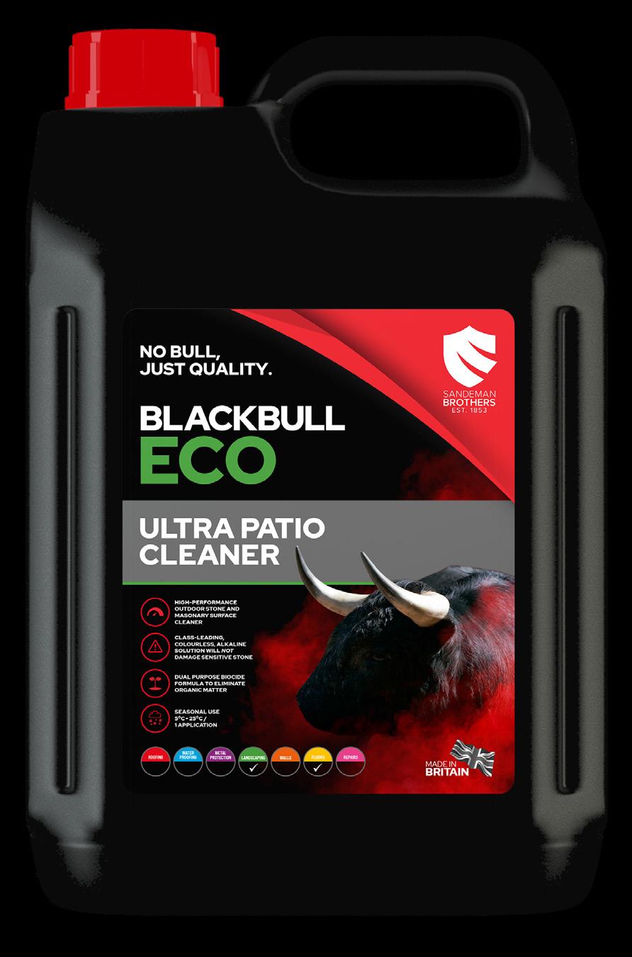
Photography and product packaging is integral to Sandeman language and supports our effort to mirror client expectations of professionalism, trustworthiness and always being on-point. The Sandeman Brand Guidelines should be used as a bible to ensure brand consistency across our product range and communications.
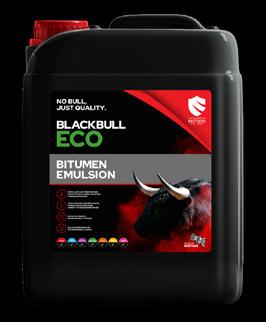
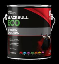
The Blackbull range of products all feature the bull image and strong, clear typography with the brand colours along with green ECO branding and coloured product range identifiers.
The Sandeman secondary logo is used here to enable maximum impace in a small space. The tagline is used at the top on all labels.
Icons are used to visually represent the key information points on the packaging.

Our Letterhead Templates Templates available:
— A4 Letterhead template (Word RGB)
— A4 Letterhead print artwork (CMYK)
Please ensure that the brand typeface, Red Hat Display Regular, is installed before using either template.
For key employees, printed business cards are still an important way to share personal contact details.
Card Size: 85 x 55