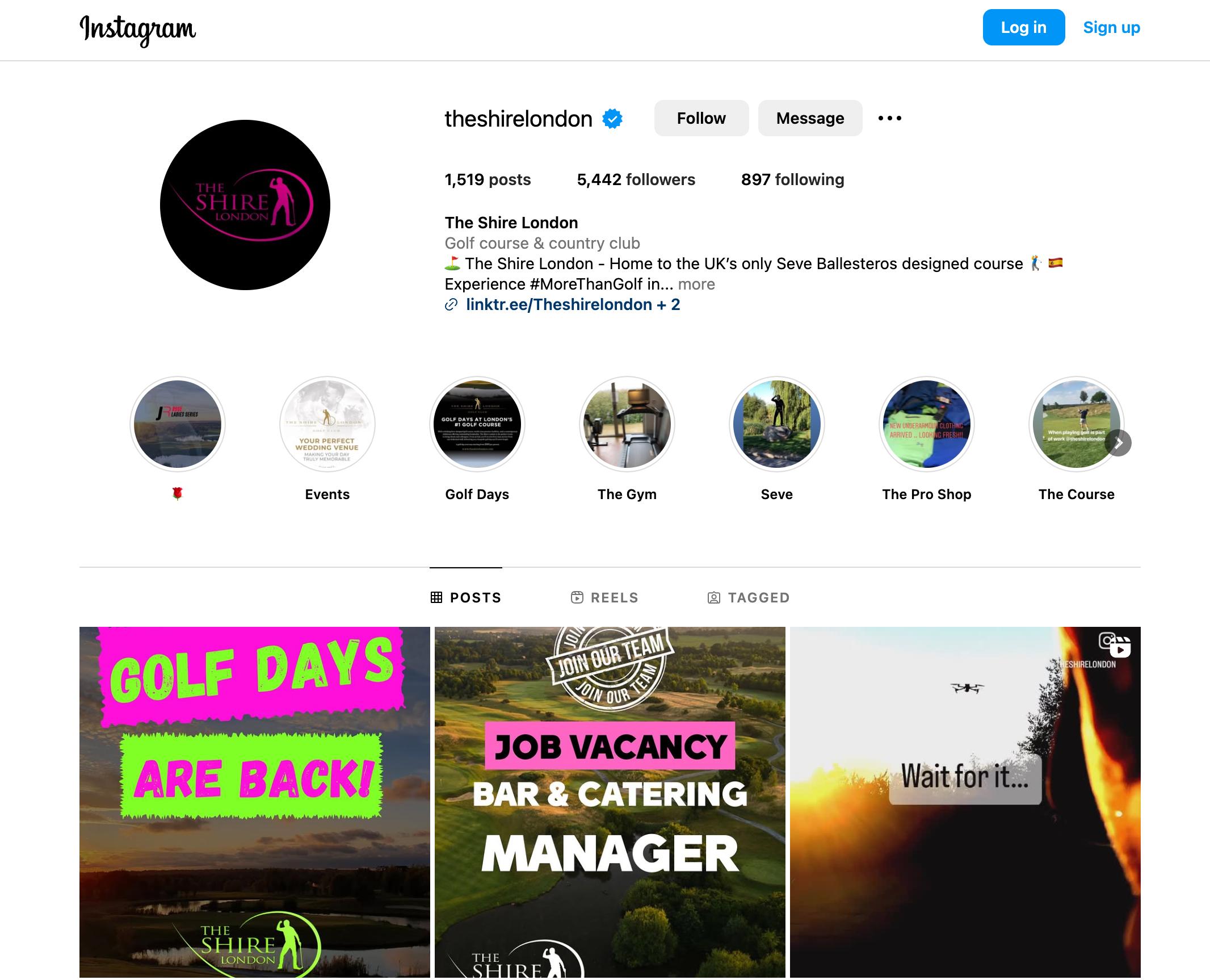

BRAND GUIDELINES
The Shire brand guidelines
There is only one orientation in which the logo should be displayed, with the icon centred above the text. The primary use of the logo is gold on purple. The clear spacing around the logo is defined by the scale of the icon.
Logo Font
MONTSERRAT MEDIUM - HEADLINE
MONTSERRAT LIGHT - SUB HEADLINE 16/19PT
Montserrat Regular - body text 10/12pt
Colours
Below is a breakdown of Nebu’s colours for Web/Digital (RGB) and Print (CMYK).
30/36PT
RGB
R54


