BRAND GUIDELINES / VERSION 1.0 2020


BRAND GUIDELINES / VERSION 1.0 2020


Based in Essex, we have become one of the UK’s leading manufacturer of specialist construction materials. For 50 years Ronacrete has been at the leading edge of product development and performance. Innovation and brand leadership are enhanced by technical support which is considered the best in the industry. The Ronacrete philosophy is to constantly strive to be the best in all activities. We are one of the few, successful, family run independent British companies in the building materials industry. This therefore allows us to have a flexible attitude and genuine commitment to customer service.
Ronacrete was founded by Fran and Maurice Osen on 1st April 1969. The first office was in the corner of their bedroom with a hand made desk and a second hand typewriter. They saw a gap in the market for alternatives to epoxy and polyester mortars, which were extensively used for concrete repair and screeding. They came up with the idea of offering Ronafix, which is an SBR polymer admixture designed to be mixed with cement and sand to form a strong and durable mortar.
1971
We start distributing internationally and our pre-packed rapid setting mortars were used extensively in the Middle East for the bedding of movement joints in road construction.
1978
Ronafix was awarded its first BBA certificate. 3 more certificates were to follow.

1984
Following the success of a large project at the new HSBC HQ in Hong Kong and high demand for our products, Ronacrete (Far East) Limited was founded.
1974
Large quantities of Ronafix were supplied to the Barbican Centre in London for bedding brick slips, laying thin screeds, repairing fire damaged concrete and bedding of block paviours.

1983
Ronacrete was founded by Fran and Maurice Osen in 1969. Still agile at 50, Ronacrete remains a family owned company and was recognised by Her Majesty the Queen when awarded The Queen’s Award for Export Achievement. Below is a brief timeline of events, taken from an idea to the Ronacrete you know today.
Over 300,000 litres of Ronafix were supplied to the new headquarters of HSBC in Hong Kong. A special formulation was required to create a spray applied polymer/ cement coating to protect the steel.
Ronacrete were awarded the Queen’s Award for Export Achievement and were invited to attend one of the famous Royal Garden Parties at Buckingham Palace.
We celebrated 30 years. The RonaDeck hard landscaping range was introduced to the industry.
Large volumes of RonaScreed 8 Day Overlay were supplied for the screeds at Heathrow Airport Terminal 2.
Ronafix Pre-packed Screed 6-50 was specified and used for the screeds at the Shangri-La Hotel at the top of The Shard
Awarded BS EN ISO 9001. Later awarded BS EN ISO 14001 and OHSAS 18001.


RonaDeck Resin Bound Surfacing was introduced to the market. We supplied materials for nearly 4,000m2 of paving for Newmarket Racecourse
Move to our new state of the art production and laboratory facilities in Harlow, Essex.

Following successful works in the early 80’s, Ronacrete was contacted again to supply materials for extensive refurbishment works to podiums at the Barbican Centre. Success at the Barbican was followed by a similar project at the Brunswick Centre. The futures bright...

Ronacrete offers a number of RIBA approved CPD seminars as part of its commitment to training. CPD seminars are held at your office at a time to suit you. Our seminars discuss the importance of specifying the most appropriate material for the application and installation techniques and procedures required for successful realisation of design. Our RIBA approved CPD seminars are also available to view online through the Ronacrete CPD Academy which can be found on our website. importance of specifying the most appropriate material for the application and installation techniques and procedures required for successful realisation of design. Our RIBA approved CPD seminars are also available to view online through the Ronacrete CPD Academy which can be found.


“Ronacrete works closely with trade associations to promote high standards at all levels of the legislative and regulatory process. We aim to work towards the improvement of training and education, promotion of high standards and quality of service”


Building a strong and vibrant identity for Ronacrtete is essential, our brand connects people to who we are as an organisation. The careful nurturing and application of our identity helps to distinguish the brand in a busy construction materials marketplace. Our identity is more than just a logo. It is a simple toolkit of core elements that come together to create a distinctive look and feel that makes the Ronacrete brand compelling and instantly recognisable.
By physically representing the brand in a consistent way, we will develop and reinforce the understanding and positioning of the marque.
Using these guidelines for every piece of communication will help project the carefully crafted and developed brand image. Consistency is key to the brand and its usage.
A brand identity with a consistent personality helps our audience to associate with our set of values and standards. These guidelines for the marque assist in the correct usage of the Vision brand, reinforcing the identity and brand personality.

The Ronacrete logo is the primary symbol of our brand. It unifies us across multiple advertising and communication platforms and geographies. In combination with our other brand elements it plays a pivotal role in establishing Ronacrete as a World Class Manufacturer

Our logo encapsulates everything that we stand for. It expresses our core values and personality. It is a simple and functional signpost to help people find and identify our business. The following pages sets out standards for the use of these visual elements to achieve brand consistency, recognition and recall.
There are two versions of our logo, to ensure word-mark legibility at all sizes.
Our PRIMARY LOGO is preferred, and we use it wherever possible. Always use it in applications where the logo is a focal point.
Our SECONDARY LOGO has a larger word-mark, for optimum legibility at smaller sizes. We use this in contentheavy applications where the logo lives at smaller scales.
The master logo is preferred, and we use it wherever possible. Always use it in applications where the logo is a focal point.
Occasionally a selected image may not have an area where the logo can be clearly applied. To allow our logo to work correctly and to maximise visibility and legibility a logo panel has been developed. This should only be used where visibility is an issue. The formula for the logo panel is shown opposite and applies to all sizes of logotype reproduction.
The graphic ident is a modern interpretation of a bridge. The graphic is a supporting element and is a combination of two parts in a fixed relationship with the master logo and on its own to be used on social media platforms.
The graphic ident can also be used in blue or black in the form of an outline when used for graphical representation, in-line with the illustration style outlined on pages 40 and 41.
Our graphic ident is a visual symbol of our company and expresses our core values and personality.


Principle
To allow our logo to work correctly, there must always be clear space around it. Our logotype must always be surrounded by an area entirely clear of copy and any other graphic devices. The formula for this exclusion zone is shown above and applies to all sizes of logotype reproduction.
You should always avoid placing text or any other graphic elements near the logo. The amount of room you need to leave is indicated by the clearzone, the pink hashed area which does not print. It is based on the circle icon of the logo - the clearspace should be the height and width of the circle icon as outlined in the illustration.


Our primary corporate colours are a bright blue PMS CYAN and a Dark blue PMS REFLEX BLUE. Black and white are also important colours in our visual language. When our logotype appears in a colour, PMS CYAN and WHITE are the colours used. When reproducing the logo always use PMS CYAN and BLACK as a solid colour, never as a tint.
Colour is a strong part of our visual language, our primary colours are bright blue, dark blue and black.
CMYK: C100 M0 Y0 K0
RGB: R0 G159 B223
CMYK: C78 M58 Y0 K0
RGB: R0 G20 B137
CMYK: C0 M0 Y0 K100
RGB: R44 G42 B41
Colour palette
To achieve a maximum consistent colour reproduction across all media and communications, please match colours to their PANTONE® coated equivalents. This applies to printing on coated and uncoated paper stocks. Sometimes it may be necessary to match the colour visually according to each particular application.
Use the CMYK and RGB supplied. The process colour values / breakdowns are those recommended by PANTONE® and are taken from the latest PANTONE® Colour Bridge book
The secondary colours should always be used as a solid colour and never as a tint.
Green
Pantone 360
CMYK: C61 M0 Y88 K0
RGB: R108 G194 B74
Red
Pantone 485
CMYK: C0 M93 Y86 K0
RGB: R218 G41 B28
Orange
Pantone 1375
CMYK: C0 M47 Y91 K0
RGB: R255 G158 B27
Teal
Pantone 7427
CMYK: C64 M0 Y28 K0
RGB: R92 G184 B178
Blue
Pantone 7684
CMYK: C78 M58 Y0 K0
RGB: R56 G94 B157
Light Grey
Pantone Cool Grey 1
CMYK: C3 M3 Y3 K8
RGB: R217 G217 B214

Type plays an important role in defining and strengthening our personality. Our typography is simple clean. With a wide range of weights. Montserrat enables us to express ourselves consistently in all applications. Wherever possible use a combination of weights and colour to create hierarchy and interest within your layouts/designs.
TYPOGRAPHY
Numbers
Symbols
Montserrat
Montserrat is a geometric sansserif typeface designed by Julieta Ulanovsky, a designer from Buenos Aires, Argentina the Montserrat typeface is based upon the old posters and signs in the city of Buenos Aires and especially the neighbourhood of Montserrat. Between 1925 and 1950 unique typography starts to emerge in the city of Buenos Aires.
Wherever possible use a combination of bold, medium and light weights to create hierarchy and interest within your layouts or design. Use Semi-bold and Regular as replacements for Medium and Light if the font is used below 7pt
Arial
Where the design requirement necessitates a universally used font – for example within the design of certain html websites or newsletters – the Arial typeface can be used instead of FS Montserrat.
Usage Licence
These fonts are licensed under the Open Font License. You can use them freely in your products & projects - print or digital, commercial or otherwise. However, you can’t sell the fonts on their own.This isn’t legal advice, please consider consulting a lawyer and see the full license for all details.
Google Fonts: Montserrat Standard-Styles
Montserrat Bold
ABCDEFGHIJKLMN
Montserrat Semi-bold
Montserrat Regular ABCDEFGHIJKLMN OPQRSTUVWXYZ abcdefghijklmn opqrstuvwxyz
Montserrat Light
ABCDEFGHIJKLMN OPQRSTUVWXYZ abcdefghijklmn opqrstuvwxyz
Montserrat Medium

Imagery is integral to Ronacrete visual language and supports our effort to mirror client expectations of professional, trustworthy and always on point. When choosing images to support Ronacrete marketing material, ensure that they are in line with the tone and feel of the Ronacrete brand.
When creating or choosing images to accompany work for Ronacrete, ensure that they are in line with the tone and feel of the brand.


Always photograph products side-on, logo and information centered. Rectangular products to be photographed at a 20° angle to show front and side information.


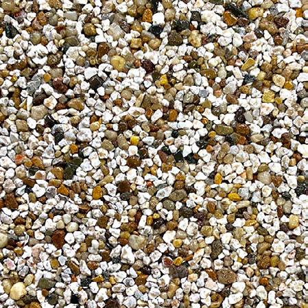
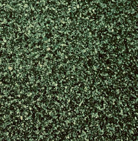
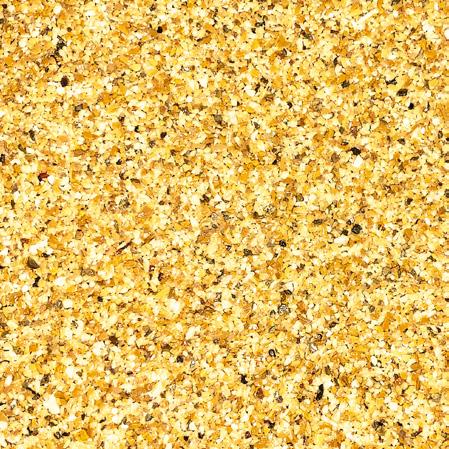
To maximise the result of close-up photography always shoot direct and straight-on. Always flatten and remove any debris from the loose gravel before photographing.


The Ronacrete line art or line drawing illustration style is used to represent two-dimensional or three-dimensional buildings or objects
Use professional photography to show-case product application. Imagery must include either one-or-two people applying the product or a piece of installation equipment.


This section shows a number of examples and illustrations of identity templates and application. Structured grids bring order to the design; they are the structural foundation for the consistent organisation of all graphic, text and photographic elements in print or online.
JOHN
SMITH COMMERCIAL DIRECTOR jsmith@ronacrete.co.uk
Ronac House, Flex Meadow, Harlow, Essex, CM19 5TD
+44 (0)1279 638700
+44 (0)1279 985492
www.ronacrete.co.uk
6mm
Printed business cards
are still an important way to share personal
contact details.
Specifications
For key employees, printed business cards are still an important way to share personal contact details.
Business cards bearing the Ronacrete logo should only be issued exclusively to Ronacrete staff only. Business cards comply with the standard layout to ISO 85mm x 55mm to ensure a consistent look.
6mm clear area all around Recommended gsm: 300 To comply with Forest Stewardship Council (FSC) regulations, printers must be FSC approved.


All print publications including brochures and catalogues should use impactful imagery that is in line with the tone and feel of the Ronacrete brand.
The design of Ronacrete publications are based upon our brand principles, employing consistent use of the brand’s elements to increase brand recognition and visibility.
Grids bring order to the design; they are the structural foundation for the consistent organisation of all graphic, text and photographic elements in print or online. They are fundamental to the overall design scheme, creating a common link between the print and digital collateral.
