connecticut cottages & gardens | march 2023 ..... cottagesgardens.com COTTAGESGARDENS.COM | MARCH 2023


every property has a story... it begins with a vision seventyacres.com SEVENTY ACRES LANDSCAPE ARCHITECTURE AND DESIGN ©2023
Seventy Acres, LLC

 *$8,490 instead of $11,480 until 04/30/23 for a dining table as shown, 86.6" L. x 29.5" H. x 45.2" D. Price includes one barrelshaped top in ceramic/glass composite (many finishes available) with 2 integrated extension leaves (15.7’’) that transform the shape of the top into an oval. Crossbar in aluminium and base in steel with epoxy lacquer finish. Other shapes and dimensions available. Kasuka chairs, designed by Roberto Tapinassi & Maurizio Manzoni. Dorienne suspension and table lamps, designed by Martino Sasso. Dune rug, designed by Emmanuel Gallina. Made in Europe.
In-store interior design & 3D modeling services (1) Quick Ship program available.(2)
 French Art de Vivre

architecture | interior design new york | nantucket | greenwich | palm beach workshopapd.com 39 west 38th street, 7th fl


Hartford,CT Fairfield,CT Farmington, CT Danbury, CT Guilford, CT Stamford, CT Torrington, CT GreatBarrington,MA www.waterwareshowrooms.com
GARRETT WILSON

1599 POST ROAD EAST I WESTPORT, CT 06880 I 203-259-3333 I GARRETTWILSONBUILDERS.COM
LLC
Christian Rae Studio,
BUILDERS


californiaclosets com CALL OR VISIT US ONLINE TODAY TO SCHEDULE YOUR COMPLIMENTARY DESIGN CONSULTATION CONNECTICUT 565 WESTPORT AVE, NORWALK 203.924.8444 WESTCHESTER 16 SAW MILL RIVER RD, HAWTHORNE 914.592.1001 @caliclosetsct MAKE ROOM FOR ALL OF YOU ©2023 California Closet Company, Inc. All rights reserved. Franchises independently owned and operated. CT HIC #0657205 CT037_CottGar_MakeRm_D1_10x12_0123.indd 1 1/12/23 10:56 AM


A&D BUILDING, NYC MAMARONECK, NY MOUNT KISCO, NY GREENWICH, CT 866.245.6882 WWW.BILOTTA.COM WITH INGERSOLL ARCHITECTS PHOTOGRAPHY BY AMANDA BERCE

ARTEMIS landscape architects www.artemisLA.com 203.683.1808 Connecting You With Nature


D E A L E R O P P O R T U N I T I E S A V A I L A B L E 877.866.40 3 8 w w w t e a kf u r n it u r e c o m B U I L T T O C O N T RACT S P E C I F I C A T I O N S W I T H P R E M I U M QU A L I T Y TE A K F R O M RENEWAB L E P L A N T A T I O N S WESTMINSTER TEAK L UXUR Y T EA K FUR N I T U R E L O N G A F T E R T RE N D S A R E F O R G O T T E N Buck ingham Back less Bench Set TIMELESS DESI G N . C R A F TS M A NSHIP PERF O RM A NC E VISIT OUR FLAGSHIP SHOWROOM IN ANAHEIM, CA Use Promo Code CTG for additional 5% discount


residential architecture of distinction NEW CANAAN 203.966.0048 wadiaassociates.com PALM BEACH 561.282.9449 Exquisite details & perfect proportions. traditional architecture for the modern world.

why settle for ordinary when you can experience excellence eggersmann since 1908 eggersmannusa.com new york | dania beach | houston | dallas | chicago | los angeles | toronto | pittsburgh | scottsdale | sand city | maui | honolulu | los cabos 150 E 58th St, 10th Fl | New York, NY 10155 | 212.688.4910 eggersmann Kitchens | Home Living


WESTPORT SHOWROOM 203.227.5181 Exceptional Products, Personal Service. BETHEL SHOWROOM 203.790.9023 Stone lasts for generations. Celebrating 160 years. gaultstone.com STONE & LANDSCAPE SUPPLIES

FEATURES 56 One of a Kind Art and grandeur happily coexist in a magnificent country estate by
66 A Study in Contrasts Sissy+Marley’s warm minimalism fills an Old Greenwich home by
photographs by Marco Ricca 74 Greek Revitalized Well-considered updates bring a beloved home into the present by
Alexa Stevenson photographs by Durston Saylor
David Masello
Mindy Pantiel
From “Greek Revitalized” page 74.
photographs by Thomas Loof Styling by Margaret Russell
84 House of Three Gables A stunning contemporary design embraces the New England vernacular
on the cover
Photograph by Thomas Loof
by Eva Hagberg photographs by Peter Brown
“House of Three Gables” page 84.
CONNECTICUT COTTAGES & GARDENS • MARCH 2023 • COTTAGESGARDENS.COM
photograph by Peter Brown
Your Inspiration. Our Expertise.

Since 1902 RING’S END
144 / CURATED PAINT COLOURS
29 / IRISH DESIGNERS
5 / STUNNING FINISHES

1 / BEAUTIFUL COLLECTION

MARCH DAY
at Ring’s End Darien and Fairfield. Available online at RingsEnd.com and by special order at all locations.
Stocked
DIANE DI COSTANZO


22 Editor’s Letter 24 Letter from the CEO 30 Contributors 32 Calendar CONNECTICUT COTTAGES & GARDENS • MARCH 2023 • COTTAGESGARDENS.COM HOBIS: MICHAEL BIONDO; CALENDAR: HANGAMA AMIRI, MAH CHEHRA BEAUTY PARLOR, 2022, COURTESY OF THE ARTIST, PHOTO: CHRIS GARDNER 18 CTC&G | COTTAGESGARDENS.COM | MARCH 2023 35 What’s New Out of the Box Distinctive architectural products combine good looks and functionality BY
FITZGERALD 38 Design Notes Buzzworthy A peek inside the latest design news happening in the area BY MARY FITZGERALD 40 Spotlight Building is Booming Top winners at the 2022 HOBI awards BY CATRIONA BRANCA 46 Project of Note A Brutalist Icon Architect Marcel Breuer’s New Haven landmark is reimagined as a sustainable hotel
48 Deeds & Don’ts Inside stories behind area real estate deals BY
92 Wine & Spirits The White Lotus Wines Sip along with the stars with some of Sicily’s best BY
94 Parties & Benefits 102 Resources 104 Meet the Architect Thomas Kligerman Known for his unique Shingle Style homes, Thomas Kligerman shares his passion for architecture, sailing and painting BY SHARON KING HOGE 40 35 32
MARY
BY MARY FITZGERALD
BARONESS SHERI DE BORCHGRAVE


BUILD YOUR NETWORK: ROBERT BENSON; DESIGN YOUR DREAM HOME: MEG MATYIA cottagesgardens.com @cottagesgardens /cottagesgardens /cottagesgardens • • • @cottagesgardens Find design professionals at cottagesgardens.com/tastemakers Subscribe now to receive C&G every month at cottagesgardens.com/subscribe DESIGN YOUR DREAM HOME DELIVERY! connecticut cottages december cottagesgardens.com COTTAGESGARDENS.CO DECEMBERINNOVATION IN DESIGN AWARDS connecticut cottages gardens november cottagesgardens.com COTTAGESGARDENS.COM NOVEMBER 2022 VIBES New Kitchen january 2023 cottagesgardens.com BUILD YOUR NETWORK Find us on Facebook at facebook.com/cottagesgardens 20 CTC&G | COTTAGESGARDENS.COM | MARCH 2023

Exquisite. Experiential. Effortless. 203.938.0900 info@homefrontfarmers.com : homefrontfarmers.com : @homefrontfarmers Words rarely used to describe vegetable gardens. Words frequently used to describe ours. Your property is an extension and reflection of your lifestyle and impeccable taste. Homefront Farmers understands this. The organic gardens we design, build, and maintain are works of art that blend seamlessly into your landscape. Our expert farmers take loving care of your ‘homestead’ to produce exceptional tasting vegetables, fruit, honey, and maple syrup all season long for your family. Delight in the joy and satisfaction of growing your own food at home… effortlessly. YARD TO TABLE SINCE 2011 A RIVERSIDE FENCE COMPANY
Iam amazed at what sometimes happens to me when I spend time searching for products. Like the rest of the world, I fall into the rabbit hole, and who knows where it will lead! I read that mushrooms are the new darlings of the food, beauty and product worlds. I don’t really like eating mushrooms. And I remember a line of beauty products a few years ago that used mushrooms. I bought a few—and immediately had an allergic reaction! Meanwhile, my search continued, focusing on—ready?— mushrooms used in lighting. I was intrigued. I searched and found “mushrooms used in buildings,” and I was on the hunt! ■ The architect, Tsukasa Ono—a specialist in the use of bacteria and fungi in architecture—had just created Sumu Yakushima, a community built in a farming area with views of the sea on the Japanese island of Yakushima. I was immediately drawn to the simple lines of these wood structures nestled into the environment. Ono, a student of regenerative architecture—which seeks to minimize the impact of buildings on the land—wanted to explore the relationship between human habitation and the environment. Several decisions were made with this in mind: The site for the buildings was determined by the existing trees on the property. The buildings were elevated to take advantage of the natural flow of air from the hills to the nearby sea. Wooden pilings with charred surfaces were driven into the soil beneath the foundations of each building. The carbonized wood promotes the growth of mycelium, which helps strengthen the soil. This regenerative building method keeps the microorganisms in the soil alive, thereby activating the bacteria. The building, in effect, can connect with the natural network. Think about it enriching nature while making the buildings more robust and comfortable. For the interiors, a fermented plaster was used for the walls and floors that was made by mixing charcoal with a special type of bacteria. According to the architect, the plaster helps to prevent mold and other decaying bacteria. All energy is generated by solar and stored in batteries; local firewood is used for heating and cooking. ■ It excites me to see such innovation. Our world is changing, and it’s exciting to discover new ideas. Forward thinking. Experimental design. I want to be a part of it all!
 DJ Carey Editorial Director djcarey@candg.com


CAREY: CHICHI UBIÑA; HAIR AND MAKEUP BY WARREN TRICOMI SALON AND SPA, GREENWICH Exploration EDITOR’S LETTER


We Make ...Too. ELECTRIC bevolo.com • 504-522-9485 • 521 Conti • 304 • 316 • 318 Royal • French Quarter • New Orleans
203-544-7988

 LETTER FROM THE CEO

Still Booming!
The coronavirus migration into Connecticut was the third highest in the United States (behind Maine and Vermont), according to a CBRE survey. Many moves were also within the state, so that our neighborhoods— including mine—are full of new young families. ■ Our parent company, C&G Media Group, conducts an annual readership survey, but there was none during the “big move” of 2020 and 2021, so we could hardly wait to find out about our new homesteaders. Happily, the newcomers have adopted CTC&G with enthusiasm, and almost half of them have read three or four of the last four issues, and 60 percent plan to save their issues for future reference. They follow us online too—with almost half of them visiting cottagesgardens.com several times a month! ■ The question I hear often is “have they finished the record amount of designing, decorating, building and landscaping that has prevailed during the past two years?” The answer is no, they have not finished! The interest in home improvement continues unabated with almost seven in 10 planning to redecorate/ remodel/renovate their homes in the next 12 months, and 64 percent planning to use a builder/contractor and 61 percent planning to use the services of a landscape designer/architect. ■ There is a lot more information about our respondents plans, so for a complete copy of the survey results contact jbarbaro@candg.com.
 Marianne Howatson CEO/Publication Director mhowatson@candg.com

HOWATSON: DOREEN BIRDSELL
84 Danbury Road Wilton CT 06897 dconlonarchitects.com
Interest in home improvement is still going strong. Many plan to use design professionals to get the job done.

OFFERING DECORATIVE PLUMBING & LIGHTING, VANITIES, CABINET & DOOR HARDWARE. CONTACT US TO SCHEDULE AN APPOINTMENT. STAMFORD • FAIRFIELD • DANBURY • NEW HAVEN • EAST WINDSOR • WATERBURY Since 1917 • www.TorrcoDesignCenter.com • 203.479.6935
FENCES PERGOLAS
ARBORS GATES TRELLISES RAILINGS
MARCH 2023
PUBLICATION DIRECTOR
MARIANNE HOWATSON
EDITORIAL DIRECTOR
DJ CAREY
DESIGN CONSULTANT ANDRZEJ JANERKA
SENIOR ASSOCIATE ART DIRECTOR
KRISTEN HOGE
ASSISTANT ART DIRECTOR
LYDIA MATTSON
EXECUTIVE EDITOR
CATRIONA BRANCA
SENIOR ASSOCIATE EDITOR
MARY FITZGERALD
EDITOR AT LARGE
SHARON KING HOGE
CONTRIBUTING EDITORS
SHERI DE BORCHGRAVE, ANN LOYND BURTON, DIANE DI COSTANZO, HELEN KLISSER DURING, EVA HAGBERG, ANN KAISER, JAMIE MARSHALL, TOVAH MARTIN, DAVID MASELLO, MINDY PANTIEL, HARRIET MAYS POWELL, ALEXA STEVENSON, SUSAN TAMULEVICH
LIVE OUTSIDE EXPECTATIONS
Bring inspired ideas for your outdoor home to life with Walpole Outdoors. Schedule your free design consultation today. walpoleoutdoors.com | 866.779.3853


CONTRIBUTING PHOTOGRAPHERS
JULIE BIDWELL, WILLIE COLE, TRIA GIOVAN, JOHN GRUEN, HULYA KOLABAS, NEIL LANDINO JR., TIM LEE, TIM LENZ, ELLEN MCDERMOTT, ANASTASSIOS MENTIS, MARCO RICCA, RIKKI SNYDER
PROOFREADER
ANNETTE ROSE-SHAPIRO
C&G MEDIA GROUP
EDITORIAL DIRECTORS
DJ CAREY KENDELL CRONSTROM
COTTAGESGARDENS.COM daily DEEDS.COM
EDITORS AT LARGE
DIGITAL AND MARKETING ASSISTANT DAILYDEEDS.COM EDITOR
PRODUCER
DIGITAL INTERN
PRODUCTION SERVICES

STACEY FARRAR, BETH MCDONOUGH JACQUELYN SHANNON
ANNE GIORDANO
MICHAEL EKSTRACT
ANNIKA HOLMBERG
INTERNATIONAL COLOR SERVICES
HEADQUARTERS
40 Richards Avenue, 5th Floor, Norwalk, CT 06854
Phone: 203-227-1400
Fax: 203-226-2824
Copyright © 2023 by Dulce Domum, LLC.
All rights reserved. Cottages & Gardens is a trademark and a service mark of Dulce Domum, LLC. Reproduction by permission only. The publisher and editors are not responsible for unsolicited material.


Building the Contemporary Home yankeecustombuilders.com
A celebration of outdoor entertaining, landscape and garden design
SAVE THE DATES
PATRON PARTY
HISTORIC MID-COUNTRY HOME
WEDNESDAY, MAY 24
6:30-8:30 PM
TOUR
THURSDAY, JUNE 1
10:00 AM-2:00 PM
HONORARY CHAIR AERIN LAUDER
PRESENTING SPONSOR
MARCH 2023
CHIEF EXECUTIVE OFFICER
MARIANNE HOWATSON
PUBLISHER, HC&G
ASSOCIATE PUBLISHER, NYC&G
ACCOUNT DIRECTORS
PAMELA ELDRIDGE 917-535-8226
MELISSA GROHER ROSENBLUTH 860-906-7182
LISA HEISSAN | 917-294-1897
WENDY HORWITZ | 914-260-2738
JAMIE LEWIS | 917-744-8106
LAURA MEYER | 203-243-4057
PRODUCTION MANAGER
DIRECTOR OF MARKETING, EVENTS AND PR


MARKETING AND EVENTS
SENIOR ASSOCIATE

CREATIVE SERVICES MANAGER

BUSINESS MANAGER/HR
FINANCE MANAGER
FINANCE ASSOCIATE
DISTRIBUTION
CONSUMER MARKETING
CARLA EVANS 203-520-6533
JENNIFER BARBARO
STEPHANIE YALAMAS
SARAH RUSSO
CAROL ABRAMS
ROSEANN BROWN
JOY MARSHALL
DIRECT MARKETING DISTRIBUTION
NEXT STEPS MARKETING
THEA SELBY AND KAREN L. CUNNINGHAM
FOLLOW #COTTAGESGARDENS
DIGITAL EDITION
Please visit cottagesgardens.com/ctcgonline
SPONSORS
MEDIA SPONSOR
GREENWICHHISTORY.ORG/SPRINGTOUR
WRITE TO US
We love hearing from you! Email us at advertising@candg.com
NEWSLETTERS
Sign up for Cottages & Gardens newsletters at cottagesgardens.com/candgnewsletters


Subscriptions to our publications are available at the following prices:
CTC&G (11 issues): $49.95 NYC&G (5 issues): $39.95 HC&G (8 issues): $39.95
Offers are available if you purchase two or more titles online at cottagesgardens.com/subscribe. To purchase a copy of the Connecticut Design Guide 2023 for $19.95 plus shipping go to cottagesgardens.com/CTCGShop. Subscription questions? Please call 203-227-1400 or email subscriptions@candg.com Please allow four to six weeks for your first issue to arrive. To subscribe by mail, send check or money order, Attention: Subscriptions, to:
C&G Media Group 40 Richards Avenue, 5th Floor, Norwalk, CT 06854 Phone: 203-227-1400 Fax: 203-226-2824
cottagesgardens.com
Dulce Domum, LLC.
Spend


Without Uschi, it wouldn’t be Clarke.
won’t
in Belgium, Uschi Samaritano speaks five languages and is also fluent in selecting just the right appliances for your lifestyle. She is an accomplished cook, passionate gardener, avid apiarist and is known by homeowners and designers alike for her valuable insights for outfitting extraordinary kitchens. Boston & Milford, MA South Norwalk, CT 800-842-5275 clarkeliving.com New England’s Official Showroom and Test Kitchen
an hour at a Clarke Showroom and one thing is clear: your time with a Clarke Consultant is the most valuable part of your kitchen journey. While they’re not designers, these are the people designers call on when it comes to appliance recommendations. You
buy anything at Clarke, so there’s simply no pressure. What you can do is compare more Sub-Zero, Wolf and Cove models than anywhere in New England. Explore a living portfolio of kitchens created by the region’s top designers. You will leave inspired with new knowledge to make your appliance selections with confidence. Born
Hangama Amiri: A Homage to Home
On view through June 11, 2023
New Haven-based artist Hangama
Amiri’s first solo museum exhibition presents work combining painting and printmaking techniques with textiles based on memories of her Afghan homeland and diasporic experience.
Plan your visit and purchase tickets at thealdrich.org
Hangama Amiri. Mah Chehra Beauty Parlor, 2022 Muslin, cotton, chiffon, polyester, suede, iridescent paper, iridescent fabric, silk, and found fabric, 74½ x 57 inches, Courtesy of the artist. Photo: Chris Gardner

In This Issue
WHAT WAS THE STYLE OF THE HOME YOU LIVED IN WHILE GROWING UP AND HOW HAS IT INFLUENCED YOUR WORK?
CHRISTOPHER PAGLIARO
“I grew up in a New York City apartment, not a single-family home. It was, however, influential in the development of my work. Modern, with abundant windows and natural light, it was always happy. I was exposed to an eclectic interior design style—inclusive of classic and modern furnishings and artwork of bold and bright color. In retrospect, the apartment itself was a white canvas that served as a pure backdrop to my parent’s personalities.”
“House of Three Gables,” page 84, principal, Christopher Pagliaro Architects, pagliaroarchitects.com.
CHELSEA REALE AND DIANA RICE

“Growing up we never had the biggest house on the block, but my mom always made it beautiful. Her eye for detail and love of all things beautiful ensured we always lived in a beautifully and thoughtfully curated space.” —Chelsea Reale “A Study in Contrasts,” page 66, interior designers, Sissy + Marley Interior Design, sissyandmarley.com.
THOMAS MCMANUS


“My childhood house in Massachusetts was a very simple, five-bay, clapboard, Colonial house with a hipped roof and an attached two-car garage—two humble, connected masses. Across the street was an identically planned house with a gable roof and a ‘hyphen’ between the house and the garage. The New England tradition of additive massing to create larger houses out of normally-scaled pieces brings a sense of relaxed elegance to residential architecture and is at the core of many of the projects I work on.”
“Greek Revitalized,” page 74, partner, Ferguson & Shamamian Architects, fergusonshamamian.com.
—Mary Fitzgerald
CONTRIBUTORS REALE AND RICE: JAMI SAUNDERS; MCMANUS: MATT LICARI
258 Main Street | Ridgefield, CT 06877 | thealdrich.org

@BURRSALVATORE | BURRSALVATORE.COM
Canadian artist Hangama Amiri combines painting and printmaking techniques with textiles, weaving together stories based on her memories of her homeland and her diasporic experience. Serving as Amiri’s solo museum debut, this exhibition is centered on the lives of women and builds interiors that capture her protagonists within domestic and entrepreneurial spaces, amplifying a collective struggle for women’s rights in Afghanistan and around the world. Open now through June 11. The Aldrich, 258 Main St., Ridgefield. For more information, visit thealdrich.org.

The Orchid Show
Renowned landscape artist Lily Kwong is the guest designer for the New York Botanical Garden’s 20th annual Orchid Show. This exhibition will transport guests to ethereal, reverent landscapes inspired by ancient Chinese garden design and artistic principles with immersive installations in the historic Enid A. Haupt Conservatory. On view now through April 23. New York Botanical Garden, 2900 Southern Blvd., Bronx, NY. For more information, visit nybg.org/event/the-orchid-show-natural-heritage.

Join CTC&G Editorial Director DJ Carey and Pollack Design Director Rachel Doriss for a comprehensive course that follows the life of a fiber, from raw material to finished textile, and includes practical applications that enable designers to choose the right fabric for their projects.


Wednesday, March 29, 9 a.m. This course is IDCEC Approved, 1 CEU credit. Holly Hunt, 375 Fairfield Ave., Suite 102, Stamford. RSVP to ctcgevents@candg.com.

FROM NYC TO RIDGEFIELD CALENDAR THE ORCHID SHOW: GESI SCHILLING, LANDSCAPE ARTIST: LILY KWONG; HANGAMA AMIRI: MAH CHEHRA BEAUTY PARLOR, 2022, COURTESY OF THE ARTIST, PHOTO: CHRIS GARDNER March 2023 NOW THROUGH JUNE 11
NOW THROUGH APRIL 23 23
HANGAMA AMIRI: AN HOMAGE TO HOME TEXTILES 101 SUBSCRIBE NOW (or give the gift of...) COTTAGESGARDENS.COM/SUBSCRIBE SUBSCRIPTIONS@CANDG.COM / $49.95 connecticut cottages & gardens december 2022 cottagesgardens.com COTTAGESGARDENS.COM | DECEMBER 2022 INNOVATION IN DESIGN AWARDS COTTAGESGARDENS.COM JANUARY 2023 VIBES New Kitchen connecticut cottages gardens january 2023 cottagesgardens.com COTTAGESGARDENS.COM | FEBRUARY 2023 COLOR ITChic


Out of the Box
DISTINCTIVE
ARCHITECTURAL PRODUCTS COMBINE GOOD LOOKS AND FUNCTIONALITY
|
BY MARY FITZGERALD
FIRST IMPRESSIONS
An inviting pergola from Walpole Outdoors adds character to this entryway. The structure is crafted from low-maintenance solid cellular vinyl and is delivered factory pre-finished in a choice of more than 100 colors. Price upon request, walpoleoutdoors.com.

WHAT’S NEW
35 MARCH 2023 | COTTAGESGARDENS.COM | CTC&G
WHAT’S NEW
Duchateau introduced its first designer hardwood flooring collection with worldrenowned interior designer Martyn Lawrence Bullard. Inspired by and named after modern and classical architects, the wide plank flooring is made from European white oak and includes six finishes. Neutra is shown here. Price upon request, duchateau.com.

PET FRIENDLY
ROCK CLIMBING
Add rustic character to interior or exterior walls with Dutch Quality Stone’s Rough Ashlar manufactured stone veneer. Lightweight, the material is composed of large and medium blocks in varying tones and textures and offered in three colorways—Winter Point is shown here. $7 per square foot, available through New Milford Block and Supply, montfortgroup.com, dutchqualitystone.com.


BESPOKE HARDWARE
Create your own design with Emtek Select Lever hardware. Specify the lever grip, stem design, rosette option and preferred finish for a unique handle set. Available in single and two-point locksets. Price upon request, available through Ring’s End, ringsend.com, emtek.com.

Pets will love the freedom to go in and out with Simpson Door Company’s dog door. Each door is made from heavy-duty aluminum and is equipped with shatterresistant K9 composite saloon-style panels. The industrial weather seal ensures air conditioning and heat stay inside your home. $2,500, available through Interstate + Lakeland Lumber, interstatelumber.com, simpsondoor.com.

NOLA CHARM
Handcrafted in New Orleans, the Bevolo Cotton Exchange lantern is fashioned in an antique copper finish and boasts a rounded roof. The fixture can be outfitted with gas or electric and is offered in three sizes. Price available upon request, bevolo.com.

WOW FACTOR
Axolotl’s surfacing solutions make quite an impact. New to the US, the Australian brand specializes in applying metal coatings, including zinc, copper or bronze, to substrates like wood, plaster, concrete, glass and steel. The material is 0.5mm thick—thin enough to be used on garage doors, walls or kitchen islands. Once adhered, it can be treated with finishing effects like etching, carving, burnishing or texturing. Price upon request, axolotlglobal.com.

36 CTC&G | COTTAGESGARDENS.COM | MARCH 2023
FAUX BOIS
Unlike timber boards, Millboard has a solid core of limestone and requires minimal maintenance. It is stain-resistant, won’t rot, warp or harbor insects, and can be used for exterior projects like siding, cladding, decking, walkways and docks. Price upon request, available through Outlive, outlive.info, millboard.com.

FIXER UPPER
The Magnolia Home Collection for James Hardie simplifies the process of re-siding your home. The curated selection of natureinspired colors, styles and textures in Hardie’s most popular cement board styles—plank, shingle and boardand-batten—are all hand picked by Joanna Gaines and pre-finished with Hardie’s ColorPlus Technology for long-lasting beauty. Price upon request, jameshardie.com.

SOUTHERN HOSPITALITY
Family-owned Southern Shutter Home offers a full range of shutters, from louver, paneled and Bahama to board-and-batten styles. The arched board-and-batten shutters, shown here, are set on hinges with bullet-catch holdbacks in a custom antique finish. Price upon request, southernshutterhome.com.

POP THE CORK
Cork is a sustainable and renewable source for wallcoverings or flooring, and its warm natural tones and textures also add thermal and sound insulation. We Cork’s material, available in plank, tile or brick patterns, is made from bark from cork oak trees grown in Portugal. Pricing as shown, $11–$13 per square foot, available through New England Custom Floors, newenglandcustomfloors.com, wecork.com.

SIGHT LINES
Andersen is expanding its A-series portfolio—including the brand’s most energy-efficient patio doors—incorporating narrower sight lines to let in more light and adding contemporary accessories for a sleek look. Choose from a variety of stain and painted interior options and 11 different exterior colors. Price upon request, available through Ring’s End, ringsend.com, andersenwindows.com.

ANDERSEN: CHELSIE LOPEZ PRODUCTION, DESIGN BY MORGAN AND JAMIE MOLITOR OF CONSTRUCTION2STYLE WHAT’S NEW 37 MARCH 2023 | COTTAGESGARDENS.COM | CTC&G
Buzzworthy

Timeless Elegance
A master of the neutral color palette, award-winning interior designer Thomas Pheasant is also known for his striking, sculptural silhouettes and luxe finishes. His latest collection for Baker—his 20th partnership anniversary with the brand— builds on these strengths with a sophisticated assortment of bedroom, dining, occasional and upholstery furniture, mirrors and lighting. Drawing from decades of inspiration, this assemblage represents his definition of modern elegance— curvaceous forms that look beautiful from all angles, classic arches, jewelry-like accents and mixed materials and textures. NYDC, 212-779-8810, bakerfurniture.com.

NEO CLASSIC
Celebrity designer Mary McDonald’s second rug collection for Patterson Flynn is influenced by the Neoclassical Directoire and Empire periods.


Crafted in abaca, the three graphic designs of Masquerade, Polestar and Compass include stylized emblems, diamond patterns, stars and sunbursts, modernized in coloration and scale. Describing Polestar, shown here, McDonald says, “Polestar is a compilation of some of my favorite marble floors in important castles and homes in Europe, translated to a more casual rug. This rug in particular reminds me of all the parts and pieces I love from the Empire period during the reign of Napoleon.” D&D, 212-688-7700, pattersonflynn.com.
BLACK ROCK FINDS ON THE BOARDS
If you haven’t yet discovered the Black Rock Department Store by Patrick Mele— opened in the fall of 2022— now is the time to check out this bohemian home and lifestyle destination. Located in the heart of the artistic Black Rock neighborhood of Bridgeport, the 2,000-square-foot space is filled with curated vintage and antique furniture, art, textiles and accessories, assembled under the tasteful direction of interior designer Patrick Mele. In addition, not-to-be missed vintage clothing by Carol Santini and rugs by Wendy Cooper round out the eclectic offerings. Open Friday and Saturday, 11 a.m.–5 p.m., 2948 Fairfield Ave., Bridgeport, 203-550-2264. patrickmele.com.
Architectural firm Burr Salvatore has a lot going on these days, starting with a new name. Previously known as Ryan Salvatore Design, the company has been renamed Burr Salvatore Architects with the addition of a new partner, Mary Burr. Salvatore and Burr are former colleagues at Robert A.M. Stern Architects and share a joint philosophy of taking inspiration from historical precedents and adapting them for how people live today. “Our portfolio includes a wide range of styles, but all are united by our unwavering commitment to what we consider the essentials of good design: attentive listening, careful consideration and thorough execution,” states Burr. In other news, the NYC firm recently announced the opening of a second office in Connecticut, located in downtown Darien. 815 Boston Post Rd., Darien, 203-655-0303, burrsalvatore.com.
 —Mary Fitzgerald
A PEEK INSIDE THE LATEST DESIGN NEWS HAPPENING IN THE AREA DESIGN NOTES
38 CTC&G | COTTAGESGARDENS.COM | MARCH 2023 ON THE BOARDS: TIM LEE


DISTINCTIVE HOMES ADDITIONS & RENO VATIONS 203.966.0726 www. hobbsinc.com CONNECTICUT • NEW YORK • NEW JERSEY Architecture: Apparatus Architecture Interior Design: Pimlico Interiors Photography: Amy Vischio Photography
FIVE TOP WINNERS AT THE 2022 HOBI AWARDS
 BY CATRIONA BRANCA
BUILDING IS BOOMING
IN CELEBRATION OF BUILDERS, a record 780 housing-industry professionals gathered for the 28th Home Builders & Remodelers Association of Connecticut’s Home Building Industry Awards (otherwise known as the HOBIs). The highlight of the evening was the presentation of the winning homes by HOBI Awards producer and dinner MC, Joanne Carroll. Awards were given in a wide variety of categories, including custom homes, spec homes, remodeled homes and much more. Here, we highlight a few of the best of the best. To see more of these projects, go to cottagesgardens.com/hobis2022. For a complete list of winners, go to hbact.org/hobiawards.
SPOTLIGHT
40 CTC&G | COTTAGESGARDENS.COM | MARCH 2023 STEVE FREIHON
HOBBS, INC.
2022 PROJECT OF THE YEAR, BEST CUSTOM HOME OVER 15,000 SF
This French Provincial–style estate on 26 Greenwich acres was built by Hobbs, Inc. and designed by Ralph Mackin of Mackin Architects with interiors by Alexa Hampton. The main house has granite lintels, limestone trim, bronze metal windows, a thick, graduated slate roof and botanical-detailed copper scuppers and leaders, and includes a four-car garage and an indoor pool. A two-story oak-paneled foyer features antique limestone imported from France, inlaid between oak accents. Exceptional features include an elegant breakfast room with layered cornice and wainscoting, timber-roof pool house with full length skylight, terraced gardens, pavilion and outdoor tennis courts. The rear terrace has fountains and stone steps that cascade to the field below. The home's state-of-the-art technological features garnered Advanced Home Audio a 2022 CTC&G IDA in Custom Smart Home Integration. Landscape design is by Janice Parker Landscape Architects.


SPOTLIGHT
41 MARCH 2023 | COTTAGESGARDENS.COM | CTC&G
HSL BUILDING COMPANY
2022 CUSTOM HOME OF THE YEAR, BEST CUSTOM HOME 6,000–7,000 SF
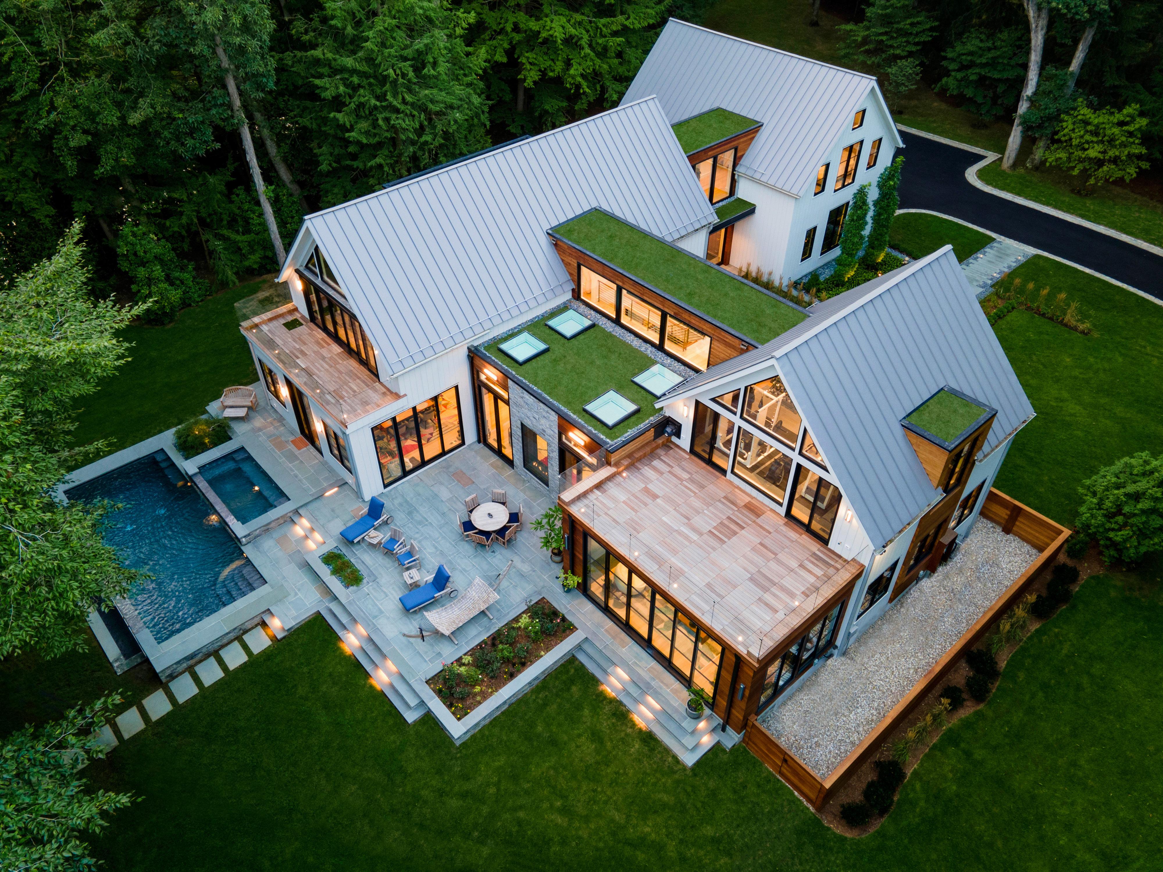
This river retreat was built by Erno Bacso of HSL Building Company and designed by Peter Cadoux of Cadoux Architects with interiors by Diana Jonason Interior Design. A modern farmhouse in three building modules, it celebrates indoor-outdoor living with heated, lit walkways, an infinity-edge pool, a year-round outdoor spa and even green roofs. The entry is distinguished by an impressive walnut pivot door and floating staircase. A translucent indoor-outdoor fireplace highlights the family room, and the kitchen boasts a 12-foot-long waterfall island that’s combined with walnut cabinetry. Landscape design is by Eckerson Design Associates.

THIS PAGE: GRANITE STUDIOS PHOTOGRAPHY; OPPOSITE: MICHAEL BIONDO SPOTLIGHT
42 CTC&G | COTTAGESGARDENS.COM | MARCH 2023
RIVERSIDE DESIGN + BUILD
2022 SPEC HOME OF THE YEAR, BEST ENTRY, BEST PRIMARY BATH

On a park-like site overlooking the New Canaan Reservoir, this project by Marc Vandenhoeck, president of Riverside Design + Build, and consulting architect Michele Rudolph, can best be defined as rustic barn meets midcentury modern. Although the stone-and-glass main entry appears to be a one-story house, in fact, it is two stories. An inverted plan’s lower level serves as a retaining wall to hold the regraded hillside in place. The entry’s 10-foot ceiling smoothly flows into the foyer before opening up to a classically proportioned double-height living room, where a linear see-through fireplace reveals a rear deck and water views. The beamed kitchen is built with a dramatic Compac “Unique Calacatta Black” backsplash and countertops. The primary bath, which won a 2022 CTC&G IDA for Bath Design, is equipped with a two-person steam shower and an oversized spa tub.


SPOTLIGHT
43 MARCH 2023 | COTTAGESGARDENS.COM | CTC&G
DEROSA BUILDERS

BEST CUSTOM HOME
5,000–6,000 SF
DeRosa Builders joined forces with architect Tanner White of Tanner White Architects and interior designer Shawna Feeley for this custom home. An oakbeamed family room with black-framed Marvin windows and an indoor/outdoor fireplace opens to a kitchen with an oak-paneled range hood and quartz backsplash. The dining room boasts an oak ceiling and is surrounded with full-height windows, while a floating oak staircase with black iron balusters leads to the second floor bedrooms. Additional features include a high-gloss blue butler’s pantry, a charcoal office and exceptional outdoor living provided by a covered wraparound patio, equipped with fireplace, TV, outdoor kitchen, ceiling heaters, fans and screens for year-round enjoyment.

SPOTLIGHT
44 CTC&G | COTTAGESGARDENS.COM | MARCH 2023
GATEHOUSE PARTNERS
BEST CUSTOM HOME 4,000–5,000 SF, BEST EXTERIOR & INTERIOR FEATURES, OUTSTANDING HOME OFFICE


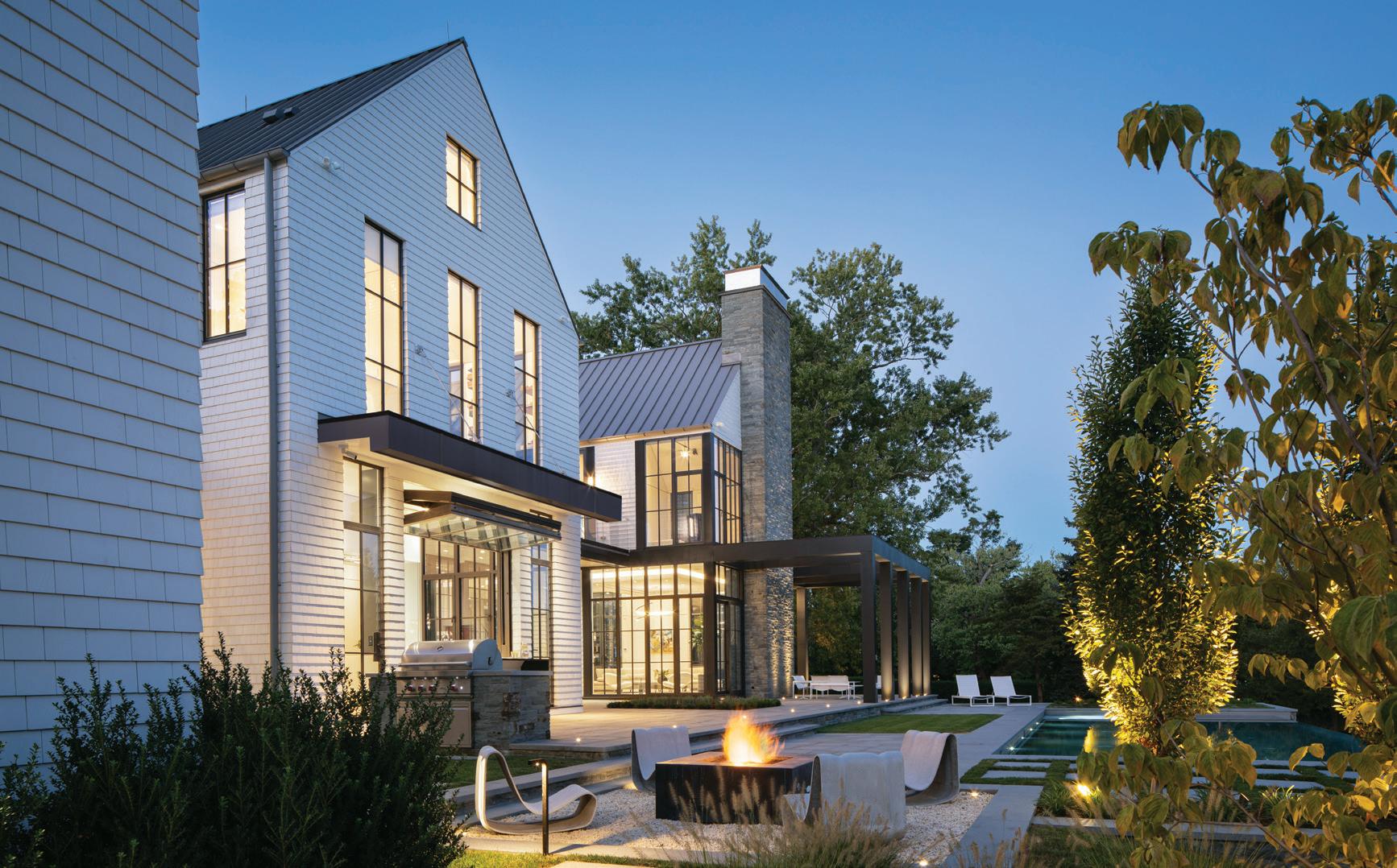
Gatehouse Partners achieved an amazing contrast of traditional and modern for the exterior of this winning Greenwich custom home. Sided in Thermory ash with a dramatic three-story stone fireplace, the home is designed with a dual-sided rear staircase, leading to a pool with Jacuzzi. Inside, a floating white oak staircase wraps around a four-story glass elevator, which won Best Interior Feature. Other outstanding highlights include a steel-clad fireplace in the family room, a Thermory ash office adjacent to owner’s bedroom, and an enormous roof deck. Architecture is by Wormser & Associates Architects

SPOTLIGHT
45 MARCH 2023 | COTTAGESGARDENS.COM | CTC&G OPPOSITE: JANE BIELES THIS PAGE: KW PHOTOGRAPHY
A Brutalist Icon
ARCHITECT MARCEL BREUER’S NEW HAVEN LANDMARK IS REIMAGINED AS A SUSTAINABLE HOTEL | BY MARY
If you’ve ever driven north on Interstate 95 through New Haven’s Long Wharf district, you’ve no doubt noticed the large concrete building looming high above the highway. Designed by Bauhaus architect Marcel Breuer in 1968, the Brutalist-style monolith was the former headquarters of the Armstrong Rubber Company and Pirelli Tire. Lying vacant for two decades, the structure has been rejuvenated as the sustainably designed Hotel Marcel New Haven, Tapestry Collection by Hilton. Architect, developer and owner Bruce Redman Becker of Westportbased Becker + Becker revitalized this historic landmark, creating a sustainable lodging and dining destination. We asked him about the process of taking on this monumental project.
How long did this project take?
We purchased the building in December of 2019, but we spent over a year studying the feasibility of the project before the acquisition. It had sat empty for over two decades. The lower two floors had been completely gutted when a two-story research wing was demolished in 2003. The upper floors had water damage and environmental issues which had to be addressed prior to commencing construction. The hotel opened in the spring of 2022.
What were some of the challenges you faced?
It was both a challenge and an exciting opportunity to modernize a historic building and to deliver a hotel that incorporates sustainability every step of the way, while still paying homage to its rich history and heritage. Because the building is listed on the State and National Register of Historic Places, we had to go through rigorous review from the National Park Service and State Historic Preservation office.
What drew you to Breuer’s Brutalist architecture?
I studied architecture at Yale and learned to love how brutalism reveals the inherent beauty of materials like concrete and its expressive use of shadow and texture. Growing up in a modern house in New Canaan—the town in which Marcel Breuer and the other “Harvard Five” built homes—I
have always appreciated the clean lines and simple elegance of modern architecture.
How were you able to preserve the legacy of Marcel Breuer’s original design?
Becker + Becker, along with interiors firm Dutch East Design, retained all significant design elements of the original building’s pre-cast concrete architecture, including its distinctive sculptural facade, board-formed concrete stairwells, elevator surrounds and granite tile lobby. We repurposed building materials throughout, such as light fixtures and carefully restored wood-paneled walls that were once used in the Armstrong executive offices and conference rooms. To maintain the midcentury aesthetic, new interiors focus on functionality, clean lines and geometric forms.
What are some of the sustainability features of this hotel?
We made a choice early on not to use any fossil fuels. We are an allelectric hotel. We’re also expected to be the first net-zero and Passive House-certified hotel in the country and will be one of fewer than a dozen LEED (Leadership in Energy and Environmental Design) Platinumcertified hotels.
Hotel Marcel New Haven utilizes renewable solar power sources on site to generate the electricity needed for its common areas, restaurant, laundry, meeting rooms and the 165 guest rooms. A power-over-ethernet lighting system reduces lighting energy use by more than 30 percent.


As a recycled building, Hotel Marcel has a greatly reduced embodied carbon impact compared to a newly constructed hotel. With the climate crisis and continued use of fossil fuels posing an existential threat to humanity, I felt an obligation to develop a hotel that can serve as a model for environmental sustainability.
Becker + Becker has taken on many urban properties, but this was a first, how so?
All of our projects are unique and Hotel Marcel New Haven, Tapestry Collection by Hilton is our first hotel project. This allowed us to look at each hotel design and development decision with a fresh perspective. My commitment to sustainability and integrated practice as architect and developer enabled us to create a new model for sustainable hospitality. The hotel offers a destination for guests who have a passion for modern design and sustainability.
500 Sargent Drive, New Haven, 203780-7800, hotelmarcel.com.
FITZGERALD
PROJECT OF NOTE 46 CTC&G | COTTAGESGARDENS.COM | MARCH 2023
Modern Makeover (clockwise across spread from above left) Inviting lobby and restaurant spaces are inspired by Bauhaus ideals; the imposing facade of Marcel Breuer’s architecture; paneling from the Armstrong executive offices was repurposed in the hotel suites.


47 MARCH 2023 | COTTAGESGARDENS.COM | CTC&G
DEEDS DON’TS
Style for Sale
March marks the start of the spring market, always the most active few months in residential real estate. And after a tumultuous year—characterized by wild swings in interest rates, housing inventory and home prices—the spring selling season is looking a lot less chaotic. Specifically, we’re seeing more high-quality listings across all architectural styles, a nice tie-in to the theme of this issue. For your shopping pleasure, we give you five for-sale homes, built (or renovated) by renowned architects and each one representing a popular British or American style. Happy spring!
STYLE FROM ACROSS THE POND—AND BEYOND
The catch-all style known as the english manor home— think Downton Abbey—is handsomely represented by a Southport estate built by architect Roger Ferris. The nearly 18,000 square feet of handsomeness

kicks off with a two-story limestone portico that leads to an entry hall with a “marmalade” marble floor and a floating, wrought-iron circular staircase. On the main floor, the wood-paneled library impresses, as does the formal dining room with its wall of French doors onto an elevated terrace with gorgeous views of Southport Harbor and Long Island Sound. Below the main level is a cabana room with all the amenities of a luxury spa, including a sauna, gym and bathroom suites, as well as a wine room and access to the outdoor pool and patio. And there’s also a squash/basketball court, dance studio and 75-foot, marble-lined indoor pool. It lists for $14,995,000 with Rick Higgins of the Higgins Group.
One of the most iconic English architectural styles is the stone-and-halftimber Tudor. And one of the most impressive examples of the vernacular is a landmarked estate called Stoneleigh Manor in New Canaan. Built in 1903 by Gilded-Age starchitect Stanford White—designer of homes for the Vanderbilts and Astors—Stoneleigh served as a summer residence for a
Southport Stunner
DEEDS & DON'TS INSIDE STORIES BEHIND AREA REAL ESTATE DEALS 48 CTC&G | COTTAGESGARDENS.COM | MARCH 2023
This English manor home overlooking Southport Harbor lists for $14,995,000 with Rick Higgins of the Higgins Group. 203-520-6778.



wealthy Manhattan couple. It sits on a high perch to take advantage of views across Long Island Sound, best enjoyed from the sprawling back veranda, which features a fireplace and runs the width of the house. Its 8,673-square-foot interiors are modern in sensibility, recently renovated by Lisa Hilderbrand of Hilderbrand Interiors. The capacious kitchen is at the heart of the home, clad in white marble and offering access to the breakfast and family rooms and walk-in pantry. Original to the home is the dramatic entry, extending from the porte-cochere through the front hall to the back veranda. And in all, there are seven bedrooms and nine bathrooms, including a pretty primary suite with a sitting room. It lists for $4,750,000 with John and Melissa Engel of Douglas Elliman. Despite its Old-World moniker, the style known as Greek Revival looks at home nearly anywhere—and certainly in New Canaan’s town center. Proving that point is the many-columned Greek Revival on Park Street, just
BROKEN RECORDS
Connecticut’s real estate market has been posting some positive—even record-breaking—sales figures. Some of the sizzling stats include:


“We’re #1”
Across the nation, the numberone residential housing market for 2023 will be the suburbs west of Hartford. Those much-admired school districts will see an 8.5 percent increase in sales prices, according to realtor.com.
a short walk to the New Canaan train station. The circa-1836 property has a literary backstory: It was once home to Maxwell Perkins, the editor for Ernest Hemingway, F. Scott Fitzgerald and Thomas Wolfe and, before that, housed the New Canaan Country School. Despite its storied history, the home fell into disrepair, but, happily, it was saved—and beautifully renovated—in the 1970s by architects (and then-owners) Richard and Sandra Bergmann. Today, the 5,700-square-foot interiors are a graceful blend of old and new, offering three bedrooms, four bathrooms and a generously sized office space, with a permit to operate a business within it. And on the .33-acre grounds are formal gardens that are included in the Smithsonian’s Archives for American Gardens. Inger Stringfellow of William Pitt Sotheby’s International Realty offers the home for $3,495,000.
$647,000
That was the median closing price for a Fairfield County home at the end of 2022, a record, despite housing market hiccups during the second half of the year. The figure represents a 6 percent increase over 2021 and a 44 percent increase over 2020 median sales price.
$7,000,000
< This sales price set a record for a waterfront condo—a Rowayton home owned by architect Louise Brooks and her husband. Even better news: The townhouse sold in three days, at 13 percent over ask.
$103,000,000
A land-sale record in Darien will be set when Great Island is sold to that town, scheduled to close in April.
BOTTOM RIGHT: CARLOS MARQUES
Storied Home This New Canaan Greek Revival, once home to famed book editor Maxwell Perkins, is listed for $3,495,000 with Inger Stringfellow of William Pitt Sotheby’s International Realty in New Canaan. 203-321-9361.
DEEDS & DON'TS 50 CTC&G | COTTAGESGARDENS.COM | MARCH 2023
Fit For A King This classic Tudor-style estate in New Canaan lists for $4,750,000 with John and Melissa Engel of Douglas Elliman in New Canaan. 203-247-4700 and 203-858-0266.


Combining the architecture of a historic candle-wick mill with modern industrial features, The Mill offers a unique residential experience in the heart of downtown Westport. Residents will enjoy concierge living with all the amenities of a fine custom home. ENVISION LIFE AT 41 Richmondville Avenue Westport, Connecticut SCHEDULE A VISIT THEMILLWESTPORT.COM | 203-454-8000 All property images are artist renderings
ARCHITECTURE WITH AN AMERICAN ACCENT
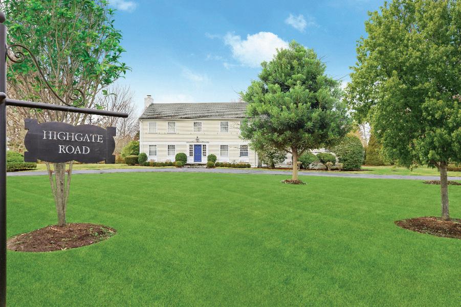
Given that our state was at the heart of colonial america, we feel duty-bound to feature a classic Colonial—a style that’s also one of our state’s most popular. Originally built in 1874, and located along gracious Pequot Avenue in Southport, the Captain Thorp House is one of the town’s finest Colonials. It was renovated in the early 1900s by famed local architect Cameron Clark, who restored the interior’s extensive molding and millwork,
wide-board flooring and numerous fireplaces. In all, the 4,419-square-foot home offers six bedrooms, five bathrooms and, on the landscaped grounds, a pool and pool terrace. It lists for $3,625,000 with the On the Harbor team at AFA/William Raveis.

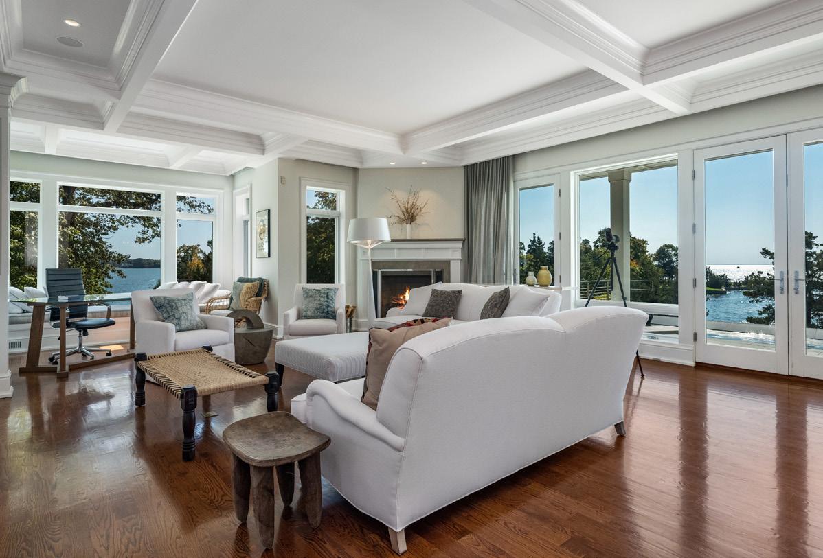
Finally, in Guilford, along the coastline north of New Haven, a Shingle-Style home sited directly on Long Island Sound is listed for $5,450,000. The natural setting is the star of this show, enhanced by a bluestone terrace with an Infinity pool and spa, all with water views—sunup and sundown. There’s also a private dock with a swim ladder leading to secluded cove. The 6,267-square-foot interiors are designed with massive expanses of glass and an open-plan flow. There’s a wine room, a screened dining porch and a home gym. And there are four bedrooms in all, including a luxe primary suite with a fireplace, lounge area and two full bathrooms. Doug Werner and Rick Weiner of William Pitt Sotheby’s International Realty share the listing. —Diane di
 Costanzo
DEEDS & DON'TS 52 CTC&G | COTTAGESGARDENS.COM | MARCH 2023 Visit cottagesgardens.com/news to start receiving our dailyDeeds newsletter On The Waterfront This Shingle-Style home in Guilford lists for $5,450,000
with Doug Werner and Rick Weiner of William Pitt Sotheby’s International Realty in Darien and Essex, respectively. 203-962-2601 and 860-227-3191.
BOTTOM LEFT: DENNIS CARBO
South By Southport A classic, circa-1836 Southport Colonial lists for $3,625,000 with the On the Harbor team at AFA/William Raveis in Southport. 203-258-1595.


PROPERTY OF NOTE FEATURED ON COTTAGESGARDENS.COM AND A dailyDEEDS® E-NEWSLETTER SIGN UP FOR A FREE SUBSCRIPTION TO dailyDEEDS® AT COTTAGESGARDENS.COM/DAILYDEEDS
Promote your property with highimpact ads where users click on your listing as they check out the best in celebrity and luxury real estate! DAILYDEEDS.COM I ADVERTISING@CANDG.COM
PHOTO BY GIEVES ANDERSON

MARCH
CONNECTICUT COTTAGES & GARDENS
EXPLORE ELEVATED DESIGN

DURSTON SAYLOR
55 MARCH 2023 | COTTAGESGARDENS.COM | CTC&G
ONE OF A KIND
Art and grandeur happily coexist in a magnificent country estate
 BY ALEXA STEVENSON | PHOTOGRAPHS BY DURSTON SAYLOR
56 CTC&G | COTTAGESGARDENS.COM | MARCH 2023
 Modern Meld In the family room, a Minotti sectional sits on a rug from Palace Oriental Rugs. The chair and coffee table are through Poliform. See Resources.
Everything in my life seems to happen by default,” says Dinyar Wadia, principal of Wadia Associates. “I found my wife by default, I became a college boy by default, and this project is no different. The clients happened to see work of ours in New Canaan, and, when they were looking for an architect, the wife reminded him to look up the name he had scribbled down and kept in his wallet.” The family was living in a comfortable house in Fairfield County but wanted an upgrade—and less noise from the Merritt Parkway. The site of the new property was on a lake, yet “the first time I saw it,” says Wadia, “I didn’t realize there was a lake in the back.” The existing house also had a conservatory in complete shambles, and when the client asked Wadia if he would keep it or knock it down, his answer—keep it—clinched the job.
When discussions started about the style and size of the house, Wadia took them to a French Country home he had recently completed. “She fell completely in love with it,” he notes. “She said: ‘I want to do that house, but completely different.’” They wanted classic and beautiful, but they didn’t want anything typical or cookie-cutter. Recalls Wadia, “One of the first things she asked me was: ‘What’s one thing in town that no house has?’” He responded, tongue firmly planted in cheek: “a moat.”


58 CTC&G | COTTAGESGARDENS.COM | MARCH 2023
Bring
(
On The Charm
clockwise from far left)
Landscape design is by Conte & Conte. A bridge was designed to connect to the two spaces of the house instead of creating another box. The greenhouse conservatory’s oculus windows overlook the
pool; arched doors off the kitchen have retractable screens. A covered patio with a fireplace is furnished with RH’s Malta Teak sofa, chairs and coffee table. Wadia’s housewarming gift to the clients was putting a garden in the greenhouse. See Resources.


With the existing house also came a walled garden, which became the central focus of the living room. The front entrance—accessible via bridge and over a moat—with a white quartzite floor and fireplace, is slightly off center with the main staircase sitting off to the right. “Most people have the staircase as the main part of the house,” says Wadia. “We didn’t want to do anything typical.” The focal point on the first floor is the living room with views of the garden to the front and of the lake in the back. Wadia Associate’s Director of Interior Design & Decoration, Saranda Berisa, placed Holly Hunt’s circular Omnibus sofa in a vivid
blue in the center of the room. “They don’t follow the mainstream edit,” notes Berisa. “Everything reflects the way they want to live. They wanted color and vibrancy with function. The sofa draws your eye into the center of the room, and also works for how they entertain. The clients didn’t want multiple seating arrangements—this is a family that wants everyone to congregate together.”
On the same side of the house are the kitchen, the dining room and a lacquered red bar that has a door to the pantry in the back. The dining room verges on grand, but the light fixture—illuminated glass drops dripping down from the ceiling— draws your eye. Subtle texture on the wallpaper and red upholstered chairs around an Italian table make it feel inviting and cozy. “People come to visit the house and consistently say that it feels intimate in some instances and has a sense of grandeur in others,” says Wadia. “Even though it’s a big house, it feels like home, and that is the decoration and the detail.”
Across the entryway, is a family room, study and library. The doubleheight study is paneled in mahogany but does not feel dark and foreboding. “It’s all in the detail and skill,” says Wadia. “Without detail it would be sterile and antiseptic. The paneling, custom moldings, colors and plaster scale the space.”
Like Wadia himself—he describes himself as “Half of me is all fun, and half of me is all business”—the 30,000-square-foot house is both formal and whimsical, plus it reflects the spirit of the family that lives there. Their collection of artwork lends personality, and at times humor, to the residence. “We like to add little bits of surprises in our work,” says Wadia, “but these clients love to surprise us right back.”
✹
59 MARCH 2023 | COTTAGESGARDENS.COM | CTC&G

60 CTC&G | COTTAGESGARDENS.COM | MARCH 2023
(
 Invitation To Lounge
opposite page)
The living room’s round sectional is through Holly Hunt. The ceiling fixture is through Dennis Miller, and the coffee table through Minotti.
Study Hall
61
(right) Another light fixture from Dennis Miller hangs in the mahogany-paneled study. The coffee table is through Kathy Kuo Home, and the desk was found on 1stDibs. See Resources.


Even though it’s a big house, it feels like home—and that is the decoration and the detail 62 CTC&G | COTTAGESGARDENS.COM | MARCH 2023
“ ”
(
Simplicity Rules
(
opposite page, top) The kitchen was intentionally left classic and subdued so it would never feel dated. The pendants are through Visual Comfort & Co.; the counter stools are from Serena & Lily.

Perfect Fit
opposite page, bottom) Nella Vetrina table and chairs anchor the dining room. The sideboard is through B&B Italia.
Gather Round
(this page, clockwise from left) The breakfast nook sits underneath the house’s turret; the table and chairs are through B&B Italia. The bar is lacquered in Fine Paints of Europe Rembrandt Red and has a door in the back that leads to the pantry. The wine cellar vestibule has fixtures from Visual Comfort & Co. The benches were found at Church Antiques. See Resources.


63 MARCH 2023 | COTTAGESGARDENS.COM | CTC&G
Devil’s In The Details (this page) Wadia designed the house so that the stairs were off to the side.
Intricate millwork on the balustrade keeps it classic.
Sleep Tight (opposite page) A Holly Hunt bed in leather sits on a rug from Palace Oriental Rugs in the primary bedroom. See Resources.

64 CTC&G | COTTAGESGARDENS.COM | MARCH 2023

 Straight Lines
66 CTC&G | COTTAGESGARDENS.COM | MARCH 2023
In the living room, a pair of Mandy Graham lounge chairs face off against a daybed and sofa through Michael Del Piero Good Design Hamptons, all situated on a sisal and suede rug from Merida Studio. The pendant is from Apparatus Studio. See Resources.
A STUDY IN CONTRASTS
Sissy+Marley’s warm minimalism fills an Old Greenwich home
 BY DAVID MASELLO | PHOTOGRAPHS BY MARCO RICCA
Not unlike the canvas of a painting, the Sissy+Marley mother-daughter design team of Chelsea Reale and Diana Rice always sign one of their finished projects. While the homeowners won’t find the designers’ actual penned names on a wall, what Reale and Rice always leave beyond is their “look”—signature elements that reflect their aesthetic. “Thankfully, most of our clients, like this young couple, come to us because they like our aesthetic,” says Reale, who has worked with her mother, Diana, since 2011 from their Brooklyn studio. “When the clients found us on Instagram, during the pandemic, shortly after they moved from a Manhattan apartment into their new home in Old Greenwich, they were already in love with the way Diana and I often use ebony and white in our projects, a dynamic that results in bold moments.”
Another signature of Sissy+Marley that reveals itself in a complete project is a subtle imbalance. Look at one of the designers’ finished rooms, and it’s likely you will see a painting hung off center above a fireplace, objects and books on shelves that are not precisely balanced, furniture that is positioned to the side. “When you place something a bit off center,” says Rice, “it makes both the object itself and what surrounds it feel not exactly typical. All the elements feel more interesting. It seems common to center something, but we make it common not to.”
Soon after moving into their home, the couple knew it was time to stop sleeping on the floor. While their children had beds, the husband and wife—he a physician, she an attorney—had left their city digs so quickly that they hadn’t brought much furniture. After a spell on a mattress on the floor, they commissioned Reale and Rice to furnish the five-bedroom home, a brand-new spec residence designed by Beinfield Architecture. One of the major changes the interior designers made—in concert with their longtime architectural collaborator, Jesus Aguilar of Studio Ater—was to add a mudroom. “We made
sure that design-wise, the new space would fit aesthetically with the existing house,” Reale says. “The couple needed that room for their kids, who are always running in and out with backpacks and boots that need to be taken off.”
As for choosing the furnishings, the experience of this project was typical for Reale and Rice. “Chelsea and Diana recommended pieces they personally saw and tried out,” says the homeowner. “They never shy away from giving you their unfiltered advice and opinion—and it’s refreshing to work with a team that is decisive and has a definite ‘view’.” Indeed, Reale and Rice are used to this dynamic, whereby they present their findings to the clients, who then let the designers go about their work unencumbered. “Our job, of course,” explains Rice, “is to take to the next level the decisions that have been made. We’re always so grateful to have clients exactly like these who have such trust in our vision.”
While the homeowner curated the artworks— notably antique portraits—in the home, Reale and Rice curated all of the furnishings and accessories, down to the books on the shelves. “There were a few pieces we weren’t sure of during the initial presentation,” says the client, “but after exploring a couple alternatives, we ultimately came back, every time, to their first choice. Those are now some of the pieces that we love the most.”
Perhaps the most exhilarating signature element of the designers, though, is their methodology about the presentation of the finished house. The so-called Big Reveal is a wellorchestrated event of theirs. “The clients were due to be away for week,” recalls Reale, “and so we used that time to put everything into place. The children weren’t there for the moment, but the homeowner later sent us lovely photos of the two children seeing their new rooms for the first time, with them bouncing happily on their new beds. As the homeowner adds, “The joy we feel now and the feeling we had at that first sighting hasn’t changed with the passage of time.” ✹
67 MARCH 2023 | COTTAGESGARDENS.COM | CTC&G
Creating Balance
(this page, clockwise from top left) A Space
Copenhagen shearling stool provides seating at a Blackcreek Mercantile & Trading table in the primary bedroom. A chair and ottoman from B&B Italia and a Cassina stool fill a corner of the primary bedroom. The home office is equipped with a desk and bench from Mandy Graham. In the foyer, a vintage portrait hangs over an Oja Design demilune table from March. In a guest bedroom, a Loop wardrobe from

Design Within Reach is complemented by black-oak-and-leather hooks from Unison Home and a low stool from Blackcreek Mercantile & Trading.

Stylish Dining
(opposite page) In the dining room, a white-oak table from Blackcreek Mercantile & Trading is surrounded by Carl Hansen chairs, while a chandelier from Apparatus Studio provides a sculptural presence. The mirror, made of ebonized oak and blacked steel, is from Yucca Stuff. See Resources.


68 CTC&G | COTTAGESGARDENS.COM | MARCH 2023

69 MARCH 2023 | COTTAGESGARDENS.COM | CTC&G

70 CTC&G | COTTAGESGARDENS.COM | MARCH 2023
 Gathering Space A blackened-brass light fixture from Apparatus Studio illuminates the kitchen island (above). In the family room (opposite page)—which melds with
the kitchen—a long, narrow trestle table is set with Carl Hansen chairs, while a Hans Wegner Circle chair beckons alongside the fireplace. See Resources.
“ ” 71 MARCH 2023 | COTTAGESGARDENS.COM | CTC&G
They were already in love with the way Diana and I often use ebony and white in our projects, a dynamic that results in bold moments
In Repose (this page, clockwise from top left) A leather sling desk chair through Fair Design is paired with an ebonized oak vanity in the primary bedroom. Sawkille’s Meditation bed through Fair and Pinch Design’s side table from the Future Perfect are used in the primary bedroom, where the rug is from Armadillo. In a guest bedroom, a Workstead sconce is complemented by
a Pinch Design side table. Lostine’s Hugo Barbell floor lamp makes a statement in the guest bedroom. The primary bathroom boasts Sissy+Marley’s custom millwork.


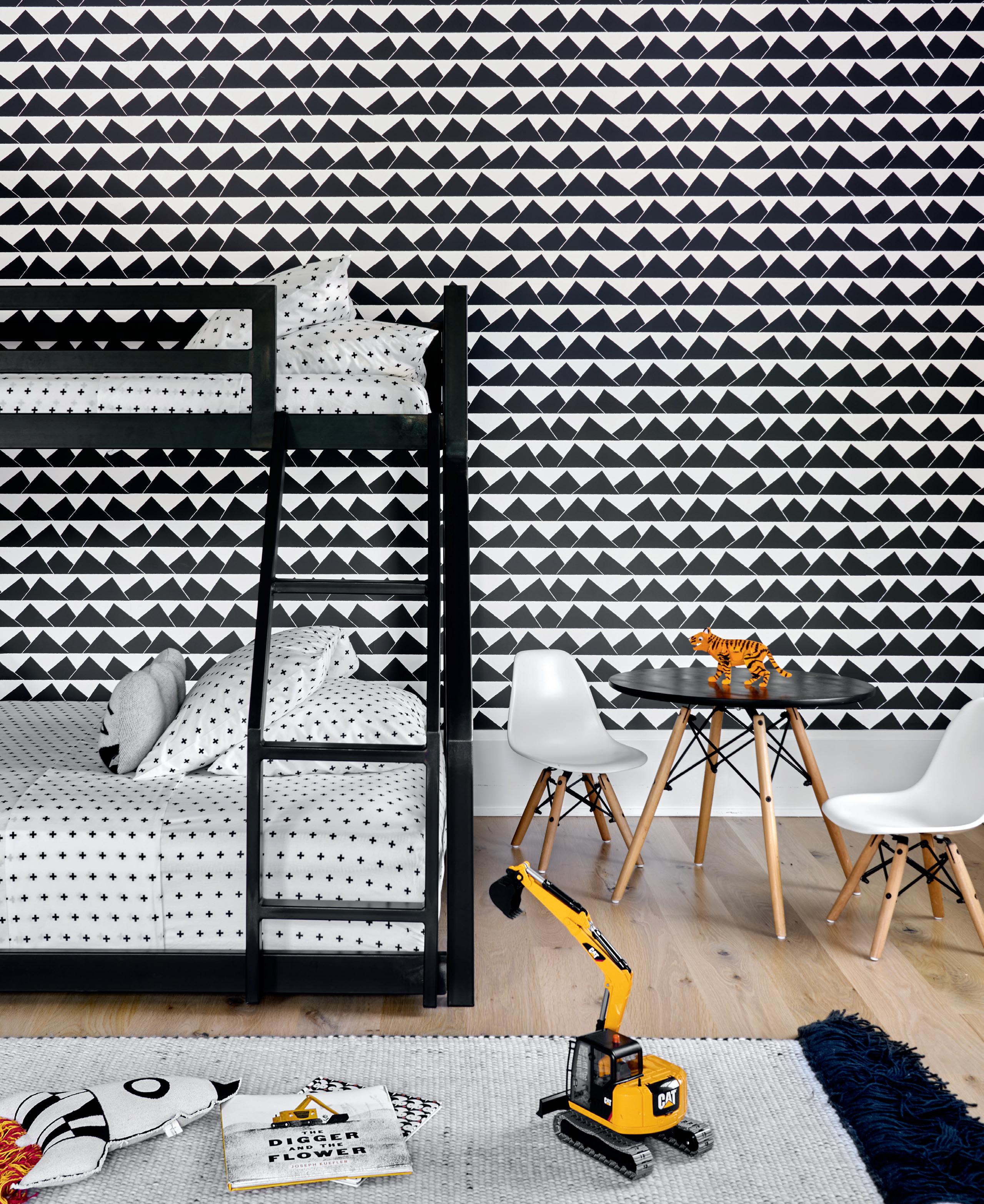
Kid’s Play (opposite page) A Room&Board Fort steel bunk bed sports bedding from Crate&Barrel. The Peak wallpaper is from Marley + Malek Kids. See Resources.

72 CTC&G | COTTAGESGARDENS.COM | MARCH 2023
73 MARCH 2023 | COTTAGESGARDENS.COM | CTC&G

GREEK REVITALIZED Well-considered updates bring a beloved home into the present
BY MINDY PANTIEL | PHOTOGRAPHS BY THOMAS LOOF | STYLING BY MARGARET RUSSELL

75 MARCH 2023 | COTTAGESGARDENS.COM | CTC&G
Poolside Paradise McKinnon and Harris outdoor furniture wears a Perennials fabric. The umbrella is from Santa Barbara Designs. See Resources.
Curve Appeal (clockwise across spread from above)
The original Greek Revival style structure followed the bend of the site resulting in a boomerang-shaped house; the new threecar garage intentionally resembles a carriage house. Artwork by Lisa Yuskavage leads the eye to the family room. Another painting by Yuskavage provides a focal point in one portion of the living room, where reupholstered sofas wear a lush cotton velvet. The sisal rug is from Beauvais Carpets. See Resources.


76
There was little doubt the upscale Greenwich builder home designed in 2001 had its shortcomings. Overzealous Greek Revival details like disproportionate corner pilasters on the outside entry and a dark north-facing kitchen with drab views of the driveway, among them. But after several meetings with the homeowners, a couple with two teenaged children, architect Tom McManus of Ferguson & Shamamian Architects realized that despite the structure’s idiosyncrasies, it was the couple’s emotional attachment to the house that played a major role in their decision to stay put and renovate. “They loved the house because it was where they raised their children, and family was very important to them,” he shares. “But they also wanted things like a bigger separate space in the kitchen to hang out and have breakfast, and amenities like a media room and a pool.”
Thanks to a quirky U-shaped lot backed by wetlands—the latter limiting the width of the house and room for expansion—the original design had no choice but to follow the bend of the site. To make room for a garage/family room addition, the homeowners purchased an adjoining lot and moved the property line. The new three-car garage—sheathed in vertical board and batten—was intentionally fashioned to resemble a carriage house
and support an additive architecture narrative that it was part of a historic property.

McManus also simplified the exterior by replacing large pilasters with more modest quoins (stepped blocks) and remaking oversized cornice moldings in a more appropriate scale. Enclosing an outdoor porch on the front side allowed for a home office for the wife, and a screen porch on the back now provides a protected outdoor living room by the pool.

77 MARCH 2023 | COTTAGESGARDENS.COM | CTC&G
In keeping with the established storyline, the separate barn-style guest house further supports the notion of a historic property with several older structures. “We treated it as a utilitarian building that was converted,” says McManus, noting they worked with renowned colorist Donald Kaufman on determining the deep green hue for the board and batten exterior. “Dark green is a color sometimes found on old New England barns, and rather than being a big box on the hill, the color helps it recede into the landscape.”
Inside the main house, flipping the kitchen to the south side of the house where southern exposure and pleasing garden views improved the room’s overall experience was a game changer. When it came to things like selecting finishes and fleshing out cabinetry details—here and throughout the house—the architect joined forces with the design team of Thad Hayes and Emily Meroney of Ries Hayes, who encouraged covering all the kitchen walls in a shimmering white tile. “Now it looks like an English kitchen,” says Hayes, who along with Meroney brought in the majority of the furnishings, rugs, window treatments and decorative lighting. “Our role
Dine In Style
In the kitchen (above), an Ann Morris pendant lights the black granite island. In the dining room, a set of carved Louis XVI chairs wearing a Scalamandre fabric surround a table from the homeowner’s collection. The antique chandelier is through Bernd Goeckler.

Passageway (left)
Existing moldings above the opening leading to the hallway enhance the traditional feel of the home. See Resources.

78 CTC&G | COTTAGESGARDENS.COM | MARCH 2023

79
Bed, Bath And Beyond
(clockwise across spread from this page)
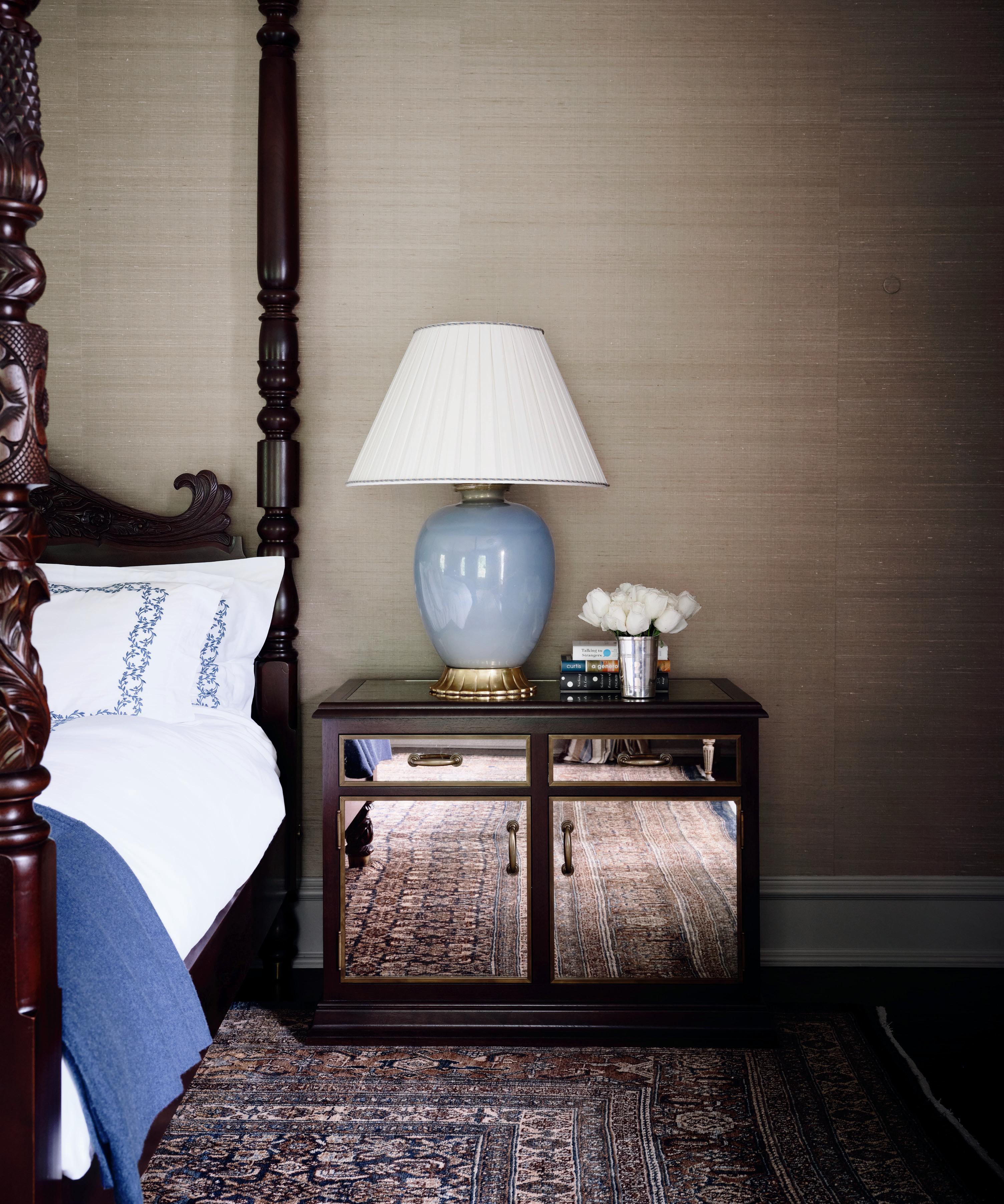
Wallcovering by Elizabeth Dow backs the four-poster bed from Leonards New England in the primary bedroom. In the primary bathroom, the pendant light is from Eileen Lane Antiques, and the antique vanity is from Lobel Modern. Media room furnishings include club chairs by Jonas in a Jim Thompson fabric. A silver-plated starburst chandelier distinguishes this guest room. Painted cabinets define the dressing room. See Resources.
What she really wanted was an updated home that had a curation of pieces steeped in history
“ ”
80


81 MARCH 2023 | COTTAGESGARDENS.COM | CTC&G
was to make sure the architecture was harmonious with the decoration.”
They also took on the task of integrating the homeowner’s contemporary art collection with the more traditional furnishings and trimmings. “What she [the wife] really wanted was an updated and more relevant home that had a curation of pieces steeped in history,” Hayes explains. In one of three sitting areas in the commodious living room, for example, the existing sofas reupholstered in deep gray cotton velvet balance the contemporary Lisa Yuskavage painting.

And in what can only be called a moment of yin-yang perfection, in the family room a modern artwork is matched with a classic wingback chair. “The clients enjoy upholstery shapes and styles that have a nod to the traditional, but they enjoy materials, art and objects that feel current,” he adds. “The mix of these elements is what creates that magic.” ✹
In

The Details
(clockwise across spread from left)
Walters Wicker seating fills the screened-in porch; the lamp is from Lumens. Architectural details help define the home’s style. A corner of the family room is furnished with a wingback chair by Kaare Klint from Gallery BAC, a brass table by Liz O’Brien, a chandelier from H.M. Luther and artwork by Guillermo Kuitca. The new guest house is reminiscent of a classic New England barn. See Resources.

82 CTC&G | COTTAGESGARDENS.COM | MARCH 2023


84 CTC&G | COTTAGESGARDENS.COM | MARCH 2023
Open House
Massive walls of windows draw sunlight into this relaxed yet sophisticated living room space, detailed with a marble fireplace, a Sacha Lakic

HOUSE OF THREE GABLES
A stunning contemporary design embraces the New England vernacular
BY EVA HAGBERG | PHOTOGRAPHS BY PETER BROWN
for Roche Bobois sectional, plus chairs
designed by Roberto Tapinassi and Maurizio Manzoni. In front of the wine storage and display, a Buddha head sculpture from Bungalow finds pride of place on a liveedge wood stand. See Resources.
The fun of this house is more in the links than the forms,” architect Chris Pagliaro says. He’s talking about a recently completed house for a couple in Westport, a project that had particular resonance for him. “This is my third time working on this property,” Pagliaro says. The first and second times were versions of historical renovations to an existing house on the site, in keeping with the town’s stringent property laws; this last time, thanks to some creative thinking (they kept the historic house, making this one a second structure), he was able to fly free.


Pagliaro was brought onto the project by Ryan Fletcher of Fletcher Development, a local design/ builder and a longtime friend, who also brought in Lisa Oakes of Oaklee Interiors for the interior design. Together, the three of them produced a geometric structure full of massive expanses of glass (that can be made opaque at the touch of a blinds-controlling button); axes along which Pagliaro’s links start to happen; and moments that support the clients’ gracious approach to entertaining.
Fletcher says that they designed the house “around the main idea of sunlight,” following where the sun rises and sets, and orienting the living quarters and more public areas around not only maximum

exposure, but best exposure. That move led to the decision to feature glass walls prominently throughout, oriented toward the rolling yard, which was as important to the husband as the interior was to the wife; the clients also wanted 12-foot ceilings, which might sound both standard and glamorous but which presented a major design challenge.
“Not every room is large in plan,” Pagliaro points out, which means that anything smaller than a living room can start to feel like a narrow shaft instead of
86 CTC&G | COTTAGESGARDENS.COM | MARCH 2023
Links + Forms (clockwise from this photo) Three gabled volumes are connected by what architect Chris Pagliaro calls “links” while double-height windows add an ultra-modern feel. A view of the back of the house at dusk shows the jewel box-like

main living section (to the right), while a more opaque space to the left holds more private spaces. Seen from above, the house is staggered in plan, and oriented around a sizable outdoor pool area. Landscape design is by Artemis Landscape Architects. See Resources.


in conversation with the slightly darker eat-in kitchen island complete with simple wood stools; appliances are Sub-Zero Wolf. A large custom kitchen window from Renlita folds up to open, introducing a sense of high-tech sophistication to this neutral and monochromatic space; hidden hardware lends to the feeling of seamlessness. See Resources.

a high-ceilinged airy space. To help mitigate that potential issue, Pagliaro introduced moments of respite from the otherwise monolithic surfaces, creating windows that bumped out to create a moment of interest on the exterior and spatial relief on the interior, and having those links offer moments of compression. “I’m all about juxtaposing eye movement,” Pagliaro says. “I didn’t want to exaggerate the linear.” The solution was three iconic gableroof sections, connected with large glass expanses, themselves detailed with, in the main area, a striking staircase. Double-height windows draw that light in, while black frames around the extruded windows provide a sense of approachable scale in what would otherwise feel monolithic.
Breaking up those exaggerated volumes is where the interior design came in. This was Oakes’ first solo project after striking out on her own, and she approached the brief with a mix of intuition and careful attention to the clients’ art collection, which they hoped would take center stage. Working closely with the clients, Oakes went for a monochromatic look leavened by statement fixtures like a Swoop Moonlight Murmuration chandelier in the dining room, and emphasized neutral details, material delicacy (like a white silk rug in the living room), and constant attention to how the furnishings and interior design support the overall aesthetic of openness, grace and hospitality. The kitchen, whose size offered a Goldilocks challenge to the designers—not too small that they couldn’t entertain but not so large that they got lost—is detailed in long stretches of neutral material with entirely hidden hardware, and features a massive folding window that allows the fresh air to rush in and circulate.
All three loved working on this project, which earned a 2022 HOBI award for Outstanding Custom Home 6,000–7,000 square feet. For Pagliaro, it offered an intellectual challenge; for Fletcher, a chance to flex his design-build wings; and for Oakes, an absolutely ideal first client. “It was an unbelievable learning experience for me,” she says. “It was such a good project to have.” ✹

89 MARCH 2023 | COTTAGESGARDENS.COM | CTC&G
Livable Luxury (clockwise from top) In the dining room, a Swoop Moonlight Murmuration chandelier from Ochre anchors the space, while Roche Bobois Identities chairs bring geometric craftsmanship into conversation with a deceptively simple table by Matthew Hilton. A long expanse of kitchen cabinets to the left are
Personal Spaces (clockwise from top left) In one of the children’s rooms, a Design Within Reach bed is complemented by wallpaper from Bradley. In the primary suite, a red Eero Saarinen Womb chair produced by Knoll brings a pop of color to the otherwise restrained space, which is lit by a pendant designed by Constance Guisset; a De La Espada bed by Matthew Hilton was sourced from the Future Perfect. In the primary bath, an Acryline freestanding tub centers the room toward the landscape outside. In the home gym, a Peloton bike and Peloton rowing machine hold center court. In the stairwell, a Moooi Random II pendant by Bertjan Pot brings a filigreed lightness to this top-floor space. See Resources.


91
The White Lotus Wines
By the time we get to episode five of The White Lotus—the wine-tasting scene in which the two young couples visit Planeta wine estate on Mount Etna—one or both husbands might have had a vacation fling with young Sicilian prostitutes. In this second season of the show, now streaming on HBO Max, The White Lotus creator Mike White takes his band of entitled, dysfunctional vacationers to the stunning San Domenico Palace, perched on a promontory overlooking the Ionian Sea in Taormina, Sicily. Along with creating hysterical human dramas, the series

showcases the island’s spectacular sites, among them, its high-altitude vineyards. Each season revolves around a theme; season one in Maui was “money.” Season two is “sex.”
The two couples book a car to Mount Etna to check out a winery. Daphne, who’s married to Cameron, comments: “Apparently, the wine has a bunch of volcanic minerals in it.” The wine tasting gets out of hand when over-served Harper interrogates the men: “Have you two ever slept with the same girl?” “Ever invited a girl to your dorm room to play naked Twister?” Meanwhile, all I could think was, “What are they drinking?”
It turns out they were drinking some of Italy’s best from the familyowned Planeta estate, which traces its beginnings back to the 1600s and has six distinct wine properties across the five regions of Sicily. Planeta’s Etna cru grapes are grown in the Sciaranuova vineyard at 2,550 feet above sea level—its soils rich in stones, minerals and ash. The wines are made at the Mount Etna winery built in the center of a 15th-century lava flow.
For several years the Etna region has become trendy—the most desirable region for interesting wines known for their minerality, which comes from grapes being

ETNA WINES
Planeta Eruzione 1614, Nerello Mascalese Sicilia DOC ($45)
With expressive perfume of white flowers and citrus, the wine displays green apple notes and a strong Etnasoil minerality.


Possessing unique aromatics combining scents of herbs, hibiscus, fennel and incense, the medium-bodied wine shows red currant and wild fruits on the palette and a subtle saline finish.
grown along the volcanic slopes. The Etna wines are crafted from indigenous Sicilian varieties. The white, Carricante, has lively acidity and citrus aromas along with a slatey mineral character—perfect with grilled fish or ceviche. The red, Nerello Mascalese—a dark-skinned noble grape—makes a fresh fruity wine with herbal, minerally and earthy notes like a Barolo. Best pairs are wild mushroom dishes, game in red-wine sauce or linguine alle vongole For season three, there are hints that the show will take us to Asia and that the theme is “religion.” I wonder what wines will appear. I’d suggest St. Francis Winery, named for Franciscan missionaries who first planted grapes in Sonoma in the mid1800s. —Baroness Sheri de Borchgrave
WINE & SPIRITS VINEYARD: COURTESY OF PLANETA; MIDDLE: HBO
92 CTC&G | COTTAGESGARDENS.COM | MARCH 2023
SIP ALONG WITH THE STARS WITH SOME OF SICILY’S BEST
Volcanic Vineyards In season two of The White Lotus, Harper (Aubrey Plaza) and Ethan (Will Sharpe) (bottom left) enjoy winetasting at Planeta’s Mount Etna estate (top). planeta.it.
Planeta Eruzione 1614, Carricante Sicilia DOC ($45)
ENTRIES OPENING MARCH 10!

DEADLINES:
HAMPTONS / MAY 19

CONNECTICUT / AUGUST 11
TROPHY SPONSOR


SPONSORS
 Photo by Marco Petrini
WWW.
.COM
WEST CHIN ARCHITECTS AND INTERIOR DESIGNERS IDA ARCHITECTURE FINALIST
CGIDAS
5
2022 HOBI Awards
CTC&G was the proud media sponsor of the 28th annual HOBI Awards presented by the HBRA of CT.


6 Best Custom Home 6,000-7,000 SF winners
Norman Allen, Erno Bacso of HSL Building Company and homeowner Heike Sommer
7 Master of Ceremonies Joanne Carroll with granddaughter
Courtney Wiele
8. HBRA President Eric Santini, with Spec Home of the Year winner Marc Vandenhoeck and Michele Rudolph of Riverside Design + Build and HBRA CEO


Jim Perras
9 Project of the Year architect Ralph Mackin and builder Scott Hobbs

10 Best Out of State Vacation Home winners Richard Jankowski, Melanie Sarantos and Vinnie Sciaretta of VAS Construction


11. C&G Media Group Account Directors Lisa Heissan and Jamie Lewis, Digital & Marketing Assistant Jacquelyn
Shannon, Account Director Wendy Horwitz and NYC&G Associate Publisher Melissa Groher

PARTIES & BENEFITS 94 CTC&G | COTTAGESGARDENS.COM | MARCH 2023
ANNE OGDEN
1 Best Remodeled Home winners Christopher Hoffman and Kevin Polcer of DeRosa Builders with architect Emilia Ferri
2 . HBRA CEO Jim Perras and Michele Quadrato
3 The HOBI judges: Kevin Polcer, Douglas Graneto, Michael Murphy and Terence Beaty
4 Daniella Rizzo and Mindy Gerhardt of Cornerstone Contracting
Construction Management Group’s Brian and Bethany Richards with Salvatore Zarella
1 2 3 4
6 7 8 9 10 11
5
WITH HONORARY DESIGN CO-CHAIRS ALEXA HAMPTON AND JAMIE DRAKE
GALA PREVIEW PARTY JULY 22 | OPEN TO THE PUBLIC JULY 23 - SEPTEMBER 4


SPONSORS DIGITAL SPONSOR


PRESENTED BY TO BENEFIT THE C M Y CM MY CY CMY K 2020_HDS_AD_2.5x2.5_VECTOR_B copy.pdf 1 1/13/20 6:56 PM
HAMPTONDESIGNERSHOWHOUSE.COM | FOR SPONSORSHIP OPPORTUNITIES, CONTACT ADVERTISING@CANDG.COM Special Promotion / 2022 Hampton Designer Showhouse Kitchen Photo by Tria Giovan
BOTERO
Botero is a design and construction company performing work throughout Connecticut and New York. The company’s primary focus has been design and creation of buildings that fit their site, historic context and client needs.
Botero understands that designing and building a home is a multifaceted process that begins with your dreams and ideas. Understanding and execution are the company’s key pillars for a successful partnership in this process. Each home that Botero designs and builds will affect it’s owners and descendants for generations. Botero strives to infuse unique ideas and personality into every one of their projects.
203.505.2165
BOTEROBDCG.COM
@BOTEROBDCG
CLASSIC CONNECTICUT HOMES


Classic Connecticut Homes specializes in the construction, restoration and renovation of fine homes and interiors. They work hard to conceive and construct high quality environments, based on classical elements that are comfortable yet elegant. Their ultimate goal is to create living spaces through careful planning and creative thinking that endure the test of time while providing their clients with exceptional service and value. Specialties include new residential construction, historic restorations, interior millwork and whole house remodels.
203.438.1736
CLASSICCTHOMES.COM
A SPECIAL SECTION
CORNERSTONE CONTRACTING
CORNERSTONE’s reputation for exceptional craftsmanship, combined with best-in-class project management teams, sets it apart from others in the industry. CORNERSTONE is involved in the pre-construction process; working with clients, architects, designers and engineers to develop realistic preliminary budgets and schedules.
CORNERSTONE is a high-energy company that prides itself on excellence in building spectacular family compounds, rustic horse barns, inviting guest houses, luxurious pool houses and more. Their reputation with world renowned architects and designers empowers them to construct the most technical and complex projects.
203.861.4200
CORNERSTONE-BUILDERS.COM
@CORNERSTONE__CONTRACTING
DAVENPORT CONTRACTING, INC.
Davenport maneuvers effortlessly between custom homes, renovations and property management. With more than 35 years in the business, they provide a suite of services including pre-construction estimating and budgets, fixed bids, and construction management. All with the goal of bringing your vision to reality.
Davenport Home (203.324.3030) is a separate division that remodels, maintains and services existing clients as well as the general residential community. Every aspect of each project receives individual attention, enabling their customers to build their dreams!


203.324.6308
DAVENPORTCONTRACTING.COM
@DAVENPORTCONTRACTINGINC
DOMUS CONSTRUCTORS
As one of Fairfield County’s leading custom home builders and remodelers since 1998, Domus Constructors, led by award-winning builder, Chris Shea, is the preferred choice for all your home building and renovation needs. Whether your project is a new custom home, renovation of an existing home, or expansion of an existing space, Domus works with you directly to ensure the finished product exceeds your expectations. Their Mission is to provide customers with an honest, responsible, and accountable service experience as they deliver a job done right.

203.852.6789
DOMUSLLC.COM
@DOMUSCONSTRUCTORSLLC
SPECIAL PROMOTION
ARCHITECTURE
BY MICHAEL SMITH ARCHITECTS; PHOTOGRAPHY BY LAURA MOSS
FLETCHER DEVELOPMENT
Fletcher Development is an industry awardwinning custom home building company. For a decade, they have been committed to providing clients with unwavering quality and craftsmanship in every aspect of home construction, creating low maintenance, high efficiency homes that are aesthetically pleasing, healthy, and safe for your family. Creating your dream ambiance with the specific features and finishes you desire is at the heart of every Fletcher design.
203.286.6166
FLETCHERDEVELOPMENTLLC.COM
@FLETCHERCUSTOMHOMES
GARRETT WILSON BUILDERS
Garrett Wilson Builders has been building luxury custom homes in lower Fairfield County for more than 20 years. This client centric firm owes its longevity to an attention to detail and the express commitment to exceed client expectations. Their leadership and project management teams, along with their highly-skilled tradespeople, operate with the highest level of transparency and integrity.


As an award-winning custom builder, Garrett Wilson personally fosters and values each and every client relationship.

203.259.3333
GARRETTWILSONBUILDERS.COM
@GARRETTWILSON_BUILDERS
HOBBS, INC.
For more than 65 years, Hobbs, Inc. has been building distinctive custom homes. Working with the most respected architects, designers, craftsmen and suppliers in the industry, the expert Hobbs team delivers a superior building experience. The company has been the recipient of numerous industry awards and is widely recognized for its focus on client service and job safety. Serving Connecticut, Westchester County, New York City, New Jersey and the Hamptons. 203.966.0726
HOBBSINC.COM
@HOBBS_INC
BUILDERS YOU SHOULD KNOW
HP BROOM HOUSEWRIGHT
HP Broom Housewright is a technical minded, boutique residential builder with artistic sensibility specializing in restoration, remodeling and new construction. HP Broom has been serving the Connecticut shoreline/river area and Fishers Island, NY for more than 40 years. With the advantage of working with award winning architects, a crew of master craftsman and our own mill shop, HP Broom expertly controls the quality and outcome of your projects with integrity and a personal touch.
860.526.9836
HPBROOM.COM
@HPBROOM
PRUTTING + COMPANY CUSTOM BUILDERS

Founded in 1975, Prutting + Company offers more than 40 years of successful building management experience with new construction, remodeling, and home maintenance. The company focuses on the cutting edge of environmentally-sensitive and progressiveminded construction, executed with precision craftsmanship. They draw from the best of current technologies, to ensure the finished product will have solid and enduring value. In addition to our office in Stamford, Connecticut, we now also serve the Hudson Valley, Berkshires, and other surrounding areas from our new satellite office in Millerton, New York. 203.972.1028

PRUTTING.COM
@PRUTTINGBUILDER
QUINNDICO CUSTOM HOME BUILDERS

Quinndico’s founders, Christopher Quinn and Ivan Dic, have been building high-end, luxury residential homes together for decades in the Hamptons, New York City, Westchester, and Fairfield County. What elevates Quinndico above the competition is Christopher and Ivan’s combined 30 years of hands-on experience. From pre-construction through completion, they take pride in being involved in the entire process of each client’s home, making sure the final product is the finest and most intricate luxury custom home imaginable.
203.990.3224
QUINNDICO.COM
@CMQ_QDCHB
SPECIAL PROMOTION
TOTAL HOME MANAGEMENT
Let Total Home Management show you the difference in home management and maintenance. A division of Clarke Builders Inc, Total Home Management has been exceeding expectations in custom building, renovations and maintaining homes for more than 40 years. They are your one-stop source for all home service and building needs. From seasonal home maintenance, new construction and renovations, the award winning team is here to guide you through the entire process.
203.962.5494
TOTALHOMEMANAGEMENTLLC.NET CLARKEBUILDERS.COM
UCE FINE BUILDERS, INC.
Based in Litchfield, Connecticut, the award-winning firm’s prominent residential and commercial portfolio throughout Connecticut, the Hudson Valley, and the Berkshire mountains, showcases exceptional craftsmanship and the team’s extensive capabilities – including magnificent custom millwork, innovative architectural concrete, and a dedication to sustainable building practices. A reputation for expertise, professionalism, and transparency has been a hallmark of the organization for more than 60 years.


860.489.7273
UCEBUILDERS.COM
@UCEFINEBUILDERS
YANKEE CUSTOM BUILDERS, INC.
Yankee Custom Builders specializes in extraordinary custom homes and renovations in the tri-state area. Based in Greenwich, Connecticut, the company is on the rise and is known for its ability to make the complexities of homebuilding a positive experience for all involved. Founder Justin Meneguzzo established Yankee Custom Builders as a precision management firm that promotes forward thinking, excels in communication, and provides comprehensive professional services. Yankee Custom’s craftsmanship, quality materials, clear budgeting and scheduling, and knowledge of refined products culminate in homes that capture the imagination of clients and architects alike.

203.588.1556
YANKEECUSTOMBUILDERS.COM
@YANKEECUSTOMBUILDERS
BUILDERS YOU SHOULD KNOW | SPECIAL PROMOTION
WESTMINSTER TEAK
The Maya Collection is a modular deep seating sectional system for both outdoor and indoor environments. The pieces can be configured in multiple variations, allowing for endless possibilities of composition. 888.592.8325 / westminsterteak.com


@westminsterteak
The Nelson chair is sleek but comfy, and only one of hundreds of styles from our custom manufacturer CR Laine. Choose your fabric and finish! Always available at The Post! 203.292.5700 / thepostct.com
@thepostct

@COTTAGESGARDENS | SPECIAL PROMOTION
THE POST
STOPS
DESIGN
MUST-HAVES FOR THE DESIGN-OBSESSED SHOPPER
RESOURCES MORE
Build, riverside-design.com. Best Custom Home 5,000–6,000 SF: Builder, DeRosa Builders, derosabuilders.com. Architect, Tanner White, Tanner White Architects, tannerwhitearchitects.com. Interior design, Shawna Feeley Interiors, shawnafeeley. com. Best Custom Home 4,000–5,000 SF, Best Exterior & Interior Features, Outstanding Home Office: Builder, Gatehouse Partners, gatehousepartners. com. Architect, Wormser & Associates Architects, wormseraia.com.
ONE OF A KIND
Pages 56–65: Architecture, Dinyar Wadia and Robert Lominski, Wadia Associates, wadiaassociates.com. Interior design, Saranda Bersia, Wadia Associates, wadiaassociates.com. Landscape design, Conte & Conte, conteandconte.com. Smart home integration, Bill Charney, Advanced Home Audio, advancedhomeaudio.com. Family room: Sofa and console, Minotti. Coffee table, Poliform. Rug, Palace Oriental Rugs. Covered patio: Furniture, RH. Living room: Sofa, Holly Hunt. Rug, Palace Oriental Rugs. Light fixture, Dennis Miller. Coffee table, Minotti. Sideboard, Poliform. Sconces, Magni. Study: Coffee table, Kathy Kuo Home. Desk, 1stDibs. Light fixture, Dennis Miller. Kitchen: Pendants, Visual Comfort & Co. Stools, Serena & Lily. Dining room: Table and chairs, Nella Vetrina. Sideboard, B&B Italia. Light fixture, Dennis Miller. Rug, Palace Oriental Rugs. Breakfast nook: Table and chairs, B&B Italia. Chandelier, Dennis Miller. Bar: Paint, Fine Paints of Europe. Light fixture, Dennis Miller. Wine cellar: Lighting, Visual Comfort & Co. Bench, Church Antiques. Primary bedroom: Bed, nightstands and pendants, Holly Hunt. Rug, Palace Oriental Rugs. Bench, Taylor Burke Home through Perigold.
A STUDY IN CONTRASTS
Apparatus Studio. Lounge chair, Hans Wegner. Sofa, Living Divani. Stools, Thomas Hayes Studio. Primary bedroom: Chair, Frederica. Bed, Sawkille Co. Side table, Pinch Design. Rug, Armadillo. Lamp, Hamptons
Good Design. Hallway: Rug, Merida Studio. Bench, Sawkille Co. Foyer: Demilune table, Oja Design. Guest room: Sconce, Workstead. Side table, Pinch Design. Floor lamp, Lostine.

Kids bedroom: Wallpaper, Marley + Malek Kids. Bunk beds, Room & Board. Rug, Little P. Bedding, Crate & Barrel. Bathroom: Millwork, Studio Ater. Blinds, The Shade Store.
GREEK REVITALIZED
Pages 74–83: Architect, Thomas McManus, Ferguson & Shamamian
Architects, fergusonshamamian.com.
Interior design, Ries/Hayes Interiors, rieshayes.com. Landscape design, Susan Cohen Landscape Architect, susancohenlandscapearchitect.com.
SPOTLIGHT BUILDING IS BOOMING
Pages 40–45: Project of the Year, Best Custom Home over 15,000 SF: Builder: Hobbs, Inc., hobbsinc. com. Architect, Ralph Mackin, Mackin Architects, mackinarchitects.com. Interior design, Alexa Hampton, alexahampton.com. Smart Home Integration, Advanced Home Audio, advancedhomeaudio.com. Landscape design, Janice Parker Landscape Architects, janiceparker.com. 2022
Custom Home of the Year, Best Custom Home 6,000–7,000 SF: Builder, Erno Bacso, HSL Building Company, hslbuilding. com. Architect, Peter Cadoux, Cadoux Architects, cadouxaia.com. Interior design, Diana Jonason Interior Design, dianajonasoninteriors.com. Landscape design, Eckerson Design Associates, eckersondesignassociates.com. 2022 Spec Home of the Year, Best Entry, Best Primary Bath: Design/Builder, Marc Vandenhoeck and Architect, Michele Rudolph, Riverside Design +
Pages 66–75: Architect, Beinfield Architecture, beinfield.com. Interior design, Sissy + Marley Interior Design, sissyandmarley.com. Millwork and architectural design execution, Studio Ater, studioater.com. Living room: Sofa and daybed, Hamptons Good Design. Lounge chairs, Mandy Graham. Rug, Merida Studio. Pendant, Apparatus Studio. Candle holder, Menu Design. Sconce, Workstead. Coffee table, Sawkille Co. Home office: Office, desk, bench and chair fabric, Mandy Graham. Rug, Merida Studio. Dining room: Table, Black Creek Mercantile & Trading. Rug, Merida Studio. Pendant, Apparatus Studio. Mirror, Yucca Stuff. Chairs, Carl Hansen. Kitchen/family room: Table, Black Creek Mercantile & Trading. Chairs, Carl Hansen. Lighting,
Contractor, Tom Walas, Prowhitmore, 203-535-5783. Cabinetry and millwork, Fairfield County Millwork, fcmillwork.com. Woodworking, Crane Woodworking, cranewoodworking.com. Pool area: Furniture, McKinnon and Harris. Fabric, Perennials. Umbrella, Santa Barbara Designs. Living room: Rug, Beauvais. Armchairs, Jonas. Armchair fabric, The Robert Allen Group. Kitchen: Pendant, Ann Morris. Stools, TK Home. Dining room: Dining chairs, Gallery Bac. Dining chair fabric, Scalamandre. Chandelier, Bernd Goeckler. Draperies, Stark. Hall: Sconces, Ann Morris. Primary bedroom: Bed, Leonards New England. Lamps, Liz O’Brien. Wallcovering, Elizabeth Dow. Armchair fabric, Donghia. Pendant, Eileen Lane Antiques. Primary bathroom: Vanity, Lobel Modern. Guest bedroom: Wallcovering, Zuber. Media room: Ottoman leather, Dualoy. Club chairs, Jonas. Club chair fabric, Jim Thompson. Ceiling covering, Schumacher. Screen Porch: Sofa and chairs, Walters Wicker. Sofa and chair fabric, Perennials. Lamp, Lumens. Family room: Wing chair, Gallery Bac. Wing chair fabric, Loro Piana. Brass table, Liz O’Brien. Artwork, Guillermo Kuitca.
HOUSE OF THREE GABLES
Pages 84–91: Architect, Christopher Pagliaro Architects, christopherpagliaroarchitects.com. Builder, Fletcher Development, fletcherdevelopmentllc.com. Interior design, Oaklee Interiors, oakleeinteriors. com. Landscape design, Artemis
HERE’S WHERE TO FIND THE DESIGN PROFESSIONALS AND PRODUCTS FEATURED IN THIS ISSUE DURSTON SAYLOR Items pictured but not listed here are either from private collections or have no additional details. CTC&G relies upon the providing party of the image to give accurate credit information. RESOURCES 102 CTC&G | COTTAGESGARDENS.COM | MARCH 2023
56
from “One of a Kind”
Landscape Architects, artemisla.com. Living room: Sculpture, Bungalow. Rug, Beauvais. Dining area: Light fixture and mirrors, Ochre. Sectional and chairs, Roche Bobois. Table, Matthew Hilton. Side chairs, Roberto Tapinassi & Maurizio Manzoni. Chair leather, Tendresse. Kitchen: Art, Laxman Shreshtha. Appliances, SubZero, Wolf. Kitchen window, Renlita. Primary bedroom: Bed, Matthew Hilton for De La Espada. Light fixture, Petite Friture by Constance Guisset. Red chair, Knoll. Gym: Exercise equipment, Peloton. Gym stairwell: Pendant, Moooi. Bathroom: Tub, Acryline. Child’s bedroom: Wallpaper, Savannah Hayes through Bradley USA. Bed, Design Within Reach. Outdoor
RESOURCES
area: Furniture, Knoll. Exterior: Siding, Maibec. Windows, Klar.
SOURCE LIST
1stDibs, 1stdibs.com
Acryline, acryline.ca
Ann Morris, annmorrislighting.com
Apparatus Studio, apparatusstudio.com
Artnet, artnet.com
B&B Italia, bebitalia.com
Beauvais, beauvaiscarpets.com
Bernd Goeckler, berndgoeckler.com
Black Creek Mercantile & Trading, blackcreekmt.com
Bradley USA, bradleyusa.com
Bungalow, bungalowdecor.com
Carl Hansen (see Suite NY)
Church Antiques, churchantiques.com
Constance Guisset Studio, constanceguisset.com
Crate & Barrel, crateandbarrel.com
De La Espada (see The Future Perfect)
Dennis Miller, dennismiller.com
Design Within Reach, dwr.com

Donghia, kravet.com
Dualoy, dualoy.com
Eileen Lane Antiques, eileenlane.com
Elizabeth Dow, elizabethdow.com
Fair, fair-design.com
Fine Paints of Europe, finepaintsofeurope.com
Frederica (see Fair)
Gallery Bac, gallerybac.com
Guillermo Kuitca (see Artnet)
Hamptons Good Design, hamptonsgooddesign.com
Hans Wegner (see Fair)
Holly Hunt, hollyhunt.com
Jim Thompson, jimthompsonfabrics.com
Jonas, jonasworkroom.com
Kathy Kuo Home, kathykuohome.com
Klar, klarstudio.com
Knoll, knoll.com
Laxman Shreshtha (see Sotheby’s) Leonards New England, leonardsnewengland.com
Little P, little-p.com
Living Divani, livingdivani.it
Liz O’Brien, lizobrien.com
Lobel Modern, lobelmodern.com
Loro Piana, loropiana.com
Lostine, lostine.com
Lumens, lumens.com
Magni, magni.com
Maibec, maibec.com.
Mandy Graham, mandygraham.com
March SF, marchsf.com
Marley + Malek Kids, marleymalekkids.com
from “A Study in Contrasts”
Matthew Hilton, matthewhilton.com
McKinnon and Harris, mckinnonharris.com
Menu Design, menudesignshop.com
Merida Studio, meridastudio.com
Minotti, minotti.com
Moooi, moooi.com
Nella Vetrina, nellavetrina.com
Ochre, ochre.net
Oja Design (see March SF)
Palace Oriental Rugs, palaceorientalrugs.com
Peloton, onepeloton.com
Perennials, perennialsfabrics.com
Perigold, perigold.com
Petite Friture, petitefriture.com
Pinch Design (see The Future Perfect) Poliform, poliform.it
Renlita, renlitausa.com
RH, rh.com
Robert Allen Design, robertallendesign.com
Robert Tapinassi & Maurizio
Manzoni (see Roche Bobois)
Roche Bobois, roche-bobois.com
Room & Board, roomandboard.com
Santa Barbara Designs, santabarbaradesigns.com
Savannah Hayes (see Bradley USA) Sawkille Co. (see Fair Design)
Scalamandre, scalamandre.com
Schumacher, fschumacher.com
Serena & Lily, serenaandlily.com
Sothebys, sothebys.com
Sub-Zero, Wolf, subzero-wolf.com
Suite NY, suiteny.com
Taylor Burke Home (see Perigold)
Tendresse (see Roche Bobois)
The Future Perfect, thefutureperfect.com
The Shade Store, theshadestore.com
Thomas Hayes Studio, thomashayesstudio.com
TK Home, tkhomefurniture.com
Visual Comfort & Co, visualcomfort.com
Walters Wicker, walterswicker.com
Workstead (see Fair)
Yucca Stuff, yuccastuff.com
Zuber, zuber.fr
MARCO RICCA
103 MARCH 2023 | COTTAGESGARDENS.COM | CTC&G 66
Thomas Kligerman
Growing up with art-patron parents who moved frequently, Thomas Kligerman had lived in six different locales—from Connecticut and New Mexico to England—by the end of his first decade. “I was learning by osmosis—I saw a wide range of architecture before I ever knew what I wanted to be,” he says. After earning an architecture degree from Yale, a chance encounter with his former professor led him to a job with Robert A.M. Stern. In 1989, he partnered in the firm Ike Kligerman Barkley, creating celebrated residences until a “conscious uncoupling” this year resulted in the launch of solo practice Kligerman Architecture & Design. His handsome book Shingle and Stone was published last fall. Kligerman lives with his architect wife—mother of their three grown daughters—in New York City and recently built a home in historic Weekapaug, Rhode Island. A sailor and watercolor hobbyist, he is a member of the Whiskey Watercolor Club, which travels and paints in locations around the globe. kligermanad.com.

Your favorite Shingle Style house is Stanford White’s Isaac Bell House in Newport. What are some of its features you admire?

It’s almost but not quite symmetrical, two shades of brick on the front, the double-stack porch wraps the first floor and pops up on the second, the free-flowing interior, the metal colonial bed warmer covers incorporated into the dining room paneling, the abstract bamboo motifs for the columns, the cupboard-like Breton beds reassembled around the centerpiece fireplace, the dolphins that leap out as you go up the porch to the front door.

Why is a Shingle Style house the “equivalent of a soul mate”? There’s a certain amount of comfort in them. A Shingle Style house absorbs its environment and reflects it in a really nice way. Shingles change appearance, they begin to weather, they evolve and change over time. They have moods the way people do.
What did you gain from your 2017 fellowship at the American Academy in Rome?
I was teaching myself watercolor, and what struck me was looking at the incredible sculptural architecture in the Italian sunlight—the importance of sunlight and shadow in showing off the forms of the building. It reinforced for me that architecture is sculpture.
How does that manifest in the “calico” effect?
It’s the shingle palette of grays and browns. Exposed surfaces have a different shade from protected areas under the porch or window wells. They look one way, silvery, in the sun but then if it’s drizzling, they’re dark. It’s the same family, but a little different—there’s a softness to it. There’s something nice about the variations across the surface on every different side of the building.
You feel your “blade chimney” may be a lasting contribution to the design canon. What inspired it?
It’s a way to reduce the mass of a chimney and make it less bulky. Like the Flatiron Building, it is wide and narrows to a point. So, it changes as you walk around it, and the pointed side seems weightless.
Why should a house be a “declaration of independence”?
You shouldn’t follow the crowd too much. You can’t be totally outlandish,
Mixed Media
Architect Thomas Kligerman is known for his Shingle Style homes, such as this (above) and the house (top) that graces the cover of his book, Shingle and Stone. The watercolor (right) is by Kligerman.

but within some historical context it behooves us to make some sort of personal statement. Be willing to take some risks, do something that is rooted in the neighborhood but can’t be interpreted as a copy.
What is a building you’d like to design?
I’d love to do a church or library. Both have a ceremonial core, the sanctuary or reading room, a very focused purpose that can be broadened through use.
What do you love about sailing?
It’s beautiful in so many ways: The boat is inherently beautiful, the sail goes up like a beautiful white plane, the sounds of the water lapping and the wind in the rigging, what it’s like to handle the ropes, the wonderful aroma of the teak and the ocean. It is something to almost all of the senses; there are not many things like that. It’s like a good house, sitting on the porch in the sun with the aroma of the wood.
—Sharon King Hoge
MEET THE ARCHITECT 104 CTC&G | COTTAGESGARDENS.COM | MARCH 2023


and Build a New Home or do a Beautiful Renovation
Design


amyhirsch.com n 203 661 1266 A MY AIDINIS HIRSCH IN TERIO R DESIG N


 *$8,490 instead of $11,480 until 04/30/23 for a dining table as shown, 86.6" L. x 29.5" H. x 45.2" D. Price includes one barrelshaped top in ceramic/glass composite (many finishes available) with 2 integrated extension leaves (15.7’’) that transform the shape of the top into an oval. Crossbar in aluminium and base in steel with epoxy lacquer finish. Other shapes and dimensions available. Kasuka chairs, designed by Roberto Tapinassi & Maurizio Manzoni. Dorienne suspension and table lamps, designed by Martino Sasso. Dune rug, designed by Emmanuel Gallina. Made in Europe.
In-store interior design & 3D modeling services (1) Quick Ship program available.(2)
 French Art de Vivre


 DJ Carey Editorial Director djcarey@candg.com


 LETTER FROM THE CEO

 Marianne Howatson CEO/Publication Director mhowatson@candg.com


 —Mary Fitzgerald


 BY CATRIONA BRANCA


 Costanzo


 BY ALEXA STEVENSON | PHOTOGRAPHS BY DURSTON SAYLOR
 Modern Meld In the family room, a Minotti sectional sits on a rug from Palace Oriental Rugs. The chair and coffee table are through Poliform. See Resources.


 Invitation To Lounge
opposite page)
The living room’s round sectional is through Holly Hunt. The ceiling fixture is through Dennis Miller, and the coffee table through Minotti.
Study Hall


 Straight Lines
 BY DAVID MASELLO | PHOTOGRAPHS BY MARCO RICCA


 Gathering Space A blackened-brass light fixture from Apparatus Studio illuminates the kitchen island (above). In the family room (opposite page)—which melds with
the kitchen—a long, narrow trestle table is set with Carl Hansen chairs, while a Hans Wegner Circle chair beckons alongside the fireplace. See Resources.


 Photo by Marco Petrini


