13 minute read
WAYS WITH PAINT Transform spaces inside and out in creative ways


Ways with PAINT
Quick, affordable and versatile, paint transforms spaces inside and out in creative ways that offer decorative impact
Whether considering a complete redecoration or a quick update, the versatility of paint opens up opportunities to add creative details and be bold with colour.
A medium that can used in any decorating project, whether on woodwork, ceilings or walls, paint is relatively easy and affordable to change as desired, as well as to match to a preferred textile choice for a cohesive look. It allows for a bold contrast in block colours without the added worry of successfully combining patterns, and the range of finishes available offers a chance to subtly but effectively transform the completed look.
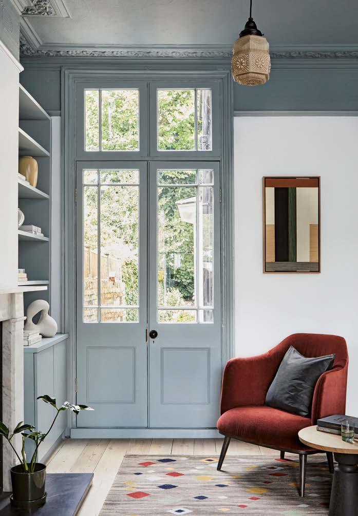
Here we look at ways to combine colours, add playful details on different surfaces, inside and out, to make the most of this essential, useful and transformative decorative tool. Use contrasting colours of paint on walls, woodwork and original architectural features to make a striking style statement, perhaps adding a bold flash of colour above a picture rail (as shown above) or painting the top or bottom half of a room in different colours. A dark colour at the bottom helps to ground the room and everything in it. For a softer look, teaming a lighter colour with a darker one to highlight certain features such as a fireplace or alcove brings areas of light to a rich and cosy scheme.
Contrast can be helpful, too, in zoning spaces or creating a backdrop to something – a bright colour around a bath, or behind a bed – or to give distinction to an area within an open-plan room.
HIGH CONTRAST
ABOVE Use block colours to experiment with bold colour contrasting. Cornicing, Slaked Lime; picture rail and above, Leather; below picture rail, Pea Green; skirting and window, Obsidian Green, all from £48.50 for 2.5l Absolute Matt Emulsion, Little Greene OPPOSITE Deep colours look even more sumptuous in a matt fi nish. Serpentine, £52 for 2.5l True Matt, Zoffany
PERFECT FINISH

The beauty of paint is that it is available in a host of transformative finishes, from chalky, matt paints that create a soft, earthy quality and limewashes with a wonderful tactile character, to high gloss and lacquer for added glamour and luxury, or the gentle sheen of eggshell to help reflect light and enliven a room.
Finishes can be combined – gloss or eggshell can work on a wall, perhaps on the bottom half of a wall with a matt in the same shade above for a subtle but effective contrast. Peter Gomez, lead designer at Zoffany adds that, “Using the same colour on not just the walls but on the skirting, fireplaces or ceilings is a really strong trend, however, if you were to use different finishes of the same colour, you’ll gain interest in the light reflection, which will break up the room to make it feel more layered.” High gloss paint can look striking on cabinetry or other furniture and offer a hardwearing finish too.
Sumptuous velvet-like matt finishes create a cosseting backdrop and work particularly well on deep vibrant colours where the block colour, without sheen allows the colour to absorb light and shadow to create beautiful character.
UP ABOVE
Traditionally ceilings are painted white, which can be a brilliant choice for creating a light, airy feel, but if the walls are a dark colour, doing so can draw the eye to top of the room and make the ceiling feel lower. One way of countering this is to paint the ceiling in the same shade as the walls. This blurs the definition between where one begins and one ends. Or turn things around and keep walls lighter and neutral and apply colour above.
“Use unexpected dark colours on ceilings to create a dramatic but cosy and intimate atmosphere, whilst lighter colours can be paired with complementary pale tones or off-white walls to expand the space and make the whole room feel larger,” Dominic Myland, director of Mylands, advises.
Wallpapered rooms can benefit from ceilings painted in a colour matched to one in the paper design. A bonus of paint is that several companies offer a bespoke colour-mixing service to ensure a perfect result is achieved.
RIGHT Reverse traditional choices by painting the ceiling and woodwork in a colour and leaving walls white. Ceiling and woodwork, Long Acre; walls, Walpole, both £51 for 2.5l Marble Matt Emulsion, Mylands
CREATIVE IDEAS
Paint can be used to add playful details in rooms. Painting behind shelves or the inside of a bookcase is an easy way to add bespoke character. A smart idea is painting the shelves and backdrop in the same colour, with one or two spaces in a contrasting, brighter colour – perhaps to highlight a cherished ornament or picture as well as tie in an accent colour used elsewhere in the scheme.
Adding a bold band of colour to a wall is also relatively simple with the help of a spirit level and good-quality masking tape. Details such as this make a room look well considered and instantly add personality.
Small details such as painting the edge of a door a different colour make for a surprising feature, particularly on darkpainted woodwork, adding a flash of a lighter, prettier colour to catch the eye.
LEFT Simple yet highly effective, painting a wide band of colour in a contrasting hue adds a bespoke detail. Walls, door and skirting, Squid Ink; stripe, Rufus, both from £51 for 2.5l Pure Flat Emulsion, Paint & Paper Library

SYMPATHETIC CHOICES
Whilst paint can be used beautifully for contemporary updates, it is also a medium well-suited to period homes. A number of paint brands offer ranges of heritage or historically accurate colours for purists.
Edward Bulmer, interior designer and founder of Edward Bulmer Natural Paint, notes another benefit of paint for older houses. “Period properties seldom have dead-straight lines, so very linear wallpapers can be problematic and do not suit oak-beamed or irregular interiors so well,” he says. “Paint is also the most cost-efficient and breathable wall covering. It suits all rooms, is serviceable and, of course, easy to update. And it is happily subservient to pictures and other furnishings in a way that wallpaper is not.” This also stands for fabrics used on upholstery and for window dressings, which can be beautifully offset against a painted backdrop in just the right hue.
Bulmer advises considering original features when choosing the right colour paint for a period property. “Period properties have features that will be part of any new scheme, like floorboards or an old fireplace,” he says. “Successful paint colours need to be the same in underlying tonality, and for this we use earth pigments to create a unifying harmony.”
ABOVE In this period property a rich chocolate brown on the walls provides the perfect backdrop for a pink sofa by Edward Bulmer and furniture, artwork and antiques from Lorfords. Walls, London Brown, from £49.50 for 2.5l of Emulsion, Edward Bulmer Natural Paint
COMPLETE TRANSFORMATION
For the creative amongst us, paint can offer a world of opportunity to revive or transform furniture (though nothing antique or of significant value) with quality chalk paints that can be used on almost any surface. Paint can make a tired-looking cabinet or table into something special that works with a new decorating scheme, and avoids the need to buy new. We will discover more ideas on later on in this Ways With series, but painting furniture, frames and even walls in a decorative way – from stencil detailing to adding patina with waxes – can be a useful tool for providing that perfect finishing touch to a room. Investing a little time and effort can offer a rewarding result that is bespoke and full of character, as well as negating the need to search high and low for the ideal piece in just the right colour.
RIGHT Give tired or outdated furniture a new lease of life, perfectly tailored to a decorative scheme with easy-to-use chalk paints. Oxford Navy and Old White, both from £21.95 for 1l of Chalk Paint, Annie Sloan


QUICK UPDATES
One of the joys of paint is that it can be used for a quick and simple – yet impactful – update on just a small area or section of a room, without having to completely redecorate.
A weekend project adding an exciting detail or a splash of unexpected colour is easily achievable, and also easy to change if the result is not as desired. The recess of a window can be painted a bright sunny colour like yellow for summer and changed to something richer for winter. Insides of cupboards or a pantry can be given a lick of paint – perhaps in a bolder choice than might be put on walls in living areas – to add a dash of daring when used. As Farrow & Ball’s colour curator Joa Studholme enthuses, “Bold but fairly small statements reflect our personalities, make us proud of our homes and bring joy into our lives.” Perhaps add colour to a white-painted staircase by painting the steps a contrasting colour, or simply paint the handrail for a striking dash of colour that can be changed as often as desired.
LEFT Adding a burst of colour in a window recess is an easy project that can be changed frequently for a quick transformation. Walls, School House White; window recess, Babouche, both £53 for 2.5l Modern Emulsion, Farrow & Ball
OUTDOOR COLOUR

Outside, paint is a useful medium for transforming the garden as well as making a welcoming sight at the front of the house. Giving a front door a makeover has a truly huge impact – it will always bring cheer when returning at the end of the day as well as delight visitors or passers-by.
Marianne Chillingford, creative director at Dulux, advises: “When choosing a colour for a front door, consider the materials of your house and how a colour will harmonise with them if you are looking for understated elegance. But if you fancy something more striking, choose a cheerful summer petal colour like Lavender Quartz and frame it with white to put a smile on the faces of everyone who walks past.”
Masonry paints can be used to paint exterior walls in the garden – perhaps to create a colourful backdrop to a seating area, add impact to a walled border or bring personality to a display of plants.
ABOVE Add cheer and personality with a front door in a favourite colour. Door in Lavender Quartz, £27.95 for 1l Weathershield Quick Dry Exterior Satin, Dulux

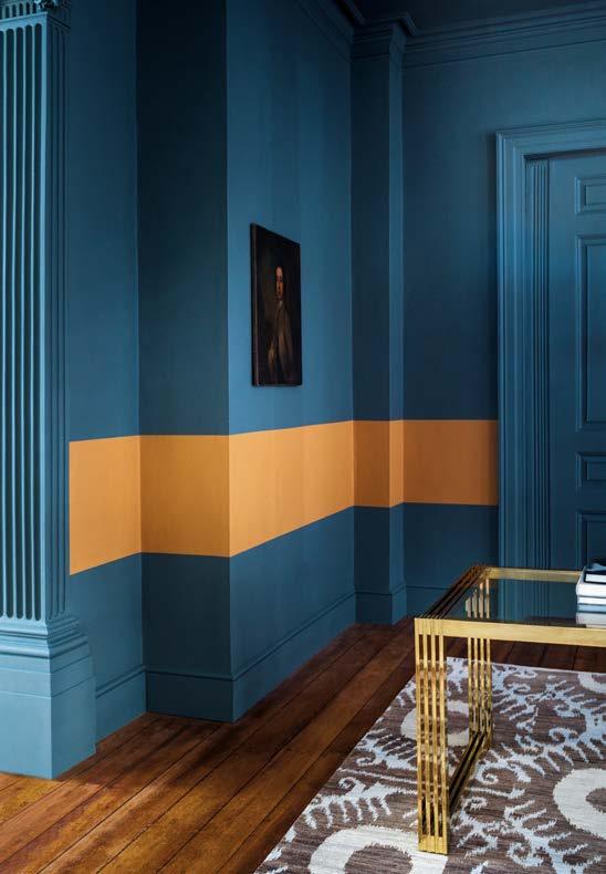
SEAMLESS COLOUR
Using the same colour across walls, ceilings and woodwork can be highly effective in making a space seem larger, without any hard contrasts or divisions. Opting for a dark colour all over can actually soften its impact. Rather than making a room featureless as might be expected if covering features, woodwork and walls in one colour, it offers a contemporary and chic look that is soothing. Helen Shaw, director of Benjamin Moore UK, advises using this technique in loft rooms. “Don’t let sloping ceilings put you off opting for colour,” she says. “Instead, make the most of the abundance of natural light to create a space that is airy and open, yet also cosy. Consider a warm, inviting mid-tone across the walls, woodwork and ceiling to maintain a light feel which is achieved by not breaking up the colour with white trims and ceilings. Instead, you’ll have an airy room that doesn’t feel cramped.”
ABOVE Unifi ed colour on walls, ceiling and woodwork creates a calming and larger-looking space. Yarmouth Blue, from £25.50 for 0.94l Advanced Matt, Benjamin Moore

WONDERFUL WOODWORK
Skirting boards, doors, windows, stairs and bannisters provide an opportunity to add expression and impact. Colourful woodwork can add character to a white room and be a softer way to introduce a bold colour without taking it all over the walls, and it is easy to update as desired. It can be a useful trick to help create flow through a house too, with woodwork throughout in one colour.
Find a colour that works well with other choices, for instance a pink can look good with whites, greys and black as well as various shades of green and blue. Dark blues together with greens are a versatile choice too. Though a unified approach creates a sense of flow, a door in a different colour adds character and creates a statement feature in minutes.
ABOVE Colourful woodwork looks considered and interesting and creates fl ow and unity throughout a house. Bannister, Blackout; door, door frame, skirting and stairs, Pink House Pink, both from £31 for 1l of Wood & Metal Eggshell Paint, Mylands
EXPERT ADVICE ON CHOOSING COLOURS
How to select the right colour for a room, whether white or something bolder
HOW TO CHOOSE A WHITE Andy Greenall, head of design at Paint & Paper Library
“Before choosing a white, it’s important to select the style you wish to create before you begin. Understanding how the nuances in different whites and soft neutrals behave in different light settings is also key. Remember that ambient light changes throughout the day, causing colours to appear to change too.
If you want to use the same white throughout your home, in rooms with different aspects, consider using whites with a grey or green undertone such as our Minim or Raw Chalk, which are very neutral, meaning they are neither warm nor cold, so work perfectly in north- or south-facing rooms.
If you are looking to use a range of whites and neutrals within a home, consider the light and orientation of each room, as well as the proportions of the space, and whether there are existing colours and surfaces to consider.
Most importantly, what kind of atmosphere do you wish to create? Whites with a soft pink (red oxide) or yellow (ochre) base will create a warm and soothing space, whilst whites with a blue undertone will make a room feel cooler and brighter – these shades are well suited to a south-facing room, where you want a crisp and impactful finish.”
CHOOSING COLOURS Joa Studholme, colour curator at Farrow & Ball
“When it comes to choosing colour for your home, you should first consider how and when you are going to use each space. Larger rooms used during the day are usually suited to lighter colours, whilst those used at night, therefore artificially lit, command stronger colours which create more intimate comforting spaces.
A strongly coloured hall creates a little drama when you enter your house and means that all the rooms off it feel bigger and lighter. For an extra chic twist, you can paint the spindles of your staircase in a really dark tone, which will create a striking spine running through your house without being overwhelming.” ■