16 minute read
CONSIDERED HOME OFFICES


HOME OFFICES Case Study One
Considered HOME OFFICES


Colour, storage and personal touches are all key factors for top interior designers when designing a work space for the home
Home offices by their very nature need to be functional spaces, providing somewhere to concentrate and plenty of storage for essentials. Yet they also need to be pleasant to spend time in. When designing such a space, thinking carefully about comfort as well as practicality can reap dividends, bringing pleasure to the working day and an aesthetically pleasing fit to the home. Whether a work space at home is in its own dedicated room, an infrequently used guest bedroom or a corner in a quiet area of the house, its design demands a level of care and attention that ensures form perfectly marries function.
Here interior designers provide their expert insights on creating a deftly balanced and harmonious home office to ensure utmost productivity and flexible use of space.

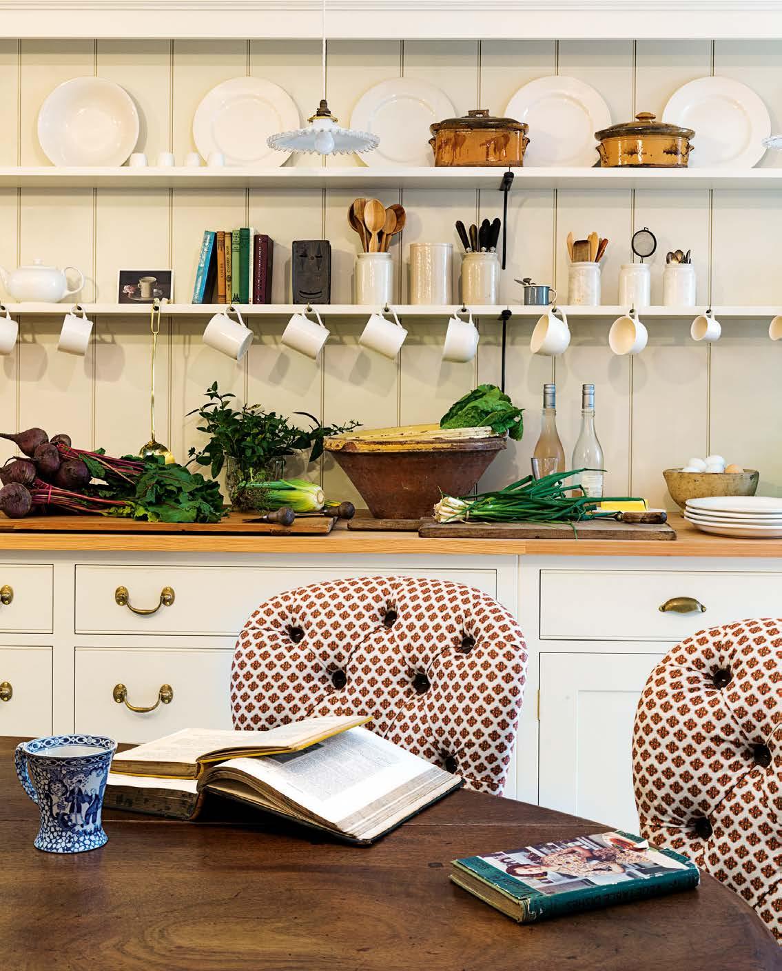
Katie Glaister and Henry Miller-Robinson, co-founders and owners of K&H Design, on creating a multifunctional room
Considered design and careful curation see much-loved pieces incorporated into a colour-led scheme for a home office that also doubles as a guest room.
The brief “This project was all about curating, working with and reworking the clients’ treasured items. They were keen to use craftsmen from the UK and around the globe, and also wanted us to play around with colour and texture. Our clients wanted this first-floor room to be their study as well as their guest bedroom. We had to include their large and much-loved Biedermeier breakfront chest (above right) into the scheme and considered it carefully in the reconfiguration of the space and tonally in this room. They also wanted the en-suite shower room to be a hidden gem for guests.”
Creating duality “As the room plays to two functions, we designed the bespoke sofa to open into a deeply comfortable bed, whilst the en-suite shower room is concealed behind a subtle floor-to-ceiling jib door. As the room is not large but there was a lot to fit in, we designed a beautifully curved and therefore space-saving desk. The detail includes neat inlay, tapered legs and cable management.
“The sofa is a playful take on a Knole sofa – it is smart and deeply comfortable. The cushions are in a soft Kelway velvet by GP & J Baker, which are a subtle but satisfying contrast to the horsehair fabric from John Boyd Textiles used on the sides and back and the sofa is finished with a studded detail.
“The curtains are a Soie de Lune and K&H Design collaboration, and are hand-dyed to our bespoke colour specification. This took three attempts before the perfect colour was achieved. They were handwoven in Vientiane, Laos.”
The en suite “Our client was keen to embrace colour in the small en suite. Farrow & Ball’s Inchyra Blue was used as the base colour, and we brought through the warmer hues from the study and reflection from the 1960s Italian shield mirror and the Swedish Orrefors glass wall sconces. As we like to mix metals we introduced the chrome taps and stand. The marriage of the basin and vanity was a triumph – the vanity unit is from Burlington Stone, with the decorative Moroccan basin sitting comfortably within the bold natural markings and multiple tones of the green stone.”
Use of colour “We had fun playing with colour through design-led pieces in this room, including the red office chair, green table lamp, and the warm tones in the rug to unite the room.”

OPPOSITE The curved desk, specially designed to fit the space, is a sleek contrast to the dynamic pattern of the Melissa Wyndham Wiggle rug from Robert Stephenson. The red olette office chair is by Baxter and the green table lamp is by Louis Poulsen. The copper convex mirror lends a further playful note. ABOVE LEFT The bespoke pull-out sofa bed by K&H Design is upholstered in horsehair fabric and velvet. ABOVE RIGHT Warm tones in the Pentreath & Hall lampshade echo the blue hues of the en-suite bathroom, whilst the mirror and wall-mounted glass sconces re ect details from the study. The Biedermeier chest is just seen to the left of the doorway.
Dynamic use of bright orange in the rug and turquoise for the woodwork are highlights the transition into the calmer-hued work space.

Sarah Peake, owner and founder of Studio Peake, on maximising minimal space
Creative storage solutions and a considered colour palette combine to create an atmosphere of productivity.
The brief “The most important thing about a study or home office is that it actually helps you to be productive. It therefore needs to be able to inspire creativity, but also to instil focus. When I designed my study at home, as part of the wider refurbishment of my London apartment, I was keen to go for a distinctly non-office feel, but also to ensure a minimum amount of clutter. Working from home can be isolating at times, so it is important to really love the space. I started my interior design studio from here, so wanted to get it right.”
Form and function “This is a room with a view: the window of the study looks out over a courtyard and then on to the reception room and garden beyond. This greatly influenced the layout, as I wanted to ensure that whoever is working at the desk feels connected to, and not cordoned off from, the rest of the apartment.”
Storage solutions “To keep clutter to a minimum, storage solutions must be creative – particularly if you are short on space. My husband and I have collected a lot of books over the years, so throughout the flat there are built-in bookcases in every nook and cranny. I designed the breakfronted joinery to have deep storage in the centre (enough depth for hanging clothes if we ever needed to refashion it as a wardrobe in the future), but the shallower bookcases at either side and the open areas for baskets ensure that the joinery doesn’t overpower what is a relatively small space. I also used the same colour paint on the cabinetry as on the walls, which helps to unify the space.”
Use of colour “The yellow curtains and pelmet frame the window in a vibrant way, and we also keep a window box there, stocked full of colourful flowers. Having proper curtains, as opposed to, say, a blind, helps the room
HOME OFFICES Case Study Two
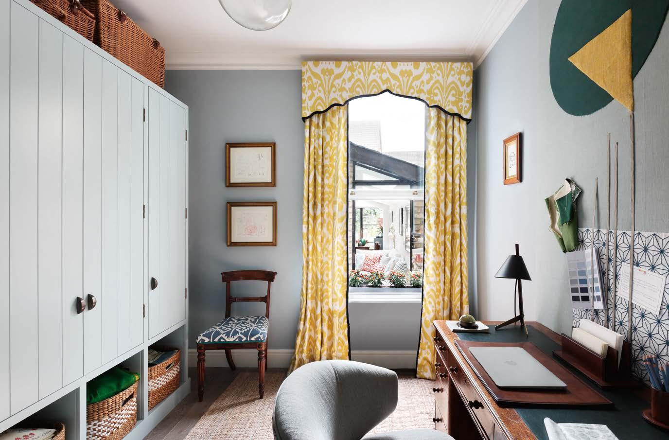

feel more like a home and less like an office. The lively yellow and off-white of the curtains is a useful foil for the more muted blue-grey of the walls (painted in Aerial Tint by Edward Bulmer Natural Paint). This interplay between vibrancy and tranquillity is key.
“The desk is reasonably traditional, which is a nice counterpoint to the more contemporary chair and pinboard. I love mixing contemporary and traditional pieces, as it gives a space vitality.
“The woodwork in the hallway is painted turquoise (in Vardo by Farrow & Ball), and this, together with the almost lurid orange of the rug, is a striking segue from the calm of the walls and cabinetry in the study.
“I am particularly fond of the pinboard. I made it myself out of fabric remnants from Vanderhurd, Lewis & Wood and Fermoie, and spent a very happy Sunday appliqueing it. It gives the scheme some texture and the room a sense of playfulness as well as a nod to my love of handmade pieces. It is great to use on the wall for display and inspiration.”

ABOVE A sense of calm pervades thanks to a carefully considered colour scheme. The cabinetry along the wall is kept from overpowering the room by having open areas for baskets underneath. RIGHT The traditional desk is complemented by a contemporary chair to bring a sense of vitality to the room. The large-scale pinboard, made from fabric remnants, adds further texture and playfulness.
HOME OFFICES Case Study Three

The downstairs library area opens out on to the patio, creating synergy and o between the inside and outside spaces.


Jane Churchill, owner and founder of Jane Churchill Interiors, on tailoring a home office space
Whichever room is used, chic use of light and layout, offset by personal touches, are key to creating the best possible environment in which to work at home.
The brief “My home office space is in the conservatory, on a raised ground floor. It is at the back of the drawing room and flooded with light, which matters a great deal to me when I am working. I have a light fixation and find most people feel happier and come to life in a light-filled space. Downstairs there is a reference library, with an adjoining patio space.”
Maximising light and space “The office looks out on to an area which goes down to the basement where the patio is, so I put a double-height trellised mirror from the top to the bottom on the opposite wall to reflect light and avoid any dark basement feel below. When the lights from the conservatory reflect in the glass at night, it is very pretty.”
Characterful touches “Behind the desk, the table is covered in a cloth with eighteenthcentury Hanoverian figures appliqued on to it. They belonged to my grandmother (Alice Winn, sister of design doyenne and owner of Colefax and Fowler Nancy Lancaster), and I had them restored and sewn on to a thick felt. I have a drinks tray on there which is so useful as there are always glasses at the ready and all you need is the ice. The candlesticks were also my grandmother’s and she bought them for nothing in Beauchamp Place before the Second World War. They are quite big and a touch ‘Liberace’ but they have always looked great in every house I have lived in. You can never go wrong with candles, as they give off such a pretty light.”
Work area flow “I turned the area downstairs into a reference library, albeit not big enough to sit in, but you come down the stairs and look straight ahead at the lit bookcases. This opens out on to the patio where I have placed bay trees, which look as though they go on for ever in the mirror. I have masses of books I use for reference, and aesthetically also like to use them like wallpaper in a room as it works so well. Erudite people obviously place the books in subjects, but not me. I like them neatly arranged according to their size – it’s a quicker job than you think and you would be amazed how you can usually find what you are looking for.”
Adding detail “The round table has always travelled with me too; it has been in several halls but works really well here. I have collected the blue and white china over the years. I find it in junk shops and because no-one knows what to do with it, it is always cheap! At night I put night lights in it or flowers and it looks great.
“The bookcases are all in wood, though I have since painted the insides in red and they come alive more. Never think that your rooms are finished, as there are often things you can do that just make all the difference without pulling the house down.”
ABOVE The conservatory location of the home office creates a light filled orking space. rnate candlesticks and appli ued eighteenth century anoverian figures, both once belonging to ane s grandmother, add character and a sense of history to the room.
HOME OFFICES Case Study Four


FAR LEFT The hidden ‘secret’ door opens to reveal the study space beyond. LEFT Light streams in beneath the charcoal tones of the Roman blind, further highlighting the use of textiles in the patterned upholstery detailing of the desk chair.
Henry Prideaux, owner and founder of Henry Prideaux Interior Design, on a harmonious, hidden home office
A calm colour palette, sleek finishes and a clever hidden door make for a sophisticated work space
The brief “As the owner predominantly runs his business from home and needed a dedicated space in which to work and host occasional meetings, the brief was to create a sophisticated study using a restful colour palette.
“We developed a scheme that was both sleek and practical, which, whilst leaning towards a slightly masculine feel, remained flexible in aesthetic with the inclusion of beautiful finishes such as figured sycamore, polished brass, leather, and linen. The door to the study is on a half landing at the top of the first flight of stairs and can therefore be seen from the entrance hall on the ground floor, so we wanted to make it a focal point by turning it into a design feature.”
A harmonious touch “The colour palette for the majority of the house is a serene combination of cool silvery grey with soft hints of blue and lilac throughout, so we designed the study to work in harmony with the decorative elements chosen for the adjacent spaces of the stairwell, landing and master bedroom.
“Inside the study, the overall concept is to subtly imitate an updated version of an old-fashioned gentleman’s club, made more contemporary with the implementation of simple wall panelling framed with a polished-brass metal inlay. The pale oak parquet floor, configured in a mansion weave design, provides the base for the rest of the scheme. We used light-grey figured sycamore veneer as the key material for the walls, custom-fitted joinery and the back of the door. The joinery forms the desk area as well as providing lots of open shelving and hidden storage. An indigo leather inlay is used as a blotter for the writing desk, adding a smart contrast.
“To accommodate an air-cooling system we installed a coffered ceiling, and chose hand-burnished brass picture lights to evoke the feel of a traditional library. Moody blue artwork, a Roman blind in charcoal chintz linen with a zigzag trim, and a chair upholstered in grey linen with contrast back and sides complete the space.”
The secret door “To access the study, we initially thought about creating a jib door to blend seamlessly with the wall, but then the idea of creating a hidden ‘secret’ door with a faux bookcase facade was born, allowing us to make the entrance to the space much more of a design feature.
“We designed the secret door to replicate a bookcase and used more than 400 hand-selected genuine vintage linen and leatherbound books in order to create it. As the books were of many different sizes and would have been too deep and heavy to use as they were, we had them cut to the required depth and attached to a board backing in a carefully configured layout to look more authentic. Finally, we had a door mechanism fitted and concealed behind one of the books to allow access.”

Paolo Moschino, co-owner with partner Philip Vergeylen of design studio Nicholas Haslam Ltd, on incorporating a modern workspace in a period home

Practical considerations and cherished pieces are brought together in a period property.
The brief “Lately we have spent more time in our country farmhouse, and the openspace office has become the most popular spot in the house as we have been using it every day rather than solely at weekends. The property is part-Tudor and part-nineteenth century – we created the office space to resonate with the age of the house. It had to be practical yet inconspicuous, in order to keep the continuous flow with the adjoining dining room and drawing room.”
Creating space “After buying the property about 10 years ago, we made a number of changes to the interior, including opening up the ground floor where the home office sits. The first thing we did was to remove the floor above the entrance to the house, to create a doubleheight space and a grander feel, and then we removed all the interior doors on the ground floor.
“Most of the time it’s just Philip and I, and I would not like to be behind a door in the kitchen or dining room and Phillip behind a door in the office. The office is almost a passageway where we go through from the living room to the dining room and the kitchen: you pass by and you can check on your emails without feeling isolated.”
Using antiques “In order to resonate with the age of the house, we used antique pieces throughout. The desk is eighteenth-century French and the tan leather-covered desk chair nineteenth-century Italian, whilst the nineteenth-century vitrine (not shown) directly behind the desk chair was bought from Brownrigg Interiors. It is filled with our collection of Italian vellum books, which on video calls serves as a beautiful background. It is also used as storage underneath for table china – Philip is a china shopaholic and we have enough to set different tables for our guests every day for more than two months.
A modern nod to the past “Often whilst on buying trips we will spot pieces that are just right for a space or project – the vitrine being one of them. Inspired by its design, we had a matching pair of built-in shelving units made for either side of the desk so that they blend seamlessly into the space.
“Lighting choices, too, play a part – the pair of table lamps that we selected from our showroom were just the right height to sit with the computer screen and add scale to the space.
“Finally, as Philip is a great admirer of the late Yves Saint Laurent, he likes to follow his advice to put a bunch of wheat on a desk for luck and happiness.”
ABOVE The offi ce space is practical yet has been seamlessly incorporated ithin the continuous o of the adjoining living areas. The tan leather covered desk chair, a nineteenth century talian fi nd, is one of a pair that are also used as dining room chairs hen entertaining. The armchair, rug, and side table seen in the foreground are all anti ue pieces sourced on aolo and hilip s buying trips.