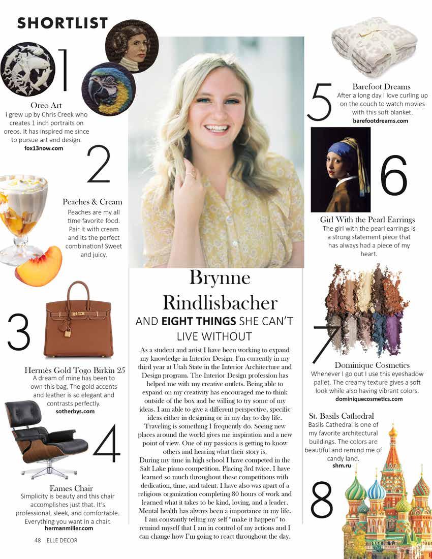
BRYNNE RINDLISBACHER PORTFOLIO
INTERIOR ARCHITECTURE & DESIGN
UTAH STATE UNIVERSITY, LOGAN, UT 20-24
Bachelor of Interior Architecture and Design
GPA: 3.89/4.0
Student member of IIDA, ASID, and representative of IADSA.
Classes include Architectural Systems, CAD I & II, Graphics I & II, Commercial Studio, Residential Studio.
Revit
AutoCAD
Adobe InDesign
Adobe Illustrator
Adobe Photoshop
ADA Design
Space Planning
Construction Documents
Group Collaboration
Hand Rendering/ Sketching
INVOLVEMENT
IADSA Student Representative
Fall 2022 - Present
IIDA Student Chapter Member
Fall 2022 - Present
ASID Student Chapter Member
Fall 2021 - Present
Brynnebacher@gmail.com
+801-870-1707
Residential Design
Commercial Design
Microsoft Office
Strong Communicator
Encouraging
Reliable
Detail Oriented
Critical Thinker
Dedicated
Time Management
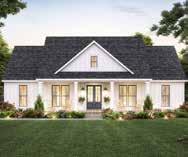
- Designed & Space Planned a 2,000 square foot home in
Alpine, Utah.
Aroon & Aiko Residence
- Collaborated with a group to design a couples home.
- Focused on creating a home using ADA requirements for
easier wheelchair accessibility.
renderings, and a study of fung shui.
- Created floor plans, reflected ceiling plans, interior
- Project included space planning, presentation board, plans, as well as mechanical and plumbing plans.
- Designed, space planned, and collaborated to create a
- Project consisted of research, schematic design,
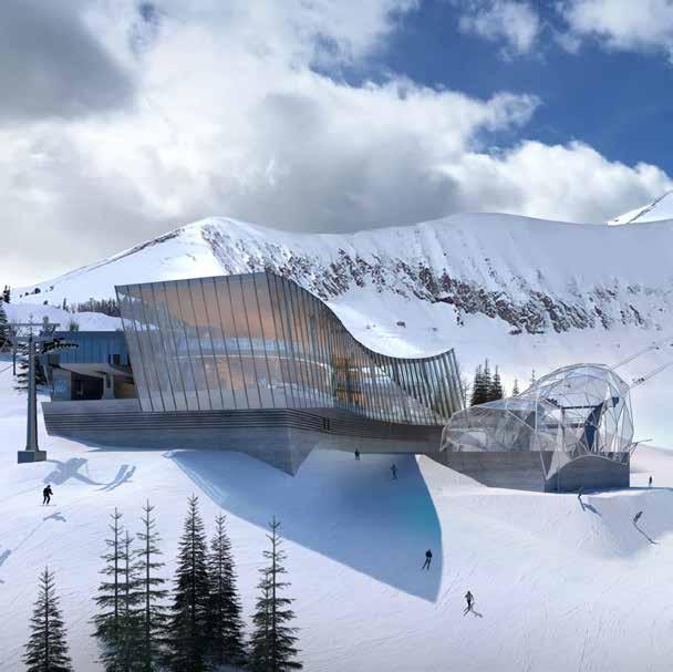
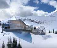
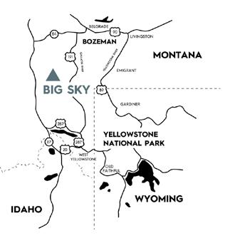
elevations, finish/door schedule, wall type/annotated ski resort located in Big Ski, Montana.
renderings, material selections, reflected ceiling plan and presentation booklet.
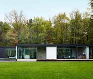
House in the Woods
- Collaborated with Drake Anderson to design a
sustainable home for Sahara Rose.
Bach Homes 05/22- 8/22
- Assisted in flooring maps to keep a detailed record of
each flooring installation and know where LVT,
Carpet, etc. would be placed in the homes.
- Aided in installations for the parade of homes by
- Project included construction documents, presentation helping keep an organized schedule, meeting our
drawings, renderings, presentation board, & a 3D model. deadlines, and finding solutions to problems that arose.
- Prepared presentation boards for client meetings to help share new ideas and provide a guide for what would be purchased.
- Effectively maintained and organized resource library, increasing productivity.
Huta Medical Spa Big Sky Ski Resort

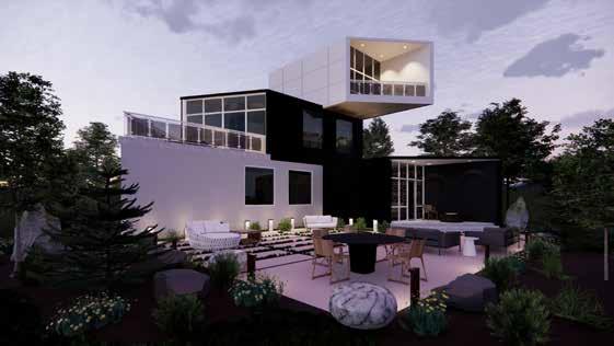

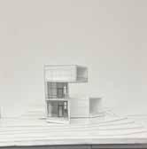
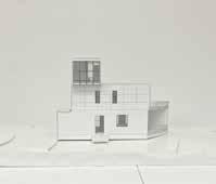
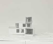
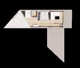
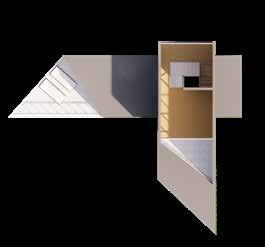
Indarra was created after a symbol from a health app. This is a home that represents power and strength, thus given the name Indarra. Each block is designed to stack up onto each other, creating lookout points in every direction, giving you the best view of the Alpine valley. This home is just under 2,000 square feet and is occupied by a couple.
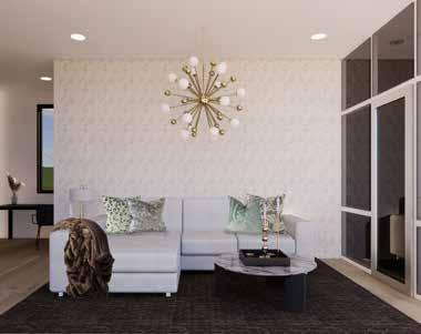
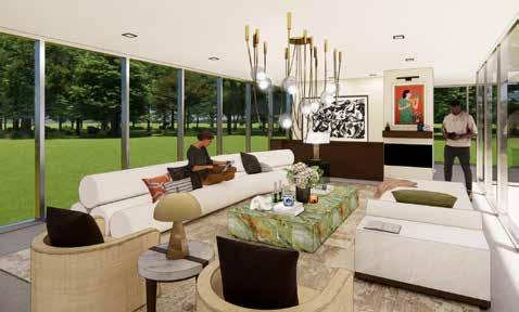
The living room is an open concept on the main floor, designed for conversation and access to the backyard. Each space is made for comfort by using soft colors, and light patterns.
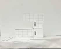
MODEL OF HOME: 1/4 SCALE

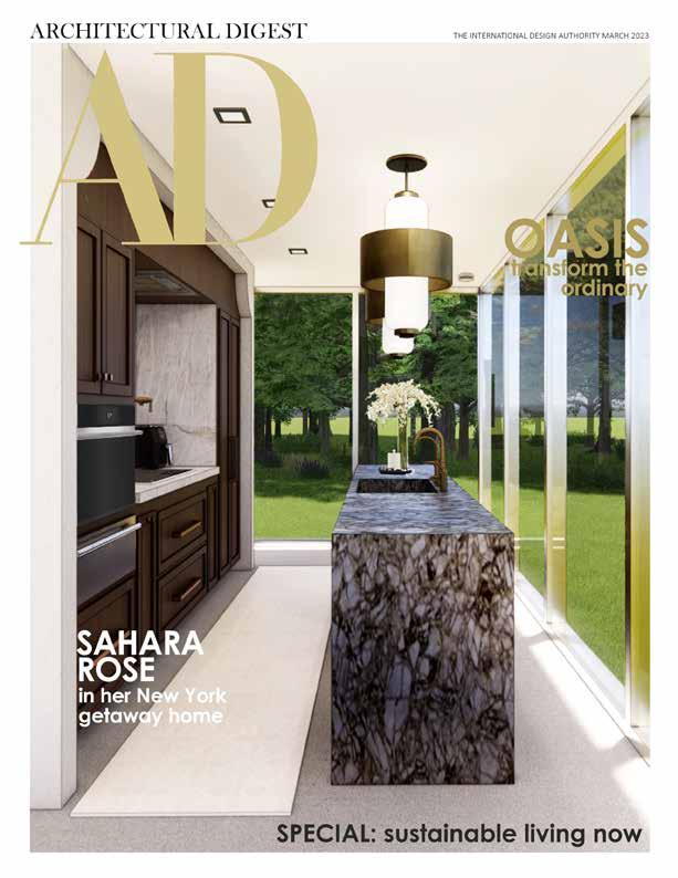
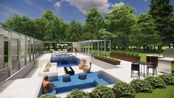
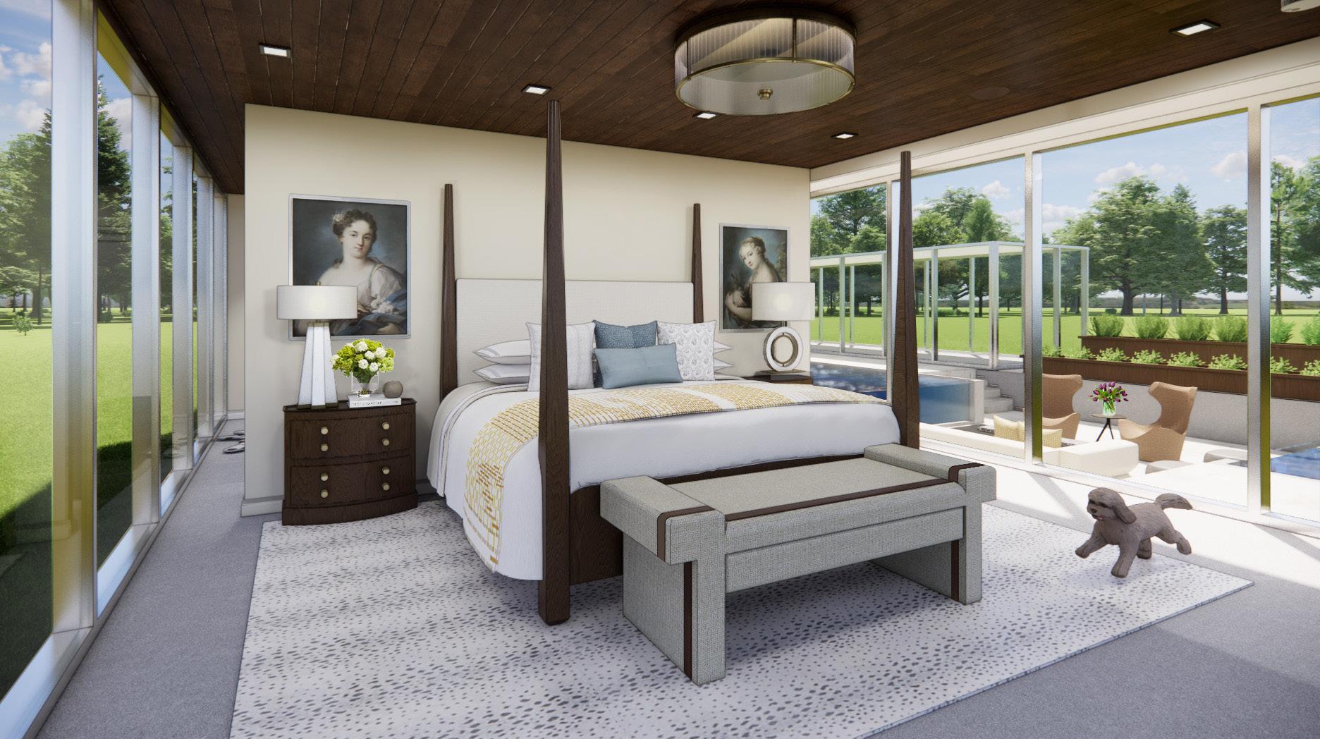
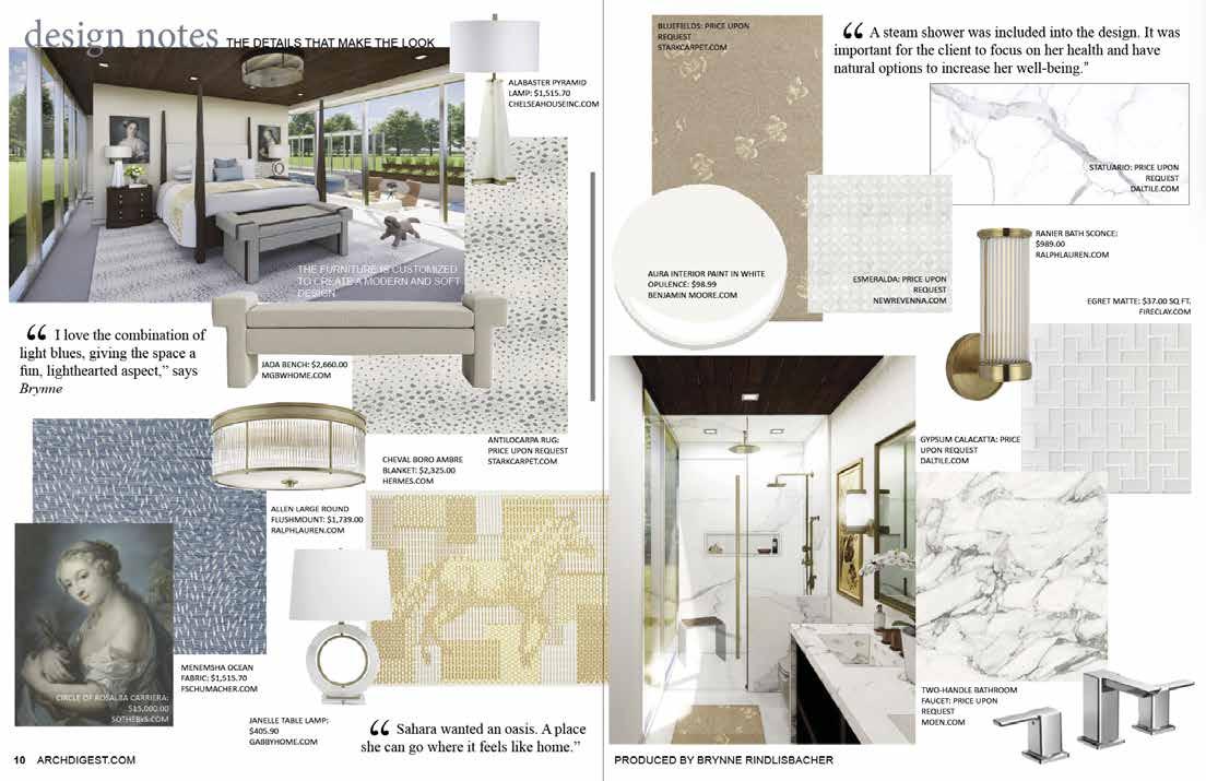
House in the woods is a collaboration with Drake Anderson taking their home and redesigning it for Sahara Rose. The requirement for this home is to be sustainable and clean, using little to no VOC’s. The home is meant to be a getaway from the city and become an oasis. Renderings were created using Revit and Photoshop.
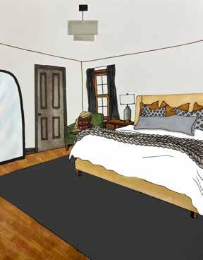
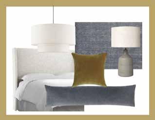
Each of these spaces are tailored for Rose. With lots of whites and warm colors to contrast each other. The bed and nightstands are custom and made to be a comfortable escape with the four posts drawing you to the center. Sahara is known for her healthy life style and ayurvedic eating habits. Needing a fresh start the house in the woods reflect her tastes, preferences, and wellness goals as her future home. As she was recently diagnosed with an autoimmune disease this home needed to be toxic free and limit the carbon footprint of the interiors. This was done by following the WELL building certification.
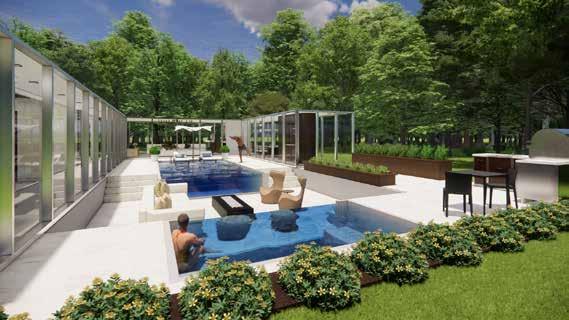
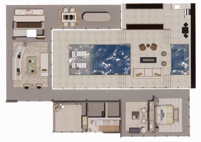
Since the home is located far in the woods in New York I wanted to make the outdoors feel like it was apart of the woods around it rather then having fences that block the view. Small Shrubs were added as well as an herb garden. An infinity pool and hot tub face each other adding a high end, elegant feel to the space.
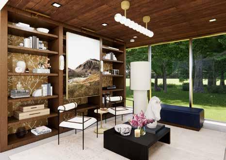
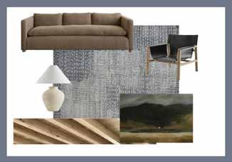
The living room was a space used to continue the light and airy feel that the rest of the home has but have a little bit more warmth since it’ll be used the most. A priceless piece of artwork was added above the fireplace to remind the client of her culture. Making the space her own.
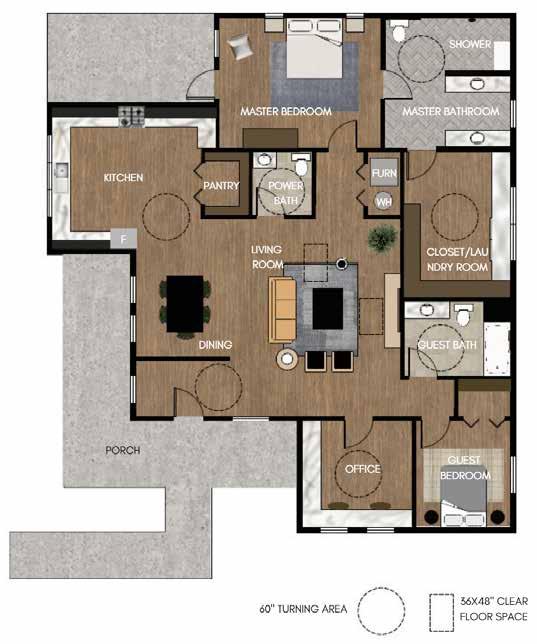
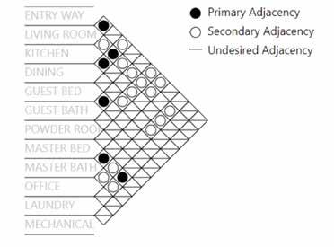

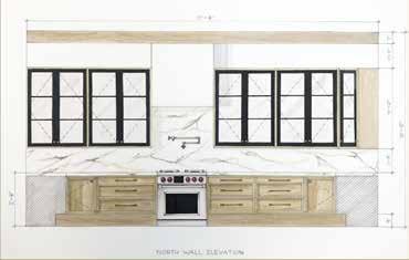
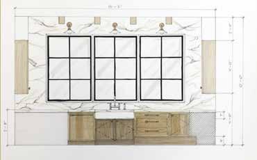
Aroon and Aiko Chen are looking for a home that will be comfortable and accessible to move around in for Aroon in his wheelchair. They need an open workspace/ home office as Aroon works from home as an accountant. They have specific requirements that needed to be met to be able to live there. An open entry, 2 bedrooms w/ closet space, 3 bathrooms, office, and laundry room close to master bedroom. The spaces are created to incorporate hygge, feng shui and shibui. Space planning, color scheme, and a collaboration with other classmates was the focuses of the project.

Aroon and Aiko were born and raised in China. After meeting they got married and decided to move to the United States. While being here the last 4 years Aiko has started her own company and Aroon finished his college degree in accounting.

Wheelchair accessible kitchen featuring ADA compliant 9” toe kicks, 32” high countertops and multiple open under-cabinets spaces.
A cozy hygge living room with warm woods and golden yellows and contrasting blues and blacks.


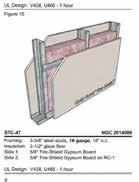
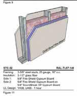
The Huta medical spa was space planned and designed to function as a new spa for consumers to get laser, erbium, and botox treatments. The exterior structure remained. The point of this project was to space plan the inside, create a full set of construction documents, and create specification sheets for the materials used.
COMPPRESSION POST DETAIL
CEILING DETAIL MAIN RUNNER DETAIL
CEILING DETAIL
CROSS RUNNER DETAIL
WEST INTERIOR ELEVATION
NORTH INTERIOR ELEVATION
EAST INTERIOR ELEVATION
SOUTH INTERIOR ELEVATION
STANDARD MOUNTING HEIGHT
INTERIOR ELEVATION
INTERIOR ELEVATION

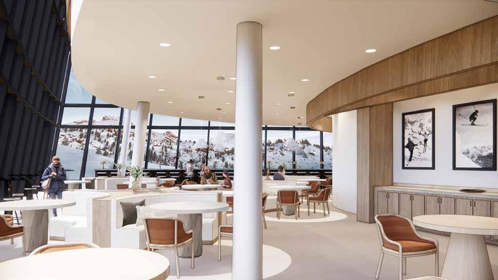
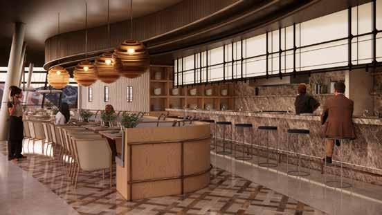
We wanted to create a relationship with the outdoors of Montana. Inviting others to continue the experience and move throughout the building, enjoying the Big Sky Resort feeling as thought they are still experiencing everything Montana has to offer outside. Each space is centered around national parks in Montana.
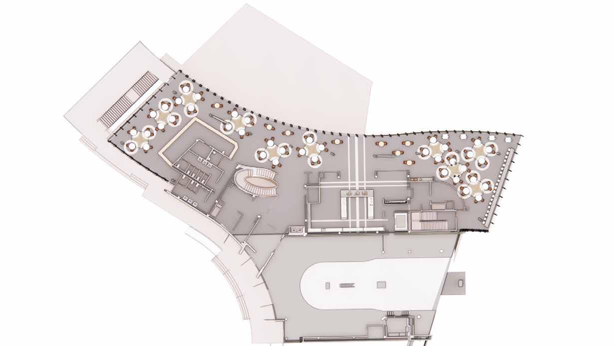
The main floor consists of three main spaces for skiers and customers. They include the retail store, cafeteria, and cafe. Each space needed to have a high end feel but still have a strong durability, and be cohesive with the 3rd level. Warm colors were brought into the space to incorporate the summer weather and colors. It was also important for us to reinvent plaid, giving it a high quality look while still being fun, light, and airy. You can find the pattern on the back of the booth seating as well as the floor of the cafeteria. These spaces were designed after the Gates of the Mountain Wilderness National Park.
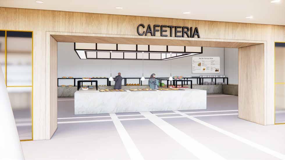
The cafeteria seating is meant to be a comfortable space that reminds people of home and the beautiful outdoors. Center pieces, stone tables and spacious open windows help brighten the space, give the illusion you are still outside and inviting nature into the space. The booths were created to make the space conversational and fun with friends and family as you gather to eat before your ski experience. This created a relaxed environment that helped people feel welcome to converse.
r i a f f & e
c a f e t e r i a f f & e
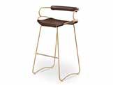
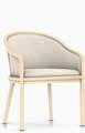
S t a r k W a l t o n e r i a f f & e o v e r + V a l l s H U G B A R S T O O L L o u s P o u l s e n R I N G C R O W N 1 L a n d m a r k c h a i r H e r m a n m l l e r C o r t n a L e a t h e r s S a n d 8 5 - 1 O y s t e r


S t a r k W a l t o n e r i a f f & e o v e r + V a l l s H U G B A R S T O O L L o u s P o u l s e n R N G C R O W N 1 L a n d m a r k c h a r H e r m a n m i l l e r C o r t n a L e a t h e r s S a n d 8 5 - O y s t e r
r k t o n c a f e t e r i a f f & e o v e r + V l l s H U G B A R S T O O L L o u s P o u l s e n R I N G C R O W N 1 L a n d m a r k c h a r H e r m a n m l l e r C o r t i n a L e a t h e r s S a n d 8 5 - 1 O y s t e r

L e 8
C o r t n a L e a t h e r s S a n d 8 5 - 1 O y s t e r
o v e r + V a l l s H U G B A R S T O O L L o u s P o u l s e n R I N G C R O W N 1 L a n d m a r k c h a i r H e r m a n m l l e r B e n a m n M o o r e t h u n d e r c l o u d g r e y p o t t e r y b a r n e v e r y w h e r e v e l v e t n o k v o g r a n t e & u m c e A r z o n a t l e p e r l a v e n a t a
S t a r k W a l t o n
C o r t i n a L e a t h e r s S a n d 8 5 - 1 O y s t e r

c a f e t e r i a f f & e o v e r + V a l l s H U G B A R S T O O L L o u s P o u l s e n R I N G C R O W N 1 L a n d m a r c h a r H e r m a n m l l e r B e n a m n M o o r e t h u n d e r c l o u d g r e y p o t t e r y b a r n e v e r y w h e r e v e l v e t n o r a k v o g r a n t e & p u m c e A r z o n a t l e p e r l a v e n a t a

S t a W a l
l a v e n a t a
S t a r k W a l t o n
# 8 a i r q u a l i t y m o n t o r i n g & a w a r e n e s s 2 p o i n t s # 3 c i r c u l a t i o n n e t w o r k 1 p o n t
# 9 p o l l u t i o n i n f l t r a t o n m a n a g e m e n t 2 p o n t # 1 0 s e l f - m o n t o r i n g 1 p o i n t
One of the requirements for the resort was making sure it was WELL certified, specifically bronze or higher. We made sure the materials selected were VOC free and cleanable.
Our word inspiration gave us direction, helped guide us to understand what it was the client wanted the space to feel. Tying nature into the space was a big focal point that was applied by the natural colors, stones, woods and layout.
# 4 e n h a n c e d w a t e r q u a l i t y 1 p o i n t
# 8 h y g e n e s u p p o r t 4 p o i n t s
# 2 v e r f e d t h e r m a l c o n t r o l 3 p o i n t s
h e r m a l z o n n g 2 p o i n t s
# 7 h u m d t y c o n t r o l o p t o n 2 1 p o i n t
PARTNER COLLABORATION: BECCA’S RENDERING
# 8 m n d f u l e a t n g 2 p o i n t s
# 1 0 f o o d p r e p a r a t o n 1 p o n t
# 4 f o o d a d v e r t i s n g 1 p o n t
# 6 p o r t o n s i z e s 1 p o n t
# 4 s i t e r e m e d i a t i o n 1 p o i n t
# 6 V O C r e s t r c t o n s 4 p o i n t s
# 1 1 c l e a n n g p r o d u c t s & p r o t o c o l s 2 p o n t s
# 3 c r c a d a n l g h t i n g d e s i g n 3 p o n t s
# 4 e l e c t r c l g h t g l a r e c o n t r o l 2 p o n t s
# 9 e n h a n c e d a c c e s s t o n a t u r e 2 p o n t s
YEAR 2020-2022
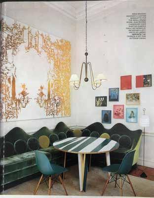
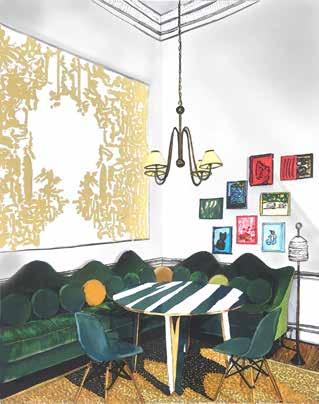
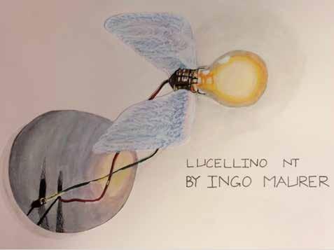
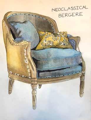
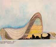
The magazine rendering was done by selecting an Interior space from a magazine and recreating it using alcohol markers. The medium for Bergere and Lucellino are watercolor, pen, and colored pencil.