INTERNATIONAL OFFICIAL LEGO SHOP 2023
Celebrate: 25th anniversary of LEGO LOGO Since 1998 to present
 by David Vi Boi Huynh
Kitty Phung Huynh
by David Vi Boi Huynh
Kitty Phung Huynh
Copyright ©vboihuynh. All rights reserved.
Project B. BDS_285105
INTERNATIONAL OFFICIAL LEGO SHOP
International Official LEGO Shop is a great architecture project which will be built someday in the future in Copenhagen, Denmark.


History of LEGO Logo

LEGO Logo: 1936

1936: While founded in 1932, Lego did not release its first official logo until 1936. The logo (seen on the left) was ink stamped on the bottom of all Lego products, which, at the time, were predominantly wooden cars and trucks, with some other wooden crafted play toys as well.
A point of note here is that Lego did have a logo from 1934 to 1936, but was used exclusively for shipping labels, correspondence, and other corporate materials, but was not printed on their toys, this did not occur until the logo redesign in 1936.
The primary reason for this rebrand in 1936 was so that the logo would fit properly on the bottom of all the wooden toys Lego was making at the time. The brand name was italicized in fine lines. It was a very modest and straightforward logo, that stayed with the company for nearly a decade.
Copyright ©2022 The LEGO Group. All rights reserved.LEGO Logo: 1951

1939: By 1939, the company had grown to 10 employees, and a new iteration of the Lego logo was created. This version (seen to the left) was applied to the bottom of Lego produced wooden toys as a decal. This is the first time we see the distinctive block lettering on the Lego logo.
1949/1951: Lego released their first brick-based play set in 1949 under the name Automatic Binding Bricks (a subcategory of Lego products). In 1951, Lego rebranded the Binding Bricks name to Lego Mursten (translating directly to Lego Bricks in English). This move was made by Ole’s son, Godtfred, who was looking to gain wider recognition for the Lego name.
As part of this rebrand, Lego introduced a new logo (seen on the left), which featured the familiar block lettering but now with the outlining that has made the Lego logo distinctive to this day.
The release of the Automatic Binding Bricks product elevated the Lego toy company above their competition and would give them a leg up for decades to come. This logo embodied the colour pallets that would come to define the Lego logo in the decades to come.
Copyright ©2022 The LEGO Group. All rights reserved.
LEGO Logo: 1953

1953-1955: An experimental logo was developed during this time in two colour schemes. They both had a red word mark in a geometric sans-serif font, with one featuring a red in white outline, with the other being the red word mark on a yellow background.
Copyright ©2022 The LEGO Group. All rights reserved.
LEGO Logo: 1955

1955-1959: In 1955, Lego underwent yet another logo change, with the adoption of a comic-derived font, maintaining the block lettering and character outlining. The red background was also introduced at this time, but an unfamiliar “bone symbol” was added in this iteration. This logo first appeared on some System of Play (or brick-based) playsets, and the early sets appeared to feature hand-drawn logos.
This was also the first time that Lego standardized the logo, having this single logo (seen to the left) being featured on both plastic brick-based sets and wooden play toys alike. While the “bone symbol” (which Lego never clarified the meaning behind) was somewhat of a mystery, it is clear that the inclusion of the symbol added a distinctive nature to the Lego logo, however, one that proved to not resonate with consumers.
Copyright ©2022 The LEGO Group. All rights reserved.
LEGO Logo: 1960
1960-1965: Starting in 1960, Lego once again changed its logo into a version more recognizable to those familiar with Lego’s current look. This change featured a rectangular red background, with the elimination of the “bone symbol.”

Notably, this version saw the addition of a “system” inscription in yellow being added to the logo. This change coincided with a box art design change as well, featuring brighter colors and crisper images (see the image on the left), pushing the box’s look to one very similar to modern Lego playsets.
Copyright ©2022 The LEGO Group. All rights reserved.
LEGO Logo: 1965
1965-1972: Lego decided to change their logo yet again in 1965, featuring a newly trademarked (but simple) Lego block lettering, and introduces a set of yellow, red, blue, white, and black coloured bars along the right side of the logo. (See photo on the left). This is the first time we see the square red logo from Lego, although the square filled with coloured bars was not carried on.
This logo featured the most colour of all the versions up until this point, indicating Lego’s aim to create the most eye-catching logo possible. The rationale behind the coloured bars in the square to the right of the logo was that “it was a reflection of joy, happy playtime and passion, evoking a smile” as per Lego’s comments on the topic.

Copyright ©2022 The LEGO Group. All rights reserved.
LEGO Logo: 1973

1973-1998: In 1973, Lego began production and distribution of its products in North America. As part of that shift, Lego decided to redesign its logo yet again. This new logo features a design almost exactly like their current logo. This logo remains the most recognizable and famous version of the brand identity of Lego. This design eliminates the coloured bars to the right of the logo but maintains the white typeface, red background, and black/ yellow outline.
Copyright ©2022 The LEGO Group. All rights reserved.
LEGO Logo: 1998 - Present
1998-Present: Finally, in 1998, Lego made some small changes to their logo, including the editing of some graphic qualities (“graphic tightening” in Lego’s words) for better digital reproduction and display.

This constituted of eliminating spaces between characters, with the entire inscription being narrowed, looking neater and more professional. From this point forward, Lego has stayed committed to its logo, with the signature red, white, yellow, and black colour palette remaining untouched as well as the composition and the mood of the iconic image in what is now one of the most recognized toy company logos of all time
Font: For the majority of Lego’s logo iterations, they have maintained an all caps word mark. Additionally, they have used a proprietary font designed in the house; however, a fan-made “lego thick” font has been published as opensource and is as close as could be recreated to Lego’s font. Similarly to the mystery “Lego font,” Lego Thick font is available only in all caps. The Lego font is italicized and is inspired by “bubble fonts” popular during the period.
Copyright ©2022 The LEGO Group. All rights reserved.
Meet Designer
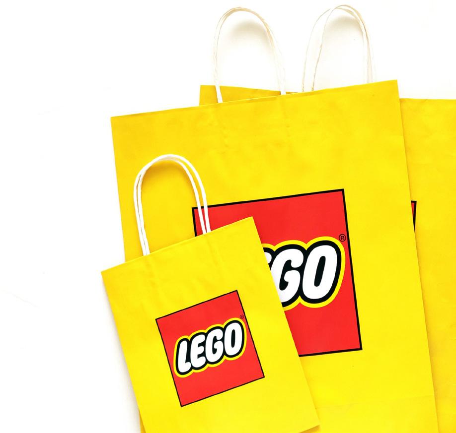
My name’s David Vi Boi Huynh, an Interior Designer. I’m so happy to present International Official LEGO Shop, an amazing modular building project designed with a height of 41 cm. I will choose Copenhagen in Denmark as the building’s location. I always dream of designing the world’s biggest and most interesting LEGO shop model with LEGO bricks. I spent a long time making a lot of ideas and transforming my ideas from sketches to a final model. My inspiration is from a LEGO paper shopping bag idea and based on my method to develop my model “When you design a building or any building, you need to start a sketch with a simple shape. And when you build the model, you must first pick a simple brick.”

It is for celebrating the 25th Anniversary of the success of the LEGO logo “Since 1998 to present.” It is also for celebrating the LEGO Group, considered a good toy brand in the world in 2023.
Copyright ©vboihuynh. All rights reserved.
Copyright ©2022 The LEGO Group. All rights reserved.
Inspiration - Architecture
It’s inspired by LEGO paper shopping bag with creating the geometry form for the structure building.


Create the space more bright, fun and cozy Feeling more welcome Ceiling with geometry ideas Copyright ©2022 The LEGO Group. All rights reserved.
Inspiration - Interior Design
Sketches/ Renderings

Flexible Function:
The entire model has three parts that are connected by the joint of the LEGO technic studs.
Part 1 has the sign streets, an icon of the LEGO shopping bag, and a tree
Part 2 is a main that is the LEGO shop building model
Part 3 has the warehouse, a small LEGO truck, and recycle trash bin
I designed this model that can take out every single level for seeing the inside interior and layout of the space.
BIG CONCEPT: PLAYFUL, & FASHIONABLE
Color:
I tried to use unique colors with yellow, red, and white to demonstrate how well the building looks and enhance its value and attraction. All colors are close to LEGO shopping bag colors.
Copyright ©vboihuynh. All rights reserved.
Programming of the LEGO Shop building:
Level 1: Entrance, Cashier Area, Shopping Area, Model Showcase Area 1 and 2, Pick a Bricks Area, Stair level 1, Build Minifigure Area, Small Storage Room, and Exit Door as well as Warehouse
Level 2: Shopping Area, Model Showcase Area 3 and 4, Print Minifigures Area, and Stair level 2
Level 3: Café Zone, Play Zone, Restroom, and Exit
Roof Level: Employee Zone and Emergency Exit
Warehouse: Place for storage
Dimensions of the shopping bag building:

Height: 15 inches / 38.1 cm
Width: 12.6 inches / 32.0 cm.
Depth: 5 inches / 12.7 cm.
Entire dimensions of the model:
Height: 15.8 inches / 40.1 cm
Width: 15.7 inches / 39.9 cm.
Depth: 15.7 inches / 39.9 cm.
Copyright ©vboihuynh. All rights reserved.
Architectural Design
We tried to bring the exterior structure look very fashionable for LEGO paper shopping bags in the 21st century. The form of the model is used geometry to show very clean horizontal and vertical lines while the handbag of the model is bent along with curving lines. Moreover, we used a lot of the glass windows at level 1 and some for level 2 and level 3. The most impressive is the big LEGO logo sign hanging on the front side of the building. We used a simple technique to present “LEGO”- the logo “since 1998.” The most interesting thing is we created the barcode located on the right side of the exterior wall.


Copyright ©vboihuynh. All rights reserved.

We designed two street signs named “Leg-godt St” and “Main St.” There has so cute micro LEGO shopping bag icon put in the front shop and next to Denmark’s flag. We built a tall tree with light green, yellow, and orange leaves that carried a taste of autumn in Denmark. We also provided emergency exit stairs for the building at the back and near the warehouse.


Copyright ©vboihuynh. All rights reserved.
Interior Design
We would provide bright and playful spaces for people to experience building interiors and decorating in the model.


Copyright ©vboihuynh. All rights reserved.

Copyright ©vboihuynh. All rights reserved.

Level 1
Level 1: Shopping Space and Model Showcase
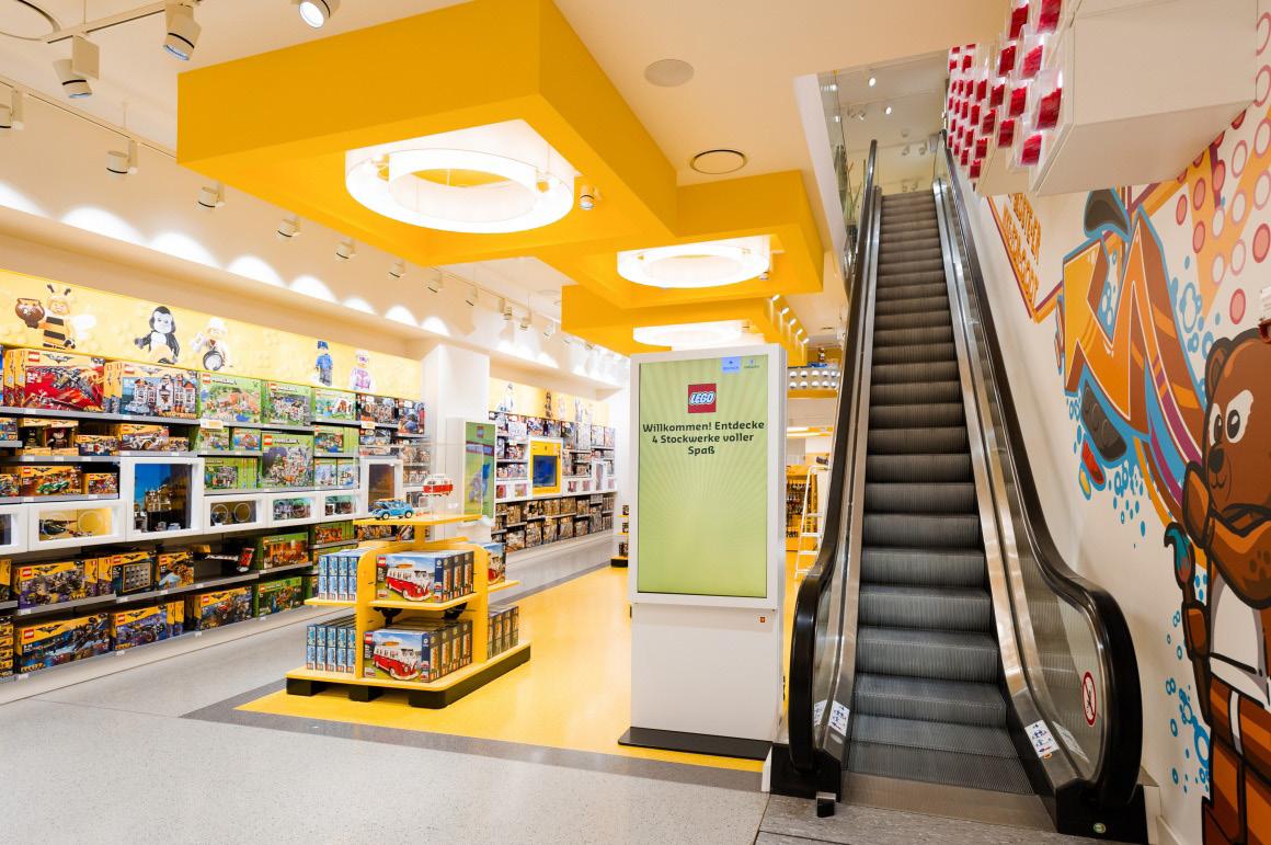
This level is designed for the LEGO model showcases located near the front of glass windows. I created a space with a high ceiling to enhance the shopping experience at the LEGO shop. All LEGO series products used unique colors to present them on the shelves. On the left side of the wall is located a cashier checkout counter. And on the right side of the wall with white, I arranged the place for “Pick a Bricks.” I also created a small storage space under the stairs for storing the LEGO products. Especially, Level 1 has a door for entry to the warehouse.


Copyright ©vboihuynh. All rights reserved.

Level 2
Level 2: Shopping Space, Model Showcase and Minifigure Factory
This level has a low ceiling but it still has space for LEGO model showcases and products display. Interestingly, I tried to create a small area called Minifigure Factory for custom-printed LEGO minifigures. Copyright ©vboihuynh. All rights reserved.


Level 3
Level 3: Café and Play Zones


Café Zone is a place for customers to drink a cup of coffee and have a piece of cake or donut after shopping downstairs. It is also a place for parents to sit and enjoy the cafe while waiting for their kids to play with the bricks at the Play Zone. In this zone, I built long bench seats back and small round coffee tables. There has a restroom next to the Café Zone. I also provided the skyline for catching the natural light into the inside of the zone.
Copyright ©vboihuynh. All rights reserved.

Level 3
Play Zone is an area for families and children to play, gather and share their creations and builds. I decorated it with colorful waterfalls. Architecturally, I designed the emergency exit ladder to the roof level.


Copyright ©vboihuynh. All rights reserved.

Roof Level

Roof level: Employee Zone
Employee Zone is a place for team meetings, taking a break, playing, and parties. The space on the roof level is created as a playground with joy and relaxation for employees including a swing, telescope, and rocking horse.

Copyright ©vboihuynh. All rights reserved.

Small truck and meet the truck driver - Ken


What’s your favorite part of the model?
I love every single detail of the model but the most favorite part of it is the micro icon shopping bag in the front shop. It gives me a lot of experience to think about and scale down the model. Of course, it looks so cute and fashionable.
Copyright ©vboihuynh. All rights reserved.
Warehouse/ Icon
Role of Minifigures:

2 LEGO shop employees: Michaels and Sydney (who standing the front door of the shop welcome people to LEGO shop)
1 LEGO truck man driver: Ken
1 Café female worker: Elizabeth
4 Customers: David (who is happy with the purchase of new LEGO sets), Kitty (who taking a selfie photo next to the cute icon of the LEGO small shopping bag), uncle Edwin and a little boy - Ocean (uncle Edwin bought a gift from LEGO for Ocean’s birthday)
Copyright ©vboihuynh. All rights reserved.

Copyright ©vboihuynh. All rights reserved.

©vboihuynh.

Version 2
Copyright
All rights reserved.
Copyright ©vboihuynh. All rights reserved.

Version 3
Interior Designer/ MOC Builder - David Vi Boi Huynh
Junior Designer/ Studio Manager - Kitty Phung Huynh