

project 5
leopard love
A1930s dark wood cabinet lacking a bit of lustre is a common occurrence when you work as a furniture artist, but can often mean the perfect blank canvas! I was looking for a piece with flat surfaces to demonstrate decoupage effectively and wanted to show how pattern can make such a huge statement to something quite plain. This technique can be likened to painting by numbers, I guess, as rather than just stopping at a pre-printed design, we’ll be modifying and making the design our own by painting on top of it to make it look more authentic. Sometimes decoupage can lack a truly unique feel, but adding your own creative touch makes your piece of furniture even more bespoke, and for me this personalised technique creates something which looks very high end; plus leopard print never gets old! a

SELECT MATERIALS
• Cha lk-based paint
• Short pile mini roller & tray
• Wallpaper
• PVA glue
• Flat brush
• Squeegee or credit card
• Sha rp scissors
• Uti lity knife blade
• Fine sandpaper and sanding block
• Round blending brush
• Det ail brushes
• Water mister
• Acr ylic paint *optional*
• Lint-free cloth
• Clea r polyurethane
• foa m mini roller
1. Prepare the cabinet as usual by cleaning using degreaser and a kitchen sponge, and then removing all the hardware. On this project, the hardware was particularly worn so I kept it all together in a safe place to clean up later. (See Chapter 3 for cleaning hardware.)
2. Check over your piece for any necessary repairs such as filling and gluing. The foot on this tallboy had come loose, so I used some wood glue and attached the broken piece back in place (a), leaving it to dry fully; use clamps or masking tape to hold the pieces tightly in position if needed.

85 DEC OUPAGE before


3. Next, scuff sand the surface. With this design, most of the cabinet will be covered in wallpaper, so only light sanding is required to create a key for the paint to stick to. I used an electrical orbital sander for this step (b) however, you can also scuff sand by hand if you do not have one of these available to you. (See Chapter 3 for sanding.) Once you have sanded all the surfaces lightly, rub everything down using a tack cloth
4. Remove any doors using the appropriate screwdriver. Hinges will often need a proper clean-up on a piece this old, and this can only be done properly once removed; but I always feel it’s worth it to create a neater look at the end! It also allows easier access to the interior for cleaning and refinishing.
5. Next, decide on a paint colour. Try to choose a base colour that matches in with the wallpaper you have chosen to use, as this will help it to blend in with the rest of the piece. Then load up your roller evenly and apply an even coat of chalk-based paint to the cabinet tend to work one side at a time, rolling in long vertica uniform strokes (c)
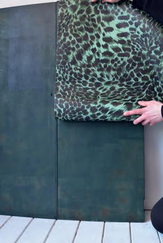
6. To make a start with the wallpaper, first check how t fits onto your piece of furniture by holding it up and working out where you would like the pattern to sit (d) was lucky here, as I didn’t need to do any measuring and could do it by eye. However, depending on the dimensions and design of the piece you are working on you may need to measure and create a central line to work from to ensure your pattern is evenly placed.
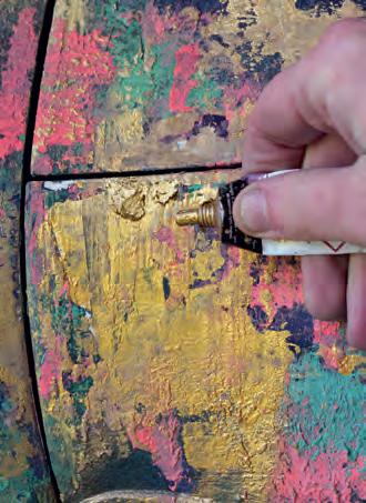
7. Apply a layer of PVA glue with a flat brush to the areas you want to decoupage. I suggest working in sections so that the glue doesn’t dry out too quickly, applying plenty of glue around the edges in particular to prevent the paper lifting up
8. Place the paper in position gently and, once straight smooth down using either your hand (e) or a squeegee tool to get rid of any bubbles
9. recommend trimming down most of the excess wallpaper as you go along, using a sharp pair of scissors and leaving a slight overhang. Then, leave overnight to dry fully.


10. Once dry, use a sharp razor blade held at an angle to trim away the excess paper (f) this will create a nice clean cut and avoid any tearing When all the paper is trimmed away neatly, reattach the cabinet doors
You could leave your project here if you like the look. However, to create a more painterly feel and to achieve the effect of the pattern wrapping around the project (which looks really cool) we are going to paint over the paper. Yes, you read that correctly!
11. To begin this stage, lightly sand the surface of the wallpaper with fine sandpaper and a sanding block (g) The aim is only to rough up the surface a tiny bit, making it a little more absorbent for paint, but also to create a slightly more aged look. Pass the sanding block over the surface very gently, perhaps applying a little more pressure towards the edges of the piece to neaten and distress them, until you are happy with it. Wipe away any dust created with a tack cloth
12. Next it is time to blend in the wallpaper more with the frame and also give it a hand-painted look, so again, select a colour palette that will match in with your chosen paper. am using mostly chalk paint here as before with a touch of acrylics, but feel free to experiment with what you have on hand. Then pick out the darkest or most prominent colour of your palette and use a round blending brush to apply the paint ver y sparingly to the piece. Create shaded areas by picking out the edges (h) leaving the middle sections with no paint on them so there is a contrast of dark and light
13. Use a water mister on the painted area, spraying a minimal amount of moisture onto the surface, which will cause the paint to thin a little; this will allow you to blend and shade the colour out with your blending brush to create a subtle faded and aged effect (i)

TIP
Using a wallpaper design with an all-over pattern is a good idea for beginners. It means that the design will always be balanced across the piece and you won’t need to worry about the placement so much.
87 DEC OUPAGE 86
b f c g d h i e


14. Add more base colours to help the paper blend into the paintwork. Of course this will depend on the wallpaper design you have decided on; for this leopard-print design am using green. Use a combination of your blending brush and a kitchen sponge here to help blend the two colours into each other (j)
15. Now begin to add in details using a smaller detail brush. I am looking to mimic the pattern that is already there, adding back in the definition to create an all-over hand-painted look (k) I use paler colours such as mint green to create some highlights, which will make the pattern pop again
16. Continue to use the water mister sparingly to blur the edges of your paintwork with a lint-free cloth or kitchen sponge on hand to blot away any drips as you go as this will soften the whole effect.
17. Extend the design in the same way all around the corners of the cabinet, the sides and onto detailed features such as the feet and even the hardware if desired, to create a seamless look; carry on repeating the earlier steps until you are happy.
18. Once the paint is fully dry, use fine sandpaper on an angle, moving it away from the wallpaper to smooth off all the edges. This will prevent the paper from lifting and make everything look neat and tidy.
19. As we are using mostly chalk-based paint and wallpaper, the whole cabinet will need to be sealed at the end to protect the paper and the paintwork. Use clear polyurethane with a foam roller to protect every surface. (See Chapter 3 for sealing.)
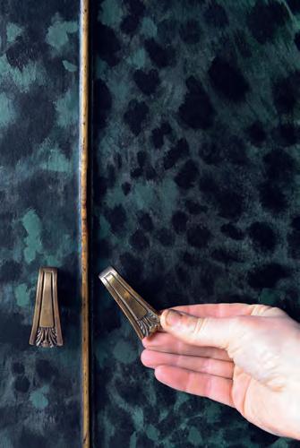
20. Finally, use a mini screwdriver or a bradawl to carefully poke a hole through the wallpaper on the reverse of the cabinet door, and reattach all the hardware (i)
TIP
Search for clues about your item’s provenance by looking for maker’s marks. These will often be found on the back of a piece or inside drawers. discovered that this piece was made by British Maker Harris Lebus and also carried the CC41 Utility mark, which was applied to furniture made in Britain during and just after the Second World War.

BETTER THAN NEW 88
j k l

hand-painted floral
When I first saw this vintage cupboard, I was attracted to its simplicity At first glance it doesn’t look much and the grey gloss paint finish leaves a lot to be desired, but I will always consider previously painted pieces of furniture. Yes, more work is involved, but the extra effort is worth it to keep these items in use for longer. On the positive side, the 1950s utility style with simple details really appealed to me; it was a great size and I was deliberately looking for a project with flat surfaces, as this always makes the perfect blank canvas. I typically choose to paint artwork on furniture that is either quite damaged or very plain in design, because a bespoke design can be just the thing to add the wow factor it so desperately needs. After just a tiny bit of preparation, I’ll be using chalk-based paint and keeping the prep minimal, meaning I can get stuck straight into being creative. I am definitely thinking something floral because flowers are my thing – however, you could use any of the techniques shown to paint a design of your choosing so feel free to experiment!

SELECT MATERIALS
• Chalk-based paint (in colours of your choice)
• Chalk-based paint (White)
• Ac rylics *optional*
• Flat brush or short pile mini roller
• De tail brushes in varying sizes
• Water soluble pastels or pencils
• Matt spray varnish
• Cle ar polyurethane
• Foam mini roller & tray
1. Since the piece had been painted a few times before, the doors would not close properly due to paint drips and build-up around the edges of the cupboard; it’s a common problem for furniture of this time and needed to take off the doors to fix it. However, on further investigation, the hinges were really caked up with paint and I couldn’t even turn the screws to remove them, so first I applied paint stripper to each hinge with a small brush and left overnight.
2. The next day, after the paint had bubbled up, took a fine wire brush and rubbed away the layers of old paint to reveal the metalware (a) This allowed me to loosen the old screws and remove the hinges with a flat-head screwdriver. I set the hinges aside to clean up and reattach later. (See Chapter 3 for paint stripping and cleaning hardware.) a

97 FURNITURE ART
7
project
before
3. With the messy bit done, I scuff sanded the cupboard with an orbital sander, smoothing out the old paint. Since I was using chalk-based paint, prep wasn’t strictly necessar y but as the cupboard had been painted many times before, the process eliminated any raised areas such as drips, before painting. (See Chapter 3 for sanding.)
4. I gave the cupboard a good wipe down with a tack cloth to pick up any excess dust. The aim of this is to achieve quite a smooth and modern finish with the paintwork, so don’t skip this step. I know the prep seems a lot on a previously painted piece, but trust me, it is required to get a much better result at the end.


5. Then I masked off the interior and anything I didn’t want to paint over, such as hardware, with painter’s masking tape and finally I was ready to paint. I applied a bright pink chalk-based paint using a flat brush (b) but a roller would also work well if preferred. (See Chapter 3 for painting.) Apply as many coats of paint as are needed, leaving drying time in between, until you are happy with the coverage
6. Once they were fully dry, I reattached the now-clean hinges and added the doors back on. It may seem strange to do it in this order, but personally I find it easier to paint my design while everything is in place so can envisage how my hand-painted design wil work across the whole piece.
7. I use a water soluble pastel to draw some very rough flower shapes onto the cabinet doors (c) personally prefer to draw in quite a large scale, covering the piece and going around the sides. Try to keep your hand quite flexible and stand a little bit away from your project to encourage more of a loose line. I suggest leaving roughly a third of empty or negative space against your design for contrast; it can really help a composition look striking. However, this is very much an organic process, and beauty is in the eye of the beholder, so plan your design as you feel.
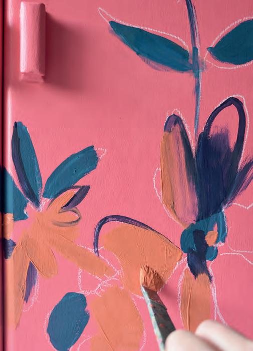
8. Begin painting in the floral shapes with larger brushes (d) I like to start with darker, more vivid shades creating some energetic and loose marks with a large
brush. (Remember the lines you have already drawn are just acting as a guide, so don’t worry if you cover some of them or the design changes, as this is a very free way of working.) My painting style is very expressive, so I used loose shapes as a starting point but you can be more exact if you want to.
9. Next, stating the obvious… add more colours! There are no set rules, but to inspire you to make a start I tend to go for a contrasting colour (for example, the orange [e, f]) at this stage alongside different versions

d

of the colour began with; so here I used navy blue and a teal blue. Fill in the shapes as you see fit, adding shapes and loose lines to form the base of the flowers. Experiment with different sizes and shapes of brush; the varied brushstrokes add interest, working well to create depth in your paintwork.
10. Try adding a tiny bit of white to mix paler versions of the same colour; this works well straight onto the piece to create shaded areas and achieves a threedimensional look. As you continue to work on your design, if you make a mistake, don’t worry at all. The beauty of chalk paint means it will wipe away easily with a damp cloth and you can make adjustments as you go along, or just paint over it
11. Next, I began to draw back in some outlines using the water soluble pastels again (g) Feel free to experiment with different colours here, and keep quite a loose feel; this will help to add more form to the flowers as you go along. You can even begin to add extra details, such as stems and leaves around the edges, if you think the design needs it

99 BETTER THAN NEW 98
b f g c e


12. Once the first few layers are completely dry, I then like to use fine detail brushes, thinning the paint with water to make it glide on the surface, which makes it easier to create finer, flowing lines – it makes such a difference. Paint loose outlines around the floral shapes using interesting marks and squiggles in contrasting colours to make things stand out. Here I used a bright green, which really pops (h)
13. Once everything has dried again, begin to repaint around your artwork in your chosen background colour, cutting into all of the shapes with a smaller detail brush (i). This helps to redefine each floral or stem shape, adding extra definition and your design will come to life.
14. For the final flourish, I drew again onto my design, adding details and dynamic lines with the water soluble pastels (j) These created a sense of movement and a graphic feel to the final design. Don’t think about the placement too much, as this will create more of an expressive feel to your artwork. (Keep in mind that you can use the pastels at any time during the painting process on wet or dry paint to create different effects)
15. When you are completely finished, as part of the sealing process, apply to your floral design an even layer of spray varnish (k) Keep in mind that water soluble pastels will smudge when you brush or roll anything wet on the surface so spray sealing is necessary first to avoid smudging. When you come to seal the piece fully later on, it will keep your artwork and all the lines you have drawn in intact.
(See Project 11 Spray Painting Handles.)
16. Once the spray varnished areas have fully dried, seal the whole piece using clear polyurethane with a foam mini roller; I like to apply a good three to four coats here to properly seal in the design and fine sanding in between coats. (See Chapter 3 for sealing.)

Take photographs of your work as you go along. This really helps to gain perspective on whether the design is working or not, and can help with envisioning what to do next. Use a sketchbook to build confidence with your design. Take time experimenting with different shapes, mark making and colour schemes before you take the plunge and paint onto a piece of furniture.
BETTER THAN NEW 100 h i j k TIP

project 14 harlequin oak
Alocal vintage dealer had this piece on sale for a really reasonable price, probably because bureaus over the years seem to have lost their relevance in modern homes. The pen and paper have been in steep decline while the laptop remains ever popular. However, I love the idea of a bureau as a space-saving office idea – there’s something nostalgic about sitting at a desk like this; and since so many of us now work from home, I snapped this up. It’s amazing quality and made from solid oak so little repair work was required, save for the tricky task of stripping back all that dark brown varnish typical of the 1930s. I was really inspired by the shape of the original handles, which gave me the idea to create harlequin shapes across the front; however, you could do stripes or a checkered effect using the same technique. I love the idea of using a classic pattern in a contemporary way, against the natural wood on this lovely tiger oak desk. Geometric patterns are a great way to update an old piece of furniture yet maintain its original character.

SELECT MATERIALS
• Tape measure
• Spir it level
• Pencil & rubber
• Pai nter’s masking tape
• Sha rp utility blade
• Clea r polyurethane
• Det ail brush
• Met allic acrylic paint
• Kitchen sponge
• Min i foam roller & tray
1. Begin by removing the hardware with pliers. Sometimes the handles can be tricky to pull out so use the back of your pliers to give them a tap if this happens. I remove the base plates carefully using a flat tool such as a stripping knife, making sure don’t damage the wood beneath (a) Keep the original handles and fixings safe as these can be extremely hard to replace if you lose them – trust me, I’ve been there!
2. The varnish on this bureau was really thick, so I decided to use a carbide scraper to remove it before the sanding process (b); this means that cleaning beforehand isn’t necessary. Start by bringing the carbide scraper towards you, while holding the tool flat against the surface of the wood. Go with the grain, pushing downwards on the tool to achieve the best results. Remove as much dark varnish from the surface as possible on all sides.


139
before
a b

3. As was leaving some natural wood exposed on the finished piece, sanded the surface fully with an orbital sander and sanding discs; this gave an even and smooth finish to the oak, and left the wood in good condition for painting and sealing later. (See Chapter 3 for sanding.)
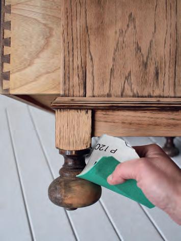
4. Next, use medium grit sandpaper to hand sand any details the carbide scraper and sanding couldn’t get to, such as feet and trims (c) used mine folded over and kept refolding in a different place when it became worn, to help get into the tight spots. You could also use a flexible sanding sponge for this step
5. With a tack cloth, wipe across all surfaces of the desk inside and out to remove any sanding dust.
6. Now work out where you want to place your pattern. always start by marking a centre point to work from with a tape measure (d)
7. Then, using a spirit level to check your lines are straight, with a pencil join up a vertical line down the centre of your project, and continue to make vertical lines through where each handle sits. I am keeping in mind where the hardware is going to be and making sure my design takes this into
TIP
For a simpler approach, try making a harlequin stencil, using a piece of A4 card folded into quarters. Then draw a straight line across the corner to the size you want and cut across with scissors, leaving an even shape; draw around it to create identical harlequins. This would work well on a flat table top, for example.


account, so that the final piece looks balanced. For example, on this piece I managed to get the harlequin shapes to cover each handle space fairly evenly (e)
8. You can now mark out horizontal lines through each handle as shown, which will provide you with anchor points for your harlequin pattern or whatever pattern you decide. Divide the space in between these lines nto relatively equal parts as you see fit, creating a grid of squares, then connect up the harlequin shapes from corner to corner with your pencil and level (f)


9. Apply painter’s masking tape to outline each shape (g)
My bureau was quite rustic and had a lot of detailing to navigate around, so I added the tape in sections, which s more time consuming. However, if you have a nice flat surface you can tape up the whole piece in one go if you prefer, using a sharp utility blade to remove the excess tape where it crosses over
10. Press down the painter’s masking tape firmly. If at this point there are any pencil lines on show within

the shape you have taped, use a rubber to remove them, before painting over the edges on the inside of your shape with clear polyurethane and a detail brush (h) This seals the tape edge and will prevent any paint bleeding underneath later on. It’s genuinely worth taking the time to complete this step because it will save you so much time in the long run and will create a really neat finish.
11. After the polyurethane is completely dry, you can begin painting each section. like to dilute the acrylic metallic paint first so that it will absorb into the grain of the wood, creating more of a washed effec t and allowing the patina of the natural oak to show through from underneath. A 50/50 ratio of paint to water should achieve the right consistency
12. Dab your sponge into the paint – you will only need a tiny amount as a little goes a long way – then rub nto the grain of each harlequin section (i). Once the first layer is dry, repeat this process as desired depending on how opaque you want the final finish to be. used two coats of paint to create the look wanted.
13. Wait until the final layer of paint is just dry to the touch and then slowly remove the painter’s masking tape, revealing the final design (j) Doing this just as the acrylic paint has dried prevents any paint peeling away with the tape and keeps your design looking neat and tidy
141 BETTER THAN NEW REFINISHING 140
g c h d i e f
j


14. For my project, then slightly distressed the edge of the drawers with fine grit sandpaper (k) This finished everything off nicely and gave a professional look to the desk.
15. Let the paint dry overnight and then use a rubber to rub away any remaining pencil lines still on show before sealing your work fully. If you have any areas that need touching up due to bleed-through, you can use a detail brush to do this.
16. Using a smooth mini roller, I sealed the paintwork and exposed wood by applying clear polyurethane (l) leaving time in between coats according to the manufacturer’s instructions. (See Chapter 3 for sealing.) I would go for a matt polyurethane on this project for a rustic look. It’s a good idea to do a small test first on an inconspicuous spot with your chosen topcoat before committing to the final finish.
17. Lastly, clean the original handles – lightly rubbed all the handles down with fine wire wool to remove any rust. Then wax and buff to a sheen with a lint-free cloth and you are ready to reattach (m)
142
k l m
TIP
Metallic pigments come in powder form and like to roll them into the surface of the wet paint. This makes the colour more intense and creates a really eyecatching effect.

project 3
texture bombe
Honestly, I probably overpaid for this little bombe chest considering t he condition it was in, but the classic curvy shape is hard to come by, so I have no regrets! Called a ‘bombe’ chest from the French word meaning ‘curved’, this reproduction piece doesn’t have a lot of age to it, but does feature that iconic bulge outwards on the front and sides, and I just fell in love with the shape. But this had already been painted a few times, with some quite thick layers which were looking tired, so choosing a rustic paint effect seemed like a good plan. This is a great technique to avoid extensive prep with a pre-painted piece like this one because texture will cover up pretty much everything and I also feel it will suit the French style. As well as incorporating texture, I experimented with metallics and pops of colour in jewel tones; it’s very much about experimentation, so when you’re in the painting stage and placing down colours feel free to mix up the order of the steps and the tools used, and keep repeating until you get a look that you are happy with. Even the mistakes you make will just form another layer which you can use to your advantage. It’s the kind of project where you have that little moment of doubt half-way through, but in the end it always turns out better than you ever thought it was going to. Keep the faith and trust the process!

SELECT MATERIALS
• Chalk-based paint (various colours)
• Rou nd blending brushes
• Bic arbonate of soda
1. As I am demonstrating a textured effec t here, the prep can be very minimal Use a sanding block and medium grit sandpaper to give the surface a good key, removing any big paint drips and raised areas. That said, the base layers of paint-jobs-gone-by can sometimes work to your advantage, so keep this in mind if you would prefer to see some of the old texture underneath.
2. For this project I paid extra attention to the drawer runners and edges as they had been previously painted; I sanded them back down flat where paint had started to build up, as this could affec t the functionality of the drawers (a) Doing this properly made sure they opened smoothly at the end.

• Br ayer
• Flat brush
• Me tallic paint
• Gi lding wax
• Splatter brush
• Ca rbide scraper
• Pa lette knife
• Sa ndpaper
• Li nt-free cloth
• Wax brush
• Kitchen sponge
• Clea r wax
• Black wax
75 CHALK PAINTING
before
a


3. To start, begin with a base coat of paint; using a dark colour will add depth and mood to your final finish. Apply the paint liberally and in a random fashion, using a round blending brush (b) This will allow you to stipple the surface and create some chunky texture in places. Stippling could be described as applying paint repeatedly in the same area with small up and down touches, to create a raised effect. Throughout this step, lay the paint on nice and thickly and in different directions to create lots of raised texture. Now leave the base coat to dry fully; this could take a while due to the thickness of the paint
4. Next, mix bicarbonate of soda with a paint colour that contrasts with the base coat. There are no set rules and feel free to experiment with consistency but I like to create a mixture about the thickness of cake icing (c) Add as much or as little bicarbonate of soda as you want to create your desired thickness making sure both parts are thoroughly combined. If your mix gets too thick thin it down using more paint
5. Using a flat surface such as an old scrap of wood or a paint palette, rol a brayer onto the surface to pick up the paint mixture, then roll in a random fashion to the front of your cabinet (d). Experiment with applying more and less pressure to get more of an irregular effect, but still leaving some of the original base coat showing through.
6. Again, wait for this to dry, then, using a flat brush and contrasting colours brush across the surface of the chest; the aim at this stage is to get distinc t areas of colour, which is why drying time between layers is important (e) It will look quite abstract but everything should be layered up like a paint sandwich rather than mixed up together like a cake (this is the best way can find to describe it!)
7. To add even more interest, I suggest experimenting with metallics because these add an extra dimension to the paintwork and will glint and glimmer on the surface (f) I recommend metallic paint – or try brushing gilding wax onto the paintwork; this will catch on all the raised areas and sit in the grooves of the texture nicely. Apply wherever you see fit, paying particular attention to the areas around the hardware, as always think handles look lovely with a bit of gold on them


8. Using a clean round blending brush, paint a single layer of your chosen colour over the previous layers, leaving some of the original colours and texture still peeping through (g) Using a paler shade will create a striking contrast with the colours underneath and make them pop. It is not as important to add any textured strokes here, so paint as normal (as in Project 1).
9. You can also try experimenting with a splatter technique by creating a drippy paint mixture. Use a 50/50 mix of metallic paint to water; dip a splatter brush nto the solution and pull back on the bristles to create a subtle splatter effec t (h) like to start doing this once the heavier layers are down, but add more splatters throughout the final steps, if you feel your project needs it
10. Next, and this bit is magic… use a carbide scraper to gently scrape away some of the top layers, revealing the texture you have been so bus y creating (i) Any areas where the paint is raised will come away to expose some of the colours you have created underneath, creating a chippy effect Scrape away paint where you feel it needs it; I paid particular attention to the edges of the drawers and legs, places where paint would naturally wear. It’s a messy part of the process but it’s so much fun seeing all the colour popping through.
11. Use a palette knife to add more textured details; with a tapping motion to build up interesting layers in colours that complement each other used a bright neon pink (j) and finally a lighter shade of green (k) to finish everything off.
12. Take a damp cloth and wet distress the handles a little, rubbing away the paint to reveal some of the metal underneath (l) You can then add a touch more gilding wax to accentuate them even further
13. If you so wish, take a piece of fine sandpaper and lightly pass it over the whole piece to knock back a little bit of texture, creating a slightly smoother and practical finish for a modern home.
14. Finally, seal in the paintwork using wax. I use a wax brush to apply an all-over coat of clear wax, followed by black wax to add even more apparent age to the paintwork. (See Chapter 3 for waxing.)


e f 77 BETTER THAN NEW CHALK PAINTING 76
b g c h d i j k l