Table of Contents
VISUAL BRANDING + SOCIAL MEDIA
ABOUT
I specialize in translating company visions into all-encompassing visual identities that fully embody and resonate with all that they represent.
Beomi Kehinde
CONTACT
Phone: +1(647)-588-7209
Email: beomilabio@gmail.com
SOFTWARE SKILLS
Adobe Photoshop
Adobe Illustrator
Adobe Indesign
Adobe Premiere Pro
Microsoft Office
EXPERIENCE
• Kenny Labs Designs | (2019 - Present)
- Logo & Visual Branding
- Website Design & Creation
- Social Media Assets
- Merchandise Design
• Loveworld Can | (2020 - Present)
- TV Show Promo Flyers
- Posters
- Lower Thirds
- Merchandise Design
• BLW Canada | (2021 - 2022)
- Social Media Assets
• Areté Sisters | (2024 - Present)
- Logo & Visual Branding
- Social Media Assets

CH RIS PROFESSION L SERVICES LTD.
Inspired by the Greek word for “Grace,” Charis Professional Services Ltd. is a company driven by purpose, excellence and integrity. With a focus on the hospitality services industry, their holistic approach towards servicing communities is three-fold: event planning, rentals and cleaning services. Whether you’re planning a banquet, need tents and chairs, or have a mess to clean, Charis Professional Services Ltd. will be with you every step.
Values: Excellence, Trust, Reliability, Transparency, Honesty, E ciency, Integrity
Primary Logo
• 3 hands - symbolizes teamwork, service & trust
• 3 hands = three services provided
• Globe-like resemblance = global vision.
• Font: Krylon Regular - Greek font style
Most E ective Uses:
Website Header | Business Cards | Large Print
Submark Logo
• 3 hands - symbolizes teamwork, service & trust
• 3 hands = three services provided
• Globe-like resemblance = global vision.
Most E ective Uses:
Website Favicon | Watermarks | Small Print
RUSSIAN VIOLET
#302560
R:48 G:37 B:96
C:96 M:99 Y:30 K:22
THISTLE PURPLE
#CCC7DC
R:204 G:199 B:220
C:18 M:19 Y:4 K:0
LION YELLOW
#C19552
R:193 G:150 B:83
C:24 M:40 Y:78 K:2
Submark Logo
SUNSET YELLOW
#F4D096
R:244 G:208 B:150
C:4 M:18 Y:46 K:0
WHITE
#000000
R:255 G:255 B:255 C:0 M:0 Y:0 K:0
KRYLON Regular
Krylon is a decorative font that alludes to Greek characters. This font can give an elegant and sophisticated feel to a brand.
This font is used sparingly as an accent or stylistic touch in headers.
Its best used in large formats so that it’s beautiful details can be seen.
Family
Loew is a modern sans serif typeface. This modern sans-serif font allows for clear legibility and can be a complimentary partner to any bold and decorative fonts. This font is best used for any length of text. By using the variations within the font family, this gives opportunities for hierarchy in typography.
in this Font Family:

organized and excellent planning services. The success of an event ultimately depends on the quality of planning, so they intricately take care of every detail and provide the most memorable, personal and beautiful experience.


CLEANING SERVICES
An essential part of event planning is the ability to source and provide resources in a timely fashion. Charis Professional Services Ltd. bridges the gap and includes everything needed in-house. They eliminate the hassle of contacting multiple companies and hoping for open availabilities. They provide everything you could ever need for a successful event.
Charis Professional Services Ltd. provides cleaning services of the utmost quality. They cover all sectors: Commercial, Industrial, Residential, etc. They leave every space in a pristine and organized condition.


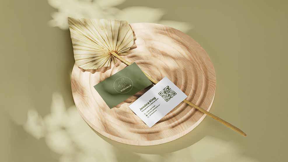
02 JKVisuals
JESSICA KING, founder and CEO of JKVisuals, was born and raised in Toronto, Ontario. She started editing videos at the age of 11, got her first digital camera at the age of 13, and it was then that she knew this was what she was meant to be.
Along the way, photography also became a passion when she started taking pictures at her church and fell in love with the cra .
“I love that I’m able to make client’s dreams a reality!” - Jessica King
Primary Logo
• JK = Jessica King
• JK Axonometric View = Pespective views
• Circular Border = Minimal allusion to lenses
• Font: Archivo Black = Bold, minimal, legible,
Most Effective Uses: All Print Sizes
Best Use: In any way. It is compatible with all colours.
#f7f7f7
RGB: 247.247.247
C=2 M=1 Y=1 K=0
Best Use: Against darker shades so it stands out.
Incompatible: Dutch White (Unless they’re both part of a background). Illegible.
#f4bd63
RGB: 243.189.99
C=3 M=27 Y=71 K=0
Best Use: Against lighter colours for contrast.
Incompatible: Moss Green (Unless both part of a background). Illegible.
#cc813d
RGB: 204.129.61
C=18 M=55 Y=87
Best Use: Against lighter colours for contrast.
Incompatible: Hunyadi Yellow (Unless both part of a background). Illegible.
#d7d0a7
RGB: 215.208.167
C=16 M=13 Y=38
Best Use: Against lighter and very dark colours.
Incompatible: Caramel (Unless both part of a background). Illegible.
#a49e56
RGB: 164.158.86
Best Use: In any way. It is compatible with all colours.
C=38 M=29 Y=80 K=3 #74794f
116.121.79
C=54 M=39 Y=77 K=17
Best Use: In any way. It is compatible with all colours.
Best Use: In any way. It is compatible with all colours.
20.66.50
C=86 M=47 Y=77 K=53
#2b2826 RGB: 43.40.38
C=68 M=65 Y=66 K=68
SATOSHI Medium ARCHIVO Black Aa Aa Aa NewYork
Archivo Black is a bold font mainly used for headers and for body paragraphs and sentences.
This striking sans-serif font allows for clear legibility when placed ontop of photographs and videos. It’s modern look gives a clean and elegant feel. It’s simple features makes it highly compatible with different styles.
Satoshi is a modernist sans serif typeface. It is an excellent choice for use in branding, editorial, and poster design.
This modern sans-serif font allows for clear legibility and can be a complimentary partner to any bold fonts. This font is best used for lengthy text.
New York is an elegant serif font that adds a classy and modern touch to any piece of work. This font is used sparingly as an accent or stylistic touch in headers.
Its best used in large formats so that it’s beautiful details can be seen. Highly recommend italicizing for more of an aestheftic effect.


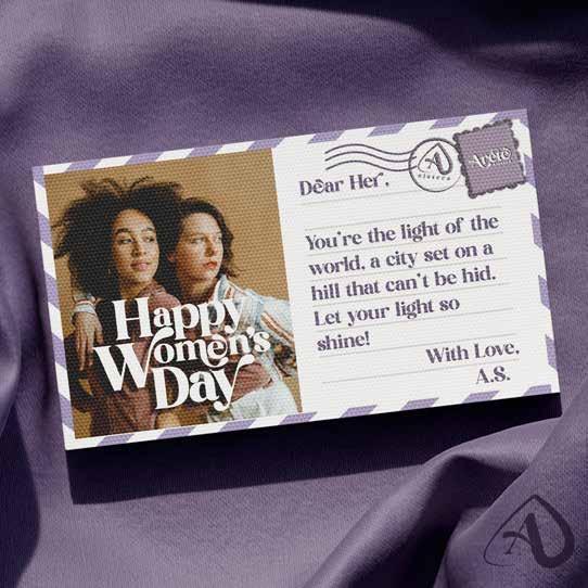
FromVision, Reality.


s isters
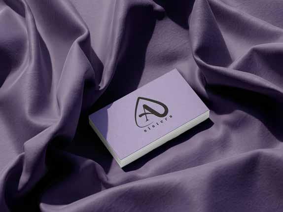
03 Areté Sisters
Areté In its most basic sense, refers to "excellence" of any kind — especially a person or thing's "full realization of potential or inherent function.
Areté Sisters are visionary, purpose driven and courageous women growing, thriving and nurturing one another for excellence. Their goal is to inspire and help each ther to realize and fulfill their full, inherent potentials, all while growing their faith.
s isters
Primary Logo
• Custom Font Base: Kind Avenue - feminine looking typography
• Another meaning for “arete” is “mountain ridge” so this is referenced through the swooping form within the design
Most Effective Uses:
Headers | Large Print | Merchandise
si s ter s
Secondary Logo
• Custom Font Base: Kind Avenue - feminine looking typography
• Another meaning for “arete” is “mountain ridge” so this is referenced through the swooping form within the design
Most Effective Uses: Headers | Large Print | Merchandise
EGGPLANT
#2b2a35
RGB: 42.44.54
C=76 M=71 Y=54 K=59
AMETHYST #766985
RGB: 117.104.132
C=59 M=60 Y=31 K=7
ROSE QUARTZ
#a99dc0
RGB: 168.157.191
C=35 M=37 Y=8 K=0
LAVENDER #e5dfe9
RGB: 128.124.134
C=9 M=10 Y=2 K=0
KIND Avenue Aa
Kind Avenue is a decorative font mainly used for accents and a stylistic touch.
This more feminine serif font has clear legibility and is quite suitable for customizations. It is the base font used for the logo. It can be used for accents and headers.
AVENIR Medium Aa
Avenir Medium is a modern font suitable for body paragraphs and any sized texts.
This clear and simple sans-serif font allows for clear legibility when information is being communicated. It’s modern look gives a clean and elegant feel. It’s simple features makes it highly compatible with all font styles.


s isters