Georgia 6
I used in the bodies of text. The use of a serif typeface is intended for prolonged reading.
Georgia (Regular)
ABCDEFGHIJKLMNOPQRSTUVWXYZ
abcdefghijklmnopqrstuvwxyz
1234567890
Project 1: Type in the Wild
Georgia (Italic)
ABCDEFGHIJKLMNOPQRSTUVWXYZ
abcdefghijklmnopqrstuvwxyz
1234567890
Georgia (Bold)
ABCDEFGHIJKLMNOPQRSTUVWXYZ
abcdefghijklmnopqrstuvwxyz
1234567890
Georgia (Bold Italic)
ABCDEFGHIJKLMNOPQRSTUVWXYZ
abcdefghijklmnopqrstuvwxyz
1234567890
34
GRA2208C Summer 2023 Table of Contents 1 Weekly Investigations 1-16 2 Typeface Analysis Revisions 17-26 3 Inspiration 27 4 Sketches - Cover Pages 28 Sketches - Spreads 29-30 5 Refined Spreads 31 6 Typestyle Sheets 32-34
Benjamin Nguyen
This is a box of Great Value bowtie pasta, these were in the pantry but you could also find this at Walmart I believe. This would be an example of what I think would be bad typography.

It is quite legible, which for this little recipe suggestion, might be all that is needed. However, there is no typeface that is visually emphasized well. The letters found here are all either title case or sentence case, I think that key ingredients of this recipe are all in title case and directions are in usual sentence structure (begin with a capital letter word with everything else lower case). Some phrases attempt to differentiate themselves by appearing slightly bigger such as “What You Need:” and “25 MINUTES”, but I think the effect and purpose of this attempt of emphasis is lost.
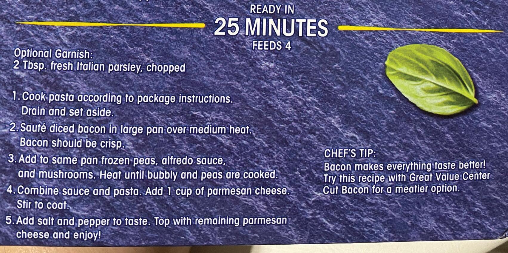
I think the reason why the emphasis is lost and also why this typography is bad is due to the color choice in these fonts. Although legible, the background these fonts are backed up against are of indigo and some white. By making the fill of these fonts white and the strokes a similar blue or indigo, it sort of blends the typefaces with the background. While the fill of the fonts almost contrast themselves with the background, since both typeface and background are of similar color scheme, the overall effect this has would be to make viewers sort of glaze over what is written. The key ingredients only being in title case barely gets the importance of these ingredients across well, the few pictures of the ingredients beside them does a better job.
Myriad Pro 6
I used only on the cover page. A modern look with the main reasoning being used is that Tw Cen MT’s lowercase “j” looks like a lowercase “i” with a longer stroke that goes beneath the baseline.
Myriad Pro (Regular)
ABCDEFGHIJKLMNOPQRSTUVWXYZ
abcdefghijklmnopqrstuvwxyz
1234567890
Myriad Pro (Italic)
ABCDEFGHIJKLMNOPQRSTUVWXYZ
abcdefghijklmnopqrstuvwxyz
1234567890
Myriad Pro (Bold)
ABCDEFGHIJKLMNOPQRSTUVWXYZ
abcdefghijklmnopqrstuvwxyz
1234567890
Myriad Pro (Bold Italic)
ABCDEFGHIJKLMNOPQRSTUVWXYZ
abcdefghijklmnopqrstuvwxyz
1234567890
1 WEEKLY INVESTIGATIONS week 1 1
33
TYPESTYLE SHEET - Tw Cen MT
The uppercase of this typeface serves a very modern look. I used this typeface for numbers and headings of the spreads.
Tw Cen MT (Regular)
ABCDEFGHIJKLMNOPQRSTUVWXYZ
abcdefghijklmnopqrstuvywxz
1234567890
Tw Cen MT (Italic)
ABCDEFGHIJKLMNOPQRSTUVWXYZ
abcdefghijklmnopqrstuvywxz
1234567890
Tw Cen MT (Bold)
ABCDEFGHIJKLMNOPQRSTUVWXYZ
abcdefghijklmnopqrstuvywxz
1234567890
Tw Cen MT (Bold Italic)
ABCDEFGHIJKLMNOPQRSTUVWXYZ
abcdefghijklmnopqrstuvywxz
1234567890
This is a box of taco shells by Old El Paso, 18 shells, Crunchy kind. These were also located in the pantry but you can probably also find this at Walmart. This would be an example of good typography to me.
For starters, each typeface here is in a direct contrast with the background behind them. Bright yellow and orange background with the dark brown lettering allows the type faces to immediately call out for the attention of the viewer. This color scheme also allows for the Old El Paso logo to stand out too in a completely different color of red.


The typefaces are legible but the contrast also makes these typefaces visually interesting to look at. I think what was done well was that key pointers were also heavily bolded. These bolded words subtly communicate to the viewer enough necessary information for them to accomplish these directions without fully reading the directions. For example, if the viewer reads only the bolded words of oven, 325 degrees F, and 6 to 7 minutes, they have all the necessary information needed to complete the task. Same with the microwave instructions, “I feel like microwaving these, oh you can microwave these? How long? High for 45 seconds? Ok.” The use of bold fonts goes a long way in communication key information. Things such as the calorie count and nutrition is also heavily bolded or emphasized as that would also be a key concern for some people.
Another thing that hasn’t been mentioned is that there’s another font being used on this box. The key information and directions were kept in an almost Sans Serif type font, but this other font is some type of cursive font. Adding multiple fonts would usually mean visual clutter and therefore losing the message, but since most of the key information is already down in one font, introducing a vastly different visual font adds another layer of contrast both visually and communication wise.
The key information was easy to read to get straight to the point, but the cursive takes a little time to read and comprehend and once someone reads one sentence or phrase, they’d realize that this is extra information that isn’t necessary to the task but serves as a means for more options. The cursive taking slightly longer to read could also serve as another way to focus on what’s more easily read at first, the key information. Overall, this seems to be a very good example of typography.
32
6
2
week 1 1
This is the front of a menu from a local Chinese American restaurant in Panama City, Florida. Food’s good, but this would be an example of bad typography. There’s at least 5 different typefaces that I can count off in this one brochure of a menu. While each typeface present here is relatively legible and contrasted clearly from its bright background, the presence of the 5 different typefaces adds visual clutter and discord to not only the overall design of the menu, but also contaminates the possible message this menu portrays. Chinese Restaurant New York Style? New York Style King House?

To start, the completely vertical text of “Chinese Restaurant,” the main strokes, stems, and spines of each letter is absurdly thick. Due to this, there isn’t any room left to make the other aspects of the letters stand out and make those letters what they are. To illustrate, the stems of the “H” are so thick that the corresponding bar is also absurdly thin. From afar, this “H” would look like two uppercase “i’s,” much like the upper case “i” below it.
Similar sentiments can be said about the R’s and A’s. Other things to note is that key information such as the telephone number and location are in different typefaces. I think instead of having the telephone number as a different thick typeface for emphasis, they could’ve had it as the same typeface as the one above and below it and perhaps had it in a bold font to accomplish the same goal but visually harmonize it better.
The kerning and tracking of the whole menu seems fine for the most part, maybe the kerning is a bit too tight between the “y” and “n” in Tyndall and maybe too loose between the “W” and “a” in Wal-mart, but overall the use of too many typefaces is what makes this a bad case of typography.
3 week 2 1
31 IMAGE HEADING TEXT TEXT IMAGE PG # IMAGE IMAGE TEXT TEXT 1 HEADING PG # IMAGE IMAGE TEXT HEADING PG TEXT REFINED SPREADS 5
Was skimming through Walmart and found this container to be a good example of typography. Emphasis seems to be a common thing I talk about when it comes to typography, but this does end up being another example of characters being well-emphasized. The main brand of Nescafe along with Clasico is plain white but it’s contrasted nicely with the dark browns behind it.
Stylistically, this choice of contrast is a good design choice for a coffee themed product, white letterforms on a brown background visually tell a message of sugar/creme and coffee. Another case of contrast above with the brown letterforms on a yellow background. The letters seem well tracked, each block of text is spaced equidistantly for an easier reading experience.


The word “Clasico” also seems to be in both a different typeface and a different almost italicized font. This word being italicized adds another layer of emphasis denoting what version of Nescafe this product is. It’s an almost subtle change due to it being the same white as “Nescafe”, but it’s a change enough that allows viewers to distinguish that this is a version of this product.


One last thing to take note of is the uppercase “N” in Nescafe. They opted to make it go larger than the supposed Cap Height of the text and they also made the ending terminal extend out horizontally almost throughout the whole word. This adds some visual interest, but also adds some sort of structure to the word. The way the space under this extension is about the same amount of spacing as the rest of the tracking in the word plays into the equal spacing of Nescafe but also the other text on this container, giving the viewer a very stable and balanced visual experience.


30 4 4 week 2 1
SKETCHES - SPREADS 4


I debated on whether to call this bottle of shampoo/conditioner an example of bad typography.
As I was looking and evaluating the typography, everything seemed fine, but there was something about this that bugged me. All of the letterforms are contrasted well, the strokes of each letter are pretty consistent, the tracking/kerning of all the text is also spaced well; in terms of legibility everything is very consistent and readable.
Eventually the conclusion I found myself upon was that for one, there’s a lot of typefaces present, with some even having a bolded font. I can maybe count around 8 different typefaces with a little more if I count each different appearance of a character (like uppercase to title case) as a separate typeface. With this many typefaces, the effect ends up being that too much is emphasized. “head & shoulders” seems to be an italicized and bolded font, indicating where its use is. The two lines below that, “Dandruff Shampoo + Conditioner” is bolded indicating what it is, but at least to me, “Dandruff ” being bolded makes it seem like this shampoo and conditioner is made of dandruff. The 2 and 1 also being larger point size and having a bolded aesthetic to them tells us information we already know (it being shampoo and conditioner, it could even be talking about head and shoulders).


Then last of all is the 4 lines of text after, it’s for MEN from the ADVANCED SERIES with the flavor of SWAGGER from Old Spice. I know commercially Old Spice tends to be rather excessive when it comes to marketing and I’ll admit, I think they got the point across, but it does bug me how each identifier that indicates a different property to this product is in a different typeface.

5 week 3 1
29
This is an acne product that I think you can find at Ulta. This is an example of good typography.

There’s a pretty simple color palette that was chosen, but the text doesn’t end up being hard to read because of it. The teal-ish color is reminiscent of cool emotions, like water and refreshments which help inform the “Cleanser.” All of the text here is sans serif which allows this product to look more modern, but also seems to abide by only one typeface throughout, just in different fonts, sizes, uppercases and lower cases, which makes this a very consistent viewing experience.

The text here is well tracked, there’s also a pretty consistent leading being used that’s rather noticeable from “Acne Control Cleanser” and “Reduces” to “niacinamide,” it’s all well-spaced. Even the smaller text under “Cera” and “Cleanser” abides by some sort of leading, not interfering with that invisible baseline. If anything, I would say that the tracking on CeraVe might be a little bit too tight, or the kerning between the C and e, r and a or V and e, but it’s loose enough to where the letters aren’t conflicting and making it unreadable. If anything, the tightness might help inform the design more, making it feel more structural.


The text is contrasted well of course. In particular, the text that is bolded, from “Acne” to “skin barrier”, is a good choice in font as emphasis is placed on the information that is key for the viewer. If the viewer requires acne care, “Acne Control Cleanser” is there as a starter and following that is specifically what the cleanser does in bold, from “Reduces blackheads” to “skin barrier.” The bolded font allows the viewer to quickly get the information they need and to make a decision.


28
PAGES 4 6 week 3 1
SKETCHES - COVER
This is a random box of tea lights that was found in a closet at home and a bad example of typography.
My first reaction to this was a rather compulsive “Ew,” so I imagine there was something to be analyzed here. These are Christmas-themed tea lights, one indication being the word “Snowman.” Due to this Christmas theme, this informs the rest of the color choices found in the rest of the letterforms and the backgrounds they lay upon.
To start at the top, there doesn’t seem to be any concern for any leading, the four words of “The Sugar Plum Collection” are colliding with each other a bit. While we can say it’s still legible, it does end up being a bit visually distracting. The other thing of note to come back to is the color choice. We have red and green choice of colors in these letterforms resembling Christmas, but “Sugar Plum” is green with a gradient. This gradient creates a visually inconsistent viewing experience but also introduces black and white as colors. Black and white aren’t usually the main colors of Christmas (probably more auxiliary at most), so adding this in combination to green specifically adds a sickly feel to the product. Also since it’s on the words “Sugar Plum,” a combination of green, white, and black on a food item gives the sense that it’s moldy, which doesn’t help convey the message of Christmas or Sugar Plums well either.


The last thing to note is the phrase under “The Sugar Plum Collection.” While the phrase is contrasted, the choice of black letters on a red background is two dominant colors next to each other, which combined with this particular typeface, could end up a harsh reading experience on the eyes.


7 week 4 1
27
3
INSPIRATION
menus, branding, advertisments, etc.
This was also found at the same local bar and also a good example of typography.

It’s a simple sans serif typeface that’s also quite a thick font size, which is usually a good way to promote legibility. The tracking looks tight but there’s enough space so that the letters don’t touch, which promotes a very structural feeling to the text. A unique or interesting design choice they had was to cut the left arm of the Y a bit in Funky to accommodate for the right arm of the K. This adds a bit more visual interest to the piece without sacrificing legibility and readability. On another note, I also think this was done to help keep a centered alignment for visual balance for the product.
The other thing of note is the word Brewery that’s diagonal following the stroke of the A. For similar reasons as before, it’s visually interesting and also helps keep a visual balance to the product. Had they chosen to have the word in a different way, the piece would feel imbalanced and distracting. If Brewery was removed all together, the alignment of text would no longer be truly centered and I’m not exactly sure if Buddha would be big enough to compensate for the missing space so they would have to either increase tracking or make the type size bigger, both of which would introduce a visual discrepancy.
Surprise, it’s another product that was found at the bar mentioned in the previous weeks (I took a decent amount of photos), but it’s the last example here, and yet again it’s another good example of typography to me.
There is largely one thing that stands out to me that could make it bad and that’d be the kerning used between the letters of K, E N in Kentucky is rather tight compared to the spacing of the rest of the letters in the word, I can’t really guess as to if that was an intentional design choice or not, but it is the most inconsistent thing that is on this product.
That being said, everything else on the product is consistent in regards to spacing, such as the words BOURBON BARREL. The layout is made so that the viewer is led through the product smoothly. The choice of a thick, bold typeface with serifs is sturdy which helps visually reinforce the impressions that the wood behind it and the product of ale give off, hard sturdy alcohol.

One of the last things about this product is that the typeface is the same with the first two instances of text, but is changed drastically for the last word of Ale. The typeface Ale uses completely forgoes the serifs in exchange for long, extenuated swashes and a larger type size. This choice emphasizes that the main and most important part of this barrel cap is the ale it holds, with the swashes seemingly implies that it is also refined and eloquent.
These are frozen Chicken Bites that you can find at Sam’s Club. This is an example of good typography.

The main appeal of this product is the consistency of the viewing experience, in essence I think I count two different typefaces across this product, the sans serif typeface and the cursive typeface. The words “Chicken Bites” are the only words that are in the cursive typeface and therefore the most visually different typeface compared to the rest of the words on this product. It’s also one of the biggest sized words on the product, that alongside the typeface having a bolded aesthetic to it gives it a great visual emphasis which tells us what exactly this product is very quickly.
The sans serif typefaces are smaller in comparison but they still tell key information. Sans serif fonts are by nature more visually modern, throughout each letter they do not really go any thicker or thinner. That in tandem with the consistent tracking and leading of the whole product, leads to a visually pleasing and consistent viewing experience.
The choice of color for the letters also lends itself to having simple but eye-catching contrast. Each word is contrasted well, white letters on a black background, black on white, red on white, white on red, these allow the words to pop out more. Interestingly enough though, there’s not any black on red or red on black, which leads me to believe that the designers of this product were aware that a dominant color on a dominant color would make the viewing experience harsher to some degree.
26
2
GOOD GOOD 8 week
4 1
This is a bottle of wine or whatever alcoholic beverage that my parents have. For this particular bottle, there’s many examples of good, readable typography, but the one thing that’ll make me call this bottle a bad example of typography is the layout they chose in the lower half of the bottle.

We’ve got a serif typeface present here at the top with Taylor and New York, which gives a more eccentric feel to the product. Followed up by a sans serif typeface with Port, most likely indicating the flavor or version of this beverage. So far, the layout and appearance is fine, the previous words are spaced and positioned enough to where they are centrally aligned and take up an equal amount of space. But where the layout starts dropping in consistency is this short paragraph below “Port.”
To accommodate for the graphic and the centrally aligned visuals, they decided to split the text. The first line is kept whole, but the remaining 3 lines of text are split in half. While we can bridge the gap between and read all of the text as usual from left to right, it’s just as easy to be able to read the split off text as their own section. I feel that if it’s even a possibility to read it like so and break how you read it, it’s not a good typographic choice.
The bottle does end up being visually interesting with these choices and they even could’ve tried to be ambitiously creative with the word choice to where having the split text could make sense both on its own and combined, but ultimately ends up being a fractured reading experience.
menus, branding, advertisments, etc.
I found this sticker on a chest that my brother had. It’s a little ripped unfortunately, but a large majority of the typography is there to make it out.
For one, it definitely has a lot of creative liberties being taken. The words “Lance Mountain” can be made out which with how the typeface is designed, it fits the theme. Irregular strokes and shapes with a spotted aesthetic imitates the look of mountains and rocks, which for branding this would probably work out well, but the legibility of this typography suffers as a result. There’s almost no regard for tracking or letter spacing, the letters are touching and colliding and the choice was even made to have some letters “fuse” into one another as seen with the L and A of Lance.
This would be very difficult to read at a glance but more likely recognizable, so it can be said this typography is going more for recognition than legibility but it would be bad typography nonetheless.
Another thing to note is that this product of a sticker hasn’t fully considered where this might be placed. Under Lance Mountain, there’s a line of black text that indicates the brand’s copyright, but because the sticker is clear and the text is black, if placed on a black object like this one, it becomes very difficult to read. A yellow outline most likely wouldn’t look good for this part, so the next best thing to make it more readable would have the sticker be opaque with some color and not clear.

This sign was also found at the same local bar place and it would be a good example.
The main thing that stood out to me was how the text is positioned and oriented. They both follow a baseline that goes in a semicircle and despite it not being horizontally aligned, it can read fine from left to right as if it was horizontal. I think a lot of it can also be contributed to where the words start. Both phrases of White Claw and Hard Seltzer start halfway on the left side of the circle and end on the right side, so that they can both be read from left to right instead of having Hard Seltzer abide by the circular conventions and end up reading upside down from right to left.
Other things to note is that this is both legible and readable. Since not much information or thought is being conveyed aside from a brand, or rather all the information is conveyed concisely, there’s a bit more work put into how the typography looks visually. Despite there being a bright background, there’s a white outline/stroke being used surrounding another gray outline to give a sense of depth and bulk, making the text stand out more and perhaps more emphasized than if it was plain black.

9 week 5 1
25
2
GOOD BAD
menus, branding, advertisments, etc.
This is a box of tea lights that was found in a closet at home and a bad example of typography.
My first reaction to this was a rather compulsive “Ew,” so I imagine there was something to be analyzed here. These are Christmas-themed tea lights, one indication being the word “Snowman.” Due to this Christmas theme, this informs the rest of the color choices found in the rest of the letterforms and the backgrounds they lay upon.
To start at the top, there doesn’t seem to be any concern for any leading, the four words of “The Sugar Plum Collection” are colliding with each other a bit. While we can say it’s still legible, it does end up being a bit visually distracting. The other thing of note to come back to is the color choice. We have red and green choice of colors in these letterforms resembling Christmas, but “Sugar Plum” is green with a gradient. This gradient creates a visually inconsistent viewing experience but also introduces black and white as colors. Black and white aren’t usually the main colors of Christmas (probably more auxiliary at most), so adding this in combination to green specifically adds a sickly feel to the product. Also since it’s on the words “Sugar Plum,” a combination of green, white, and black on a food item gives the sense that it’s moldy, which doesn’t help convey the message of Christmas or Sugar Plums well either.
The last thing to note is the phrase under “The Sugar Plum Collection.” While the phrase is contrasted, the choice of black letters on a red background is two dominant colors next to each other, which combined with this particular typeface, could end up a harsh reading experience on the eyes.

This magazine was found around the house amongst another array of magazines. Throughout all the magazines it was actually a bit difficult to definitively find something that struck me as bad, however after looking at this for a moment, I realized that it committed a classic readability mistake of splitting and combining two different phrases together. Though I think some credit can be attributed to keeping the two different phrases of “How Should I Vote?” and “The Catholic Dilemma” distinct with different typefaces, sizes, and colors. Anecdotally, I asked my mom how she read this and she read each phrase separately as “How Should I Vote - The Catholic Dilemma,” which would probably be the intended way to read it. However, like any similar example, it’s also just as easy to read it as it is from top to bottom as “How The Should Catholic I Vote? Dilemma.” They attempt to keep the text center aligned in respect to the buildings beside it, which is a good consideration. However, the issue lies in their decision to split the phrases in the first place. If there’s enough space to have them separated, then there should also be enough space to keep them together. They’d be able to save the readability that way. The only reason I can see to have them separated is to add visual interest as alternating the text that way can create a visual rhythm, but I think it’s too risky to be attempting that over readability.

This is Chicken Broth that you can find at Sam’s Club. This is the example I chose for good typography because it has a quite unique choice of typeface for advertising the main product.

To begin, there does exist sans serif typefaces on this product, with the choice for this typeface is to relay descriptions and perhaps some promotional information such as “No Added MSG’’ and “No Artificial Flavors.” Interestingly enough, the choice for emphasis for the promotional information isn’t using a bold font (even though it looks as it would) but instead just using a larger point size. There’s only two phrases that aren’t capitalized, the phrase with an asterisk starting with “except” and the phrase “ready to serve.” In some ways, these two phrases help emphasize the promotional phrases, maybe not by much (especially “ready to serve” since its point size is rather big and can stand alone as its own emphasized promotional phrase) but it helps a little bit.
The main typographic attraction to me is the main indicator of the product, “Chicken Broth.” These two words are the largest sized words on the entire product so the viewer can tell what it is. Interestingly, they aren’t the same size. Broth is almost 50% bigger to really indicate that it’s not just any chicken product, it’s chicken BROTH.
The typeface they used is very interesting as well, it’s a very blocky typeface. Where there would normally be a curve on the word, it is instead an edge, which makes this more visually interesting. The terminals of practically every letter also protrudes out a little bit to almost to give them a sense that they’re serifs but they aren’t really in the end (at least I think). Of course, one of the last things that stands out is the choice of making the “O” smaller and raised to include an underline looking thing under it. I’m not quite sure if it’s supposed to represent something. If I had to spitball, maybe it represents a bowl and a utensil, but if it doesn’t represent anything, it still makes this product more visually interesting.
24
2
BAD BAD 10 week
1
5
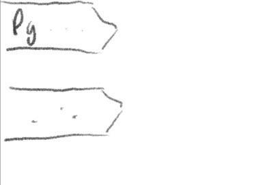
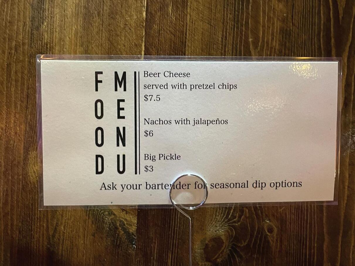
These menu cards I found at a local bar/pool (the stick and ball game) place here in Panama City. It was quite coincidental to find these because I was wondering how to make vertical text look “good” recently. This is, however, my bad example.


The first example I saw was the card on the left, where initially I wasn’t sure what the vertical words on the left were, as I had read them from left to right literally as “FM, OE, ON, DU.” But on second glance I realized that it was a “Food Menu,” but vertical. While legible, the readability isn’t good. While readability could be improved by having it be horizontal, let’s entertain the idea that it can only be vertical.
One solution I’d think would work would have them separate, Food on the left side of the card, Menu on the right side. In some ways, this might make it take longer to read by having both words separated like that and it might introduce another form of disruption in the visual hierarchy, but I think that given they’d stay the same type style and that one word would imply the other in this scenario (Food implies food in the middle of the card, menu implies food in the first place), I think it’d be one way to solve this readability problem.
Another thing I’m not sure why it was made a choice, but aside from the two cards having the same typeface for Food Menu, they use a serif font on the left one and a sans serif font on the right one for the rest of the information. I would say the right one is a bit better because it boasts all caps for the food item for emphasis and ingredients in lower case, but since both cards aren’t the same typeface for the food or ingredients, there becomes a lack of unity and consistency for the food menu card.
menus, branding, advertisments, etc.
To start off this next section are these menu cards I found at a local bar/pool (the stick and ball game) place here in Panama City.
The first example I saw was the card on the top, where initially I wasn’t sure what the vertical words on the left were, as I had read them from left to right literally as “FM, OE, ON, DU.” But on second glance I realized that it was a “Food Menu,” but vertical. While legible, the readability isn’t good. While readability could be improved by having it be horizontal, let’s entertain the idea that it can only be vertical.

One solution I’d think would work would have them separate, Food on the left side of the card, Menu on the right side. In some ways, this might make it take longer to read by having both words separated like that and it might introduce another form of disruption in the visual hierarchy, but I think that given they’d stay the same type style and that one word would imply the other in this scenario (Food implies food in the middle of the card, menu implies food in the first place), I think it’d be one way to solve this readability problem.
Another thing I’m not sure why it was made a choice, but aside from the two cards having the same typeface for Food Menu, they use a serif font on the top one and a sans serif font on the bottom one for the rest of the information. I would say the right one is a bit better because it boasts all caps for the food item for emphasis and ingredients in lower case, but since both cards aren’t the same typeface for the food or ingredients, there becomes a lack of unity and consistency for the food menu card.
This is the front of a menu from a local Chinese American restaurant in Panama City, Florida. Food’s good, but this would be an example of bad typography. There’s at least 5 different typefaces that I can count off in this one brochure of a menu. While each typeface present here is relatively legible and contrasted clearly from its bright background, the presence of the 5 different typefaces adds visual clutter and discord to not only the overall design of the menu, but also contaminates the possible message this menu portrays. Chinese Restaurant New York Style? New York Style King House?

To start, the completely vertical text of “Chinese Restaurant,” the main strokes, stems, and spines of each letter is absurdly thick. Due to this, there isn’t any room left to make the other aspects of the letters stand out and make those letters what they are. To illustrate, the stems of the “H” are so thick that the corresponding bar is also absurdly thin. From afar, this “H” would look like two uppercase “i’s,” much like the upper case “i” below it.
Similar sentiments can be said about the R’s and A’s. Other things to note is that key information such as the telephone number and location are in different typefaces. I think instead of having the telephone number as a different thick typeface for emphasis, they could’ve had it as the same typeface as the one above and below it and perhaps had it in a bold font to accomplish the same goal but visually harmonize it better.
The kerning and tracking of the whole menu seems fine for the most part, maybe the kerning is a bit too tight between the “y” and “n” in Tyndall and maybe too loose between the “W” and “a” in Wal-mart, but overall the use of too many typefaces is what makes this a bad case of typography.
11 week 6 1
23
2
BAD BAD
toiletries & cleaning

I found this around the house looking for a bad example and when I turned this container around I was immediately greeted with an explosion of typefaces.
I count at least 4 different typefaces, so there can be more than what I counted, but the only reason why I wasn’t completely sure is that each instance of text feels like a different typeface in general. Although some typefaces might be the same like “KILLS MOST GERMS AND BACTERIA” and “SANITIZING WIPES,” because of a difference in type size they give the illusion of two different typefaces at a glance.
Though the main reason this product was bad typography to me is the disruption to visual hierarchy. Each line of text is visually different and attempts to emphasize something different with each one. But the effect that ends up occurring is that when everything tries to be different, nothing is different. Each line of text feels independent from one another so there’s no consistency or harmony. Since there isn’t any consistent typeface being used as a standard, it’s hard to say that any of these words are truly emphasized meaningfully.
When attempting to utilize different typefaces, the choice is to either have very minimal changes or have very dramatic ones, but this product somehow feels as if it does both. There’s enough minimal changes for the viewer to notice something different but also annoy them and also lots of drastic changes that ultimately doesn’t contribute to the product meaningfully.
This was also found around the house but at the moment this picture was taken, there isn’t a green tea sugar scrub in this container, but red paint. That aside, this would be a good example of typography. Usually this would be something I’d consider a bad example of typography due to the many typefaces and fonts being used, like the previous example,but I think this is one of the few cases that manages to have many typefaces without being overbearing and disruptive.
The main attraction of this product is the large “GREEN TEA” in a vastly different typeface than the rest of the product with an almost brush-like appearance. With that being the major distinct typeface, how the rest of the text remains undisruptive while appearing different is most likely through the combination of different fonts and uppercase and lowercase characters. A closer inspection will see that the words “Tree Hut” and “Shea Sugar Scrub” have a very similar appearance in typeface, notably with the capital E and U they share, with Shea Sugar Scrub most likely being a bold font. These two seem to be a pair of the same type family. “Tree Hut” also seems to recede how dominant it is by being a brown color that complements the peach color behind it.
The last three lines of text, the line under Shea Sugar Scrub is a sans serif font, but it isn’t disruptive due to how extremely small the type size is in comparison to everything else. The last two lines seem very similar in appearance and could be in the same type family but it’s difficult to tell. One thing for sure is that one is regular and one is italic. All three lines of text appear different but because they aren’t very large and emphasized, they also aren’t disruptive. The takeaway being that it might be possible to include many different typefaces if each typeface isn’t fully emphasized and doesn’t take away from the main product or advertisement, which in this case the different typefaces doesn’t take away the attention from “Green Tea Shea Sugar Scrub.”

This sign was also found at the same bar place and it would be my good example for this week.
The main thing that stood out to me was how the text is positioned and oriented. They both follow a baseline that goes in a semicircle and despite it not being horizontally aligned, it can read fine from left to right as if it was horizontal. I think a lot of it can also be contributed to where the words start. Both phrases of White Claw and Hard Seltzer start halfway on the left side of the circle and end on the right side, so that they can both be read from left to right instead of having Hard Seltzer abide by the circular conventions and end up reading upside down from right to left.
Other things to note is that this is both legible and readable. Since not much information or thought is being conveyed aside from a brand, or rather all the information is conveyed concisely, there’s a bit more work put into how the typography looks visually. Despite there being a bright background, there’s a white outline/stroke being used surrounding another gray outline to give a sense of depth and bulk, making the text stand out more and perhaps more emphasized than if it was plain black.

22
2
GOOD BAD 12 week 6 1
This was found at the same local bar from the previous week. This is a good example of typography.
It’s a simple sans serif typeface that’s also quite a thick font size, which is usually a good way to promote legibility. The tracking looks tight but there’s enough space so that the letters don’t touch, which promotes a very structural feeling to the text. A unique or interesting design choice they had was to cut the left arm of the Y a bit in Funky to accommodate for the right arm of the K. This adds a bit more visual interest to the piece without sacrificing legibility and readability. On another note, I also think this was done to help keep a centered alignment for visual balance for the product.
The other thing of note is the word Brewery that’s diagonal following the stroke of the A. For similar reasons as before, it’s visually interesting and also helps keep a visual balance to the product. Had they chosen to have the word in a different way, the piece would feel imbalanced and distracting. If Brewery was removed all together, the alignment of text would no longer be truly centered and I’m not exactly sure if Buddha would be big enough to compensate for the missing space so they would have to either increase tracking or make the type size bigger, both of which would introduce a visual discrepancy.
In search of bad typography, I found this sticker on a chest that my brother had. It’s a little ripped unfortunately, but a large majority of the typography is there to make it out.
For one, it definitely has a lot of creative liberties being taken. The words “Lance Mountain” can be made out which with how the typeface is designed, it fits the theme. Irregular strokes and shapes with a spotted aesthetic imitates the look of mountains and rocks, which for branding this would probably work out well, but the legibility of this typography suffers as a result. There’s almost no regard for tracking or letter spacing, the letters are touching and colliding and the choice was even made to have some letters “fuse” into one another as seen with the L and A of Lance.

This would be very difficult to read at a glance but more likely recognizable, so it can be said this typography is going more for recognition than legibility but it would be bad typography nonetheless.

Another thing to note is that this product of a sticker hasn’t fully considered where this might be placed. Under Lance Mountain, there’s a line of black text that indicates the brand’s copyright, but because the sticker is clear and the text is black, if placed on a black object like this one, it becomes very difficult to read. A yellow outline most likely wouldn’t look good for this part, so the next best thing to make it more readable would have the sticker be opaque with some color and not clear.
toiletries & cleaning 2
Next is the toiletries & cleaning section, starting with this bottle of shampoo/conditioner. I noticed this while showering and heavily debated if this had good or bad typography. Everything seemed fine, but there was something about this that bugged me. All of the letterforms are contrasted well, the strokes of each letter are pretty consistent, the tracking/kerning of all the text is also spaced well; in terms of legibility everything is very consistent and readable.
Eventually the conclusion I found myself upon was that for one, there’s a lot of typefaces present, with some even having a bolded font. I can maybe count around 8 different typefaces with a little more if I count each different appearance of a character (like uppercase to title case) as a separate typeface. With this many typefaces, the effect ends up being that too much is emphasized. “head & shoulders” seems to be an italicized and bolded font, indicating where its use is. The two lines below that, “Dandruff Shampoo + Conditioner” is bolded indicating what it is, but at least to me, “Dandruff ” being bolded makes it seem like this shampoo and conditioner is made of dandruff. The 2 and 1 also being larger point size and having a bolded aesthetic to them tells us information we already know (it being shampoo and conditioner, it could even be talking about head and shoulders).
Then last of all is the 4 lines of text after, it’s for MEN from the ADVANCED SERIES with the flavor of SWAGGER from Old Spice. I know commercially Old Spice tends to be rather excessive when it comes to marketing and I’ll admit, I think they got the point across, but it does bug me how each identifier that indicates a different property to this product is in a different typeface.

Following is this acne product that you can find at Ulta. There’s a pretty simple color palette that was chosen, but the text doesn’t end up being hard to read because of it. The teal-ish color is reminiscent of cool emotions, like water and refreshments which help inform the “Cleanser.” All of the text here is sans serif which allows this product to look more modern, but also seems to abide by only one typeface throughout, just in different fonts, sizes, uppercases and lower cases, which makes this a very consistent viewing experience.

The text here is well tracked, there’s also a pretty consistent leading being used that’s rather noticeable from “Acne Control Cleanser” and “Reduces” to “niacinamide,” it’s all well-spaced. Even the smaller text under “Cera” and “Cleanser” abides by some sort of leading, not interfering with that invisible baseline. If anything, I would say that the tracking on CeraVe might be a little bit too tight, or the kerning between the C and e, r and a or V and e, but it’s loose enough to where the letters aren’t conflicting and making it unreadable. If anything, the tightness might help inform the design more, making it feel more structural.
The text is contrasted well of course. In particular, the text that is bolded, from “Acne” to “skin barrier”, is a good choice in font as emphasis is placed on the information that is key for the viewer. If the viewer requires acne care, “Acne Control Cleanser” is there as a starter and following that is specifically what the cleanser does in bold, from “Reduces blackheads” to “skin barrier.” The bold font allows the viewer to quickly get the information they need and to make a decision.
13 week 7 1
21
GOOD BAD
food products
The last food products start with this, which I found at Walmart looking for a bad example, and instead found a good example of typography (it’s a lot harder to find something bad than I thought). This product in particular stood out to me from the rest of the “good” typography examples initially because of the unique case of the letter “U.” They use a smiley face as the U, which in itself adds a lot of visual interest to the product to distinguish itself from the other products a bit. But they stop that uniqueness there at the branding of the product, it’s now time for the rest of the information to come across. Though that’s not to say that there isn’t room to still be creative with how to present the text. For example, the next two instances of text, “Fig Bar” and “10 Twin Packs” use a surrounding box that inverts the foreground and background colors for the text and the box. In a way, this inverted appearance can resemble a fig bar, the box being the bar and the text being the filling. It’s a creative way to present the text and adds more visual interest without being disruptive to the product as it uses the same two colors in the background and in the text. Next they indicate the flavor of Raspberry clearly after this series of inverted colors. It’s a slightly smaller type size than the rest of the previous text, but by breaking the visual flow from “regular” to inverted and back to regular, that switch back to regular can add a form of visual emphasis.
I found this around the house looking for a bad example and when I turned this container around I was immediately greeted with an explosion of typefaces.

I count at least 4 different typefaces, so there can be more than what I counted, but the only reason why I wasn’t completely sure is that each instance of text feels like a different typeface in general. Although some typefaces might be the same like “KILLS MOST GERMS AND BACTERIA” and “SANITIZING WIPES,” because of a difference in type size they give the illusion of two different typefaces at a glance.
Though the main reason this product was bad typography to me is the disruption to visual hierarchy. Each line of text is visually different and attempts to emphasize something different with each one. But the effect that ends up occurring is that when everything tries to be different, nothing is different. Each line of text feels independent from one another so there’s no consistency or harmony. Since there isn’t any consistent typeface being used as a standard, it’s hard to say that any of these words are truly emphasized meaningfully.

When attempting to utilize different typefaces, the choice is to either have very minimal changes or have very dramatic ones, but this product somehow feels as if it does both. There’s enough minimal changes for the viewer to notice something different but also annoy them and also lots of drastic changes that ultimately doesn’t contribute to the product meaningfully.
On the flip side, also found at Walmart, is the final food product than is an example of typography I’d consider bad. If we take the previous example, it only uses two colors yet it kept itself interesting with the switch up of using an inverted color palette for the text. This bag of chips however, isn’t promoting many forms of visual interest. The most interesting and emphasized piece of text on here is the brand itself, a giant “KETTLE” followed by the word “Brand” just to make sure the viewer gets the point. Aside from that, each piece of text after comes in varying sizes that isn’t all that noticeable and slightly irritating. “Brand” is the same size as or perhaps slightly smaller than “Potato Chips,” “Potato Chips” is the same size as “Backyard” which is smaller than “Barbeque” but larger than “great taste... naturally.” The most emphasis they attempted to put into this product was varying degrees of size changes, none of which really doing anything. Along with the text on the product being the same color, everything feels visually stale. The biggest change I see they did is go from a brown to a brighter orange background, which personally still hasn’t done anything for the visual hierarchy. This product could take a few pointers from the previous example and try inverting the foreground and background for the text with the orange background, which possibly creates some visual interest very easily.

20
2
BAD GOOD 14 week
1
8
Surprise, it’s another product that was found at the bar mentioned in the previous weeks (I took a decent amount of photos). It’s another good example of typography to me.
There is largely one thing that stands out to me that could make it bad and that’d be the kerning used between the letters of K, E , N in Kentucky is rather tight compared to the spacing of the rest of the letters in the word, I can’t really guess as to if that was an intentional design choice or not, but it is the most inconsistent thing that is on this product.

That being said, everything else on the product is consistent in regards to spacing, such as the words BOURBON BARREL. The layout is made so that the viewer is led through the product smoothly. The choice of a thick, bold typeface with serifs is sturdy which helps visually reinforce the impressions that the wood behind it and the product of ale give off, hard sturdy alcohol.
One of the last things about this product is that the typeface is the same with the first two instances of text, but is changed drastically for the last word of Ale. The typeface Ale uses completely forgoes the serifs in exchange for long, extenuated swashes and a larger type size. This choice emphasizes that the main and most important part of this barrel cap is the ale it holds, with the swashes seemingly implies that it is also refined and eloquent.
food products 2
We’re continuing the food products with double good examples starting with this Chicken Broth from Sam’s Club. To begin, there does exist sans serif typefaces on this product, with the choice for this typeface is to relay descriptions and perhaps some promotional information such as “No Added MSG’’ and “No Artificial Flavors.” Interestingly enough, the choice for emphasis for the promotional information isn’t using a bold font even though it looks as it would) but instead just using a larger point size. There’s only two phrases that aren’t capitalized, the phrase with an asterisk starting with “except” and the phrase “ready to serve.” In some ways, these two phrases help emphasize the promotional phrases, maybe not by much (especially “ready to serve” since its point size is rather big and can stand alone as its own emphasized promotional phrase) but it helps a little bit. The main typographic attraction to me is the main indicator of the product, “Chicken Broth.” These two words are the largest sized words on the entire product so the viewer can tell what it is. Interestingly, they aren’t the same size. Broth is almost 50% bigger to really indicate that it’s not just any chicken product, it’s chicken BROTH.
The typeface they used is very interesting as well, it’s a very blocky typeface. Where there would normally be a curve on the word, it is instead an edge, which makes this more visually interesting. The terminals of practically every letter also protrudes out a little bit to almost to give them a sense that they’re serifs but they aren’t really in the end (at least I think). Of course, one of the last things that stands out is the choice of making the “O” smaller and raised to include an underline looking thing under it. I’m not quite sure if it’s supposed to represent something. If I had to spitball, maybe it represents a bowl and a utensil, but if it doesn’t represent anything, it still makes this product more visually interesting.
The next food product to go over are these frozen Chicken Bites also found at Sam’s Club.


The main appeal of this product is the consistency of the viewing experience, in essence I think I count two different typefaces across this product, the sans serif typeface and the cursive typeface. The words “Chicken Bites” are the only words that are in the cursive typeface and therefore the most visually different typeface compared to the rest of the words on this product. It’s also one of the biggest sized words on the product, that alongside the typeface having a bold aesthetic to it gives it a great visual emphasis which tells us what exactly this product is very quickly.
The sans serif typefaces are smaller in comparison but they still tell key information. Sans serif fonts are by nature more visually modern, throughout each letter they do not really go any thicker or thinner. That in tandem with the consistent tracking and leading of the whole product, leads to a visually pleasing and consistent viewing experience.
The choice of color for the letters also lends itself to having simple but eye-catching contrast. Each word is contrasted well, white letters on a black background, black on white, red on white, white on red, these allow the words to pop out more. Interestingly enough though, there’s not any black on red or red on black, which leads me to believe that the designers of this product were aware that a dominant color on a dominant color would make the viewing experience harsher to some degree.
15 week 8 1
19
GOOD GOOD
food products
Next is this bottle of wine or whatever alcoholic beverage. I initially thought this was a good example of typography as there’s a good amount of legible, readable typography, but it fell short with the layout they chose in the lower half of the bottle.

We’ve got a serif typeface present at the top with Taylor and New York, which gives a more eccentric feel to the product. Followed up by a sans serif typeface with Port, most likely indicating the flavor or version of this beverage. So far, the layout and appearance is fine, the previous words are spaced and positioned enough to where they are centrally aligned and take up an equal amount of space. However, the layout starts losing readability with the paragraph below “Port.”
To accommodate for the graphic and the centrally aligned visuals, they decided to split the text. The first line is kept whole, but the remaining 3 lines of text are split in half. While we can bridge the gap between and read all of the text as usual from left to right, it’s just as easy to be able to read the split off text as their own section. I feel that if it’s even a possibility to read it like so and break how you read it, it’s not a good typographic choice.
The bottle does end up being visually interesting with these choices and they even could’ve tried to be ambitiously creative with the word choice to where having the split text could make sense both on its own and combined, but ultimately ends up being a fractured reading experience.
The next example of good example of typography is this container of coffee powder. Emphasis seems to be a common thing I talk about when it comes to typography, but this does end up being another example of characters being well-emphasized. The main brand of Nescafe along with Clasico is plain white but it’s contrasted nicely with the dark browns behind it.
Stylistically, this choice of contrast is a good design choice for a coffee themed product, white letterforms on a brown background visually tell a message of sugar/creme and coffee. Another case of contrast above with the brown letterforms on a yellow background. The letters seem well tracked, each block of text is spaced equidistantly for an easier reading experience.
The word “Clasico” also seems to be in both a different typeface and an almost italicized font. This word being italicized adds another layer of emphasis denoting what version of Nescafe this product is. It’s an almost subtle change due to it being the same white as “Nescafe”, but it’s a change enough that allows viewers to distinguish that this is a version of this product.

One last thing to take note of is the uppercase “N” in Nescafe. They opted to make it go larger than the supposed Cap Height of the text and they also made the ending terminal extend out horizontally almost throughout the whole word. This adds some visual interest, but also adds some sort of structure to the word. The way the space under this extension is about the same amount of spacing as the rest of the tracking in the word plays into the equal spacing of Nescafe but also the other text on this container, giving the viewer a very stable and balanced visual experience.
This magazine was found around the house amongst another array of magazines. Throughout all the magazines it was actually a bit difficult to definitively find something that struck me as bad, however after looking at this for a moment, I realized that it committed a classic readability mistake of splitting and combining two different phrases together. Though I think some credit can be attributed to keeping the two different phrases of “How Should I Vote?” and “The Catholic Dilemma” distinct with different typefaces, sizes, and colors. Anecdotally, I asked my mom how she read this and she read each phrase separately as “How Should I Vote - The Catholic Dilemma,” which would probably be the intended way to read it. However, like any similar example, it’s also just as easy to read it as it is from top to bottom as “How The Should Catholic I Vote? Dilemma.” They attempt to keep the text center aligned in respect to the buildings beside it, which is a good consideration. However, the issue lies in their decision to split the phrases in the first place. If there’s enough space to have them separated, then there should also be enough space to keep them together. They’d be able to save the readability that way. The only reason I can see to have them separated is to add visual interest as alternating the text that way can create a visual rhythm, but I think it’s too risky to be attempting that over readability.

This was found around the house but at the moment this picture was taken, there isn’t a green tea sugar scrub in this container, but red paint. That aside, this would be a good example of typography. Usually this would be something I’d consider a bad example of typography due to the many typefaces and fonts being used, but I think this is one of the few cases that manages to have many typefaces without being overbearing and disruptive.
The main attraction of this product is the large “GREEN TEA” in a vastly different typeface than the rest of the product with an almost brush-like appearance. With that being the major distinct typeface, how the rest of the text remains undisruptive while appearing different is most likely through the combination of different fonts and uppercase and lowercase characters. A closer inspection will see that the words “Tree Hut” and “Shea Sugar Scrub” have a very similar appearance in typeface, notably with the capital E and U they share, with Shea Sugar Scrub most likely being a bold font. These two seem to be a pair of the same type family. “Tree Hut” also seems to recede how dominant it is by being a brown color that complements the peach color behind it.
The last three lines of text, the line under Shea Sugar Scrub is a sans serif font, but it isn’t disruptive due to how extremely small the type size is in comparison to everything else. The last two lines seem very similar in appearance and could be in the same type family but it’s difficult to tell. One thing for sure is that one is regular and one is italic. All three lines of text appear different but because they aren’t very large and emphasized, they also aren’t disruptive. The takeaway being that it might be possible to include many different typefaces if each typeface isn’t fully emphasized and doesn’t take away from the main product or advertisement, which in this case the different typefaces doesn’t take away the attention from “Green Tea Shea Sugar Scrub.”

18
2
GOOD BAD 16 week
9 1
I found this at Walmart looking for a bad example, and instead found a good example of typography (it’s a lot harder to find something bad than I thought). This product in particular stood out to me from the rest of the “good” typography examples initially because of the unique case of the letter “U.” They use a smiley face as the U, which in itself adds a lot of visual interest to the product to distinguish itself from the other products a bit. But they stop that uniqueness there at the branding of the product, it’s now time for the rest of the information to come across. Though that’s not to say that there isn’t room to still be creative with how to present the text. For example, the next two instances of text, “Fig Bar” and “10 Twin Packs” use a surrounding box that inverts the foreground and background colors for the text and the box. In a way, this inverted appearance can resemble a fig bar, the box being the bar and the text being the filling. It’s a creative way to present the text and adds more visual interest without being disruptive to the product as it uses the same two colors in the background and in the text. Next they indicate the flavor of Raspberry clearly after this series of inverted colors. It’s a slightly smaller type size than the rest of the previous text, but by breaking the visual flow from “regular” to inverted and back to regular, that switch back to regular can add a form of visual emphasis.

On the flip side, also found at Walmart, is an example of typography I’d consider bad. If we take the previous example, it only uses two colors yet it kept itself interesting with the switch up of using an inverted color palette for the text. This bag of chips however, isn’t promoting many forms of visual interest. The most interesting and emphasized piece of text on here is the brand itself, a giant “KETTLE” followed by the word “Brand” just to make sure the viewer gets the point. Aside from that, each piece of text after comes in varying sizes that isn’t all that noticeable and slightly irritating. “Brand” is the same size as or perhaps slightly smaller than “Potato Chips,” “Potato Chips” is the same size as “Backyard” which is smaller than “Barbeque” but larger than “great taste... naturally.” The most emphasis they attempted to put into this product was varying degrees of size changes, none of which really doing anything. Along with the text on the product being the same color, everything feels visually stale. The biggest change I see they did is go from a brown to a brighter orange background, which personally still hasn’t done anything for the visual hierarchy. This product could take a few pointers from the previous example and try inverting the foreground and background for the text with the orange background, which possibly creates some visual interest very easily.

TYPEFACE ANALYSIS REVISIONS - food products 2
For revisions, lets begin with the Great Value bowtie pasta box that I found in the pantry but could also be found at Walmart; the first bad food product example.

It is quite legible, which for a recipe, might be all that is needed. However, there is no typeface that is visually emphasized well. The letters found here are all either title case or sentence case. The key ingredients of this recipe are all in title case and directions are in usual sentence structure (begin with a capital letter word with everything else lower case). Some phrases attempt to differentiate themselves by appearing slightly bigger such as “What You Need:” and “25 MINUTES”, but I think the effect and purpose of this attempt of emphasis is lost.
I think the reason why the emphasis is lost and also why this typography is bad is due to the color choice in these fonts. Although legible, the background these fonts are backed up against are of indigo and some white. By making the fill of these fonts white and the strokes a similar blue or indigo, it sort of blends the typefaces with the background and reduces readability. While the fill of the fonts almost contrast themselves with the background, since both typeface and background are of similar color scheme, the overall effect this has would be to make viewers sort of glaze over what is written. The key ingredients only being in title case barely gets the importance of these ingredients across well, the few pictures of the ingredients beside them does a better job.
Next is the box of taco shells that I found to be an example of good typography. Compared to the pasta box, each typeface here is in a direct contrast with the background behind them. Bright yellow and orange background with the dark brown lettering allows the type faces to immediately call out for the attention of the viewer. This color scheme also allows for the Old El Paso logo to stand out in a completely different color, red.

The typefaces are legible but the contrast also makes these typefaces visually interesting to look at. What was done well was that key pointers were heavily bolded. These bolded words subtly communicate to the viewer enough necessary information for them to accomplish these directions without fully reading the directions. For example, if the viewer reads only the bolded words of oven, 325 degrees F, and 6 to 7 minutes, they have all the necessary information needed to complete the task. The use of bold fonts goes a long way in communication key information. Calorie count and nutrition are also bolded as that would also be a key concern for some people. There’s also another typeface being used on this box. The key information and directions were kept in an Sans Serif typeface, but this other typeface is some type of cursive font. Adding multiple fonts would usually mean visual clutter and therefore losing the message, but since most of the key information is already in one font, introducing a vastly different visual font adds another layer of contrast both visually and communication wise.
The key information was easy to read to get straight to the point, but the cursive takes a little of time to read and comprehend and once someone reads one sentence or phrase, they’d realize that this is extra information that isn’t necessary to the task but serves as a means for more options. The cursive taking slightly longer to read could also serve as another way to focus on what’s more easily read at first, the key information. Overall, this seems to be a very good example of typography.
16 week 10 1
17
GOOD BAD
