5 minute read
toiletries & cleaning

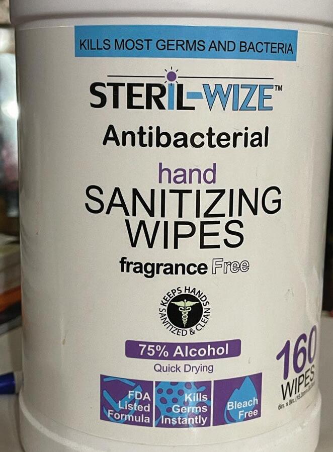
I found this around the house looking for a bad example and when I turned this container around I was immediately greeted with an explosion of typefaces.
I count at least 4 different typefaces, so there can be more than what I counted, but the only reason why I wasn’t completely sure is that each instance of text feels like a different typeface in general. Although some typefaces might be the same like “KILLS MOST GERMS AND BACTERIA” and “SANITIZING WIPES,” because of a difference in type size they give the illusion of two different typefaces at a glance.
Advertisement
Though the main reason this product was bad typography to me is the disruption to visual hierarchy. Each line of text is visually different and attempts to emphasize something different with each one. But the effect that ends up occurring is that when everything tries to be different, nothing is different. Each line of text feels independent from one another so there’s no consistency or harmony. Since there isn’t any consistent typeface being used as a standard, it’s hard to say that any of these words are truly emphasized meaningfully.
When attempting to utilize different typefaces, the choice is to either have very minimal changes or have very dramatic ones, but this product somehow feels as if it does both. There’s enough minimal changes for the viewer to notice something different but also annoy them and also lots of drastic changes that ultimately doesn’t contribute to the product meaningfully.
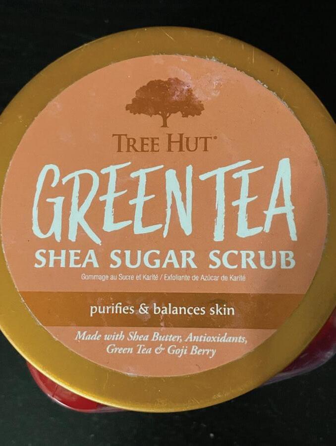
This was also found around the house but at the moment this picture was taken, there isn’t a green tea sugar scrub in this container, but red paint. That aside, this would be a good example of typography. Usually this would be something I’d consider a bad example of typography due to the many typefaces and fonts being used, like the previous example,but I think this is one of the few cases that manages to have many typefaces without being overbearing and disruptive.
The main attraction of this product is the large “GREEN TEA” in a vastly different typeface than the rest of the product with an almost brush-like appearance. With that being the major distinct typeface, how the rest of the text remains undisruptive while appearing different is most likely through the combination of different fonts and uppercase and lowercase characters. A closer inspection will see that the words “Tree Hut” and “Shea Sugar Scrub” have a very similar appearance in typeface, notably with the capital E and U they share, with Shea Sugar Scrub most likely being a bold font. These two seem to be a pair of the same type family. “Tree Hut” also seems to recede how dominant it is by being a brown color that complements the peach color behind it.
The last three lines of text, the line under Shea Sugar Scrub is a sans serif font, but it isn’t disruptive due to how extremely small the type size is in comparison to everything else. The last two lines seem very similar in appearance and could be in the same type family but it’s difficult to tell. One thing for sure is that one is regular and one is italic. All three lines of text appear different but because they aren’t very large and emphasized, they also aren’t disruptive. The takeaway being that it might be possible to include many different typefaces if each typeface isn’t fully emphasized and doesn’t take away from the main product or advertisement, which in this case the different typefaces doesn’t take away the attention from “Green Tea Shea Sugar Scrub.”
This sign was also found at the same bar place and it would be my good example for this week.
The main thing that stood out to me was how the text is positioned and oriented. They both follow a baseline that goes in a semicircle and despite it not being horizontally aligned, it can read fine from left to right as if it was horizontal. I think a lot of it can also be contributed to where the words start. Both phrases of White Claw and Hard Seltzer start halfway on the left side of the circle and end on the right side, so that they can both be read from left to right instead of having Hard Seltzer abide by the circular conventions and end up reading upside down from right to left.
Other things to note is that this is both legible and readable. Since not much information or thought is being conveyed aside from a brand, or rather all the information is conveyed concisely, there’s a bit more work put into how the typography looks visually. Despite there being a bright background, there’s a white outline/stroke being used surrounding another gray outline to give a sense of depth and bulk, making the text stand out more and perhaps more emphasized than if it was plain black.

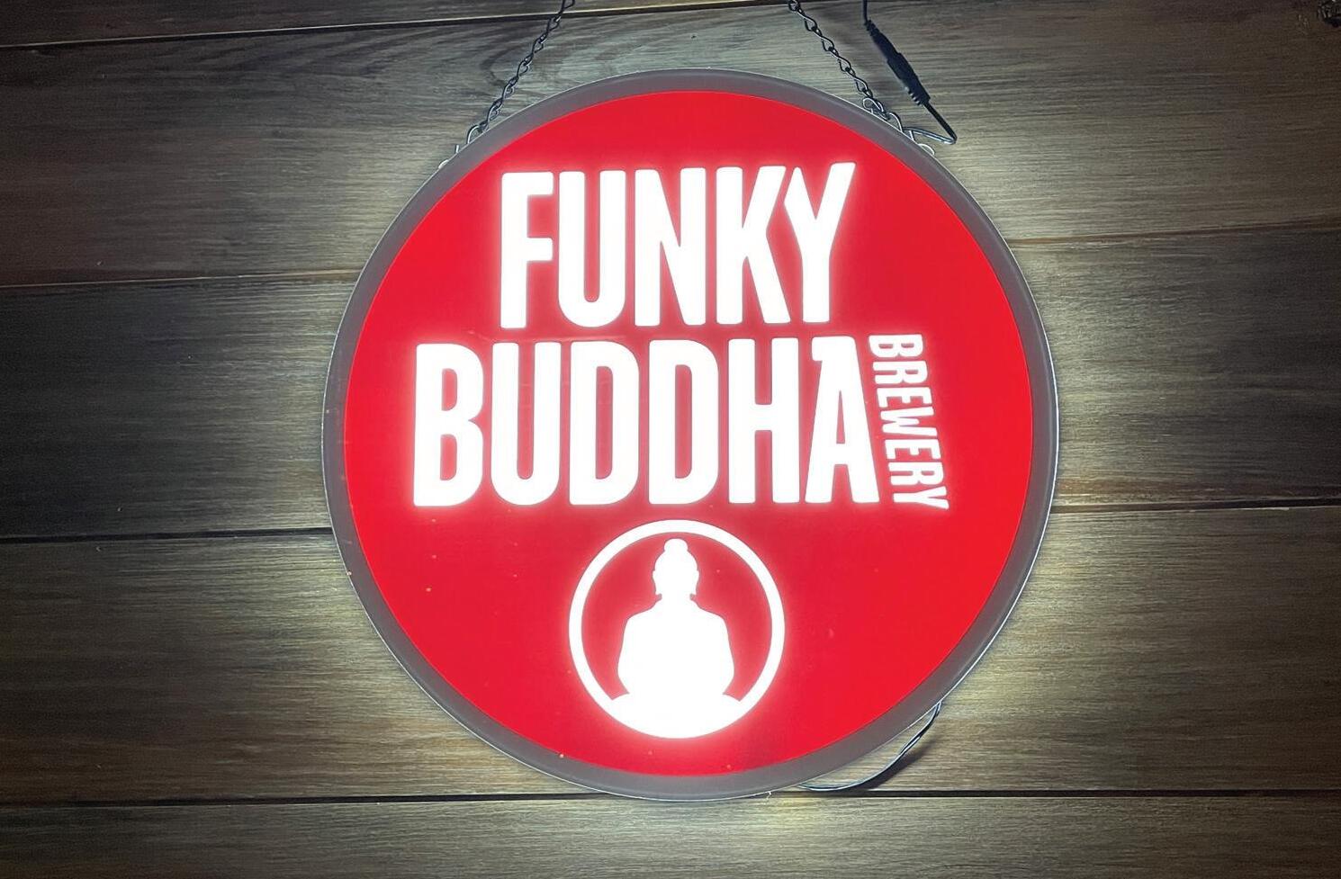
This was found at the same local bar from the previous week. This is a good example of typography.
It’s a simple sans serif typeface that’s also quite a thick font size, which is usually a good way to promote legibility. The tracking looks tight but there’s enough space so that the letters don’t touch, which promotes a very structural feeling to the text. A unique or interesting design choice they had was to cut the left arm of the Y a bit in Funky to accommodate for the right arm of the K. This adds a bit more visual interest to the piece without sacrificing legibility and readability. On another note, I also think this was done to help keep a centered alignment for visual balance for the product.
The other thing of note is the word Brewery that’s diagonal following the stroke of the A. For similar reasons as before, it’s visually interesting and also helps keep a visual balance to the product. Had they chosen to have the word in a different way, the piece would feel imbalanced and distracting. If Brewery was removed all together, the alignment of text would no longer be truly centered and I’m not exactly sure if Buddha would be big enough to compensate for the missing space so they would have to either increase tracking or make the type size bigger, both of which would introduce a visual discrepancy.
In search of bad typography, I found this sticker on a chest that my brother had. It’s a little ripped unfortunately, but a large majority of the typography is there to make it out.
For one, it definitely has a lot of creative liberties being taken. The words “Lance Mountain” can be made out which with how the typeface is designed, it fits the theme. Irregular strokes and shapes with a spotted aesthetic imitates the look of mountains and rocks, which for branding this would probably work out well, but the legibility of this typography suffers as a result. There’s almost no regard for tracking or letter spacing, the letters are touching and colliding and the choice was even made to have some letters “fuse” into one another as seen with the L and A of Lance.
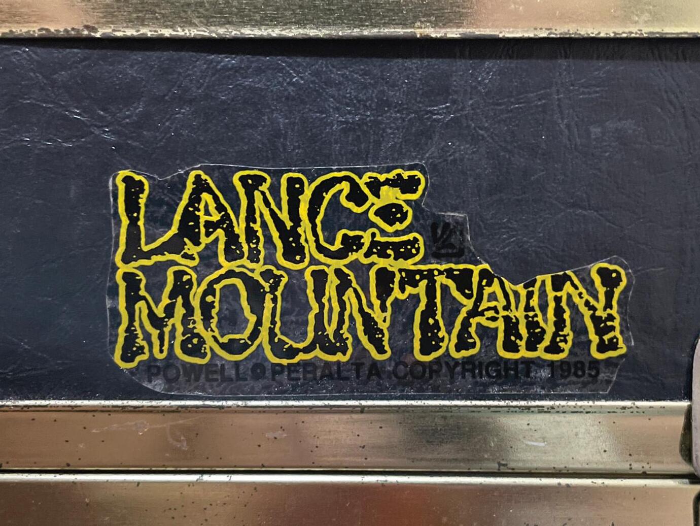
This would be very difficult to read at a glance but more likely recognizable, so it can be said this typography is going more for recognition than legibility but it would be bad typography nonetheless.
Another thing to note is that this product of a sticker hasn’t fully considered where this might be placed. Under Lance Mountain, there’s a line of black text that indicates the brand’s copyright, but because the sticker is clear and the text is black, if placed on a black object like this one, it becomes very difficult to read. A yellow outline most likely wouldn’t look good for this part, so the next best thing to make it more readable would have the sticker be opaque with some color and not clear.
