architecture & urban design phygital physical digital user experience design information technologies smart & responsive urban products, services & environments
Bartol Oremović, M.Arch
D-O-B: 26.08.1994.
A: Zagreb, Croatia
M: +385 91 7805 263
E: bartol.oremovic@gmail.com
LI: https://www.linkedin.com/in/ boremovic/
ABOUT
Hi, I’m Bartol, a product designer strongly rooted in user experience & urban design.
What does this mean? Well, it means I strive to put my creative effort to imagine and develop products, services and experiences fit for modern day cities, while always putting innovative design and user experience at the core of every project.
Over the next few following pages, You will get to know me better and understand what I do, as well as see for yourself if there is an opportunity to work together, or collaborate in a meaningful way.
Thank You for looking through these pages!
EXPO 2025 Osaka Botinec Residence
page 11. page 7.
Digital City Totem
page 17. page 21. page 7.
Solar Tree Perceiving:Spaces
Rakitje Agro-City
page 31. page 25. page 37 page 41.
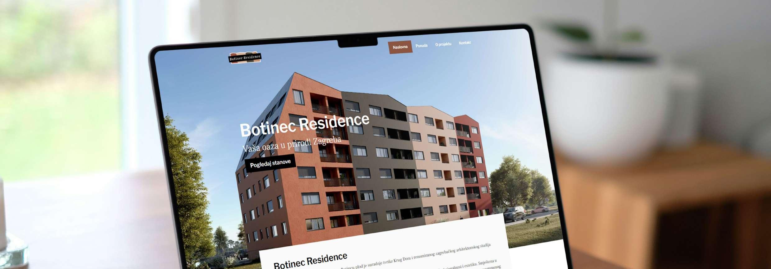
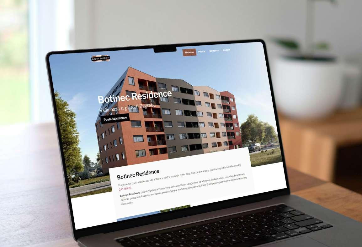
Botinec Residence
https://botinecresidence.com/ access code: 1801
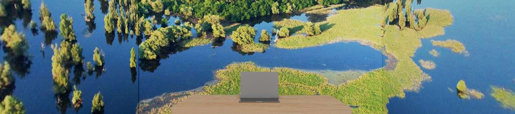
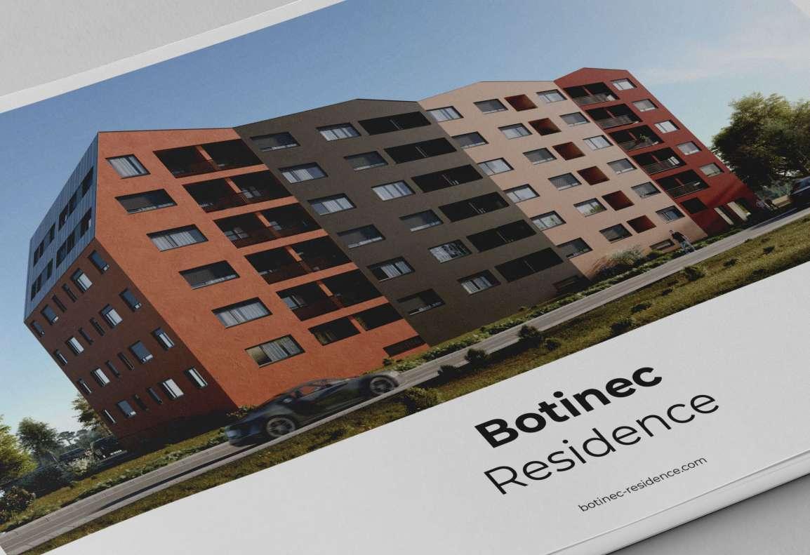
Botinec
Residence is a real estate project being built on the outskirts of the City of Zagreb, Croatia. The client commissioned me to design and develop a website to be used for showcasing and boosting sales of residential units of this project.
The website was designed and built using Figma and Elementor Pro (via WordPress), to be responsive on all standard modern device sizes, from mobile, tablet to desktop.
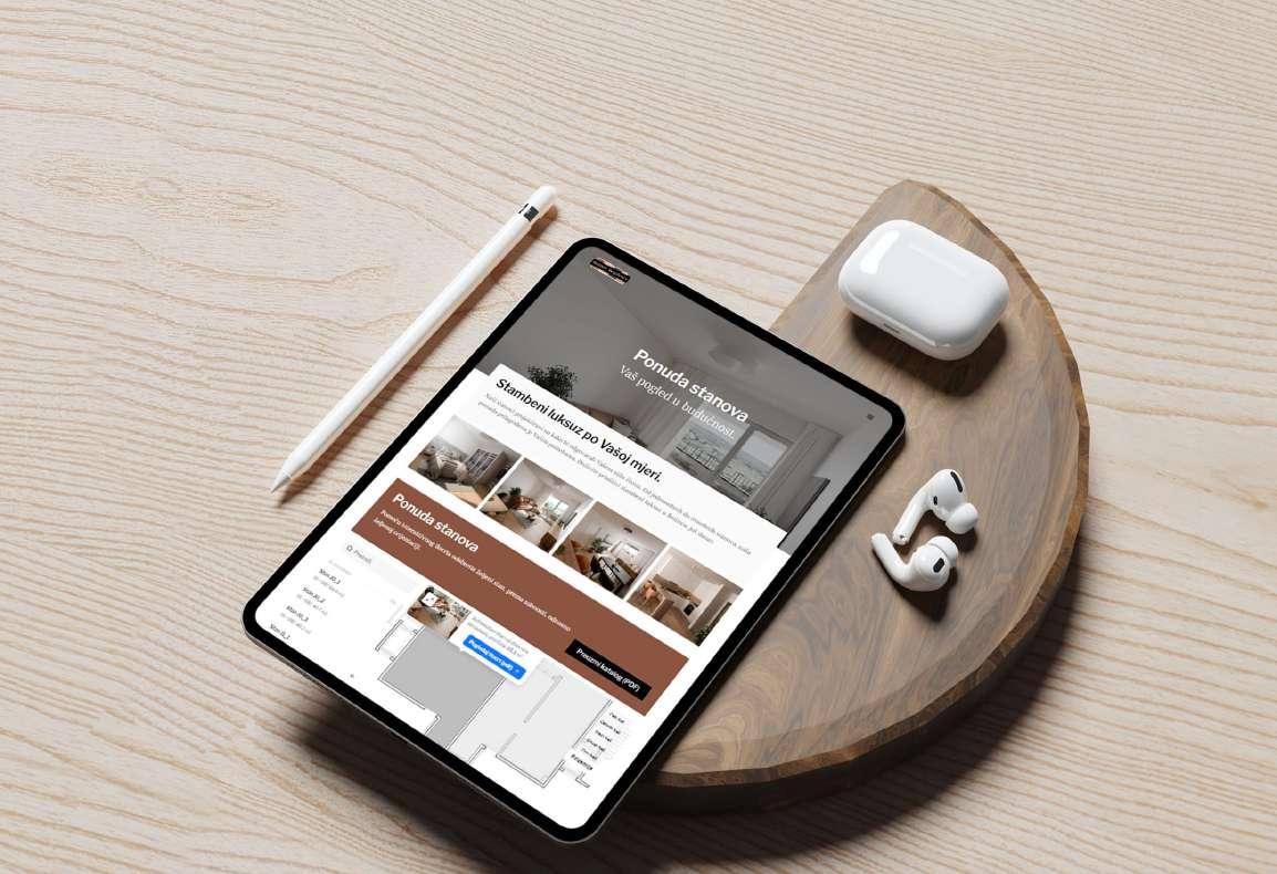
Interactive Website
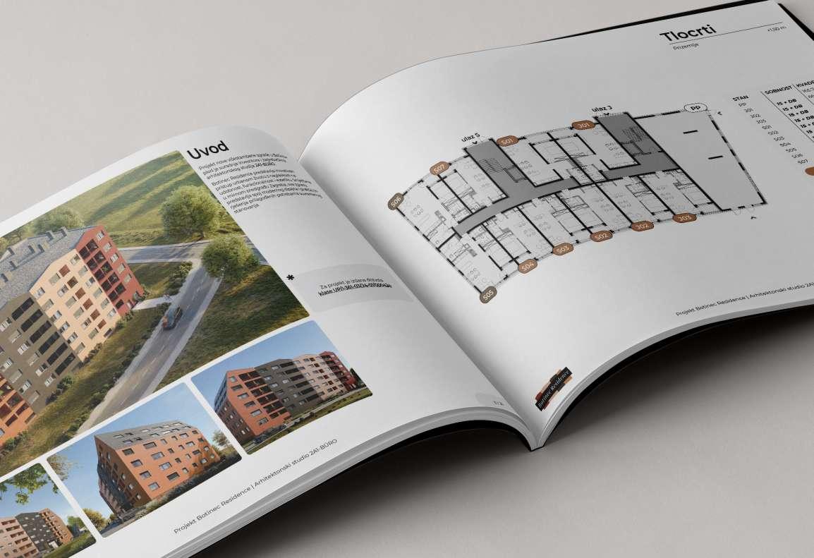
A special feature of the website is an interactive floorplan, built via the Mapplic WordPress plugin, which enables uploading of floorplans in SVG format.
image 2. iPad mockup
image 1. MacBook mockup
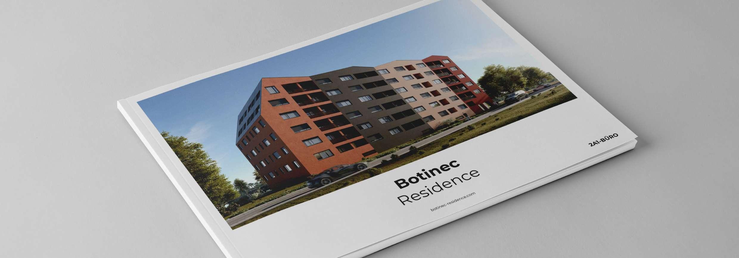
For additional marketing purposes I’ve designed a print version of the catalogue, which complements the website.
Marketing Strategy
The project investor requested both a digital and a physical catalogue, in the form of a booklet as well as the website, meant to give the buyer the clearest possible idea of the property, before deciding whether to invest.
Image
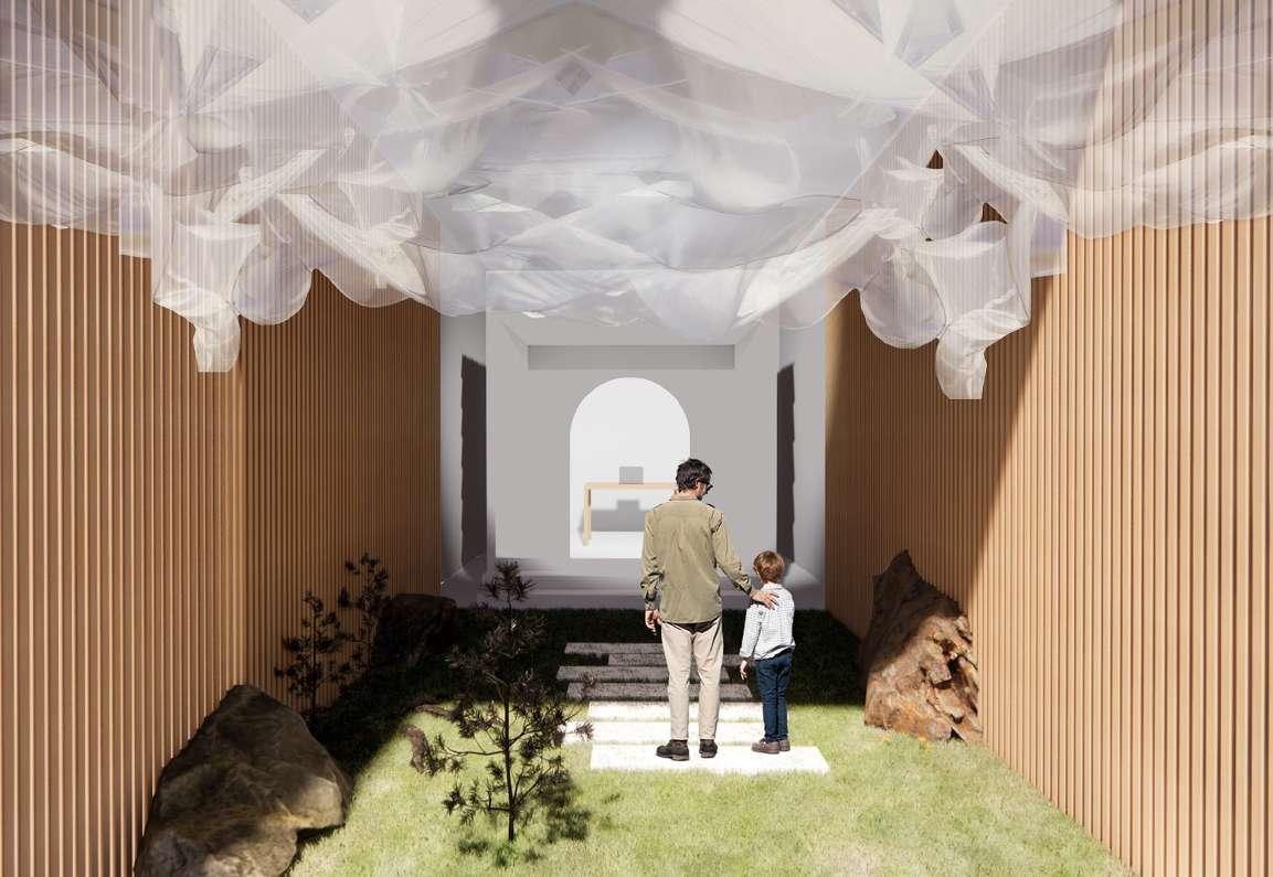
EXPO 2025 Osaka
Croatian national pavilion for the 2025 world exhibiton
Work Croatia / Play
Croatia was the unsubmitted competition entry, designed together with the Croatian
arhitectural studio RADOradiona, for the design of the national pavilion of the Republic of Croatia, for the 2025 EXPO World exibition, to be held in Osaka, Japan.
Year: 2024.
Client: design competition (Ministry of Foreign Affairs, Croatian Society of Architects)
Status: unsubmitted
Type: interior, exhbition, interaction design
Role: lead designer (w/ RADOradiona)
Tools: AutoCAD, Rhino3D, Adobe CC, Figma
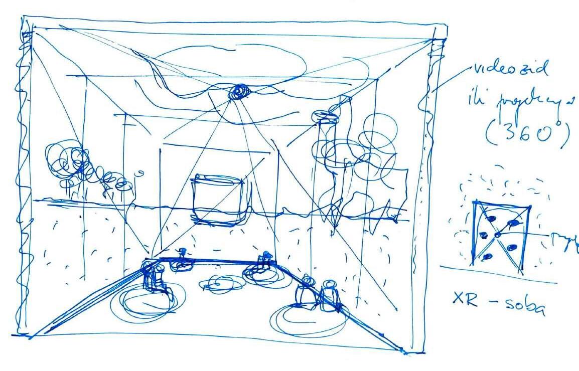
image 5. First concept illustration
Rooted in Tradition / Looking Towards the Future
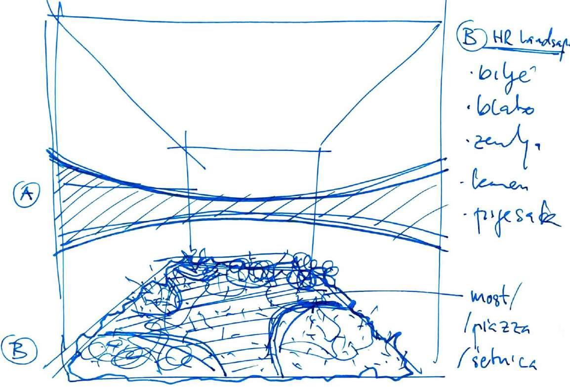
was the name of the first concept we proposed, having put natural elements on the ground (B), while proposing a 180 thin display around the viewer (A), at eyesight, to show various images and videos of Croatian landscape.
Immersive Croatian
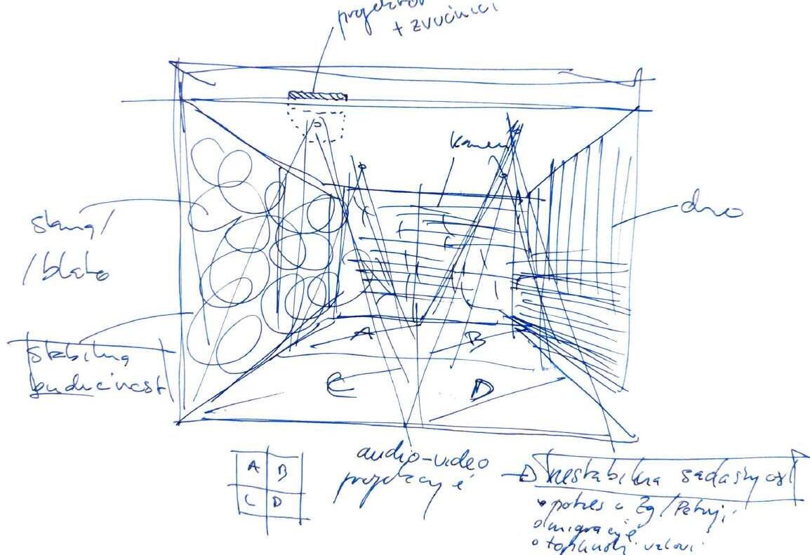
image 6. Second concept illustration
Reality was the name of the second proposed spatial concept, which would feature a fully immersive ‘extended reality’ or a so called XR room, again showing various projections of country landscapes and experiences.
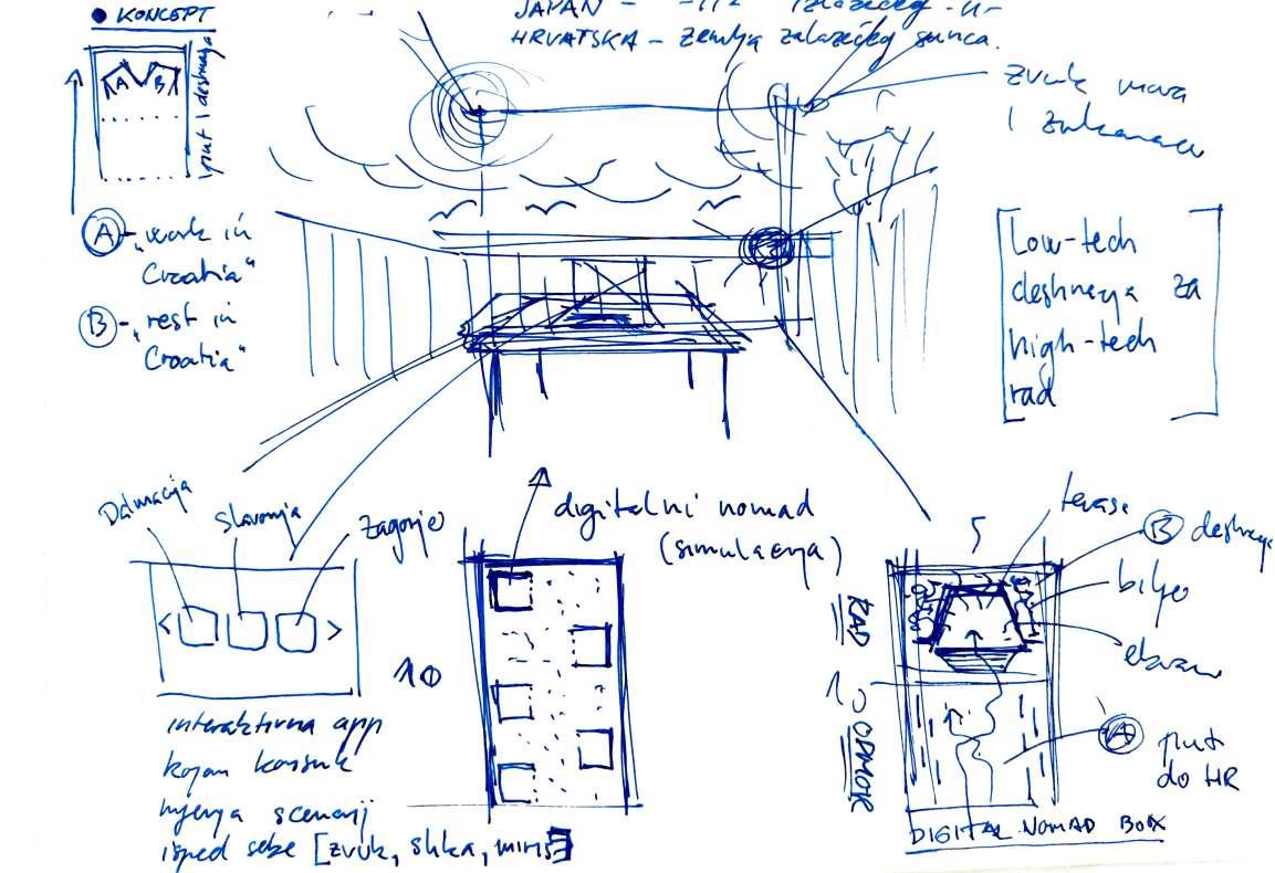
Unstable Grounds, Stable Future
was the third proposed concept, that was kind of an inverted concept of the first one, showing projections of actual national realities on the ground (the key word being unstable), while the walls were supposed to be clad in natural materials, representing a stable future, going back to natural roots.
Image 7. Third concept illustration
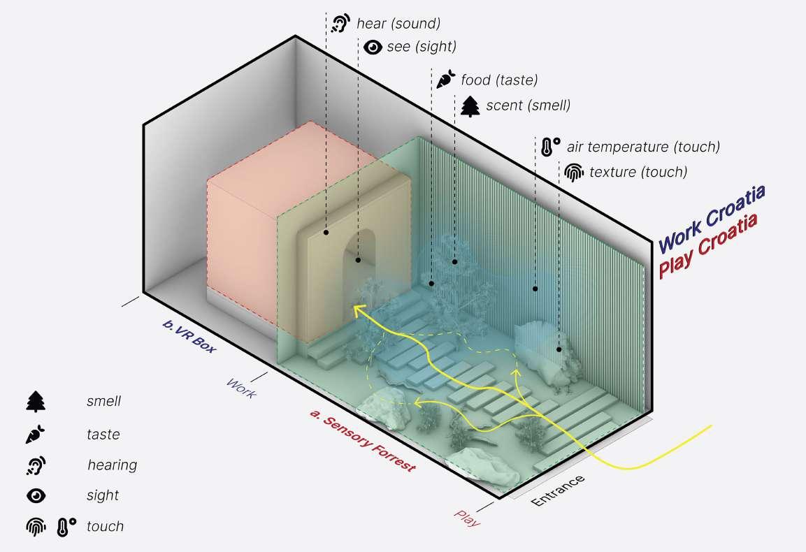
Work (in) Croatia, Play (in)
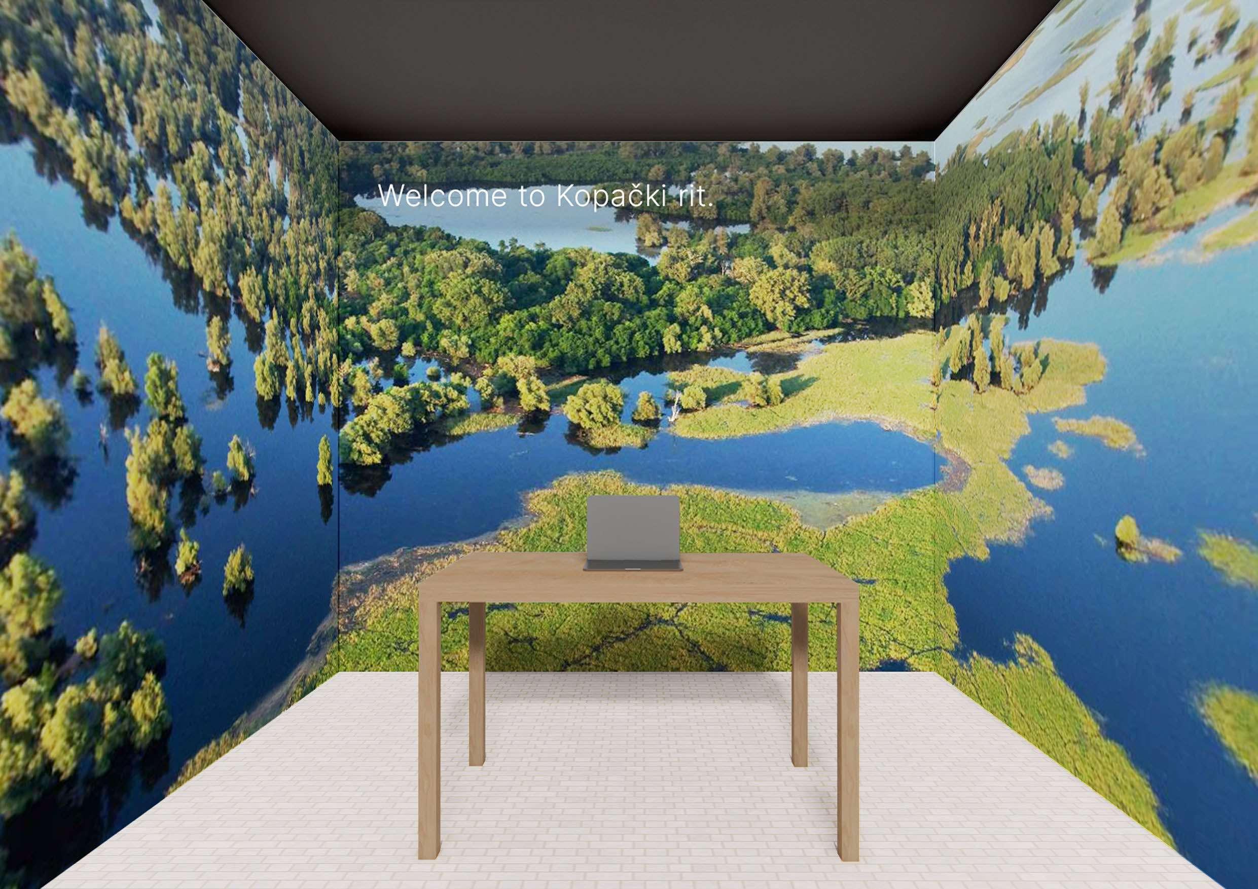
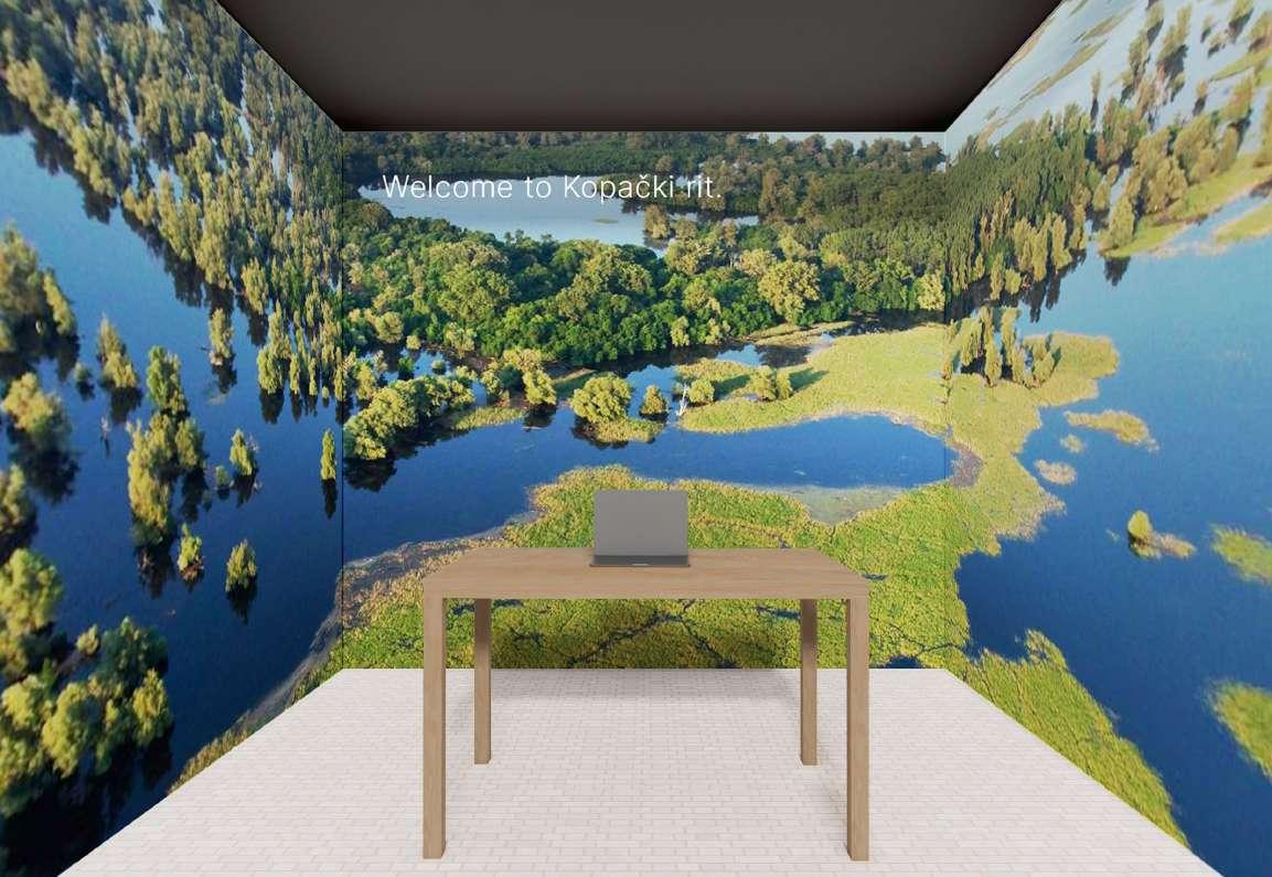
Croatia was the concept we chose, as a kind of a hybrid between three previous ones. It features both the natural landscape typical of mediteranean and submetiranean Croatian climate, as well as an XR room, that was supposed to ‘transpose’ the viewer to a reailty of being a digital nomad in Croatia, showing different environments, while having the viewer seated on a porch with a laptop to ‘work on’.
Work Croatia / Play
Croatia was spatially illustrated in the form of a diagram, which shows two distinct spatial and senseable experiences. First named ‘visitor forrest’ and second the ‘digital nomad VR box’.
Sensory Forrest
‘transposes’ the visitor to a typical mediterranean landscape, with distinct local Croatian features. Different experiential effects area achieved through envoking different senses, such as the smell of pine trees, warm climate via hidden heating systems, textures of rocks, as well as local foods to taste.
image 10. ‘Sensory Forrest’ visualization
image 9. Chosen concept diagram
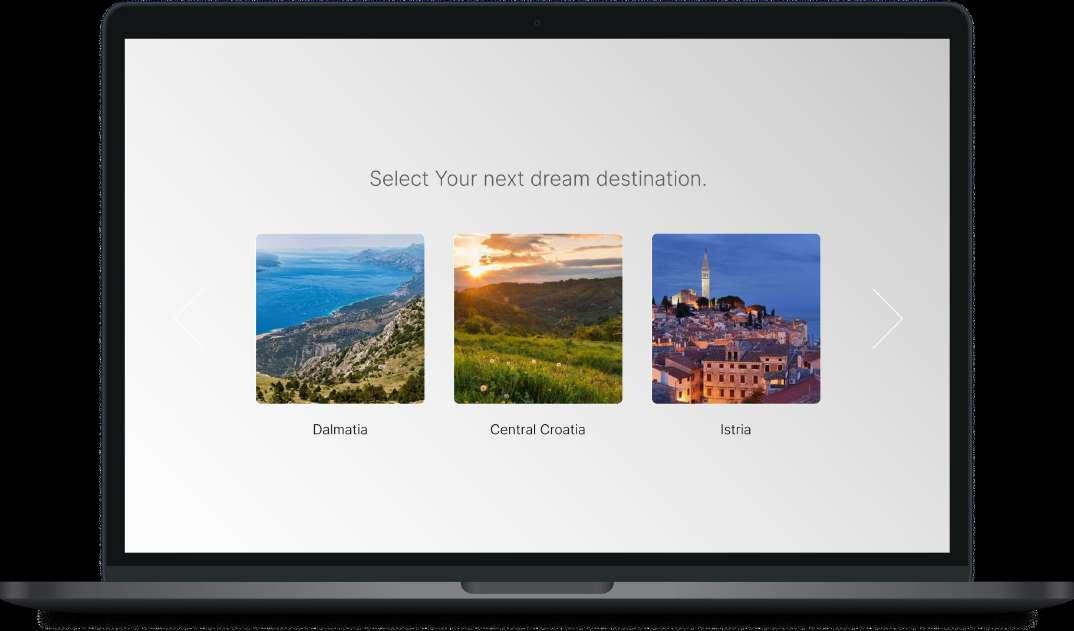
Digital Nomad VR-Box
is the second part of the experientital experience, meant to immerse the visitor in an extended reality experience, while featuring an interactive app on a laptop, supposed to represent the ‘digital nomad’ experience of many internationals chosing to workin remotely in Croatia.
Visitor Companion
App is a simple concept of the official visitor app, that was supposed to help the visitor choose from a variety of different landscapes, and help him control the virtual surroundings around him in such a way.
Image 12. ‘Visitor Companion App’ concept design
Image 11. ‘Digital Nomad VR-Box’ visualization
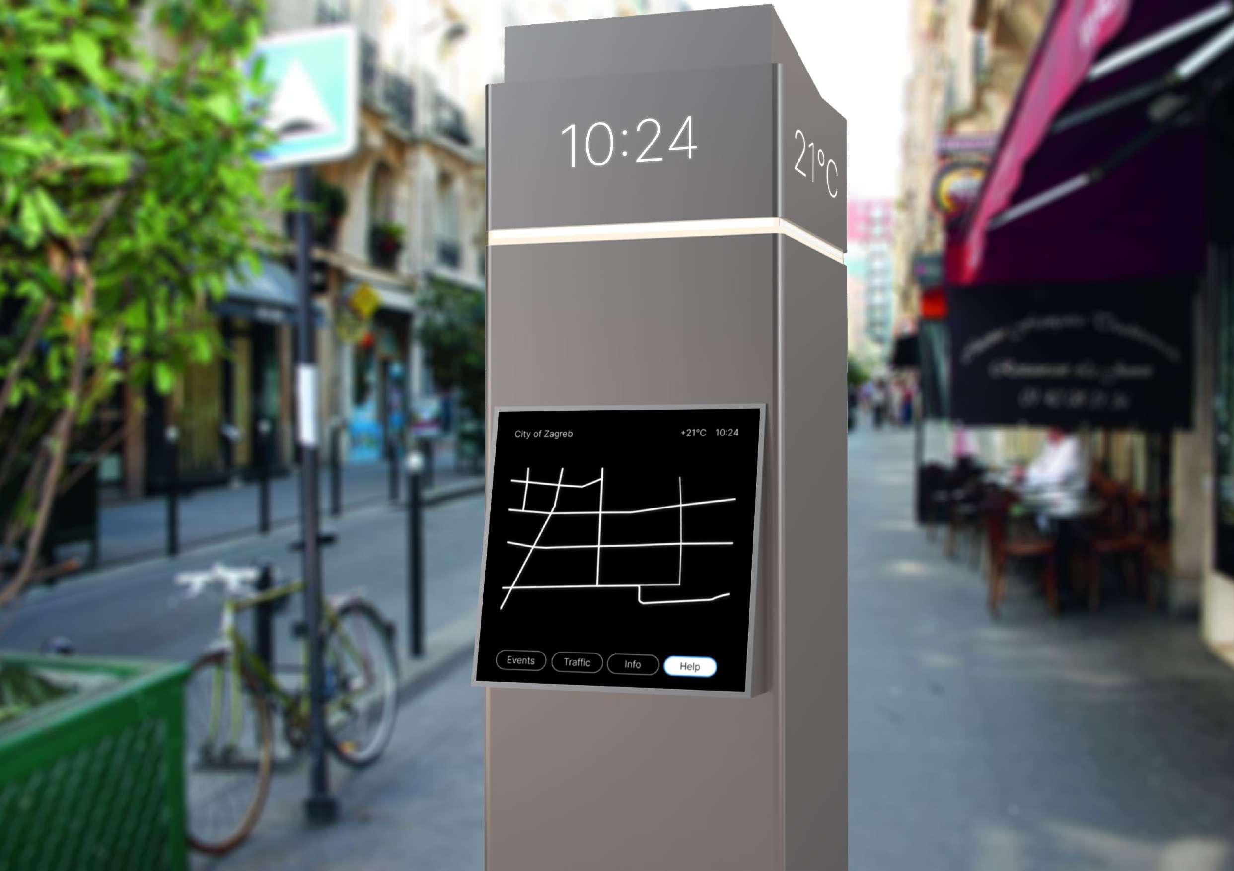
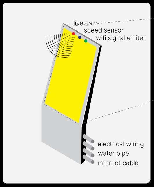
Digital City Totem
A concept design of a digital urban street totem
A digital street info
totem is a personal project, that was part of a street design
competition for the redesign of an important historical street in the center of the City of Zagreb, Croatia.
Year: 2024.
Client: street design competition (City of Zagreb), self-initiated project
Status: unsubmitted
Type: product design
Role: lead designer
Tools: Rhino3D, V-Ray, Adobe CC, Figma
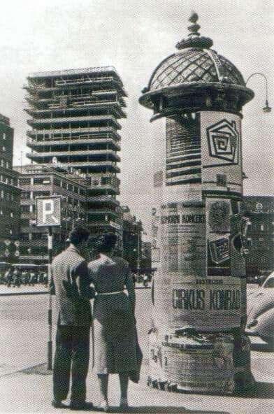
image 13. Historical informational totems in the City of Zagreb
Historical Information
Totems in the city of Zagreb were designed in cilindrical shapes, with various news and advertisment placed on top of them.
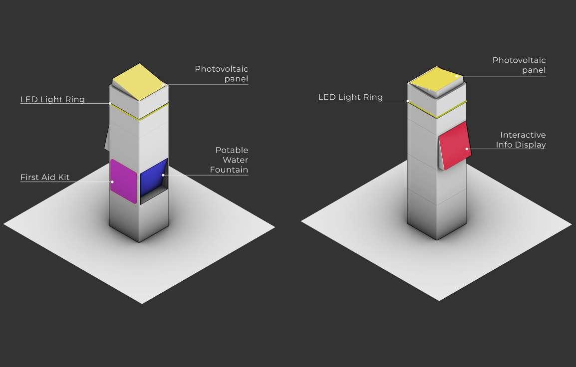
image 14. Functional diagram of a digital totem concept
Digital City Totem presented here consists of different useful ammenities, such as an LED light ring, a photovoltaic panel to power it, a first aid kid to help in emergencies, a potable water fountain as well as the main feature, the interactive info display, connected to various digital city services, IoT-powered.
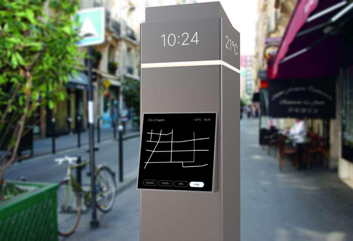
City Information in Real
Time is accessible via the front-facing digital interface of the totem, giving access to real-time traffic info, local weather data, air quality, events in the city, as well as providing access to local emergency services.
Single Point of Urban
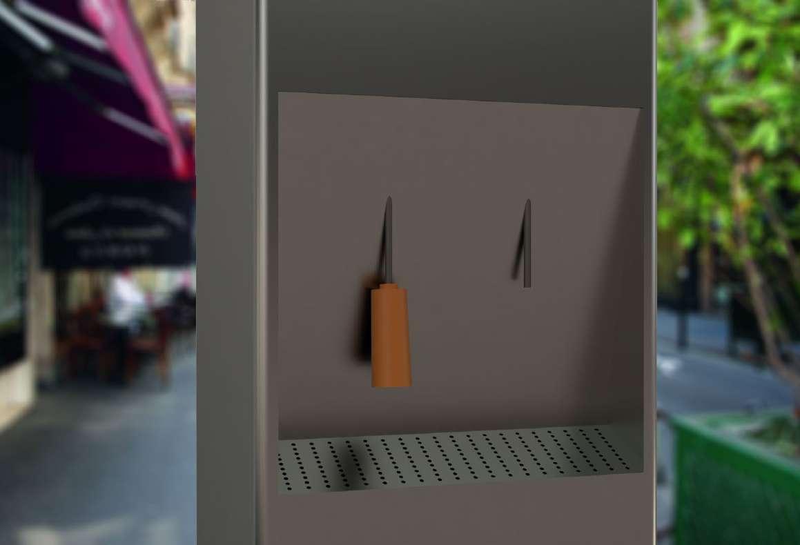
Experience is enabled by this urban product, as it contains many different functions useful for public space, such as a potable water fountain on the back-side, or a defibrilator device, all powered by a solar panel on top of it, making this device a ‘swiss knife’ that enhances the city experience.
16.
Image
Back-side visualization of the totem concept
Image 15. Front-side visualization of the totem concept
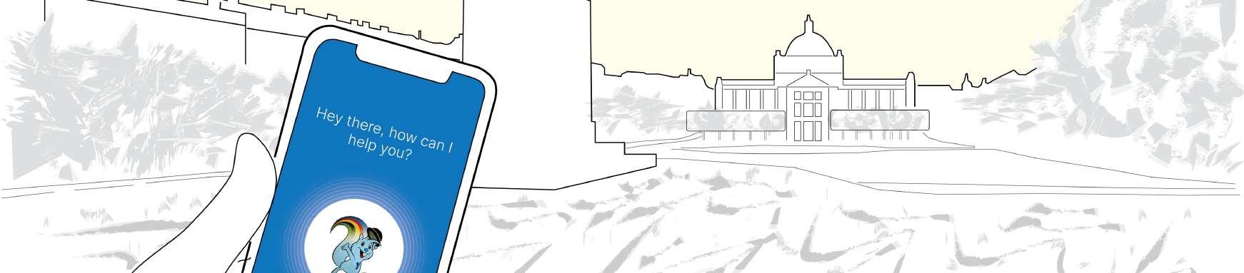
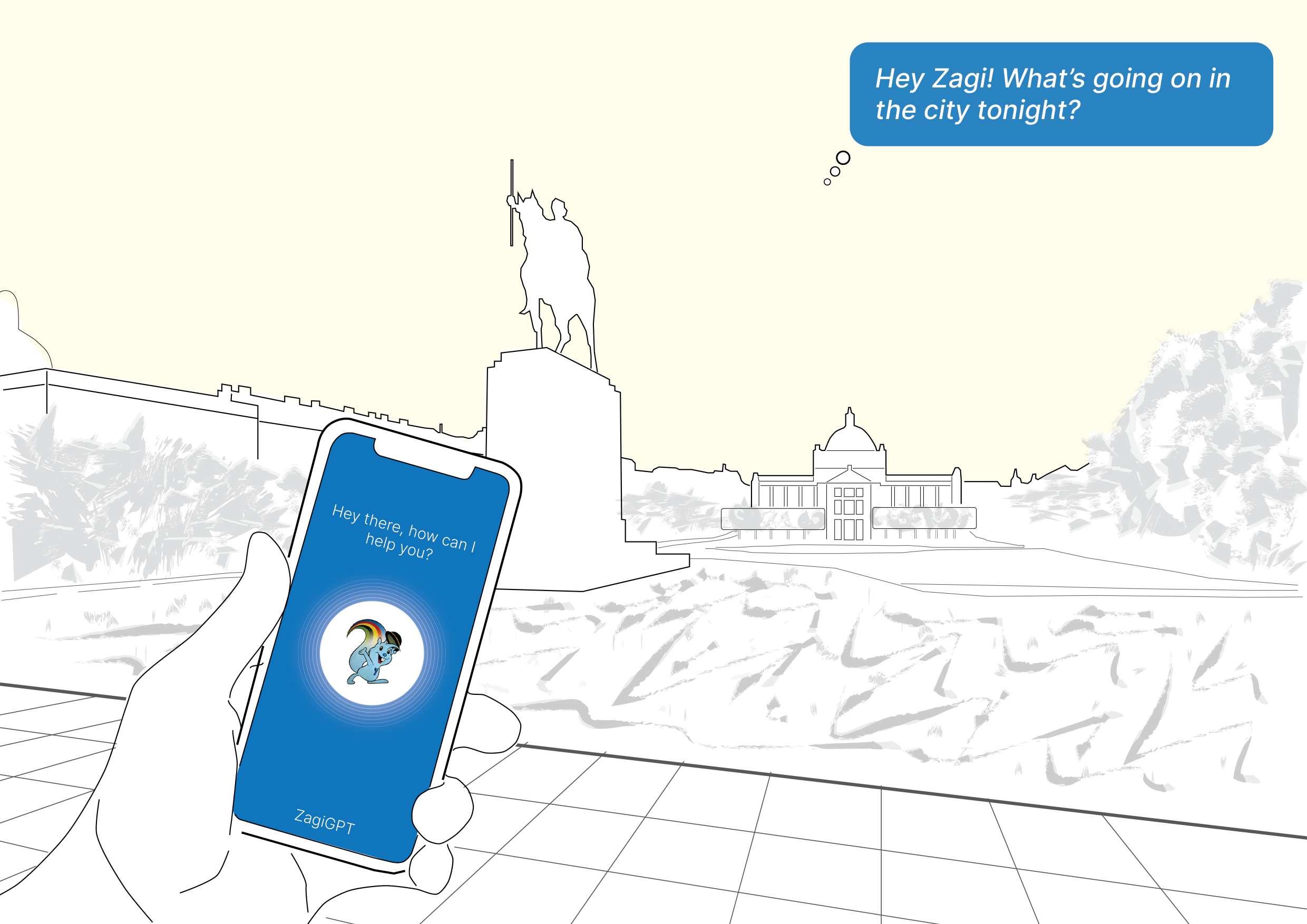
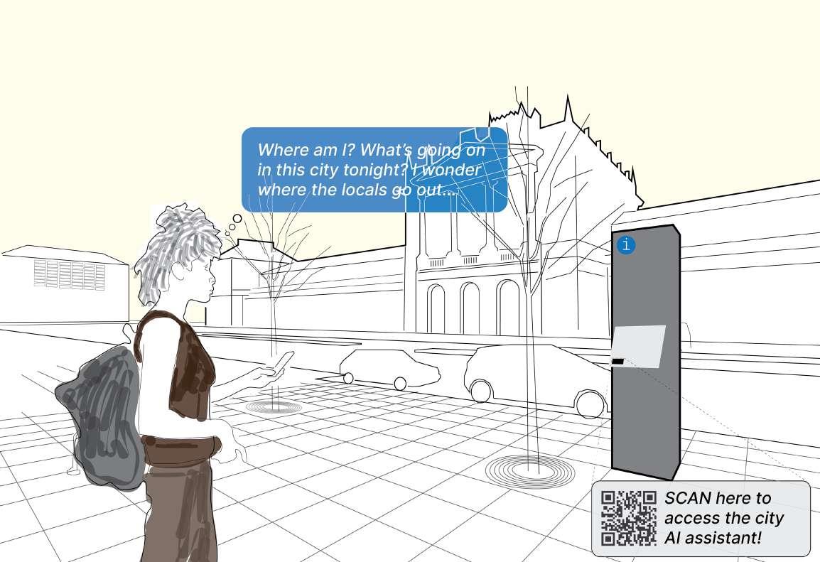
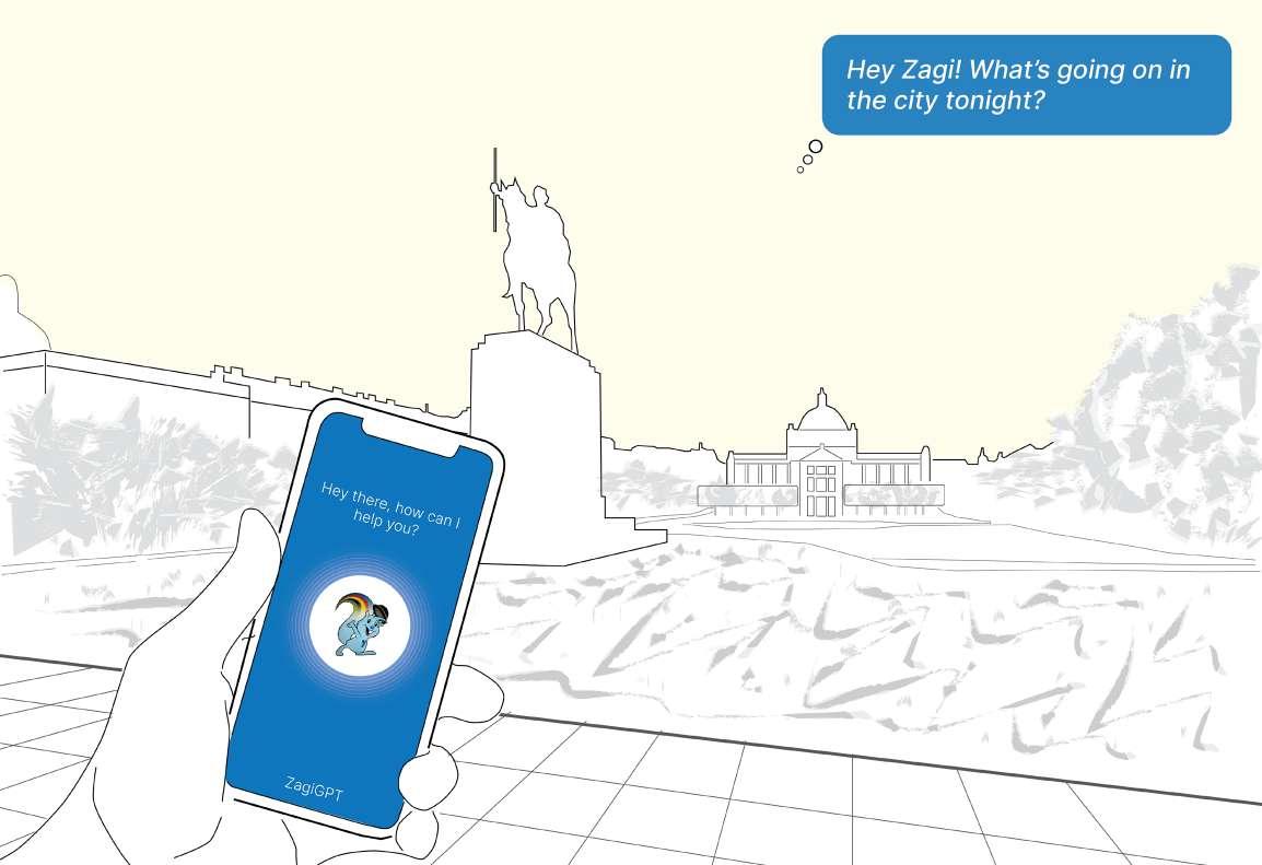
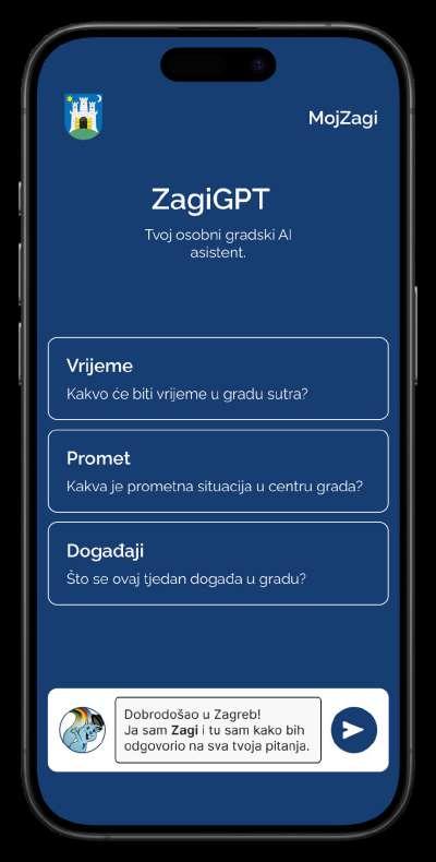
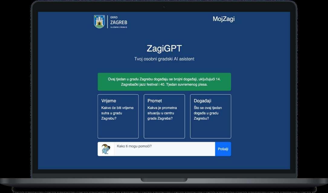
ZagiGPT
Your personal AI assistant
https://medium.com/@
http://bit.ly/bored2024
image 17. Storyboard illustration of the UX
ZagiGPT is the assistant you never knew you needed to navigate the City of Zagreb. It’s a customized GPT assistant that has direct access to all internal city data, that might not usually be accessible via the open web.
image 18. Storyboard illustration of the app
Point of First Contact
with the city, after exiting the main train station, is the informational totem on the square in front of the building, facing the city. This is the moment where a traveler enters this city with many doubts in their mind, and this is where ZagiGPT comes in handy first.
The
App Prototype off the web app was coded in simple HTML, CSS and JavaScript, accessing OpenAI’s ChatGPT browsing feature, that has access to the internet, and was made as a means of effectively demonstrating the concept of the app, gathering urban data through browsing the web.
The
Portable Assistant
comes as a mobile app that features a voice and a text interface, keeping accesability and ease-ofuse on the go in mind. Just like Apple’s Siri assistant, it taks back to you and does so in the form of the Zagreb city’s official mascot - the squirrel ‘Zagi’.
Image 20. Web-based app prototype
Image 19. Mobile app concept design
Perceiving Spaces
A spatial data intelligence platform
web application prototype | 2022
Perceiving:Spaces
is the codename for a project which resulted in the web application presented here. Originally developed by a number of partners from the industry and academy. Such as at the Senseable City Lab, a research lab at the Massachusetts Institute
Year: 2022.
Client: Austrian Institute of Technology, OBB
Status: prototype delivered
Type: web application
Role: UX/UI design (w/ Carlo Ratti Associati)
of Technology (MIT) and the Italian design office Carlo Ratti Associati. Industry partners include BRIMATECH, a Vienna based consulting company, the Austrian Institute of Technology and ÖBB in Austria, as well as the Massachusetts Bay Transportation Authority (MBTA) in the USA.
Technologies: React.js, Deck.gl, D3.js, Chart.js
Tools: Figma, Adobe CC
AutoCAD
Devices: desktop
https://cra-perceivingspaces.vercel.app/
Web
http://bit.ly/bored2024
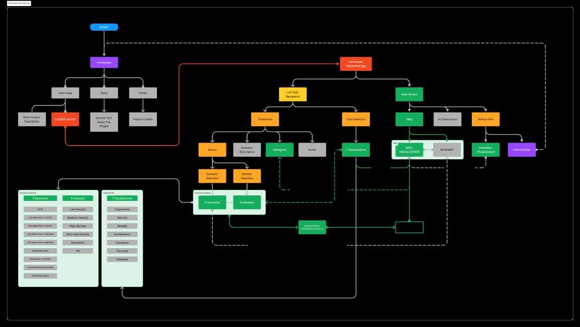
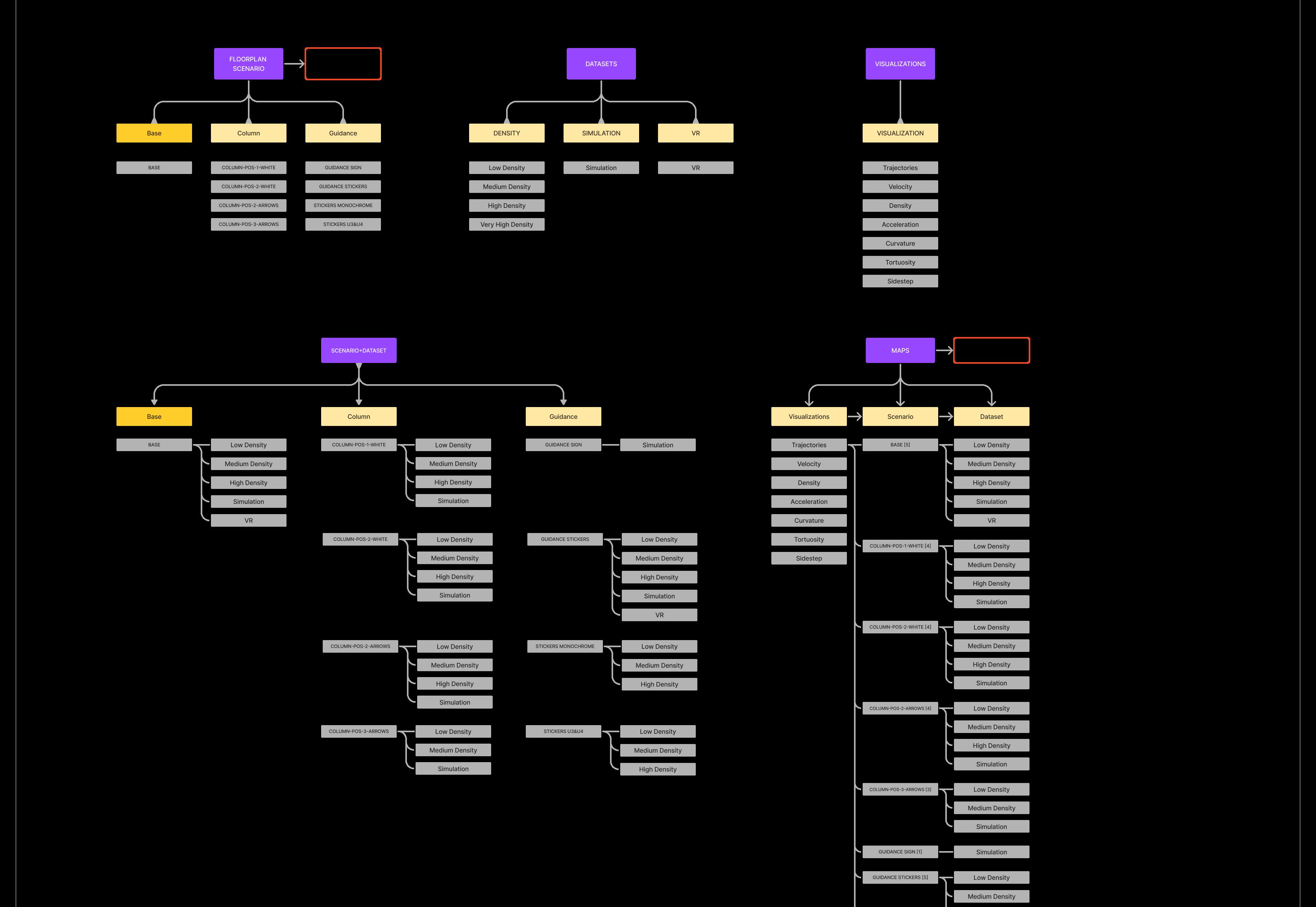
image 21. Information architecture flowchart
App Flowchart was drawn to help understand the UX/UI better, and hand off the design to the developer. To do so a flowchart was created, which explains the both the landing page and the way the the app itself functions, in a coherent way. It also helps understand how various distinct datasets are combined to form unique visualizations.
image 22. Diagram of data sets
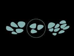
Data Sets form a total of 244 unique screen states, that are generated dynamically using various JavaScript data visualization libraries, such as d3.js, chart.js and deck.gl wrapped by React used to represent the data.
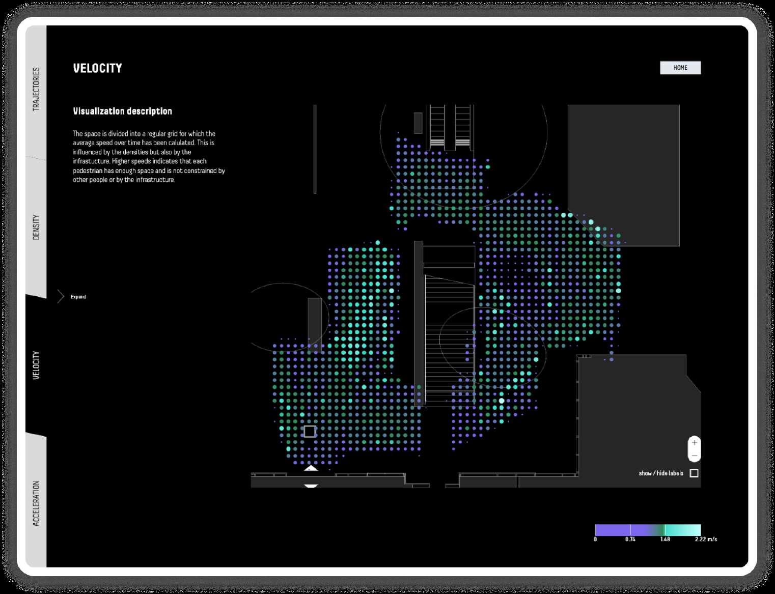
Data Visualizations
were designed by a colleague from the design team. The visual type used was a dotted grid, which permitted us to assign different values to each dot individually, and the fluorescent colour spectrum was chosen to differentiate between different data, on a black background.
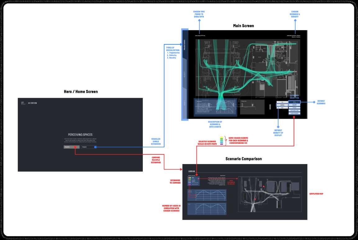
User
Experience of the app was clarified via flowcharts, that explain two different types of interaction with the pedestrian movement data that was collected.
The main distinction was whether to visualize a single scenario of data, or to compare multiple methods of measurement. Inside of the dashboard, there is a button dedicated to the ‘compare’ function. By pressing this button the user can select up to two different ‘datasets’ and up to two different ‘scenarios’ that he chooses to compare.
The comparison is done by subtracting one chosen dataset from the other.
Image 24. Data visualization illustration (by Erzë Dinarama)
Image 23. Diagram of user experience
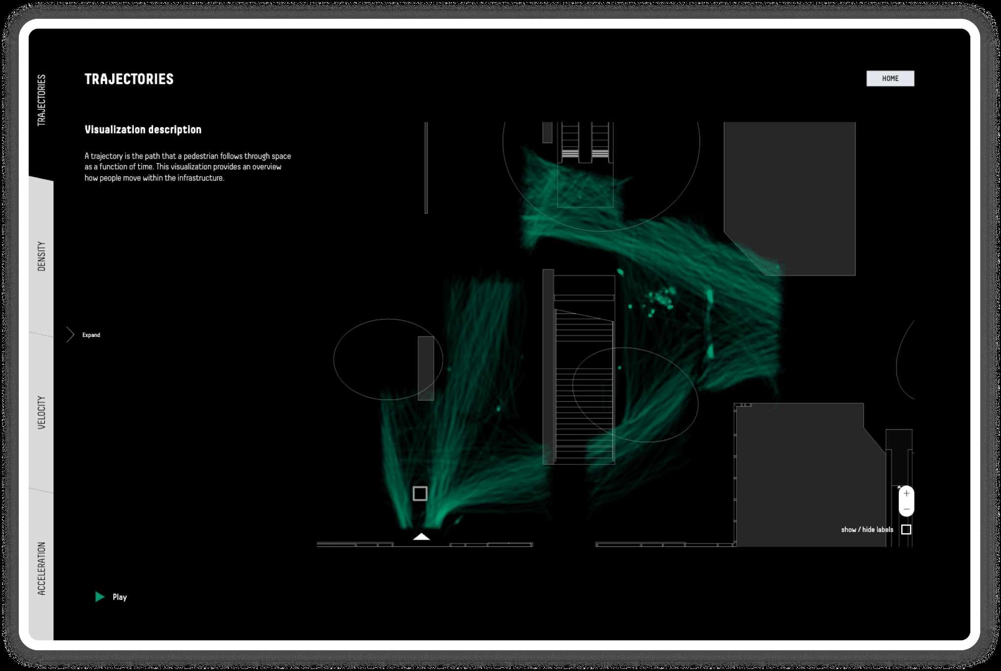
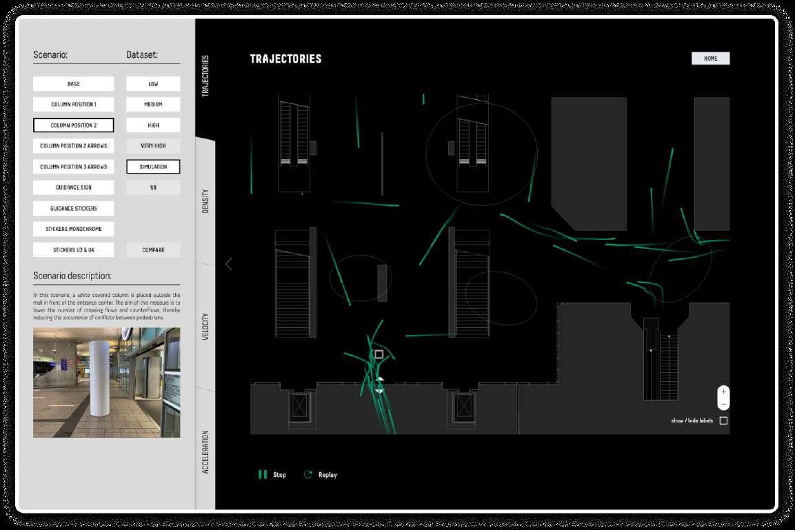
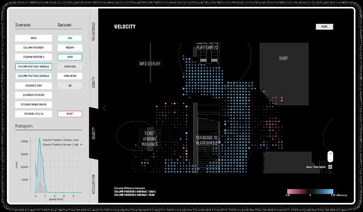
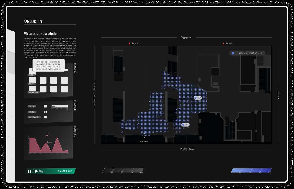
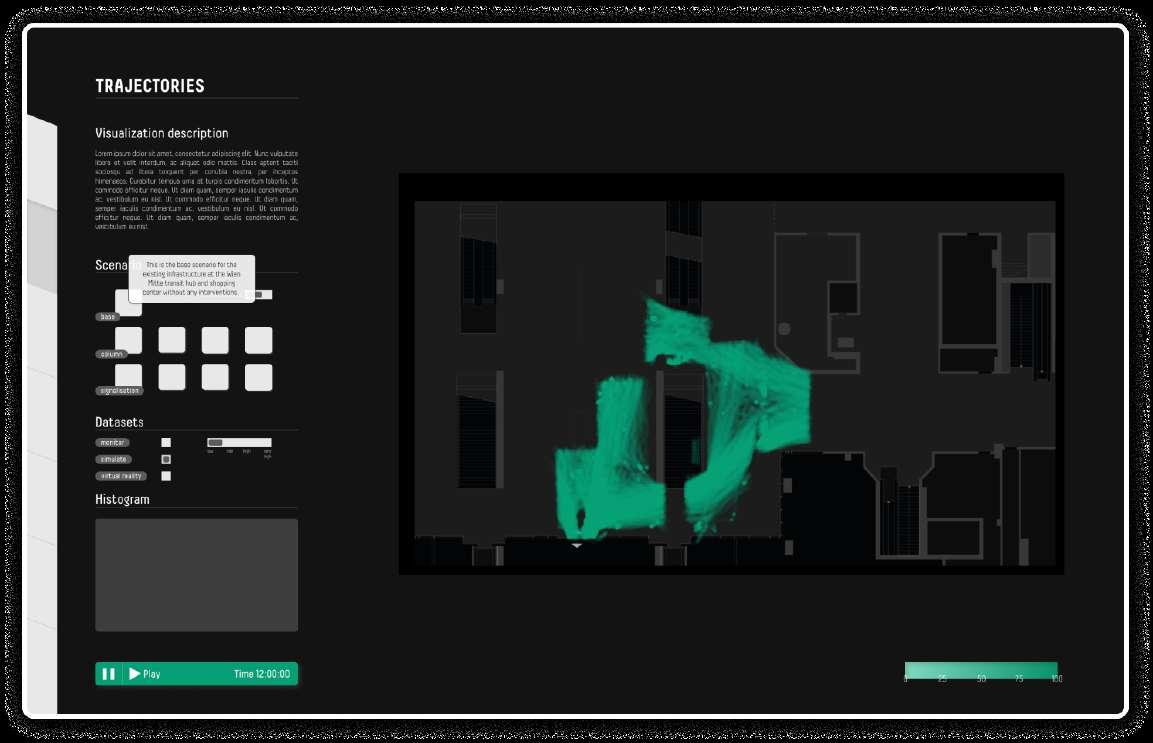
image 25. Web application interface (screenshot)
Navigation consists of the vertical navigation bar and the dashboard. The vertical navigation bar features a ‘card selection’ which enables the user to change the type of movement properties they want to see, which changes the visualization style accordingly. The dashboard, accessed by expanding the navigation bar, gives access to the visualization modifiers.
image 26. Web application interface (screenshot)
The User Interface consists of two main elements, the map and the side navigation. The map, centrally positioned on the screen, is overlaid by a few layers of data. It consists of the floorplan of the surveyed area, the Wien Mitte Mall, into which the architectural interventions were inserted during the survey phase. On top of which there is a layer of data visualized in the form of lines or a dotted grid, which represent different physical properties obtained by measuring movement of passengers throughout the surveyed area.
App Development
The application has been developed in Javascript, the standard programming language of the web, using Meta’s ‘React’ framework. It has been structured as a “single-page” application given the simplicity of the project.
The development team decided to bundle the application for production using ‘ViteJS’, a new build tool for modern JavaScript applications that aims to improve the development experience by providing a faster, more flexible, future-proof and easier-to-use alternative to existing tools like Webpack and Rollup.
The main feature of the application is to visualize abovementioned datasets, which is achieved through an interactive interface that is responsive to different user inputs.
The visualizations are static, displayed as a grid of dots, except for the ‘trajectories’ one, which is animated as well. The animation can be played and replayed by the user, using the animation controls provided.
Image 28. High-fidelity design
Image 27. High-fidelity design
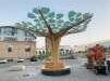
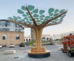
Solar Tree
Solar-powered shading device
product concept | 2022
The Solar Tree was a conceptual redesign project, for an existing solar shading device prototype, made by the italian energy company Eni Plenitude.
Year: 2022.
Client: Eni Plenitude
Status: concept design
Type: product
Role: concept design
Tools: Adobe Illustrator, Indesign
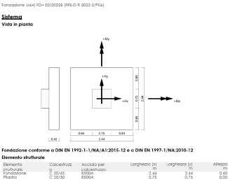
image 30. Cost estimate analysis image 29. Scheme of structure and wiring
SCHEME OF STRUCTURE AND WIRING
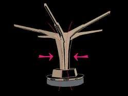
Scheme of Structure
and Wiring of the prototype received from the client, was used to represent the product structure in three parts, the ‘tree crown’, ‘tree trunk’ as well as the ‘roots of the tree’.
Cost Estimate analysis was made to help reduce the cost of the project.
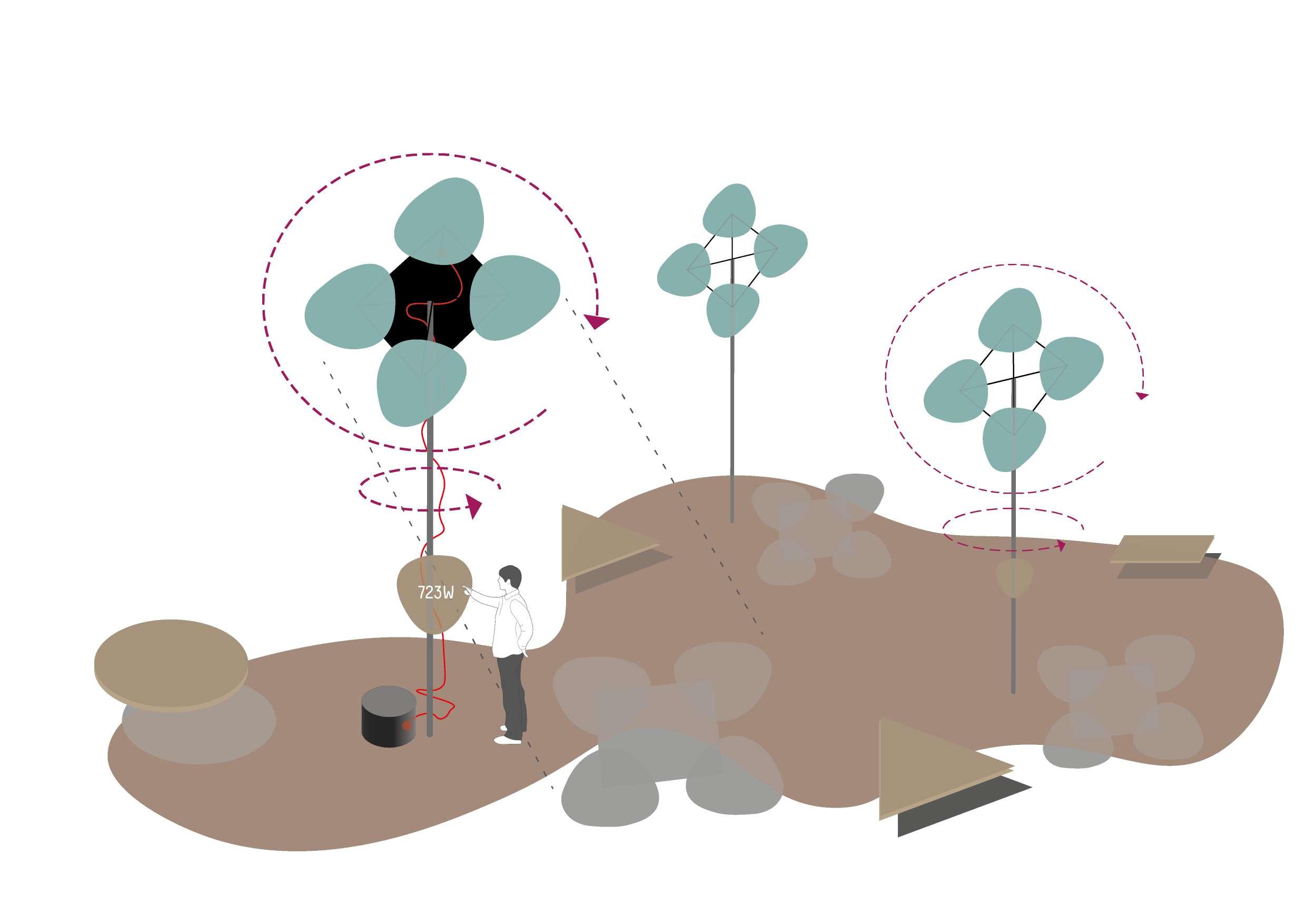
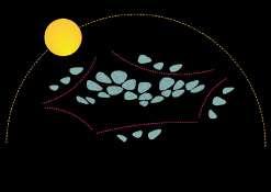
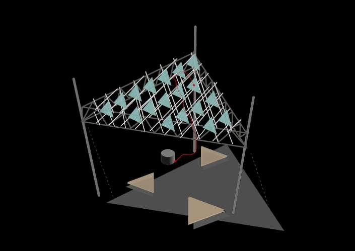
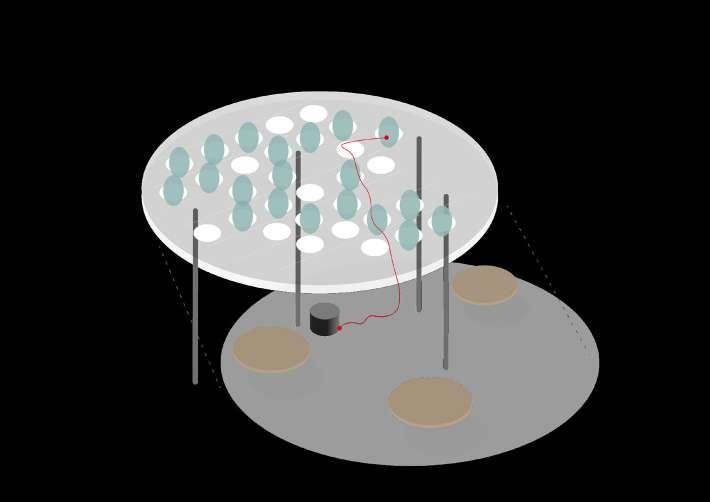
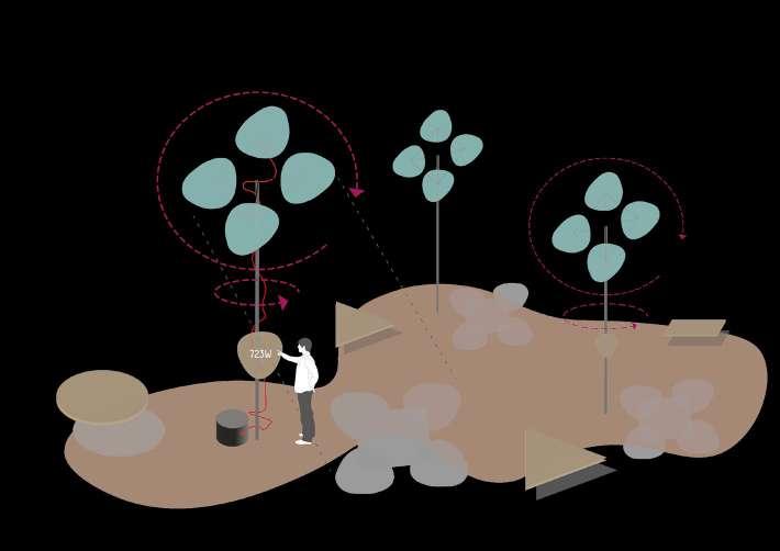
Project Brief consisted of three key takeaway points, which were to demonstrate the OPV system of the ‘solar leaves’ via an interactive product - the ‘solar tree’. The other point was to generate electricity via the panels, and third was to use this shading device as a piece of urban furniture.
Image 31. Illustration of project brief
Project
Goals were defined to help optimise the existing product prototype by making it modular and scalable, minimizing its structure, maximizing energy production via the OPV cells, as well as to optimize the over cost of the product.
3.1 GOALS OPTIMIZATION OF EXISTING STRUCTURE
Image 32. Illustration of project goals
image 33. Concept design illustration
5.1
PROPOSAL
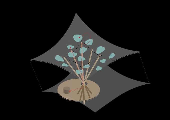
A. OPTIMIZED SOLAR TREE
image 34. Concept design illustration
OPV LEAVES PLACED ON A LIGHT NET ANGLE OF OPV CELLS CORRESPONDS TO OPTIMAL SOLAR RADIATION
LIGHTWEIGHT TREE STRUCTURE
PUBLIC BENCH FOR RELAXATION, WORKING, PLAYING IN SHADE OF CANOPY
HIDDEN BASE OF STRUCTURE CONTAINING FOUNDATION AND ELECTRICAL BOX
OPTIMIZED TREE STUCTURE
Tensegrity Cloud was a similar proposal to the first one, the difference being that the structure was changed from a ‘tree’ to a ‘cloud’ resembling one, with poles holding the angles of the canopy.
5.3
PROPOSAL
B. TENSEGRITY CLOUD
OPV LEAVES PLACED ON A LIGHT SPATIAL NET ANGLE OF OPV CELLS CORRESPONDS TO OPTIMAL SOLAR RADIATION
Optimized Tree Struc-
ture was the first redesign proposal. It was meant to use the best angle of the OPV cells, to maximize sun exposure, while placing the leaves on a light net.
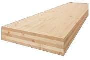
The trunk itself was to be lightweight and broken-down into multiple wooden poles, while the bottom of the ‘tree’ featured a public bench in the shade of the ‘tree’.
LIGHTWEIGHT TREE STRUCTURE
PUBLIC BENCH FOR RELAXATION, WORKING, PLAYING IN SHADE OF CANOPY
HIDDEN BASE OF STRUCTURE CONTAINING FOUNDATION AND ELECTRICAL BOX
Zanotta – Sciangai
Numen / For Use - Tube Net
Yona FriedmanArchitettura Mobile
Studio Saraceno - Ommage to Buckminster Fuller
StructureModeTension Pavilion
PROPOSAL
C. KINETIC CLOUD
ANGLE OF OPV CELLS CHANGING TO OPTIMAL SOLAR RADIATION
OPV LEAVES PLACED IN THE OPENINGS OF THE CANOPY
MODULAR STRUCTURECOVERING LARGE SPANS
PUBLIC BENCH FOR RELAXATION, WORKING, PLAYING IN SHADE OF CANOPY
HIDDEN BASE OF STRUCTURE CONTAINING FOUNDATIONS AND ELECTRICAL BOX
KINETIC CLOUD
Solar Flower was the last proposal, that takes the OPV cell, and forms a ‘flower’ instead of a ‘tree’.
Sun & Shade, CRA
Kinetic Cloud was a variation of the second proposal, featuring a modular system of kinetic, movable PV cellls, rotating towards the optimal sun angle.
Image 35. Concept design illustration
5.5
PROPOSAL
D. SOLAR FLOWER - VARIATION 1
USER ROTATES FLOWER ANGLE TO FIND OPTIMAL SOLAR RADIATION
OPV LEAVES MOUNTED ON TOP OF STRUCTURE
MODULAR SYSTEM
PUBLIC BENCH FOR RELAXATION, WORKING, PLAYING IN SHADE OF FLOWER
HIDDEN BASE OF STRUCTURE CONTAINING FOUNDATIONS AND ELECTRICAL BOX
Image 36. Concept design illustration
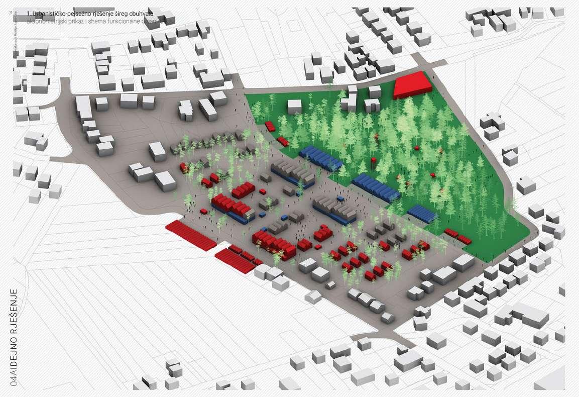
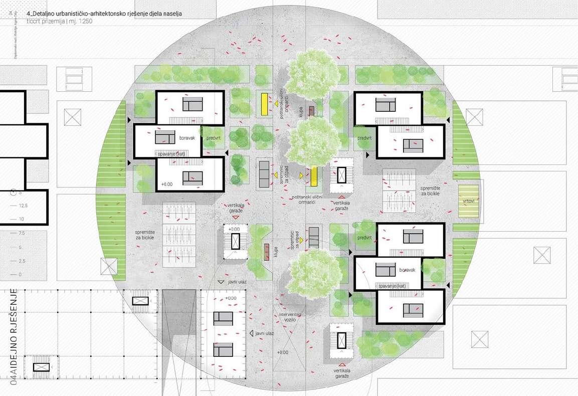
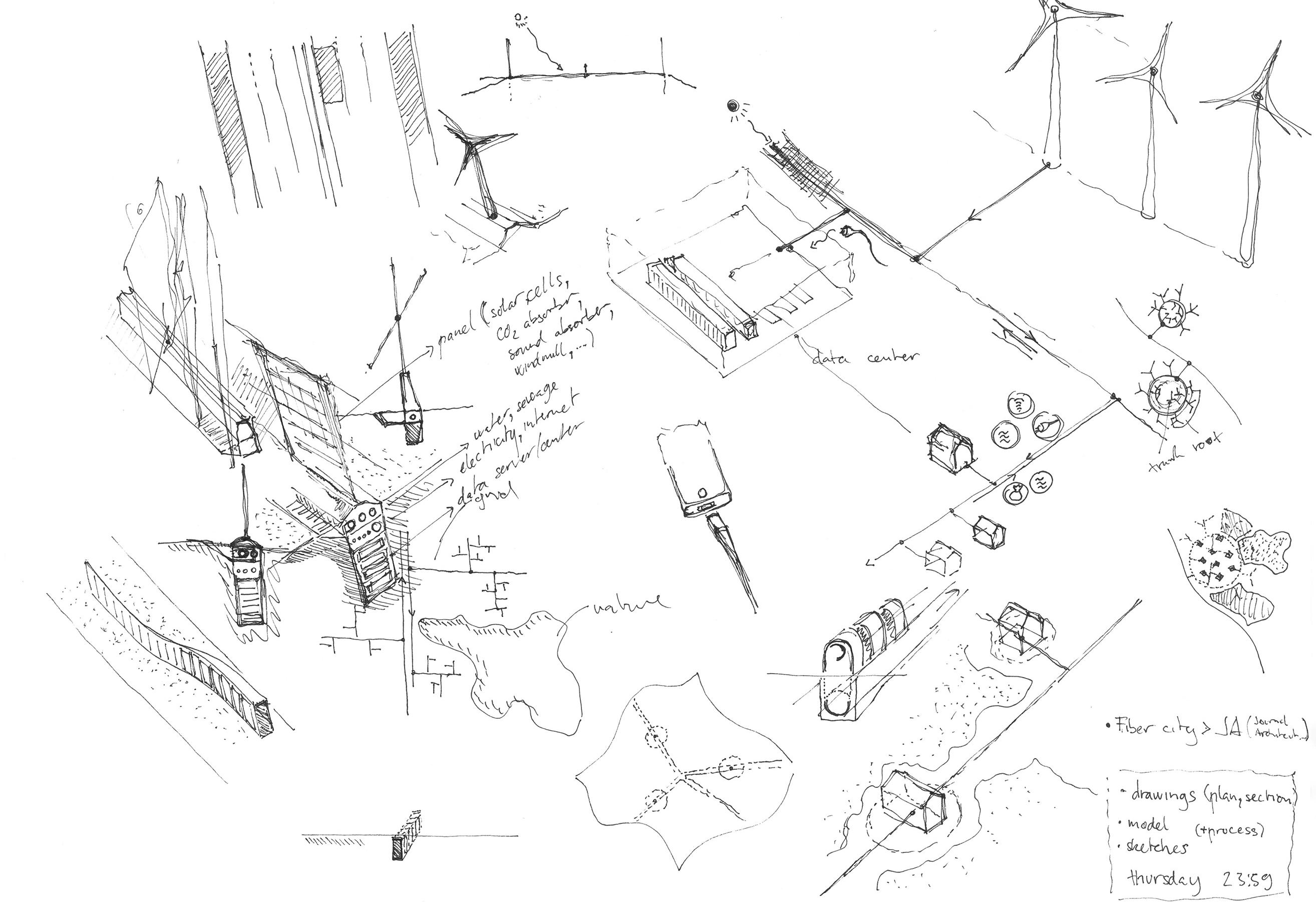
Rakitje AgroCity
A self-sustainable neighbourhood
Self-sufficient living for the 21st century
The main challenge of todays global politics - climate changes, is best answered locally. Current pandemic crisis, as well as a series of earthquakes which hit Croatia in 2020. make the idea
Year: 2021.
Project: diploma thesis (School of Architecture, University of Zagreb)
of self-sufficiency and autonomy of living ever more important. Sustainability and self-sufficiency in building, housing, work and life in general demand short and local supply chains, of energy, building materials as well as a circular way of managing goods in general, by means of reusing and recycling.
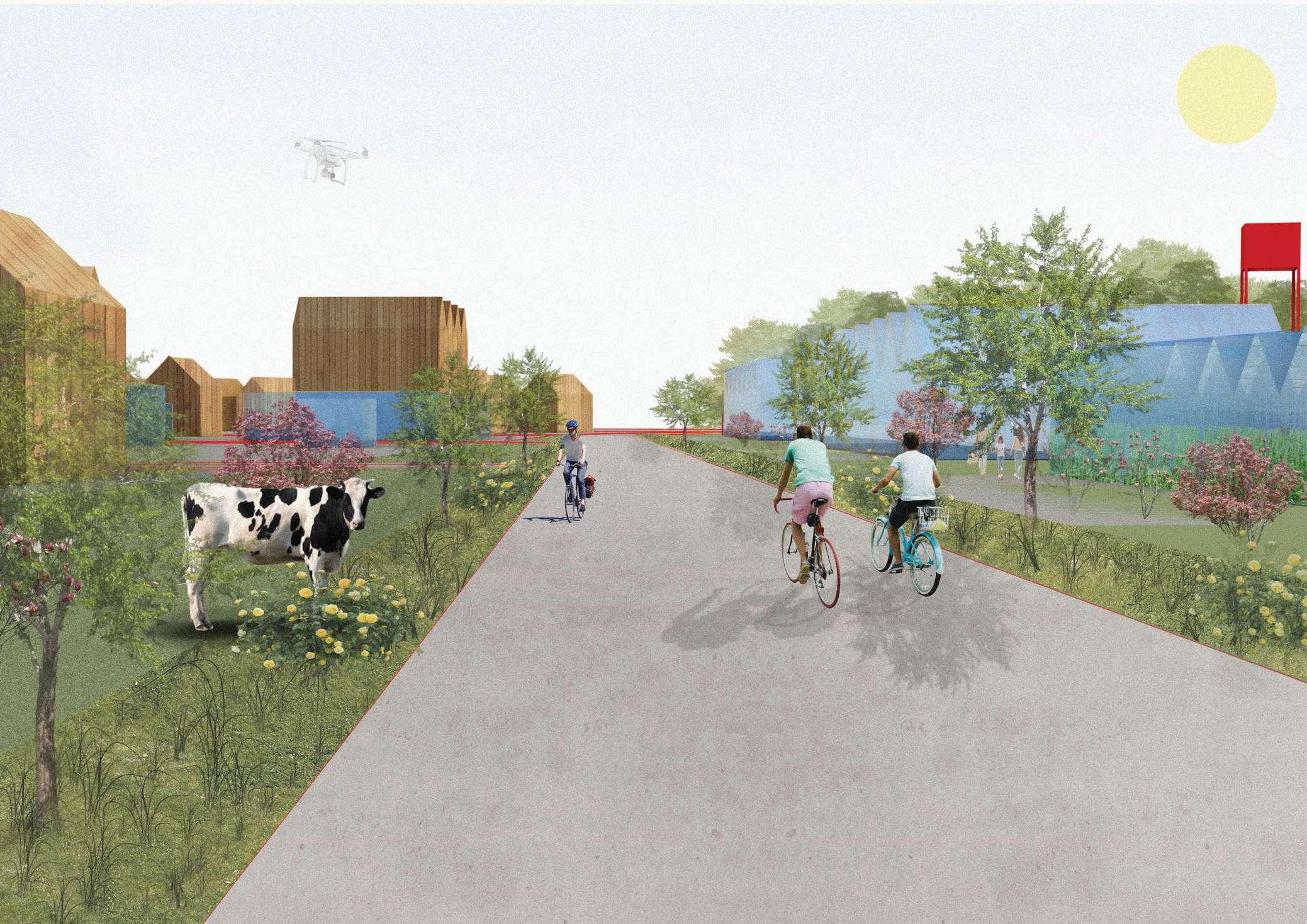
street level, the neighbourhood is equiped with vaiours urban IoT devices, like a 24/7 postal locker for delivery of parcels. Smart waste-management in the form of an undeground waste containers, connected by small scale e-trucks which transfer waste to the recycling unit at the edge of the neighbourhood. The streets are also equipped with communal bike racks, as well as plenty of sitting area in the shades of greenery.
A Smart Neighbourhood
A model for a self-sufficient, smart city for the 21 st century, set in suburban Zagreb County area, functions as a mixeduse residential neighbourhood equipped with urban features, making for an ideal place of living for young and urban singles, families as well as seniors who want to adapt to contemporary lifestyles.
image 38. Smart street illustration
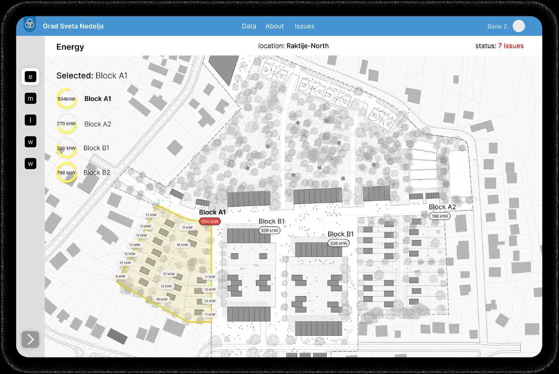
Infrastructure Optimization
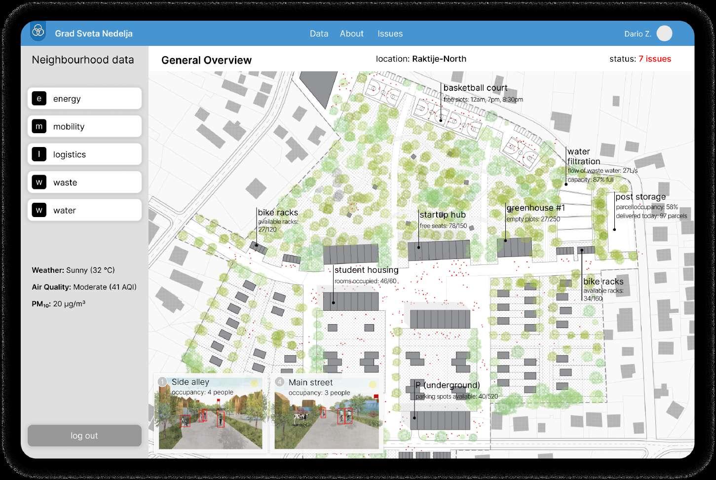
Central control of infrastructure via the smart dashboard allows not only for solving issues that arise in the neighbourhood, but also helps optimize the use of the infrastructure and reach sustainability goals.
Smart Dashboard
The neighbourhood ‘control centre’ is a equipped with a smart dashboard app, that is connected to all the infrastructural systems of the neighbourhood, allowing central control and data analysis.
Image 40. Smart dashboard app concept
Image 39. Smart dashboard app concept
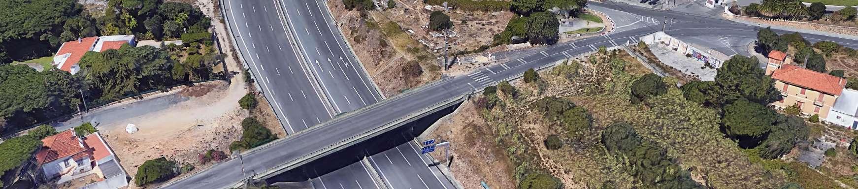
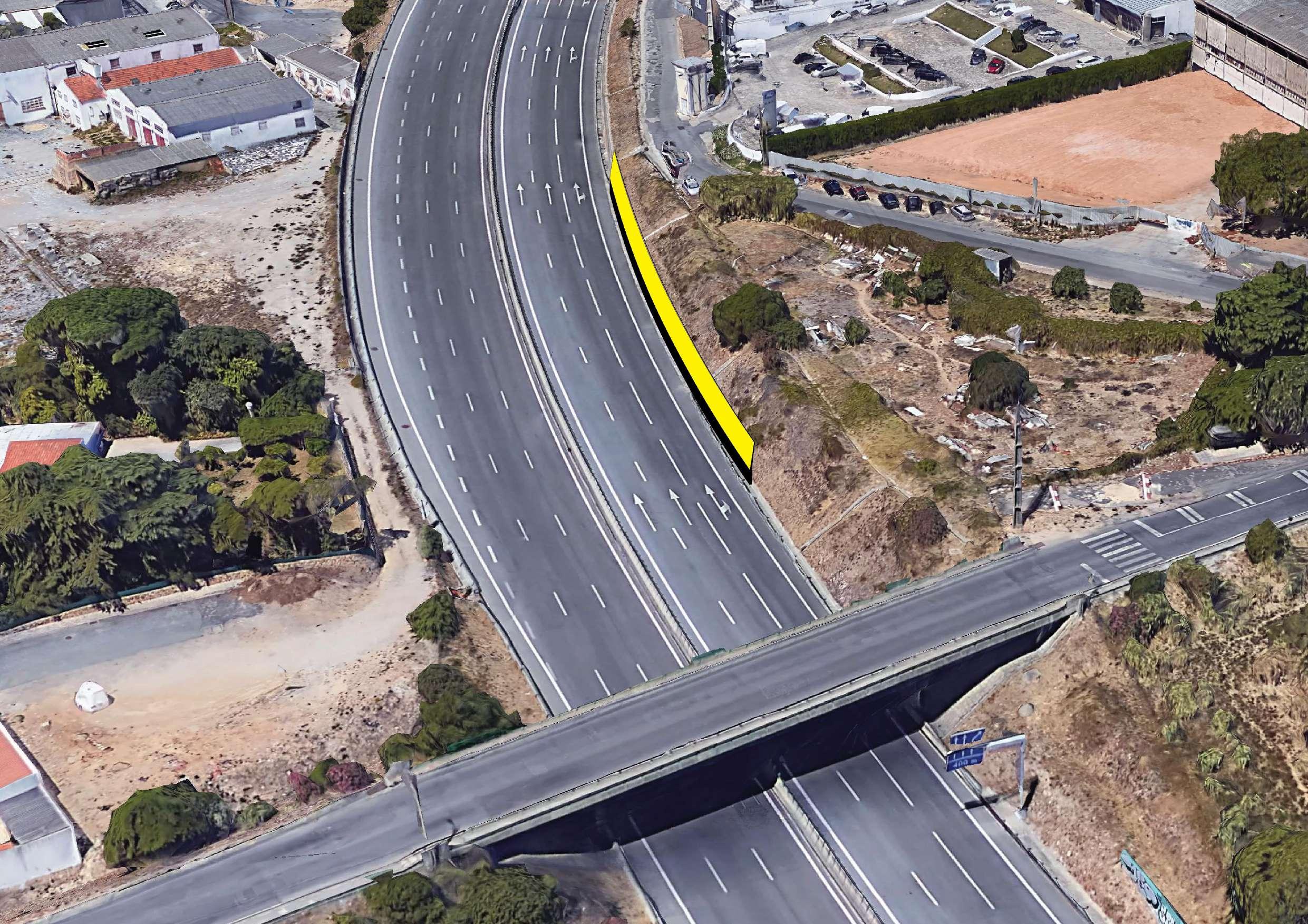
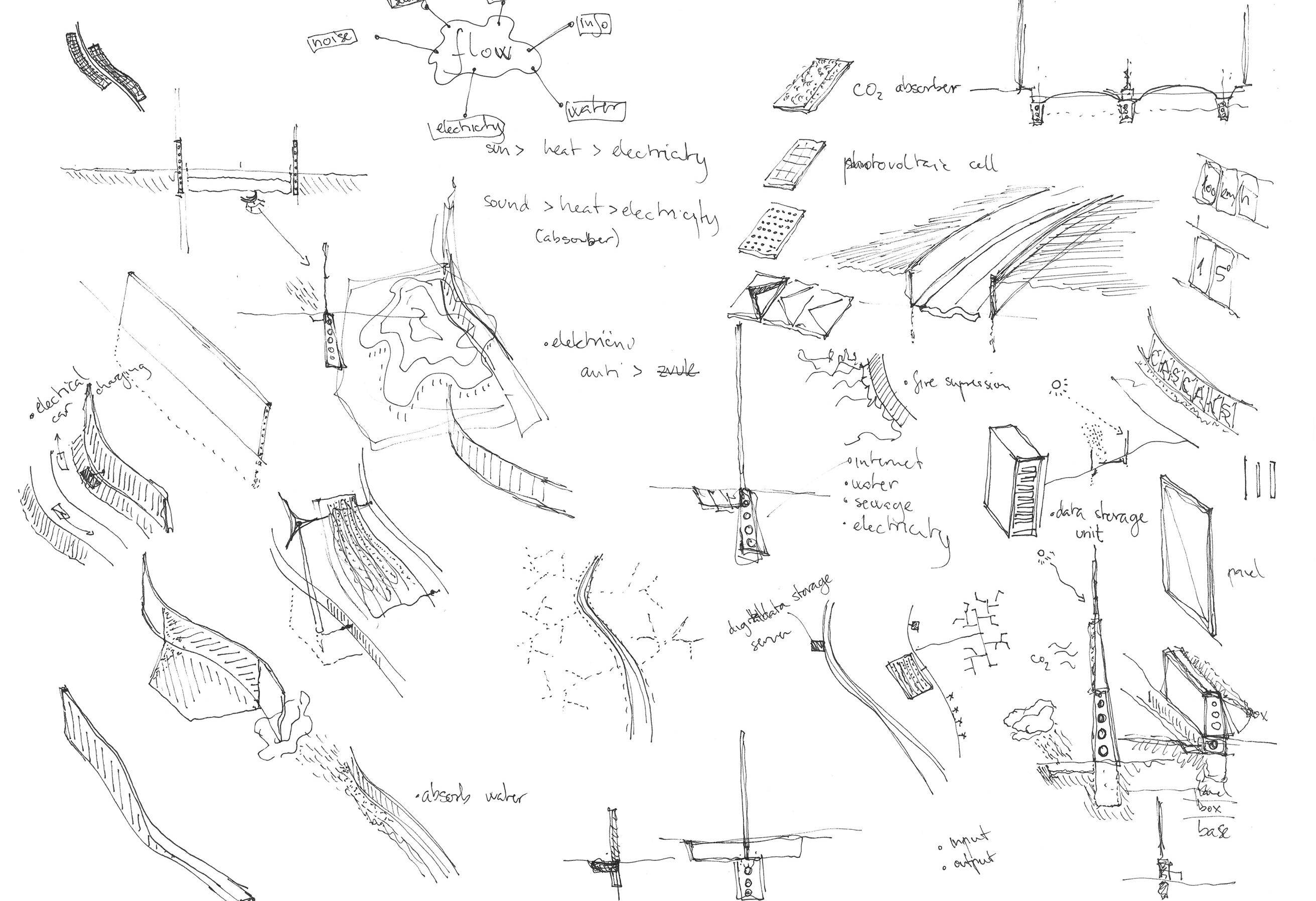
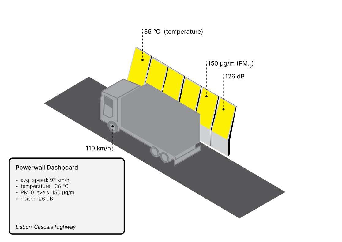
Lisbon Powerway
The ‘A5’ Powerway
A ‘smart-city’ is defined by it’s responsivnes to citizens needs. Therefore it is defined by it’s public space. For this task a strategy was designed for various scales of city and intercity infrastructure.
The highway, in the case of this project the A5 connecting Lisbon and Cascais, was imagined as a ‘smart-road’, also equipped with PV cells, CO2 and sound absorbers.
Year: 2019.
Project: Urban Design class ( University of Lisbon)
Type: Urban, Product, Interaction Design
Tools: Adobe CC, Rhino 3D, hand-sketching
image 41. Conceptual exploration sketches
Urban Devices
Exploring various types of urban infrastructure was key to this project. The research mostly focused on energy infrastructure. Thus a series of ‘smart urban devices’IoT powered tools were imagined and explored.
image 42. Conceptual exploration sketches
The A5 (LisbonCascais highway)
The project task required evalutation of the A5 highway connecting Lisbon and Cascais, and the surrouding neighbourhoods it divides - north and south.
The aim was to propose design solutions to make the massive infrastructure and its area more useful to its surroundings.
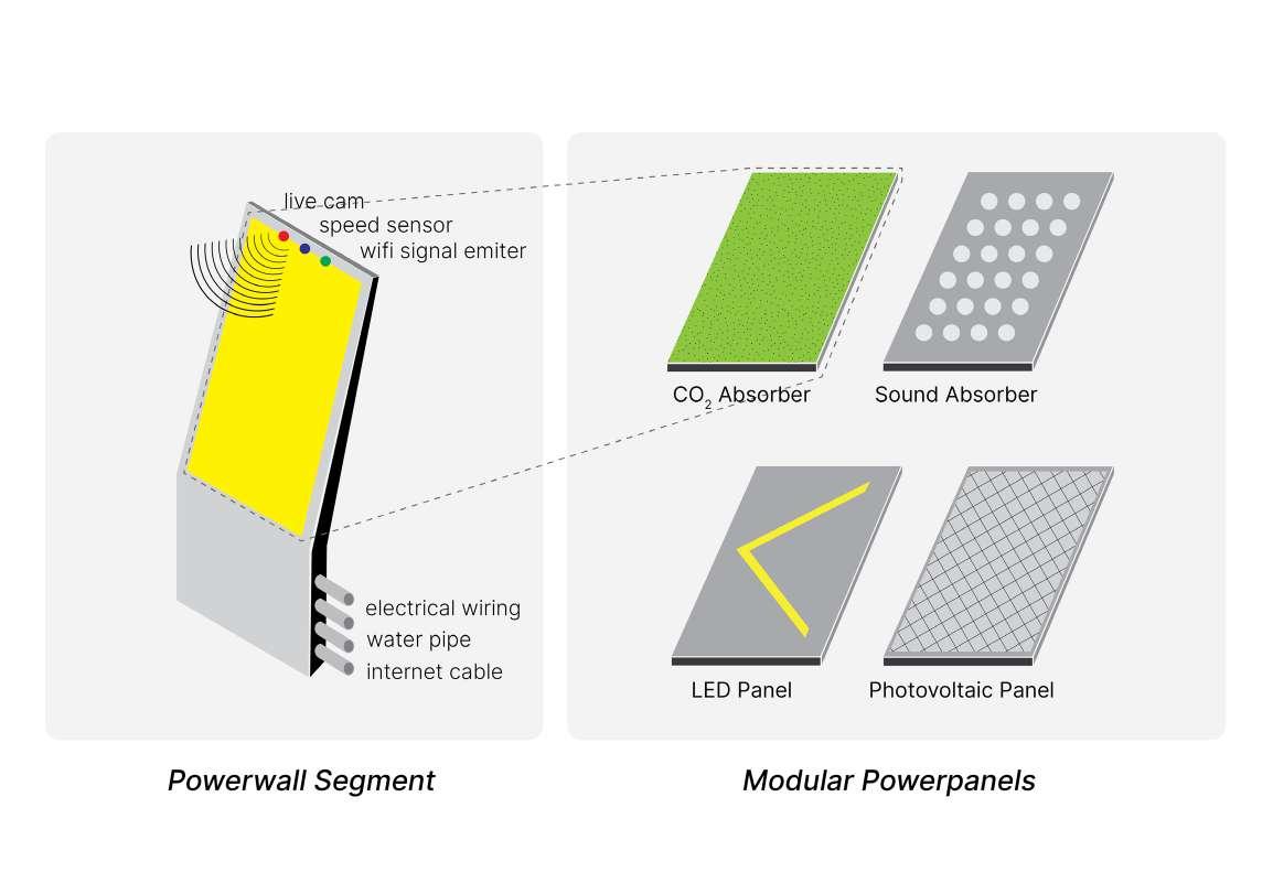
The Powerpanel
A segment of the ‘powerwall’ is a single module, that come with different ‘powerpanels’ that give it a specfic use, such as a CO2 absorber, a sound absorber, an LED panel or a PV cell.
The Powerwall
The project imagined a device called the ‘power-wall’, an IoT powered-multifunctional wall, similar to those we find on modern highways, usually serving as sound barriers.
In addition to noise absorption, the ‘powerwall’ also generates electricity from solar power and purifies air of CO2 with plant based solutions. It can also serve as a big digital screen displaying road-side informational messages.