Style Guide
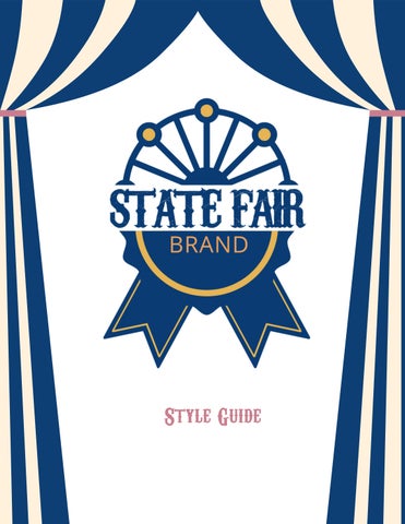
Style Guide
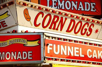
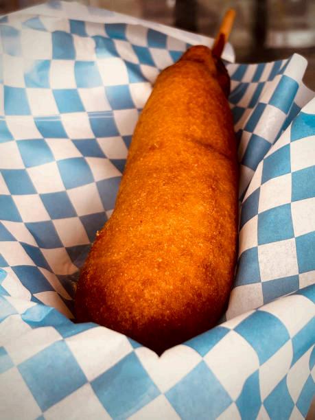
State Fair Brand is all about fast, fun, fuel for the whole family—creating a celebration for a classic fairground favorite, the corndog. This brand is rooted in the deep nostalgia of a fun summer night at the fair and creating and upholding traditions with the whole family, but in the comfort and convenience of your own home.
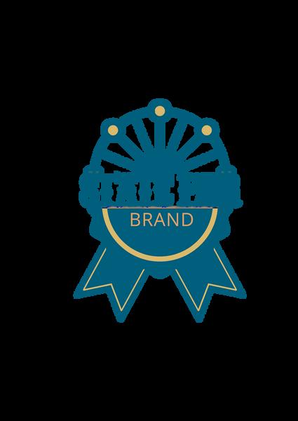
These colors evoke the nostalgia of a tradition-rich, family night at the fair. The mint and sage toned greens bring a sense of harmony and renewal to meal that is going to bring families and friends together. The peachy orange and golden crisp represent a perfectly cooked and convenient corn dog as well as the beautiful glow of the fair. Lastly, the rose pink is a fun and retro charm to this wholesome tone.
Carnivalee Freakshow is a decorative and bold font that pays homage to the fair-style flair
Secondary
Playfair Display is Serif font that doesn’t outweigh the primary font. It keeps the classic feel, but adds a neutral ground.
Headlines or logo only
Regular only
Line Spacing: 1.1
Letter Spacing: +0.5
Section & sub headers only
abcdefghijklmnopqrstuvwxyz
ABCDEFGHIJKLMNOPQRSTUVWXYZ
0123456789@$()!?&
Accent
Cabin is an old school font that adds a slight nod to the midcentury. It is also plays well with the above fonts. abcdefghijklmnopqrstuvwxyz
All weights Line Spacing: 1.3
Letter Spacing: 0
Body text All weights
Line Spacing: 1.4
Letter Spacing: +0.5

This is the body paragraph. This is the body paragraph.
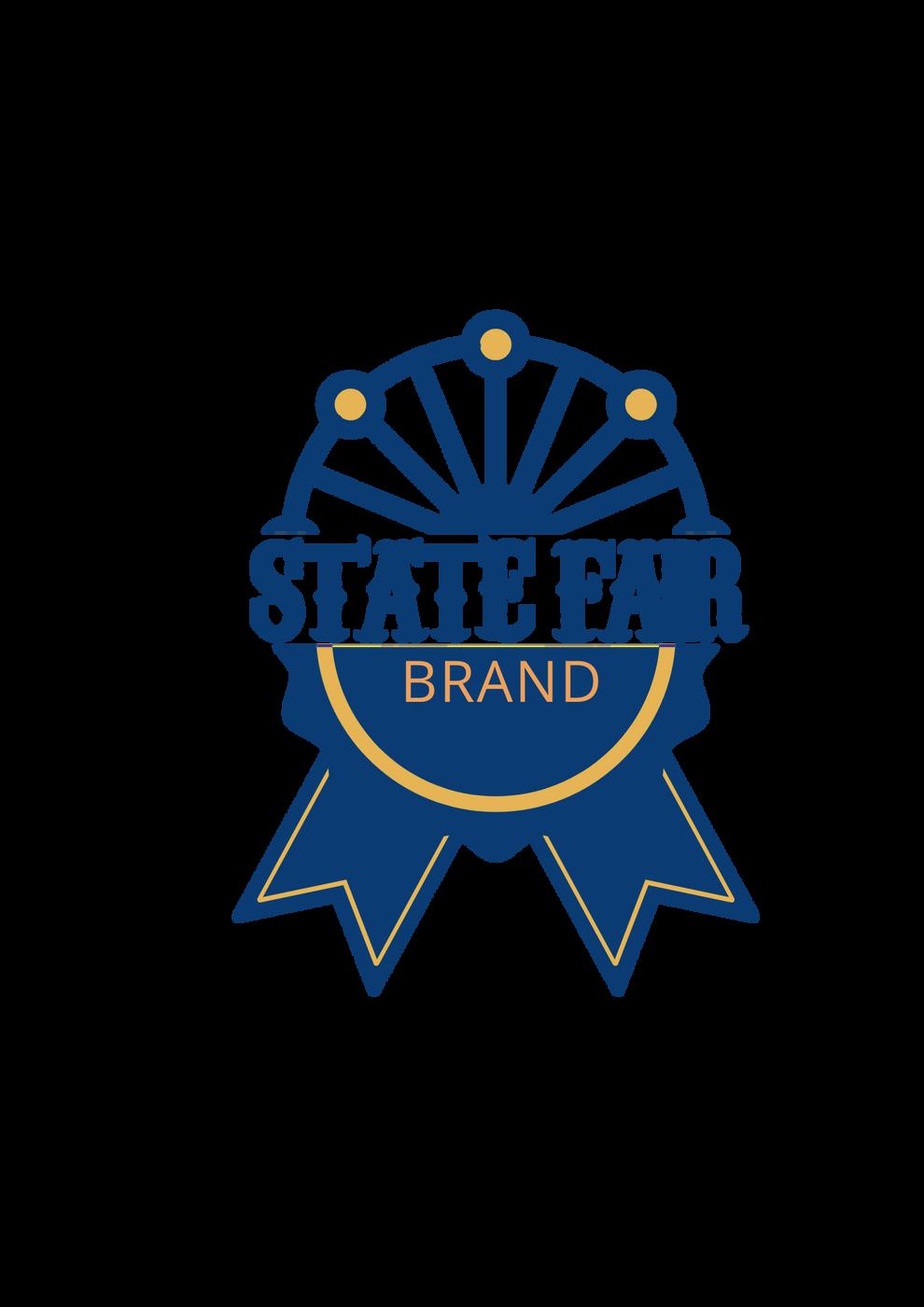
A logo is one of the most important marketing features that a brand has because it is what identifies a product as their own. To preserve the integrity and consistency of our brand, it's important that the logo is used correctly across all applications. The following guidelines outline how to present the logo clearly and professionally. State Fair Brand’s logo expresses a fair-style flair with the iconic blue ribbon that was featured on their past logo.
Keep the original aspect ratio and orientation intact
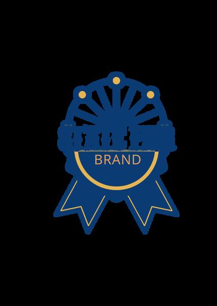
Don’t recreate the logo yourself
Don’t use the logo in lowcontrast
Don’t alter the logo in any way


Don’t apply effects or filters
Don’t place text or graphics within the logo clear space
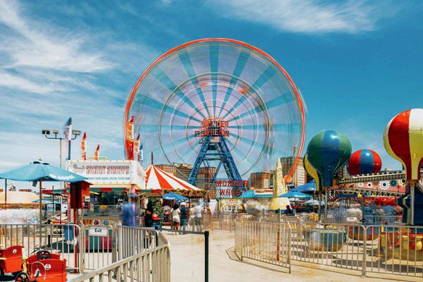
Imagery and photography elevate a brand’s impact on their customers. Visual storytelling is one of the most influential decisions that a brand can make. To align with State Fair Brand’s goals, imagery and photography styles must convey a fun, whimsical atmosphere to our customers. The bright and pastel coloring is crucial to maintaining a lighthearted feel and invoking nostalgia among customers, taking them back to a summer night at the fair with family and friends.

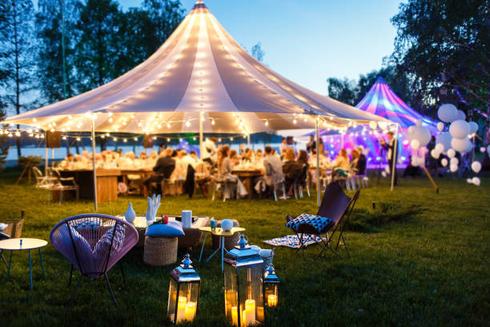

Website and digital presence allows customers to learn more about the brand, their goals, and products. To align with State Fair Brand’s goals, all presence should be cohesive and follow imagery and photography guidelines.
300 DPI TIFF or High-Res PNG


Extend all items at least ⅛ inch beyond trim line, but all critical items at least ¼ inch inside trim line
Bleed Requirements Print Ad Recommendations
In-store