Style Guide
To Our Clients
We are excited to share with you the State Fair Brand Style Guide. This style guide will bring your brand's mission and marketing campaign to life.
Inside, you will find a brand overview, color palette, typography and font usage, logo guidelines, photography style, and digital and print marketing guidelines. As well as some brand do and don’ts to ensure brand consistency.
This guide will allow your brand to stay consistent and grow brand recognition, in turn increasing revenue for your company.
Please take the time to thoroughly look through this guide, and please don’t hesitate to reach out if you have any questions.
Thank you again for this opportunity—we look forward to being a part of the big impact State Fair Brand is making in the lives of their customers.
Best Regards,
The Lavender the Label Team
Brand Overview
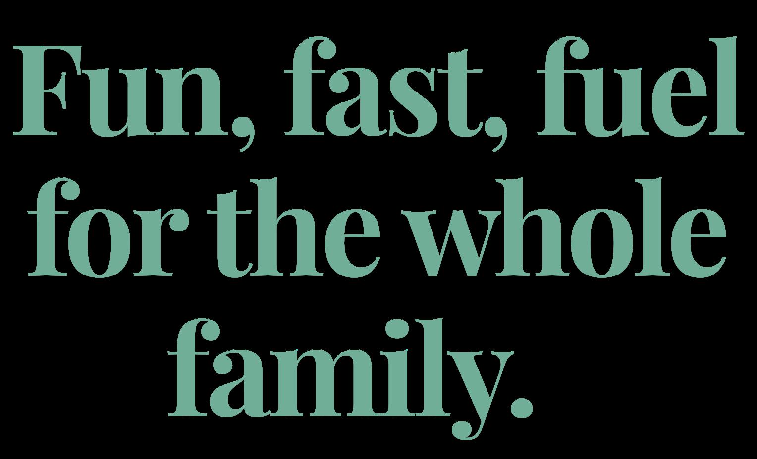
State Fair Brand is all about fast, fun, fuel for the whole family—creating a celebration for a classic fairground favorite, the corndog. This brand is rooted in the deep nostalgia of a fun summer night at the fair and creating and upholding traditions with the whole family, but in the comfort and convenience of your own home.
BRAND PERSONALITY, VOICE, & TONE:


ONE BIG THING:
Color Palette
These colors evoke the nostalgia of a tradition-rich, family night at the fair. The mint and sage toned greens bring a sense of harmony and renewal to meal that is going to bring families and friends together. The peachy orange and golden crisp represent a perfectly cooked and convenient corn dog as well as the beautiful glow of the fair. Lastly, the rose pink is a fun and retro charm to this wholesome tone.
PRIMARY COLORS: APPROVED USES
Royal Blue
Hex: #0d3f74
RGB: 13, 63, 116
CMYK: 89, 46, 0, 55
Golden Crisp
Hex: #E6B655
RGB: 230, 182, 85
CMYK: 0, 21, 63, 10
SECONDARY COLORS:
Rich Sage
Hex: #70AE98
RGB: 112, 174, 152
CMYK: 36, 0, 13, 32
Peachy Orange
Hex: #FOA35E
RGB: 240, 163, 94
CMYK: 0, 32, 61, 6
Popsicle Pink
Hex: #CA7E8D
RGB: 202, 126, 141
CMYK: 0, 38, 30, 21
Prominent background and text color usage across all media platforms Main recognition components
Minimum usage in one component is 60%
Use only to complement primary colors in graphics as elements or text
Maximum usage in one component is 40%
Typography&Font Usage
Typography is a major part in a brand’s identity. It allows consumers to recognize and relate to a brand. In using these fonts, State Fair Brand would be able to express their personality of tradition-rich, nostalgic fun. The main font, Carnivalee Freakshow evokes a sense of the classic fair feeling through decorative and bold letters. The secondary font and accent font, Playfair Display and Cabin, respectfully, add balance and a neutral ground.
Primary
Carnivalee Freakshow is a decorative and bold font that pays homage to the fair-style flair
Secondary
Playfair Display is Serif font that doesn’t outweigh the primary font. It keeps the classic feel, but adds a neutral ground.
Headlines or logo only
Regular only
Line Spacing: 1.1
Letter Spacing: +0.5
Section & sub headers only
abcdefghijklmnopqrstuvwxyz
ABCDEFGHIJKLMNOPQRSTUVWXYZ
0123456789@$()!?&
Accent
Cabin is an old school font that adds a slight nod to the midcentury. It is also plays well with the above fonts. abcdefghijklmnopqrstuvwxyz
All weights Line Spacing: 1.3
Letter Spacing: 0
Body text All weights
Line Spacing: 1.4
Letter Spacing: +0.5

This is the body paragraph. This is the body paragraph.
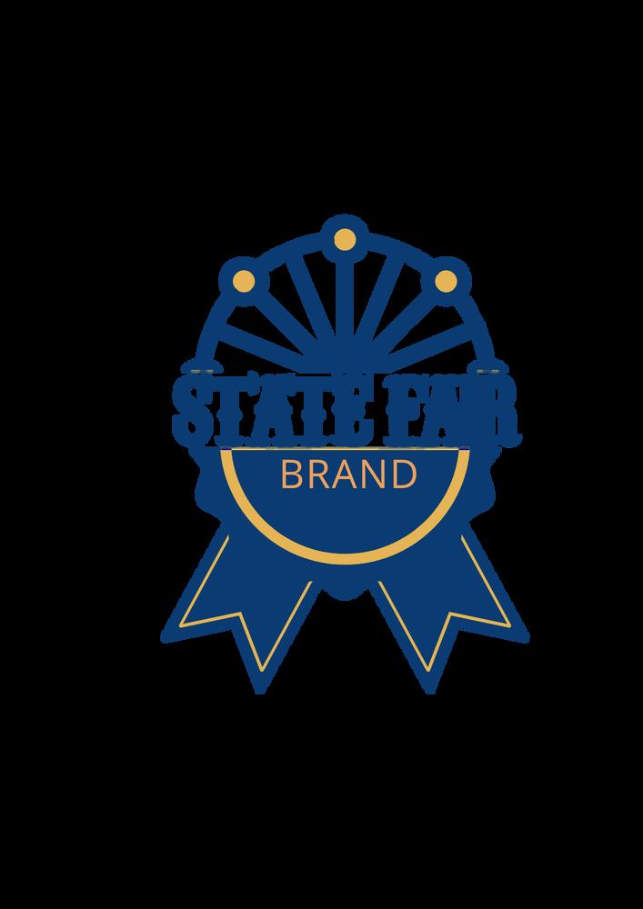
Logo Guidelines
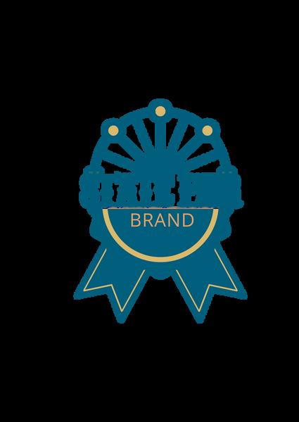
A logo is one of the most important marketing features that a brand has because it is what identifies a product as their own. To preserve the integrity and consistency of our brand, it's important that the logo is used correctly across all applications. The following guidelines outline how to present the logo clearly and professionally. State Fair Brand’s logo expresses a fair-style flair with the iconic blue ribbon that was featured on their past logo.
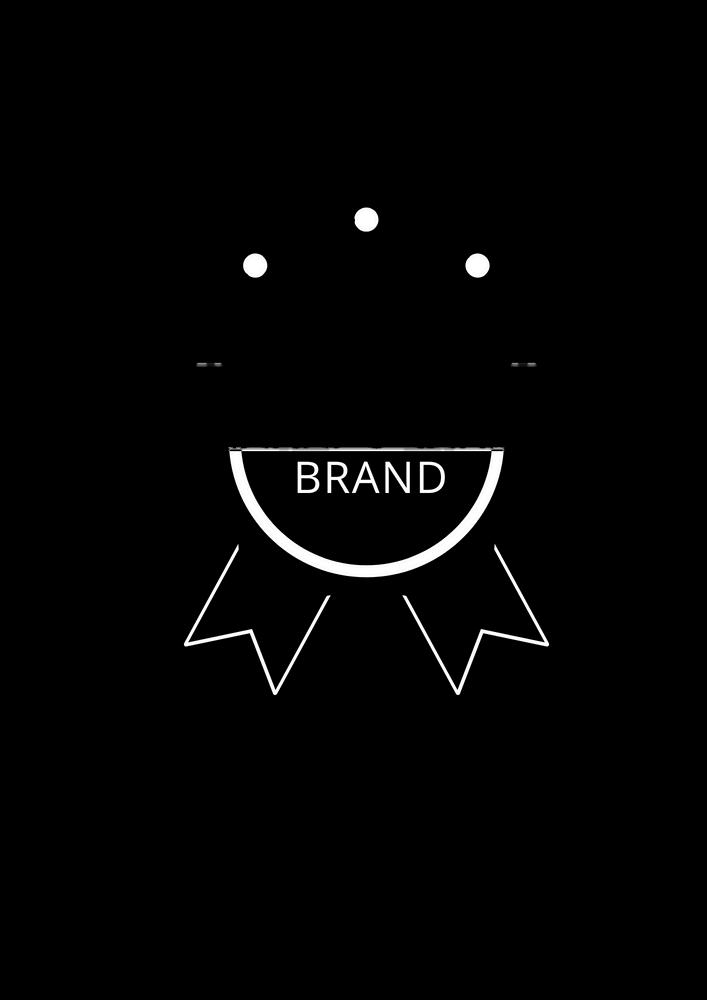
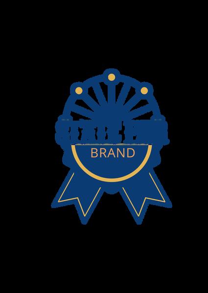
COLOR: BLACK&WHITE:
Use high-resolution files
Scale the logo proportionally
Use correct color variations
Place on approved backgrounds
Logo Don’ts
Improper use of the logo can dilute the brand’s impact and create confusion. In order to avoid these, logo guidelines have been set.
Keep the original aspect ratio and orientation intact
Examples
Don’t recreate the logo yourself
Don’t use the logo in lowcontrast
Don’t alter the logo in any way
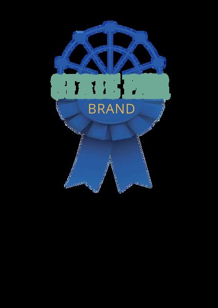

state fair BRAND

Don’t apply effects or filters
Don’t place text or graphics within the logo clear space
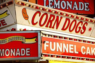
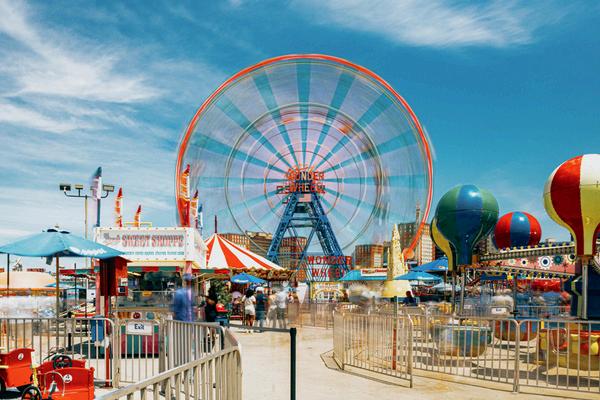
Imagery & Photography Style Alignment
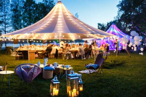
Imagery and photography elevate a brand’s impact on their customers. Visual storytelling is one of the most influential decisions that a brand can make. To align with State Fair Brand’s goals, imagery and photography styles must convey a fun, whimsical atmosphere to our customers. The bright and pastel coloring is crucial to maintaining a lighthearted feel and invoking nostalgia among customers, taking them back to a summer night at the fair with family and friends.
APPROVED PHOTOGRAPHY EXAMPLES:


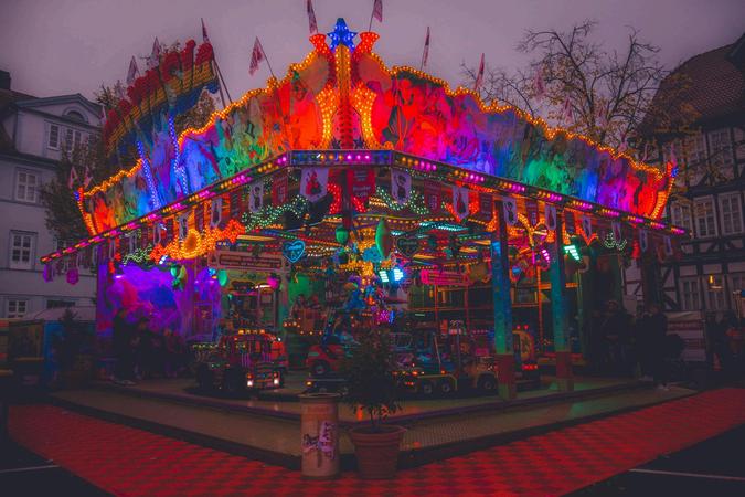
Imagery & Photography Style Don’ts
Improper imagery and photography styles can dilute the brand’s impact and create confusion. In order to avoid these, imagery and photography guidelines have been set.
NOT APPROVED PHOTOGRAPHY:
No dark backgrounds
No oversaturated filters
No black and white
Avoid ominous, mysterious vibes
Maintain a light and nostalgic vibe throughout all photography


Website & Digital Presence
Website and digital presence allows customers to learn more about the brand, their goals, and products. To align with State Fair Brand’s goals, all presence should be cohesive and follow imagery and photography guidelines.
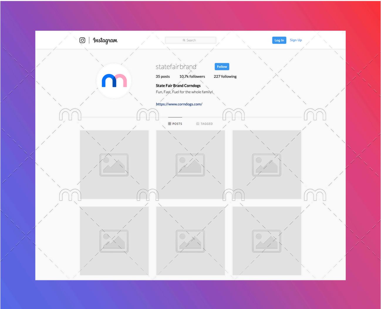


Pictured above is a potential mock up for State Fair Brand social media presence. Instagram has a wide age range present, with the ability to reach children, teens, and adults. Other social media sites could include Facebook, X, and Tik Tok. Keep all social media platforms cohesive. The nostalgic vibe should be present across all sites.
2.
1. Upload posts and videos to all platforms, this increases engagement and reinforces a cohesive aesthetic
3.
Stay active! Having a brand that is active across all platforms keeps users engaged, and keeps content interesting to customers. Participate in social media trends to keep the brand relevant.
Print Guidelines
Print reflects a brand’s visual impact on customers. There is a variety of media that should be utilized to enhance visual storytelling and market the brand. State Fair Brand influences their consumers via print marketing in stores and through print materials such as billboards and magazine advertisements.
Resolution Requirements
300 DPI TIFF or High-Res PNG


Extend all items at least ⅛ inch beyond trim line, but all critical items at least ¼ inch inside trim line
Bleed Requirements Print Ad Recommendations
In-store
Brand Don’ts
To protect and uphold the mission of State Fair brand, there are a few key elements to avoid. As a brand first and foremost we always want to serve our customers. They are the main characters and need to be treated accordingly. There is also high importance in keeping the branding and mission simple, clear and consistent. If people do not understand they will not trust or buy. Every detail should feel like that family friendly nostalgia of the fair.
The Customer is Never Wrong
State Fair Brand Needs to Serve its customers a.
Don’t Overcomplicate the Message
No slang or trendy language a. Stay family friendly b.
Don’t Lose the Nostalgia
Honor the family feeling of a summer night at the fair a.
Don’t Be Inconsistent Across Platforms
Consistently convey fun, fast, and fueling a. Consistently use color pallet, logo, imagery, packaging and fonts across all platforms b.
Don’t Use Harsh Visuals
No dark filters or overly saturated tones a.