Interior Architecture & Design
Fay Jones School of Architecture & Design
Summer 2022 - Fall 2023

Interior Architecture & Design
Fay Jones School of Architecture & Design
Summer 2022 - Fall 2023

@adrienneofria@gmail.com
@asofria@uark.edu
972.953.5224
413 N West Ave.
APT# 2-304-A
Fayetteville, AR 72701 United States
Enthusiastic Interior Architecture + Design student with skills in working both creatively and logically. Strong work ethic and excellent organizational skills in any setting. I am looking for an internship to grow my knowledge and skills within the field.
University of Arkansas
Expected graduation, May 2025
Bachelor of Interior Architecture + Design
Fay Jones School or Architecture +Design
Danish Institute for Study Abroad Summer 2023, Copenhagen, Denmark
Visual Cultures of Cities
Urban planning + Design
ASID Student Member
IIDA Student Member
NEWH Student Member
2021
- Served lunch and dinner to 50-100 customers per shift at an up-and-coming chain restaurant.
- Memorized over thirty menu items and rotating specials in order to give customized recommendations to guests.
- Learned how to swiftly and successfully resolve conflict resulting in customer satisfaction 100% of the time.
- Warmly greeted new and returning customers and developing relationships resulting in customer loyalty
- Maintained and enforced strict and up-to-date cleanliness and social distancing policies regarding the COVID-19 outbreak to ensure both customer and employee safety.
Each summer was located in a different location including San Antonio, Phoenix, Austin, and Houston.
- Consisted of remodeling houses back to code to ensure residents would not get evicted.
- Working with a variety of different charitable companies to get fresh food and water to as many individuals as possible over the duration of our time there.
- Building affordable housing around this city of Fayetteville, AR
- Getting physical, hands-on experience and understanding the process involved to build a house from the ground up.


Fall
15 Weeks

Me + We


Fixed to Fluid Open + Enclosed Braiding
Digital + Physical

Logo
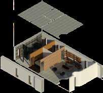
This project was orchestrated through the Steal-case design competition. Everyone was given the same building location, floor plan, and program. The goal of the competition was to design the space into a functional design office. Each person chose their own concept they felt would most effectively portray the creativity and functionality of the design office for the employees and visitors, while following the needs and wants for the client.
1. To design a space that promotes collaboration and productivity for both employees and clients to achieve the best work possible.
2. To give a fresh take on an office space to differentiate from typical outdated offices. These new and improved offices need to focus on and improve employee wellbeing.


Sustainability, innovation, collaboration, and equality is what the NEXT company and NEXTERS stand for in their new office in Dallas, TX. Dallas is a diverse, arts district that strives on bringing people together by connecting the culture of Texas, with the modern city lifestyle of Dallas, while incorporating the unique design of the urban metro arts district causing these ‘worlds to collide’.
This floor plan is divided into two halves. I used this layout to my benefit by separating the private and public portions of the program. The left side of the building is the “private” half that is geared towards the employees and their needs throughout the design process. The first level includes the workstations, resource center, personal phone rooms, huddle spaces, and some private offices, while the mezzanine level includes the training classroom, innovation lab, design library, and more huddle spaces. The right half is the “public” side. This side contains amenities for visitors, clients, vendors, etc. The main level includes the reception, one art gallery, meeting and presentation rooms, the wellness room, mothers room, resource center, a couple more private offices, and some huddle spaces. The mezzanine level includes the cafe and another art gallery.


The Reception space houses two receptionists, a waiting area, easy access to the main level art gallery, and stairs leading to the mezzanine level cafe and art gallery.
The reception sets the tone for the space by exaggerating thecolors, materials, and concept of blending modern living,urban design, and Texas style.
Some of the challenges within the space include noise and security, as well as making the large space feel cozier. To address this, lowering the wall behind the reception space as well as the built-in component dividing the waiting area helped bring the space down to the human scale. There are double doors located on either side of the elevator hallway to monitor safety as people enter the building.
The staircase follows the curve of the art gallery boarder to connect the spaces though movement and easily view the art from above.


Two of the three office variations are located in the center of the workstations for easy accessibility for employees and their supervisors to work together. While the last variation is located on the opposite side of the building near the reception and meeting spaces to benefit client and visitors. Each office includes carpet in the center of the space and a dropped ceiling making the office ceiling height 10’ - 0”.


Because the ceilings are tall and the walls and floor are made from concrete, noise became an issue. Applying carpet under each workstation, in the offices, and along the path of circulation helped regulate noise pollution.
With tall ceilings and a deep space, getting light to distribute throughout the space was a challenge. By illuminating the walls in the offices, I was able to use the office spaces as another light source throughout the space.
 Concrete
Paint Color
Carpet
White Plastic Iron
Concrete
Paint Color
Carpet
White Plastic Iron


Grafiti art
Following my concept, I added graffiti art along the railing of the mezzanine to combine the modern and urban aspects of ‘Worlds Collide’.
All of the workstations are located in the same area for convenient collaboration between employees. Private Offices are located in the center of the space creating easy and consistent circulation. Although there is overhead lighting, there is also task lighting on each desk. All the necessities for a design project are located on this side of the building as well including a resource center, design library, innovation lab, and collaborative work tables to layout drawings. This space is made for employee productivity while the other side of the building contains more relaxing features.
 5' - 4 9/32"
5' - 4 5/32"
2'6" 5'9" 2'5"
5' - 4 9/32"
5' - 4 5/32"
2'6" 5'9" 2'5"

The cafe space is located on the mezzanine level adjacent to an art gallery. There is a variety of seating options in the space including seating on the island, cozy nooks, and table seating for employee and visitors to choose from based on comfortability. Multiple mini fridges are included under the island for employees to bring and store lunches as well as a display case to purchase baked goods and snacks. Each seating arrangement is paired with different types of lighting to help accentuate the feeling of each space from conversational areas to individual work/relax spaces.


 Cafe nook elevation NTS
Cafe Floor Plan NTS
Concrete
Paint color
Terracotta Tile
Island Base Green Metal
Dark Wood
Cafe nook elevation NTS
Cafe Floor Plan NTS
Concrete
Paint color
Terracotta Tile
Island Base Green Metal
Dark Wood


There are two art galleries located in the design office. One is on the main level adjacent to the reception space for people to see as they enter the space, and the other gallery space is located on the mezzanine level adjacent to the cafe. The intention of the art galleries is to bring inspiration to both employees and clients through local artist artwork and previous projects from the office.
 Main Level Art Gallery Floor Plan


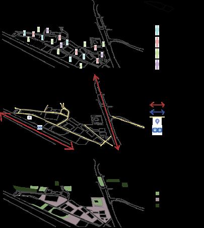
Addapting a building in Padderborn, Germnay for universally designed independent living center.

This Adaptive Reuse building is located in Padderborn, Germany in a busy suburban area near many parks, churches, and sports arenas.
The intention of this project is to transform the interior of this space into an ADA accessible and universally designed independent living space for ages 55 and older. The design needs to be supportive for the residents to grow and age comfortably by providing a safe way for them to stay active and connect with the city.
Introduction
A conceptual pin wheel showing how the design came together through color and words to create conceptual ideas.

Mid-Century modern design came from architects fleeing from Germany during the war in the 1940’s. One architect that designs a good example of this type of architecture is Archibald Quincy Jones. I drew a lot of inspiration from his designs and played with different concepts of his in each space. I chose Quincy to be my inspiration because of the way he manipulates simple material with light.
1. To transform the building into a comfortable living community that feels livelier than a typical retirement complex.
2. Making sure everything is up to ADA code and adaptable to grow and age into.
3. Find ways to connect to building to the community and the people in the area through the restaurant, cafe, and pool and the design.
4. Keep the space youthful, but comfortable for all ages.
This building contains three levels for the program needs to be separated between. The first level contains some double and single residential space for individuals who may have a harder time using stairs or elevators. The first level also includes a fountain as you enter the building, a welcome/cafe/bar area, fitness center, staff area, library, as well as access to the center courtyard. Level two follows the same idea as level one but with more residential rooms and less amenities. This is because it is easier for everyone to access these things on the ground level. The third level is separated into three different chunks. Two of those segments are designated to more residential space with amazing views. The third section is the restaurant and bar. This space includes almost 360 degree windows and lots of space to maneuver.


1
6


The ceiling element is composed of Gothic style arches inspired by the first church in the town that contains Gothic architecture. Each arch contains cove lighting along the edge for the overhead restaurant lighting.
With almost 360 degree windows and soft lighting elements, this restaurant environment easily transforms from day to night. The large diffused light in the center of the space can change color to adapt for different events. There is a small stage for live performances as well as a bar area and access to outdoor rooftop seating. The contrast between warm and cool tones makes the restaurant feel fresh but also cozy in a large space.


While brain-storming ideas for this area, I came across the issue of safety with a deep pool. Because many residents in this establishment may use walkers or canes, I didn’t want balance to be an issue. Opting for a shallow pool with fountains rather than a deep swimming pool excluded more opportunity for drowning if someone looses their balance or trips into the water.
 Concrete
Paint Color
Carpet
White Plastic Iron
Concrete
Paint Color
Carpet
White Plastic Iron


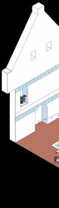
As people enter the space, they are welcomed by the bright, fun, and relaxing pool/fountain courtyard. This space was so fun to design and to think of ways to connect this building to the city. This outdoor area is open to the residents as well as the public. Anyone can sit down, enjoy the water, and grad something from the cafe/bar directly inside. Using bright blues, terracotta, and creams with lots of greenery made the aesthetic of a “European dream summer” making people gravitate to the space to have conversations with one another, and relax.
 Pool/Fountain Floor Plan

Creating privacy for the residents on the second level while also enhancing the skylight became more challenging than expected. Instead of closing the second level openings with flat walls, Adding demention to the space sculptural elements made with acoustical paneling made the space more defined, enhanced the sky light by drawing the eye up, and helped with noise pollution of the cafe.
 Concrete
Paint Color
Carpet
White Plastic Iron
Concrete
Paint Color
Carpet
White Plastic Iron


This room has a large skylight in the ceiling bringing in lots of natural light during the day and a beautiful ambiance at night. This area is meant to feel dreamy like clouds in the sky to connect the interior room with the exterior in a unique way that differs from the other spaces in the building.


Both the single and double complex’s follow a linear flow through the space by splitting them into thee sections, the kitchen/living room, the bedroom, and the bathroom. The kitchens include a large dimmed circle ceiling light element that changes color and intensity as well as lots of linear and cove lighting throughout each room. These rooms are completely ADA compliant


 Single Residence Floor Plan NTS
Single Residence Ceiling Plan NTS
Double Residence Floor Plan NTS
Double Residence Ceiling Plan NTS
Single Residence Elevation
Single Axonometic
Double Axonometic
Single Residence Floor Plan NTS
Single Residence Ceiling Plan NTS
Double Residence Floor Plan NTS
Double Residence Ceiling Plan NTS
Single Residence Elevation
Single Axonometic
Double Axonometic


During this workshop, each person was assigned a famous designer to draw inspiration from and design a studio for within certain measurement constraints while meeting the programs expectations that were necessary for each studio. The person I designed my studio space for was Ray Eames. The furniture and textile designer worked mainly with plywood, primary colors, and funky patterns so these things became staples for the space.

The concept for the small studio space is Ray and Charles Eames inspired. Drawing a lot of inspiration from looking at their past works, interviews, photos, and videos of their personal home help me the most through the process of decided what would be most functional for them and how to reflect them in the space. Ray and Charles love connecting with nature by bringing plants to the interior. This gave me the inspiration for the tree through the ceiling.
1. Make sure the space is suitable for two people to coexist and work together.
2. Have space to layout play wood, patterns, and fabrics as well a storage locations for all the materials.
3. Reflect their personalities as best you can without mimicking or using their own designs. Give them something fresh.
4. Keep the space functional for them and their lifestyle.


Because the “concept” was given to me by assignment, the first step was research. Putting myself in the shoes of Ray and Charles was important to create a space that would reflect them. The next step was the studio layout. After understanding what the studio would be used for and what materials the couple needed, the layout came together functionally. Lastly was material choice. I was able to get most of my material inspiration from Ray and Charles patterns, furniture pieces, and images of their home.


 Initial Sketch
1.
Initial Sketch
Initial Sketch
1.


By the end of our one week long workshop, our instructors proceeded to choose five studios total to 3D print into a physical model and display throughout the Fay Jones School entry hall for people to view as they enter the building. I am honored to say my project was one of the five chosen. Being able to see my design in a physical form gave me a whole new understanding for spacial exploration. Because I could hold the model in my hands physically, I was able to start understanding the design process in a more realistic, human experience way.


With the focus of the pineapples throughout this project, I was able to dissect individual shapes, colors, and textures from within and look at the pineapple in an abstract way I never had before.

1. To look at the pineapple fruit in a new way by thinking abstractly about its attributes.
2. The create numerous patterns inspired by the pineapple by finding shapes within the fruit.
3. To Create two abstract models that reflect both the pineapple, and the patterns by looking at shape, color, size, minor details, and big picture ideas.
4. Make sure that every step of the project and process connects to see the progression.

Nature as a Teacher focuses on using ordinary objects around you and think about them in a way you never have before to create creative patterns and abstract models that reflect the object. With your fruit or vegetable of choice, I chose the pineapple, you begin to take pieces apart, and looking up close to find details that may not stand out to you naturally. These methods unlocked a new style of thinking through design and seeing objects.


Step one to this project was to choose a fruit or vegetable that will bring you inspiration. I chose the pineapple because there was lots of texture and shapes to draw inspiration from
In graphite, I realistically sketched the fruit from multiple different angles including the top, bottom, side, and cut in half.
Applying shapes found within the fruit and applying them in pattern form. This started the beginning of the abstract thinking.
Choosing a handful of patterns from step three and adding color provided me with a color scheme, depth, and more inspiration for the 3D models.
I wanted to turn one of patterns into 3D form. I chose to recreate the pattern on the bottom right corner from step four by adding depth to it.
For this model, I wanted to use the opportunity to play with color. This model resembles the pineapple through the curves and sharp points. By adding lighting, I was able to accentuate the color and make the model stand out.


Thank You!