TABLE OF CONTENTS


RIVAAZ AMOEBA STUDIO TWIRLING TREE 03 02 01 BRANDING 06 FICTIONAL SPACES 04 FOUNDATION COURSE 05
The Amoeba Studio is an unconventional form of library, that deals with, and uses Nukkad Natak, a form of street theatre as the medium to spread knowledge. Nukkad Natak is an old, yet unrecognized artform. The library also acts as a medium to promote and revive this impactful artform.

Isometric Views.

The design approach follows an ‘Inside in Mumbai, the city that rightfully gave class of society, the Juhu beach. Let’s
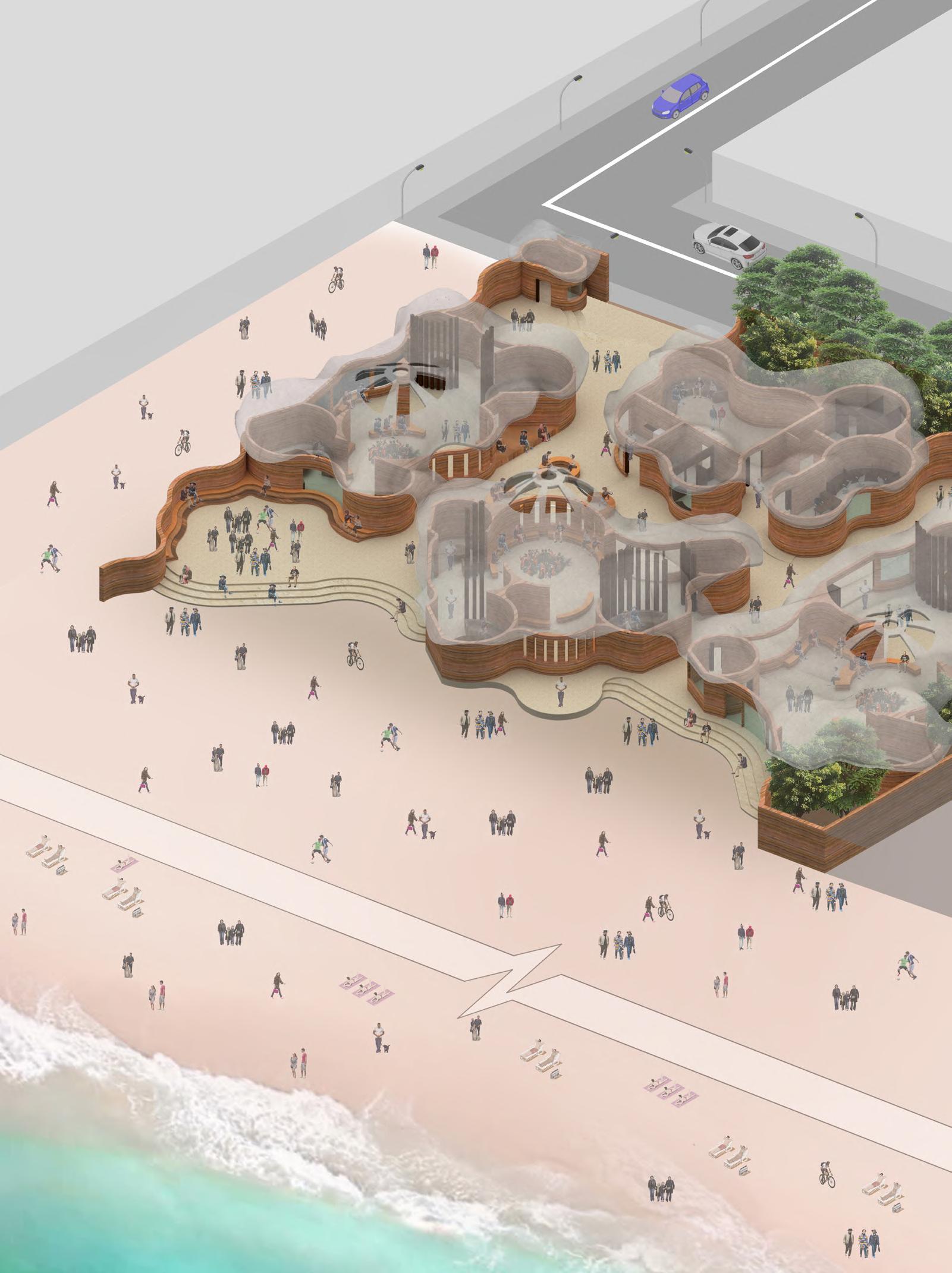
‘Inside out’ approach, with the interiors giving the exterior shell its form. Located gave this artform it’s establishment, in a context unbiasedly access by each look into the journey of this unconventional library.

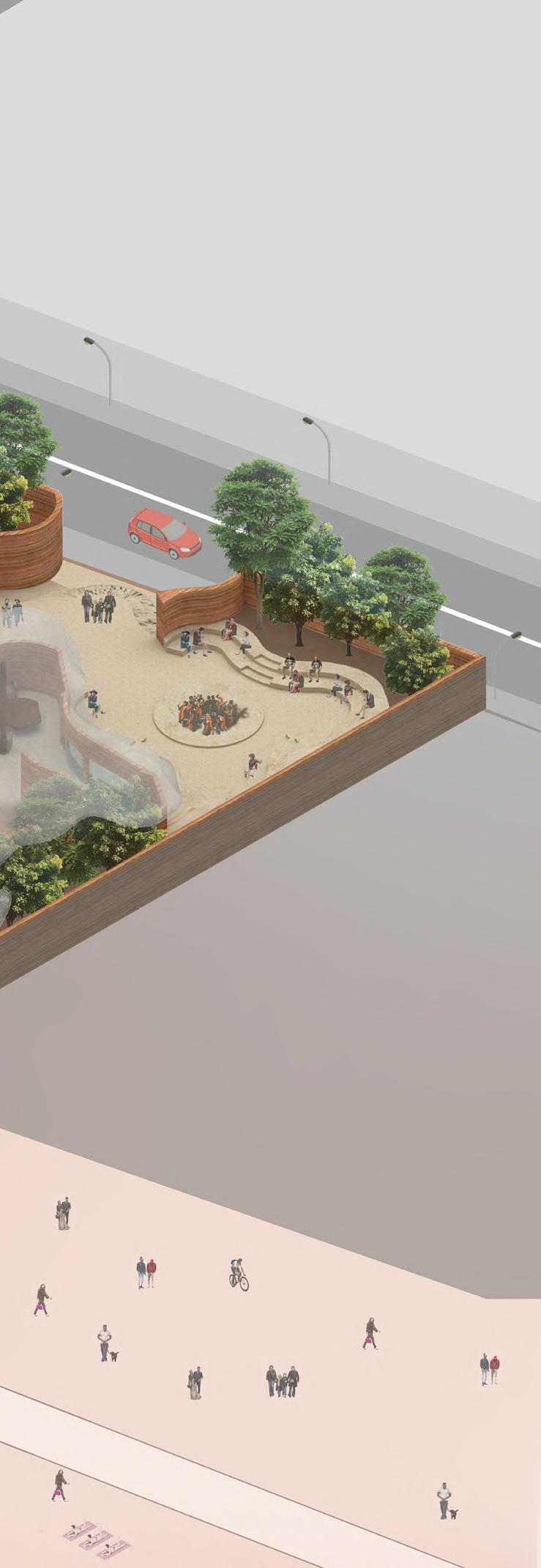
Since Nukkad Natak’s key objective is to gain as much public attention as possible, Juhu beach being an exceptionally crowded space is a very suitable option.
• Juhu, Andheri are the most well connected area as it lies around the centre. It is the most easily accessible area for the entire Mumbai.
• Due to various existing Art galleries and museum, there is a strong cultural knowledge in the South Bombay area. However, the North Bombay lacks such spaces, hence would be fruitful to introduce such a library.
Residential building Site Tea Store
• Site

Garden
Hotel Trees Road Beach Sea
The Location’s most crucial ascpect is the Juhu Beach. Since the place is used and accessed by people of every class, religion and background, it creates a diverse environment for the library,

The site is located at the Juhu beach, existingly a residential building. The site is surrounded by young people ranging from schools, junior colleges and colleges. Juhu beach being a key hangout spot for younger generation would make the library gain their attention. The more these college/school going students would see how different the approach of the library is, the more they would be interested. The area has a number of pre-existing cultural cafes that promote certain artforms and styles.

 Site Pics.
Ferrocement.
Stabilized Rammed Earth.


• Material Palette.

• Colour Palette, in order of usage.

 Sandstone.
Plywood, Teak Veneer, Dark Lacquer finish
Sandstone.
Sandstone.
Plywood, Teak Veneer, Dark Lacquer finish
Avenues.
• Concept: Streets.
• An interestion of 4 roads.
• One of the most interactive part of the streets.
• Enables people to create and participate various smaller activities
• Long narrow passages.
• Close interactions.
• Creates no pause points; once in, a person would feel like getting out as quickly as possible.
• Large open streets with buildforms and trees covering the space.
• Has multiple pause points, intentionally created for people to sit back and interact.
• Squared spaces created adjacent to a street.
• More or a public hotspot.
• Enables multifaceted interactions amoung the people.
• As there are no other vehicles, the street is covered people only.
• Enables free movement.
• Multiple interactions occur through out the street.
• Only one way in, one way out
• Has the most private characteristics
• Enables people to create more intimate interactions.
One critical aspect that really defines a street is the human interaction. Streets are the ubiquitous public realm nearly everyone touches on a daily basis. They give a city its distinctive feel. As such, they hold all of society’s joys and sorrows. Embrace the opportunities this brings. It embraces the human scale to it, supports a wide range of interactions and invites participation. The streets are one of the most fundamental elements that we encounter on a daily basis. Nukkad natak itself uses streets as a major performance place.
Chaurahas. Plazas.
Pedestrian Only.
Dead Ends.
Alleys.


•
•
•
•
•
Inside-Outside.
Curiosity.
Volume.
Movement
Character.
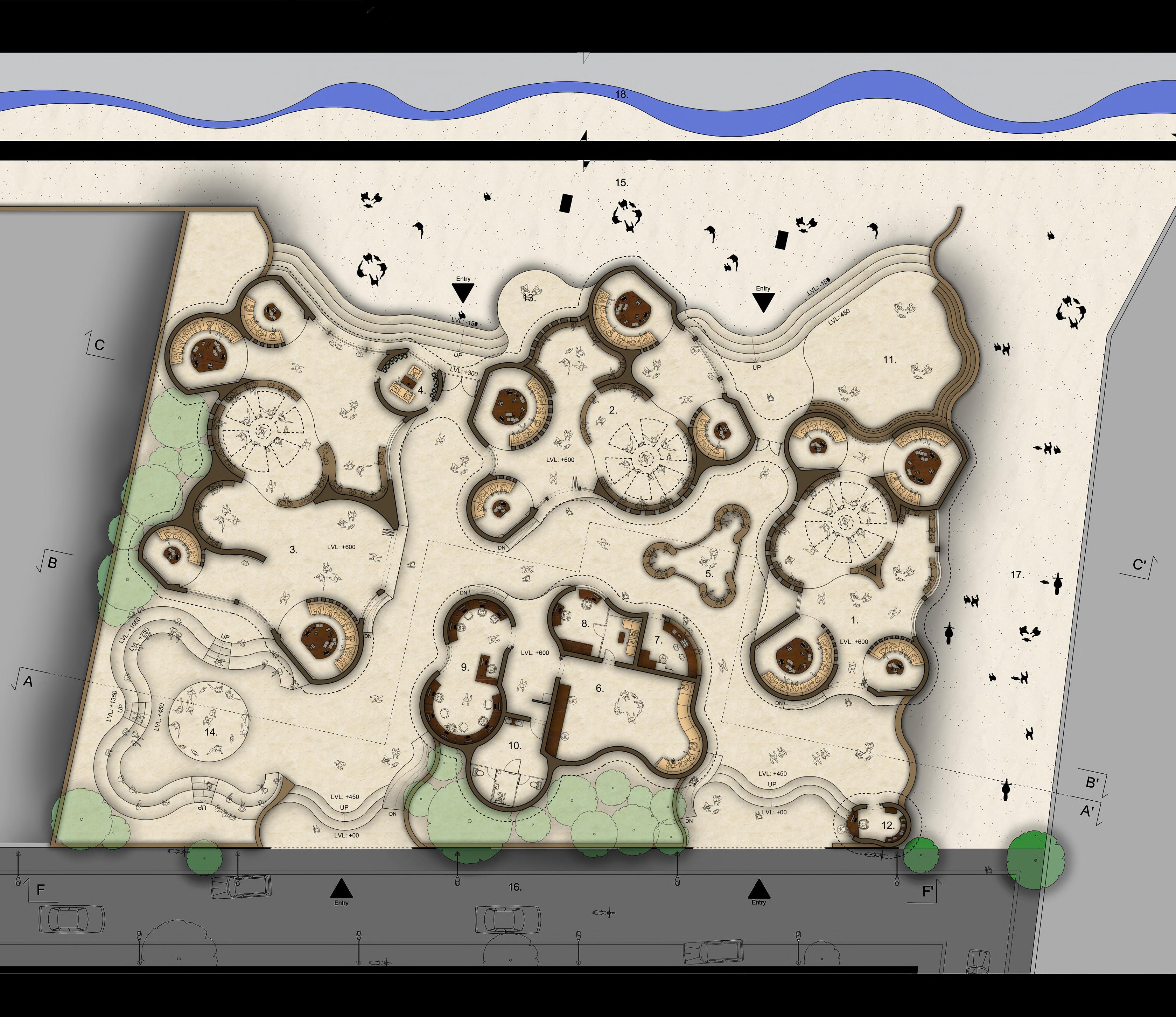
• Final Rendered Plan.
Main Movement Path
Indoor Performance Area Sub Movement Path

Outdoor Performance Pockets
Movement Pattern: The Areas where performances are possible are coincide with the movement paths.

Light Quality
• Details of Prominent Joineries.

• Rendered Sections.
Section AA’ (Staggered).
Section BB’.
Section CC’.


 Section EE’.
Section DD’.
Section FF’.
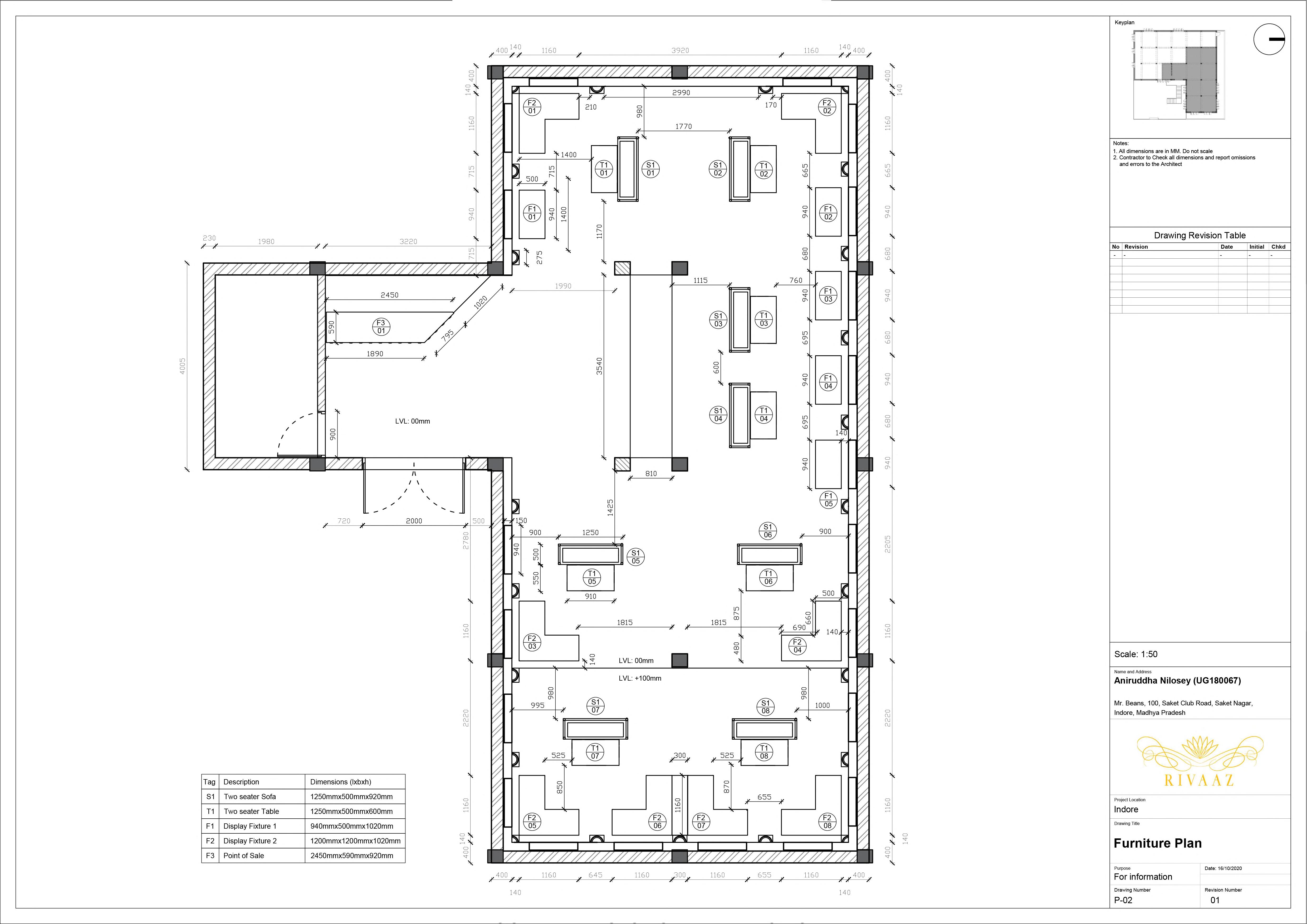
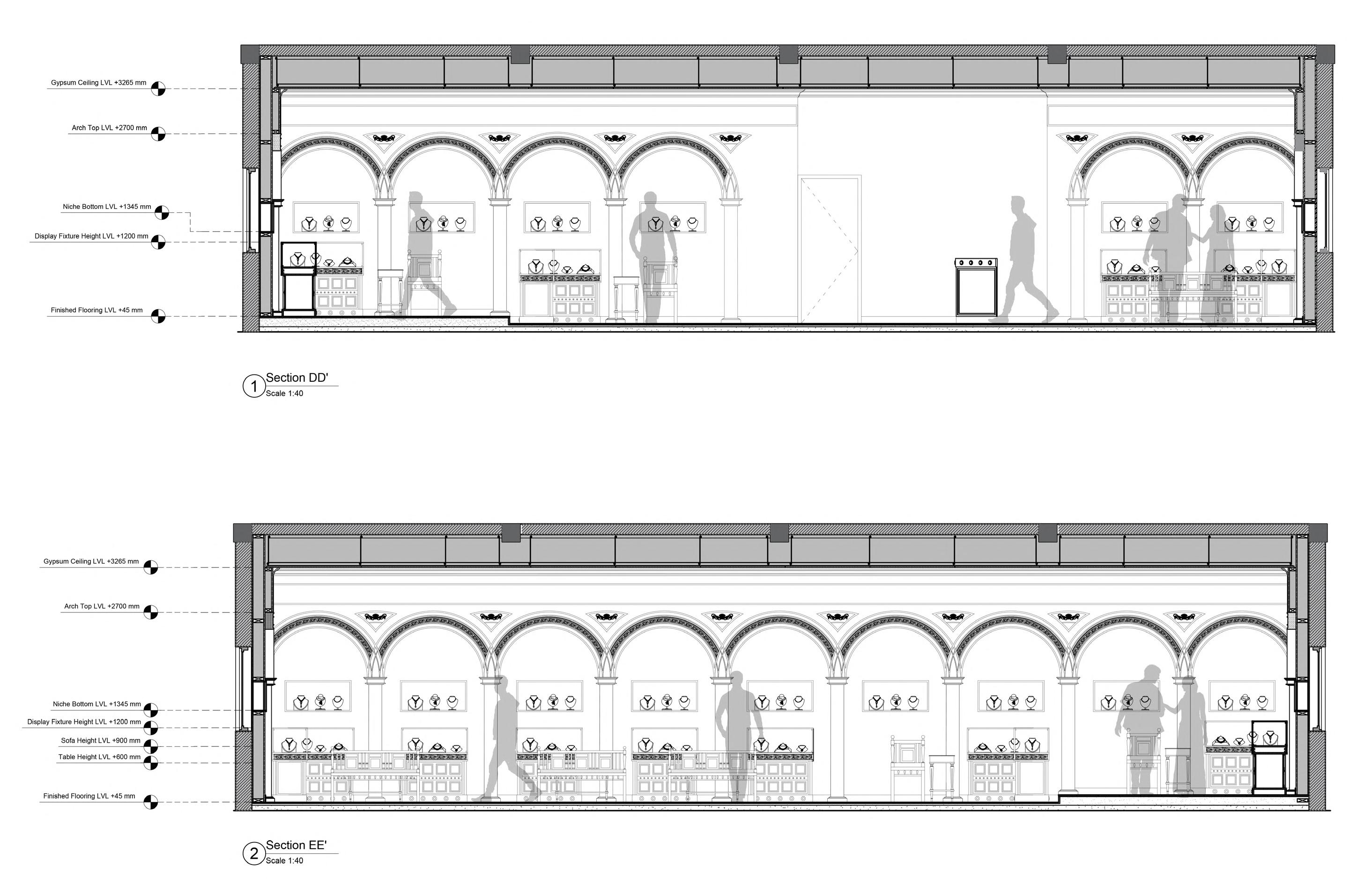
Rivaaz is a south indian jewellery store. The traditional jewellery of india has a unique charm to them, they bridge the gap we have with our own culture by connectting us to our tradition. This is a game changer when it comes to jewellery, as the most obvious and prominant occasion to wear expensive jewelleries are the traditional ones, predominantly, Weddings.

 A.
A. View from Entry.
B. View of a corner.
B.
A.
A. View from Entry.
B. View of a corner.
B.


 C. View from counter towards private area. E. View of courtyard.
D. View from behind towards private area. F. View from private area.
C. E.
D. F.
Using Arches for division.
Creating a central core space around which the user feels in focus.
Having a loop based pathway to create continuity.
• The store needed to look authentic and cultural, with a traditional atmosphere. Exploring the architectural style of Chettinad, known for its housing design and intricate details.


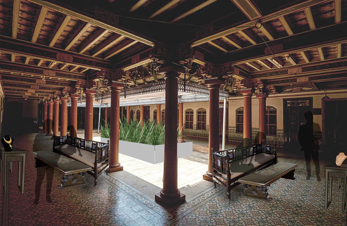
• Final Layout.
• Rendered Sectional Perspectives.


• Wall Section Details. • Sections.
Section AA’
Section CC’


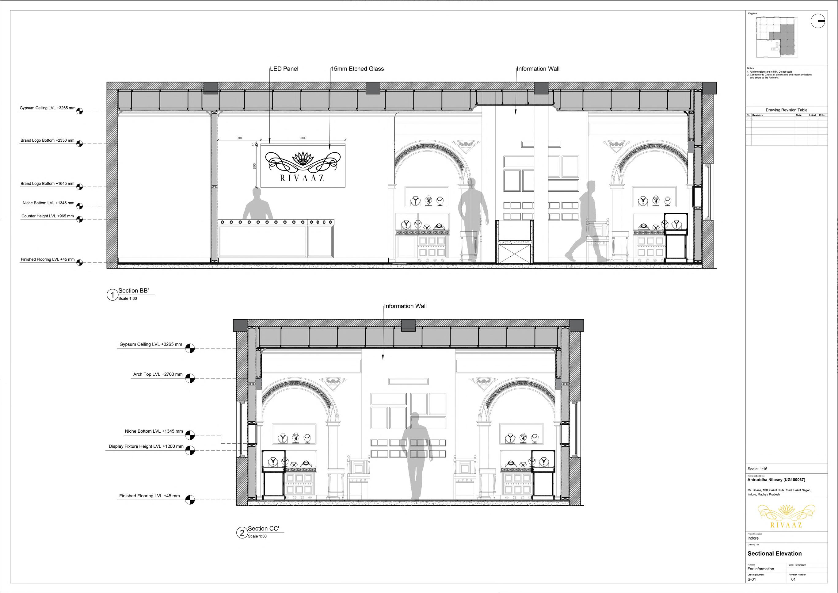

 Section BB’
Section DD’
Section EE’


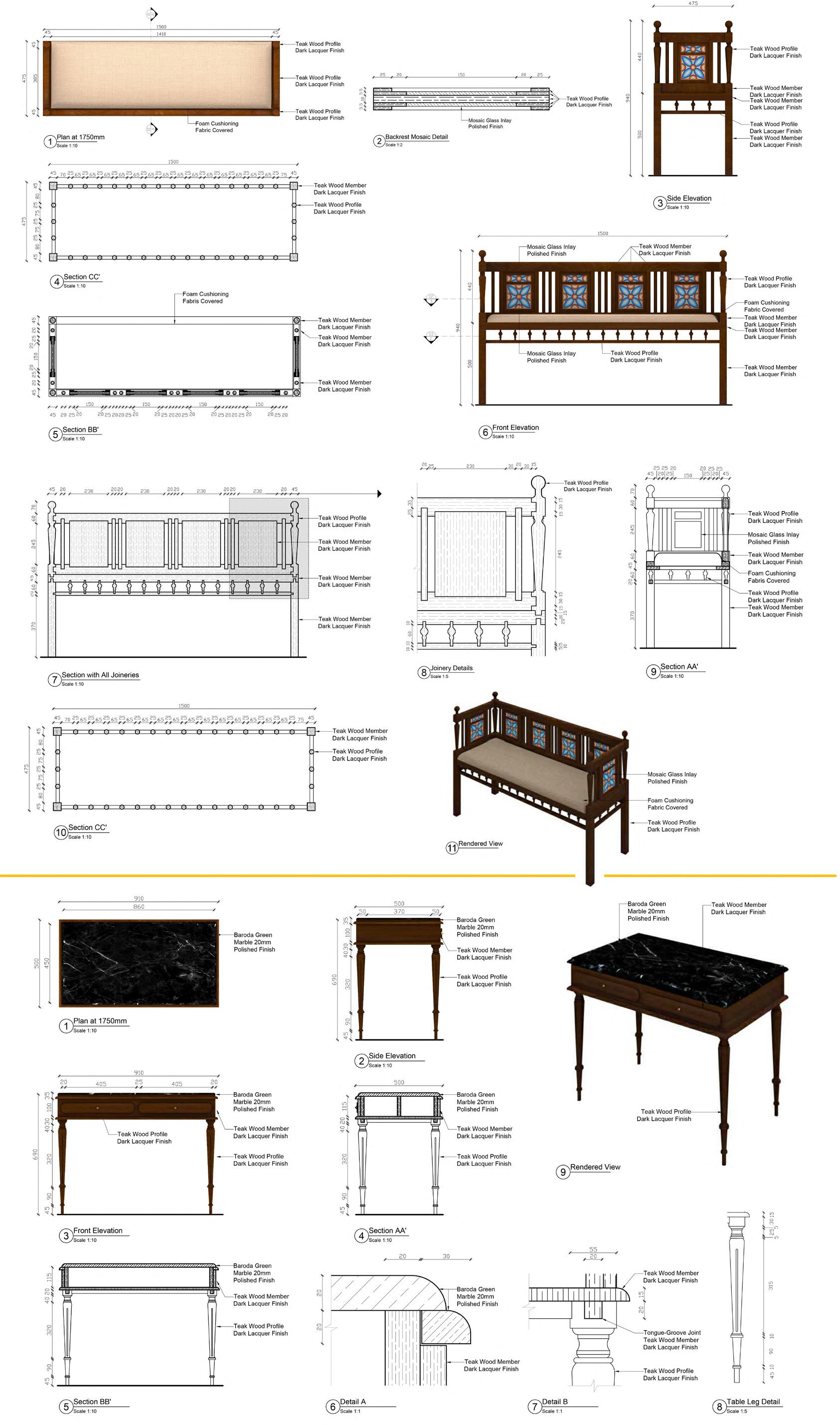
• Display Fixture Details. • Counter Details.
• Sofa-Table Details.

Functionally, the purpose of the project is to create elevated docks, which can be climbed by a person to provide an adrenaline rush. We, CEPTians love to sit at spots and locations which are at a height and a “different” spot. The primary reason behind this is that being at a spot above the ground provides a change of perspective, along with a sense of elevation.


 View of structure (Deployed state).

• Small Unit (Mechanism).
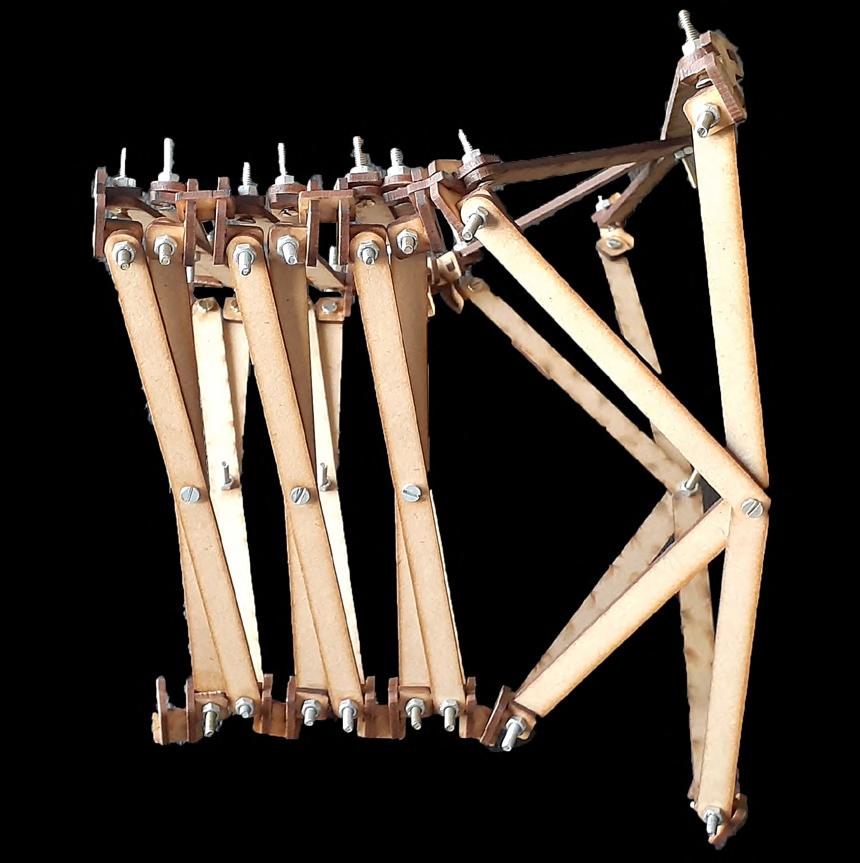
• Conceptual Model (Deployed and Contracted

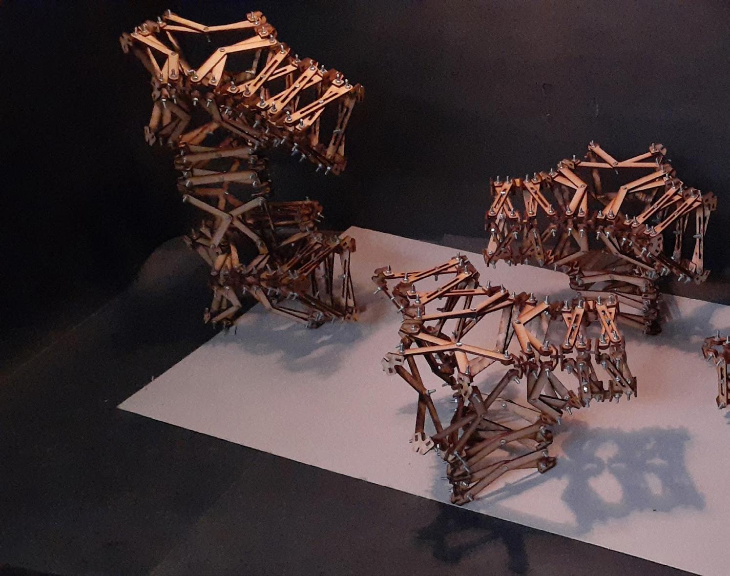
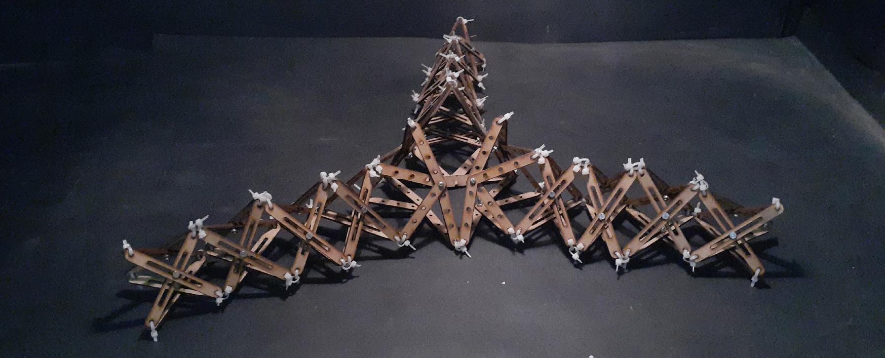


Deployable systems: form, space and function


Contracted State).
 decks which are connected to each other. The 2 primary ‘pillars’ have a ladder to climb it from the inside, whereas the other two can be accessed only using the branching
View from inside. Line drawing and heights. Top view.
Expanded Deployment State.

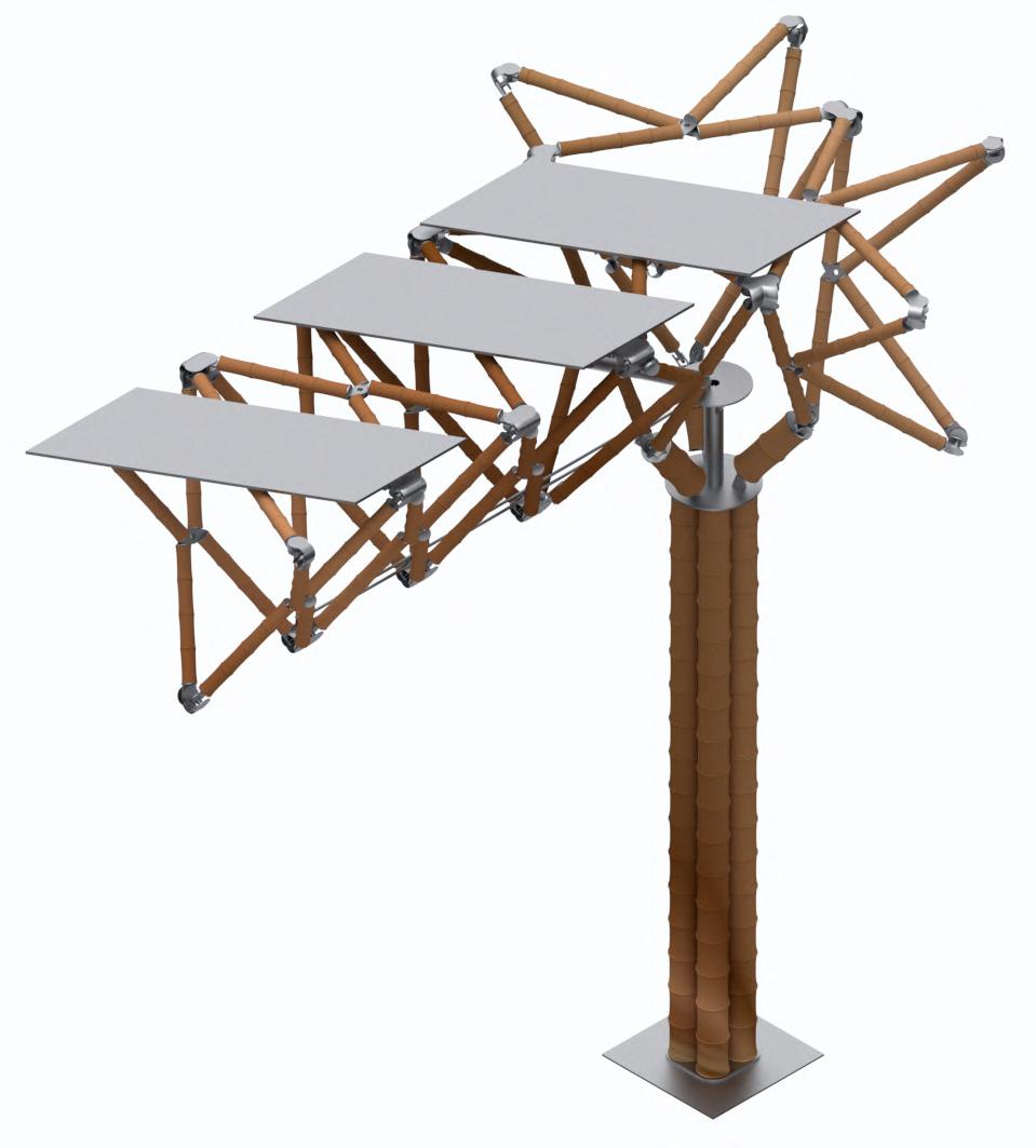

• Final Unit. Deployed State. Joinery A. Joinery B. Joinery C. Joinery D. Joinery G. Joinery F. Joinery E. Contracted State.
MS Shaft 25mm x 15mm (Ø)
MS Plate Th. = 2mm
PRODUCED BY AN AUTODESK STUDENT VERSION
Bamboo 40mm (Ø)
Bolt 1
Washer 1 Nut 1
MS Circular Hose Clip 20mm x 40mm (Ø)
Joinery G.
Telescopic Pipe Ø = 50mm
Al Rivet 12mm x 6mm (Ø) Steel Cable 4mm (Ø)
MS Rod 24mm x 5mm (Ø)
MS Stand 25mm x 20mm x 20mm Th. = 5mm
MS Plate 5mm x 200mm (Ø)

MS Pulley 30mm (Ø)
MS Pipe 200mm x 5mm x 50mm (Ø)
Bamboo Ø = 80mm
MS Sheet 5mm x 250mm (Ø)
PRODUCED BY AN AUTODESK STUDENT VERSION
PRODUCED BY AN AUTODESK STUDENT VERSION
PRODUCED BY AN AUTODESK STUDENT VERSION
MS Connector 2
MS Washer 2 MS Nut 2
MS Bolt 2
MS Circular Hose Clip 40mm x 80mm (Ø)
Joinery D.
• Details of Prominent Joineries.
MS Plate Th. = 2mm
MS Plate Th. = 2mm
MS Plate 1mm
MS Ball Bearing Housing 40mm (Ø) x 5mm
MS Ball Bearing 30mm (Ø) x 5mm
Pulley 20mm x 30mm (Ø)
MS Rivet 5mm x 7mm (Ø)
PRODUCED BY AN AUTODESK STUDENT VERSION
MS Holder 42mm (Ø) x 7.5mm x 1mm
MS Circular Plate 40 mm (Ø) x 3mm
PRODUCED BY AN AUTODESK STUDENT VERSION
MS Connector 30 mm (Ø) x 50 mm x 5mm
Bolt 1 Washer Nut 1
MS Circular Hose Clip 20mm x 40mm (Ø)
MS Bracket 75mm x 75mm x 5mm
MS Circular Plate 2mm x 80mm (Ø)
MS Bolt 10mm x 5mm (Ø)
MS Plate
MS Housing Shaft 30mm x 15mm (Ø) Bolt 1
PRODUCED BY AN AUTODESK STUDENT VERSION
Bamboo Ø = 40mm
Washer 2 Nut 1
PRODUCED BY AN AUTODESK STUDENT VERSION
MS Housing Shaft Lock 15mm x 2mm x 16mm (Ø)
Joinery E.
PRODUCED BY AN AUTODESK STUDENT VERSION
MS Thrust Bearing Housing 40mm x 40mm x 2mm
MS Nut 4mm (Ø)
Thrust Bearing 10 mm x 30mm (Ø)
MS Circular Hose Clip 20mm x 40mm (Ø)
MS Bolt 2 MS Washer 2 MS Nut 2 MS Connector 2 MS Pivot Arm 36mm x 36mm x 5mm MS Rivot 10mm (Ø)
Pivot Arm
Joinery F.
Arm Joinery.
The following set of views are figments of my imagination, of Lord Krishna with a twist of him being in the fictional world of Alice in Wonderland. The project focused on the broad aspects of Production Design.


 A.
A. Mayur Sabhagrah.
B. Divya Snanagaar.
B.
A.
A. Mayur Sabhagrah.
B. Divya Snanagaar.
B.


 C. Adhyayan Shala.
E. Vrindavan Kaksh.
D. Prem Khandahar.
F. Study of Set: Alice in Wonderland.
C.
E.
D.
F.
CEPT Foundation Program focused on developing and cultivating basic design skills, such as sketching, drafting, model making, workshop skills, softwares, etc. The programme believes in an intersectional approach which encourages students to learn across discipline boundaries. The programme balances technical skills, discipline-related critical thinking, and an ability to express oneself through varying media.
• Making a Cantilever Beam. • Making

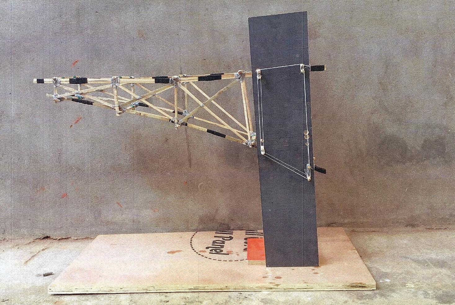


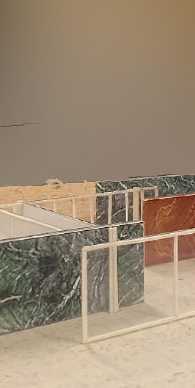


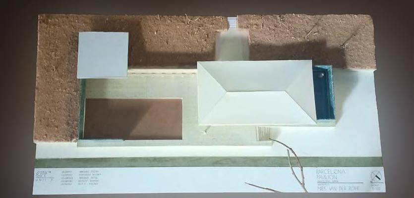
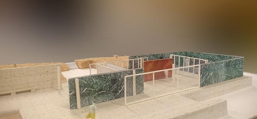

 Making a Material Assemblage.
• Model Making.
• Studying the local crafts of Varanasi: Handlooms and making of a Banarasi Saree. (Group work with


with Raj Kansara & Samriddhi Arora)

• Tihs (/tI:(h)zs/) is a hypothetical brand that deals with mens’ wrist watches as the primary product.


• The name originates from gibberish and has no meaning. This was done so as to avoid any association that may occur of it with the brands identity.



• The project defines this fictitious brand’s logo, font family (Longa Iberica), brand ambassadors, associated food, smell, dance, music, car, colour palette and an abstraction to convey the brands philosophy.
• The project also focuses on how the brand identity transforms into a simple object such as a bottle and the window display case.
All about your perspective.

The world we live competitive and judgemental. to an assumption, table. Craftmenship that is a unique factor robotic world.


Attention to

Creation comes through a thought, or rather an entire thought process. The target audience is in a situation where they live the life they want to. And obviusly this leads to each such person have their own perspective and thought process that they have developed through their knowledge and experience.
Moodboard Collage.
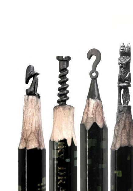
live in today is extremely judgemental. When it comes assumption, its the details what flip the Craftmenship and accuracy is something factor that we have in todays


details.
Nothing to hide.

The unique ability that an honest person has is that they can look straight into others eyes. And that is a quality that makes you stand out. Eye contact is one of the most intimate action, which arrives only when you have nothing to hide.

The key idea is to create a workspace, where a customer can design and customise your wrist watch. A wrist watch is often considered as a status symbol that describes how successful you are. Since the defination of success itself is fluid, then why does your symbol be a predesigned rigid idea. The idea is to also depict the attention the brand pays towards the details. Hence, the entire wrist watch can be seen as an exploded working model, where it would all align when seen from a particular spot. The front view would eventually look like the actual case of a wrist watch, thereby the entire system together looks like a big watch case where you choose, design and customise the watch inside it.

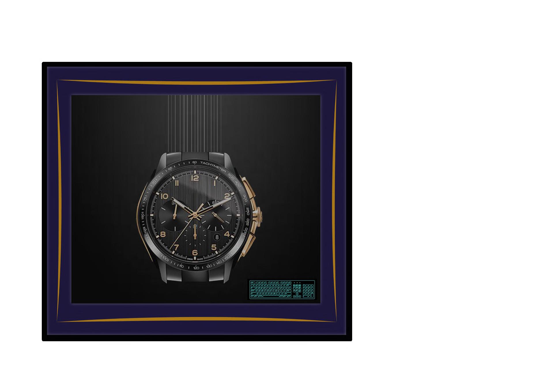

 Perfume Bottle Design.
Front
Window Display.
Side view.
view.
THANK YOU Aniruddha Nilosey +91 9669223000 aninilosey@gmail.com aniruddha.ug180067@cept.ac.in


 Site Pics.


 Sandstone.
Plywood, Teak Veneer, Dark Lacquer finish
Sandstone.
Sandstone.
Plywood, Teak Veneer, Dark Lacquer finish


 Section EE’.
Section DD’.
Section FF’.

 A.
A. View from Entry.
B. View of a corner.
B.
A.
A. View from Entry.
B. View of a corner.
B.


 C. View from counter towards private area. E. View of courtyard.
D. View from behind towards private area. F. View from private area.
C. E.
D. F.


 View of structure (Deployed state).


 decks which are connected to each other. The 2 primary ‘pillars’ have a ladder to climb it from the inside, whereas the other two can be accessed only using the branching
View from inside. Line drawing and heights. Top view.
Expanded Deployment State.


 A.
A. Mayur Sabhagrah.
B. Divya Snanagaar.
B.
A.
A. Mayur Sabhagrah.
B. Divya Snanagaar.
B.


 C. Adhyayan Shala.
E. Vrindavan Kaksh.
D. Prem Khandahar.
F. Study of Set: Alice in Wonderland.
C.
E.
D.
F.


 Making a Material Assemblage.
• Model Making.


 Perfume Bottle Design.


