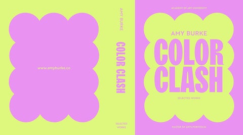
ACADEMY OF ART UNIVERSITY
AMY BURKE
SELECTED WORKS
MASTER OF ARTS PORTFOLIO
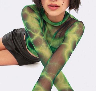
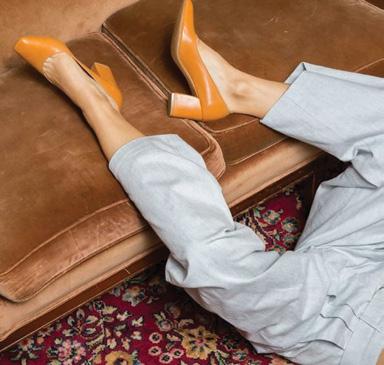
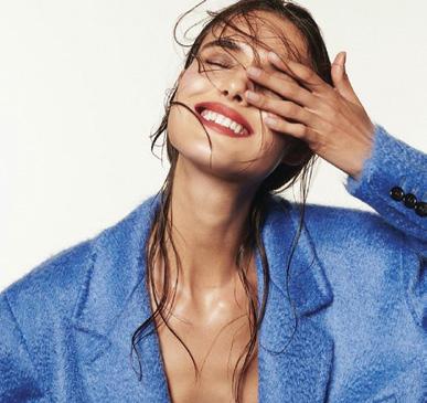
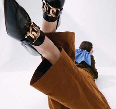
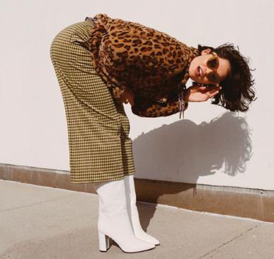
COLOR CLASH is a celebration of my passion for bold, vibrant design and the endless possibilities of color. Embracing a fearless, high-impact aesthetic, it reflects both my personality and my love for dynamic, statement-making visuals. With a background in retail and beauty branding, my work proves that unapologetic color isn’t just a choice, it’s a powerful storytelling tool.
FOR MY FAMILY,
Your unwavering support, endless encouragement, and belief in my creativity have shaped the designer I am today. Every color, every concept, and every creation in this portfolio is a reflection of the love and inspiration you’ve given me. Thank you for always seeing the world in full color with me.
ESSENCE OF COLOR
EXPLORATION
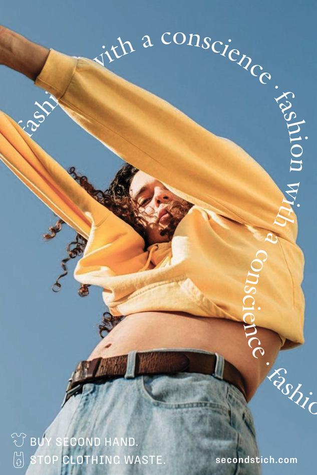
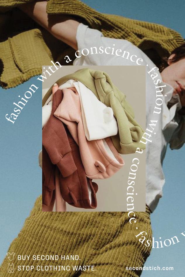
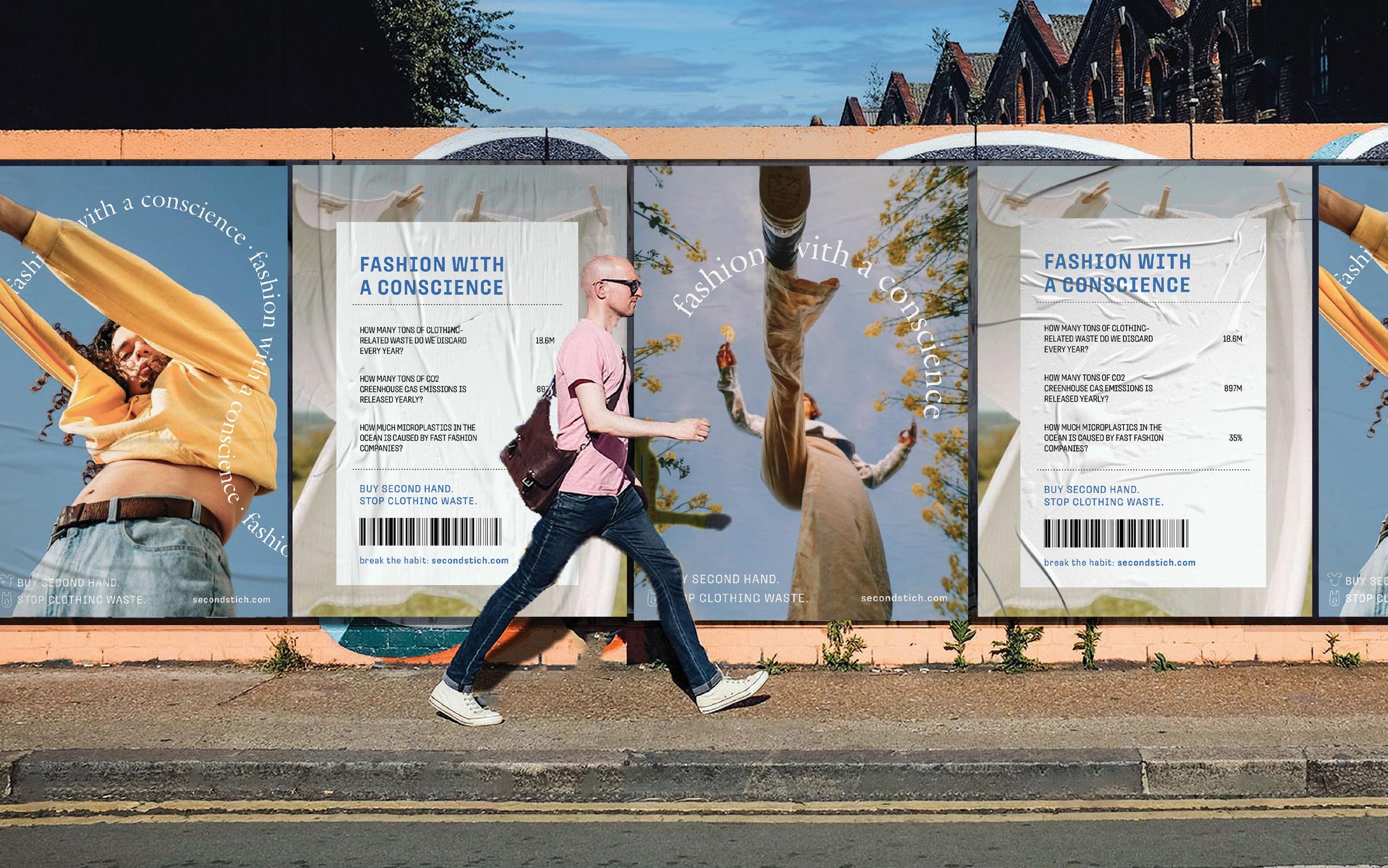
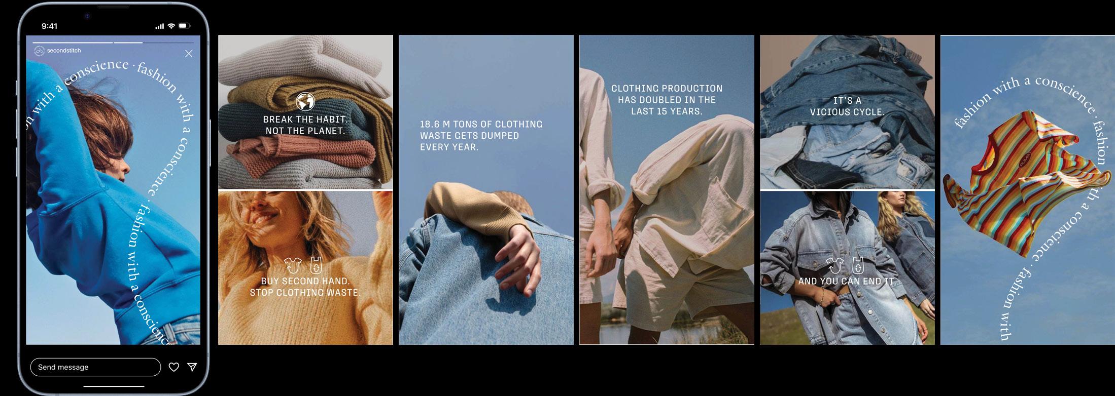
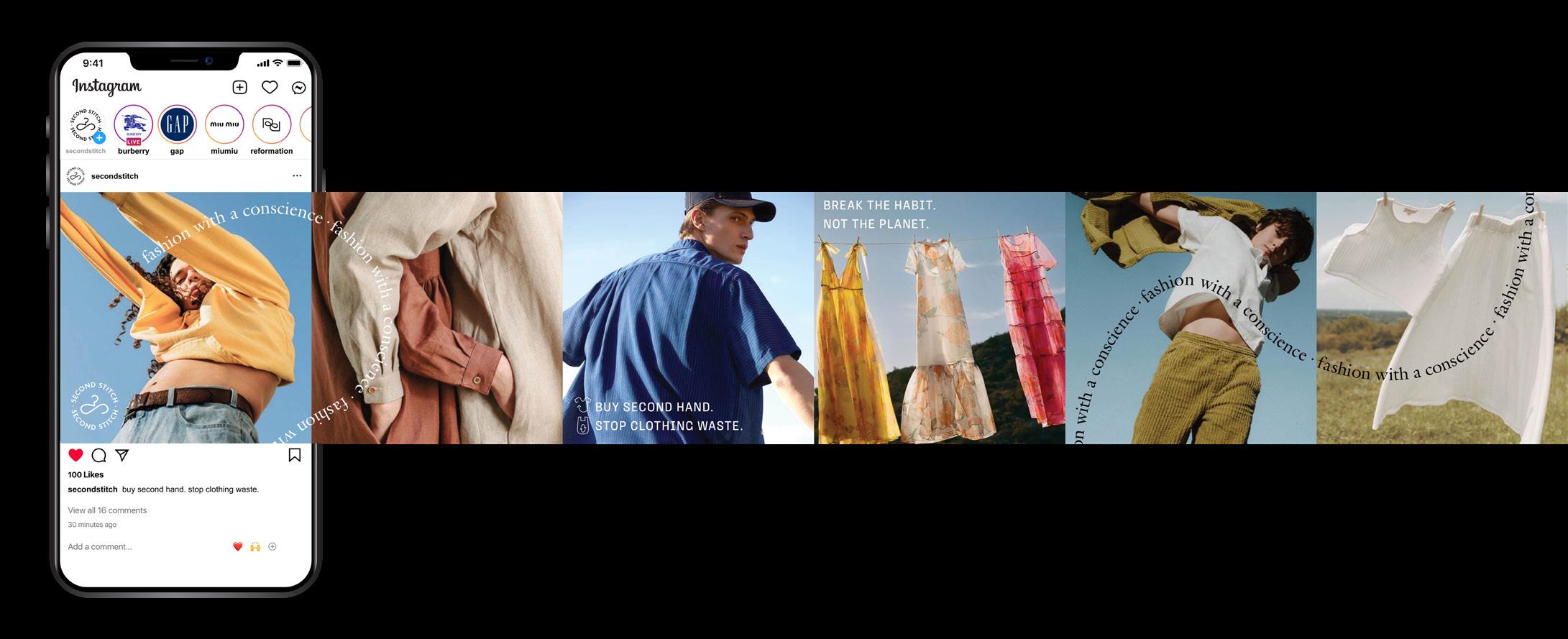
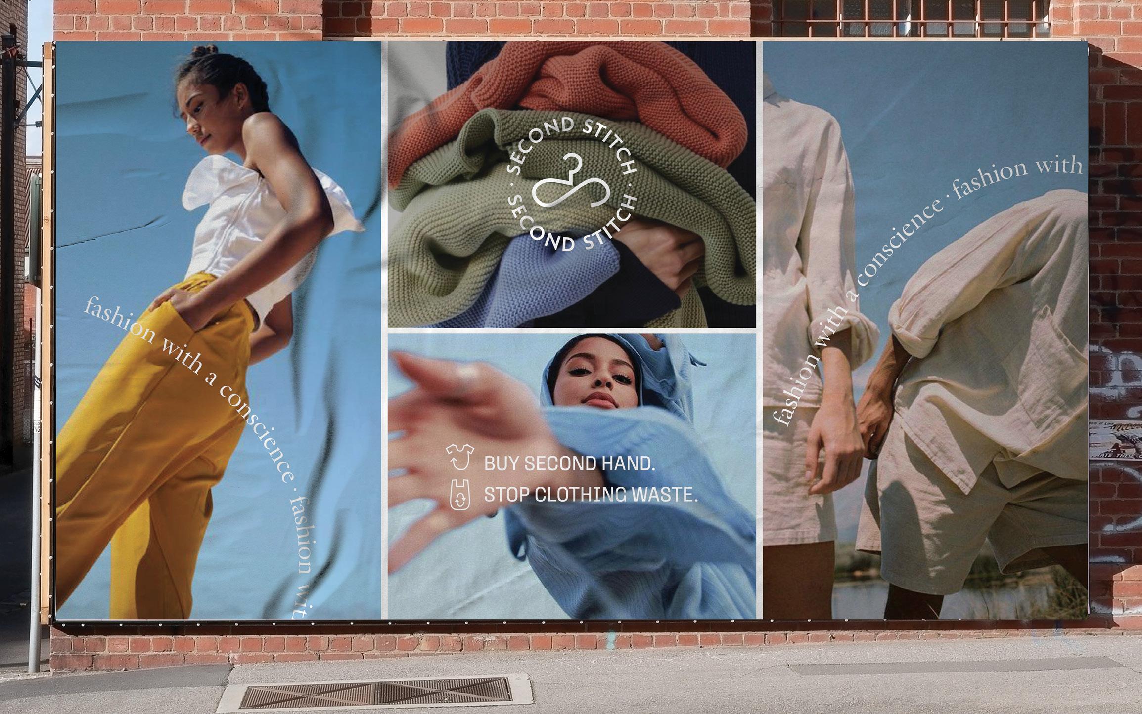
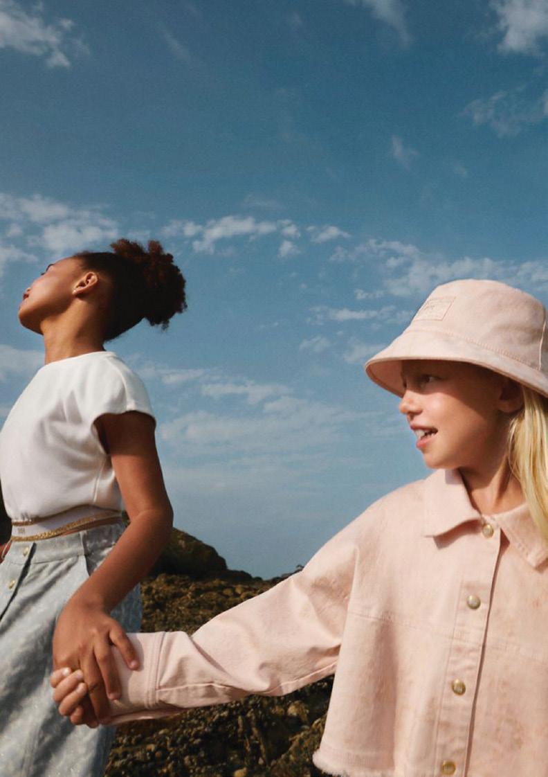
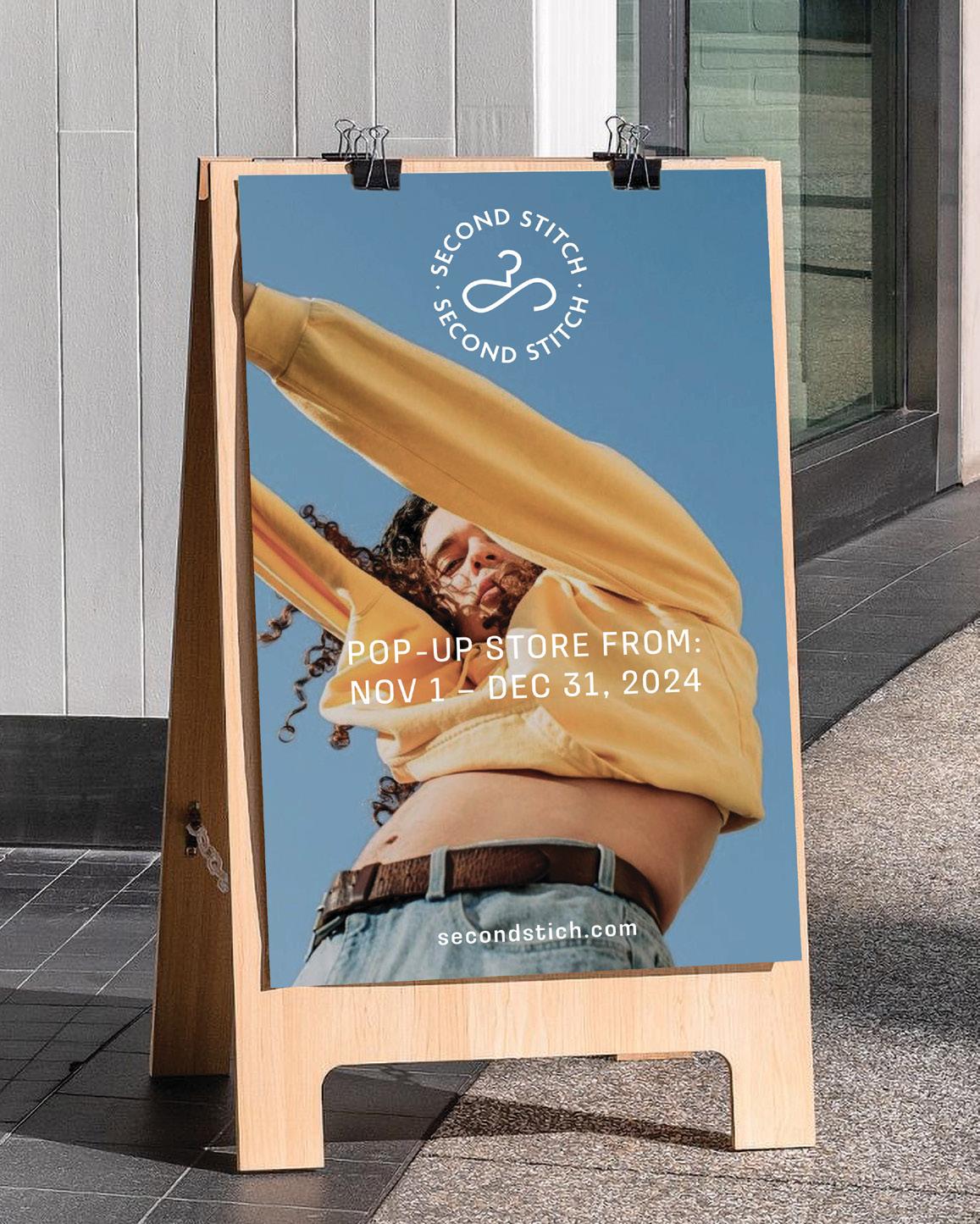
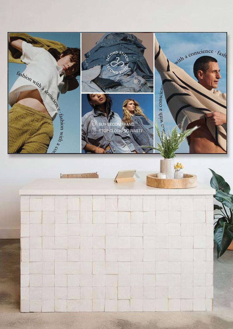
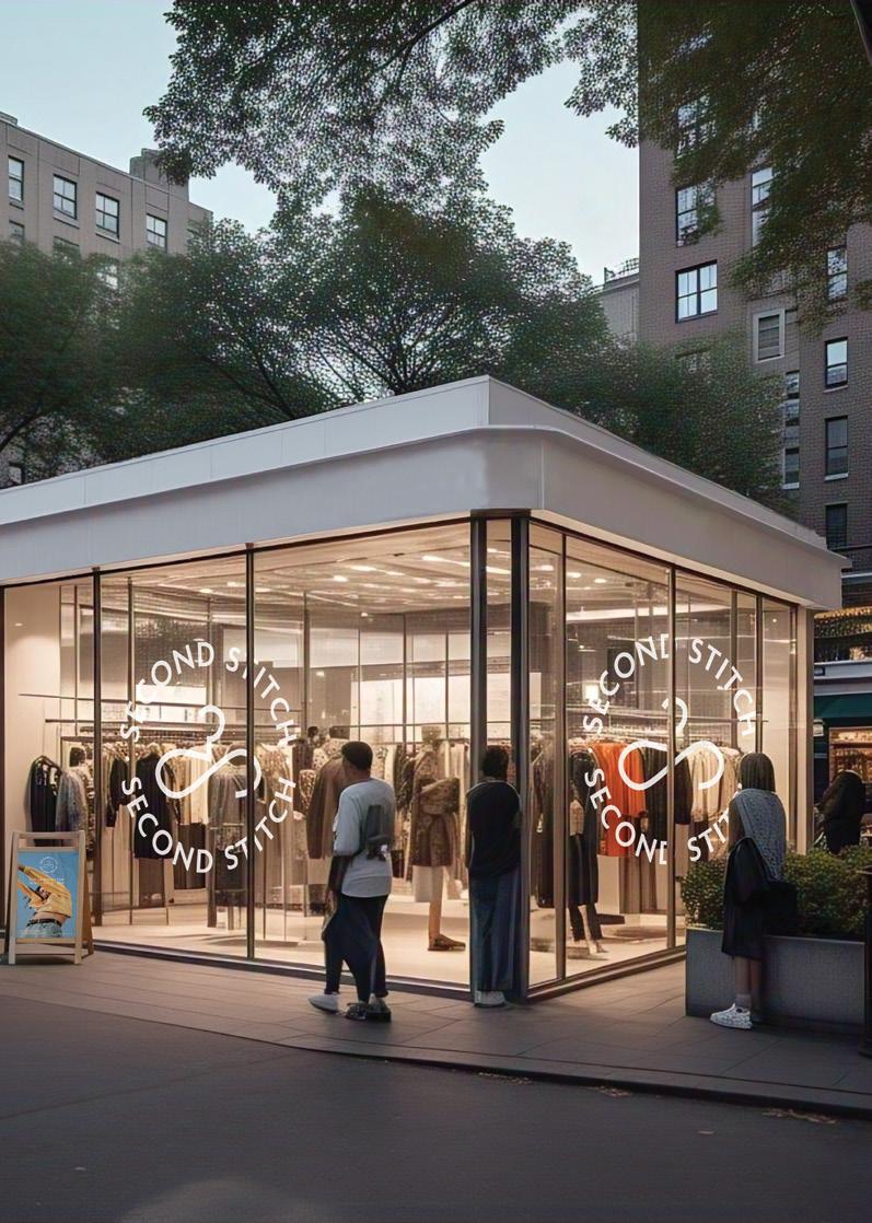
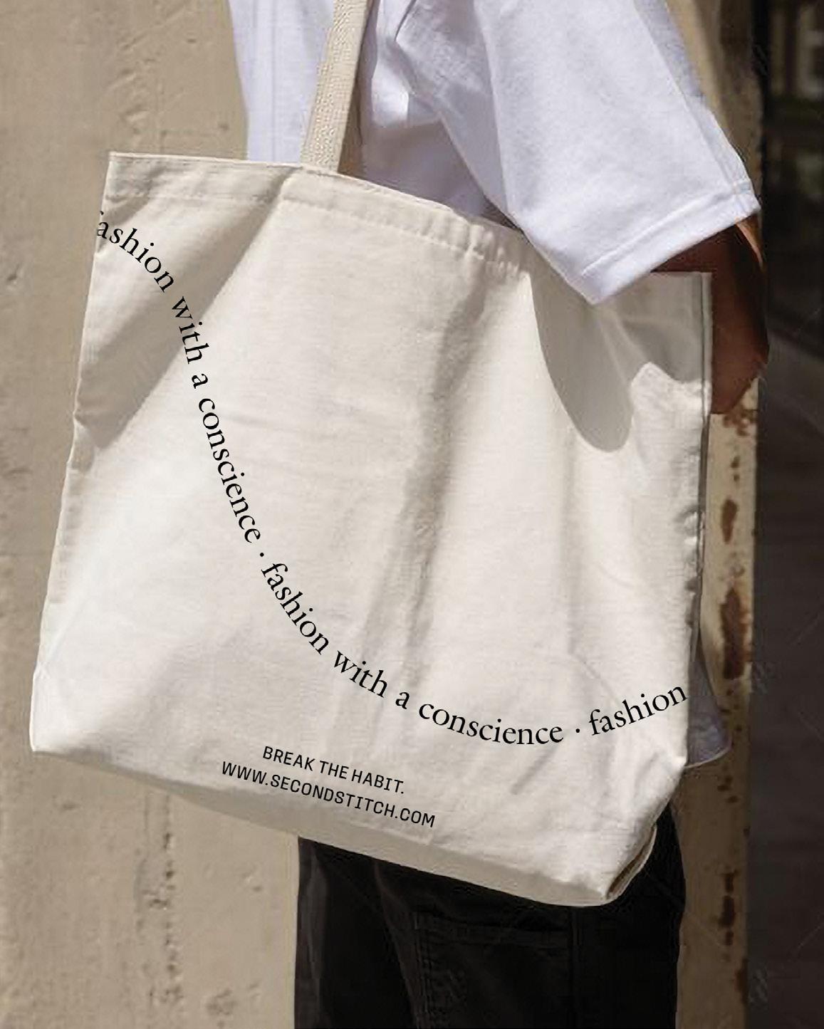
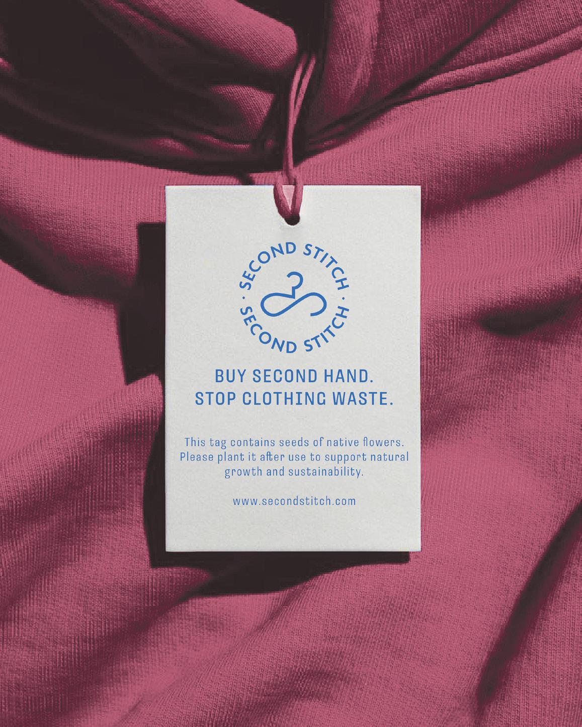
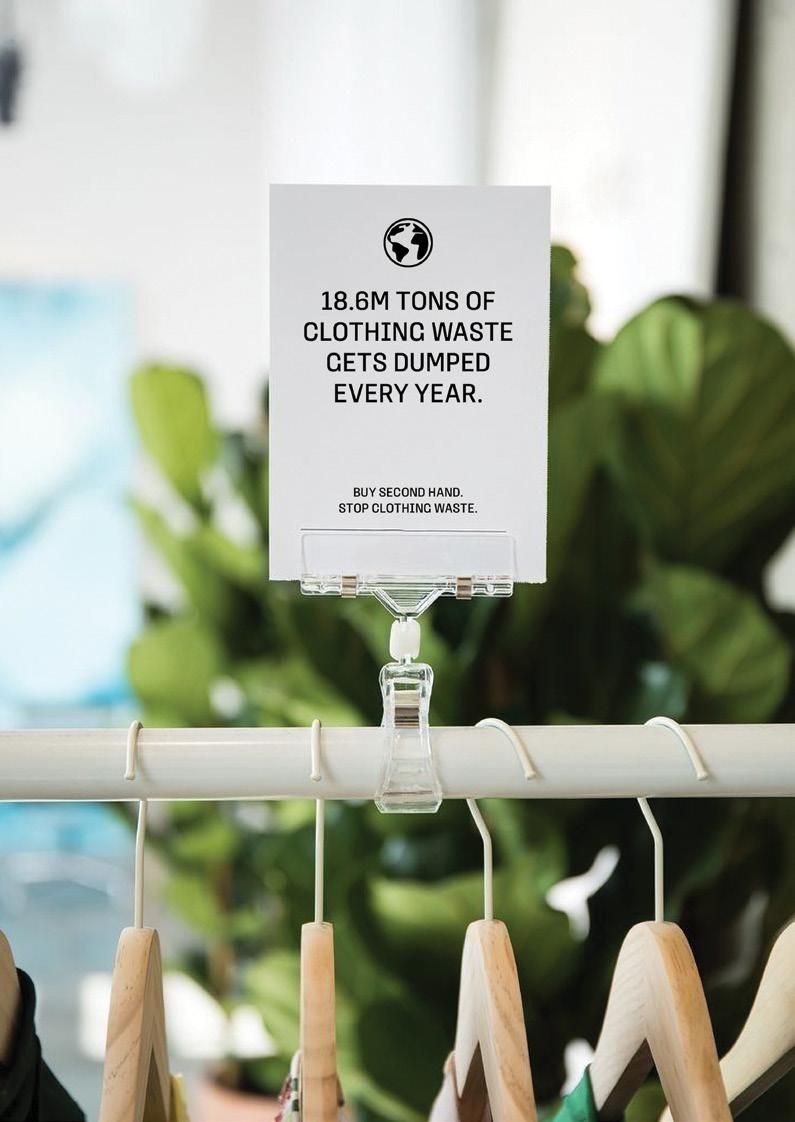
This project aimed to address the issue of clothing overconsumption and waste through a research-driven and strategic design approach. After extensive exploration, including potential brand names, color palettes, industry challenges, and expert consultations, Second Stitch was born.


SECOND STITCH
branding identity design typography
CHALLENGE
This project aimed to address the issue of clothing overconsumption and waste through a research-driven and strategic design approach.
SOLUTION
After thorough research—including name exploration, color palettes, industry insights, and expert interviews—the project was officially named Second Stitch. A full brand identity and comprehensive style guide were developed to define the brand’s look and feel. This included the logo, color system, typography, and photography direction, all designed to create a cohesive visual language. Every design detail, no matter how small, was crafted with an eye toward an eco-conscious future.
VISUAL THINKING | FIONA BLANKENSHIP


TENSION & RELEASE
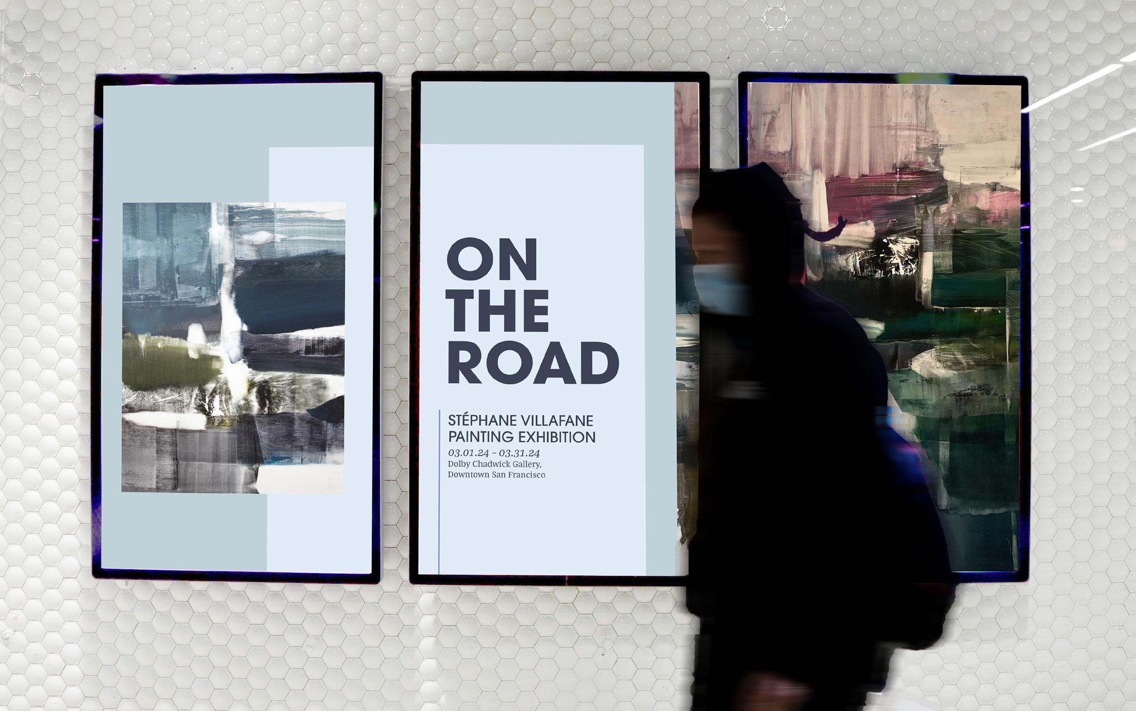
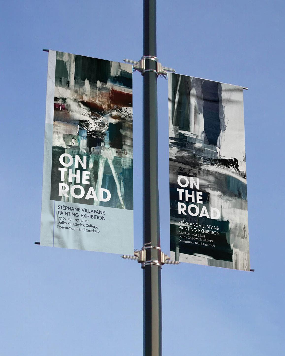
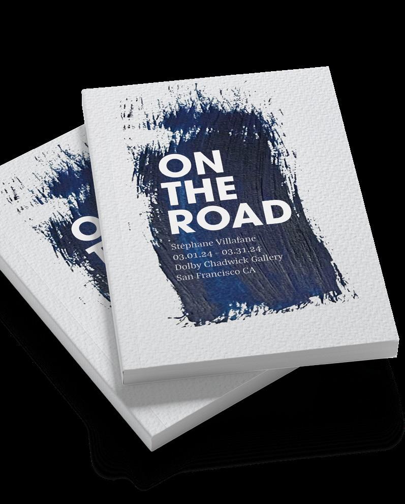
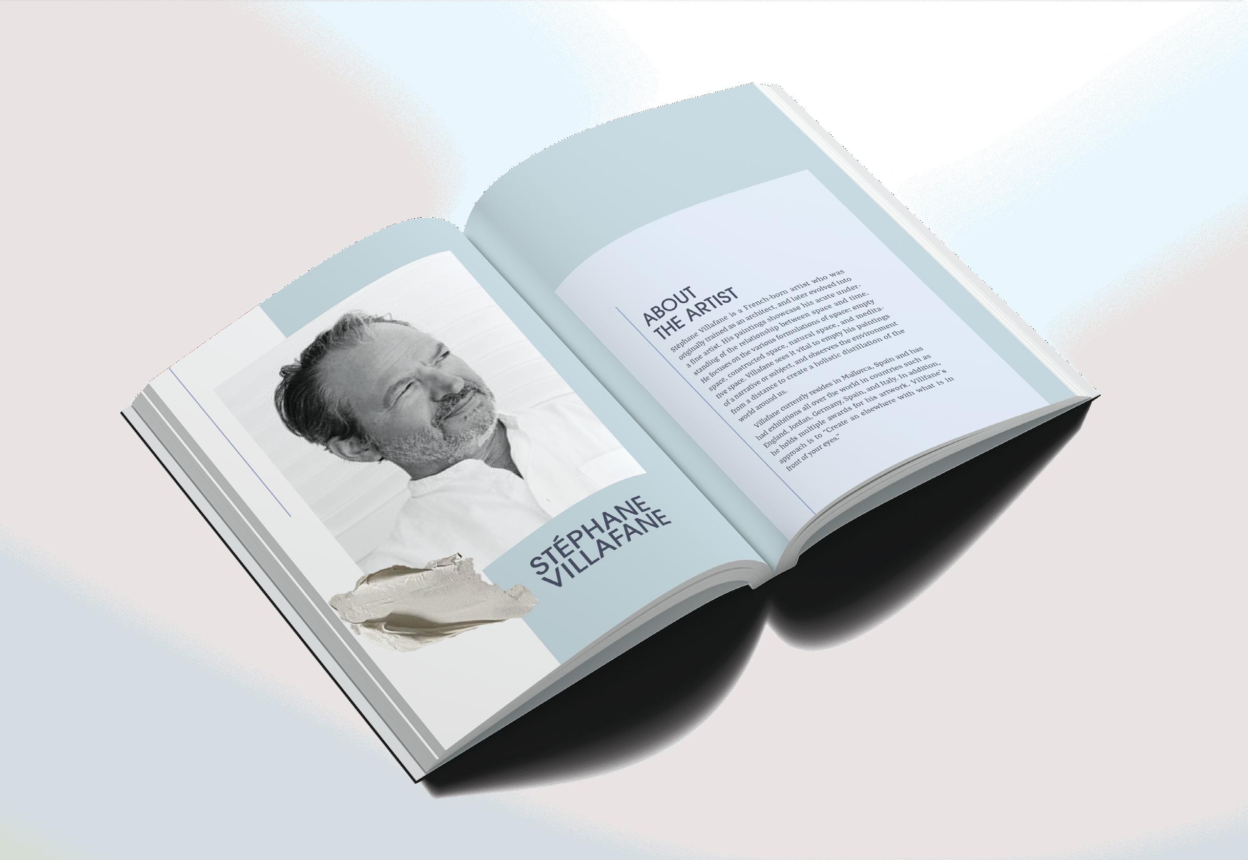
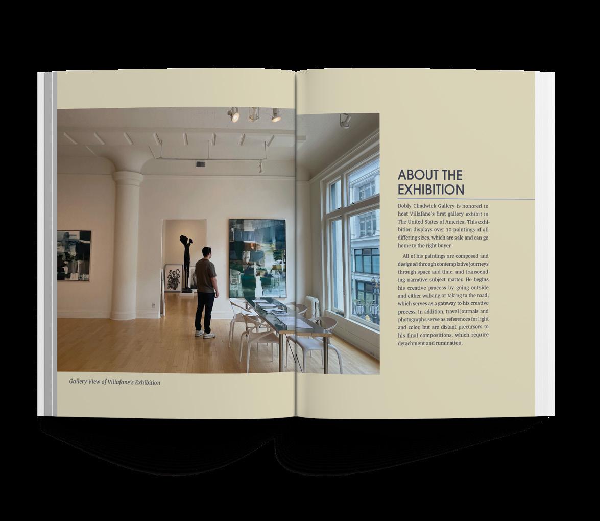
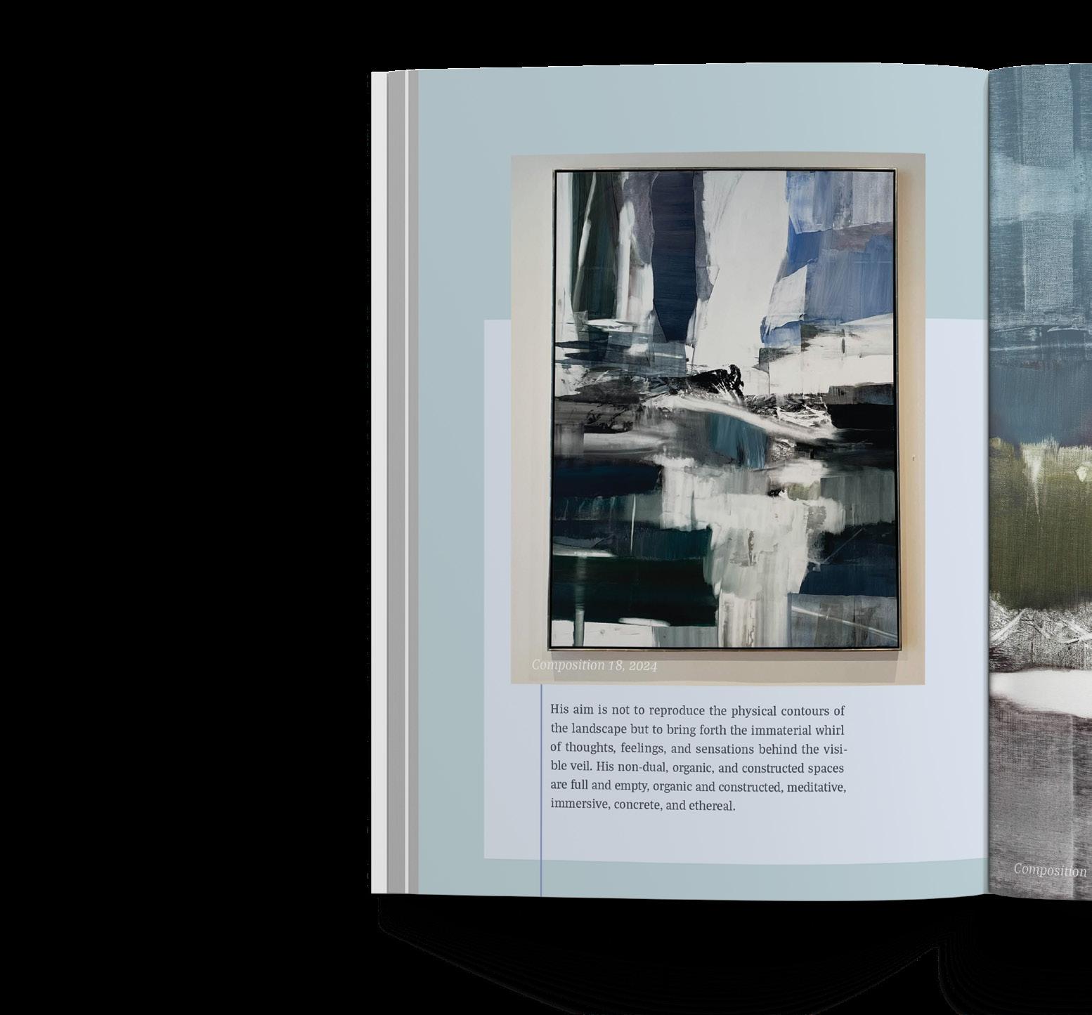
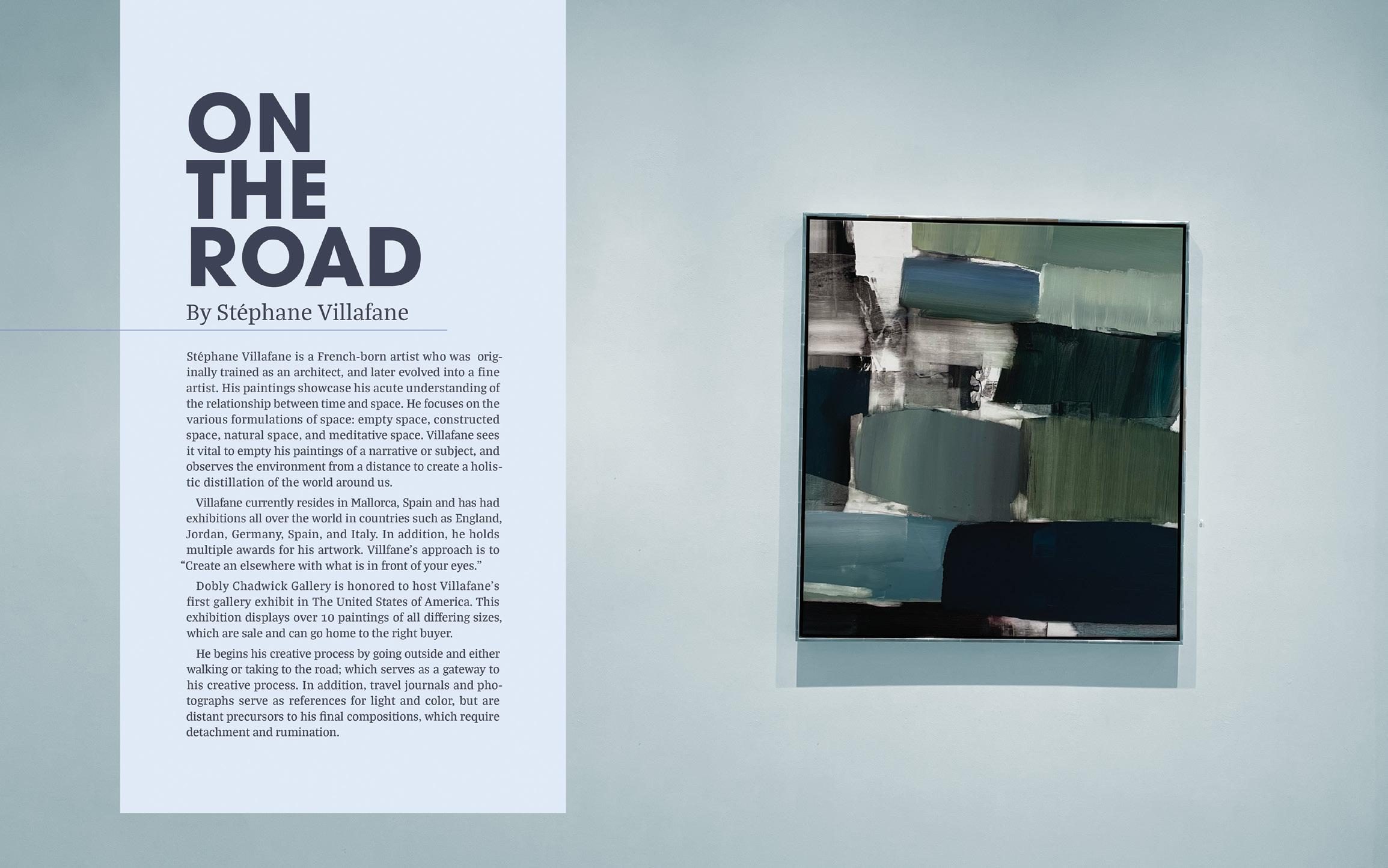
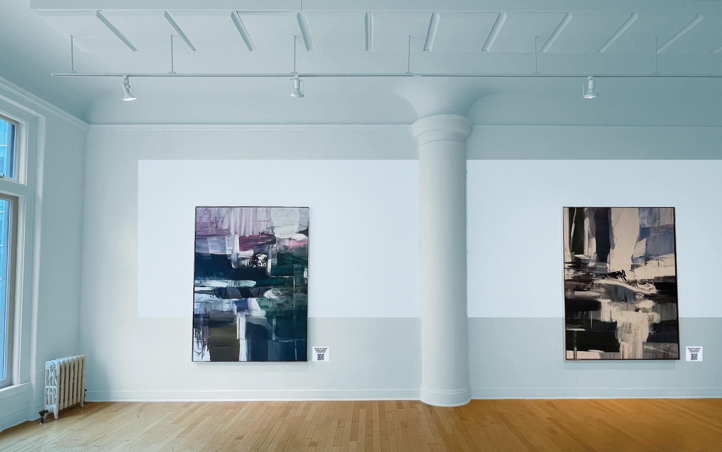
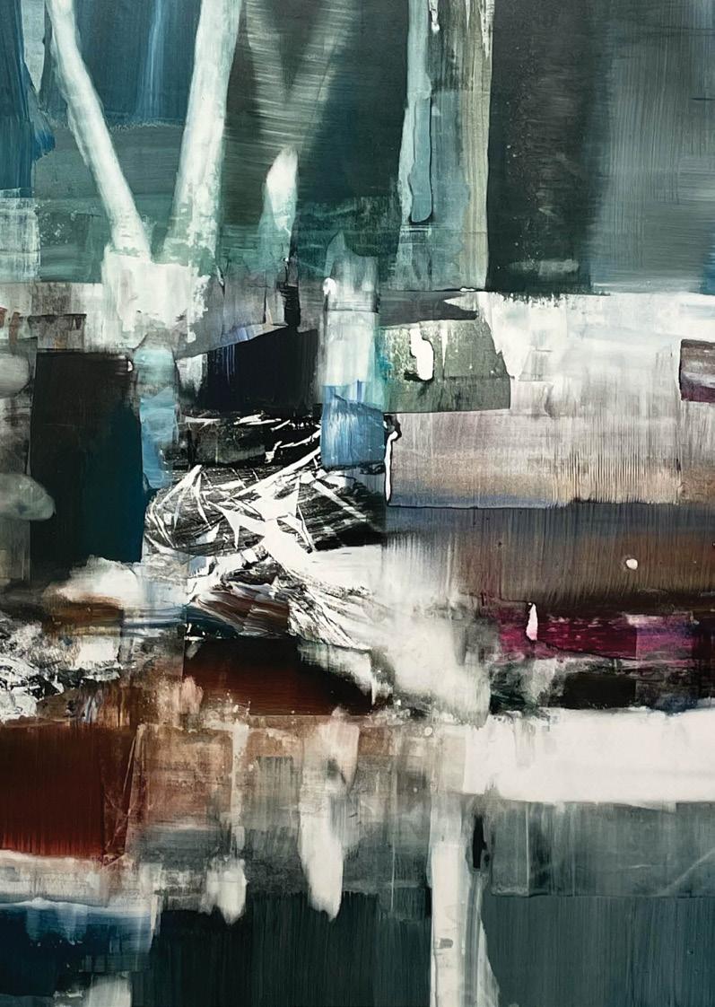
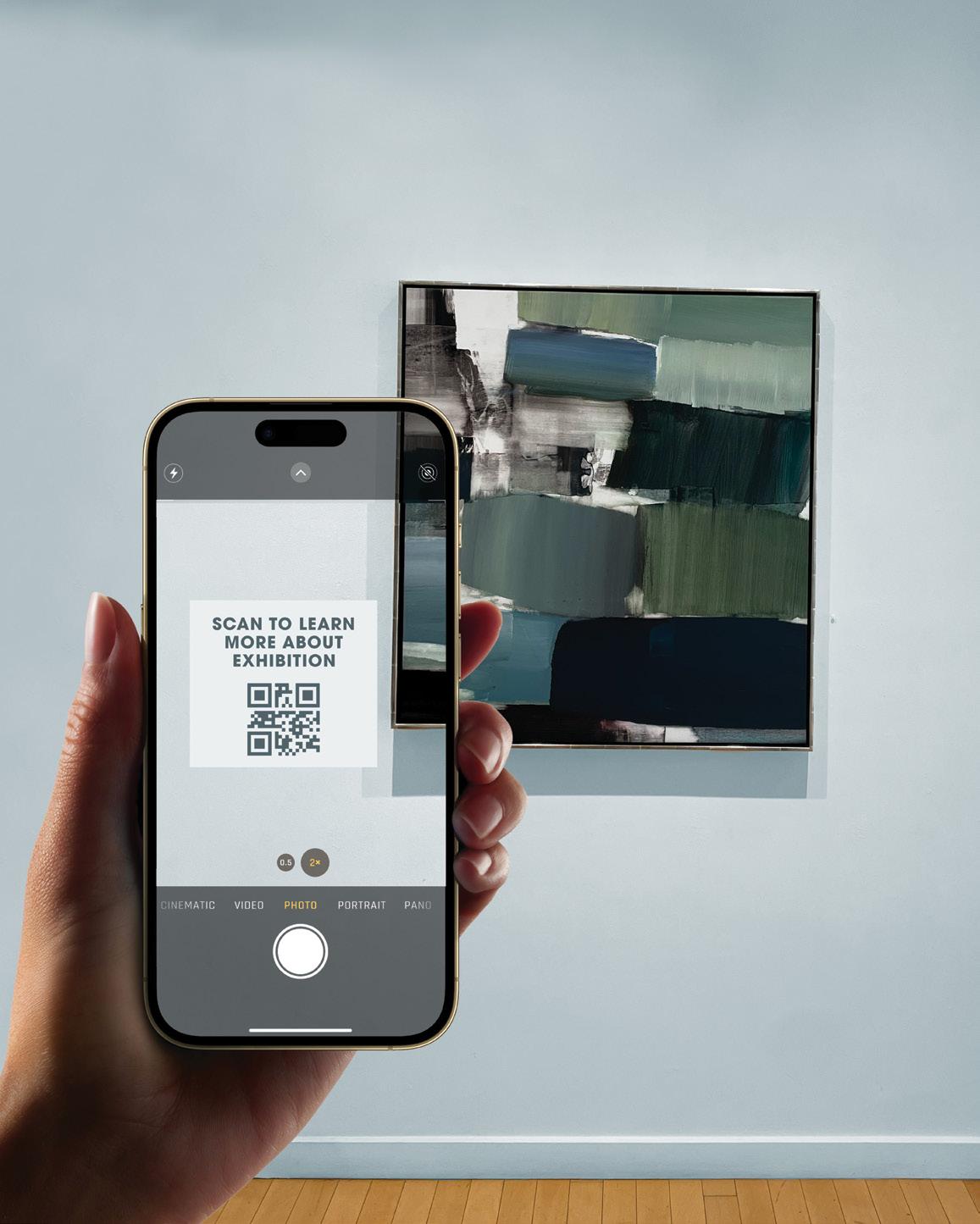
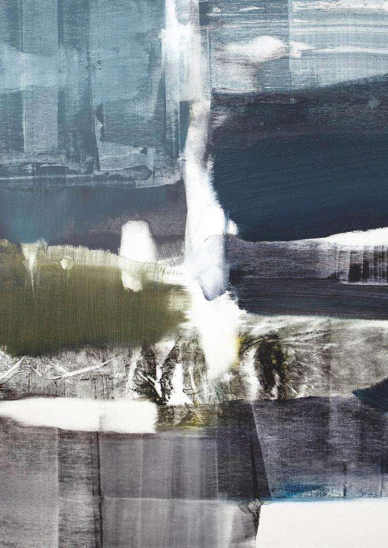
“On the Road” is an exhibition by Stéphane Villafane in San Francisco, showcasing his latest collection of expressive oil paintings. Drawing inspiration from his unique style and artistic voice, the task was to reimagine the exhibition across three distinct mediums. This project explores how Villafane’s work can be experienced in new, immersive ways while staying true to the spirit of his original collection.

ON THE ROAD
exhibit design
branding
graphic design
CHALLENGE
Stéphane Villafane’s latest exhibition in San Francisco showcases a vibrant collection of oil paintings rooted in movement and emotion. After visiting the show in person and photographing the artwork, the challenge was to reimagine the exhibition across three unique mediums. This project explores new ways of experiencing Villafane’s work while remaining faithful to his artistic vision.
SOLUTION
The inspiration to reimagine Stéphane Villafane’s exhibition was directly taken from the rich, dynamic color palette of his oil paintings to apply the visual language across three key mediums—revamping the exhibition floor layout and signage, designing subway banners and promotional materials, and creating a cohesive app and brochure experience. Each element was designed to extend the emotional impact of his work, inviting viewers into a bold, immersive journey beyond the canvas.
TYPE SYSTEMS | JEREMY STOUT

COLORFULLY COMPOSED
EXPLORATION
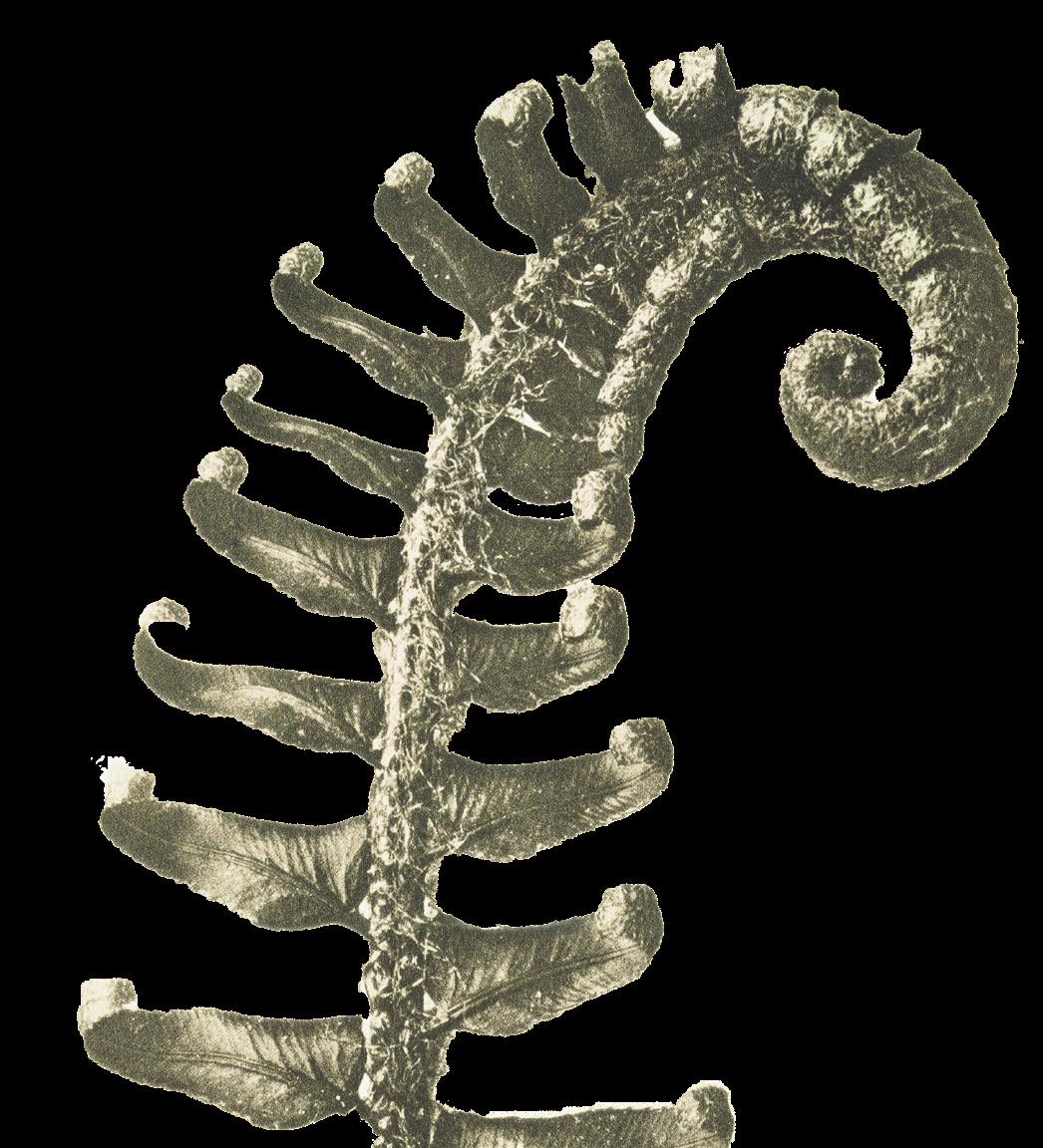
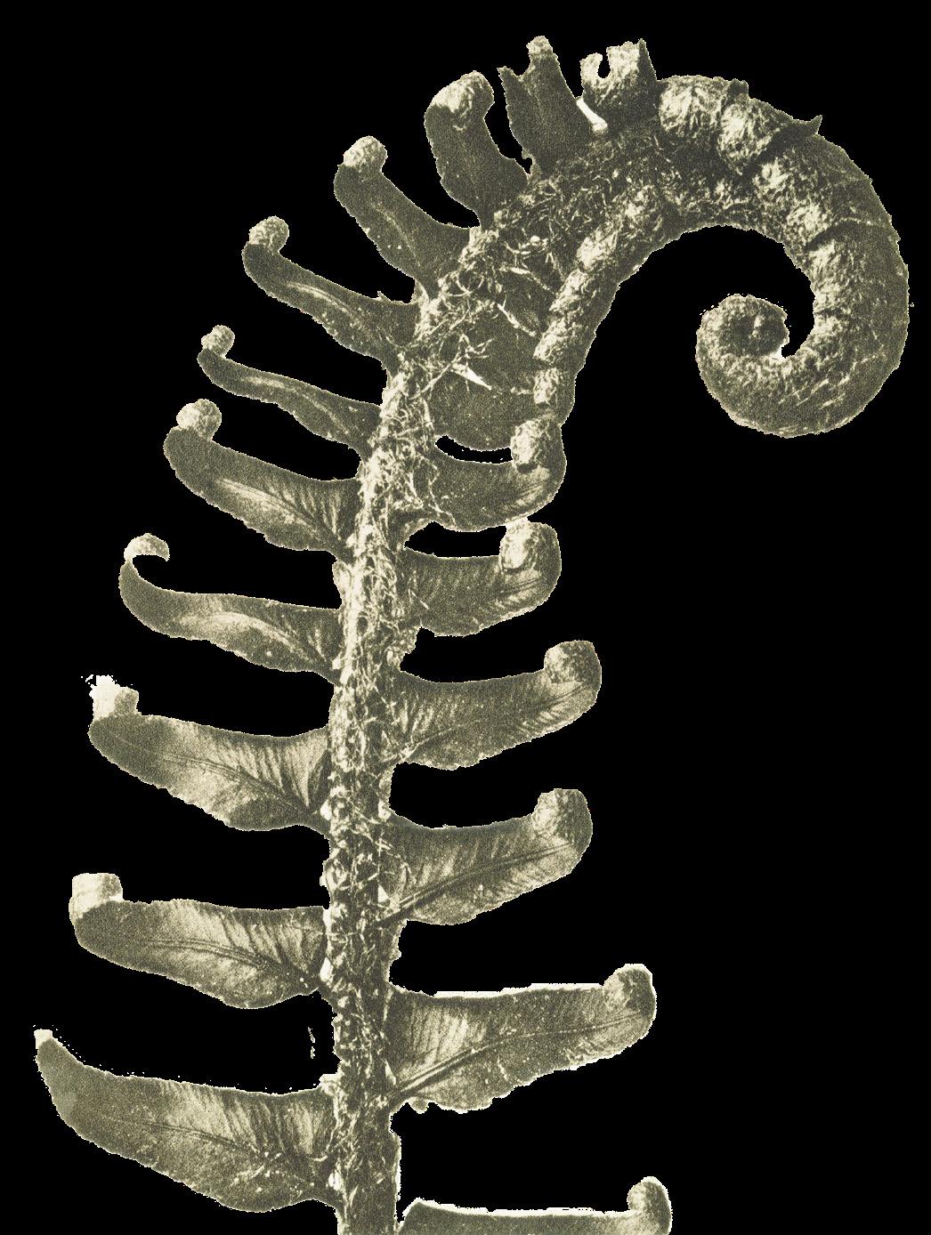
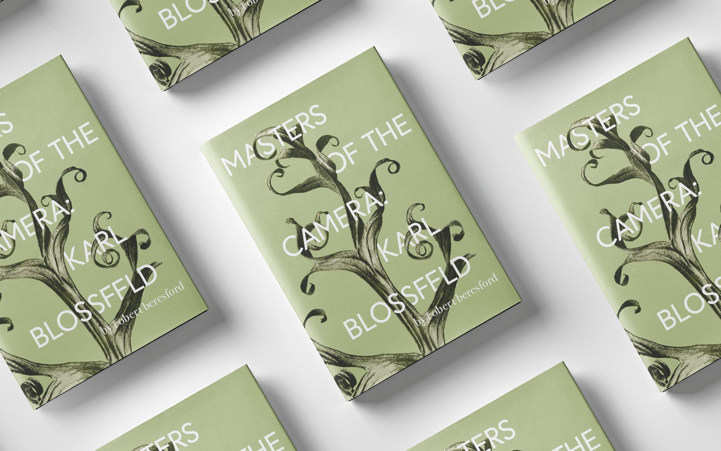
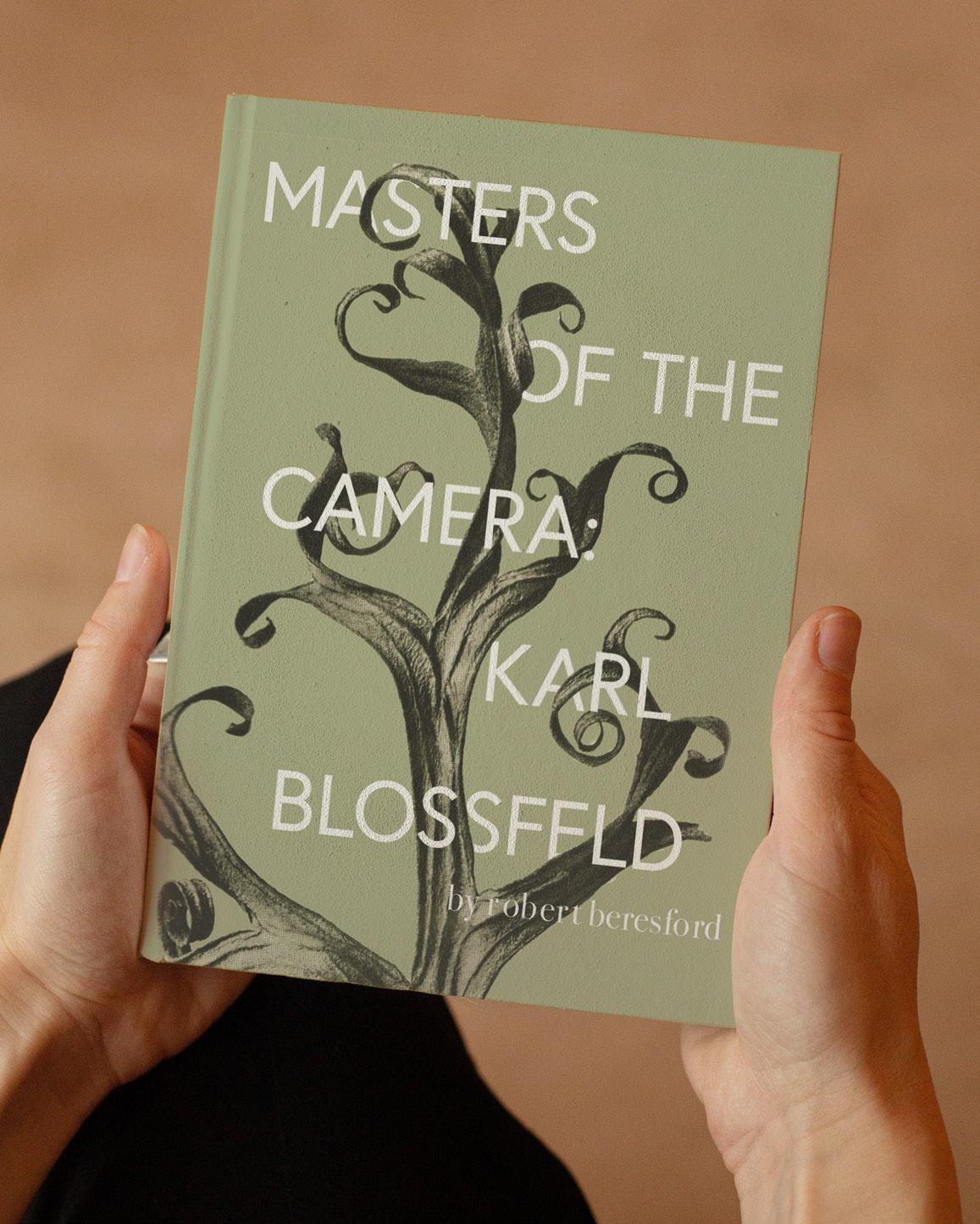
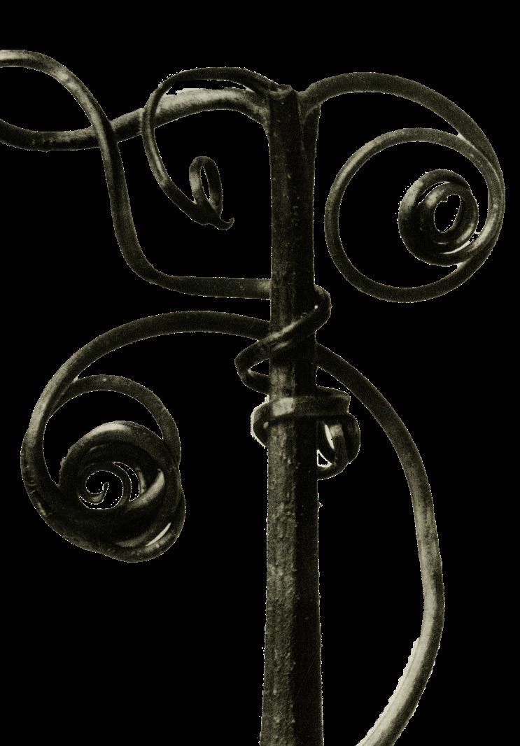
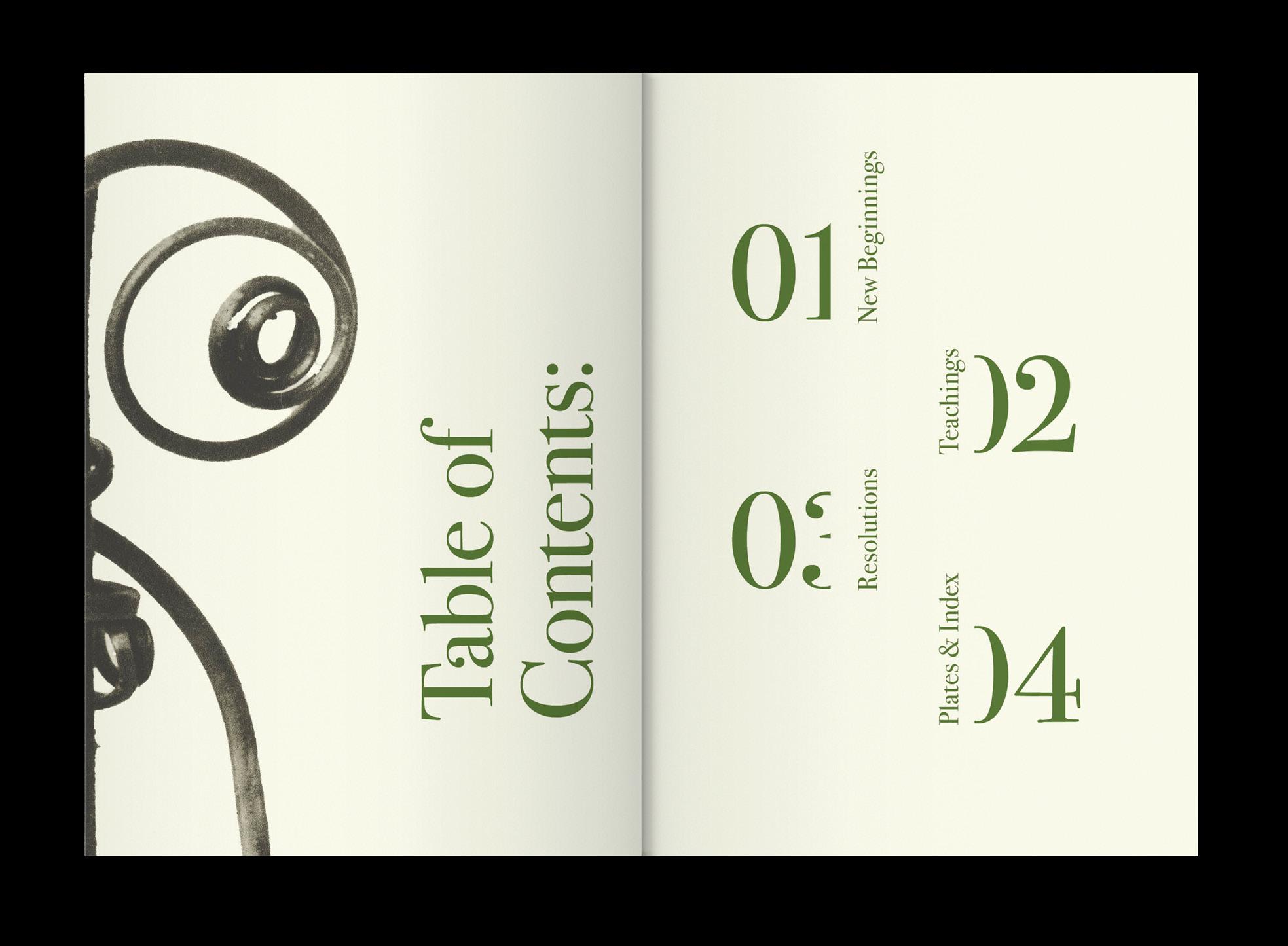
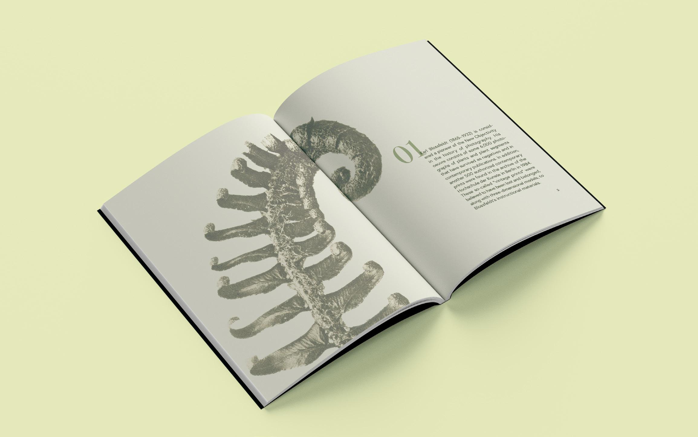
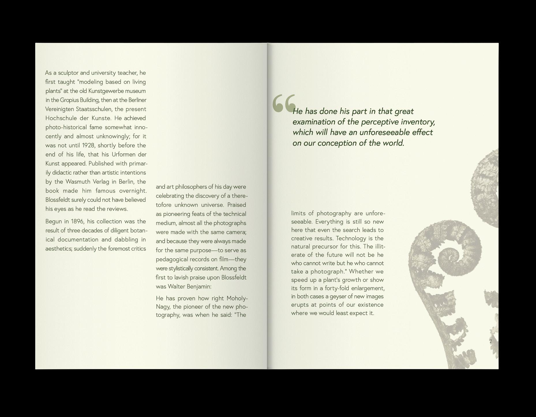
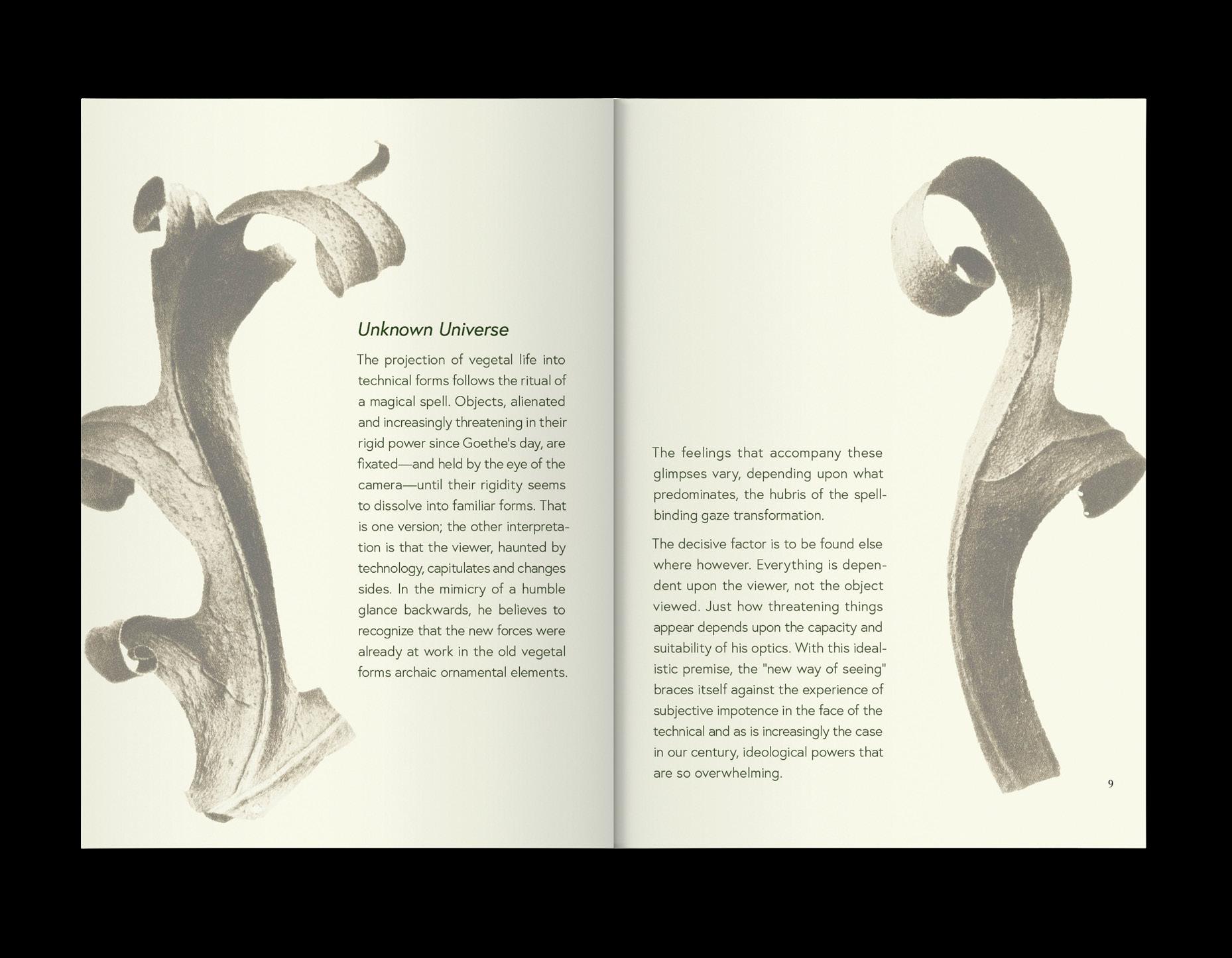
To create a visually compelling book for Masters of the Camera: Karl Blossfeldt –Nature as Art, it is essential to develop a balanced layout, enhance images through subtle manipulation, and refine typography to complement the photography. By thoughtfully using contrast, white space, and strategic font pairing, the design achieves a cohesive and sophisticated aesthetic that honors Blossfeldt’s artistic vision.
WILD & ROOTED
photo editing grid layout
editorial design
CHALLENGE
Using the provided images and text from Masters of the Camera: Karl Blossfeldt – Nature as Art by Robert Beresford, a visually compelling and cohesive book design was created by developing a distinctive layout, applying innovative image manipulation techniques, and refining typography to enhance the artistic essence of Blossfeldt’s work.
SOLUTION
It began with a strong layout that carefully balanced text and imagery, maintaining a consistent visual hierarchy to create a sense of harmony. Image manipulation techniques—like contrast adjustments and selective cropping—were used to highlight the intricate details of Blossfeldt’s botanical photography without losing its authenticity. Typography was refined by pairing an elegant serif for body text with a modern sans serif for headings, striking a balance between readability and a sophisticated aesthetic that complements the organic nature of the visuals.
TYPE COMPOSITION | THOMAS MCNULTY

FRACTURED PALETTE
AN EXPLORATION
The project involved redesigning a regional or local digital newsletter to better engage its target audience and increase attention. This was achieved by tailoring the design with a userfriendly layout and visually appealing elements that aligned with the audience’s preferences.
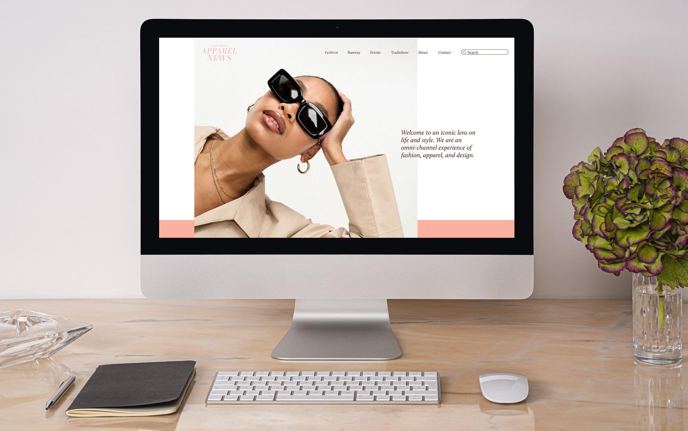
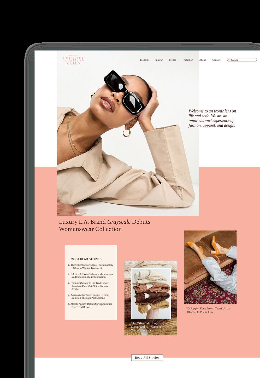
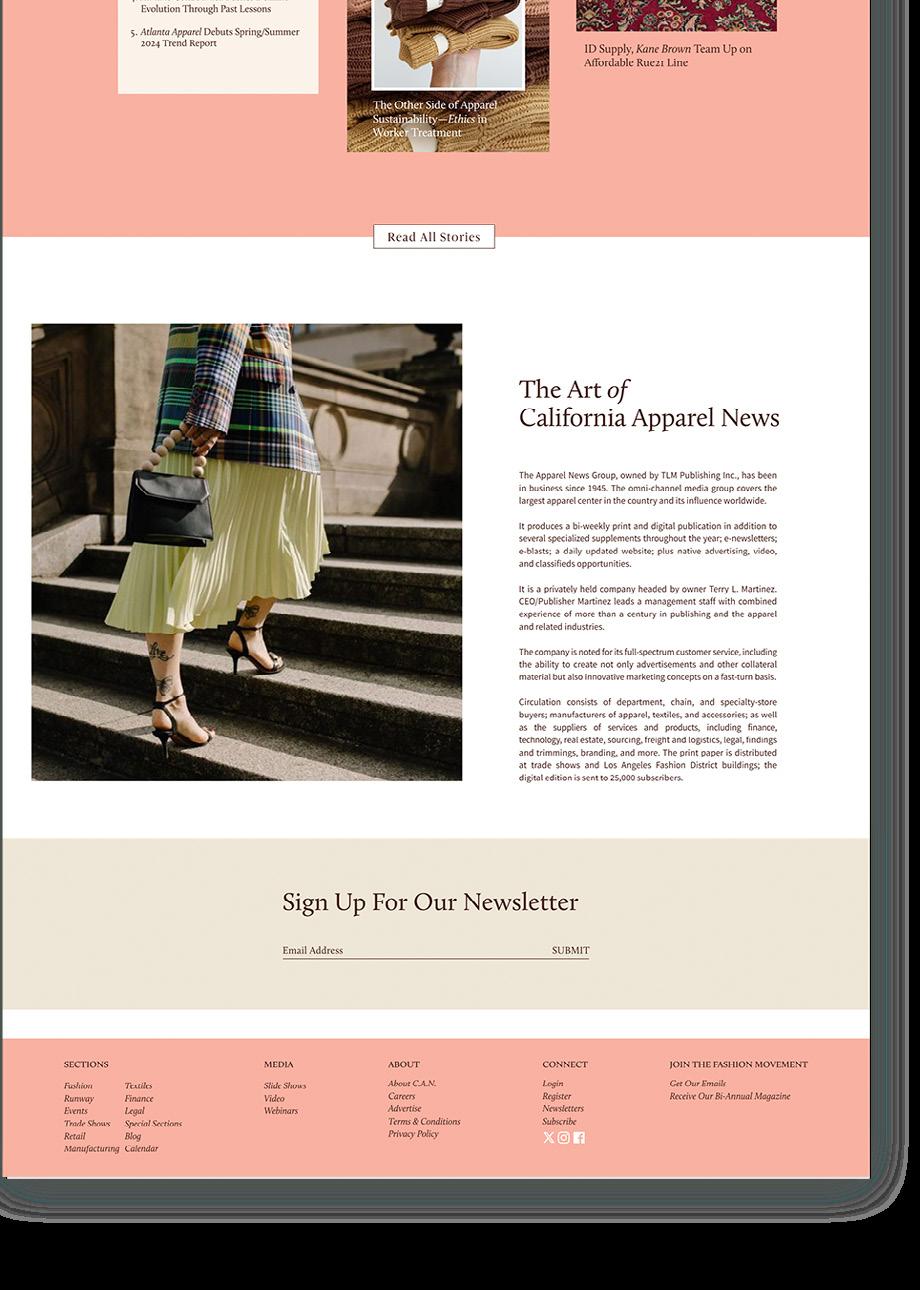
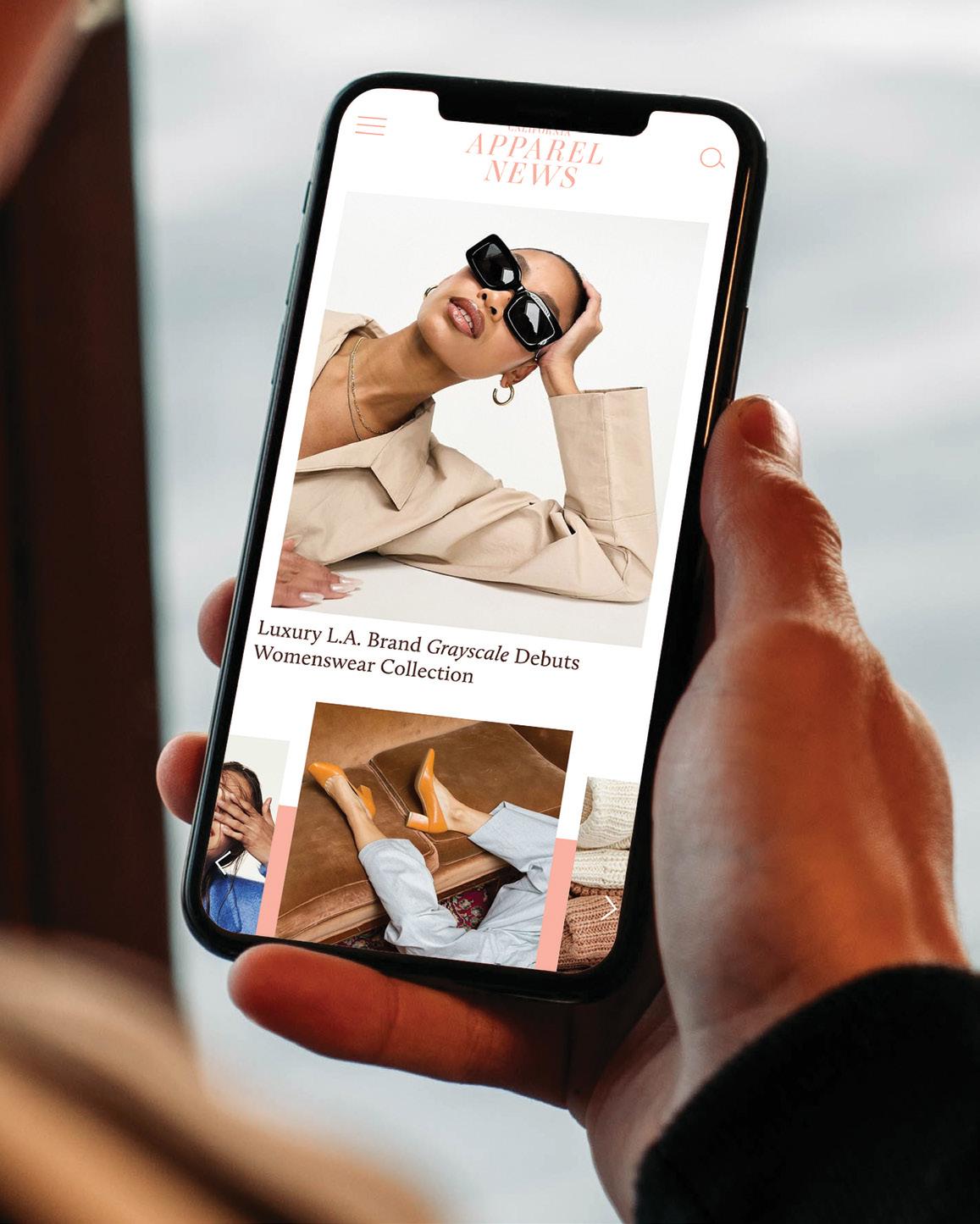
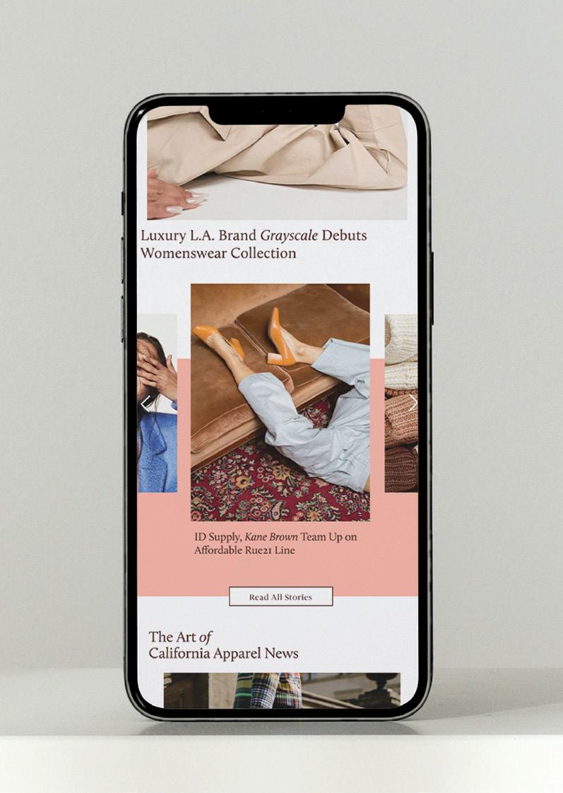
APPAREL NEWS
web & mobile design branding
user interface
CHALLENGE
The challenge was to redesign a regional or local digital newsletter, tailoring it to its target audience in order to increase engagement and attract more attention. This required a deep understanding of the audience’s preferences and creating a visually appealing, user-friendly design that captured their interest.
SOLUTION
California Apparel News’ website was revamped with a new logo, branding colors, and a modern style. Focusing on fashion trends, a trendy yet timeless color palette was selected to ensure the design remains sophisticated and relevant for years to come. The overall design elevates the user experience while maintaining a stylish and enduring aesthetic.
TYPE COMPOSITION | THOMAS MCNULTY


DUELING HUES
AN EXPLORATION
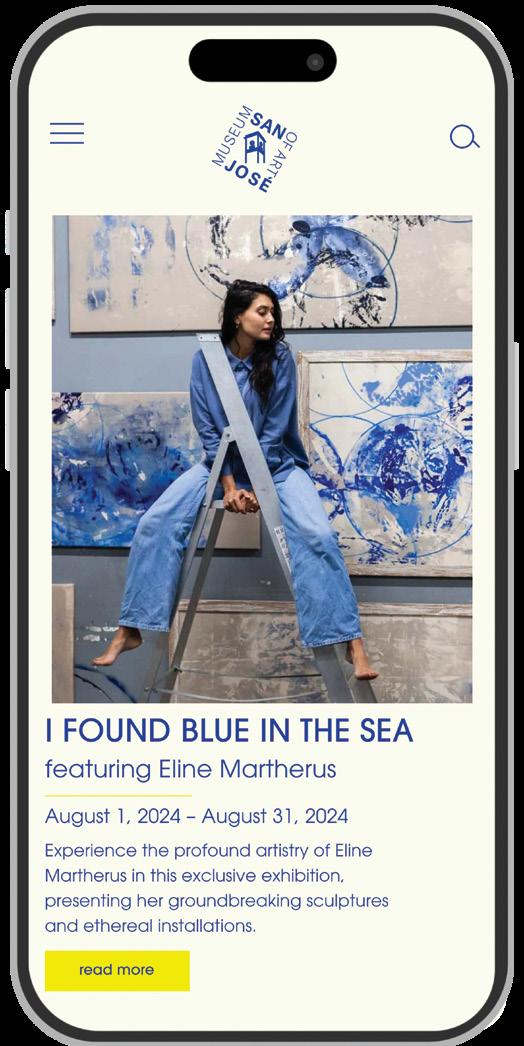
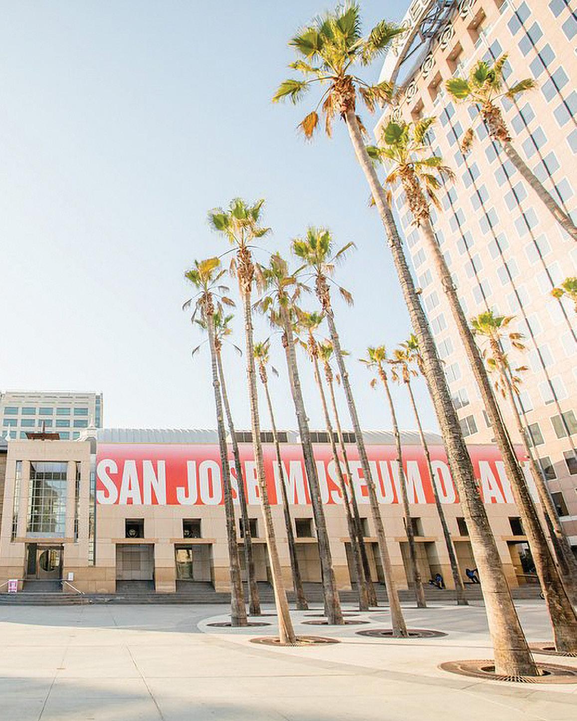
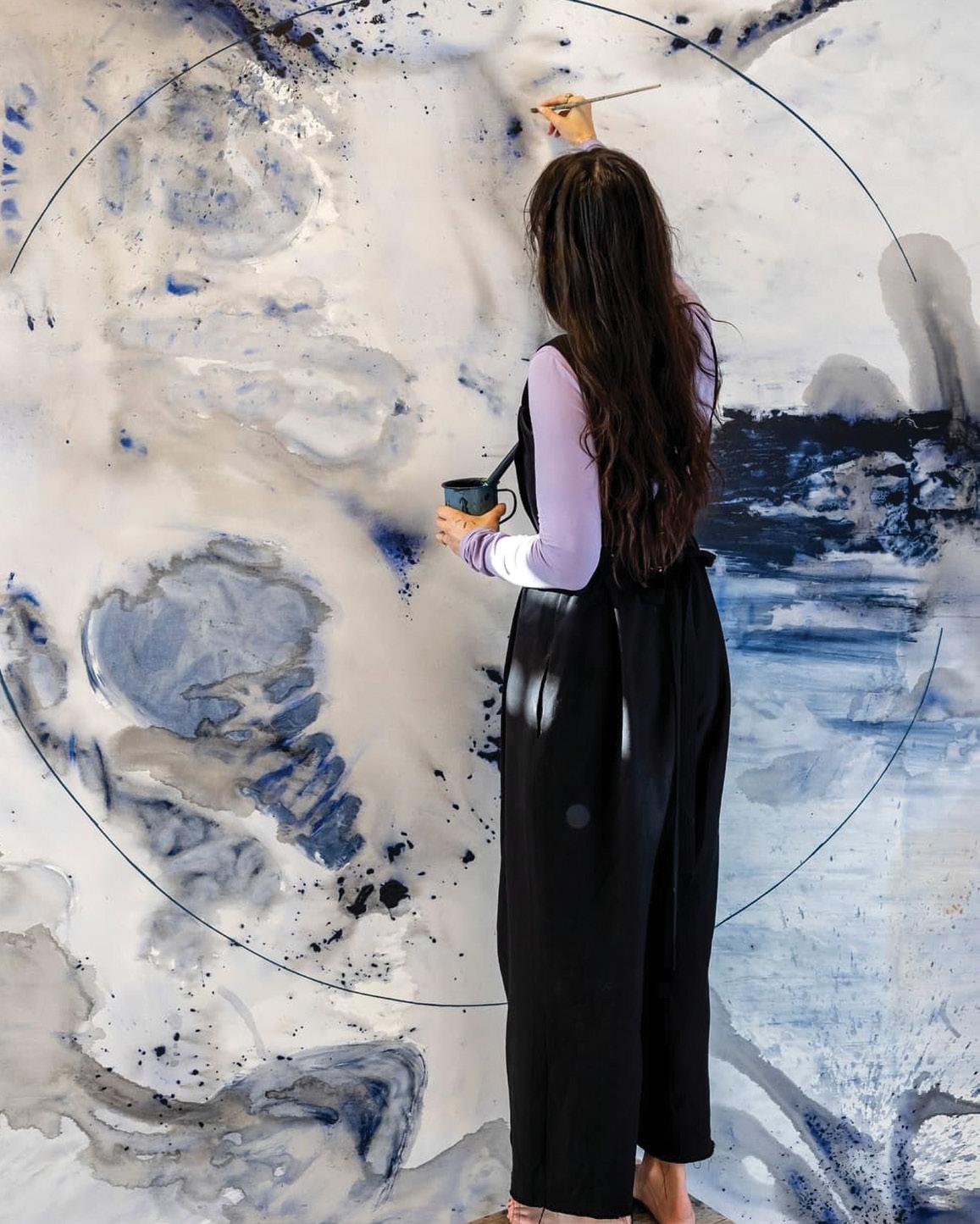
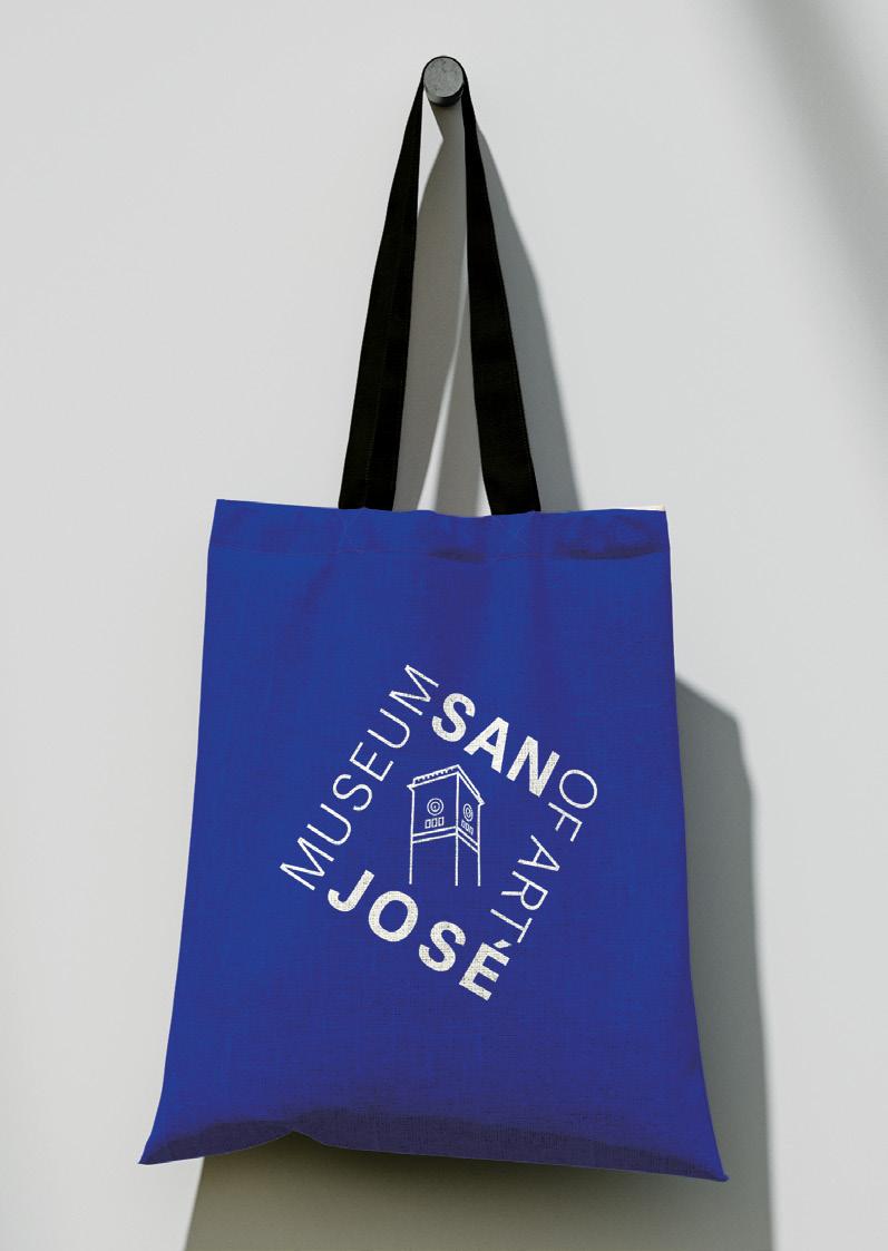
This project focused on selecting a local museum and reimagining its branding to create a fresh, modern identity while preserving its historical essence. Through extensive research and design exploration, the goal was to develop a cohesive visual system that enhances the museum’s appeal to contemporary audiences.
EXHIBIT ELEVATE
branding logo design digital design
CHALLENGE
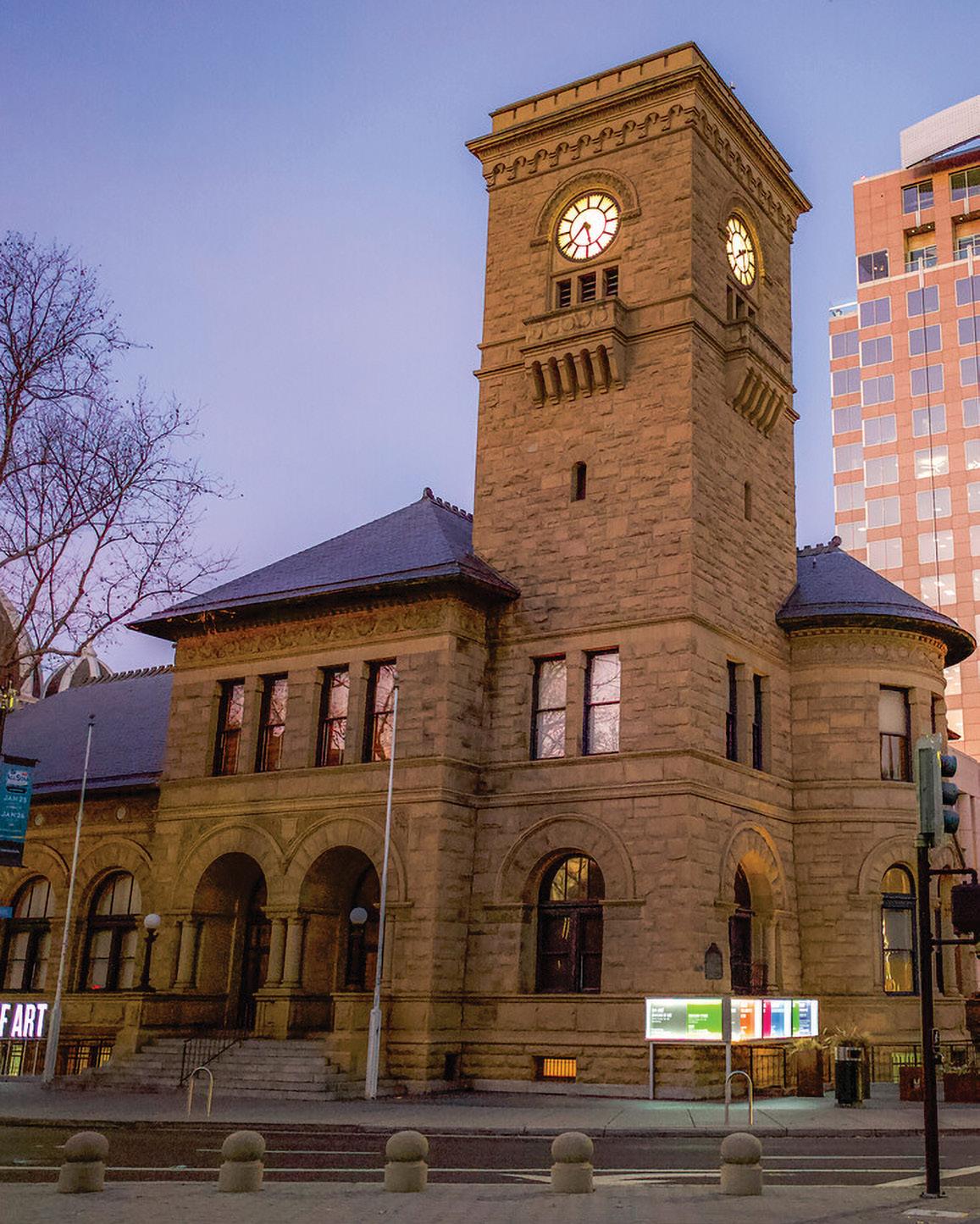
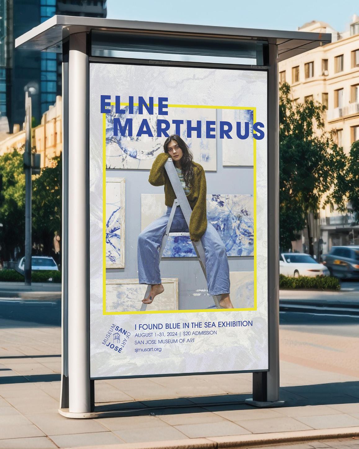
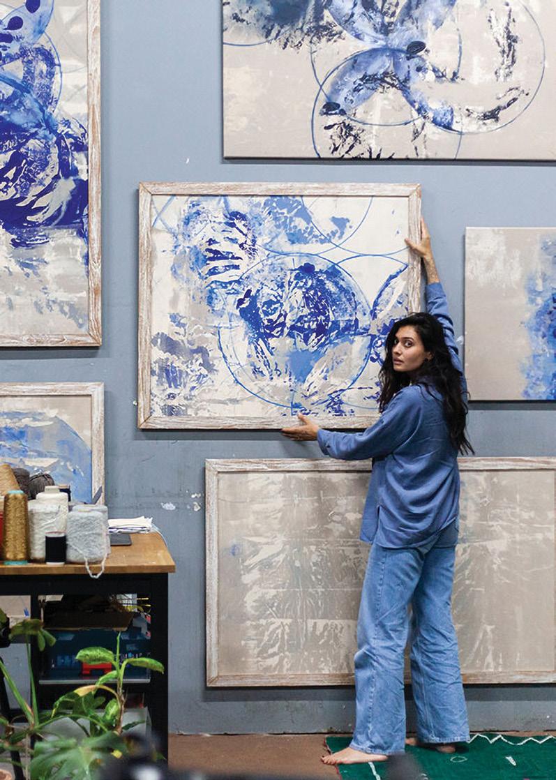
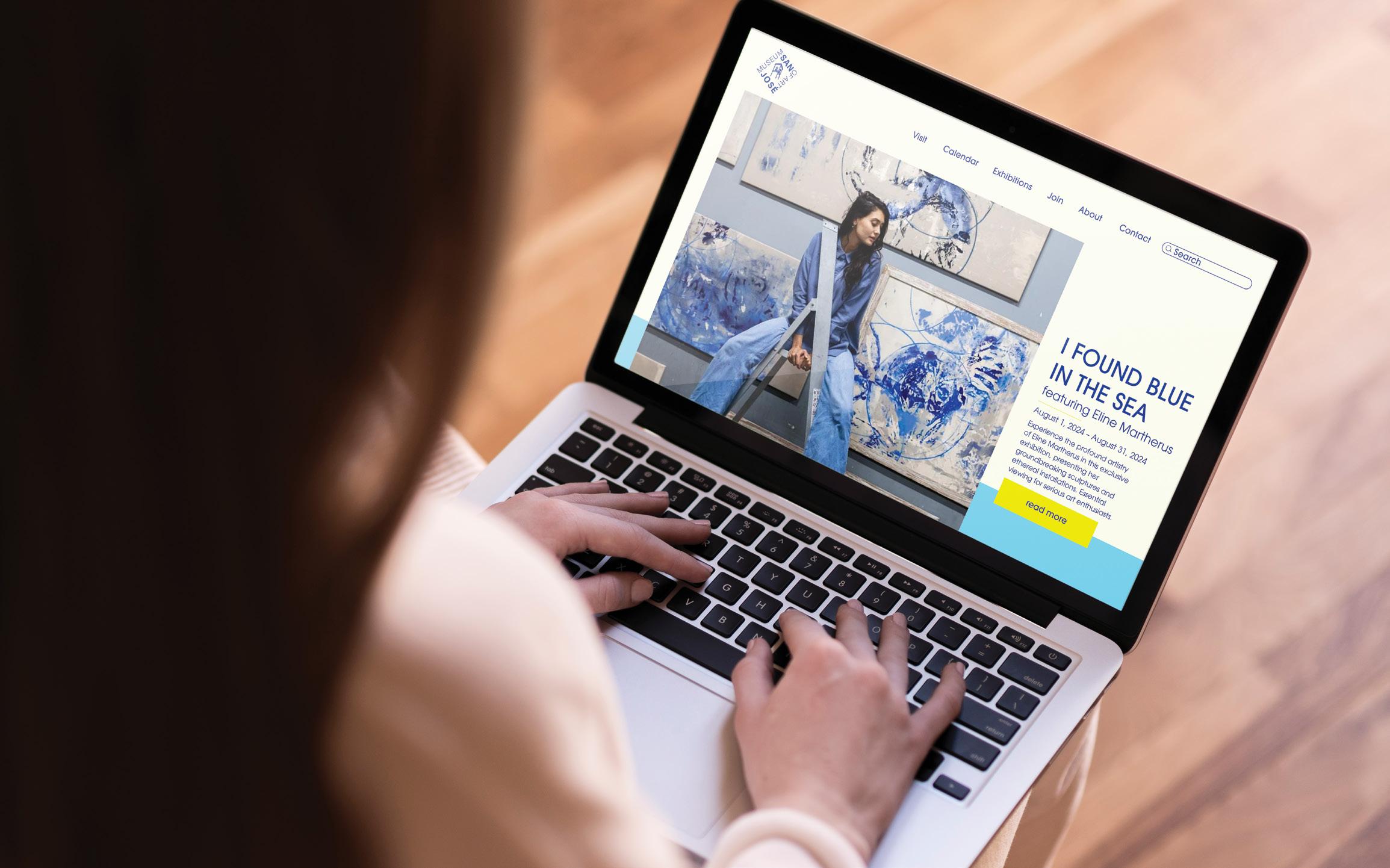
After finding a local museum, the challenge was to develop a revitalized brand identity that felt both contemporary and true to its heritage. The existing branding for San Jose Museum of Art lacked cohesion and struggled to connect with modern audiences, making it less engaging and recognizable.
SOLUTION
To create a compelling and authentic brand identity, inspiration was drawn from the museum’s exhibitions, architecture, and surrounding landscape. Textures, colors, and motifs from the exhibits informed key design elements, while structural details of the building influenced typography and layout choices. By integrating these visual and environmental cues, the resulting branding system feels deeply connected to the museum’s essence, offering visitors a seamless and immersive experience.
DIGITAL GRAPHICS | JEREMY STOUT
CHROMATIC EVOLUTION
AN EXPLORATION
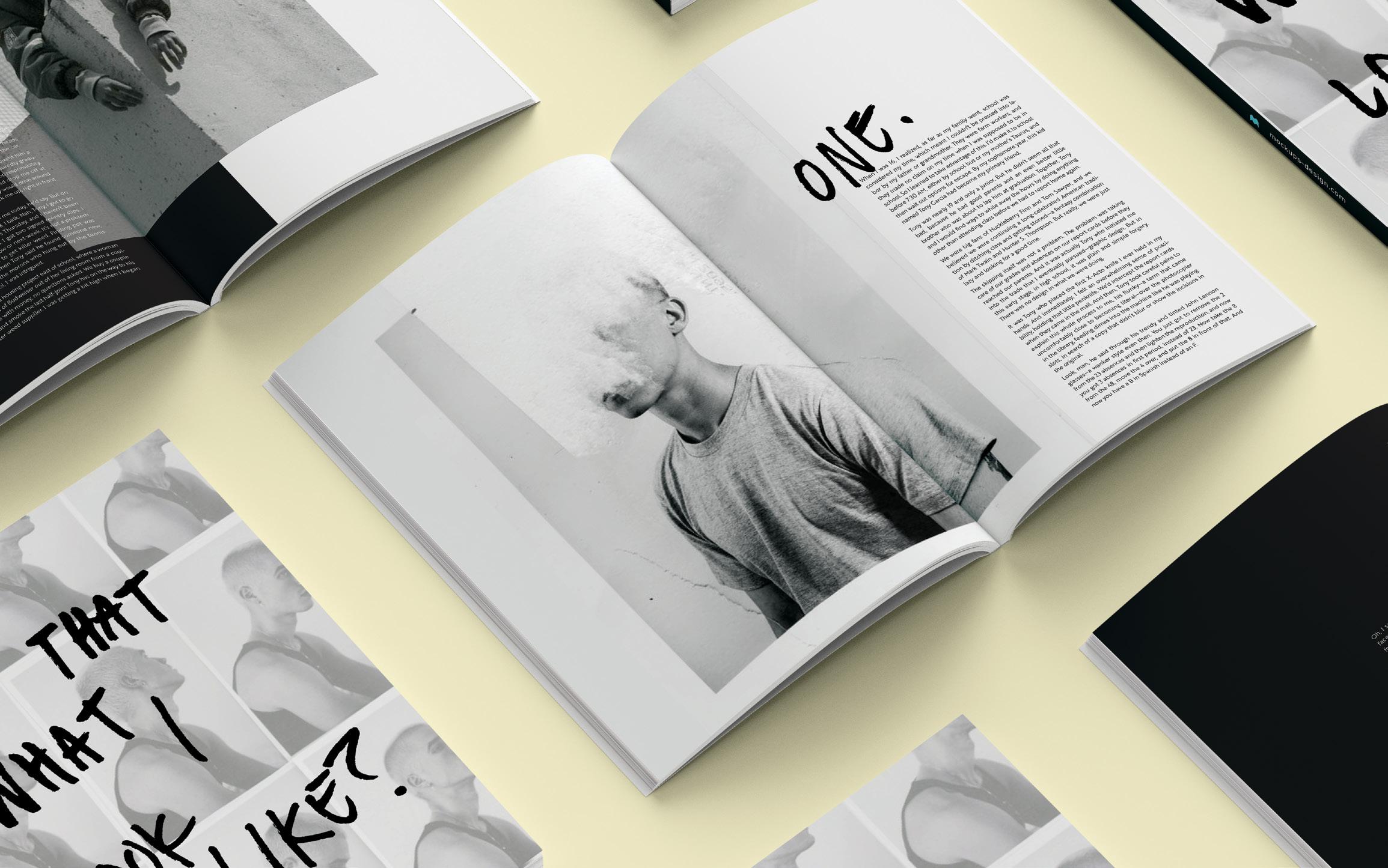
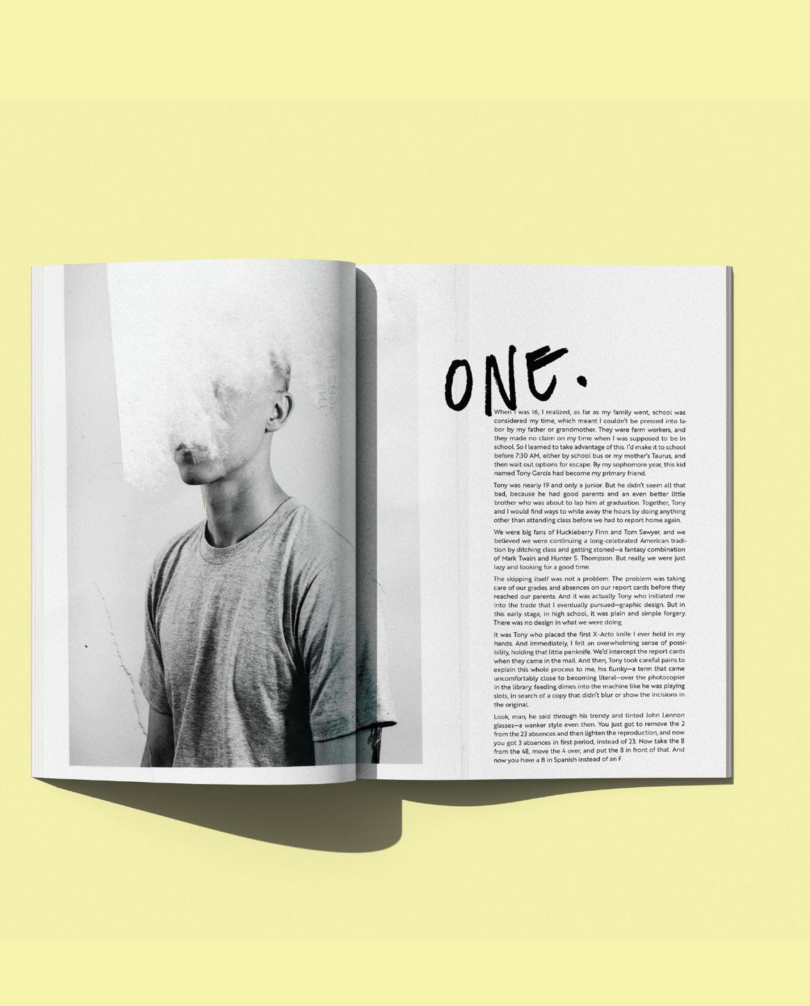
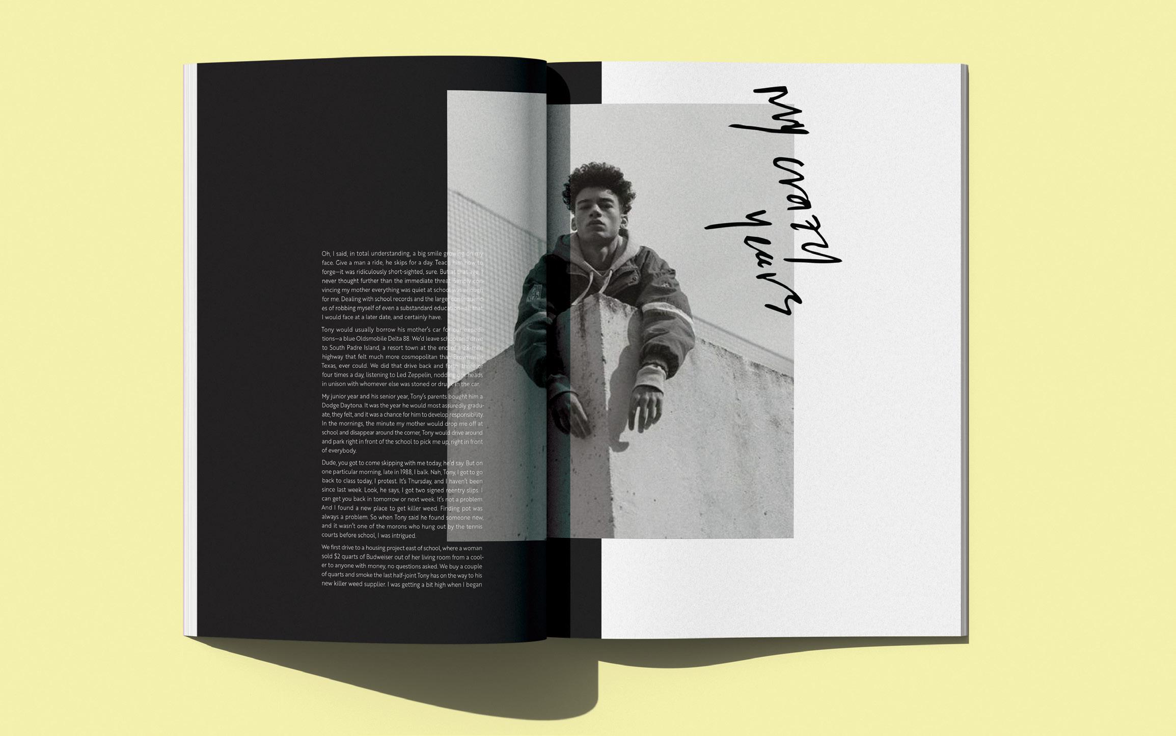
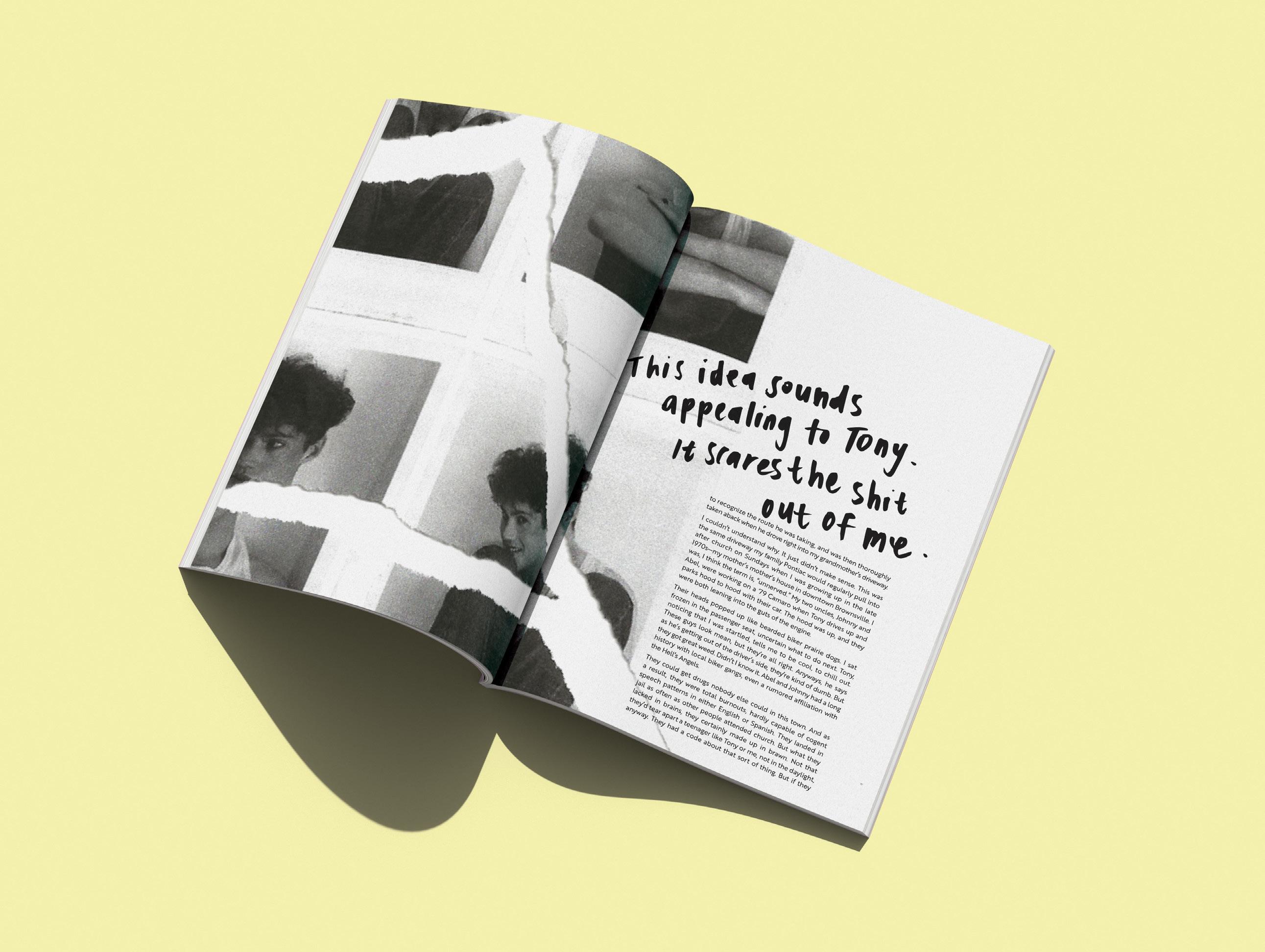
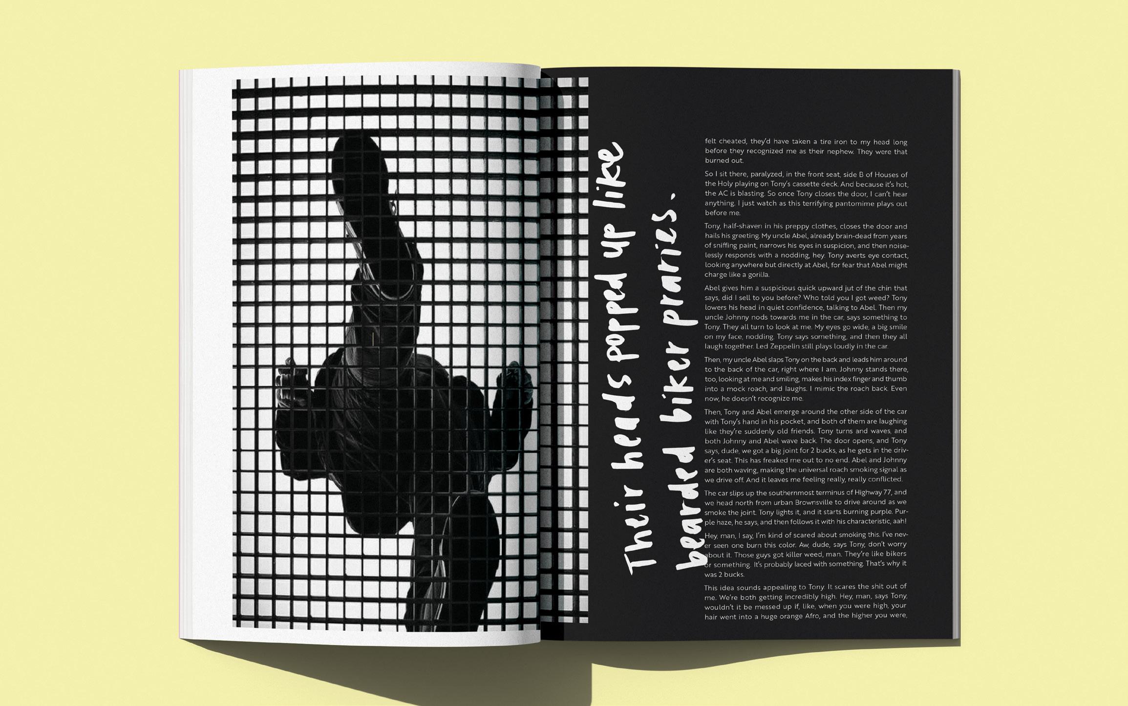
“Is That What I Look Like” is a visual translation of a This American Life podcast into a thoughtfully designed booklet. The podcast follows Domingo Ramirez, a Los Angeles native, as he recounts a pivotal moment that reshaped his perspective and led him to change his friendships to avoid trouble.
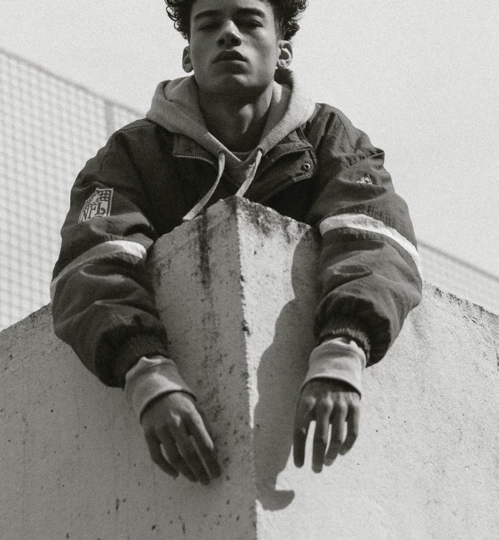
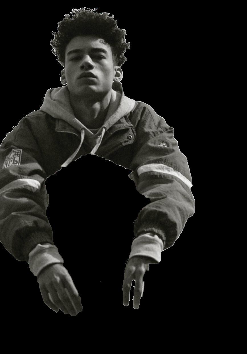
image retouching editorial design typography
HARD EDGES
CHALLENGE
The task was to visually capture the tone, style, and pace of the audio, translating its emotion and rhythm into a tangible, immersive reading experience. By carefully selecting typography, layout, and graphic elements, this booklet reflects the raw introspection and transformation at the heart of Ramirez’s story.
SOLUTION
The design approach relied on strategic typography and imagery to echo the podcast’s narrative flow—balancing moments of tension with spaces for reflection. Bold, abrupt typography mimics the weight of Ramirez’s realizations, while softer, more open layouts allow room for contemplation. Color and graphic elements were used to reflect both the urban setting of Los Angeles and the internal shift Ramirez undergoes.
TYPE SYSTEMS | JEREMY STOUT

DYNAMICS
AN EXPLORATION
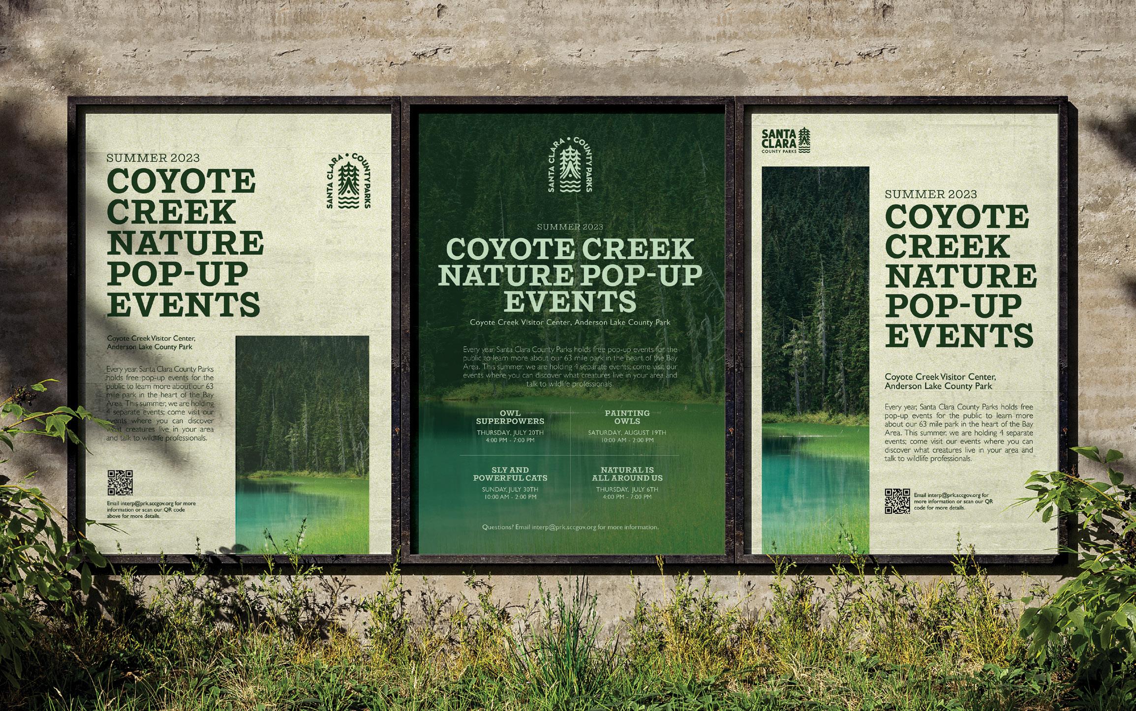
After discovering a community poster while visiting the local library, there was an opportunity to improve its visual impact. It was redesigned into a cohesive system that better communicates with its intended audience.
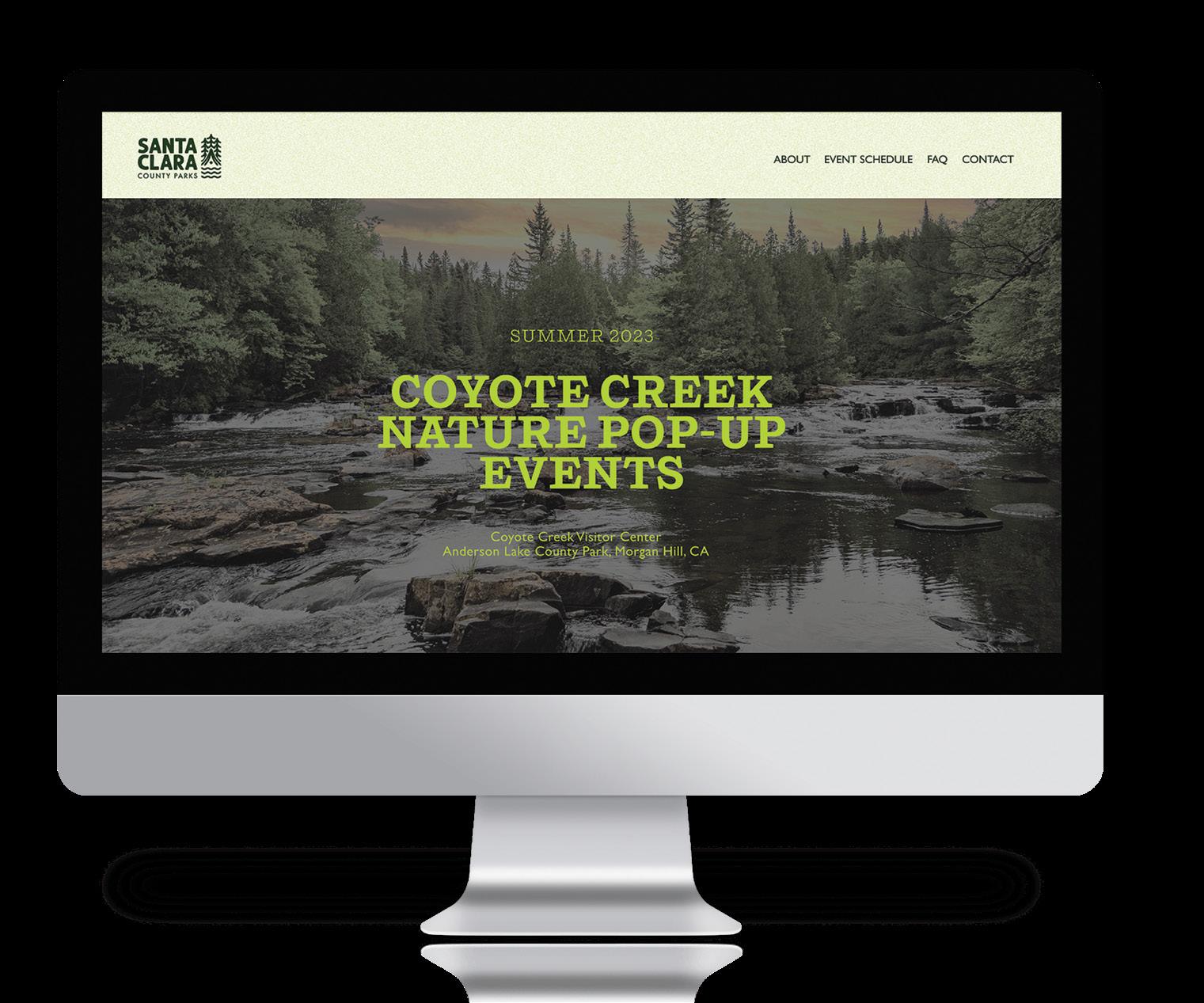
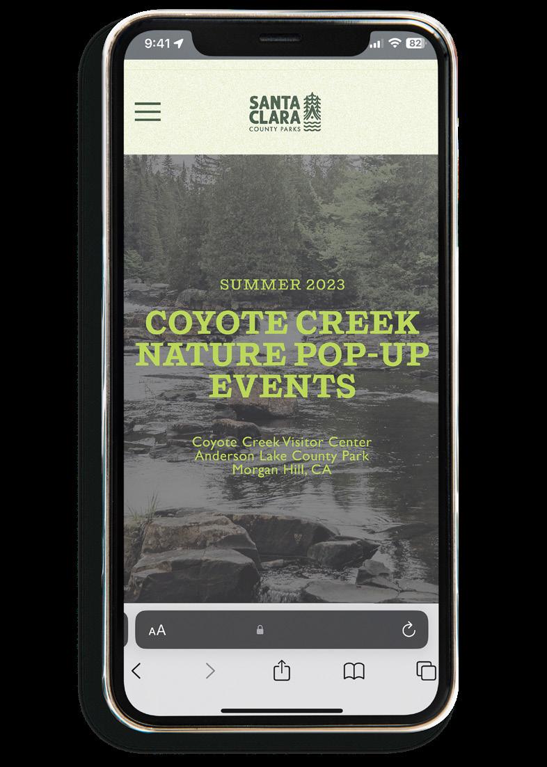
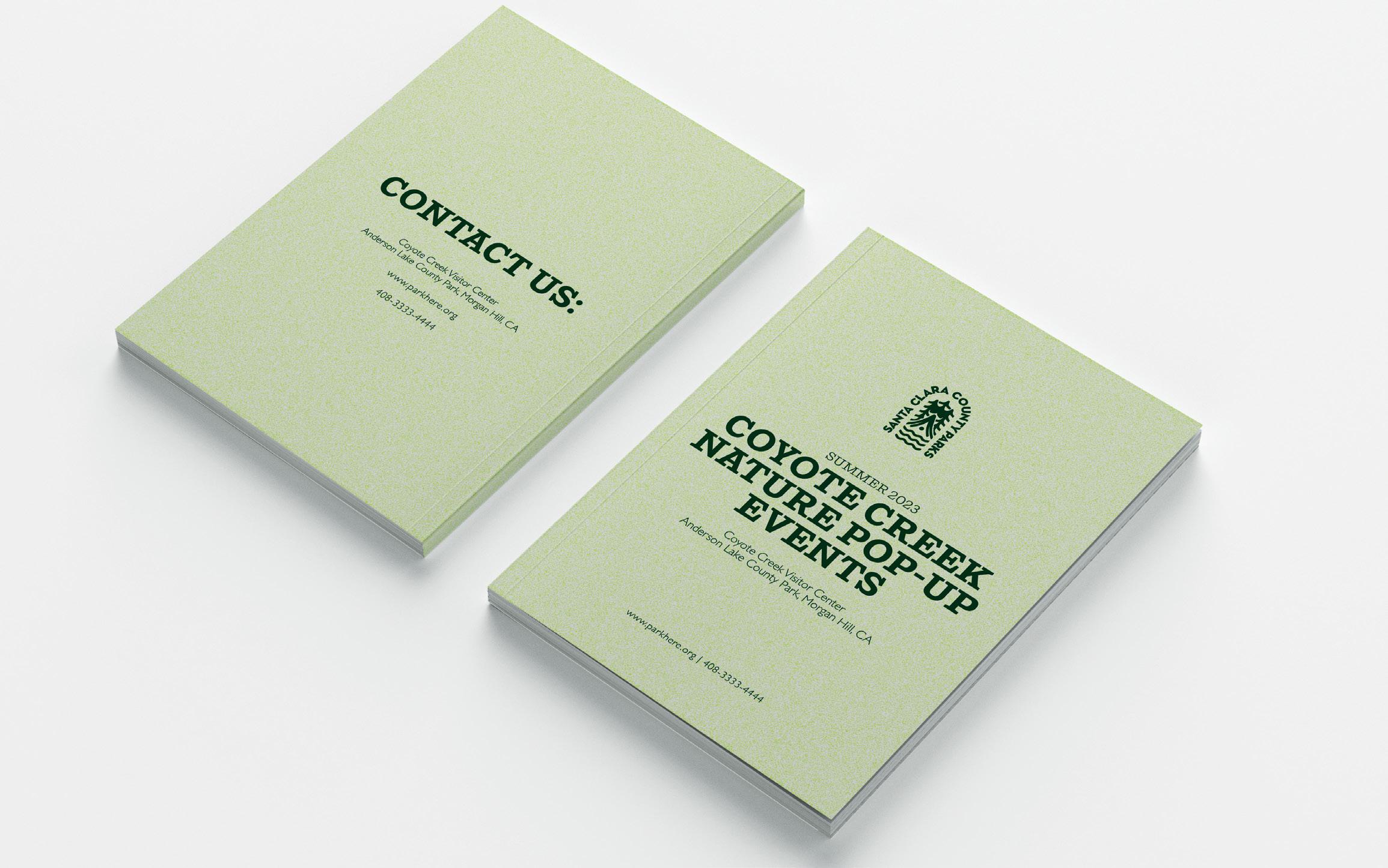
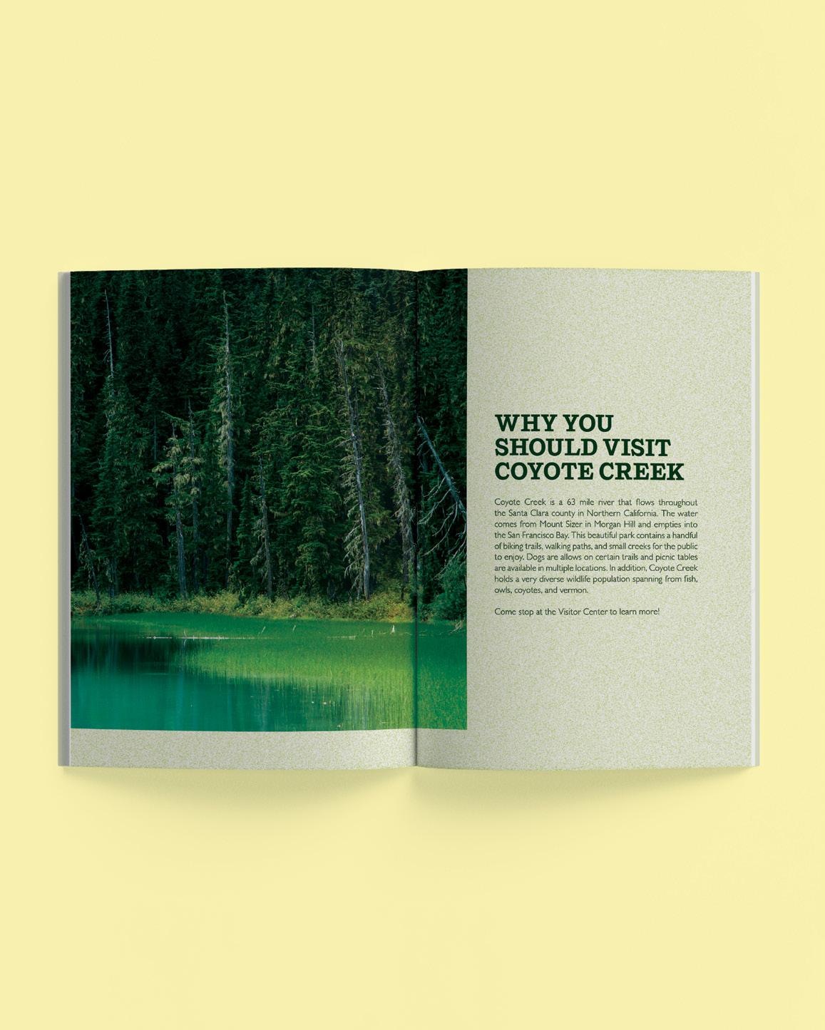
COYOTE CREEK
branding logo design digital design
CHALLENGE
The challenge was to take a locally posted flyer and transform it into a cohesive visual identity. This included developing a logo, color palette, typography, and imagery style through research that aligned with both the content of the original poster and the needs of the target demographic.
SOLUTION
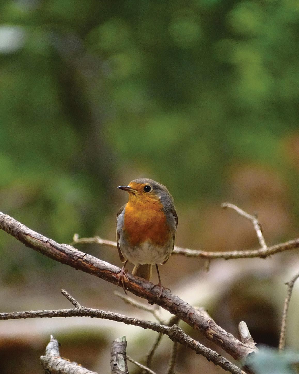
The solution involved designing a series of poster styles, a website, and a brochure that expanded on key information useful for individuals attending the events. After conducting extensive research on past nature-related events, a comprehensive style guide was developed to unify the visual identity across all platforms. The visual direction draws inspiration from the event’s location, incorporating colors found in the natural surroundings—such as a dark, earthy green—and using textured backgrounds to evoke an organic, grounded feel.
TYPE COMPOSITION | THOMAS MCNULTY


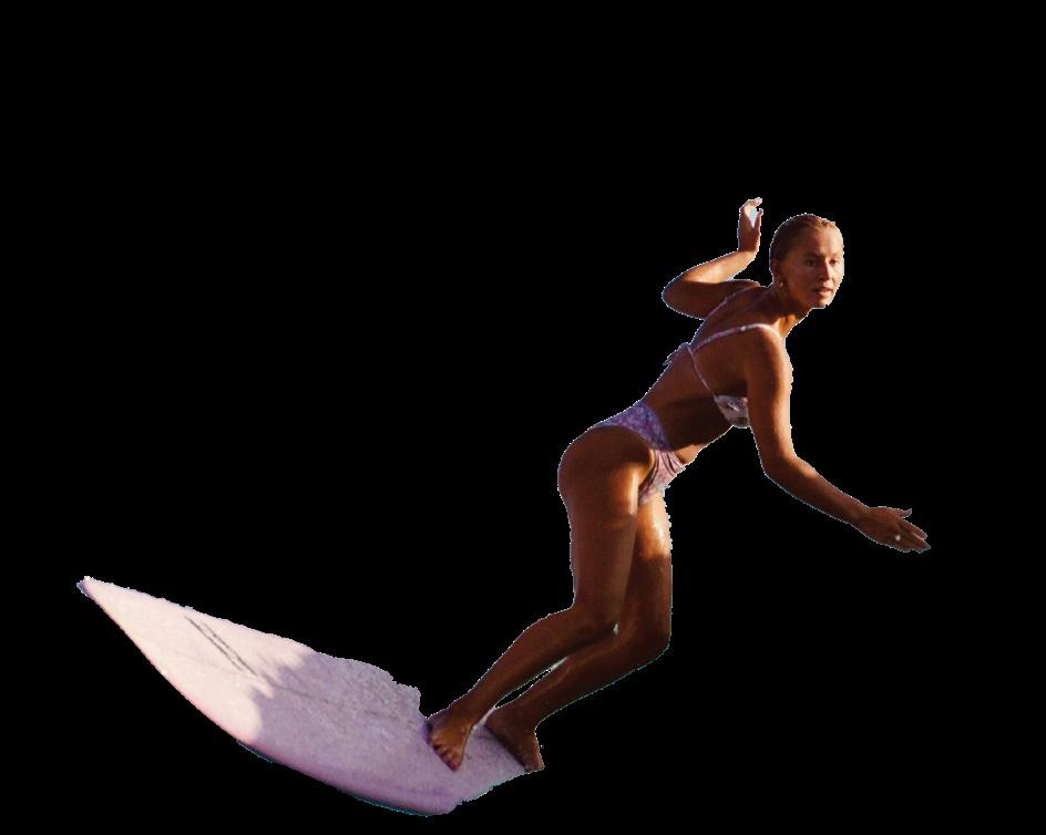

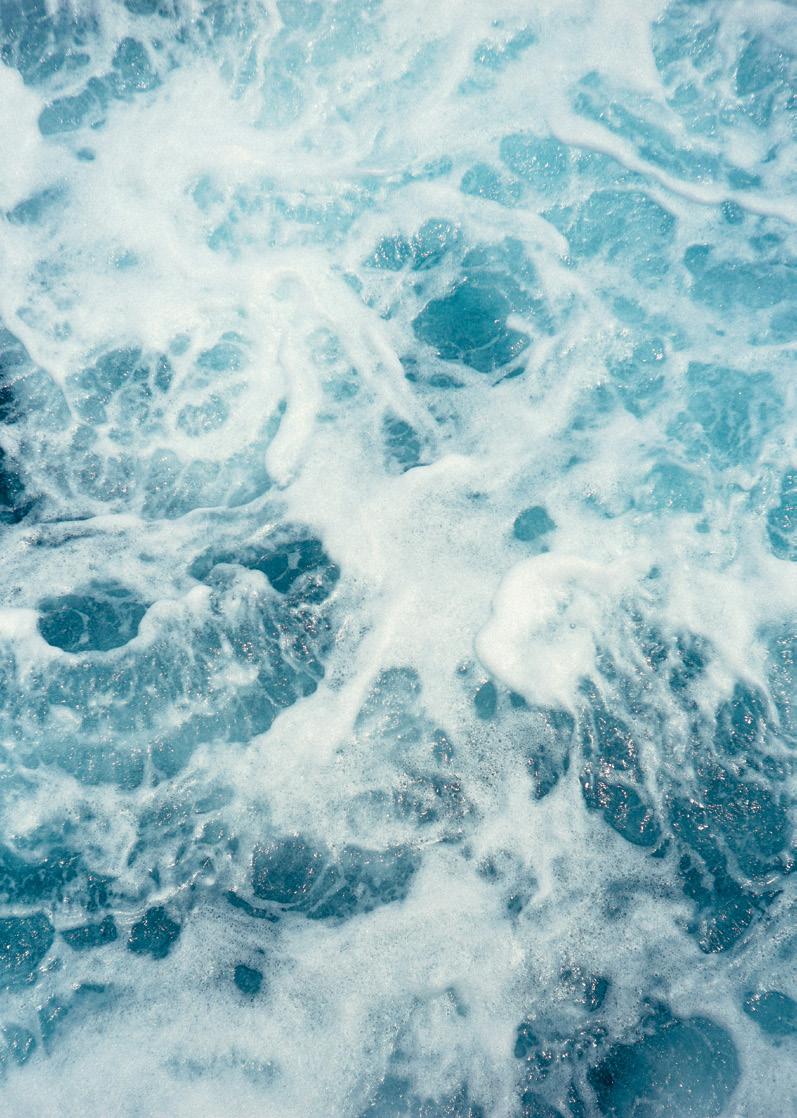
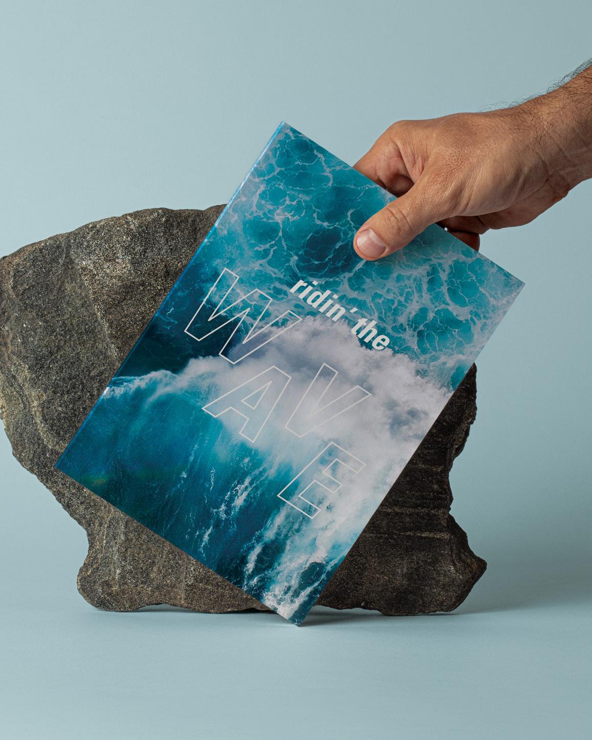
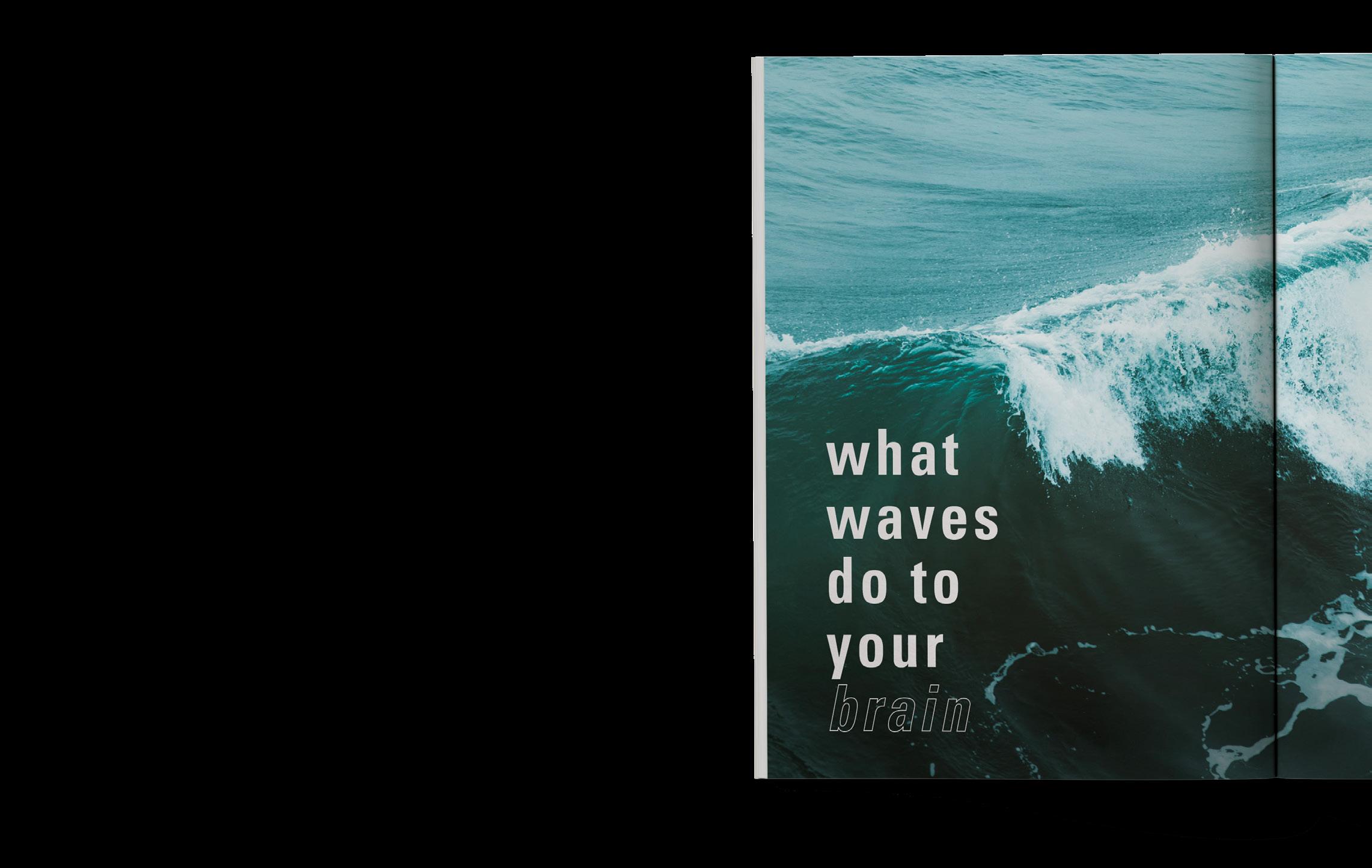
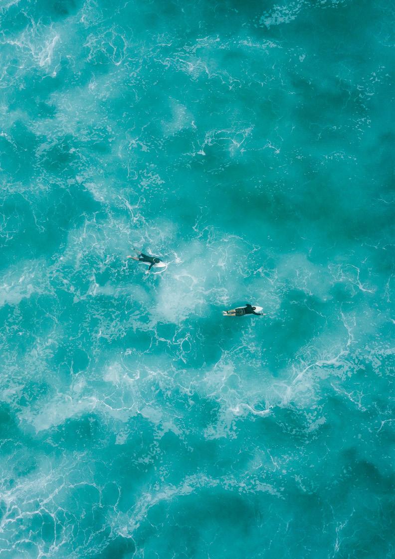
RIDIN’ WAVES
editorial design typography
post-production
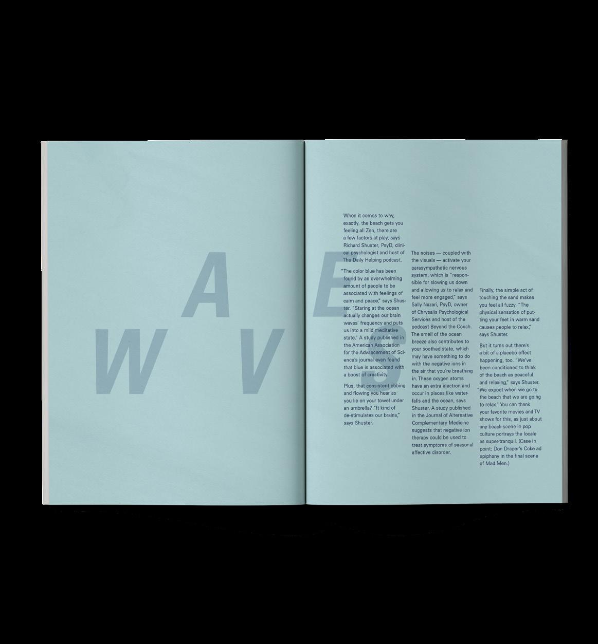
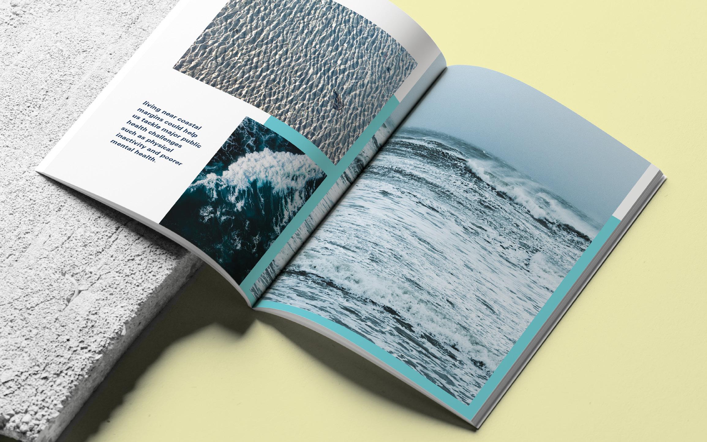
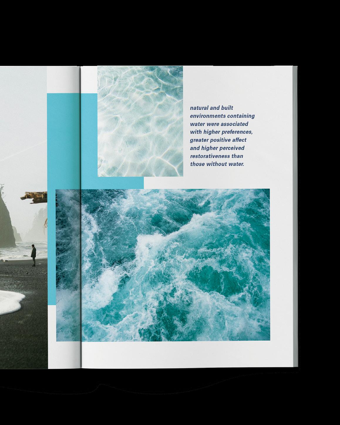
CHALLENGE
The challenge was to take a text-heavy research paper and break down key points into a dynamic multi-page spread, incorporating a strong branding guideline, clear visuals, and a thoughtful text hierarchy. This approach aimed to distill complex information into an engaging and accessible layout, balancing informative content with visual flow.
SOLUTION
After researching inspiration, imagery, and type styles, I decided on a photo-heavy design that incorporates playful typography, using organic elements to mimic the movement of waves. This approach allowed me to create a visual rhythm that reflects the calming, fluid nature of the research, while maintaining a clear and engaging text hierarchy.
VISUAL LITERACY | LAURIE MAKELA
TO MY INSTRUCTORS —
Thank you so much for your support, encouragement, and thoughtful feedback throughout my time in the program. Your guidance has been incredibly impactful in shaping my growth as a designer and future educator. I’m truly grateful for the insight and mentorship you’ve shared with me along the way.
COLOPHON
School: Academy of Art University, School of Graphic Design
Course: GR 700 – Senior Portfolio
Instructor: Irena Milev
Website : www.amyburke.co
Bookbindery : Blurb.com
Fonts : TT Trailers & Brother 1816
Software : Figma, InDesign, Photoshop, Illustrator, Acrobat
© 2025 All rights reserved. No part of this publication can be reproduced without express written permission from Amy Burke.