VISUAL DEVELOPMENT GUIDE
AMY BURKE | GR 604
AMY BURKE | GR 604
A capsule of identity development process from initial ideation to final form of the company’s re-branding.
History
Logo Sketches
Logos
Logo Research

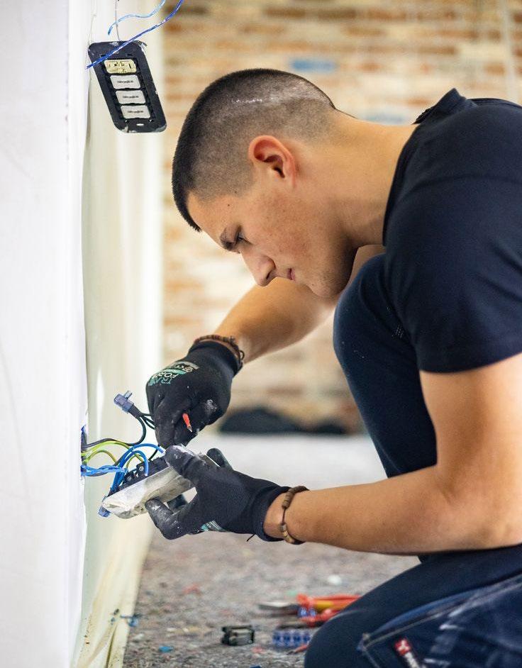
American Apparel was founded in 1989 by Dov Charney and has become a celebrated American fashion brand, renowned for its high-quality, ethically produced basics. Starting as a wholesale manufacturer, it evolved into a retail powerhouse, offering timeless essentials like t-shirts, hoodies, and leggings. With a commitment to domestically produced, sweatshop-free garments, the brand emphasizes fair labor practices and environmentally responsible manufacturing.
Rooted in transparency, sustainability and respnisbility, American Apparel strives to deliver well-crafted wardrobe staples while setting a standard for ethical fashion. Despite facing financial hurdles, its core values of quality and integrity continue to resonate with a diverse customer base that values style with a conscience.

“Our needs are identical with labor’s needs. Decent wages, fair working conditions, livable housing, oldage security, health and welfare measures, conditions in which families can grow.”
–Martin Luther King Jr.
OLD MISSION STATEMENT:
To make great quality clothing without compromising our values, and to innovate the way we make and sell products while remaining committed to our communities, ethical labor, and sustainability.
NEW MISSION STATEMENT:
Maintaining fair, ethical practices and better opportunities for the American worker, while strengthening communities nationwide.
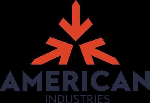
American Apparel has officially re-branded as American Industries to better reflect its core values, mission, and vision for the future. This new name encapsulates the company’s commitment to ethical practices, innovation, and its dedication to supporting American workers. The re-branding also signals a strategic shift, enabling the company to diversify beyond apparel and expand into a range of industries, fostering growth and creating new opportunities across multiple sectors.
”Actions with purpose” displays the brand’s commitment to responsible and intentional practices. It conveys a clear message that every decision is made with a thoughtful focus on sustainability, ethics, and long-term impact.
”True to our roots” reflects the brand’s core values of being unapologetically themselves and doing what they believe is best for them and their clientele.
”Driven by conscience” defines the brand’s ethical responsibility and thoughtful decision-making. It highlights the company’s commitment to fair labor practices and sustainable production, appealing to customers who prioritize ethical values in their purchases.
A variety of physical and digital iterations of logos for American Industries. It is split up between the three key phrases: Responsible, Authentic, and Ethical.
This is part one of rough sketches based on the first key phrase, “Responsible” and its tagline, “Actions with purpose”. These sketches were done with paper and pencil.
This is part two of rough sketches based on the first key phrase, “Responsible” and its tagline, “Actions with purpose”. These sketches were done with paper and pencil.
This is part one of rough sketches based on the second key phrase, “Authentic” and its tagline, “True to our roots”. These sketches were done with paper and pencil.
This is part two of rough sketches based on the second key phrase, “Authentic” and its tagline, “True to our roots”. These sketches were done with paper and pencil.
This is part one of rough sketches based on the third key phrase, “Ethical” and its tagline, “Driven by conscience”. These sketches were done with paper and pencil.
This is part two of rough sketches based on the first key phrase, “Authentic” and its tagline, “Driven by conscience”. These sketches were done with paper and pencil.
More robust versions of the logo after feedback from the original styles.
Here are the physical drawings of the logos. They were later made into digital renderings.
Here are some of the digital logos made from the sketches on the page before.
Our new logo encapsulates our core values— responsible, authentic, and ethical—through a cohesive design. The graphic mark features three inward-pointing arrows arranged in the shape of a triangle. The letter “A” forms the outline of a pyramid, representing the strength and stability of unity, symbolizing the collective power of workers.
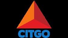
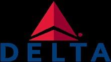
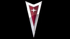
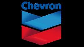
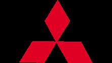
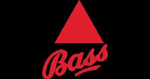
To gain a perspective on the logo, research was done with existing examples on shape, style, and design to see how they respresent their identity.
To gain a perspective on the logo, research was done with existing examples on shape, style, and design to see how they respresent their identity. These logos have a geometric 3-pointed shape that mimics a triangle or arrow.


After examining many examples of existing Visual Standards Guidelines, here are the ones that had the best based on each section.
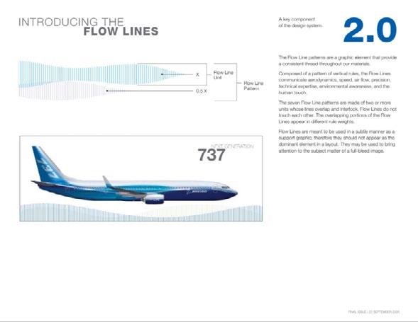
BOEING:
The PDF goes straight into a concise synopsis of how the graphics and illustartions for the company are inspired by the shape of the product (airplanes) and how air flows around it. illustrations for the com-
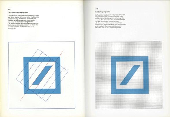
DEUTSCHEBANK:
The brand guideline clearly shows how the logo was constructed with a 1:1 grid. In addition, it visually depicts how it was designed.
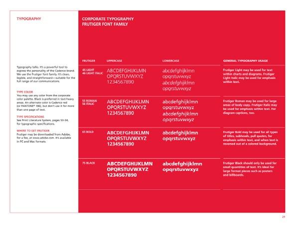
CADENCE:
This page is concise and shows which scenario the different typefaces and weights are used. In addition, it states where they font can be downloaded.
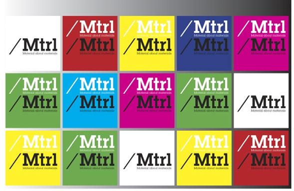
MTRL:
The brand shows off a large array of different colors that can be used with the brand. In addition, it displays what color logos can be used on what background color.
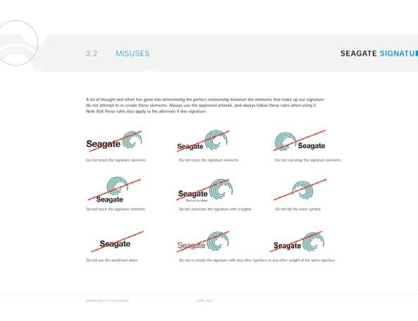
SEAGATE:
Seagate shows many different ways how their logo should not be used. It’s clear and visualizes some easily-made mistakes.
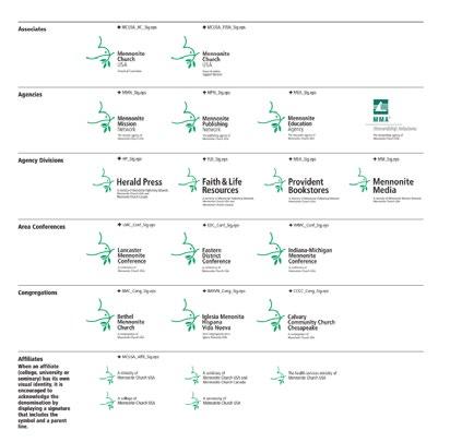
With so many different entities, Mennonite Church did a good job on showing different styles of how the logo should look within different departments.
www.unsplashed.com
www.americanapparel.com
www.gildancorp.com/en/
www.pinterest.com
www.gq.com/about/american-apparel
his publication is set in Brother 1816, a robust and versatile typeface designed by Fabio Haag and Nelson Balaban, blending geometric precision with humanist warmth. Its balanced proportions create a visual rhythm that enhances readability and design.
WEBSITE: www.american-industries.org