1 minute read
SLAB SERIFS


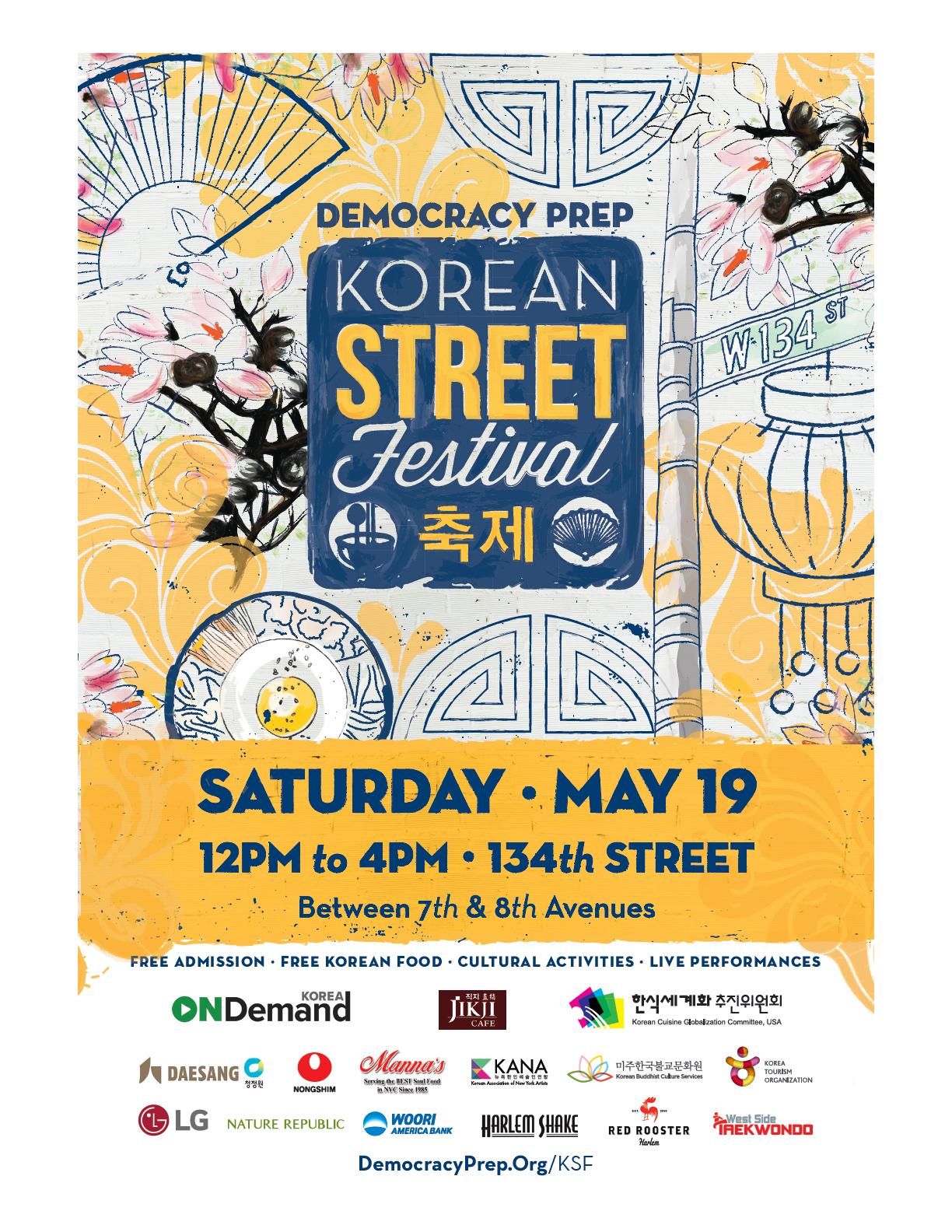
We use slab serifs to emit a collegiate feel. Sports World is our primary slab serif used in our DREAM values. We use additional slab serifs for headlines in various banners and graphics.
San Serifs
Advertisement
While we prefer the use of the Neutra Text Family, sometimes an ulterior font is preferred or may be more accessible. Below are some acceptable san serif substitutions.
Sometimes more elegant messaging is needed for upcoming ceremonies or festivals. We use scripts that compliment Neutra and have strong readability.
Our iconic crest consists of an open book to signify education and reading, a flag to portray our values of civic engagement and mortar boards to celebrate our college driven scholars. To ensure the legibility of the logo, it should be surrounded by a minimum of clearspace. This isolates the logo from competing elements. Using the logo consistently helps to establish and reinforce recognition of the Democracy Prep® brand. Careful attention should always be paid to alignment, font weight, kerning and leading.
margin around = height of both lines
Democracy Prep
Public Schools
Stacked
margin around = height of top line
Crest Considerations
Using the logo consistently helps to establish and reinforce recognition of the Democracy Prep® brand.
PUse on white or gray background
Use on navy or gray background
Use on yellow background
Use on white, gray or yellow background
Use on dark gray or navy background
Use on gray or navy background
Crest Considerations
Our crest is iconic and should not lose its integrity through incorrect use. Please mind the following guidelines.
Never use navy on a dark background
Do not inverse colors by using dark on light
Do not deviate from our palette
Do not squeeze or distort crest
Do not stretch or distort crest
Do not change orientation
Do not reconfigure
Do not block crest with text or other elements
Do not use smaller than 0.35”
Democracy Prep Public Schools
School Applications
School names are applied to our DPPS logo format keeping fonts and font weights identical. Font size, leading and kerning become adjusted to maintain consistent alignment.
margin around is about the height of both lines
Charter Middle Democracy Prep
margin around is about the height of top line


