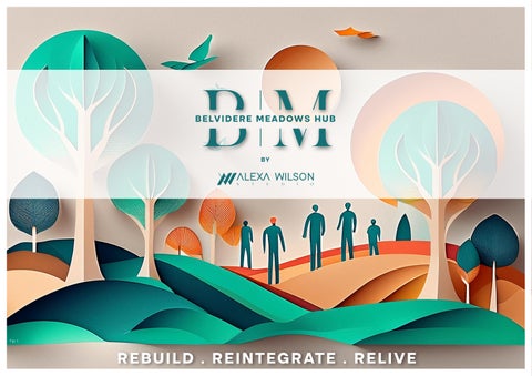

BELVIDERE MEADOWS HUB


BY
ALEXA WILSON STUDIO

DESIGN DEVELOPMENT
Design Development: Natural Light Analysis
0507 |
2124
0920 |
1704
OVERALL ANALYSIS
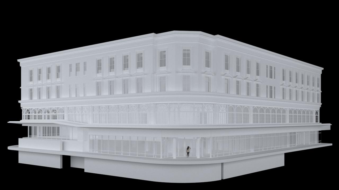
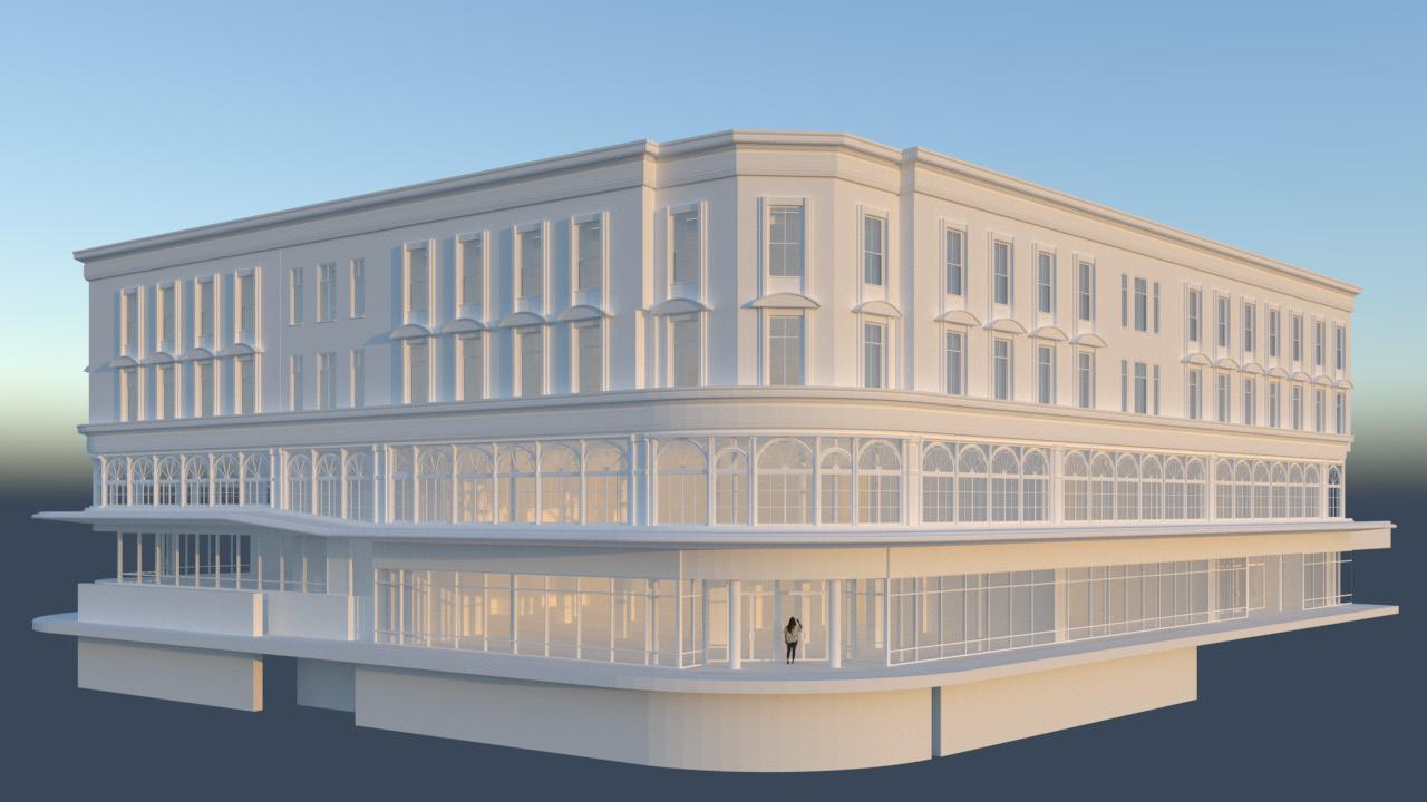
The building are south-facing to the main entrance that aligns with the university’s side gates. Studying natural light is crucial for designing the space and selecting appropriate materials that contribute to heating or cooling efficiency. During the summer, when the sun is at its highest and daylight hours are longer, sustainability functions of the building can be enhanced. While there are no direct sunlight penetrations into the building due to architectural shading elements, it still allows for the ingress of natural light. During winter, lights enter the building and this will allow for efficient heating. Some rooms may block windows entirely, but designing forms that permit light penetration will help distribute natural light throughout the building as much as possible. Fig. 58 and Fig. 60 illustrates the times when the sun impacts the building.
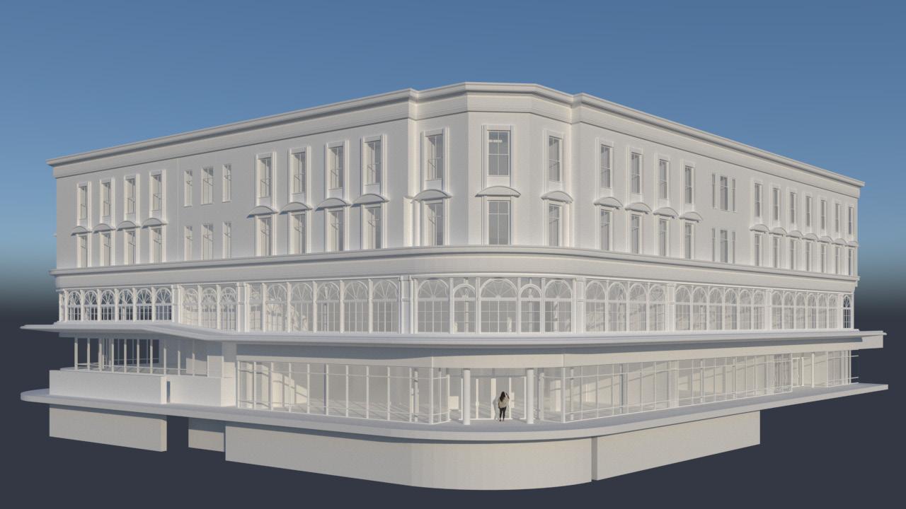
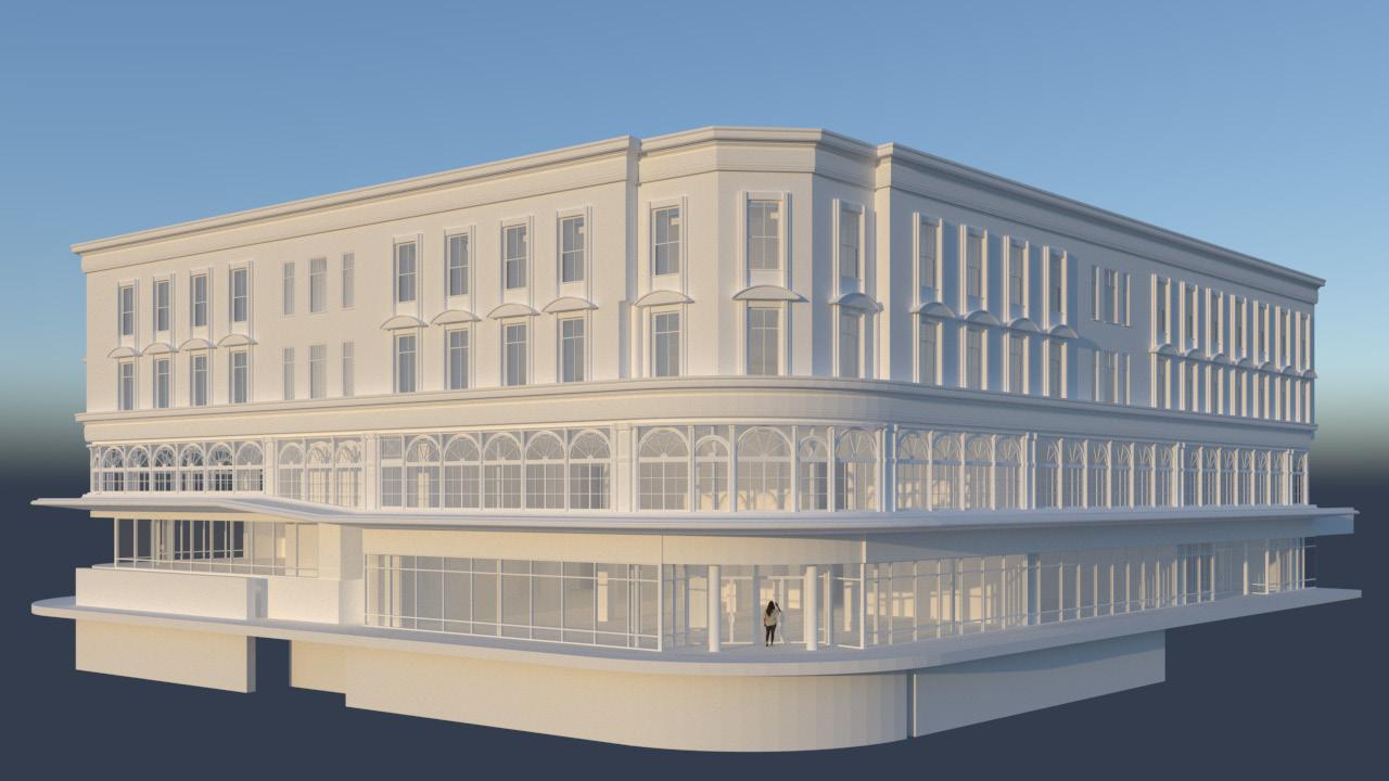
Fig. 41
Fig. 43
N Fig. 42
Design Development: Spatial spatial allocations
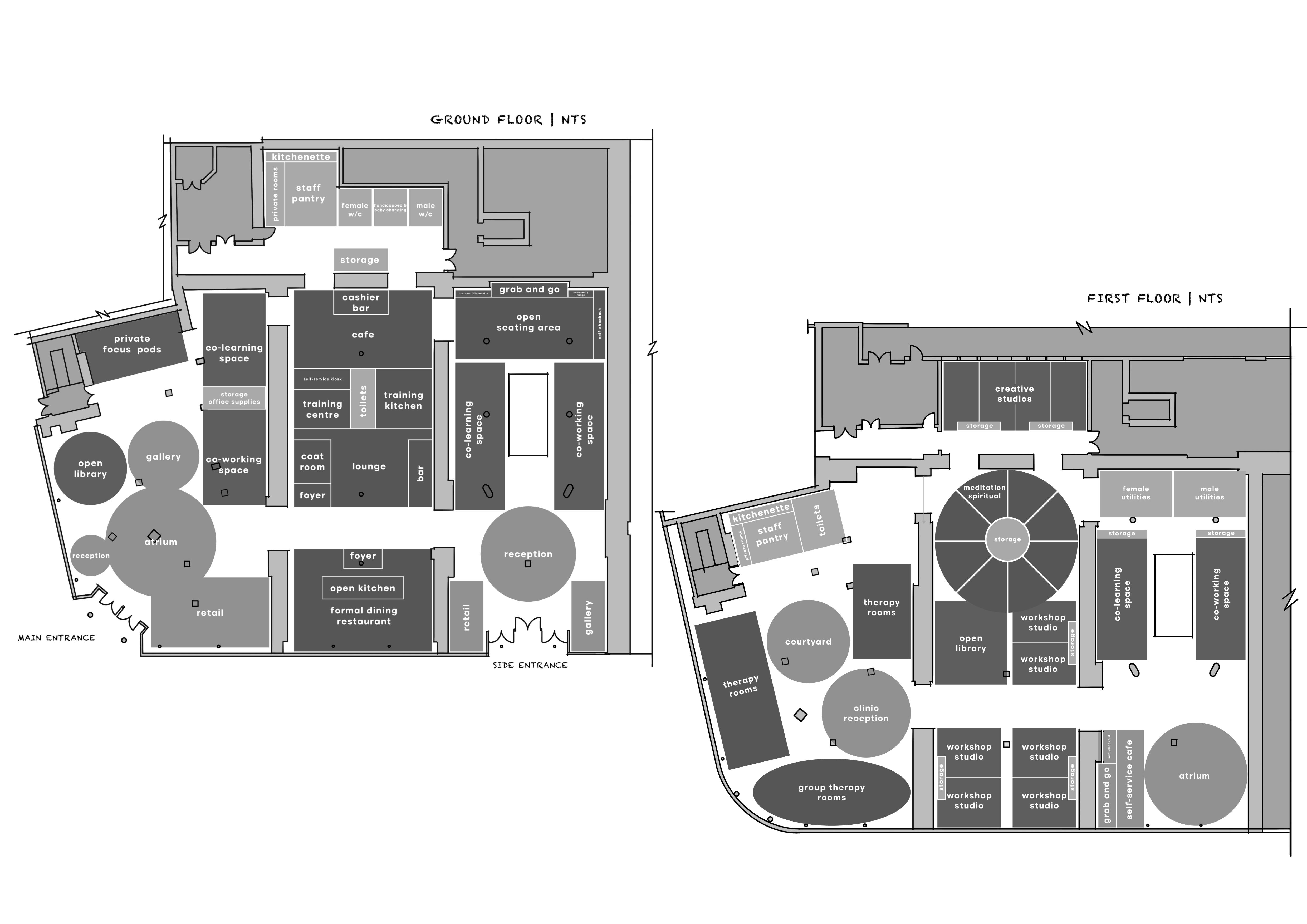
All allocated spaces adhere to industry-standard practices and guidelines, ensuring user comfort within the building's ample space. These guidelines serve as a foundation for designing spatial programs.
GROUND FLOOR

FIRST FLOOR
Design Development: Spatial
spatial adjacencies
Through the use of the radial spatial strategy, the design emphasizes the "core" of the radial, encouraging and facilitating interaction between the general public and offenders, with the goal of breaking societal barriers. The ground floor is crucial for advocacy and integration initiatives; therefore, the visual connection right from the main entrance should establish a link between the space and the visitors.

LEGENDS
SHARED SPACE COMMUNITY SPACE
PRIVATE SPACE FOCUS SPACE

GROUND FLOOR
Design Development: Spatial
spatial adjacencies
The first floor, dedicated to rehabilitation, learning, and wellness, is a quieter zone with specific public access areas that don't compromise the focus needed for offender rehabilitation. Following adjacencies to the ground floor, this adheres to prison design guidelines for "order and complexity." The 'core' balances a sense of familiarity with the need for environmental cues, avoiding excessive order that may limit spatial familiarity cues. The "core" provides a sense of familiarity in the building.
LEGENDS
SHARED SPACE COMMUNITY SPACE
PRIVATE SPACE FOCUS SPACE
CONNECTION
FIRST FLOOR


Fig.
Design Development: Spatial
Applying Theories of Social Needs
This social design project's success hinges on the application of theories related to social needs, encompassing physiological, safety, love and belonging, esteem, and self-actualization. The primary objective of this project is to address a social cause, as demonstrated on the ground floor and first floor, where all the aforementioned needs have been meticulously highlighted to cater to the users.


SELF-ACTUALIZATION
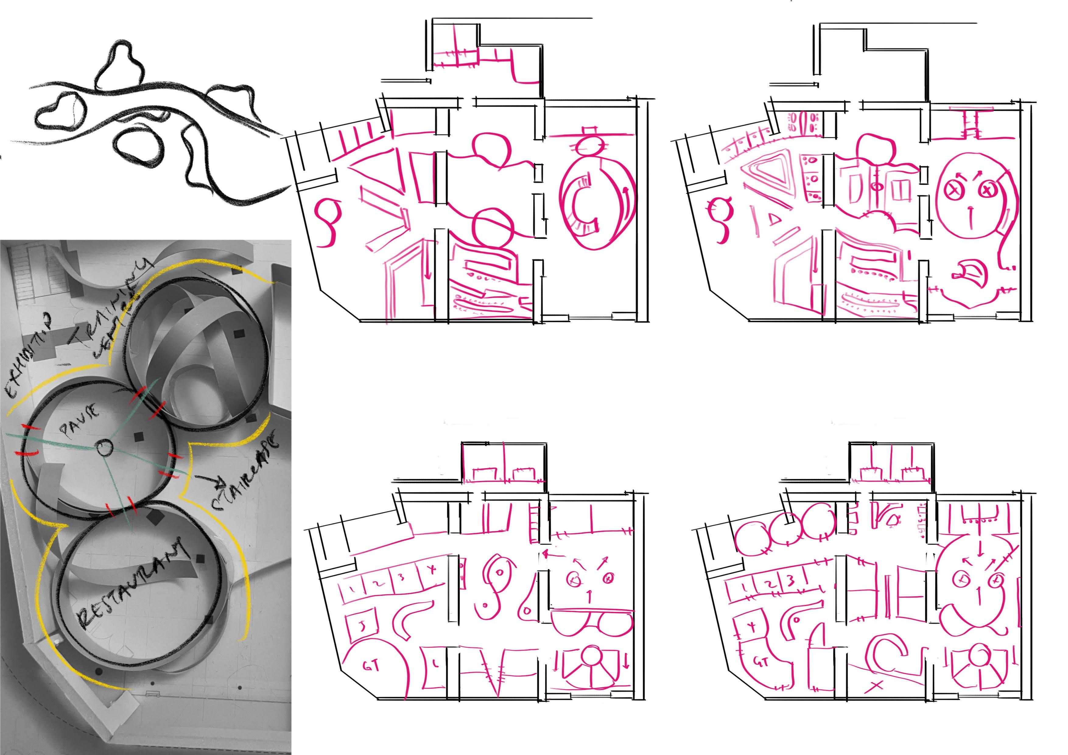
Design Development: Spatial
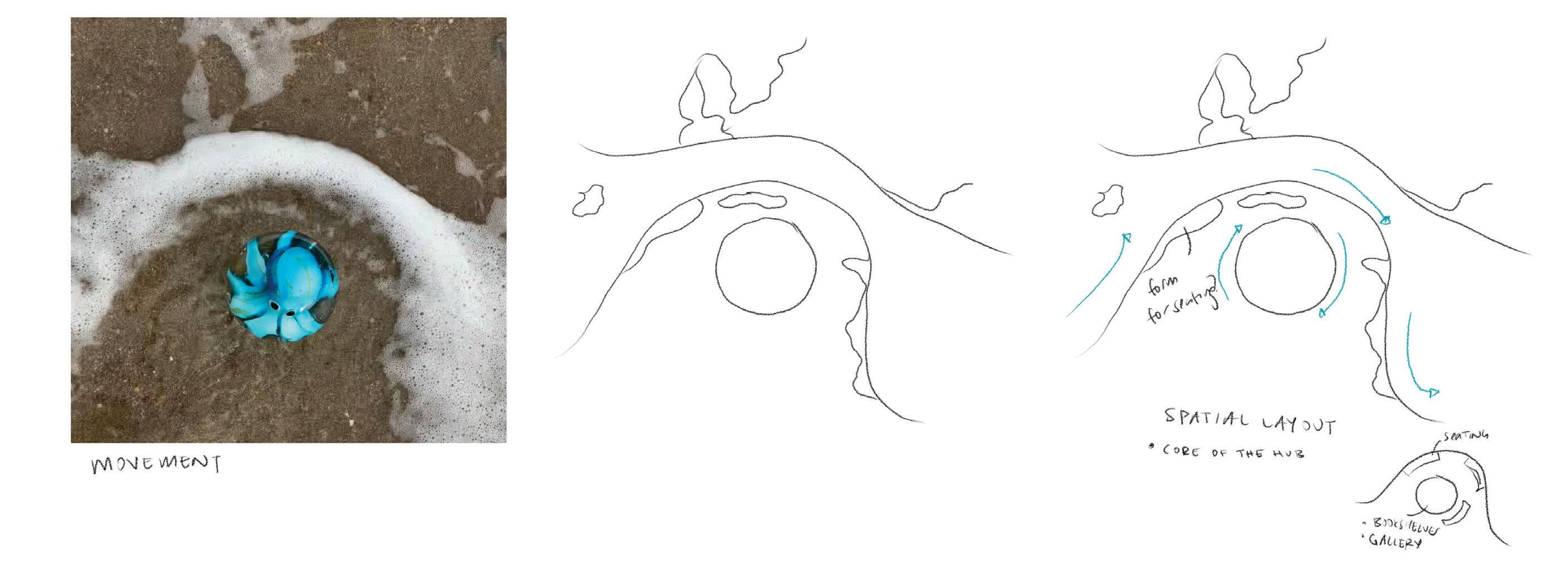
“the core”
As the space adheres to the radial spatial strategy, it prioritizes the 'core' of the building, serving as the hub. The strategic placement of the hub facilitates seamless integration between society and offenders, functioning as a versatile space for various activities.
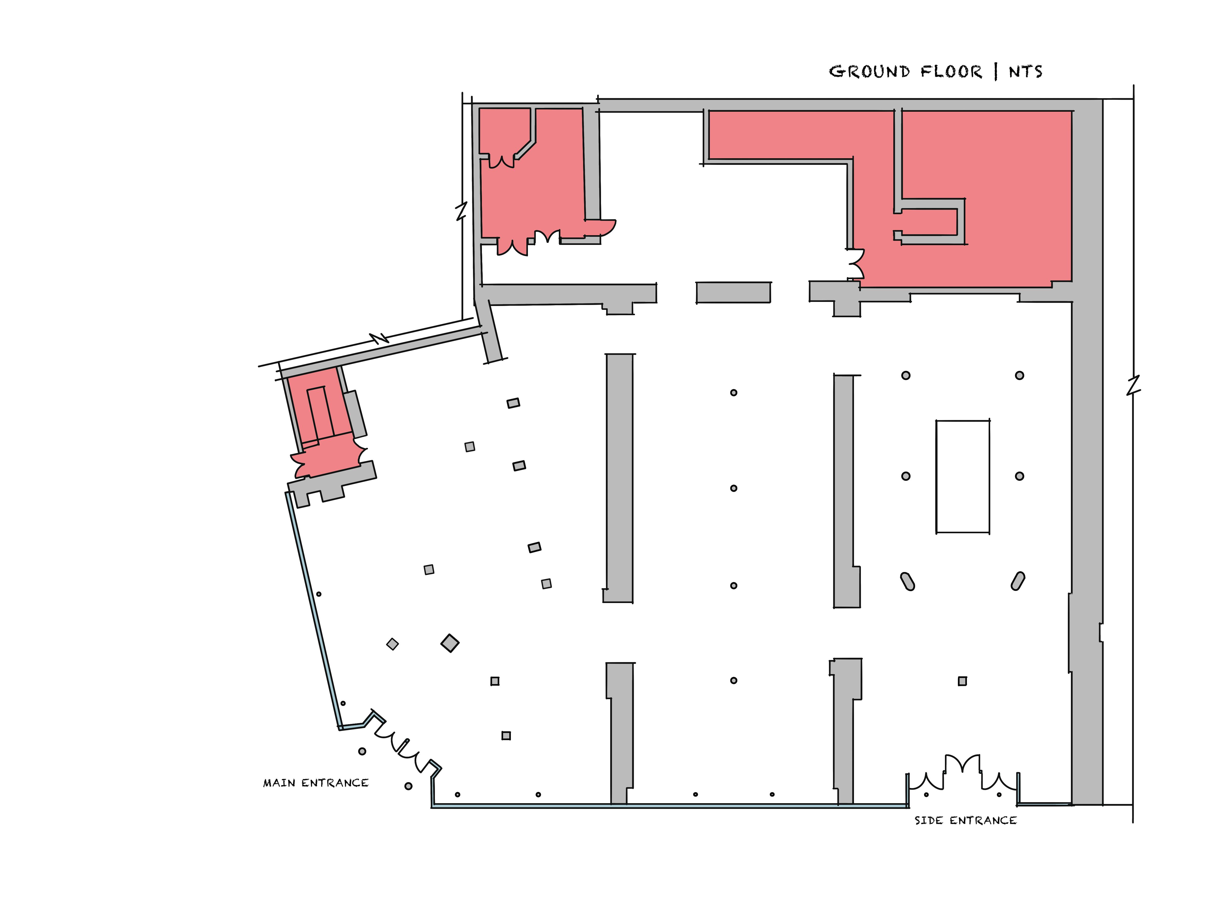
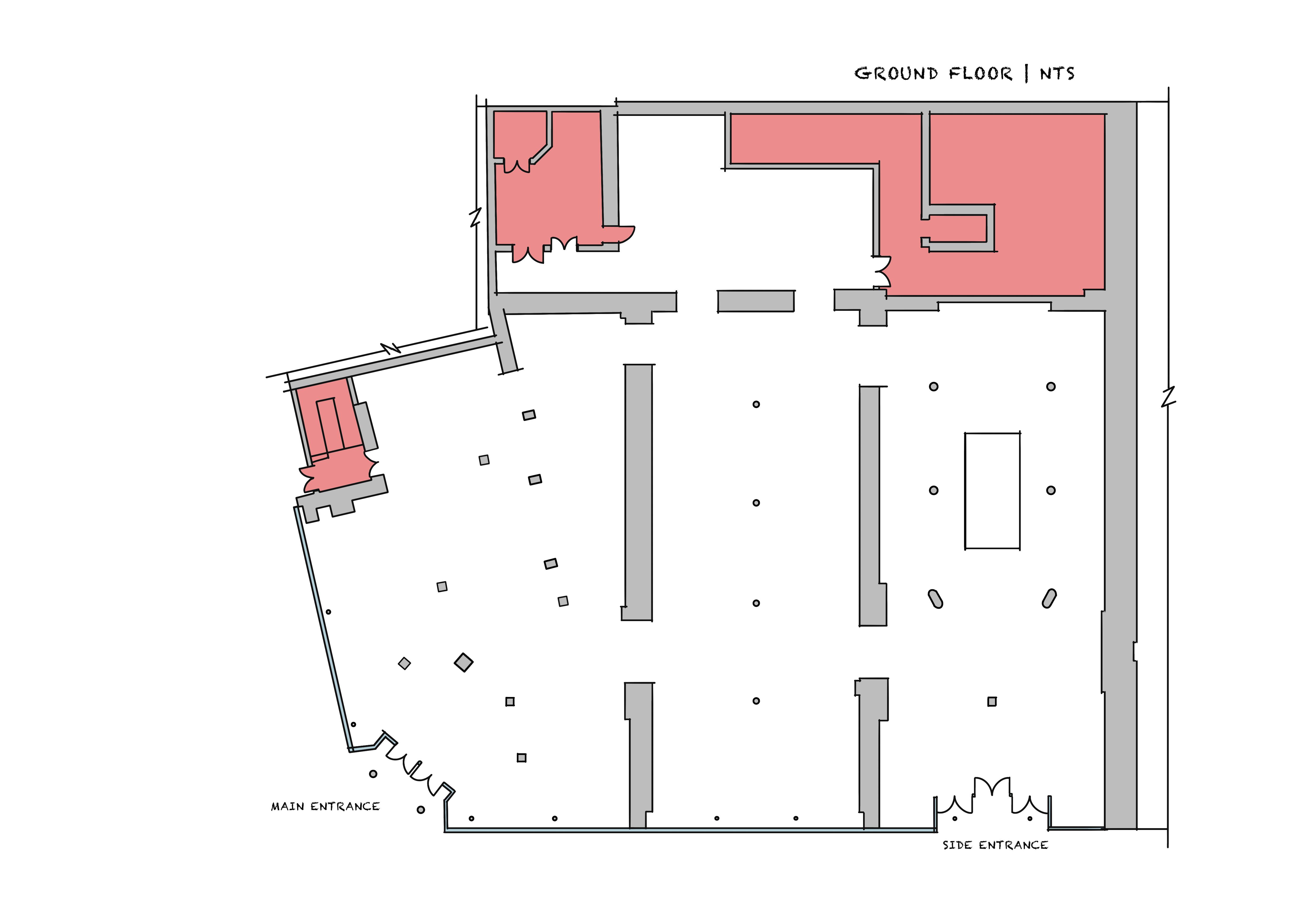
ANALYSIS
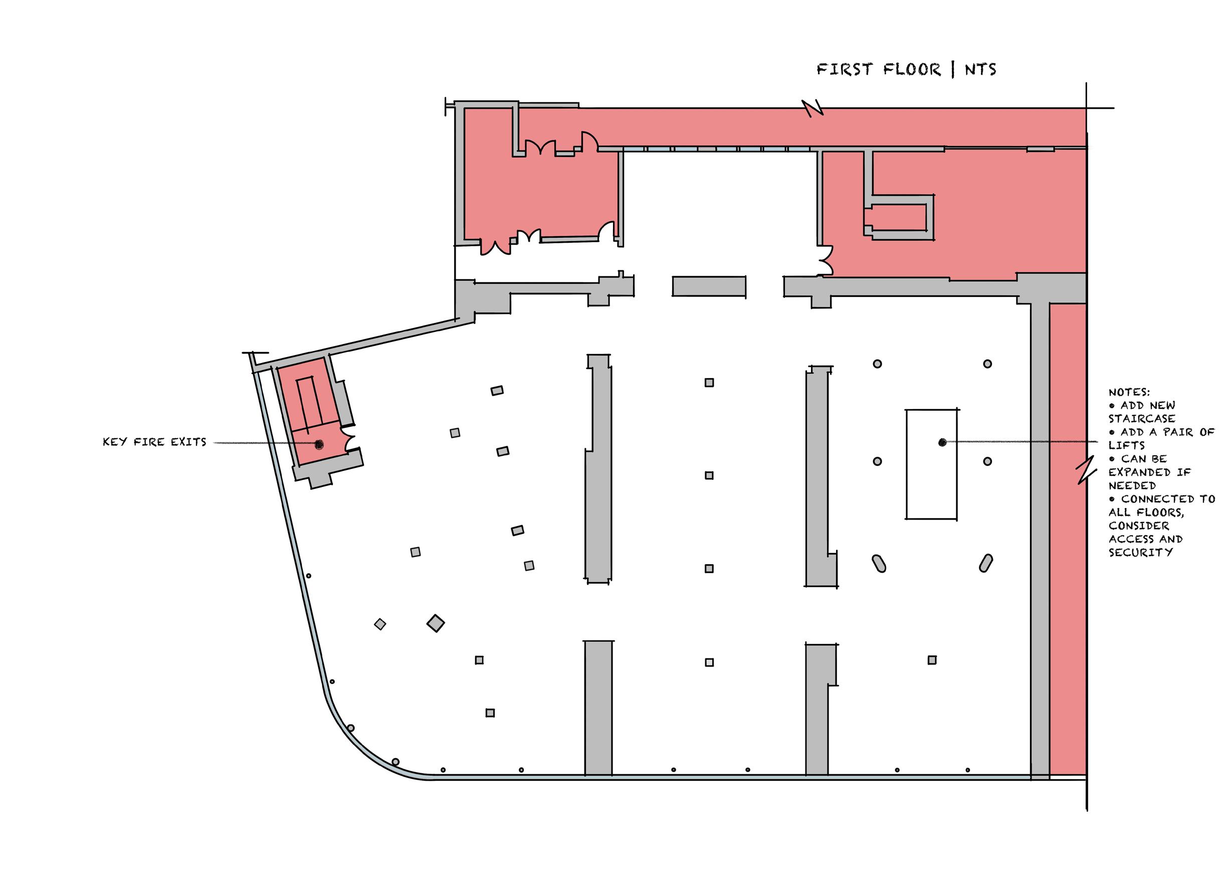
Given its significance, the hub should avoid locations with vertical circulation, as it is a smaller area that may impede traffic flow. Option A provides greater visibility, being located at the main entrance, while Option B is obscured by walls with no visibility from either access point. The hub's direct adjacencies to other areas make it crucial for advocacy initiatives.
Fig. 48

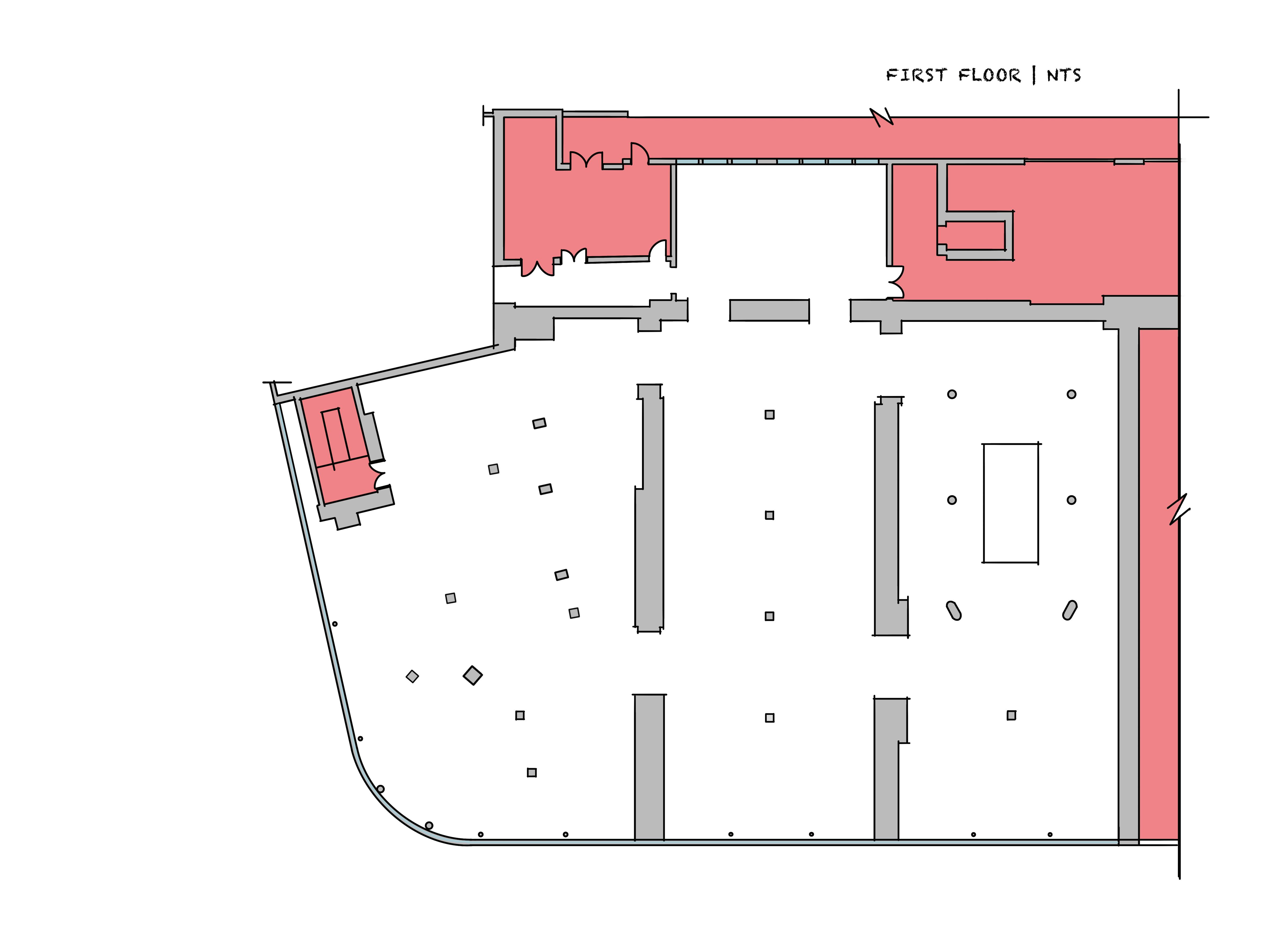
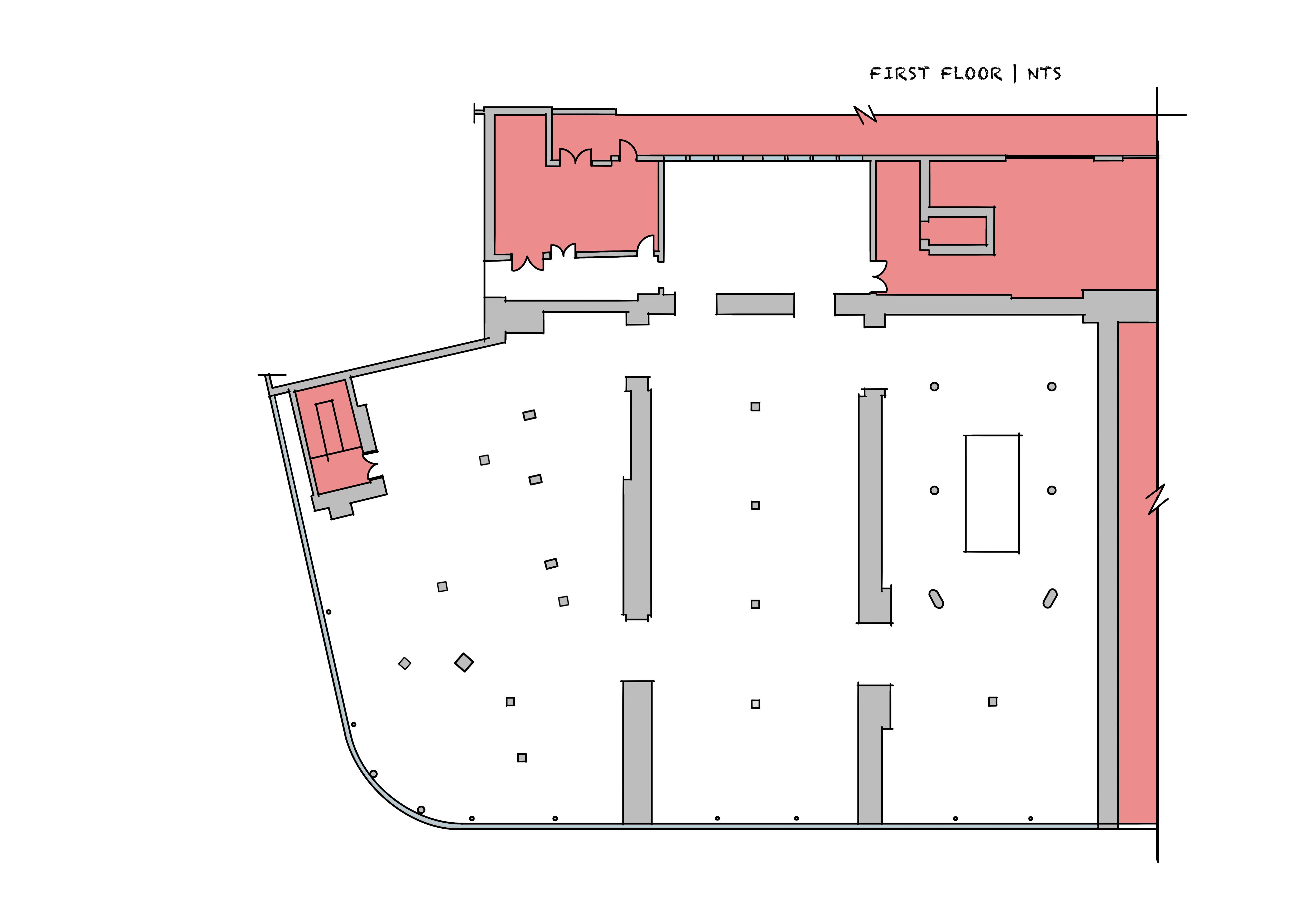
Design Development: Spatial
“the core”
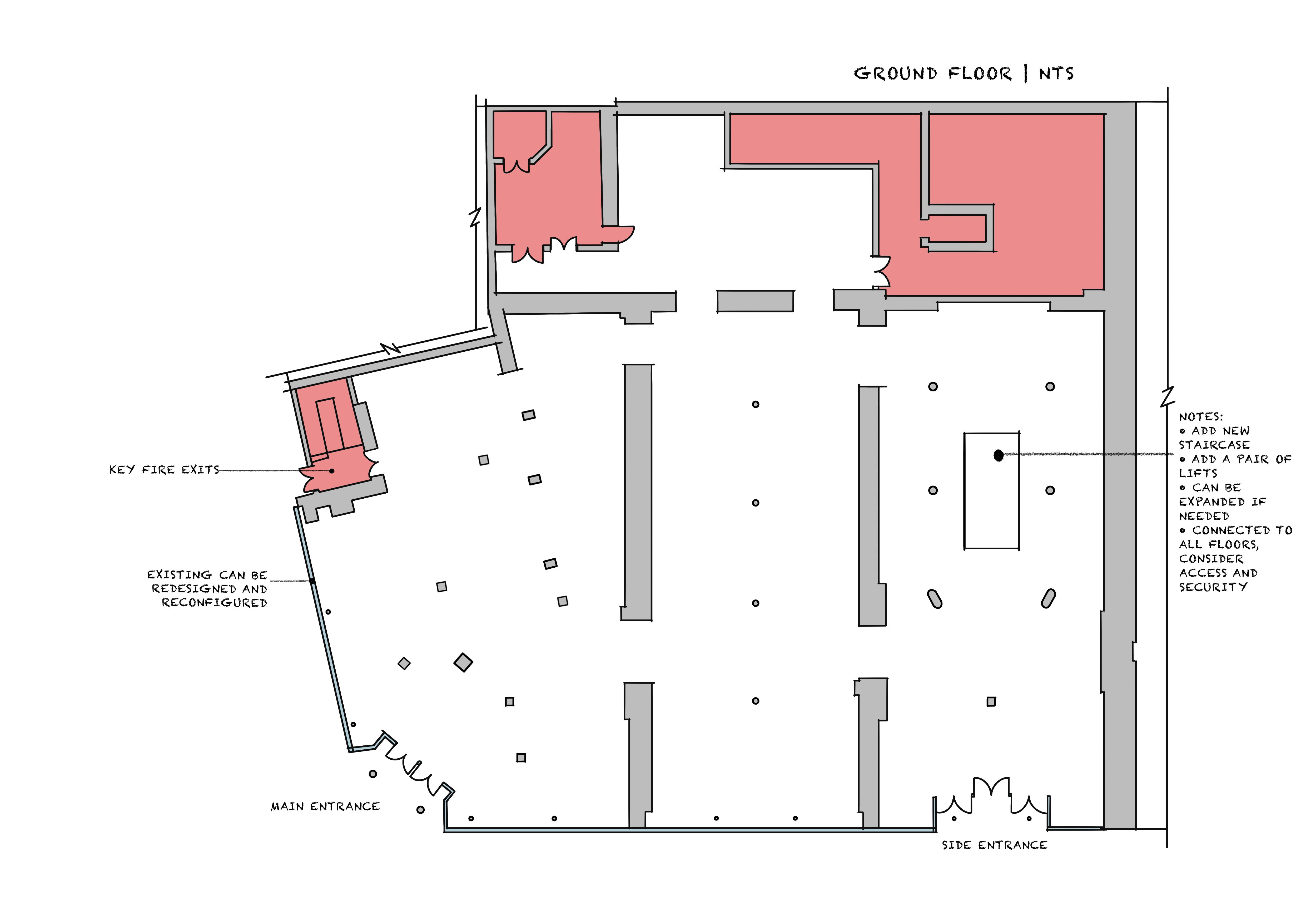
While it is crucial for the hub to be strategically located to fulfill its objectives, the first floor is dedicated to the education and well-being of the offenders. Therefore, the hub should be situated in a way that is non-invasive and does not disrupt the intended purpose of the spaces.
ANALYSIS
The placement of Option B makes strategic sense, with the smaller area dedicated to the public and the larger area reserved for the rehabilitation and educational purposes of the offenders. Option A seems to be a wasteful use of space, especially considering that the ground floor hub already covers a significant area, serving its intended purpose for both daily use and future events. Placing the hub where Option B is located would allow one side of the opening to be closed off, providing direct and secure access for the offenders into their rehabilitation and educational area.
Fig. 49
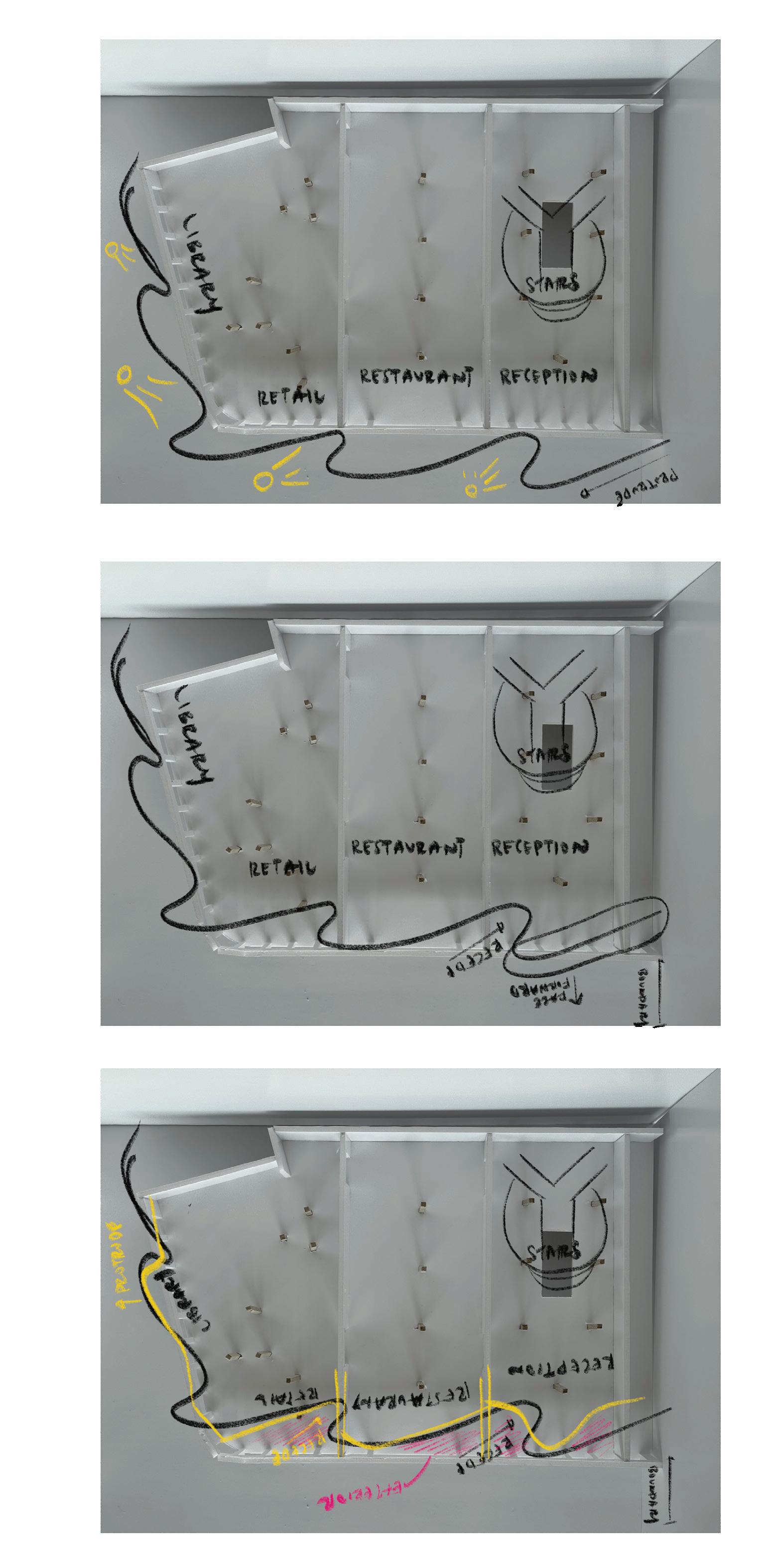
Design Development: Spatial Zoning V1
PROS
• Spatial adjacencies strategy is met.
• Presence of two reception points.
• Main entrance features an atrium, with a gallery to the left and retail to the right.
• Grouped working and focus spaces.
• Restaurant offers scenic views.
• Cafe serves the collaborative shared spaces.
• Storage and utilities are tucked away.
CONS
• Limited visual connection to utilities.
• Gallery and retail areas don't extend to the other side of the building.
• Open library is tucked away with no visual connection.
• Lack of storage area for collaborative shared spaces.
OPPORTUNITIES
• Move the open library parallel to the gallery. Move storage to the back of the building with other utilities to open up more cafe spaces for self-service.
• Toilets should be placed in two areas to ensure visible proximity for public use.
• The other end of the building could benefit from more co-learning and co-working space that blends its design with the staircase.
• A featured staircase is possible.
• Add storage in between collaborative shared spaces.
• The training kitchen should be accessible for the cafe and restaurant but also have an open kitchen in the restaurant for a visual experience.

Design Development: Spatial Zoning V1
• The cafe now offers a view from the first floor and is adjacent to the collaborative space, similar to the external library adjacencies.
• All rehabilitation and education areas are grouped together.
• There is a defined division between private and public areas.
• Showers and toilets have adjacency.
• Open library is adjacent to the atrium.
• The space appears underutilized.
• Workshops are at two different ends of the area, losing their connection.
• Toilets and showers meet with vertical connection to the ground floor, but they have windows, compromising privacy.
• The necessity of having two reception points is questionable.
• There is no sense of security and obscurity for the wellness area.
• Another toilet is needed.
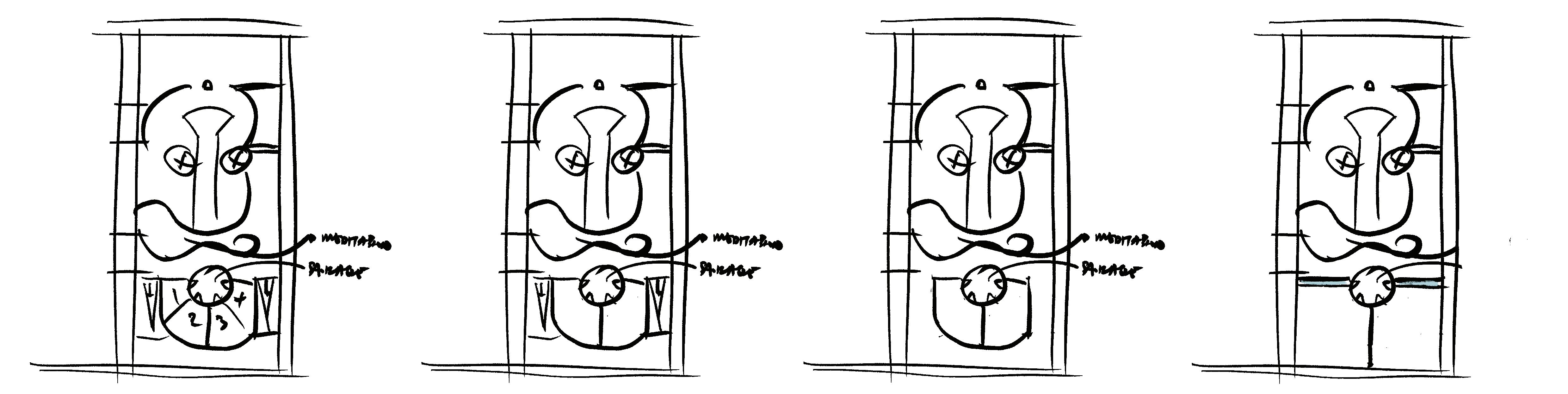
• Meditation is in a private area when it is meant to be a shared space.
OPPORTUNITIES
• Move the other reception to the wellness area and provide a waiting lobby for users too.
• Consider incorporating an element, such as a courtyard, to bring all areas together.
• Bring the meditation room to the back of the building along with other utilities.
• Group workshops together for improved organization and accessibility.
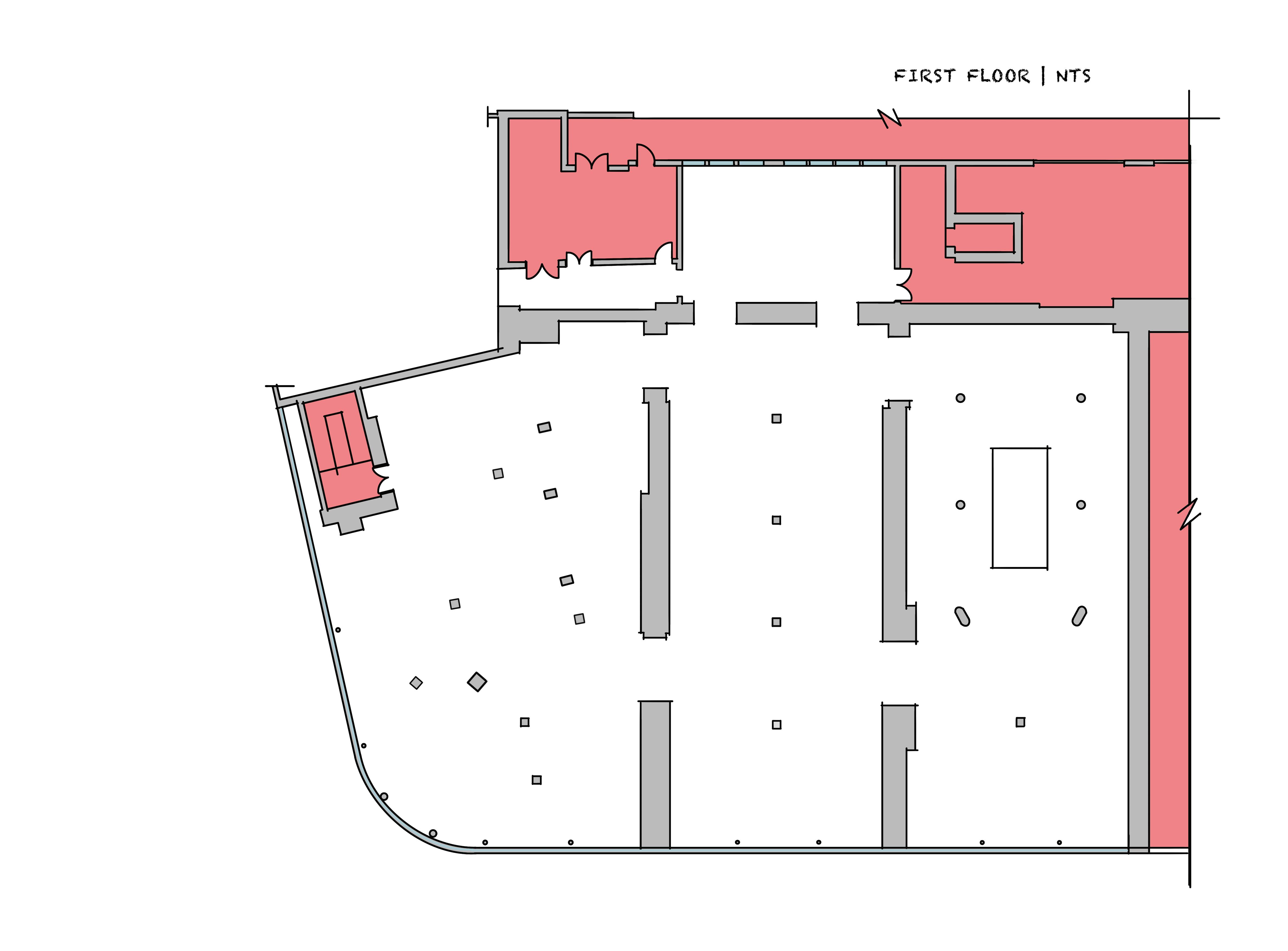
Fig. 51
Design Development: Spatial
Zoning V2
PROS
• Toilets with better visibility to the public enhance accessibility and convenience.
• Placing the restaurant adjacent to the atrium creates a visually appealing connection.
• An open concept restaurant is trendy and aligns with contemporary design preferences.
• The generous space allocation for the staff pantry enhances functionality and comfort.
• Equal allocation of storage areas contributes to a balanced and organized layout.
• Grouping collaborative shared spaces in one area allows for a potential open layout, fostering collaboration and interaction.
• The toilets appear to obstruct traffic circulation, requiring reconsideration of their placement.
• The open concept restaurant might not effectively target the desired customer demographic for program income and publicity.
• The training centre and kitchen could be insufficient and obstruct circulation, potentially compromising a sense of familiarity.
• The size of the staff pantry raises questions about the necessity for such extensive space.
• Underutilization of the side entrance area.
CONS OPPORTUNITIES
• Integrate utilities like toilets strategically within the space, especially between programs like kitchens to streamline plumbing services.
• Market the restaurant more effectively to the ideal target customers to enhance revenue generation for the initiatives.
• Introduce a bar and waiting area to elevate the dining and drinking experience, particularly for upscale patrons.
Design Development: Spatial
Zoning V2
PROS
• Toilets are now accessible in both private and public areas.
• Workshops have scenic views.
• Collaborative shared spaces are well-spaced and distributed.
• The staff pantry benefits from sunlight.
CONS
• Since the rehab area has workers, the staff pantry seems too far out.
• Group therapy rooms could benefit from the area with the view.
• The cafe seems small considering the number of people it has to serve.
• Does the staff pantry need a view?
• Underutilized space, one of the weaknesses mentioned during SWOT analysis.
OPPORTUNITIES
• Instead of blocking the area with all of the rooms, provide a sense of privacy that does not compromise lighting throughout the building.
• A courtyard as part of the waiting area, adding a continuous "zen" atmosphere for users waiting for their treatment.
• Artificial lighting to imitate natural daylight.
• The pantry should be moved to a private area for workers in the space.
Design Development: Spatial
Zoning V3
PROS
• Restaurants have a view and are greeted by users at the main entrance.
• Retail and the restaurant have a direct visual connection.
• Collaborative shared spaces are grouped in the same area.
• The cafe maintains a visual connection with collaborative shared spaces.
• Collaborative shared spaces have scenic views.
• The gallery, retail, and atrium are all in line, creating a direct visual connection and a sense of continuation.
• The gallery is too far out in the back of the building, making it redundant for visitors and advocacy campaigns.
• The side entrance is redundant and underutilized.
• The training center at the back of the building appears dark and dingy, resembling a prison setting.
• Toilets are located only on one side of the building.
• There is a lack of storage areas.
OPPORTUNITIES
The gallery needs to maintain a connection to the atrium and retail, as it has the potential to retain attention and traffic in the area. The training center and training kitchen could benefit from being together.
• Toilets should be available in two areas to enhance the user experience. There is a need for a storage area to store furniture for collaborative events and learning tools like whiteboards.
Design Development: Spatial
Zoning V3
• Co-learning space is provided in a private area adjacent to workshops.
• Utilities are provided in the private area.
• Therapy areas have views and receive natural sunlight.
• The atrium has natural light and scenic views.
• Collaborative shared spaces are grouped together with good adjacency.
• The right side of the building is well-utilized.
• The reception for the private area is accessible for checking in for treatment.
• The pantry is out of reach for staff working on the first floor.
• There is excessive space for utilities at the back.
• There is wasted daylight at the back.
• There is no storage area.
• Is it necessary to have 3 receptions?
OPPORTUNITIES
• Provide storage in between workshops so they can share this area.
• Toilets and the staff pantry should all be together for the private area, ensuring easier accessibility.
• Placing the meditation room in between the atrium and working spaces could benefit wellness.
Design Development: Spatial
Proposed Zoning
RATIONALE
The final zoning plan integrates elements from various options, incorporating opportunities identified in each to create a well-informed space planning strategy. Visitors will be welcomed by a gallery and retail area at both the main and side entrances, ensuring sustained attention and engagement.
Co-learning and co-working spaces share a storage area for furniture and technology, serving as a practical solution for events in the atrium. The central section of the building is dedicated to F&B activities, strategically placing toilets in between to encourage purchasing and maximize space utilization. Training spaces are situated between the cafe and restaurant, promoting efficient traffic flow and providing offenders with a practical learning environment.
On the right side of the building, an additional open seating area extends from the cafe, incorporating self-service facilities such as a community fridge inspired by the Exeter library. This innovative approach adds dignity to using and accessing donated food and drink items while maintaining privacy. Furthermore, the area accommodates more co-learning and co-working spaces, potentially integrated with a featured staircase.
In summary, the final zoning plan optimally utilizes spaces for their intended purposes, catering to the diverse needs of users in an efficient and thoughtful manner.
LEGENDS
VISUAL CONNECTION
Design Development: Spatial
Proposed Zoning
RATIONALE
The first floor is strategically designed to cater to both rehabilitation and education, featuring areas focused on privacy and public shared spaces. Central to the rehabilitation area is a courtyard, serving as a central ground and waiting area for offenders. The courtyard is intended to evoke a zen atmosphere, providing a calm environment before individuals enter therapy rooms.
Within this floor, workshops are strategically positioned, accommodating 10-15 individuals per room. A shared storage area is strategically placed between the workshops, ensuring flexibility for activities requiring multiple rooms. Toilets and a staff pantry are conveniently located within the private area, meeting the needs of the space's workers, while another group of utilities also provides visibility to users in the public shared area.
The middle section of the building houses workshop studios, offering a range of essential to creative skills. These are adjacent to the open library, providing accessibility for everyone. Flexible meditation spaces cater to both group and solo activities, with an acoustic barrier enhancing the overall experience.
Towards the back of the building, there are workshop studios ideal for creative activities such as photography or media production. The right side of the building includes a self-service cafe by the atrium that keeps visual connection throughout the space.
In summary, the proposed zoning plan effectively utilizes all areas to meet the diverse needs of users in various states. It ensures a well-balanced and functional spatial arrangement while maintaining a continuation of functions from the ground floor. The spaces are strategically intended for collaborative integration activities between the community and offenders.
LEGENDS
Fig. 57
Design Development: Spatial
Circulation Strategy
ANALYSIS
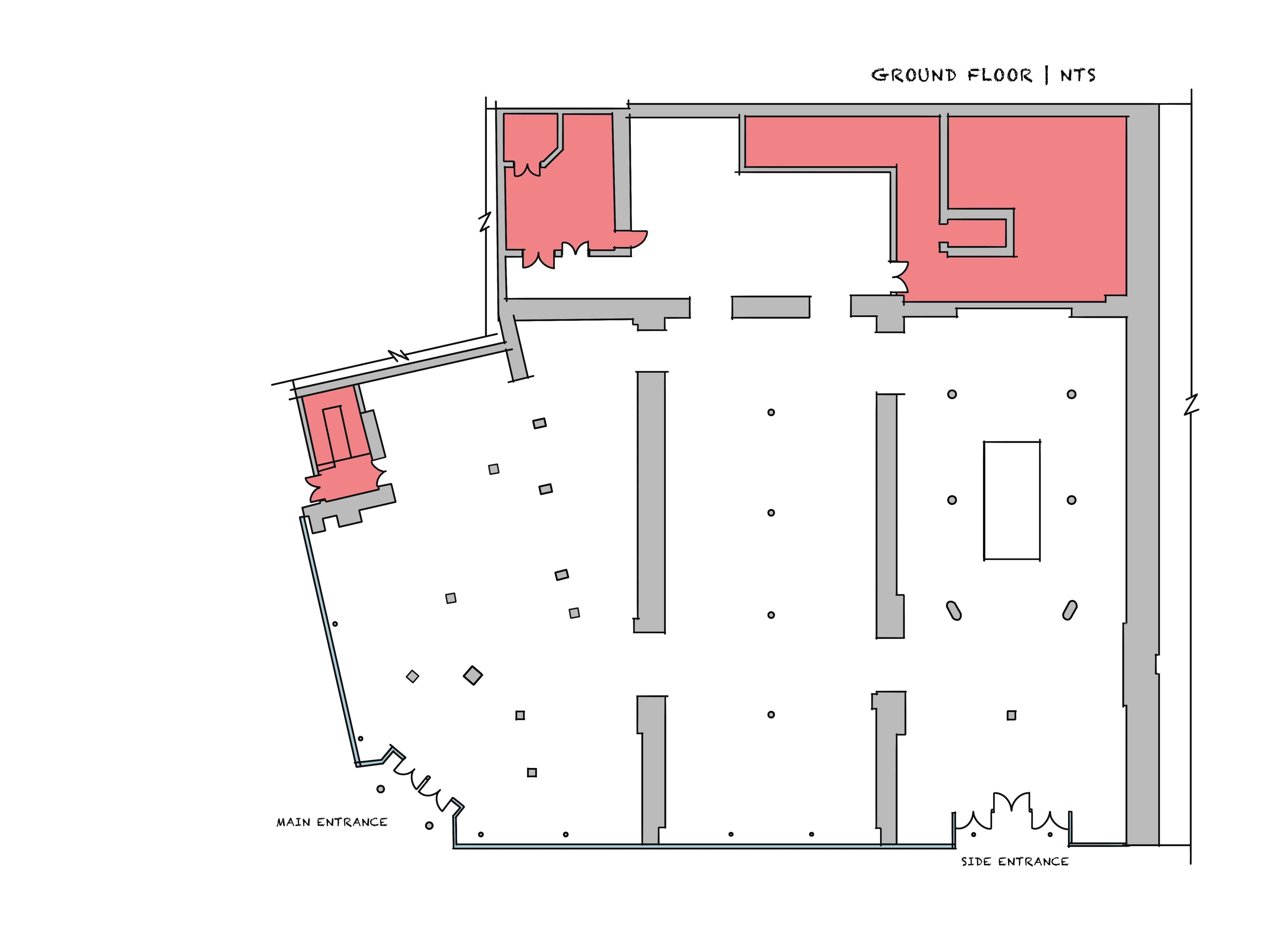
Existing openings and structural walls create obstructions. A direct emergency escape route would be suitable as this space is catered to meet DDA requirements too. According to fire regulations in a commercial building, the maximum travel distance to reach an exit should be limited to ensure timely escape. Moving and creating new openings will enhance traffic flow for emergency escape. The ground floor will have three escape routes, and depending on the occupancy rate at the time of emergency, this will ensure efficient escape times.
FIRE SAFETY REGULATIONS
• safe and efficient evacuation route exit doors open in direction of escape
• maximum travel distance be limited
• clear & visible signages
• emergency lighting for escape route and building
• clear of obstructions
• stairs & ramps designed to allow safe descent
• handrails and guardrails provided
• fire resistance doors
• refuge area
DDA
• 1.5m width pathways
• tactile pads
• handrails

• wheelchair-friendly working table heights
• lifts
LEGENDS
PROPOSED ROUTE
EXISTING ROUTE
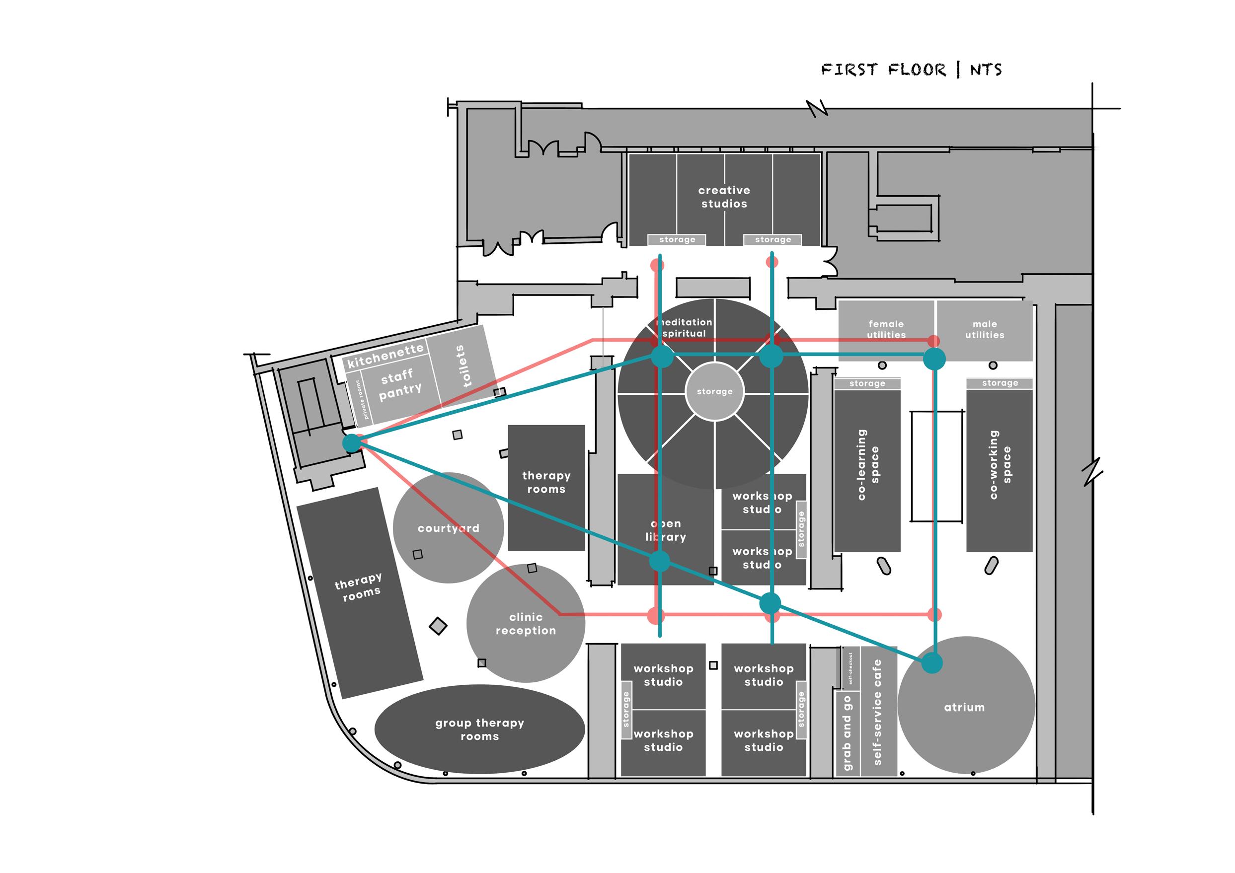
Fig. 58
Fig. 59
Design Development: Spatial
Circulation Strategy
ANALYSIS
The circulation strategy is derived from the spatial adjacency programs, ensuring that each spatial program facilitates effective visual connections and traffic flow within the space. The circulation plan will influence the design of internal walls and the creation of corridors. Additionally, it provides insights into the required lighting distribution throughout the space. The traffic circulation aligns with the design objectives and user needs, ensuring it remains user-friendly and not overly complex for navigation.
Fig. 61
Fig. 60
Design Development: Spatial
DESIGN CONSIDERATIONS
The original design of the department retail store lacks depth and visual interest due to its flat layout. By incorporating levels and a hierarchy of forms, we can introduce a playful element reminiscent of childhood, creating a more inviting and relaxing atmosphere. Taking inspiration from a community center case study, we aim to design a space that accommodates multiple generations comfortably. One idea is to mimic the natural slopes of the meadows, integrating them into the layout to establish a sense of hierarchy and flow.
Fig. 62
FF Ceiling Height: 3550
GF Ceiling Height: 4170
Design Development: Physical Working Models
DESIGN CONSIDERATIONS
Utilizing ideas generated from concept development, the shared spaces involve incorporating both horizontal and vertical curvatures. These elements offer hierarchy across different spectrums, adding visual interest. Curved pathways provide a natural guided path, aiding long-term offenders in becoming familiar with the space and adapting quickly. However, it's crucial to strike a balance between guided paths and curvatures to prevent users from feeling overwhelmed, as if navigating a maze. Combining innovative lighting and signage will provide additional assistance in wayfinding.
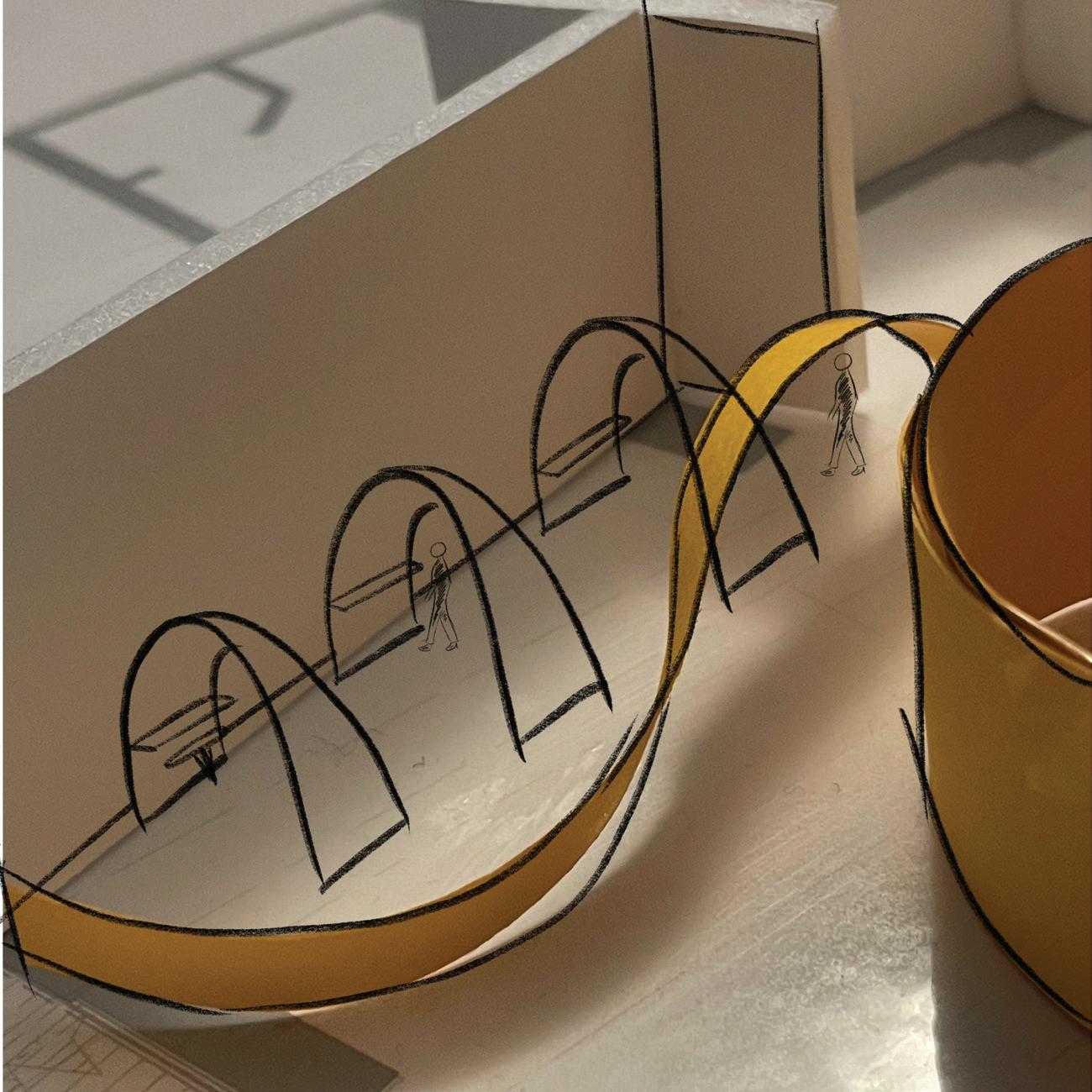
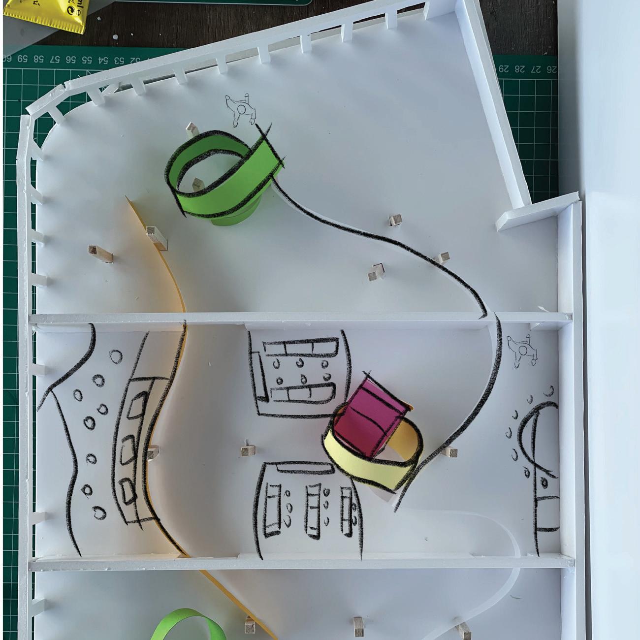
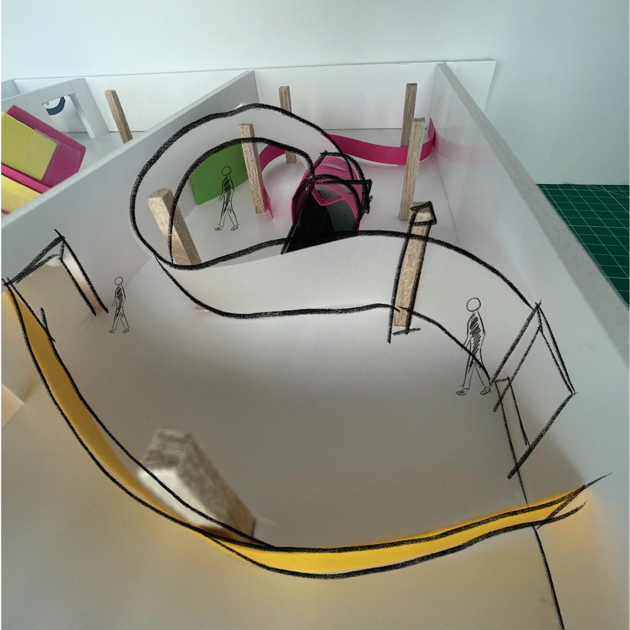
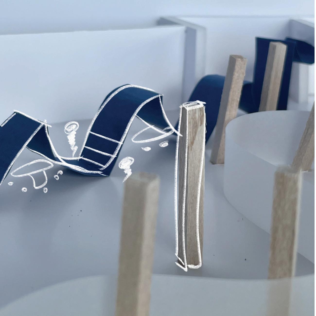
Fig. 63: Proposed area for private focus pods on Ground Floor.
Fig. 64: Proposed wall division for public spaces.
Fig. 65: Proposed forms for landing area on First Floor.
Fig. 66: Proposed structure for co-learning and co-working spaces.
Design Development: Physical Working Models
DESIGN CONSIDERATIONS
These working models experimented with forms for the retail and gallery spaces. Introducing odd forms can add a child-like element while providing visibility and easier recognition for certain spaces even without signage. In Fig. 68, we experimented with a cuboid shape with a curvature in the middle, offering possibilities for innovative ideas in retail design. Fig. 67 demonstrates ideas for the gallery space, which is kept open. However, this provides very little surface area for hanging objects used to display arts by the offenders. Considering additional surfaces for hanging objects is essential.
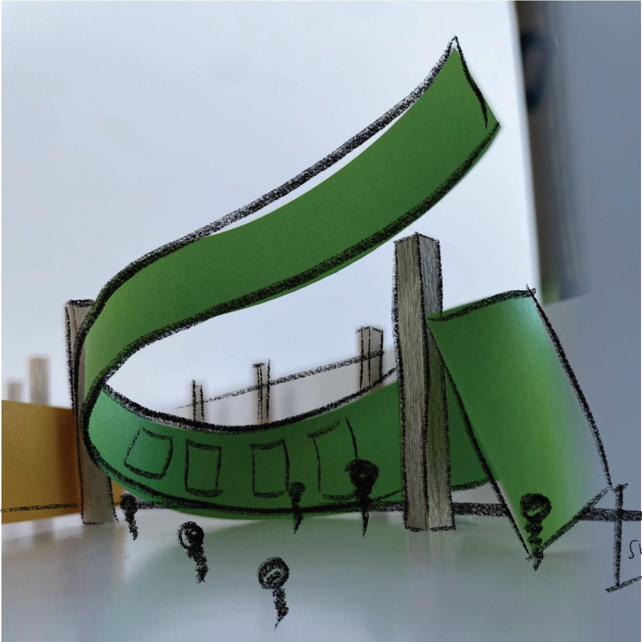
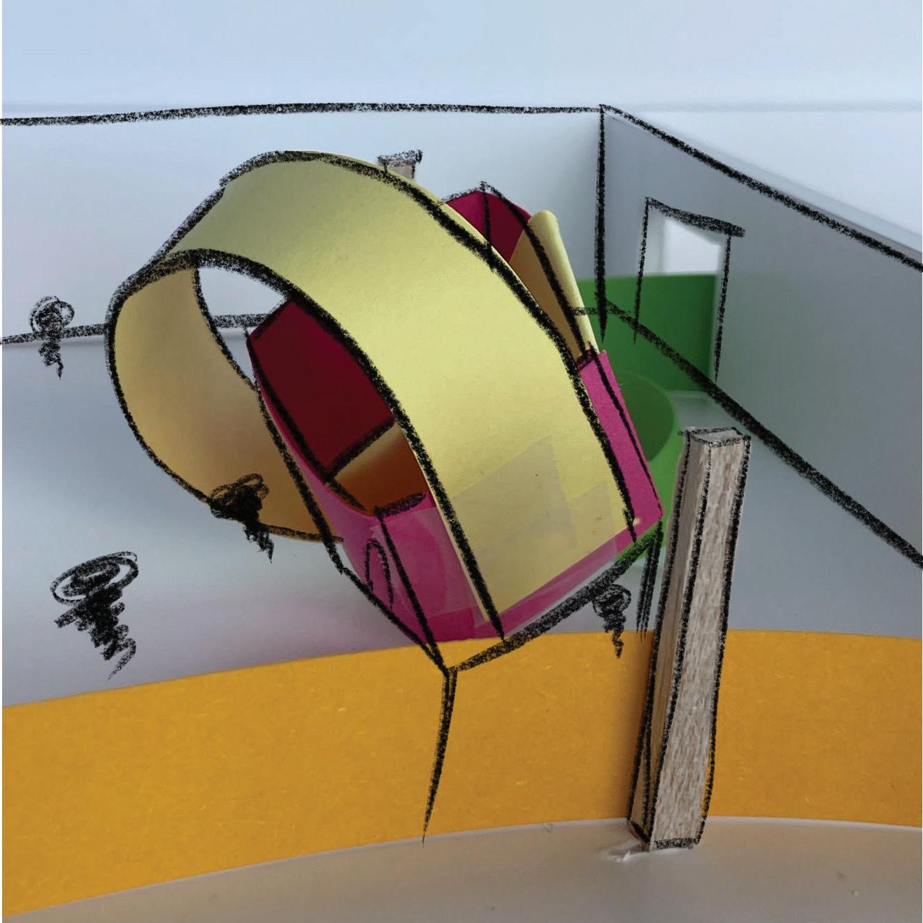
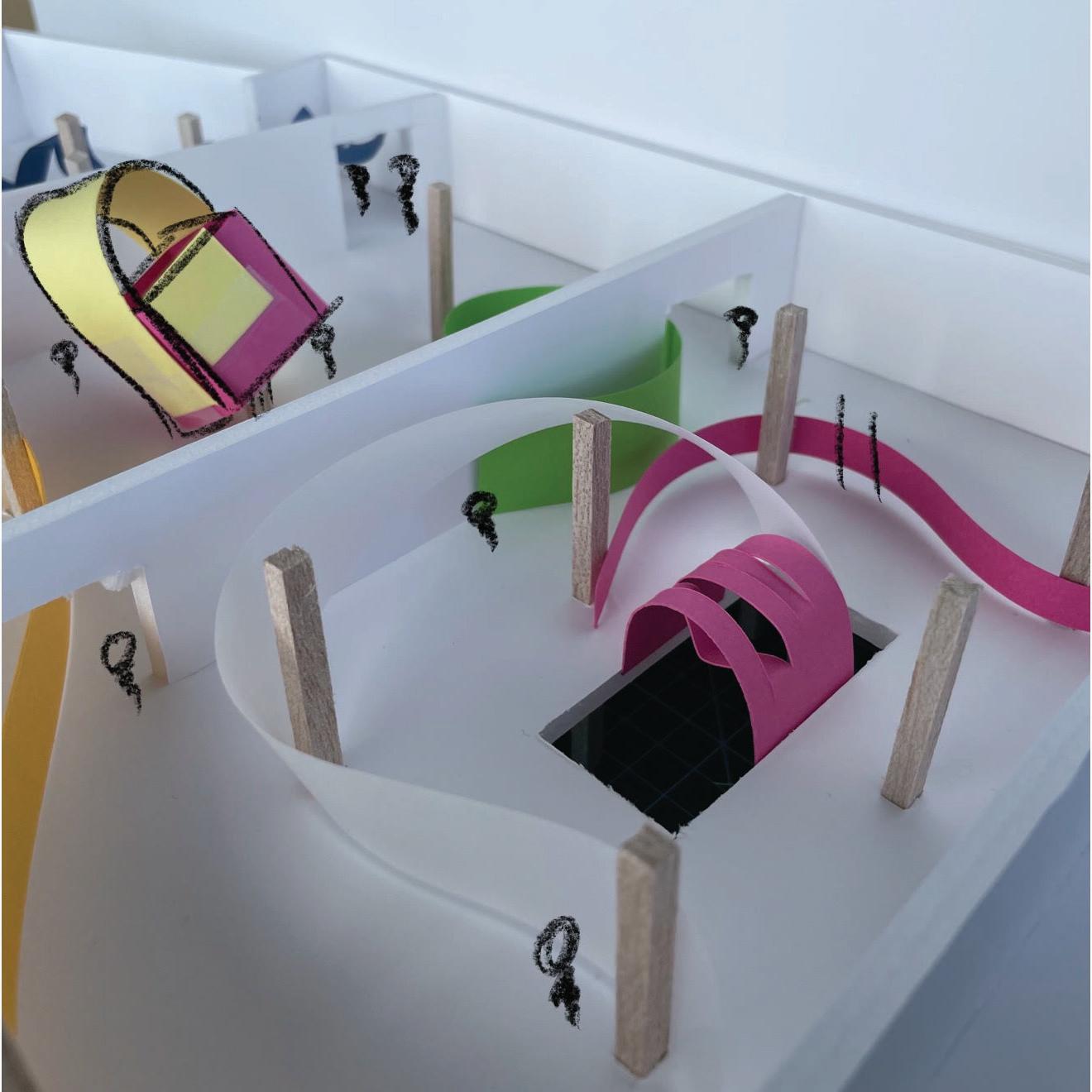
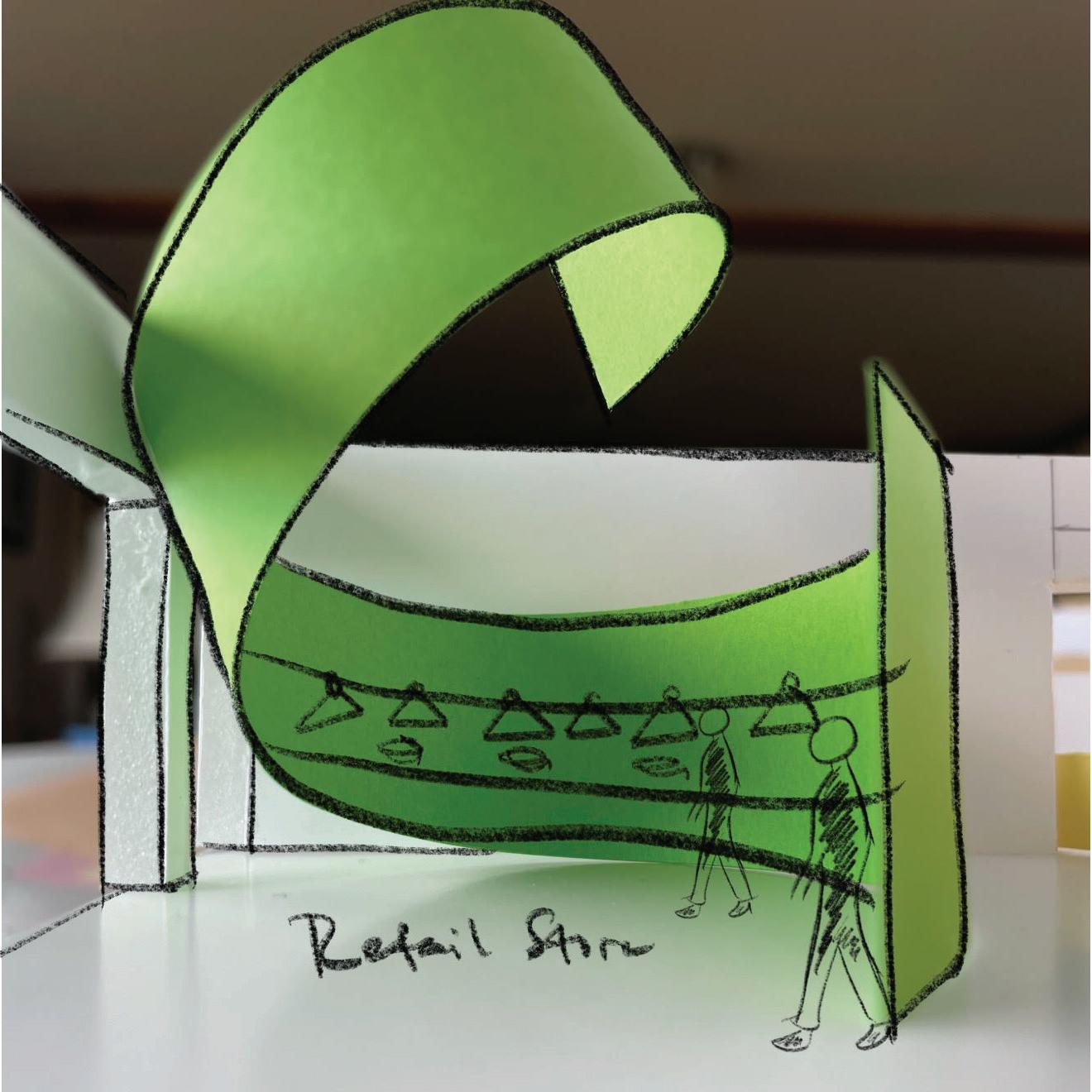
Fig. 67: Proposed structure for gallery.
Fig. 68: Proposed structure for retail store.
Fig. 69: Proposed forms for landing area on First Floor.
Fig. 70: Proposed structure retail space.
Design Development: Physical Working Models
DESIGN CONSIDERATIONS
This section presents physical models exploring learning and rehabilitation areas. The concept emphasizes elements of anomaly while maintaining familiarity. For instance, in Fig. 73, the atrium incorporates the reception instead of separate spaces, optimizing space utilization and providing additional seating areas for adjacent open library spaces. The curved walls in learning areas create an informal learning setting, departing from traditional straight lines. Considering that offenders will spend considerable time in these spaces, it's essential to contemplate how the combination of rigid and curved forms can contribute to their comfort.
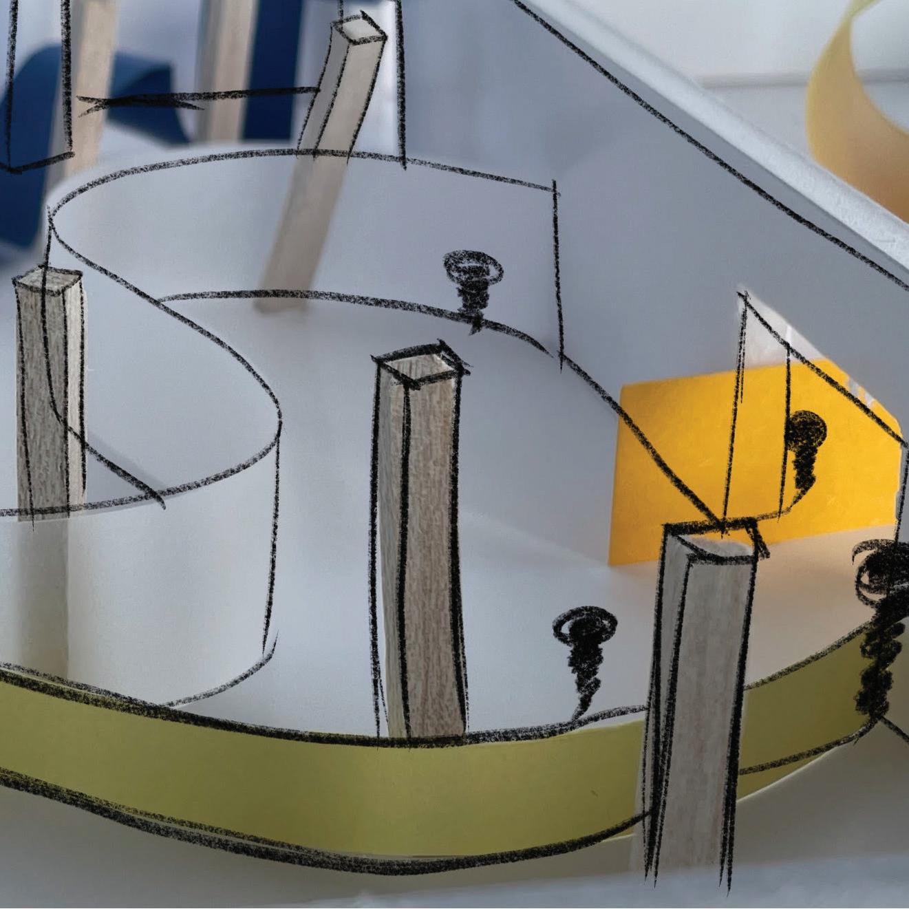
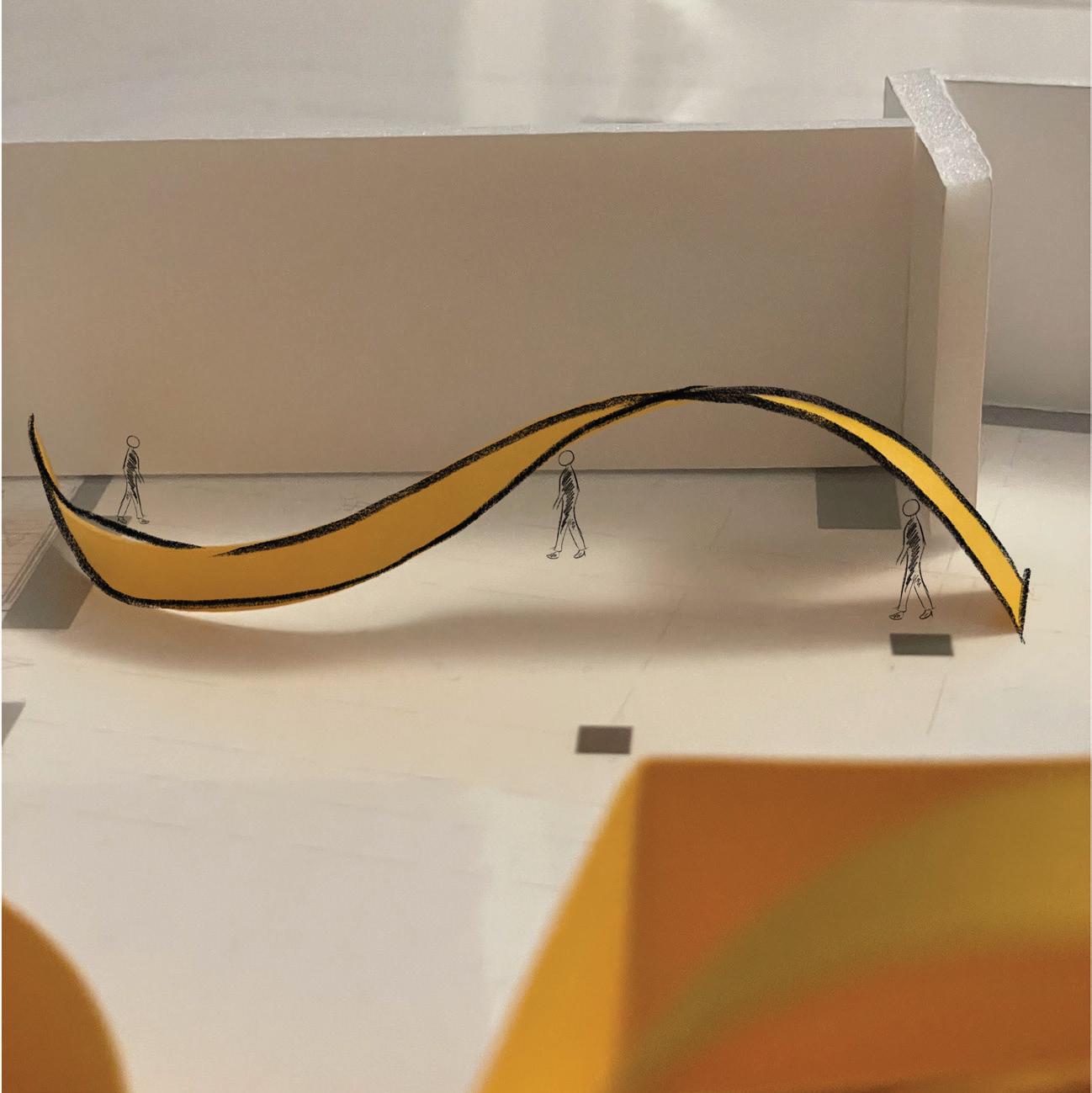
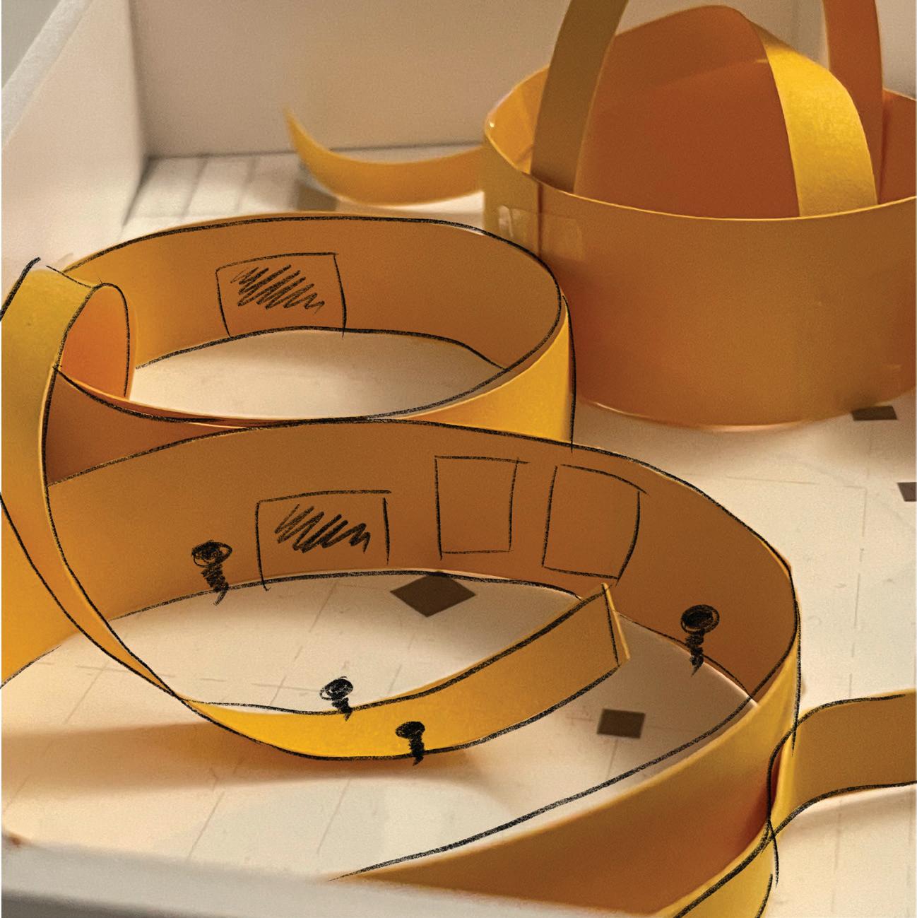
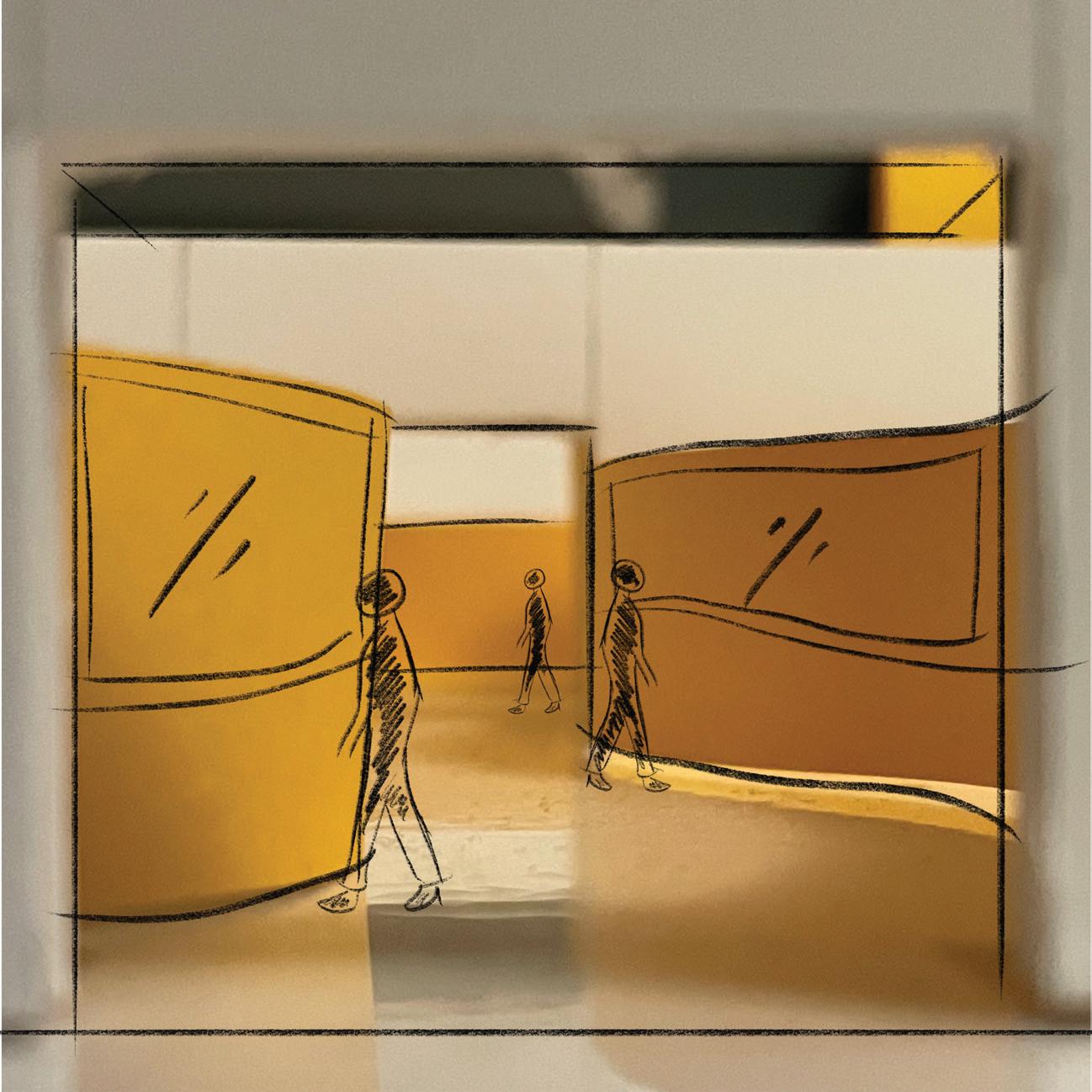
Fig. 71: Proposed walls for rehabilitation area.
Fig. 72: Proposed structure for focus pods.
Fig. 73: Proposed structures for atrium and reception.
Fig. 74: Proposed walls for learning areas.
Design Development: Colours

CONTEXT
Japanese culture is renowned for its Zen philosophy, promoting a life of peace, calm, and balance. Drawing inspiration from the Japanese Zen lifestyle, their aesthetic choices pay homage to nature's elements—earth, fire, water, and air.
In line with the vision of Belvidere Meadows Hub as a center for rehabilitation, wellness, and education, the design aims to seamlessly integrate with the natural surroundings of the meadows. Purposeful design elements will be incorporated to evoke a sense of tranquility. The color palette, influenced by Japanese interior aesthetics and colour psychology are chosen with the intention of creating a serene environment.
To support this goal, an article on colors that alleviate anxiety and enhance well-being insights from Thomas (2020), has been referenced. The resulting color palette will contribute to the overall aesthetic of Belvidere Meadows Hub.
ANALYSIS
Row A features colors recommended by Thomas (2020), with purple hues that bring balance and inner peace by connecting the body and mind. This colour could be used for learning and working areas. Thomas also suggests that meditating under purple lights is more effective than other colors. Green, being the color of nature, has scientifically proven benefits, improving mood, cognition, and overall health. While grey is often associated with low moods, choosing the right shade, such as lavender grey, can be calming and relaxing, particularly when connected with natural daylight.
According to Feng Shui principles, pink is considered the perfect tone for soothing energy. Soft and light pink can evoke feelings of compassion, nurture, and love, especially in softer and lighter shades associated with tenderness and empathy. Considering the restaurant setting, where red is often used to enhance appetite, it's essential to be mindful of potential negative effects. Exploring various hues and shades of pink could strike a balance, increasing appetite without causing stress for the primary users.
Blue is well-known for its peaceful and calming qualities. It has the ability to calm the mind, slow the heart rate, and lower blood pressure, making it suitable for areas like the rehabilitation section.
Row B, C and D are shades of colour suggested by Thomas ranging from lightest shade to darkest shades that is acceptable for the space.
Fig. 75 Zen stones on sand. Sense of balance with rhythm/repetition.
Fig. 76
Fig. 77 Colour palette from Japanese interior.
Design Development: Materials
CONTEXT
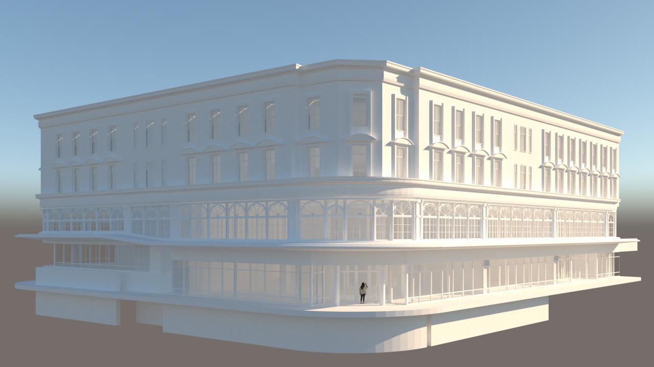
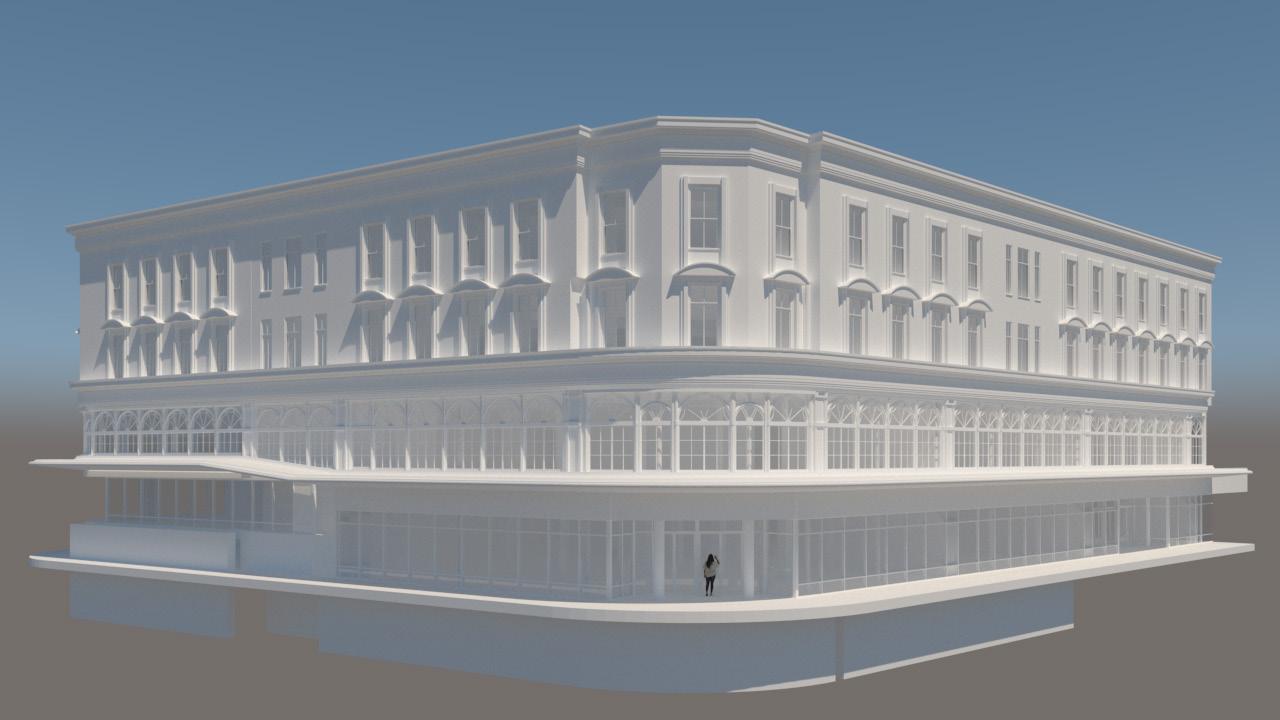
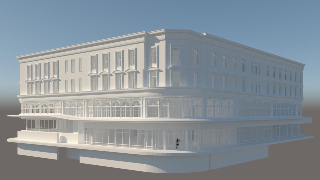
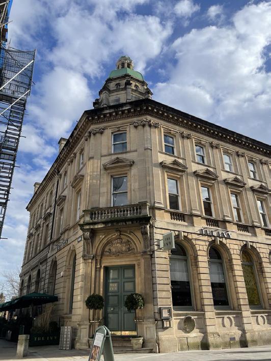
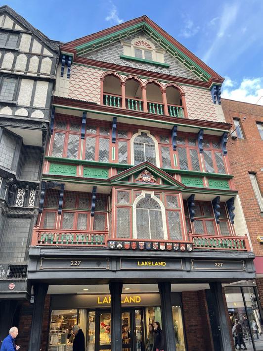
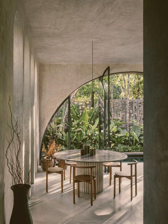
Relevance to the surroundings and the design's intentions will play a crucial role in selecting materials for Belvidere Meadows Hub. Drawing inspiration from various architectural typologies in Exeter, including the Arding and Hobbs building, the prison, and wellness centers, a consistent theme emerges. Case studies of learning centers, rehabilitation centers, and community centers reveal a commonality in the materials used, often featuring wood in soft and lighter shades.
Additionally, carpets, whether in neutral tones (as seen in community centers) or adorned with colorful graphic patterns (typical in learning centers), serve dual purposes. They not only provide acoustic support by absorbing noise but also introduce softness and contrast against the backdrop of cold grey tiles.
EXETER ARCHITECTURAL TYPOLOGIES
DESIGN CONSIDERATION
METAL MESH
ANALYSIS
Observing the interiors of several prisons, it's evident that steel metal mesh is a commonly used material. However, introducing brass as a color for the metal mesh can completely transform its aesthetic. Unlike steel, brass exudes elegance and sophistication, creating an atmosphere that is far from intimidating. By incorporating subtle elements reminiscent of a prison environment, albeit in a contemporary context, the space can maintain a sense of authenticity while avoiding direct references to incarceration. This approach allows for a nuanced design that acknowledges the space's purpose. Utilizing metal mesh in innovative ways throughout different areas of the space can provide flexible division of spaces, allowing for adaptability and customization according to various needs and functions. The use of brass as a color for metal mesh transforms the perception of the material from industrial and utilitarian to elegant and refined.
ARDING AND HOBBS ROOFTOP EXTENSION
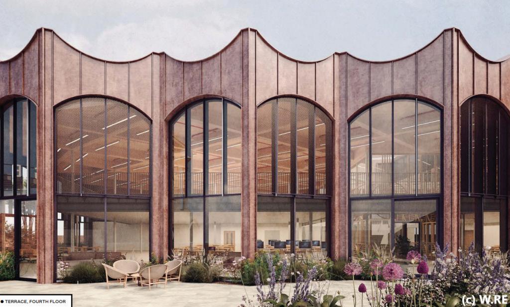
ANALYSIS
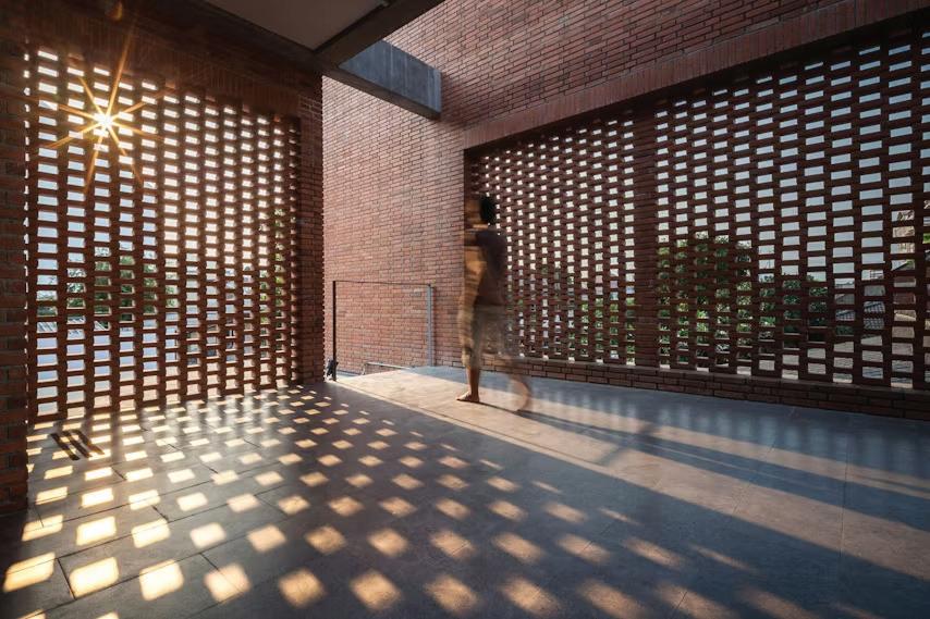
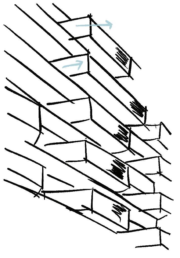
Exeter boasts a diverse architectural landscape influenced by various historical periods, contributing to the city's vibrancy and allure. While the traditional use of bricks in architectural design can sometimes evoke a sense of rigidity and conformity, exploring alternative approaches such as perforated brick walls introduces a new dimension. These perforations allow for improved air circulation while also maintaining privacy, offering a modern twist on traditional brick structures. As mentioned by Bukett from Architizer , many contemporary projects incorporate brick elements to pay homage to tradition while embracing innovative design concepts. 1
ANALYSIS
The Arding and Hobbs building has undergone significant transformations over time. A recent notable change is the addition of a rooftop structure, which makes a striking architectural statement. This addition features custom-made cladding crafted from brass and bronze, designed to serve as a rainscreen with a Structural Framing System (SFS) backing. The selection of these materials for the project introduces a contemporary and modern aesthetic to the building, with forms that complement the chosen materials. This unique choice of materials not only enhances the building's appearance adding a touch of luxury and sophistication. However, careful consideration should be given to factors such as cost, maintenance, and compatibility with the hub's overall design concept.
PERFORATED BRICKS
Arranging the bricks in various directions generates dimensional forms, while leaving gaps and incorporating different sizes and colors of bricks adds visual interest from different perspectives. This approach aligns with the architectural context but introduces a contemporary twist. The use of bricks and metal mesh as primary materials creates contrast within the space, offering a dynamic visual experience. Additionally, incorporating wood and fabric adds warmth and familiarity, balancing the hard textures of bricks and metals with softer elements.
1 Burkett (2021)
2 oag.uk.com (n.d.)
Fig. 78 Buildings along the main street of Exeter City.
Fig. 79
Fig. 80
Fig. 81
Fig. 82
Design Development: Forms / Spatial Division
ANALYSIS
Initial: Initially, spatial divisions were designed under the influence of DDA and Fire Regulations. Defined pathways were established, and walls were constructed within the voids. The aim of this design is to facilitate easy wayfinding through a subconscious sense of movement. Rather than relying on guided paths, vertical forms create zones that intuitively direct users to other spaces. Feedback highlighted potential pinch points that could impede movement.
Development: The final wall design eliminates pinch points to improve circulation. Curved walls are used to guide users and enhance wayfinding. The spatial division provides ample space, with walkway widths ranging from 1500mm to 2000mm, accommodating diverse users. All forms include wheelchair-friendly features. Seating arrangements are designed to ensure that wheelchair users can mingle in the same space without obstructing circulation.
ANALYSIS
Initial: Initially, access to the quieter area was limited to just one entrance, which posed concerns for users, especially those intending to visit the holistic health center. Originally, the rehab area was completely blocked off from other areas. Feedback highlighted potential issues with this setup, particularly in terms of impeding movement during a fire evacuation.
Development: An opening from the main staircase that connects to the rest of the building has been created to provide direct access to the holistic health centre through lockers. In the rehab centre, one room has been replaced with a pantry that includes an emergency door leading to the nearest exit. A void has been incorporated above the restaurant to accommodate the main dining area, elevated by 450mm, offering a panoramic view of the meadows. Initially, the ceiling treatment felt too low; therefore, a double-height ceiling has been introduced to flood the space with light, create a sense of airiness, and allow views into the dining area from the first floor.
REHAB CENTRE
PINCH POINTS HOLISTIC HEALTH CENTRE
Fig. 83: Alexa Wilson. Development of spatial division
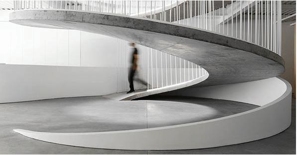
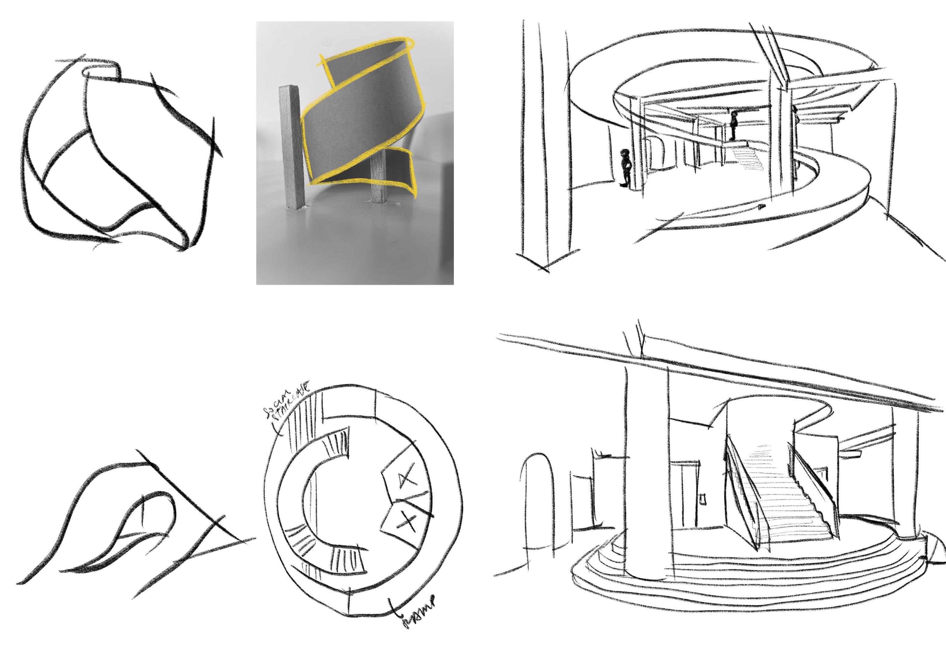
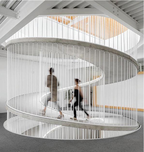
Design Development: Staircase
INITIAL
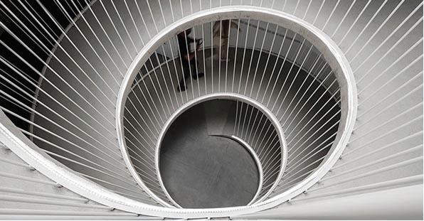
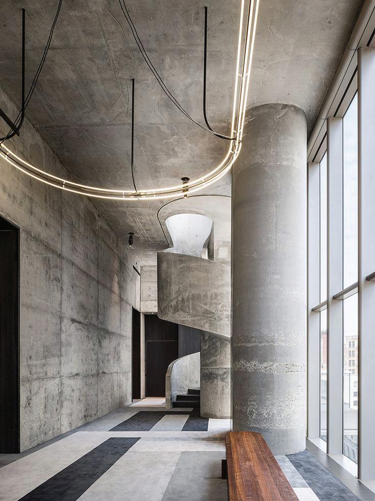
To continue with the concept of movement, the experimental model suggested vertical movement in a spiral shape, flow like a ribbon or the waves. Initially, a ramp was considered throughout the floors inspired by a precendent project (fig. 84) , but the design didn't comply with Part K regulations in the UK. The vertical circulation was intended to make a statement, highlighting frequent interactions between offenders and the general public. The design's scale needed to be large, symbolizing the idea that "we come from different places but we are all together as one."
DEVELOPMENT
A social staircase has been integrated, serving both as a seating area and a means of vertical circulation. A ramp is included to accommodate diverse users, ensuring everyone can be at the same height and enjoy different levels of visual sight. Moving forward, continuing the use of social staircases and additional stairs to other floors will enhance circulation and support the goal of providing opportunities for everyone to be in one place. The elevators on the ground floor open from different sides, with one facing the entrance and another facing the training center and hangout area in front of the screen.
Fig. 84: Spiralling ramp
Fig. 86: Alexa Wilson. Development of vertical circulation’s structures
Fig. 85: Alexa Wilson. Development of vertical circulation, the ramp
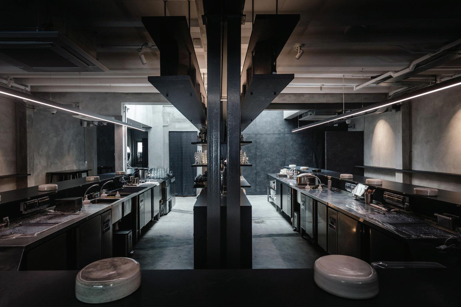
Design Development: Restaurant
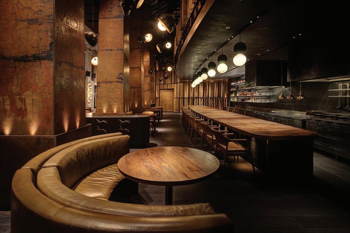
ANALYSIS
Even though Burnt Ends inspired the concept, it felt too industrial. However, for this project, the restaurant plays a crucial role in marketing and advocacy. The goal is to achieve a fine dining experience that provides offenders exposure and experience in both professional kitchen and casual settings.
Further research into brutalist aesthetics was prompted, focusing on materials suitable for the space. A notable example is the Rappu Sushi joint in Singapore, which features a brutalist interior. It utilizes a mix of polished and rough concrete, exposed brick, and dark stone.
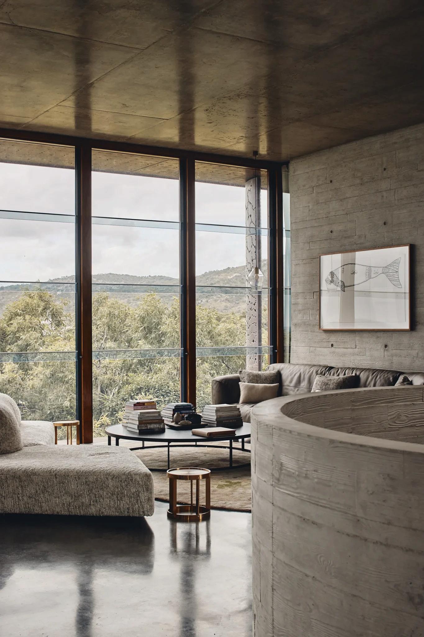
The color scheme is dominated by shades of brown, black, and grey, complemented by metallic accents. The brutalist influence creates a rugged sophistication that is desired for Belvidere Meadows Hub's restaurant. However, adding a touch of warmth to the space would enhance its desired aesthetic as a fine dining establishment while maintaining its unique identity and the mission of involving offenders in service provision.
Design considerations include an open kitchen and a dining counter in the front, accompanied by comfortable seating areas that encourage customers to stay longer. The concrete effect harmonizes with the sampling of materials reminiscent of a prison setting, creating a cohesive and distinctive atmosphere.
CONTEXT
A dining experience at Burnt Ends, designed by Emma Maxwell, inspired the spatial program for an open-kitchen restaurant in this project. During this experience, there was a sense of entertainment and pleasure in eating and interacting with the chefs. The kitchen area was kept tidy and clean, with everyone performing their duties diligently. Beaming with pride are shown through their faces and actions. This is the kind of scenario the project aims to create for the offenders. From personal experience and opinion, this environment offers many opportunities for acquiring life skills and character-building skills.
ANALYSIS
The layout of Burnt Ends fosters a sense of transparency and interaction, enhancing the dining experience by allowing patrons to feel connected to the preparation of their food, creating a lively, engaging atmosphere. The use of a mix of raw and refined materials, such as exposed brick, steel, concrete, and wood, echoes the primal aspects of barbecue while adding sophistication. Curated lighting creates an intimate yet vibrant ambiance, with pendant lights and strategically placed spotlights illuminating key areas and contributing to the cozy, welcoming atmosphere. The color palette, dominated by earthy tones including shades of brown, black, and grey, and complemented by metallic accents, reinforces the industrial aesthetic while creating warmth and intimacy. The open kitchen allows for easy movement of staff and clear sightlines for diners, enhancing the overall dining experience by increasing interaction. This balance between rugged aesthetics and comfort ensures that diners feel welcome and relaxed, encouraging longer stays and repeat visits.
ANALYSIS
Further research led to discovering a brutalist-inspired restaurant in Japan specializing in smoked and grilled dishes. The space accommodates 26 customers, similar in scale to Belvidere Meadows Hub’s restaurant. Despite its brutalist aesthetic, the atmosphere feels comforting and balanced.
The design effectively combines wood with various textures of concrete, incorporating different colors and finishes to achieve a contemporary effect. Minimalist in its approach, the restaurant speaks volumes through its use of textures.
The project’s restaurant aims to incorporate these elements to achieve the desired aesthetic. Emphasizing functionality, the clean lines and effective use of space seen in this restaurant will influence the design.
Fig. 87: Burnt Ends Singapore
Fig. 88: Rappu Singapore
Fig. 89: Grillno
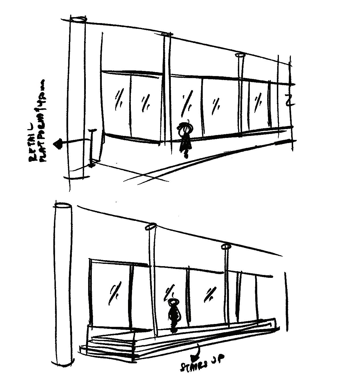
Design Development: Restaurant
ANALYSIS
Initially, the dining platform was positioned opposite the windows, providing a scenic view to customers outside the restaurant. However, this setup obstructed the view for trainee chefs, which is essential to the restaurant's concept. By relocating the kitchen to the corridor side, with glazed walls, outsiders can now observe restaurant activities. This adjustment optimizes both the dining experience and visibility of culinary training. The dining platform ensures that all customers can see the trainee chefs at work, while also offering a panoramic view outside the windows.
ANALYSIS
Placing the kitchen on the corridor side will allow passersby outside the restaurant to glimpse the activities within. This adjustment aims to provide chefs with positive exposure, fostering character-building traits such as self-confidence and the ability to work under pressure with others observing them. It will also enhance their training in kitchen hygiene and proper work practices in a visible environment.
ANALYSIS
Continuing with the concept of movement, curves were introduced into the design of the dining platform to mimic the ebb and flow of tides. This pattern also serves to create privacy for each dining area. However, the current design has proven to be somewhat cramped due to an excessive number of curves. Perhaps refining the curvature will create a more pleasant seating environment.
DINING PLATFORM
ANALYSIS
Refinements to the previous design introduced elegant curves, but their length now appears unnecessary, particularly since the platform starts near the staircase and entrance. Placing seating for four people obstructs traffic flow for both workers and customers. Despite accommodating 10 tables seating four each, the dining area on the platform feels cramped. The current arrangement of tables does not align with the goal of creating a cohesive and enjoyable dining experience that brings people together.
ANALYSIS
The length of the banquette seating now accommodates only 2 tables, but its proximity to the busy opening of the kitchen feels out of place. Perhaps removing the seating altogether would create more space for both workers and customers to move freely in the area. The dining area on the platform could benefit from a communal seating style, but traditional bench seating might not be elegant enough for female customers. Custom-made furniture will be necessary for the communal table, reflecting the communal dining experiences often associated with correctional facilities.
ANALYSIS
The final layout of furniture and dining structure achieves the goal of fostering community. This experiential restaurant encourages customers to dine together, sparking conversations about their dining experiences. Operating as a lunch and dinner service, it mirrors a fine-dining Michelin-style restaurant. Between meals, time is dedicated to preparation and trainee training. Seating near the open kitchen offers a close-up experience and promotes interaction between trainees and customers, enhancing the dining experience through observation and engagement with culinary training.
Fig. 90: Alexa Wilson. Restaurant Design Developments
OPEN KITCHEN
Design Development: Exterior
CONTEXT
The concept of this project is guided by design principles, with hierarchy being expressed through varying levels and the use of materials. The exterior is designed to imitate the motion of receding tides, using receding forms to attract users and invite them to pause.
In design, receding elements are known to attract users' attention visually:
Architectural Niches:
Recessed areas in walls for artwork or decorative elements draw attention and encourage closer inspection.
Curved or Angled Pathways:
Paths that recede or curve away guide users naturally, creating a sense of journey and discovery.
Retail and restaurant spaces benefit significantly from this approach, aligning with the project's crucial advocacy aims. By intentionally designing in a way that attracts patrons, it increases the likelihood that they will spend time engaging with the space and forming positive judgments before entering the space.

ANALYSIS
The initial design for the restaurant's exterior featured ceiling-to-floor glazing, which created an awkward experience for diners due to the elevated dining platform as users from outside looked straight to their legs. This platform is crucial to the design as it allows diners to oversee the open kitchen's activities—a key element of the restaurant.
Upon further development, it was realized that the interior kitchen walls were designed with flowing forms, which were also reflected in the platform. Consequently, the exterior was redesigned to follow these forms, increasing the height at both the top and bottom of the wall. This resulted in a panoramic glazing effect with a black frame instead of the initial ceiling-to-floor glazing. This design allows users to view the restaurant's interior without invading the privacy of the diners.
ANALYSIS
The initial design featured receding walls with a flat exterior floor surface. However, the retail space includes an elevated platform at 450mm, resulting in users being at different levels when walking past from outside.
To address this, the exterior was redesigned to include a platform that matches the retail space's elevation. This elevated void forms a sharp-angled platform, creating an interesting architectural form. This platform can serve as a casual waiting area where students can sit on the steps or as a social space. Additionally, the exterior design provides quick visual marketing of the space before users enter.
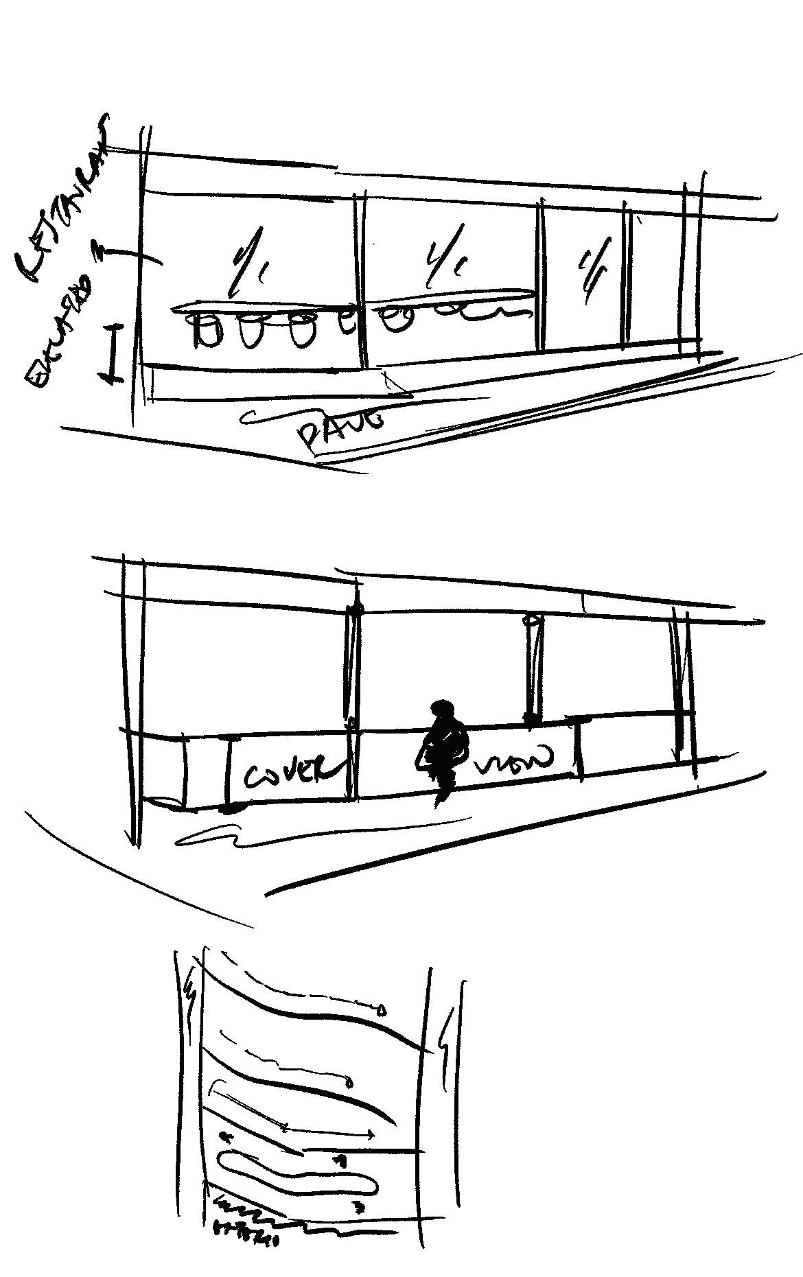
Fig. 91: Alexa Wilson. Sketch of tides coming in to the shore. Applying the outlines as the translating into forms.
Fig. 92: Alexa Wilson. Outlines of tides are projecting outside of facade.
Fig. 95: Alexa Wilson. Development of Retail side.
Fig. 95: Alexa Wilson. Development of Restaurant side.
Fig. 93: Alexa Wilson. Outlines of tides are moved into the facade and interior space
Fig. 94: Alexa Wilson. Part of the exterior is extended into interior.
Design Development: Rehabilitation Centre
CONTEXT
The rehabilitation area is the most private and sensitive part of the center. Initial ideas include providing a pause moment after a session for clients to gather themselves before rejoining the shared spaces. The rehabilitation area aims to elevate the aesthetics away from a typical rehab setting. While maintaining a minimalist aesthetic, it should offer warmth and remain free of distractions.
Although the interior here maintains the scheme as the rest of the space, this area also incorporates Japanese motifs and wooden elements to add warmth. Design considerations include the division of materials to establish hierarchy and identity for each space, such as distinguishing group therapy clinics from private clinics. Additionally, carpets are used to introduce soft textiles, complementing the hard surfaces and adding comfort.


ANALYSIS
The final spatial division of the rehabilitation center is designed to reflect the concept of flowing spaces, using curved lines to guide movement and enhance circulation. The initial layout blocked most sunlight and views, benefiting only those near the windows. To address this, pathways were created to improve circulation and provide private moments before entering the shared reception area. The rehabilitation clinic now features private areas, with numerous walls to obscure visibility and ensure privacy after sessions, preventing clients from feeling vulnerable.
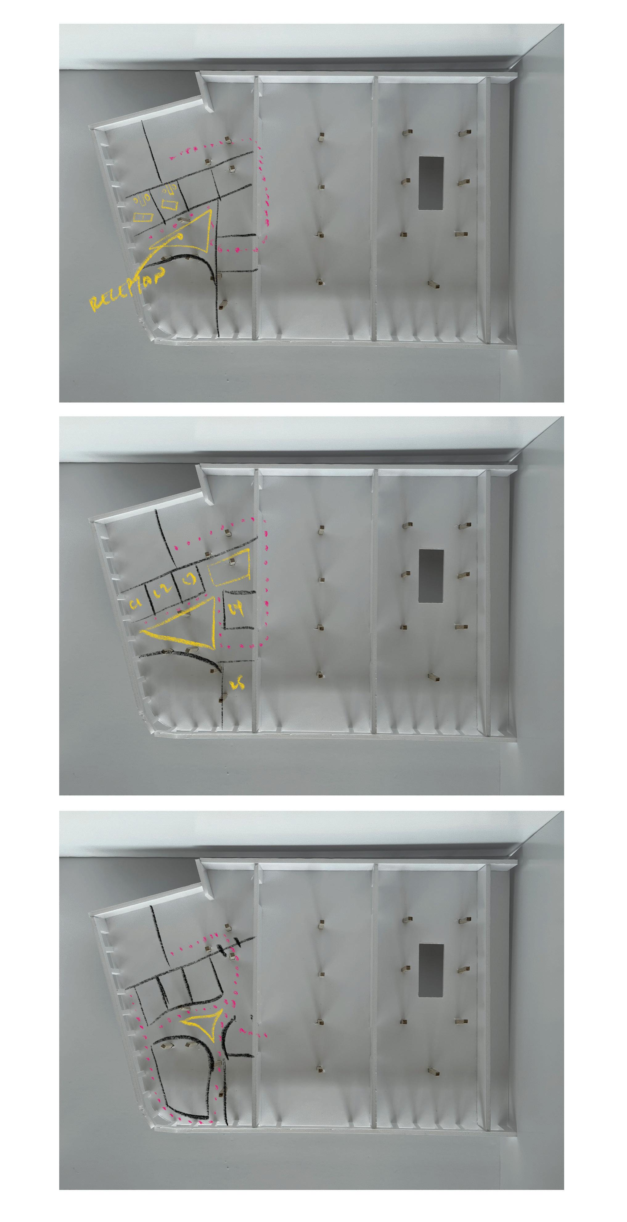
Fig. 88: Rehab centre design development.
Fig. 96: Concept development observing interaction of abnormal object to the nature. Applying this shape to divide the space making the reception as the “abnormal” shape and the rest of the rooms follows its outlines.
Fig. 97: Configuration 1 maximasize the space to add more clinics but it will be so dark at the back as it is away from the light.
Fig. 98: Added a shared space (in yellow) but the nearest exit to the emergency exit is too far,
Fig. 99: Added an escape door that will only open during emergency and have no access from outside without a security access on regular days.
Design Development: Holistic Health Centre
ANALYSIS
The initial spatial design aimed to provide multiple rooms for different uses simultaneously but quickly realized it could not accommodate the appropriate number of users. A ramp was included to offer an elevated view, but it became pointless when the room divisions proved ineffective. The final design makes sense, allowing for better flow and maximizing the use of space.
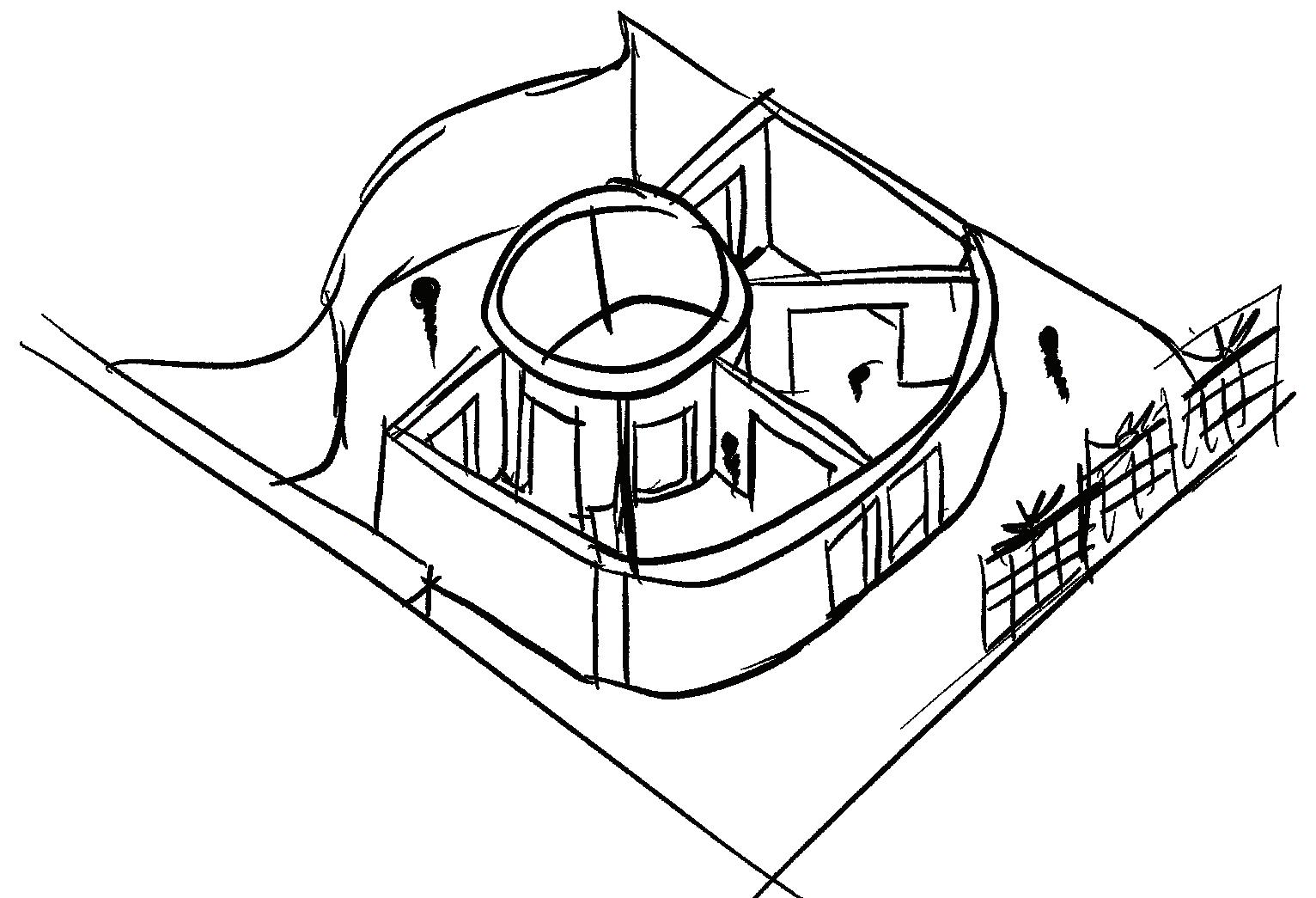
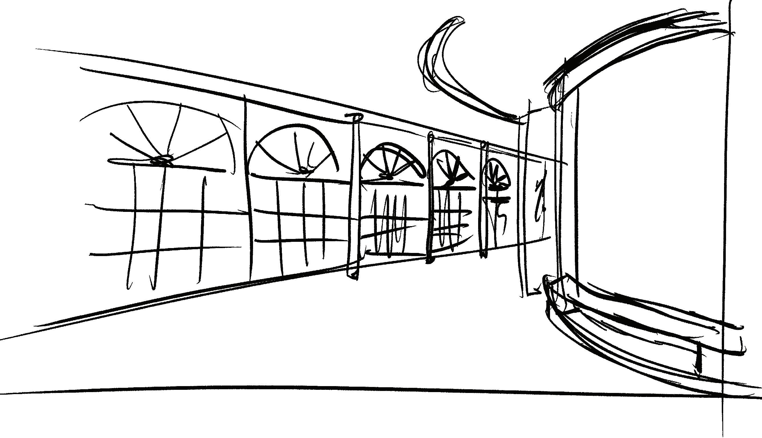
Fig. 100: The division of space away from the landing guides the users away from the quiet area. The transparency could allow light to pass through, throughout the space.
Fig. 102: The space division made each room so small. max occupancy 4 at once.
Fig. 103: The space division maximizes this side of the holistic health center, making it feel bright and airy thanks to the windows and the view for holistic activities. The divisions within the center allow the rooms to serve two different purposes simultaneously, while accommodating up to 12 users at once.
Fig. 101: Progression of space division.
Design Development: Lighting
CONTEXT
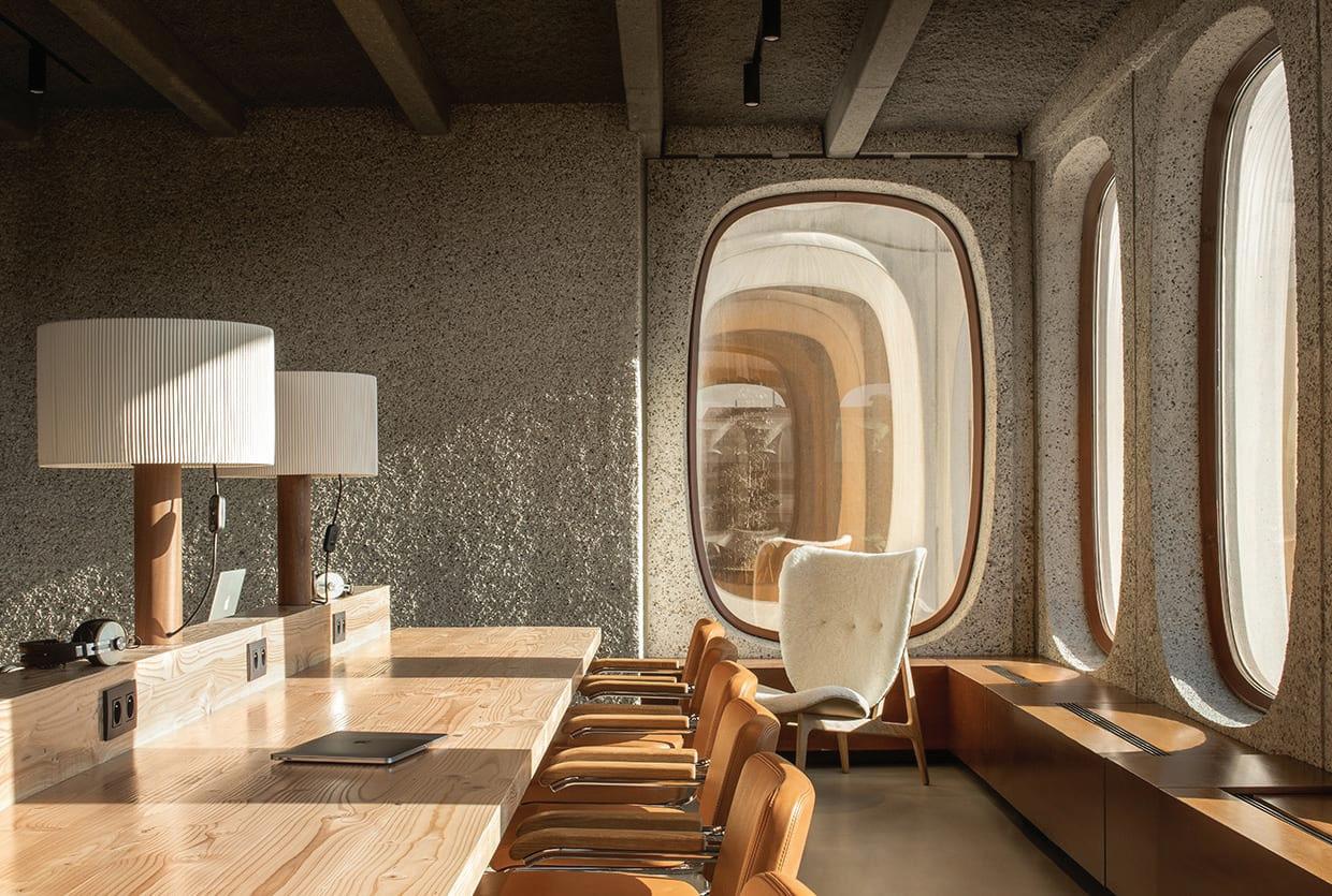
Lighting is crucial for this space, as the interior aesthetic is heavily dominated by brutalist elements and materials. To complement this style while avoiding a heavy feel typical of brutalism, careful consideration is required. The lighting should fill the space and create a sense of lightness. Linear lighting can add a modern touch and also assist with wayfinding, enhancing both functionality and aesthetic appeal.
ANALYSIS
These lighting inspirations highlight the contrast between heavy and light brutalist lighting. For example, Fig. 104 uses concrete as a cover for the lighting, creating a sense of lightness. In contrast, Fig. 106, despite being suspended, appears heavy and imbalanced between the floor and ceiling.
Linear lighting, as seen in Fig. 105, provides inspiration for ceiling treatment. The exposed ceilings in the building reveal beams, and this type of lighting can create a visual deviation from the unsightly beams. Additionally, using warmer Kelvin lighting will add ambiance to the surroundings.
Fig. 107 exemplifies the kind of lighting the building aims to achieve—a contemporary brutalist feel that balances the heavy elements with a sense of lightness and modernity.
Fig. 104
Fig. 105
Fig. 106
Fig. 107
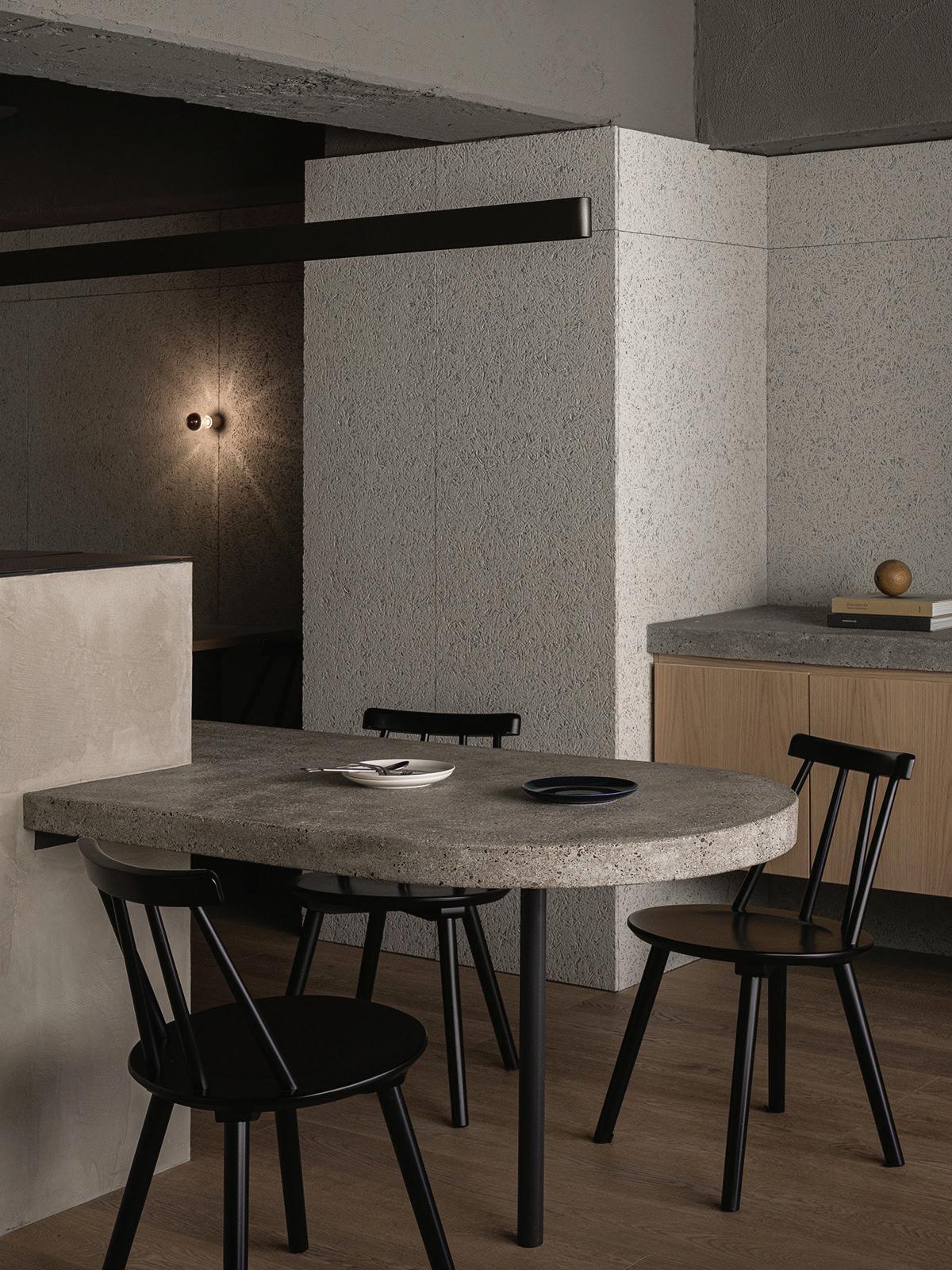
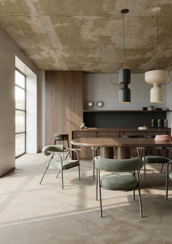
Design Development: Furniture
CONTEXT
Brutalist architecture is characterized by its raw, exposed materials, monolithic forms, and minimalist aesthetic. Furniture for a Brutalist architecture-inspired rehabilitation and reintegration facility should balance the raw, minimalistic aesthetic with elements that provide comfort, warmth, and functionality.
ANALYSIS
The showcased furniture features low-level pieces paired with high ceilings, creating a sense of grandness. The chosen materials, such as soft textiles and warm-toned leather, complement the brutalist grey aesthetic. Brutalism is a design style that allows the forms to speak for themselves, with other design elements enhancing them. This should be the aim for the project’s design goals.
Considering classic-looking furniture will also provide a contemporary look, offering a suitable design palette for diverse users.
DESIGN CONSIDERATIONS
Furniture for a Brutalist architecture should use concrete, steel, and natural wood to balance raw aesthetics with warmth. Upholstered pieces in natural textiles like wool, linen, and cotton add softness. Designs should feature minimalist forms and substantial, monolithic pieces for stability. Modular seating allows flexibility for group therapy or relaxation. Adding soft seating and warm lighting helps counterbalance the stark environment, creating a more welcoming space.
Fig. 108
Fig. 109
Fig. 110
Fig. 111
the end
ALEXA WILSON STUDIO
references images
Fig. Alexa wilson (2023) prisoners. [digital art]
Fig. 2 Lundgren, D. (2010). Prison Painter. [Online Image] Addicted Gallery. Available at: https://addictedgallery.com/Artists/Detail/dolk-lundgren-biography [Accessed 25 Nov. 2023].
Fig. 3 Santayana, G. (2013). PriSchool. [Online Image] Available at: https://www.glensantayana.com/PriSchool-A-Prison-School-Hybrid?utm_medium=website & utm_source=archdaily.com [Accessed 25 Nov. 2023].
Fig. 4 Digalakis, G. (2020). Zen: Peaceful Long Exposure Photography By George Digalakis. [Online Image] 121 Clicks. Available at: https://121clicks.com/inspirations/george-digalakis-zen-peaceful-long-exposure-photog raphy [Accessed 19 Nov. 2023].
Fig. 5 Priest, I. (2023). Hope Street for convicted women keeps families and prospects together. [online image] www.ribaj.com. Available at: https://www.ribaj.com/buildings/snug-architects-hope-street-southampton-womens-jus tice-system [Accessed 26 Nov. 2023].
Fig. 6 Hansen, J. (2019). U.K. Charity ’ s Prison Restaurant Training Programme Reduces Reoffending. [online image] Eater London. Available at: https://london.eater.com/2019/8/2/20751417/clink-prison-restaurant-charity-reoffending -rates-uk [Accessed 26 Nov. 2023].
fig. 7
Schaik, T. (2021). i29 creates colour-block interiors for Amsterdam dental clinic. [Online Image] Dezeen. Available at: https://www.dezeen.com/2021/12/27/dentista-dentist-amsterdam-i29/ [Accessed 13 Jan. 2024].
Fig. 8
Stott, R. and Santayana, G. (2014). A Radical New Approach to Prison Desig. [Online Image] Available at: https://www.archdaily.com/464371/a-radical-new-approach-to-prison-design [Accessed 10 Jan. 2024].
Fig. 9
Urban Carve (2023). Forest of Blocks. [Online Image] Available at: Archdaily.com [Accessed 11 Jan. 2024].
Fig. 10
Bennetts, P. (2020). MLC Nicholas Learning Centre. [Online Image] Arch Daily. Available at: https://www.archdaily.com/941057/mlc-nicholas-learning-centre-mcildowie-partners?ad _source=search & ad_medium=projects_tab [Accessed 11 Jan. 2024].
fig. 11
Huthmacher, W. (n.d.). Psychiatric Centre in Friedrichshafen. [Online Image] Available at: https://www.german-architects.com/en/huber-staudt-architekten-bda-berlin/project/ps ychiatric-centre-in-friedrichshafen [Accessed 11 Jan. 2024].
fig. 12
Lutyens, D. (2022). Biophilic Design – the green philosophy gripping the design world. [Online Image] Available at: https://magazine.thebrunoeffect.com/biophilic-design-the-green-philosophy-gripping-the -design-world/ [Accessed 14 Jan. 2024].
fig. 13
Fox Business and iStock (2023). Gen Z, Millenials have bleak outlook on financial futures, study finds. [Online Image] Available at: https://www.foxbusiness.com/personal-finance/gen-z-millenials-bleak-outlook-financia l-futures-study [Accessed 13 Jan. 2024].
Fig. 14
Martin & Co (n.d.). Exeter City. [Online Image] Available at: https://www.martinco.com/estate-agents-and-letting-agents/branch/exeter/insights [Accessed 5 Jan. 2024].
Fig. 15
Hedge (n.d.). Arding & Hobbs Office to Let. [Online Image] Available at: https://hedge.search-prop.com/properties/111024-arding-hobbs-london [Accessed 8 Jan. 2024].
Fig. 16
Wilson, A. (n.d.). Wild about Battersea. [Online Image] Available at: https://www.wildlondon.co.uk/books/wild-about-battersea [Accessed 8 Jan. 2024].
Fig. 17 - fig. 21
wilson, a (2023) site visit photos
fig. 22
Devon Libraries (n.d.). Layout of Exeter Library. [online IMAGE] www.devonlibraries.org.uk. Available at: https://www.devonlibraries.org.uk [Accessed 15 Feb. 2024].
fig. 23 - fig. 26
wilson, a (2023) site visit photos
fig. 27 - fig. 28
Kim, S. (n.d.). Architecture Anomaly. [Online Image] Saul Kim Studio. Available at: https://www.saulkim.com/architecture-anomaly [Accessed 28 Feb. 2024].
references images
fig. 29
Statesman News Service (2019). Grim Numbers. [Online Image] Getty Image. Available at: https://www.thestatesman.com/opinion/grim-numbers-1502787489.html [Accessed 28 Feb. 2024].
Fig. 30 - fig. 31
wilson, a (2024) spatial diagrams
fig. 32
Adrian & Gidi (n.d.). Paper Study. [Online Image] Pinterest. Available at: https://www.pinterest.es/pin/335518241001277782/ [Accessed 29 Feb. 2024].
fig. 33
Freepik (n.d.). Abstract Premium Mock up Marble Podium Stage with Pink Curve and Cosmetics. [Online Image] Pinterest. Available at: https://www.pinterest.es/pin/334884922306958261/ [Accessed 29 Feb. 2024].
fig. 34
Freepik (n.d.). Abstract Geometric Shape with Minimal Style and Pastel Color. [Online Image] Pinterest. Available at: https://www.pinterest.es/pin/1145884698937694174/ [Accessed 29 Feb. 2024].
fig. 35
Bentobox (n.d.). Feathers Opacity. [Online Image] Pinterest. Available at: https://www.pinterest.es/pin/27725353947097828/ [Accessed 29 Feb. 2024].
Fig. 36 - fig. 39
wilson, a (2024) Concept abstract models
Fig. 40 wilson, a (2024) forms
Fig. 41- fig.43 wilson, a (2024) light analysis
Fig. 44
wilson, a (2024) spatial allocations
fig. 45
The Denizen Co. (n.d.). Radial Sculpture. [Online Image] Pinterest. Available at: thedenizenco.com [Accessed 29 Feb. 2024].
fig. 46
StokkeAustad and Frost Produkt (2009). Basic Series by StokkeAustad and Frost Produkt. [Online Image] Dezeen. Available at:
https://www.dezeen.com/2009/11/08/basic-series-by-stokkeaustad-and-frost-produkt/ [Accessed 1 Mar. 2024].
Fig. 47- fig.62
wilson, a (2024) spatial planning
Fig. 63- fig.74
wilson, a (2024) physical working models
fig.75
Getty Images (2021). Bilin ç alt ı n ı n Gizli G ü c ü Olumlamalar. [Online Image] Vogue.com. Available at: https://vogue.com.tr/wellness/bilincaltinin-gizli-gucu-olumlamalar [Accessed 11 Mar. 2024].
fig.76
Edward George London (2023). The Japanese Living Room - 42 Interior Design Tips To Get The Look Right. [Online Image] Available at: https://edwardgeorgelondon.com/blogs/home-garden/the-japanese-living-room [Accessed 11 Mar. 2024].
Fig. 77
wilson, a (2024) generated colour palette
Fig. 78
wilson, a (2024) street of exeter city
Fig. 79
Junsekino Architecture & Design (2014). Ngamwongwan House. [Online Image] Architizer. Available at: https://architizer.com/projects/ngamwongwan-house/ [Accessed 30 Apr. 2024].
Fig. 80
wilson, a (2024) mesh grill
Fig. 81
W.RE.London (n.d.). Arding and Hobbs Rooftop. [Online Image] Lavender-Hill. Available at: https://lavender-hill.uk/2023/02/11/arding-hobbs-in-clapham-junction-the-first-signs-ofwhat-the-redeveloped-building-will-look-like/ [Accessed 1 May 2024].
Fig. 82
wilson, a (2024) sketch of bricks
Fig. 84
Paulo Merlini Architects (2021). Instead Of Stairs, A Spiraling Ramp Was Designed For This Office Building. [Online Image] www.contemporist.com. Available at:
references images
https://www.contemporist.com/instead-of-stairs-a-spiraling-ramp-was-designed-for-this -office-building/ [Accessed 26 Jun. 2024].
fig. 87
Boardman, B. (2022). Fire, skulls and AC/DC: This is Burnt Ends. [Online Image] indesignlive.com. Available at: https://www.indesignlive.com/projects/burnt-ends-emma-maxwell-design [Accessed 5 Jul. 2024].
fig. 88
Fallon, F. (n.d.). Rappu Is a Brutalist Sushi Joint in Singapore. [Online Image] thespaces. Available at: https://thespaces.com/rappu-is-a-brutalist-sushi-joint-in-singapore/6/ [Accessed 5 Jul. 2024].
fig. 89
TOMOOKI, K. (2021). Grillno Restaurant. [Online Image] leibal. Available at: https://leibal.com/interiors/grillno-restaurant/ [Accessed 5 Jul. 2024].
fig. 89 - fig. 103 alexa wilson. sketches
fig. 104
Est Living (2024). How to Incorporate Brutalist Design into Your Home. [Online Image] SampleBoard.com. Available at: https://blog.sampleboard.com/the-rising-popularity-of-brutalism-in-interior-design/ [Accessed 7 Jul. 2024].
fig. 105
Severin, A. (2017). Brutalist interiors of Herzog & de Meuron ’ s ‘ Jenga tower ’ revealed. [Online Image] thespaces.com. Available at: https://thespaces.com/brutalist-interiors-herzog-de-meuron-jenga-tower/2/ [Accessed 7 Jul. 2024].
fig. 106 behance.net (2024). How to Incorporate Brutalist Design into Your Home. [Online Image] SampleBoard.com. Available at: https://blog.sampleboard.com/the-rising-popularity-of-brutalism-in-interior-design/ [Accessed 7 Jul. 2024].
fig. 107
Ann Viz (2021). Brutalist Lighting. [Online Image] instagram. Available at: https://sabiinadesign.com/brutalism-interior-design/ [Accessed 7 Jul. 2024].
fig. 108- fig. 111
Hommes Studio (2023). Get Inspired by 5 Stunning Brutalist Interior Design Projects. [Online Image] Available at: https://hommes.studio/journal/5-brutalist-interior-design-projects/ [Accessed 7 Jul. 2024].
FIg. 120
Pinterest (n.d.). Core Nudes. [Online Image] Pinterest. Available at: https://www.pinterest.es/pin/879961214690601207/ [Accessed 9 Jul. 2024].
FIg. 121
Polo, A. (2022). Tejocote House / Gonz á lez Muchow Arquitectura. [Online Image] Arch Daily. Available at: https://www.archdaily.com/989805/tejocote-house-gonzalez-muchow-arquitectura/633 5dedf4dba6e4426c95546-tejocote-house-gonzalez-muchow-arquitectura-photo [Accessed 9 Jul. 2024].
fig. 122
Ikea (n.d.). Tossberg Chair. [Online Image] Ikea. Available at: https://www.ikea.com/gb/en/p/tossberg-langfjaell-conference-chair-grann-light-brow n-white-s19567333/#content [Accessed 9 Jul. 2024].
fig. 123
Industville (n.d.). Ornat Vase Table Lamp. [Online Image] industville. Available at: https://www.industville.co.uk/collections/table-lamps/products/ornate-vase-table-la mp-brass?_gl=1*1rren0e*_up*MQ.. & gclid=CjwKCAjwyo60BhBiEiwAHmVLJVQWcmBtswWWnTU6SA bMAxQumQs_BEgp2LYirEGzqMgvW1OHKU1s1RoCOzcQAvD_BwE [Accessed 9 Jul. 2024].
fig. 124
Furniture Fusion (n.d.). Organic Modular Sofa. [Online Image] Furniture Fusion. Available at: https://furniturefusion.co.uk/furniture/organic-modular-sofa [Accessed 9 Jul. 2024].
fig. 125
AND LIGHT (n.d.). Design by Us Marble Art Pendant Sand. [Online Image] andlight.co. Available at: https://andlight.co.uk/shop/design-by-us-15814p.html [Accessed 9 Jul. 2024].
fig. 126
Babblebe (n.d.). BabbleBe Japanese light. [Online Image] etsy. Available at: https://www.etsy.com/uk/listing/1703920352/handmade-japanese-style-solid-wood-style? click_key=06478e1bb337159f26240482bc42ba5696019e46%3A1703920352 & click_sum=90f0ffa0 & ref=shop_home_active_5 & frs=1 [Accessed 9 Jul. 2024].
fig. 127
Tikamoon (n.d.). Ava Teak Nesting Table. [Online Image] Available at: https://www.tikamoon.co.uk/art-ava-teak-nesting-tables-6694.htm [Accessed 9 Jul. 2024].
fig. 128
AND LIGHT (n.d.). 101 Copenhagen Pearl Pendant Brass. [Online Image] Available at: https://andlight.co.uk/shop/101-copenhagen-pearl-28676p.html [Accessed 9 Jul. 2024].
fig. 129
Dunelm (n.d.). Lovato Dining Chair. [Online Image] Available at: https://www.dunelm.com/product/lovato-dining-chair-1000229682?defaultSkuId=30857636
references images
& srsltid=AfmBOorPn9tbDgymaeVMVq_rfGCtHgB_ZyAJpvOHaEKArx4KHpL14DsVbM0 & colour=Na tural [Accessed 9 Jul. 2024].
fig. 130
AND LIGHT (n.d.). Moooi NomNom Light 20 Pendant Ginger. [Online Image] Available at: https://andlight.co.uk/shop/moooi-nomnom-light-41617p.html [Accessed 9 Jul. 2024].
fig. 131
Rosehill Contract Furniture (n.d.). Kaika Meeting Chairs. [Online Image] Available at: https://www.rosehill.co.uk/product/kaika-meeting-chairs/ [Accessed 9 Jul. 2024].
fig. 132
Heal's (n.d.). Mela Dining Chair by Artisan. [Online Image] Available at: https://www.heals.com/mela-dining-chair.html [Accessed 9 Jul. 2024].
fig. 133
wescover (n.d.). Wing Maple - Pendants. [Online Image] Available at: https://www.wescover.com/p/wing-maple-by-studio-vayehi--PB17D83qbT [Accessed 9 Jul. 2024].
fig. 134
Darlings of Chelsea (n.d.). Wandsworth Chair. [Online Image] Available at: https://www.darlingsofchelsea.co.uk/wandsworth-range-pview [Accessed 9 Jul. 2024].
fig. 135
Heal's (n.d.). Neva Light Counter Stool. [Online Image] Available at: https://www.heals.com/neva-light-counter.html [Accessed 9 Jul. 2024].
fig. 136
Alherani, S. (2023). Lighting Up Your Life: Exploring the Radiant World of James Turrell. [Online Image] medium.com. Available at: https://medium.com/ @ sofialherani/lighting-up-your-life-exploring-the-radiant-world-of -james-turrell-4db20c0aee8e [Accessed 9 Jul. 2024].
fig. 137
Furniture Fusion (n.d.). Sushi Modular Sofa. [Online Image] Available at: https://furniturefusion.co.uk/furniture/sushi-modular-sofa [Accessed 9 Jul. 2024].
references vectors
pg.3 - Freepik (n.d.). Doodle Valentine ’ s Day Element Collection. [Vector] Available at: https://www.freepik.com/free-vector/doodle-valentine-s-day-element-collection_150491 3.htm#query=sketch%20empathize%20icon & position=18 & from_view=search & track=ais & uuid= a55e21c0-bfa9-490d-96ec-ef1f8e3c9f5c [Accessed 9 Jan. 2024].
Harry Arts (n.d.). Technology Sketch Icon Set Doodle. [Vector] Available at: https://www.freepik.com/free-vector/technology-sketch-icon-set-doodle_9711796.htm# query=sketch%20icon & position=4 & from_view=search & track=ais & uuid=a05b6dba-71b6-48cfa38c-df2dbcbecd3b [Accessed 9 Jan. 2024].
Rawpixel (n.d.). Mental Health. [Vector] Available at: https://www.freepik.com/free-vector/brain-mental-health-icons-vector-set_3438021.htm #query=Therapy & position=7 & from_view=search & track=sph & uuid=836bbc13-afe0-44d6-860acc1487f2f07b [Accessed 11 Jan. 2024].
Freepik (n.d.). Community Hands. [Vector] Available at: Image by Freepik [Accessed 11 Jan. 2024].
Flat Art (n.d.). Pharmacy. [Vector] Freepik. Available at: https://www.freepik.com/free-vector/pharmacy-25-solid-glyph-icon-pack-including-alte rnative-pharmacy-pharmacy-medicine-location_38543484.htm#query=drug%20treatment%2 0icon & position=4 & from_view=search & track=ais & uuid=9051d77b-f73d-43c5-89cb-e8c1a8d0e3 ad [Accessed 11 Jan. 2024].
references
works consulted
Abdel, H. and Arch Daily (2023). Forest of Blocks / UrbanCarve. [online] ArchDaily. Available at:
https://www.archdaily.com/1011138/forest-of-blocks-urbancarve?ad_source=search & ad_m edium=projects_tab [Accessed 11 Jan. 2024].
Arch Daily (2014). Psychiatric Centre Friedrichshafen / Huber Staudt Architekten. [online] ArchDaily. Available at:
https://www.archdaily.com/486389/psychiatric-centre-friedrichshafen-huber-staudt-arch itekten?ad_medium=gallery [Accessed 11 Jan. 2024].
Arding and Hobbs (n.d.). Arding & Hobbs. [online] Arding & Hobbs. Available at: https://ardingandhobbs.london/ [Accessed 8 Jan. 2024].
Bernheimer, L., O'brien, R., Barnes, R., Korsak, A. and Karthaus, R. (2017). Wellbeing in prison design A guide Matter Architecture THE WELLBEING PRISON: DESIGN TOOLKIT. [online] p.34. Available at:
https://www.matterarchitecture.uk/wp-content/uploads/2018/05/421-op-02_Design-tool kit-report-online.pdf [Accessed 13 Jan. 2024].
Bennett, A. (n.d.). Gen Z and millennial shopping habits. [online] www.ukpos.com. Available at:
https://www.ukpos.com/knowledge-hub/gen-z-and-millennials-shopping-habits#:~:text=Li ke%20the%20generation%20before%20them [Accessed 15 Jan. 2024].
Burkett, K. (2021). 7 Clever Projects Utilizing Perforated Brick Fa ç ades - Architizer Journal. [online] Journal. Available at: https://architizer.com/blog/inspiration/collections/perforated-brick/ [Accessed 30 Apr. 2024].
Census 2021 (2023). How life has changed in Exeter: Census 2021. [online] www.ons.gov.uk. Available at: https://www.ons.gov.uk/visualisations/censusareachanges/E07000041/ [Accessed 5 Jan. 2024].
Cherry, K. (2022). Maslow ’ s Hierarchy of Needs. [online] Verywellmind. Available at: https://www.verywellmind.com/what-is-maslows-hierarchy-of-needs-4136760 [Accessed 25 Nov. 2023].
Coles, D. (2022). 5 Things We Learnt from Our 2022 Student Volunteering Research. [online] LSE Volunteer Centre. Available at: https://blogs.lse.ac.uk/vcb/2022/11/25/5-things-we-learnt-from-our-2022-student-volun teering-research/#:~:text=Only%2C%2026%25%20of%201st%20year [Accessed 14 Jan. 2024].
Cottrell, S. (2020). A Year-by-Year Guide to the Different Generations and Their Personalities. [online] Parents.
Available at: https://www.parents.com/parenting/better-parenting/style/generation-names-and-year
s-a-cheat-sheet-for-parents/ [Accessed 15 Jan 2024].
Dewar, C. (2022). Look at First Ever Women ’ s Community Custody Unit in the UK Opens in Scotland. [online] STV News. Available at: https://news.stv.tv/north/look-at-first-ever-womens-community-custody-unit-in-the-uk -the-bella-centre-in-dundee [Accessed 26 Nov. 2023].
Folan, E. (2023). The UK Has Its Own Mass Incarceration Crisis. [online] Novara Media. Available at: https://novaramedia.com/2023/01/02/the-uk-has-its-own-mass-incarceration-crisis/ [Accessed 19 Nov. 2023].
Foodbev (2023). Interview: Gen Z is driving F & B companies to become more sustainable. [online] FoodBev Media. Available at: https://www.foodbev.com/news/opinion-why-gen-z-is-driving-food-beverage-brands-to-b ecome-more-sustainable/#:~:text=Recent%20research%20found%20that%20Gen [Accessed 15 Jan. 2024].
Fresh Start Housing Service (n.d.). About us. [online] Fresh Start Housing. Available at: http://freshstarthousingservice.com/about-us/ [Accessed 26 Nov. 2023].
Freifeld, L. (2020). Zooming in on Gen Z. [online] Training. Available at: https://trainingmag.com/zooming-in-on-gen-z/ [Accessed 15 Jan 2024].
Goodhand, I. (2023). Over 50% of UK Prisoners Cannot Read – Addressing Alarming Illiteracy Rates in Offenders. [online] North West Bylines. Available at: https://northwestbylines.co.uk/news/education/over-half-of-uk-prisoners-cannot-read/ #:~:text=Over%2050%25%20of%20adults%20in [Accessed 11 Jan. 2024].
Hadjiosif, S. (2021). What Is Social Impact Design And Why It Matters • Terra Movement An Artivist Hub. [online] Terra Movement | An Artivist Hub. Available at: https://www.terramovement.com/what-is-social-impact-design-and-why-it-matters/ [Accessed 9 Jan. 2024].
Hansen, J. (2019). U.K. Charity ’ s Prison Restaurant Training Programme Reduces Reoffending. [online] Eater London. Available at: https://london.eater.com/2019/8/2/20751417/clink-prison-restaurant-charity-reoffending -rates-uk [Accessed 26 Nov. 2023].
Hempstead, S. (2019). Designing for Generation Z Schmidt Associates Architects & Engineers. [online] Schmidt Associates. Available at: https://schmidt-arch.com/designing-for-generation-z/ [Accessed 15 Jan. 2024].
references
works consulted
Available at:
https://www.ucas.com/explore/unis/91fd2fa0/university-of-exeter/stats?studyYear=curre nt [Accessed 8 Jan. 2024].
Historicengland.org.uk (n.d.). ARDING AND HOBBS STORE, Non Civil Parish - 1389528 | Historic England. [online] historicengland.org.uk. Available at: https://historicengland.org.uk/listing/the-list/list-entry/1389528?section=official-list-e ntry [Accessed 8 Jan. 2024].
Hope Into Action (n.d.). Hope Into Action UK. [online] Hope into Action UK. Available at: https://www.hopeintoaction.org.uk/ [Accessed 26 Nov. 2023].
M, Y. (2023). Gen Z Shopping Habits 2022: Stats & Behavior [New Data]. [online] Businessedit.com. Available at: https://www.businessdit.com/gen-z-shopping-habits/ [Accessed 15 Jan 2024].
Ministry of Justice (2019). Economic and social costs of reoffending Analytical report. Available at: assets.publishing.service.gov.uk/economic-social-costs-reoffending (Accessed: 19 November 2023)
Ministry of Justice (2021). Prisons Strategy White Paper. Available at: assets.publishing.service.gov.uk/prisons-strategy-white-paper (Accessed: 19 November 2023)
Ministry of Justice. (2023) Prisons Data. data.justice.gov.uk. Available at: https://data.justice.gov.uk/prisons (Accessed: 11 Jan. 2024).
Ministry of Justice (2023). Proven reoffending statistics: October to December 2021. [online] GOV.UK. Available at: https://www.gov.uk/government/statistics/proven-reoffending-statistics-october-to-d ecember-2021/proven-reoffending-statistics-october-to-december-2021 [Accessed 11 Jan. 2024].
Ministry of Justice (2019a). Scheme giving ex-offenders a stable place to live up and running. [online] GOV.UK. Available at: https://www.gov.uk/government/news/scheme-giving-ex-offenders-a-stable-place-to-liv e-up-and-running#:~:text=Ex%2Doffenders%20in%20the%20scheme [Accessed 26 Nov. 2023].
Ministry of Justice (2019). Your A-D Guide on Prison Categories - Working in the Prison Service. [online] Gov.uk. Available at: https://prisonjobs.blog.gov.uk/your-a-d-guide-on-prison-categories/ [Accessed 26 Nov. 2023].
Nicita, C. (2020). Council Post: Three Ways You Can Bring Humanistic Design To Your Organization. [online] Forbes. Available at: https://www.forbes.com/sites/forbesagencycouncil/2020/03/18/three-ways-you-can-brin
g-humanistic-design-to-your-organization/?sh=7ab32f774cc9 [Accessed 26 Nov. 2023].
oag.uk.com (n.d.). Materials of Arding and Hobbs. [online] OAG. Available at: https://www.oag.uk.com/project/arding-hobbs/ [Accessed May 2024].
Pintos, P. and Arch Daily (2020). MLC Nicholas Learning Centre / McIldowie Partners. [online] ArchDaily. Available at: https://www.archdaily.com/941057/mlc-nicholas-learning-centre-mcildowie-partners?ad _source=search & ad_medium=projects_tab [Accessed 11 Jan. 2024].
Priest, I. (2023). Hope Street for convicted women keeps families and prospects together. [online] www.ribaj.com. Available at: https://www.ribaj.com/buildings/snug-architects-hope-street-southampton-womens-jus tice-system [Accessed 26 Nov. 2023].
Prison Reform Trust (2021). Bromley Briefings Prison Factfile. Available at: prisonreformtrust.org.uk/Bromley_briefings_winter_2021
Prison Reform Trust (2021). Long-term prisoners: the facts. [online] Available at: https://prisonreformtrust.org.uk/wp-content/uploads/2021/10/Long-term-prisoners_thefacts_2021.pdf [Accessed 11 Jan. 2024].
says, L.L. (2022). A Nation Obsessed with Crime: Prisons in England and Wales. [online] Social Policy. Available at: https://blogs.lse.ac.uk/socialpolicy/2022/08/09/a-nation-obsessed-with-crime-prisons-in -england-wales/ [Accessed 19 Nov. 2023].
Stott, R. and Arch Daily (2014). A Radical New Approach to Prison Design. [online] ArchDaily. Available at: https://www.archdaily.com/464371/a-radical-new-approach-to-prison-design [Accessed 10 Jan. 2024].
Switchback (n.d.). About Us. [online] Switchback. Available at: https://switchback.org.uk/about-us/ [Accessed 26 Nov. 2023].
The Clink Charity (2018). Home – The Clink Charity. [online] The Clink Charity. Available at: https://theclinkcharity.org/our-story [Accessed 26 Nov. 2023].
The Guardian (2021). If Prisoners Are to Help with the UK ’ s Labour shortages, They Must Not Be Exploited | Frances Crook. [online] the Guardian. Available at: https://www.theguardian.com/commentisfree/2021/aug/26/prisoners-uk-labour-shortageexploited [Accessed 19 Nov. 2023].
The Interaction Design Foundation. (n.d.). What is Design Thinking? updated 2024. [online] Available at: https://www.interaction-design.org/literature/topics/design-thinking#:~:text=The%20Fiv
references
works consulted
e%20Stages%20of%20Design%20Thinking [Accessed 9 Jan. 2024].
Thomas, J. (2020). Colours to Soothe Anxiety & Promote Wellness WGSN. [online] www.wgsn.com. Available at: https://www.wgsn.com/en/blogs/colours-to-soothe-anxiety-promote-wellness#:~:text= Green%20is%20a%20restful%20and [Accessed 11 Mar. 2024].
urbanlocker (2022). What age do you start and finish University? [online] Urban Locker. Available at: https://www.urbanlocker.co.uk/what-age-do-you-start-and-finish-university/#:~:text=St udents%20typically%20start%20university%20aged [Accessed 8 Jan. 2024].
Visit Exeter (n.d.). Culture in Exeter. [online] www.visitexeter.com. Available at: https://www.visitexeter.com/things-to-do/attractions/culture [Accessed 5 Jan. 2024].
Wikipedia (2022). His Majesty. [online] Wikipedia. Available at: https://en.wikipedia.org/wiki/His_Majesty [Accessed 19 Nov. 2023].
Wikipedia Contributors (2023). Arding & Hobbs. [online] Wikipedia. Available at: https://en.wikipedia.org/wiki/Arding_%26_Hobbs [Accessed 8 Jan. 2024].
Woodland, E. (2024). 4 Effective Strategies for Criminal Rehabilitation in the Justice System. [online] blog.govnet.co.uk. Available at: https://blog.govnet.co.uk/justice/what-is-rehabilitation-in-criminal-justice.