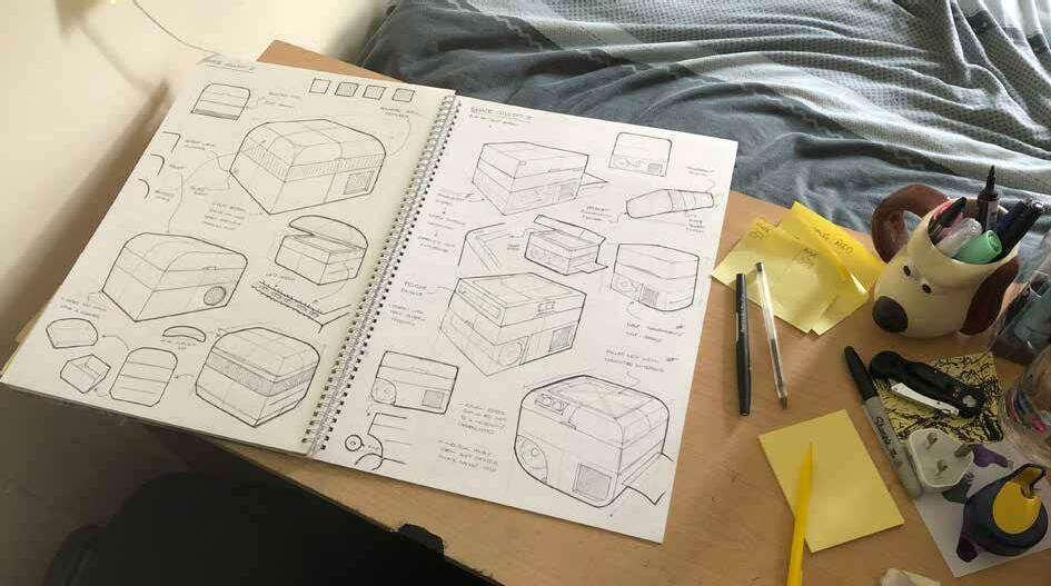
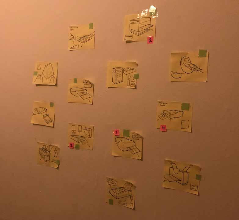
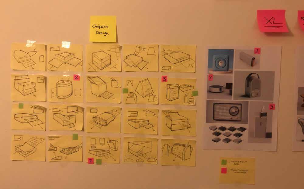
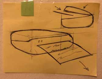
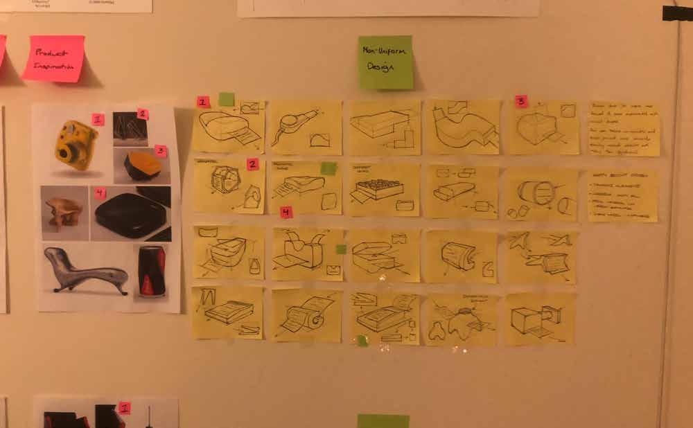
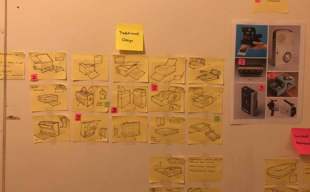
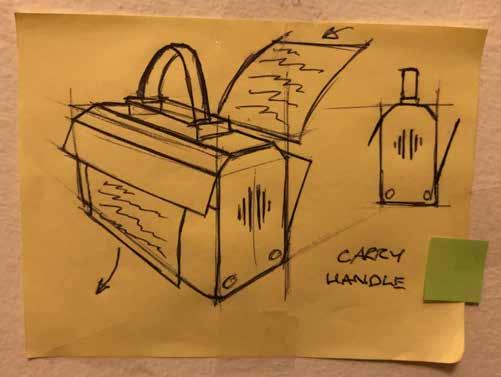
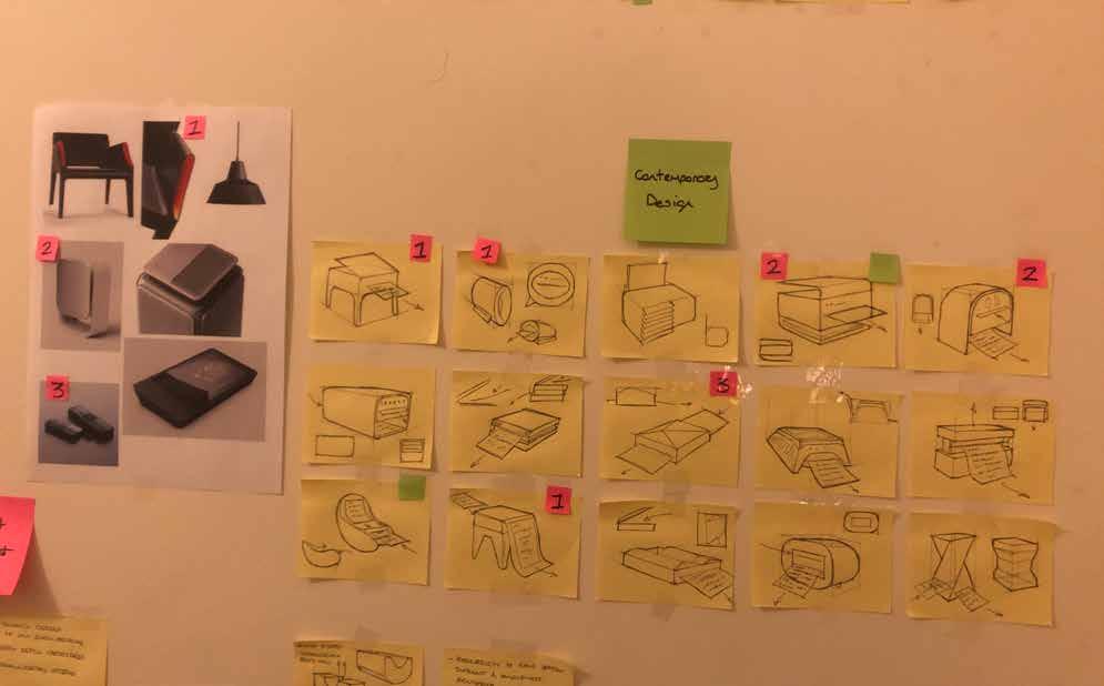
Initial Sketch Work
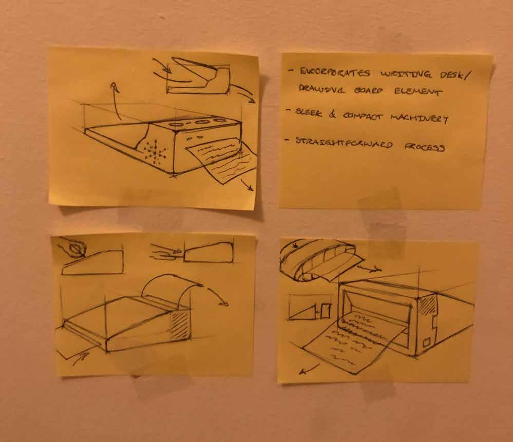
Collating rough initial ideas and visualising them through post-it notes.
I used post-it notes to ideate designs for my minor project, and as a visual learner I definitely prefer getting all my ideas into one large area to cross-examine and determine which are the strongest.
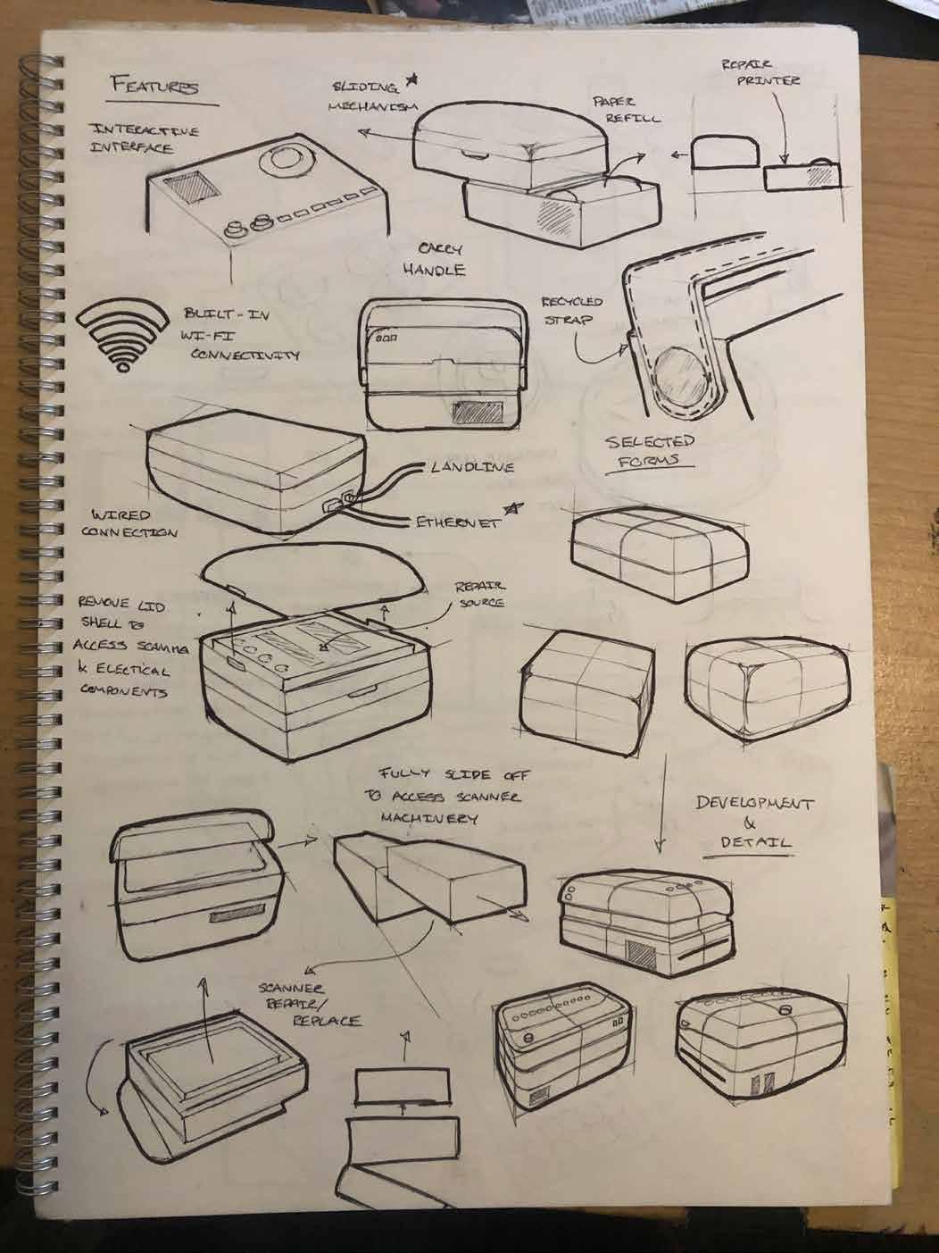
Early development of the essential and potential features of my product.
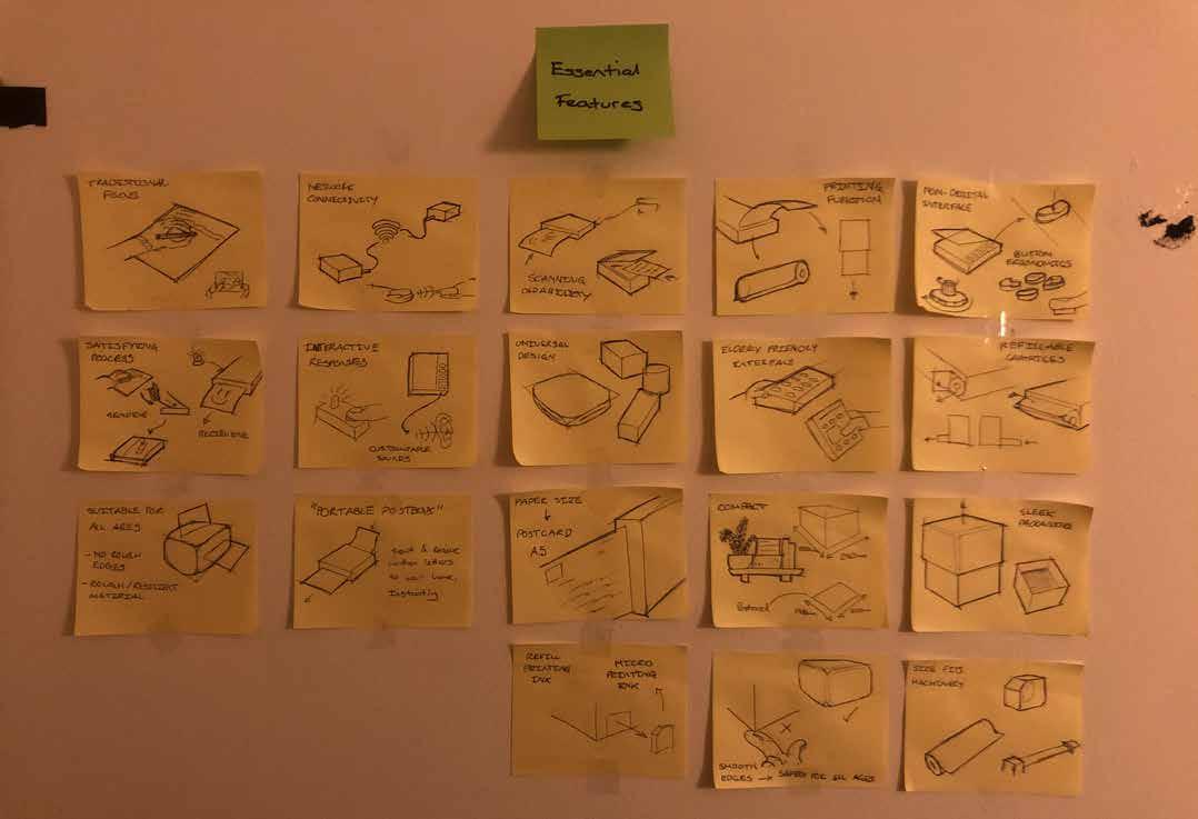
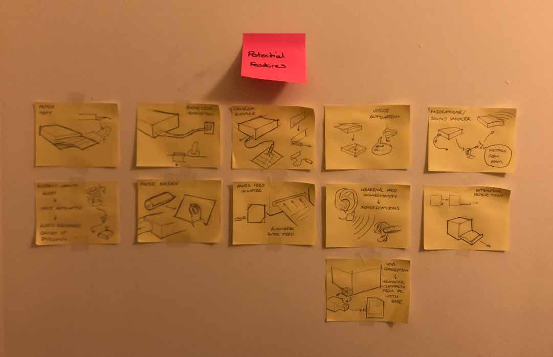

Sketch Work Aims.
Ideate and experiment with different forms and styles of design to come up with an ideal product shape.
Unfortunately the wall space in my room is very limited, however I didnt want to fill it with rough, thoughtless scribbles.
Each post-it was carefully thought out with unique features and additions to the base product, making it a perfect beginning to the design stage of the project.
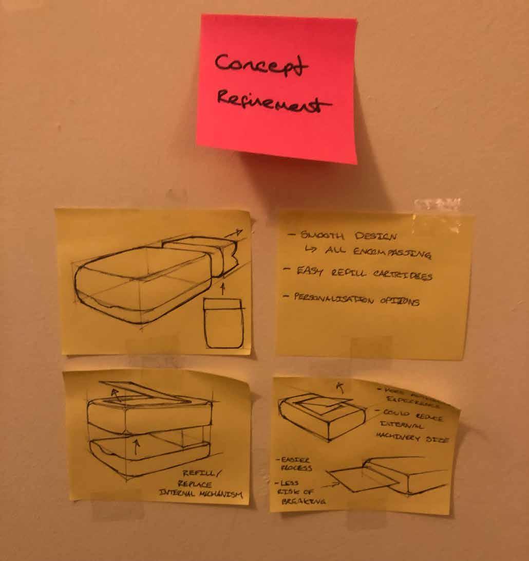
As this product is targetted at a wide base of consumers from all age ranges, a key focus on all-encompassing and welcoming design was set out from the beginning.
Uniform Design.
Shapes and forms that arent too irregular, mostly symmetrical shapes.

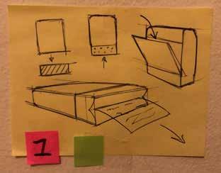
Vertical paper dispensing allows messages or drawings to be visually displayed before being taken.
Smooth edges makes product much more all encompassing, sharp edges could prove to be a hazard.
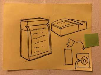
Simple paper roll replacement and personalisation options, rear hatch design much like a Walkman cassette player.
Encorporating the simple paper refill cartridges with the vertical message display.
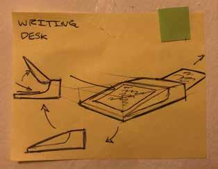
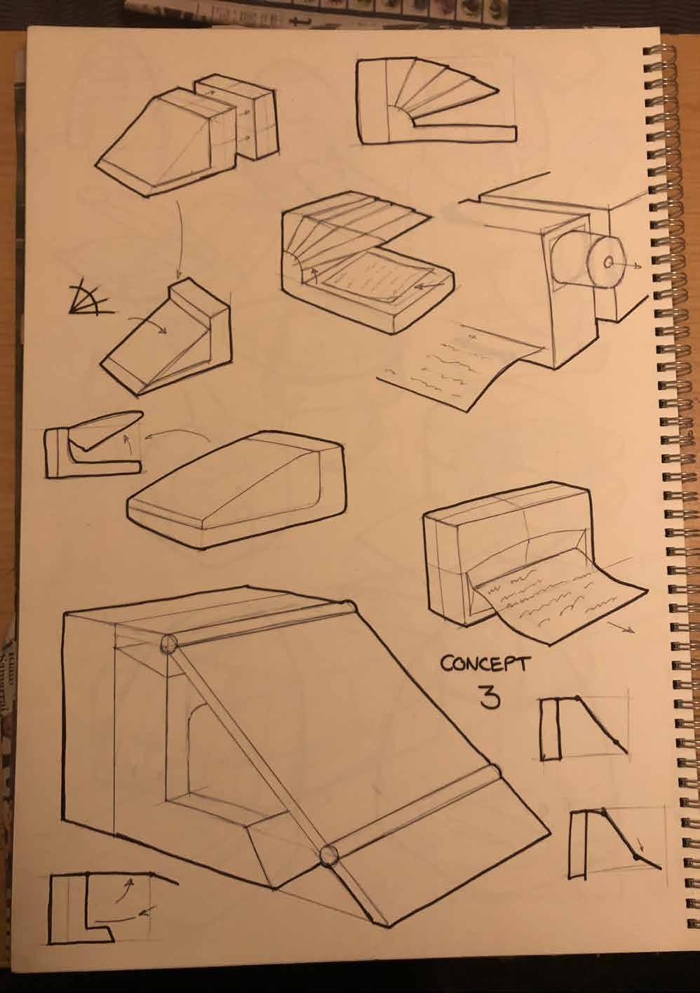
Slanted scanner lid could be used as a writing desk, potential for those in smaller accommodation.
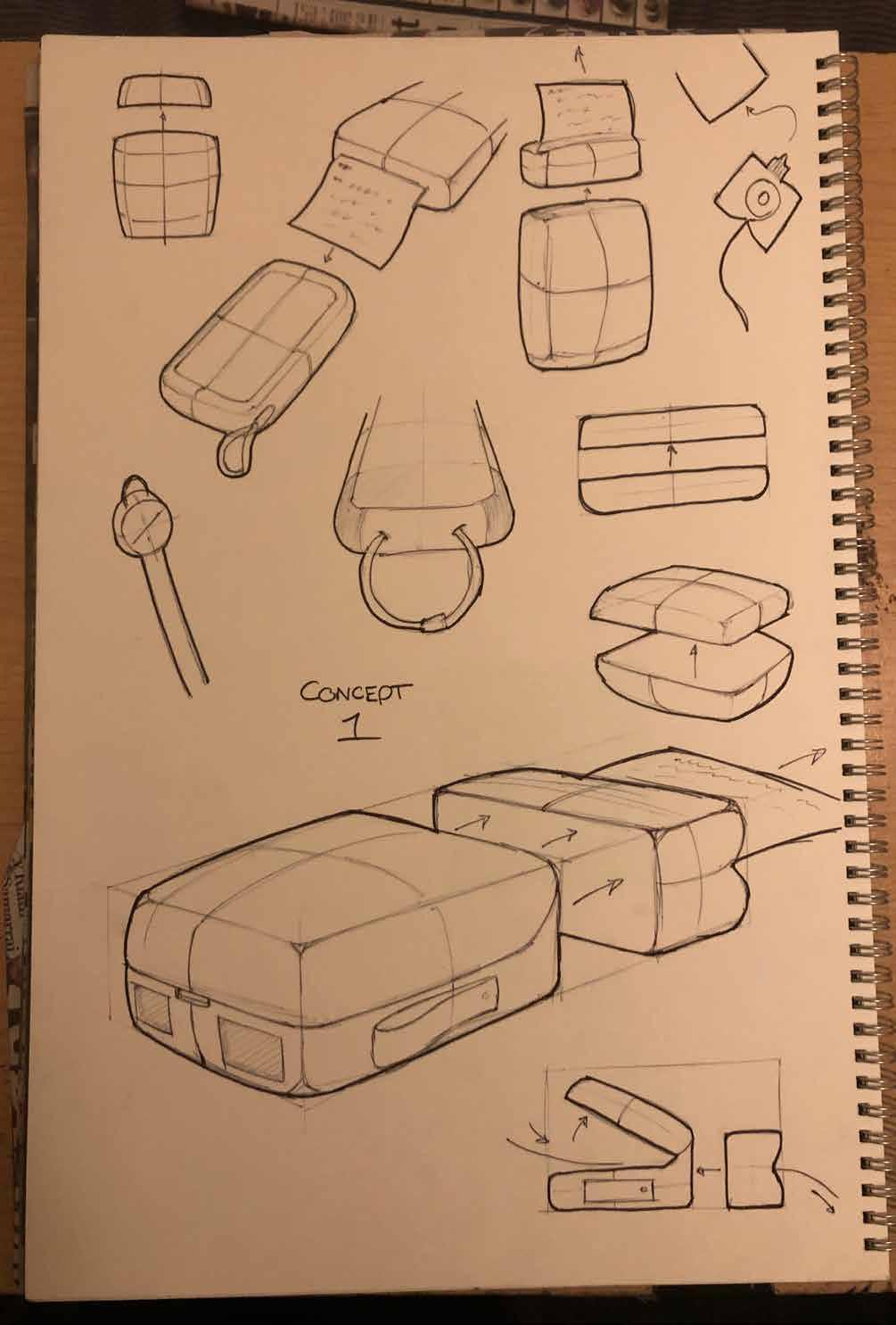
Non-Uniform Design.
Generally irregular or flowing forms that could result in an interesting user experience.
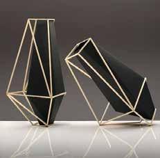
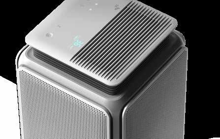
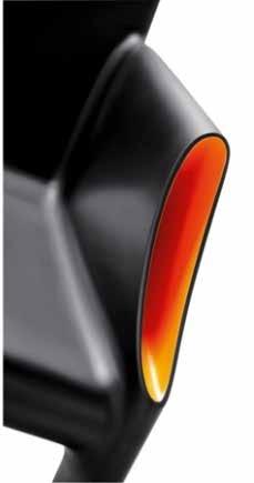
The Happy Whale by Jonas WagellSoft design inspiration
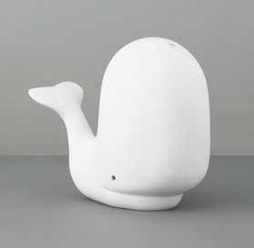
Rounded irregular shape would be ergonomic in the hand and could create a unique resting form.
Dropped curve corners would create an interesting and bold highlight to the room, and could also provide satisfaction from the smooth waved surface.
Curved design almost resembles a smile, could bring potential for branding as well as creating a happy and positive product.

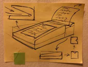
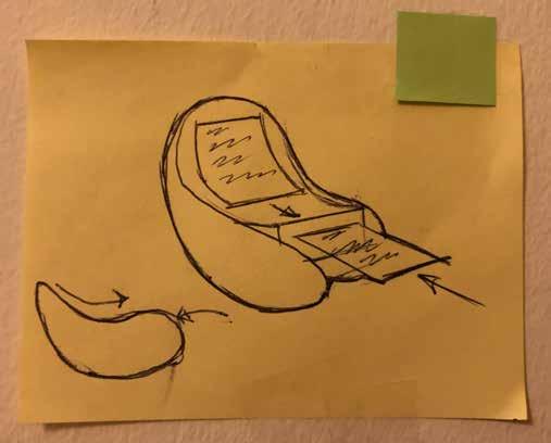
A development of the writing desk concept with refillable catridges and a paper output much like a reciept machine.

Traditional Design.
Influenced by examples of nostalgic and dated technology to provide for elderly taste.
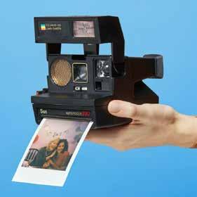

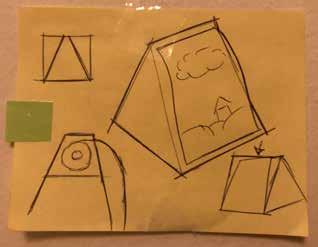
Elevating paper output from a seamless shape would look very sleek and satisfying for the user. Mechanism could resemble a camera shutter.
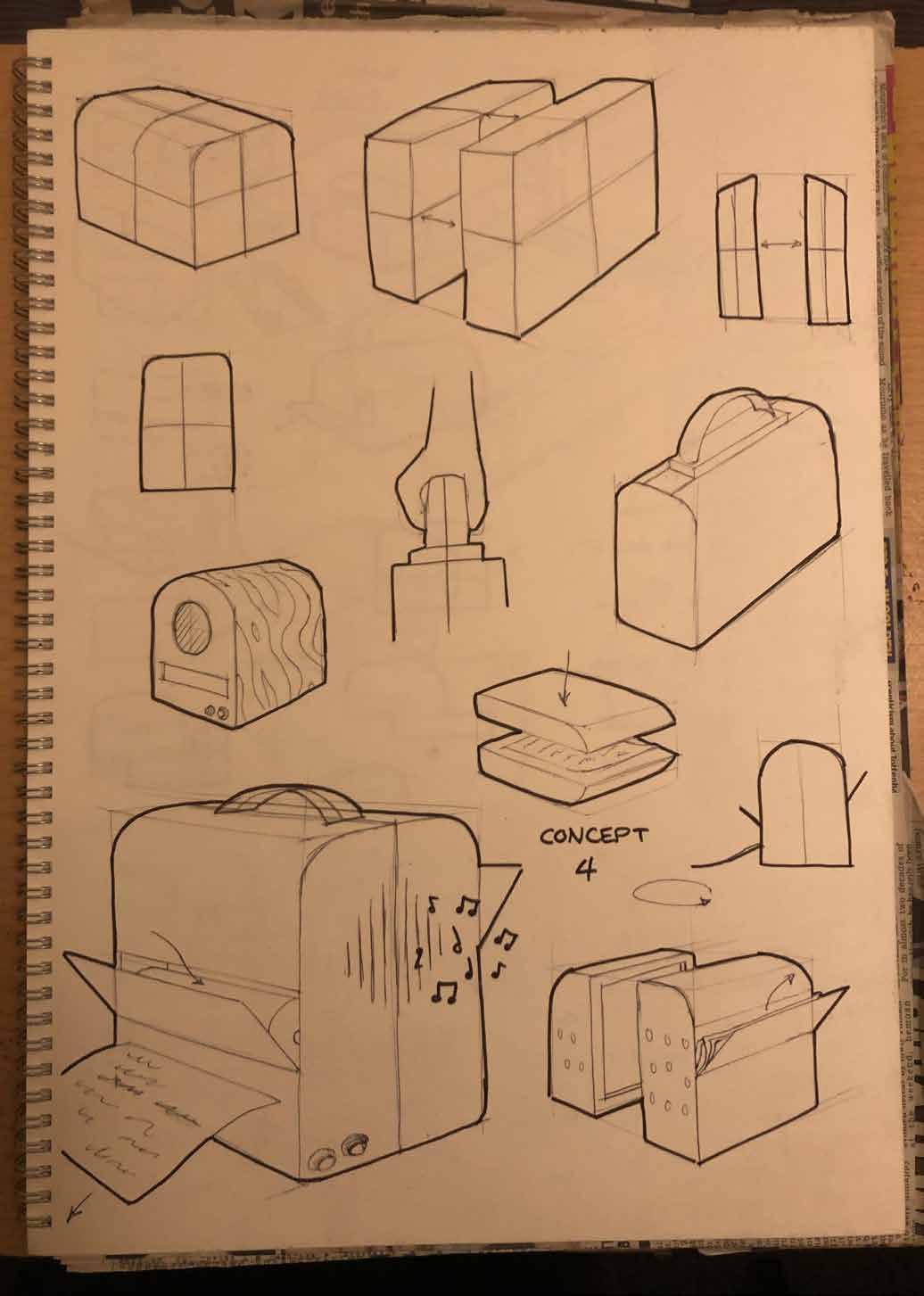
A more vertical design to resemble an old jukebox.
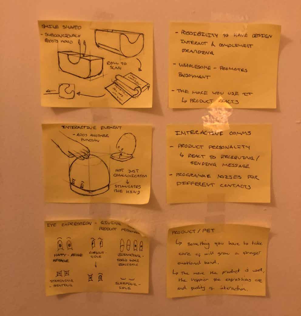
This made me start thinking about how my product could be more than just a communications device.
It was difficult to ideate soft and happy styled designs while also encorporating traditional elements as the harsh rigidness and intricacy of many traditionally inspired products clashes with the minimal and welcoming aesthetic I hoped to achieve.
I still wanted my product to feel nostalgic for elderly users, but I think that the key nostalgic element of the product will be the physical process of writing the message, which is the USP that will draw in consumers.
Contemporary Design.
Influenced by examples of modern and sleek technology to provide for younger generations taste.

This futuristic design could open up various interactive opportunities, as well as unique scanning and storage features.
The rounded base of this design could allow the user to interact with the product by rolling it over, further adding to the hands on process.
The modern takes on soft designs were also less sucessful than the uniform and non-uniform sketches, and at this point it became evident that the internal machinery required for my product to work wouldnt allow for mind bending exterior forms.
I took the most promising ideas from this initial excercise and drew them up on a larger scale to evaluate my options and detail better.
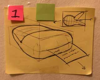
The soft shape makes this product seem useable for all ages, with its simple processes further adding to the all-encompassing concept.
The indented top face design instantly took to me and will definitely be taking it forward in the design process.
I liked how engaging and interactive this concept could be, with features like touching the top face to create emotion from the product, making it more like a pet.
This would provide a lot of stimulation for all users, however also makes the product more childish and potentially less desirable on a large commercial scale.
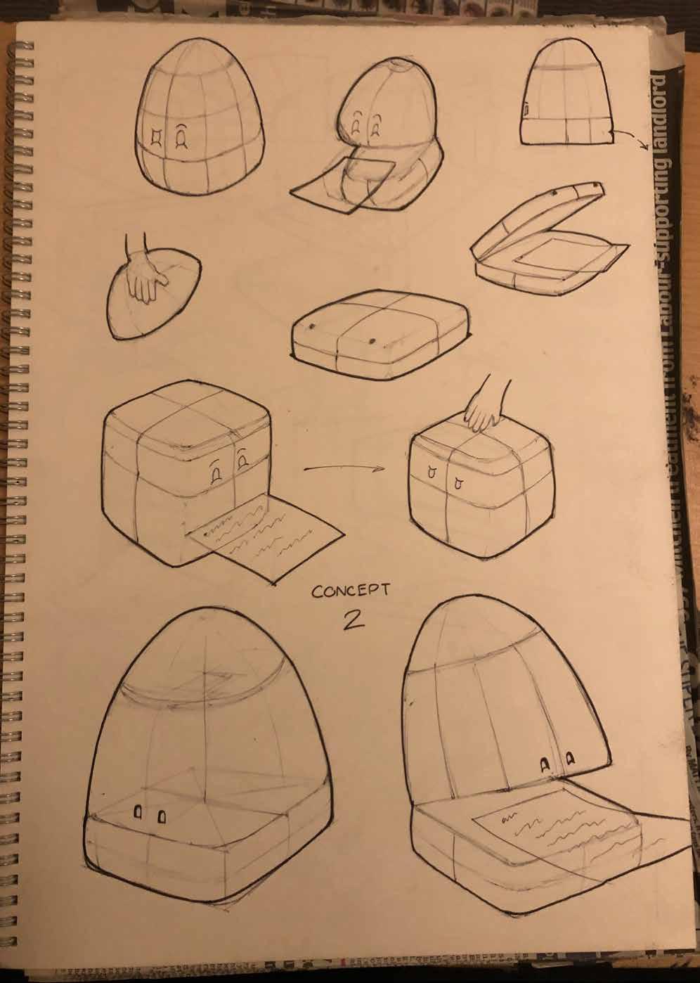
The writing desk concept was developed into an adjustable alternative, with further details like a shell closing and opening mechanism. Despite these features, the sleek and less detailed design was more effective in my opinion.
This was definitely the weakest concept, however i still like the adjustable writing desk and its hinged mechanism.
The jukebox inspired concept showed potential for creating an extra mental stimulant for elderly users while the product is idle. The music could be stored on an internal drive and play via a onebutton system for ease.
I did think this was taking credit away from the main purpose of the product, and realistically music can be played from a variety of different methods and doesnt need to be incorporated in my design.

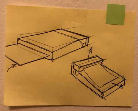
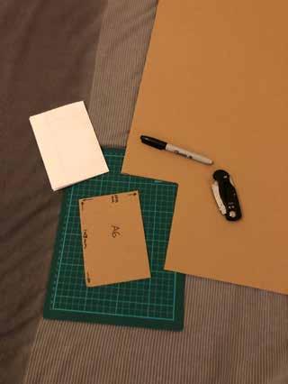
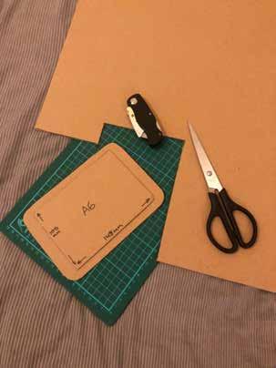
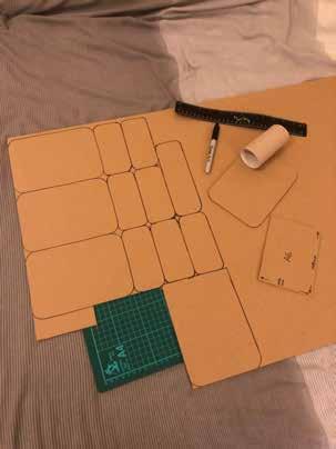
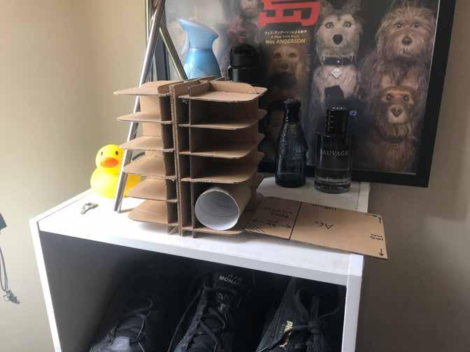
Sketch Modelling.
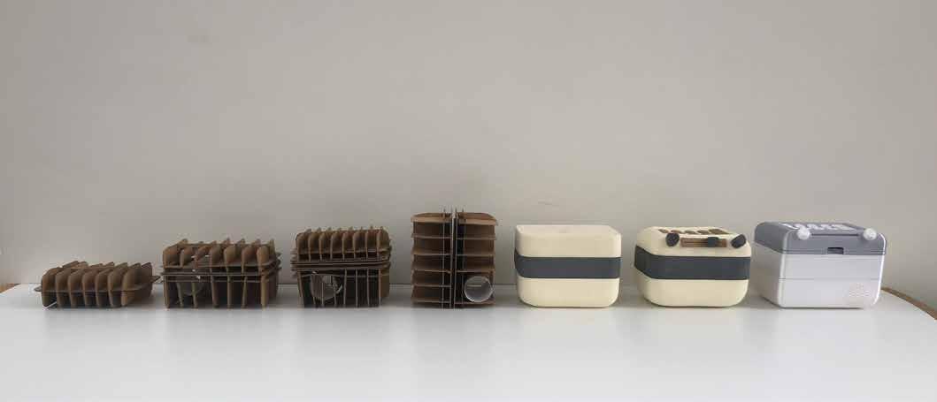
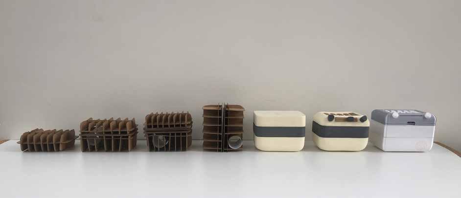
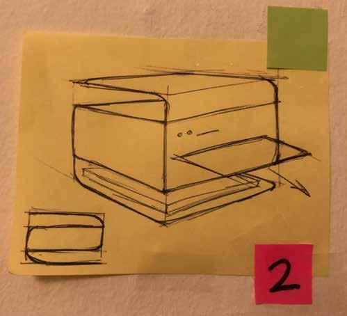
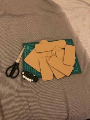
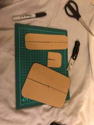
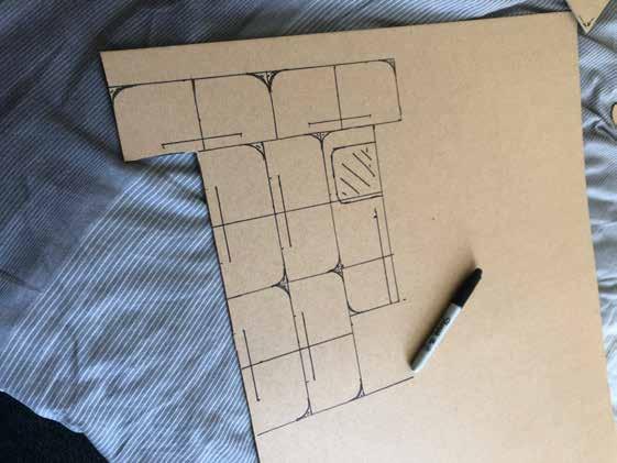
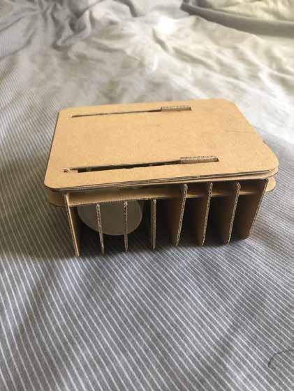
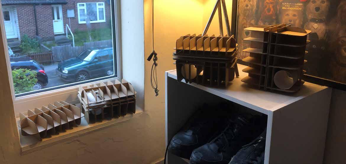
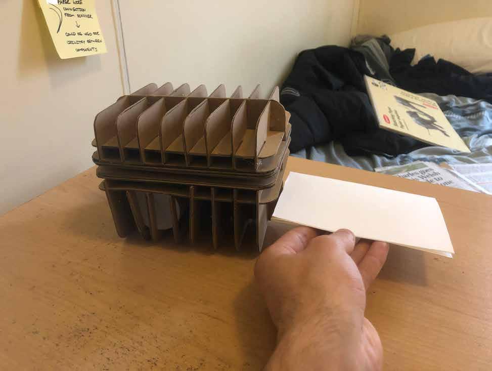
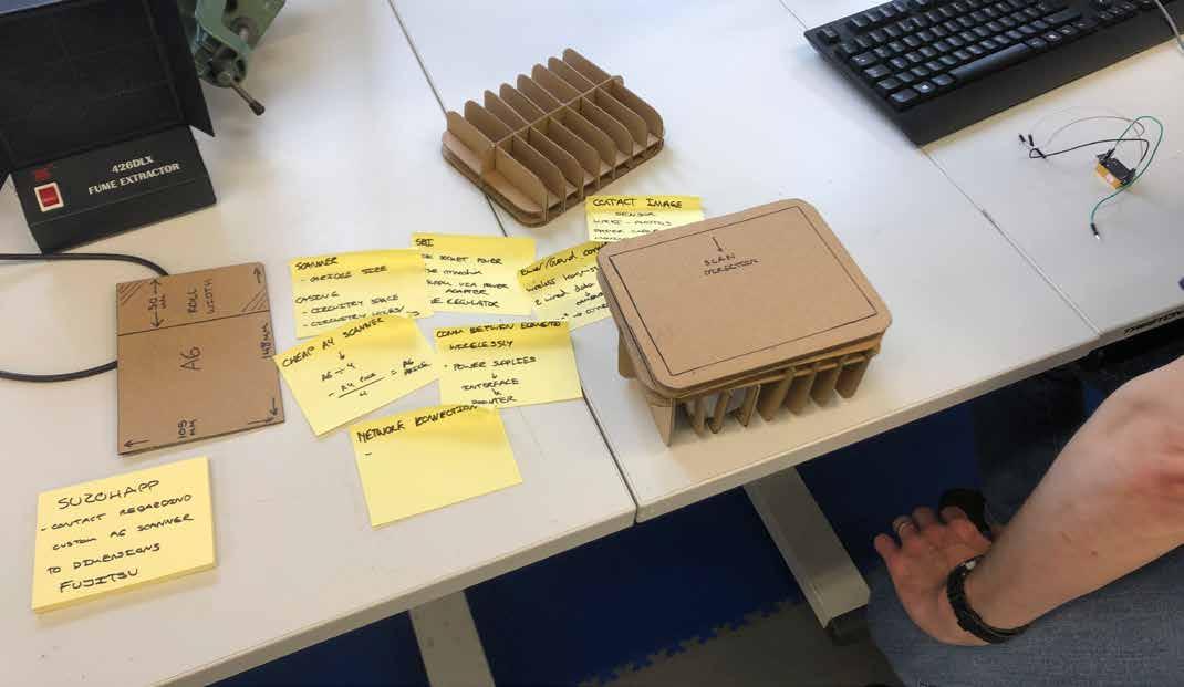
After ideating a few shapes and forms I was happy with, I began making1:1 scale models using cardboard.
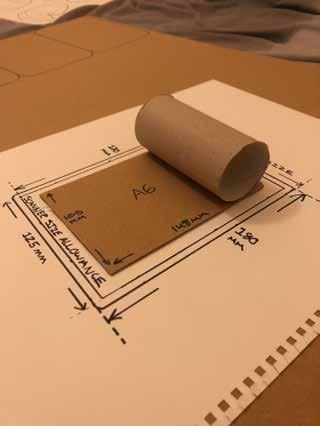
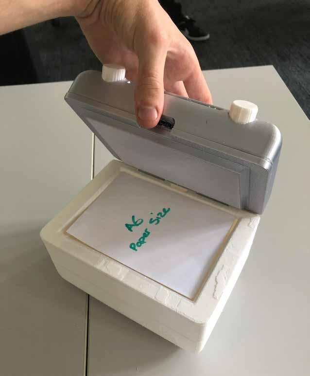
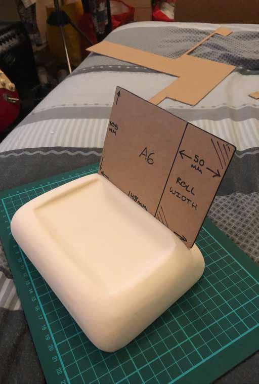
The A6 paper size just so happened to be the exact width of a toilet roll, making it perfect for modelling the thermal paper roll.

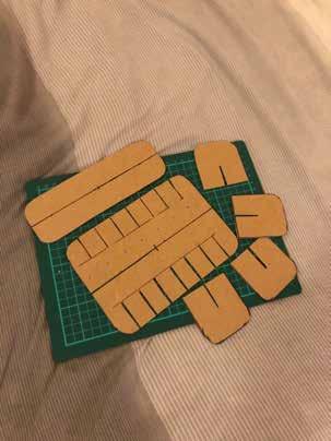
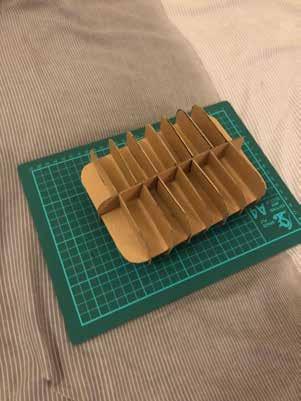
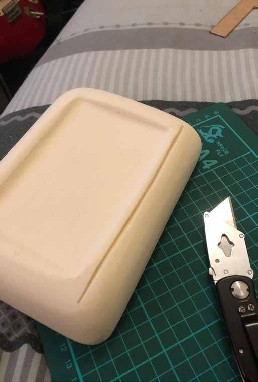
After constructing my first model, it soon became apparent that the shape had to be much larger to house all the internal components.
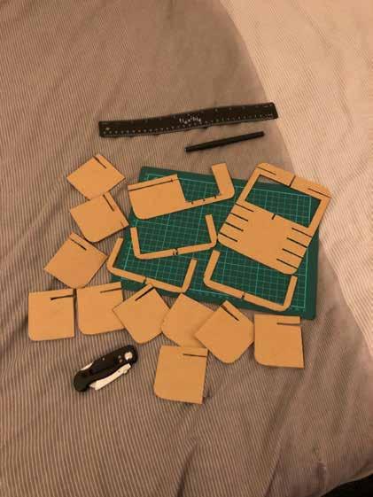
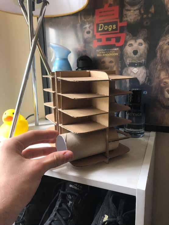
Taking inspiration from the PeriPage paper refill mechanism, I made a second model with a removable paper roll. 026. & 027.

I immediately preferred the size of this model to the previous as it felt more substantial and eye catching.
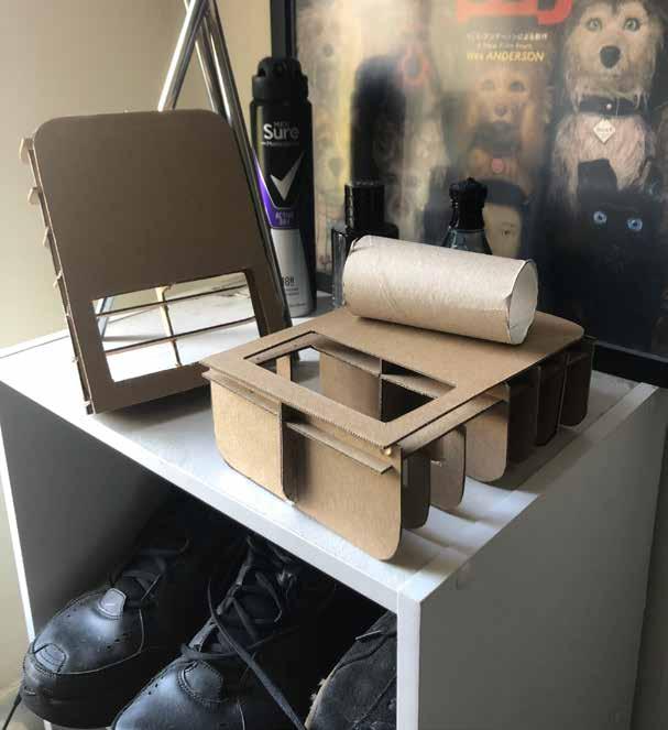
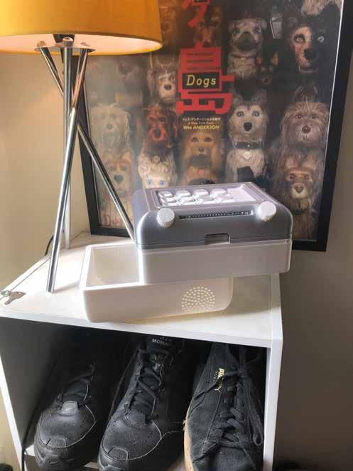
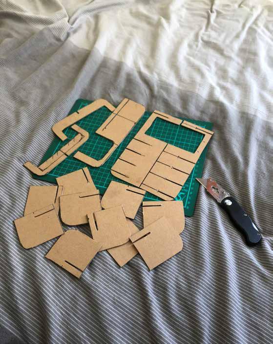
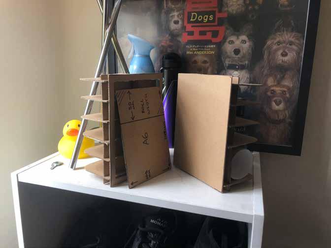
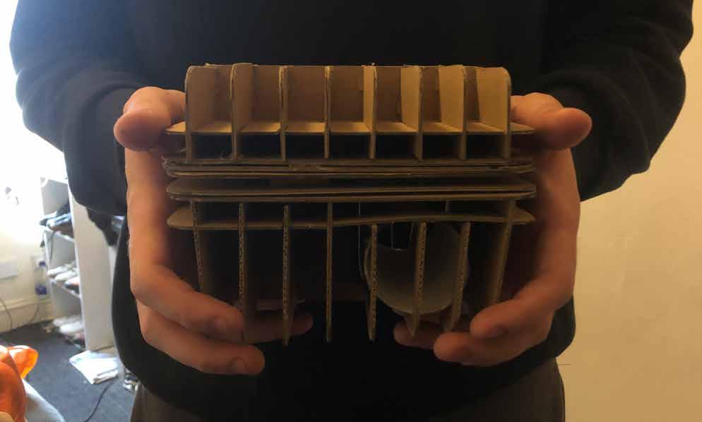
The next model encorporated a sliding scanner mechanism which allowed easy access to the roll of thermal paper, making refilling a simple process.
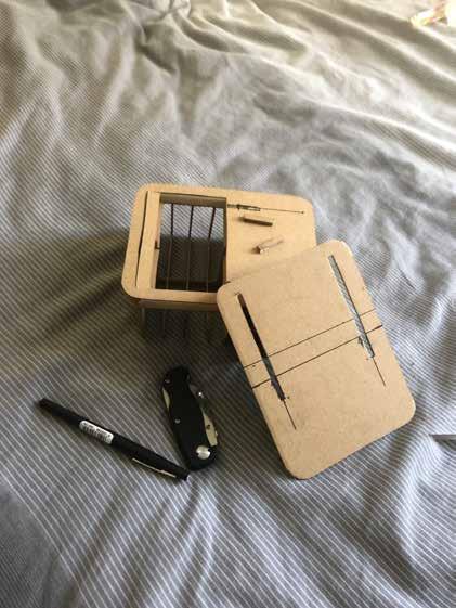
The sliding mechanism worked perfectly and keeps the shape as seamless as possible.
It also makes the refill process much more satisfying, which is usually a tedious part of any products process.
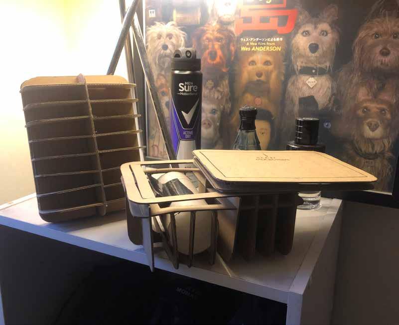
The paper roll refill in the 4th model was much more easilly accessible, but didnt posess the same satisfying feeling as the sliding mechanism in model 3.
I liked the idea of the product being multi-functional, and by playing music it could add an extra interactive feature for the user to enjoy.
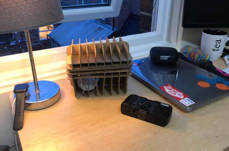
The 4th model was more vertical to resemble an old jukebox shape.
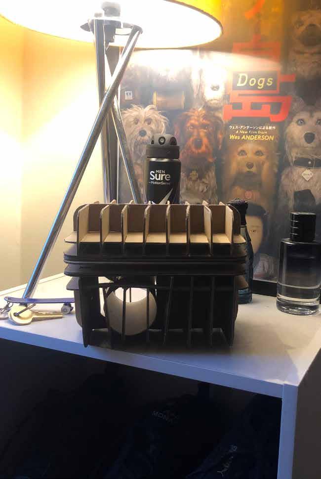
The vertical scanning method wasnt ideal, and therefore I decided to opt with the 3rd model as the slidng mechanism recieved strong feedback from peers.
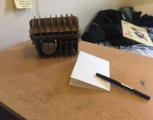
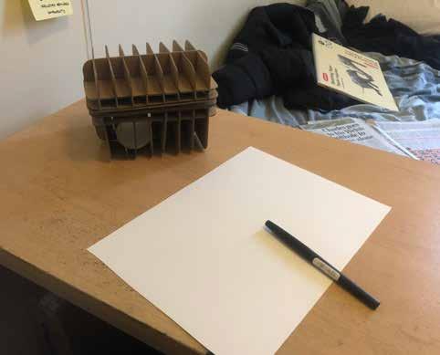
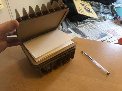
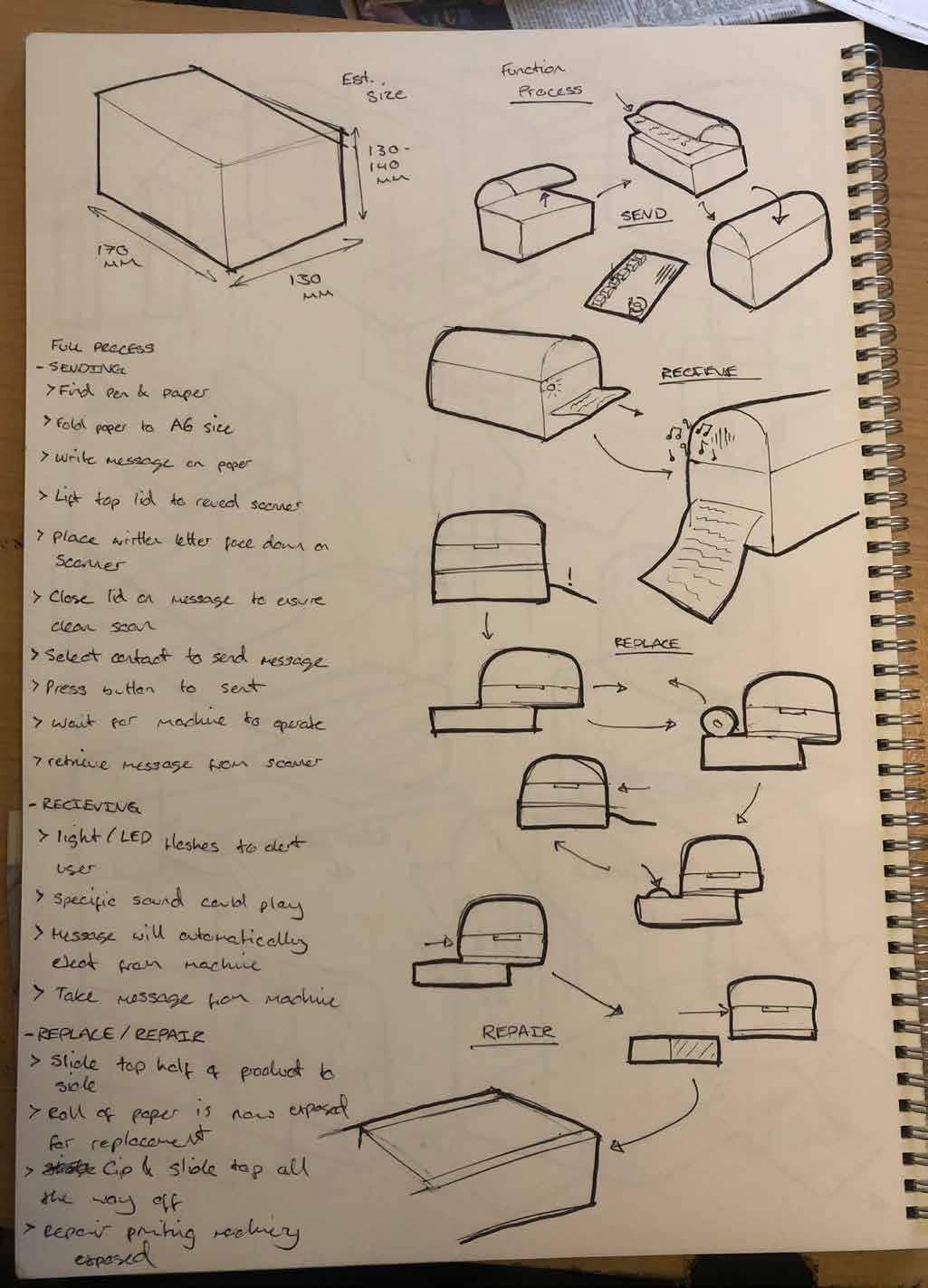
User Process.
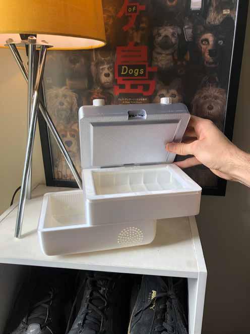
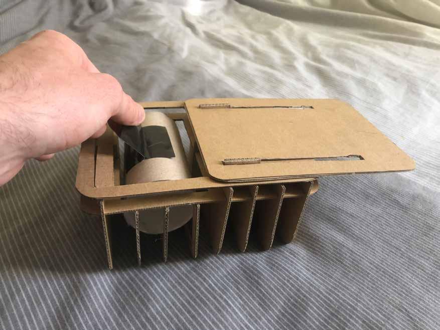
Having a roughly full scale physical model made it possible to demonstrate the intended user process.
Sending -
The first step is to find something to write on. As the scanner size fits A6, waste paper can be folded to the correct size to ensure no paper is wasted in the process.
Step 1
Write a message or draw something for a friend on the A6 piece of paper. Blank paper is obviously ideal however it will still work with any other paper alternative.
Step 2
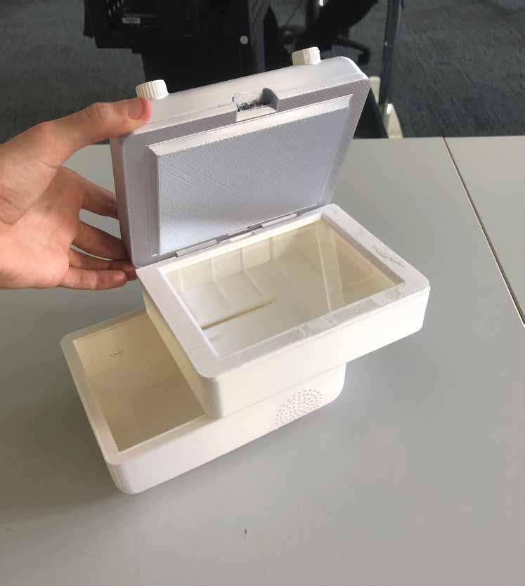
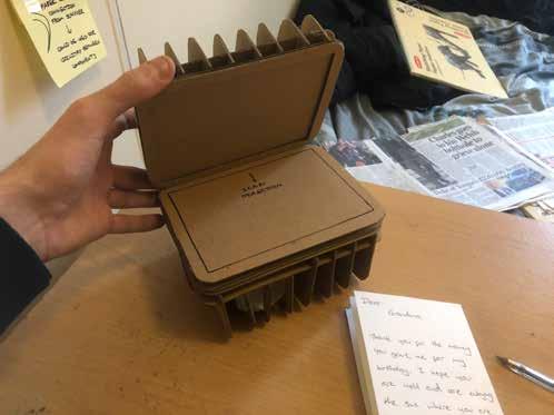
Lift the hinged lid to reveal the scanning element, place the message or drawing face down on the glass to ensure the best scan possible.
Step 3
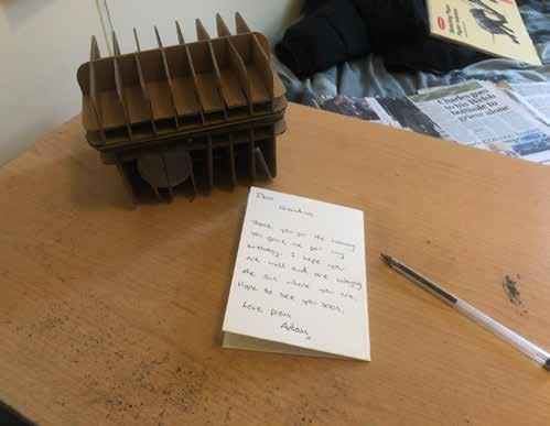
Close the lid on the paper, select the contact you wish to send to via the top interface and wait for the sent chime to retrieve your written letter from the scanner.
Recieving -
Recieving a letter is a much simpler process than sending, as you dont really do anything.
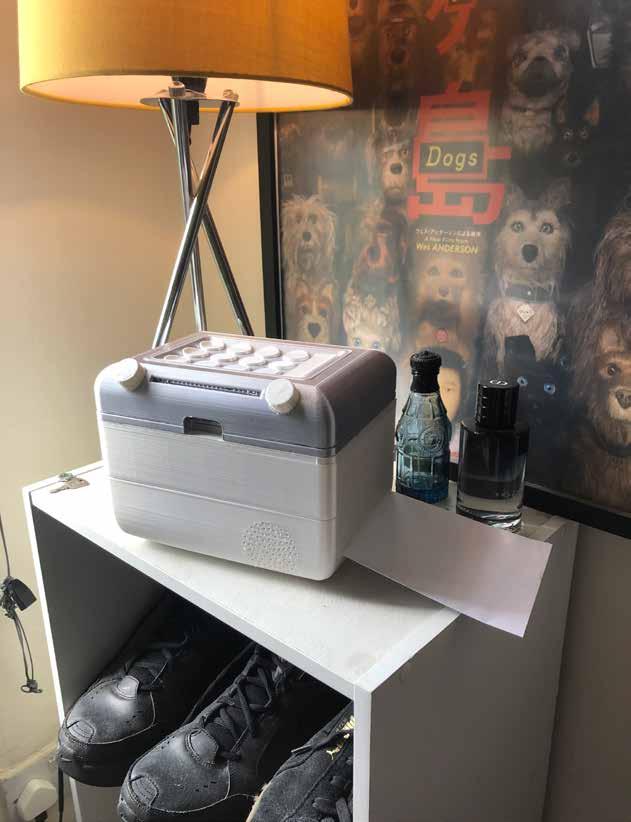
Much like a fax machine, the messages will print out as soon as they have been sent, adding an element of suprise to the process.
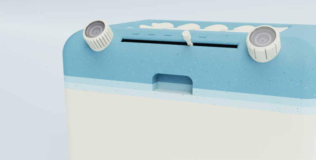
Due to the shape of the shell and positioning of paper roll and thermal scanner, the paper output is on the right face, meaning space will have to be made on that side.
This is not vital, as the paper will just coil up if it isnt allowed to print out flat.

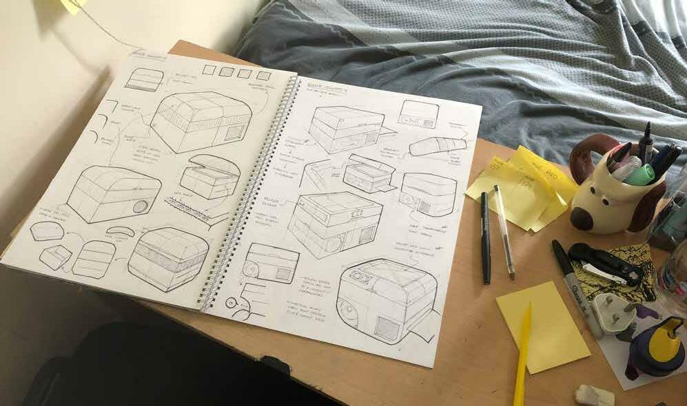
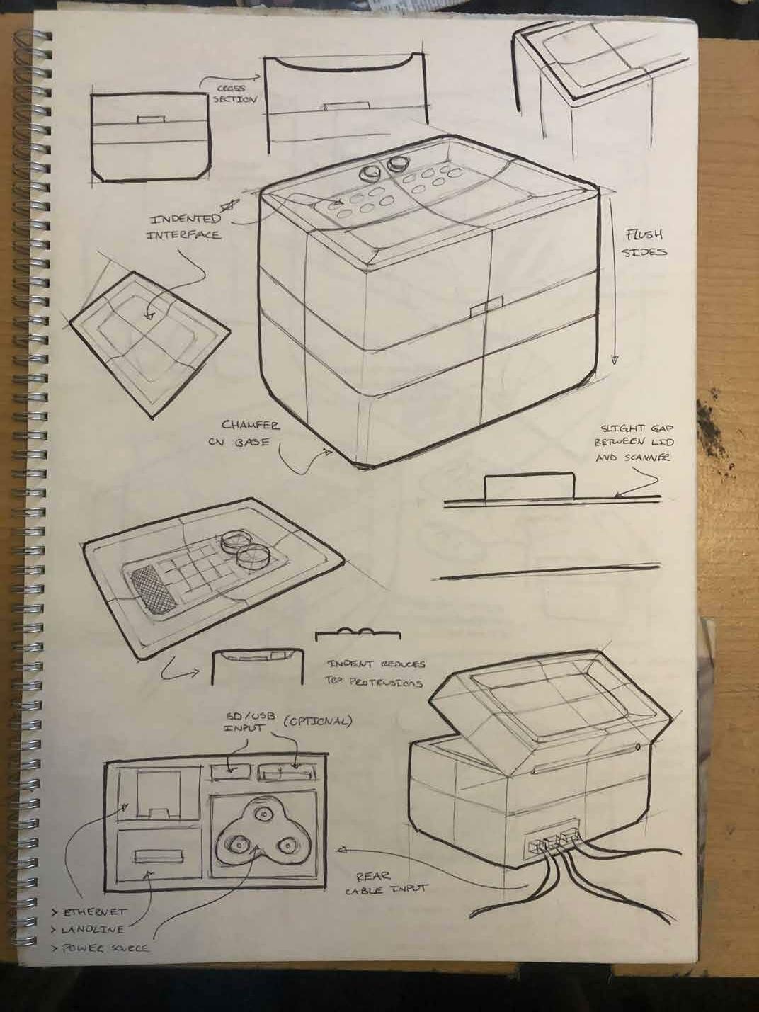
Refined Sketch Work.
Now that the general shape and process of the product have been decided, more refined sketch work can commence.
Sketching is one of my strongest assets and I fully believe in quality over quanitity. Having hundreds of pages full of vague and irrelevant shapes and forms has never been my ethos, and my ability to sketch accurately definitely helped the visualisation of my final product.
I started by making quick drawings of the sliding and refill mechanisms as well as outlining the full process of using the product.
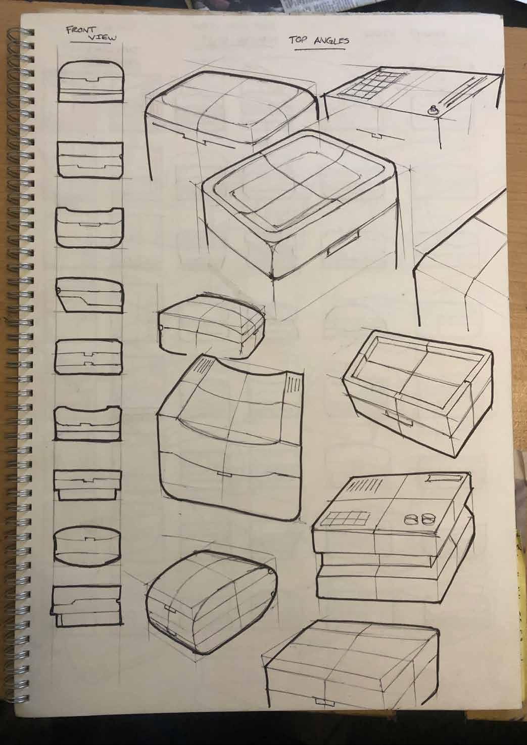
The indented lid makes another appearance here, with the curved detail adding depth to the top face.
This indented detail also caught my eye, with a lot of useable interface space in the dip.
Creating protrusions on the sides adds depth, but gives the product sharp edges that I am looking to avoid.
This further highlights the use of seamless, flush sides to be the most aesthetically pleasing and relevant to the product’s aim.
This 2 dimensional rapid ideation technique was used frequently in my minor project as it allows me to evaluate a collection of concepts in a small amount of time.
Sketching the side view made me think about potential hinges to be used.
Curved top would be the most frequently seen part of the product, roundness makes it more welcoming.
Flat top and rounded base creates clean aesthetic, must be cautious of sharp edges on top.
Slightly similar to a traditional camera design, chamfered base corners give the product a more industrial and rustic feel.
Curved base and top gives the product a soft form, rounding all corners could be the best idea for adopting an all-encompassing design.
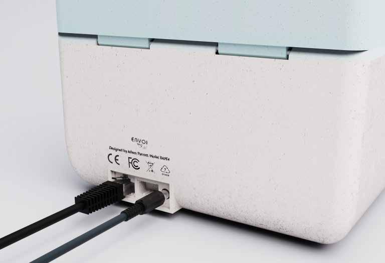
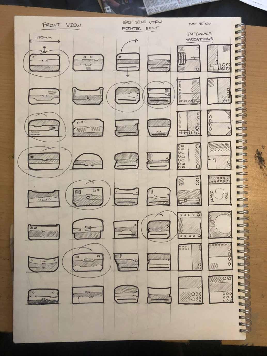
WiFi connection would make the product seem less traditional, but would reduce the external cabling needed.
Providing a landline and ethernet port in the back provides the user with a choice of network connection, which may be vital for elderly users.
Sliding mechanism could slide all the way off to reveal the thermal printer and power components if they need to be fixed.
I felt these three shapes were the strongest base forms to develop into refined concepts.
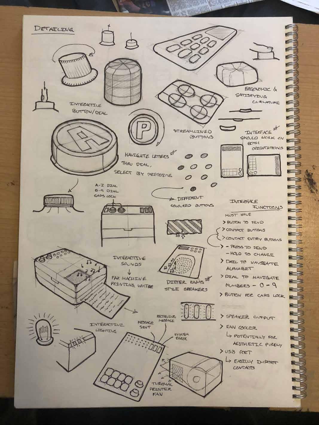
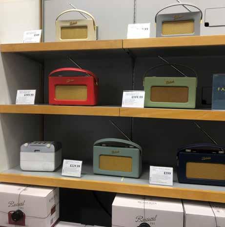
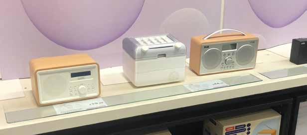
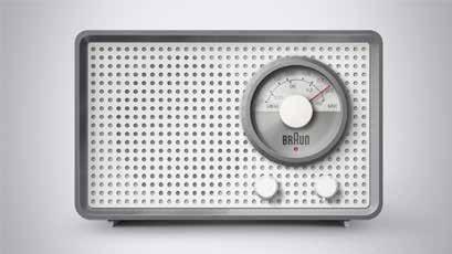
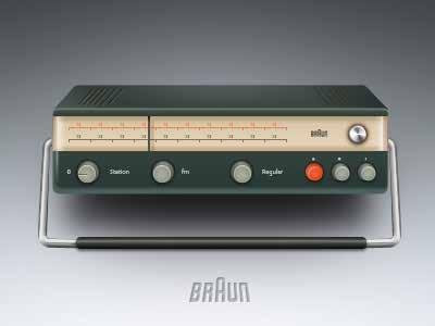
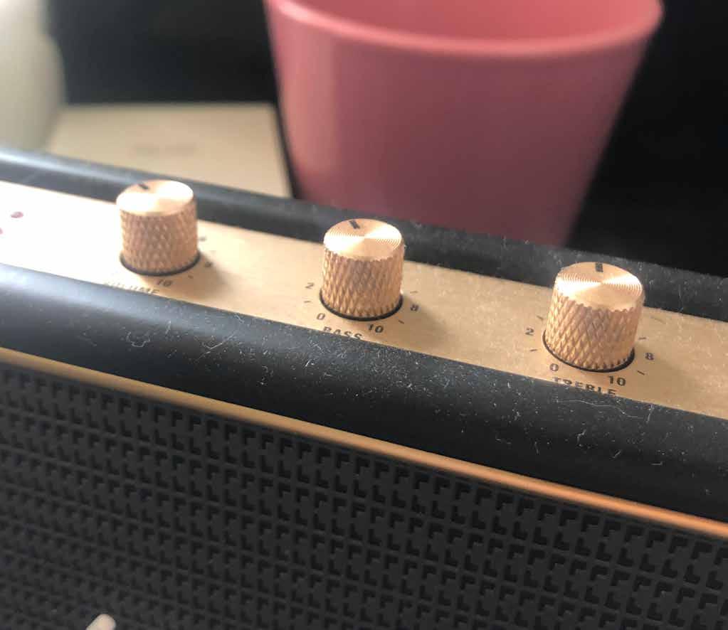
Ridged dials, much like roberts radio’s dials, could give the product a more traditional element as well as potentially provide a sense of nostalgia.
Being able to use the interface from any angle makes the product more accessible.
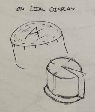
On-dial display would reduce the need for numbers around the dial maintaining aesthetic, and would also greatly aid elderly users or those with impaired vision.
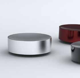
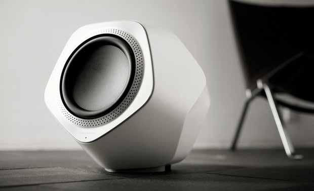
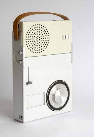
Dieter Rams’ styled minimalist speaker could definitely be implemented into my design due to its sleek yet softness.
Having interactive sounds like the fax machine printing noise could provide further nostalgic effect as well as providing further sensory stimulation for the user.
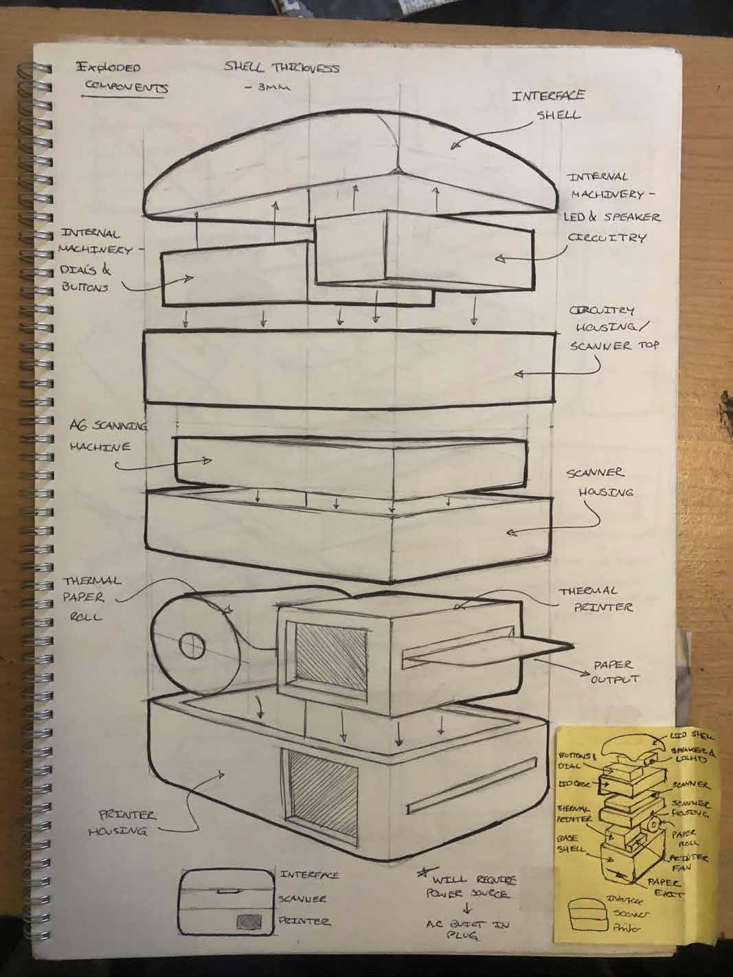
I sketched this predicted exploded view to demonstrate my intentions to an NTU electrical engineer, who agreed to help me with understanding the internal mechanisms.
Despite my lack in electrical and wiring knowledge, I was able to vaguely understand some of the electrical components I would need and why.
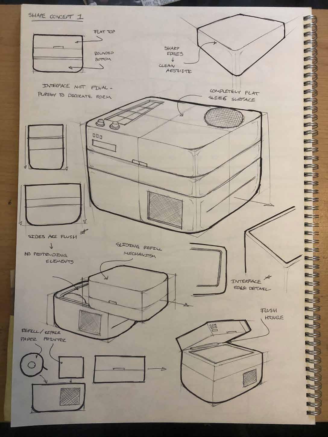
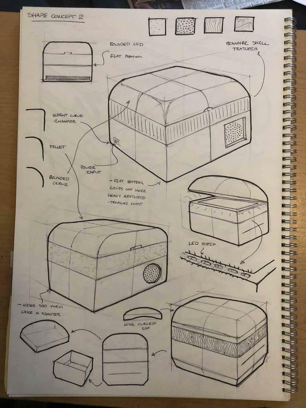
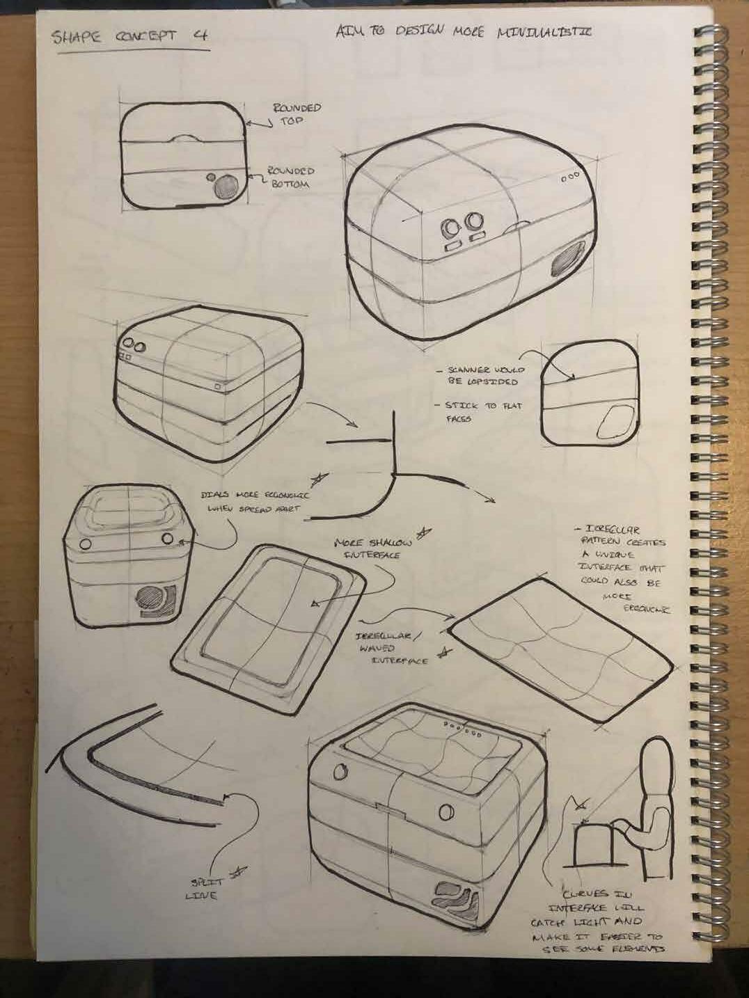
Before starting concept refinement, I decided to do a quick render of some of the shapes I had chosen to be my final forms.
Shape concept 1 had a rounded bottom and flat top with curved edges all the way around.
I felt the flat top lacked depth and made the shape seem too bulky, however the curved base provided a contrast to the top which I liked.
Placing the dials on the curve of the indented interface makes them less of a focal point and draws more attention into the interface.
The indented interface means buttons are lower in elevation and do not protrude out the top face as much, or at all.
Sketching the rear side made me think of the power and cable input board, with initial layout and idea sketches including a USB and SD port for easier contact storage.
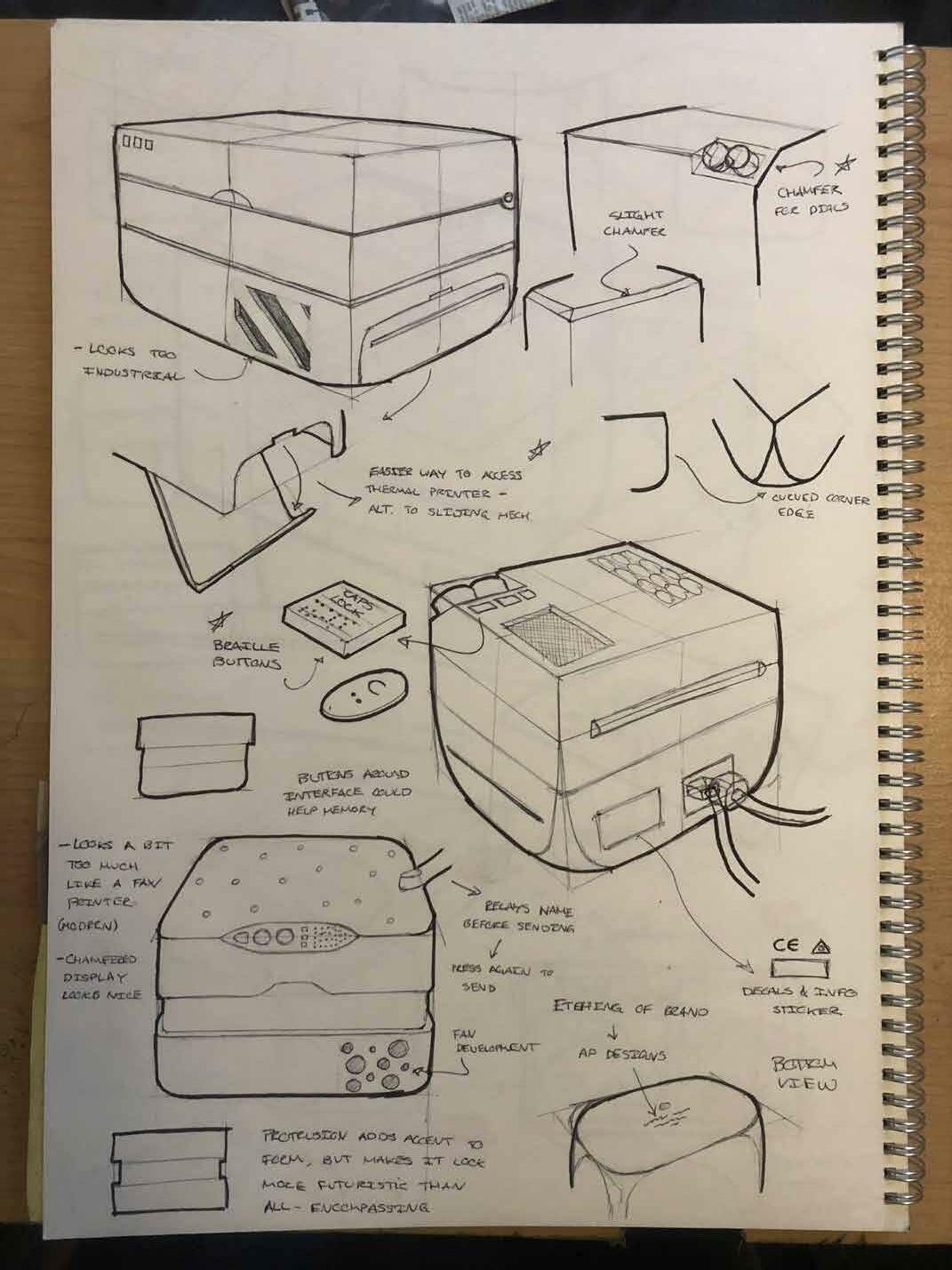
Dials looked very sleek and traditional when positionad on a chamfer, however this takes away some of the softness.
A thermal printer access point in the base would get rid of the need for the full sliding mechanism, which would cause wiring issues.
Brailled buttons make product more inclusive for those with vision impariments, although it is very unlikely that a blind person could use my product due to the process.
Plastic information and decals make product more believable in renders and more professional.
Interesting fan/ air exit design with bubbles, could provide a basis for branding.

An irregular or waved indent pattern could create a unique user experience while using the interface. This could cause added difficulty however which may not be ideal for elderly users.
Fan/ Air exit design becoming too complex, Dieter Rams styled vent would be subtle and effective.
Wanted to avoid having a hinge sticking out as it would look un-aesthetic along with the rest of the sleek design with flush sides.
A volume slider would provide an extra interactive element while also allowing those who dont want the sounds to be played to turn them off.
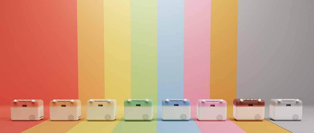
Applying textures to the product could make it more personal, especially if the user could choose which pattern or finish they want.
First sketch implementing the Rams fan, indendet feature will likely not be necessary and would just create another indent to the sleek surface.
A lip to allow the user a better process of opening the scanner lid could also be incorporated into the design.
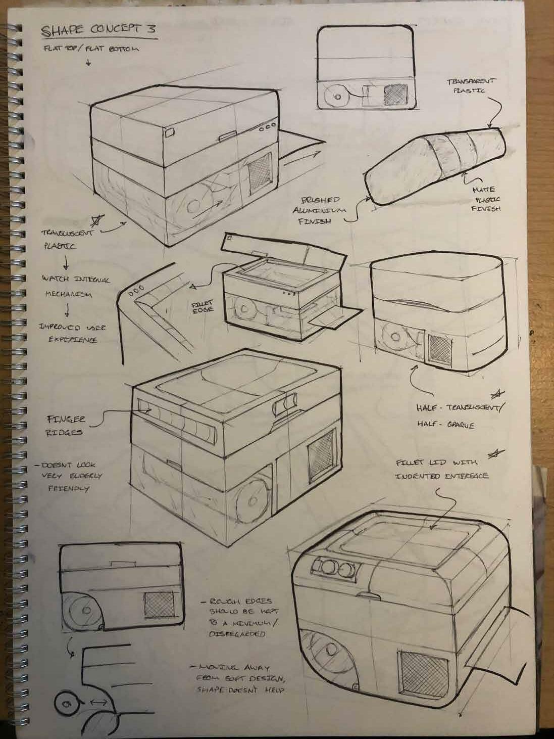
Different finishes for each major component would break up the block and provide aesthetic contrasts between each material.
Sketching a semi-translucent finish for the base allowed the internal mechanism to be visible, which would be an interesting feature for the user
The half translucent concept would allow the user to see how much paper is in roll without revealing the ugly printer and power mechanics.
This filleted lid with indented interface concept immediately took to me and will most likely be pushing it towards the final concept.
This bubble fan concept could work well with the Rams circular styled output.
Having the dials on the front facing fillet with space inbetween would be optimal for ergonomics .
This very irregular indented feature looks organic and flowing, which could add a more dynamic element to the design.
A split line running around the interface would allow it to be easilly removed to access wiring while also giving it a sleek detail.
This chamfered hinge would allow the back face to remain flush with minimal indented details, and would also stop the lid from pivoting all the way back.
A more streamlined and non-visible alternative to the thermal printer access point would reduce the unnecesary detail arounf the printer exit.
Creating a hole between the scanner base and interface lid would allow wiring to easilly pass through.
This concept closely resembles a kitten, and although this would probably be unsuitable for marketing on a wide scale, it could be a vital future development into a childrens educational product.
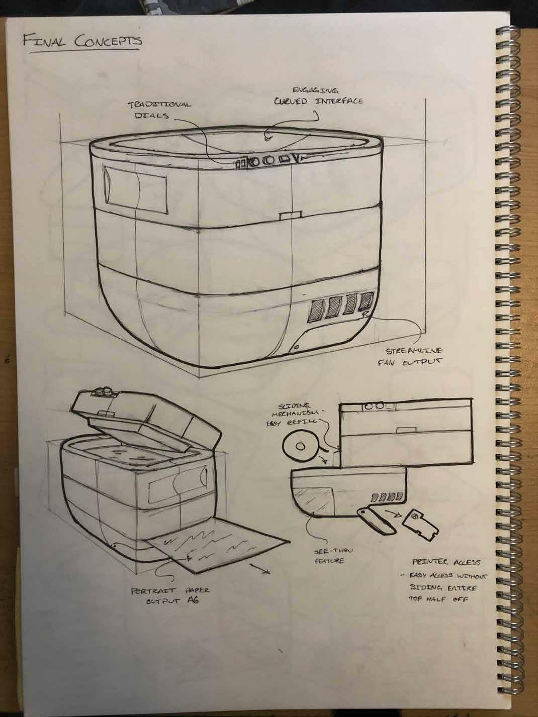
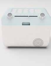
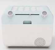
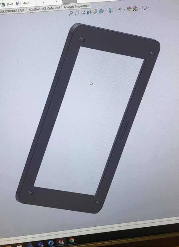
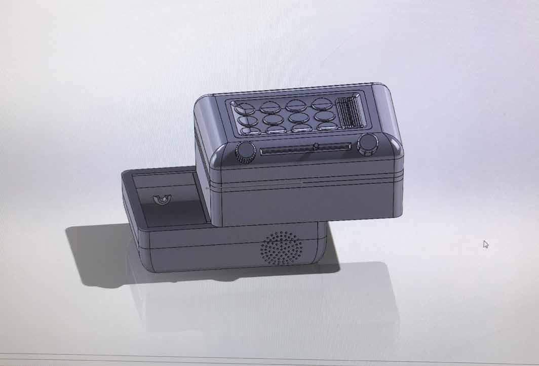
The first final concept included the rounded base with a flat indented top, with dials and buttons on the front chamfered edge.
This design looked sleek and modern, with the flat indented top giving the shape a touch of added depth.
I played around with some finger trench ideas on the side of the interface lid, however I felt it was an unnecessary feature, especially with the lip at the front which will be used for opening and closing the scanner element.
The front 2D view of the mechanisms works well, with the sliding refill process being a key part of the design.
I am yet to find the ideal fan/air exit design for the thermal printer, as the vents on this concept seem too uniform and bold.
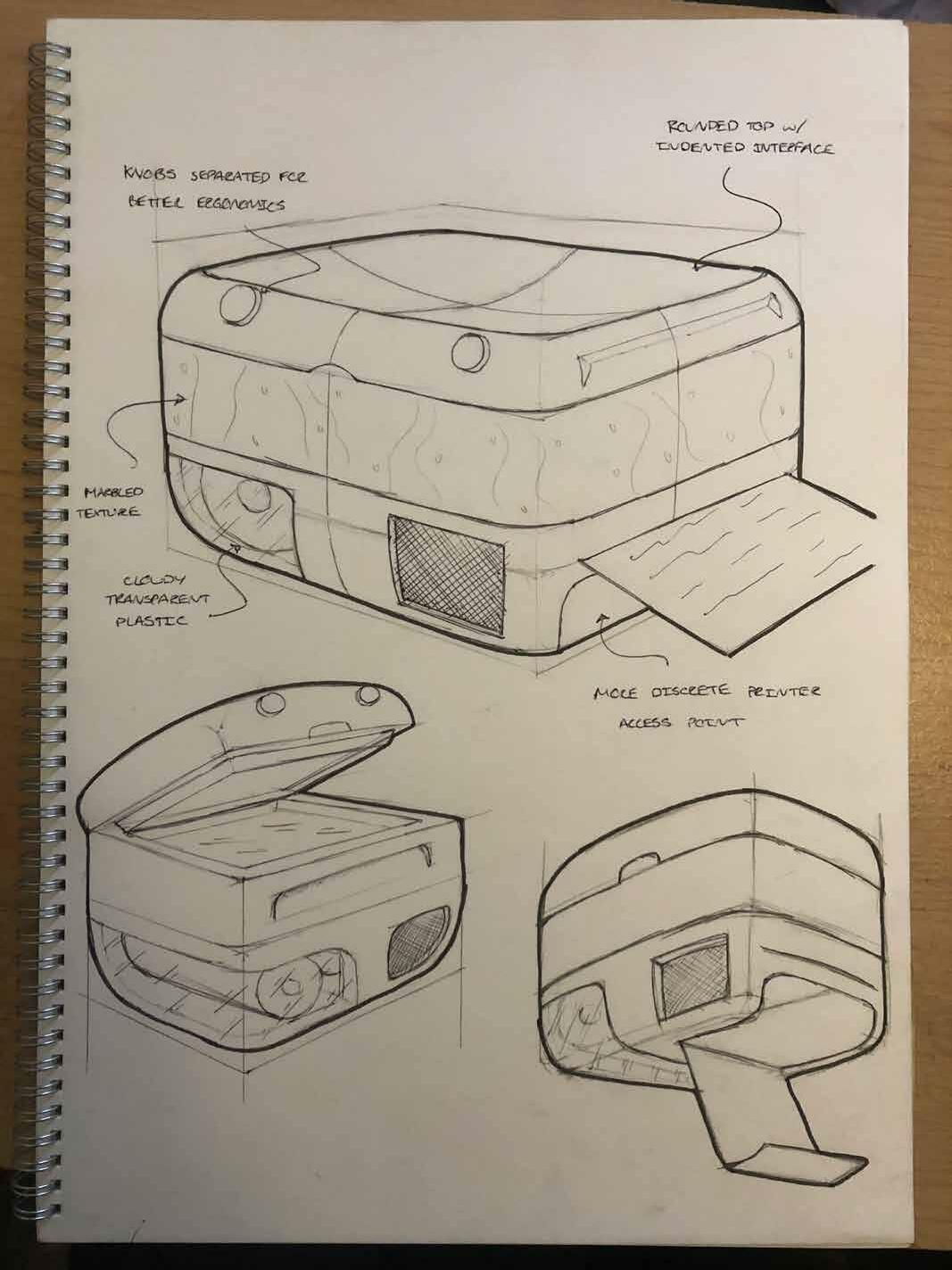
The second final concept instantly gave off a more welcoming and friendly feeling, with the separated dials providing character to the front face.
The filleted top edges and indented curved interface was a key feature from sketching and definitely makes the product seem more useable.
The roundness of the whole shape and lack of sharp corners and edges makes it ideal for users of all ages, and could even provide satisfaction to touch due to its flush sides.
This concept was my favourite out of the two and also recieved strong feedback from peers who unianimously agreed that this shape was more fitting for my product.
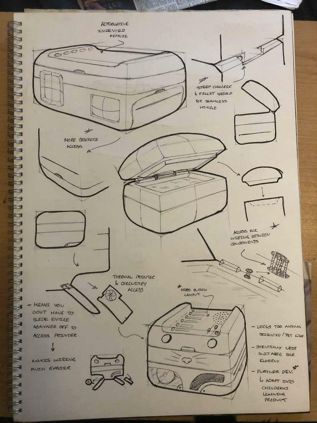
Now that I had the ideal shape, i moved on to sketching some of the mechanisms and details that would be required to make my product work as desired.
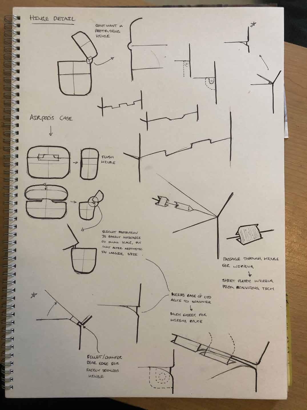
The chamfered hinge design seen previous seems to be the best option as it is discrete and functional. Other hinges may be tested during CAD development but this is definitely the front runner.
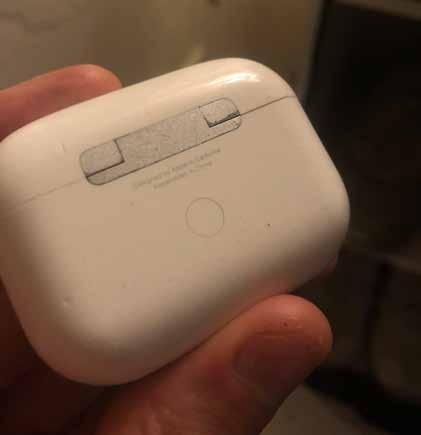
I used the hinge on my Airpod Pro’s case as an example of a streamlined hinge, however upon closer examination it became clear that this hinge would cause problems and could potentially be un-aesthetic on a larger scale.
Using the paper thin plastic wiring seen in the scanners to pass through the scanner and interface elements could be more beneficial than normal wires as they are ugly and intrusive. Open wiring on a product often indicates poor design.
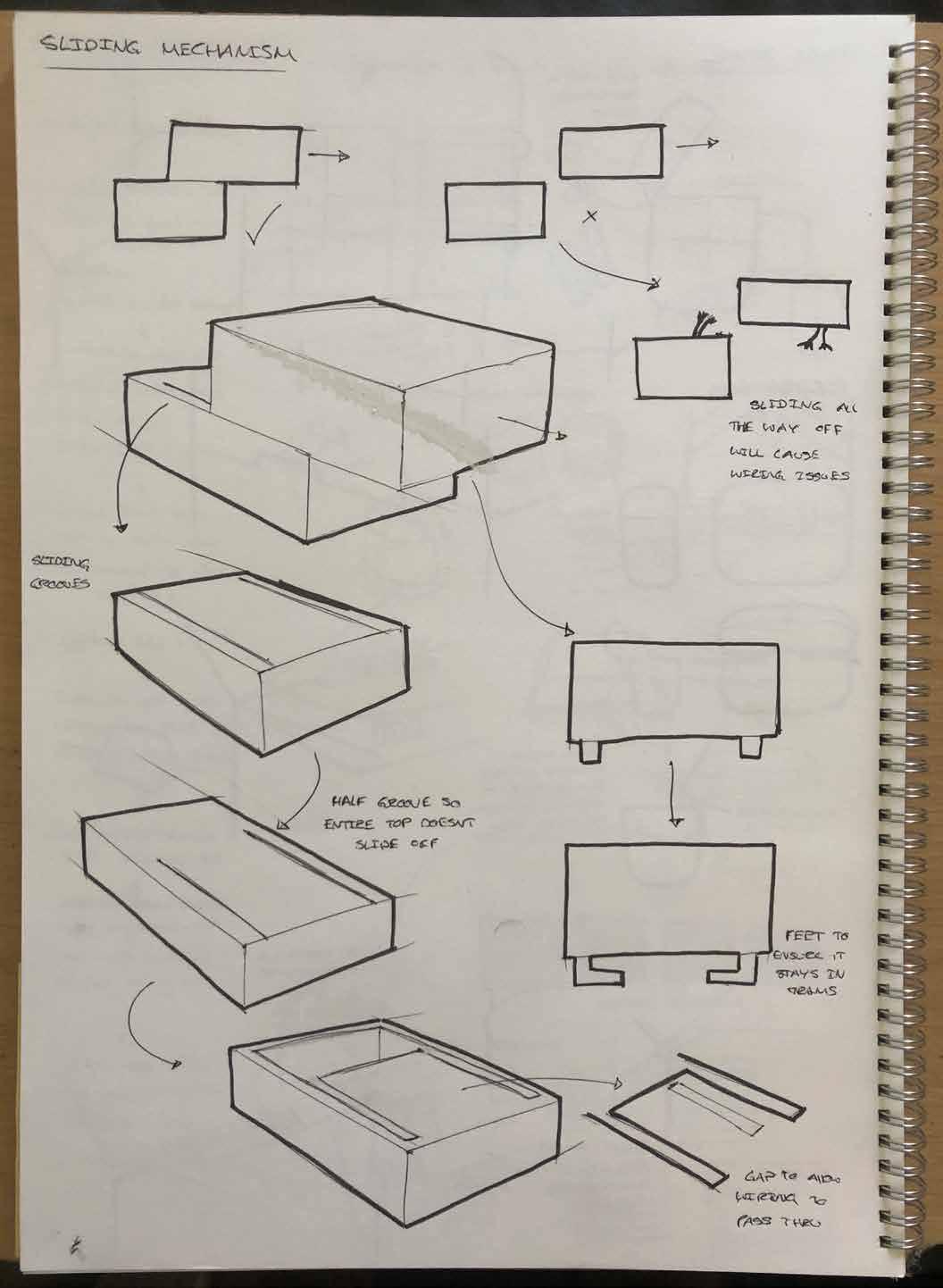
Allowing the top half to fully slide all the way off the base would cause issues with the wiring, therefore indicating that the sliding mechanism must stop after revealing the paper roll input.
Creating grooves that stop half way through the base will allow the mechanism to stop before sliding all the way off
Putting feet/teeth on the top lids’ protruding notches will allow it to stay securely in place in the sliding mechanism.
Creating a trench in the base and lid will allow wiring to pass through each component while still allowing for the sliding mechanism.
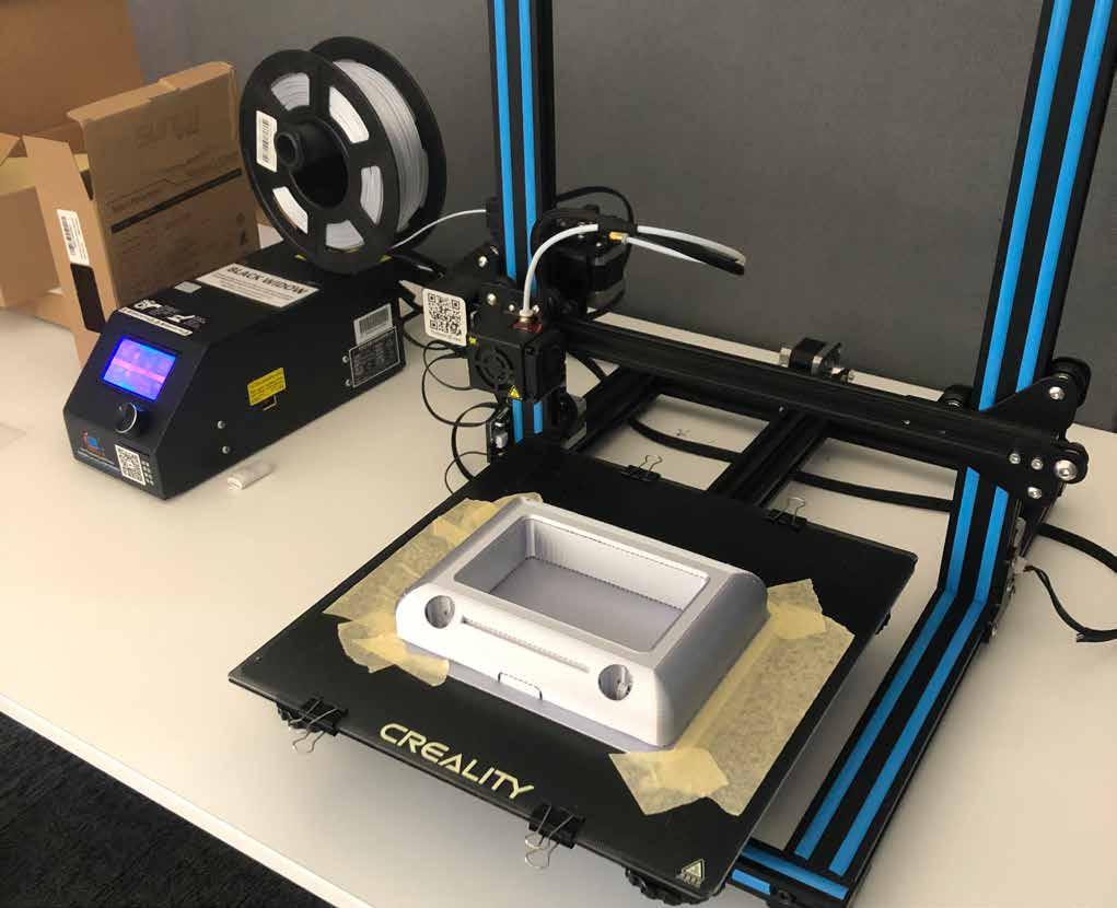
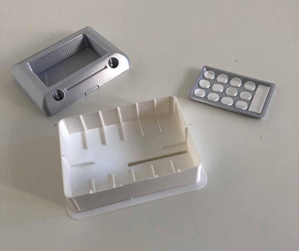
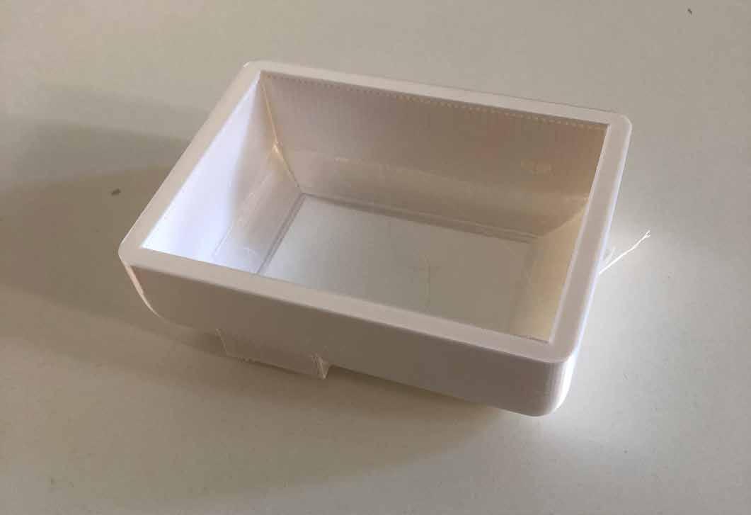
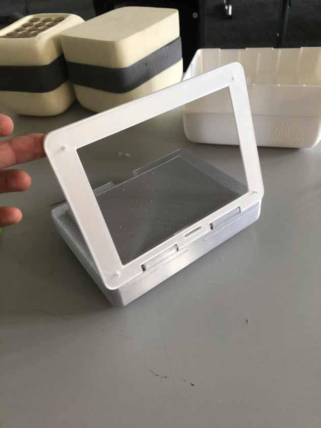
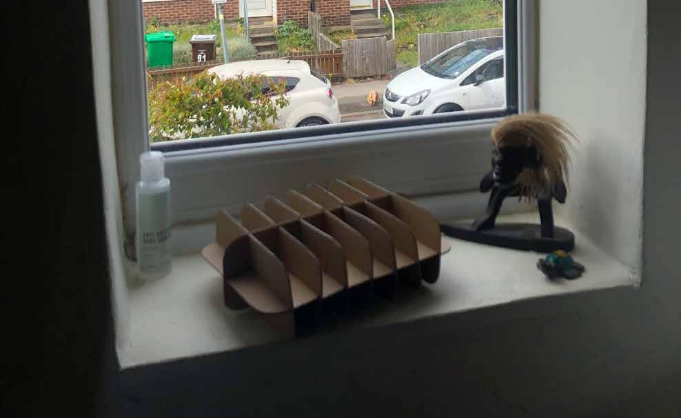
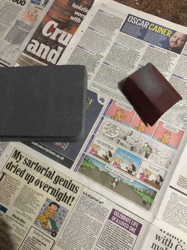
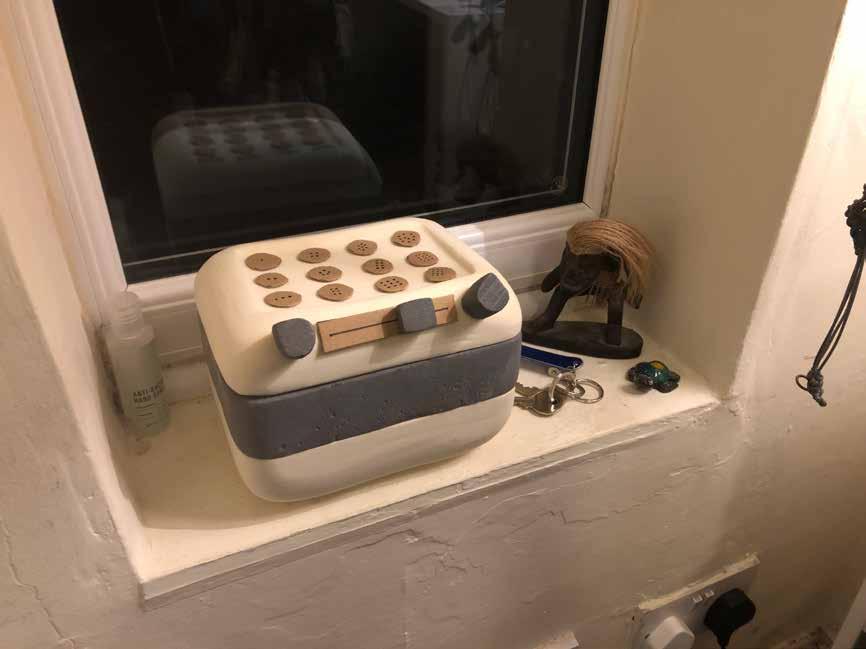
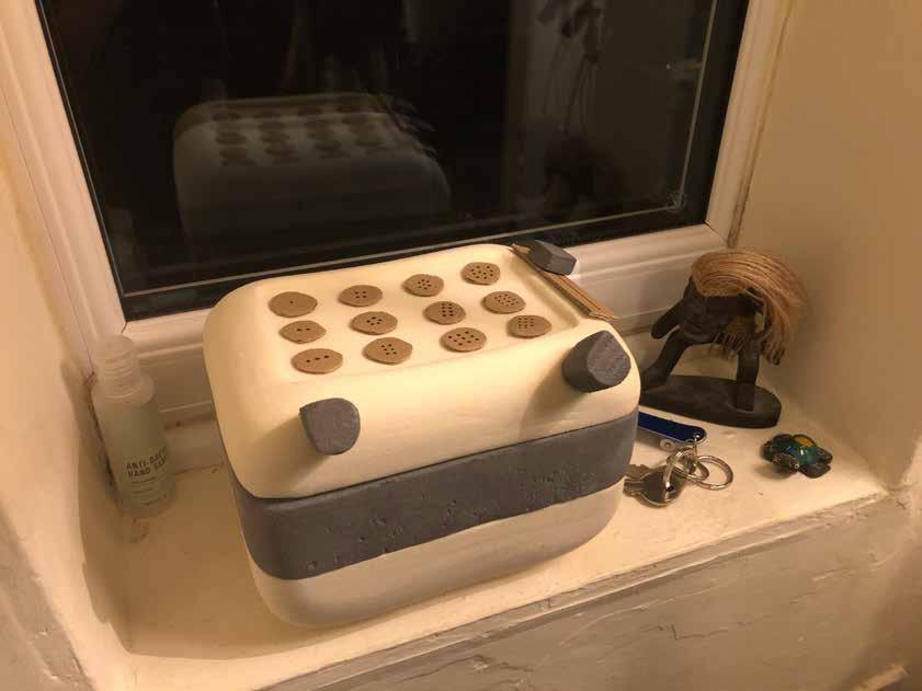
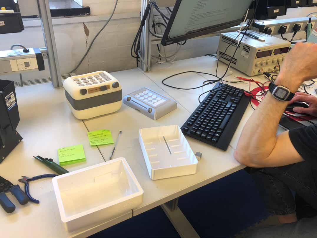
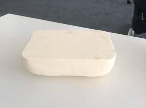
1:1 Scale Modelling.
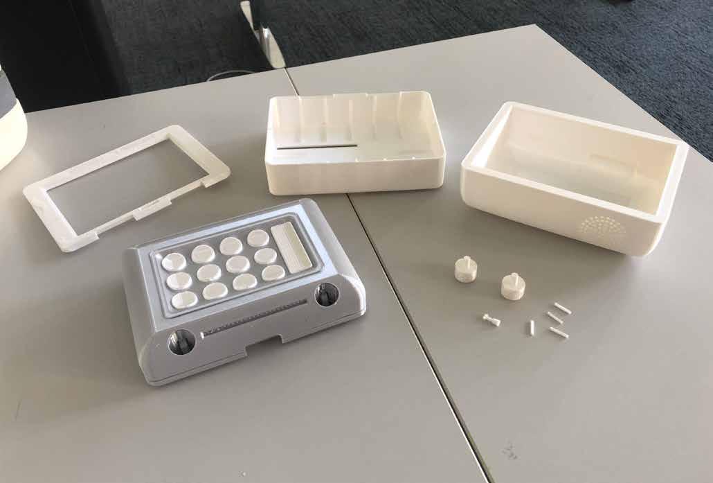
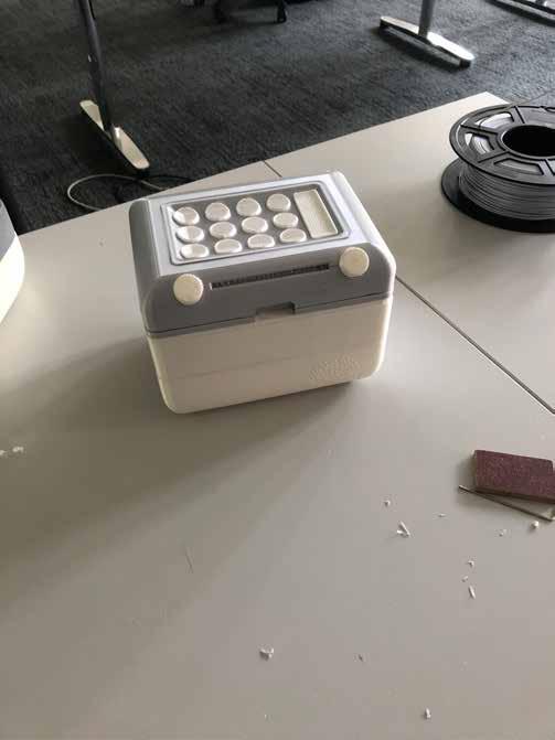
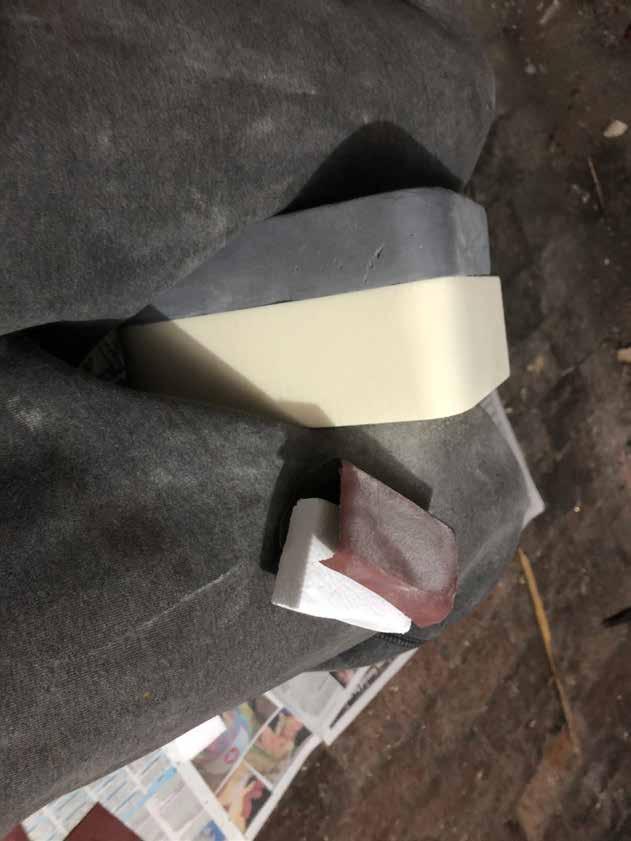
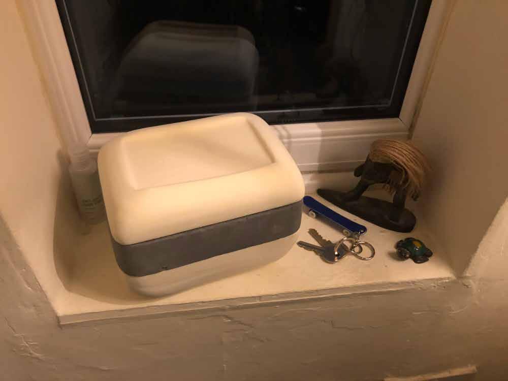
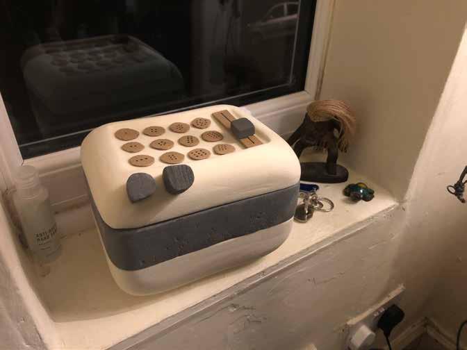
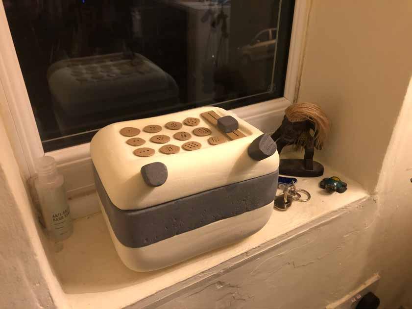
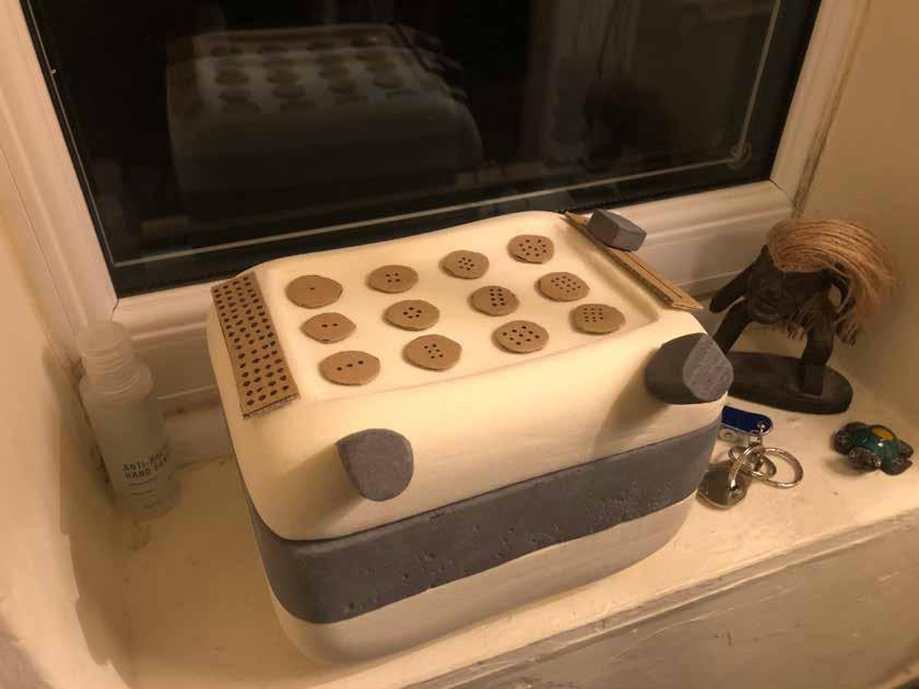
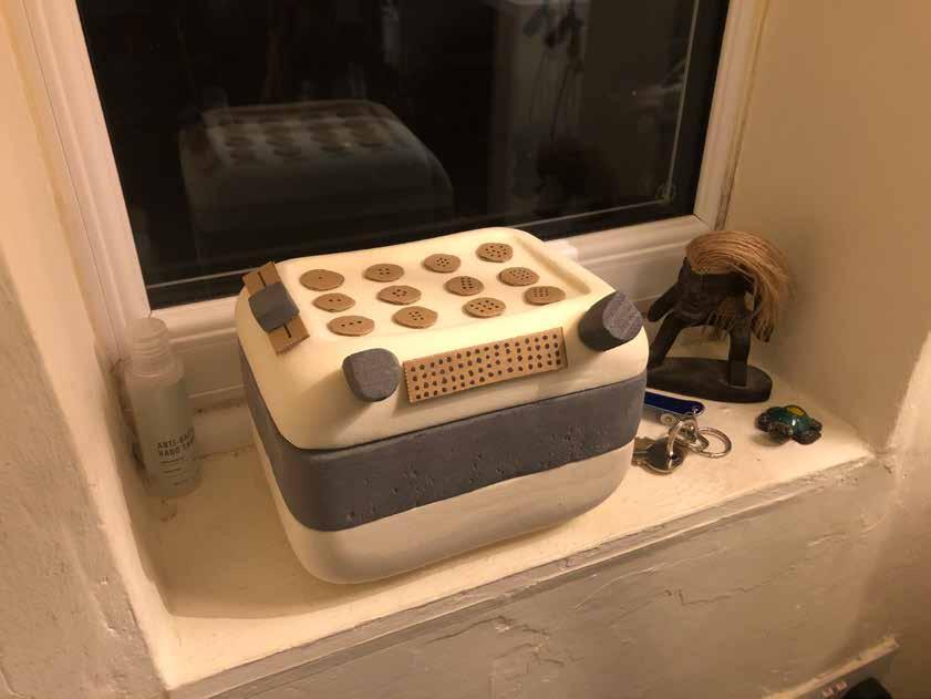
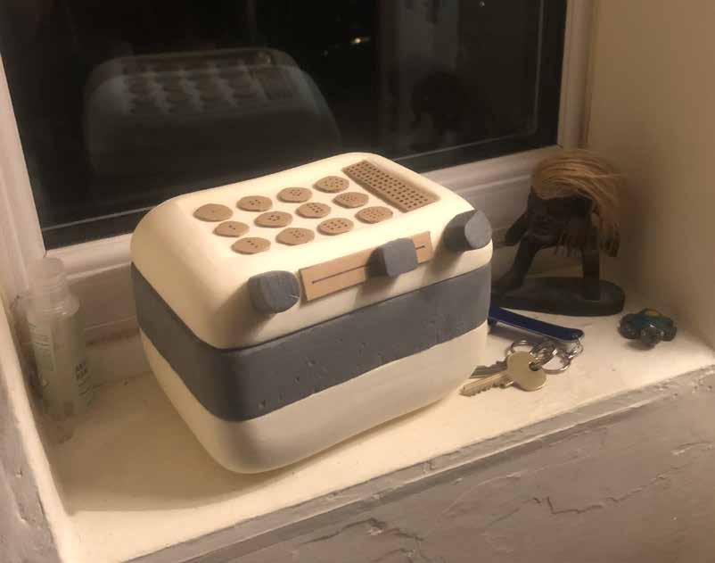
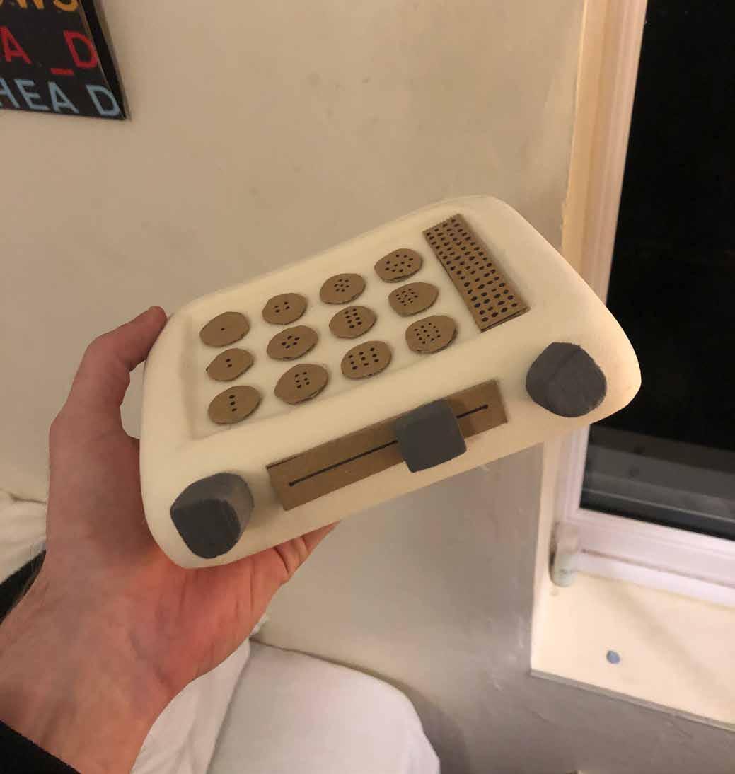
After aqcuiring some modelling foam, I was able to create roughly 1:1 scale models that greatly helped with visualising and creating the interface for my product.
Unfortunately at this time there were no available spaces in the workshop for over a month, meaning the process of sanding took longer than desired.
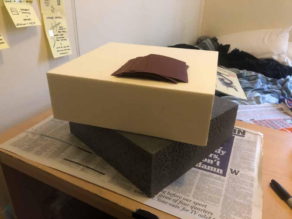
Despite this, I was able to smuggle my blocks into the workshop and rendezvous with an excellent technician named Alan who cut them for me while I waited in the shadows.
If it wasn’t for this then I wouldve greatly struggled to come up with the interface design, making me very greatful for Alan in particular.
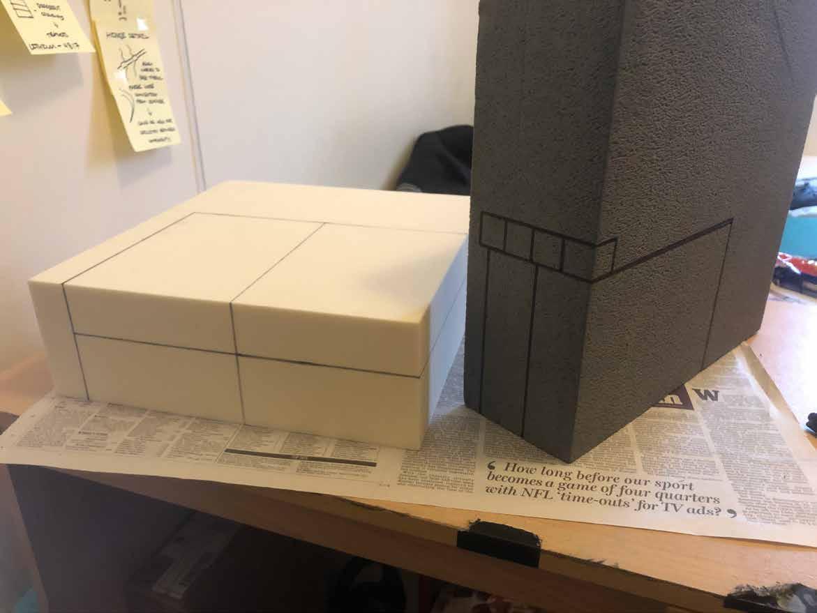
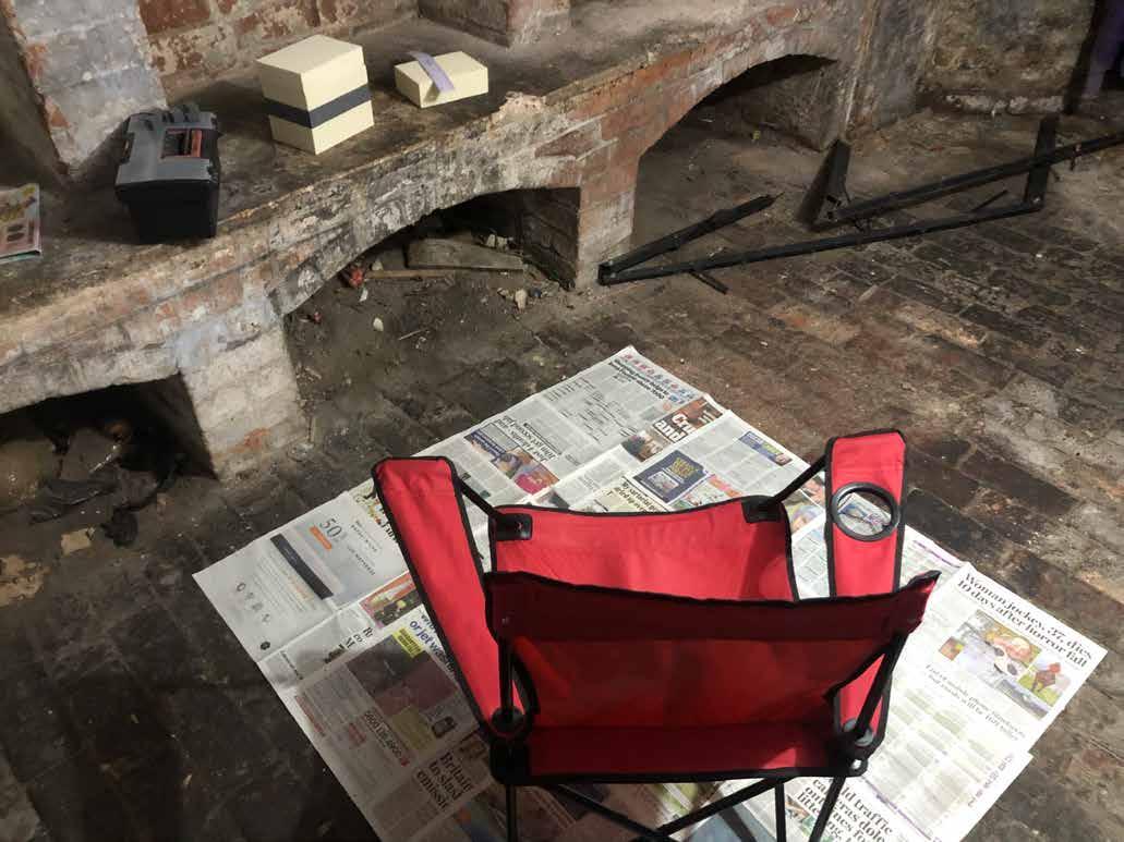
My basement home studio was nothing to be desired, but it was effective as I didnt want to ruin anywhere else in the house with foam dust.
I could get a pretty accurate idea of the scale of my product just by putting the blocks together.

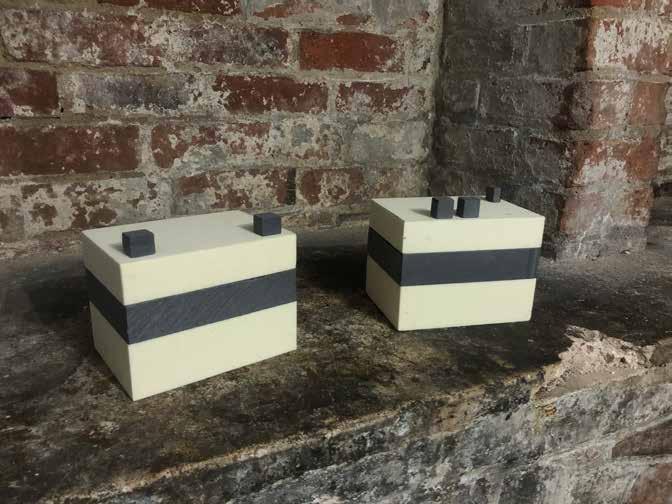
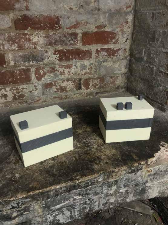
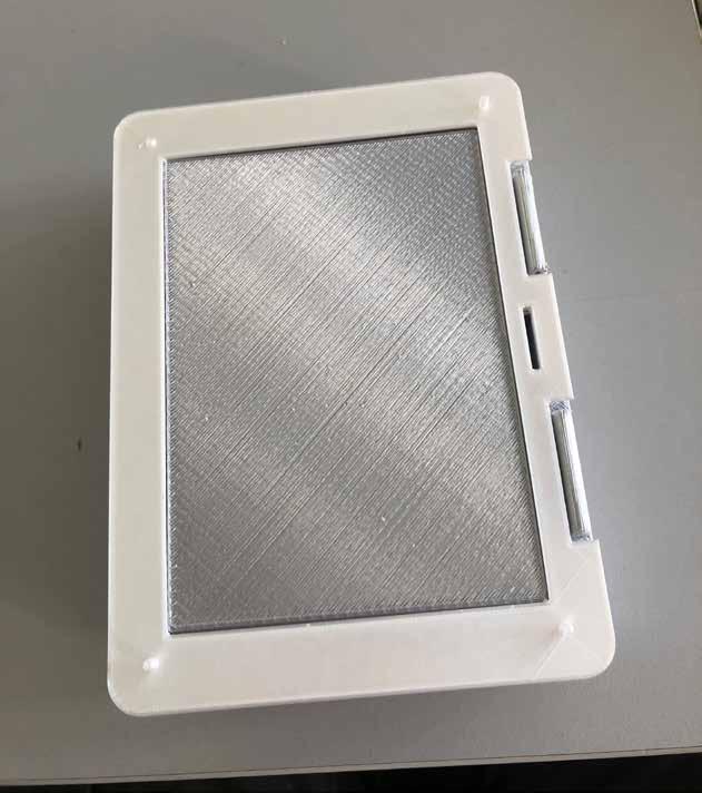
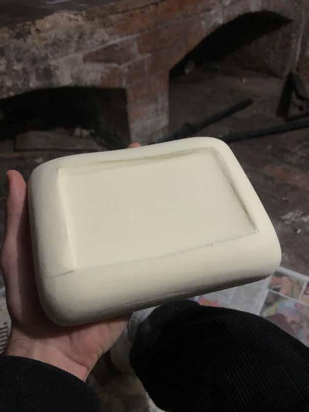
The sanding process required a fair bit of elbow grease, but the results were instantly visible, with the curved corners providing a much more sleek aesthetic.

After developing a technique the process became much more accurate, as i could match the fillet to each corner, creating seamless faces on each side.
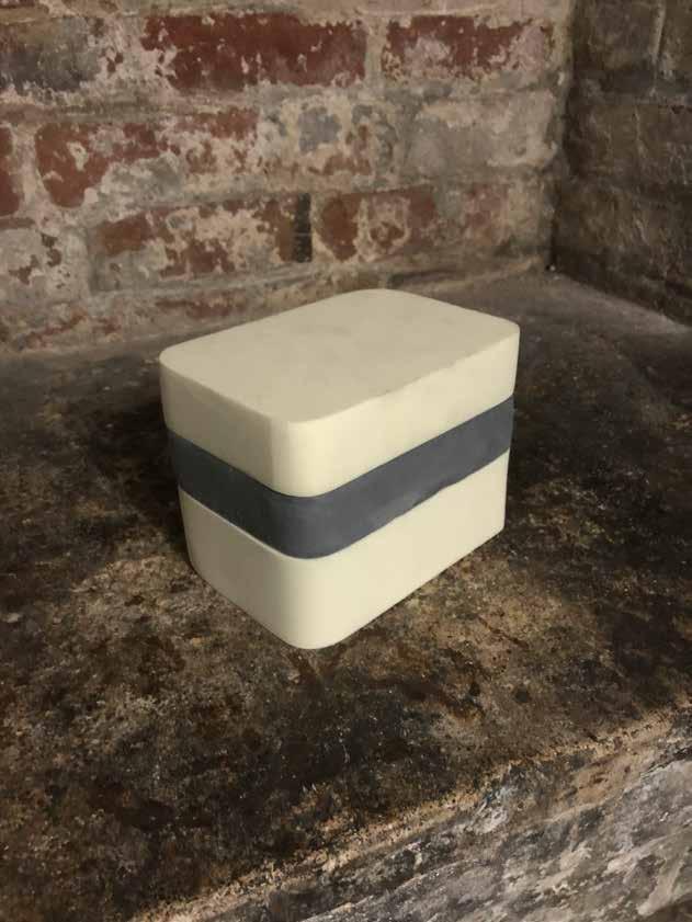
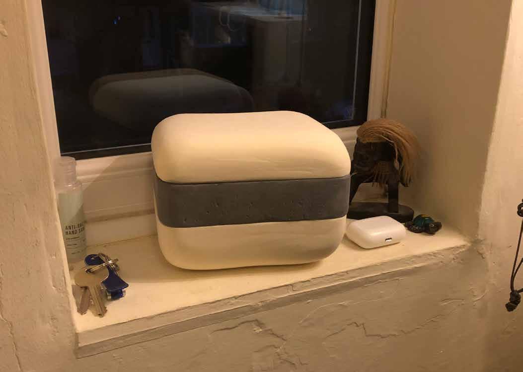

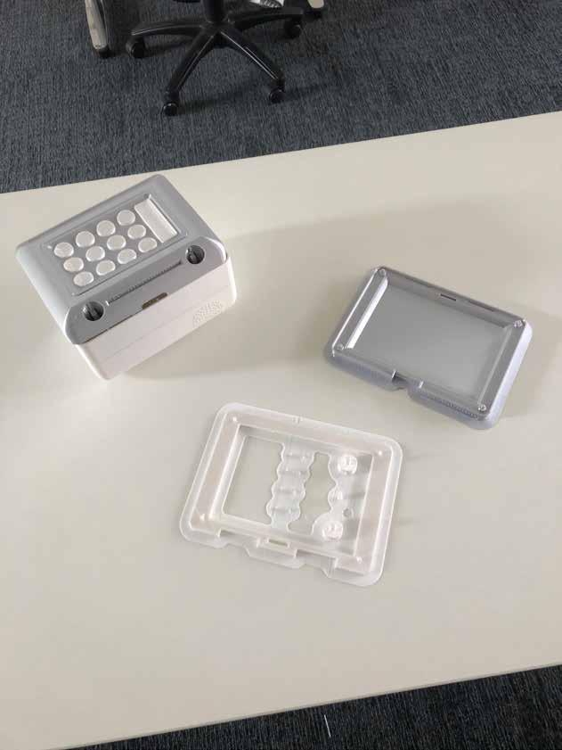
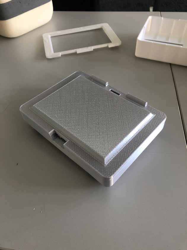
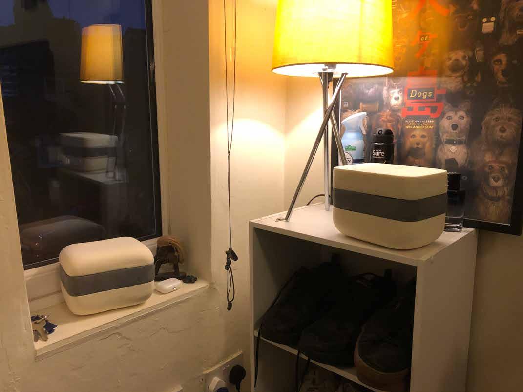
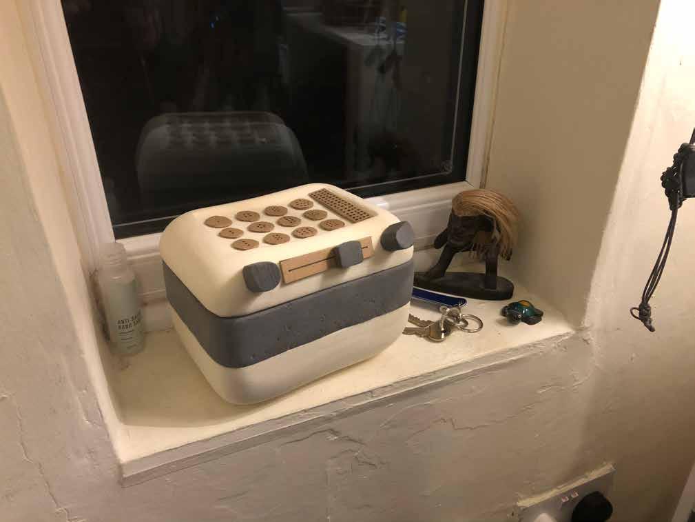
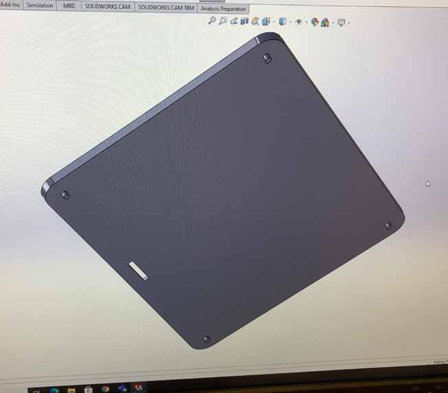
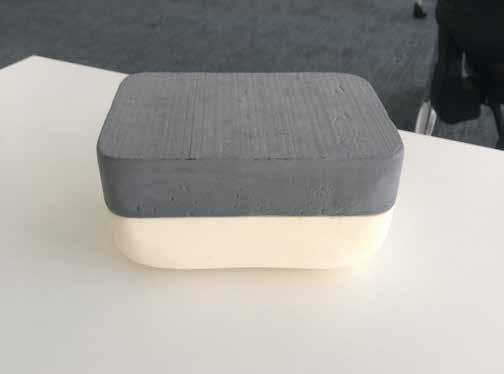
I made a model of both final concepts to compare them in full scale, and although I though the flat top and rounded bottom model was sleek and modern looking, the rounded shell gives off a much more welcoming and friendly mood by simply having no sharp edges.
I was eager to move onto the interface design as it will be the most intricate and user based element of the design, with various factors to be taken into consideration.
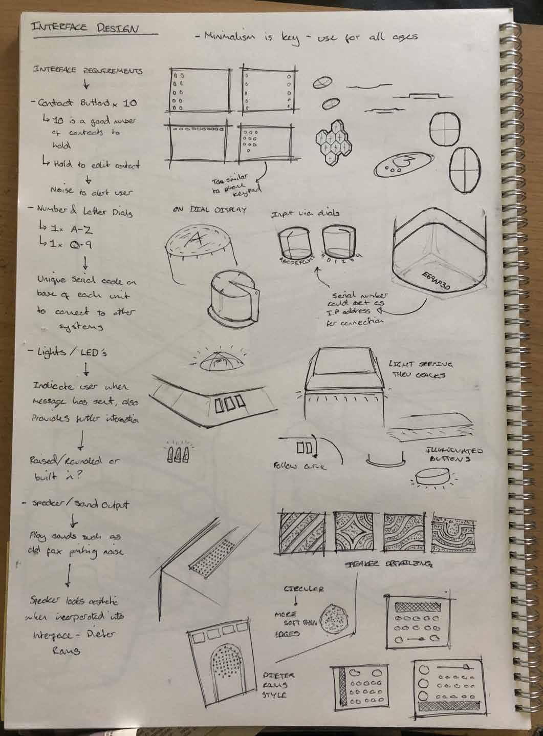
Before jumping straign into designing the interface, I had to think about what needed to be on it, and what could make it more enjoyable to interact with.
The button height can make a great difference, with flat or concave buttons giving a sleek, minimal appearance, while larger round buttons seem more fun and interactive.
On-dial display is a concept that featured during sketch work, and would display the letter or number the user is on for ease and benefiting those with impaired vision.
Each unit would have a unique serial code, a digit and number combination that will be used to connect to other devices.
To avoid cluttering the shell with LED’s, an indicator light could be wired underneath the interface shell, so that the user knows is there is an issue from the light colour.
The speaker would play interactive noises, such as chimes for a successful or failed sent, or a fax machine whirring for nostalgic effect. These sounds will be controlled via a volume slider.
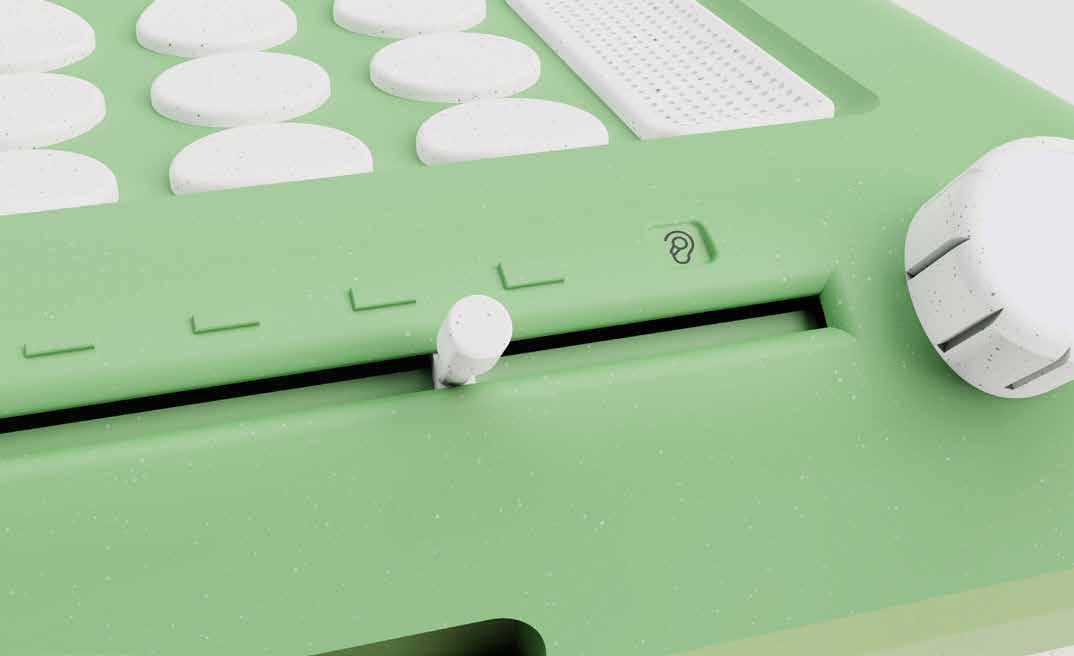
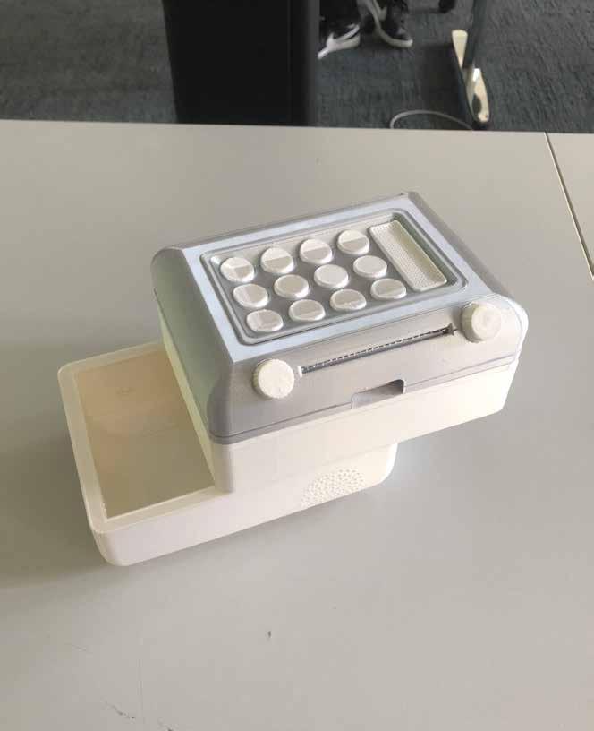
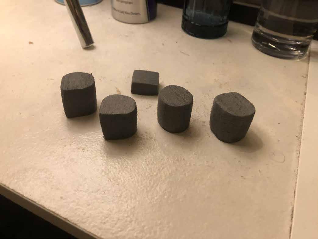
The knobs were slightly oversized to make them easier to see, however this may be a feature that is required for elderly useage.
I created two pairs of knobs, one fully rounded and one pointed, however I quickly decided the pointed ones would draw in unwanted attention, and would be unnecessary if implementing an on-dial display feature.
The inspiration behind the interactive dial comes from the central control dial in Audi cars, which also includes a finger pad so the user can draw in the desired letter or number.

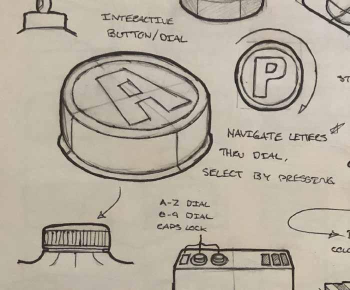
The dial is pressed down to select, which will be incorporated into my design. Further in-depth research and design of this dial will be covered during CAD development.
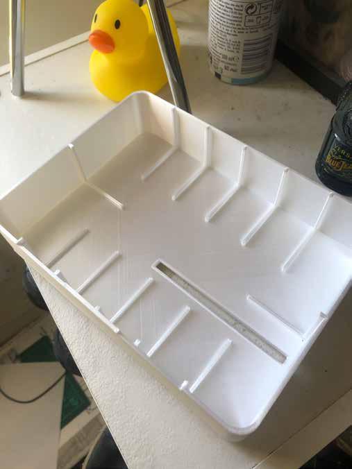
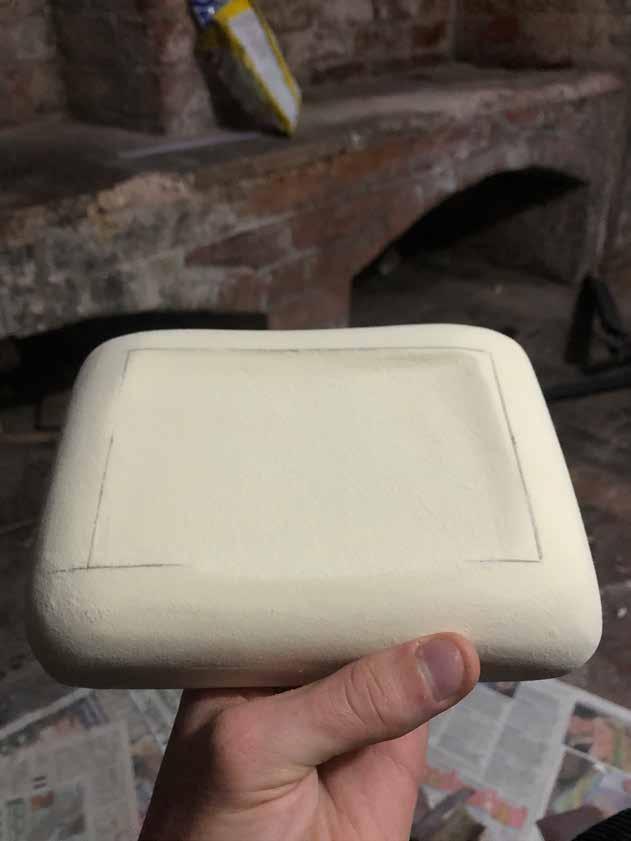
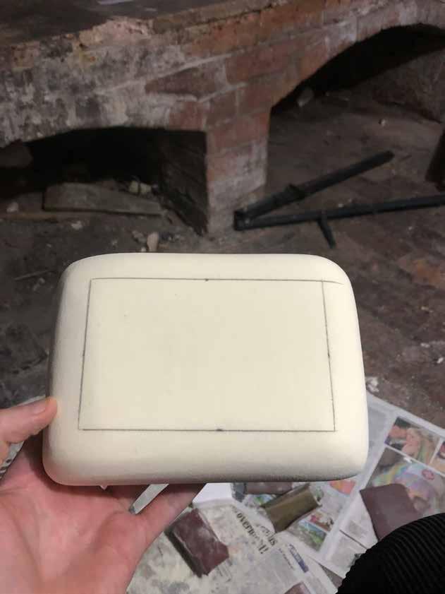
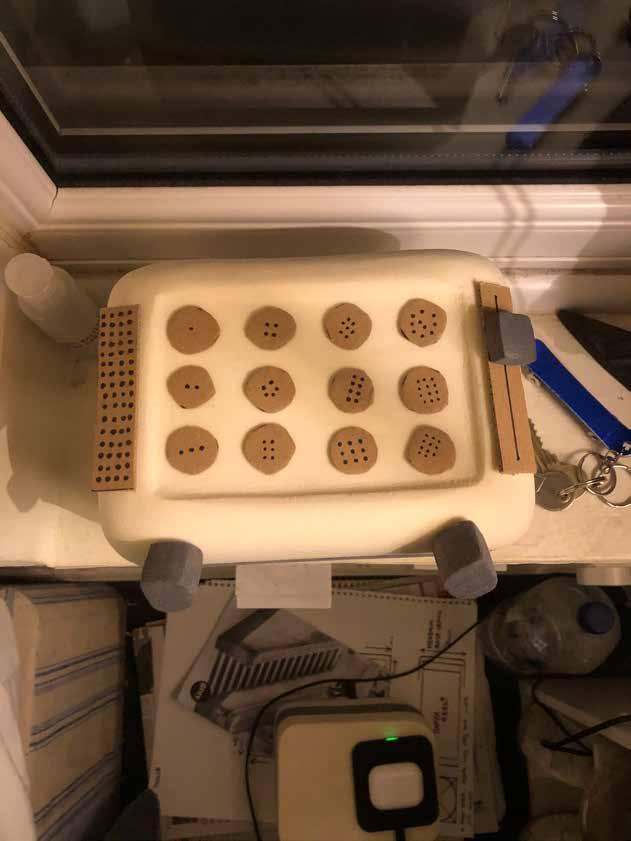
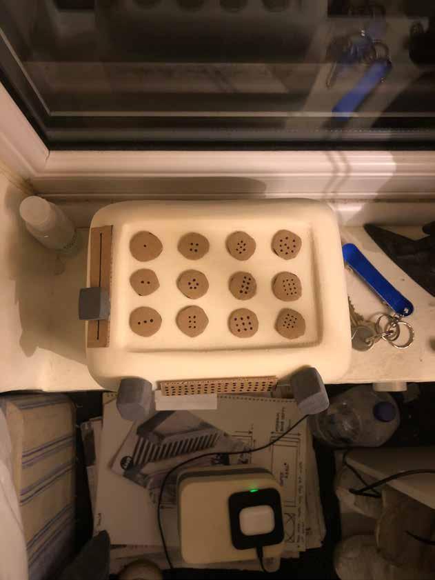
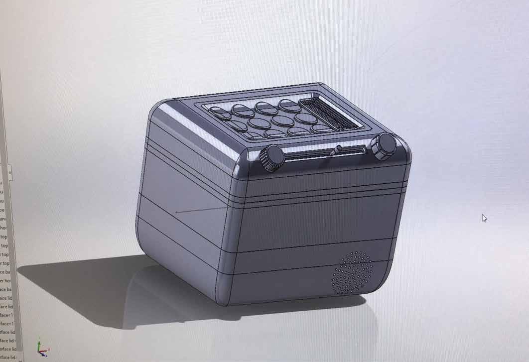
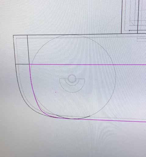
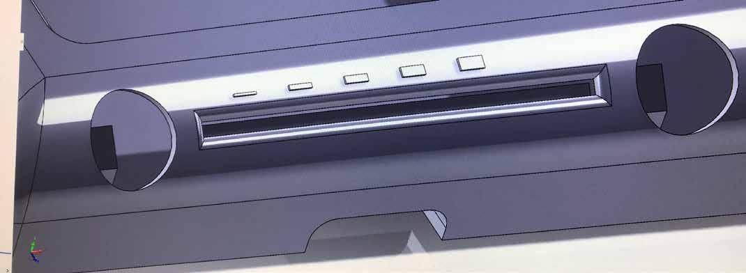
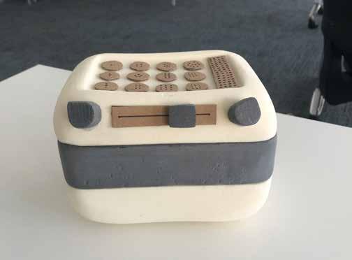
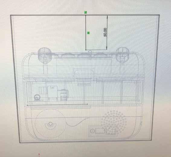
After marking out a 130 x 80 mm rectangle, I began sanding away a large indent on the top face for the interface to lay in.
The indented interface concept recieved strong feedback from peers, and I also think it adds needed depth to a fairly uniform and cubic shape.
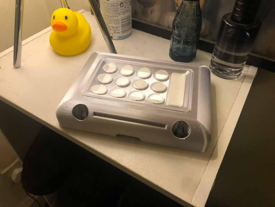
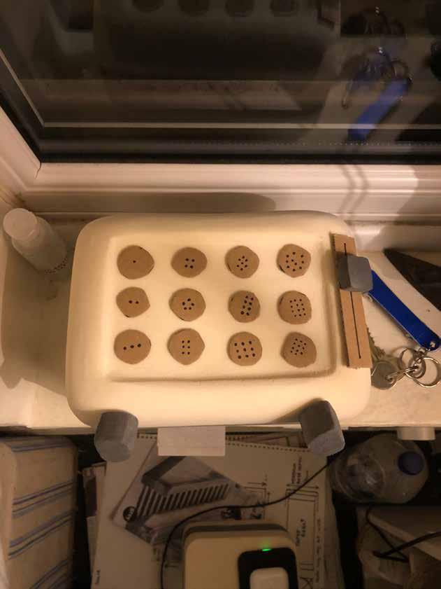
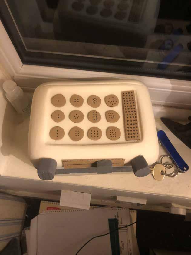
By re-using cardboard cut offs I could simulate the button layout along with other details.
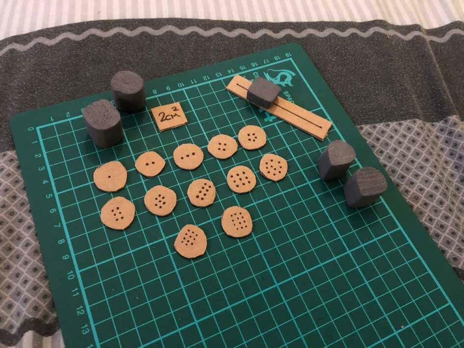
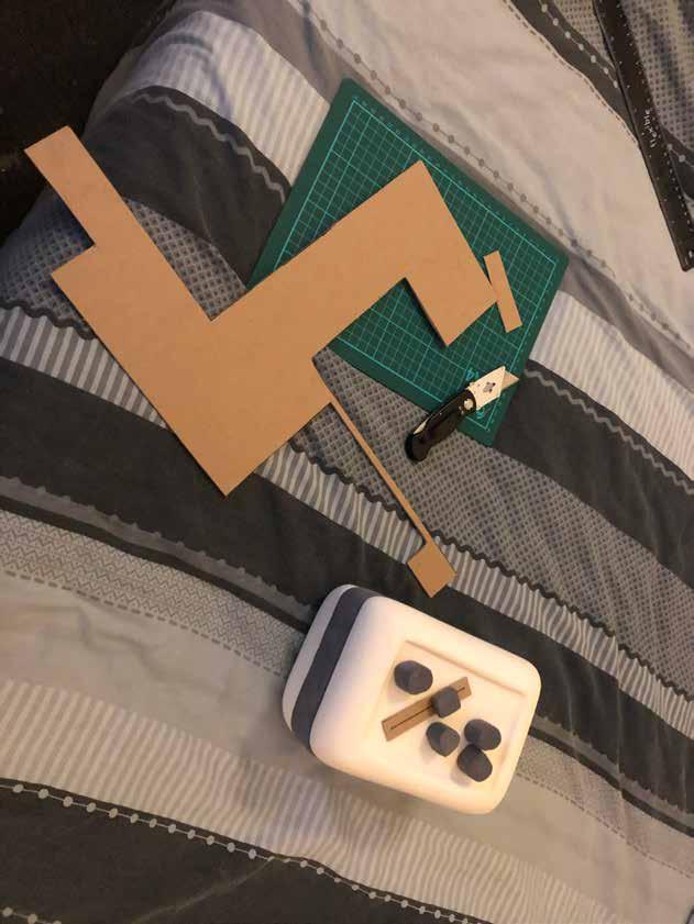
I decided the rounded 2cm2 button size would be the perfect size for interaction while not being too big to fit the interface.
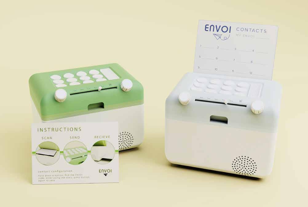
12 Buttons perfectly fit the interface, making it an ideal number of contacts for my product to hold.
Placing the dials next to each other immediately indicated un-ergonomic design, as if used both at the same time, discomfort may be caused in the wrist.
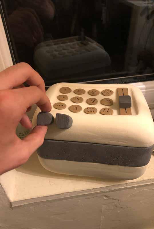
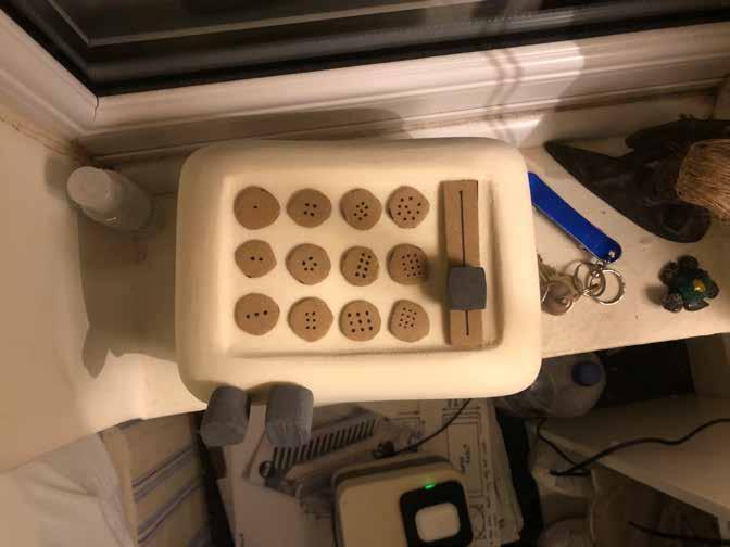
Separating the dials creates a much more comfortable user process, and also gives the product some character. The first interface contained the buttons and volume slider in the indent, which made it seem a bit cluttered while not utilising other surface space.
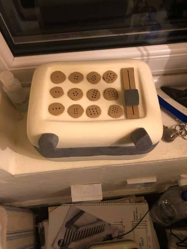
Something about just having buttons on the interface didnt sit right with me, however I liked the volume slider being positioned between each dial as it added futher detail to the side that will be seen mostly.
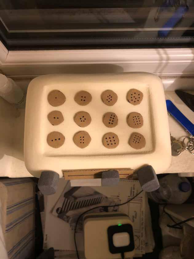
This was my least favourite interface, the lack of symmetry was offputting and I felt the dials needed something between them to break up the front flat face.
This
interface felt more balanced due to the symmetry, however the gap inbewteen the dials still needed to be filled in my opinion.
Placing the speaker between the dials creates a less cluttered front face, however the volume slider on the side looked out of place.
I liked the volume slider being between the dials, but the full interface of just buttons still wasn’t sitting right.
This layout is aesthetically pleasing, although i didnt like how the volume switch would protrude out of the indented section.
I found this layout to be the most compact yet simple to use. The issue of the volume switch cluttering the front curve can be avoided by making it more descrete to blend in with the rest of the design.
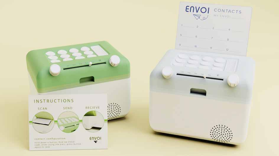
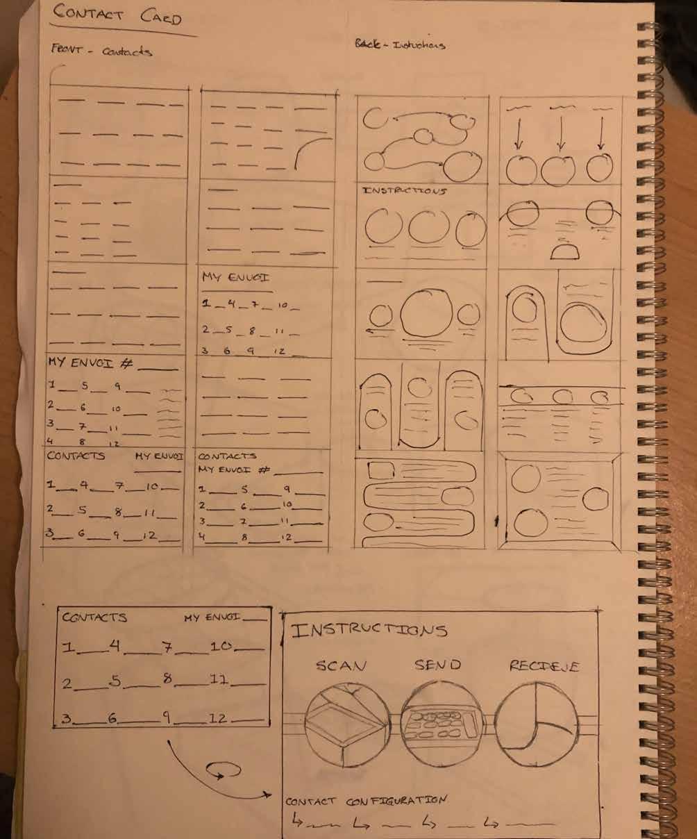
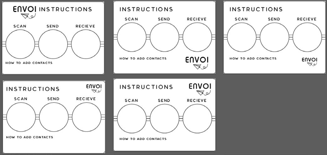
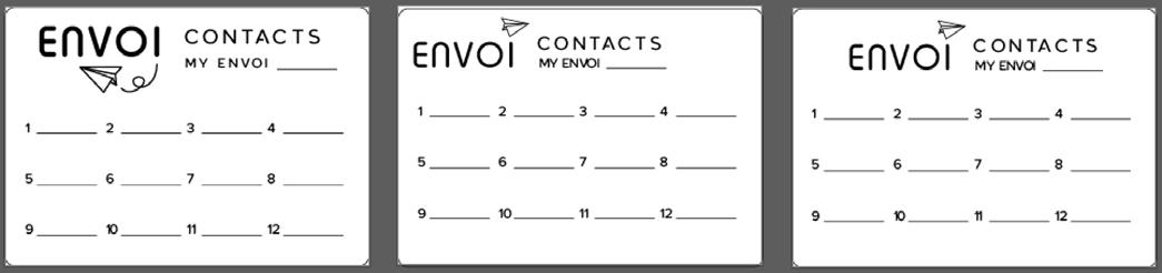
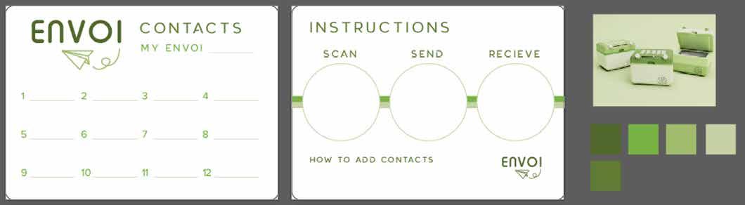
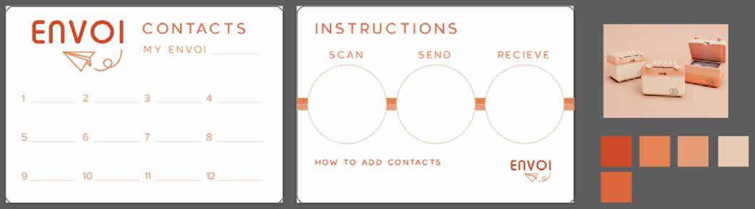
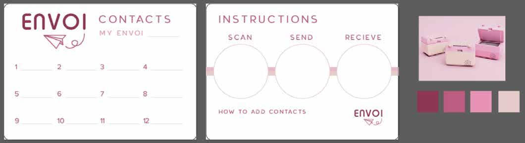
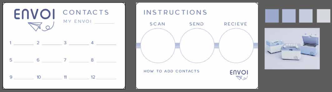
This card could also be used as the instruction manual, with clear and consise instructions on how to operate the product.
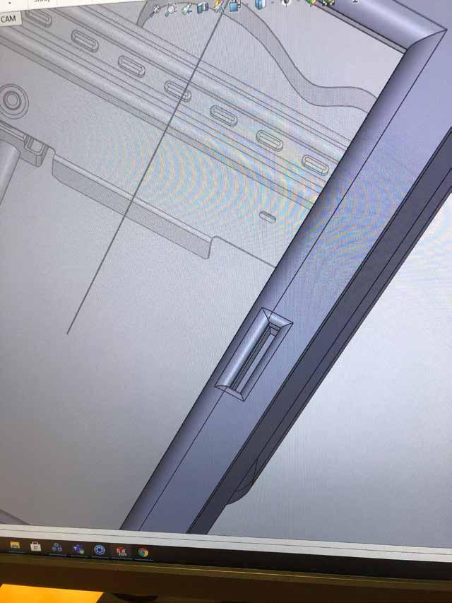
The idea of cutting a notch into the rear curved face will allow the user to display notes or messages, but also allow them to store a card displaying all of their contacts, meaning the user has to physically write down each contacts name.
I was happy with the final interface layout, it seemed simple enough for anyone to grasp while maintaining a minimal, soft and welcoming appearance with various elements for the user to interact with.
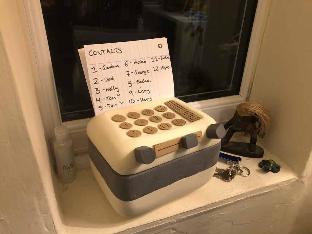
Combining the contact card with an instructional leaflet will reduce the amount of paper used and also create a unique and helpful source of information that will always be near the user.
I sketched some potential concepts with a simple instruction process on the rear, and will develop this further during the branding stage.
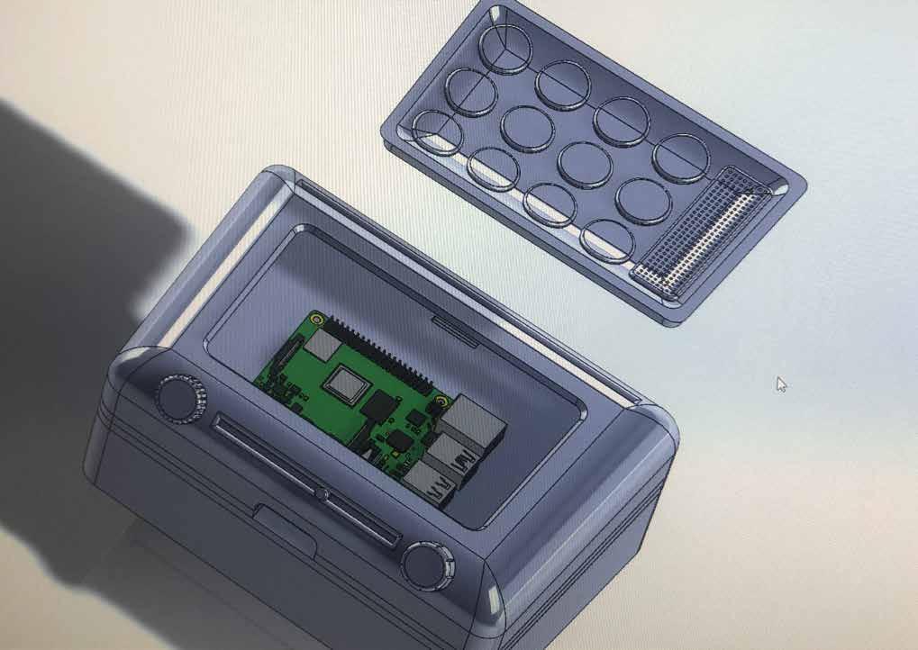
CAD Development.

With all sketch work and modelling done, I had a clear vision of what I wanted my product to look like.
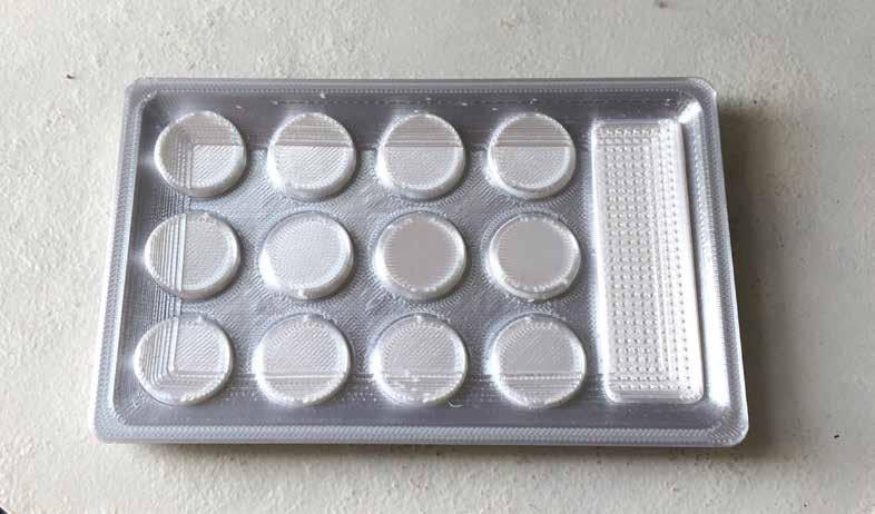
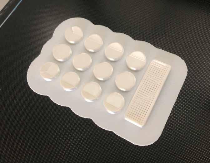
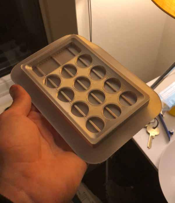
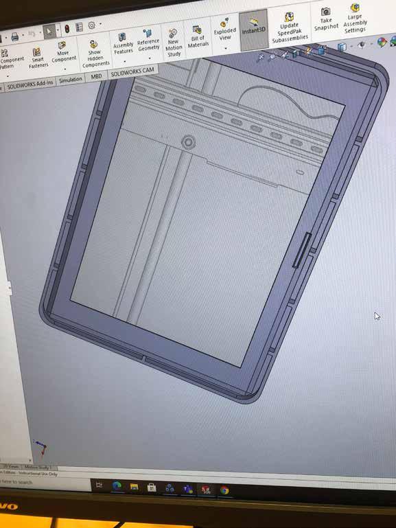
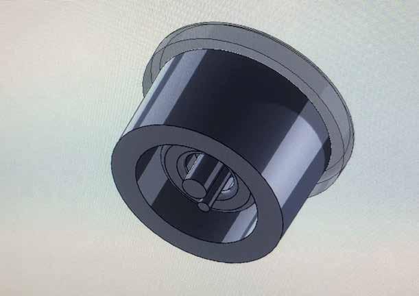
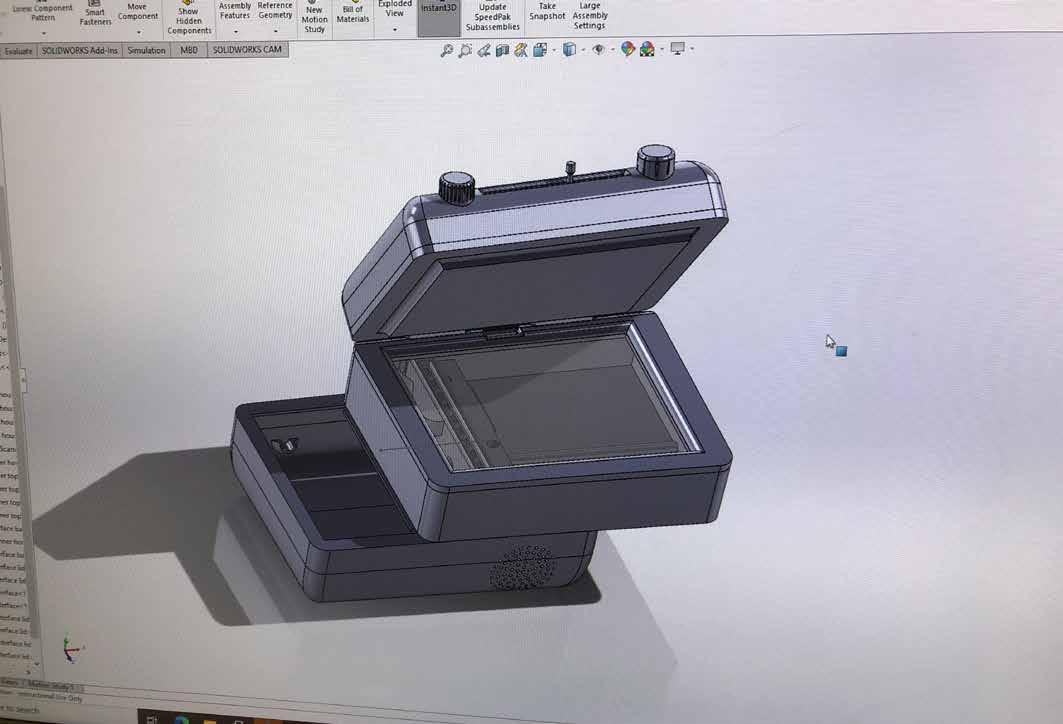
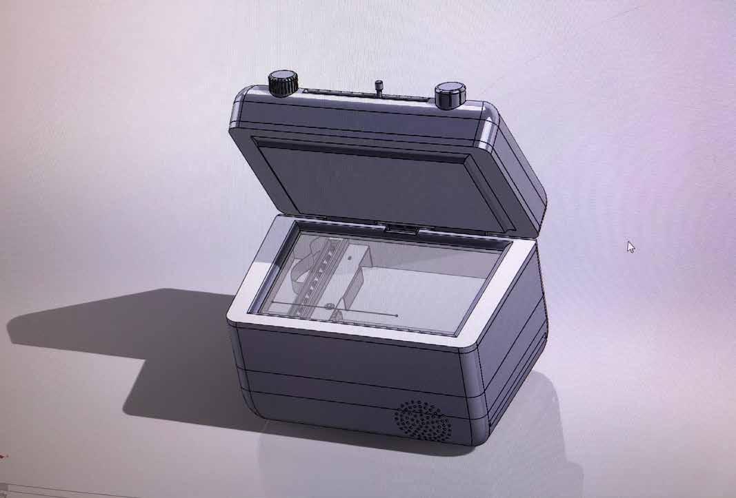
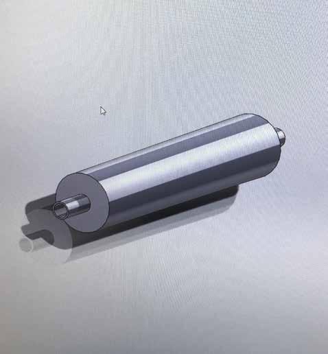
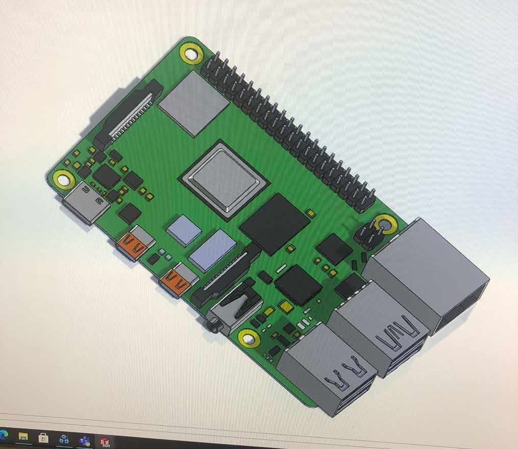
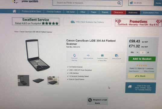
I began my CAD model by making a A6 contact image sensor scanner, as it is the largest and most vital component in the assembily.
Using a photo seen above and my exploded view sketch as references, I made the scanner as accurate as possible so it would look realistic in renders.

I soon realised that these models did not allow for wiring space, as the scanner took up the entire interior space of its shell.
The hinge mechanism I made was also faulty, therefore I started again with a focus on industry realism.
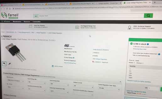
After researching, it was made clear that A6 scanners are not readily available, meaning the scanner for my product may have to be custom built.
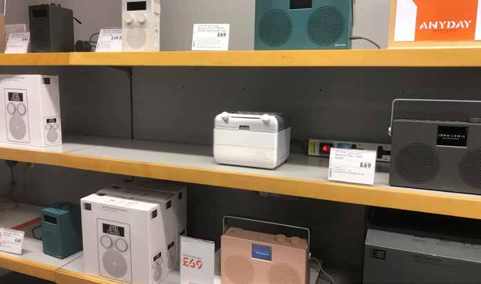
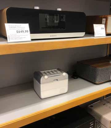
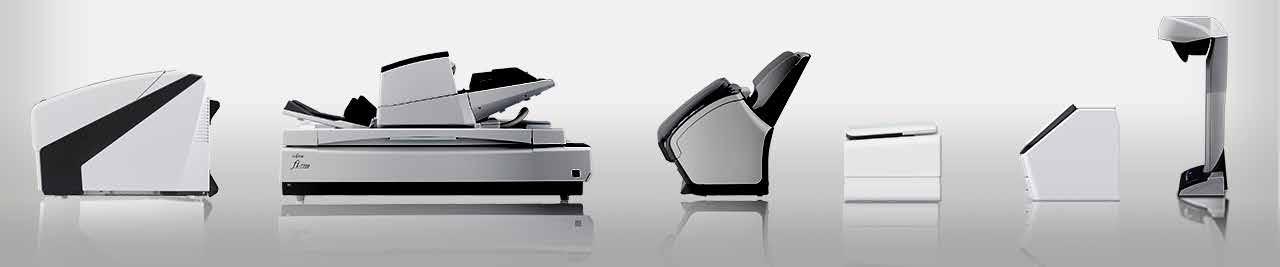
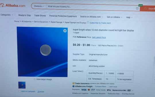
The censor image scanner technology used in many of Fujitsu and Canon scanning machines could easilly be scaled down to the A6 size desired, and could also reduce the raw material costs of the component being manufactured.
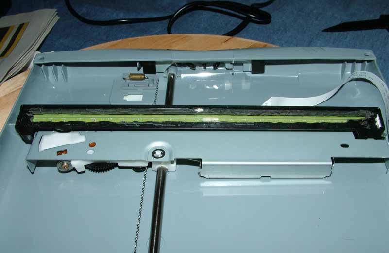
The image above was what I used as a guide for making my A6 scanning component. The paper thin wiring cable seen is what gave me the idea to thread a ribbon cable through the scanner and interface shells, as it will look much better than having visible wiring.
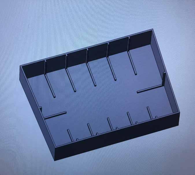
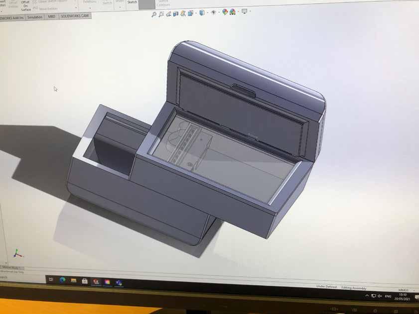
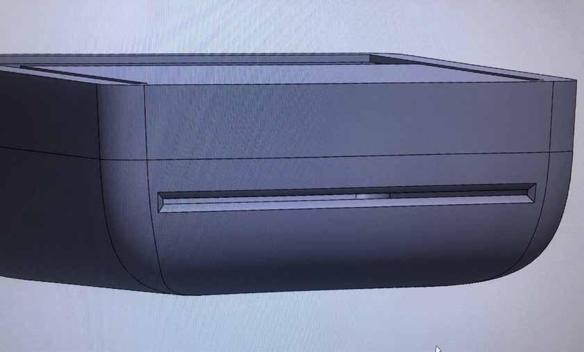
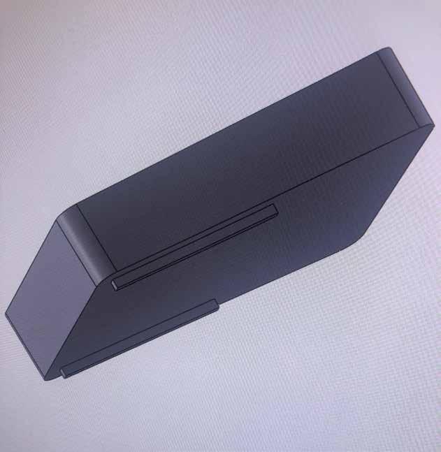
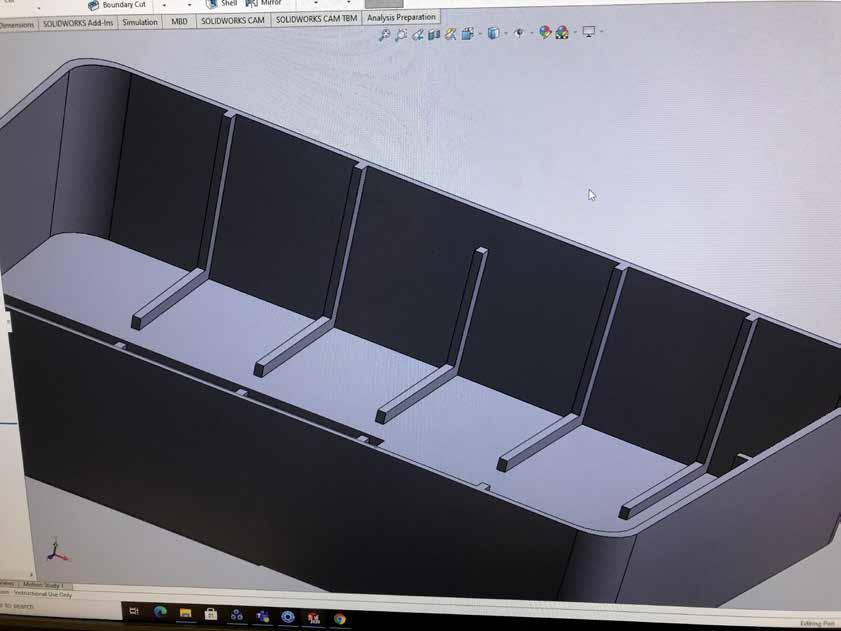
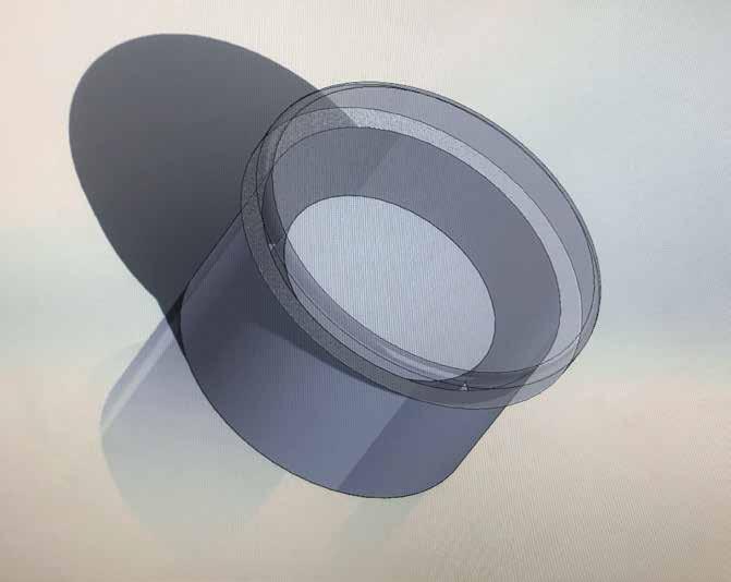
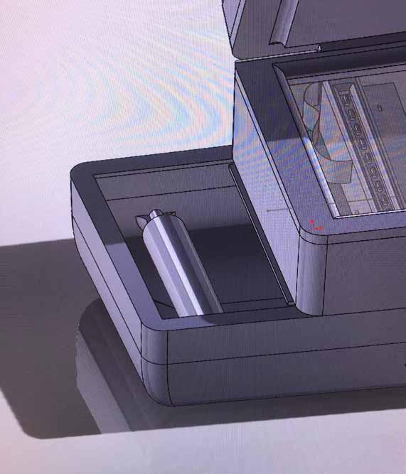
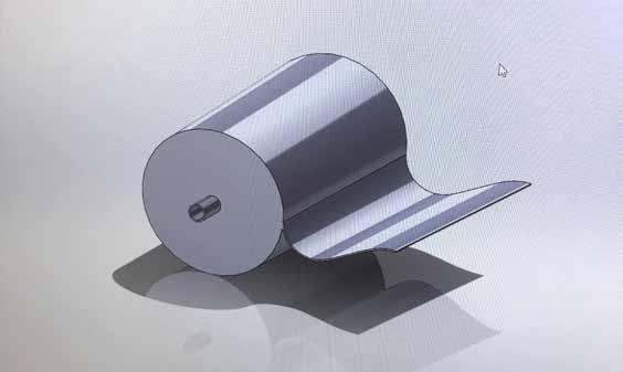
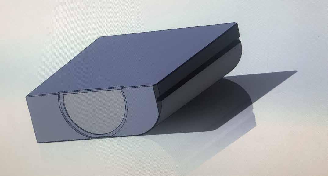
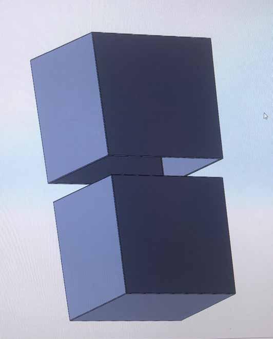
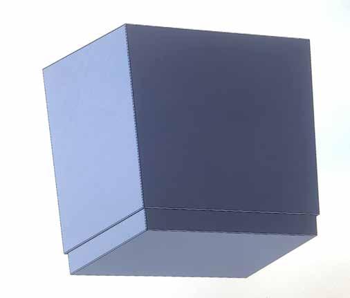
I then added the base for the sliding mechanism with reference from my own sketches and created the printer output with a slight chamfer for realism.
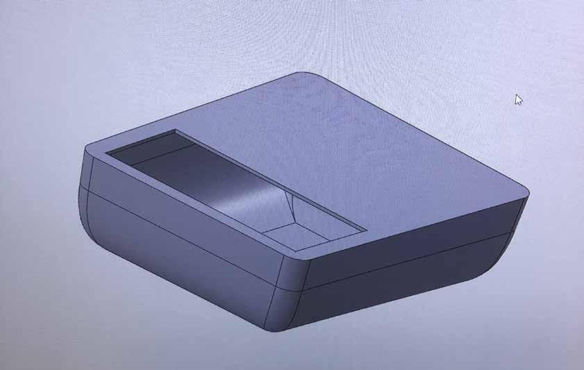
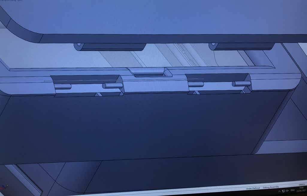
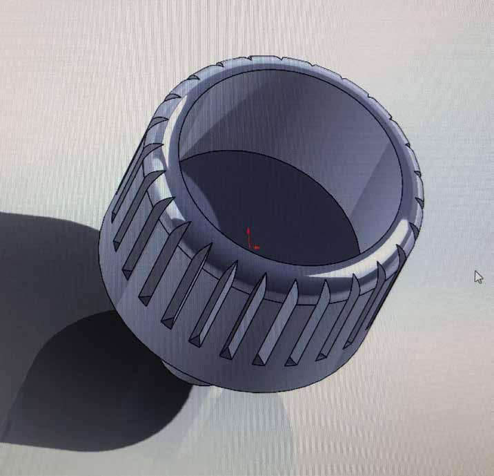
The male end of the sliding mechanism located under the scanner shell were given teeth to secure onto the base while still allowing the sliding refill feature.
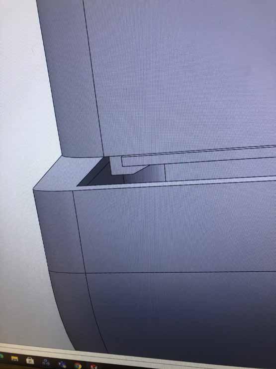
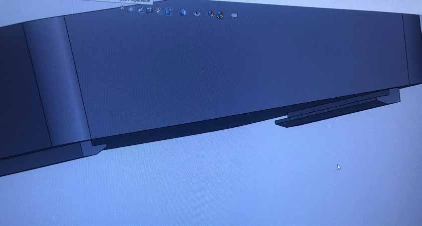
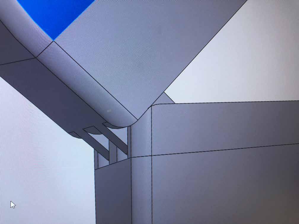
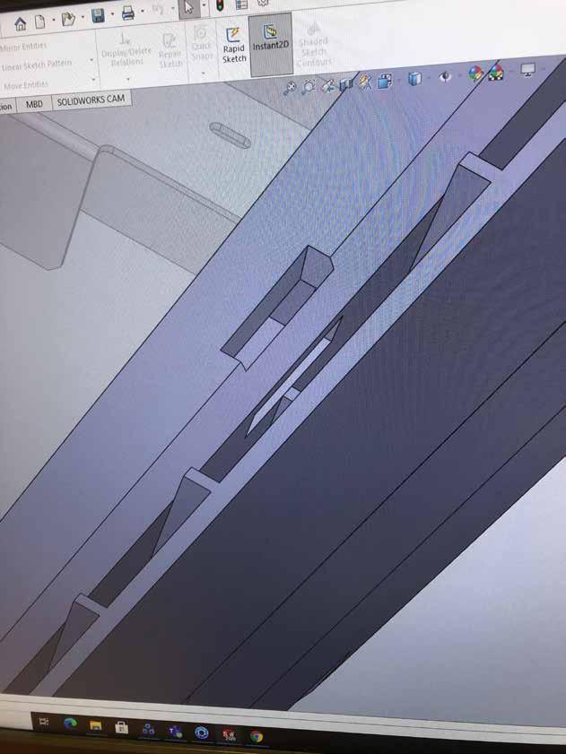
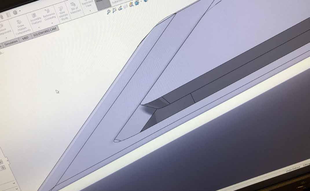
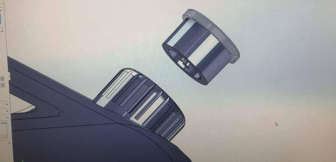
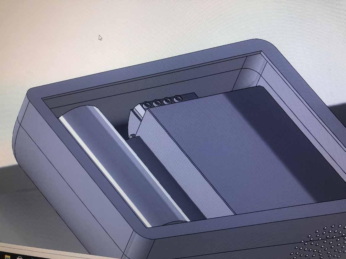
Wiring became a potential issue with the sliding feature, which led me to cutting a trench in the base of the scanner case and top of the printer housing that would allow wiring to stay connected while the mechanism slides about.

From the image above you can see that there is a good amount of space for wiring when the mechanism is closed, which only gets wider once opened.
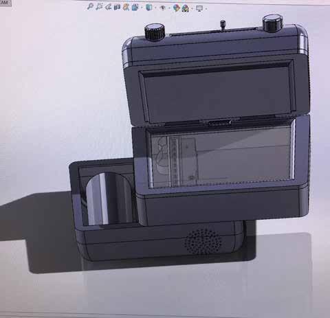
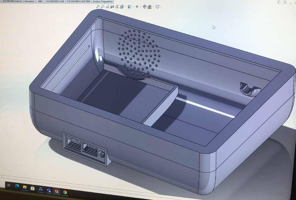
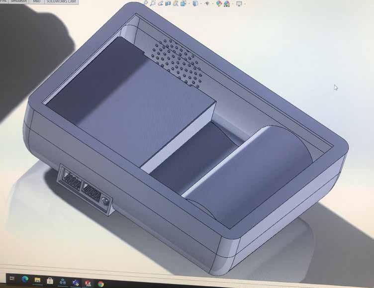
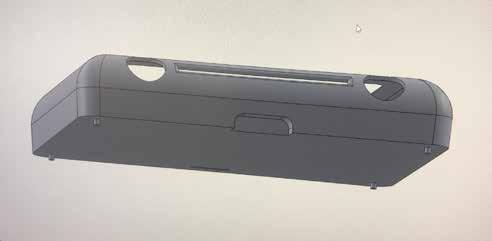
With the scanner shell complete for the moment I moved on to detailing the printer and paper housing.
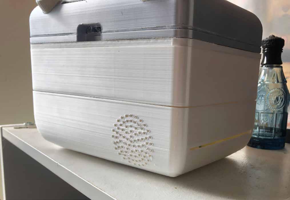
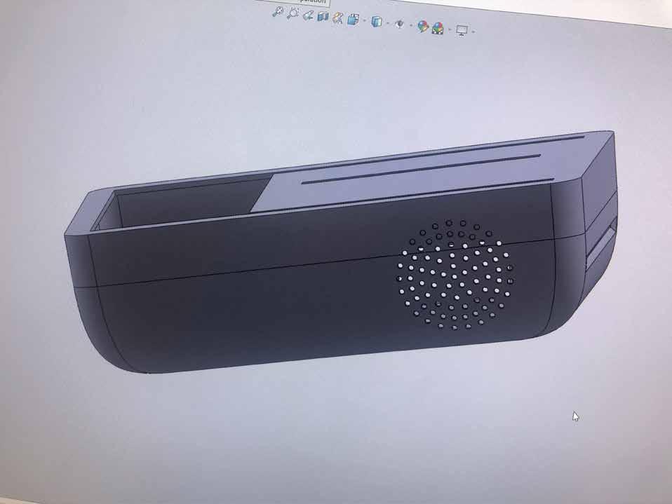
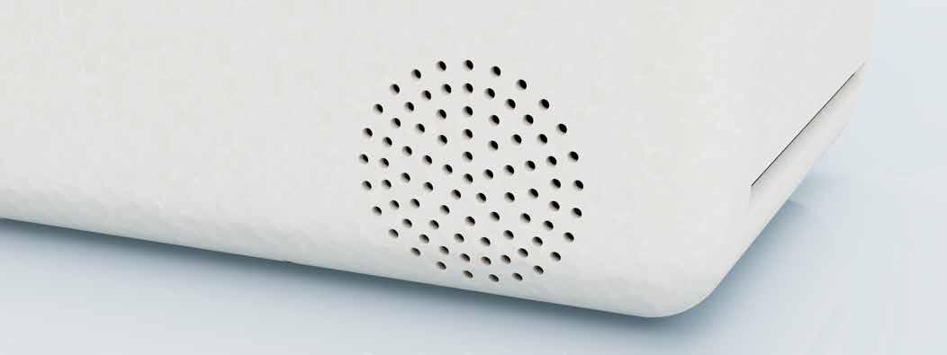
Supports for the thermal paper roll were added on either side and a Dieter Rams inspired fan/air exit was positioned on the front face to provide detailing and break up the large blank front face.
I left room at the back of the shell for the power and network connection cables, as I was unsure at this point of which I would need.
This was not an issue at the time as the majority of initial renders would be from the front or side angle, and I therefore left this technical element till further notice.
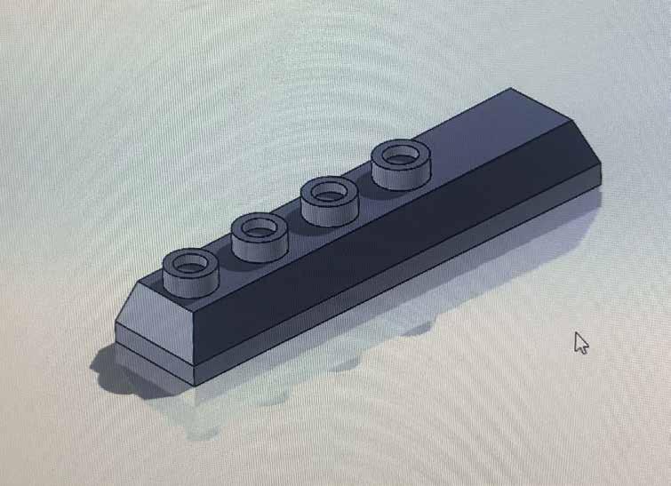
I had to shorten the middle scanner support as it was blocking the wiring entrance I had cut into the scanner. The scanner and printer housing fit into place and I was able to test this mechanism using SolidWorks.
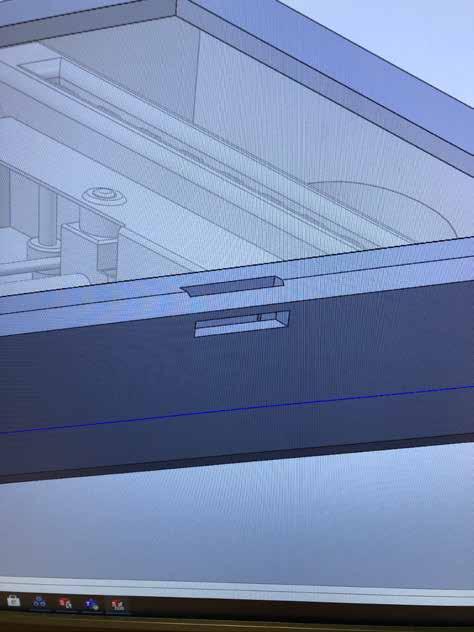
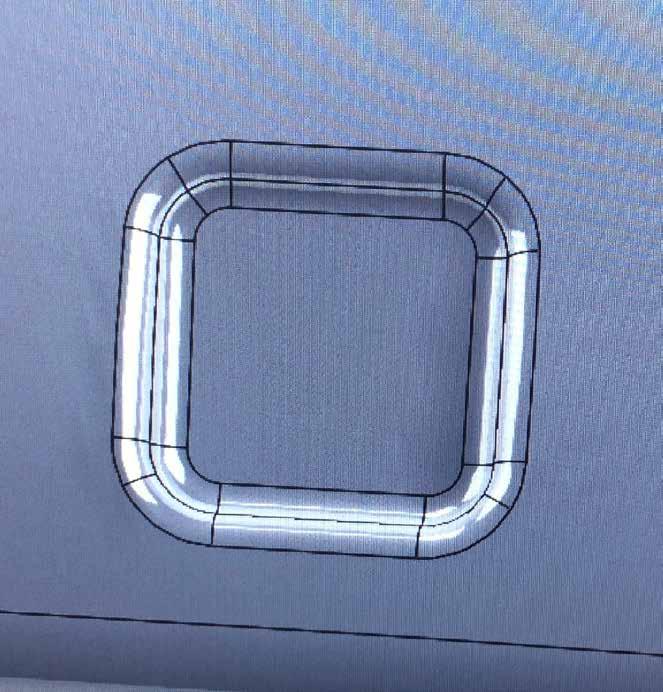
I needed to create a top for the scanner as I didnt want the component to be easilly accessible.
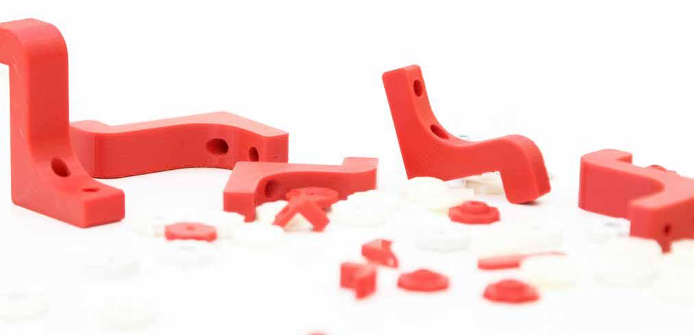
Cutting 3mm diameter holes in each corner of the scanner allows the top element to slot into place, which was mainly designed for 3D printing convenience.
The scanner top included a gap for wiring to pass through as well as a filleted curve inwards all the way round the A6 perimeter, which is commonly found in larger scale scanners.
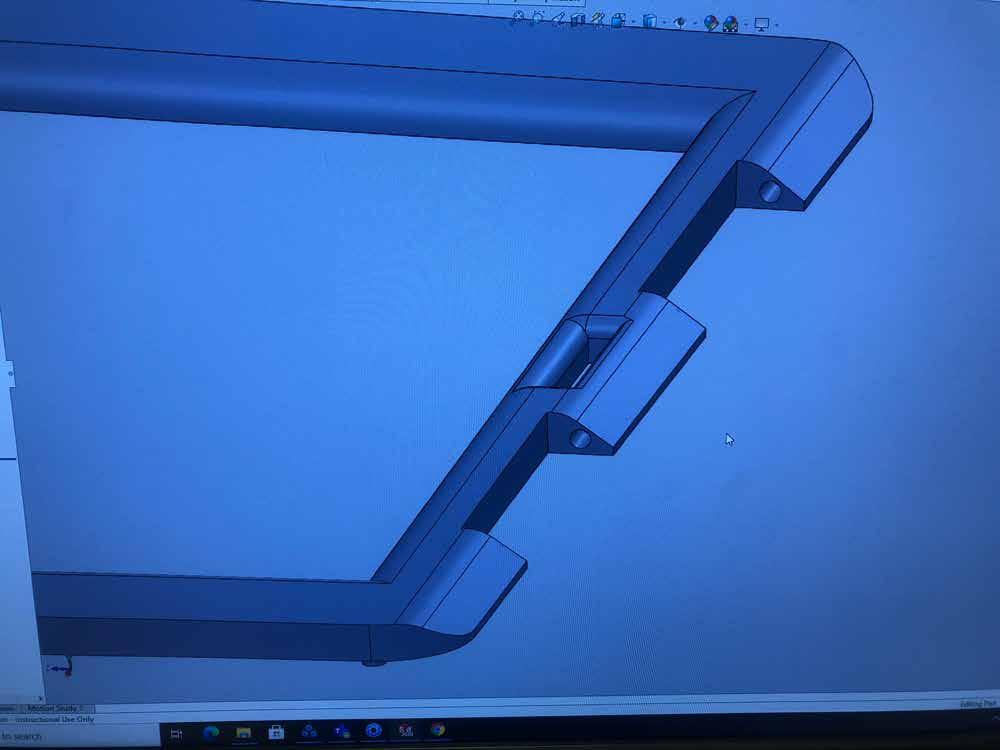
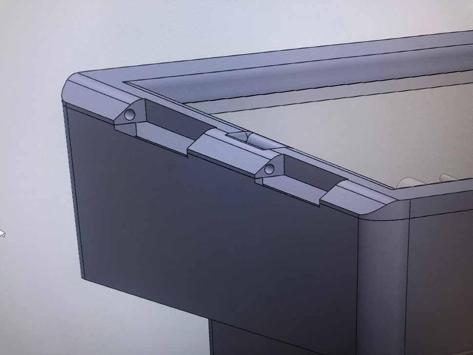
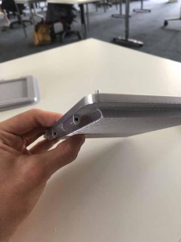
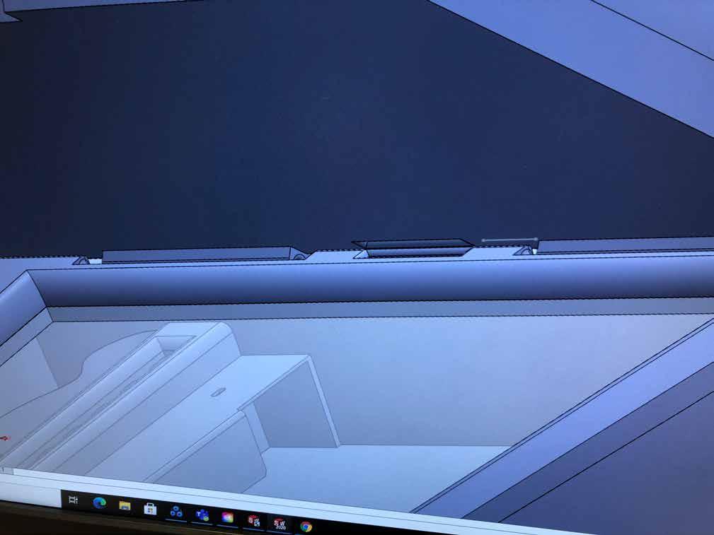
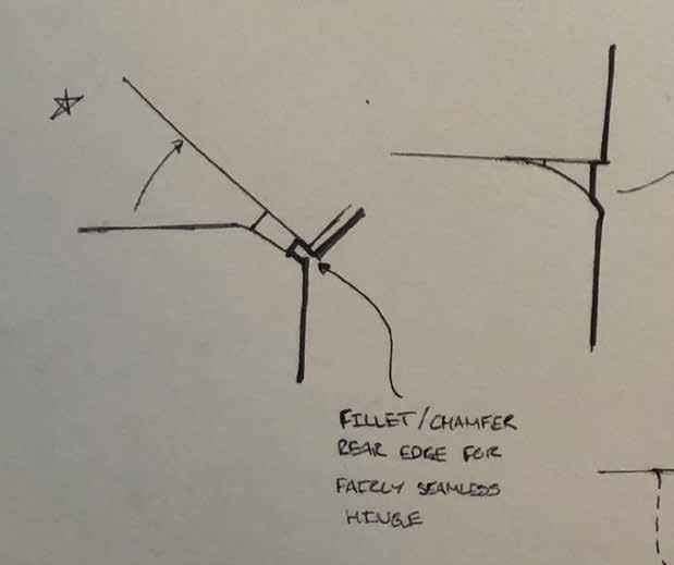
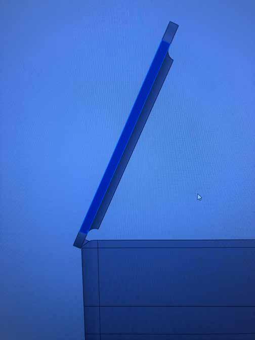
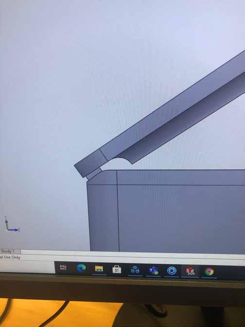
I based the hinge mechanism off of a sketch I had produced as it seemed to be a seamless and descrete option. By doing so, I realised that the scanner wiring supports may obstruct the hinge and therefore shortened them down and also added a chamfer onto the rear edge to allow for the swinging hinge.

Small pins were put into place to make the hinge operate. This design is purely for simplifying the 3D printed model and would likely be replaced with a non-removable solid beam in a real model
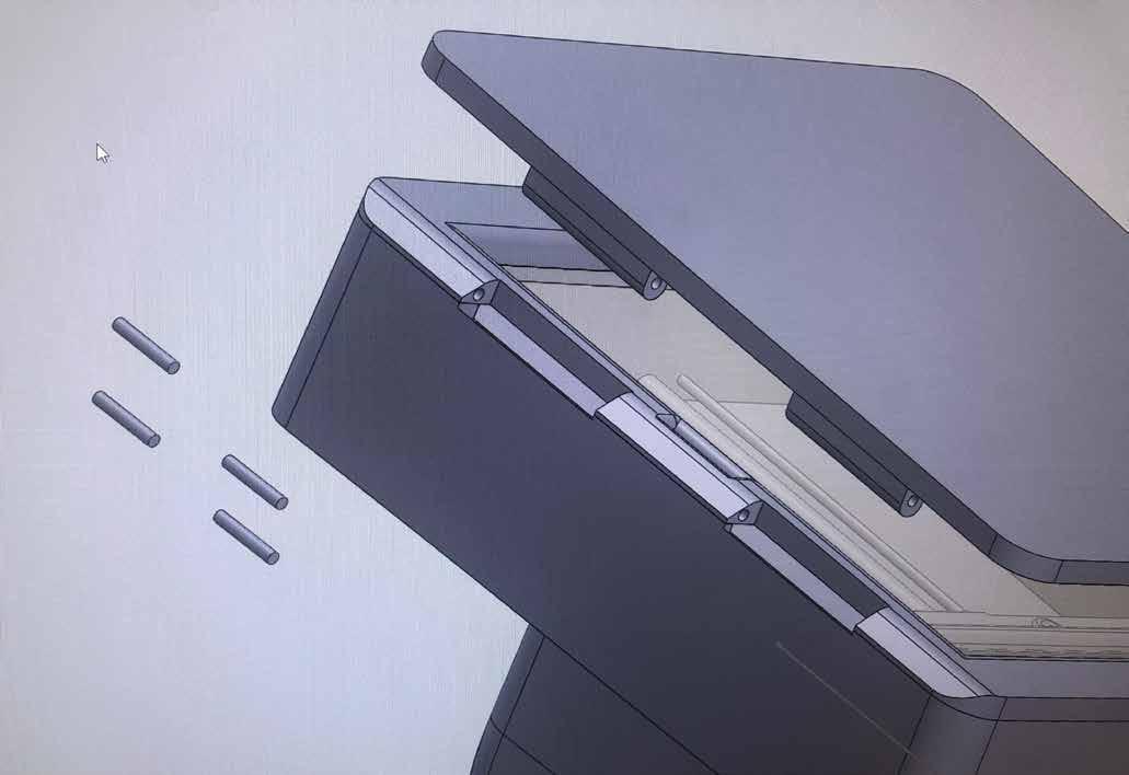
After creating a top half to the hinge, I could test the mechanism to see if it would rub against anything, and gladly the concept worked perfectly, not allowing it to swing all the way over.
The top half of the hinge was connected to the base of the interface.
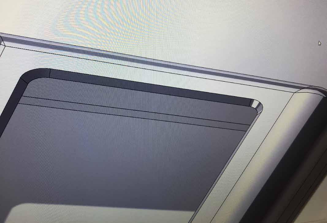
I created a matching fillet underneath this element to fit perfectly into the scanner face, ensuring accurate scans every time.
I also created a gap allowing wiring through, which had to be flush with the other gaps to ensure the wiring has clear passage all the way through the product.
I added 3mm diameter holes in each corner of the interface base so that it could slot nicely into the actial interface shell, another 3D print hack.

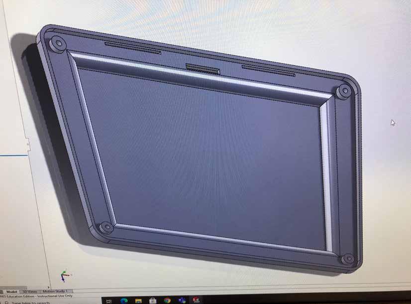
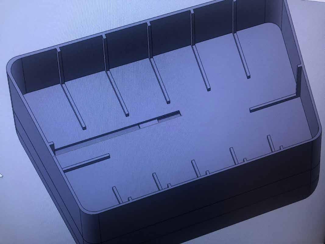
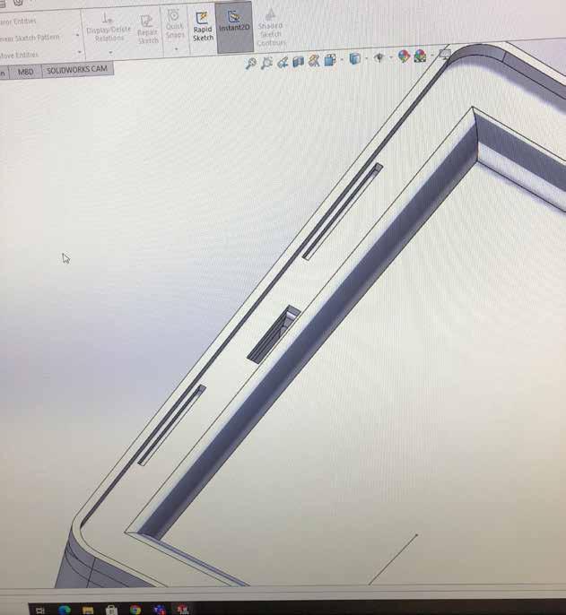
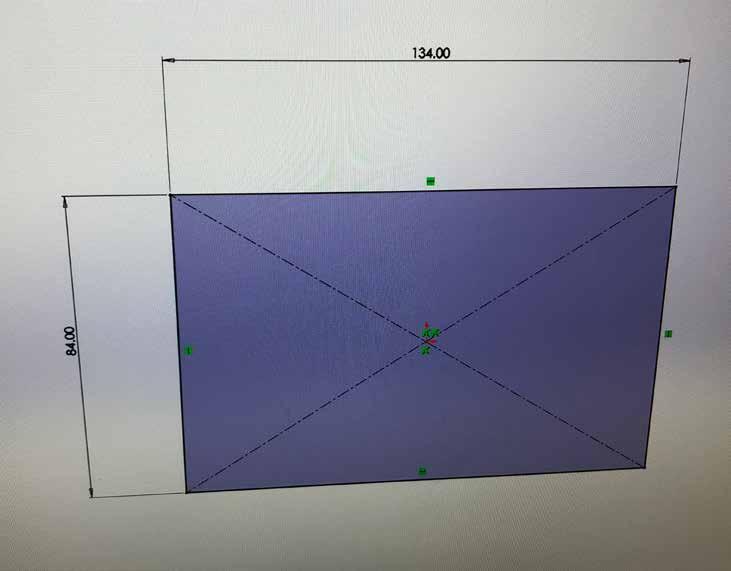
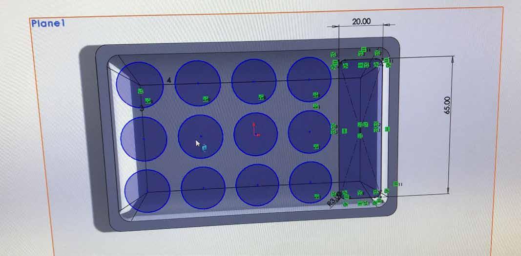
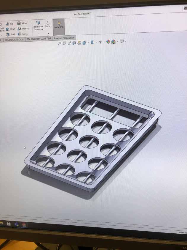
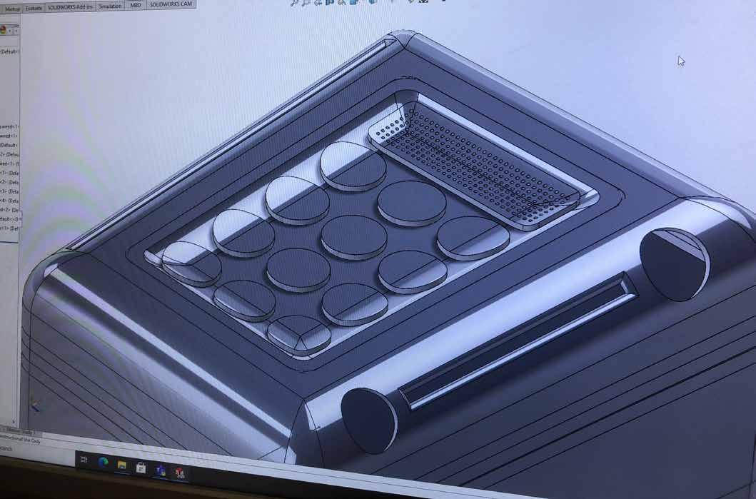
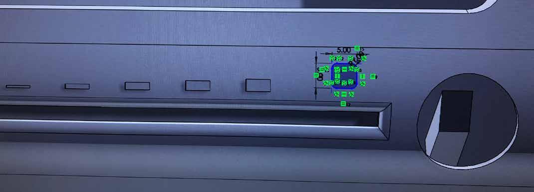
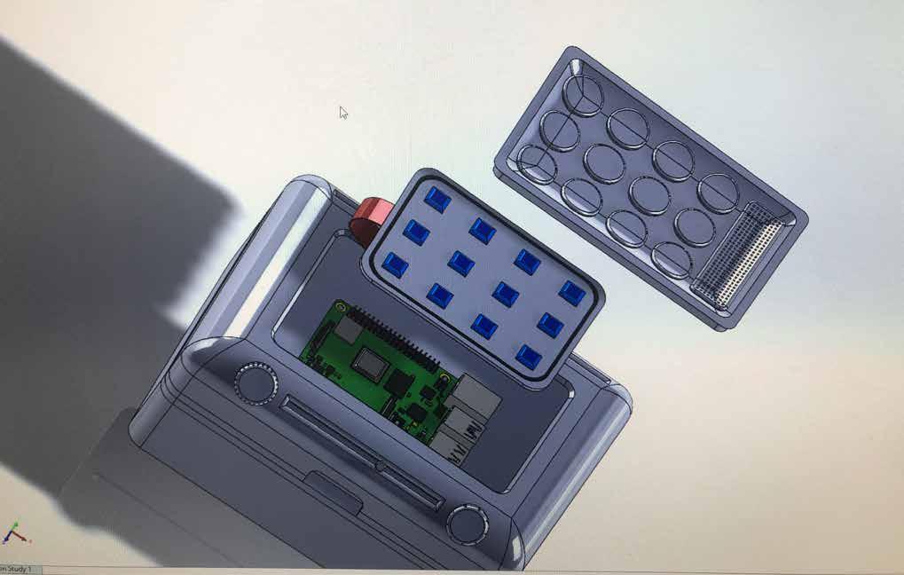
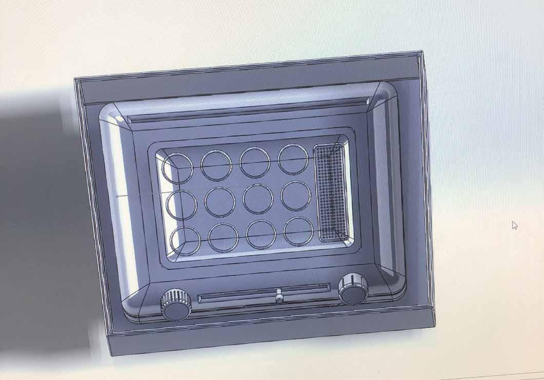
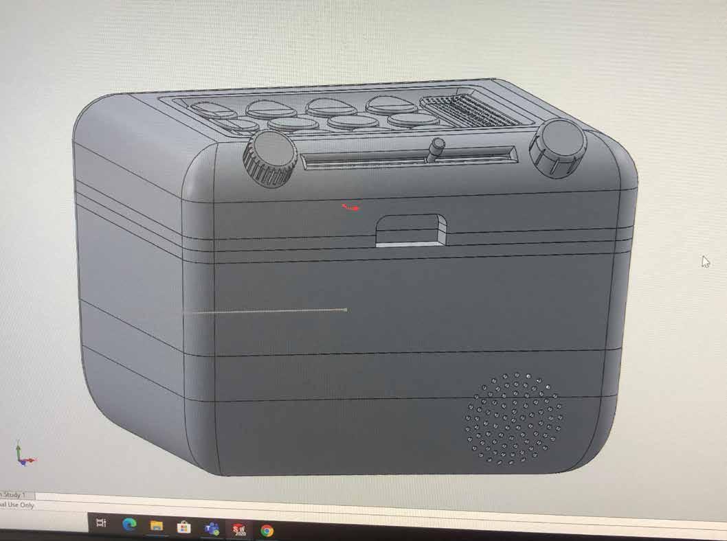
I made a 134mm x 84mm cut into the top plane of the interface shell which would become the base for the buttons and speaker.
Having a chamfer all the way round that matches the interface allows it to snap in and out of its place. The spit line around the interface will be barely noticable, and in an actial model the interface would more than likely be fully attached, however making the model this way makes 3D printing easier.
I created an indented base for the interface to lay in, and extruded holes for each button and the speaker, leaving me with the skeleton of the interface.
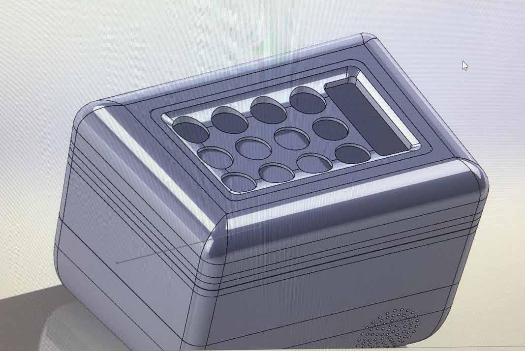
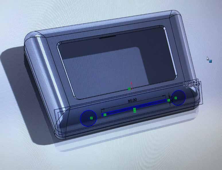
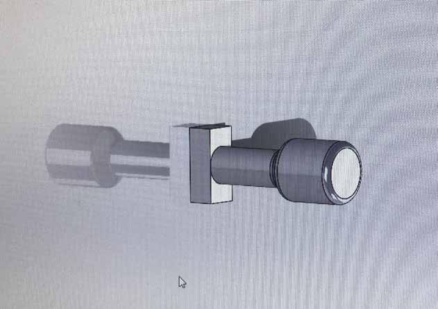
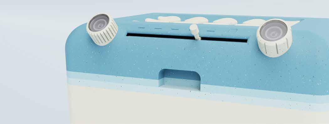
I then added the holes for dials and a straight slot for the volume knob on the front facing fillet of the interface shell.
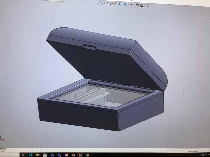
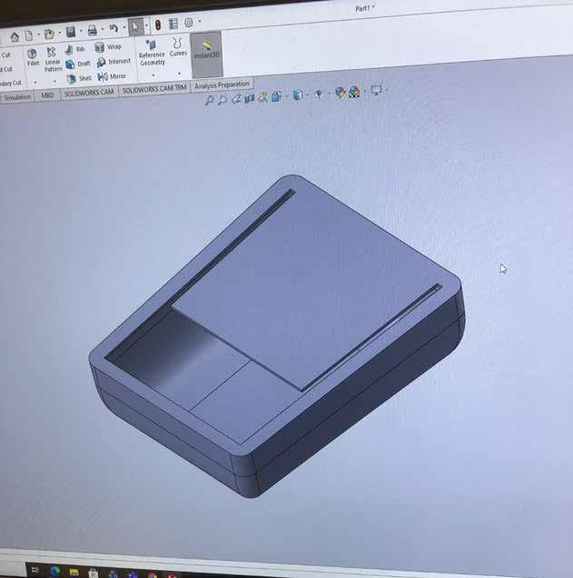
With all of these features complete the model was beginning to take shape.
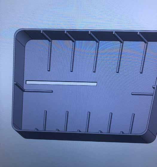
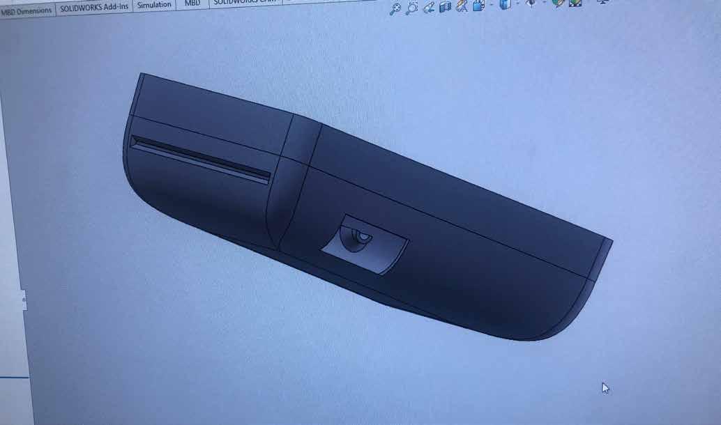
I added a 108mm slot on the rear curved face for the contact card to sit in.
I also gave the interface some base supports to allow the buttons to sit for my 3D print. This obviously would not be the design for a fully wired model.

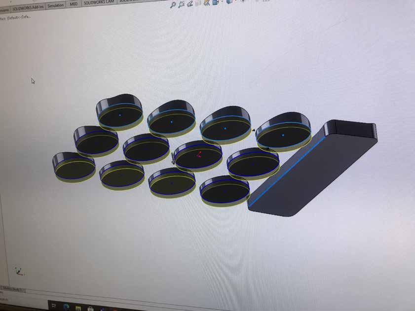
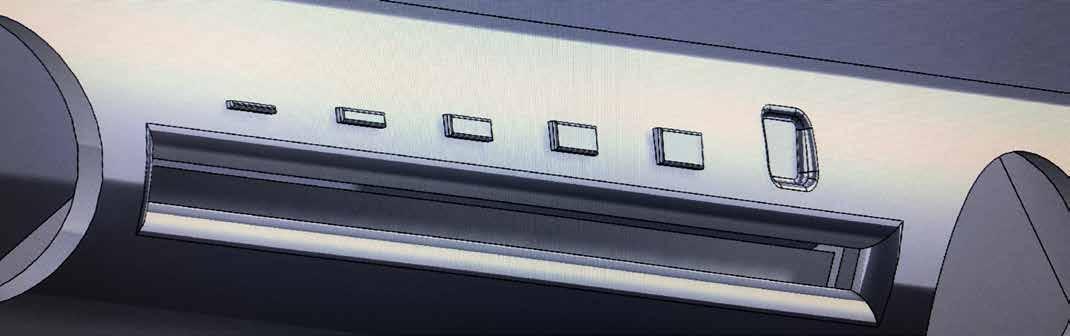
By cutting away the inverse from the original interface model, I was able to create these nicely curved buttons that would match the fillet of the indented interface.
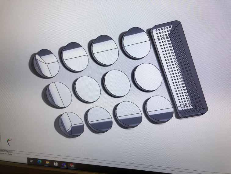
I then added 3 mm to the base of each button and speaker output to allow them to stand out of the indent.
The Interface looked clean and simple, with the slight indent providing much needed depth to the mostly flat outside faces.
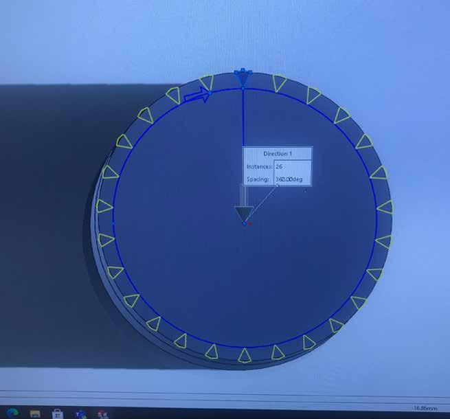
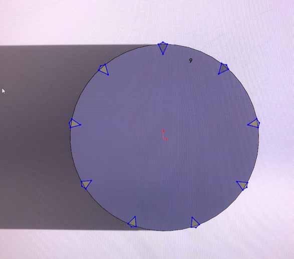
The A-Z dial was given 26 notches to make it obvious that it is the letter dial.
I made the volume slider small and discrete as I didnt want the front fillet to become cluttered with knobs.
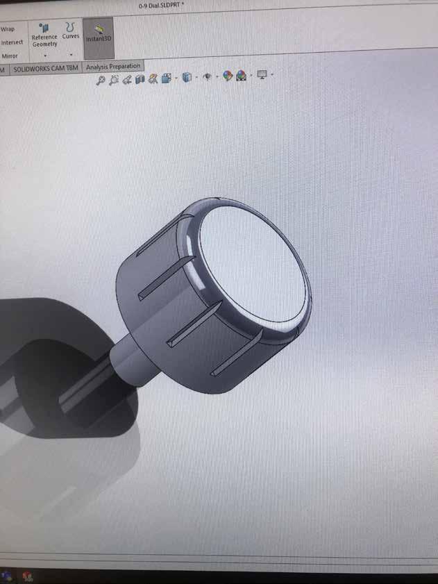
The 0-9 dial was given 9 notches for the same reason as before.
From sketch ideation, I decided that opting for a rounded looking dial would suit the design best.
Studded dials that you see on old radios or even some guitars have a traditional and nostalgic aesthetic, however I felt they wouldnt suit the soft aesthetic I was aiming for.
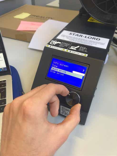
While doing my 3D printing induction, I was using the Creality 10S interface which incorporated a dial to navigate the display menu. I found this to be simple and satisfying, which further strengthened the case for using dials for my interface.
My concept for the on-dial display would work much like most modern smart thermostats, but on a much smaller scale. The idea was validated by the NTU electrical technicians.
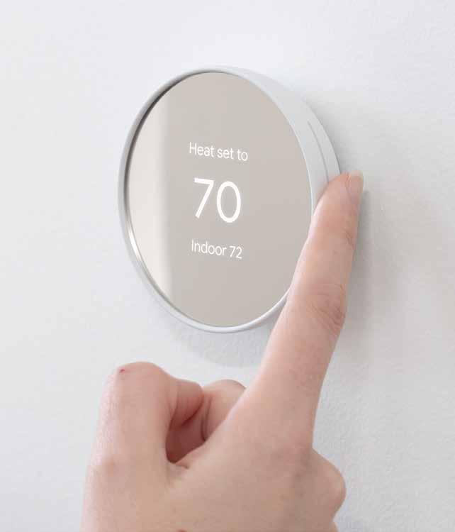
The screen used for my product will be much smaller, only displaying one digit at a time, which should make it a fairly in-expensive electrical component.
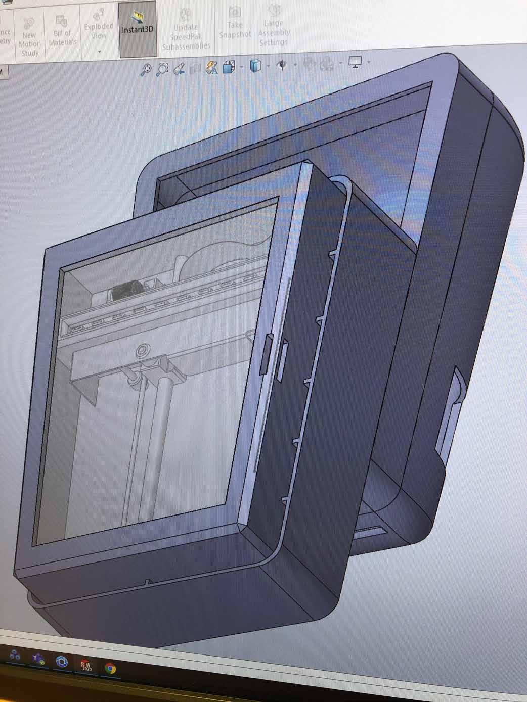
This detail may be innacurate, but it served the purpose of showing the different components in an exploded view.
The LED screen component will slide into the dial shell, wiring directly into the main computer board. The digits will be displayed on the screens, with data stored as RAM on the computer board.

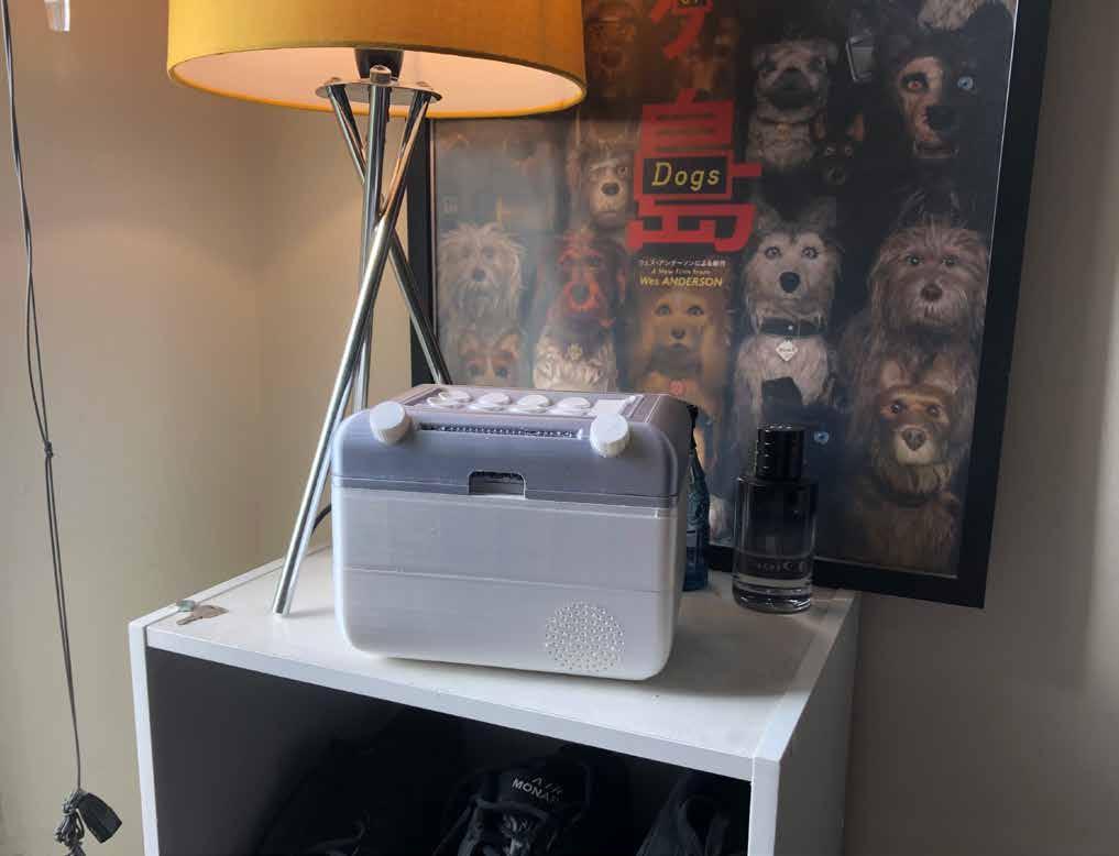
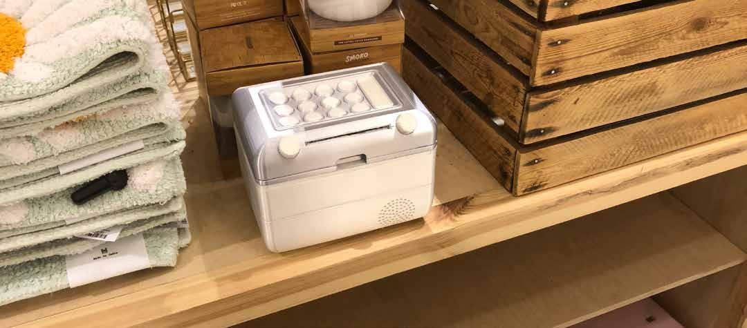
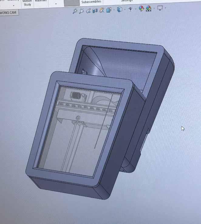
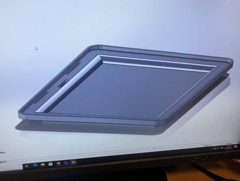
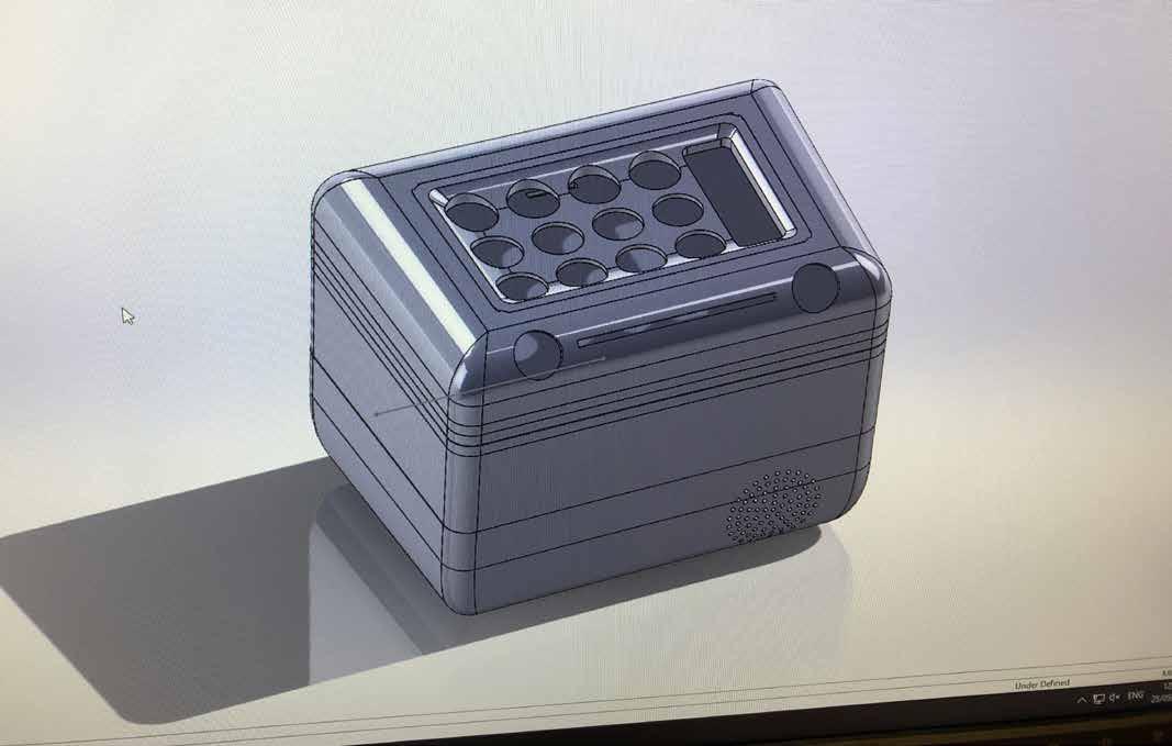
The final model seemed quite bulky, but when you picture it being only 190mm x 140mm, it soon becomes small again.
The hinge and sliding mechanisms both worked perfectly, making me eager to get it manufactured or 3D printed.
Finer Detailing.
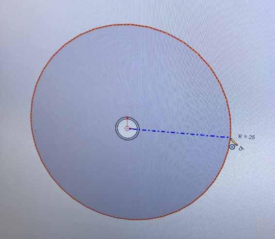
I made a paper roll in SolidWorks just to see how it would sit on the roll holders, as well as seeing how much space there was available for the paper.
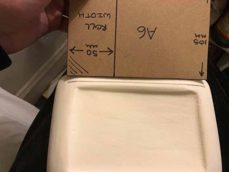
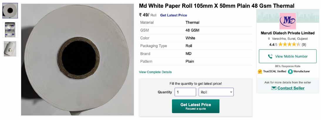
The shell can hold paper of 50mm diameter with a width of 105mm, which is the width of an A6 piece of paper.
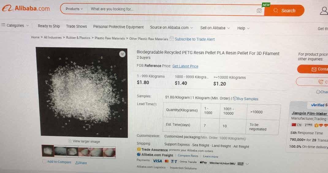
I was able to find a very cheap source of the exact size paper that would be required, although the shipping may increase the cost.

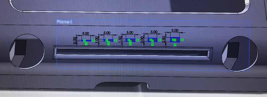
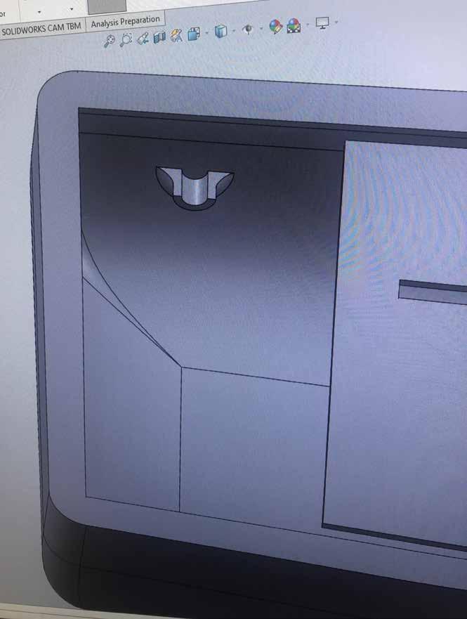
I wanted to make it completely obvious that the sliding knob between the dials was for the volume control, and decided to add volume indicators onto the surface of the front fillet, and also added a space for the hearing aid decal.
Hearing aid compatibility will be achieved with a Telecoil chip on the main computer board that will be activated once the volume slider is all the way to the right.
Telecoil is the most common hearing aid wireless connector, as informed by my near-deaf Grandad, as he showed me the app on his phone he uses to connect his aid to different devices.
Note - This detailing was done after most of the initial renders and 3D priting as I thought about it during the final stages of design.
Some form of hearing aid symbol will be applied to the indent during the rendering process.

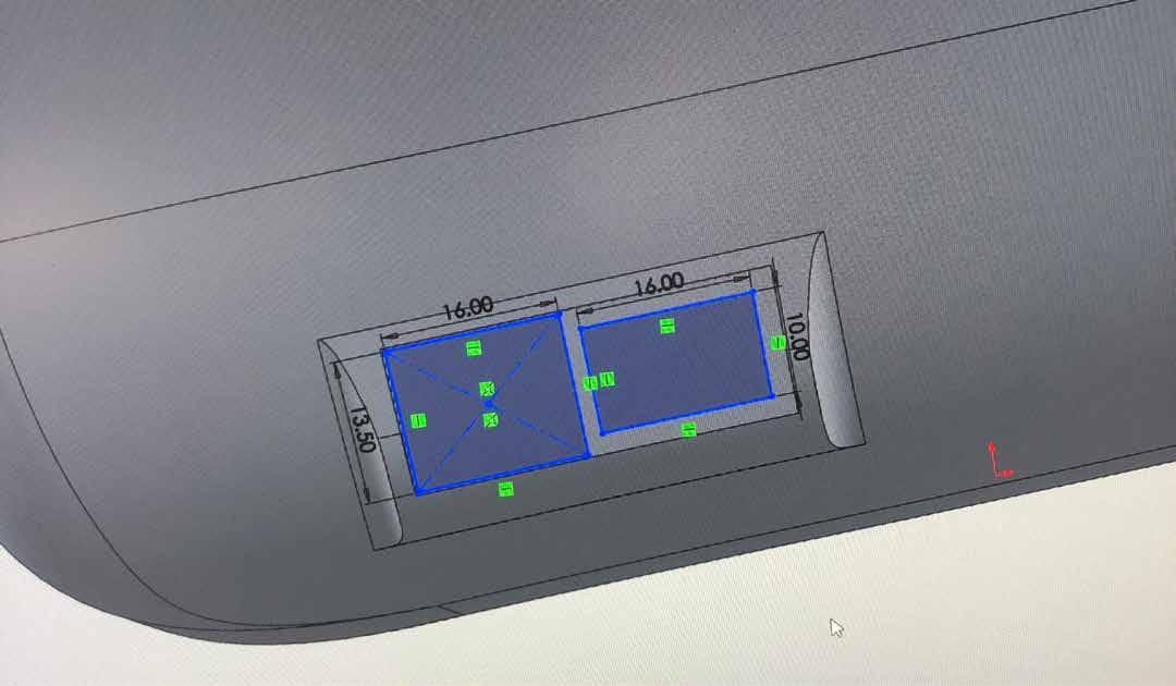
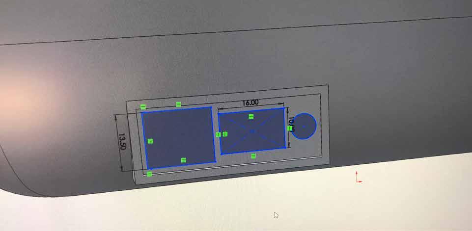
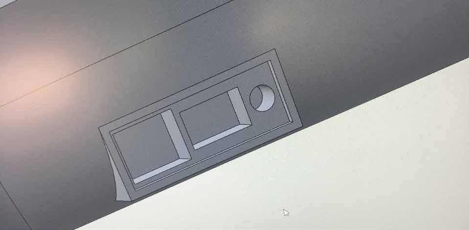
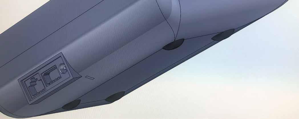
I had left a gap in the rear side of the base for the cable jacks, which would be ethernet, landline and then a power input.

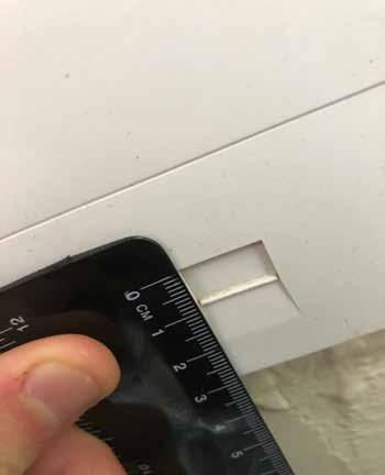
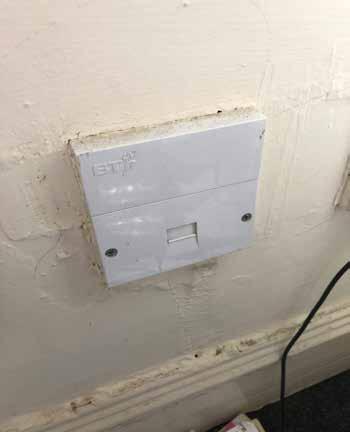
I researched the dimensions of each of these sockets to make the model as accurate as possible, however I couldnt seem to find the size for a BT jack anywhere, and resulted to measuring a landline jack I had in my room.
With the accurate sizes mapped out on the socket board, it became immediately apparent that it was too small to fit the power input aswell, therefore leading me to extending it out so that all jacks could fit neatly on the same board.
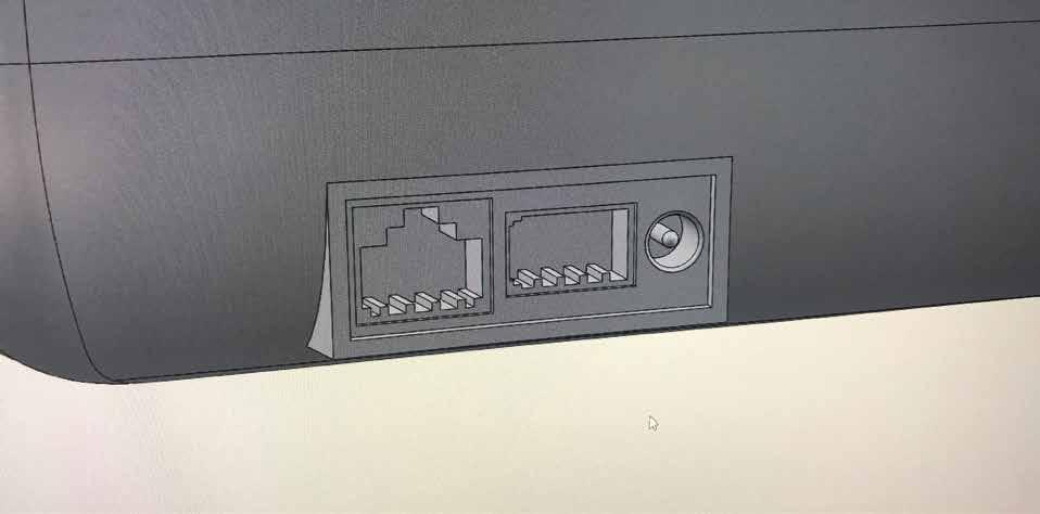
Modelling the plug sockets proved simple, and at this point
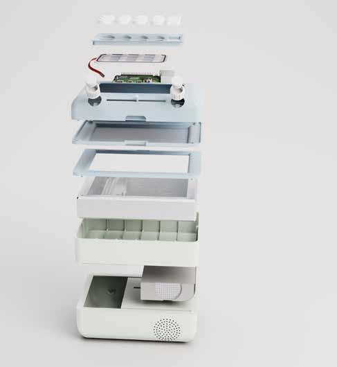
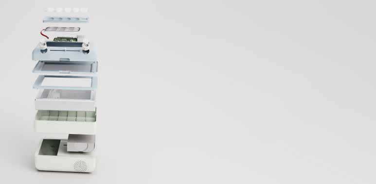
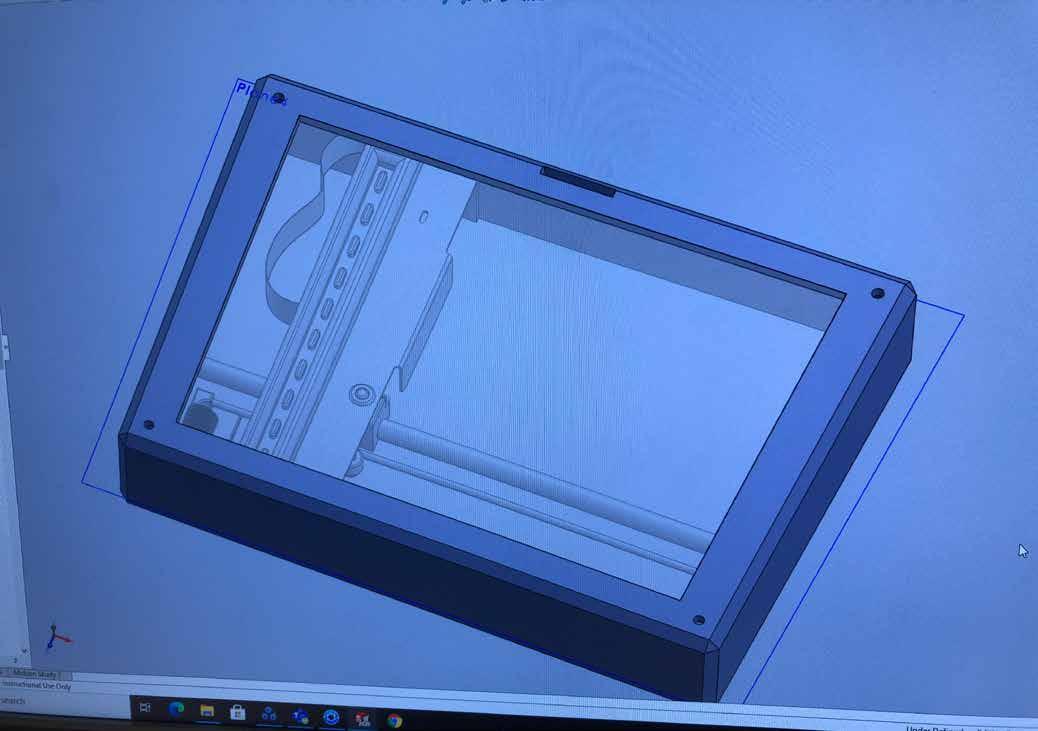
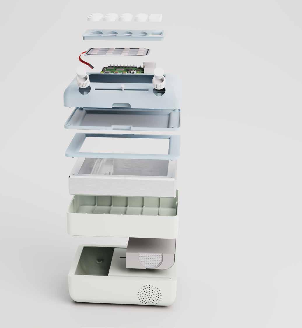
I decided to detail the model as much as possible to provide an effective exploded view of all components, as well as giving myself a better idea of where the internal parts will be positioned.
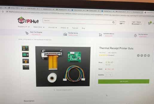
The thermal printer will most likely have to be custom built, increasing the manufacturing costs, but the price is something that I am less concerned about due to the high retail prices of any other communications device on the market.
This model was merely a placeholder, as I only required it for one render, with all others only seeing the outside faces.
Wiring sources for each electrical component was positioned on top of the cable input box, with cables threading through the slots in the scanner shell base and printer shell roof.
At this point I began to wonder how my product will connect to other devices, and what circuitry would be needed to make this happen.
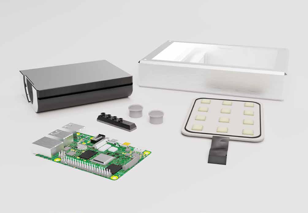
Raspberry Pi is a programmable circuit board that can be altered to suit any needed systems, whether it be network connection or just generally inter-product connections.
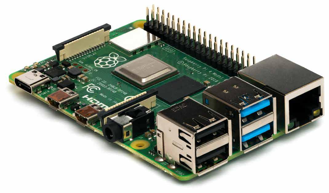
The circuit board would serve as the brain of my product, powering and providing data for basically all elements, including the interface, speaker, dials, scanner and thermal printer.
The circuit board will need a 5.2 V power supply to work, which will be obtained from the D.C power input in the base, which will then be split/ regulated to provide the required power for each component.
A LAN card will also allow ethernet devices to connect to landline, and vice versa, meaning cross-compatibility.
A second visit to the electrical engineering technicians allowed me to make much more sense of what I had been told originally.
Technicians Matt and Susan were very helpful in making me understand the assembily, where components needed to go and how they will connect.
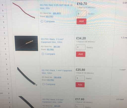
I suggested using a ribbon cable to transfer data between components as it will be less intrusive than having visible open wiring, which was agreed by Sue.
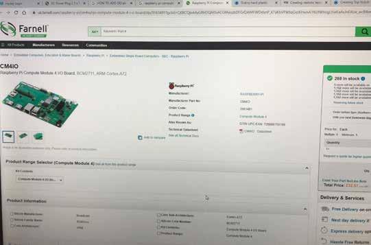
The Raspberry Pi Compute Module 4 was identified as the most ideal variation of the circuit board, as it contained all the elements I would need for my product to connect internally and to other devices via network.
I was able to find the exact circuit board that will be used, which was scaled down to the accurate size of 85.6mm x 56.5mm to ensure realism in the exploded render.
I added a block to the board to represent the LAN card and also added a Telecoil connection to allow for hearing aid compatibility...
This was then positioned in the interface shell underneath the interface part.
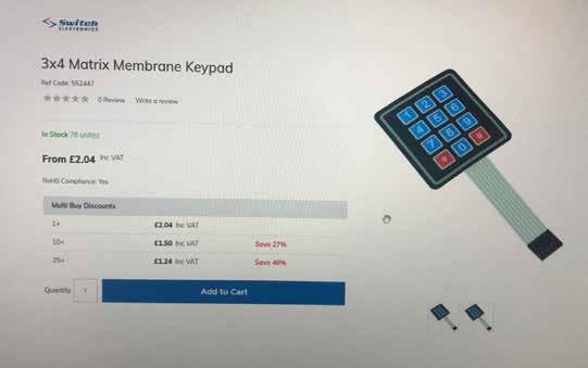
I couldnt find a keypad membrane that fitted perfectly, and therefore made a quick model for the exploded view.
Power distribution- Scanner - 5V - Thermal printer - 5-9V - Speaker - 5V
- Raspberry Pi - 5.2V
- Dial screens - 2-5V
I was able to gain a lot of information on the internal components, what I would need and where they would go, as well as the peace of mind that Susan and Matt both said the product would work with all the correct machinery.
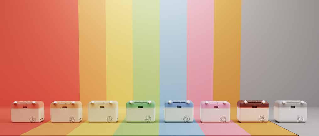
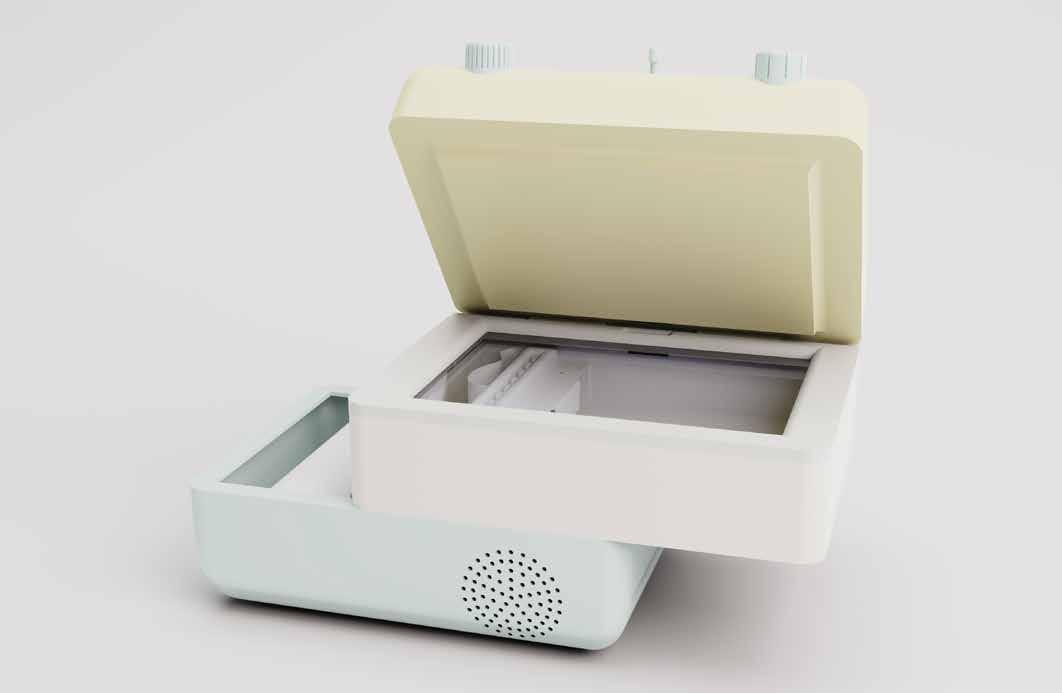
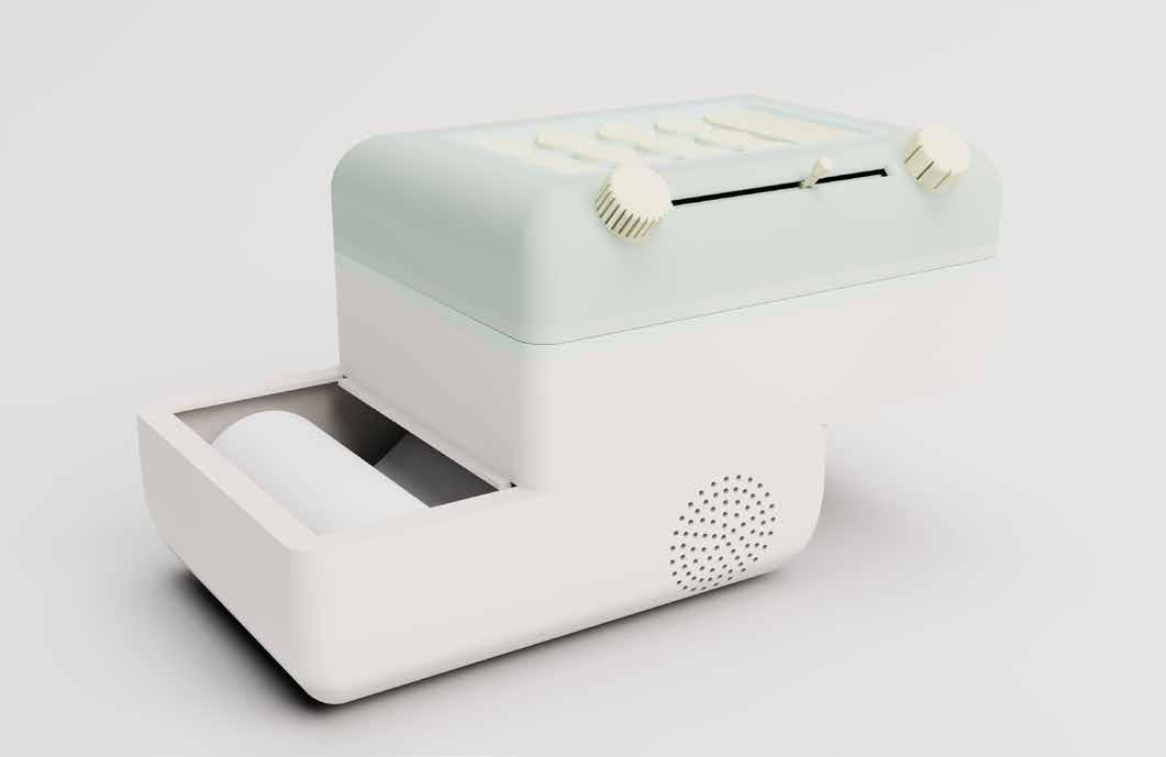
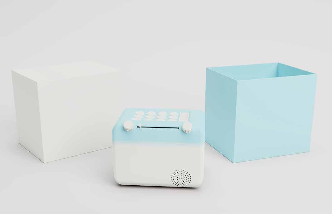
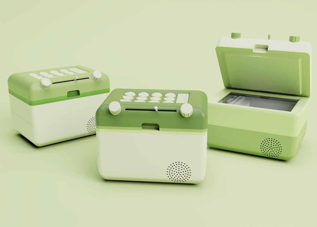
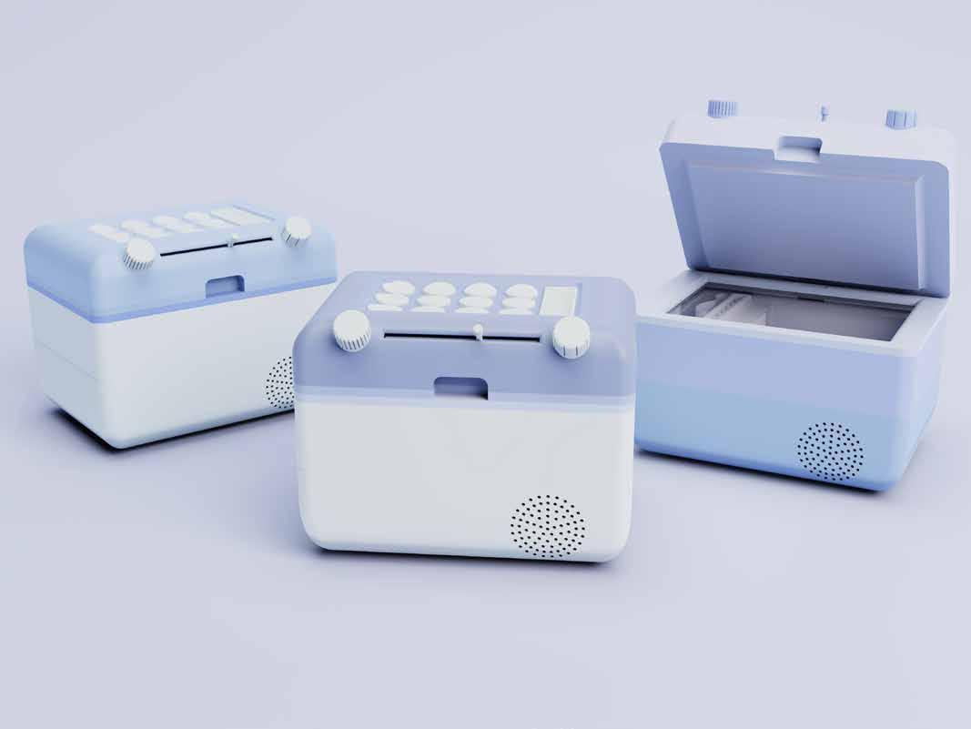
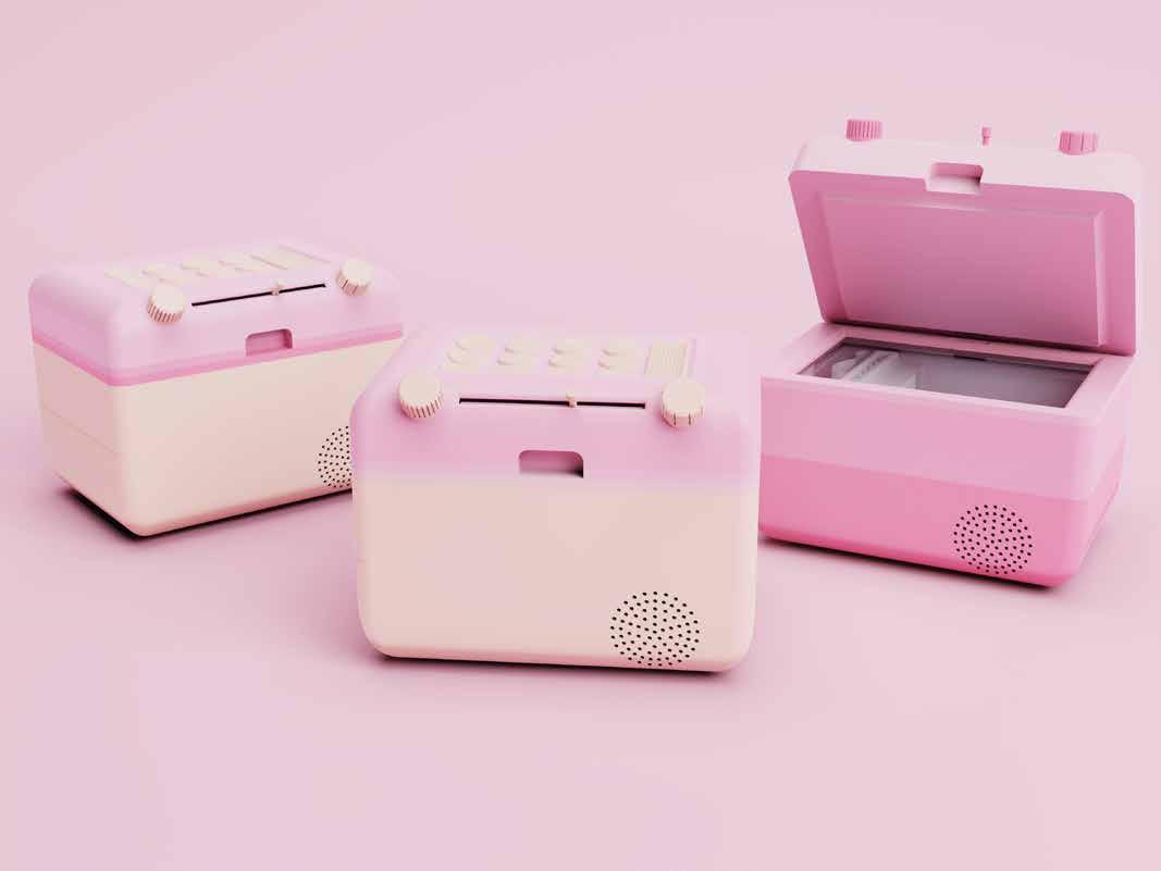
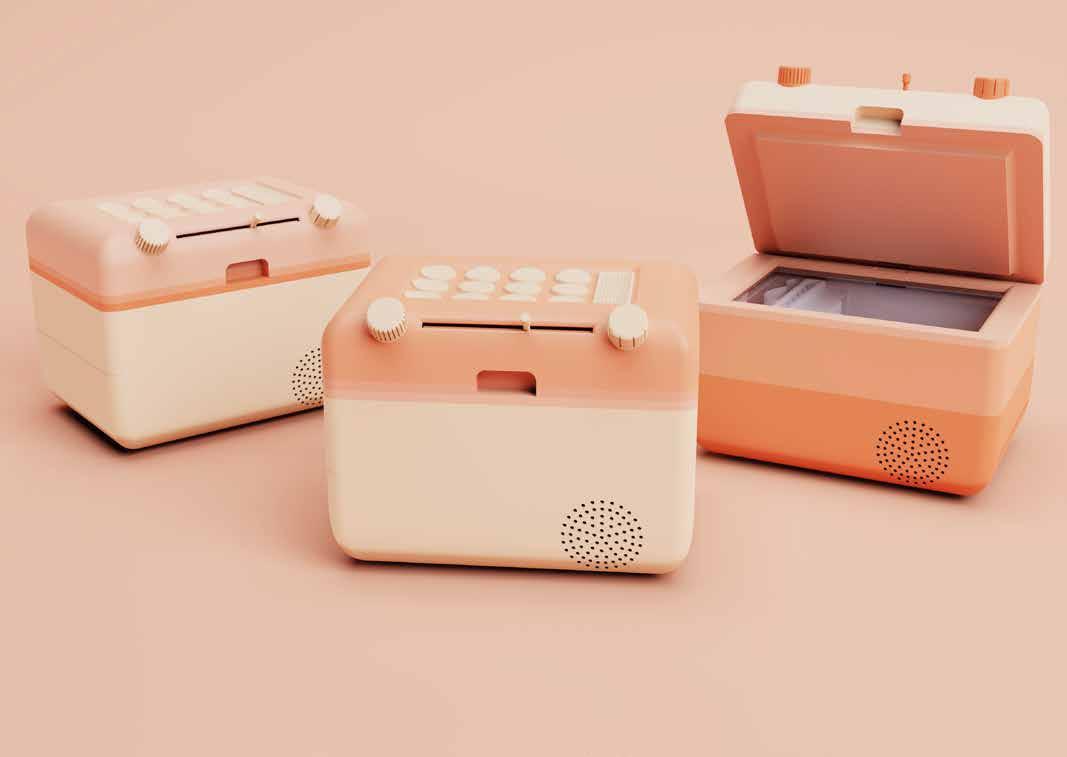
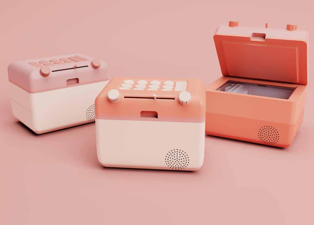
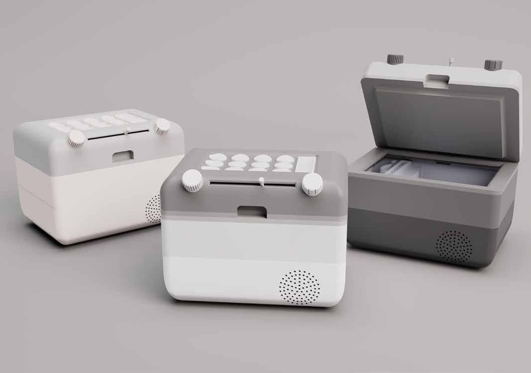
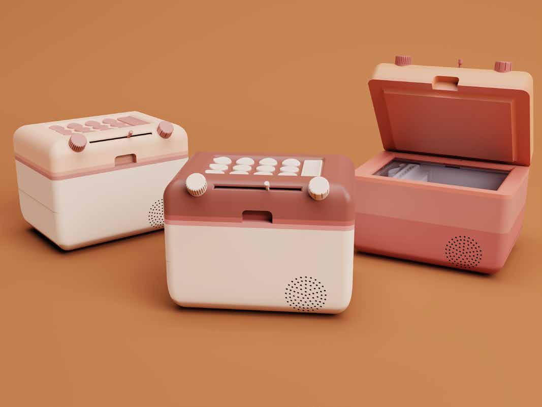
With all 3D modelling a technical testing done, I produced some initial Keyshot renders to see what the product would look like with some colour.
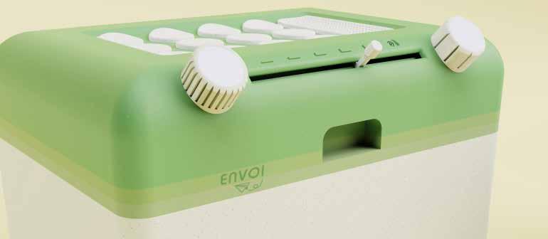
Gradient of layers between scanner and interface is a very nice design touch, slightly similar to the polaroid colour stripes.
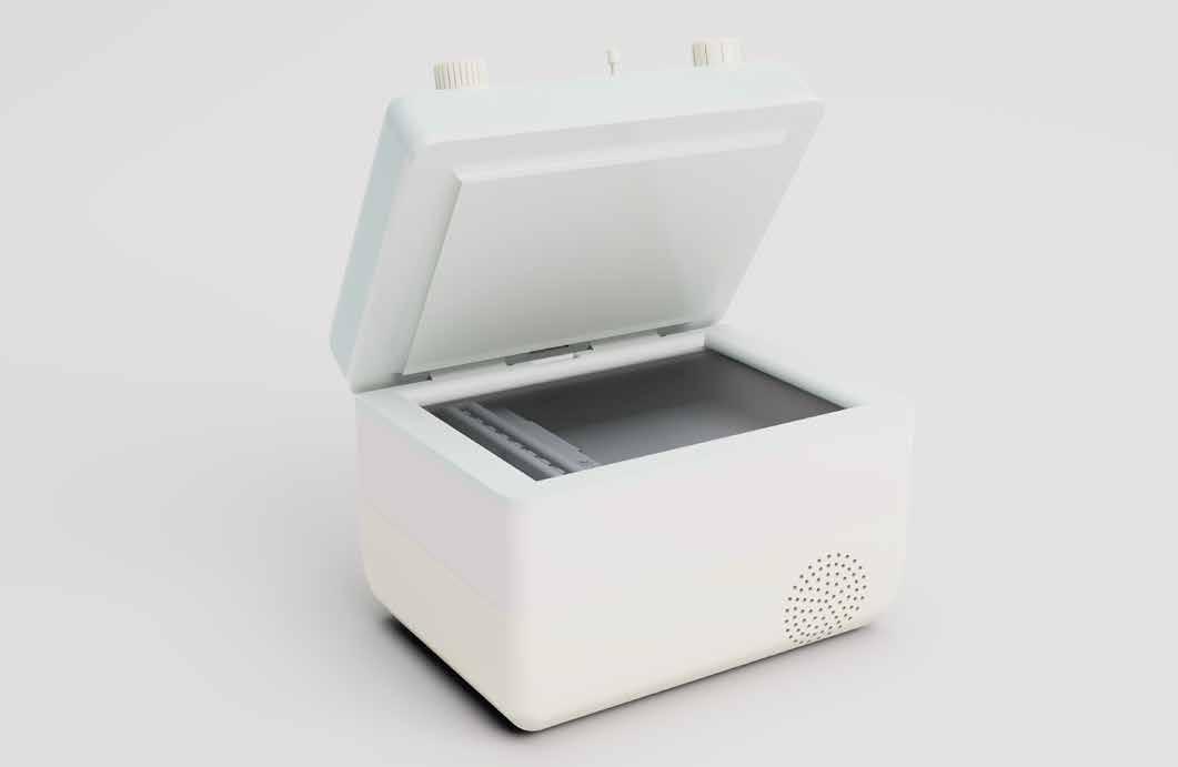
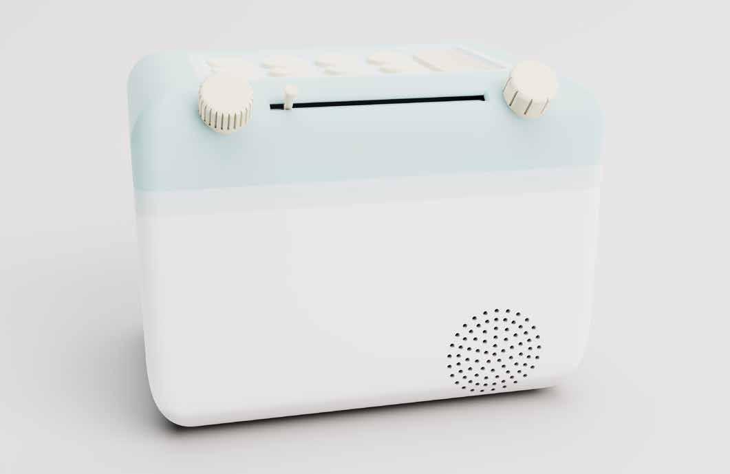
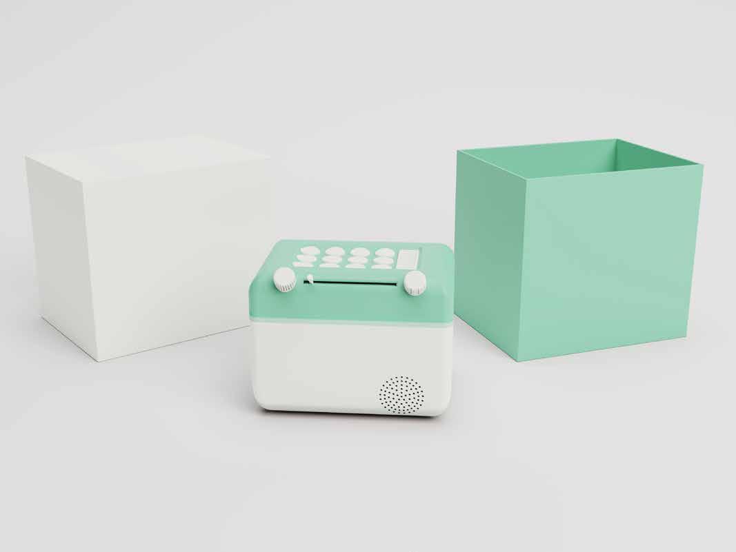
Having 3 layers of colour is less effective than the gradient in my opinion, as it breaks up the product and makes it look like a flag.
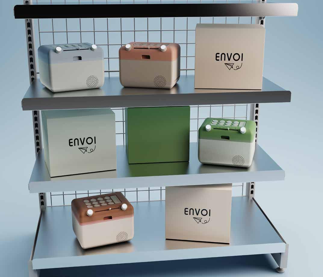
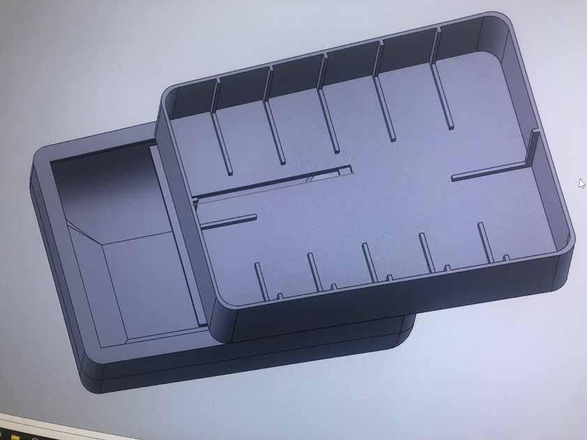
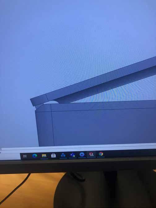
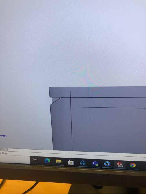
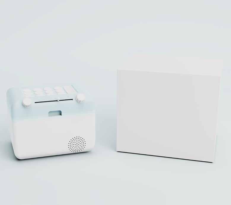
Now that I had a final model with accurate dimensions, I decided to look into the packaging of my product, with Apple packaging as a key inspiration point.
Every part of the packaging is designed to be clean and direct. The design is simple in a world of clutter and constant sensory over-stimulation.
Apple’s iconic sensory experience is the expression of the absence of eye-grabbing colors and images. And that minimalism is exactly the thing that attracts the eye.
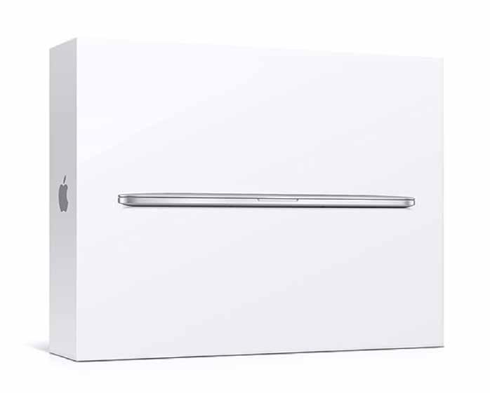
I knew as soon as I started refining my concepts that the product would suit this style of packaging, and especially the sliding box opening mechanism.

My initial dimensions were too small, as the product would barely fit within the walls, making it difficult to prize it out of the box.
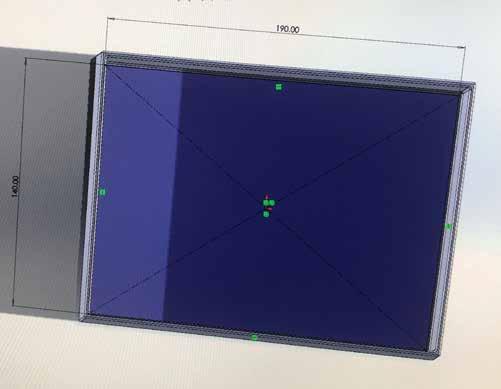
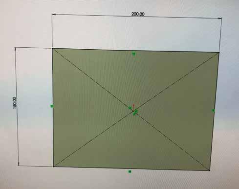
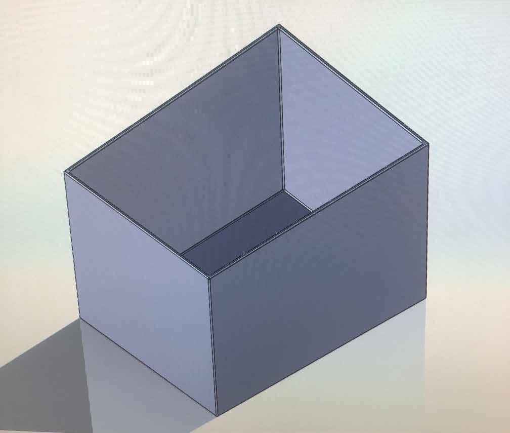
By having a 15 mm allowance with the packaging, there is more space for protective insulation as well as other components that need to be included in the packaging, like the power cable and network cables.
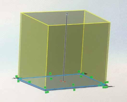
The packaging height of 200mm is a perfect size for the product while leaving roughly 50mm of vertical space for any other added components.
Keep top part clean and minimal, with branding/ logo decals.
Add writing, product info and graphics onto coloured section as it wont be seen when packaging is closed.
Match colour with product highlight.
A DC power adapter, landline cable and ethernet cable must all be added to the packaging, along with the contact card and main product.
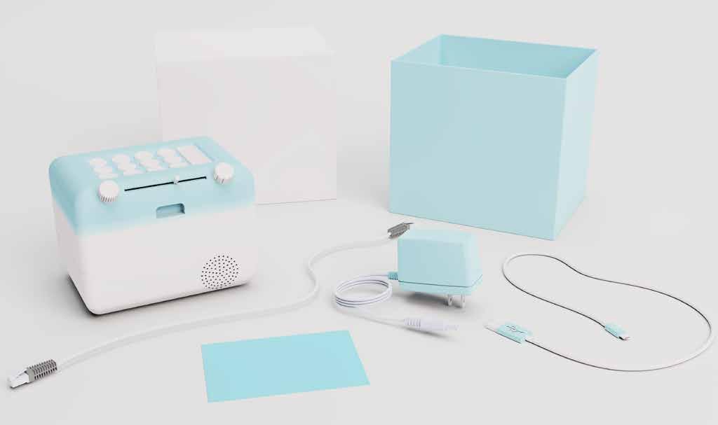
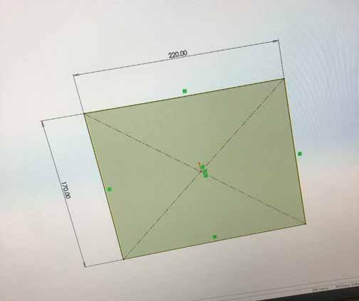
Product dimensionsHeight - 145 mm Width - 140 mm Length - 190 mm
Packaging dimsbase height - 150mm width - 170 mm length - 220 mm top height - 156mm width - 176 mm length - 226 mm
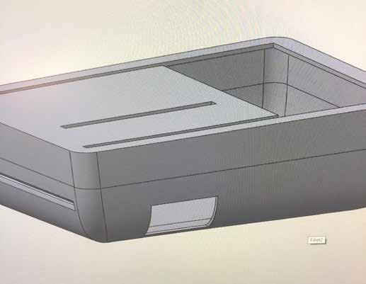
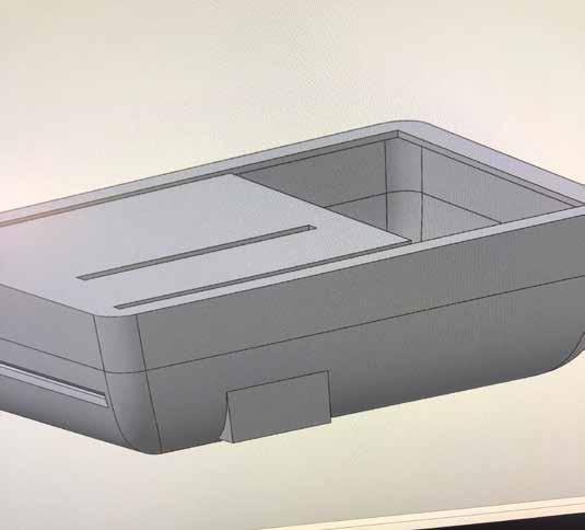
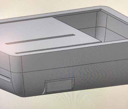
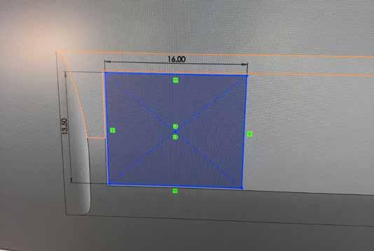
After completing initial renders, it became clear that the front face was too flat, mainly because I had forgotten the finger handle to open the interface lid and reveal the scanner.

The see-through plastic feature displayed in previous sketch pages looked very effective and gave another interactive element, however after seeing the soft aesthetic of the initial renders I decided not to encorporate it as I liked how welcoming and simple the design already looked.
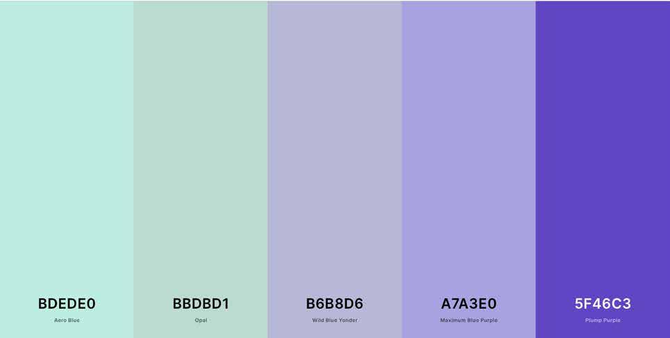
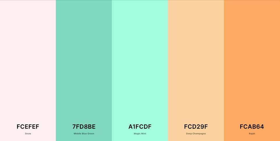
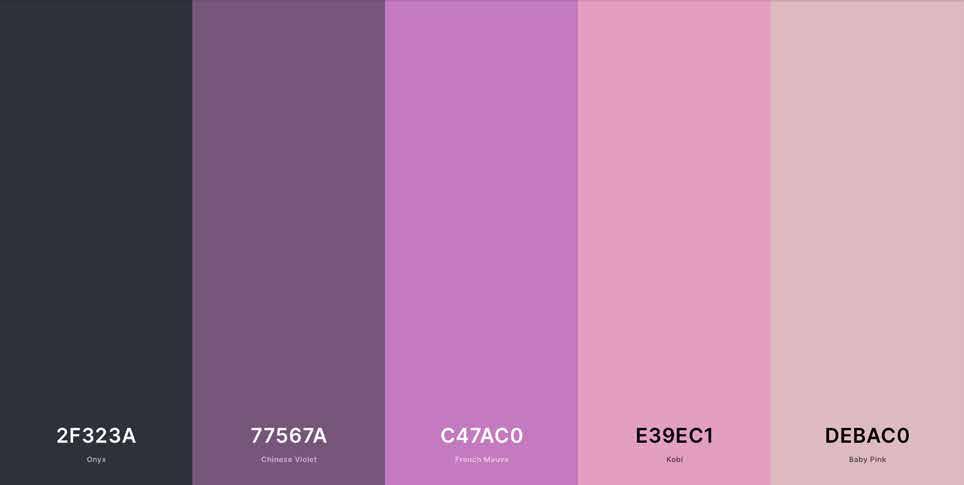
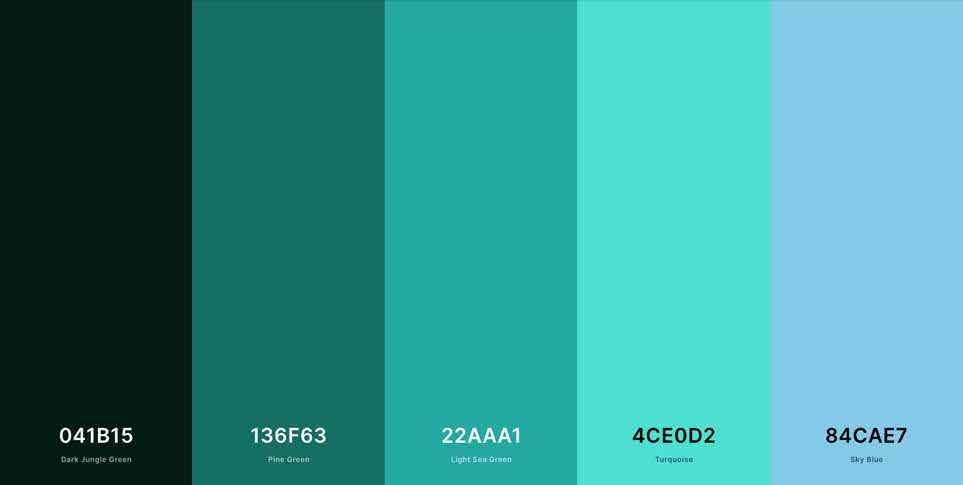
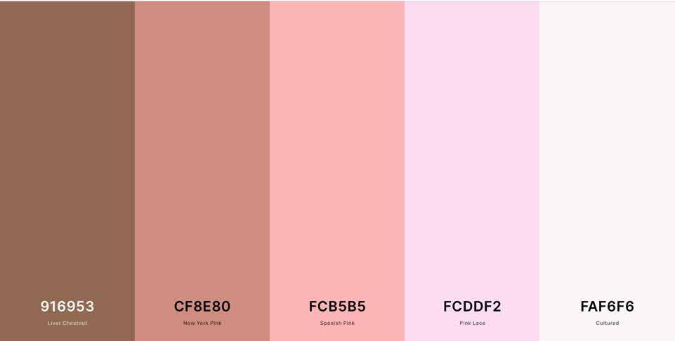
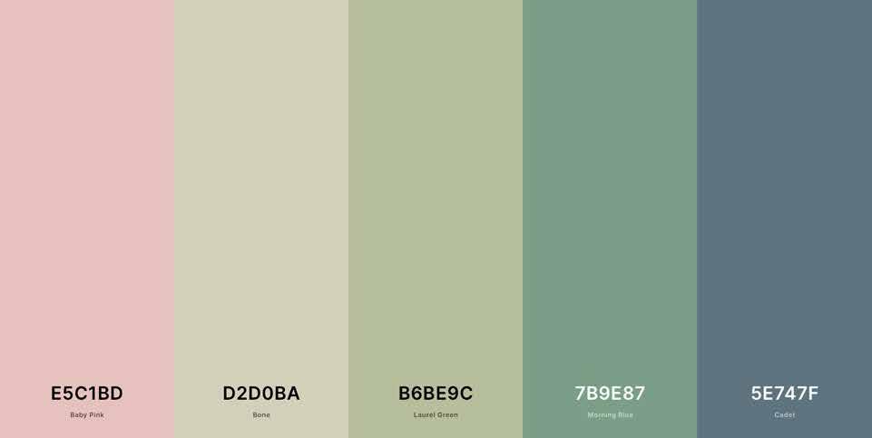
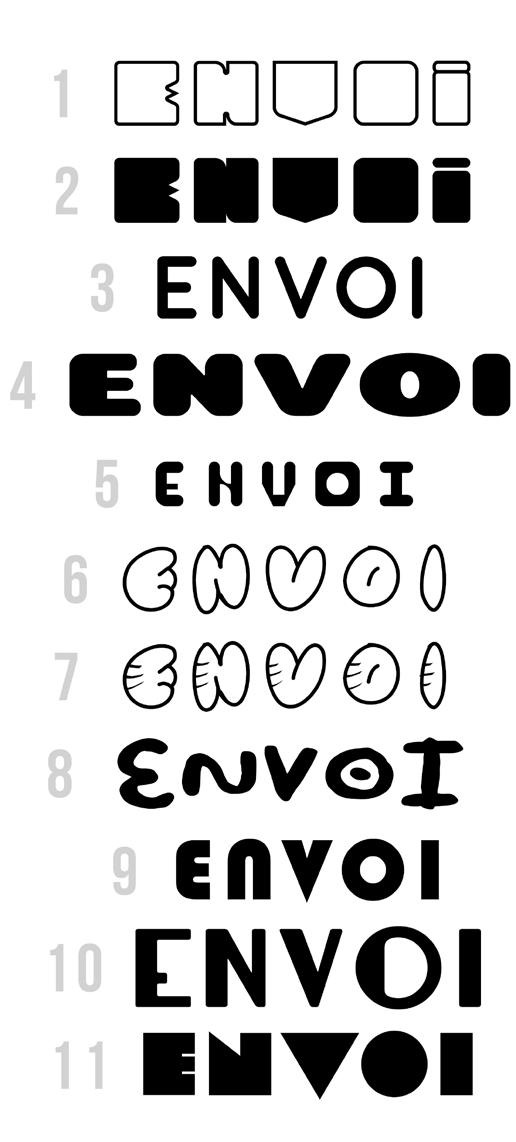
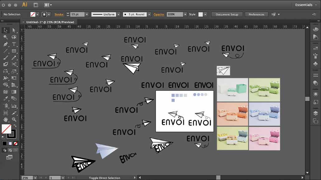
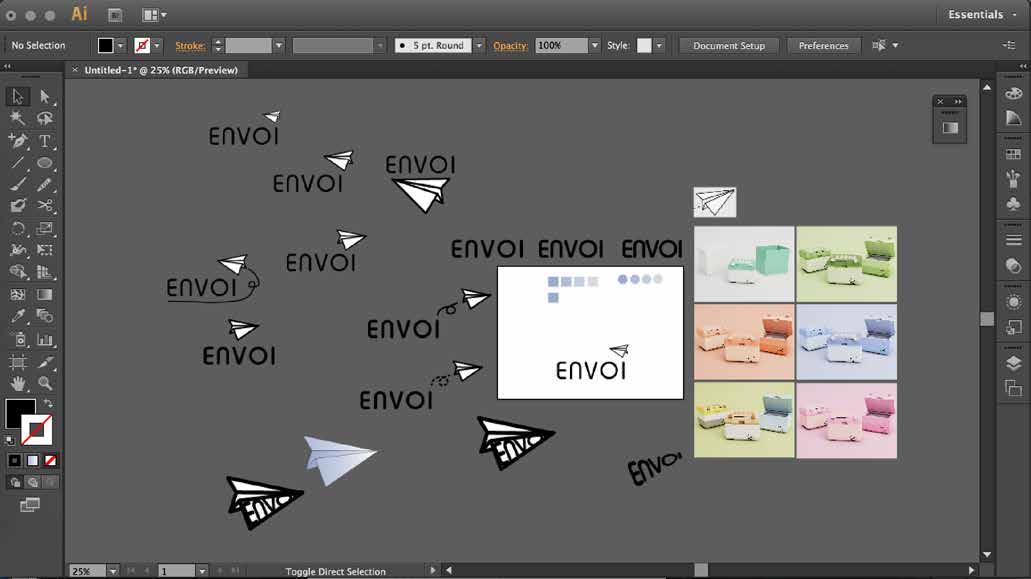
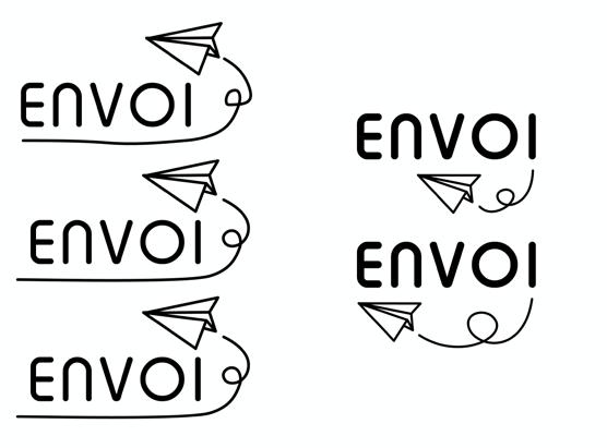
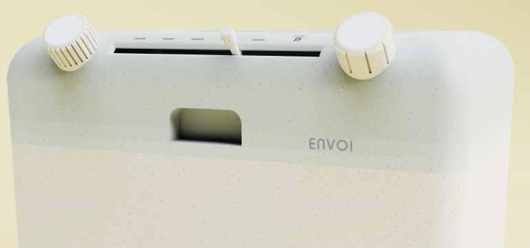
With all 3D modelling complete, I began to build up the brand of my product, starting with finding complimentary colours that could accentuate and refine the design.
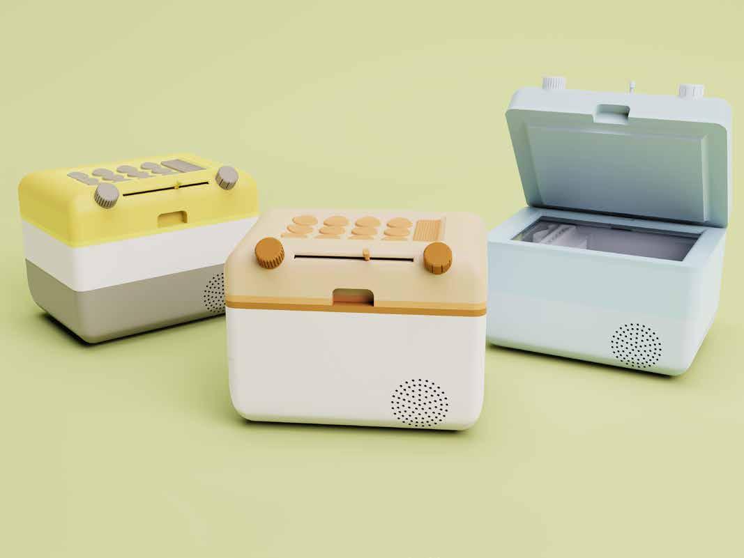


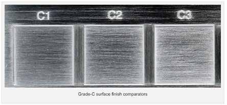
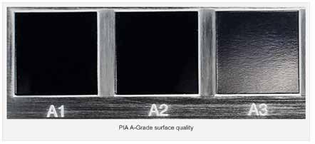
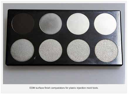
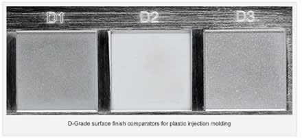
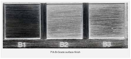
 created by Polishing
Finishes made by Sandpaper
Finishes made with Grit Stone
Finishes made with EDM
Finishes made by Blasting
created by Polishing
Finishes made by Sandpaper
Finishes made with Grit Stone
Finishes made with EDM
Finishes made by Blasting


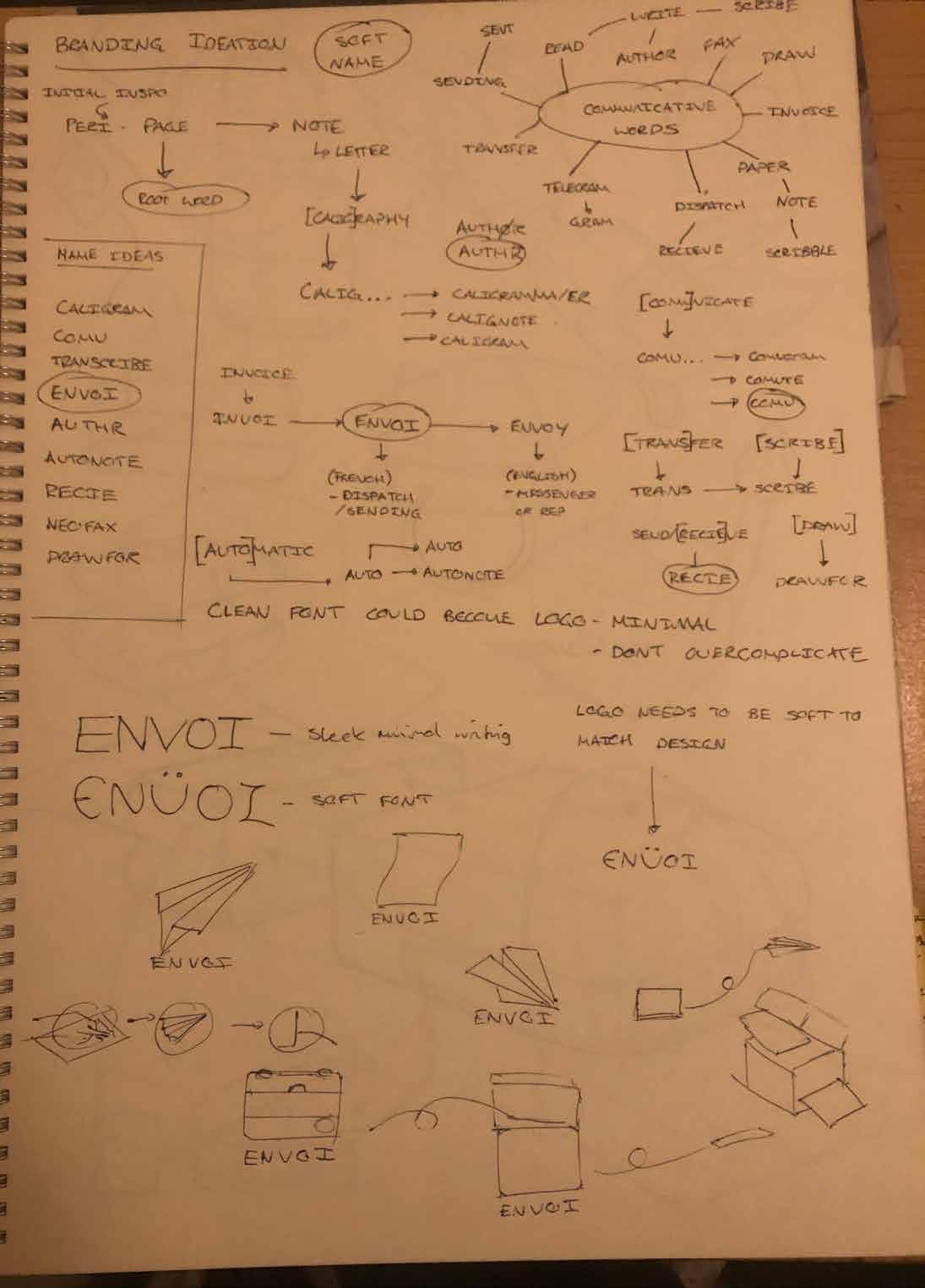


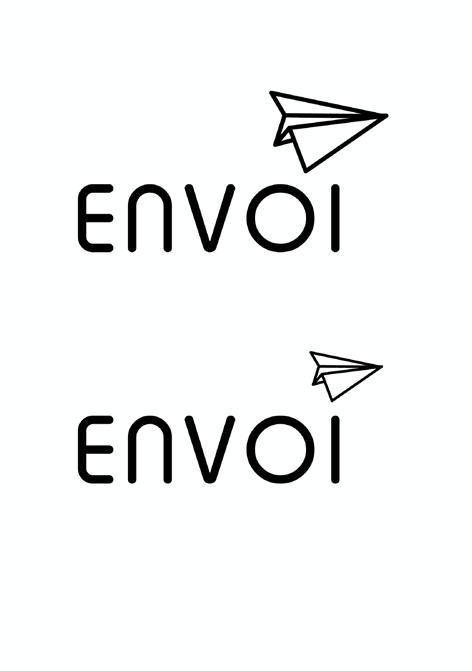


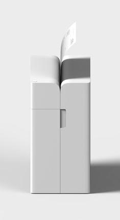
 ENVOI. Designed by Adam Parrott. Model (8APE4)