
Realizados
Suenos
I. MEET THE ARTIST
II. INTERVIEW
III. A COLORFUL SYMPHONY
IV. ART REVIEWS
V. FINAL THOUGHTS
VI. Art Index

Hello! My name is Alexandra Courtney and I am a 20-year-old CommD Major at Pratt Institute who specializes in Illustration. I also go by Alex, Alexa, Mya (thanks Dad), Xandra, it’s all good.

The role of a designer is one that carries the responsibility of planning and producing works that are meant to interact with the world around us. General audiences consume what we put forward and what we put forward undeniably has an impact, no matter how small, on the audiences we manage to reach. And moving forward as a designer, a self-conscious awareness of what I put forward begins to manifest itself into what I produce. It makes me acknowledge and embrace what inspires me so that I can move forward in making art that emulates what I want to express to the world.
And what inspires me to design is my culture. While some of my work features themes from the unrealistic, strange, and supernatural to the realistic and literal all bundled up in explosions of color and detail, I’ve found that the work that resonates with me the most is often inspired by not only my personal interests but also my culture.
It comprises the culture of various hobbies I enjoy like listening to music, playing games, the occult, or literature. It acknowledges the culture share with those who bear the same
The term culture is such a large word.
Name: Alexandra
nickname: AlEx
AGE: 20
Sign: Aries
Major: Illustration
• NIghT Owl
• RESIDENT New Yorker
• PANAMAnian/Mexican
ITems
Fun Facts:
• Favorite Artists:
• Distubed, Linkin Park, Hozier, The Cure, MCR, gorillAz, eTc.)
• Makes own Earrings
• Iced TeA FAn
• Loves Animated Media

• HAs GenerAlized And Social Anxiety
• Was valedictorian in HS
• Uses ANY Pronouns
• Former BAND & ArT kid
• loves FUN MAKEUP
• Always in need of sleep
in Alex’s BAg: 1. WAter BoTTle 2. Ipad & Pen 3. kEYS 4. Airpods 5. HeaDPhonES 6. LipGloss 7. chargers 8. Laptopresemblance to me, my hair, skin tone, and size coming to mind first and foremost. And it also recognizes the culture I share with those who identify as the same ethnicity that I do. All of these cultures that I am comprised of make me who I am, and they are points of reference that I take inspiration from when it comes to designing. Even quite literally when it comes to pieces that feature me as my own model and point of focus.
someone on a personal level, the very same way I wish I had been able to have when I was younger. I think it’s the reason why becoming an illustrator resonates with me so much. We are so much more than just “artists”; we become visual storytellers who can bring to life what was thought to only be limited to words.
After countless years of not seeing yourself, any aspect of yourself in any capacity, it can become disheartening. It has taken a long time for me to push past the idea that people like me, who share my same values, ethnicity, gender or sexual identity, and interests, don’t belong in a space. And as a designer, it is my hope that my work, despite being perceived as odd or strange, can resonate with
Telling stories of becoming comfortable with my appearance, being proud of my culture, and being proud of who I am as an Individual. And I want those stories to speak to someone who could use them. It’s quite literally my dream.
My interests, my culture, and my own person aren’t something to be ashamed of.
I want to become an artist who can help others express their narratives and tell their stories visually before eventually telling my own.
Esta es mi razón de vivir; This is what I live for.


A: Honestly, I don’t know if this will seem super vapid or anything but I initially wanted to go to Pratt because a past high school teacher of mine suggested this school to me. She said I’d be a good fit and I said “Good enough for me!’ I did do research afterward and I value its location a lot. It’s close to home but distant enough that I could flourish on my own. I think New York is just an amazing hotspot for culture and art as well with all of the museums and the other art schools here.
If we want to talk about why choosing art school, I felt like it was the only option. It felt right! I’ve always loved art. I’ve been drawing since.. forever. Drawing vampire and werewolf girls, ponies, fairies, etc. It’s such a big part of me that I didn’t feel compelled to really do anything else. Can you imagine me as a lawyer? Probably not, but it was either that, a history teacher, or an artist.
My family had always wanted me to use my “big brain” for something that really mattered and I decided that art was what really mattered. Illustration was something that I just happened to, fortunately, stumble across because both ‘Fine Arts’ and ‘Graphic Design’ felt too restrictive for me. I knew that while you could learn Illustration from books and self-driven courses on your own, it doesn’t really beat sitting in a class with professionals in the field that you are interested in, learning curated materials to better your skills and artistry. Well, I guess it does beat it in price haha. But I knew that when applying here and generally just how much of a privilege this kind of education really is.
A: My process is all over the place! My process in making art typiically follows a general format that changes depending on the time allotted and the kind of project I’m doing. The key parts to it-are Research, Gathering, and Doing.


The research part takes the longest and can be the most fun at times. Doing my research, and doing it properly at that, allows me to put forth well-thought-out projects so that I can cover a lot of information with my projects. I do love to inform! So many references to pull from and look at, and it makes planning a project very fun.
Gathering refers to my gathering of assets for a project. This can mean really anything: from getting my needed materials in making a project or making small illustrations to going into an animation.
The doing is just me sitting down and getting to work. That’s really all it is. I can just sit there for hours with the goal of completing my project and then boom, it’s finished. Music really helps me stay on track and I’d sincerely advocate for using music during your working time. That and finding a a comfortable place and position to work in.
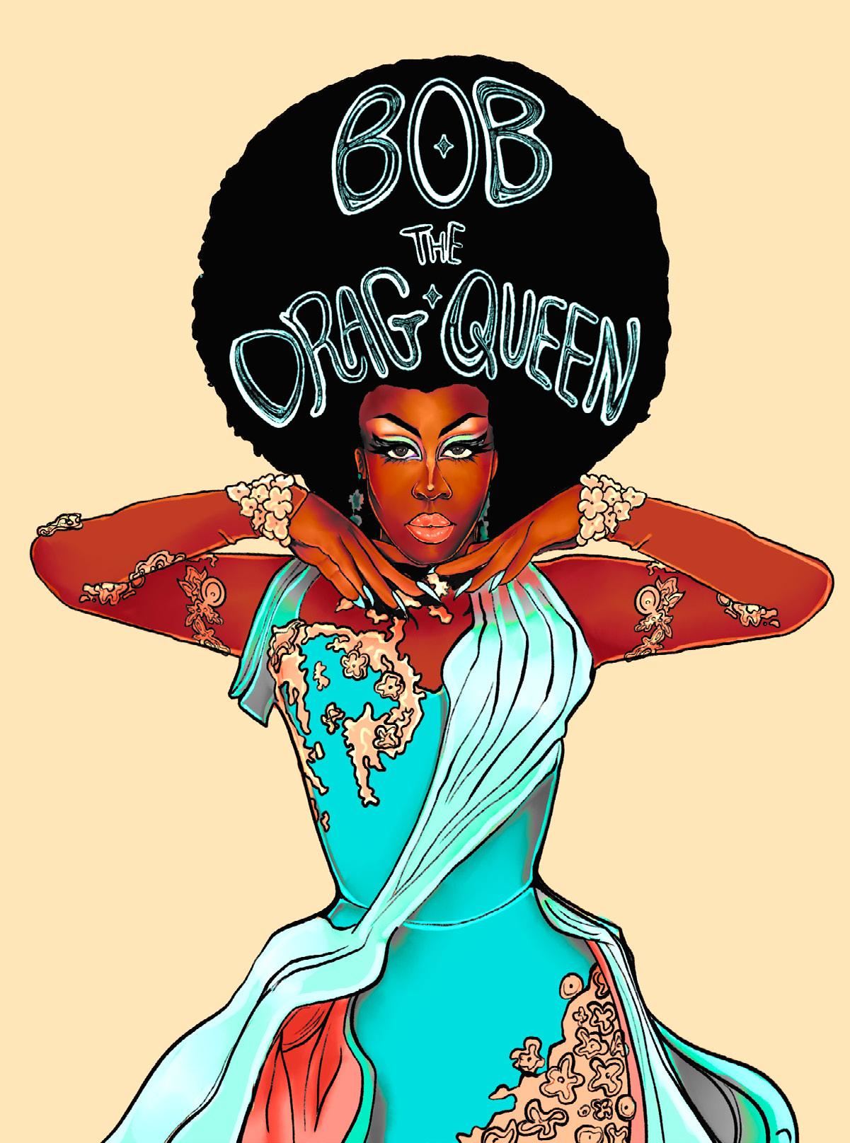
A: Just one? I think one of the hardest projects I’ve had to do was my coding project in Digital Prototyping. I had to make an interactive biographical poster and I chose to talk about one of my favorite Drag performers, Bob the Drag Queen. Despite me engaging with the software in class and for homework, I was clueless about P5.js. It was really frustrating trying to learn such an experimental program when you don’t have the time to mess around. I had to not only draw elements for the poster but I had to import those illustrations, add sound into the project, and add buttons, it was a nightmare. But I got it done and Bob herself even liked the art I did for it. I almost cried. My animation assignments have also not been the kindest to me. I want to five them the love and attention to detail I’d normally give every project but time isn’t always on my side.


A: I could talk about my Research, Analysis, and Process final for ages. I had to compile 10 photos for a couple of weeks and then make 2 new images based on the 10. My professor disclosed the final would result in us making 4 posters, album covers, etc. based on whatever concept we created. Now I don’t know how, but my brain automatically went “You are making a monster band, Alex” and I went “Okay.”
As I worked on it I began to sort of narrow the scope of the assignment. I began to reference album covers I liked, Drag makeup, gothic fashion, pop culture monster icons, metal, and rock band culture, so many things I loved to look into. I think things got really interesting once my professor made us go to the American Museum of Natural History to get scientific and cultural inspiration. It gave me the opportunity to look into Mesoamerican jewelry and symbolism and just opened the doors to adding a new layer of contextt to a fictional band that was lacking identity and a connection to our world.
And thus, Casket’s Paradise was born: A band of demons that come from the Mayan underworld, donned in skeletal clothing who have come to our world to spread tales from Xibalba. They break gender roles and sing awesome rock, punk, and alternative music. It’s everything I’ve ever dreamed of making. An excellent opportunity to practice my character design, illustration skills, and worldbuilding, all of it. And I enjoyed every moment of it.
A: I’m super invested in learning how to be a more effective character designer because I love developing and writing plots for each and every character I make. I don’t think it’d be super unlikely that I will eventually make some sort of comic or even animation project with said characters, like with the band. I want to really realize them but I know I still have so much to learn! I’m also really interested in making things such as posters and just generally things that make me happy!

We, the undersigned, are graphic designers, photographers and students who have been brought up in a world in which the techniques and apparatus of advertising have persistently been presented to us as the most lucrative, effective and desirable means of using our talents. We have been bombarded with publications devoted to this belief, applauding the work of those who have flogged their skill and imagination to sell such things as: cat food, stomach powders, detergent, hair restorer, striped toothpaste, aftershave lotion, before shave lotion, slimming diets, fattening diets, deodorants, fizzy water, cigarettes, roll-ons, pull-ons and slip-ons.
By far the greatest effort of those working in the advertising industry are wasted on these trivial purposes, which contribute little or nothing to our national prosperity.
In common with an increasing number of the general public, we have reached a saturation point at which the high pitched scream of consumer selling is no more than sheer noise. We think that there are other things more worth using our skill and experience on. There are signs for streets and buildings, books and periodicals, catalogues, instructional manuals,
industrial photography, educational aids, films, television features, scientific and industrial publications and all the other media through which we promote our trade, our education, our culture and our greater awarenes of the world.
We do not advocate the abolition of high pressure consumer advertising: this is not feasible.
Nor do we want to take any of the fun out of life. But we are proposing a reversal of priorities in favor of the more useful and more lasting forms of communication. We hope that our society will tire of gimmick mechants, status salesmen and hidden persuaders, and that the prior call on our skills will be for worthwhile purposes. With this in mind we propose to share our experience and opinions, and to make them available to colleagues, students and others who may be interested.

When Observing my artwork as a whole body, it becomes increasingly clear that color is a large part of many of my projects. While I think art pieces that are only in black and white certainly have beauty, I’m just compelled towards color. Colors themselves are so multifacted, able to represent several emotions all at once simply depending on surrounding visual context clues, It’s amazing! The color blue for instance is a great examples of this. Blue skies ahead is meant to represent hope and positivity but when you’re feeling blue, it’s meant to represent sadness, maybe even despair. Color is one of the most important tools that an artist can ever use. For me, I almost pretend that I’m a conductor.
It’s as if I lead a symphony of different values, saturations, tints, and shades in order to perform the perfect piece; a piece that can illcit whatever emotional response I want from my work. Like the swelling of my own Crescendo.
0


Each note represents a color on the color spectrum: Red/pink, Orange, Yellow, Green, blue, and purple. Based on the work included in this manual, I took note of what colors appeared the most in my different pieces. Their place on the bar staff dictates how frequent the color appears on my work with each line and space between representing a number.

Red/pink = 7
Orange = 0
Green = 6 Blue = 5 Purple = 7
• I always like that Alex has her own stylized work as well as more realistic pieces, it always shows how flexible her skill really is :D
• Very good especially with shading and tone. The cohesive and uniform aesthetic is very consistent which allows me to easy interpret what it is. There is also a good mix of mediums which implies that you are very well versed and creative.
• flowy, iconography; direct, poignant, soulful; sadness, poise, solitude; yes, it feels like a bathroom at 1 AM; unique color palettes and poses.
• Very different themes and emotions from picture to picture; Flashy, touching, glossy(in a good way!; The feeling varies, but i’d say they all evoke a feeling of passion; In some way, the pieces feel more valuable to other things i’ve seen.
• Detailed, emotional/emotive, cool color themes, cute grunge, confident.
These are a couple of art reviews left by my friends, family, and fellow classmates and Commd Majors describing the general feeling that they get from looking at my work!
• I think you artwork is very dramatic ! Very moody and striking, yet very bold. It might be because I’ve been influenced by your RAP project but there’s a bit of darkness or horror influence to your work, but it’s never drabby. It’s like camp in a good way if that makes sense? I also feel personally that your work skews towards the warm side, it’s a reddish purple in my mind!
• I think what makes your work stand out to me is your line work. You have a very innate sense of how it’s weight can impact the emotion of a piece. I’ve also noticed that sometimes you go very intricate in that manner so sometimes your line art resembles filigree or it’s almost fabric like. I also love how established your figures feel, like you’ve done an intensive amount of research and thinking about their character or how the clothing they wear relates to them and their environment.


I wanted to compile some of my favorite quotes that I feel loosely sum up a lot of the reasoning behind my art and who I am as an artist. I’ve always held doubts about where I’ve stood as an artist. Am I enough? Will I ever be enough? Is what I make valid? Simply just existing and producing artwork in an enviornment such as Pratt makes me wonder a lot of these things a lot of the time.
And while I constantly go over these thoughts everyday I’m in school, I’ve learned to take the time to think and fight them. It’s okay that my art isn’t perfect or polished, it isn’t supposed to be. Neither am I. I’m just here to learn the best way to share my stories to those who’ll listen. I’m here and I’m proudly taking up the space that I deserve, and I shouldn’t doubt that for even a single second.
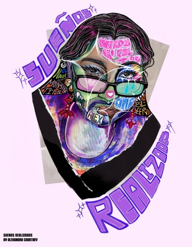
The phrase “Sueños Realizados” in English means “Dreams Come True.” I believe by simply making art, putting in the effort to get better and learn, trying to share my stories that my dreams are already in motion, already coming true. All there’s left to do is continue to grow and work hard, making even more of my hopes and dreams come true.
“I see the new Latin artist as a pioneer, opening up doors for others to follow. And when they don’t open, we crowbar our way in.”
-John Leguizamo
“You are not lucky to be here. The world needs your perspective. They are lucky to have you.”
– Antonio Tijerino
“Have no fear of perfection - you’ll never reach it.”
- Salvador Dali.
“Estoy feliz, mis sueños ya realizados...”

This was a part time project I decided to do for fun while I was being stressed out in my freshman spring semester. I wanted to experiment with digitally illustrating, even if I wasn’t good at it. And who better to use than myself.
Gerard Way has defined my middle school, highschool, and college life. All of his work from from his vocals in MCR to his writing in The Umbrella Academy has been really important to me! And his gothic style and chaotic myserious energy was so interesting to try and channel. A true icon and such a fun way to try out photoshop on the tablet. I’m still a Procreate © gal but it was still fun!
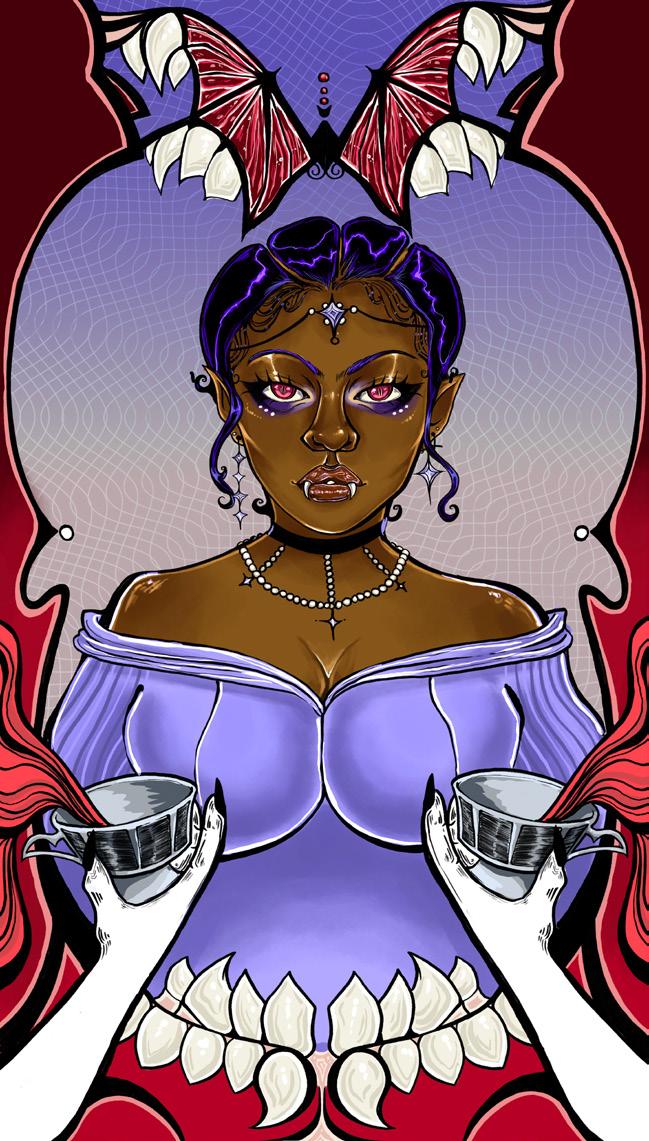
I’ve always been infatuated with creatures like vampires. So when being tasked with making a currency project, my brain automatically went “Vampire Money”. Well, that and the song by MCR. I knew I wanted them to look similar to portraits, emulating a sense of Art Novueau while painting regal and important figures in that society.
I love John Leguizamo! He has so many good movies but when I was shown “Romeo + Juliet”, I immediately fell in love with his portrayl of Tybalt. It gave a strong energy that I knew I had to draw. Not only that, he is such an inspirational figure in the Latino community for so many. He constantly speaks up for the rights of entire community, speaking truth and power.
For this assignment I was tasked with making Icons to describe myself. I intially designed 8 but these are the ones I feel the most proud of: Anxious, Panamanian, and Aries. I’m not proud in the sense I’d let these totally define me, but I’m proud of the designs I was able to achieve with experimenting with line in the absence of color.
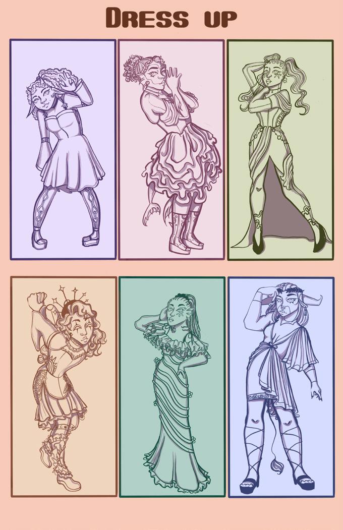
Here is a collection of pages from a short zine I designed for a sequential narrative assignment. I used characters I designed from a previous assignment in that class when I studued the brand “Monster High” and created characters with the intention of furthering the level of representation the doll brand was able to achieve. I wanted to bring them to life through showing their everyday lives in short small scenes. Very domestic! I look forward to making more projects with these characters.
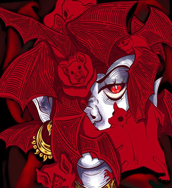
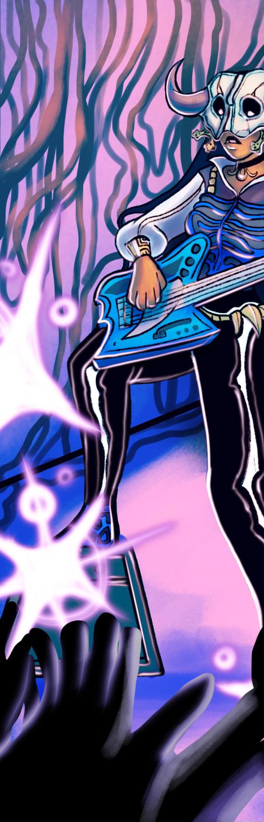
My album covers for this project were inspired by Maya Mythology surrounding the six houses of Xibalba. Of the six, these are my absolute favorites: The Razor, Jaguar, Cold, and Bat house. In addition to the Dark and Heat house, they make up stages mortal souls must travel through in order to move through the underworld. Each album cover has the character from the group that hails from that house, showcasing each memeber on their own.
This was half of a project where I decided to investigate how similar the themes and subject matter of my work are to the works of the Surrealist artist Remedios Varo. i decided to reference “El Mundo” and “Personaje” and I used them to inspire a piece of my own.
(Typography& Information)
Here I was tasked with creating a manual that displayed the 1964 and 2000 “First Things First” Manifestos in addition to a foreward and my own text of choice that responded to the concerns of the provided text. I took the opportunity to experiment with some fonts of choice while presenting my own thoughts about the writings themselves. All while being able to reference one of my favorite bands, Disturbed.
(Typography &Information)
This poster was meant to advertise a Hip Hop event hosted by the Brooklyn Academy of Music, BAM, while activating the text in some manner. I knew I wanted to have a radial design to the text in order to emphasize the rhythm that comes with music, Taking it a step further, I splattered ink on the outskirts, blowing at it in order to create the impression that an impact of some sort created the inky effect, almost like paint on a drum. It was a fun way to reconnect with a more traditional method of making art since I mainly do digital art nowadays.
(Typography &Information)
Intially, I had tried to design the word “Wild” but embodying the sort of asymmetrical, organic, and wispy nature I thought the word to have. When tasked with producing a deisgn for the title “The Call of the Wild” a whole new level of context was added that informed what kind of design I’d make. I wanted to contrast the expression handdrawn type to the more formally set type adjacent to it.
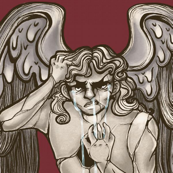
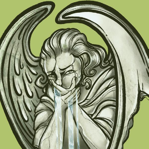
These stills are four out of my eight different stone angel gifs. Each are meant to represent a different emotion. I wanted to unify my gifs through the concept of angel statue-fountains who are stuck displaying one emotion for the rest of time, the only moving part of them being the water flowing though them. The four here are Disgust, Anger, Boredom, and Fear.
This are stills from my moving posters triptych meant to echo the sentiments of the Riot Grrl Manifesto. I truly wanted to channel the feeling of the self-made zines with an analogue feeling while paying homage to the band culture that fueled the Riot Grrl Movement. I also wanted to make sure that I showcased the women of the movement who weren’t as included in the movements, specifically trans women and women of color.
This is an interactive biographical poster that is meant to discuss the life and career of the performer Bob the Drag Queen. While this sitll is from the entry page, I coded it using P5.js and did 6 other illustrations and some animation. Choosing a drag performer was integral to me as we are currently seeing widespread attempts to eliminate the art of drag on a national scale.
This is a still from my Kinetic typography where I merged activated type and my illustrations to embody the sorrowful and somber narrative that comes from this musical number. My main goal was to capture speaking inflections while have a really animated and gradiose sense of movement to match the song’s theatrics.

