4 minute read
Art Index


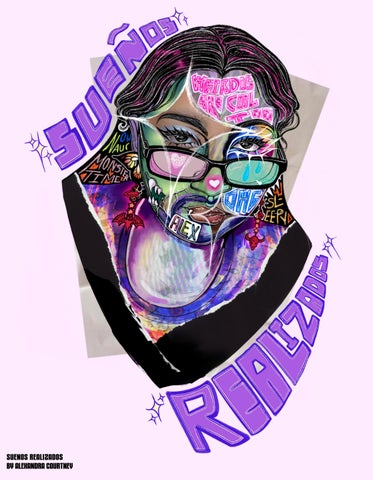
A. “What’s in Your Head?” (Spring 2022)(Personal)
This was a part time project I decided to do for fun while I was being stressed out in my freshman spring semester. I wanted to experiment with digitally illustrating, even if I wasn’t good at it. And who better to use than myself.
Advertisement
B. Gerard Way Poster (Fall 2022) (P&P)
Gerard Way has defined my middle school, highschool, and college life. All of his work from from his vocals in MCR to his writing in The Umbrella Academy has been really important to me! And his gothic style and chaotic myserious energy was so interesting to try and channel. A true icon and such a fun way to try out photoshop on the tablet. I’m still a Procreate © gal but it was still fun!
C. Vampire Currency Bill (Fall 2022) (P&P)
I’ve always been infatuated with creatures like vampires. So when being tasked with making a currency project, my brain automatically went “Vampire Money”. Well, that and the song by MCR. I knew I wanted them to look similar to portraits, emulating a sense of Art Novueau while painting regal and important figures in that society.
D. John Leguizamo Poster (Fall 2022) (P&P)
I love John Leguizamo! He has so many good movies but when I was shown “Romeo + Juliet”, I immediately fell in love with his portrayl of Tybalt. It gave a strong energy that I knew I had to draw. Not only that, he is such an inspirational figure in the Latino community for so many. He constantly speaks up for the rights of entire community, speaking truth and power.
E. ”Signs and Symbols” (Fall 2022) (IAC)
For this assignment I was tasked with making Icons to describe myself. I intially designed 8 but these are the ones I feel the most proud of: Anxious, Panamanian, and Aries. I’m not proud in the sense I’d let these totally define me, but I’m proud of the designs I was able to achieve with experimenting with line in the absence of color.
F. “Monster Moments” Comic Pages (Fall 2022) (IAC)
Here is a collection of pages from a short zine I designed for a sequential narrative assignment. I used characters I designed from a previous assignment in that class when I studued the brand “Monster High” and created characters with the intention of furthering the level of representation the doll brand was able to achieve. I wanted to bring them to life through showing their everyday lives in short small scenes. Very domestic! I look forward to making more projects with these characters.
G. Casket’s Paradise Album Covers (Fall 2022) (RAP)
My album covers for this project were inspired by Maya Mythology surrounding the six houses of Xibalba. Of the six, these are my absolute favorites: The Razor, Jaguar, Cold, and Bat house. In addition to the Dark and Heat house, they make up stages mortal souls must travel through in order to move through the underworld. Each album cover has the character from the group that hails from that house, showcasing each memeber on their own.
H. Casket’s Paradise “Valentina” Poster (Spring 2023) (History of Graphic Design & Illustration)
This was half of a project where I decided to investigate how similar the themes and subject matter of my work are to the works of the Surrealist artist Remedios Varo. i decided to reference “El Mundo” and “Personaje” and I used them to inspire a piece of my own.
J. “First Things First” Manifesto (Spring 2023)
(Typography& Information)
Here I was tasked with creating a manual that displayed the 1964 and 2000 “First Things First” Manifestos in addition to a foreward and my own text of choice that responded to the concerns of the provided text. I took the opportunity to experiment with some fonts of choice while presenting my own thoughts about the writings themselves. All while being able to reference one of my favorite bands, Disturbed.
K. “BAM Music” Poster (Spring 2023)
(Typography &Information)
This poster was meant to advertise a Hip Hop event hosted by the Brooklyn Academy of Music, BAM, while activating the text in some manner. I knew I wanted to have a radial design to the text in order to emphasize the rhythm that comes with music, Taking it a step further, I splattered ink on the outskirts, blowing at it in order to create the impression that an impact of some sort created the inky effect, almost like paint on a drum. It was a fun way to reconnect with a more traditional method of making art since I mainly do digital art nowadays.
L. “The Call of the Wild” Title (Spring 2023)
(Typography &Information)
Intially, I had tried to design the word “Wild” but embodying the sort of asymmetrical, organic, and wispy nature I thought the word to have. When tasked with producing a deisgn for the title “The Call of the Wild” a whole new level of context was added that informed what kind of design I’d make. I wanted to contrast the expression handdrawn type to the more formally set type adjacent to it.
M. Crying Angel Emotive GIFS (Spring 2023) (Dynamic Imagery)
These stills are four out of my eight different stone angel gifs. Each are meant to represent a different emotion. I wanted to unify my gifs through the concept of angel statue-fountains who are stuck displaying one emotion for the rest of time, the only moving part of them being the water flowing though them. The four here are Disgust, Anger, Boredom, and Fear.
N. Riot Grrrl Manifesto Moving Posters (Spring 2023) (Dynamic Imagery)
This are stills from my moving posters triptych meant to echo the sentiments of the Riot Grrl Manifesto. I truly wanted to channel the feeling of the self-made zines with an analogue feeling while paying homage to the band culture that fueled the Riot Grrl Movement. I also wanted to make sure that I showcased the women of the movement who weren’t as included in the movements, specifically trans women and women of color.
O. “Bob the Drag Queen” Interactive Poster (Spring 2023) (Digital Prototyping)
This is an interactive biographical poster that is meant to discuss the life and career of the performer Bob the Drag Queen. While this sitll is from the entry page, I coded it using P5.js and did 6 other illustrations and some animation. Choosing a drag performer was integral to me as we are currently seeing widespread attempts to eliminate the art of drag on a national scale.
P. “The Ballad of Jane Doe” Ride the Cyclone Kinetic Type (Spring 2023) (Digital Prototyping)
This is a still from my Kinetic typography where I merged activated type and my illustrations to embody the sorrowful and somber narrative that comes from this musical number. My main goal was to capture speaking inflections while have a really animated and gradiose sense of movement to match the song’s theatrics.