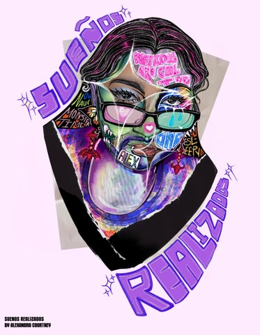
1 minute read
A COLORFUL SYMPHONY
When Observing my artwork as a whole body, it becomes increasingly clear that color is a large part of many of my projects. While I think art pieces that are only in black and white certainly have beauty, I’m just compelled towards color. Colors themselves are so multifacted, able to represent several emotions all at once simply depending on surrounding visual context clues, It’s amazing! The color blue for instance is a great examples of this. Blue skies ahead is meant to represent hope and positivity but when you’re feeling blue, it’s meant to represent sadness, maybe even despair. Color is one of the most important tools that an artist can ever use. For me, I almost pretend that I’m a conductor.
It’s as if I lead a symphony of different values, saturations, tints, and shades in order to perform the perfect piece; a piece that can illcit whatever emotional response I want from my work. Like the swelling of my own Crescendo.
Advertisement
0


Colors used in my work
Each note represents a color on the color spectrum: Red/pink, Orange, Yellow, Green, blue, and purple. Based on the work included in this manual, I took note of what colors appeared the most in my different pieces. Their place on the bar staff dictates how frequent the color appears on my work with each line and space between representing a number.

Red/pink = 7
Orange = 0
Green = 6 Blue = 5 Purple = 7


