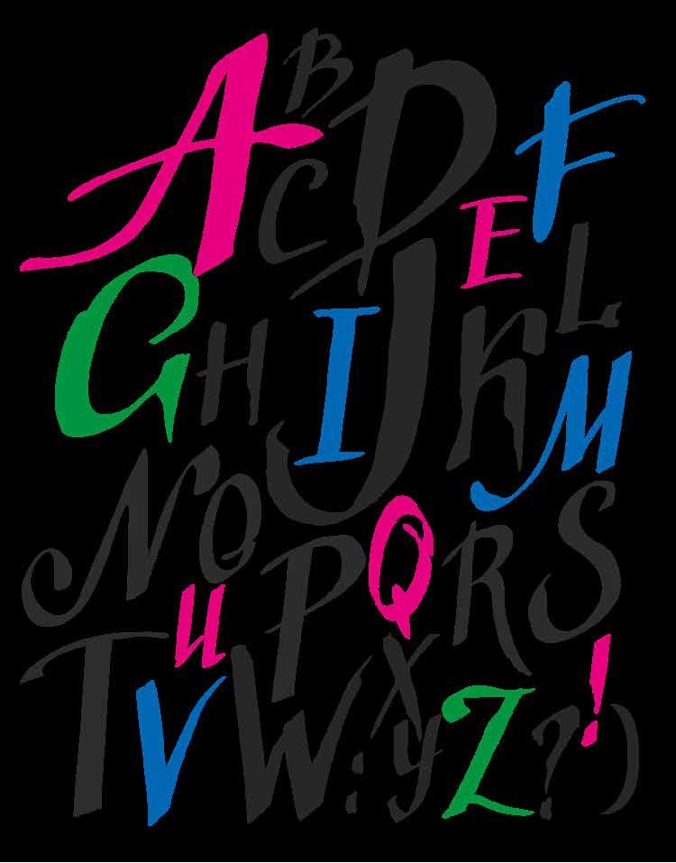



Three examples are offered in this section based on the essential shapes of three classic lettering styles: chancery, roundhand, and English cursive.
Chancery is one of the oldest extant lettering styles. The italic version of the script was introduced by Ludovico degli Arrighi of Vicenza in 1522. It has been rediscovered in recent years for its dynamic style and flexibility, and it is very often used in advertising, publishing, and fashion.
The cursive included here was developed in 18th-century England and is a highly slanted, formal cursive.
The roundhand (Italian roundhand) shown here was taught in Italian schools until the 1960s, with the use of nib and ink.
All these characters stand out for being extremely legible, boasting a clear shape. It is this very precision that allows us to explore various possibilities through creative variations, and they lend themselves very easily to making highly original or personal projects.
The scripts and typefaces shown in this section are written with a fine-point marker: guidelines defining the height of characters in each alphabet are shown with measurements in inches. The measurements are outlined several times on the writing exercise sheet with a ruler, showing length and height, taking line spacing into account.
In classical calligraphy, chancery is actually written with a broad-edge nib, cursive with an elbow nib, and roundhand with both, using ink in all three cases.
Another important model in the study of hand lettering is the majuscule (uppercase) typeface inspired by Roman capital shapes: a model of harmony and precision, based
on a solid geometric structure. It appeared in 113 CE in an inscription at the base of the Column of Trajan in Rome.
We are seeking, firstly, to become familiar with uncommon, long-lost forms of writing, to recover a forgotten manual skill. Once you have experienced it, you may be surprised at the pleasure that can come from making a composition in text using proportionate, harmonious letters in vibrant colors.
To get started:
1. Assemble all the right TOOLS and a good sketch pad.
2. Select an alphabet and examine the patterns carefully: their PROPORTIONS, slope, and shape.
3. Draw the GUIDELINES in pencil each time, even if it may seem superfluous. This is a fundamental step toward obtaining a good result.
4. Train your hand to hold the pen at a fixed ANGLE.
5. Don’t become complacent and keep practicing: it would be ideal to write for a few minutes every day.
6. Regularly compare what you have written with the examples provided in order to note differences or mistakes.
Happy writing!
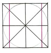
The following is based on one of the greatest examples of typeface in the history of lettering: Roman square capitals, on the inscription at the base of the Column of Trajan in Rome (113 CE). Based on a solid, geometric structure, it is a fundamental model for its perfection and clarity of form.
Round and Normal letters

Narrow letters
Wide letters
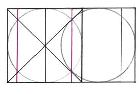
The letters are divided into:
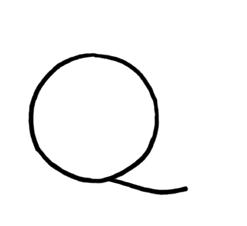
Round letters: C, G, D, O and Q occupy the entire grid
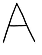
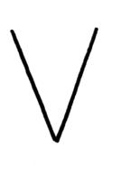
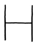
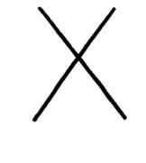
Normal letters: H, T, N, Z, A, X, Y, U, V occupy 3/4 of the grid
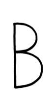
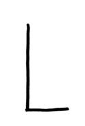
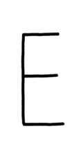
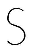
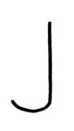
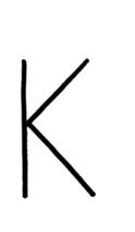
Narrow letters: E, K, F, B, I, P, L, R, J, S occupy 1/2 of the grid
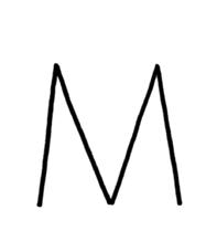
Wide letters: M, W are the width of the grid
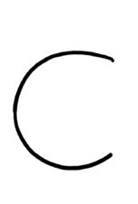
Round letters
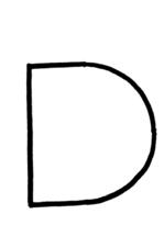
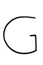
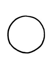
Normal letters
Narrow letters
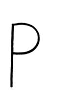
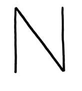
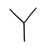
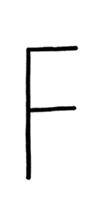
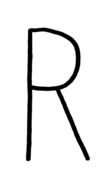

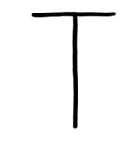
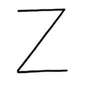
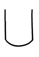
Wide letters

A calligram is a very old form of decoration made from letters and words. From ancient Greece to illuminated manuscripts, to the poet Apollinaire, to the Futurists, the calligram has spanned the entire history of art, remaining in the background yet constituting one of the most original models of decoration using letters. Nowadays, it is often used in advertising, in graphics, to design a unique tattoo, and in many diverse environments.
A calligram consists of a short text in which the writer draws the subject of the text using words: if a ship is being described, the letters and words will be arranged on paper to form the image of a ship.
The writing becomes flexible, in order to accommodate the shape: it can be straight, slanted, narrow, or wide, all according to how the chosen subject can be best represented.
To get started:
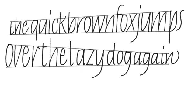
Draw two guidelines, then write the sentence “The quick brown fox ...” on each guideline in lowercase chancery, without any spaces between the words. Try to make sure that the sentences are the same length.

Draw two parallel wavy guidelines and repeat the exercise.

Draw two wavy guidelines that mirror each other; repeat the exercise. Practice with various different wave shapes, some more dramatic and some more subtle.
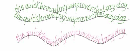
Draw two wavy lines that are neither parallel nor specular: this time, fill the space between the two lines by adapting the shape of the letters to the curves.

Draw two converging and diverging lines: fill the growing and shrinking space with letters.
In hand-lettered text compositions, decorations play a significant role, and a very fun one. They can be executed in a thousand different ways by assessing the most suitable style and instrument for each.
Compositions can be made with fine-, medium-, or broad-tip markers and nibs. They can be either monochromatic or colorful, either rigorous or freer and more expressive. It is necessary in this case to make several sketches in pencil before a final result is reached. Remember to also test a selection of colors when drafting in order to be certain of your final version.
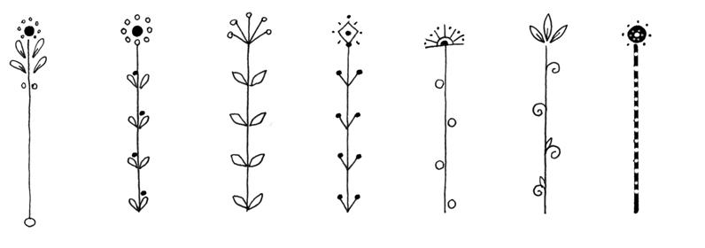
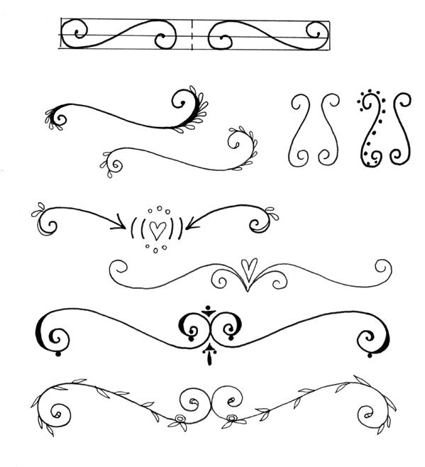
Below is a small selection of motifs that can be used in your projects.
1. Simple, straight lines, either single or parallel, of varying thicknesses.
2. Lines adorned with little leaves, straight, wavy, or curled at the ends.
3. Vertical decorative elements with subtle floral motifs.
4. Curled accents and scrolls, which require some preparatory sketches for them to be symmetrical:
A. Sketch your curled design.
B. Measure its length and height with a ruler, then draw a small grid with double the length of your sketch measurements and mark out the axis of symmetry with a dashed line (4).
C. Draw a scroll inside the grid, and then a second, so that they are mirroring each other across the central axis, paying special attention to the direction of the coils. After some practice tests, draw the scrolls freehand.
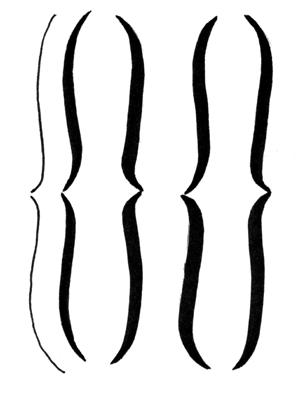
5. Brackets of different thicknesses.


So far, we have examined and learned about scripts and typefaces from the historical tradition of calligraphy, a critical exercise to establish certain fundamental principles that one must always bear in mind when it comes to lettering.
For example:
1. Draw guidelines with care.
2. Respect the structural relationships between letters of various styles.
3. Pay attention to the proportions that determine the height, width, and slope of a script or typeface.
4. Keep the angle of your nib steady.
When using instruments with a broad tip or brush and the writing angle has been decided, it must not be changed: the wrong angle can create strokes that are too thin or too broad, resulting in an unpleasant mess lacking harmony.
This having been clarified, we can begin to consider other shapes. Some new alphabet styles are therefore illustrated in this section, while others are clearly inspired by the classics. These are simple to execute, with differing characteristics and aims: some are smooth, others angular, some letters require a single stroke of the pen, and others a more laborious design.
These are just some of the thousands of ideas that lettering can offer, developing a creative pursuit that, for those who wish to deepen their experience, will always reveal itself to be rich and surprising.
Now, following the opulence of the previous pages, here are a few lowercase and uppercase alphabet styles. These are simple and fairly commonplace but truly invaluable.
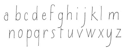
With its flexibility, this lowercase alphabet is easy to use for hand lettered items. Very often, a single line of text written in this style turns a composition that would otherwise feel flat or incomplete into something much more interesting.
After you have written all the lowercase letters, add some small serifs, or write the alphabet mixing thin and thick strokes, using a medium-point marker for the latter.
3/8
3/8
3/8

Standard Alphabet
With serifs Added
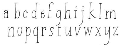
With broad strokes
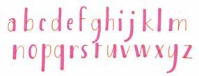
This uppercase alphabet also lends itself easily to small but very useful variations.
1. Make some of your strokes with a chisel-tip marker.
2. Do the same thing while enlarging the size of the letters slightly.
3. Write out the alphabet using a fine-tip pen, then use that same pen to create the broad strokes, completed with small serifs.
At the end, have a look at the distinct results you have obtained making these different alphabets.


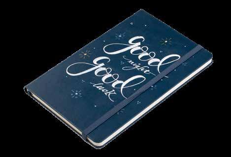
It is easy to find planners and journals in many colors and sizes. They often come with laminated covers, in which case permanent markers are very useful.
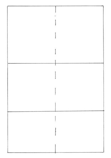
1. Draw the layout on a sheet of sketch paper; the dimensions in this case are 5 1/8 x 8 1/4 inches (13 x 21 cm). Mark the vertical midline and guidelines CD and EF. Find yourself a fine-point white marker and a medium-point white marker.
2. Write the text so that the word “good” is more prominent than the others.
3. Write your letters so they are not overly regular; transfer measurements and text onto the diary and trace the text with the fine white marker.
4. Fill in the broad strokes of your letters using the medium white marker; you can then add small decorative elements in white and gold.

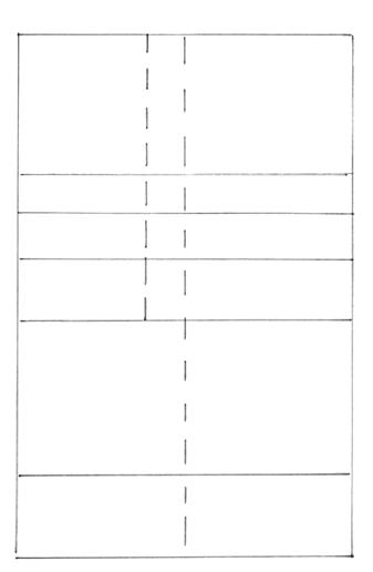
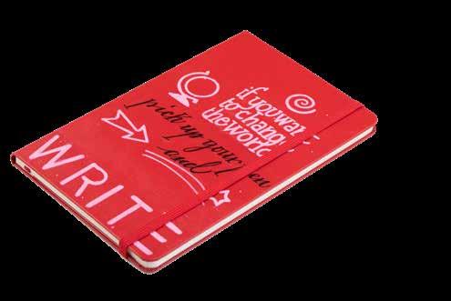
1. Draw the template on a sheet of sketch paper; its dimensions are 5 1/8 x 8 1/4 inches (13 x 21 cm). Draw the vertical midline, AB, and guidelines CD, EF, GH, IJ, and KL.
2. 5/8 inch (1.5 cm) left of the vertical median line, AB, draw line MN parallel to it, starting at the top of the layout and reaching line IJ: this will be the alignment line for the first block of text. Find a fine-tip black marker and a medium-point white or pink marker.
3. Write out the text, with broad strokes, and transfer the measurements and writing onto the diary; start from the first block, using line MN for alignment, giving it a slightly irregular feel.
4. Now write the rest of the text, taking care that the word “WRITE” spreads evenly across the space.

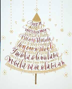
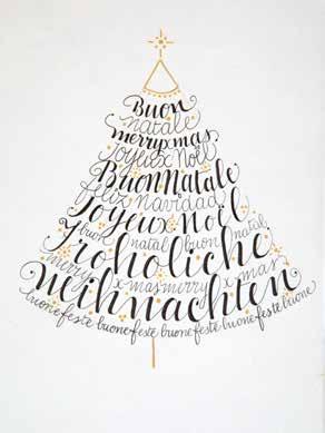
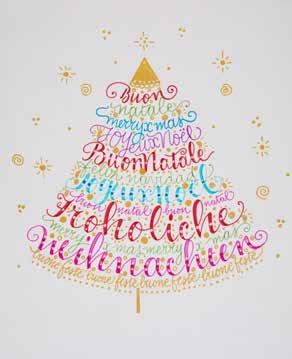
A calligram is, in effect, a decoration meant to astound and amaze. It therefore lends itself perfectly to making cards for Christmas!
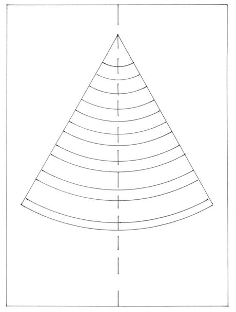
1. On a piece of sketch paper, draw the layout in pencil (7 7/8 x 5 3/4 inches / 20 x 14.5 cm). Draw vertical midline AB. Mark points C, D, E, and F. On the median line, mark point G. Center the compass, with a 5 1/8 inch (13 cm) opening, on G and draw an arc reaching points E and F. Then, draw lines between points G and E, then between points G and F: you have created a border for the silhouette of your tree.
2. With the compass needle still on G, draw a series of arcs inside the cone shape, from the bottom to the top of the tree. The distance between arcs is about 3/8 inch (1 cm), except for the two lowest bands, which need to be wider, about 5/8 inch (1.5 cm).
3. Try several different ways to write the text inside the cone, marking out the thicknesses of the letters. In this case, words are arranged in alternating lines of text. Once the shape of the text has been defined, transfer the measurements in pencil to a rather thick, light-colored cardstock, laying out the lettering.
4. Using a pen with a pointed nib, begin writing the words using a burgundy ink; then clean the nib and write the rest of the text using gold ink. With a copper or bronze gel pen, fill the spaces between letters in the two lines at the bottom. Then, using a gold gel pen, fill the spaces between the other letters with dots of various sizes. You can use this layout to make many other kinds of trees. Finally, draw some lines in pencil starting from the upper edge of the card. You can then draw points, stars, and golden spirals along them.
5. When the ink is completely dry, erase all traces of pencil.
Mugs with a decorative inscription are very popular. They can communicate a fun message and be used in all kinds of situations.

1. In order to decorate ceramic cups and glass, you will need special markers, which can be found in a good range of colors in specialty shops. These “paint pens” write on various surfaces. They are often called “permanent” markers, but the ink’s resistance over time and washing is not unlimited. Always do several tests with multiple brands, until you find the kind that is most resistant. Taking care when cleaning the cup is also advised, as it will be more of a decorative item than something suitable for everyday use.
2. Before you write, clean the surface very well with denatured alcohol and avoid touching it with your bare hands. You can use thin latex gloves, which allow for good sensitivity.
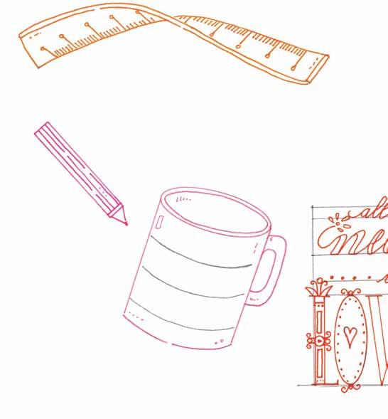
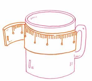
3. In addition to the indelible markers, get yourself a couple of flexible rulers of different lengths: these are easily found in craft stores and are essential for taking measurements on curved surfaces. The procedure for transferring these measurements on the cup is the same for each example provided.
4. Write out the strokes to be traced on the cup with a very soft pencil or, better, with a normal fine-point marker, easily removable once the final version is finished.
5. In case of mistakes, use a cotton swab, moistened with a little alcohol. Wait for it to dry before starting to write again.

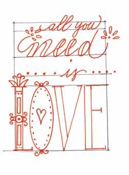
1. The cup pictured is 3 1/2 inches (9 cm) high with a diameter of 3 1/8 inches (8 cm).
2. Do some practice tests, then measure the guidelines and write the measurements onto the cup using the flexible ruler (B) and a very soft pencil or a fine-tip non-permanent marker. Then find a red fine-point permanent marker.
3. Check that the guidelines on the cup are straight and not too close to the handle.
4. Write the text, add decorations to the letters, then gently erase the guidelines (C).
