A SHORT SUMMARY
to a good poster
1
2
3
4
6
7
9
10
Stand out with your scientific poster
11 Bring in your data
Don’t just take a screenshot of your Excel charts. Put the conclusion of the graph in the title too.
12 Add an element of surprise
Bring a prop and get creative.
13 Ask for feedback 143
Fellow researchers aren’t always the best source of feedback.
14 Think of an icebreaker question 151 It’s up to you, not your audience, to get the conversation started.
In that respect, a poster is in fact completely useless for conveying information. Your audience is standing in a busy conference hall; people are staring at them as they walk around; they’re short on time; it’s not so easy for them to take notes; and if there’s too much information on your poster, they’ll completely ignore it.
During a poster fair, your audience is simply not prepared to absorb large amounts of information. They have an hour to walk around a hundred posters and will give you five minutes of their time at most. Try conveying enough information and having a meaningful conversation in that small space of time. ‘Conveying information’ is, therefore, at most a nice-to-have for a scientific poster, but it cannot and should not be your main goal.
The real goal of your scientific poster is to start a conversation. Because that’s where posters come into their own. They are real conversation starters that draw people into the world of your research. You get one-on-one contact with those who stop at your poster, which means an opportunity for a real conversation. You can delve deeper into the questions that your research raises and look for a link to the other persons research. You can share anecdotes, brainstorm follow-up research together, consider where your results can be put to good use, which projects you might be able to start up or which other perspectives would add even more value. A presentation or paper doesn’t even come close to doing that. Researchers sometimes see scientific posters as the conference presentation’s less important little brother, but that’s unfair. A poster is a powerhouse when it comes to conversations and new insights.
That observation provides us with a key takeaway: the winning poster isn’t the one that conveys the most information but the one that starts the most conversations.
The key message ‘Stress monitoring through wearables can contribute to earlier detection and better monitoring of Alzheimer’s’ is right in the middle of the image to grab the audience’s attention (poster by Linde Proost).
You can of course also make your key message part of the image itself. This is a great way to grab the audience’s attention. On the left page is a poster in Dutch, but even if you don’t speak the language, you can tell that the ‘conclusie’-message in the image is important.
Put your key message in BIG letters
A tip: we’re increasingly seeing researchers taking the plunge and putting their key message in BIG letters on their poster. This is an excellent idea because it means visitors immediately grasp the key message, even if they only look at your poster for three seconds and from a few metres away.
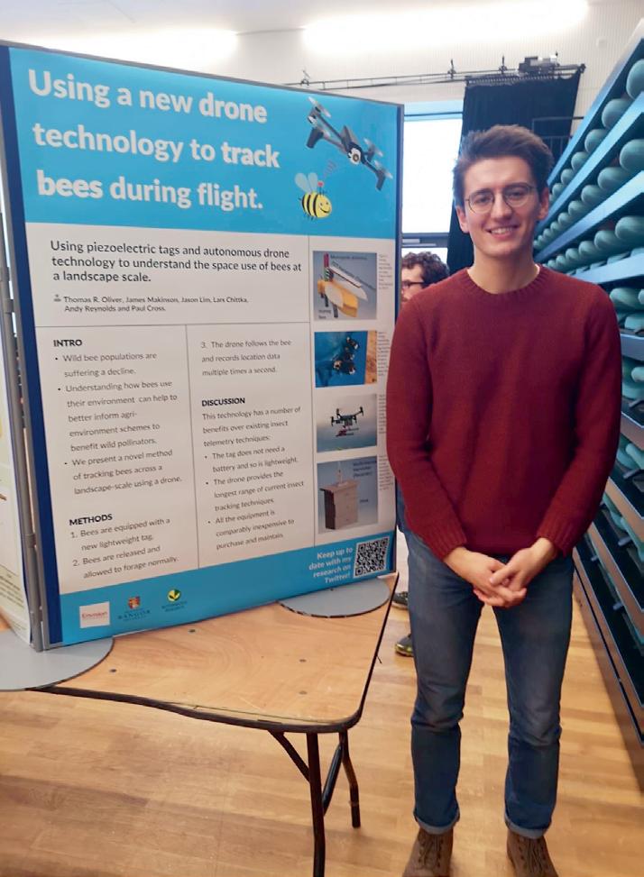
If you’re interested in drones and bees, you’ll be instantly drawn to this poster. Note that the key message is an attention-grabbing sentence without jargon, while the title (Using piezoelectric tags and autonomous drone technology to understand the space use of bees at a landscape scale) would immediately put me off (poster by Thomas Oliver).
CASE 1: The pain-free way to identify muscle fibre type
PROBLEM To identify muscle-fibre type, we need to cut a piece of muscle out of the athlete’s leg.
SOLUTION Development of a pain-free method to estimate muscle-fibre type using an MRI scan.
ADVANTAGE/KEY MESSAGE We can now optimise sports performance in a pain-free way based on muscle-fibre type.
CASE 2: Searching for earthquakes
Written documents don’t tell the full story of past earthquakes. That’s why I’m studying the bottoms of lakes, where thousands of years of earthquake history are buried, so that I can find out how often major earthquakes occurred in the past.
KEY MESSAGE By studying the bottoms of lakes, we learn information about earthquakes that no history book can tell us.
Step 4. Draw a pyramid structure
You now have an idea for your key message and what you want to put in the introduction of your poster, but the rest of your poster is still looking a bit empty. How do you fill it up? What you shouldn’t do at this stage is open up your design tool and simply throw your text at the page. There’s a good chance you’ll end up with an unstructured dump of information. You first need a structure that supports your key message, and you get that by drawing a pyramid structure.
BARBIE is an exception we’ll allow to the advice not to use acronyms. Researcher Natasha Latouf received positive international feedback on this design and told us she likes ‘to encourage scientists to get creative and have fun with acronyms and designs.’
Step 6. Make a handout and QR code
You may find it difficult to limit the amount of text on your poster. For example, what do you do with references? What about that table that you don’t really need but the expert may ask about? Or the abstract or that extra bit of text you should really delete but don’t want to? One answer: put them in a handout.
On your poster, put only the essential information that’s needed to understand your research and story. Move the rest to a paper or digital handout for people who want to know more.
A handout is the best way to remove things from your poster. Include everything that’s too detailed for the average visitor and give it to those who want to know more. You can also keep hold of one of your handouts in case you need an extra graph or table to support your explanation.
This leaves your poster to do what it does best: convey the key message and start conversations. The handout then takes care of communicating information.
You could approach your handout in two ways: as a sheet of paper to accompany your poster that visitors can take with them, or as a QR code on your poster.
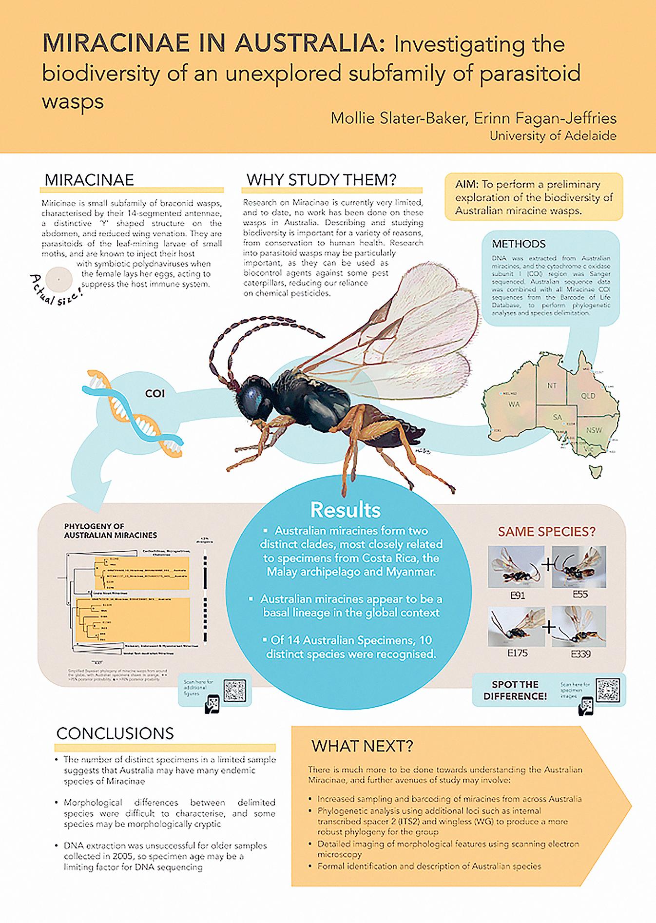
Large images really attract the attention (poster by Mollie Slater-Baker and Erinn Fagan-Jeffries).
Award-winning pitch posters in South Africa
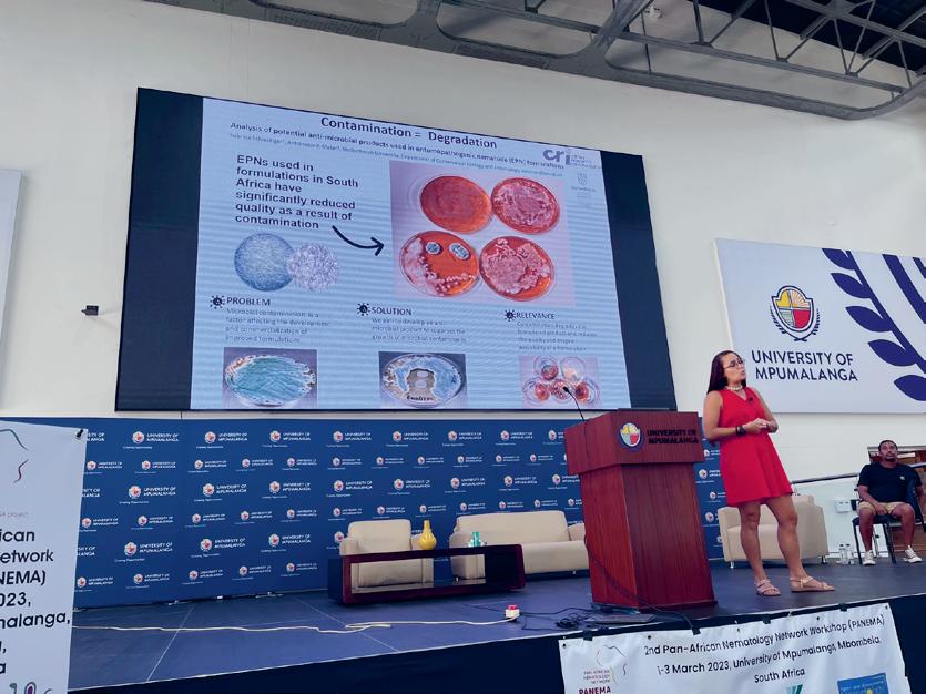
Hans, one of the authors of this book, was invited to a conference in South Africa where they organised shotgun-poster presentations. Before the event, we gave the researchers poster training, during which they learnt how to make a pitch poster. Some applied the tips to their poster, while others stuck to the traditional scientific poster. At the end of the poster session, there was an awards ceremony for the best poster presentations. And guess what? The top three winners all used a pitch poster (and no, we weren’t on the jury). Later, researcher Nicolle Claasen used the same pitch poster for a five-minute poster presentation at another conference and she won again.
Some more pitch poster examples
Looking for more inspiration? Lots of researchers have made pitch posters about their research. On the following pages are some examples of posters that have been used at conferences and posters that were made after a workshop.
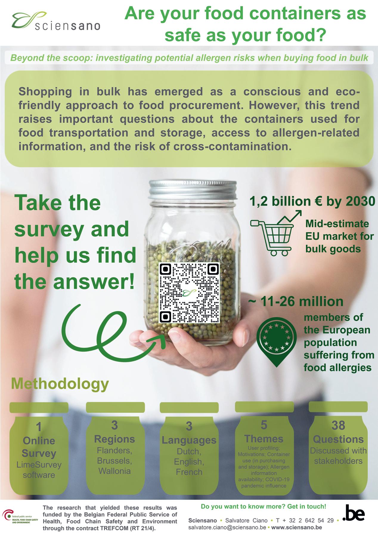
Salvatore Ciano used this pitch poster to clearly convey his key message: ‘Take the survey.’
→ Canva.com: An online design tool that you can use to design your whole poster, but also to find great ready-made design elements and illustrations. There is a limited free version but also a free trial period for the paid version.
→ Fiverr.com: A website where you can pay for freelance services online. Are you looking for some nice images for your project, a great line drawing or a very specific illustration that you’re never going to find on the internet? At fiverr.com you can commission a custom illustration. Often very affordable and with great results. For example, we had this lightbulb logo made for the Battle of the Scientists, an event we organise.
→ Do it yourself: If you’re not particularly artistic, this might seem like too much of a challenge, but a lot of the most attractive posters I’ve seen feature self-made illustrations, usually handdrawn and then digitised. You can digitise a drawing and use it on a poster by scanning it and removing the white background or by creating it directly in a digital drawing app like Adobe Fresco. A handmade image is original and immediately stands out. Are you good with a pencil or pen? Then definitely give it a try.
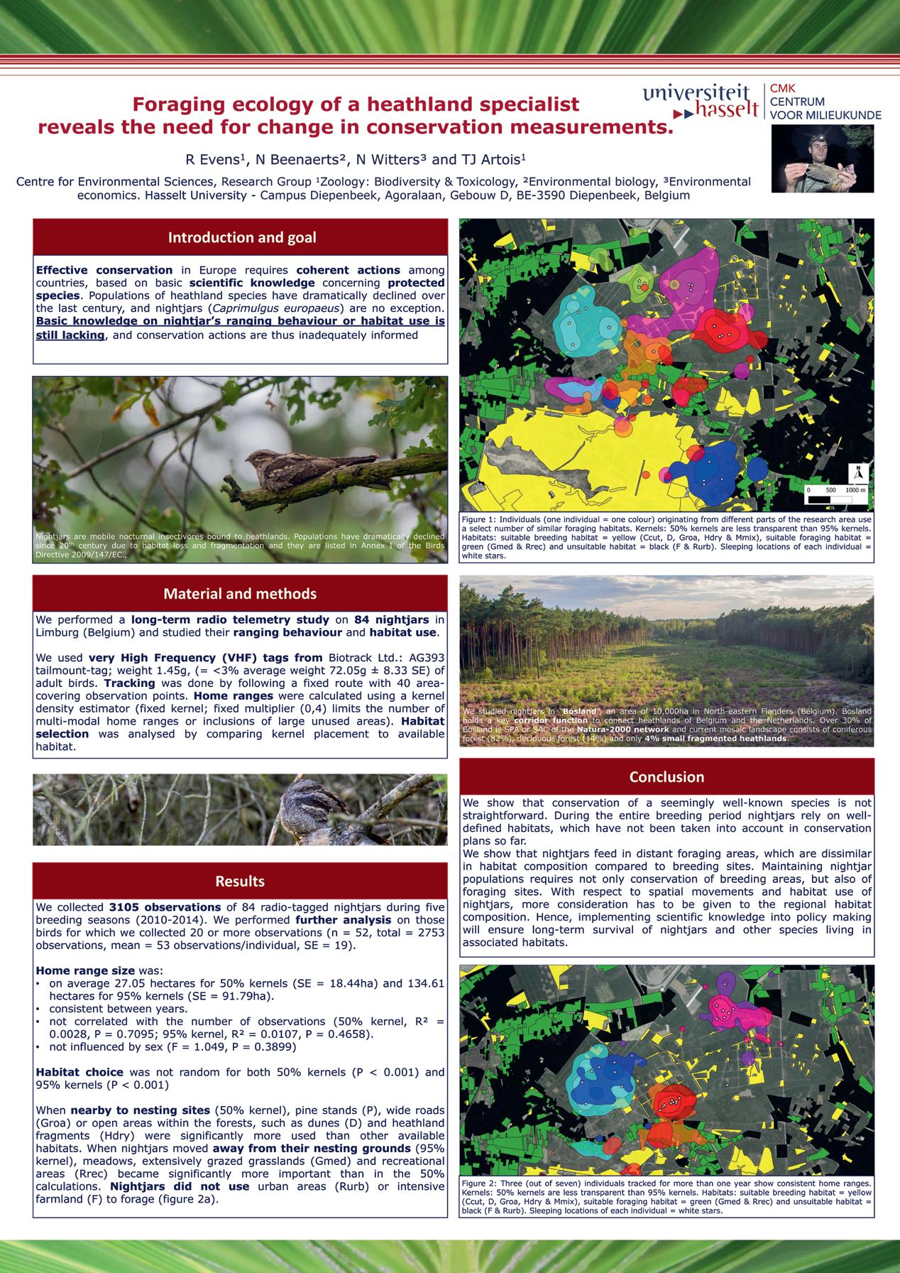
Poster by Ruben Evens before the workshop.
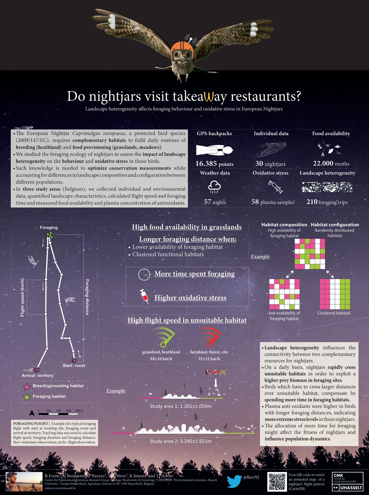
This is the poster Ruben Evens made after the workshop. With the new version he won the Best Early Career Research Award, and the poster was chosen as the best among 180 other participants.
