CONTEMPORARY MUSEUM
Abby Naugle

Title: New Taipei City Art Museum
Location: Yingge District, New Taipei City, Taiwan
Architects: KRIS YAO | ARTECH Area: 32,641 m²
Year Completed: 2023
Photographs: KRIS YAO | ARTECH, Shephotoerd Co.
Overview: The New Taipei City Art Museum is designed to blend seamlessly with the natural landscape where the Yingge and Dahan Rivers meet. Located on reclaimed land, the site’s gentle slopes create an island-like setting, framed by Guilun Mountain to the north and the Dahan River and Xueshan Range to the south. The design draws on the area's rich culture and history, with nods to dry riverbeds, old streets, brick architecture, and seasonal reeds. As a “museum of modern and contemporary art among the reeds,” it bridges tradition and modernity, becoming a vibrant new addition to Taiwan’s art scene.
Exterior Design The museum’s façade combines a series of sandblasted aluminum tubes of varying heights and vertically segmented three-color aluminum panels, arranged to evoke the appearance of reeds swaying in the wind. This screen-like exterior serves to integrate the museum visually into its changing natural surroundings, allowing the building to appear both solid and ephemeral, depending on the viewer's perspective.
Structural and Material Details The main museum structure floats above the village, its rigid mass softened by the swaying reed e ect. Inside, flexible exhibition spaces cater to diverse art displays, including general, large-scale, international, and themed exhibits. An elevated lobby on the second floor provides access to these galleries, while a rooftop garden restaurant allows visitors to dine with sweeping views of the Dahan Riverscape.
The museum’s architectural concrete walls, textured with cedar wood planks, mimic the eroded landscapes formed by the Dahan River. Weathering steel on the entrance bridge develops a unique patina over time, aligning with the blurred, natural façade and serving as an inviting gateway into the museum.


The circulation throughout this level of the building is straightforward and easy to navigate, with no dead-end hallways. A centralized, flexible exhibition space enhances accessibility and flow.
Symmetry
The floor plan is symmetrical both horizontally and vertically. Ray The rooms radiate outward, stemming from a central connection line.
Rhythm The angled, repetitive stairs create a sense of rhythm throughout the space.
The repetitive use of vertical gray cladding on the building creates visual flow and reinforces repetition.


Emphasis The elongated midsection of the building draws attention to the space, creating a strong sense of emphasis.
A.Underpass and Communal Area: An underpass within the building provides a covered communal area featuring lounge seating and gathering spaces.
B.Vertical Circulation: The use of staircases creates unique vertical circulation throughout the building, enhancing spatial movement and flow.
C.Cladding and Natural Lighting: Thoughtful use of cladding and glass brings in ample natural light while adding visual interest.
D.Lobby Design and Visual Hierarchy: The lobby’s elongated, additive shape establishes a visual hierarchy, emphasizing its design and drawing attention to this central area within the building.
Cleared display spaces and pededtals artificial and natural lighting
Cleared display spaces and pededtals artificial and natural lighting
Cleared display spaces and pededtals artificial and natural lighting
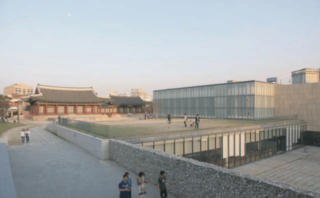
Title: MMCA Museum of Modern and Contemporary Art
Location: Seoul, South Korea
Architects: Hyunjun Mihn, MPART Architects
Area: 52,101 m²
Year Completed: 2013
Photographs: Hyunjun Mihn, Myung Rye Park, JongOh Kim, Hongsoon Park, Young Chea Park
Overview:
Placed in one of Seoul's oldest neighborhoods, the MMCA Museum of Modern and Contemporary Art serves as a bridge between the city’s rich cultural history and modern-day artistic expression. Nestled between Gyeongbokgung Palace and Bukchon Village, the museum stands on a site deeply interwoven with the city’s political and historical fabric, once the heart of administrative activity during the Chosun dynasty. Structures from various eras, including those from Korea’s early 20th-century Japanese occupation and the Defense Security Command, are part of the complex, each contributing to the site’s historical significance.
Architectural Approach
The architectural concept of an "Unstructured Museum" introduces a series of open courtyards, creating fluid connections between historic and contemporary spaces. These outdoor areas foster views of Seoul's traditional landmarks and provide gathering spaces that invite informal engagement with art. The design includes an additional 48,372 square meters of space that blends with historic architecture, supporting both preservation and contemporary use.
Facade and Community Interaction
The museum’s exterior features curved terra-cotta tiles inspired by traditional roof styles, visually connecting the building to its surroundings. A pedestrian walkway runs through the center, with courtyards bordering this path to create an open, accessible flow that encourages public interaction. The layout intentionally blurs the boundaries, welcoming casual visitors and inviting them to experience art in an organic way.
Inside, the museum prioritizes open, interconnected spaces with ample natural light. The layout o ers expansive sightlines across multiple levels, drawing visitors through di erent exhibition areas. The exhibition halls provide flexible spaces designed to create a meaningful connection between visitors and Seoul’s evolving cultural identity.


A.Throughout the exhibition space, there is ample seating to ensure comfort and encourage prolonged engagement with the art. The lighting is simple and consistent across all areas, designed not to detract from the displays while providing high-quality, optimal illumination.
B.The lighting throughout the spaces is consistent, providing illumination for both artwork and visitor visibility. This ensures that the art is showcased e ectively while maintaining a comfortable viewing experience for all visitors.
C.The overlook area allows users to experience di erent perspectives of the gallery space and can accommodate vertically larger art installations.
D. This drop-down section helps create zones by dividing the circulation space and walking path beneath it.
E.The higher ceiling in this area fosters a more open atmosphere, encouraging visitors to gather comfortably and appreciate the artwork from the elevated overlook.
F.The bumped-out viewing spot is a creative architectural feature, adding visual interest to the building and enhancing the connection between interior and exterior views.
G.The centralized area is open and hosts an outdoor installation space, e ectively zoning and dividing the two distinct sections of the building, while also providing a dynamic focal point for visitors.
The various rectangles use scale to form a dynamic geometric pattern, adding visual interest and depth to the design.
The larger rectangle creates emphasis amongst the smaller rectangles
The rectangular windows create repetition, establishing a rhythm that unifies the design and guides the viewer’s eye, enhancing visual harmony.
Pattern
The stair exterior showcases a dynamic pattern by incorporating rectangles of varying thicknesses. This is further enhanced by the contrasting materials of glass and brick, adding texture and depth to the design.
Display And Lighting Needs
Small display space, natural and artificial lighting
Cleared display spaces and pedestals, artificial and natural lighting
Cleared display spaces and pedestals ,artificial and natural lighting
Cleared display spaces and pedestals, artificial and natural lighting
Natural and artificial lighting Natural and artificial lighting
Natural and artificial lighting

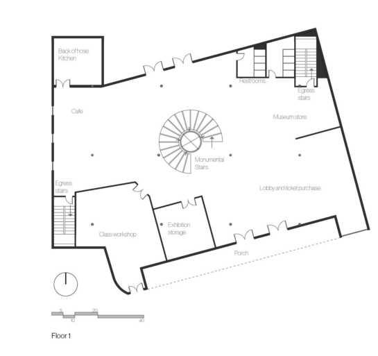
This floor plan distributes di erent spaces throughout the building, creating functional variety. It also includes various types of zones on the same floor, combining food areas, exhibition spaces, the lobby, and back-of-house areas to provide easy access to everything without requiring movement to a di erent floor.
The use of implied lines through walls and other design elements subtly guides users toward a focal point or desired area within the lobby, enhancing wayfinding and spatial flow.
Title: Museum of Contemporary Art San Diego (MCASD)
Location: San Diego, United States
Architects: Selldorf Architects
Area: 104,400 ft²
Year: 2022
Photographs: Nicholas Venezia
Project Goals
By 2014, the Museum required additional space to house its expanding collection. Selldorf Architects’ redesign doubled its size, integrating 28,000 ft² of renovated space with 46,400 ft² of new additions. Key design goals included: expanding gallery space from 10,000 ft² to 40,000 ft², enhancing visitor experience with clearer circulation and more welcoming entry points, and improving connection to the coastal setting
Key Features
Materials: Cast-in-place concrete, travertine panels, aluminum brise-soleils
New Galleries: High ceilings and natural light integration via skylights and vertical windows
Repurposed Auditorium: Sherwood Auditorium converted into a 7,000 ft² gallery with 20’ ceilings
Art Park & Terraces: Former parking lot transformed into a public art park and terraces with dramatic Pacific Coast views
Back-of-House Enhancements: New loading dock, art storage, freight elevator, and below-grade parking
Visitor Experience
The design reconfigures gallery circulation, o ering visitors the choice between special exhibitions or permanent collections upon entry. Venturi Scott Brown’s Axline Court now functions as an education space, while flexible event areas and a central lobby bookstore enhance the Museum’s public engagement.


This floor plan integrates exhibition space throughout the entire layout, allowing for seamless transitions between di erent areas and maximizing the use of available space. This design promotes excellent circulation, ensuring that the entire building remains active and accessible. Additionally, thoughtful outdoor design elements, such as the art park, terrace, and courtyard, are seamlessly incorporated. These features provide opportunities for outdoor exhibitions and events, enhancing visitor engagement and o ering greater flexibility for various programming needs.
These shapes demonstrate hierarchy through their size. The larger shape naturally draws more attention, establishing its prominence within the composition.
The plaza utilizes curvilinear lines to guide users through the space, creating a sense of fluidity and movement.


A.The ceiling design utilizes natural light alongside fluorescent lighting to create a consistently bright and well-lit environment, ideal for showcasing artwork. The ceiling pattern adds visual interest without detracting from the displayed pieces. Vertical slats are strategically placed to allow sunlight to penetrate evenly, minimizing glare and preventing disruptive lighting patterns.
B.Large openings enhance visual flow, allowing users to clearly see the circulation paths while accommodating multiple visitors moving through the space simultaneously. The ceiling itself features integrated artwork that doubles as lighting, serving as both a functional element and a focal point. This introduces texture and visual intrigue to the otherwise simple design, without detracting from the art on display.
C.The large art installation draws users into the space, serving as both a focal point and a functional element by incorporating strip lighting on its underside to enhance

The ceiling pattern achieves balance by creating a shape that is
The baby installation in the ceiling of the exhibition space creates visual movement through its flowing lines, guiding the viewer's eye across the
The tall columns create emphasis by drawing the viewer's eye upward, highlighting the artwork and accentuating the elevated ceiling height.
This contemporary museum is a dynamic cultural space where art and community converge, supporting collaboration and participation Its design emphasizes openness, with transparent facades connecting interior and exterior spaces. Flexible layouts adapt to exhibitions, workshops, and events, ensuring a continually evolving experience. Interactive installations invite visitors to engage directly with the art. Community zones, including workshops, class spaces and collaborative walls, provide platforms for local artists, while outdoor areas like the art park and plaza host public events. Modular galleries accommodate diverse artistic expressions, enhance engagement. The museum prioritizes inclusivity, o ering sensory-friendly environments. Visitors are welcomed by a “Community Wall” showcasing local art, setting the tone for interaction. By making art accessible to everyone, the museum becomes a vibrant, participatory space where creativity is shared and continually shaped by its community.


and
Small diplay space natural and artificial lighting
Display pediments and shelfs space natural and artificial lighting
Natural and artificial lighting
Cleared display spaces and pedestals; artificial and natural lighting
Cleared display spaces and pededtals; artificial and natural lightings
Natural and artificial lighting
Natural and artificial lighting
Natural and artificial lighting
Natural and artificial lighting
Natural and artificial lighting

Lobby and Ticket Purchase
Museum Store
Café
Exhibition Spaces (multiple across floors)
Exhibition Storage
Public Class Workshops
Event Space
Private O ces/Administrative Spaces
Communal Zone
Restrooms (on each floor)
Elevators & Stairs
Mechanical Space
Courtyard
Central Plaza
Art Park
Primary Adjacency
Secondary Adjacency
Secondary Adjacency
Undesired Adjacency
Undesired Adjacency
Public
Semi Private
Private
The adjacency matrix outlines the spatial relationships and proximities between all areas in the museum, ensuring e cient flow and functionality. Public zones, like the lobby, café, and museum store, are placed near each other for visitor convenience, while exhibition spaces connect directly to storage for smooth operations. Administrative and support spaces, like o ces and mechanical areas, are positioned away from high-tra c zones to maintain quiet and e ciency. Key circulation elements, such as elevators and stairs, are strategically located to connect floors while maintaining accessibility. This arrangement balances operational needs with an engaging visitor experience.


This layout distributes the various types of spaces across all floors, allowing for a well-balanced flow throughout the museum. Spaces that are open to everyone, such as the café and event space, are centrally located to foster accessibility and encourage interaction among visitors.
Overlapping
This parti diagram shows how figures can overlap one another and create a sense of depth, layering, and spatial relationships.
Harmony
This parti diagram demonstrates harmony by creating a sense of visual flow and movement through the interplay of shapes.
Balance
This parti diagram shows balance through the
Hierarchy
This parti diagram shows the use of hierarchy to establish visual order and emphasize the importance of certain elements within the composition.
Solids and Voids
This parti diagram highlights the interaction of solids and voids, using color to create blank spaces to contrast with the color.
White space or negative space
Additive and Subtractive
This parti diagram shows an increased elevation and a decreased one, which creates dynamic volumes that emphasize the overall form.
This diagram shows how white space, or negative space, allows for a clear division within the form, creating a sense of separation.
Movement
This form demonstrates movement by separating the two shapes, creating a sense of outward flow.

This parti diagram demonstrates alignment by stacking identical forms directly on top of one another, creating a sense of order and visual continuity.
This form illustrates a ray extending outward from a centralized point, creating a sense of movement and radiating energy.

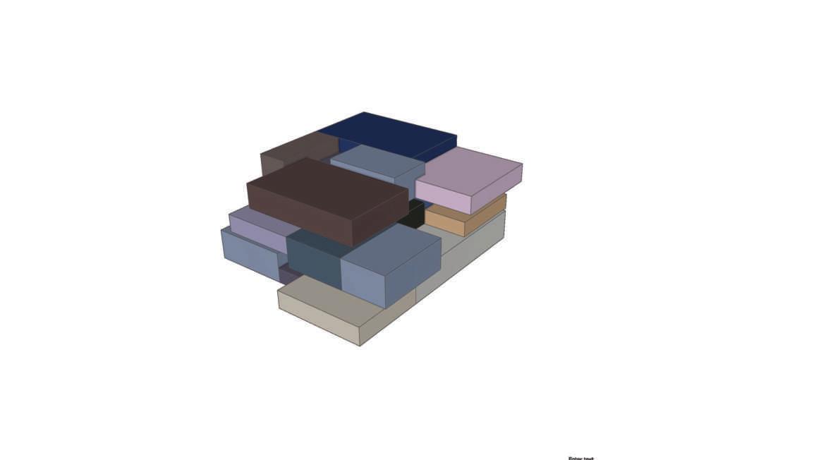
This parti diagram illustrates how layering and stacking various forms can create dynamic and cohesive forms.
This form creates symmetry by generating equal and consistent shapes to form a balanced and harmonious composition.
This parti diagram shows color by utilizing a darker tone for the tops of the sections and a lighter one for the sides, creating a sense
This form creates harmony by balancing all the shapes to feel proportional and visually cohesive.
This site diagram positions the main building on the far Northwest side of the lot, allowing for open space and better integration with the surrounding environment. The design also creates two distinct zones for the art park, with the southern section benefiting from its proximity to a small river, enhancing the natural and tranquil atmosphere.
The site diagram positions the building in the lower southeast corner of the lot, allowing for optimal natural light and pedestrian flow. The Art Park intersects with the building, enabling potential integration, such as an outdoor gallery underpass. Landscaping surrounds key areas to enhance aesthetics.
This site diagram places the building centrally to allow for a radial flow of outdoor spaces. The Art Park and plaza intersect with the building, creating potential for an integrated underpass structure. Both the Art Park and plaza o er views of the river, while greenery surrounds the lot to blend the built environment with its natural surroundings.

These spiral stairs create a striking visual impact by wrapping around a centrally positioned elevator. This design seamlessly integrates the elevator within the staircase, maximizing space e ciency while maintaining a visually cohesive and dynamic appearance. The spiral form adds an elegant, flowing quality to the vertical circulation, enhancing both functionality and aesthetics.

The arched space serves as a semi-private area, perfect for viewing art or creating a resting area. This architectural feature not only provides a functional purpose but also delivers a significant aesthetic impact. The archway adds a sense of elegance and rhythm to the design, framing the space while enhancing the overall ambiance.

This mobile wall can be placed throughout the exhibition spaces, allowing the layout to be customized with ease, thanks to the casters that enable smooth movement. The wall also serves as a versatile display surface, accommodating various types of artwork or multimedia installations. Additionally, it can function as a partition to create more intimate viewing areas or guide the flow of visitors through the exhibition.
This sketch illustrates an exhibition space, featuring a smaller area dedicated to showcasing an individual collection. The large, curved doorway leads seamlessly into the next space, enhancing the flow of the gallery. Track lighting is installed to spotlight various artworks, ensuring each piece is properly illuminated. Additionally, a built in display area is provided for the title of the exhibition, creating a cohesive and professional presentation.


This sketch illustrates a potential seating concept for either the interior or exterior of the building. The sketch shows the seating mass positioned outdoors in the art park. This free-flowing seating can accommodate a variety of users and serves multiple purposes due to its two tiered structure.
the block floor plans experimented with room arangement adjacencies and sizes ontoduced the idea of monumental stairs thought the center of the building


Itteration 1
this was my first itteration i wanted to play with cured arches and walk out patios for the building the building mass looked o and it was due to the flatness of the overall shapes

Itteration 2
for the creation of itteration 2 there is more volume in the form as well as layoring of the forms to create a blended look there are also beveled rounded edges thought the corners of the for mo give the hard boxy shape a softer look to go with the overall arches

the proposed floor plan plays with balencing engulat lines with soft curves many of the rooms have sharp angeled walls buiding the user thogh the space there is contrasting circular spiral stair case thought the center of all of the floors creating a contrast in forms the exhibition spaces are mostly open creating an inviting and open atmosphere on the second floor the exhiprion entreance utlizes movile wlls that serve as the entry to allow biger pices of art for fit thoug as well as a dymanic look v


The finalized floor plan displays the selected furniture layouts and includes labels that identify where each perspective is situated within the space. These labels provide a clear connection between the plan and the experiential views, helping to visualize the design's functionality. The focus is on showcasing the spatial organization and demonstrating how the design elements harmonize to create a cohesive environment.


The lobby area greets guests with a service desk and surrounding seating, creating a comfortable and welcoming atmosphere. This space utilizes natural light to enhance visibility and provide a warm, inviting ambiance.

The communal zone is designed for guests to relax, o ering various seating options built into a seating cluster. Open areas within the communal zone are used to display local art, ensuring these pieces receive attention due to the space's central location in a busy public zone.

The café creates an inviting, open atmosphere with multiple seating options, including booths, high-top tables, picnic tables, and lounge seating. This space also takes advantage of natural light, fostering a cheerful and vibrant environment for dining and socializing.

The museum shop showcases merchandise and provides customers with an opportunity to take home mementos of their visit. The shop is conveniently located near the lobby and ticket area, ensuring easy access for visitors as they enter or exit the museum. This strategic placement encourages foot tra c and enhances the overall visitor experience by integrating shopping seamlessly into the museum journey.


The o ce team space provides a private area where sta can come together for collaboration, informal meetings, or breaks throughout the day. This versatile space fosters teamwork and communication while o ering a comfortable environment for relaxation and productivity. It’s an essential support zone for maintaining sta cohesion and e ciency.


