


craftsmansh


craftsmansh
Letter from the President.......................................page 4
The latest AAPL News from Aki Kano ................................................
And the Winners Are page 6
The winners of AAPL’s 2025 Spring Online Show
Lead to Design..........................................................page 10
An interview with expert pencil artist Greg DiNapoli
The Story Behind the Paintings..........................page 14
The Champion and the Artist
Len Jagoda discusses his pastel painting of ‘Triple Crown Champion - American Pharoah’
The Professional Amateur
Brian Burt talks about his oil painting ‘Inspiration is for Amateurs’
The Story Behind the Sculpture..........................page 18
Showing His Hand
Master wood carver Lorenzo Cardim shares the process behind his piece ‘Felt, Not Seen’ ..........................................
Come Blow Your Horn page 20
The latest AAPL Member News


Happy Spring!
I hope you all are enjoying this beautiful time of year. You may go outside to plein air paint or paint flowers from your garden in your studio… I hope you find much inspiration and joy in your creative endeavours this spring.
The AAPL Board of Directors and I continue working hard to provide valuable opportunities to our talented members and the art community.
I am very excited to introduce a new special section in our newsletter, The Story Behind the Painting: Have you ever wondered about the inspiration behind a certain painting or how the artist came up with the title? The Grapevine's newest feature will highlight works by two different talented artists members and the inspiration behind their pieces, in their own words. For our inaugural feature, we will focus on paintings by Fellow Member Len Jagoda and another one by Elected Artist member Brian Burt with a bonus feature with Elected Artist The Story Behind the Sculpture member Lorenzo Cardim. Keep on reading to find out more…
And, for the Spring Edition of the Grapevine showcases an interesting interview
The AAPL Member Artist Highlight with Elected Artist Member Greg DiNapoli. He shares with us the background and process behind his expert graphite drawings.
The Third Annual Realism on the Hudson Small Works Exhibition happened this early Spring at the Howland Cultural Center. We are thrilled that this show preview was published in the March issue of and a local American Art Collector paper called the . For those of you who are interested in ordering a Highlands Current beautiful hardcopy catalog for this show or downloading a free digital copy, please go to: Magcloud

The Viewer's Choice Award winner for this exhibition has been determined. The winner with the most votes is Chantal Sulkow! She will receive the board game Attribution! by Trois Crayons.
Thank you again to Brian McClear for his oil painting demo this past March in conjunction with this special show. To see his brilliant and insightful demo, go here: https://aaplinc.org/demos/v/cshell-demo-brian-mcclear
Thank you for all your submissions to the Spring Members Online Show, which will be held from May 3rd to July 12th. We are so thrilled to have two special guest jurors. The guest juror of selection is Signature Member , Elizabeth Rhoades and the awards juror is Elected Artist Member . Artwork will be available for purchase during the show Margret Short dates at our This show has also been featured in a prominent article in the May issue of American Art Artwork Store. Collector. Congratulations to those of you whose work was chosen for the feature. We encourage everyone to submit their entries early for our shows, as early submissions are often considered for press opportunities.
We will soon accept submissions for our Young Artist and Associate Artist Members show, Emergence: Young Artist & Associate Artist Members Online Show This online show will be up July 14 - September 7, 2025, and entries will open on May 14th, with a deadline of June 14th.
To see the full lineup of gallery and online shows and submission deadlines, go to: https://aaplinc.org/upcoming-shows
Thank you to several AAPL members for creating lovely testimonial videos about why they value AAPL. Please click here to see a compilation of the testimonials: https://aaplinc.org/level
We'd love to hear from you about ways you have benefited from being a member of AAPL. Please email your short, 1-2 minute video testimonials to: demos@aaplinc.org
We appreciate those of you who answered our annual survey! As we have done in the last few years, we will make positive changes and create new initiatives based on your replies.
Finally, Eric Chauvin, AAPL's Demo Director, has created a fantastic video on photographing artwork. I am sure that you'll find it very helpful. The video itself is a true work of art! Eric walks you through each step of the process with clear, detailed instructions. A big thank you to Eric for sharing his time and expertise! Here is the link to the video: https://aaplinc.org/demos
As always…
Keep painting and creating…
Sincerely,

Aki Kano, President of the AAPL
Connect to AAPL on LinkedIn: https://www.linkedin.com/company/aaplinc/ Friend AAPL on Facebook: https://www.facebook.com/AmericanArtistsProfessionalLeague Follow @aapl_nyc on Instagram and we’ll follow you back! https://www.instagram.com/aapl_nyc/ View all of AAPL’s videos on our YouTube channel: https://www.youtube.com/channel/ UCMgxKD7YycGWxmZOmlL4d5g
May 3 -July 12, 2025
The Spring Members Online Show is a digital showcase featuring an impressive array of works by established realists. Curated by the AAPL, this show aims to demonstrate the mastery of realism across various mediums, inviting online visitors to explore the depth and precision of these seasoned artists. To download the free pdf catalog or enjoy the digital catalog flipbook visit: https://aaplinc.org/2025-spring

Cher Pruys Innocence First Place Acrylic
Elliot Appel Macdougal Street Melting Pot Second Place Acrylic


John Dorchester Before the Downpour First Place Oil


Caryn Coville Farm Fresh First Place Graphics
Max Savaiko Stagg Party Second Place Oil


Susan Grimm Tbird Reflections Second Place Graphics

Carolyn Latanision End of Summer, Monhonk First Place Water Media


Linda Brown
Footsteps #9
First Place Pastel
Robert A. Steedman
Bailey Island Dories
Second Place Water Media


Joel Sobelson
Dancing Queen Second Place Pastel


The Board of Directors appreciates the time and effort our Guest Jurors have dedicated to their fellow members. The Spring Members Online Show is curated by the AAPL Board of Directors and Guest Juror of Selection, Signature Member Elizabeth Rhoades. www.elizabethrhoades.com
The Juror of Awards is Elected Artist Member Margret Short. www.margretshort.com
Embrace the opportunity to bring these masterpieces into your own home. Artwork is available for purchase unless marked “Not For Sale”. Visit AAPL’sArtwork Store to make secure credit card purchases during the show dates. Please contact admin@aaplinc.org for inquiries. AAPLinc.org/artwork-store


Greg DiNapoli is a New Jersey based artist best known for his highly realistic drawings in the medium of graphite. Greg has been featured in publications such as Artist's Magazine, Art & Color 365 Magazine, Creative Quarterly Journal, and Architecture in Perspective, a yearly journal honoring excellence in rendering by the American Society of Architectural Illustrators. He has also been recognized in multiple international art competitions such as the Derwent Art Prize and the ARC Salon.
Greg has been passionate about architecture, lighthouses and the Titanic since he was a child. The goal of his work is to keep these historic subjects alive through his drawings. Creating texture is of the utmost importance as every blemish, stain or jagged edge of stone tells a story of the subject's life. It is his hope that through his fine level of detail, the viewer sees the beauty of the forgotten or commonplace subjects that we take for granted today. From Greg’s website: https://gregdinapoliart.com/
How do you choose the perspectives of the buildings you draw and what tells you that the view you choose will best convey the essence of the structure and to what extent do you research a drawing and plot out what you want to capture?
I tend to do a lot of research for my drawings. I want to be confident in my composition before I invest the many hours it takes to complete one of my pieces. Once I pick a particular subject, I usually start my research by looking it up on Google Earth. This allows me to see the
subject and its surroundings from every angle so I can begin deciding how to set up my composition. Once I have some ideas, my next step is visiting the location in person and taking reference photos. This way I can get a feel of the location and its surroundings and study my subject up close. Next, I carefully review each photo, focusing on compositional balance and how the eye travels through each image. I also look for strong contrast and a definable light source, as well as which composition will allow me to show the character and beauty of the subject best. This would include making sure key or defining features of the subject are visible so that they can be highlighted in the piece.

When you're drawing something like the Titanic or a historical building, do you ever feel a connection to the builders or the people who have passed through them from past decades?
I generally have more of a connection to the subject itself rather than those who buiIt them. I've always been fascinated by the design and construction aspect of my subjects, but what really grabs me is the story of its life, how it defines its surroundings, its resilience over time and its impact on the world. For example, standing next to a lighthouse that has stood for over a hundred years, has weathered a thousand storms and saved countless lives, really inspires me to celebrate its story through my art. I always try to show a lighthouse's imperfections, whether it's a stain or aging stone, as
those details help tell its story and show its resilience against time.
In a sense you're recording history through the subjects you draw, are you adding to history also? If so, why is that important to you?
I don't think I'm adding to the history of my subjects as much as I'm preserving it. My drawing that appeared in th the 96 Grand National Exhibition of the Staten Island Lighthouse was mostly about drawing attention to how beautiful it is. That lighthouse, which is in some disrepair, sits on private property in a residential neighborhood making it somewhat inaccessible. Unlike other prominent lighthouses on the east coast, most people have never heard of it before. But if you stop and really look at it, with its beautiful stone trimmings and ornate cast iron brackets, it truly is an architecturally stunning structure. I hope my drawing makes the viewer stop and appreciate its beauty, question where it is and want to learn more about it.
Additionally, one of the goals of my Titanic work is to keep the ship's memory alive. Because it was only around

for about 2 weeks and photography wasn't as readily available in 1912, there are very few photographs of it. By creating historically accurate and well-researched drawings of the ship's short life, my hope is to show my audience views of the ship that they haven't seen before, inspiring interest in her story which will preserve the memory of the ship and those who perished aboard her for generations to come.
The skies in your drawings are fantastic. What advice can you give to our readers about drawing skies and clouds in graphite? How do you keep them dynamic without taking away from the main subject matter?
I find creating the skies in my drawings are the most enjoyable part. They allow me to work loosely, and they aren't as premeditated as the rest of the drawing. It's a fun way to add motion, interest, atmosphere, mood, as well as contrast to a composition. There is however a delicate balance to ensure the skies don't overshadow the subject. As the sky gets closer to the subject and the horizon, I try to keep the edges softer and the values lighter so the subject will stand out against the background. I also try to make sure the focal point of the drawing has the most contrast.

How important is capturing the detail of a building you draw? Do you feel that you can ever have too much detail or does every 'brick' tell a story?
As detailed as my drawings tend to get, I do feel that too much detail can flatten the drawing out. I do not consider myself a hyperrealist for that reason. I enjoy pushing the contrast in my work, which can add depth and realism, and that allows me to just suggest detail or leave it out completely in the extreme light or dark areas. In the focal points of my drawings, I feel that showing the weathering of a building's materials or intricate architectural details help tell the story of the subject's life, which can lift it off the paper and bring it to life.
What do you think makes a drawing successful?
I think first and foremost, a piece of art must capture the viewer's interest to be successful. For my work, creating the illusion of realism is extremely important. This involves getting proportions, perspective, value contrast, the light source, etc. all correct so that the viewer can buy into the composition. Once that is done, the message of the piece can be effectively delivered to the viewer which will hopefully capture their imagination and inspire them.
What are your drawing goals for the next five years?
This answer may be cliched, but I honestly just want to continue to grow and improve as an artist. As a pencil artist who draws pretty niche subjects, there aren't a lot of people that do what I do, so I just want to be the best I can be at it. I enjoy entering competitions, so I would like to do well in those, continue to build a resume and eventually get some of my work into a gallery.
It's hard to believe what builders of the past accomplished without the use of advanced technology. Other than the Titanic, what is your favorite historical structure and why?
I have so many favorite lighthouses and ships, but my favorite historical structure is probably the Empire State Building. I find everything about its history fascinating, from being built on the former site of the Waldorf Astoria Hotel (which hosted the U.S. inquiries into the Titanic disaster) to its unprecedented height. As soon as it was completed, it became instantly recognizable with its iconic art deco design and immediately defined the New York City skyline. Perhaps the most interesting thing about the Empire State Building is that it was built during the height of the Great Depression in only 13 months!
My interest in this world-renowned skyscraper and architectural masterpiece has led me to draw it several times.
You did a replica of the One World Observatory in Legos. It measures nearly eight feet and includes about 25,000 pieces and took eight months. What inspired that?
As a child, I had a healthy obsession with Lego bricks, and I'd always try to recreate my favorite buildings. I remember seeing Lego exhibitions with giant skyscrapers and I wanted so badly to build my own. Unfortunately, I didn't have the pieces to do it! As an adult, after 9/11, I followed the redevelopment of the World Trade Center site very closely, and I fell in love with the design of One World Trade Center, sometimes referred to as the Freedom Tower. I wanted to fulfill my childhood ambitions and build my own large-scale model of it. Because of the internet, not having the right pieces was no longer a problem and I could source all the parts I needed. I designed and built it over a period of about a year, and to my surprise it went somewhat viral. It appeared on TV, on several notable websites, as well as in numerous Lego publications. I was even invited to bring the model to One World Observatory at the top of the real building for an interview which appeared on their social media channels.
What do you want to be remembered for as an artist?
Can you tell us a little bit about your family and life in New Jersey?
Growing up close to both New York City and the Jersey shore shaped my interests at a young age. I've been fascinated with lighthouses and skyscrapers for as long as I can remember and they continue to be a primary focus

I think every artist wants to be known for being good at their craft, but in addition to that, I hope that I'm remembered for the passion I have for my subjects. I hope my love and appreciation for everything that I draw comes through in my work and people see my subjects as I see them. Whether it's the graceful lines of the Titanic, the extreme scale and architectural details of a skyscraper, or the longevity and steadfastness of a lighthouse, I would love to be remembered for being able to successfully translate these characteristics onto a piece of paper and make them come alive.
Many thanks to Greg DiNapoli for his generosity and kindness in putting this interview together.
LookingUp,theEmpireStateBuilding
of my work. I am currently living in Monmouth County, New Jersey, still close to the shore and the city, with my wife Jessica and my daughter Gabriella. I work as an art director/graphic designer and my wife works in the medical field. My daughter is currently in middle school and enjoys competitive dance. We all love traveling together which allows me to discover new subjects that inspire me and my art.
To learn more about Greg and see his other works visit his website at: https://gregdinapoliart.com/


Leonard Jagoda
www.backstretchstudio.com
Horses have been a major part of my life for the past 55 years, including riding, owning, breeding and racing; and, especially in the past 20 years, my art. I have been fortunate to have had the opportunity to meet some really special horses including champion racehorses and influential sires and some really nice show horses. My experiences breeding and raising foals taught me how different their personalities can be, telling me that they have unique minds
Artist Member
and are a lot smarter than most people give them credit. I also know from firsthand experience that they have emotions, they can be arrogant, affectionate, kind; they make friendships, they grieve, and they have long memories. These perceptions play an important part when I engage myself doing an equine portrait.
Just as their personalities differ, so does their conformation and their facial features; they most certainly do not “all look alike” – you just
must pay attention to the details. The challenge is always to marry up the personality to the physical attributes. I've had the good fortune to meet and portray the great Champion Tiznow, Kentucky Derby and Preakness winner Big Brown, and champions like Rachel Alexandra, Bluegrass Cat, and many others. They each have their own “presence” and meeting each of them was a very special treat, so when the opportunity arose to portray American Pharoah, the first Triple Crown winner since Affirmed (1978) I jumped at the
The Georgia Coalition for Horse Racing was raising money and awareness in their efforts to get the legislature to approve horse racing in the state. The plan was for a portrait of American Pharoah, who not only won the Triple Crown but went on to win the richest and most prestigious race in America, The Breeder's Cup Classic with a $5,000,000 purse, and in so doing won horse racing’s Grand Slam. A special edition of reproductions would be sold to raise the money, and I was selected to do the portrait. He was and still is at Ashford Stud, Coolmore's US operation, one prestigious farm that I had not yet had the opportunity to visit. What a kick!
When I arrived at Ashford I was met by Adrian Wallace and we talked horses on the way to American Pharoah's barn. Adrian was terrific, he had American Pharoah brought out of his stall and gave his groom instructions that I had all the time that I wanted with this horse – he was mine, well sort of. I've met several great horses, and he too was quite different; not particularly large but extremely well put together. Still muscular even after having been out of training for quite some time, but the power was evident in his hind quarters, gaskins and shoulder and so perfectly balanced. Physically superb. His personality was a little different though. American Pharoah is a “Ham”. No joke, he is one of those that thinks highly of himself and a bit of a showoff. I believe that he enjoyed posing which allowed me to not only make notes but a couple of quick sketches as well.

Back in the studio, I chose pastels, pastel mat for a substrate (mounted on thick foamcore). I used sticks, pencils and Pan Pastels determined to get the likeness and a “Look at me” expression. I selected four or five photos in addition to the primary one and had my notes and three partial sketches. Once finished, the Special Edition Prints were made for the Coalition and I had the original and rights to have prints made for me to market after the fund raiser was completed. This portrait was juried into two art exhibitions, the 89th Grand National Exhibition and some months later the Metro Montage XVII held at the Marietta Cobb Museum of Art. I had it in one art show prior to the Metro Montage drop off and it sold there with the stipulation that it be allowed to fulfill my commitment to the Metro Montage exhibit
Ashford is a fantastic place, and the visit enabled me to establish a relationship and since then visited every time I am in Lexington


PS. I did not misspell his name, the owner's son did that when he submitted the registration to the Jockey Club.


So I really place all the work that I do into two camps. . . the first camp is the “It's just a donut and I liked how it looked” camp. Basically, I paint simply a single or maybe a couple of objects together that I really like for one reason or another. There's nothing more to it than that. Whatever message, story, or meaning is brought to the painting by the viewer. The painting itself is merely a catalyst or a jumping off point for the viewer, if they like the work, to have a response. The second camp
which “Inspiration Is for Amateurs” is a part of is the “There is a story/ message and although you may not understand it in the beginning it is definitely there.” The majority of my paintings fall into the former category, but I do love putting paintings in the latter.
This painting is basically a play on a statement that I have always loved but as it is irony personified, I can never truly practice. This painting is itself inspired by the quote "Inspiration is for amateurs.
The rest of us just show up and get to work.” This quote was made by Chuck Close on The Sunday Morning program many years ago during an interview he gave. In it he read a letter that he wrote to his younger self that contained advice on how to approach a life in painting. So, the piece starts with the inspiration from a painter who I did my senior thesis on in college and moves through the years with other artists who have inspired me to be a better painter.

Jean Leon Gerome
Jean Leon Gerome, an orientalist painter whose work I fell in love with after seeing his painting at The The Carpet Merchant Minneapolis Institute of Art. His painting, Woman's Head with Ram Horns, hangs above my back.
John Singer Sargent
John Singer Sargent a master American Impressionist, a name I heard over and over while I studied at The Atelier School of Fine Art. The postcard of A Venetian Woman, a painting that hangs in my hometown's Cincinnati Art Museum, is pinned to the left of my head.
Norman Rockwell
. I graduated from Miami University with a BFA in Painting & Illustration so I hope that the Norman Rockwell book is self-explanatory.
Side note: this particular book, Norman Rockwell Behind the Camera, is magnificent. You get to see a ton of his preparatory photos for some of his most famous paintings. Side by side with the finished works themselves it shows you how one can use photography as a jumping off reference point to create truly amazing works of art.
Hans Holbein
The Hans Holbein book is there because from a portraitist standpoint he had few if any rivals in his time. Five centuries and his paintings have a very eerie quality with superb detail that stands the test of time. Also, he painted many of his subjects in full profile. . . by today's portrait standards a rarity.
Malcolm Stewart
The framed print was given to me by a couple who are collectors of mine many years ago. It comes from a charcoal drawing by Malcolm Stewart of an artist working in his studio surrounded by paintings turned away facing the wall, some with “Rejected” written on the back. The message: keep working, keep failing, keep getting better.
The tarot card stuck in the corner of the frame is from a hand printed set I purchased from an Italian artist years back. The card is The Hermit. When I'm in the studio by myself this would seem to be the card for me.
And obviously the book. Chuck Close
So, if Inspiration is for Amateurs, I guess an Amateur I am.
“Inspiration is for amateurs. The rest of us just show up and get to work. If you wait around for the clouds to part and a bolt of lightening to strike you in the brain, you are not going to make an awful lot of work. All the best ideas come out of the process; they come out of the work itself.”
― Chuck Close

Brian standing next to his painting Oil on Panel, 16x16 SayCheese,
www.lorenzocardim.com
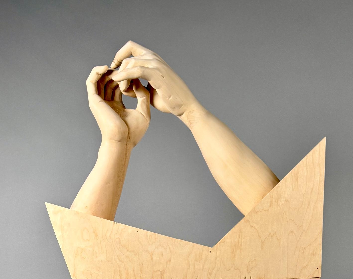
Touch is how we first come to understand the world—immediate, instinctive, a way of saying I'm here without words. In Felt, Not Seen, I wanted to linger in that idea: how touch speaks not only of presence, but of care, of vulnerability, of the intricate ways we relate to one another
The sculpture features two arms emerging from a sharply faceted wooden form. Their hands are interlocked—fingers gently pressed together, suspended in the quiet
BasswoodFelt,NotSeen,
suggestion of motion. The gesture, drawn from sign language, means “relationship.” It's not static. It holds tension, softness, a subtle rhythm—like the start of a conversation or the echo of one long past. That ambiguity—of time, of meaning—sits at the core of the work.
Before I Carve
Before I carve, I draw. I spend hours sketching hands in countless positions, studying the architecture of the form—how bone, tendon, and skin conspire to create expression. Each
drawing is an exploration of tension and release, of gesture as language. I work from life and from sculpted molds, rendering not just structure, but presence. I look for the subtle shifts: the way a wrist softens under weight, how a finger arcs in hesitation. These aren't just studies—they're rehearsals. Through line and shadow, I search for the emotion that lives in form, the story held in stillness.
“Carving asks for a different kind of attention: a slow, subtractive patience where every mark is final and full of care.”
-Lorenzo Cardim
. I work in a variety of woods for commissioned pieces —each with its own demands, its own voice. But for my own work, I return to basswood. I prefer it because it listens. Its fine, even grain offers precision, but it's soft enough to carry tenderness. It allows me to carve in a way that feels intimate—like speaking in a whisper. I begin with saws and large gouges, blocking out form with broad, confident cuts. From there, the pace slows. I move to finely honed gouges, allowing the details to rise gradually—listening to the wood, letting it reveal what it wants to keep
Some surfaces I leave rough, marked with the rhythm of the blade. Others—knuckles, creases, the gentle compression where fingers meet—I shape more deliberately. That contrast is intentional. It reflects how connection feels: some moments come into focus; others remain unfinished. I don't sand away all the tool marks. They matter They are the residue of process, of attention, of touch made visible.

hands.
Felt, Not Seen is about how we shape and are shaped by one another. It's about how gestures carry weight, even in their quietest form. These hands aren't simply touching—they're reaching, holding, nearly moving. In that space between motion and stillness, I try to hold something true: to be in relationship is to stay open—to contact, to change, to care.
“Basswood is a species of linden tree common to North America. A large shade tree, basswood provides wood for beehives, crating, furniture, and excelsior It is also a popular honeybee tree.”
-The Encyclopedia Britannica


Best Bourgeois was awarded the Sentient Academy Award of Excellence for her painting Hummer at Feeder II in the recent Realism on the Hudson Exhibition at the Howland Cultural Center in Beacon, NY.
Karen Burns, EAM
In Full Bloom, 20"x l O", has been juried into the NOAPS International Best o[ America Small

Works Exhibition which will be held at the Eisele Gallery in Cincinnati, Ohio, May 9 through May 31, 2025.
Bursting Blooms, 24"x24", has been juried into the Richeson75 International Still Life and Floral Online Exhibition as a Finalist. This exhibit begins April l l, 2025.
Get Up! Brush Yourself Of{!, 24"x24", won First Place at the Magnum Opus International Juried Exhibition at Sacramento Fine Arts The show runs from March l l through April 12, 2025.


Mary Chandler
Glorious Sunlight, After the Rain

Mary Chandler, EAM
Mary Chandl er's painting Glorious Sunlight, After the Rain has been awarded Best Floral in Plein Air Magazines December 2024 Piein Air Salon Art Competition. This qualifies her as a se mi-finalist in the 14th Annual Plein Air Salon Art Compefifion {or 2024.

Caryn had her colored pencil painting, Season's End, selected as a finalist in the upcoming 2025 Richeson75 Still Life & Floral Competition and Exhibition. The online exhibit was open for viewing on April 18th, 2025 and can be found at richeson75.com.

Lorraine recently received a Special Merit Award from Art and Color 365, for her penci I drawing Jodie's Eyes. The art will be featured in the International Art Magazine's Spring issue.


Dill's portrait of Regina, Free Minds Member, Youth Charged as Adult will show in the Oil Painters of America's 34th National Exhibition of Traditional Oils, May 30 through June 28, 2025, at The Herrig Center for the Arts, Bradenton FL. There will be a printed catalog as well. This exhibit ion consist s of artists throughout North Am erica.
Jeanette created illustrations in The Promise of Sunrise: Finding Solace in a Broken World, the latest book by the Burroughs medal-winning author and naturalist, Ted Levin. The book is available through Green Writers Press in March of 2025.


Karen's pastel painting, The Guardian of Central Park West, was featured in American Art Collector (issue 223, March 2025, pages 031 and 032) as part of an article about the Salmagundi Club's 141 sf Annual Juried Members Exhibition which ran through March 14th.

Heather won an Honor Award in Richeson75 Small Works Exhibition for her watermedia painting, Triumph. Richeson Gallery, Kimberly, WI, running February 21 through April 25, 2025.


Aki Kano, SM
Aki's watercolor self-portrait, lllumination, is highlighted in the May issue of Fine Art Connoisseur in a feature about watercolors. Aki's portrait of her two cats, Sisters, was also selected to be featured in the article Wild At Hearl, Pets - Collector's Focus in American Art Collector's May issue. Aki was recently interviewed by Canvas Rebel Magazine https://canvasrebel.com/meetaki-kano/

Debra took best in show for her 3" x 3" painting Just in Time at the WaterWorks Art Museum Miniatures and Mediums National Exhibition in Miles City, MT. All work in the show fits into the palm of your hand. Visit at Debra Keirce - Event - Miniatures & Mediums Exhibition for a view of Debra's work.

Debra was chosen as judge for Southwest Artists National Small Works Show, April 30 through June 28, 2025. Southwest Artists was founded at the end of WWII to help heal the wounds of war. The shows continue to be held at Mena Art Gallery in Mena, AR. All work in the show is less than 16" on any side. Debra's 9" x 12" painting in the show is called Evening Comes. Southwest Artists Mena Art Gallery - PageGallery Shows & Exhibits


