Our Purpose.
through the promotion of high standards of beauty, integrity and craftsmanship in painting, sculpture and the graphic arts.
To emphasize the importance of order and coherent communication as
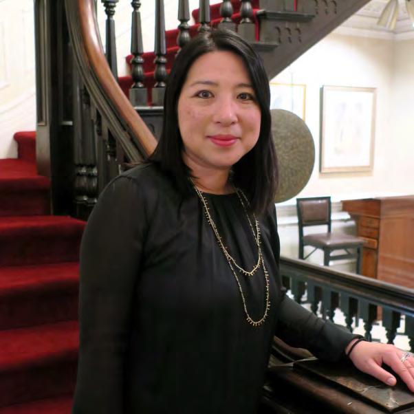
Letter from the President
The latest AAPL news from Aki Kano.
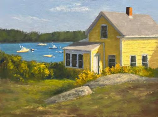
And the Winners Are... Winners of AAPL's Juried Members Show, Timeless, at the Lyme Art Association in Old Lyme, Connecticut.
A Realist painter until her last brush stroke AAPL President Aki Kano interviews Master Watercolorist Lana Privitera.
The Story behind the painting A Healthy Obsession with Elected Artist Member Andy Eccleshall Painting the Beauty in Her Life with Associate Artist Member Temple Reece two AAPL updates to our leadership team Meet AAPL’s new Vice-President, Heather J. Jones, and New Marketing Director, Bill Jobson. The Story behind the drawing Appearances Can Deceive with Elected Artist Member Arlene Steinberg Come blow your horn The most
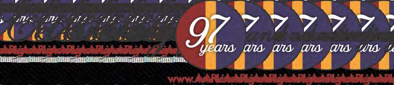
Grapevine N ewsle�er
fall
2025
Le�er from the President
Happy Autumn!
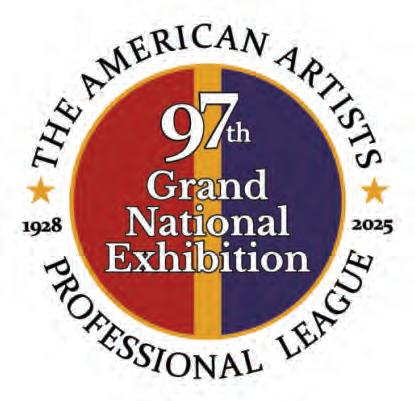
This is an exciting season for AAPL, with two exhibitions happening back-to-back. Timeless opened on September 19th at the historic Lyme Art Association in Old Lyme, CT, and runs through November 6th, followed shortly by our 97th Grand National Exhibition at the elegant Salmagundi Club in New York, November 18th–December 5th. The AAPL Board of Directors and I remain committed to providing meaningful opportunities for our talented members and the broader art community through these exhibitions.

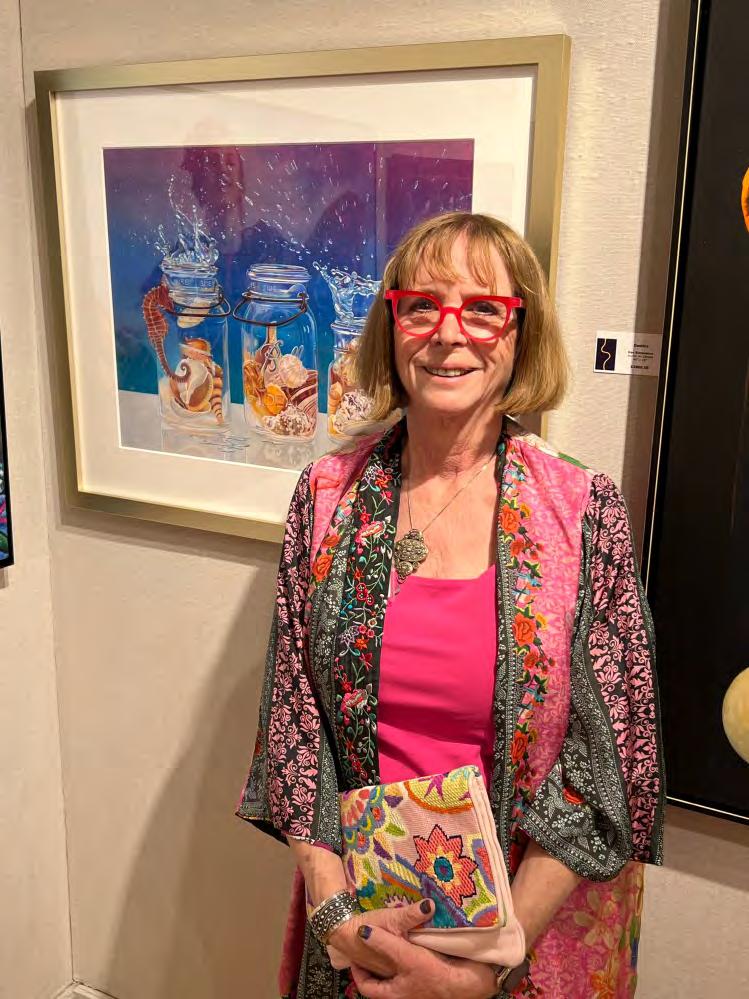
The Timeless reception was a wonderful success, and the exhibition looks fantastic. Thank you to our Chair and selection /awards juror Del-Bourree Bach, along with awards juror Antonio Lones, for their excellent work in recognizing seven very deserving award winners, which Del and I announced at the September 21st reception. See pages 6 and 7 for the list of winners. I was so delighted to mingle with so many member artists and hear such positive feedback about AAPL—words that make all of the Board's efforts so worthwhile.
If you haven't yet picked up a catalog for Timeless, you can order a copy through MagCloud: https://www.magcloud.com/browse/issue/3156523
And don't forget to cast your vote in the Timeless Viewers' Choice poll: https://aaplinc.org/timeless-2025vc
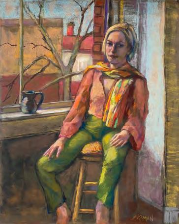
This edition of the Grapevine features Signature Member Lana Privitera, who discusses the background and details of her remarkable watercolor paintings. In “The Story Behind the Painting,” Elected Artist Member Andy Eccleshall and Associate Artist Member Temple Reece share their inspiration and creative processes in creating their stunning work. In “The Story Behind the Drawing,” Elected Artist Member Arlene Steinberg shares the hidden meaning behind one of her marvelous images. Read on to learn more about their amazing art.
Looking ahead, I'm thrilled for our agship event, the 97th Grand National Exhibition. Congratulations to all the artists whose work will be featured! The awards reception will be held on November 21st from 5:00–7:30 pm. In addition to celebrating the award winners, the evening will also feature a special performance by the amazing 13-year-old pianist Brielle Logel. As always, our receptions draw hundreds of attendees—please remember to RSVP in advance:
https://www.zeffy.com/en-US/ticketing/97th-grand-national-exhibition-awards-reception
Rick Brosen
Thank you to the renowned watercolorist for being our awards judge for this important exhibition. He will not be able to attend our reception, but I look forward to reading his statement about his experience jurying the awards during the awards ceremony. Also, please look out for the write-ups
about our 97th GNE in the November 2025 issues of Fine Art Connoisseur, American Art Collector, and Southwest Art magazines.
To close the exhibition, Elected Artist Member Scott Nickerson will present a live oil portrait demonstration on December 5th, the nal day of the show. Please RSVP in advance at:
https://www.zeffy.com/en-US/ticketing/scott-nickersons-live-painting-demonstration
This year’s AAPL scholarship recipients have been announced. Victoria Sepulveda, a student at the Grand Central Atelier, received a $5,000 award through the Art Renewal Center (ARC). Celeste Maslovsky, studying at the Art Students League of New York, was also awarded $5,000 from the League. Each year, AAPL proudly presents two scholarships to support promising students dedicated to creating art in the realist tradition. See more information about the scholarship recipients in the upcoming pages.
I hope to see many of you at our upcoming events!
As always, keep painting and creating!
Sincerely,

Aki Kano President, American Artists Professional League
Let’s Stay Connected!
Connect to AAPL on LinkedIn: https://www.linkedin.com/company/aaplinc/ Friend AAPL on Facebook: https://www.facebook.com/AmericanArtistsProfessionalLeague Follow @aapl_nyc on Instagram and we’ll follow you back! https://www.instagram.com/aapl_nyc/ View all of AAPL’s videos on our YouTube channel: @americanartistsprofessiona8630


Winners
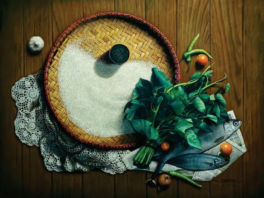
FIRST PLACE: $600
Romeo Ratio Cortez Jr. Daily Grace
Pastel
23 x 29
$5,000
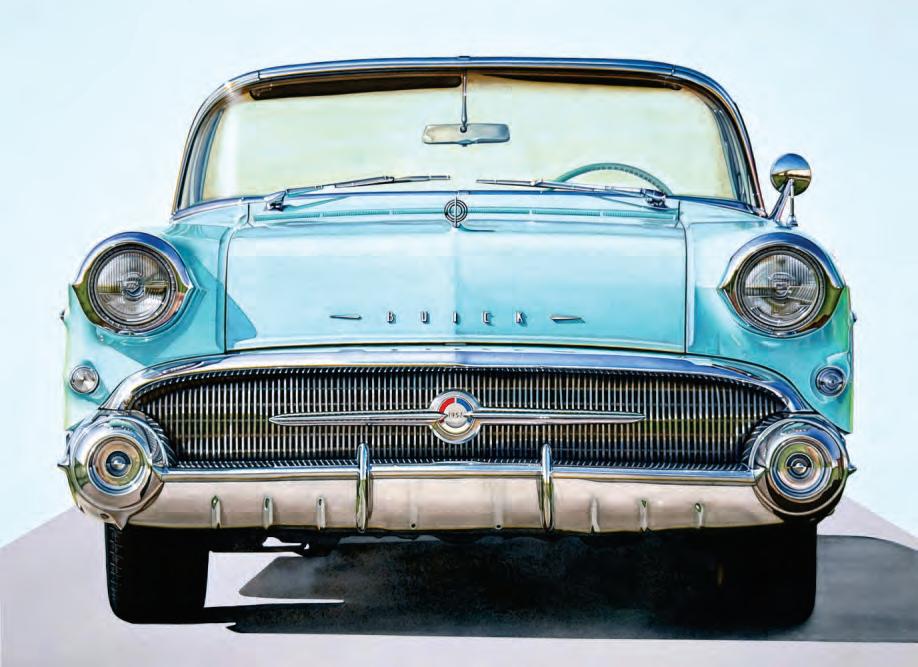
SECOND PLACE: $400
Heather J. Jones
Saving Up for a Buick Watermedia
22 x 30
$9,600
Honorable Mention: $50
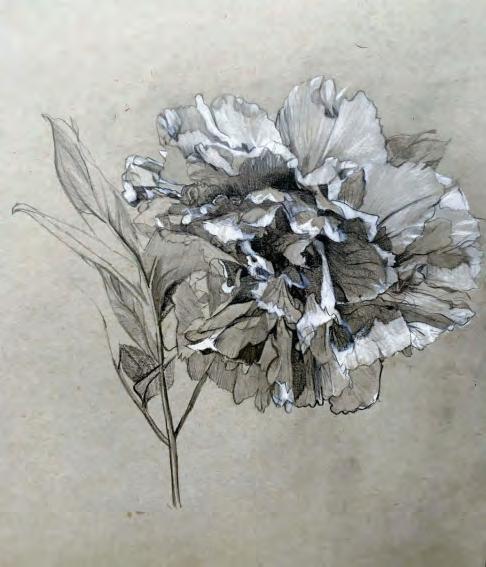
Aki Kano
Peony I
Graphite
11.5 x 11.5
$800
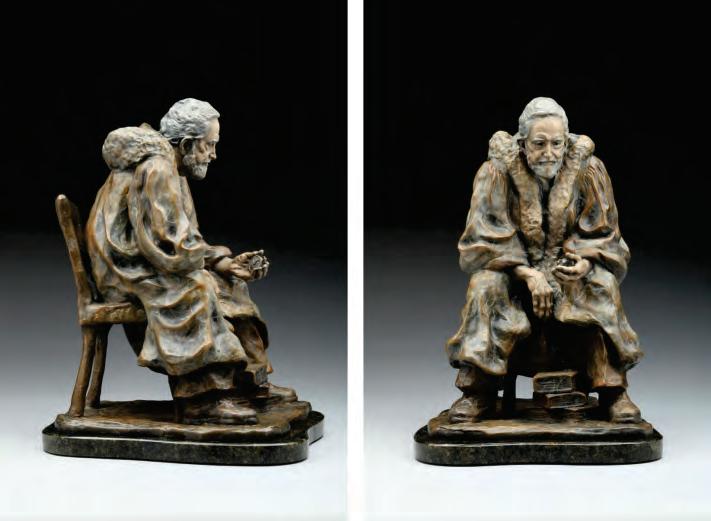
Angela Mia
Fine Art Connoisseur Half-Page Ad Award Winter
Sculpture
17 x 10 x 10
$4,900
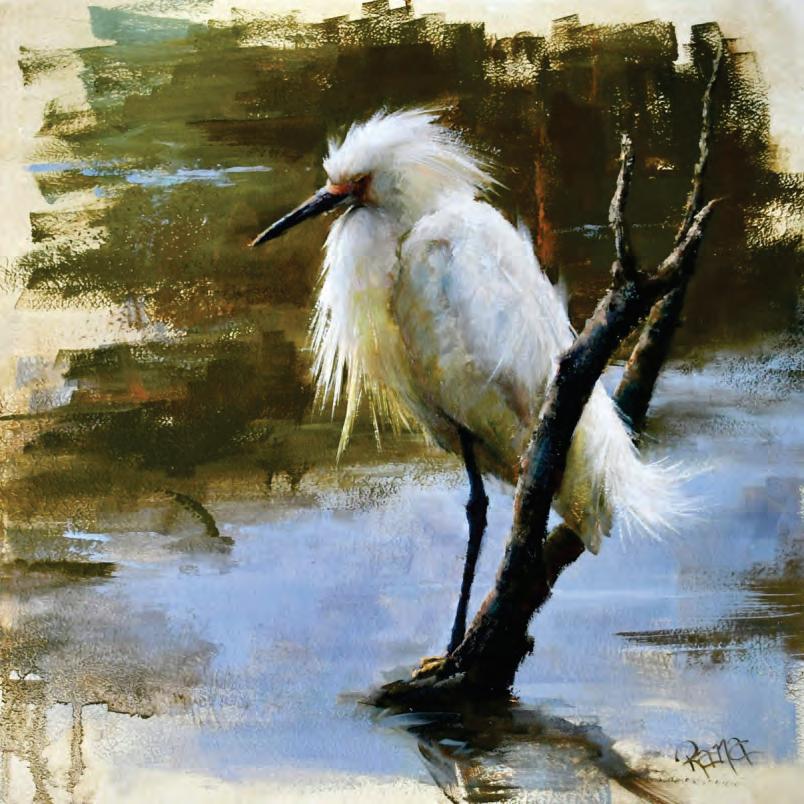
THIRD PLACE: $200
Rana Jordahl
Egret Nothing Oil
12 x 12
$1,700
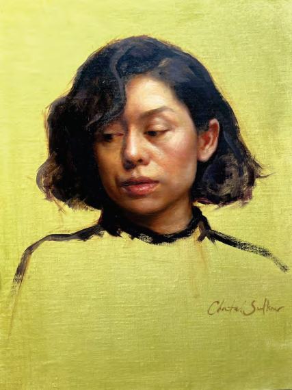
Chantal Sulkow: American Art Collector Full Page Ad Award
Portrait of Monica Oil
12 x 9
$3,500
Honorable Mention: $50
Katherine Irish
A Blaze of Red
Pastel and White Colored Pencil
30 x 15
$2,500
2025 Scholarship Recipients and Artist Statements
This year's AAPL Scholarships will go to Celeste Maslovsky and Victoria Sepulveda.
Celeste Maslovsky has been awarded The American Artists Professional League Scholarship for students of realism. Celeste studies at the Art Students League of New York.
To watch Celeste’s YouTube video, click here:

Celeste's “Personal and Artistic Statement”
“I am a representational painter of the human form, focused primarily on the face. I nd myself thinking of my portraits as I go to sleep and they are often my rst consideration in the morning. I enjoy painting people who have a solid sense of self. The challenge of capturing their strength of spirit is fascinating to me. The variety of people who I see this quality in is what most inspires me to paint.
Through the instruction I have already received through AAPL, my ability to see and paint has grown in many ways. Each critique I have received from a League instructor has helped me to develop my eye. I have been thrilled every single time I enter the building on 57th Street for Robin Smith's class. My hours painting from a model with her skilled instruction have been invaluable. In future class work, I hope to improve my anatomical knowledge, play with the complexity of color and continue pushing my condence as a painter. So far I have only been a part-time student, always wishing for more time. I look forward to the extra time, instruction and learning I would no doubt enjoy as a full time student.”
2025 Scholarship Recipients and Artist Statements
This year's AAPL Scholarships will go to Celeste Maslovsky and Victoria Sepulveda.
Victoria Sepulveda has been awarded the American Artists Professional League award for the 2025 ARC Scholarship Competition. She studies at Grand Central Atelier in New York.
To watch Victoria’s YouTube video, click here:
Victoria’s “Personal and Artistic Statement”
"As an artist, I am driven by a sense of awe at the beauty of this world we live in. It is this feeling that has drawn me to the works of the old masters, to try to uncover not only their techniques but also their long-forgotten way of viewing the world, of participating in something greater than themselves. Through the challenges of the human experience, art has always been my anchor. This is why I feel compelled to pursue a career in the arts: so that I may share a sense of relationship to the sublime with those around me.
Creating realist art is a slow, meditative practice, something I believe is more important than ever in a world where everything is quick and convenient. To me, it is an act of gentle rebellion to prioritize slowness and intentionality over instant gratication. By choosing craftsmanship, presence, and discipline, I feel I am investing in the kind of future I want to live in.
I am deeply honored to receive the AAPL scholarship: this support is allowing me to devote myself completely to my artistic education in the next year. I am incredibly grateful for the kinship and mentorship I have received at the Grand Central Atelier, and to my family and friends for supporting and cheering me on.
My dream is ultimately to travel the world and engage in a lifelong study of craft, inspiring large narrative works expanding upon careful studies made from life. In doing so, I hope to contribute to the long lineage and living tradition of realist art, as well as the world at large."
Member Artist Highlight
A REALIST PAINTER TILL HER LAST BRUSH STROKE
An interview with master
WATERCOLORIST
Lana Privitera
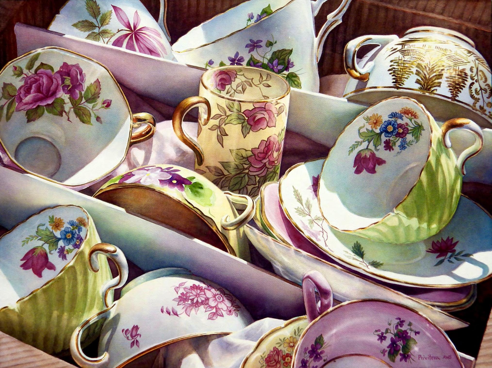
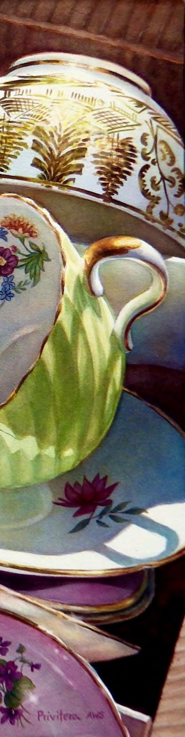
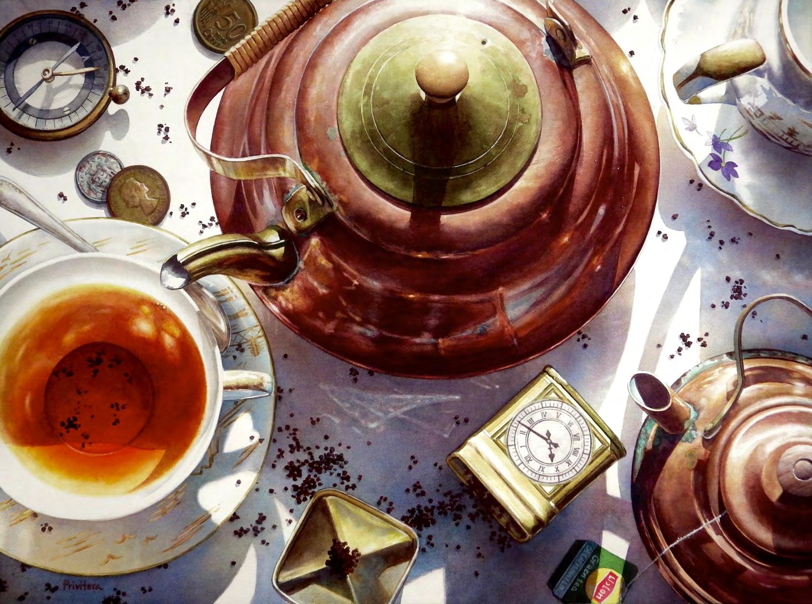
Daretobedifferent by Lana Privitera, SM www.www.lanaprivitera.com
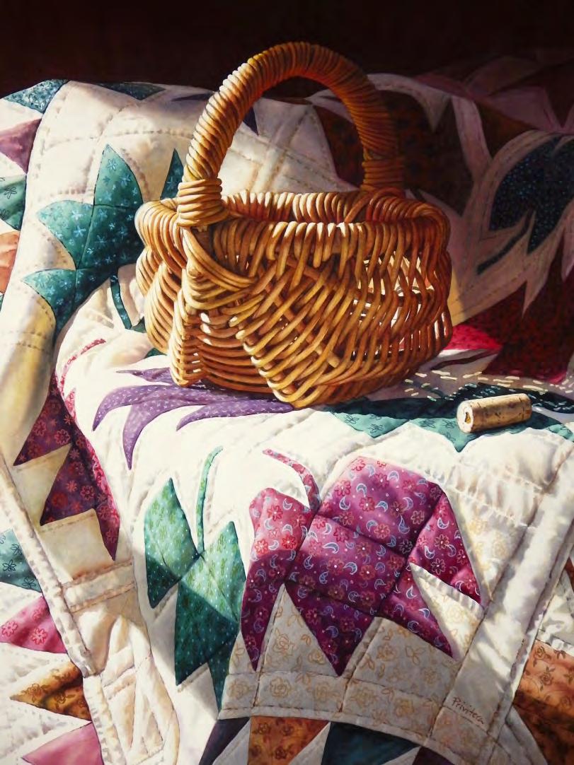
Originally from Spain, Lana Privitera graduated in 1983 from the Fine Arts School of Zaragoza, where she majored in Fashion Design and Art History. After working in Advertising for a few years, she moved to the USA in the early 1990s. Mrs. Privitera returned to painting and art competitions full time in 2014, specializing in creating very detailed still lifes in Watercolor.
Background & Inspiration
What rst drew you to watercolor, and why realism as your main style?
Even as a young kid I felt more attracted to watercolors than to crayons and it seems that that preference paved the way for my future. Drawing and painting have been a constant in my life and I have
always been fond of Realism. So, when I arrived in the US in the 1990s and realized how many people admired realistic artists here, I saw no reason to try to switch to another medium or to another painting style.
Who or what were your earliest artistic inuences?
I was raised in Spain, and my parents made sure we visited museums and traveled to Historic sites frequently. We also had an extensive library that included many art books. I was 9 years old when I fell in love with Van Gogh, Vermeer and Turner's work. It wasn't until I was an adult that I nally felt some interest in other more avant -garde styles.
Has your style changed over time, or has it always leaned toward realism?
My style has remained unchanged through all my life. I have always had an eye and preference for replicating detail. Even as a young kid I liked to draw every single fold and shadow in the fancy dresses I designed for my Princesses and super models.
Process & Technique
Can you walk us through your typical painting process from concept to nal piece?
Because I'm so thorough with the planning of my paintings, I might spend several days taking reference photos before choosing the nal design.
I always hand-draw the nal design of the project in sketch paper rst, and then I trace it onto my watercolor paper using a Light box. I do this to make sure that there are not erasing marks anywhere damaging the watercolor paper bers.
I do not pre-stretch my watercolor paper. Meaning that I don't soak it in clean water before attaching it to my board.
If the project is large, I tape down all the perimeter of the watercolor paper onto a rigid board, and then I staple down over the tape every two inches. For smaller projects I don't use the staples, just the tape.
If the painting has a dark background, I paint that background rst.
To protect the rest of the painting from the dark colors, and to make sure I have freedom of movement with my brush strokes, I mask the immediate area completely before starting to apply any layers of paint to the background. A dark background might need four to seven layers depending on if it is a uniform color or if it is variegated.
Steps of the Process
STEP 1 - Mapping the painting - If my project doesn't have a dark background, I proceed directly to “map” the entire painting. That means that I will paint almost every single shape in the project in the lightest color that I can see in my reference photo. Mapping allows me to see if all the shapes are drawn correctly, or if some of them look odd. At that point I can still correct shapes and also modify the design.
I don't usually rely on masking uid to save highlights, but If I feel that I might forget to save them later, I will reserve them with masking uid at this point, before I paint that rst layer.
STEP 2 - Second layer - I like to use the second layer to establish some mid values and to see how the paper is reacting to my colors. Sometimes the paper is “drier” than you are used to, and you have to adapt your process, so you don't run into problems later. Currently, defective paper is a common issue.
STEP 3 - Introducing the darkest darks - At this point I like introducing some of the smaller darkest darks. That helps me assess better the range of the mid values and how dark I need to go in some other spots.
STEP 4 - Completing all the mid values and shadows - I move around the painting adding more mid values here and there, completing all the shadows and smaller individual objects.
STEP 5 - Working on the details - Once all the shadows and mid values in the larger shapes are in place, it is time to start completing the details. The details might need two or three layers themselves to become realistic. So, I start completing one object at a time.
STEP 6 - Relying on intuition - Rening the detail and cleaning edges - Once the painting looks almost completed, I put it away for several days or weeks.
When I return to it, I try to critique it objectively, looking for problems and for things that need improvement. I actually write a list, to keep them in mind.
I also take photos of the painting at this stage because it helps me see better the problems when I see them in small format.
Then, I take my time and work on the painting's issues, one by one, adding colors and values that I feel will improve it, lifting hard edges and creating extra highlights where I think they are needed.
STEP 7 - The last revision - We all rush to post our work on social media only to realize two weeks later that we found a new problem to x. That's why I wait at least another two weeks before calling it done. Because when you start taking the “nal” photos you ALWAYS nd something that needs more tweaking.
How do you handle watercolor's unpredictability while maintaining realism?
Knowing your paper properties and knowing how much water to use for each particular section in your project is crucial. For example, for small details, you don't need much water and it is best to paint directly on dry paper using a relatively small size brush.
Color won't spread beyond the brush stroke edges when applied on dry watercolor paper, but color will ow freely if you apply it in a pre-wet area.
To paint a realistic project successfully, you basically have to work in sections, but each area might require a different technique.
When working in large areas, wetting the paper rst with clean water is especially important, as it allows the paint to spread smoothly within the boundaries of that wet area.
But to paint clean, interesting, large washes you need to be prepared with large brushes, larger puddles of paint and a quick hand.
Personally, to maintain control of where my paint goes, I keep my board at while applying the paint because it helps me to disperse the paint more evenly. But if I want to create more interesting effects or I desire changes in value or color, I will tilt my board in different angles to redirect the ow of color to other areas.
Do you work from life, photographs, or a mix of both —and why?
My current work is mostly still lifes, and I nd it really useful to have some good reference photos when I start planning the painting. The photos help me see better if the composition works well or if something is missing. I take hundreds of reference photos for each of my projects. Later, I choose only the ones that I think show the best composition and that have the right contrast and colors. But once a painting is about 80% completed, I ignore the reference photos and I rely only on my intuition and creativity to add color nuances, or extra values where I think they are needed.
What are your go-to materials, and what makes them essential to your practice?
Paper for me, is the most important element when painting in my Realistic Style. My personal favorite is Arches Cold Press 140 Lbs. Natural color.
Yes, I can paint on other papers, of course, but they will not react the same way to my washes so, if I use them, I need to adapt my painting style to those papers' particular absorbency and “liftability” rates, which might become quite time consuming, and I still might not get the best results in the end.
An important tip here: When using Cold Press paper, I recommend that you use the “bumpy” side of the paper, where the grain is more relevant. That side lets the washes spread more evenly and also allows you later to lift highlights when needed. The more “at” side of the paper can give you more uneven results and lifting color from it later might prove harder to do.
You can nd my general Material List on my website https://www.lanaprivitera.com/
I use mainly Daniel Smith paints and Escoda brushes.
How do you build depth and luminosity without losing watercolor's transparency?
Oil and watercolor pigments have similar names and properties. You have some that are more transparent, and some that are more opaque.
To paint luminous shadows in watercolors, you need to know the properties of your colors. If you use opaque colors exclusively you might end up with muddy looking shadows and at-looking objects. You need to know when to use opaque colors.
I personally work only with professional transparent watercolors that are rated excellent for lightfastness. I have a very limited palette of about 5 or 6 favorite Daniel Smith colors that I mix either on my palette or blend wet-on-wet on the paper to obtain a range of different hues and values. Of course, I use other hues too when needed, but most of the time all I use is Cobalt Blue, Quinacridone Burnt Orange, Quinacridone Rose and Quinacridone Gold.
Working with very transparent washes, and letting them dry thoroughly between applications is fundamental to get clean-looking and transparent layers. Sometimes I might need to apply six to eight layers to get the depth I'm looking for.
What's the most technically difcult part of painting in watercolor realism?
Each artist has different strengths. What is easy for
one is difcult for another. But I would say that many artists nd Drawing quite daunting. After teaching for many years, I came to the realization that many artists don't like to draw free hand because they don't have good observation skills. And that is a problem because even when they trace a template, they are unable to see where they misaligned a curve or which straight lines became wobbly.
Other artists are able to see the problem, but they don't know how to x it.
Many of these artists also struggle replicating varied levels of contrast because they literally cannot see the nuances within shadows.
So even if these artists can apply beautiful watercolor washes, unfortunately their paintings will always come a bit short of total realism.
The good news is that they can train themselves to become better “observers”. They just need to spend a bit more time training their eyes and learning some old drawing tricks.
Have you ever had a piece go wrong mid-process? How did you adapt or recover it?
The creative process with watercolors is never fail proof. I personally switch gears halfway in most of my paintings for many reasons. Sometimes accidents happen and you need to disguise an out-of -place color or shape. Sometimes, you realize that you should add or remove an element from the composition to make it more interesting. That is why I paint in layers from light to dark. That way I can easily correct any problems early on. And that's why I say that the “bumpy” side of the paper is better for Realistic watercolor work. That side of the paper tolerates lifting better and you can go almost back to white if you need to correct an outline or switch hues.
I never have the perfect Reference photo, so many times I have to reinvent a whole section. I usually leave that kind of problematic area to paint last. Once I see what the completed 90% of the painting looks like, I can decide on the best colors or shapes for the problematic area.
If the problem is really bad, I might just get some scissors and trim off the offending section, and I just complete and frame the best portion of the project.
I have sold many “trimmed” paintings through the years.
How do you balance technical precision with artistic expression?
Some people accuse Realistic artists of not being “creative artists” and I totally disagree with them. Your personal artistic expression shows in the colors you choose, the objects you decide to depict, and on how you implement the rules of design and composition, placing those objects in the connes of the paper or canvas. I might choose to leave some hard edges or to soften some lines to enhance an object. I might exaggerate a highlight or create some new ones to bring more balance to another area. Realism is not a synonym of Rigidity. We Realistic painters still have leeway to bend reality to suit our vision.
Philosophy & Vision
What does realism in watercolor allow you to express that other mediums or styles might not?
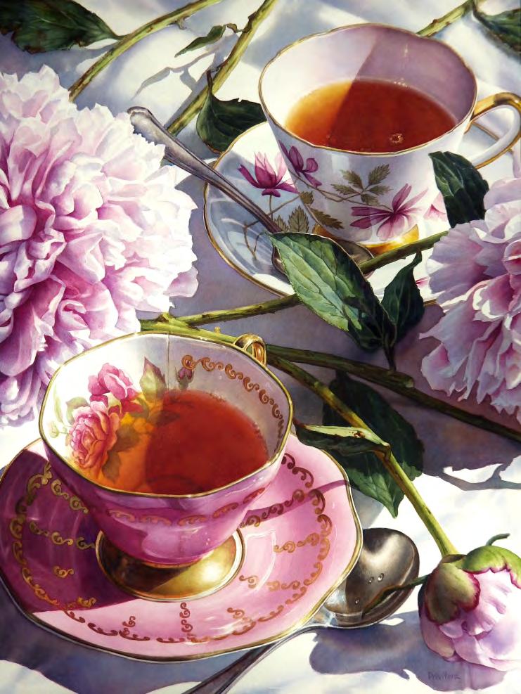
Teafortwo
I could paint the same exact paintings in watercolor, oils and pastels and I'm sure I would enjoy working in them all.
They all would express the same and they will all look about the same. But only the watercolor version would give me the ultimate satisfaction of knowing that I conquered a very difcult challenge.
How do you choose your subjects, and what qualities draw you to them?
As any other artist, I have a personal vision and motivation when it comes to creating art. But to be truthful I'm also a business woman. I need to nd subjects that suit my taste and personality, yes, but they need to be subjects that are able to provide me with nancial stability.
So, when I returned to the art world in 2015, I explored social media and saw what was trending and who was nding success. Then I assessed objectively my set of skills and my favorite subjects and decided to focus on painting difcult realistic
still life watercolors.
I didn't want to do what others were doing already, so I searched in yard sales and secondhand stores for unique cloths and decorative objects that were pleasant to the eye but hard to replicate faithfully in watercolor.
Then I took my time revisiting the Principles and Elements of design until I could apply them instinctively to my compositions.
Today I plan each of my watercolors like my life depends on it. I take reference photos several days in a row, in different light conditions and angles. Later I stare at those photos on my computer screen while I write notes on what I need to change in them to improve them. It might take me several days to decide on the nal design. The more difcult a subject is to replicate, the more I will enjoy painting the project.
How do you keep your work fresh and avoid repetition in your compositions?
I like experimenting with new view angles, contrast and color.
Some subjects look better when you present them surrounded by dramatic shadows, and others look better when using an extensive range of happy colors. Some objects look more interesting when looked at from above and others when you see them in back light. The possibilities and variations are endless. I try to alternate the view angles and subjects often, to avoid repetition.
Career & Audience
How has your work been received in the art world, and do you feel watercolor realism gets enough recognition?
In recent years watercolor has gained a lot of recognition in the Art World. Thanks to Still Life Realistic painters such as Chris Krupinski, Laurin McCracken and Soon Young Warren, watercolor became more relevant years ago. Other amazing watercolorists such as Andy Evansen, Thomas W. Schaller, John Salminem, Dean Mitchell and Alvaro Castagnet - to mention just a few - have amassed thousands of followers that love their more loose styles and subjects. All these artists have opened the doors to a brighter future for many of us working
in watercolors.
I'm very happy to be where I am today, getting recognition for my personal painting style and subjects.
Can you share a moment in your career that felt like a turning point?
In 2015 I had the chance to return to the watercolor world after an eleven year hiatus, and I had to decide in which direction I wanted to go. I had painted portraits, and home and pet commissions for many years and I wanted to try something new. After testing the waters with some Plein Air landscape and small-town scenes, I switched gears and completed a few simple still lifes. A few months later, in 2017, I hit jackpot with two large watercolors, “Silk” and “The Hunter”. Those two paintings went quite viral on Facebook and appeared in many publications nationally and internationally. I had received quite a few art awards in the past, before my art-hiatus, but the choices I made in 2017 denitely sent my art career in an upward direction that has brought me many satisfactions since.
Do you approach painting differently for exhibitions versus private commissions?
That is an interesting question. I have just nished an important commission, and I was panicking all the way through it, worrying if the buyer would like it. I plan and paint my commissions and my exhibition paintings the same way, so the method is the same for both. But I feel more free to change things half-way when I'm painting for an exhibition. I can stop and go as I please, leaving the painting alone for months when I need some fresh-eye objectivity. I usually work on three or four paintings at the same time, so I can take breaks from any piece that gives me problems.
That's why I usually don't paint commissions anymore. I don't like to rush my paintings, and I like to be able to deviate from my original plan if I feel like it.
How do you see your work evolving in the next few years?
I don't foresee my work changing dramatically in the future. I'm happy with what I have achieved so far and I'm comfortable with my subjects and style. I still have plenty of combinations of objects
to explore and themes that I have not tested yet. I just don't feel the urge to switch to other mediums or styles or to try to become super famous on social media. I'm very happy just being the little next-door-neighbor in my neck of the woods. I believe I will be a fullled and happy Realistic painter to my last brush stroke.
Advice for Others
What advice would you give to artists who want to master watercolor realism?
Advice #1: Be patient. Wait for the layers of paint to dry thoroughly.
Advice #2: Know the colors you need for your style of painting. Not every color is the perfect one for every style. Check the Material lists of your favorite painters and you'll see what I mean. Test as many colors as you can so you learn how they behave on the paper. I'm not talking about painting a chart full of tiny squares, I mean to test your colors in larger areas. See how they work when applied on top of another dry layer as a glaze, or when used wet-on-wet on the paper, or when mixed with other colors in the palette before applying the mix to wet paper. You need to know if a color is going to create mud, or if it will not lift at all. It's important that you see if it fades a lot when it dries, or if it's too opaque or extremely transparent.
Advice #3: Do some important reading. Memorize the 7 Elements of Design and the 8 Principles of Design. It will improve your compositions.
What’s the most important skill or mind set to develop for working in this medium?
Plan ahead and be patient. Let me repeat that: Plan ahead and be patient. You basically have to keep planning while you are painting. You need to know what layer and color should go rst, and what layer and color should be last. Rushing a watercolor might not work well for you.
What is one lesson that you learned the hard way that you would like to share?
I'm a methodical person, so I have never really had any major issues because I test and plan everything so carefully. But one time I almost ruined a painting because I didn't test a new color properly.
At that time, I had never used QOR paints before. I had heard that they don't fade when they dry, but I kind of forgot about it.
I needed to apply some reddish reection on a white and blue ceramic vase sitting atop red silk.
Without testing the color ahead of time, I got the left bottom section of the vase wet with a bit of clean water so the color could spread well, and then applied a pale Pyrrole Red Light glaze over it. I waited for the color to become more subdued… but, to my dismay, it never did.
The paint sank like the Titanic into the paper, and I was unable to lift any of it.
Since I didn't want to risk making more of a mess, or damage the paper, I just left it as it was.
I was very fortunate that I didn't apply full strength color that day.
Pyrroles ARE very strong staining colors, and QOR makes excellent Pyrroles.
I could have ruined my painting with just that little wash.
So, my best advice to you is: Don't forget to test your colors ahead of time!!
The 7 Elements of Design:
The path between two points, which can vary in Line: width, direction, and length.
The hue, saturation, and brightness that can Color: evoke emotions and convey messages.
The two-dimensional area dened by bound- Shape: aries, which can be geometric or organic.
The three-dimensional counterpart of shape, Form: adding depth to design.
The surface quality that can be seen or felt, Texture: adding richness to the design.
The area around and between elements, Space: which can create balance and focus.
The lightness or darkness of a color, contributing Value: to contrast and depth in design.
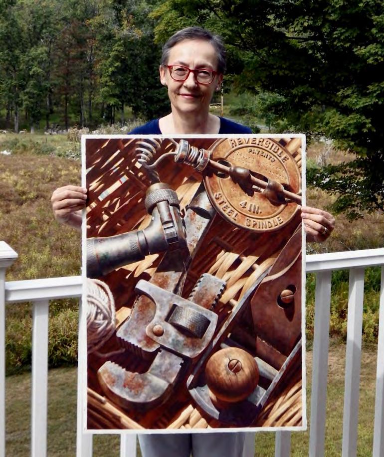
LanawithherwatercolorStillusefulnonetheless
For more information about Lana Privitera, her work, online tutorials, in person workshops, and demos, visit her website at: https://www.lanaprivitera.com/
The 8 Principles of Design
The arrangement of the artwork in a way that
Balance: does not allow any one element to overpower another. How well one element functions with the remain- Unity: ing elements.
The use of conicting elements or colors while
Contrast: still remaining harmonious and unied when the artwork is viewed as a whole.
The different types of elements used in a piece– Variety: for example, small and large elements, as well as black and white elements.
The path the eye follows when viewing a Movement: piece of art, or the elements in a work that create movement.
Proportion:
The size of elements in a design.
The repetition of elements or the use of lines to Rhythm: give the impression of energy or activity.
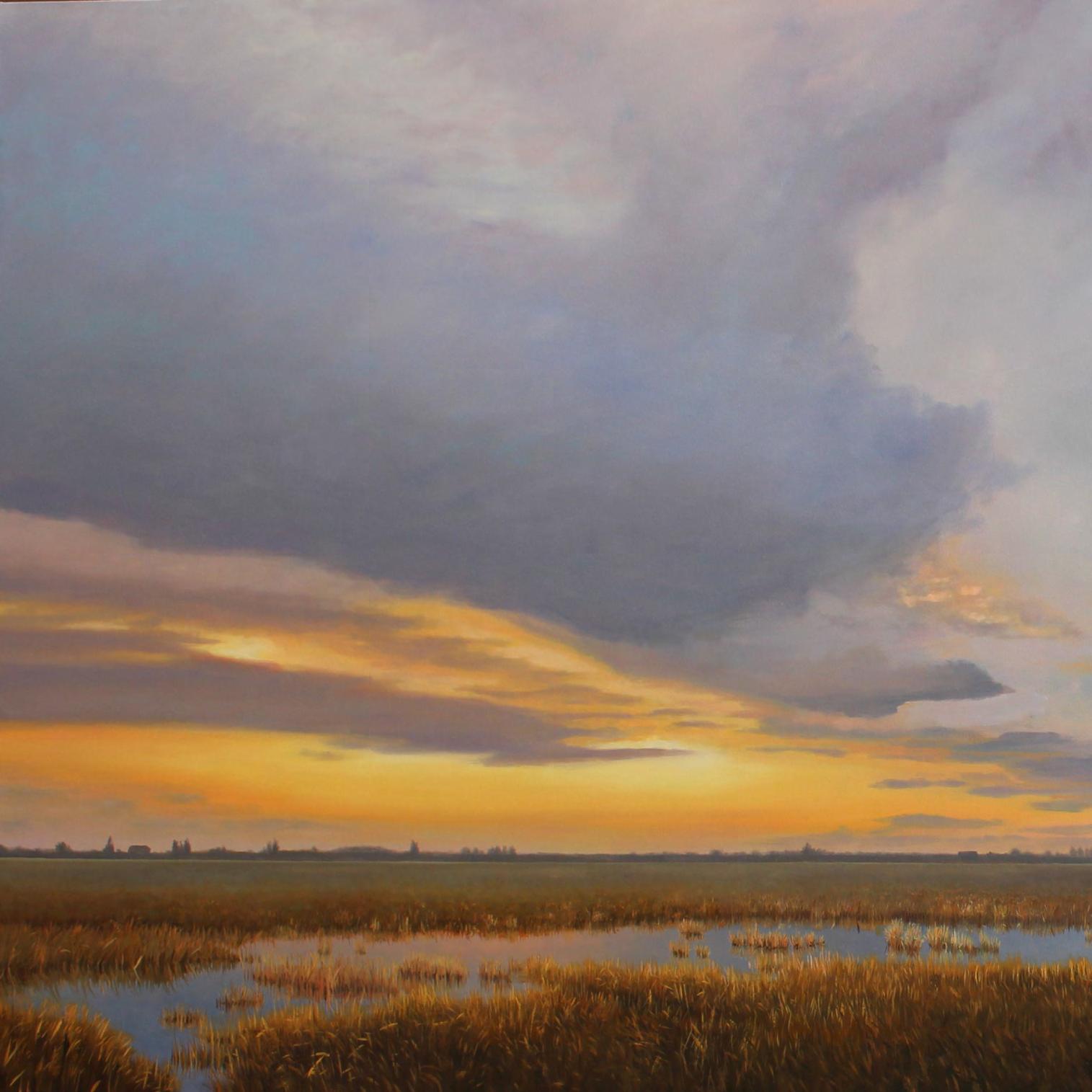

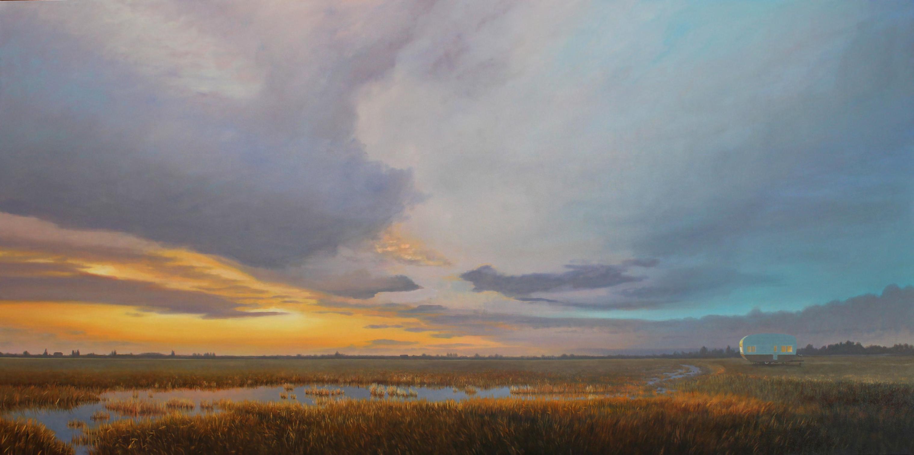
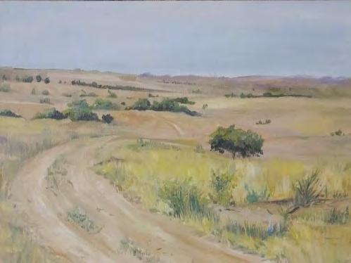
I've lived just north of Seattle in a wonderfully artsy town called Edmonds…and the weather is exactly the same.
Growing up I was always fascinated with the sky and the light. It was a sort of white light which created subtleties in the color palette of the landscape. Tonal, not vibrant. And so when I found myself in the Pacic Northwest I was delighted and inspired to nd the
same kind of light, a constantly changing sky and a never ending supply of inspiration.
We live in a spot which is east of the Olympic Mountains and west of the Cascade Mountains. The weather blows in from the west, separates around the Olympics and “converges” somewhere between Seattle and Everett WA, depending on the direction of the wind. This
leads to micro climates-sunny and warm in Seattle, dumping rain in Edmonds, sometimes all day, and often vice versa. And spectacular cloud formations result. Walls of cloud, brilliant white cumulus, or intricately layered strata. Not as
gigantic as the clouds found inland but still breathtakingly voluminous and visually striking.
Inspiration
I travel a lot here in the Northwest. We love the coast and the mountains but our favorite location is just a little north of us in the Skagit Valley. This is an area of reclaimed tidal ats (created well over a hundred years ago-by hand), expansive, at and dotted with old barns and farmsteads. It has attracted artists for generations and was home to the Washington Mystics; artists like Guy Anderson, Morris Graves, Mark Tobey and Richard Gilkey. They were drawn to the valley because of its unique light. And I'm drawn to it for the same reason. It's one of the few places in the region
where you can get wide open vistas of the sky. And with the Puget Sound to the west and the mountains to the east, the light play and the sense of distance is spectacular. Interestingly it appears to me that it's the same white light that I grew up with in the UK. The landscape itself is familiar too. Flat and rolling landscape, distant hills, fog, mist, cloud and lots and lots of WEATHER!
The Painting
When I paint I'm always trying the capture the “feeling” of the day. Whether it's the sun, the rain, the cold, the wind, the silence...I want the viewer to feel it too. So when someone says of one of my paintings "I know just how that feels” or “I know that day” then I know I've achieved my goal. One of the reasons I paint so large is that it enables me to put myself back into the scene and remember the atmosphere.
I paint in oil on canvas and I work in layers. The painting usually begins with an experience which I mentally chew on for a while. As the composition begins to form in my mind I can move the elements of the painting around in my imagination until I get it where I want it. Then thumbnail sketches to anchor it in place and a very fast, loose rendering in an oil wash on the canvas allows me to visualize the composition and know if the whole notion is going to work or not. The painting is then developed over a couple of months, slowly building the layers and rening the elements, the light and the mood until it's as close as I can get it to that picture in my head.
This particular piece attempts to capture the mood of an evening along a slough in the valley, in combination with some wonderful childhood memories of camping with the family.
The scene depicts the warm glow of a sunset over a fairly minimal landscape. The arc of the lowland in the front gently guides you to the horizon and the sky above. I wanted to try to capture some of the wonderful layering we get here. Low cloud and higher strata, with just enough of a break in the cloud to assure you that the sun will come out tomorrow...maybe. To the right of the painting, and almost not visible is a small trailer with its interior lights on. Why is it there?
When I was a child we used to borrow our friends travel trailer for holidays. There were ve of us in what was probably a 14' trailer, and it was so much fun. But money was tight so we couldn't always afford a proper campground, and on occasion we would stay on a farm, it was less expensive. So the scenario seen here is a little
nod to those “good old days” when we would pretty much have the place to ourselves. Settling in for the night packed around a table to play monopoly or cards, with a lantern and a cup of warm milk.
My hope is, whether you're a camper or not, or whether or not you like monopoly and warm milk, that you feel the warmth of the scene, the last glimmer of warm sun on the grass and the excitement of a new day ahead.
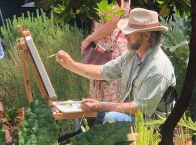
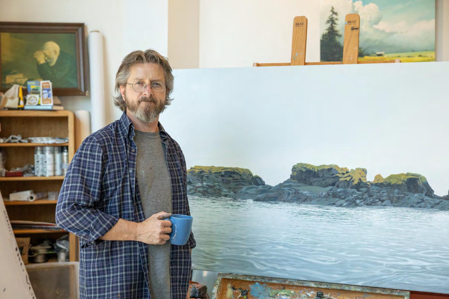
My studio is located at Graphite (202A Main St., Edmonds, WA). The studio is open by appointment so please contact me to schedule a showing. Graphite, and the studio are normally open to the public 12-5 Friday and Saturday and on Third Thursday Artwalks. If you see me working just tap on the glass (along 2nd Ave at Main St) and drop in for a visit! www.andyeccleshall.com
The Story Behind the Painting
PAINTING THE BEAUTY in HER LIFE

TEMPLE REECE
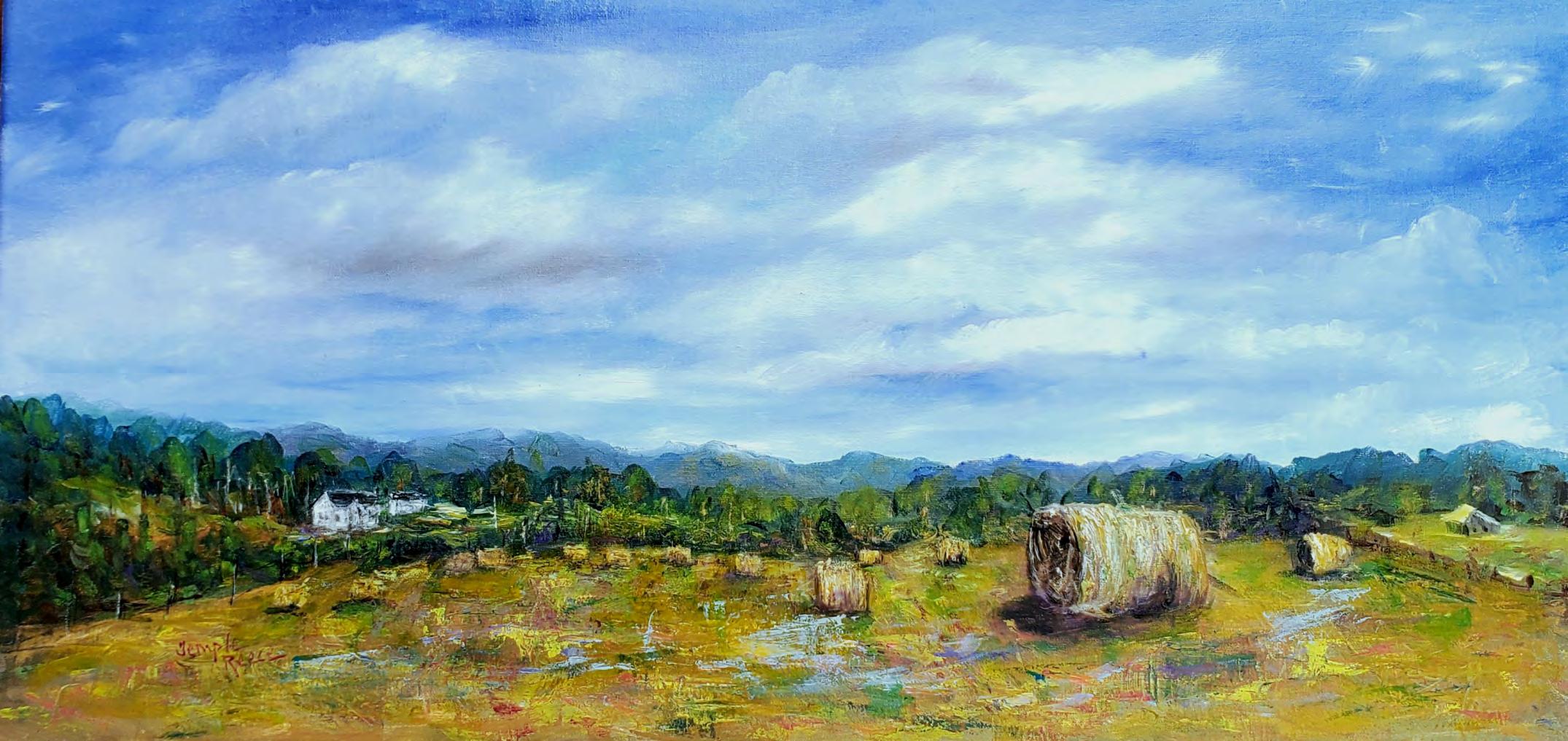
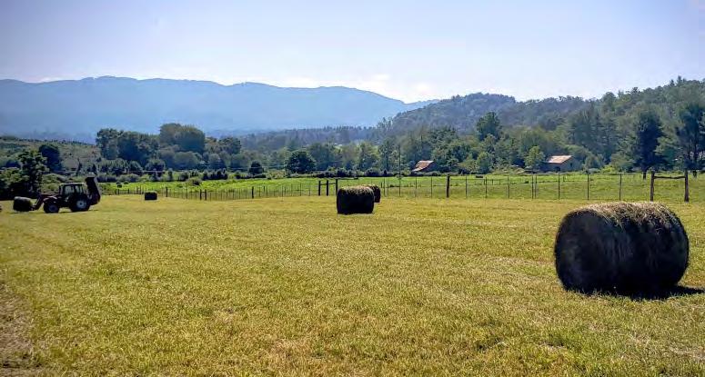
The Second Load- Hauling in the Hay was painted in oils on linen for “The Heart of the Land” Community Show at Johnson County Center for the Arts in Mountain City, Tennessee. The show in collaboration with the Johnson County Farmers Market was in honor and celebration of local farmers. The rst cutting of hay season had just ended and I had a head full of images and some on my phone, so it was the perfect time to paint the big rolls of hay. The rolls were stacked neatly in the hay shed and smelled so good which just added to the inspiration.
As with all parts of farming, hay is almost a year long process. From fertilizing the ground, weed control, fencing to keep the cows off the hay elds, then mowing, kicking, raking, rolling the hay and nally getting it in the dry before the summer rains. There's
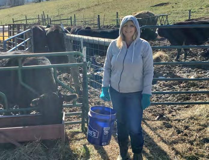
a little break before the second cutting at the end of summer and then not long until time to start feeding the hay. Every day from late Fall until the Spring grass grows, the cows and donkeys have plenty of hay and grain. One of my winter jobs is to carry buckets of grain to the feeders and make the hungry cows happy. It is sometimes very cold, muddy and not always fun. You never know what awaits you on any given day and the cattle have to be taken care of no matter the temperature or any other plans you may have.
Our farm is a beef cattle, cow and calf production that calls for a visit to the farm 365 days a year. It's a huge commitment to care for animals and the land and farmers don't take that lightly. I consider myself a farmer's helper
as my husband does all the tractor work but every day I'm there feeding, fencing or whatever needs to be done. I also spend a lot of time walking along the cow paths, through the pasture and the pines. It helps keep my body and mind in shape and do something productive at the same time. I love hearing the laughter of grandchildren who enjoy visiting the farm, too.
Lorenzo Cardim
Fellow Artist
The Beauty of the Farm
As an artist and lover of nature, I am always in awe of the beauty at the farm. The clouds are huge and puffy, mountains surround the farm with endless changing shadows, meadows are alive with wildowers and happy cows are grazing while calves run and play. I love to sit in the elds with my paints and watch the cows gather around. They get so close you can feel their breath on your back and they just watch, curiously. They will circle around and hang out with me as long as I paint. I think it's amazing that they do that. One of the donkeys comes by for me to rub her nose and have a little talk every time I'm in the eld.
touch speaks not only of presence, but of care, to one another. suggestion of motion. The gesture, drawn from sign language, means “relationship.” It's not static. It holds tension, softness, a subtle rhythm—like the start of a conversation or the echo of one long past. That ambiguity—of time,
Before I Carve
pressed together, suspended in the quiet
I have completed many paintings en plein air at the farm but even more after painting in my head and getting back to my studio. When I am doing farm work, my mind is savoring the moment but it's also creating art. I would guess
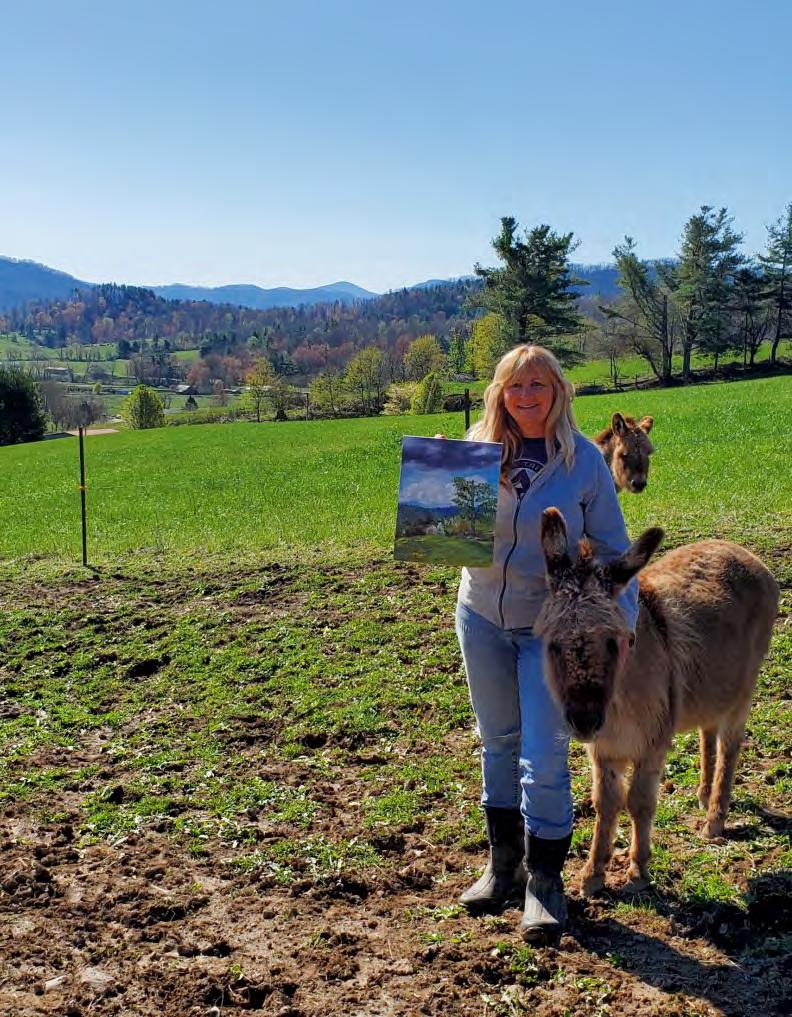
Temple with her friend Daisy, and the inspiration of the Appalachian Mountains behind her.
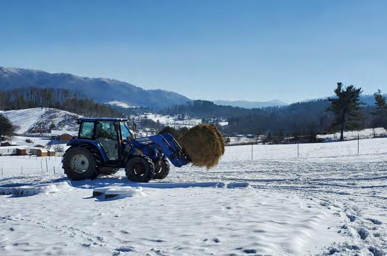
Meals on wheels: Temple’s husband Mike moving hay to the cows.
that at least half of my recent work has been inspired by the beauty at the farm. You would think it would always look the same but each day, even each moment presents itself with endless possibilities for art.
Art and farming go hand in hand as each nurtures and cherishes the land and all its glory. The stillness, the energy of life, the work, the hard times and all the rewards for ourselves and future generations thrives in art and farming. If you are ever around farmers, you might hear them say “I need to quit this farming, there's no money in it, too much work, tied down every day, etc….” but in the next breath, “but, gosh I love it though”. And onward they go as that pretty much sums up the life of a farmer. Artists feel the same way at times because it's not just what you do but who you are.
This particular painting, like some I've painted before, started with a plan in my mind as I was working at the farm, then a quick photo on my phone. I did a sketch in my studio, covered my linen canvas with a burnt sienna wash, added darks to dene my composition and wiped out areas of light. I then began adding color and in my style of realism with a hint of impressionistic air, made the hay eld come to life. The scene was after the rst load of hay had been taken to the barn and the second was ready to be loaded. It was a hot summer day and perfect hay weather. The shadowed mountains, distant barns and an old homeplace added to the serenity of the day. I can smell the hay in my mind each time I see the painting. I've found that years later, the feelings and senses of the day return as the art is viewed.
Although farming is a part of my everyday life, it's the artist in me that I choose to nurture most and the area in which I pursue the most growth. It is the best
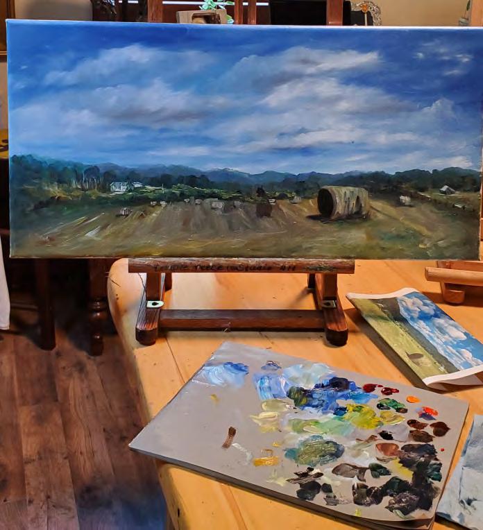
TheSecondLoad:workinprogressinTemple’sstudio. way for me to be a good steward of my blessings and share my love of God, nature, family and the world. So, the story behind this painting for me is to see art, gain wisdom, perspective and gratitude in whatever I do everyday and express it in the best way I can. Art, like farming, is about nding beauty in the journey and is something we all need in our lives.
I hope this painting and the story behind it brings you joy and lls your heart with all the senses of freshly mowed hay.
The AAPL Board of Directors is pleased to share two updates to our leadership team.
Heather Jones, formerly our Marketing Director, has been appointed Vice President. Stepping into the role of Marketing Director is Bill Jobson. Both Heather and Bill will play key roles in advancing AAPL’s marketing and strategic initiatives. Read more about them below.
Heather j. jones
Heather J. Jones is a photorealist painter specializing in watermedia. Originally from New York City, she has lived for over two decades between NYC and London, and now resides in New Canaan, Connecticut. Working in gouache and watercolor layered over graphite, Jones creates richly detailed and vibrantly saturated paintings that celebrate the character and craftsmanship of vintage vehicles.
Largely self-taught, Jones has rened her technique through course work at Parsons School of Design and the School of Visual Arts in New York, as well as Heatherley’s School of Fine Art in London. Her work reects a deep appreciation for precision, nostalgia, and the interplay of light and form.
Jones is an active member of the arts community, serving on the Board of Directors for the American Artists Professional League, where she is also an Elected Artist Member, and as Vice President of the Board of Directors for Carriage Barn Arts Center.
Her work has been featured in several prestigious juried exhibitions, including the Allied Artists of America 112th Annual Exhibition, the 96th Annual Grand National Exhibition at the Salmagundi Club, American Women Artists 2025 Exhibition, and the National Watercolor Society 2025 Exhibition as well as in major publications, including Fine Art Connoisseur and Art and Color 365.
bill jobson
William Jobson is a New York City raised artist.
Graduating from F.I.T. with a Degree in Advertising Design, he entered the eld of commercial graphic design, Art Directing in publishing and advertising. Along the way, Bill continued developing his life long artistic skills in drawing and painting.
He began exhibiting as a non-resident artist at the Salmagundi Club in 2019 and would become a member in 2022. He joined the board in 2024 as First Vice President and later held the position of President. His objective of creating more opportunities for all artists led to the largest schedule of exhibitions in years.
Bill is also a member of the Edward Hopper House Art Center, in Nyack, N.Y.
He and his wife live in Englewood Cliffs, New Jersey with their Aussie/Collie dog, Luke.
My Inspiration
I often work with owers and other natural wonders to create works of art that inspire viewers and leave them with a profound sense of joy. However, beneath the surface beauty of many of my draw-
ings are more subtle meanings, things that viewers cannot immediately grasp until they delve deeper into the underlying themes. While working on my drawings “Gossip Column” I used this same approach to create the composition.
The Feeling Behind the Drawing
Upon rst glance, viewers may simply see ve vibrant owers arranged in their own vases, rendered in my signature saturated colors against a richly textured background. Upon closer examination however, they may begin to sense a deeper emotional narrative at play—the profound feeling of being the odd one out. Then they notice the
solitary ower in the left corner drooping and deliberately turned away from the others; a concrete metaphor of that isolation.
The drawing captures the complexity of group dynamics where, on the surface, everything seems harmonious. An outsider might not notice anything amiss, but within that seemingly perfect arrangement, one individual is experiencing exclusion and
loneliness. The owers themselves serve as a poignant reminder that even when a social situation appears beautiful and unied from the outside, the deeper reality may be emotionally fraught, and things are often far more complicated than they seem.
The vases add another layer of symbolism to the composition. Each ower sits in its own individual container, suggesting that although we may be physically grouped together with others, we can still experience emotional isolation.
In The Studio Reference Photos
I use reference photos to create the atmosphere and design that I'm looking for in a drawing. In Gossip Column, the vases and owers were real parts of the composition but their proportions are completely different than in real life.
Using photo editing software, I altered the elements of the drawing to create a composition that was both visually and intriguing and portrayed the emotion I wanted to show my audience. I did this by altering the sizes and shapes of the owers and vases, as well as turning one towards the side. Once that was done, I was ready to begin my drawing.
Textile Backgrounds
Since I photograph my reference materials outdoors in natural lighting, the backgrounds captured are simply whatever happened to be behind my subjects.
To address these challenges, I employ an unconventional approach: I sometimes create entirely new, custom wallpaper backgrounds from scratch. Depending on the drawing, I do this either digitally or on the drawing itself. This technique affords me the creative freedom to incorporate additional textural elements and other imaginative components to enhance the overall piece.
For Gossip Column's wallpaper specically, I created the background entirely through traditional handson methods, without any digital enhancements. I carefully crafted a cloud shape from stiff cardboard, then used this template to repeatedly trace the cloud pattern across the drawing surface to build up a complex rhythmic background that creates a sense of depth and adds visual interest.
Bold Color Choices
My distinctive style, characterized by bold saturated colors, is achieved through a meticulous under painting technique that involves slowly building up layers of colored pencil. In this particular piece, I made the deliberate choice to use dramatically contrasting colors as a way to add a nal dimension of visual and conceptual complexity.
It's just another way of showing that appearances can deceive and that surface impressions rarely tell the complete story.
ArlenewithhercoloredpencilpieceHorsingAround
To learn more about Arlene Steinberg and view her incredible work visit her website at: https://www.arlenesteinberg.com/ or follow her on Instagram at: https://www.instagram.com/arlenesteinberg/
Come Blow Your Horn MEMBER UPDATES
A special thanks goes to our submissions editors at large, Fran Wood and the kind support of Deborah Gersony!
Nancy Allen, EAM
Nancy's colored pencil drawing, Growing Out of Polo, will be shown at The Society of Animal Artists 65th Annual International Exhbition "Art & the Animal," at The Art Museum of Eastern Idaho, Idaho Falls, Id., October 10, 2025 –January 3, 2026.
Additionally, she has had four drawings juried into the drawing category of The Almenara Art Prize Online Exhibition which is on display November 7-30, 2025. This show serves as a semi-nals for the in-person show in Cordoba, Spain, for which nalists were announced on September 20. Her drawings chosen for the Online Exhibition were: Pura Raza Española, Growing Out of Polo, Two Mares in Shadow and End of Fall
Nancy also was juried into The International Guild of Realism's Fall Online Salon, October 15-December 20, 2025, for her colored pencil piece Cocktails!
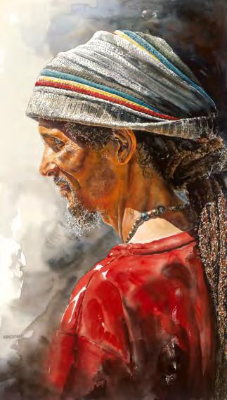
Tony Armendariz, SM
Tony had his painting Luís win Second Place at Aqueous 2025, the Kentucky Watercolor Society's 48th National Exhibition. The juror was Tim Oliver. The exhibition is now showing at the LexArts /ArtsPlace in Lexington, Kentucky through November 2.
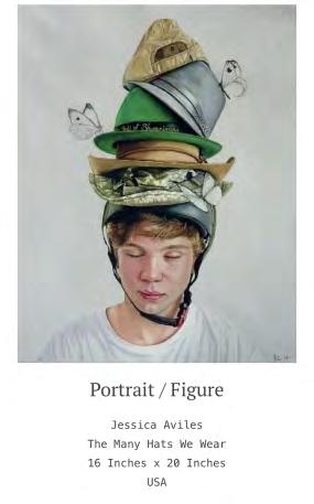
Jessica Aviles, EAM
Jessica won the Ampersand Award in the Woman in Watercolor International Competition 2025 for her painting The Many Hats We Wear.
Also, two of her paintings, The Best Naps, and Astrid, were juried into the online exhibition of the Almenara Collection 2025 Online Competition.
Carol Ashton-Hergenhan, FM
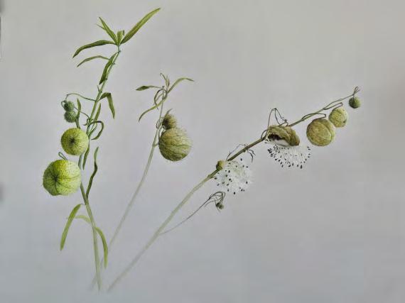
Carol's watercolor, Bishops Balls, was accepted into the American Society of Botanical Artists 28th International Juried Exhibition, opening September 26 at the Marin Art and Garden Center in Ross, CA. The watercolor was executed on gray paper to highlight the delicate seeds of Gomphocarpus physocarpus, also known as Bishops Balls. You can read more about the piece at ASBA-art.org under the Exhibits tab. Carol also had work accepted into 4 other juried exhibits opening in September, two of which were national and two regional.
Holly Bedrosian, SM
Holly Bedrosian's oil painting Peace has been awarded 2nd Place in the Richeson75 Figure/Portrait 2025 competition. The full exhibit is available for viewing online at richeson75.com.
Karen Burns, EAM
Sisters has been accepted into the Bold Expressions International Juried Exhibition at Sacramento Fine Arts sponsored by Northern California Arts. The exhibit will run from September 30th through October 25th, 2025.
Service Retired has been accepted into the Best of America International Exhibition with the National Oil and Acrylic Painters Society. The exhibition runs from October 2nd through October 25th, 2025.
Caryn
Coville, EAM
Caryn had two pieces juried into the UK Colour Pencil Society's, "Annual Open Exhibition 2025”. With this latest acceptance, she earned her "UKCPS” Signature Status.
https://ukcps.org.uk/index.php/ukcps-exhibitions/annual-open-exhib-2025/ open-2025-gallery
Her colored pencil painting, Storytime, won Second Place in TheArtList.com, “Artist of the Month”, July 2025 competition. https://www.facebook.com/photo?fbid=1280928544034585&set=a. 487098880084226
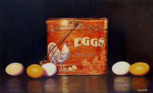
Her colored pencil painting, Farm Fresh, was juried into the International Guild of Realism, "Fall Salon Online Exhibition", October 15-December 20, 2025.
https://www.realismguild.com/
https://www.americanartcollector.com/
Caryn won an Honorable Mention for her colored pencil painting, Harmony, in the Art Guild's show, Flora and Foliage. The show is on view Sept. 7-27, 2025. The Art Guild, 200 Port Washington Blvd, Manhasset, NY.
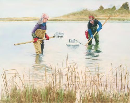
Madeline Daversa, AA
Madeline Daversa's watercolor painting Clamming was featured on the cover of Dan's North Fork paper, (August 29th, 2025) along with a full interview regarding her East End Watercolor series. The watercolors highlight individuals who shape Long Island's East End, through their hard work, care for the land, water, and deep passion for what they do.
Caryn Coville, EAM continued
Storytime was juried into the Catharine Lorillard Wolfe Art Club, "128th Anniversary Open Juried Exhibition", on view at the Salmagundi Club, 47 5th Ave, New York, NY, October 28November 14, 2025.
Storytime was also juried into The Almenara Collection,"2025 Art Prize" (Drawing Category). The exhibit is online September 1-November 30, 2025.
https://www.thealmenaracollection.com/keyvalue=94232&page=viewcolle ction&subkeyvalue=214986&startrec=1&displayperpage=9999&displayhorz=1
Madeline Daversa's watercolor painting Toys in the Attic was accepted into the 158th Annual International Exhibition of the American Watercolor Society.
Cristy Dunn, EAM
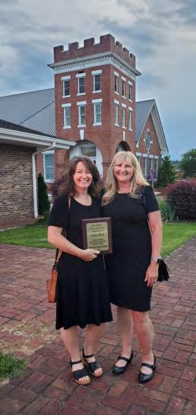
Christy, the Executive Director of Johnson County Center for the Arts was recently named as the recipient of a 2025 Tennessee Governor's Arts Leadership Award. She was also surprised with the 2025 Mac Wright Citizen of the Year Award by the Johnson County TN Chamber of Commerce. She credits these honors to her hard work over the years and the ongoing support and help of family and her community. You can see her work at www.cristydunn.com
Pictured on the left are Cristy, after the Chamber of Commerce Awards, with friend, fellow AAPL artist member and Art Center Board Member, Temple Reece.
Karen Israel, SM
During The Connecticut Pastel Society’s 32nd Annual National “Renaissance in Pastel” Exhibit, Karen’s pastel A Million Stories won the Catharine Lorillard Wolfe Art Club Award.
The Central Mass. Pastel Society’s 7th Annual “Marks of Distinction” awarded Karen the Red Rock Pastel Society of Nevada Award for her piece Fingers Crossed.
The Philadelphia Pastel Society’s 4th Annual National “Visions in Pastel” Exhibit saw Karen winning the Central Mass. Pastel Society Award for her drawing The Home Stretch
Nancy Jacey, EAM Nancy's piece, A Bright Future Lies Ahead, was accepted into the 2025 Almenara Art Prize Online Exhibition and was also the recipient of the Third Place Award in CPSA DC 117's 20th Anniversary Celebration Exhibition: “Colored Pencil Expressions."
Laura Jones, AA
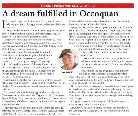
Laura fullled her dream of opening her own gallery and studio with a ribbon cutting ceremony presided over by Occoquan, Virginia's Mayor Earnest W. Porta, Jr. on June 29th, 2025. Located in the Riverwalk at 125 Mill Street #10, Laura's gallery features her own artwork, an art studio overlooking the Occoquan River, a gathering space and an art-related gift shop for both local and international visitors. Laura will teach painting classes in both oils and acrylics with the goal of inspiring others to develop their artistic skills and benet from all that the world of ne art has to offer. https://www.lauradjonesart.com/
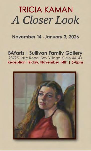
Tricia Kaman, FM
Tricia Kaman's pastel, Emily, was accepted into The Pastel Society of North Carolina's 9th International Online Juried Exhibition Pure Color 2025. The Exhibition is online at: https://www.onlinejuriedshows.com/ClosedShow Thumbs.aspx?OJSID=58801
Tricia is also having a Solo Show titled "TRICIA KAMAN A Closer Look" November 14 -January 3, 2026, at the BAYarts, Sullivan Family Gallery, 28795 Lake Road, Bay Village, Ohio 44140. The reception will be Friday, November 14th, from 5-8pm.
CLJ Lancaster, FM
CLJ Lancaster was awarded the de Gerenday Memorial Award for her oil painting Warriors Over the River in the Lyme Art Association show, “Red Hot.” The exhibition was on view at the Lyme Art Association in Old Lyme, Connecticut from July 25 through September 4, 2025, and can be viewed online at https://lymeartassociation.org/red-hot-2025-online-gallery/
Karen Maloof, EAM
Karen Maloof was presented with a Special Merit award for her painting Welcome in the 2025 Open Compe tition sponsored by the bi-monthly digital Art and Color 365 Magazine. The link to view the wide range of work is artandcolor365.com/2025-open —2025 Open Art Competition Award Winners Art and Color 365
Karen's painting, Stonington Greetings was honored with a Special Merit award by Light Space Time Online Gallery, in their 7th Primary Colors Art Exhibition-September 2025. Her painting Sun-drenched was also given a Special Merit award. This competition can be seen at –“Primary Colors” Art Exhibition September 2025 | Light Space & Time Online Art Gallery
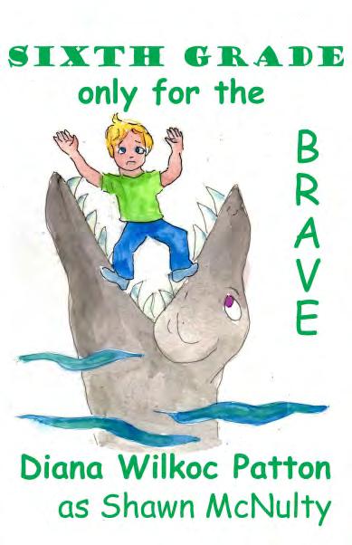
Diana Wilkoc Patton, EAM
Diana's watercolor Goldshes' Rhythm was accepted into 2025 Aqueous Open International Exhibition at the Latrobe Art Center in Latrobe, PA with show dates being Oct 4-31st.
Her chapter book Sixth Grade...Only for the Brave was released, written and illustrated by her (available on Amazon or autographed from: diana@dianapatton.com)
Karla Pirona, EAM
Karla Pirona, a Florida-based gurative oil painter, presented her solo exhibition “Timeless Lakeland” on September 7 at Pirona Studio. The series celebrates Lakeland'slandscapes and legends, transforming familiar landmarks into vessels of memory, myth, and imaginative futurism. The exhibition included live classical music performed by musicians from Pirona Studio.
Additionally, Pirona's portrait Many Conditions, Only One Portrait (oil on canvas, 30 × 24 in) was selected as a nalist in the international ModPortrait competition. This artwork was exhibited at the Real Círculo de la Amistad in Barcelona, Spain, from March to April 2025, and at the Auditorium Municipal de Arroyomolinos in Madrid, Spain, from May 5 to 31, 2025.
Pirona's painting Fifth Symphony of Shostakovich, 1st Movement (oil on canvas, 30 × 40 in) was selected for the Almenara Prize 2025 Online Show, held September 1 through November 30, 2025.
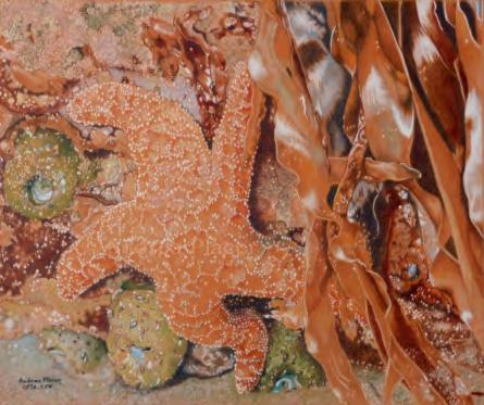
Andrea Placer, SM
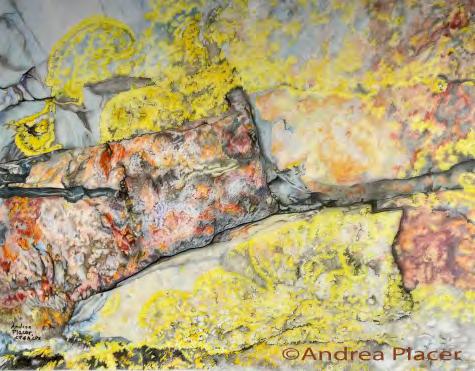
Andrea's drawing, Tidal Pool Habitat, has received the David Wu & Elsie Jack-Key Award at the 112th Allied Artists of America Exhibition (currently online at and has been invited to alliedartistsofamerica.org exhibit it in person at the Reading Public Museum, Sept. 13 - Jan. 11, 2016.
Her drawing, World on a Rock Face was juried into the Colored Pencil Society of America 33rd Annual International Exhibition, held in Bethesda Maryland at the Mansion at Strathmore, June 14 - August 2, 2025; and Painted Petals, Nature as Artist received a Talent Prize in the Teravarna International 10th Flower Competition.
Cher Pruys, SM
Cher made a presence in the following magazines: Artistonish Magazine July, August & Sept. Issues, Art Closeup Magazine #34, #35, Women In Arts Magazine issue X, Art Ideal Magazine Sept./Oct. 2025, Art & Color 365 Volume 3 #3 summer 2025 & Hyperrealism Special Edition Magazine “The Amazing World of Cher Pruys”. She also was awarded numerous awards highlights of these include FCA International Annual AIME 1st Place for Struttin', Grey Cube Galleries Patterna International Sept. 2025 for Unhinged, Tire Attire & Love Hearts, Artist Space Gallery International Artist's Choice Sept. 2025 Painting Prize for Fancy Free & New York New York!, Terevarna International 2025 Water Talent Award for Tidal Pressures, Terevarna International 2025 Colors talent award for Sweet Oranges, Global Painting Conclave 2025 International Animals, Gold for Oliver, 2025 International Nature Gold for Thistle Flowers, Fusion Arts All Women International Sept.2025, Best of Show for Awesome Sloan, Camelback Galleries 2025 Best of Acrylic 2nd for Sweet Oranges, Art & Color 365 2025 Open Competition Special Merit for Sweet Oranges, Ten Moir Galleries Green International 2025 Best of Show for An Apple A Day, 2025 International Cityscapes, Best of Show for Lonely Looking Street, 2025 Circle of Life International 1st Place for Aunt Mary, 2025 International Memories 1st Place for Flashback 1960, & 2025 Ebb & Flow International, 1st Place for Cruising, Progressive International realism Art Competition 1st Place with Entranced, LST Galleries 2025 Cityscapes International 1st in Painting 2nd overall for New York New York!, 2025 International Colors 2nd in Painting & 2nd Overall for Flashback 1960, 2025 Animals International 2nd Place in painting & 3rd Overall for Nova.
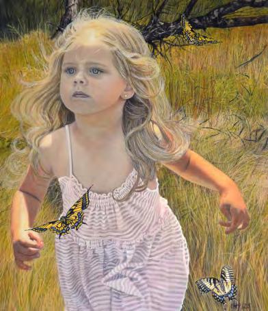
Galal Ramadan, EAM
Galal received a Merit Award, for his drawing Dreamer's Realm!, Best in Medium in the 2025 Art Awards-Drawings Art Competition. Camelback Gallery, Sept. camelback.com
He also received a Special Merit Award for Dreamer's Realm! in the 2025 Drawings Art Competition: Art&Color 365 Magazine, Sept. 2025, artandcolor365.com
Galal Ramadan, EAM continued Dreamer's Realm! appeared in Allied Artists of America, 112th Online Annual Exhibition, and was honored with an Invitational Museum Exhibit. September 2025- September 2026, AlliedArtistsofAmerica.org
Juried Exhibition: Dreamer's Realm!, 2025 UKCPS Annual Open Online Exhibition, UK Colored Pencil Society which features work from a variety of international artists, August 2025, ukcps.org
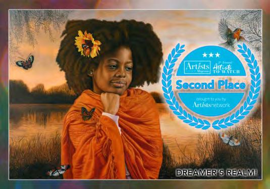
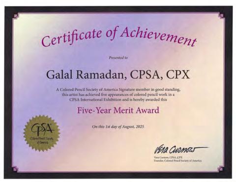
A Certicate of Achievement: Five-Year Merit Award, was awarded to Galal by the Colored Pencil Society of America, August 2025, cpsa.org
Best of the Show was also awarded to Dreamer's Realm! by the Colorful Times, Visual Arts Competition, Old Town Arts & Crafts Guild, North Folk, Long Island, NY. July - August 2025, oldtownartsguild.org
Galal had a Solo Exhibition: Beyond Boundaries I, Art Exhibition, Hollywood Arts & Culture Center, Hollywood, FL. June – August 2025 culturalcenterhollywood.org
Juried Exhibition: Dreamer's Realm!, CPSA, 33rd Annual International Exhibition, The Mansion at Strathmore Gallery, MD. June - August 2025, cpsa.org
Solo Exhibition: NO Boundaries, Art Exhibition, Sunrise Dan Pearl Library, Sunrise, FL. July 2025, sunrisedanpearllibrary.org
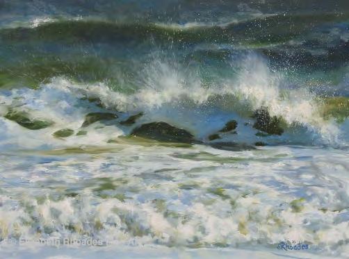
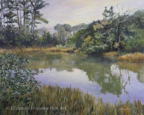
Elizabeth Rhoades, SM
Elizabeth Rhoades won five awards in the past few months for her paintings; she was also included in an international exhibition, and achieved elected artist status in a professional art organization.
Her awards include: Excellence in Painting, Graphics or Sculpture Award: Rockport Art Assoc. Fall Exhibition 2025, for her painting Low Tide.
Seascape Award of Excellence: Eastern Regional Oil Painters of America 2025, for her painting Fast and Furious.
Martha Moore & Louis A. Burnett Memorial Award: Rockport Art Assoc. Fourth Summer Show 2025, for her painting Sounds of Silence.
Nathalie J. Nordstrand Award: Rockport Art Assoc. Second Summer Show 2025, for her painting South Tongue River View.
Best Use of Light and Color Award: NOAPS Best of America Small Painting National Juried Exhibition, 2025, for her painting Fast and Furious.
Almenara Art Prize Collection International Virtual Exhibition: Peaceful Lagoon, and Frothy Tide.
Elected Artist membership in the Hudson Valley Art Association
Arlene Steinberg, EAM
Jane Robbins, EAM
Jane received the Award for Texture or Mark Making in the 2025 Marks of Distinction National Juried Exhibition.
Four of Arlene's drawings were juried into the online Almenara Art Prize Still Life portion of the show: And One for Her, Splash Down, Caught In the Act, and Boys to Men.
Arlene was also juried into The International Guild of Realism's Fall Salon Online Exhibition which runs from October 15th - December 20th, 2025. Artists from over 15 countries are represented in the Fall Salon Final Jury, and a large diverse variety of media.
Ekaterina Stolyarova, AA
Ekaterina Stolyarova was selected as a nalist for the 2025 Fall Salon Online Exhibition organized by the International Guild of Realism, which will be presented on two major arts platforms from October 15 to December 20, 2025.
Her works were also exhibited at the prestigious Hamptons Fine Art Fair 2025 in the Hamptons and featured in the international group exhibition at the Museum of International Art (MORA).
Her practice has also been included in recent international publications and catalogs highlighting contemporary art.
Annie Strack, LF
Annie was an invited Master Artist in the 7th Watercolor International Exhibition in Greece. Her paintings were also juried into the Silk Road 11th Biennial International Exhibition in China, Northeast Watercolor Society 49th International Exhibition, and Philadelphia Watercolor Society 125th International Exhibition.
Don Taylor, SM
Don won the Jane Peterson Memorial Award for his painting Locked In in the Allied Artists of America 112th Annual Exhibition.
Diane Tomash, EAM
Diane has a Monotype titled Along the Edge included in the ImMigration at IMPACT13 Exhibition, held at the Mus'ee des Cultures du Monde, Nicolet, Canada, show dates: October 1-December 2025. Impact stands for International Multi-disciplinary Printmaking Artists, Concepts and Techniques.
Rosanne S. Wolfe, EAM
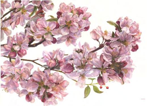
Branch In Bloom, a watercolor by Pennsylvania artist Rosanne Wolfe received an Honorable Mention in the Women in Watercolor's 6th Annual International Competition (online) in July 2025. With this recognition, Wolfe was elevated to Signature Status in WIW.