
Aadil Shah RIBA Part 1
2019 - 2023 https://www.aadilarchitecture.com/
Portfolio
2


3 Extra Projects Architecture Projects Other Projects CONTENTS 3.2 FINE ART 3.1 ARTOFTHECITY
Pg 22 Pg 21 1.2
Pg 16 1.1
Pg 4 01 03 04 05 2.1
Pg 10 02
COMPETITION
ARCHITECTURAL DESIGN
FONDAZIONE PRADA
UNIQUE UTOPIA
PRADA
This project began with a thorough investigation into the Fondazione Prada’s philosophy and the design methodology of Bjorke Ingles Group (BIG), as the project was being executed in collaboration with BIG. The objective was to create a modular and scalable system to produce multipurpose spaces to host exhibitions, performances, and events that are financially sustainable and environmentally responsible
The foundation’s focus was on creating culturally accessible exhibitions that encouraged self-reflection and interaction with both the site and viewers. During the design of the foundations new headquarters in milan, OMA tailored their approach to fit with Fondazione Prada’s key philosophy of innovation and the use of new technologies. This is portrayed through the unique materials the Fondazione is built with.
In response to these requirements, we proposed a concept of a system that could create spaces that adapt to the needs of the exhibition and its art pieces. This system was designed to be easily assembled and disassembled, seamlessly integrating the context’s culture and materiality, while staying true to Fondazione Prada’s philosophy, regardless of the location.
4
1.1 // YACademy: Architecture for Exhibition 01
Italy Id Twin Motion Rhino Ps Auto CAD Enscape Ai Revit SketchUp
FONDAZIONE
Milan,
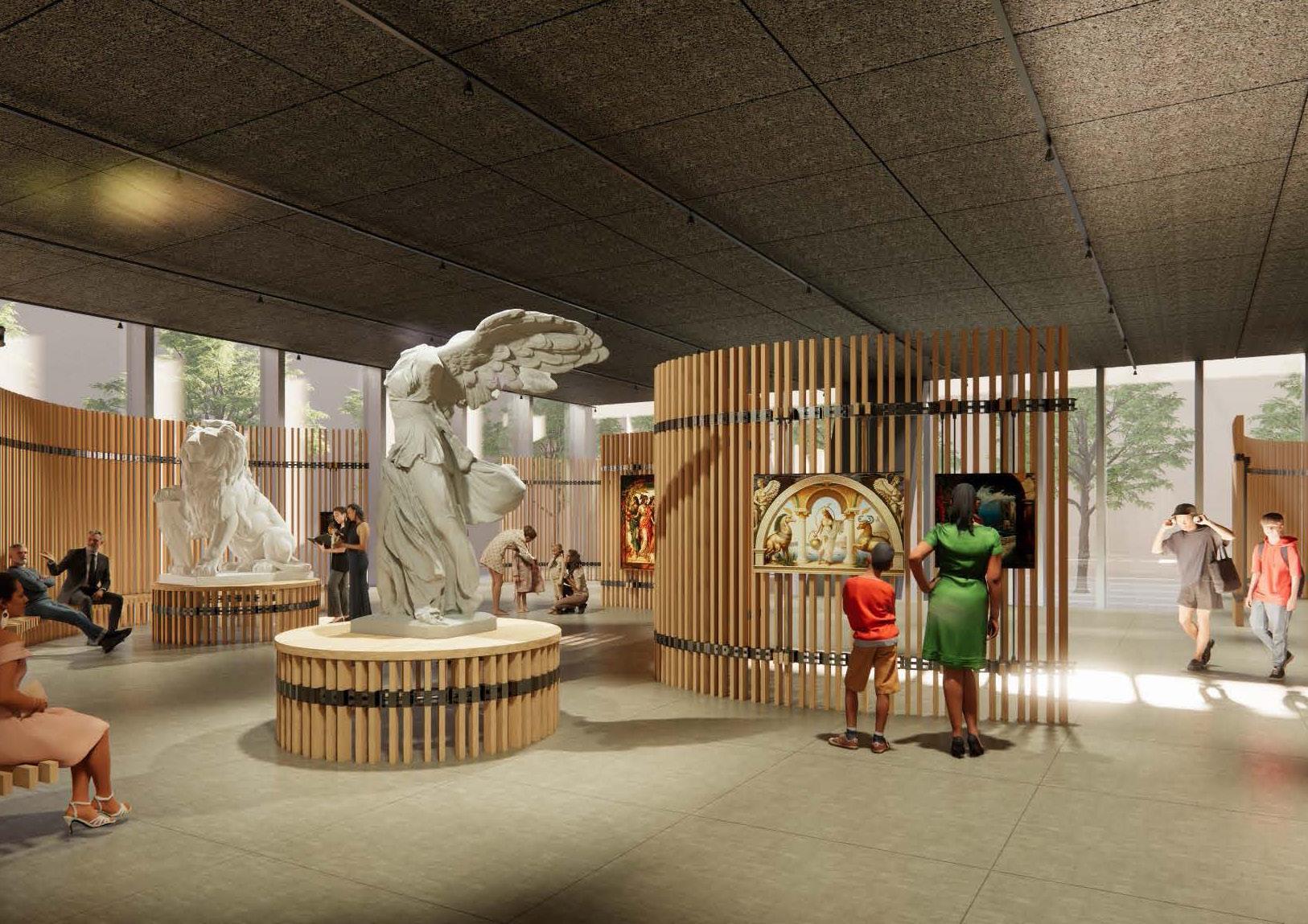
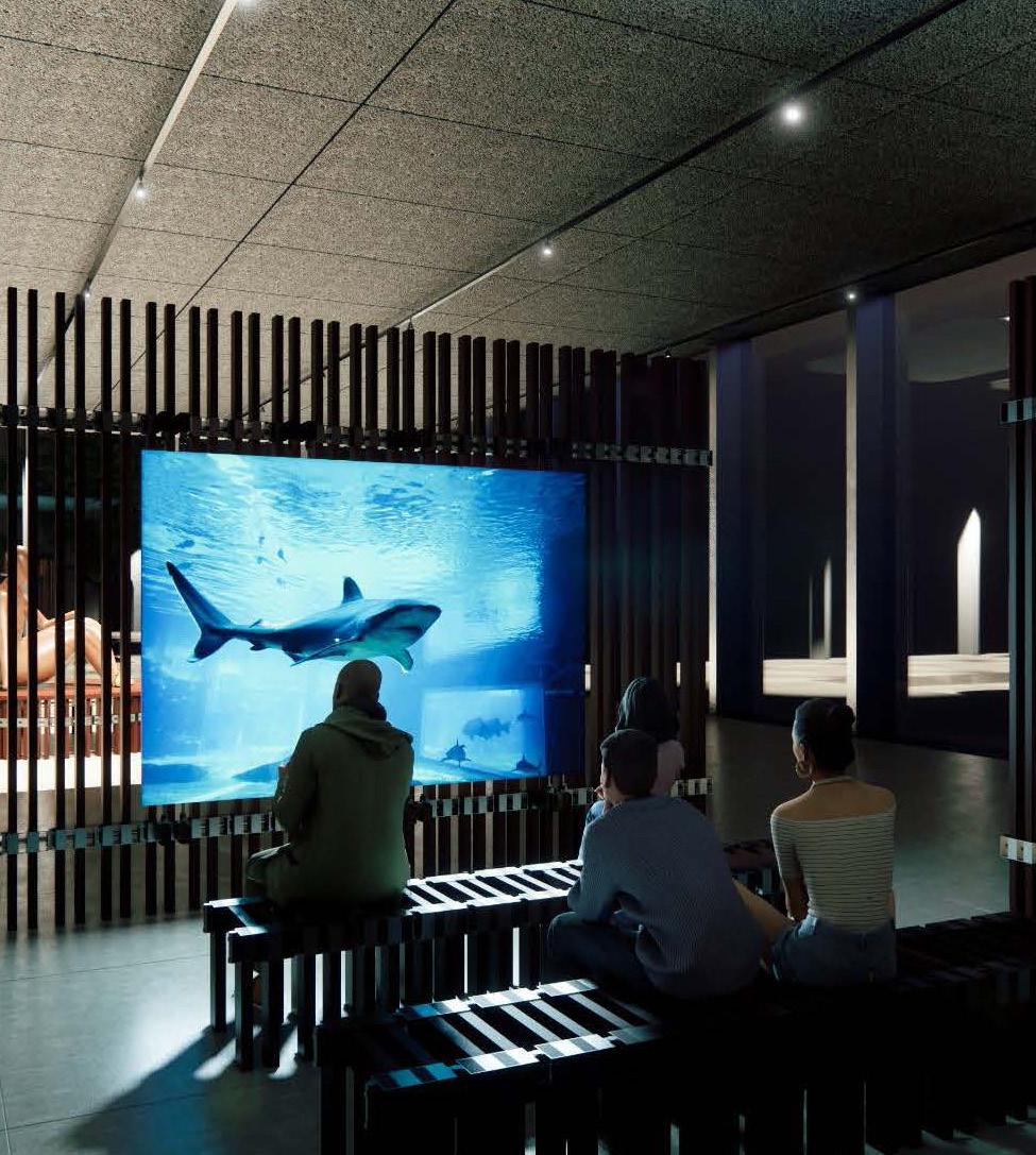
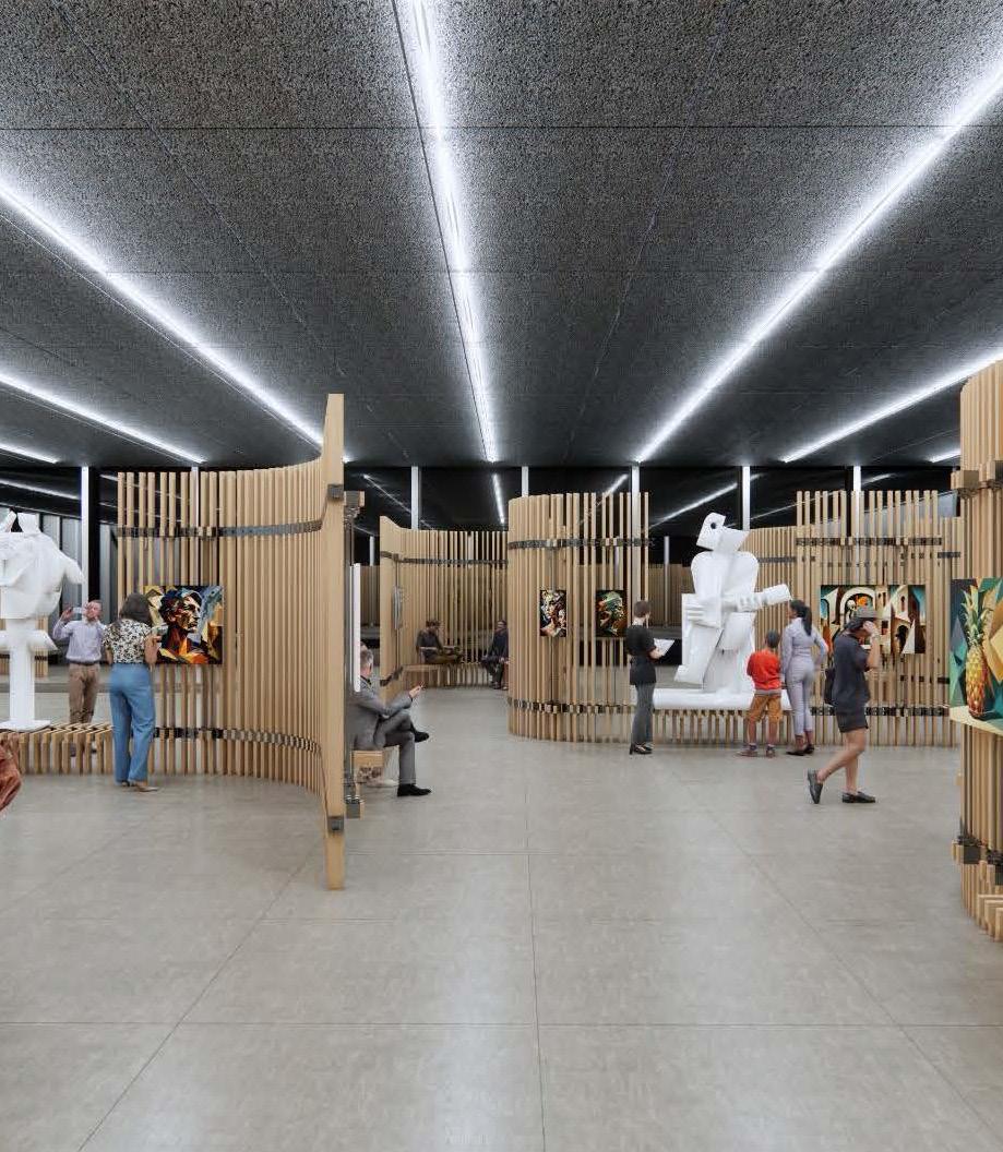
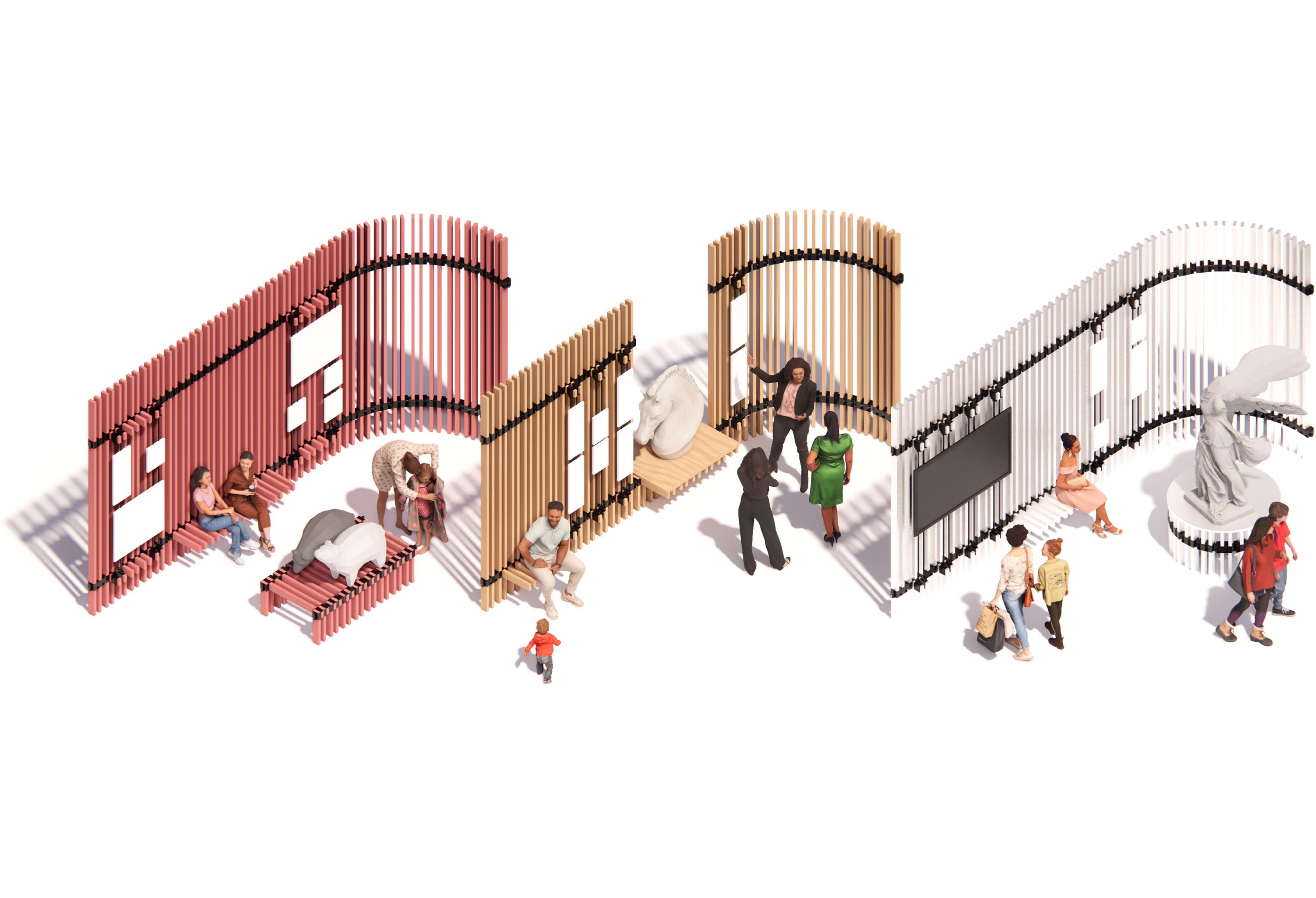
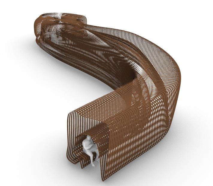
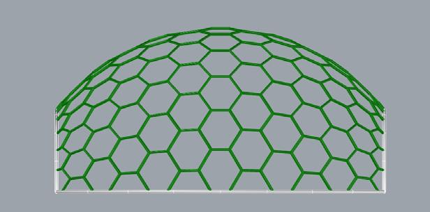
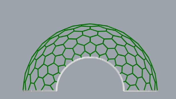
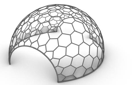
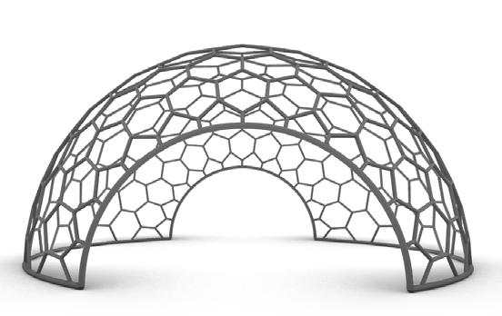
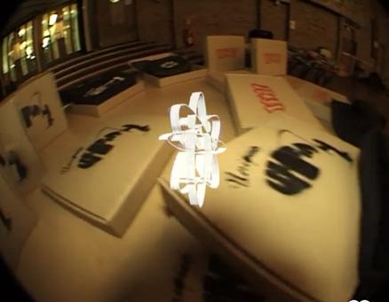
The Link Components
The Link - manufactured components
Sustainable, local, standard dimensioned building components
Step 1: Horizontal components are introduced - for seating/ platforms to display 3D artwork
Step 3: Adding more componets together to make a wall
Step 2: Inserting the vertical locally sourced material
Components added into the link
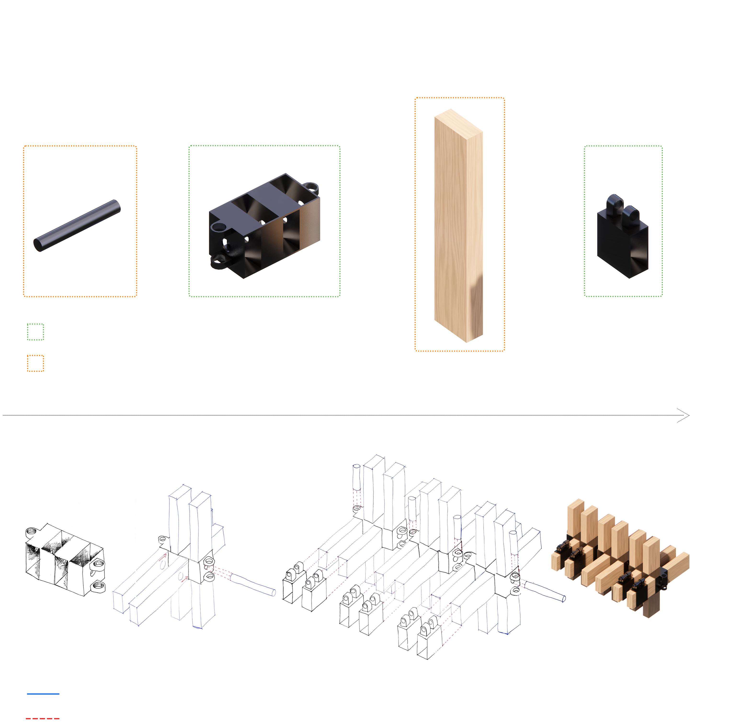
The line of movement and connections
Step 4: Attaching the manufactured componenets of the Link to hang artwork.
6
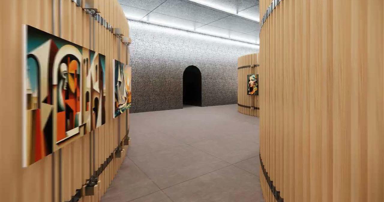
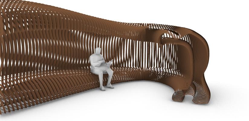
Re-Inventing an Exhibition Wall
Another defining characteristic of the installation system is its flexibility, allowing the use of any appropriate material for the vertical components. This enables the representation of the site’s context and culture throughout the exhibition and ensures the preservation of Fondazione Prada’s distinct identity.
The wall system distinguishes itself through its flexibility, modularity, and adaptability and can be easily repurposed. Its design accommodates a range of straight and curved forms, serving dual functions. Additionally, it offers a versatile platform for showcasing diverse artwork and provides seating for viewers.
7
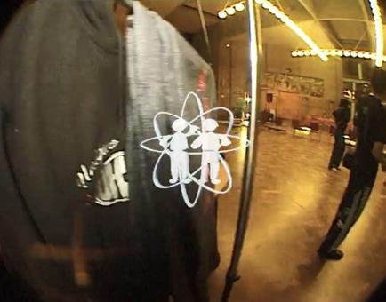
This is a snapshot of video showing a walkthrough done first person - showcases how the space would feel as a person walks through the exhibition set up.
Scan to view the video of the walkthrough. If viewing on a computer click here
8
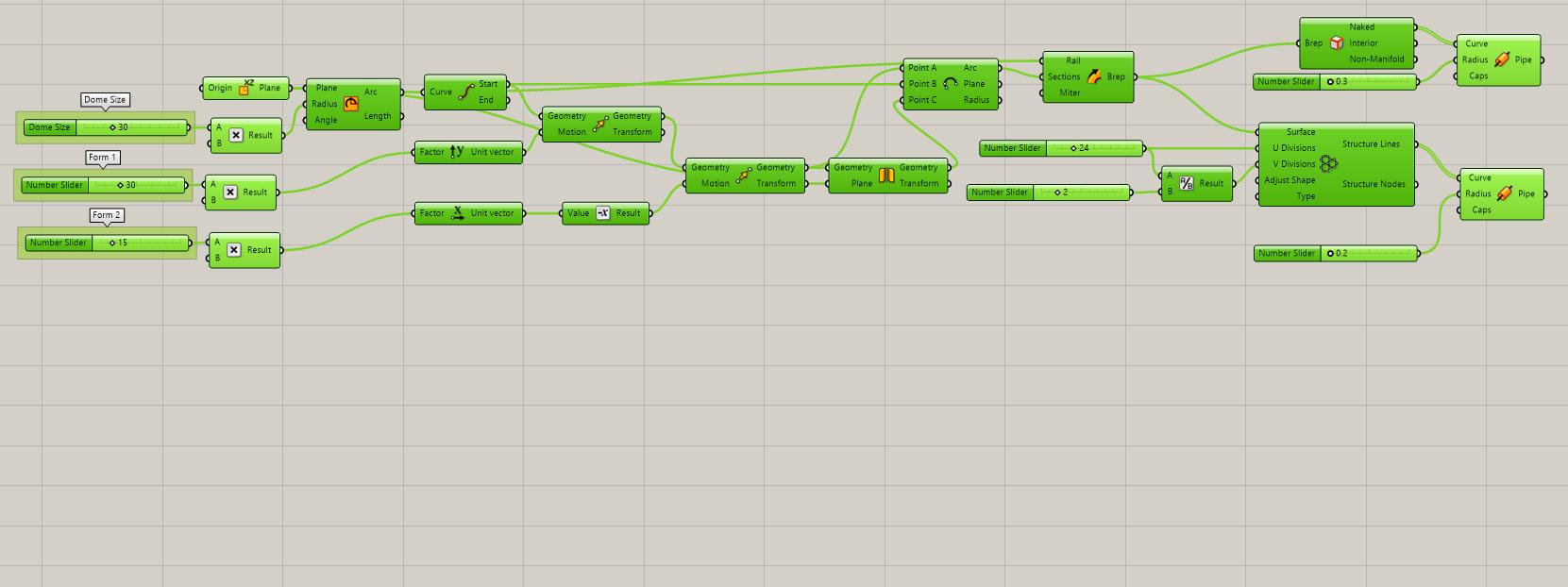
04 GRASSHOPPER
During the Fondazione Prada Project, my team and I considered a parametric design approach. However, the brief’s focus on ‘maximum financial sustainability’ made this infeasible. Nevertheless, this sparked a more profound interest in parametric design, leading me to learn Grasshopper after the course.
9
3.0 3.1 1.1
After YACademy - Fondazione Prada (Project 01)
3.1 // Other Projects Post YACademy Project
1.3 4.1 4.3 4.2 4.4 4.5 1.2
This project began with a thorough investigation into the Fondazione Prada’s philosophy and the design methodology of Bjorke Ingles Group (BIG), as the project was being executed in collaboration with BIG. The objective was to create a modular and scalable system to produce multipurpose spaces to host exhibitions, performances, and events that are financially sustainable and environmentally responsible
The foundation’s focus was on creating culturally accessible exhibitions that encouraged self-reflection and interaction with both the site and viewers. During the design of the foundations new headquarters in milan, OMA tailored their approach to fit with Fondazione Prada’s key philosophy of innovation and the use of new technologies. This is portrayed through the unique materials the Fondazione is built with.
In response to these requirements, we proposed a concept of a system that could create spaces that adapt to the needs of the exhibition and its art pieces. This system was designed to be easily assembled and disassembled, seamlessly integrating the context’s culture and materiality, while staying true to Fondazione Prada’s philosophy, regardless of the location.
10
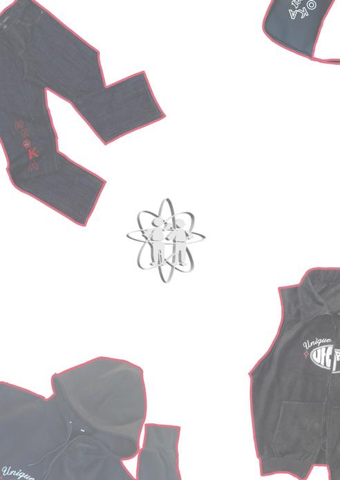
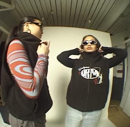
1.1 // Clothing Brand 02 UNIQUE
Online Id Twin Motion Rhino Ps Auto CAD Blender Ai SketchUp Pr When you are younger you see the unknown world as utopia. As you grow older you begin to see less of the utopia and more of the real world with all its problems. Utopia brings the inner peace we had child and the innocent dreams and perspective of the world. As you become an adult you realise that all the hardships faced builds your character today making you unique, thus, we came up with Unique Utopia, where everyone’s perfect world remembered through wearing the garments. We decided create a clothing brand growing up in Kenya, we have family textile shop passed down from generations. This is where our interest in fabric materials and colours began. When we were younger we’d visit my father’s shop and he would expose us to several materials. So at a young age, we were intrigued in designing and making clothes. It has been something we wanted to do for while. Unique Utopia Website Instagram
UTOPIA
Collection 1: ANOKA +FISHERMAN
Most recent prouduction
ANOKA DENIM
Navy blue denim + detailed red embroidery (oversized fit).
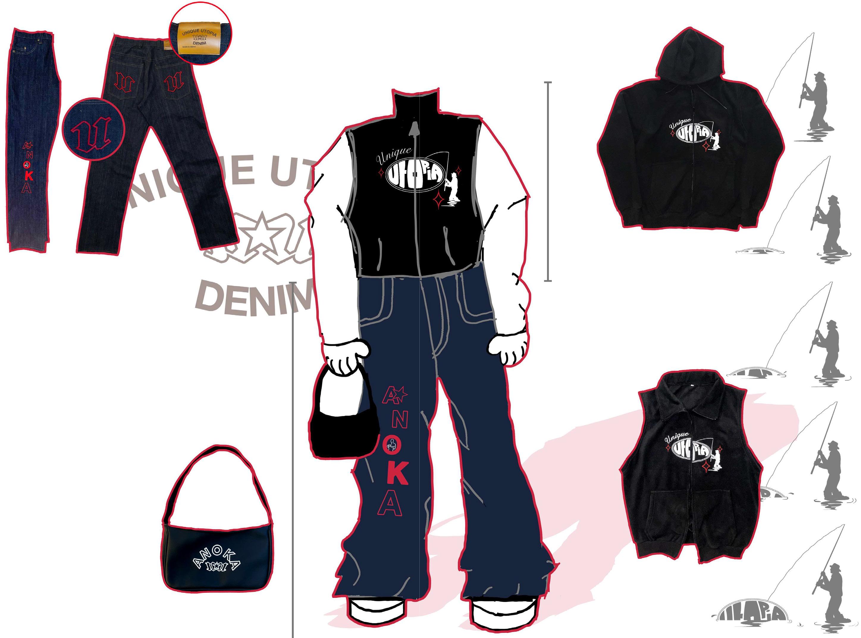
ANOKA: Growing up as a twin, we often faced the challenge of being seen as a single person. To assert our individuality, our parents used to call us “Anoka,” meaning “unique” in Gujarati.
FISHERMAN: On the Unique Utopia website, the introductory page features a video where the fisherman symbolically fishes the word “Utopia” from a sea of waste (Click here or scan QR code below). This video aims to raise awareness about environmental preservation while highlighting the true meaning of utopia.
ANOKA + FISHERMAN: By combining the notions of uniqueness and the pursuit of a better world, this brand embodies the concept of Unique Utopia.
QR code 1
UU Website video
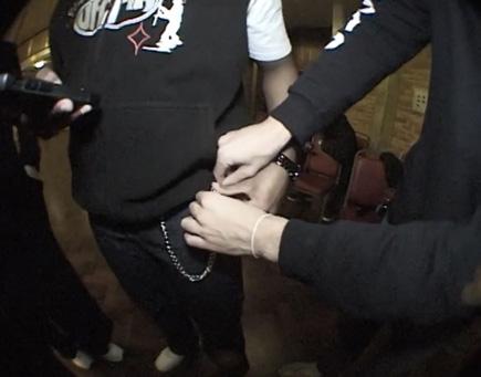
ANOKA PURSE
Black rexine and white embroidery
FISHERMAN SWEATER
Constructed using soft cotton blended fleece material.Finished with detailed white and red embroidery
FISHERMAN GILET
Constructed using soft cotton blended fleece material. Finished with detailed white and red embroidery
11
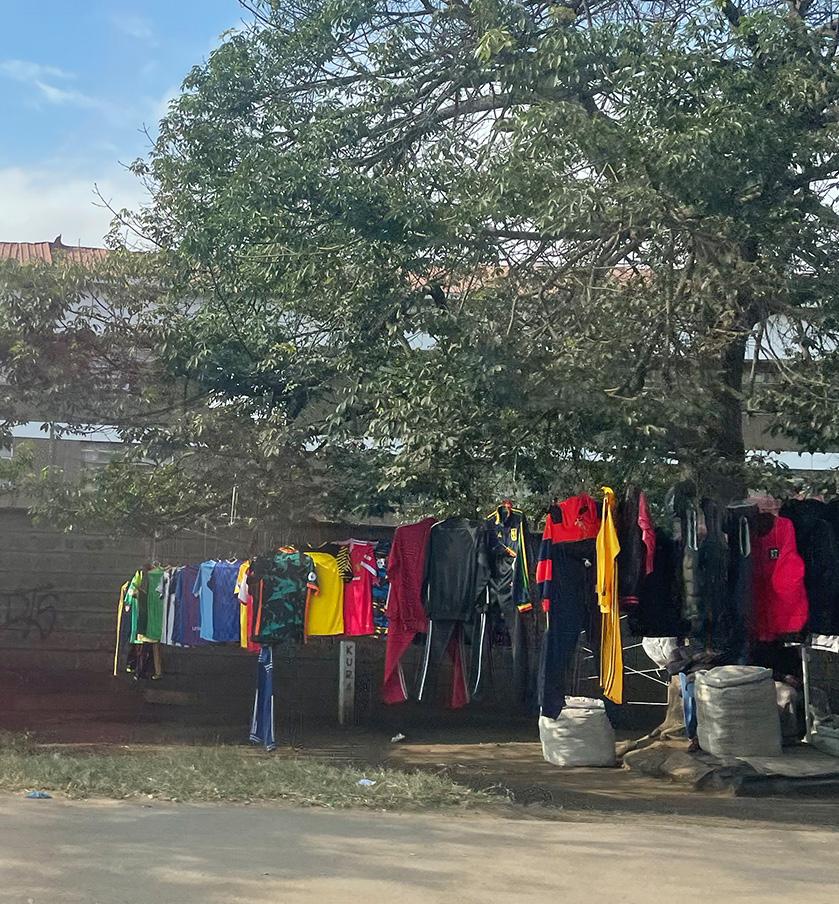
MADE IN KENYA
The garments hanging on a tree
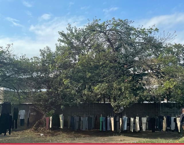
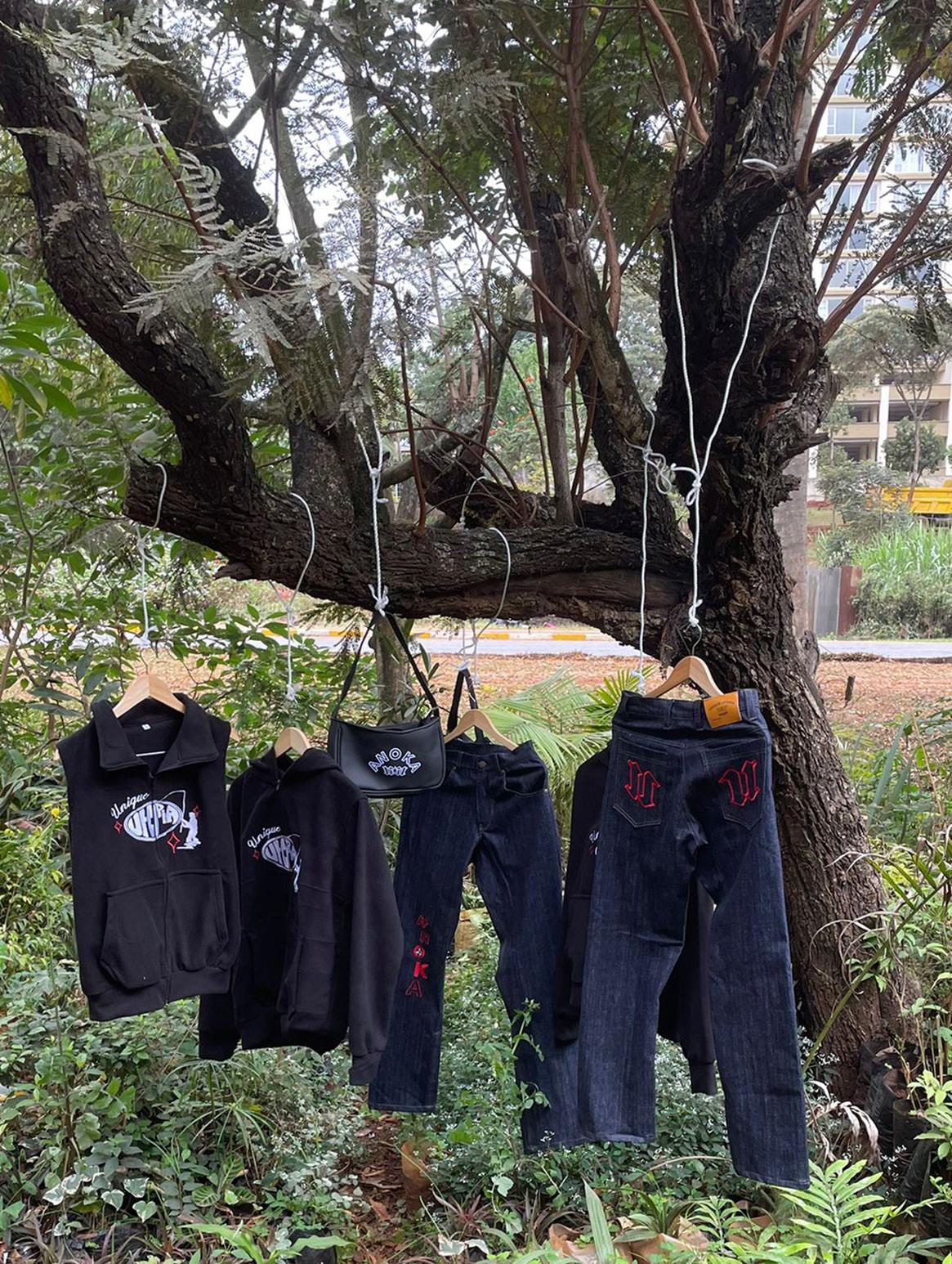
Growing up in Nairobi, Kenya, played a significant role in shaping the brand image of Unique Utopia. Inspired by the vibrant local culture, I sought to incorporate elements of the traditional roadside shops known as “Kiosks” into our brand’s promotion strategy.
In Kenya, it is customary for locals to display their products by hanging them on a tree, seeking shade beneath it during the scorching hot days. Drawing inspiration from this tradition, Unique Utopia embraces the spirit of the Kiosks by adopting a similar method of showcasing our garments. Just as locals in Nairobi can discover unique treasures under the shade of a tree, our customers have the opportunity to encounter our fashion creations as they go about their day. This innovative and culturally influenced approach to promotion adds a sense of authenticity and identity to the Unique Utopia brand, creating a connection between our products and the vibrant local community.
Unique Utopia’s mission
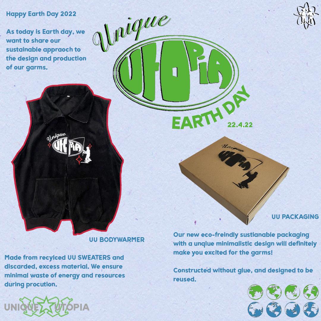
Unique Utopia’s mission is to become a sustainable fashion brand to address the negative impacts of the fashion industry on the environment. Extensive research has been conducted to identify the ways discarded materials from large manufacturing factories can be used. By repurposing materials that would otherwise go to waste, UniqueUtopia takes a significant step towards reducing landfill waste and minimising the environmental footprint of its products.
Denim is a primary material used by Unique Utopia, collected from factories to extend its lifecycle and create trendy clothing items. Additionally, discarded soft cotton fleece is upcycled to produce comfortable sweaters and gilets. Rexine, a synthetic leather substitute, is used in the bag designs. While the production and disposal of rexine can have harmful effects, Unique Utopia sources discarded rexine from factories, offering an eco-friendly alternative to traditional leather bags and reducing the demand for animal-based materials.
12
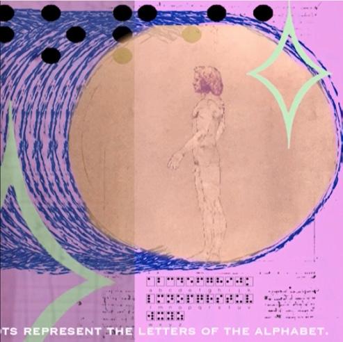
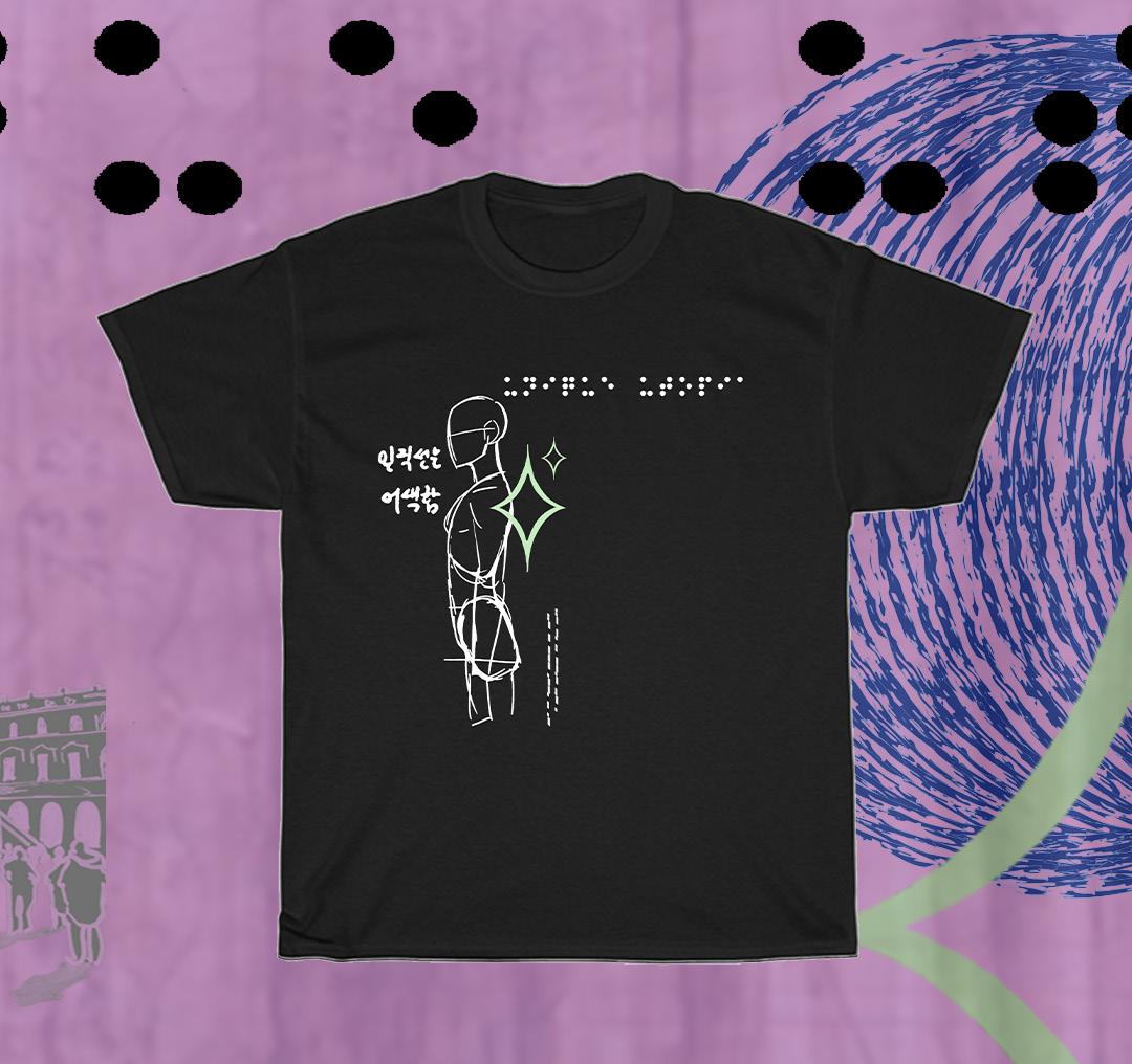
Collection 2: Sketch T-shirt
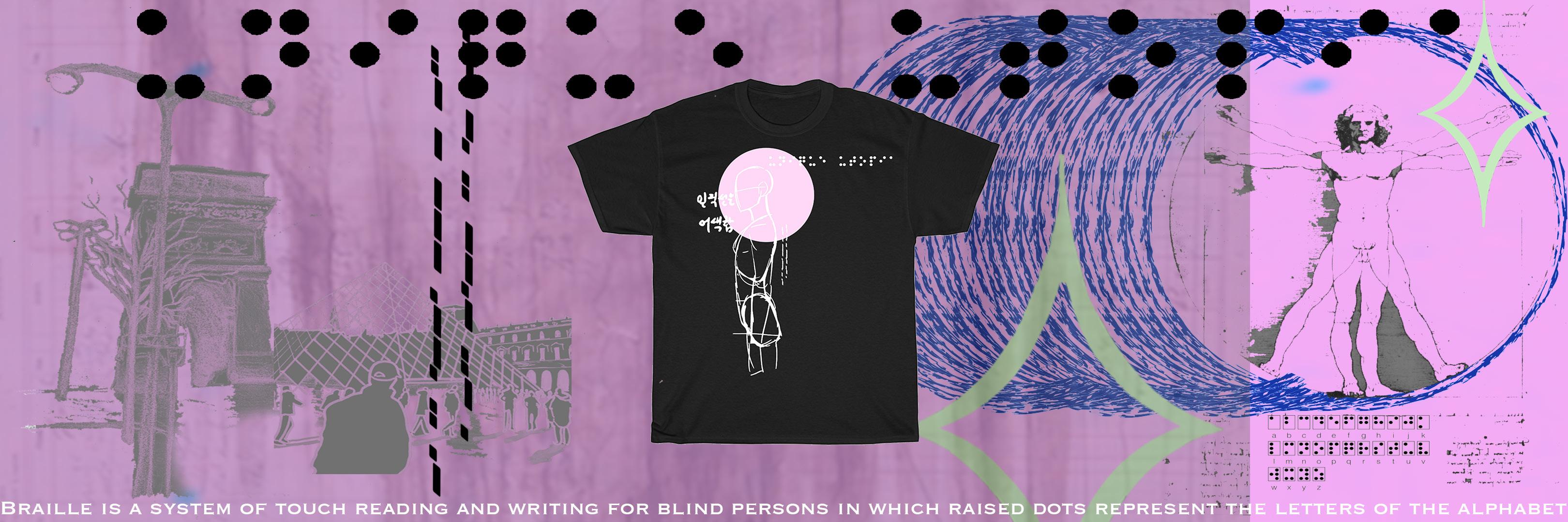
The Vitruvian Man is a famous drawing created by the Italian polymath Leonardo da Vinci during the Renaissance period. It is a representation of the ideal proportions of the human body based on the writings of the ancient Roman architect Vitruvius.
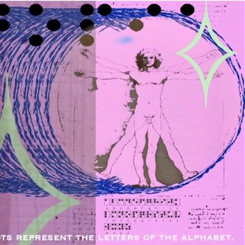
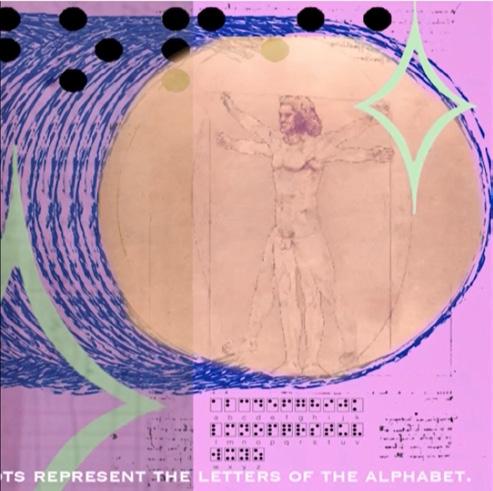
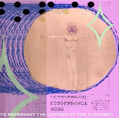
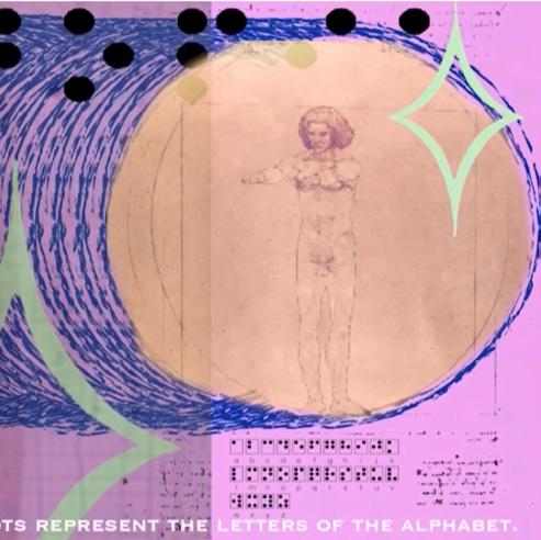
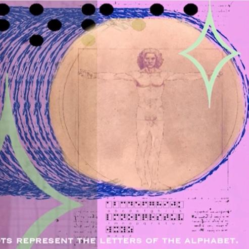
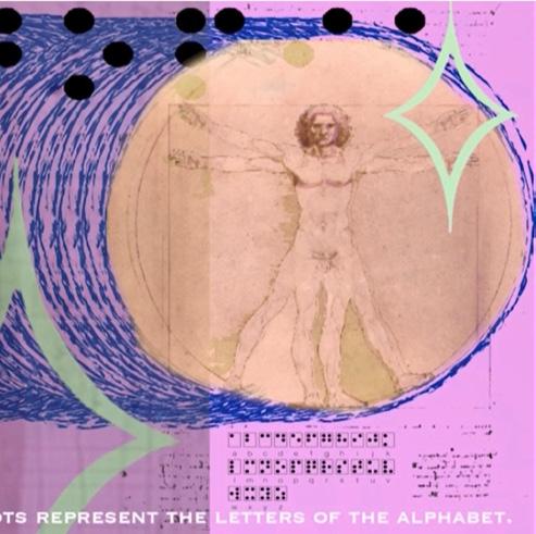
I came accross this drawing during my art studies at Rugby School. Understanding the human form, is the main design of this t-shirt.
The series of images is a video storyboard, understanding the form and movement of a human body. (Click here or scan QR code below)
QR code 2
Sketch T-shirt video
13
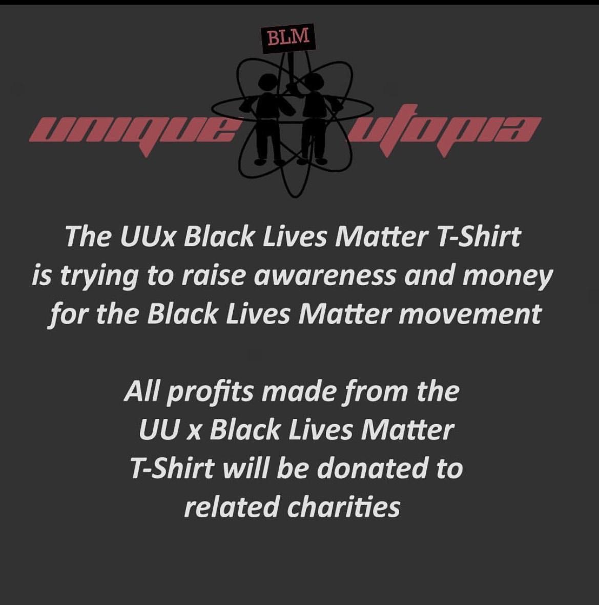
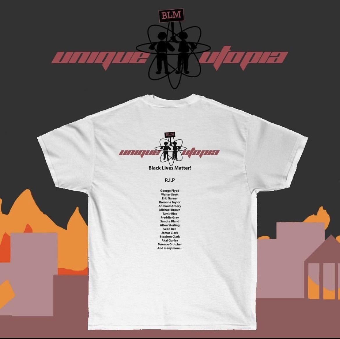
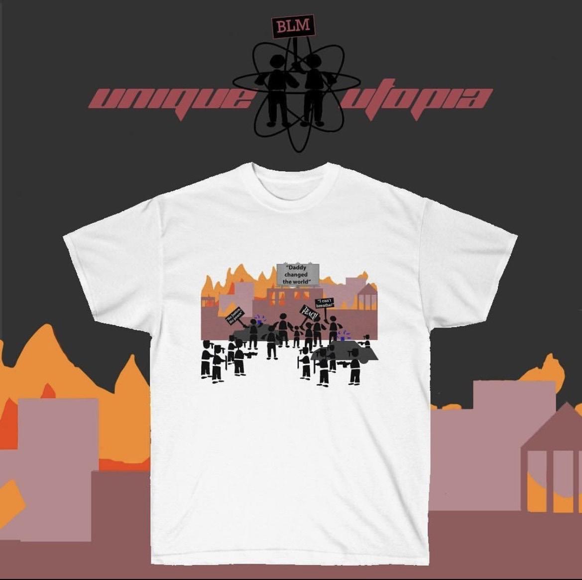
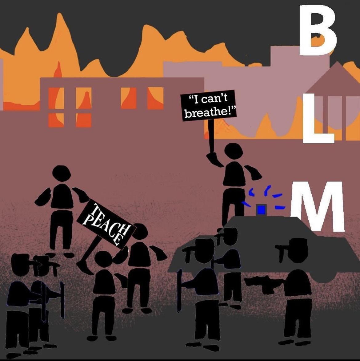
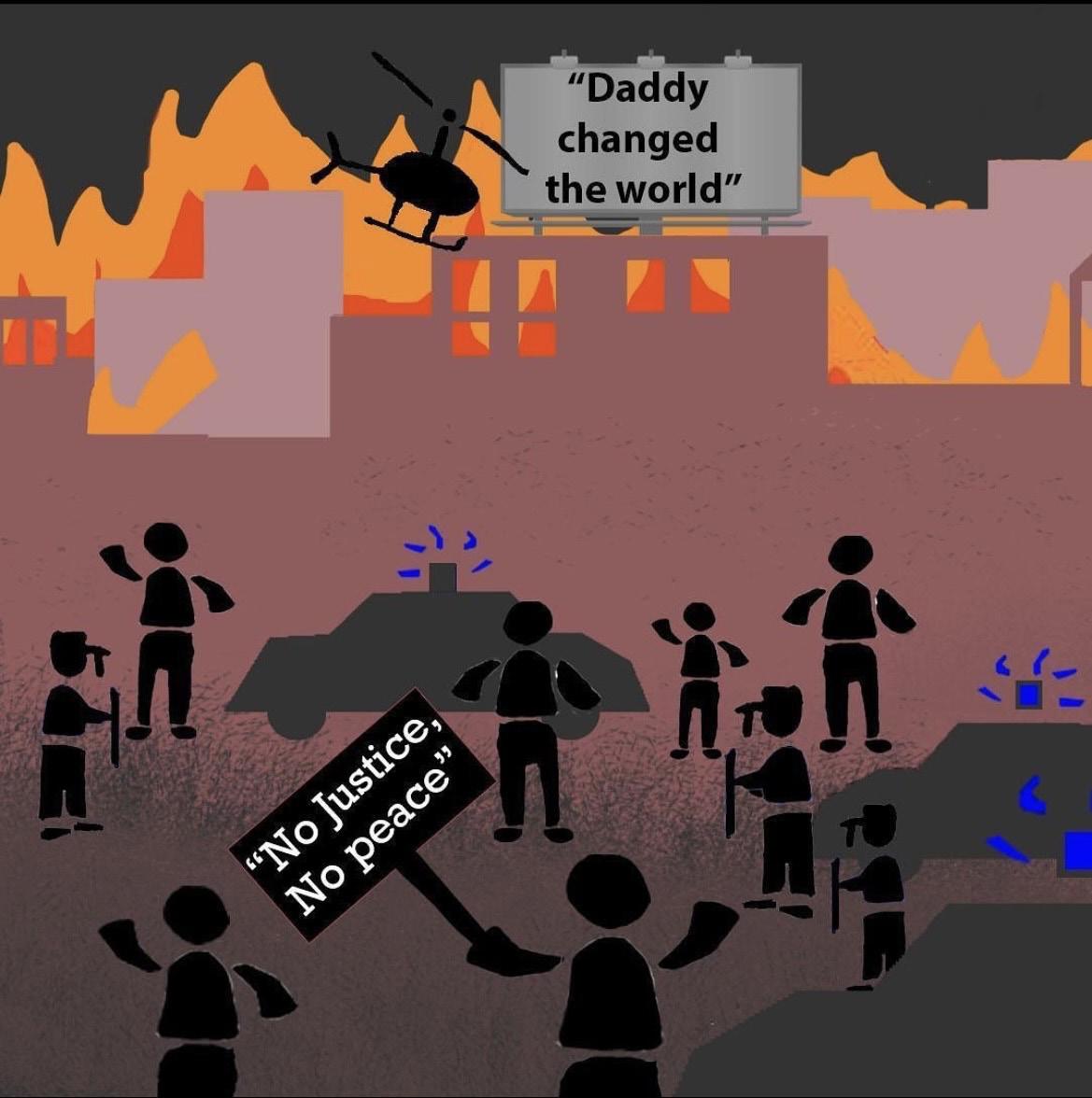
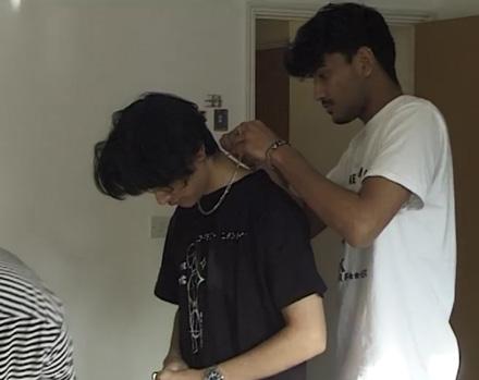
Unique Utopia made a powerful debut with their BLM (Black Lives Matter) T-shirts during the global COVID-19 lockdown when the movement gained momentum. The T-shirts served as a statement of solidarity, raising awareness and supporting the fight against racial injustice. All profits from the initial drop were donated to BLM-related charities. The design featured a narrative of a protest scene and impactful quotes, including “Daddy Changed the World”, famously spoken by George Floyd’s daughter, and the widely recognized slogan “TEACH PEACE,” promoting unity. This launch showcased Unique Utopia’s commitment to social impact through fashion, empowering individuals to advocate for change.
QR
14
Collection 3: BLM T-shirts
code for BLM T-shirt instagram
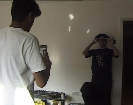
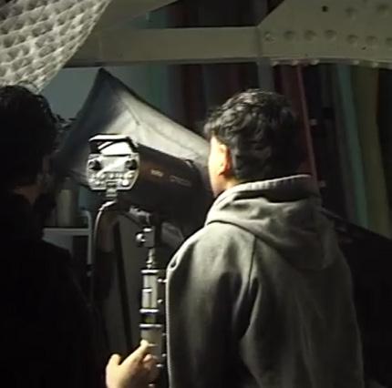
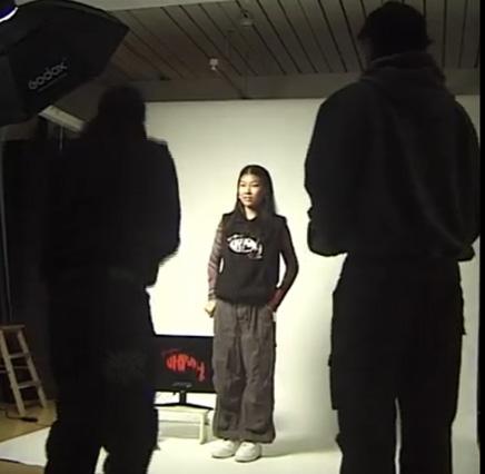
Videography
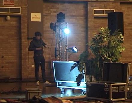
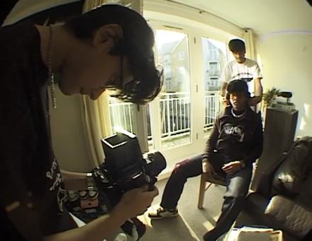
Behind the scene of a photoshoot
The behind the scene video showcasing the events that happen before the final product. this style enganges with the customers making them feel as if they are part of the journey. This video storyboard shows the activites during a photoshoot. (Click here or scan the QR code for the view)
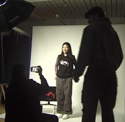
Behind the scene of the UU fashion show
This video storyboard shows the activites during before and druing the fashion show. (Click here or scan QR code)
QR code 3
Behind the scene of a photoshoot
QR code 4
Behind the scene of the UU fashion show
15
02 ARCHITECTURE DESIGN
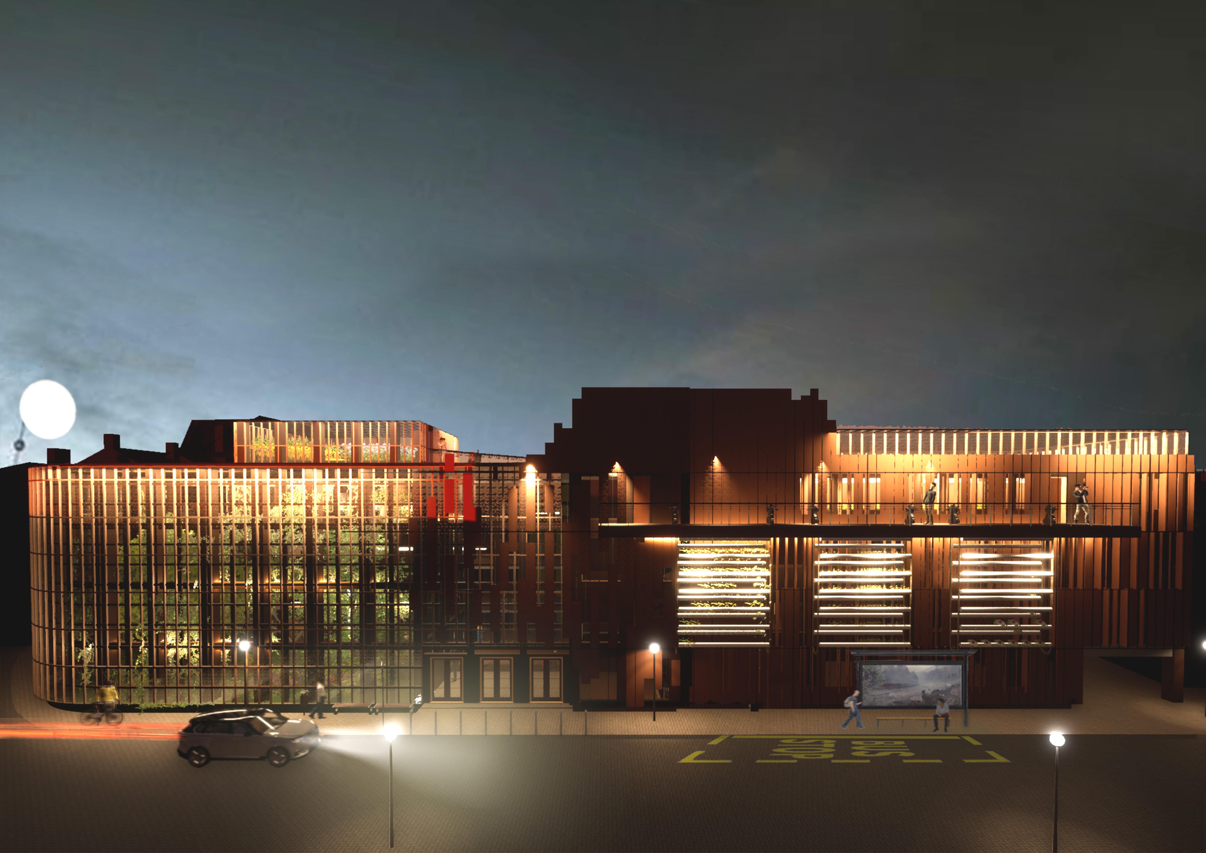
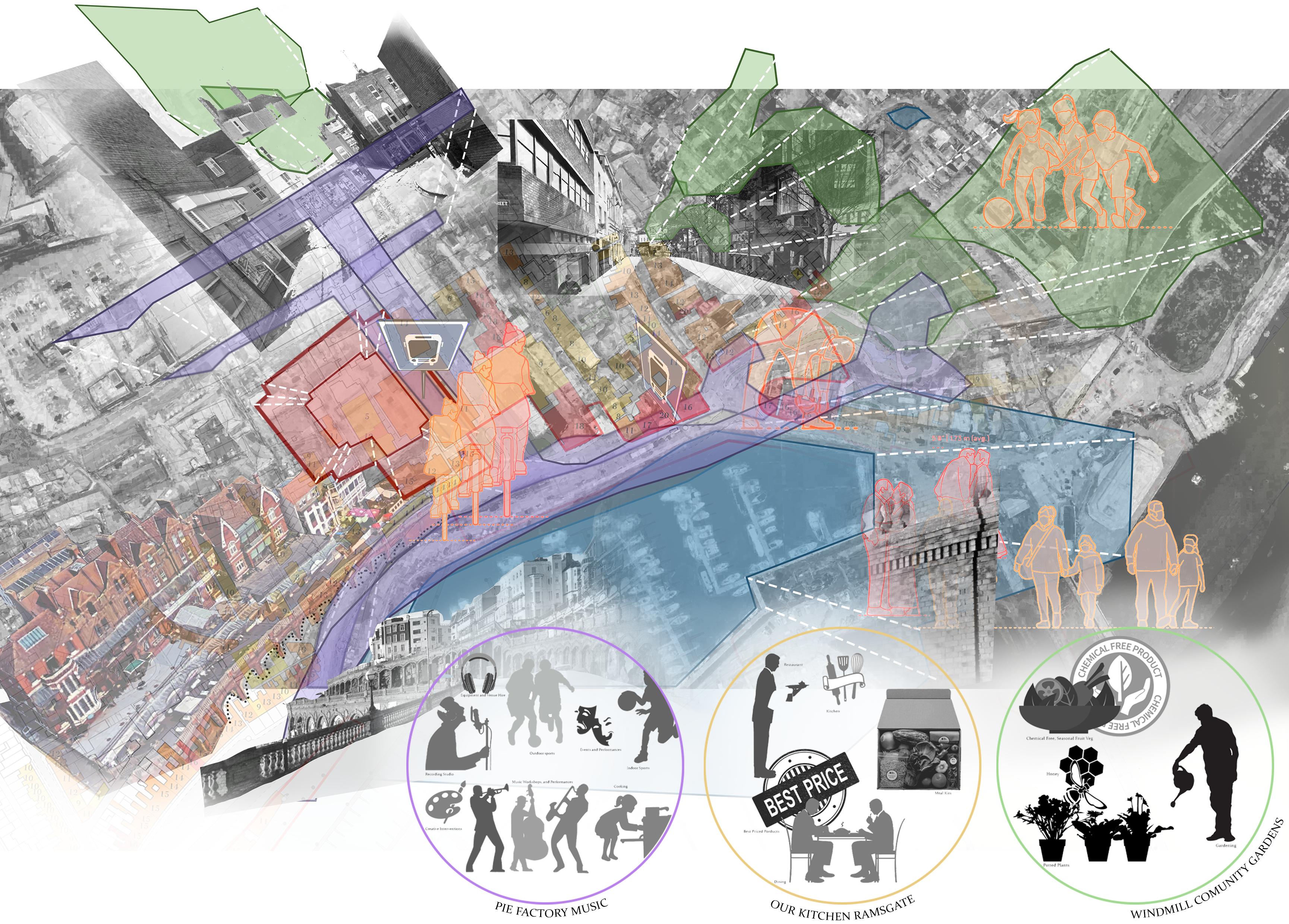
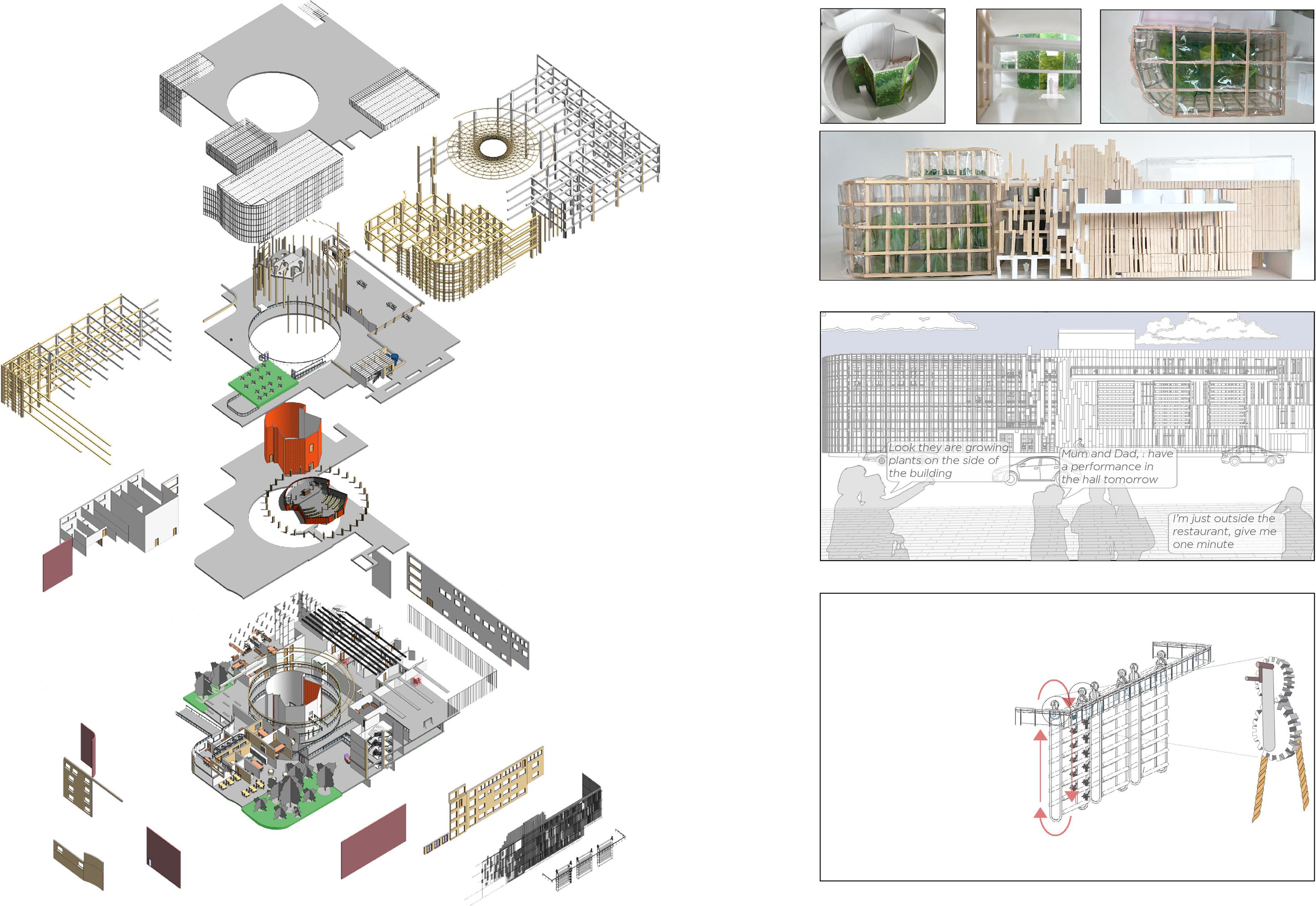
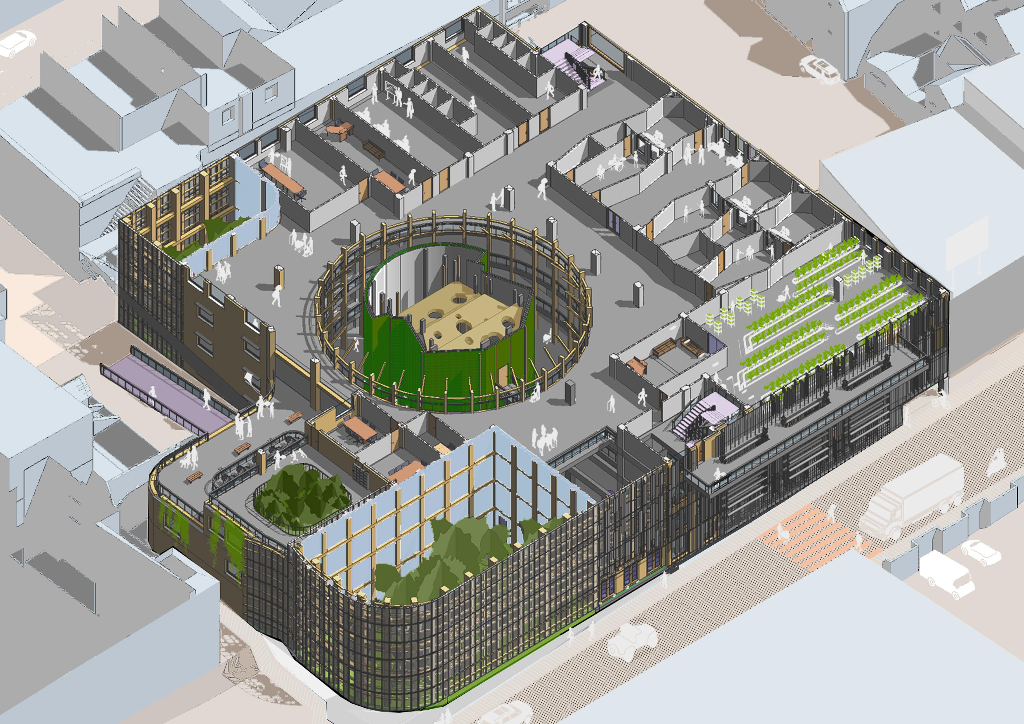
I designed a new civic amenity by repurposing the existing Royal Harbour Carpark found in Ramsgate. This project embraced the idea of ‘trade and exchange’ to support community growth. I independently developed briefs through consultation with three diverse clients whose purpose was to expand/relocate to this new site. I created groups of clients and analysed possible collaborations through spaces. To further understand this, I undertook a task of mapping the nearby streets to understand the towns social and physical conext. This allowed my design to support the town’s social, economic, and cultural life.
The proposal focused on the collaboration between three separate organisations: Our Kitchen, Windmill Community Gardens, and Pie Music Factory. Although the clients’ goals were different, the common theme was focusing on a better tomorrow. ‘Our Kitchen’ charity headquarters created a unique opportunity to rethink the typical food bank and meal kits. Additionally, collaborating with ‘Windmill Community Gardens,’ who produce eco-friendly vegetables at a cheaper price. Finally, ‘Pie Music Factory’ introduced an after-school music facility, creating exopsure for for an educational opportunity of growing vegetables. The building was organised where on one half of the facade was greenrooms, and the other contained enclosed spaces. This idea was mirrored onto the facade showing the collaboration of natural and built enviroment, from man-made to organic forms.
Ramsgate, United Kingdom
16 Id Twin Motion Rhino Ps Auto CAD Enscape Ai Revit SketchUp 2.1 // Year 3 Project
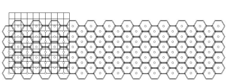
Mapping and Clients
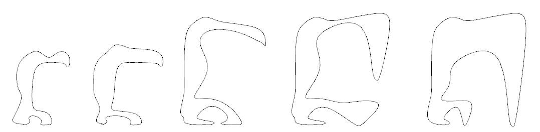
Exploded Axonometric
19
Hydroponic pulley system found on facade
Facade - wooden panels to ETFE
Model pictures - ETFE panel + facade
I received third place in the renowned #ARTOFTHECITY competition.
The premise of this competition was to generate a design that embodies the vibrancy and essence of Kenya. The task was to craft an innovative disposable coffee cup for ArtCaffe, one of Kenya’s most prominent restaurant chains. My design encapsulated the graffiti-filled Matatu buses, a prominent part of Kenyan public transport that is uniquely significant to the local community. I also included depictions of the celebrated ‘Big 5’ animalsthe Lion, Leopard, Buffalo, Elephant, and Rhino. To complete the portrayal of Kenya’s diverse culture, I incorporated elements representing the Maasai tribe, known for its rich traditions and heritage.
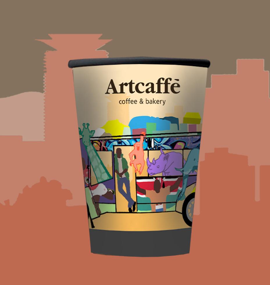
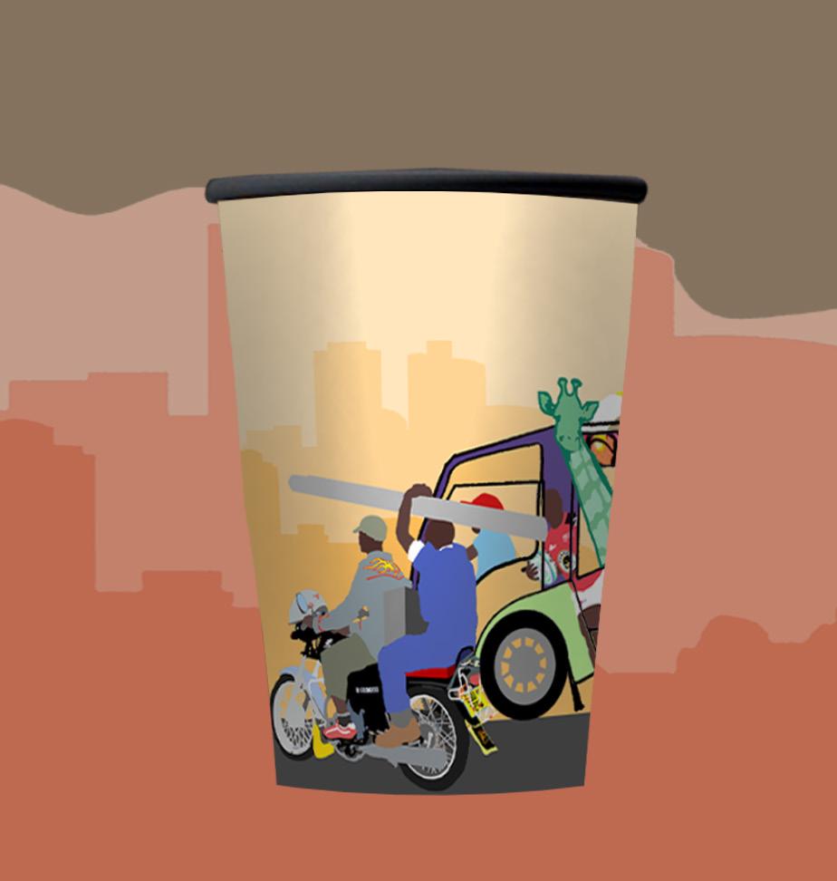
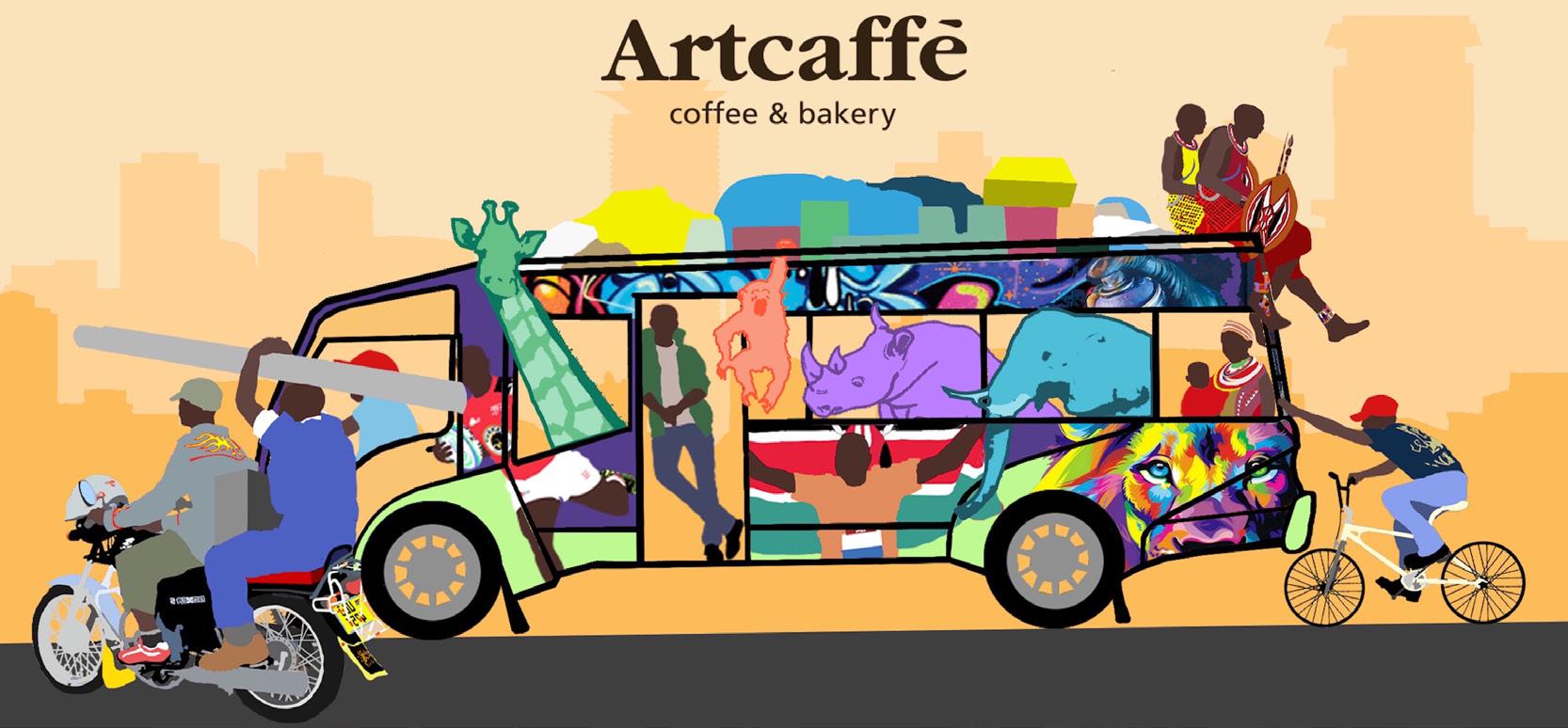
21 05 #ARTOFTHECITY Id Twin Motion Rhino Ps Auto CAD Enscape Ai Revit SketchUp
3.2 // Other Projects Nairobi, Kenya
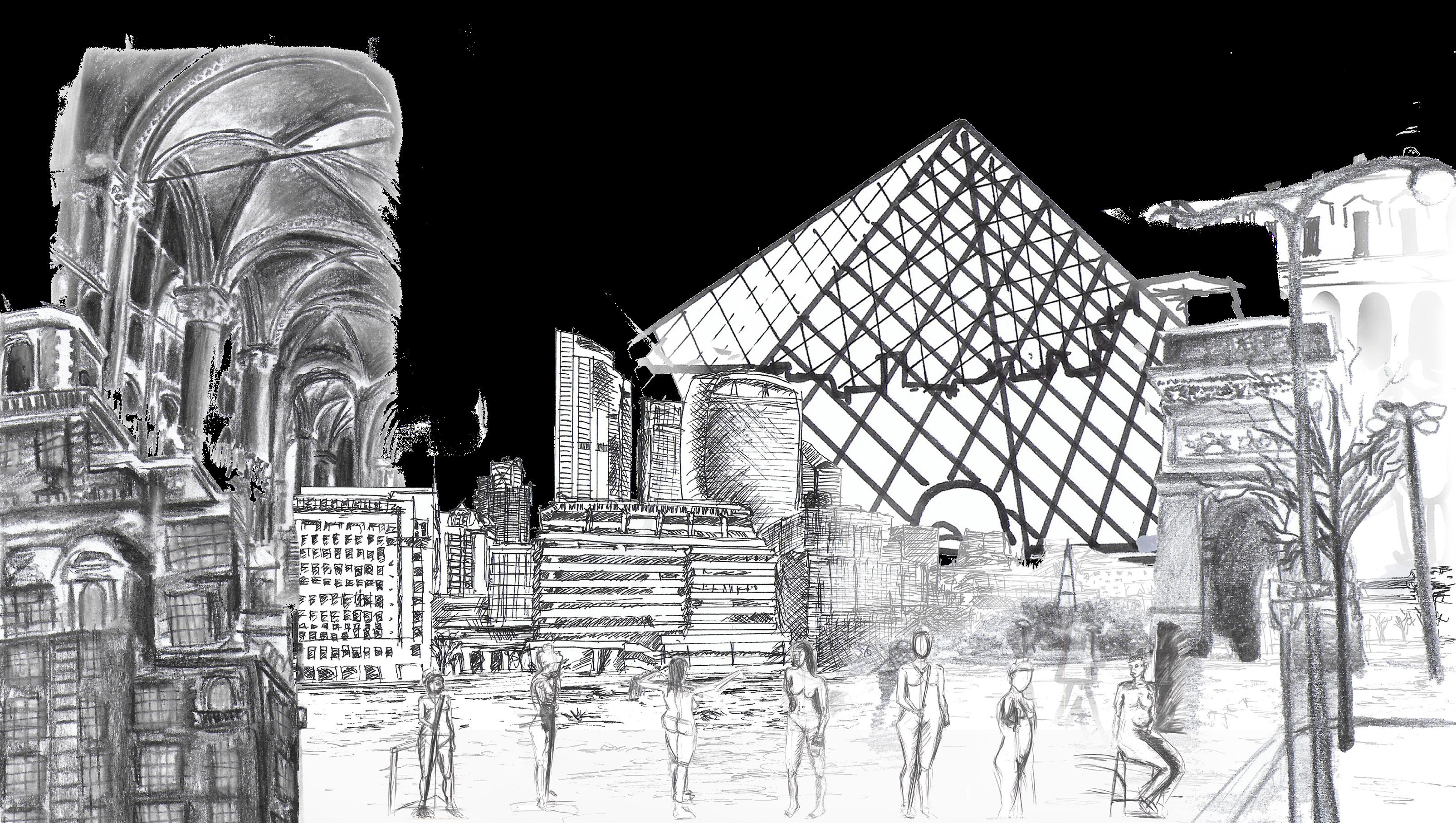
22 06 FINE ART 3.3 // Other Projects Canterbury, Paris, London, New York


23 AADIL SHAH Email: aadil2701shah@gmail.com Phone: +44 7864052140 https://www.aadilarchitecture.com/
