


Content | PR | Media Consultancy Helping amazing businesses grow Rebrand Proposal


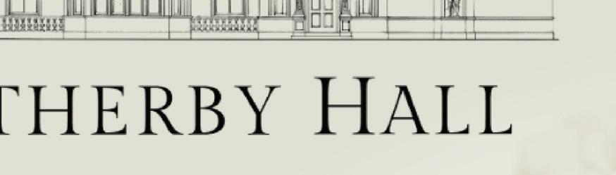
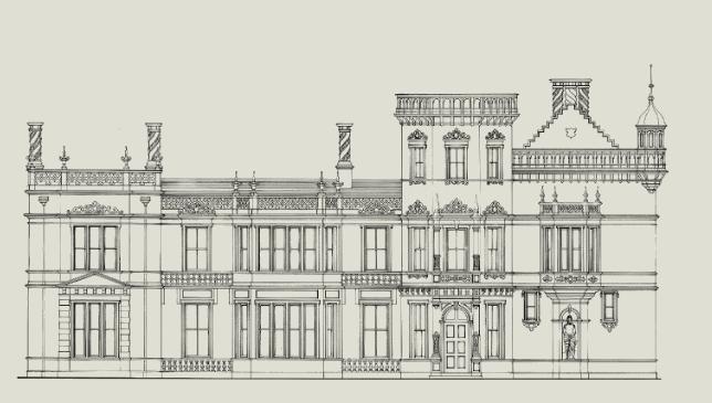
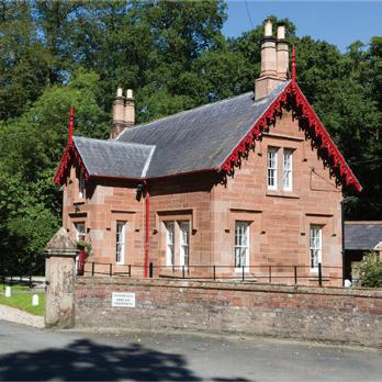
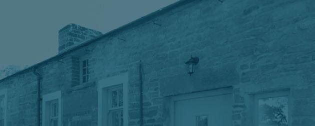
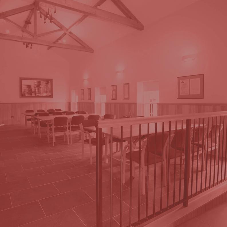
Beautiful, intricate architects drawing of the main building provides an historical, heritage feel.
The single colour makes the logo easily adaptable depending on how it needs to be used.
The overall look and feel is thoughtfully created and is sympathetic to the history of the building and how it has developed.
developed.
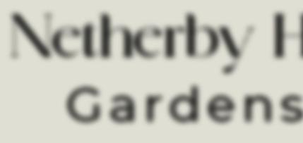
The Netherby Hall typeface has a timeless and classical feel, reflective of the place itself.
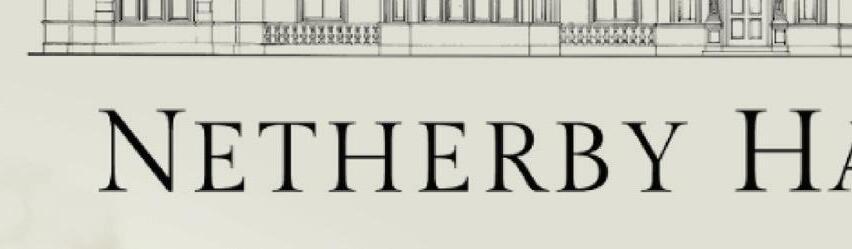
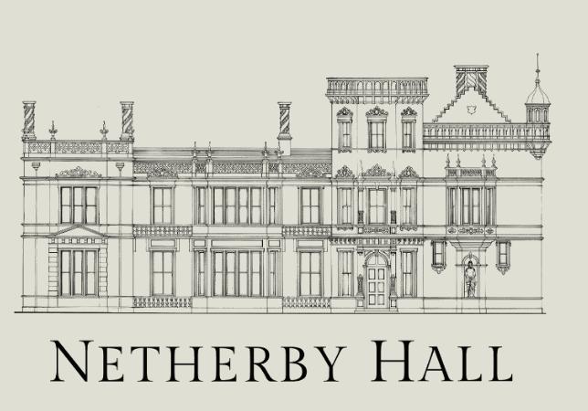


This image is really low resolution and wouldn’t work if this needed to be scaled up. A vector version would be required.

Due to the intricacy of the architects drawing, it may not work and adapt to every requirement needed for a logo design i.e embroidery for garments.
The typeface isn’t really strong enough to be stand alone and doesn’t fully represent the Netherby Hall brand.
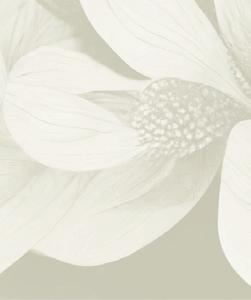
Colour/texture could make this more interesting and eye catching. the monotone look can easily get lost. The intracacy of the logo as a whole doesn’t really complement the Pentonbridge Inn brand.


As a logo, aesthetically, the current logo works well, in terms of being true to the heritage of Netherby Hall, however other than the monotone colour, there’s little relation between Netherby’s and Pentonbridge Inn’s visual identity.
The current colour palette is again complementary to the Pentonbridge Inn brand, conveying a classical and sophisticated feel, however it is very limited and a wider range of colour options should be explored to bring the brand to life, and be truly reflective of the building and its stunning grounds.


The creation of a uniform colour palette relating to each aspect of Netherby Hall would be an excellent way to elevate the brand and create distinction between the accommodation and the hall itself.


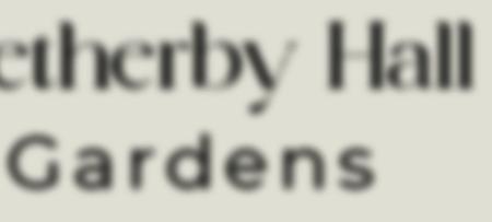
Variations of the logo are also required so that it is adaptable for all circumstances. A linear landscape version (as shown above) and stacked versions are two of the basic variations a logo should provide, so that it can fit in any given space, and allow the logo the space it needs.
Font weight and posture can have a huge effect on the aesthetic of a brand and its logo. After reviewing of the Netherby Hall logo font, it feels unoriginal and a little dated and doesn’t set Netherby Hall apart.
A change of font could really help elevate the brand. A more unique, clean and sophisticated aesthetic would work well and complement the Pentonbridge Inn.
Below are some suggestions of fonts that would work well on delivering the above, as well as feeling modern and complementary of Netherby Hall and Pentonbridge Inn
Colour is imperative when it comes to conveying a brands identity. Netherby Hall’s palette has a level of sophistication but is far too limited and exclusive of particular areas of importance such as the beautiful grounds and plant life.
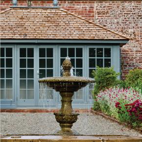

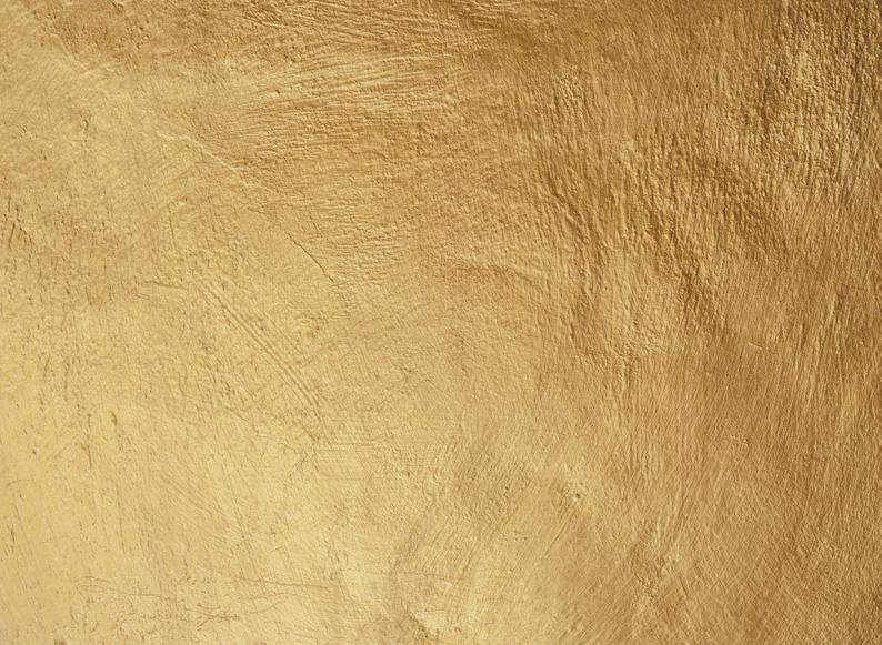
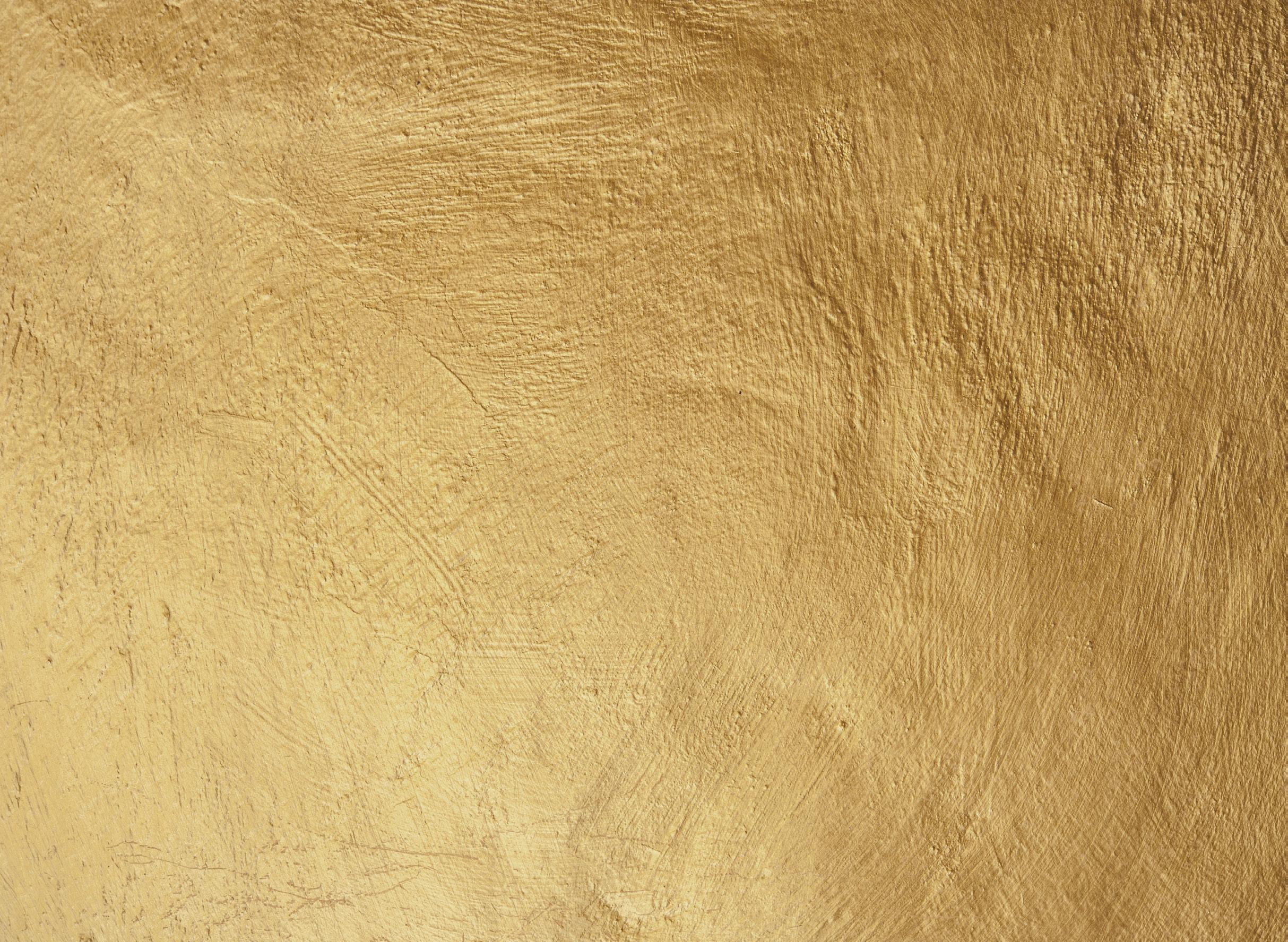
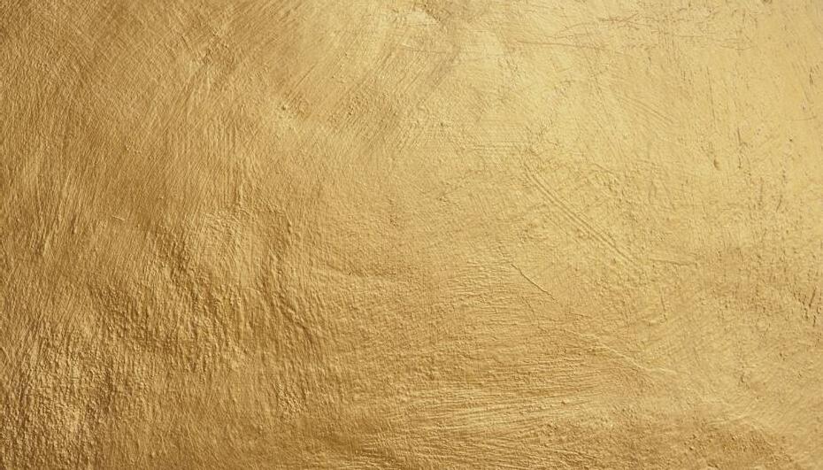
Taking direct inspiration from different aspects of Netherby Hall, the below colours work collectively, fully represent the various areas of the Netherby Hall estate and are rich and sophisticated in tone. The navy tone used in the brand currently is a classic and contemporary colour which works well when paired with the colours selected, the golden texture adds to the richness and creates dimension and a luxe feel.

Simplifying the logo would be an effective way of elevating Netherby Hall’s visual identity.
Moving away completely from the intricate architects drawing, a clean, structured and contemporary visual can be created.

Taking inspiration from the intricate curves and structures of the main hall and traditional calligraphy, provides a simple emblem that provides sophistication and modernity. Simplifying the design also allows the logo to be much more adaptable and usable across many different formats


Looking at this reworked form and new rich colours, allows the brand to divide where necessary.


The accommodation part of Netherby Hall can now be distinguished by a separate identity by simply using colour. This could also be applied to other areas if required.


This new simplified vision also creates much more adaptability when it comes to layout.


This reworked version is also more complementary to the Pentonbridge Inn brand, and there feels like there is real synergy between the two but with distinct indentities.
A brand’s font should always take into consideration the font used in its logo and how a secondary font would complement this.
The suggested fonts for the logo comprise of serif and semi-serif fonts, therefore a sans serif font or a heavier serif font would complement this.
Museo Sans or Montserrat would be great complementary fonts to the more decorative Kugile Regular.
They’re clean, modern blocky appearance give lots of clarity in any given situation. It also consists of a number of different weights so can be used in any instance required.


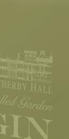
Netherby Hall
TO JOHN DOE Marketing ManagerNetherby Hall
Netherby, Longtown Carlisle, Cumbria CA6 5PR
Dear Sir,

There are many variations of passages of Lorem Ipsum available, but the majority have suffered alteration in some form, by injected humour, or randomised words which don't look even slightly believable.


If you are going to use a passage of Lorem Ipsum, you need to be sure there isn't anything embarrassing hidden in the middle of text. All the Lorem Ipsum generators on the Internet tend to repeat predefined chunks as necessary, making this the first true generator on the Internet.


All the Lorem Ipsum generators on the Internet tend to repeat predefined chunks as necessary, making this the first true generator on the Internet.


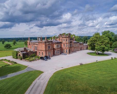
Award-winning accommodation in Carlisle


- A thorough and well thought out concept with a coherent and distinctive aesthetic.
- A choice of three logo designs.
- A full set of brand guidelines and guidance on how the brand is to be rolled out as well as guidance on how the brand should be styled for social media purposes.
- Access to selected fonts to be used internally.
- Access to any imager y outside of what has been provided by the Netherby Hall team
Total cost - £3, 500+VAT


