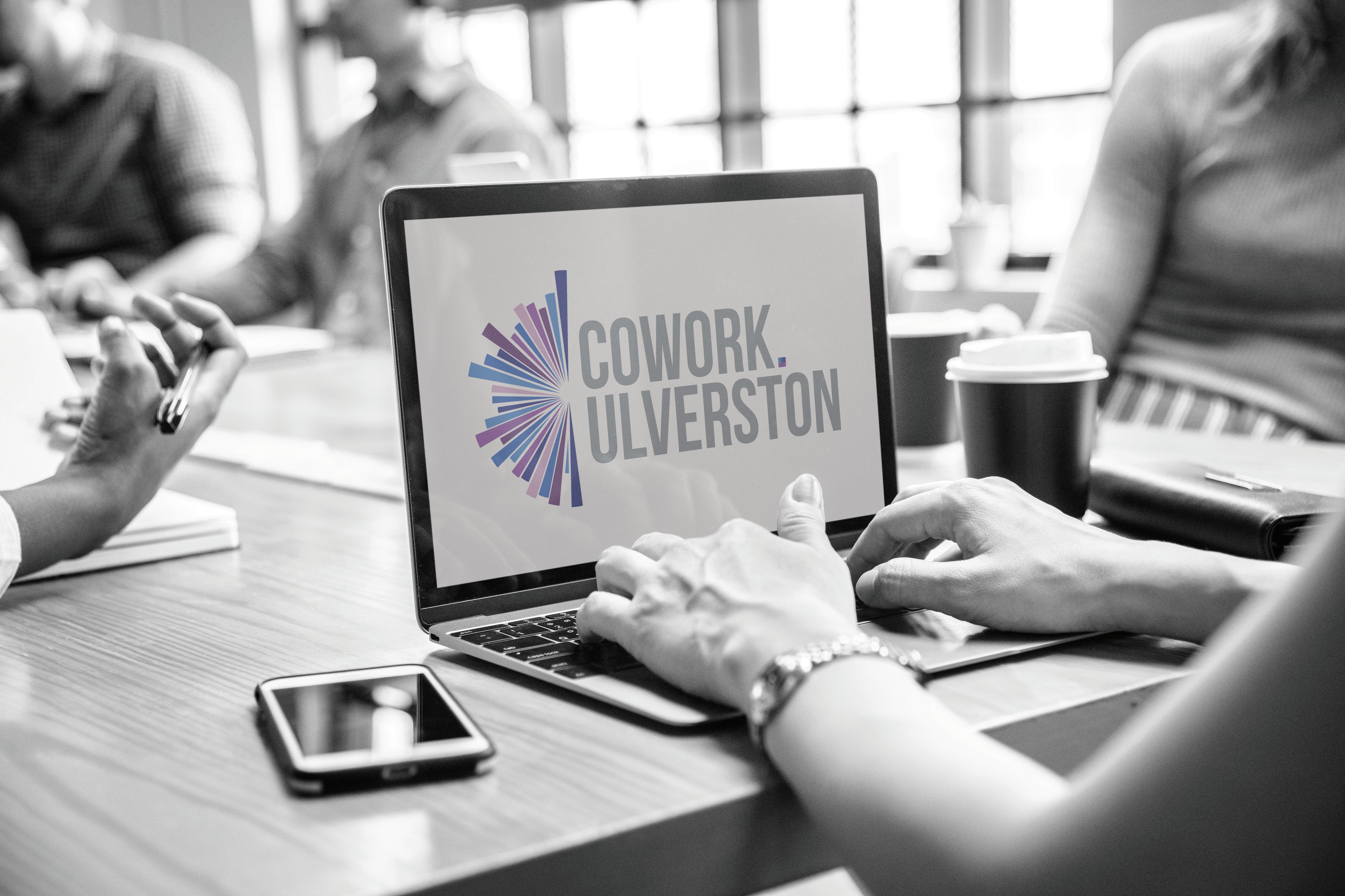
Brand Guidelines Your Business Our Passion Connected • Convenient • Collaborative

Connected • Convenient • Collaborative
Table of contents
Brand Guidelines 2022
1 Brand Overview Logo type construction Brand Typography Brand colour palette
2
3 Section 4 1
Section
Section
Section
Brand Overview
Lorem ipsum dolor sit amet, consectetuer adipiscing elit, sed diam nonummy nibh euismod tincidunt ut laoreet dolore magna aliquam erat volutpat. Ut wisi enim ad minim veniam, quis nostrud exerci tation ullamcorper suscipit lobortis nisl ut aliquip ex ea commodo consequat. Duis autem vel eum iriure dolor in hendrerit in vulputate velit esse molestie consequat, vel illum dolore eu feugiat nulla facilisis at vero eros et accumsan et iusto odio dignissim qui blandit praesent luptatum zzril delenit augue duis dolore te feugait nulla facilisi.
Lorem ipsum dolor sit amet, cons ectetuer adipiscing elit, sed diam nonummy nibh euismod tincidunt ut laoreet dolore magna aliquam erat volutpat. Ut wisi enim ad minim veniam, quis nostrud exerci tation ullamcorper suscipit lobortis nisl ut aliquip ex ea commodo consequat.
Lorem ipsum dolor sit amet, consectetuer adipiscing elit, sed diam nonummy nibh
Lorem ipsum dolor sit amet, consectetuer adipiscing elit, sed diam nonummy nibh euismod tincidunt ut laoreet dolore magna aliquam erat volutpat. Ut wisi enim ad minim veniam, quis nostrud exerci tation ullamcorper suscipit lobortis nisl ut aliquip ex ea commodo consequat. Duis autem vel eum iriure dolor in hendrerit in vulputate velit esse molestie consequat, vel illum dolore eu feugiat nulla facilisis at vero eros et accumsan et iusto odio dignissim qui blandit praesent luptatum zzril delenit augue duis dolore te feugait nulla facilisi.
Lorem ipsum dolor sit amet, cons ectetuer adipiscing elit, sed diam nonummy nibh euismod tincidunt ut laoreet dolore magna aliquam erat volutpat. Ut wisi enim ad minim veniam, quis nostrud exerci tation ullamcorper suscipit lobortis nisl ut aliquip ex ea commodo consequat.
Lorem ipsum dolor sit amet, consectetuer
Brand Guidelines 2022
2
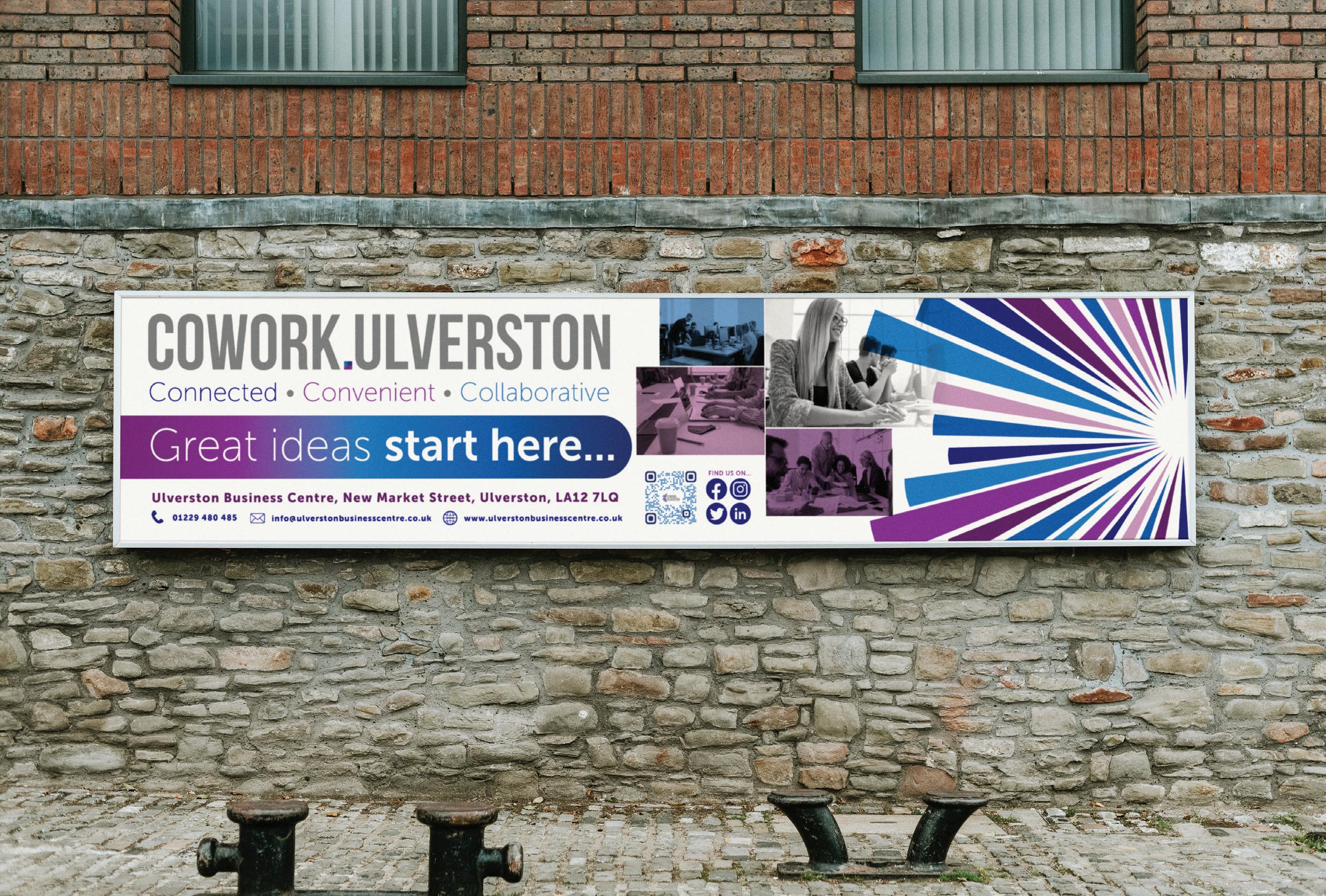
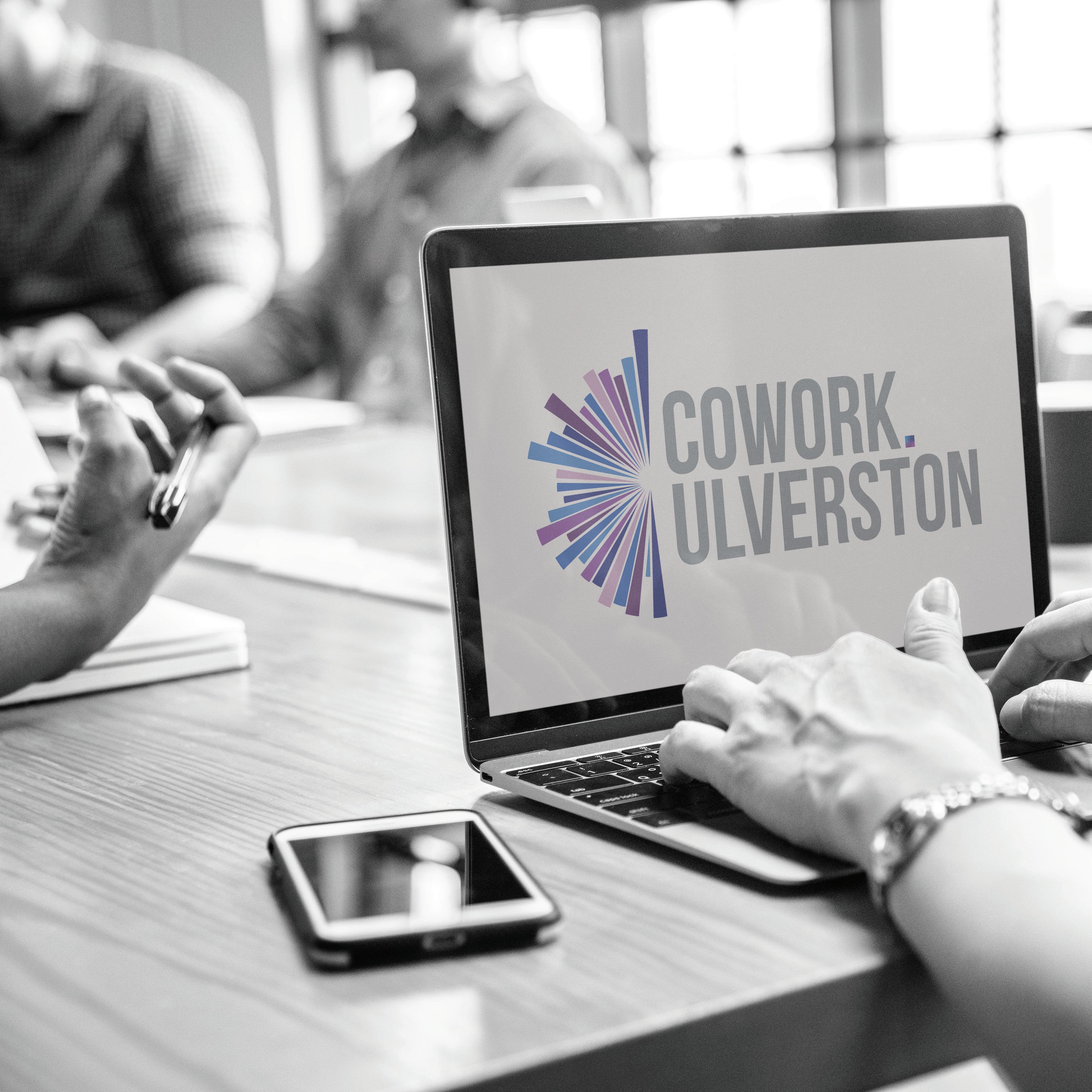
Full and single colour linear versions without strapline
2022 3
Brand Guidelines
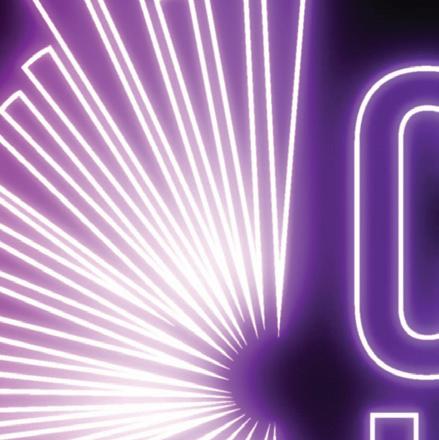
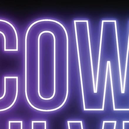
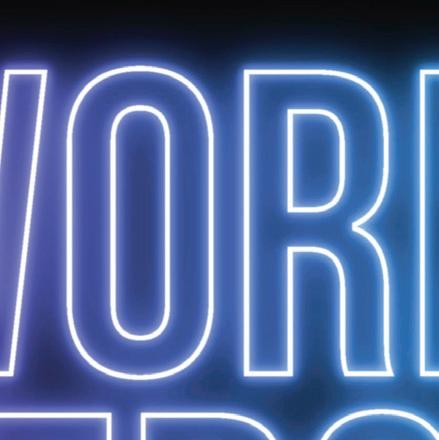
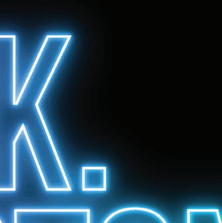
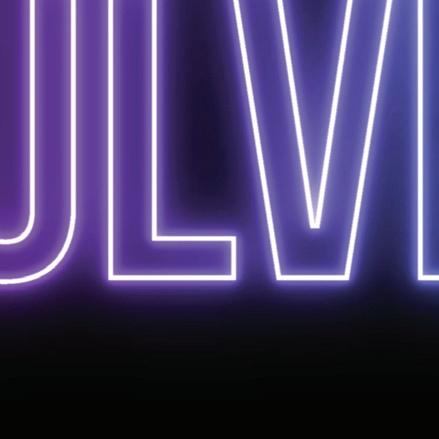
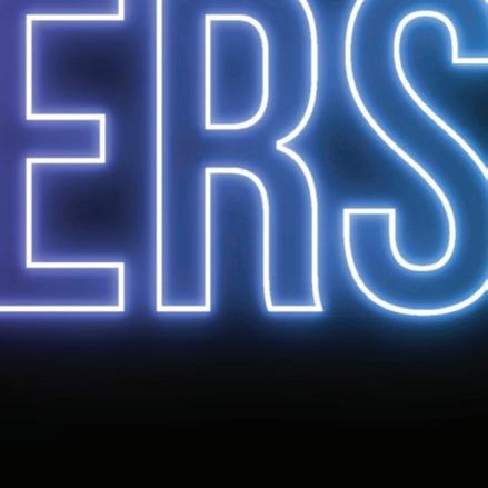
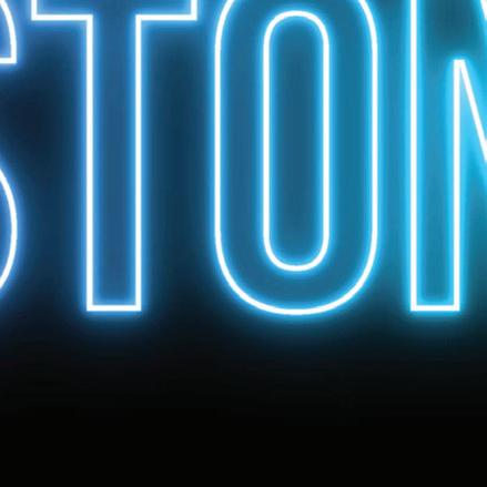
Logotype construction
Connected • Convenient • Collaborative Full and single colour linear versions with strapline Brand Guidelines 2022 4 Logotype construction Connected • Convenient • Collaborative Connected • Convenient • Collaborative Connected • Convenient • Collaborative
Full and single colour
one line linear versions
Brand Guidelines 2022 5 Logotype construction
Full and single colour stacked social media icons
Brand Guidelines 2022 6 Logotype construction


Brand Guidelines 2022 7 Connected • Convenient • Collaborative
Typography plays an important role in communicating an overall tone and quality. Careful use of typography reinforces personality and ensures For Cowork.Ulverston’s primary font
Bebas Neue, our selected secondary font is used within our logo, due to it’s bold, simplistic and condensed nature, providing the modernity and sleekness we wanted the brand to represent.
It is however unsuitable for use in body text and should only be used for headings where emphasis is required.
geometric, highly legible sans serif typeface very well suited for any
provides a very nice visual contrast to the secondary font Bebas Neue.
Both fonts can be accessed via the Adobe fonts manager which is included with any Adobe package and can be found here:
Museo Sans - https://fonts.adbe.com/fonts/museo-sans
Bebas Neue - https://fonts.adobe.com/fonts/bebas-neue
Brand Guidelines 2022 8 Logotype construction
Museo Sans
PRIMARY:
DESIGNER: JOS
THE FONT
Museo Sans is based on the well-known Museo. It is a sturdy, low contrast, geometric, highly legible sans serif typeface very well suited for any display and text use. There is also a Condensed, a Rounded and a Display family available.
EXTRA MUSEO SANS
900 300 Figures
MUSEO SANS
Special Characters
TYPE EXAMPLES
BUIVENGA
A B C D E F G HI J K L M NO P Q R S T U V W X Y Z a b c d e f g h i jk l m n o p q r s t u v w x y z A B C D E F G HI J K L M NO P Q R S T U V W X Y Z a b c d e f g h i jk l m n o p q r s t u v w x y z 01234567890 !“§$%&/()=?`;: ¡“¶¢[]|{}≠¿‘ « ∑ €®† Ω ¨⁄ø π •±‘ æœ@ ∆ ºª©ƒ ∂ ‚å¥≈ç √ ~µ∞…–≤<>≥˘›‹ ◊ Brand Guidelines 2022 9 PrimaryBrand font
BebasNeue
A B C D E F G HI J K L M
NO P Q R S T U V W X Y Z
a b c d e f g h i jk l m
n o p q r s t u v w x y z
Regular
A B C D E F G HI J K L M
NO P Q R S T U V W X Y Z
a b c d e f g h i jk l m
n o p q r s t u v w x y z
Figures
01234567890
Special Characters
!Ҥ$%&/()=?`;:
¡“¶¢[]|{}≠¿‘
SECONDARY BRAND FONT
BEBAS NEUE
DESIGNER:
RYOICHI TSUNEKAWA
THE FONT
Bebas Neue is world wide, the most popular font family with all caps released in 2010.
The sister font Bebas Neue Pro offers manymore weights and postures as well as sleek
EXTRA BEBAS NEUE TYPE EXAMPLES
Bold
Brand Guidelines 2022 10 SecondaryBrand font
«∑€®†Ω¨⁄ø𕱑 æœ@∆ºª©ƒ∂‚å¥≈ç √~µ∞…–≤<>≥˘›‹◊
BrandColour palette
Primary Colour
Palette
Colour plays a vital part in our brand’s visual identity. The Cowork.Ulverston colour palette is as diverse, vibrant and on trend as our users.
The colours were chosen due to their rich, complimentary and striking tones. All colours are used within the full colour logo design to represent diversity coming together in one harmonious workplace.
Usage
The blue and purple tones should be used strategically within any design as they are stand alone colours, so should be used either against a white or dark grey backdrop, or themselves with white overlaid. This stands for all internal and external representation of the business.
Colour Codes
CMYK : C100 M093 Y026 K014
RGB : R000 G004 B128
Web : #000480
Colour tones
Colour Codes
CMYK : C071 M100 Y026 K017
RGB : R097 G034 B097
Web : #612261
Colour tones
100% 80% 60% 40% 20% 100% 80% 60% 40% 20%
Brand Guidelines 2022 11
Colour Codes
CMYK : C056 M095 Y000 K000
RGB : R138 G042 B134
Web : #8A2A86
Colour tones
Primary Colour Palette
The paler purple and blue selected helps to create contrast and harmony alongside the darker richer hues. these colours collectively work well together due to their close relationship in tone, and di erence in depth.
Colour Codes
CMYK : C081 M046 Y000 K000
RGB : R046 G121 B190
Web : #2E79BE
Colour tones
100% 80% 60% 40% 20% 100% 80% 60% 40% 20%
Brand Guidelines 2022 12
Brandcolour palette
BrandColour palette
Secondary Colour Palette
The Secondary colours selected are purely complimentary to the primary colours and should be used sparingly and should appear in less than 30 percent of the overall palette in one piece.
Usage
These colours should be used to accent and support the primary colour palette. A good use of these colours would be to introduce pattern/texture and iconography.
Tones
Colour Codes
CMYK : C005 M004 Y010 K002
RGB : R241 G239 B231
Web : #F1EFE7
Colour Codes
CMYK : C082 M029 Y027 K008
RGB : R004 G132 B159
Web : #04849F
Tones
Colour Codes
CMYK : C055 M044 Y044 K030
RGB : R108 G108 B108
Web : #6C6C6C
Tones
This is a specific gradient created combining all of the primary brand colours in one place, this is predominantly used to emphasise the dot within the logo, but should, if used, be used very sparingly and strategically.
Brand Guidelines 2022 13


14 Brand Guidelines 2022
Ulverston Business Centre, New Market Street, Ulverston, LA12 7LQ 01229 480 485 info@ulverstonbusinesscentre.co.uk www.ulverstonbusinesscentre.co.uk FIND US ON...