THE VISUAL DEVELOPMENT GUIDE


New Mission Statement
Logo History

We provide a nurturing, playful and educational experience to help children reach their full potential so they can have a positive impacton the world.
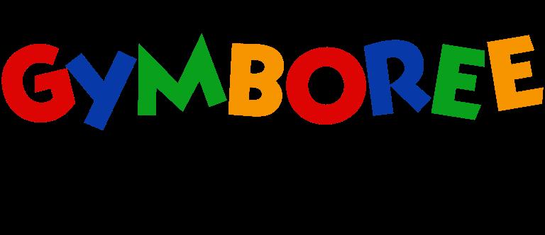
The Gymboree Logo, used by the company in the 1980s, featured a colorful Logotype in a bold sans-serif typeface with the letters slanted and jumping above the line. Each character in the inscription was colored in one of the following shades: blue, red, green, and orange. It was a very lively and playful badge, brilliantly reflecting the purpose and mood of the brand.
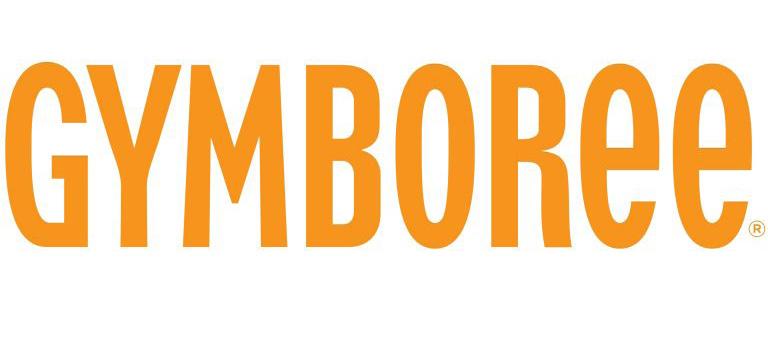
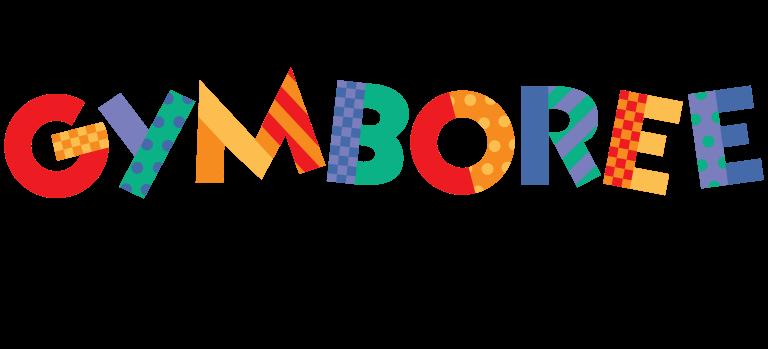
The old Gymboree Logo looked far more playful and colorful than the current one. Although the glyphs were very legible and had a classic shape (mostly) and proportions, they were moved above and below the line. As a result, they appeared to be dancing. The vivid palette combined red, yellow, orange, green, blue, and purple.
All capital letters of the wordmark are written in a custom typeface with bold lines and rounded angles. Letter “R” of the nameplate is the most interesting element, due to the curved line of its right bar.
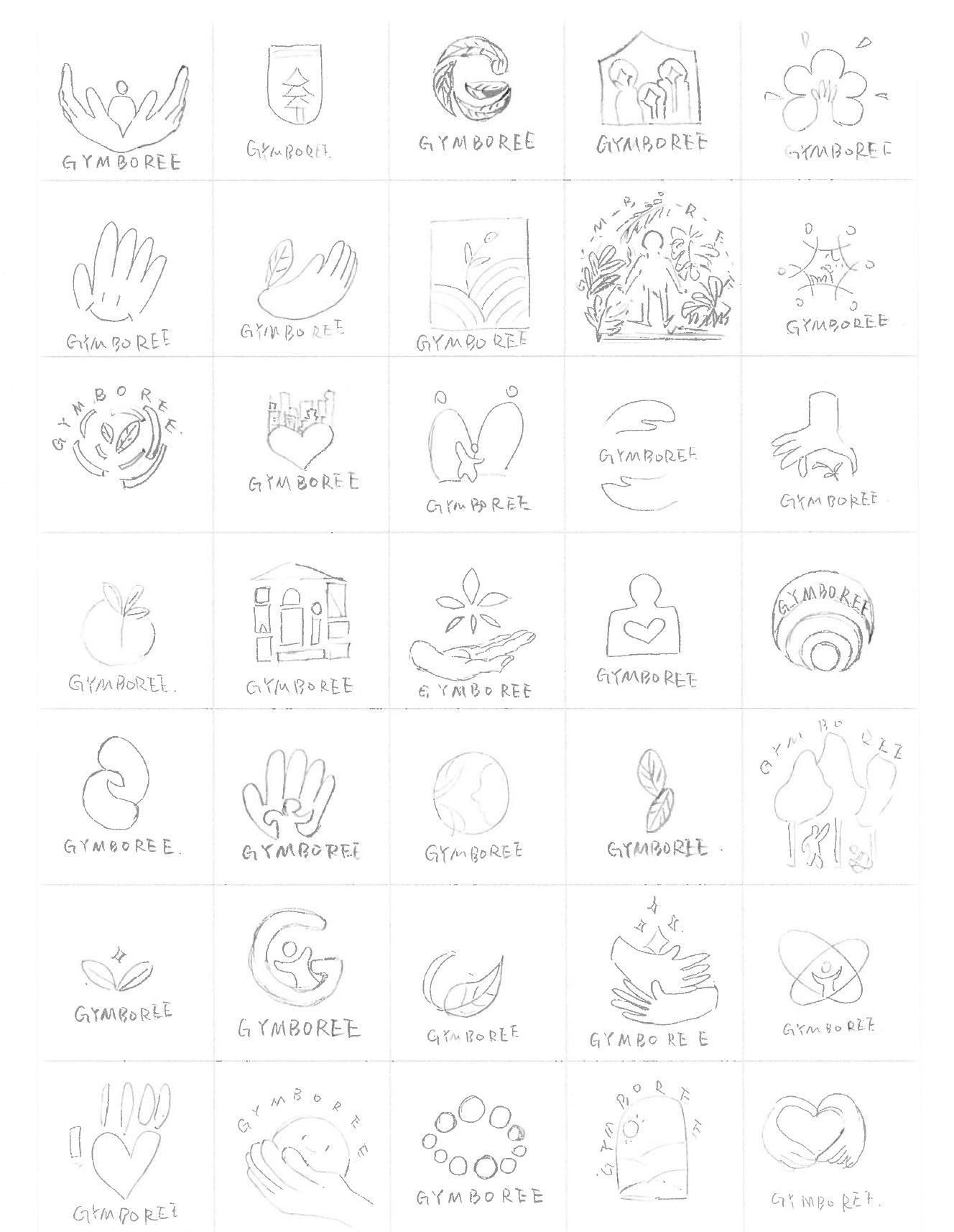
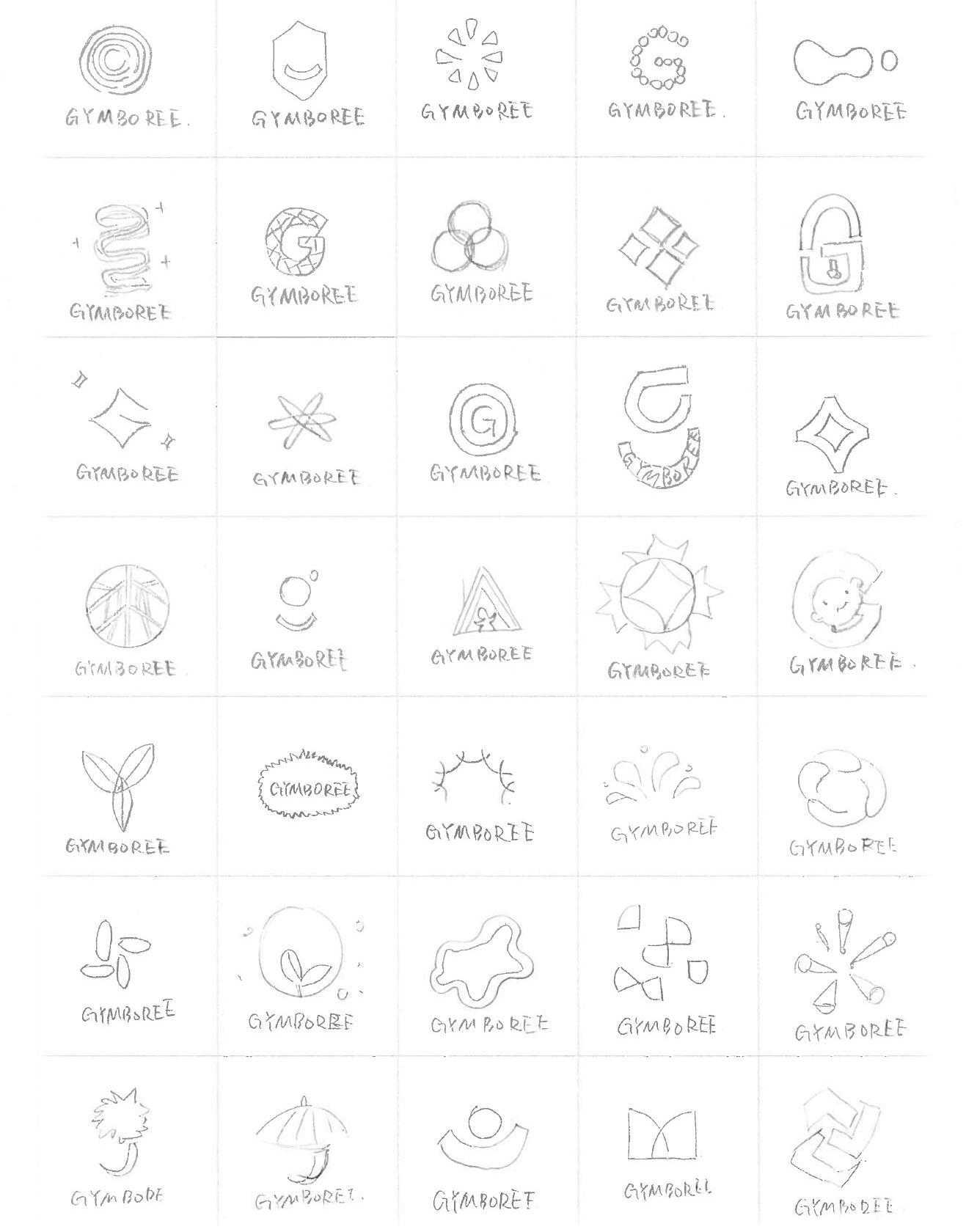
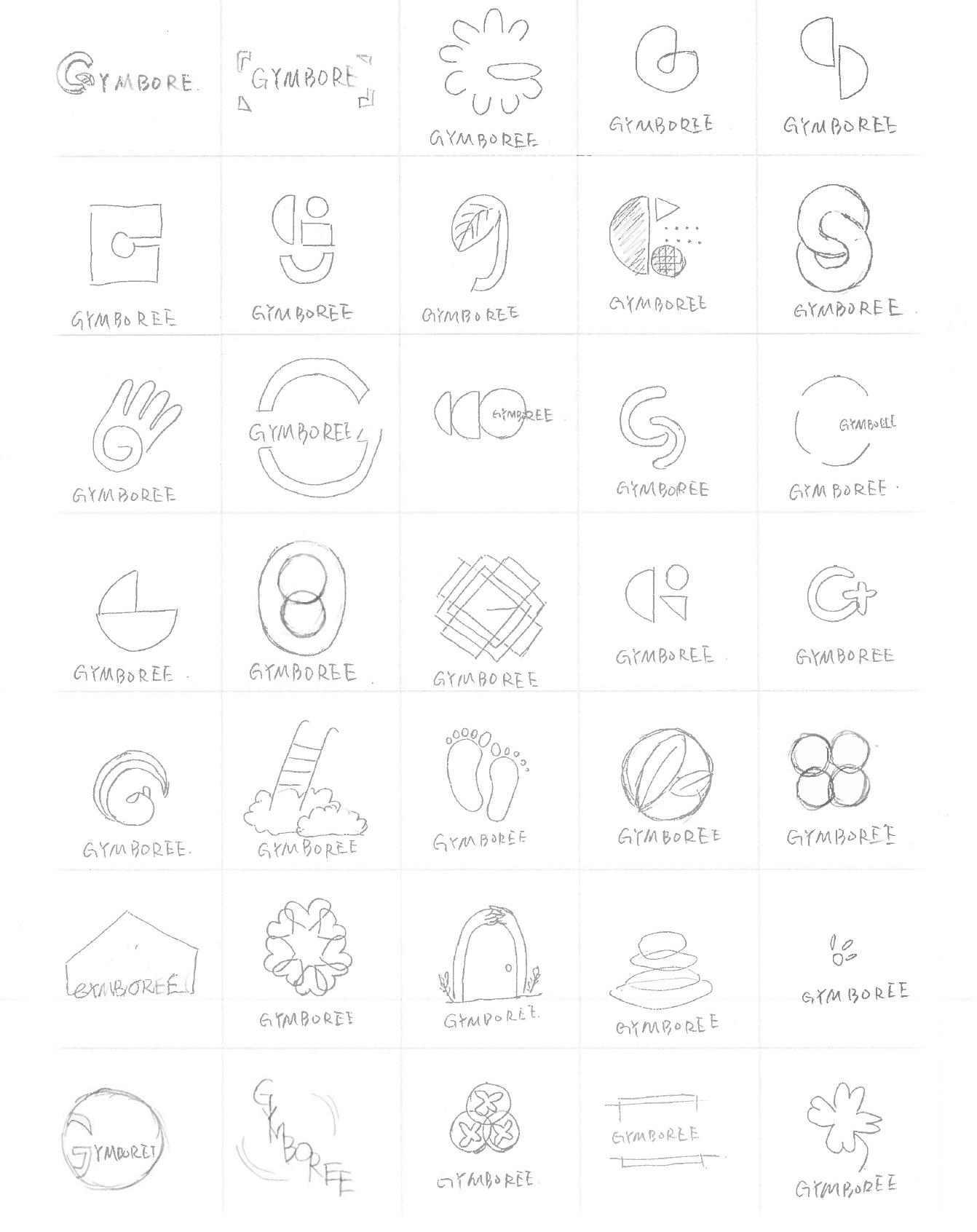
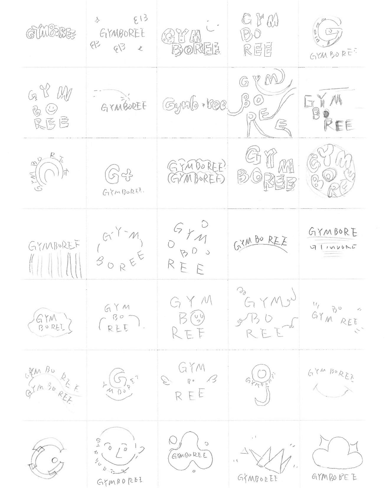
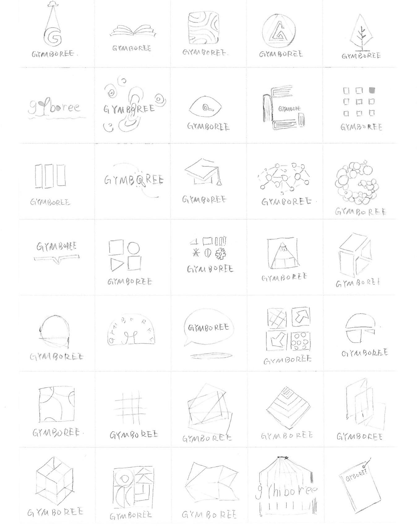
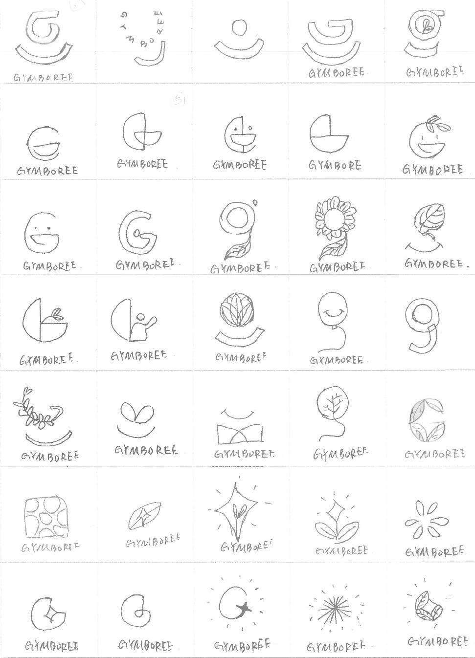
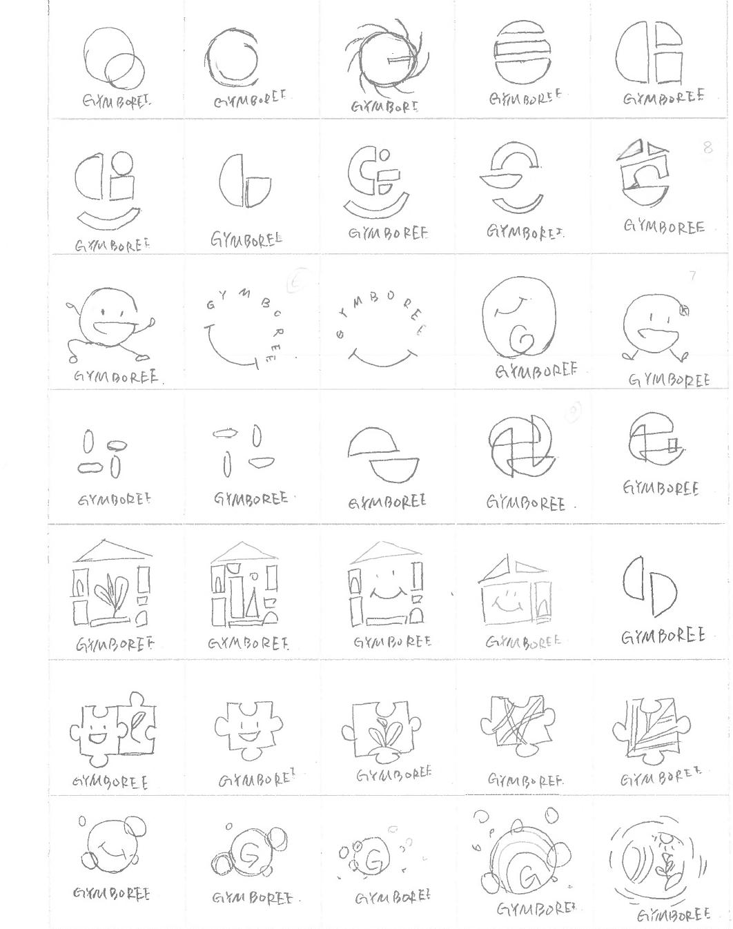
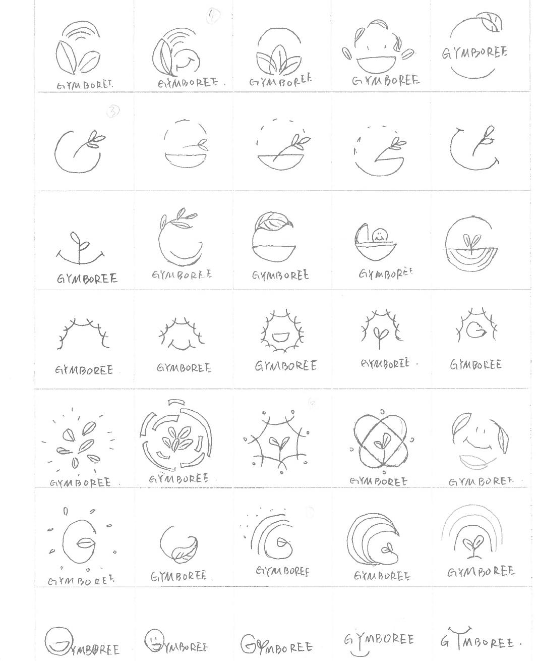
Round 1 Sketches
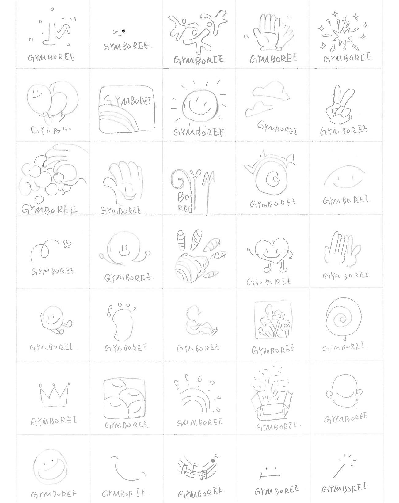
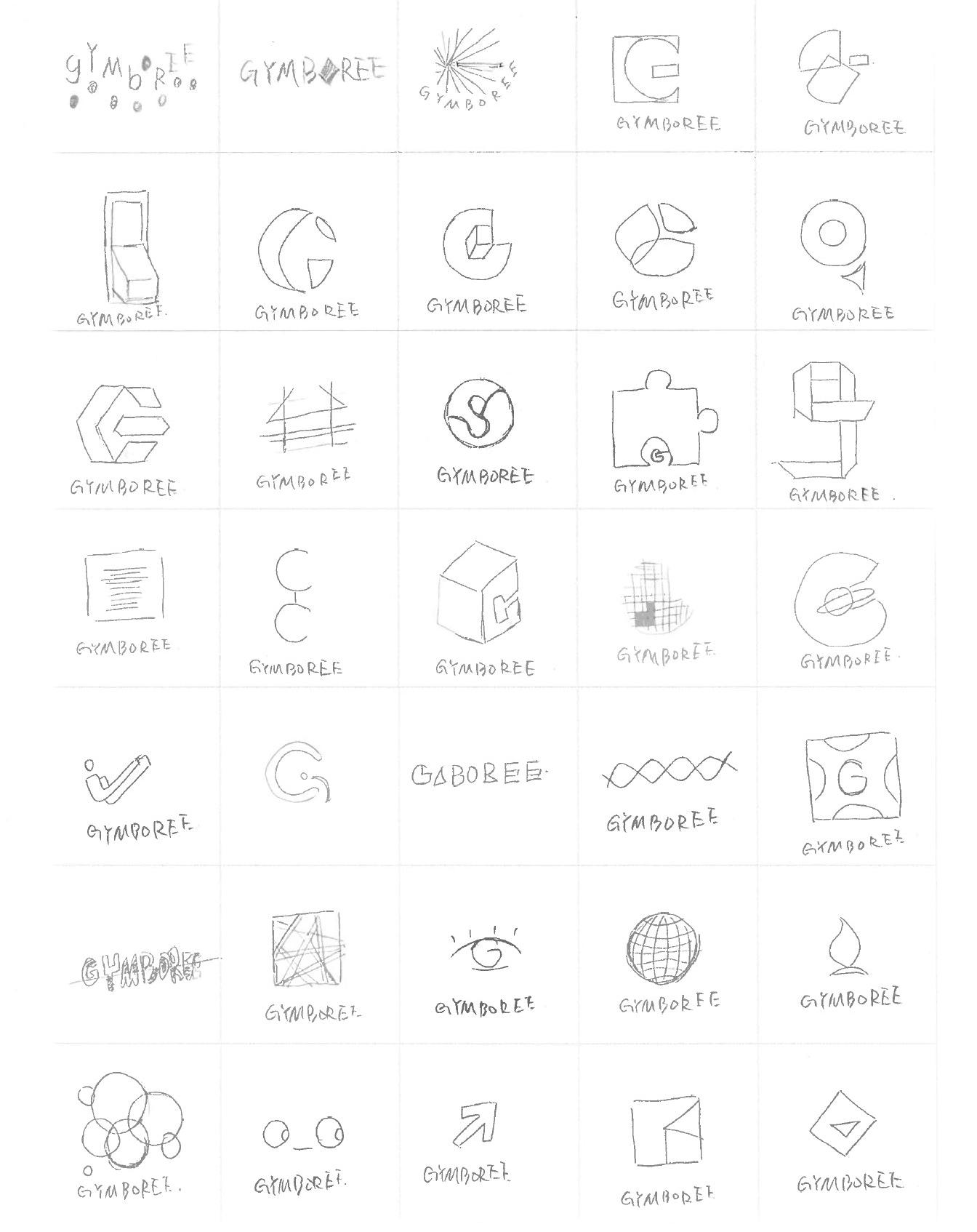
Round 2 Sketches
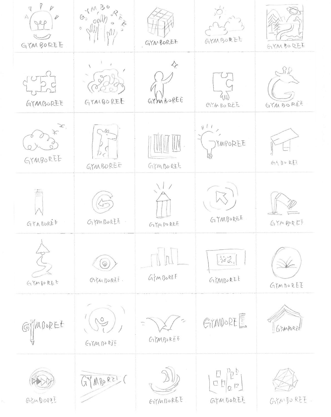
Round 3 Sketches
Round 4 Further Refined
Round 5 Further Refined

Three Key Phreases

R1 Rough Sketches
R1 Refined Sketches
In this section, the three initial keywords of the brand evolve into "key phrases" that guide the visual development of the brand, thus creating a consistent visual identity for the brand. By identifying key phrases that capture the essence of the brand and using them as a guide for design decisions, it effectively communicates its values and personality to the target audience.
Protecting children, nurturing futures.
Playful
Playful minds, limitless possibilities.
Educational
Grow with knowledge, thrive with wisdom.
The concept of this camp is "Protecting Children, Nurturing the Future", conveying the importance of the brand's aim to create a safe and nurturing environment for children to grow and thrive. The Logos were designed for the most part to convey this message through the use of related elements such as sprouting seedlings, caring hands, and rainbows.
The use of sprouting seedlings and leaves represent growth and new beginnings, symbolizing the potential for children to grow and develop into strong, healthy adults. The caring hands represent protection and support, emphasizing the need for adults to create a safe and nurturing environment for children to grow. The rainbow, a universal symbol of hope and optimism, is used in the Logo to represent the brand's priority for the safety and well-being of children. It also conveys an inclusiveness that reminds us that all children, regardless of their background or cir-cumstances, deserve to be protected and nurtured.
The yellow symbol means that the logo selected in this round can be further refined.
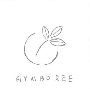
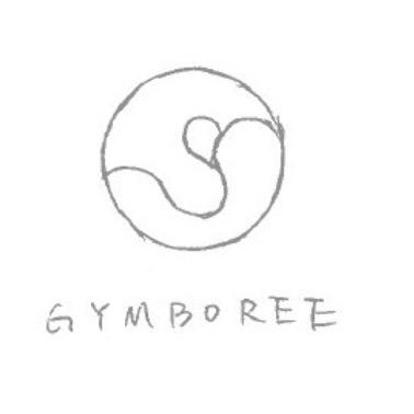
The protective letter "G" wraps around the growing sprout.
Build a safe and nurturing home for children with building blocks. Protect their future brick by brick.
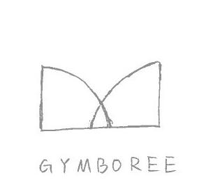
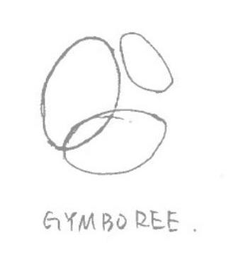
The Logo uses two overlapping sectors to symbolize the harmonious balance of child safety and growth.
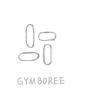
The Logo uses four cylindrical shapes to represent stability and supportiveness in protecting children.
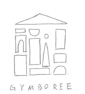
Transformed with the letter "g", the graphic symbolizes the protection of children.
The combination of the cradle graphic and the letter "G" expresses the care for children's growth.
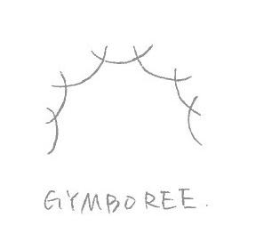
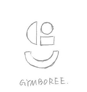
The Logo combines the block shape and the letter "g" to represent the cornerstone of protection and nurturing offered by the brand.
The Logo features a rainbow and sprouts blended with the letter "G" to symbolize the colorful future of protecting children.
The Logo shows a cradle incorporating the letter "G", representing a safe and nurturing environment for children.
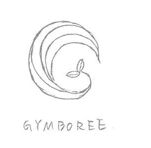
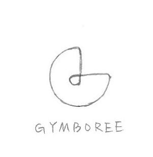
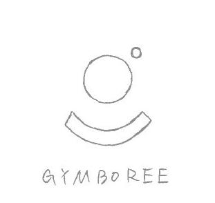
The Logo is inspired by the shape of a bird's nest, symbolizing the brand's commitment to providing a safe and nurturing space for children.
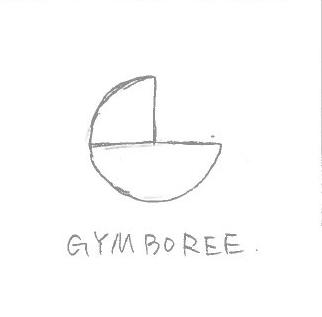
The concept of this camp is "Playful Minds, limitless Possibilities" and when we encourage children to be creative and use their imagination, we can unlock their full potential and help them achieve great things. The importance of playfulness in children's development. Play is not just a form of entertainment, but an essential part of children's learning and growth.
Through these Logos, the importance of fostering creativity and imagination in children through playfulness is conveyed. The design of the Logo uses many relevant elements, such as smiles, sunlight, clouds and font distortion. The smile in the Logo represents joy and happiness, which are essential elements for cultivating children's playful mindset. The sunlight and clouds represent a sense of freedom and boundlessness, emphasizing the idea that the possibilities are endless when children are allowed to explore and be creative. The use of font distortion adds a playful and creative idea to the design.
The yellow symbol means that the logo selected in this round can be further refined.
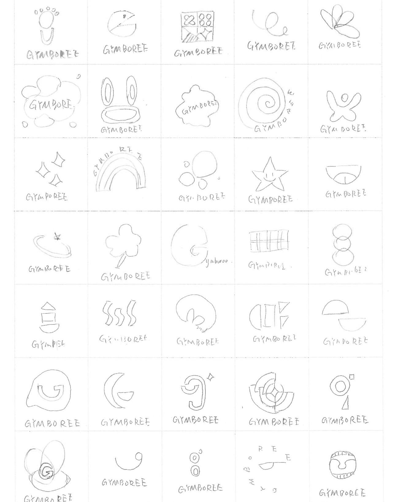
Playful minds, limitless possibilities.
The combination of smiley face and G brand values the joy of children's growth.
Smiley face and represents the brand values the joy of children's growth.
The bubbles represent the joy and playfulness of children growing up.
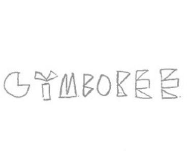
The graphical composition "g" represents the idea of creative joy.
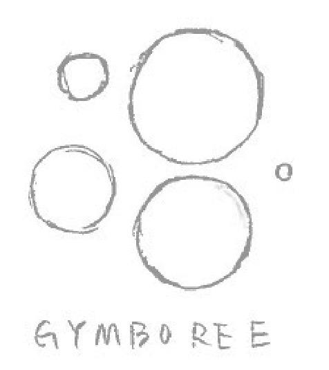
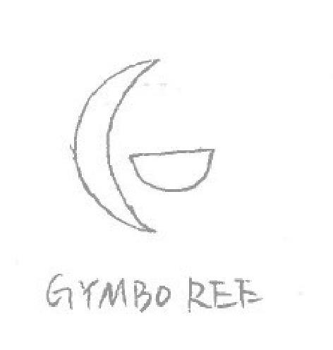
The overlapping shapes of the "G" symbolize the infinite possibilities of the child's future.
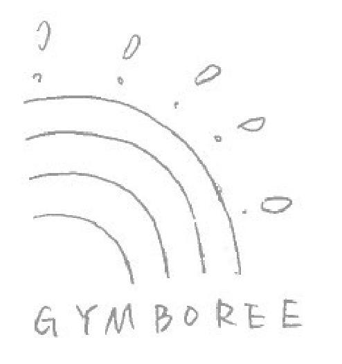
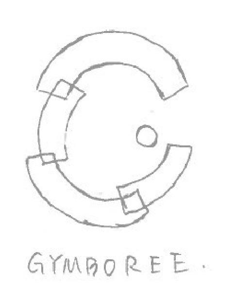
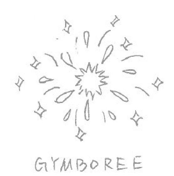
Sparks represent the future expectations of children.
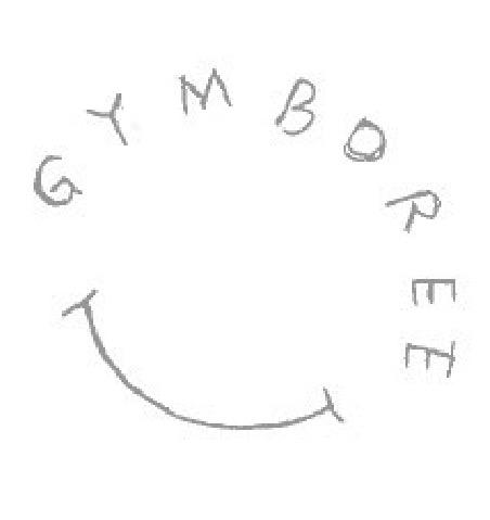
The combination of the smiley face and the text represents the brand's emphasis on the joy of children's growth.
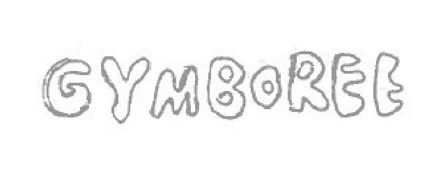
The rainbow combination represents the colorful growth of children.
The cute words represent the idea of children's lovely joy.
The combination of the smiley face and the sun represents the brand's emphasis on the joy of children's growth.
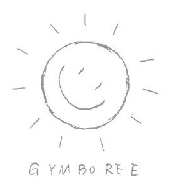
The concept of this camp is "grow with knowledge, thrive with wisdom", learning is a continuous process and the brand focuses on the growth and development of children in the process of acquiring knowledge. It conveys the importance of continuous learning and personal growth in the development of children. The design of the Logo conveys this message through the use of relevant elements such as the annual ring, light bulbs, puzzles and origami.
The annual ring in the Logo represents the continuous cycle of learning and growth, reminding us that there is always something new to learn and discover. The light bulbs represent knowledge and the ideas that come with it, emphasizing the importance of education and critical thinking. The puzzles represent the challenges and problem-solving skills necessary for personal growth and development. Origami represents the trans-formation and creativity that can come from applying knowledge and wisdom.
The yellow symbol means that the logo selected in this round can be further refined.
R1 Camp 03
Grow with knowledge, thrive with wisdom.
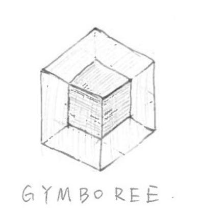
The overlapping squares represent the overlay of knowledge.
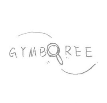
The design that includes a magnifying glass represents children exploring as they learn.
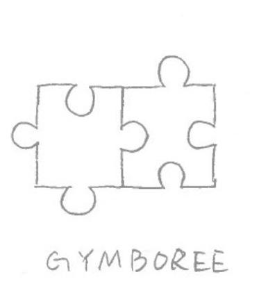
Puzzles represent the cumulative process of learning as children grow.
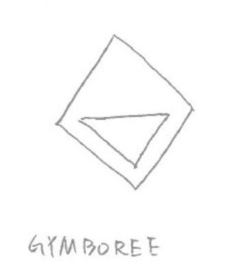
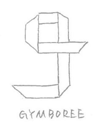
This figure represents the wisdom associated with geometry.
The geometric patchwork logo represents the wisdom of creative inspiration.
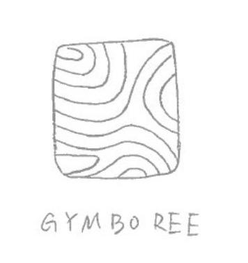
The texture of the tree's annual rings represents the accumulation and growth of knowledge.
The overlap of circles represents the overlapping accumulation of knowledge in children's learning.
The origami designs represent creative ideas and ingenuity.
The circle design contains the "g" which represents the creative and dynamic ideas of children.
The light bulb design represents the keen thinking power of children.

R2 Rough Sketches
R2 Refined Sketches
R2 Digital Sketches
This round of sketches combined the two comps of Nurture's "Protect Children, Nurture the Future" and Playful's "Playful Minds, Limitless Possibilities" and then came up with a new phrase, "Nurturing Children to Grow in Joy," indicating the brand's commitment to communicating care and support and creating an environment where children feel happy to grow. Combining the two comps of Nurture's "Protecting Children, Nurturing the Future" and Playful's "Playful Minds, Limitless Possibilities" then came up with a new phrase, "Nurturing Children to Grow in Joy," demonstrating the brand's commitment to communi-cating care and support and creating an environment where children feel happy to grow.
The yellow symbol means that the logo selected in this round can be further refined.
This step is to make further selections from the previous sketches, select 10 Logos to draw in the computer, and add some color choices to show the visual effect of the Logos.
The Logo combines the letter "G" with a cradle and a smiley face to represent the brand's positivity in nurturing care.

By merging a stylized "G" and a smiley face, the brand's joyful identity is displayed.
This Logo ground blends the letter "G" with the building blocks to symbolize the brand's focus on creativity in children's growth.
In this Logo, a stylized "G" is blended with images of seedlings and rainbows to represent the positive growth of children.


The Logo design incorporates the image of the sun into the brand name to create a warm and welcoming visual image.
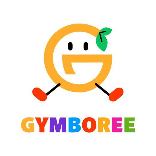
The Logo design for this brand is a cute cartoon character "G", as well as leaf and smiley elements that convey a positive.
The Logo design incorporates rainbows, leaves and smiley faces to convey the message of nurturing children's growth with joy.
The Logo design combines the letter "G" with the leaves to represent the brand's commitment to nurturing growth.
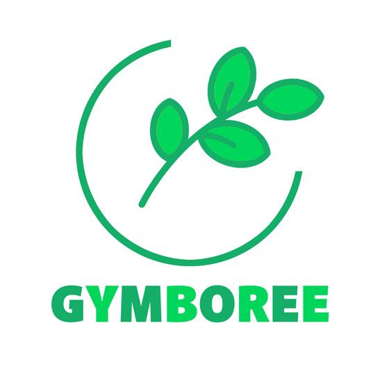
The Logo design combines bird's nest and sprout, representing the brand's care and love for children's growth.
The Logo design incorporates the smiley face motif, representing the brand's expectation that children will grow up with joy.


R3 Digital Comps
R3 Refined Comps

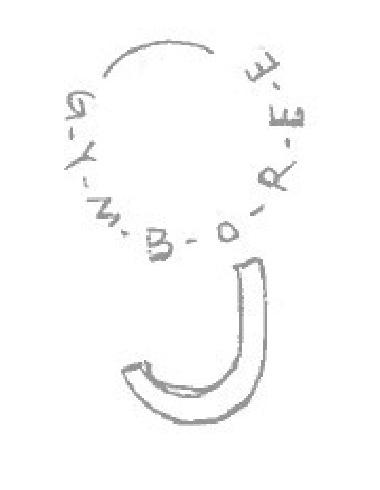
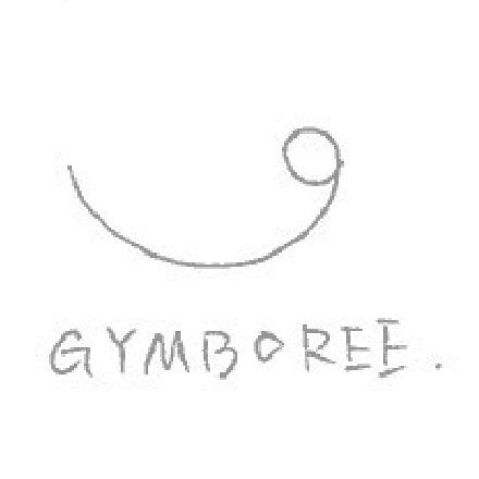
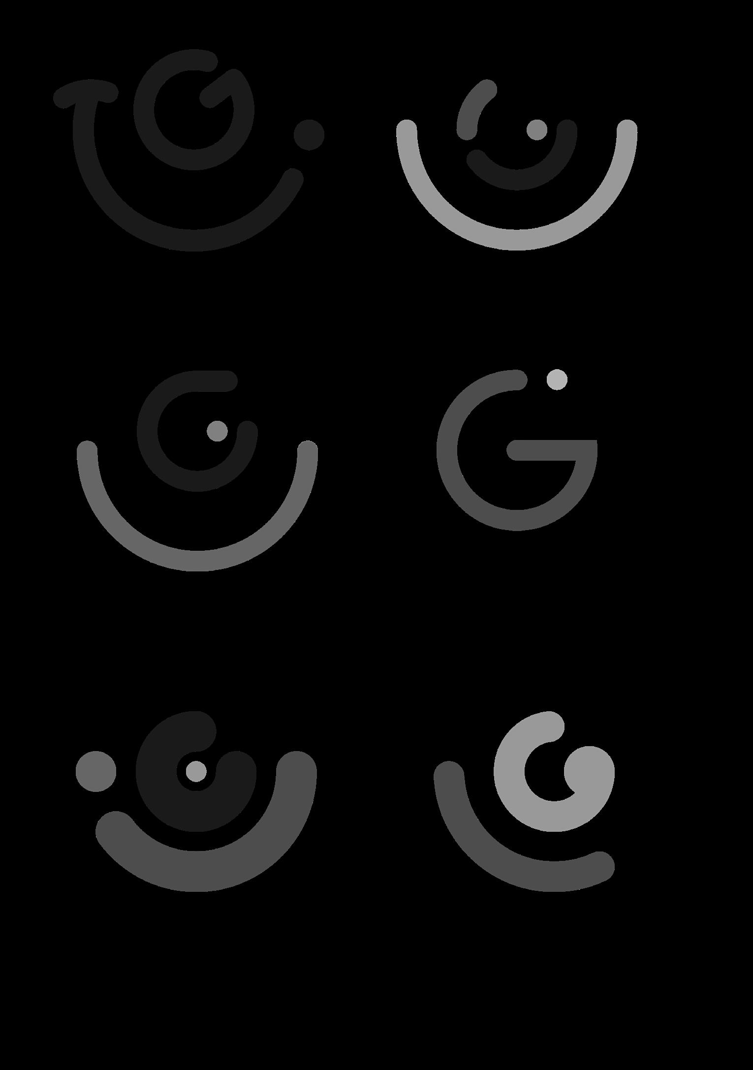
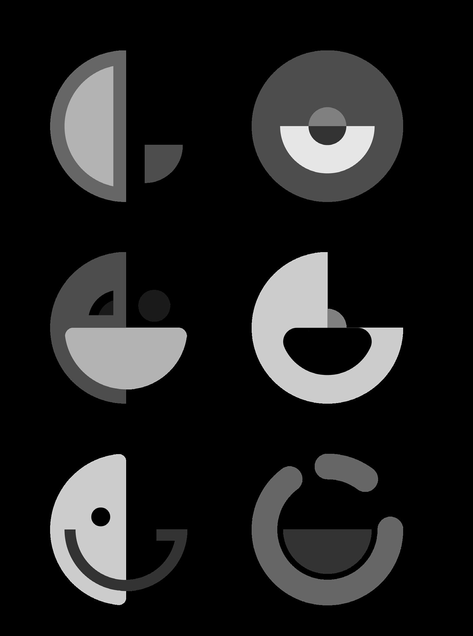
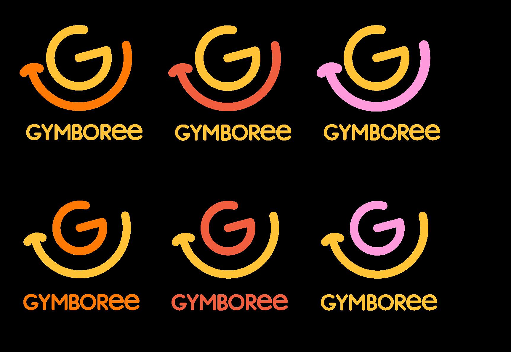
The Logos are a combination of the letter "G" and a smiley face. The design uses an arc to represent the smiley mouth, wrapping around the brand's "G" and decorating with other graphics to make the Logo more playful and cute. The concept of this comps represents the brand's focus on the joy of children growing up.

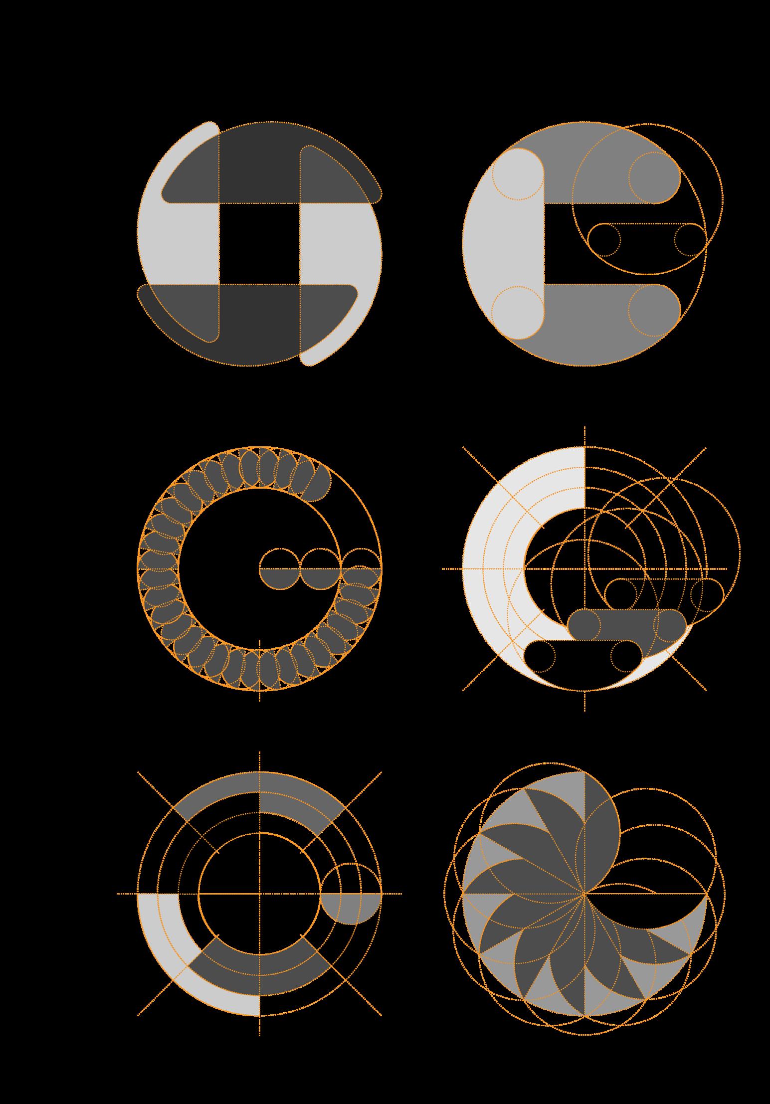
The Logos are a combination of the letter "G" and a smiley face. The design uses the shape of a half-circle to represent the mouth of a smiley face, cutting the circle at different angles and combining these shapes. The concept of this comps represents the brand's concern for children's growth and hope that children's childhood is full of laughter.

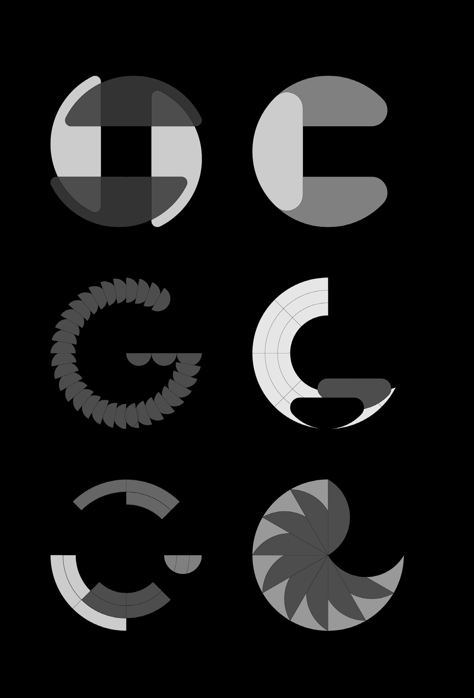
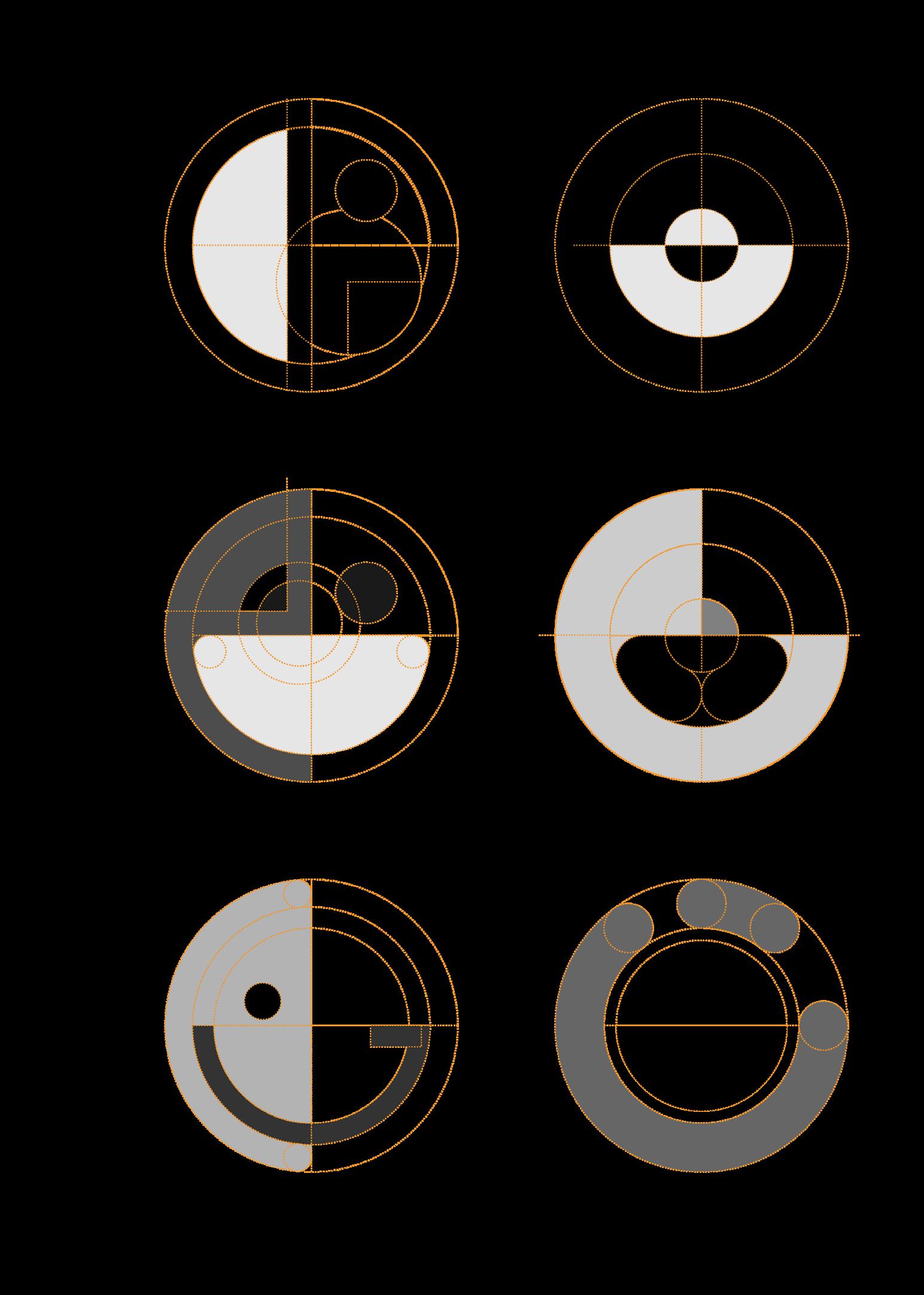
The Logos combine the letter "G" with a cradle and a smiley face. The design uses a number of half-circle shapes to represent the smiley face's mouth as well as the cradle graphic, and circles to represent the face and eyes. The concept of this comps represents the brand's aggressiveness in nurturing the happy growth of children.


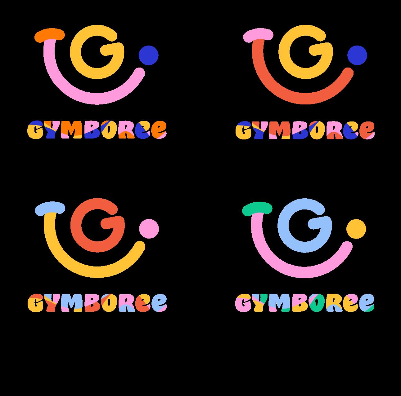
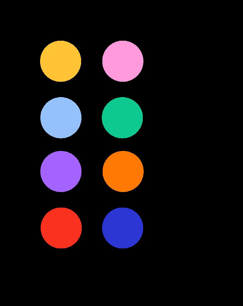
In this step, further selections were made in each of the previous comps, two Logos were selected for each comps, for a total of 12 Logos, and then further refinements and explorations were made to confirm the initial color palette and add colors to further confirm the visual effect of the Logos.
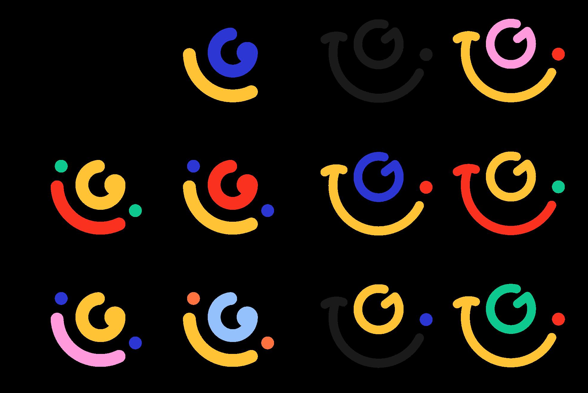
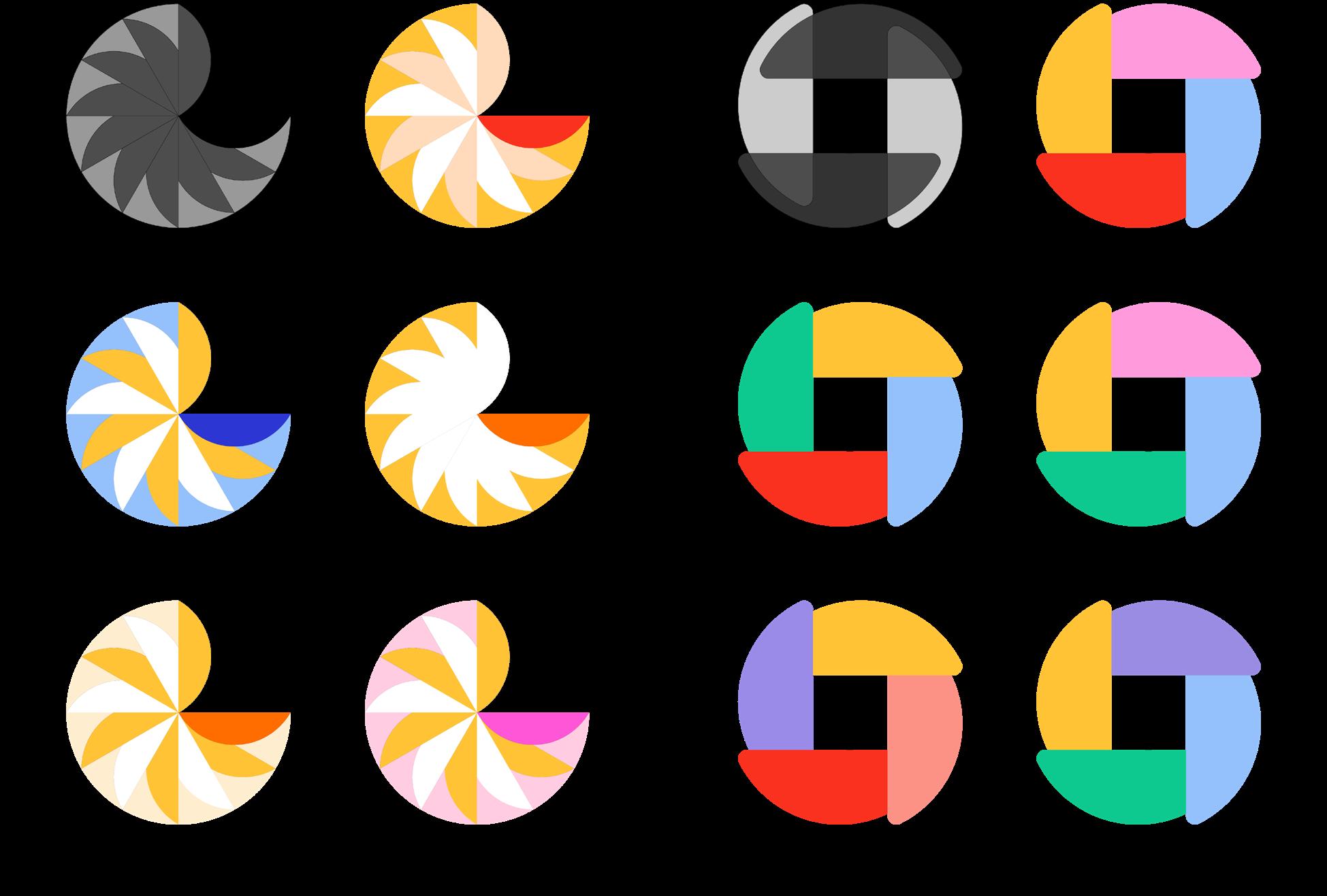
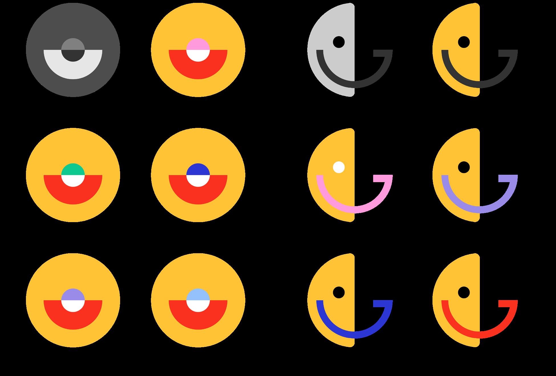
In this step, three Logos were selected in Round 3's comps 1, and then further refined and explored, adjusting the details of the graphics, adjusting the spacing between graphics and elements and the size of the graphic elements, and trying different Logotype effects to come up with a satisfactory final choice.


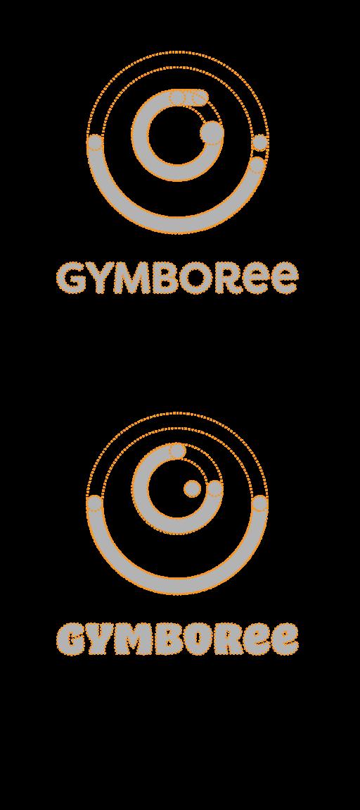
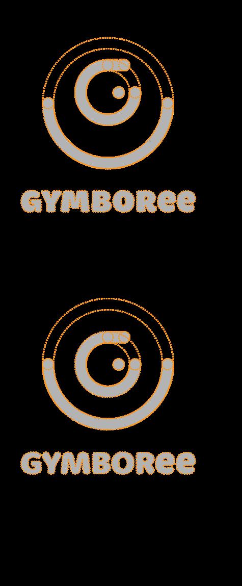
The yellow symbol means that the logo selected in this round can be further refined.


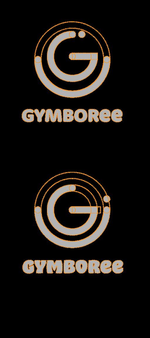
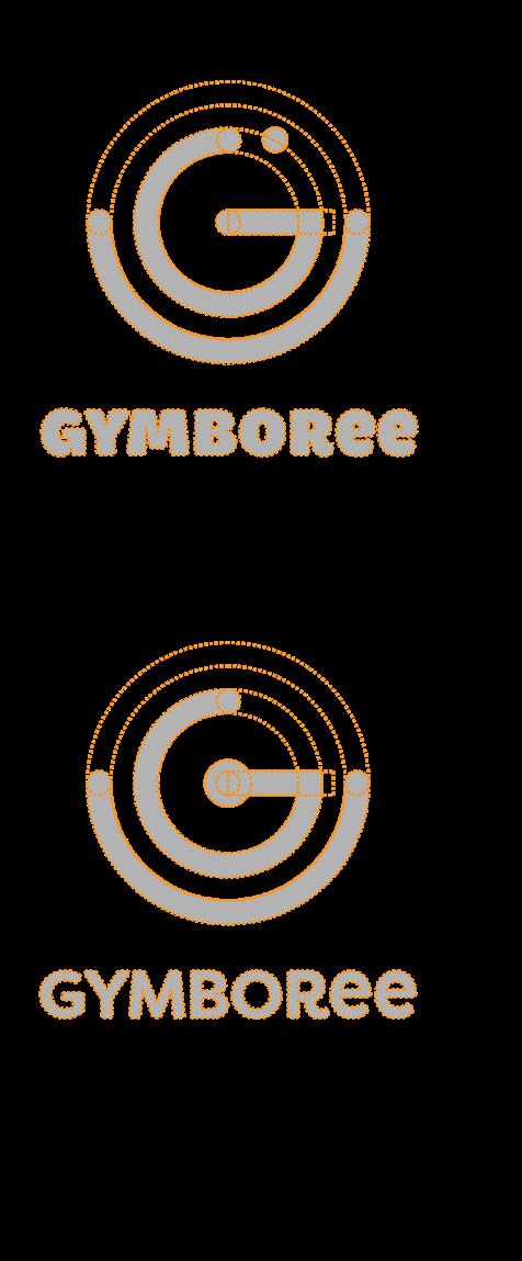
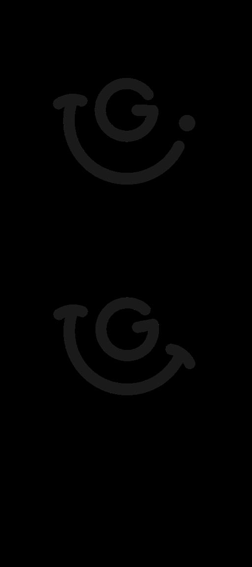

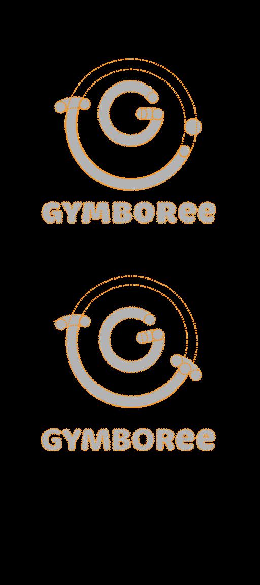
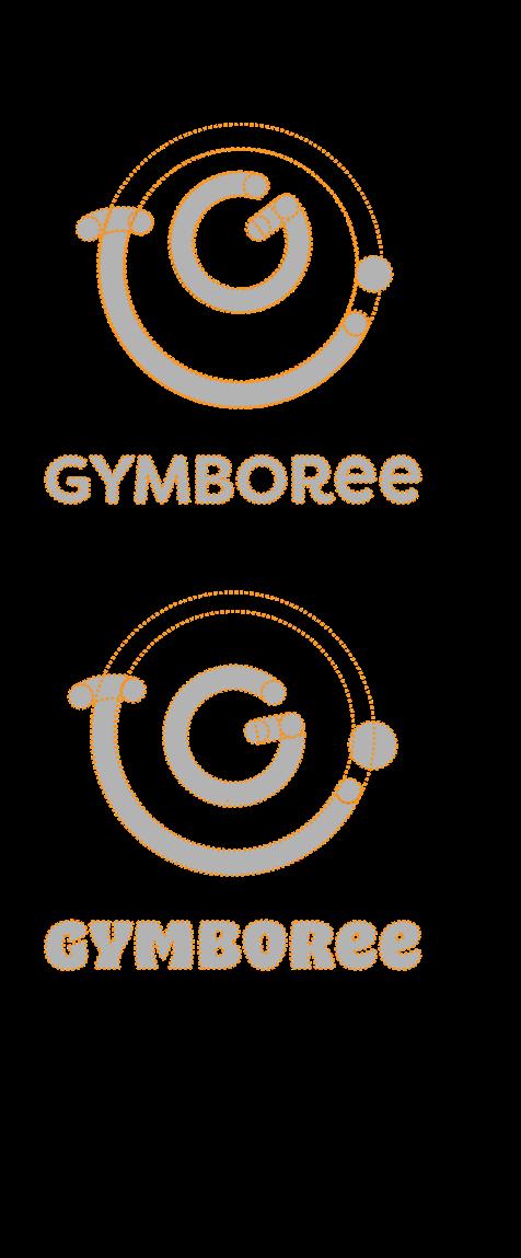
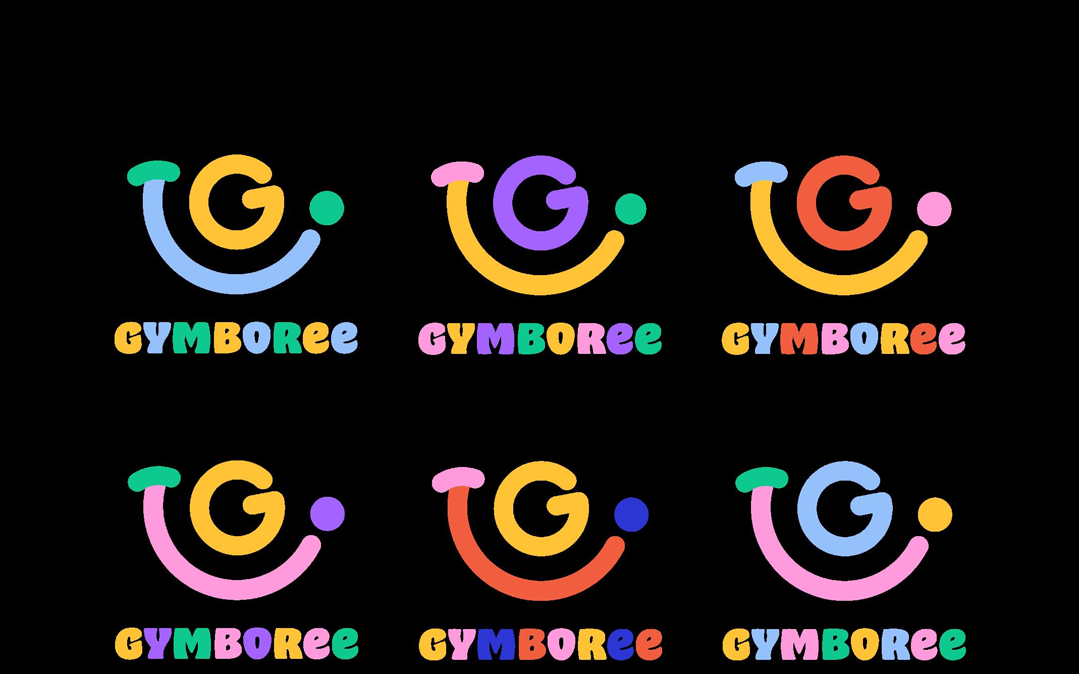
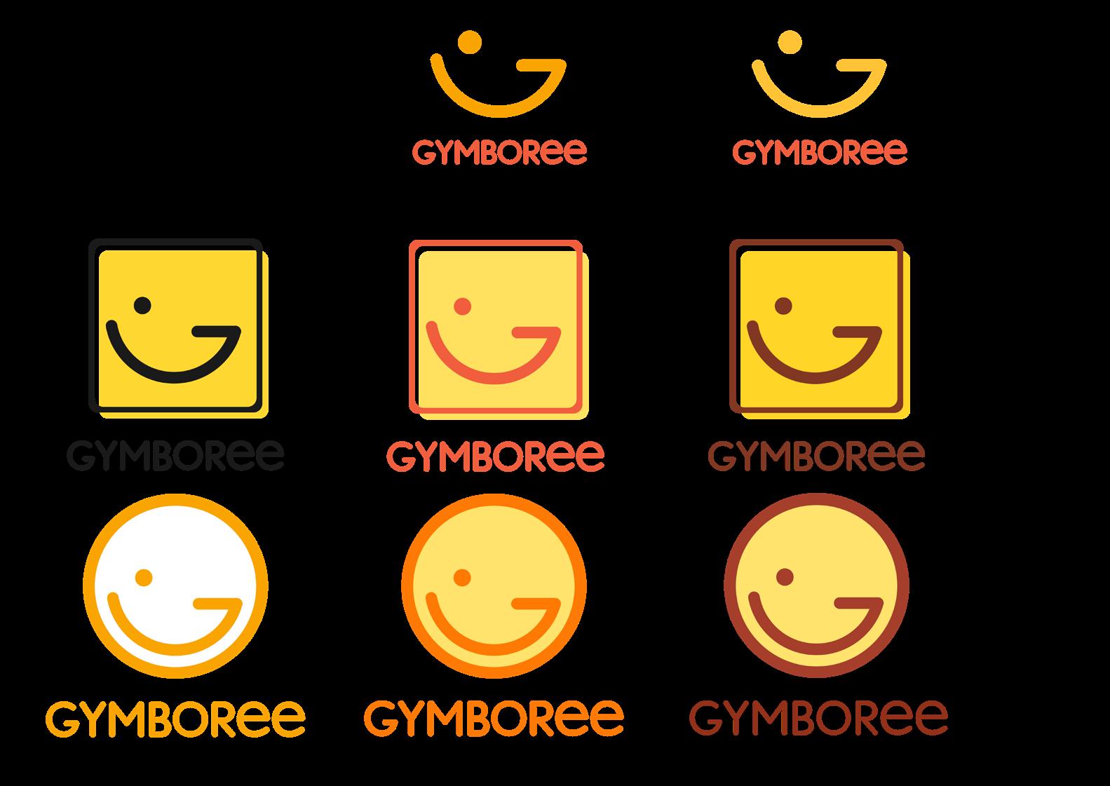
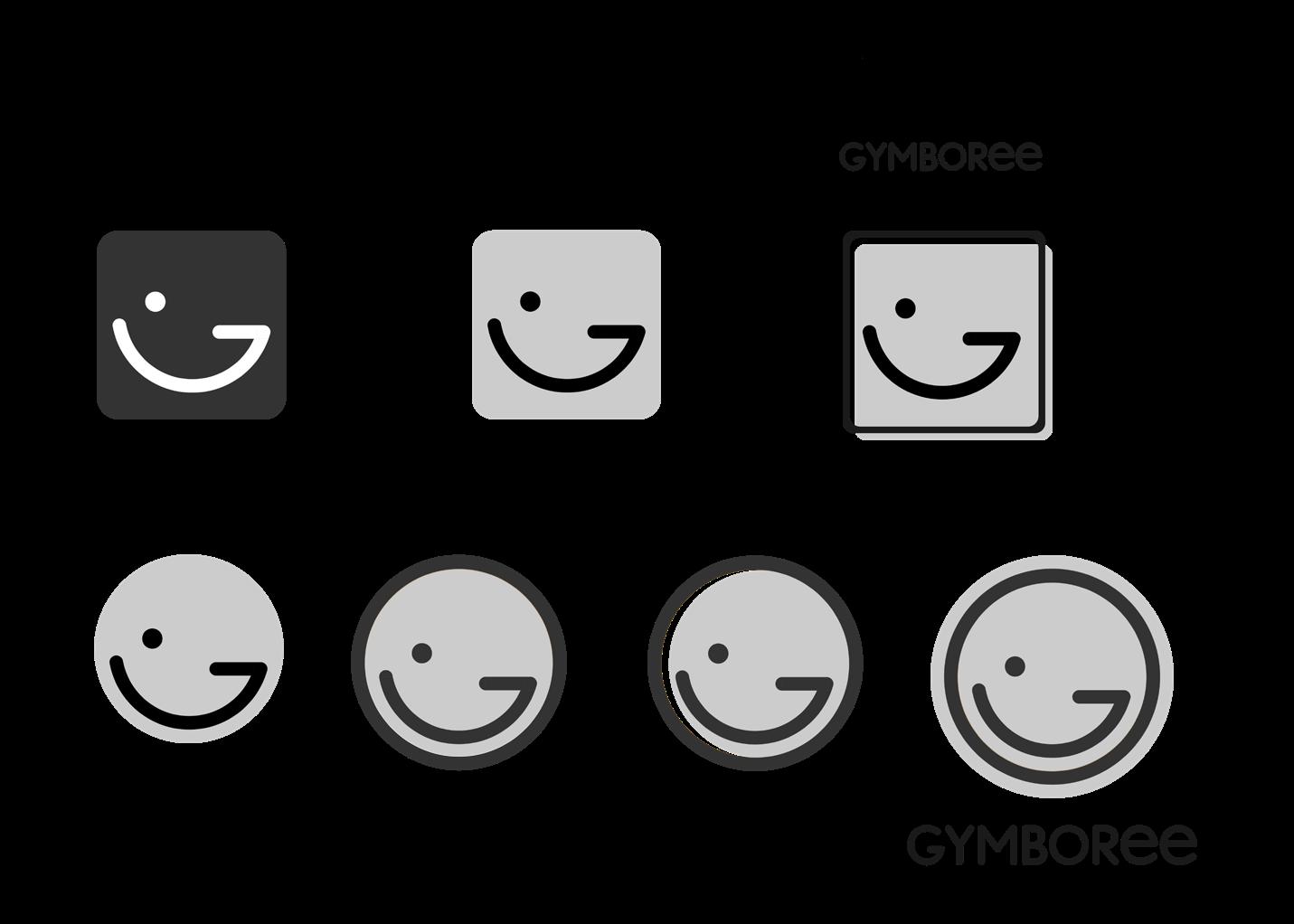
In the further refinement of R4's Logo, choose one of Logo option 2 for further exploration and try different symbol and Logotype style styles. Add different color combinations for different combinations of styles to determine the visual effect of the final chosen Logo
Symbol Logotype
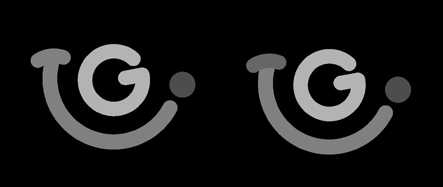


Colors
Color Options
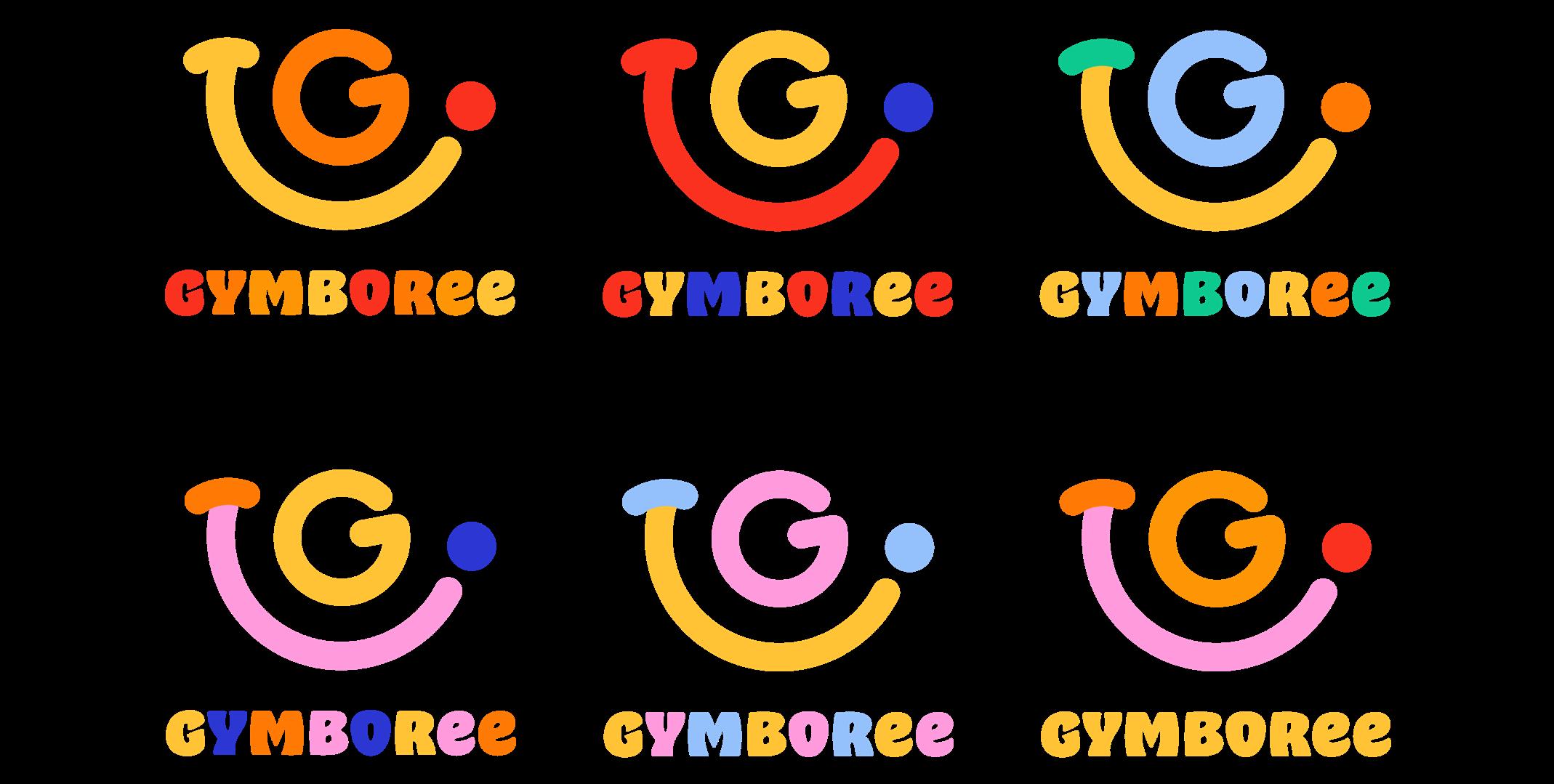
Logo Option 1
Color Option
The yellow symbol means that the logo selected in this round can be further refined.
Logo Option 2
Color Option
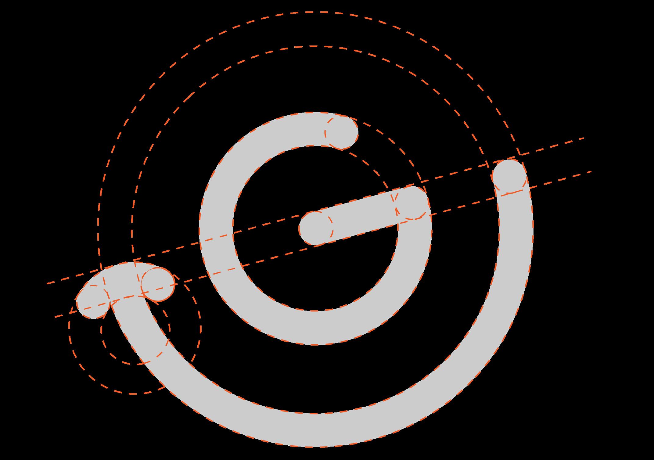
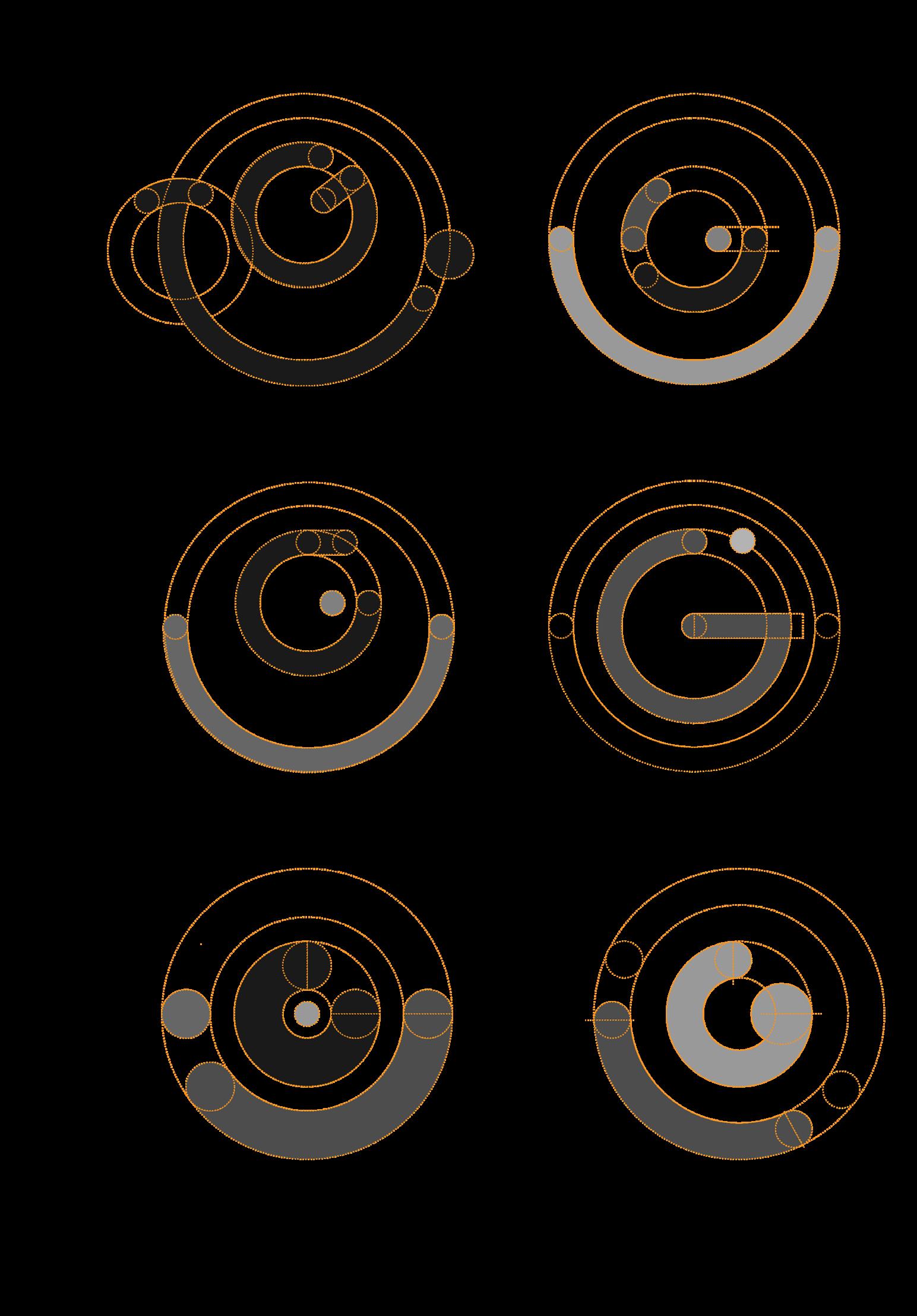
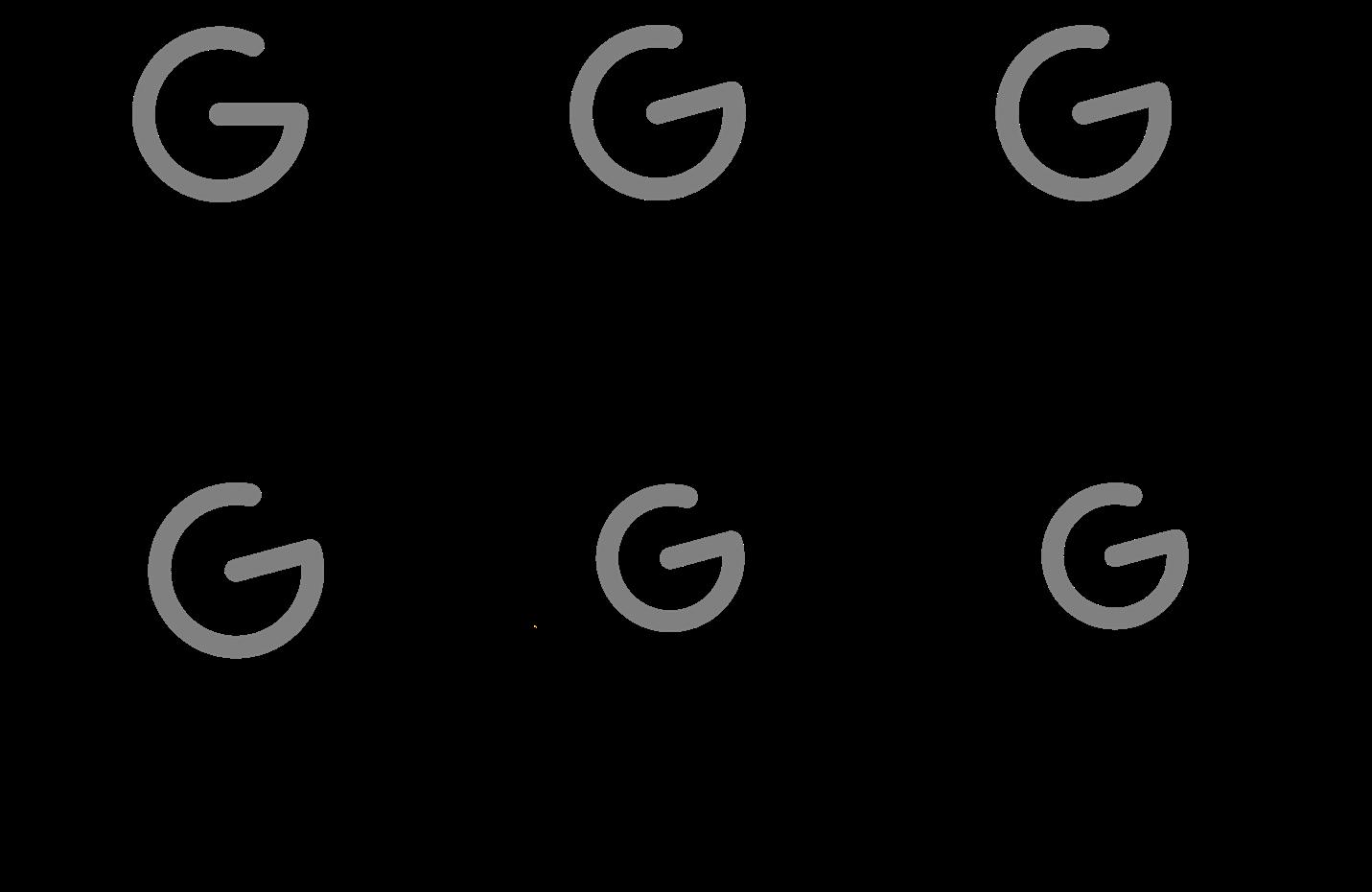
The logo is designed with a grid structure to ensure accuracy and stability, the symbol part and the logotype are done by geometric circular cutting.
Symbol
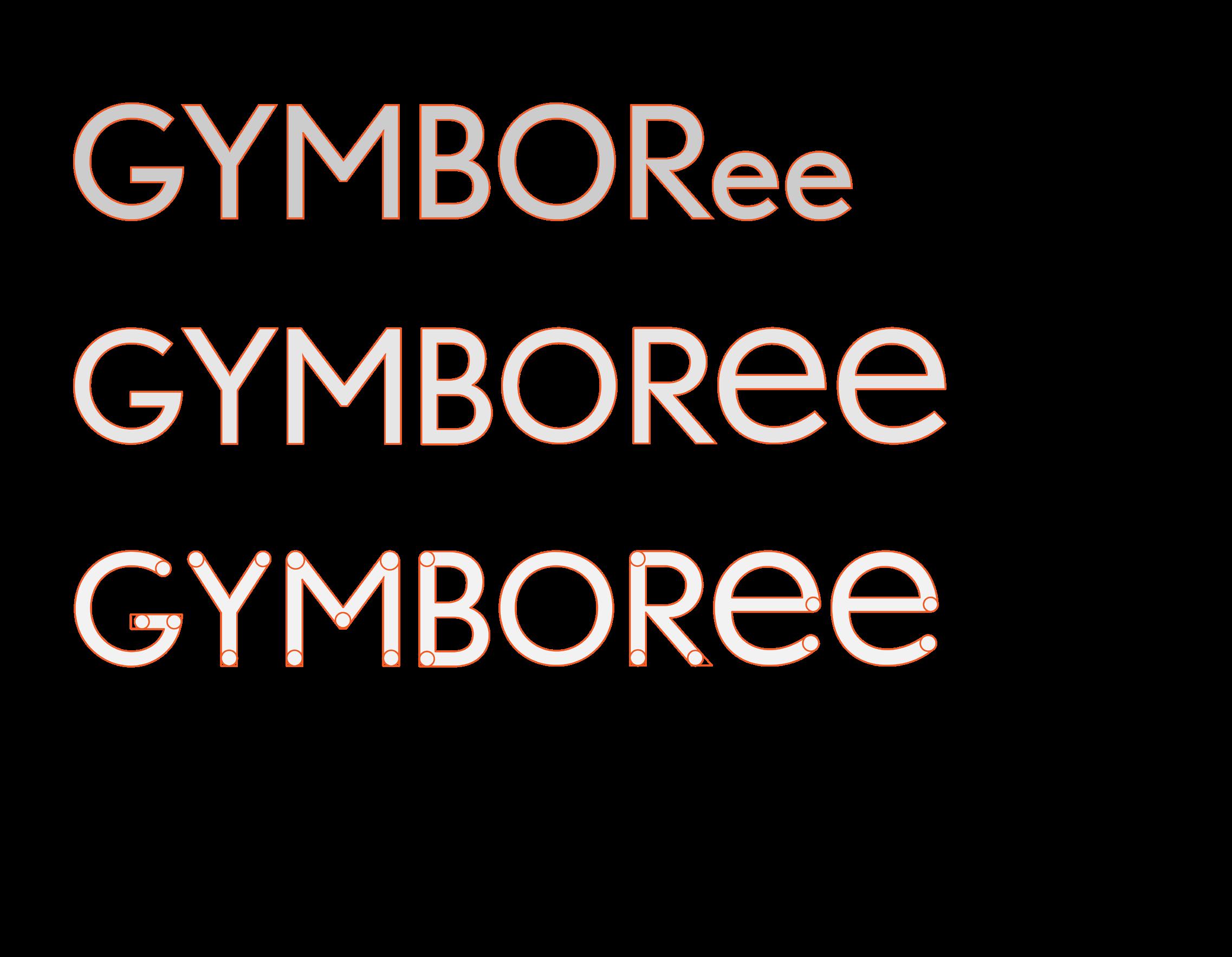
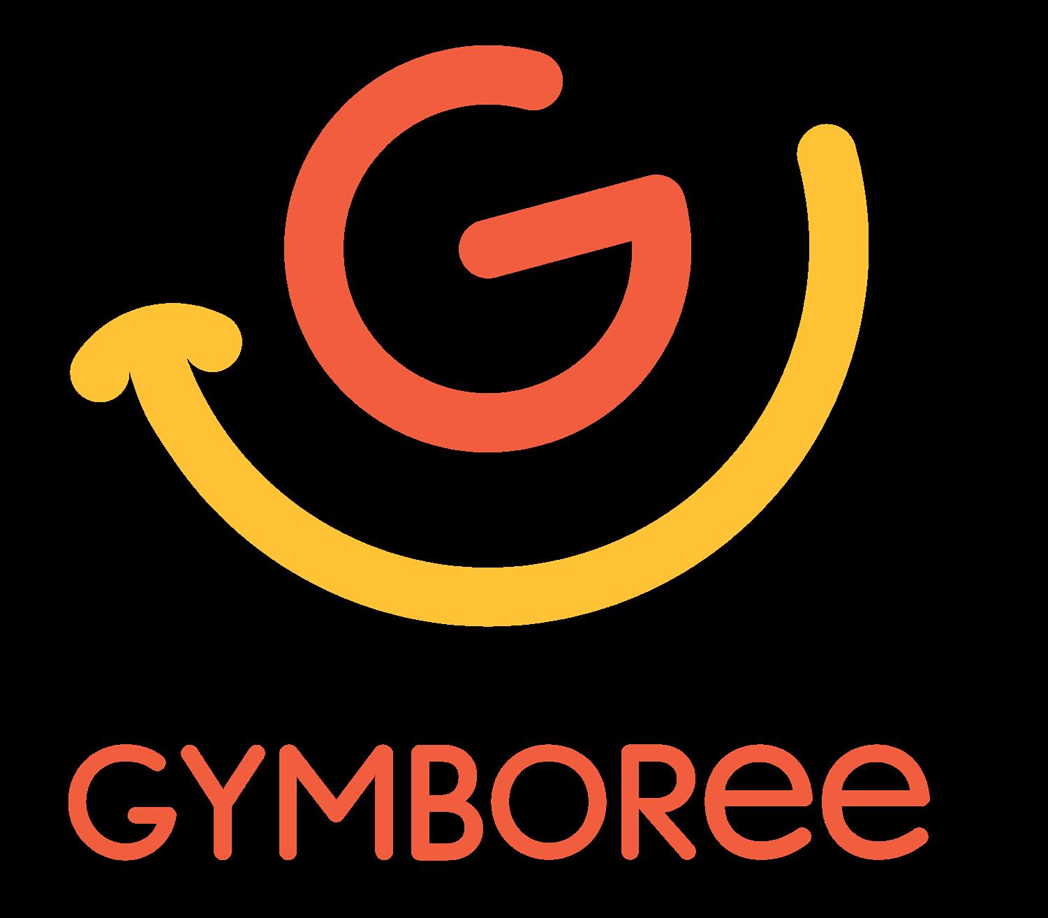
The new Logo is a combination of the letter "G" and a smiley face. The design uses an arc to represent the smiley face's mouth, wrapping around the brand's "G" and rotating at an angle to make the Logo more playful and cute, a design concept that represents the brand's commitment to making children grow up with joy.
Symbol Signature
Logotype
Standards Inspirations
Look-alike Logos

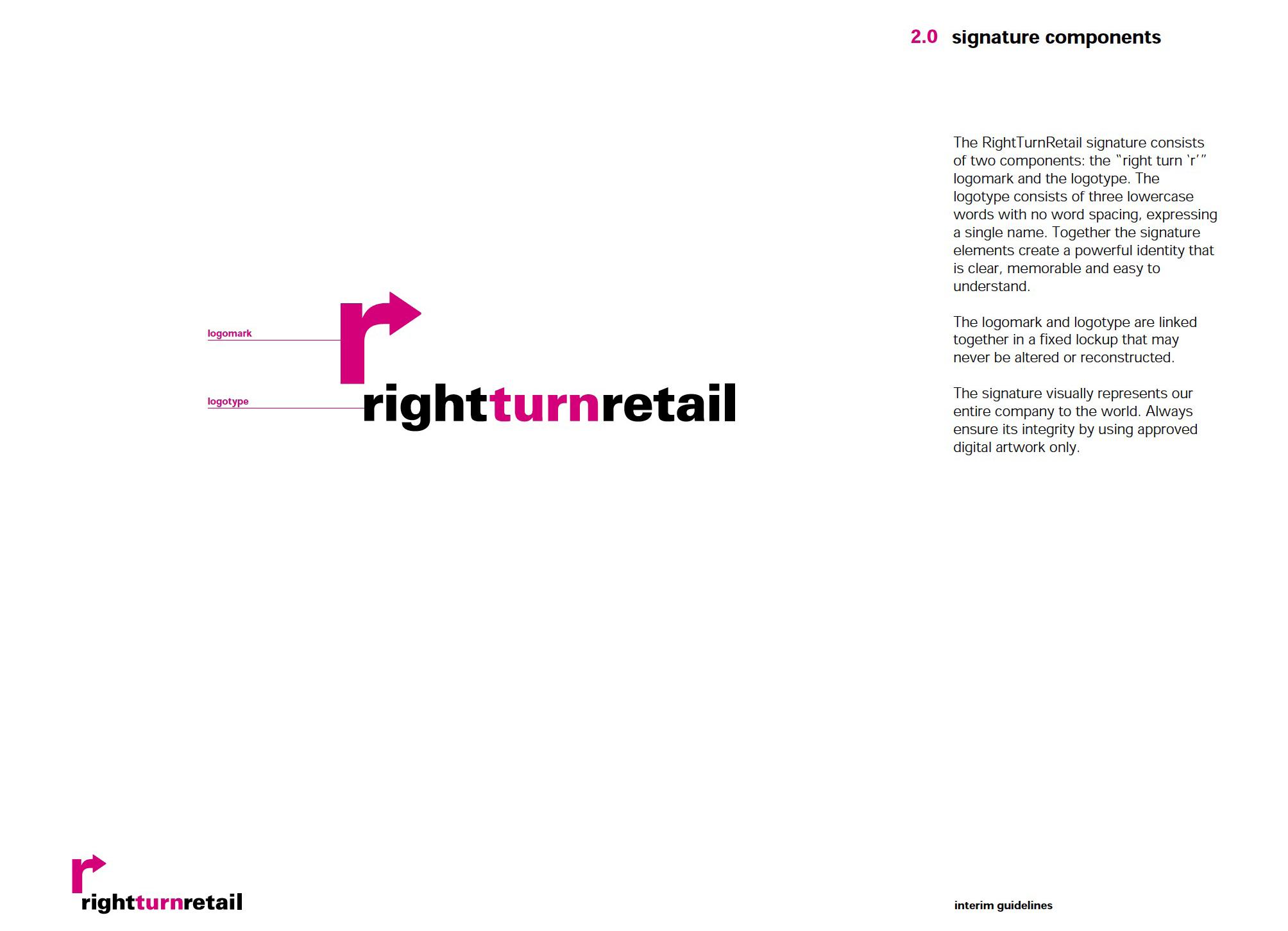
The RightTurnRetail signature consists of Logomark and Logotype. Logomark is a combination of brand letters and the brand's "arrow" meaning, Logomark and Logotype combined, these elements together create a clear, easy to remember and easy to remember, easy to understand and a powerful image.
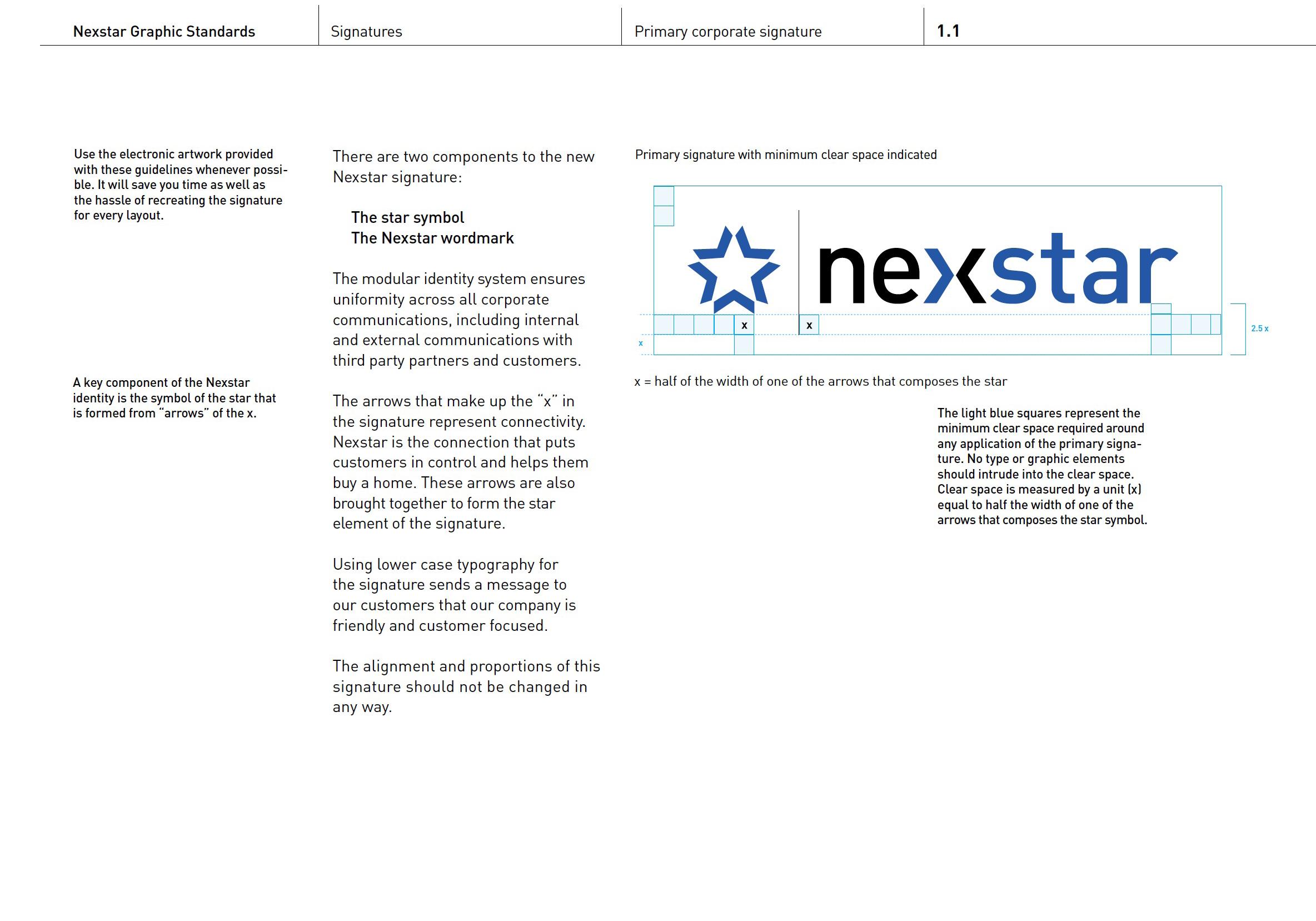
The anatomy of the Nexstar Logo details the symbol and wordmark used in the Logo. Nexstar used blue squares for the distance between the symbol and the wordmark to indicate the proportional space between the symbol and the text and around the Logo.
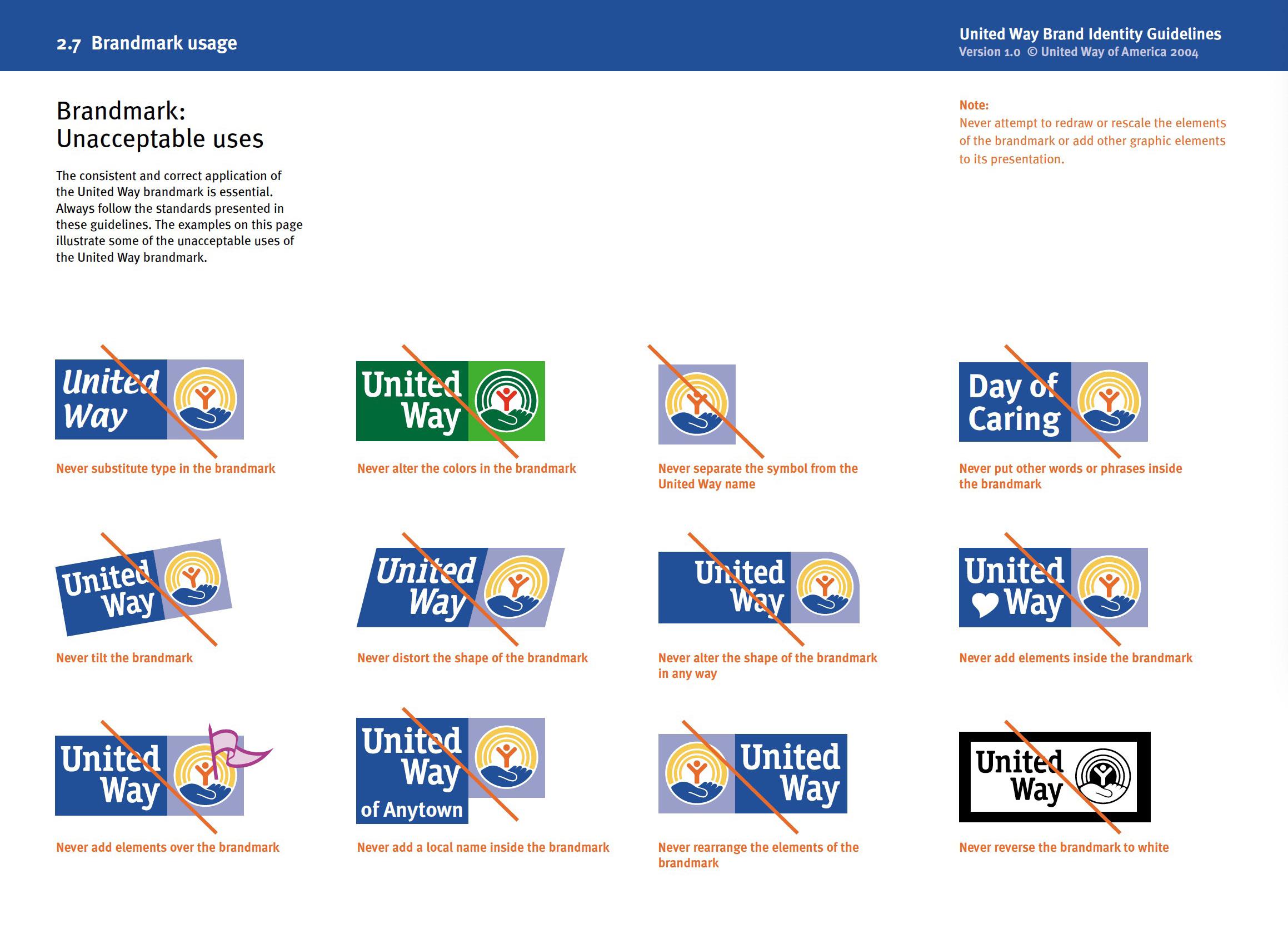
United Way shows how to apply the United Way brand identity consistently and correctly. The visual guide presents examples of how the Logo should be applied, both visually and with written explanations, illustrating some examples of what is not acceptable.
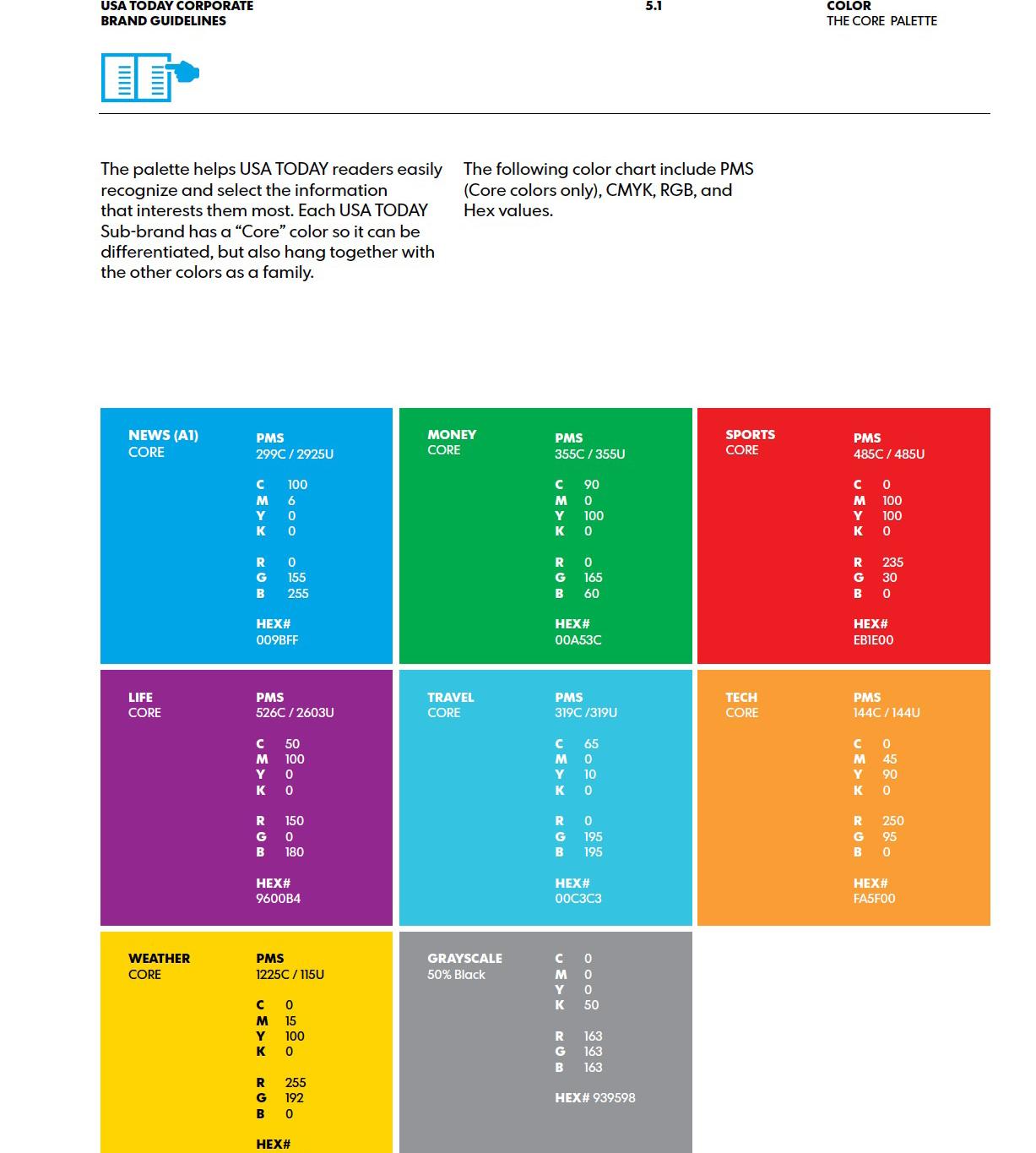
Each USA TODAY sub-brand has a "core" color, and USA TODAY's color palette can help readers identify the information. the color chart includes PS, CMYK, RGB, and Hex values.
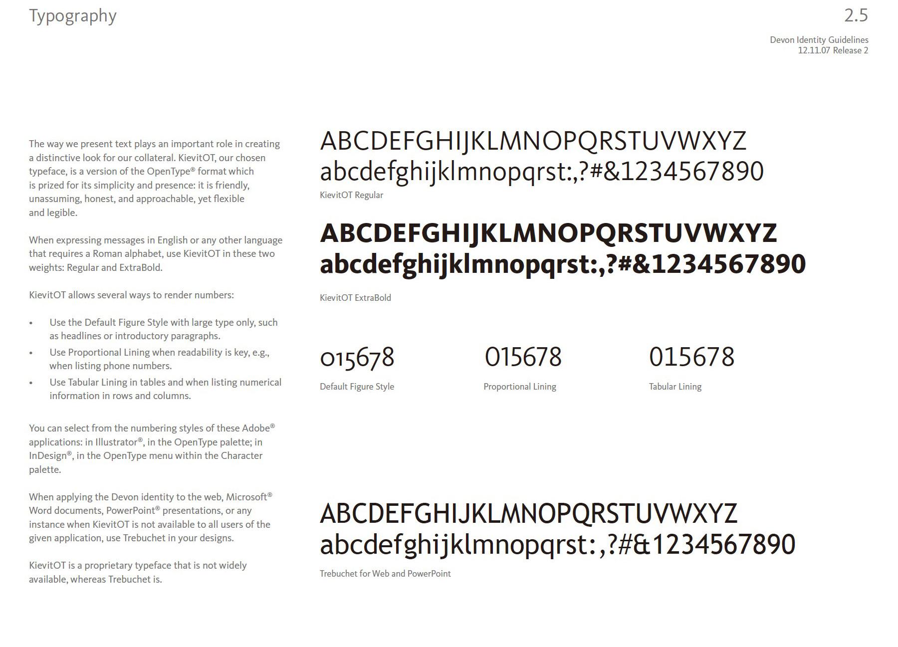
Devon explains the role of text in the brand's appearance and the desired presentation, as well as detailing the two fonts, and number styles, when the brand uses English or any other language that requires Roman script to convey its message.
Sumo's version of the symbol contains two parts, primary and secondary. The primary as the primary version should appear in Sumo Logic's blue if the symbol is used when it is introduced as a heroic symbol. The second level is used as an extended representation of the brand.

The Logos of these brands all contain the capital letter "G" and they are all designed with the letter "G"'s as the main element, like a combination or deformation with other elements, which has some similarities to the new Logo being developed by Gymboree.
Google is a multinational technology company specializing in Internet-related services and products. The multi-colored capital "G" in the Google Logo represents the innovative spirit of the brand.
Gucci is a luxury fashion brand known for its high-end clothing, accessories and fragrances. The Gucci Logo is an interlocking double "G" symbol representing the brand's founder, Guccio Gucci.
Gatorade is a sports drink brand that offers a range of beverages designed to help athletes perform at their best. Gatorade's lightning bolt "G" Logo represents energy and the brand's commitment to helping athletes perform at their best.
Graco is a baby products company that makes strollers, car seats and other essentials for babies and toddlers. the simple "G" in the Graco Logo combines the shape of a hexagon to represent the brand's focus on creating practical and functional baby products for parents.
Gazprom is a Russian energy company that focuses on the exploration, production and distribution of natural gas. The "G" in the company's Logo incorporates a fire, representing the company's focus on natural gas and its role as a major energy supplier.
LG is a multinational electronics company that produces a variety of products, including smartphones, televisions and home appliances. the "L" and "G" in the LG Logo form a human face, representing the brand's focus on innovation and technology
Grammarly is a writing assistant tool that helps users improve their grammar and writing skills. the "G" in the Grammarly Logo incorporates the icon of an arrow, representing the brand's focus on helping people improve their writing and communication skills.
Groupon is a discount deal site that offers a range of products and services at discounted prices. the capital "G" in the Groupon Logo on a green background represents the brand's focus on bringing people together and creating connections through shared experiences.

Gray Television is an American television broadcasting company. The simple "G" in the company Logo is made up of many colored curves, representing the brand's focus on local news and community involvement.
G-Shock is a watch brand known for producing durable and rugged timepieces designed for outdoor and extreme sports. A handwritten red "G" in the G-Shock Logo has a sporty feel and represents the brand's focus on creating tough, durable watches for extreme sports and outdoor activities.
All of this brand's Logos contain the element of a smile, and they all have the curved pattern graphic of a smiley face in their Logos, combining the smiley face with the brand name or using the smiley face as the main visual. This has some similarities with the new Logo being developed by Gymboree.
Amazon is the world's largest online retailer. The Amazon Logo is a smiley face and an arrow from "A" to "Z", symbolizing the company's wide range of products and services. The arrow also resembles a smile, signifying the brand's commitment to customer satisfaction.

Goodwill is a nonprofit organization that sells donated items to fund job training programs. the Goodwill Logo is half a white smiley face on a blue background in the Logo, representing the brand's mission to help people in need and provide them with the opportunity to succeed.
Peoplepc is an Internet service provider offering affordable dial-up and broadband plans. the Peoplepc Logo has a smiley face underneath the brand name, symbolizing the brand's willingness to provide people with access to information and technology.
TUI is a leading global travel company offering vacation packages, flights and hotels. the TUI Logo is a stylized smile with a small circle for an eye on the smile, representing the brand's commitment to creating happy and memorable travel experiences for its customers.
Bledina is a French baby food brand. the Bledina Logo is a smiley face underneath the brand name, representing the brand's focus on providing healthy and nutritious food for babies and children.
DANONE is a multinational food company that produces dairy and plant-based products, bottled water and medical nutrition products. The DANONE Logo features a red smiley face, symbolizing the brand's commitment to promoting health and well-being.
Crayola is an American art supply company that offers a range of products for children and adults. the Crayola Logo has a smile in the colors of the rainbow, representing the brand's focus on creativity and imagination through its art supplies.
Colgate is an oral care brand that produces toothpaste, toothbrushes and mouthwash. The Colgate Logo features a white smile, representing the brand's commitment to oral health and cleanliness.
Telenet is a Belgian telecommunications company that provides Internet, television and mobile services. the Telenet Logo features a yellow smiley face, representing the brand's focus on innovation and technology.
Kraft Foods is an American food company that produces a range of packaged foods and beverages. The Logo features a blue smiley face underneath Kraft, represent-ing the brand's commitment to customer satisfaction.
Content
Wikipedia.org
Gymboree.com
Google.com
Photograohy
Unsplash.com
Stock.adobe.com
Designer
Zhaoxin ( Laycie) Li
Instructor
Hunter Wimmer
GR 604 The Nature of ldentity Academy of Art University
