Portfolio
Yolan ne YONNET

Master Student in Spac es, Color and Light Design


2 Yolanne YONNET Master Student in Spaces, Color and Light Design Toulouse, France • +33 6 59 52 81 60 • yyolanne@gmail.com
Contact :
+(33) 6 59 52 81 60
yyolanne@gmail com
Skills
Experiences
Interior Design Internship, Spring 2024
YONNET Yolanne
Paris, France
https://issuu com/yolanneyonnet/docs/portfolio yonnet yolanne
Adobe: InDesign, Illustrator, Photoshop, Lightroom / Autocad, Blender, Sketchup, pConPlanner, Rhinoceros VRay, Blender, TwinMotion, pConPlanner / PowerPoint, Word, Excel, Google Slides, Docs, Sheets
CARTIER / Project Manager Assistant - Store Design & CSR
Internship, Jul 2023 - Jan 2024, Paris
● Designed Whole Sale and Retail projects
● Updated "Store Design & Planning" Catalogues (FF&E, Textile, Wall Focus…)
● Developed "Art & Crafts" Network (new artists, price list )
● Contributed and presented during worldwide CSR project meetings
● Gathered and analyzed data for new concepts
AIRBUS / Trends & Materials Designer - Cabin Advanced Design
Internship, Jan 2023 - Jul 2023, Toulouse
● Designed and planned Airbus’ Sustainability Booth for AIX in Hamburg
● Prepared cabin interior concepts: created moodboards, sketches, plans, 3D
● Interpreted trends, customer feedbacks,market informations for design concepts
● Contributed to the Eco-Design Strategy definition & operational development
● Contracted design agencies from creative brief to artwork production
● Communicated to customers, internal and external stakeholders
Oddos Design / Space Planner
Internship to part-time employee, Jan 22 - Aug 2022, Toulouse
● Designed interior concepts, moodboards, zoning, plans, 2D, 3D visuals
● Visualized presentations and communications to various interlocutors
● Implemented a creative tool: “FF&E Materials & Colors Inspiration Cards”
Education
Master of Spaces, Color and Light Design
Sept 2022 - Jul 2025, ISCID, Toulouse
● Winner of the «Artistic Sensitivity» Award in a national student design competition «Aluminnov’», 2023
● Relevant courseworks: Cross-disciplinary collaborative projects in partnership with companies Color: codification, experimentation and know-how Light: manipulation and experimentation of equipments, creation of event lighting Space: scenography, set design, interior, urban landscape design projects
Bachelor of Visual Design - With Honors
2019 - 2022, Higher Institute of Color, Image and Design (ISCID), Toulouse
● Relevant courseworks: Color Theory, Project Design, Creation-Research, Critical approaches in Social Sciences, Graphic Design, Set Design
Interests
● Contemporary Culture, Fashion & Architecture: interest in art direction, photography, cinema, design
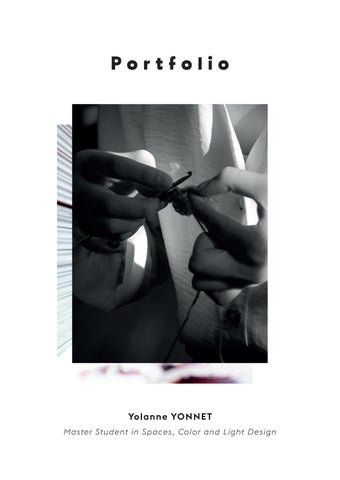
● Artistic Sensibility: Love to sketch, paint, knit, crochet and practice photography
● Sport: Danced in a modern-jazz dance school for over 10 years
Languages
● French / Native
● English / Professional working proficiency
Sommaire


 06-11. Ornamental chandelier
24-29. Wallpaper Collections
12-23. Retail Tea Shop
06-11. Ornamental chandelier
24-29. Wallpaper Collections
12-23. Retail Tea Shop


 30-33. Color planning tool
40. Sketchbook spread 34-39. Interior restaurant
30-33. Color planning tool
40. Sketchbook spread 34-39. Interior restaurant
Trésor Iodé (iodized
treasure)

Collection of natural curiosities: Oyster shells

Concept: Second life of local materials
Diving into the heart of the ocean to find our inspirations, we wish to reinterpret through this project the ornamental style, while keeping in mind the needs of today and tomorrow.

The dynamic of this project is launched by the major themes of ecological responsibility, sustainability and biomimicry, by the materials and the shape of our object.
The objective is not to reproduce organic
forms, pastiches or trumpets the eye, but to reconnect with the decorative ornamental always drawing its source in nature.
To do this, the creation is part of a circular design from an environmental and social point of view.
Using our raw materials in industrial and food production, waste, scrap and scrap take a second life here.

6
PRODUCT DESIGN | MASTER | MAY 2023
01 - ocean
03 - cochlear forms
02 - collection
04 - ornamentation
shells

marine treasures
natural curiosities


YONNET Yolanne 7
Technical sheet
Plans of the chandelier and its modules
-Type: Small craft series made in France
-Material: Plaster of oyster shells, aluminum, porcelain (ceramic)
-Finish: granular plaster, shiny hammered aluminium, white matte biscuit
-Dimensions: H: 1165mm / L: 1327mm / l:633mm
-Installations: To be fixed to the ceiling
-Not waterproof: not suitable for use in a bathroom or outside
80 mm
13 mm
8 PRODUCT DESIGN | MASTER | MAY 2023
1327 mm 1165 mm 693 mm 1387 mm 80 mm 30 mm 48 mm
9 YONNET Yolanne 3 mm 19 mm 633 mm 1327 mm 1165 mm 693 mm 1387 mm
«Trésor Iodé»
Ornamental chandelier - 132,7 x 116,5 cm Oyster shell plaster, aluminium drop and Limoges porcelain.


10
01. Details on oyster/aluminum modules
02. View of the chandelier and its mirror
02.
03. Representation of the chandelier in an environment
01.

03. 11
Tea Room
Retail Design Project

This tea room hosts a sales area as well as a tasting area. Through the front door, the sales and staging of tea practices is presented to us.
Then through the corridor we discover the more private part allowing to take the time to discover the tea ritual. The guest wishes a relaxing and
soothing atmosphere, with natural materials such as wood and bamboo and plants. The chosen color and material palette brings together the colors of the wood as well as the different shades of tea according to its infusion. The lights are soft and diffuse to create a soothing atmosphere.
12 Retail Design Project | Master 1 | Jan. 2023
The color palette in mineral and fleshy tones, is composed of warm and versatile colors. Sure feminine, it remains timeless and functional.
As part of the spirit of the times, aspiring to a more conscious life and a return to the roots, she embodies the colours of nature and the body. In search of simplicity and elegance, we find the play of textures and lights.


The mineral and fleshy hues are enhanced by the generous round shapes with smooth dancing colours on the cold walls made of concrete or lime.


A palette with powdered tones, it is available in raw or natural materials, such as terracotta, brick, wood and diaphanous fabrics, which give the interior a warm and intimate atmosphere.


YONNET Yolanne 13
ncs s0510 y90r ncs s4010 y70r ncs s8010 y70r ncs s5040 y80r ncs s2010 g60y ncs s2020 y70r Colors & materials moodboard InDesign
Zoning of interior spaces


14
Retail Design Project | Master 1 | Jan. 2023
Coloured isometric
view Illustrator exhibition and sale area entrance and checkout area


15 YONNET Yolanne tasting area exhibition and sale area
Plan of lighting installations with symbols

16
Retail Design Project | Master 1 | Jan. 2023
LEGEND
TOBIAS GRAU, Oh China Up Bone China, White


MUUTO, AMBIT RAIL LAMP, TAUPE
MUUTO, PULL FLOOR LAMP, OAK/WHITE

MUUTO, STRAND PENDANT LAMP / CLOSED Ø40, Ø60, Ø80
ARTEMIDE


17
YONNET Yolanne
Meet up space, little suspended fixtures diffusing a soothing light
Global Light Plan - Main Scenario
 Backlit exposure area with LED strips behind the cabinet
Light input by strip of spots
Hallway: from the sales area to the floor, slightly lit in the dark
Backlit exposure area with LED strips behind the cabinet
Light input by strip of spots
Hallway: from the sales area to the floor, slightly lit in the dark
Retail Design Project | Master 1 | Jan. 2023
Welcome highlighted by decorative suspensions, LED strips under each floor, trees lit in reverse.
Space illuminated by suspension with soft lighting
Decorative lighting: in the daytime the light from the window reflects it, in the night: it illuminates the ceiling
Light space in front of a window, suspensions off during the day/on when it gets dark
Space illuminated from the top of the wall by an LED strip hidden by a back ceiling + paper suspensions that light up gently

Retail Design Project | Master 1 | Jan. 2023 3D model pConPlanner


21 YONNET Yolanne

Retail Design Project | Master 1 | Jan. 2023

23 YONNET Yolanne
Chromatic Partition
Designing a wallpaper collection
This range of wallpapers with patterns and colors inspired by nature, transcribes the harmonious and natural exchange operating in an ecosystem. Through this first approach exploring the aspect of fungi and their properties, I wanted to highlight their tinctorial,

formal and natural qualities within an ecosystem.
The vibration patterns of this range give the colors a resonance of a beautiful tone.
24 WALLPAPER COLLECTION | LICENCE 3 | MAY 2022
Samples of the 3 wallpaper variations Illustrator Photoshop
Tinctorial colour chart


Watercolour counterpart of 32 colours obtained from mushroom tincture Referencing using a Pantone colour chart
List of tinctorial mushrooms (numbered from left to right, top to bottom)
1. Bolet Bai
2. Gomphide rutilant
3. Bolet pomme de pin
4. Pisolithe des teinturiers
5. Paxille à pied noir
6. Hydne ferrugineux
7. Phellodon noir
8. Hydne scrobiculé
9. Bolet satan
10. Bolet à pied rouge
11. Hypholome couleur de brique
12. Pholiote remarquable
13. Polypore rouillé
14. Diatrype sp.
15. Flavoparmelia caperata
16. Mousse de chêne
17. Polypore hérissé
18. Usnées
19. Cortinaire à chair olive
20. Cortinaire de phénicie
21. Cortinaire rouge cinabre
22. Cortinaire de phénicie
23. Cortinaire sanguin
24. Cortinaire sanguin
25. Cortinaire semi-sanguin
26. Coprin noir d’encre
27. Lichen jaune
28. Roccelle des teinturiers
29. Cortinaire rouge cinabre
30. Cortinaire sanguin
31. Polypore rutilant
32. Lichen jaune
YONNET Yolanne 25

26
WALLPAPER COLLECTION | LICENCE 3 | MAY 2022
Infographic implantation of the wallpaper in a bedroom Photoshop
Botanical research using tinctorial mushrooms

research of watercolour technique with water-on-water technique
search for integration of the motif on the watercolour background


YONNET Yolanne 27
Fugue

Soft shades bring a discreet and hypnotising breath, taking us elsewhere for an instant.


PANTONE 7334C PANTONE 7419C PANTONE 105C PANTONE 7617C PANTONE 7521C
28

29
Infographic implantation of the wallpaper in a dining room Photoshop
Materials & Colors Chart
Creating a tool : Materials & Colors Inspiration Cards
To try to bring back a more sensitive, aesthetic and colorful approach to the customer proposal, I wanted to create a tool listing palettes of defined colors.
By showing how these palettes adapt to two compositions of different spaces, by noting the surface, the number of seats, an layout, the furniture and its references of finishes, then adding a few sentences of arguments to adopt this atmosphere.
Attached we can see 3 examples of color palettes suitable for a Cafeteria. For each palette, 2 space organizations are proposed to illustrate how to use colors according to the chosen furniture.
Thanks to this colorful repertoire that can be continually enriched, my goal is to propose a tool to adopt different atmospheres by projecting more easily.

30
Materials & Colors Chart | LICENCE 3 | MAY 2022
Front/back presentation of the inspiration cards InDesign Photoshop


31 YONNET Yolanne
Presentation of color palettes and their uses according to different layouts InDesign

Materials & Colors Chart | LICENCE 3 | MAY 2022 32

33 YONNET Yolanne
Overview of inspirations cards Photoshop
«Boco Loco»
For the modernization of the restaurant concept, the new owner offers a trendy and sustainable offer, with fresh, local, homemade products and new services with a jar presentation and bike delivery.
The color palette takes on natural hues, green, ochre, beige, brown that recall the durable aspect. Yellow or pink, allows to highlight the young and fresh aspect of the new concept of the restaurant.
The brand offers a take-away sale that will be presented inside as a shop, where the jars are stored on shelves ready for sale.
The sale and restoration part will be in the same place, in an eco-responsible and soothing atmosphere.
For the atmosphere of the restaurant, it was essential to keep the authentic and comforting aspect.

34
INTERIOR DESIGN | LICENCE 2 | MAY 2021
Restaurant Interior Design Project
Isometric view pConPlanner
Colors & materials

moodboard
InDesign

YONNET Yolanne 35 3D model pConPlanner

36 INTERIOR DESIGN | LICENCE 2 | MAY 2021 3D model pConPlanner

37 YONNET Yolanne
3D isometric view pConPlanner

38 INTERIOR DESIGN | LICENCE 2 | MAY 2021

39 3D model pConPlanner
pencils


oil pastels

40
Sketchbook
watercolor


pastels
oil
acrylic paint
markers and pens
Yolan ne YONNET Master Student in Spac es, Color and Light Design yyolanne@gmail.com (+33) 6 59 52 81 60 31000 Toulouse, FRANCE