Master Painters & Pioneers
18th to 20th Century
The Fine Art & Sculpture Company
CONSIGNED FROM PRIVATE COLLECTIONS 18th to 20th Century
A SELLING EXHIBITION
Monday 28 July – Saturday 16 August 2025 Exhibition at GALLERY 8 8 Duke Street, St James’s London SW1Y 6BN 10 am – 6pm daily
Enquiries
Grant Ford grant@winsorbirch.com +44 (0)7770 787160
Charlie Minter charlie@winsorbirch.com +44 (0)7872 621632
The Fine Art & Sculpture Company
1 The Parade, Marlborough, SN8 1NE, UK www.winsorbirch.com enquiries@winsorbirch.com | +44 (0)1672 511058
Foreword
Master Painters & Pioneers chronicles an extraordinary journey of artistic achievement, from the founding principles of the Royal Academy to the pivotal moment when that same institution finally welcomed female members. This exhibition, drawn from distinguished private collections built over decades of passionate collecting, narrates the story of British and European art through its most influential figures.
The exhibition begins with Sir Joshua Reynolds, the founding President of the Royal Academy, whose classical vision established the institutional framework that would both support and limit artistic growth for generations. From Reynolds’ 18th-century authority, we see the gradual rise of new sensibilities: the atmospheric poetry that would challenge academic orthodoxy and the social awareness that would redefine the purpose of art.
We witness the revolutionary achievements of the 19th century’s greatest innovators. Edward Burne-Jones’s mystical St Barbara, St Dorothy and St Agnes transforms Pre-Raphaelite idealism into profound spiritual symbolism; James Tissot’s sophisticated modernism captures the cosmopolitan elegance of contemporary life while Frederic Leighton’s subtle portraits are exemplars of Aestheticism. These works mark the moment when British art began its dialogue with Continental innovation, a conversation that reaches sublime expression we see reflected in Camille Pissarro’s Impressionist mastery and Henri Martin’s Post-Impressionist synthesis of colour theory with humanistic vision.
Sir George Clausen’s agricultural scenes showcase how sophisticated pictorial techniques can express deeply empathetic themes, transforming everyday labour into a universal reflection on human dignity. His work bridges the gap between Victorian social awareness and modernist aesthetic independence, laying the groundwork for the bold new voices of the 20th century.
Dame Laura Knight’s Lamorna Cove is a dazzling panoramic of Cornish waters, painted by an artist who, in 1936, became the first woman elected as a full Royal Academician, 168 years after its founding. Knight’s achievement resonates strongly with current interest in female artists whose contributions were historically overlooked. Her inclusion alongside Elizabeth Stanhope Forbes and the women depicted in Burne-Jones’s and Tissot’s paintings highlights art history’s ongoing reassessment of gender and artistic authority.
These masterpieces embody not just individual achievement but also the remarkable collectors who have preserved them, often across generations. As these works pass to new custodians, they carry forward both their creators’ revolutionary vision and their guardians’ dedication to cultural stewardship.
Grant Ford Curator
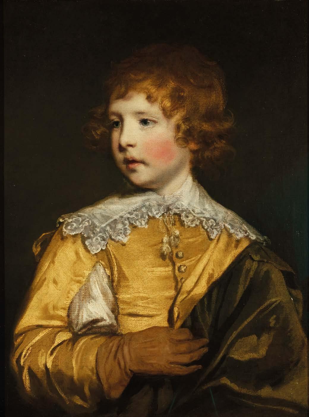
Image:
Sir Joshua Reynolds, R.A.
(1723-1792)
The Yellow Boy – Lord George Seymour-Conway, 1770
Oil on canvas
Unframed: 62.2 x 46.2 cm.; 24½ x 18 in.
Framed: 82 x 69 cm.; 32¼ x 27 in.
PROVENANCE
Painted for the sitter’s father, afterwards 1st Marquess of Hertford
By descent to the 7th Marquess of Hertford
Sold 1938, by Spink’s to H.M. King Carol of Romania
Bequeathed to his mistress Madame Lupescu
Sold by her to a lady resident in Mexico City
Bequeathed by her to her niece resident in Portugal
Christie’s, London, 27 March 1981, lot 150 Agnew’s, London (purchased from the above)
Private Collection (purchased from the above)
EXHIBITIONS
Worcestershire Exhibition, 1882
London, Grosvenor Gallery, 1883, no. 202
Guildhall, 1890, no. 191
London, 45 Park Lane 1937, no. 50
London, Royal Academy, 1986, no. 76
LITERATURE
Graves, A., and Cronin, W.V., History of the Works of Sir Joshua Reynolds, vol. 1, London, 1899-1901, pp. 191-2
Waterhouse, E.K., Reynolds, London, 1941, p.61
Cormack, M., The Ledgers of Sir Joshua Reynolds, Walpole Society, XLII, 1970, p. 116
Penny, N. et al., Reynolds, London, 1985, p. 120 (illustrated), pp. 244-245
Davis, L. and Hallet, M. et al., Joshua Reynolds: Experiments in Paint, London, 2015, p. 20 (illustrated) Mannings, D., Sir Joshua Reynolds: A Complete Catalogue of his Paintings, New Haven, 2000, p.143
Reynolds stands as a giant of eighteenth-century British art, the visionary genius who transformed a provincial painting tradition into an international force rivalling the continental masters. As founding President of the Royal Academy and Britain’s first knighted artist, he helped establish the intellectual framework that placed British portraiture among Europe’s finest achievements.
Painted in 1770 during Reynolds’s prime decade, the present portrait of Lord George Seymour-Conway (1763-1848) exemplifies his innovative blending of Van Dyck’s aristocratic grandeur with intimate childhood observation, a fusion that fundamentally changed British portraiture. He presents the young nobleman in a three-quarter view against moody brown tones, his golden curls catching light through Reynolds’ signature loose brushwork. Each strand looks lively, shifting between amber and bronze as light moves across the surface. This technique turns still hair into lively texture through purely painterly means.
The Van Dyck costume functions as a sophisticated piece of historical commentary. The vivid yellow silk doublet, slashed to reveal white undergarments, directly references seventeenth-century court portraiture, notably echoing Van Dyck’s The Three Eldest Children of Charles I (Royal Collection Trust) and creating a deliberate dialogue between historical and modern nobility. The Seymour-Conway family were descendants of Charles I’s courtiers. The intricate bobbin lace collar flows across small shoulders, while the asymmetrically draped olivegreen cloak showcases Reynolds’s mastery of fabric weight and texture through subtle tonal variations.
The child’s gaze, directed at an angle away from the viewer, has an introspective quality rarely seen in contemporary childhood portraiture. Reynolds captures natural contemplation instead of artificial poses, revealing personality beneath ceremonial dress. The slightly parted lips hint at imminent speech; the eyes reflect inherited dignity tempered by childhood curiosity.
Commissioned by Francis Seymour-Conway, 1st Marquess of Hertford, as part of an extensive family programme, the portrait remained in their collection for nearly two centuries. Many of the works were subsequently inherited by Sir Richard Wallace and now form part of the Wallace Collection.
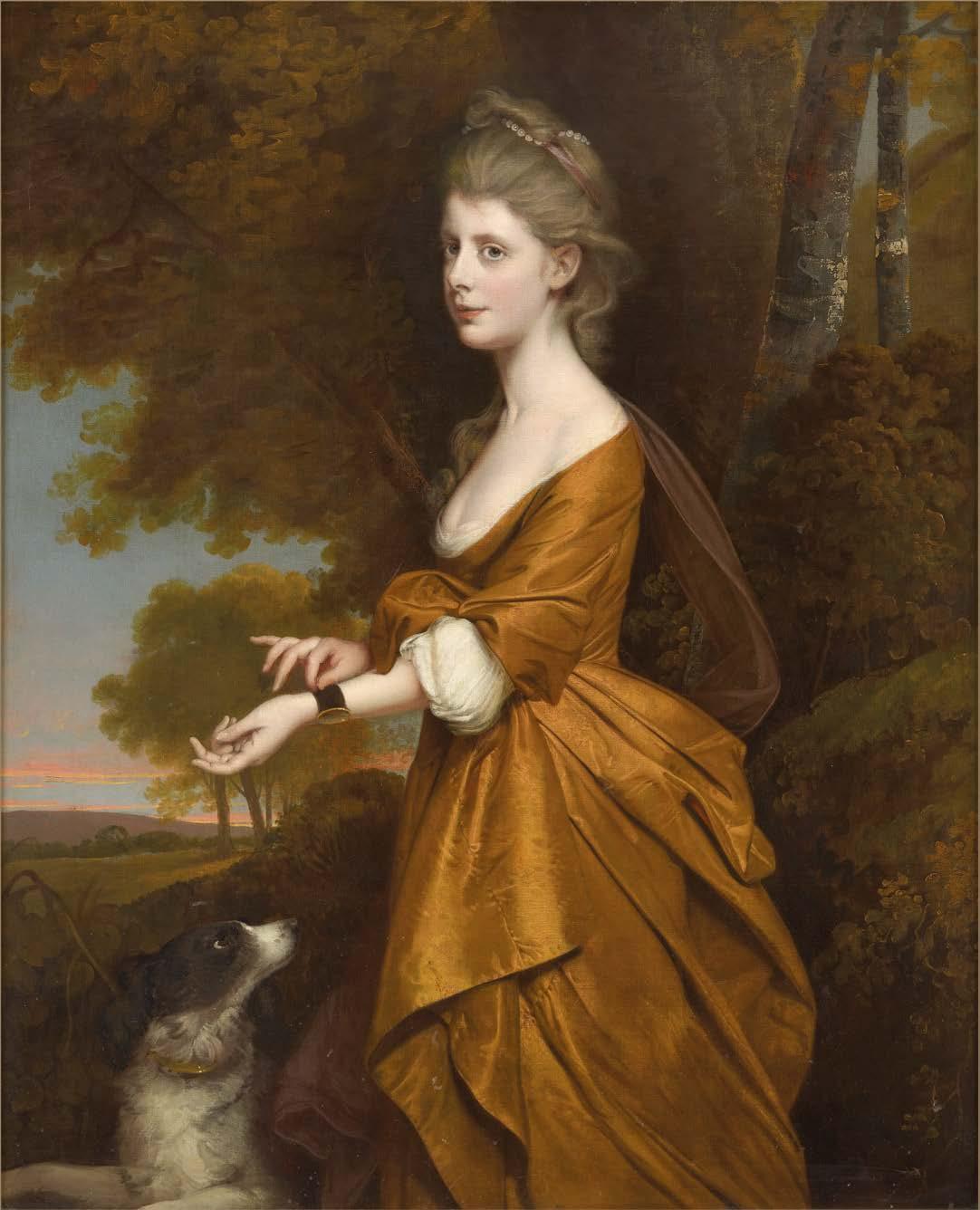
Joseph Wright of Derby, A.R.A. (1734-1797)
Portrait of Anne Parker, 1785
Oil on canvas
122 x 99 cm.; 48 x 39 in.
PROVENANCE
Sir John Thursby (born 1921), Ormerod House, Burnley, Lancashire
Thence by descent to Ruth Aspinall, his granddaughter;
Sotheby’s, London, 6 July 1983
Private Collection (purchased from the above)
EXHIBITIONS
London, Tate Gallery, Wright of Derby, February-April 1990
LITERATURE
Judy Egerton, Wright of Derby, exh. cat., Tate Gallery, London, 1990
Within eighteenth-century British portraiture, few works possess the immediacy of Joseph Wright of Derby’s Portrait of Anne Parker, painted in 1785 when she was 17. This traditional Georgian society portrait showcases an artist at the height of his talents and a young woman caught as childhood innocence transitions into mature understanding. Previously tentatively identified as ‘Miss Parker’ from Wright’s Account Book entries, recent genealogical research by the current owner has transformed our understanding of both sitter and context, elevating what was once an enigmatic figure into a fully realised historical individual whose brief life sheds light on the network of Lancashire’s landed gentry.
Anne Parker was born in 1786 to Robert Parker of Cuerden Hall, Lancashire. Her powdered hair, elegantly dressed and adorned with pearls, catches the ambient light with subtle brilliance, whilst her complexion radiates that peculiar luminosity Wright achieved through his understanding of flesh tones.
The artist’s technical mastery peaks in his portrayal of the shimmering, amber silk gown. This was almost certainly selected from Wright’s studio wardrobe rather than being personally owned by the sitter. The fabric drapes into sculptural folds, while the sleeves, gathered at the elbow, flow in graceful curves.
Anne’s hands are poised with studied naturalness. A bracelet appears on her wrist, possibly containing a lock of her father Robert Parker’s hair, who died in 1779 when Anne was eleven, according to family tradition preserved through the painting’s provenance. At her feet, a brown and white spaniel gazes up at Anne, a symbol of fidelity and devotion.
Anne’s expression blends alertness with introspection. There is a sense of watchful reserve in her face, as if she were both present in the moment and contemplating something beyond the artist’s studio. Within eighteenth-century portraiture, Wright offers a distinct stance among his peers. While Sir Joshua Reynolds might have glorified his subject through classical allusions, and Thomas Gainsborough might have showcased fashionable elegance with virtuosic brushwork, Wright produces something more straightforward yet equally refined.
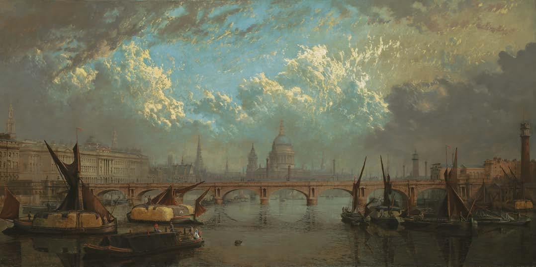
John MacVicar Anderson (1835-1915)
The Thames from Hungerford Bridge, 1871
Signed and dated on the barge lower left ‘JOHN ANDERSON 71’
Oil on canvas
76 x 152.5 cm.; 30 x 60 in.
PROVENANCE
Christie’s, London, 26 November 1999, lot 93 Private Collection
John MacVicar Anderson’s The Thames from Hungerford Bridge offers a profound reflection on Victorian London’s architectural transformation, moving beyond simple topographical recording to become a refined urban portrayal. This 1871 work captures the city at a crucial moment when industrial modernity clashed with ecclesiastical tradition, portraying the Thames as both a literal route and a symbolic channel of change.
Anderson’s vantage point from Hungerford Bridge places the viewer in the very heart of London’s transportation revolution. The railway bridge, completed just seven years before this work was conceived, marked Sir John Hawkshaw’s triumph of engineering pragmatism over Isambard Kingdom Brunel’s earlier suspension footbridge. This strategic viewpoint enabled Anderson to craft a symphonic scene where Wren’s church spires punctuate the skyline with baroque precision, culminating in St Paul’s Cathedral’s commanding dome. The foreground buzzes with commercial activity: hay barges pass beneath Waterloo Bridge, their lowered masts demonstrating the artist’s careful attention to maritime detail.
The composition’s horizontal format highlights the Thames’s role as London’s main artery, while the pearl-grey atmosphere captures the city’s unique luminosity created by coal smoke and river mist. Somerset House’s neoclassical grandeur dominates the left quadrant, its Portland stone façade contrasting sharply with the South Bank’s industrial warehouses and factory chimneys – a far cry from the cultural quarter it is today. Anderson’s architectural training under William Burn shows in the work’s structural precision, elevating veduta into sophisticated urban form.
Spanning the Thames is Waterloo Bridge. Built between 1811 and 1817 to commemorate Wellington’s victory, the bridge was a masterpiece of Regency engineering, with its nine elliptical arches and paired Doric columns creating what Canova famously declared ‘the noblest bridge in the world, worth a visit from the remotest corners of the earth.’ Anderson’s depiction preserves this architectural marvel for posterity with archaeological accuracy, a prescient act given that the bridge was demolished in 1936 and replaced by Sir Giles Gilbert Scott’s modernist interpretation.
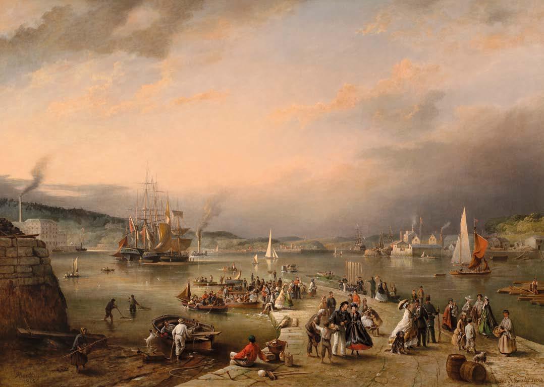
Richard
Brydges Beechey, H.R.H.A. (1808-1895)
The Admiral’s Hard, Stonehouse, Plymouth
Signed and dated lower left ‘RBeechey/ 1865’; titled lower right Oil on canvas
Unframed: 78 x 112 cm.; 30¾ x 441/8 in.
Framed: 93.5 x 126 cm.; 37 x 49½ in.
PROVENANCE
Christie’s, London, 17 November 1989, lot 4 Private Collection (purchased from the above)
Richard Brydges Beechey holds a unique position as both a naval professional and a skilled artist, bringing an authentic sense of experience to his canvases that sets his work apart from many of his contemporaries. Created in 1865, the year after Richard Brydges Beechey retired as Admiral, this substantial canvas marks the peak of an extraordinary career that included Pacific exploration, Irish coastal surveying, and extensive knowledge of Royal Navy protocol. Very few artists in British maritime tradition held such genuine credentials: son of Royal Academician Sir William Beechey, veteran of the 1825-1828 Pacific voyage aboard HMS Blossom, and notably the first to sketch John Adams, the last surviving mutineer from HMS Bounty, on Pitcairn Island.
Viewed from the western shore of Stonehouse Creek, the artist depicts a bustling scene with an eye for detail that extends throughout the composition. Gathered on the jetty are uniformed naval officers greeted by women and children; behind more boats can be seen arriving on the jetty that recedes into the distance, where a steam-assisted warship symbolises the evolution of naval power. The accuracy of architectural detail, careful observation of costume, and feel for atmosphere exemplify Beechey’s naval paintings. Its scale and ambition places it within the celebrated tradition of 17th-century Dutch marine painting.
In 1835, Beechey was appointed to the Admiralty Survey of Ireland and in 1844 he married Frideswide Maria Moore Smyth of Portlick Castle. Over three decades he made valuable surveys of the Irish coast and in 1868 was elected an Honorary Royal Hibernian Academician for his dual contribution to Irish art and cartography.
James Jacques Joseph Tissot (1836-1902)
The Lover’s Tiff, 1876
Oil on canvas
Unframed: 72.5 x 48 cm.; 28½ x 18¾ in.
Framed: 80 x 64 cm.; 31½ x 25 in.
PROVENANCE
Sold by Tissot in 1876 for £525 to Alexander Kay as Quarrelling
Alexander Jafferson Buist (1818-1901); John Charles Buist by 1912
Hammer Galleries, New York, March 1955
Charpentier Auctions, Paris, June 1956
Christie’s, London, 26 July 1957, lot 96 With Miss Wellesley by 1967
Agnew’s, London, 1983
Private Collection
EXHIBITIONS
Glasgow International Exhibition, 1901
Victoria Art Galleries in Dundee, 1912
American Federation of Arts: James Tissot: Victorian Life/Modern Love, 22 September 1999 – 2 July 2000, touring exhibition, no. 43; Oxford, Ashmolean Museum, 2017
LITERATURE
James Tissot’s sales notebook or Carnet de ventes (whereabouts unknown; photocopy in Mantion Collection), second entry under 1876;
James Tissot’s photograph album, London. From 1871 to 1878 (private collection), unnumbered, 38th of 64 images, Connoisseur, March 1955
Etching by Tissot dated 1876 (Wentworth 18) published by Tissot in Ten Etchings by J. J. Tissot Tissot 1876; James Jacques Joseph Tissot: A Retrospective Exhibition, Exh. Cat., Museum of Art, Rhode Island School of Design, Providence and Art Gallery of Ontario Toronto, 1968, no, 63;
Willard E. Misfeldt, ‘James Jacques Joseph Tissot: A Bio-Critical Study’ PhD dissertation, Washington University, 1971, p. 159;
Michael Wentworth, James Tissot: Catalogue Raisonné of His Prints Minneapolis Institute of Art, 1978, p. 90, fig. 18b; Michael Wentworth, James Tissot, Oxford, Clarendon Press, 1984, p. 111, p. 121, pl. 97; James Tissot, Exh. Cat., Barbican Art Gallery, London and Whitworth Art Gallery, Manchester, 1984-1985, p. 116;
James Tissot, Exh. Cat., Petit Palais, Musée de BeauxArts, Paris, 1984, p. 186;
Christopher Wood, Tissot : The Life and Work of Jacques Joseph Tissot, 1836-1902, London, Weidenfeld and Nicolson, 1986, pp. 76-77, fig. 74;
Willard E. Misfeldt, J. J. Prints from the Gotlieb Collection, Alexandria, VA, 1991, p. 52;
Nancy Rose Marshall and Malcolm Warner, James Tissot: Victorian Life/Modern Love Exh. Cat., Yale Center for British Art, New Haven; Musée du Québec, Québec City, and Albright-Knox Art Gallery, Buffalo, 1999-2000, pp. 105-107, illustrated back frontispiece; Katharine Lochnan (Ed.), Ann Saddlemyer, ‘Spirits in Space: Theatricality and the Occult in Tissot’s Life and Art’, p. 147 and p. 151, fig. 54 and Carole G. Silver, ‘Tissot’s Victorian Narratives: Allusion and Invention’, p. 132; in Seductive Surfaces: The Art of Tissot, New Haven, Yale University Press, 1999; Melissa E. Buron with Krystyna Matyjaszkiewic, James Tissot, Fine Arts Museums of San Francisco, Delmonico Books, 2019, p. 291, illustration pl. 51;
An etching of Querelle d’amorureux was exhibited at the Royal Academy, the Paris Salon and Durand Ruel’s gallery in 1876 under the title The Garden at St John’s Wood
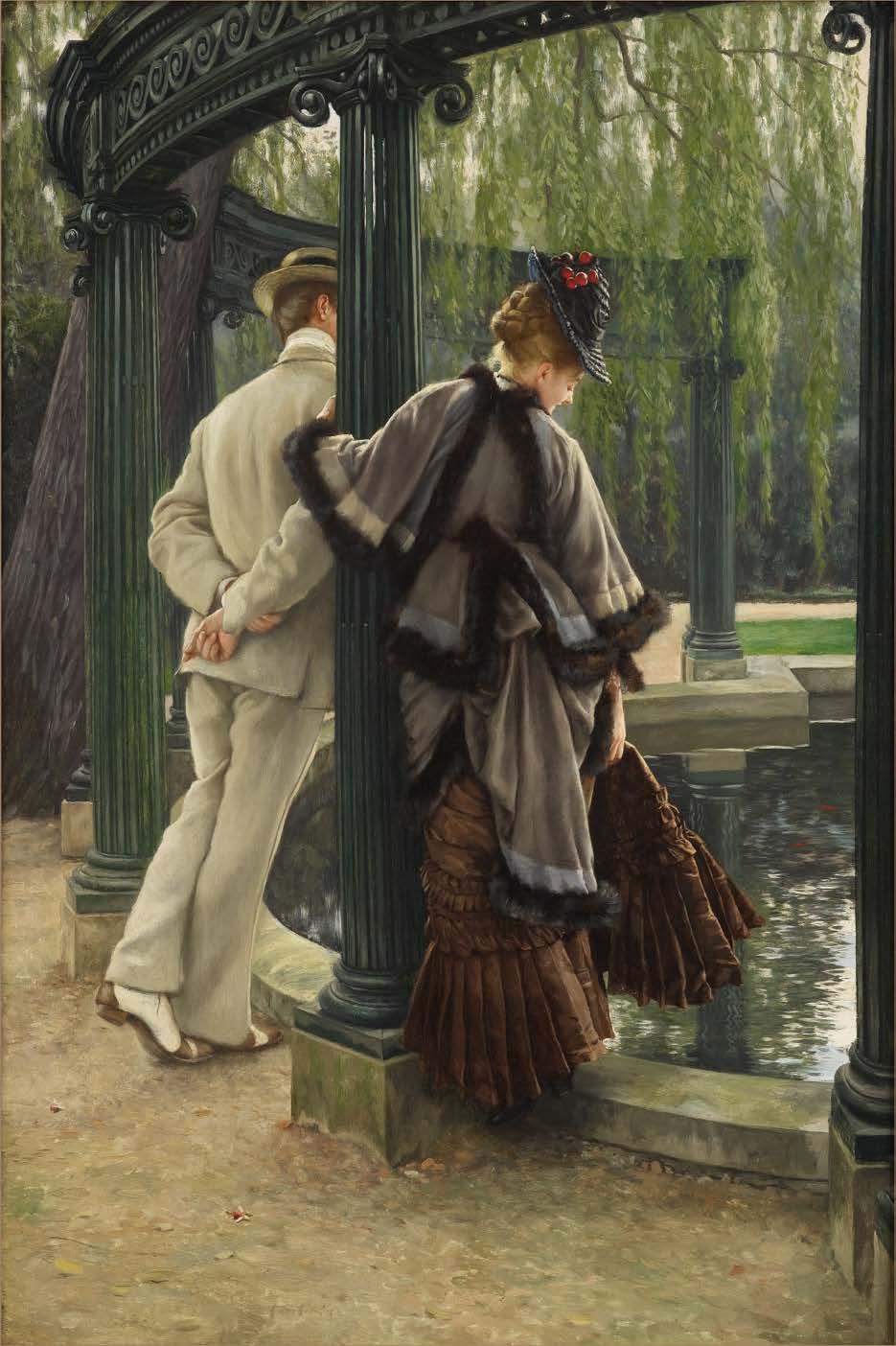
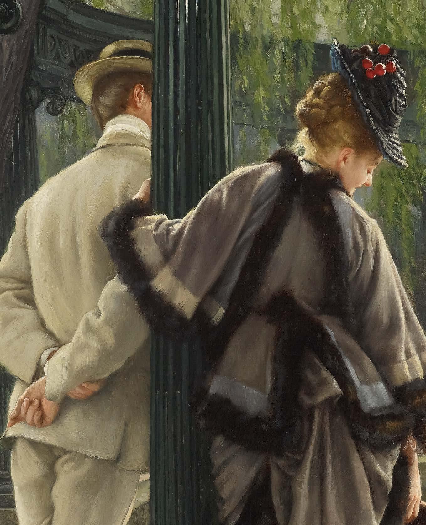
Within the private enclosure of his St John’s Wood garden, Tissot captures a psychologically complex and visually striking moment in Victorian narrative painting. The Lover’s Tiff presents itself not merely as a snapshot of romantic discord but as a refined meditation on desire, social conventions, and the intricate choreography of human relationships.
The work demonstrates Tissot’s unique ability to transform the everyday gestures of fashionable society into profound studies of emotional ambiguity. The painting shows two figures suspended in a moment of tension beside the artist’s renowned colonnade, which is itself a replica of the romantic folly from Baron Haussmann’s Parc Monceau in Paris.
The woman, turning with deliberate coyness, steps carefully onto the ornamental pool’s stone parapet, an action that suggests both retreat and allure. The exquisitely rendered brown silk dress, with intricate pleating and luxurious fur trim, serves as social armour, a facade of respectability that masks her true emotional state. The raffia hat’s red cherries echo goldfish below and scattered rose hips, creating a visual symphony while conveying Victorian symbolic meaning: innocence intertwined with sensuality.
The gentleman leans against the column with deliberate nonchalance, hands clasped behind his back. His pristine white ‘sack’ suit exemplifies casual elegance, while his John Lobb spectator shoes, originally designed for cricket enthusiasts in 1868, identify him as a gentleman of leisurely sporting tastes.
“A painting by Mr. Tissot will be enough for the archaeologists of the future to reconstruct our era.”
Élie Roy, 1869
Tissot’s compositional brilliance shines through in how he transforms everyday gestures into compelling psychological theatre. The column acts as both a physical barrier and a symbolic divide, representing societal constraints that influence the lovers’ interactions. The leaning willow mirrors the gentleman’s inclined posture, suggesting that nature itself participates in this romantic drama. Light plays a vital role, flowing through the hanging branches to catch the nape of the woman’s neck, highlighting her escaped curls and creating an almost golden glow that elevates her into an object of aesthetic admiration even as she withdraws.
The apparent privacy of Tissot’s lovers, their escape from observation, would have held significant transgressive implications for contemporary viewers constrained by social courtship customs. The painting exemplifies Tissot’s skill in achieving pictorial ambiguity, setting him apart from his British contemporaries, who focused on moral clarity. Unlike traditional academic paintings that are symbolically transparent, Tissot intentionally complicates straightforward interpretation; viewers cannot easily tell if this depicts a real quarrel, an elaborate flirtation, or a ritualised romantic performance that both participants understand and enjoy.
The placement of The Lover’s Tiff within Tissot’s career is quite significant. Created during his most successful period in London, when he was earning the equivalent of a Cabinet minister’s salary, the work reflects both the confidence of professional success and the start of his personal change. Soon after completing this painting, Tissot met Kathleen Newton, the divorced Irish beauty who would become his muse, model, and companion until her tragic death from tuberculosis in 1882. Looking back, The Lover’s Tiff can be seen as Tissot’s last major commentary on romantic relationships as a social performance, before his own experience of deep passion altered his artistic perspective. The deliberate ambiguity of the garden encounter stands in stark contrast to the tender intimacy that would later define his portraits of Newton. Through its skilful blend of technical mastery, social insight, and narrative complexity, The Lover’s Tiff attains what Charles Baudelaire regarded as the highest artistic aim: turning contemporary life into a lasting aesthetic experience.
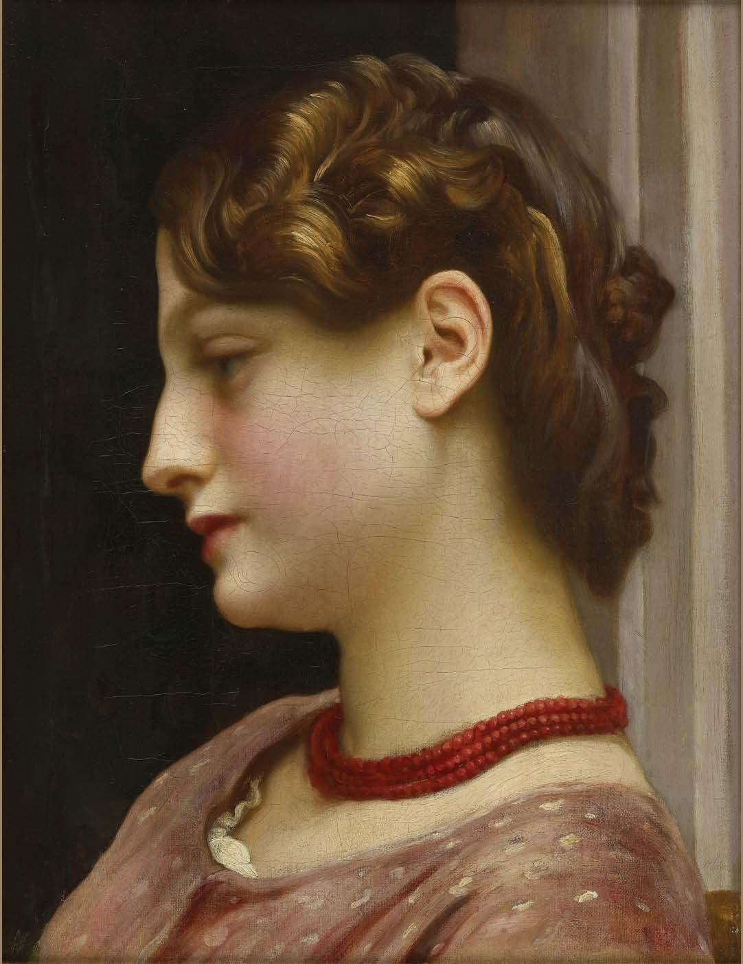
Frederic, Lord Leighton, P.R.A. (1830-1896)
6. The Coral Necklace Oil on canvas
Unframed: 43 x 33 cm.; 17 x 13 in.
Framed: 63.5 x 51 cm.; 25 x 20 in.
PROVENANCE
Christie’s, London, 25 November 1988, lot 97 Private Collection
Leighton stands as arguably the most distinguished artist of the late nineteenth century, a figure whose influence extended well beyond his Holland Park studio to shape British artistic culture. Elected President of the Royal Academy in 1878, a position he held with unprecedented authority until his death, Leighton wielded influence akin to that of a minister of state in the realm of the arts. His elevation to the peerage in 1896 marked him as the first and only British artist ever to receive such an honour. However, he enjoyed this distinction for merely one day before his death, creating the shortest-lived title in British history.
Leighton’s residence at 12 Holland Park Road, designed by his close friend George Aitchison, served not merely as a home but as a temple of aesthetic refinement, embodying the Victorian ideal of how a great artist should live. This extraordinary house, with its famed Arab Hall adorned with tiles from Damascus and its purpose-built studio, where masterpieces including Flaming June (1895, Museo de Arte de Ponce, Puerto Rico) were created, functioned as both an artistic laboratory and a cultural salon, welcoming prominent personalities of the age, from Robert Browning to Queen Victoria herself. The domestic environment from which The Coral Necklace emerged was thus one of unparalleled sophistication, where every surface and object was carefully chosen to create what contemporaries called a ‘private palace of art.’
Within the intimate confines of a modest canvas, Leighton’s portrait transcends mere representation to become a meditation on feminine virtue, aesthetic philosophy, and the enduring dialogue between antiquity and modernity that defined nineteenthcentury British art.
Depicted in profile, the model’s downcast eyes indicate introspective reverie. Leighton’s sublime technical proficiency is seen in her porcelain skin which contrasts sharply with the dark background; in the golden hues of her hair and in the delicate embroidered drapery. It is a masterful arrangement of textural harmonies, embellished still with the eponymous coral necklace, serving as the focal point around which the painting is built. Its deep crimson beads, meticulously detailed to highlight their natural irregularities, provide the only splash of saturated colour in an otherwise muted palette. Coral, prized since antiquity for its protective qualities and association with feminine virtue, symbolises the delicate balance between natural beauty and cultivated refinement that characterised Victorian ideals of femininity.
Leighton’s synthesis of classical idealism with contemporary naturalism positioned him at the forefront of the Aesthetic Movement, where narrative content gave way to compositions that relied entirely on mood and formal harmony. We witness this perfectly distilled in The Coral Necklace.
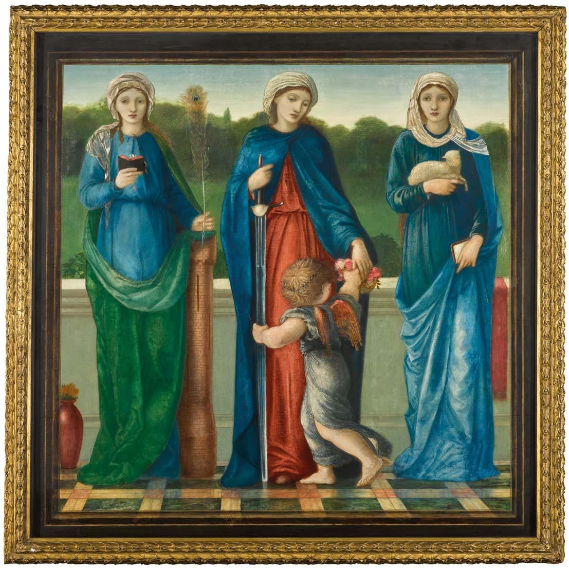
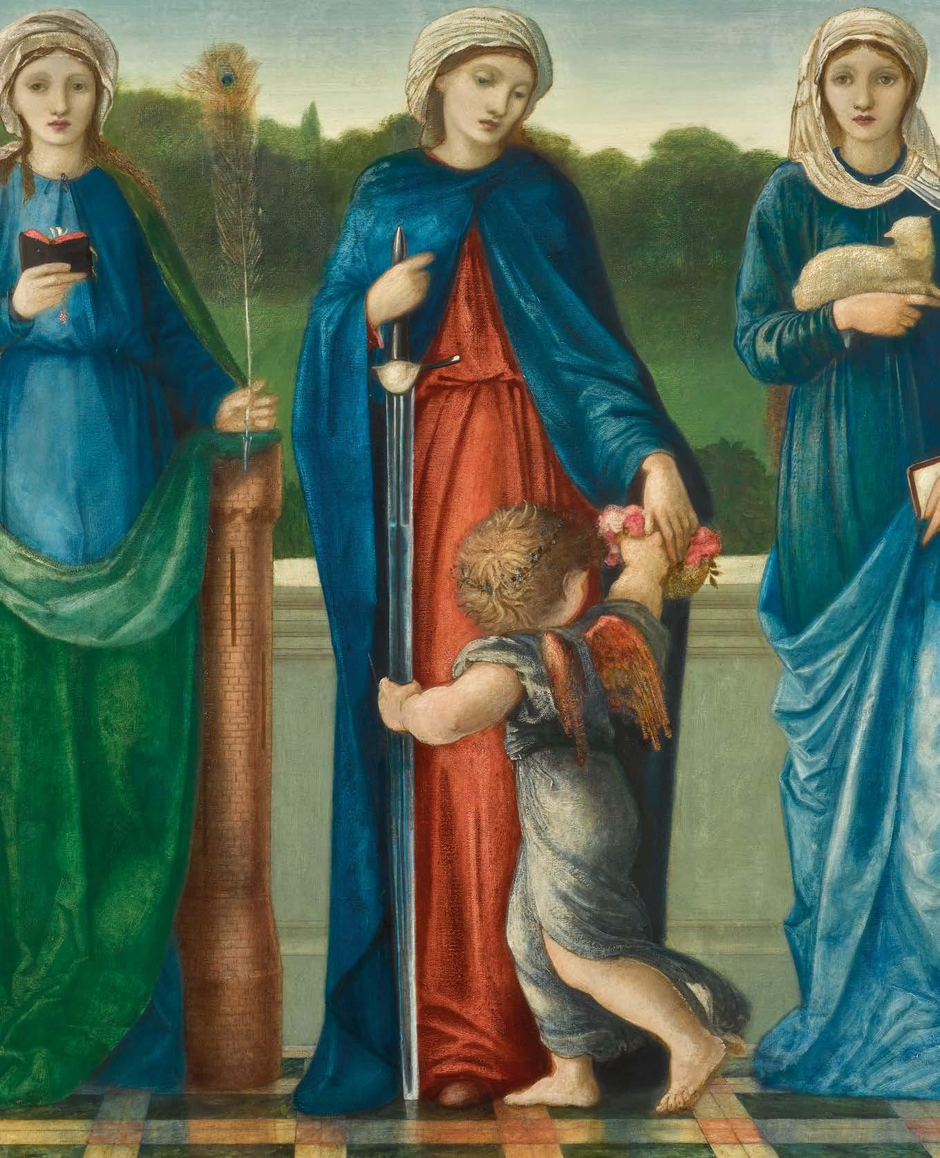
Sir Edward Coley Burne-Jones, BT., A.R.A., R.W.S. (1833-1898)
St Barbara, St Dorothy and St Agnes, 1869
Oil on canvas, in original frame
Unframed: 83.5 by 83.5 cm.; 33 by 33 in.
Framed: 95 x 96 cm.; 37½ x 37¾ in.
PROVENANCE
Purchased from the artist by William Graham in 1869 (listed as no.15 in his 1882 inventory)
Sold by the beneficiaries of William Graham, Christie’s, London, 3 April 1886, lot 156 to Sir John Gray Hill of Mere Hall, Birkenhead with whom it remained until 1911
His sale, Christie’s, London, 11 February 1911, lot 119 to Gooden & Fox, London
Sotheby’s, London, 18 March 1964, lot 138 Maas Gallery, London Agnew’s, London
Lord Lambton by 1971
Private Collection, London
Christie’s, London, 22 November 2006, lot 230
Sotheby’s, London, 10 December 2019, lot 15
Private Collection (purchased from the above)
EXHIBITIONS
London, New Gallery, Exhibition of the Works of Sir Edward Burne-Jones, Bart., 1898-9, no.107 Sheffield, Mappin Art Gallery, Burne-Jones, 1971, no.24
LITERATURE
Fortunee de Lisle, Burne-Jones, 1904, p.182 Arsene Alexandre, Sir Edward Burne-Jones, 1907, illustrated plate 8 from a photograph by Frederick Hollyer
Oliver Garnett, ‘The Letters and Collection of William Graham – Pre-Raphaelite Patron and Pre-Raphael Collector’, Walpole Society, Vol.62, 2000, pp.249, 290
Within the reflective silence of Burne-Jones’ St. Barbara, St. Dorothy, and St. Agnes, three martyred saints rise from the artist’s most turbulent personal crisis to become powerful symbols of virtue victorious. Painted in 1869 during his passionate affair with model Maria Zambaco, this remarkable canvas paradoxically serves as an intimate tribute to his wife Georgiana, whose steadfast devotion endured her husband’s emotional infidelities.
The work moves beyond religious iconography to become a psychological depiction of feminine strength, created with the otherworldly intensity that characterises Burne-Jones’ most notable achievements.
Three female martyrs stand on gleaming marble before a pastoral landscape. The pure white balustrade creates a symbolic boundary between earthly and celestial realms, while the polished floor reflects azure draperies in pools of light that heighten the painting’s ethereal atmosphere. Each figure occupies a distinct space yet participates in unified visual harmony, showcasing Burne-Jones’ mastery of Renaissance compositional principles. St Barbara, positioned on the left, gazes outward with deep introspection. Draped in flowing blue beneath a green mantle, she embodies scholarly devotion, clutching a volume that signifies religious learning, while beside her rises the cylindrical tower that has become both sanctuary and prison. The structure’s barely visible three windows symbolise her devotion to the Trinity, the revelation that led to her martyrdom. Her peacock feather, enigmatic yet possibly alluding to resurrection, completes her iconographic identity whilst suggesting the transcendence of earthly vanity through faith.
The central figure, St Dorothy, was a 2nd Century maiden of Caesarea in Cappodocia, put to death by sword by the Emperor Diocletian for refusing to marry on the grounds that she was mystically espoused to Christ. An angel stands before her carrying a basket of roses, the miraculous flowers Dorothy promised to send from heaven’s garden to the mocking Roman notary, Theophilus, leading to his own conversion. Dorothy’s red undergown, visible beneath her blue mantle, provides the painting’s most striking colour contrast, while symbolically referencing both royal lineage and the blood of martyrdom.
“In the palace of art there are many chambers, and that of which Mr. Burne-Jones holds the key is a wondrous museum. His imagination, his fertility of invention, his exquisiteness of work, his remarkable gifts as a colourist—all these things constitute a brilliant distinction.”
Henry James, 1877
St Agnes adorns the right side – another victim of Diocletian’s suppression martyred in Rome in 304AD. Her cascade of hair references the miracle of her execution, when her tresses grew to preserve her modesty. She gently holds a lamb, both a symbol of her identity and a nod to her name’s Latin origin, with protective tenderness. Yet, her expression displays unwavering faith upheld through persecution. She is a symbol of sacrificial innocence, linking Agnes to Christianity’s broader story of redemption.
The biographical subtext of the painting is unavoidable. In 1869, Burne-Jones’s involvement with Maria Zambaco reached a crisis when she attempted suicide with laudanum, forcing him to confront the destructive potential of his romantic obsessions. The three saints, with their shared dedication to virginal purity and rejection of earthly marriage, serve as stark contrasts to the sensual Venus archetype that Maria embodied. More importantly, all three martyrs clearly resemble Georgiana BurneJones, whose quiet strength and moral authority supported both her husband’s career and their troubled marriage. Her Methodist upbringing, emphasising moral integrity and spiritual discipline, is perfectly reflected in these figures who chose divine love over earthly passion.
Technically, the work reveals Burne-Jones’ progression from early Pre-Raphaelite linearity to a refined Italian Renaissance synthesis. The drapery modelling reflects Giotto’s Scrovegni frescoes, while the elongated figures echo Botticelli’s elegant style. The background landscape, with its atmospheric perspective and rolling hills, evokes Giovanni Bellini’s sacra conversazione, creating infinite depth beyond architectural boundaries.
The work’s origins lie in designs for All Saints Church, Cambridge, linking it to Victorian church decoration and the Gothic Revival movement.
William Morris was commissioned to create the East Window in 1866 and turned to Burne-Jones to produce 15 cartoons, which included individual portrayals of St. Barbara, St. Dorothy and St. Agnes
Uniting these figures into the present painting, it was purchased shortly after by Burne-Jones’ greatest patron, William Graham (1817-1885). Graham, whose collection included the artist’s finest works, recognised a union of technical skill and emotional depth that ranked it among Pre-Raphaelitism’s most notable achievements. The painting connects the movement’s early medievalism with the aesthetic sophistication that would influence later Symbolist artists. Its blend of narrative clarity, technical skill, and psychological depth makes it a major achievement in Victorian religious art.
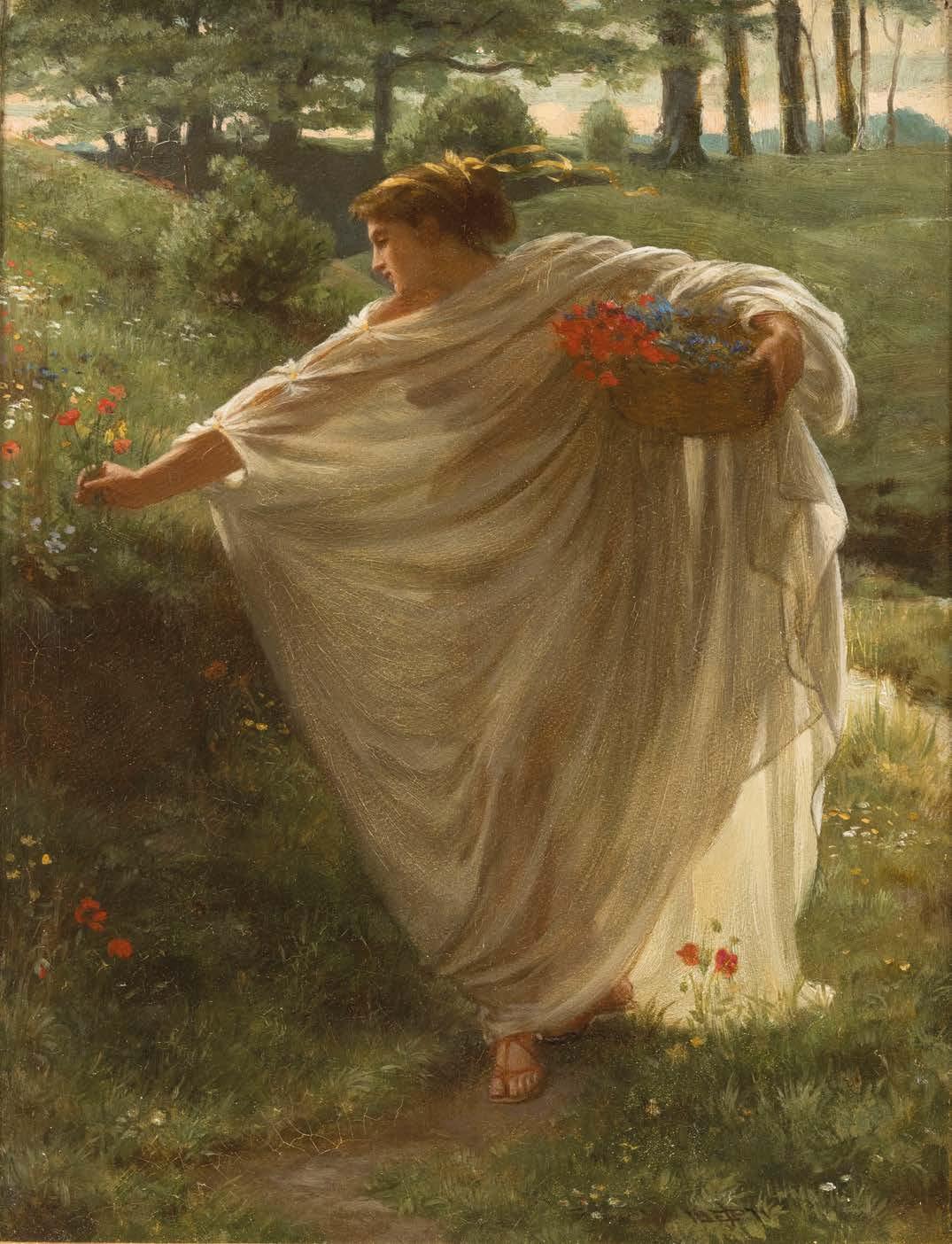
Sir Edward John Poynter, P.R.A. (1836-1919)
Proserpine, 1871
Signed with initials and dated lower right ‘EJP 1871’ Oil on canvas
Unframed: 24 x 18.5 cm.; 9½ x 7¾ in.
Framed: 35.5 x 32.5 cm.; 14 x 12¾ in.
PROVENANCE
Maas Gallery, London Private Collection Ireland, Private Collection, circa 1960s, thence by family descent
Proserpine (Proserpina or Persephone in Greek) –Goddess of the Underworld whose myth represents the story of the seasons – was a popular subject in Victorian times as questions about the after-life, religious faith and the ideas of theosophy loomed large, all amid a Classical Revival which influenced paintings, sculpture, novels and the theatre. Subjects from classical mythology had become increasingly important stimuli for artists from the 1860s onwards. Notable interpretations of Proserpine include Walter Crane’s The Fate of Persephone (1878, sold Christie’s London, 12 June 2002); Lord Frederic Leighton’s The Return of Persephone (1891, Leeds Art Gallery) and Dante Gabriel Rossetti’s Proserpine, (1874, Tate Britain).
Rather than concentrating on the more dramatic moments of Proserpine’s myth – her abduction by Pluto (Hades), her eating the pomegranate seeds which ensure that she must return to the Underworld or her reunion with her mother Ceres (Demeter) who has been desperately searching for her – in this small, exquisite oil, Poynter offers an alternative vision. He depicts an instant of tranquil flowergathering, where the figure seems to float weightlessly through an idealised Arcadian landscape. It relates to larger painting of Proserpine Poynter exhibited at the Royal Academy in 1869, depicting a young girl in classical robes picking flowers in a landscape. Agnes Poynter (the artist’s wife) wrote that it caused ‘quite a sensation, one hears of it on every side. We have just had another offer for it … the Queen insists upon a copy.’ (Christopher Wood, Olympian Dreamers, 1983, p. 138).
Poynter’s Proserpine is draped in a diaphanous white robe, which billows with sculptural grace while revealing the goddess’s silhouette through the translucent fabric. Golden, flowing ribbons crown her auburn hair, while delicate crimson sandals anchor her to the lush earth. She carries a wicker basket filled with vivid scarlet poppies and azure blooms, their symbolic meaning resonating with both life and death, consciousness and eternal slumber.
Dappled sunlight filters through ancient trees, creating an atmosphere of a mystical sacred grove. Behind the figure is a hint of flowing water, whilst distant hills add compositional depth. Every element contributes to an overwhelming sense of lyrical beauty, transforming the mythological narrative into an aesthetic experience.
This intimate work marks a departure for Poynter, shifting away from his usual archaeological reconstructions towards a more emotionally immediate approach. The work’s contemporary relevance to Aesthetic Movement principles becomes clear through its focus on beauty rather than moral lessons, and classical form over modern social critique.
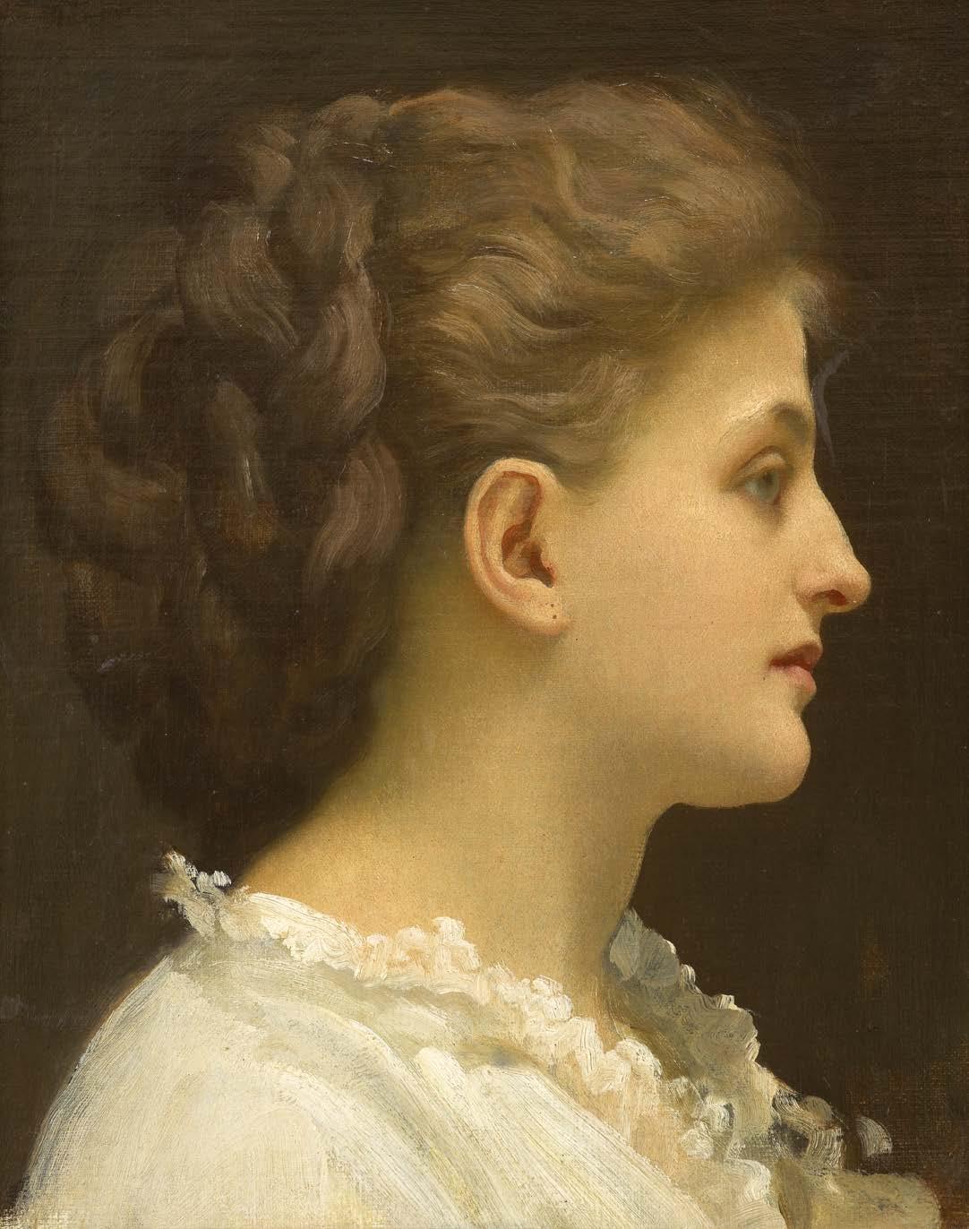
Frederic, Lord Leighton, P.R.A. (1830-1896)
Lady in Profile
Oil on canvas
Edgcumbe Staley, 1906 9.
Unframed: 24 x 20 cm.; 9½ x 7¾ in.
Framed: 39.5 x 35cm.; 15½ x 13¾ in.
PROVENANCE
Sotheby’s, London,26 November 1986, lot 39 Thomas Agnew & Sons, London Private Collection (purchased from the above)
Stripped of superfluous detail, Lady in Profile is an exercise in formal arrangement and feminine beauty on their own terms – an aesthetic approach that defined Leighton’s celebrated career. The profile of the sitter, one of quiet reverie, also recalls Roman imperial coinage; yet Leighton reinterprets ancient conventions through a distinctly modern lens. With remarkable subtlety and technical proficiency, the model’s luminous flesh tones emerge from the enveloping darkness through delicate gradations, creating a sculptural presence that showcases Leighton’s Continental training from Frankfurt to Paris. The background’s velvety opacity functions not as negative space but as an active part of the composition, generating dramatic tension between illumination and shadow, reminiscent of Ingres’ psychological depth while maintaining distinctly British restraint.
The sitter’s elaborately styled coiffure is masterfully rendered, with golden strands carefully defined yet smoothly blending into a larger architectural form. The delicate, white garment, crafted with surprisingly liberal brushwork, offers a textural contrast to the hair’s structured complexity and the skin’s porcelain smoothness.
Through this modest yet profound portrait, Leighton realises the Aesthetic Movement’s ultimate aspiration: art liberated from narrative obligation towards pure formal beauty. It is a timeless work that represents Victorian portraiture’s most sophisticated engagement with tradition whilst pioneering modernist aesthetic independence.
‘[His head studies are an] epoch in themselves in Leighton’s story of eclectic beauty. Each one is marked by loveliness and distinction, each head is ideal.’
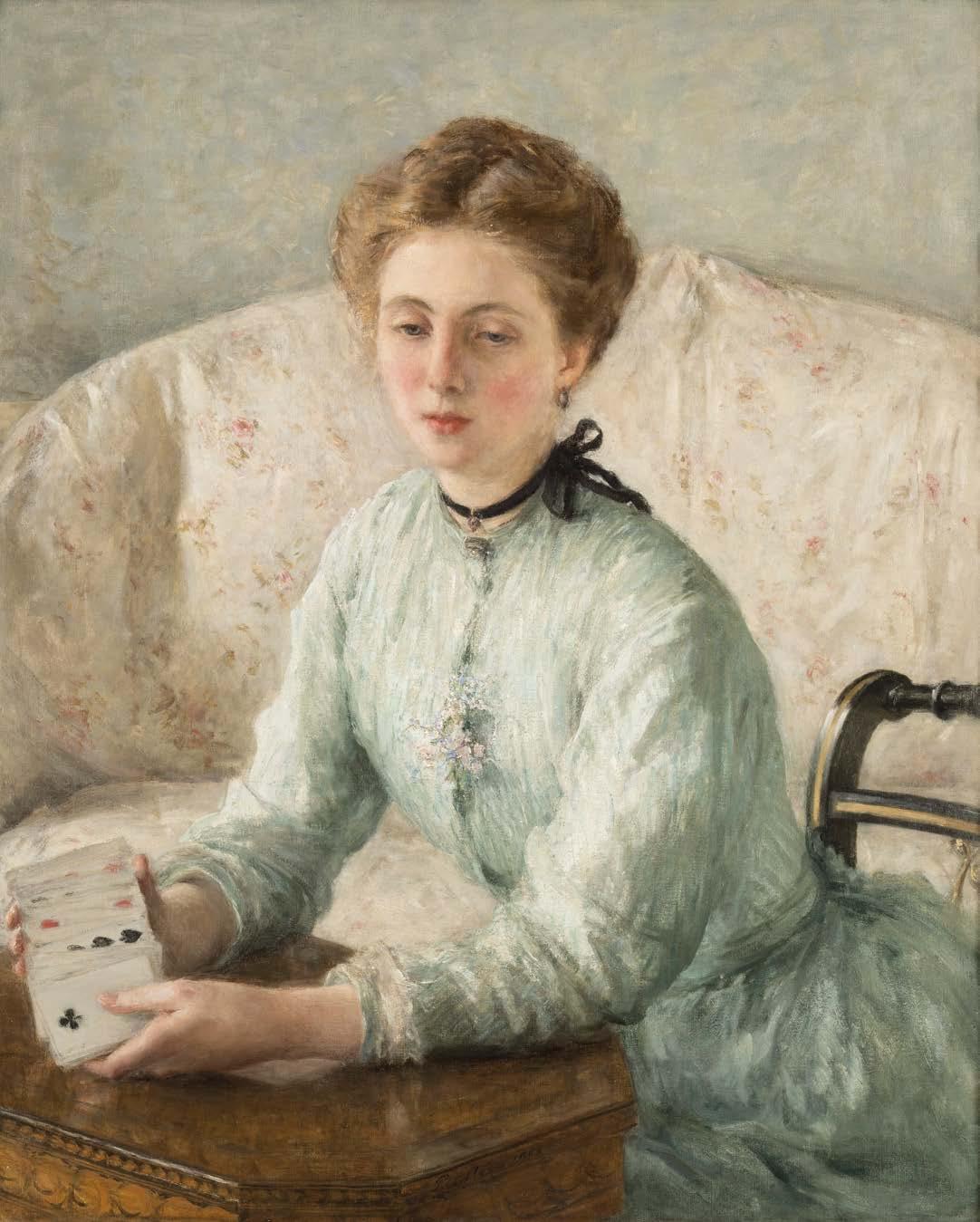
Philip Wilson Steer, O.M. (1860-1942)
A Turn of Cards, 1903
Signed and dated lower centre ‘P. Steer 1903’ Oil on canvas
Unframed: 81 x 66 cm.; 32 x 26 in.
Framed: 100 x 87.5 cm.; 39¼ x 34½ in.
PROVENANCE
Edgar Hesselein, acquired from the New English Art Club, 1903
Sotheby’s, 20 June 1962, lot 36 (sale of the collection of the late Mrs. Emily Hesselein of New York City)
The Fine Art Society, London
R.F. Glazebrook, Brynbella
Sotheby’s, London, 2 June 1994, lot 361
Sotheby’s, London, 27 November 1996, lot 18 Private Collection (purchased from the above)
EXHIBITIONS
New English Art Club, 1903
Bradford, Cartwright Hall, 1904
Brooklyn Institute of Arts and Sciences, Loan Exhibition, 1922
LITERATURE
D.S. MacColl, The Life, Work and Setting of Philip Wilson Steer, Faber & Faber, London, 1946, p. 205.
Bruce Laughton, Philip Wilson Steer, Clarendon Press, Oxford, 1971, pp. 75-76, 142, no. 315, (illustrated pl. 135)
In the forge of British Impressionism’s development, Philip Wilson Steer’s A Turn of the Cards is an exquisite example that goes beyond simple portraiture. Painted in 1903, the artist’s progression from radical experimentalist to a skilled interpreter of domestic psychology demonstrates how Continental techniques could be adapted through British sensibilities.
The composition centres on a young woman, likely Theodora or Helen Bennett, a frequent subject during this period, absorbed in deep thought as she shuffles playing cards delicately held in her hands. This depiction of the sitter’s introspection adds a layer of psychological depth that is both captivating and thought-provoking. The cards themselves serve as narrative focal points, drawing attention to hesitant hands that suggest both chance and deliberation, a metaphor for life’s uncertainties that elevates this domestic scene beyond mere documentation.
Steer positions his restrained subject within a floral-upholstered armchair, its pale pink and white chintz creating luminous contrast against her seagreen dress, demonstrative of Steer’s refined colourist sensibilities. The garment’s lustrous surface, created through distinctive broken brushstrokes, shows the artist’s ongoing adherence to Impressionist techniques while revealing greater sophistication in capturing the interaction of light with fabric.
Compositionally, Steer employs geometric precision that is concealed by an apparent spontaneity. The echoing colour of the sitter’s hair, the table and chair, and the sitter’s triangular silhouette anchors the pictorial space, whilst the dark wooden table introduces horizontal stability.
The work occupies a unique position between Victorian academic tradition and modernist innovation. Unlike contemporaries who embraced either conservative approaches or radical Continental developments, Steer forged a distinctive synthesis that honoured both influences while maintaining an individual voice. His ability to capture psychological interiority through material observation aligns him with Vermeer’s legacy, whilst his Impressionist technique places him within contemporary discourse. Tradition and innovation singularly blend in Steer’s work. Through deft technique combined with deep psychological insight, he crafted not just a portrait but a reflection on solitude, contemplation, and the quiet moments that shape the human experience.
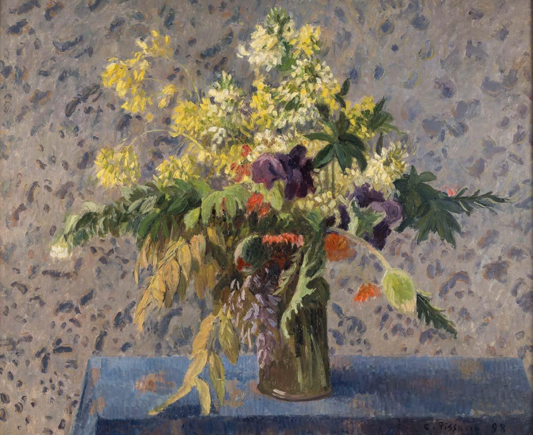
Camille Pissarro (1830-1903)
Bouquet de Fleurs; Iris, Coquelicots et Fleurs de Choux, 1898
11. In the autumn of 1898, as the nineteenth century approached its conclusion, Camille Pissarro sought refuge in the tranquillity of his studio to capture something profoundly personal yet universally resonant. His Bouquet de Fleurs, Iris, Coquelicots, et Fleurs de Choux emerges not merely as a still life, but as a meditation on transience, domesticity, and the revolutionary potential inherent in the seemingly mundane. The subject represents a masterful synthesis of Impressionist technique and PostImpressionist sensibility, revealing Pissarro at his most contemplative and technically accomplished. The composition showcases an asymmetrical arrangement that defies classical conventions while maintaining perfect visual balance. A forest-green vessel anchors the arrangement against an ambiguous, mottled grey-blue ground. Golden mimosa cascade in delicate sprays, juxtaposed with deep purple iris petals. Scarlet poppies punctuate the arrangement, while ornamental cabbage leaves introduce an element of domesticity.
Signed and dated lower right ‘C. Pissarro 98’ Oil on canvas
Unframed: 60.5 x 73.5 cm.; 23¾ x 287/8 in.
Framed: 83 x 96 cm.; 32½ x 37¾ in.
PROVENANCE
Mme. Julie Pissarro (the artist’s widow), Paris
M. Knoedler & Co., New York
Henry Ittelson, Jr., New York
Edward Speelman, London, 1959
Mrs. Neville Blond, O.B.E.
Christie’s, London, 23 June 1986, lot 5
Private Collection (purchased from the above)
EXHIBITIONS
Paris, Galerie Nunes et Fiquet, Collection de Madame Yve. Pissarro, May-June 1921, no. 35
Paris, Galerie Charpentier, Les Fleurs et les Fruits depuis le Romanticism, 1942-43, no. 123
Paris, Galerie Charpentier, Tableaux de la Vie silencieuse, 1946, no. 52
New York, Wildenstein & Co., Magic of Flower Painting, April-May 1954, no. 51
London, Marlborough Fine Art, Pissarro in England (a loan exhibition in aid of The Save the Children Fund), June-July 1968, no. 20 (illustrated p. 50)
LITERATURE
L.R. Pissarro and L. Venturi, Camille Pissarro, son art, son oeuvre, Paris, 1938, p. 229, no. 1063 (illustrated)
Joachim Pissarro, Camille Pissarro, London, Pavillion Books Ltd., 1993, p. 271, no. 319 (illustrated)
Pissarro’s broken colour technique, a significant aspect of his artistic evolution, is evident throughout the vibrational grey-blue tonalities of the background. This technique, which involves applying small strokes of pure colour to a canvas, creates atmospheric unity while preserving the visibility of individual brushstrokes. It demonstrates his transition from a pure plein-air methodology to a synthetic vision that incorporates Neo-Impressionist colour theory.
The still life occupies territory between Cézanne’s geometric investigations and Van Gogh’s psychological intensity. Unlike contemporaries who infused similar subjects with symbolic meaning, Pissarro pursues pure optical sensation, asserting presence through visual truth rather than metaphorical content. The work’s sophisticated colour relationships and spatial complexities anticipate Fauvist developments while remaining anchored in Impressionist observational honesty.
The enduring presence of this painting lies in its ability to transform the most ordinary of subjects –cut flowers in a domestic setting – into a profound statement about the nature of seeing and the possibilities of paint. It offers a vision of art’s capacity to find significance in the seemingly insignificant, beauty in the commonplace, and permanence in the transient.
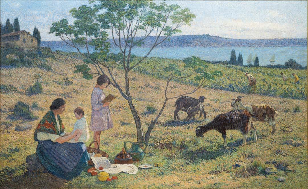
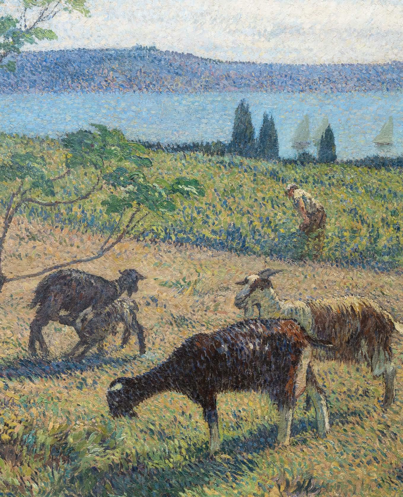
Henri Martin (1860-1943)
Bucolique, c. 1932
Signed lower right ‘Henri Martin’ Oil on canvas
Unframed: 199 x 323 cm.; 78¼ x 127 in.
Framed: 218 x 340 cm.; 85¾ x 134 in.
PROVENANCE
Commissioned by the Chambre de Commerce et d’Industrie, Béziers, in 1932
Christie’s, London, 25 June 2008, lot 497 Private Collection (purchased from the above)
A native of Toulouse, Henri Martin’s roots in the South of France gave him an innate love of sundrenched landscapes and a profound sense of man’s need to coexist harmoniously with nature. His paintings evoke the southern sun and have an other-worldly, dream-like atmosphere, often celebrating mankind embroiled in and at one with his surroundings.
“My preoccupation with rendering atmospheric effects increased...after three months in the country, face to face with nature. Trying to capture its diverse effects, I was compelled to paint it differently. The natural light, now brilliant, then diffuse, which softened the contours of figures and landscape, powerfully obliged me to translate it any way I could, but other than using a loaded brush—through pointillé and the breaking up of tone.”
Martin studied at the Ecole des Beaux-Arts and received a grant enabling him to go to Paris to continue his studies. In 1885 he travelled to Italy where he observed the Italian Renaissance masters which had an intense effect on his work. The work of Giotto, in particular, with his tranquil, light-filled landscapes, helped Martin to distance himself from his academic training and develop his own style, with affinities to Symbolism. By the 1890s, he had moved towards a new way of painting clearly influenced by the Impressionists and the Neo-Impressionist pointillist technique. His fame during his lifetime came from the numerous murals he painted, which suggest classical components clearly impacted by the work of Puvis de Chavannes. His murals are visible all over France and in Paris, in the Hôtel de Ville, the Sorbonne, the Palais Royal and the Conseil d’Etat Bucolique is a masterpiece of tranquillity, harmony and balance in atmosphere, colour and structure. Martin felt at his most comfortable in a rural setting, producing his best works while he lived at his country estate, Marquayrol, which he purchased in 1900, overlooking La Bastide du Vert near Cahors. The Musée d’Orsay, which houses several of Martin’s most important canvases including his introspective self-portrait from around 1912 and the monumental Sérénité (1899), acknowledges the artist’s refined method of applying ‘the division of colours’ to ‘capture the vibrating light of the south of France.’ The painting’s title, Bucolique, places the work within an artistic tradition extending back to classical antiquity. Virgil’s pastoral poems, the ‘Eclogues’, established the bucolic mode as a means of examining humanity’s relationship with nature through idealised rural imagery. Martin’s canvas thus engages in a dialogue spanning centuries of artistic expression, from Poussin’s classical landscapes to Millet’s peasant scenes, from Corot’s silvery pastoral scenes to the sunlit canvases of the Impressionists. Yet, where many pastoral works retreat into nostalgic fantasy, Martin’s vision remains grounded in the authentic rhythms of Mediterranean agricultural life.
Henri Martin quoted in Petra ten-Doesschate Chu, Eden Close at Hand: The Paintings of Henri Martin, Beverly Hills, 2005, p. 26
Bucolique is one of six landscapes that Martin was commissioned to paint for the Chamber of Commerce and Industry of Béziers, in Hérault, the premier wine-growing department of the Languedoc region in the South of France. The landscapes celebrate the pastoral way of life and wine-growing industry which existed in Hérault since the 7th century BCE. The founding of the Chamber of Commerce and Industry of Béziers in 1902 was necessitated by the burgeoning importance of the local wine industry. Its relocation into the beautiful Renaissancefacaded Hôtel du Lac led to Martin’s commission for the Salle des Délibérations
In four vertical canvases, he depicted the key seasonal occupations of wine growing: ‘déchaussage des souches’ by labourers under the mild early spring sun in Le cultivateur ; the sulphating of the vines traditionally carried out between Easter and Pentecost in Le sulfatage ; September grape-picking in La cueillette ; and Autumn harvesting in Les vendanges Idylle and Bucolique, two horizontal paintings, accompanied the four canvases. In the series, Martin ennobles the workers, celebrates the timelessness of their labour and lends poetry to the ancient symbiosis of man and agriculture through harmonious compositions and a brilliant palette. The warmth of the Mediterranean sun radiates from the canvases, which are suffused with the golden light of the late summer, and the vegetation and soil of the Midi are evoked in vivid green and orange tones on a lusciously textured, impasto surface.
In Bucolique, Martin used small brushstrokes of colour interspersed with a lighter tone to convey the idea of a sun-filled scene. The outline of the tree and figures indicate a strong sunlight as do the colourfilled shadows. The painting is strangely reminiscent of Pre-Raphaelite landscapes in its bright colours and every stroke of paint seems to represent a blade of grass, a leaf or light dappling on the water. The group of mother and two children connects with the group of goats to the right. As the nanny goat feeds her kid, so the mother and children are provided with the produce of the land laid at their feet. Three men work in the middle distance –mimicked in number by the trio of conifers and the three sailing boats behind them. Man works in harmony with nature and reaps the rewards. All is harmony, all is bucolic in this pastoral idyll.
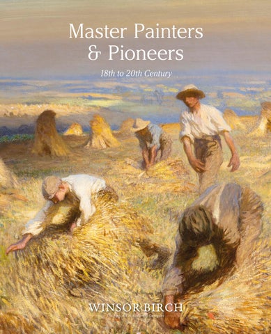
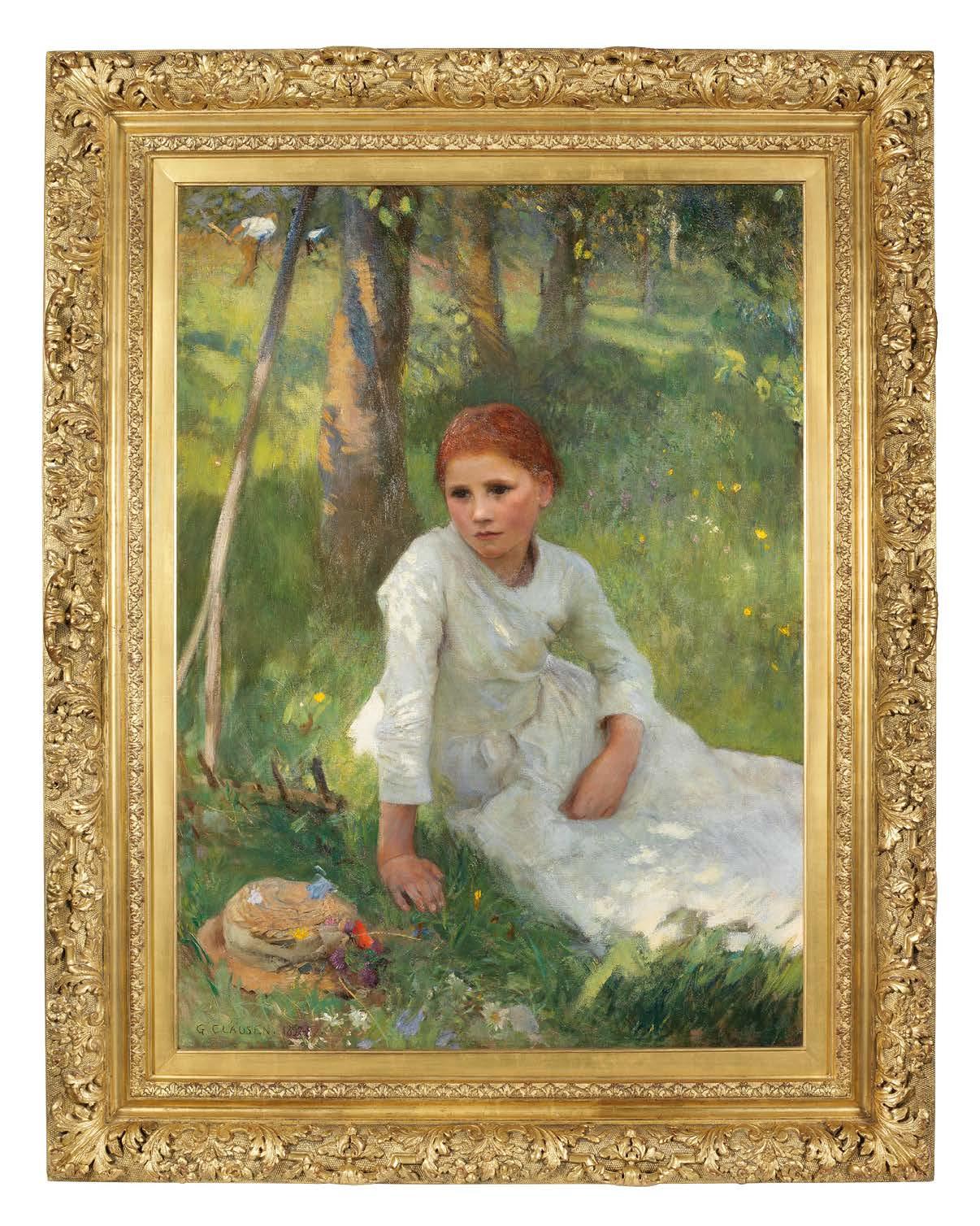
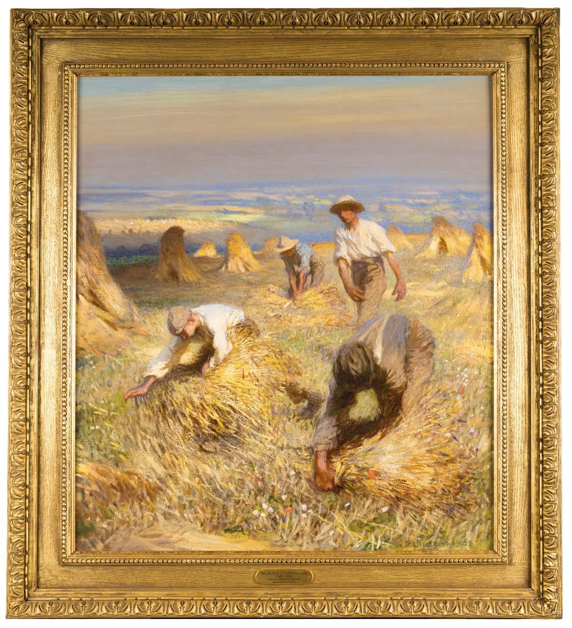
Sir George Clausen, R.A., R.W.S. (1852-1944)
Noon in the Hayfield, 1897-98
Signed and dated lower left ‘George Clausen. 1897-8’; signed and titled on the reverse Oil on canvas
Unframed: 116.5 x 84 cm.; 46 x 33 in.
Framed: 150 x 118 cm.; 59 x 46½ in.
PROVENANCE
The Artist, to Isaac Smith Esq, JP, Field House, Dausy Hill, Bradford
His sale, Christie’s, London 15 May 1911, lot 43 (90 gns)
Private Collection, by descent
Sotheby’s, New York, 28 February 1990, lot 122
Private Collection, Germany
Sotheby’s, London, 23 May 2013, lot 27 Richard Green Gallery, London
Private Collection
Bonhams, London, 27 September, 2017, lot 114
Private Collection
LITERATURE
Kenneth McConkey, George Clausen and the Picture of English Rural Life, Edinburgh, 2012, pp. 122-3 (illustrated in colour)
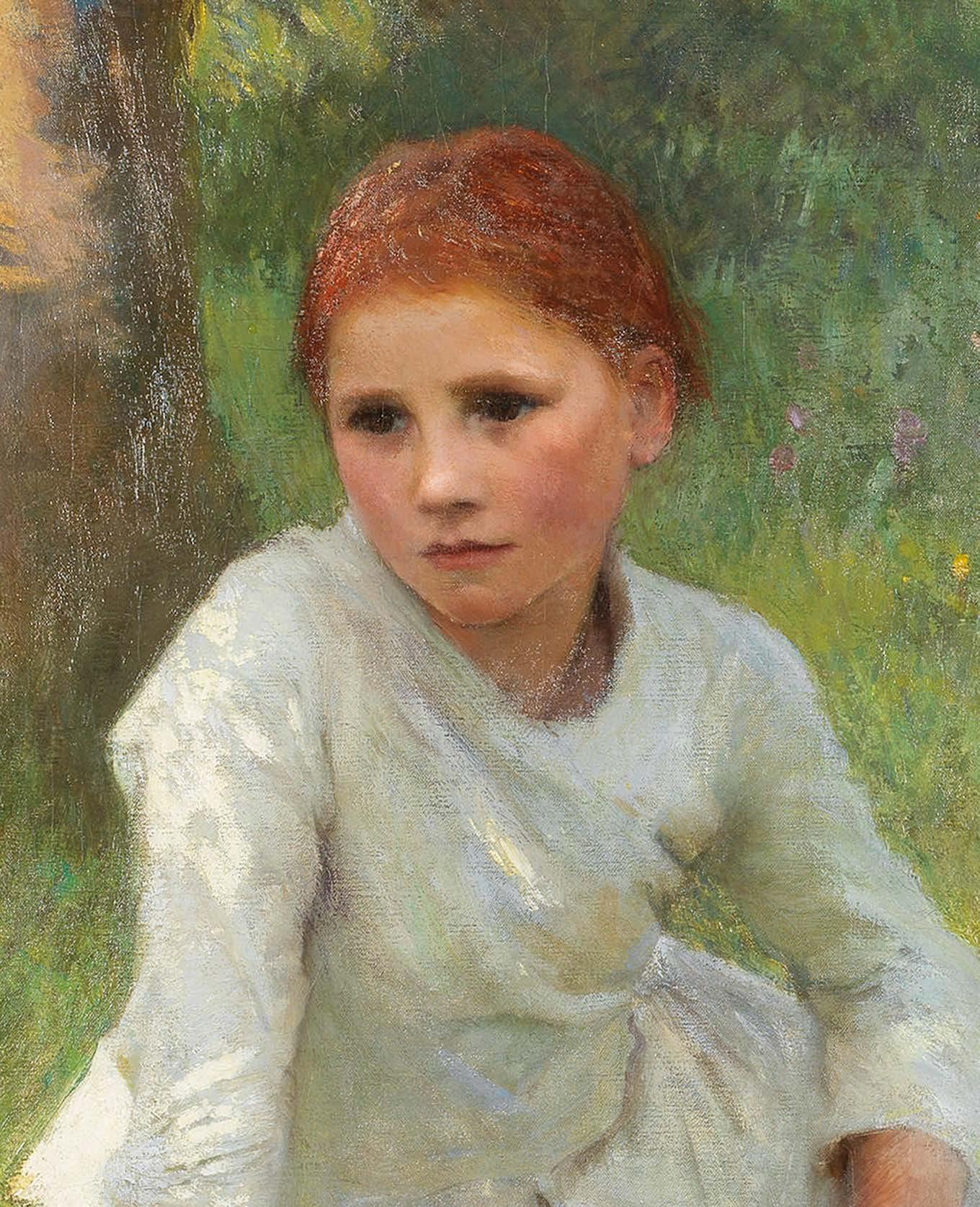
In 1897 Clausen gave a small oil sketch to his friend, the sculptor, William Goscombe John, Girl in a Field, (National Museum of Wales, Cardiff). Painted around seven years earlier, the sketch was part of the elaborate planning procedure for a major work abandoned at the time, but now being revisited. The circumstances surrounding this act of generosity remain obscure, but the little picture itself is not insignificant. It shows a girl with red hair, sitting under a tree. The full sunlight strikes her white dress. Swift, slashing strokes of paint indicate that this figure study was blocked in very quickly – but then, the artist knew exactly what he was doing as he worked towards the realization of Noon in the Hayfield , the major canvas he had temporarily put aside back in 1891.
Some of Clausen’s earliest preoccupations are reflected in the work. These stretch back to 1880 when, in his late twenties, he stood in front of BastienLepage’s Les Foins, (Musée d’Orsay, Paris), the great picture of resting haymakers, then on show at the Grosvenor Gallery. It, as much as anything, prompted his move to the country the following year, and by 1883 his own version of the subject, Day Dreams, (private collection) was exhibited at the Institute for Painters in Oil Colours in London. Here, two women, young and old, are resting in the shade, while nearby, a young mower pauses and realizes that it is time to lay down his rake. By 1886, when he painted A Midsummer Day (private collection), Clausen had witnessed such moments of reverie on many occasions.
By 1890, sketchbook studies in pencil, at least one pastel and the Goscombe John oil, indicate that he was reworking the same pose using a younger model, Rose Grimsdale. But what did this mean? Was the content – a haymaker’s rest – a given, and technical advance the true priority? Was this innocent idleness, a moment’s respite from relentless toil, or an experiment in new techniques? As Clausen returned to apply the finishing touches to Noon in the Hayfield, in 1897, the work that had been in gestation for over a decade, would all become clear?
Clausen left London in 1881 at a time of great unrest in the countryside when labouring families, like that of his model, had been drifting to the burgeoning industrial centres for several generations. A crisis was fast approaching. The country was no longer selfsustaining in food production. For many landowners, the situation was exacerbated by tighter regulation that affected the employment of children at key points
in the farmer’s year. While the Education Act of 1880 demanded compulsory school attendance for all children up to the age of ten, it was not unusual for classrooms to be empty during the month of June when ‘haysel’ – the hay harvest – occurred. This required boys and girls to follow the mowers, their job simply to rake the fallen grass into ‘haywakes’ to aid the drying process This was labour-intensive. On small holdings, where fruit trees were often planted at the edge of a meadow, the use of new-fangled machinery was impossible.
Around 1890 Clausen’s sketchbooks record men scything, rick-building and tending livestock. Implied narratives of youth and age or secret trysts are excluded as his young fieldworker is placed at the edge of the meadow. Sketchbook studies of Rose are drawn and redrawn in reverse. And while we can vouch for the accuracy of Clausen’s observation, by the late nineties it had become clear that he and his French and British contemporaries were not so much recording an occupation as bolstering a threatened way of life. It was this powerful sense of a stable society under threat that kept the image of the country girl in focus as plein air painting moved ever closer to Impressionism. The planning for what would become Noon in the Hayfield had started in earnest and the resting fieldworker was redrawn in outline on a larger scale with trees and haywakes in the background, almost as a cartoon (Study for ‘Noon in the Hayfield’, c. 1890, Royal Academy of Arts, London).
‘...he [Clausen] has seldom painted anything more finely than these unsophisticated young country girls with their healthy pink faces glowing through their own shade. In this sort of natural study the best energies of some of our strongest young painters are now engaged.’
‘The
By 1891 an exhibition-piece watercolour was nearing completion, when Clausen’s circumstances changed. Early in the year it became apparent that his lease on Grove House, Cookham Dean was coming to an end and he would have to move. With a growing reputation, he also required a larger studio, and the stimulus of a new working environment. The early summer of 1891 was spent
house-hunting in the northern reaches of Essex until he hit upon ‘Bishops’ at the village of Widdington, where he moved just before harvest time. At the last minute, the watercolour, Idleness, (private collection) was submitted, ex-catalogue, to the Royal Society of Painters in Watercolours as he set to work exploring the fields and farms of a new landscape. The large painting, later to be known as Noon in the Hayfield, was put on hold.
New subjects – harvesting, ploughing and barn interiors followed – but the contact with his Cookham Dean models, Rose Grimsdale and the Baldwin sisters, was severed. It was only when he started to look again at head studies of Rose in 1896 and had found new girls and boys in Widdington who were willing to pose for him, that the thought of finally finishing the picture returned. He looked again at all the planning he had done and made some changes. The hat, which in Idleness lies behind the girl, was brought into the foreground. The windfalls that lie on the grass in the watercolour, suggesting an orchard in autumn, are removed, and the rake, essential in midsummer mowing is added, as in the outline drawing. Having begun to modify the mechanical ‘square’ brushwork of his early naturalist pictures, Clausen was thinking more about colour. Sundry references in letters indicate that he had been looking critically at the work of Manet, Monet and Degas. The high colour key derived from pastel, reveals the degree to which new attitudes were informing Clausen’s technique in all media. Questions of métier, of how to represent, overtake those connected with what to represent. His previous reference to Rose at this point was the halflength, Brown Eyes, (Tate Britain), held over from Cookham days to be shown in 1892 and when Noon in the Hayfield was finally resumed five years later, Clausen had been elected Associate of the Royal Academy by a popular vote.
Clausen’s long gestation of the resting haymaker had, for all its suave naturalism, resulted in one of his most rigorously taut and deeply pondered compositions. Rest, reverie and the sunlit glow of field and wild flowers combine to produce one of the most satisfying visions of the English countryside at the end of the nineteenth century.
Kenneth McConkey
Cosmo Monkhouse,
Institute of Painters in Oil Colours’, The Academy, 12 December 1885, p.399
Henri Martin (1860-1943)
14.
Les Faucheurs, c. 1903
Oil on canvas
Unframed: 66 x 150.5 cm.; 26 x 59¼ in.
Framed: 91 x 175 cm.; 35¾ x 69 in.
PROVENANCE
Armand Alexis Larroque Collection, Toulouse L. Mascart Collection, Paris, by 1910
Christie’s, London, 24 June 1997, lot 146 Private Collection
EXHIBITIONS
Paris, Salon, 1906
Paris, Galerie Georges Petit, June-July 1910, no. 171
Paris, Petit Palais, Retrospective de Henri Martin, 1935, no. 16
“Henri Martin was without contest an Impressionist and one who had the deepest sensitivity, certainly equal to that of Monet, whom he most admired. Their interpretation of nature is certainly owing to their utmost sensitivity and not through research of a technical process, a poetical evocation hued by a thousand colours which can undoubtedly be called a work of art.”
Jac Martin-Ferrières, Henri Martin, Paris, 1967, p. 35
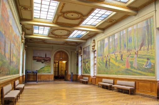
Photo: Interior of the Capitole de Toulouse showing the full-scale L’été (or Les Faucheurs) in context.
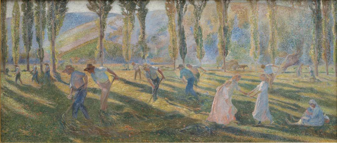
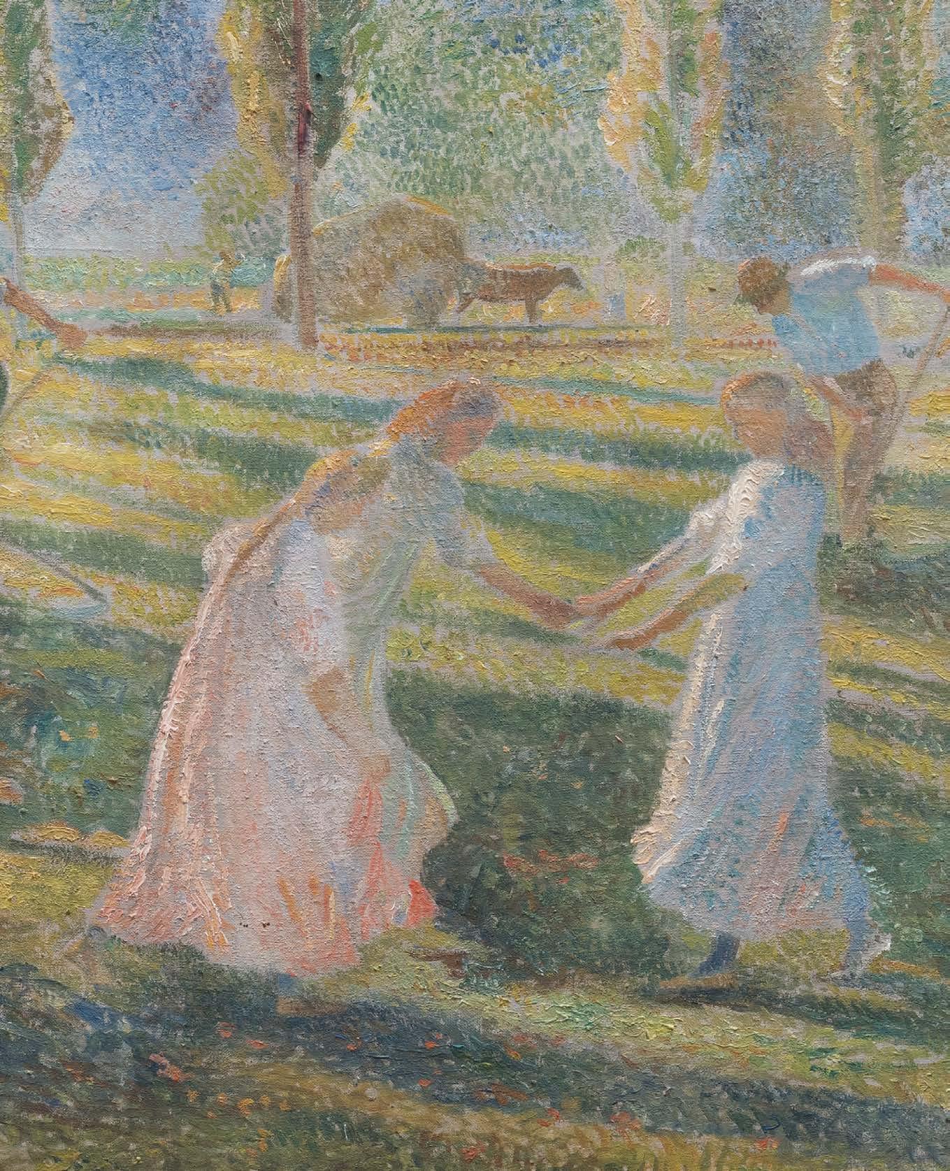
Painted circa 1903, Les Faucheurs is an idyllic vision of rural harmony bathed in the light of southern France. Themes of harvest labour – portrayed as both documentary record and poetic meditation –comprise some of Martin’s most celebrated works, many the result of commissions housed in public buildings throughout France.
The present example is one such, being a smaller version of Martin’s expansive mural cycle housed in the Capitole de Toulouse, comprising three monumental canvases entitled ‘Le printemps’, ‘L’été and ‘L’Automne.’ L’été – also known at Les faucheurs (mowers)– is the central panel. The figures are arranged with expert skill, Martin positioning the haymakers in a rhythmic sequence that draws the viewer’s eye from the shadowed foreground through the sunlit middle ground and the distinctive poplar trees, to the distant purple hills beyond. This thoughtful choreography turns manual labour into a pastoral ballet, where each movement adds to a larger visual symphony. This is directly expressed in the three girls performing a dance to the right of the composition, and in contrast to the otherwise masculine activity.
Martin’s characteristic use of divisionist brushwork, applied with intuitive fluidity, allows colour variations to breathe across the canvas and evoke an atmosphere of shimmering light. His palette combines warm ochres and golden yellows with cool violets and blues, which energises the whole composition and evocatively suggests the late afternoon sunshine of southern France.
Martin, who studied under Jean-Paul Laurens at the École des Beaux-Arts, belongs to a generation of artists who aimed to bridge the gap between academic tradition and avant-garde experimentation. His interest in the harvesting theme was prevalent throughout his career. Indeed, sketches from 1901 reveal his early ideas for the present composition.
Exhibited at the prestigious Paris Salon in 1906, it was also included in Martin’s retrospective at the Petit Palais in 1935, where it was positioned as a key example of the artist’s mature style and his influence on the development of Post-Impressionist painting.
Sir George Clausen, R.A., R.W.S. (1852-1944)
Harvest, Tying the Sheaves, 1902
Signed and dated lower right ‘G.CLAUSEN 1902’ Oil on canvas
Unframed: 89 x 63.5 cm.; 35 x 25 in.
Framed: 103.5 x 94.5 cm.; 40¾ x 37 in.
PROVENANCE
Agnew’s, London, December 1902
C. J. Galloway, 1905
Sharpley Bainbridge, Hatfield House, Lincoln, by 1910
His sale, Christie’s, London, 10 February 1922, lot 110 (310 gns. to Thomson)
David Croal Thomson, Barbizon House, London; Private Collection, 1927, by descent
Christie’s, London, 30 November 2000, lot 26 Private Collection (purchased from the above)
EXHIBITIONS
Manchester, City Art Gallery, Exhibition of Modern Paintings, Drawings and Prints, 1910, no. 88 Pennsylvania, Pittsburgh, Carnegie Institute, no. 97 (not traced)
Ottawa, National Gallery of Canada, Exhibition of Contemporary British Paintings, 1915, no. 23
LITERATURE
The Barbizon House Collection, The Studio, February 1923, p. 106 (illustrated as the frontispiece)
The Barbizon House Record, 1927, no. 30 (illustrated) Christopher Wood, Paradise Lost, Portraits of English Country Life and Landscape 1850-1914, London, 1988, p. 89, pl. 77
Kenneth McConkey, George Clausen and the Picture of English Rural Life, 2012, Atelier Books, Edinburgh, pp.129-130 (illustrated)
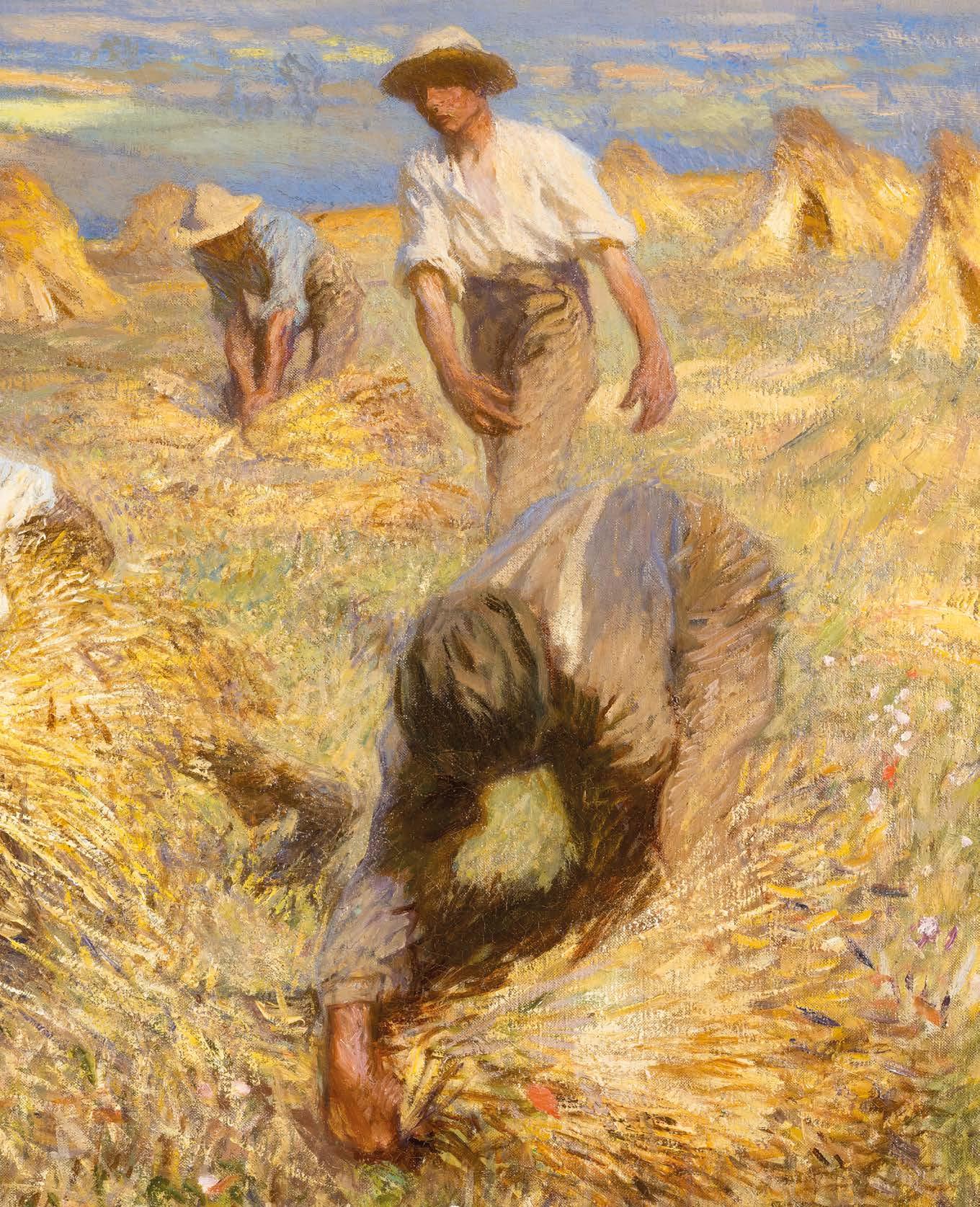
15. During the final quarter of the nineteenth century, conditions in the English countryside preoccupied writers and artists. With imperial expansion, the rapid growth of cities and the ready availability of cheap foodstuffs from North America, agricultural production was in decline. Britain, which led the world in industrial mechanization, was slow to modernize its farming processes. Alongside the continued reliance upon labour intensive methods, an impressive rearguard action was mounted by Edwardian intellectuals who sought to justify healthy outdoor work, in contrast to that of the factory. The countryside embodied healthiness and the city, degeneracy. George Clausen was central to this cultural movement, and within his work, the groups of pictures of field work, rick-building and grain-sifting, painted around 1900, are its pictorial archetypes. The field gang pictures, principally, Sons of the Soil, (private collection, R.A. 1901, no. 378), the present work of 1902, and Harvest: In the Bean Field (1904, Durban Art Gallery), show different stages of crop production, from seed-time through to harvest. The cool spring palette used for the painting of a group of men hoeing in Sons of the Soil gives way to the rich golden glow of the present work. The fact that the laboureres are few in number reminds us that the period of large itinerant gangs had passed, and that by 1900, harvesting depended upon smaller groups based upon old tithed families. Boys, men and old men would work together. Here Clausen accentuates the rhythmic, co-ordinated activity of the group by emphasising the movement of hands and forearms. There are no tools for this task. Two foreground labourers, one dramatically foreshortened, are bent over their work, gathering the final sheaves at the edge of the field, here indicated by a patch of rough soil and some wild meadow flowers at the bottom edge of the canvas. Once collected and tied, the sheaves are stacked upright in groups of five or six, in a stook. Dots of colour in the middle distance, indicate that this same activity is going on in a far off field, while the striding harvester on the right, with his swinging arms and massive hands, provides an almost symbolic presence in what must be considered one of the most expressive of Clausen’s works.
Clausen had tackled this subject before, around 1890, in his sub-Bastien-Lepage manner. However, the two most important precedents for the present work were the much criticised Harvest (untraced; R.A. 1895,
no. 91) and Setting up Sheaves (untraced, formerly Lady Plender; R.A. 1900, no. 4). The second of these won considerable favour, being praised by The Magazine of Art for its ‘brilliancy of illumination and daintiness of aerial colour’. Taking a close-up view of two labourers, gathering and setting up sheaves, Clausen delights in the fanning strokes of pigment used for the corn stooks, which imitate pastel, a preferred medium of the period. This canvas formed the basis of Harvest, Tying the Sheaves a work, so successful in itself, that the painter produced a later, simpler variant of the composition, Binding Sheaves (private collection). Drawings related to this sequence of compositions are retained in the Royal Academy (particularly Sketchbook 21, 1902). As is clear from the contemporary canvases of Léon Lhermitte, Julien Dupré and others, these simple practices were also consistent with French agriculture of the period, although in France, men and women worked together in tying the sheaves. Where Lhermitte habitually deployed a landscape format for such a scene, showing a line of workers cutting into the corn, Clausen accentuates the visual drama by allowing more air around his figures, in an upright presentation. The landscape itself is more than simply a backdrop against which his figures perform: they progress through it, defining their spatial relationships as they move. The painter was preoccupied with movement, as his sketchbooks of the period indicate. He had first experimented with this format in Summer in the Fields (sold Christie’s, New York, 22 October 1997, lot 142), a picture of two girls resting on an open hillside, overlooking an expanse of fields near the painter’s home at Widdington in Essex. As with the Impressionists, Clausen was preoccupied with the concept of an ‘envelope’ of coherent atmosphere in which figures, foreground, middle distance and background are all seen together and partake of the same palette. This is especially clear in the present work where, in a palette reminiscent of Van Gogh’s gleaners and harvesters, after Millet, the brilliant blues, mauves, ochres and whites reverberate throughout the canvas.
The picture was dispatched to Thomas Agnew in December 1902, and presumably passed immediately to his client, Charles Galloway, a Cheshire industrialist who owned a number of fine rustic pictures, including Henry La Thangue’s An Autumn Morning (1897, private collection). By 1910, when the picture was shown in Manchester, it had passed to Clausen’s most important early patron, the Lincoln retailer, Sharpley Bainbridge, who owned early works like Labourers after Dinner (1884, private collection) and The Mowers (1891, Usher Gallery, Lincoln). In 1927, Barbizon House Record, referring to Harvest, Tying the Sheaves noted that,
‘the less scientific, less logical, more wayward, more charming English impressionists, Wilson Steer and Clausen, made Impressionism affectionate, with a sort of English wildflower poetry.’
James Bones, Barbizon House Record
Kenneth McConkey
Henri Martin (1860-1943)
La Moisson, c. 1918-22
Signed lower left ‘Henri Martin’ Oil on paper laid down on canvas
Unframed: 60 x 117 cm.; 24½ x 47 in.
Framed: 89 x 143 cm.; 35 x 56½ in.
PROVENANCE
Hammer Galleries, New York
Private Collection, acquired from the above circa 1970s
Sotheby’s, New York, 23 May 2008, lot 192 Private Collection
Henri Martin’s La Moisson offers a panoramic vision across a sunlit wheat field where peasant workers bend to their ancient task of harvesting grain. Martin’s bold, broken brushwork, recalling that of Van Gogh, sweeps across the canvas like currents of light and shadow. These energetic marks do more than just describe the surface; they embody the very essence of movement, growth, and seasonal change that characterises agricultural life.
Martin constructs his scene with expert attention to the relationship between figure and environment. The harvesters, depicted with deliberate simplification, appear as essential parts of the landscape rather than just its inhabitants. Their bent postures mirror the
curved lines of the wheat sheaves, creating a visual harmony of repeated forms that suggest the seamless integration of human activity with natural cycles. Two horses, at first almost indistinguishable in the centre, wait patiently while the hay is collected. Unlike the more radical departures of Paul Cézanne or Paul Gauguin, Martin’s evolution remained rooted in observational painting, albeit transformed by the lessons of colour theory and expressive brushwork learned from his avant-garde contemporaries.
The work is a preparatory study for Martin’s grand decorative cycle housed at the Conseil d’État in the Palais Royal completed in 1920 (see Le Port de Marseille, no. 20, for another related example). The commission called for four monumental canvases illustrating the labours of France: Agriculture, Commerce, Industry, and Intellectual work. Martin’s fame during his lifetime came from these successful public commissions, which also included the Hôtel de Ville in Paris, the Sorbonne and the Palais Royal .
On this smaller although by no means inconsequential scale, the painting’s expressive qualities are more immediately felt, particularly through the sweeping brushwork. It is an absorbing pastoral idyll which demonstrates why Martin was regularly sought to carry out some of the nation’s most significant public commissions.
Photo: Interior of the Conseil d’Etat, Paris showing the full-scale La Moisson in context.
Henri Martin (1860-1943)
La Conversation, 1912
Signed and dated lower right ‘1912/ Henri Martin’ Oil on canvas
Unframed: 54 x 96 cm.; 21¼ x 37¾ in.
Framed: 78 x 119 cm.; 30¾ x 46¾ in.
PROVENANCE
Phillips, London, 23 June 1986, lot 27 Private Collection (purchased from the above)
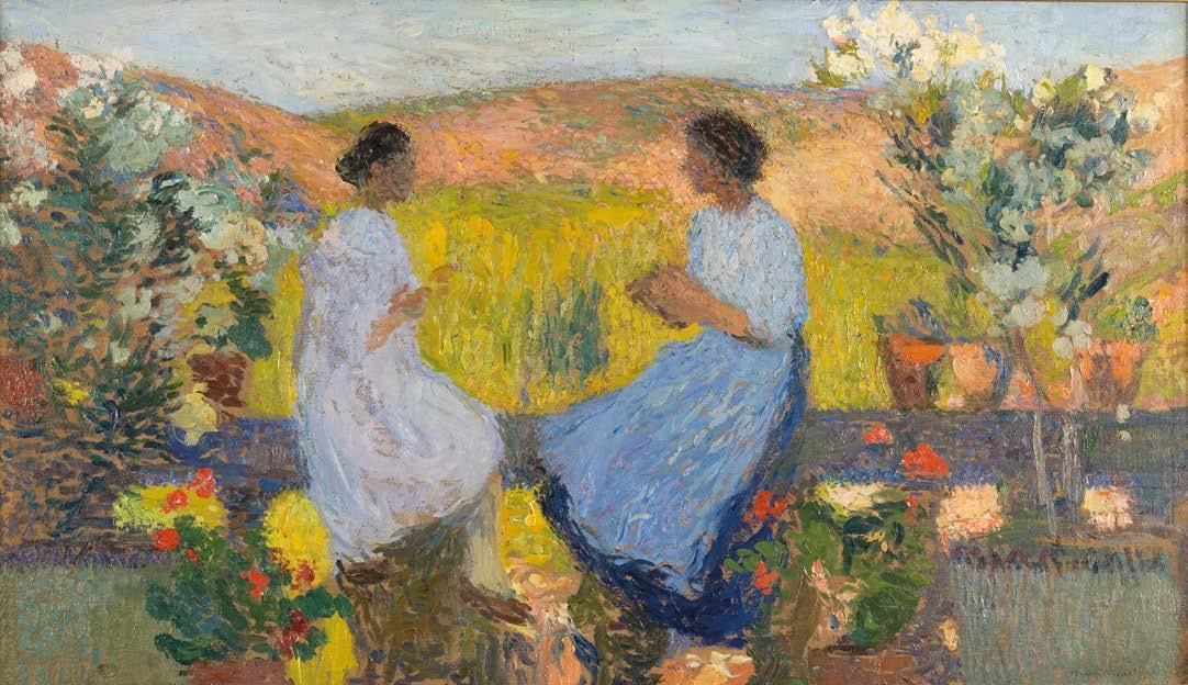
Seated on a terrace in the golden glow of late evening, two women pause in intimate discourse, their forms almost dissolving amongst the flowers and landscape unfolding behind them. The left figure, dressed in luminous whites with violet shadows, sits facing her companion clad in rich blue-violet garments, engaged in what seems to be needlework. The curved yellow-green space between them creates a kind of aureole, imbuing the work with a spiritual dynamic.
The location for the work is Martin’s countryside home Marquayrol in Labastide-du-Vert in the south of France. He purchased the estate in 1900, and his time there marked a decisive shift from his Symbolist roots to a personal form of Neo-Impressionism. Like Monet’s Giverny or Le Sidaner’s Gerberoy, it was a cultivated paradise: lush, ordered, and endlessly inspiring. He painted the grounds from countless angles over four decades, compare for example Le Terrasse de Marquayrol, 1920 (sold Sotheby’s, 25 June 2025, lot 141).
“By discovering Marquayrol, Henri Martin had found his equilibrium, his personal and artistic fulfilment.”
Claude Juskiewenski, Henri Martin 1860–1943, Paris, 1993, p. 103
The compositional structure evokes the tradition of enclosed gardens – ‘hortus conclusus’ – prevalent in Christian art from the Middle Ages onwards, often used to suggest purity and symbolic of a sanctuary for feminine contemplation. In this regard, the painting relates to the work of the Symbolists with whom Martin had associated, Pierre Puvis de Chavannes once declaring Martin his successor. Their work is infused with mystery and allegorical
undertones which go beyond simple observation. La Conversation functions simultaneously as a glimpse of observed life and as a reflection on the themes of communication, creativity, and the passage of time. The cyclical nature of seasonal change, implied by the flowering garden, mirrors the rhythmic continuity of human discourse and domestic labour.
Martin’s consistent and sophisticated use of colour and light is a defining feature of his career and emphatic in La Conversation . The warm Mediterranean sun permeates every element of the composition through a bold palette of complementary pigments, which he applies in a variety of gestural brushstrokes that suggest rather than describe form, and which animate the entire surface.
The painting holds a fascinating position between tradition and innovation. While Picasso and Braque were fragmenting reality through Cubist analysis, and the Fauves were exploring pure colour as emotional expression, Martin pursued a more contemplative path that honoured both classical composition and modern chromatic theory.
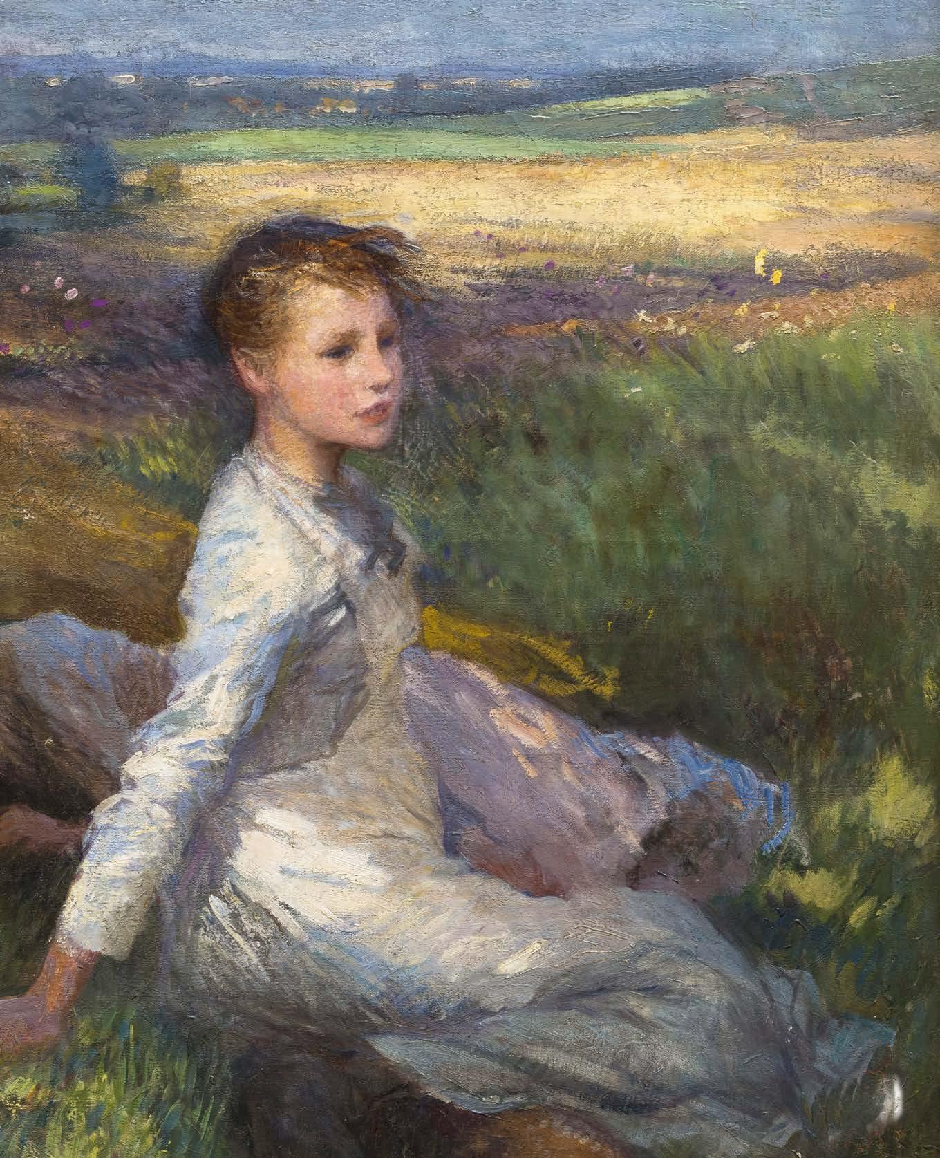
Sir George Clausen, R.A., R.W.S. (1852-1944)
Summer in the Fields, late 1890s
Oil on canvas
Unframed: 108 x 81.5 cm.; 42½ x 32 in.
Framed: 128 x 102 cm.; 50½ x 40 in.
PROVENANCE
The Artist’s Studio sale
Christie’s, London, 19 October, 1945, lot 136 Mitchell Galleries
Christie’s, London, 10 November 1950, lot 100 (10gns. to Salz)
Private Collection
Christie’s, London, 19 November 2004, lot 76 Private Collection (purchased from the above)
EXHIBITED
Munich, Secession (catalogue untraced)
Clausen’s Summer in the Fields captures a perfect moment: two girls resting from haymaking in golden English sunlight. One sits alert, gazing across distant fields; her companion sleeps peacefully beside her. This seemingly simple scene represents one of the outstanding achievements of British Impressionism.
Created in the late 1890s, the painting reveals Clausen transforming French influences into something unmistakably English. He drew the elevated perspective and figure arrangement from Jules Bastien-Lepage’s Les Foins (1878, Musée d’Orsay, Paris), which he had studied with great intensity. However, while the French masterpiece harboured undertones of rural poverty, Clausen’s vision feels uplifting, even romantic.
The composition draws us in through masterful spatial orchestration. Positioned high above the scene, we observe both intimate human drama and the expansive Essex countryside around Tilty and Clavering, near Clausen’s home. Our eyes naturally traverse from foreground figures across patchwork fields to the horizon, creating a seamless visual flow.
“Those who take a superficial view, such as is unfortunately inevitable in hurrying through these galleries, so rich as they are in fine works and masterpieces, may fancy that in Mr Clausen they see a pupil of the French masters, Millet and Jules Breton. But I would beg them to give a little longer study to this painter; they will find that they are in the presence of a really original artist –a rare bird even on the English side of the Channel.”
Clausen’s technical brilliance is evident throughout the canvas. The girl’s face is delicately modelled, capturing luminous flesh tones, while bold palette knife work in the sky creates clouds that appear to move. Small dabs of pure colour in the grass generate an optical shimmer, perfectly reflecting the essence of summer heat. Warm ochres and siennas contrast with cool violets and greens, while the seated girl’s face glows with an almost halo-like effect created by surrounding touches of mauve and emerald.
Summer in the Fields marks Clausen’s transition from literal naturalism to atmospheric experimentation. By painting specific English landscapes rather than generalised rural scenes, he helped to establish a tradition that celebrates native places and instils a sense of national pride. This was not just artistic innovation; it was cultural assertion. By the 1890s, British artists were tired of being seen as mere followers of French fashion. Clausen and his contemporaries were developing a distinctly British variant of modern painting that honoured international developments while celebrating native traditions and landscapes. Summer in the Fields is an exemplar and its exhibition at the Munich Secession is testament to the international recognition that British Impressionism had received by this period.
French critic, Philippe Gille in Le Figaro, 1889
Femme à la Corbeille, c. 1918-22
Signed lower right ‘Henri Martin’ Oil on canvas
Unframed: 97 x 57 cm.; 38¼ x 22½ in.
Framed: 121 x 81 cm.; 47½ x 32 in.
PROVENANCE
International Galleries, Chicago (acquired by 1965)
Christie’s, New York, 2 October 1990, lot 49 Private Collection, Japan (acquired 1994) Private Collection
Femme à la Corbeille is a character study for the central figure in Henri Martin’s Le Port de Marseille –a monumental painting he was commissioned to paint for the Conseil d’État in the Palais-Royal, commissioned in 1914 and finished in 1922. It formed part of a larger decorative scene on four grand allegories of Agriculture, Industry/Public Works, Commerce – represented by the activity of the port of Marseille – and Intellectual Labour. Another preparatory painting for that work is included in the current exhibition, no. 20, in which the present figure can be seen. There, she forms part of broader panoramic of activity along the quay; extracted in the present work, she stands as a striking figure in her own right.
The wicker basket held aloft on her head and filled with harvest produce, also serves to shield her eyes from the Mediterranean sunlight. The sensation of heat is evocatively conveyed through the bold colour palette. The figure’s garment pulses with vermilion and orange, applied through distinctive colour separation, achieving what Albert Dubois-Pillet described as ‘vibrating light’ through contrasting complementary hues. The ambiguous background is also a masterful example of Martin’s highly developed painting technique. Unlike traditional Pointillism, Martin uses broader, gestural brushstrokes worked in various directions that animate the composition. The overall effect is a captivating moment suspended in time that leaves an enduring impression.
Henri Martin (1860-1943)
Henri Martin (1860-1943)
Le Port de Marseille, c. 1918-22
Signed lower right ‘Henri Martin’ Oil on canvas
Unframed: 61 x 117 cm.; 24 x 46 in.
Framed: 86 x 139 cm.; 34 x 54¾ in.
PROVENANCE
Sotheby’s, New York, 6 October 1989, lot 16 Private Collection (purchased from the above)
This significant painting, named after the bustling port it portrays, belongs to a series that began with Martin’s 1903 ‘Labour’ decoration for the Caisse d’Épargne in Marseille and culminated with his monumental Commerce panel for the Conseil d’État in the Palais-Royal, commissioned in 1914 and finished in 1922. This large decorative scheme, titled ‘La France laborieuse se présentant devant le Conseil d’État’ (Working France Presenting Itself Before the Council of State), featured four grand allegories including Agriculture, Industry/Public Works, Commerce – represented by the activity of the port of Marseille – and Intellectual Labour. The state commission was among the most prestigious public decorative projects of the Third Republic. Another example from the commission within the present exhibition is Henri Martin’s La Moisson (no. 16), while a character study of the central woman in the present work can be seen in the preceding work, no. 19.
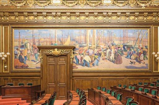
Martin presents a bustle of activity along the quay with dock workers engaged in purposeful activity. Vivid cerulean and ultramarine, oranges and ochres and strategic red accents infuse the painting with vibrant energy and the warmth of the Mediterranean sun. The upper half of the canvas is given to a vertical forest of masts beyond which the architecture of Marseille is glimpsed.
The dynamic composition and accomplished use of colour and animated brushwork creates an arresting image. He avoids the social critique often associated with contemporary Realist imagery, presenting labour as part of the harbour’s natural rhythm rather than a subject for political debate. This reflects the artist’s primary focus on visual rather than ideological concerns, while supporting the Third Republic’s goal to dignify productive work.
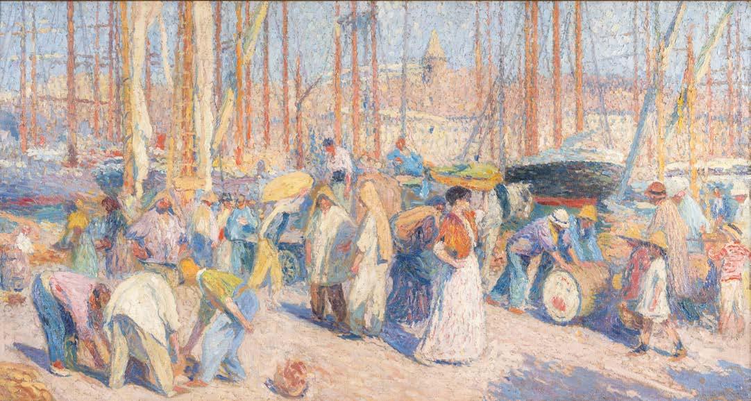
Photo: Interior of the Conseil d’Etat, Paris showing the full-scale Le Port de Marseilles in context.
Stanhope Alexander Forbes, R.A. (1857-1947)
The Fleet in Sight, 1911
Signed and dated lower right ‘Stanhope A. Forbes. / 1911.’
Oil on canvas
Unframed: 100 x 135 cm.; 39 x 53 in.
Framed: 130 x 166 cm.; 51 x 65 in.
PROVENANCE
Mr Joe Marchman, Texas
For whom sold by Pyms Gallery, London, to Philip, Baron Harris of Peckham, circa 1987
Donated by Lord Harris to a charity auction Private Collection (purchased from the above)
EXHIBITIONS
London, Royal Academy, 1911, no.118
Pyms Gallery, London, Truth to Nature – French, British and Irish Paintings of the Nineteenth and Twentieth Centuries, 1996, no.20
Pyms Gallery, London, Rural and Urban Naturalism –Masterpieces of Late Nineteenth Century French and British Art from the Marchman Collection, 1987, no.23
LITERATURE
Royal Academy Pictures, 1911, illustrated p.83 Pall Mall Gazette ‘Extra’, 1911, illustrated p.24
C. Lewis Hind, Stanhope A. Forbes, R.A., ‘Special Christmas Edition’ of The Art Annual, 1911, p.32 Caroline Fox, Stanhope Forbes and the Newlyn School, 1993, p.89
Elizabeth Knowles, Stanhope Forbes – Father of the Newlyn School, 2017, p.11
Stanhope Forbes was elected a Member of the Royal Academy in 1910 and the pictures that he exhibited at the Summer Exhibition the following year proved that he was deserving of the accolade. The three exhibits also sum up Forbes’ main Newlyn motifs at this time in his life – aspects of the traditional way of life of coastal communities but also the hardships, bonds and challenges of an existence dependent on fishing. The Harbour Window was submitted as his Diploma picture (Collection of the Royal Academy of Arts, London) and depicts a young woman sewing curtains by a sunlit window overlooking Newlyn pier – a scene of tranquil everyday domesticity. The Old Pier Steps (Bradford City Art Galleries) depicts the landing of a successful day’s catch and the interaction between the men who fish at sea and the women who work to prepare the fish for sale and repair the nets. The third exhibit was the most dramatic, a picture full of anticipation and tension – The Fleet in Sight
It is a sunlit day and those who have gathered at the wall of the old pier to welcome the fishing fleet back to safety, are squinting as they look out to sea, each searching the horizon for the boat of their son, husband or father. Young children point out the familiar red sails of the pilchards boats, whilst women stand patiently –they have watched many times from the same place, each time hoping against tragedy. The sun is shining today and the blue waters are calm but this was not always the case and the ‘old salts’ who are looking out to sea with a telescope – their eyes no longer as strong as they used to be – know that many boats have been lost to the storms and rocks during their lifetimes. The great wall of the sea bastion has taken the force of the ocean for longer than anyone can recall, creating safe anchor for the little boats but beyond its sanctuary the cruel sea is both a giver of life and livelihood and a taker of those who make their living with nets and lobster pots.
The Fleet in Sight was in direct contrast with pictures like Walter Langley’s watercolours For Men Must Work and Women Must Weep of 1883 and Disaster of 1889 (both Birmingham Museum & Art Gallery) in which the perils of the sea have taken their toll. It is likely that this was Forbes’ intention – to present a contrast to the melodramatic scenes painted by Langley, Bramley and himself in the 1880s and 1890s. In 1911 he was commercially successful, at the height of his artistic powers and living a blessed existence among the community of artists and fishermen whose lives were hard but not as hard as they were about to become as war loomed across the sea.
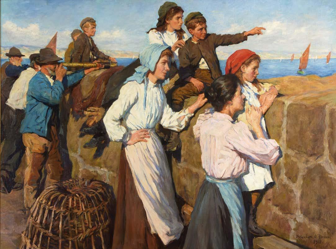
It is clear that by the later stage in the artist’s life, Forbes knew his subject so well and respected the Cornish people to such an extent that he understood their lives and how to depict them with intelligence, warmth and honesty. He and his wife, Elizabeth Stanhope Forbes, had founded the Newlyn Art School several decades earlier, making Cornwall a place of artistic pilgrimage for the next generation of modern artists. Forbes painted among the people, choosing subjects which were immediately engaging and understandable even to those who lived miles from London – his paintings were bought for the municipal galleries in many of the northern industrial towns and cities. Visitors to Cornwall could often find the great painter standing in the cobbled streets with his easel and canvas set up in front of him, working on the oil sketches for his next paintings which would find their way into public and private collections.
‘1911 was probably the most successful year Cornwall has ever had at Burlington House... a few art lovers, ever eager for signs of a vision unspoilt and unfatigued, sought the Newlyn pictures at the Royal Academy exhibitions, welcomed the grey pure light, the sense of atmosphere, the honest painting of the thing seen, fisherfolk and the seaman’s sea... all the simple happenings of that remote corner of England.’
C.
Lewis Hind, Stanhope A. Forbes, R.A., 1911, p. 6
The Fleet in Sight was painted in Mousehole, a fishing village on Mount’s Bay, three miles from Penzance. The original quay walls had been built in the fourteenth century and the Southern and Northern piers were added in 1887 and 1888 with huge wooden gates between to seal off the harbour from the sea. At this time the fleet numbered more than sixty boats fishing for pilchards in the North Sea. Forbes had painted several important pictures on almost exactly the same spot, including A Safe Anchorage of 1909 (private collection), The Pier Head of 1910 (Phillips, 17 July 2001, lot 23) and probably also the contemporary The Old Pier Steps . The latter picture appears to depict two of the models that appear in the centre of The Fleet in Sight,
local Cornish girls found among the community of Mousehole fisherfolk. Eight years after Forbes painted The Fleet in Sight he painted Fitting Out, Mousehole (Bradford City Art Galleries) in which the old pier can be seen most clearly and we can see that the present picture must have been painted on the raised section of the wall at the top of the flight of stone steps in the upper right of the 1919 canvas.
Whether consciously or not, with The Fleet in Sight Forbes echoed elements from his painting The Seine Boat of 1904 (Phillips, London, 6 June 2000, lot 114) in which, like the present work, the concentration is on the human figures and their gestures. Several poses are reminiscent and the dramatic composition – with a biased left-to-right focus – is very similar. In both pictures, it is the implied scene beyond the confines of the picture that is vast and absorbing of the attention and we, as spectators, are concentrated on the figures all of whom look to an unseen horizon.
In The Pier Head (Geelong Art Gallery, Australia), exhibited the previous year Forbes painted a more conventional scene and perhaps the prelude to The Fleet in Sight – in which the fleet is leaving whilst being watched from a similar vantage. Several oil sketches are known for The Fleet in Sight, including one depicting the principal group of figures (sold Sotheby’s, 25 November 2004, lot 411) and another of the group of male figures to the right (sold Phillips, London, 10 March 1987, lot 17). It was Stanhope Forbes’ usual method to produce elaborate plein air studies for his pictures, concentrating on a particular section of the composition and recording as much detail of light and shadow as possible. These studies would then be used in combination to build up the composition of the finished exhibition painting in the artist›s studio. In 1917 Forbes appears to have returned to the subject and painted a variant of The Fleet in Sight in watercolour (exhibited Messum’s, British Impressions, 2012, no.31) with a related oil sketch (Haddock Collection).
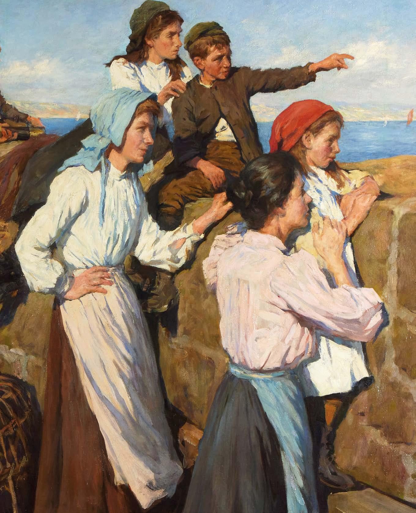
Walter Langley, R.I. (1852-1922)
Carrying The Catch, c. 1890s
Signed lower right ‘W. Langley.’ Watercolour
Unframed: 35.5 x 45.5 cm.; 14 x 18 in.
Framed: 52.5 x 62 cm.; 20¾ x 24½ in.
PROVENANCE
Alexander Gallery, Bristol; Christie’s, London, 3 June 2004, lot 194 Private Collection
Carrying the Catch brings together all of the aspects of Langley’s practice that brought him such renown – technical accomplishment and a profound reflection on labour, dignity and survival in Cornwall’s rural maritime communities. Today his work is considered ‘vital to the image of the Newlyn School’ (Caroline Fox and Francis Greenacre, ‘Walter Langley’, Painting in Newlyn 1880-1930, London, Barbican Art Gallery, 1985, p. 62) and he is remembered as the founder of an art colony that instigated a mini-Renaissance in a sleepy Cornish fishing town.
The composition focuses on an elderly fisherwoman, her frame bowed beneath a substantial wicker basket filled with the day’s catch. The figure is based on the woman on the left of Langley’s large oil painting The Breadwinners exhibited at the Royal Academy in 1896 (private collection). Langley’s detailed brushwork, capturing every nuance of her weathered features and worn garments, exhibits the depth of his observation. The tattered shawl, the patched dress, and the bent posture that reflect decades of hard work are all vividly brought to life with his careful strokes.
Langley’s architectural details reveal his lithographic training: cobblestones depicted with geological accuracy, slate roofs that capture Cornwall’s characteristic vernacular, and weathered stone walls that testify to Atlantic storms. The colour palette of muted ochres, greys, and blues reflects the Newlyn School’s dedication to naturalistic observation whilst also reinforcing themes of endurance and austerity. The translucent layers of watercolour portray Cornwall’s distinctive light while maintaining the immediacy of plein air observation.
Unlike many of his Victorian contemporaries who romanticised rural life, Langley, shaped by his impoverished upbringing in Birmingham, refused sentimentalised interpretations. Carrying the Catch stands as a visual tribute to working-class resilience. The anonymous fisherwoman becomes a symbol of countless individuals whose labour supported Britain’s coastal communities. Through compassionate yet unwavering observation, Langley created not merely documentary art but deep social commentary, setting his reputation as a pioneering voice of the Newlyn School artist colony.
Elizabeth Adela Forbes (1859-1912)
In the Lane
Signed lower left, ‘E. A. Forbes’ Oil on canvas
Unframed: 46 x 35 cm.; 18 x 13¾ in.
Framed: 61 x 51 cm.; 24 x 20 in.
PROVENANCE
Sotheby’s, London, 12 July 2007, lot 81
Richard Green, London
Private Collection (purchased from the above)
On a dappled lane in Autumn, a boy proudly displays his woodland treasure to three passing companions – a portrayal of youthful camaraderie and innocence with which established Elizabeth Adela Forbes her reputation.
Born in Ottawa in 1859, Forbes would become one of Britain’s most perceptive painters of childhood at the turn of the 20th century, and a pioneering spirit of the Newlyn School. She was sent by her family to England for her education, living with an uncle on Cheyne Walk near Dante Gabriel Rossetti, whom she admired greatly though she never met him. She enrolled at the South Kensington School of Art, developing the academic draughtsmanship that would underpin her later innovations. However, it was her subsequent experience at the Art Students League in New York under William Merritt Chase that introduced her to plein air painting. Chase’s admiration for Jean-François Millet and Jules Bastien-Lepage proved prophetic, as these influences would significantly shape Forbes’ development and link her work to the wider European naturalist movement. In 1882 she arrived at Pont-Aven in Brittany to experience first-hand these artistic developments. It was also there that she first heard of Stanhope Forbes who was working nearby in Quimperlé. They did not meet until 1885 in Newlyn, and married in 1889 – an artistic partnership that led to their cofounding of the Newlyn Art School, fostering a new generation of artists that would form a distinct trajectory in early 20th century British painting.
The Impressionist and naturalist structure of the present painting is characteristic of the principles Elizabeth and Stanhope advanced in the Newlyn School. Loose, confident brushwork animates the composition, while the palette of muted ochres and verdant undertones shows her mastery of atmospheric effects. The children are lively with character and intrigue – a subtle but transforming presence to a composition given predominantly to the canopy of light-filled woods. Her sensitive and honest depictions of childhood progressed from the sentimentalised versions that characterised much Victorian painting on the theme.
In the Lane is a wonderful example by the artist, testament to the significant role Forbes played in the development of British Impressionism before her career was cut short by her untimely death from cancer in 1912.
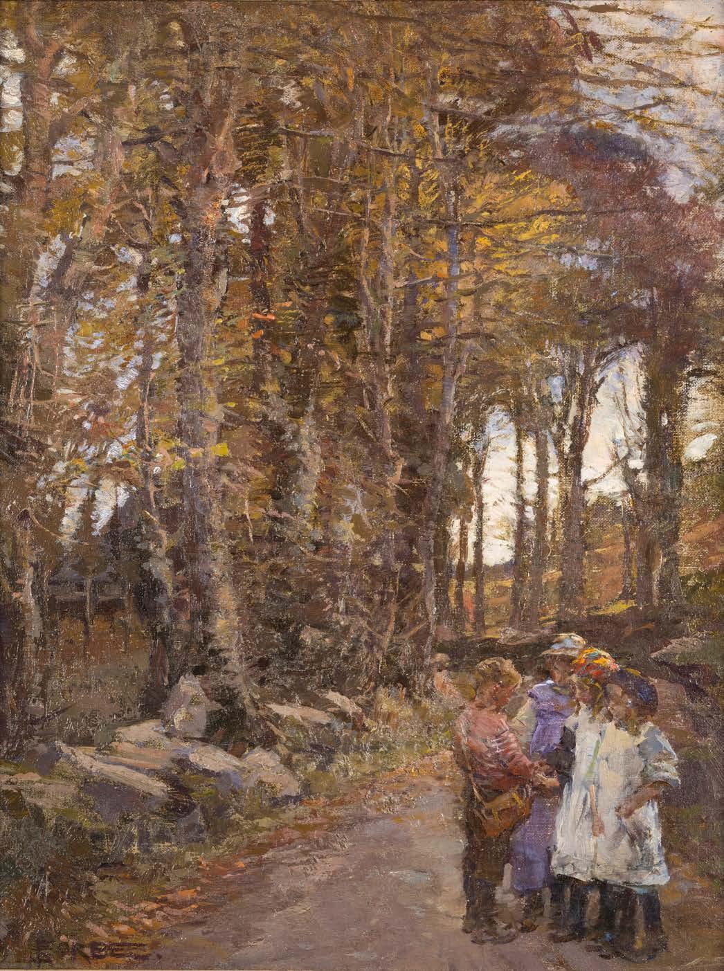
Stanhope Alexander Forbes R.A. (1857-1947)
The Old Bridge of Relubbus, 1927
Signed and dated lower left ‘Stanhope A. Forbes/ 1927’ Oil on canvas
Unframed: 61 x 76 cm.; 24 x 30 in.
Framed: 80 x 94 cm.; 31½ x 37 in.
PROVENANCE
Christie’s, London, 6 June 2003, lot 10
Private Collection
Christie’s, London, 13 July 2017, lot 66 Borro, 27 April 2018
Private Collection
EXHIBITIONS
London, Royal Academy, 1927, no. 311
Painted en plein air in 1927, The Old Bridge of Relubbus centres on a sturdy stone bridge spanning the River Hayle, its weathered masonry rendered in subtle shades of grey that mirror the overcast Cornish sky. Two children occupy the foreground parapet, their contemplative poses suggesting both innocence and the artist’s nostalgic view on the fleeting joys of childhood. The middle ground reveals a carefully choreographed scene of everyday activity: maternal figures conversing with their children, pedestrians navigating the dusty thoroughfare towards Tregembo Hill, and residents emerging from local dwellings, the warm ochre stonework of which contrasts sharply with the cooler palette of the bridge and surrounding atmosphere.
The verdant riverbank vegetation, punctuated by turquoise reflections, juxtaposes the earth-toned built environment. Crimson chimney stacks and scattered details in clothing provide colour accents that enliven the predominantly muted harmony, demonstrating the artist’s debt to his Parisian mentor, Léon Bonnat, who emphasised tonal relationships over academic finish. The looser brushwork in The Old Bridge of Relubbus is typical of Forbes’ later, more expansive paintings. It exemplifies Forbes’ mature aesthetic philosophy, in which social documentation gives way to picturesque idealisation. Unlike his earlier industrial subjects, such as Forging the Anchor (1892, Colchester and Ipswich Museum Services), the present consciously evokes pre-modern rural rhythms, with only telegraph poles betraying contemporary reality. It was a scene he turned to again in a comparable work Relubbus Bridge (1928-30, Penlee House Gallery & Museum). These nostalgic visions align with broader cultural anxieties following the Great War, when artists sought solace in pastoral tradition and which proved popular with the public. They remain as poignant evocations of a bygone world.
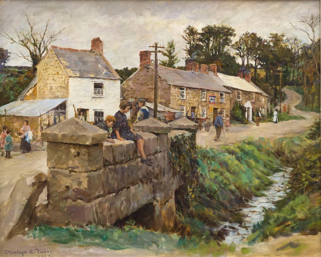
‘Forbes was the artist par excellence of Newlyn. Though his contemporaries produced some superb individual works, to Forbes alone fell the major task of providing a wealth of good and varied paintings of every aspect of life in and around Newlyn.’
Caroline Fox, Stanhope Forbes and the Newlyn School, London, David & Charles, 1993, p.93.
Dame Laura Knight, R.A., R.W.S. (1877-1970)
Lamorna Cove, c. 1919
Signed lower left ‘Laura Knight’ Oil on canvas
Unframed: 98 x 138 cm.; 38½ x 54¼ in.
Framed: 119 x 160 cm.; 47 x 63 in.
PROVENANCE
Ian MacNicol, Glasgow (possibly from the artist)
James Sword Esq
Ian MacNicol, Glasgow
Charles Hepburn (proprietor of Red Hackle Scotch Whiskey)
Ian MacNicol, Glasgow
Private Collection, Scotland
Peter Nahum at the Leicester Galleries, London
Sotheby’s, London, 21 July 2005, lot 20
Private Collection (purchased from the above)
EXHIBITIONS
London, Royal Academy, Summer Exhibition, 1920, no. 618
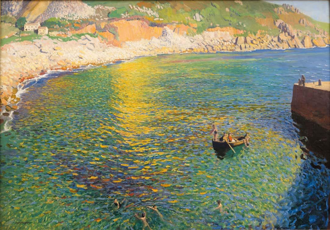
“The sunlight on this Cornish Coast was unlike anything Laura remembered in Staithes, it was golden, glowing, turning the blue – green sea into sparkling iridescence... Laura wholeheartedly accepted the tenet of the Newlyn School that outdoor subjects, like landscapes and seascapes, should be faithful transcripts from nature painted from first to last on the spot.”
Janet Dunbar, Laura Knight, London 1975
Lamorna Cove is a remarkable canvas which not only celebrates Cornwall’s enchanting luminosity but also evokes a deep emotional resonance. It stands as a bold declaration of artistic freedom that arose from Laura Knight’s profound connection with the pristine landscape of West Cornwall. Painted from an elevated vantage point beneath Tregurnow Cliff, the painting provides a glorious view across Lamorna cove that remains mostly unchanged today. Several of Knight’s most evocative Cornish landscapes were situated between Lamorna and Portcurno, including cliff-top views. In the present work, Knight diverts her focus solely to the sparkling water of Lamorna’s secluded bay on an unusually large scale. It emphatically marks Knight’s transformation from the restricted palette of her native Yorkshire to the vibrant exuberance that would characterise her Cornish paintings. Moving to Cornwall from Staithes in 1907 with her husband Harold, the impact was immediate. As their contemporary Norman Garstin recalled: ‘...with their advent, there came over their work an utter change in both their outlook and method: they at once plunged into a riot of brilliant sunshine of opulent colour and sensuous gaiety’ (Caroline Fox, Dame Laura Knight, 1988, p.26).
Knight’s masterful treatment of the sea’s expansive surface employs an almost pointillist technique, where countless individual brushstrokes combine to form a shimmering rhythm that pulses with Mediterranean brilliance. Topographical features guide the eye across the canvas: the protruding jetty, the cluster of white cottages in the upper left quadrant, and the rocky promontories more broadly rendered. In the foreground are swimmers, glimpsed rather than scrutinised, and evoking the liberation from urban constraint that Cornwall represented for Knight and her contemporaries. It bears comparison with the work of Henry Scott Tuke, whose celebrated depictions of male bathers on Cornish beaches had established a visual vocabulary for representing the intersection of youth, beauty, and the natural environment. Knight’s absorption of French impressionist technique within an English context parallels the achievements of her contemporaries in the Camden Town Group and the New English Art Club. However, her commitment to plein-air observation kept her aligned with the Newlyn School and its philosophy of placing oneself in the landscape and painting directly from nature.
In 1936, Knight would be elected the first woman to the Royal Academy, an achievement secured on such paintings as the present – one of her largest and most spectacular depictions of the Cornish coastline. In her own words, Cornwall brought ‘an ebullient vitality’ that made her ‘want to paint the whole world and say how glorious it was to be young and strong and able to splash with paint.’ (L. Knight, Oil Paint and Grease Paint, London 1936, pp. 169–86).
Laura and Harold Knight lived in Cornwall until 1919 when they moved to London. Lamorna Cove is the last major canvas Laura painted before their departure. Over the following years, Laura would energetically embrace a remarkable range of subjects including theatre and circus performers, gypsies, ballerinas and boxers. During the Second World War she was an official war artist, notably documenting women’s manufacturing contribution to the war effort and depicting the Nuremberg trials. In 1936, she was elected to the Royal Academy and in 1965 was the first woman to be honoured with a retrospective exhibition at the institution. Her time in Cornwall was an especially fruitful and transformational period, resulting in some of the defining paintings of British Impressionism in the early 20th century. What emanates from her canvases so emphatically is her joyful and physical response to the Cornish landscape. As Laura was to recall of her years in Cornwall, ‘the very bright of life beamed on us. We had never known the joys of youth before. We danced, played games and lived half the night as well as working hard all day’ (Caroline Fox, Dame Laura Knight, 1988, pp. 25).
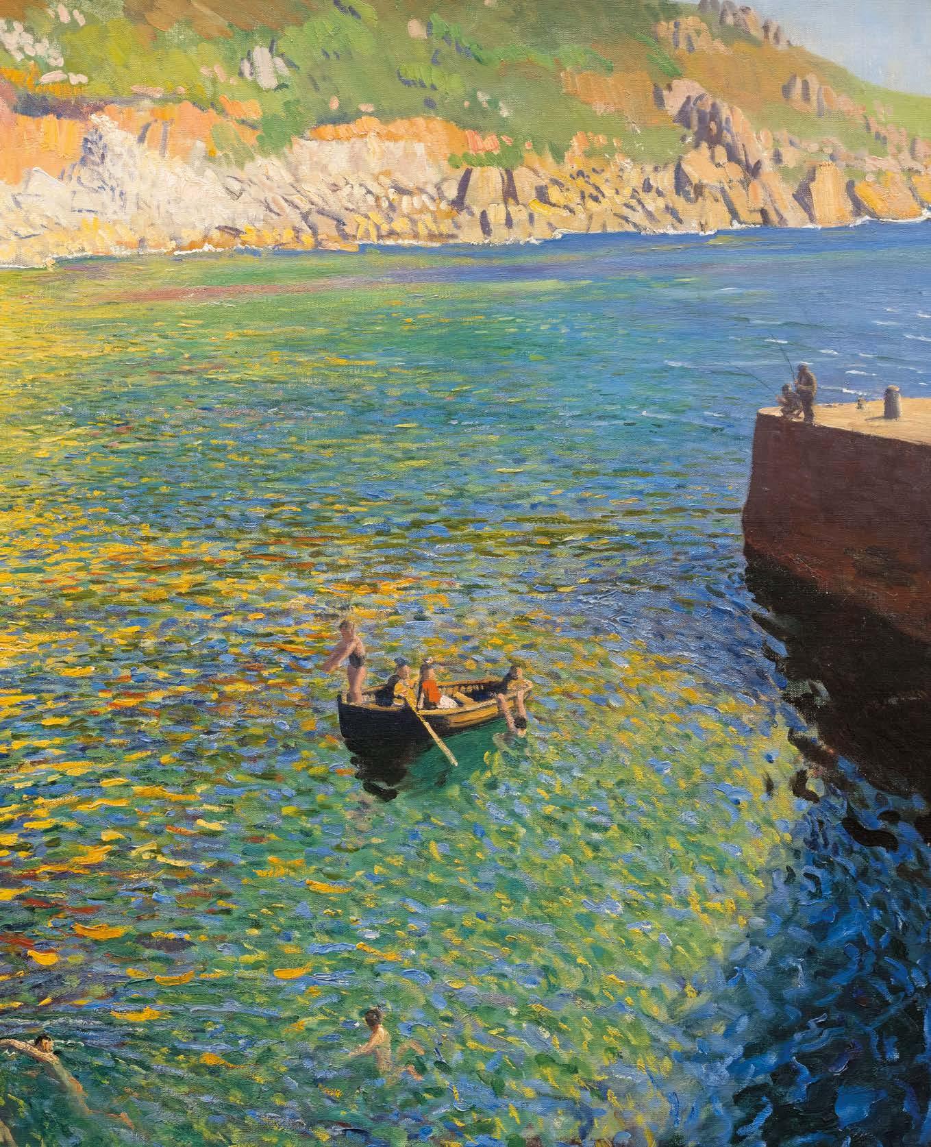
Sir Alfred James Munnings, P.R.A., R.W.S. (1878-1959)
The Pink Parasol – Study – September Afternoon, 1938
Signed and dated lower right
‘A.J. MUNNINGS/ 1938’; Inscribed in pencil on the reverse ‘Study – September Afternoon’ Oil on panel
45.7 x 61 cm.; 18 x 24 in.
PROVENANCE
Frost and Reed, London
The Roberts Gallery, Toronto Murray MacAllister, circa 1960, thence by descent Christie’s, New York, 1 December 2006, lot 124 Richard Green Fine Paintings, London Private Collection (purchased from the above)
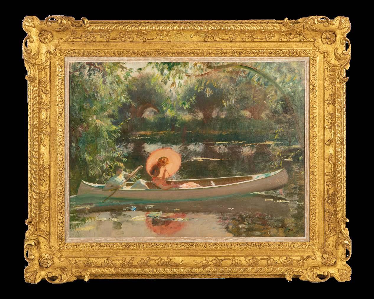
‘...Willows, the river, two girls drifting in a canoe – an old theme of past years taken up again. Sunlight streaming through a transparent pink Japanese sunshade –exquisite – a challenge to the eyes. So fine was the September weather that I did many pictures on that spot.’
A.J. Munnings, The Finish Bungay, 1952, p. 60
Within the pantheon of British landscape painting, few artists have captured the fleeting qualities of light and atmosphere with the poetic sensibility shown in Sir Alfred Munnings’s The Pink Parasol –Study – September Afternoon . Through skilled use of colour, composition and brushwork, Munnings transforms a modest riverside scene into a luminous tribute to the Impressionist ideal of plein-air painting. Two figures are seated within a white Canadian canoe beneath the drooping branches of ancient willows along the River Stour near Flatford Mill. The pink parasol, serving as the painting’s main focal point, stands out with its soft salmon-rose colour against the darker pools of water. Elegantly held by one of the two female figures, this seemingly simple accessory becomes a means to explore the transformative effect of light.
The river’s surface acts as a mirror of remarkable intricacy, capturing not only the reflected forms of the canoe, parasol and figures but also the very spirit of the overhanging willows and the interplay of light filtering through their pendant branches. Munnings employs broken colour and varied brushstrokes to suggest the movement and shimmer of water while maintaining the overall impression of stillness that characterises this September afternoon. The reflections are not simple duplicates but interpretations, slightly distorted and softened, creating a dreamlike quality that elevates the scene beyond literal reflection.
Growing up in Mendham, located on the bank of the river Waveney in Suffolk, and the son of a miller, Munnings had a love of river subjects that is reflected throughout his career. Stranded of 1898 (Bristol City Art Gallery) is one of the earliest examples. Munnings made several iterations of the present work with the earliest, White Canoe, exhibited in at the Royal Academy in 1924. Some fifteen years later Munnings painted The Pink Parasol – Study –September Afternoon, which he worked into a larger version, September Afternoon, 1939, housed in the Sir Alfred Munnings Art Museum, Castle House, Dedham.
Fiercely critical of Modernism, controversially so during his tenure as President of the Royal Academy, Munnings upheld the principles of representational work, distilled through the lens of Impressionism to which he was so ably gifted. Of his landscapes, they echo the pastoral tradition established by Constable in the same region, and remain as evocative nearly a century on. Painted in 1938, with the impending outbreak of World War II, the scene of tranquillity and care-free days holds added poignancy.
‘Until I pass out I shall always long for the river and the warbler’s song going on and on, and now and then the wind through the willows turning the surface blue and purple.’
Sir Alfred Munnings, The Finish, 1952, p.297
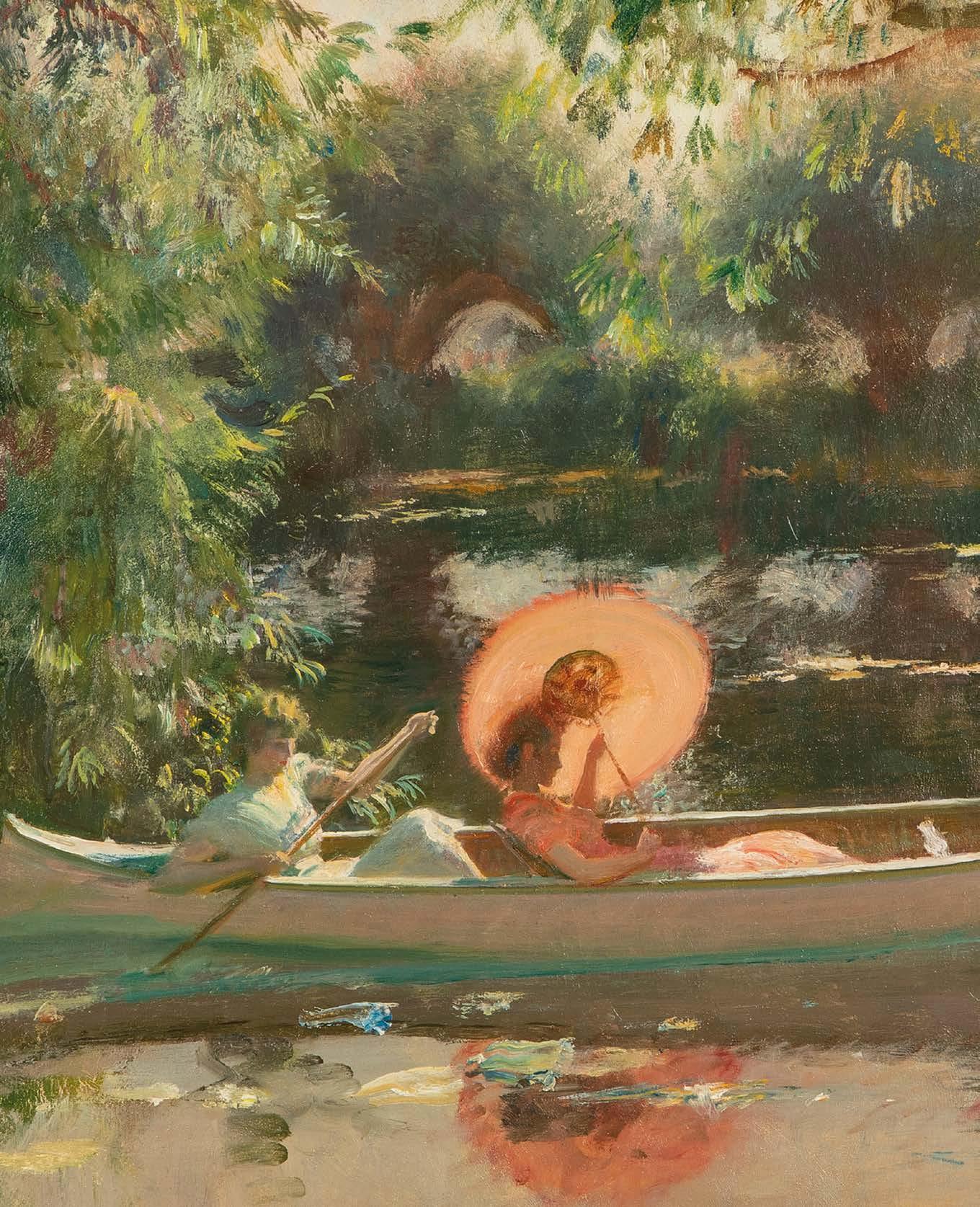
William Leech, R.H.A. (1881-1968)
The Secret Garden, c.1911
Signed; also signed and inscribed with title on the crossbar of the stretcher Oil on canvas
Unframed: 112 cm x 86.5 cm.; 44 x 34 in.
Framed: 128 x 104 cm.; 50 x 41 in.
PROVENANCE
The Artist, thence by direct family descent Private Collection since 2004
EXHIBITIONS
Dublin, Royal Hibernian Academy, 1920, no.147 (£75) London, Royal Academy, Summer Exhibition , 1921, no.123 (as Lilies, one of only nine paintings ever exhibited by Leech at the London Academy)
Dublin, National Gallery of Ireland, William John Leech, An Irish Painter Abroad , 1996, no.36
LITERATURE
Denise Ferran, ‘W.J. Leech’s Brittany’, Irish Arts Review, 1993, pp.228-9, illustrated Denise Ferran, William John Leech: An Irish Painter Abroad , National Gallery of Ireland in Association with Merrell Holberton, London, no.36, illustrated in colour, p.165
Anne Crookshank and the Knight of Glin, Ireland’s Painters, 1600-1940, published for the Paul Mellon Centre for Studies in British Art, Yale University Press, New Haven and London, 2002, p.292.
The Secret Garden is one of the finest paintings by Leech remaining in private hands, which relates to his most famous work The Convent Garden (1912, National Gallery of Ireland). The subject is a luscious, sun-filled garden where lilies, grass and leaves dance amongst one another in a symphony of lively brushwork and colour, which reveals Leech’s accomplished artistic skill. He does not use a conventional horizon or perspective in his composition; rather he focuses his attention on the lilies in the foreground, while the clever use of light and shadow and fluid brushstrokes leads the eye through the lilies, beyond the dappled tree leaves above, to an enclosed hedgerow behind.
Born in Dublin, Leech had trained under influential Irish painter, Walter Osborne, at the Royal Hibernian Academy. It is likely Leech knew of Osborne’s A Cottage Garden that also takes lilies as its subject, but in the freedom and vibrancy of The Secret Garden Leech pushes boundaries further. In 1903, he had gone to Paris to study, from where he travelled to Concarneau, one of several artistic colonies in Brittany. There he befriended John Lavery, who had already well-established himself in France.
Leech spent several years in Concarneau. The present work developed while Leech was convalescing at the Sisters of the Holy Ghost after contracting typhoid fever in 1904. The grounds of the convent hospital very much represented a ‘secret garden’ and one to which Leech had privileged access. The title also links to Frances Hodgson Burnett’s novel, The Secret Garden, written in America in 1909, which tells the story of a young girl also recovering from typhoid, who finds respite in a secret, walled garden of her own. Drawings and sketches of Leech’s time there led to the present painting, executed circa 1911, and A Convent Garden, Brittany, which expands upon The Secret Garden by including the Sisters. Most immediately, the paintings recall John Singer Sargent’s famous Carnation, Lily, Lily, Rose (Tate, London). The Secret Garden however, like its namesake, retains an air of mystery and informality.
Leech’s time in Brittany was a critical period for him, with Denise Ferran commenting how The Secret Garden ‘shows a freedom and facility to render colour and light, which strengthened in Leech’s work from 1910 onwards, after several years of painterly development in Concarneau.’ (Ferran, William John Leech: An Irish Painter Abroad, London, 1993, p.166). In recognition of his stature, Leech was elected a full member of the Royal Hibernian Academy in 1910 aged only twenty-eight. The Secret Garden and its counterpart, A Convent Garden, Brittany, represent Leech at the height of his artistic achievements.
John Lavery, R.A., R.S.A., R.H.A (1856-1941)
Miss Kate Gentles, 1889
Signed and dated lower left ‘J Lavery 1889’ Oil on canvas
61 x 41 cm.; 24 x 16 in.
PROVENANCE
Christie’s, Scotland, 9 December 1993, lot 413 Private Collection
Whyte’s, Dublin, 14 March 2011, lot 106 Private Collection (purchased from the above)
By the end of 1888, John Lavery had been contracted by Glasgow city council to produce a large memorial canvas portraying the State Visit of Queen Victoria to its International Exhibition (Glasgow Museums). The task, which necessitated depicting a gathering of 253 guests, with visits to London, Windsor and Darmstadt to paint members of the royal household, was daunting. It consumed the next two years of the artist’s life, requiring a move to a larger studio at West George Street, with most of the preliminary portrait sketches being painted in 1889 (Kenneth McConkey, John Lavery, A Painter and his World , 2010, Edinburgh, p.40-48).
It may seem surprising that during the busiest year of his life, Lavery should have taken on other commissions, but such was his reputation as a Salon medallist that he was in great demand. The portrait of Miss Kate Gentles, larger and more finished than the numerous International sketches, may however, have been produced as a special favour to Glasgow merchants whose shop the artist frequented. (A surviving diary for the following year indicates that Lavery’s purchases at Gentles & Co on 6 March 1890 came to seventeen shillings.) This was Gentles & Co, wallpaper, brush, mouldings and frame manufacturers of 336 Sauchiehall Street. The shop’s proprietor, Thomas Gentles, was a supporter of the Scottish Artists’ Benevolent Association and attendee of its costume ball in November 1889 for which Lavery painted quick sketches of the participants. Not only would Gentles and his sons, William and Thomas, now running the family firm with their father, have known about the royal commission, Thomas senior would also have had the opportunity to see the painter in action, and the caché of association with such an important young artist
was clearly desirable. Further research will reveal the relationship between Miss Gentles and Gentles clan. It is probable that the present portrait represents Katherine McCallum Gentles, who would have been in her late twenties in 1889.
As she entered the studio, Miss Gentles was wearing a buff tailored coat with lappets in the style of an officer’s dress uniform, after the fashion of the day. Observed in profile, her black pill-box hat and pink corsage was wrapped in a fine gauze veil that extended to under her nose. A similar motif – a face seen through a veil – had been adopted for HRH Princess Alix of Hesse (Private Collection), a celebrated portrait that was quickly framed after Lavery’s return from Darmstadt and shown at the Grosvenor Gallery earlier in the year. (HRH Princess Alix of Hesse was the future Czarina murdered by the Bolsheviks). The artist was fascinated by this partial softening of the young woman’s features –rendered with consummate skill in the Gentles portrait. The sitter’s suave distinction thus paved the way for a cavalcade of portrait studies in the early 1890s such as La Zibeline 1892 and The Invisible Veil 1894 (Private Collections), both likely to have been shown in Thomas Lawrie’s ‘Fair Women’ exhibitions. These marked out the territory of a painter who, avoiding pretty ball gowns and extravagant coiffure, presents a radically unsentimental rendering of the modern woman.
Kenneth McConkey
Harry Watson, R.W.S., R.O.I., R.W.A. (1871-1936)
The Garden Party, c.1913
Signed lower right ‘Harry Watson’ Oil on canvas
Unframed: 71 x 91.5 cm.; 28 x 36 in.
Framed: 93 x 113 cm.; 36½ x 44½ in.
PROVENANCE
Richard Green, London
Private Collection, London
Sotheby’s, London, 27 November 2003, lot 34
Richard Green, London
Private Collection
Christie’s, London, 20 November 2018, lot 9
Private Collection
EXHIBITIONS
Probably, London, Royal Academy, 1913, no. 230
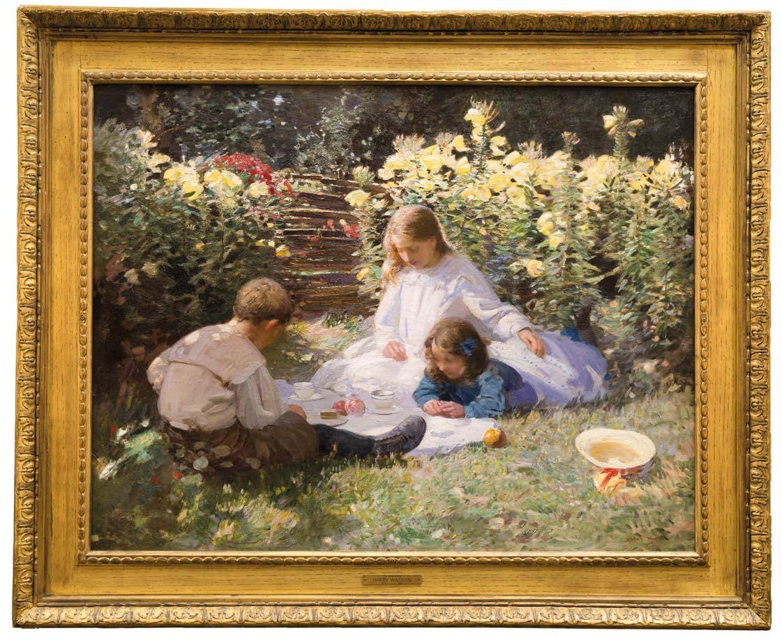
Primarily known for his landscape studies, The Garden Party is at the pinnacle of Watson’s rare ventures into figurative painting. Garden scenes provided Impressionist artists with ideal settings to develop their own interpretation of the modern concepts of naturalism and spontaneity, through new techniques using colour and light effects, and a greater sense of dynamism and atmosphere. Watson’s use of a modern, vibrant palette, bold and rapid brushstrokes, and a sense of rapidly capturing a moment in time, rather than a detailed devotion to narrative, sets The Garden Party apart from the depictions of children that his more traditional contemporaries were exhibiting. The painting provides a fascinating link between Edwardian subject matter and the modern techniques that had been developed by the Impressionists, and is redolent of Sargent’s influential Carnation, Lily, Lily, Rose (1885-6, Tate Britain).
The Garden Party delivers a direct experience of light. In this vision of innocent, Edwardian summers, three children sit in a sun-dappled garden, abundant with flowers, and arranged around a pristine white tablecloth. The eldest girl, with luminous hair and resplendent in white lace, rests a protective hand on the younger girl who lies to her side. The boy, positioned with his back towards the viewer, completes this triangular arrangement. The children have their eyes lowered, possibly in prayer as they say ‘Grace’ before their repast, consisting of apples and cake.
Contextually, the painting embodies Edwardian attitudes about the proper cultivation of childhood. In the middle class especially, there was an emphasis on the innocence and gaiety of children, and that should be protected as far as possible from adult life concerns, which inevitably did not fit with workingclass notions of childhood, education or with the economic needs of poorer families. However, educationalists like Friedrich Froebel and Maria Montessori, were influential in the idea that children needed time and space to play as much as they needed food and shelter. Concern for children was focused on their health and healthy amusements. The imagery of childhood most available reinforces the notion of an abstract, idealised idea of the child. This illustrated a narrow social band of children, and alternative representations of the working or street child were to be viewed often as part of the presentation of a problem. Rural children could however be portrayed in a similar contextual idyll to the present work as although poor, they were
seen to be removed from the grime and dangers of an urban, industrial setting. Within this context, The Garden Party serves both as an aesthetic triumph and a cultural document – revealing of a moment when artistic innovation converged with social aspiration to produce images of enduring resonance and beauty.
Harry Watson studied at the Lambeth School of Art and at the Royal College of Art (1889-94) where he won numerous gold, silver and bronze medals. It was during this time that he would have encountered the work of the Impressionists, exhibited regularly at Durand-Ruel’s gallery on Bond Street, and would have been aware of how it was influencing the works of his contemporaries through exhibitions at the Royal Academy and the New England Arts Club. Initially, Watson painted in a conventional late-Victorian style but later developed into a plein air painter whose works exhibit great freshness and spontaneity, reminiscent of George Clausen and Jules Bastien-Lepage. From 1906, Watson’s Academy exhibits celebrate rural activities, illustrating figures recumbent beside streams, or wandering through woodland settings, using the theme as a metaphor for the profound relationship between nature and mankind.
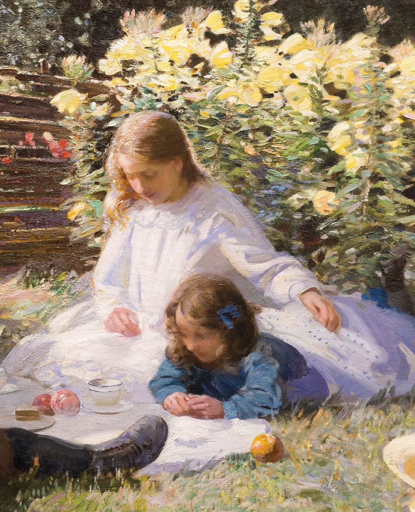
William Strang, R.A. (1859-1921)
Girl Reading. The Storyteller, 1911
Signed and dated lower left ‘W. STRANG/1911.’ Oil on canvas
Unframed: 71 x 51 cm.; 28 x 20 in.
Framed: 100 x 80 cm.; 39½ x 31½ in.
PROVENANCE
Christie’s, London, 14 December 2016, lot 85 Private Collection (purchased from the above)
EXHIBITIONS
London, Council for the Encouragement of Music and the Arts, Regional Collection, 1943-44, no. 2.
Girl Reading, The Storyteller ranks as one of William Strang’s most successful and striking portraits. Seated upon a chair in profile, the sitter half-turns to us, momentarily distracted from the red book, a visual high note within the painting. It is a refined composition of balance and harmony, removed of superfluous details, yet retaining an enigmatic atmosphere. The background is painted sparingly, neatly divided by the horizontal line, against which the book, brightly painted, sits prominently between the picture and clock. The rich blue of the dress, a hint of decorative pattern to the collar and sleeve, is freely painted and counterbalanced by the vivid green seat of the chair.
The painting belongs to a series of portraits Strang painted in the 1910s, using the subject to explore compositional arrangements and formal harmonies rather than portraits in the conventional sense. In this manner, they carried on the Aesthetic principles of the late Victorian period seen notably in the work of Frederic Leighton (see nos. 6 and 9 in the current catalogue). Although the artist invites a degree of intrigue and speculation which engages the viewer, narrative detail takes second stage.
The Art Journal observed when reviewing Strang’s paintings at the time, that one of its most obvious qualities was ‘the simplicity of colour…and the almost indescribable effect of fine composition’ (Art Journal, 1910, p.49). Other notable examples of the period include Panchita Zorolla (1916, Manchester Art Gallery), Lady with a Red Hat (1918, Kelvingrove Art Gallery and Museum, Glasgow – a portrait of Vita Sackville-West) and Girl with Fan (1912, Private Collection). His confident and spare use of colour distinguishes these works so prominently.
Strang was born in Dumbarton, Scotland in 1859, the son of a builder. He moved to London in 1875 and there briefly was taught by Edward Poynter, before studying at the Slade School of Fine Art under the French Realist Alphonse Legros. With a vigorous training in draughtsmanship and as an assistant to Legros’ printmaking, Strang devoted the first part of his career to etching. When he later turned more fully to painting, he concerned himself with various movements from Realism (in the manner of his teacher Legros) to Symbolism, drawing on Classical and Biblical subjects (The Temptation, 1899, Tate Collection). An significant voice within British art at the turn of the 20th century, Strang was elected President of the International Society of Sculptors, Painters and Gravers in 1918, and in 1921 was elected an Engraver Member of the Royal Academy.
Joaquín Sorolla y Bastida (Spanish, 1863-1923)
Portrait of Mrs. Orville E. Babcock, 1911
Signed, inscribed and dated upper right, ‘J Sorolla y Bastida 1911/ Chicago’ Oil on canvas
Unframed: 106.5 x 76 cm.; 42 x 30 in.
Framed: 124 x 94.5 cm.; 49 x 37 in.
PROVENANCE
The sitter Sloan’s, North Bethesda, 3 October 1982, lot 1425 Christie’s, New York, 27 October 1983; Private Collection, USA; Bonhams, 27 September 2017, lot 101 Private Collection (purchased from the above)
EXHIBITIONS
Chicago, Art Institute, Portraits loaned for the benefit of the Passavent Memorial Hospital, 1 – 24 January, 1912, no. 93
LITERATURE
Blanca Pons-Sorolla, Sorolla and America, exhibition catalogue, Madrid, 2013, no. 253, p. 318
Joaquín Sorolla’s Portrait of Mrs. Orville E. Babcock highlights the artist’s bold painting style and innovative techniques. It moves beyond traditional aristocratic portrayals to achieve a blend of Spanish luminosity and American social elegance within early twentieth-century portraiture. Created during the artist’s important stay in Chicago, this painting demonstrates how Mediterranean sensibility could reshape the typically Germanic academic conventions that dominated American taste, fostering a dialogue between Old World craftsmanship and New World ambition.
Mrs Babcock emerges from olive-toned shadows through Sorolla’s expert chiaroscuro, her threequarter pose establishing psychological intimacy. Her haunting gaze has the refined reserve typical of the American upper classes during the waning years of the Gilded Age. Sorolla’s technical virtuosity is most evident in his handling of materials and flesh. The subject’s black velvet evening gown demonstrates his ability to suggest texture through colour relationships rather than straightforward description. The fabric’s glossy surface reflects ambient light, creating subtle tonal shifts that convey both the garment’s luxury and the artist’s skill. Against this dark background, the sitter’s décolletage appears with pearlescent glow, achieved through careful gradations of warm ochres and cool violets that portray light on skin. Lustrous pearls encircle her graceful neck, while a vibrant yellow corsage adorns the bodice, creating a focal point that energises the otherwise muted palette.
Within the broader context of American portraiture, the painting marks a departure from traditional academic methods. The growing admiration for the more sensual and emotionally direct styles emerging from Mediterranean Europe was reflected in the response to Sorolla’s 1911 Chicago exhibition, which drew over one hundred thousand visitors.
Mrs. Babcock herself embodies this cultural development. As the wife of Orville A. Babcock Jr., whose father had served as private secretary to President Ulysses S. Grant, she represented the continuity of the American political and social elite whilst also embracing the cosmopolitan artistic currents reshaping cultural life. Her decision to commission a portrait from Sorolla rather than from one of the established American artists indicates both adventurous taste and confidence in her cultural judgment.
Henri Lebasque (1865-1937)
La Corbeille de Fruits
Signed lower left ‘Lebasque’ Oil on canvas
Unframed: 66 x 82 cm.; 26 x 32¼ in.
Framed: 92 x 107 cm.; 36¼ x 42 in.
PROVENANCE
Galerie Brame & Lorenceau, Paris
Christie’s, London, 31 March 1987, lot 78 Private Collection (purchased from the above)
Henri Lebaqsue trained at the Beaux-Arts de Paris from 1885 and exhibited at the Salon des Indépendants and the Salon de la Société des artistes français. He was closely connected with the Parisian avant-garde in his early career. He co-founded the Salon d’Automne with Henri Matisse, which in 1905 included the work of Andre Derain and Maurice Vlaminck, soon to be dubbed Les Fauves.
La Corbeille de Fruits occupies a position within the ‘intimist’ tradition that paralleled and complemented the more revolutionary developments of Fauvism and early Cubism, retaining closer links to Impressionism’s principles. Whilst artists like Matisse pursued increasingly abstract formal innovations, Lebasque maintained faith in the capacity of representational painting to convey profound emotional and aesthetic truths. This philosophical position aligns him with contemporaries Bonnard and Vuillard, who similarly found the material for sophisticated artistic expression in domestic subjects.
The composition’s seeming simplicity conceals intricate chromatic relationships and spatial arrangements. Upon a chequered tabletop sits a wicker basket filled with citrus fruit; the cropped composition, textured and patterned surfaces give the painting an immediate visual appeal. The curved form of the basket, echoed in the table, and its arching handle provides a counterpoint to the surrounding interior geometry.
Lebasque’s depiction of fruit demonstrates his engagement with Cézanne’s principles while maintaining a distinctive interpretative freedom. Each orange exhibits subtle tonal variations, ranging from amber depths to golden radiance, with occasional vermilion. The harmonious deliberation of colour overall reflects the influence of Seurat and Signac, from whom he learnt colour theory and the use of complementary colours, notably in shading.
The work embodies what the scholar L. Banner identified as Lebasque’s particular gift for conveying ‘the personal nature of his response to the thing painted, and the universal familiarity of home and family.’ Even in this simple still life, we encounter that sense of domestic contentment and aesthetic pleasure that characterised Lebasque’s outlook and earned him recognition as the chronicler of life’s quieter joys.
Mark Gertler (1891-1939)
Still Life, 1917
33. In the painting, fragmented strokes of colour are used to build form and substance akin to Cezanne, by which he developed Impressionism’s daubs of light and laid the foundations for Picasso’s Cubism.
Signed, titled and dated Aug 1917 (on the reverse) Oil on canvas
Unframed: 61 x 51 cm.; 24 x 20 in.
Framed: 85.5 x 75.5 cm.; 33½ x 29¾ in.
PROVENANCE
Jas Wood, 1917
Sotheby’s, London, 18 June 1997, lot 72 Private Collection
EXHIBITIONS
Mansard Gallery, London Group, November 1917, no. 45
London, Piano Nobile, Mark Gertler Works 1912-28: A Tremendous Show of Vitality, 2012, no. 13
LITERATURE
John Woodeson, Mark Gertler – Biography of a Painter, 1891-1939, Sidgwick & Jackson, London,1972, p.368
Mark Gertler was born in London to poor PolishJewish immigrants and through raw talent, force of will and patronage, he became one of the most significant British painters of his generation. After successfully enrolling at the Slade School of Art, he distinguished himself amongst an incredibly talented generation, which included Augustus John, Stanley Spencer, Paul Nash and CRW Nevinson, who declared him ‘the genius of the place’ (Paint and Prejudice, 1937).
The present still-life, painted in 1917, belongs to a critical period in Gertler’s oeuvre when some of his boldest and most radical works were created, most famously Merry-Go-Round (Tate Collection, 1916). Among his contemporaries, Gertler was arguably the most European-orientated, and Still Life reveals the dominant influence of Cezanne at this time. He was simultaneously occupied with a large and complex composition, Bathers (1917-18, private collection) that equally responded to the visual challenges laid down by Cezanne. As Gertler stated, ‘The entry of Cezanne, Gauguin, Matisse etc., upon my horizon was equivalent to the impact of the scientists of this age upon a simple student of Sir Isaac Newton’ (Studio, September 1932).
Gertler’s bold palette and simplification of forms make for a particularly striking image, made more arresting still by the deliberate ‘missing’ edge of the flowerpot and apple at its base. This conscious decision adds a psychological charge to the work.
Painted during the First World War and on the back of Merry-Go-Round, his biting War-critique, Gertler was at this time confronting existential angst, as well as battling ill-health from tuberculosis and the distress of his unrequited love for Dora Carrington. The work appears to rotate and shift, defying easy interpretation and like many of the greatest artworks, presents more questions than answers.
Gertler painted the work while staying at Garsington Manor, his patron Lady Ottoline Morrell’s artistic enclave in Oxfordshire. It is quite probable he had with him Ambrose Vollard’s book on Cezanne, which Roger Fry had reviewed earlier that year.
Gertler and Fry had met at the Omega Workshops in April 1917 (who found him ‘a most rare and refreshing thing’), and it proved a formative and lasting encounter. The following month Fry had asked Gertler to an exhibition of translations of past masters by contemporary artists and Gertler responded with a ‘Yiddish Cezanne’, a still life of fruit and flowers against a rumpled blue cloth.
In September 1917 Clive Bell wrote from Garsington that Gertler had just shown him four pictures painted there that summer, ‘They are really very interesting and superbly conscientious; I don’t think there is anyone in England but Duncan [Grant] who can do better. All are under the influence of Cezanne.’
At its exhibition in 1917, Dora Carrington wrote to Gertler, ‘I want to tell you how very much I liked your Still-Lifes in the London Group. Especially the big one with drapery making a shape.’ Given Gertler’s complicated relationship with Carrington that in part shaped the composition of the present work, it must have been a bittersweet moment of acknowledgement. Still Life stands as a pivotal work, a pioneering British painting that also stands on level terms with the Continent’s modern masters.
Spencer Frederick Gore (1878-1914)
Reflections: Female Nude in an Interior, c.1907-08
Oil on canvas
Unframed: 33 x 23 cm.; 13 x 9 in.
Framed: 46 x 35.5 cm.; 18 x 14 in.
PROVENANCE
Peter Nahum, London
Private Collection, 1987
Private Collection
‘It is my privilege to have observed at close quarters the development of Spencer Frederick Gore, from what I may perhaps call the coming of age of his talent in 1906, to its close in 1914 ... In his painting was made manifest colour, and not merely colours ... He attained exquisiteness in touch. Expression descended like snowflakes on his canvases, varied, adequate, and economical. He painted with the reticence and the measure of the great gentleman that he was.’
Reflections: Female Nude in an Interior is an intimate work which demands closeness from its viewer; the impasto texture and rich, bold colouring allows a painting of its scale great depth and perspective. The nude figure reclines against white bed linen, her form illuminated by soft, natural light. The room’s furnishings, a metal bedstead, patterned wallpaper and domestic objects, are rendered in warm, earthy tones, establishing an atmosphere of bourgeois comfort. We are not in fact looking directly at the figure as a first impression gives, but as denoted by the mantlepiece and gilt mirror frame to the bottom edge, a reflection of the nude, creating spatial complexity.
The painting reveals the close collaboration between Walter Sickert and Gore during this period – a time when both artists shared studios, models and furniture in their exploration of intimate interior scenes. Gore had first met Sickert in 1904 on a trip to Normandy where the older artist was resident. Enthused by the new generation of painters within Gore’s circle, Sickert returned to London in 1905, laying the foundations for the emergence of the Camden Town Group in 1911 (of which Gore became its President).
Sickert encouraged Gore to paint in a studio rather than the more typical impressionist practice of en plein air and passed on his passion for depicting everyday urban life. Unlike Sickert’s more psychologically charged Camden Town series, Gore’s interpretation exhibits a sensuous restraint. The painting stands as an evolution from English Impressionism towards Post-Impressionist experimentation, evident in the bold colour palette and structural composition. Through meticulous observation and chromatic sophistication, Gore achieved what Sickert described as the ability to ‘take a flint and wring out attar of roses,’ creating art from everyday existence.
While painting outside during the cold winter months, Gore contracted pneumonia and died in March 1914 aged thirty-five, abruptly ending a career which had led such a central role in the advancement of British art at the turn of the twentieth century, to which the present work testifies.
Walter Sickert, The Complete Writings on Art, Oxford 2000, pp.402-403.
Roderic O’Conor (1860-1940)
Reclining Nude, 1921
Signed and dated upper right ‘O’Conor 1921’ Oil on canvas
72.5 x 91.5 cm.; 28½ x 36 in.
PROVENANCE
Sotheby’s, London 26 April 1972, lot 107
Sean O’Criadain, Dublin
Christie’s, London, 10 May 2007, lot 66
Collection of the Hon. Francis D. Murnaghan Jr., thence by descent Private Collection
EXHIBITIONS
London, Barbican Art Gallery, ‘Roderic O’Conor 1860- 1940’, 1985, cat.no.78 with tour to Belfast, Ulster Museum
Dublin, National Gallery of Ireland; Manchester, Whitworth Art Gallery
On loan to Dublin, Hugh Lane Municipal Gallery of Modern Art, 1995-2000.
LITERATURE
J. Benington, Roderic O’Conor, a Biography with a Catalogue of his Work , Dublin, 1992, no. 229, p. 217
In the aftermath of the First World War, progressive artists such as Picasso and Matisse relinquished some of the innovatory zeal that had previously coloured their work. The pre-war headlong rush to break new ground thus experienced a slow-down, and there was a brief return to more straightforward figurative idioms such as classicism and Impressionism. O’Conor, as can be seen in this rare dated nude from the beginning of the new decade, was not immune to this trend. His inspiration seems to have come from the bathers pictures of Renoir and the classical nymphs of Rubens.
Reclining Nude is an accomplished and arresting tribute to female beauty. The model sleeps lying on her side, her legs pulled up for modesty’s sake whilst her head and shoulder rest on a cushion. A second bolster has been positioned behind the model, bringing her upper body closer to the viewer’s gaze. The cropping of the model’s ankles and feet by the lower edge of the canvas reinforces the feeling of proximity, as does the very direct and even fall of light.
The artist, in other words, does everything in his power to focus attention on the shape, colour, texture and mass of the forms he is describing, and beyond that, to render palpable the “gleam of light and warmth and life” which Sickert described as the chief source of pleasure in a nude.
In the 1920s, O’Conor chose models who were young, pretty, of slender build and furnished with up-to-the-minute bobbed hairstyles. That these pictures were admired by his peers is confirmed by the fact that the noted art critic, Roger Fry bought an example directly from O’Conor, on behalf of the Contemporary Art Society (now in Derby Art Gallery). Reclining Nude could have been one of the pictures Fry saw in O’Conor’s studio on the occasion of his purchasing visit in 1924.
Fry would have been the first to notice that, however much the picture might owe to Renoir, it was still very much a product of its time. The subject is a modern, fashionable young woman. It is to O’Conor’s credit that, despite being in his sixties, he was not locked in the mindset of an earlier generation struggling to keep pace with the times. The 1920s was the era of jazz and jive, flapper dresses and the movies, and aside from his models, we can be sure that the artist’s young mistress, Renée Honta, helped to keep him informed about current trends.
Jonathan Benington
Francis Edwin Hodge, R.P., R.O.I. (1883-1949)
Aprés Midi – Le Touquet, 1929
Signed and dated ‘F.E.Hodge/ 29’ (lower left), signed and inscribed with title verso Oil on canvas
Unframed: 61.5 x 74 cm.; 24¼ x 29 in.
Framed: 83 x 96 cm.; 32½ x 37¾ in.
PROVENANCE
Sotheby’s, Billingshurst, October 20, 1987, lot 2285 Messums, London
Private Collection
Après Midi – Le Touquet depicts holidaymakers enjoying themselves at the French seaside resort of Le Touquet, dotted with distinctive beach tents and huts which recede into the distance. Painted in 1929, it seems to exalt the freedom, prosperity and leisure Europe experienced following the First World War. The bright cream sand, pastel blue sky and multitude of vivid colours that adorn the beachgoers and their tents creates a tone of light-hearted indulgence and untroubled indolence. It is testament to Hodge’s impressive ability to delicately relay the mood and feeling of a place on canvas.
Hodge was born in Plymouth, Devon in 1881 to family of modest means. He worked committedly to be granted admission into the Westminster School of Art, followed by the Slade School of Fine Art, where his teachers included Augustus John, William Orpen and Frank Brangwyn, influencing the Impressionist, informal approach of his work.
Hodge served in the Artists’ Rifles Regiment during the First World War. He saw active service on the Western front and was commissioned by the British Army to document the conflict. Mont St Quentin and Péronne from near Maisonette, 1918 (Imperial War Museums, London) subtly suggests both the creeping horror of war and the beauty of the blasted land. Following the War, Hodge capitalised on the demand for paintings that looked back with nostalgia at the luxuries and leisure of the pre-war period, producing paintings that evoked a sense of timeless tranquillity, such as the present work.
Hodge became a successful portraitist, notably when in 1938 he was commissioned to paint a portrait of King George VI.
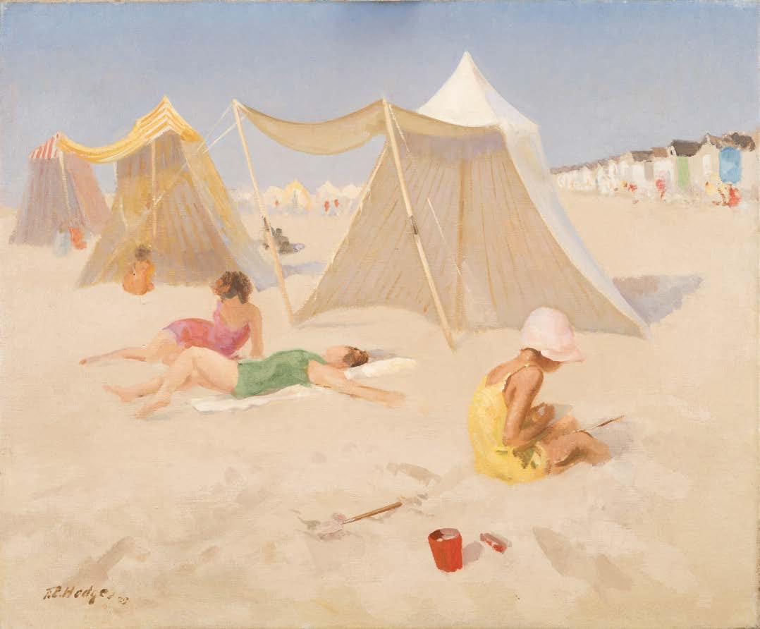
HENRY ORLIK
28 JULY – 16 AUGUST 2025
Following the success of our exhibition Henry Orlik, Surreal Metropolis: Looking for America in New York this June, we shall have a selection of further revelatory works by Orlik on view during our Master Painters & Pioneers exhibition at Gallery Eight.
GALLERY 8
8 Duke Street, St James’s London SW1Y 6BN
WINSOR BIRCH
25 JULY – 4 SEPTEMBER 2025
Our summer exhibition at The Little Gallery will include paintings, works on paper and bronzes spanning artists from the 19th century to the present day.
The Little Gallery
1 The Parade, Marlborough, Wiltshire, SN8 1NE
WINSOR BIRCH
The Fine Art & Sculpture Company
Nicholas Verrall (b.1945), Seaside, Oil on panel, 45.5 x 61 cm.
Henry Orlik (b.1947), Shard of Glass c.1980-85, Acrylic on canvas, 170 x 134 cm.

25 – 28 SEPTEMBER 2025
Saatchi Gallery, London
Collectors’ Preview: Thursday 25 September, 11am – 9pm
Contact the gallery for more information
WINSOR BIRCH
30 SEPTEMBER – 5 OCTOBER 2025
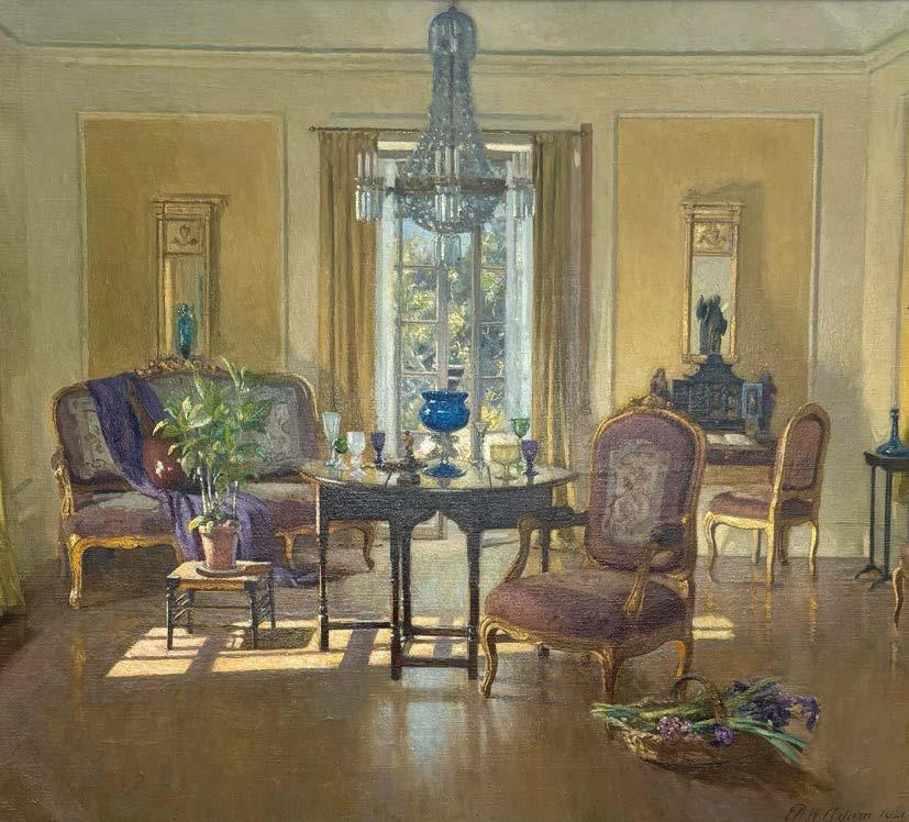
Evolution London, Battersea Park
Preview Day: Tuesday 30 September, 12pm – 8pm
Contact the gallery for more information
WINSOR BIRCH
The Fine Art & Sculpture Company
Patrick Procktor (1936-2003), Venice Procession 1979, Acrylic on board, 183 x 120 cm.
Patrick William Adam (1852-1929), Interior, Ardilea, North Berwick, 1921, Oil on canvas, 100 x 116 cm.

28 OCTOBER – 2 NOVEMBER 2025
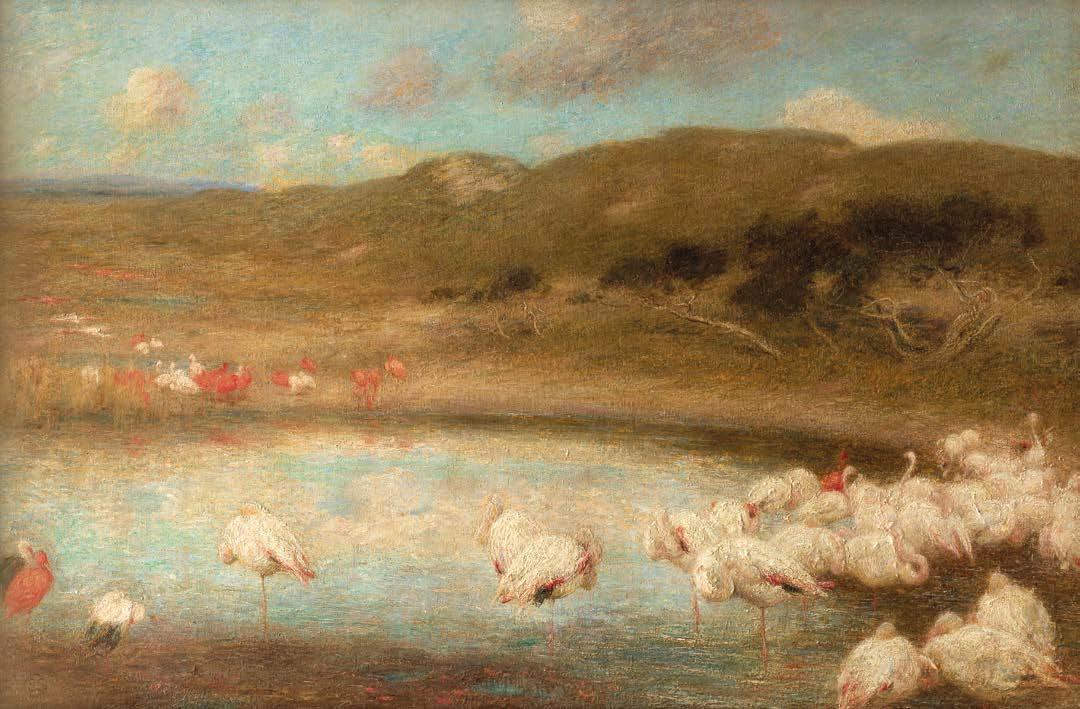
Berkeley Square, London
Preview Day: Tuesday 28 October, 3pm – 10:30pm
Contact the gallery for more information
WINSOR BIRCH
The Fine Art & Sculpture Company
SCULPTURE
AT WINSOR BIRCH

Winsor Birch exhibits a variety of large-scale sculpture throughout the year by leading sculptors and craftsmen. We are able to advise on all aspects of a specific commission.
Contact the gallery for more information
WINSOR BIRCH
Edward Stott, A.R.A (1855-1918), The Flamingoes, c.1908, Oil on canvas, 67.5 x 101.5 cm.
The Fine Art & Sculpture Company
Tessa Campbell-Fraser (b.1967), Stag, Bronze, life-size
Artist Cat ref.
Anderson, John MacVicar 3
Beechey, Richard Brydges 4
Burne-Jones, Sir Edward 7
Clausen, Sir George 13, 15, 18
Forbes, Stanhope Alexander 21, 24
Forbes, Elizabeth Adela 23
Gertler, Mark 33
Gore, Spencer Frederick 34
Hodge, Francis Edward 36
Knight, Dame Laura 25
Langley, Walter 22
Lavery, Sir John 28
Lebasque, Henri 32
Leech, William 27
Leighton, Lord Frederic 6, 9
Martin, Henri 12, 14, 16, 17, 19, 20
Munnings, Sir Alfred 26
O’Conor, Roderic 35
Pissarro, Camille 11
Poynter, Sir Edward 8
Reynolds, Sir Joshua 1
Sorolla, Joaquin 31
Steer, Philip Wilson 10
Strang, William 30
Tissot James Jacques Joseph 5
Watson, Harry 29
Wright of Derby, Joseph 2
Published in 2025 by Winsor Birch.
All rights reserved. No part of this publication may be reproduced, stored in a retrieval system or transmitted in any form or by any means, electrical, mechanical or otherwise, without first seeking the permission of the copyright owners and the publishers.
All images in this catalogue are protected by copyright and should not be reproduced without permission of the copyright holder. Details of the copyright holder to be obtained from Winsor Birch.
© 2025 Winsor Birch.
Designed and produced in the UK by Footprint Innovations – www.fpiltd.com
Right: Henri Martin, La Moisson (detail) c. 1898, Oil on paper laid down on canvas
Back cover: Sir Joshua Reynolds, The Yellow Boy – Lord George Seymour-Conway, 1770, Oil on canvas
The Fine Art & Sculpture Company