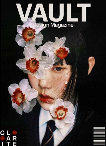
VAULT ascdef
Design Magazine
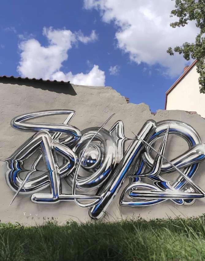
Gra iti is writing or drawings made on a wall or other surface, usually without permission and within public view. Gra iti ranges from simple written "monikers" to elaborate wall paintings, and has existed since ancient times, with examples dating back to ancient Egypt.
Modern gra iti is a controversial subject. In most countries, marking or painting property without permission is considered vandalism. Modern gra iti began in the New York City subway system and Philadelphia in the early 1970s to the rest of the United States throughout the world. "Gra iti" and the rare singular form "gra ito" are from the Italian word gra iato. In ancient times gra iti were carved on walls with a sharp object, although sometimes chalk or coal were used.
Modern gra iti style has been heavily influenced by hip hop culture and started with young people in 1960s and 70s in New York City and Philadelphia.
Films like Style Wars in the 80s depicting famous writers such as Skeme, Dondi, MinOne, and ZEPHYR reinforced gra iti's role within New York's emerging hip-hop culture. Although many o icers of the New York City Police Department found this film to be controversial, Style Wars is still recognized as the most prolific film representation of what was going on within the young hip hop culture.
While the art had many advocates and appreciators others, including New York City mayor Ed Koch, considered it to be defacement of public property, and saw it as a form of public blight. While those who did early modern gra iti called it "writing", the 1974 essay "The Faith of Gra iti", which stuck. An early gra ito outside of New York or Philadelphia was the inscription in London reading "Clapton is God". Creating the cult of the guitar hero, the phrase was spray-painted by an admirer on a wall in Islington, London.
People who appreciate gra iti often believe that it should be on display for everyone in public spaces, not hidden away in a museum or a gallery. Art should color the streets, not the inside of some building. Gra iti is a form of art that cannot be owned or bought.
El "color crashing" es una tendencia en el diseño gráfico y la moda que se caracteriza por la combinación intencional de colores que normalmente se considerarían discordantes o no armoniosos. El enfoque es audaz y busca captar la atención mediante la yuxtaposición de tonos que chocan entre sí. Contrastes atrevidos: Usa combinaciones de colores que tradicionalmente se evitarían, como neones con tonos apagados o colores complementarios extremos. Impacto visual: Está diseñado para sobresalir y capturar la atención rápidamente. Funciona bien en entornos donde se necesita atraer la mirada del espectador de inmediato. Es popular en el diseño de sitios web, moda y publicidad, especialmente en marcas que desean transmitir una imagen moderna, irreverente y juvenil.

Perdiou started by creating style frames in Photoshop while Tomaszewicz made quick mockups directly in Cinema 4D. Found that they were on the same page and compositional style.
There's a material crispness to Peter Tomaszewicz's work that makes you want to reach out and touch the parade of ever-changing objects and elements in his animated films. From surprising architectural transformations in States of Matter to fabric forms in Silent Aesthetics and textile feathering in the BBC2 Sharp - Ident, hyperreal elements typify his personal and commercial work.
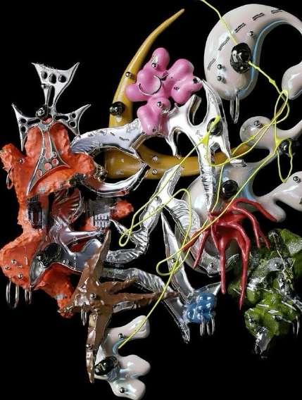
The idea was to use everyday objects to create a playful narrative with humoristic elements and visual impact.
To give the animations a natural, playful feel used C4D’s alembic integration, which allowed him to easily retime and fine tune animation speed. And create simulations and imported the alembic files into Cinema 4D.
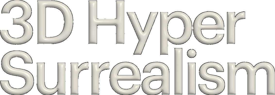
Definitions of 3D hyper-surrealism center around descriptions of a particular style that seamlessly blends hyper-realistic and surreal 3D designs. It is a style that includes abstract and organic shapes and fonts.
"Then we take the objects we found inspirational and use them in ways that are not their real purpose, which is why we call it hyperreal surrealism,"
During the late 1960s and early 1970s a significant revival in sculptural depictions of the human figure and other forms occurred. Newly available synthetic materials and technical processes allowed artists and creative designers to start producing highly detailed works. This experimentation established a new hyper-realistic style, a hyper (beyond) realism (true-to-life). 3D hyper-surrealism could be thought of as an extension of this style via experimentation with rapidly changing, new technologies. The biggest trends in graphic design for 2024 highlights the more realistic portrayals including more rawer, more grainy imagery. In practice it is believed that 3D hyper-surrealism will see brand design move towards imagined lush, opulent worlds with landscaping that is rich in detail. Typography will become more experimental and ornate as brands seek to deliver otherworldly experiences through their designs whilst remaining customer focused.
During the late 1960s and early 1970s a significant revival in sculptural depictions of the human figure and other forms occurred. Newly available synthetic materials and technical processes allowed artists and creative designers to start producing highly detailed works.
Anti-design is the last thing you’d expect to use on a design project. But for a rising number of digital designers, it is the go-to aesthetic of choice—even if it is defined by its lack of aesthetic.
While the name might sound like an aggressive stance, anti-design is not about negativity. First of all, anti-design is not the same as anti-user. Some argue that it is the strongest advoca- te of the user, seeking to create me- morable experiences that both res- pect and challenge their intelligen- ce. It also doesn’t replace “design” with nothing. Instead, anti-design seeks to expand what design can be, encouraging viewers to reconsi- der what constitutes beauty and usability. But with a name like an- ti-design, it should be no surprise that this is a tricky style to approach as a business—assuming it’s even worth the e ort to do so. To get a better idea of what makes this style so appealing, we’re going to break down what exactly anti-design is and how it works. Anti-design is framed as a reaction, its very name a description of what it is not. So understanding anti-design means understanding what specific “design” it is referencing. In a word: simplicity. Is the idea that simplicity is the pathway to a good user experience.