November – December 2014
The Visual Artists’ News Sheet Critique Supplement
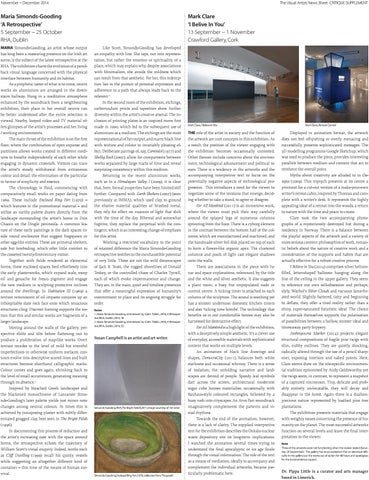
Maria Simonds-Gooding ‘A Retrospective’ 5 September – 25 October RHA, Dublin Maria Simonds-Gooding, an artist whose output has long been a reassuring presence on the Irish art scene, is the subject of the latest retrospective at the RHA. The exhibition charts the evolution of a paredback visual language concerned with the physical interface between humanity and its habitat. As a prophetic taster of what is to come, recent works on aluminium are arranged in the downstairs hallway. Hung in a meditative atmosphere enhanced by the soundtrack from a neighbouring exhibition, their place in her overall oeuvre can be better understood after the entire selection is viewed. Nearby, looped video and TV material offers glimpses of the artist’s processes and her living / working environments. The main thrust of the exhibition is on the first floor, where the combination of open expanse and partitions allows works created in different mediums to breathe independently of each other while engaging in dynamic cross-talk. Visitors can trace the artist’s steady withdrawal from extraneous colour and detail: the elimination of the particular in favour of simplicity and essence. The chronology is fluid, commencing with comparatively small works on paper dating from 1969. These include Enclosed Ring Fort (1970) – which features in the promotional material – and utilise an earthy palette drawn directly from the landscape surrounding the artist’s home in Dún Chaoin on the Dingle peninsula. A common feature of these early paintings is the dark spaces inside round enclosures that suggest frogspawn or other egg-like entities. These are primeval shelters, safe but foreboding, which offer little comfort to the cosseted twenty-first-century visitor. Together with fields rendered as elemental forms, these enclosed spaces feed effortlessly into the early plasterworks, which expand scale, swop oil and gouache for fresco pigment and engage the new medium in sculpting protective inclines around the dwellings. In Habitation III (1969) a texture reminiscent of oil impasto conjures up an inhospitable slate rock face onto which tenacious structures cling. Discreet framing supports the notion that this and similar works are fragments of a larger landscape. Moving around the walls of the gallery, perspective shifts and tilts before flattening out to produce a proliferation of map-like works. Overt texture recedes to the level of mild but eventful imperfections in otherwise uniform surfaces, contours evolve into descriptive scored lines and built structures become shorthand calligraphic marks. Colour comes and goes again, shrinking back to the level of small occurrences, generating meaning through its absence.1 Inspired by bleached Greek landscapes and the blackened monochrome of Lanzarote Simonds-Gooding’s later palette yields just minor note changes among neutral colours. At times this is achieved by juxtaposing plaster with subtly differentiated grogged clay, best seen in The Bright Fields (1996). In documenting this process of reduction and the artist’s increasing ease with the space around forms, the retrospective echoes the trajectory of William Scott’s visual enquiry. Indeed, works such as Cliff Dwelling (1999) recall his quirky vessels while suggesting an altogether different kind of container – this time of the means of human survival.
Mark Clare ‘I Belive In You’ 13 September – 1 November Crawford Gallery, Cork Like Scott, Simonds-Gooding has developed an empathy with line. She taps, not into representation, but rather the emotion or spirituality of a place, which may explain why, despite associations with Minimalism, she avoids the coldness which can result from that aesthetic. For her, this redemption lies in the pursuit of personal expression and adherence to a path that always leads back to the referent.1 In the second room of the exhibition, etchings, carborundum prints and tapestries show further diversity within the artist’s creative arsenal. The inclusion of printing plates is an inspired move first made in 2000, which led to the subsequent use of aluminium as a medium. The etchings are the most representational of her output, and marry black line with texture and colour to invariably pleasing effect. Deliberate pairings of, say, Cominéol (1977) and Skellig Rock (2007), allow for comparisons between works separated by large tracts of time and reveal surprising consistency within this medium. Returning to the recent aluminium works, such as In a Himalayan Valley I (2009), it is clear that, here, formal properties have been limited still further. Compared with Earth Shelters (2007) (seen previously at IMMA), which used clay to ground the elusive material qualities of brushed metal, they rely for effect on nuances of light that shift with the time of the day. Ethereal and somewhat fugitive, they replace the perpetual with the contingent, which is an interesting change of emphasis for this artist. Working a restricted vocabulary to the point of retained difference the Maria Simonds-Gooding retrospective testifies to the inexhaustible potential of very little. These are not the wild dreamscapes of Jack B. Yeats, the rugged shorelines of Donald Teskey, or the controlled chaos of Charles Tyrrell, each of which evoke impermanence and change. They are, in the main, quiet and timeless presences that offer a meaningful expression of humanity’s commitment to place and its ongoing struggle for order. Notes 1. Maria Simonds-Gooding, interviewed by Colm Tóibín, 2010, A Retrospective, RHA, Dublin, 2014, 18 2. Maria Simonds-Gooding, interviewed by Colm Tóibín, 2010, A Retrospective, RHA, Dublin, 2014, 33
Susan Campbell is an artist and art writer.
Simonds-Gooding RHA,The Bright Field II,2011,image courtesy of the artist
Simonds-Gooding,Enclosed Ring Fort,1970, collectionTerry Fitzgerald
Mark Clare, I Believe In You
The role of the artist in society and the function of the artwork are core concepts in this exhibition. As a result, the position of the viewer engaging with the exhibition becomes occasionally contested. Other themes include concerns about the environment, technological advancement and political issues. There is a tendency in the artworks and the accompanying interpretive text to focus on the potentially negative aspects of technological progression. This introduces a need for the viewer to negotiate some of the tensions that emerge, deciding whether to take a stand, to agree or disagree. For All Mankind (2011) is an immersive work, where the viewer must pick their way carefully around the splayed legs of numerous columns sprouting from the floor. There is a cyborg element in the contrast between the bottom half of the columns, which are manufactured and machined, and the handmade silver foil disk placed on top of each to form a flower-like organic apex. The clustered columns and pools of light cast elegant shadows onto the walls. There are associations in the piece with lunar and space explorations, referenced by the title and the white and silver aesthetic. It also suggests a plant room, a busy but unpopulated node or control centre. A ticking timer is attached to each column of the sculpture. The sound is soothing yet has a sinister undertone: domestic kitchen timers and also ‘ticking time bombs’. The technology that benefits us in our comfortable homes may also be harnessed for destructive effect. For All Mankind is a highlight of the exhibition, with a deceptively simple aesthetic. It’s a clever use of everyday, accessible materials with sophisticated content that works on multiple levels. An animation of black line drawings and shapes, DemocraCity (2011), balances both white starkness and occasional whimsy. There is a sense of isolation; the unfolding narrative and landscapes are devoid of people. Speedy leaf symbols dart across the screen; architectural modernist sugar cube houses materialise, occasionally with Bauhaus-style coloured rectangles, followed by a busy rush into cityscapes. An Arvo Part soundtrack imaginatively complements the patterns and visual rhythms. Towards the end of the animation, however, there is a lack of clarity. The supplied interpretive text for the exhibition describes the Onkalo nuclear waste depository site its long-term implications. I watched the animation several times trying to understand the final apocalyptic or ice age finale through the visual information. The role of the text as a means of mediation, ideally to accompany and complement the individual artworks, became particularly problematic here.
Mark Clare, Remote Control
Displayed in animation format, the artwork does not feel off-putting or overly menacing and successfully presents sophisticated messages. The 3D modelling programme Google Sketchup, which was used to produce the piece, provides interesting parallels between medium and content that act to reinforce the overall point. Myths about creativity are alluded to in Outopia (2009). This triptych presents at its centre a print-out for a cut-out version of a make-your-own writer’s retreat cabin, inspired by Thoreau and complete with a writer’s desk. It represents the highly appealing ideal of a retreat into the woods, a return to nature with the time and peace to create. Clare took the two accompanying photographs of a mysteriously destroyed hut during a residency in Norway. There is a balance between the playful aspects of the artwork and a variety of more serious content: philosophies of work, romantic beliefs about the nature of creative work and a consideration of the supports and habits that are actually effective for a robust creative process. I Believe in You (2014) comprises silver heliumfilled, letter-shaped balloons hanging along the line of the ceiling in the upper gallery. They seem to reference our own self-obsession and perhaps, slyly, Warhol’s Silver Clouds and vacuous fame-fixated world. Slightly battered, tatty and beginning to deflate, they offer a tired reality rather than a shiny, super-saturated futuristic ideal. The choice of materials themselves supports the polarisation of possibilities between a hollow, sinister ideal and throwaway party frippery. Anthropocene Marker (2014) projects elegant structural compositions of fragile pine twigs with slim, nubby outlines. They are quietly shocking, radically altered through the use of a pencil sharpener, exposing interiors and naked points. Here, Clare seems draw on the site-specific environmental tradition epitomised by Andy Goldsworthy, yet the twigs seem, in contrast, to represent a snapshot of a captured microcosm. Tiny, delicate and probably entirely un-locatable, they will decay and disappear in the forest. Again there is a dualism: precious nature represented by loathed pine tree plantations. The exhibition presents materials that engage with weighty issues concerning the presence of humanity on the planet. The most successful artworks function on several levels and leave the final interpretation to the viewer. Note Three of the artworks were not functioning when the review visited (Saturday 20 September). The gallery has since explained that an electrical difficulty in the gallery put the works out of action for 48 hours and apologises for the inconvenience caused.
Dr. Pippa Little is a curator and arts manager based in Limerick.