A great destination brand creates a long-term meaningful relationship with visitors by connecting with them in relevant, differentiated and credible ways that reflect the true spirit and ambition of a place.
When creating content for the Experience Abu Dhabi Brand, we always
consider the following:
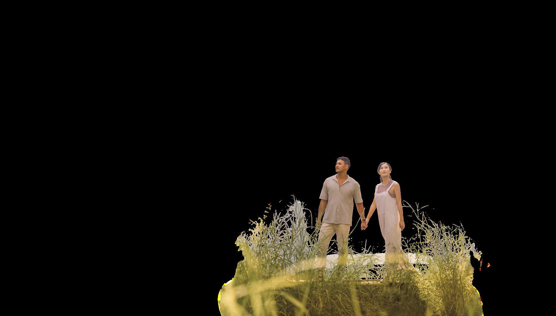
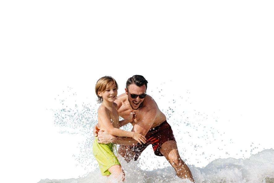
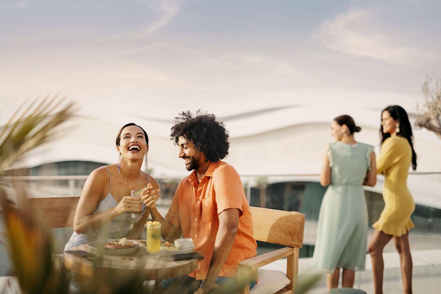
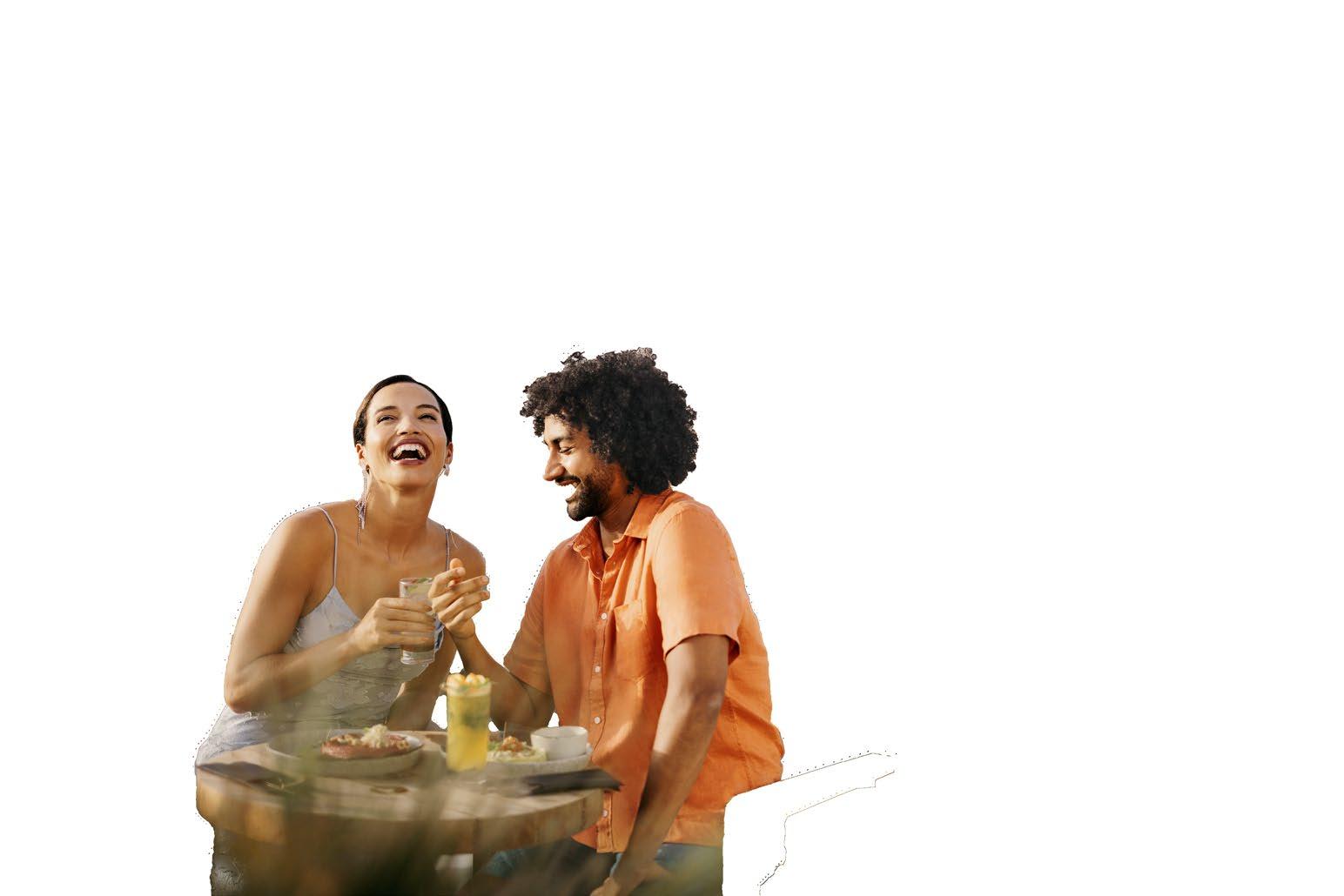
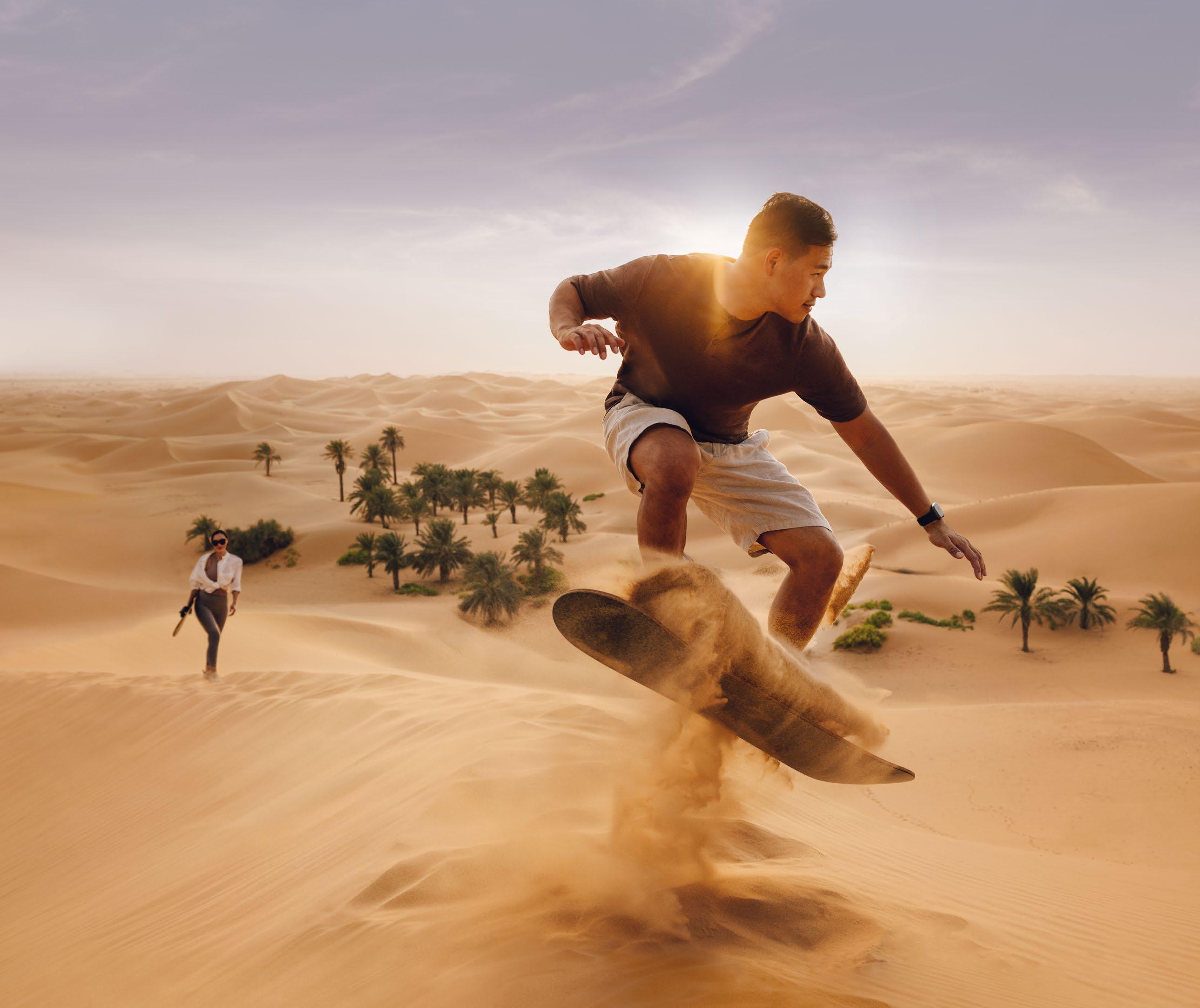
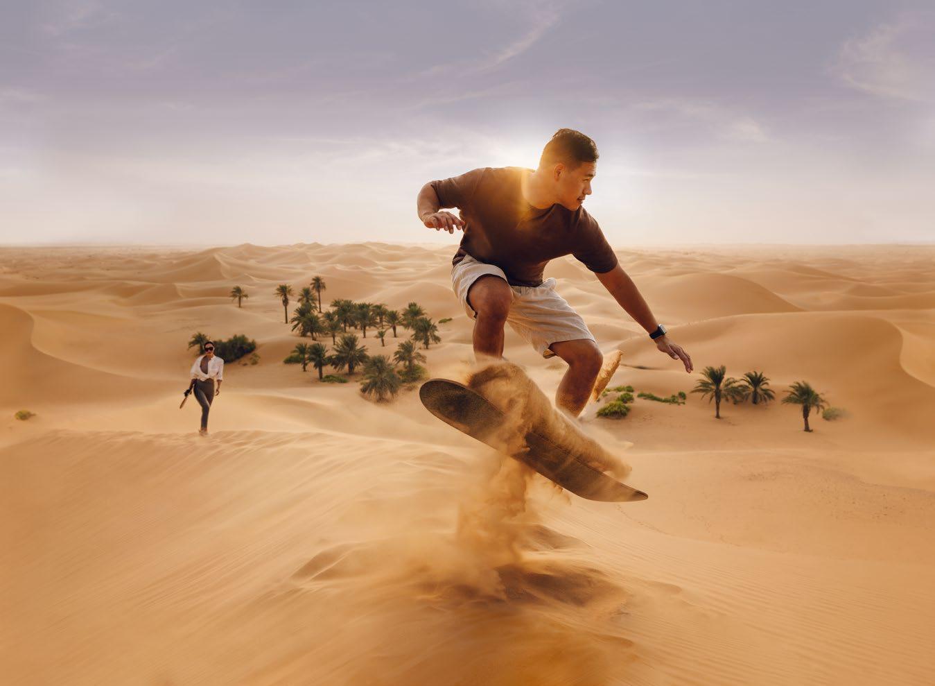
Always lead with human experience, sharing powerful immersive moments.
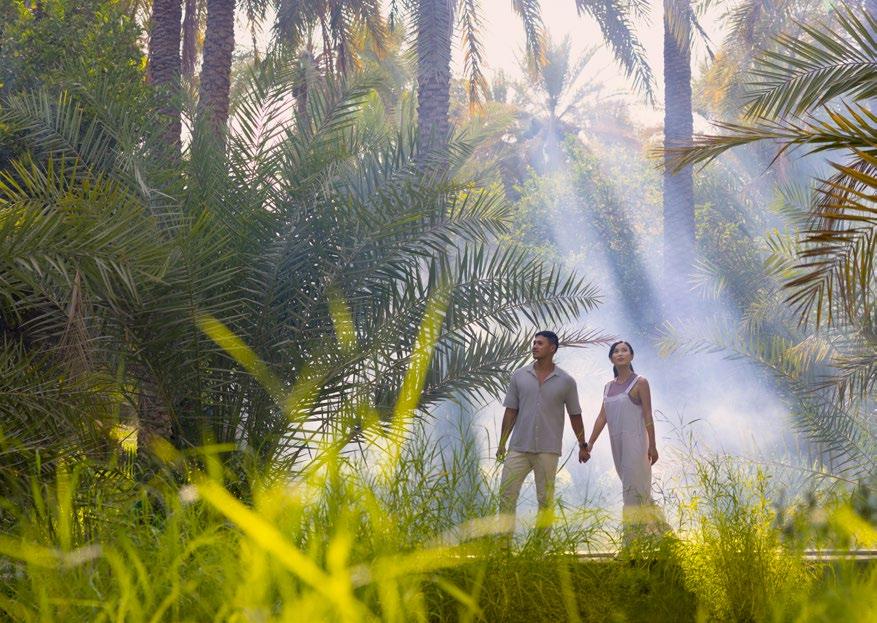
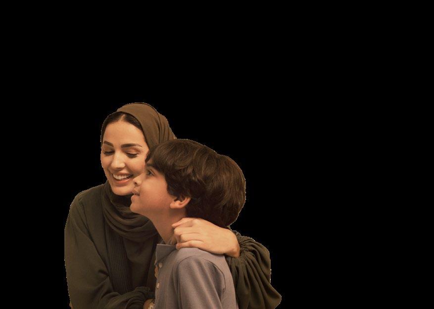
Establish Abu Dhabi as a living destination, never showing our assets devoid of people and atmosphere.
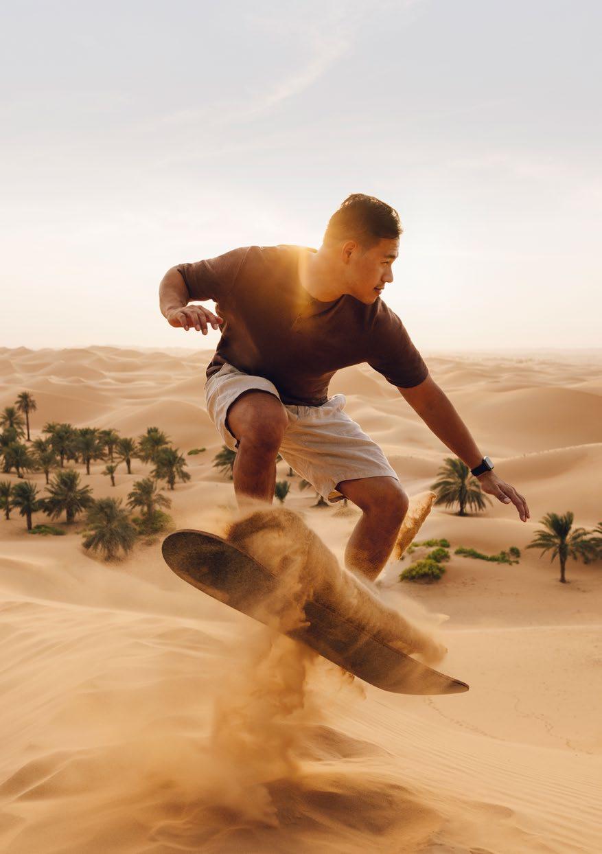
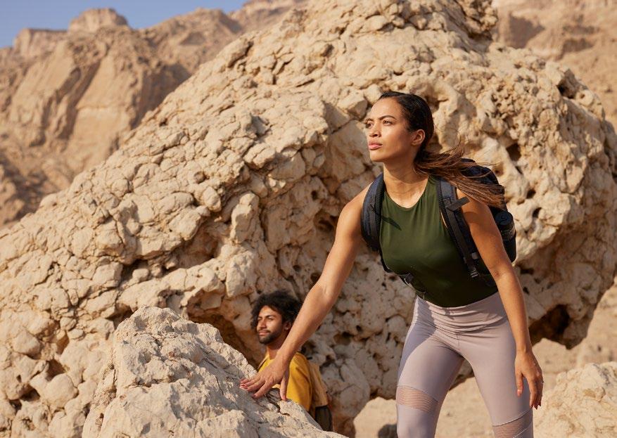
Express our truly diverse range of experiences, reinforcing the idea of ‘Find your pace'.
Elevate and amplify the essence of each experience.
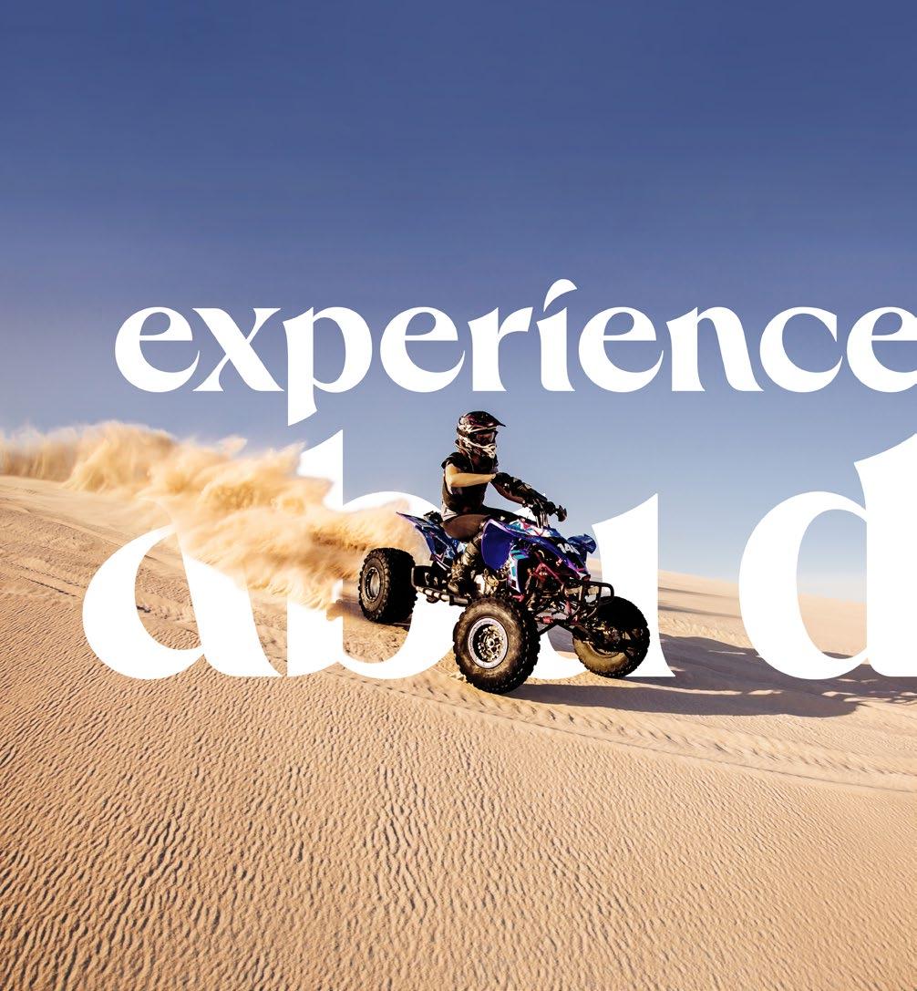
For example: F1 = High octane.
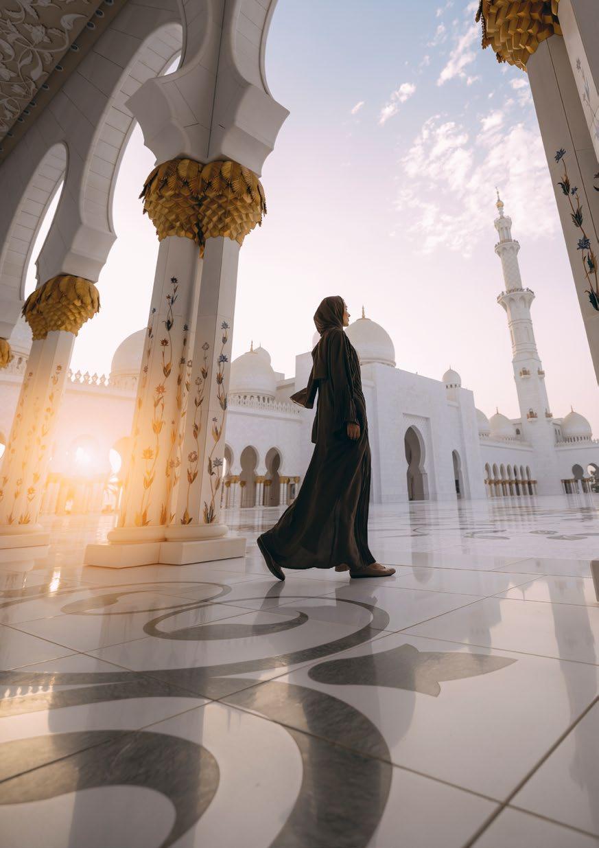
Shatter misconceptions by sharing the unknown and unexpected assets of Abu Dhabi.
Take a point of view on culture, arts and entertainment.
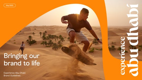
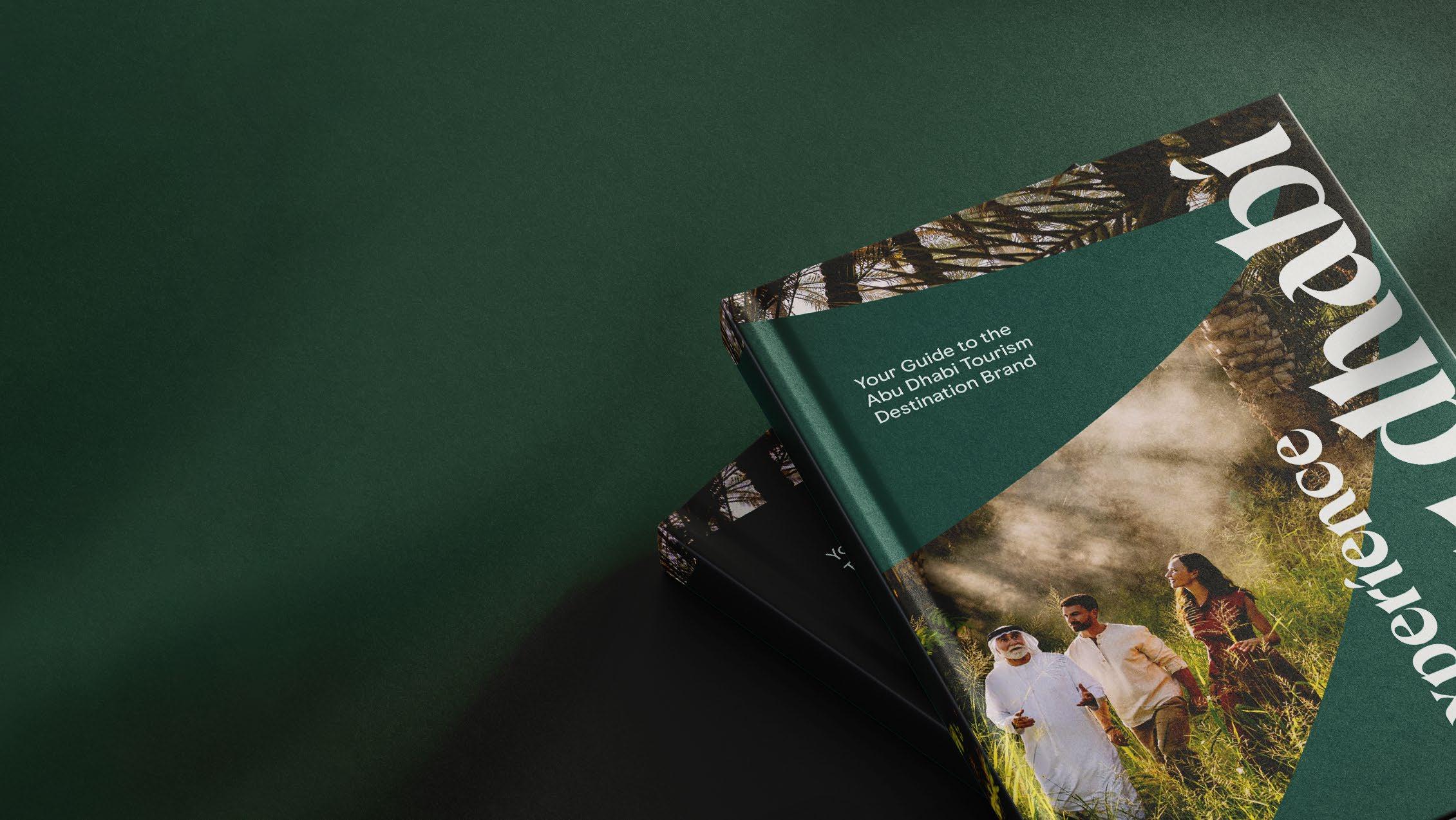
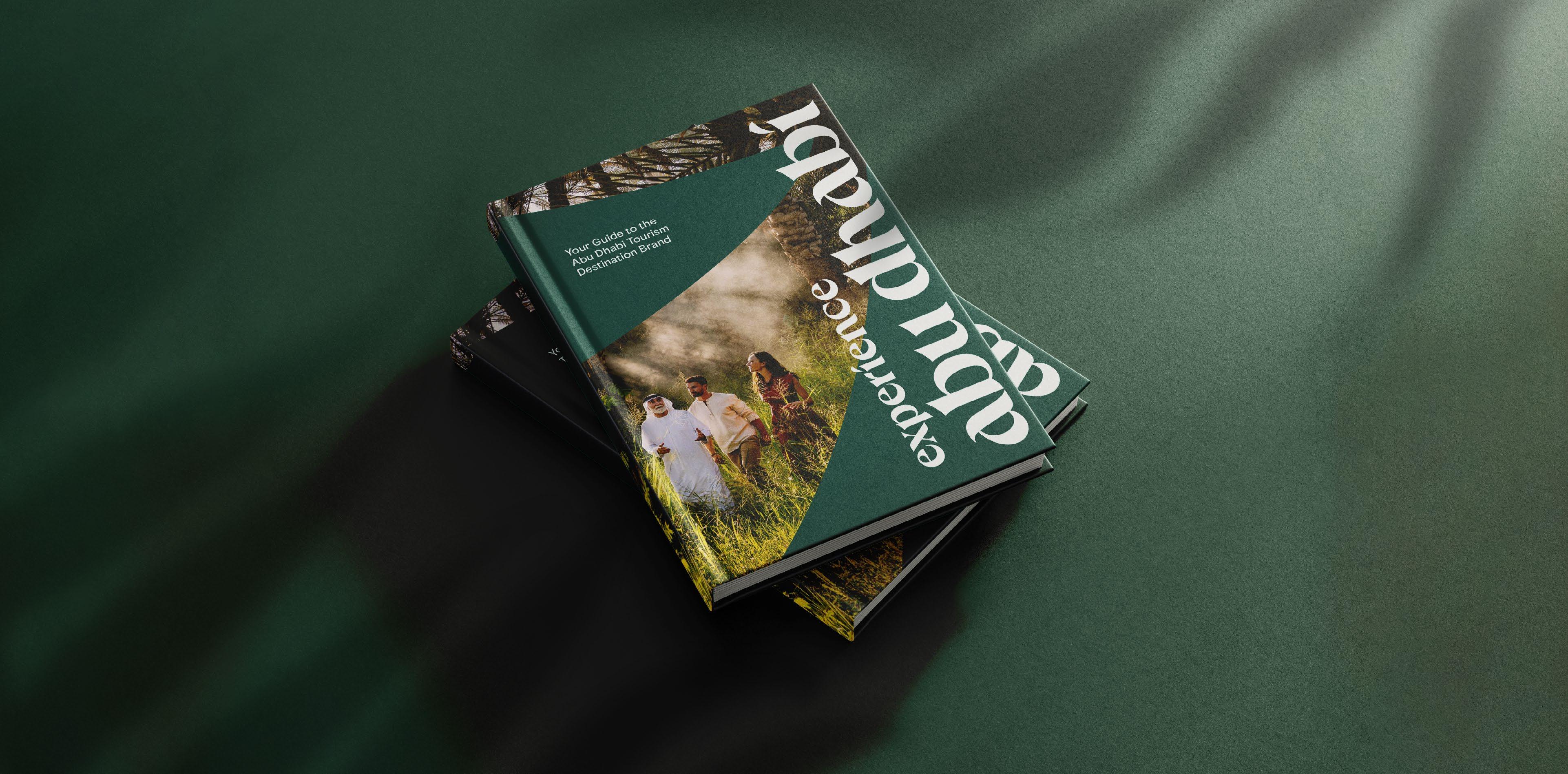
This document is designed to be a quick, easy and digestible overview of our brand. It is a source of guidance and inspiration when creating anything for the Experience Abu Dhabi Brand. Our guidelines have interactive buttons throughout to help navigate the document. Use the top left navigation menu to return to the contents page. The navigation itself is interactive, taking you to each selected page.
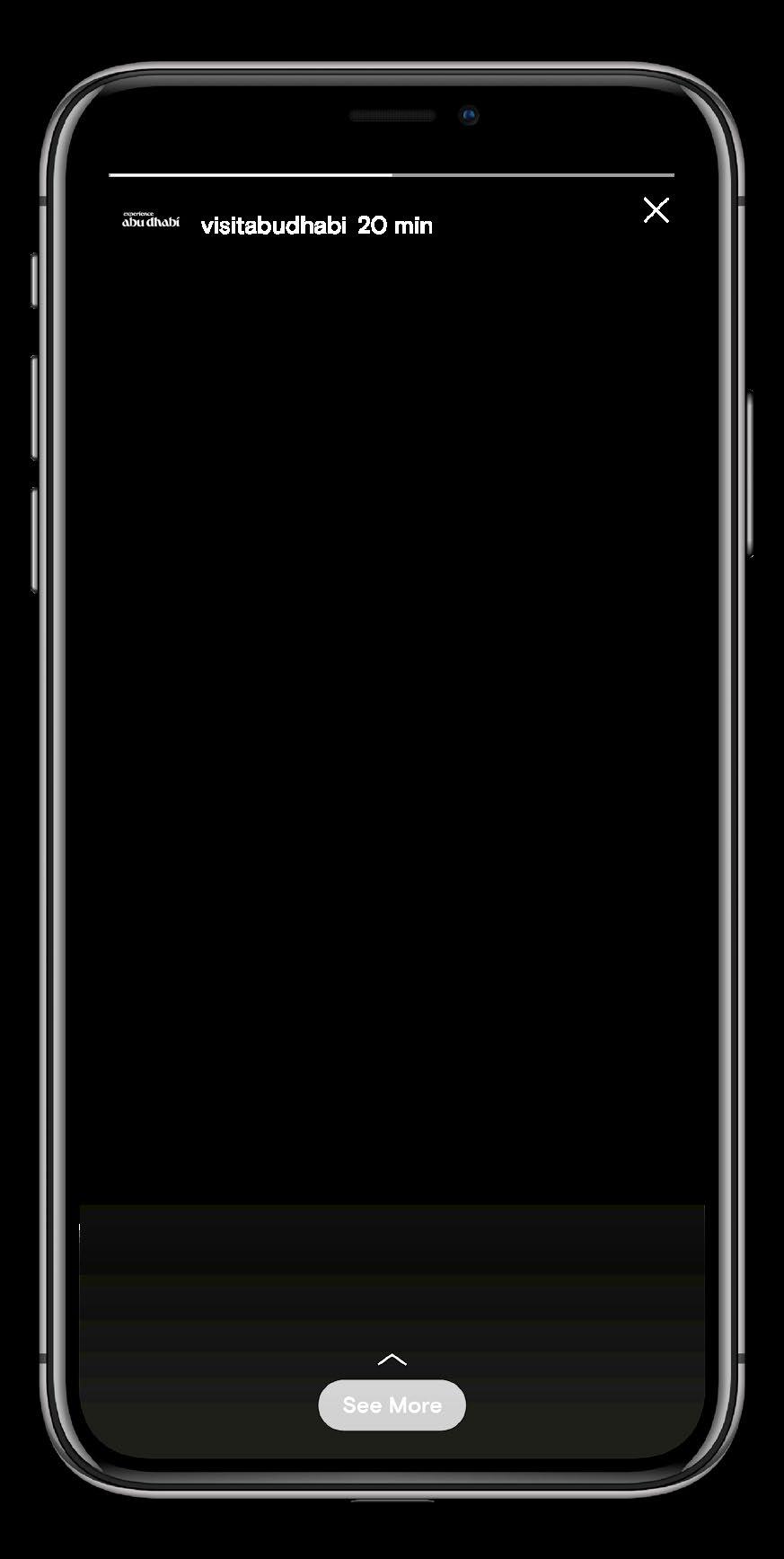
To complement these guidelines there is a social media playbook, that covers our design approach for social media in more detail.
Brand Strategy
Within this section you’ll find everything you need to know about who we are as a brand. Get to know our new strategically developed brand that puts our visitors at the heart of everything we do.
Enrich people's lives through sharing Abu Dhabi.
Strategy Our purpose: Why we exist
Our purpose explains why we exist in the world—our reason for being.
Enrich people's lives through sharing Abu Dhabi.
What these words mean to us:
Enrich: To make experiences fuller, more meaningful, or more rewarding.
People: We aim to bring genuine value and joy to people within Abu Dhabi and in the wider world, enriching their lives through culture, ideas, experiences and our shared landscape of possibilities.
Sharing: We have so much to celebrate about who we are. We have a heritage to be proud of and a story that people want to learn and be a part of. It’s time to share our living culture with the world.
Abu Dhabi: As Emiratis, we welcome people with warmth and respect. We are excited to share what we have with the world in a spirit of exchange and openness.
Our promise articulates the value we create for, and with, our visitors.
Thoughtful experiences that inspire. For you to discover at your own pace.
What these words mean to us:
Thoughtful: Abu Dhabi offers truly considered experiences that are fully thought-through from the perspective of the visitor. Born out of shared human values that consider what really matters to people, communities and the planet.
Experiences that inspire: We have a diverse landscape of experiences for every visitor. We aim to take visitors out of the every-day and enable them to create meaningful and enduring memories in Abu Dhabi.
For you: We empower every individual to create a distinct and personal ‘Abu Dhabi story’. This isn’t a ‘check-list’ destination – it’s all about what you want to do.
To discover: We aim to ignite the curiosity in all of us by inviting people to get to know all the experiences Abu Dhabi has to offer. Known and unknown.
At your own pace: We enable you to define your own ‘pace’ – whatever that is – getting to know our Emirate in a way that works for you. We give you the freedom to define your own ‘personal journey’.
Welcoming Empowering Bold
It is a place where people are welcomed with warm Emirati hospitality, a home away from home – where moments become more meaningful because they are shared. It meets you as you are and seeks to empower you. It not only welcomes you to be yourself, it surrounds you in an environment that inspires it.
It always endeavours to discover new ways, unafraid to be the first. It pushes the boundaries of possible and helps us see things in new ways.
We are not… Cold ⁄ Indifferent ⁄ Inauthentic
We are not… Overbearing/Forceful/Domineering
We are not… Brash/Audacious/Reckless
Considered
It’s a place that acts with consideration –for people, values, and the environment that surrounds it. It’s thoughtful and respectful, looking to make a better world for future generations.
Genuine
It honours its heritage, true to its roots and its history of shared progress that drives it to this day. It’s a genuine living culture – a unique kaleidoscope of past, present and future.
We are not… Quiet/Passive/Apathetic
We are not… Manufactured/Fabricated/Arrogant
Our brand narrative: Our story
Our brand narrative sets out a clear picture to our employees and visitors of who we are, what we believe, where we’re going and how we’re different from other destination brands.
Enrichment. The very essence of Abu Dhabi. Welcoming and sharing at heart.
Empowering. Bold. Genuine. A living culture, driven by boundless curiosity. Embracing creativity. A culture celebrating exchange. Connect with what matters to you. At your pace. Inspiring, exciting, restoring. Diverse experiences that mirror your passions. From the tranquillity of Al Ain to the thrill of Yas Island. From the wonder of the Louvre Abu Dhabi to the breathtaking beaches of Saadiyat island. From the known to the unknown, we invite you to shape your own journey of personal discovery. Thoughtful experiences, at your pace.
Communications Tagline:
● Visitor centric; personalised
● Conveys diversity of activities
● Empowering; invites action
● Short and punchy
● Modern, memorable style
Our tagline is only to be used in the context of campaign assets. It’s not needed on general branded content.
There is a specific campaign logo (see p.14) and tagline lock-up that should only be used in campaign scenarios.
Our tagline: A simple articulation of our brand promise
Find your pace — this is only used in the context of campaign assets. It's not needed on everything.
Find: Leverages a verb as a call to action. An invitation to participate. Builds on the notion of curiosity and discovery (the known and unknown).
Your: Speaks to individuality and personal choice. Suggestive of ‘alternatives’ – for you to experience ‘at your own pace’. Reflective of empowerment of the individual.
Pace: The speed at which someone or something moves, or with which something happens or changes.
We use our passion pillars to:
● Organise assets around visitors
● Support visitor navigation and more relevant marketing and communications
● Guide how assets appear and are communicated
Brand passion pillars
We use passion pillars, rooted in visitor needs, to guide navigation of our diverse portfolio:
Inspire
Brands and offers that inspire and educate creatively and culturally to enrich people’s lives
Restore Brands and offers that allow people to revive, refresh and escape
Excite
Brands and offers that excite through entertainment and adventure Prosper Brands and initiatives that support and promote industry, trade & commerce
Brand Strategy
Passion pillar asset mapping
Please note that this is not an exhaustive list of assets and that should only be used as a reference.
Inspire Restore Excite Prosper
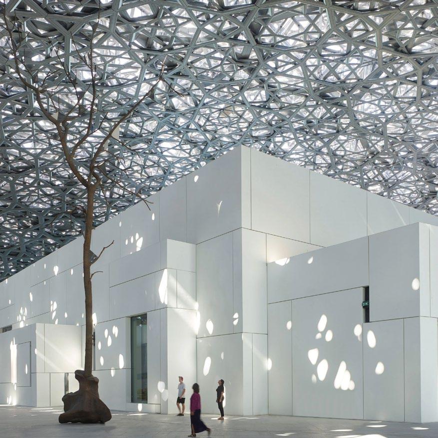
● Louvre Abu Dhabi
● Guggenheim Abu Dhabi
● Abu Dhabi City of Music
● Natural History Museum Abu Dhabi
● Abu Dhabi Art
● Bait Al Gahwa
● Cultural Foundation
● Qasr Al Hosn
● Qasr Al Hosn Festival
● Bait Al Oud
● Abu Dhabi Classics
● House of Artisans
● Children’s Art Centre
● Abu Dhabi Children’s Library
● Al Marsam Al Hor
● Bait Al Khatt
● Abu Dhabi Crafts
● Sheikh Zayed Grand Mosque
● Mother of the Nation Festival
● Manarat Al Saadiyat
● Al Ain Museum
● Zayed National Museum
● Qasr Al Watan
● Qasr Al Muwaiji
● Al Jahili Fort
● Al Dhafra Fort
● Bail Mohammed bin Khalifa
● Al Qattara Arts Centre
● The Founders Memorial
● Umsiyat
● Sounds of the UAE
● The Church and Monastery of Sir Baniyas Island
● Traditional Handicrafts Festival
● Culture Summit Abu Dhabi
● Emirates Palace
● Saadiyat Island
● Al Ain Oasis
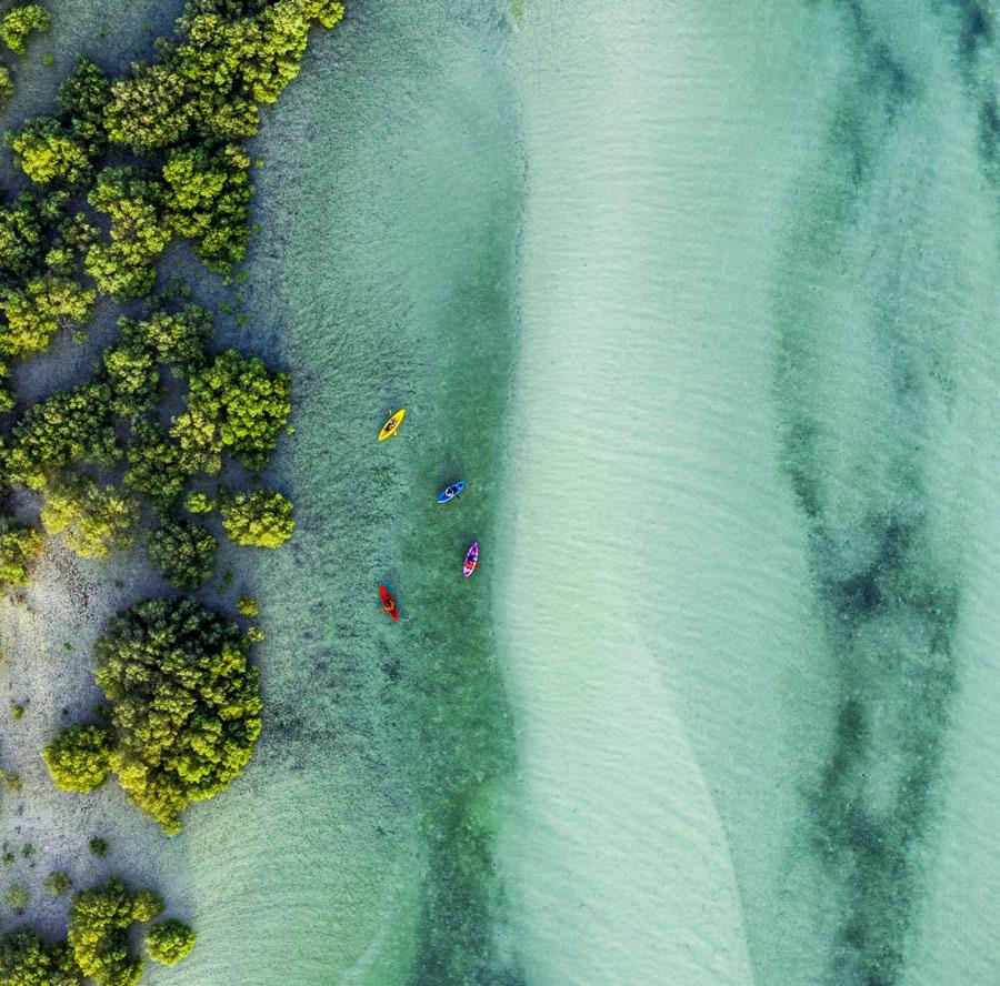
● Jubail Mangrove Park
● Marina Island
● Sir Bani Yas Island
● Saadiyat Beach Club
● Qasr Al Sarab
● Formula 1
● SeaWorld® Abu Dhabi
● Warner Bros. World™ Abu Dhabi
● Ferrari World Abu Dhabi
● Yas Island
● Al Ain Zoo
● The Galleria
● Mamsha Al Saadiyat
● Yas Bay
● Yas Mall
● Yas Marina Circuit
● CLYMB™ Abu Dhabi
● Emirates Heritage Club
● Jebel Hafit Desert Park
● Etihad Arena
● Zayed Sports City
● Wadi Adventure
● The National Aquarium
● Reem Mall
● Yas Waterwold Abu Dhabi
● Image Nation Abu Dhabi
● Abu Dhabi Convention and Exhibition Bureau
● Etihad Airways
● Abu Dhabi Film Commission
● Abu Dhabi International Book Fair
● Abu Dhabi Gaming (AD Gaming)
● Abu Dhabi Arabic Language Centre
● Kalima
● twofour54
● Esdarat
● Arab Film Studio
● Yas Creative Hub
● Sandstorm Comics
● GCC Heritage and Oral History Conference
● Sheikh Zayed Book Award
● Abu Dhabi Specialists Program
Tone of Voice
Whenever we communicate, we always speak in one Abu Dhabi voice. This is our persona and personality, the foundation of our verbal expression.
How we speak & write We are...
The inspiring host
Inviting
When we talk to our audience, we’re inviting them to visit our home. Focusing on being open, warm and welcoming. Our voice is authentic we’re not speaking ‘to’ people, we’re speaking ‘with’ them.
Confident
We are Abu Dhabi experts, proud of our home and excited to share it. We know who we are and have insider knowledge and thoughtful opinions. We express ourselves with confidence, intelligence, and at times a boldness that reflects our ability to think outside the box and achieve goals beyond our limits.
Immersive
We want to bring our destination to life, putting our audience at the centre of the experience, transporting them, rather than telling them. Immersing them in our world with creative storytelling.
1. Inviting
When we talk to our audience, we’re inviting them to visit our home. Focusing on being open, warm and welcoming. Our voice is authentic we’re not speaking ‘to’ people, we’re speaking ‘with’ them.
Do…
● Use invitational language – reflecting our purpose to share Abu Dhabi
● Connect human-to-human – using personal pronouns like ‘we’ and ‘you’ to ensure our audience know there’s someone behind the writing
● Write authentically - as you’d really say it – not using overly complex language or phrasing
● Express our passion for our home using emotive language – don’t be afraid to use colourful and emotional adjectives and verbs
● Be genuine – express real thoughts and opinions
Do not…
● Be too chatty and casual. Don’t use language that is too colloquial or slang
● Be overly friendly or intimate using inside jokes or obscure cultural references that our audience won’t understand
● Be too enthusiastic or over exaggerated we’re not here to convince, we’re here to inspire
2.
Confident
We are Abu Dhabi experts, proud of our home and excited to share it. We know who we are and have insider knowledge and thoughtful opinions. We express ourselves with confidence, intelligence, and at times a boldness that reflects our ability to think outside the box and achieve goals beyond our limits.
Do...
● Have a point of view and express it – for example on culture, arts, history and more
● Use varying sentence structures –including shorter sentences that are bold and to the point
● Play with words to build more creative and playful expressions that inspire and entertain
● Use punchy headlines to stand out
● Share our unmatched knowledge of our home revealing ‘secret’ tips and other things only we would know
● Leave some room for guessing – don’t tell the whole story
● Use active language to express confidence
Do not...
● Be arrogant or overly-confident – we’re not shouting or trying to show that we’re better than others
● Be funny or comical – we’re not trying to make people laugh like a comedian
● Be too clever and witty – don’t try to show off
● Try too hard to impress
● Be mysterious or hard-to-get – we want Abu Dhabi to be open to everyone
3. Immersive
We want to bring our destination to life, putting our audience at the centre of the experience, transporting them, rather than telling them. Immersing them in our world with creative storytelling.
Do…
● When describing an experience, go deeper by focusing on what it really feels like to be there - describe what you see, smell, hear – even how it tastes - no senses are left out
● Bring some passion and energy to your writing - allow yourself to get excited
● Use onomatopoeia, alliteration and other literary devices to bring the place to life
● Make it personal - talk directly to our audience - helping them to picture themselves
● Tell stories – bring it to life through characters, heritage and history
Do not…
● Go over the top – using too many techniques or descriptions at once
● Go on and on - this isn’t a novel!
Welcomes you. Discover it at your own pace and connect with what Diverse experiences that mirror our passions. Letting you shape your own journey of personal discovery.
A cultural destination that embraces creativity and exchange, inspiring
Meet our six segments
Comfort Seeker
I’m looking for a trip where I can take it slow and feel the comforts of home, ideally with a culture that’s not too far from what I’m used to. I want quality accommodation and a nice beach where I can relax and create memories with my family.
Modern Globetrotter
I travel to find cool, modern activities like music festivals and theme parks that I can’t find anywhere else. I also want a safe destination that can provide me with moments of luxury when I’m done with the fun! I don’t mind spending a little more for the best experience around.
Easy-going Unwinder
I’m hoping to relax and recharge in a place that attracts a cool crowd but doesn’t overwhelm me with too much to do. I want a few things to do alongside some time to chill out, so I can dip in and out as I please.
Culture Enthusiast
I often travel globally and am looking for a getaway full of authentic cultural experiences, most likely with my partner. Wherever I go I want to educate myself about the local tradition/history and be able to explore at my own pace.
Authentic Explorer
I’m looking for an adventure - seeking trips that can be spontaneous and let me discover new cultures and incredible nature through local recommendations. I’ll probably be exploring with my family, and don’t mind if it costs a little more to find the most exciting experience.
Low Effort
Fun-Seeker
I’m a hands-off traveller –looking for maximum family fun with minimal effort. I’ll likely go for a popular destination and use a tour operator to take away the stress. I want to keep things fast-paced yet feel I’m taking a deserved break.
2. Captivate
Visitor discovers Abu Dhabi or the experience in question. “I am curious about visiting this place or destination.’
3. Engage
Visitor searches – trying to find more information. ‘I am well-informed and inspired to book a trip or visit.’
4.
Facilitate
Visitor commits and starts to book their trip / experience(s). “I am able to easily and seamlessly arrange my whole trip or visit.’
1. Connect
Visitor arrives in Abu Dhabi and explores the activities on offer. “I am able to enjoy all the experiences the place or destination has to offer.’
5. Delight
Visitor leaves Abu Dhabi and reflects and remembers the trip. “I would recommend this place and I am excited to go back.’
VISITOR REVISITS
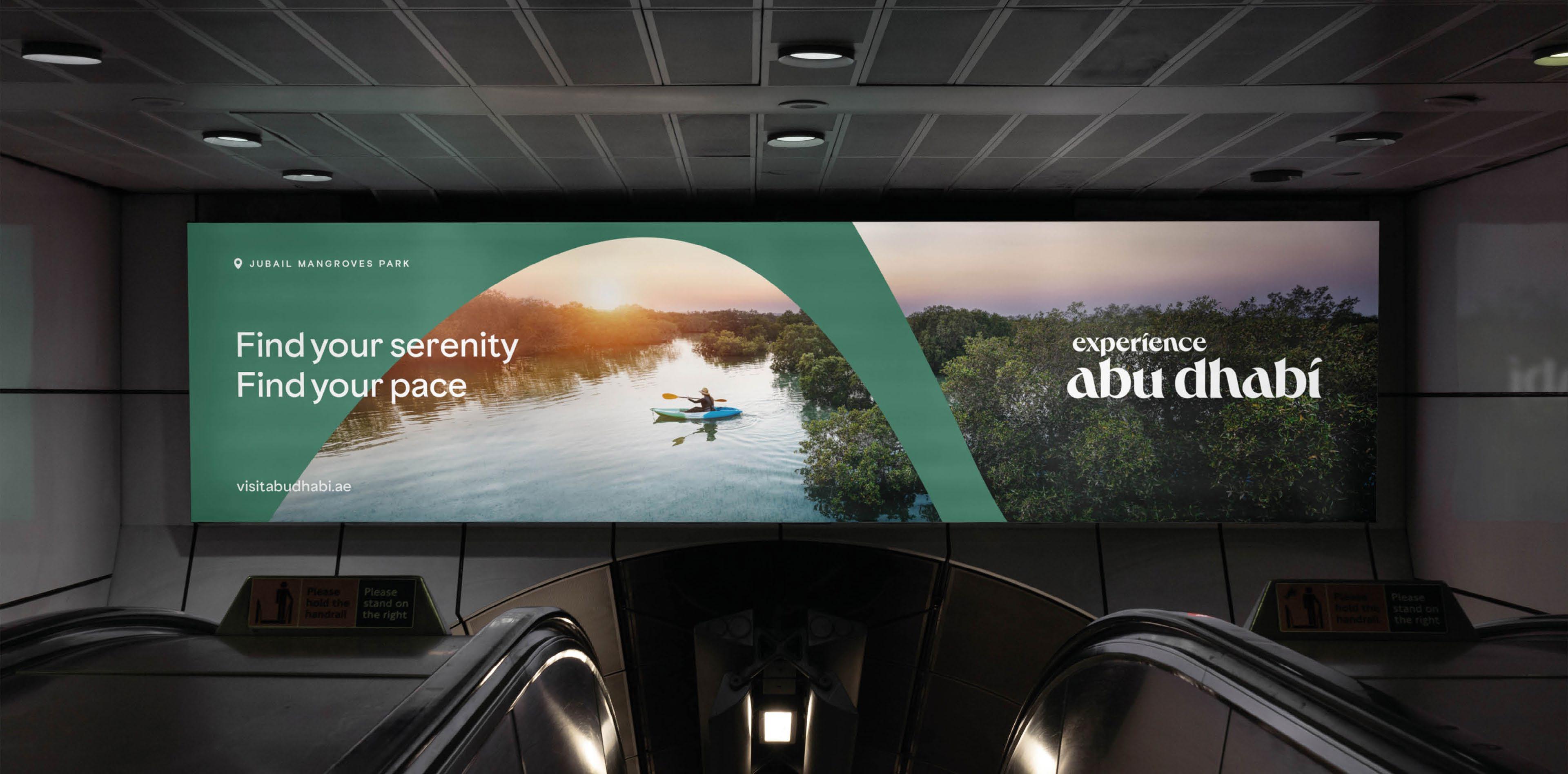
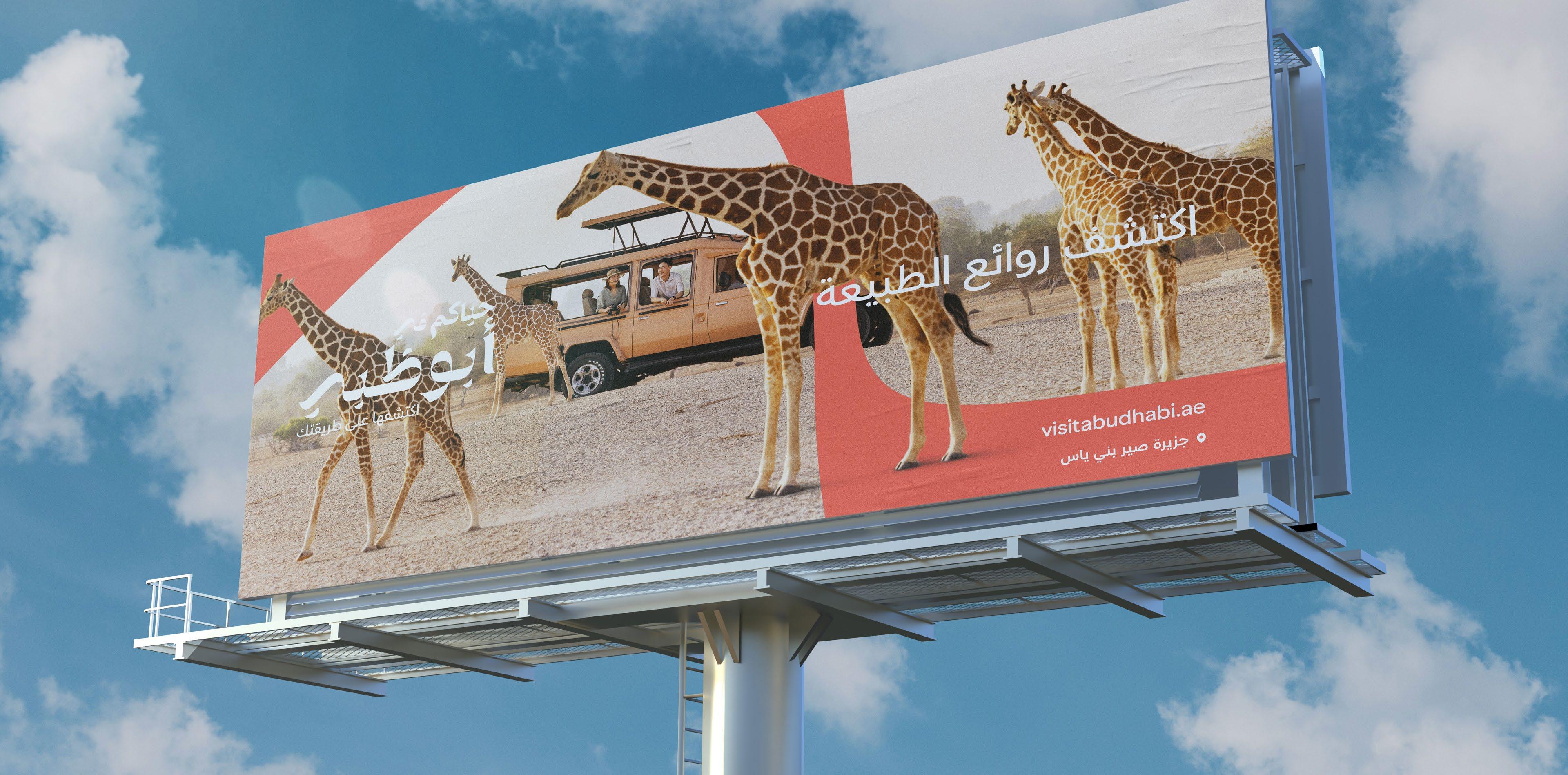
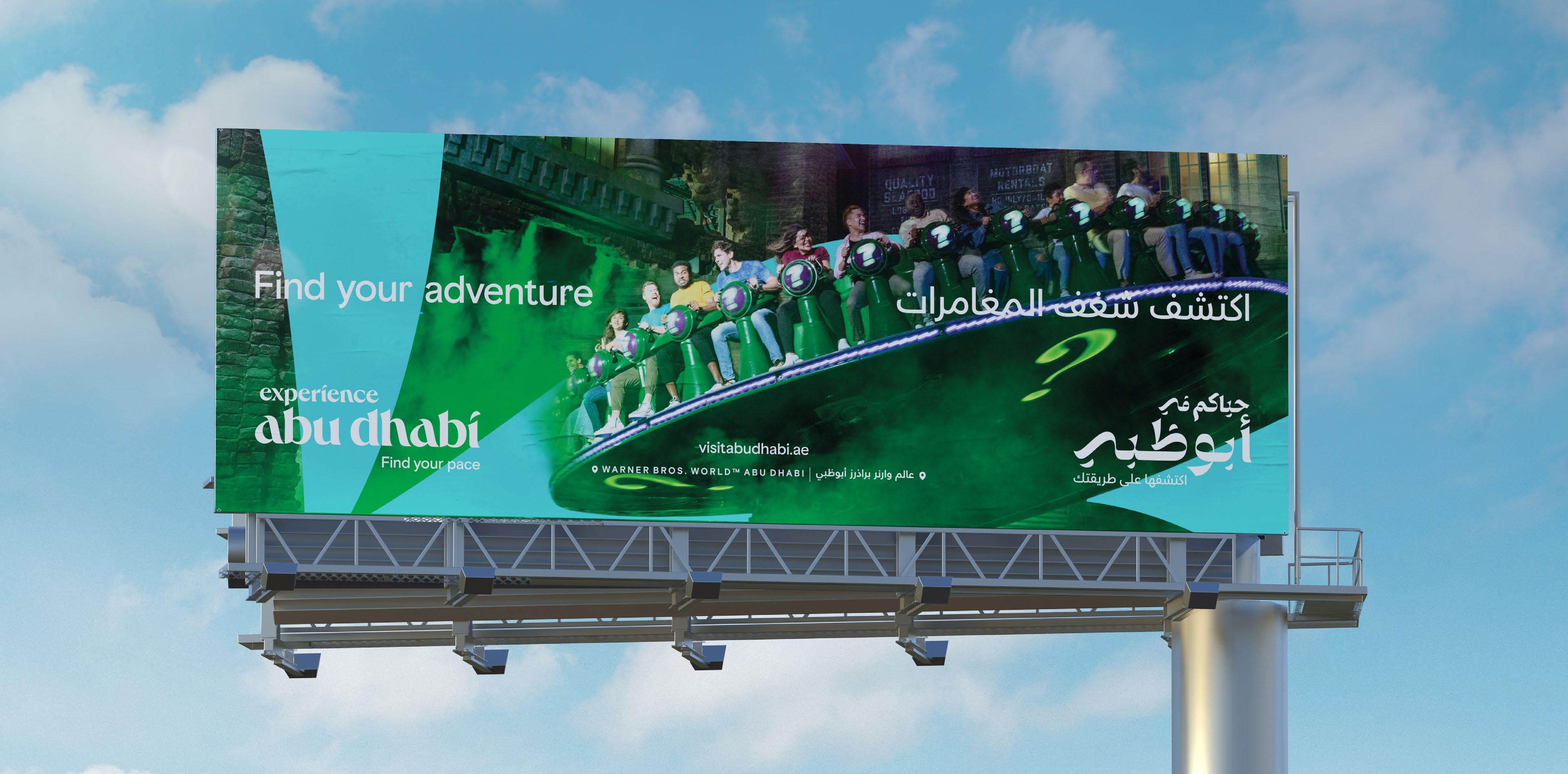
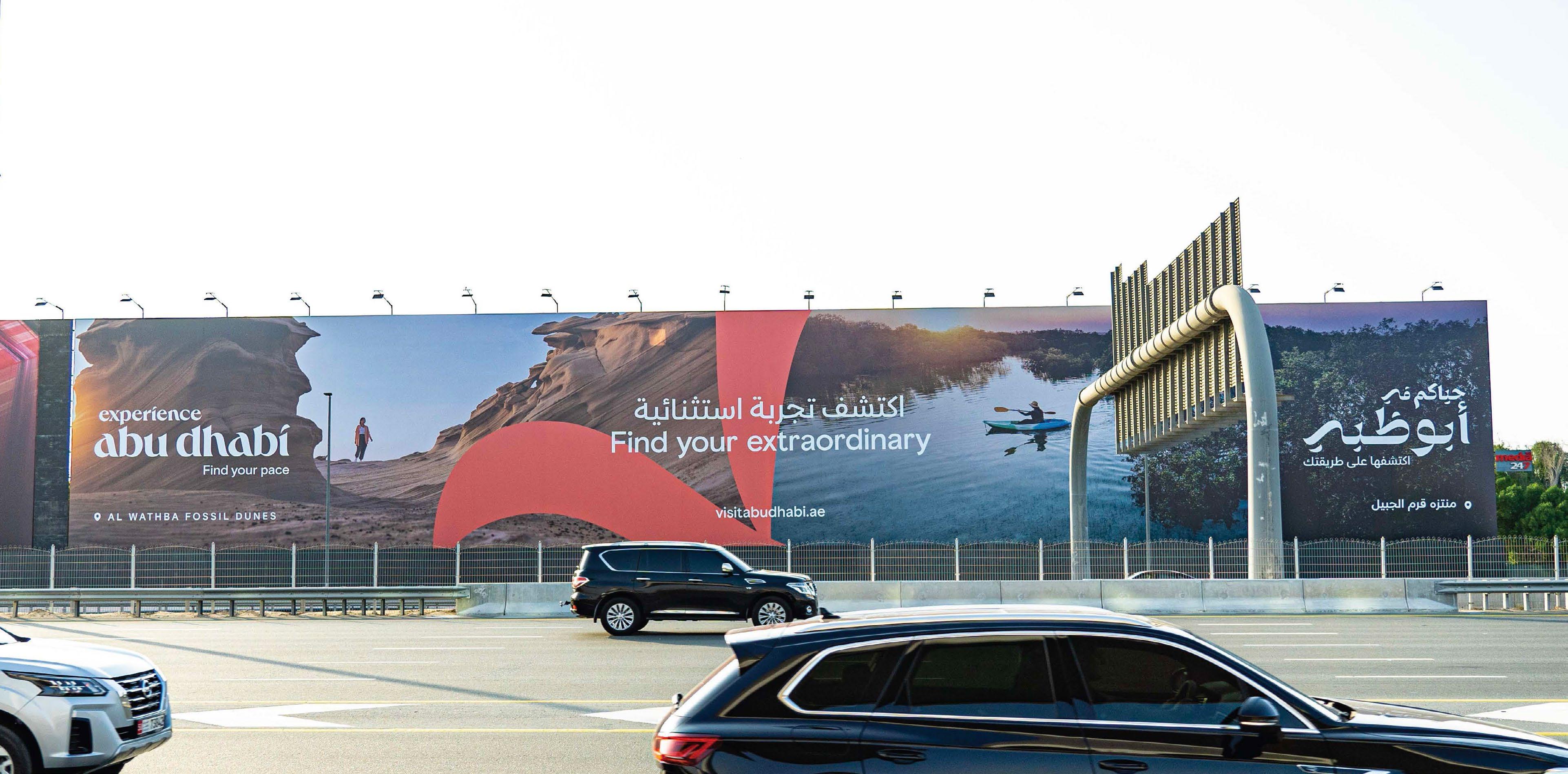
Visual Identity
When combined, our signature visual assets express who we are and what we do. Taking an editorial point of view, we create a visual language that is uniquely Abu Dhabi.
Visual
Identity Our signature brand assets
Our brand consists of six key signature assets, which combine to form our visual identity. The next pages explain each element and their correct usage within our visual identity.
It's important to read and follow these pages to ensure we always show up in the best and most consistent way possible, so people always recognise us.
ABU DHABI BASIS
Logo
Three
things
to
know when applying our logo:
01 Be big & bold
Think in colour 03 Apply playfully
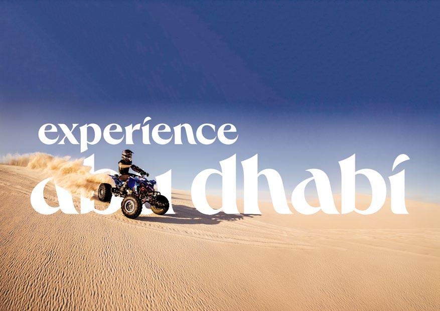
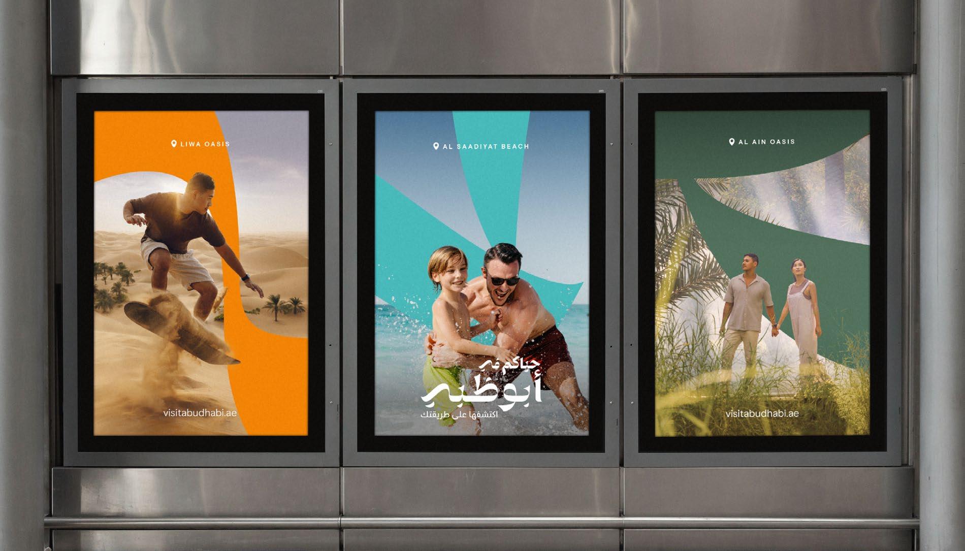
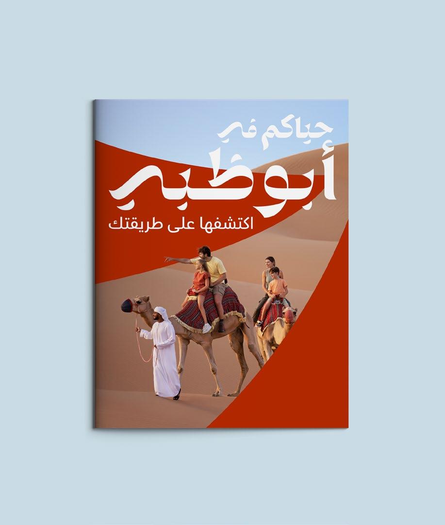
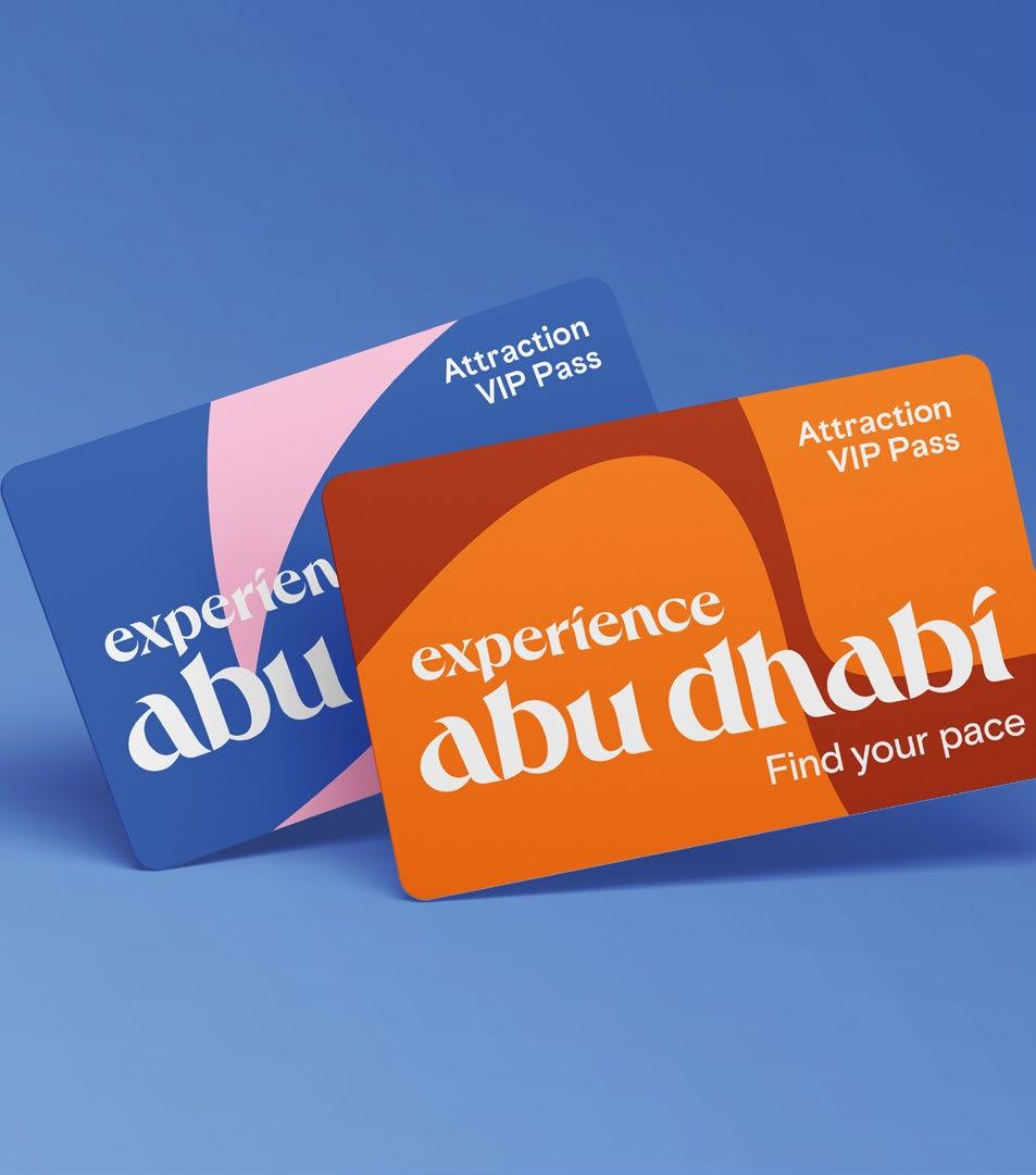
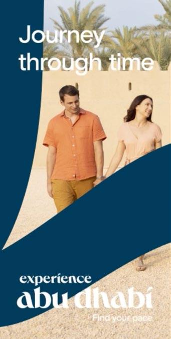
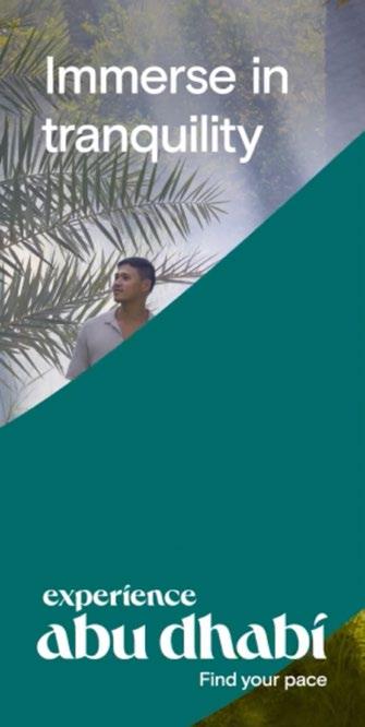
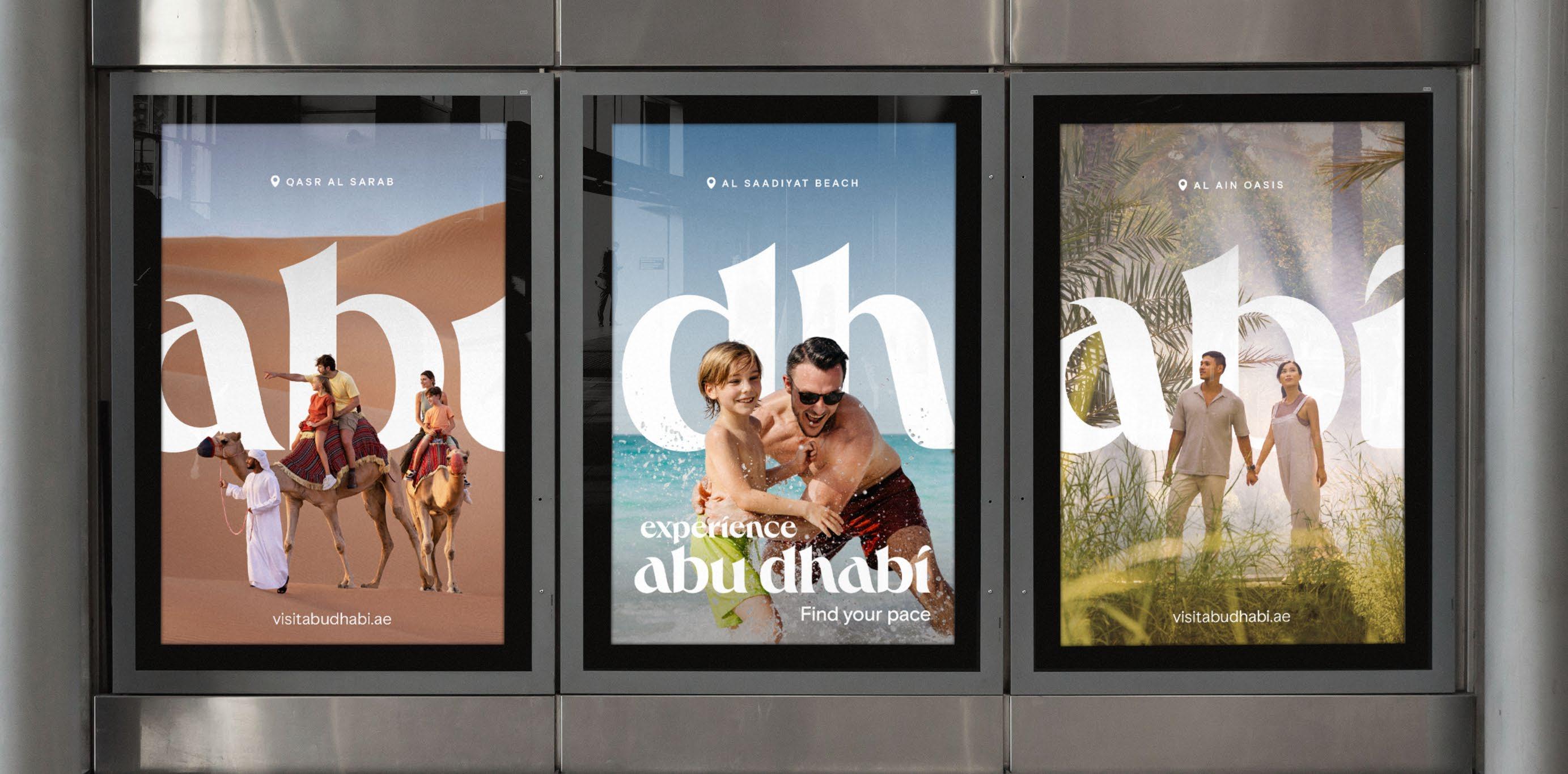
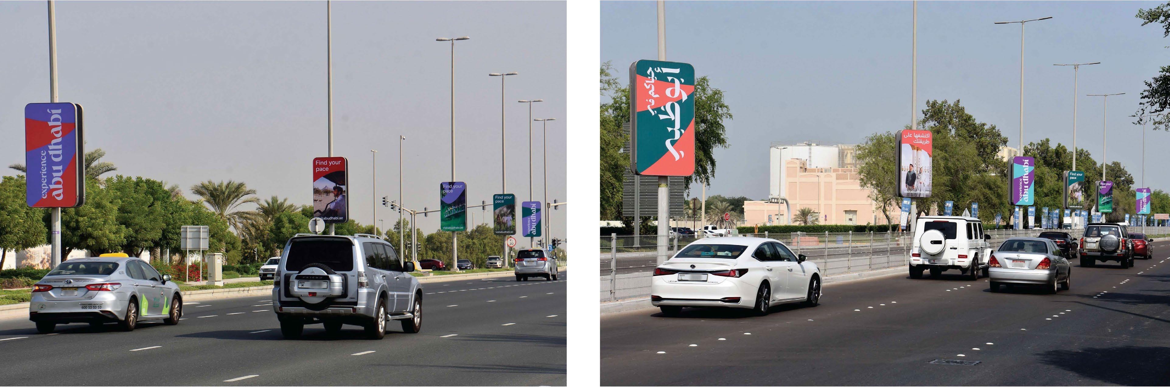
Where possible our Abu Dhabi campaign logo should be used as a hero graphic –either vertically or horizontally as a large masthead device.
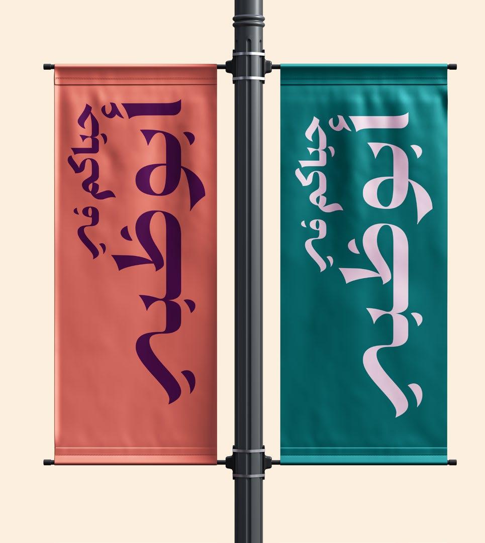
Our logo appears in multiple colours reflecting our diverse experiences. When implementing our logo, always use the approved colour pairings to ensure legibility and standout.
Elements from our imagery can interact with our logo, enabling our brand to feel more immersive and integrated with Abu Dhabi. Our logo must always be legible when applying this technique.
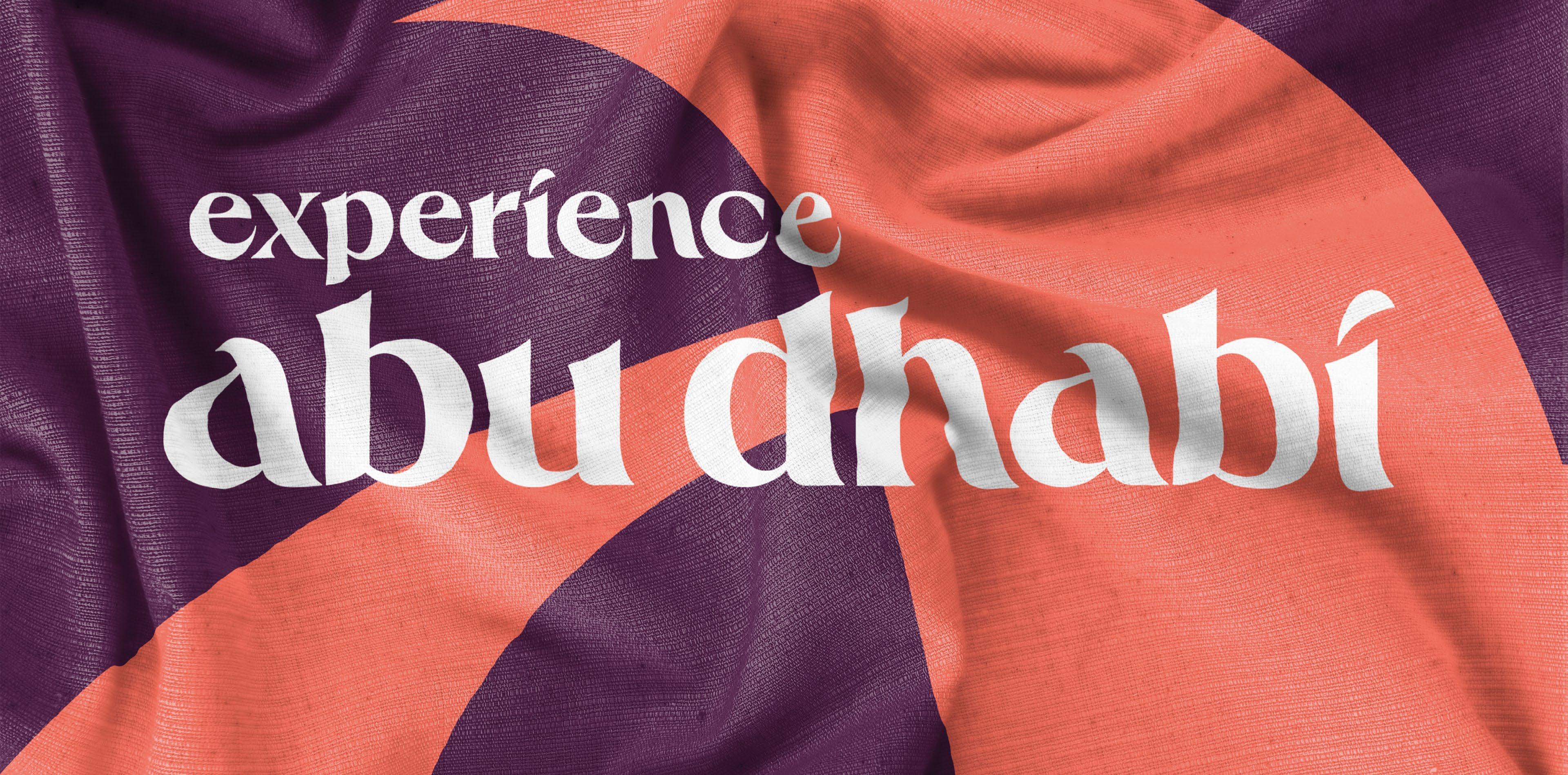
Our primary logo is our most recognisable and valuable asset. It appears on everything we do, acting as a visual shorthand for all we stand for.
It’s bold, assured and visually represents the virtues we embrace as a destination brand; modern, human and authentic. To maintain its value and recognition, we have some rules that govern its use.
DOWNLOAD LOGO
We take a flexible approach to colour to express the many different experiences on offer in Abu Dhabi. For that reason there is no one master logo colourway. We select the logo colour based on the background colour of our canvas.
Black and White
Our logo can also be used in black and white. To ensure maximum legibility of our logo, black is used on light background colours whilst white is used on dark backgrounds.
For more information on our colour values and colour pairings, please visit the colour section of these guidelines on pages 52–62.
Clear space
To ensure our logo stands out wherever it appears, we have defined clear space and minimum size guidance.
We use a clear space around our logo that is equal to half the height of our logo. The clear space is kept free from graphics, text, and other marks. It also defines the minimum distance between the logo and the edge of a printed piece of communication.
Minimum size
The master logo artwork is available in one size that can be scaled down to a minimum width of 30mm in print and 75 pixels in digital.
All logo usage must be approved by the brand team before publication
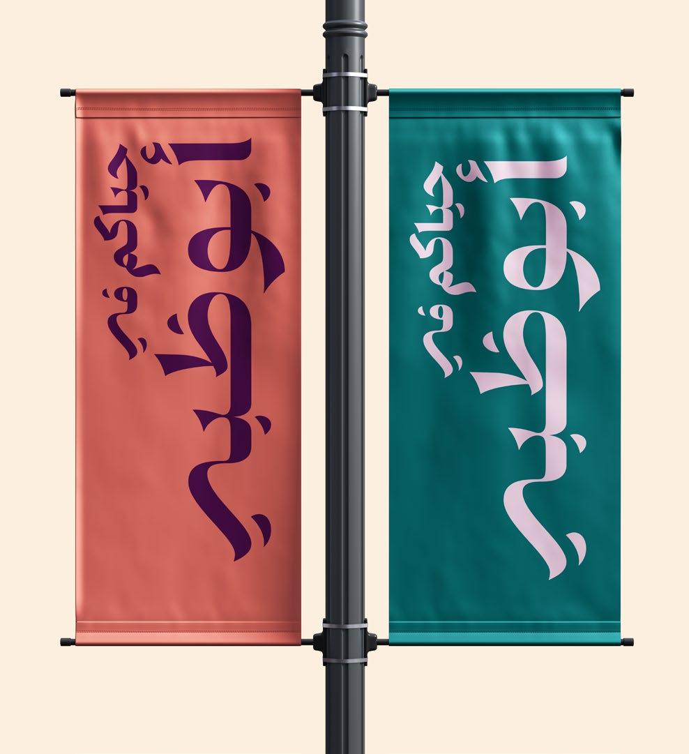
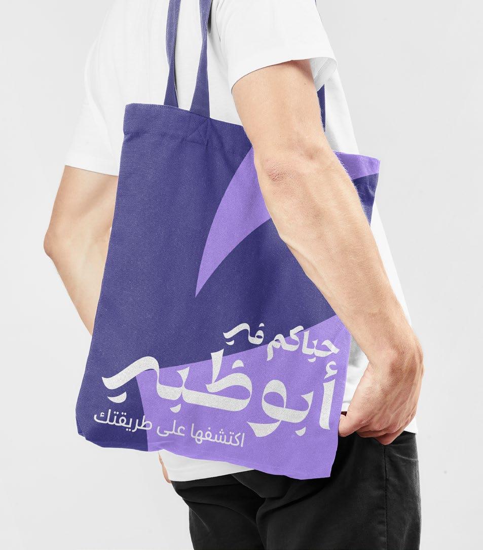
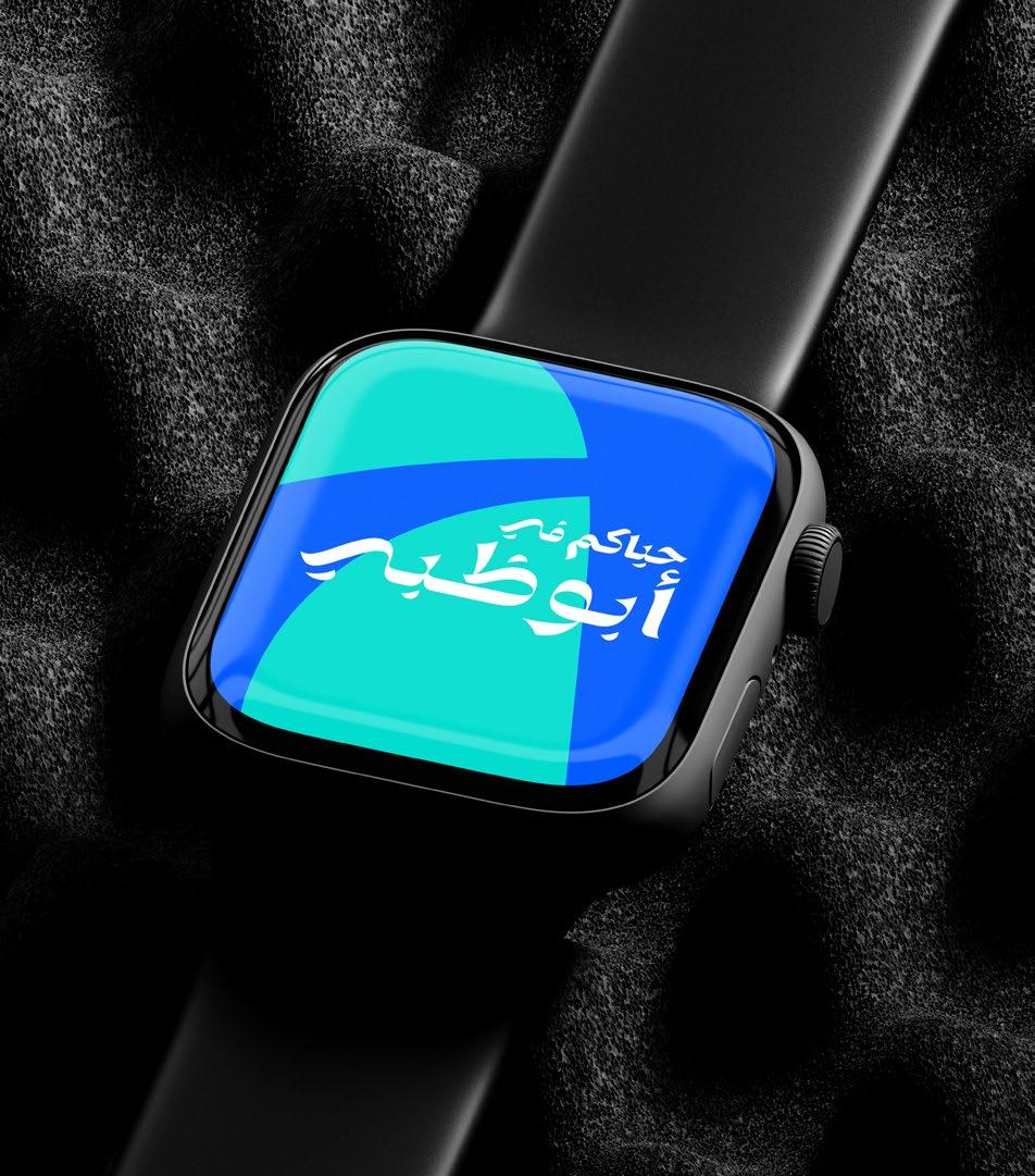
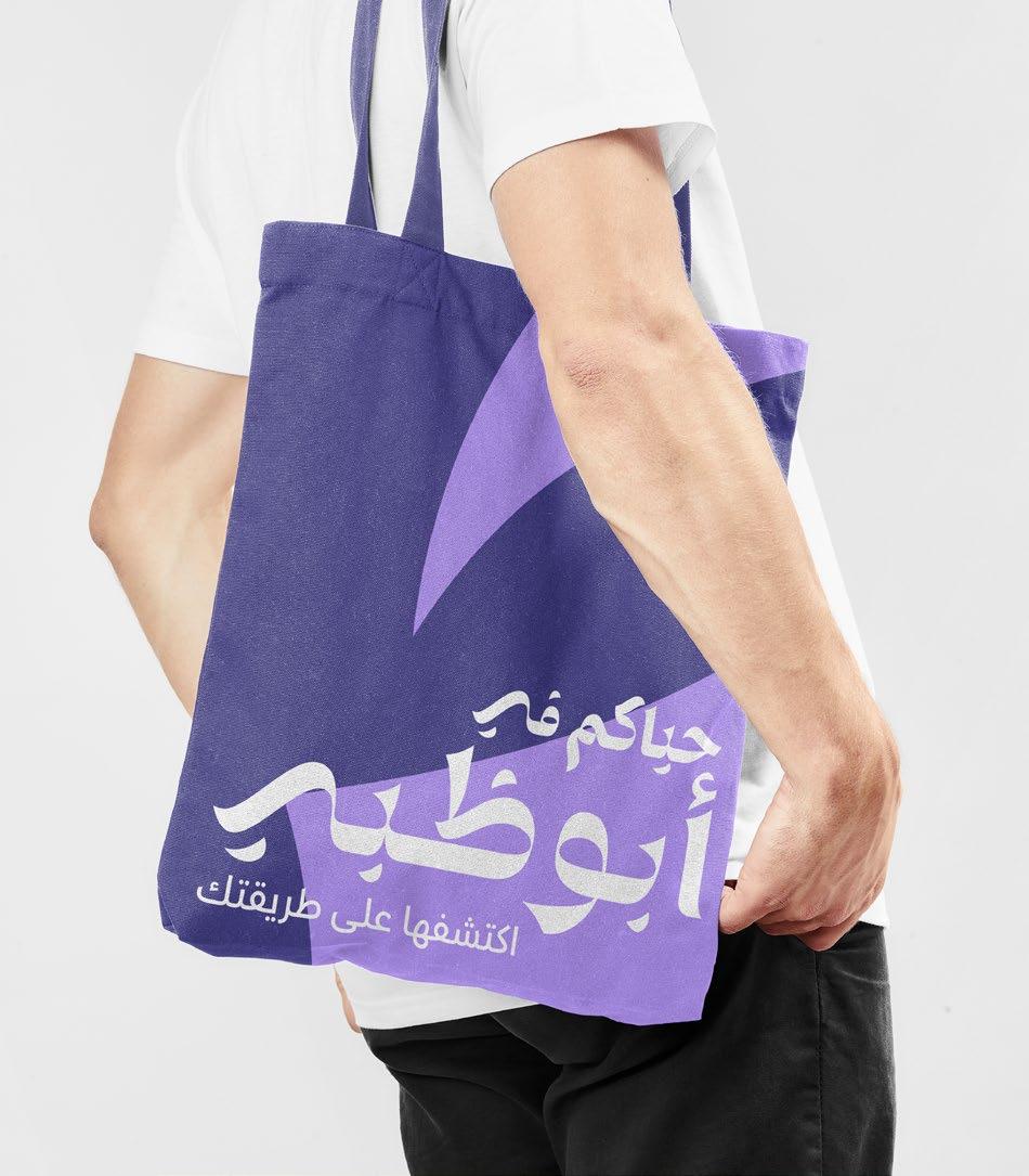
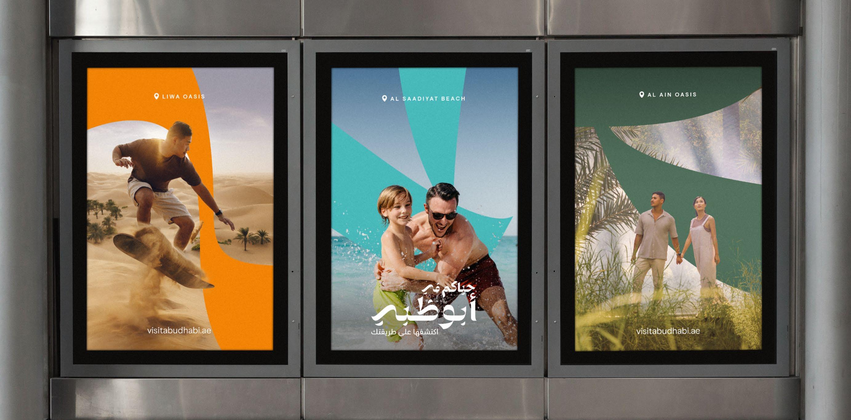
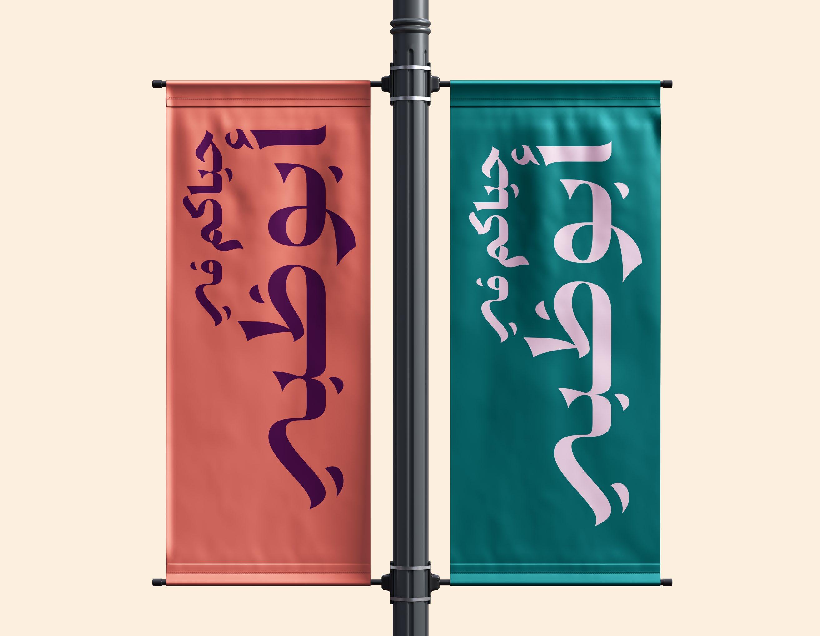
Our primary Arabic logo has been designed to match the forms of our English logo. We use it across all of our communications when we are communicating in Arabic-speaking markets. For all other markets we lead with our English logo.
Our Arabic logo has been translated to read as ‘Welcome to Abu Dhabi’. It is not a literal translation of our English logo — Experience Abu Dhabi. It reads as ‘Hayakom fi’ which is an Emirati word used to welcome people to a place.
All logo usage must be approved by the brand team before publication
DOWNLOAD LOGO
Clear space
To ensure our logo stands out wherever it appears, we have defined clear space and minimum size guidance.
We use a clear space around our logo that is equal to half the height of our logo. The clear space is kept free from graphics, text, and other marks. It also defines the minimum distance between the logo and the edge of a printed piece of communication.
Minimum size
The logo is available in one size that can be scaled down to a minimum width of 25mm in print and 90 pixels in digital. Always maintain the logo’s proportions when scaling.
logo usage must be approved by the brand team before publication
URL spacing
To ensure the URL is never seen as a lock-up to the logo, it should always be positioned further away from the logo than the clear space. This distance is defined relative to the logo you are using.
English wordmark
The URL should be positioned no closer than the height of the logo, defined as X.
Arabic wordmark
The URL should be positioned no closer than 75% Y, where Y is the height of the Arabic wordmark.
visitabudhabi.ae
visitabudhabi.ae
visitabudhabi.ae
visitabudhabi.ae
When the audience, location or format requires it, we can display our logo in both languages.
The English and Arabic logos have been visually balanced to take up the same space. The descriptor sits on the same baseline as the arabic equivalent, as illustrated opposite, with a spacing of X, which is equal to the height of the English Descriptor logo.
When displayed together, the Arabic logo is sized to 76% of the width of the English logo.
Applying logos for dual language
For Co-branding rules on spacing, please refer to the Co-Branding guidelines.
DOWNLOAD LOGO
Our logo can be used in two ways across our visual identity system and communications; as a masthead and as a sign-off.
Masthead
When we are celebrating Abu Dhabi and want to capture the attention of our audience, we use our logo at scale. We refer to this way of using the logo as the masthead. In these instances we use our logo positioned top, bottom or centred on the canvas with the option to overlay and interact with imagery. The masthead can also run vertically, in these instances the baseline of Abu Dhabi always aligns to the margin.
Sign-off
There are exceptions to this rule where space and formatting may better suit alternative logo arrangements e.g. video end frames, website. In these instances, we use our logo as a sign-off. The sign-off is used at smaller sizes and is optimized for the touchpoint. It should be clearly attributable to Experience Abu Dhabi.
How we use our logo
How we use our Arabic logo
Our Arabic wordmark is used in a very similar way to our English wordmark, both as a masthead and as a sign-off, but there are a few small differences.
Masthead
When using the Arabic wordmark as a masthead we use it positioned horizontally. Where appropriate the logo can be used vertically. This is to ensure it remains legible and always allows sufficient space for our content to flourish.
Sign-off
As a sign-off our Arabic wordmark is always positioned top or bottom right to ensure it is read right to left. There are exceptions to this rule where the format may suit alternative logo.
The examples shown on this page are for illustrative purposes only and should not be considered final designs.
When we use the logo as a masthead, and when it interacts with imagery, it is permitted for elements of the imagery to appear in front of the logo.
As a general rule of thumb no more than 20% of the logo should be obscured. This ensures that our logo is recognisable and legible.
Please note: When using the logo as a masthead, feet should not be on top of it, where it appears as if the subject is stepping on the logo.
All logo usage must be approved by the brand team before publication
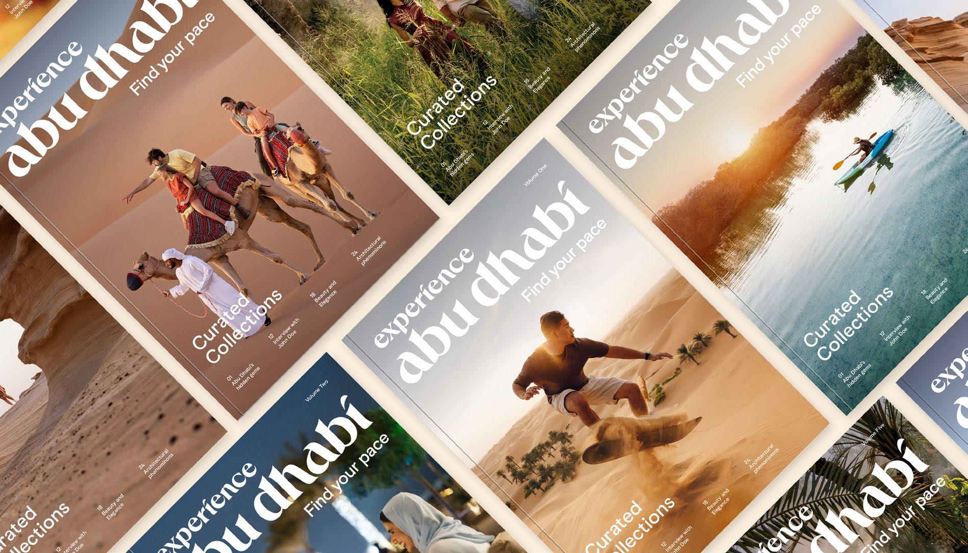
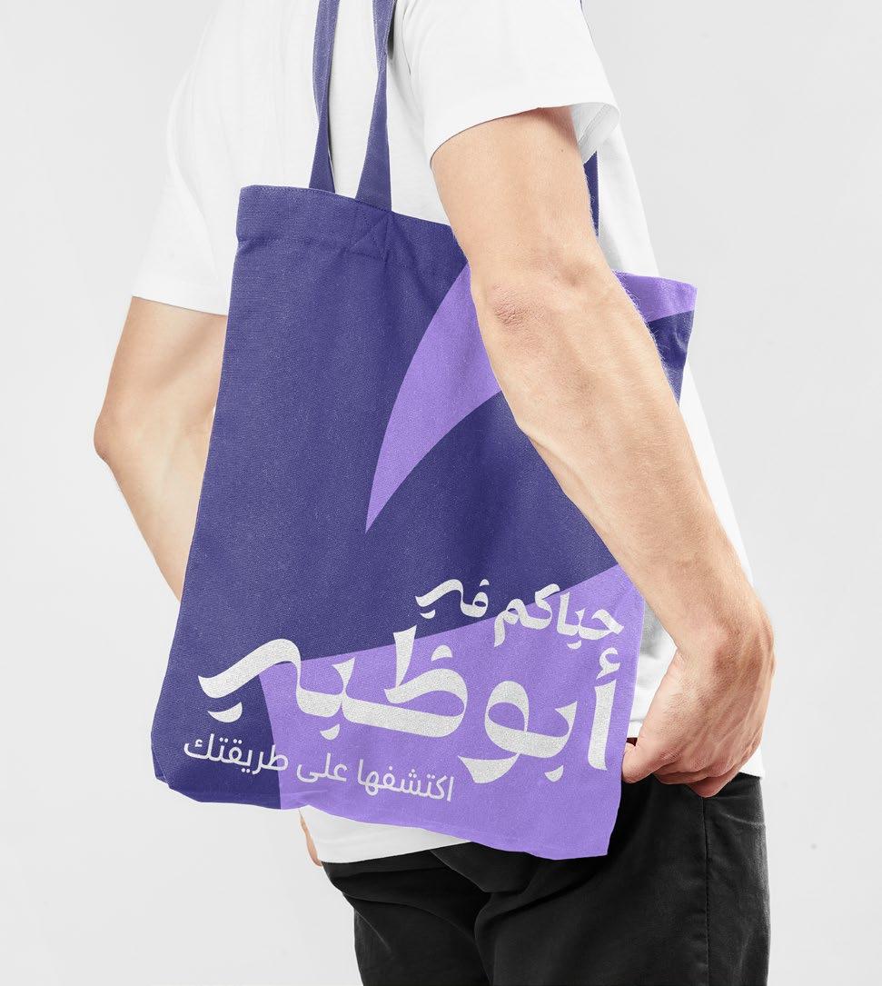
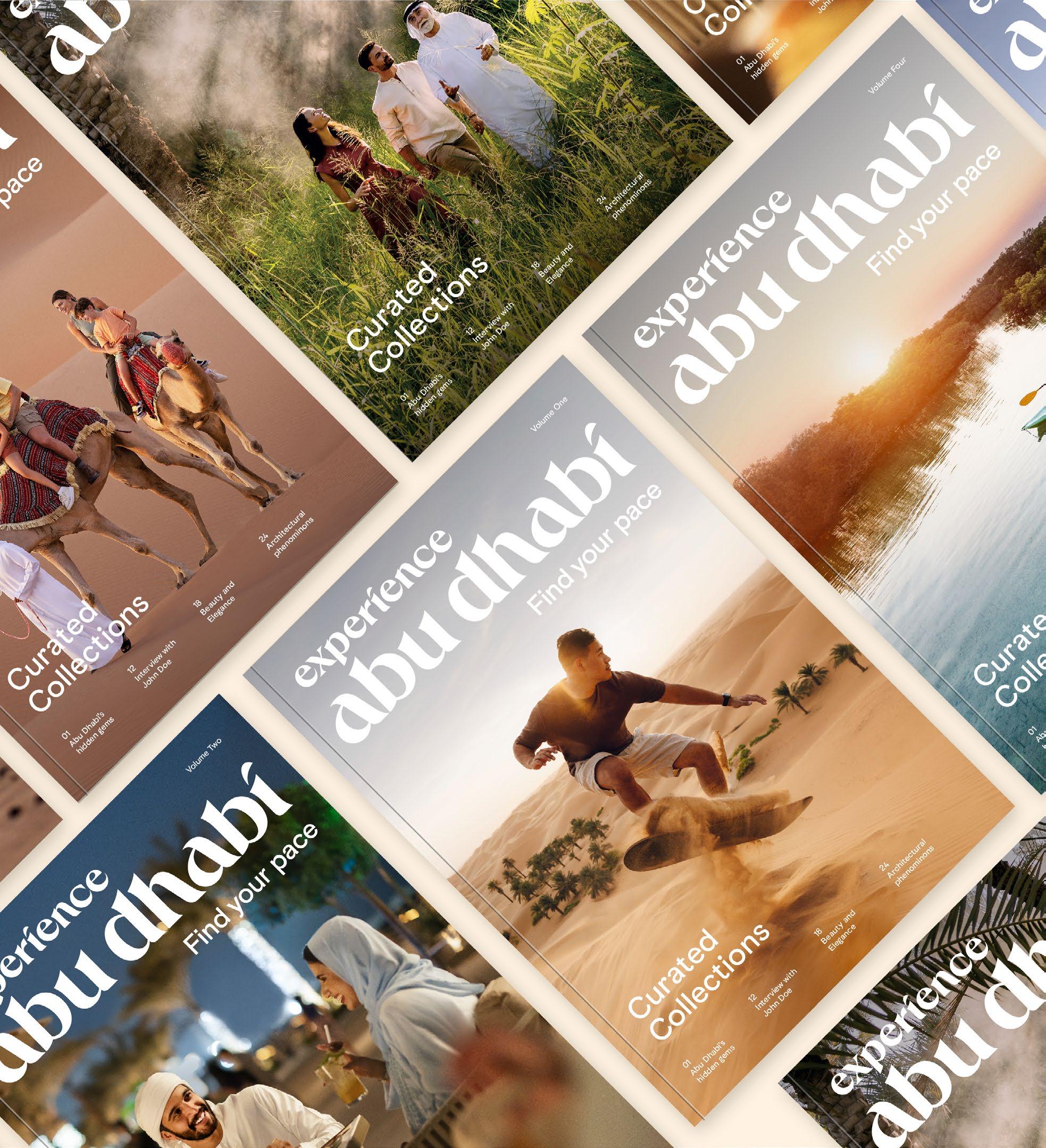
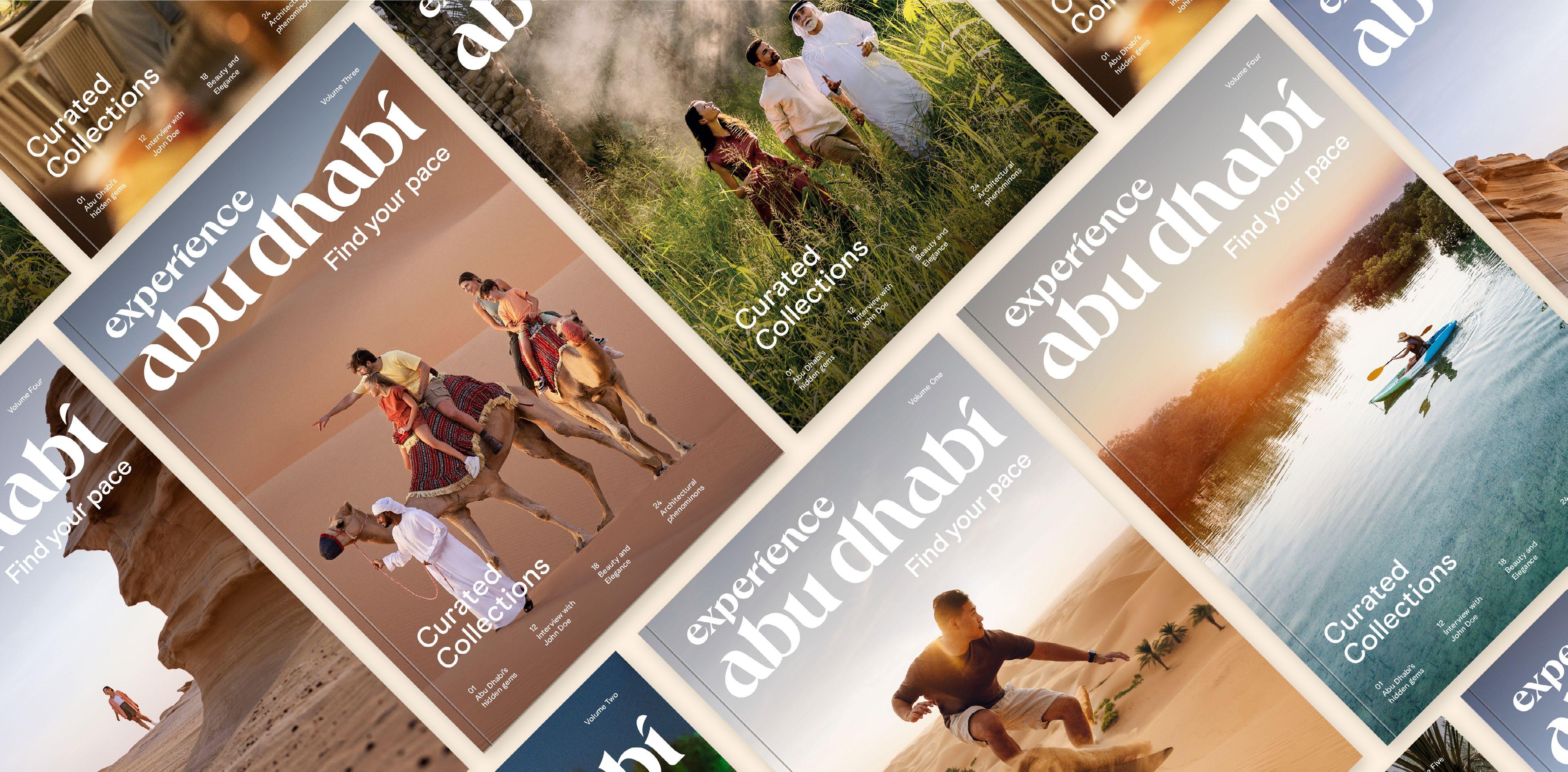
Curated Collections
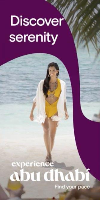
Find your pace
Do not use our logo on an angle. Use it in approved orientations only.
Do not use the logo in multiple colours. Use one colour only.
Do not change the position of any of our logo elements. Use master artworks only.
Do not set the logo in colours that are not part of our colour palette.
Do not distort our logo or apply any visual effects. Use master logo artworks only.
www.visitabudhabi.ae
Do not set text with our logo. Use master logo artworks only.
Do not use separate elements of the logo. Use master logo artworks only.
Find your pace
Do not mix elements of the English and Arabic logo. Use master logo artworks only.
This version of the logo is to be used across all of our campaign communications. In certain instances, it can also be used in our brand and marketing materials. Where, when and how we use the tagline are outlined on the following page. Always use the master artwork when working with the tagline logo lock-up.
Clear space
The tagline lock-up logo follows the same rule as our primary logo, using a clear space equal to half the height of our logo. Please see page 30 for more details on clear space.
Minimum size
Both our English and Arabic tagline lock-ups have a minimum size of 100px wide in digital and 25mm in print. This is different to our primary logo minimum size to ensure our tagline is clearly legible in all scenarios.
English tagline lock-up
Arabic tagline lock-up
In our brand and campaign communications, our communicative tagline should always be present. There are three ways in which we can use the tagline. Carefully select the right approach for your medium and format.
There are exceptions to the guidance shown opposite where space and formatting may better suit alternative tagline positions e.g., video frame, and events. In these instances, we position the tagline so that it is optimized for the touchpoint and is clearly attributable to the logo.
Logo lock-up
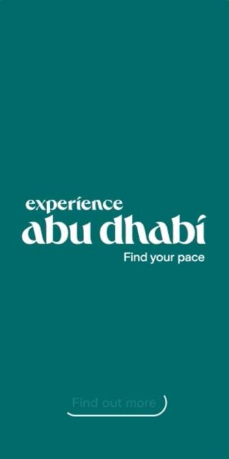
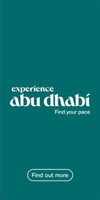
In all of our campaign materials our preferred use of the tagline is locked-up to the logo. It can also be used in brand and marketing materials when neither hero messaging or use as a support line are appropriate.
Logo + hero messaging
Where appropriate we can use the tagline as our hero messaging.
Logo + support line
The tagline can also be used as a sign-off or supporting line to our hero messaging.
The examples shown on this page are for illustrative purposes only and should not be considered final designs.
Embrace heritage Find your pace Immerse in tranquility Find
your pace
When creating campaign communications in other languages (apart from English and Arabic), either the universal English version of the tagline lock-up can be used or, if preferred, the tagline in the lock-up can be translated. Please note that we only provide artwork for English and Arabic tagline lock-ups.
When translating, use Abu Dhabi Basis font following the size and position of existing version.
When using 'Find your pace' in the copy of communications, it should be translated into the local language. We have a series of translations, see below for this list.
German: Finde deinen Rhythmus Russian:
Italian: Viaggiate al vostro ritmo
French: Trouvez votre rythme Hebrew:
Finde deinen rhythmus
Translated tagline within lock-up
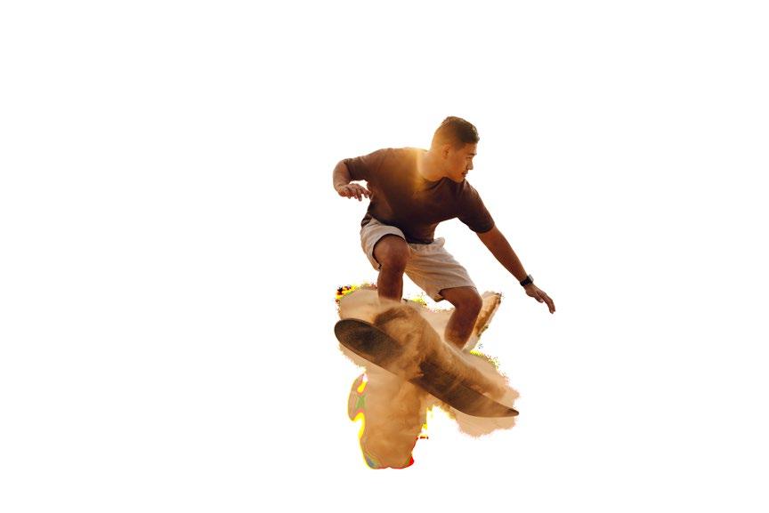
Supergraphics
When using our supergraphics we should always:
Build equity through recognition
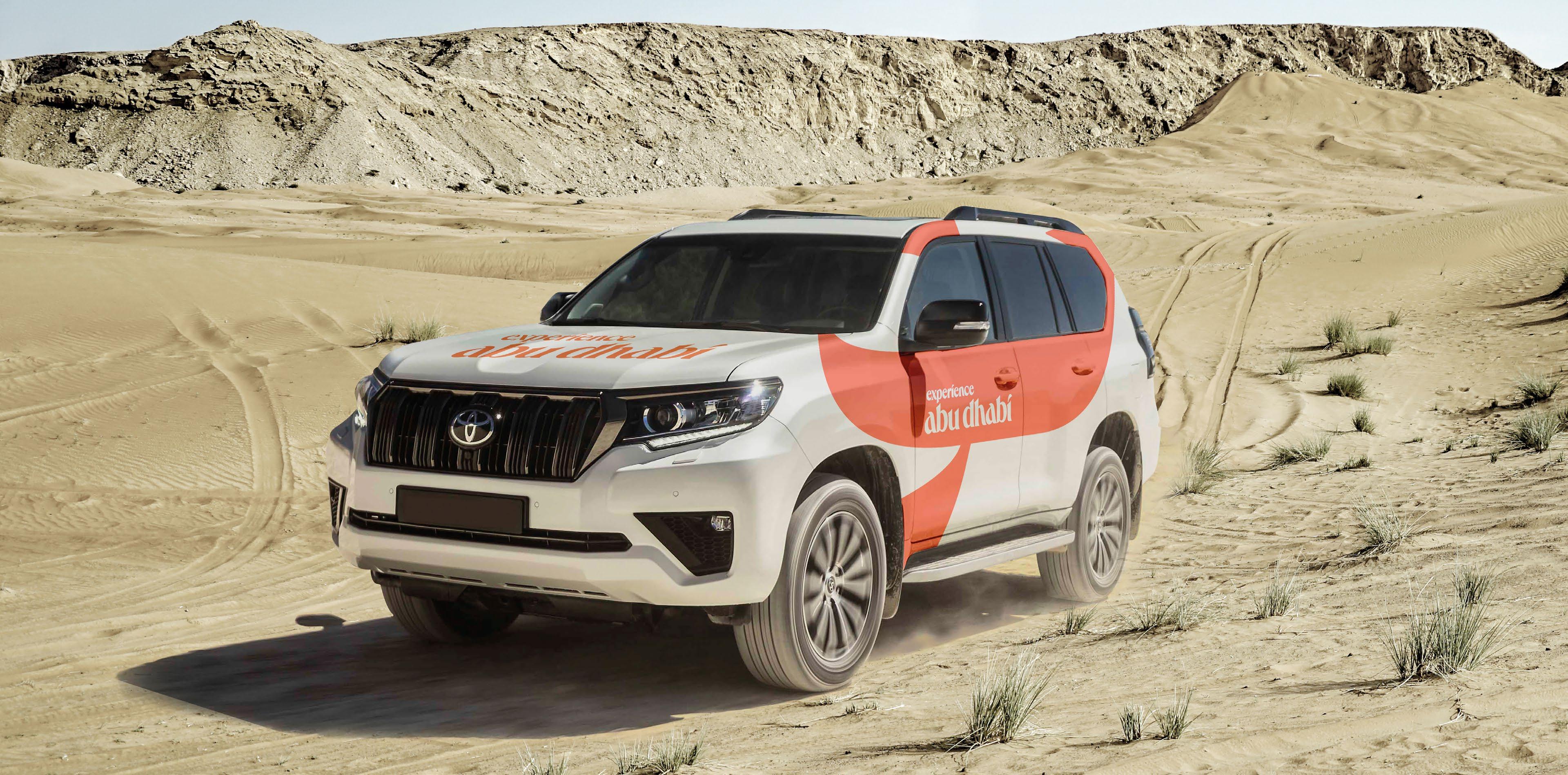
We use our supergraphics to evoke dynamism, energy and visual interest, they in turn build equity and recognition in the new brand. We use our supergraphics with and without imagery to create ownable content that is uniquely Abu Dhabi.
Our supergraphics provide powerful graphic backdrops, they interact with imagery in different ways enabling flexibility to keep our applications fresh.
Our supergraphics, where possible, should be bought to life in motion, reflecting our seamless experiences. Our graphic should flow elegantly, varying in speed to reflect the diverse pace of our experiences.
Our supergraphic is an additional way in which we can use the logo to build equity and recognition into the new brand.
Using the English and Arabic logos we crop into various characters to create graphics that can be used with and without photography across our applications.
These graphics can be used in any of our approved colour pairings.
When using the supergraphic we always use the master crops as a starting point. They can then be adjusted to fit the format or content you’re working with. To ensure the supergraphic remains attributable to Abu Dhabi, always include the most recognisable forms of the logo. Do not alter any element of the logo within the crops.
The crops shown opposite are readyto-use assets available in portrait, landscape, square and 16:9 formats. Please contact the Experience Abu Dhabi Brand team for access to these assets.
DOWNLOAD SUPERGRAPHICS
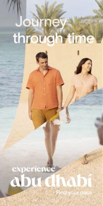
As well as working in isolation our supergraphic can also work with imagery.
We combine imagery and our supergraphics in one of two ways. We either mask imagery within the letterforms or use imagery as the background.
In both instances the graphic and imagery should interact with one another. We do this by layering elements of the imagery over the graphic and vice versa.
There should always be a considered but playful arrangement between the imagery and the supergraphic.
Supergraphic and imagery
The examples shown on this page are for illustrative purposes only and should not be considered final designs.
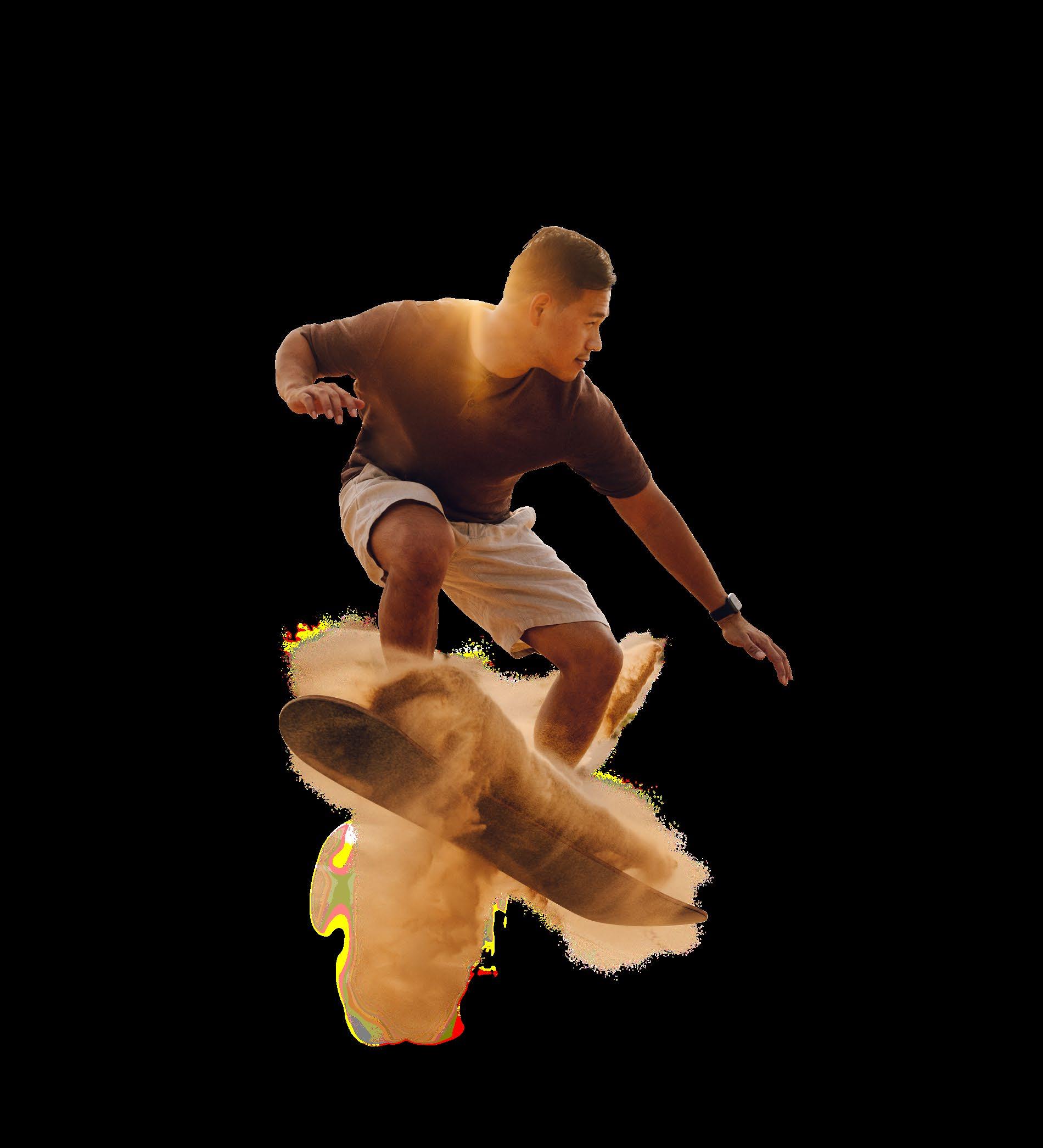
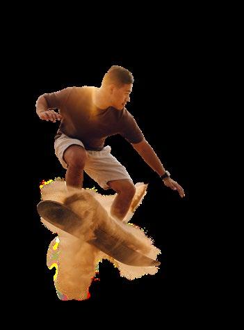
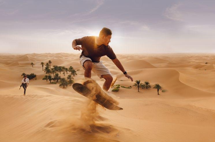
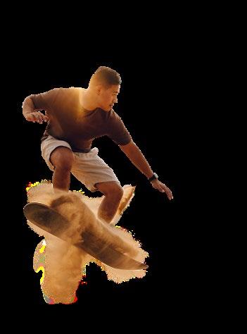
1. Photography masked in supergraphic
2. Photography masked in supergraphic with cut-out elements to create a sense of depth
3. Photograph used as background with supergraphic interacting with subject
Creating supergraphic and image compositions takes 4 steps:
1. Select the image that best communicates your message.
2. Select the supergraphic that complements the image and position over the image to playfully interact with the subject.
TIP: Tighter crops where the subject appears larger in the frame work better for masking imagery within the letter forms (example 1). Images with more space, where the subjects appear smaller work well as backgrounds (example 2).
3. Either mask the image (example 1) to reveal the colour background, or fill the supergraphic with colour (example 2). Colours should be picked to complement or contrast with the image and follow our 'Selecting colour guided by our imagery' on p.59.
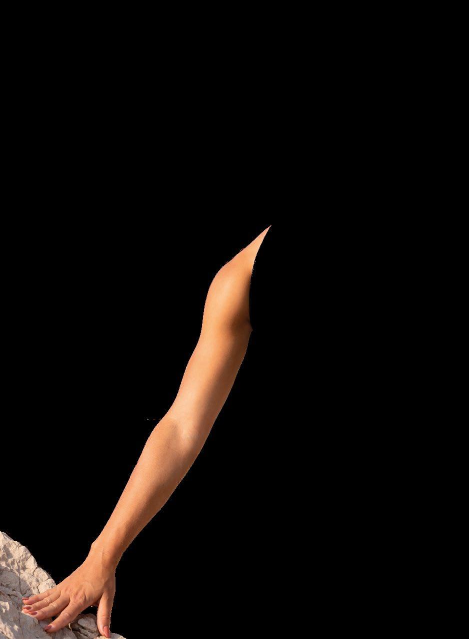
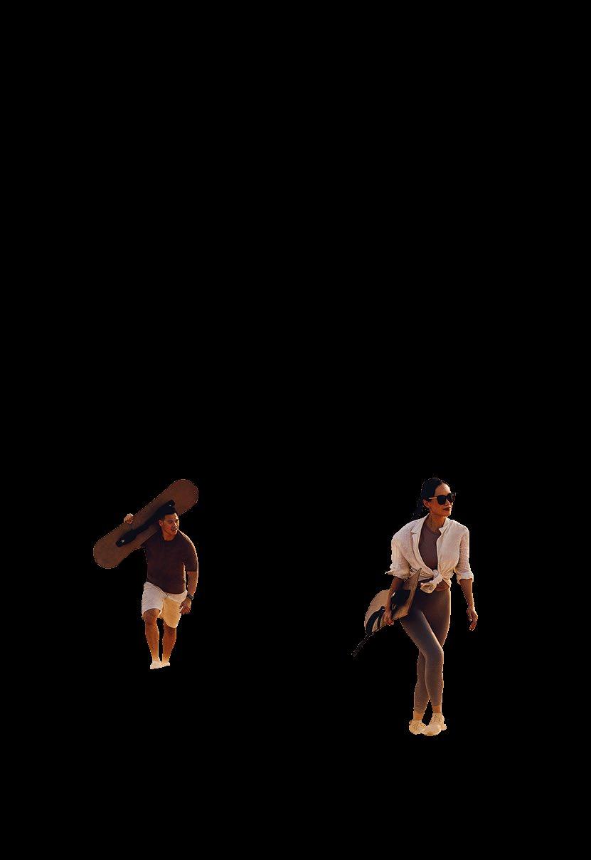
4. Cut out the area of the subject that you would like to sit over the top of the supergraphic. Example 1 shows how we can achieve a layered effect by only cutting out certain elements.
Creating supergraphic and imagery compositions
For example 1, it is ok to stop at step 3 to allow more space for text, as illustrated by example 1 on p.43.
Tints
In exceptional scenarios where we need our supergraphic to behave more subtly (eg. text heavy communication) we can use 80% tints of the background colour.
Tints of our colours cannot be applied to supergraphics used with imagery.
Subtle Crops
As well as tinting supergraphics it is permitted to amend the crop to work more sympathetically with the format of the page you are using.
Rotating Crops
Supergraphics may also be rotated between +25° and –25° of their vertical position.
Tints, crops & rotating
The examples shown on this page are for illustrative purposes only and should not be considered final designs.
80% Tints
Subtle crops
Rotating crops
The full Abu Dhabi wordmark can also be used as a supergraphic on its own (without cropping).
It can be used in colour, following the colour pairing rules (see p.52) or white on a colour. It must always be legible.
When using the full wordmark as a logo it must be legible and unobstructed by other graphic elements or text. It can interact with elements in the foreground, such as when being used across carousels (see example opposite).
The full 'Experience Abu Dhabi' must always be used.
Interacting with photography
We use our supergraphics to supplement photography or create texture where photography isn’t appropriate for use.
When used at its best it should stand bold and proud.
We do not need to explicitly use English supergraphics with English brand and marketing materials. The same applies for the Arabic supergraphics. We can freely use the crops with either language.
The examples shown on this page are for illustrative purposes only and should not be considered final designs.
visitabudhabi.ae
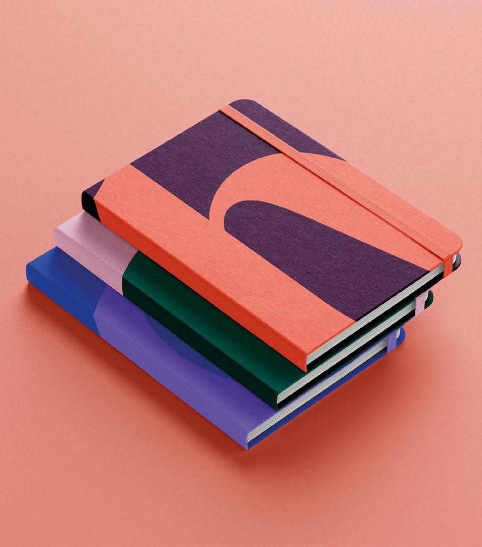
Colour Palette
When applying colour we should follow these principles:
We use preselected colour pairings, comprised of brights, pastels and deeps. We only ever use 2 colours per frame. Start by selecting your dominant colour. Pre-defined colour pairings are outlined in our brand guidelines.
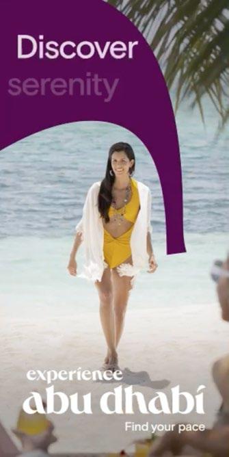
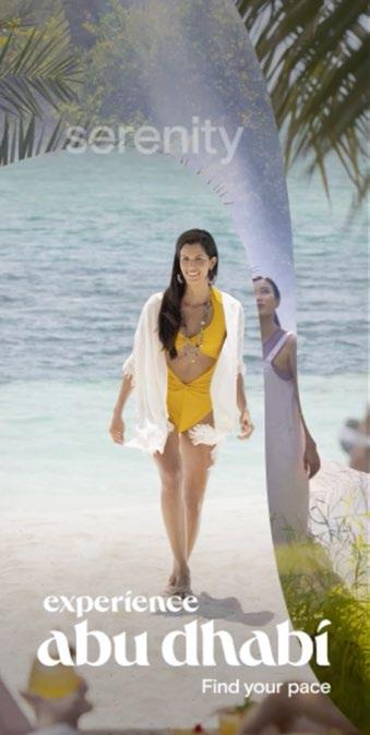
Discover Serenity
We use colour to evoke a feeling and set the tone for every communication. We select colour pairings that express the feeling of an experience.
We can use colour to set the pace of our narrative, bring a single experience into focus using just one colour or show the vast array of experiences by using multiple colours.
Our colour palette is made up of a broad range of colours, covering the full spectrum. They have been carefully chosen to be used alone or combined in specified pairings, providing a flexibility to communicate in every scenario, from vibrant to calm, tonally matching the mood and style of any Abu Dhabi brand communication.
Breakdowns
Sandstone
RGB: 252 239 222
HEX: #fcefde
Pantone: 9225C
CMYK: 0 6 15 0
RAL: 9001
Dune
RGB: 218 187 153
HEX: #dabb99
Pantone: 4675C
CMYK: 15 27 42 3
RAL: 1019
Sunrise
RGB: 255 233 0
HEX: #ffe900
Pantone: 108C
CMYK: 0 4 100 0
RAL: 1018
Sunset
RGB: 255 135 7
HEX: #ff8707
Pantone: 144C
CMYK: 0 56 100 0
RAL: 2011
Haze
RGB: 255 202 187
HEX: #ffcabb
Pantone: 4032C
CMYK: 0 24 23 0
RAL: 3012
Coral
RGB: 255 112 97
HEX: #ff7061
Pantone: 4057C
CMYK: 0 71 63 0
RAL: 3022
Safari
RGB: 186 42 0
HEX: #ba2a00
Pantone: 2349C
CMYK: 12 88 100 12
RAL: 3000
Pomegranate
RGB: 255 32 76
HEX: #ff204c
Pantone: 1787C
CMYK: 0 95 62 0
RAL: 3028
Flamingo
RGB: 255 195 222
HEX: #ffc3de
Pantone: 217C
CMYK: 0 31 0 0
RAL: 3015
Royal
RGB: 76 12 71
HEX: #4c0c47
Pantone: 2627C
CMYK: 75 100 46 40
RAL: 4007
Iris
RGB: 159 40 193
HEX: #9f28c1
Pantone: 2592C
CMYK: 52 90 0 0
RAL: 4008
Dusk
RGB: 182 150 254
HEX: #b696fe
Pantone: 7446C
CMYK: 46 46 0 0
RAL: 4005
Midnight
RGB: 58 52 138
HEX: #3a348a
Pantone: 2146C
CMYK: 100 81 0 17
RAL: 5002
Seaport
RGB: 0 52 81
HEX: #003451
Pantone: 2188C
CMYK: 100 64 28 44
RAL: 5001
Pacific
RGB: 0 90 255
HEX: #005aff
Pantone: 2175C
CMYK: 97 51 0 0
RAL: 5005
Our RAL colours have been selected from a limited library of colours. When creating a custom colour for interiors and signage always use the Pantone values for a more accurate colour reference.
Sky
RGB: 201 219 228
HEX: #c9dbe4
Pantone: 545C
CMYK: 25 8 12 0
RAL: 7035
Sea
RGB: 0 216 204
HEX: #00d8cc
Pantone: 3255C
CMYK: 65 0 33 0
RAL: 6027
Mangrove
RGB: 0 144 134
HEX: #009086
Pantone: 7473C
CMYK: 82 10 51 6
RAL: 6016
Palm RGB: 0 96 95
HEX: #00605f
Pantone: 330C
CMYK: 90 22 53 48
RAL: 6005
Olive
RGB: 87 115 96
HEX: #577360
Pantone: 5615C
CMYK: 66 36 63 27
RAL: 6002
When combining our colours to create colour pairings we follow some simple rules to ensure that our colour combinations are always harmonious and easy to use.
We only ever use two colours paired together. It is not permitted to use more than two colours to create colour combinations.
Our brand and marketing comms can use more than one colour pairing in a design so long as they do not appear together, for example in a PowerPoint document we can use different colour pairings for the divider page but we wouldn’t show more than one colour pairing on a single slide.
Our users will have different requirements of our colour palette, to solve this we provide guidance and colour palettes to two types of users; Everyday Users and Power Users. Only use colour pairings from these palettes.
Applying colour
The examples shown on this page are for illustrative purposes only and should not be considered final designs.
Carefully curated from our deep, bright and pastel tones within our colour palette, our Everyday User Palette is available to everyone working with the Experience Abu Dhabi brand.
We use the colours from these pairings as background and foreground colours across our communications.
When selecting which colour pairing to use, we decide by assessing what tone, emotion or experience we want our communication to strike with our audience.
Alternatively, we select colour pairings based on the imagery we use in our design. Everyday user palette: 24 colours
Professional marketing and design organisations who are familiar with producing creative work have the flexibility to use the full suite of colour parings.
All the possible colour pairings are outlined in the framework shown opposite. They have been created to provide enough flexibility to be used across all of the Abu Dhabi experiences, from high energy experiences to the more cultural delights of Abu Dhabi.
When selecting which colour pairing to use, we decide by assessing what tone, emotion or experience we want our communication to strike with our audience.
Alternatively, we select colour pairings based on the imagery we use in our design.
Power User Palette:
Bright Colours
Pastel Colours
Set the tone
Deep & Pastel
These colour pairings can feel; natural, calm, sophisticated, relaxed, subtle, premium, aspirational.
Bright & Pastel
These colour pairings can feel; energised, curious, educational, cultural, inspiring, thoughtful and unexpected.
Bright & Bright
These colour pairings can feel; fun, vibrant, playful, surprising, energetic, bold and youthful.
We use powerful colour pairings that allow us to tonally express to our full range of experiences.
Deep & Bright
These colour pairings can feel; dynamic, enriching, sophisticated, vibrant, thoughtful and intriguing.
When we don’t use imagery in our communication we select colours based on the tone or emotion we want to communicate to our audience. The colour pairings within our palette give us the flexibility to communicate for all scenarios.
Deep & Pastel
In our communications these colour pairings can feel; natural, calm, sophisticated, relaxed, subtle, premium, aspirational.
Selecting colour guided by the emotion ⁄ tone we need to communicate
The examples described above are not exclusive to this colour pairing. They are demonstrative examples of the tone this colour pairing sets.
The examples shown on this page are for illustrative purposes only and should not be considered final designs.
Bright & Pastel:
These colour pairings can feel; energised, curious, educational, cultural, inspiring, thoughtful and unexpected.
Selecting colour guided by the emotion ⁄ tone we need to communicate
The examples described above are not exclusive to this colour pairing. They are demonstrative examples of the tone this colour pairing sets.
The examples shown on this page are for illustrative purposes only and should not be considered final designs.
Bright & Bright:
These colour pairings can feel; fun, vibrant, playful, surprising, energetic, bold and youthful.
Selecting colour guided by the emotion ⁄ tone we need to communicate
Glide through the mangroves Find your pace
The examples described above are not exclusive to this colour pairing. They are demonstrative examples of the tone this colour pairing sets.
The examples shown on this page are for illustrative purposes only and should not be considered final designs.
Submerge in crystal waters
Deep & Bright:
These colour pairings can feel; dynamic, enriching, sophisticated, vibrant, thoughtful and intriguing.
Selecting colour guided by the emotion ⁄ tone we need to communicate
The examples described above are not exclusive to this colour pairing. They are demonstrative examples of the tone this colour pairing sets.
The examples shown on this page are for illustrative purposes only and should not be considered final designs.
The taste of global cuisine
visitabudhabi.ae
Selecting the correct colour when creating a piece of communication is key to visually harmonious designs. When selecting a colour to complement the tones in an image we follow a simple three step process outlined over the next few pages.
Selecting colour guided by our imagery
Step 1
Select 2-6 key colour tones from the image that has been selected. Try to identify dominant colours (colours that make up a lot of the image) as well as highlight colours (smaller areas of colour that stand out in the image).
Step 2
Use your judgement to match the colours from the image to those closest within our colour palette.
Step 3
These matches are now ready to be used alongside the selected image. Only use two colour pairings per canvas.
Selecting colour guided by our imagery
Step 1
Step 2
Step 3
Shown opposite are some examples of colours picked out from a range of imagery shared in our work so far.
Notice how the colours selected are either dominant within the image or pop out as smaller details of colour.
Selecting colour guided by our imagery
We use colour pairings across our logo, our supergraphics or in communications where we want to create impact.
Supergraphics
When using colour in supergraphics we use our selected colour pairings to distinguish the background of our communication from the supergraphic. The background is set in one colour and the supergraphic in the paired colour. Make sure to always use approved colour pairings only. Always ensure the logo is fully legible over the colour pairings.
Logo
In instance where we have a one colour background we can set the logo in an approved colour pairing. When we use supergraphics in a colour pairing the logo should always appear white to ensure maximum legibility.
How we use colour pairings
The examples shown on this page are for illustrative purposes only and should not be considered final designs.
Typography
When using typography we should always:
01 Be dynamic 03 Layer type & image
02 Create simple messaging hierarchy
Headline
Supporting headline
We always use our brand typeface, applying it in different ways to create interesting type arrangements that can express the emotion or mood of any communication. We create simple type hierarchies, making our messaging bold and engaging. We are confident and always seek to say one thing really well. We can create hierarchy in a number of ways.
Messaging can interact with imagery in a playful way, overlaying and interacting with elements of the image.
Our primary typeface is Abu Dhabi Basis – a customised font designed specifically for this brand. We use it across all our external and internal communications across both English and Arabic languages. Its contemporary appearance and unique features help us challenge the perceptions of Abu Dhabi and position ourselves as a cosmopolitan, modern and aspirational travel destination.
We use Abu Dhabi Basis in four weights — Light, Regular, Medium and Bold.
This typeface supports our Arabic, English, French, German and Italian markets and will support any other Latin based languages. It does not support Cyrillic, Hebrew or East Asian languages. When working with these languages we use Noto Sans.
For Hebrew, Cyrillic, Chinese, Japanese and Korean languages our typeface is Noto Sans. Produced by Google Fonts, they are available for use without license across print and digital communications.
Noto Sans is intended to be visually harmonious across all languages.
CYRILLIC
CHINESE (SIMPLIFIED & TRADITIONAL)
HEBREW
JAPANESE
KOREAN
DOWNLOAD TYPEFACE
Our system typeface is Arial. It is built into most computer operating systems. We use this in PowerPoint and other digital applications where our brand typeface is not readily available, or when we are sharing files with partners and clients who do not have access to our brand typeface.
Arial Bold
Use for titles, headlines, and call-out copy.
Arial Regular
Use for body copy and small caption text.
We always use our brand typeface, applying it in different ways to create interesting type arrangements that can express the emotion or mood of any communication.
Dynamic type, like colour and image selection can help dramatically change the mood of a communication. Dynamic type allows us stretch our creativity and create engaging and energetic layouts and animations to emphasise and amplify our messaging.
We create simple type hierarchies, making our messaging bold and engaging. We are confident and always seek to say one thing really well. We can create hierarchy in a number of ways.
Messaging can interact with imagery in a playful way, overlaying and interacting with elements of the image.
Layer type & image
01 When layering ensure messaging is legible
Select dynamic subjects/objects in the foreground 03 We can also be subtle with the layering
When using text in colour please follow these steps:
Play with scale
Play with scale to emphasise key words.
Highlight key message
Highlight a maximum of 2 words in colour.
Ensure legibility
Select colours with an appropriate level of contrast to background image to ensure headline is always legible.
Use one colour only
Only use one colour highlight within the same frame, the remaining copy should always be displayed in white.
We never use more than 2 colours at a time and always use the approved colour pairings, see pages 52-53 for details.
There are three ways to use colour headlines for social and campaigns
Note: Coloured type may only be used for social and tactical campaign deliverables.
In our marketing communications we use the various weights of our typeface to create a clear typographic hierarchy. This helps the reader navigate the page and understand the different types of information. Using scaling between headlines, intro text and body copy also creates texture within layouts making them feel visually engaging.
Abu Dhabi Basis Light ⁄ Regular
Light or Regular is typically used for body copy. In digital applications Regular should be used to ensure legibility.
Abu Dhabi Basis Medium ⁄ Bold
Medium or Bold are used to create emphasis where needed, for example; headlines, subtitles, and CTA’s.
How we use typography
Captions:
Regular/Medium
Headlines: Medium/Bold
Sub-headline: Regular/Medium
Tags: Regular/Medium
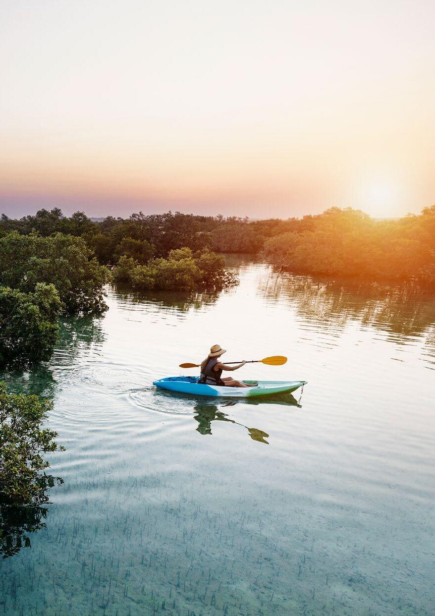
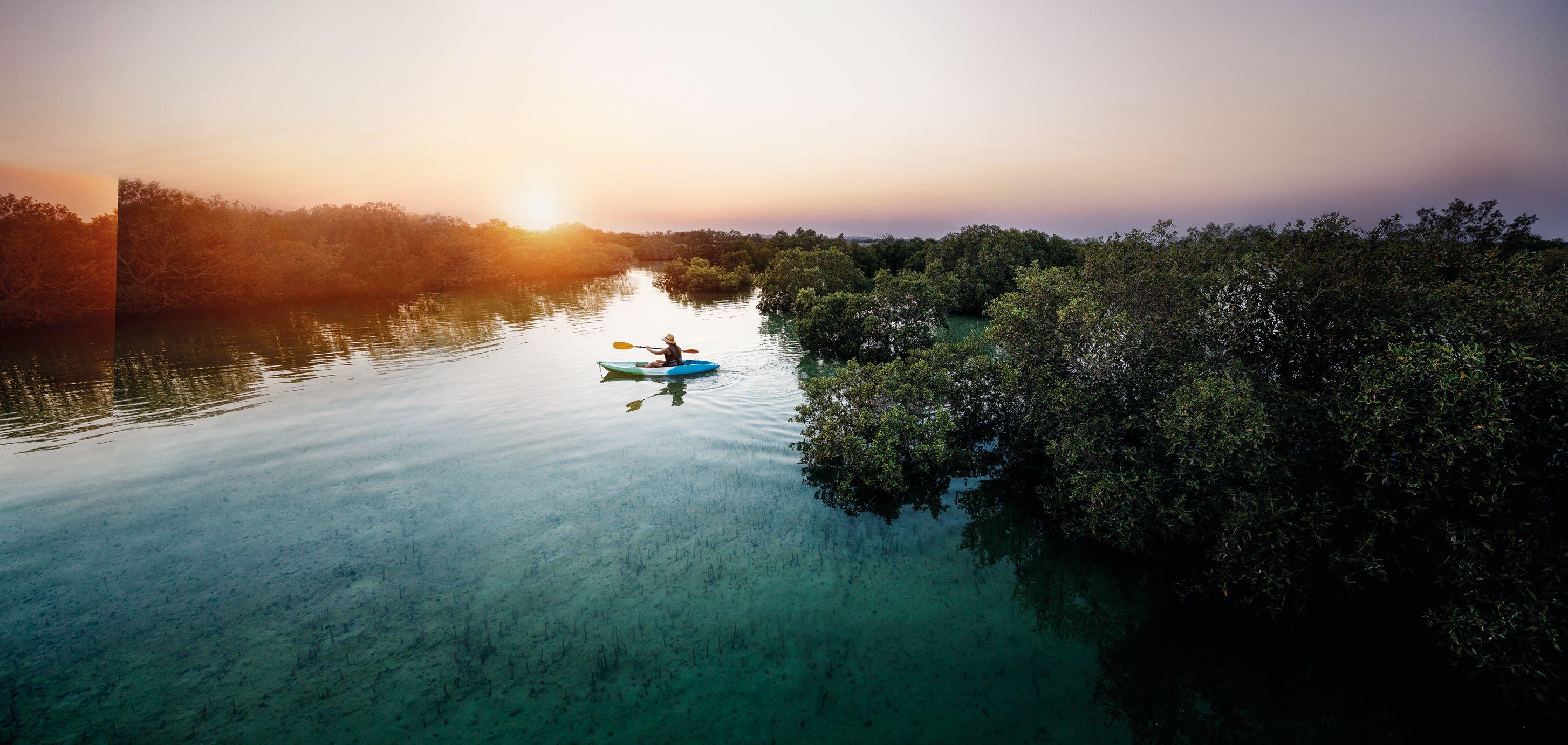
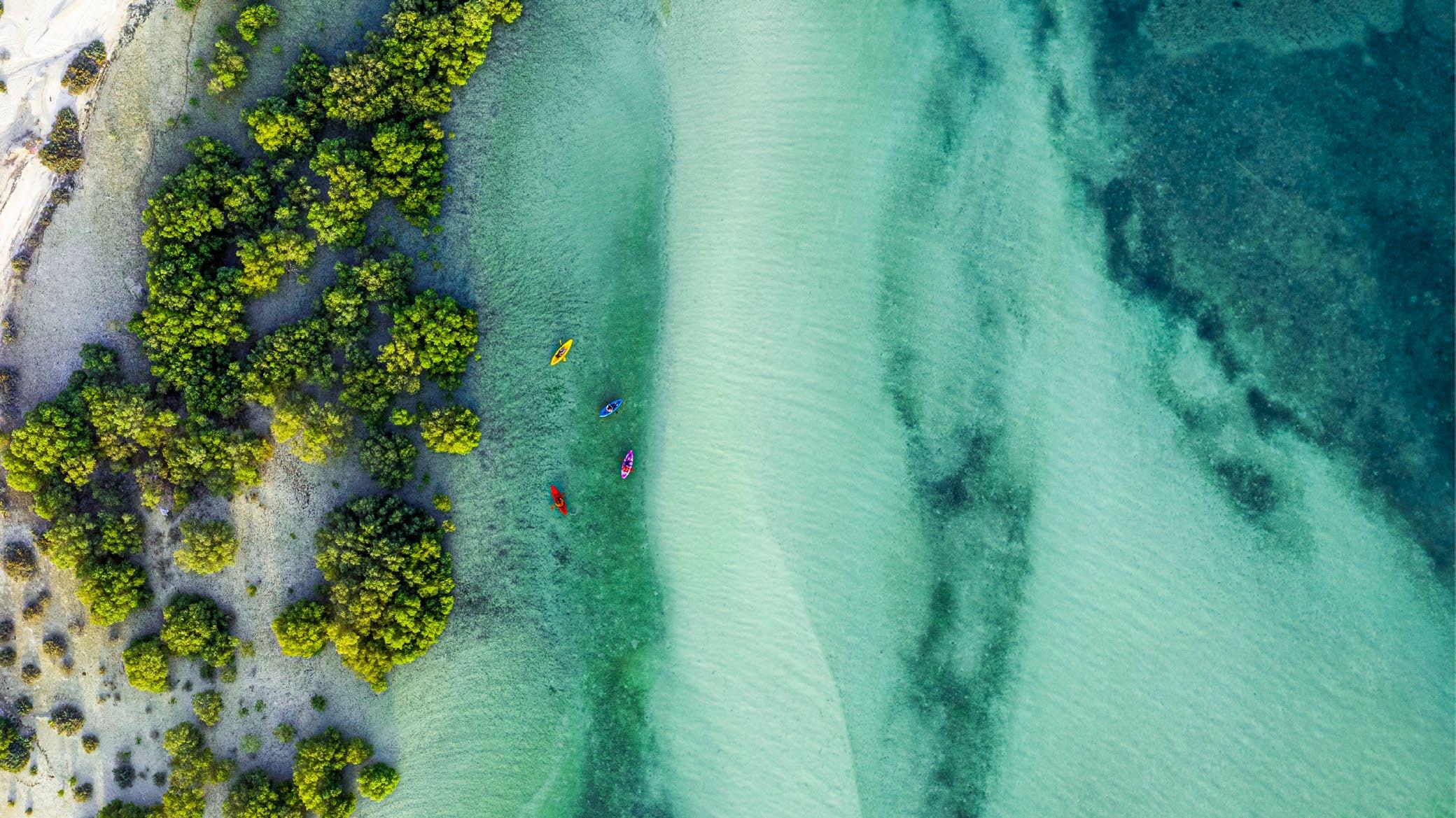
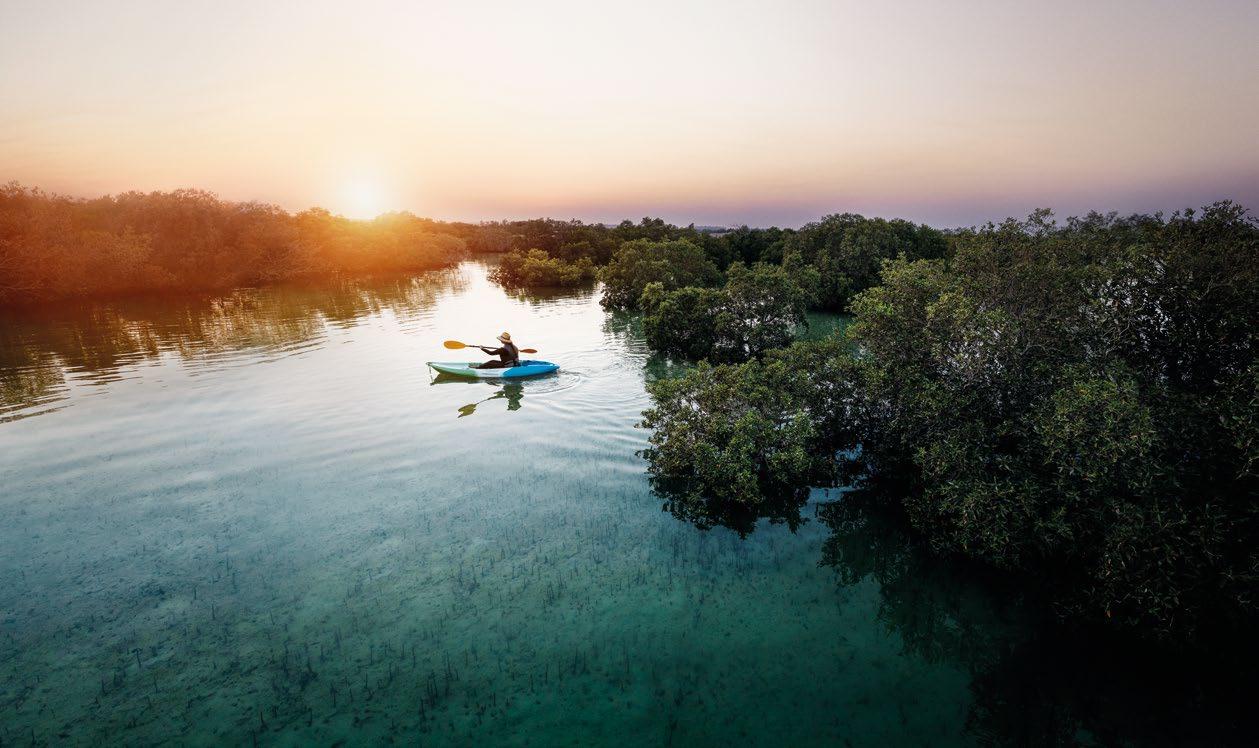
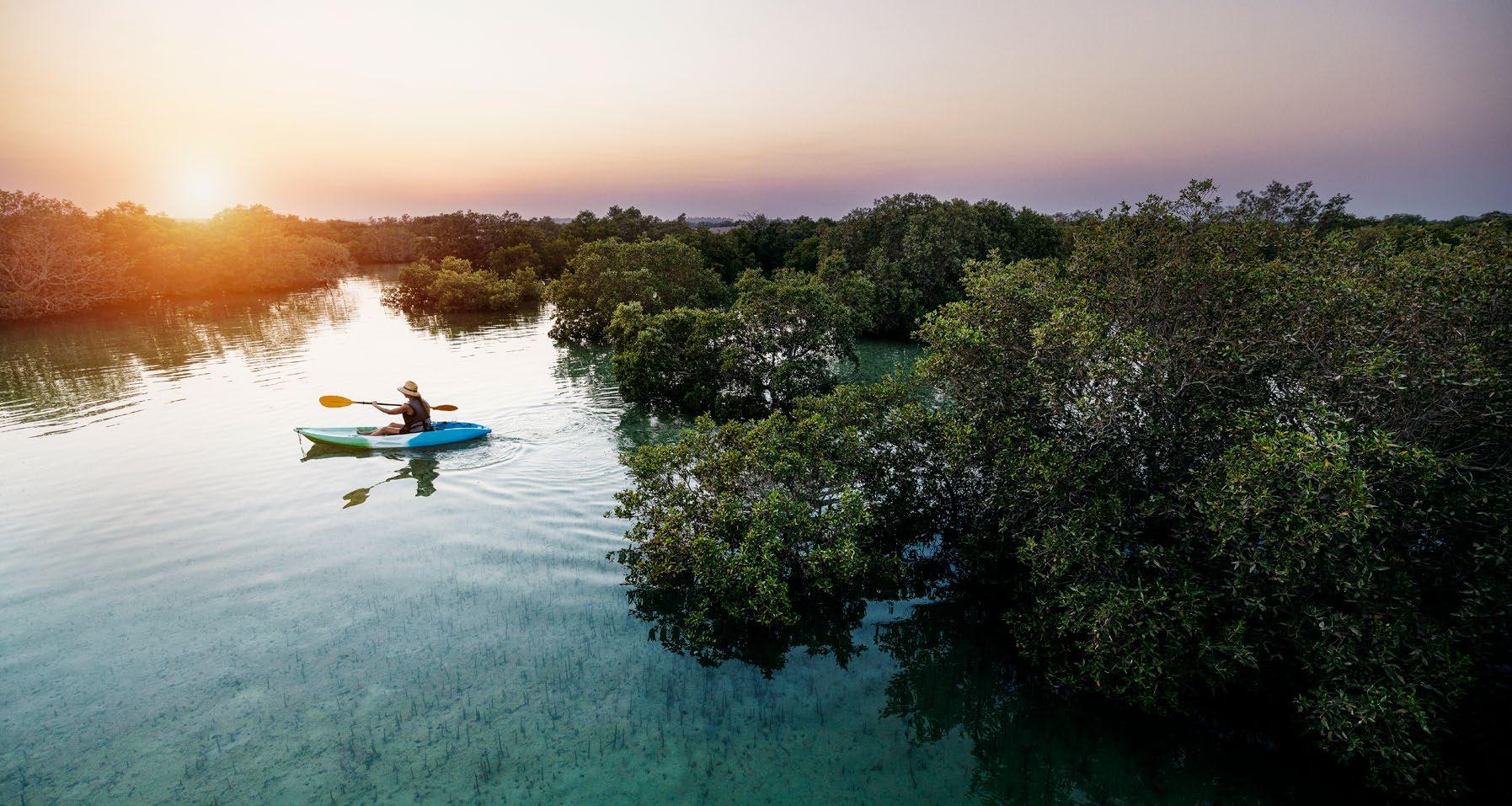
Mangrove National Park
Note: The visual shown opposite is a schematic only and is not representative of a final touchpoint.
Intros/pull-outs
Regular/Medium
Body headline
Medium/Bold
Body Light/Regular
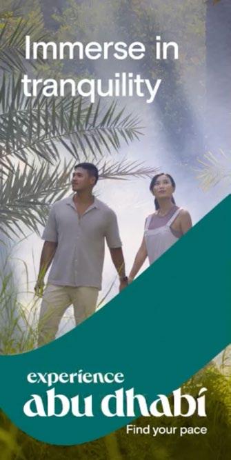
Worlds away from skyscrapers and the bustling city nightlife of Abu Dhabi, there is a serene place which will leave you with a sense of being renewed.
This reserve of beauty and biodiversity is called Mangrove National Park. If you are trying to teach your little ones about the environment, a stroll in this humble park is a sure way to tick all those boxes. Protected by the Environment Agency Abu Dhabi (EAD), this stunning park makes up almost 75 per cent of the total mangrove forest area in the UAE. This biodiversity hotspot includes salt marshes, mud ats, and algal communities.
Stay in the Mangroves Why escape from nature when you’re right there? Tuck into much-needed relaxation at the nearby Anantara Eastern Mangroves Hotel - a luxury retreat that is cosily nestled in the lush landscape. From sunset hues to stark views of the mangroves, there is plenty to appreciate at this Arabian-inspired getaway.
Eastern Ring Road ⁄ Abu Dhabi
KAYAKING IN THE MANGROVES
Photography
When using photography we should always:
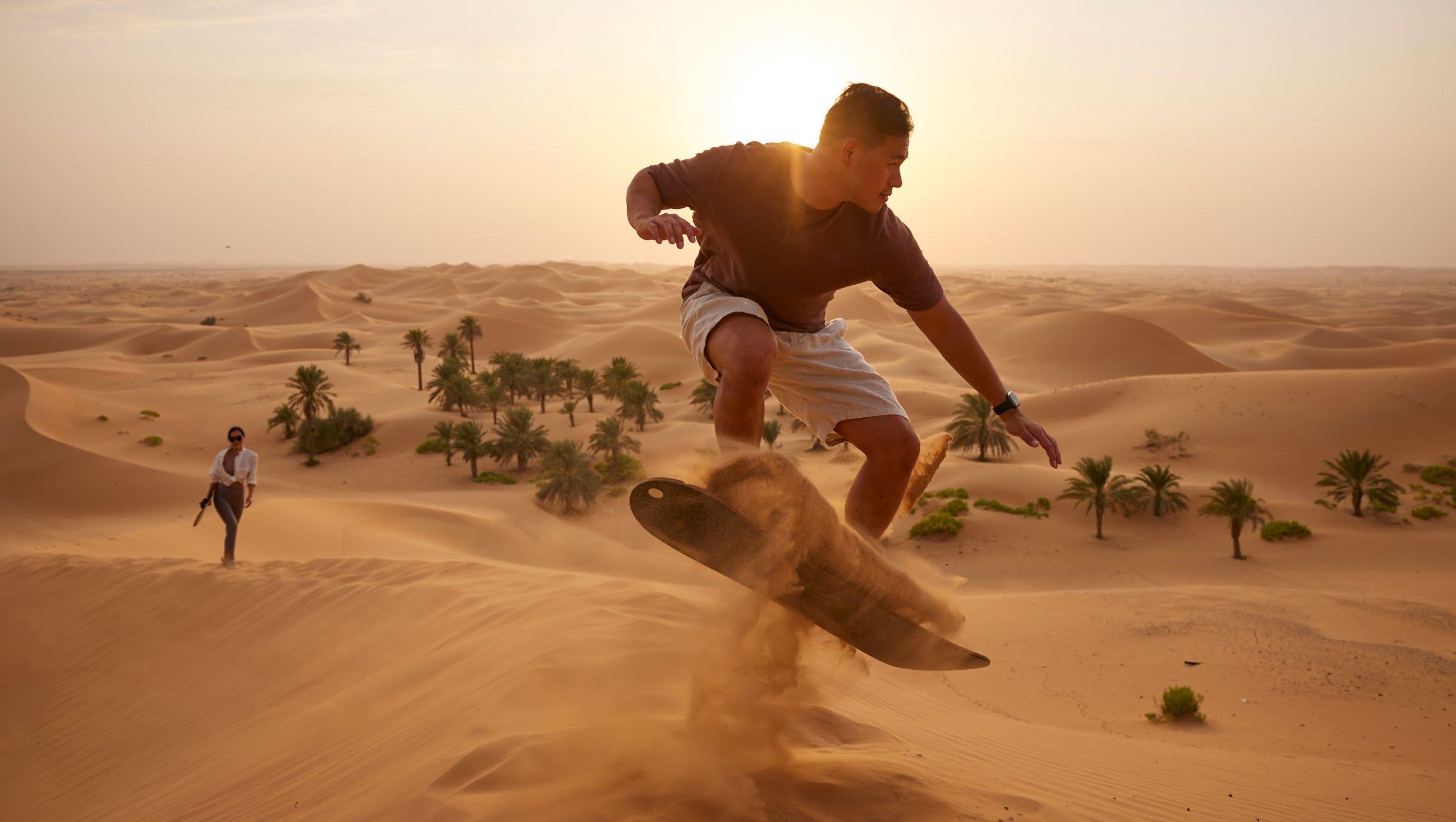
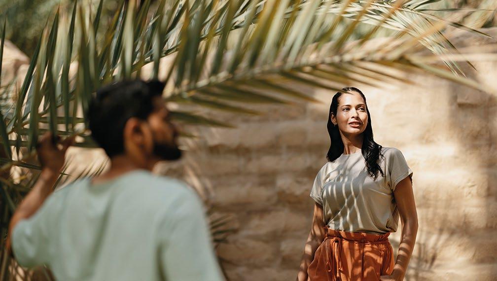
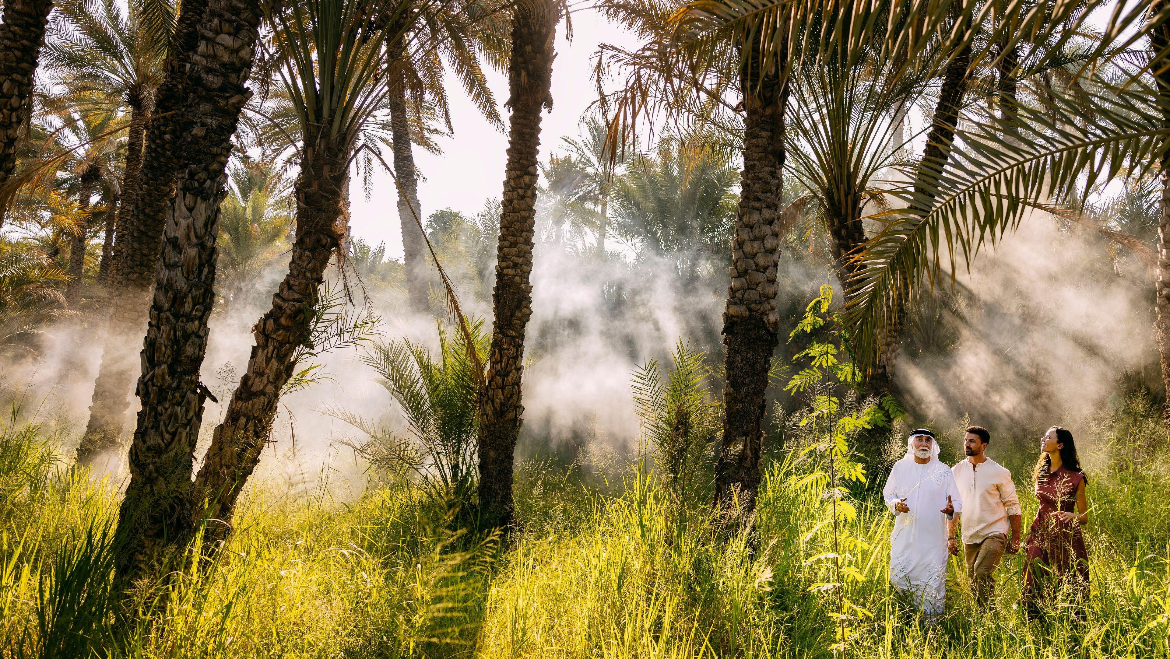
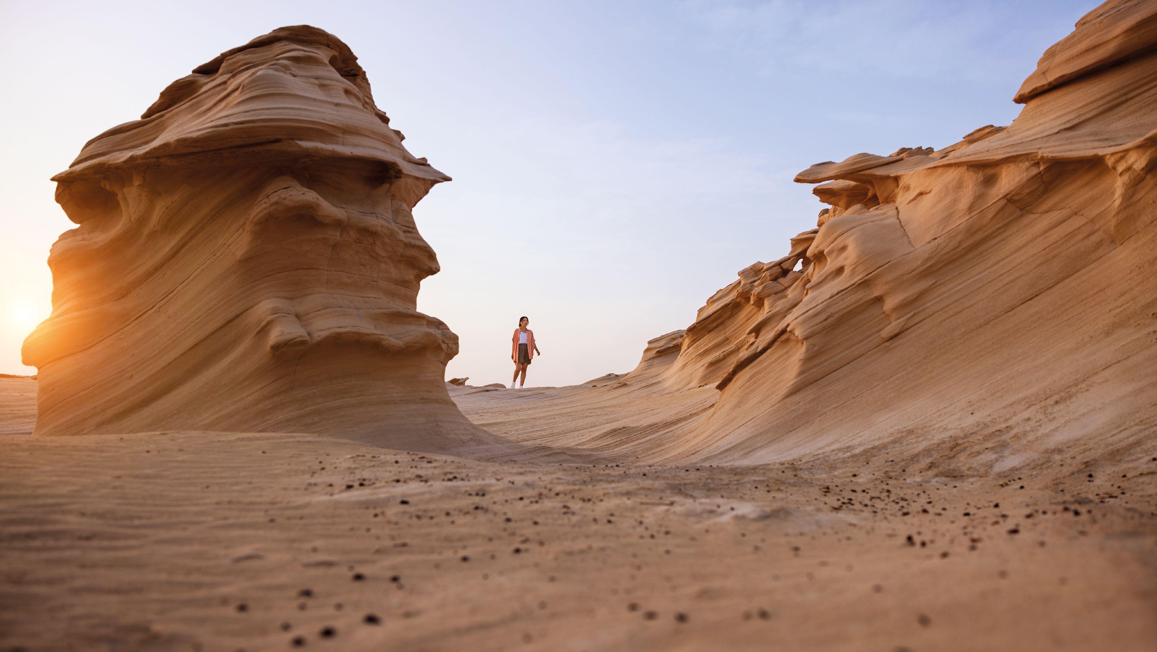
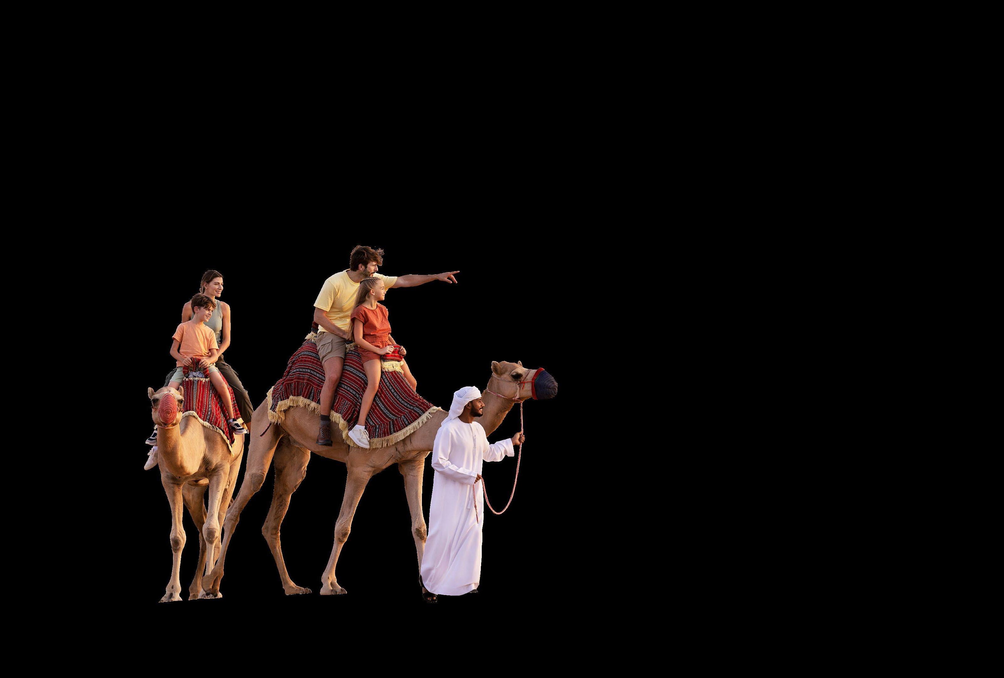
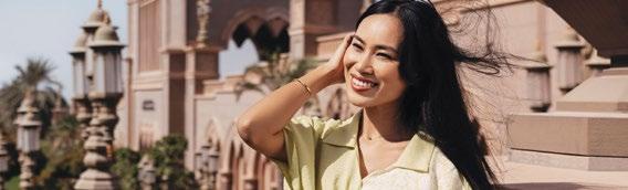
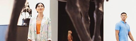
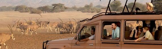
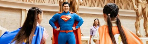
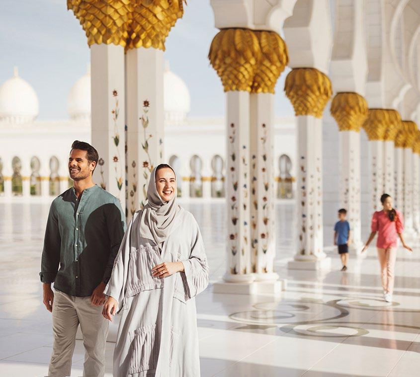
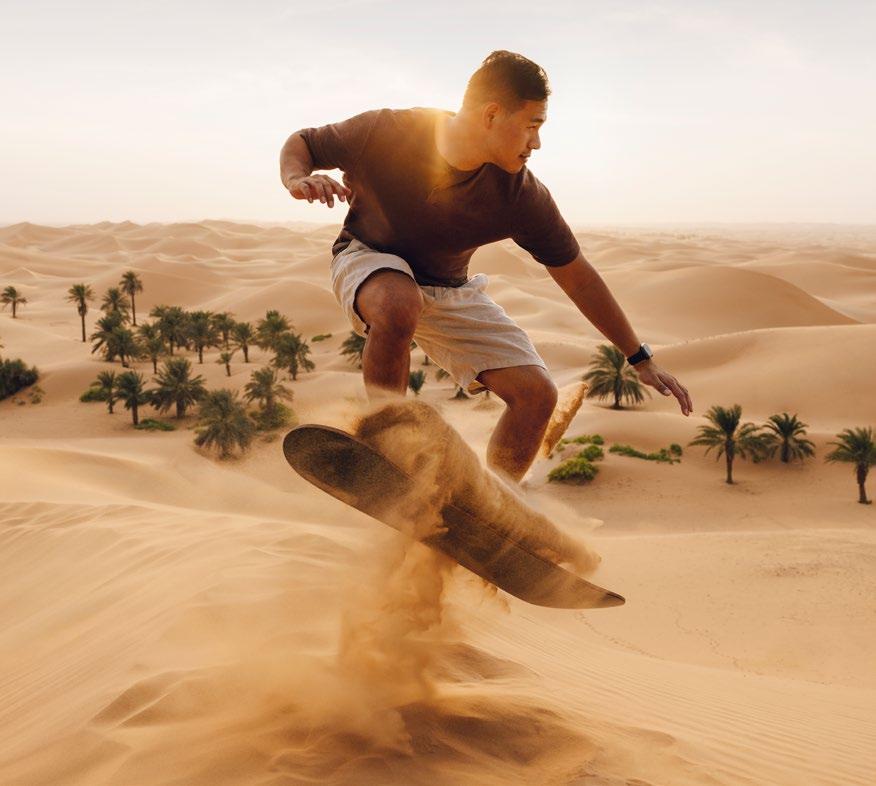
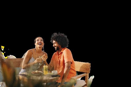
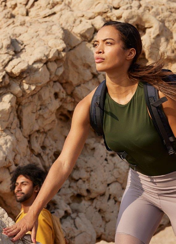
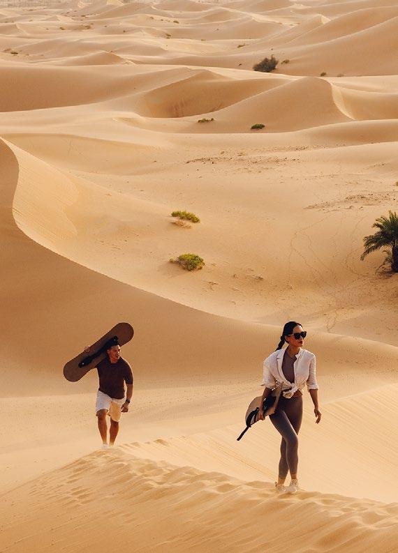
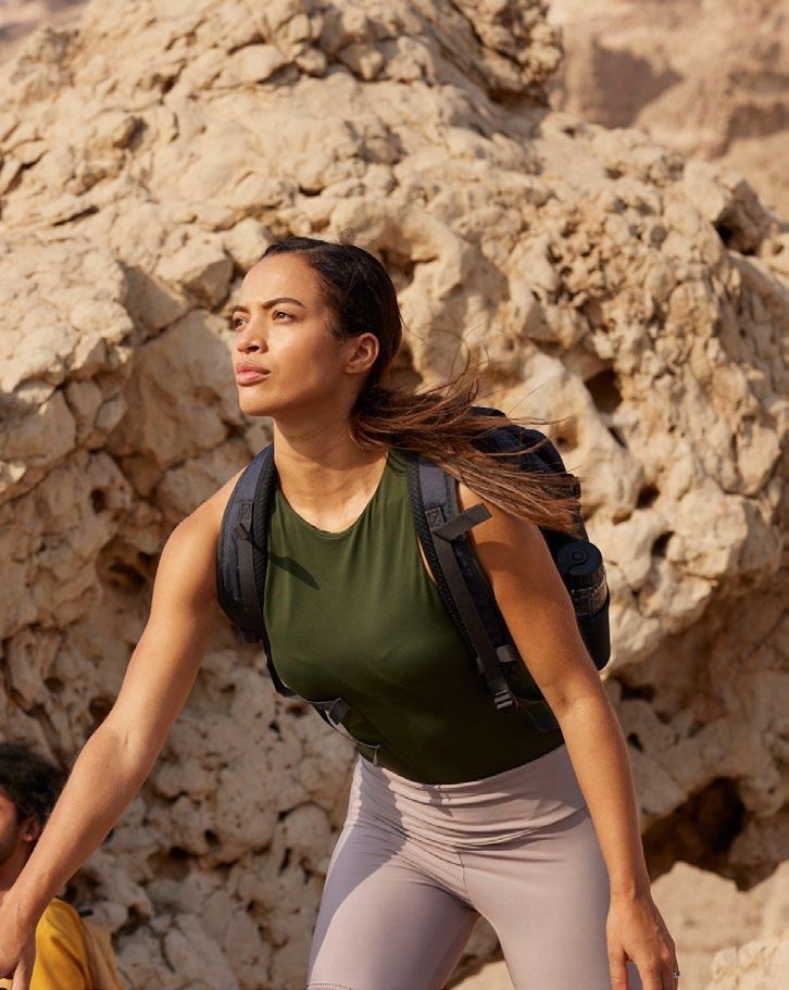
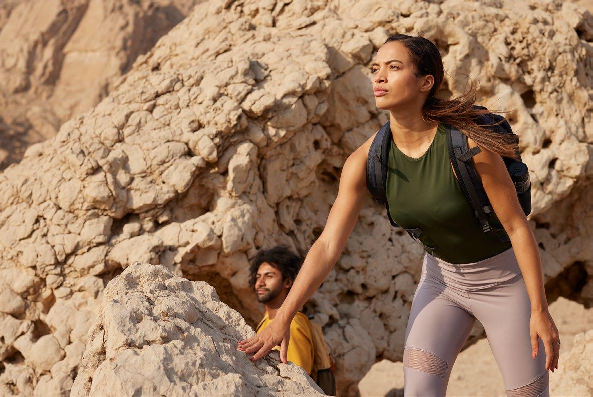
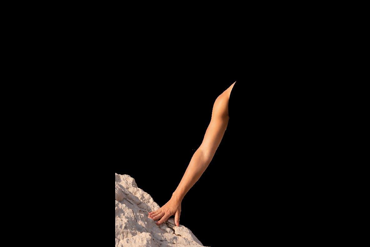
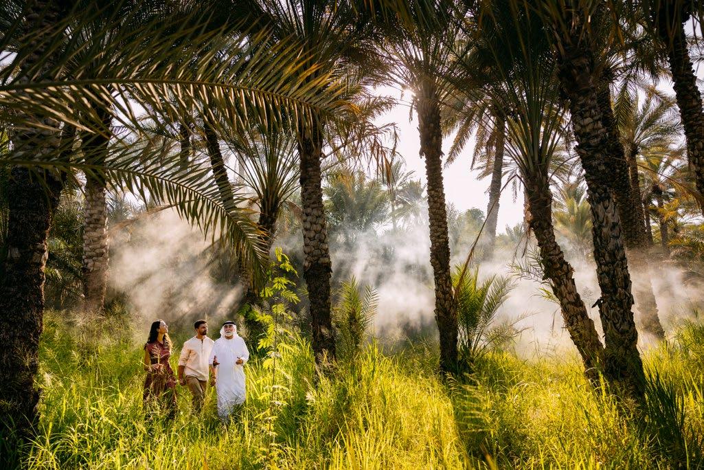
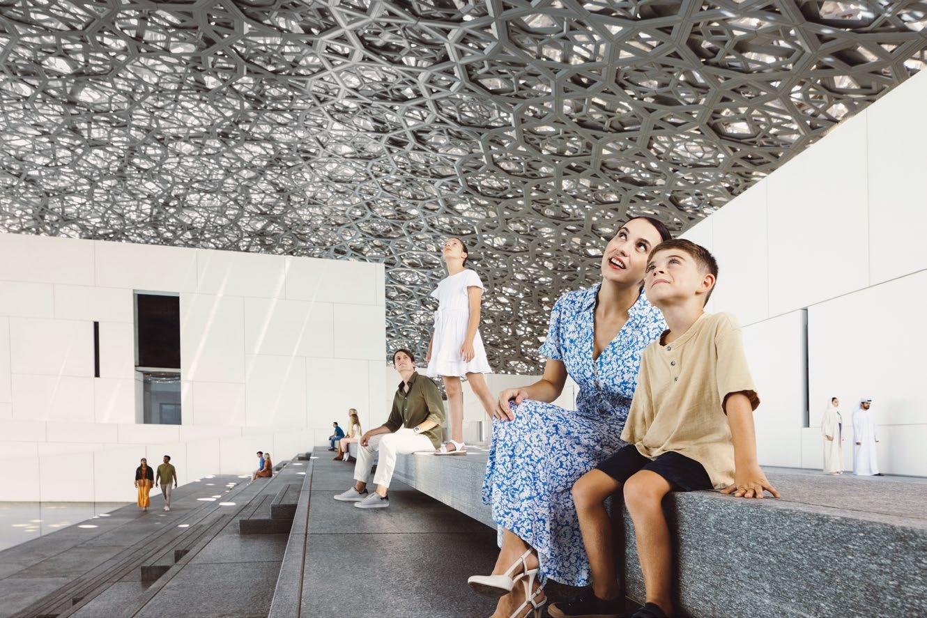
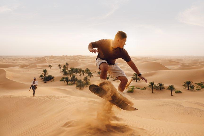
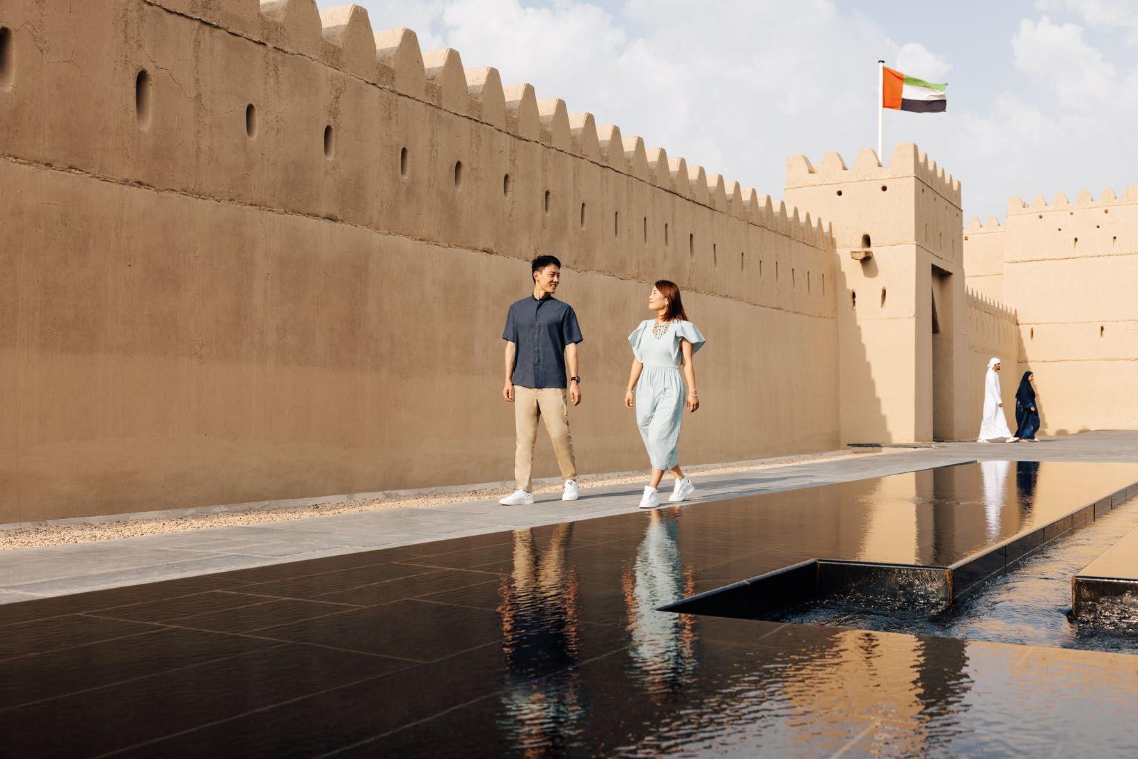
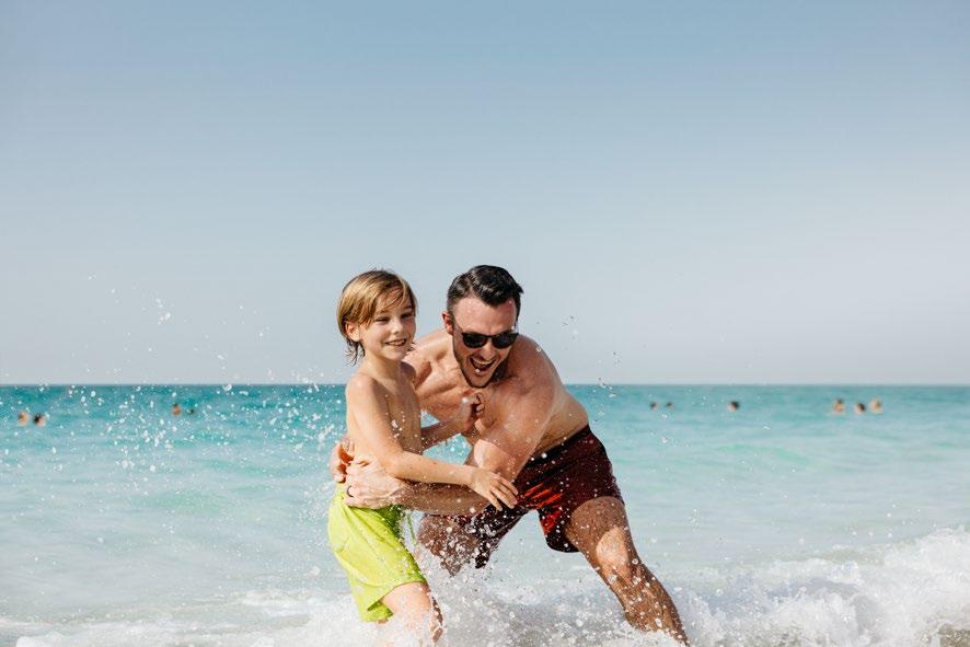
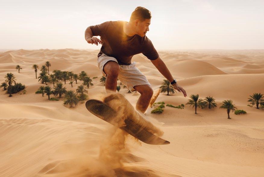
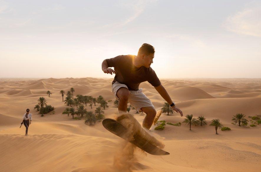
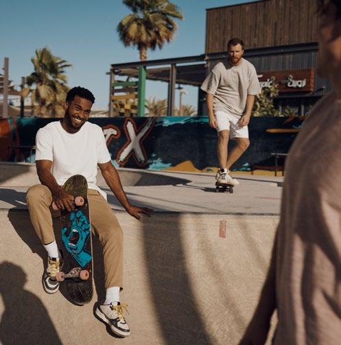
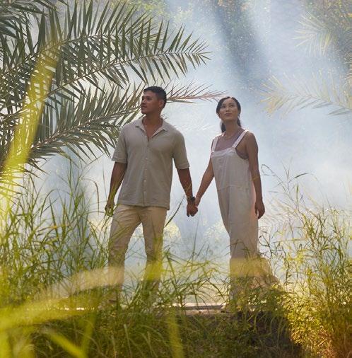
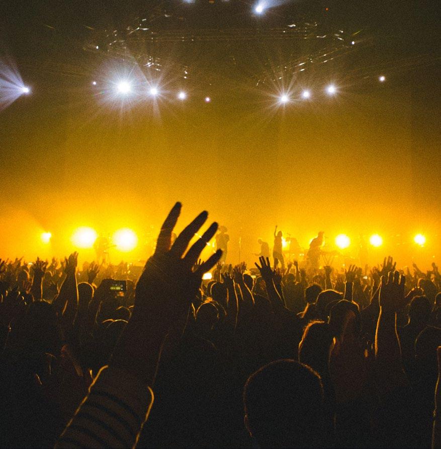
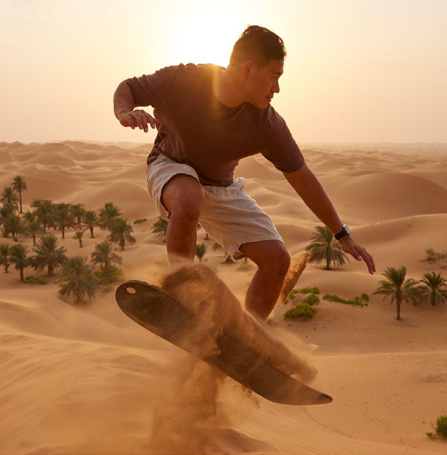
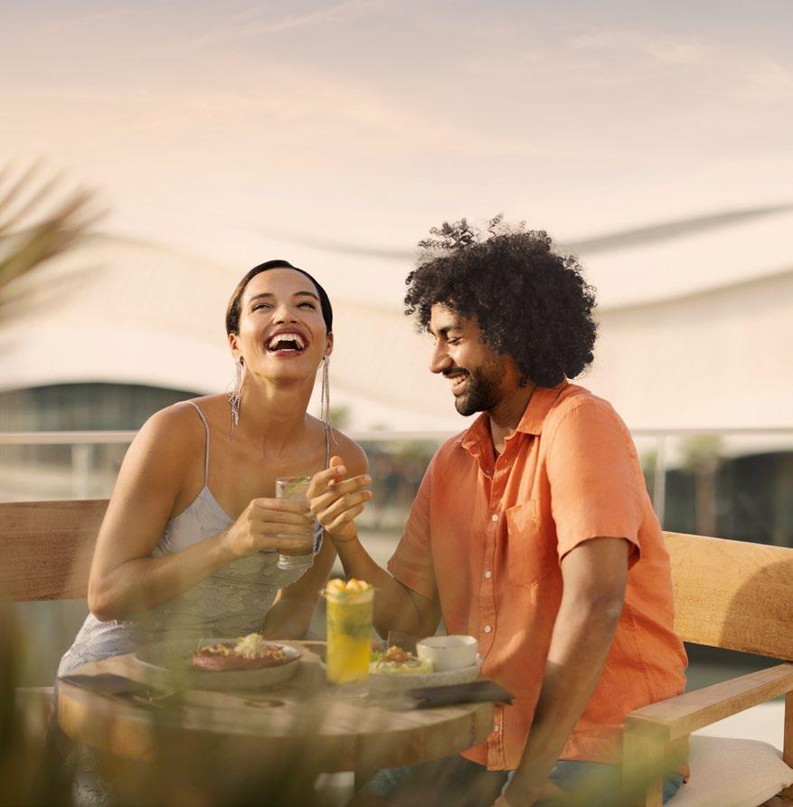
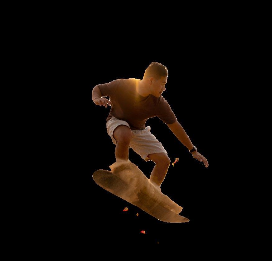
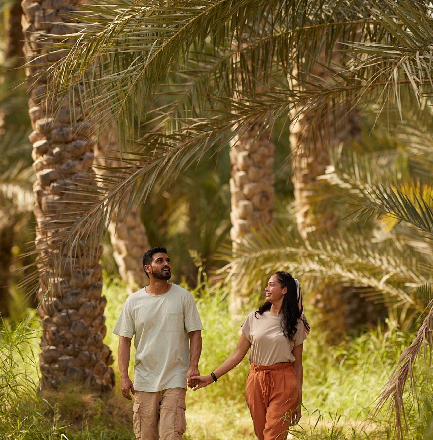
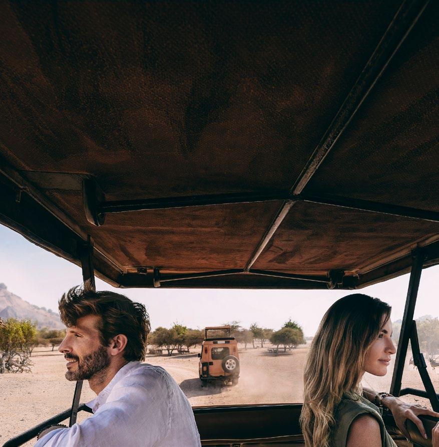
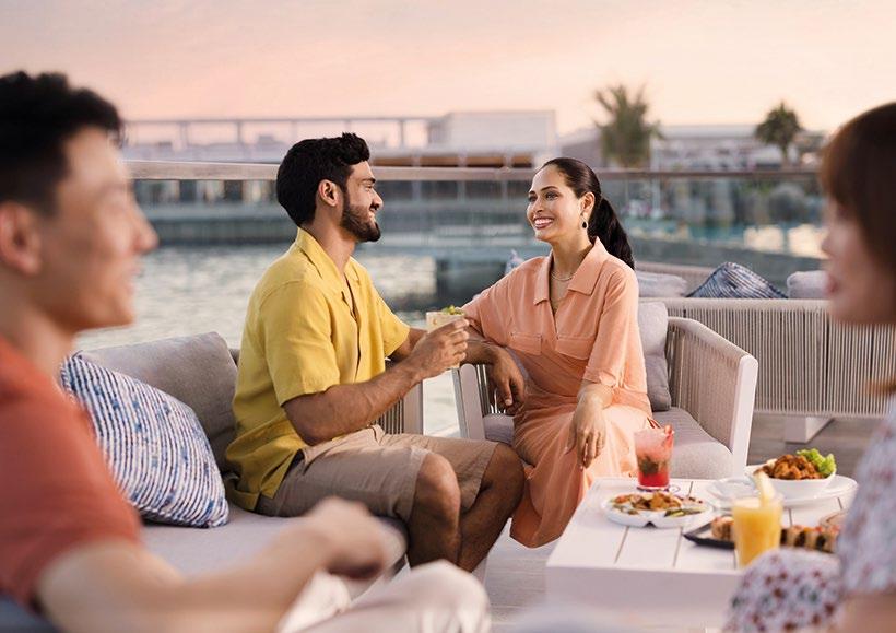
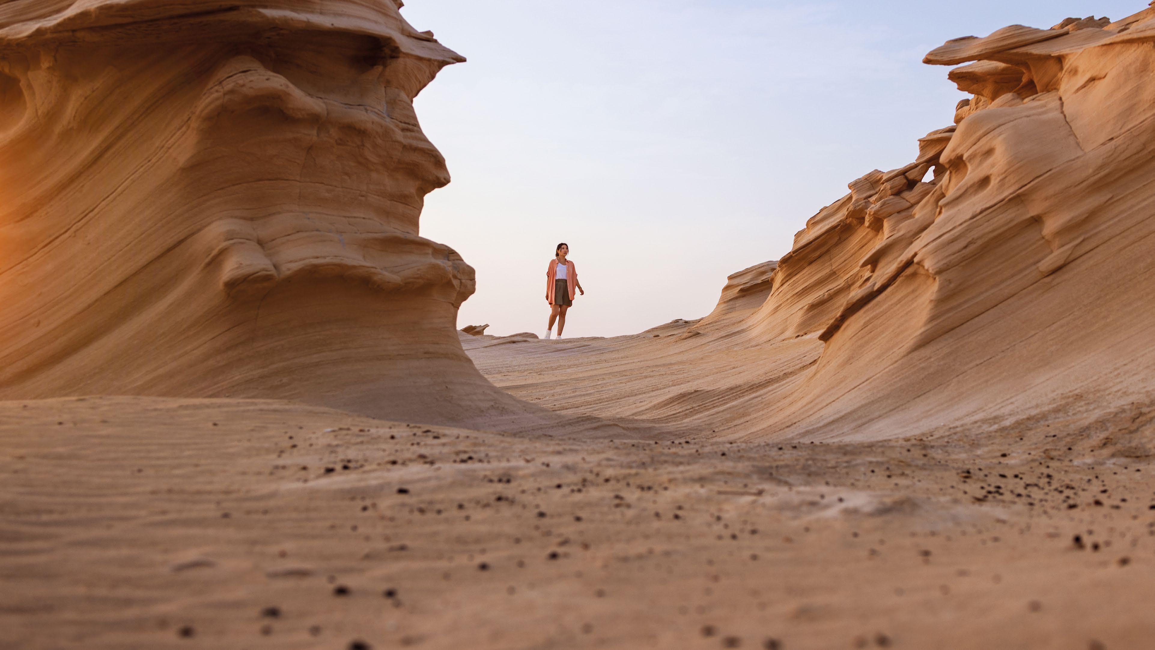
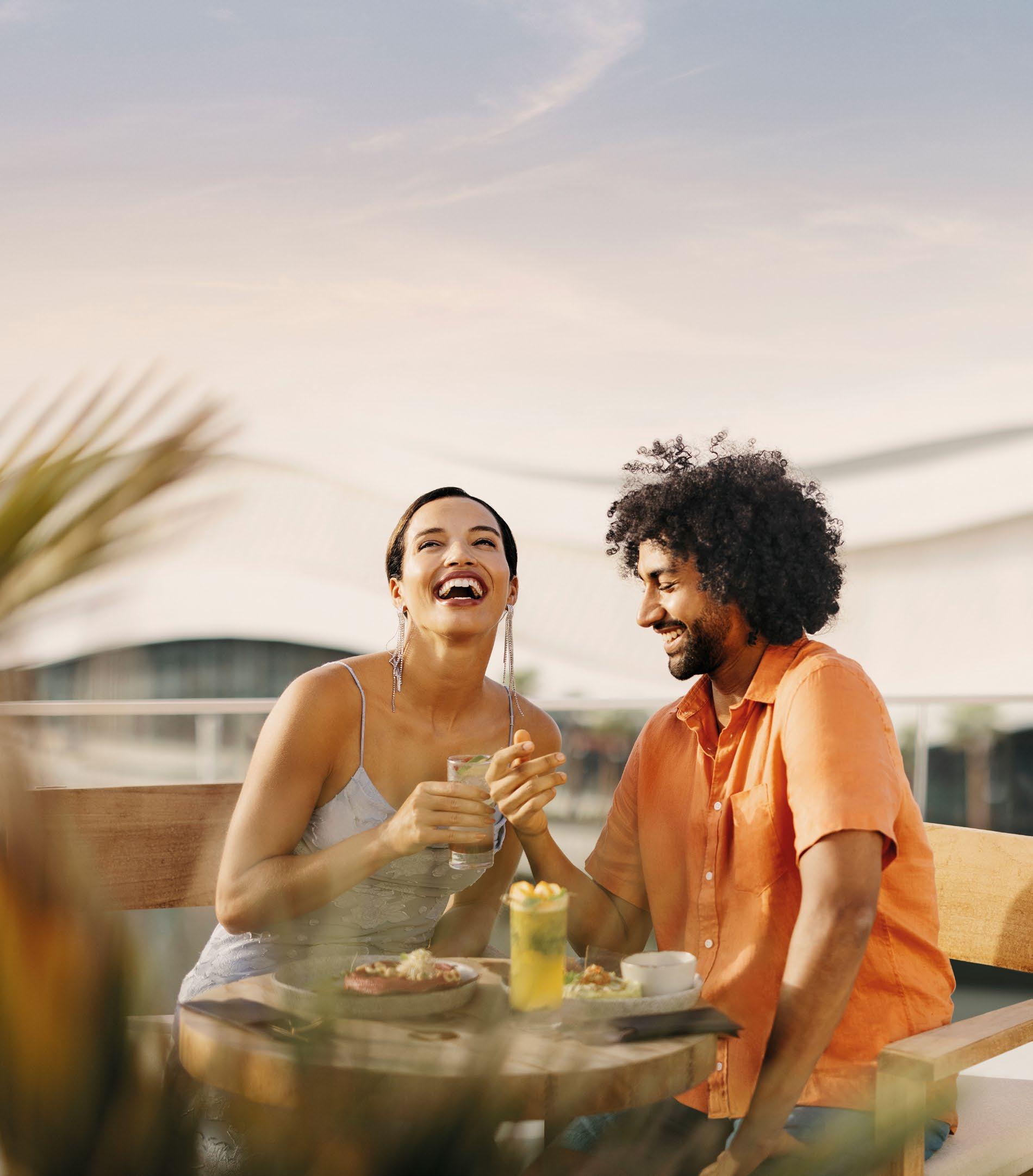
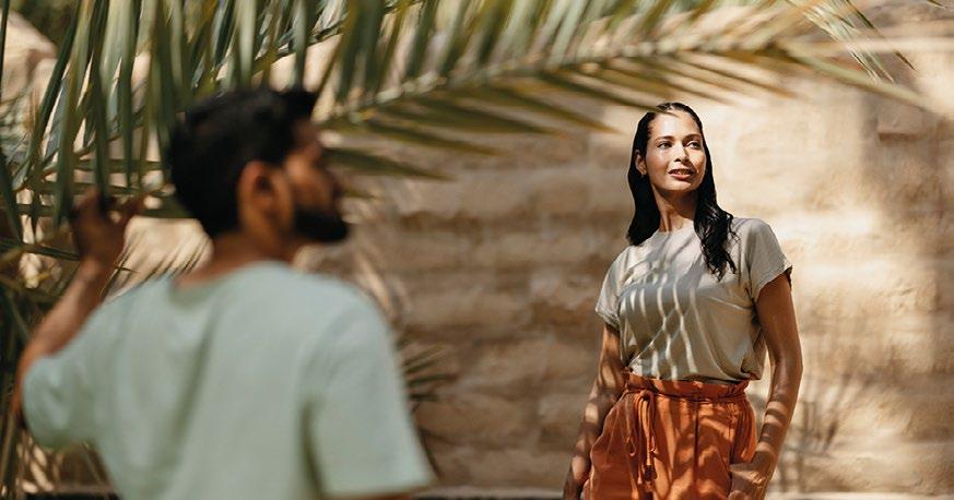
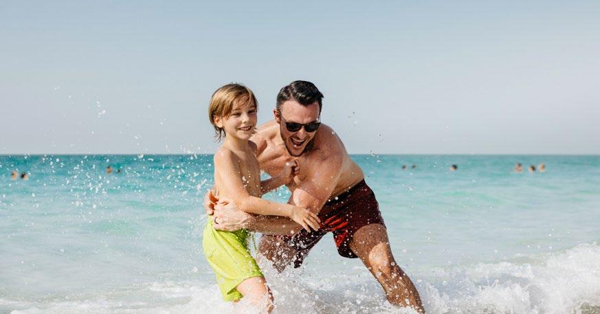
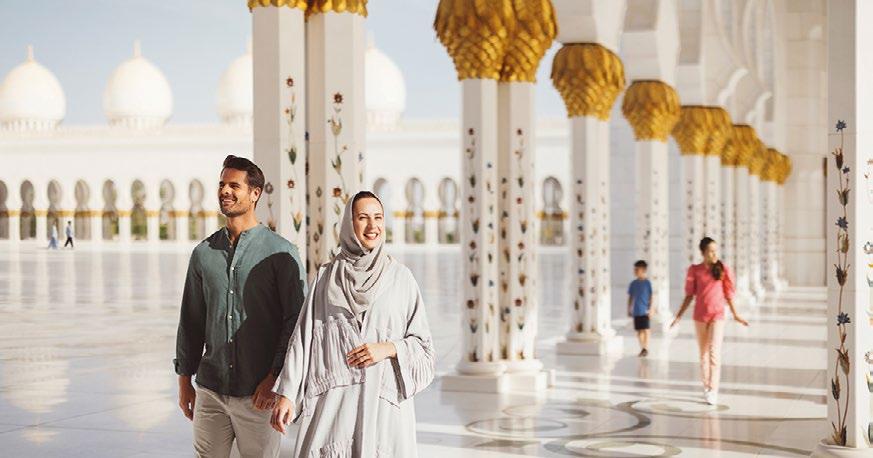
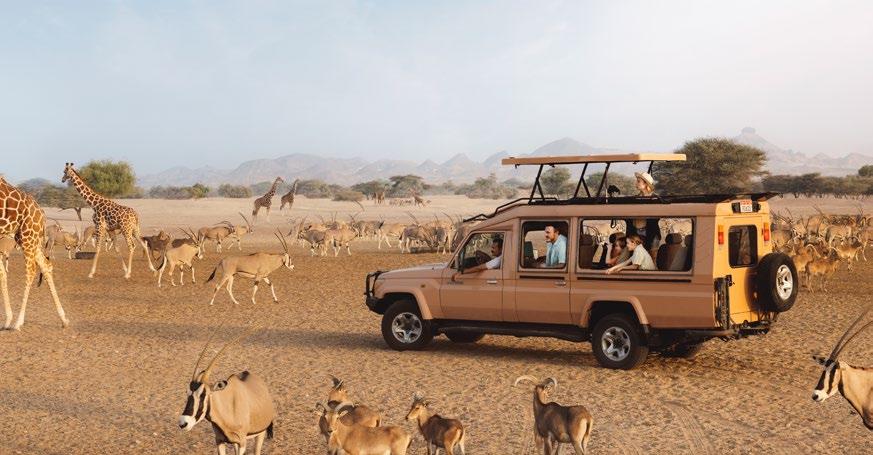
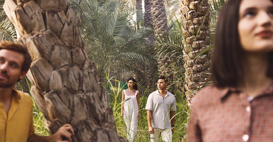
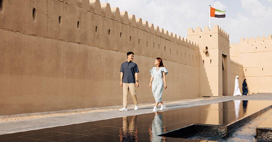
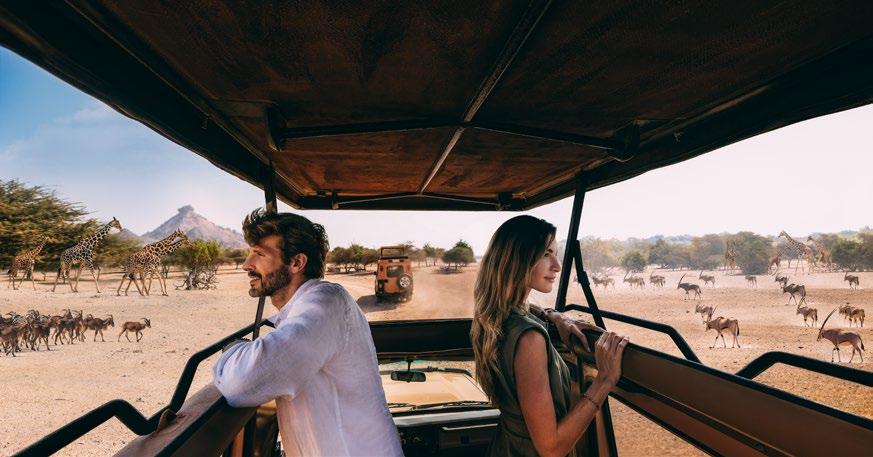
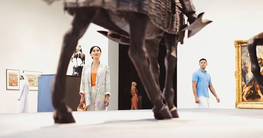
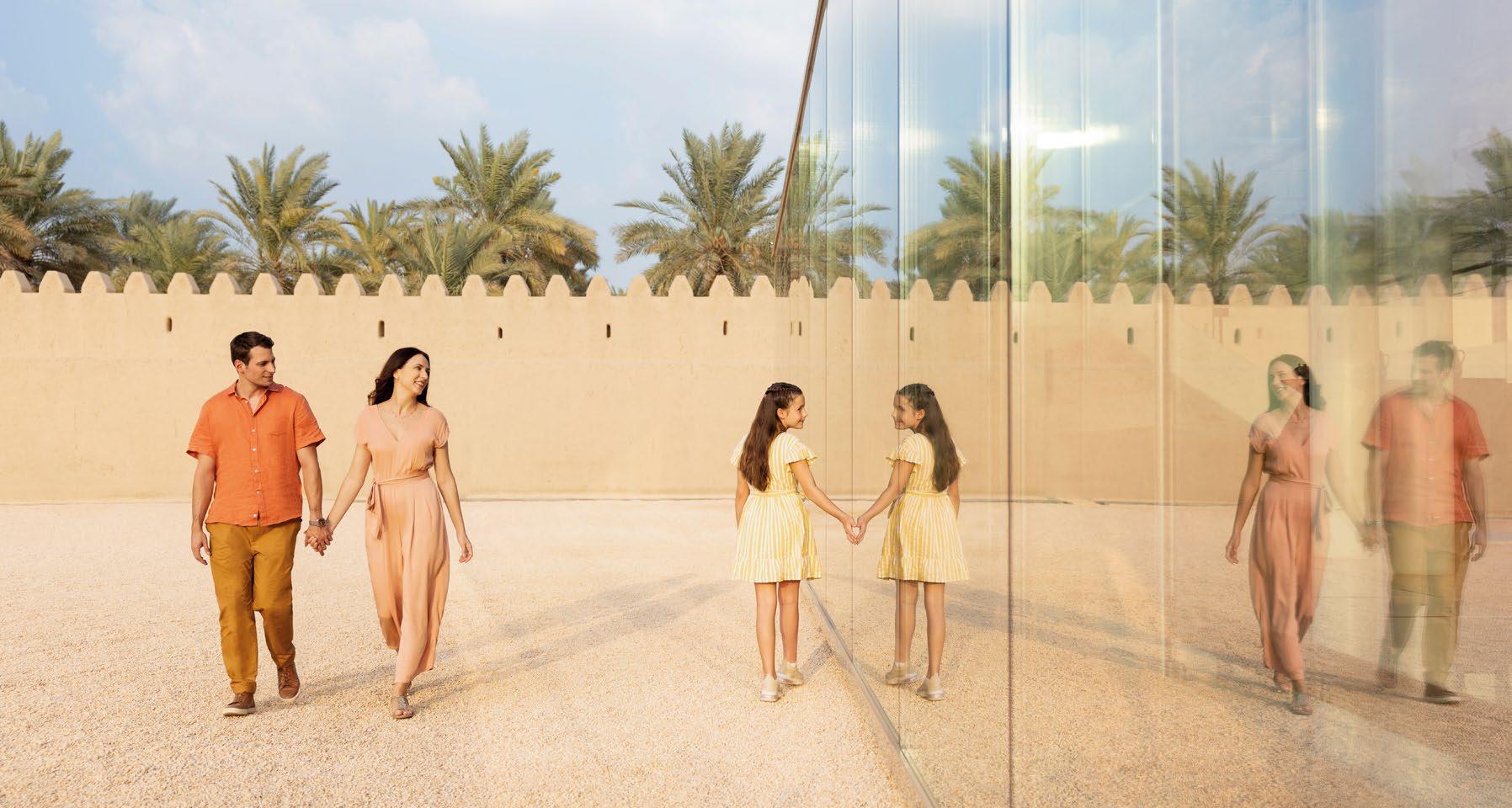
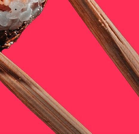
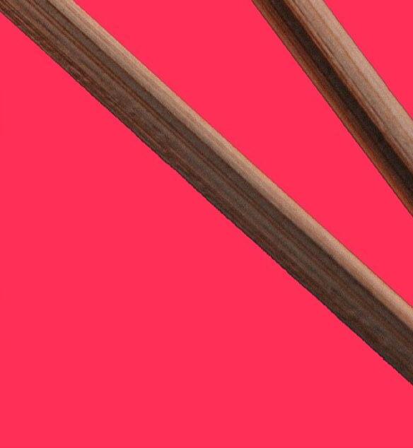
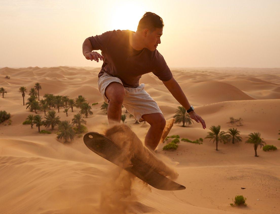
Using candid, ‘in the moment’ shots gives our imagery a more authentic feel, creating believable photography that genuinely represents the experiences that Abu Dhabi offers.
Capturing images with natural light helps them feel more authentic. Natural light can be recreated with lighting effects but as a general principle we avoid studio lighting and lighting effects.
Our imagery uses the rule of thirds, where key compositional elements are positioned on the 1/3 lines, as shown above. We use this to create clear focal points within our images that capture and engage our audience.
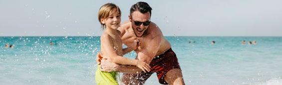
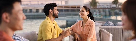
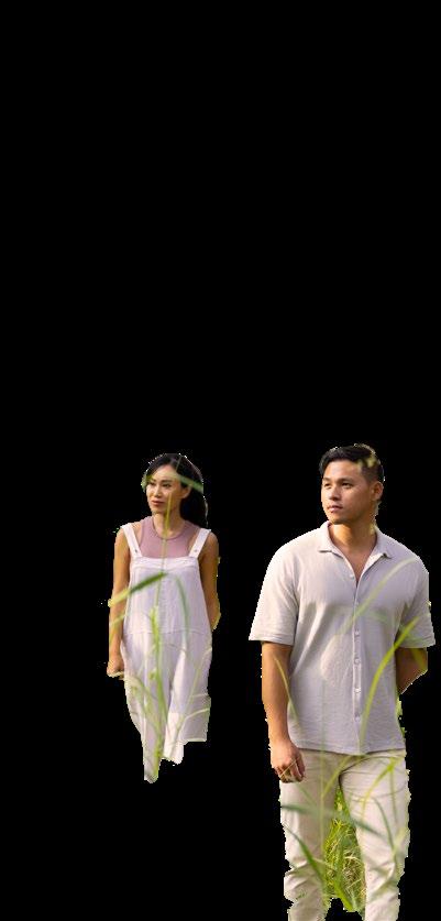
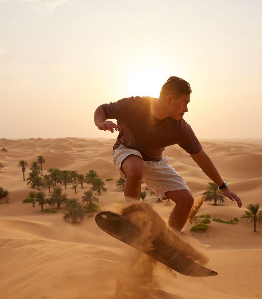
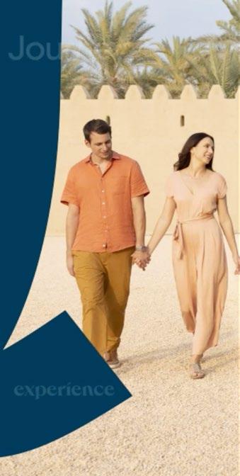
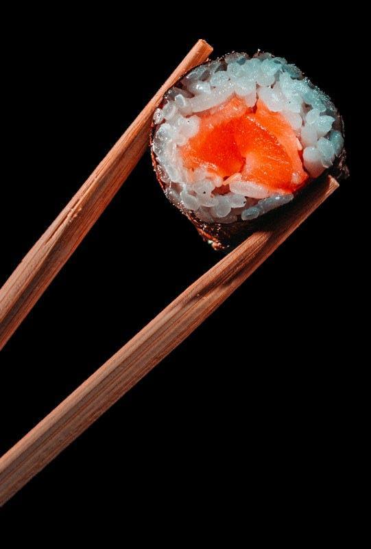
Our imagery helps us communicate the Abu Dhabi experience to our audience. From the natural beauty of our ancient landscapes, to the rich, diverse and modern metropolis that is Abu Dhabi. It visualises an experience for everyone in a highly immersive and authentic manner.
Photographic principles
To achieve the imagery that represents Abu Dhabi in its best light, we follow some guiding principles that should be adhered to in all of our imagery.
Unexpected reportage
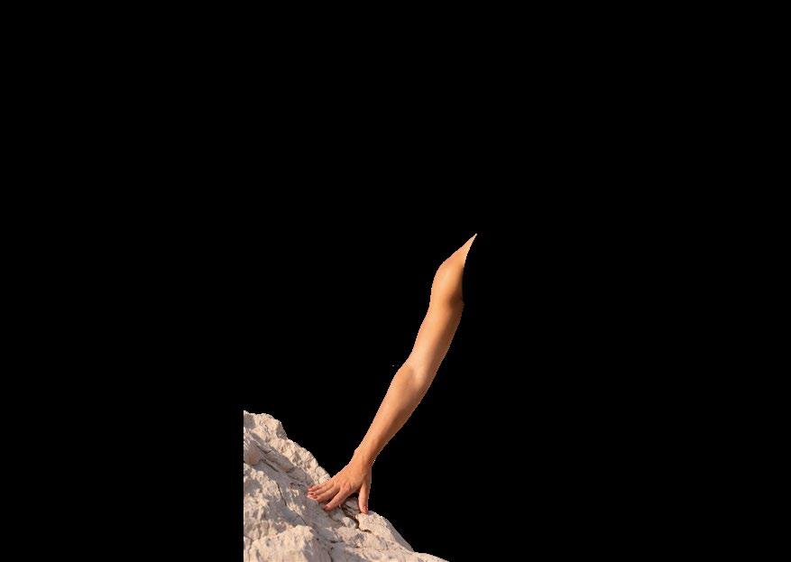
Our photography takes cues from documentary film-making and journalism. People and places are captured in the moment, from unexpected perspectives portraying an active and vibrant Abu Dhabi.
Show a human component
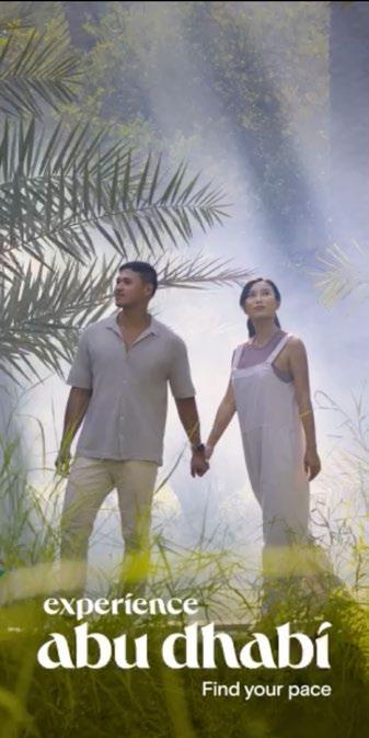
Our imagery always shows a human element, whether it’s by shooting from eye level or capturing people within the image. This brings context to our imagery, helping it feel more authentic and relatable.
Immerse your audience
Our imagery should make our audience feel like they are in the image with the photographer. Whether it’s shooting an image half submerged in the ocean or from within a crowd of people, our imagery is highly sensorial and immersive.
How we use photography
Grids & Guides
Underpinning all of our communications is our grid. Our grid helps us structure information on the page and guides design teams to create layouts that feel balanced and easy to process.
Over the following few pages we outline how our grid is created, how we apply our logo to our layouts and how we use our grid.
Overview
The examples shown on this page are for illustrative purposes only and should not be considered final designs.
Our grids are made up of three foundational components; margins, columns and gutters. Combined, they make up our grid.
To create a grid we define each of these underlying elements in three simple steps. These steps are explained over the following few pages.
Step 1: Define our margin size
Our margin is the clear space that separates our content from the edge of the canvas, whether it’s print or digital. Our first step is to define the size of the margin according to the format we're working with.
1. Define margin
Step 2: Decide the number of columns
Once we’ve defined our margin size, we can determine the number of columns we’re going to need. We typically use a 6, 9 or 12 column grid. A 12 column grid provides the most flexibility for designers when it comes to placing content.
The purpose of columns, is to help us organise content on the page and ensure that the placement of content is consistent across our design, aiding the readability of our communications.
Step 3: Define our gutter size
Gutters are the clear space between our columns. This helps us separate one piece of content from another. The third step before placing content onto the grid, is to define the size of the gutters. As a general rule of thumb these are at least a minimum of ¼ the width of the page margin.
Define gutters
When we’ve defined our grid, we can then begin to place content into our layout using the grid as a guide to creating organised layouts with a hierarchy of information.
Masthead
As a general principle, our masthead logo is always sized so that it meets each margin edge. This ensures that, where used, it’s delivered with impact.
Headline/body copy
Headlines and body copy are organised using our columns. This creates structure and helps our readers make sense of the information on the page. Columns of body copy typically have a maximum of 10 words per line.
Our
Note: The number of columns, margin size and gutter size will vary from one design to the other. Always use one grid per piece of communication e.g. one grid across website, one grid across brand campaign etc.
The example shown on this page are for illustrative purposes only and should not be considered final designs.
Masthead logo
Headline
Body copy
Iconography
Our icons are visual symbols used to represent locations, objects, ideas or narratives. They are designed to communicate messages at a glance and enhance the message we’re conveying.
Our icon design is inspired by the organic hand drawn forms in our logo. We use organic forms such as semi-circles combined with geometric forms. The geometric forms are reference to the world of Islamic pattern. Combined they create a style that reflects our identity and is distinctly of the region.
Icons are used on websites, PPT, Abu Dhabi Guides, stickers for social, and other promotional material.
Overview
Our icons are created using a 32px x 32px base grid with 2px padding that acts as clear space. Use the grid lines as a guide to snap the shapes you are using to create your icon to.
Colour use
Our icons always use single colour. We do not use colour pairings within our icon design. Use cases
Some examples of where our icons might appear across our brand and marketing materials are; editorial communications, newsletters, signage, website etc.
Creating our icons
2px padding
We use the Google system icons to ensure consistency across digital devices.
The Google material icon library can be downloaded here: fonts.google.com/icons
Motion
When using motion we should always think about:
Explore
The pace of animation and transitions should reflect the pace of the experience depicted. Movement enhances and elevates the key themes within our content. We create visual interest and energy by using dramatic shifts in pace. Our motion can also flow at a consistent pace (fast or slow) in keeping with the experience.
Our text animation can link directly to our four passion pillars. Setting the pace for; Restore, Excite, Inspire, Prosper. For example ‘Restore’ would leverage a more relaxed motion, whereas ‘Excite’ would feel energetic and ‘Inspire’ uplifting. These characteristics translate directly into transitions and on-screen effects.
We create a consistent forward motion with purpose. Our animation should flow positively in one direction, from left to right or bottom to top. Dependant on the language, the direction of flow may vary.
1. Setting the pace
The pace of animation and transitions should reflect the pace of the experience depicted. Movement enhances and elevates the key themes within our content. We create visual interest and energy by using dramatic shifts in pace.
Our motion can also flow at a consistent pace (fast or slow) in keeping with the experience.
1. Single experience story
To convey a sense of serenity, we would animate at a consistent pace with smooth and elegant transitions.
2. Multi-experience story
When showing multiple experiences across a story, leverage dramatic changes of pace to keep the viewer engaged and reflect each individual experience.
Our text animation can link directly to our four passion pillars. Setting the pace for; Restore, Excite, Inspire, Prosper. For example ‘Restore’ would leverage a more relaxed motion, whereas ‘Excite’ would feel energetic and ‘Inspire’ uplifting. These characteristics translate directly into transitions and on-screen effects.
2. Type behaviours
We create a consistent forward motion with purpose. Our animation should flow positively in one direction, from left to right or bottom to top. Dependant on the language, the direction of flow may vary – for example, Arabic should flow from right to left.
Applications
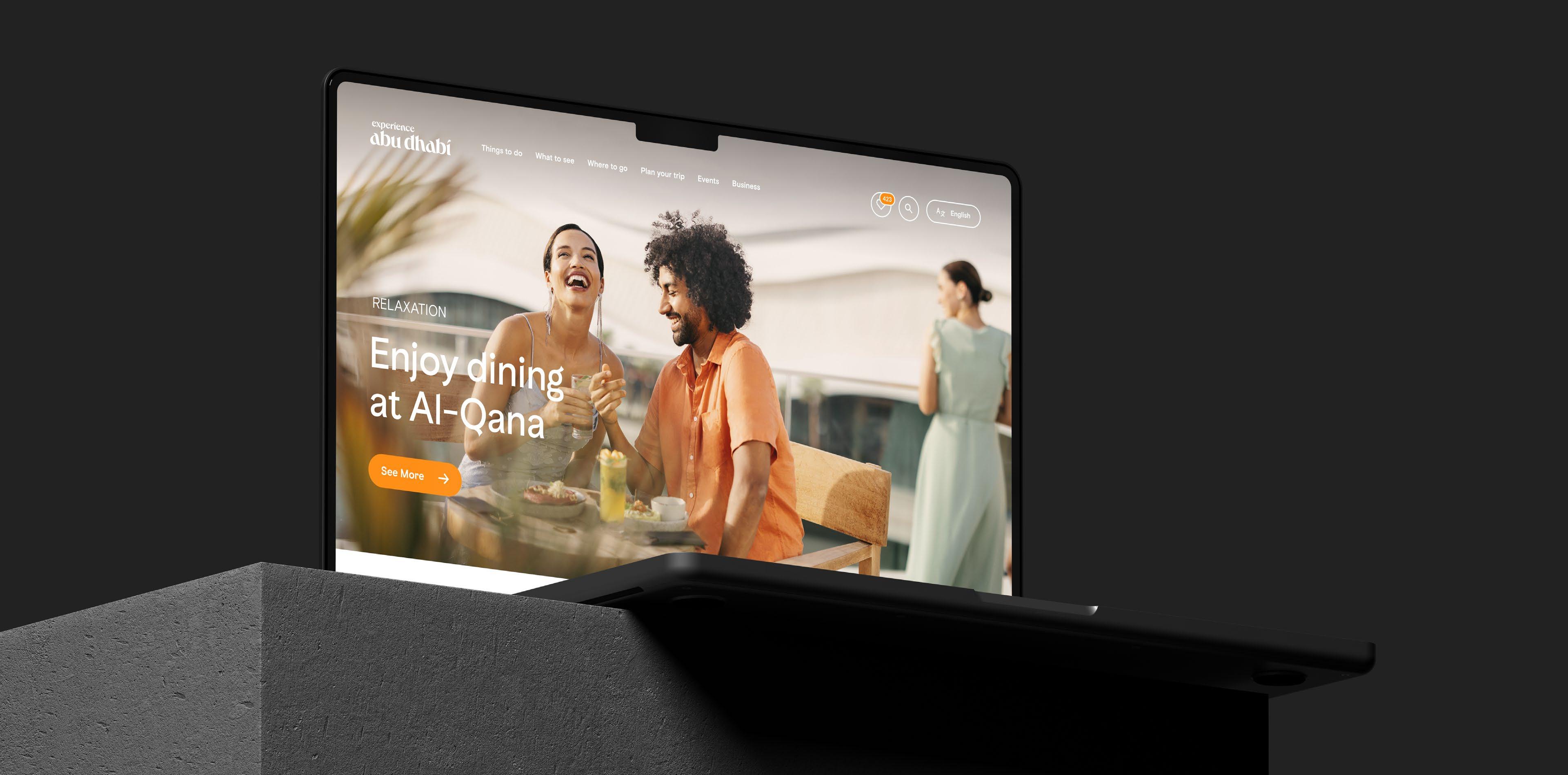
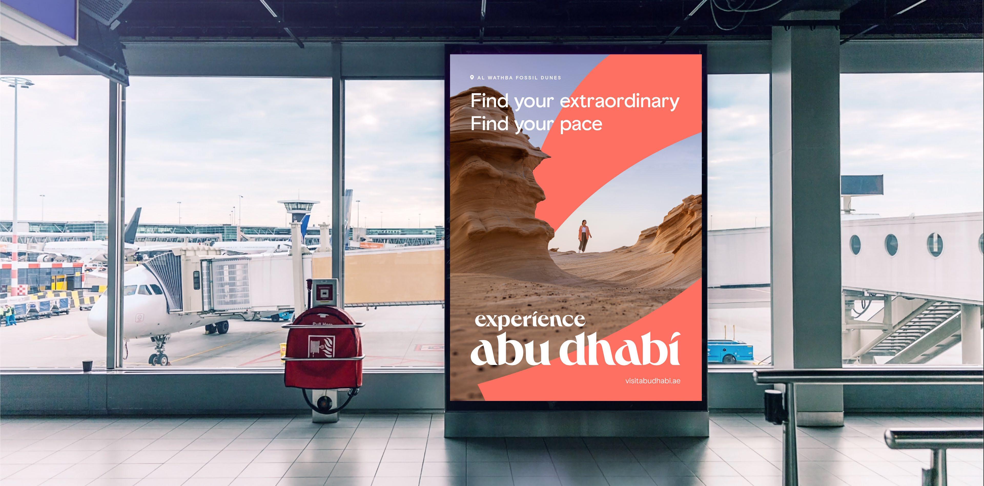
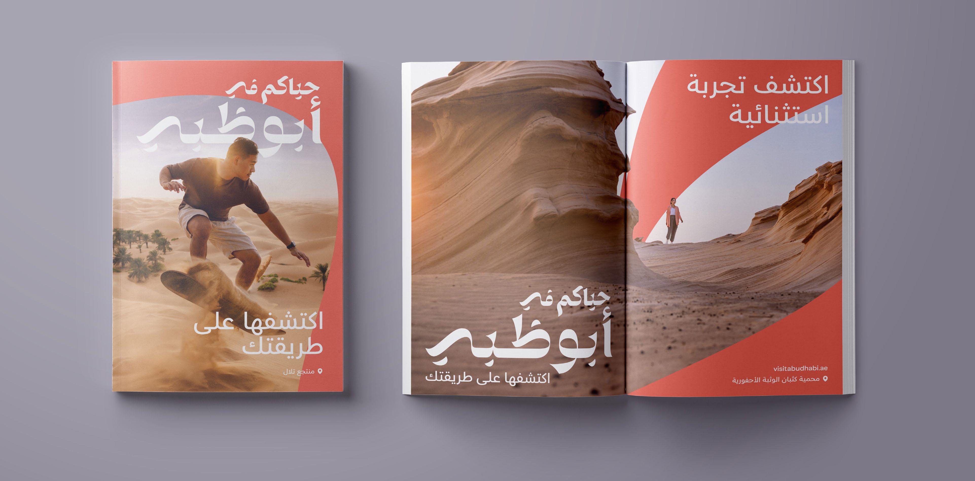
See our new brand come to life, through a variety of applications. Our brand’s flexibility allows content to stay fresh and exciting, constantly evolving with Abu Dhabi.
Find your thrill
Find your pace
Thank You
If you have questions or comments regarding the guidance given here, please contact the brand team: