Brand positioning
Purpose Why we exist?
Enrich people’s lives through sharing Abu Dhabi
Promise What we deliver?
Principles
How do we deliver?
At DCT we promote, protect and progress Abu Dhabi as a cultural and tourism destination. Visionary at heart, sustainably driven –collaborating to succeed.
We... lead
We drive our industry forward with vision, embracing new ways of thinking, leading transformation across sectors and providing stewardship to those we work with.
We... protect
As guardians of our culture, heritage and language, we protect Abu Dhabi in all aspects – proud of our Emirate’s heritage and honoured to have the responsibility to preserve it.
We... enable
We create the foundations for success through fair and effective regulation, shaping and governing the industry – inspiring the confidence and security to truly realise opportunities.
We... collaborate
We always work together closely, building trusted relationships with partners locally and globally, knowing that when they succeed, Abu Dhabi does too.
We... care
We love sharing Abu Dhabi with the world - our work is our passion. We care for the destination we call home as we care for those we work with. Led by our values we strive to leave a better home for future generations.
Brand toolkit
An overview of the tools we use to build DCT brand.
Logo
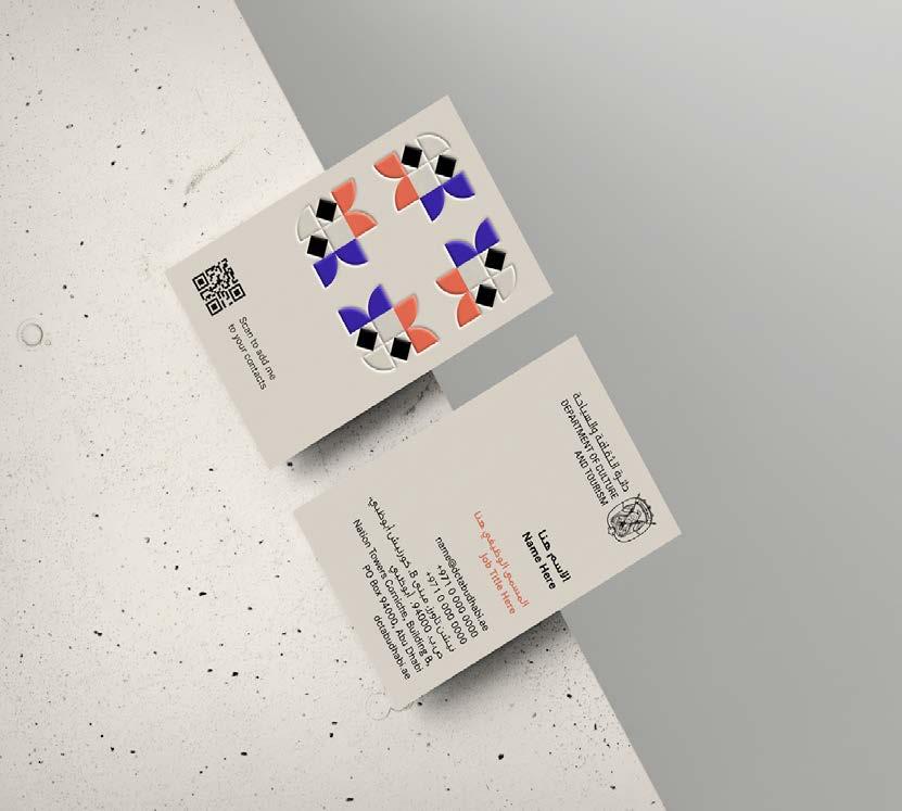
The full colour logo is to be used in all official communication and announcements, and partnerships with other government entities.
Contents
Brand positioning
Brand toolkit
Logo
Colour
Typography
Imagery
Graphic system
Layout system
Bringing it all to life
We always align our logo to the right. In the top or bottom position.
We always align our stacked lockup to the centre in the top position.
Contents
Brand positioning
Brand toolkit
Logo
Colour
Typography
Imagery
Graphic system
Layout system
Bringing it all to life
To ensure our logo is always legible and displayed with pride, use the following rules.
Clearspace
We measure our clearspace with the X height of the DCT wordmark. Always use the artwork file provided.
Minimum size
Minimum size in print is to be determined based on the print test of the new logo
Minimum size in digital is to be determined based on the new logo.
Colour
Contents
Brand positioning
Brand toolkit Logo Colour
Typography
Imagery
Graphic system
Layout system
Bringing it all to life
Our primary colour is dawn. It is recognisable across everything we do. Combined with the sophisticated Sandstone and vibrant secondary palette, we create a rich visual language that evokes elements from Abu Dhabi.
Dawn Sandstone
Is how DCT brand is recognised. It is vibrant, warm and distinctive. Dawn should be present across all of our design.
Plays an essential role in creating a balanced composition across our communications. It should be present across majority of our design and communications.
Contents
Brand positioning
Brand toolkit
Typography
Imagery
Graphic system
Layout system
Bringing it all to life
Our secondary palette exists to create an interplay of colour throughout the brand. We use our secondary palette to create vibrant accent and pace. We only use one secondary colour at a time.
Stargaze
Is inspired by the night sky in the desert.
HEX 4832b8
RGB 72 50 184
Pantone 2098 C
CMYK 84 82 0 0
Flamingo
Is inspired by the vibrant details of Abu Dhabi.
HEX CD3151
RGB 205 49 81
Pantone 206 C
CMYK 0 100 58 0
Palm
Is inspired by the nature of Abu Dhabi.
HEX 1C9667
RGB 28 150 103
Pantone 340 C
CMYK 83 8 64 0
Typography
Corporate S
Our primary typeface is Corporate S.
It feels contemporary and clean, and is well suited for both corporate and more expressive communications. Contents
Corporate S Light
We use Light for most body copy or large numbers.
Bringing it all to life
0123456789
Corporate S Regular
We use Regular for most headlines and sub-heads.
Corporate S Bold
We use Bold for most subheadings where we need contrast against Light.
AaBbCcDdEeFfGgHh
IiJjKkLlMmNnOoPpQq
RrSsTtUuVvWwXxYyZz
0123456789
Typography
Contents
Brand positioning
Brand toolkit
Logo
Colour
Typography
Imagery
Graphic system
Layout system
Bringing it all to life
GE SS
Our primary typeface for Arabic is GE SS.
It feels contemporary and clean, and is well suited for both corporate and more expressive communications.
GE SS Light
We use Light for most body copy or large numbers.
GE SS Regular
We use Regular for most headlines and sub-heads.
GE SS
GE SS Bold
We use Bold for most subheadings where we need contrast against Light.
To create a simple hierarchy we will ‘simplify to amplify’ using a maximum of 4 type sizes per application.
Building a future together.
Lorem ipsum dolor sit amet, consectetur adipiscing elit.
Lorem ipsum dolor sit amet, consectetur adipiscing elit. Maecenas pharetra interdum nisl, eu sollicitudin orci pulvinar quis. Maecenas mi nisl, luctus vitae lorem eget, euismodci pulvinar quis. Maecenas mi nisl, euismod ornare erat.thought into our online service as the face-to-face experience.
We’ve established a few guiding principles to ensure we treat typography consistently throughout the entire DCT brand.
Things to avoid Things to achieve
Too many weights
Don’t use too many weights of the typeface when laying out type.
Hierarchy
Ensure to create a central point and clear hierarchy when working with typography.
Using wrong typefaces
Always use our brand typeface for all communications.
Swiss sensibility
Layout the type to create a sense of space, scale, look for inspiration in Swiss design.
Overlapping type and graphics
Don’t place any type on the graphics to ensure consistency in design and legibility.
Think creatively
Don’t be afraid to pull out important information and make it large, make the page sing.
Avoid busy layout
To ensure everything looks structured, considered and hierarchical.
Don’t ignore the grid
Use the brand grid to achieve optimum results.
Legibility
Always make sure the design and colour usage is accessible; use contrasting colours, and sizes.
Imagery
Contents
Brand positioning
Brand toolkit
Logo
Colour
Typography
Imagery
Graphic system
Layout system
Bringing it all to life
Three things you need to know about our imagery
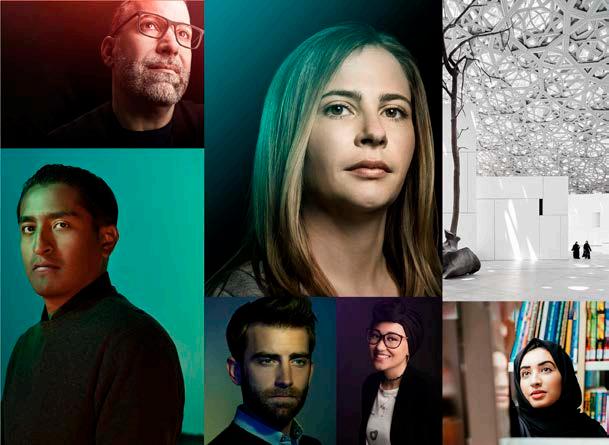
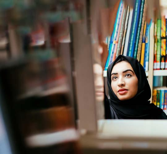
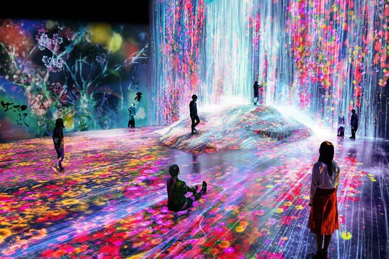
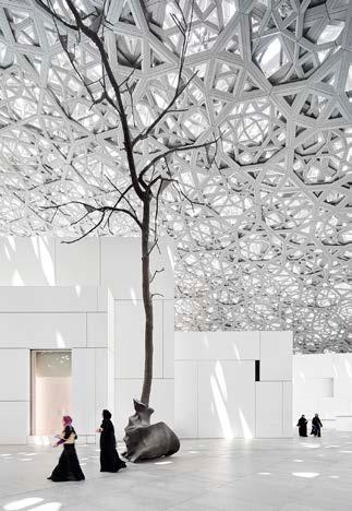
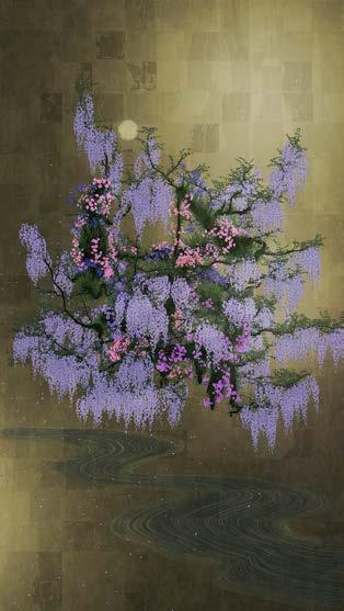
We use 3 types of imagery: our people, places and experiences. Imagery

3 types of imagery
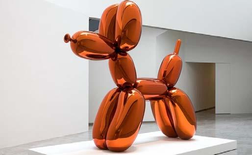

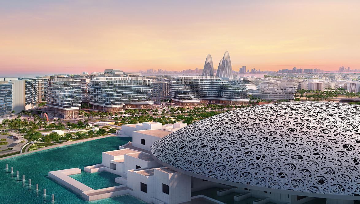
Use to tell a story
A picture can say a thousand words; we use imagery to tell purposeful and powerful stores.
Reflect our vision
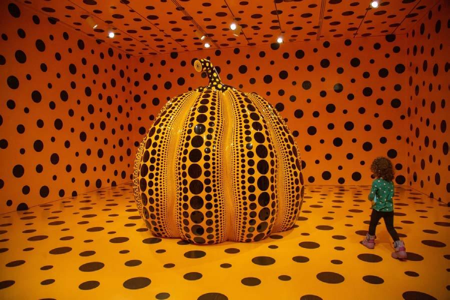
Our photography should always translate our ambitious vision and strategy. Showing our unique culture and innovation.
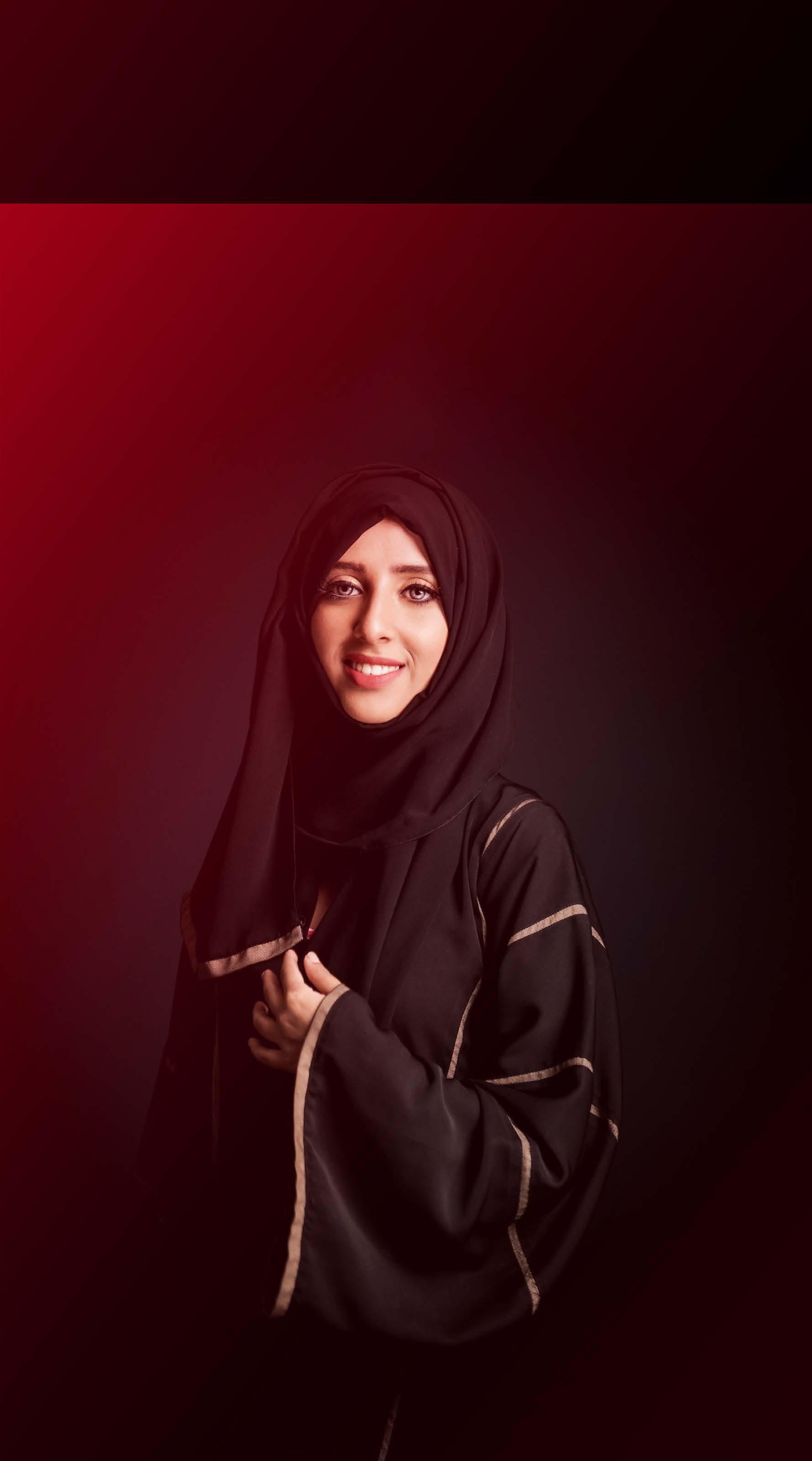
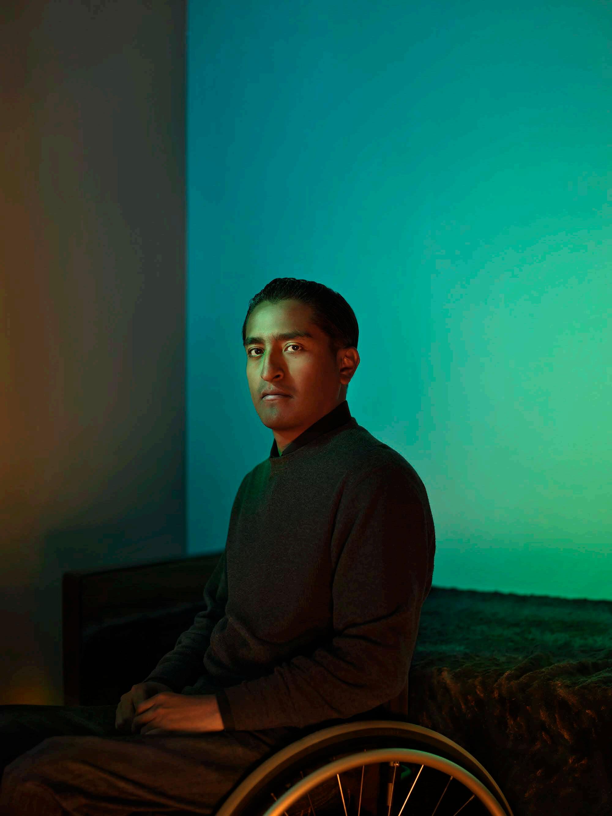
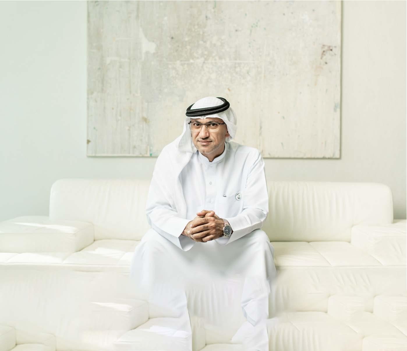
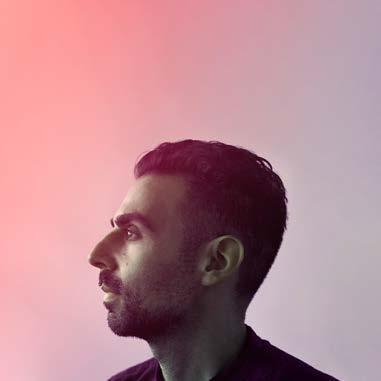
Portraiture
A signature photographic style to reflect the visionary values shared by the people behind DCT.
Dramatic | Impactful | Studio
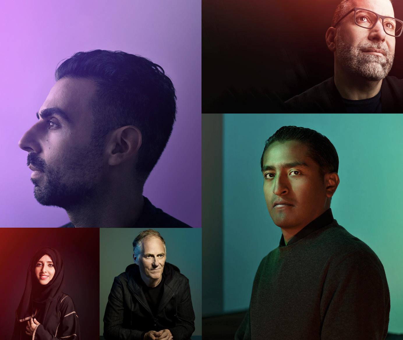


Note: portrait photography is for illustrative purposes only.




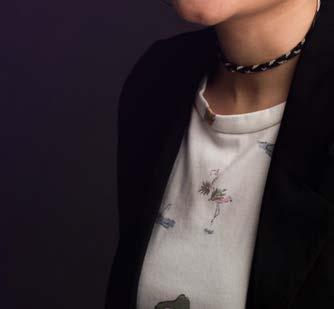












Photography considerations
We use these principles to guide our image creation or curation for our flagship materials. Each of these content streams helps us tell a unique part or perspective of a story.

Effortless engagement
Capture candid, authentic moments in realistic context.
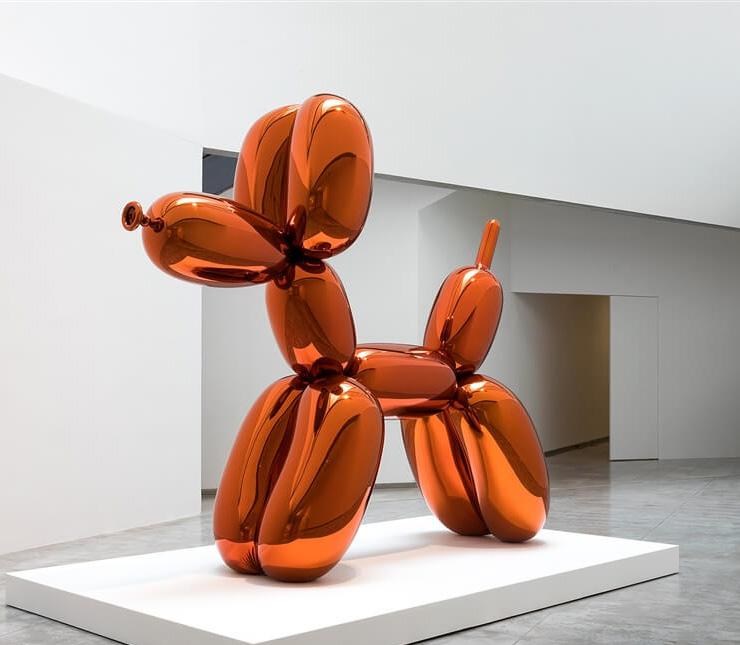
Focal point
Keep it simple with a single focal point, so our audience will understand the message quickly.
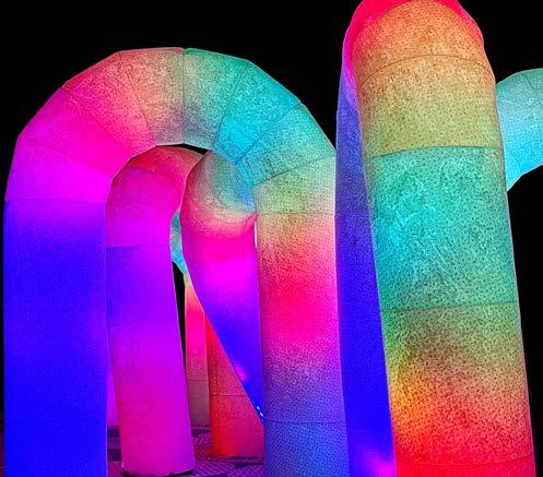
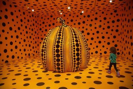
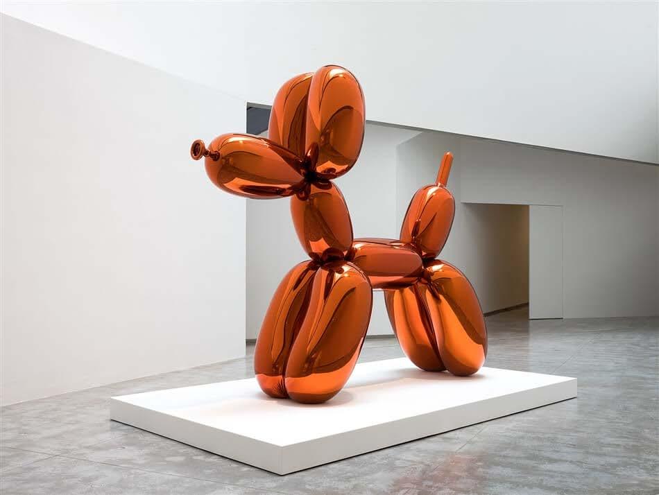
Spark the imagination
Use places, experiences and objects to ignite excitement, provoke the imagination and spark creativity.
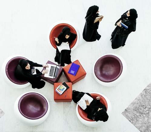
Group engagement
Show interaction to symbolise collaboration and passion.
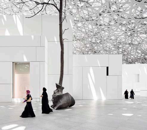
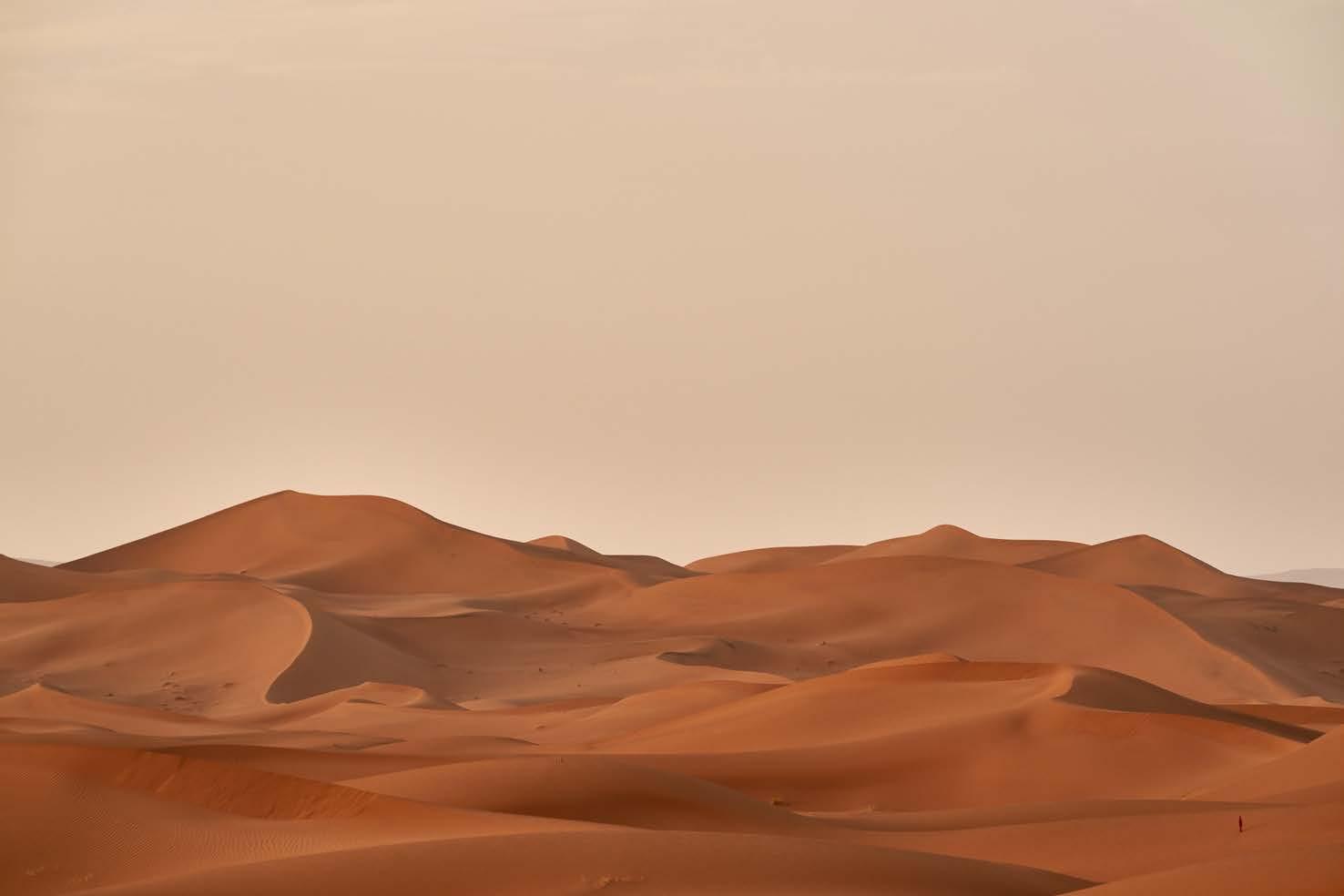
A sense of place
Draw the viewer in and create intrigue by capturing a sense of place, space and scale.
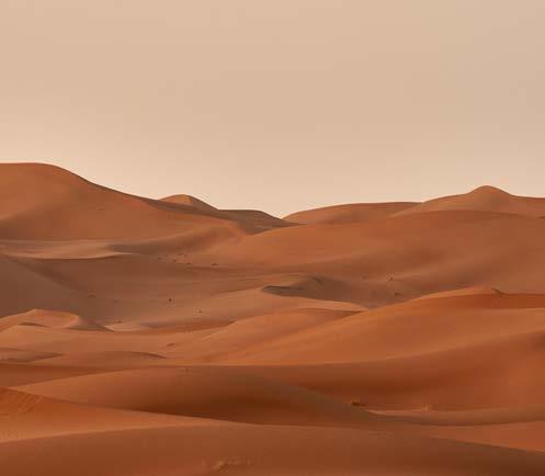
Breathtaking views
Utilise the beauty of Abu Dhabi to communicate the vision of DCT successfully.
Graphic system
Graphic system
Contents
Brand positioning
Brand toolkit
Logo
Colour
Typography
Imagery
Graphic system
Layout system
Bringing it all to life
Our visual language was inspired by the intricate craftsmanship of Abu Dhabi’s cultural and architectural elements: weaving the story of Abu Dhabi together
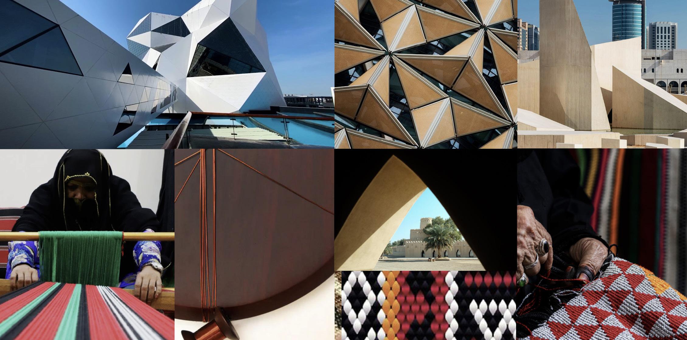
Contents
Brand positioning
Brand toolkit
Logo
Colour
Typography
Imagery
Graphic system
Layout system
Bringing it all to life
Hero shapes
There are three main hero shapes in our brand: Quadrant, Diamond and Square. These are the only shapes we use to build our graphic devices.
Our hero shapes are inspired by Abu Dhabi. They represent DCT and our partners coming together as a collective, and in a considered formation become messages, patterns, icons and stories.
Graphic system
Hero shapes
Contents
Brand positioning
Brand toolkit
Logo
Colour
Typography
Imagery
Graphic system
Layout system
Bringing it all to life
Three things you need to know about our graphics
We use grid to ensure continuity, providing a flexible structure. Everything in the graphic system is built on the foundation of the grid. Graphic system
All graphics are created on a simple grid
We use our graphics in different ways
We have a flexible and versatile graphic system.
To speak to a variety of audiences, we have 4 types of graphic treatments. Each playing a role to create an exciting and future-proof visual language.

Our graphics make us recognisable Our bold graphic system creates a continuous and constant brand presence across all of the communication channels.
Contents
Brand positioning
Brand toolkit
Typography
Imagery
Graphic system
Layout system
Bringing it all to life

1. Pictograms
Our pictograms serve as primary brand assets. They create a sense of DCT spirit across all of the communications. They act as our primary storytelling device, easily communicating both abstract and literal concepts.
Graphic system
1. Pictograms
Contents
Brand positioning
Brand toolkit
Logo
Colour
Typography
Imagery
Our pictograms can explain both abstract concepts and literal depictions
Storytelling pictograms
To be used when telling a DCT story, highlighting values or creating an emotional symbol.
Graphic system
Graphic system
Layout system
Bringing it all to life
Literal pictograms
To be used to represent the actual content and visualise data in a more engaging way.
Numerals
To be used when visualising data, in editorials and PowerPoint. Do not recreate the numbers and always use the artwork files provided.
Graphic system
1. Pictograms
Contents
Brand positioning
Brand toolkit
Logo
Colour
Typography
Imagery
Graphic system
Layout system
Bringing it all to life
How we create our icons & pictograms
Icon base grid - 7X7
Our base grid for all current and future icons is 7X7.
Building the base
Use our 3 hero shapes to build the icon.
Building the object
Continue with the left side.
Applying colour - primary
Start filling the icon with colour by applying DCT Dawn to the shapes. Make sure the application is symmetrical. (Apply sandstone if the background colour is Dawn).
Applying colour - secondary
Continue by adding an secondary colour. Apply it strategically to counter balance the primary colour.
Applying colour 3
Add white. Use white as a palette cleanser in places that need the viewers eye to rest.
Reflection and symmetry
Duplicate the shape to create symmetry in the icon.
3 shape row rule
We always want to ensure that all three of our hero shapes are present in each icon/pictogram we design. Together they create a sense of collaboration and refer back to the Al Sadu inspiration.
3 colour in a row rule
A colour within an icon/pictogram can’t repeat more than 3 times in a row to avoid creating large blocks and retain shape recognition.
Colour application
We want to make sure that each icon is built using Sandstone or Dawn, white, black and a secondary colour of your choice.
Symmetry & mirroring
When filling the shapes with colour, ensure you apply it symmetrically. Left side corresponding with the right side, or bottom part with top part.
Applying colour 3
Finally add black. Use black in areas that need definition.
Colour balance
Make sure to use 4 colours in every pictogram, an optically equal balance of primary and supporting colours. Secondary colours should not take over the overall design.
Typography
Imagery
Graphic system
Layout system
Bringing it all to life
1. Pictograms
We can utilise the our pictograms in the following colour ways.
Full colour
Full colour pictograms should be used on colour background.
(See how to build on page 30)
Transparency
Should be used over imagery.
To create such colouration adjust the opacity of white symmetrically across different shapes.










2. Supergraphics
Supergraphics can easily be applied to create brand presence and recognition. They can be used as solid graphic, keyline, or an image holding device.
Contents
Brand positioning
Brand toolkit
Applying the supergraphics
Imagery
Graphic system
Layout system
Bringing it all to life
Large scale
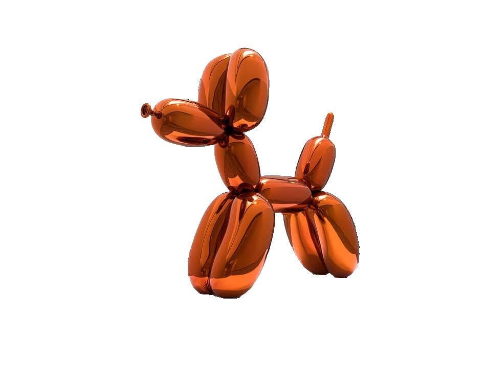
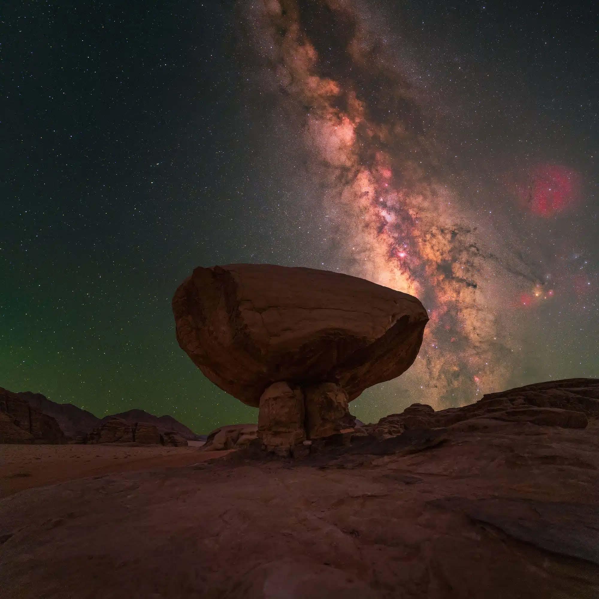
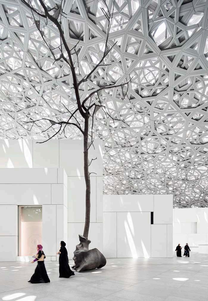
We use large scale holding shapes / supergraphic format to create a proprietary treatment used for photography on social media channels, digitally and in smaller communication formats. The image can sit inside the shape, or be masked out to affect the outside area.
Medium scale
Medium scale is ideal when needing to create a focal point with multiple images on posters, brochure covers and divider pages. The larger shape can be used to hold photography, or present itself as an outline when the full crop is applied to a photograph.
Small scale
Smaller scale is ideal to create brand presence when showcasing partners’ or initiatives’ own photography. It is a great tool to customise layout, add character to photography and create further brand recognition.


Contents
Brand positioning
Brand toolkit
Logo
Colour
Typography
Imagery
Templates
Large scale supergraphics can house imagery or be used as colour blocks over imagery.
Graphic system
Graphic system
Layout system
Bringing it all to life
Large scale Small scale
scale
Medium supergraphics can house imagery in an accent shape or in the entirety of the shapes. Filled in shapes represent the image holding area, whereas the rest of the shapes should appear as outlines.
Are always used on top of imagery in a form of an outline.



Graphic system
3. Framing devices
Contents
Brand positioning
Brand toolkit
Logo
Colour
Typography
Imagery
Graphic system
Layout system
Bringing it all to life
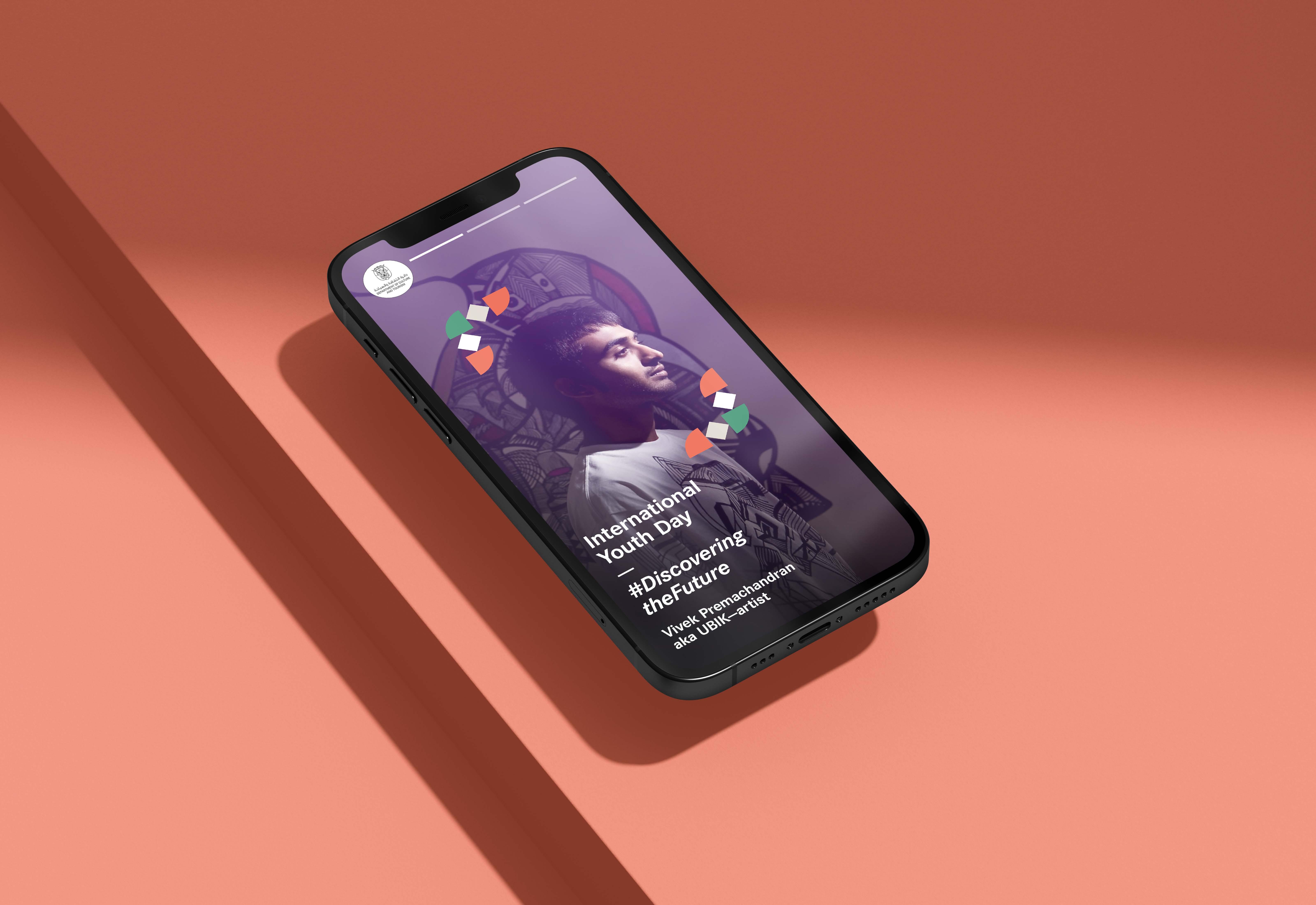
We use framing devices to highlight people, landmarks, and important information.

Contents
Brand
3. Framing devices
We use framing devices to highlight people, landmarks, quotes, and key information.
Graphic system
Quote
Quotation marks
Should be created using two colours and sit on a contrasting background. They can also be used as an outline in white.
Frames
Should be created using four colours and sit on a contrasting background. They can also be used as an outline in white.
We acknowledge the vital role our many stakeholders play in building a destination, and industry, which is integral to fulfilling our
and
Exception

When placed on light photography, diamonds in the frames can be in black, and in white on dark photography.


Contents
Brand positioning
Brand toolkit
Logo
Colour
Typography
Imagery
4. Dynamic patterns
We have a set of dynamic patterns that range from literal infographic style visuals to more expressive abstract motifs.
Their role in the brand is to elevate editorial pieces, enrich animations and, at the core, serve as rich storytelling tools.
Graphic system
Graphic system
Layout system
Bringing it all to life
The visuals on the right should serve as inspiration source, as the system was designed to create a versatile and interesting visual language.
These could be used on things such as: motion graphics, screensavers, double page spreads, murals, PPT.
Contents
Brand positioning
Brand toolkit
Logo
Colour
Typography
Imagery
Graphic system
Layout system
Bringing it all to life
4. Dynamic patterns
How we create our dynamic patterns
Pattern base grid - 16X9
All patterns start with this grid.
Building the base
Use our 3 hero shapes to build a composition.
Building the object
Interchange the shapes to make them feel dynamic.
Applying colour 1
Start filling the pattern with colour by applying DCT Dawn to selected shapes. Make sure the application is symmetrical. (Apply sandstone if the background colour is Dawn).
Applying colour 2
Continue by adding a secondary colour. Apply it strategically to counter balance the primary colour.
Applying colour 3
Add white. Use white as a palette cleanser in places that need the viewers eye to rest.
Reflection and symmetry
Mimick the shape throughout to create appearance of symmetry and balance in the pattern.
3 shape row rule
We always want to ensure that all three of our hero shapes are present in each icon/pictogram we design. Together they create a sense of collective effort.
3 colour in a row rule
A colour within an icon/pictogram can’t repeat more than 3 times in a row to avoid creating large blocks and retain shape recognition.
Colour application
We want to make sure that each icon is built using Sandstone or Dawn, white, black and a secondary colour of your choice.
Symmetry & mirroring
When filling the shapes with colour, ensure you apply it symmetrically. Left side corresponding with the right side, or bottom part with top part.
Applying colour 3
Finally add black. Use black in areas that need definition.
Colour balance
Make sure to use 4 colours in every pictogram, an optically equal balance of primary and supporting colours. Secondary colours should not take over the overall design.
4. Dynamic patterns - Arabic
Contents
Brand positioning
Brand toolkit
Logo
Colour
Typography
Imagery
Graphic system
Graphic system
Layout system
Bringing it all to life
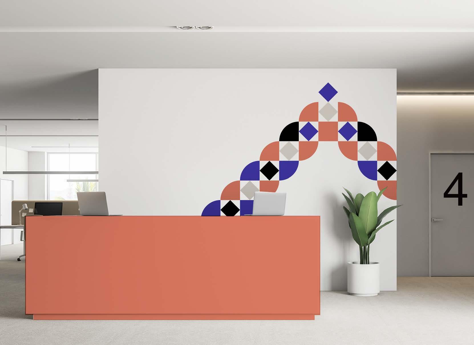
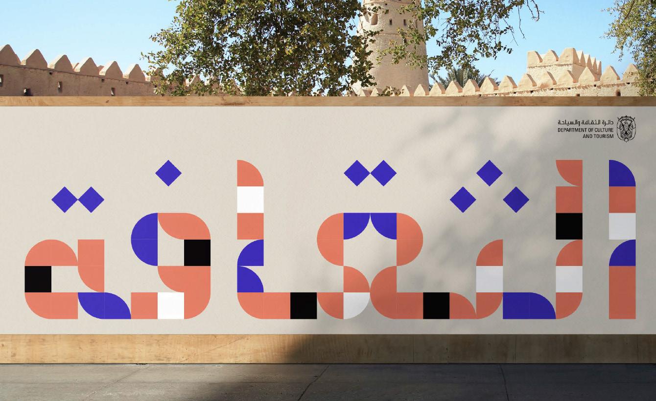
Using the grid system from the dynamic patterns, we can also create words in Arabic for when we want to accentuate the region, create stand-out messaging and showcase the breadth of the DCT visual system. Always apply one word at a time and ensure it is used in large sizes. These could be used on things such as: office wall art, hoardings, banners.
Grid height is 6 squares
Utilise a 6 square by a variable length grid, depending on the length of your word. Colour
Colouring the words should be about highlighting parts, not creating an equal balance to achieve legibility.
Layout
Elevating Culture
Contents
Brand positioning
Brand toolkit
5. Small use icons guide
When small icons are required, simplified linear icons can be created. Leverage the diamond hero shape to create a branded look and feel. These could be used on things such as: UI/UX, PPT, data visualisation, and infographics.
Typography
Imagery
Graphic system
Layout system
Bringing it all to life
We’ve established a few guiding principles to ensure we treat our graphic system consistently throughout the entire DCT brand.
Things to avoid Things to achieve
Secondary colours
Avoid using more than one secondary colour when creating custom graphics.
Colour repetition
Avoid using 3 of the same colours in a row.
Hierarchy
Think of the visual hierarchy in threes. Always primary focal point, secondary message, and tertiary CTA.
Creativity
Consider your subject matter and create something fitting the idea. The object you create can be literal, as the technique will elevate the visual.
New shapes
Don’t introduce new shapes into the graphic system. Our hero graphics are square, diamond and quadrant.
Use of dynamic patterns
If the idea is too difficult to translate into a pictogram, make use of the dynamic patterns to elevate the design. Don’t ignore the grid
Use the grid provided to build new graphics.
Layout system
We’ve built a layout system with flexibility, where our graphics system can be applied across various formats whilst retaining the integrity of the visual identity.

The Story of our Universe
Contents
Brand positioning
Brand toolkit
Logo
Colour
Typography
Imagery
Graphic system
Layout system
Bringing it all to life
Three things you need to know about our layouts
Square grid
Always use a square grid when working with layout design. It ensures we accommodate brand elements effectively and create a well balanced design.
Flexibility
To ensure our designs are consistent across multiple touch points, our grids help to unify varying applications by creating an ownable layout.
Balance


Our layouts should never be overwhelming. A less is more approach should be taken when designing.
That means we should always strive to strike the right balance between each element.
Bringing
We’ve built a layout system with flexibility, our graphics system can be applied across publication covers in the following ways:
Having a grid system like ours allows us to create a multitude of dynamic layouts using our graphic elements. Our content can adapt and move around the layout, as long as the components always adhere to our squared grid.


dolore magna aliquam erat volutpat. Ut wisi enim ad minim veniam, quis nostrud exerci tation ullamcorper suscipit lobortis nisl ut aliquip ex ea commodo consequat. Lorem ipsum dolor sit amet, cons ectetuer adipiscing elit, sed diam nonummy nibh euismod tincidunt ut laoreet dolore magna aliquam erat volutpat. Lorem ipsum dolor sit amet, consectetuer adipiscing elit, sed diam nonummy nibh euismod tincidunt ut laoreet dolore magna aliquam erat volutpat. Ut wisi enim ad minim veniam, quis nostrud exerci tation ullamcorper suscipit lobortis nisl ut aliquip ex ea commodo consequat. Duis autem vel eum iriure dolor in hendrerit in vulputate velit esse molestie consequat, vel illum dolore







all to life
Adapting our grid for various formats
Our grid system is adaptable enough to be utilised across a variety of formats. Our squared grid can adapt to anything we design, whether for digital or print, portrait or landscape.
When applying icons and pictograms to the layout, ensure the they align to the grid. They should take up two thirds of the layout.
Always respect the clear space when working with icons and pictographs in layout.
The Future of Search & Social
Contents
Brand positioning
Brand toolkit Logo Colour
Typography
Imagery
Graphic system
Layout system
Bringing it all to life
When applying dynamic patterns to a layout, ensure the graphics align to the grid.
This is introduction, talk about the page’s contents. What is important, what is clever, what is needed.
Layout



We’ve established a few guiding principles to ensure we treat our layout system consistently throughout the entire DCT brand.
Things to avoid Things to achieve
Floating visuals
Make sure everything you lay out snaps to the grid, this will make the layout feel intentional and structured.
Elements that are too small
Ensure the brand pictograms/icons/patterns sit well within the grid and don’t feel too small.
Uneven safe space
Always adhere to the safe area, especially when working with icons/pictograms and typography.
Don’t cram the layout
Use a limited and harmonious number of elements within a layout, ensuring that it feels considered and respects the negative space needed for hierarchy.
Crammed supergraphics
Laying out Supergraphics should not feel like a mosaic, avoid using too many elements on a page.
Change the grid
Even when tweaking the grid for unusual formats, always adhere to the square structure.
Sophisticated layout
Utilise the grid to create sophisticated layouts. Split copy across several columns, create tension with alignment.
Clarity
Create with the main message in mind, arrange objects in accordance with priorities.
Bringing it all to life
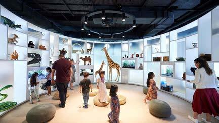




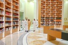
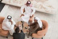



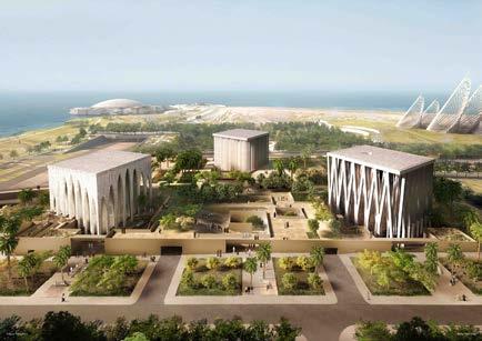
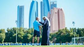

page layout
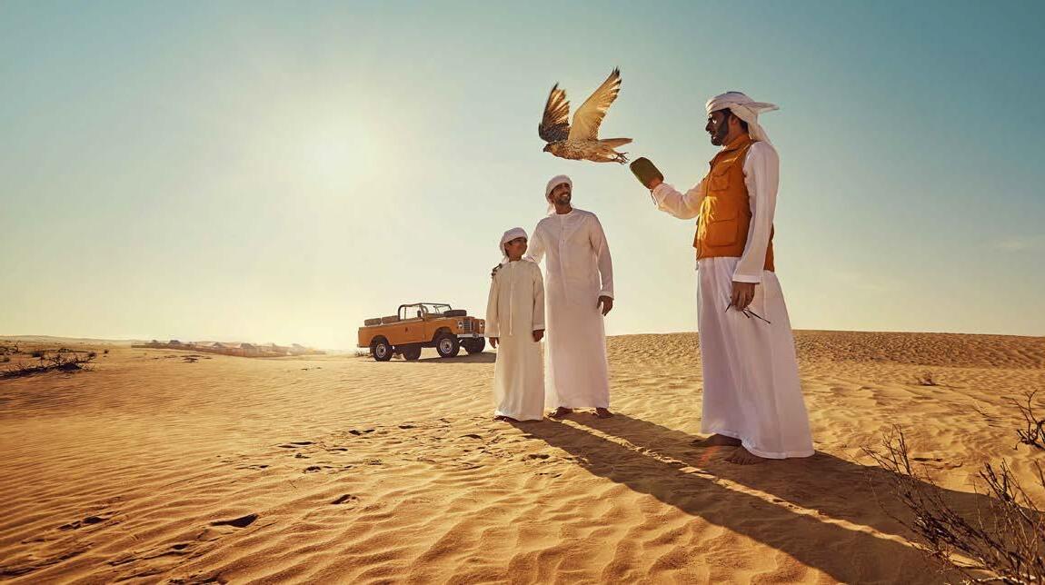
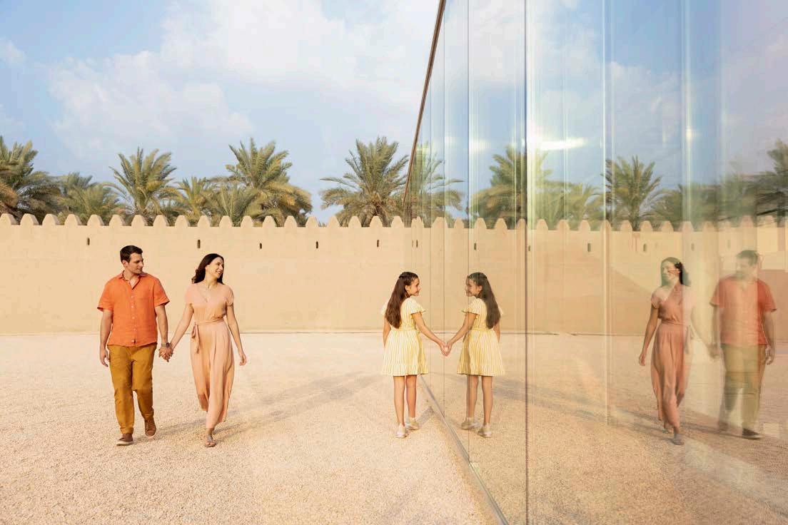


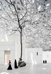


Secondary
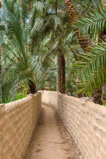
Sharing Abu Dhabi’s cultural heritage with the world

Culture Our organisation strives to preserve and promote the emirate’s rich cultural and historic heritage. By sharing Abu Dhabi’s unique legacy through a wide-ranging programme of cultural events, exhibitions and museums, we aim to present the emirate as an international cultural destination.


Applications
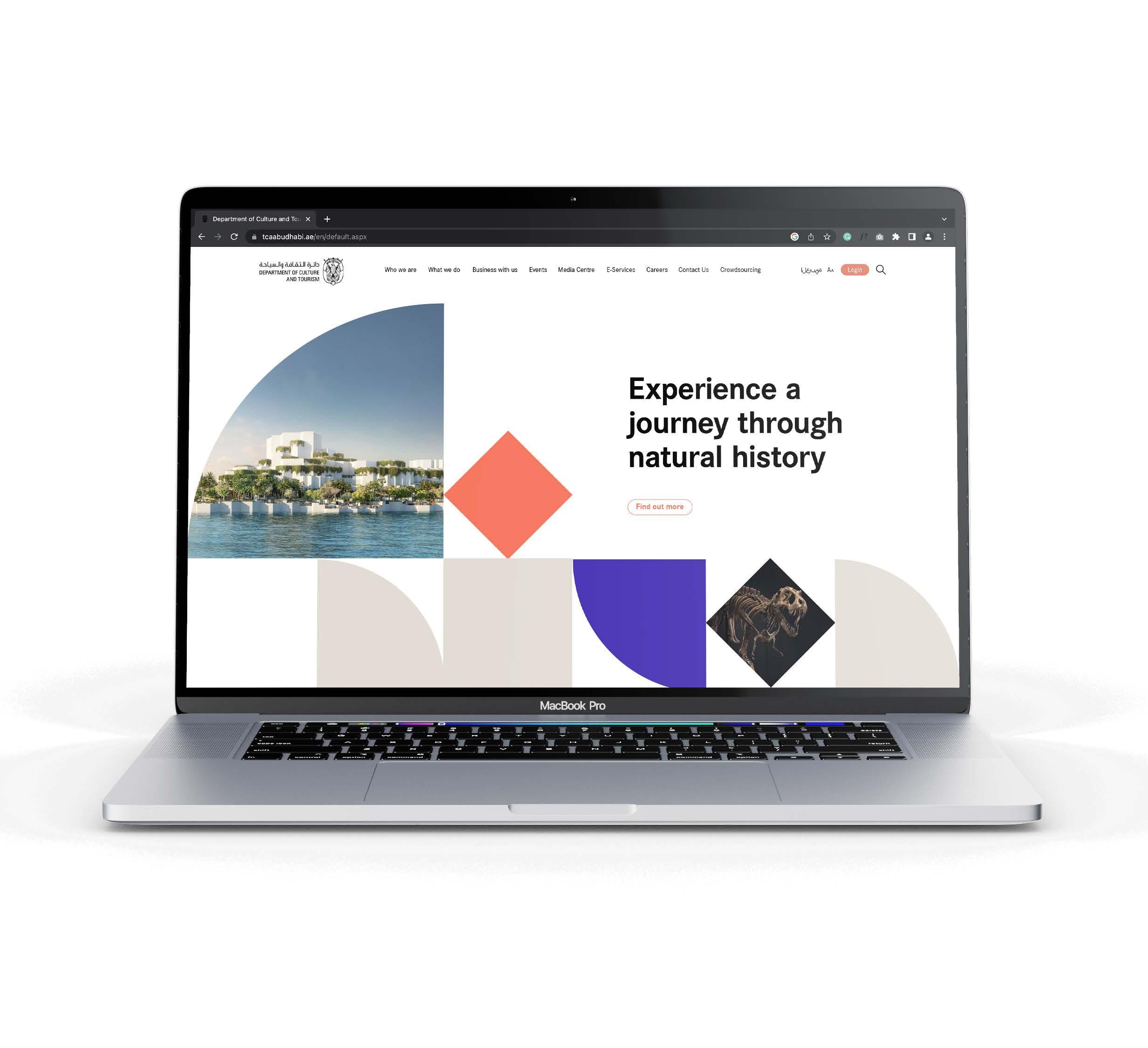
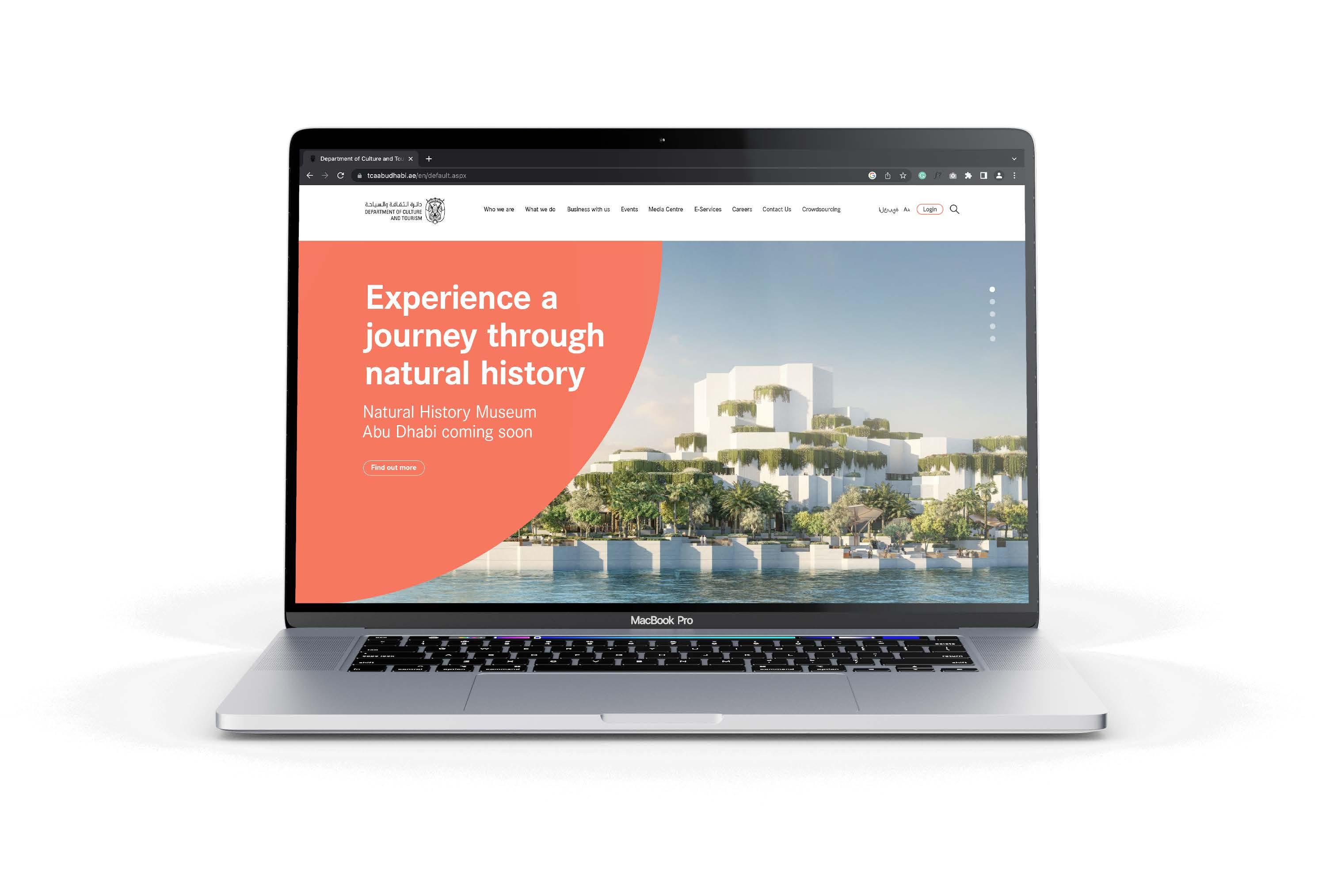
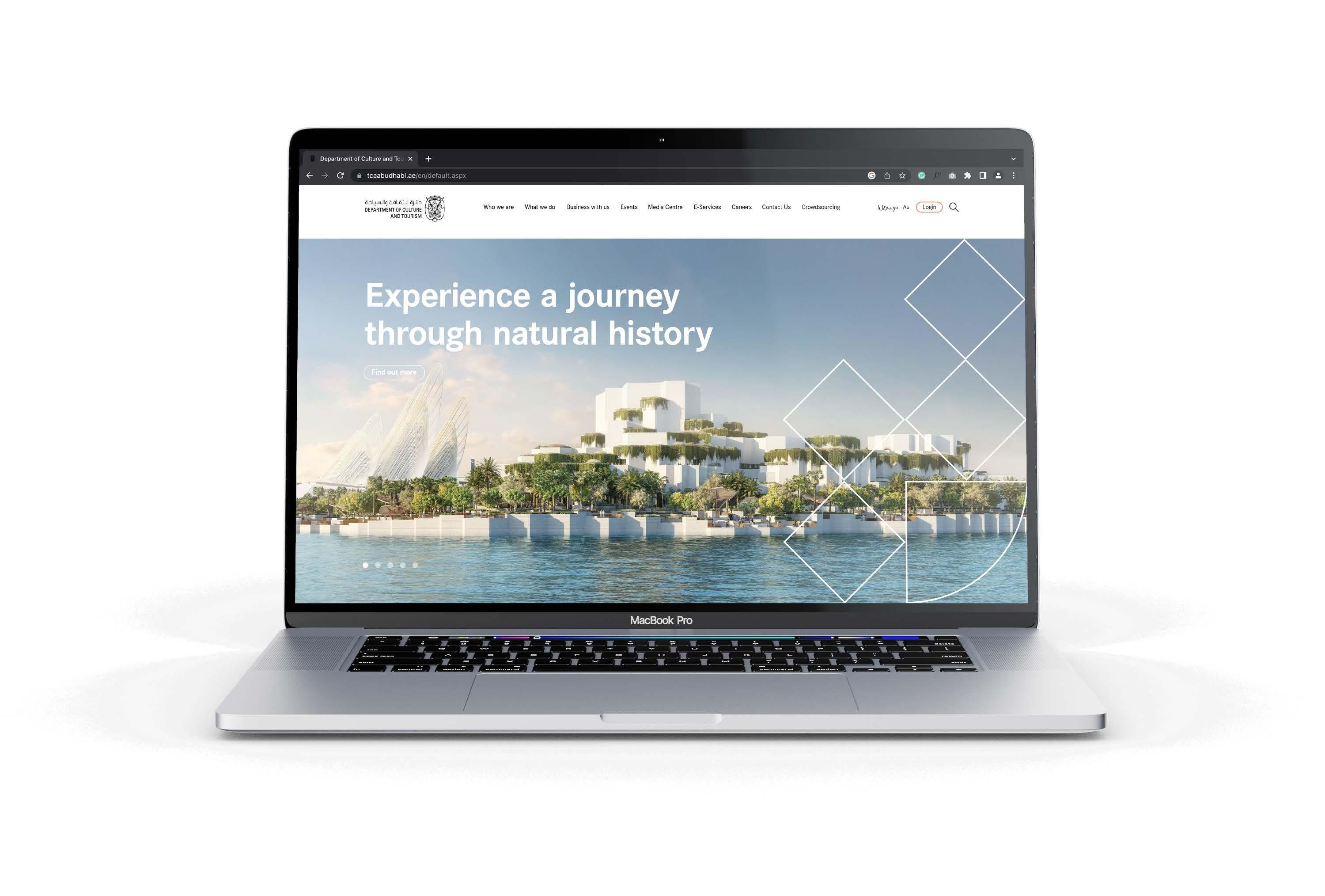
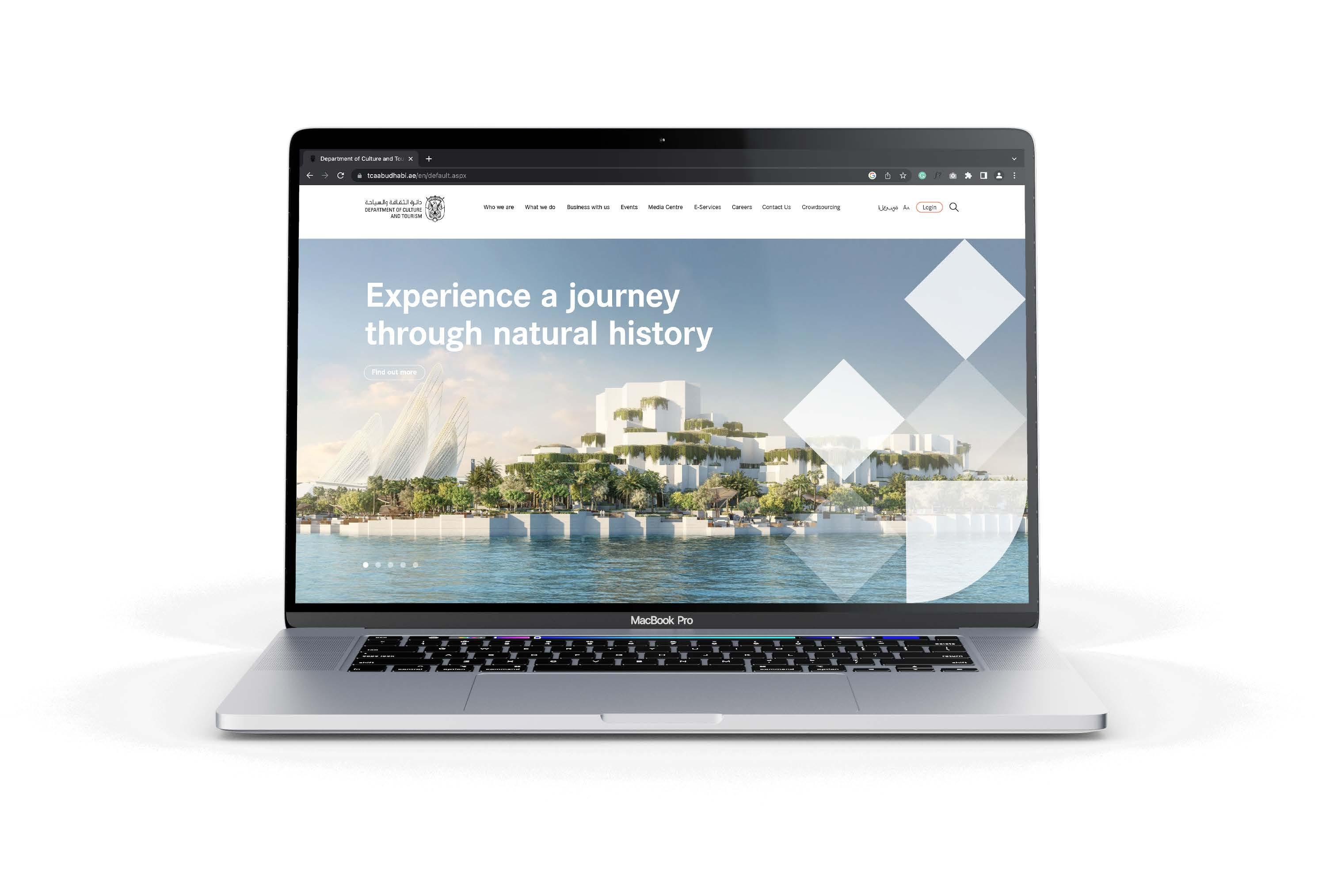
Website homepage header
Option
Contents
Imagery
Graphic system
Layout system
Bringing it all to life
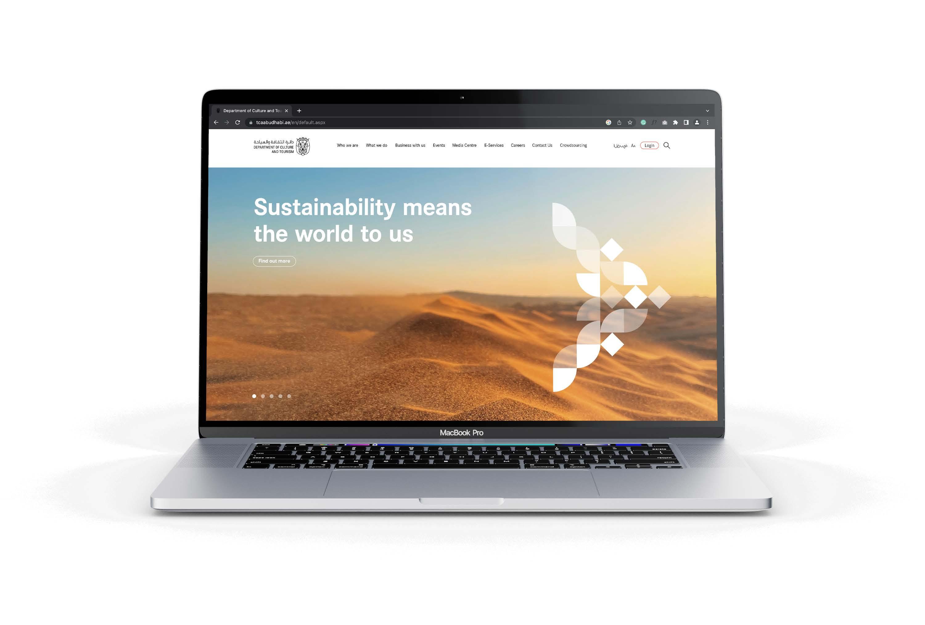
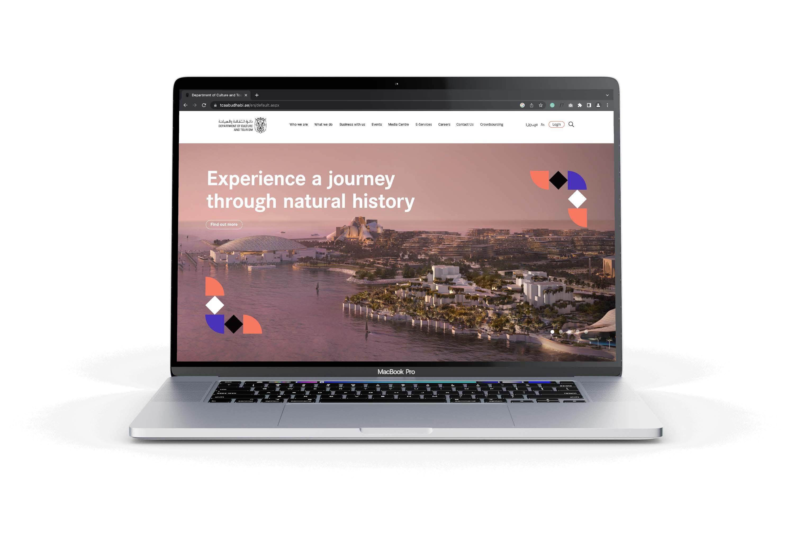



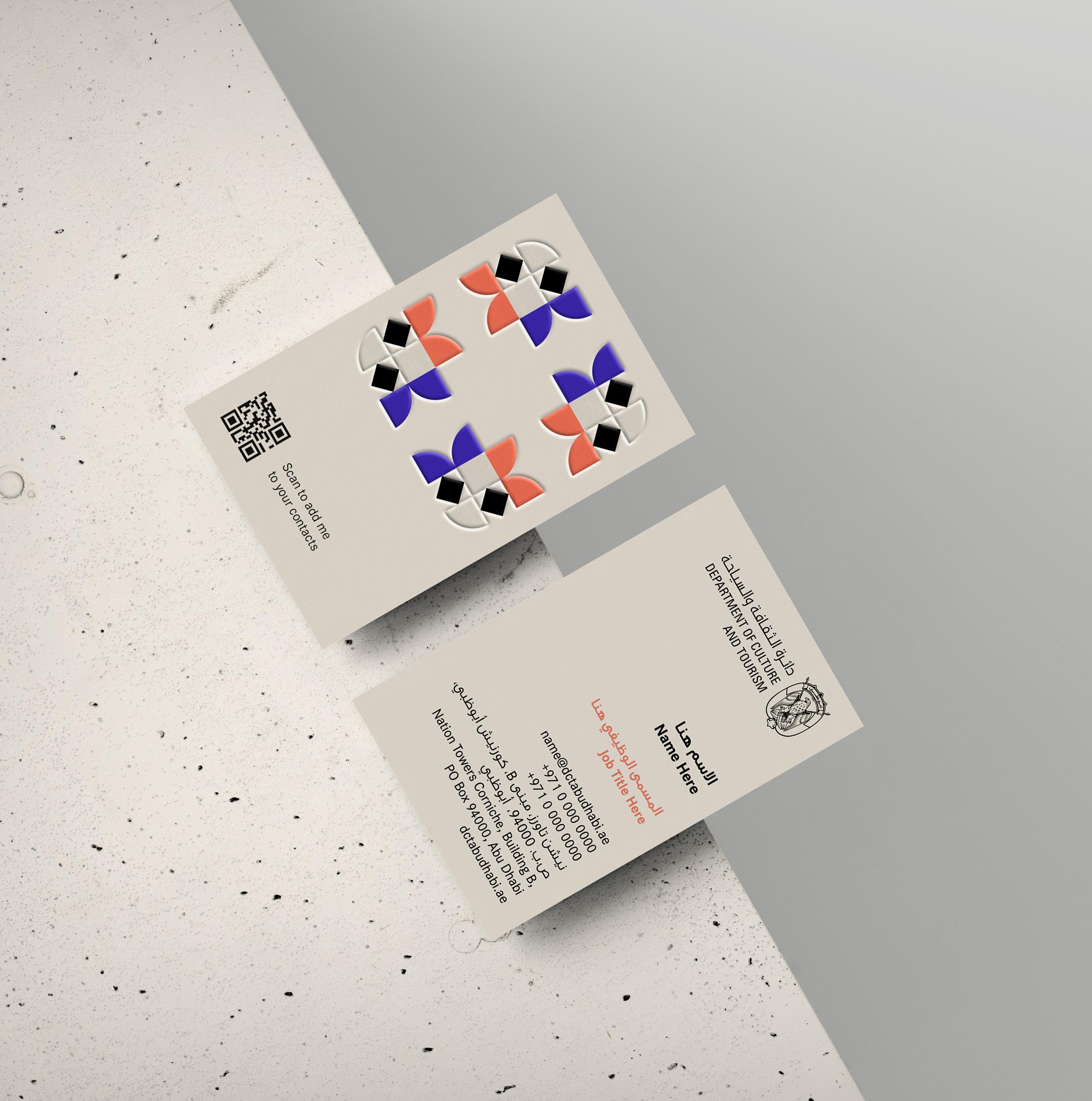
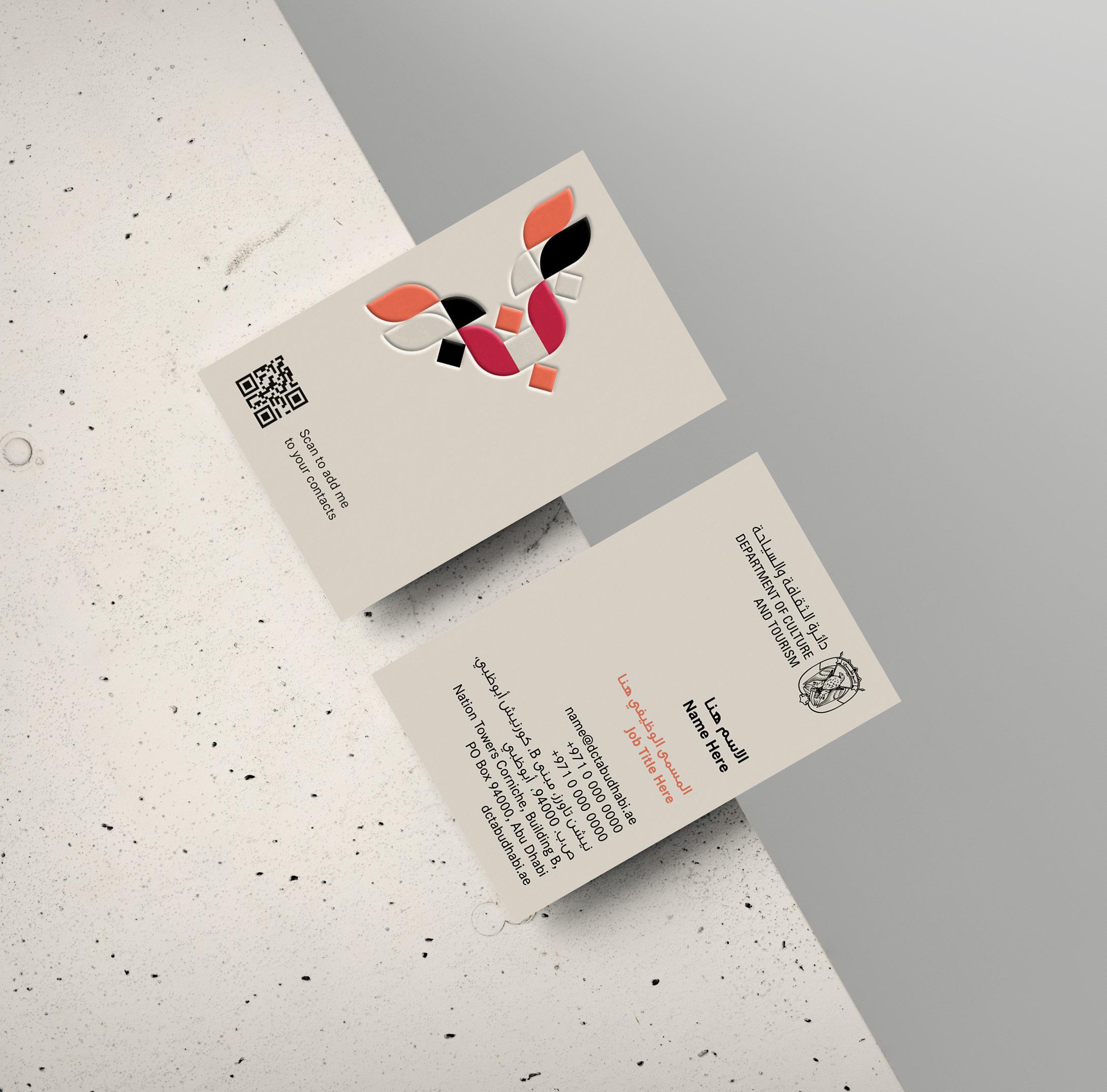
Graphic
Layout














Brand positioning
Brand toolkit
Typography
Imagery
Graphic system
Layout system
Bringing it all to life
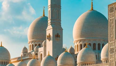
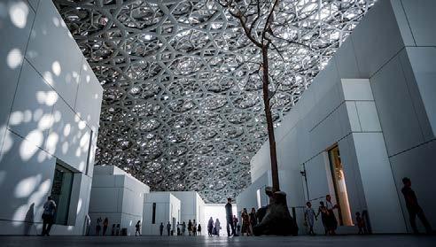
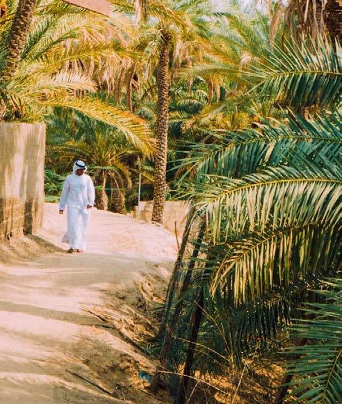
Around Abu Dhabi in 180 experiences. New campaign showcases why Abu Dhabi should be on everyone’s bucket list.
Aped mint arcidun dendiam eratia cusaped ut quodi aut iuntiore, cum ute qui dolupta taerrovit fugit audi ommos doluptatque nos ene vitam id quo omnient porum nis autem estia volenduciur magnihicitat optibus aut ature nobitas percius, con eos nonsed qui doluptatur si vendeli sciatqu ossuntia volor sitem rem eum reste occusam quo quuntur ad eos inctur acerchitibus rempor adi officaerum et aliciissi sunt. Aped mint arcidun dendiam eratia cusaped ut quodi aut iuntiore, cum ute qui dolupta taerrovit fugit audi ommos doluptatque nos ene vitam id quo omnient porum nis autem estia volenduciur magnihicitat optibus aut ature nobitas percius, con eos nonsed qui doluptatur si vendeli sciatquomnient porum nis autem estia volenduciur magnihicitat optibus aut ature nobitas percius, con eos nonsed qui doluptatur si vendeli sciatqu ossuntia volor sitem rem eum reste occusam quo quuntur ad eos inctur acerchitibus rempor adi officaerum et aliciissi sunt.


Contents
Brand positioning
Brand toolkit
Logo
Colour
Typography
Imagery
Graphic system
Layout system
Bringing it all to life


Around Abu Dhabi in 180 experiences. New campaign showcases why Abu Dhabi should be on everyone’s bucket list.
Aped mint arcidun dendiam eratia cusaped ut quodi aut iuntiore, cum ute qui dolupta taerrovit fugit audi ommos doluptatque nos ene vitam id quo omnient porum nis autem estia volenduciur magnihicitat optibus aut ature nobitas percius, con eos nonsed qui doluptatur si vendeli sciatqu ossuntia volor sitem rem eum reste occusam quo quuntur ad eos inctur acerchitibus rempor adi officaerum et aliciissi sunt. Aped mint arcidun dendiam eratia cusaped ut quodi aut iuntiore, cum ute qui dolupta taerrovit fugit audi ommos doluptatque nos ene vitam id quo omnient porum nis autem estia volenduciur magnihicitat optibus aut ature nobitas percius, con eos nonsed qui doluptatur si vendeli sciatquomnient porum nis autem estia volenduciur magnihicitat optibus aut ature nobitas percius, con eos nonsed qui doluptatur si vendeli sciatqu ossuntia volor sitem rem eum reste occusam quo quuntur ad eos inctur acerchitibus rempor adi officaerum et aliciissi sunt.
Contents
Brand positioning
Brand toolkit
Logo
Colour
Typography
Imagery
Graphic system
Layout system
Bringing it all to life
Around Abu Dhabi in 180 experiences. New campaign showcases why Abu Dhabi should be on everyone’s bucket list.
Aped mint arcidun dendiam eratia cusaped ut quodi aut iuntiore, cum ute qui dolupta taerrovit fugit audi ommos doluptatque nos ene vitam id quo omnient porum nis autem estia volenduciur magnihicitat optibus aut ature nobitas percius, con eos nonsed qui doluptatur si vendeli sciatqu ossuntia volor sitem rem eum reste occusam quo quuntur ad eos inctur acerchitibus rempor adi officaerum et aliciissi sunt. Aped mint arcidun dendiam eratia cusaped ut quodi aut iuntiore, cum ute qui dolupta taerrovit fugit audi ommos doluptatque nos ene vitam id quo omnient porum nis autem estia volenduciur magnihicitat optibus aut ature nobitas percius, con eos nonsed qui doluptatur si vendeli sciatquomnient porum nis autem estia volenduciur magnihicitat optibus aut ature nobitas percius, con eos nonsed qui doluptatur si vendeli sciatqu ossuntia volor sitem rem eum reste occusam quo quuntur ad eos inctur acerchitibus rempor adi officaerum et aliciissi sunt.
Aped mint arcidun dendiam eratia cusaped ut quodi aut iuntiore, cum ute qui dolupta taerrovit fugit audi ommos doluptatque nos ene vitam id quo omnient porum nis autem estia volenduciur magnihicitat optibus aut ature nobitas percius, con eos nonsed qui doluptatur si vendeli sciatqu ossuntia volor sitem rem eum reste occusam quo quuntur ad eos inctur acerchitibus rempor adi officaerum et aliciissi sunt.
Optibus aut ature nobitas percius, con eos nonsed qui doluptatur si vendeli sciatqu ossuntia volor sitem rem eum reste occusam quo quuntur ad eos inctur acerchitibus rempor adi officaerum et aliciissi sunt. Aped mint arcidun dendiam eratia cusaped ut quodi aut iuntiore, cum ute qui dolupta taerrovit fugit audi ommos doluptatque nos ene vitam id quo omnient porum nis autem estia volenduciur magnihicitat optibus aut ature nobitas percius, con eos nonsed qui doluptatur si vendeli sciatqu ossuntia volor sitem rem eum reste occusam quo quuntur ad eos inctur acerchitibus rempor adi officaerum et aliciissi sunt.
Aped mint arcidun dendiam eratia cusaped ut quodi aut iuntiore, cum ute qui dolupta taerrovit fugit audi ommos doluptatque nos ene vitam id quo omnient porum nis autem estia volenduciur magnihicitat optibus aut ature nobitas percius, con eos nonsed qui doluptatur si vendeli sciatquomnient porum nis autem estia volenduciur magnihicitat optibus aut ature nobitas percius, con eos nonsed qui doluptatur si vendeli sciatqu ossuntia volor sitem rem eum reste occusam quo quuntur ad eos inctur acerchitibus rempor adi officaerum et aliciissi sunt.
Aped mint arcidun dendiam eratia cusaped ut quodi aut iuntiore, cum ute qui dolupta taerrovit fugit audi ommos doluptatque nos ene vitam id quo omnient porum nis autem estia volenduciur magnihicitat optibus aut ature nobitas percius, con eos nonsed qui doluptatur si vendeli sciatquomnient porum nis autem estia volenduciur magnihicitat optibus aut ature ossuntia volor sitem rem eum reste occusam quo quuntur ad eos inctur acerchitibus rempor adi officaerum et aliciissi sunt.
About the Department of Culture and Tourism – Abu Dhabi: The Department of Culture and Tourism – Abu Dhabi (DCT Abu Dhabi) drives the sustainable growth of Abu Dhabi’s culture and tourism sectors and its creative industries, fuelling economic progress and helping to achieve Abu Dhabi’s wider global ambitions. By working in partnership with the organisations that define the DCT Abu Dhabi’s position as a leading international destination, DCT Abu Dhabi strives to unite the ecosystem around a shared vision of the DCT Abu Dhabi’s potential, coordinate effort and investment, deliver innovative solutions, and use the best tools, policies and systems to support the culture, tourism and creative industries.
DCT Abu Dhabi’s vision is defined by the emirate’s people, heritage and landscape. We work to enhance Abu Dhabi’s status as a place of authenticity, innovation, and unparalleled experiences, represented by its living traditions of hospitality, pioneering initiatives and creative thought.
For more information about the Department of Culture and Tourism – Abu Dhabi and the destination, please visit: dctabudhabi.ae and visitabudhabi.ae
For more information, please contact: Mohammed Daqqaq ASDA’A PR Consultancy +971507037115 Mohammed.daqqaq@bcw-global.com
2 © Department of Culture & Tourism
2 © Department of
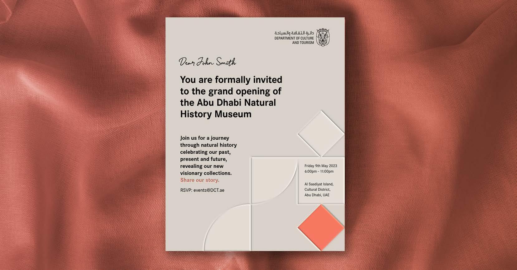
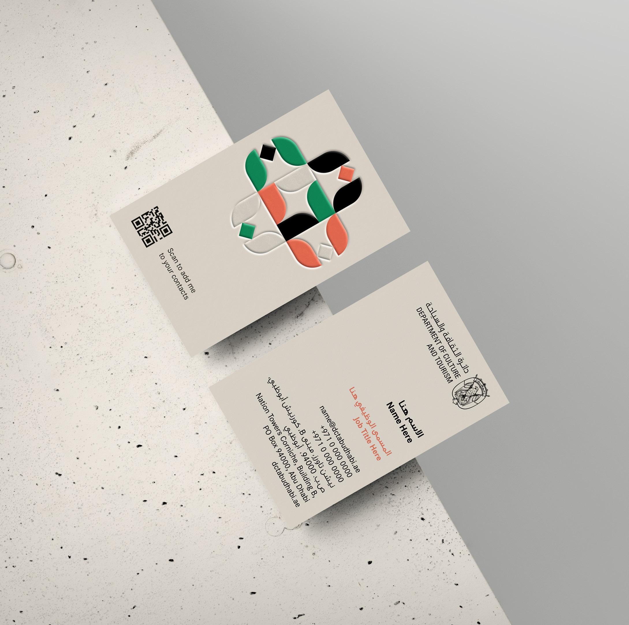
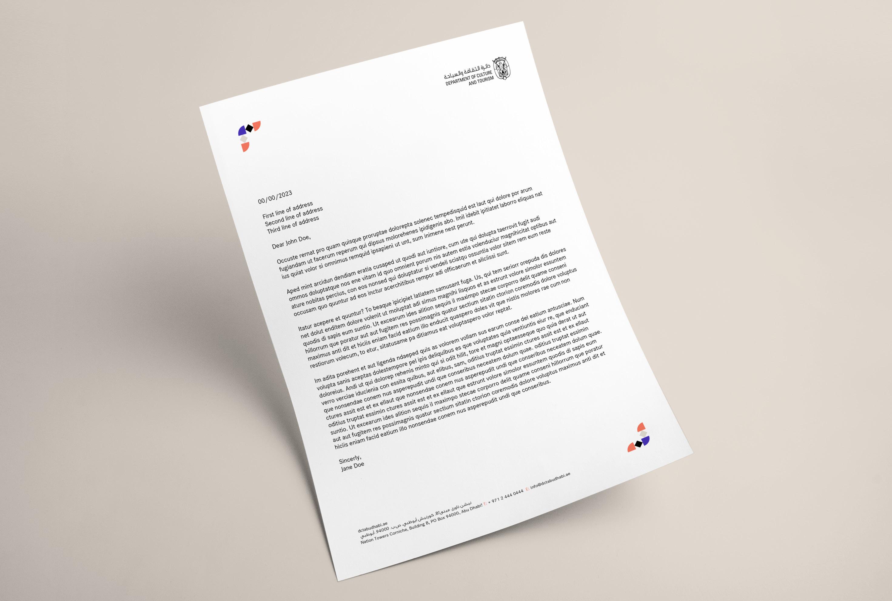
Applications
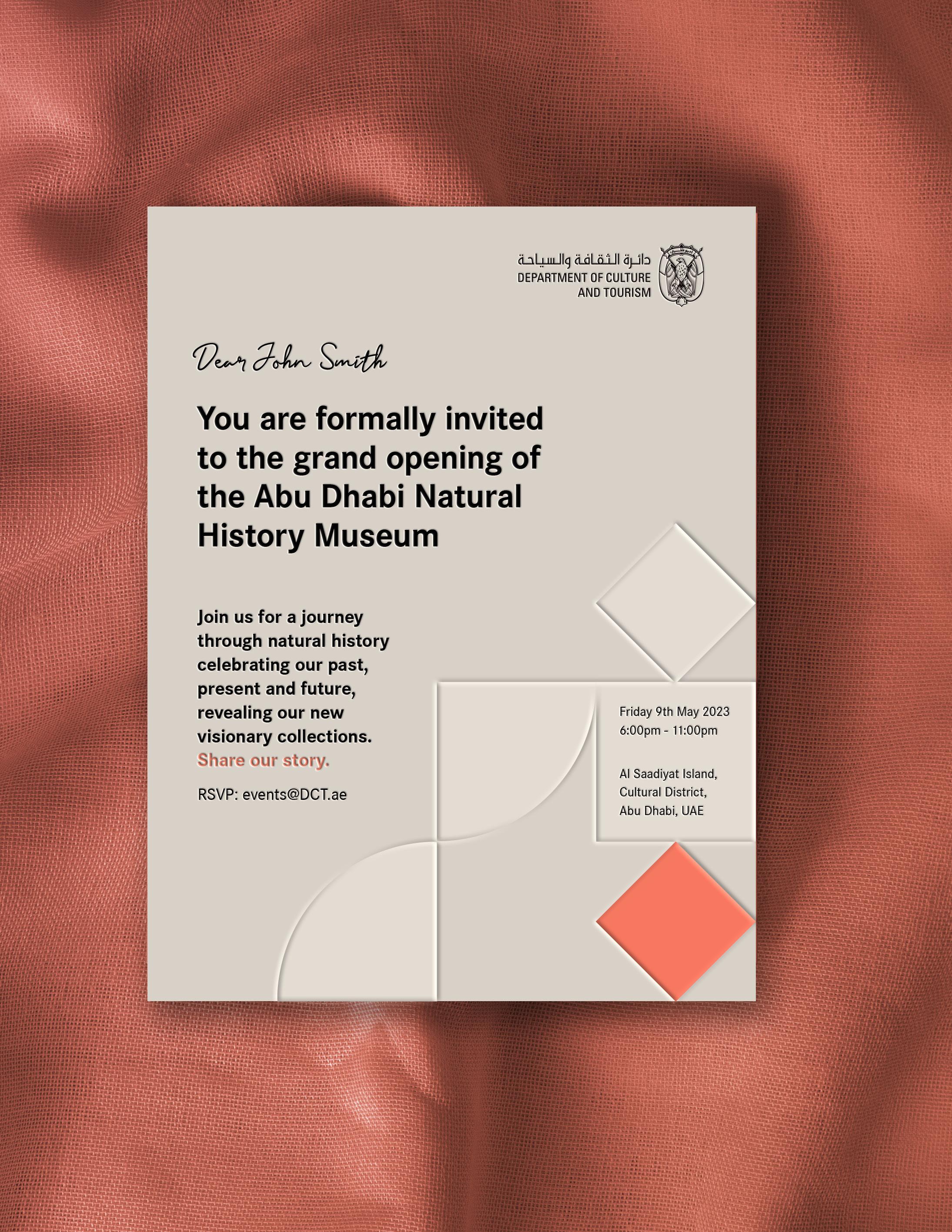
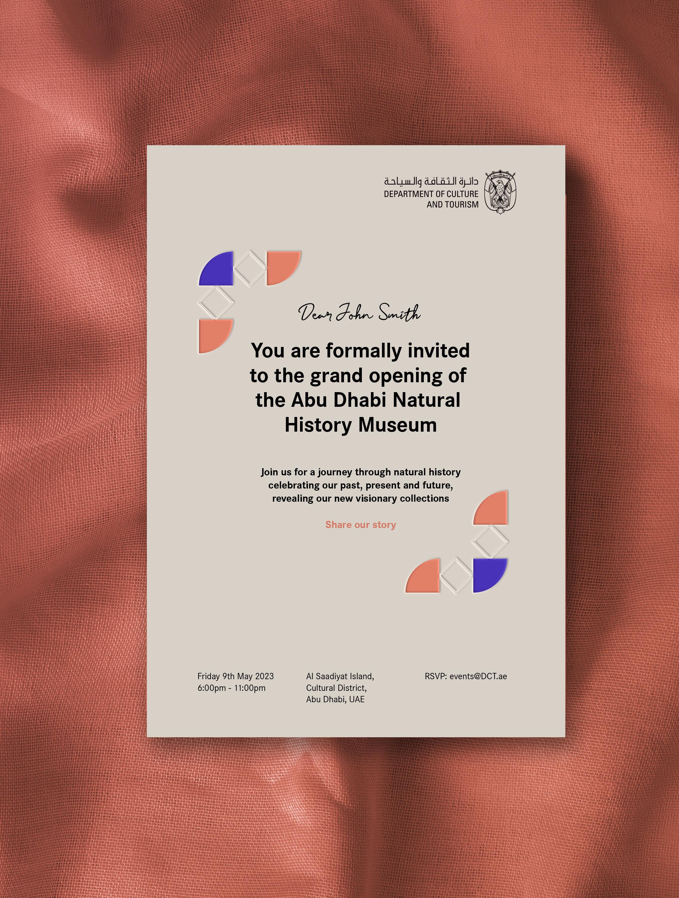
Invitation options
Contents
Brand toolkit
Typography
Imagery
Graphic system
Layout system
Bringing it all to life
Applications
Email signature
Contents
Brand positioning
Brand toolkit
Logo
Colour
Typography
Imagery
Graphic system
Layout system
Bringing it all to life
Good morning Mark, Lorem ipsum dolor sit amet, consectetuer adipiscing elit, sed diam nonummy nibh euismod tincidunt ut laoreet dolore magna aliquam erat volutpat. Ut wisi enim ad minim veniam, quis nostrud exerci tation ullamcorper suscipit lobortis nisl ut aliquip ex ea.
Lorem ipsum dolor sit amet, consectetuer adipiscing elit, sed diam nonummy nibh euismod tincidunt ut laoreet dolore magna aliquam erat volutpat.
Ut wisi enim ad minim veniam, quis nostrud exerci tation ullamcorper suscipit lobortis nisl ut aliquip ex ea.
Hamda Rashed Al Qubaisi
Executive Administrator Strategic Communications & Marketing Department +971 2 421 00325 PO Box 94000, Abu Dhabi, UAE
| Follow us

Recipients
Subject
Good morning Mark,
Lorem ipsum dolor sit amet, consectetuer adipiscing elit, sed diam nonummy nibh euismod tincidunt ut laoreet dolore magna aliquam erat volutpat. Ut wisi enim ad minim veniam, quis nostrud exerci tation ullamcorper suscipit lobortis nisl ut aliquip ex ea.
Lorem ipsum dolor sit amet, consectetuer adipiscing elit, sed diam nonummy nibh euismod tincidunt ut laoreet dolore magna aliquam erat volutpat.
Ut wisi enim ad minim veniam, quis nostrud exerci tation ullamcorper suscipit lobortis nisl ut aliquip ex ea.
Thanks Hamda Rashed Al Qubaisi
Executive Administrator
Strategic Communications & Marketing Department +971 2 421 00325
PO Box 94000, Abu Dhabi, UAE
tcaabudhabi.ae | Follow us

Thank you
For enquiries regarding the brand guideline and visual system please contact us at
