INTERIOR AND ARCHITECTURAL DESIGN
1
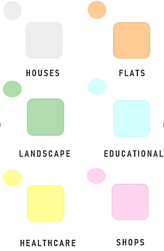
COMPONENT
“ BUILDINGS ARE DEEPLY EMOTIVE STRUCTURES WHICH FORM OUR PSYCHE. PEOPLE THINK THEY’RE JUST THINGS THEY MANOEUVRE THROUGH, BUT THE MAKEUP OF A PERSON IS INFLUENCED BY THE NATURE OF SPACES. ”
- DAVID ADJAYE
BRIEF + SPECIFICATION
Throughout the years, we as a country has evolved and become less susceptible to scarcity of world wars. The need for social housing has become more in demand as communities have settled and found solace in their area. For my design I wish to create a space that allows for people to thrive in a space designed for them, sharing spaces with people alike. Where people can interconnect - not only function - with a supportive community, but to also function as one. A place that can reflect the characteristics of those who inhabit it. A space that is in dire need of such design and connection.
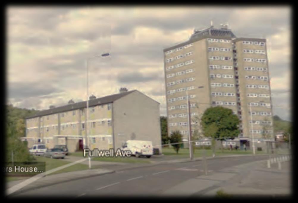
My site of choice is Owen Walters House. The reason being that the building has passed its era and can regrettably no longer accommodates to it residents’ needs. With newly built housing which caters to its neighbour's needs, Owen Walters house has been discarded in the areas’ crucial development phase and now towers over the area, being physically secluded. I believe that the residential block of flats is no longer enough to suffice. With the area surrounding it being extremely ideal, I think it's time for the residents to experience the advantages of social housing.
WITH CONSIDERATION: MY DESIGN WILL ONLY REACH THE EXTERIOR AND THE SITE. THE INTERIOR WILL BE MET WITH LESS SIGNIFICANCE.
THE SPACE SHOULD PROVIDE:
- The space should provide access to users ranging from children to adults, wheelchair users, visually impaired etc
- Secure parking spaces for both vehicles and micro-mobility vehicles
- Permeant seating areas
- Key link to open spaces
- Pedestrian priority
- Community garden
- Public recycling Bins
- Minimum of 2 communal bins
- Outdoor play section
- Community rooftop area (tailored to a rainy climate)
- Guest parking
- Car parking width or widening capacity
- Car parking overlooked by dwellings
INTRODUCTION TO CLAYHALL
My site is located in an area named Clayhall, in the East London borough of Redbridge. Redbridge is most known for being one of the greenest Boroughs as it maintains over 1,200 acres of forests, parks and open spaces. This helps it create a perfect mix of both village and city living. In recent years, many new builds and social housing have been a priority in Redbridge as I've noticed an influx of housing integrated onto shops and green spaces being bulldozed in sight for new developments.
SUITIBLE AREA FOR HOSUING?
Though Clayhall has been one of the most unaffected areas in terms of a housing influx, with only seeing a total of one housing project in the last 6 years. Clayhall is much more of a suburban area with much more houses than flats to accommodate growing families. It's surrounded by dozens of schools and nature activities for schools and families to be explore with its local park named after the area, ‘Clayhall Park’, which is 140 acres of woodland. These characteristics seem to make a suitable residential area for new and growing families, hence why I've chosen this area.
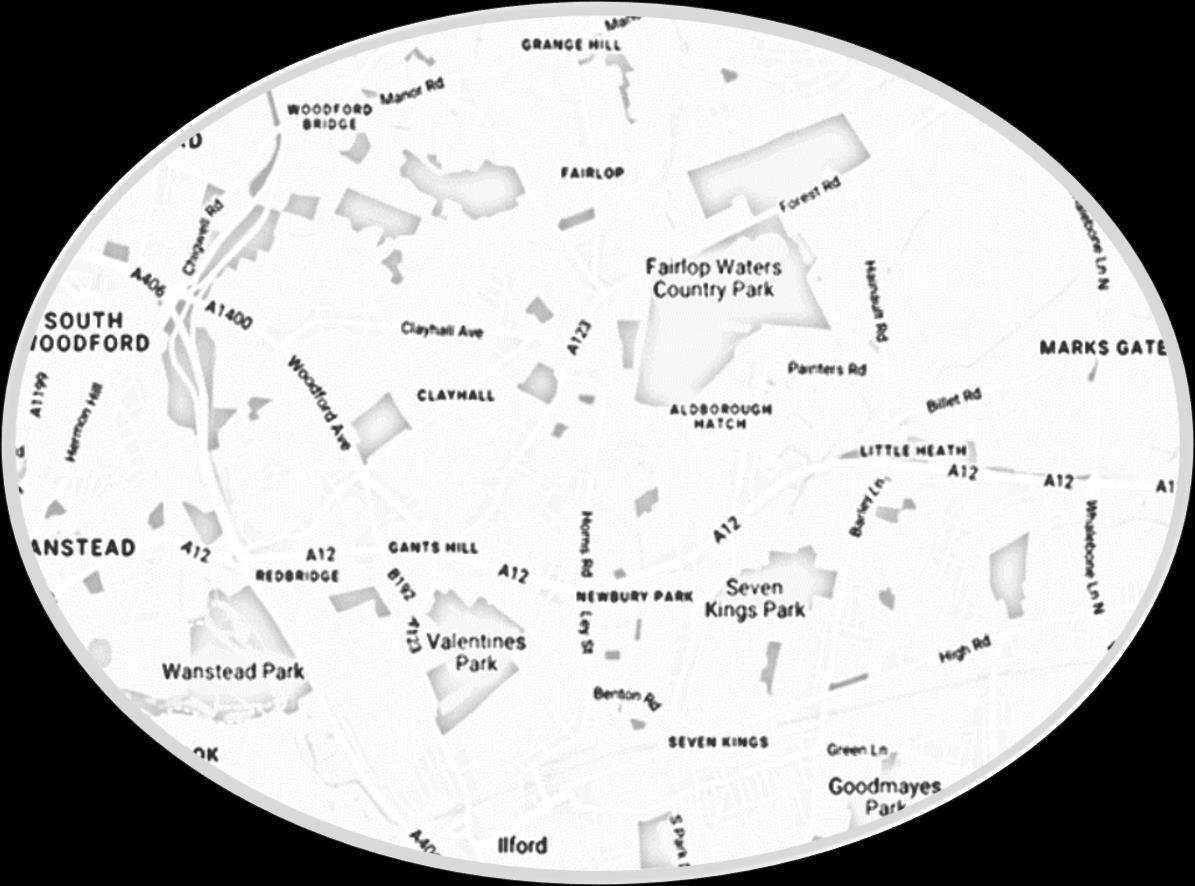
SITE INTRODUCTION
CLAYHALL
MY SITE
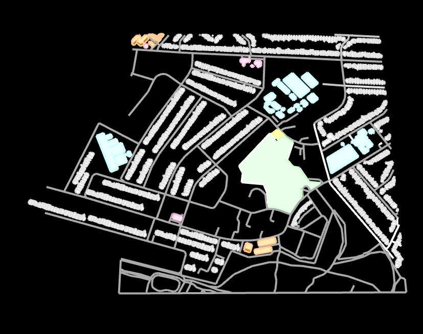
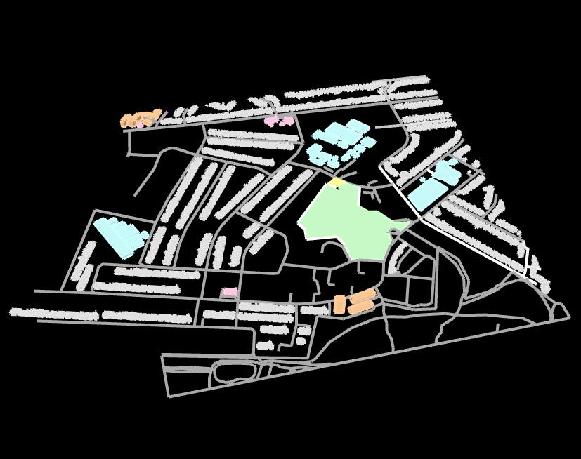
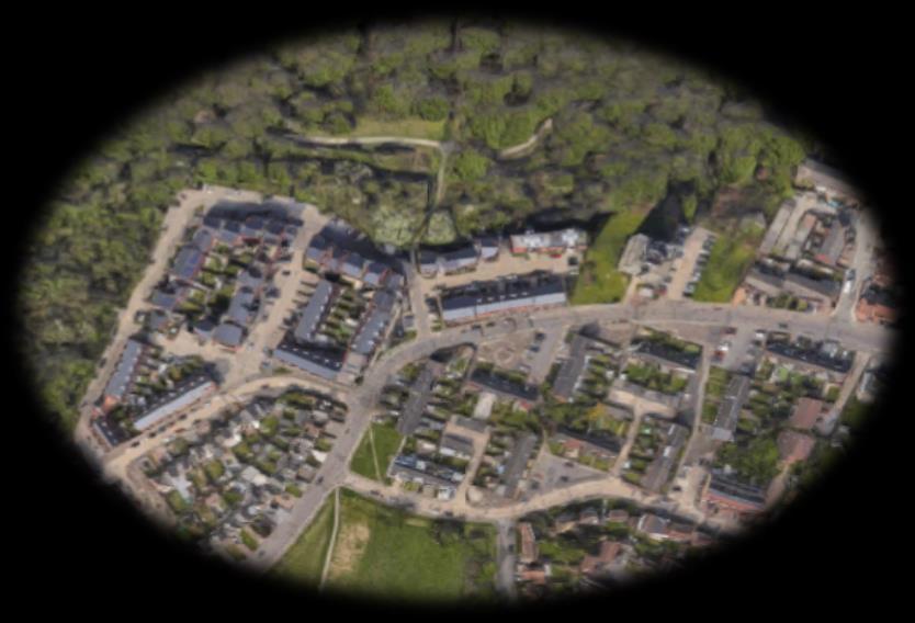
Facilities and features surrounding my site can further reinforce the suitability of the site by displaying its convenience and preexisting well balanced infrastructure.
AN IN-DEPH LOOK AT MY SITE
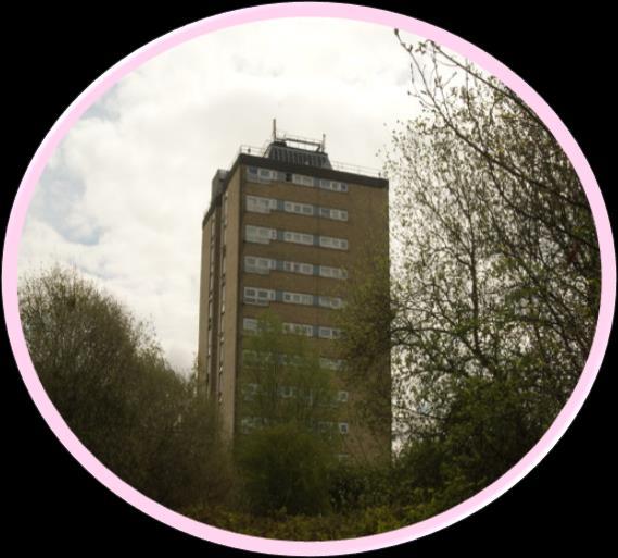
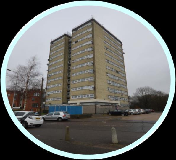
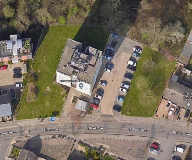
I have decided to redevelop the site of ‘Owen Walters House’. This flat is 12 storeys high, which is quite high in today's standards, though considering the time period of which it was built, 1962, and the housing crisis which occurred after the 2nd World War, this block of flats acted effectively to house individuals at the time. But has unfortunately become outdated, and only reminiscent of an era of desperacy and necessity. The site itself is surrounded by advantageous features and would be a waste to not take advantage of its convenient settings.
MY SITE
INITIAL DISADVANTAGES
- Lack of functional green space
- Quite an old building which needs a lot of renovation and maintenance
INITIAL ADVANTAGES
- Many schools in the area
- Communal car park
- Public transport
- Shelter for micro-mobility vehicles
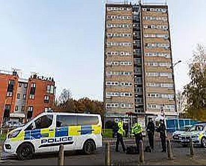
A2019 STABBING OCCURRING RIGHT OUTSIDE THE FLAT
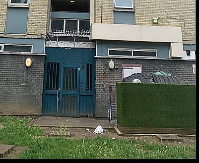
RESIDENTS’ SHARED BIN OVERFLOWING, BEING NEGLECTED
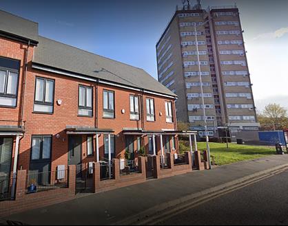
LARGE INCREASE OF NEW BUILDS AROUND THEAREA
FEEDBACK FROM IN-PERSON VISIT
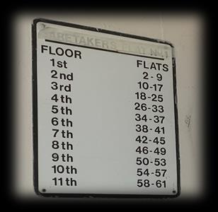
- Supplies an estimated 61 households with only one communal bin, which is not regularly maintained and overflows resulting in an odour.
- Great area to redevelop as housing surrounded it has also been redeveloped
- Elevators often break down
- Anti-social behaviour in stairwells
- Cleanliness of building was maintained but the odour was not
Comments visitors had written on Google, with comments such as: ‘Clean’ ‘So dirty and stink’
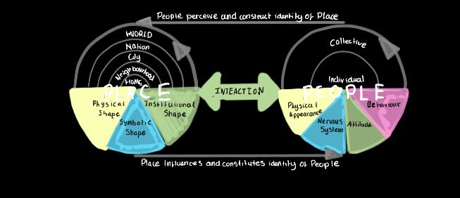
HUMAN PSYCHE + ARCHITECTURE

SMALLER TIGHTER SPACES
MINIMAL LIGHTING
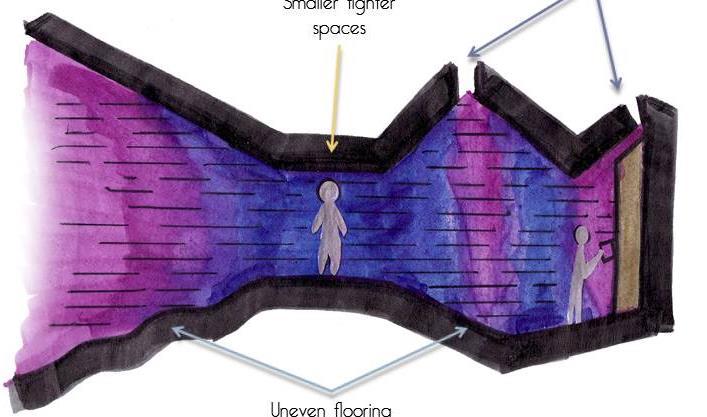
UNEVEN FLOORING (OBSTACLE)
I think there is a clear correlation between human psychology and architecture as design and architecture have a significant influence on human psychology and emotions. For example, the right use of certain architectural elements (such the colour of the walls) may lighten the mood, while the wrong use has the opposite effect. Resulting, in the design impacts the consciousness of the users and it becomes a part of people's life
Significant to our site, as I'm focusing on exterior, exterior shades of white, grey and tan evokes a sense of shelter and warmth.
Architectural psychology can sensitize the significant influence of the designed environment on human experience and behaviour and can contribute to an understanding of the interrelation between humans and the human-designed and influenced environment.
COMPONENTS OF ARCHITECTURE
WHICH AFFECTS HUMAN PSYCHOLOGY:
- Positive and Negative Spaces - Colours - Openings - Lighting - Acoustics
- Sound Construction
- Green Techniques
- Landscapes
- Building Forms

BEHAVIORAL SCIENCES
ENVIRONMENTAL PSYCOLOGY
ARCHITECTURE
It is crucial to design areas that have an influence on people feeling, thoughts, and how they act. The architecture of a structure can significantly affect our emotions and behaviour
Poorly maintained buildings make us nervous and fearful by activating our sympathetic nervous system which is detrimental to our health. Dull repetitive buildings (such as outdated tower blocks)bore us which has been clinically proven to induce stress.
Furthermore, constant exposure to such negative building characteristics can be detrimental to health since they can be a source of chronic stress. Fortunately, this is both avoidable and correctable considering all of the cognitive research and building technology at our disposal. Ideally, the construction of new buildings and urban areas should not simply avoid these negative attributes, but work to counteract them by incorporating the aforementioned methods of beautiful design
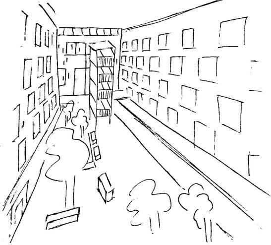
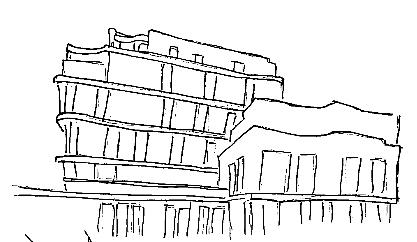
DEVELOPMENTS NEAR THE SITE IN
RECENT YEARS
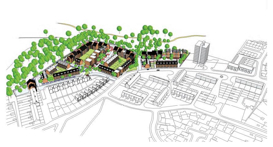
In recent years redevelopment of a project adjacent to my site - Repton Court and Claire House - began in 2012. It sits directly alongside my site, Owen Walters House, and is normally shown in pictures of my site therefore I find it relevant and necessary research.
The original building could be characterised as low-rise, post-war suburban housing. The buildings are grouped into short terraces or semi-detached, generally set back from the street.
There is a mixture of architectural styles but pitched roofs predominate. The visual appearance of the surroundings is not particularly distinctive and represents a mixture of styles from the 1940s onwards. My site Owen Waters House tends to stand out both because of its height and its more functional1960s aesthetic.
Hunters Architects wanted to connect the rebuild with the current times , while re-providing flats and providing new family homes.
Hunters Architects were inspired by more traditional street layouts and looks, creating over 100 new homes in two phases, a mix of flats, houses and duplexes.
Most existing residents were re-housed in the new homes which are situated on the edge of the Green Belt and area of special ecological interest.

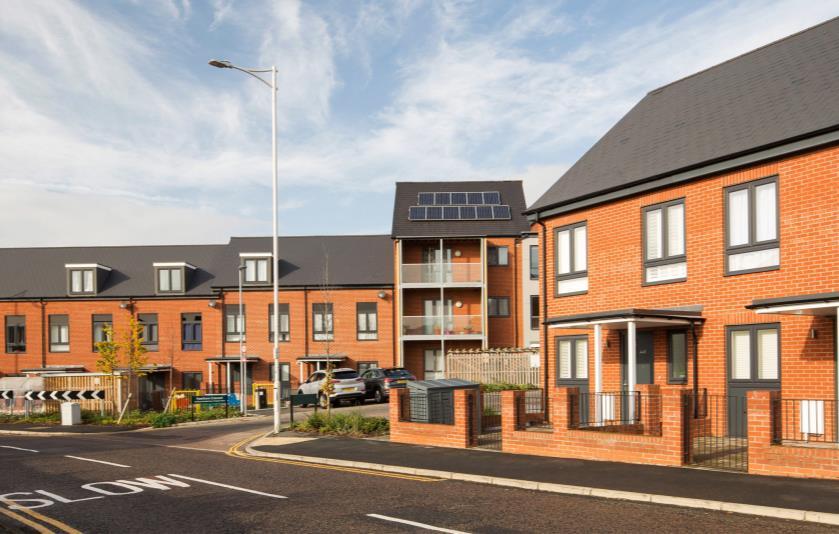
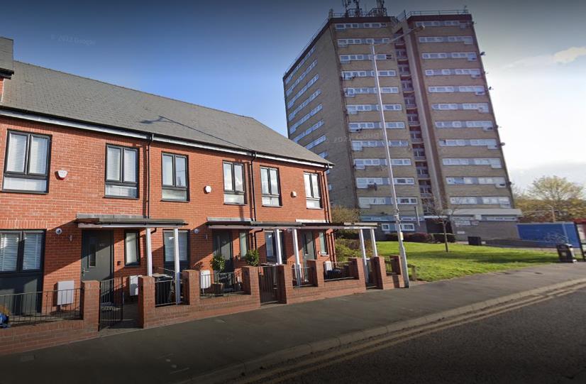
AFTER
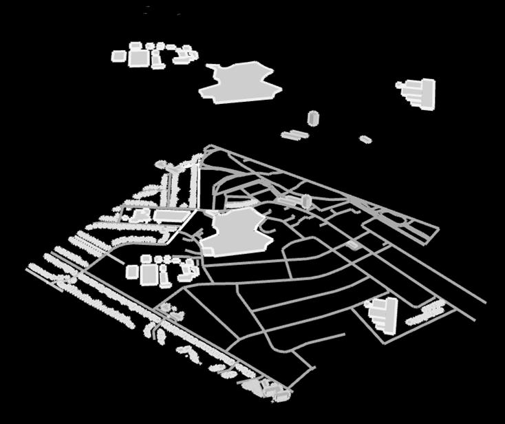
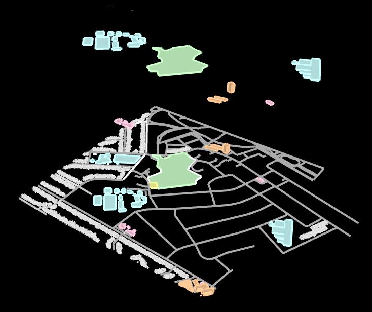
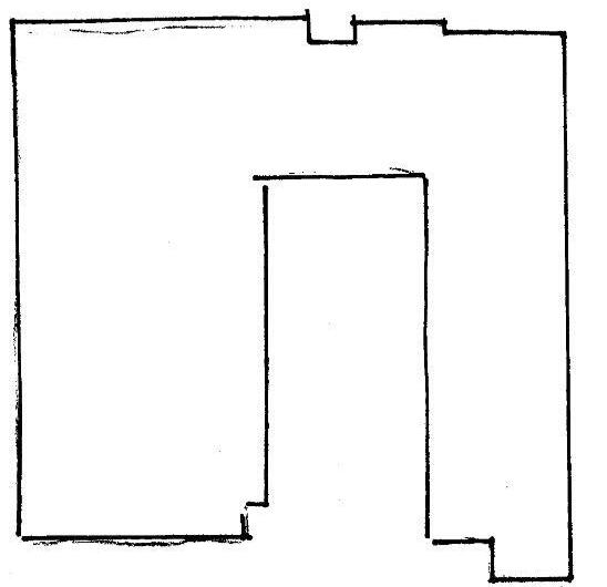
SITE PARAMETERS

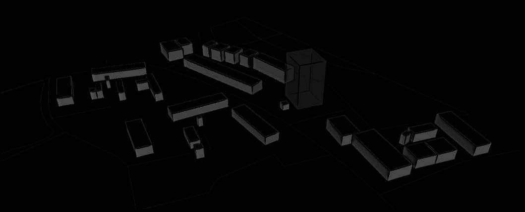
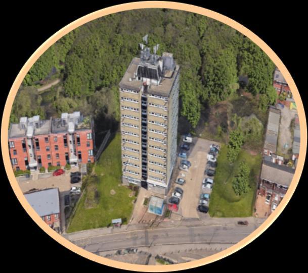
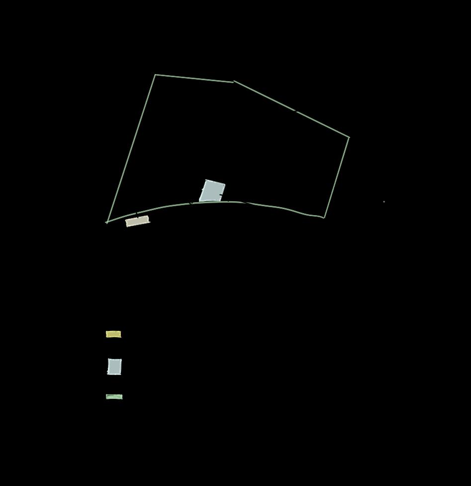
As you can see the total area of the site is very large compared to the building itself, the site could probably fit triple the amount of buildings it currently holds. The diagrams below depicts the measurements of the building, though it is a very vague estimate as I collected my information using google maps. However the measurements I have gathered will be sufficient and give me more than enough rough idea and understanding on the site parameters. Below I have also included the Goggle Earth view of the site rendered. I have outlined the entire site, in this view you can get a good understanding on the potential of the site. What I've gathered from primary research is that the site doesn’t use the space around it effectively especially its large parking area, Hence why I believe ill have much more freedom to execute my idea.
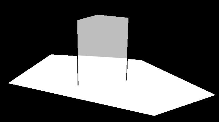
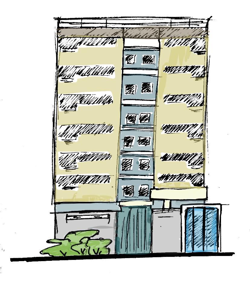
It is a quite tall building, with a height of 110ft compared to new builds with a height of 40ft.
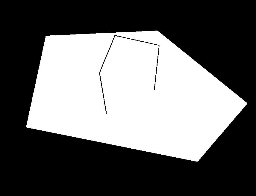
TOTAL AREA: 3,081.25 M² (33,166.31 FT²)
TOTAL DISTANCE: 228.03 M (748.13 FT)
33.53m 16.92m 19.03m 29.27m 30.1m 71.94m 48.86m
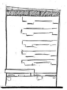
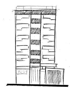
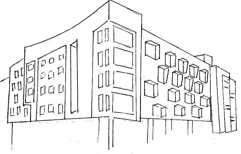
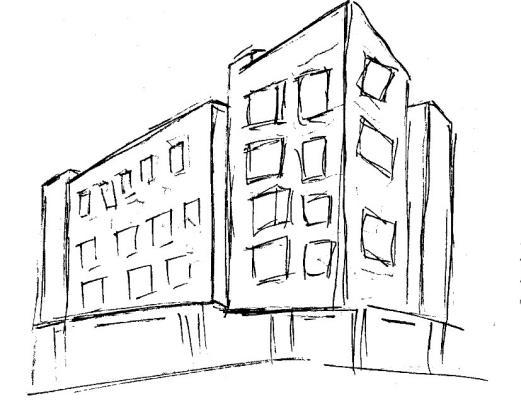
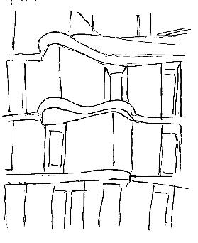
ELEVATIONS + FURTHER SITE ANALYSIS
EASTERN ELEVATION
NORTHEN ELEVATION
SOUTHERN ELEVATION
WESTERN ELEVATION
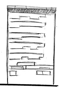
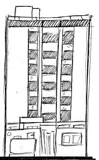

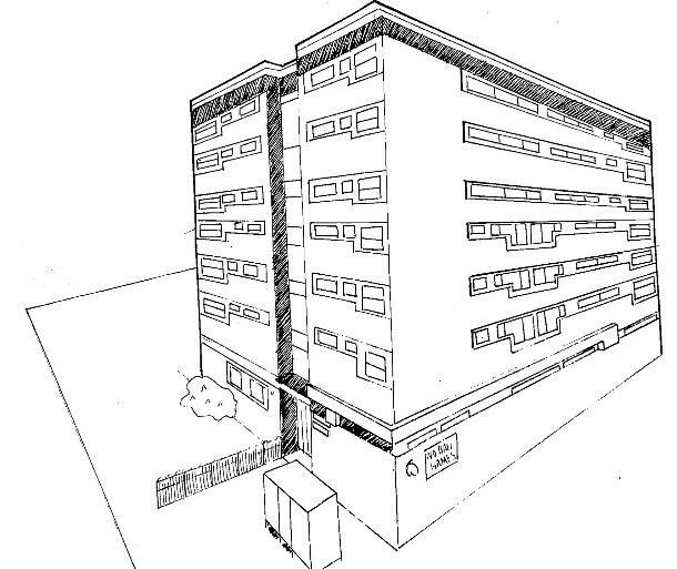

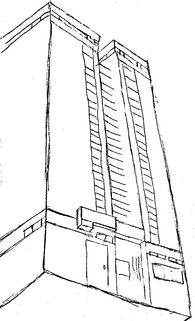
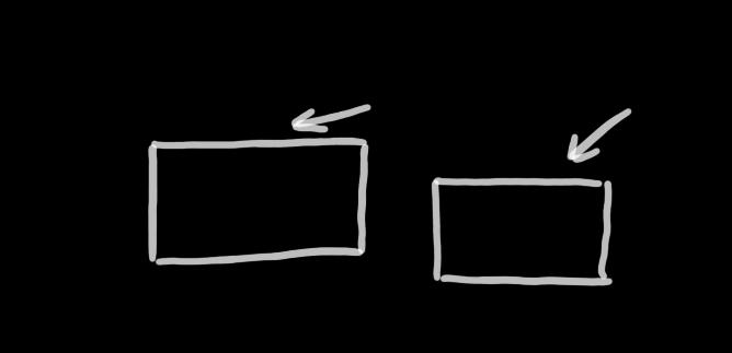
The building can be easily simplified into two rectangles, this simplified perspective of the building can make it easier to understand how the building functions as a whole. Both blocks - furthest to the left and furthest to the right – contains the main function of the building as each block holds 30 dwellings with one dwelling on the ground floor, combining to make 61 dwellings altogether. The middle blocks function is to connect the two outer blocks via stairs and elevators also accommodating both the exit and entrance of the building.
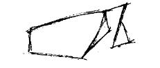
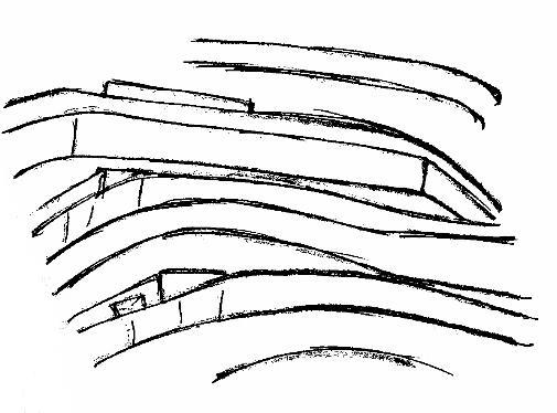
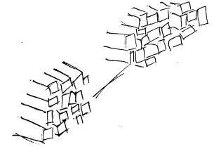
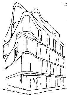
DRAWINGS LINEAR THEMES SEEN IN EVERYDAY OBJECTS
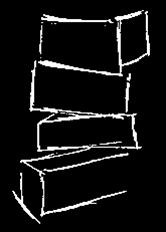
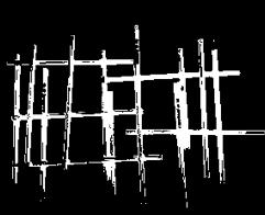


I've chosen a linear theme for my redevelopment. Linear essentially means something ‘arranged in or extending along a straight or nearly straight line.’ I picked the linear theme as my initial perspective on linear design seemed quite bland, neat and subjective, I wanted to challenge myself and see how much I could learn and create from something I had little to no knowledge on. Therefore, I've broadened my view on the theme of linear by researching all types of ways linear design can be created as many creations start off with lines.
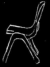
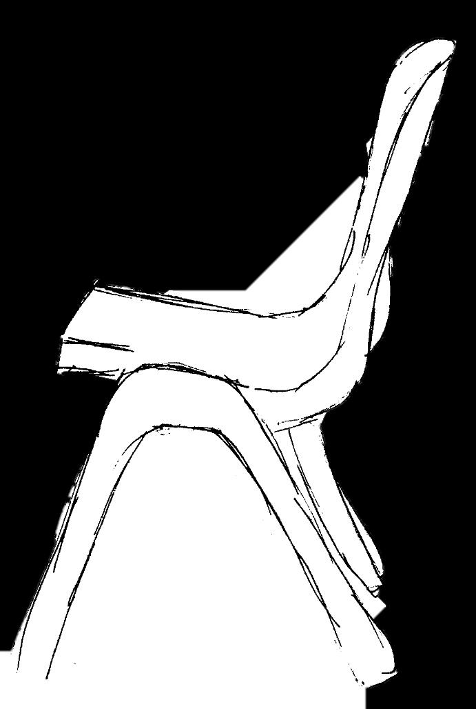
I also chose to search for linear themes in the objects around me. I discovered objects like windows, pencils, rulers, wires, bricks, chairs and rods all had linear aspects to them. With objects I found I then began creating patterns with them and therefore creating a shape. I think the amount of primary research will be adequate enough to develop.
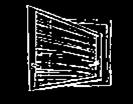
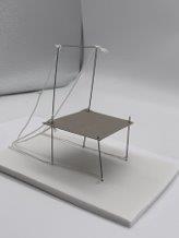
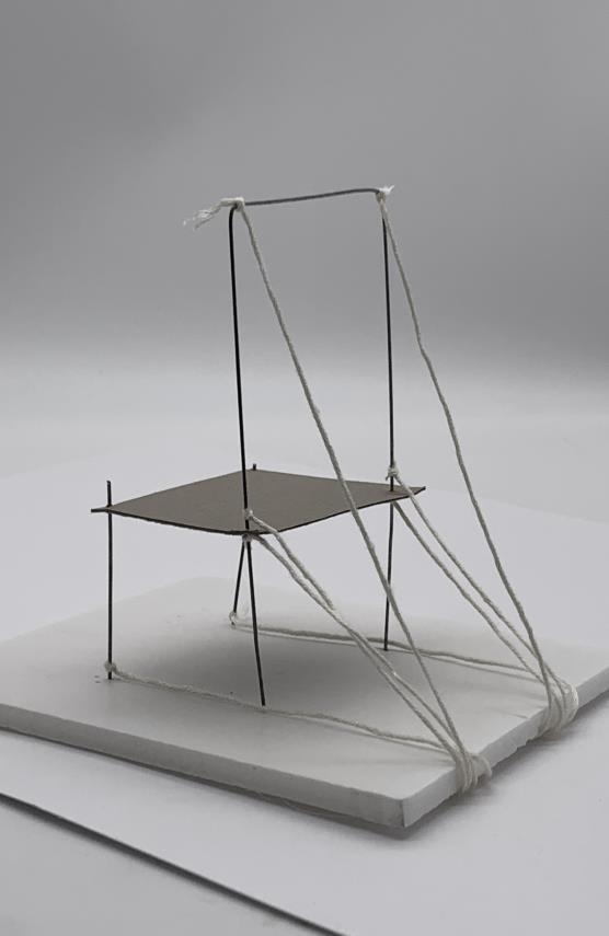
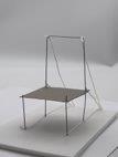
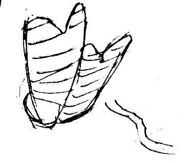
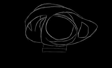
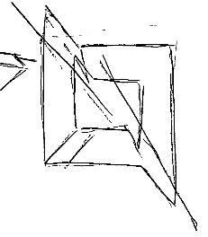
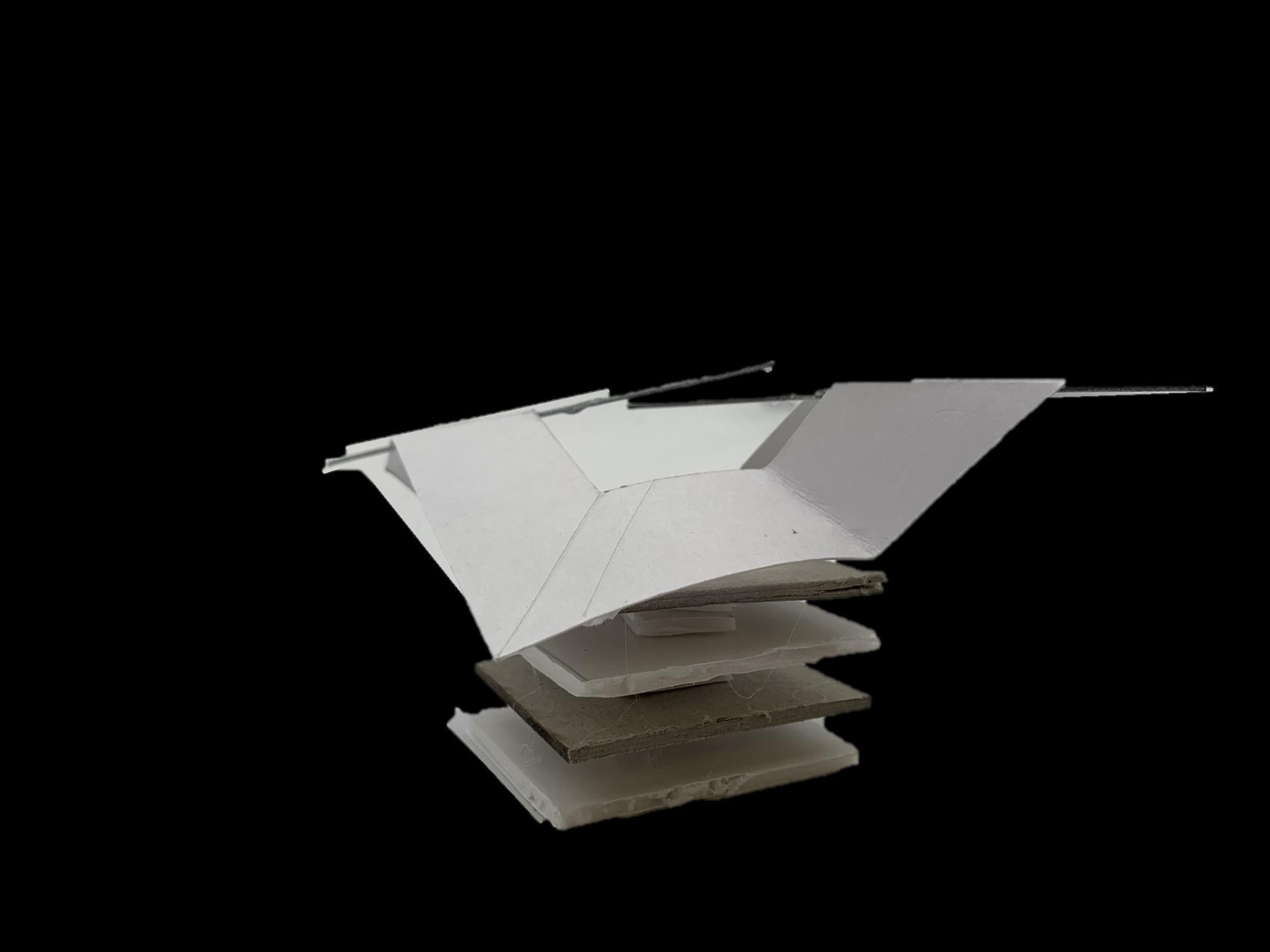
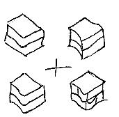
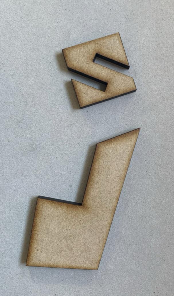
CONCEPT MODEL – DERIVRD FROM LINEAR PRIMARY PHOTOS
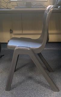
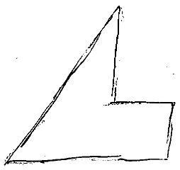
CHAIR FROM MY SURROUNDINGS SKETCHED DUE TO ITS LINEAR STRUCTURE
USED THREAD, METAL RODS AND CARDBOARD TO RECRATE CHAIR AS A MODEL
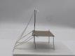
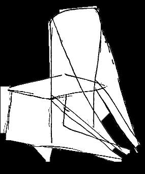
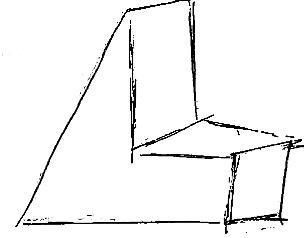
SIMPLIFIED DRAWING OF MODEL I CREATED
DRAWING
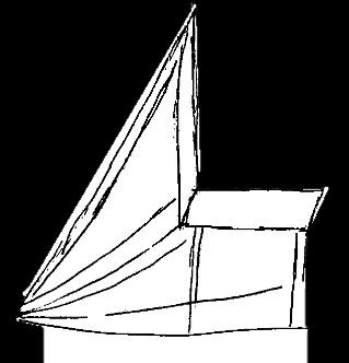
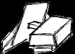
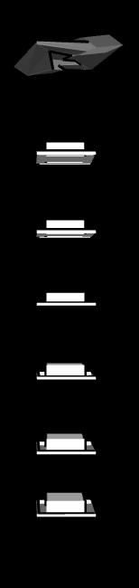
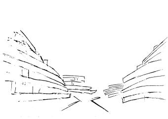
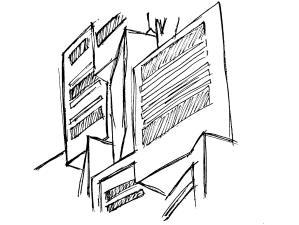
SIMPLIFIED AGAIN AND POTENCIAL BUILDING SHPE DEVELOPMENT

SPLIT ONE BUILDING INTO TWO
POTENCIAL BUILDING SHAPE

CONNECTING BUILDINGS
LINEAR THEME INSPIRATION

NAUM GABO
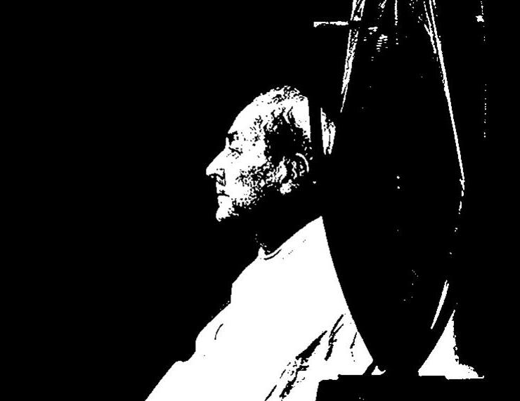
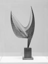
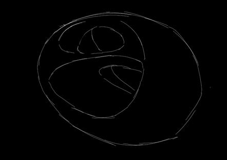
I also discovered the work of Naum Gabo, a Russian sculptor who focused on constructionism and modern art when creating his sculptures . My favourite pieces from him are: Spiral Theme, Linear Construction in Space No.2, Sphere construction of a fountain and Model for 'Spheric Theme’.
HIS PICESES EXPLORE HOW THE USE OF SIMPLE NON COMPLEX LINES CAN CREATE ART. ALL HI WORKS ARE SO DIFFERENT
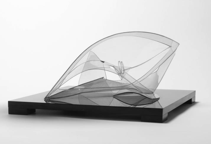
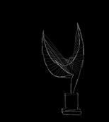
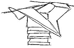
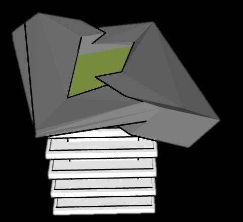
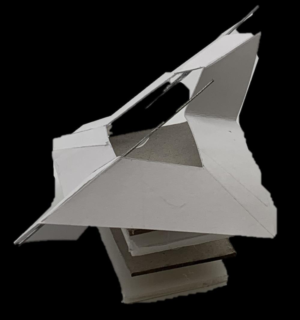
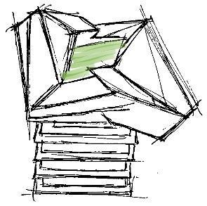
CONCEPT MODEL INSPIRED
BY NAUM BABO
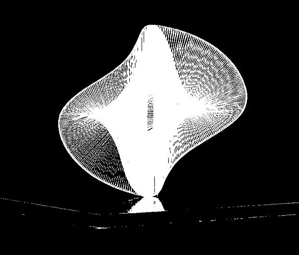
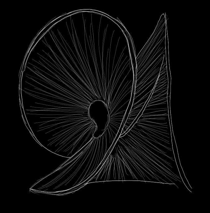
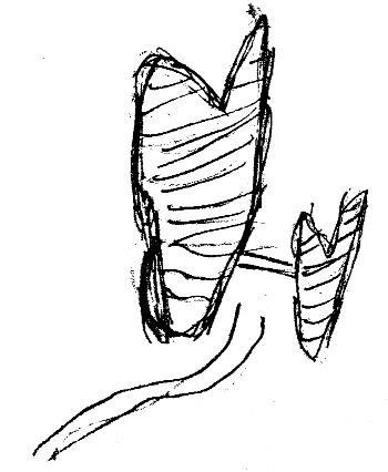
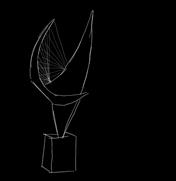
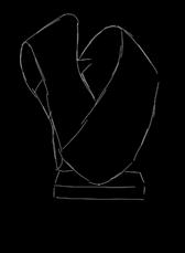
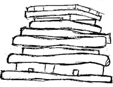
SIMPLIFIED ONE LINE SHAPE NAUM GABO’S SPIRAL THEME
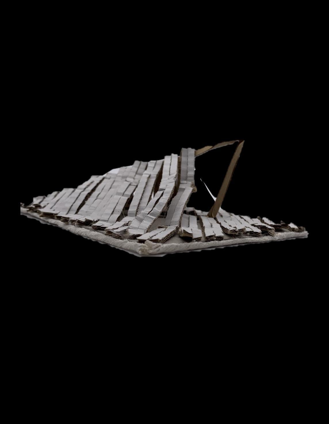
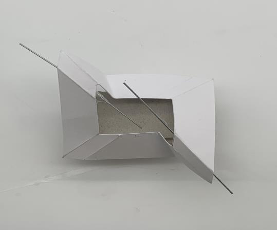
MODEL REPLICA OF NAUMS BABO’S ‘SPIRAL THEME’ USING A RANGE OF MATERIALS
I FOUND THE ORIGINAL SCULTURE HARD TO RECRATE WITH VAST MATERIALS, USING THE SIMPLIFIED SHAPE HELPED ME VISUALISE WHICH MATERIALS TO USE TO DEVELOP A CARD MODEL
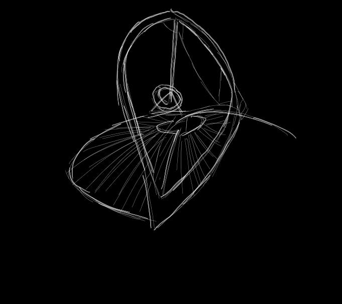
DRAWING OF MODEL

SIMPLIFIED ONE LINE SHAPE OF MODEL

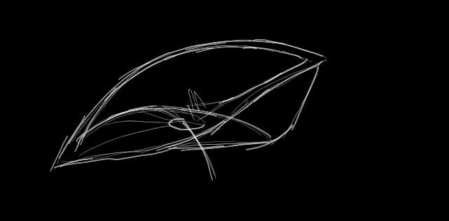
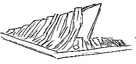
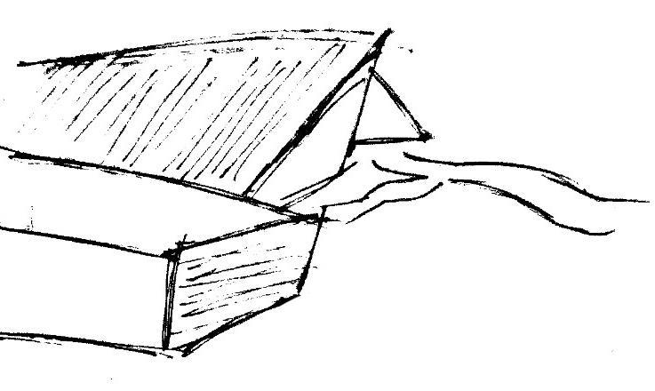
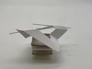
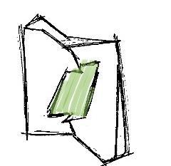
ANGLED CARDBOARD OF MODEL COULD BE USED AS AN ENTRENCE

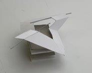
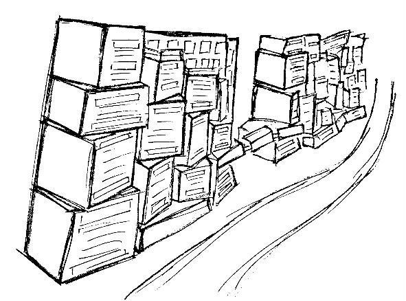
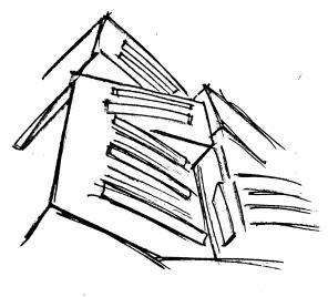
POTENCIAL BUILDING
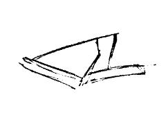


ATTEMTING TO FIND A SHAPE
POTENCIAL BUILDING


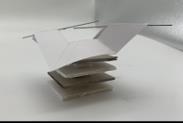
ORIGINAL SIMLIFIED MODEL SHAPE FLIPED

POTENCIAL
BUILDING
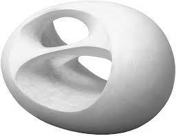
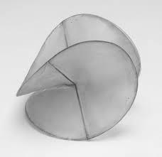
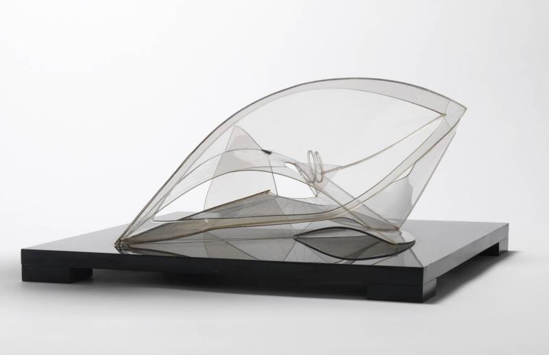
BARBARA HEPWORTH
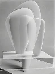
When looking for linear inspiration, I found myself at loss of a concepts for design. I was trapped in the concept of squares and found my ideas lacking. Though when researching linear works, I came across various art sculptures by Barbara Hepworth, pieces such as: Oval Sculpture (No.2), Orpheus: Maquette 2 (version l), Oval Form (Trezion) and Foto-collage (1939).

LINEAR THEME INSPIRATION


BARBARA’S ART USES A MIX OF CURVED AND STRIGHT LINES TO CREATE HER WORK. IT INSPIRES ME TO USE A RANGE OF LINES IN MY WORK.
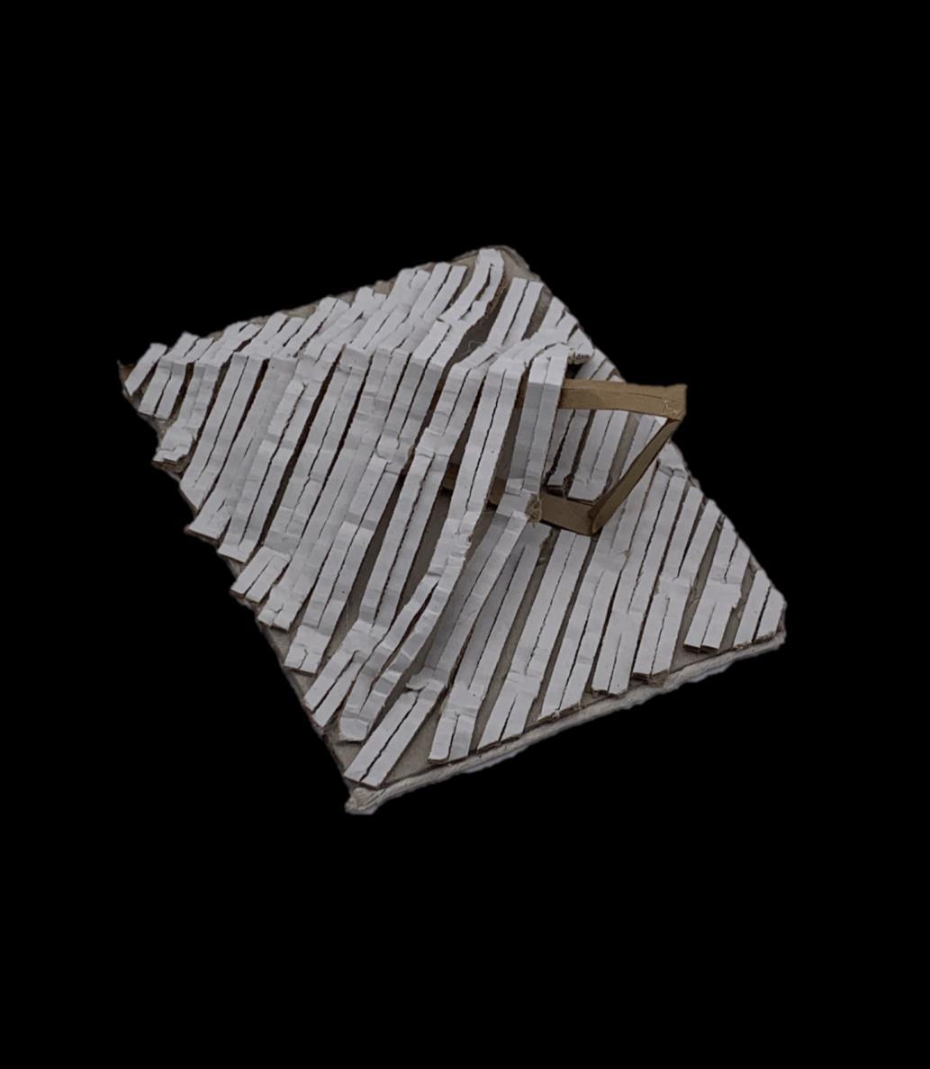
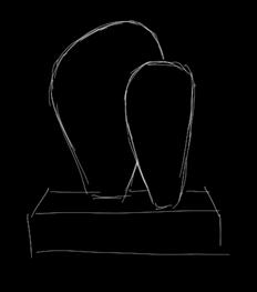
CONCEPT MODEL INSPIRED
BY BARBARA HEPWORTH
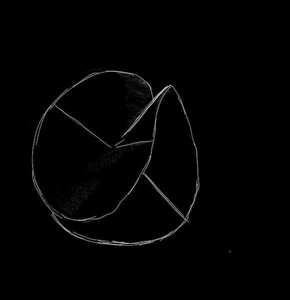
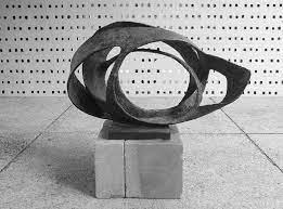
MODEL REPLICA OF BARBARA HEPWORTH’S OVAL FORM (TREZION).,
’ USING A RANGE OF MATERIALS
RECRATING HER WORK IN MY OWN WAY HELPED ME CREATE NEW SHAPES I COULD DEVELOP
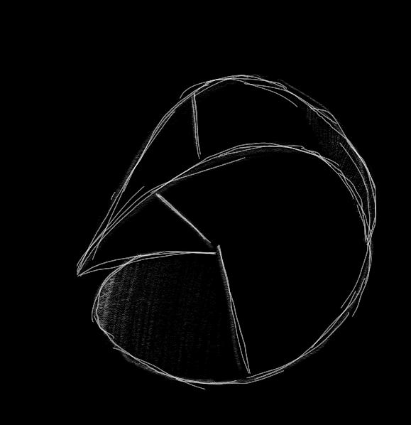
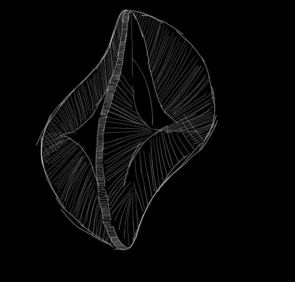
SIMPLIFIED ONE LINE SHAPE
DRAWINGS OF MODEL
SIMPLIFIED ONE LINE SHAPE OF MODEL
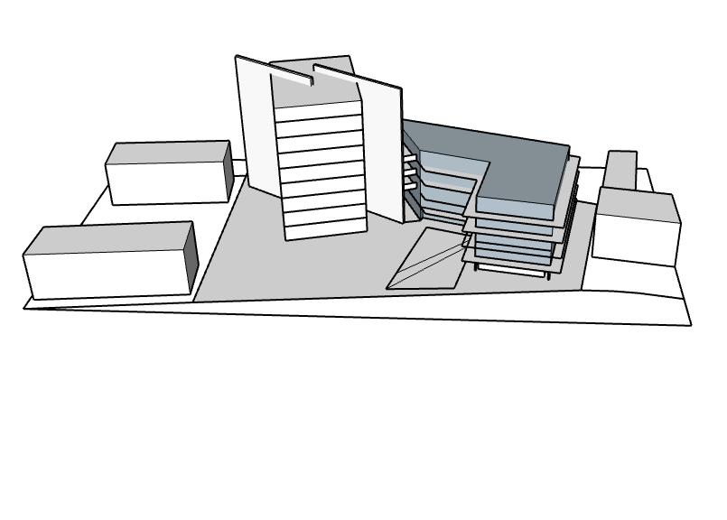
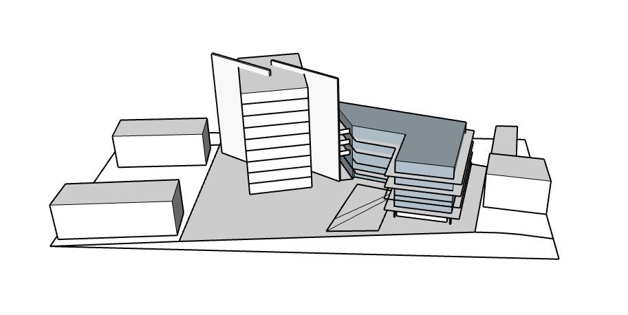
CONCEPT MODEL ONE: INSPIRED BY BARBARA HEPWORTH - SKETCHUP

BARBARA HEPWORTH INSPIRED MODEL RECARED ON SKETCHUP
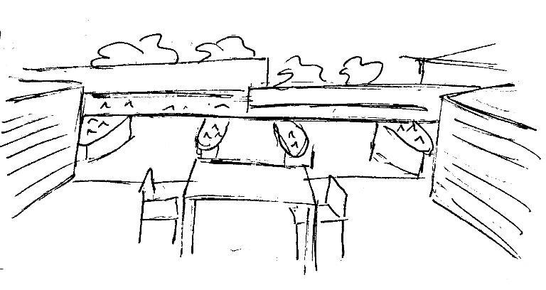
TOP FLOOR CONTAINING THE ROOF GARDEN TERRANCED LOWER LEVELS ACCOMDATING DWELLINGS
THE TOP FLOOR WILL CONTAIN THE COMMUNAL GREENERY AREA OPEN TOALL RESIDENTS


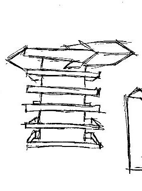
THE GREEN SQUARE WILLACCOMMODATEALL GREENERY WITH LESS SEATING IT WILL ALSO HAVE INDOOR SPACE FOR SHELTER AND SEATING
ENVIRONMENT PSYCOLOGY
CONCEPTS OF FUNCTION & DESIGN
My secondary research was based upon how architects used design and function to integrate environmental psychology.

My overall goal for my redevelopment site is to re-provide housing for current tenants rather than to evict households. I want to create social housing which will work more effectively than a high-rise tower block would. Though to achieve the correct balance of function and design I've explored the architecture of social housing, some appealed to me due to the design and some because of its catered function.
LA CRIQUE APARTMENTS
MARSELLA, FRANCE
PIETRI ARCHITECTES · 2017

The end walls with their staggered terraces create tiers, echoing the mountainous topography nearby. To the north, along the Chemin du Roy d’Espagne, the building’s line has been interrupted, creating thereby an “inlet”, reminiscent of the calanques and revealing a landscaped garden of Mediterranean garrigue. Access to the hallways of the two buildings is set in the centre of the plot, slightly below the private road, allowing residents daily enjoyment of the greenery.
BASKETAPARTMENTS
PARIS, FRANCE OFIS ARCHITECTES · 2017
The project is located on a long and very narrow site, on the edge of Parc La Vilette in Paris’s 19th district, within an urban development done by Reichen & Robert architects..
The major objective of the project was to provide students with a healthy environment for studying, learning and meeting. Along the length of the football field is an open corridor and gallery that overlooks the field and creates a view to the city and the Eiffel tower. This gallery is an access to the apartments providing students with a common place.
RICHARDSON APARTMENTS
SAN FRANCISCO, UNITED STATES
DAVID + BAKER · 2011
The Richardson Apartments were built to provide permanent supportive housing for a verylow-income, formerly homeless population.
The architecture consists of cubic and rectangular shapes all throughout the building. They using protruding shapes to create an emphasis on the accent colours on each side of the building. The specs of nature place on the rooftop area and seating enclosed by the building resemble the accent colours which brings the building together.
David Baker and Partners used cubic shapes to reduce costs while creating affordable apartments. I also want my apartments to be low-income friendly, so I’ll keep this in mind.
PLAN ROOFTOP COMMUNAL GARDEN
IVCASTELLANEAPARTMENTS
WESTMINISTER, UNITED KINGDOM
NAME ARCHITECTURE · 2017
The IV Castel Lane Apartments were built to provide a high-end residential in London.
They use a mix of circular and rectangular shapes to create a modern yet familiar façade. The use of the protruding curved window gives the building a sculptural, it also a valuable additional interior area offering a semi-external floating space which is simultaneously inside and outside. The architecture follows a theme of English domestic architecture which mixes old with new. This building features sustainable and energy efficient measures, such as living roofs.
NAME architects used a mix of shapes causing this building to be quite expensive as the building shape and materials are not cost effective. Ill deter from mixing large shapes structurally to reduce costs for my apartment.
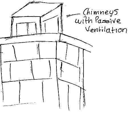
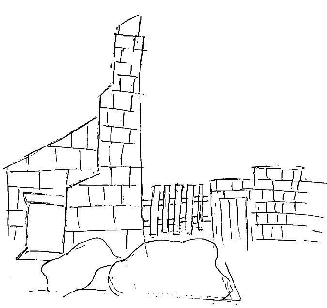
BARKING, UNITED KINGDOM
PATEL TAYLER ARCHITECTS · 2015

Courtyard housing provides social housing bungalows for retired elderly residents. It follows a concept of the traditional English alms-house through its redbrick and memorable tall brick chimney. Though the layout is spread out rather than extending horizontally. I think I'll avoid this as my area cannot fit horizontal housing to accommodate 22 households.
As it is a mixed age residential, I think this could isolate the elderly, therefore ill avoid aiming my apartments to one age group. Its design can provide high-quality social housing on a budget. I also don’t view this build as cost effective as it wastes material; the chimneys' serve no purpose and are passive ventilation, the two-storey brickwork are both entirely blank at the first floor and aren’t necessary as it isn’t useable. Ill avoid designing my apartment like this in order to reduce costs.
HOUSING
COURTYARD
DEVELOPMENTS TOWARDS FINIAL MODEL
LAYOUT POSITIONING
IMPLEMENTATION OF ENVIRONALMENTAL
PSYCOLOGY ON MY MODEL
PREPARATIONS FOR FINAL MODEL
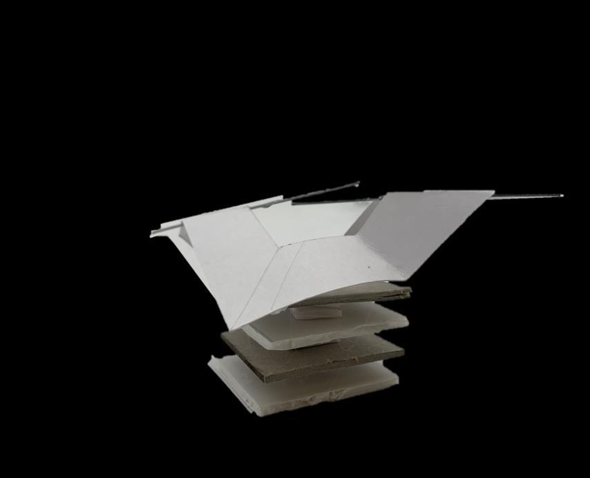
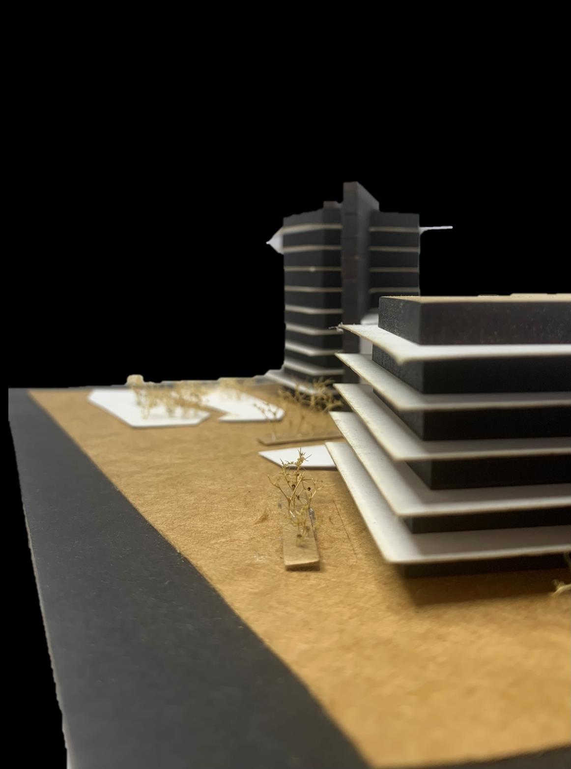
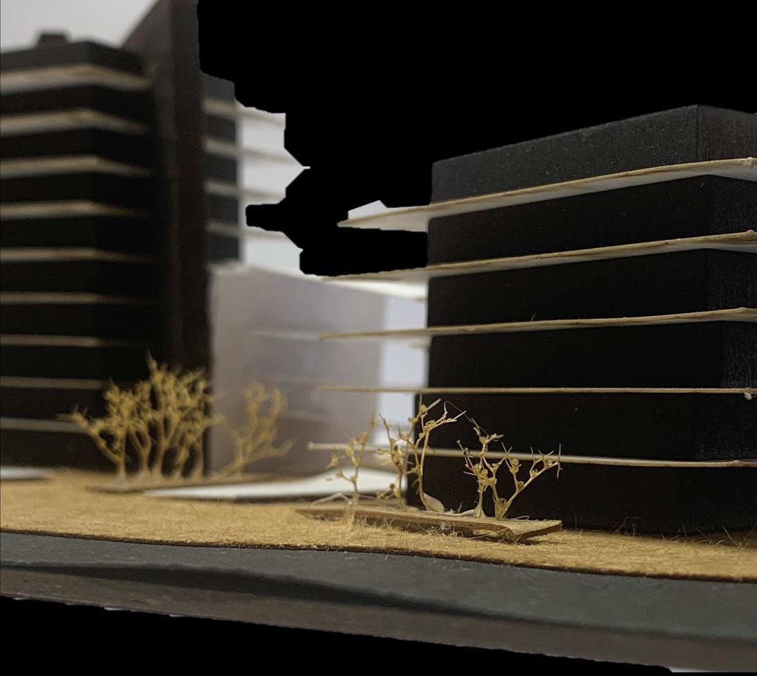
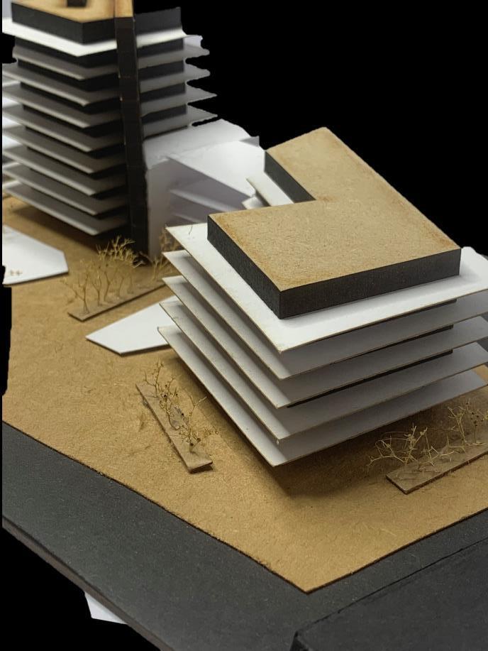
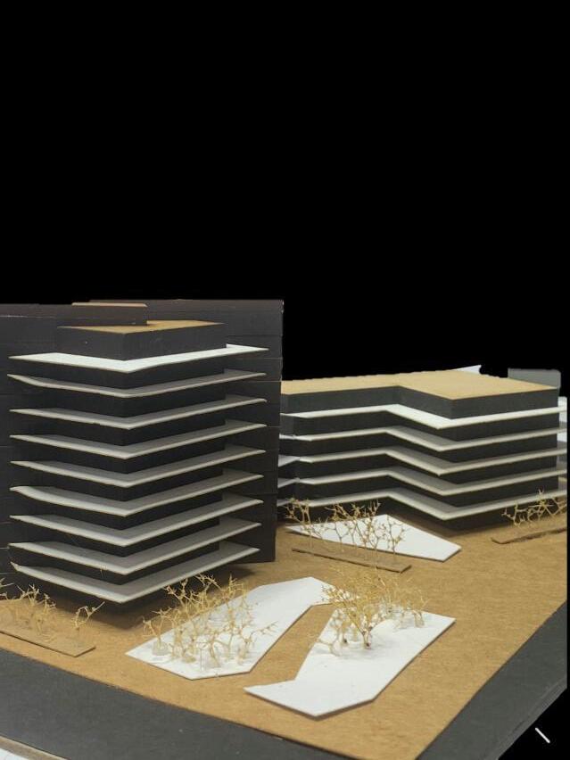
FINIAL MODEL
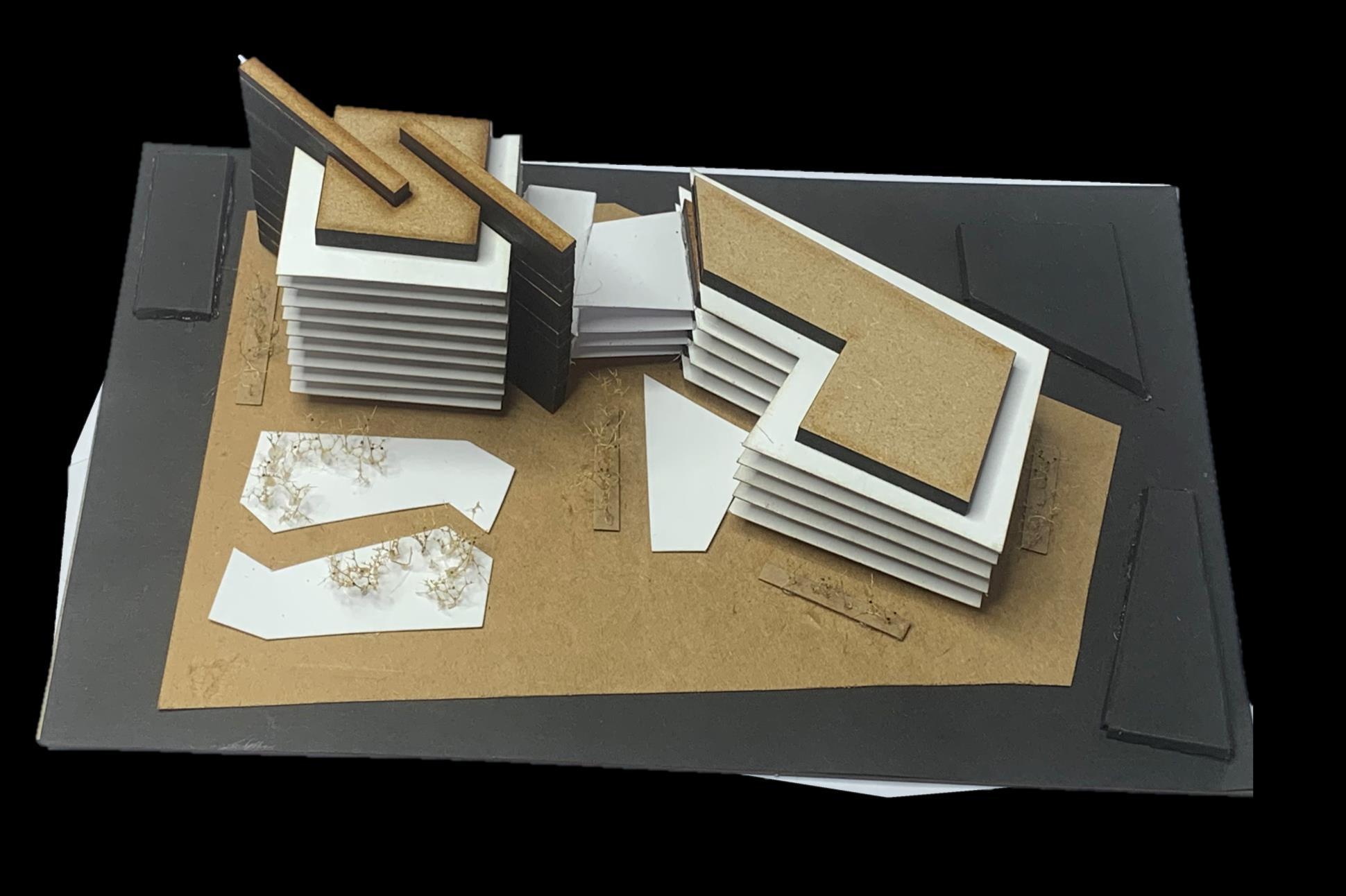
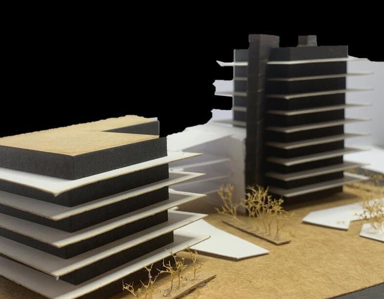
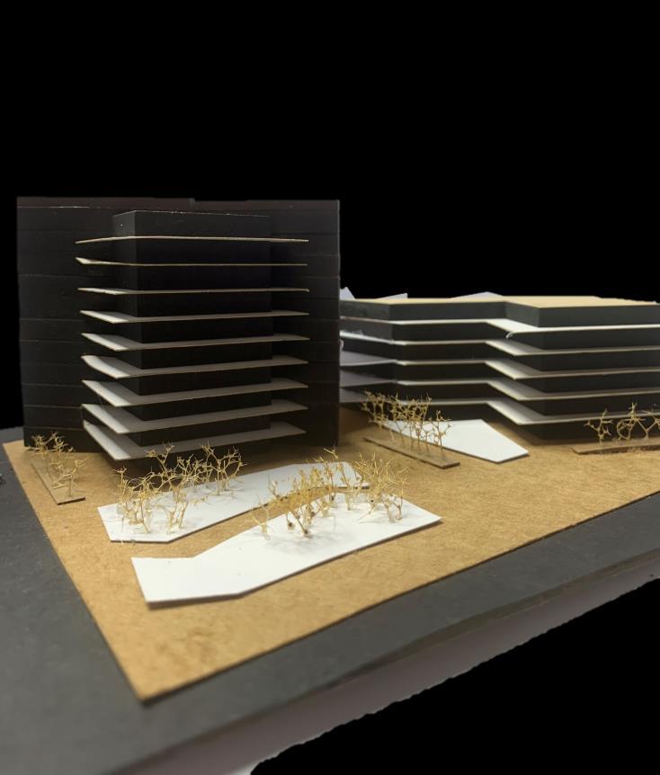
USING LASER CUTTING, I CREATED MY FINAL MODEL BY CUTTING 6 MM MDF, WHITE CARD AND BLACK CARD.
THIS MODEL'S LAYOUT PROVIDES AN ADEQUATE DESIGN TO SERVE MY BRIEF. IN THE MODEL DISPLAYED I HAVE SURROUNDED THE DESIGN WITH TREES, EMBRACING NATURE WHILE PROVIDING SHADE AND IMPROVED AIR QUALITY TO RESIDENTS. I AM PLEASED WITH THE MODEL'S OUTCOME; AS FOR MY SECOND COMPONENT, I WANTED TO USE A DIFFERENT COLOUR SCHEME THAN MY FIRST. EVEN WITH A SET LIMIT ON THE RANGE OF MATERIALS, I THINK I'VE SUCCEEDED. CONSIDERING MY CHOICE OF MEASURING AND CUTTING MY WHITE CARD AND BLACK CARD BY HAND, THEY MEASUREMENTS WERE ACCURATE AND FURTHER ENHANCED MY MODEL.
HOWEVER, I DO FEEL AS THOUGH I COULD HAVE DEVELOPED THE LANDSCAPE FURTHER AND ADDED MORE COLOUR, AS WELL AS ADDED MORE FEATURES TO THE BUILDING ITSELF.
FINIAL SKETCHUP