Brand Guidelines
If you have questions about Findlay’s brand and this resource, please contact the Office of Marketing and Communications at 419-434-4520 or marketingsupport@findlay.edu. Visit brand.findlay.edu to view the full brand guidelines.
If you have questions about Findlay’s brand and this resource, please contact the Office of Marketing and Communications at 419-434-4520 or marketingsupport@findlay.edu. Visit brand.findlay.edu to view the full brand guidelines.
For 140+ years, the University of Findlay has upheld its commitment to higher education while building a brand that reflects the best of our institution, students, community, and global impact. Our brand is more than a logo—it represents our values, reputation, and the experience we provide.
This brand style guide serves as the official resource for Oiler Nation, outlining best practices for maintaining the University’s identity. With thoughtful evolution, our brand includes refined logos, typography, and additional design elements essential for contemporary marketing. A strong, consistent brand fosters trust, recognition, and pride among students, faculty, alumni, and external audiences.
Inside, you’ll find key elements of our visual identity, writing style, and marketing strategies, along with examples for your reference. Whether you’re creating print materials, digital content, or promotional assets, following these standards ensures a unified and professional presentation. Adhering to these guidelines safeguards our brand’s recognition and integrity across all colleges and programs.
The mission of the University of Findlay is to equip our students for meaningful lives and productive careers.
Findlay cultivates the potential within each student through academic excellence, transformative experiences, and a supportive community that is grounded in Christian faith.
A brand is not just a logo or a tagline or an ad campaign that changes as trends change. A brand is earned. It is the cumulative result of how others have interacted with us. Every experience, impression, and touchpoint made by or with our institution tells the story of our brand. Communicating a clear and compelling brand helps people associate the University of Findlay with academic excellence, transformative experiences, and a supportive community. Building and protecting our brand takes collaborative effort from individuals, organizations, programs, and colleges to impact our audiences and influence our followers.
Every Oiler, Every Step of the Way.
Invite students into a welcoming campus where they find their place and their calling and help others do the same.
Engage students in discovering and preparing to fulfill their calling(s) alongside others of diverse perspectives and identities.
Inspire students to reach their full promise in serving and leading others.
The University of Findlay logo is the primary visual identifier of our institution and should be used in all non-athletic references and publications. All official University communications must prominently feature this logo or an approved iteration.
Our primary academic logo is supported by alternative formats for flexible-use cases. They include the lone icon (square), banner, stacked, and rectangle. Each version is designed to accommodate different layouts across various communication materials. When selecting a logo version for your project, size and readability should be the top considerations.
The University of Findlay logo consists of three elements: the icon, the wordmark, and the tagline. The wordmark should never be separated from the icon, ensuring brand consistency. However, the icon may be used independently for internal audiences, when appropriate, as a standalone brand mark or a graphic element. Use of the University of Findlay logo and associated marks indicates agreement to abide by the University standards within the brand guide.
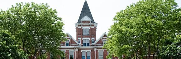
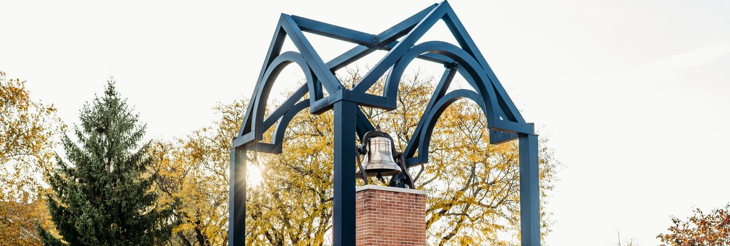
The University of Findlay logo features the tower of Old Main, symbolizing tradition and history. The six slats in the cupola represent the University’s six colleges, while the outline reflects The Griffith Arch, a key campus landmark. The keystone, inspired by the Arch Ceremony, reinforces this meaningful campus tradition.
The University of Findlay wordmark is designed to be friendly and approachable. It features the Tisa Sans Pro font, which should be used exclusively within the official logo and not for any other purposes. Please see page 12 for more on approved university fonts.
Logos can be downloaded at brand.findlay.edu. File types include .jpg and .png files. Vector files are available upon request. Other requests should be directed to the Office of Marketing of Communications at 419-434-4520 or marketingsupport@findlay.edu.
The tagline, "Meaningful Lives. Productive Careers." can be applied to both primary or secondary versions in the display format. The tagline is not a mandatory element in the display of the logo, but is encouraged.

The stacked layout is bold and requires ample space surrounding it. This layout is best suited for formal communications where sufficient space is available. The stacked layout is featured on items such as the back of folded cards and invitations.
The rectangle layout, a hybrid of the banner and stacked versions, is designed for tighter spaces. It maximizes readability and size when other layouts do not fit. It is preferred when identifying us as a University to external audiences and needs to be clear.
he message intended for the target audience. Each version is designed to fit different formats while maintaining clarity and brand consistency, ensuring the logo is presented effectively across all materials.
< .5in
The clear space, defined by the “F” in Findlay, is the protected area around the logo that ensures maximum impact. This space must remain free of other graphics, text, or logos and serves as the minimum distance the logo can be from the edges of any publications.
When used in combination with other logos, the University logo should be the same size or proportionate to the partner logo. The logo should not appear smaller than 0.5 inches tall in print or 55px tall on screen. Anything smaller should use a simplified version of the logo.
Squeeze, distort, or rotate the logo
Crop the logo Do Not...
Outline the logo
Use unapproved colors on or with the logo
Apply extreme effects to the logo
Place the logo on a busy background
The department logos are a way for colleges, academic programs, offices, and departments to identify themselves in marketing materials while still representing the University as a whole. These logos come in two formats, banner and stacked, and can be requested through the marketing support ticketing system. These logos follow the same guidelines as the primary logo mark and should be treated the same as the banner and stacked arrangements in their need for adequate space.
The University seal is only to be used by the Office of the President and the Board of Trustees for materials such as official University awards, recognition and documents like transcripts, diplomas, and acceptance letters. Written permission must be requested and approved for their usage.
Centers and institutes affiliated with the University that compete in the marketplace are permitted to use custom logos and identities with approval and collaboration with the Office of Marketing and Communications.
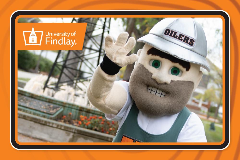
Derrick the Oiler is the official mascot of the University of Findlay. Derrick first appeared as a cartoon character around 1937 and has undergone many stylistic improvements in the years since. Like our logos, slogan, and seal, Derrick is a protected mark associated with the official trade dress of the University and has specific standards and guidelines for his usage.
Mascots are a powerful tool for building a brand and adding personality, flair, and a touch of humor to events and communications. Derrick is a memorable figure used to humanize the University and can be used to make our brand stand out. Derrick has many followers in his loyal fanbase. As a protected figure, his purpose is to increase brand awareness, facilitate engagement, and provide emotion and fun in our marketing platforms.
Derrick can be incorporated on websites, social media, print materials, digital platforms, and in campaigns when used in accordance to policy and with approvals from the University’s Office of Marketing and Communications. Additionally, he may also be used on merchandise associated with the University provided the vendors have met the proper collegiate licensing requirements. Derrick is a silly figure and should not be associated with serious content, impact, or events. To facilitate proper usage of Derrick, there are preapproved Derrick designs that may be used. Derrick should not be re-created on your own or designed by individuals not associated with the University of Findlay‘s Office of Marketing and Communications. Rather, if you have a specific application or need for Derrick, please contact Marketing and Communications.
The athletic logo is reserved for the Athletics Department, sports teams, athletic marketing communications, and trademarked merchandise. To maintain clear and effective branding, athletic and academic identities remain separate. Using athletic marks and colors in academic materials weakens both brands by blurring messaging and reducing recognition. These marks should be used exclusively for athletics marketing, communication, and promotion in order to maintain a strong athletic brand image.

Color is a vital component of the University of Findlay visual identity. Our brand colors help create instant recognition and reinforce the University’s image, even in the absence of a logo. The iconic combination of orange and black has been a part of Findlay’s heritage since 1892, symbolizing both tradition and pride.
Consistent and appropriate use of our color palette is essential not only for brand recognition, but also for accessibility and distinction. The examples on the left outline approved color combinations and provide the proper colors to use when working with the University of Findlay logo.
The University of Findlay logo should only appear in one of the following approved colors: white, black, or Findlay Orange. To maintain brand integrity, the logo must not be placed on visually busy backgrounds or unapproved colors.
When incorporating the logo over images or complex visuals, use a gradient overlay or solid color block to maintain clarity and contrast with the branded mark.
For content that conveys essential information, text on a Findlay Orange or Findlay Gray background should be displayed in black to ensure maximum clarity, readability, and accessibility.
White text on Findlay Orange and Findlay Gray does present some accessibility issues for screen readers and should be used with consideration. Sufficient font size and weight can help offset contrast limitations, ensuring the design remains visually effective while staying true to the brand aesthetic.
Primary Colors To be used in all communication related to Univerisity of Findlay.
Secondary Colors To be used sparingly in communication related to the corresponding college.
Accent Colors
To be used sparingly as a design option, but should not dominate or replace primary colors.
Pantone colors are listed, but printing them can be costly. CMYK should be used for most materials unless the project warrants Pantone use for enhanced color performance.
Avenir is our font family for primarily body text, but may be used for headings and sub-headings as well. This is our primary font. Avenir has many weight options, but our primary weights are Avenir Book and Avenir Heavy.
Museo Slab is our font family for headlines and subheadings. We use the 700 weight and 500 weight the most. The 900 weight and 100 weight should be used carefully as both may encounter issues at various large or small sizes.
Avenir, Book
Aa Bb Cc Dd Ee Ff Gg Hh Ii
Jj Kk Ll Mm Nn Oo Pp Qq Rr Ss Tt Uu Vv Ww Xx Yy Zz
Museo Slab, 500
Aa Bb Cc Dd Ee Ff Gg Hh Ii
Jj Kk Ll Mm Nn Oo Pp Qq
Rr Ss Tt Uu Vv Ww Xx Yy Zz
Museo Slab, 700
Baskerville is our font family for elegant communications. This font family is typically used for communications from Advancement or the Office of the President on more official or premium communication pieces, but the italic variants can be a good companion to Avenir and Museo Slab.
Baskerville, Regular
Aa Bb Cc Dd Ee Ff Gg Hh Ii
Jj Kk Ll Mm Nn Oo Pp Qq
Rr Ss Tt Uu Vv Ww Xx Yy Zz
Baskerville, SemiBold
Aa Bb Cc Dd Ee Ff Gg Hh Ii
Jj Kk Ll Mm Nn Oo Pp Qq
Rr Ss Tt Uu Vv Ww Xx Yy Zz
Baskerville Italic Type Treatment: Set the kerning to optical and the tracking to -30.
Adios Script is our script font for elegant communications. It is to be used as a display font.
Baskerville, Bold
Aa Bb Cc Dd Ee Ff Gg Hh Ii
Jj Kk Ll Mm Nn Oo Pp Qq Rr Ss Tt Uu Vv Ww Xx Yy Zz
Baskerville Italic Normal
Baskerville Italic -30 Tracking
Adios Script Pro, Regular
Baskerville, SemiBold Italic
Aa Bb Cc Dd Ee Ff Gg Hh Ii Jj Kk Ll Mm Nn Oo Pp Qq Rr Ss
Tt Uu Vv Ww Xx Yy Zz
Madina Script is our font for fun and engaging communications. It is to be used as a display font.
Madina Script, Regular
Arial Regular and Rockwell are suitable substitute for Avenir and Museo if they are not available on your machine.
Regular
Rockwell, Regular
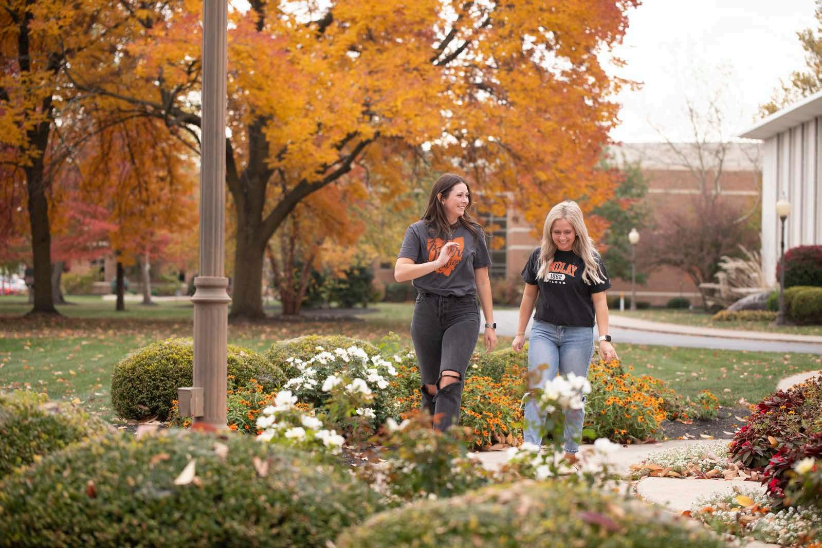
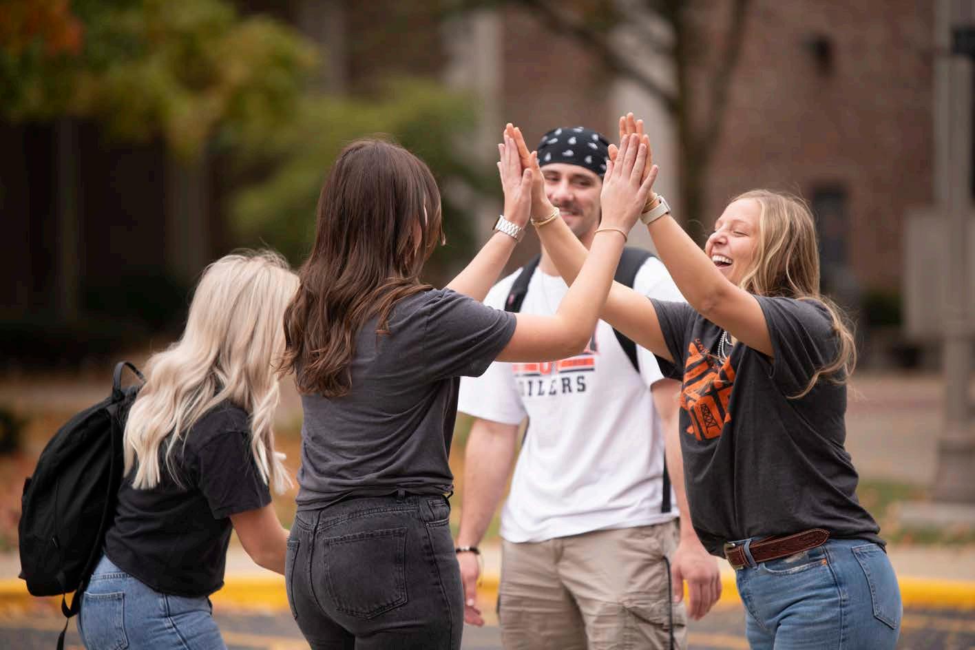
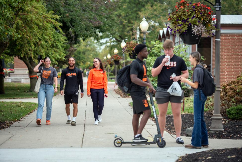
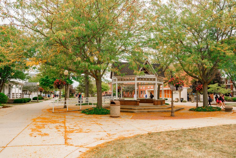
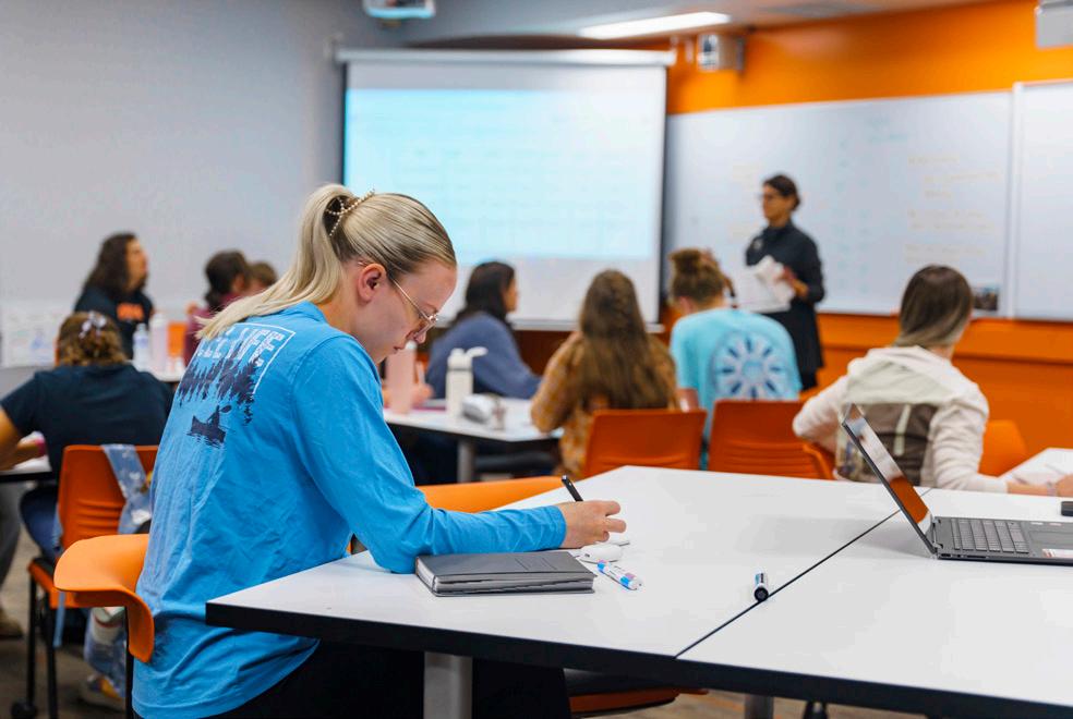
Visually representing the University with quality photography in authentic ways aids in connection with our designated audiences. Marketing and Communications provides photography services as requested utilizing our staff, students, and outside freelance support as necessary. Custom digital collections can also be developed. Individuals may also capture and curate your own collection of photography.
· Our special UF students, faculty, staff, and alumni
· Our special UF moments in time and connections with others
· Our special UF places on campus, their purpose, engagement, and surroundings
Strive to obtain candid moments with a softer focus which appear more authentic and can convey a mood. Look to capture a sense of curiosity, discovery, or emotional connections with others. Consider inclusionary photos with diverse audiences and individuals collaborating together. While UF has the right to photograph individuals on our private campus, not everyone likes to be in photos. When possible, provide the courtesy of allowing others to remove themselves from photos if they choose.
Photograph in natural environments and lighting as much as possible. Consider the surroundings in the foreground and the background, avoiding obstructions, unflattering clutter (trash cans in backgrounds or food items left on surfaces). Try to avoid using photos with competing logos, schools, teams, or messages contradictory to UF’s mission and values.
Consider how the photo may be used after the event. Could the photo be used for digital, print purposes, or both? Try to build space into the frame to assist in graphic design purposes such as adding headlines, captions, and logos. Provide captions and alternative text when utilizing photos in print or online for accessibility compliance.
Consider the quality of the photos in terms of pixels and digital file sizes. Often smartphones and amateur photographers may have exceptional photo quality in smaller sizes, but they can also be challenging to expand into larger format printing or specialized applications. For this reason, sometimes blurry photos should be discarded and when possible, re-photographed.
If our brand were a person, they would sound: approachable, visionary, and dedicated.
Approachable: We use warm, accessible language that makes everyone feel welcome, regardless of background. Visionary: We communicate with purpose and optimism about the future. We highlight pathways to success. Dedicated: We are committed to student success and transformation.
Be direct and active. Write in active voice, not passive. Use action verbs to hone your point. Be concise and clear. Use short sentences and do not repeat information. Be authentic. Highlight real student journeys and faculty accomplishments. Share specific outcomes.
Tone
Consider the tone necessary to influence your audience and meet their expectations of the University. Is your message formal, informal, serious, or humorous? Match your tone when possible to the themes of invite, engage, and inspire to reinforce our strategic goals.
Invite
Use “you” when addressing prospects and students, “we”, “us”, or "our" when speaking as the University. Use warm, hospitable language. Emphasize the supportive Findlay community and Christian values that ground the University without being exclusionary. Highlight personal attention and individualized paths.
Engage
Employ calls to action where appropriate. Emphasize the collaborative, experiential, and service-learning opportunities that make the University unique. Highlight diverse perspectives and inclusive environments. Focus on practical application of knowledge.
Inspire
Showcase concrete examples of positive impact. Center communications around student, faculty, and alumni stories that demonstrate transformation and success. Connect success to broader service and leadership. Emphasize innovation and entrepreneurial thinking. Use warm, accessible language that makes everyone feel welcome, regardless of background.
Clarity, openness, and an information-driven approach are essential components of our style. Visually we give importance to a message by using ample white space and allowing simple points to speak volumes. Keep writing style and visual design concise, purposeful, and clear.
Facts, figures, statistics, and outside endorsements can help elevate our style and credibility, but all data provided must be adequately substantiated or provided with approvals of Institutional Research and Marketing and Communications.
Consider style as it relates to your department and audience: Academic Affairs = Emphasize academic excellence and leadership Athletics = Convey competitive athletic teams and exciting action Admissions = Capture prospective students' attention by focusing on their future self
Advancement = Champion relationships with donors and alumni Student Affairs = Encourage belonging and instill confidence
Exemplify with style the best assets we have to offer with distinction and professionalism. Be equally prepared to personalize messages, when appropriate, in order to humanize our brand and have a little fun when inviting, engaging, and inspiring others.
Governance refers to people, policies, procedures, standards, and guidelines that govern the creation and maintenance of the University of Findlay brand and its associated assets. This includes the visual appearance of the University including its protected wordmarks, imagery, and trademarks used in print and digital applications.
The Office of Marketing and Communications governance is to protect the University of Findlay branded assets and ensure alignment with organizational goals and adherence to best practices, legislative standards, and accreditation agencies’ requirements. Governance policies and documents are updated annually for the campus community.
The University of Findlay holds a U.S. Trademark on all words and images associated with the University, including official logos, “Findlay,” “Oilers,” “University of Findlay,” and related variations.
The University’s licensing program promotes, protects, and ensures proper use of its brand. The Office of Marketing and Communications oversees all trademarks, logos, insignias, seals, symbols, and slogans. Anyone using these marks must obtain approval before producing any materials featuring the University’s brand.
Licensing ensures brand consistency, proper approvals, and payment of royalties while protecting the University from liabilities. The University partners with the Nexus Licensing Group to manage licensing, with all revenue reinvested into University initiatives.
To apply, contact the Nexus Licensing Group and complete the licensing application: www.brandcomply.com
Any vendor or crafter producing apparel or merchandise featuring University trademarks — whether for campus departments, student organizations, or third-party sales—must be an approved licensee. Applications are evaluated based on product appropriateness, trademark usage, and compliance history.
Licensed vendors must pay a royalty fee for using protected names or marks. Items for internal use by departments or student organizations are exempt unless resold, including fundraisers. All artwork must be approved before production. Retail items, in whole or part, are always subject to royalty fees—no exceptions.
For a complete list of licensed vendors for your project, please visit: ufindlay.sharepoint.com/sites/MarketingCommunication/SitePages/Licensed-Vendors.aspx